Nespresso x Swarovski: A $299 Coffee Machine Nobody Ignores

Coffee machines have an awkward relationship with the kitchen counter. We need them within reach every morning, but once the coffee is made, many look like appliances we would rather tuck away. The Nespresso x Swarovski collection takes that small design problem seriously. Its crystal-embellished CitiZ Platinum is a machine meant to stay visible, giving the coffee corner a reason to look considered even when nobody is making a cup.

That does not mean your morning coffee needs an audience. Most of us just want a reliable routine before the day gets loud. But a machine that sits out all day affects how a kitchen feels long after its job is done. I like the idea of treating that presence as part of the design, rather than pretending a frequently used appliance can somehow vanish between cups.

Designer: Nespresso x Swarovski
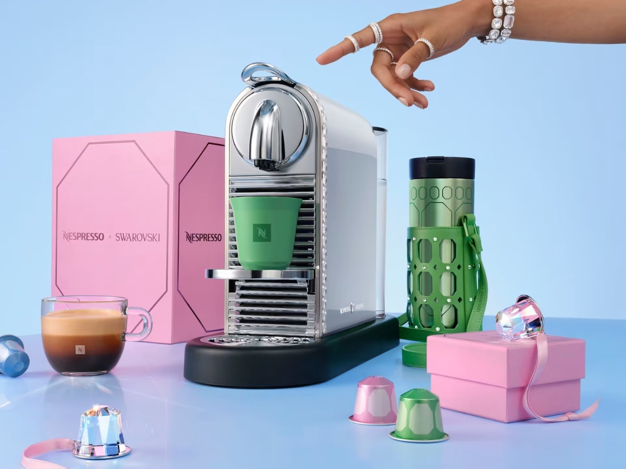
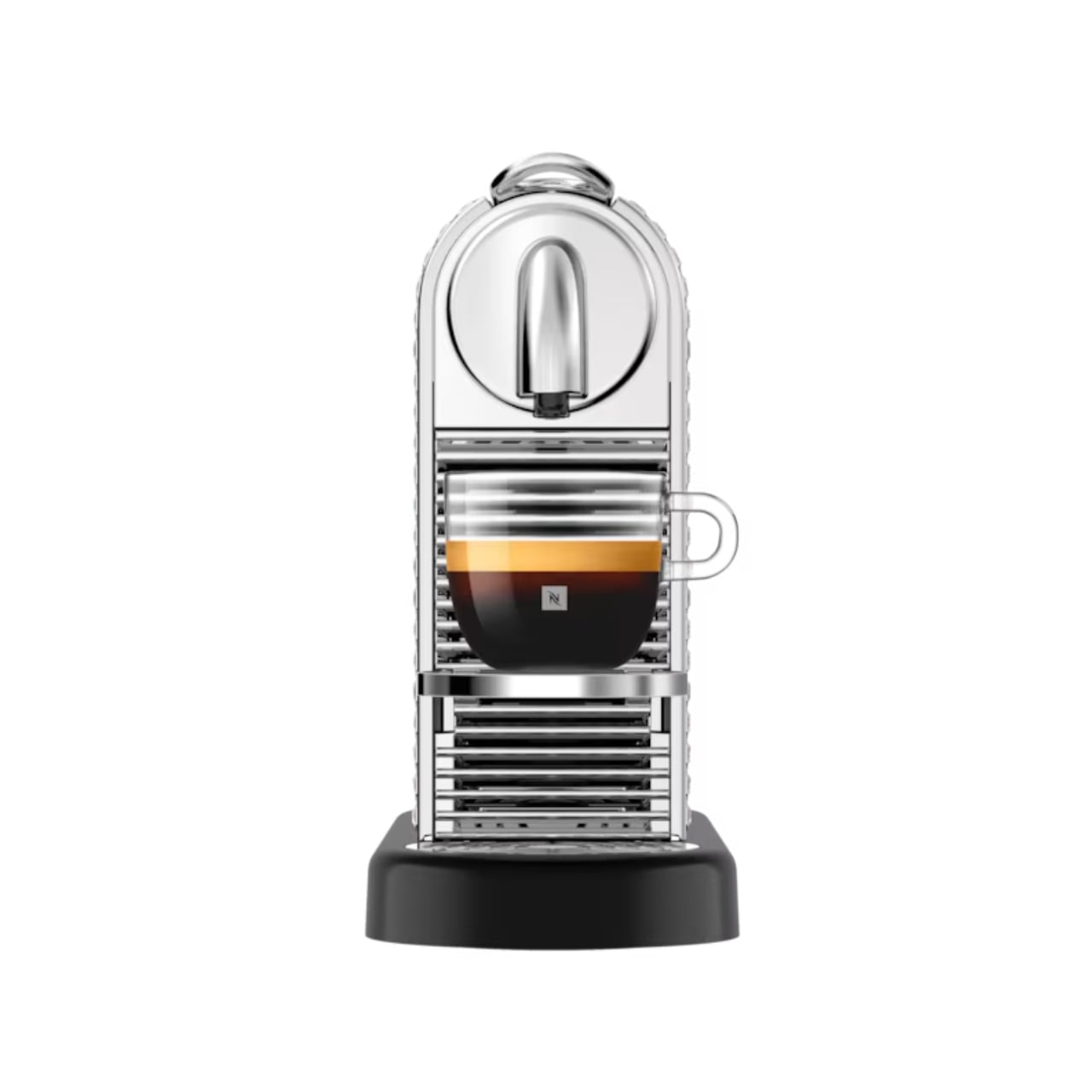
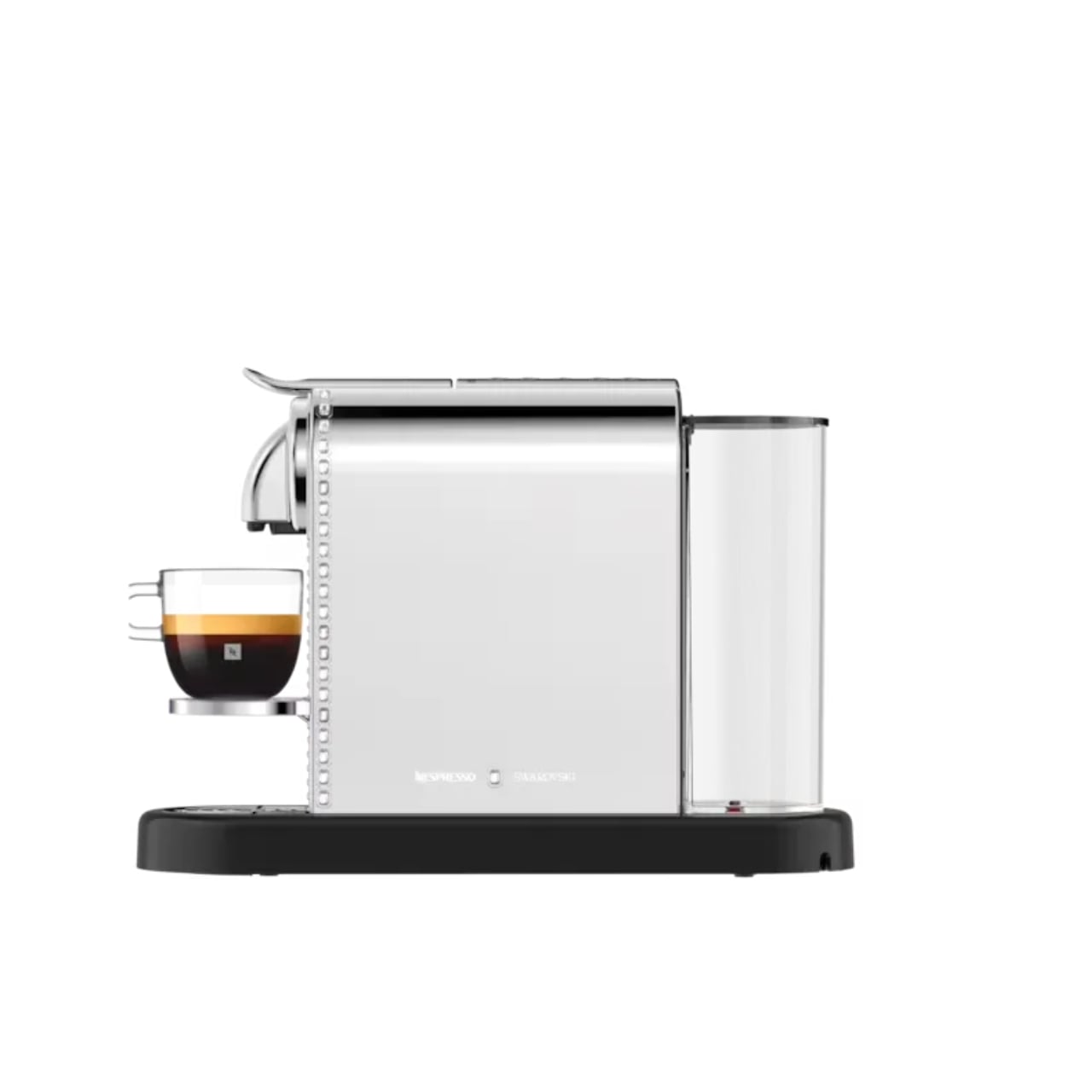
The limited-edition CitiZ Platinum has a silvery finish, with Swarovski crystals placed around its border. It is a noticeable change, though the machine remains recognizable as a CitiZ Platinum. That balance matters. Covering every surface in sparkle might make for a memorable photograph, but the more useful question is whether you would enjoy seeing it beside your favorite mugs on an ordinary Tuesday.

For me, the answer has less to do with luxury than with attention. Kitchens collect objects by necessity: a toaster, a kettle, a jar of spoons, the mug that never quite makes it back into the cabinet. A crystal-accented coffee machine cannot tidy that counter for you. It can, however, make one of its most permanent residents feel intentional.
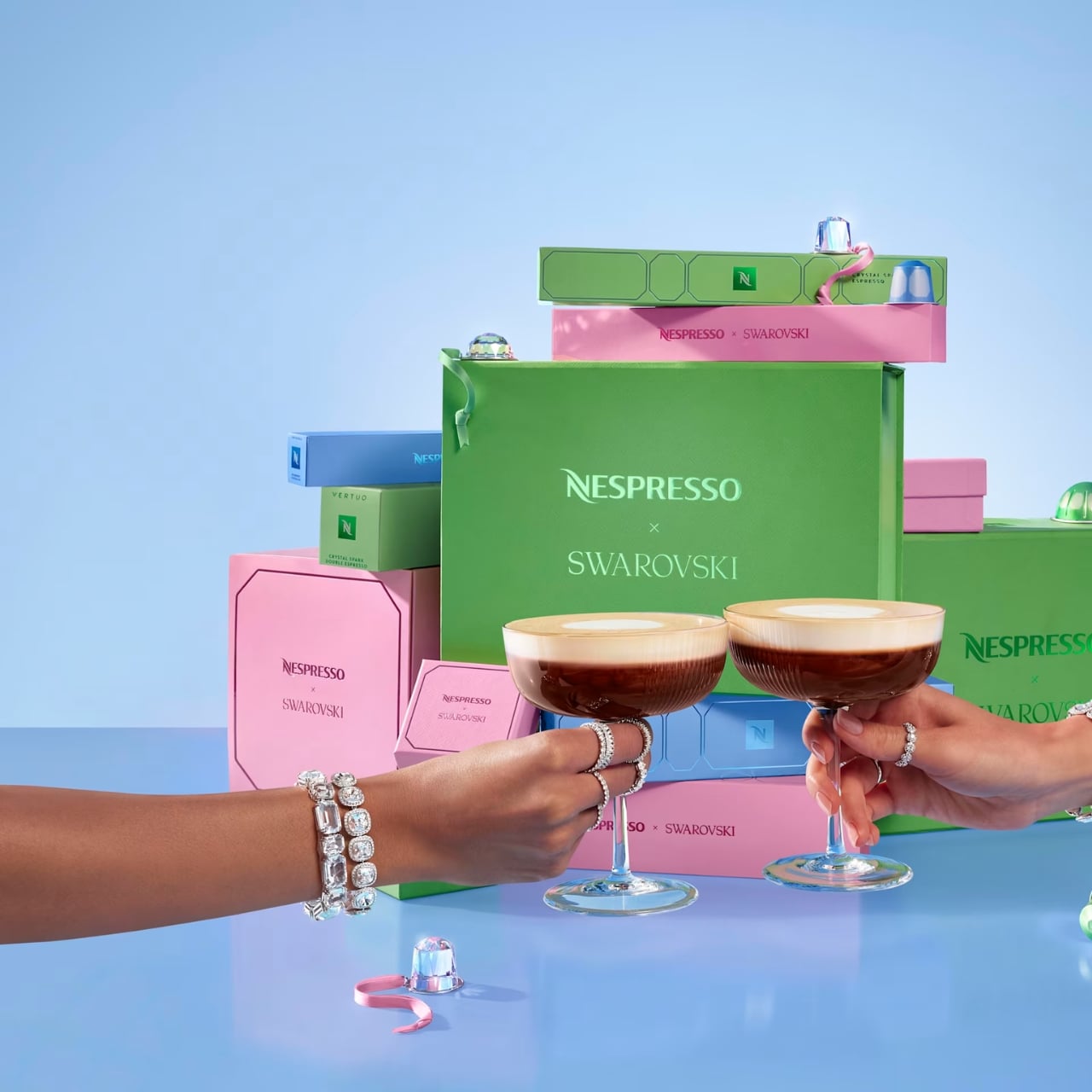
The collaboration stretches beyond the machine. Nespresso and Swarovski have carried the festive look into coffee, accessories, and capsule-inspired ornaments. The collection’s packaging draws on Swarovski’s octagonal shape and color palette, so the visual idea follows you from the machine to the smaller things around it. I appreciate that continuity. A special-edition appliance can feel oddly isolated when everything accompanying it looks like business as usual.

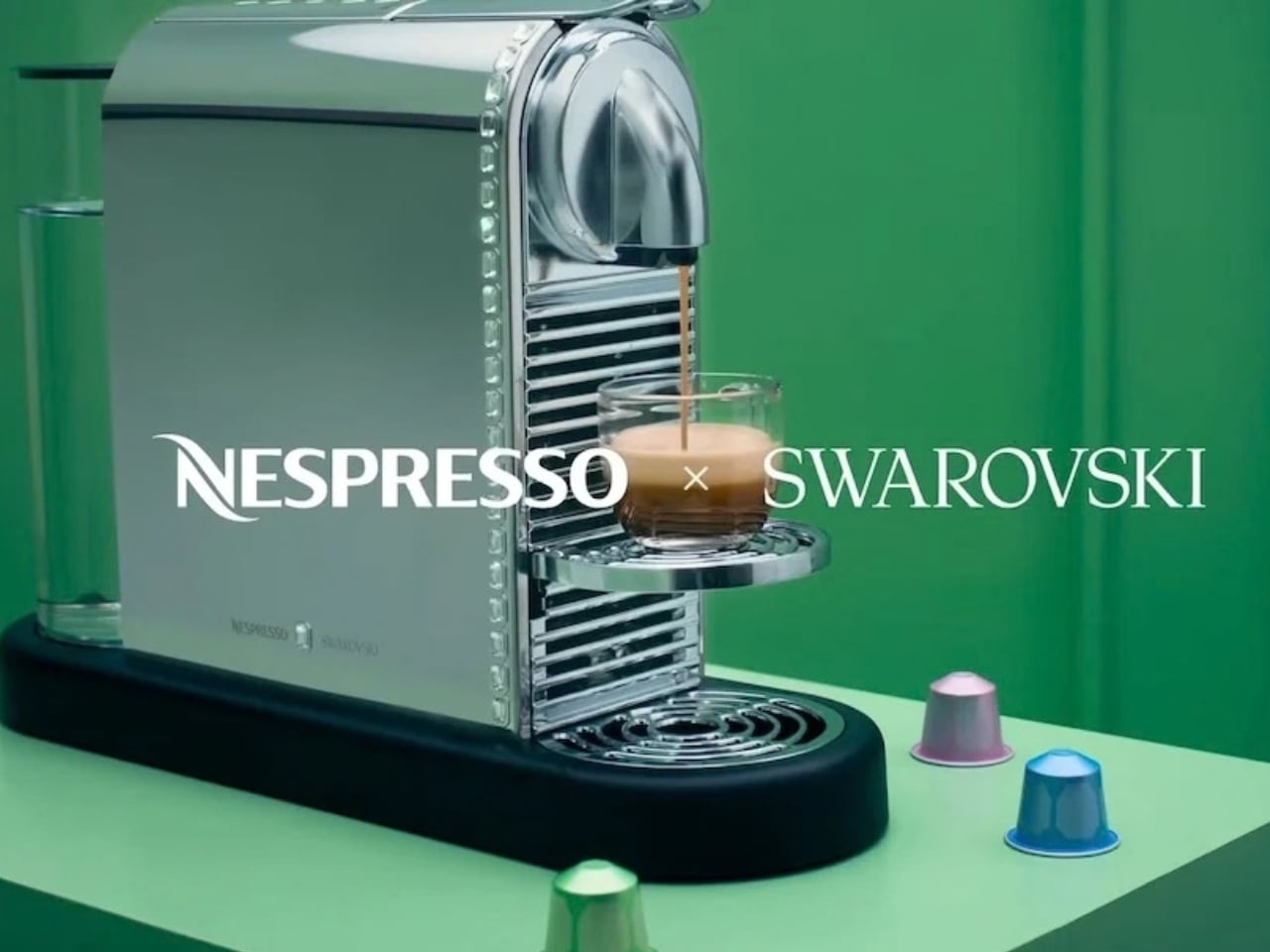
There are limited-edition coffees in the collection, too, including Crystal Spark options for Nespresso’s Original and Vertuo systems. That gives the partnership a place in the cup as well as on the counter, though I would keep the two appeals separate. The crystals are a design choice, not a claim that the machine brews better coffee because it has been dressed up.
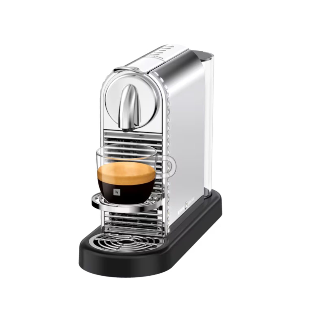
That distinction makes the product easier to appreciate. You do not have to believe every appliance needs a glamorous makeover to see who this is for. If you have spent time arranging a coffee station, choosing cups you enjoy holding, or finding a spot where the morning light hits just right, the machine fits into an interest you already have. It offers convenience without asking you to give up the pleasure of looking at your space.

It also makes sense as a gift for someone who already has very specific tastes. Coffee can be hard to buy for another person, especially when their preferred capsules and flavors are settled. A design-led machine is a more personal gesture, provided you know it suits their setup. I would check compatibility and availability before getting attached to the idea, particularly with a limited-edition collection.
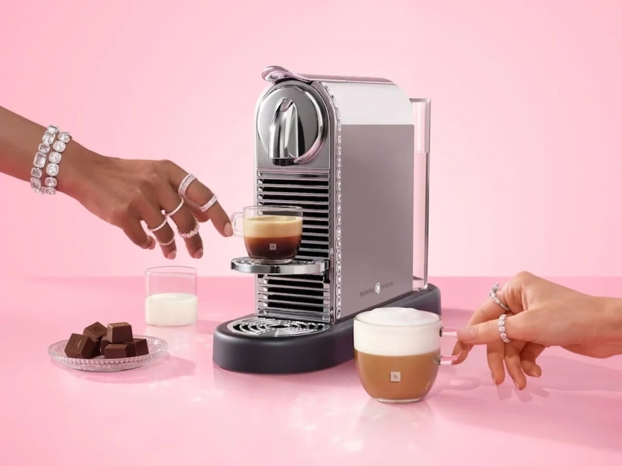
Of course, sparkle is a matter of taste. Some kitchens look best with almost nothing on the counter; others are happier with color, collections, and objects that start conversations. This CitiZ Platinum belongs to the second group. It asks for a little space and attention, and that is either its charm or a good reason to admire it from afar.

What makes the Nespresso x Swarovski collection interesting is its modest premise beneath all the shine: everyday tools deserve design consideration, too. The machine still has coffee to make. But when that job is done, it remains part of the room. For anyone tired of choosing between a useful counter and a beautiful one, that is a lovely place to start.
The post Nespresso x Swarovski: A $299 Coffee Machine Nobody Ignores first appeared on Yanko Design.
Motorola’s Swarovski Razr Was Designed to Be Seen, Not Hidden

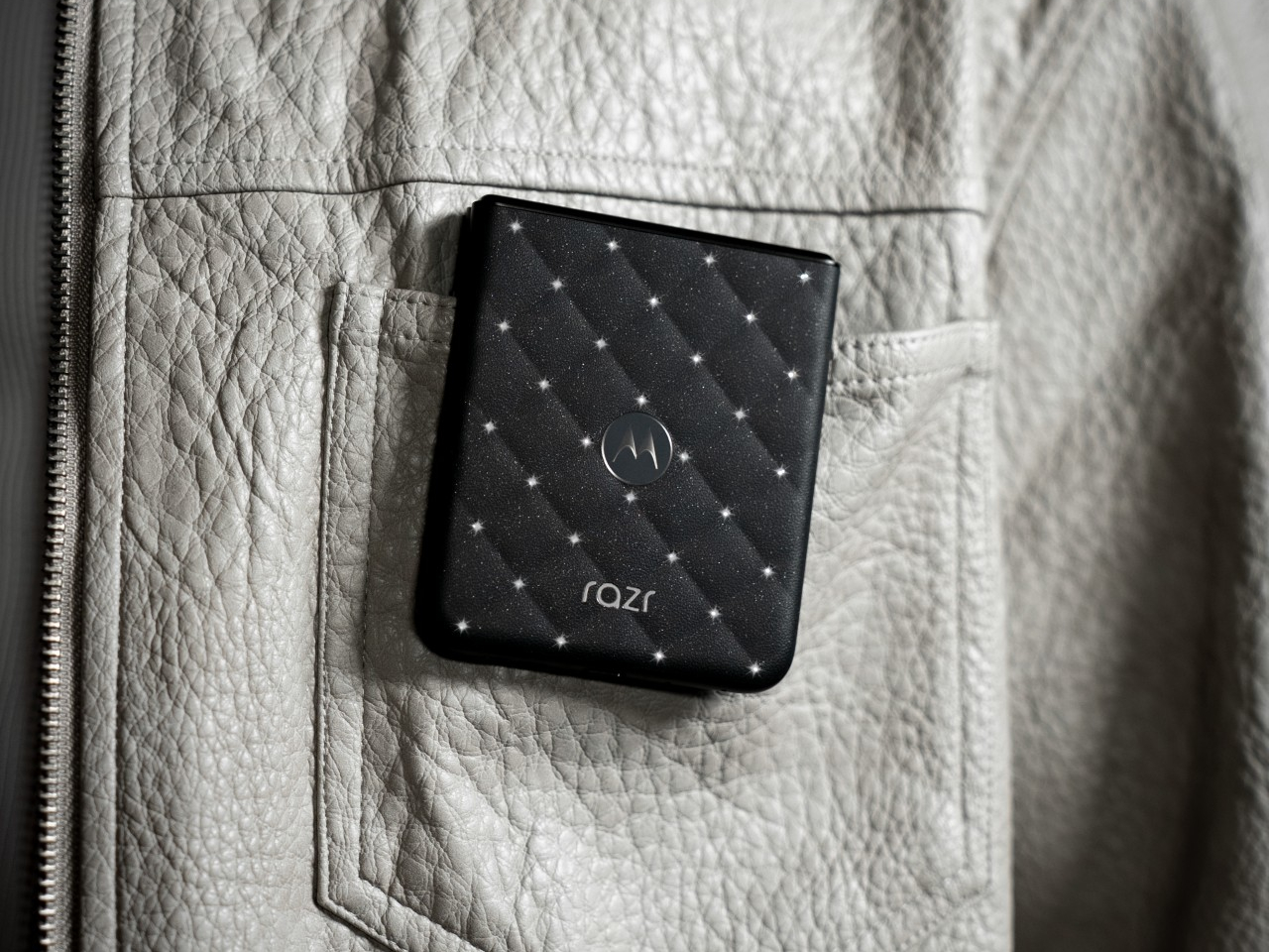
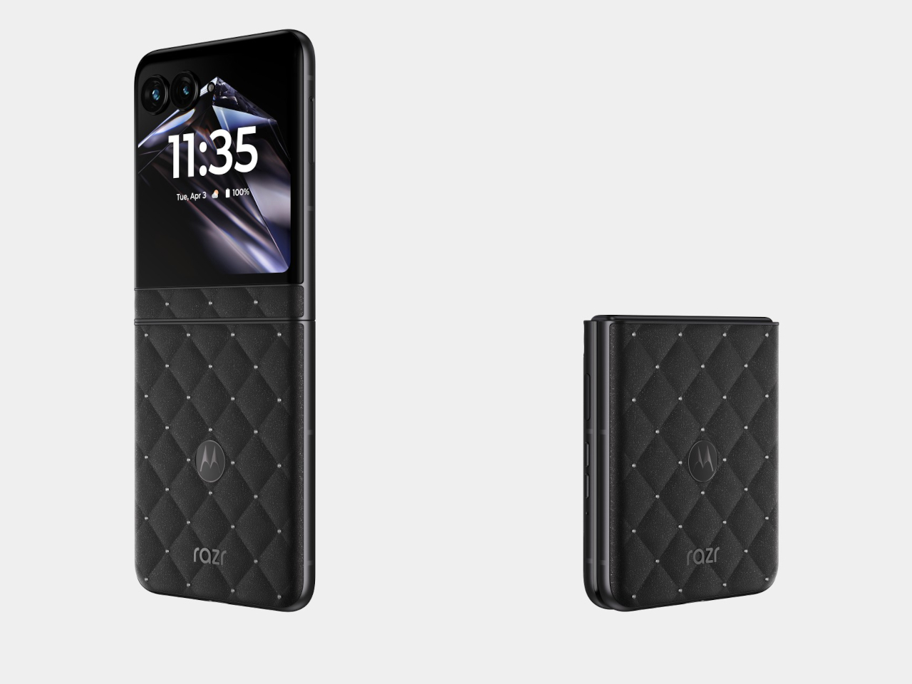
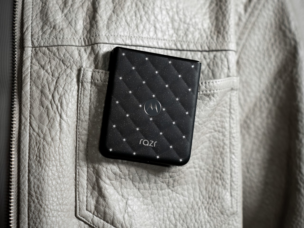
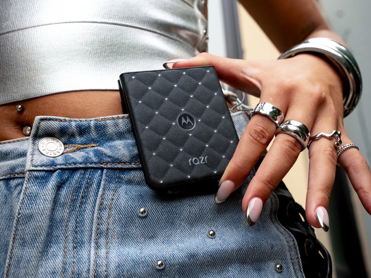
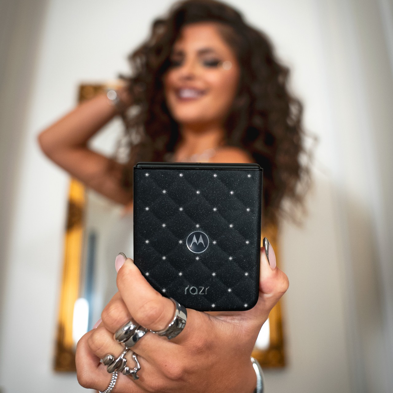
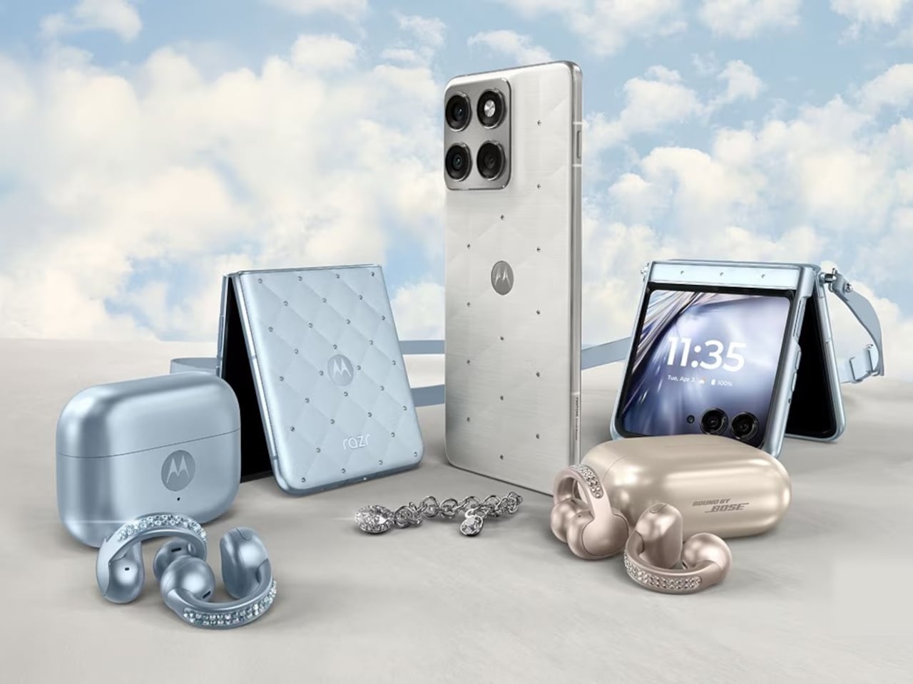
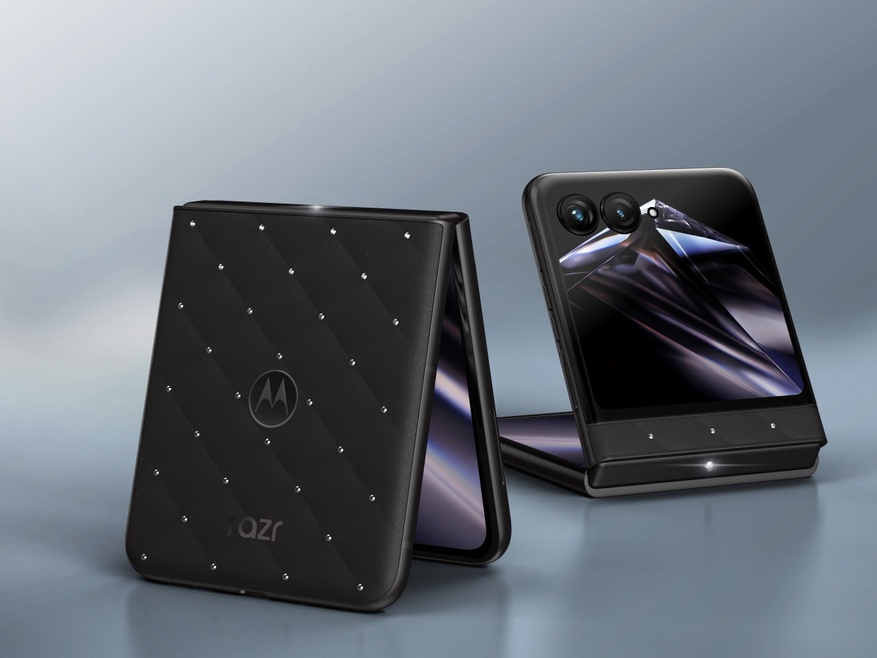
Motorola built a phone that asks to be noticed before it’s even unfolded. The 2026 motorola razr with Crystals by Swarovski joins the Brilliant Collection at IFA 2026, pairing Pantone’s color expertise with Swarovski’s craftsmanship on a foldable that reads less like consumer electronics and more like a clutch bag someone forgot was also a smartphone. It’s Motorola’s clearest statement yet that a phone’s exterior deserves as much attention as its chipset.

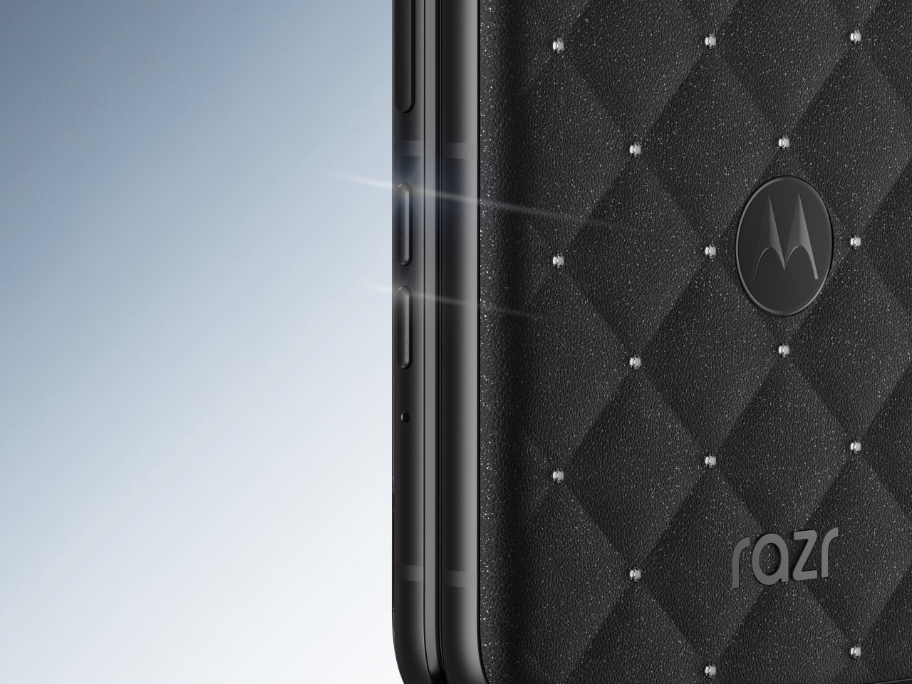
That statement starts with PANTONE Meteorite, a deep, understated shade that never competes for attention against the crystals resting on top of it. Instead, the finish creates contrast, revealing different dimensions of light and sparkle as the phone moves, so a simple pocket check under a restaurant table catches light differently than the same motion under office fluorescents. Color, in this case, does the quiet work of making everything layered on top of it shine harder.

Designer: Motorola x Swarovski

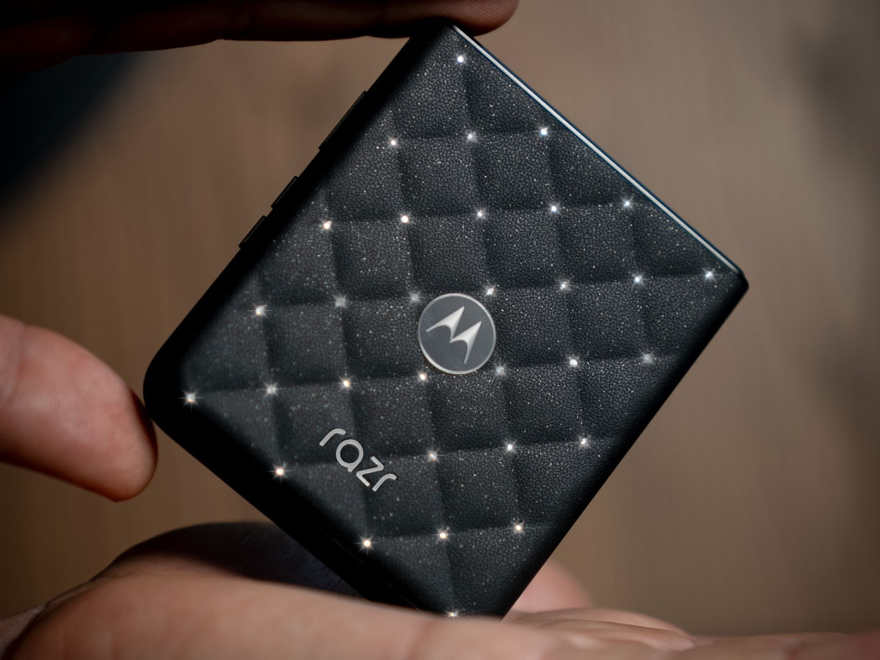
That layering happens across a quilted, leather-inspired texture that already feels premium before a single crystal enters the picture. Set against that padded surface, 35 hand-positioned Swarovski Crystals in Silver Night catch light from nearly any angle, each one placed with enough precision that the pattern reads as intentional rather than scattered. It’s the kind of detail that rewards a second glance rather than exhausting itself after the first one.

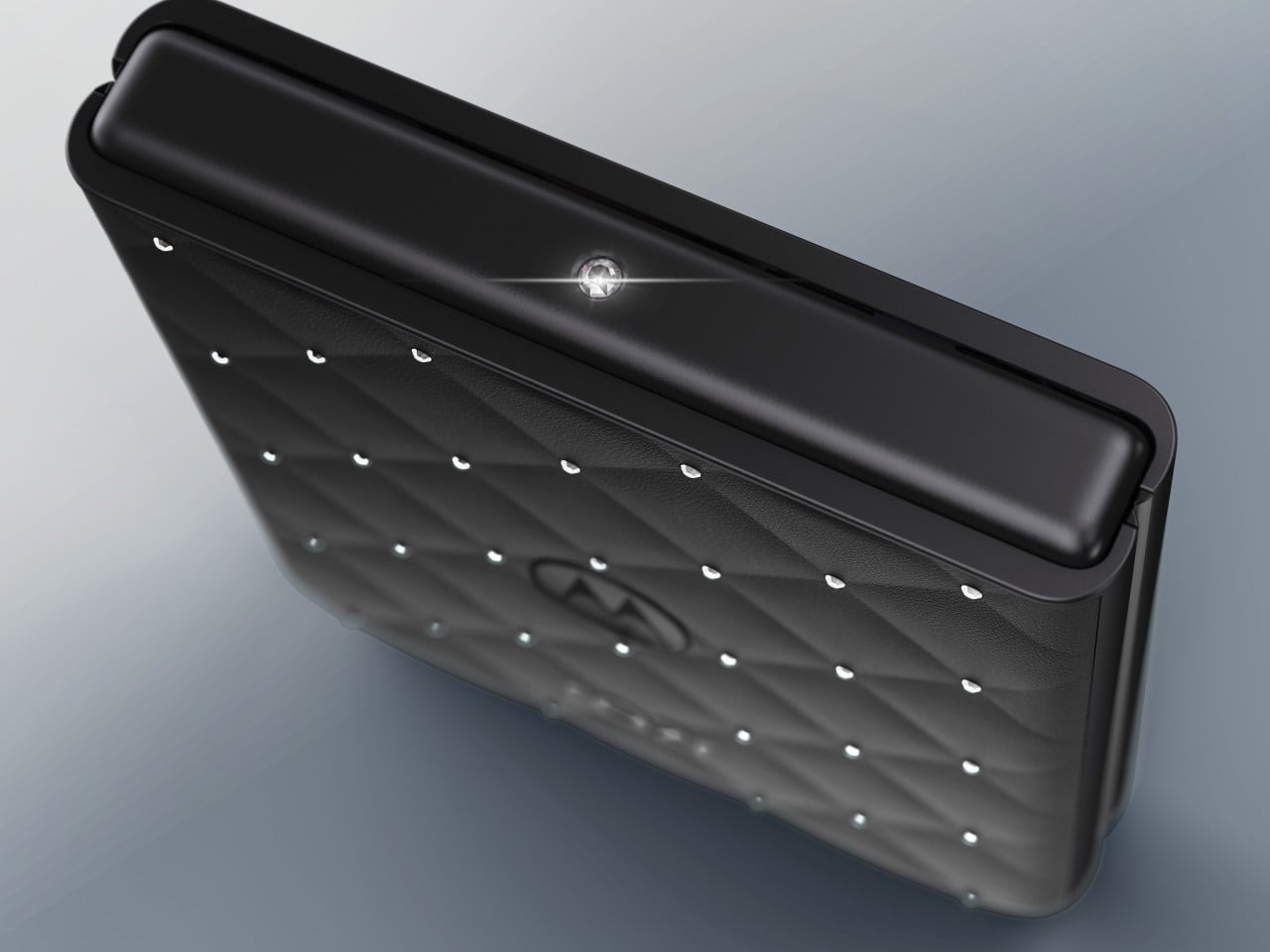
One crystal earns special treatment. A signature 32-facet Swarovski Crystal sits directly on the hinge, catching light with every flip in a way that turns the phone’s most mechanical motion into its most theatrical one. Razr’s flip has always been a small performance, and Motorola clearly understood that placing its biggest crystal exactly where the hinge pivots would turn an everyday gesture into something worth watching happen.

Motorola ships the device with a clear protective case built to frame the design without hiding it, a detail that matters more than it initially sounds. Plenty of phone cases exist purely to protect a device at the cost of concealing whatever made it desirable in the first place. Here, the case reads more like a museum vitrine than a rubber shell, letting the crystal work stay visible through daily handling.

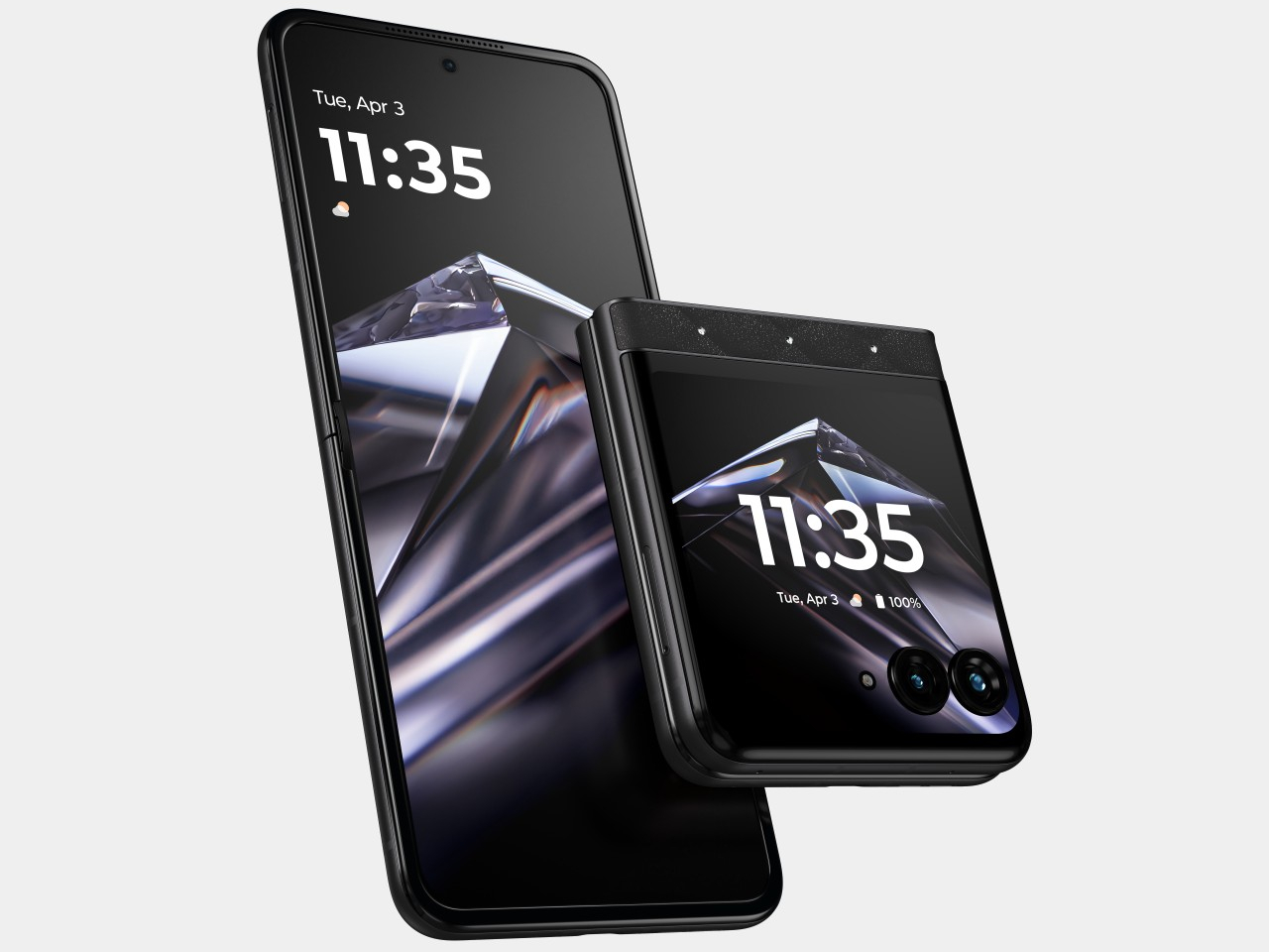
None of that styling comes at the expense of the hardware underneath. A 6.9-inch Extreme AMOLED display unfolds for daily use, backed by a dual 50MP main camera system and a 4800mAh battery rated for more than 36 hours on a single charge. The external 3.6-inch display still runs full apps and handles notifications without requiring an unfold, keeping the phone functional even when someone’s more focused on how it catches light in a bag.

Motorola frames the Brilliant Collection as proof that technology can be both beautiful and intelligent, and this razr backs that framing with hardware that would hold its own even without a single crystal attached. Pricing lands at $899.99 when the phone arrives on Motorola.com and Amazon on September 10, with Verizon carrying it starting September 24, putting genuine jewelry-adjacent design within reach of anyone willing to treat a phone as an actual accessory.

The post Motorola’s Swarovski Razr Was Designed to Be Seen, Not Hidden first appeared on Yanko Design.

Motorola Edge 70 Accents Pantone’s 2026 Color with Swarovski Studs

Pantone’s Color of the Year 2026, Cloud Dancer, arrived with a thesis that we are all collectively tired and need visual relief from the chaos. The soft, lofty white was pitched as clarity over clutter and presence over pressure, a quiet protest against hyper saturated everything, including the phones buzzing in our pockets. It felt less like a trend forecast and more like a group therapy session disguised as a paint chip.

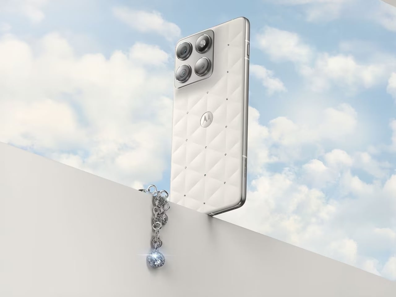
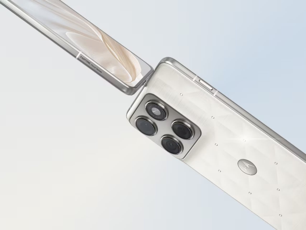
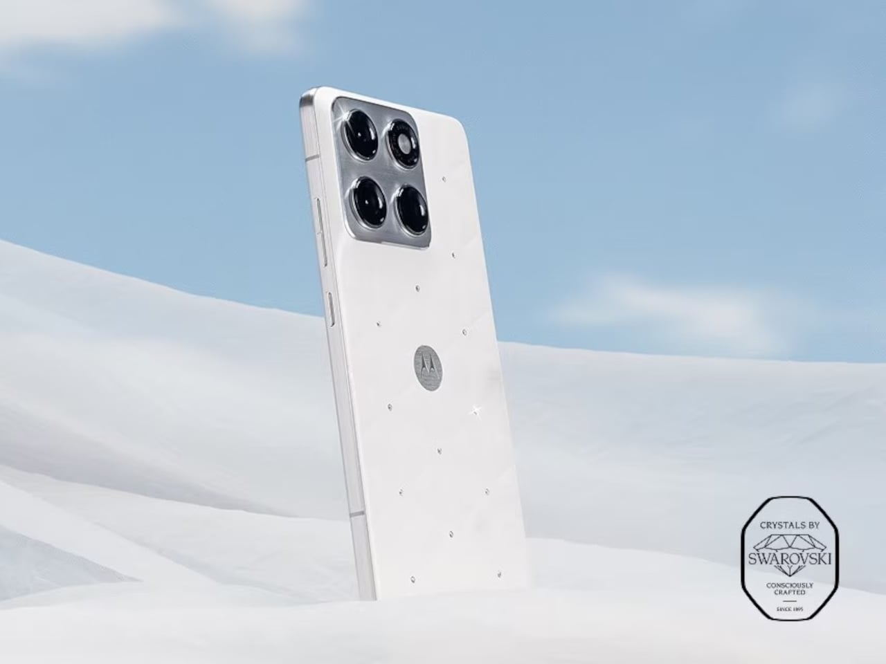
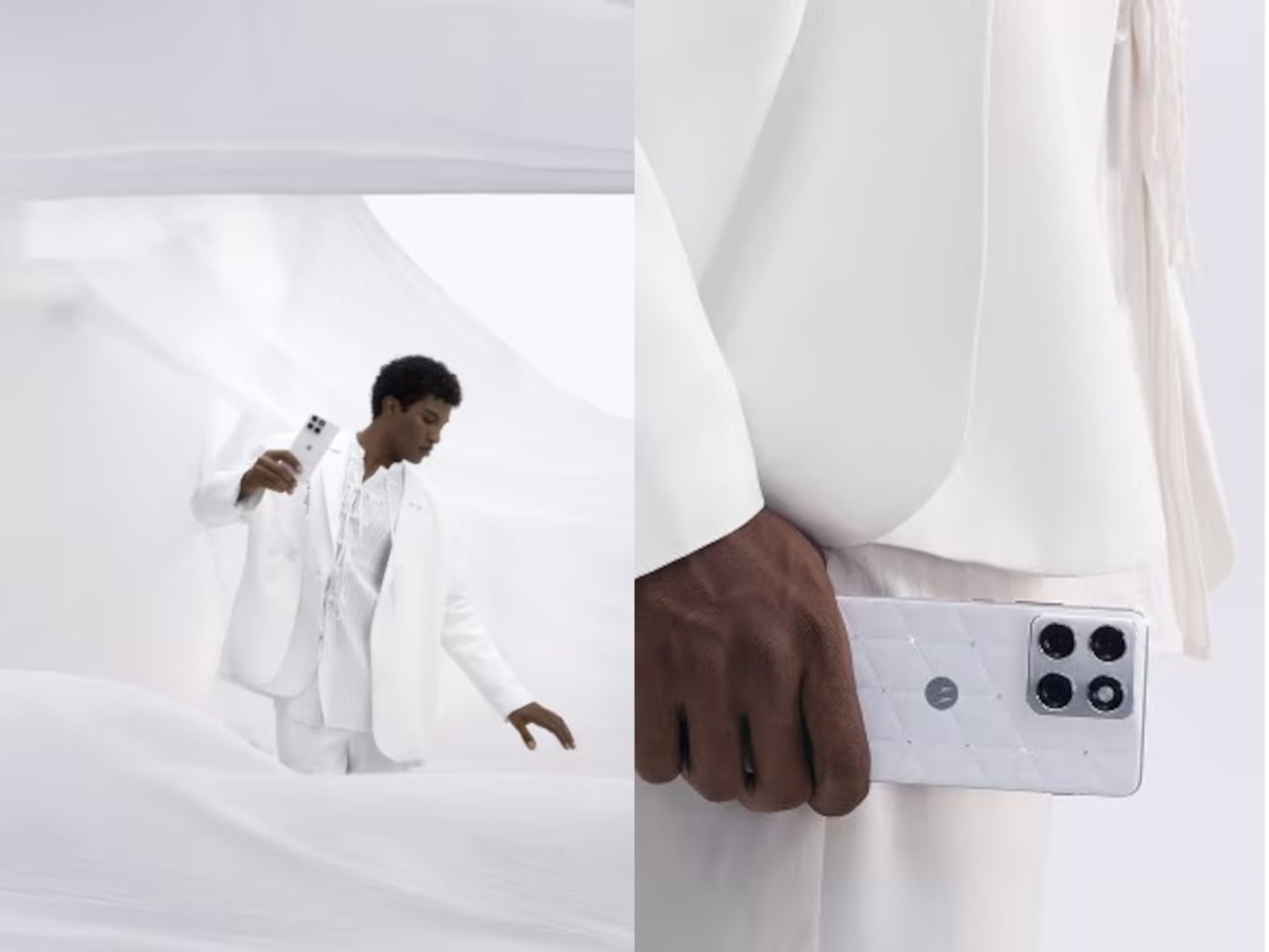
Motorola took that color story seriously. The Edge 70 special edition wraps Cloud Dancer around its thinnest chassis yet, embellished with crystals by Swarovski, continuing the design run that started with the Razr Brilliant Collection earlier this year. Where the Razr leaned extroverted and fashion forward, the Edge 70 Cloud Dancer edition feels like its quieter sibling, still sparkling but content to sit on a nightstand without demanding constant attention or Instagram documentation.

Designer: Motorola

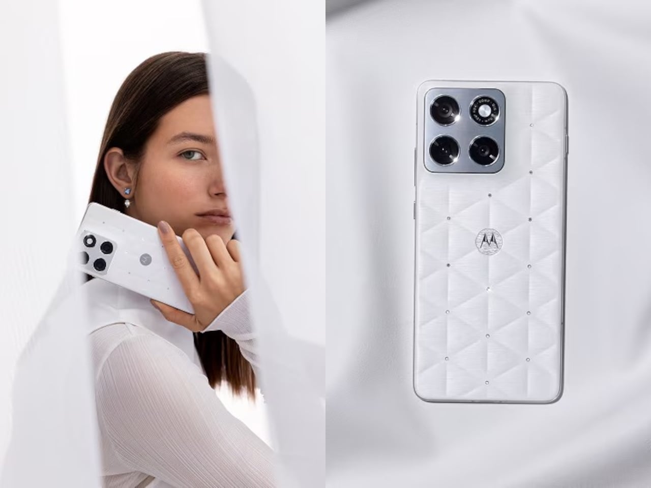
Cloud Dancer, officially Pantone 11-4201, lands on the Edge 70 as a leather inspired, quilted back that reads more like a minimal clutch than a piece of consumer electronics. The finish has a silk like sheen that shifts slightly in light, soft enough to avoid sterility but restrained enough to avoid looking like a frosted cupcake. Motorola calls it an object of clarity and quiet confidence, which fits the brief so precisely it almost sounds rehearsed.

Crystals by Swarovski are embedded into the quilted back, small enough to catch light without shouting for attention. The Brilliant Collection, which debuted with the Razr a few months ago, focuses on meticulous craftsmanship and timeless luxury, treating phones like accessories that happen to also make calls. Here, the crystals feel less like decoration and more like strategic punctuation marks on an otherwise very calm sentence, little flickers that keep the white from feeling too monastic.

Underneath sits the regular Edge 70 hardware, Snapdragon 7 Gen 4, dual 50 megapixel cameras, a bright display, and moto ai that adapts quietly. Motorola emphasizes that the device is the thinnest in its category, hedged by footnotes about regional price bands but still impressive for something packing a 4800 milliamp hour battery and full day reliability without feeling fragile in the hand.

The approach contrasts with the usual luxury phone playbook, which tends toward loud colors, heavy logos, or aggressive patterns that scream performance. Cloud Dancer is almost the opposite, a discrete white Pantone describes as conscious simplification. The quilting and crystals prevent it from becoming sterile, but the overall vibe lands somewhere between spa robe and gallery wall, an unusual place for a smartphone to occupy.

Motorola seems intent on building a design ecosystem where color forecasting and material craft matter as much as chipsets. The Razr Brilliant Collection introduced Swarovski, and now the Edge 70 ties that to Pantone’s annual ritual. We live in a world where most phones blur into identical black rectangles, so a calm white device with a quilted back and a handful of crystals starts to feel surprisingly memorable, even if memorable was never the point.

The post Motorola Edge 70 Accents Pantone’s 2026 Color with Swarovski Studs first appeared on Yanko Design.
PENT Made Dumbbells Too Pretty to Actually Work Out With

There’s something slightly absurd yet completely mesmerizing about the idea of working out with equipment covered in Swarovski crystals. But here we are in 2025, and Polish luxury fitness brand PENT has partnered with Swarovski to create gym equipment that looks like it belongs in a museum rather than your basement workout space.

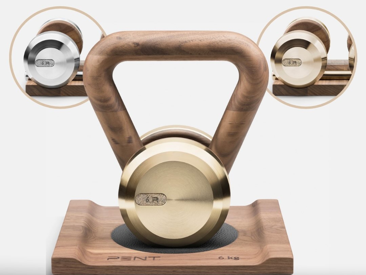
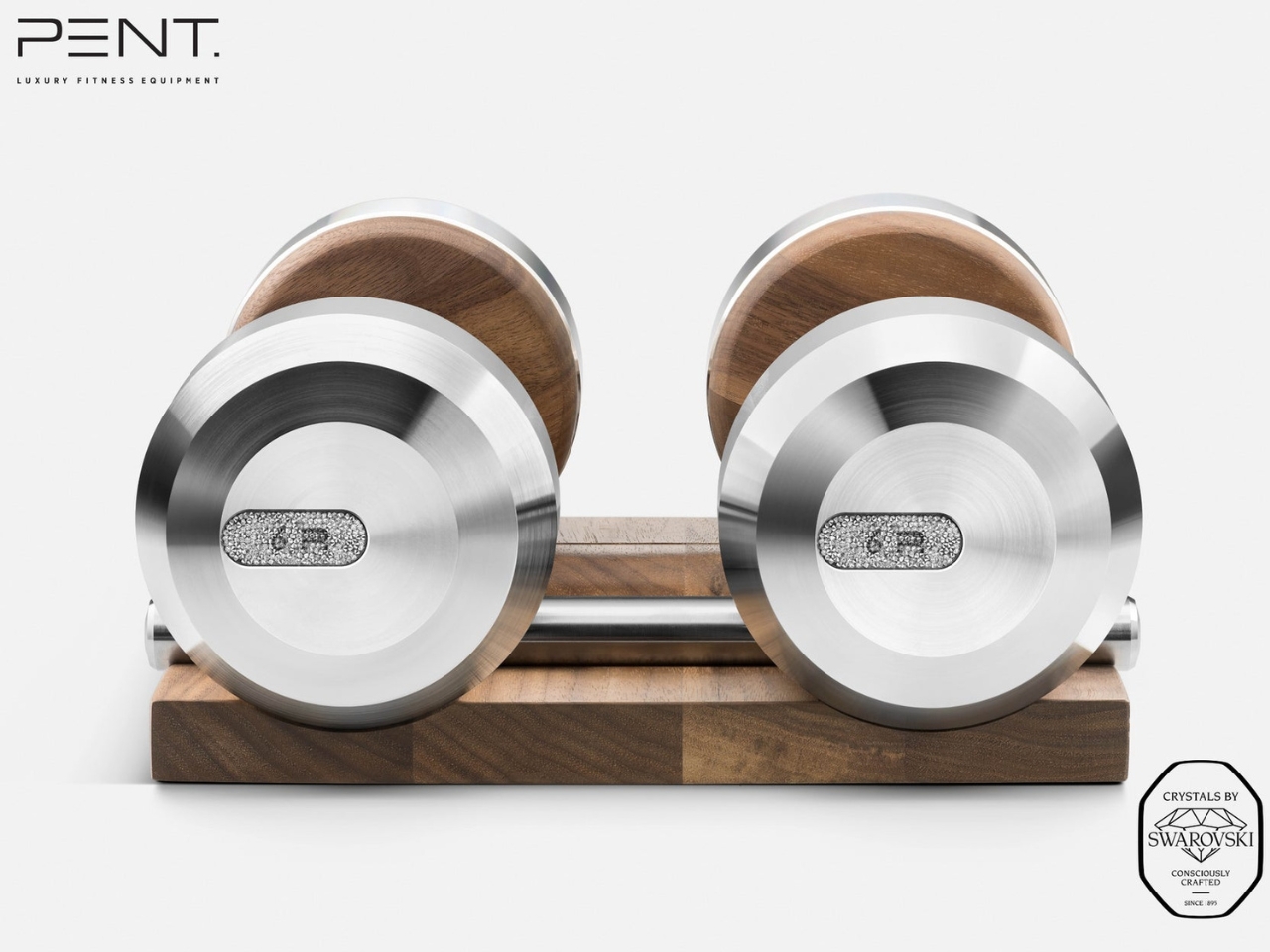
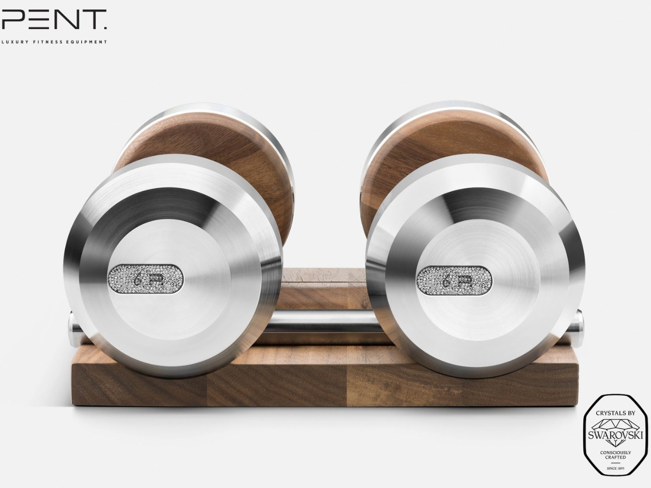
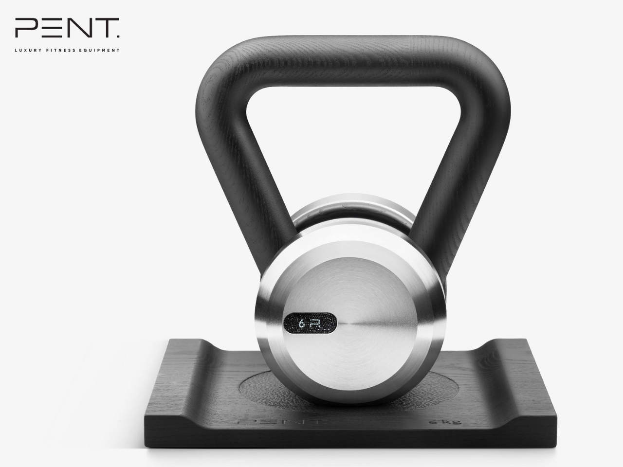
Let’s be honest. Most of us have dumbbells tucked away in closets or gathering dust under the bed. They’re functional, sure, but they’re not exactly objects you’d want to display on your coffee table. PENT is completely flipping that script with their “Embellished with Crystals by Swarovski” collection, which features handcrafted dumbbells and kettlebells that are as much about aesthetics as they are about bicep curls.

Designer: PENT x Swarovski

The collection includes the COLMIA dumbbells and LOVA kettlebells, each one meticulously handmade in Poland using materials that sound more suited to a luxury yacht than a home gym. We’re talking walnut or ash wood handles, Italian leather, stainless steel, and of course, those signature Swarovski crystals hand-applied to every piece. Even the storage racks are designed with architectural precision, so the equipment becomes a sculptural element in your space rather than something you need to hide away.

What makes this collaboration particularly interesting is how it challenges our assumptions about where luxury belongs. Fitness equipment has traditionally been purely utilitarian. You want something that works, not something that sparkles. But as home wellness spaces have evolved from dingy garage setups to carefully curated environments, there’s clearly a market for equipment that doubles as design objects. According to Iron House Design, which is bringing the collection to the U.S. market, these pieces are intended for luxury home gyms, private spas, hotel suites, and superyacht interiors.

The price tag reflects this positioning. The collection starts at around $613 for dumbbells with a wooden stand and goes up to $681 for kettlebells, though more customized sets can reach $25,000 depending on the level of crystal detailing and personalization you want. That’s a significant investment for equipment you could theoretically replace with a $30 set from a sporting goods store.

But that misses the point entirely. These aren’t meant to be practical purchases in the traditional sense. They’re statement pieces that happen to be functional. Tanya Ryno, founder of Iron House Design, describes them as being “for those who make bold statements with every choice.” It’s for the person who wants every element of their home to reflect a certain level of taste and refinement, from the artwork on the walls to the weights on the floor.

The collaboration also taps into a broader cultural shift around wellness and self-care. Exercise is no longer just about breaking a sweat or hitting certain fitness goals. For many people, especially in the luxury market, it’s about the entire experience. The space you work out in matters. The equipment you use matters. And increasingly, people are willing to invest in making those experiences feel special.

That said, there’s an inevitable question hovering over the whole thing: would you actually work out with crystal-covered dumbbells, or would you just keep them on display? According to reports, many owners treat them more like collectible art pieces or conversation starters rather than everyday workout tools. Some designers are even using them purely as decorative elements in high-end spaces. Technically, these pieces are engineered to meet professional fitness standards, so you absolutely could use them for your actual workouts. The wooden handles are smooth and ergonomically designed, and the stainless steel ends are weighted properly. But when something is that beautiful and that expensive, there’s an understandable hesitation to actually get your sweat all over it.

What the PENT x Swarovski collection really represents is the ongoing blurring of boundaries between different design categories. Furniture looks like art. Kitchen appliances become sculptural centerpieces. And now, gym equipment gets the high-jewelry treatment. It’s all part of a world where the objects we surround ourselves with are expected to be both functional and beautiful, practical and aspirational.

The post PENT Made Dumbbells Too Pretty to Actually Work Out With first appeared on Yanko Design.