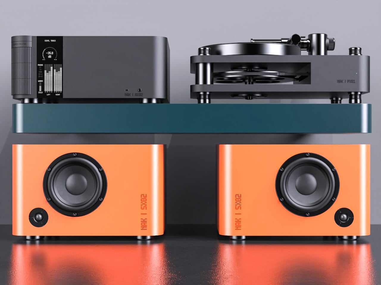
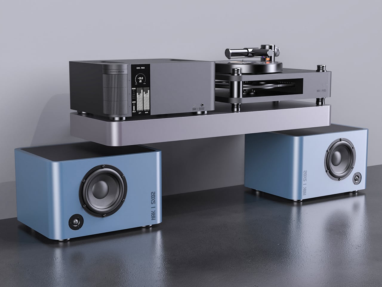
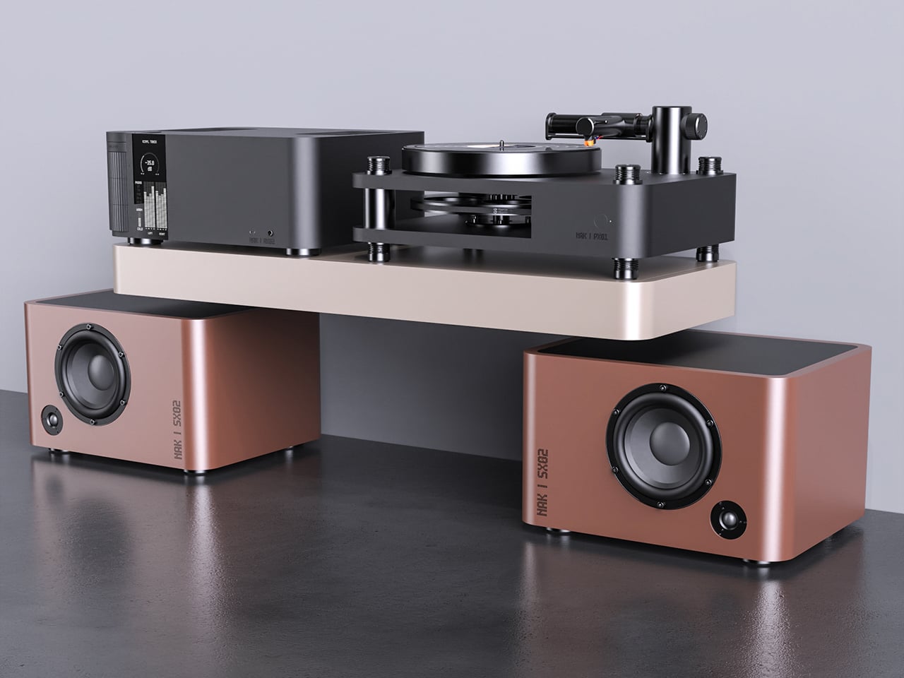
Most Hi-Fi gear still looks like anonymous black rectangles, even in carefully designed living rooms. Serious listeners often hide their amps and speakers in cabinets because the hardware rarely matches the rest of the furniture, even when the sound is great. The default assumption is that audio equipment belongs out of sight, tolerated for its performance but not celebrated for its presence.
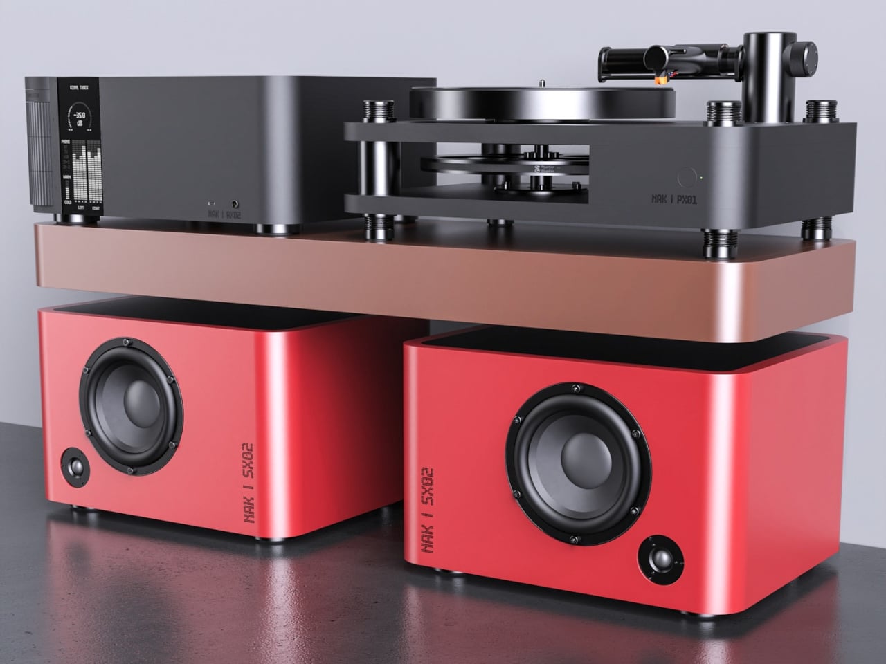
Antoine Brieux of NAK Studio designed a complete stack he would personally want at home, treating it as a thought experiment about what happens when an integrated amplifier, speakers, and turntable are drawn as one family from the start. Color, tactility, and proportions are treated as seriously as the signal path, so the system could earn a spot in the open rather than behind doors or under furniture.
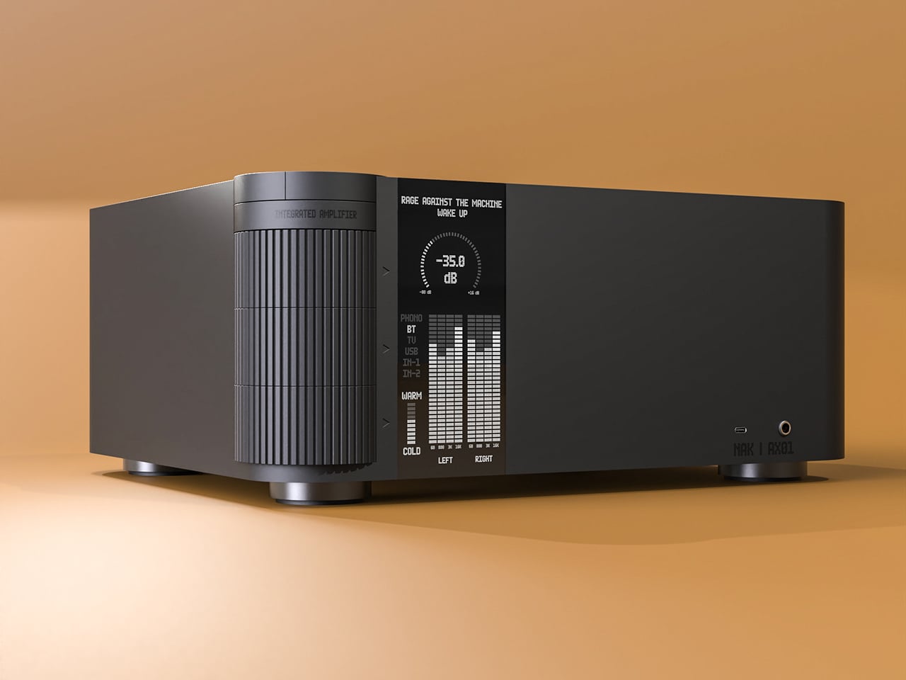
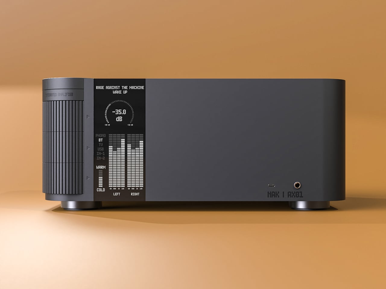
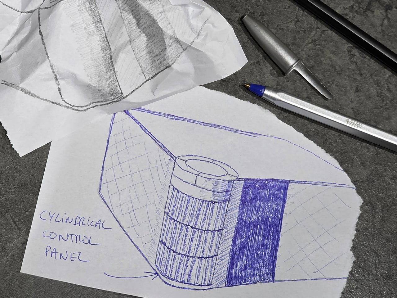
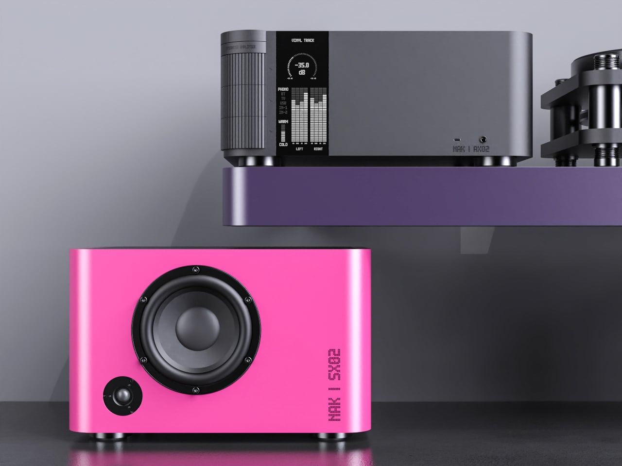
The integrated amplifier is a low, solid block with a ribbed cylinder grafted onto one corner, turning the usual volume knob into a full control column. That cylinder suggests precise, satisfying adjustments for volume, inputs, and tone, giving your hand a clear place to land instead of hunting for tiny knobs or touch buttons scattered across a cluttered front panel.
The tall monochrome display beside the cylinder shows track info, a big dB scale, and twin bar-graph meters dancing with the music. The list of inputs covers phono and TV to Bluetooth and USB, and a warm-to-cold tonal slider sits below, so the front of the amp feels like a calm, legible dashboard rather than a technical interface that demands constant attention or an instruction manual.
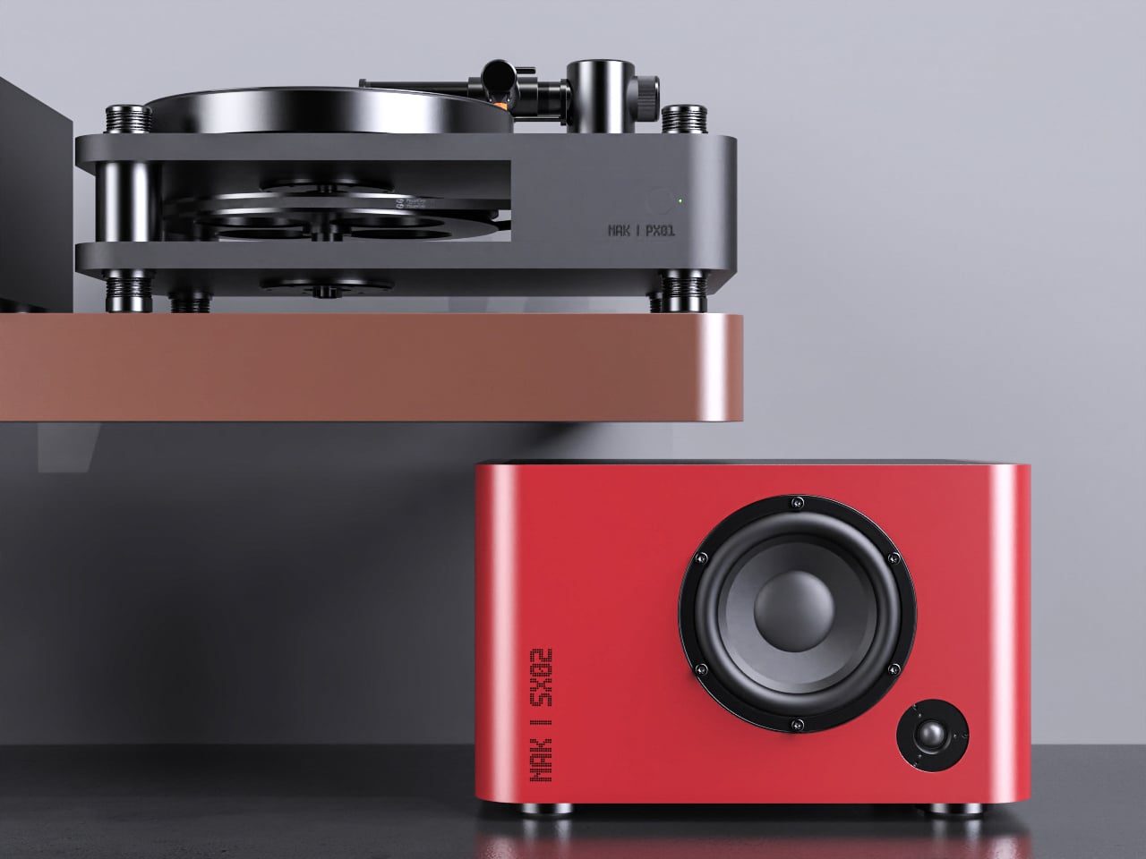
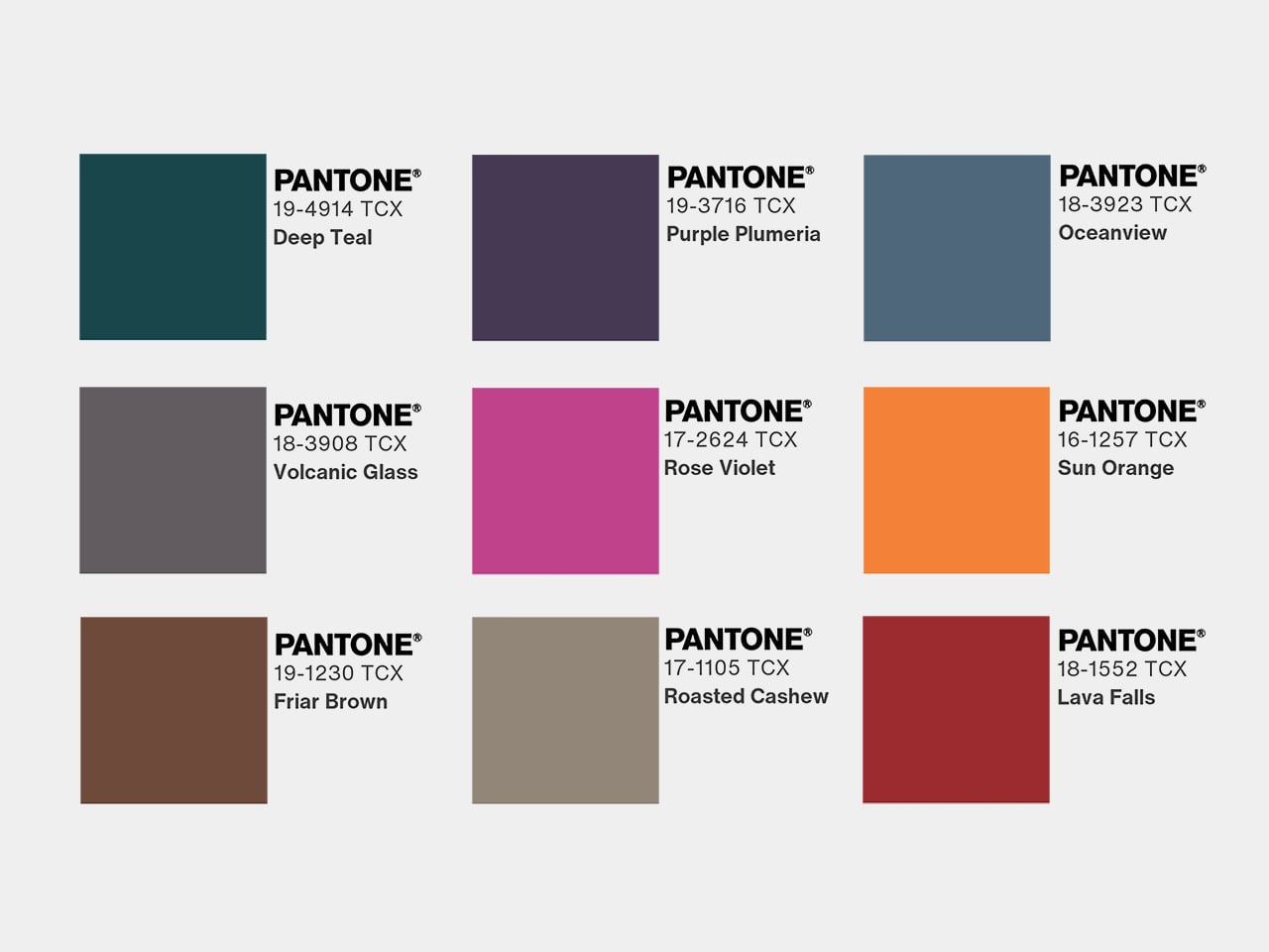
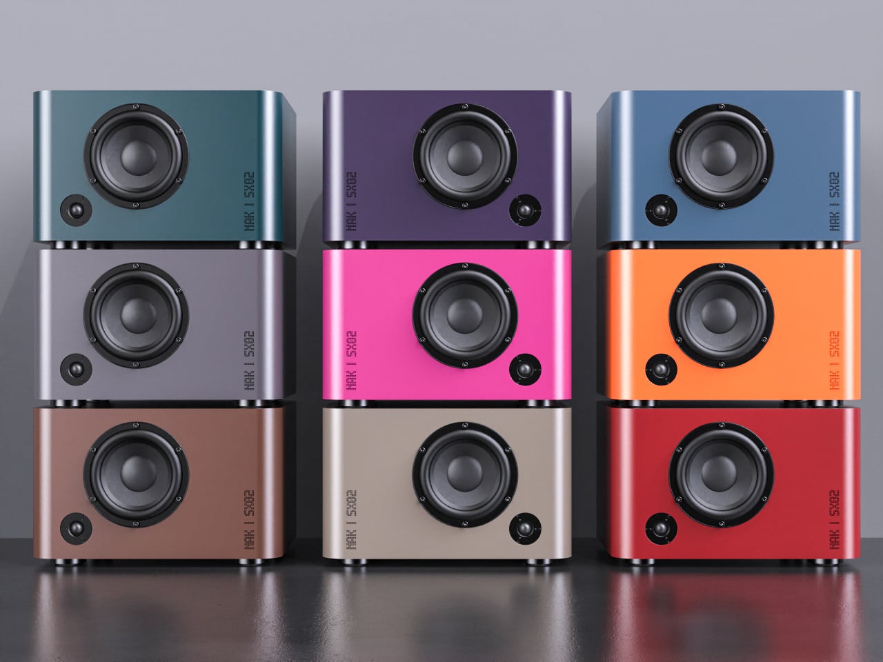
The compact speakers are each a rounded rectangle with a single driver and tweeter, but finished in mixable Pantone colors, letting you treat them as color accents in a room. You could pair teal with orange, or match a pair to a shelf or wall, so they become part of the space’s palette instead of something you try to hide or apologize for when guests visit.
The matching turntable sits on the same footprint as the amp, with exposed suspension pillars and a straight arm that echoes the cylinder theme. The three components stack visually into a tidy tower, making the whole listening setup feel intentional, almost like a piece of modular furniture for records and streaming alike, cohesive enough to anchor a sideboard or desk.
NAK Studio’s concept is not about chasing specs, but about imagining a Hi-Fi system that earns its place in the open. The controls invite touch, the colors play with the room, and the stack looks as considered as the music it is built to play. It starts to feel less like a fantasy and more like how audio gear should have evolved all along.
Most Hi-Fi gear still looks like anonymous black rectangles, even in carefully designed living rooms. Serious listeners often hide their amps and speakers in cabinets because the hardware rarely matches the rest of the furniture, even when the sound is great. The default assumption is that audio equipment belongs out of sight, tolerated for its performance but not celebrated for its presence.
Antoine Brieux of NAK Studio designed a complete stack he would personally want at home, treating it as a thought experiment about what happens when an integrated amplifier, speakers, and turntable are drawn as one family from the start. Color, tactility, and proportions are treated as seriously as the signal path, so the system could earn a spot in the open rather than behind doors or under furniture.
The integrated amplifier is a low, solid block with a ribbed cylinder grafted onto one corner, turning the usual volume knob into a full control column. That cylinder suggests precise, satisfying adjustments for volume, inputs, and tone, giving your hand a clear place to land instead of hunting for tiny knobs or touch buttons scattered across a cluttered front panel.
The tall monochrome display beside the cylinder shows track info, a big dB scale, and twin bar-graph meters dancing with the music. The list of inputs covers phono and TV to Bluetooth and USB, and a warm-to-cold tonal slider sits below, so the front of the amp feels like a calm, legible dashboard rather than a technical interface that demands constant attention or an instruction manual.
The compact speakers are each a rounded rectangle with a single driver and tweeter, but finished in mixable Pantone colors, letting you treat them as color accents in a room. You could pair teal with orange, or match a pair to a shelf or wall, so they become part of the space’s palette instead of something you try to hide or apologize for when guests visit.
The matching turntable sits on the same footprint as the amp, with exposed suspension pillars and a straight arm that echoes the cylinder theme. The three components stack visually into a tidy tower, making the whole listening setup feel intentional, almost like a piece of modular furniture for records and streaming alike, cohesive enough to anchor a sideboard or desk.
NAK Studio’s concept is not about chasing specs, but about imagining a Hi-Fi system that earns its place in the open. The controls invite touch, the colors play with the room, and the stack looks as considered as the music it is built to play. It starts to feel less like a fantasy and more like how audio gear should have evolved all along.
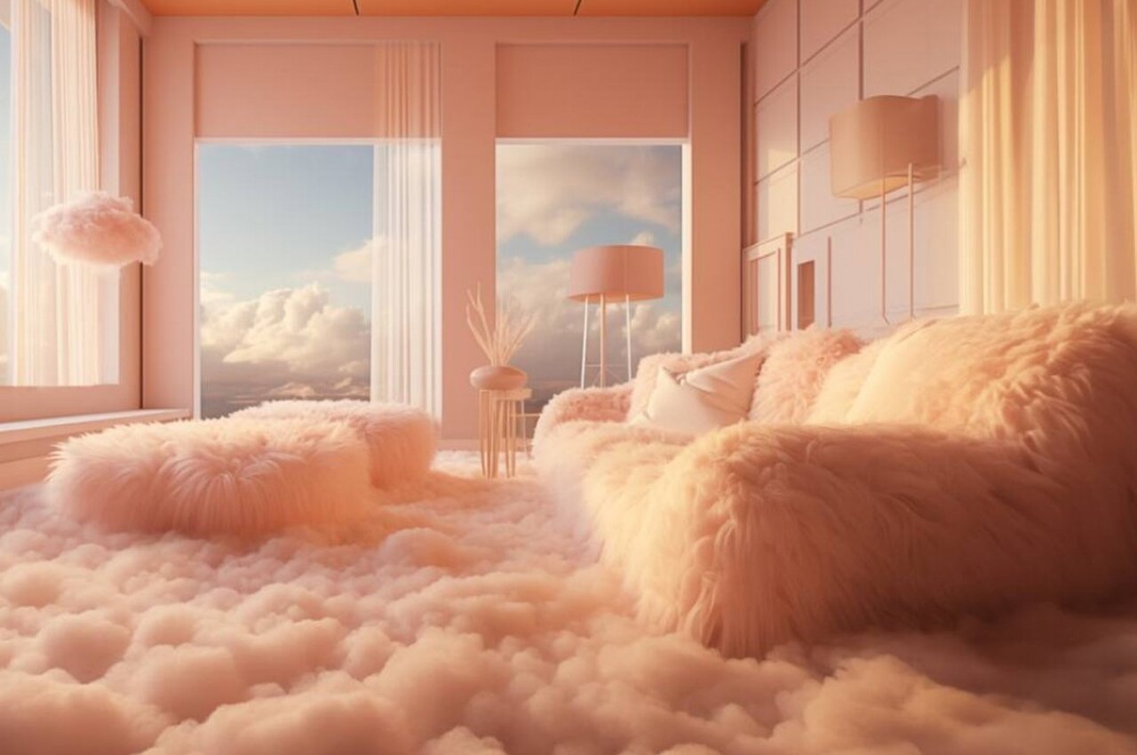
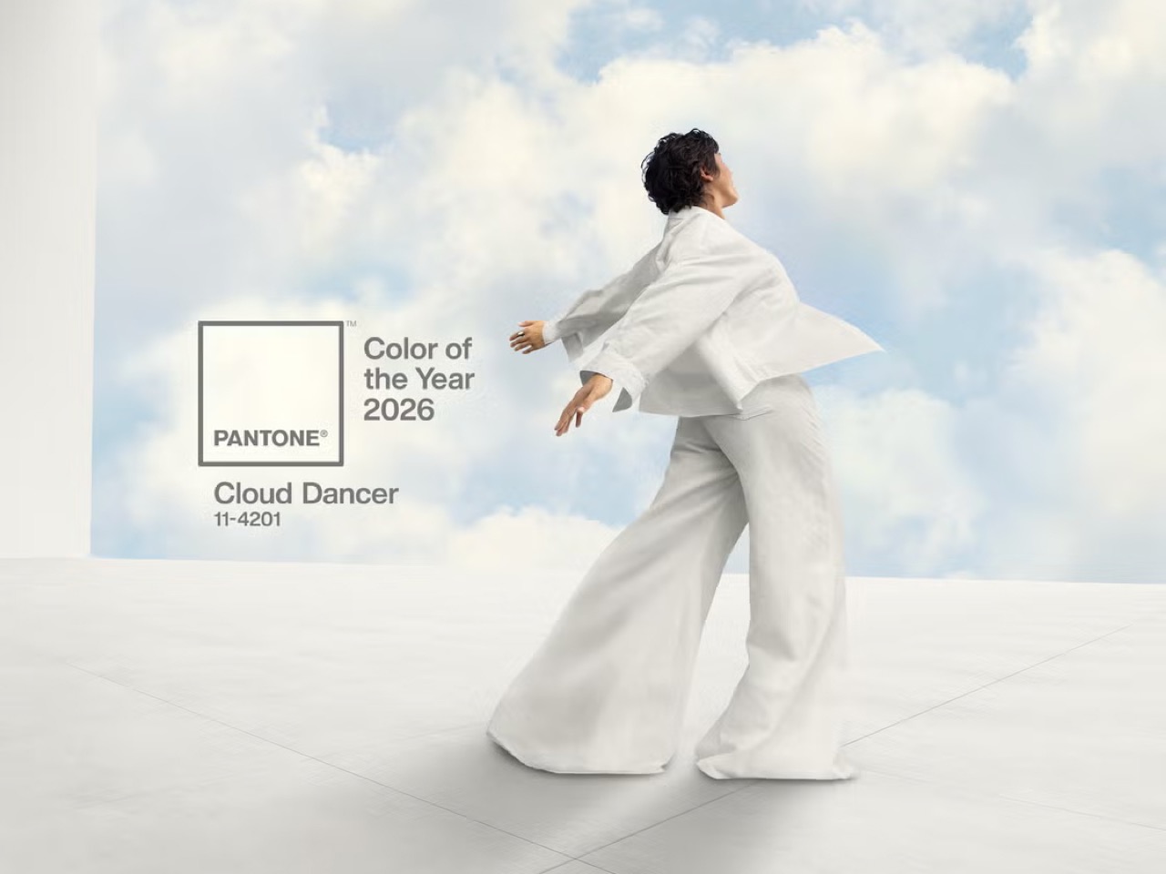
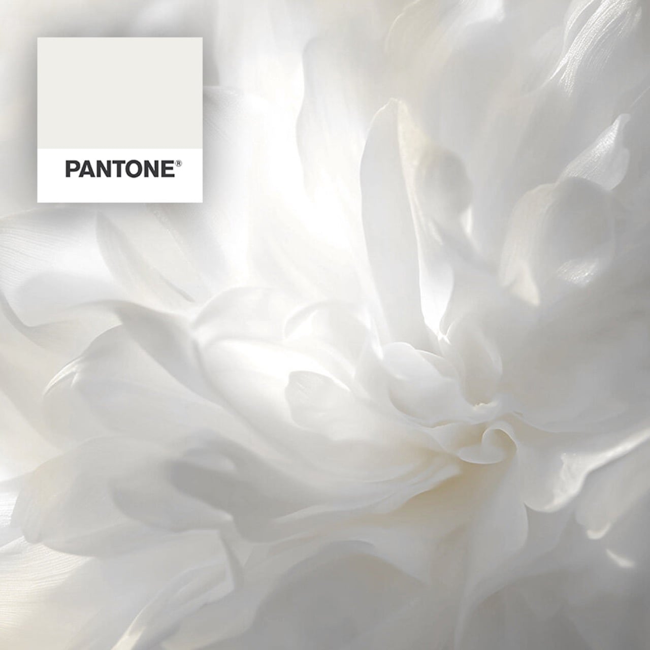
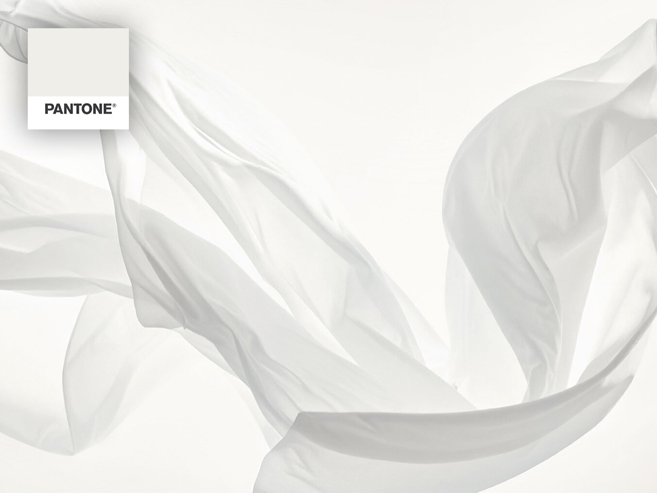
Pantone has taken a surprising turn for 2026, choosing a shade that feels almost weightless, simple at first glance, yet reflective enough to echo every color around it. Cloud Dancer (PANTONE 11-4201), a soft, airy white, emerges as a soothing antidote for a world craving stillness, clarity, and mental reset.
This understated hue speaks to the overstimulation and digital noise of modern life, offering a visual pause amid the chaos. As a trend, Cloud Dancer embodies minimalism with meaning, which is clean, thoughtful, and emotionally grounding. Versatile yet quietly sophisticated, it creates a space for other colors to breathe while making its own serene, modern statement, which is a calm canvas for mindful living. To see how Cloud Dancer’s serene, versatile qualities can transform interiors, here are five key ways to incorporate this calming shade into your home design.
1. Soft-Toned Furniture
Soft-toned furniture in Cloud Dancer, Pantone’s Color of the Year 2026, brings a gentle, modern refinement to any space. Sofas, armchairs, and ottomans in this airy white create a sense of calm while maintaining a contemporary edge. The shade’s soft luminosity helps rooms feel more open, making it ideal for compact spaces or minimalist interiors.
What sets Cloud Dancer apart is its ability to add warmth without heaviness. When applied to upholstered pieces, it softens the architecture of a room and pairs beautifully with natural textures like wood, linen, or stone. The result is a balanced, serene environment that feels both stylish and restorative.
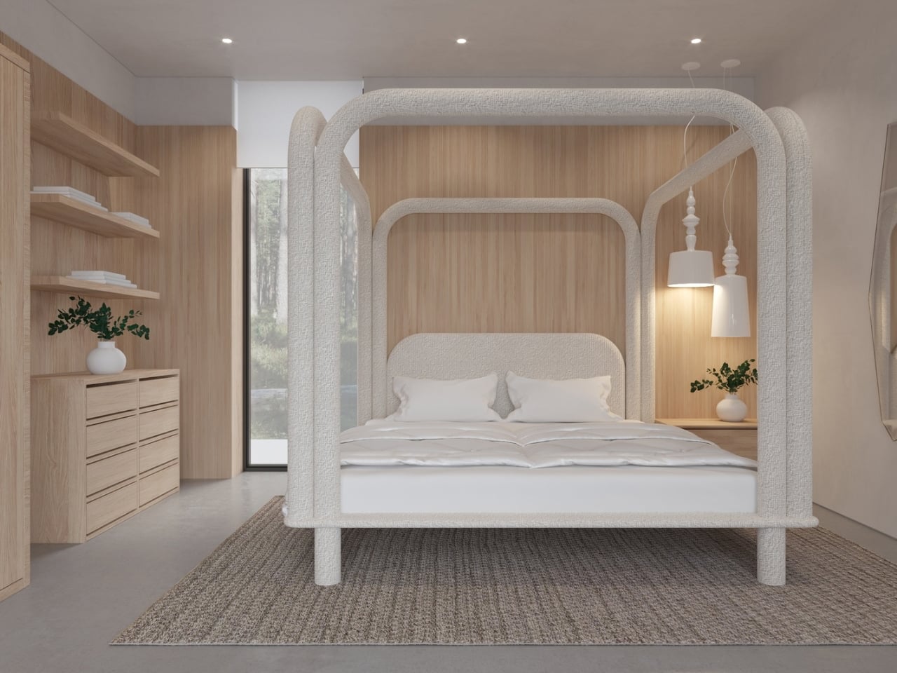
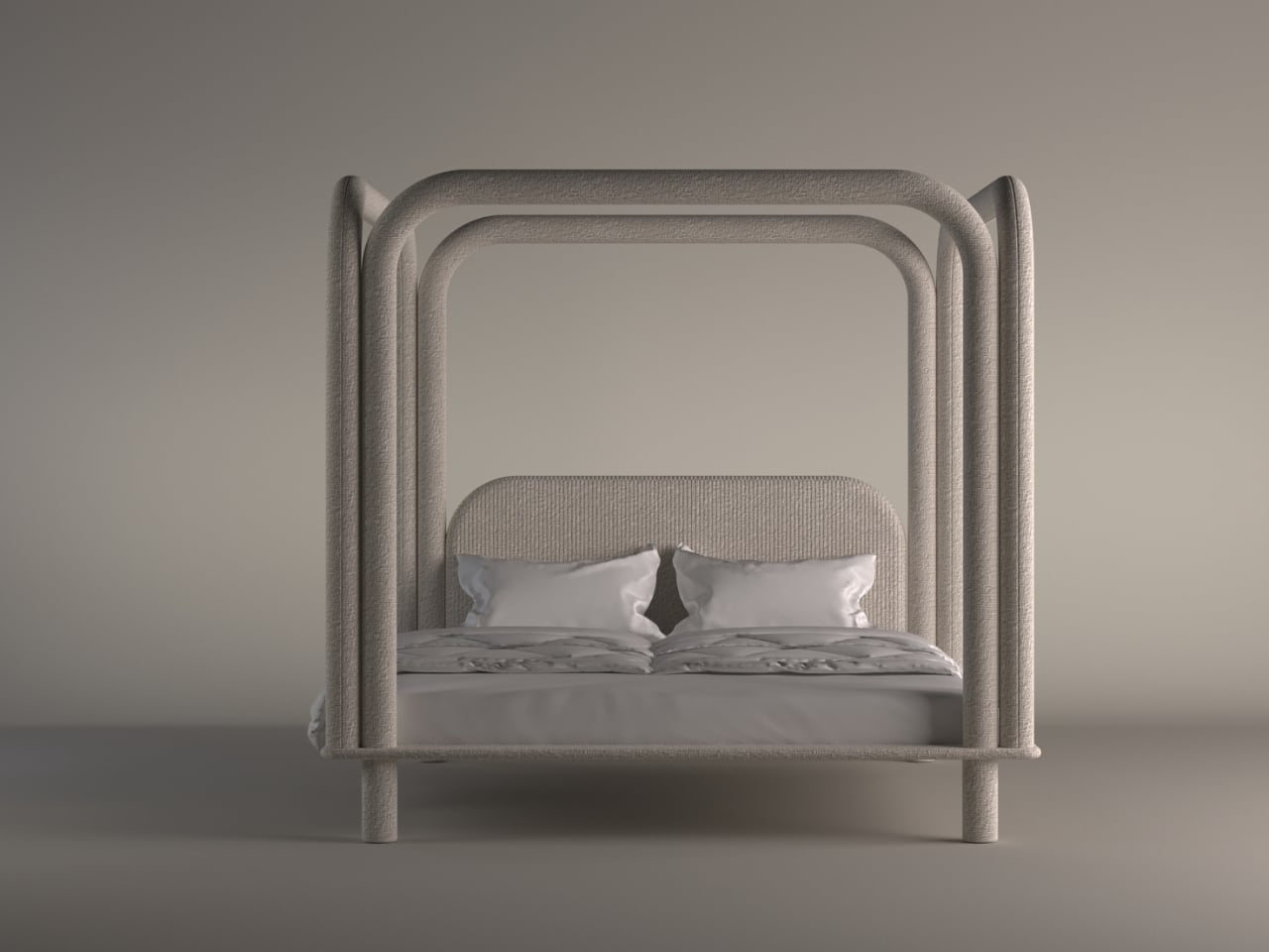
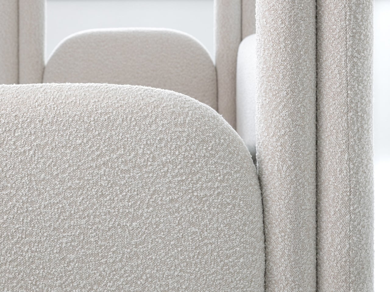
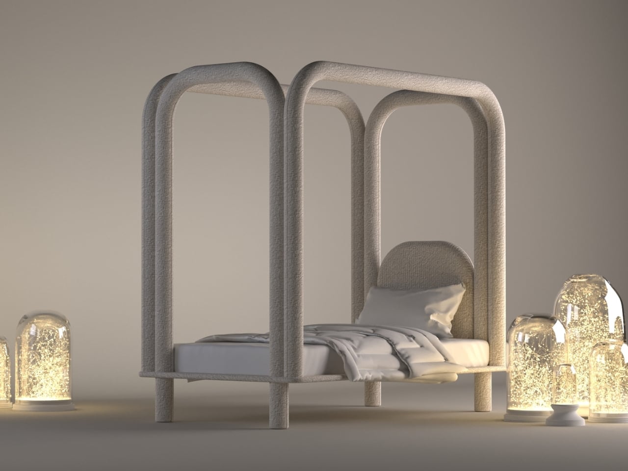
Designers are now treating the bed as a sculptural centerpiece or an element that sets the emotional tone of the entire room. The Roundish Bed captures this shift beautifully. Its creamy palette, rounded silhouette, and sanctuary-like presence reflect the growing preference for softer forms and serene aesthetics. Instead of rigid lines or bulky frames, it introduces a gentle visual language that feels restorative the moment you step into the space.
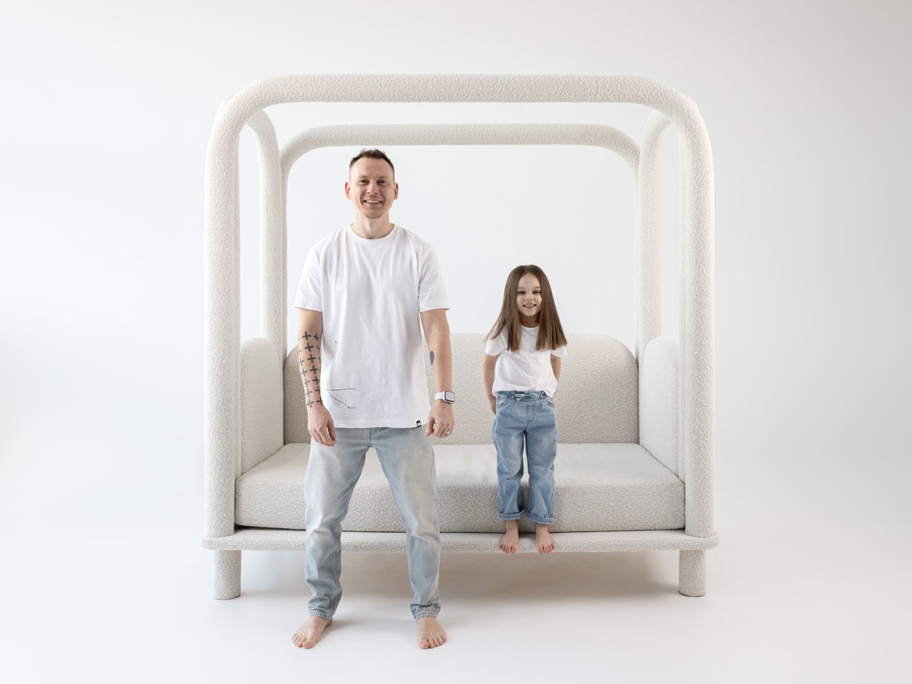
Wrapped in plush foam and tactile textiles, the design creates a cocooning effect that brings quiet sophistication to the bedroom. Every curve is intentional, enhancing both comfort and safety – especially for families. Its popularity even inspired a kids’ version, scaled down yet equally soft and inviting. With its warm geometry and calming simplicity, the Roundish collection shows how gentle neutrals and fluid shapes are reshaping modern living into something more soothing, minimal, and deeply nurturing.
2. Sculptural Lighting
Sculptural lighting becomes even more refined when expressed in Pantone’s Cloud Dancer, which enhances the trend toward quiet, effortless luxury. Whether used on matte ceramic bases or frosted-glass pendants, this shade transforms lighting into a calming focal point. The glow feels diffused and gentle, bringing a sense of balance and serenity to any room.
In contemporary and minimalist interiors, Cloud Dancer allows the form of the fixture to shine without overwhelming the space. Its clean, billowy tone amplifies the artistic quality of sculptural lighting, turning functional pieces into subtle works of design. The result is illumination that feels soothing, modern, and beautifully intentional.
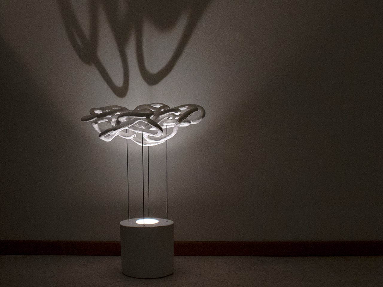
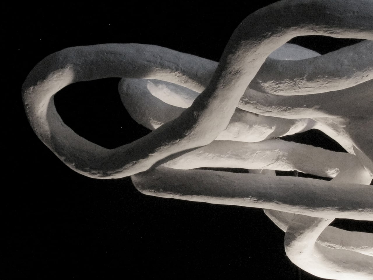
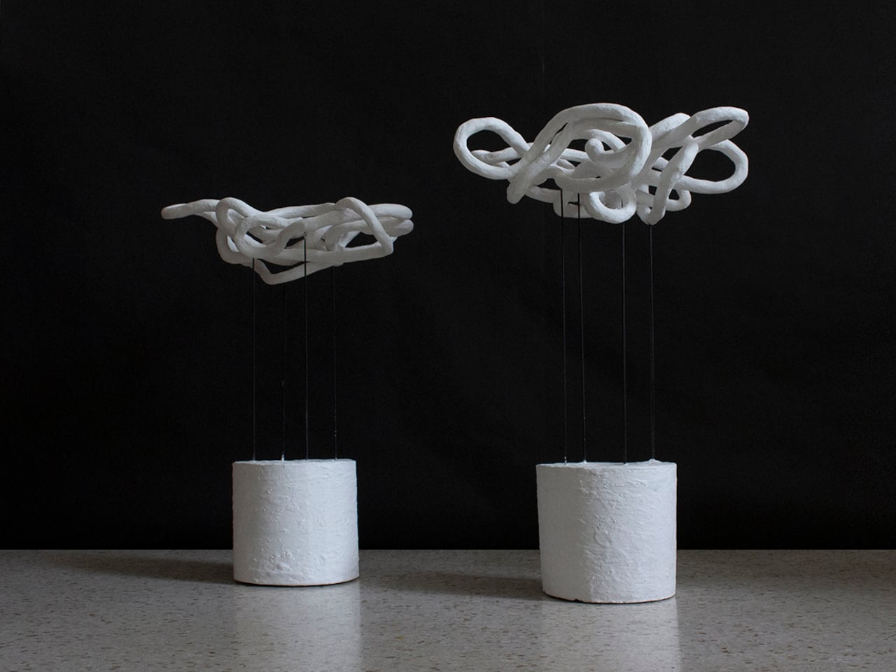
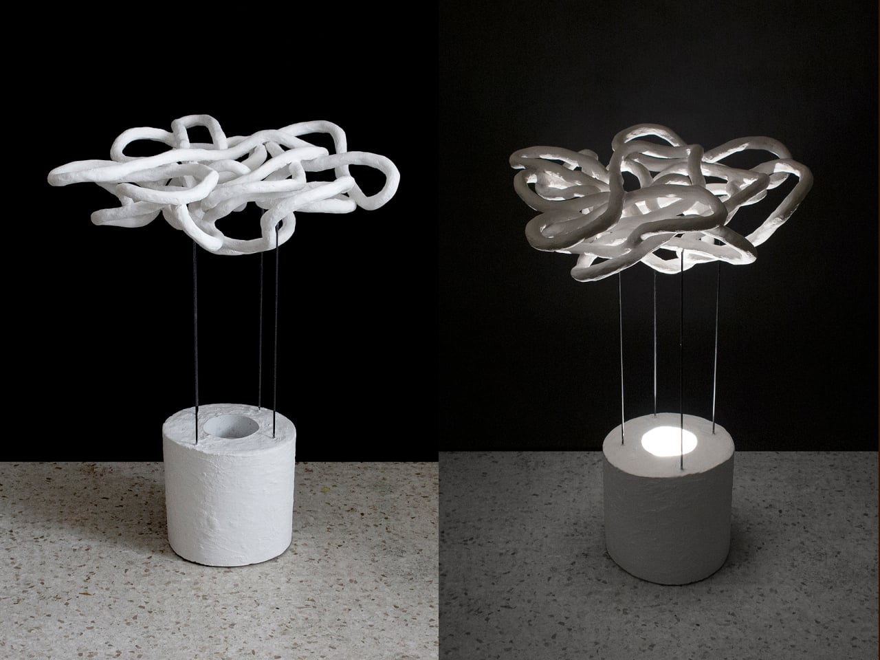
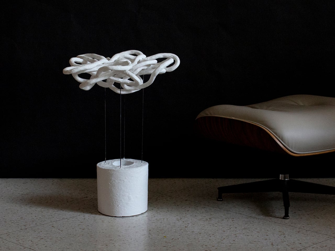
Most lighting fixtures behave predictably, looking the same whether they’re switched on or off. Taeg Nishimoto’s LOOPS lamp breaks that pattern completely. By day, it appears modest and sculptural, but once illuminated, it transforms the room into a canvas of shifting, intricate shadows. Built from simple materials like sisal rope, plaster, concrete, and steel rods, the lamp proves that innovation doesn’t require luxury and is just an intention. Nishimoto forms loose loops from untwisted sisal rope, stabilizes them with fabric hardener, and wraps them in fast-setting plaster, creating surfaces that feel raw, organic, and entirely handmade.
These plastered loops are joined where they naturally touch, forming clusters that resemble natural formations like dunes or coral. Elevated on slim steel rods above a concrete base, hiding the light source, the lamp casts dramatic patterns across walls and ceilings when lit. The effect feels part lighting, part art installation.
3. Decorative Accessories
The color’s soft, airy white finish highlights form over decoration, allowing curves, contours, and textures to take center stage. Whether crafted in matte ceramic, hand-thrown stoneware, or frosted glass, these pieces act as subtle anchors that calm visual pauses within a space filled with color and pattern. Even a single Cloud Dancer vase can add a touch of serene modernity to a console or side table.
In minimalist, contemporary, or Japandi-inspired settings, this gentle hue enhances the sculptural quality of each piece. The neutral tone makes dried florals, branches, and fresh greenery appear more vivid, creating a balanced yet elevated look. These vases don’t just hold arrangements—they shape the atmosphere, reinforcing the 2026 shift toward softer aesthetics, mindful styling, and timeless quiet luxury.
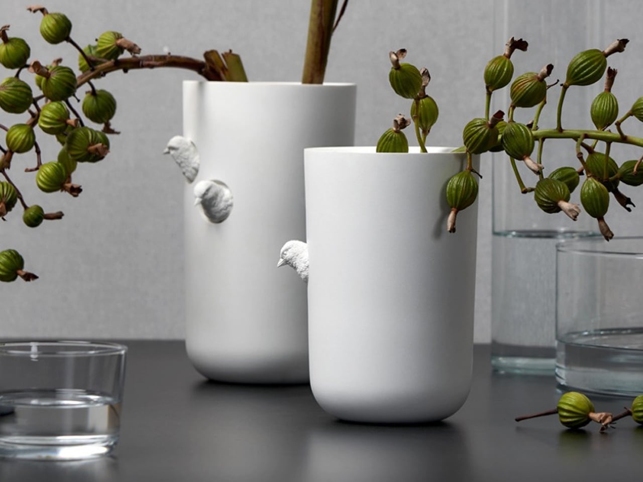
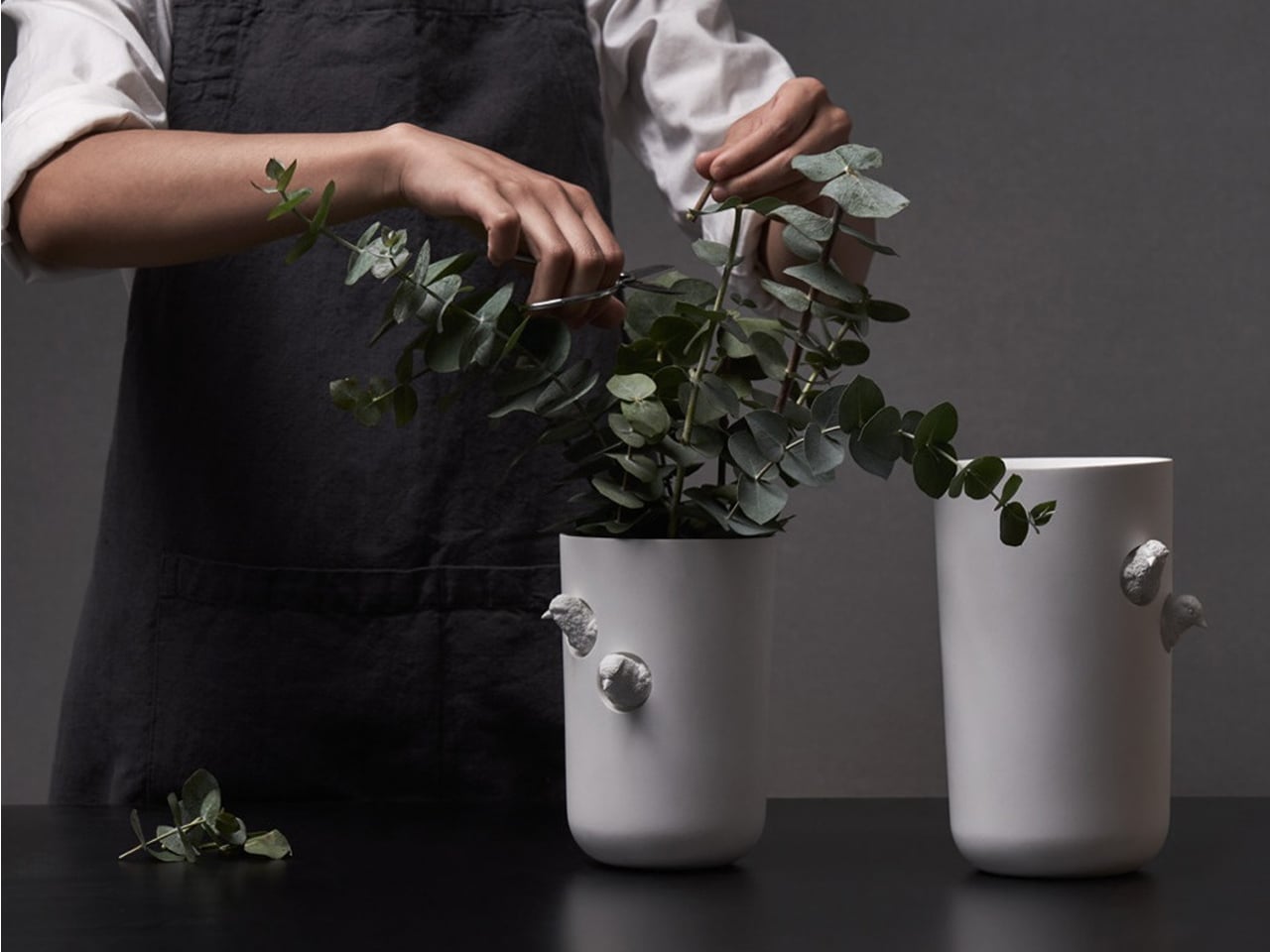
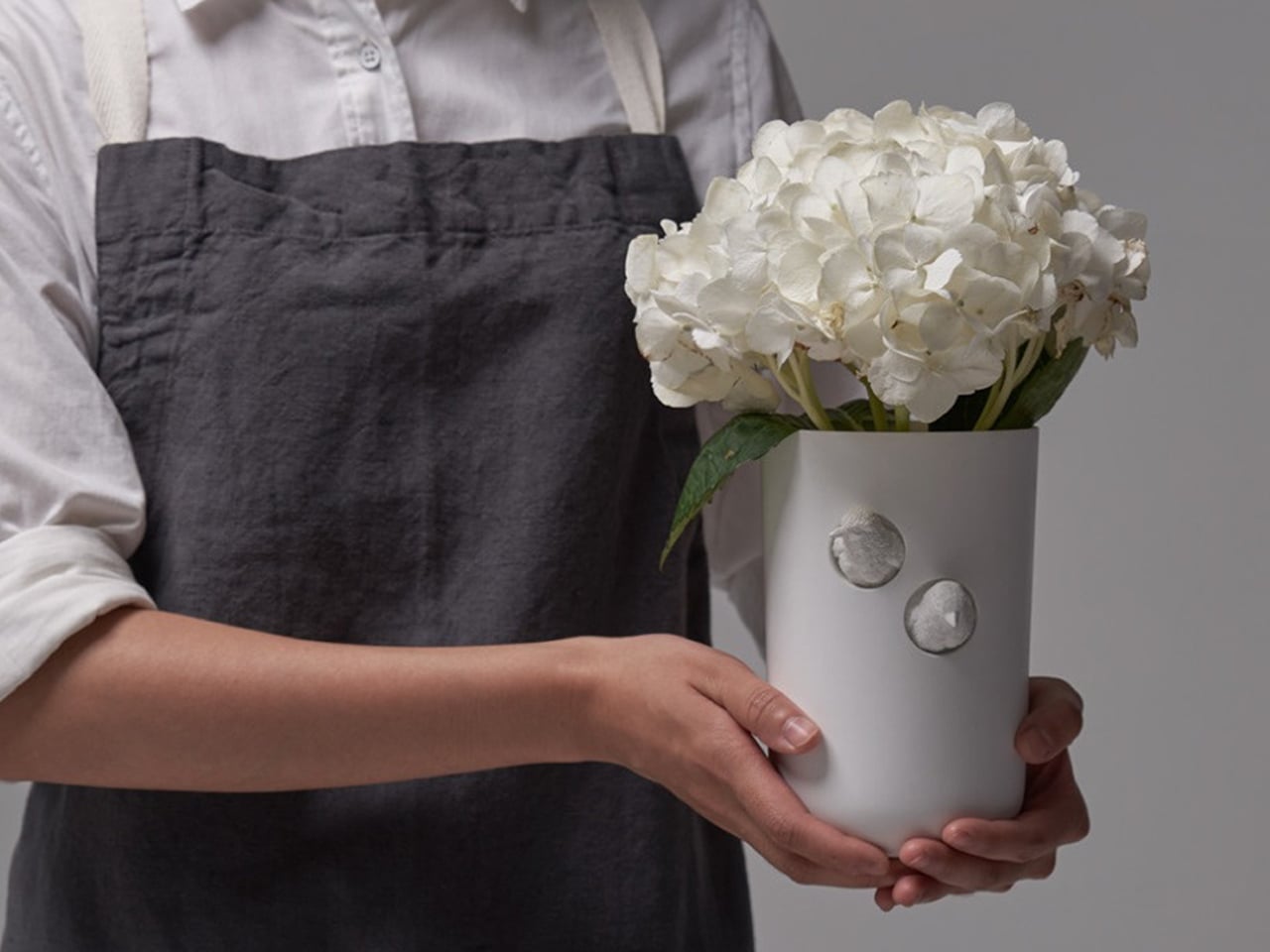
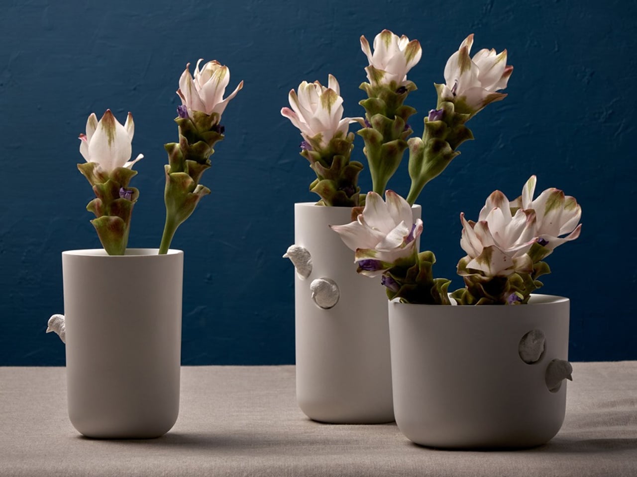
The Sparrow X Vase from Haoshi Design brings an artful twist to a classic silhouette. Its clean, seamless form is gently interrupted by two finely sculpted sparrows that appear to peek out from the vase itself. These curious little birds add a touch of personality and storytelling, turning an otherwise minimalist vessel into a piece that invites a second look.
Their intricate detailing stands in striking contrast to the vase’s smooth, marble-like white surface, highlighting both craftsmanship and restraint. The sparrows not only introduce visual charm but also echo the organic beauty of the blooms placed inside. Together, the form, texture, and sculptural accents create a vase that feels serene, distinctive, and quietly poetic.
4. Bedding, Textiles & Cozy Layers
Soft, white-but-warm bedding instantly transforms a bedroom into a restorative retreat. Linens, duvets, throws, and blankets in gentle, airy tones create a serene foundation, promoting calm and mindful living. Their neutral palette allows the room to feel open and balanced, while adding subtle warmth that makes the space inviting rather than sterile.
When layered thoughtfully, these textiles bring comfort and style. A plush duvet paired with cozy blankets, textured throws, or tactile cushions enhances the sensory experience, making the bed feel luxurious and welcoming. This approach turns everyday bedding into a tool for relaxation, emphasizing softness, simplicity, and a quiet, elevated aesthetic that supports modern mindful living.
With the HILU blanket, getting a good night’s sleep becomes simpler and cooler. This innovative blanket is four times cooler than linen, yet still soft and cozy against your skin. It’s Adaptex CoolWeev fabric, woven from gel‑spun Eco‑cool Polyfibers, pulls warmth away from your body, helping you sleep undisturbed and sweat‑free. Lightweight but sturdy, the blanket works as a duvet, throw, or even a mattress topper—adaptable through all seasons.
Beyond cooling, HILU blankets care for your health and comfort. The fabric is antimicrobial and hypoallergenic, reducing bacteria, odors, and skin irritation. Designed with sustainability in mind, it’s made from OEKO‑TEX-certified recycled materials and built to last.
5. Modern Kitchen Cabinets
Applying this soft, neutral tone to kitchen cabinetry instantly elevates the space, creating a crisp and refined aesthetic. Its clean, airy quality balances beautifully with warm wooden surfaces, adding depth and sophistication without feeling heavy or overpowering. Whether used on upper cabinets, lower drawers, or full pantry units, the tone brings a timeless, minimalist touch to the kitchen.
Pairing these cabinets with brushed metal handles or sculptural hardware enhances the modern feel while maintaining warmth and tactility. The result is a kitchen that feels light, elegant, and carefully curated, or a space that blends functionality with quiet luxury and makes every culinary experience feel thoughtful and stylish.
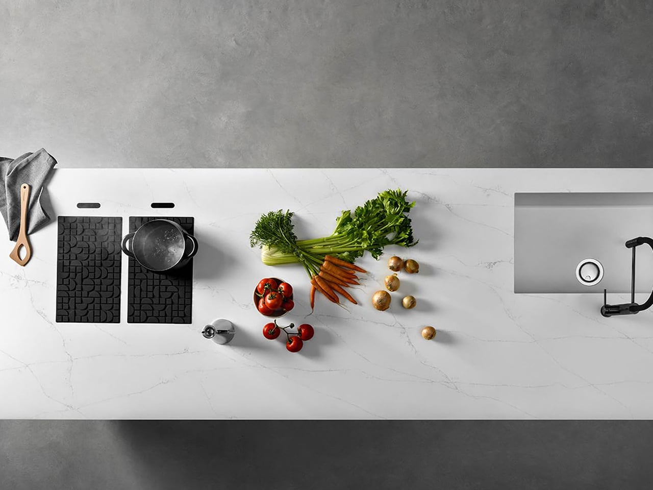
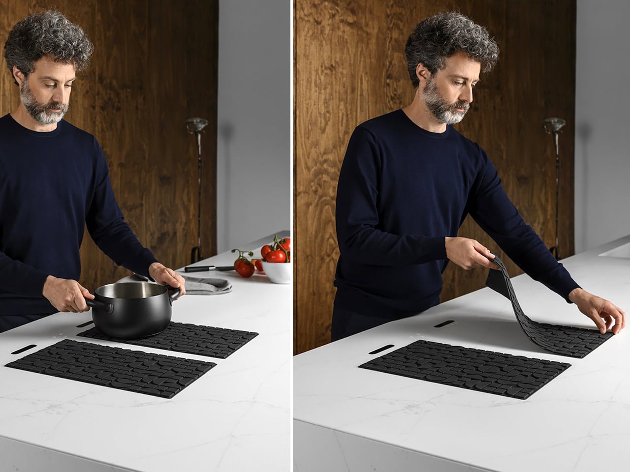
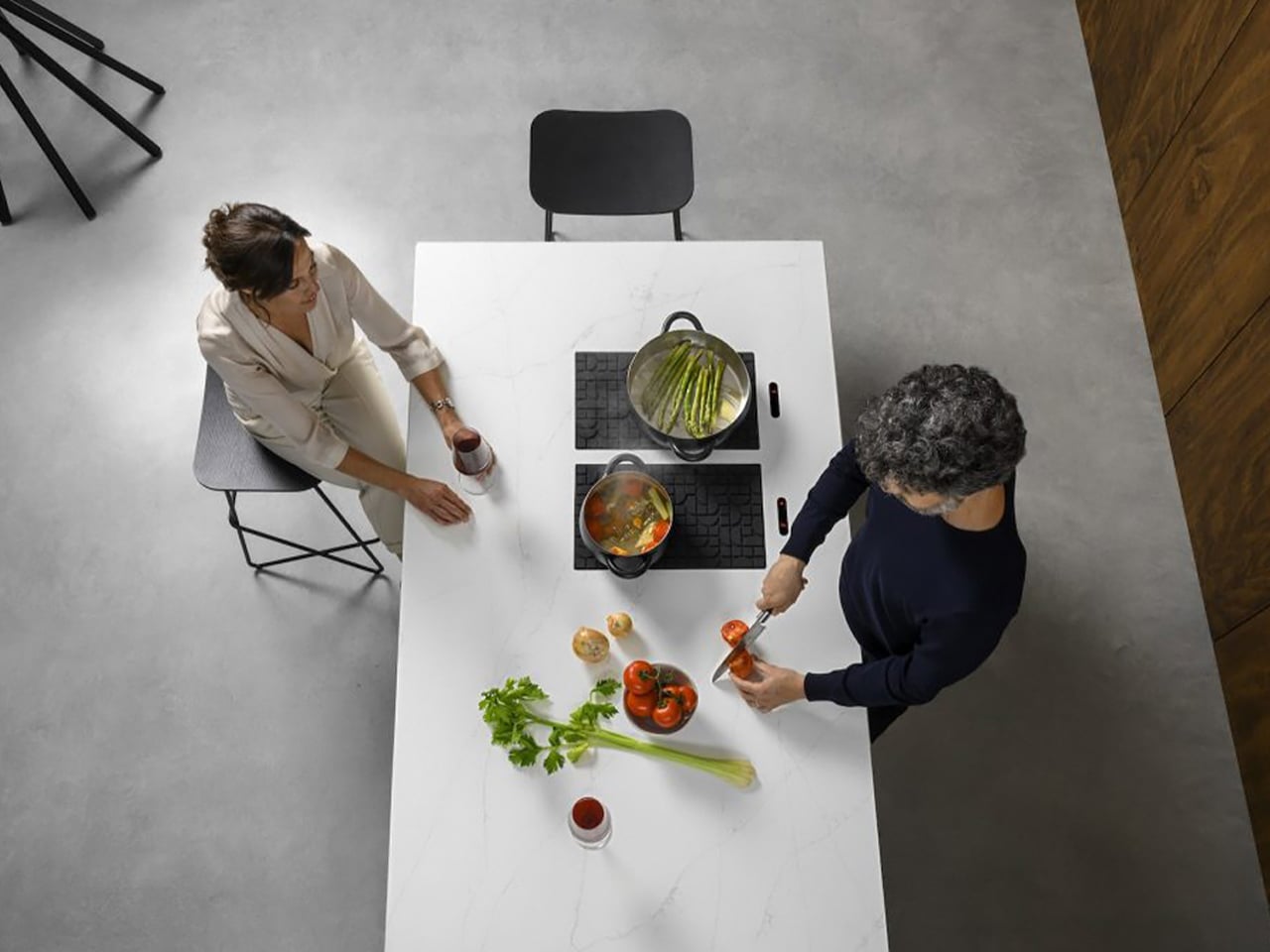
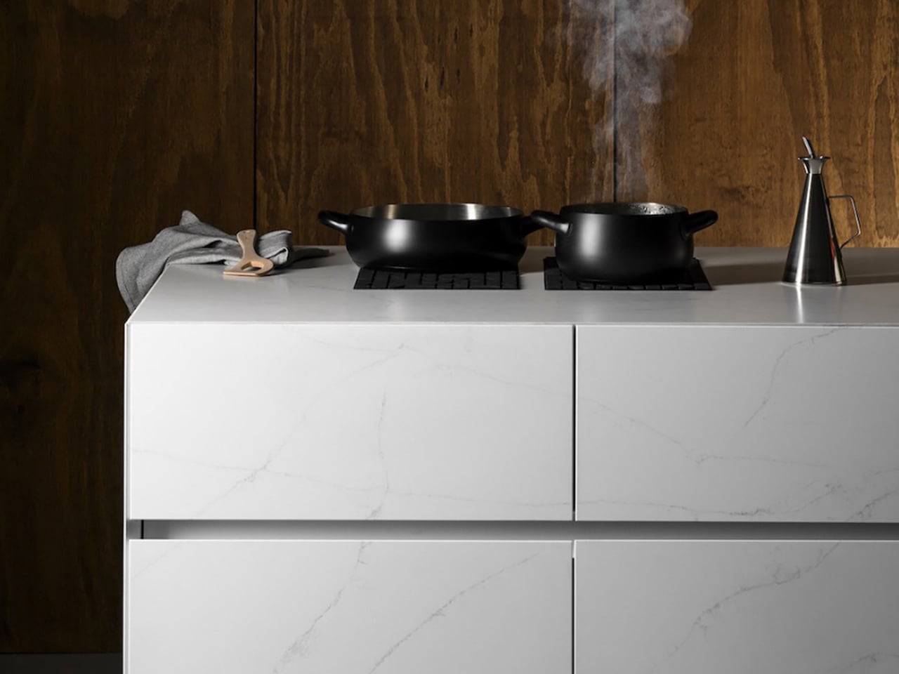
Soft, white tones on kitchen cabinets create a crisp, refined backdrop that instantly brightens the space and highlights the quality of surrounding surfaces. Paired with warm wooden accents or brushed metal hardware, the white cabinetry adds depth and a sense of modern elegance. Complementing this, a high-performance sintered stone countertop in light or neutral shades elevates the kitchen’s aesthetic while offering unmatched durability. The smooth, non-porous surface of Lapitec stone is resistant to stains, chemicals, and heat, making it ideal for both functional and stylish kitchen designs. Its range of finishes allows seamless integration with cabinetry, creating a harmonious, sophisticated environment that feels airy and inviting.
The Lapitec Chef induction system, hidden beneath the countertop, enhances this modern setup. Activated by a silicone mat, it transforms the white countertop into a fully functional cooking surface while keeping the workspace clean and versatile.
As Pantone’s Cloud Dancer ushers in 2026, companies across design, interiors, and lifestyle sectors have a unique opportunity to embrace this soft, airy white as a unifying trend. From furniture and lighting to textiles, vases, and kitchen cabinetry, the shade offers versatility that pairs seamlessly with natural textures, warm metals, and sculptural forms. Brands can experiment with Cloud Dancer in product finishes, packaging, or showroom experiences to convey calm, sophistication, and mindful luxury. Its understated elegance allows other colors, materials, and design elements to shine, making it an ideal foundation for contemporary collections.
By using Cloud Dancer thoughtfully, brands and companies can create products and spaces that resonate with consumers seeking calm, clarity, and modern serenity. This gentle hue supports minimalism with meaning, offering a fresh, timeless canvas that blends aesthetic appeal with emotional well-being, making it a defining trend for 2026 and beyond.
Pantone’s Color of the Year 2026, Cloud Dancer, arrived with a thesis that we are all collectively tired and need visual relief from the chaos. The soft, lofty white was pitched as clarity over clutter and presence over pressure, a quiet protest against hyper saturated everything, including the phones buzzing in our pockets. It felt less like a trend forecast and more like a group therapy session disguised as a paint chip.
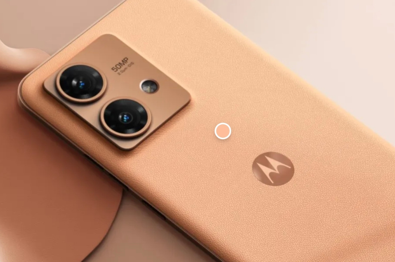
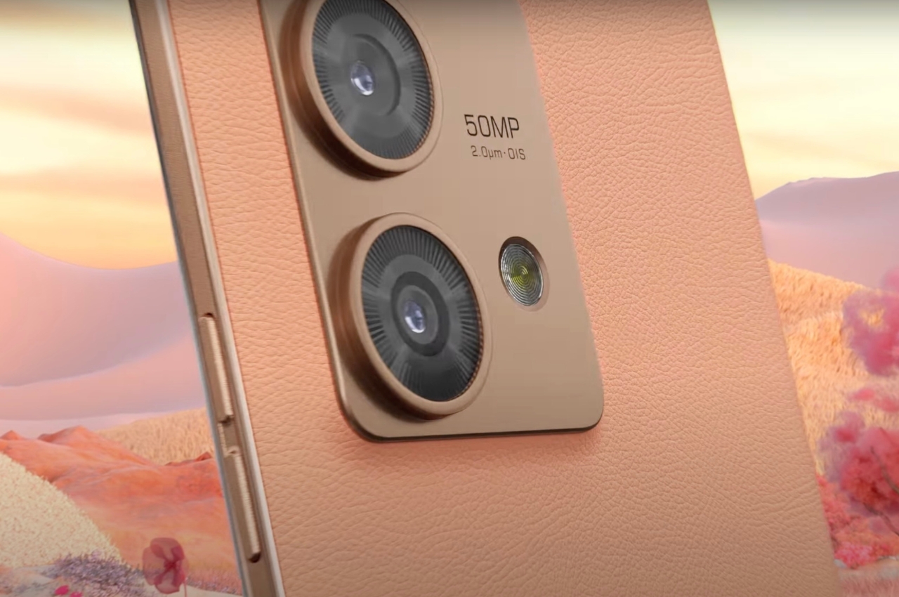
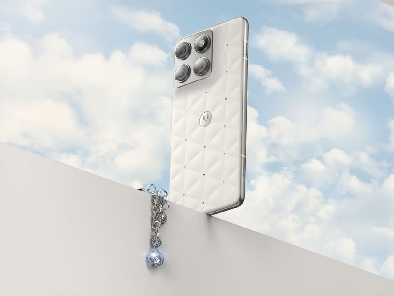
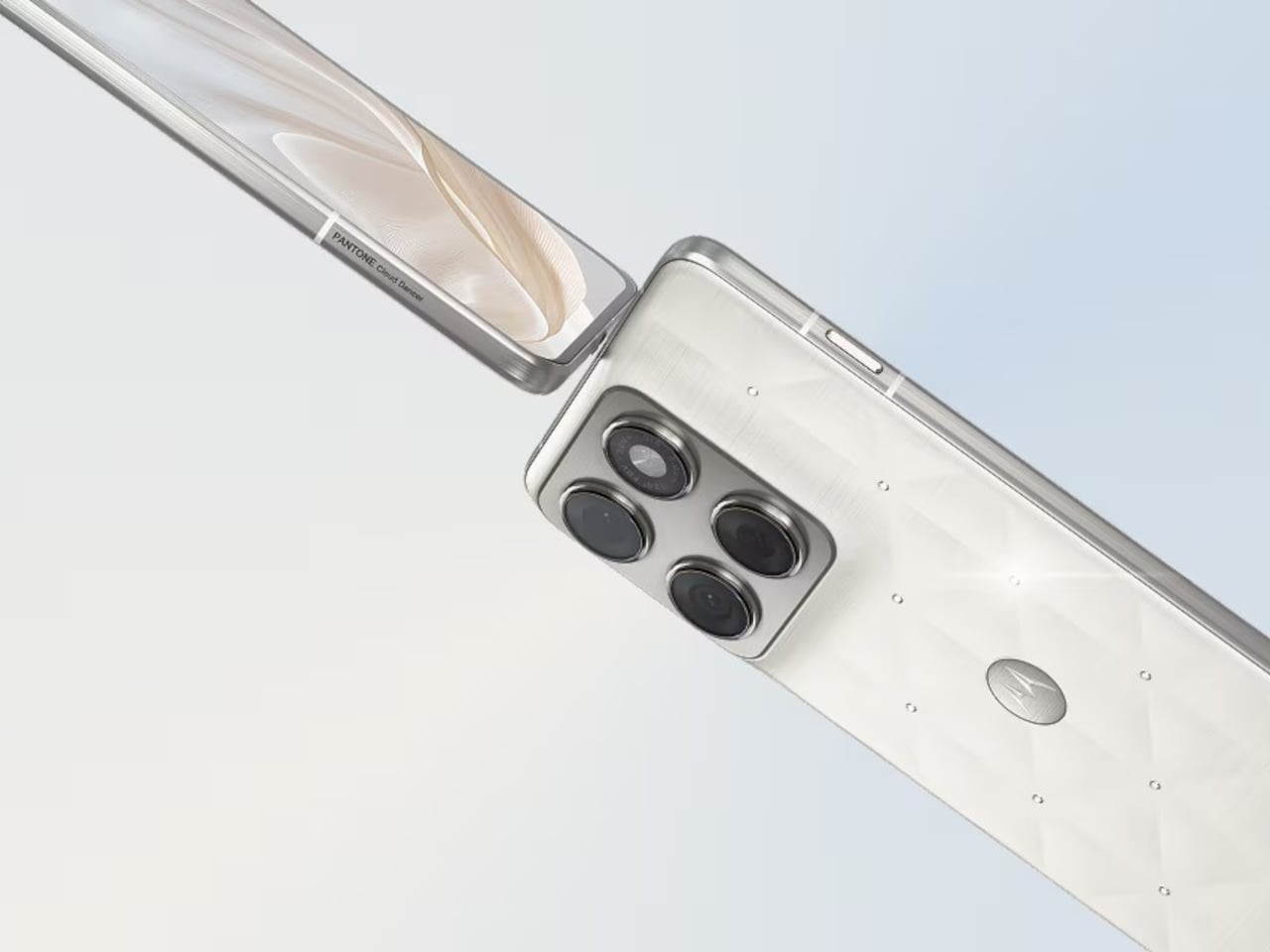
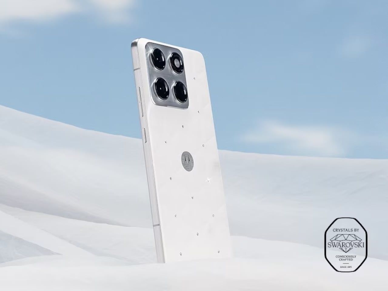
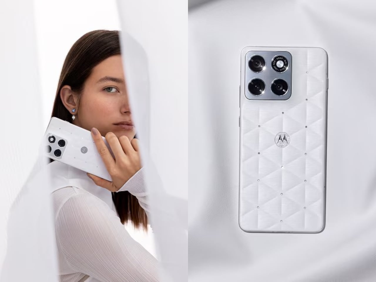
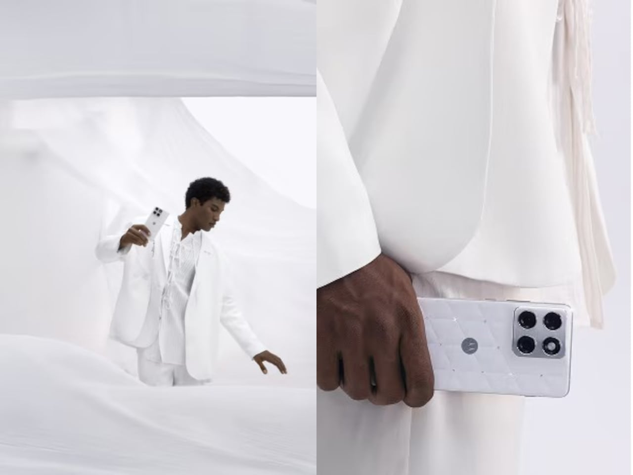
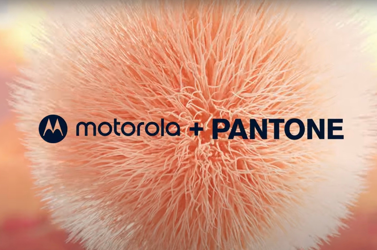
Motorola took that color story seriously. The Edge 70 special edition wraps Cloud Dancer around its thinnest chassis yet, embellished with crystals by Swarovski, continuing the design run that started with the Razr Brilliant Collection earlier this year. Where the Razr leaned extroverted and fashion forward, the Edge 70 Cloud Dancer edition feels like its quieter sibling, still sparkling but content to sit on a nightstand without demanding constant attention or Instagram documentation.
Cloud Dancer, officially Pantone 11-4201, lands on the Edge 70 as a leather inspired, quilted back that reads more like a minimal clutch than a piece of consumer electronics. The finish has a silk like sheen that shifts slightly in light, soft enough to avoid sterility but restrained enough to avoid looking like a frosted cupcake. Motorola calls it an object of clarity and quiet confidence, which fits the brief so precisely it almost sounds rehearsed.
Crystals by Swarovski are embedded into the quilted back, small enough to catch light without shouting for attention. The Brilliant Collection, which debuted with the Razr a few months ago, focuses on meticulous craftsmanship and timeless luxury, treating phones like accessories that happen to also make calls. Here, the crystals feel less like decoration and more like strategic punctuation marks on an otherwise very calm sentence, little flickers that keep the white from feeling too monastic.
Underneath sits the regular Edge 70 hardware, Snapdragon 7 Gen 4, dual 50 megapixel cameras, a bright display, and moto ai that adapts quietly. Motorola emphasizes that the device is the thinnest in its category, hedged by footnotes about regional price bands but still impressive for something packing a 4800 milliamp hour battery and full day reliability without feeling fragile in the hand.
The approach contrasts with the usual luxury phone playbook, which tends toward loud colors, heavy logos, or aggressive patterns that scream performance. Cloud Dancer is almost the opposite, a discrete white Pantone describes as conscious simplification. The quilting and crystals prevent it from becoming sterile, but the overall vibe lands somewhere between spa robe and gallery wall, an unusual place for a smartphone to occupy.
Motorola seems intent on building a design ecosystem where color forecasting and material craft matter as much as chipsets. The Razr Brilliant Collection introduced Swarovski, and now the Edge 70 ties that to Pantone’s annual ritual. We live in a world where most phones blur into identical black rectangles, so a calm white device with a quilted back and a handful of crystals starts to feel surprisingly memorable, even if memorable was never the point.
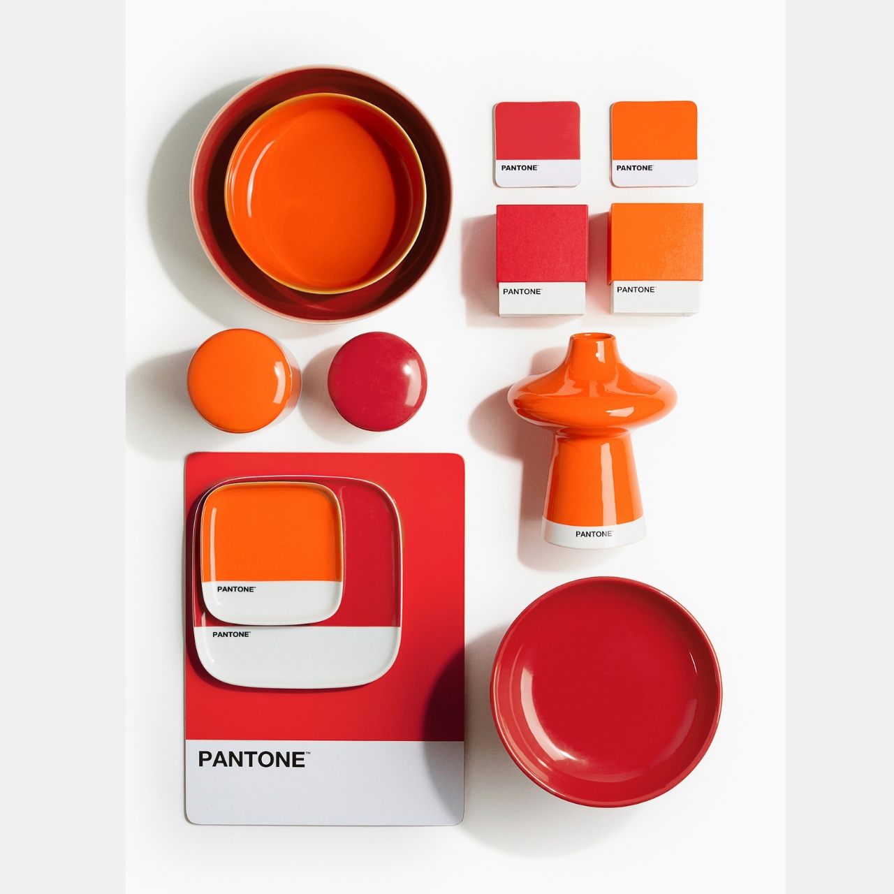
When it comes to decorating our homes with furniture and accessories, there are two kinds of people: the minimalist and monochromatic kind or the maximalist and colorful aesthetic. There can also be some sort of cross-over between the two but mostly, that’s the two general kind of homeowners. I am more of the latter as I have a lot of stuff and I want to keep my surroundings colorful and vibrant. This new collaboration between H&M Home and Pantone will definitely appeal for those who are like me.
Designer: H&M Home and Pantone
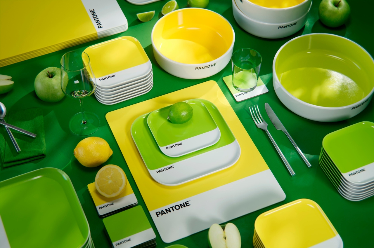
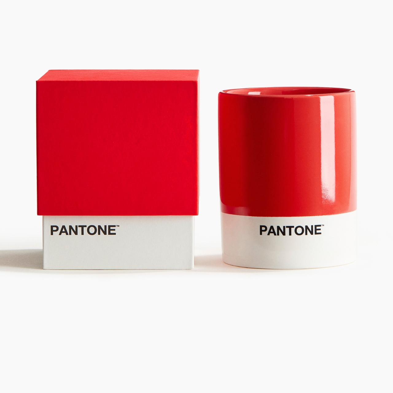
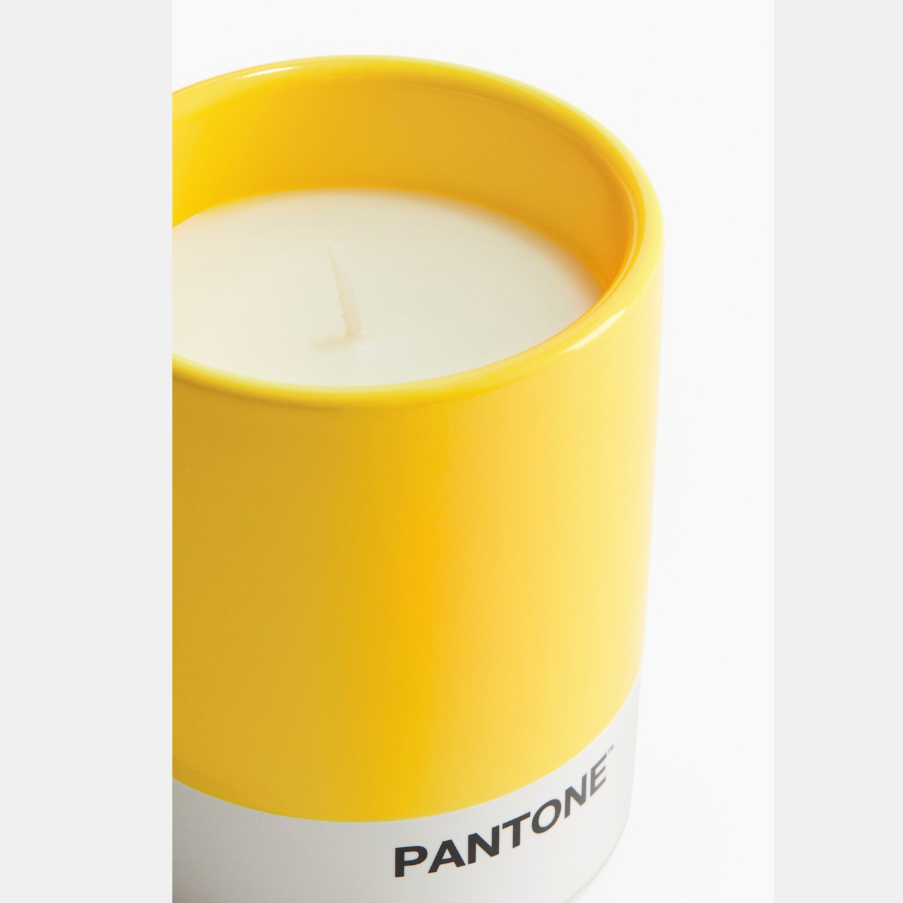
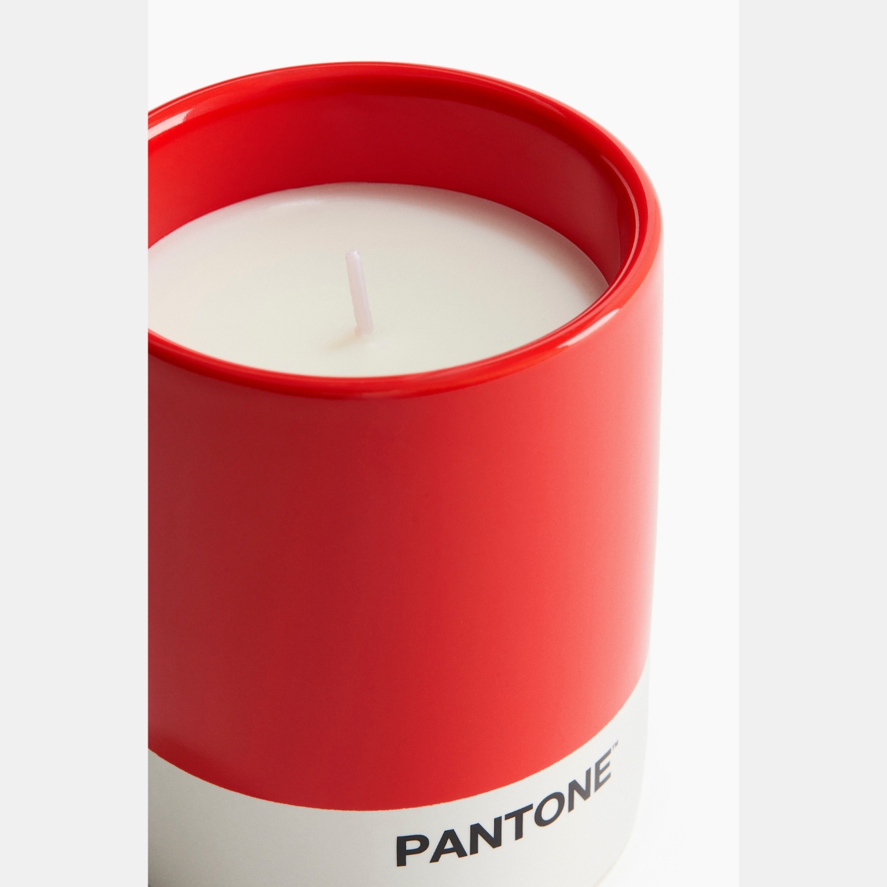
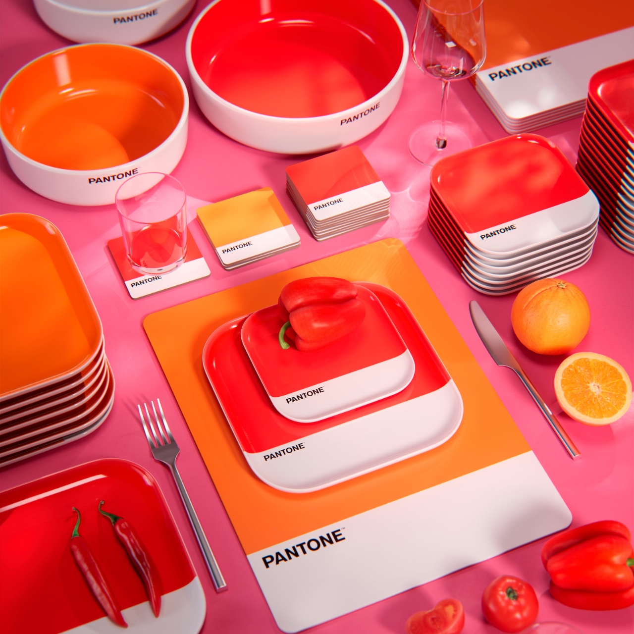
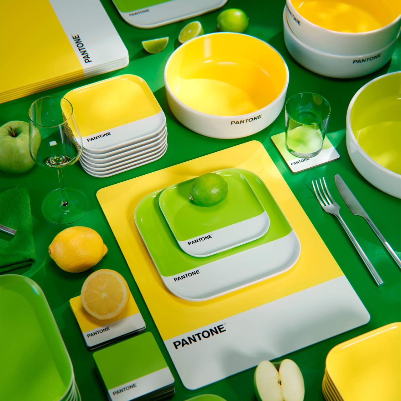
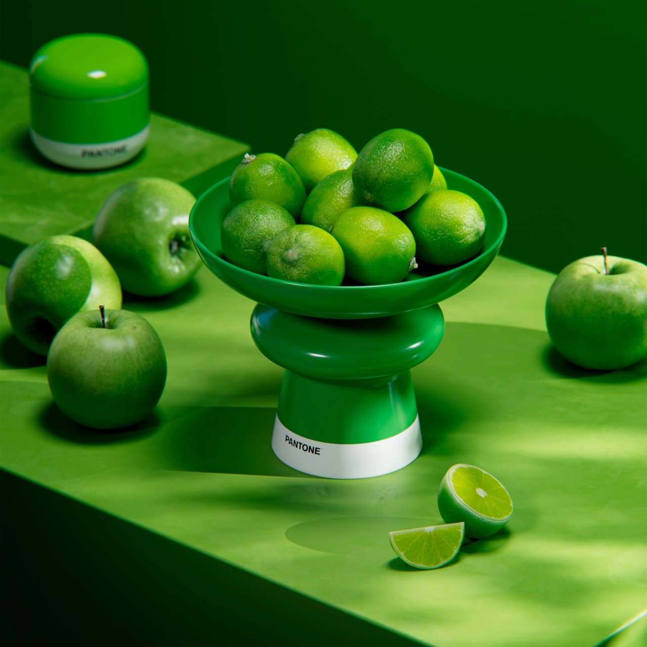
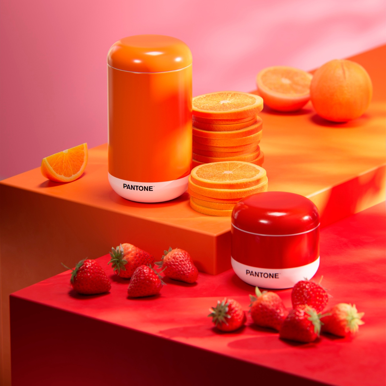
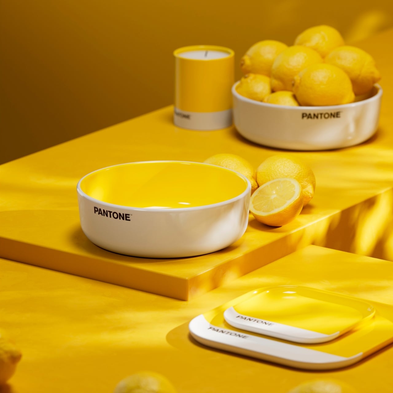
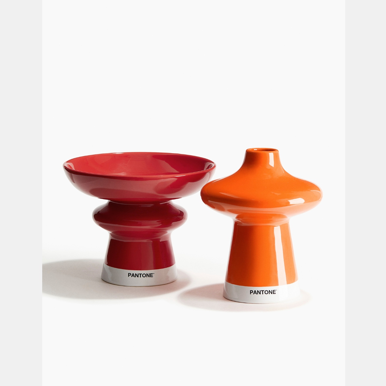
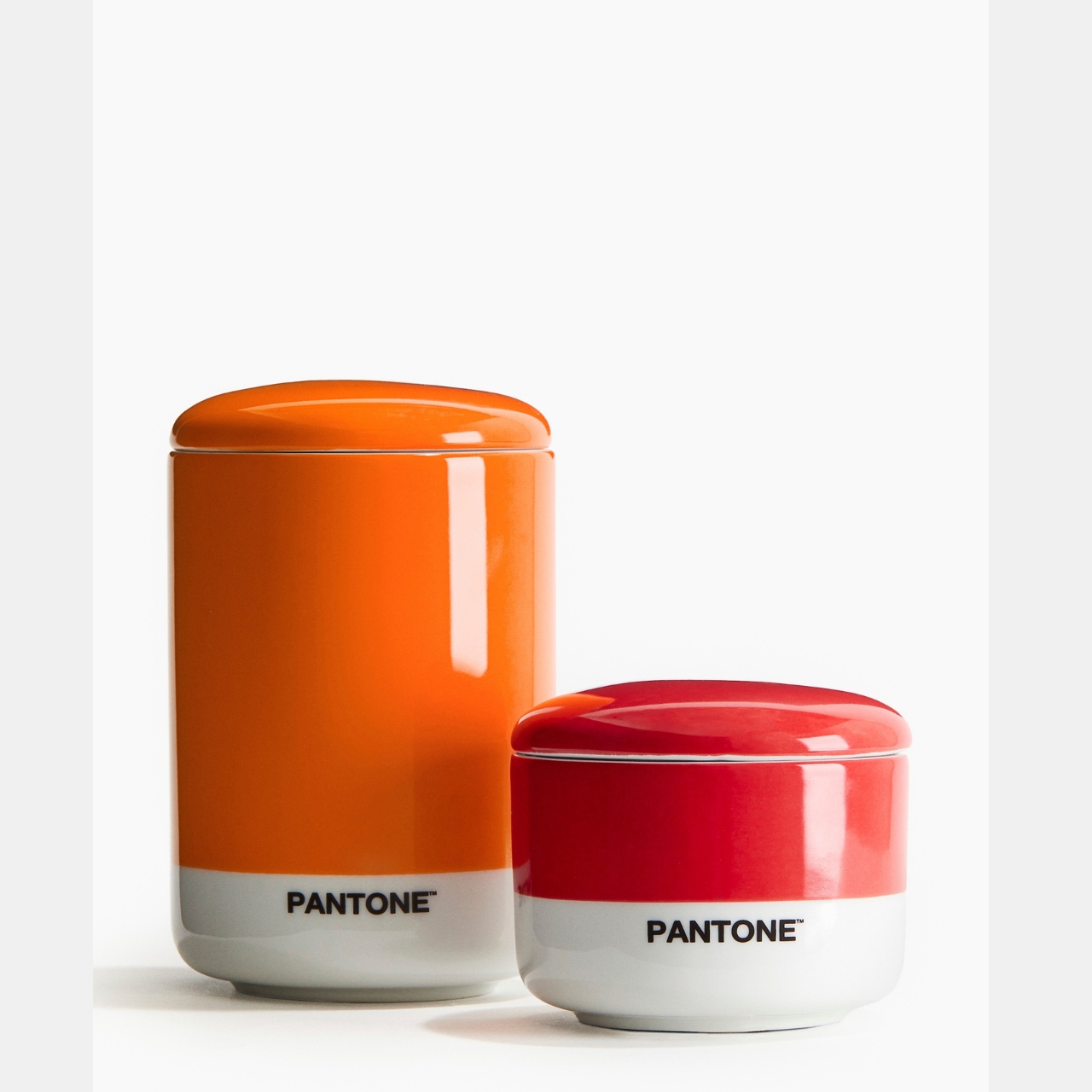
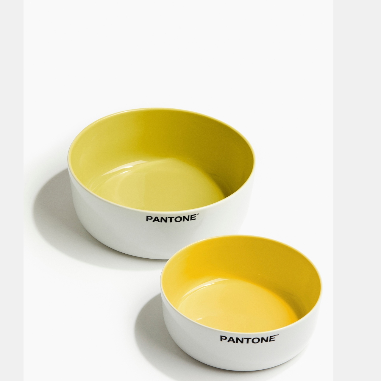
This is actually the second time that these two brands have collaborated and this time around, the colors just keep on coming. The H&M Home Pantone Collection comes in two palettes: Zesty & Fresh and Sweet & Juicy. The collection includes different food serving and food storage items like serving bowls, placemats, footed trays, coasters, salt shakers, etc. Just like the previous collection, you also get different colors of scented candles that come in the pantone palette looking box.
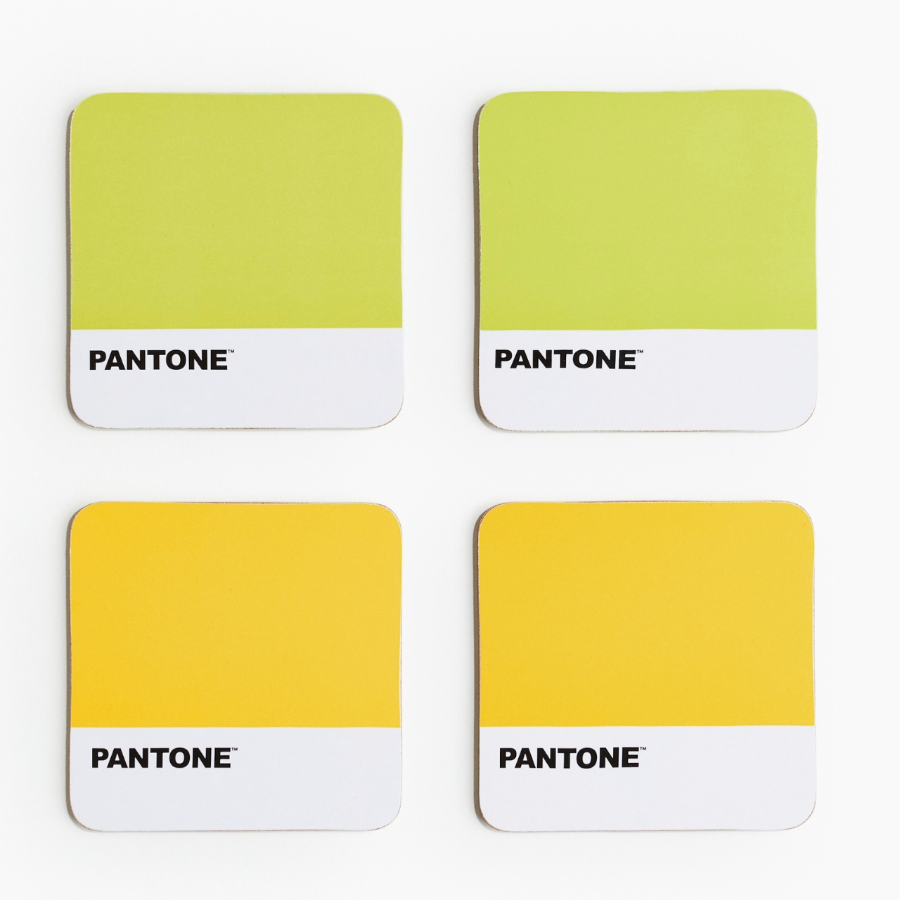
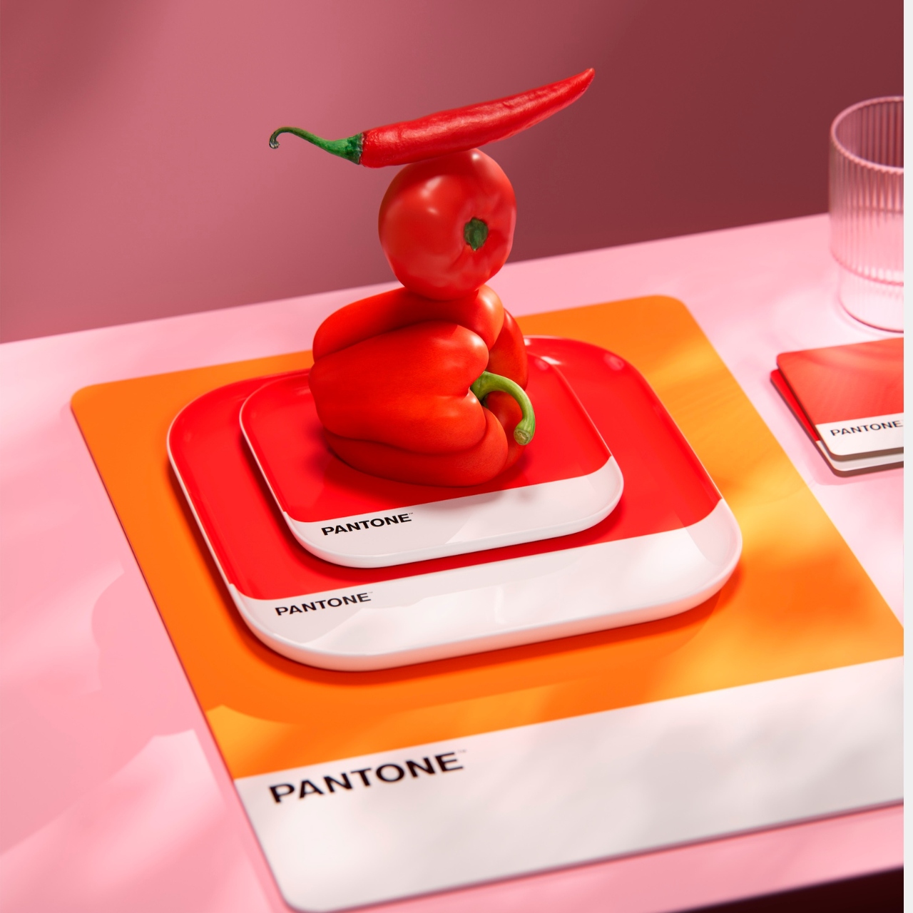
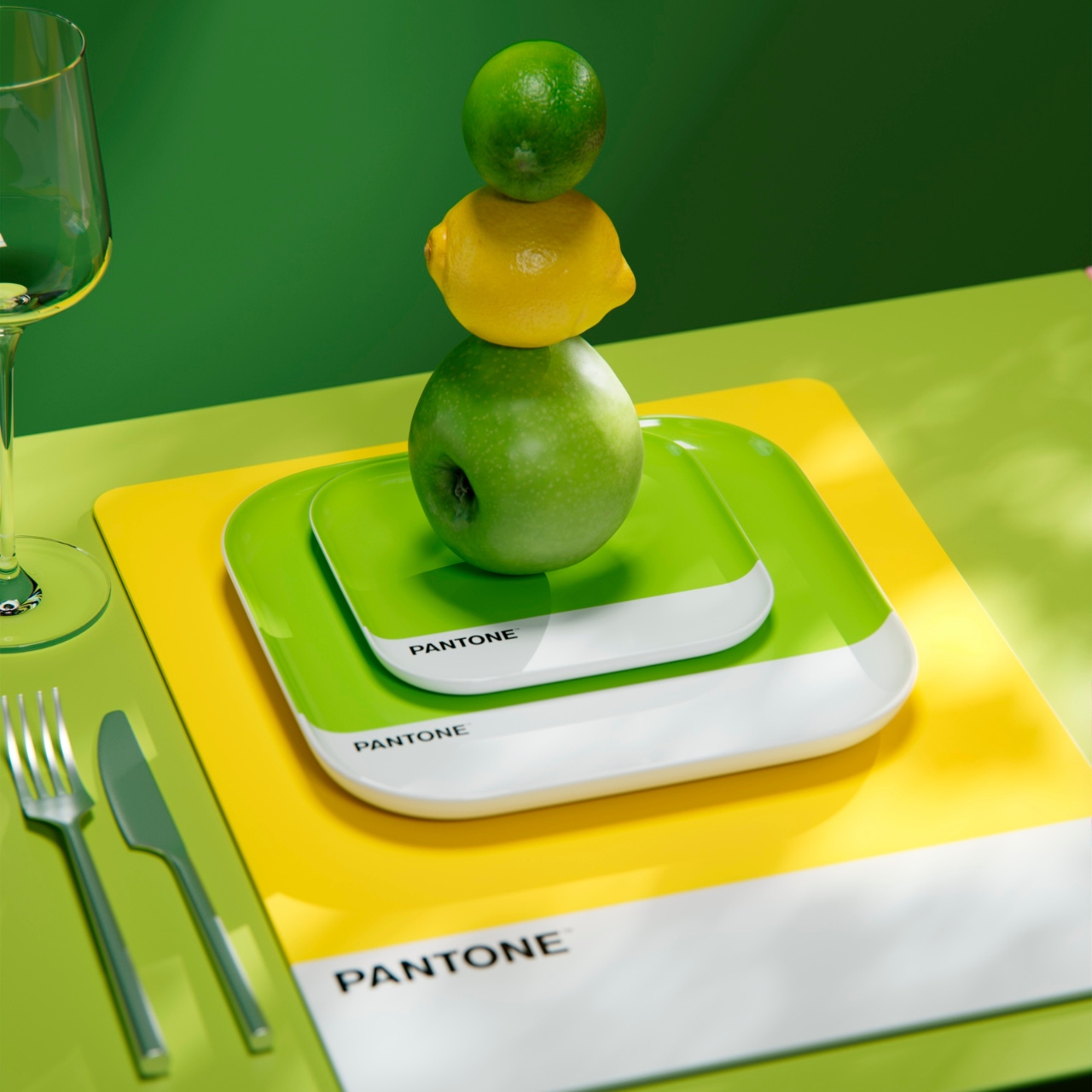
Unlike the previous collection that had more “calm” colors, these two collections are brighter and more vibrant and has more color options for those who want to mix and match or stay with their color of choice. The Sweet & Juicy has spicy red and strong orange colourways, representing excitement and passion and love and anger, respectively. This is the more intense option if that’s your aesthetic. The Zesty & Fresh collection meanwhile has a more refreshing vibe, with the fresh lime bringing balance, joy, and serenity while the bright yellow is more of joy and happiness but also enhances communication and wisdom, as per the color experts.
The collection includes the following dining and kitchen accessories: small and large plates, serving bowls, coasters, placemats, and container jars. The scented candles available are Mandarin Gelato (orange), Pink Grapefruit (red), Lemon Verde (yellow), and Green Basil (green). The collection is now available in selected stores and at their online store. My wallet is thanking me that this is not available where I live.
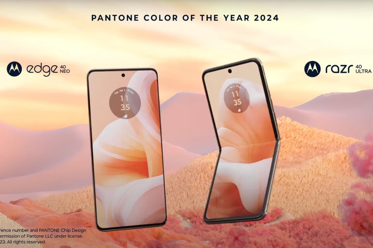
The moment Pantone announced their Color of the Year for 2024, we expected a lot of brands to officially and unofficially carry the Peach Fuzz tones for their respective products. If that is a color that you prefer or if you like that shade, then good for you as all year round you’ll see different brands and products carry the hue. If you’re not a fan, well, you’ll have to endure it and just look for other colors that match your preferences. If you’re the former and you’re looking for a new Android phone, then Motorola is a very good option.
Designer: Motorola
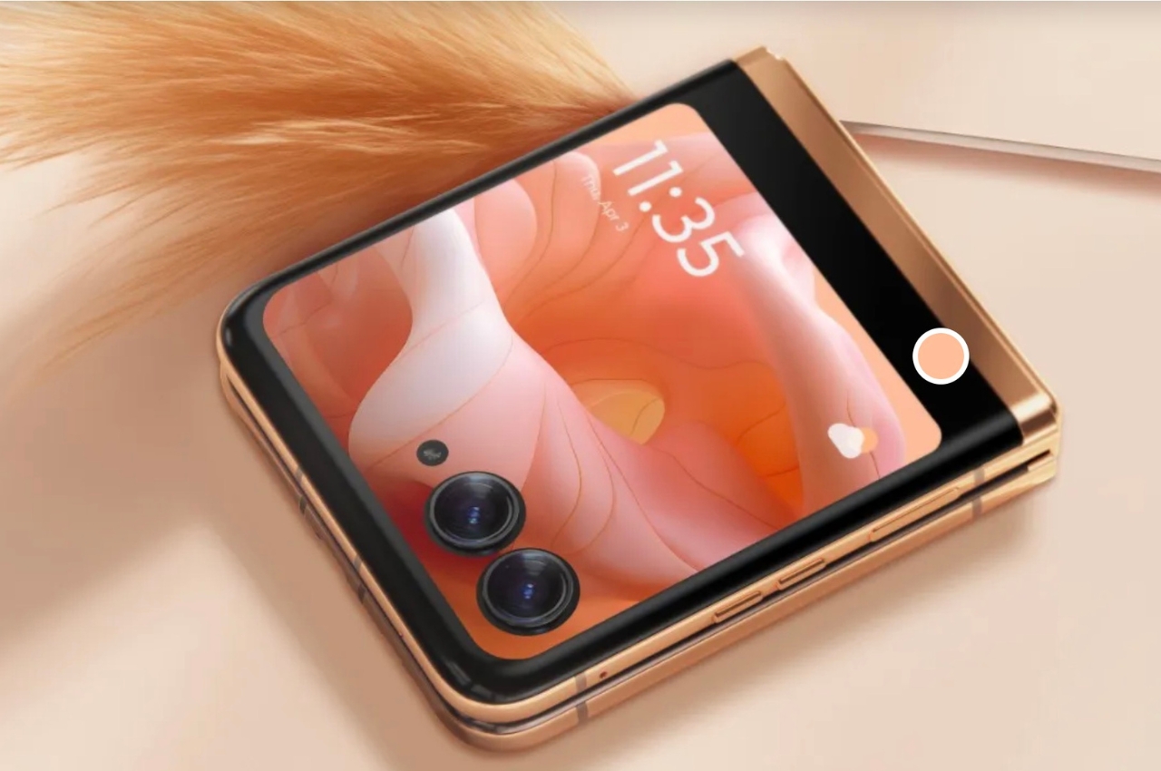
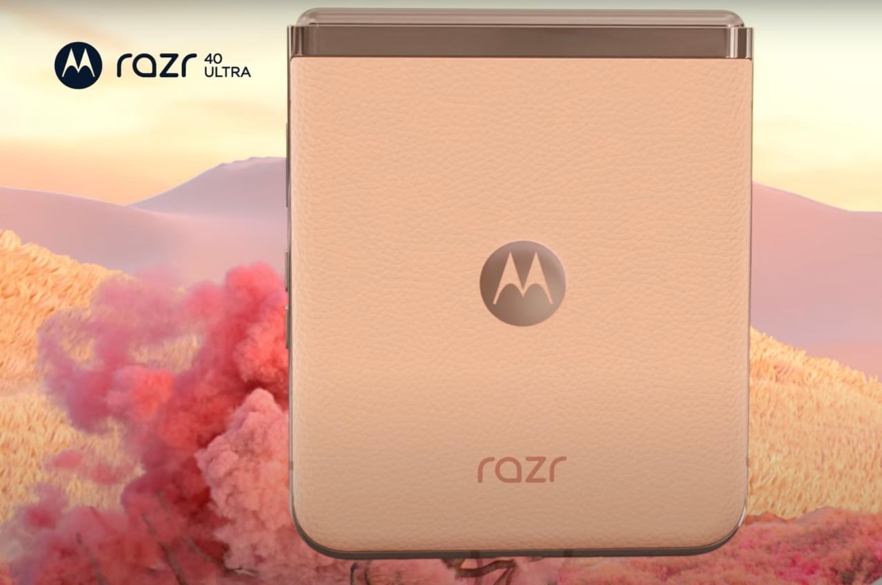
Motorola has come up with a tie-in with Pantone to bring Peach Fuzz versions of two of their newest smartphones, the motorola razr 40 ultra and the motorola edge 40 neo. The only difference between these versions of the smartphones and the original iteration is that they’re carrying the warm and cozy hues of the color of 2024, “highlighting the importance of shared moments” through the combination of Pantone’s “mastery of color” and Motorola’s “legendary design”
.
For those who prefer a more hip and modern device, the flippable design of the motorola razr 40 ultra / razr+ with the Peach Fuzz color with the vegan leather finish might appeal more as they’re branding it for the extroverts. It boasts of several camera modules like its 12MP dual cam, the 13MP ultrawide lens, and the 32MP wide selfie camera. Those looking for a more “sophisticated” smartphone can go with the motorola edge 40 neo with its 6.55-inch P-OLED display, 5,000 mAh battery, and camera setup (50MP main, 13MP ultrawide lens, 32MP selfie cam).
Both Motorola and Pantone believe that color deepens our interaction with our devices as they express our individuality and preferences. The Peach Fuzz color in particular was chosen to harness “connection, community, and personal wellbeing”, which is what Motorola also wants to encapsulate in their smartphones.
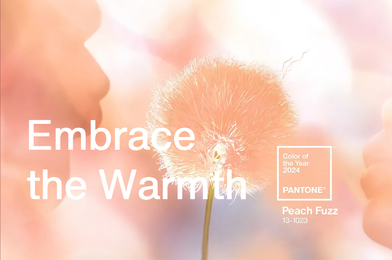
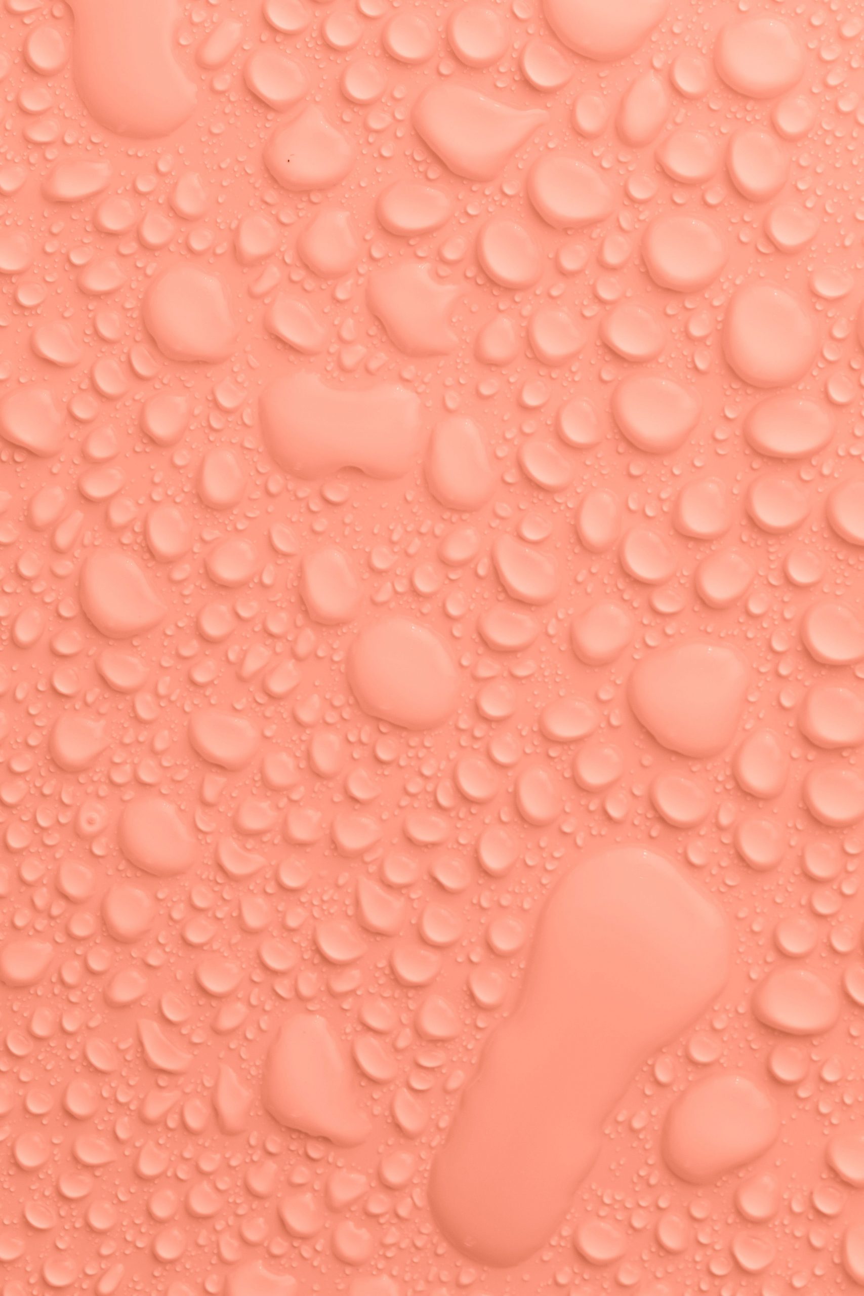
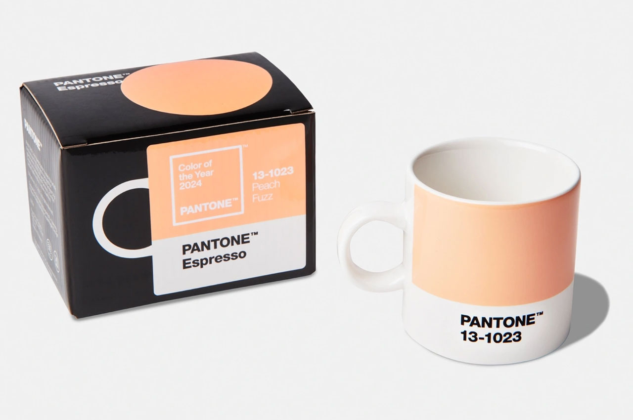
The eagerly anticipated moment has arrived, and the designated color of the year for 2024 by Pantone is PANTONE 13-1023 Peach Fuzz. Amid worldwide conflicts, climate change, and multiple sources of stress, Peach Fuzz is a “velvety gentle peach whose all-embracing spirit enriches heart, mind, and body,” Laurie Pressman, Vice President, Pantone Color Institute said. This soft and comforting peach shade evokes a sense of warmth and gentleness, conveying a message of kindness, tenderness, communal spirit, and cooperation.
What Is the Pantone Color of the Year and Why Is It Important?
Annually, during the initial days of December, The Pantone Color Institute headquartered in Carlstadt, New Jersey reveals the latest Color of the coming Year. Recognized globally as a leading source of color expertise, the Pantone Color Institute tracks yearly color trends, considering diverse societal aspects like fashion, marketing, social media, and politics to determine the influential Color of the Year, impacting design and brand marketing.
Peach is a great color for making us feel calm and positive. It shields us from negative emotions like sadness and disappointment, encouraging us to be our best selves even in tough times. Peach is widely appreciated as an excellent color for communication and instilling a sense of calm and courtesy. This color radiates positivity and consistently revitalizes us, especially during challenging moments.
Which colors complement Peach Fuzz?
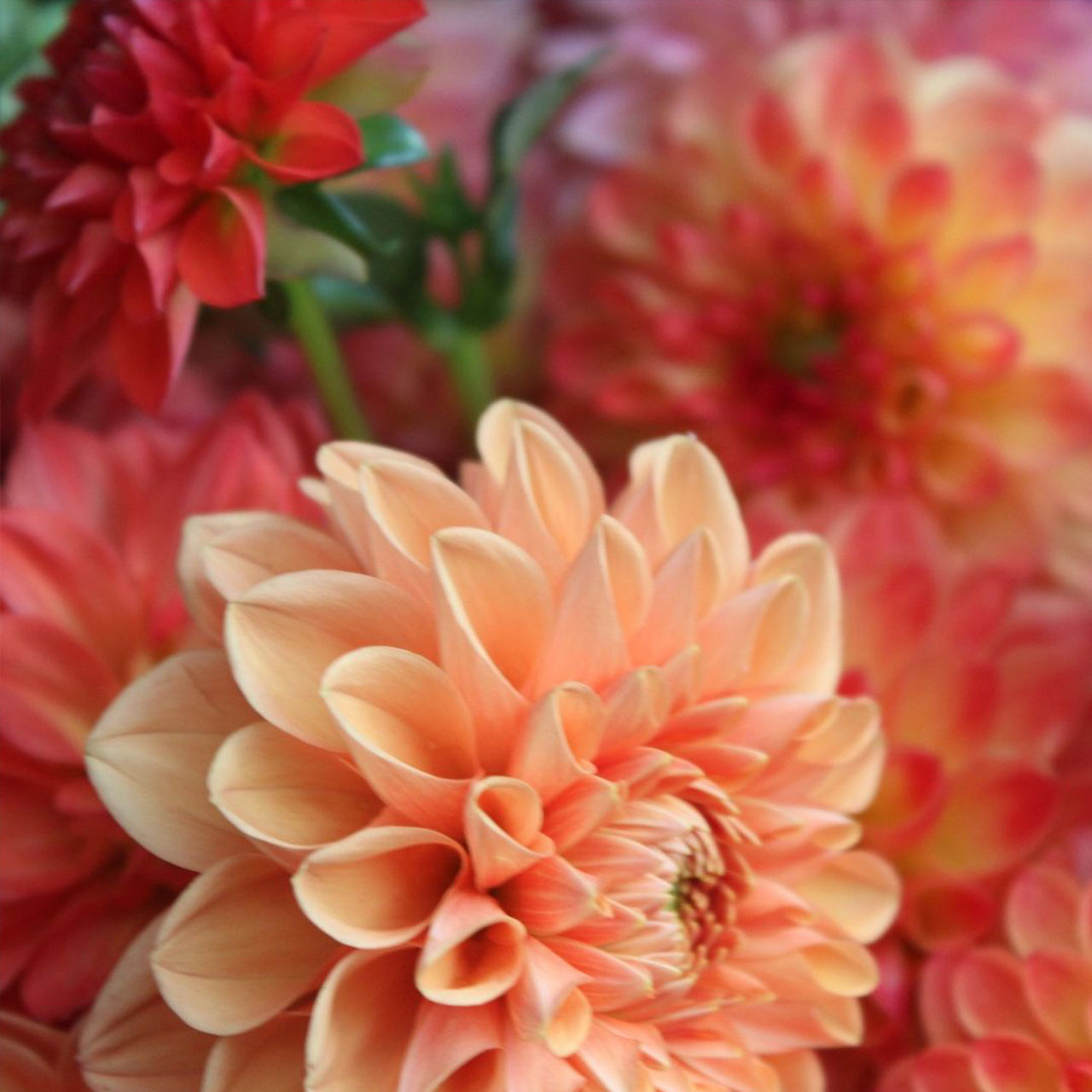
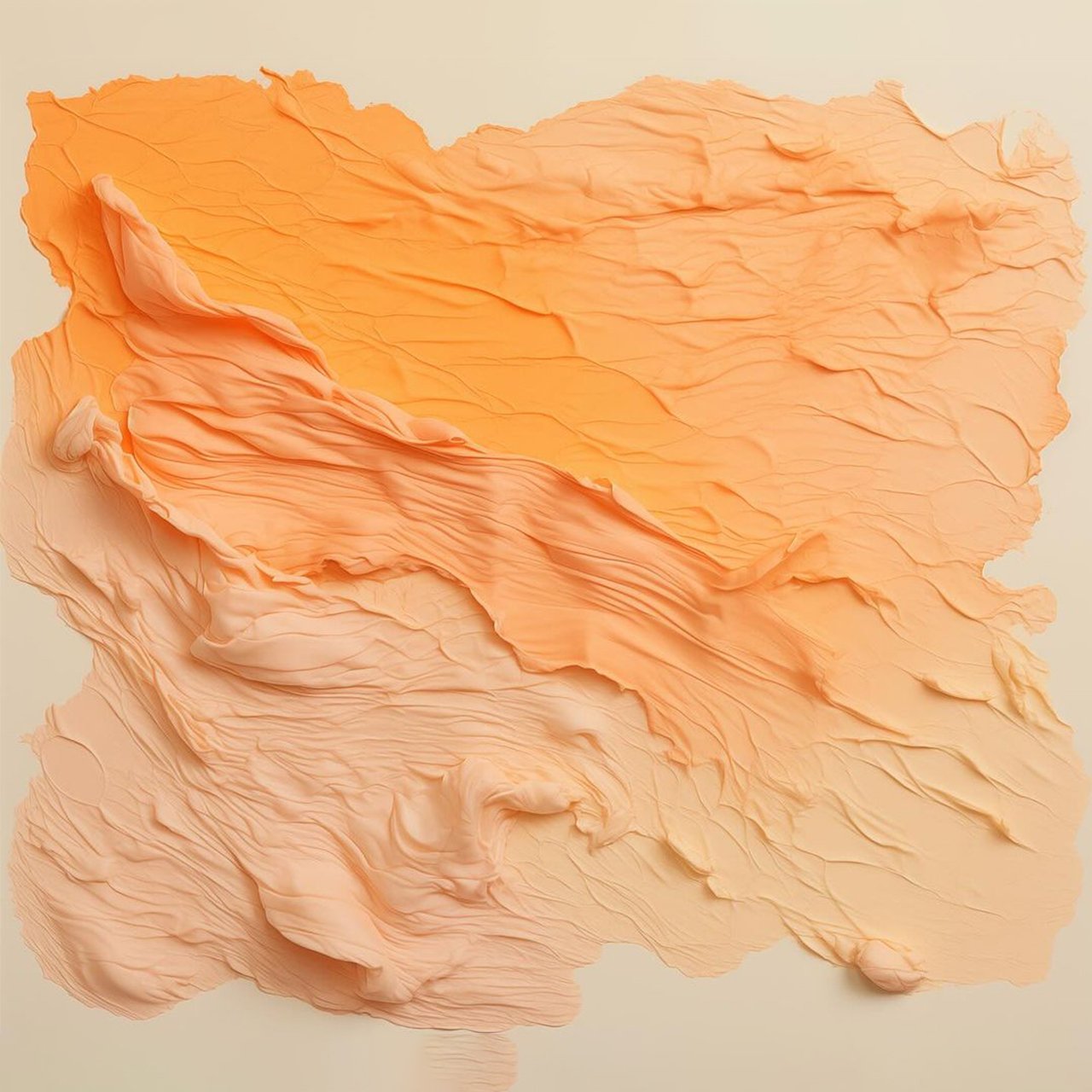
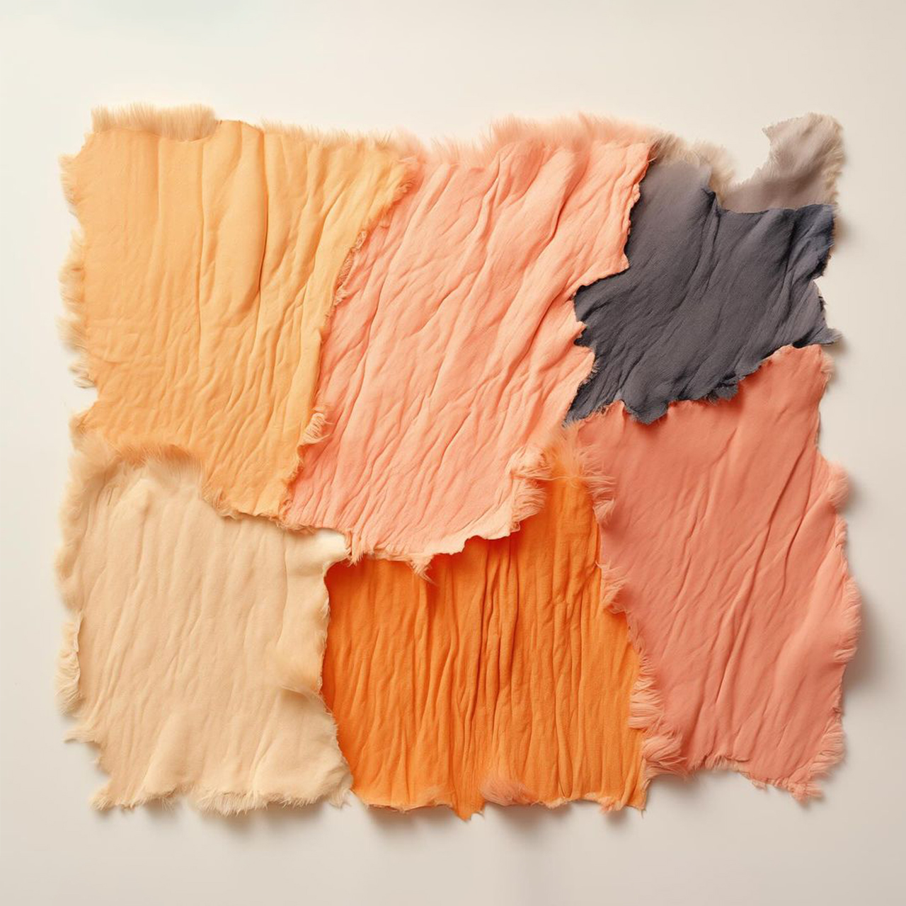
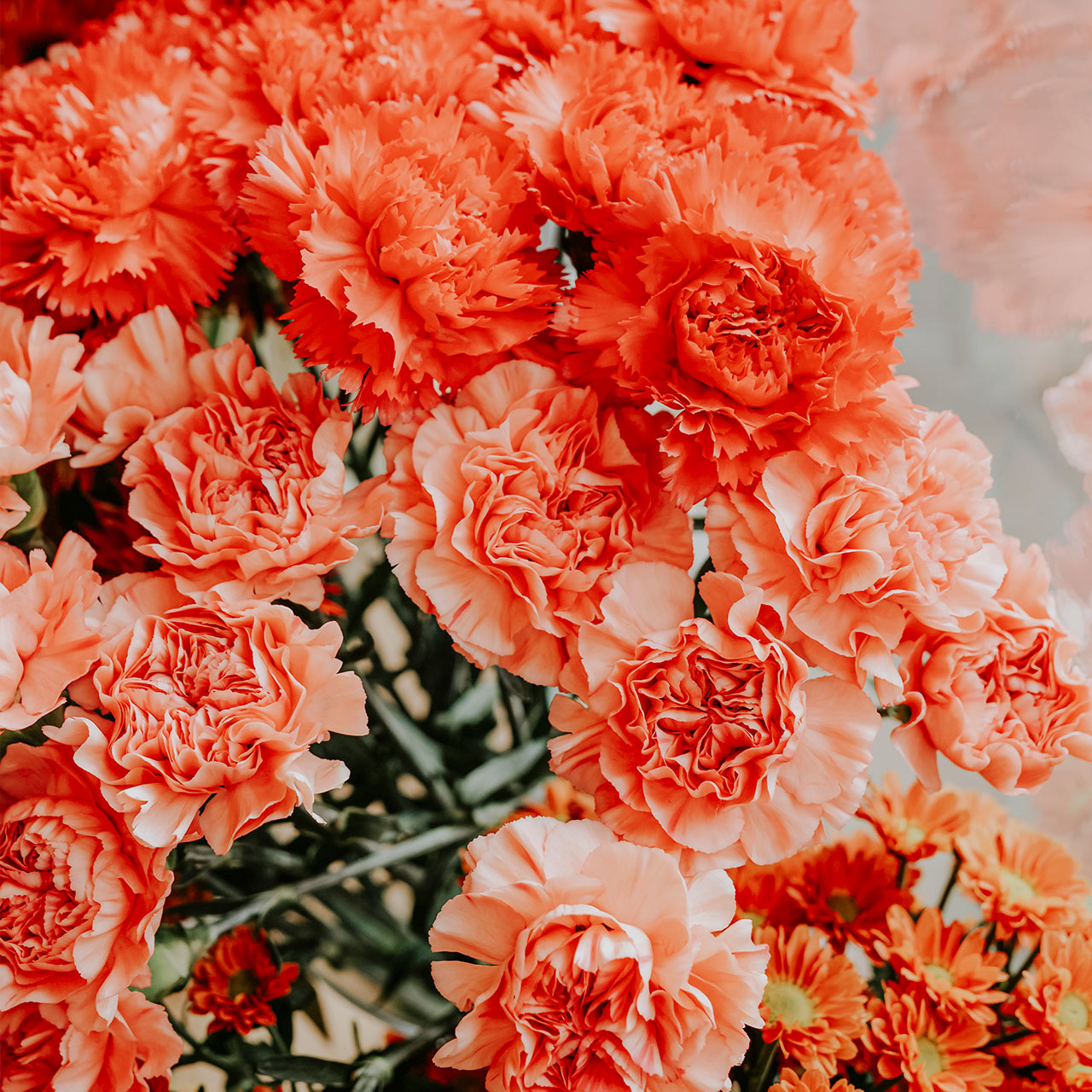
Peach is a warm hue between pink and orange on the color wheel, distinct from orange and terra cotta.
Explore the vibrant and lively color combinations that emerge when peach is paired with various hues applied to these functional and aesthetically pleasing home décor products.
You can combine peach with lively colors such as blue, yellow, orange, grey, white, and green—pair peach with white, grey, and black for a modern aesthetic.
Explore the mood boards through product design, highlighting colors that pair well with peach, along with innovative products and ideas.
Do you want to embrace the essence of sophisticated minimalism.
How to introduce Peach Fuzz into your interiors?
Peach color can refresh the look of the décor and create a lively ambiance. If you’re seeking to bring a touch of this peachy color into your space, here are tips to get you going.
1. Home Décor
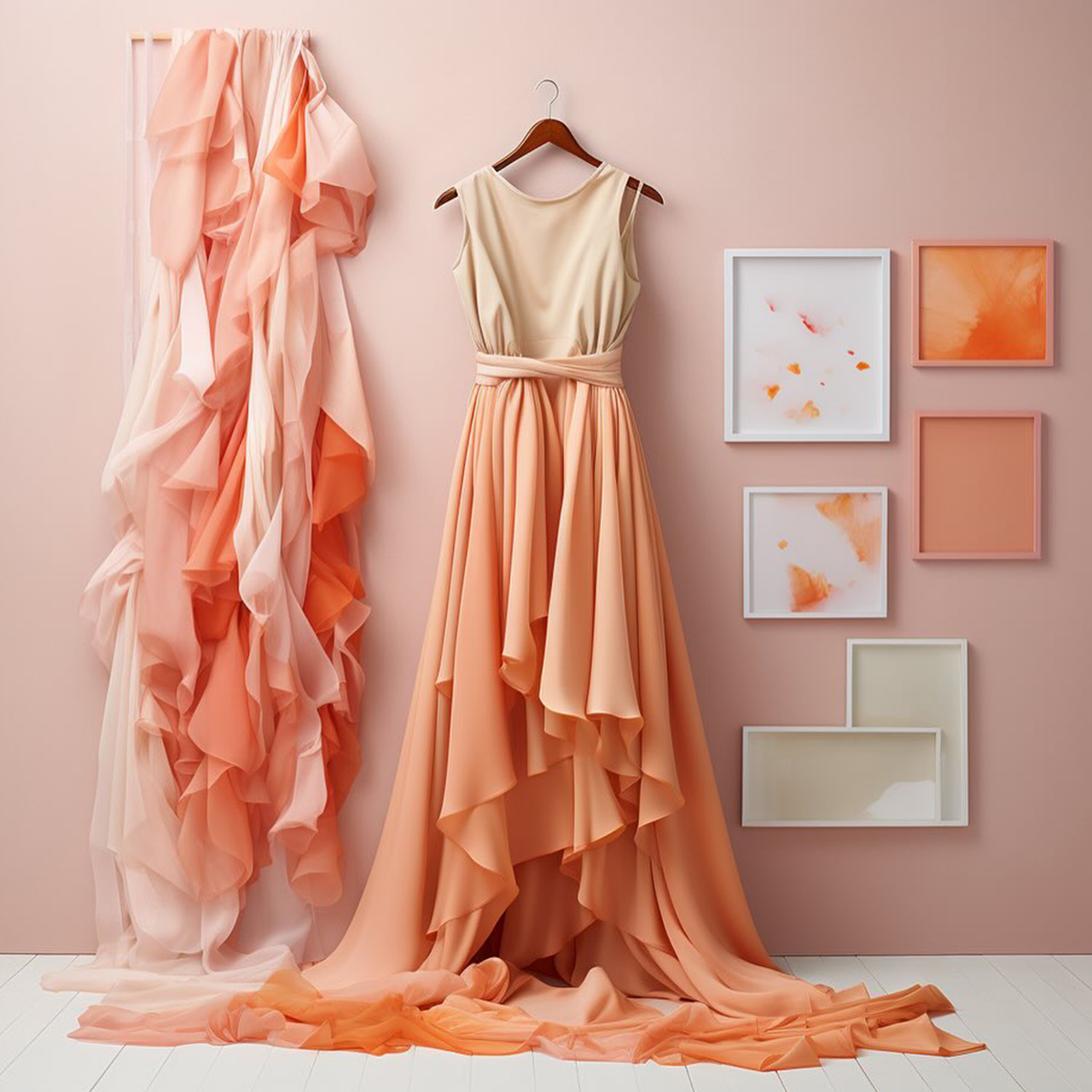
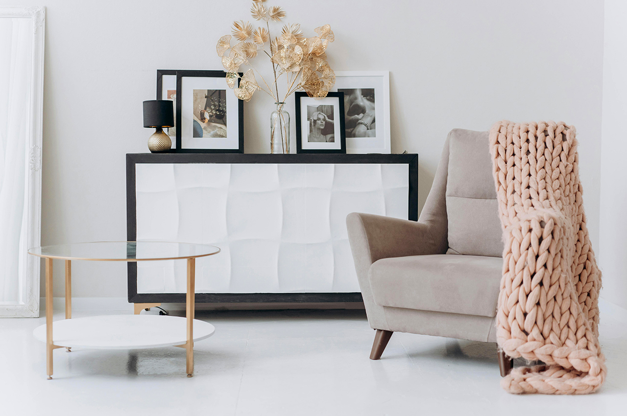
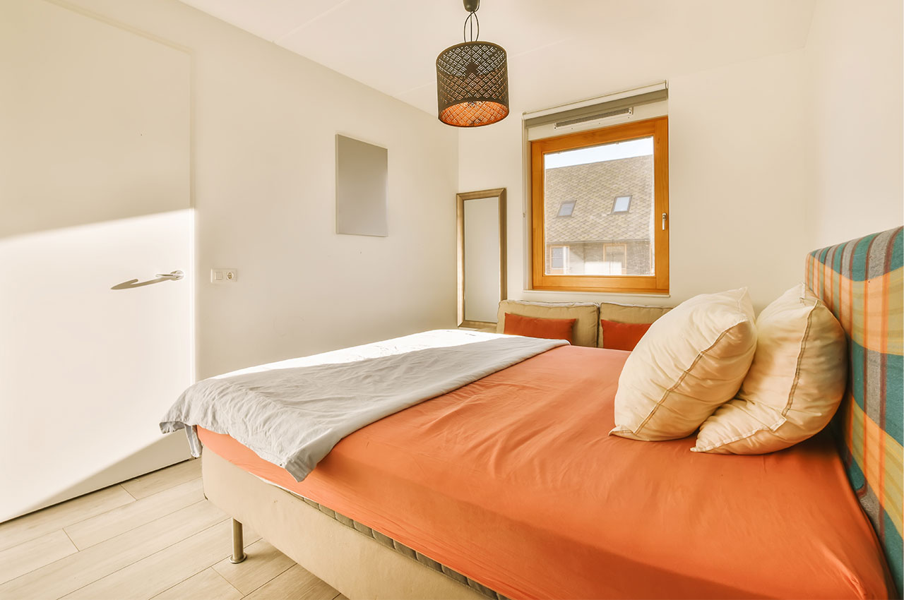
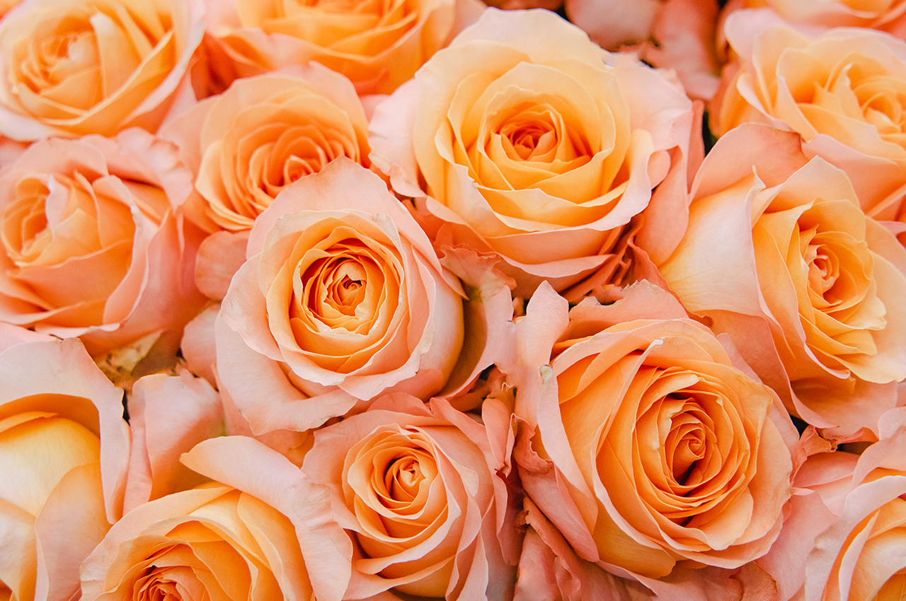
A fantastic way to introduce Peach Fuzz into your living space is by incorporating it into the items adorning your shelves. This subtle tone makes a soothing impact, so consider starting with vases, sculptures, or floral arrangements that can be layered to subtly infuse this lively shade. If you’re still craving more of this color, you can enhance the vibrancy in your home with peach color lighting, such as candles and lampshades, or make a bold statement with a couch or accent chair.
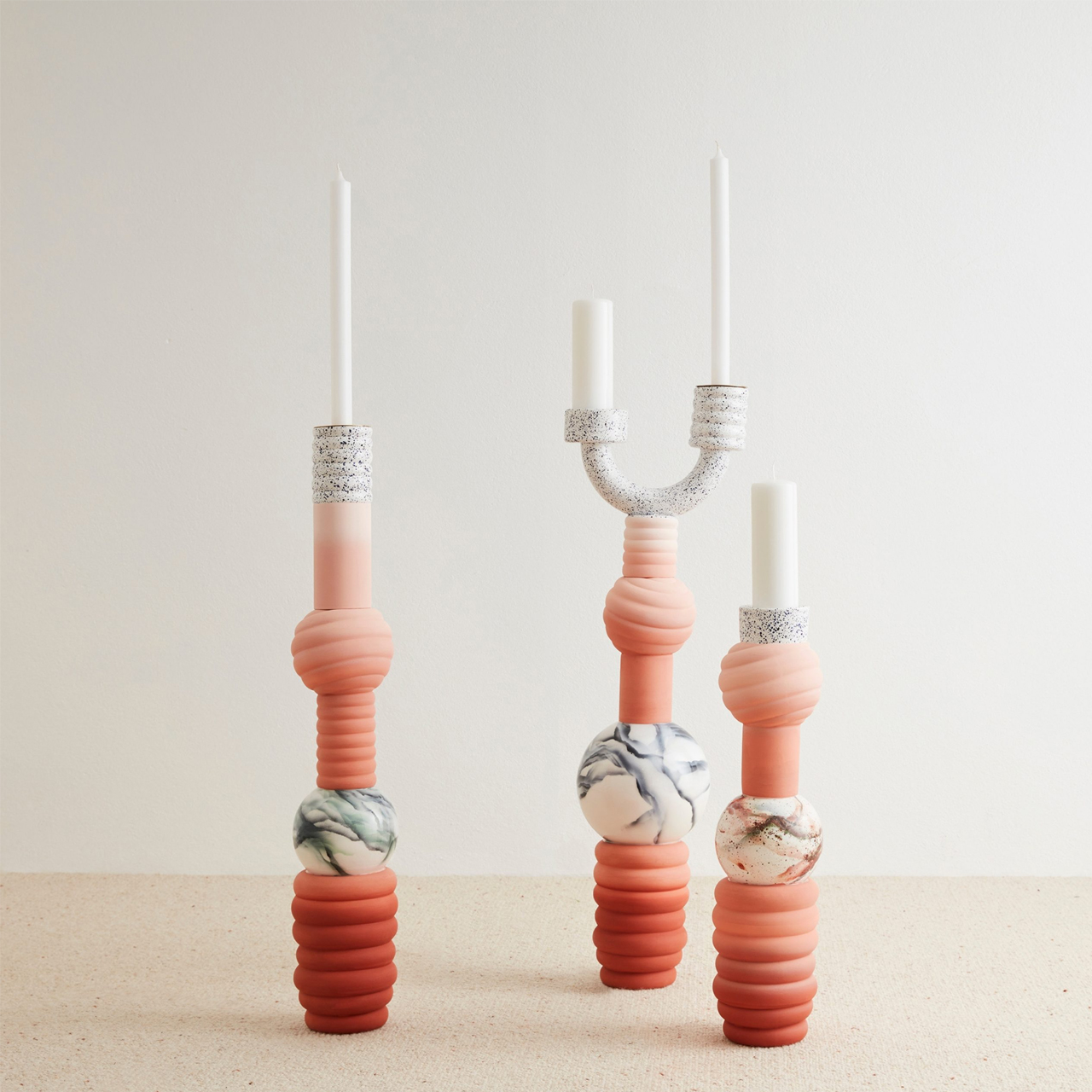
The Nyx Candleholder by Villa Arev x French Cliché is a limited edition, playful twist on traditional candleholders, made of glazed earthenware—a colorful tribute to grand candelabras.
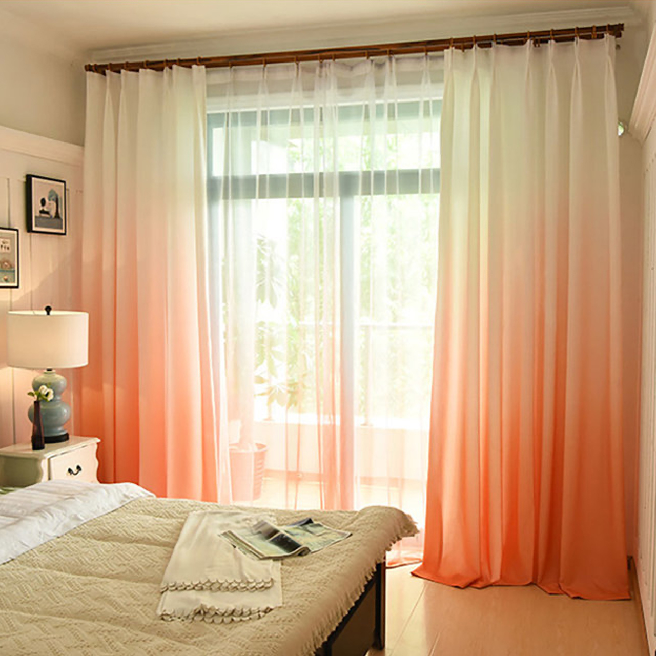
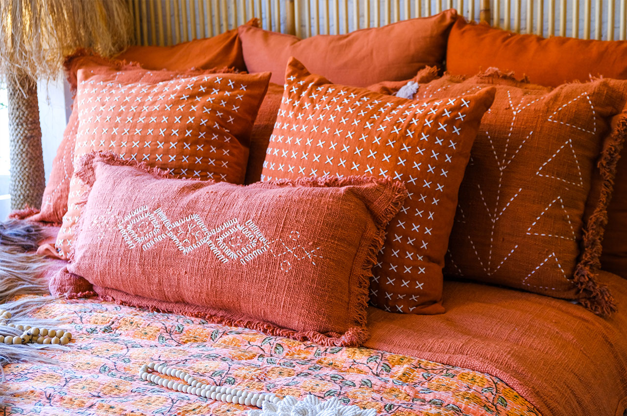
Textiles provide an excellent means to harmonize this peach hue with a touch of added softness. Drape a woven magenta blanket over your couch or bed to introduce a cozy texture and a personal touch to the décor. Enhance comfort by layering vibrant accent pillows on your bed, couch, or outdoor furniture, and by incorporating peach-hued towels into your bathroom, or incorporate this color with flowing curtains that filter sunlight through the windows.
This Peach All Season Comfort Luxurious Soft Comforter brings a modern aesthetic to a neutral-toned bedroom and adds a pop of color.
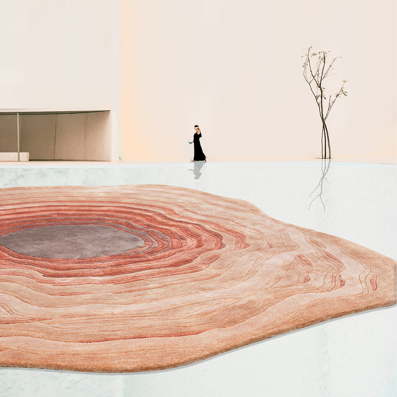
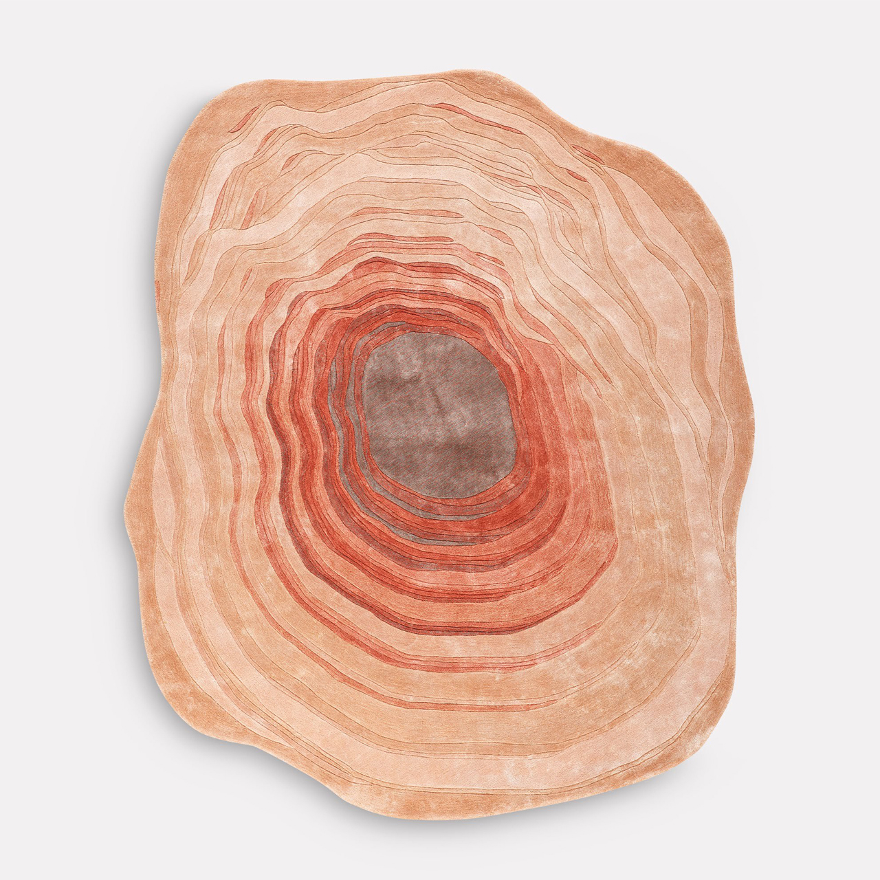
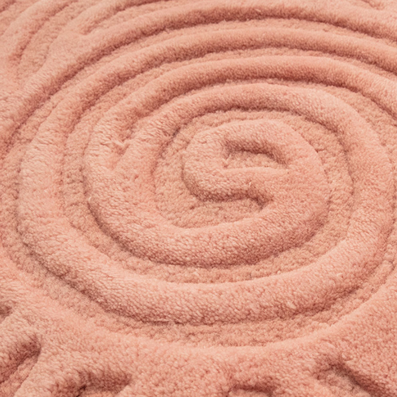
The Aram rug by Hands captivates with its distinctive shape and layered design inspired by sandstone formations. It showcases a spiral pattern reminiscent of the gradual erosion seen in sedimentary rocks, echoing the natural formations shaped by shifting sand dunes over countless millennia.
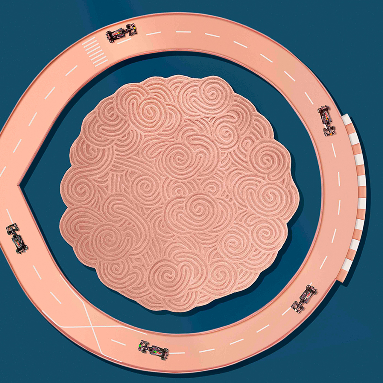
The circular patterns of the Bloom Rug draws inspiration from the dry gardens or karesansui gardens of Japan. Adding a touch of uniqueness and chic style to your home, this rug is hand-tufted and meticulously hand-trimmed to replicate the aesthetic of Japanese gardens.
3. Create an Accent Wall
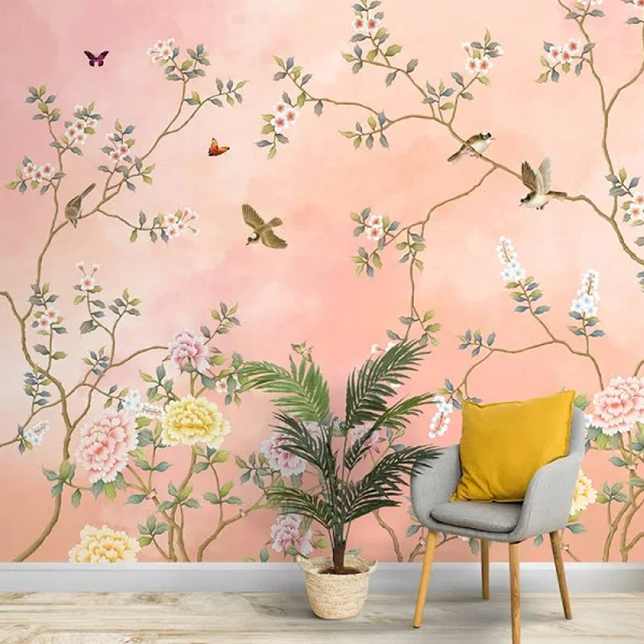
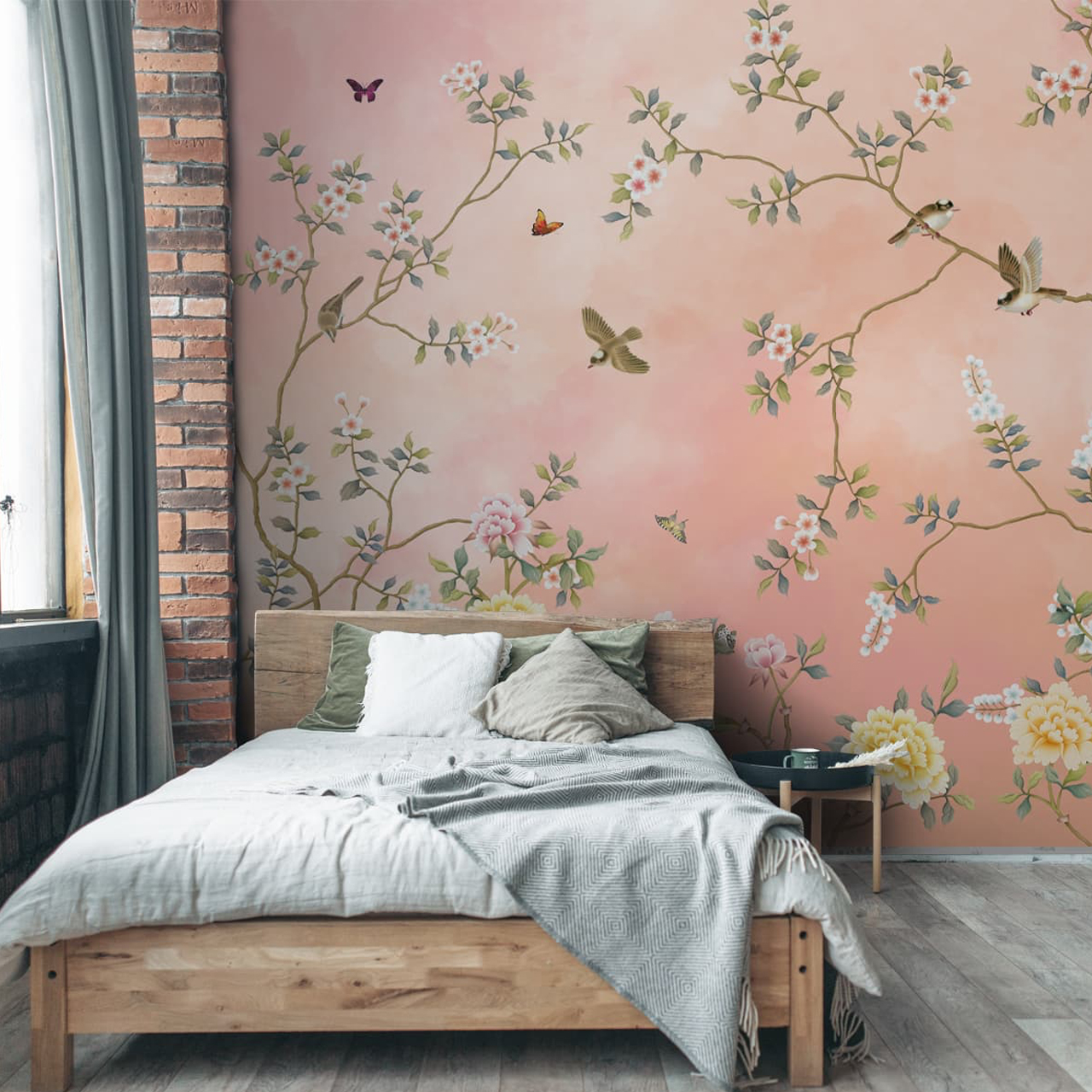
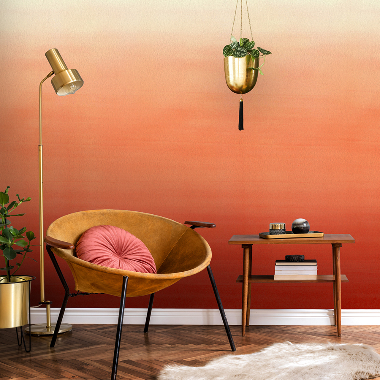
If you want to fully embrace the peach fuzz aesthetic, contemplate incorporating it into your space through an accent wall, capturing the soothing hue. Begin by selecting a focal point in your home—whether it’s the wall behind your bed or TV, or the wall along your staircase, and introduce the accent color with wall paint or textured paint. For a less permanent burst of color, consider using tapestries or peel-and-stick wallpaper as an ideal temporary solution.
Choose a soft floral wallpaper with peach blooms or go for bold patterns with Blossom Peach Chinoiserie Wallpaper for a touch of intricate style.
This orange and peach wallpaper showcases the gradual transition from one hue to another, typically progressing from lighter to darker tints and shades.
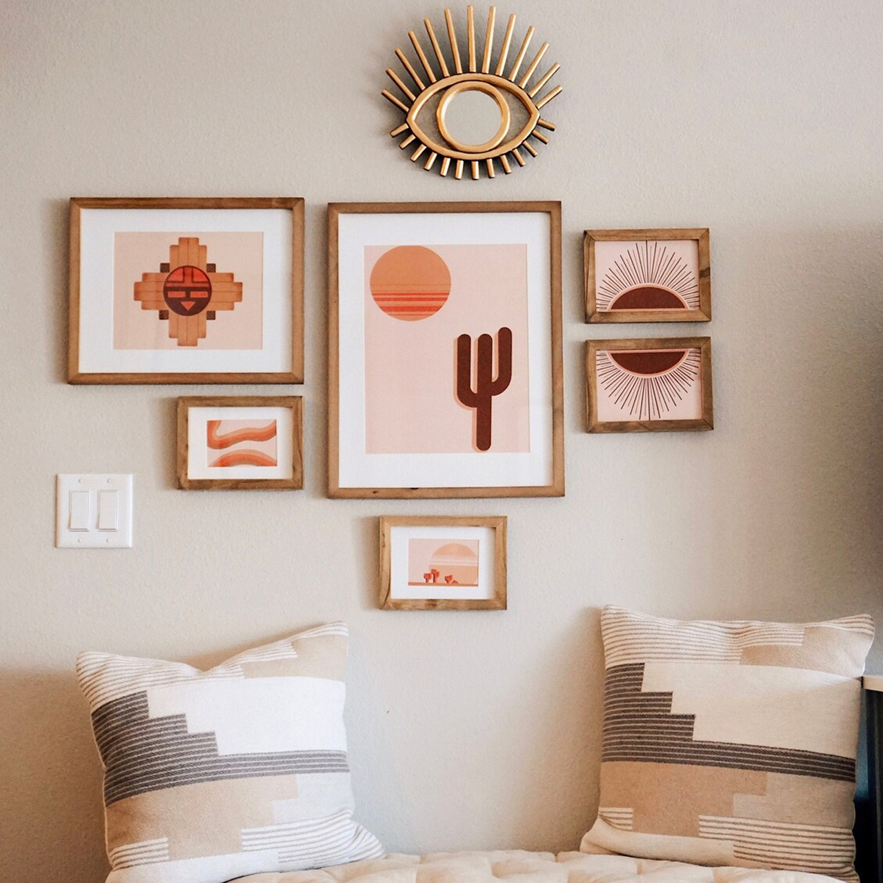
4. Create a Gallery Wall
Creating a gallery wall is an excellent method of incorporating this color into your home décor. Use peach-colored prints or peach-colored frames against a neutral backdrop, such as beige, white, or grey walls.
The inspiration for the Desert Gallery Wall comes from journeys to Saguaro National Park in Arizona.
5. Beautify with Accent Pieces
How about bringing in the beauty of Peach Fuzz via accent pieces?
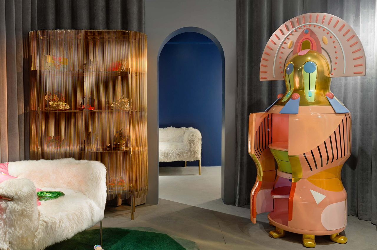
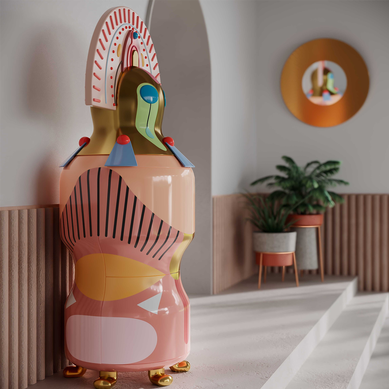
The Chhau Donna Cabinet features beautiful colors, a nautical resin head in gold, two drawers, and ample shelves. Its timeless design and superior craftsmanship make it a standout in your space, offering a captivating experience every day! The cabinet boasts two drawers and ample shelves for practical storage.
The Hullabaloo is a unique standalone bookshelf with a twisting design created from four cuboidal quadrants forming a circle. Functionality is achieved by opening each quadrant, and a translucent back adds mystery. Its shape, requiring multiple glances, blends aesthetics seamlessly with function in a compact yet captivating design.
The Marigold One Arm Sofa designed by Fleur Delesalle features a beautifully rounded bench-like design, showcasing exquisite details from every angle—front, side, and back. This sofa serves as an ideal room divider. Its distinctive armrest also functions as a comfortable headrest, making it perfect for a relaxing break.
6. Design the Tablescape
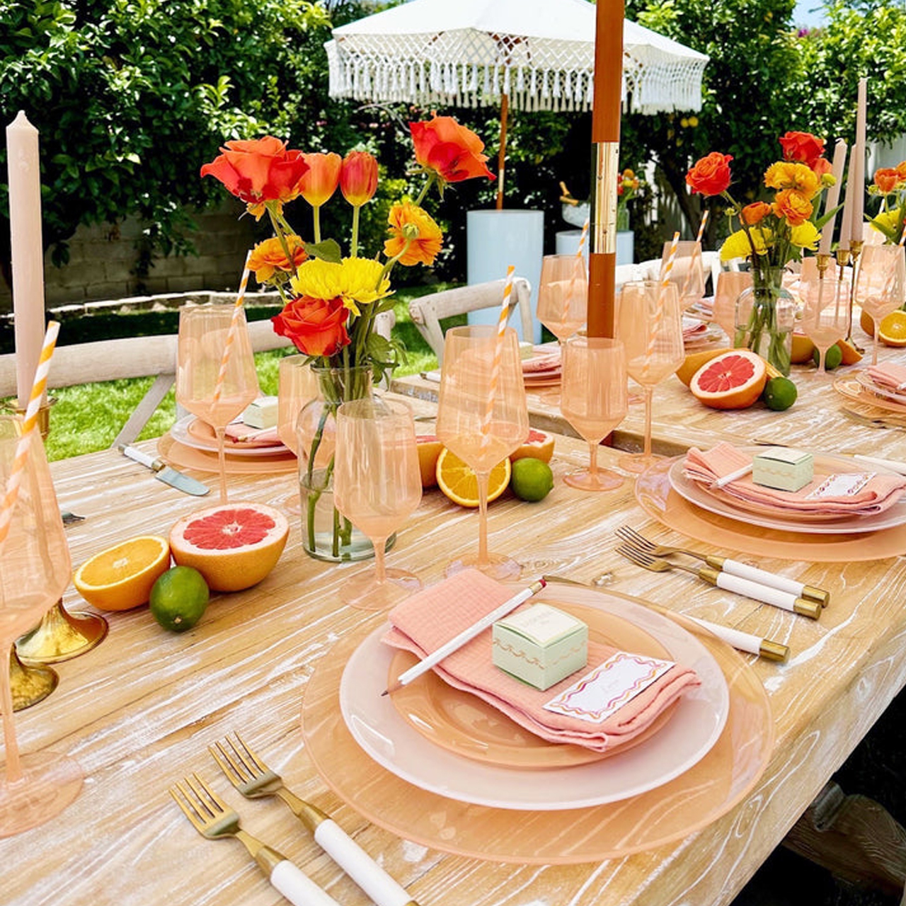
Revitalize your dining area with Peach Fuzz by creatively using your tablescape to mix and match plates, cups, bowls, napkins, and more. For a subtle nod to the color, consider placing a beautiful bouquet of peach flowers on your dining table or incorporating peach hand towels in your kitchen. For a more complete embrace of the color, introduce a Peach Fuzz table runner or placemats to rejuvenate your dining space, infusing new life into gatherings with family and friends.
Soirée8’s collection is both eccentric and subtle, bold yet minimal, seamlessly blending vintage and modern elements.


 Pantone Collection comes in two palettes: Zesty & Fresh and Sweet & Juicy. The collection includes different food serving and food storage items like serving bowls, placemats, footed trays, coasters, salt shakers, etc. Just like the previous collection, you also get different colors of scented candles that come in the pantone palette looking box.
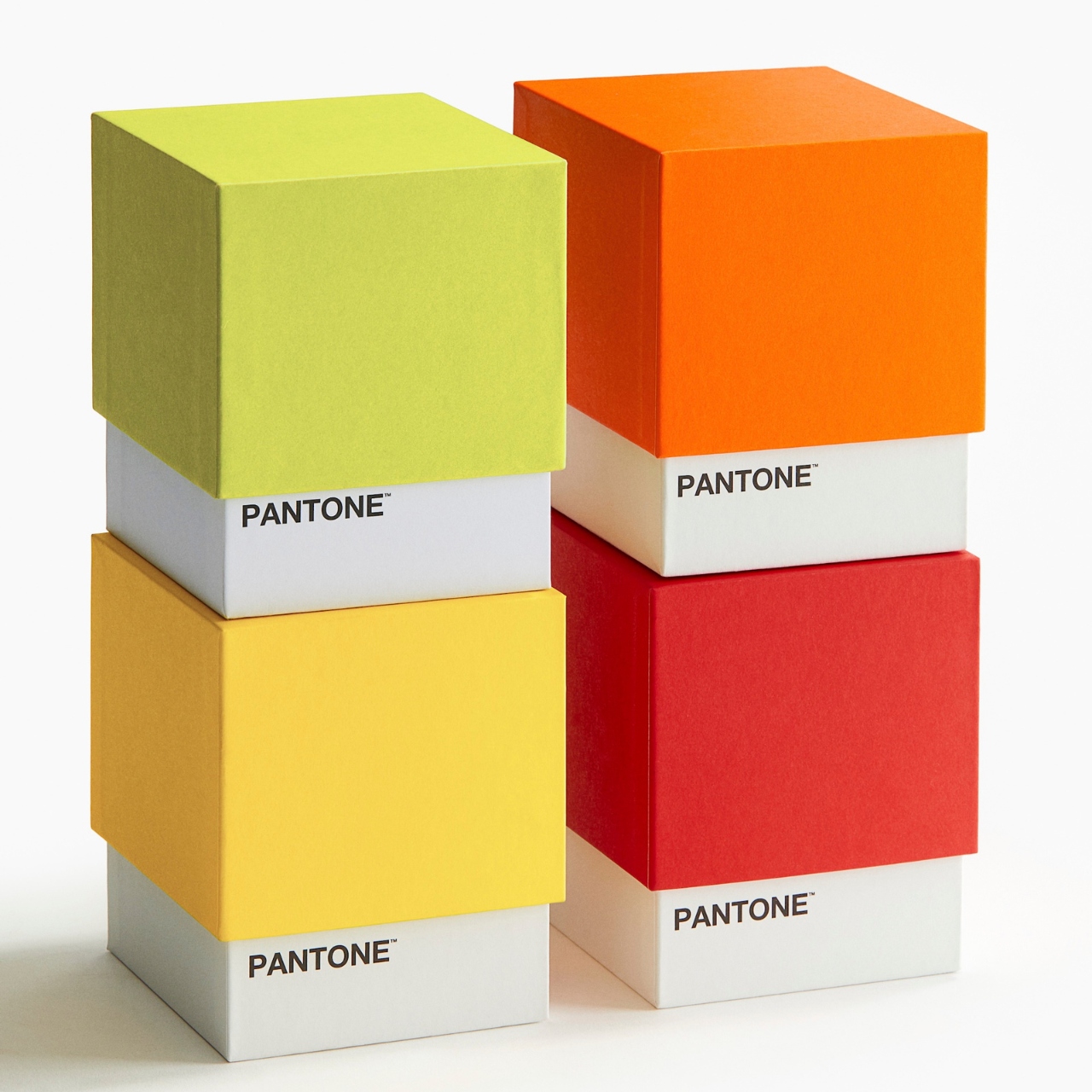


 .
.