The much-awaited FIFA World Cup kicks off with an opener between co-hosts Mexico and South Africa at Mexico City Stadium on 12 June. While the fandom and the love for the most popular sport on earth remain constant off the field, there is a lot that’s changing on the field. The Virtual Assistant Referee (VAR) is getting more control of the game, with the power to intervene in spotting fouls and also identify real-time data from the specially designed football to make faster offside decisions, or pick out individual ball touches in a crowded set piece.
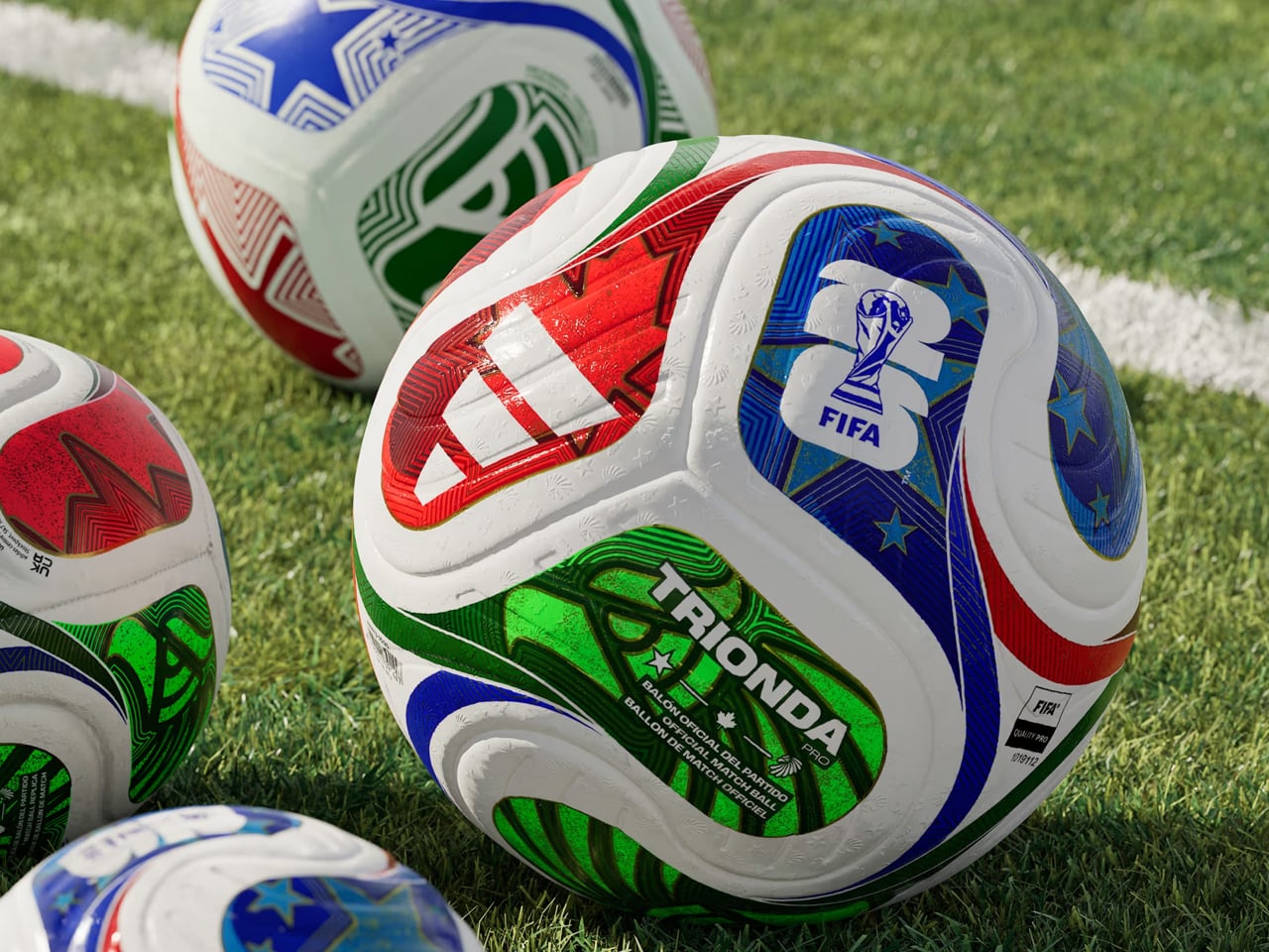
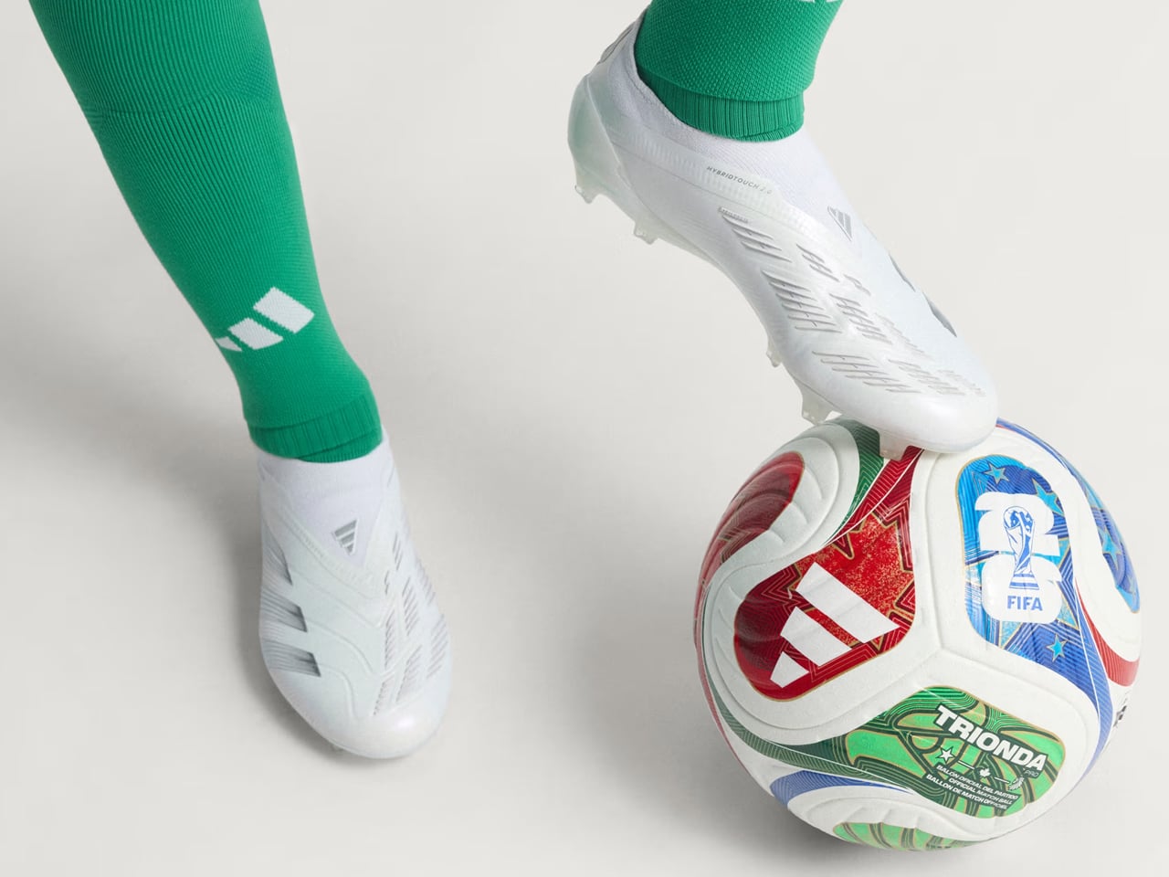
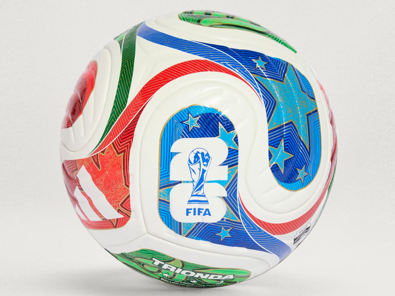
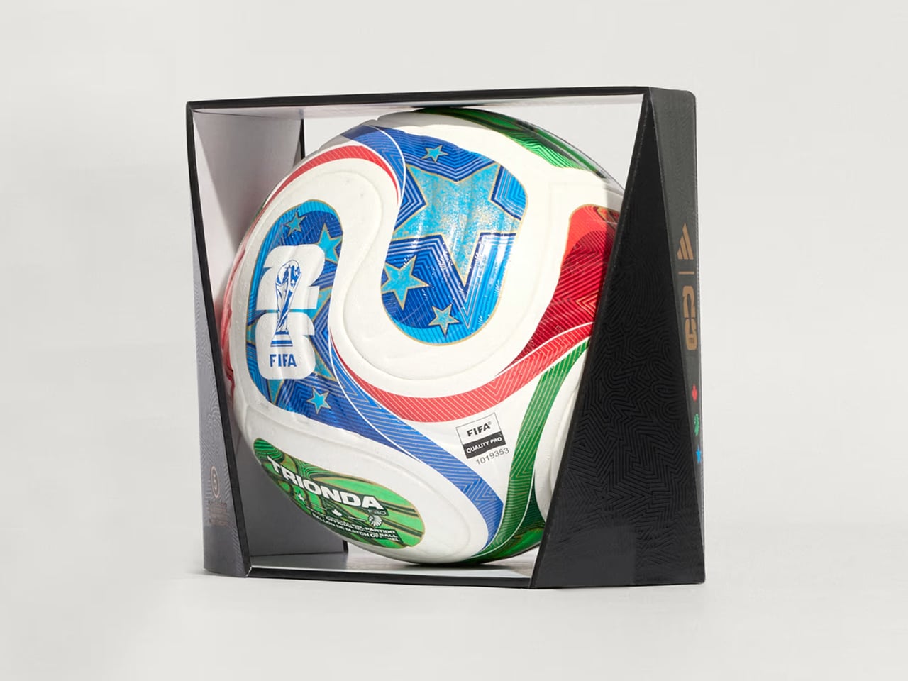
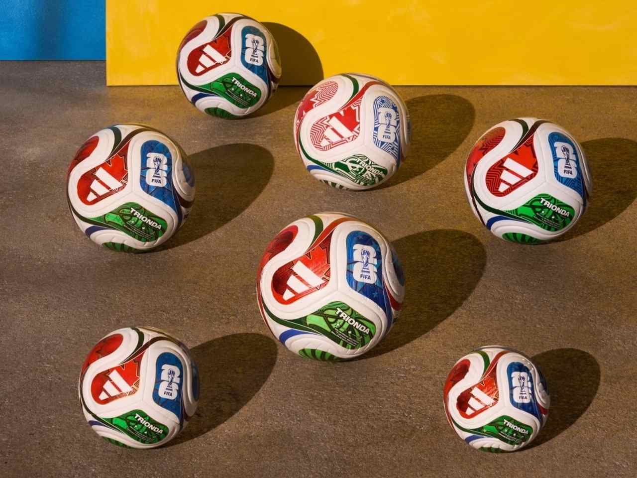
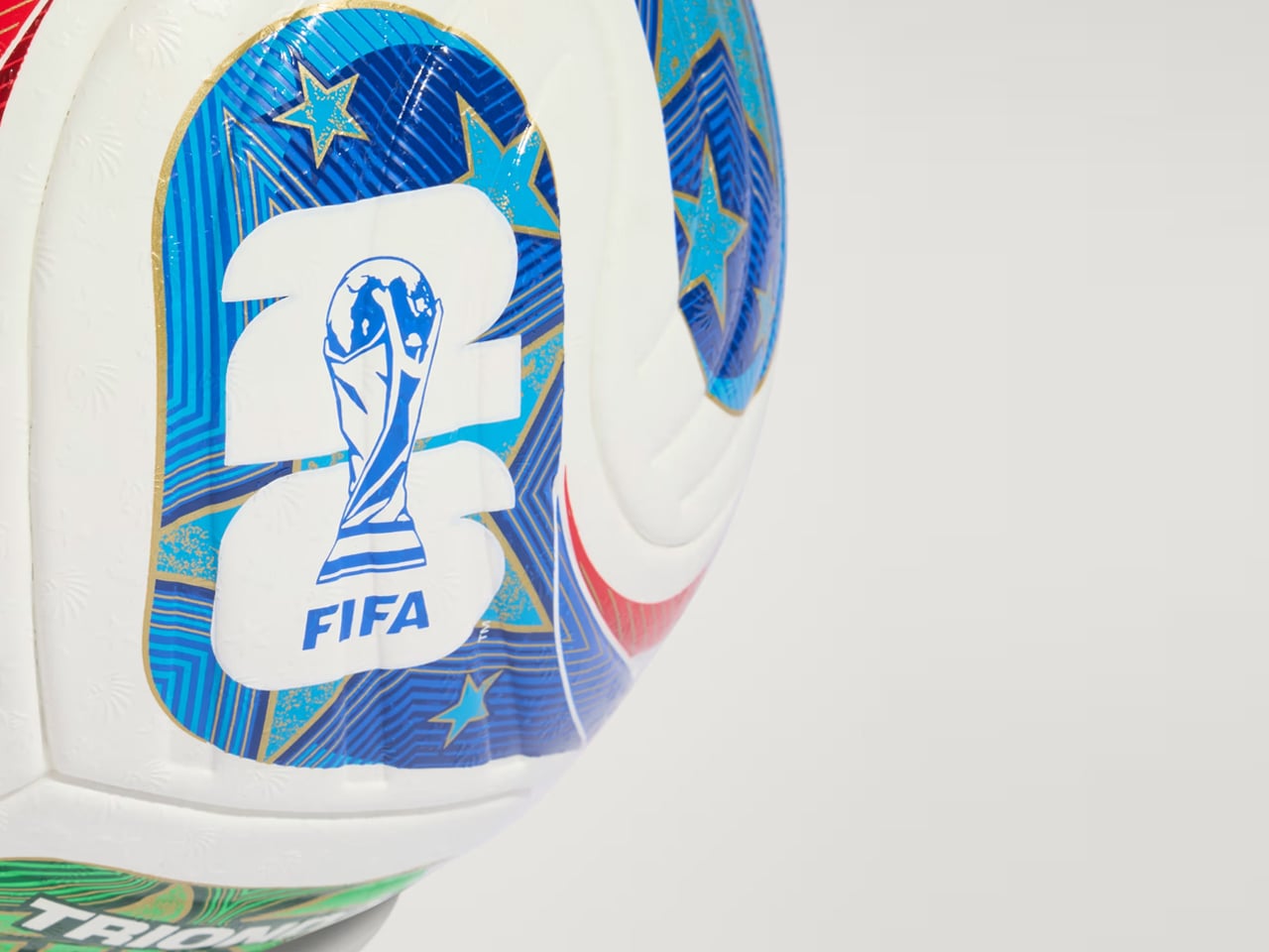
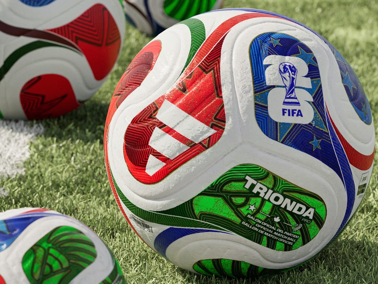
The football designed especially for match day is called Trionda Pro, which means “three waves.” It is styled in the colors and motifs of the three co-hosting nations, Mexico, Canada and the United States of America, and is said to arrive with a built-in motion sensor, which would send real-time ball data to VAR. The ball is now available for $170.
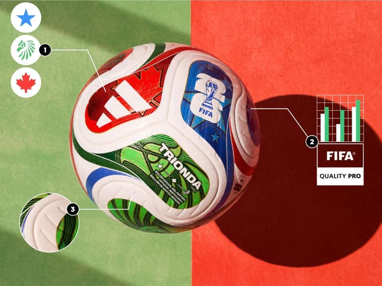
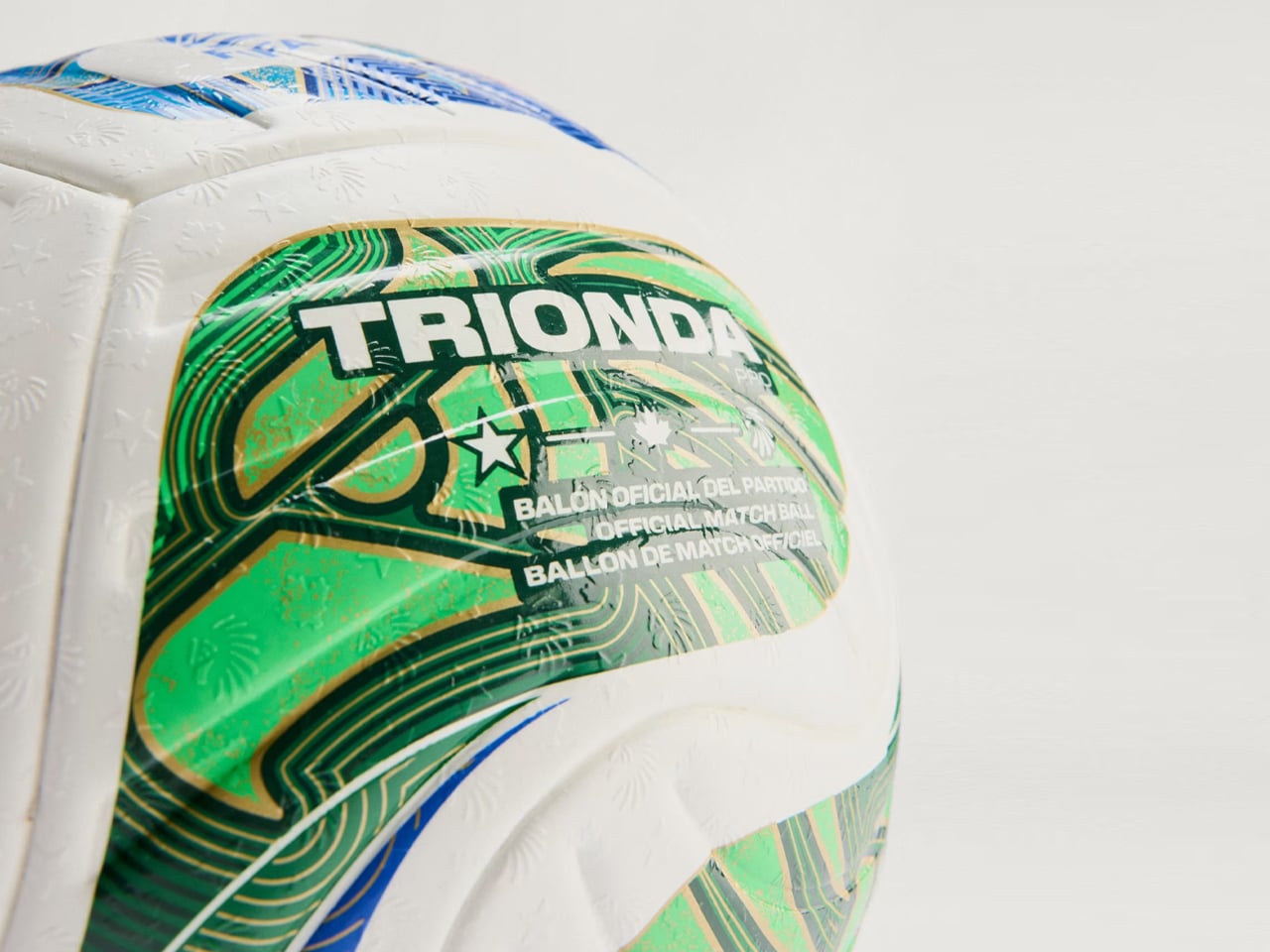
Created by adidas for the FIFA World Cup 2026, Trionda Pro is the official match ball of the tournament. It will arrive in a tricolor wave panel design with red, green, and blue graphics, which pays tribute to Canada, Mexico and the USA. The ball also features maple leaf, eagle, and star – again representing the nations – visible across the four-panel construction of the ball.
“The Trionda Pro has a textured surface for a more predictable trajectory, better touch and lower water uptake, combined with a thermally bonded seamless construction for added performance and design benefits,” adidas notes on its webpage dedicated to the match ball.
Even though the impactful silhouette makes the ball pretty identifiable on the ground, adidas and FIFA wanted more from it. To that accord, Trionda Pro features a 500Hz motion sensor installed inside of its specially created layer in one of the four panels. The other three panels are provided with counterbalances ensuring flight stability in all playing conditions. The sensor is part of adidas’ in-house Connected Ball Technology and used in the match ball. It sends accurate ball movement analytics to the VAR in real time and also helps identify individual touches precisely.
The data of the ball movement, then combined with AI and player-positioning data, can allow the virtual referee to assist with correct offside calls and also identify a handball from headers in a crowded space on the field. Accurate and fast decisions regarding off-sides and fouls can make a big difference in high-octane games, especially on the world stage. So, Trionda Pro is a viable tech upgrade to the sport, which is going into a mega tournament for a period of 39 days starting 11 June through 19 July, 2026.
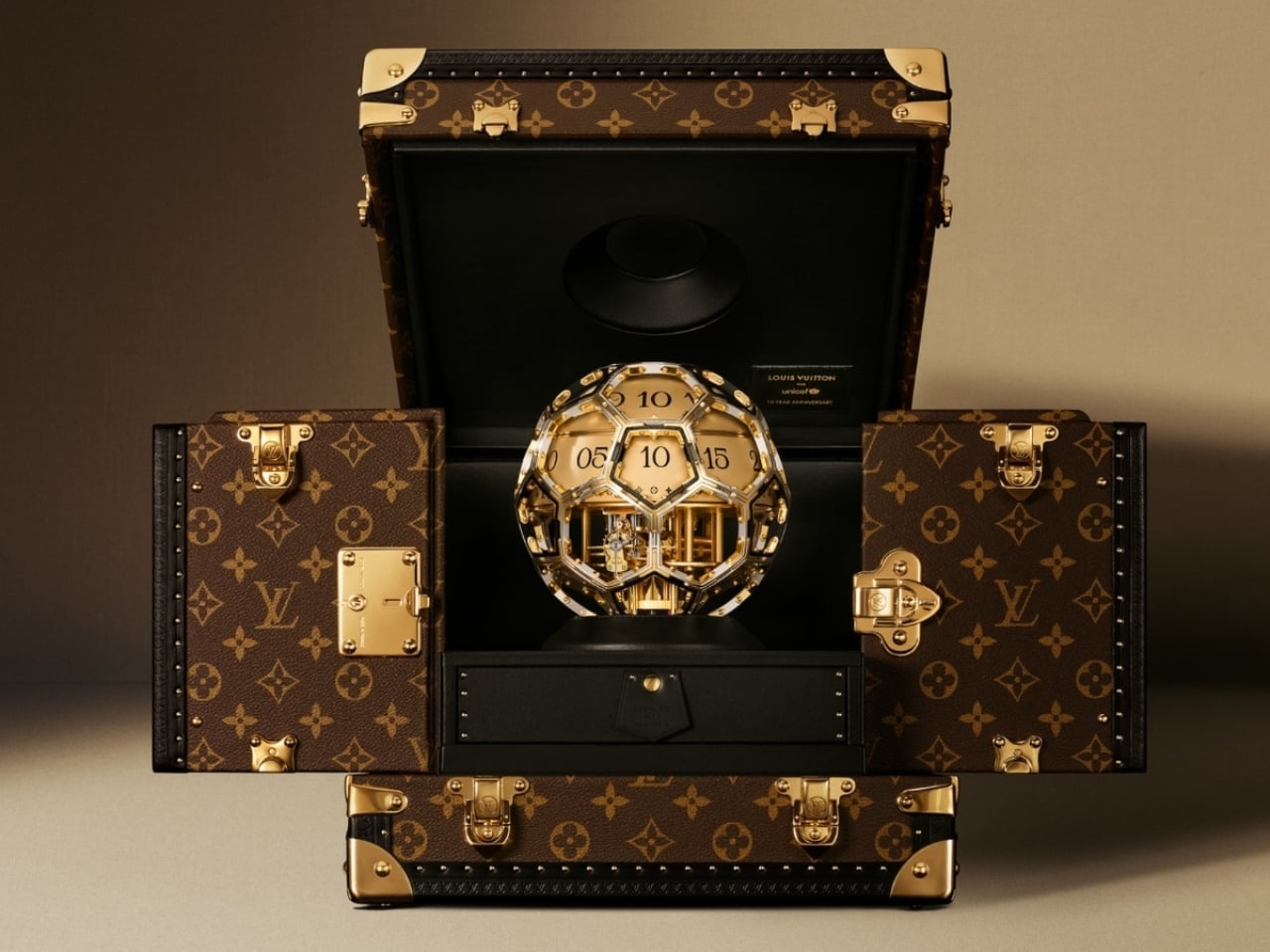
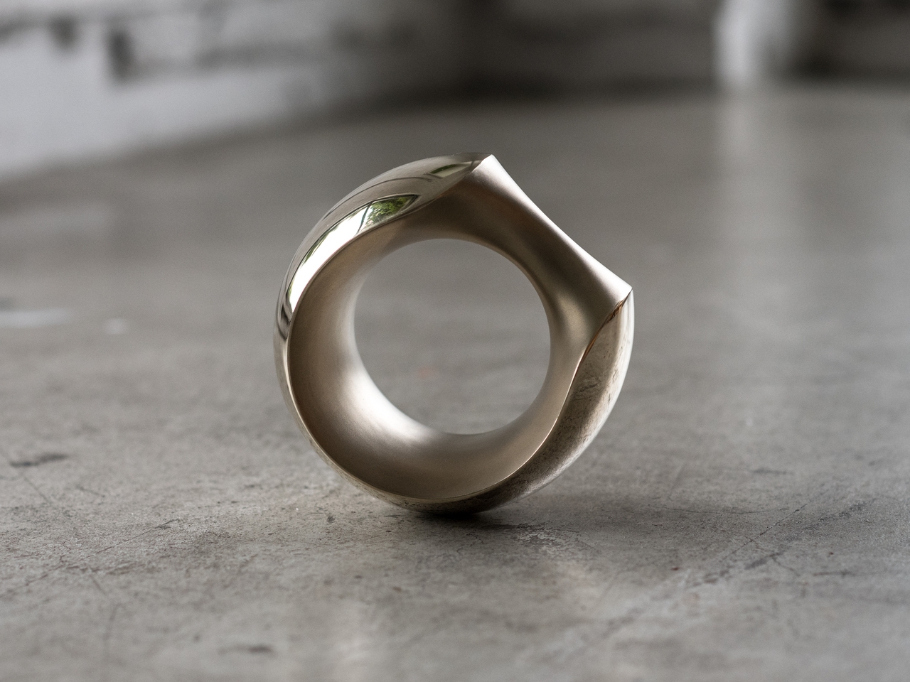
Not every luxury piece earns the word “meaningful.” Beautiful, yes. Covetable, absolutely. But meaningful is a harder category to land in, and the Louis Vuitton Unity Time Object lands there without trying too hard about it.
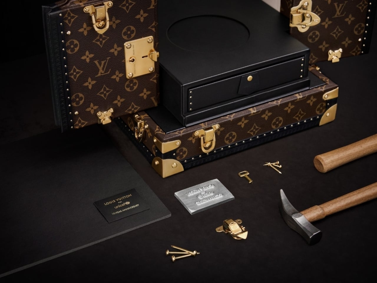
Unveiled at the Fall-Winter 2026 Men’s Fashion Show in Paris, the piece was created to mark ten years of the Louis Vuitton for UNICEF partnership. A decade of fundraising, direct action, and advocacy for vulnerable children around the world. That’s the kind of milestone that deserves more than a press release, and Louis Vuitton clearly agreed.
Designer: Louis Vuitton
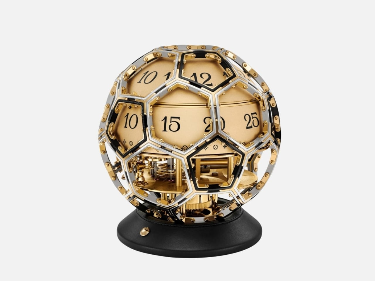
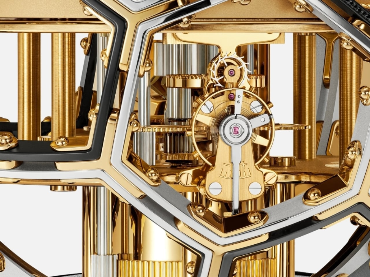
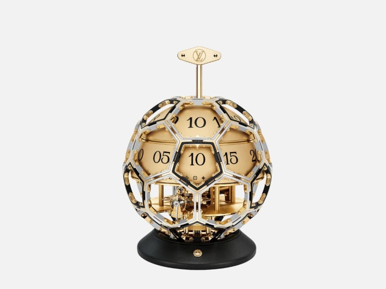
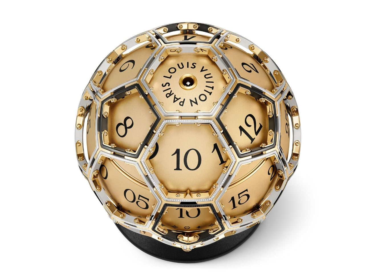
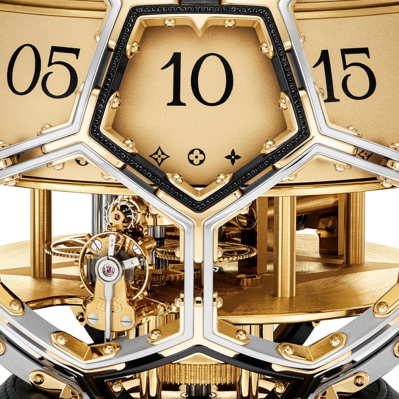
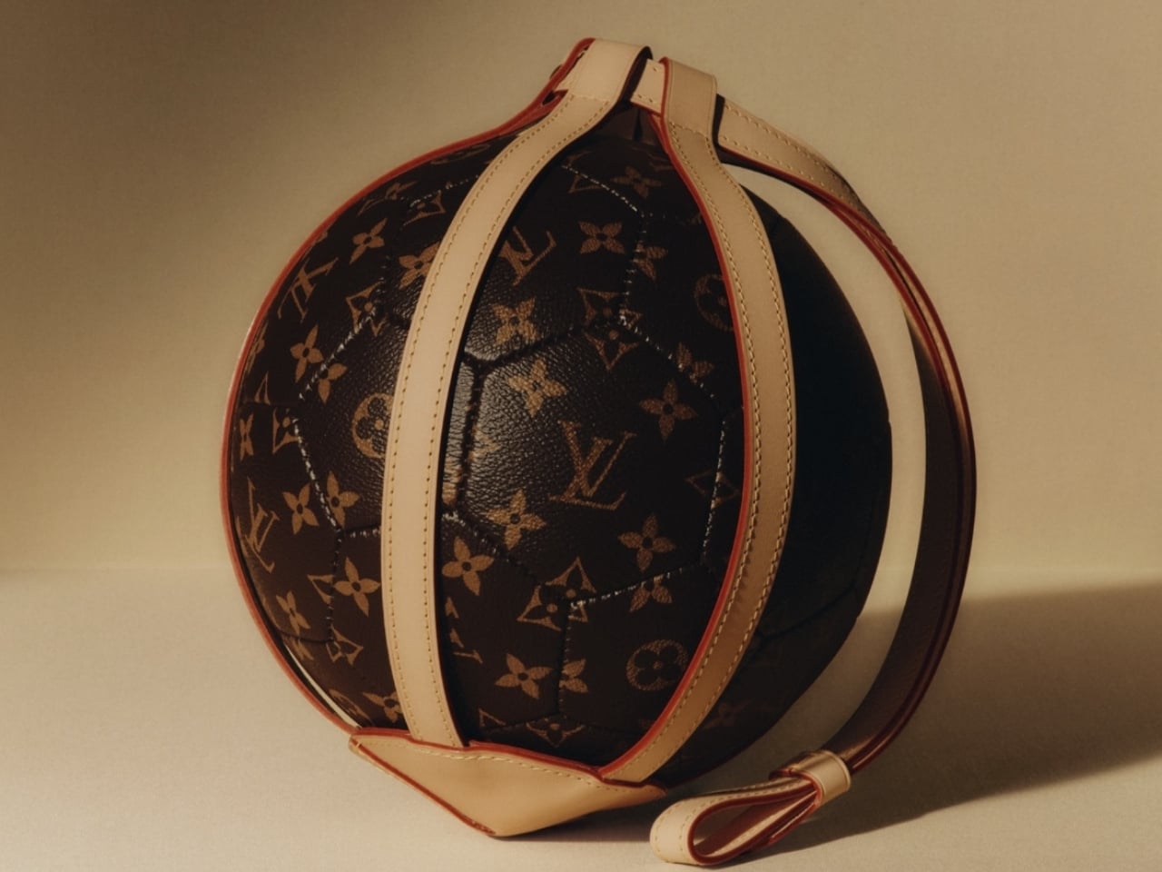
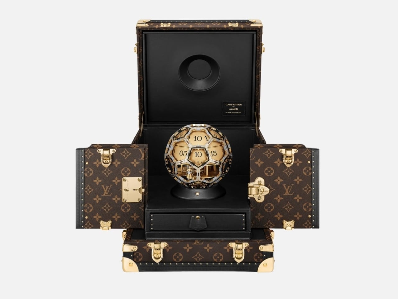
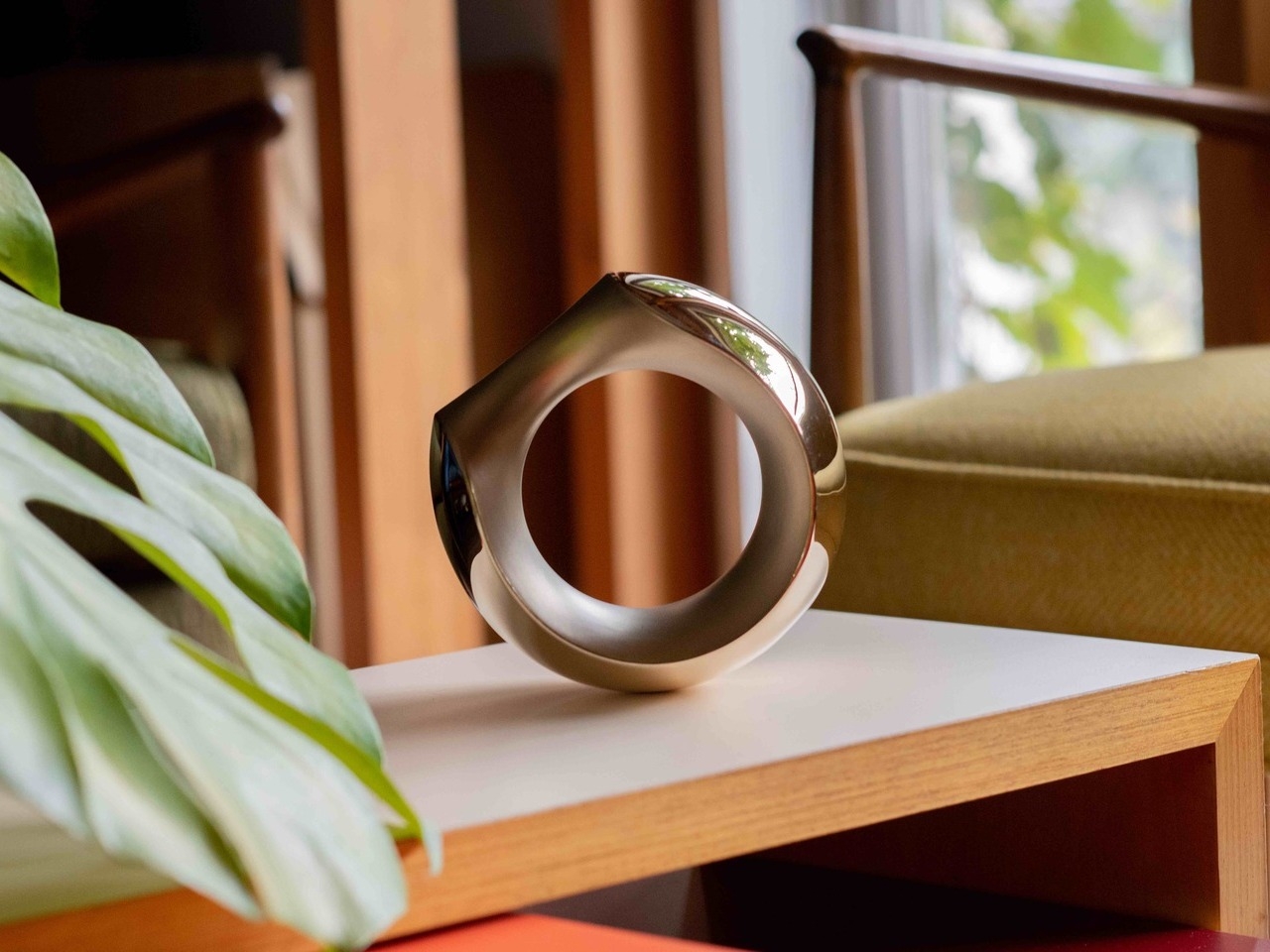
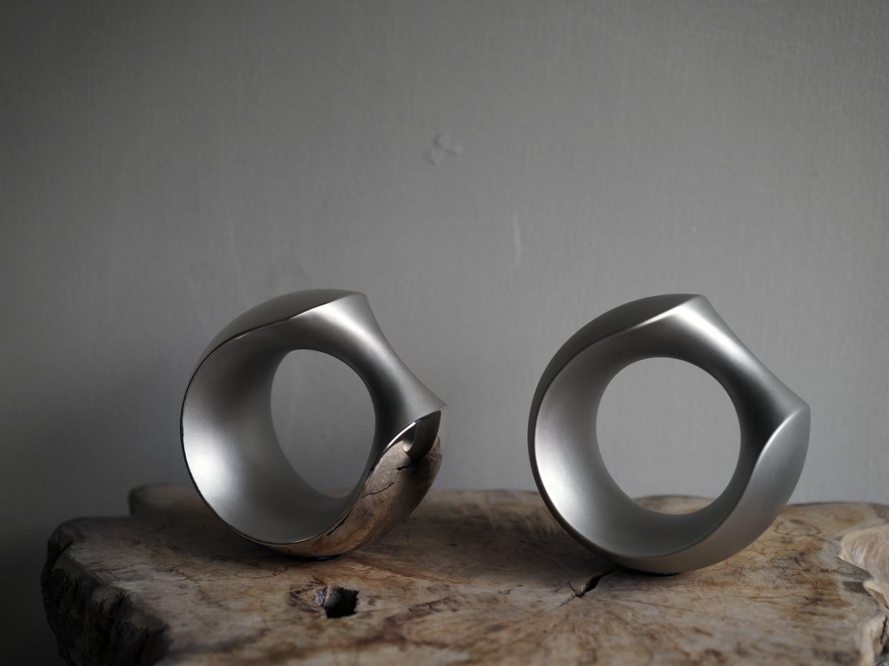
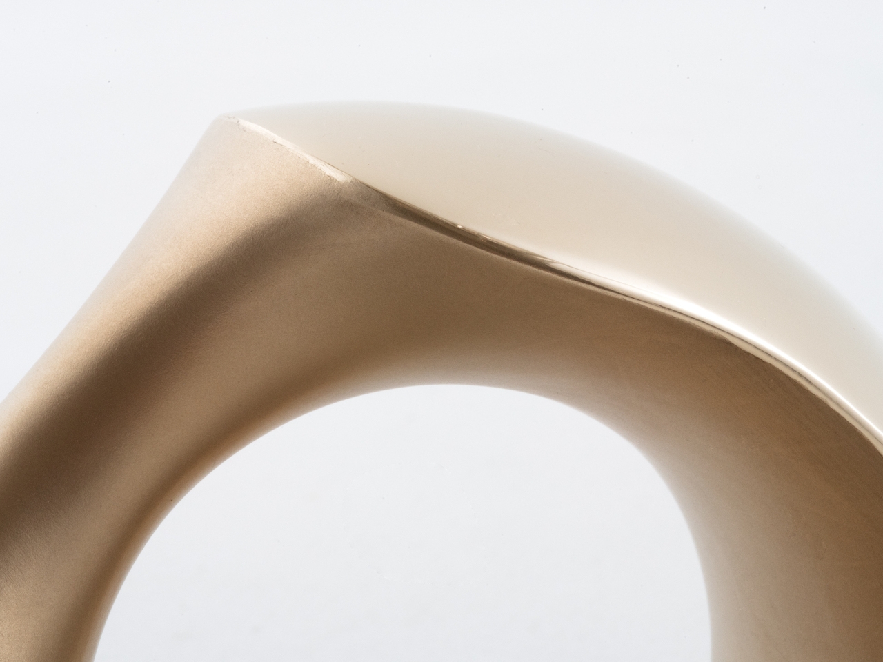
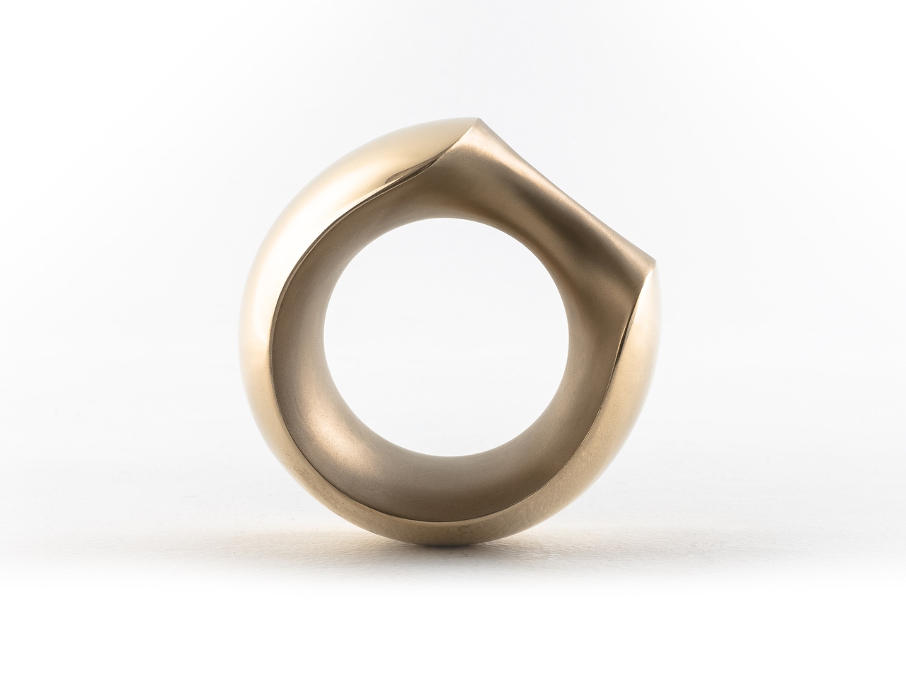
The form alone is worth sitting with for a moment. The clock takes its shape from the LV Soccer Ball, one of the house’s most recognized sporting objects, now reimagined as a sculptural timepiece that functions equally as objet d’art and design statement. A sphere has no front or back, no implied hierarchy, no right way to face. It looks the same from every corner of the room, every corner of the world. For a partnership rooted in the idea that every child deserves access and dignity regardless of where they were born, the shape isn’t just aesthetic. It’s a quiet argument made in steel and gold.
Time on the Unity Time Object is told through two rotating cylinders rather than conventional hands. A sculpted golden steel dome forms the upper half of the clock, and beneath it, one cylinder tracks the hours while the other handles the minutes. The minute cylinder is engraved with Louis Vuitton’s Monogram motif and flowers, with “Louis Vuitton Paris” running along its top. You wind it with a key inserted at the side or top, and the act carries an almost ceremonial quality. It asks you to slow down, to pay attention. In a product era built on digital convenience, that small ritual feels genuinely countercultural.
The movement was developed in collaboration with L’Épée 1839, the Swiss clockmaker with nearly two centuries of history behind it. It’s entirely visible through the skeletonized structure, with every screw and movement plate worked with the Monogram flower. Diamond-set details add richness without overwhelming the mechanical poetry underneath. The whole piece reads like a conversation between decoration and precision, and neither side loses.
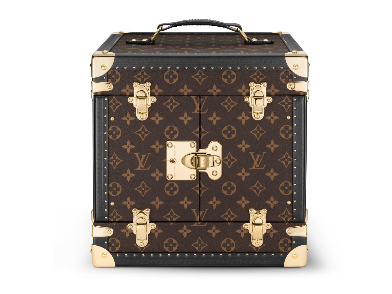
The clock arrives in a trophy-style trunk made from Louis Vuitton’s Monogram canvas, handcrafted at the house’s historic Asnières workshop. The brass corner protectors, lock, and clasps are the same ones found on Louis Vuitton trunks going back to the 1860s. A display case built with 160 years of muscle memory, housing an object shaped like a ball. It shouldn’t cohere as well as it does, and yet here we are.
The Unity Time Object is classified as a pièce unique at Sotheby’s, meaning one exists in the world, full stop. It goes to auction on June 9, 2026, with the sale closing June 18, and all proceeds going directly to UNICEF and its work supporting children globally. The estimate is available upon request, which is auction-house language for a number most of us should simply appreciate from a respectful distance.
What I keep returning to is the simplicity of the choice. Louis Vuitton could have marked a ten-year UNICEF partnership with a capsule line or a limited-edition accessory. Something accessible, something scalable. Instead, they made a single, unrepeatable object with no commercial return for the house. Every dollar from the sale goes to the cause. That kind of gesture is rare in luxury, where even the most philanthropic moves tend to benefit the brand as much as the cause.
Good design holds meaning without over-explaining it. The Unity Time Object doesn’t need paragraphs of context to communicate its weight. A sphere. A clock. A trunk built by the same craftspeople who have been making trunks for generations. Whether you’re drawn to the horology, the design, or just the idea of what luxury could stand for at its very best, the Unity Time Object makes a compelling case that beauty and purpose don’t have to be separate conversations.
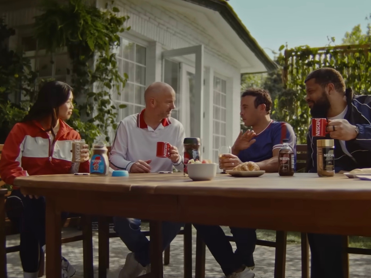
The world’s most-watched sporting event is about to kick off in less than a month. This means that World Cup watch parties are probably being set up in various households for football fans who won’t actually be able to make it to the stadiums in the U.S., Canada, or Mexico. While beer is probably the drink of choice for most of these events, NESCAFÉ wants to begin a new tradition for those who want to have a livelier, but probably safer, discussion amongst family and friends.
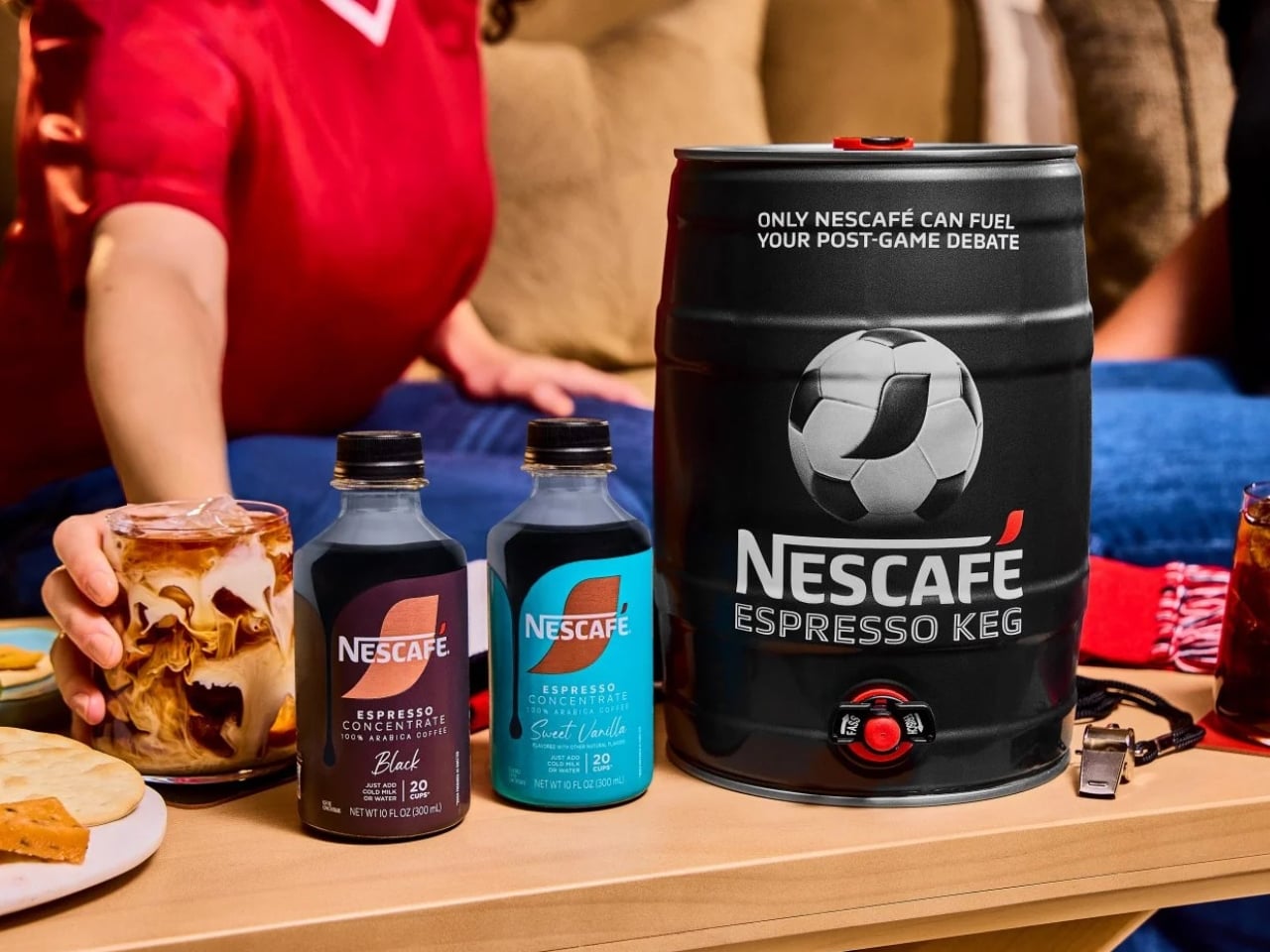
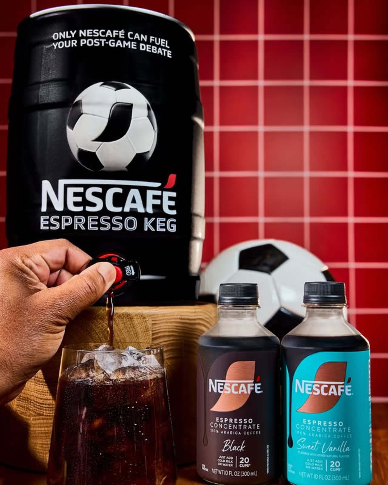
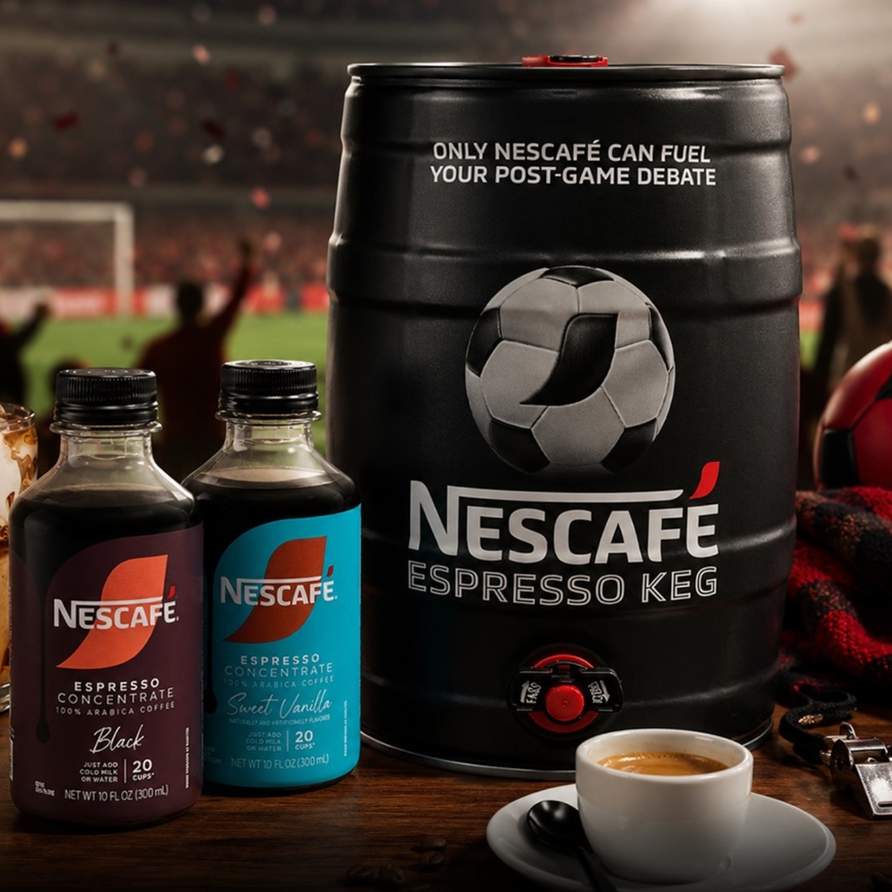
The coffee brand is introducing the NESCAFÉ Espresso Keg, a limited-edition World Cup special designed to help you get into the “Third Half.” This is a ritual they want to start, and caffeine may be the perfect companion as you get talking about the 90-minute-and-change match you just finished watching. They believe that “the conversation doesn’t end after the game,” and it should be helped along over a cup of coffee.
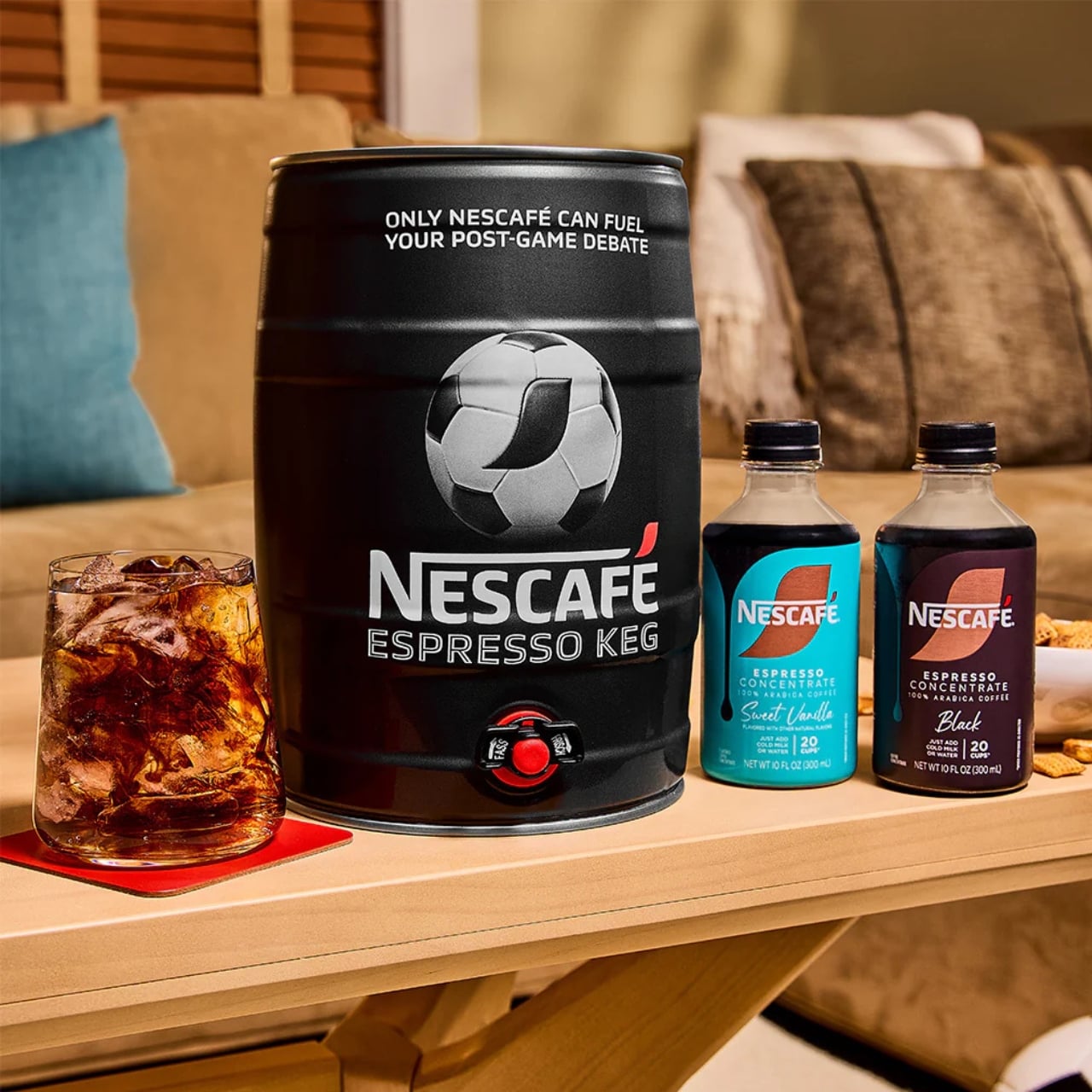
The keg actually looks like your usual beer keg, but instead of dispensing beer, you’ll have coffee pouring out of it as you discuss every goal, call (or non-call), and every exciting and controversial thing that happened during the match. Each package comes with a 5L keg and two 10oz bottles of NESCAFÉ Espresso Concentrate in Black and Sweet Vanilla flavors. In case you don’t know how to mix it up, it also comes with instructions and recipes so you can “brew” the perfect cup for your Third Half. You’ll be able to serve around 20 cups with the package, so you may need to stock up on more concentrate if you have a larger crowd attending your watch party.
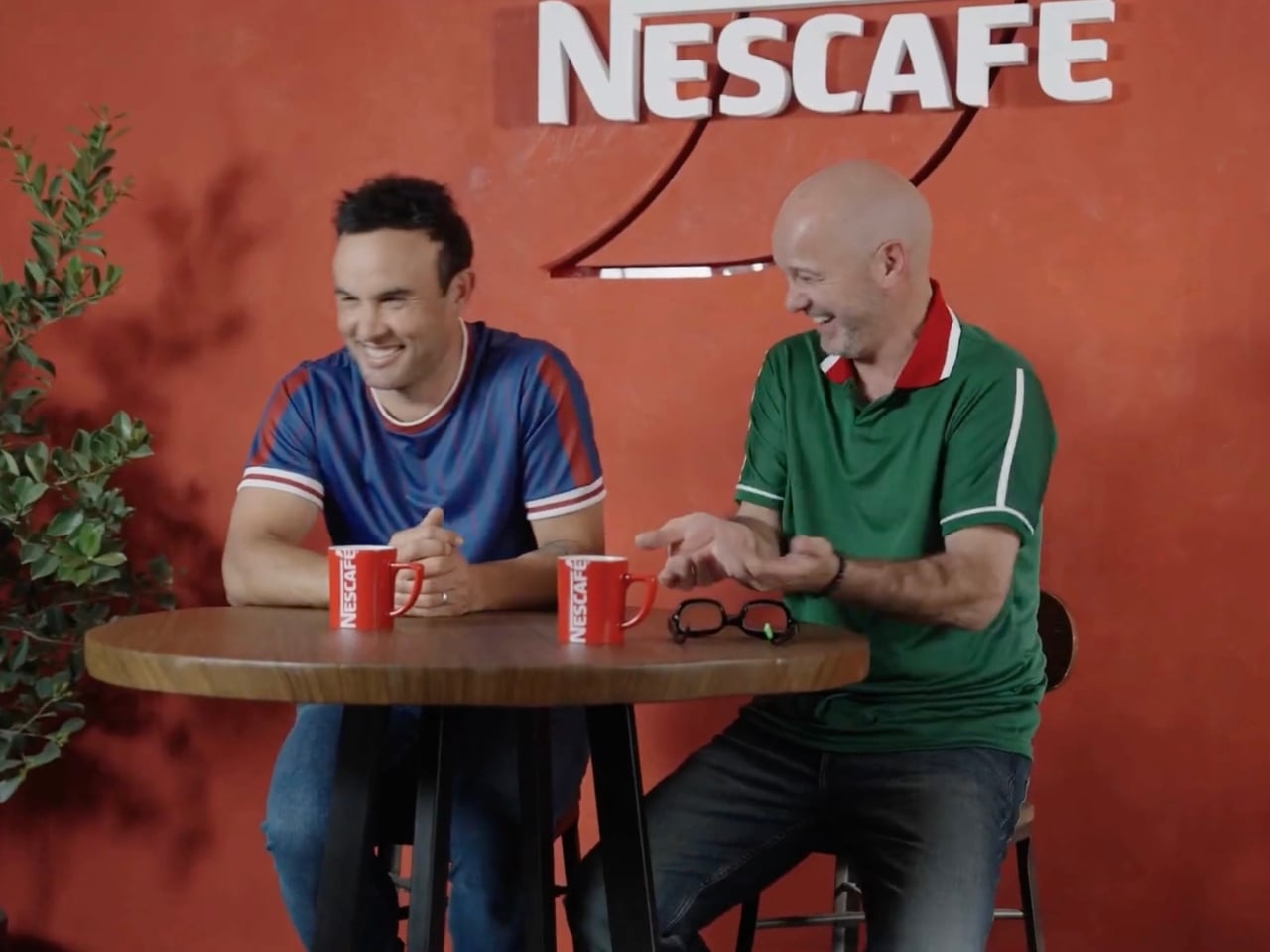
There is a special bi-cultural campaign to promote this limited-edition keg. We’re not sure why Canada was left out of the equation, but U.S. soccer legend Landon Donovan and Mexican fútbol icon Luis García are the faces of the campaign, representing their two countries. It’s priced at $10 as a tribute to Donovan’s jersey number, the iconic number 10 he wore while bringing glory to the U.S. Men’s National Team. To make it even more of a must-have item, there will be three separate drops, and the last one is this coming June 10, just a few days before the start of the World Cup.
And it turns out the concept isn’t just a clever marketing angle, as the numbers actually back it up. According to NESCAFÉ, 73% of soccer fans already drink coffee during game time, making it a surprisingly natural fit at any watch party table. Rob Marsh, NESCAFÉ’s Marketing Director, summed it up well: “We’ve coined a new half, ‘The Third Half,’ to represent the moments after and in-between games when passionate debates peak. Like any good conversation, these often take place over a beverage, making our coffee and the Nescafé Espresso Keg the perfect fuel to keep things flowing.”
It’s a fun and genuinely refreshing idea, especially for watch parties where not everyone is reaching for a beer, particularly during those early-morning kick-offs that come with a global tournament spanning multiple time zones. The Espresso Keg gives you that same communal, tap-style energy of a classic keg party, just with a serious caffeine boost instead of a headache waiting to happen. Whether you’re a black coffee purist or someone who loves a touch of Sweet Vanilla in their cup, there’s a flavor to match every personality and every strongly-held opinion about the offside rule.
The limited-edition nature of this release makes it all the more exciting. With earlier drops reportedly selling out quickly, demand has clearly been there. If you missed the first rounds, don’t sleep on that final June 10 drop. It’s the kind of collectible that doubles as a genuinely useful party accessory, a rare combination at any price point, let alone $10.
If you’re serious about hosting the ultimate World Cup watch party this summer, the NESCAFÉ Espresso Keg might just be the most unexpected and delightful centerpiece you didn’t know you needed. So mark the date, set up those fold-out chairs, hang your team’s flag, and get ready to debate every single moment of the beautiful game, one perfectly poured cup at a time.
Home fitness equipment has quietly moved into the living room, but most of it hasn’t earned its place there. Dumbbells in particular are purely functional objects, usually made with rubber-coated iron and sold on practical merits alone. They get used, then tucked away or left on the floor because nobody really wants them on display. For most people, what’s out of sight tends to be out of mind.
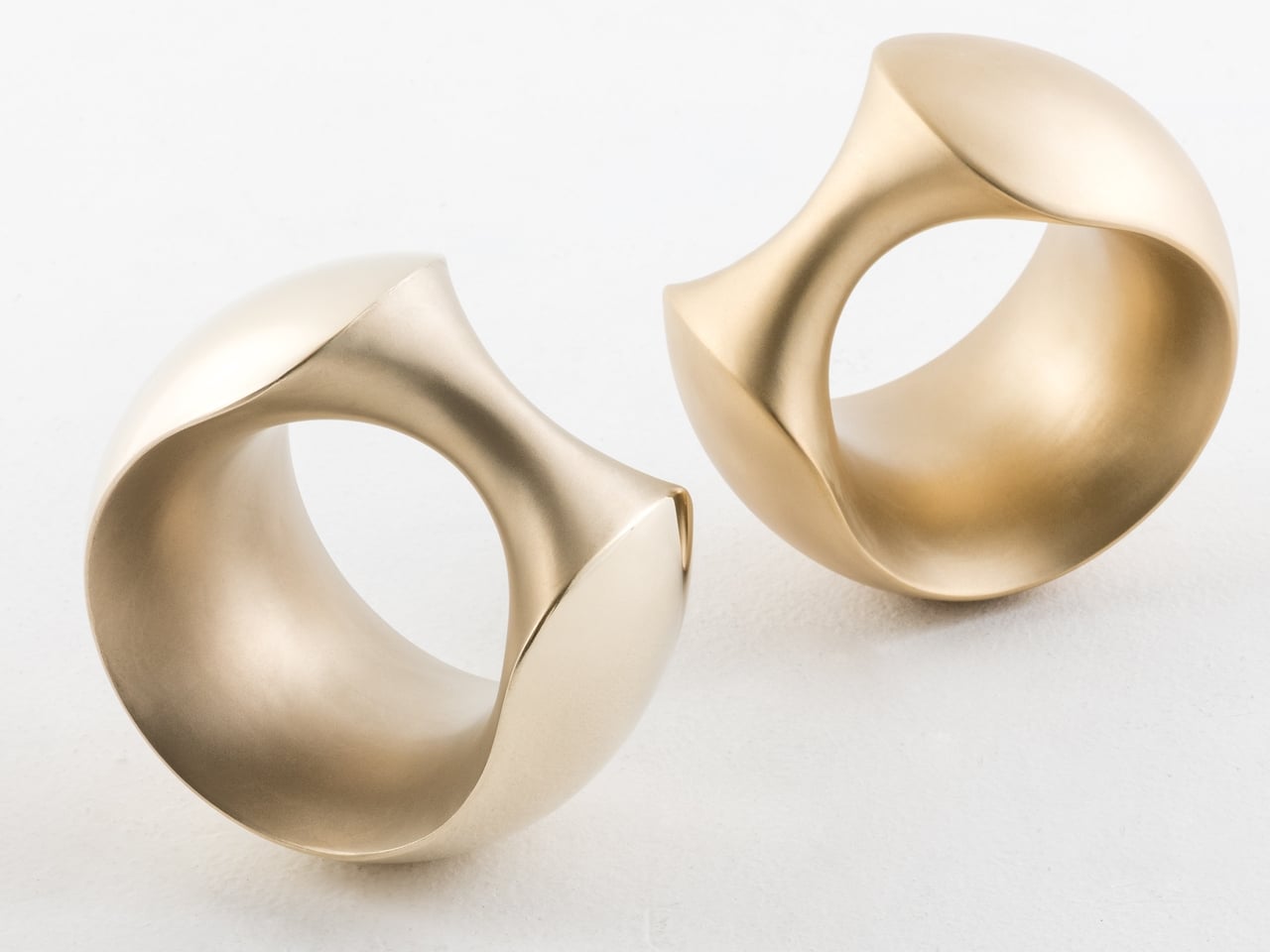
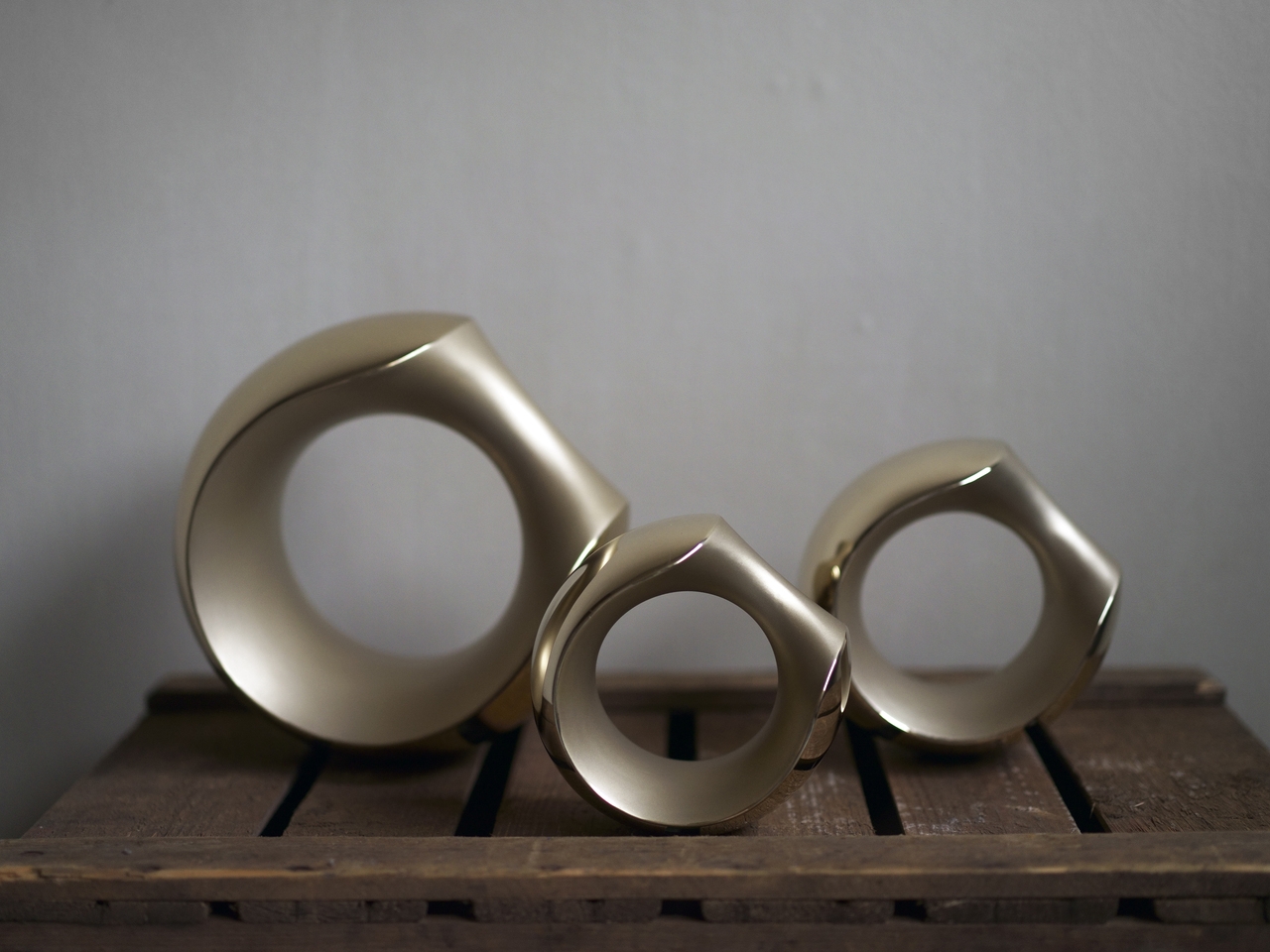
Tokyo-based designer Kenji Abe knows this from personal experience. He would put his own dumbbells in a drawer when friends came over, and then forget about them entirely. That specific frustration became the brief for MANTLE, a pair of bronze dumbbells produced under the ifuki brand in Takaoka City, Japan. The goal was a dumbbell you’d actually want to leave out, all day, even on a good shelf.
That required rethinking the object from the start. MANTLE combines several surface treatments on a single cast form, with sandblasted sections contrasting against mirror-polished areas. The result carries the visual weight of a sculpture or a piece of jewelry rather than exercise equipment. Set on a side table, it reads as an intentional object, not something that ended up there because there was nowhere else to put it.
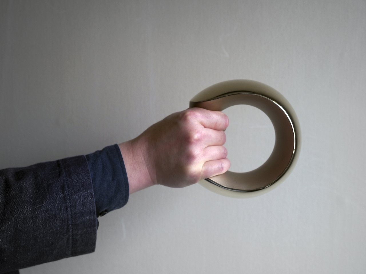
The form is just as deliberate. Inspired loosely by the armadillo, the sculptural shape is perfectly balanced, which means the dumbbell stands upright on its own without tipping. A grip tilted at 45 degrees makes it easy to pick up from any angle, and the smooth bronze surface was selected specifically to feel comfortable against skin rather than abrasive during a workout.
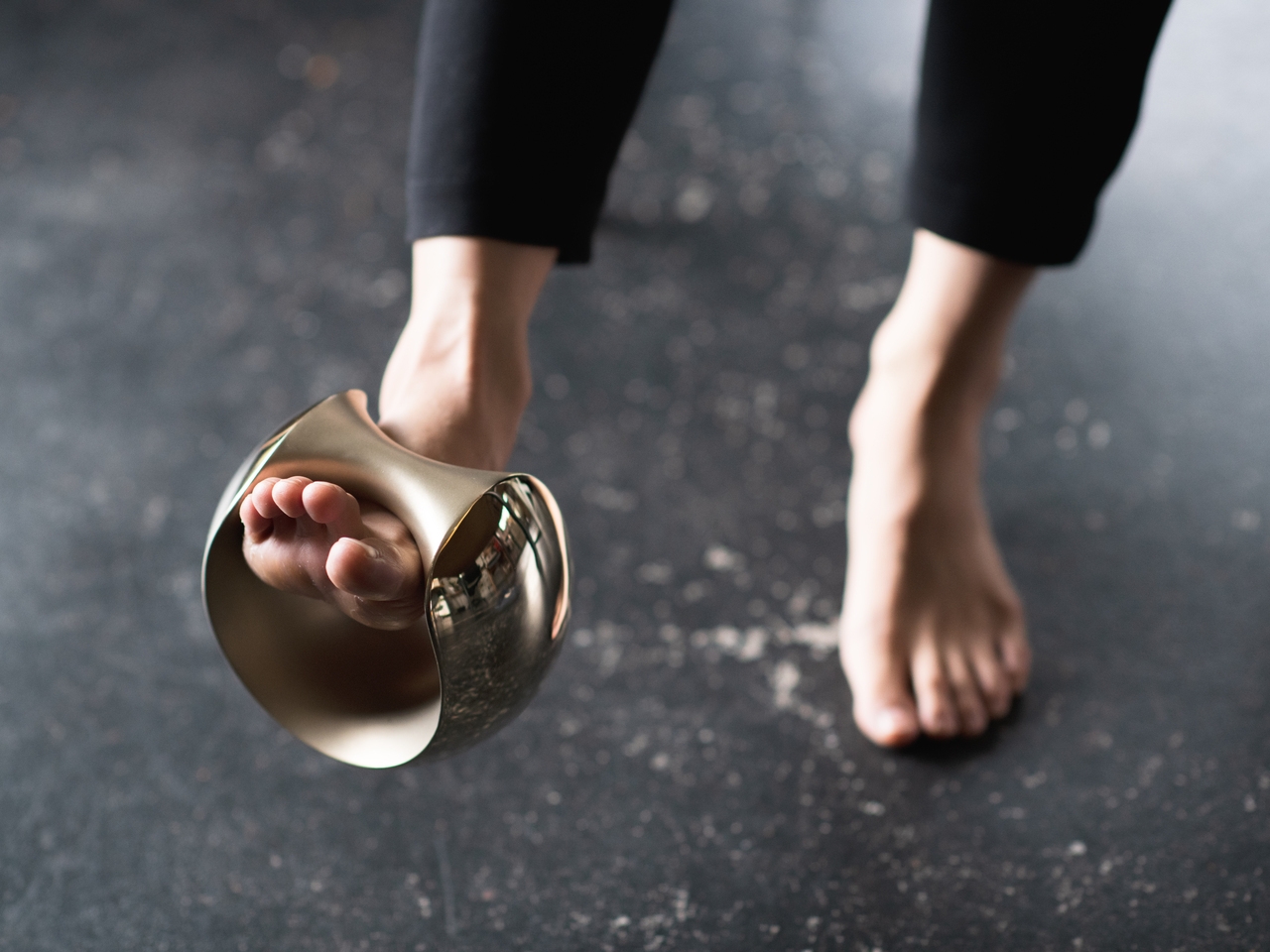
The versatility goes further than the grip. You can hold it conventionally for curls or presses, slide it over a wrist to add resistance to arm movements, or hook it around a foot for leg raises. The same object adapts across different exercises without needing adjustments, and the balanced form means it doesn’t fight you regardless of how you’re holding it or what you’re doing.
MANTLE also ages gracefully. Bronze develops character over time, and the combination of matte sandblasting and mirror polishing makes that aging process something worth watching. The material catches light differently across its surfaces, and the contrast in textures gives it a depth that most gym equipment doesn’t have the ambition to pursue.
MANTLE won the Grand Prize at the Toyama Design Competition in 2018 before being developed into a commercial product through ifuki. Abe’s reasoning has always been straightforward: a well-designed dumbbell doesn’t get hidden away, and one that doesn’t get hidden away is one that actually gets used. The drawer stays empty, and the habit becomes a little harder to abandon.
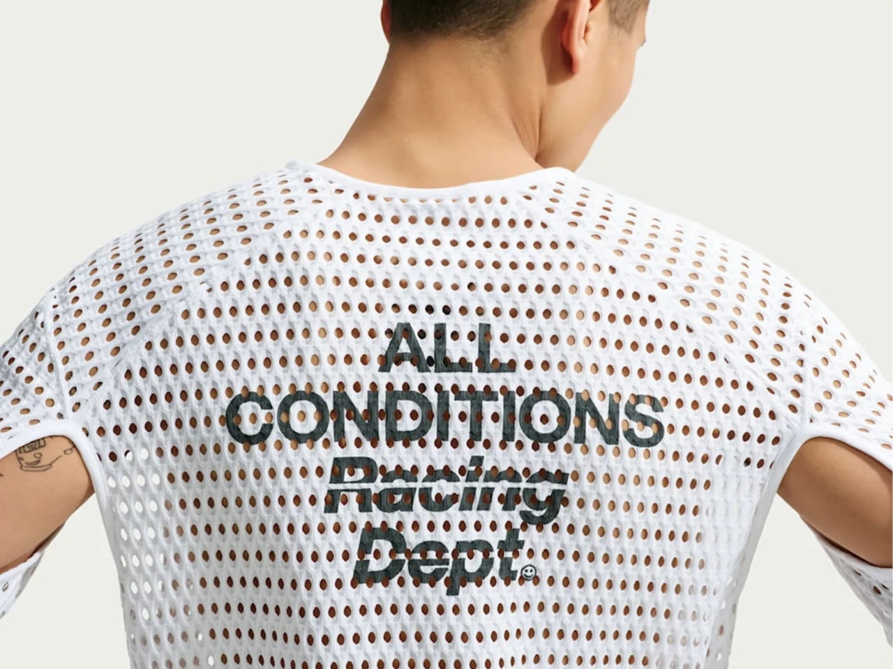
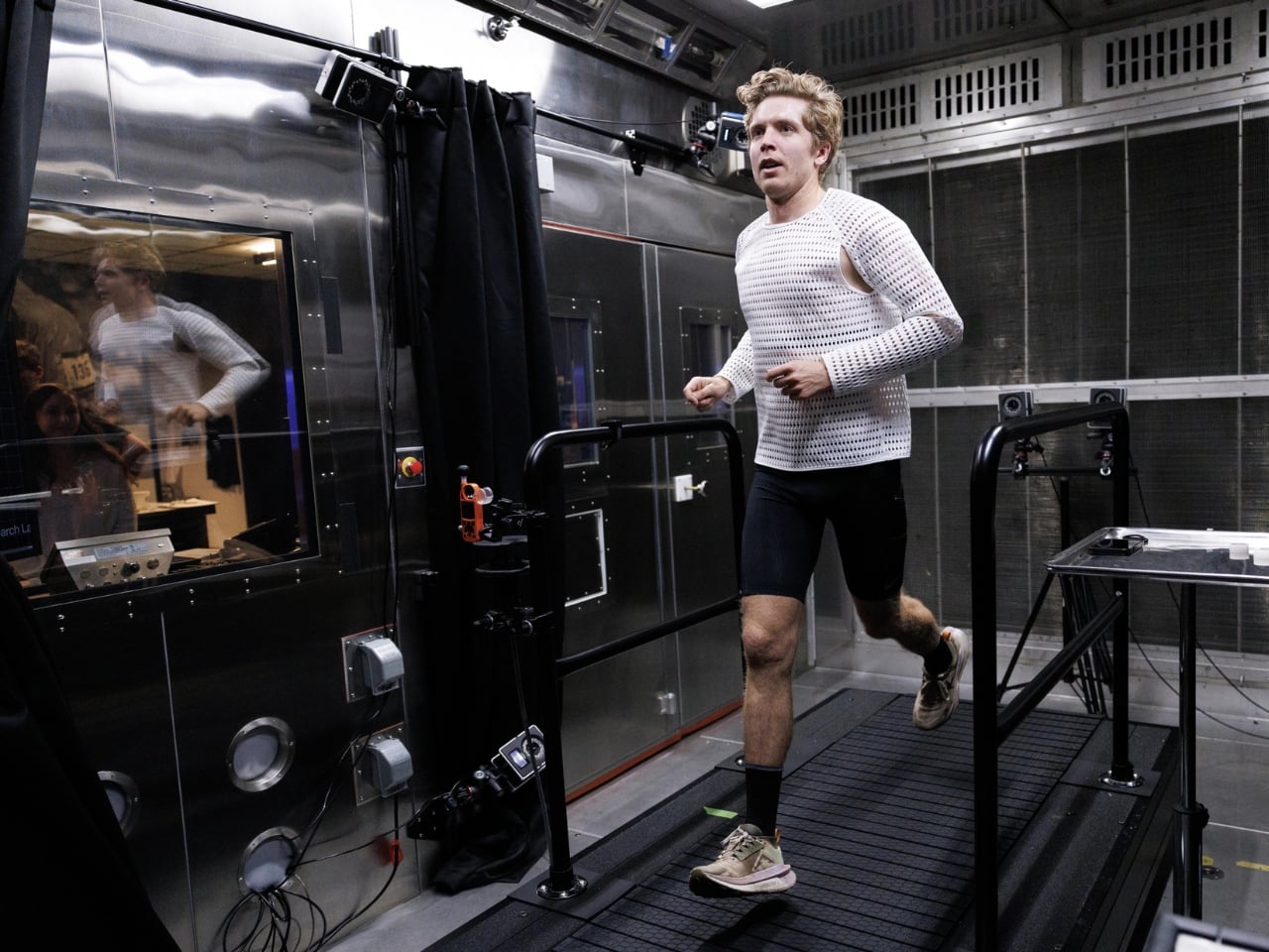
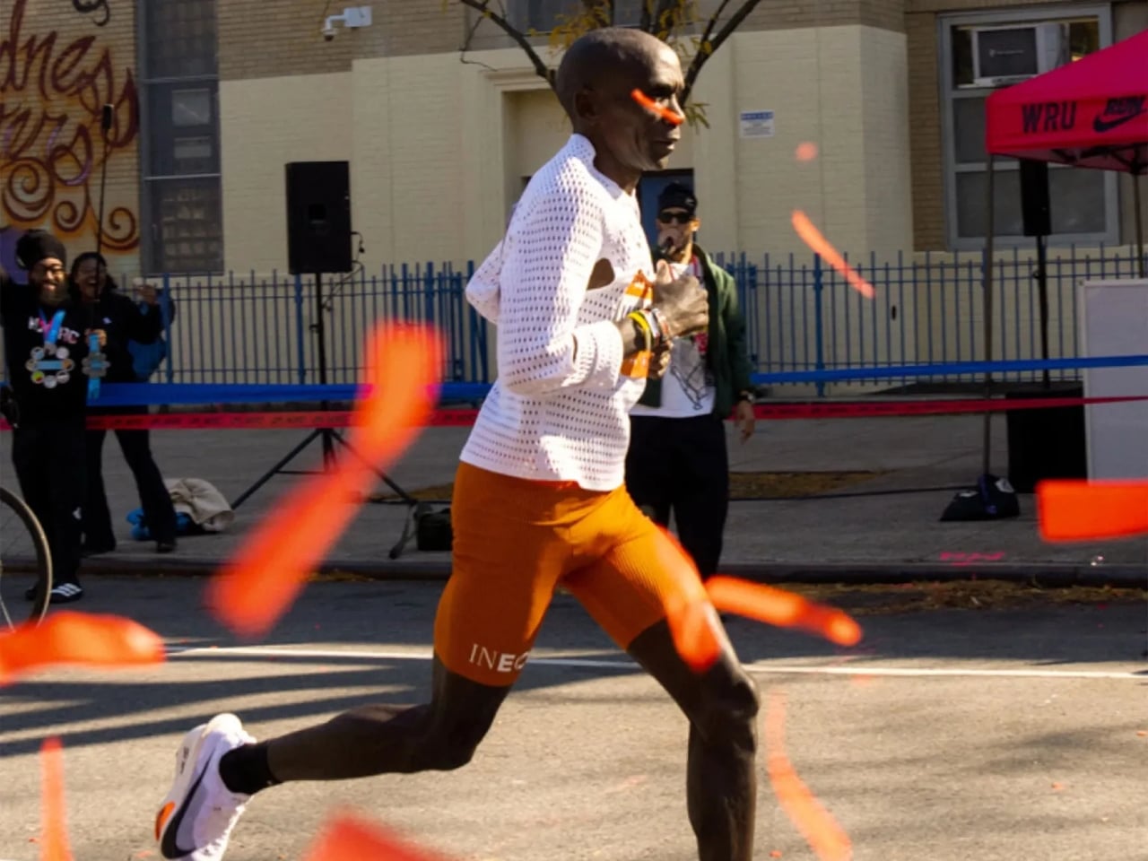
There are moments in design when a product looks so strange that you can’t stop staring at it, and then you find out how it works and it suddenly makes perfect sense. That’s exactly what happened when trail runner Caleb Olson crossed the finish line at the 2025 Western States Endurance Run in the second fastest time in the race’s history. People clapped. Then they immediately started asking: what is he wearing?
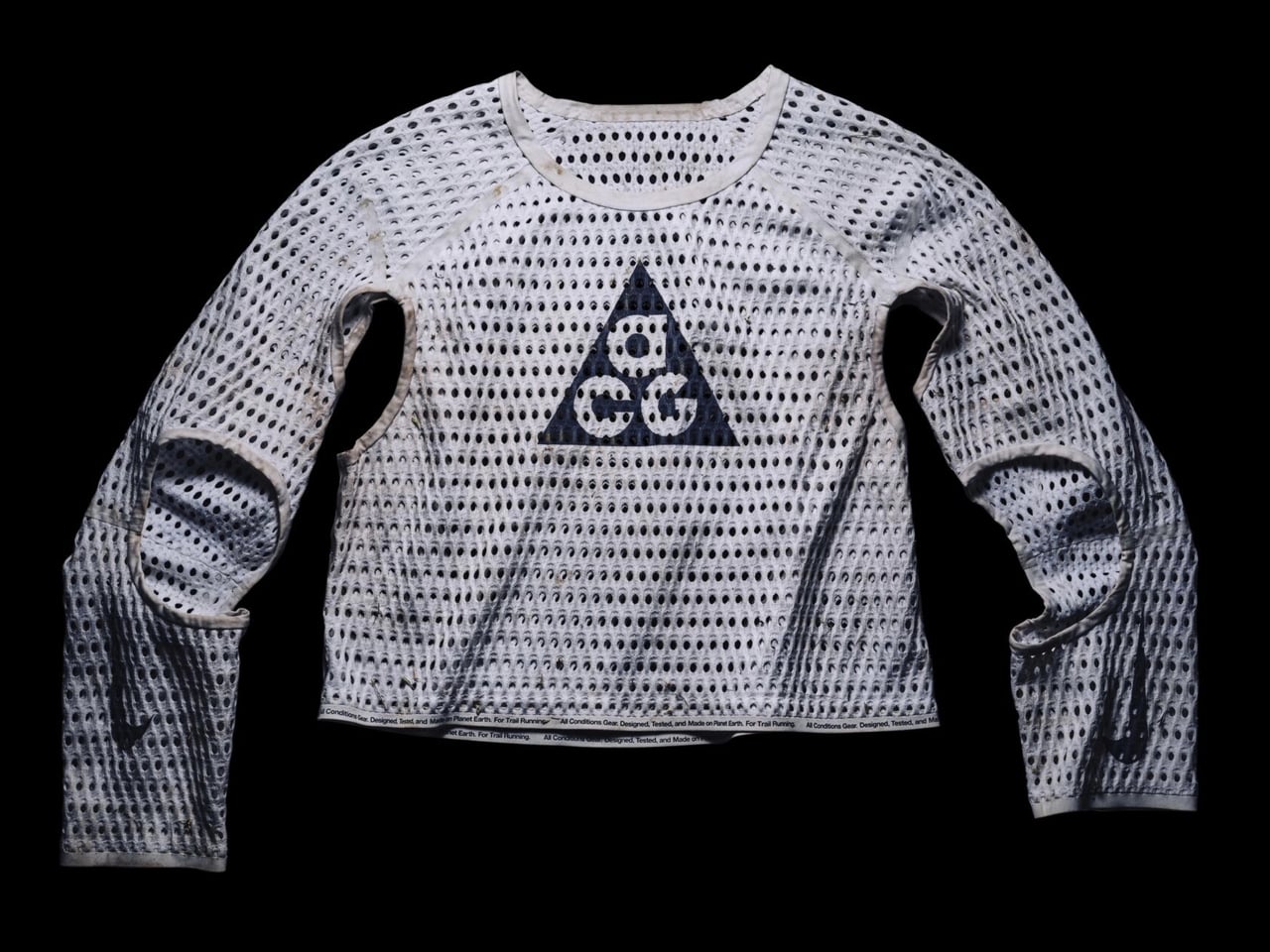
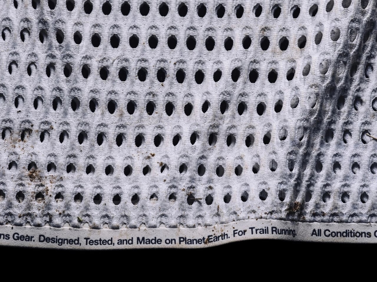
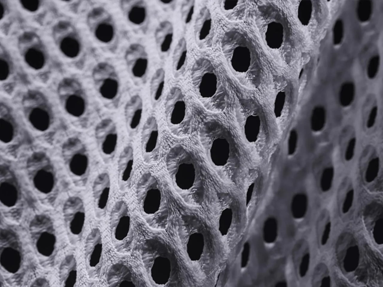
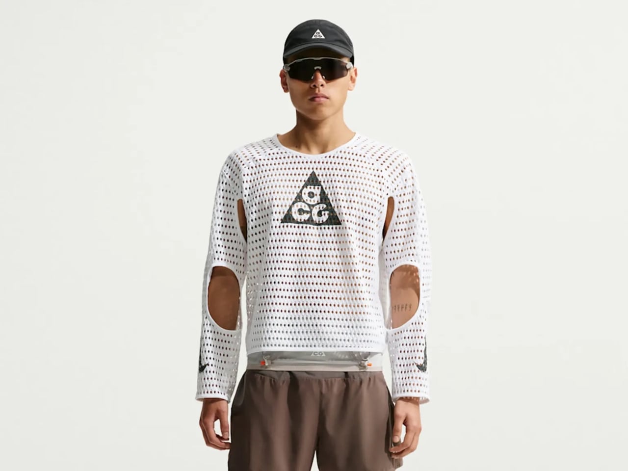
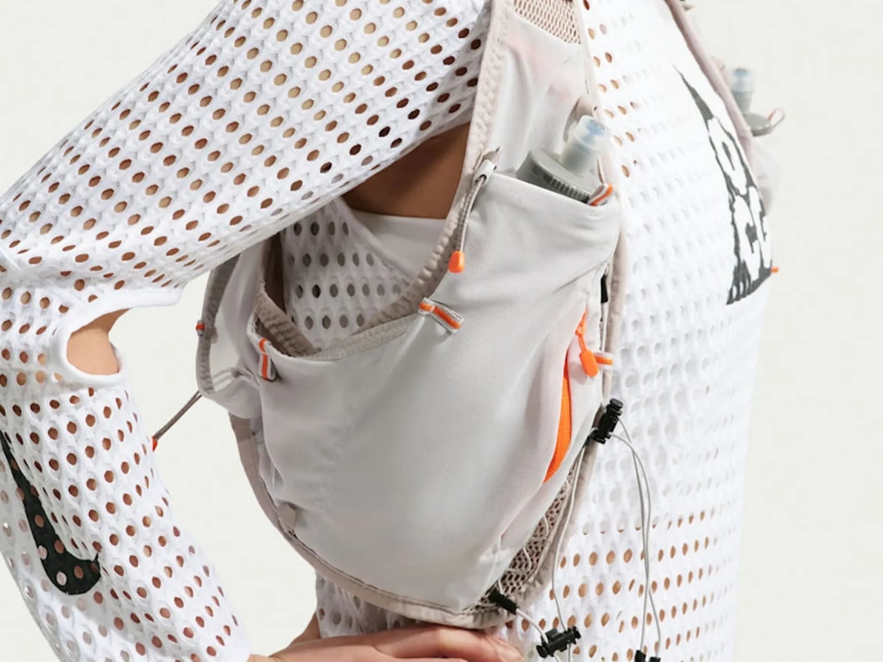
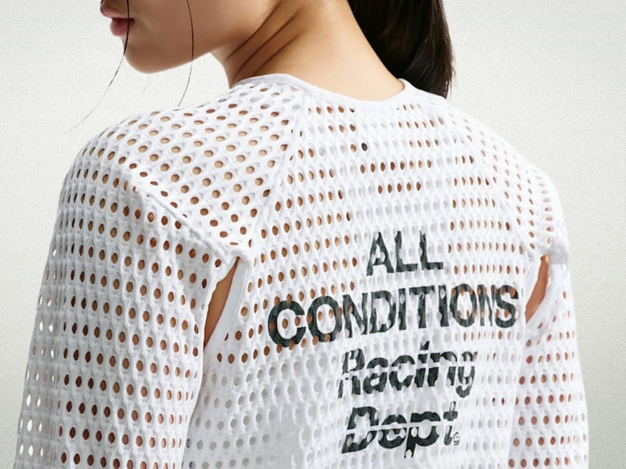
The shirt is the Nike ACG Radical AirFlow, and calling it a “shirt” feels generous. It looks more like a sweater that had an encounter with a drill press. Cone-shaped holes punctuate the fabric in deliberate patterns, creating what Nike calls airducts. They’re not just decorative (though they definitely are that, too). They’re functional in a very specific, physics-driven way. The design harnesses the Bernoulli principle and the Venturi effect, two concepts most of us haven’t thought about since a physics class we may or may not have paid attention to. The short version: as air moves through a narrowed opening, it speeds up and pressure drops. Nike essentially engineered that phenomenon into a fabric layer sitting on your body while you run.
Designer: Nike
The result, according to Nike’s own testing, is a top that absorbs and retains 50% less sweat than DriFit, the brand’s long-trusted performance fabric. It’s also 25% less resistant to the evaporation of sweat. For those of us not running ultramarathons in the California mountains, those numbers might sound abstract, but the principle holds whether you’re hiking a trail in August or doing anything remotely active in heat. The body cools itself through sweat, and anything that helps that process happen faster is worth paying attention to.
What makes this interesting beyond the performance specs is how it got here. The Radical AirFlow came out of Nike’s All Conditions Gear line, a sub-brand with a very specific purpose: designing for the outdoors, not the gym. ACG lives by the motto “Designed, Tested, and Made on Planet Earth,” which sounds like a marketing line until you realize the top was debuted mid-race at one of trail running’s most grueling events. The testing wasn’t a controlled brand activation. It was a competitive ultra-marathon.
The design itself doesn’t pretend to be subtle. It’s a cropped silhouette, worn long-sleeved, with large cutouts under the arms and at the elbows for mobility. The airducts are visible and intentional. It reads more like a prototype from a materials science lab than a rack piece at your local athletic retailer. And I think that’s the point. Nike ACG has always occupied that niche space between gear and fashion, performance and provocation. The Radical AirFlow leans all the way into that tension.
It also went viral in a way that athletic apparel rarely does, because the response was split. Some people immediately understood it. Others were convinced it was a joke. Trail runner Drew Holmen, an ACG athlete who tested the garment, said it plainly: “When I first saw the product, it was like nothing I had ever seen before.” That reaction, repeated by thousands of people online, is actually a good sign in design. If no one’s confused, nothing is new.
The broader conversation Radical AirFlow opens up is one about where performance apparel is headed. For a long time, innovation in this space meant better synthetic blends, tighter weaves, smarter seam placement. The Radical AirFlow goes in the opposite direction. It removes material entirely, then structures the absence of it. The holes aren’t a compromise or a cost-cutting measure. They’re the technology.
Whether you’d actually wear it outside of a race context is a fair question, and a cap version built on the same technology is already on the way, which might make the concept more accessible. But the full racing top is a genuine design statement, one that prioritizes function in a way that can’t be hidden. You can see it working. That kind of transparency, in design, is rarer than it should be.
Most fitness trackers have followed the same design logic for years: a screen on the wrist that flashes step counts, shows incoming messages, and turns the whole device into a smaller, sweatproof version of your phone. That approach has its fans, but it also has a ceiling. Screens add bulk, drain batteries, and tempt you to keep checking things you probably didn’t need to check while trying to fall asleep.
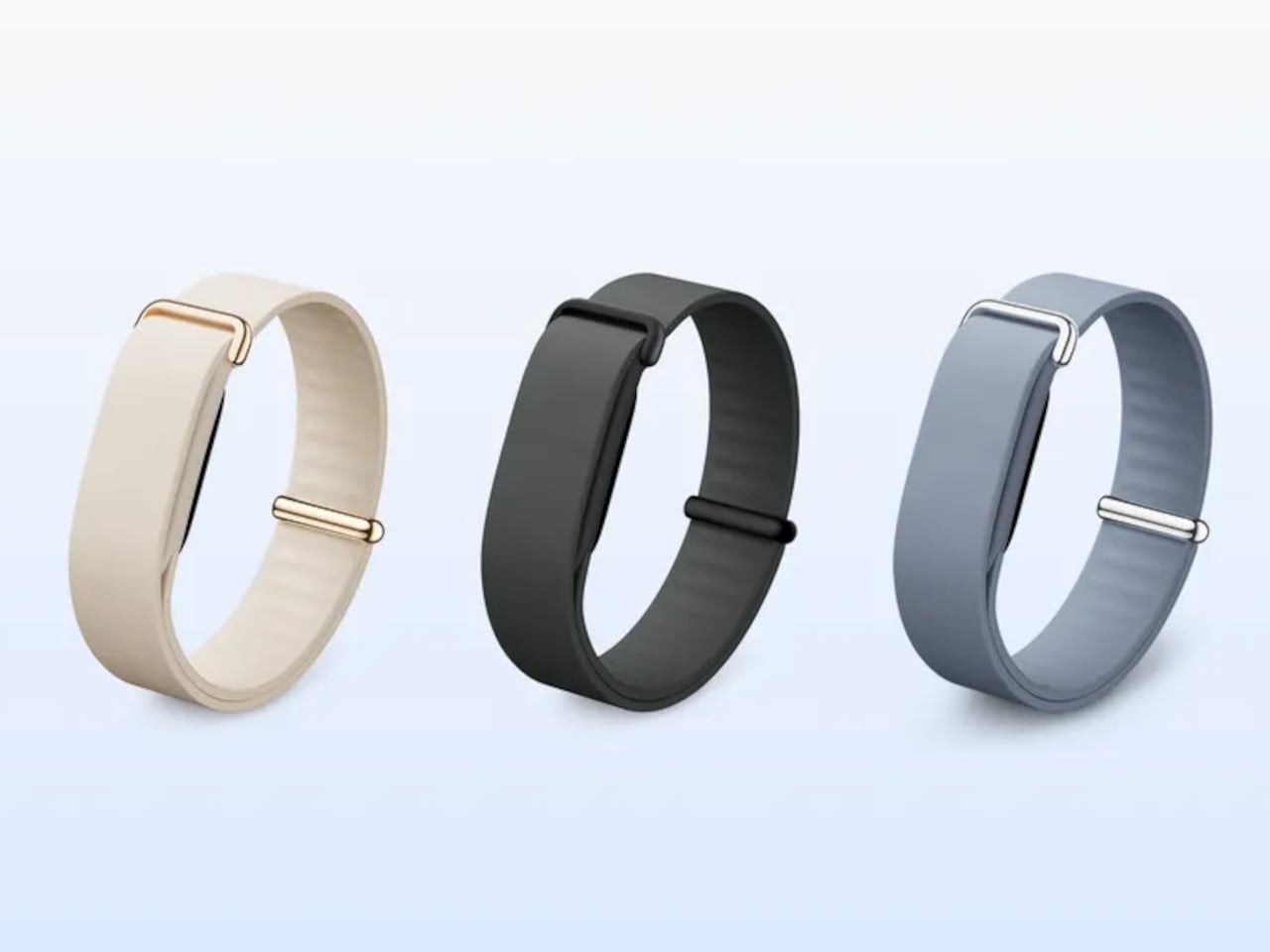
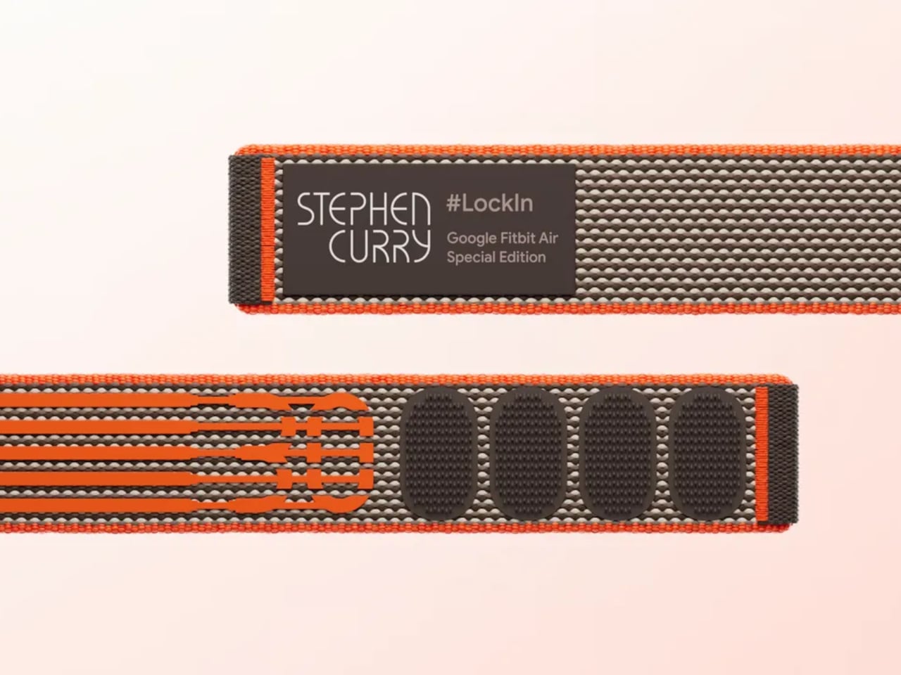
Fitbit Air is Google’s answer to what a fitness tracker looks like when the screen comes off entirely. It’s the smallest Fitbit ever made, weighing roughly five grams on its own and about 12g with a band, and it has nothing on its face except a slim oval housing made from recycled polycarbonate. No display, no haptic button, no notification feed; just sensors doing their job quietly and continuously.
That doesn’t mean there’s less happening inside. The Air carries an optical heart rate monitor, a three-axis accelerometer and gyroscope, red and infrared sensors for blood oxygen monitoring, and a device temperature sensor. Together, these maintain a continuous record of heart rate, heart rate variability, resting heart rate, oxygen saturation, and sleep stages, while also flagging irregular heart rhythms along the way without any input from the wearer.
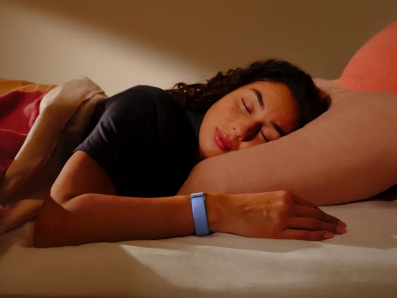
Wear it to bed, and it tracks sleep stages through the night without lighting up or buzzing. Take it through a workout, and it recognizes the activity automatically. The battery lasts up to seven days under normal use, and a five-minute top-up adds another full day when the charge runs low. Water resistance reaches 50 meters, so showers, swimming, and sweaty training sessions don’t require a second thought.
The data flows into the Google Health app, which is where the Air actually earns its keep. Built on Gemini, Google Health Coach reads everything the tracker has collected and turns it into something genuinely useful: personalized recommendations, recovery guidance, trend analysis, and answers to specific questions about why you might be feeling tired after travel or how to adjust training around an injury, all based on your actual biometrics.
The app works the same way with Pixel Watch, meaning the Air can slot into an existing Google wearables setup or work entirely on its own. Wearing both simultaneously is supported, health data syncs automatically, and the app lets you sort metrics by device. For someone who already carries a Pixel Watch but wants continuous overnight tracking without the bulk of a full smartwatch, the Air fills that gap neatly.
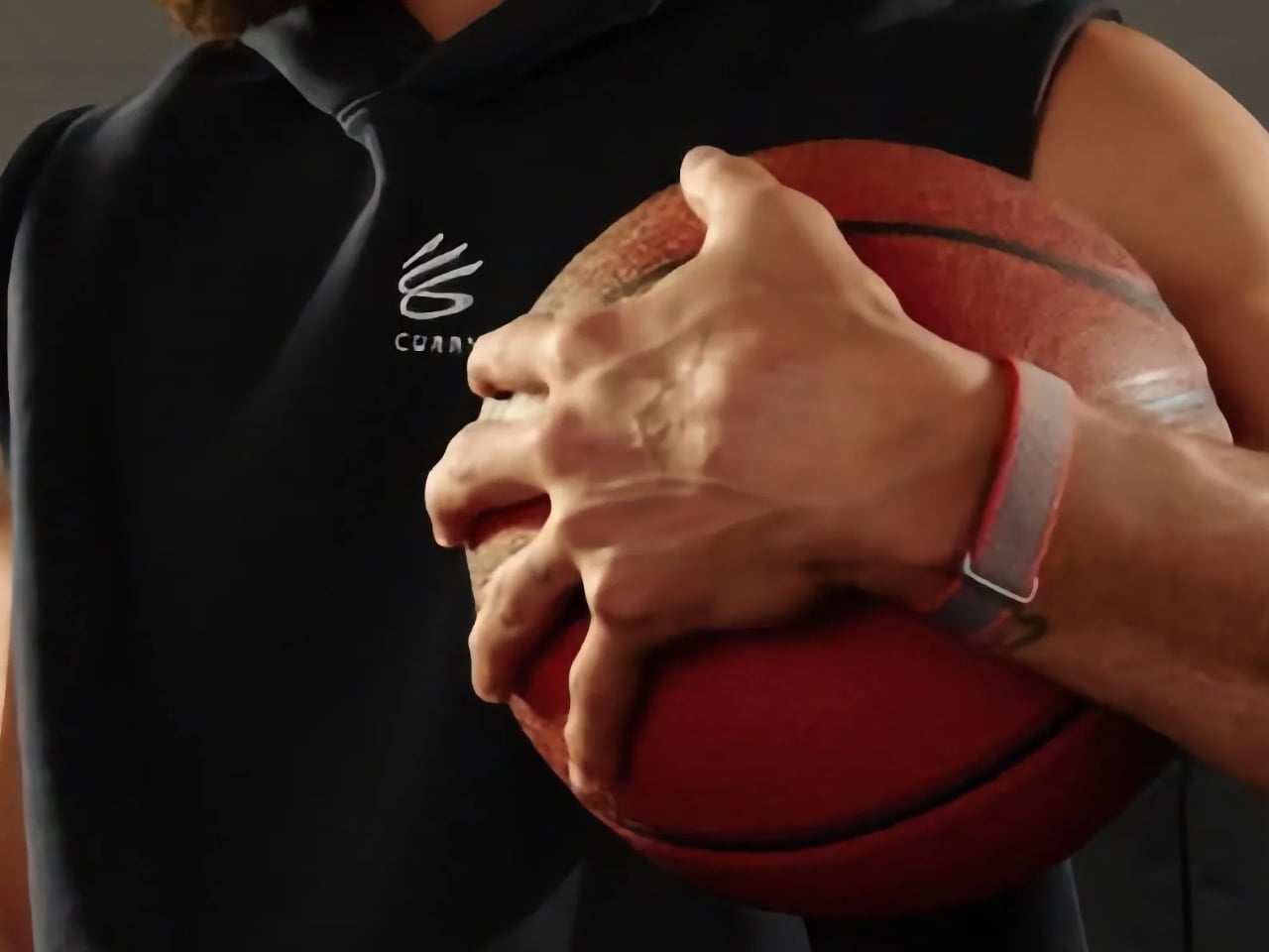
Fitbit Air is available for preorder at $99.99, with first shipments scheduled for May 26. That price includes three months of Google Health Premium, which unlocks full access to Health Coach. After the trial, continuing the service runs $9.99 per month or $99.99 per year. A Stephen Curry Special Edition runs $129.99, and interchangeable accessory bands start at $34.99, compatible with Android and iOS.
Compared to other services that charge nothing upfront but require a subscription from the start, the Air’s $99.99 entry price is a more accessible way in. As a device you’re genuinely not meant to look at, its value lives almost entirely in the software behind it; the band gathers, and Google Health interprets. For a tracker specifically designed to be forgotten on the wrist, that’s a quietly compelling arrangement.
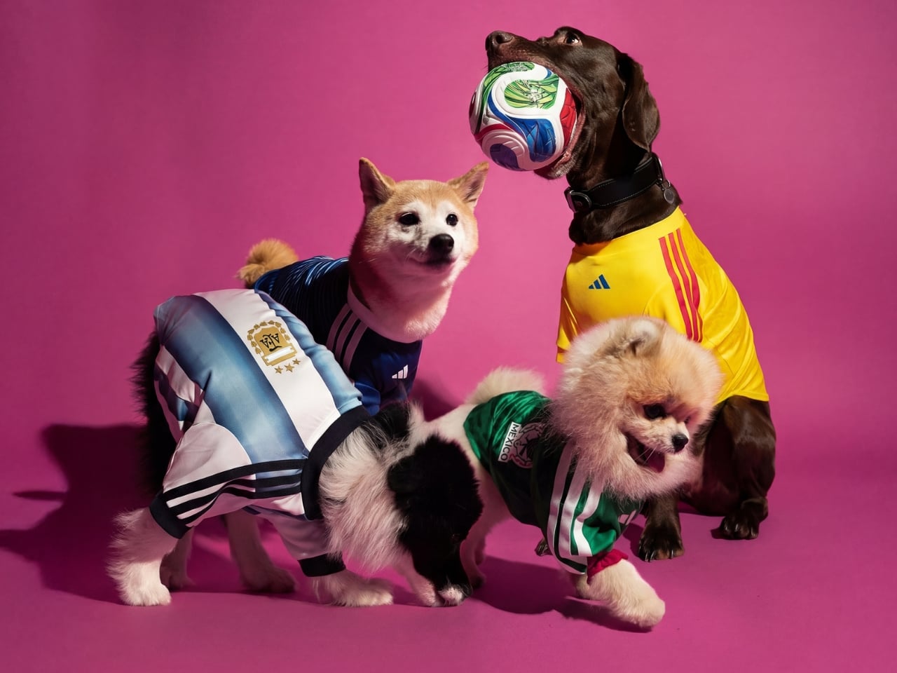
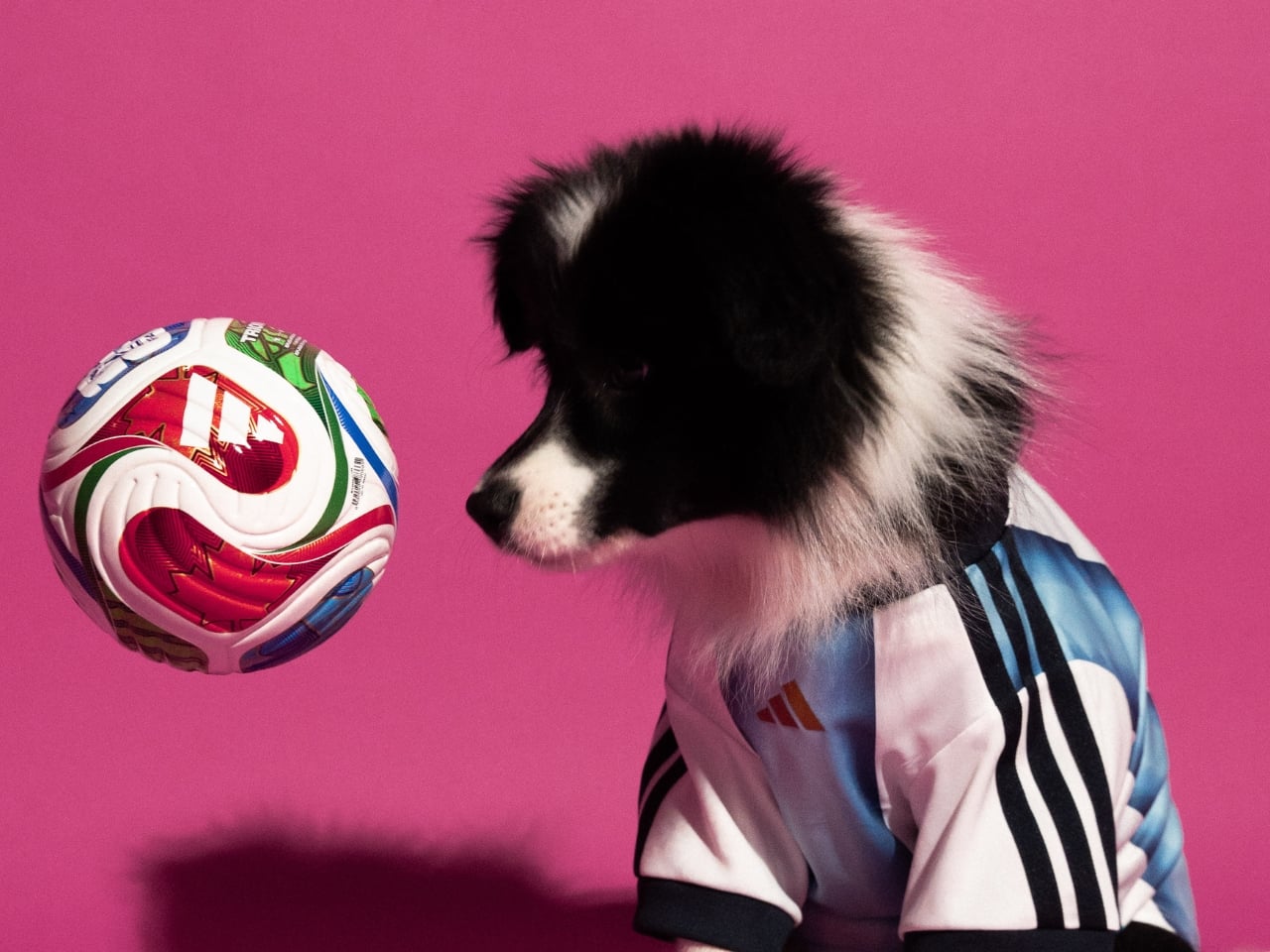
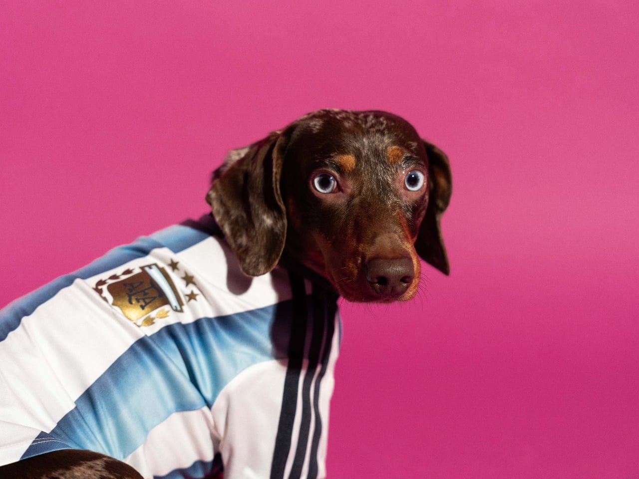
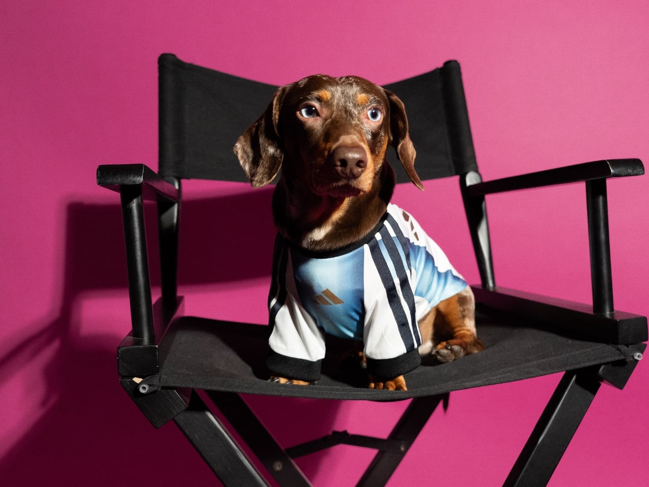
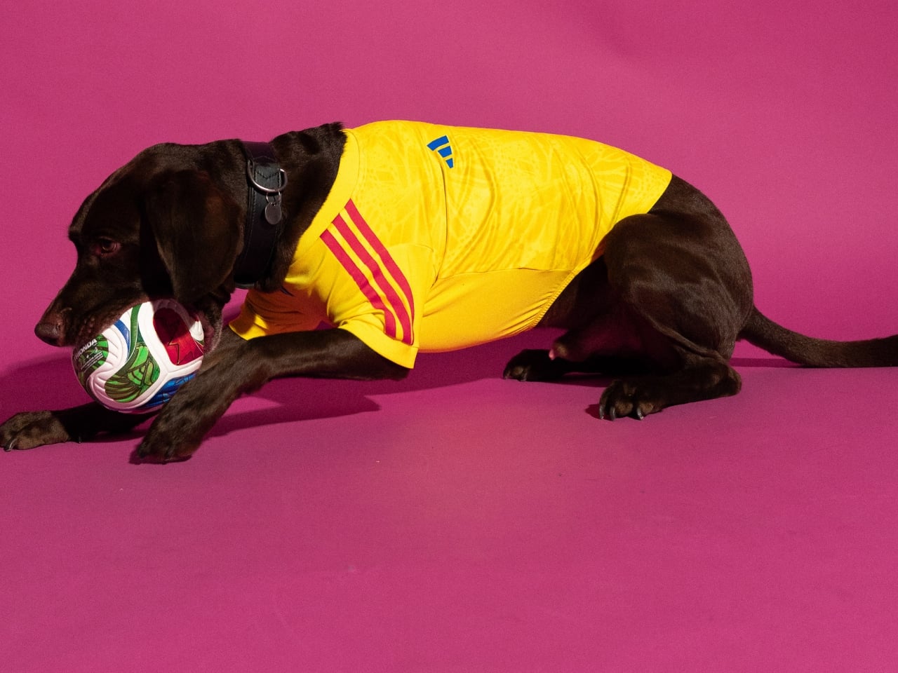
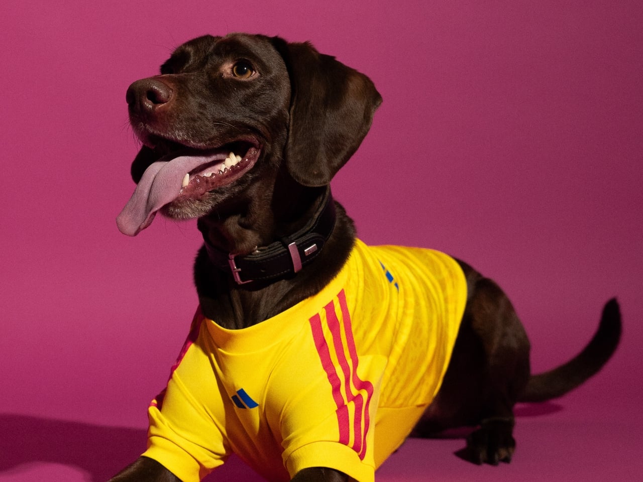
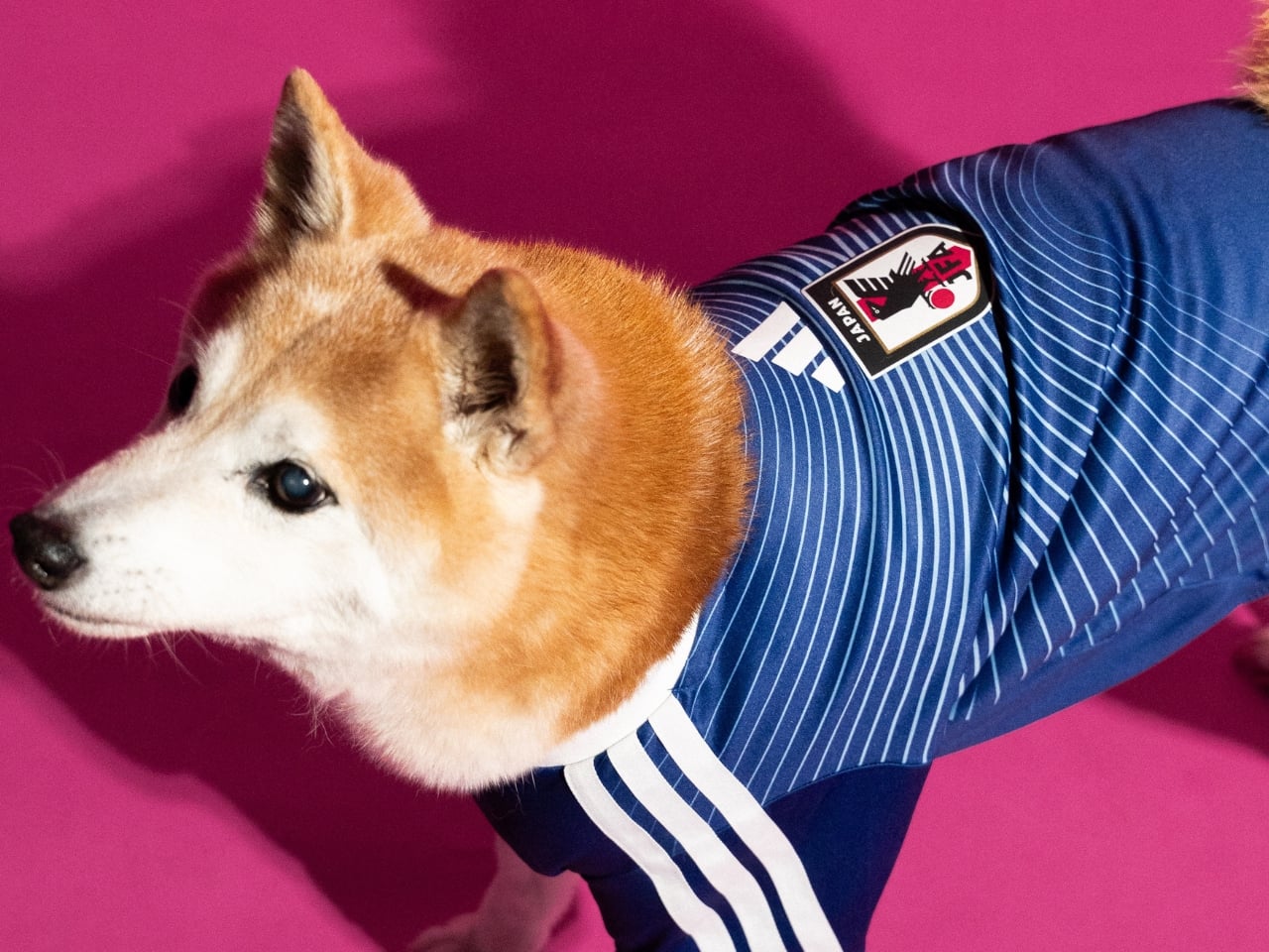
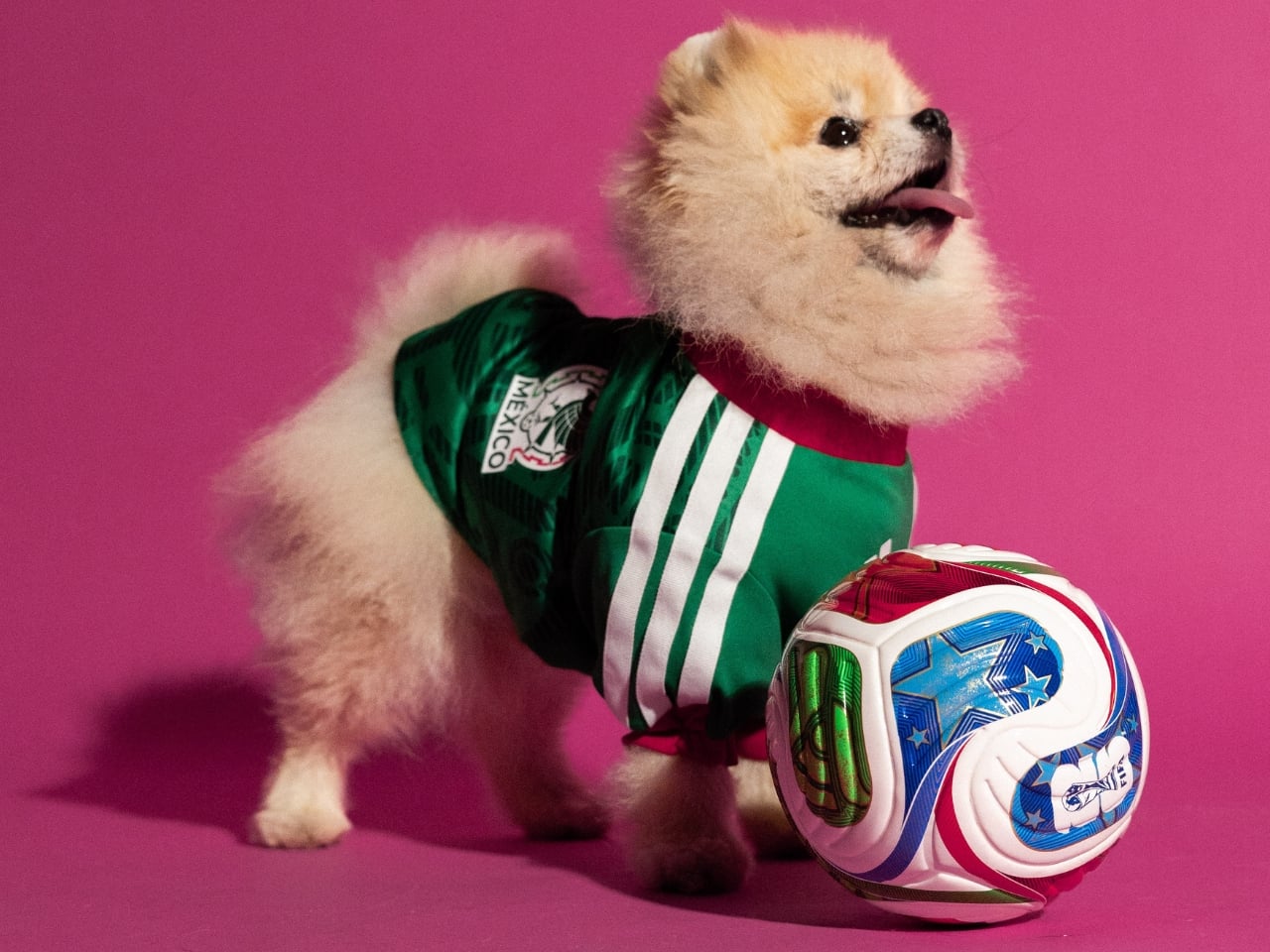
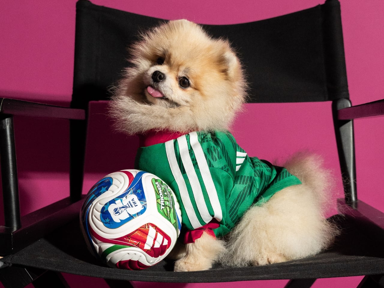
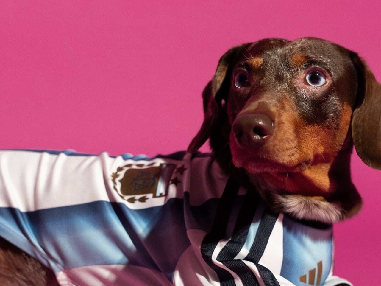
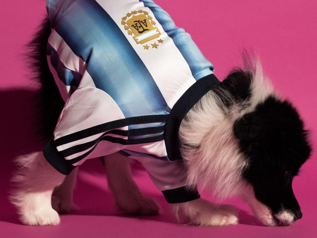
adidas dropped a pet jersey collection for the FIFA World Cup 2026 and I genuinely cannot decide if it’s brilliant or completely unhinged. Maybe both. That tension is precisely what makes it worth paying attention to.
The collection features scaled-down versions of the official home kits for four national federations: Argentina, Mexico, Colombia, and Japan. Each jersey is made with interlock fabric, finished with heat-transferred federation crests and the adidas logo, and sized to fit pets of varying builds. On paper, it reads like a novelty item, the kind of thing that gets a cute Instagram moment and then disappears. But the more I think about it, the more I suspect adidas is operating on a level most people aren’t fully registering yet.
This isn’t the brand’s first move into pet fashion. They released a pet tracksuit collection in late 2025 and followed it up with Lunar New Year designs in early 2026. The World Cup drop is the third chapter, and it’s by far the most culturally loaded. Attaching pet merchandise to the biggest sporting event on the planet isn’t a gimmick. It’s a calculated bet on where consumer culture is right now. People don’t just watch the World Cup. They host parties, coordinate outfits, wear matching kits with their kids, and increasingly treat their pets as full participants in the whole ritual. adidas saw that behavioral shift and decided to meet the moment rather than wait for someone else to.
The design fidelity is where I think they actually earned some genuine respect here. These aren’t generic jerseys with a crest slapped on. The Argentina kit carries the iconic Albiceleste stripes. The Mexico jersey features the Piedra del Sol, the same Aztec sun stone print embedded in the human version. The Colombia and Japan kits follow the same logic: faithfully reproduce the visual DNA of the official tournament kits, just at a smaller scale. That level of attention to detail signals that adidas isn’t treating the pet market as an afterthought. They’re treating it as a legitimate extension of the product line, and that’s a meaningful distinction.
Whether that’s the right move commercially is a separate conversation. The pet economy has been growing steadily for years, and premium pet accessories have become a real, serious category. But there’s also a risk of diluting what a World Cup kit means. A national team jersey carries history, identity, and a specific kind of weight. Putting it on your Corgi is either a celebration of that connection or a softening of it, depending on how you feel about football culture to begin with. I lean toward the former, mostly because fandom has always been about emotional inclusion rather than gatekeeping.
What adidas is really selling here is a shared experience. The visual of a fan and their dog in matching kits is immediately legible as a moment of joy, and that’s not nothing. The FIFA World Cup 2026 runs from June 11 to July 19 across the United States, Canada, and Mexico, which means there’s an entire summer of viewing parties and matchday gatherings where this collection becomes exactly the kind of organic conversation starter that no marketing budget can easily manufacture. You don’t need a big campaign when your product photographs that naturally.
The collection became available on May 1st across North America, Latin America, and selected markets in Asia including Japan, China, Vietnam, the Philippines, and Indonesia, through adidas stores, retail partners, and online. The timing gives fans about six weeks to get their pets game-ready before the opening match. That’s enough runway to make it feel intentional rather than rushed. Is it the most important design release of 2026? Obviously not. But it’s a genuinely smart piece of brand work that understands its cultural moment, respects its source material, and executes with more craft than the premise suggests it deserves. Sometimes that’s enough. Sometimes that’s actually the point.
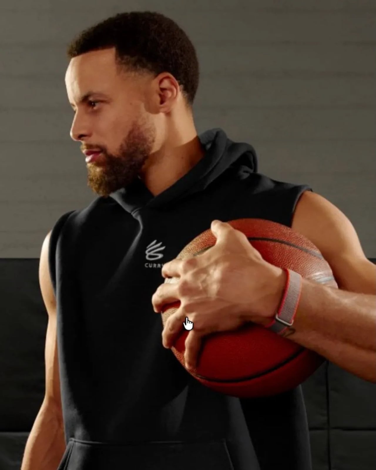
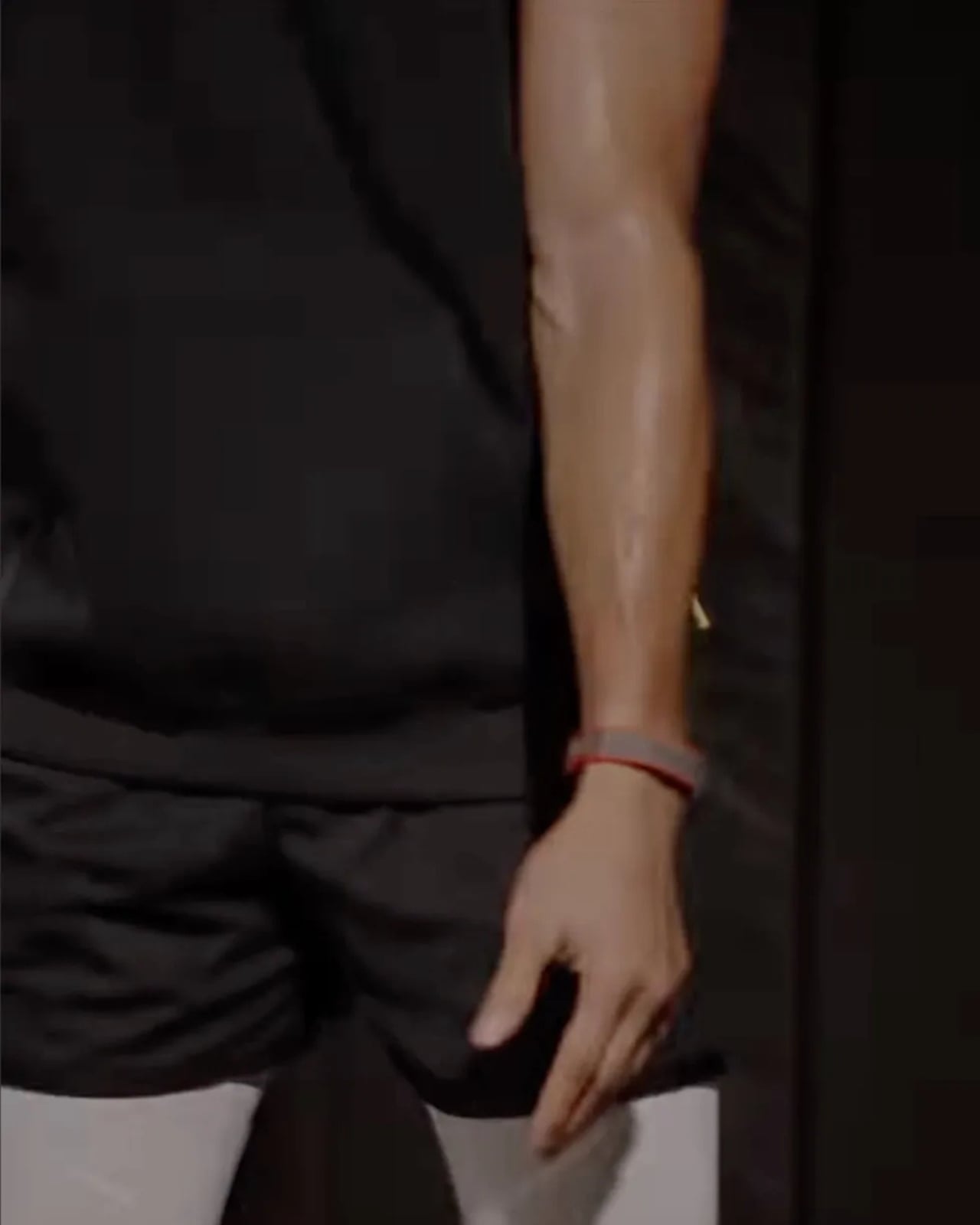
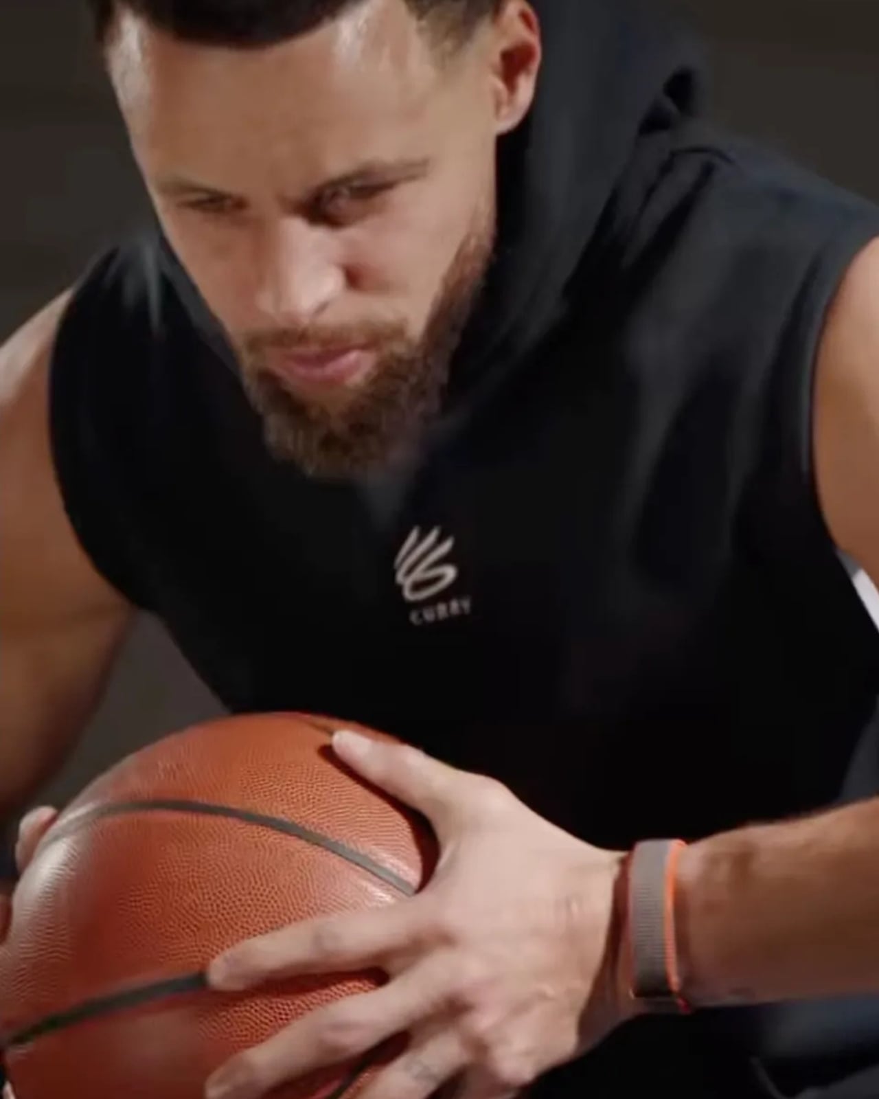
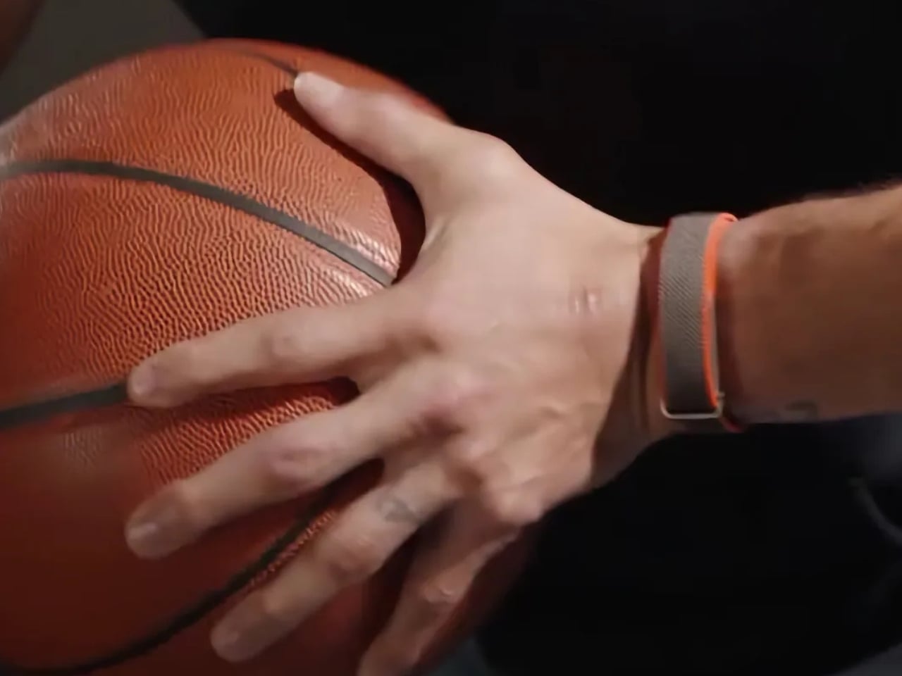
Somewhere between the chaos of leaks and an NBA star quietly going about his Instagram life, Google’s next wearable started taking shape. The Fitbit Air has reportedly been sitting on Steph Curry’s wrist since the beginning of 2026, patiently waiting to be noticed. Now that the name has leaked, so have the details, and they’re worth talking about.
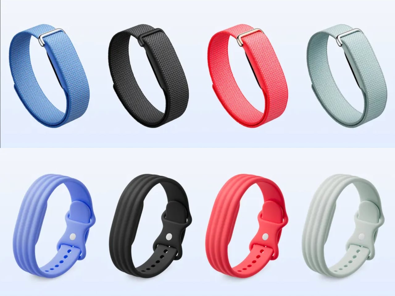
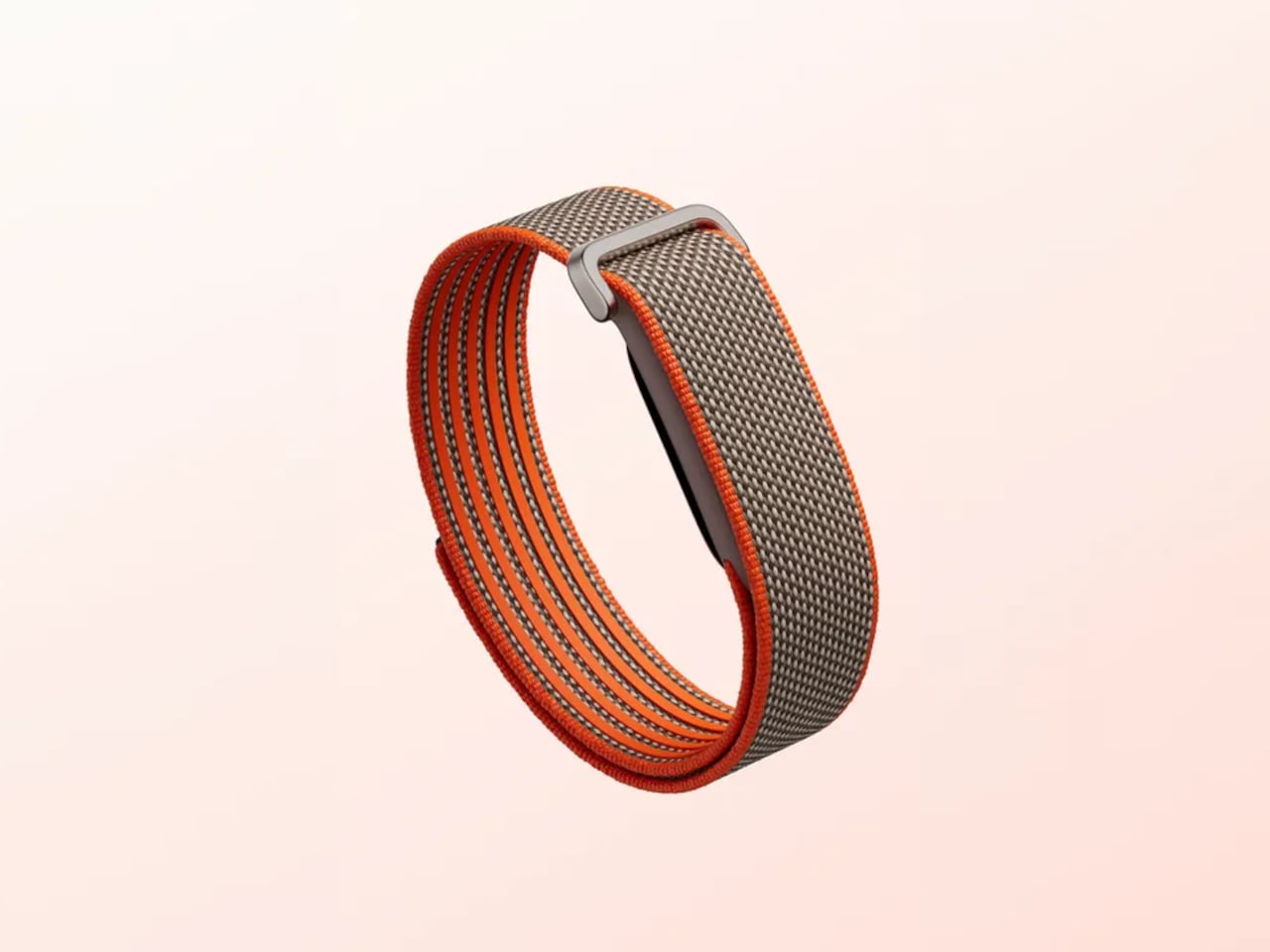
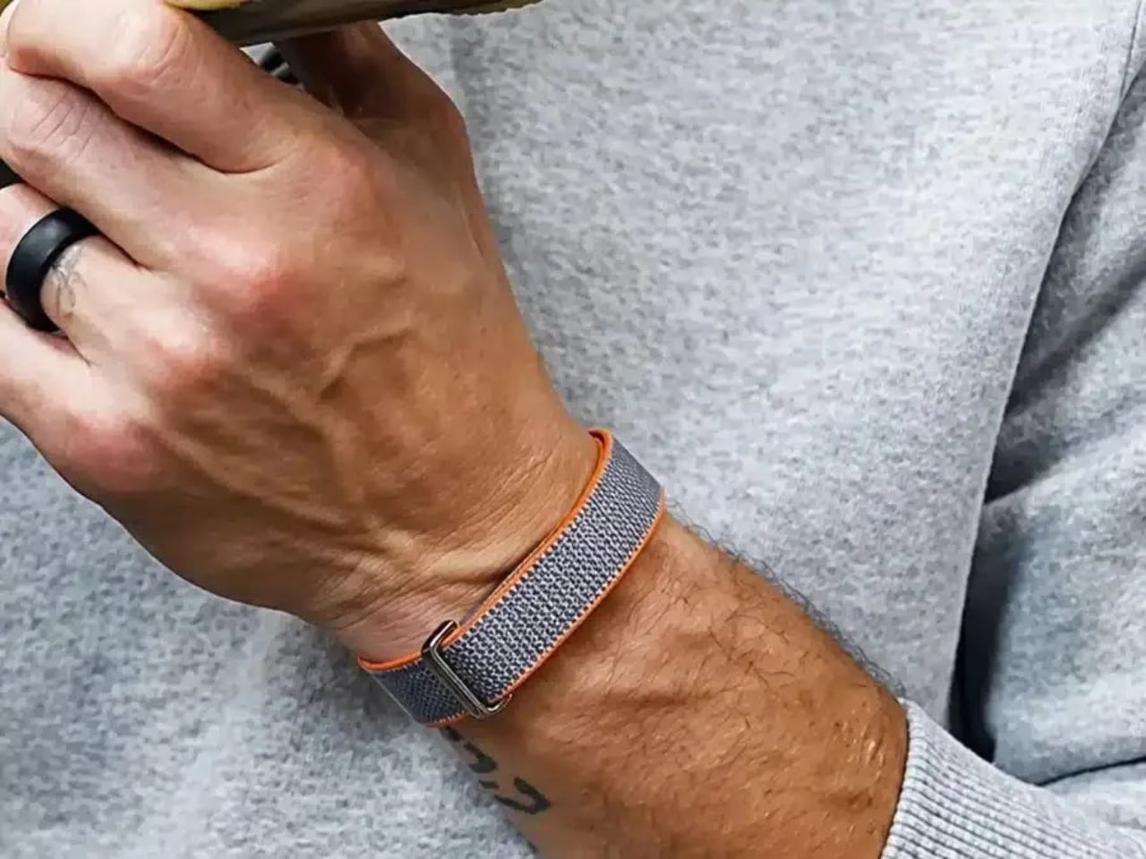
According to supplier and retail data uncovered by Droid-Life, the Fitbit Air is a screenless fitness band with an expected May 16 launch date and a price point hovering around $99. It reportedly comes in three colors: Obsidian, Lavender, and Berry. Band options allegedly cover a wide range, from a Performance Loop Band to an Active Band, an Elevated SoftFlex Band, and even a Metal Mesh Band in Silver and Warm Gold. That last one especially catches my attention. A metal mesh band on a screenless tracker isn’t gym gear. That’s an everyday accessory.
Design: Fitbit
And that, honestly, is the smarter move. The fitness tracker market has been stuck in a cycle where every new device tries to do more: more sensors, more screens, more notifications, until the thing on your wrist becomes basically a phone you can’t type on. If the leaks are accurate, the Fitbit Air is moving in the opposite direction. No screen means no distractions, and for a device whose entire job is to monitor your sleep, heart rate, and activity in the background, that’s actually a reasonable design philosophy.
The obvious comparison here is Whoop. The Fitbit Air is clearly gunning for the same audience: people who care about health data but don’t want the clutter of a smartwatch. But the pricing argument is where Google may genuinely have an edge, if these numbers hold. Whoop’s cheapest plan runs $199 a year or $25 a month, and the device itself isn’t even sold separately; you’re subscribing to the whole ecosystem. The Fitbit Air, based on current leaks, would reportedly sell for a one-time cost of around $99 with core health insights included upfront. Advanced features like the AI-powered Google Health Coach are expected to sit behind a paid tier, but the baseline experience reportedly doesn’t require an ongoing subscription. That’s a meaningful difference, and a real one for people who bristle at paying a monthly fee just to see their own sleep score.
To be clear: none of this is confirmed yet. Google hasn’t officially said a word about the Fitbit Air. Supplier data is often directionally accurate but rarely exact, and both the May 16 launch date and the $99 price could easily shift before anything goes official. But the sheer volume of converging reports, covering the name, colors, band types, pricing, and release window, makes this feel less like speculation and more like an imminent announcement.
What keeps drawing me back is the reported design direction. The move toward screenless wearables isn’t a niche preference anymore. Whoop built a loyal following around it. The Oura Ring made passive tracking feel premium. Samsung and Apple are both circling the idea. Google, with the Fitbit brand in hand and a Google Health AI stack to back it up, is in a real position to make this category accessible to people who’ve been put off by the Whoop subscription model. The timing feels right.
The rumored Lavender and Berry colorways are a quiet but deliberate signal. Those aren’t colors aimed at hardcore athletes. They’re designed for the person who wants to wear something comfortable, low-key, and actually stylish all day, not just during a workout. The leaked Metal Mesh Band reinforces this. If accurate, Google seems to understand that a product you’re meant to wear around the clock needs to work in every context, not just at the gym.
If the Fitbit Air launches anywhere close to what these leaks suggest, it could be one of the more genuinely interesting product releases of the year. Not because it’s flashy. It’s the opposite of flashy. But because it shows a clear point of view. Sometimes less, done well, is exactly the right answer.
Portugal and football connection may not resonate with everyone
Expressive color palette and graphics are too bold for minimalist tastes
Higher price point compared to other cases
RATINGS:
AESTHETICS
ERGONOMICS
PERFORMANCE
SUSTAINABILITY / REPAIRABILITY
VALUE FOR MONEY
EDITOR'S QUOTE:
The TORRAS × FPF Limited Edition earns its stripes through genuine design depth and a rotating stand that quietly changes how you use your phone every day.
The premium phone case market has refined itself to a point where technical competence is almost a given. Protection ratings, slim profiles, and magnetic compatibility have become standard expectations rather than differentiating features. That baseline has pushed the most interesting cases in this space to compete on a different level entirely, one defined by design identity, material intelligence, and a sense of purpose that goes beyond the purely utilitarian.
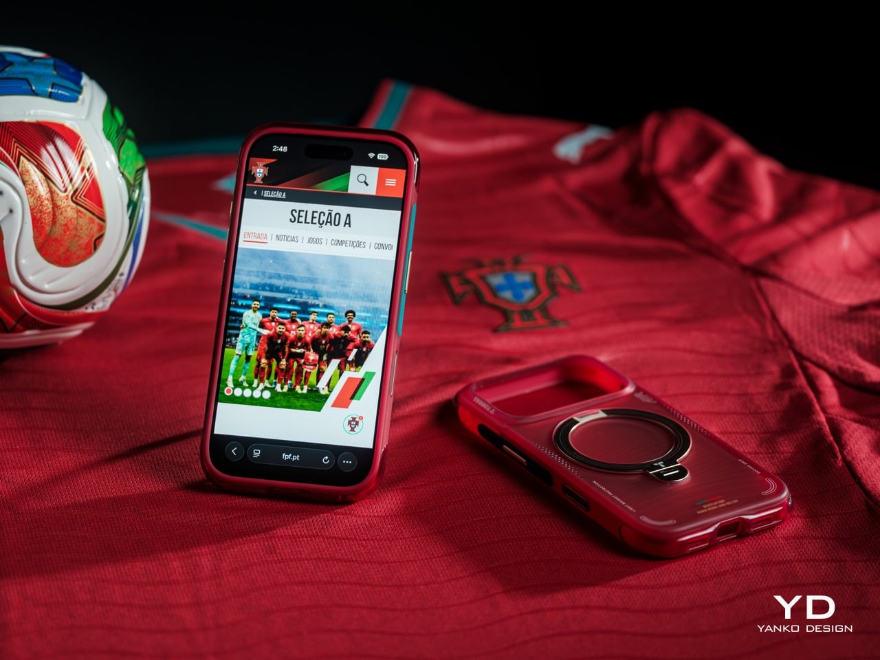
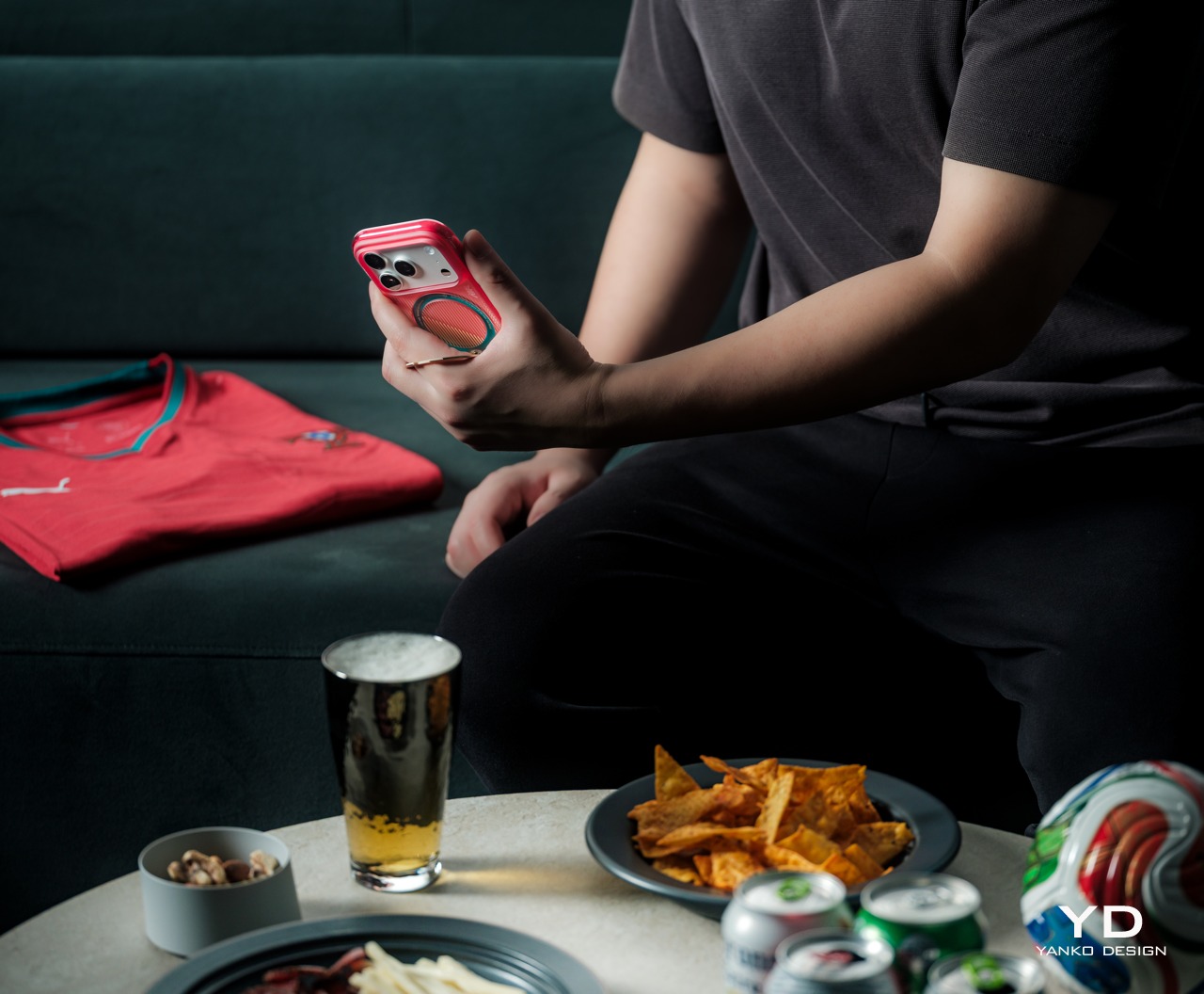
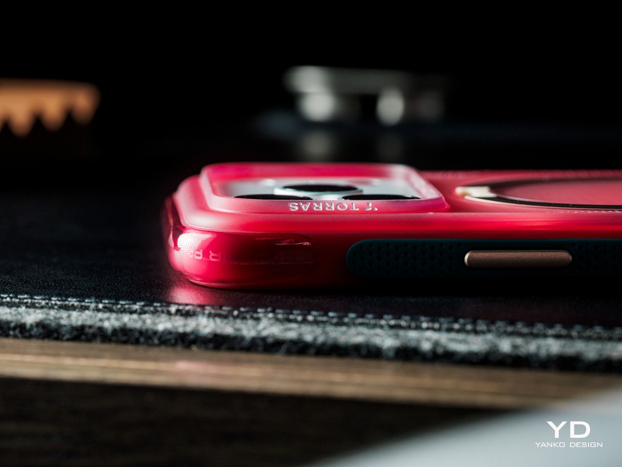
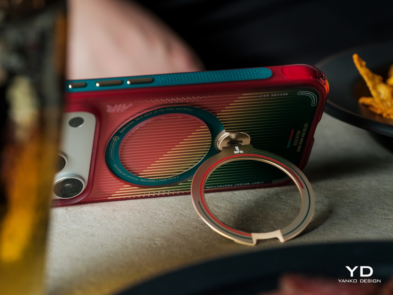
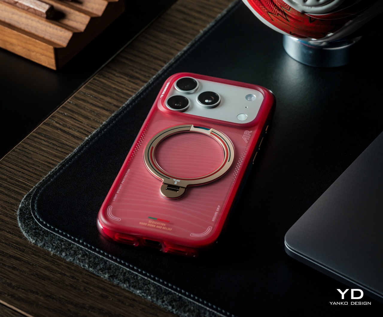
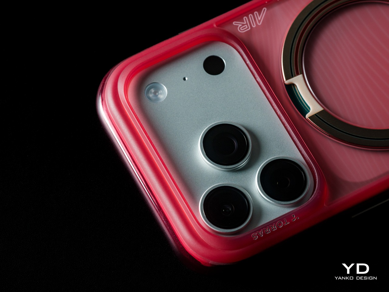
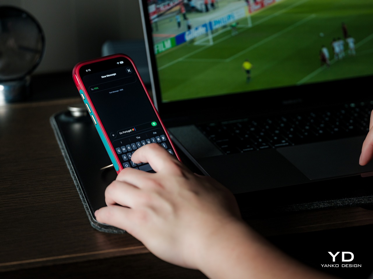
The TORRAS Q3 Air Portugal National Football Team Limited Edition for iPhone 17 Pro Max is precisely that kind of case. Built on the Q3 Air Ostand platform, it brings Portugal’s national team identity, its colors, maritime heritage, and championship legacy into a functional accessory with a rotating stand, magnetic compatibility, and solid protective architecture. It’s a combination that genuinely earns the “limited edition” label.
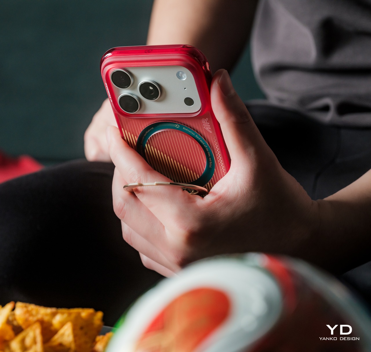
Portugal’s national colors aren’t subtle, and this case doesn’t try to temper them. The translucent crimson shell gives the design a vivid, confident presence while still letting the case’s structural layers show through, which adds depth that solid-color shells typically can’t offer. The result is visually bold in a way that feels deliberate and controlled, leaning into the energy of Portuguese football culture without tipping into anything that feels overwrought.
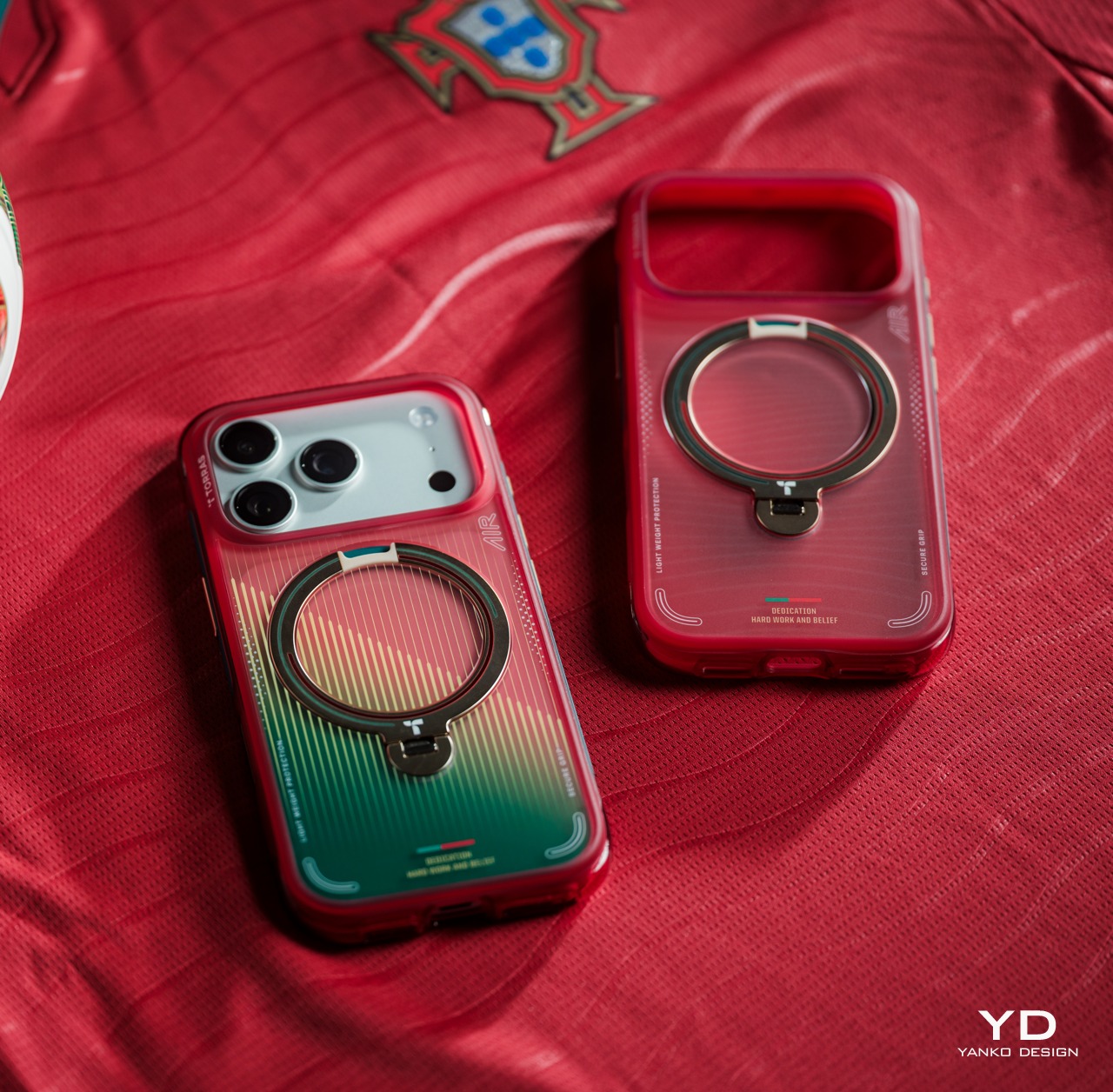
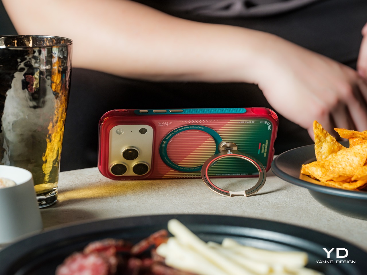
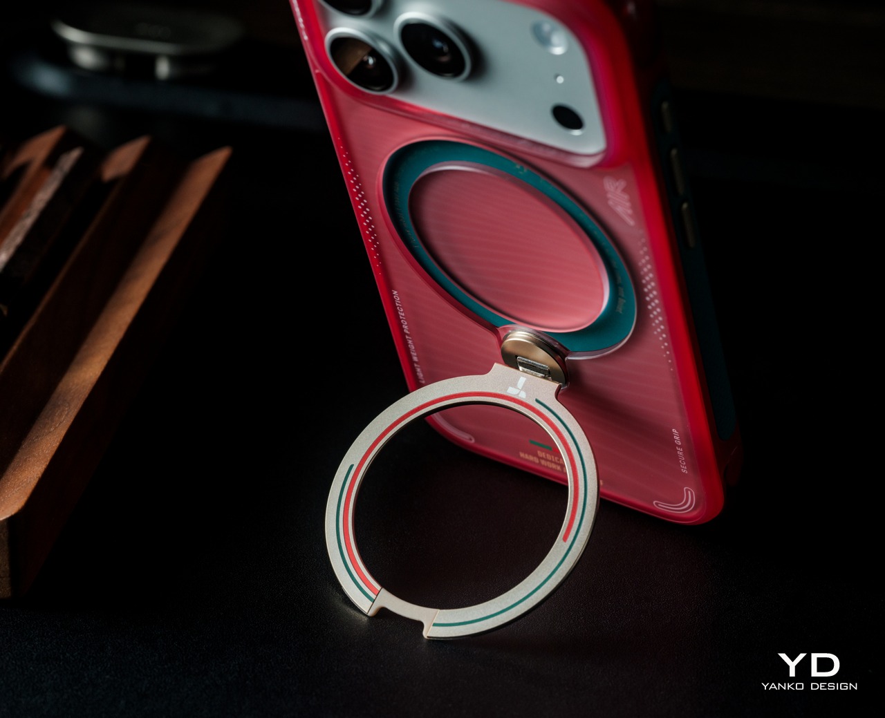
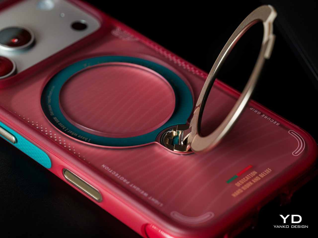
The back of the case is where the design story gets specific. Fine horizontal striping draws a clear visual reference to the texture of a football jersey, while the circular framing around the magnetic ring gives the composition a natural focal center. Gold accents on the ring stand connect to Portugal’s championship legacy, and Portugal’s Quinas emblem appears in the airbag structure as a rewarding detail on closer inspection.
What separates this collaboration from typical team merchandise is the depth of the cultural reference. The wave patterns running through the design draw from Portugal’s maritime history rather than just the football crest, and the gold elements speak to themes of honor and achievement that run through both the country’s history and its footballing legacy. These aren’t decorative choices; they’re a considered visual language built from real cultural material.
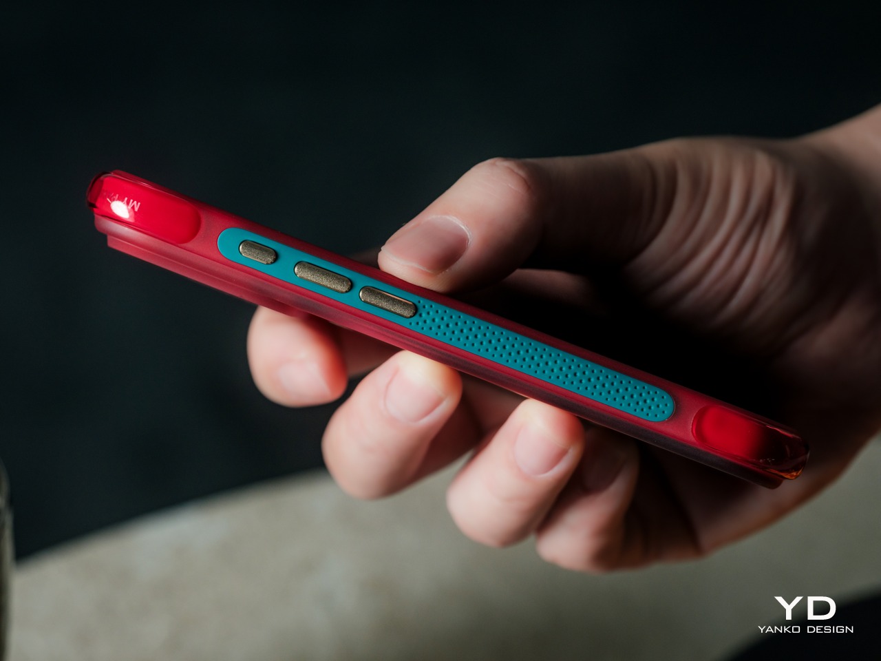
The lateral profile adds another layer to the overall composition. A teal green accent runs along the side rails, creating a sharp contrast against the red shell that reads as unmistakably Portuguese in its color pairing. The buttons carry a warm metallic finish that echoes the gold used across the design, and the tactile grip texturing on the edges reinforces that every surface of this case has been considered.
Ergonomics
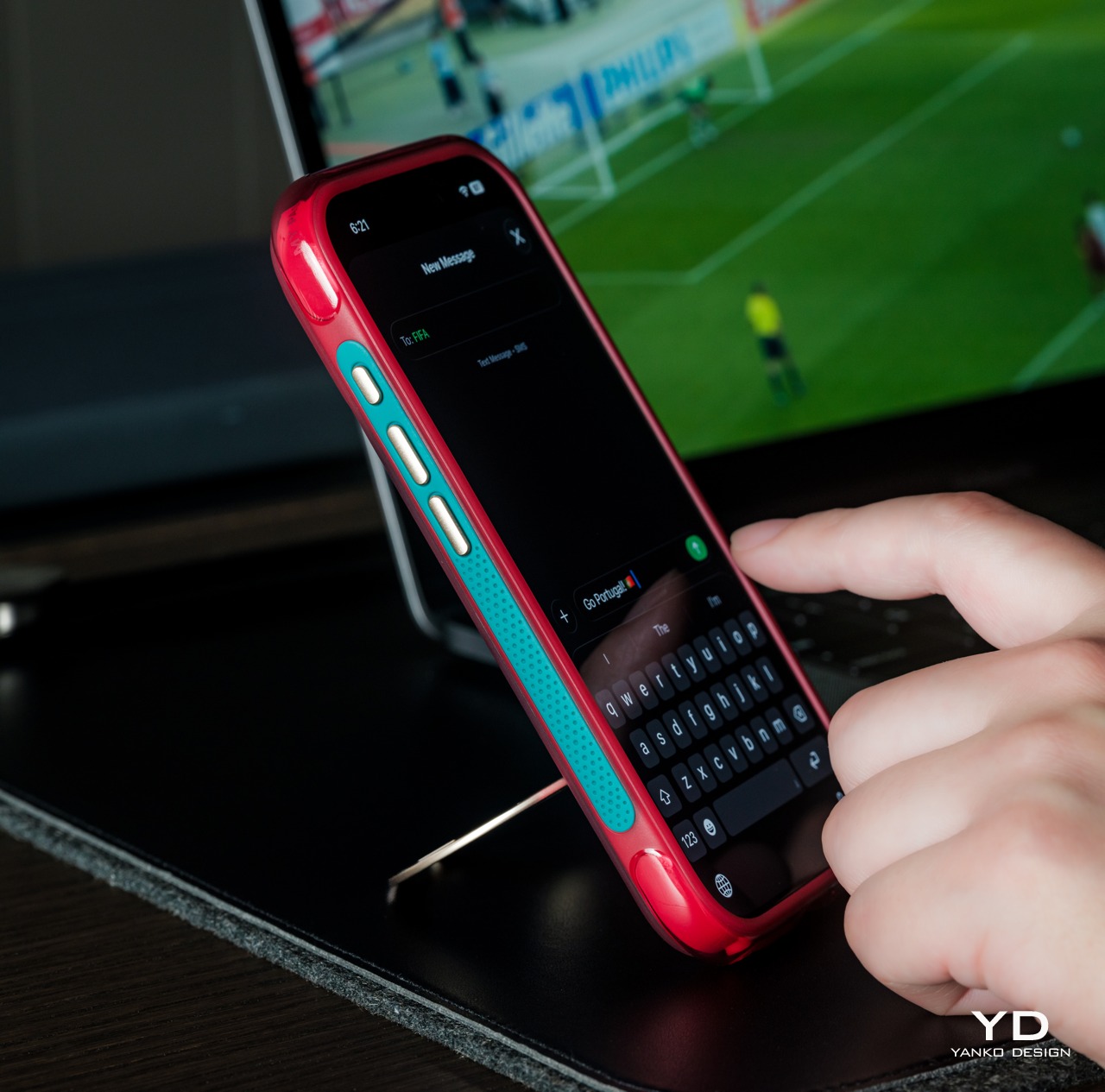
The Q3 Air Ostand platform was designed for daily carry from the ground up, and the Q3 Air Portugal Football Edition fully inherits those ergonomic priorities. The textured side rails give the phone a secure grip in hand, and the overall profile adds enough structure to feel purposeful without pushing into the territory of cumbersome bulk. It’s comfortable to hold for extended stretches and easy to manage with one hand.
The ring stand, folded flat against the back, adds a natural grip point that makes single-handed use of the iPhone 17 Pro Max genuinely more manageable. On a device this size, that matters more than it might seem on paper. When deployed, the stand clicks into place and holds whatever angle you set, making hands-free viewing a quick and reliable option rather than an occasional curiosity.
The case also carries well in a pocket, which isn’t always a given with stand-equipped accessories. The ring folds flat enough to avoid catching on fabric, and the overall thickness stays reasonable for an iPhone case with a fully integrated hardware mechanism. Moving between a bag, a desk, and a hand throughout a busy day feels natural, which is what you’d want from something worn this often.
Performance
The functional centerpiece of the Ostand series is its rotating magnetic ring stand, which supports 360-degree rotation, 180-degree flipping, and a magnetic hold that snaps securely onto metal surfaces and stays put once set. Propping the iPhone hands-free on a flat surface for a video call, a watch-party stream, or a spontaneous recording takes seconds, and the stand holds whatever angle you choose without needing adjustment.
That hands-free capability sits at the heart of what TORRAS calls “Record Your Passion,” the campaign built around the idea that documenting training sessions, matchday rituals, and shared moments is part of the sporting experience itself. Setting the phone down on a gym floor, snapping it onto lockers and training equipment, or propping it on a table during a watch party transforms it from a passive device into an active participant.
On the protective side, the case uses airbag technology that hugs the top and bottom edges and wraps around the corners. This air-cushioning structure, one of the Q3 Air’s signature innovations, protects the areas where drops tend to concentrate their force. By buffering and dispersing the force of impact, the TORRAS Q3 Air Portugal Football Limited Edition provides peace of mind for those unavoidable accidents of life.
A raised camera lip also keeps the lenses from direct contact with flat surfaces, an often unforeseen consequence in everyday use. The reinforced frame wraps the phone’s edges in a way that provides structural confidence throughout. It’s the kind of protection that works quietly in the background rather than advertising itself through unnecessary bulk.
The case is also fully MagSafe compatible, preserving the magnetic ring system so that wireless charging and MagSafe accessories work without interruption. For iPhone 17 Pro Max owners already invested in the magnetic ecosystem, that compatibility keeps everything running as expected. The full suite of MagSafe accessories, from chargers to wallets, connects and functions just as reliably as it would with any premium iPhone case.
Sustainability
The most honest form of sustainability in phone accessories comes down to longevity, even if the product itself is made of your typical synthetic materials. A case that holds its structural integrity and visual quality over years of daily use reduces the frequency of replacement, which matters more than most people consider. The Portugal Football Edition is built on a platform engineered for resilience, with reinforced corners, a durable shell, and a stand mechanism that holds up through consistent use.
The limited-edition format adds an interesting dimension to the longevity argument. Objects with cultural weight tend to stay in people’s hands rather than getting rotated out at the next refresh. A case tied to Portugal’s journey through the 2026 World Cup carries a specific cultural moment with it, giving it an emotional durability that significantly extends its useful life past what a generic alternative could claim.
Value
Limited-edition collaboration cases carry a $69.99 price premium by nature, and this one makes a clear case (pun intended) for that premium being earned rather than simply charged. The FPF edition packages the Q3 Air Ostand’s rotating stand, air-cushion protection, and full MagSafe compatibility inside a design rooted in Portuguese heritage and a genuinely considered visual system. That’s a lot of functional hardware and design thinking in one accessory.
For someone already drawn to the Ostand’s stand functionality, the Portugal Football Edition makes the value proposition even clearer. The design premium doesn’t come at any cost to the case’s functional strengths. You’re getting the same protective architecture and rotating stand mechanism, with the added dimension of a culturally layered identity that gives the accessory a meaning and visual presence that plain cases simply can’t offer.
The limited availability also factors into the value equation. This isn’t a mass-produced accessory available at any time; it’s tied to a specific cultural collaboration with a defined production run. For buyers who value their accessories carrying a genuine story rather than a borrowed aesthetic, the FPF edition offers something that feels irreplaceable in a way that standard catalog options simply aren’t positioned to match.
Verdict
The TORRAS Q3 Air Portugal Football Limited Edition for iPhone 17 Pro Max is a premium phone case that earns its place in that category through functional integrity and genuine design depth. The rotating stand is a practical differentiator that changes daily phone habits in a meaningful way, the protective architecture is solid, and the cultural design language is rich enough to hold up far beyond the initial impression.
For football fans with an eye for design, or iPhone 17 Pro Max owners who want a case that carries a real story behind its finish, the timing of this collaboration is excellent. Portugal is heading into the 2026 World Cup cycle with a clear sense of purpose, and TORRAS has built an accessory that connects to that energy in a way that’s both functional and genuinely worth holding onto.
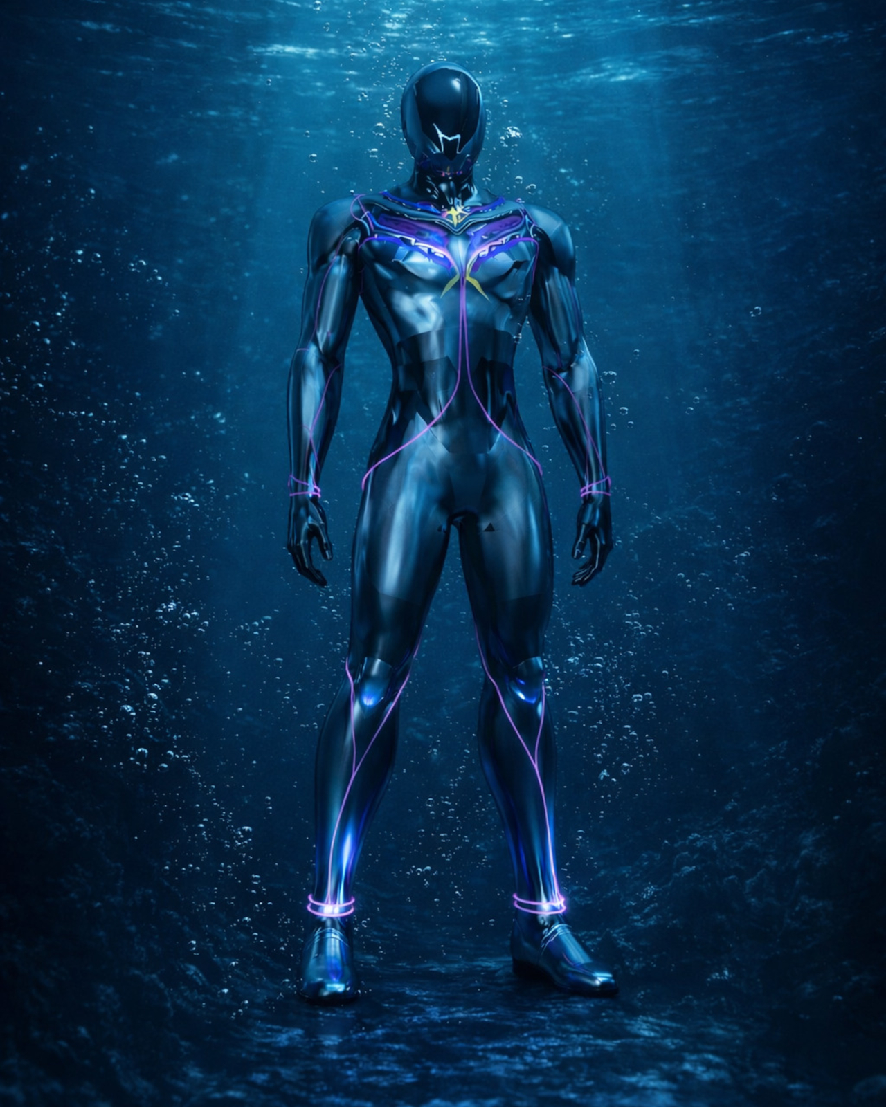
The way divers go underwater hasn’t fundamentally changed much in decades. You strap tanks to your back, manage hoses, regulate breathing, and navigate a system of equipment that always feels bolted on rather than built in. The gear works, of course, but it keeps reminding you it’s there. Improvements have mostly been incremental, focused on making the existing system lighter, safer, or easier to manage, not rethinking it from scratch.
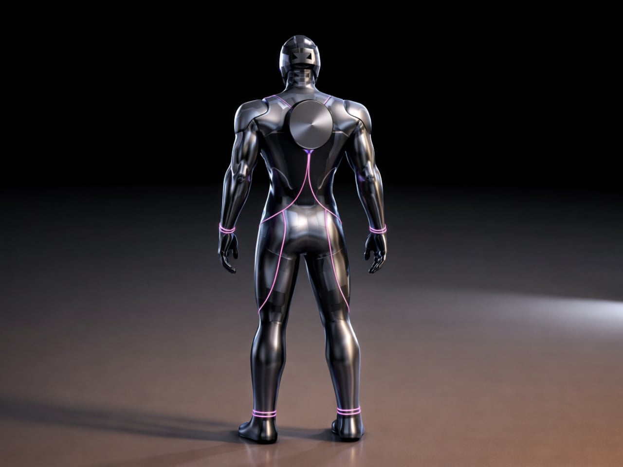
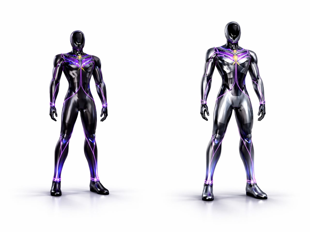
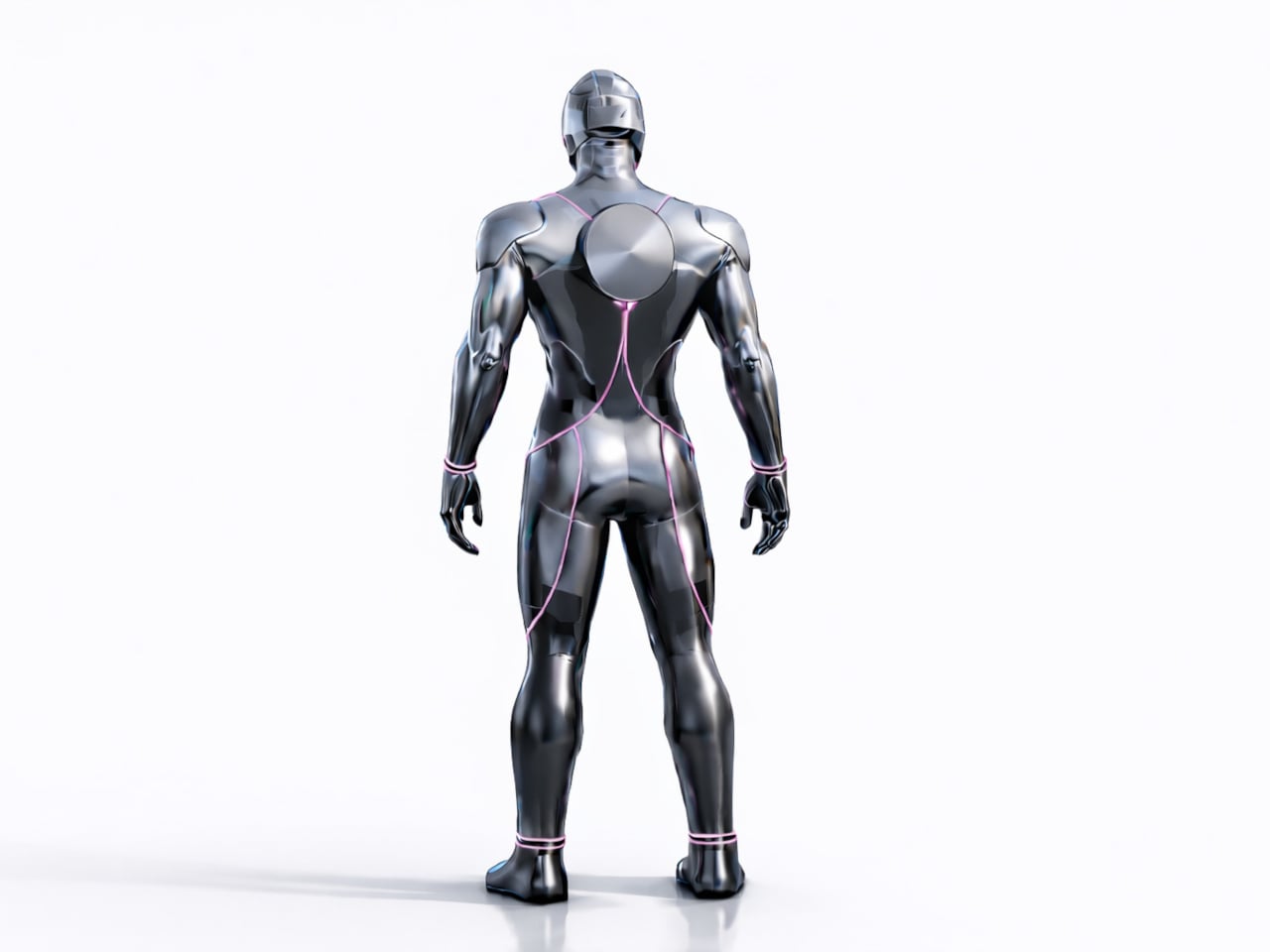
That’s the gap designer Ivana Nedeljkovska set out to explore with AQUA HUMAN, a conceptual underwater atmospheric diving suit that starts from a different question. Not how to make existing equipment better, but what happens when you stop treating the suit as equipment altogether. The concept pushes for diving gear that functions as a unified system, one that works with the body rather than being strapped onto it.
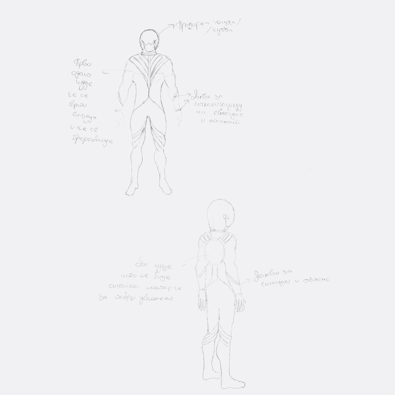
The design process reflects that shift in thinking. Nedeljkovska didn’t begin with sketches of a suit; she started by studying how breathing works, how the body reacts to pressure, and where conventional gear creates friction between the diver and the water. Form followed only after function was understood, which is why the result looks less like upgraded scuba equipment and more like something the body might have grown into naturally.
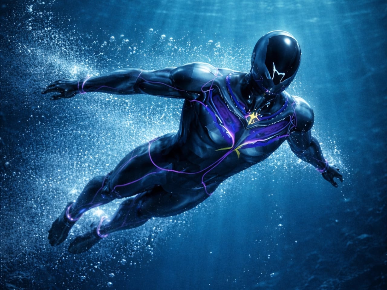
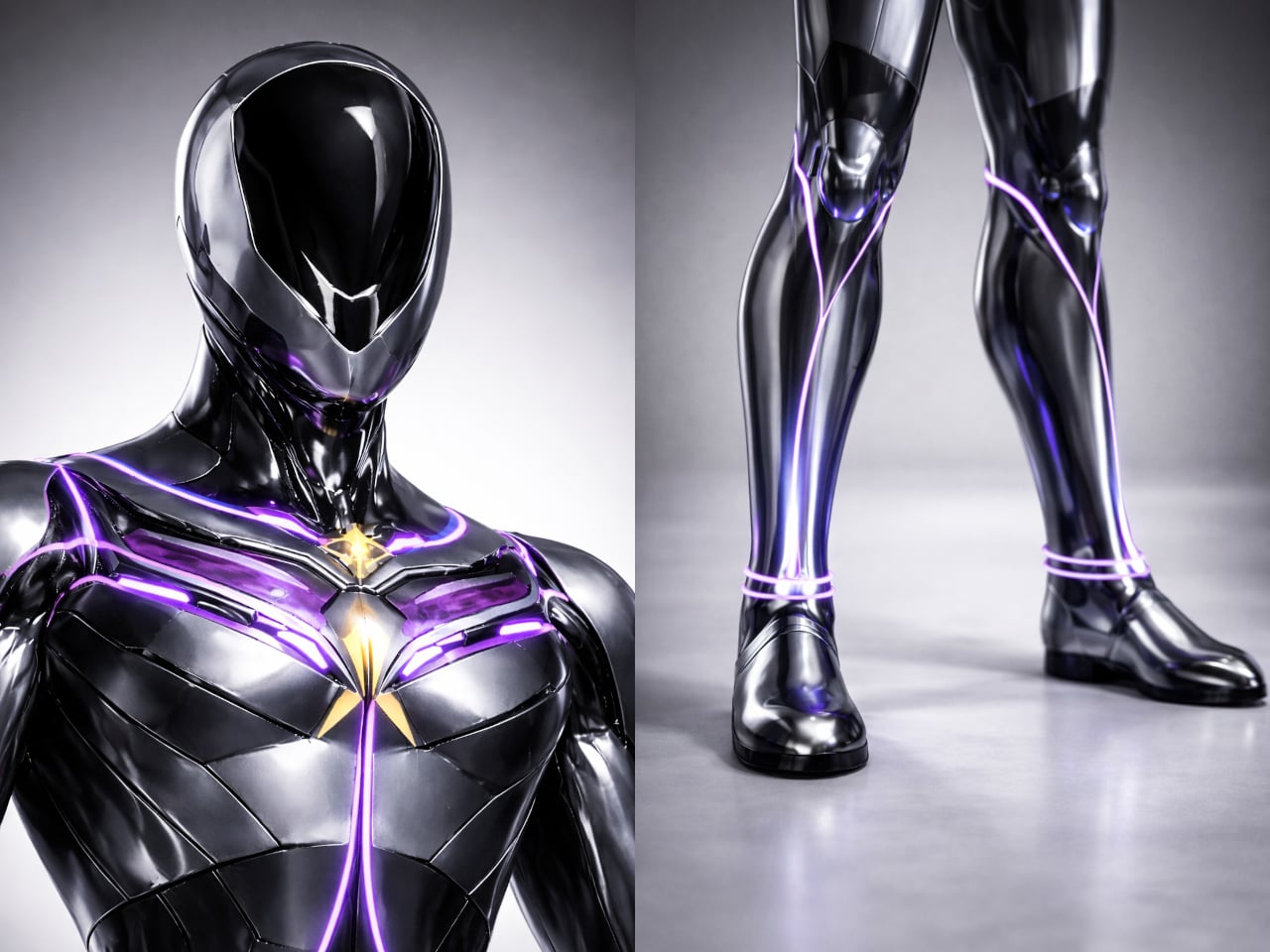
The central idea is integration rather than addition. AQUA HUMAN ditches the external tanks and brings breathing, temperature regulation, and mobility into the suit’s structure itself, functioning as a single synchronized system. The suit’s multi-layered material construction handles durability, water resistance, and flexibility simultaneously, so a deep-sea researcher or rescue diver can move without the suit fighting back. There’s no cluster of components to manage, just one continuous form.
On top of that, built-in motors reduce water resistance, making movement through the ocean feel less like fighting a current and more like navigating it. An integrated AI system runs alongside all of this, continuously reading the diver’s condition and the surrounding environment. It’s a real-time feedback loop designed to catch problems before they become emergencies, which matters considerably more at depth than it does on land.
Then there’s the light strip system, which might sound like an aesthetic choice but isn’t only that. The strips running across the suit serve as a visual language, changing to signal potential danger or communicate the wearer’s condition to others nearby. Underwater, where verbal communication isn’t possible and hand signals have limits, having a suit that actively broadcasts information in real time is genuinely useful, not decorative.
Diving suits have been layered with improvements for decades without anyone seriously questioning the core architecture. AQUA HUMAN isn’t trying to sell you something new; it’s asking why we’re still building on a foundation that hasn’t changed since the tank became standard. That kind of questioning is where genuinely different solutions tend to start, even if they take a while to arrive.