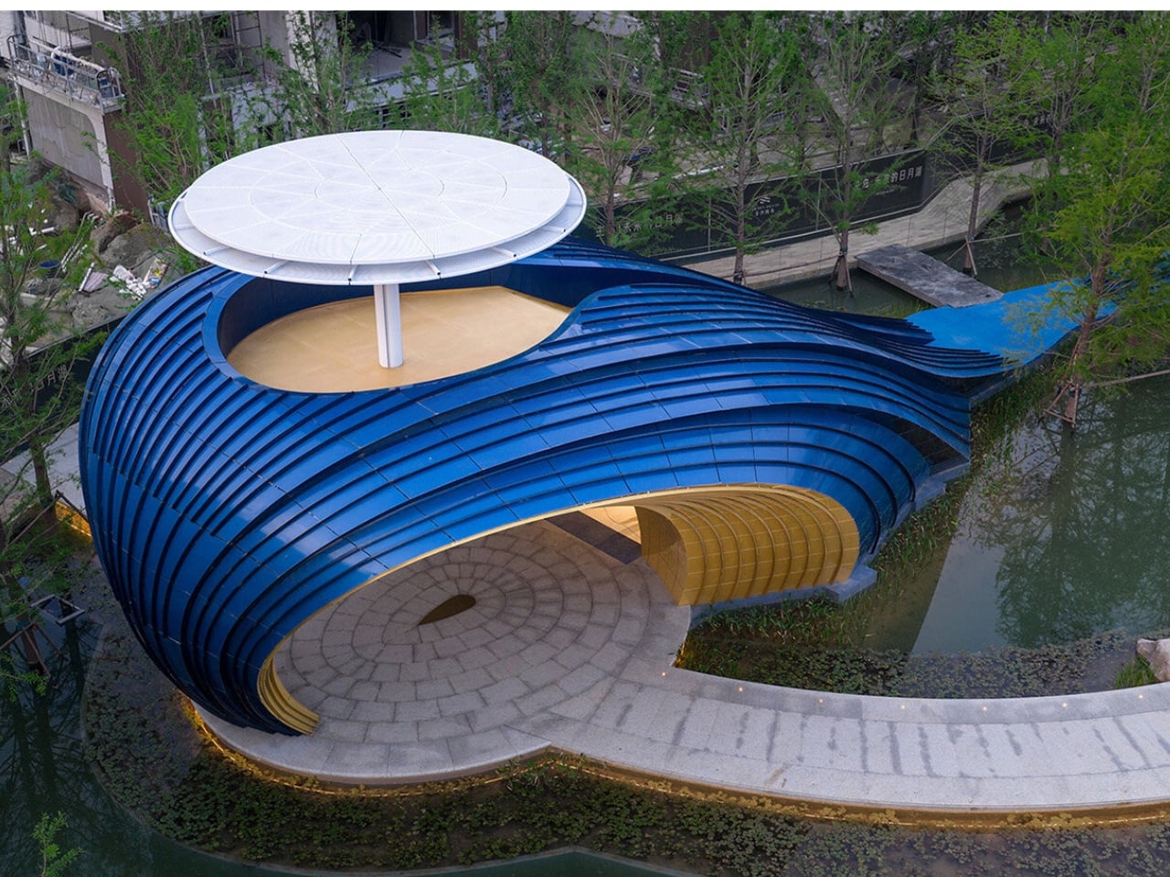
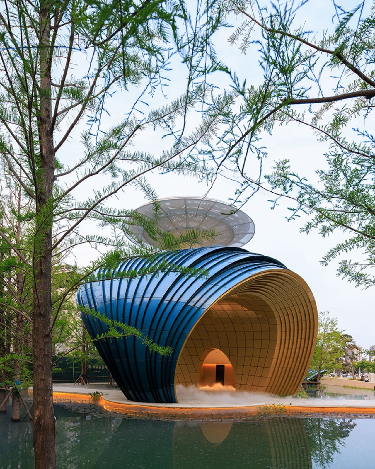
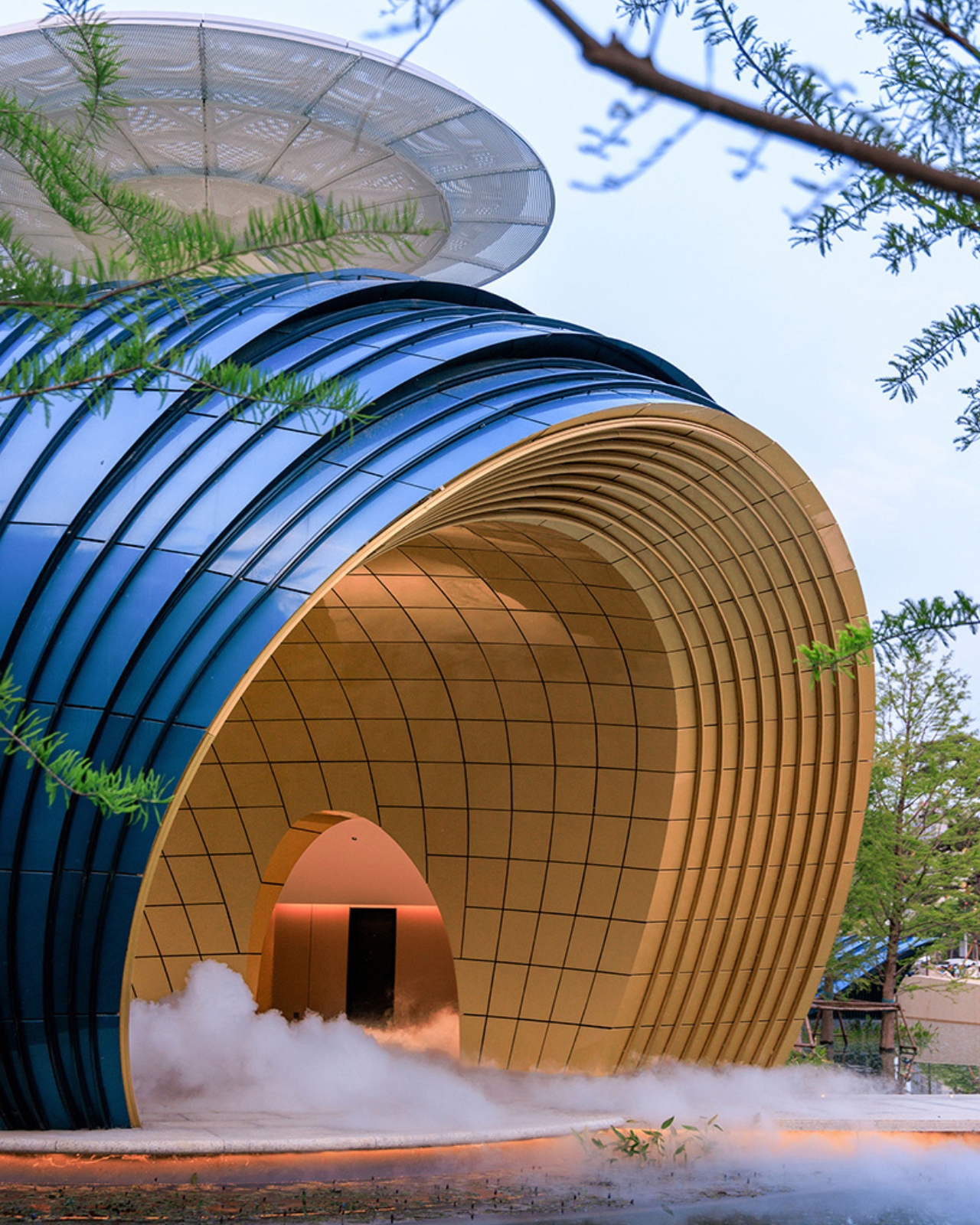
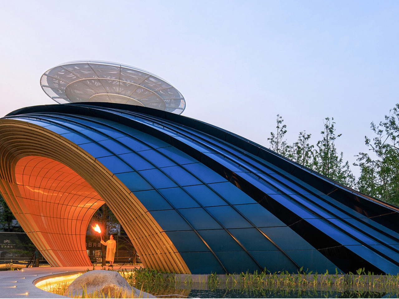
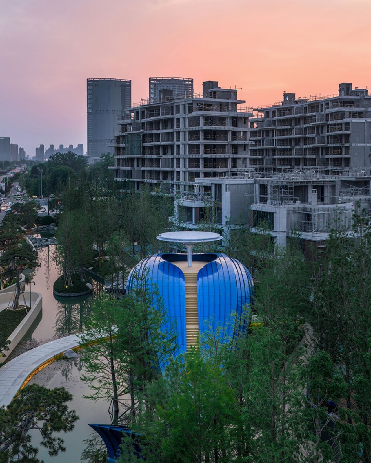
If you told most architects to design a residential gate, you’d probably end up with something clean, understated, and entirely forgettable. A nice water feature, maybe. Some carefully shaped hedges. Wutopia Lab looked at the same brief and decided the answer was a whale. A full, mid-leap, cobalt blue whale, placed at the entrance of a residential complex in Shangqiu, Henan, China. It is one of the most confidently strange things built in recent memory, and I mean that as the highest possible compliment.
The project is called Whale Gate, and it serves as the entrance structure for Golden Island, a development by Jinsha Group. The masterplan for the entire site is built around an archipelago concept, with residential buildings that appear to float across a landscape of water and greenery, as if scattered across a private sea. The client’s stated goal was to create the feeling of entering a different world when residents came home. Wutopia Lab took that mandate seriously, perhaps more literally than anyone expected.
Designer: Wutopia Lab (photos from LIU Guowei)
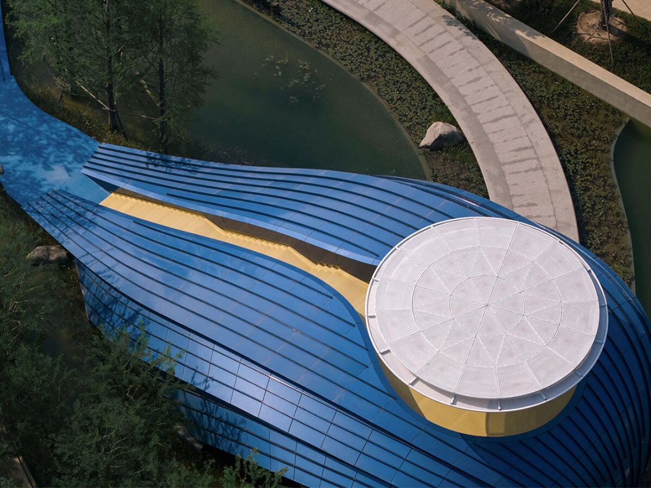
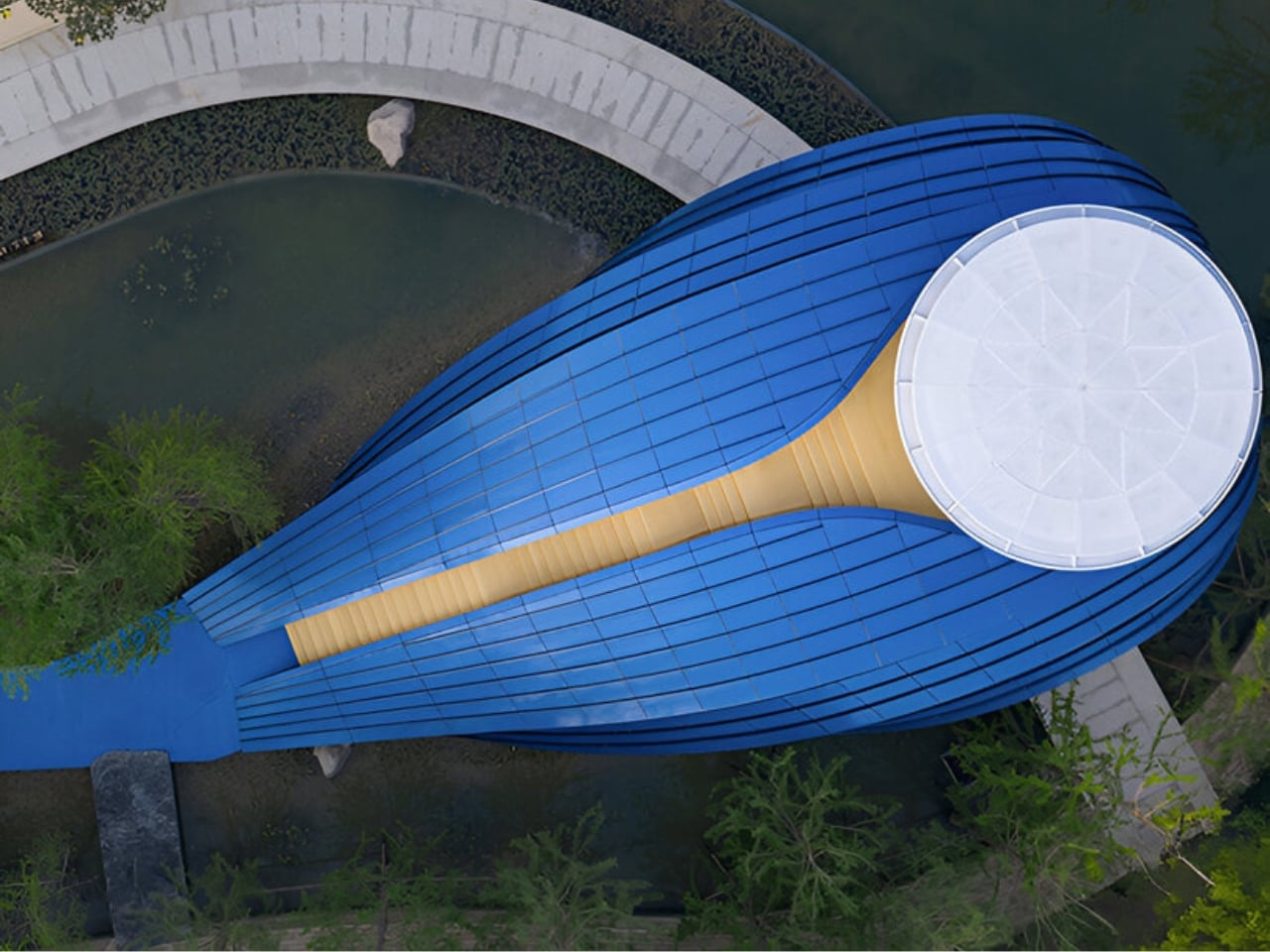
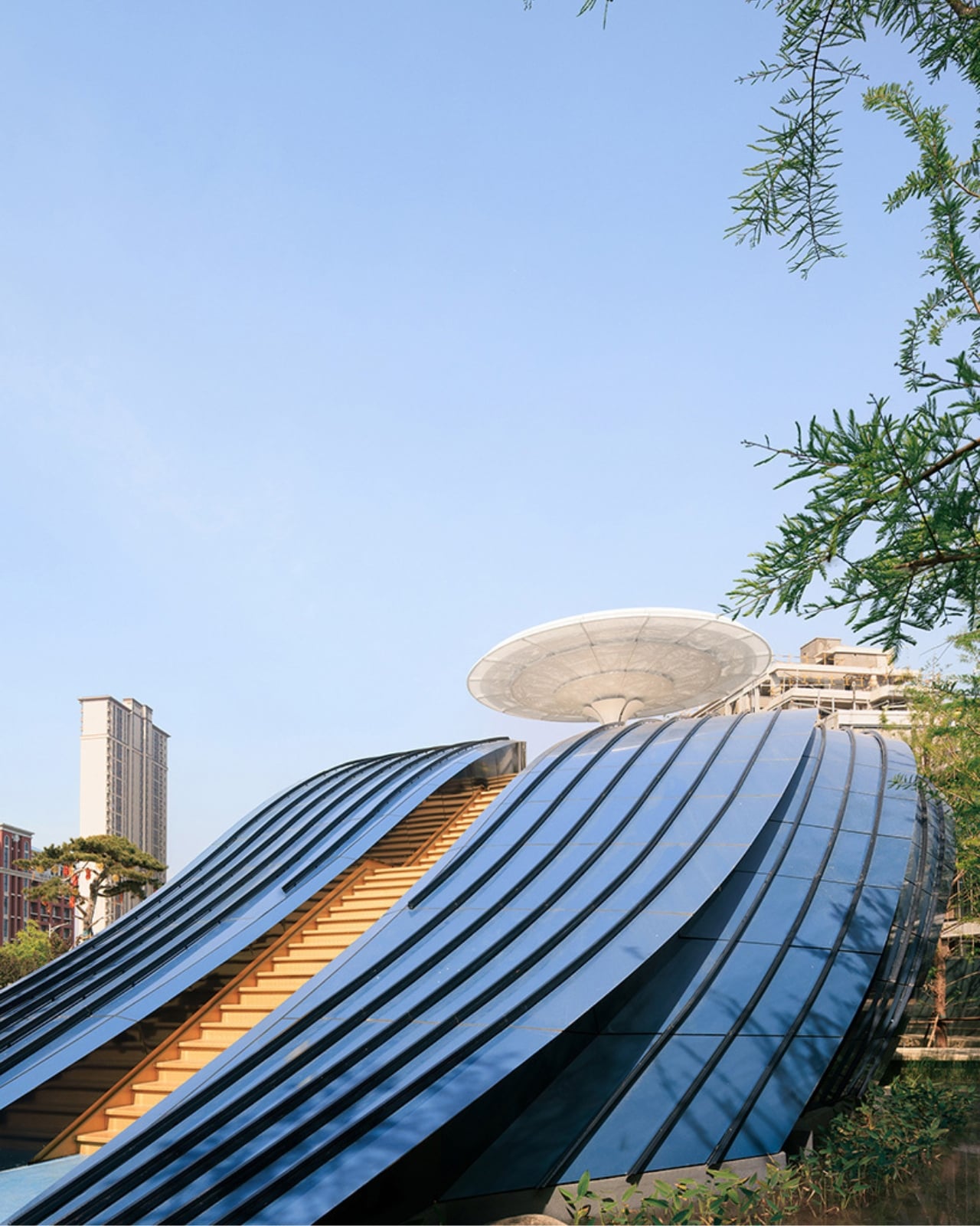
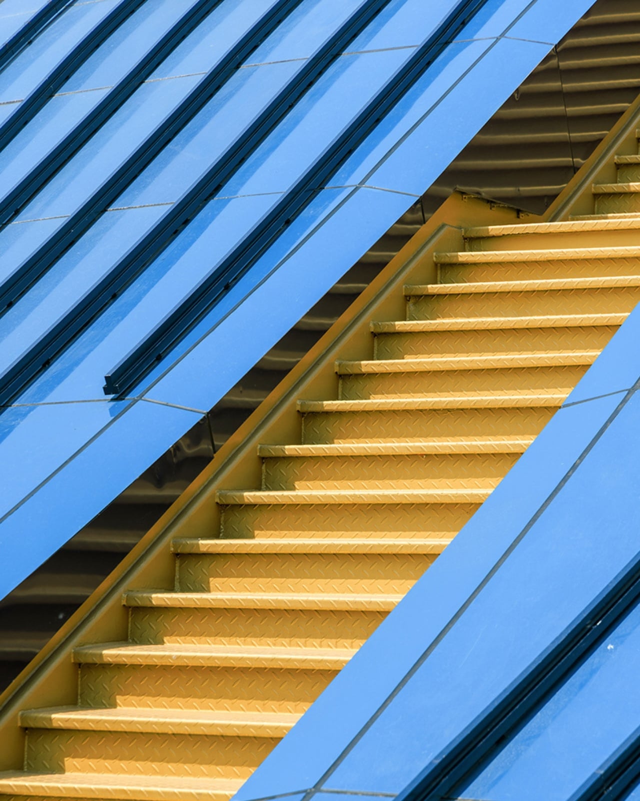
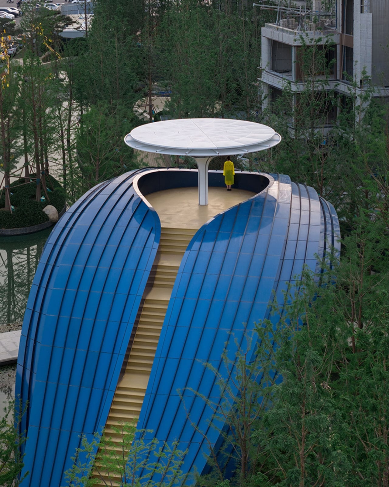
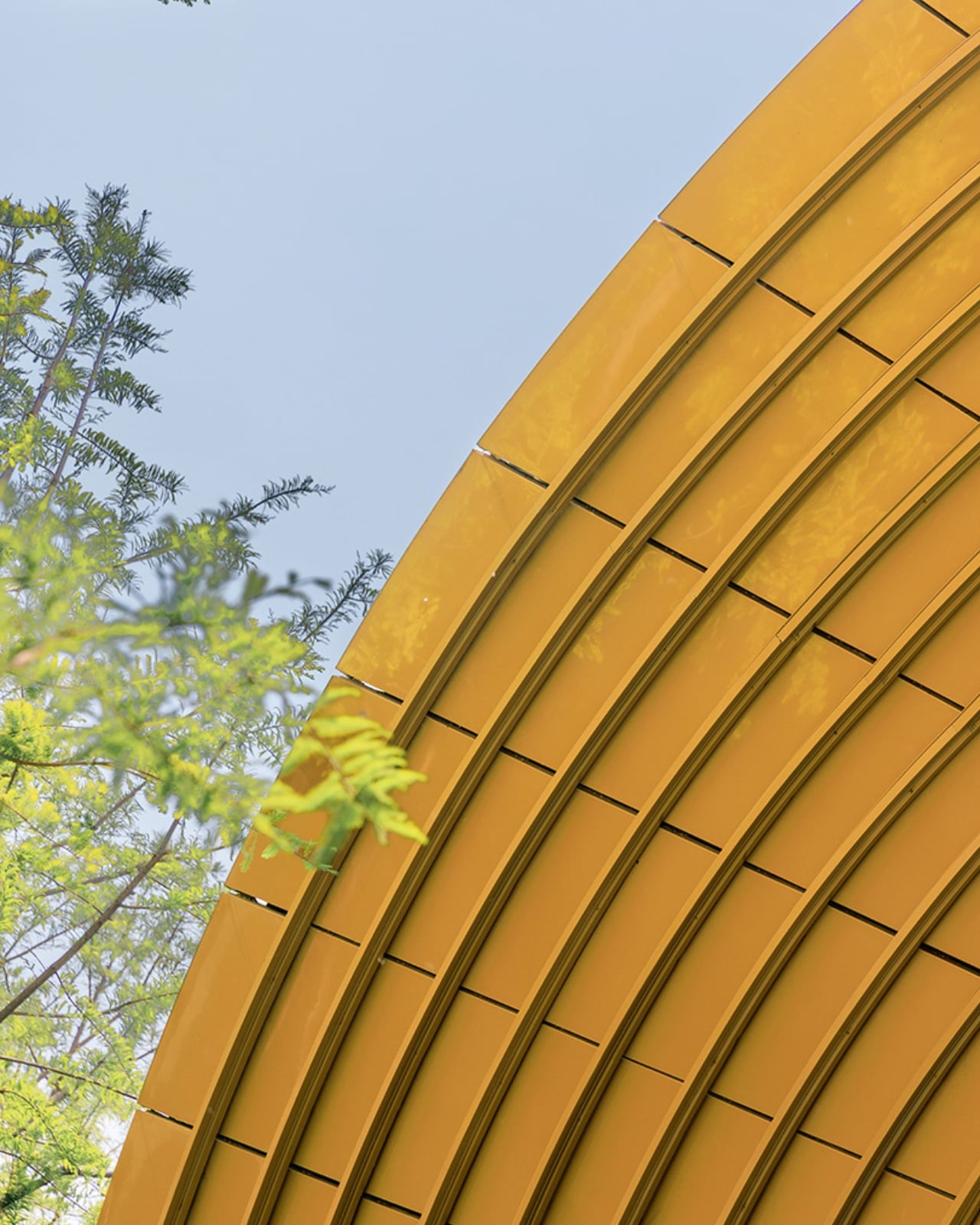
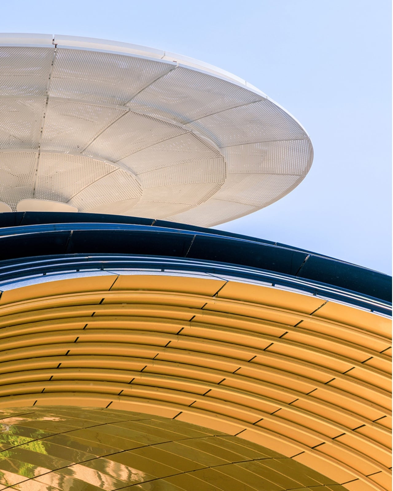
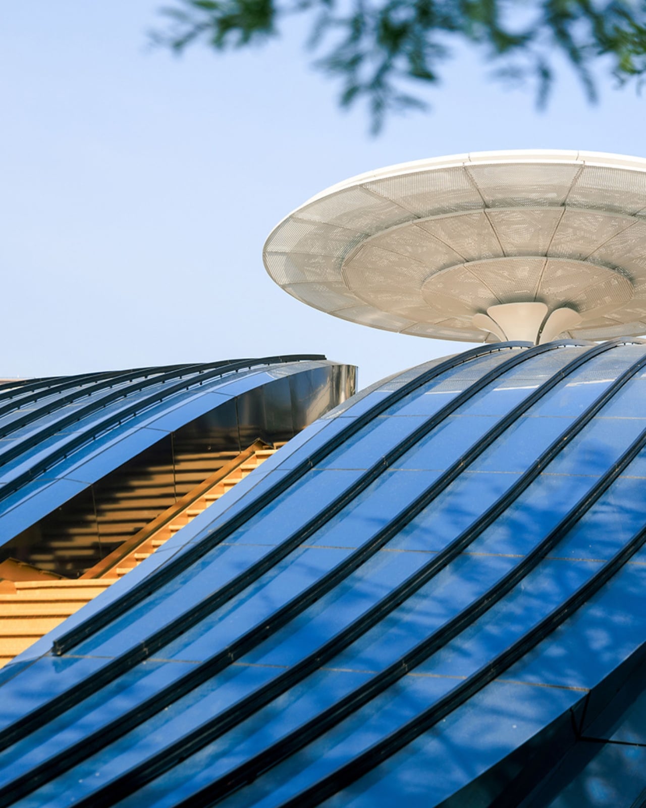
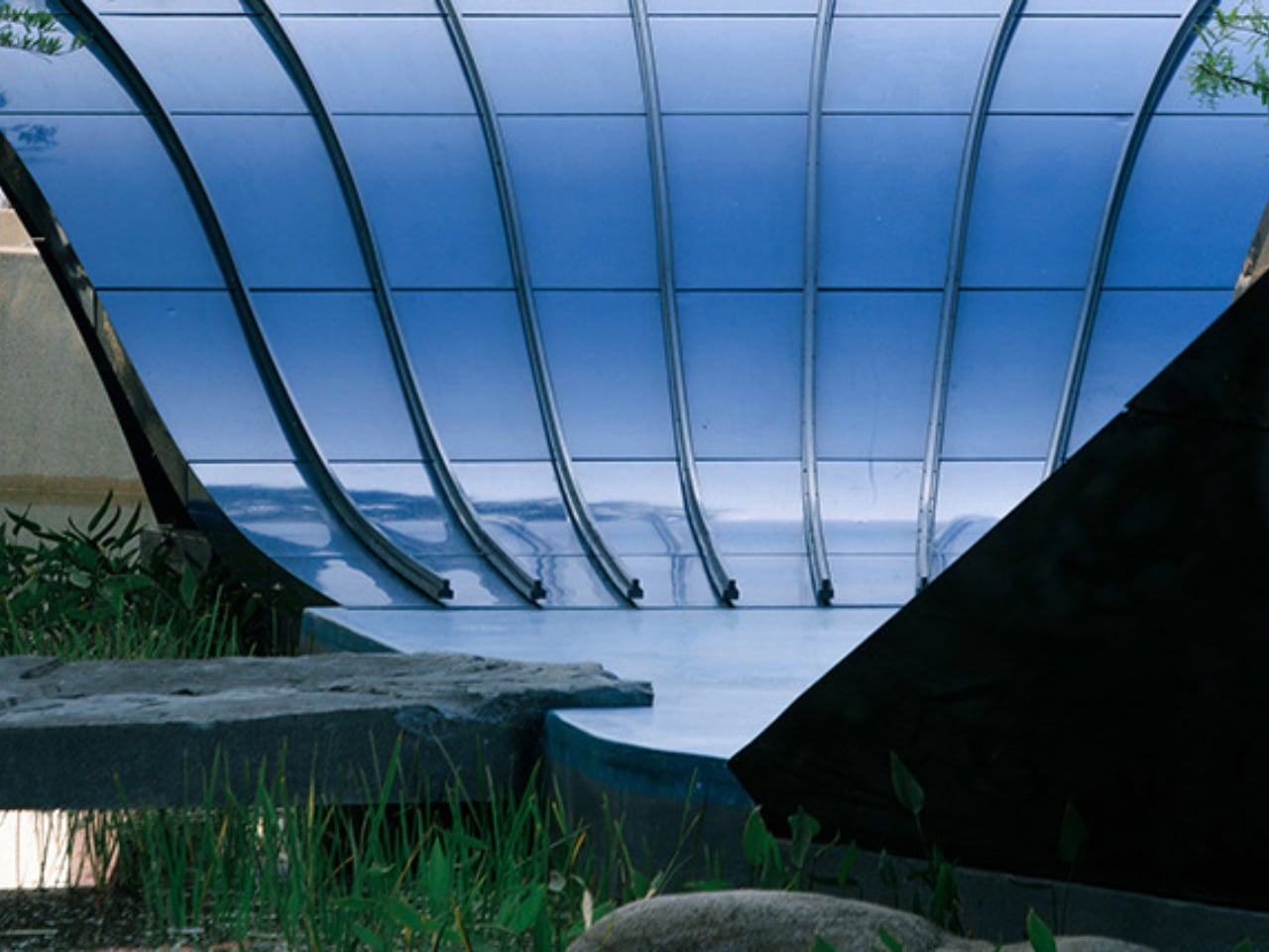
Architect Yu Ting froze the exact moment a whale breaches the ocean surface and translated that image directly into architecture. The result spans 242 square meters and weighs sixty tons, covered in 1,170 double-curved aluminum panels, not one of which is identical. The exterior is that deep, specific cobalt blue that reads instantly as oceanic. The entry point cuts through the belly of the structure as a golden vertical opening, giving the whole composition a two-act quality: the whale from the outside, a golden threshold from within. Perforated white aluminum panels above suggest water spray mid-exhale. It works on every level it is trying to work on, and the total absence of subtlety feels like a feature rather than a flaw. Most architecture of this scale tries to keep its options open. This one doesn’t.
What gets me about Whale Gate isn’t the strangeness of it, though that’s certainly part of the appeal. It’s the clarity of conviction behind it. The design doesn’t hedge. There’s no half-measure where it almost looks like a whale but could also be read as a biomorphic abstraction. Wutopia Lab made an animal, and they committed. The studio has been explicit that symbolism is a function, that arriving home deserves the kind of architecture willing to acknowledge what that moment actually means to people.
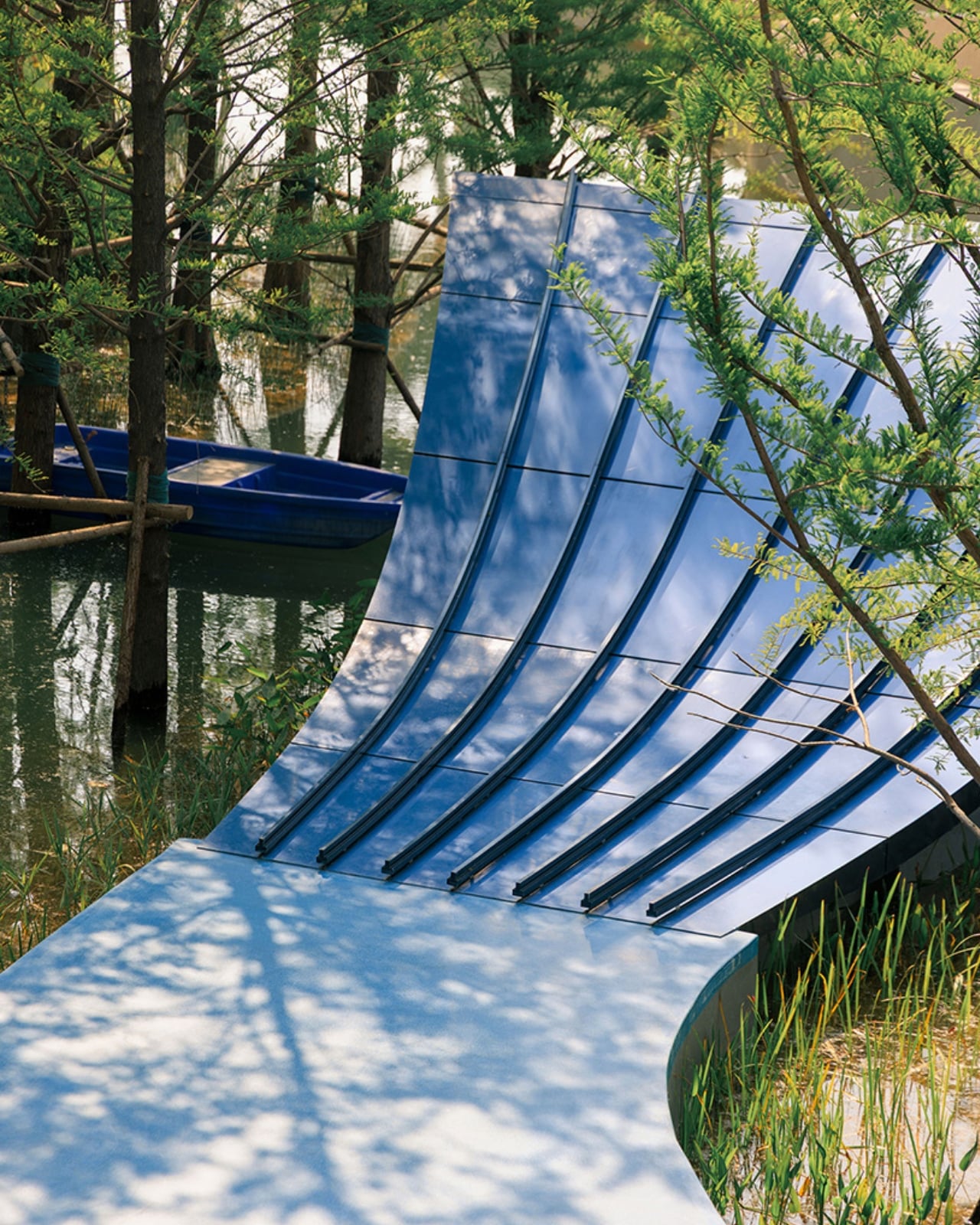
That position is worth sitting with. So much of what gets labeled “landmark architecture” in residential design is really just scale. Big things that feel important because they are big. Whale Gate earns its presence differently. The structure runs on a six-layer construction system with nearly 4,000 individual components, and every steel and aluminum member was custom-fabricated to account for varying curvatures and torsions across the form. The engineering involved in making a sixty-ton whale look like it’s mid-leap is genuinely extraordinary. But the engineering serves the story, which is the right order of operations.
There’s also a viewing platform at the top, accessible exclusively to residents via a golden staircase that climbs through the whale’s head. From up there, the entire compound unfolds below: water, cypress trees, buildings still under construction. The platform transforms the gate into something more than a threshold. It’s a place that belongs specifically to the people who live there, a reward for the commute home, a brief moment of elevation and perspective. One that quietly asks you to look at where you live and actually feel something about it.
I know biomorphic architecture has a complicated history of landing closer to spectacle than to substance. Plenty of “iconic” gateway designs end up aging like novelty; the initial wow gives way to “why, though?” within a decade. Whale Gate sidesteps that trap because the symbolism isn’t arbitrary. The whale connects to the water, the water connects to the archipelago layout, and the archipelago connects to the mythological idea of arriving at an island realm. The logic holds all the way down.
Whether or not you’d want to drive through a whale every morning is a fair question. But few people would argue it’s worse than a security booth and a speed bump.
The post The 60-Ton Blue Whale You Walk Through to Get Home first appeared on Yanko Design.