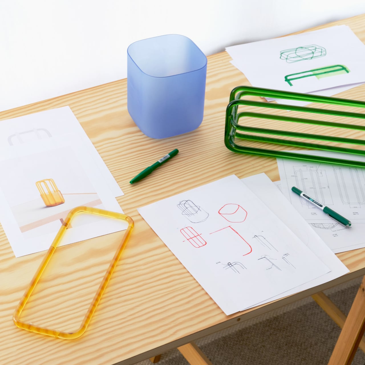
Five months into 2026, the interior design trends predicted back in January are no longer speculative mood boards or Pinterest saves. They are appearing in apartment listings, furniture launches, hospitality spaces, and renovation projects worldwide. Grey walls are officially over. Six months into 2026, the interior design predictions from January have either proven true or quietly disappeared. What remained? Terracotta, limewash, curved sofas, and layered warmth – and what didn’t? Icy white rooms, sharp minimalism, and any surface that feels clinical rather than lived-in.
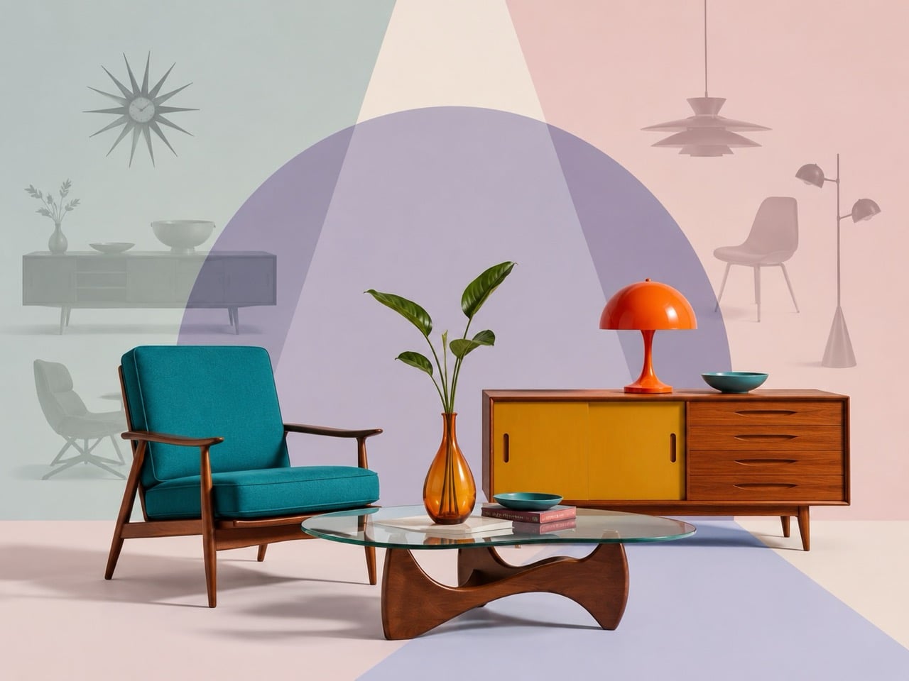
The biggest shift in 2026 home décor trends is emotional, as homes are moving away from the cool, ultra-controlled minimalism that defined much of the past decade. In its place comes warmth, tactility, softness, and personality. Terracotta is replacing icy grey. Rounded forms are overtaking rigid geometry. Natural stone, vintage furniture, and sculptural decor are transforming interiors into layered spaces that feel lived-in rather than staged.
Here are the seven interior design trends 2026 shaping homes, while some older design styles are slowly fading away in the background.
1. Warm Neutrals Replace Cool Grey Interiors
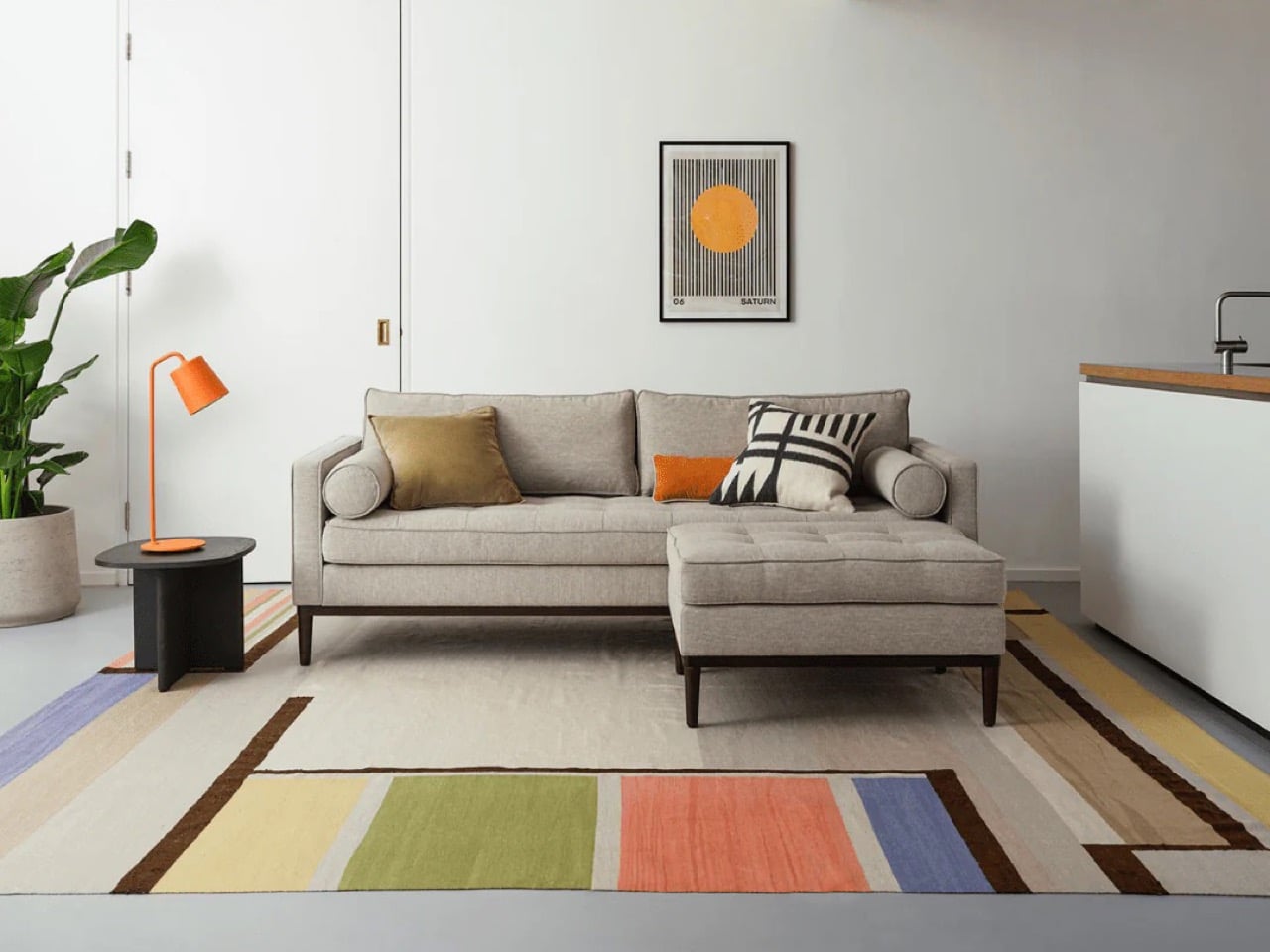
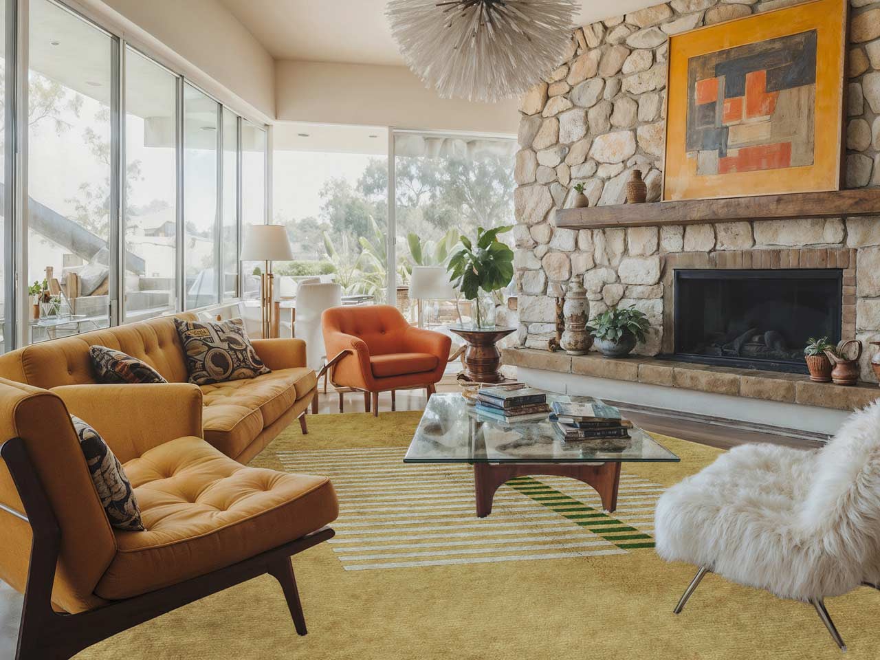
The era of cold grey interiors is fading fast. In 2026, warm neutrals interior palettes are dominating living rooms, kitchens, and hospitality spaces with shades like terracotta, creamy white, ochre, sand, caramel, and warm taupe. These tones create spaces that feel grounded and relaxed rather than clinical. Designers are increasingly choosing colors that mimic earth, clay, and sunlit plaster instead of industrial concrete-inspired shades.
This shift is also influencing materials and furniture finishes. Walnut wood, brushed brass, textured linen, and warm-toned stone are replacing chrome, charcoal, and high-gloss monochrome schemes. The popularity of Mediterranean-inspired homes and desert-inspired interiors has accelerated this movement. Cool grey walls and icy white spaces now feel visually distant and emotionally detached compared to the softer atmosphere homeowners want in 2026.
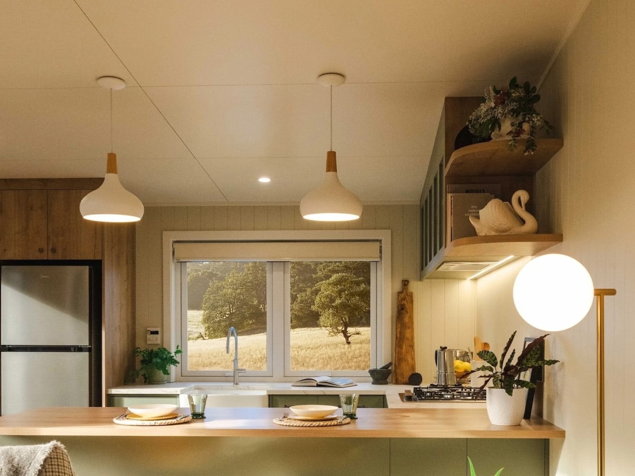
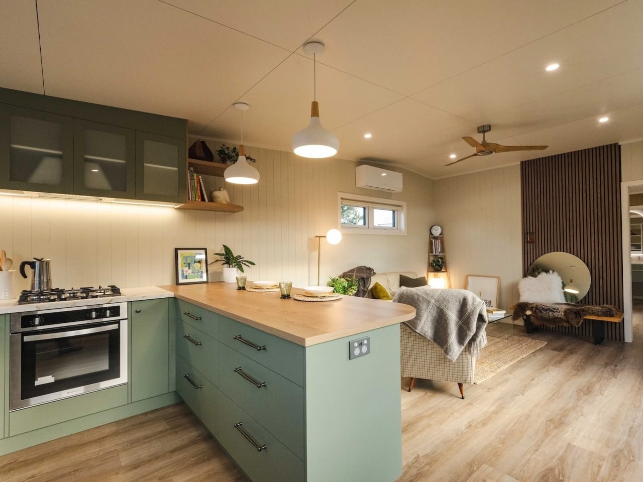
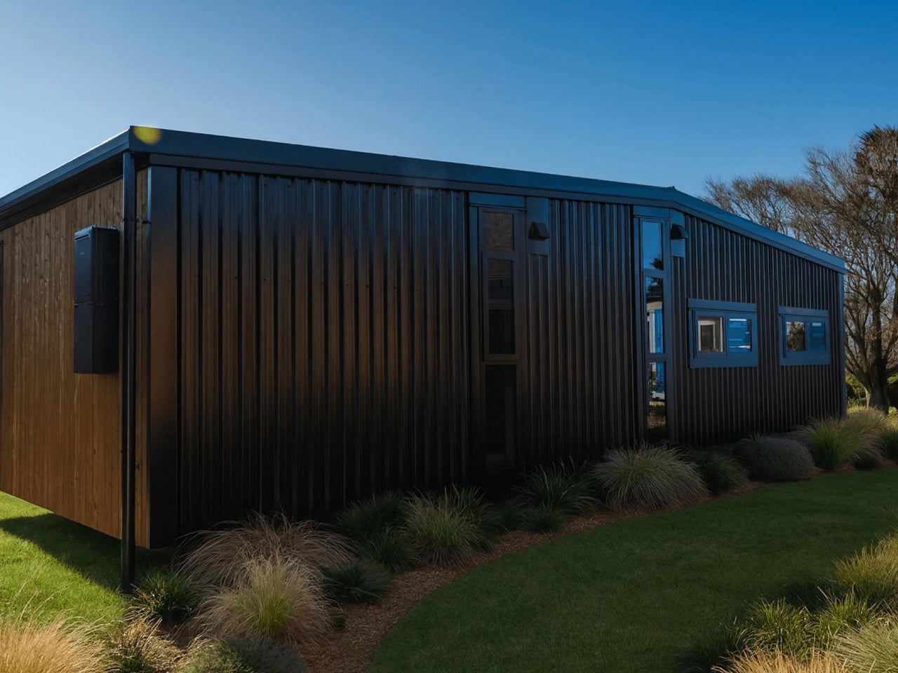
The English Garden by South Base Tiny Homes reimagines compact home design by creating a space that feels open, warm, and highly functional despite its modest footprint. Unlike many tiny homes that rely on lofts and ladders, this residence follows a single-level layout that allows every room to flow naturally into the next. Large windows fill the interiors with sunlight, enhancing the warmth of the timber finishes and soft earthy tones used throughout the home. Inspired by traditional English cottages, the design combines cosy textures with a relaxed coastal aesthetic, making the compact dwelling feel more like a refined apartment and not just a typical tiny house.
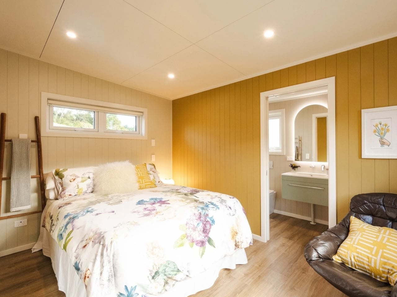
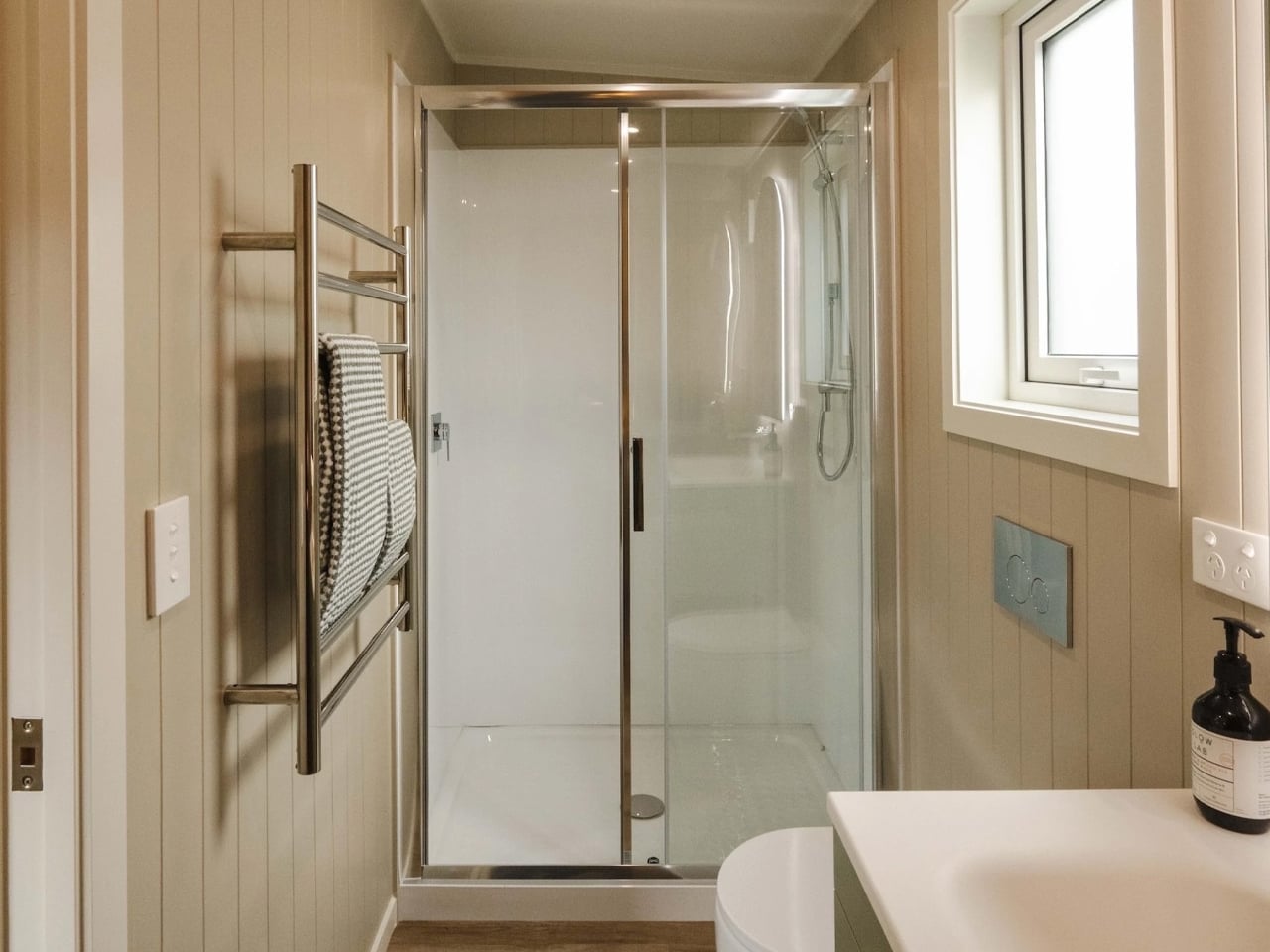
The kitchen features warm wood cabinetry, generous storage, a farmhouse sink, and a full cooking setup that supports everyday living. At one end, the bedroom connects directly to a private bathroom, creating a suite-like arrangement that adds a sense of luxury to the compact interior. Natural materials, warm colours, and thoughtful spatial planning work together to make the home feel calm, inviting, and visually spacious.
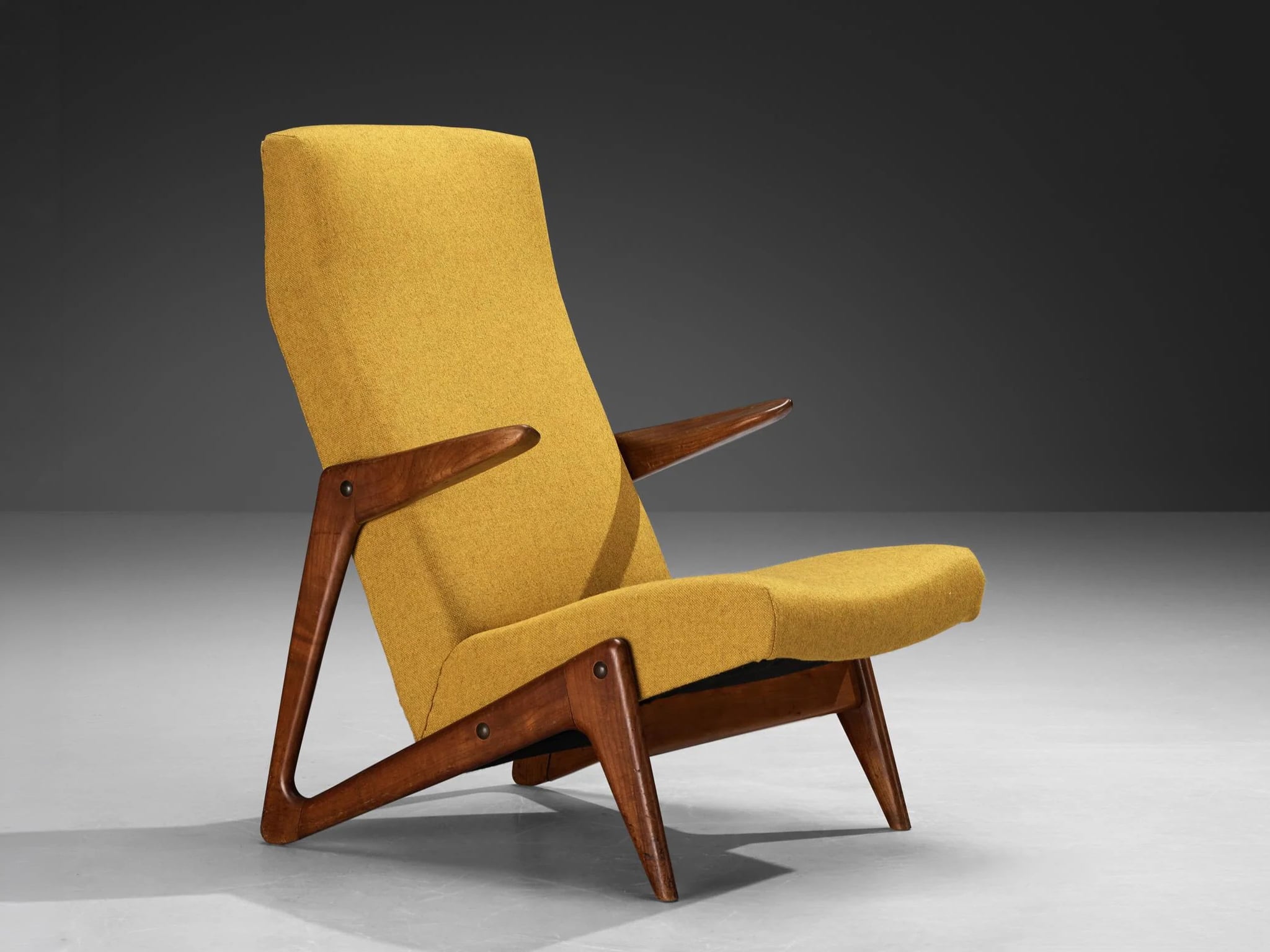
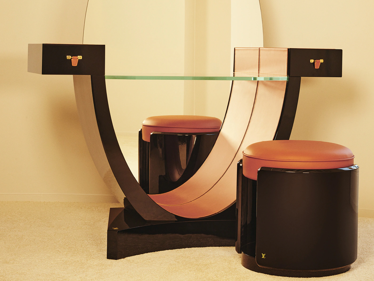
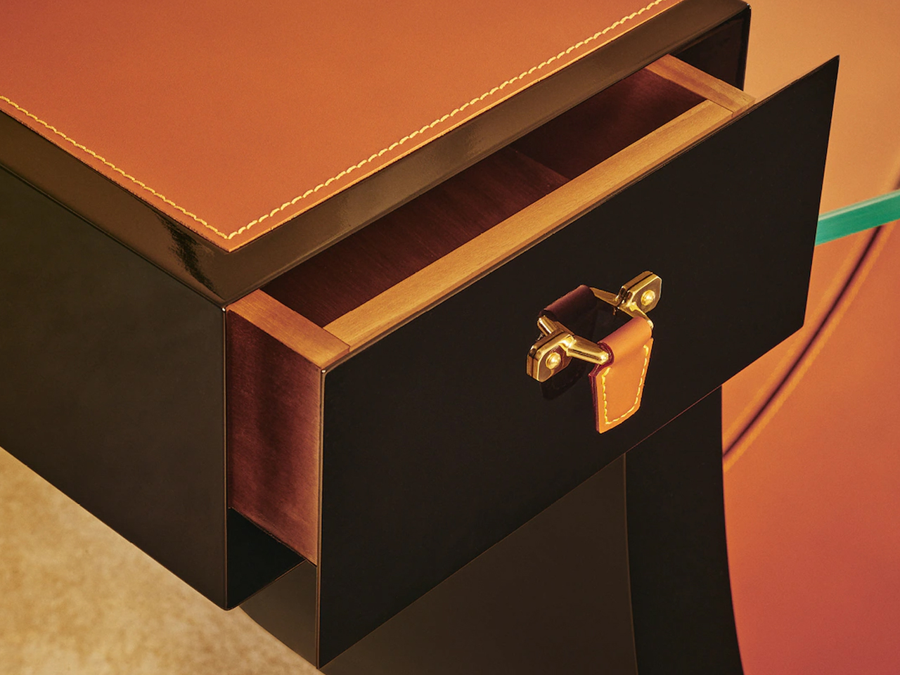
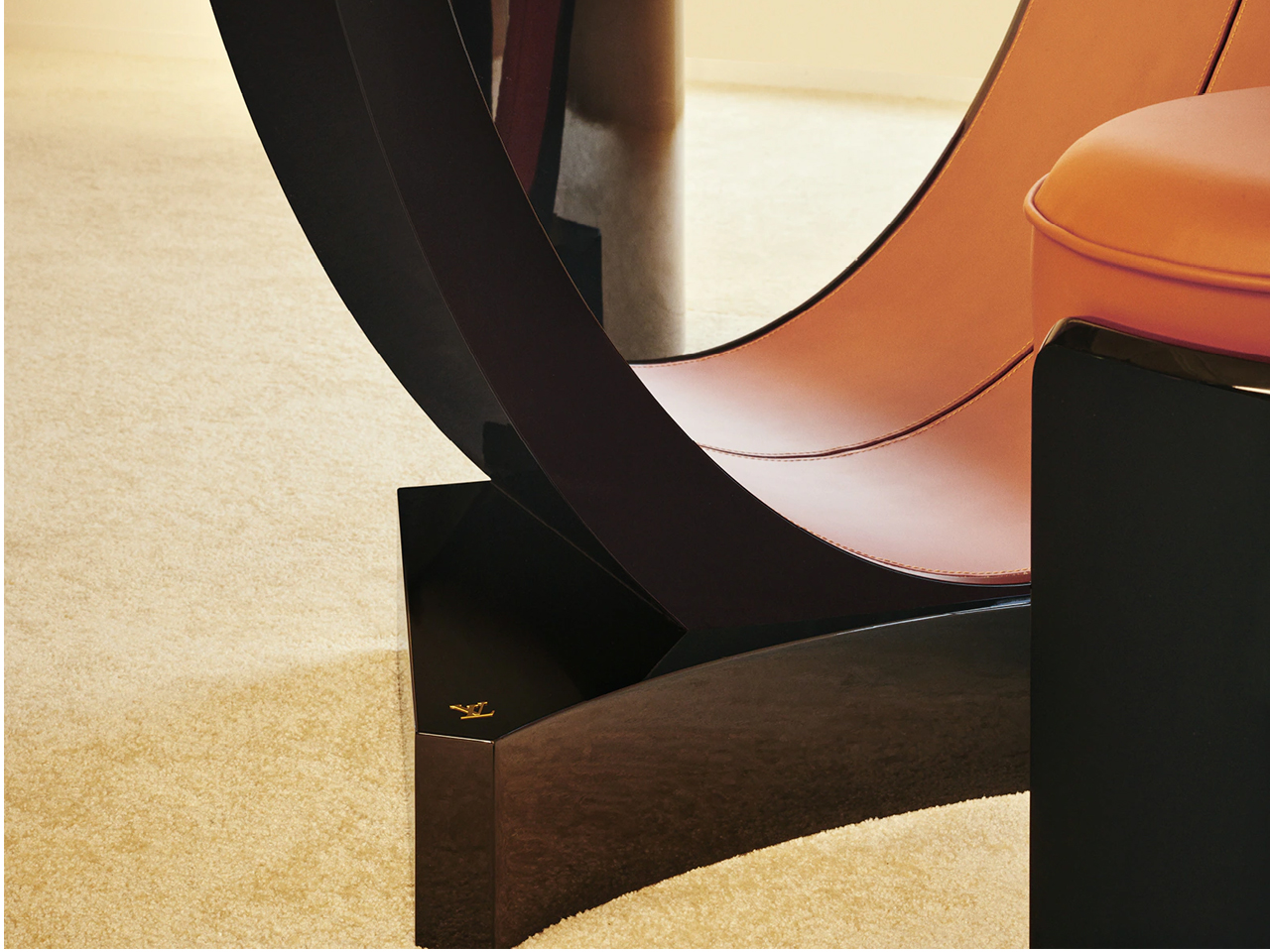
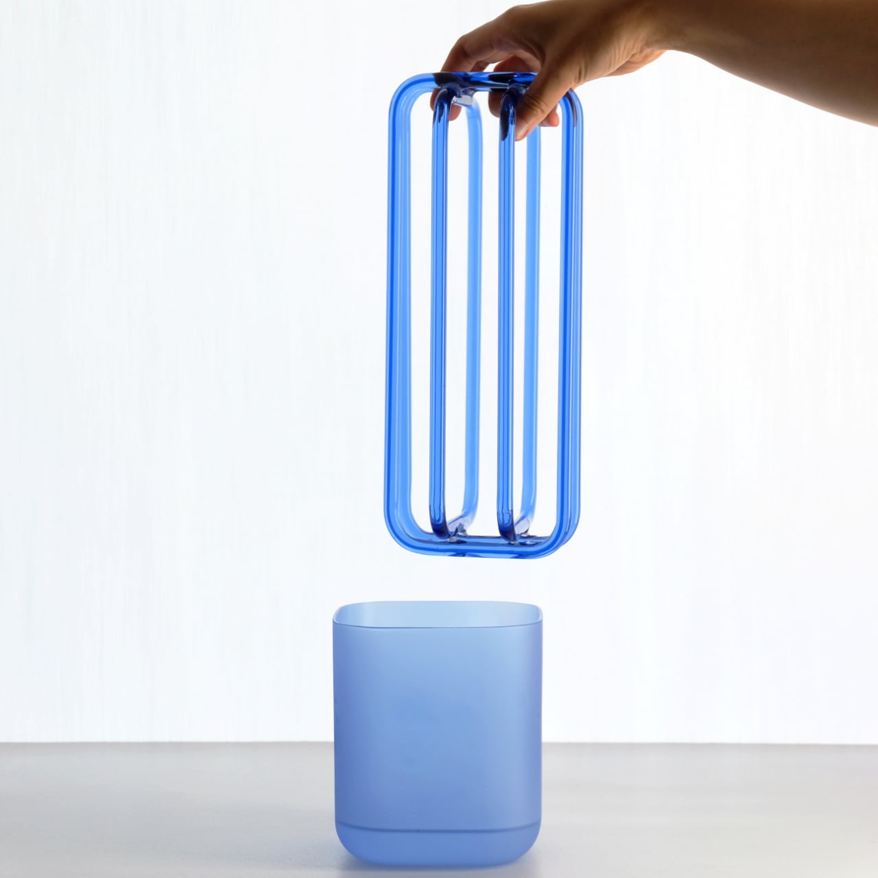
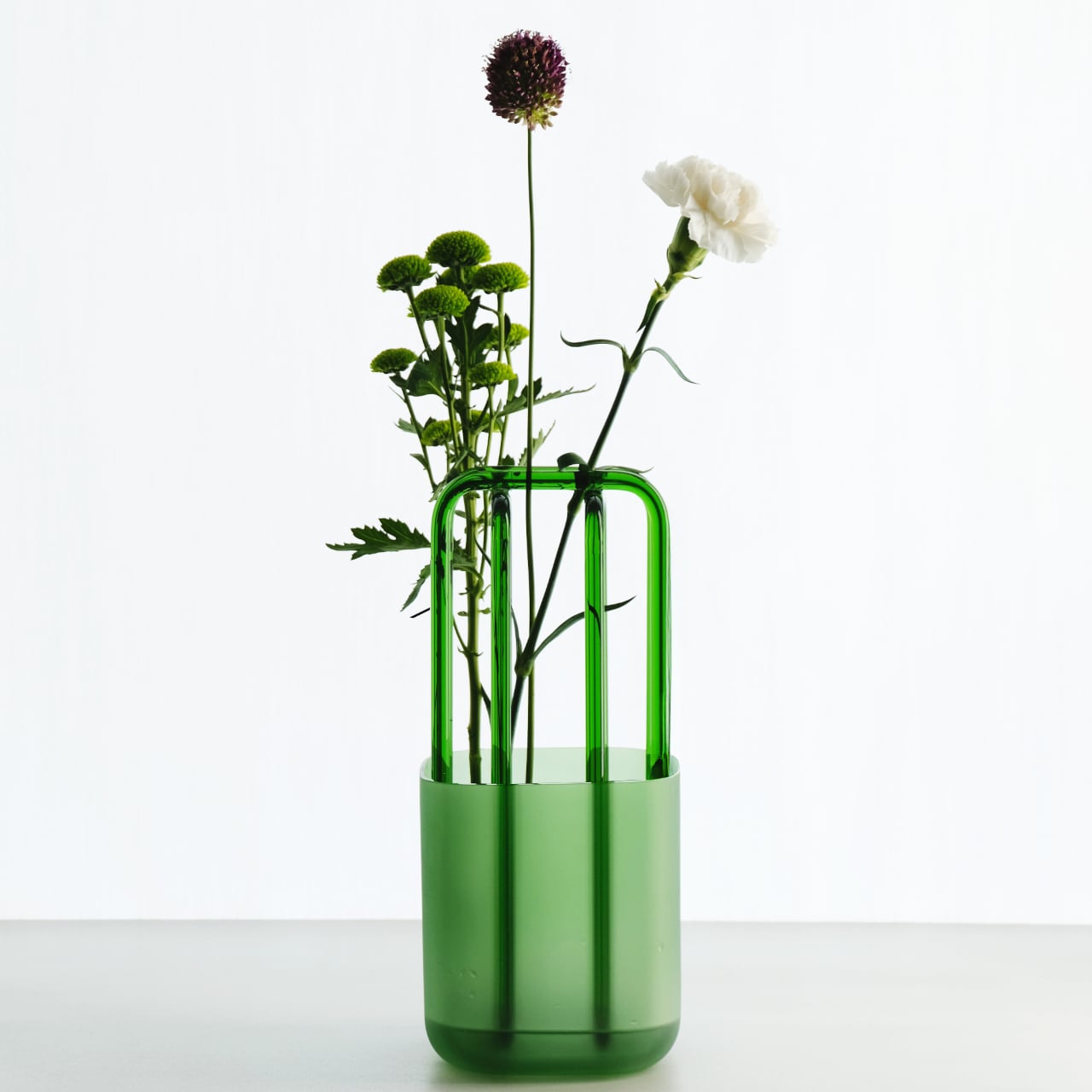
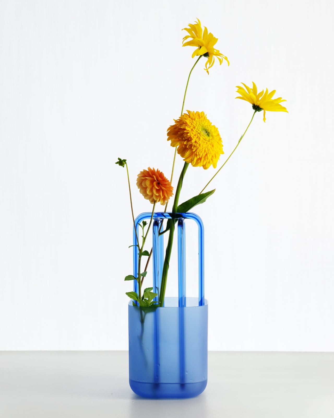
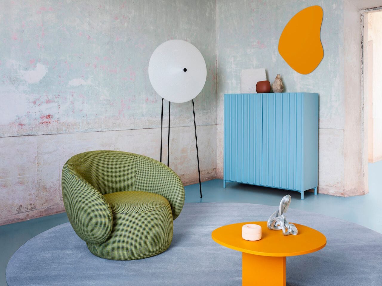
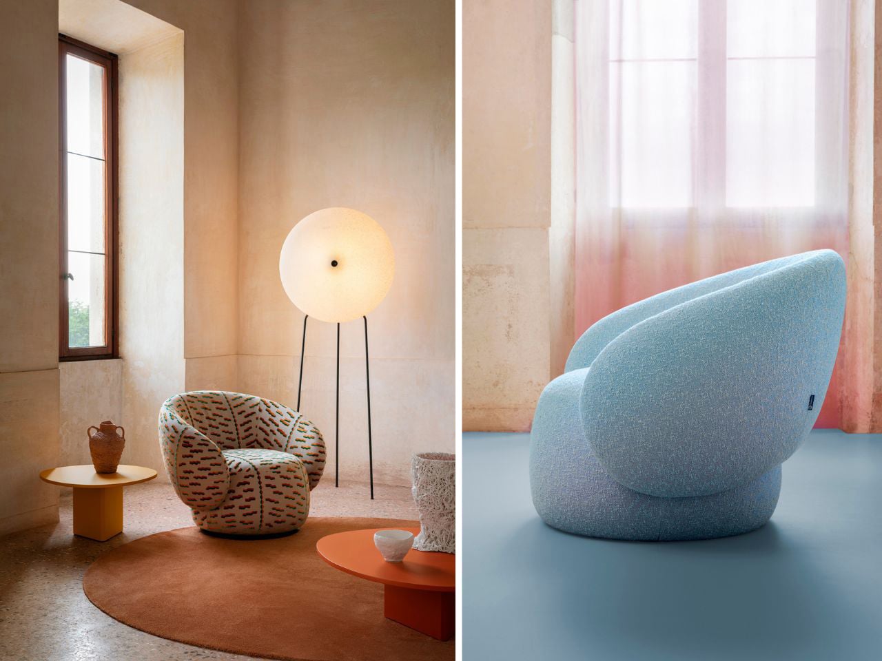
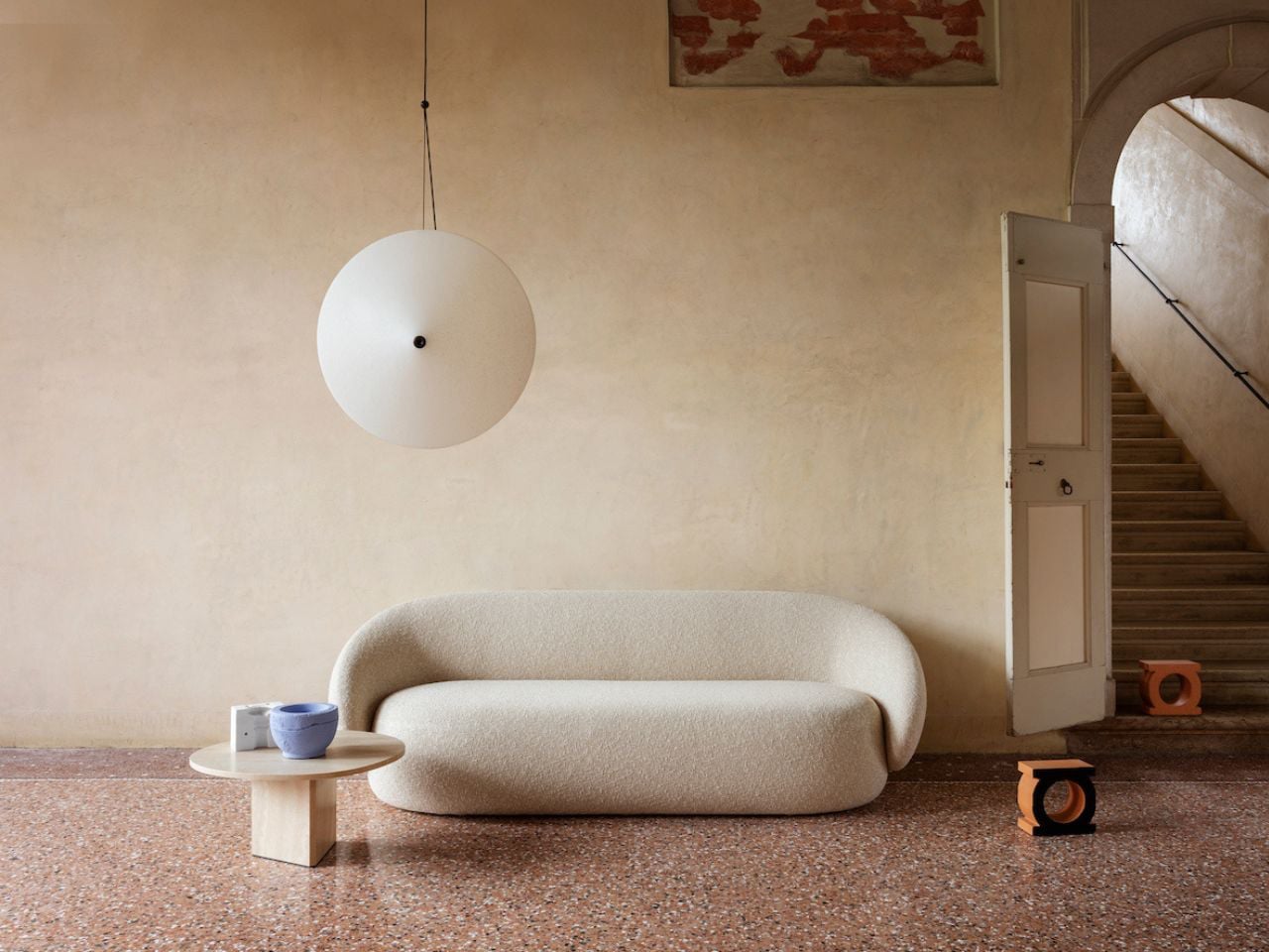
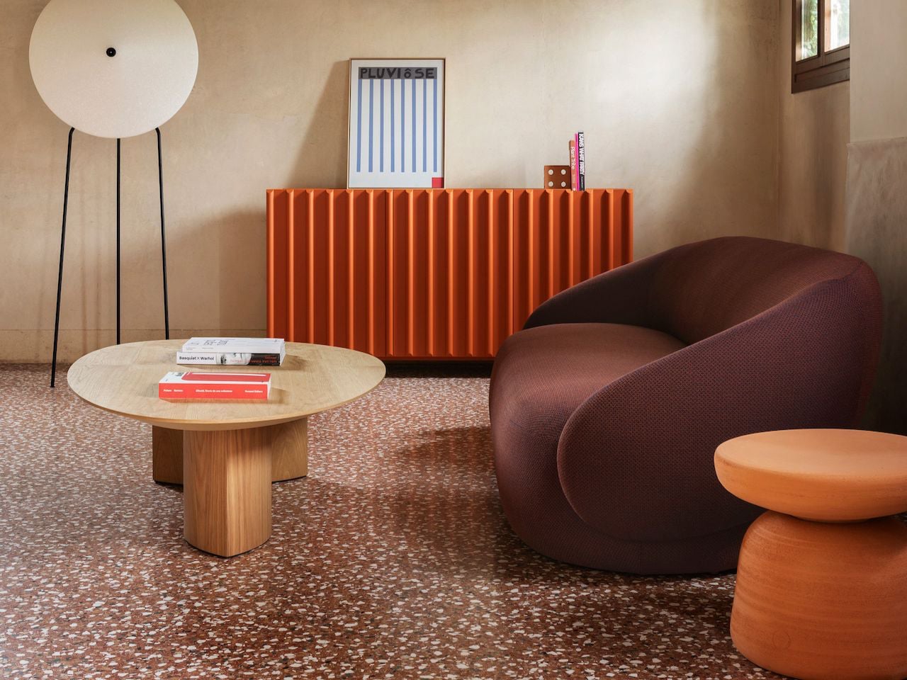
2. Curved Furniture Becomes the Dominant Silhouette
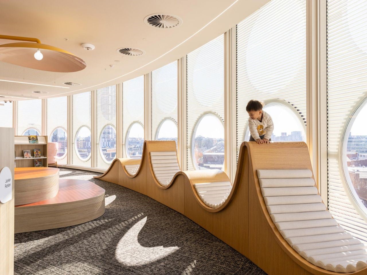
The curved furniture trend has officially moved into the mainstream. Sofas with rounded backs, circular coffee tables, arched shelving, and soft-edged islands are replacing the sharp, angular minimalism that dominated the late 2010s. Interiors now prioritize flow and comfort over strict geometry, creating spaces that feel visually softer and easier to inhabit.
Designers are leaning into sculptural forms because they make rooms feel more organic and less rigid. Rounded silhouettes also work well with smaller urban homes, where softened corners visually reduce harshness and improve movement through space. Even luxury kitchens and bathrooms are adopting curved detailing through fluted islands, oval mirrors, and arched entryways. The clean-lined boxy aesthetic is slowly giving way to interiors that feel fluid and calming.
The Nebula collection by Miniforms transforms furniture into sculptural design objects inspired by the softness and fluidity of clouds. Defined by sweeping curves and oversized teardrop-shaped armrests, the collection creates a bold visual identity that feels both artistic and comforting. The Nebulona Armchair features a cocoon-like silhouette with rounded edges that flow seamlessly into the seat and backrest, giving the piece an organic and almost floating appearance. Its soft curves and voluminous form add a sense of movement, turning the armchair into a sculptural centerpiece within modern interiors.
Expanding the collection’s curvaceous language, the Nebulone Sofa introduces elongated proportions and exaggerated rounded forms that emphasize comfort through design. Crafted with plush contours and seamless curves, the sofa creates a fluid silhouette that feels soft from every angle. The oversized armrests and sculpted structure enhance its artistic presence while maintaining a welcoming atmosphere. With its cloud-like shapes, tactile upholstery, and flowing geometry, the Nebula collection blurs the line between furniture and sculpture, bringing a sense of softness and visual elegance into contemporary living spaces.
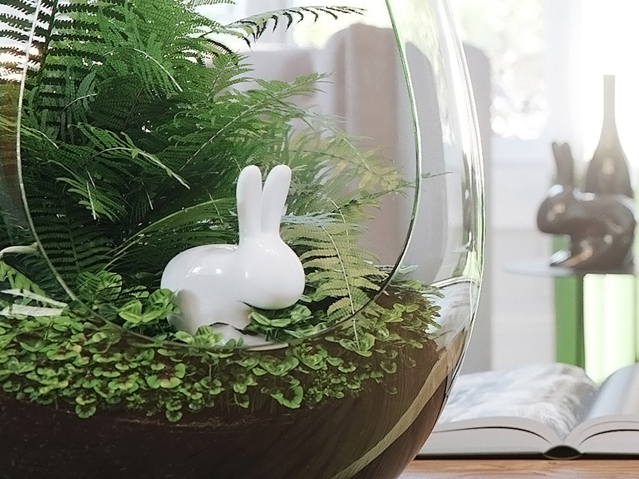
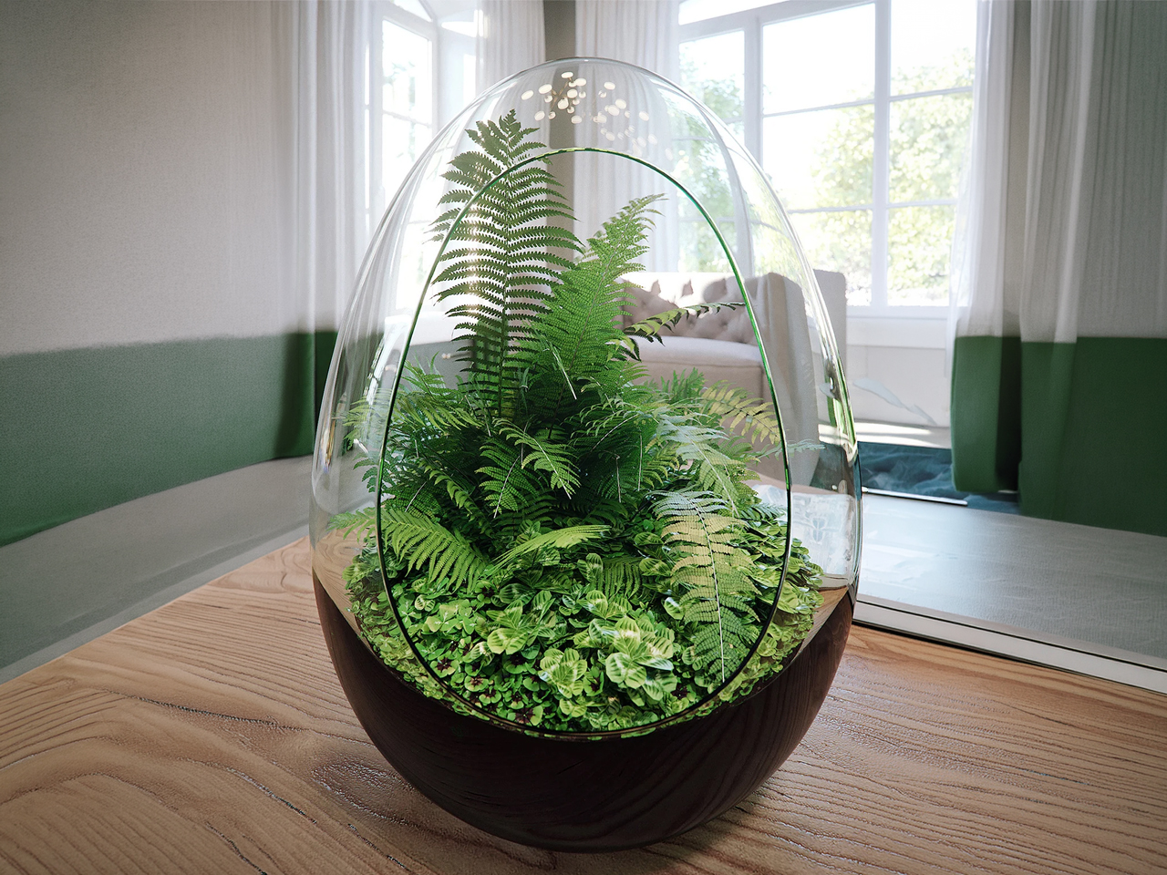
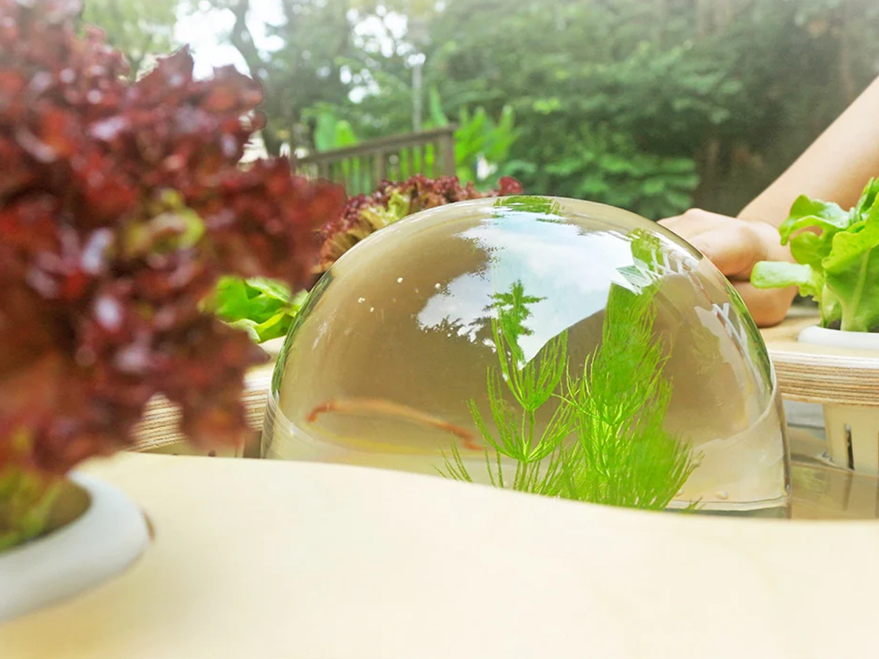
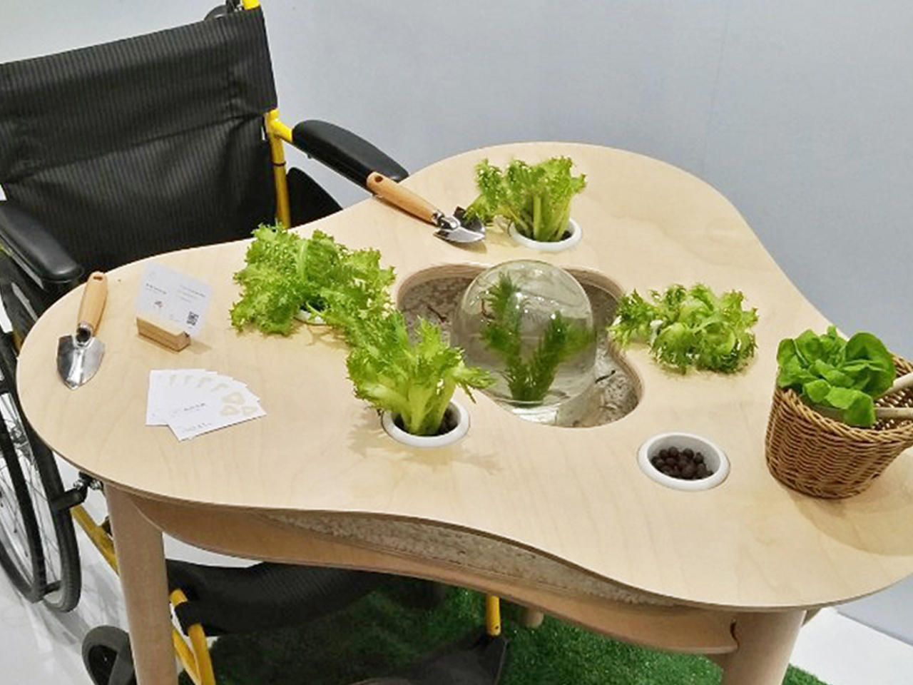
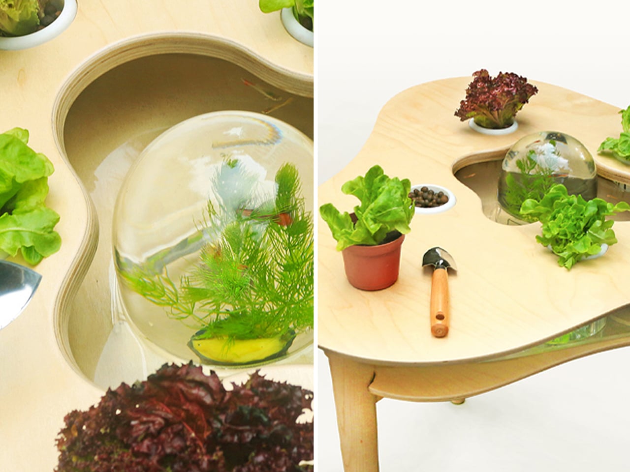
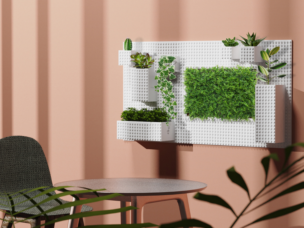
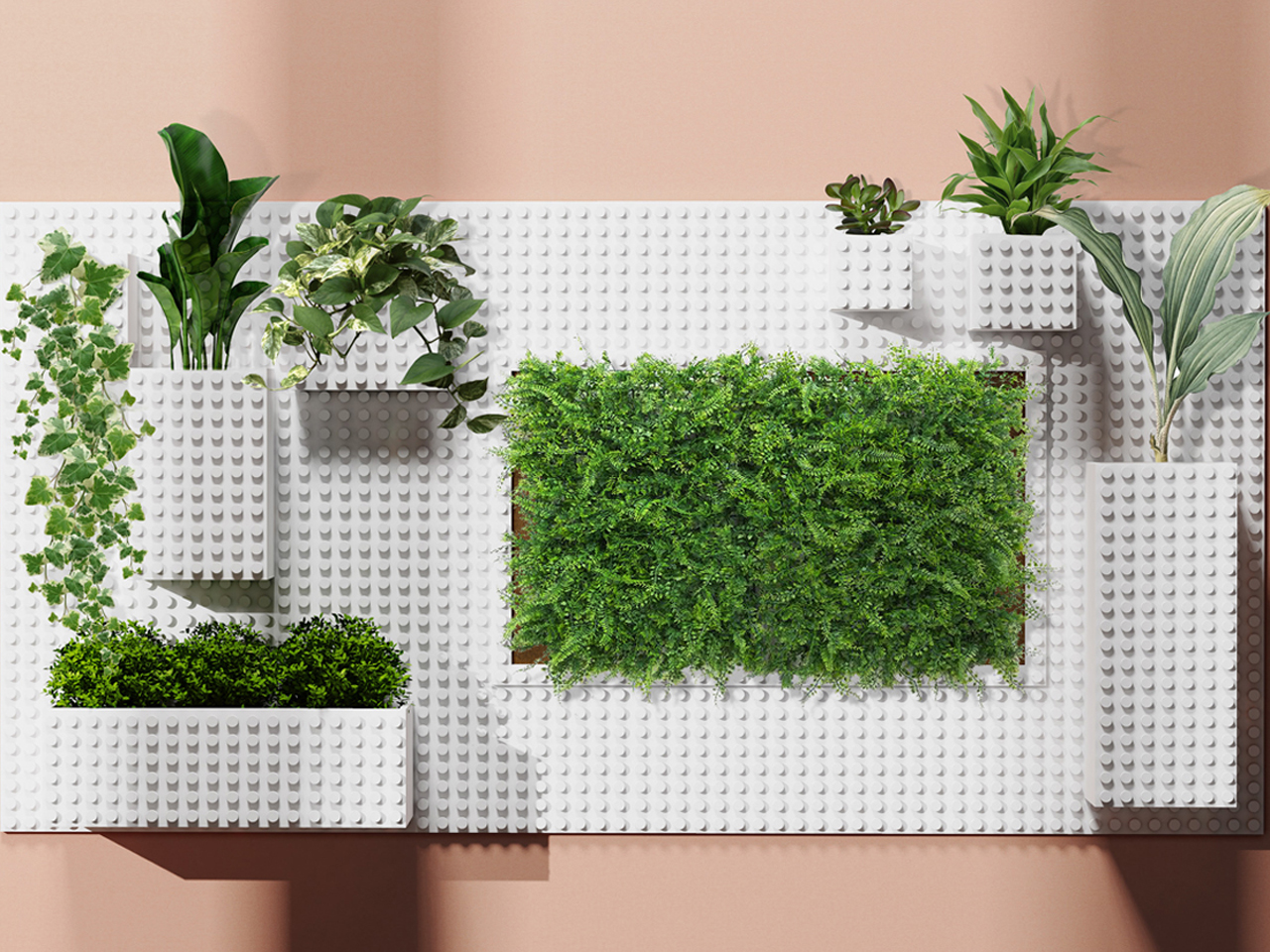
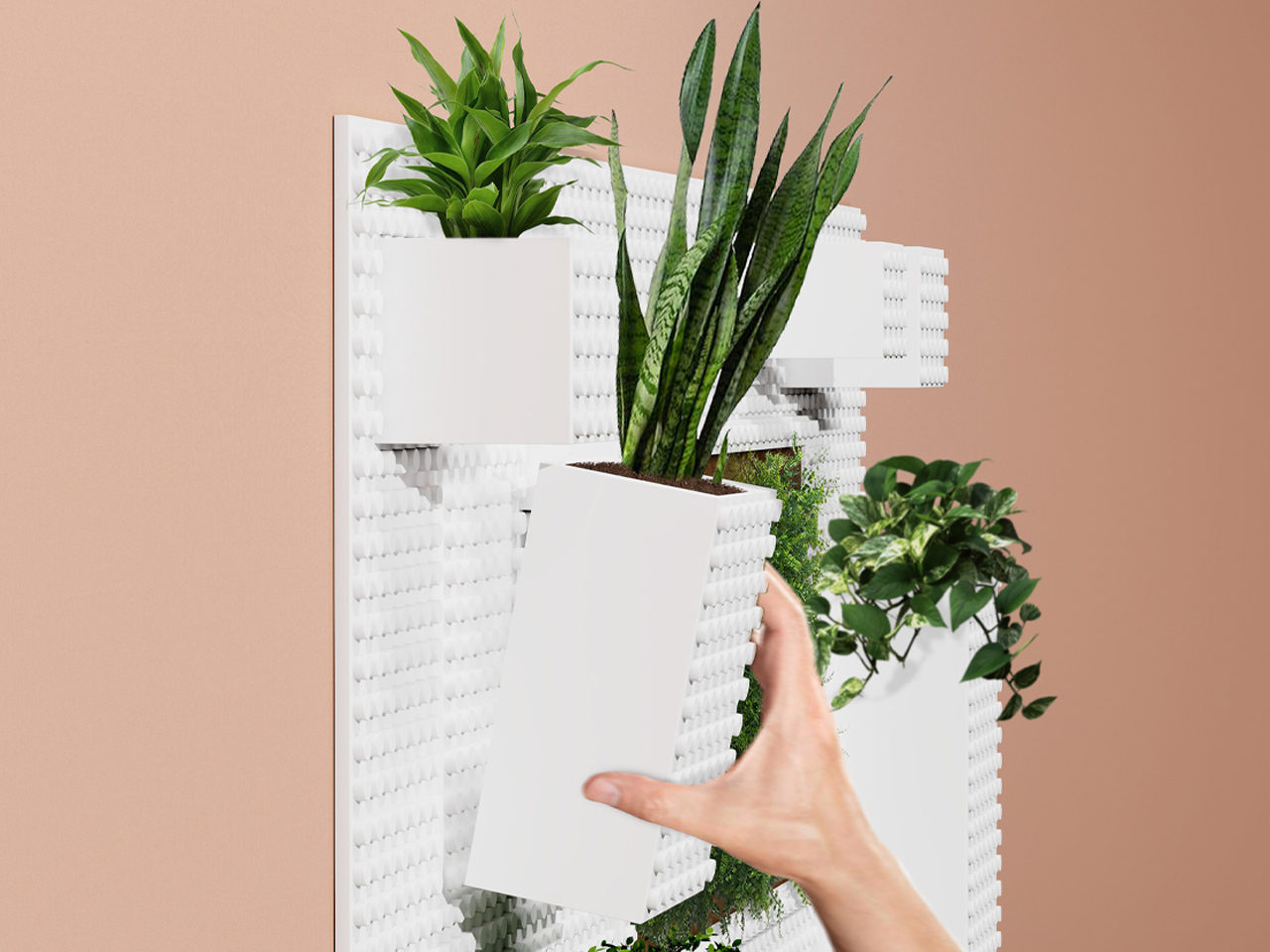
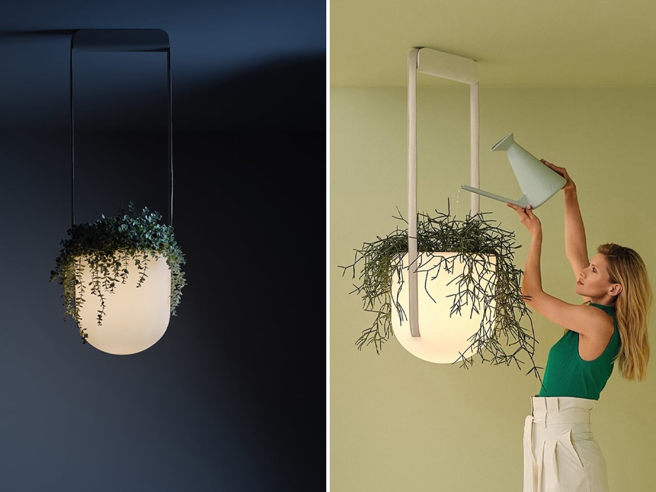
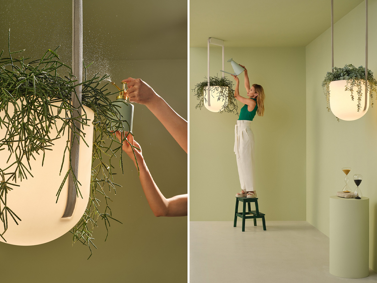
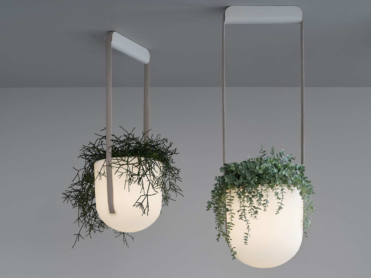
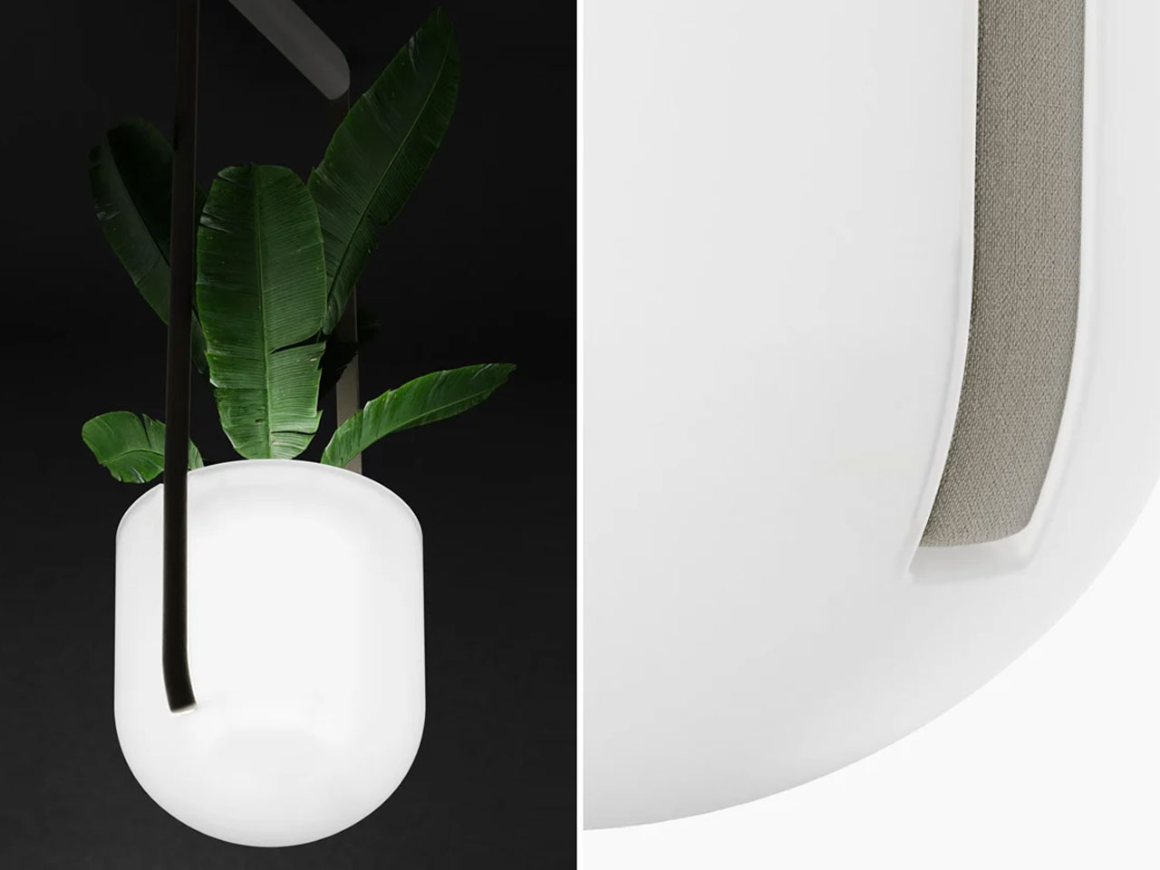
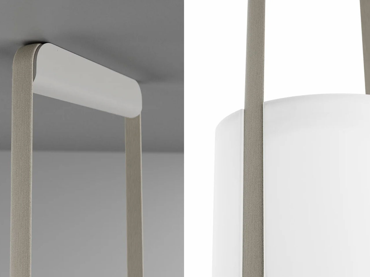
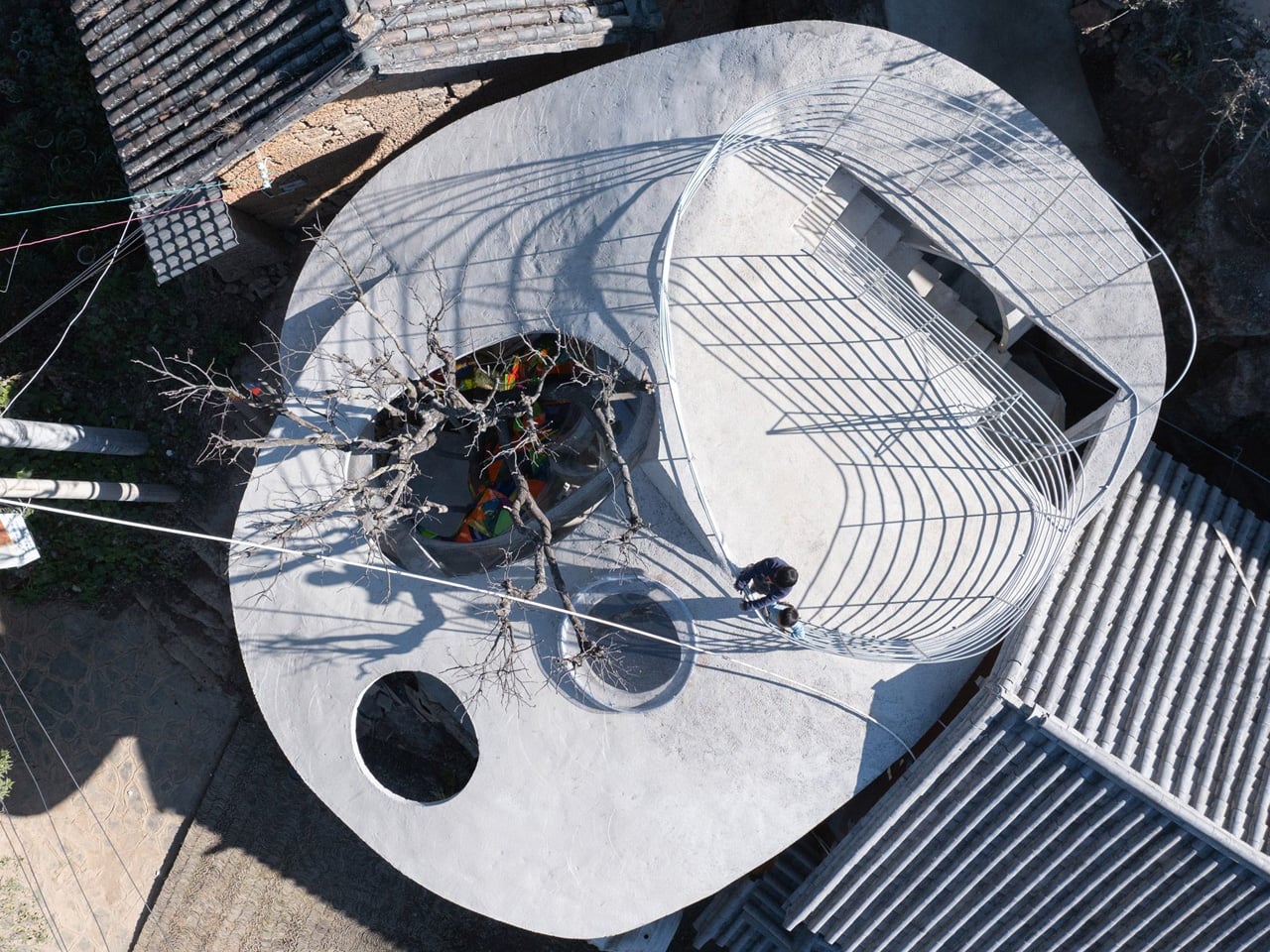
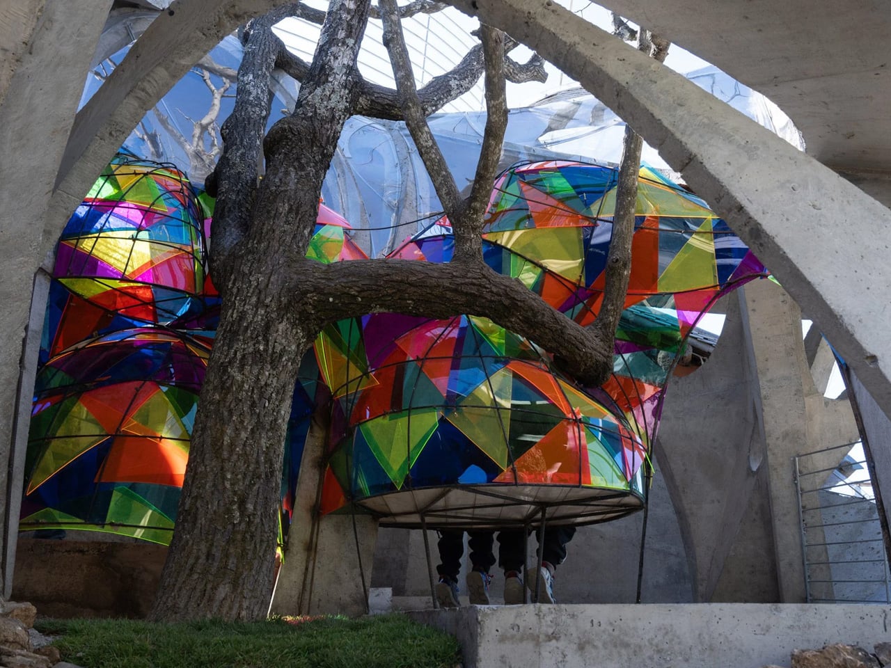
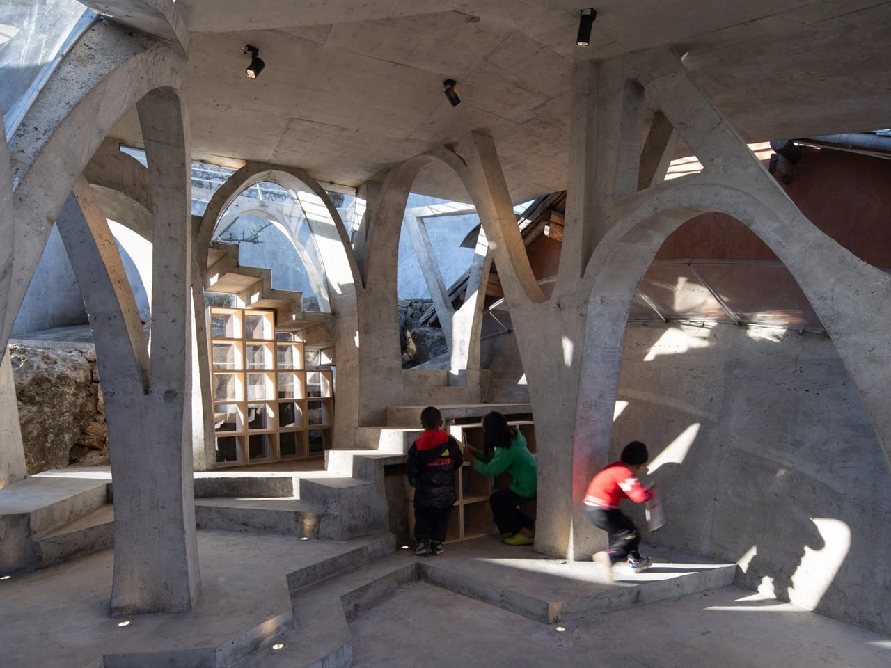
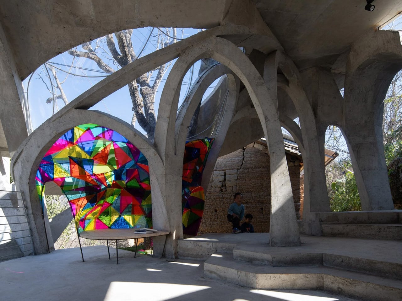
3. Biophilic Interiors become Bolder and more Architectural
Biophilic interior design is no longer limited to a few indoor plants near a window. In 2026, the trend has become far more immersive and architectural. Stone walls, exposed timber beams, indoor courtyards, oversized skylights, and integrated greenery are increasingly becoming part of the actual structure of the home rather than decorative additions.
Natural materials are also appearing in more expressive ways. Travertine, raw limestone, textured slate, and reclaimed wood are being used to create tactile surfaces with visible imperfections and grain. Designers are embracing materials that feel alive and weathered instead of polished and artificial. Living walls and oversized plants remain popular, but the real evolution lies in how architecture itself is being designed to reconnect interiors with nature.
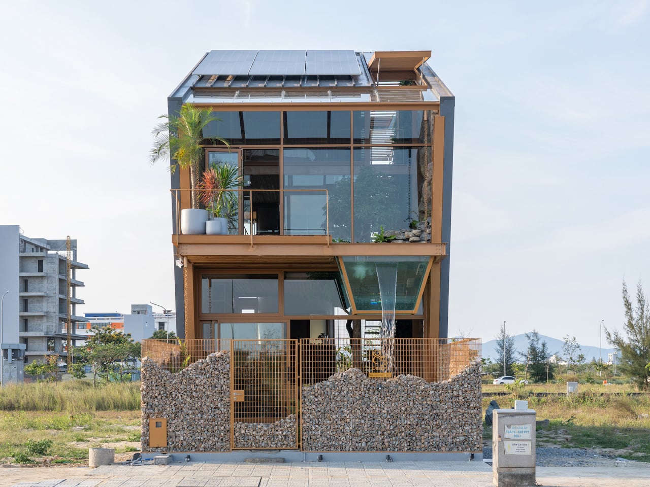
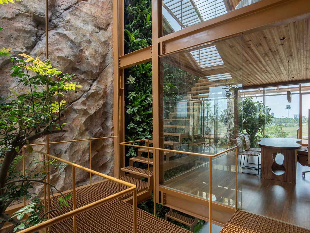
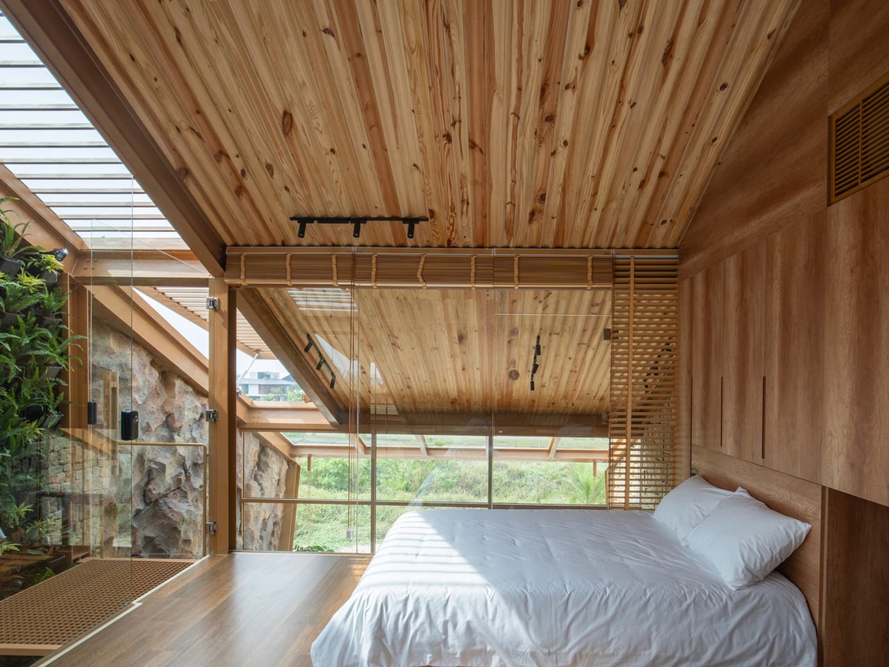
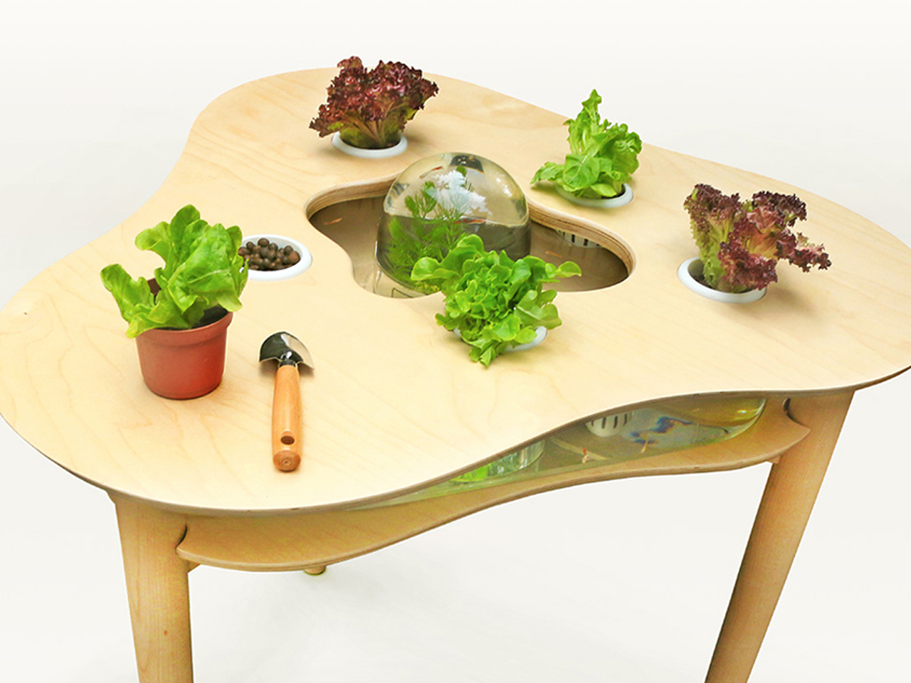
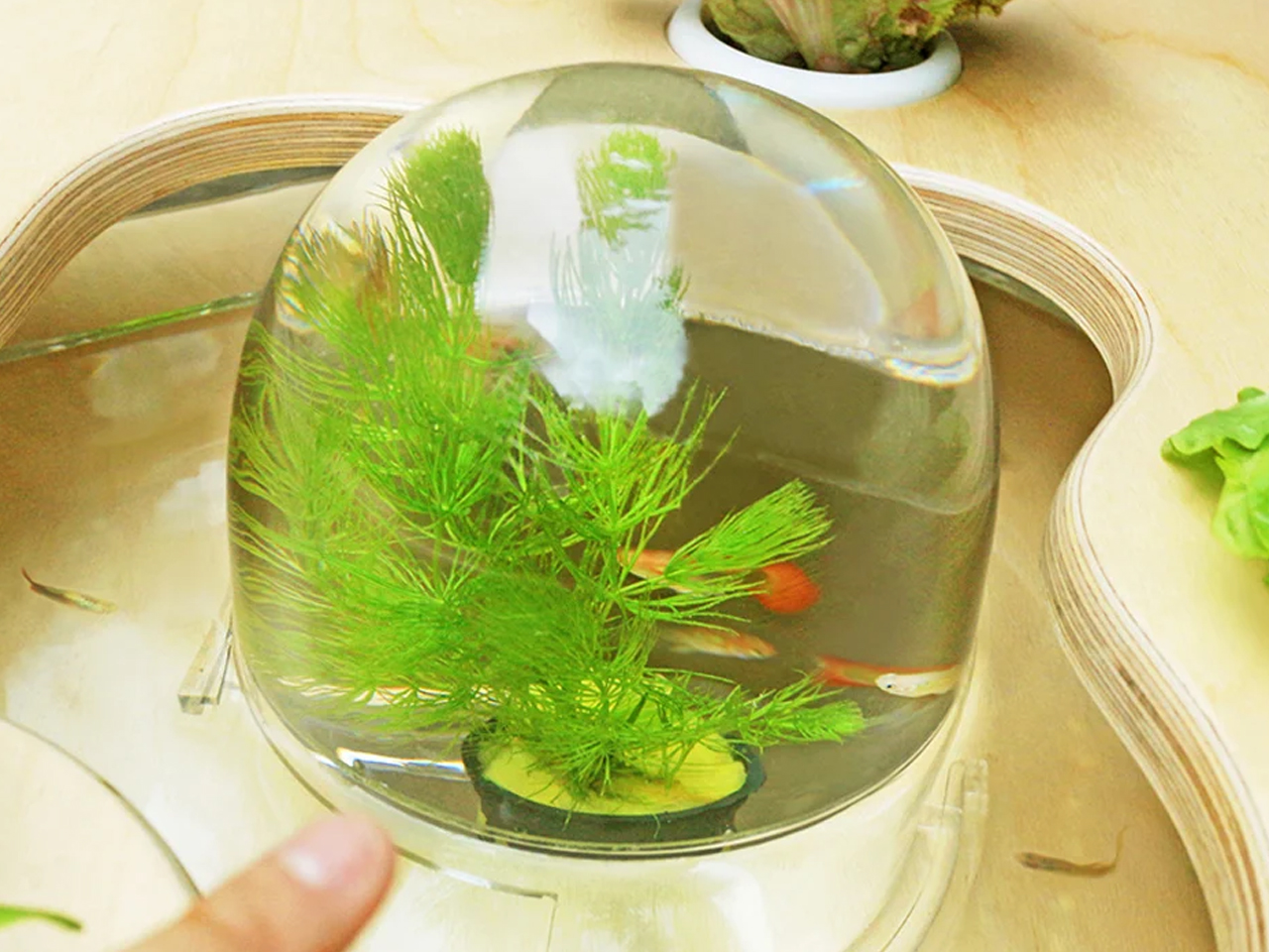
G.ao House by 85 Design embraces biophilic design by creating a strong connection between architecture and nature within a compact urban setting in Vietnam. Surrounded by tropical greenery, the residence combines indoor and outdoor living through open layouts, natural airflow, and abundant daylight. Gardens wrap around the structure, softening the building’s footprint while improving ventilation and creating a calming environment. Water features, reclaimed stone, and lush planting introduce natural textures throughout the home, allowing the spaces to feel deeply connected to the surrounding landscape.
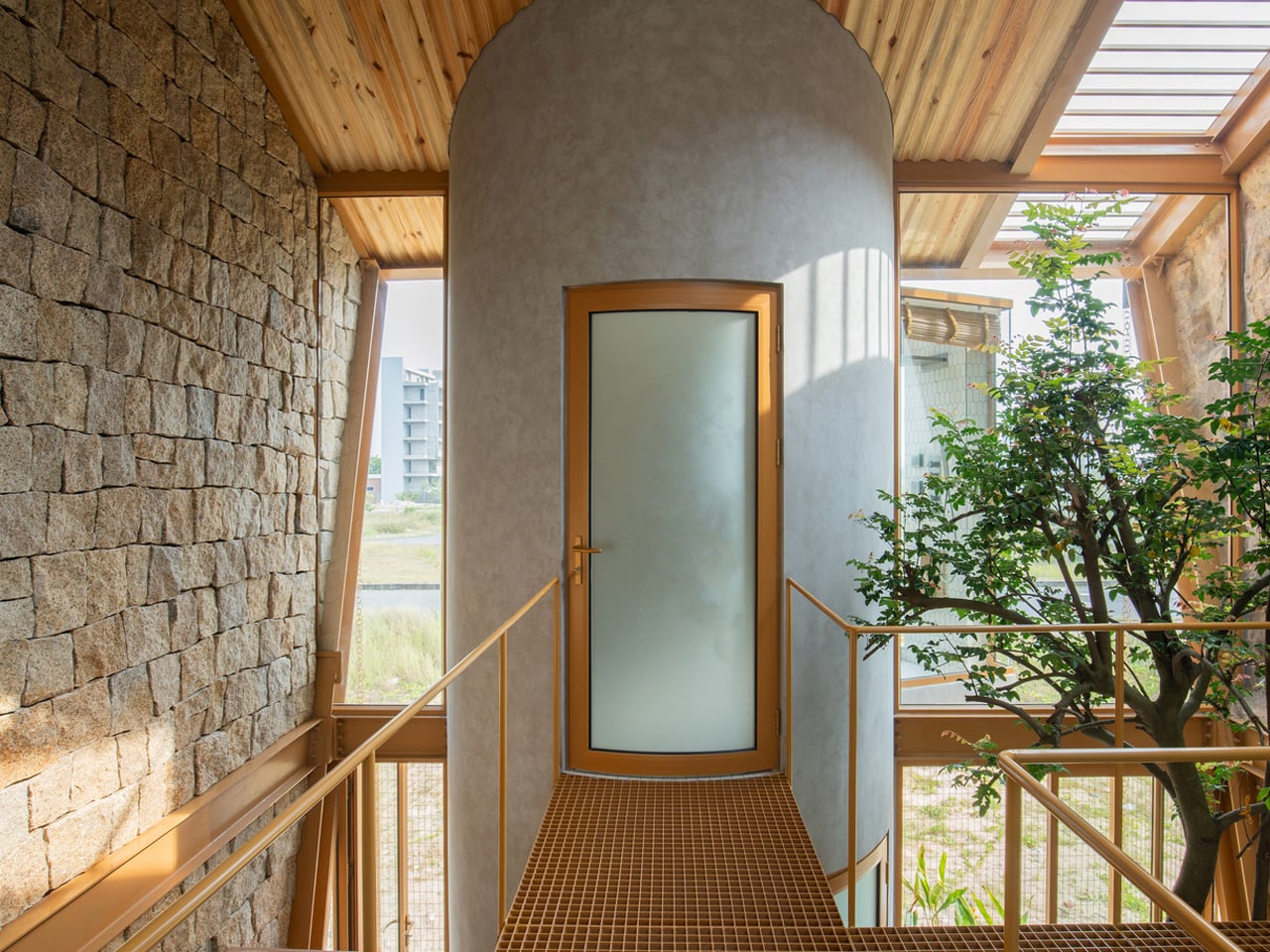
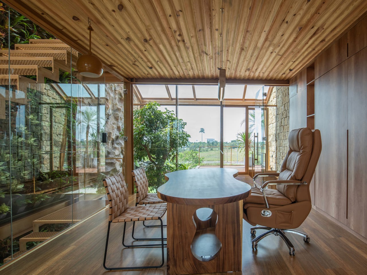
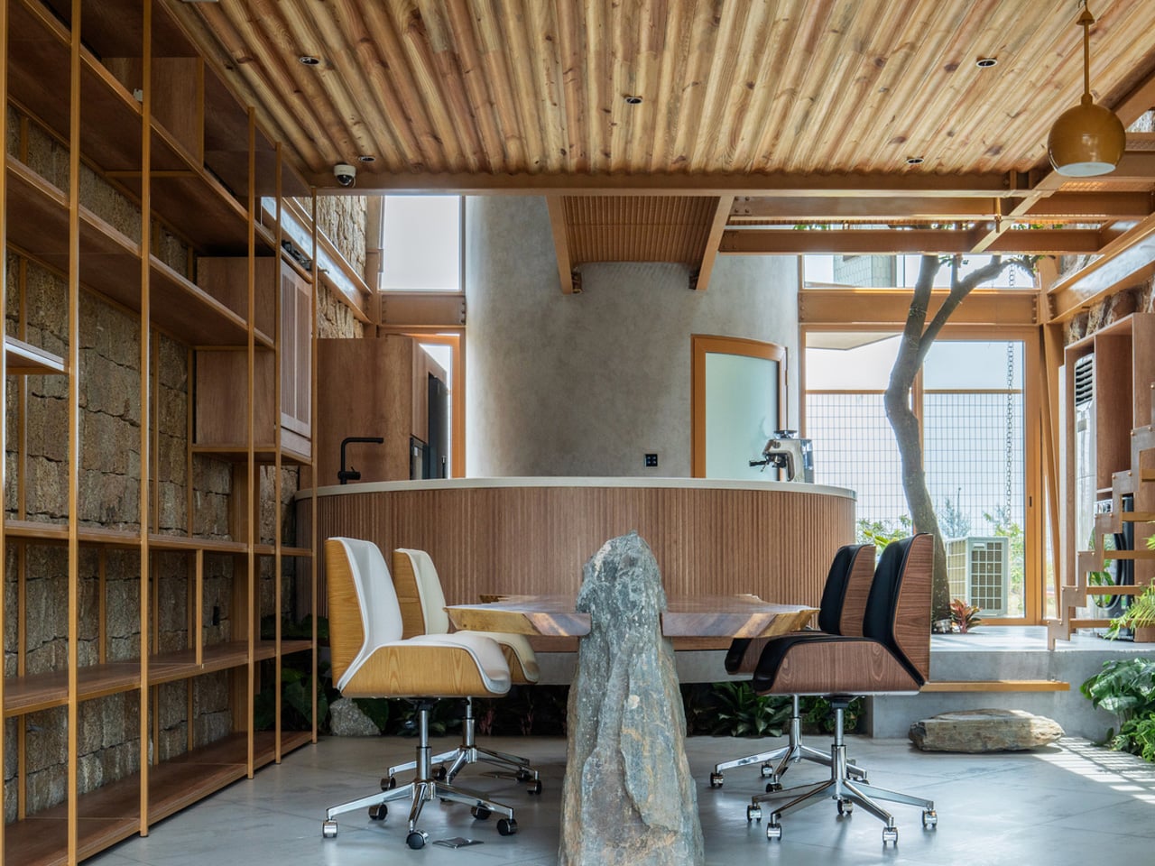
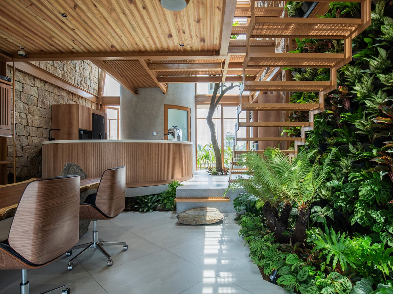
The interior design further strengthens this relationship with nature through layered sensory elements and fluid spatial planning. A double-height void increases openness and allows sunlight to move freely across the interiors, while balconies, cascading water features, and a glass fish tank add movement and tranquility. Flexible living and working spaces are carefully positioned to maintain visual links with greenery at every level. By blending sustainable materials with biophilic principles, G.ao House creates a peaceful environment that promotes comfort, well-being, and harmony with nature.
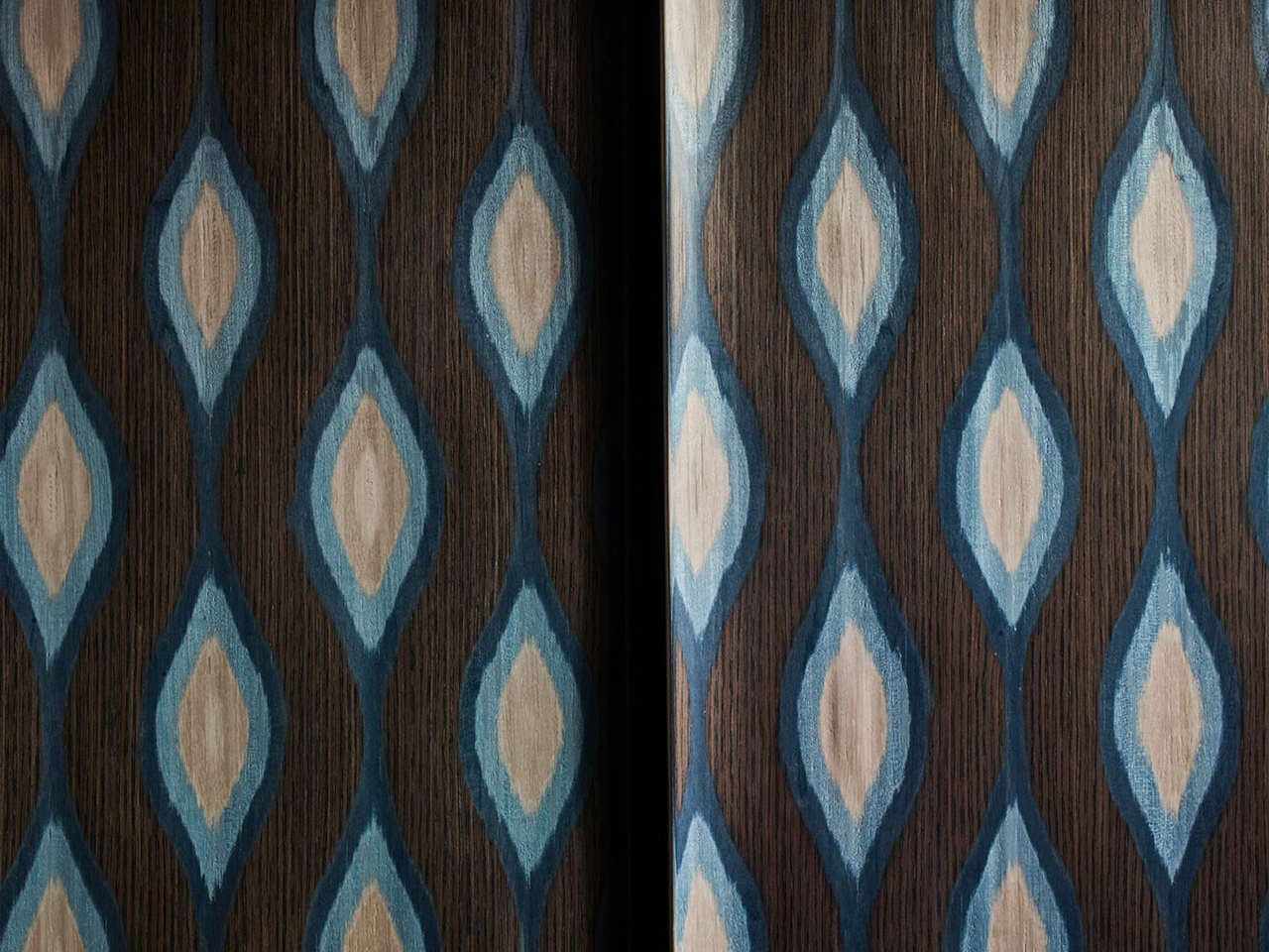
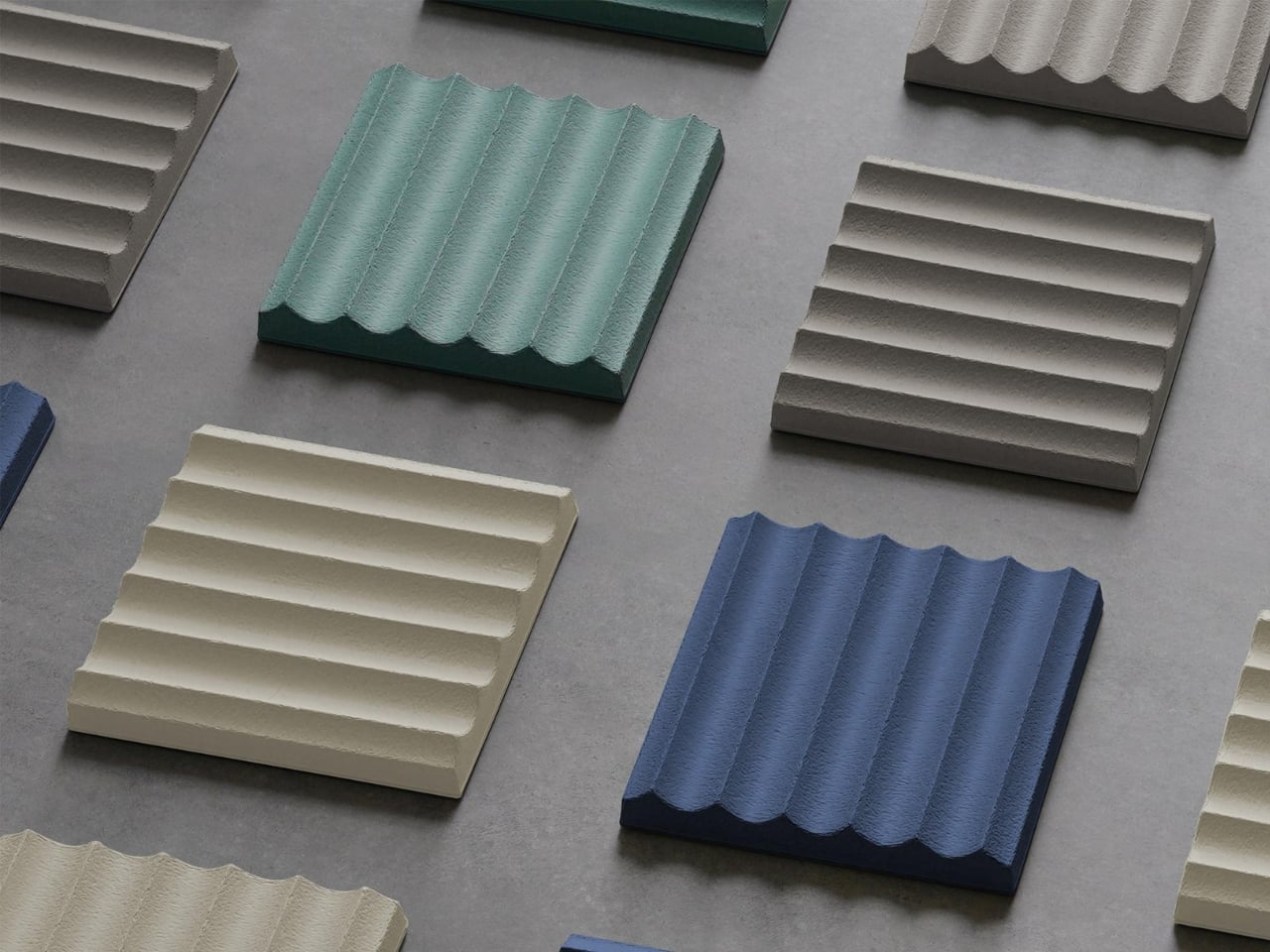
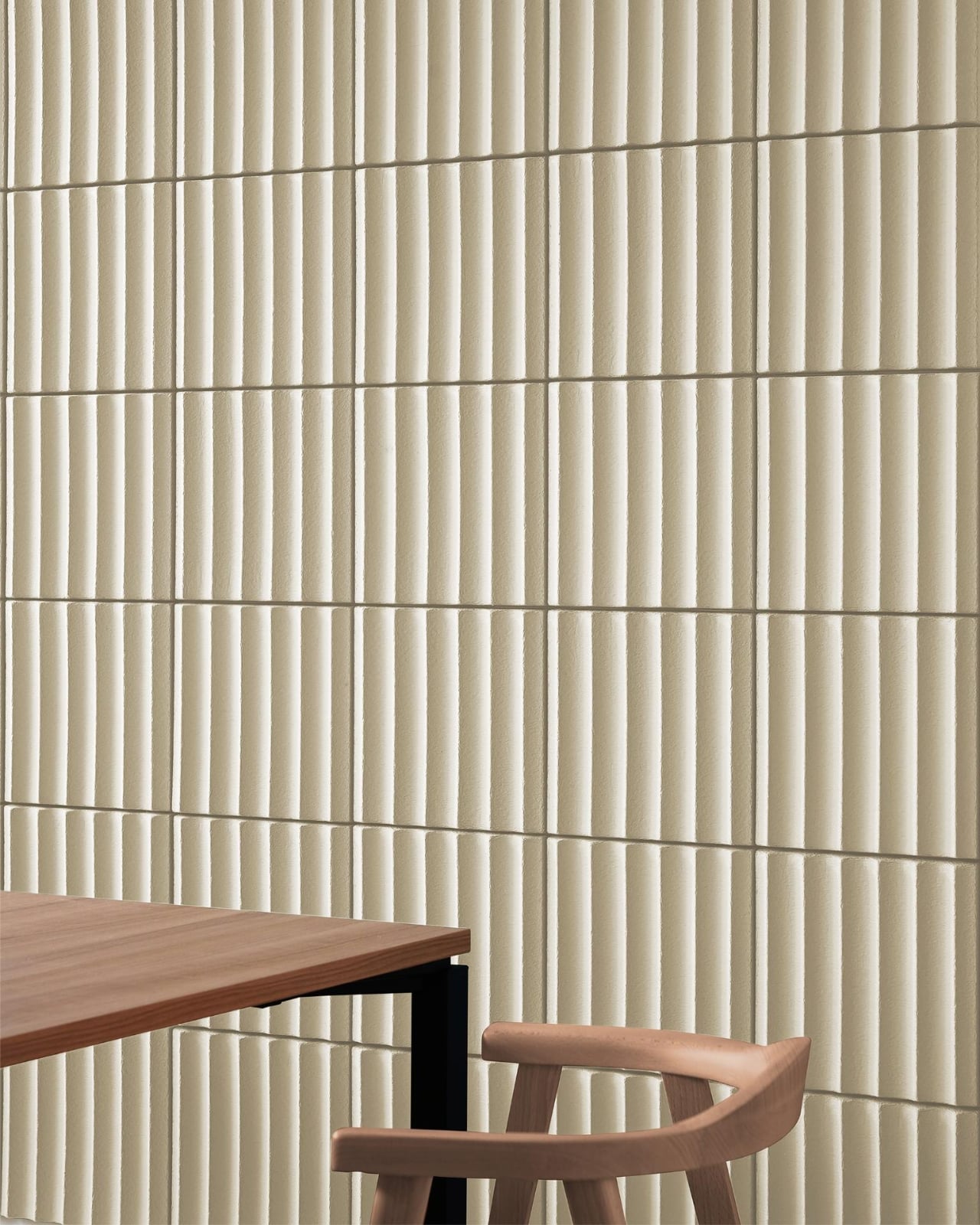
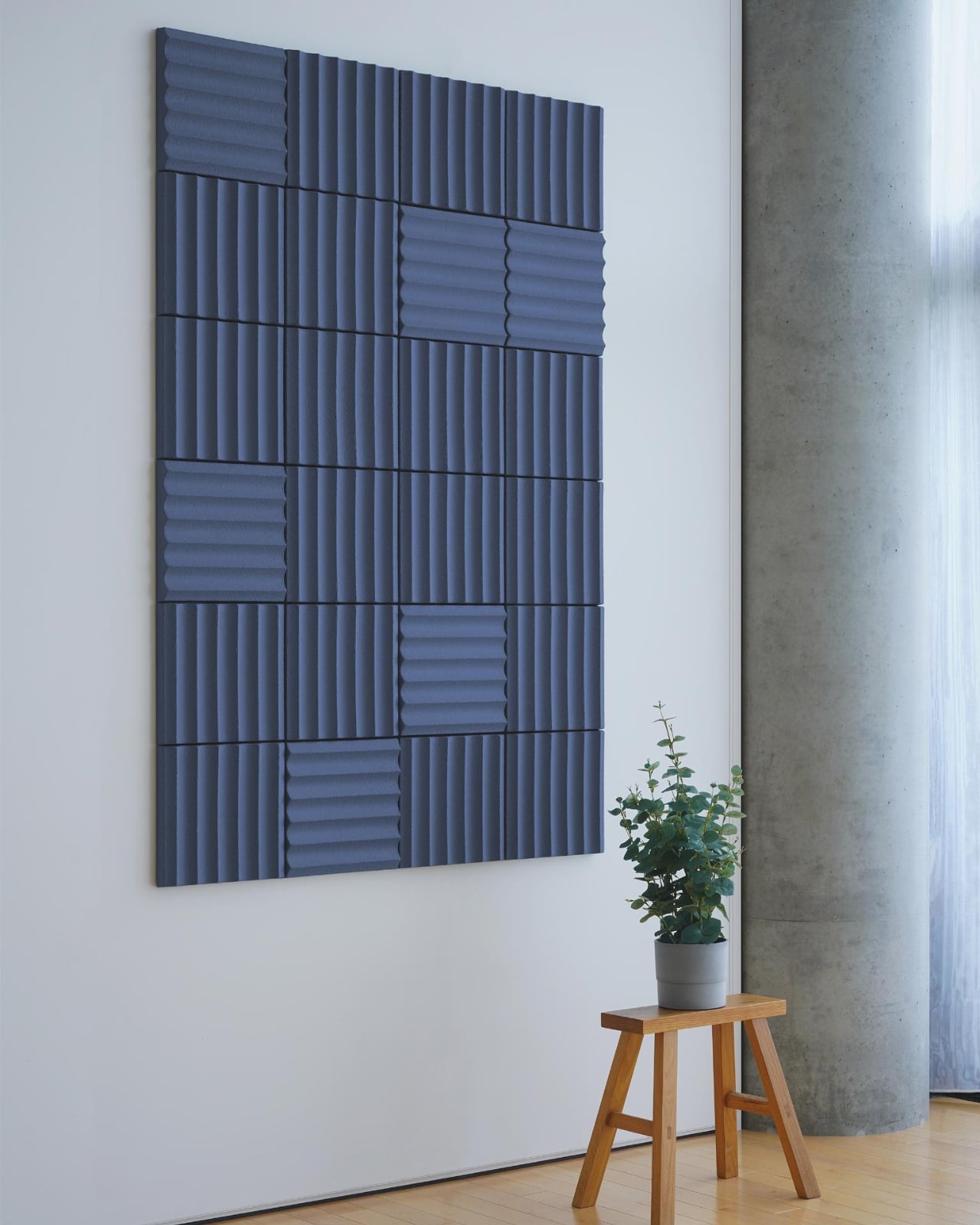
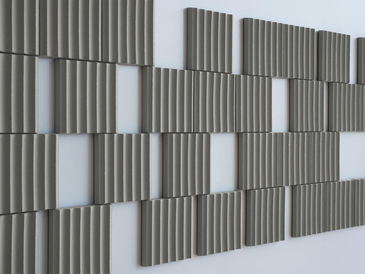
4. Tactile Walls Replace Flat Minimal Surfaces
One of the biggest 2026 home decor trends is the return of surface texture. Limewashed walls, slatted wood paneling, ribbed finishes, and decorative molding are transforming interiors that once relied on flat painted drywall. Homeowners are increasingly looking for depth, shadow, and handcrafted character within spaces.
Limewash, in particular, has become popular because of its soft movement and imperfect finish, which changes subtly throughout the day with natural light. Slatted wood detailing is also appearing everywhere, from bedrooms to kitchen islands, because it introduces warmth and rhythm without feeling overly decorative. Instead of smooth perfection, interiors now celebrate material variation and tactile richness that make spaces feel layered and visually engaging.
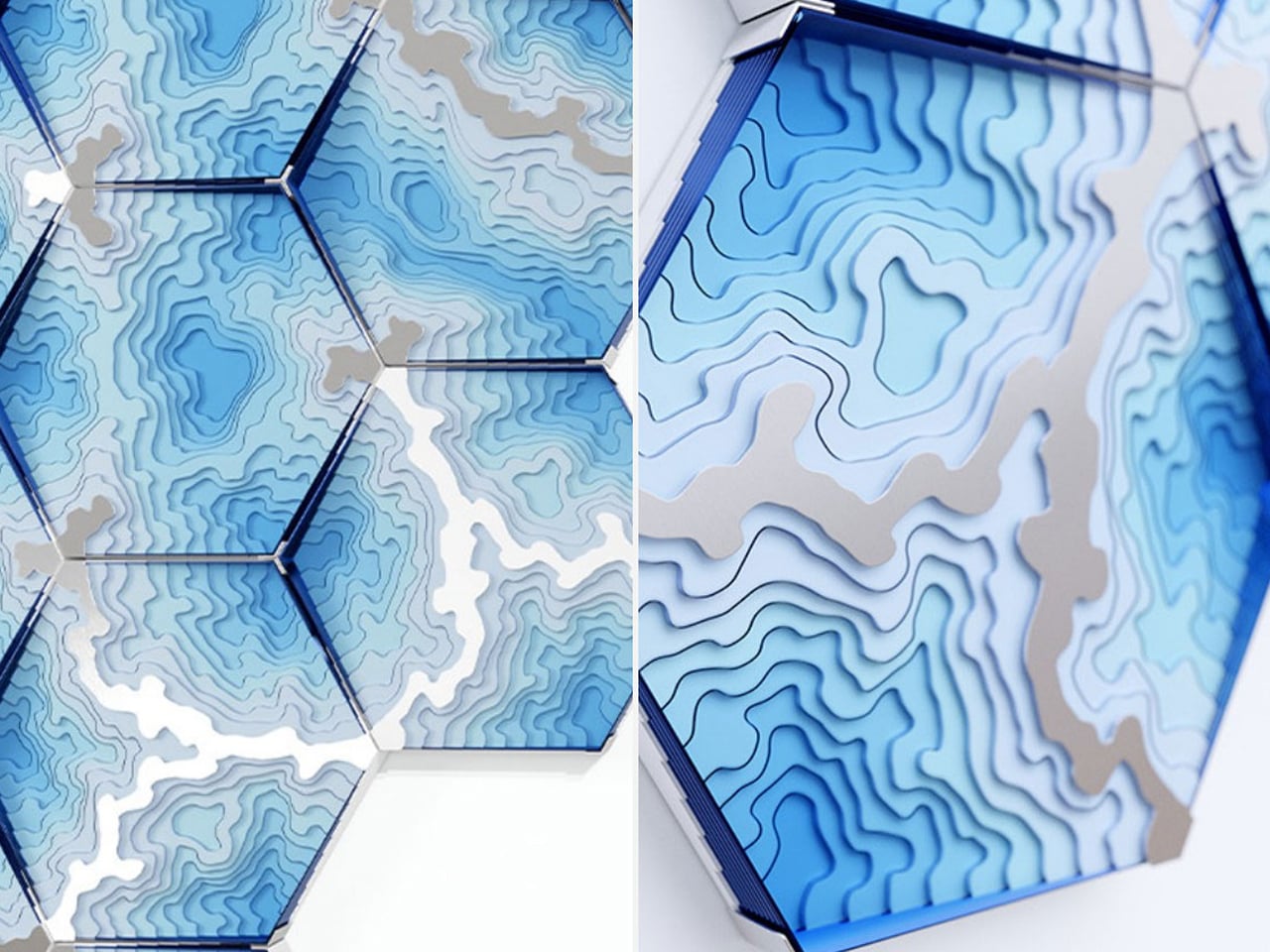
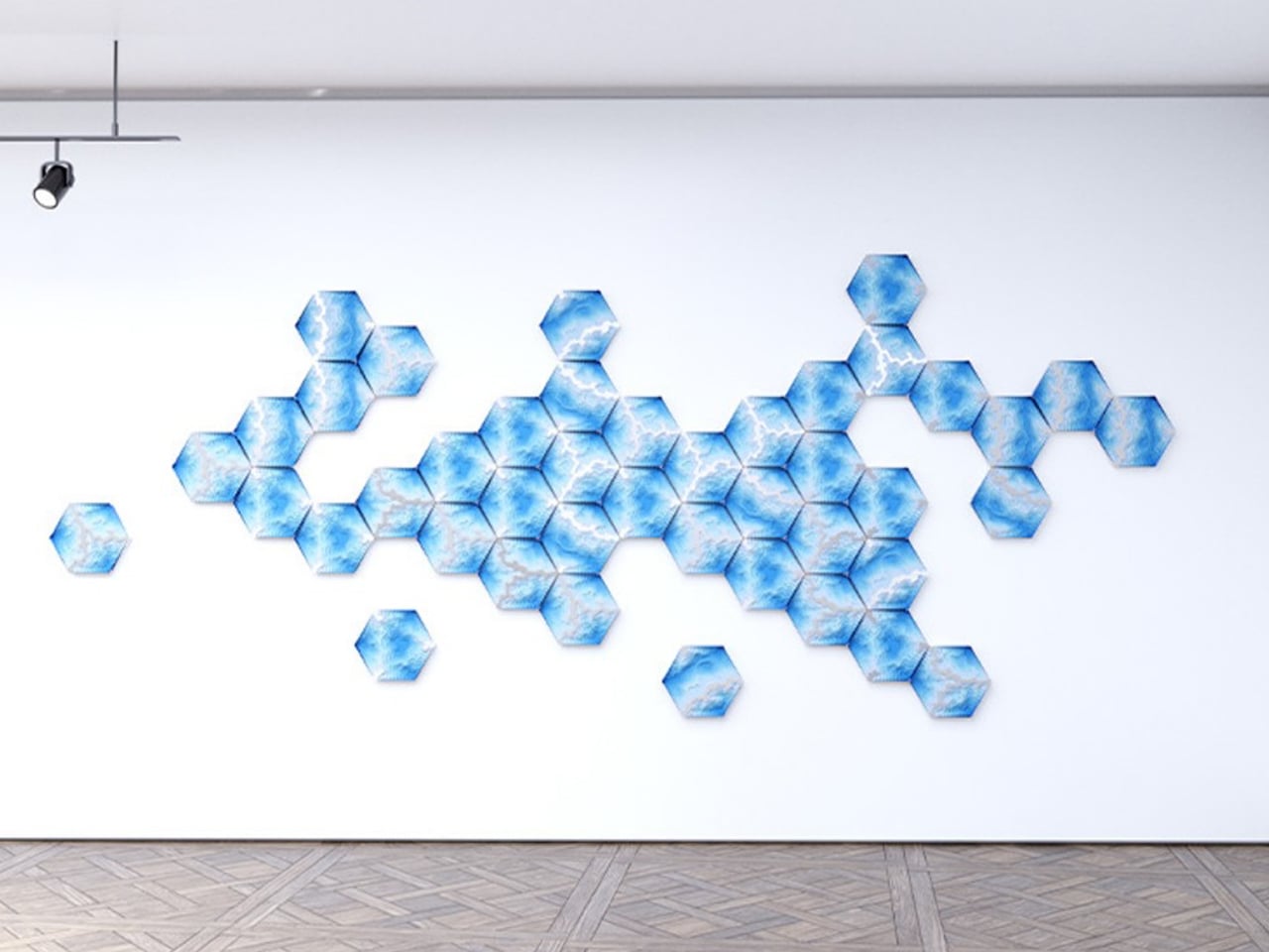
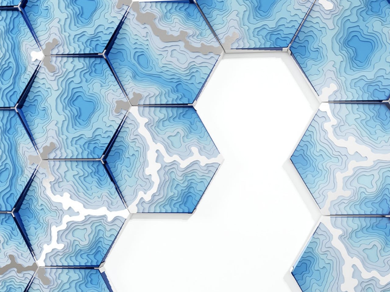
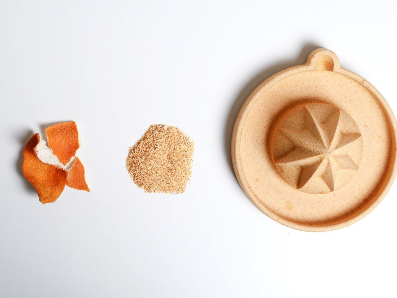
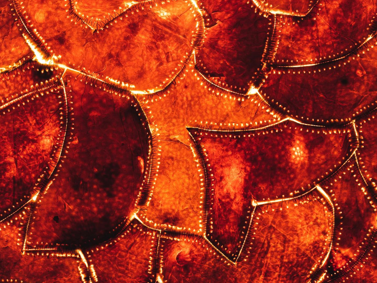
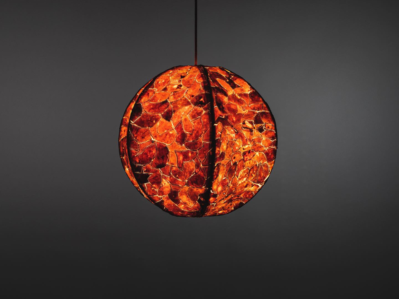
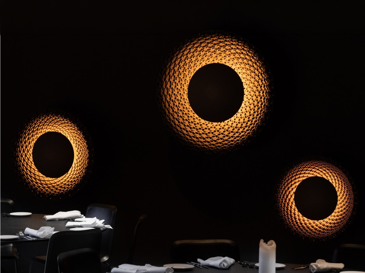
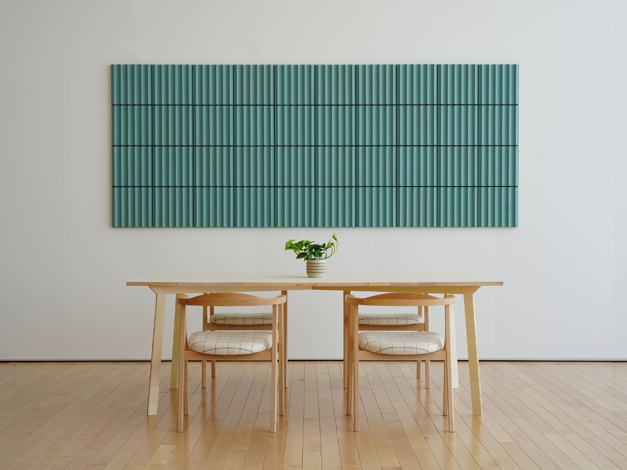
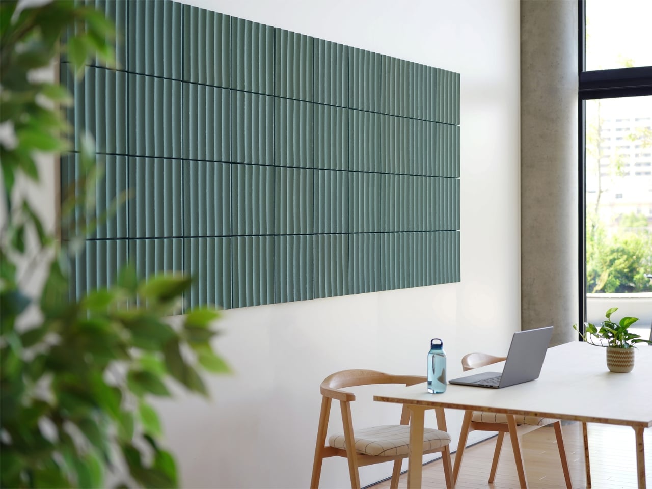
The Abyss Wall Tiles by Duffy London transform wall décor into a tactile design experience through layered textures and sculptural surfaces. Inspired by ocean floor contour maps, each hexagonal tile features engraved patterns that create visual depth and a striking three-dimensional effect. The overlapping lines and textured detailing invite both visual and physical interaction, turning ordinary walls into dynamic art installations. Crafted from plexiglass, recycled plastic, and brushed stainless steel, the tiles combine reflective finishes with textured surfaces that shift beautifully under changing light.
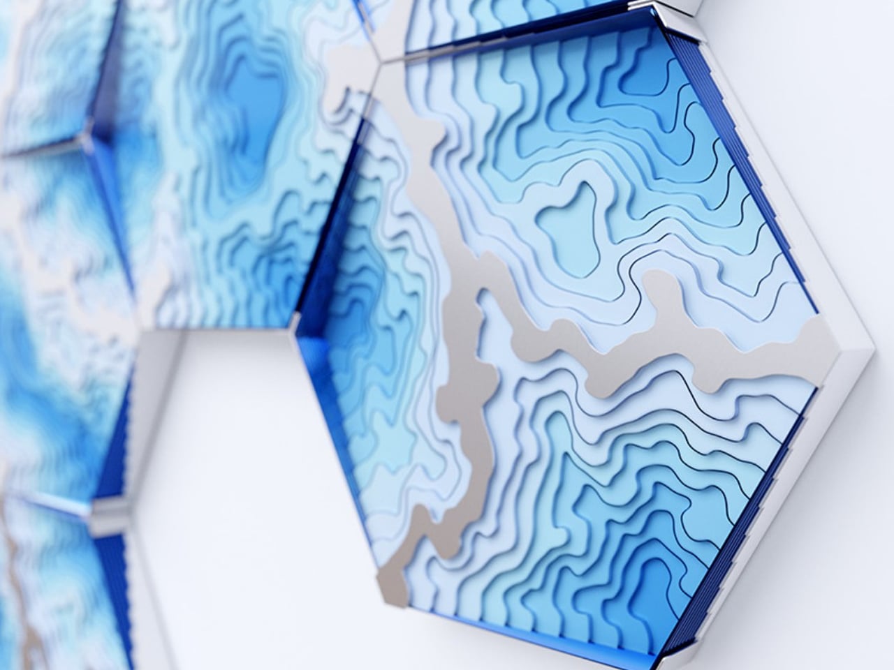
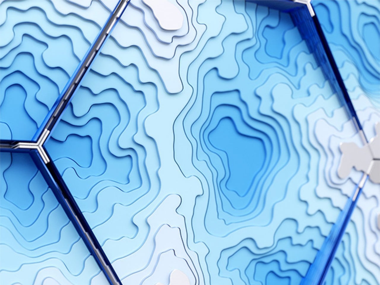
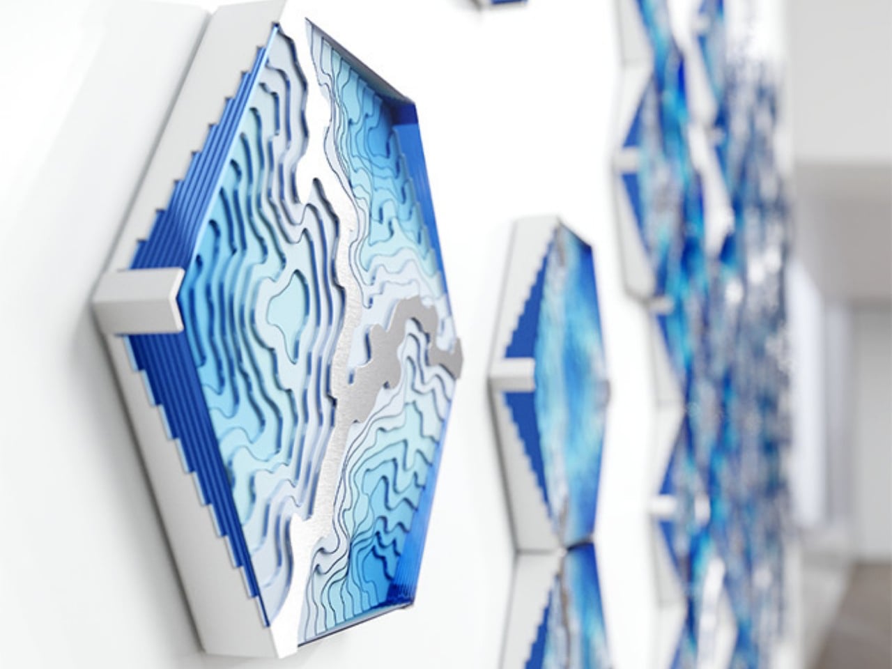
The modular design allows the tactile surfaces to evolve freely across the wall, creating compositions that feel organic and fluid. Different hexagonal patterns can be rotated and rearranged while still maintaining a seamless visual flow, adding flexibility to the design. The layered contours create shadows, movement, and depth, enhancing the sensory quality of the installation. Through its sculptural textures and handcrafted finish, the Abyss collection transforms flat walls into immersive surfaces inspired by the mystery and movement of the ocean.
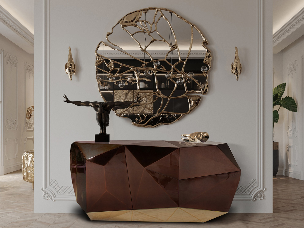
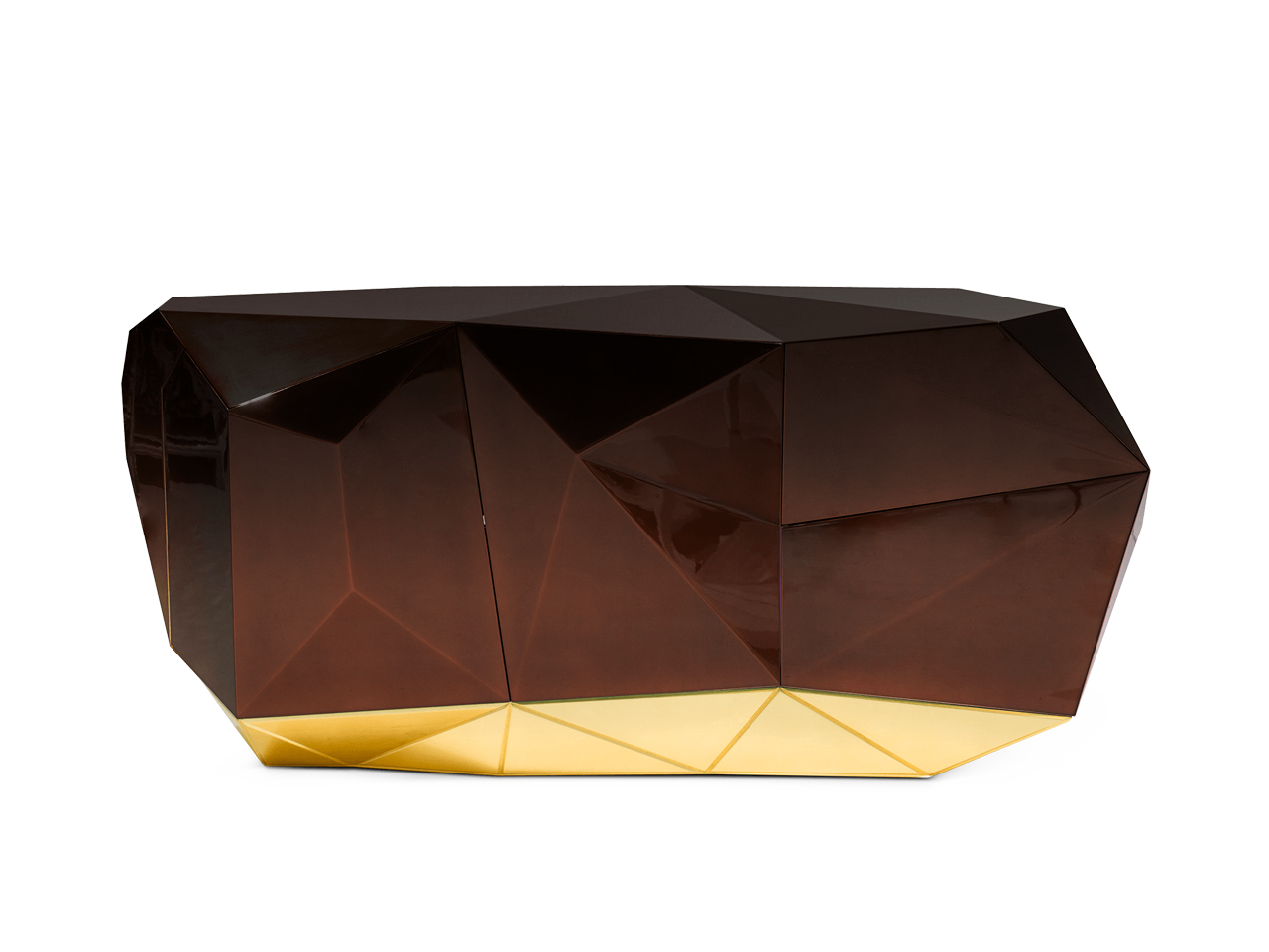
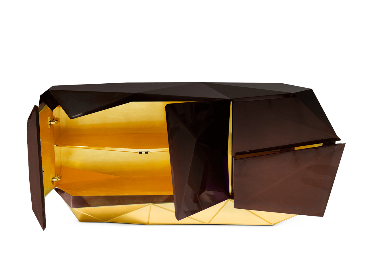
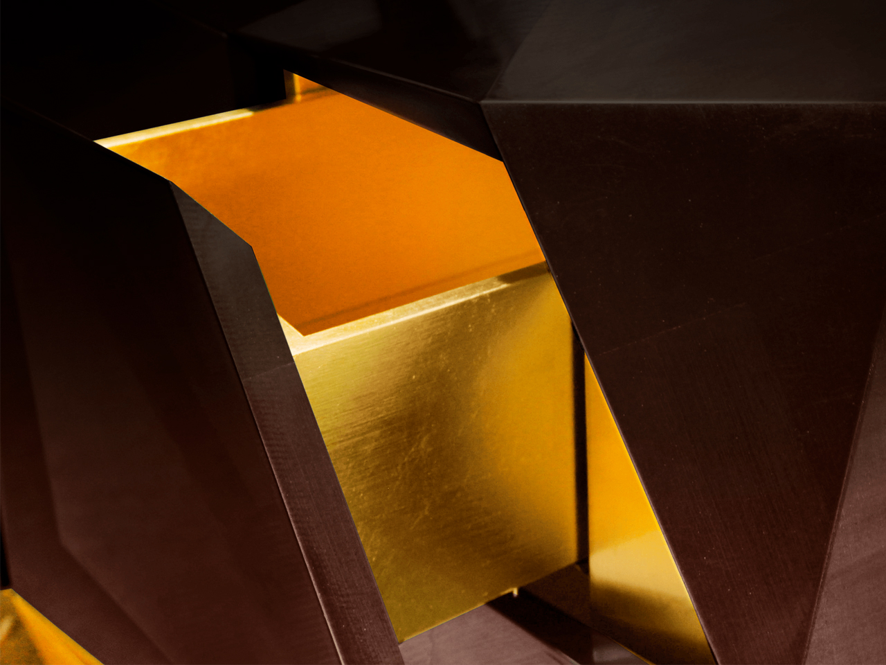
5. Sculptural Decor becomes the Focal Point of Rooms
Art-driven interiors are becoming one of the defining aesthetics of 2026. Rather than filling rooms with multiple small accessories, designers are focusing on fewer but more sculptural statement pieces. Oversized lighting, abstract chairs, ceramic installations, and collectible furniture are increasingly acting as the visual anchor of a room.
This shift reflects a growing overlap between interior design, art, and fashion. Homes are being styled more like curated galleries where each object contributes to the identity of the space. Sculptural furniture also complements the rise of curved forms and textured interiors, adding visual drama without relying on excessive decoration. Minimalism is not disappearing entirely, but it is evolving into something more expressive and emotionally layered.
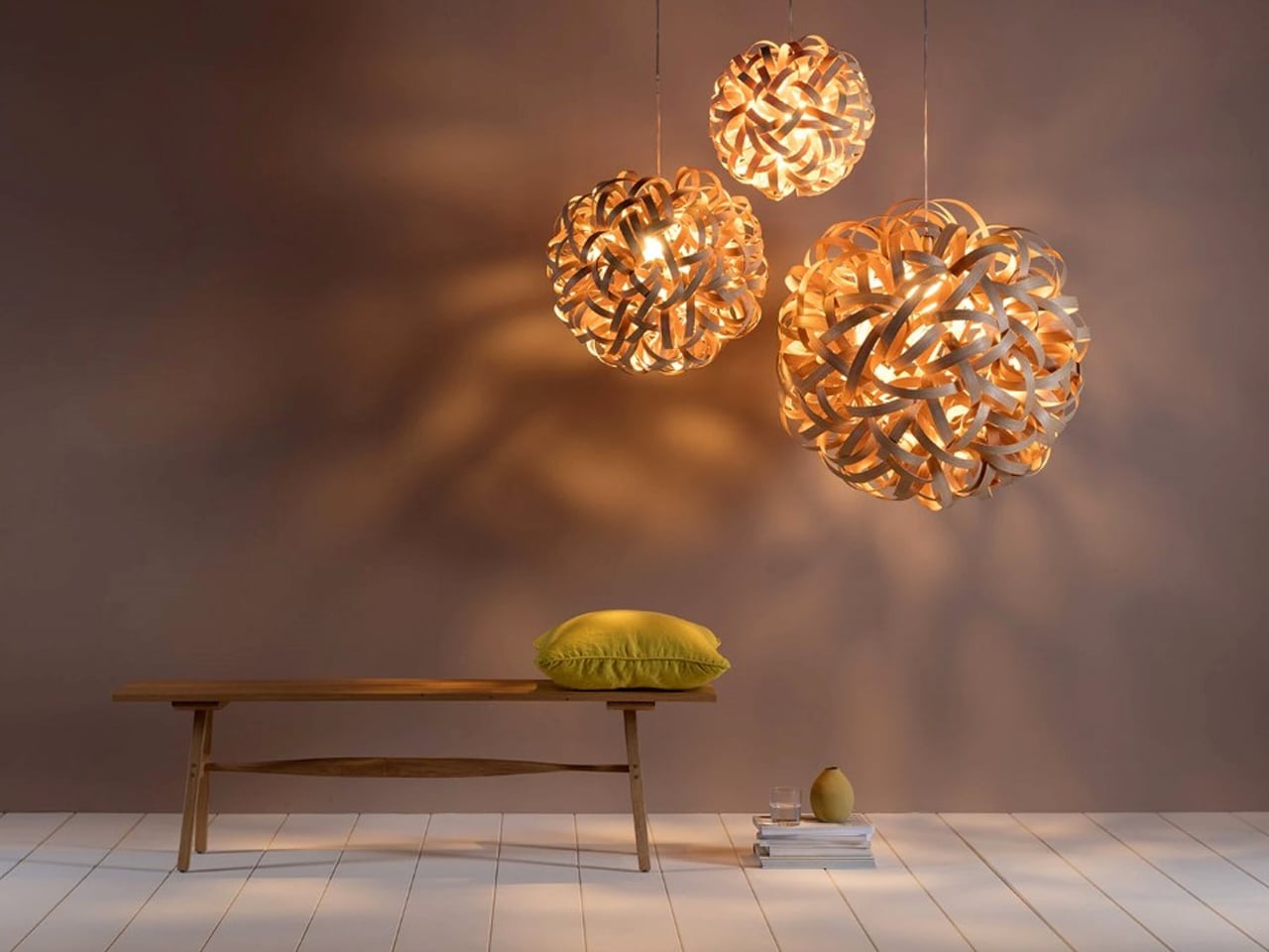
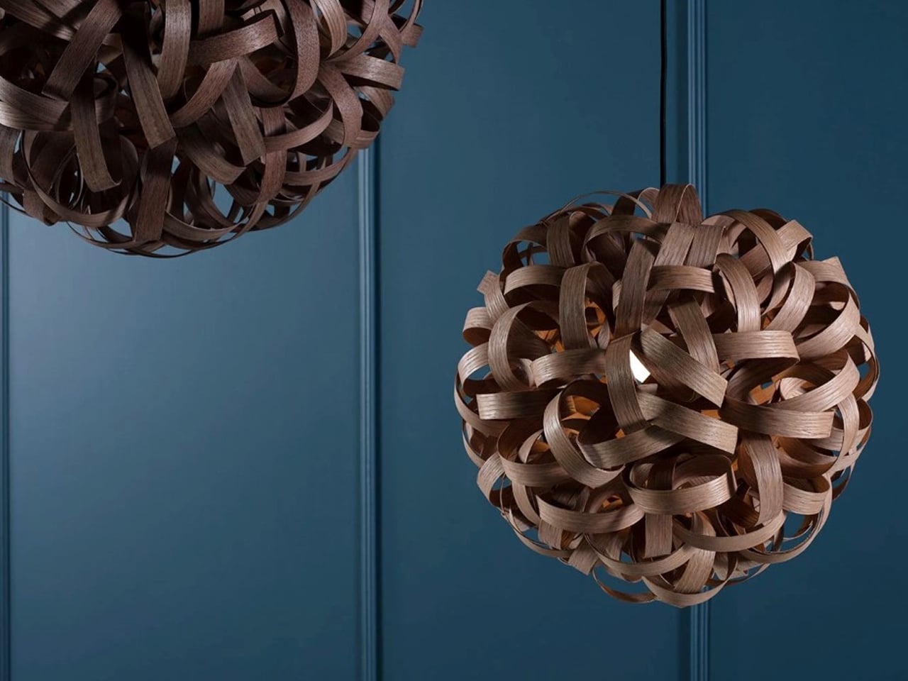
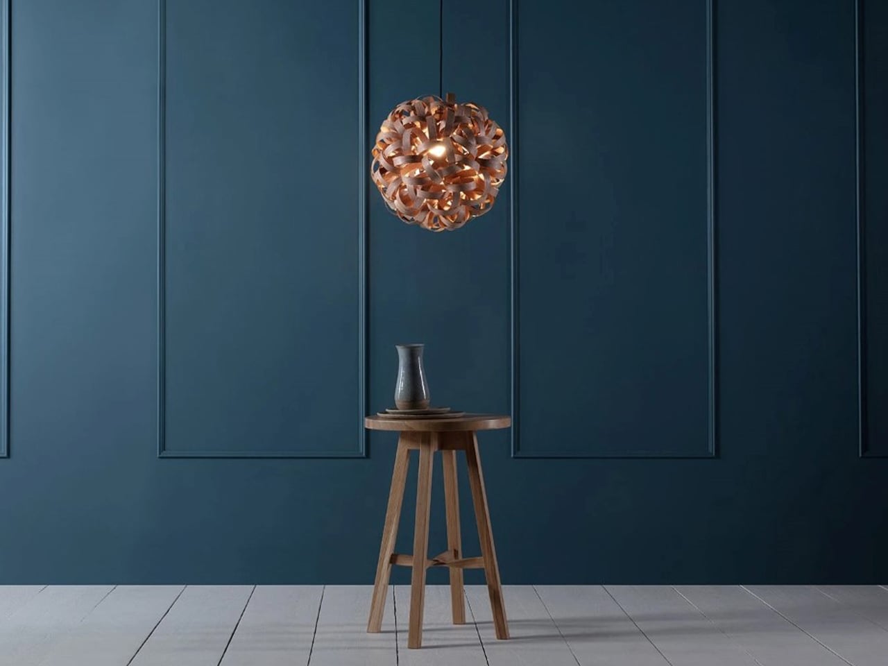
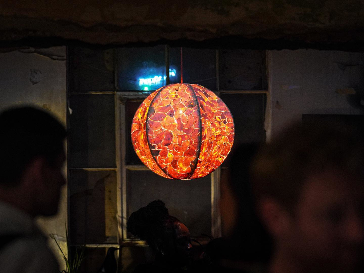
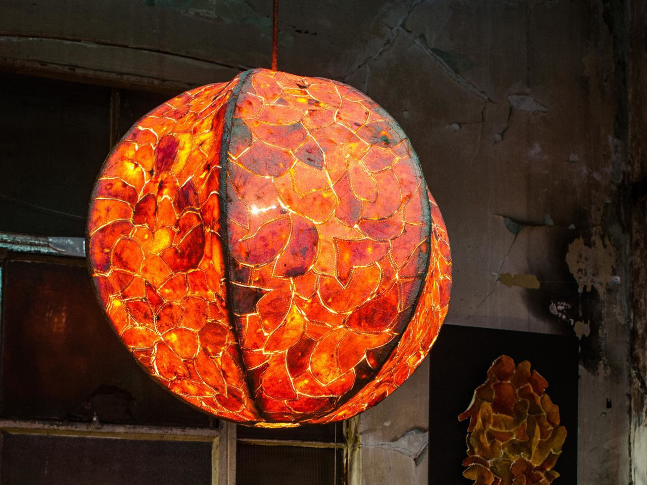
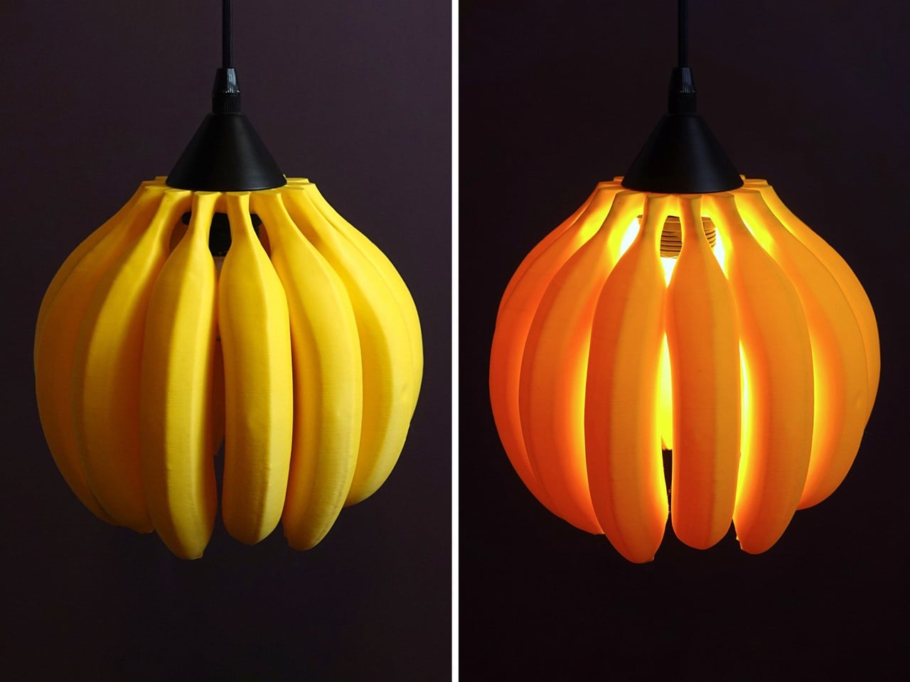
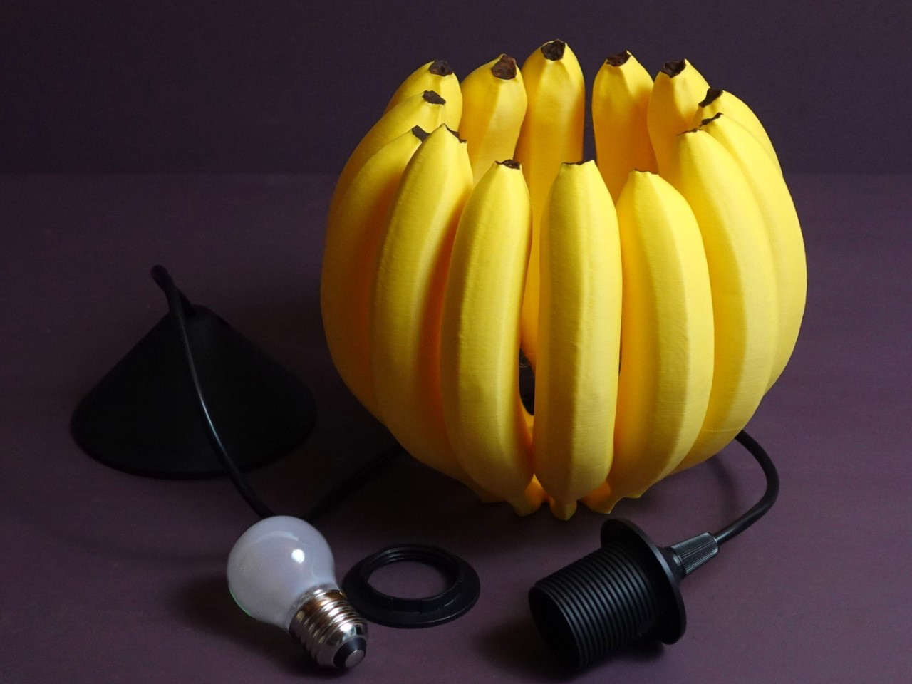
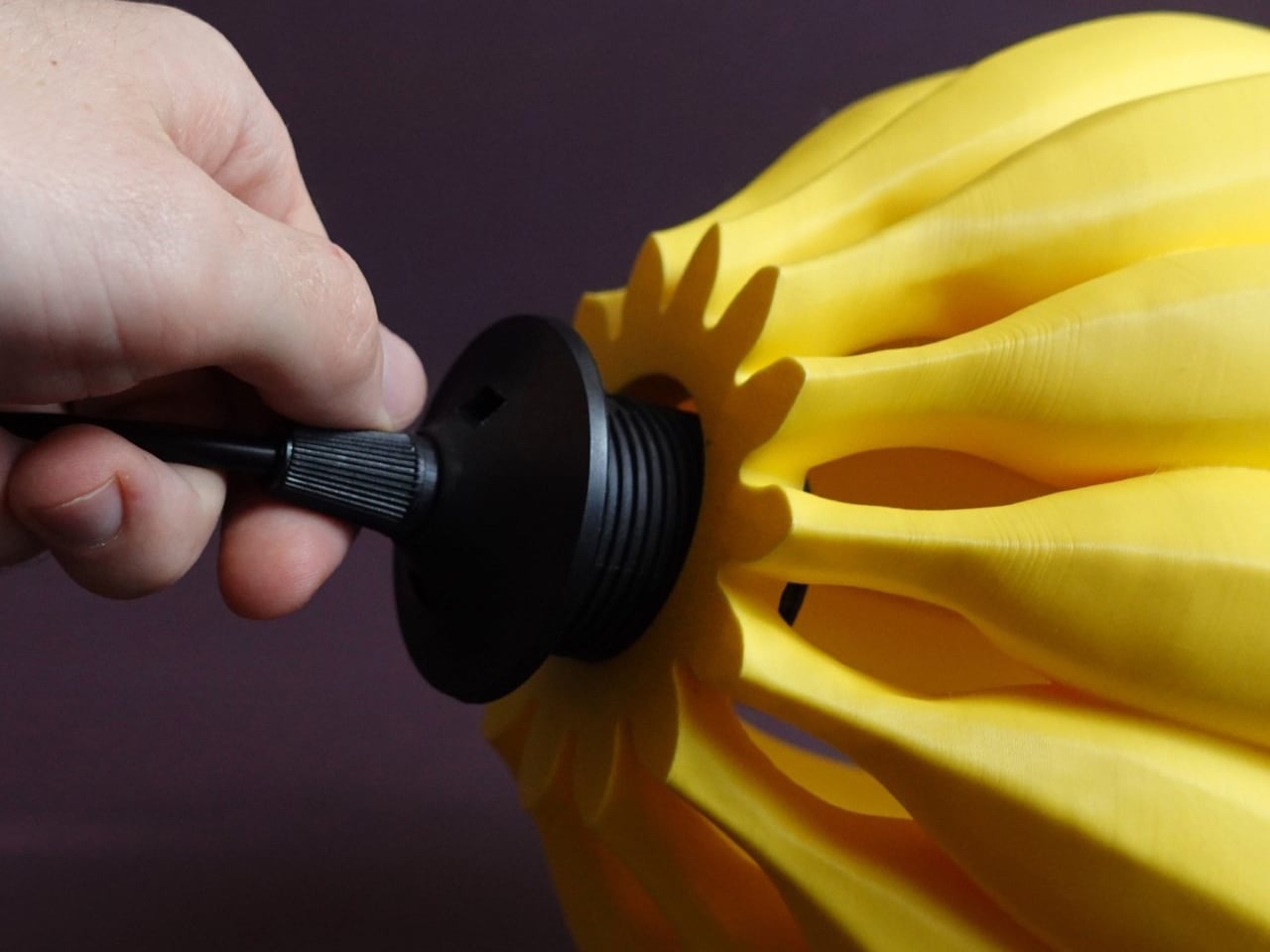
For art-inspired interiors, consider the No.1 Pendant by Tom Raffield, which transforms traditional woodworking techniques into sculptural art through flowing layers of steam-bent timber. Inspired by the curled shavings found in woodworking studios, the pendant light captures movement and texture in an organic form that feels both delicate and dramatic. Instead of treating wood curls as waste, Raffield elevates them into an artistic composition where each curved strip contributes to a larger sculptural silhouette. The layered timber creates a soft, swirling structure that resembles a suspended artwork more than a conventional lighting fixture.
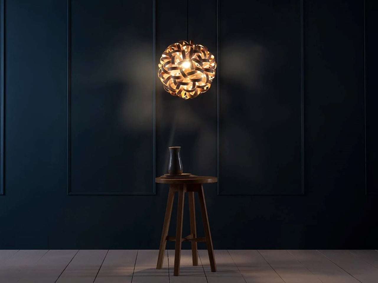
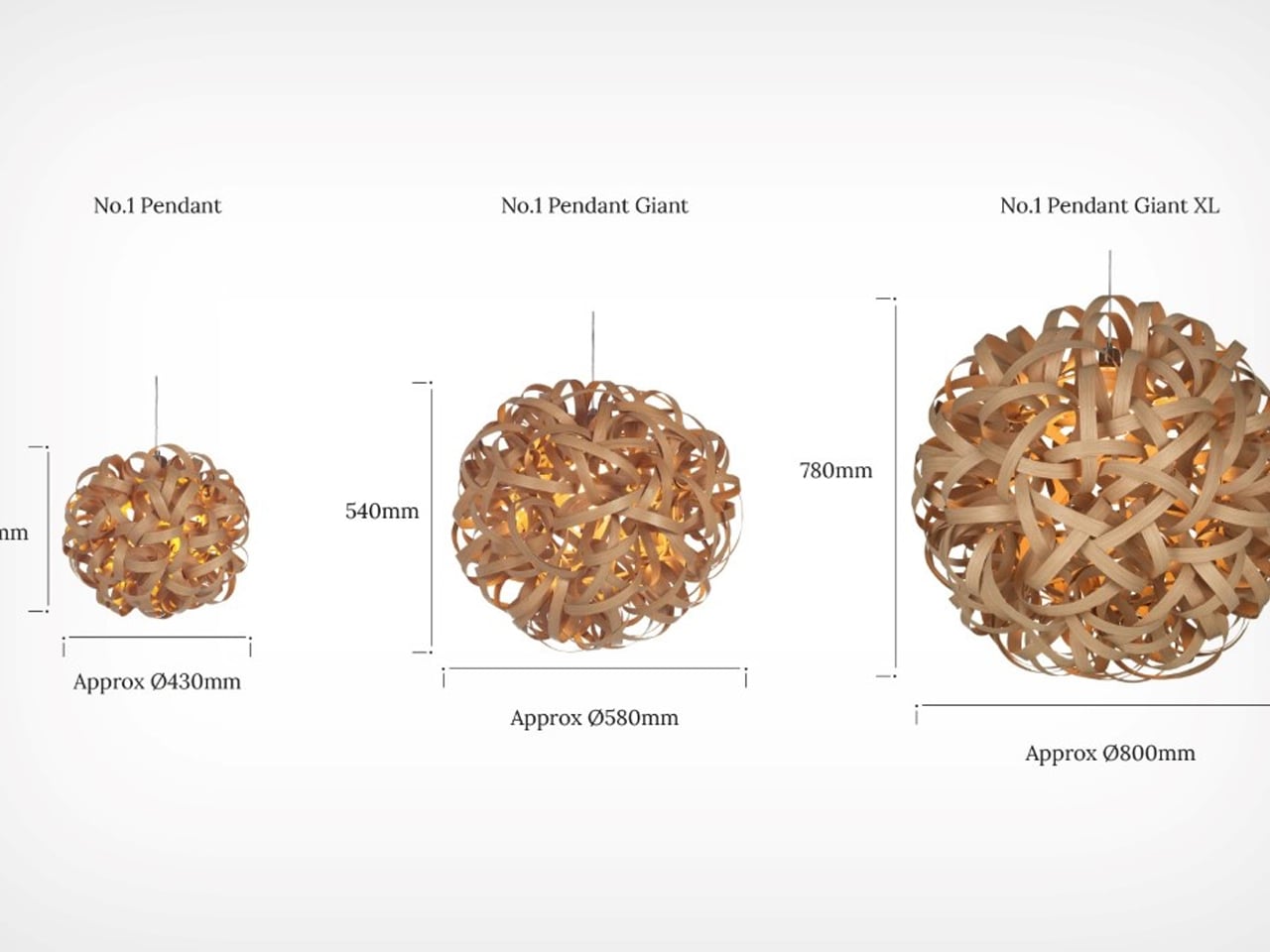
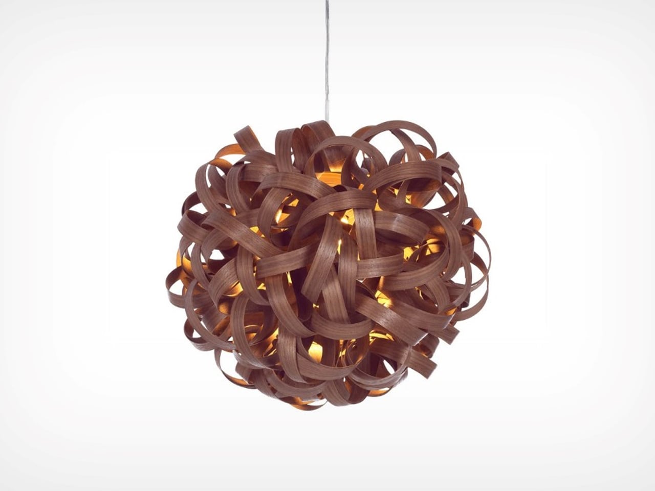
Crafted using over 40 meters of carefully steam-bent wood, the pendant features an intricate woven form inspired by the folds of a scrunchie. The overlapping curves create depth, rhythm, and shadow, allowing the piece to interact beautifully with light from every angle. Available in ash, oak, and walnut finishes, the design highlights the natural beauty of timber while celebrating craftsmanship through sculptural expression and fluid geometry.
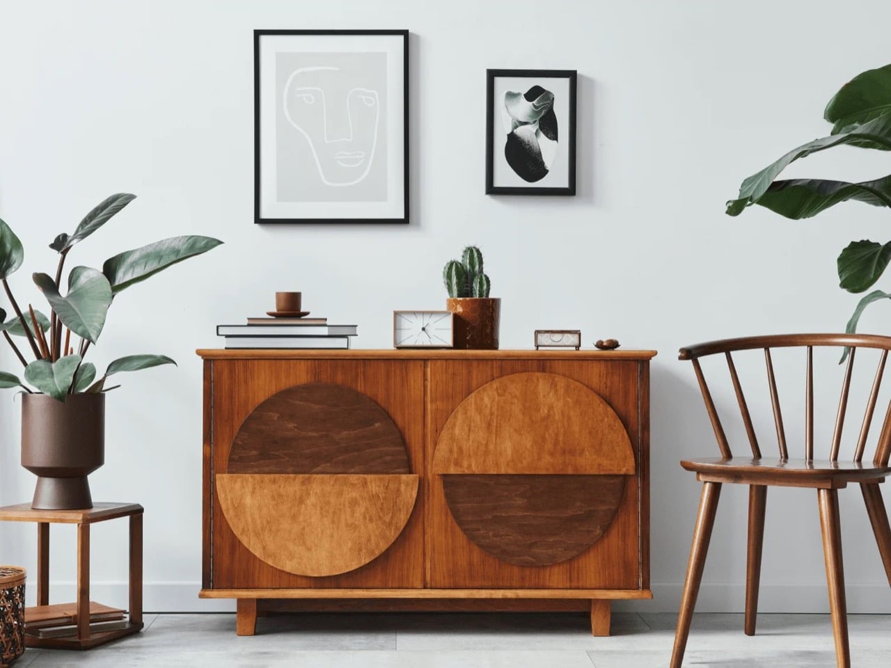
6. Vintage and Sustainable Furniture become the Default Choice
Sustainable design in 2026 is less about marketing language and more about purchasing behavior. Vintage furniture, reclaimed materials, and long-lasting craftsmanship are becoming standard choices for homeowners who want interiors with character and durability. The fast-furniture cycle is increasingly losing appeal as buyers seek pieces with history and longevity.
Designers are also mixing contemporary interiors with antique or vintage accents to create contrast and authenticity. A sculptural modern sofa paired with an aged wooden cabinet or vintage marble table now feels more desirable than a perfectly matched showroom set. Sustainability is no longer treated as a separate design category. It has become integrated into how people define good design itself.
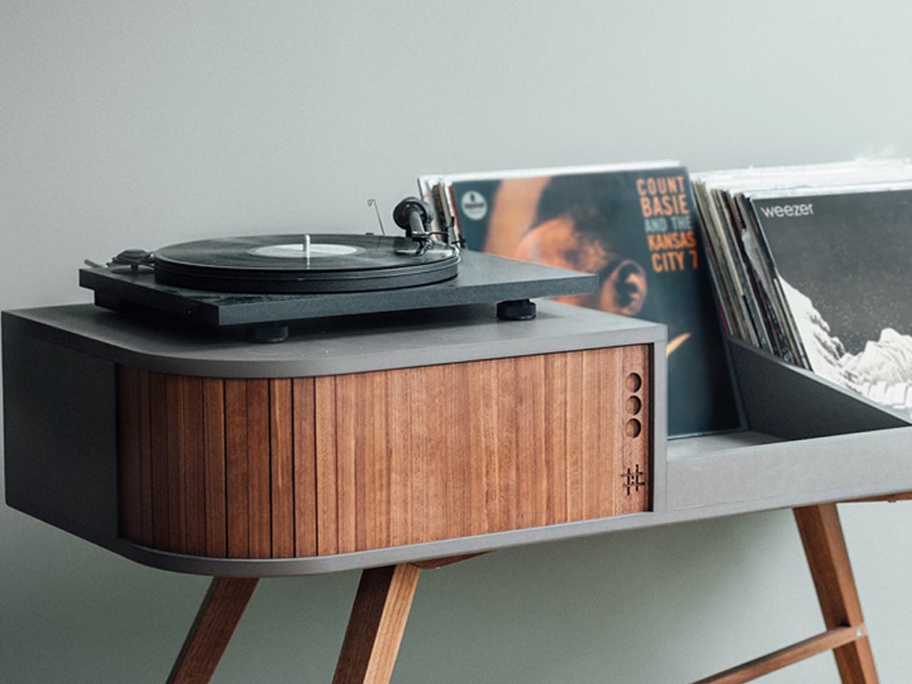
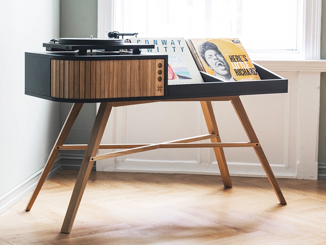
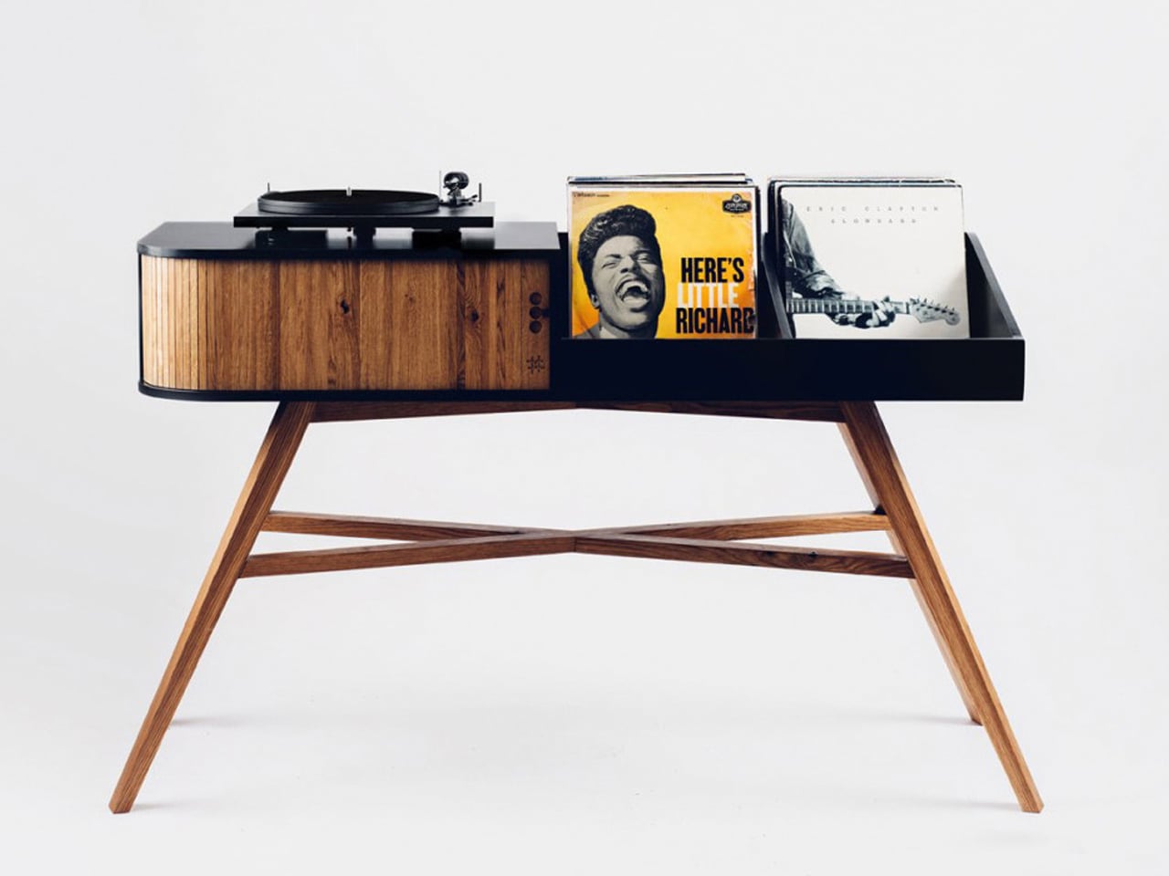
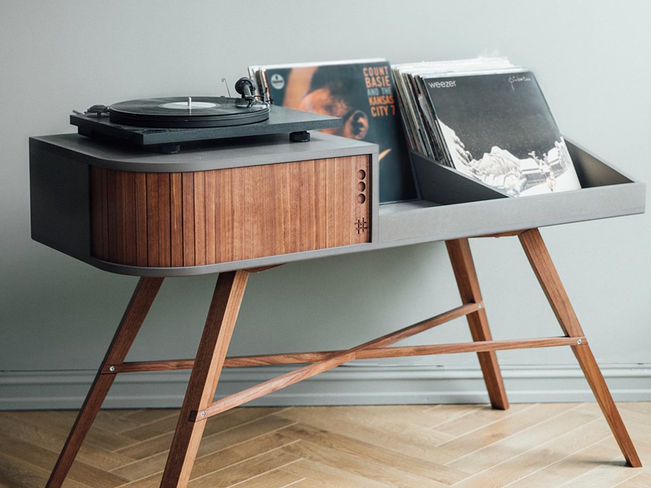
Take a look at the Vinyl Table by Stian Herdal, which celebrates vintage design through a warm mid-century aesthetic crafted for modern vinyl collectors. Made from oak and Valchromat, the handcrafted cabinet combines the character of classic record consoles with clean contemporary detailing. Its elegant proportions, tapered leg options, and natural wood finishes evoke the charm of retro interiors while creating a dedicated space for turntables and treasured vinyl collections. Designed to hold nearly 200 records, the piece transforms music storage into a nostalgic visual centerpiece that feels timeless and personal.
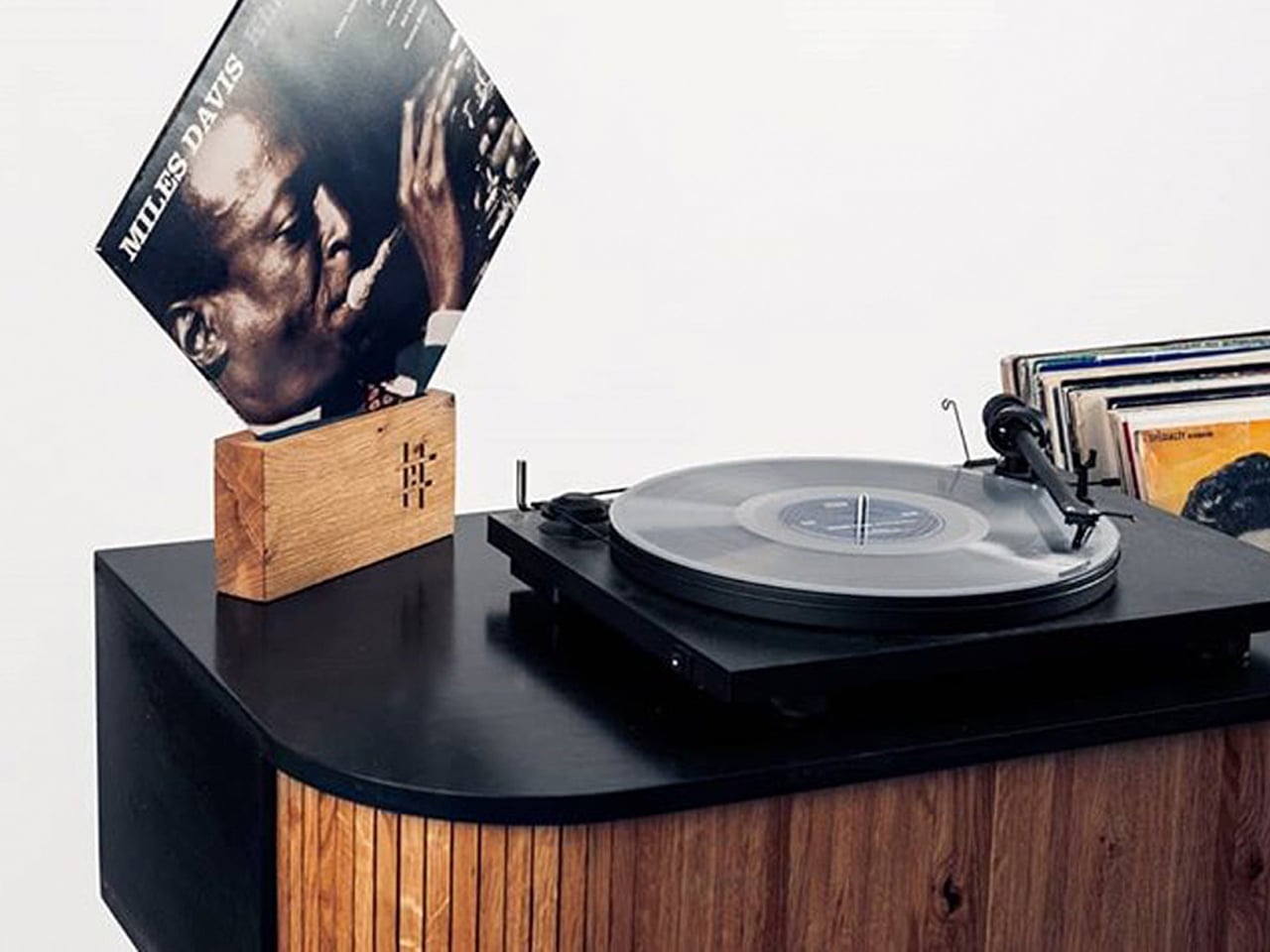
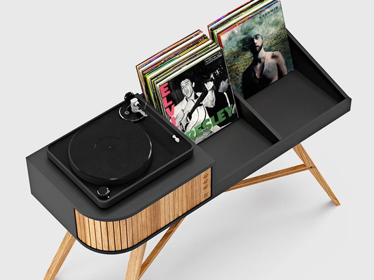
A standout vintage detail is the beautifully crafted sliding tambour door, which introduces both texture and movement to the design. As the wooden panels glide open, they reveal hidden storage for amplifiers and audio equipment, recreating the tactile experience associated with classic furniture craftsmanship. Every element, from the smooth wood grain to the soft mechanical movement, reflects an appreciation for old-world design traditions. The Vinyl Table captures the atmosphere and romance of vintage listening culture through refined craftsmanship and nostalgic detailing.
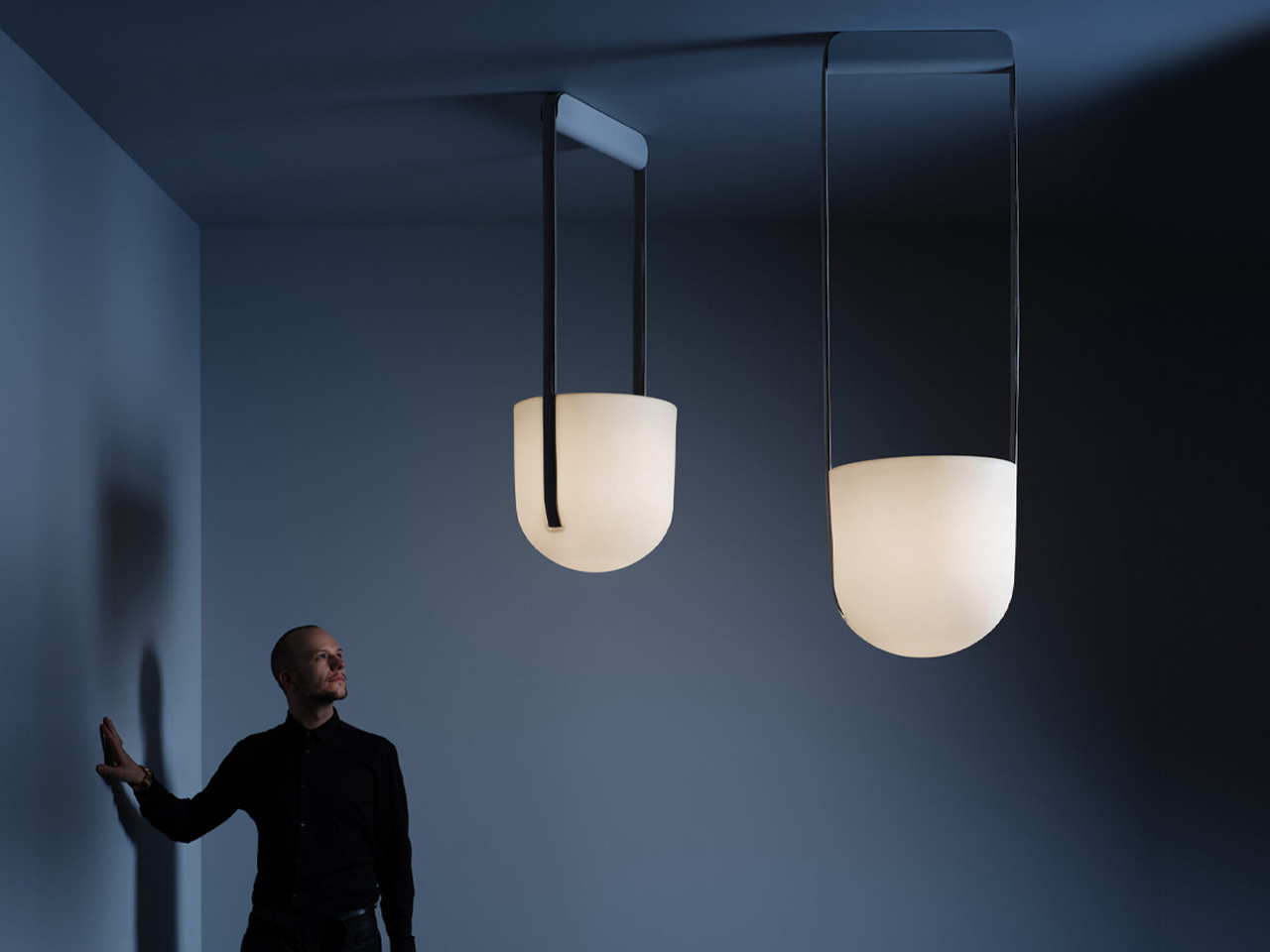
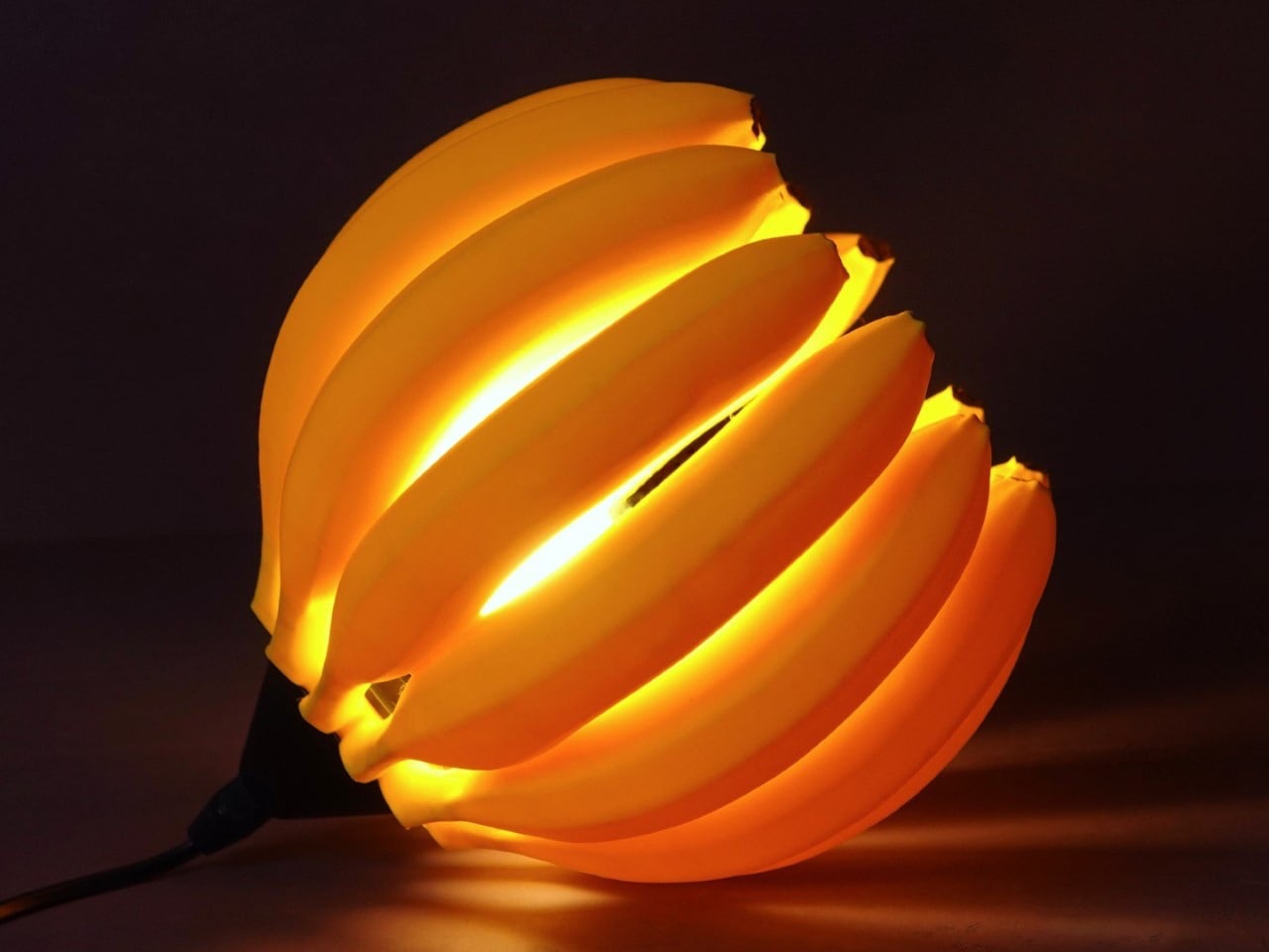
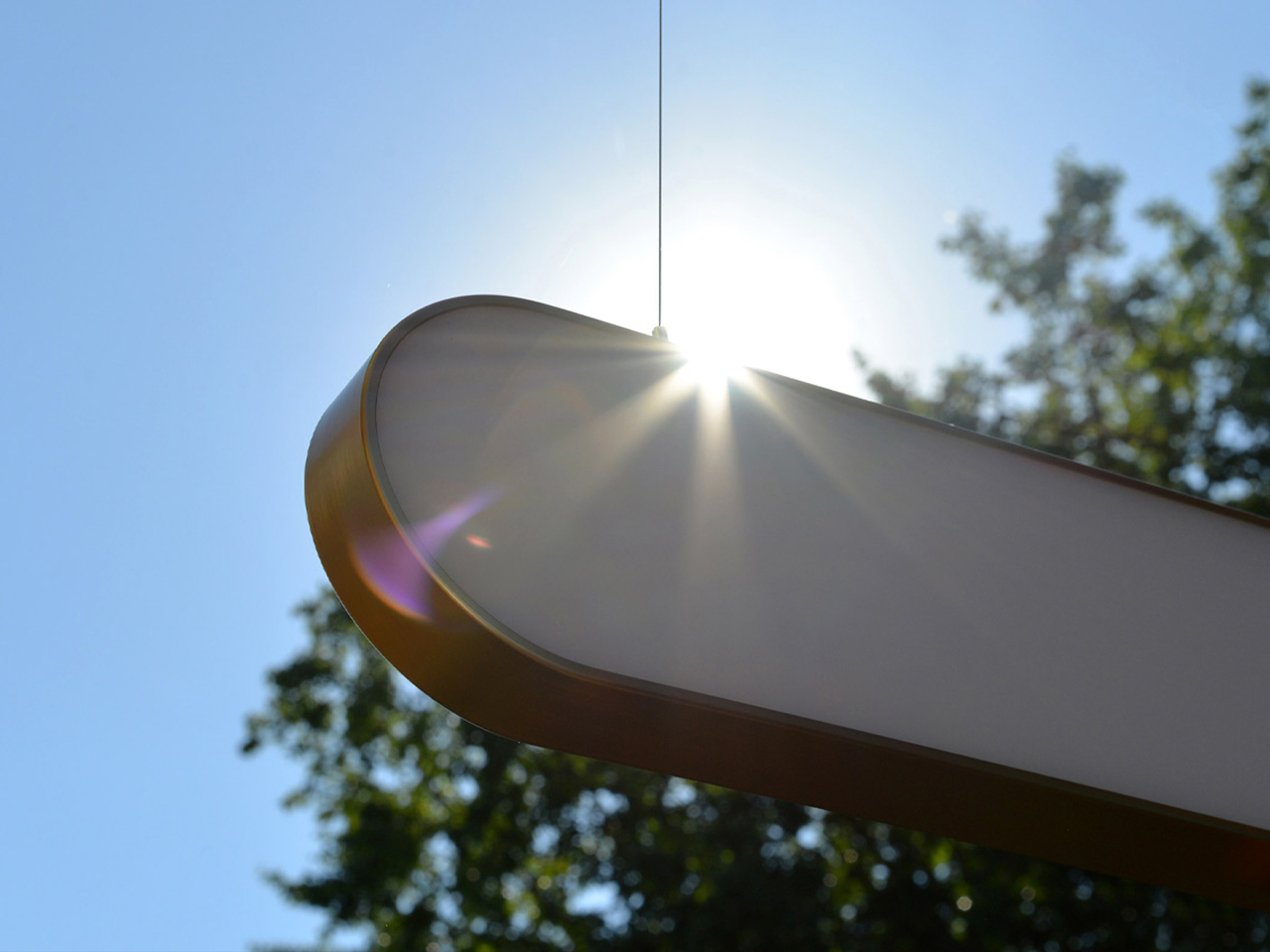
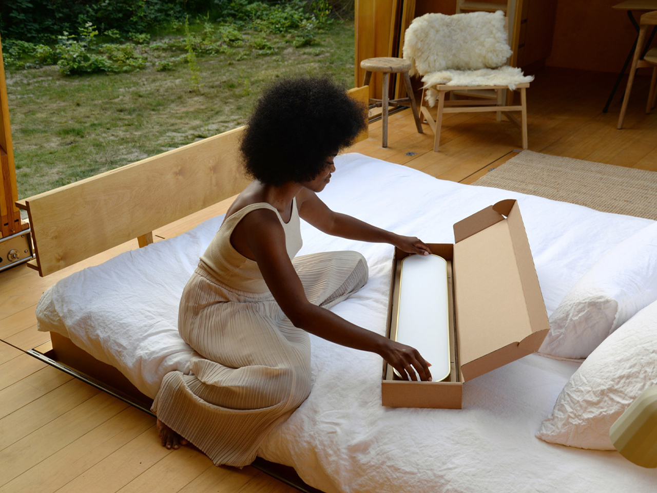
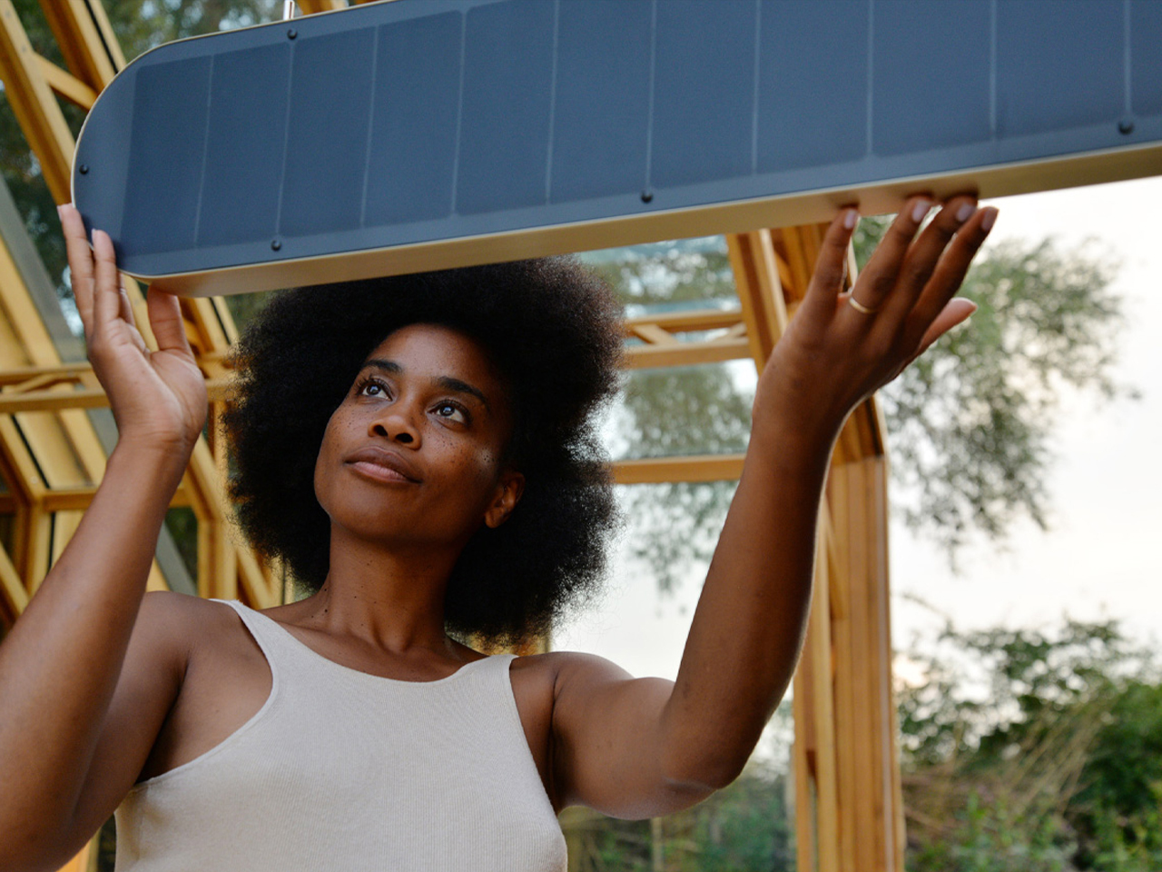
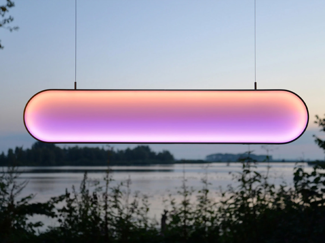
7. Layered Lighting Replaces Harsh Overhead Illumination
Lighting design has become far more atmospheric in 2026 interiors. Instead of relying on a single overhead fixture, designers are layering spaces with table lamps, concealed LED lighting, wall sconces, floor lamps, and sculptural pendants. The goal is to create warmth, softness, and visual depth throughout the home.
This approach works closely with the wider movement toward comforting and emotionally rich interiors. Warm lighting enhances terracotta tones, textured walls, and natural materials while making spaces feel more intimate. Harsh white lighting and ultra-bright open spaces are increasingly being replaced by layered illumination that changes mood throughout the day. Lighting is now treated as part of the architecture of the room and not just a decorative addition.
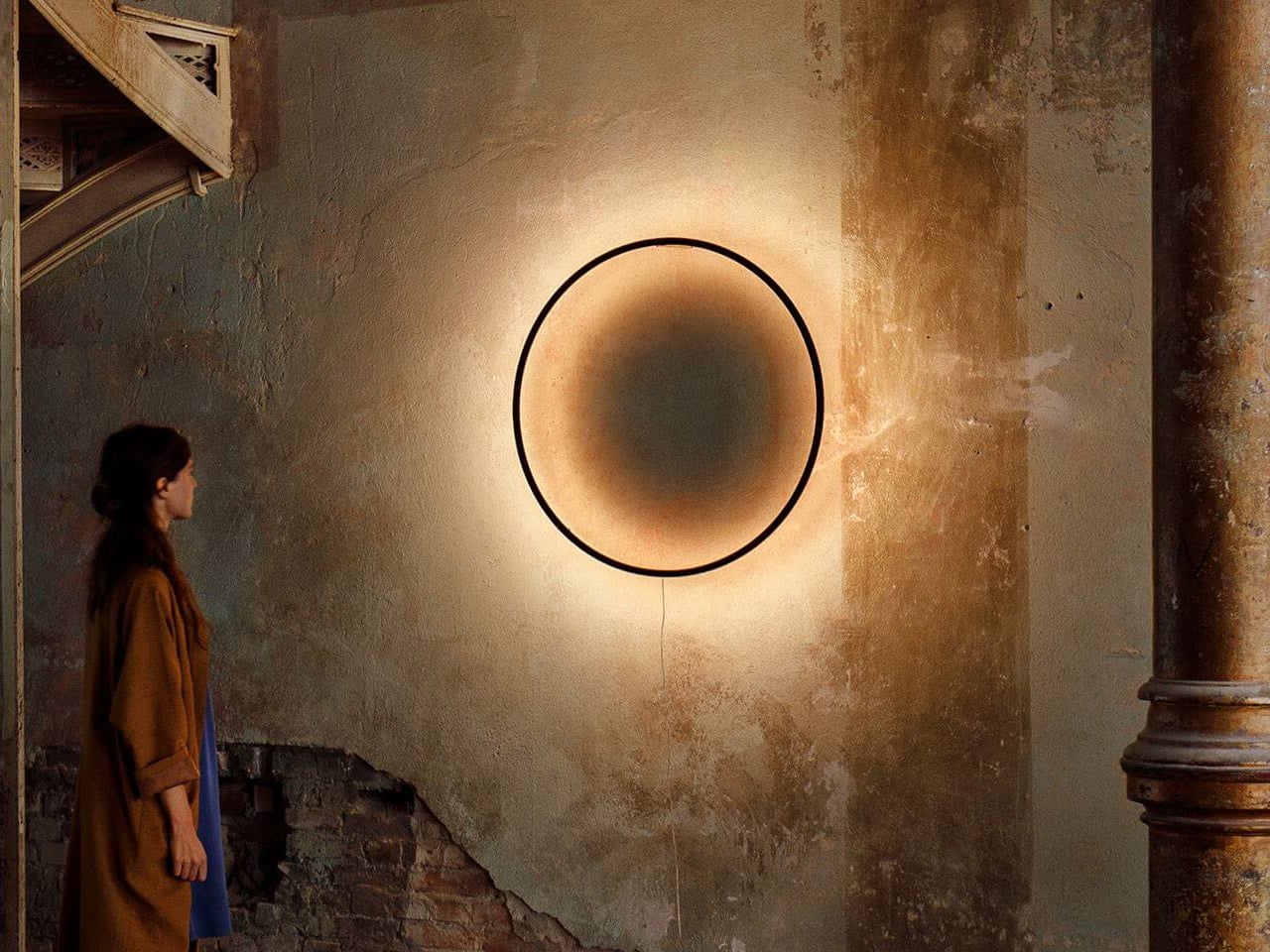
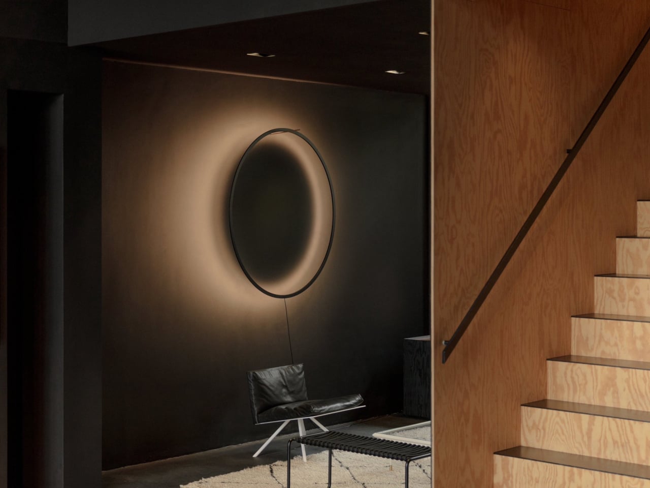
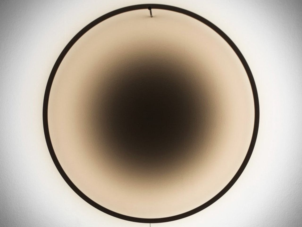
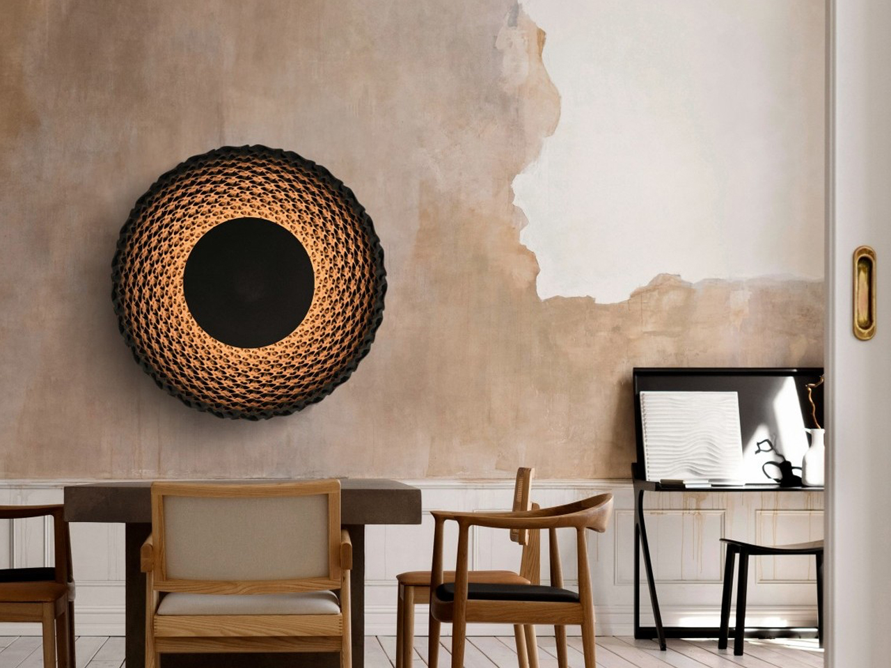
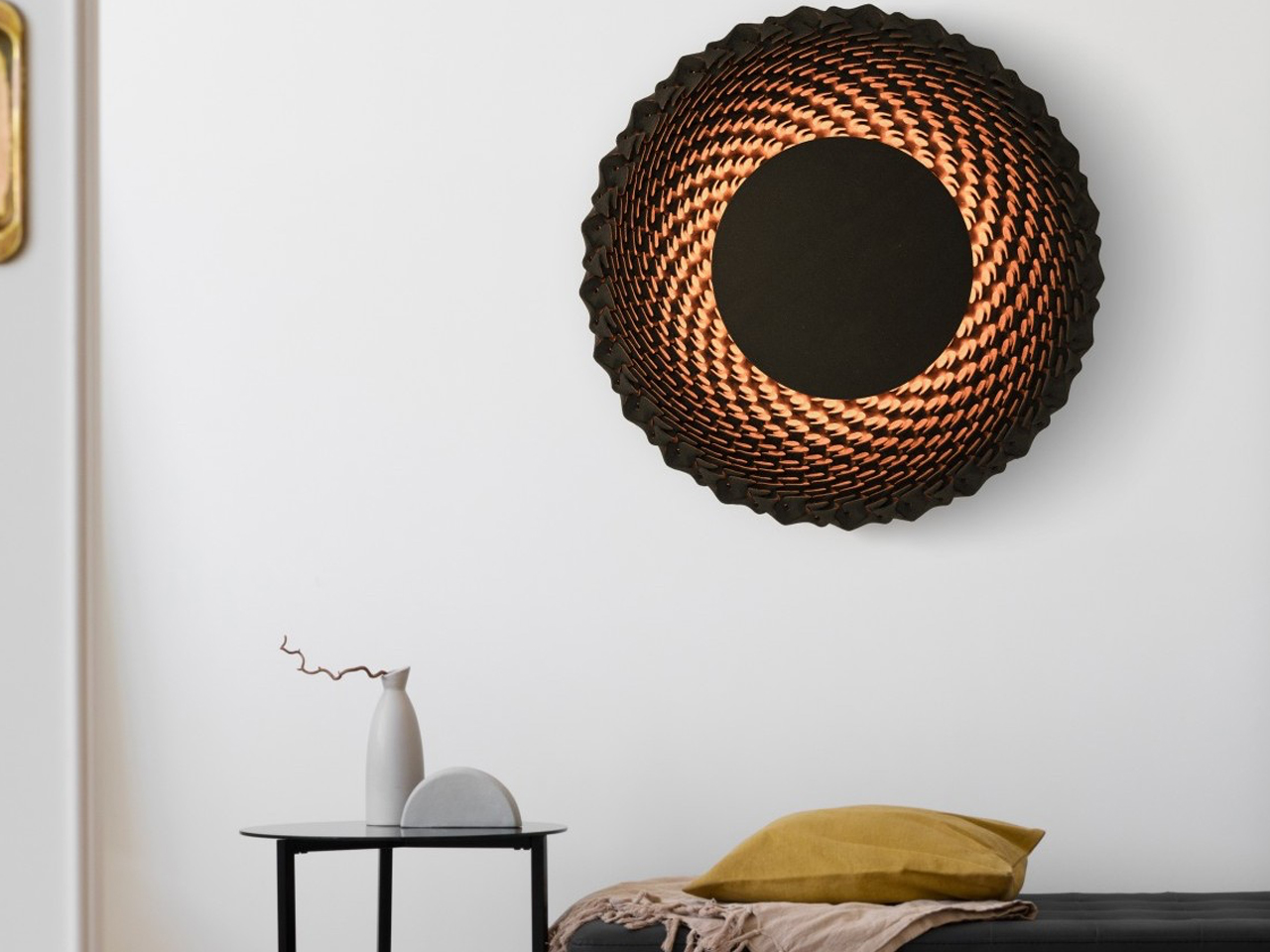
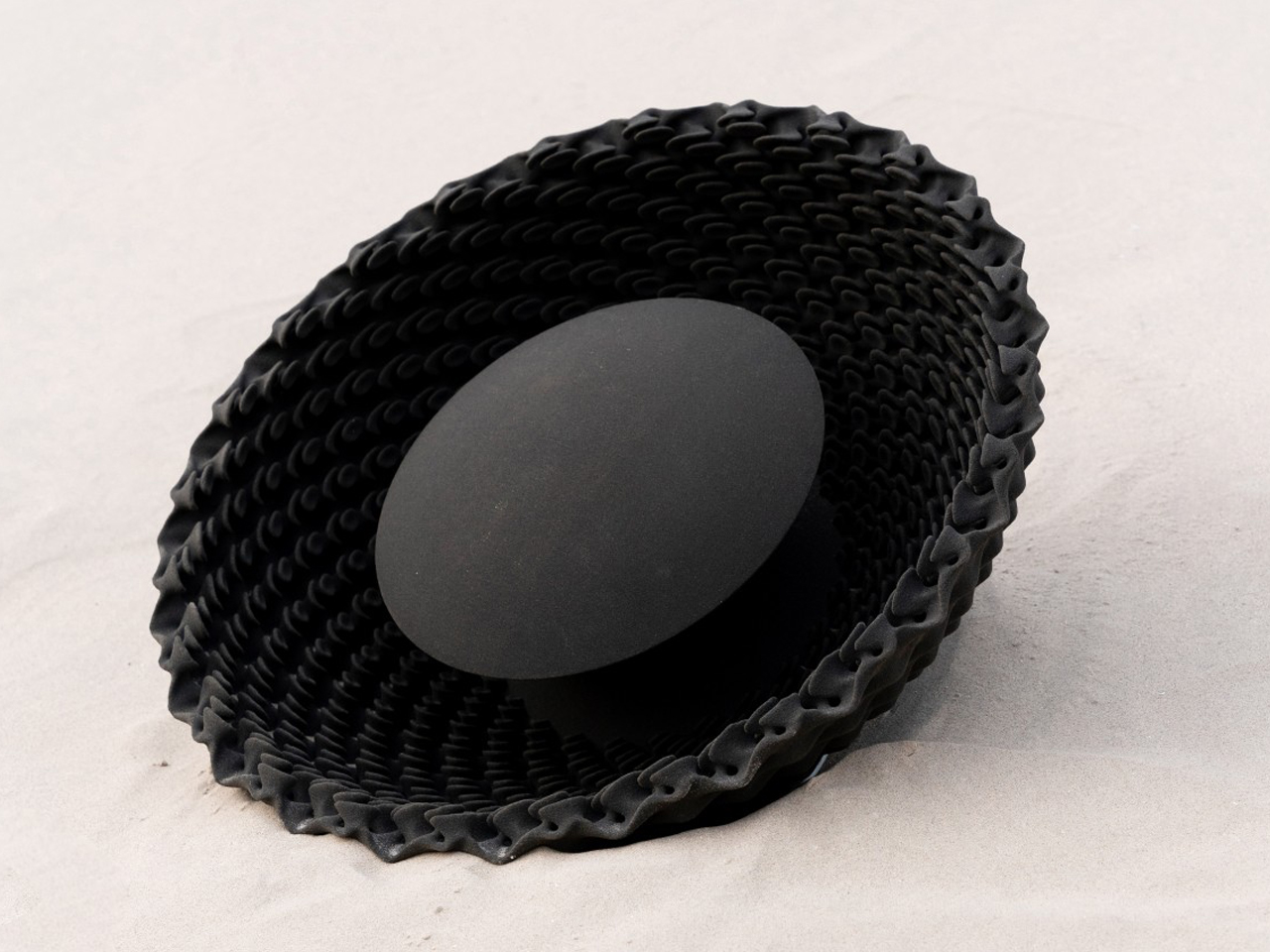
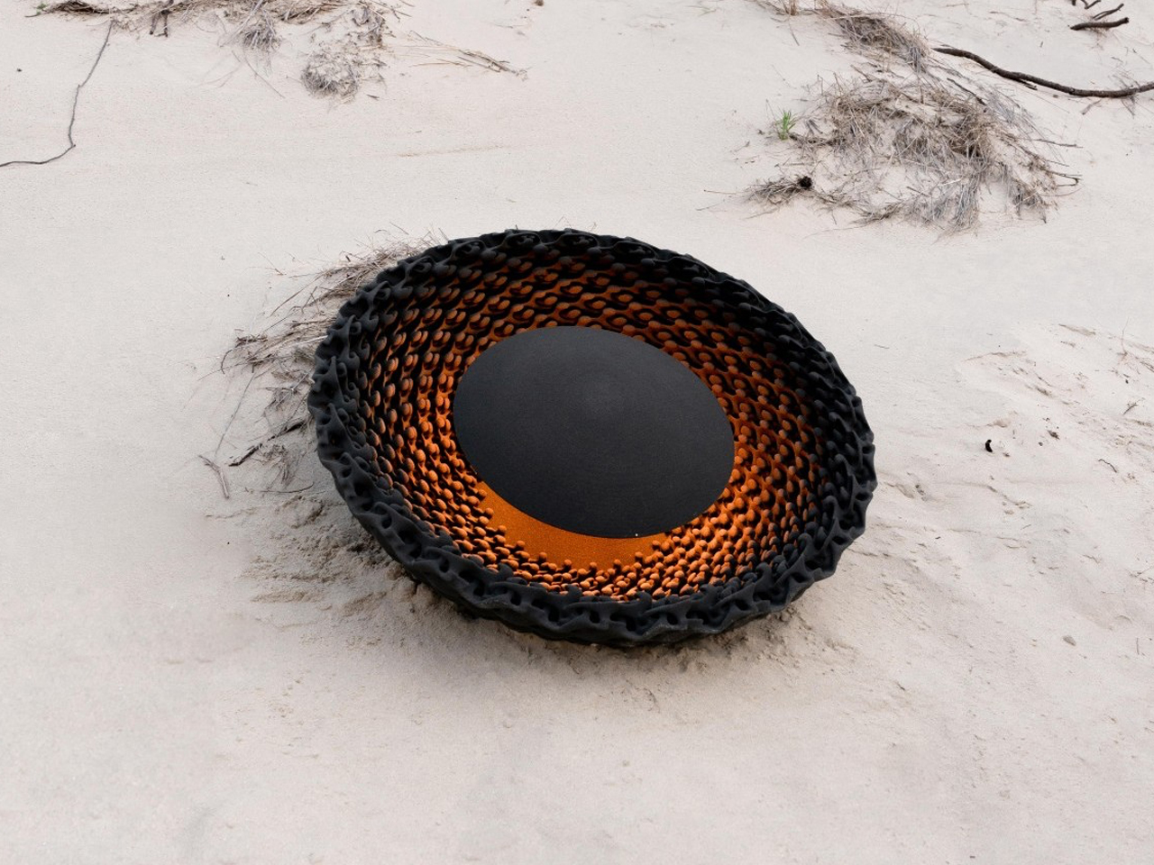
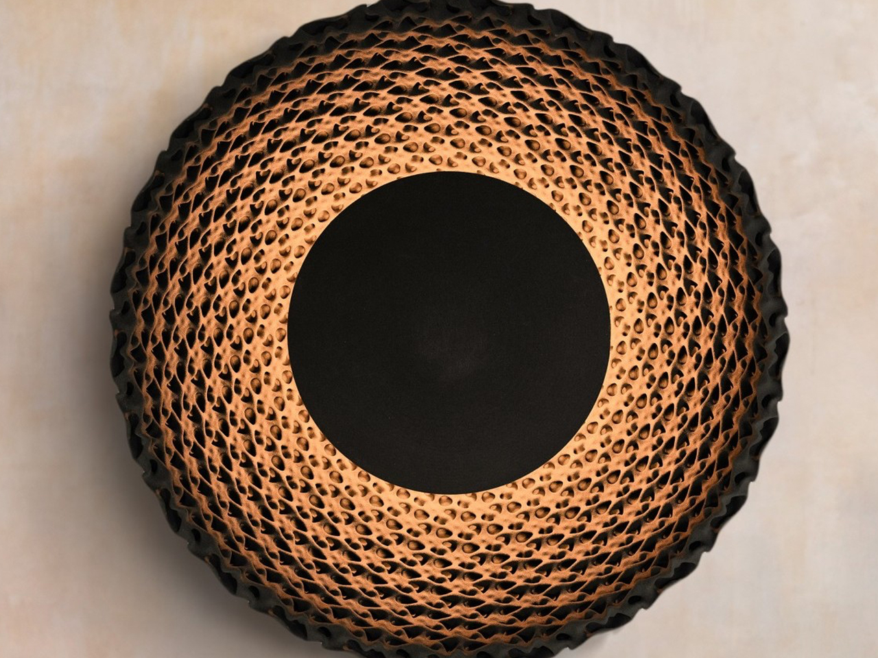
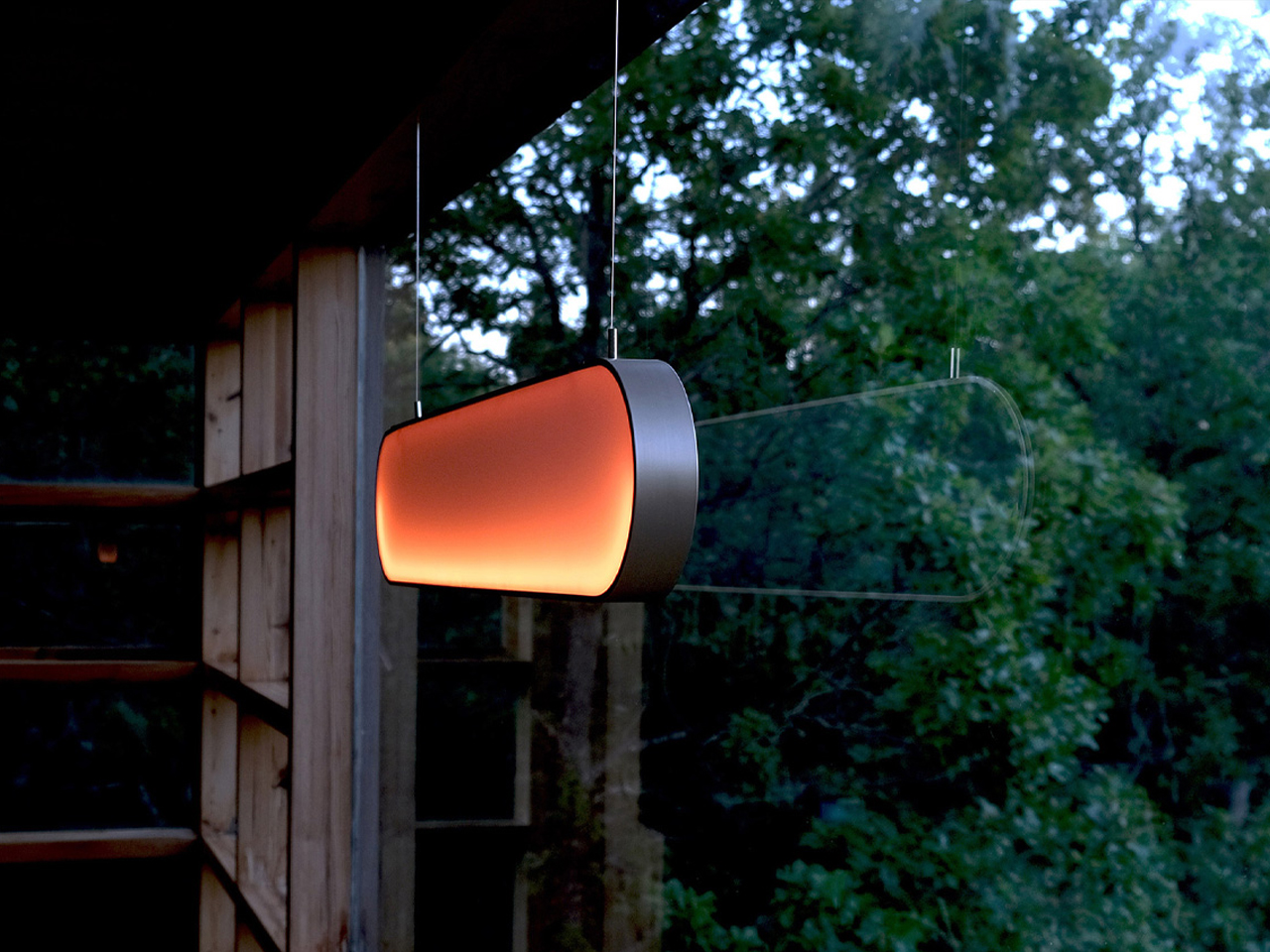
The Eclipse wall lamp by Tilen Sepič explores layered lighting through a sculptural circular form that transforms the atmosphere of a room. During the day, the lamp appears as a minimalist wooden ring with a quiet architectural presence, blending naturally into contemporary interiors. Crafted in finishes like natural beech, white, and burnt wood, the design balances simplicity with visual depth. It steps beyond a conventional wall fixture; Eclipse acts as both decorative art and an ambient lighting element that changes character throughout the day.
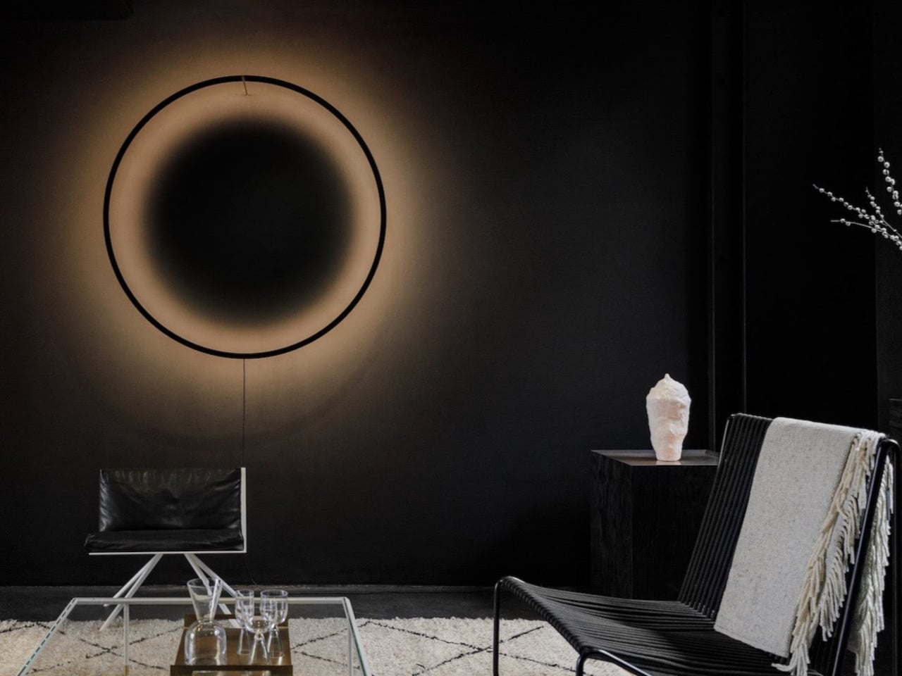
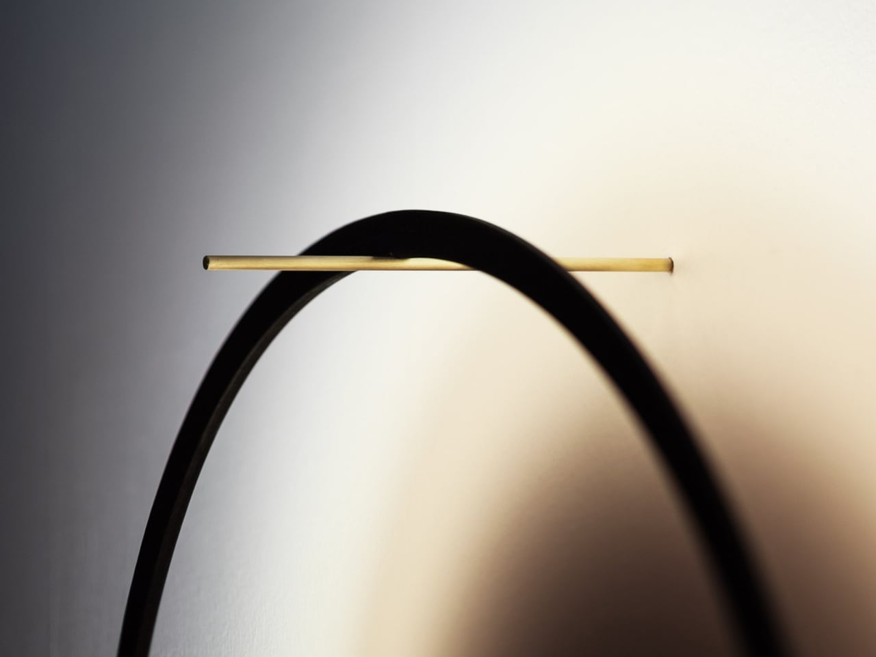
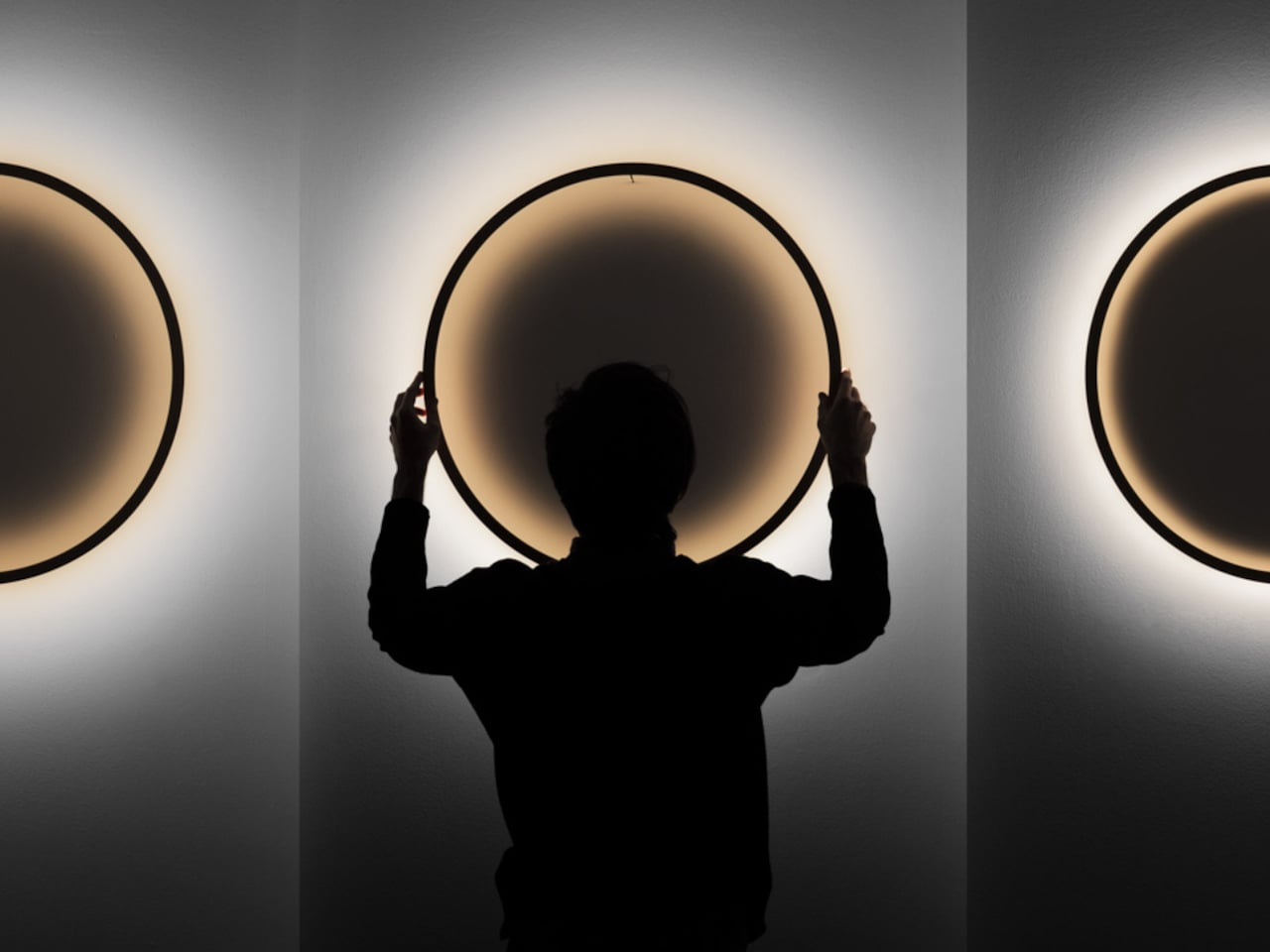
Once illuminated, the lamp creates a layered lighting effect through a warm LED glow diffused across the wall surface. The circular frame casts a dramatic central shadow, producing depth, contrast, and a soft, halo-like atmosphere that feels almost cinematic. Its adjustable distance from the wall allows the light to shift between sharp definition and softer diffusion, giving users control over the mood of the space. The interplay of glow, shadow, and warm tones transforms the lamp into an immersive lighting experience rather than a simple source of illumination.
What’s quietly being retired in 2026 interiors
Several aesthetics that once dominated social media and showroom floors are now losing relevance. Cool grey palettes are the clearest example. Once considered modern and timeless, they now often feel cold and overexposed. Stark all-white interiors are also fading because they lack the warmth and tactility homeowners increasingly want from their spaces.
Sharp-edge minimalism is another design language slowly being softened. Boxy furniture, rigid monochrome schemes, and ultra-sparse rooms are giving way to layered interiors with texture, warmth, and personality. The dominant mood of 2026 is no longer about perfection or restraint. It is about creating homes that feel human, sensory, and emotionally comforting.
Interior design trends 2026 are ultimately moving toward spaces that feel softer, warmer, and more connected to everyday life. The homes defining this year are tactile, expressive environments built around comfort, material richness, and individuality. As the second half of 2026 approaches, it is becoming increasingly clear which trends truly landed and which ones quietly stayed behind in January mood boards.
The post The 7 Interior Design Trends Actually Defining 2026 Homes first appeared on Yanko Design.