The floor is the canvas. That’s the premise behind Geometry of Play, Sharmistha Ray’s new public art installation at Arts Landing in downtown Pittsburgh, and it might just be the most quietly radical thing to happen to both art and sport this year.
Ray, an artist, writer, and educator born in Kolkata and raised in Kuwait before settling in the United States, has always worked in the language of vibrant geometric abstraction. Their paintings draw from South Asian visual traditions, including kaleidoscopic mandalas and architectural ornamentation, filtered through a lens of queerness, migration, and belonging. It’s rich, layered work. So when the Pittsburgh Cultural Trust commissioned Ray to create a mural across three pickleball courts for their inaugural public art program at Arts Landing, the choice wasn’t arbitrary. They needed someone who understood that abstraction isn’t just decoration. It’s meaning.
Designer: Sharmistha Ray
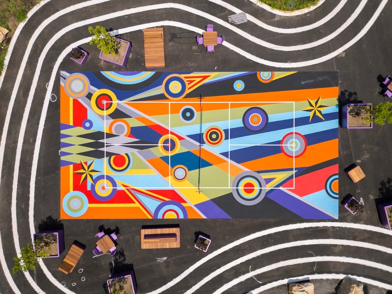
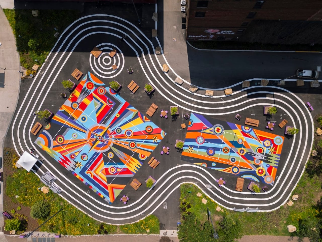
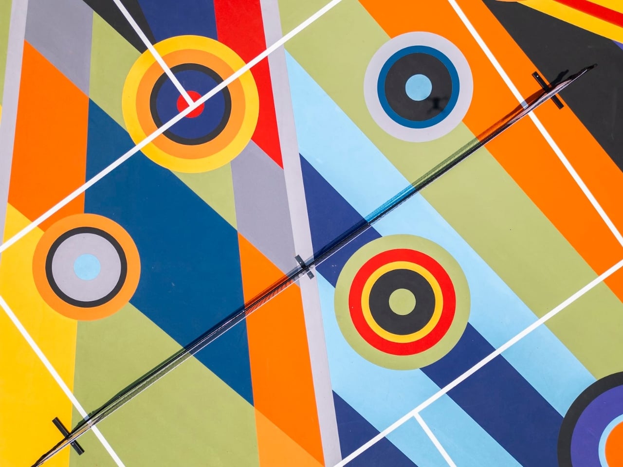
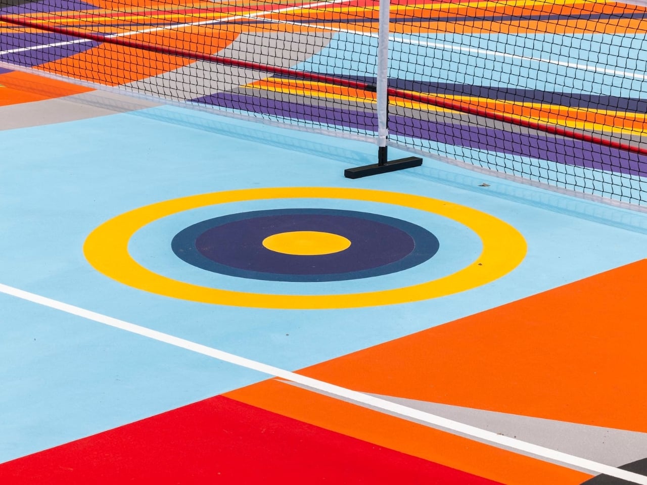
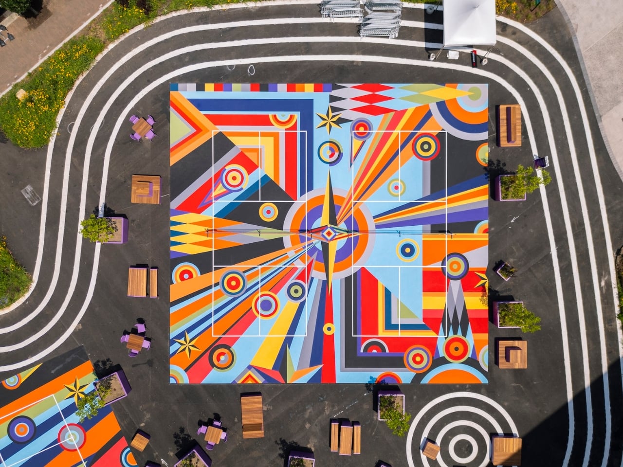
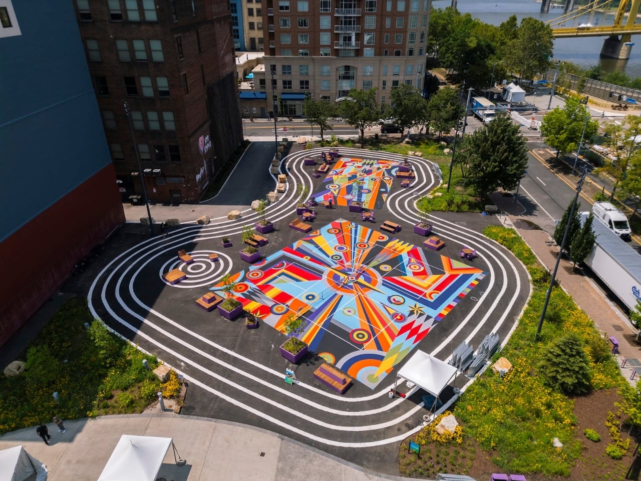
Geometry of Play is made up of large-scale murals painted directly onto the playing surfaces of three 22-by-40-foot pickleball courts, making them the first artist-designed pickleball courts in the entire country. Interlocking circles, triangles, and grids move across the pavement in bold, saturated color. Up close, it reads like a painting you’d frame and hang in a gallery. From a drone view, it’s something closer to architecture, or maybe a quilt, or a mandala. All of those things at once.
What strikes me about this project is how well it understands its context. Pickleball is famously communal. It’s not a solitary sport of stoic concentration. It’s loud and social and a little chaotic, and the people who love it tend to love it deeply. Ray’s work doesn’t ignore that energy; it amplifies it. The mural creates a constantly shifting visual and physical experience as players move across the court. The geometry doesn’t sit still. It responds to motion, to foot traffic, to the unpredictable choreography of the game itself.
That’s a pretty smart relationship between art and function, and I’ll be honest: I think it puts a lot of conventional public art to shame. So much public art, especially the kind installed on flat, horizontal surfaces, tends to feel like an afterthought. A logo. A pattern that exists to fill space without challenging it. Geometry of Play actually does the opposite. It treats the court not as a site that needs decorating but as a site that can carry meaning, even while a game is being played on top of it.
Ray is also a founding member of Hilma’s Ghost, a feminist artist collective, and currently teaches at Carnegie Mellon University. That connection to Pittsburgh runs deeper than a single commission, and you can feel it in the work. This isn’t a project that was parachuted in from another city. Geometry of Play is part of a larger program featuring 23 works by 10 artists, all commissioned for Arts Landing. It’s part of something being built slowly, intentionally, in one place.
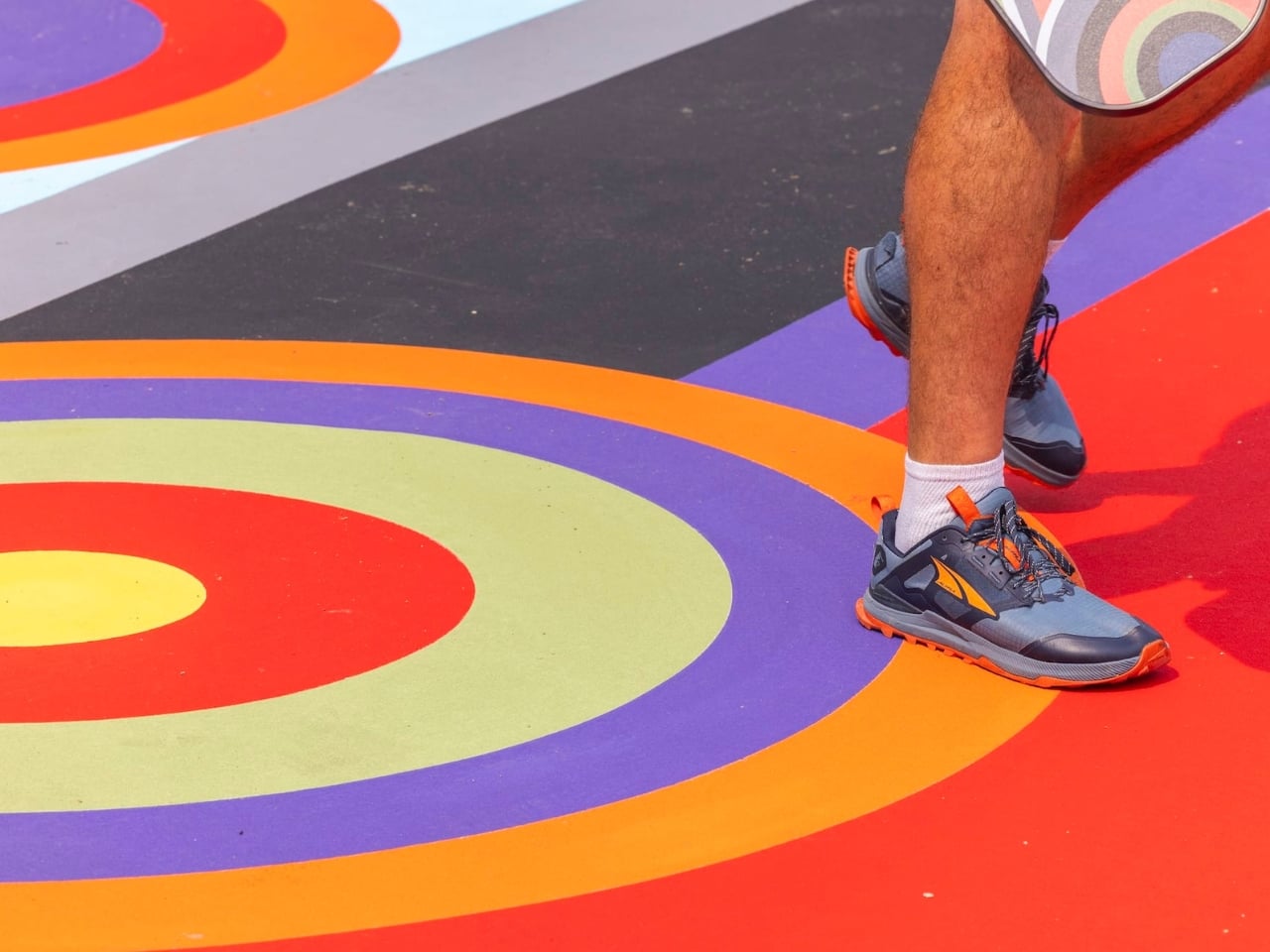
The installation debuted during Picklesburgh, Pittsburgh’s beloved annual festival, in July 2026. But the courts aren’t going anywhere. They remain open for public use, which means people will be playing pickleball on top of a painting for years. I find that genuinely exciting. Art in a museum demands a certain mode of attention: quiet, reverential, scheduled. Art on a pickleball court demands nothing. It just shows up where life already is.
Ray has said that they treat abstraction as “a spatial and cultural gesture of joy, inclusion, and shared encounters across identities, generations, and modes of seeing.” That framing matters. Geometry of Play isn’t trying to be monumental. It’s trying to be present, in the middle of things, where people are actually gathering and moving and having fun. We talk a lot about making art more accessible. Most of the time, that conversation stays theoretical. Sharmistha Ray just painted it onto the ground and said: here. Come play.
The post Pittsburgh Just Built the Most Beautiful Pickleball Courts in America first appeared on Yanko Design.