Chrome Spheres Are Now Furniture, and It’s Surprisingly Beautiful

The easiest way to describe the Wishes Collection is to say it looks like someone took a string of chrome Christmas ornaments and turned them into furniture. But that description undersells it considerably.

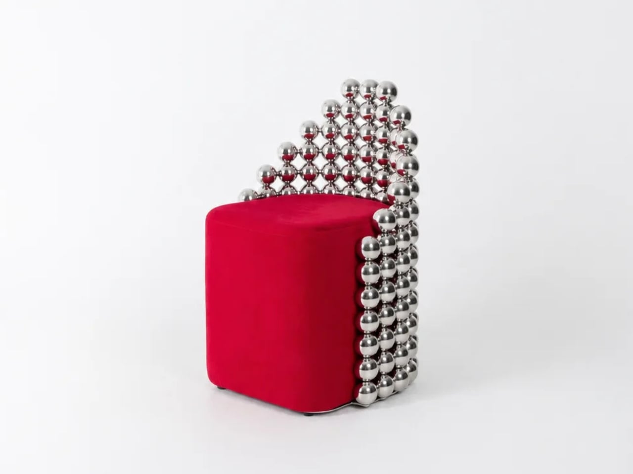
Designed by Reza Raeisifar in collaboration with Saber Abar, the Wishes Collection is a limited-edition furniture and lighting series built around a single, almost stubborn idea: take one spherical module, connect it to another, and keep going until you have a chair. Or a rocking chair. Or a bench, a table, a lamp, or a pet house. The collection includes all of these, and the remarkable thing is that they all feel like they genuinely belong together, not as a marketing decision, but as a structural one. Literally, visually, and materially.

Designers: Reza Raeisifar, Saber Abar
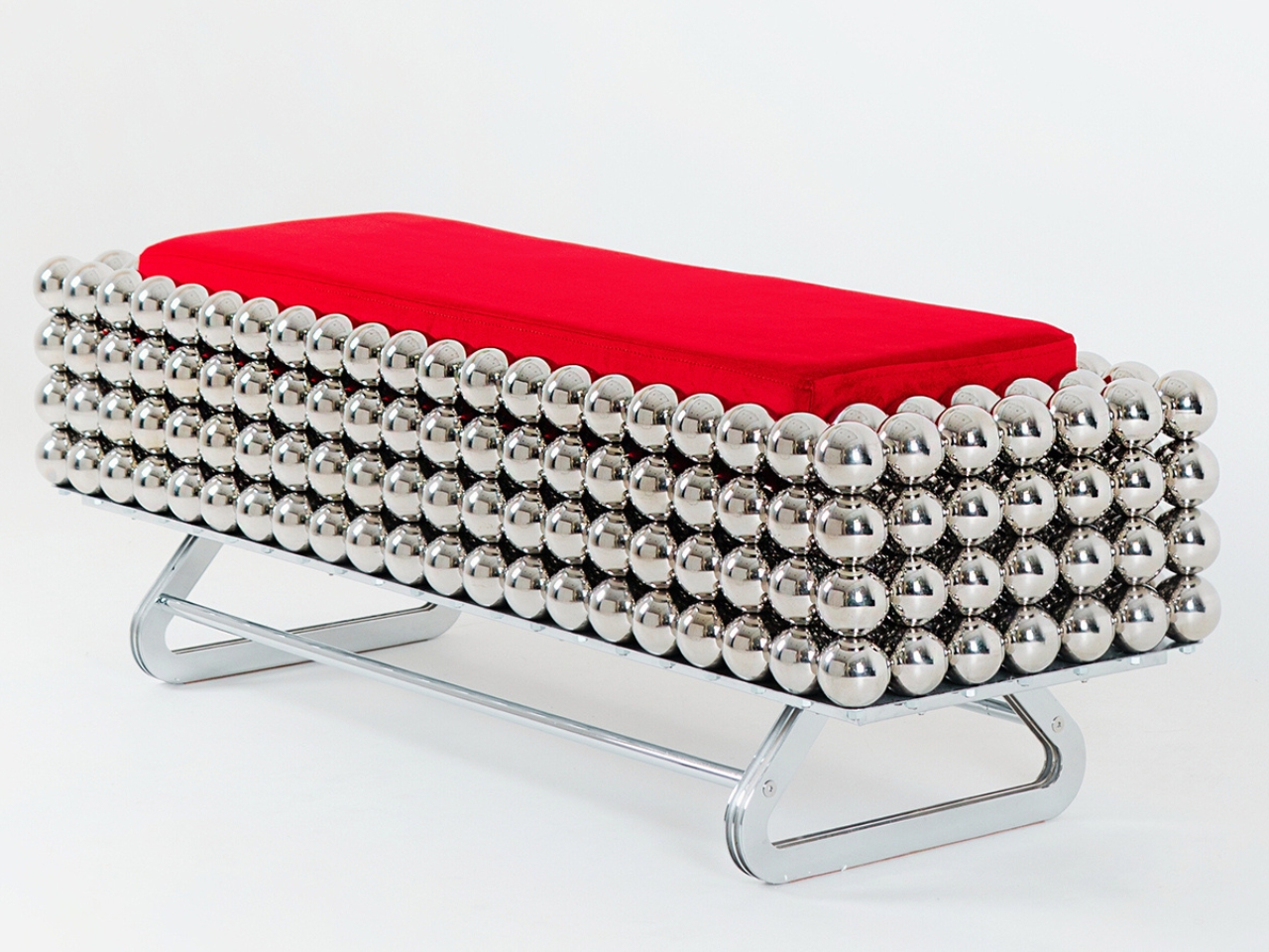
The concept draws from how nature builds complexity. Think coral reefs, honeycomb, bone structure. Raeisifar and Abar were inspired by the way intricate forms emerge from the patient repetition of simple elements, and they made that principle the backbone of everything here. It is a surprisingly old idea to apply to contemporary furniture design, but that is part of what makes the execution feel considered rather than gimmicky. Each piece is constructed from interconnected spherical modules in Grade 404 stainless steel with a nickel-chrome finish. The result reads as opulent without being overwrought, sculptural without needing to announce itself.
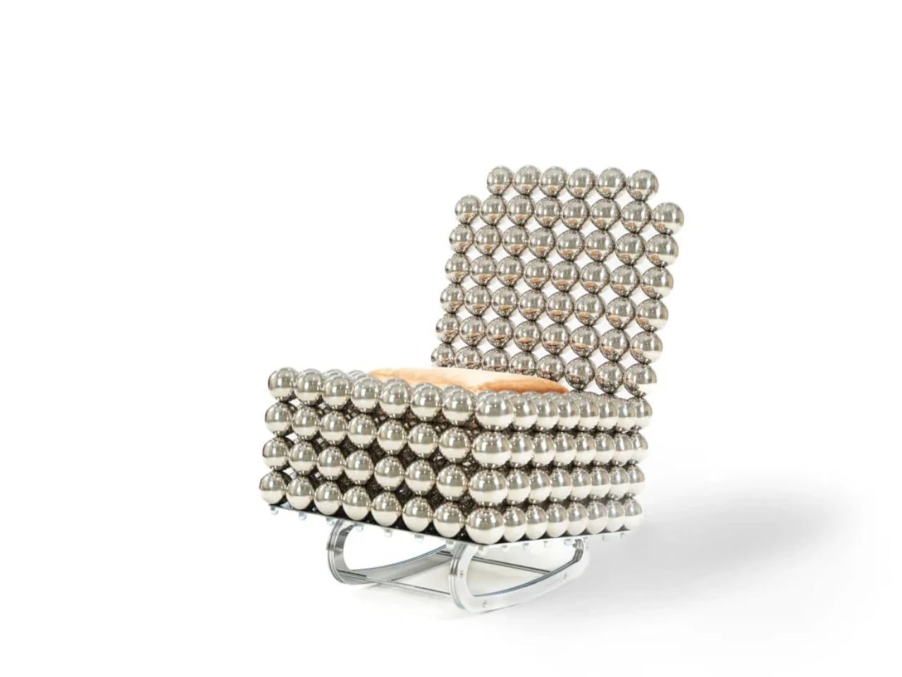
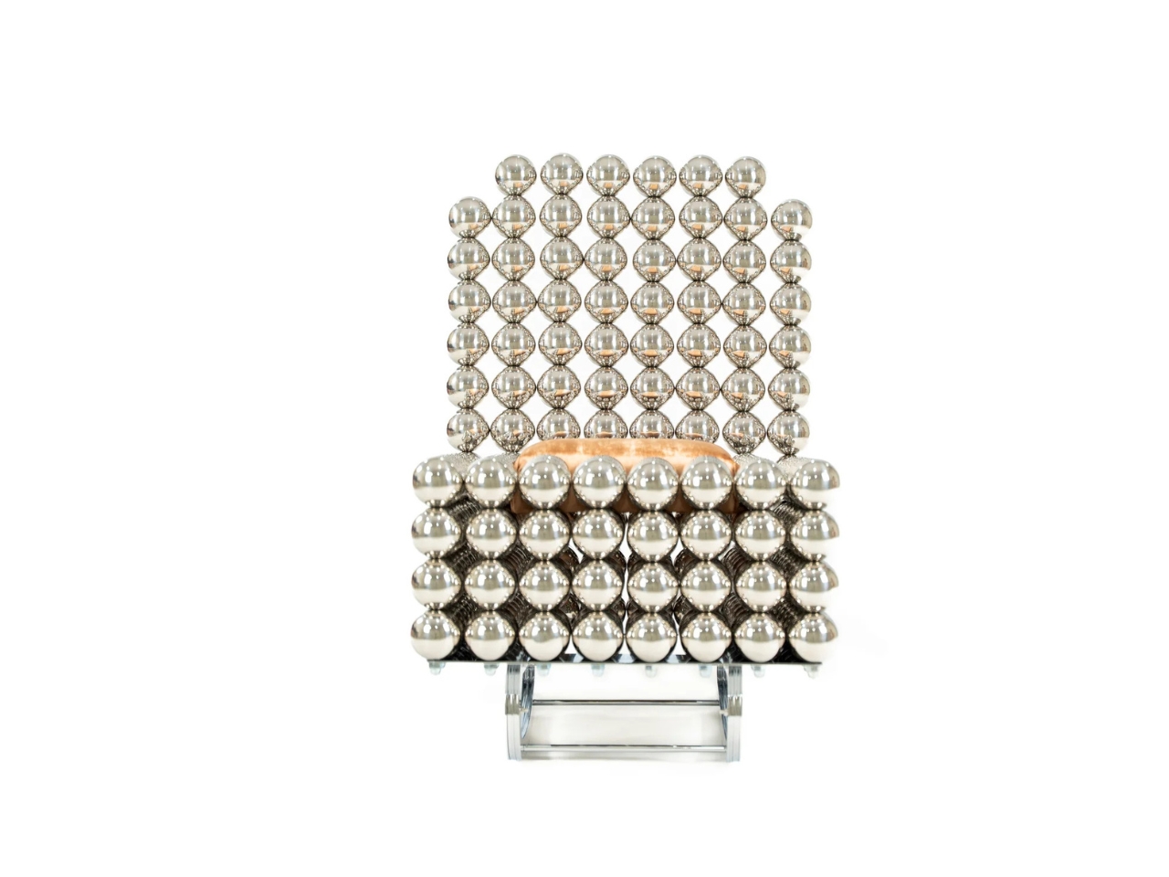
The rocking chair is where the collection’s internal logic gets genuinely interesting. On paper, chrome steel spheres and a piece of furniture meant to sway gently do not sound like natural partners. The spheres carry an obvious rigidity, an almost architectural seriousness. But paired with curved wooden runners beneath and a soft cushion on top, the chair pulls off a kind of material negotiation that should not work as well as it does. You see the tension and it reads as deliberate. It is.
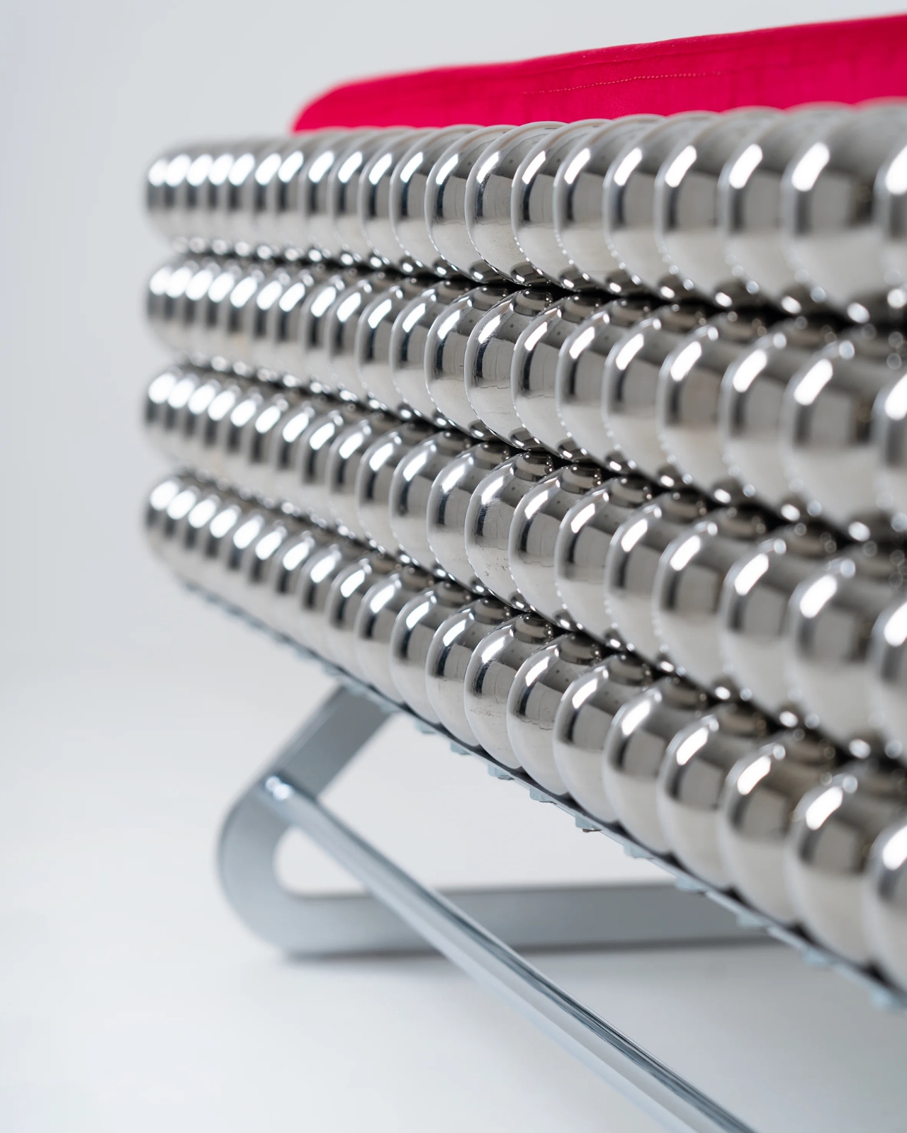
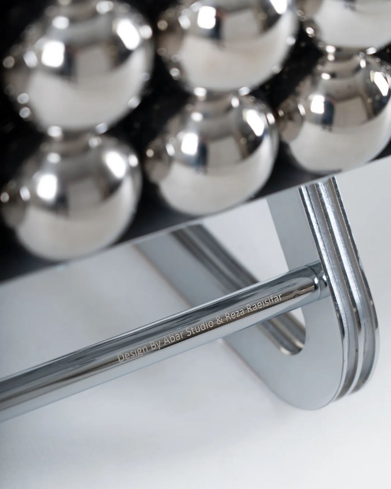
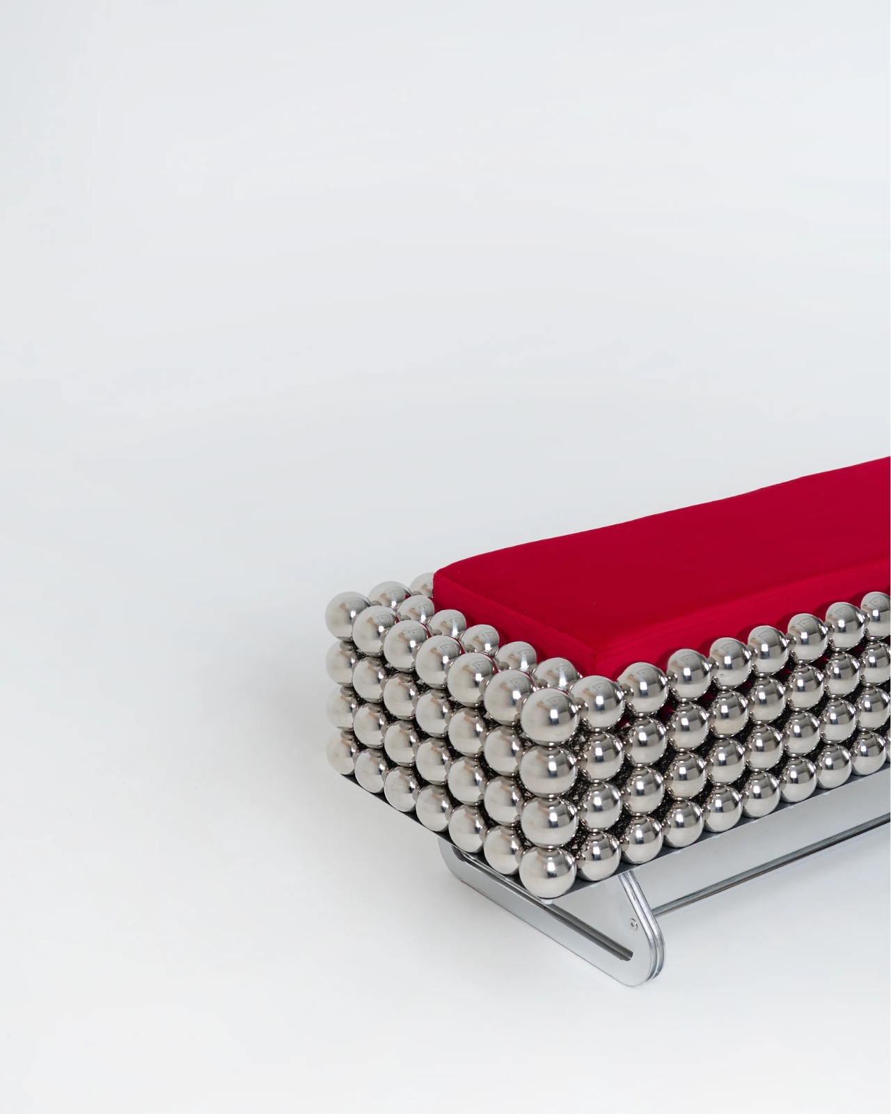
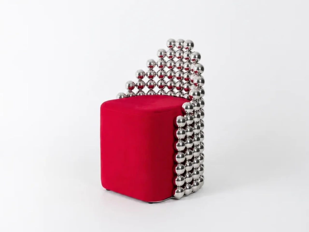
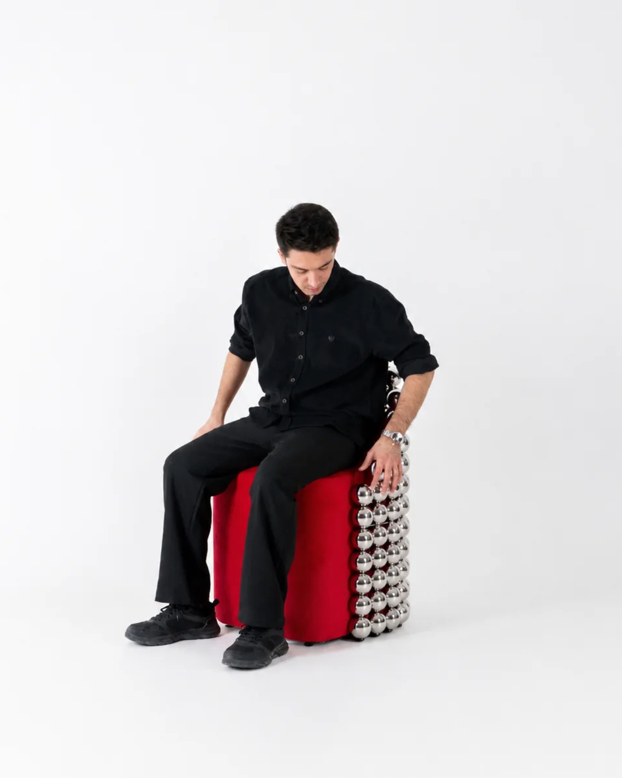
The bench and chair follow the same logic. Polished steel spheres form the body, a cushion in red or velvet sits on top, and the whole thing manages to look both industrial and inviting at the same time. It is the kind of furniture that makes you want to sit in it before you even think to ask whether it is actually comfortable. For a limited-edition piece, that is exactly the instinct you want to provoke.
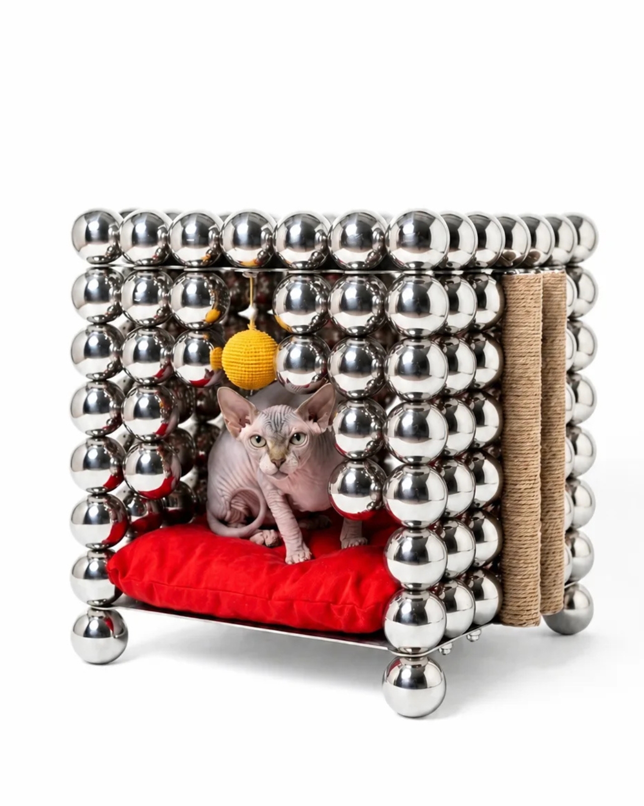
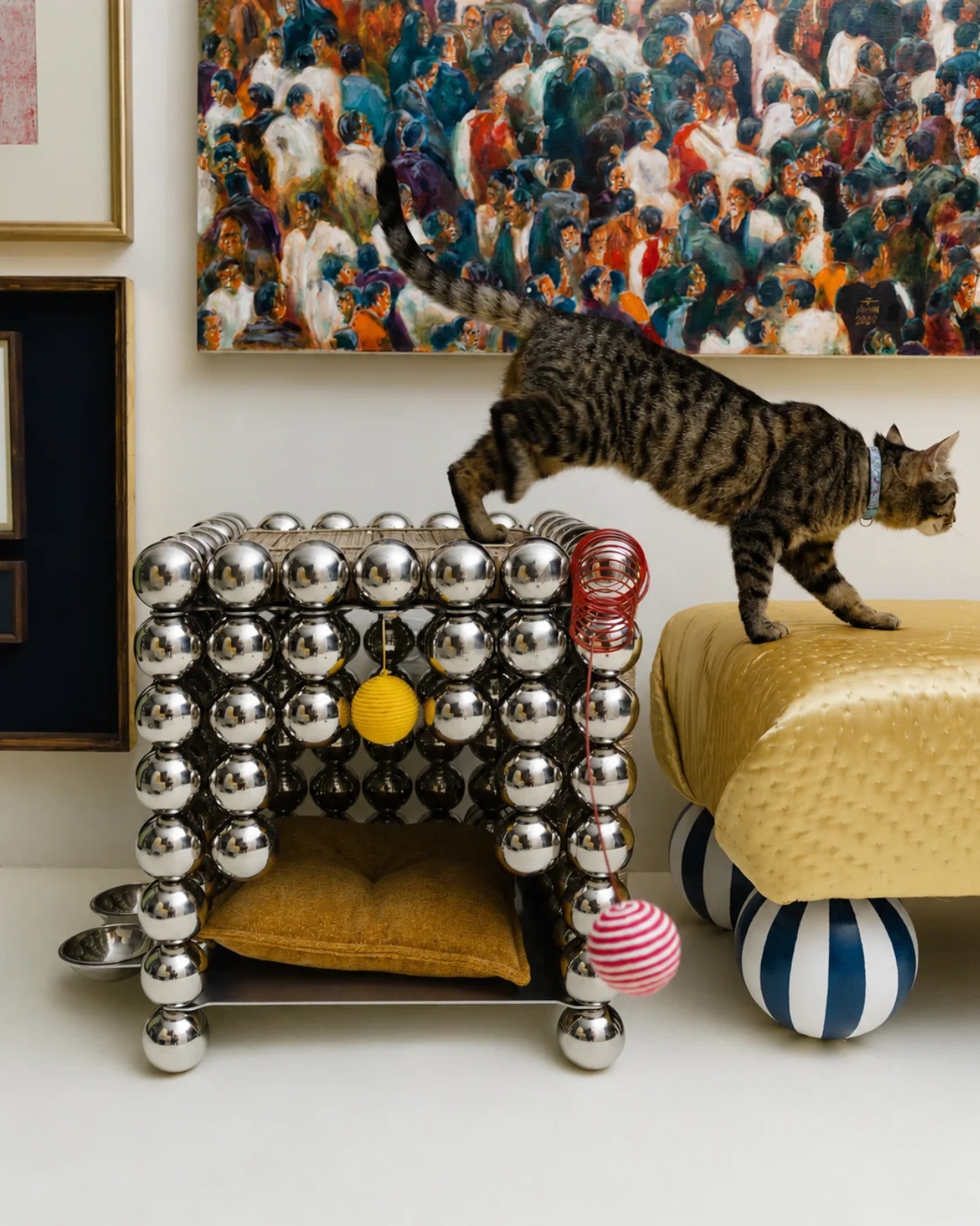
Then there is the pet home, which is either the collection’s best joke or its most earnest moment, depending on how you look at it. The same modular sphere system that supports a grown adult on the rocking chair now forms a miniature shelter for a cat, a cat that, in the campaign images, looks perfectly unbothered living inside polished chrome walls. The designers describe it as the architectural boundary element now forming a miniature interior of its own, and while that framing reads a bit grand for a cat house, they are not entirely wrong. The logic holds, and it lands.
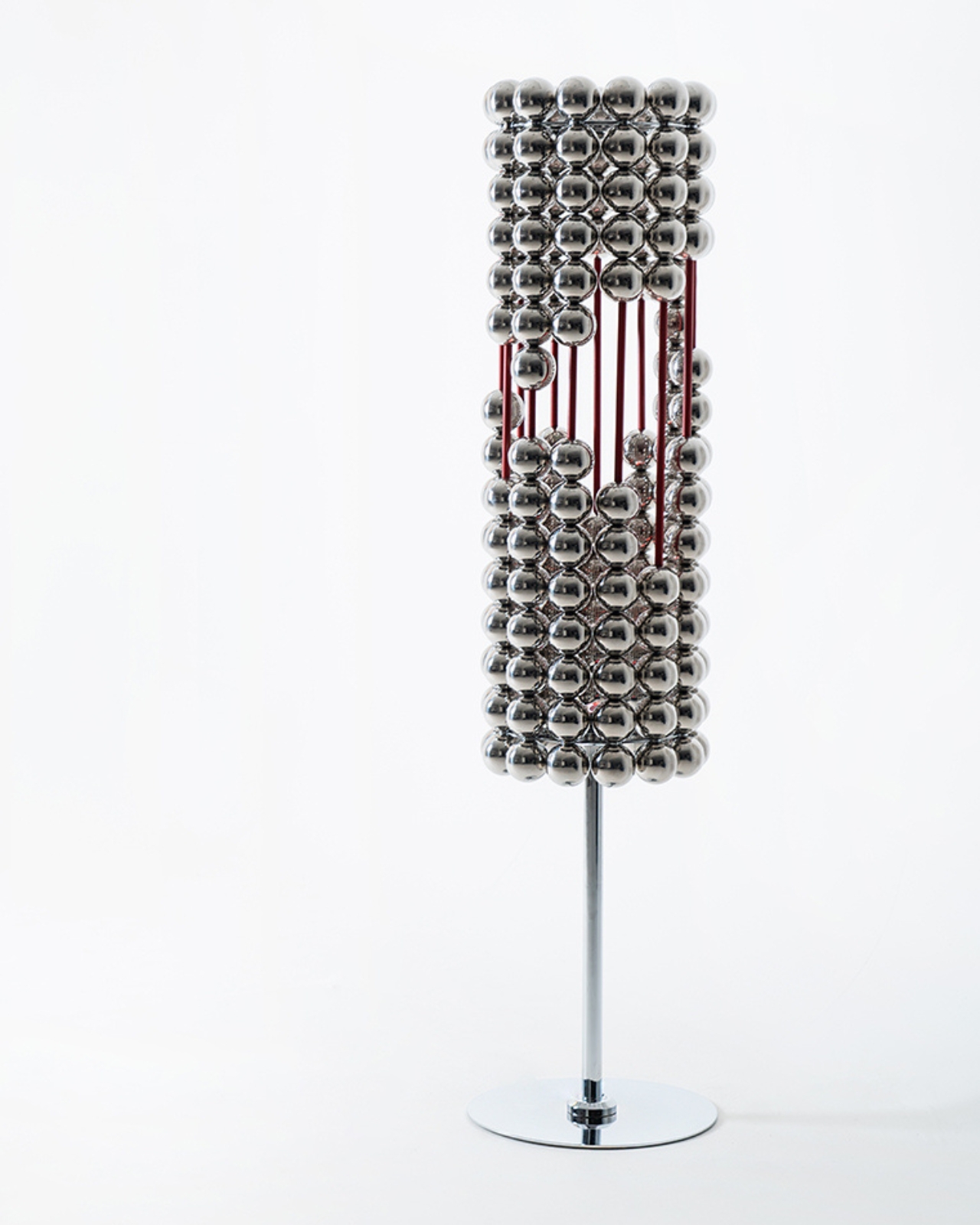
The floor lamp completes the picture by pushing the modular system beyond furniture altogether. Here, the spheres are no longer bearing weight or defining form. They are catching light, letting it fracture across their polished surfaces in ways that feel more jewel-like than industrial. It is a smart shift in function, and it shows how far a single design language can travel when the designers trust it enough to keep pushing rather than introducing something entirely new.
Raeisifar and Abar have tied the collection’s name to a metaphor. A wish, they suggest, takes shape through many small actions over time. One modest step, repeated often enough, eventually becomes something whole. The Wishes Collection makes that idea physical, and it works. Not because the metaphor is particularly new, but because the execution is committed enough to make you believe it.
For a limited-edition collection, Wishes does what the best ones do. It does not just sell you an object. It sells you on a way of thinking about design. And given how much of the current design conversation rewards loudness and novelty at almost any cost, a collection this disciplined, this committed to a single shape, feels more interesting, not less.

The post Chrome Spheres Are Now Furniture, and It’s Surprisingly Beautiful first appeared on Yanko Design.

Wooden Bench Hides a Full Survival Kit Inside

Most benches exist to give you somewhere to sit and catch your breath. They are humble, taken-for-granted objects, placed at intervals on a trail to mark the rhythm of a hike, to offer a moment of stillness in an otherwise demanding landscape. Nobody really thinks about them. And that’s exactly the kind of object Italian designer Francesco Faccin loves to rethink.

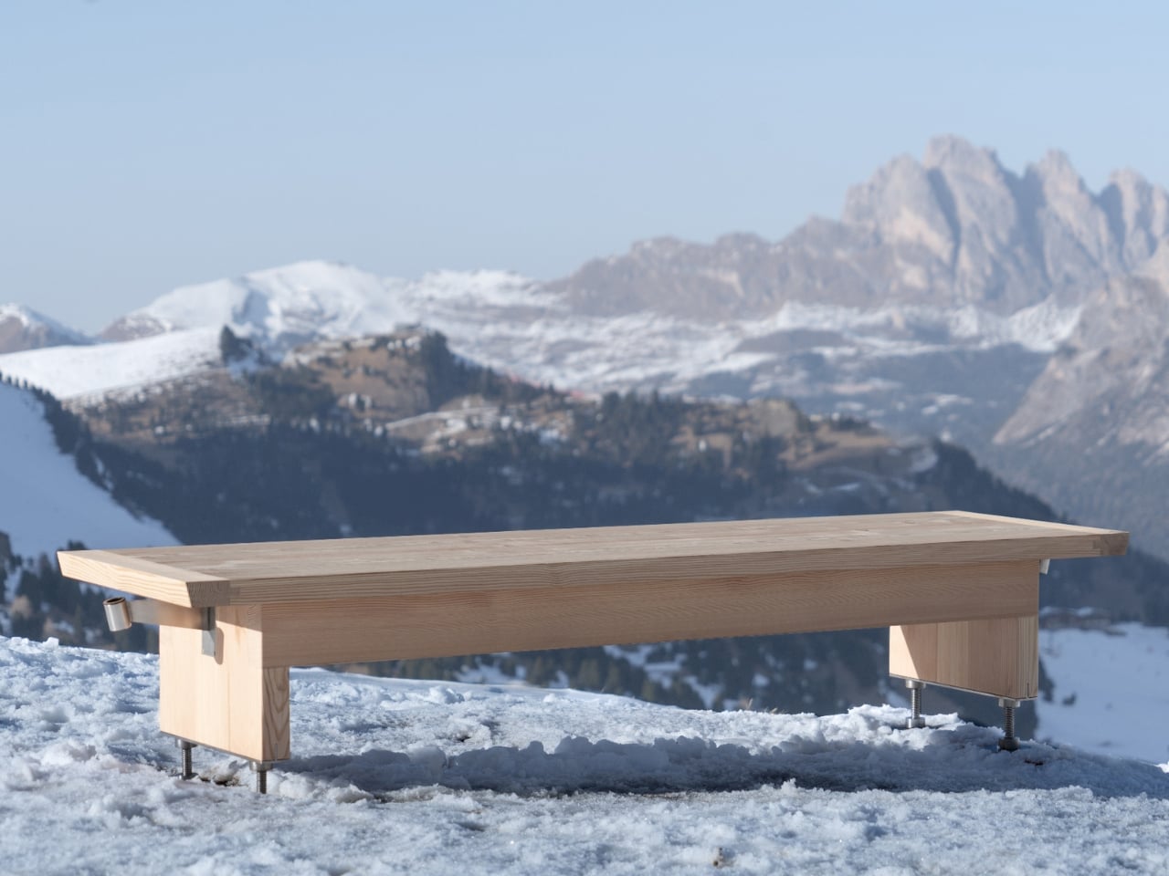
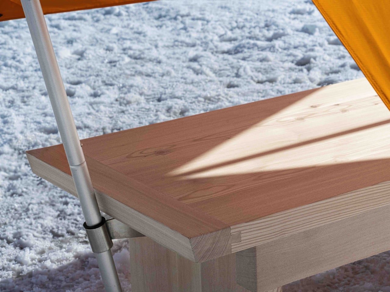
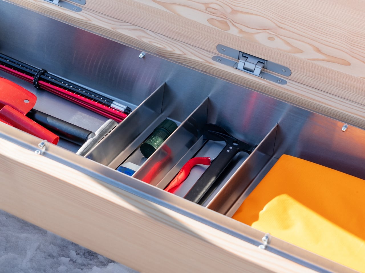
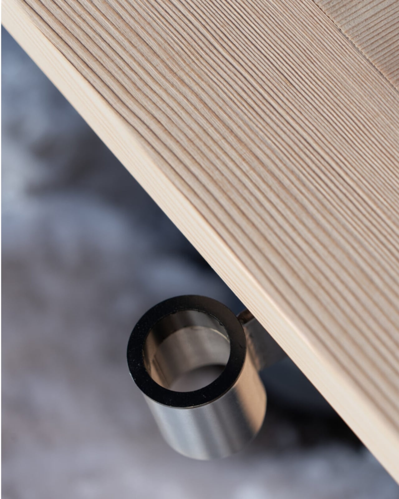
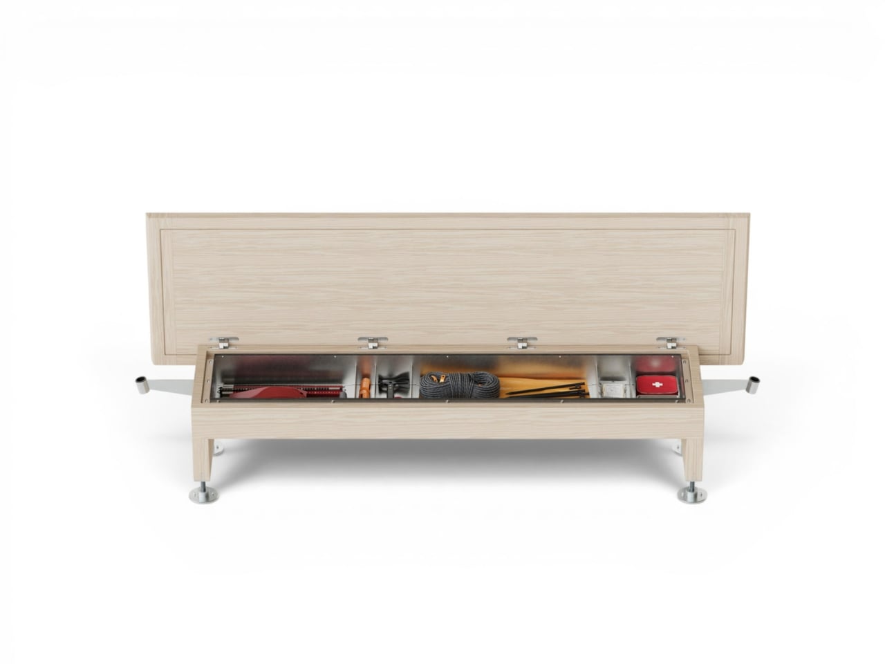
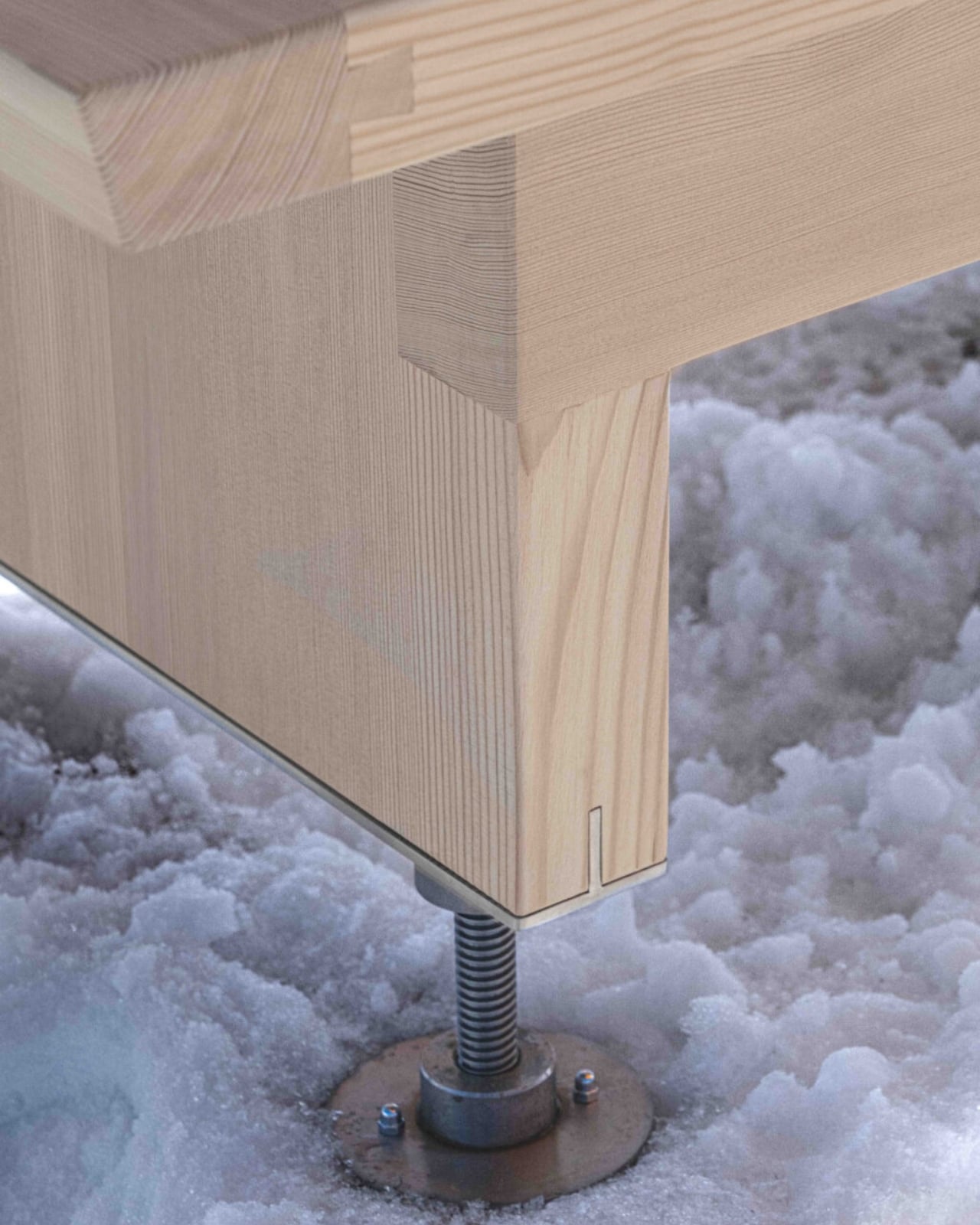
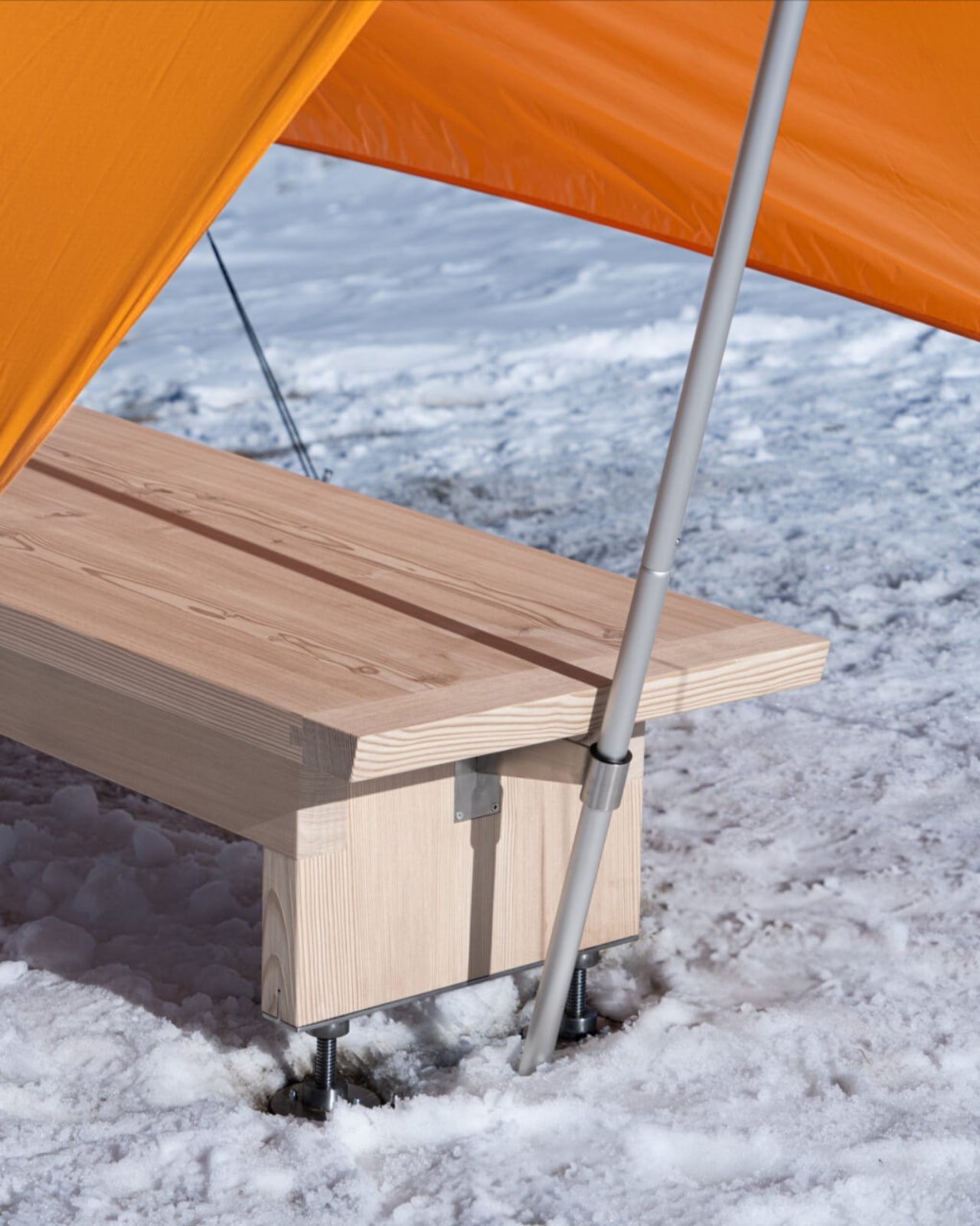
Pancalpina is Faccin’s latest project, commissioned by Trentino Sviluppo for the alpine landscape of Trentino in northeastern Italy. From the outside, it reads as a traditional wooden bench, crafted from solid larch with stainless steel components that can handle whatever the mountains throw at it. Sit on it, take in the view, rest your legs. Nothing unusual. But hidden inside the bench’s belly is a complete survival kit: thermal blankets, a shovel, a torch, and a tent that deploys using the bench’s own structure as its frame.

Designer: Francesco Faccin

This is not a product born from a design brief looking for novelty. It’s a response to a real and recurring problem in alpine environments: people caught off guard by sudden weather changes, injuries, or simple miscalculation of distance and daylight. Faccin’s answer isn’t to build more formal infrastructure, which would disrupt the wild, sparsely touched nature of the terrain. Instead, he embedded emergency capacity into an object that already belongs there.

The philosophy behind Pancalpina is important to understand because it’s what separates it from a clever gadget. The alpine environment, as Faccin has noted, is one of the few remaining areas of genuinely wild nature in Europe. Refuges, bivouacs, and trail markers already exist as artificial landmarks in these spaces, helping hikers orient themselves and find safety. Pancalpina slips into that existing language. It doesn’t announce itself as a technological intervention. It just looks like a bench.

And yet the moment you need it, the object transforms. The tent isn’t designed for a comfortable night out. It’s designed for the specific, unglamorous situation of waiting for rescue or riding out a night of rain or sudden snowfall when you have no other option. Faccin is precise about this distinction: Pancalpina is not a bivouac for extended stays. It’s a minimal shelter, built for survival in the time between crisis and help arriving.

That restraint is actually the most interesting design decision here. A lesser designer might have overcomplicated the solution, packed the bench with sensors and GPS alerts and solar charging panels. Faccin kept it elemental. Wood, steel, blankets, a shovel, a tent. Materials and tools that don’t require a signal to function, because when you actually need them, there might not be one.

Faccin himself trained under Enzo Mari, one of Italy’s most rigorous design thinkers, and that influence shows in how he approaches objects with genuine seriousness of purpose. His work has been recognised with a Compasso d’Oro honourable mention, and he teaches product design at the Free University of Bolzano, which puts him, fittingly, right at the edge of alpine territory. He’s not designing Pancalpina from a studio purely for aesthetic effect. He’s designing it because he understands that environment.

What strikes me about this project is how it reframes the idea of public infrastructure. We tend to think of safety in the mountains as a function of signage, emergency apps, or rescue services. Pancalpina asks: what if the bench itself carried some of that responsibility? Not in a dramatic or high-tech way, but quietly, modestly, in the way that good design tends to do its best work.

The name, too, is worth noting. Panca is Italian for bench, and alpina for alpine. It’s compound, direct, and a little poetic. The kind of name that feels inevitable once you hear it. If Pancalpina ever moves beyond prototype to wider installation across Italian alpine trails, it would represent one of the more genuinely thoughtful examples of public design in recent memory. Not because it’s revolutionary, but because it understood exactly what it needed to be, and nothing more.

The post Wooden Bench Hides a Full Survival Kit Inside first appeared on Yanko Design.
Japanese Designer Built Furniture With No Glue or Screws

Most furniture is held together by things you can’t see. Mortise-and-tenon joints, steel brackets, wood glue applied in generous amounts before being clamped overnight. The craft of traditional joinery is genuinely impressive, and furniture historians will rightly tell you it’s one of the oldest engineering feats in human history. But a Japanese designer named Tact Inoue just asked a simple question: what if you didn’t need any of that?

His answer is Mocky, a furniture series that throws out conventional joinery entirely and replaces it with heat, pressure, and the natural behavior of a material most people walk past every day without a second thought.

Designer: Tact Inoue

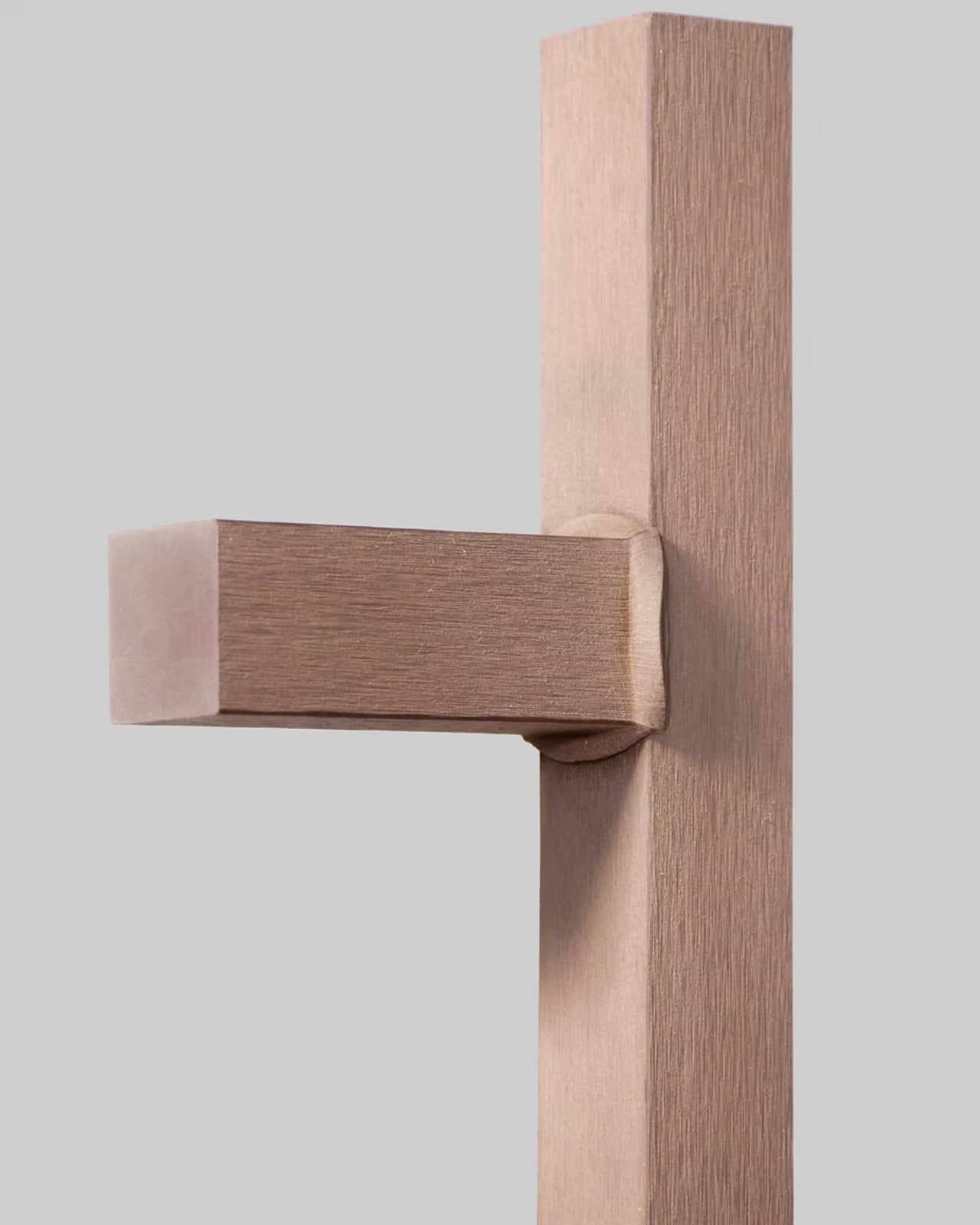
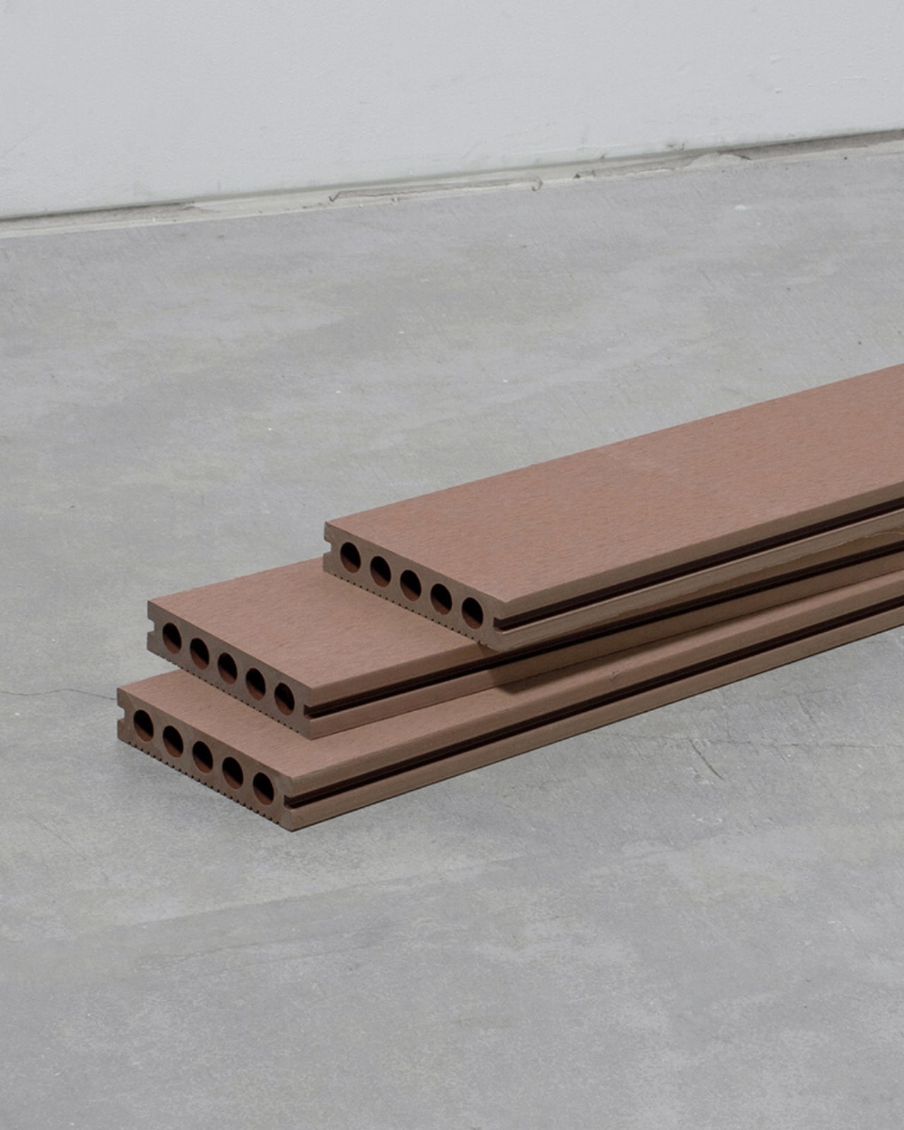
The material in question is artificial wood, specifically the kind composed of wood flour and resin, commonly used in outdoor decking. It’s not a glamorous material by any stretch. You’ve probably seen it on a boardwalk, a backyard patio, or a poolside deck. It blends in, does its job, and gets credited with being “low maintenance.” Tact Inoue looked at that material and saw something different entirely.

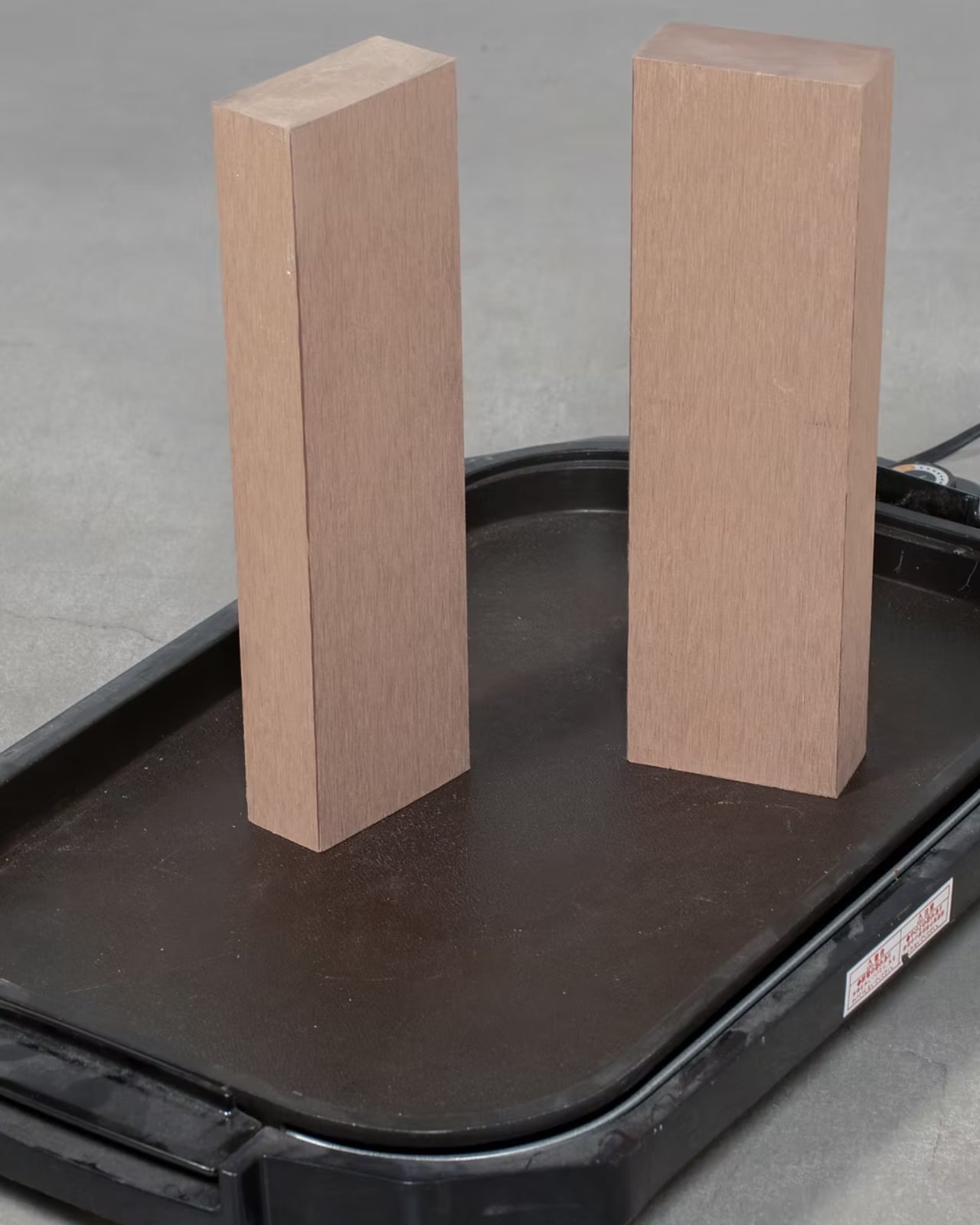
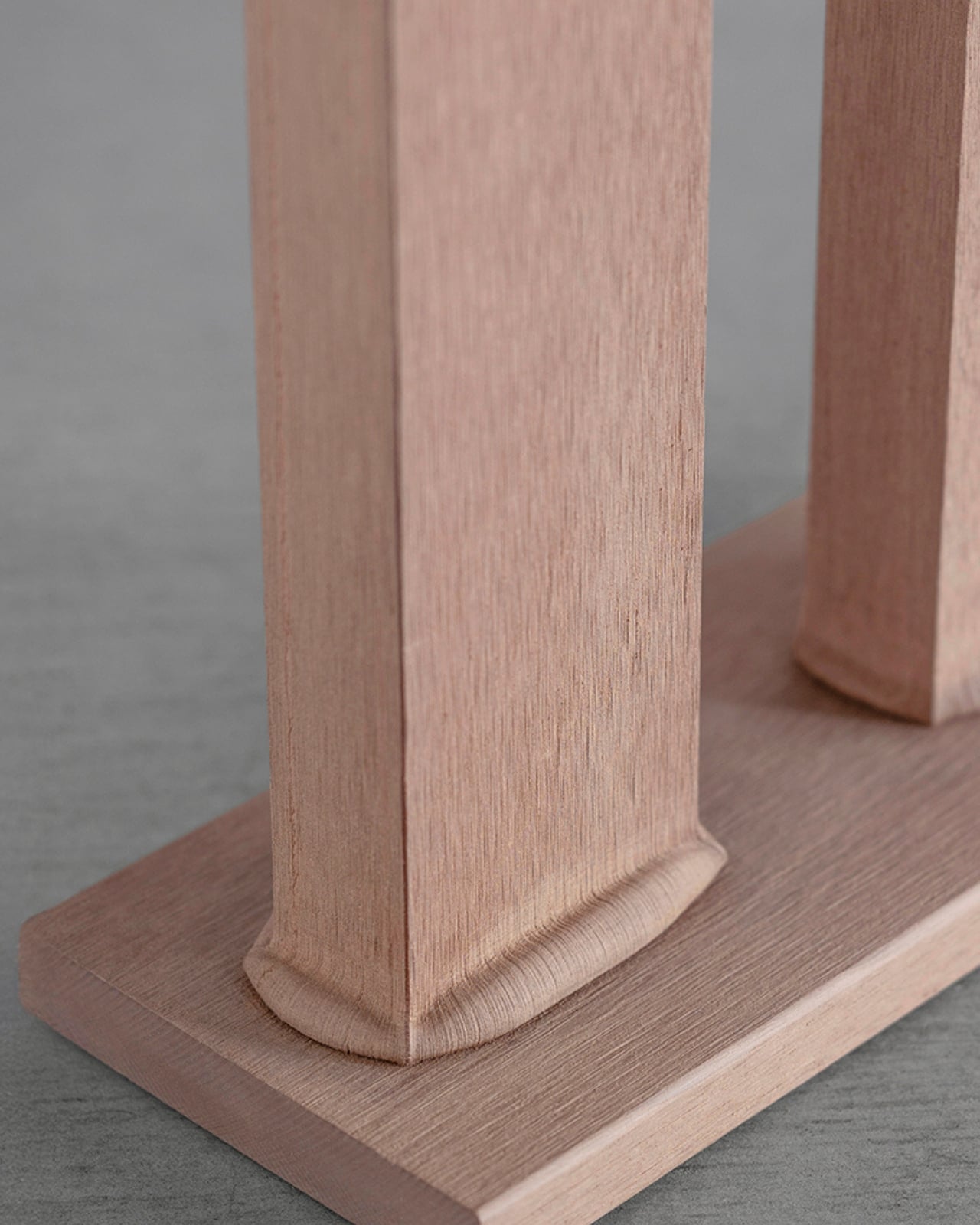
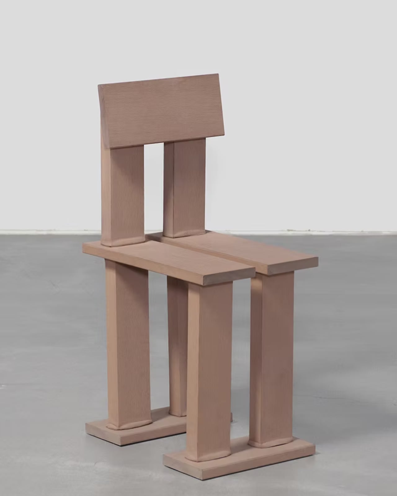
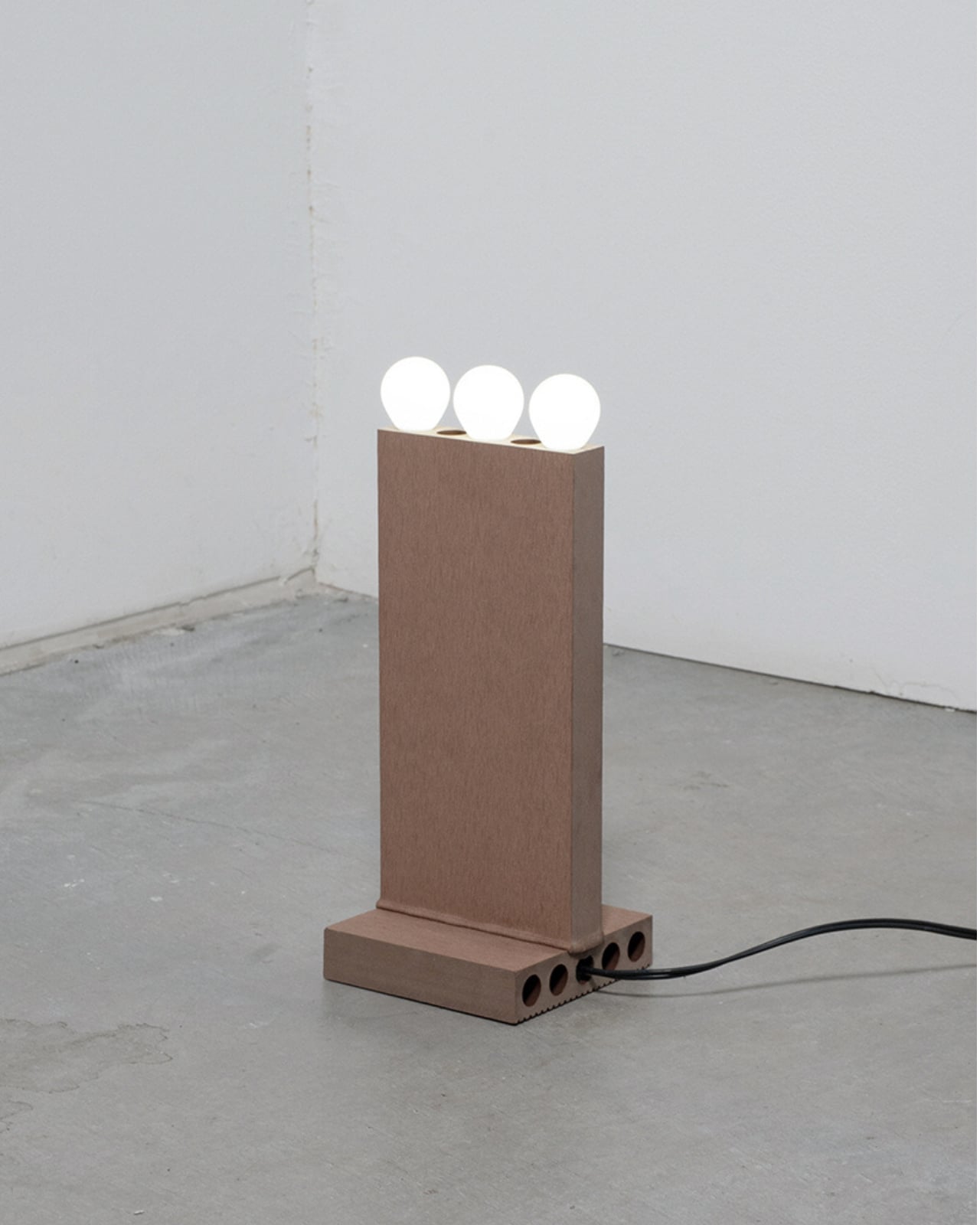
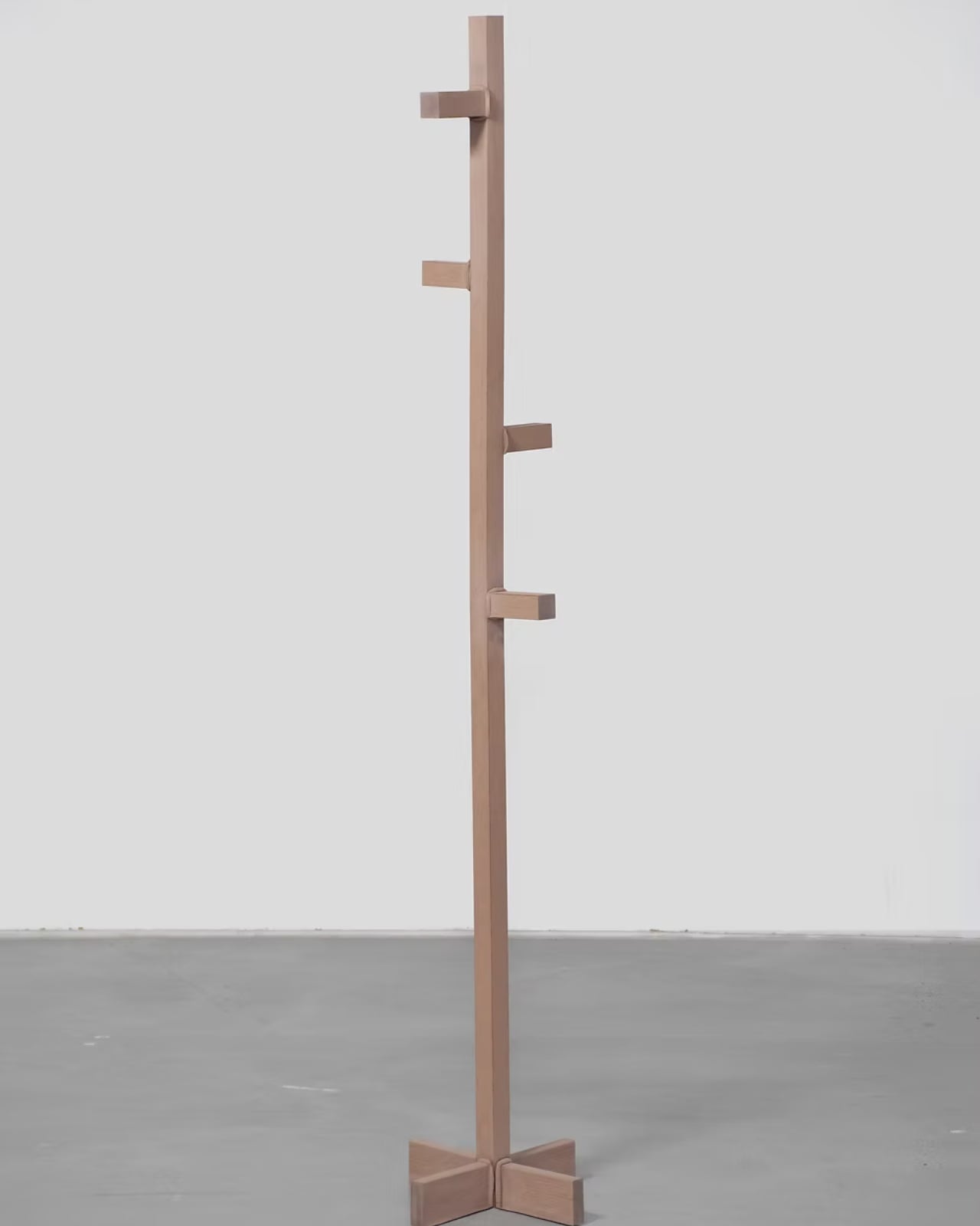
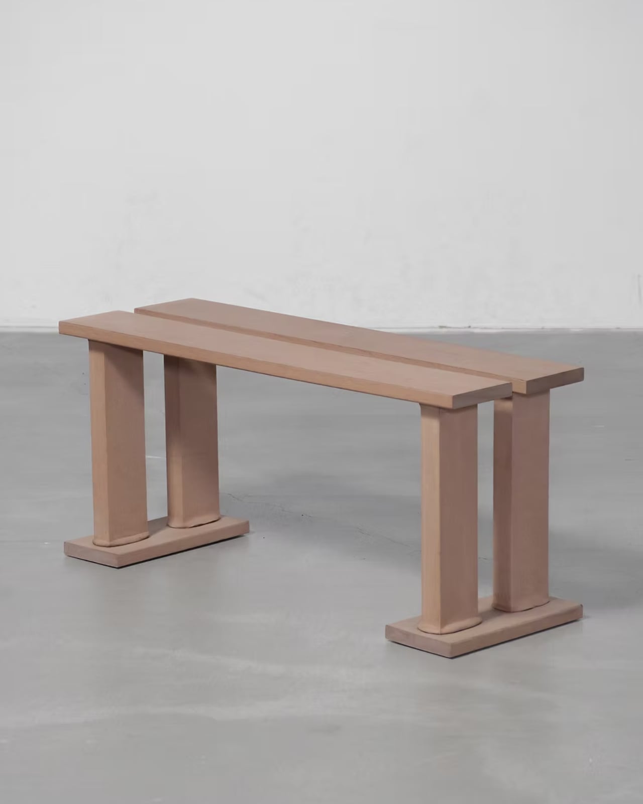
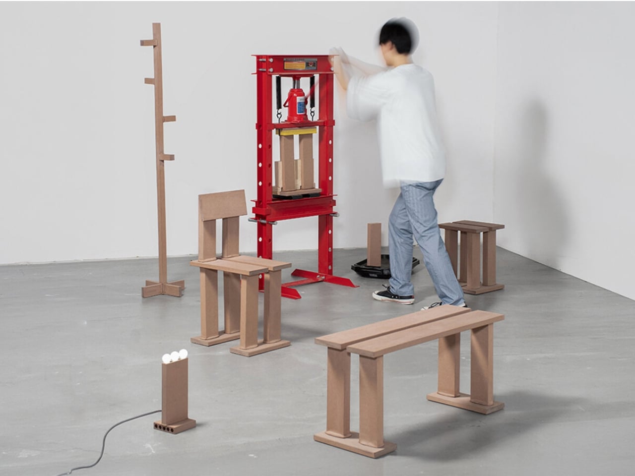
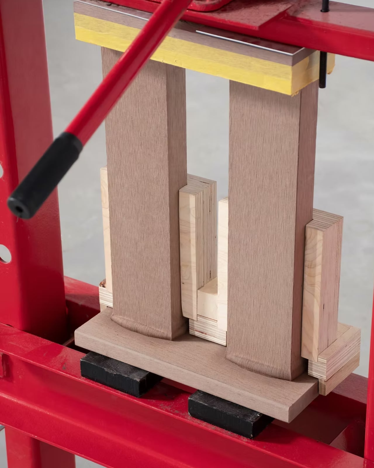
Because of its resin content, artificial wood can be heated until it softens. Inoue takes that softened state and presses the components together using a 20-tonne press machine. The heated surfaces fuse, adhering to each other as they cool. There are no fasteners, no glue, no mortise-and-tenon joints. The connection is the material itself. What comes out the other side looks nothing like what you’d expect from anything made of wood: warped surfaces, irregular joints, organic protrusions where two pieces met and merged under pressure.

And the thing is, it looks extraordinary. The imperfections are the point. Inoue isn’t treating the irregularities as flaws to be corrected before the piece ships. The warping and distortion that happen during the heat-pressing process are built into the design language of Mocky from the start. Irregularity is an active part of the making, not an accident of it. Each joint emerges from the behavior of the softened material rather than from a pre-drawn spec sheet. That’s a genuinely different relationship between designer and material, one where control is shared rather than total.

One of the standout pieces in the series is a bench that requires no aprons or stretchers to hold it together. The seat is made of two completely independent components that bond entirely through the fused connection. From a structural standpoint, that’s remarkable. From a visual one, it’s striking in the best way: a piece that looks grown rather than built.

That distinction matters. So much furniture design right now falls into one of two camps: aggressively minimal, where the process is hidden and the object looks like it appeared fully formed, or intentionally handmade, where visible effort is treated as the point. Mocky doesn’t fully belong to either. The process is visible, but it isn’t precious. The irregularity is intentional, but it isn’t decorative for its own sake. It reads as material honesty, which is a rarer quality in furniture than we might assume.

Inoue is also making a quieter argument about what artificial wood is for. It has spent its entire commercial life as a substitute, a stand-in for timber that doesn’t want to rot on your deck. Mocky pushes back on that framing. When you stop treating artificial wood as a replacement for something better and start treating it as a material with its own specific properties, it turns out it can do things natural wood never could. You cannot melt a solid oak leg into a joint. You cannot fuse cherry wood planks into each other using pressure alone.

That shift in perspective, from material-as-substitute to material-on-its-own-terms, is what makes Mocky feel genuinely interesting rather than just visually surprising. It’s a reminder that designers often do their best work not when they reach for the expected material, but when they ask what a rejected or overlooked one is actually capable of. The answer, in this case, is quite a lot.

The post Japanese Designer Built Furniture With No Glue or Screws first appeared on Yanko Design.
When F1 Engineering Becomes the Chair You Sit In

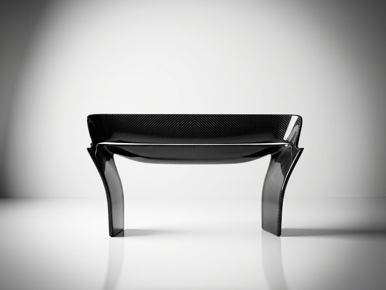
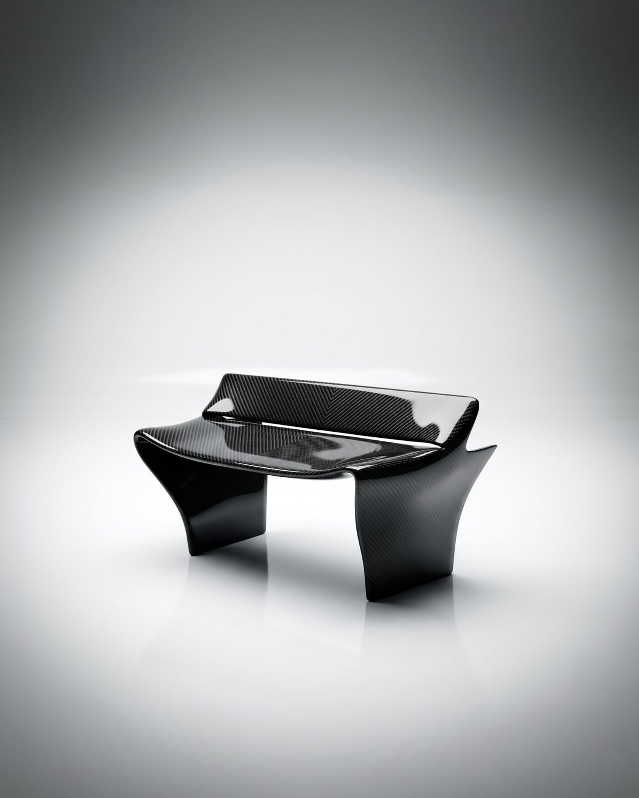
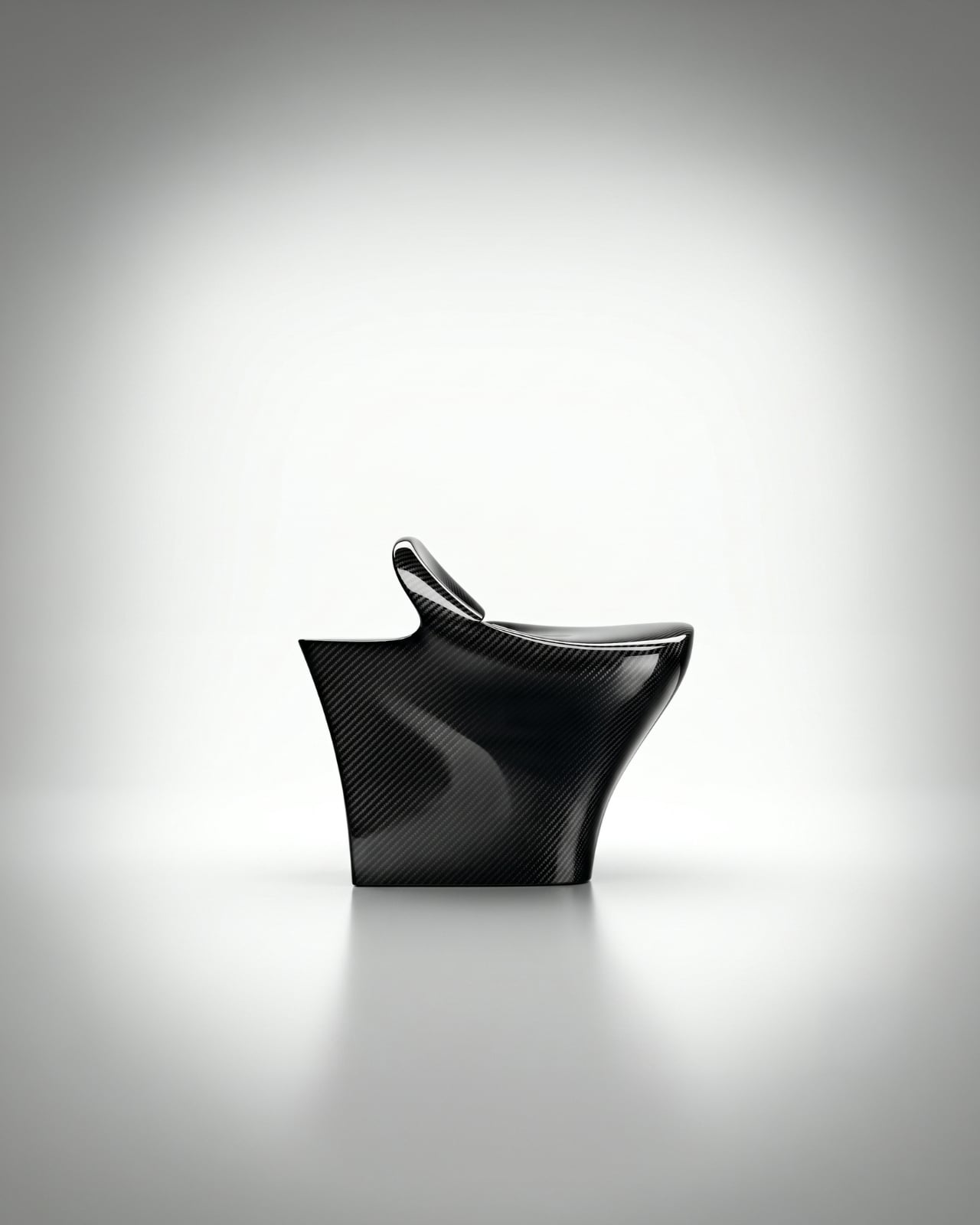
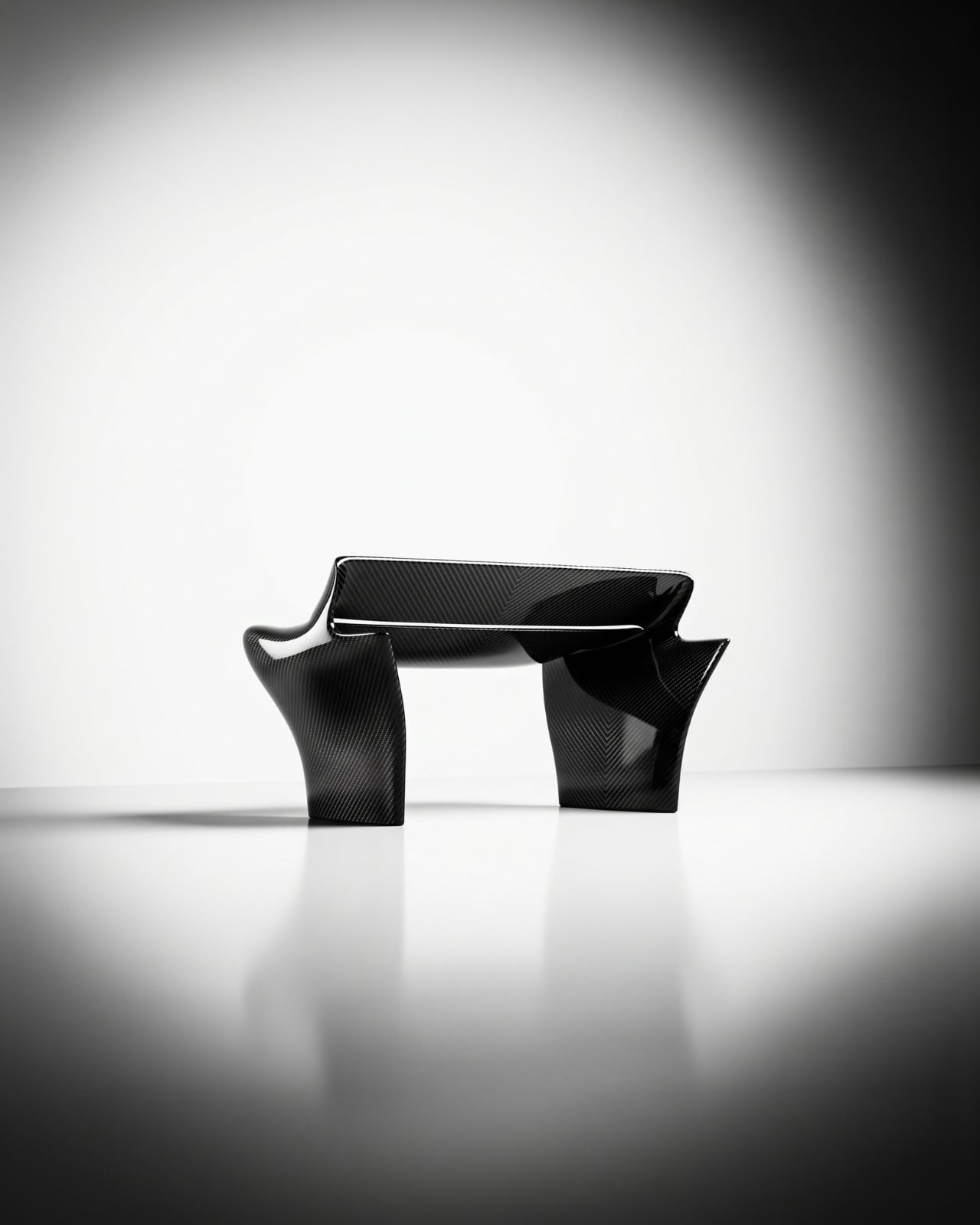
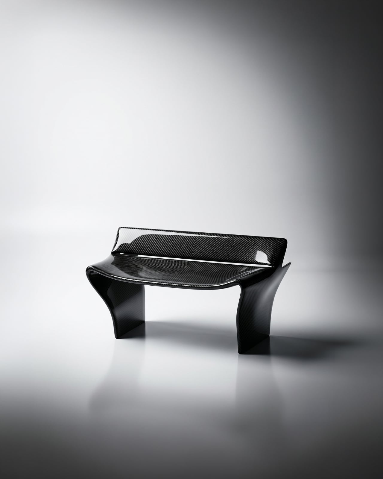
The first time I saw images of the Rear Wing Chair by Keon-Jo, I genuinely had to look twice. Not because it’s strange, but because it’s so precisely right that your brain takes a moment to catch up with what it’s actually looking at. That wide, sweeping profile. Those curved, grounded legs. The unmistakable geometry of an F1 rear wing, scaled and reoriented into something you can actually sit in.

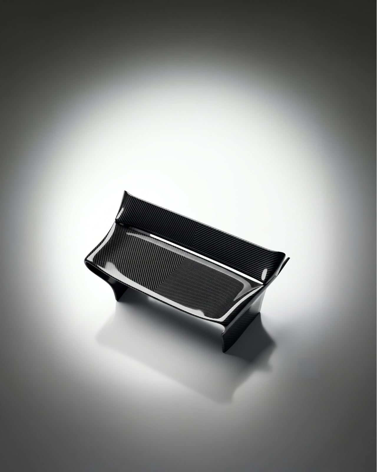
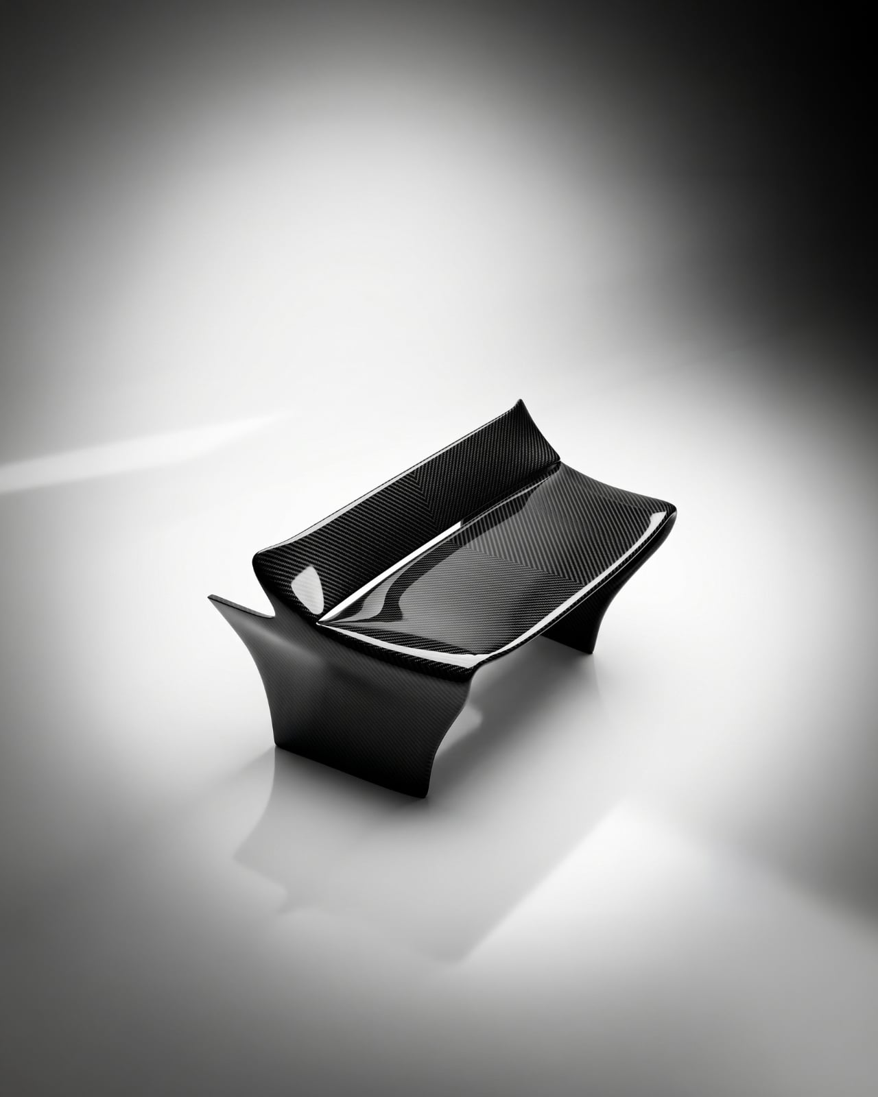
And that’s the thing about this piece: it isn’t motorsport-themed furniture. It’s not a chair with a racing stripe or a decorative spoiler bolted on for effect. Designer Keon-Jo took the actual geometry of an F1 rear wing, the profile, the curvature, the aerodynamic structure, and translated every element with full fidelity into a functional object. The result is 100% carbon fibre, unmodified and unapologetic, with every surface showing the raw woven weave exactly as it comes. Nothing softened, nothing added.

Designer: Keon-Jo

I think that restraint is everything here. A lesser approach would have tried to make it more accessible, more livable, more palatable for people who might not know or care what a rear wing actually does. Keon-Jo didn’t do that, and the piece is stronger for it. The chair carries the authority of the original object because it commits to the original object, completely.

The question that started all of this was a good one: what would one of the most engineered components in motorsport look like if it stopped being a car part and became something you lived with? F1 rear wings are products of obsessive precision. Aerodynamicists and engineers spend entire seasons calculating the exact angles and curves that will shave fractions of a second off a lap time. Every millimetre is deliberate. Every surface has a reason. Keon-Jo took that same philosophy and asked what happens when you apply it to the home.

The answer is a chair that sits at the edge of sculpture and engineering in a way that very few objects manage. It doesn’t look like it’s trying to be art. It also doesn’t look like it’s trying to be furniture. It looks like what it is: an engineered object, repurposed through a specific creative lens, and built with a level of craft that the source material demands.

The launch timing is as considered as the chair itself. The Rear Wing Chair is debuting during Monaco Grand Prix weekend, June 6 to 8, 2026. Monaco is where engineering culture and design culture genuinely converge on the F1 calendar. The streets, the yachts, the paddock, all of it operates at a level of precision and detail that matches the ethos of this piece exactly. It’s a smart choice, and not an obvious one.

This is also only Keon-Jo’s second physical object. The first was the Front Wing Wall Art, a wall-mounted sculptural piece built from F1 front wing geometry, working from the same core idea: take what motorsport engineers obsess over and translate it into something people actually live with. Two pieces in, the studio already has a clear and convincing point of view. That’s harder than it sounds. A lot of design studios spend years finding their language. Keon-Jo arrived with theirs already formed.

At 1200 x 760 x 670mm, the Rear Wing Chair is a substantial presence in a space. This isn’t a subtle accent piece. It’s a statement, and it knows it. The kind of object that defines a room rather than decorates it. For anyone who grew up around motorsport, or who simply cares about the relationship between engineering and form, this is the piece that gives both equal weight.

Whether you follow F1 or not, the Rear Wing Chair makes an argument that precision has genuine aesthetic value, that the same thinking that wins races can produce something beautiful enough to own and live alongside. Keon-Jo is building a body of work around that idea, and with only two pieces, it already feels like a compelling one. See more at keon-jo.com.

The post When F1 Engineering Becomes the Chair You Sit In first appeared on Yanko Design.

The Bench That Grows Stronger Every Time You Water It

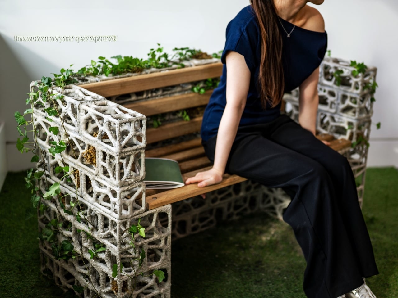
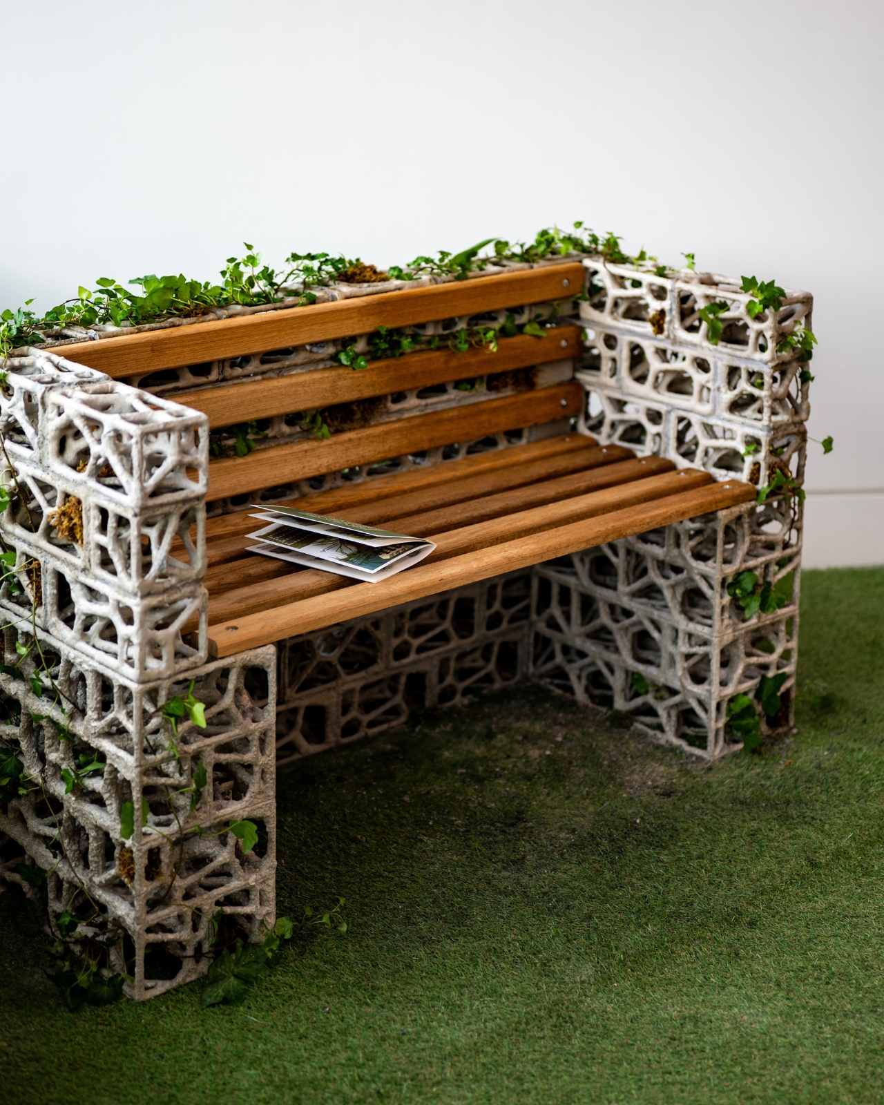
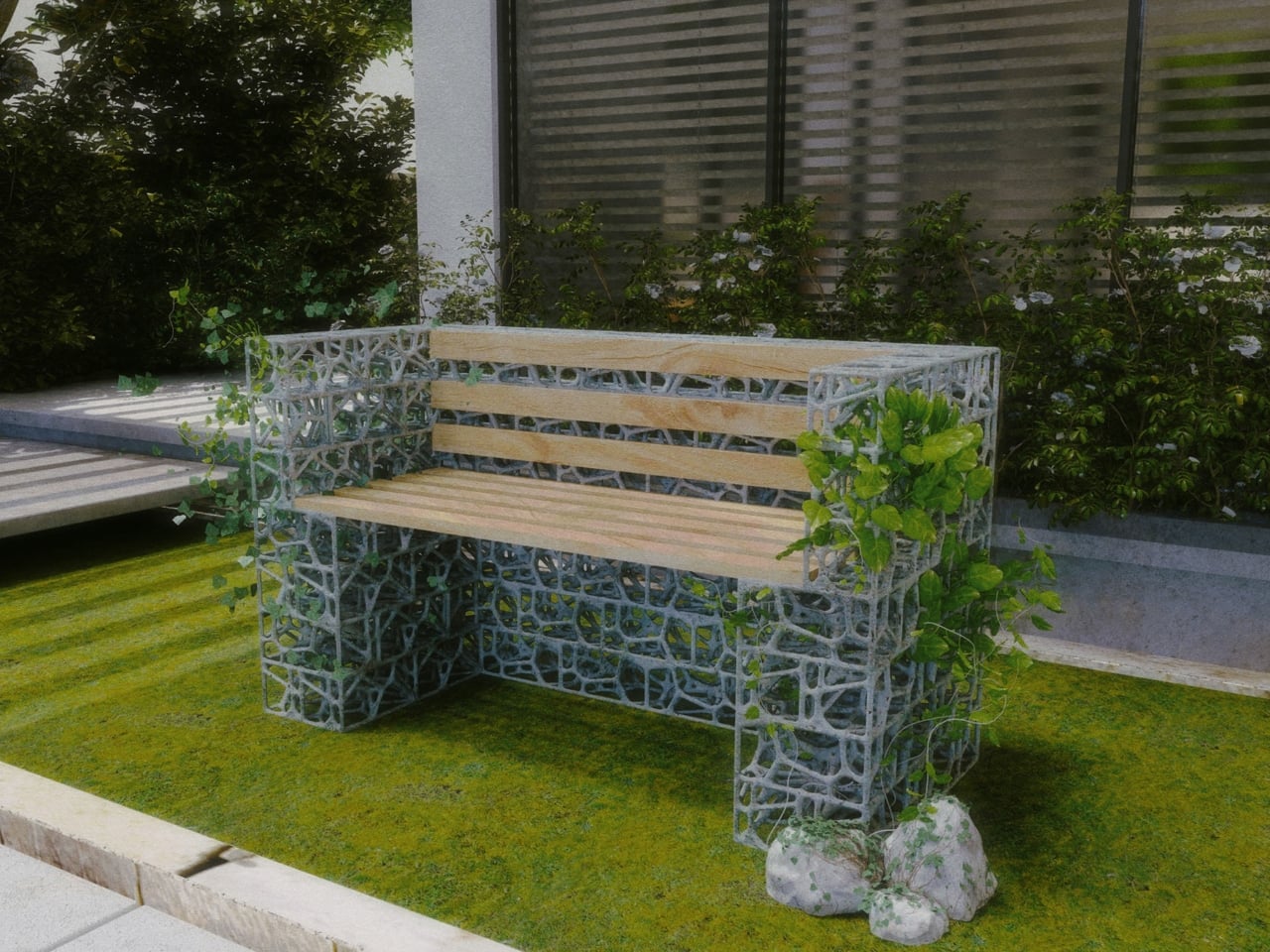
When I first came across the PhytoSymbiosis Seat, it looked like a piece of architecture that had been left in a garden long enough to transform into something else entirely. That’s not an insult. It’s the point. Designed by a student at the Royal College of Art and recently recognized by the NY Product Design Awards, this outdoor bench is one of those rare design concepts that makes you stop and rethink a question you didn’t know you were asking. The question, in this case, is: what if public furniture didn’t just sit in nature, but actually participated in it?

The bench was developed over nine months of community observation in London. The designer spent that time watching how people move through public green spaces and noting the growing disconnection between urban residents and the natural environments around them. To get the material details right, they consulted botanists at Kew Garden and invited residents near Westfield Park to touch and evaluate plant samples firsthand. That kind of patient, place-based research tends to produce something more honest than a concept born entirely at a drafting table, and you can feel it in the outcome.

Designer: Royal College of Art

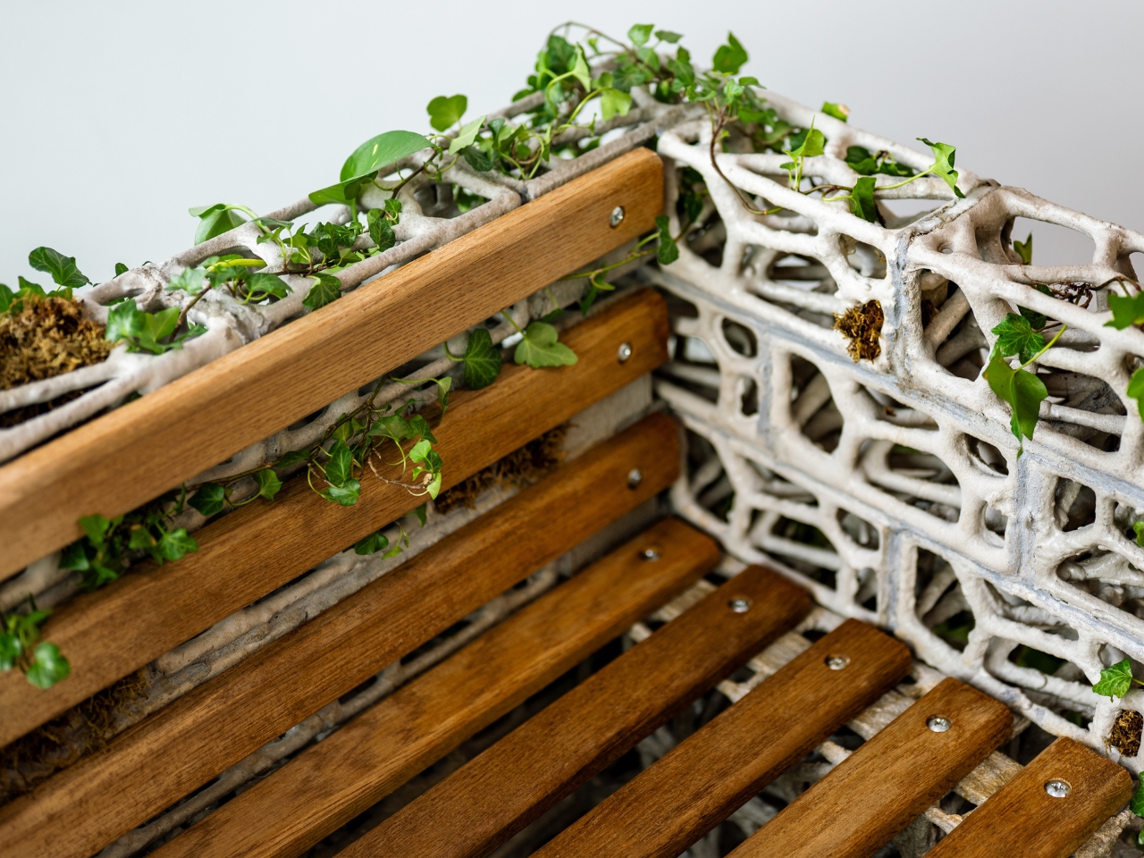
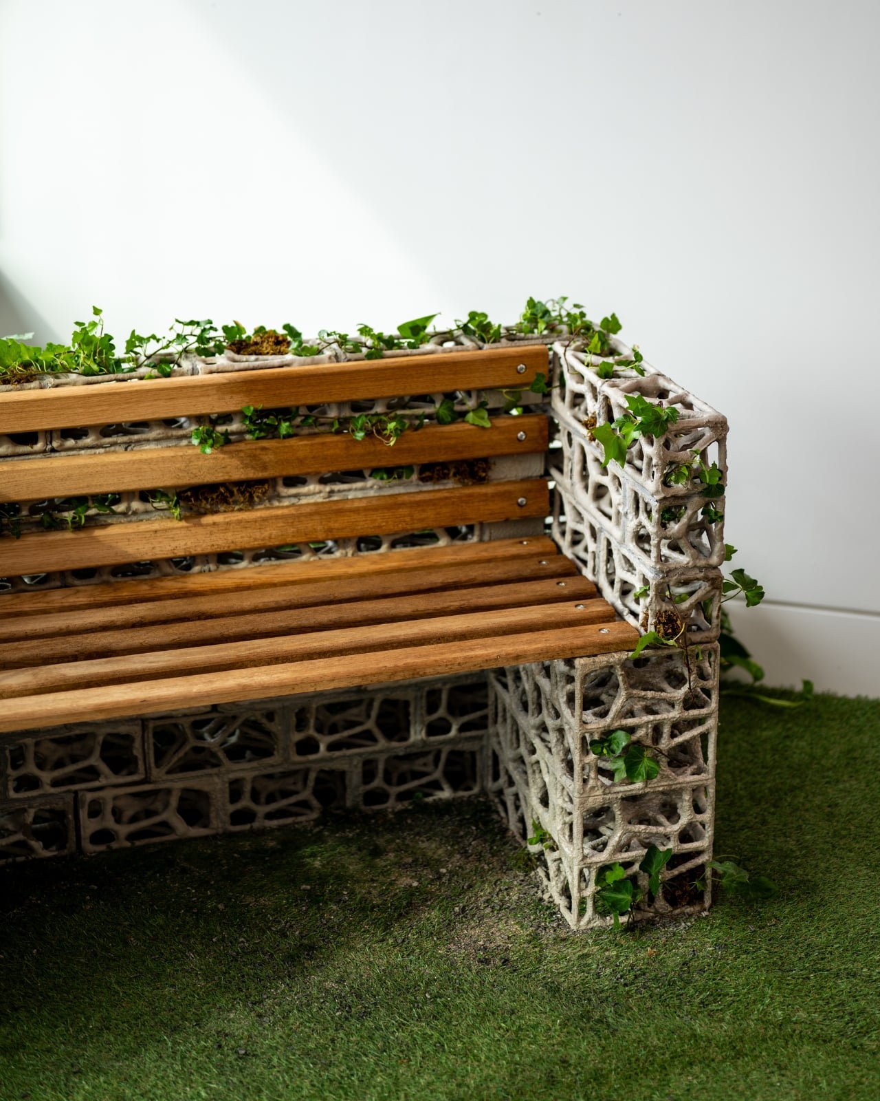
The frame is made from bio-concrete bricks with a porous surface structure. The porosity isn’t decorative. It was specifically engineered through material experiments to give English ivy something to grip. The ivy’s aerial roots, which can reach a density of 30 to 40 roots per 10-centimeter stem section, attach naturally to the rough concrete surface, forming a composite structure that gets stronger over time rather than weaker. That last part is worth sitting with: most public furniture degrades. This bench, in theory, consolidates. The plant’s growth actually reinforces the structure rather than working against it.

The form itself comes from Voronoi geometry, the same spatial patterns that govern how plants distribute resources and compete for space in nature. Those lacy, cellular shapes in the frame are not just aesthetic. They were calculated to accommodate the physical behavior of climbing plants, guiding and supporting ivy as it grows across and through the structure. The parametric modeling was verified with a finite element analysis to ensure the whole thing would hold together structurally. There’s real engineering behind what looks, at first glance, like a beautiful accident of nature.

But the part of this project that keeps pulling me back is the social layer, and I think it’s the most underappreciated dimension of the design. The bench is built to be cared for by the people who use it. Residents are meant to water it, to guide the ivy’s direction of growth, to make small decisions over time that shape what the bench becomes. A water level sensor built into the system even triggers user interaction by signaling when the plant needs attention. This turns an act of sitting into an act of tending, and tending, as anyone who has ever kept a plant alive will tell you, creates a very specific kind of attachment.

The pilot results support this. Volunteer participation in surrounding neighborhoods increased by 40 percent. Carbon emissions were reduced by 62 percent compared to traditional furniture. The plant palette is 100 percent native species, supporting local biodiversity without the risk of invasive growth. Neighbors reportedly gather around the bench, exchanging knowledge about plant care and falling into conversations they might not have had otherwise. These aren’t incidental benefits. They were built into the project’s goals from the start, aligned with the UN’s Sustainable Development Goals and measurable enough to take seriously.

What gets me is how quietly radical this is. Public benches are usually passive objects. We sit on them, we ignore them, we move on. The PhytoSymbiosis Seat makes the bench a responsibility, a neighborhood project, a small stake in the life of a shared space. It asks something of the people who encounter it, and in asking, it gives something back: a reason to notice, to return, and to care. That, more than any material innovation, might be its most lasting design achievement.

The post The Bench That Grows Stronger Every Time You Water It first appeared on Yanko Design.

The 2-Person Rocking Bench Made From 55kg of Plastic Waste

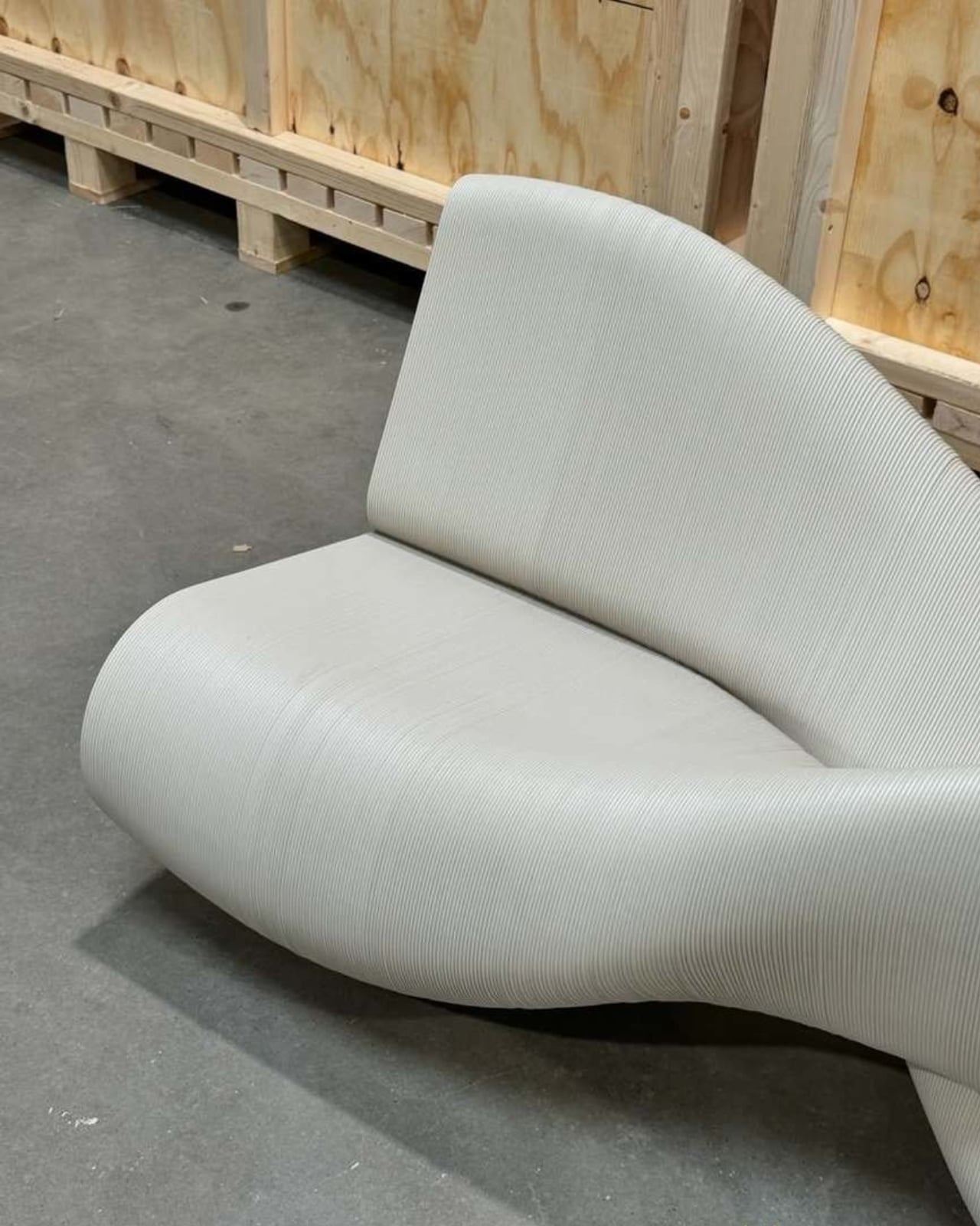
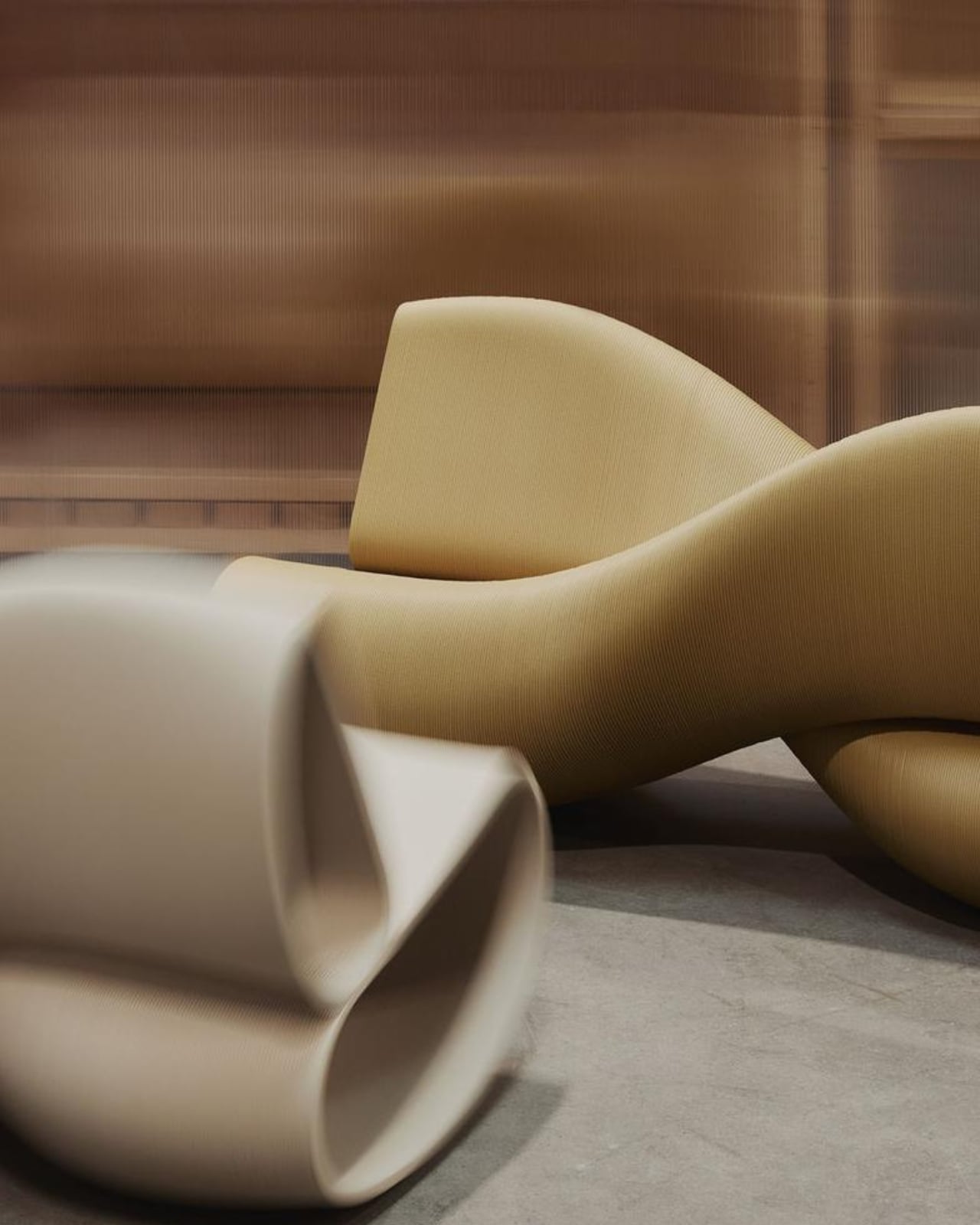
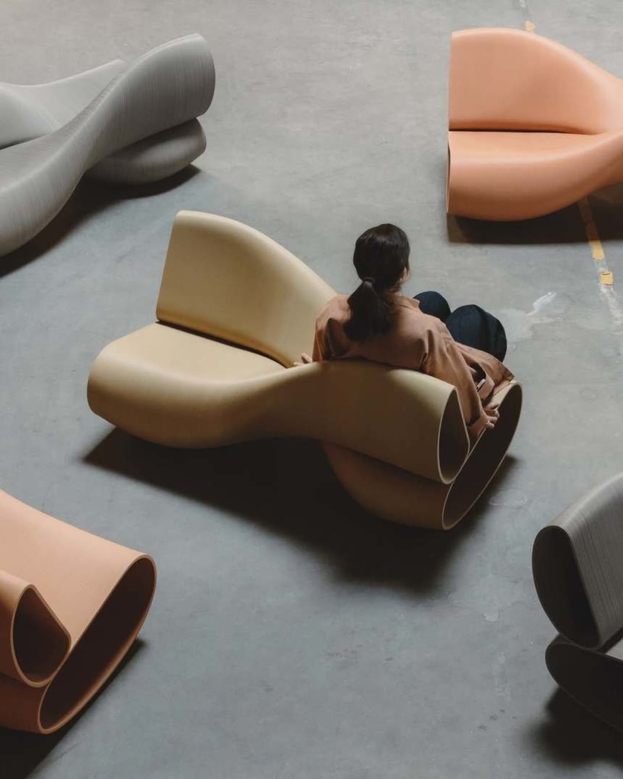
Most furniture tells you exactly what to do with it. A chair says sit. A table says set things down. A bench says sit, maybe share the space. The X Bench Swing, the latest from Rotterdam-based studio The New Raw, has a slightly more interesting ask: sit, rock, and do it facing the opposite direction from whoever’s sitting next to you.

That setup sounds strange until you see it. The bench seats two people, but the clever part is that both sitters face opposite ways while sharing a single rocking motion. Think of it less like a traditional bench and more like a kinetic sculpture that happens to be incredibly functional. The form is defined by two intersecting volumes that create a sculptural, sturdy X-shaped structure. It’s the kind of piece that makes you want to walk around it before you sit down.

Designer: The New Raw

The New Raw describes the design’s intent with quiet confidence: “X Bench explores movement as a design principle.” That could easily read as throwaway design-speak, but when you look at the object itself, it actually lands. The rocking motion isn’t just a feature. It’s the whole point of the bench. The movement is built into the geometry, encoded in the alternating orientation of the seats, and made possible by a curved base that lets both sitters sway in rhythm even while facing away from each other.

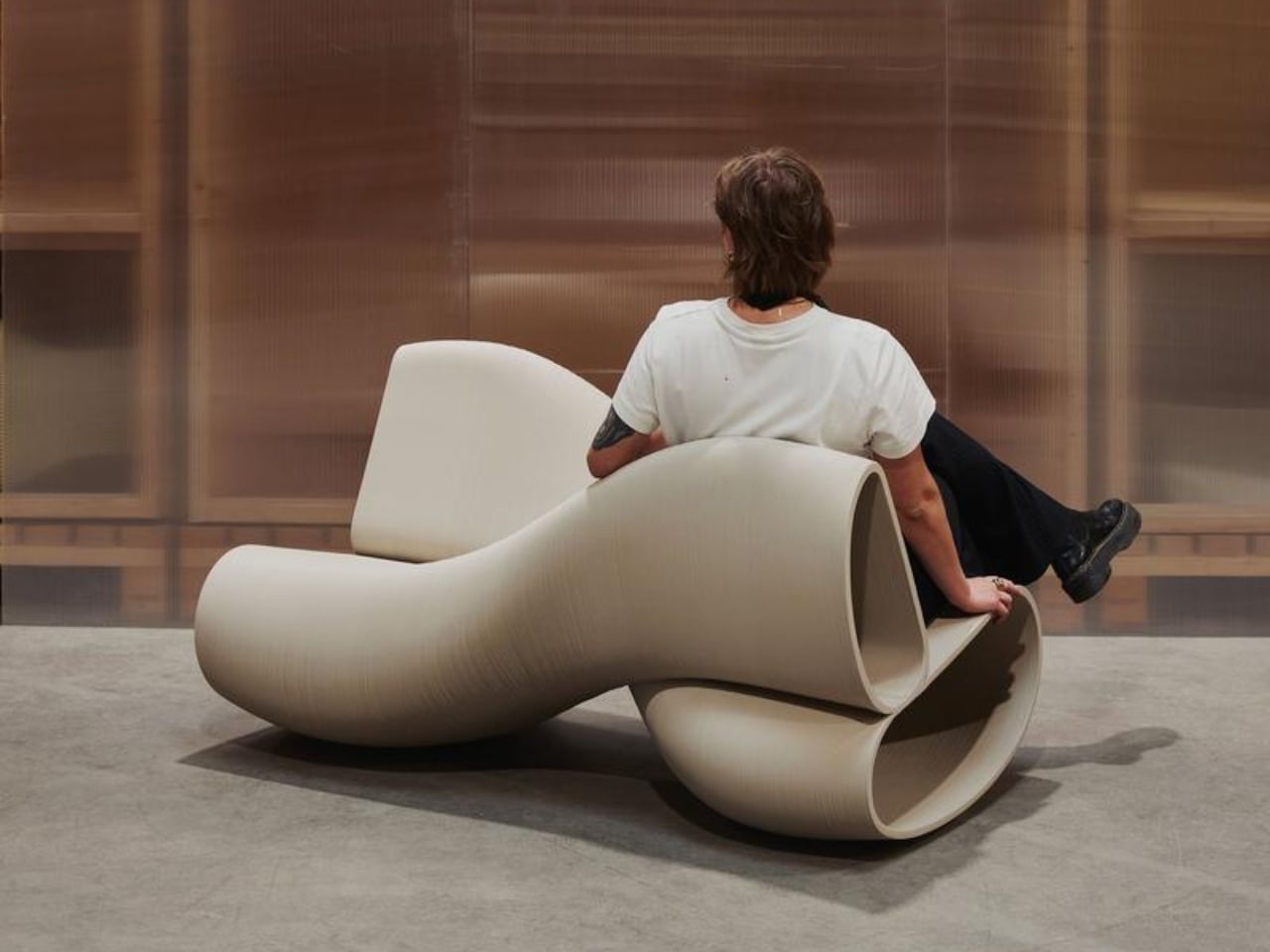
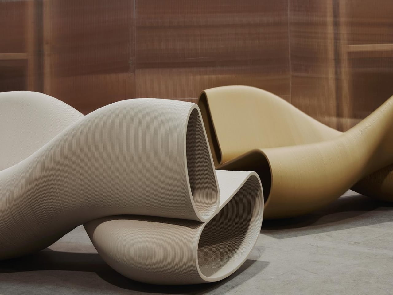
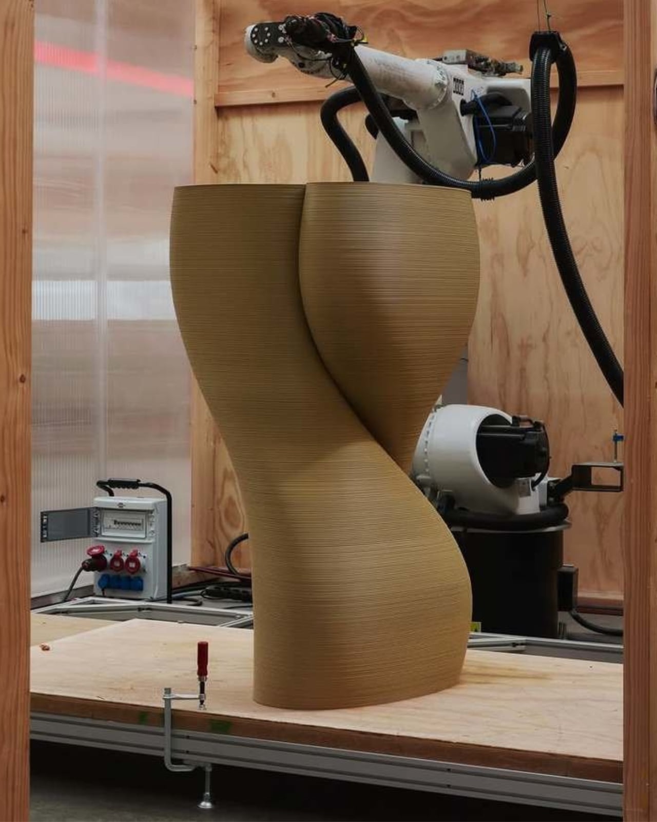
And yes, it’s 3D printed, but not the kind of 3D printing you might be picturing. The New Raw works with industrial robotic arms to fabricate their pieces layer by layer from recycled polypropylene (rPP), plastic waste that would otherwise not have much of a future. Each X Bench uses 55 kilograms of recycled plastic and saves an estimated 143 kilograms of CO2 compared to conventional manufacturing. The studio sources materials from local recyclers in Rotterdam, prints on demand, and uses no adhesives or mixed materials, which means every piece can be fully recycled at the end of its life. The sustainability story here isn’t bolted on as an afterthought. It is the manufacturing philosophy.

The result is a bench that looks nothing like recycled plastic is supposed to look. The surface texture has a tactile, almost geological quality. The layered printing process turns what could be a visual liability into a genuine aesthetic. It reads as warm and handcrafted even though a robot arm built it. That tension between industrial process and sensory finish is, arguably, The New Raw’s most consistent signature across their body of work.

At 70 x 140 x 76 cm, the X Bench isn’t small, but it’s sized for real use. It works indoors or out, which makes it an easy fit for public spaces, gardens, lobbies, or any room that can absorb a statement piece without turning into a gallery. The studio describes it as suited for spaces “with an open-hearted character,” which I’d translate as: don’t put this in a minimalist white box and expect it to whisper quietly in the corner.

The social dimension baked into the design is where the piece gets genuinely interesting. Sitting across from someone on a bench is one kind of dynamic. Sitting back to back while you both rock is another kind of conversation entirely. It invites a sideways glance, a shared rhythm, an awareness of another person without the weight of direct eye contact. For a piece of furniture, that’s a lot to offer.

A lot of sustainable design right now carries a slightly apologetic quality, as if the environmental credentials are meant to compensate for aesthetic compromise. The X Bench doesn’t do that. It’s confident, a little playful, and the fact that it’s made from waste plastic feels like a bonus rather than a burden. The New Raw has been quietly making that argument with their work for years. With the X Bench Swing, they’re making it more clearly than ever.

The post The 2-Person Rocking Bench Made From 55kg of Plastic Waste first appeared on Yanko Design.

Forget Upholstery: Lærke Ryom Tailors Furniture Instead

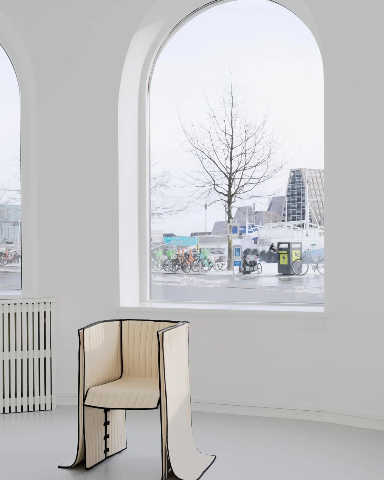
Most upholstered furniture is essentially furniture under stress. Fabric gets stretched, stapled, pulled taut, and forced into submission over rigid frames. It is, fundamentally, a question of control. Danish designer Lærke Ryom looked at that process and decided to do the opposite. Her debut solo exhibition, Raiments, now open at Innenkreis gallery in central Copenhagen, is built entirely around that single act of refusal.

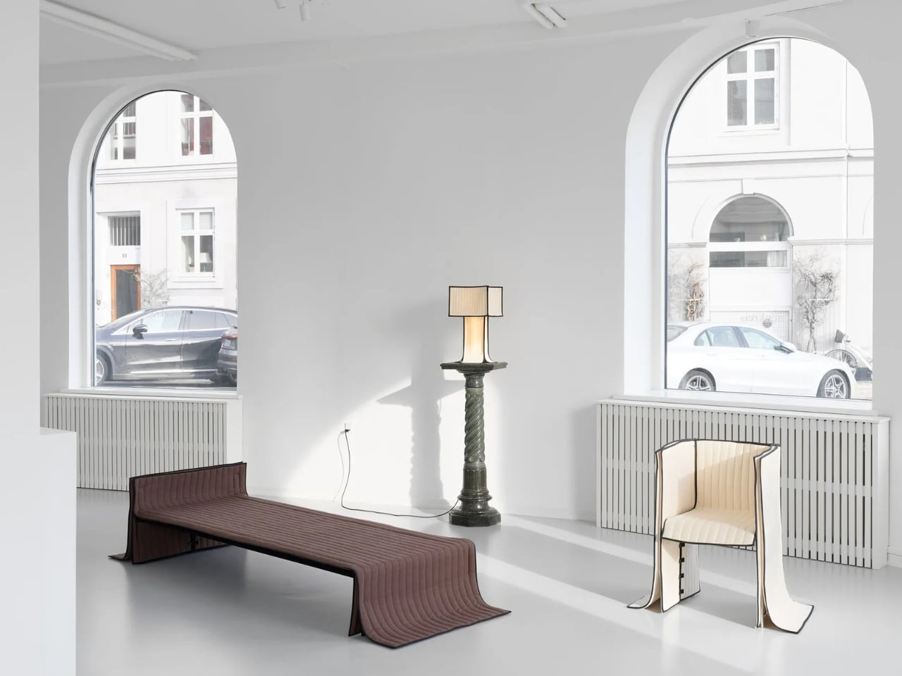
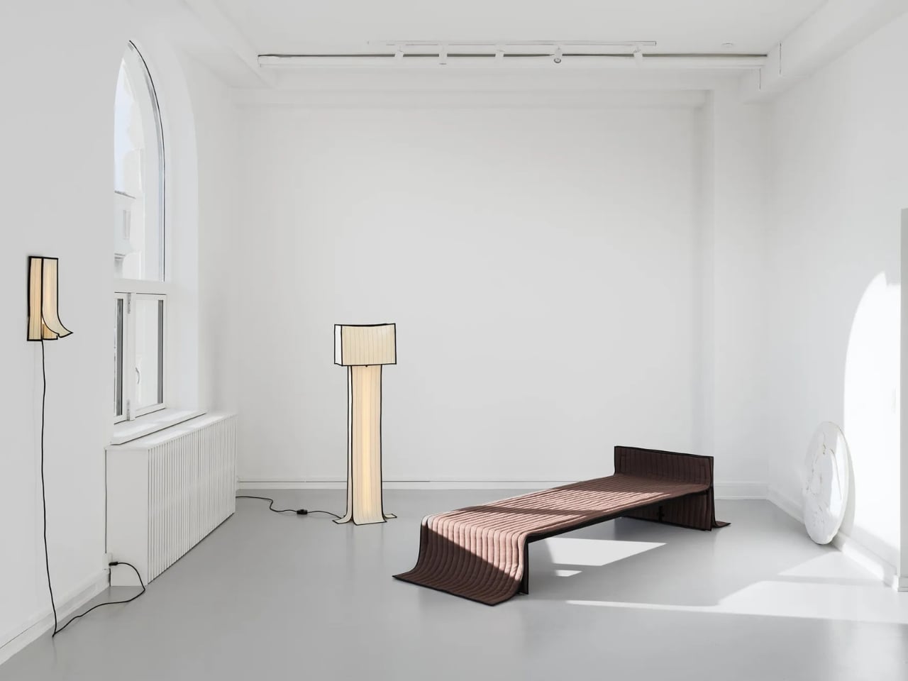
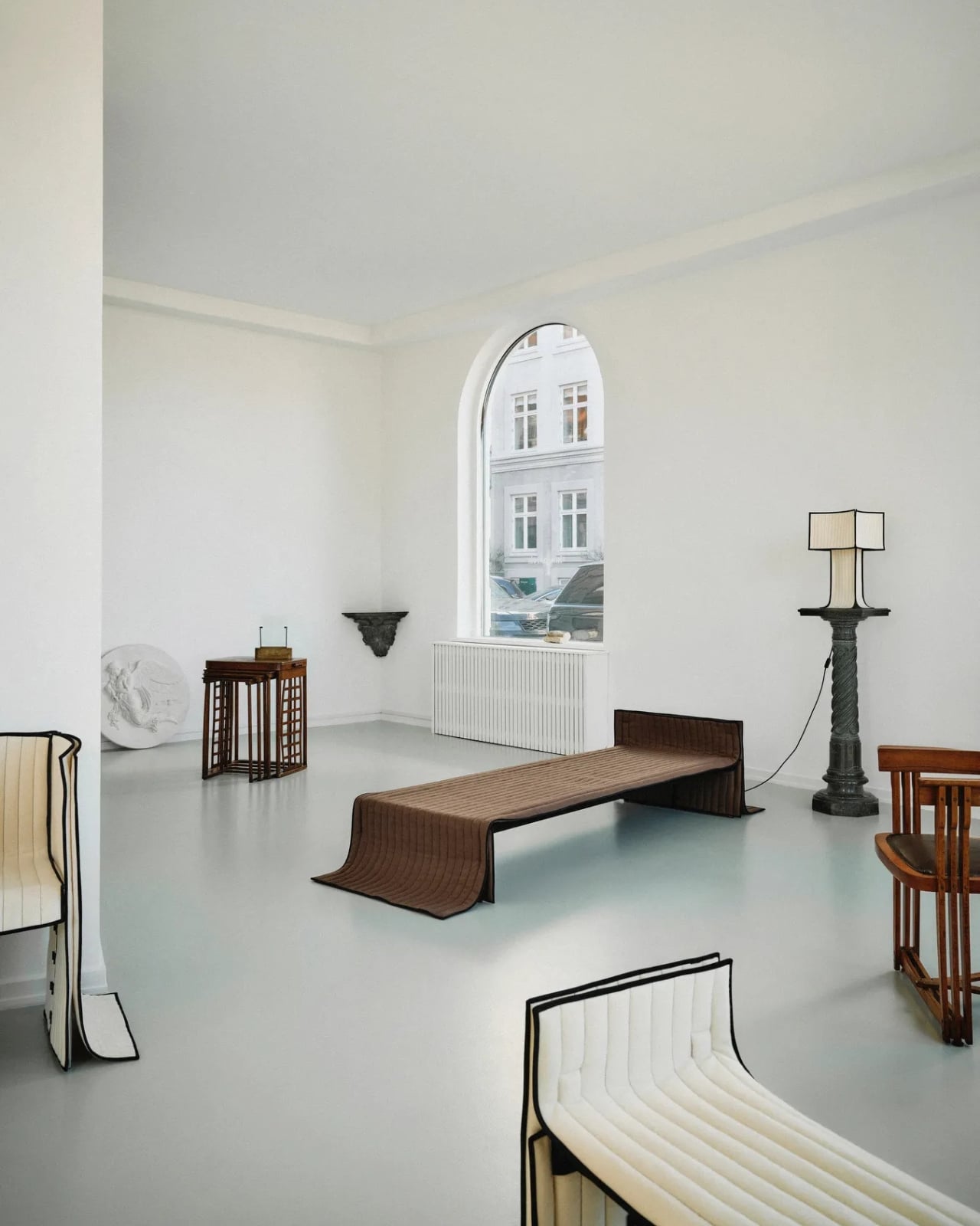
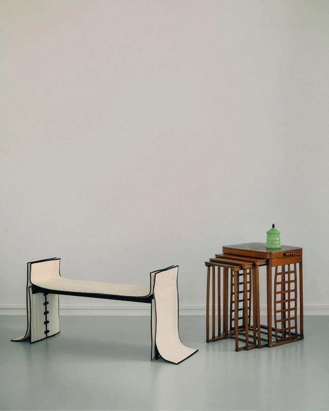
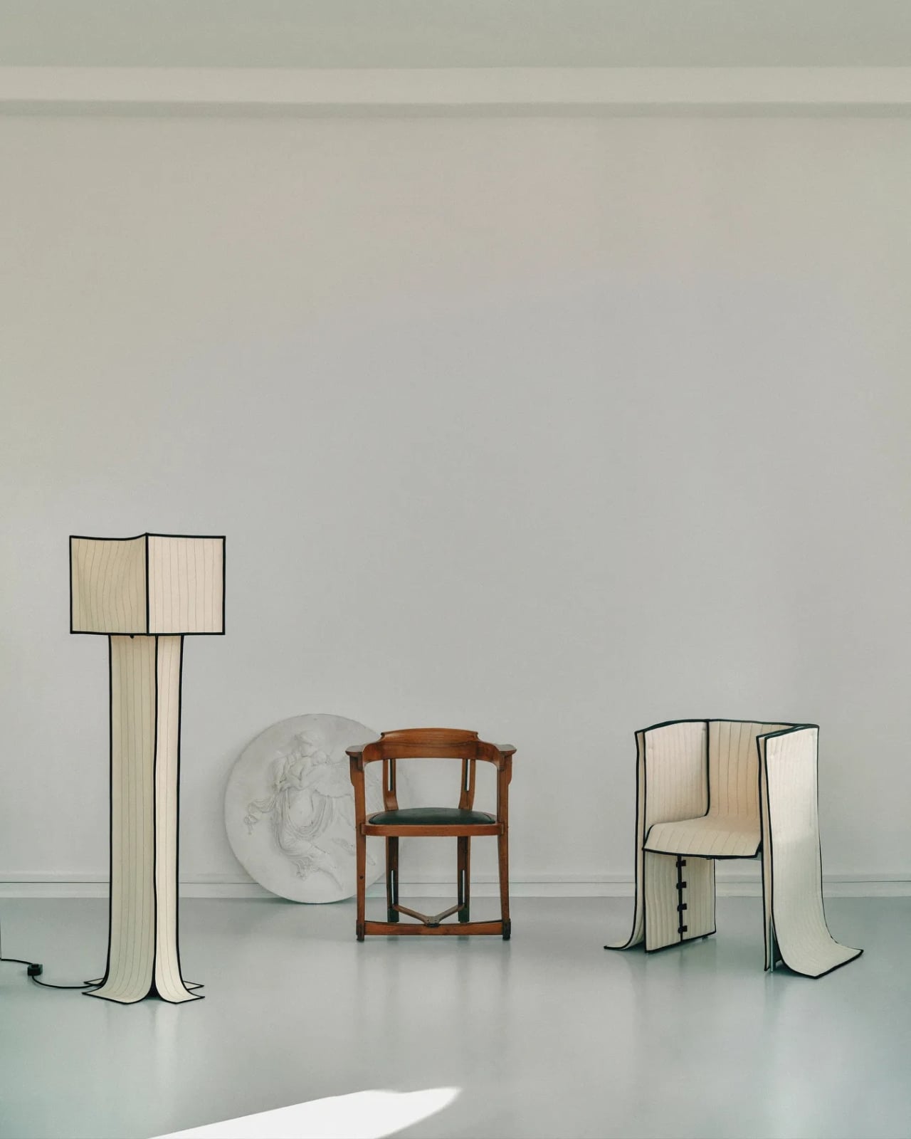
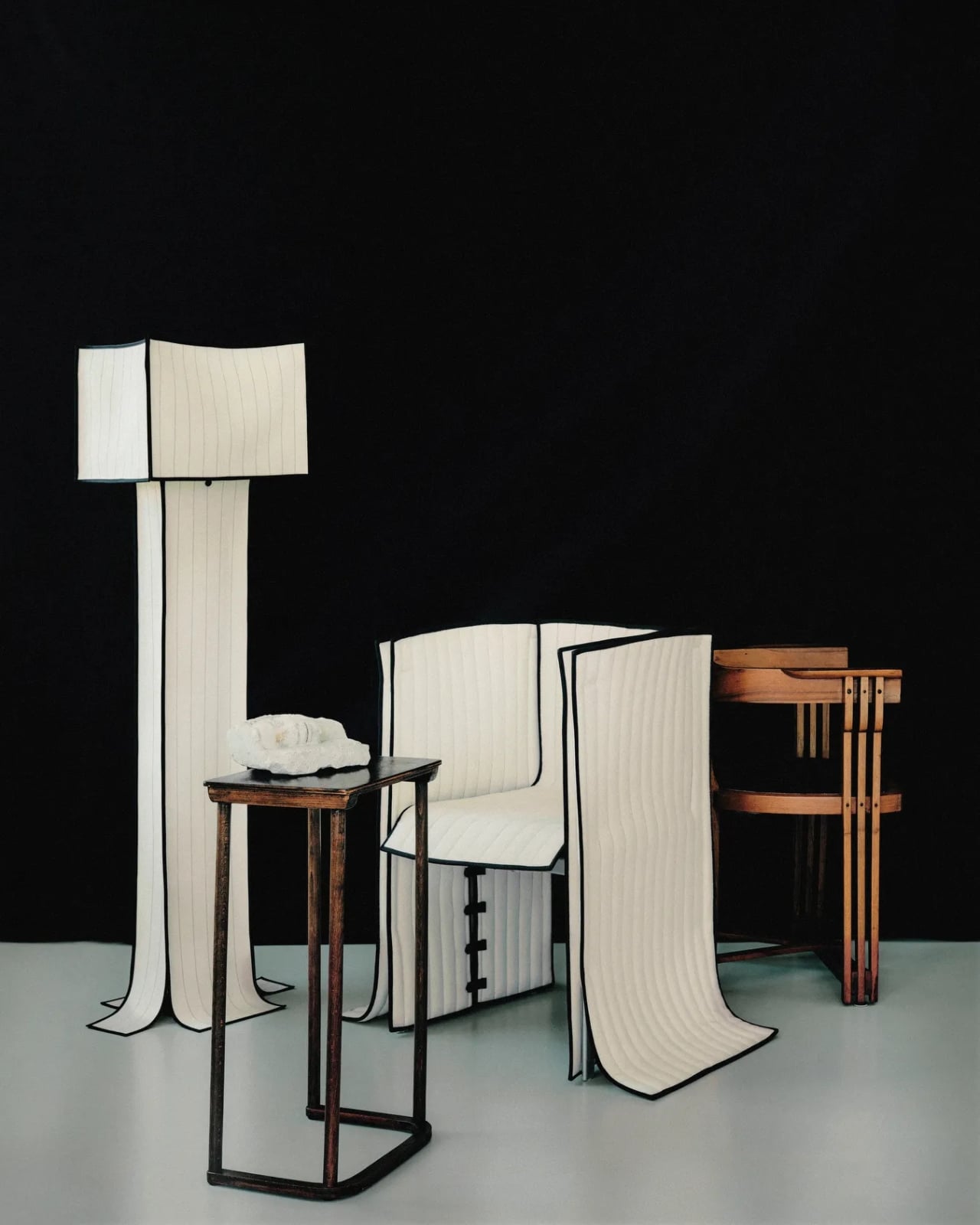
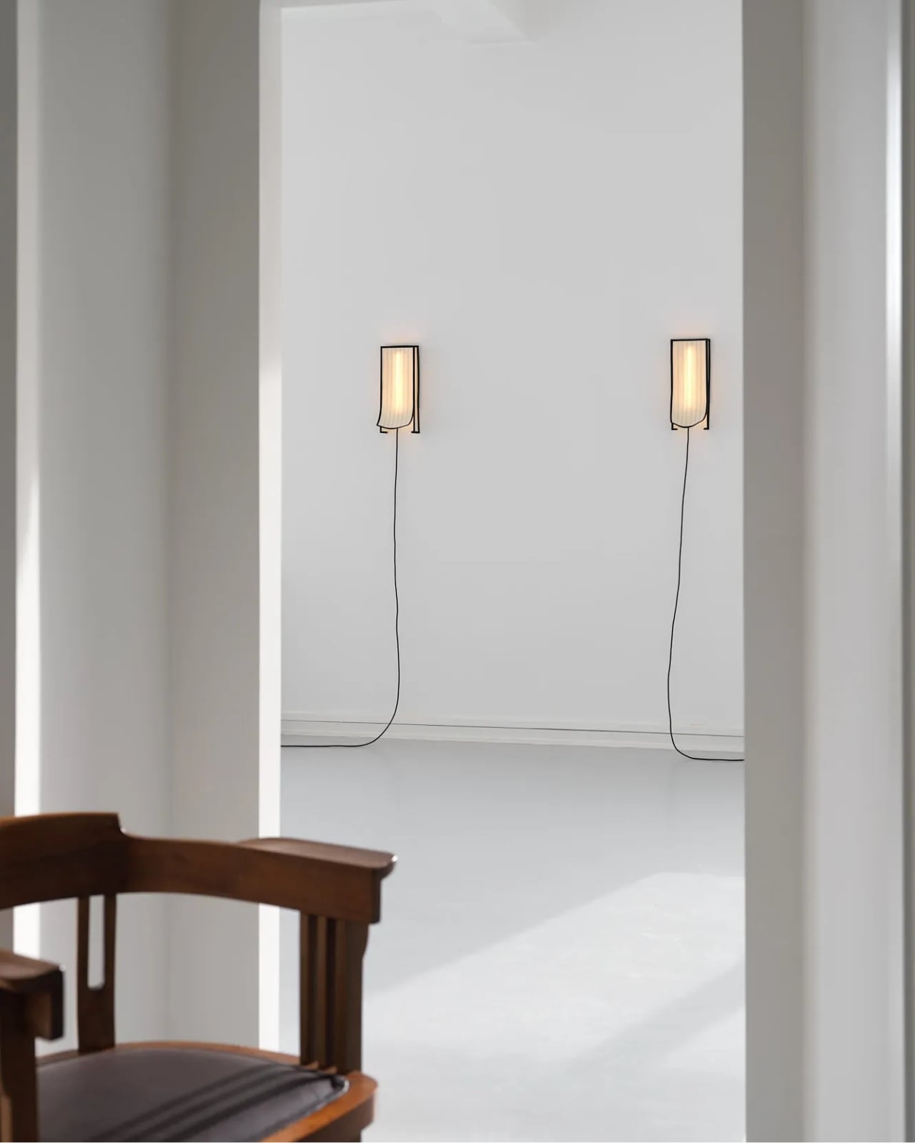
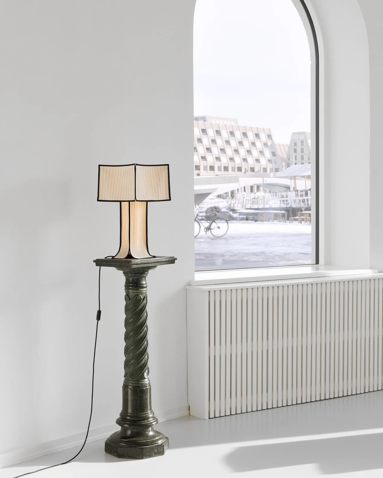
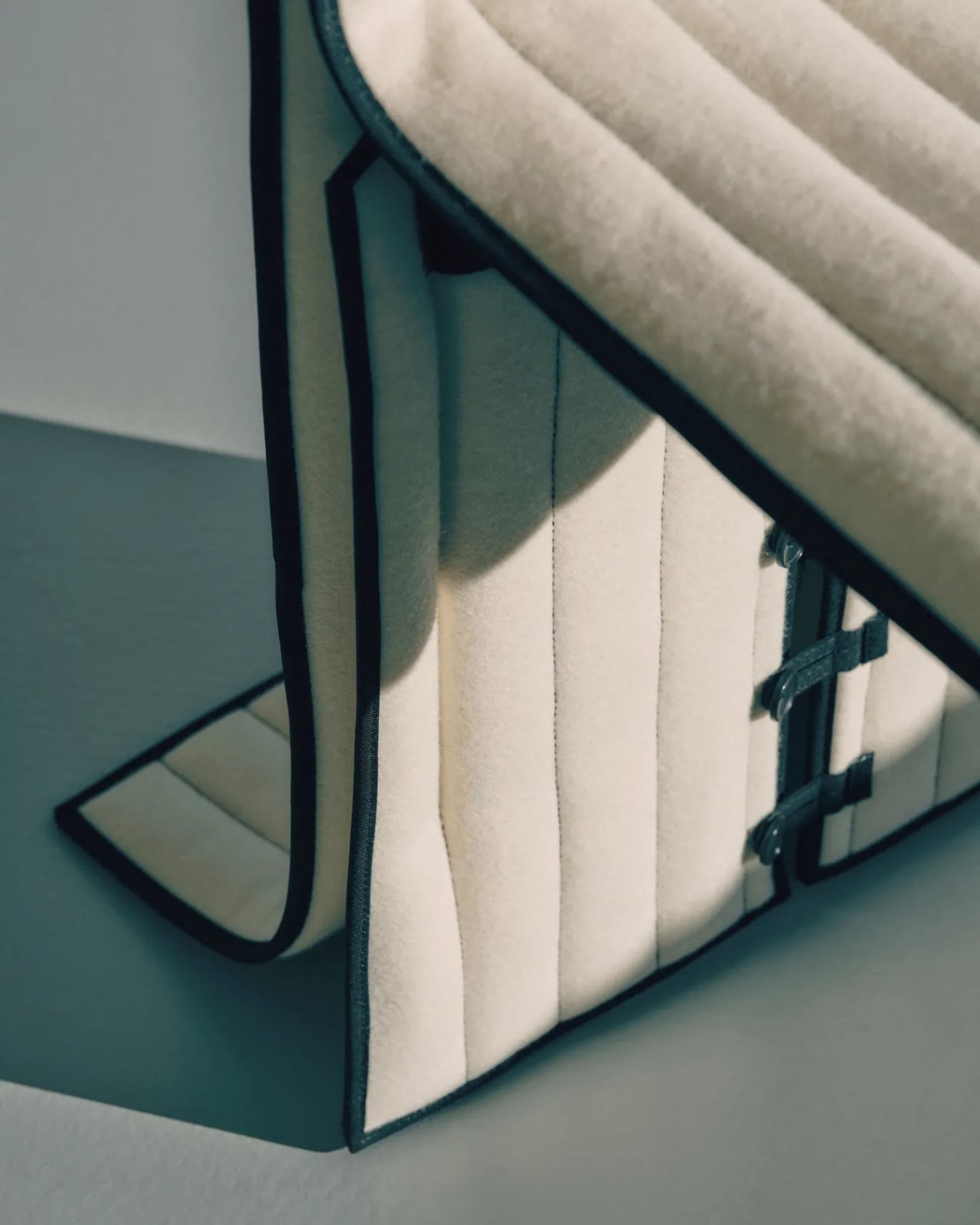
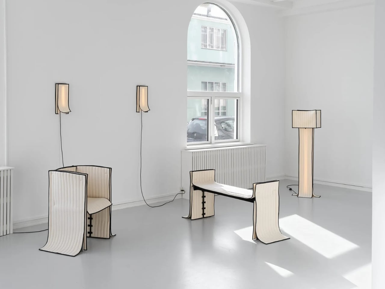
The collection includes a daybed, a chair, a bench, table lamps, a floor lamp, and wall lamps, all presented in soothing cream and chocolate-brown hues. The palette is calm and considered, which makes sense. These are pieces that ask you to slow down and look closely, because the detail is where the story actually lives.

Designer: Laerke Ryom

The daybed is probably the clearest expression of the concept. Long, low, and dressed in Kvadrat wool with visible quilting stitches running across its surface, it reads more like a made bed than a piece of showroom furniture. The fabric is not pulled over the form but rather allowed to settle onto it, the way a well-cut linen drapes over a body. The powder-coated steel frame beneath does its structural job quietly, without announcing itself.

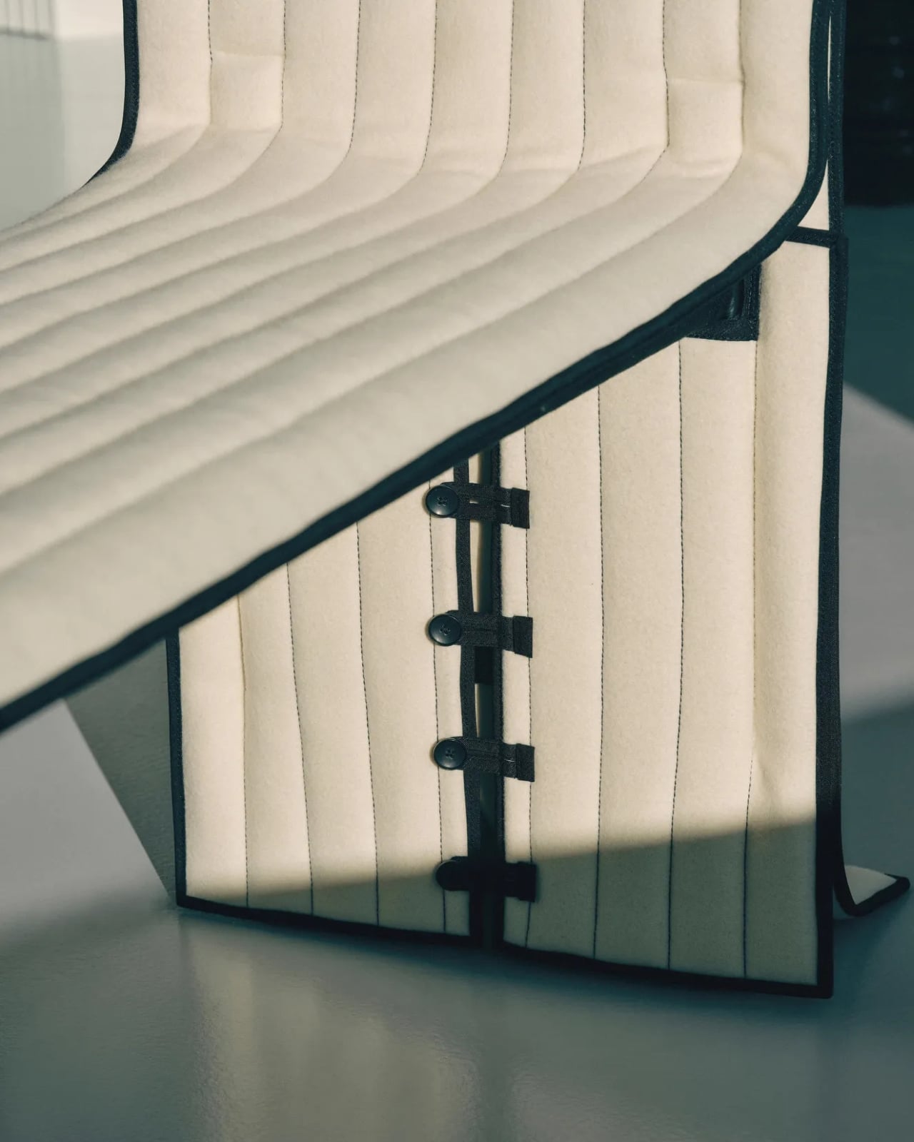
The bench follows a similar logic. Compact and precise, it carries the same quilted wool surface and the same twill weave edge banding that appears across the collection. That edge band is a detail worth pausing on. Ryom chose it specifically because twill weave is a technique rooted in clothing and home textiles rather than furniture. “It places the upholstery pieces somewhere in between,” she has said, “adding to the feeling of a tailored piece rather than upholstery.” It is a small choice with a large effect on how the finished object feels.

The chair, built on an aluminium frame rather than steel, is the lightest piece structurally, and it shows. It sits with a kind of ease that heavier upholstered chairs rarely manage. The wool covers it without gripping it, and the stitching adds just enough surface interest to reward a second look without demanding one.

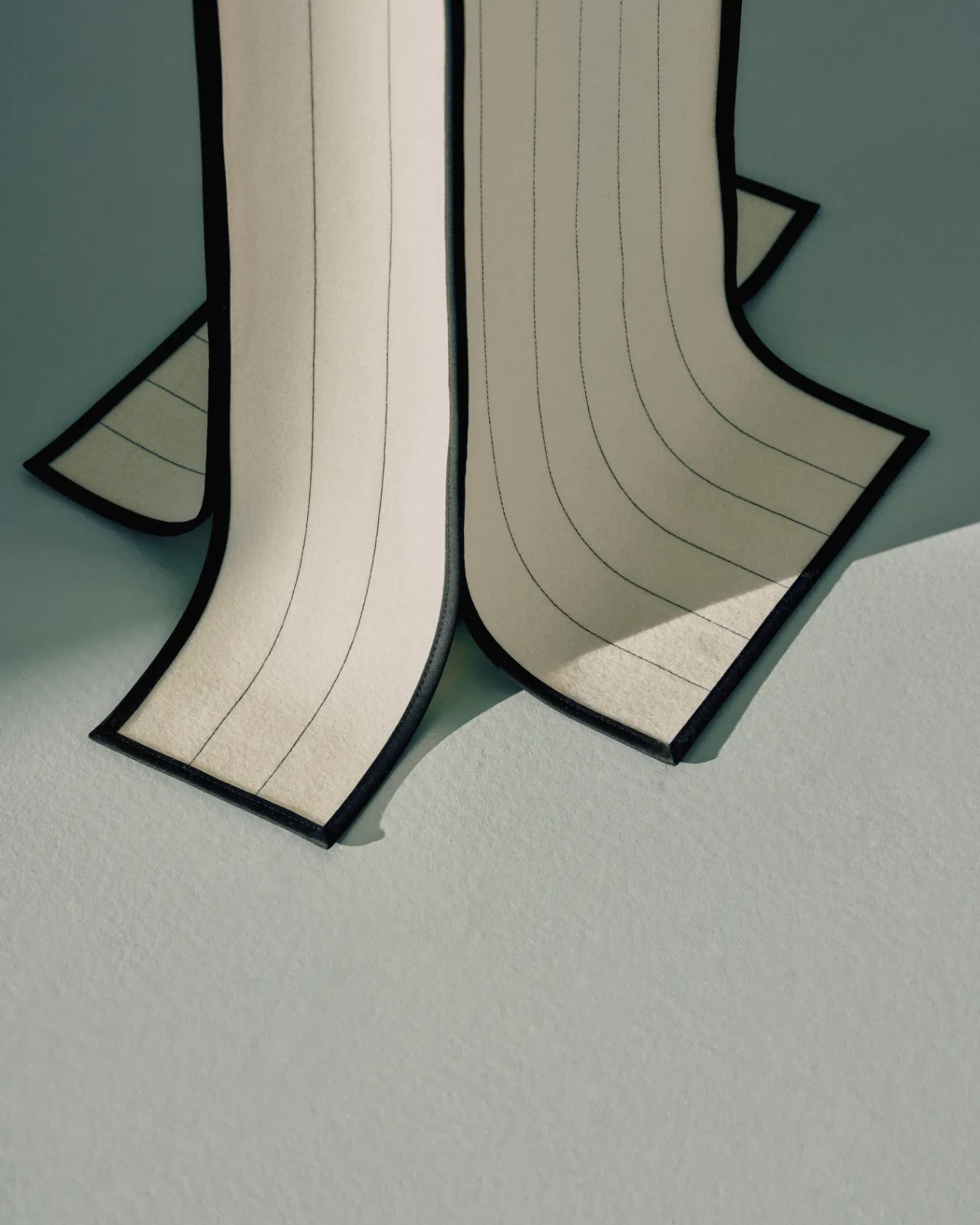
The lighting pieces are where the tailoring metaphor gets genuinely interesting. The floor lamp and table lamps, both on powder-coated steel bases, incorporate fabric shades that are constructed the same way as the seating pieces, draped and stitched rather than stretched and glued. The wall lamps, built on stainless steel bases, carry the same approach. Seeing the textile treatment applied to lighting as well as furniture makes the collection feel like a genuine system of thinking rather than a one-off experiment. Ryom is not just applying a technique to a single object type. She is testing a philosophy across an entire interior.

Underlying all of it is a material choice that matters. The Kvadrat wool she selected deliberately lacks visible weaving, which gives the stitching room to become the primary surface detail. The quilting is not decorative in a fussy sense. It is structural and honest, doing exactly what it appears to do, which is hold the fabric in place without adhesives or staples. The result is upholstery that can be disassembled, repaired, and eventually recycled. The clothes metaphor is not just aesthetic. It is practical in the most direct way possible.

Ryom, born in 1995 and working out of The Factory for Art and Design in Copenhagen’s Amager district, has been exploring alternative upholstery techniques for several years. Raiments feels like the point where that exploration becomes a fully formed position. The pieces are not minimal for the sake of it. They are restrained because restraint is what the concept requires. Every choice, from the aluminium chair frame to the stainless steel wall lamp bases to the twill edge banding, is in service of the same idea: that furniture should be dressed, not wrestled.

Whether or not that idea changes how people think about upholstery at large is probably too early to say. But Ryom has made a collection that is hard to look at and then go back to thinking about furniture the old way. That, for a debut solo show, is more than enough. Raiments is on show at Innenkreis, Herluf Trolles Gade 28, Copenhagen, through 23 May.

The post Forget Upholstery: Lærke Ryom Tailors Furniture Instead first appeared on Yanko Design.

The Furniture That Looks Like It’s About to Walk Away

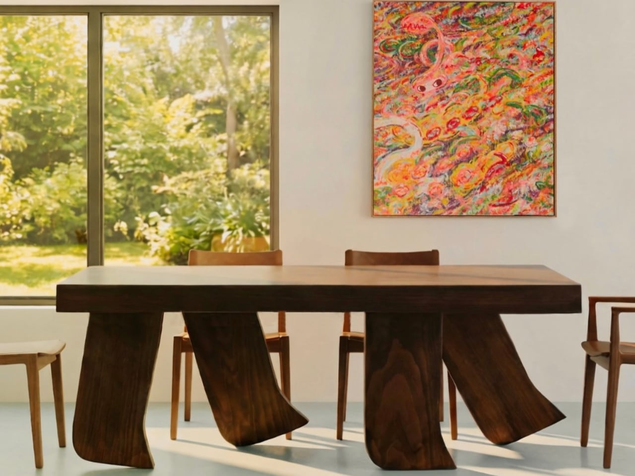
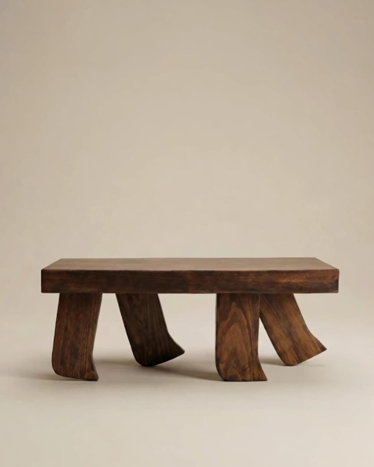
There’s a particular kind of design that stops you mid-scroll and makes you think: wait, what exactly am I looking at? That’s exactly what happened when I first came across the Barefoot Collection by Jorge Suárez Kilzi. At first, you register dark, richly grained wood. Beautiful, but expected. Then your eyes drift downward to the legs, and something shifts. They’re not straight. They’re not tapered. They’re curved, splayed, mid-stride, like a large foot caught in the quiet moment between lifting and landing. It’s subtle enough to feel elegant. It’s strange enough to feel unforgettable. That, to me, is the sweet spot.

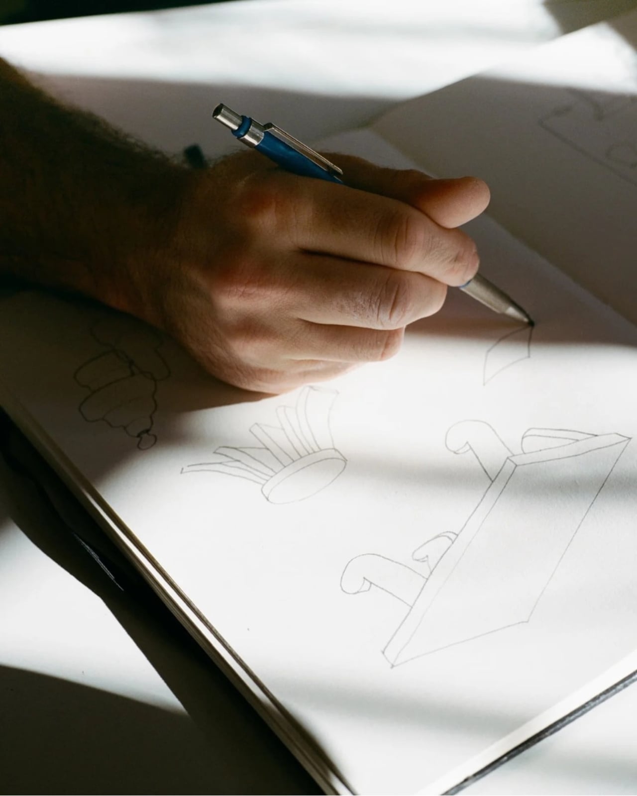
Jorge Suárez Kilzi, who signs his work under his mother’s Syrian surname as a personal tribute, is a Barcelona-based architect and designer whose story is inseparable from what he makes. Born in Venezuela to a Spanish father and Syrian mother, he spent his childhood in constant movement, crossing cultures and countries, learning early on that the objects you carry with you carry meaning far beyond their function. That nomadic upbringing, he has said, taught him to see life from more than one angle, and that perspective filters directly into the furniture he creates. He also spent time in Japan working with SANAA and architect Junya Ishigami, and you can feel that influence in how restrained and quietly deliberate his work is.

Designer: Jorge Suárez Kilzi

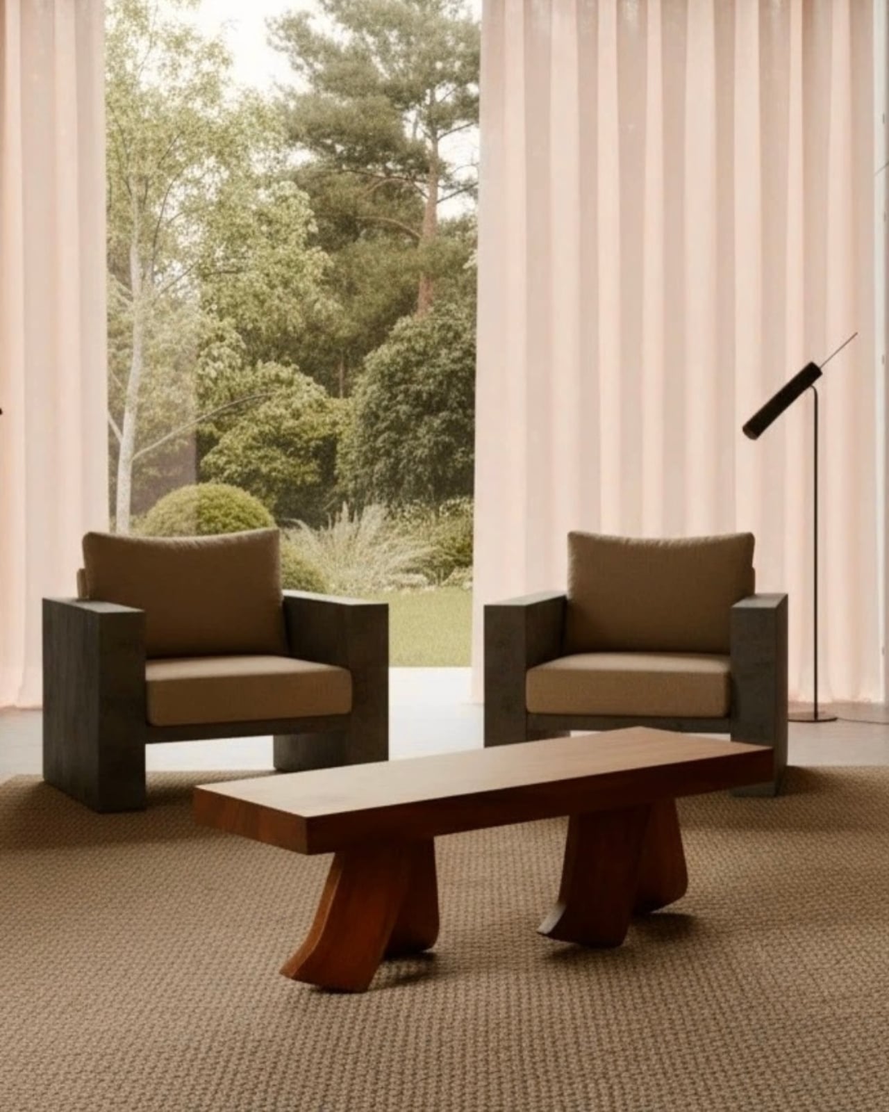
The Barefoot Collection grew out of a single idea: a coffee table designed to look like it was walking. The legs, built from solid wood and shaped to simulate the arc and flex of a bare foot mid-step, give the piece an uncanny sense of momentum. The top surface stays completely calm and rectilinear. That contrast is the whole point. Stillness above. Motion below. It’s a tension that shouldn’t work as well as it does, and yet here we are.

What I find genuinely compelling about this collection is that it resists the urge to explain itself too loudly. A lot of conceptual furniture falls into the trap of being more interesting to talk about than to actually live with. Barefoot doesn’t do that. You could sit a cup of coffee on it and forget it was ever supposed to mean something. Then a guest walks in, does a double-take, and suddenly you’re having a conversation about impermanence and what it means for a home to change over time. The piece earns that conversation by earning its place in the room first.

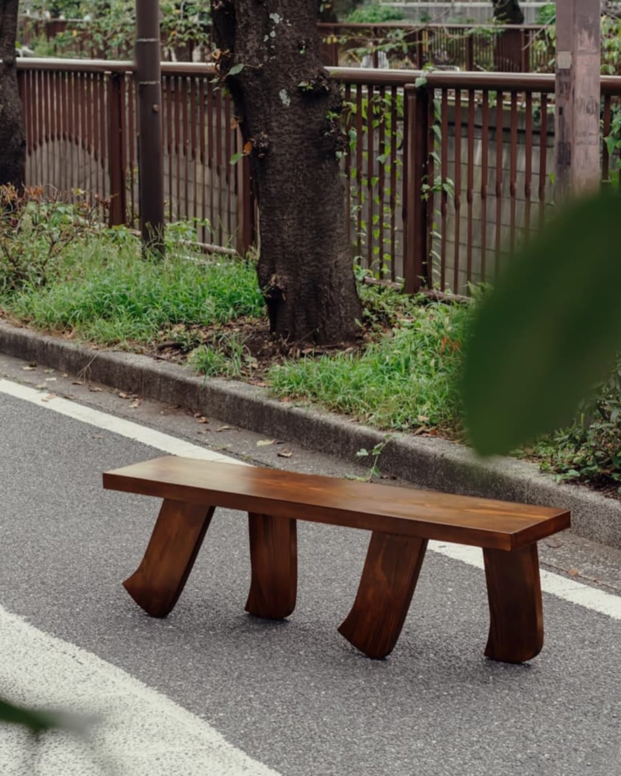
The collection has since expanded beyond the original coffee table to include a dining table and a bench, each carrying the same foot-like base into a different scale and context. The dining table version, in particular, has a presence that borders on sculptural. Placed beneath a colorful, painterly work, it holds its own without competing. The bench, spotted in one campaign image walking alongside a tree-lined street in what looks like Tokyo, has a lightness to it that almost reads as humor. Almost. The craft is too careful for it to be purely a joke, and Kilzi clearly intends both readings to coexist.

There’s also something worth noting about how the collection is built to adapt. The design can be reinterpreted across dimensions and formats to suit different interior projects, which is a practical flexibility that a lot of collectible furniture doesn’t bother offering. It acknowledges that real spaces have real constraints, and that a beautiful object with no room to negotiate isn’t as beautiful as it could be.

Kilzi has described his studio as one driven by the desire to create honest objects that coexist naturally with the body and space, not as decorative gestures but as presences that remain. The Barefoot Collection feels like the clearest expression of that to date. It doesn’t demand your attention. It just stays, quietly, on its four walking feet, reminding you that the room you’ve always lived in is still capable of surprising you. That’s a rare thing for a table to pull off.

The post The Furniture That Looks Like It’s About to Walk Away first appeared on Yanko Design.
This Furniture System Uses Just 2 Materials and No Glue

Let’s be real about furniture for a second. Most of us want pieces that look great, last forever, and don’t cost as much as a vacation. But we also want to be able to move without having to hire a team of professionals just to disassemble the bookshelf. Oh, and while we’re at it, can it also not destroy the planet? Apparently, that’s been too much to ask. Until now.

Meet LinumTube, a furniture system that manages to check all those impossible boxes at once. This isn’t your typical design project. It’s a collaboration between Studio Jonathan Radetz and the Fraunhofer Institute for Wood Research in Germany, and it’s rethinking what furniture can be from the ground up.

Designers: Studio Jonathan Radetz and Fraunhofer Institute for Wood Research

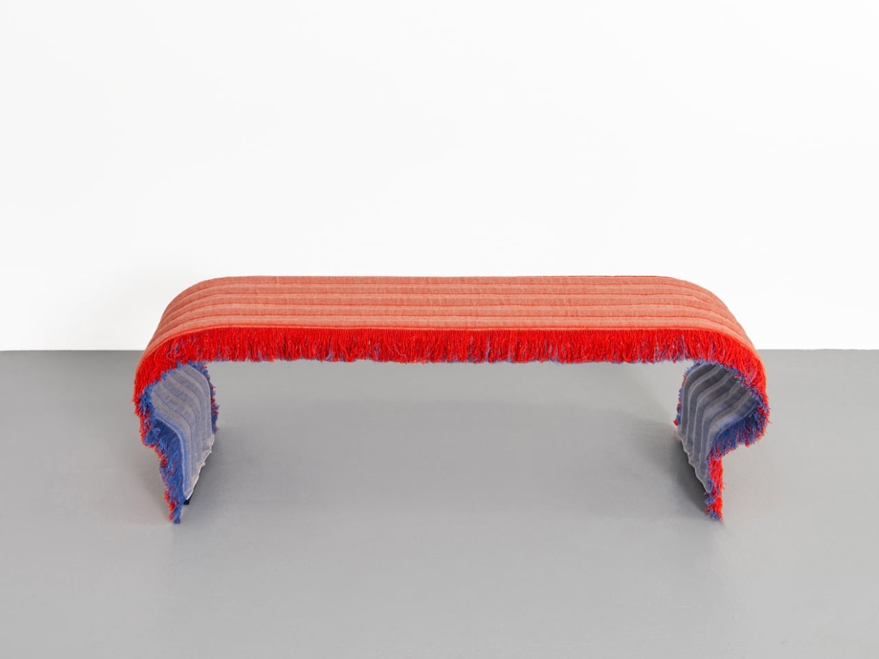
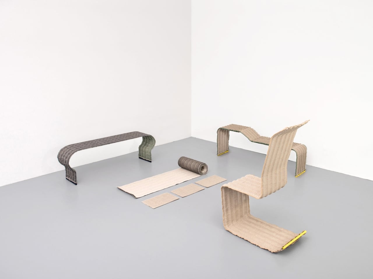
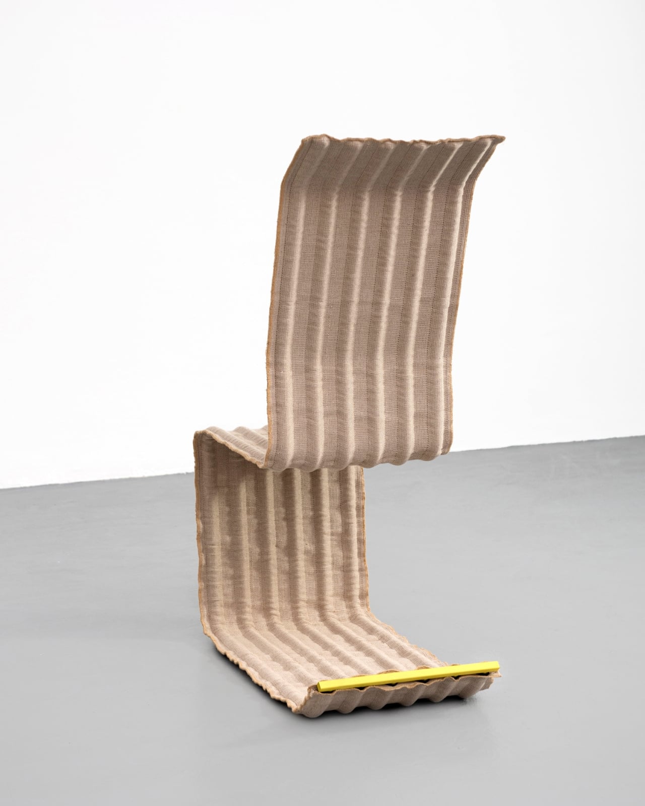
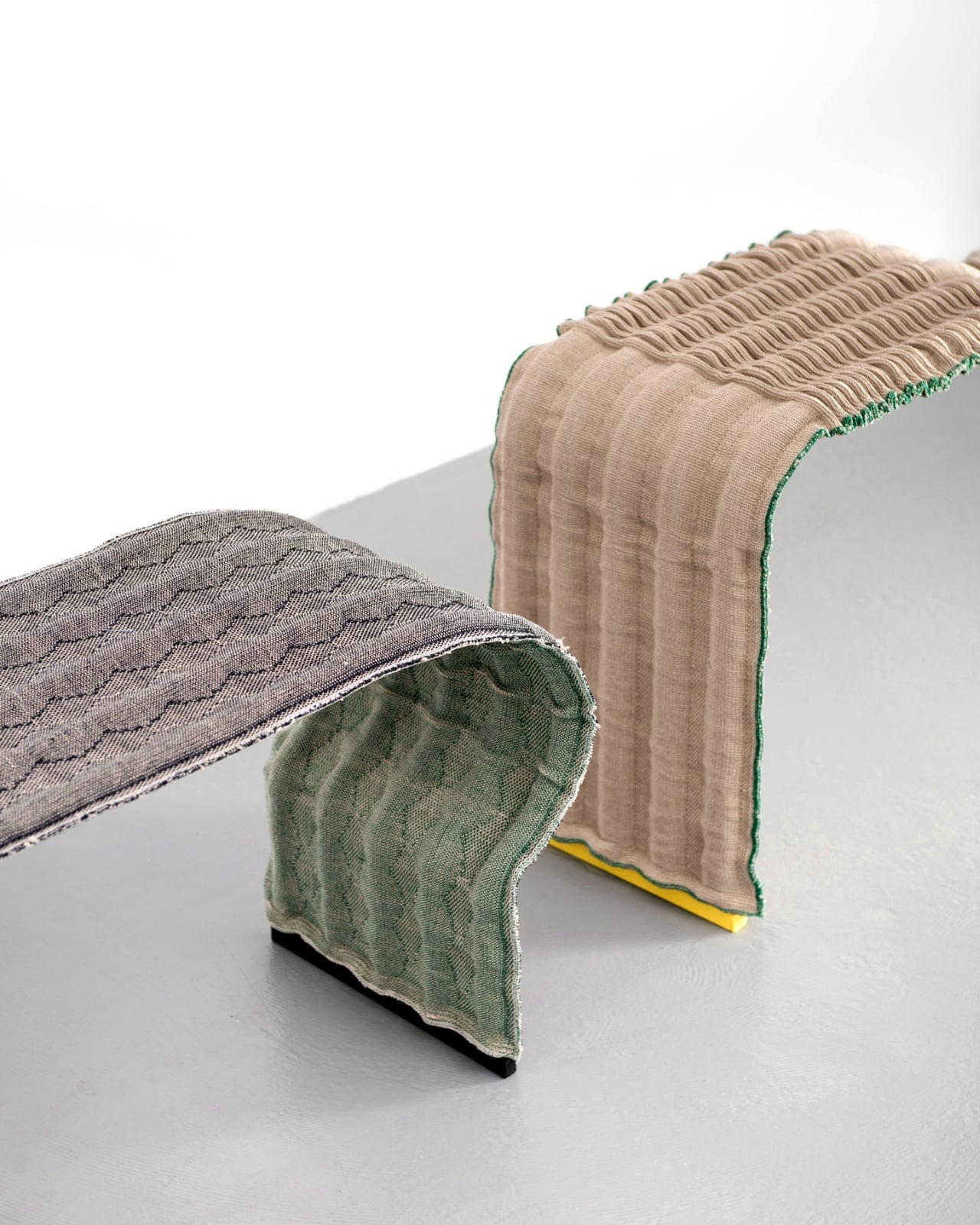
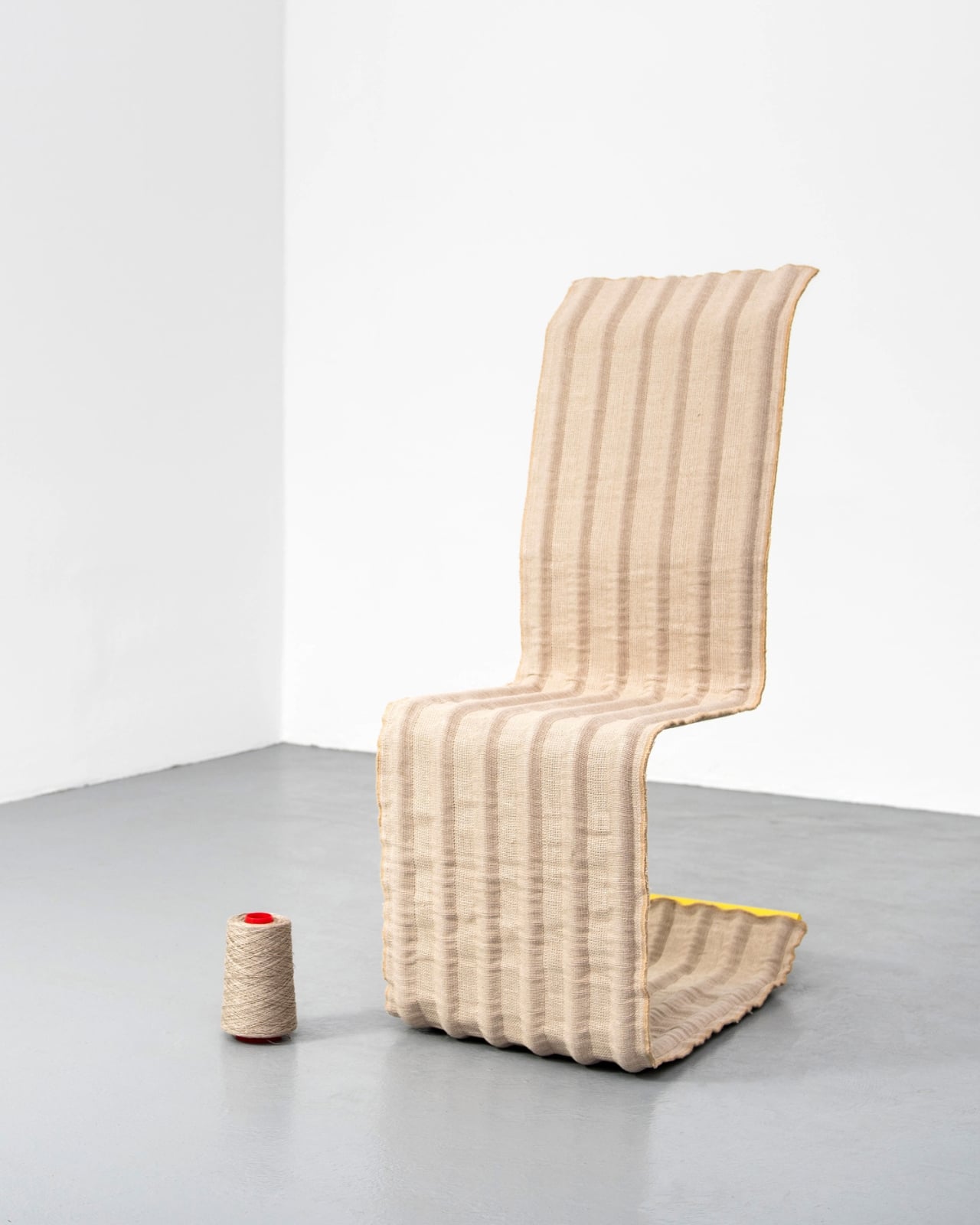
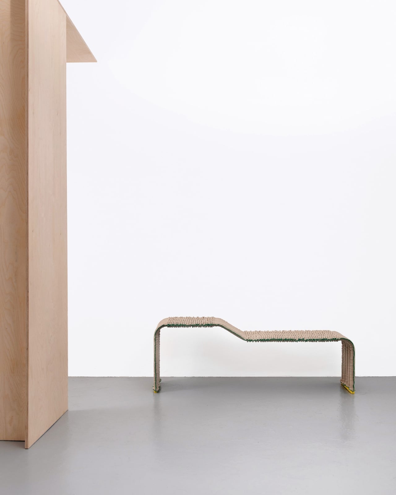
The concept is beautifully simple. The furniture, which includes benches, chairs, and stools, is built from just two materials: steel tubes and multilayer flax fabric. That’s it. No glue, no bolts, no complicated hardware that you’ll lose during your third apartment move. The flax fabric wraps around the tubular steel frame, creating a self-supporting structure that stays stable through clever engineering rather than industrial adhesives.

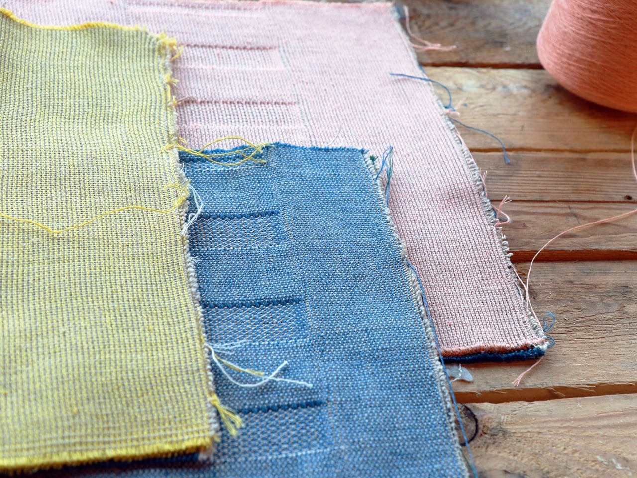
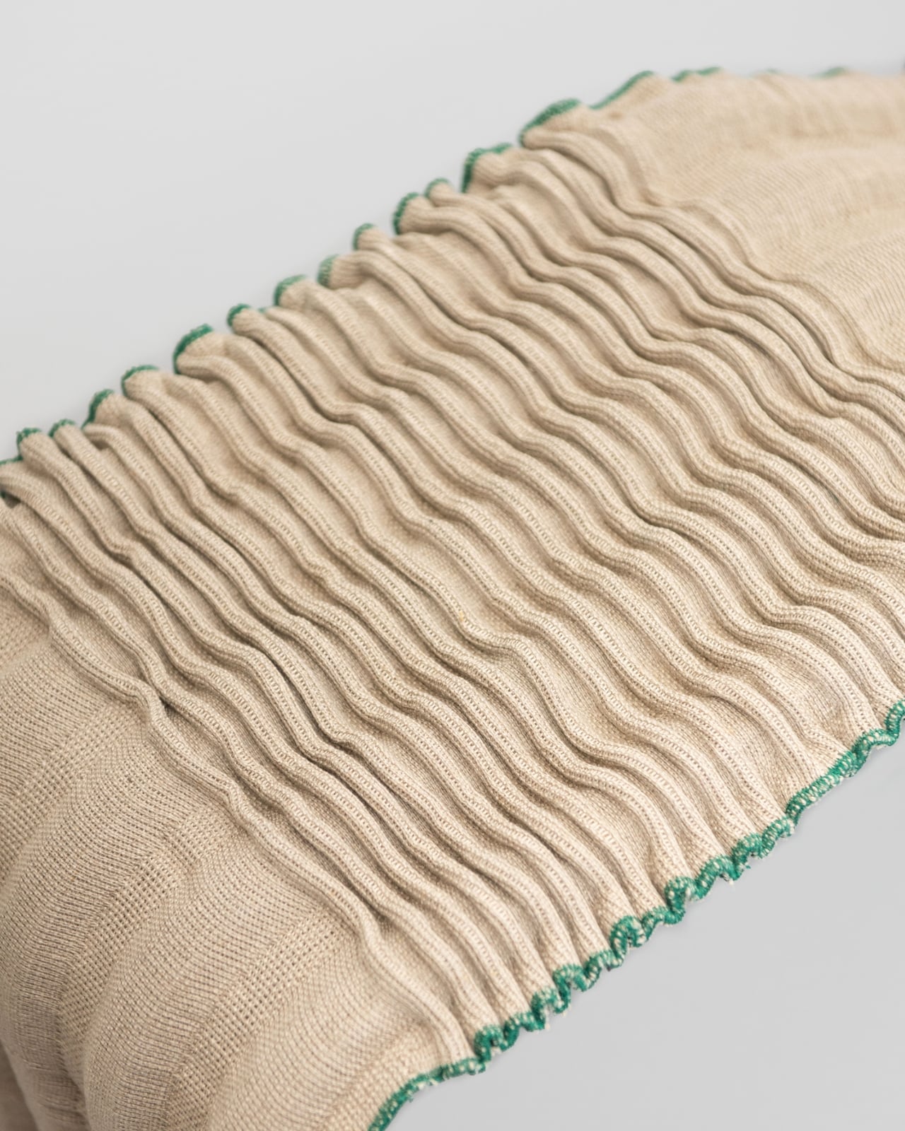
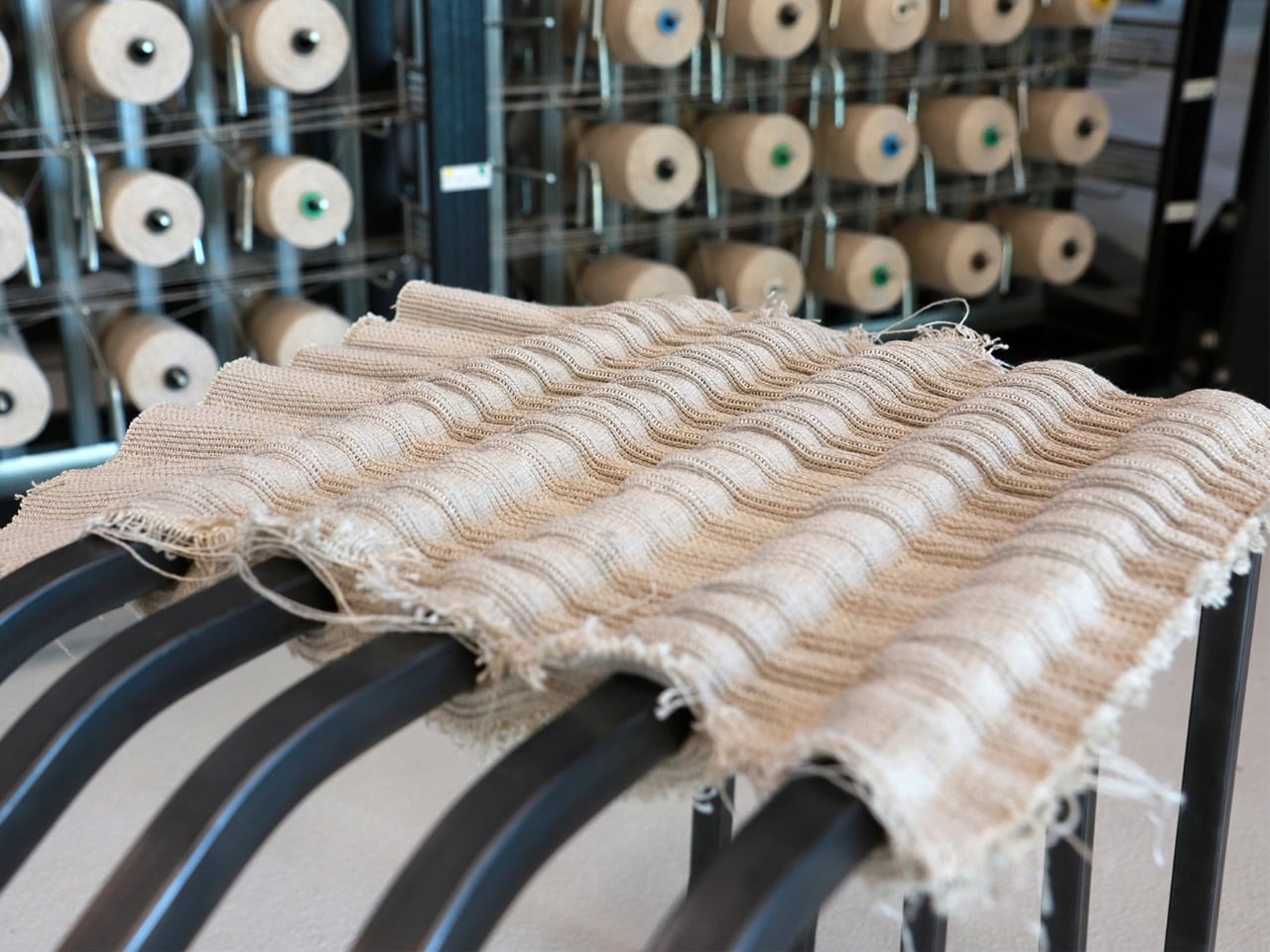
What makes this particularly clever is the fabric itself. The team at Fraunhofer developed a specialized multilayer flax textile with open constructions and integrated channels that interact with the steel tubes to create varying levels of stiffness. This means you get support exactly where you need it without adding extra materials or complexity. The seating surface can even be customized with a lamellar structure that provides additional cushioning for those of us who like to linger.

The whole system is modular and completely reversible. Researcher Christina Haxter explains that the goal was to design seating furniture that allows for quick assembly, disassembly, and rearrangement, making it easy to take apart when moving. You can reconfigure pieces depending on your space, separate everything by material type at the end of its life, and send each component back into its own recycling stream. Steel stays with steel, flax goes back to being flax. It’s circular design at its most practical.

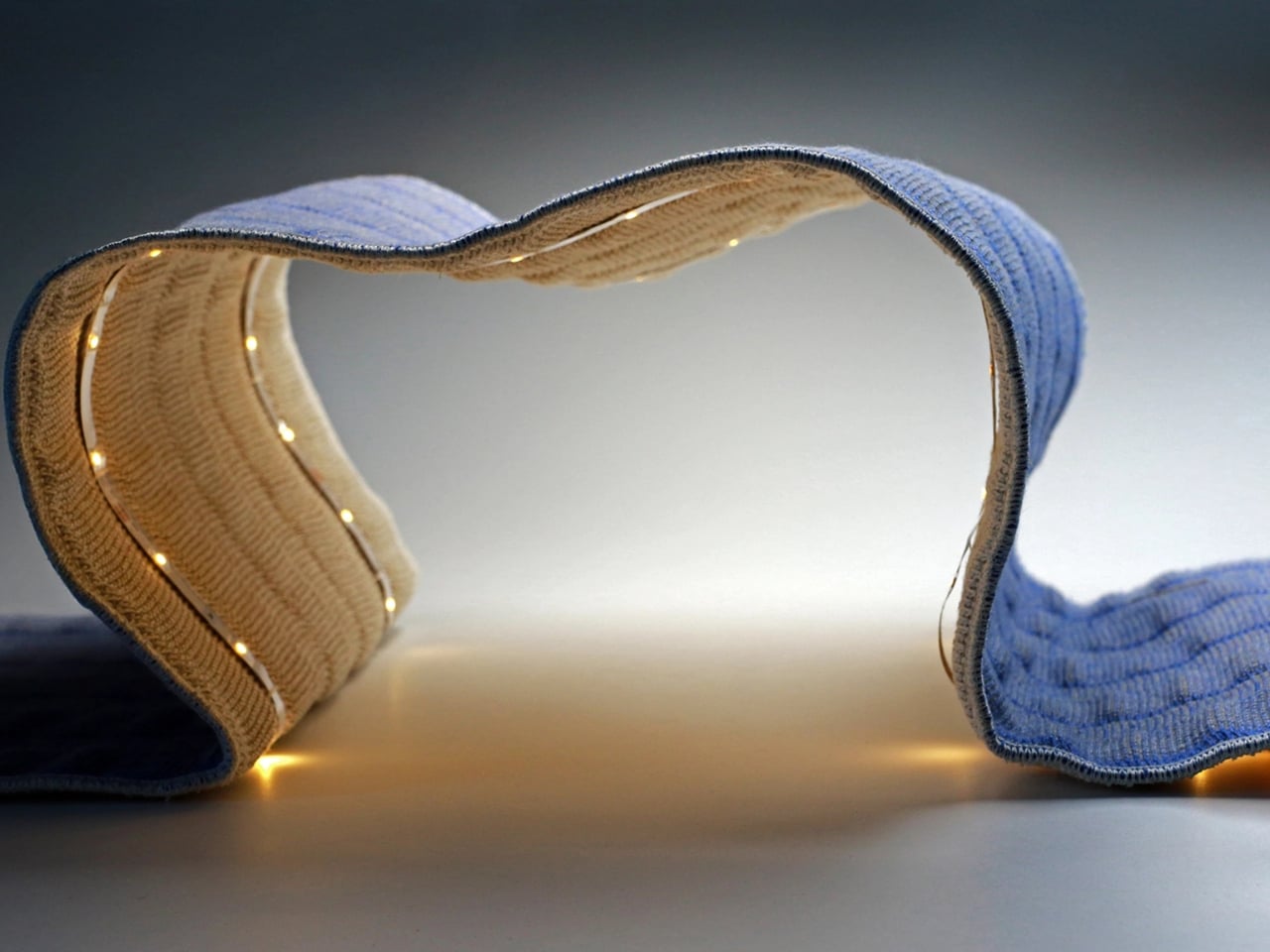
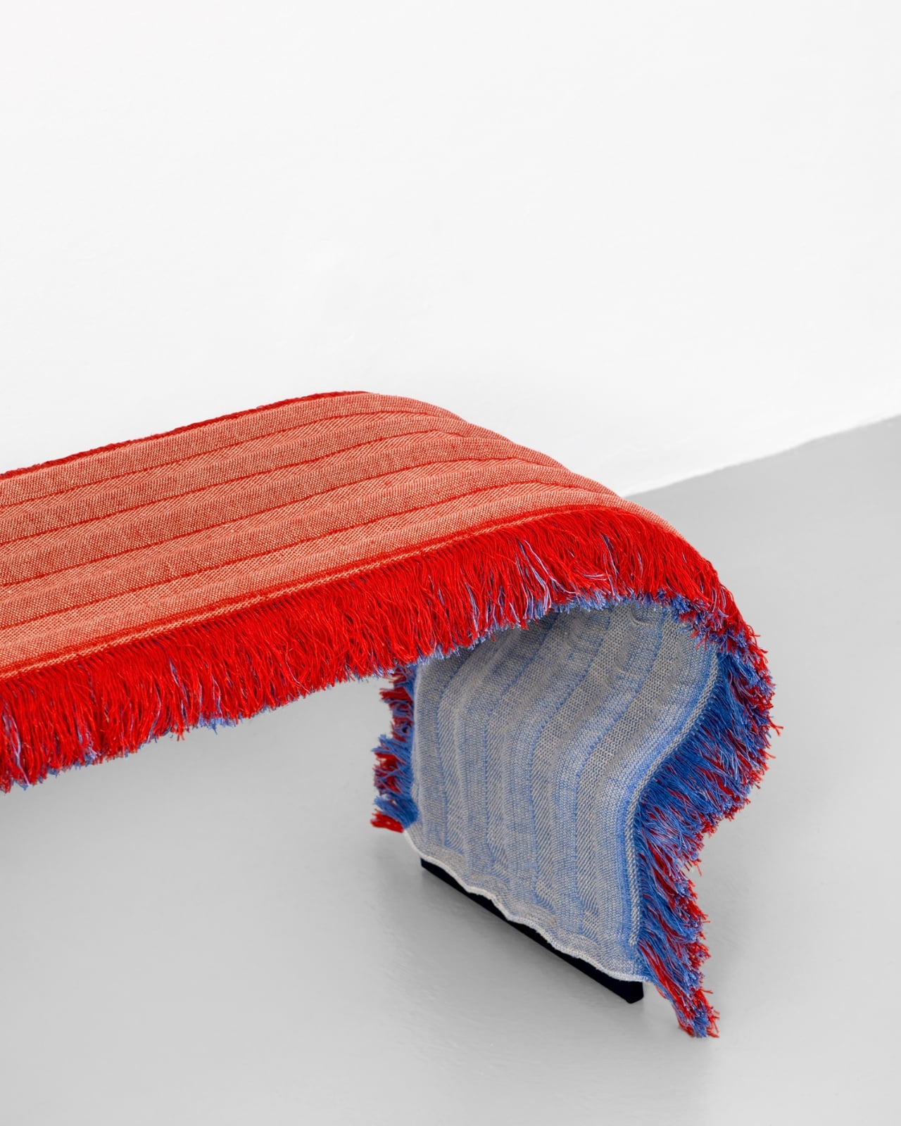
But here’s where LinumTube really shines: it doesn’t look like a sustainability lecture. The covers come with or without fringes and are available in both multicolored and natural pastel tones. The aesthetic is minimalist but warm, the kind of thing that would fit just as easily in a modern office lobby as it would in your living room. There’s even an option for integrated LED lighting woven into the fabric, because why shouldn’t sustainable furniture also have a bit of flair?

The project received funding from the German Federal Ministry of Education and Research, and was unveiled at Milan Design Week 2025 during the Materially exhibition. It represents a genuinely different approach to how we think about furniture design. Instead of creating objects meant to be used and discarded, LinumTube embraces the idea that furniture should evolve with us. Need more seating? Add another module. Moving to a smaller place? Reconfigure what you have. Done with it entirely? Return everything to the material cycle without guilt.

This is the kind of innovation we need more of. Not flashy tech for tech’s sake, but thoughtful problem solving that addresses real challenges without sacrificing style or functionality. Furniture has been essentially the same for decades, built on a model of planned obsolescence and complicated assembly instructions. LinumTube proves there’s another way: lighter, smarter, and infinitely more adaptable.

The best part? This doesn’t feel like a compromise. You’re not choosing between design and sustainability, or between affordability and quality. You’re getting furniture that works better precisely because it was designed with all those constraints in mind from the beginning. That’s the kind of thinking that actually changes industries. So next time you’re wrestling with an Allen wrench at 2 a.m., wondering why furniture has to be this complicated, remember that someone out there is already building the alternative. They’re using flax, steel tubes, and some seriously smart engineering to prove that better is possible.

The post This Furniture System Uses Just 2 Materials and No Glue first appeared on Yanko Design.
The Case for Heirloom Furniture in an Era Obsessed With Biodegradable Everything

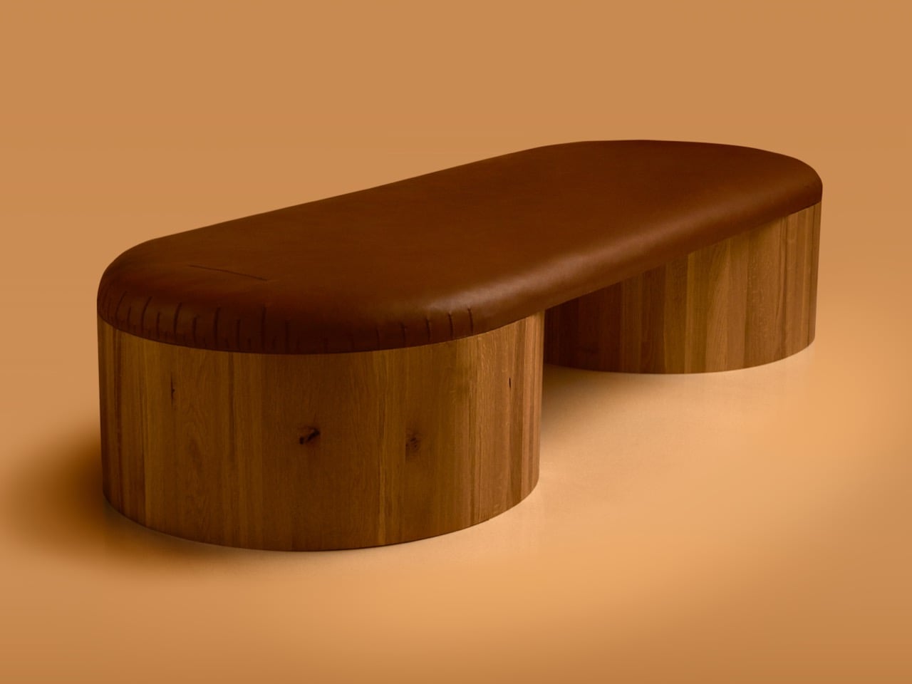
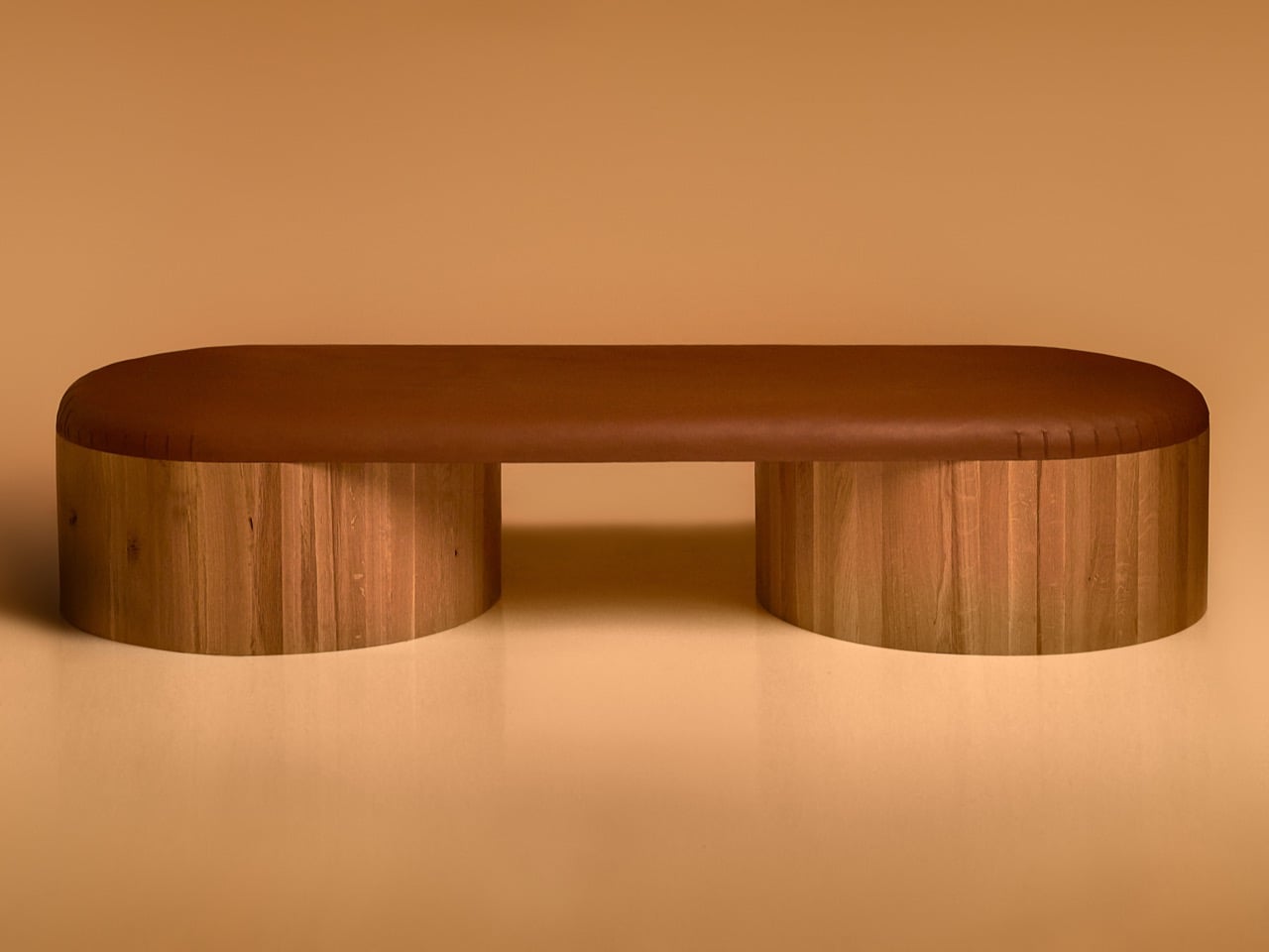
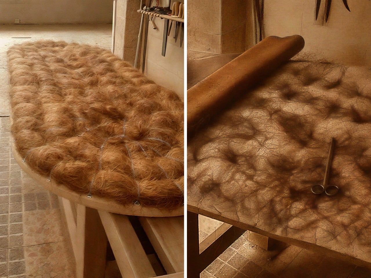
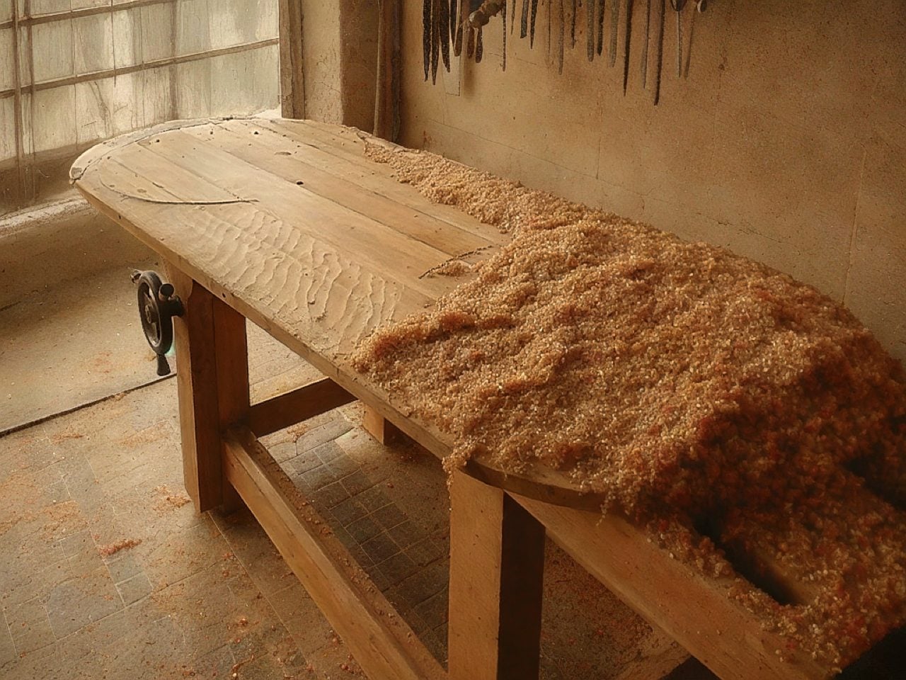
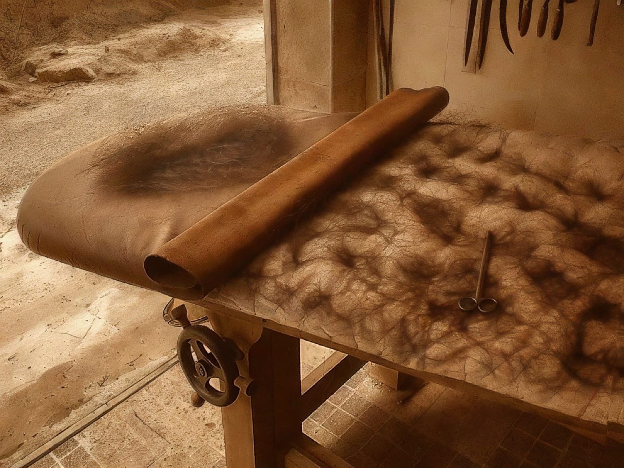
Joe Doucet has always been good at saying uncomfortable things politely. His latest provocation, delivered via Columns, a furniture collection with Bulgarian studio Oublier, is that the design industry’s obsession with biodegradable materials might be missing the point entirely. Furniture made from mycelium or algae can decompose in five years, sure, but a well-made antique armoire outlives empires because no one throws it away. Columns takes that logic seriously. Handcrafted in solid oak, natural leather, and horsehair, the pieces are built to last a thousand years, which sounds like marketing hyperbole until you look at the joinery, the hand stitching, and the material choices. This is furniture designed to be inherited, repaired, and remembered.

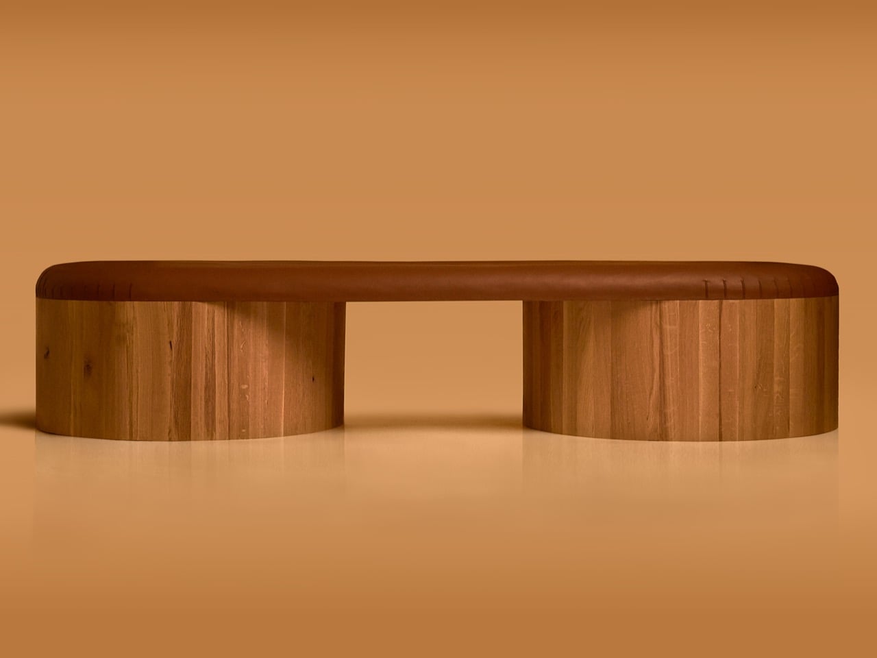
Oublier, a studio that typically explores forgetting as a cultural and creative act, seems like an odd partner for a project about permanence. But the contradiction makes sense once you see the work. The collection’s name refers to its columnar bases, two cylinders of oak laid horizontally and bridged by a continuous leather top. There are no fashionable details to anchor it to a specific decade, no finishes that will look dated in ten years. The form is so spare it borders on austere, which may be the entire strategy. If sustainability is about what we keep rather than what we compost, then the object has to earn its place across generations. Columns bets on clarity, craft, and a very patient understanding of time.

Designers: Joe Doucet X Oublier

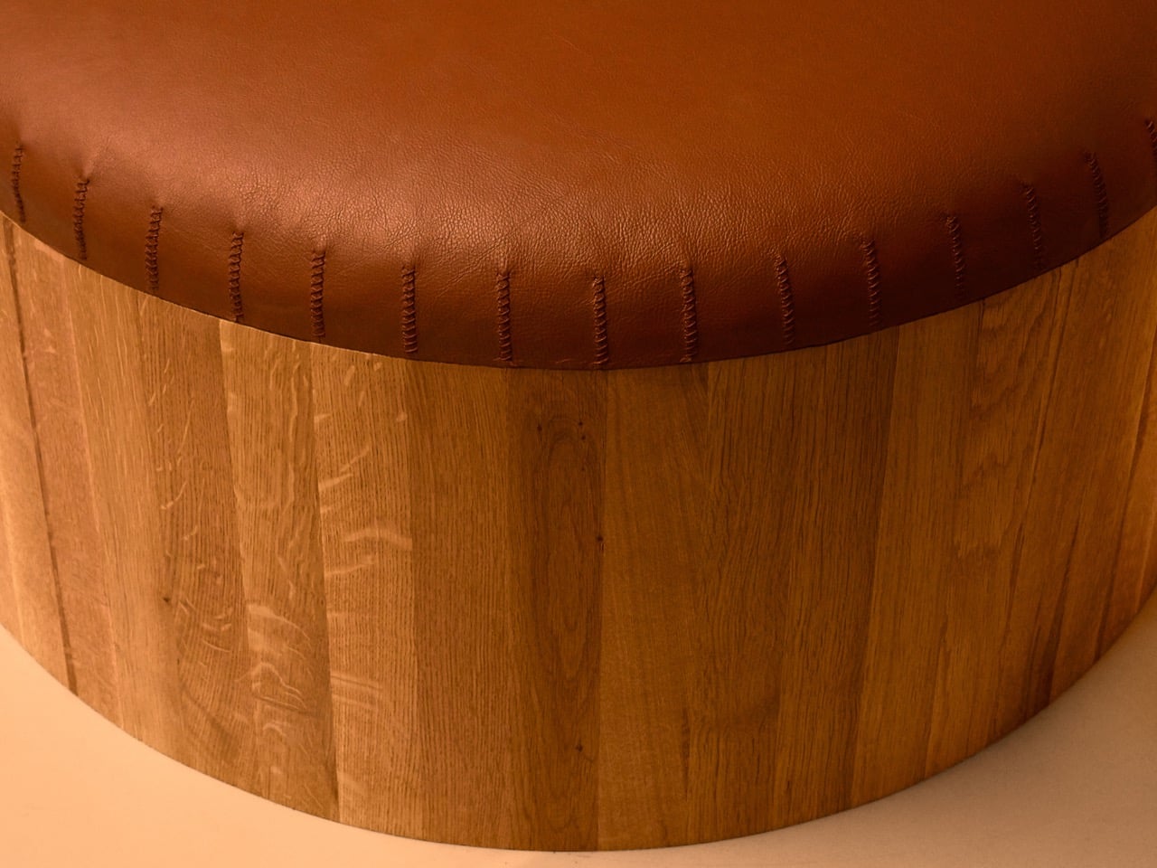
Looking at the piece itself, the argument becomes tangible. The form is elemental, almost architectural, with the two solid oak drums giving it a grounded, permanent presence. The leather top is stretched over this base with a continuous curve, and the hand stitching along the perimeter is left visible. This small detail is a critical part of the story, acting as a quiet signal of human labor and future repairability. It suggests the piece can be opened, its horsehair padding refreshed, and its leather resewn a century from now. There is a thoughtful honesty in showing the construction, which reinforces the idea that this is a working object, not a sealed artifact. It feels built to withstand use, not just admiration.
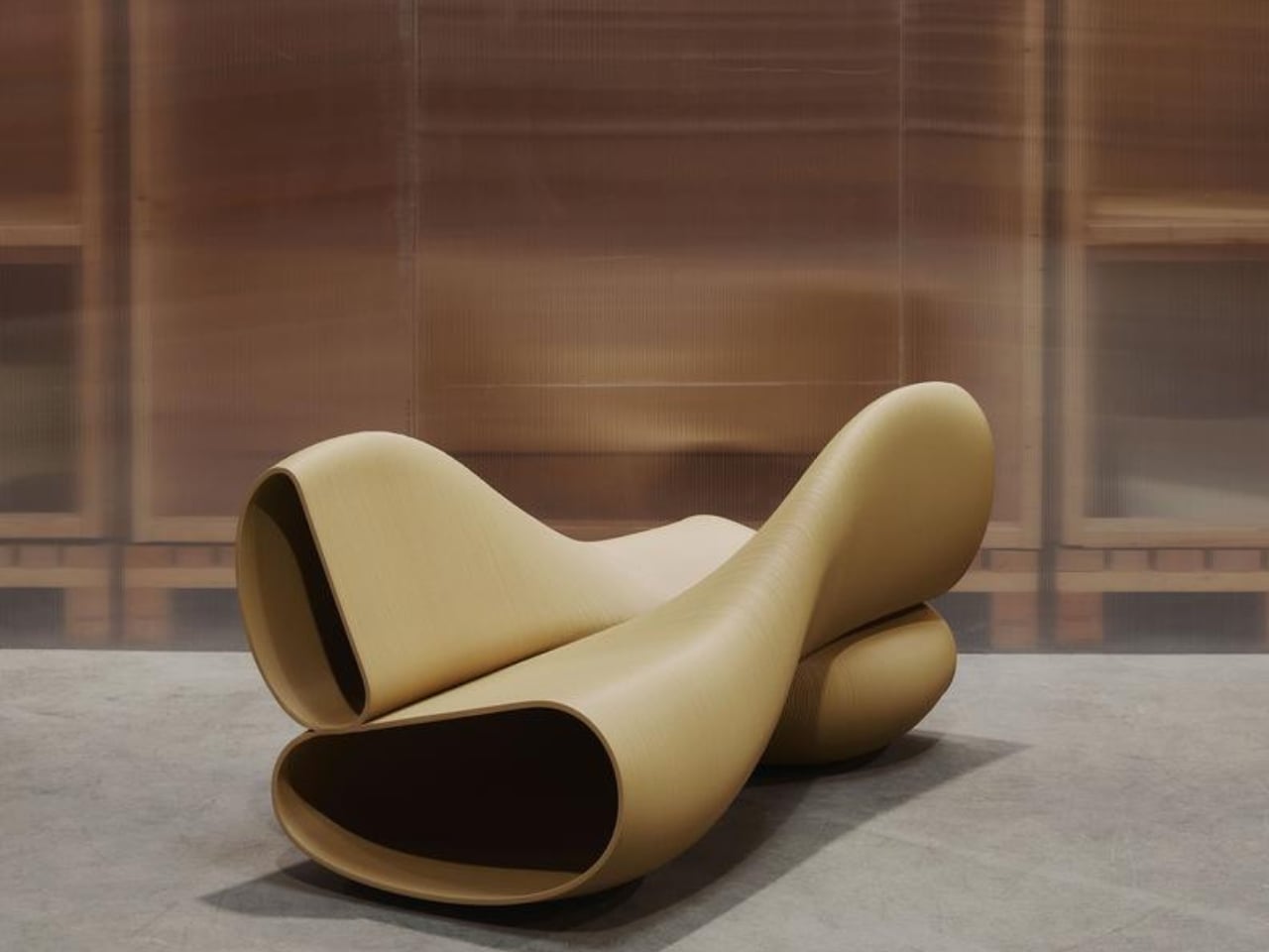
The choice of materials is a direct commitment to graceful aging. The solid oak is not a uniform, characterless surface; it has grain and life that will deepen over the decades. Similarly, the natural leather is intended to absorb the evidence of its existence, developing a rich patina from sunlight, touch, and time. This philosophy is the complete opposite of designing for pristine, showroom condition. Instead, Columns proposes that wear is a form of beauty, that an object’s value increases as it accumulates a history. This approach redefines luxury away from novelty and toward endurance, suggesting that the ultimate premium is an object that improves with you.
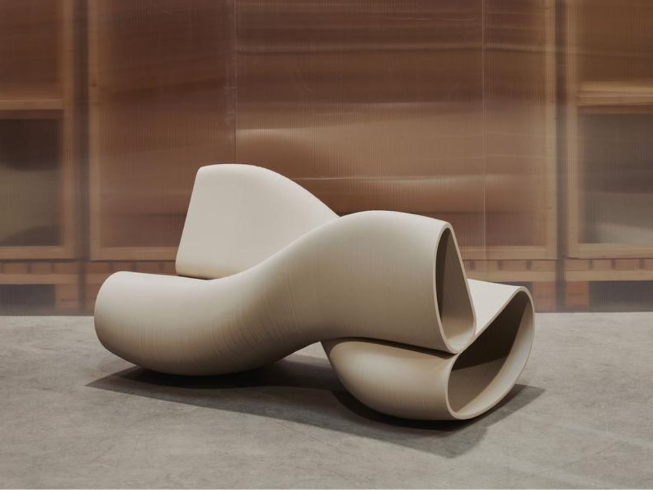
 

What Doucet and Oublier have created is a subtle but firm critique of disposability. The project opines that true innovation might lie in looking backward, applying traditional techniques and durable materials to a clean, contemporary form. It challenges the prevailing notion that sustainability requires constant material invention and complex recycling systems. Instead, it offers a simpler, more profound solution: make things that last, and are simultaneously too good to throw away. Columns proposes that the most responsible act of consumption is to buy something once and keep it for a lifetime, passing it on as a functional heirloom rather than a problem for a landfill.

The post The Case for Heirloom Furniture in an Era Obsessed With Biodegradable Everything first appeared on Yanko Design.