There has been a proliferation of various kinds of cameras in the market, driven by a growing demand for nostalgic and analog devices. While some of them look analog, they’re just retro-styled gadgets that still capture digital pictures. But there’s also a market segment producing actual film cameras, with varying levels of complexity and expertise required to operate them.
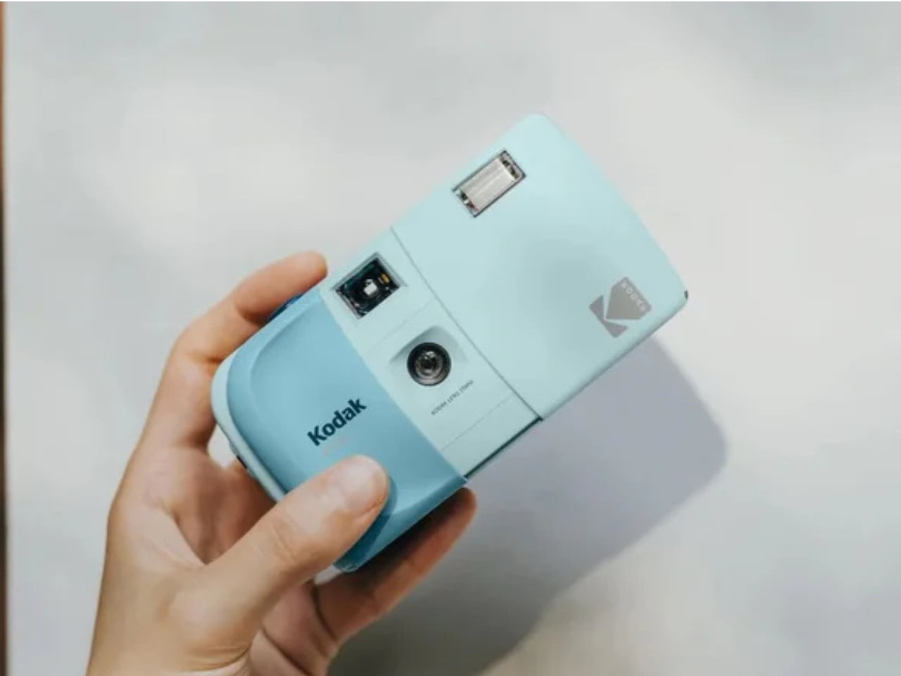
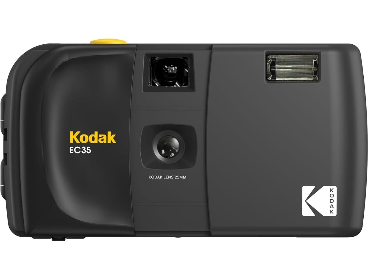
For those looking for a simple point-and-shoot film camera, the Kodak EC35 is a reusable 35mm film camera that lets you explore analog photography effortlessly. It bridges the gap between the carefree convenience of a disposable camera and the longevity of a proper reusable one. Think of it as the spiritual successor to the once-popular single-use camera, but this one is built to last and designed to grow with you.
Designer: Kodak
While there’s room for analog cameras that let you play around with various settings, lenses, and focus options, there are times when you just want a film camera that’s simple enough to point and shoot. The Kodak EC35 is one such camera that removes the usual complexities of film photography and lets you load, shoot, rewind, and enjoy the process without any hassle. Whether you’re a complete newcomer to film or simply someone who wants a grab-and-go option for everyday adventures, the EC35 fits the bill perfectly.
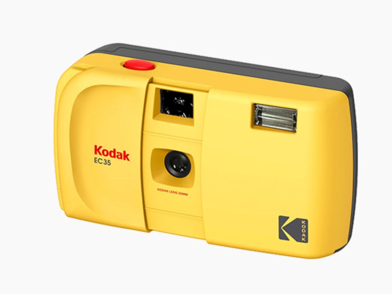
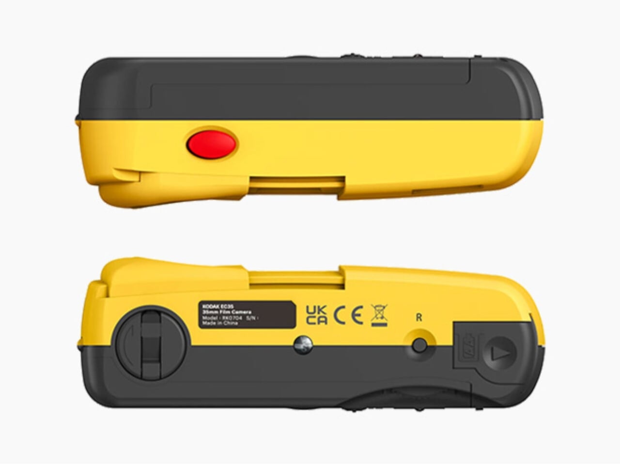
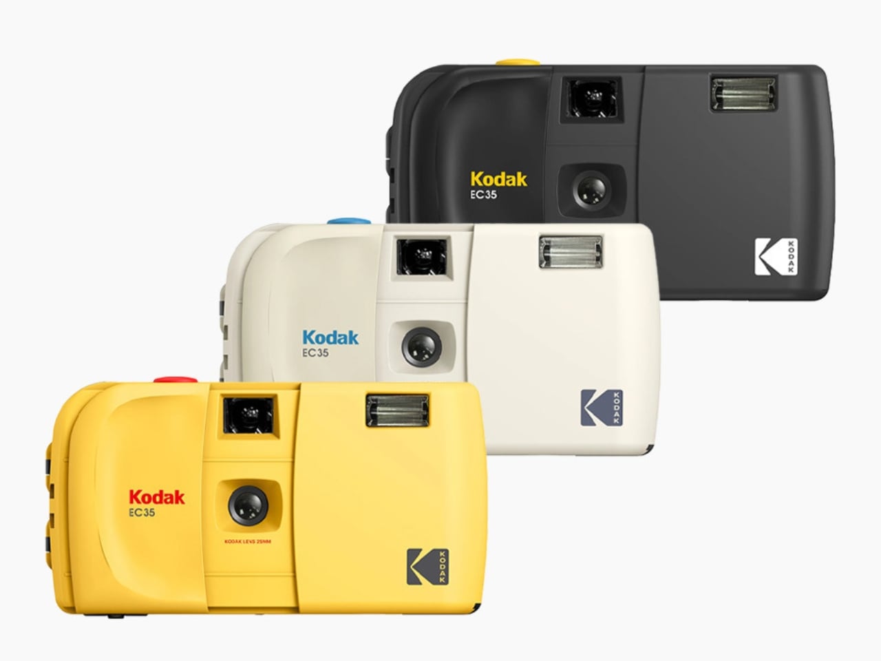
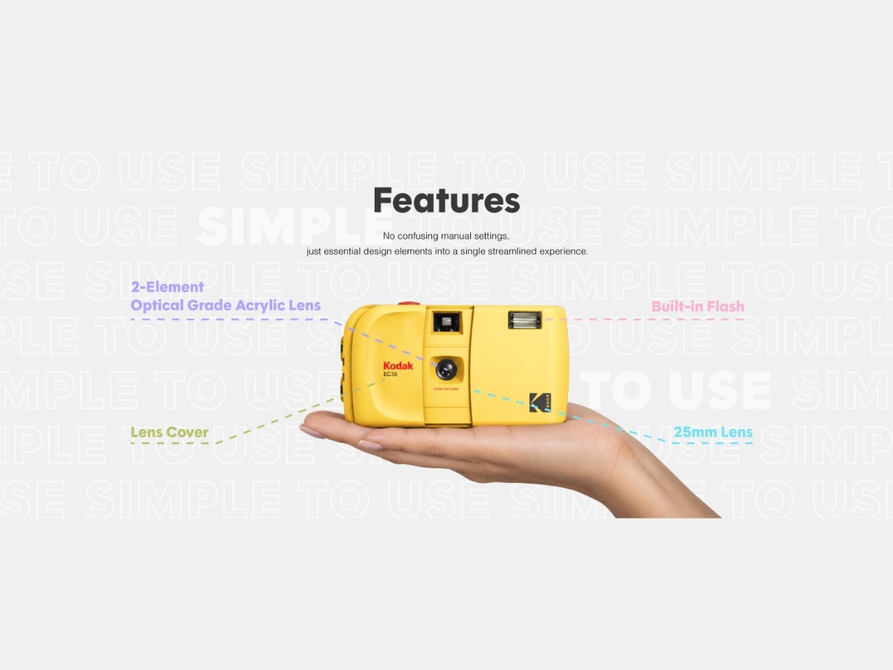
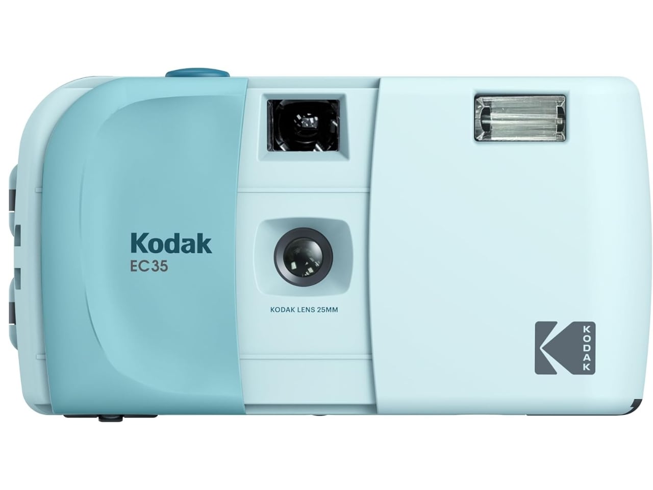
True to its beginner-friendly promise, the EC35 is a fully focus-free camera equipped with a 25mm, 2-element optical-grade acrylic lens fixed at an f/10 aperture, which means there’s no adjusting, no guessing, and no fussing over focus. The shutter speed is set at a fixed 1/100s, keeping things consistent and reliable every time you press the shutter. A built-in electronic flash handles low-light moments, powered by a single AA alkaline battery. Film transport is handled manually through a satisfying wind and rewind mechanism, a small ritual that serves as a reminder that there’s something special to look forward to at the end of each roll. A simple optical viewfinder sits above the lens, keeping the entire interface clean and intuitive.
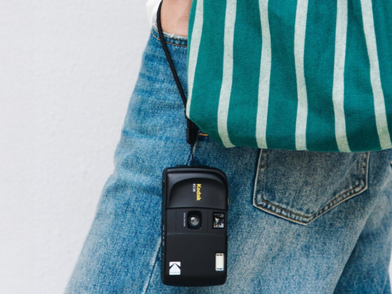
Measuring just 119mm wide, 65mm tall, and 41.5mm deep, and tipping the scales at only 102 grams, it’s genuinely light enough to slip into your pocket or tuck into the tiniest of bags, no camera bag required. It also features the iconic slide cover to protect the lens, a nod to beloved retro camera designs that delivers a satisfying, tactile feel and adds a distinctly vintage appeal. In a world dominated by digital photography, there’s something undeniably charming about carrying a film camera that looks, feels, and shoots the part. It’s the kind of camera that fits seamlessly into your everyday routine rather than demanding a special occasion.
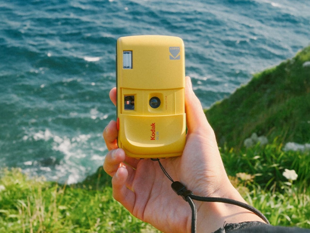
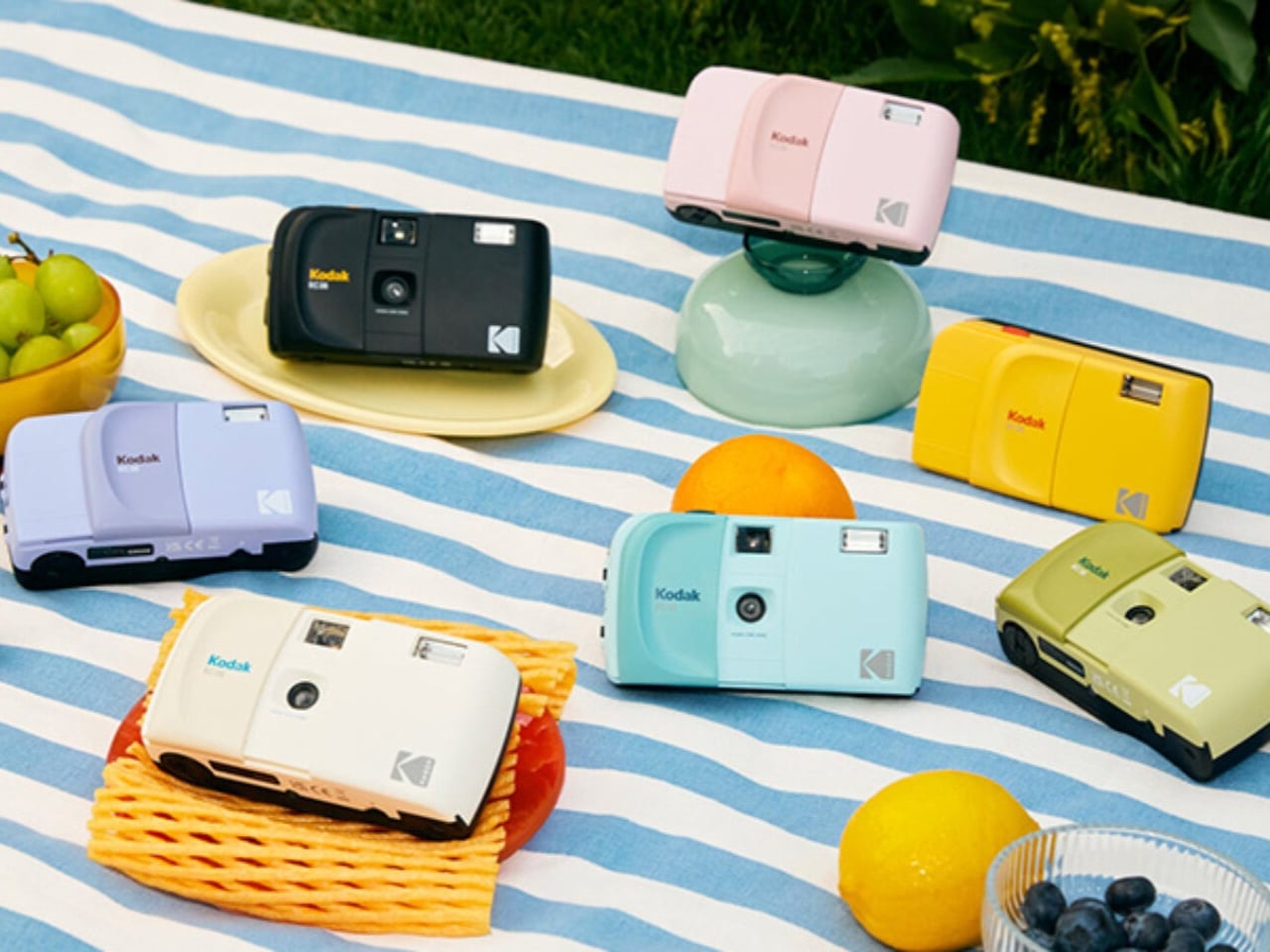
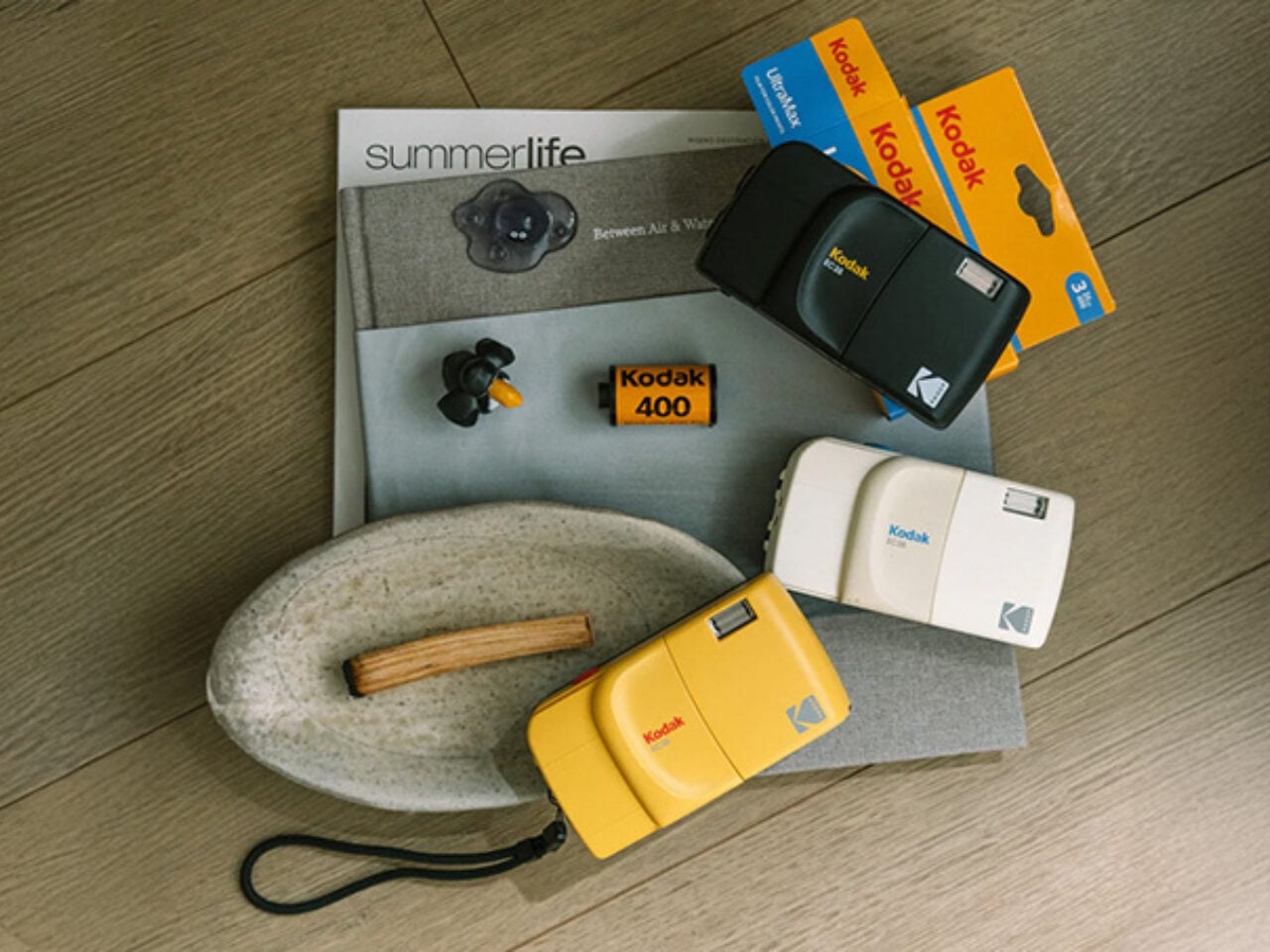
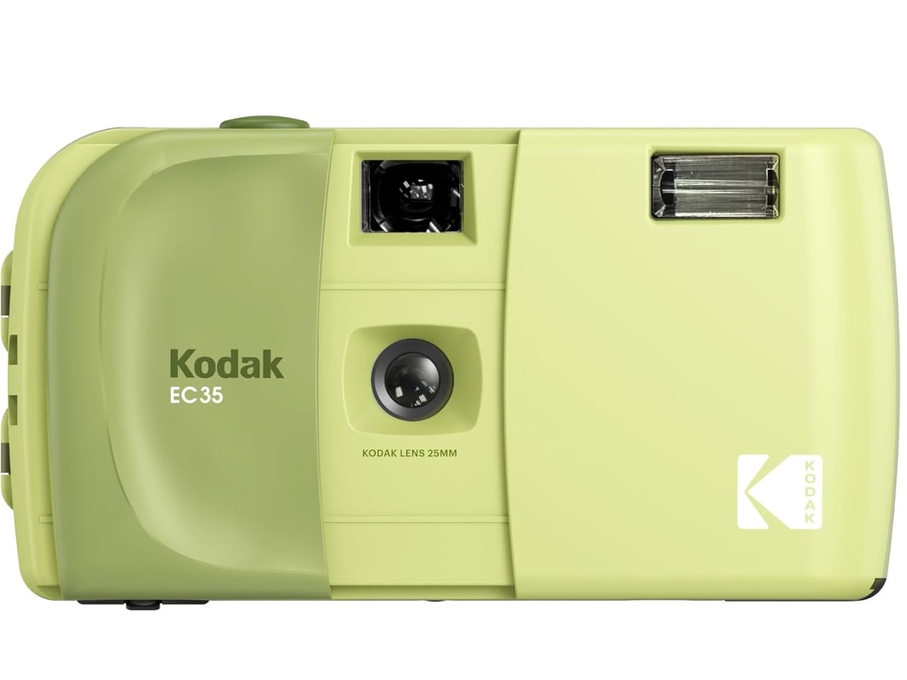
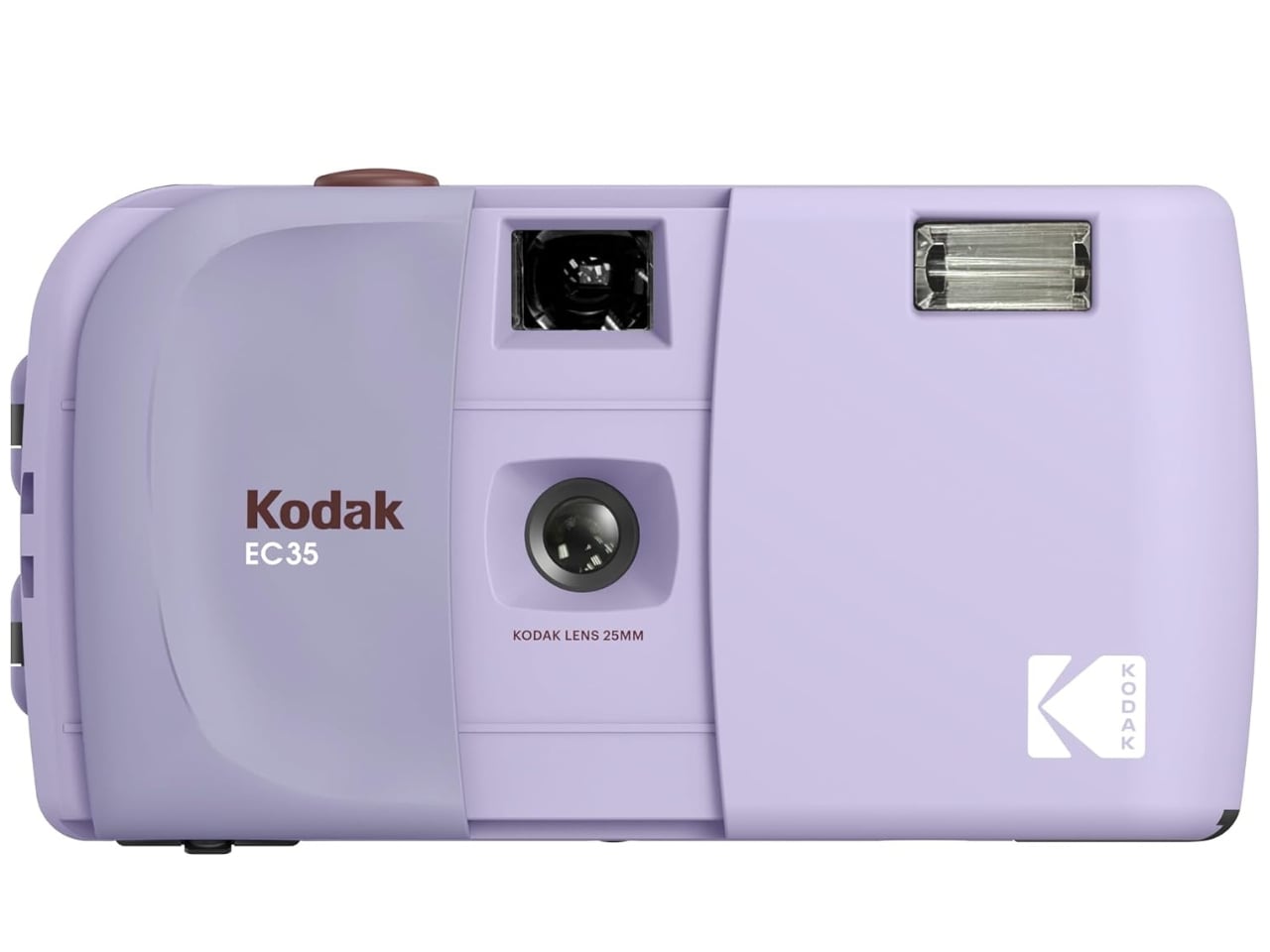
The Kodak EC35 comes in seven different colorways, specifically Midnight Black, Vanilla White, Butter Yellow, Lavender, Powder Blue, Blush Pink, and Avocado Green. Whether you lean toward bold and moody or soft and dreamy, there’s a shade for every personality. The wide color range also makes it a surprisingly thoughtful gift for anyone who is curious about film photography but doesn’t quite know where to start.

The Kodak EC35 shoots on 35mm film with a 25mm, f/10, 2-element optical-grade acrylic lens and a fixed shutter speed of 1/100s. It is fully focus-free and comes with a built-in electronic flash, a manual wind and rewind film transport system, and a simple optical viewfinder. The camera runs on a single AA alkaline battery and weighs just 102g (3.6 oz), with dimensions of 119(W) x 65(H) x 41.5(D) mm. It is available in 7 colorways and is priced at $35.
Available on its own or as a bundle that includes a camera strap and a 24-frame roll of Kodak Ultramax 400 film, the EC35 is one of the most accessible entry points into analog photography today. Note that a battery is not included, but at just $35 for the camera itself, that’s a small price to pay for a device that makes real film photography available to virtually anyone. For beginners, collectors, and anyone who simply loves the look and feel of a film camera, the Kodak EC35 makes a compelling and wallet-friendly case for going analog.
The post Kodak Just Made a $35 Film Camera That Replaces Disposables first appeared on Yanko Design.