
YouTube expands direct messaging to the US
YouTube is testing DMs in its mobile app, and US is now part of the experiment.

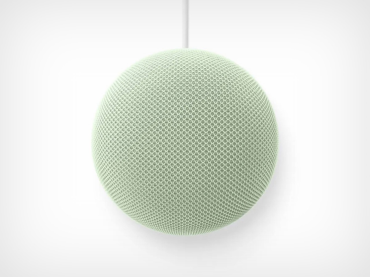
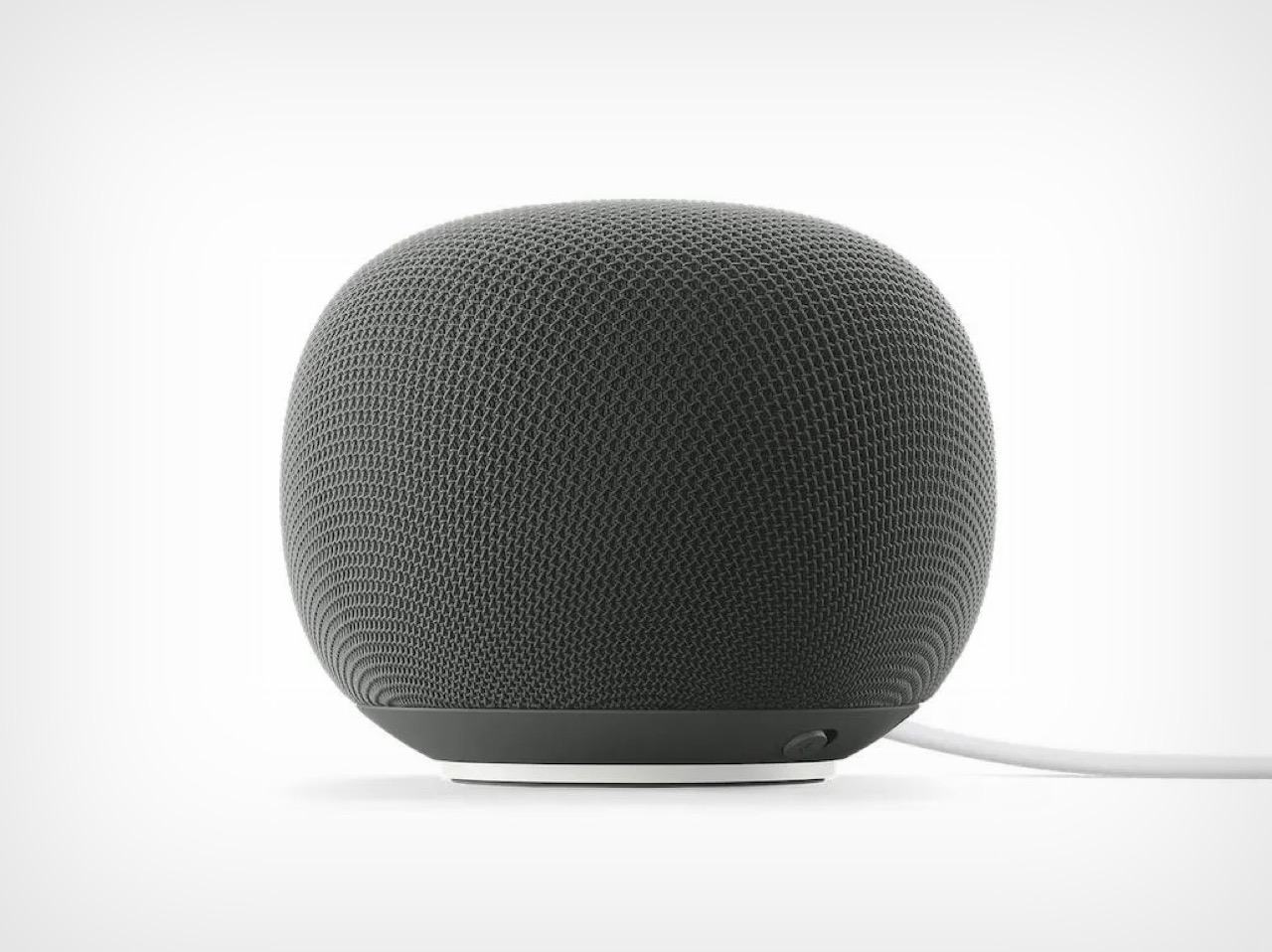
The Nest Audio came out in September 2020. If you bought one that fall, you were probably still navigating pandemic grocery runs and wondering when offices would reopen. Nearly six years later, Google has finally shipped something new to put on your kitchen counter. The Google Home Speaker, now landing in June 2026 after a “Spring 2026” promise that tested the meaning of the word spring, is the company’s first new standalone smart speaker in half a decade. Six years is a long time in consumer electronics. Apple refreshed AirPods three times. Sonos launched and then partially broke its app and still found time to make new speakers. Google, meanwhile, treated the entire category like a parked car, leaving the Nest Audio to quietly collect dust while the company sprinted elsewhere.
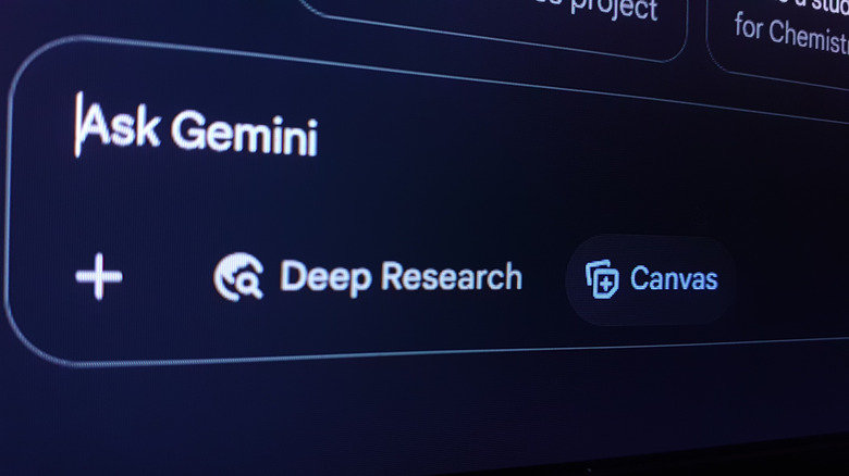
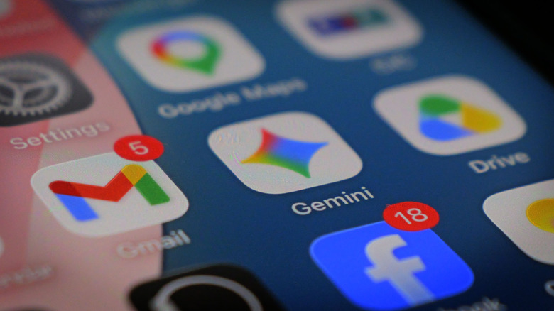
Where was Google sprinting? Toward Gemini, mostly. The AI model has been grafted onto Search, Maps, Workspace, Android, Chrome, YouTube, and practically every other product in the portfolio with enough surface area to carry a chatbot. Google even announced the Googlebook at I/O 2026, a new category of premium Android laptops billed as the successor to the Chromebook and the Pixelbook, built, predictably, around Gemini Intelligence. When Google finally announced the new Home Speaker at its Made by Google event in October 2025, the device was framed almost entirely around its role as a Gemini endpoint. The speaker came back because Gemini needed somewhere new to live, and the kitchen seemed underserved.
Designer: Google
There was a time when the company’s smart home pitch felt like a real platform strategy, ambient computing, voice everywhere, helpful devices fading into the background. The original Google Home arrived in 2016 with a sense of ambition. It was a bet that Google could own the center of the connected home by making voice control feel natural, useful, and quietly omnipresent. Then came the Mini, the Max, the Hub, the Nest rebrand, and eventually the Nest Audio. After that, the energy drained out of the room. The category was never formally abandoned, but it entered that peculiarly Google state where a product remains alive enough to avoid a funeral and neglected enough to make users wonder whether anyone still remembers where the light switches are.
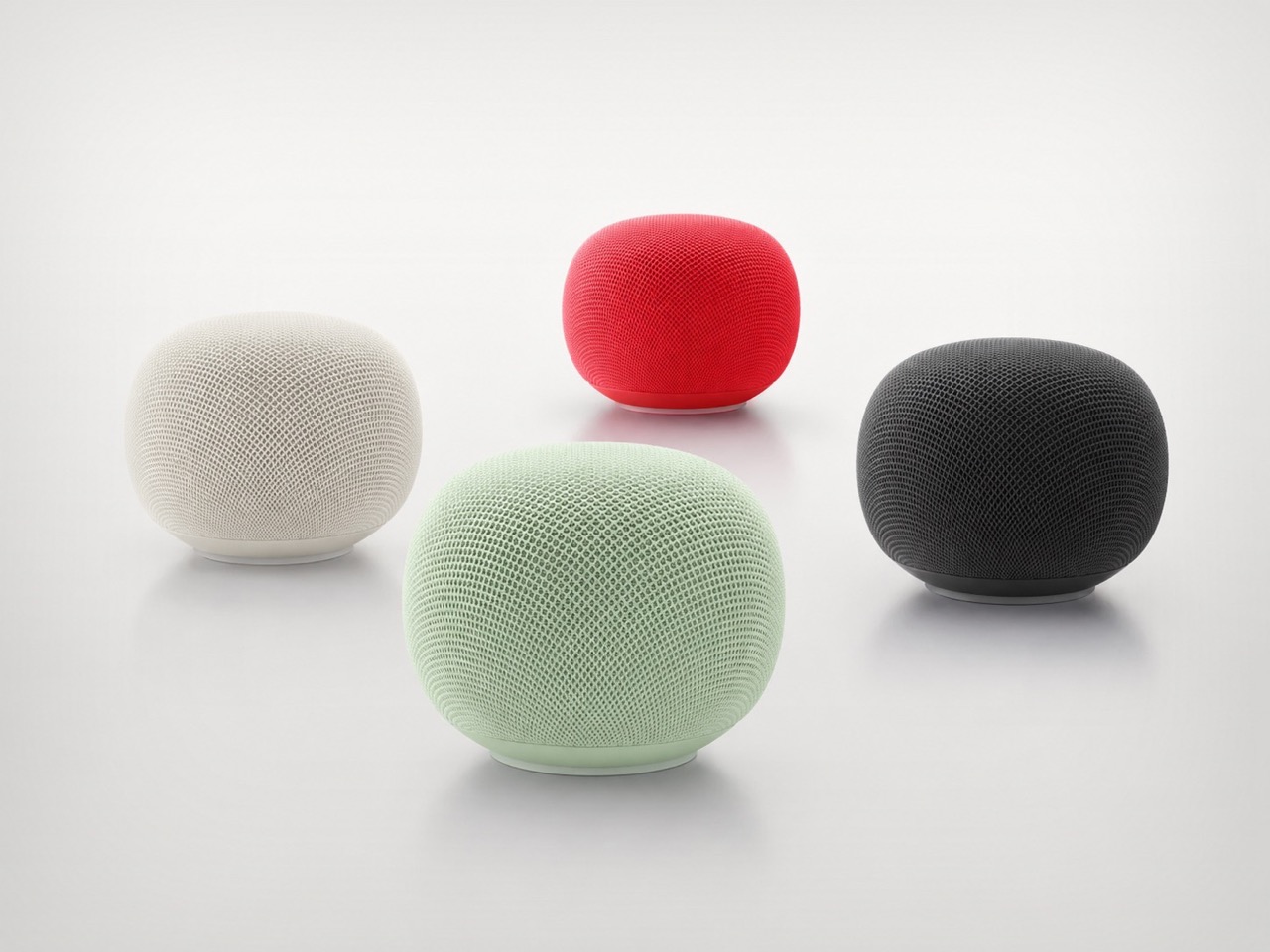
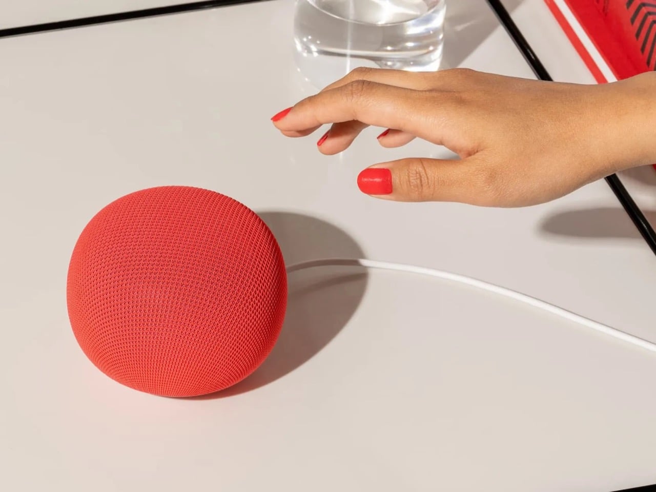
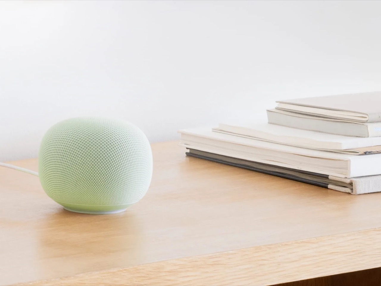
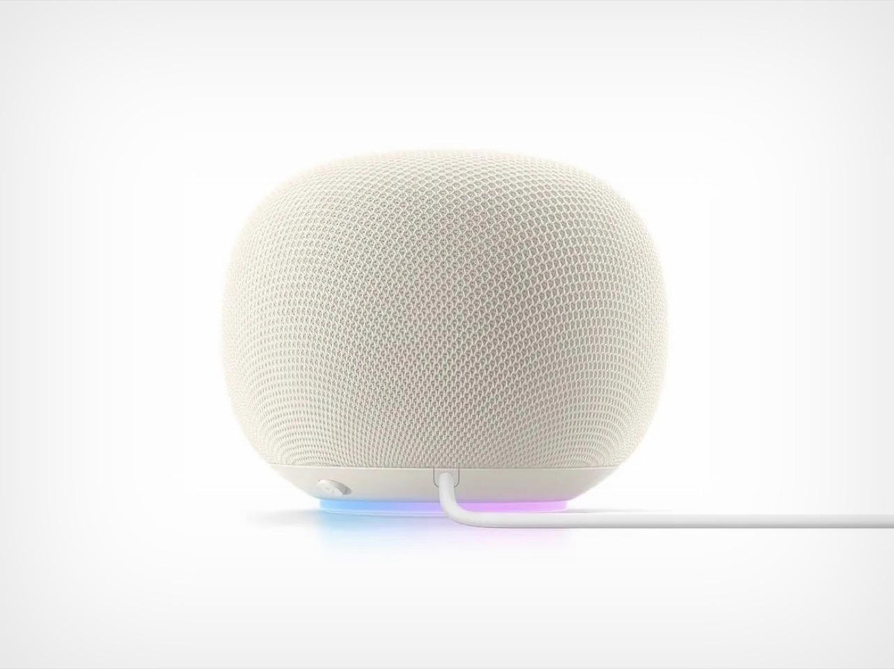
The new speaker itself looks perfectly pleasant. It is small, rounded, soft, and available in the sort of colors Google hardware teams always seem to get right, the kind that make every room look slightly more curated than it probably is. Google says it has 360 degree audio, faster processing for more fluid conversations, and a new light ring that signals when Gemini is listening, thinking, or responding. Fine. Great, even. The problem is that none of this arrives in a vacuum. Google has trained people to see its hardware launches through a second lens, one that asks a less flattering question: for how long is this category going to matter to the company?
That question hangs over almost every Google device that is not a Pixel phone. The company loves a fresh start, a new naming scheme, a reset button disguised as a vision statement. It also has a long history of treating hardware categories like experiments that can be deprioritized the minute a more interesting internal narrative comes along. Smart speakers spent years as a central piece of Google’s ambient computing story. Then Gemini became the story, full stop. Once that happened, every product had to justify itself in AI terms. Phones became Gemini phones. Search became Gemini search. The smart home became Gemini for Home. Laptops became Googlebooks. And now, after years of silence, the speaker has returned as a vessel for the new corporate religion.
There is a certain irony in that. Smart speakers were already one of the clearest examples of what AI in the home was supposed to feel like: conversational, contextual, present without demanding attention. Google had the hardware footprint. It had the installed base. It had a brand that, for a while, was practically synonymous with talking to your house. If the company had kept iterating steadily, this new moment could have felt like a natural evolution. Instead, it feels like a rediscovery. Google wandered away from the category long enough that its return carries a faint air of surprise, as if someone opened a closet at Mountain View headquarters and found an entire product line under a sheet.
Maybe the Google Home Speaker will be excellent. Maybe Gemini will finally make the smart speaker feel smarter than a kitchen timer with good branding. But this launch still lands as a reminder of how erratic Google’s hardware attention span can be. The company did not so much nurture this category back to health as remember it was still on the org chart. After nearly six years, Google has a new smart speaker, and the most Google part of that sentence is that it only happened once the device could be recast as AI infrastructure. The speaker is back on the counter. Whether Google stays in the room this time is the harder question.
Image Credits: 9to5Google
The post After 6 Years, Google Finally Remembered To Launch A New Smart Speaker, This Time with Gemini Built-in first appeared on Yanko Design.