How a 4,200 sq ft Home Finally Solved Multigenerational Living

Multigenerational living has become one of those design phrases that gets thrown around a lot lately, usually attached to a floor plan that just tacks an extra bedroom onto an existing house and calls it a day. The real challenge isn’t fitting more people under one roof. It’s building a home where an aging parent, a sibling, or a grown child can live fully independent lives while still feeling like they belong to the same household. Most builders solve this with a wall and a separate entrance. A Minnesota architecture firm just solved it with light, geometry, and a piano room.

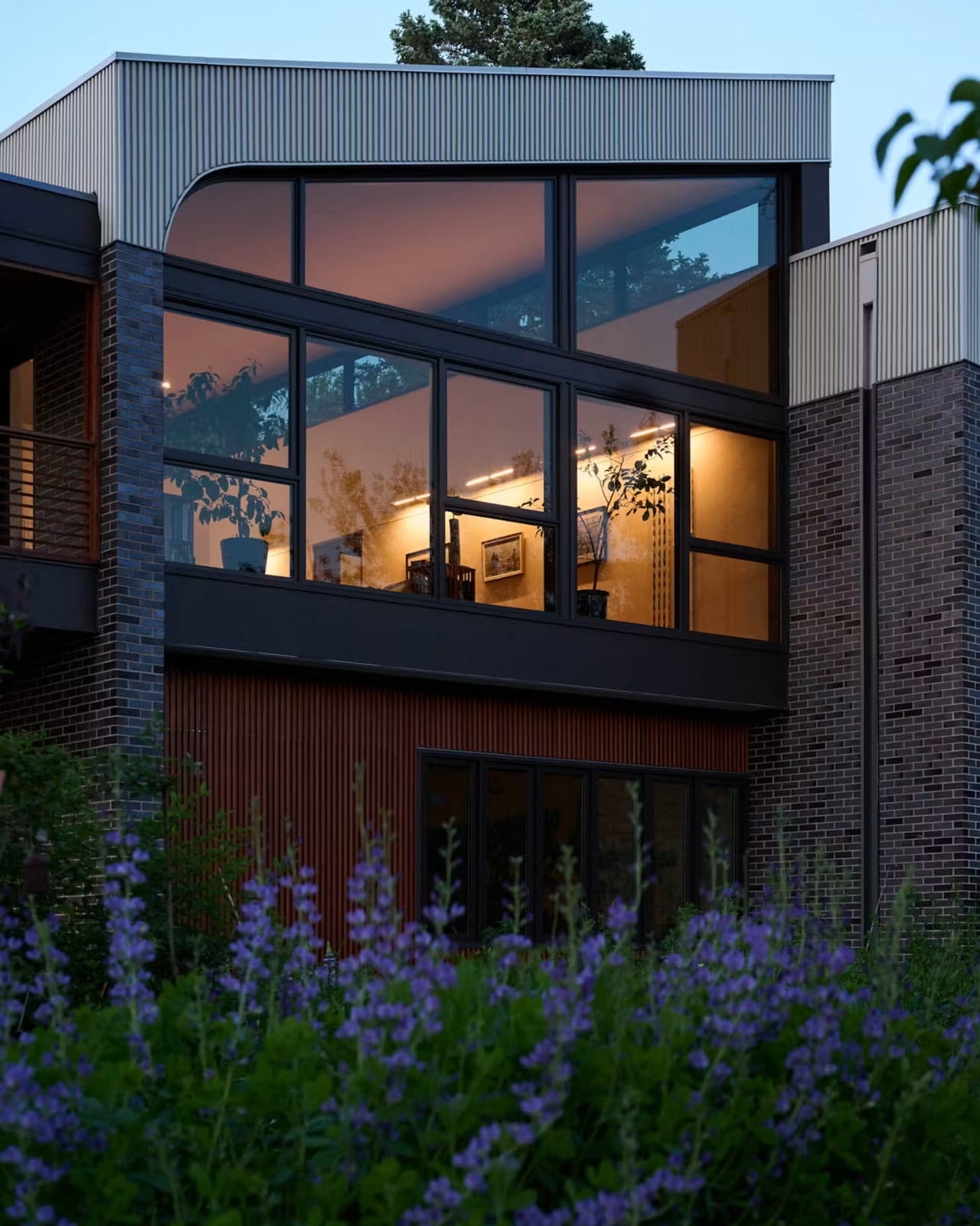
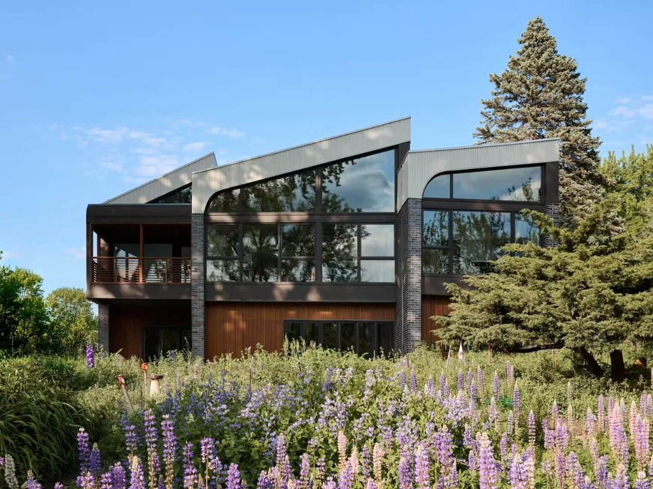
The house is called Crescendo, designed by CityDeskStudio’s Ben Awes on a narrow creekside lot in the Twin Cities. The story behind it is the kind that makes you rethink what a “forever home” is actually for. A woman had the chance to move back onto the land where she grew up with her three sisters, but she didn’t want the old 1950s house that sat there. She wanted the land itself, the creek, the trees, the memory of the place, rebuilt into something that could hold her present life. That’s a very different starting point than most home renovations, and it shows in how personal the final design feels.

Designer: CityDeskStudio

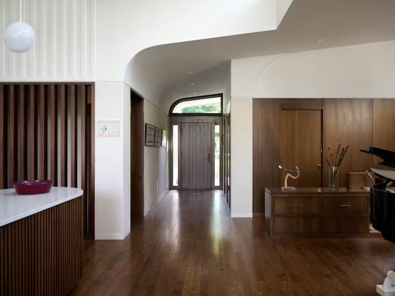
The couple needed a single-level home they could age into, a separate apartment for the wife’s sister, a home office, and an art studio, which is already a lot to ask of 4,200 square feet. What makes Crescendo work is a shared front entry that splits into two half-flights of stairs, one for the sister’s mudroom and one for the couple’s living space, meeting in the middle but never crossing into each other’s territory. It’s a quietly clever piece of choreography. Nobody has to knock. Nobody has to explain their comings and goings. The privacy is built into the bones of the house rather than negotiated after move-in.

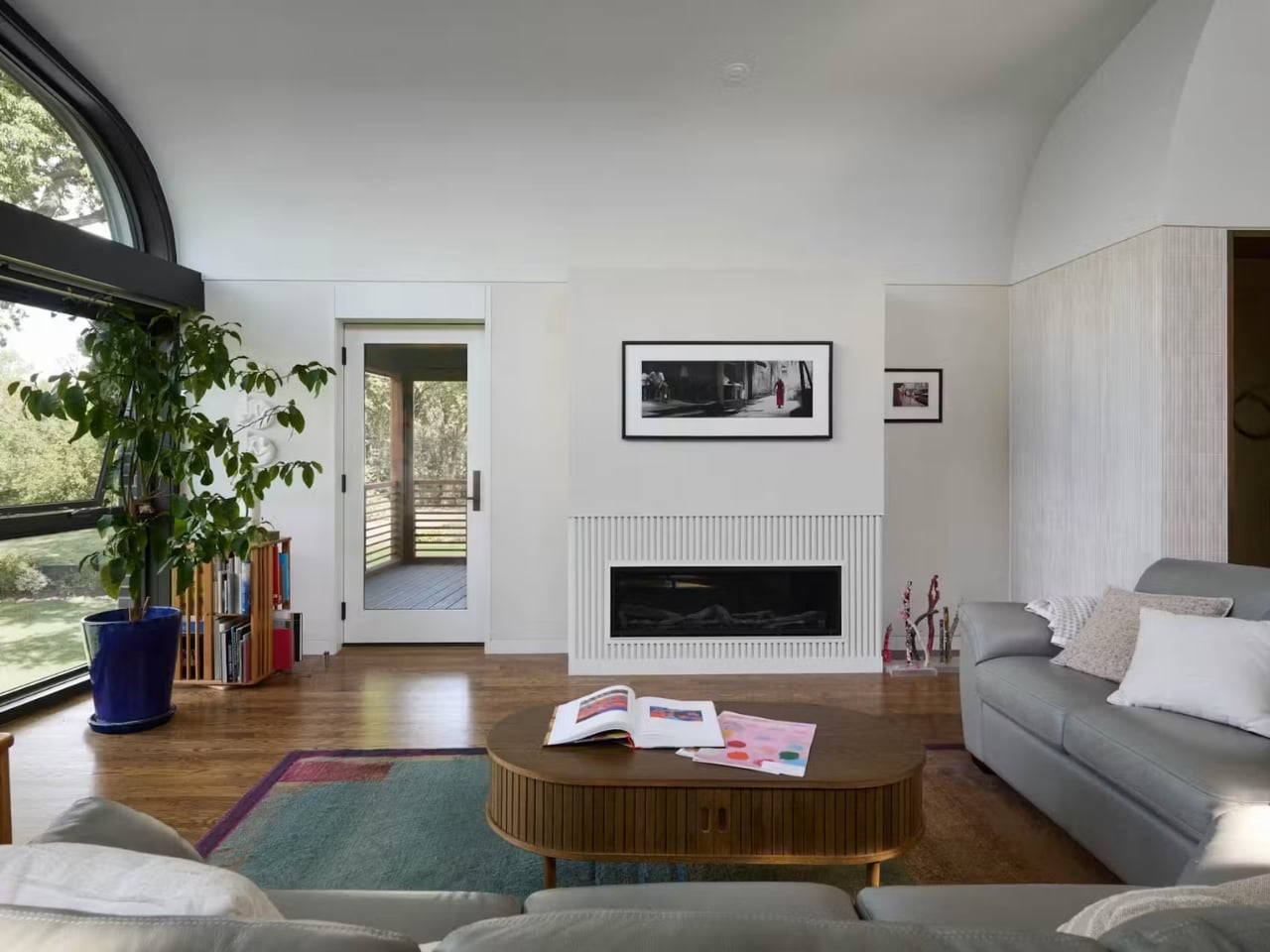
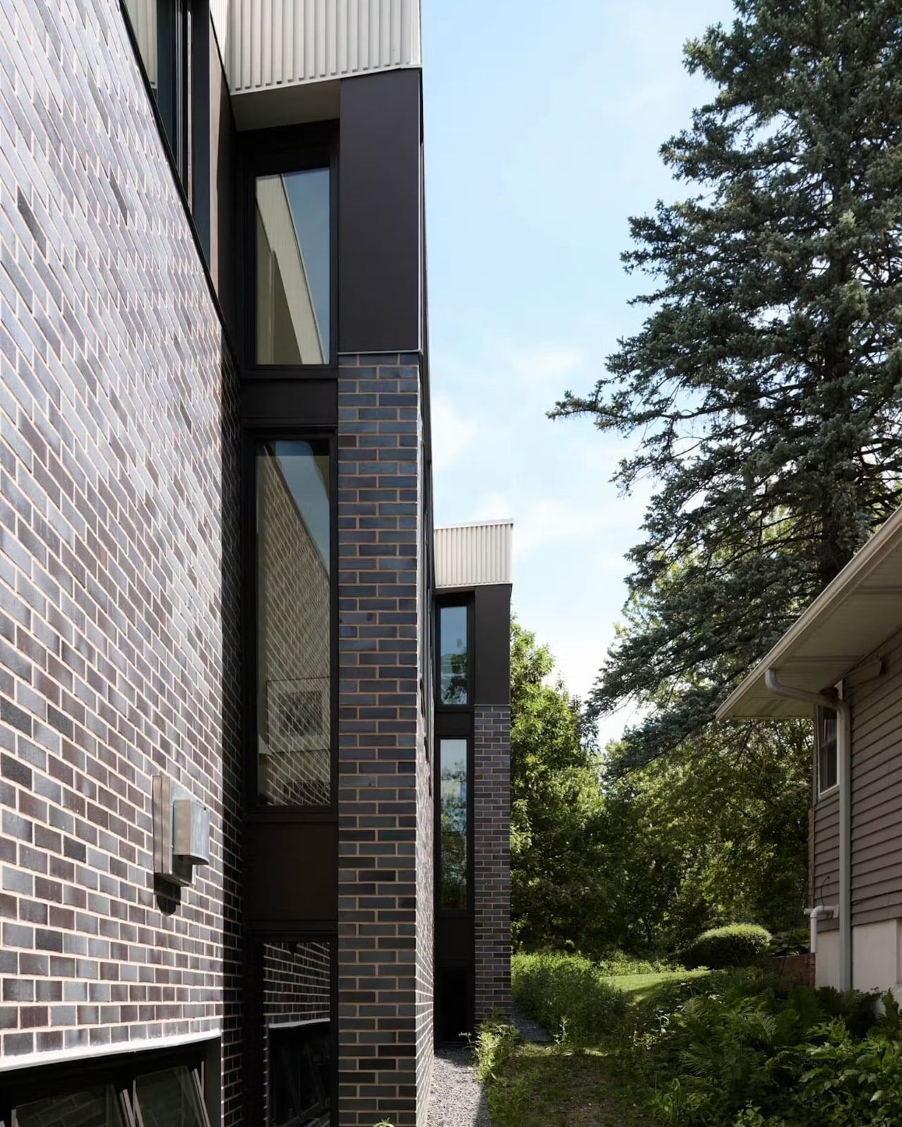
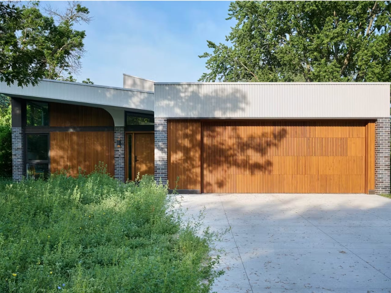
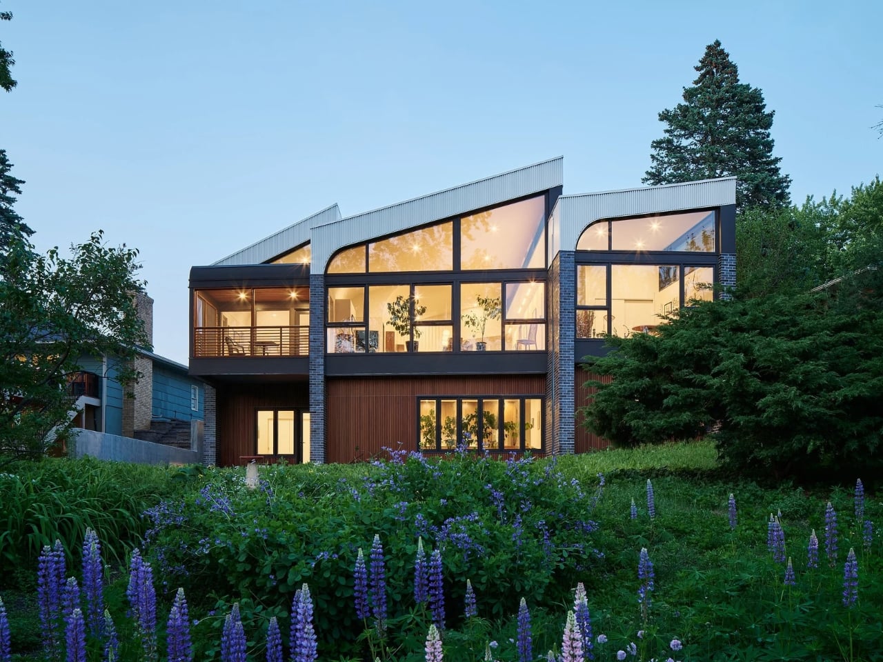
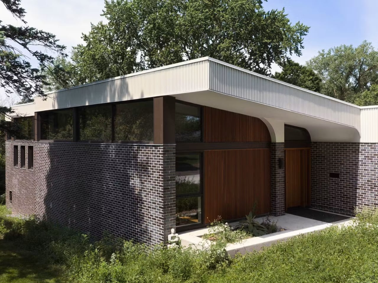
Then there’s the husband’s request, which I have to admit is my favorite detail in the whole project. He’s an architecture fan who loves Louis Kahn, and early on he told Awes that all great architecture has “lift.” So the rooflines rise in sequence across the plan, each section a little higher than the last, which is exactly why the house is named Crescendo. It’s a strange, almost musical way to think about a floor plan, but it works. The house reads as modest from the street, low and unassuming, and then opens up as you move through it. That contrast between restraint and ambition feels honest in a way a lot of statement architecture doesn’t.

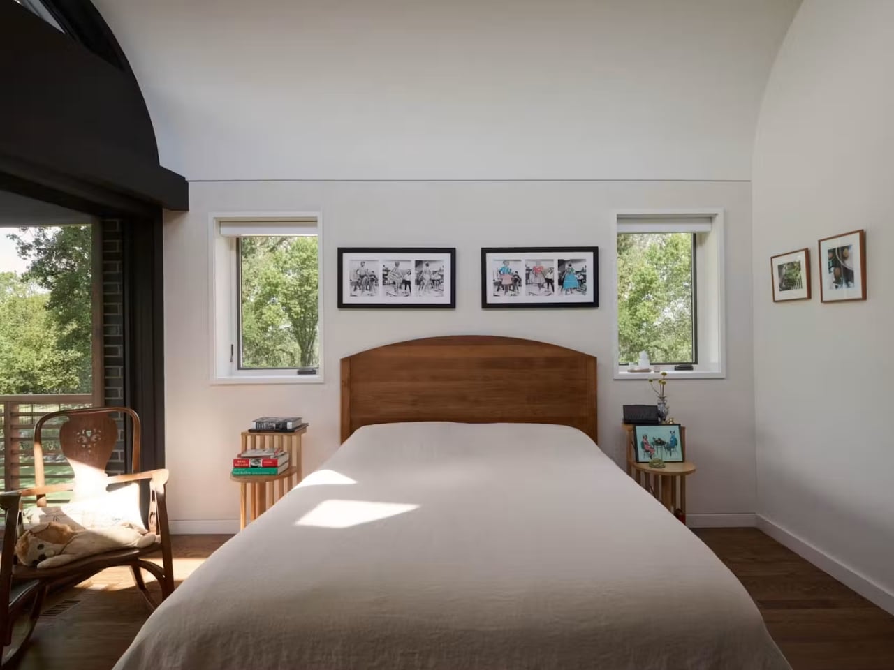
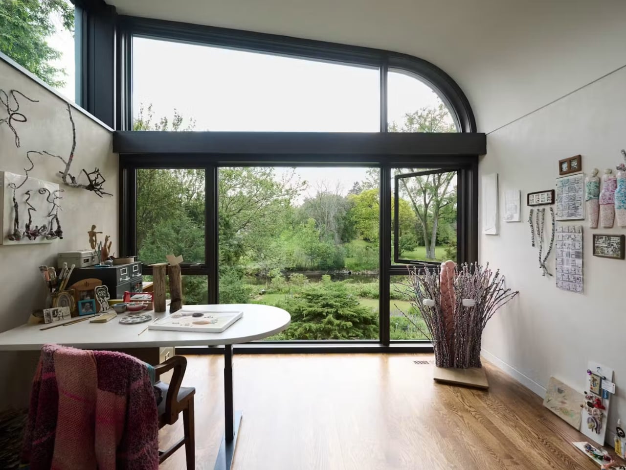
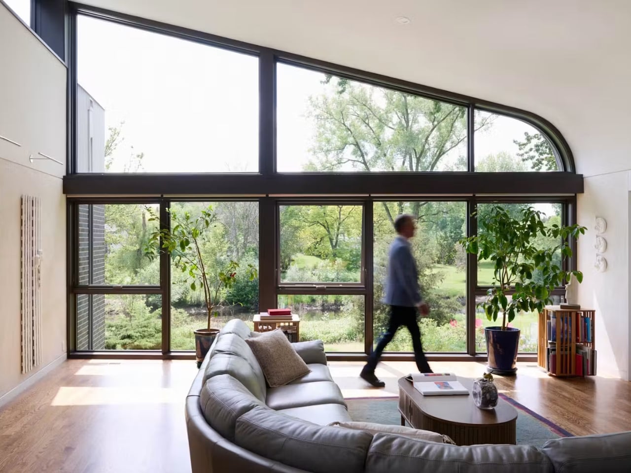
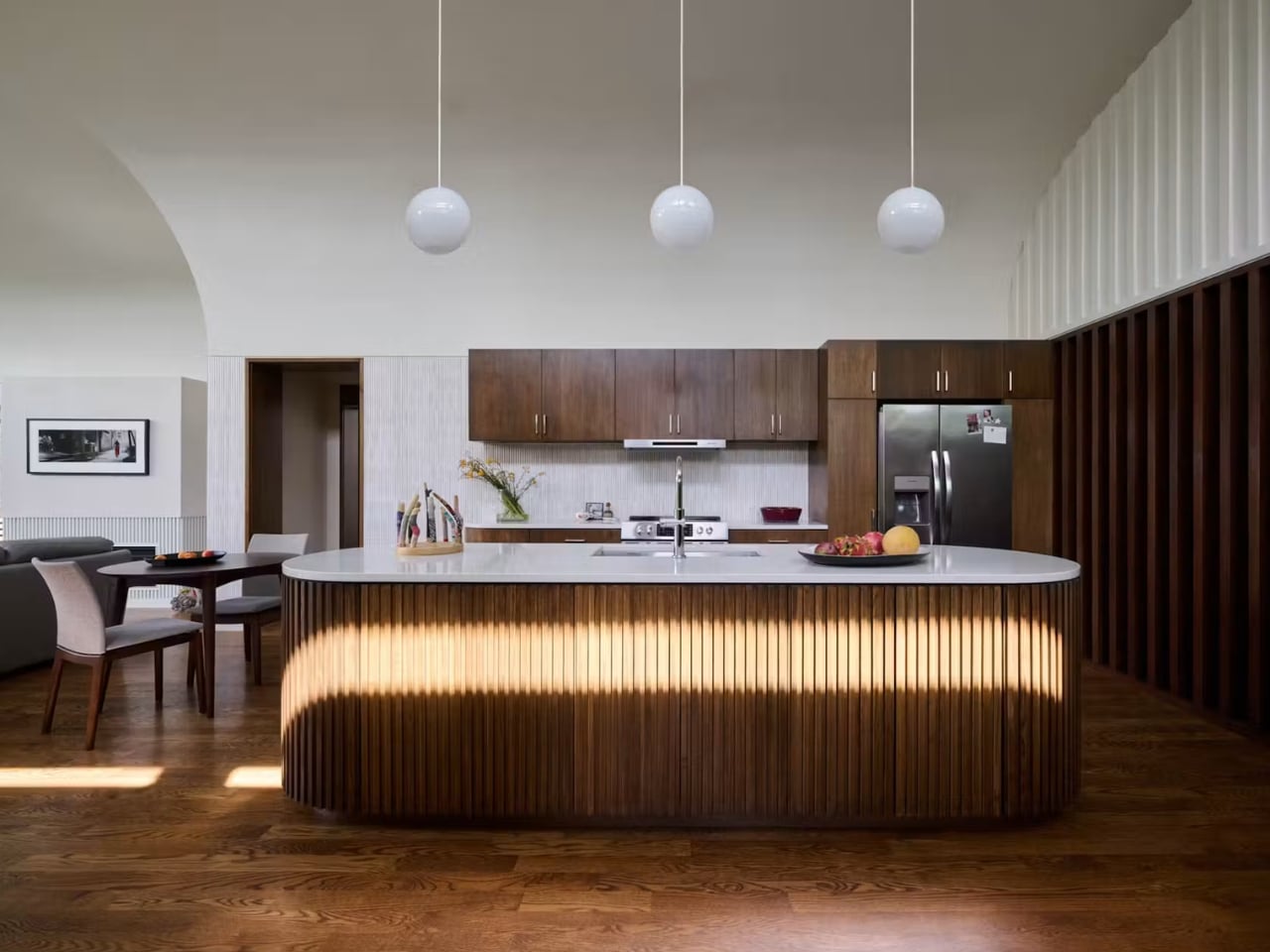
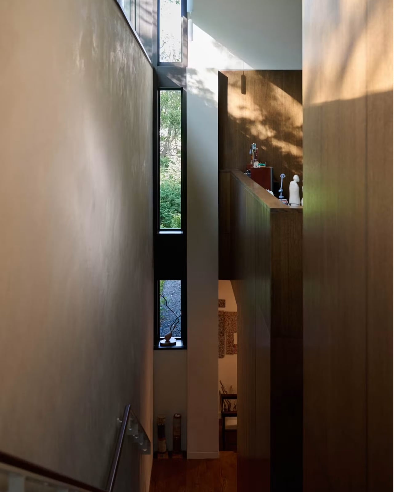
The windows carry most of the emotional weight here. Awes worked with Marvin for months on custom, slightly trapezoidal clerestory windows that run higher on the creek side and taper toward the street, and the collaboration involved full-size plywood templates before the bespoke units were ever built. Awes describes the finished house as a literal sundial, saying the windows “locate you in time and space every day” and that the curved plaster ceilings bounce the landscape’s colors back into the interior. That’s a genuinely lovely idea for a house meant to hold three generations of the same family. The light itself becomes a kind of shared calendar, marking the day the same way for everyone living there, separately but together.

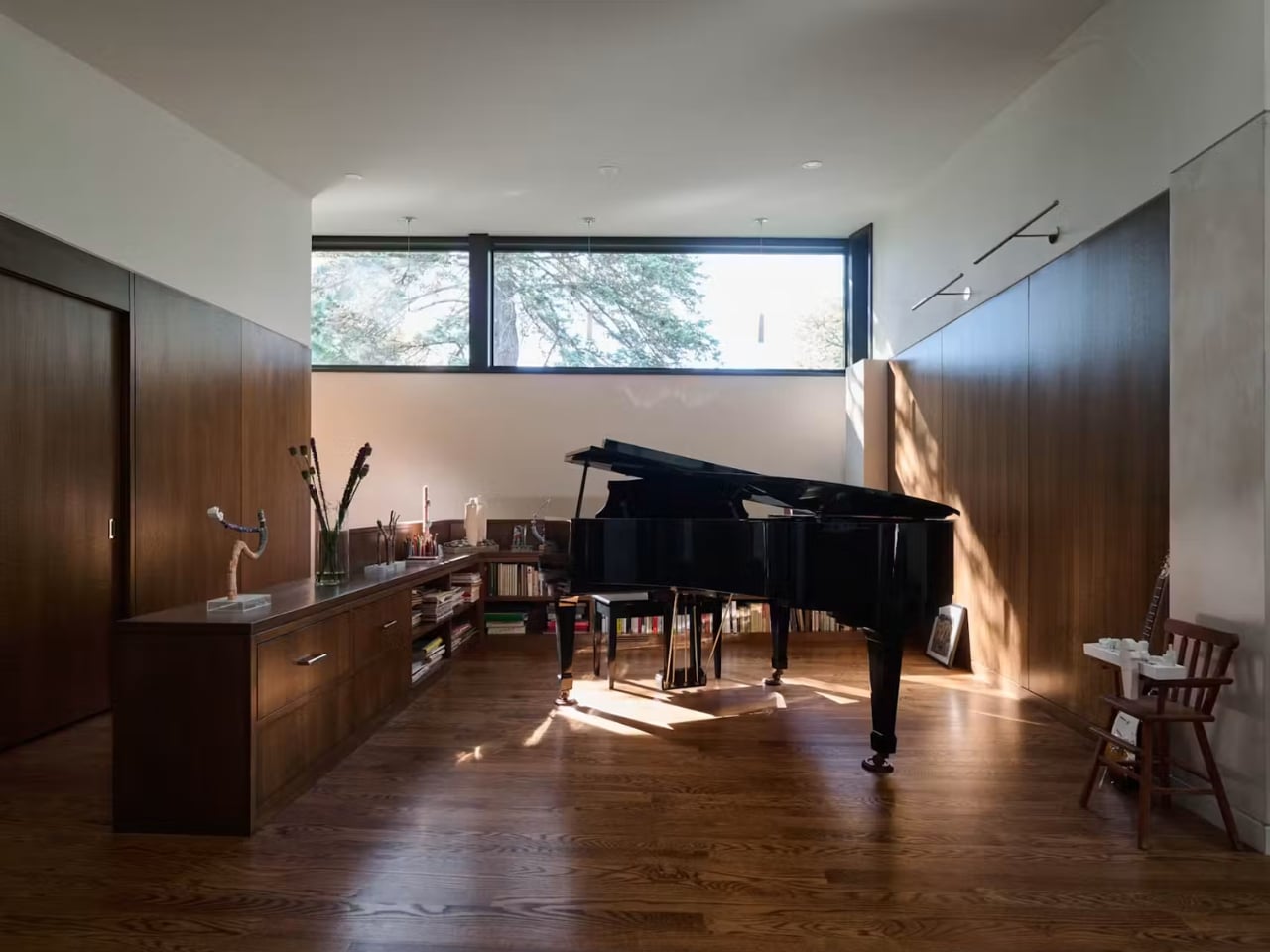
Even the small choices reflect this same instinct. An heirloom grand piano gets its own room lit by a high clerestory instead of being pushed into a corner, because Awes felt it deserved to be treated as something worth honoring rather than accommodating. That’s the difference between a house that’s merely functional and one that actually understands what a family needs from a space. Crescendo doesn’t solve multigenerational living by cramming more rooms into a footprint. It solves it by giving everyone their own light, their own stairs, and their own sense of arrival, while still letting the whole place breathe as one home.

The post How a 4,200 sq ft Home Finally Solved Multigenerational Living first appeared on Yanko Design.

This Startup Says Your House Should Be the Robot, Not ‘Have’ a Robot

Most of the AI money right now is betting on robots. Hundreds of embodied-AI startups and their backers are convinced that a bipedal machine will eventually become the household’s operating system, rolling from room to room and handling everything. Endong Zhang, the founder and CEO of LiveLarge Home Inc., thinks that’s the wrong frame, and he’s pretty candid about it.

A robot, he points out, has limited battery life, limited field of view, and can only be in one place at any given moment, which makes it a fairly weak candidate for running a multi-room household with several people in it. His counterproposal is that the building itself is the smarter infrastructure bet, and he’s building a company around exactly that.

Click Here to Know More

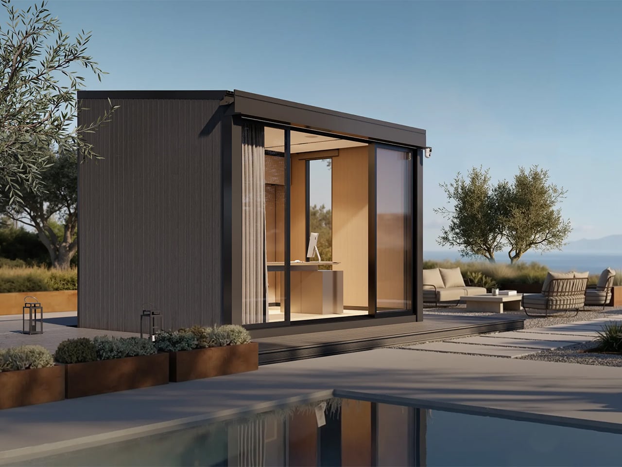
The company Zhang founded in 2023 spent its first few years looking more like a serious California construction operation than a tech startup, delivering more than 20 accessory dwelling units (ADU) and residential projects across the Bay Area and Los Angeles.

Endong Zhang – Founder and CEO, LiveLarge Home

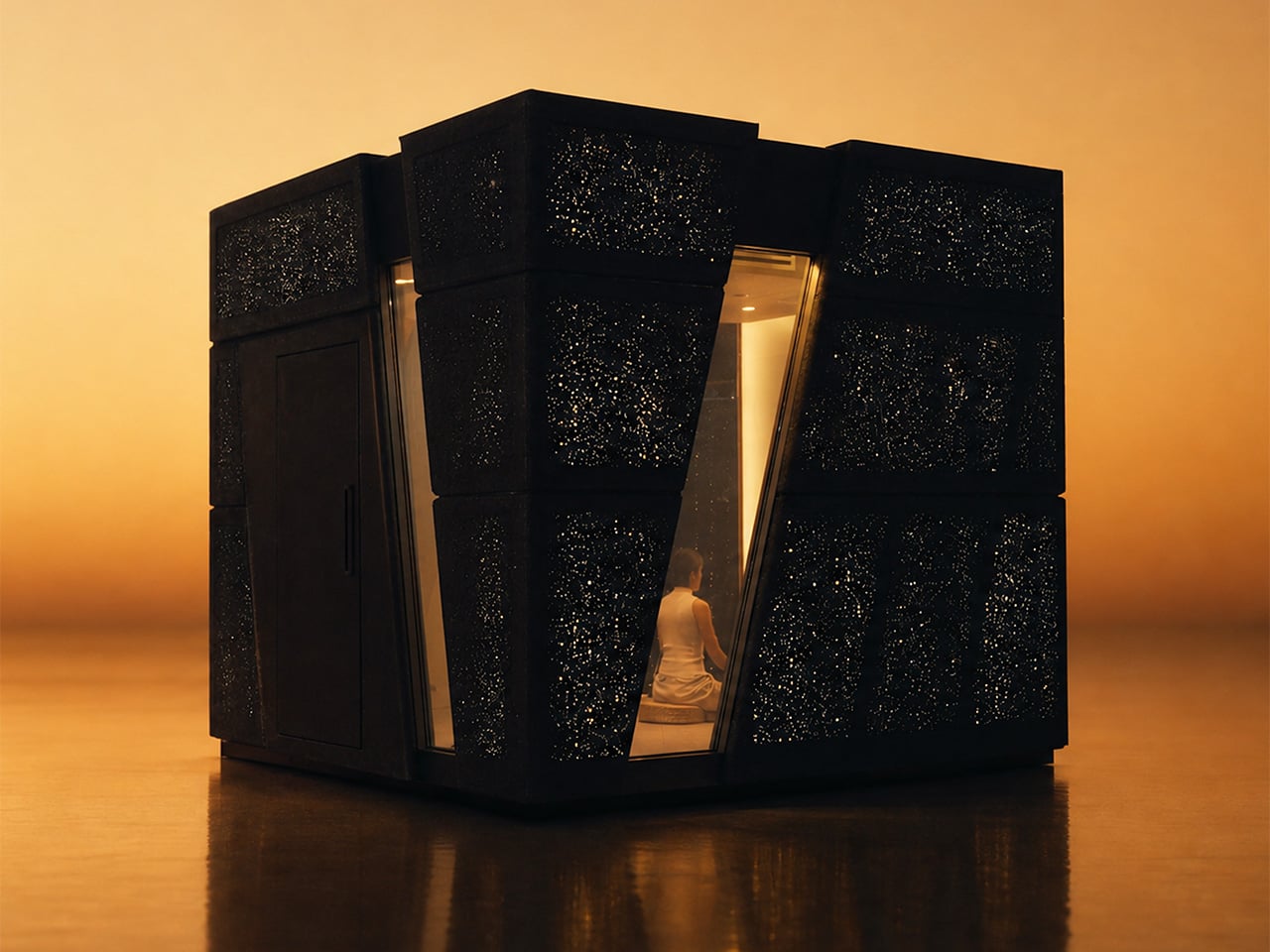
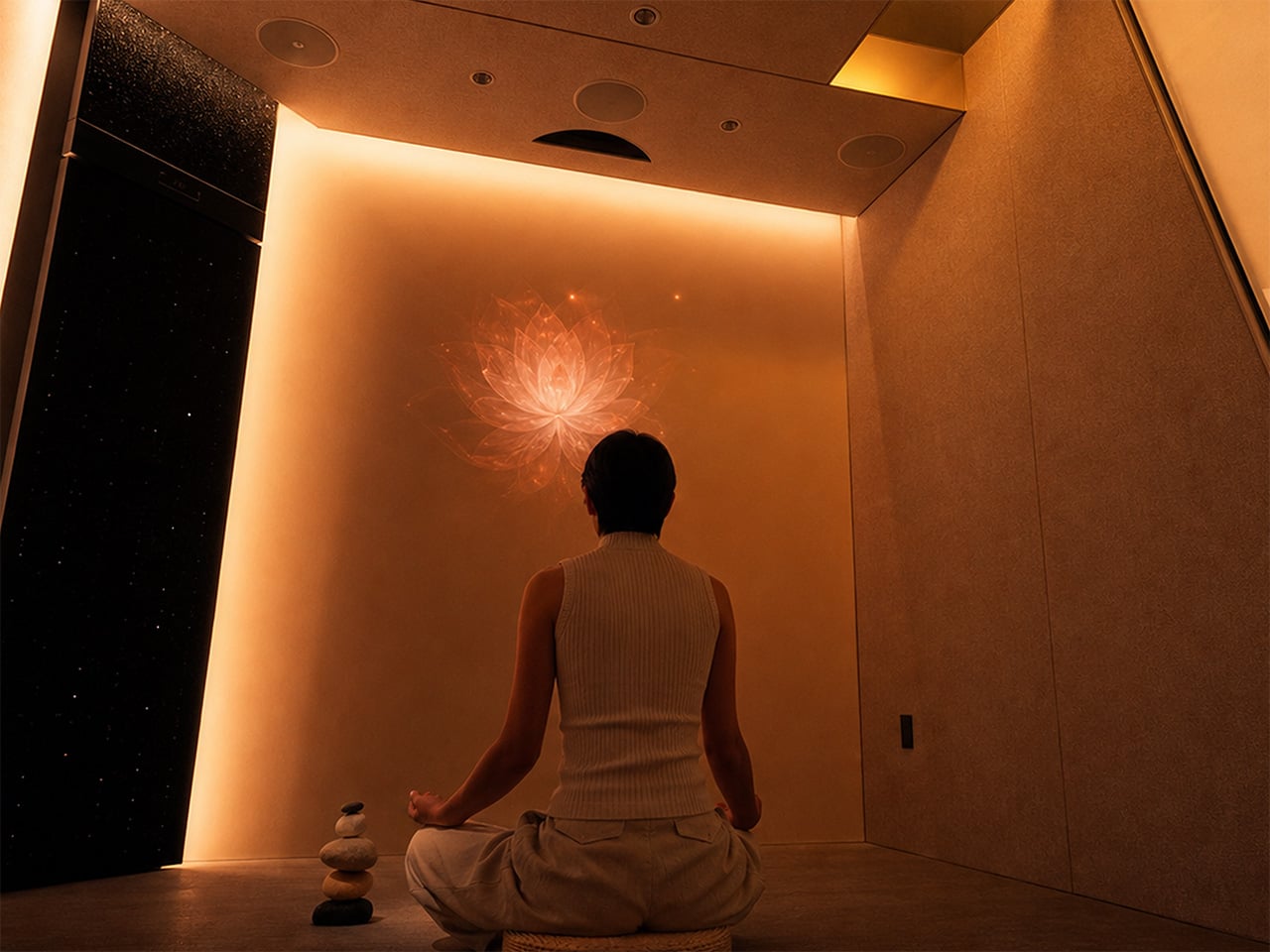
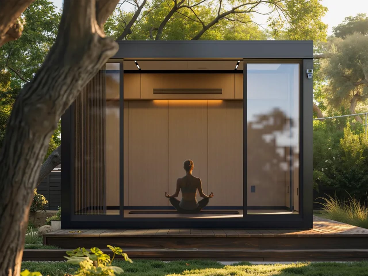
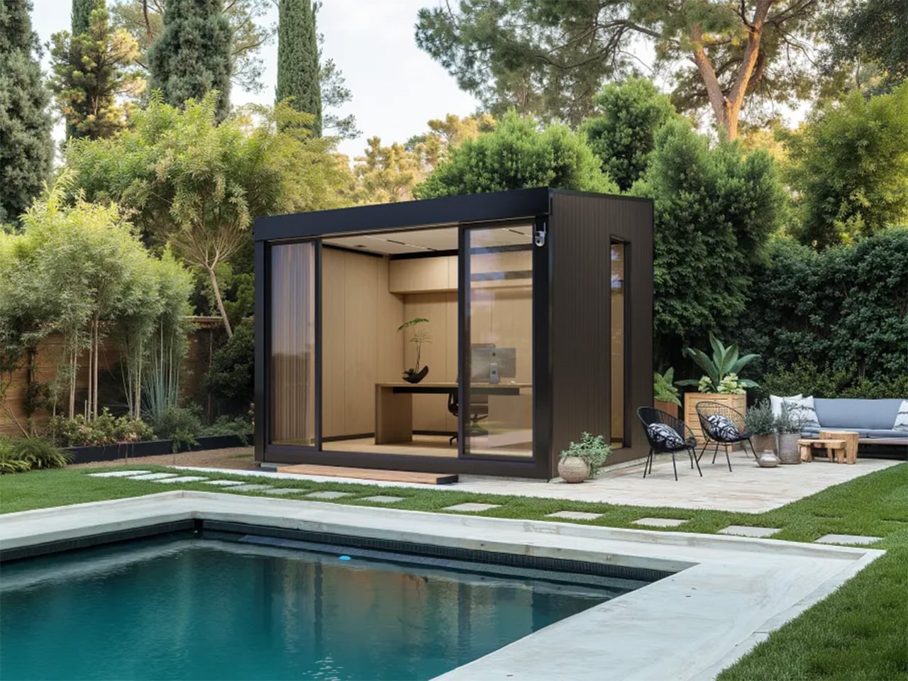
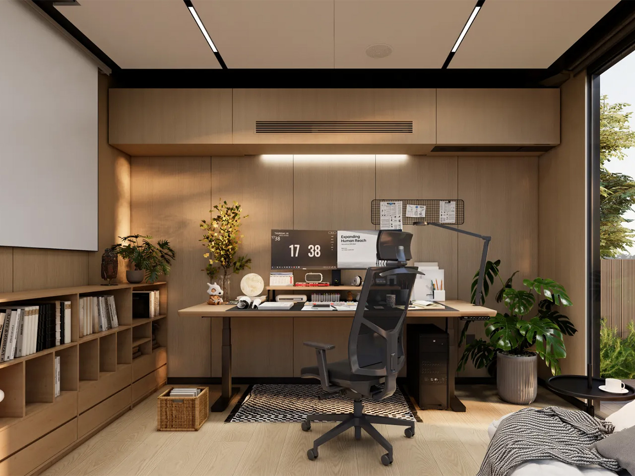
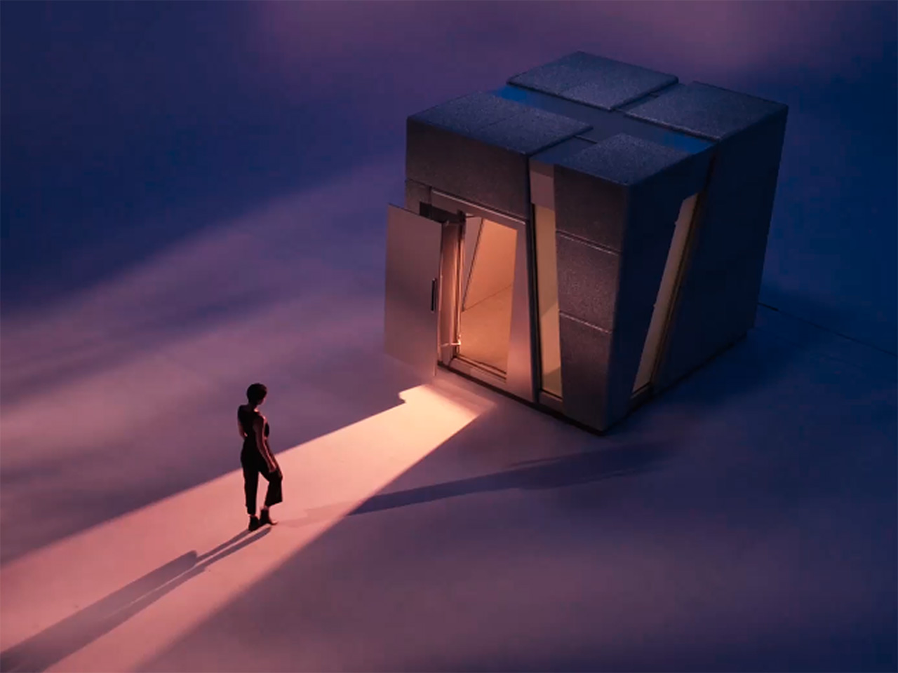
In July 2026, LiveLarge revealed the Flagship L-Space, a standalone AI-native room environment and the clearest physical statement of Zhang’s thesis so far. Light, sound, air, privacy glass, and a voice assistant called Lila are coordinated as one system rather than a pile of separate apps, organized around three modes: Focus, Reset, and Passion.

Space AI: the invisible housekeeper

The conceptual core of Space AI is a deceptively simple question: can AI give every household some version of what a housekeeper provides? Zhang keeps returning to the housekeeper image because it captures something the smart home industry never quite cracked. A housekeeper reads the room, observes what’s needed, and acts without being told every small step. A traditional smart home, by contrast, receives a command or follows a fixed rule, and it doesn’t understand the situation, decide what should be done, or make a plan. “Without a human housekeeper,” Zhang says, “the home itself has to listen, observe, understand, decide and act.” That’s the jump LiveLarge is trying to make. LLMs, multimodal models, and a maturing robotics ecosystem are what make the timing feel genuinely different now rather than aspirationally so.

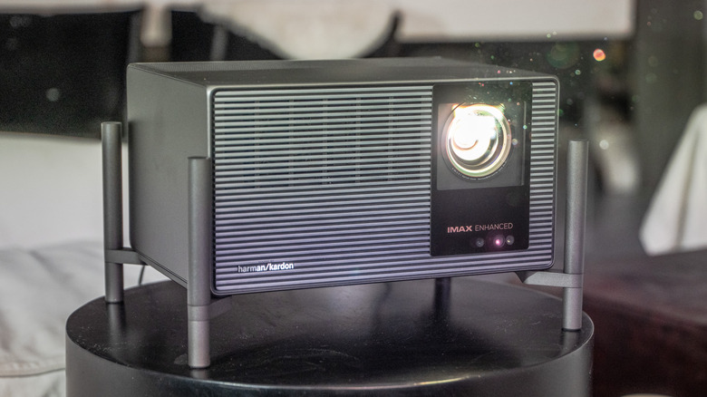
The room integrates a 5.1 surround sound system, adaptive lighting, fresh-air circulation, a 4K short-throw projector, and privacy glass into a single coordinated environment, all orchestrated by an AI assistant called Lila. The three modes, Focus, Reset, and Passion, were shaped directly by early users rather than invented in a whiteboard session. “People do not really want smarter devices,” Zhang told us. “They want to focus better, relax, recover, or spend time on something they care about.”

LiveLarge makes some deliberate engineering choices when it comes to privacy, with pretty straightforward reasoning: a room that watches, listens, and learns is exactly the kind of product that erodes trust the moment something leaks. The first rule is to do as much computation locally as possible, and L-Space uses an NVIDIA Jetson Orin as its local AI computer, with a large part of the sensing, data processing, storage, and inference happening inside the product. Sensitive information, including conversations, biometric signals, and usage data, can stay local.

The system uses voiceprints to recognize regular users, each user has a separate history and profile, and User A cannot access User B’s conversations or usage records. The full permission system is still in development, but the architecture already accounts for different access levels across family members, guests, and service providers. Zhang’s framing is tidy: “Personalization only makes sense within the permission given by the user.”

The Flagship L-Space is what Zhang calls a “concept car,” and the analogy holds up across more dimensions than the marketing might suggest. The Standard and Flagship models share the same core Space AI platform, but the key addition in the Flagship is vision: locally processed computer vision that lets Lila recognize individual users, read gestures, and actually observe what’s happening in the room rather than waiting to be addressed.

Vision is, in Zhang’s view, one of the most important sensors for a future AI-native home, and once AI can actually see a space, many services that are difficult today become possible. He’s testing facial identification and gesture control as more natural interaction layers on top of voice, and all of it runs on-device because visual data inside a home should never casually leave the building. “The engineering question is simple,” he says. “If AI can really understand a room, what useful services can it provide to the people inside it?”

The biggest lesson in getting from concept car to delivered product is that a lab demo and a product are different engineering objects. In the lab, every cable, firmware version, network condition, and room setup is controlled. A delivered L-Space has to survive shipping, installation, startup, software updates, and daily use. The customer also needs to set it up quickly, understand how to use it, and trust that the basic functions will keep working over time.

At current production volumes, many subsystems still use consumer-grade components, and the challenge of packing computing, storage, networking, IoT control, audio, projection, sensors, and actuators into a compact structure without compromising acoustics or airflow is, as Zhang puts it, closer to vehicle electronics than construction. “A feature is not finished when it works once,” he told us. “It is finished when it works repeatedly in the customer’s space.”

Technology is reshaping architecture and interior design

What the home looks like ten years from now, in Zhang’s telling, reads more like a tech product manifesto than an architecture brief. The house becomes a device in the same way a phone or laptop is a device: one integrated hardware and software system where every new appliance, robot, or sensor plugs into a shared runtime rather than living as yet another isolated smart product.

He also believes the intelligence shouldn’t stay tied to any specific building. “If you move, the home model, preferences and memory should move with you,” he says. “The new house becomes the new body, but the agent continues.” For designers, he sees a real reskilling moment coming, one where sensor placement, robot clearances, and interaction architecture start sitting alongside floor plans and material palettes as standard deliverables.

LiveLarge’s roadmap for the second half of 2026 includes bringing Space AI into ADU and broader residential products, which means the concept car phase has a fairly clear expiry date. You can see what the company is building at livelargetech.com.

Click Here to Know More

The post This Startup Says Your House Should Be the Robot, Not ‘Have’ a Robot first appeared on Yanko Design.

8 Best Home Objects So Cleverly Designed They Make Your Entire Furniture Setup Look Boring

The most interesting objects in a room are rarely the loudest ones. They are the ones that sit quietly in plain sight, behaving like one thing until you look closely and realize they were always something else. A table that swallows a book. A clock that hides its own hands. A speaker tucked inside a tin dollhouse from the 1930s. The best design of 2025 and 2026 is hiding in plain sight, and it is hiding on purpose.

This listicle exists for the person who finds more satisfaction in a well-considered object than in a loud one. Every product here has a second identity — a behavior, a trick, or a material logic that reveals itself slowly. Some are available to buy right now. Some are concepts that deserve to exist in production. All of them share the same quality: they make you stop, look again, and want one.

1. NjommNjomm
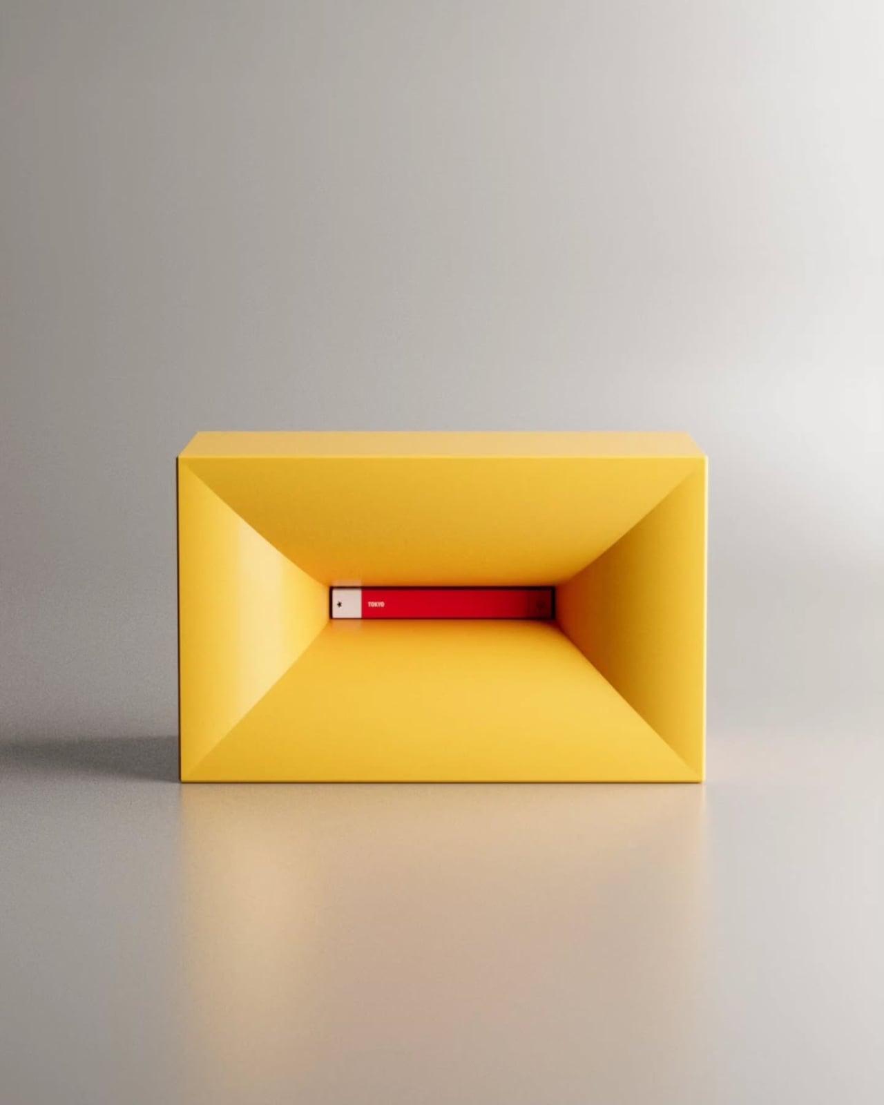
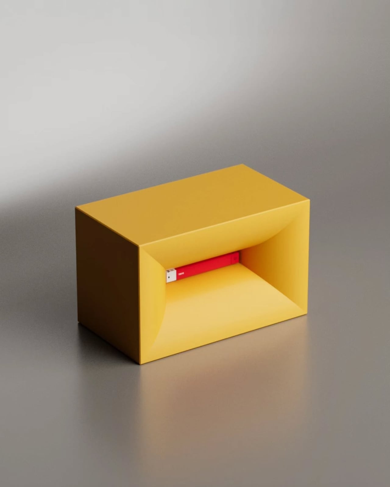
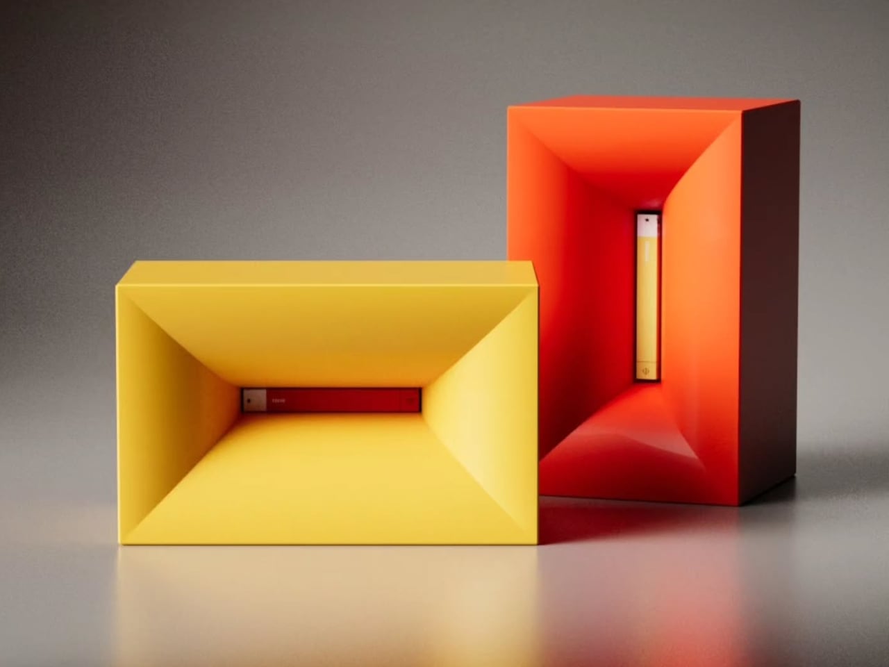
Say the name out loud, and you already understand the concept. NjommNjomm, by Stuttgart-based designer Deniz Aktay, is a cuboid coffee table made from sustainable plastics with a bevelled internal compartment that does something no coffee table has managed before: it makes a book appear to vanish inside it. Slide the right-sized book into the slot, and the table appears to swallow it whole, the pages disappearing into the body of the furniture with an optical sleight of hand that stops every person who walks into the room.

What makes it work beyond the trick is the restraint of the form. Nothing about the NjommNjomm announces itself. The exterior is clean, minimal, and almost unremarkable until the moment it is not. The cuboid shape also means the table can be repositioned vertically, giving it a flexibility most coffee tables never offer. For anyone who stacks books on every surface and has quietly given up apologizing for it, this is the table that finally takes their side. It is currently a concept by dezinobjects, and it is the right place to start.

What We Like

  • The optical illusion is genuinely surprising every single time someone encounters it
  • Works horizontally and vertically, making it adaptable to smaller living spaces

What We Dislike

  • Currently, it is a concept with no confirmed production timeline
  • The slot is most effective with books of a specific size

2. Portable CD Cover Player
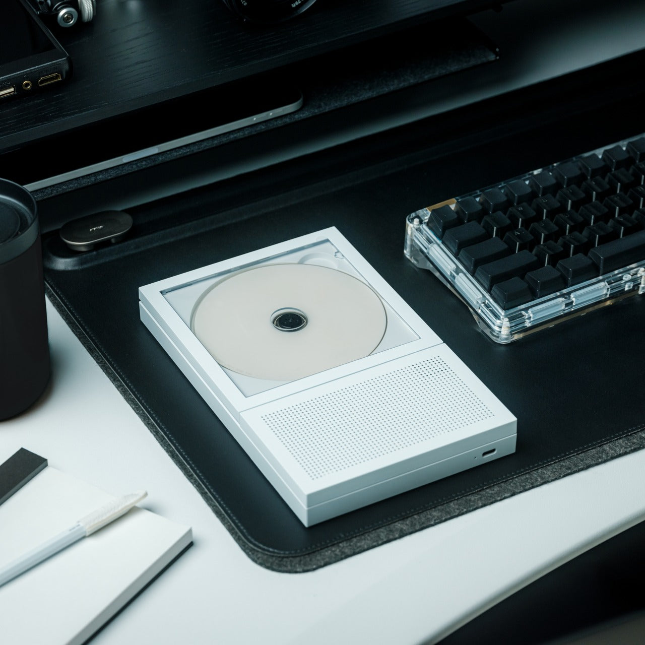
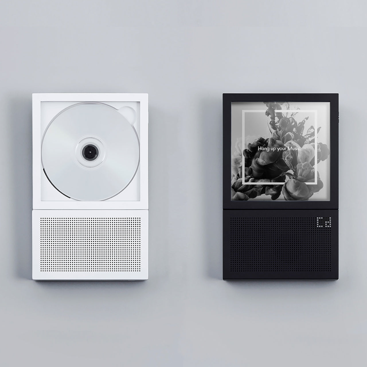
The Portable CD Cover Player does exactly what its name promises, and the effect is completely disarming. It looks like a CD sleeve. It sits like a CD sleeve. Then you realize it is the player itself. The entire device is designed around the silhouette of the packaging that physical music has always lived inside, turning the most overlooked part of the format into an object. For anyone who still has a collection gathering dust on a shelf, this reframes the entire relationship with the format in a single glance.

There is a specific kind of satisfaction in owning something that makes people pick it up and ask what it is. The Portable CD Cover Player earns that reaction every time it is left on a desk, a shelf, or a coffee table. It brings the physical music experience back without demanding space or ceremony, fitting into a bag or slotting between records with equal ease. Three remain in the YD shop, which is not a large number, and the kind of detail worth noting before moving on.

Click Here to Buy Now: $199.00

What We Like

  • The cover-as-player concept turns a format’s most discarded element into the product itself
  • Compact form factor slots naturally into an existing music collection without demanding its own space

What We Dislike

  • Only three units are currently available in the YD shop
  • Technical specifications for battery life and connectivity are not listed

3. Ghost Clock
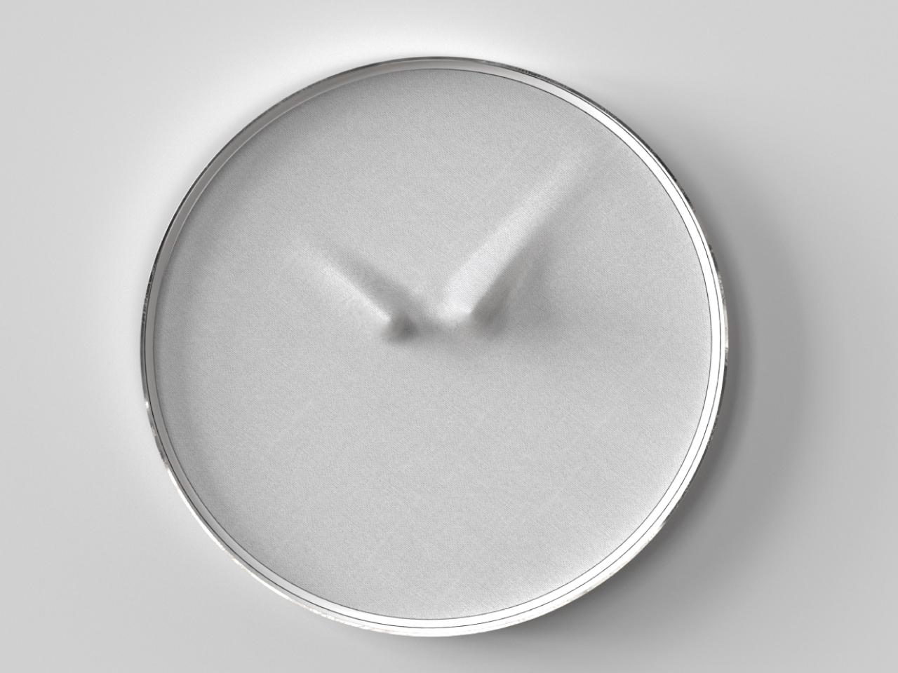
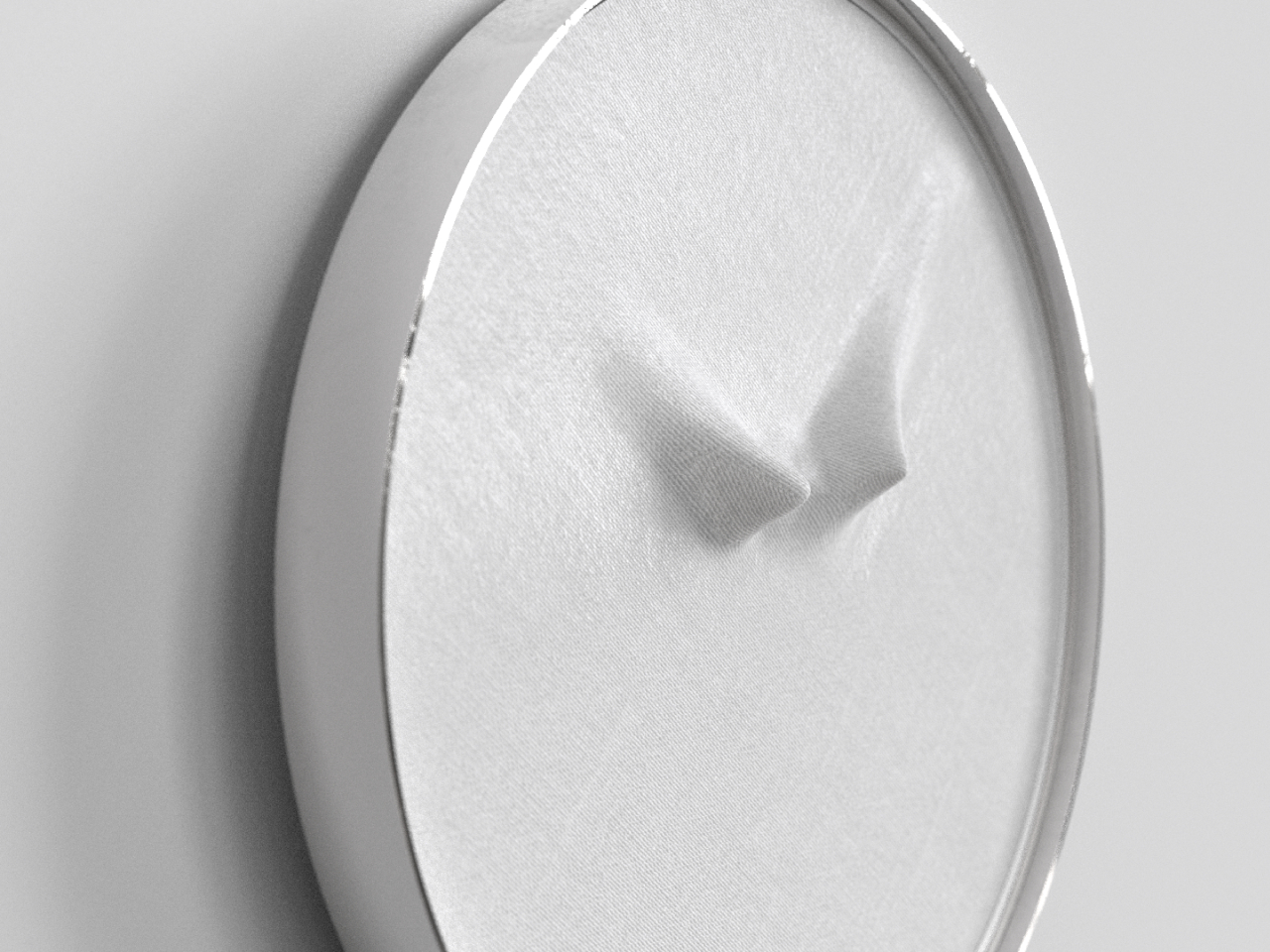
Istanbul-based designer Fatih Demirci took a simple question — what if a clock tried to disappear — and turned it into one of the most quietly compelling wall objects of 2025. The Ghost Clock stretches a thin fabric over the hour and minute hands without restricting their movement. The result is two slow-moving bumps that creep around the face of the clock, telling the time and refusing to tell it at the same time. The concept is drawn from the way objects look under drapery, and the reference earns every bit of the eerie quality it produces.

You cannot read the Ghost Clock with the precision a meeting demands, and that is the point. It is a wall object that removes the anxiety from timekeeping and replaces it with something stranger and more honest — a gentle reminder that time is moving without forcing you to count how fast. In a bedroom or a reading corner, this presence is more useful than precision. It is a concept by Fatih Demirci, and it deserves to exist in every room that takes itself a little too seriously.

What We Like

  • The fabric-over-hands mechanism is deceptively simple and visually arresting from across the room
  • Shifts the emotional register of timekeeping without removing its function entirely

What We Dislike

  • Not suited for precision timekeeping and should not be the only clock in a working space

4. Sail Away Tranquility Mobile
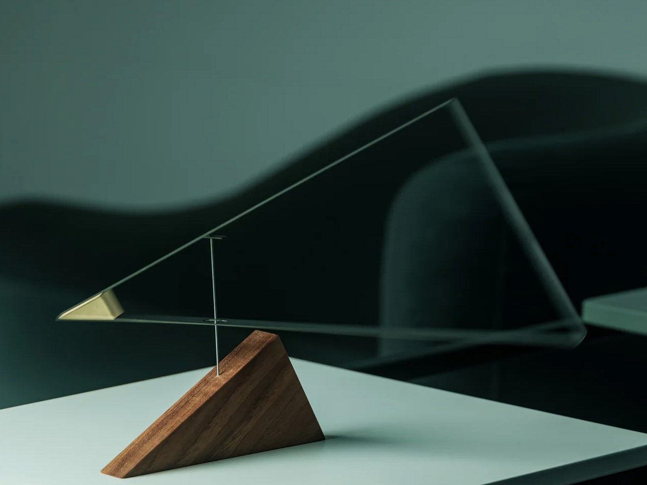
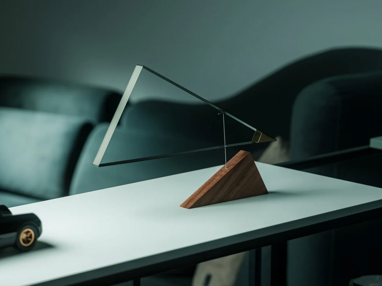
DRILL DESIGN is an award-winning Japanese studio, and the Sail Away Tranquility Mobile is the kind of object that explains why it has that reputation. Three interlocking triangles — one lightweight aluminum, one polished steel, one warm walnut — are hand-balanced at a workshop in Ashikaga City, Tochigi Prefecture, until the whole structure finds a perfect equilibrium. Then it sits on your desk and does almost nothing. Until the air shifts, and the triangles begin to move in response, and you realize you have been watching it for considerably longer than you intended.

The secret of the Sail Away Mobile is that it is kinetic without demanding anything from you. No batteries, no charging, no interaction required. The movement comes from the air in the room, which means it is always slightly different and always responding to something real. Weighing just 80 grams and requiring no tools to set up, it is genuinely easy to live with. As a desk object, a housewarming gift, or a quiet act of calm placed in a room that moves too fast, it earns the space it occupies.

Click Here to Buy Now: $129.00

What We Like

  • Entirely passive movement with no power source needed — the room does the work
  • Handcrafted in Japan with meticulous material balance across three distinct and contrasting materials

What We Dislike

  • The gentle movement requires some ambient air circulation to be fully appreciated in still rooms

5. Verse Chair
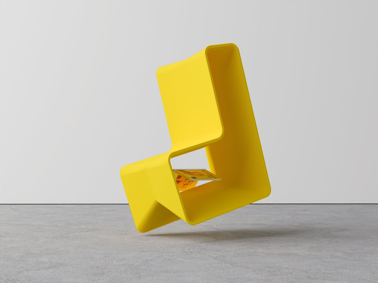
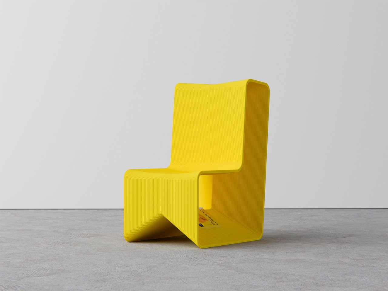
Most chairs do one thing. The Verse Chair by Liam de la Bedoyere does two, and the second one is so specific and considered that it reframes the entire object. The 3D-printed chair has a curved seat designed for ergonomic comfort, but beneath the seat lies a sharp-angled V-shaped base proportioned precisely to hold a book open at the page you left it. Set the book down mid-chapter, and the chair holds it. Come back later, and the page is exactly where you stopped. The chair remembers for you.

The name Verse refers both to the line-by-line process of 3D printing and the V-shaped form of the base, which is the kind of naming discipline most designers do not manage to pull off. The chair does not shout its bookmarking function. It holds the book quietly, at floor level, in the structure of the legs, visible only when you know to look for it. For anyone who reads in the same chair every day, this is the version of that chair designed specifically around that habit.

What We Like

  • The book-holding function is built directly into the structural logic of the chair, not added to it
  • The name connects form, manufacturing process, and purpose into one coherent idea

What We Dislike

  • Currently a concept and not available for purchase
  • The bookmarking function works most reliably when the chair remains in a fixed position

6. BGN 11
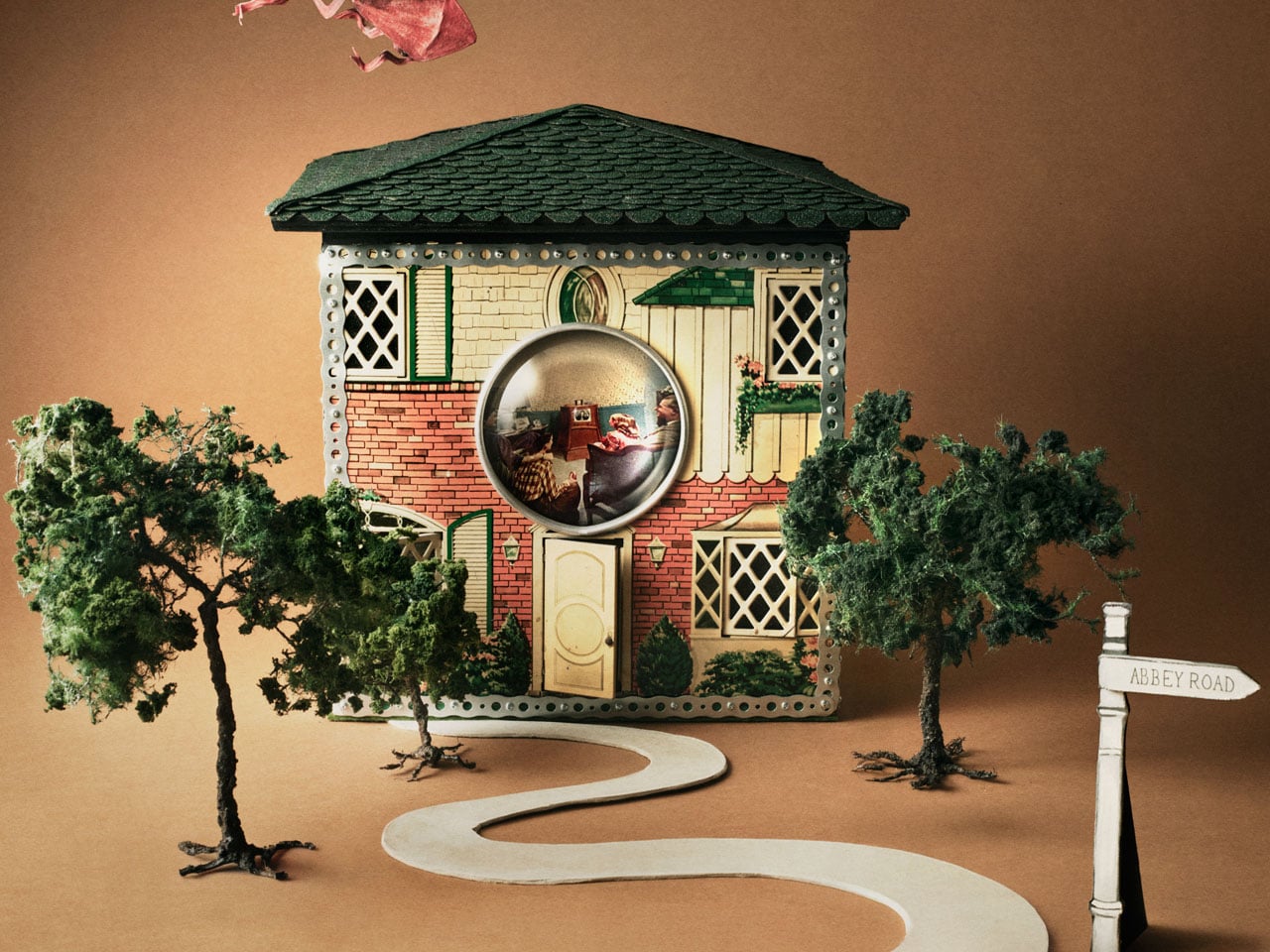
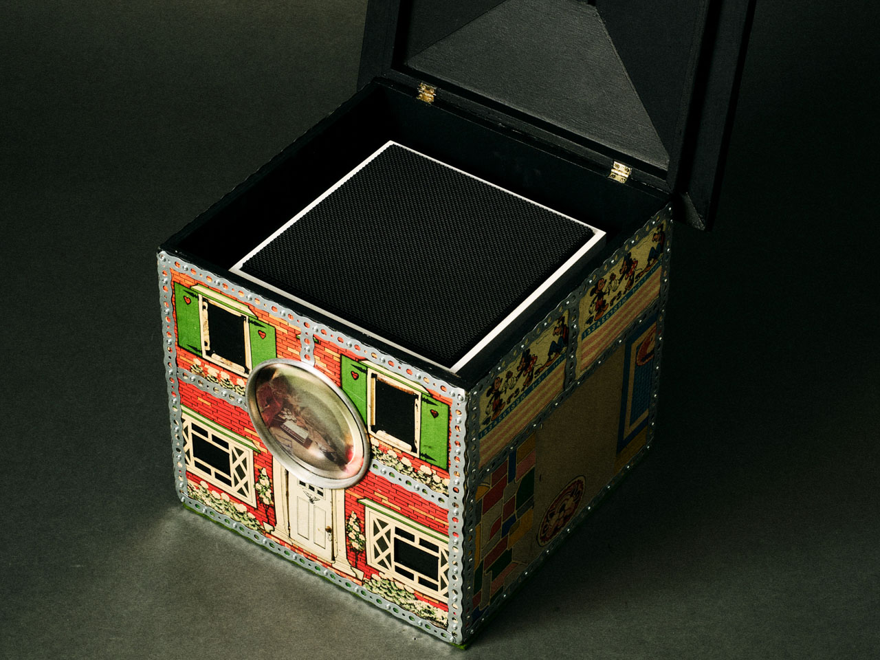
Teenage Engineering has made a sampler that plays only Gregorian chants and a PC chassis with retro-futuristic proportions, so it should come as no surprise that they also made working speakers out of 1930s tin dollhouses. BGN 11, a collaboration with Toronto-based craft collective Bentgablenits, transforms ten salvaged pressed-metal toy buildings — a chapel, a corner shop, a living room, an ice cream parlor — into working TE OD-11 speaker units. Each one was hand-altered, rewired, and reupholstered to broadcast ambient compositions matched to its specific setting.

Only ten units were ever made, shown for three days at a Shopify creative space on Greene Street in Soho, New York, in June 2025. They are gone. BGN 11 sits in this roundup not as something to acquire but as proof of a design argument: that the most interesting audio object is one that makes you forget it is an audio object. A dollhouse murmuring like a congregation. A corner shop that chimes. The speaker disappears completely into the story of the building it lives inside.

What We Like

  • Each unit delivers a specific narrative through both its visual form and its audio content simultaneously
  • The collaboration between Bentgablenits’ tactile craft and Teenage Engineering’s acoustic precision produces something neither could have made independently

What We Dislike

  • The ambient compositions are matched to each specific unit and are not user-configurable

7. Invisible Shoehorn
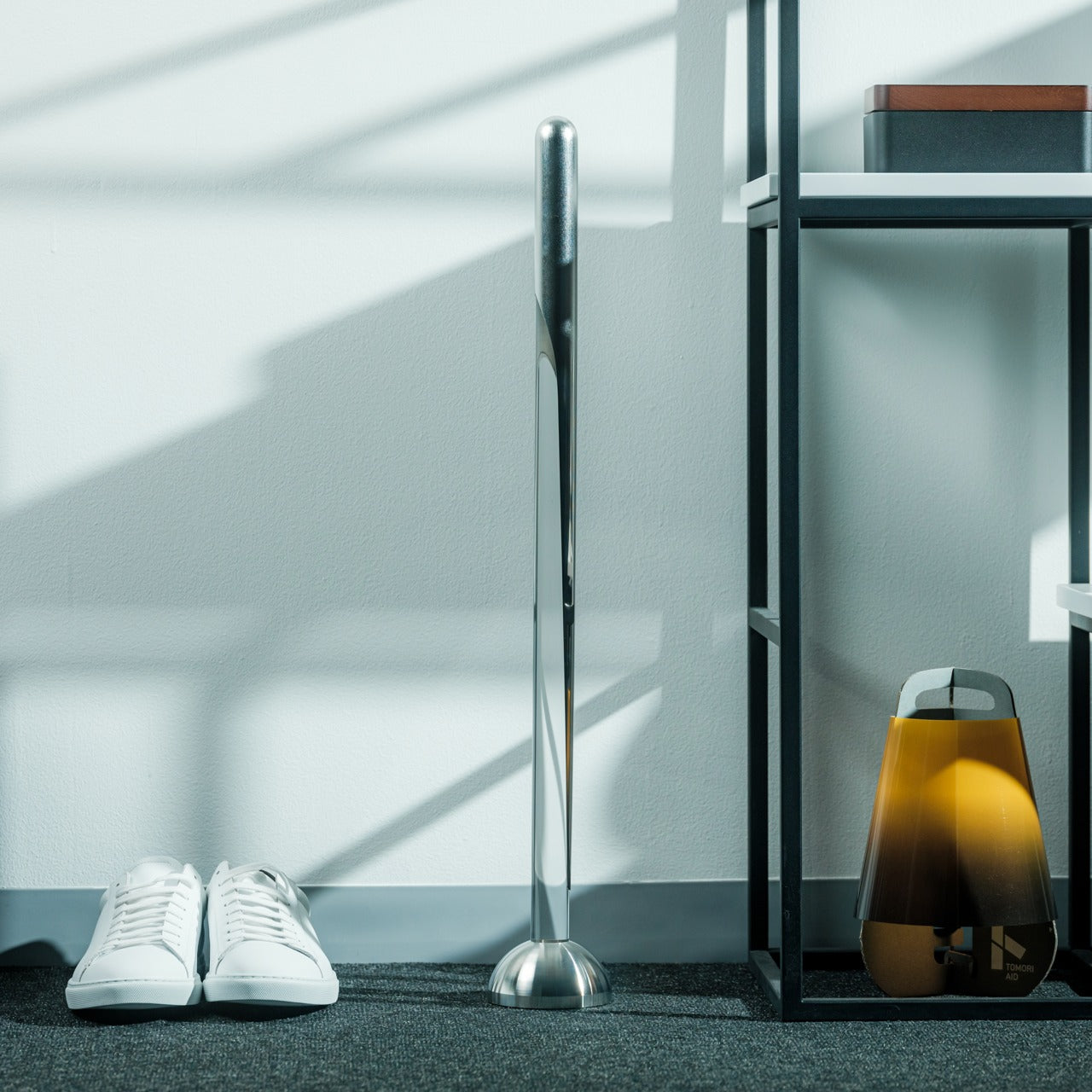
The Invisible Shoehorn is the most committed object in this roundup. Where other pieces here have hidden functions or optical tricks, this one has a single purpose and has dedicated its entire design language to not being seen while performing it. Made from transparent acrylic, it is built to vanish against any backdrop — a shelf, a closet floor, a basket by the door. Its clear body and ergonomic curved form make it read as a small sculpture before it reads as a tool, and the moment you actually need it is the moment it stops being invisible.

There is a specific kind of confidence in designing something intended to be overlooked. The Invisible Shoehorn sits in a space and contributes nothing visually until the moment it contributes everything functionally, then returns to transparency. For a hallway or entryway that takes its aesthetic seriously, this is the version of the object that belongs there. The ergonomic curve makes it genuinely comfortable and easy to grip, and the transparent material means it works equally in any color palette.

Click Here to Buy Now: $299.00

What We Like

  • Transparent acrylic construction genuinely disappears against almost any surface or backdrop
  • The ergonomic curve makes it comfortable to use without compromising the minimal, tool-free visual

What We Dislike

  • Transparent acrylic shows fingerprints and requires regular cleaning to maintain the invisible effect

8. Magician’s Rope
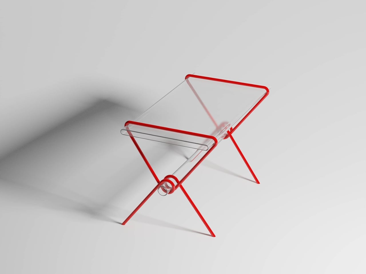
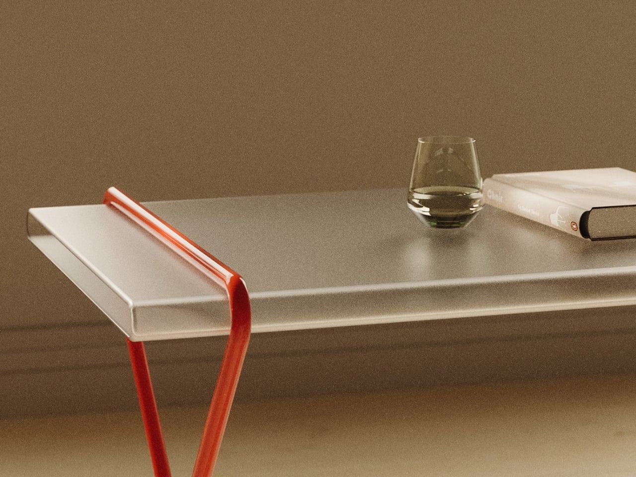
Close the roundup with the table that should not hold anything, but somehow holds everything. Magician’s Rope, by designer Hanqi Jia, earned recognition at the NY Design Awards by doing something structurally improbable and making it look completely inevitable. A single continuous red metal line bends, loops, and crosses itself into a structure that supports a transparent tabletop. It looks like a drawing. It looks like a gesture caught mid-motion. It does not look like a table, which is precisely why it is such a considered one.

The red line is the detail that holds the whole thing together conceptually. Red, in most design contexts, demands attention. Here it asserts itself visually while the overall form stays quiet — the line says look at me, while the rest of the table says I will be here whenever you need me. The transparent top reduces the visual footprint significantly, making it a strong choice for smaller rooms or spaces already doing a lot of visual work. It is a concept by Hanqi Jia, and it earns the closing position in this list.

What We Like

  • A single continuous red metal line achieves structural integrity through elegance rather than bulk
  • The transparent top reduces the table’s visual presence dramatically in smaller or busier rooms

What We Dislike

  • The red line is a defining feature that will not integrate easily into every interior palette

The Best Objects Don’t Explain Themselves

Every object in this list shares the same quality: it does something you did not expect it to do. The table eats the book. The clock hides the time. The shoehorn disappears. The dollhouse plays a sermon from a tin chapel. None of them announces their second nature from across the room. You have to live with them, look closely, or accidentally slide a paperback into the wrong slot before discovering what they actually are.

That quality — the hidden behavior, the withheld function, the object that rewards attention — is increasingly rare when most products explain themselves loudly and immediately. These eight do not. They ask you to slow down, look again, and sit with something that has more going on than it first appeared. That is a reasonable thing to ask of the objects you choose to keep around you.

The post 8 Best Home Objects So Cleverly Designed They Make Your Entire Furniture Setup Look Boring first appeared on Yanko Design.
Fire-Proof & Forest-Focused: A Holiday Home That Embraces The Australian Bush

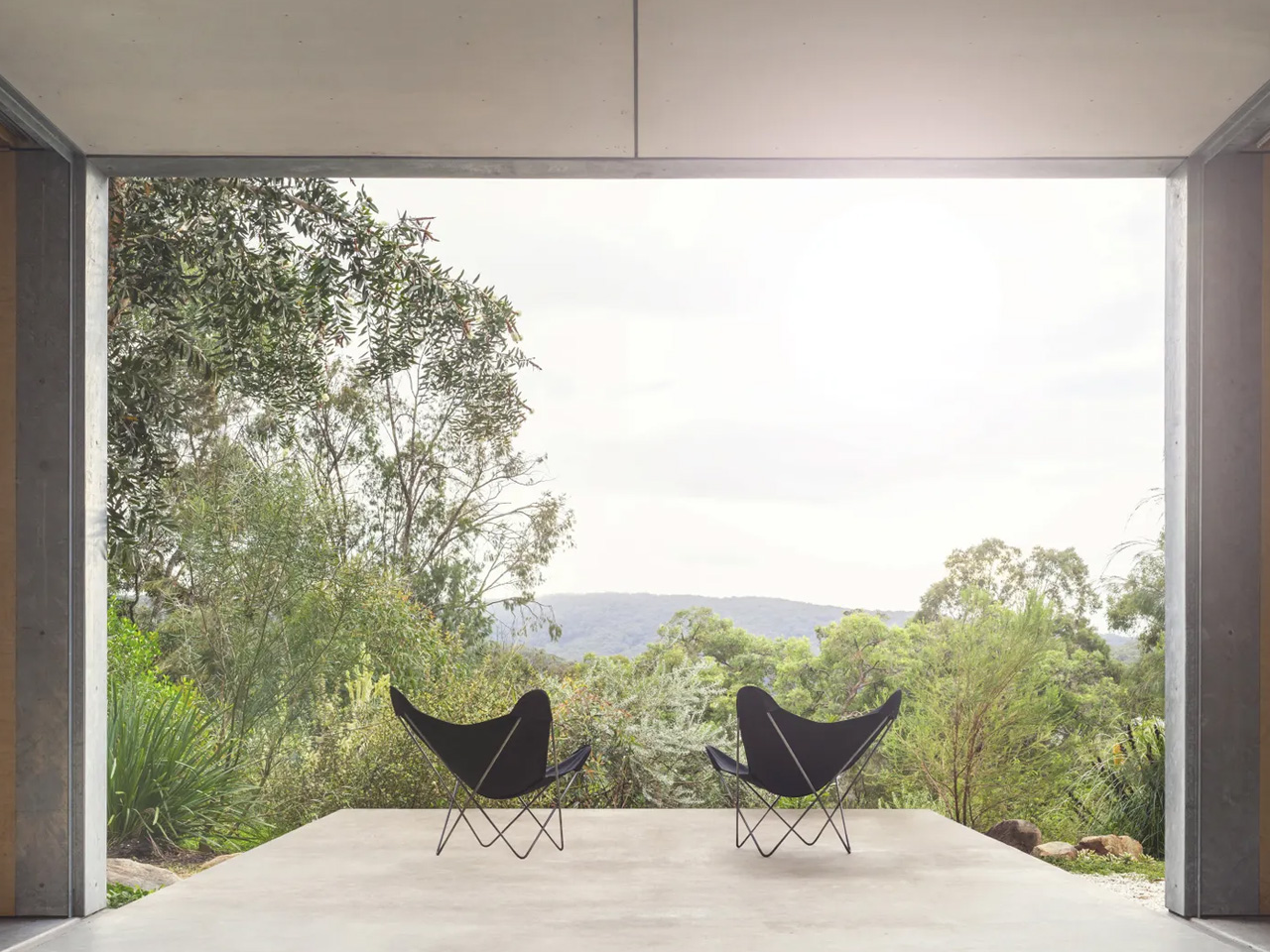
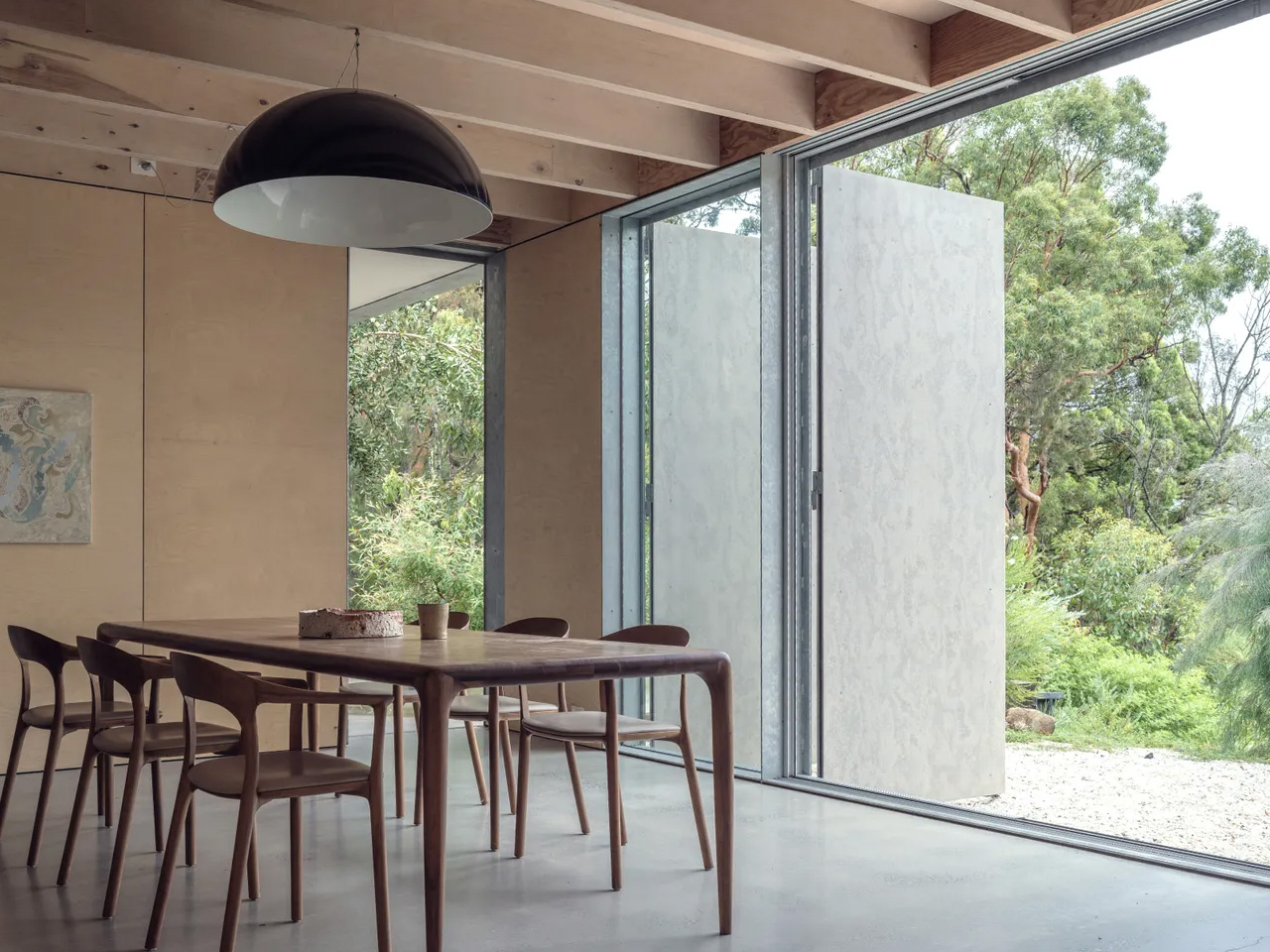
High in the canopy of a eucalyptus forest in New South Wales, a holiday home sits perched like an eagle’s nest, looking out over the landscape with quiet confidence. Amongst the Eucalypts, designed by Jason Gibney Design Workshop, reimagines what it means to live within fire-prone Australian bushland, creating a space that embraces nature while respecting its volatile temperament. The clients came to JGDW with a vision that might seem contradictory: they wanted both refuge and connection, a home that could evoke the immersive experience of camping in nature’s vastness while offering protection from its extremes. They sought a place where family and friends could gather communally yet still find moments of solitude within nature’s embrace.

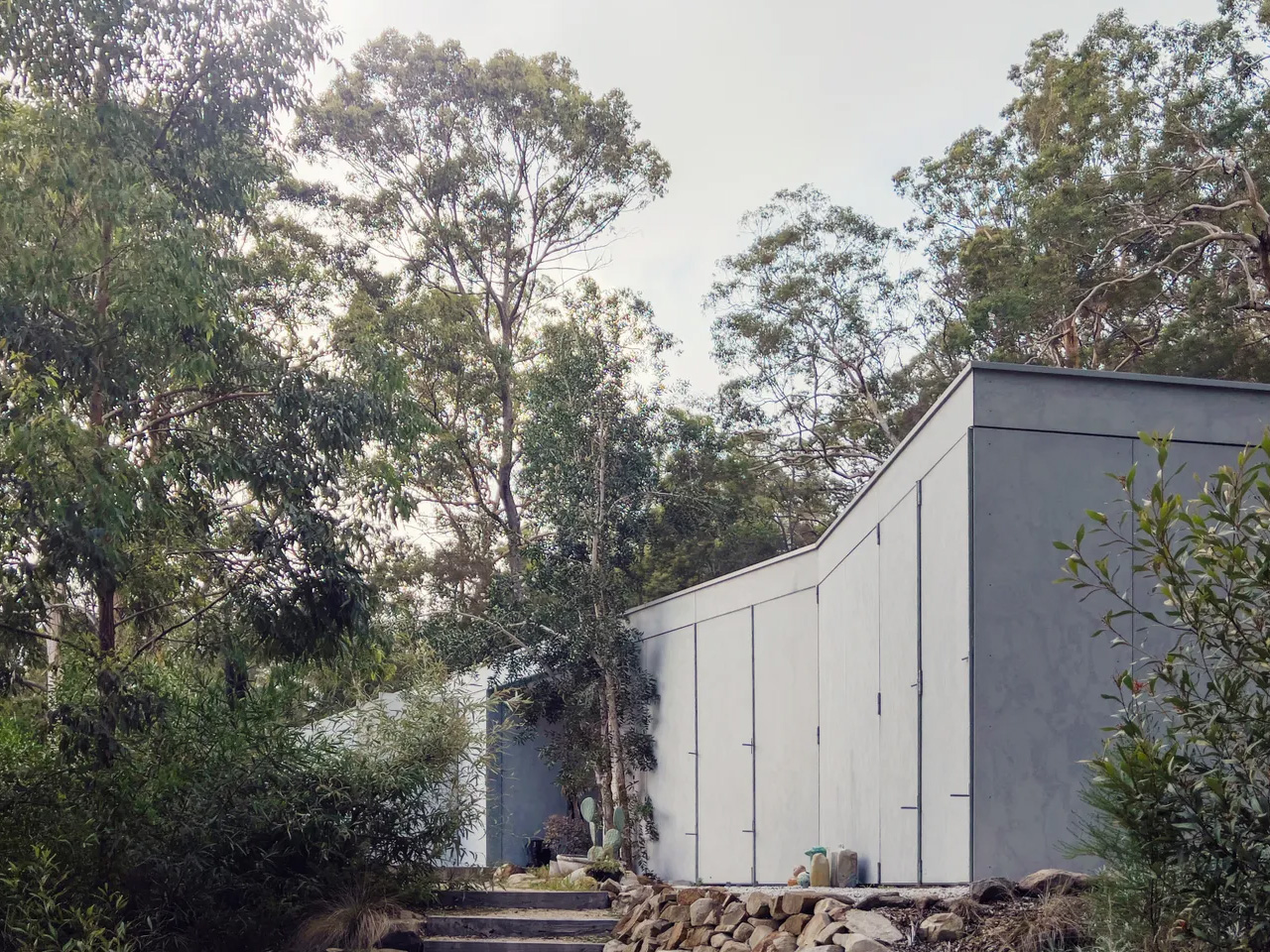
The architectural response is a study in balance. Set high behind the tree line on a steeply sloped site, the house grounds itself along the hill’s natural contour. Its split form creates intimate, private moments while maintaining what the NSW Architecture Awards jury described as “a quiet dialogue between space and landscape beyond.” This isn’t a home that dominates its setting or shrinks from it. Instead, it unfolds to meet the upper realm of the forest, positioning itself as both observer and participant in the landscape.

Designer: Jason Gibney Design Workshop

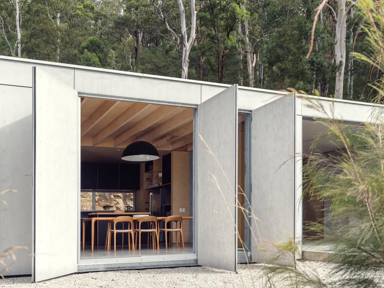
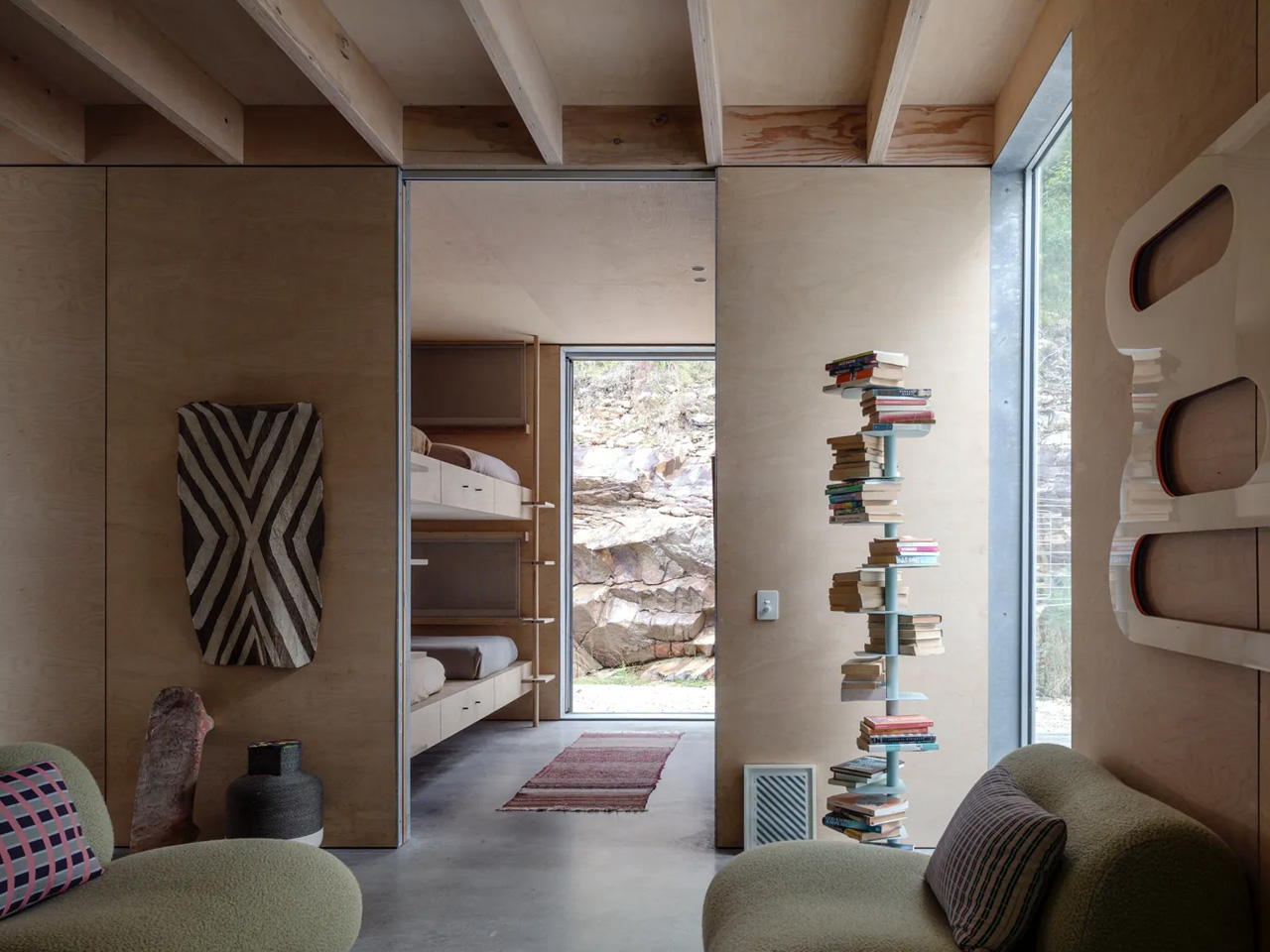
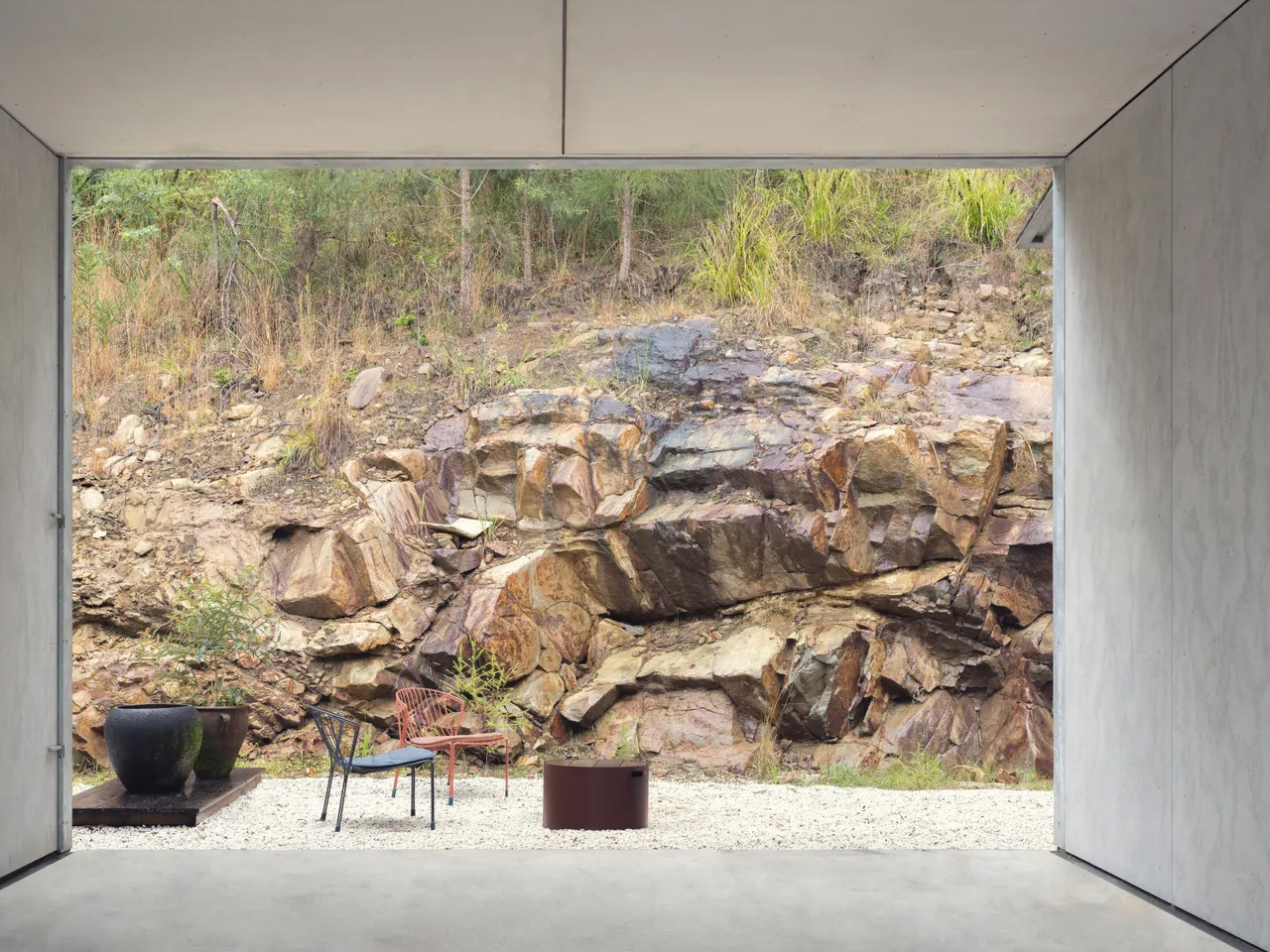
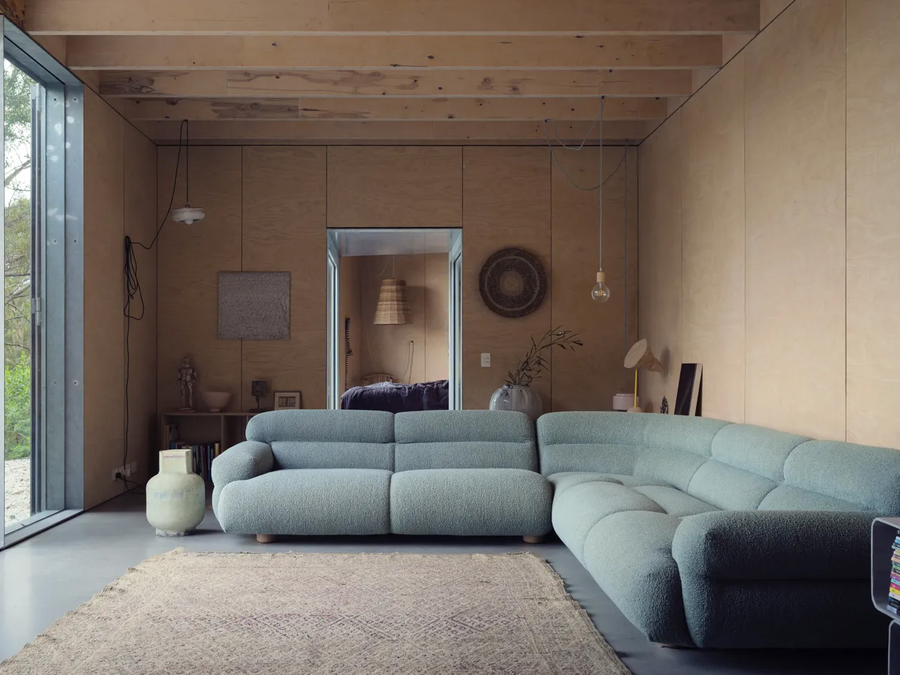
Material choices reflect the reality of building in bushfire country. The palette is deliberately raw and robust: plywood, lightweight cladding, and metal sit comfortably within the remote setting, offering low maintenance and crucial protection from fire. These aren’t just practical selections. They’re materials that age gracefully in the elements, developing character rather than requiring constant intervention.
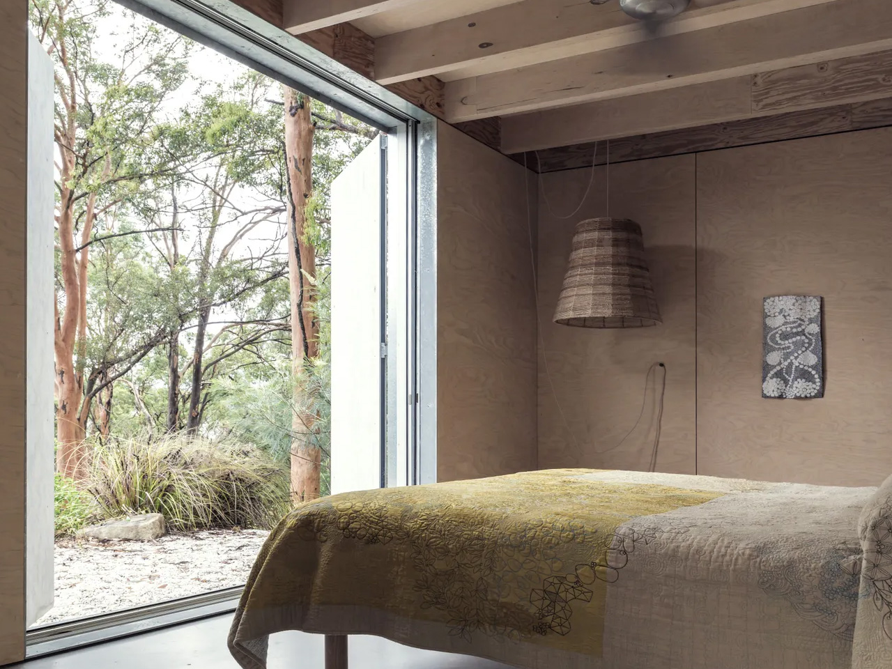
What sets this project apart is its embrace of impermanence. The operable facade allows the home to open and close to the elements, transforming its relationship with the outdoors. Outdoor washrooms and a loose-fit interior reinforce this camping-inspired approach, where the boundaries between inside and outside become negotiable rather than fixed. The architecture suggests a way of living that’s more adaptable, more responsive to seasonal changes and the rhythms of nature.

Built by Midcoast Construction on Worimi land, the home earned a Commendation for Residential Architecture at the 2025 NSW Architecture Awards and recognition in the Sustainable Architecture category at the National Architecture Awards Program. The jury commended the design team for creating a home that addresses the pressing question of how to build responsibly in fire-prone landscapes. Photography by Justin Alexander captures the home’s unique position, revealing how it sits suspended among the eucalypts, neither floating above nor buried within the forest but existing in comfortable coexistence with it.

As climate change intensifies fire seasons across Australia, projects like Amongst the Eucalypts offer more than aesthetic pleasure. They demonstrate that building in bushland doesn’t require choosing between connection to nature and protection from it. The home stands as evidence that thoughtful design can create spaces of genuine sanctuary and contemplation, places where engaging with the landscape occurs with the solace of protection from the extremes.

The post Fire-Proof & Forest-Focused: A Holiday Home That Embraces The Australian Bush first appeared on Yanko Design.