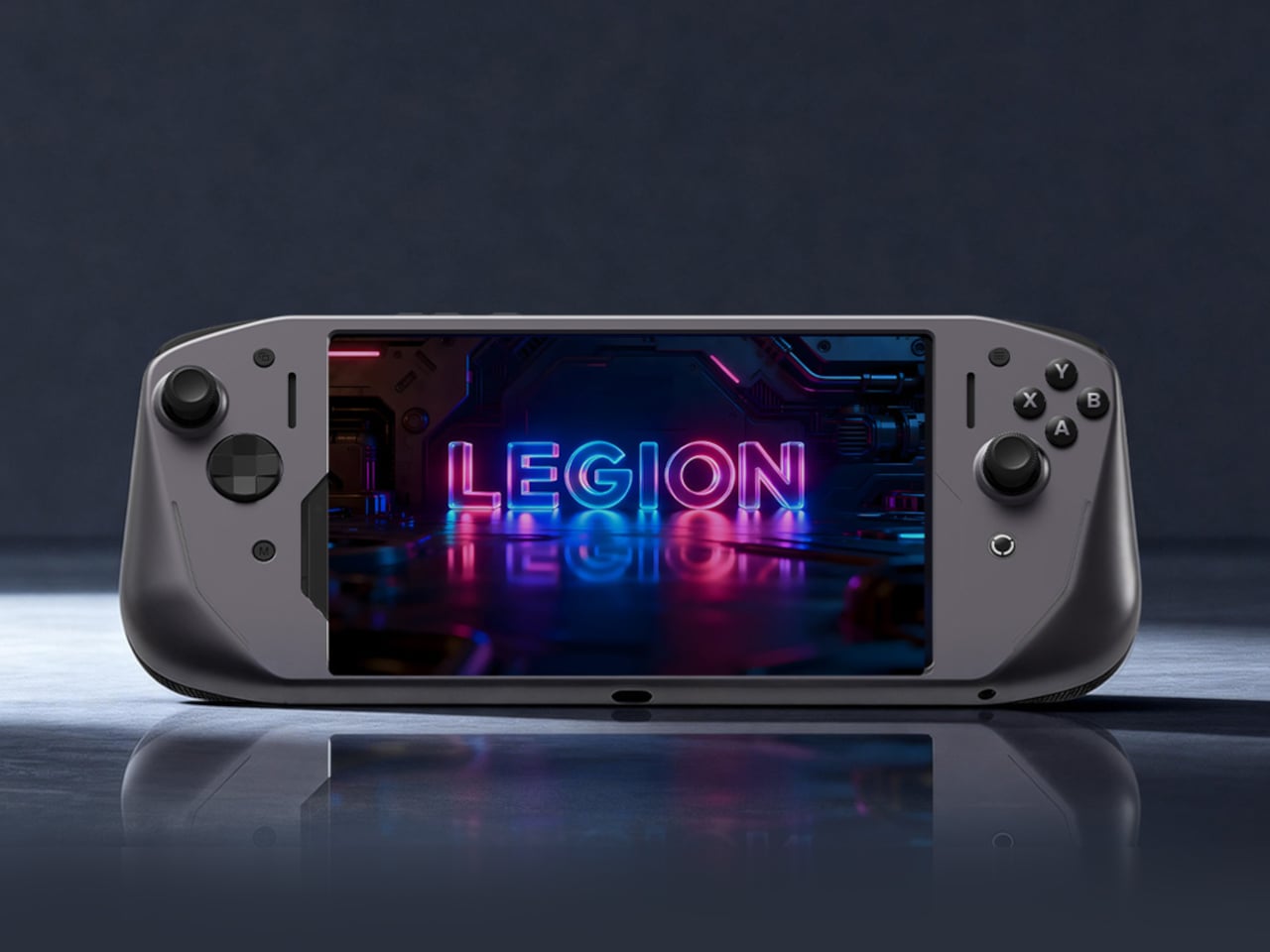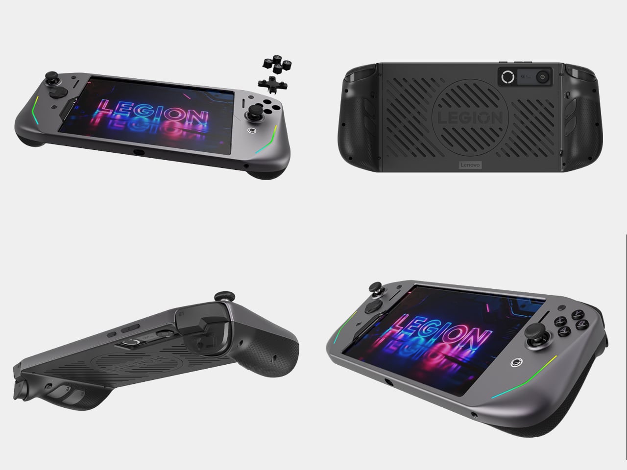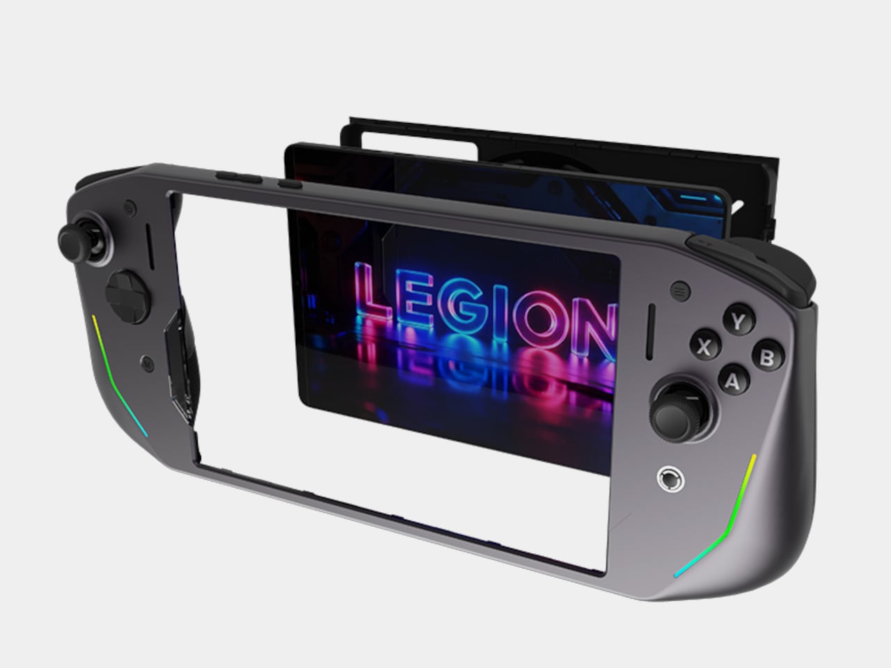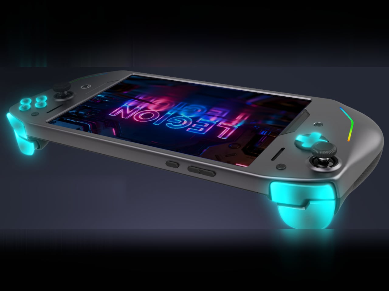
Nintendo SNES-inspired handheld console runs Android 11 to let you play mobile games

It looks like a SNES controller with a screen in the middle, but this right here is, in fact, the perfect platform for mobile gaming. With an ergonomic design that feels absolutely nostalgic to hold, and controllers on each side that let you navigate your games like you would on an Xbox, PlayStation, or Switch, the Anbernic RG353P retro handheld is a versatile gaming device that allows you to play both Android and Linux games. It’s got an operating system that’s both Android 11 and Linux-compatible, giving you the ability to play a vast library of Android-based games on it, along with support for emulators and apps that let you squeeze the most out of the device.

Designer: Anbernic

Click Here to Buy Now

There’s something truly comforting about the RG353P’s design. Sitting wonderfully in your adult palms the way a SNES controller would in the same teenage palms, the RG353P feels like a modern classic. It comes with the D-Pad and action buttons, as well as two joysticks, four shoulder buttons, and even two MicroSD card slots for expanding its 32GB internal storage to up to 512GB. It also offers 2.4/5G Wi-Fi and Bluetooth 4.2 connectivity, making it easy to connect to other devices.

Available in grey and translucent black versions, the Anbernic RG353P is a compact little device with a 3.5-inch IPS touchscreen (and a 640×480 resolution) that runs both Android 11 as well as Linux on its quad-core 64-bit RK3566 processor with built-in LPDDR4 2GB RAM for a pretty buttery-smooth experience. That’s also including the fact that the RG353P doesn’t have apps running in the background the way your phone does.

On the inside, a 3500mAh battery gives the RG353P a solid 6 hours of gaming time, allowing you to play all your favorite Android games or even popular GameBoy, PSP, SNES, NES, and Atari Lynx titles through emulators (with support for loads of other consoles). Built-in speakers offer high-quality sound, although there’s even a 3.5mm headphone jack for hooking a pair of earphones to the RG353P for that nostalgic backseat-gaming-while-parents-are-talking touch. Ah, the good old days!

Click Here to Buy Now

The post Nintendo SNES-inspired handheld console runs Android 11 to let you play mobile games first appeared on Yanko Design.
Android gaming handheld is a throwback to the venerable Nintendo DS

It seems to be the age of gaming handhelds once again. With the continued success of the Nintendo Switch, all sorts of portable gaming devices have popped up, ranging from PCs like the Steam Deck to dedicated Android gaming devices like the Logitech G Cloud and the new Razer Edge. Although they have actually been around far longer than these, more obscure handhelds have become more prominent because of this industry trend. Some require you to do the work of cobbling up the pieces together, while others sell a more finished product instead. The latter is the case for the latest device to hit the market, one that eschews the trending Switch form factor for something that gives a nod to Nintendo’s previous top-selling portable.

Designer: Retroid Pocket

The Nintendo DS had a very good run in the gaming market, replacing the iconic Game Boy with a portable machine that got on with the times. It featured a revolutionary (for that time) dual-screen clamshell design that truly felt like a new breed rather than a Game Boy just folded in half. Almost two decades later, that design has become antiquated, but it’s exactly that nostalgia that this look-alike is aiming for.

Granted, the Retroid Pocket Flip is more like a cross between the DS and the GBA SP, having a single screen only and with a more horizontal clamshell design. It almost has the best of both worlds, with a more conventional and more comfortable form factor and a wide screen that is more common with games today. Despite its old-fashioned looks, it does stick to modern gaming features, including the basic set of controls, such as both bumper and trigger buttons.

One advantage that a clamshell design has over something like the Nintendo Switch is that you can set the angle of the screen independently of your hands. You also automatically have a protective case for the device and don’t have to worry about the screen getting scratched and the controls snagging in your bag. The design also tends to be more compact, though it does get thicker compared to a flat handheld device.

That said, the Retroid Pocket Flip is pretty much an Android device, so you might have to debate whether having a dedicated gaming device separate from your phone is worth the cost. Not all Android games are also controller-friendly, and using the touch screen, in this case, is ironically more cumbersome. Still, if you’re an avid Android gamer that uses a controller most of the time, this charming throwback could be something worth adding to your collection.

The post Android gaming handheld is a throwback to the venerable Nintendo DS first appeared on Yanko Design.
Pixel 8 Pro renders hint at a maturing design language

We had thankfully gone past the phase when everyone was trying to look like the iPhone or something similar. Although phone designs still change at a fast rate, major brands have started sticking to more standard and identifiable designs, at least for two or three generations. This helps develop brand recognition and trust, especially if it happens to be a very popular and distinctive design. A case in point is the Pixel 6 from 2021, whose quirky “visor” has endeared it to many fans. Fortunately, Google decided to stick to that with the Pixel 7 last year, and it seems that it will still be doing so with the Pixel 8 Pro based on these unofficial renders, with a few changes to make it look like a more refined product rather than something that was just made on a whim.

Designer: Steve Hemmerstoffer (via Smartpix)

Despite using the front of our phones 100% of the time, it’s really their rears that give them their identity. Lately, phone manufacturers have thankfully become more mindful of the designs of their phone’s backs and don’t simply slap on whatever works just to fit the large camera sensors there. Google made a leap of faith with the Pixel 6’s camera design, and its gamble paid off, becoming the identifying mark of its flagship smartphones. The design is perhaps so eccentric that few even dared to copy that, much to the Pixel’s advantage.

The Pixel 7 didn’t change that basic design language, but it did smooth out some of the rough edges, making the phone look almost more professional. Given smartphone trends of the past, there was a very real chance that the Pixel 8 would no longer use that design. According to leaks, that isn’t the case, but Google is apparently still shuffling things around a bit to improve on the design, hopefully for yet another round next year.

There are two things that will immediately stand out from these renders. The corners of the phone are more rounded, for one, though the effect is more subtle. The more visible difference from the Pixel 7 Pro, however, is the screen, which is now completely flat. There was a time when curved edges were considered the hallmark of premium phones. That doesn’t seem to be the case anymore, especially after more people found those curved sides to be less usable.

While the visor-like camera design remains unchanged, the holes for the cameras have now been unified into a single area, at least visually. This hopefully simplifies the design as well as the manufacturing, perhaps even increasing the structural integrity overall. Other than those, the changes to the Pixel phone’s design seem to be minimal, pointing to refinement instead of revolution. Moving forward, this could easily become the Pixel’s signature design, that is, until Google stumbles on the next big thing in design.

The post Pixel 8 Pro renders hint at a maturing design language first appeared on Yanko Design.
OPPO Find N2 Flip Foldable Phone Review: Challenging the Foldable Status Quo

PROS:


  • Beautiful gap-less folded design topped with a crease-less inner screen

  • Largest Cover Screen in its class

  • Impressive Hasselblad-tuned camera and large battery

  • Multi-angle Flex Mode enables different photography styles

CONS:


  • No water resistance rating

  • Missed opportunity for apps on Cover Screen

  • No telephoto camera

RATINGS:

AESTHETICS
ERGONOMICS
PERFORMANCE
SUSTAINABILITY / REPAIRABILITY
VALUE FOR MONEY

EDITOR'S QUOTE:

The OPPO Find N2 Flip offers a beautiful and more usable foldable clamshell but falls a bit short of utilizing its strengths to the fullest.

By now, almost everyone knows that foldable phones exist, even if most still don’t understand what they’re useful for. Thanks to Samsung’s heavy push, foldable phones are becoming more known, but the majority of the attention in that niche market is placed on “horizontal” foldables like the Galaxy Z Fold 4. That’s not the only foldable form factor, of course, and foldable clamshells like the ones started by the new Motorola Razr are coming into focus as more affordable and more fashionable options. Just like with its Find N2, OPPO is staking a claim to a part of this largely unexplored territory, presenting a design that is meant to push the envelope when it comes to foldable clamshells. But is the OPPO Find N2 Flip just a pretty face, or does it have something truly special to bring to the table? We take the newest kid on the foldable block to find out.

Designer: OPPO

Aesthetics

As far as appearances go, the OPPO Find N2 Flip seems to be aiming to make a good impression without being overbearing. It is sleek, stylish, and elegant without stunning your eyes with an overabundance of luxurious details. To some extent, it sends a message that you don’t have to be extravagant or excessive to make an impact. You just have to be tasteful, and this “vertical foldable” definitely has plenty of that.

The devil is in the details, as they say, and so is beauty. The two color options of Astral Black and Moonlit Purple each have their own distinct personalities to match your style or taste. The black colorway, for example, has a silky texture that also makes the surface look like it has been littered with powdered crystals. The milky purple, on the other hand, has a gentle diffuse that doesn’t attract as many fingerprints as glossy glass. Regardless of the version, the OPPO Find N2 Flip’s hinge captures light in a unique manner that makes it look like dancing waves on the surface.

The biggest attraction of the phone isn’t its foldable inner screen, surprisingly. It’s actually the large 3.26-inch Cover Screen that makes it seem as if there’s a second, tinier phone on its back. That’s not completely far from the truth since the display’s 17:9 aspect ratio is nearly similar to most phones, though there’s a big catch that we’ll get to later. This screen sits flush with its surroundings, creating a seamless visual. Of course, that detail becomes pointless if you opt to protect the phone with the included transparent crystal case.

The rest of the phone’s design is what you would consider “normal,” which is actually good for making this unconventional form factor more approachable for regular phone users. The flat aluminum edges of the phone offer no surprises, which also means no headphone jack. The inner screen, while practically bezel-less, does have a raised border to protect it. The focus, of course, is on what you won’t see. Although it’s still there, the crease is hardly visible unless you really look hard, a feat made possible with OPPO’s latest-gen Flexion Hinge. Whether folded or opened, the OPPO Find N2 Flip offers the eyes a pleasant sight but also dials down the extravagance to make the foldable phone feel less alien and a bit more normal.

Ergonomics

Foldable phones complicate the ergonomics of mobile devices a little bit. Just as we were getting used to large slabs of glass and metal in our hands, these form-shifting phones stretched the ratio a bit more. Compared to regular handsets, foldable phones are often taller and narrower, and the OPPO Find N2 Flip is really no different. Compared to its peers, however, it is a little bit wider, bringing it closer to normal proportions. What this means, in practice, is that you’ll really have to stretch your thumb farther to reach higher UI elements on the screen, though it’s probably safer to just use your other hand anyway.

Fortunately, it is possible to use the Find N2 Flip with a single hand, especially when folded. The larger Cover Screen leaves plenty of room for notifications, buttons, and other interactive elements that you can comfortably reach with either hand. This allows you to answer calls, toggle certain phone settings, or even fire off canned responses to messages, all without having to open the phone at all.

And when you do need to flip it open, you can do so with a single hand as well by carefully sliding your thumb in between the two halves and then pushing it inward to widen the gap. Of course, the OPPO Find N2 Flip folds completely flat without any gap, unlike the Samsung Galaxy Z Flip 4, so there might be some hesitation in slipping your thumb inside for fear of scratching the sensitive inner screen. Fortunately, that screen isn’t so fragile, and the sturdy gives you a more solid feel when opening or closing the device with one hand.

That new hinge also opens up new ways to use the phone as a camera, no pun intended. Since it can remain open at almost any angle, you use the lower half of the phone as a steady tripod or go low and still see the preview on the lower half of the screen. You can even hold it like a mini camcorder, giving you that cinematographer feeling while shooting the next YouTube sensation.

Performance

Just like with its more horizontal sibling, the OPPO Find N2 Flip is fighting in the foldable arena not just with looks but also with brawn. Powered by a MediaTek Dimensity 9000+ with 8GB of RAM, the pretty clamshell has plenty of muscle to drive your mobile experience to the fullest, from browsing to video to games. There’s only 256GB of internal storage, though, which sounds a little too modest, especially considering you can’t expand it with a microSD card.

Along with all that power, the Find N2 Flip packs the largest battery in its class. Sure, we’ve seen larger, but considering space constraints, it’s definitely quite a feat to cram 4,300mAh inside, far larger than any of its foldable clamshell peers. It charges fast, too, with a 44W SUPERVOOC tech that goes from zero to full in an hour. One rather disappointing detail is that the phone doesn’t support any form of wireless charging, which has already become a standard these days. Not a complete deal breaker unless you’ve completely committed your mobile life to wireless charging everywhere.

The OPPO Find N2 Flip packs two cameras on its back and a whopping 32MP front-facing camera for normal selfies and video calls. Of these three, the 50MP Sony IMX890 is definitely the highlight, especially with its Hasselblad-tuned lens and special filters. Together with OPPO’s custom MariSilicon X imaging NPU, the camera takes great shots, regardless of the lighting condition. Colors are accurate, and details are rich, though faces do come out a bit pasty thanks to default beautification effects. In comparison, the 8MP ultra-wide camera is so-so, making it feel like it’s simply there for the sake of specs. There is no dedicated telephoto lens, so you’ll have to settle for the, unfortunately, underwhelming digital zoom.

The inner foldable screen measures 6.8 inches on the diagonal and has an FHD+ resolution of 2520×1080, which isn’t that different from other foldable clamshells. While the display is definitely bright, responsive, and fast at 120Hz, its crowning glory is the near-absence of a crease. Thanks to the hinge design that Samsung still hasn’t adopted, the phone is able to fold completely flat without straining the screen in the middle and lessening the effect of a visible crease. It’s still there, and you can see it at certain angles, but it’s almost invisible in day-to-day use.

As mentioned, the star of the show and the feature that really sets the OPPO Find N2 Flip apart is that 3.26-inch 720×382 Cover Screen. It’s not exactly the sharpest, but its tall rectangular shape leaves room for more content, including a more natural camera preview similar to the main screen. Unfortunately, it is also the biggest source of disappointment for the phone, and it feels that OPPO barely scratched the surface of what such a display can be used for.

At the moment, you only have a fixed selection of screen widgets, including an animated wallpaper, a camera shortcut, weather, events, and a timer. The Chinese version of this phone has two more widgets specific to the market, but none really comes close to offering more functionality. You have room to see up to six notifications at a time, and you can even reply to supported messaging apps. You can only use pre-set phrases or voice recognition, though. Given how much space the screen has, you’d expect there to be more, but as of this writing, that just isn’t on the table yet.

Sustainability

OPPO, along with Realme, is one of the major phone brands making a strong push for reducing their carbon footprint and increasing the sustainability of their products and processes. There are quite a few notable phones that take that mission to heart, but the Find N2 Flip isn’t part of that still small circle. If anything, it’s almost as if it takes one step back, at least when it comes to packaging and longevity.

The foldable phone comes in a big white box that does it a bit of a disservice. While the way it pushes the phone up at an angle when you lift the top is nice, that’s pretty much all there is to it. It isn’t space efficient, and while the design is minimal, it isn’t particularly elegant. To put it bluntly, it is quite plain, a stark contrast to the phone itself, and is probably wasteful as well.

The phone also doesn’t come with any guarantee of water resistance, especially an IP rating. That may have been understandable for a foldable phone a few years back, but technology has progressed since then. IP certification is admittedly expensive, but some assurance would still go a long way in giving buyers peace of mind for their investment.

Value

Even after four years, it’s still difficult to pin down the true value of a foldable phone, at least in ways that most consumers would appreciate. Horizontal foldables like the OPPO Find N2 offer a larger screen that you can still cram in your pocket, but it also comes with some awkwardness in use. We’re still a few years away from a perfect form factor, and the current generations feel more like stopgaps and milestones rather than finished products.

A foldable clamshell might actually make a bit more sense, especially since we’ve already been used to their ancestors like the iconic Motorola RAZR. They feel and look more stylish, and the small external screen helps set your expectations low. The OPPO Find N2 Flip definitely brings both benefits to the table, but the clincher will always be the price tag. Now available in global markets, it will compete with the Samsung Galaxy Z Flip 4 in both reach and price, and at £849 (roughly $1,000), it’s going to be a very close call, especially when you consider how young OPPO’s foldable is in comparison.

Verdict

The OPPO Find N2 Flip is undoubtedly a charming device that cements the foldable segment as something for normal folks to enjoy. It carries an elegance that isn’t overwhelming and a style that is more approachable yet also distinctive. It is no slouch when it comes to performance, especially with its large battery and larger-than-normal external Cover Screen. Its main camera is quite impressive, but the ultra-wide shooter and the lack of a telephoto lens could disappoint mobile shutterbugs, especially when they can pretend they’re holding a camcorder with the phone’s Flexion Hinge.

Unfortunately, the Find N2 Flip’s biggest asset is also its biggest letdown. For all the space it gives, that Cover Screen feels so underutilized that it could have been just half its size, and none would be the wiser. Fortunately, it’s something that can be addressed with future software updates, presuming OPPO is willing to put in the work before its next-gen foldable. As it stands, the OPPO Find N2 Flip is an admirable first step as far as vertical foldables go, but it feels lacking that extra punch that would make it OPPO’s best yet.

The post OPPO Find N2 Flip Foldable Phone Review: Challenging the Foldable Status Quo first appeared on Yanko Design.
Dangbei Mars Pro 4K Laser Projector Review: Premium Experience in an Affordable Package

PROS:


  • Stylish metal chassis with black piano surfaces

  • Effective auto keystone correction, focus, and obstacle detection

  • Impressive image quality and brightness

  • Wallet-friendly price tag compared to equivalent 4K projectors

CONS:


  • Tall box design requires more vertical space allowance

  • No USB-C port

  • No Google Play Support

RATINGS:

AESTHETICS
ERGONOMICS
PERFORMANCE
SUSTAINABILITY / REPAIRABILITY
VALUE FOR MONEY

EDITOR'S QUOTE:

Packing high-end features in an attractive box with an alluring price tag, the Dangbei Mars Pro easily outshines its rivals in the 4K laser projector space.

While many people had cut the cord when it came to TV subscriptions, some have even completely cut out TVs from their living rooms. Of course, that doesn’t mean they no longer watch things on screens larger than their phones and laptops, just that they have chosen to embrace the more flexible and liberating setup of having a home projector instead. There are some compromises to be made, particularly when it comes to the projected image’s brightness and price. As you might expect, the better the performance, the higher the price tag. There are, however, exceptions to that rule, but it isn’t easy to spot them at a glance. The Dangbei Mars Pro easily catches your attention, though, so we took it for a test drive to check if it’s really worth more than what its price tag would seem to suggest.

Designer: Dangbei

Aesthetics

Right off the bat, you could already tell that the Dangbei Mars Pro isn’t your run-of-the-mill laser projector. Where even the most stylish of its kind come in short rectangular boxes, the Mars Pro arrives in a more cubical shape. This does mean you will have to take into account its height when setting it up, but that shouldn’t be too much of an issue since it isn’t a short-throw projector. You will most likely set it up somewhere in the middle of the room, whether on a table or hanging from the ceiling.

Despite its budget price tag, the Mars Pro immediately impresses with its design and build quality. The box is mostly made from metal, with a serving of black piano glass on the top and on the front. Dangbei covers these surfaces with a plastic sheet for protection, but there are holes for the laser light and front sensors to have an unobscured path. The sides and back of the projector are littered with holes, both for ventilation and speaker output. The ports are all lined up neatly on the back for easy access, leaving no unnecessary visual breaks on other sides.

All-in-all, the Dangbei Mars Pro definitely stands up there with more expensive projectors when it comes to visual charm. The glossy surfaces and small ventilation holes give it a more refined flair compared to the typical slats and obviously plastic chassis of more expensive options. The Mars Pro already wins in this department, but, fortunately, it isn’t just a pretty face either.

Ergonomics

Unlike a mobile device or laptop, you won’t be handling projectors directly that often. In fact, you might not want to do that with the Mars Pro anyway, at least not regularly. Coming at around 10 lbs, it isn’t exactly the lightest in its group, so you’ll seldom want to carry it around the room. Its weight is also something critical to consider if you plan to hang it from the ceiling or place it on top of a tripod mount.

As mentioned, you won’t be interacting directly with the projector anyway. Aside from the ports on the back, the only other interactive element is the touch-sensitive power button on the top. This isn’t a typical push button, so there’s no need to press hard on it. The area is clearly indicated by a light halo that gives it a futuristic vibe. The center of this circle also has a sensor that detects the amount of ambient light in the room to automatically adjust the projector’s brightness.

All other controls for the projector will be done through the included remote control, which is a bit of a mixed bag. It is simple enough to use with very few buttons, though there are additional buttons for mouse mode and a quick menu on the side. The build quality, however, is so-so. While the projector is mostly made of metal and glass, its remote is a completely plastic affair. That might be for the best, considering how often you’re likely to drop it, but it does sharply contrast with the premium quality of the Mars Pro.

Performance

Where this Dangbei projector really shines, almost literally, is in its projected image. Using ALPD or Advanced Laser Phosphor Display technology, the projector boasts a brightness of 3200 ANSI lumens, which is a maximum brightness that only more expensive projectors can even promise. It also supports native 4K UHD resolution and HDR10+ as well as HLG, putting it on par with many TVs. The question is whether it can rival a 4K TV in practice. The answer is a resounding yes and then some.

The Mars Pro’s output is bright, crisp, and vibrant, especially in dark settings. Admittedly, it will struggle when there’s direct sunlight, but that’s also on par with pricier projectors. The projector supports a plethora of technologies and features that can be used for different types of content, like MEMC smoothing or even 3D, though the latter is a hit-or-miss kind of thing. It also has a Game Mode that reduces latency down to 20ms, but more discerning gamers might not be too satisfied with actual performance. Bottom line, the projector performs admirably, especially under controlled lighting, which might come as a shock if you consider how much more affordable it is compared to equivalent 4K projectors.

The premium experience doesn’t stop at image quality, though. The Dangbei Mars Pro has a couple of intelligent features that almost make it work like magic, automatically adjusting its settings depending on the situation. Autofocus is pretty much a given these days, but automatic keystone correction definitely upgrades the experience so that you don’t have to worry about the angle of the projector against a wall or screen. There’s also obstacle avoidance, where it shrinks the projected display to avoid lamps, vases, or other furniture. If it detects that there’s something directly in front of or near the lens, it will reduce the brightness to avoid hurting your eyes. All of these work automatically like magic, though you might have to do some fine-tuning if the focus or keystone is still a bit off for your tastes.

Like any projector, the Mars Pro generates heat, so it has both vents and fans to keep things cool. Cool air is sucked into the right side of the box while the hot air is pushed out from the left, something you might want to keep in mind when considering where to place the projector. Fortunately, the Mars Pro’s fans never get loud during its operation, and it definitely doesn’t overpower the built-in speakers. The only time the fans become very audible is when you turn on Auto Dust Cleaning mode, where it runs at full blast to get those particles out.

The Mars Pro boasts two 10W speakers with Dolby Digital Plus and DTS Studio Surround. That’s enough power to fill a small room, and the audio quality doesn’t get distorted even at higher volumes. While the speakers are good enough for most cases, it does lack a bit of substance that audiophiles will be looking for. Fortunately, you can remedy that by connecting your favorite sound system, but the built-in speakers will do well in a pinch.

Things get a bit less ideal when it comes to the system running on the projector, which is a very old, customized Android 9 version. The Mars Pro definitely has the hardware to run more sophisticated software with its quad-core MT9669 CPU, 4GB of RAM, and 128GB of internal storage, but Dangbei opted to favor a more simplified user experience. It does have the basic apps and streaming services pre-installed, but you’ll have to scour the Internet for anything that’s not available on Dangbei’s app store. There’s no Google Play, of course, though it might be possible to install it manually. Of course, you can plug in any other content source, including a Google TV dongle, if you so wish. The only limitation in its selection of ports is USB-C, which is a little bit disappointing in this time and age.

Sustainability

The Dangbei Mars Pro projector is your typical consumer electronics product, which basically means it has your typical components that hurt the environment in the long run. It does score a little better thanks to its use of a metal chassis rather instead of plastic. There are glass parts as well, but the plastic covering on these nullifies that advantage.

In terms of longevity, Dangbei only gives a one-year warranty off the bat, but you might have options to buy additional years depending on where you’re buying it from. Laser projectors are admittedly short-lived products, even with the advertised 25,000 hours of lamp life. Sadly, they aren’t trivial to repair either, especially if the product is coming from another region of the world. Parts and services will be a big consideration for those who are a bit more conscious of how much use they want to squeeze out of a projector.

Value

If it hasn’t been that clear yet, the Dangbei Mars Pro 4K projector is right up there with other 4K projectors. The 3200 lumens brightness, intelligent correction and configuration options, and overall performance all mark it as a premium product. The kicker is that it isn’t priced like one, selling for only $1,699 (or $1,799 from Amazon).

Admittedly, that’s a large figure, but only if you take it in isolation. A “regular” 4K laser projector with the same feature set or performance easily costs almost double that amount. Conversely, projectors with that price tag often have too many compromises, especially in terms of picture quality. You’ll also have to consider that 4K UHD TVs cost just as much, and you’ll be hard-pressed to find one that will be able to cover the same 100-inch maximum space as this projector can.

Verdict

Choosing consumer electronics is often a case of choosing compromises, whether it’s in performance, quality, or price. Rarely will you find a gem that hits all three with very little compromise. When one does pop up, it’s not hard to understand why the Internet would be abuzz about something so rare and almost unbelievable. The Dangbei Mars Pro 4 Laser Projector is definitely one such rare creature. Not only does it deliver on its promises, it actually looks good doing so, making that price tag so much sweeter for anyone planning a TV-free entertainment setup at home.

The post Dangbei Mars Pro 4K Laser Projector Review: Premium Experience in an Affordable Package first appeared on Yanko Design.
OnePlus Pad will bring a somewhat unusual design to the tablet market

Until Apple started trying to present the iPad Pro as something to replace traditional computers, the tablet market seemed to be on its last breaths. Suddenly, plenty of new slates started popping up, not yet counting the foldable phones that unfold into small tablets. Despite that revitalization, the fundamental formula for tablets had changed very little, especially when it came to cameras. With the front-facing camera taking a more important role, the rear camera is almost like something that’s there just for the sake of being complete. Ever the upstart, it seems that OnePlus wants to make that camera more prominent, suggesting that it could have a bigger role to play in its first-ever tablet.

Designer: OnePlus (via Steve Hemmerstoffer)

Tablet cameras have always been less impressive compared to their smartphone cousins, even if both come from the same generation or year. The reasoning is perhaps the lack of uses for a rear-facing camera on a tablet, while the front camera will be heavily utilized for video calls. That said, more recent high-end tablets from Apple and Samsung have indeed stepped up their game, but they have barely changed when it comes to their design.

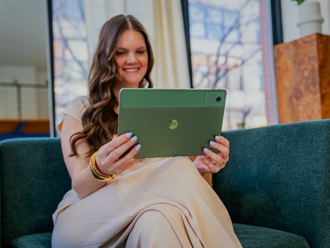
The OnePlus Pad, the brand’s first Android tablet, is aiming to stand out from the crowd visually, which isn’t that difficult considering how similar-looking most tablets are these days. While the tablet is expected to have a metal unibody design and flat edges, a staple of premium tablets these days, it will have one design detail that you will rarely find in others of its kind. According to renders and confirmed by OnePlus itself, the OnePlus Pad’s rear camera will be placed in the middle of its long edge rather than in the typical corner.

This makes the camera more prominent and visible on this large 11.6-inch tablet, which suggests it might even be more capable than your typical tablet cameras. Indeed, it has a large circular bump that is reminiscent of the confirmed camera design for the OnePlus 11 that will be launching on the same date, February 7th. It could simply be a visual embellishment, but OnePlus is known to be a bit more modest in design changes that don’t bring any functional benefits.

Together with the placement of the front camera, which is also on the same long edge, OnePlus is using design to inform people how this tablet is meant to be used. Unlike most tablets, the OnePlus Pad is designed for a horizontal or landscape orientation, which is how you’re most likely to use it not only to watch videos but also to do some work. OnePlus will probably focus on these use cases when it makes the big announcement next week, pitting the OnePlus Pad against big shots from Apple and Samsung.

The post OnePlus Pad will bring a somewhat unusual design to the tablet market first appeared on Yanko Design.
Onyx BOOX Tab X is an Android tablet with a giant E Ink screen

Despite the ubiquity of phones and tablets, eBook readers are still going strong. In fact, they’re experiencing a renaissance thanks to the arrival of colored E Ink readers and Amazon’s long-overdue adoption of styluses for its Kindle. Brands like Onyx are pushing the boundaries of what E Ink devices can do, like putting out readers that are actually Android devices inside. It seems that the company isn’t done challenging the status quo just yet and has just launched its latest premium E Ink device, which happens to also be a large Android tablet that can actually stand toe to toe with other Android tablets. Except, of course, it has a more energy-efficient monochrome display.

Designer: ONYX

If you’re shocked by the large 13.3-inch E Ink screen of the new Onyx BOOX Tab X, then you haven’t been paying attention to this fast-growing market. This tablet actually replaces the BOOX Max Lumi 2 as the company’s high-end offering, both of which come with this gigantic E Ink display. The device runs on an octa-core processor, has 6GB of RAM and 128GB of storage, speakers, Wi-Fi, Bluetooth, a gyrosensor, and a large 6,300mAh battery, which is pretty much standard for tablets these days. Of course, it’s designed primarily as an eBook reader and note-taking device, and its functionality and design revolve around these.

Most eBook readers of the past don’t have their own light, but that has started to change. But while some of Onyx’s devices have adopted front lighting, the BOOX Tab X is backlit, meaning that the light is directed towards you rather than across the surface of the screen. You can still adjust the coldness and warmness of those lights to your comfort, so it might not be that big of a deal in the long run.

And unlike typical eBook readers, this extra-large tablet runs Android 11 rather than some custom operating system. Even better, it actually supports Google Play Store, so you won’t be lacking in apps. You can definitely watch videos or even play games to some extent, but that’s more of a side effect rather than a selling feature. Onyx does modify the interface heavily to reflect the core experience they’re aiming for, and it’s a pretty streamlined and efficient UI at that.

While the Onyx BOOX Tab X is big on size and features, it’s also big on the price, starting at $879.99. Fortunately, that price does include the stylus that lets you write or even draw on the screen. Depending on where you buy it from, the package will also include a trifold case to protect and prop up the device. While the sheer size of the BOOX Tab X is pretty astounding, it is probably questionable whether it will be something that even E Ink fans will gravitate toward. Fortunately, Onyx also has the 10.3-inch BOOX Tab Ultra that we reviewed recently, which is a pretty good compromise between size, price, and usability.

The post Onyx BOOX Tab X is an Android tablet with a giant E Ink screen first appeared on Yanko Design.
5 Reasons the Microsoft Surface Duo 2 Design Failed

They may be technological marvels, but foldable and rollable screens remain just that in consumers’ eyes. Foldable phones have been on the market for almost five years now, but they’re still considered to be expensive eccentricities and luxuries that only a few can really afford. Even if they were more affordable, most people would probably still not be able to justify such a purchase, especially considering some concerns regarding durability. The Microsoft Surface Duo and its successor tried to offer a less risky yet still expensive interpretation of the foldable design, offering two distinct screens rather than folding a single one. At first, it seemed that it would actually be a new mobile device category to stand beside typical foldables, but the rumor now is that Microsoft seems to have thrown in the towel. Although it did have its fair share of fans, the Surface Duo 2 just didn’t seem to click with the masses, even less than the likes of the Samsung Galaxy Z Fold, and these are five reasons why.

Designer: Microsoft

Identity Crisis

To some extent, the Microsoft Surface Duo is in a class of its own. You can’t really call it a smartphone, even though it does make calls since it’s rather awkward to actually use it as a phone unless you’re always wearing earbuds. You can’t even fold the Surface Duo 2 back completely now that it has a camera bump. You can easily call it a tablet, either, even though content can span both screens to form one single display that has a very noticeable cut in the middle. Even Microsoft itself avoids calling the Surface Duo by either name, preferring to just refer to it as a “dual-screen mobile device.”

The Surface Duo’s unconventional design does warrant a different classification, though it’s not exactly original in the basic concept. LG tried to take a stab at a dual-screen phone with a case that you can attach and remove as needed. The experience, of course, was very different, more similar to how you’d connect a second monitor to a computer. The Surface Duo had that capability built-in, saving users from having to juggle accessories. It didn’t, however, solve the fundamental problem of exhibiting an identity that people can understand and relate to, which would have gone a long way in making the device more appealing beyond mere curiosity.

The device’s ambiguity meant that it was actually difficult, if not awkward, to use it like you would a familiar mobile device. It’s too wide to use as a phone when folded, and it’s unusable as a “full” tablet when spread out. Admittedly, it’s unfair to judge the Surface Duo by these standards because it’s neither a phone nor a tablet but a completely different device. Unfortunately, people will approach it from either direction because they’re more familiar with smartphones and tablets and might not be able to adequately wrap their heads around a new creature such as this, especially when they might not even understand what it is for. Unfortunately, Microsoft’s target audience makes it clear that it’s not for everyone in the first place.

Niche Business

The Surface Duo 2 can do almost anything a smartphone or tablet can do, especially if you use only a single screen. Those won’t take full advantage of the device’s capabilities, though, and you’ll have to make use of both screens at the same time. And therein lies the biggest question of the Surface Duo’s design purpose. While most people will probably want a bigger screen, how many will actually need two somewhat small screens instead? Why, those who use two apps at the same time, of course!

The School of Jobs and the smartphones that followed have conditioned our minds to use one app at a time, deftly switching back and forth between apps and screens as needed. This is admittedly very limiting, especially if you’re used to the multi-window world of desktops and laptops. There might be some who wish they could do things at the same time or see two apps simultaneously, and it’s exactly for that use case that the Surface Duo was designed. To be more specific, the dual-screen device is made for highly productive people who find themselves always switching between two or three apps.

The subset of mobile users that regularly do this, however, might be very small. Microsoft is clearly focusing its marketing on business users who’d have different documents or apps running at the same time to compare or even share data. There is also the case of some more social users who might be chatting away while watching a video together or browsing the Web. These are definitely legitimate use cases, but not common enough to make the idea of the Surface Duo to be so popular that it would drive sales. Because while the device does enable using two apps side-by-side, the unfortunate truth is that these apps and the Android platform, in general, were designed for single-screen use and remain stubbornly so.

Growing Software Pains

Whether it’s iOS or Android or anything in between, mobile operating systems have been designed from the start with a single screen in mind. And while Android did actually have the foundations for multi-window support, few outside of the likes of Samsung ever took advantage of that and evolved it. Now iOS, particularly iPadOS, has left Android in its dust, and devices like the Surface Duo or even the Galaxy Z Fold are having trouble shoehorning a different paradigm into the platform.

The first release of the modified Android system for the Surface Duo was pretty much disastrous, with plenty of instabilities and bugs marring the otherwise beautiful first-gen device. To its credit, Microsoft has been addressing those issues slowly but surely, yet the fact remains that Android apps always behave as if they’re the only show on stage. It doesn’t help that that stage doesn’t seem to push those actors to play well with others, even when all the facilities are there. It will take a Google foldable device for Android to really adopt all these features it already has, but that’s a story for another day.

To be fair, even Samsung’s foldables have this kind of problem, only that the phone maker giant has been working on its solution for years. Those flaws are more pronounced on a younger device like the Surface Duo. Despite being primarily a software company, Microsoft still has trouble adapting Android to its needs. And, unfortunately, it doesn’t exactly have a track record in that aspect, either.

Software is Hard

Just because Microsoft is adept at making software doesn’t mean it’s an expert at everything. Some might even refute how good it is at software development in the first place due to innumerable issues with Windows and Office. That’s even truer with platforms that aren’t its own, particularly Android, which it has been using ever since it ditched the idea of any form of Windows on mobile. It hasn’t had much success then, and it doesn’t seem to be having better luck now.

To be fair, Microsoft has shown better performance with the Surface Duo 2, at least as far as pushing fixes is concerned. Unfortunately, even those fixes leave some things to be desired, and the software still shows some of the problems exhibited in the first Surface Duo. Given the fast pace of Android updates, Microsoft is clearly lagging behind on that front as well. Confidence in Microsoft’s ability to fix those software issues isn’t exactly that high, and the latest rumors only serve to validate those doubts.

Microsoft switching to a single foldable screen for the Surface Duo 3 doesn’t make all those problems go away. It could, however, alleviate or even fix some of the problems, particularly when it comes to having to support two screens, something that Android at its core still doesn’t do well in the first place. Unfortunately, it does pretty much throw away all the rhetoric around the first Surface Duo devices, validating once again that Samsung’s design might have been right all along.

An Answer in Search of a Problem

The biggest problem with the Surface Duo design is that there was probably no problem, to begin with. While some will say that this applies to foldable devices as well, it’s even more poignant with a dual-screen mobile device. The Surface Duo 2 is slick, beautiful, and innovative. Unfortunately, it is also incomprehensible for the majority of consumers, even those that can actually afford one. Microsoft tried to offer a device that seemed less fragile than a Galaxy Z Fold but unfortunately slapped a price that is just as inaccessible anyway.

Microsoft did have a clear audience in mind, but it might have overestimated its own clout in that industry. It might have envisioned a large army of mobile users who depend exclusively on Microsoft apps and services, but that ship has long sailed. Without support for other “normal” apps, the overall experience was clunky, awkward, and sometimes even unusable. The Surface Duo 2 definitely has fans that are now disillusioned at the path that Microsoft is rumored to take, but those fans won’t be able to help turn the device into a profit.

While the Surface Duo 2 is admittedly an interesting innovation, at the end of the day, it’s still a product that has to bring Microsoft money. By turning away from the dual-screen design, the company is effectively admitting that it failed to accomplish that. The “innie” foldable screen first used by Samsung is by no means perfect, but it’s also more usable for both regular and power users. It remains to be seen how much of the Surface Duo user experience will remain in such a different device and whether or not it will even be worth investing in a Microsoft mobile device that could suffer the same fate as other Microsoft mobile devices.

The post 5 Reasons the Microsoft Surface Duo 2 Design Failed first appeared on Yanko Design.
Airtag-inspired Google tracking device has literally the most unfortunate name ever

“Can’t find the G Spot? There’s an app for that…”
The jokes practically write themselves with this hilariously audacious fan-made concept.

It’s true that Google is the undisputed king of search, and it’s also true that Apple and Samsung have both beaten Google to the punch when it’s come to searching for actual objects in the real world… so one designer decided to take matters into his own hands. Designed less as a serious concept and more as a way to really scratch a specific itch, Italy-based Obi Fidler created the G Spot – a mildly raunchy conceptual tracker with a name so wild I’d pay good money to watch Sundar Pichai give an entire keynote on it. The G Spot (I’m glad this isn’t YouTube or I’d probably be demonetized) is a simple GPS smart tracker designed in the vein of Apple’s own AirTag. It comes with the same portable, tiny design, and can be tracked through Google’s own Find My Device and Google Maps services. Unlike the AirTag, however, this particular product comes in a variety of colors to match your sense of style…

Designer: Obi Fidler

The idea for creating a Google-made tracker started with Obi asking himself the most obvious question ever – Google’s got everything in place. The ecosystem, the map network, the hardware chops, even a highly capable Tensor chip… so why hasn’t Google built a tracking device yet? Heck, it even has the market penetration needed! (Pun intended)

The G Spot device looks almost entirely like the AirTag, with a UI that carries forward rather seamlessly to the Android ecosystem. Strap the device to your keys or put it in your backpack and you can track it through your phone the way you would a Chipolo tracker. The trackers are small, have a battery life that lasts years, and are designed with the Tensor chip on the inside to provide security. The only real problem is that they’re conceptual, although I do hope Google comes around to creating their own tracking device.

What’s hilarious yet equally amazing about this concept is just the brilliant humor behind it. Designed to be as clever as an April Fool’s prank from Google, the G Spot’s promo images are just filled with puns galore, like the one below, or the fact that the tracker cases are referenced as ‘protection’. The entire project is filled with laughs and if you got this far, I’m sure you enjoyed reading about the G Spot as much as I did writing about it. I had a few more jokes that I didn’t end up adding to my article, like this being the one true G Spot men can easily locate!

The post Airtag-inspired Google tracking device has literally the most unfortunate name ever first appeared on Yanko Design.
Lenovo goes beyond computing with Tab Extreme, Smart Paper, and Project Chronos at CES 2023

We’ve seen plenty of new laptops and desktops so far at CES 2023, especially since silicon giants Intel, AMD, and NVIDIA have all announced their newest, shiniest, and most powerful processors to date. While these cover the majority of computing needs, especially gaming, they aren’t the only personal computers available to us today. Thanks to advancements in technology, we have a variety of devices available today that make computing more mobile, more efficient, and even more personal. At CES 2023, Lenovo is showing off how it goes beyond regular computers with its most powerful tablet yet, a new e-Paper solution, and the next step in bringing mixed reality to your living room.

Designer: Lenovo

Lenovo Tab Extreme

There was a point in time when it seemed that tablets were on the way out. As smartphones became bigger, the need for tablets with big screens became almost pointless. Recently, however, the tablet has taken on a new mission as a true mobile computer, almost like a laptop replacement, and Lenovo is taking that to the extreme with its biggest and most powerful tablet yet, clearly designed for more than just watching videos.

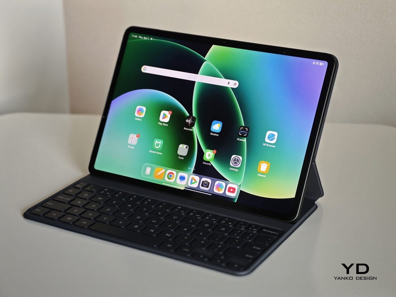
Of course, it’s also a delight to do that on the Lenovo Tab Extreme, thanks to its spacious 14.5-inch 3K 120Hz OLED screen and eight high-performance JBL 4-channel speakers. The tablet shines brightest, however, when used for more than just consumption but also for creation, whether it’s a work of art or a work document. The MediaTek Dimensity 9000, 12GB of RAM, and Android 13 all work together to deliver this productivity experience on the go, and the gigantic 12,300mAh battery ensures you’ll have as little downtime as possible.

Beyond just the specs, the Lenovo Tab Extreme is designed to be flexible and stylish in any situation. A magnetic dual-mode stand makes it convenient to prop up the tablet horizontally or vertically, while the optional dual-hinge keyboard lifts it up for a more ergonomic position while you type your next great novel. The tablet can even be used as a digital sketchpad by plugging it in via its DP-in USB-C port or as a second monitor through the DP-out port. The Lenovo Tab Extreme will be available later this year with a starting price of $1,199.99.

Lenovo Smart Paper

Not everyone needs a full-blown tablet, though. There are some who just need the digital equivalent of a notebook, one that blends the conveniences of mobile tech with the universality of pen and paper. Fortunately, there is a new breed of devices that promise exactly that, and the new Lenovo Smart Paper takes the lead in combining digital and analog in a smart and meaningful way.

Powered by a 10.3-inch E-Ink display, the Lenovo Smart Paper presents the perfect size for a paper notebook, one that does away with wasteful paper without giving up on the experience of using a pen. It’s all digital, of course, but the feeling and texture of guiding the Smart Paper Pen over the e-Paper display are as close as you can get to the real thing. And like a normal pen or pencil, you don’t need to worry about batteries or charging the pen as well.

The device is specifically designed to make taking notes not only enjoyable but also efficient. With two integrated microphones, you can record a meeting or lecture while you’re scribbling down notes. And when it’s time to review those notes, simply select the written text to hear a playback of the recorded audio to help jog your memory. The Lenovo Smart Paper is expected to launch sometime this year for $399.99.

Lenovo Project Chronos

Most of the computing devices we have today come in the form of something we can touch, be it a laptop, a tablet, or a smartphone. The future of computing, however, might be less tangible. Buzzwords aside, the metaverse and mixed reality represent an inescapable future, but it’s a future that’s hindered by clunky headsets and devices. Lenovo is taking a plunge into this still-gestating market with an innovative concept device that removes the need to weigh your body down just so that you can move your virtual avatar.

Project Chronos is basically a box with a camera that can keep track of your body movement to control a virtual character, often your avatar. It uses advanced depth cameras and algorithms to recreate your movement within a 3D environment without having to wear glasses or mocap sensors. It can even track your facial expressions so that your avatar can truly express your emotions, just as your own body can sometimes betray you in the physical world.

Despite that seemingly magical capability, Project Chronos is designed for home use, and its simple and discreet design can easily blend with the rest of your entertainment system. You simply connect the box to a TV or monitor, and you’re good to go. And once you’re done, you can rotate the camera down to ensure your privacy. This gear-free mixed reality device opens a whole new world of applications, from creating content with a VTuber avatar to getting personalized real-time coaching from a fitness expert. The Lenovo Project Chronos, however, is still a concept and work in progress, and its full name and capabilities will be disclosed when it’s ready to launch.

The post Lenovo goes beyond computing with Tab Extreme, Smart Paper, and Project Chronos at CES 2023 first appeared on Yanko Design.