Microsoft Teams’ Copilot brings AI-driven functionality to virtual meetings, offering practical ways to manage tasks and streamline collaboration. As demonstrated by Mike Tholfsen, one notable feature is its ability to automatically record action items during meetings and assign them to the appropriate team members. This reduces the need for manual follow-ups and allows participants to […]
A federal judge has approved the $1.5 billion settlement between Anthropic and a group of authors who sued the company for using their work to train Claude.
Apple’s highly anticipated iPhone Air 2, set to debut in spring 2027, is generating significant buzz in the tech world. Designed to combine performance, efficiency, and innovative technology, this device aims to refine the lightweight smartphone experience. By addressing previous limitations and introducing innovative features, the iPhone Air 2 could establish itself as a benchmark […]
Building your own custom Steam Machine is an excellent way to achieve high-performance gaming without exceeding your budget. As demonstrated by ETA Prime, a carefully chosen configuration can deliver up to 21% better performance than Valve’s official model, which starts at over $1,000. For instance, pairing an AMD Ryzen 7 7745HX processor with an AMD […]
Pocket-sized e-readers have existed in one form or another for years, but most have struggled to be genuinely pocketable. Anything much larger than a phone immediately stops feeling like a carry-anywhere device and starts feeling like something you have to plan around. The original Xteink X4 built a loyal following by treating compact form and distraction-free reading as non-negotiables, with physical buttons, a clean 4.3-inch E-Ink screen, and a $69 price that was hard to argue with.
The one complaint that kept surfacing was the absence of a frontlight. Reading in dim conditions meant clipping on a separate lamp or giving up entirely, which was an odd gap for a device otherwise built around serious reading habits. The Xteink X4 Pro addresses that directly. It launches at $99 with an adjustable warm-to-cool front light built in, removing the need for any workarounds when the lighting situation isn’t ideal.
The frontlight isn’t the only addition. The X4 Pro also introduces a touchscreen for navigation, though it retains physical page-turn buttons along the sides for anyone who’d rather not tap the display while reading. That combination matters because part of what made the standard X4 appealing was the tactile, no-swipe experience. The Pro doesn’t discard that, but it layers touch navigation on top for people who want it.
The trade-offs are real and worth noting. The front navigation buttons that sat below the screen on the original have been removed on the Pro, replaced by the touchscreen. More significantly, the USB-C port is gone, swapped out for a proprietary pogo-pin magnetic connector. That means carrying a specific cable rather than reaching for any USB-C cord already in a bag. The X3 has used the same pogo-pin setup since its release, so it’s a known quantity, but it’s still a step backward in convenience for anyone who valued USB-C universality.
The physical footprint barely changes. Despite adding layers for the light and touch sensor, the X4 Pro is actually marginally thinner at 5.95mm versus the X4’s approximately 6.4mm, and sheds a couple of grams to land at 72g. The same 4.3-inch, 220-PPI E-Ink display carries over, and battery life holds steady at around 14 days per charge. Storage remains the same 16GB microSD configuration with expansion support.
It’s a focused upgrade rather than an overhaul. The X4 Pro doesn’t try to compete with full-featured six-inch Kindles or Android-based E-Ink tablets. It stays small, stays quiet, and now stays lit, at $99 for people whose reading life regularly extends past sunset.
For existing X4 owners, the calculus comes down to one question: how often does dim lighting stop you from reading? If the answer is rarely, the base X4, for $30 less with USB-C and front buttons intact, still has a strong case. For anyone who’s been waiting to pick up an Xteink device but held off specifically because of the missing frontlight, the Pro closes that gap without fundamentally changing what the device is about.
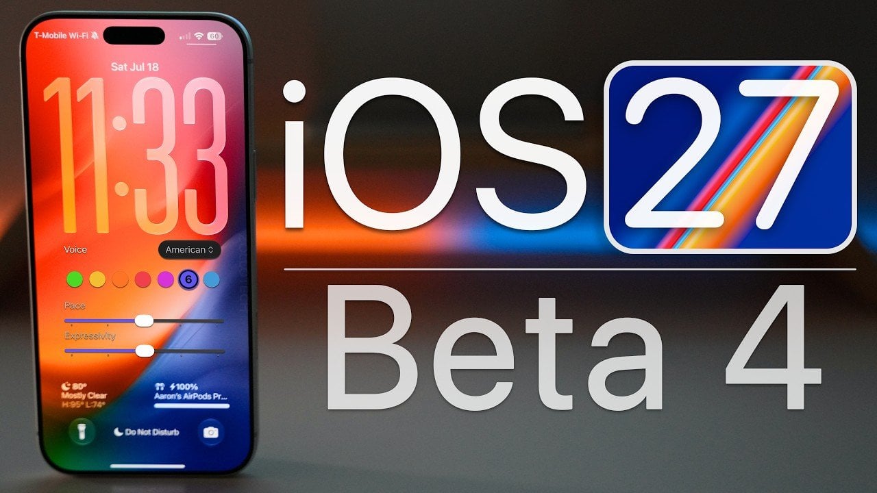
Apple has officially released iOS 27 Beta 4, a significant update aimed at refining functionality, enhancing performance, and addressing persistent bugs. This beta version is available to developers and aligns with iOS 27 Public Beta 2, paving the way for the final public release expected in September. Alongside iOS 27 Beta 4, Apple has also […]
Artificial General Intelligence (AGI) could be closer than many anticipated, according to Google DeepMind CEO Demis Hassabis. Speaking on the timeline for AGI’s development, Hassabis suggested that this new technology might emerge within the next three to five years, carrying the potential to reshape industries, economies and society itself. In a recent discussion highlighted by […]
The Samsung Galaxy Z Fold 8 Ultra sets a new benchmark in foldable smartphone technology, particularly with its display enhancements. With five significant upgrades, including resolution, brightness, glare reduction, crease visibility, and durability, this device refines the foldable experience, offering practical benefits for everyday use. Here’s an in-depth look at how these advancements compare to […]
The DJI Mini 6 Pro has sparked widespread discussion, but much of the information circulating about this rumored drone is misleading. As Tech Court explains, the Mini 6 Pro does not currently exist and its release before late 2026 is highly unlikely. This skepticism is grounded in DJI’s predictable two-year product cycle and the significant […]
Samsung’s Galaxy Watch 9 and Galaxy Watch Ultra 2 introduce distinct features tailored to different user needs. According to TechAvid, the Galaxy Watch 9 emphasizes health tracking with the Vitals Dashboard, which consolidates metrics like heart rate and oxygen levels for a clearer understanding of physical well-being. In contrast, the Galaxy Watch Ultra 2 prioritizes […]