Most public spaces do one thing: they sit there. They look the same in the morning as they do at noon, and they expect you to adapt to them. That’s just how it’s always been. LUO Studio’s Shell Book Pavilion in Beijing decided to skip that whole arrangement entirely.
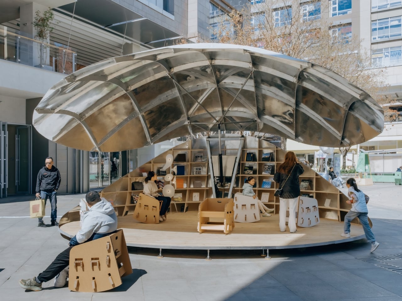
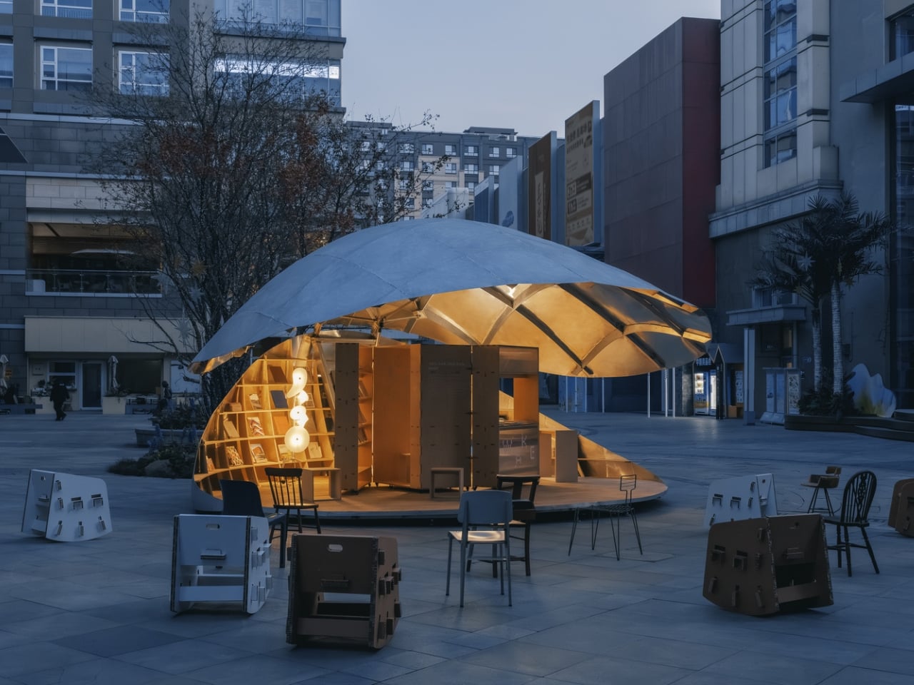
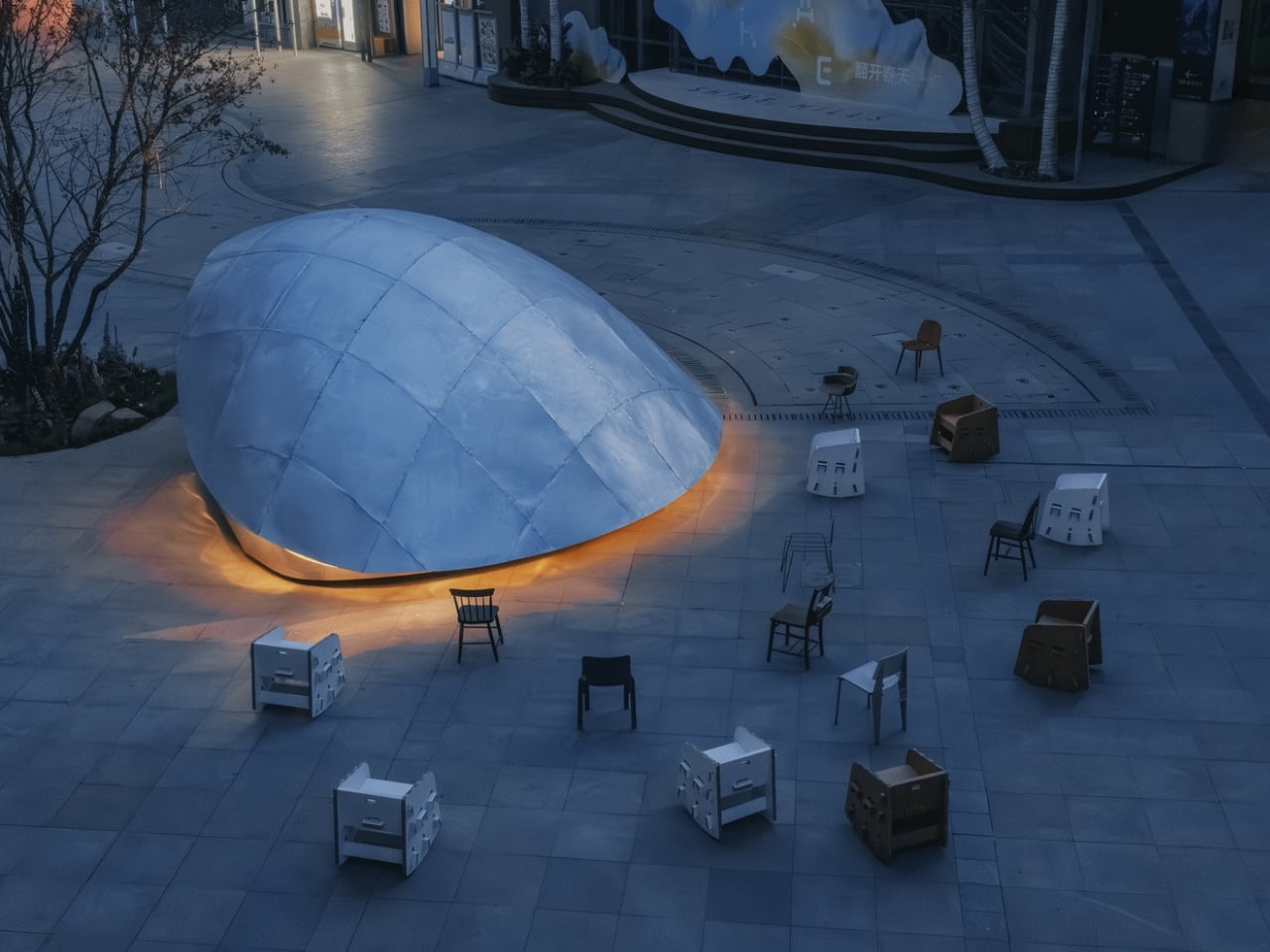
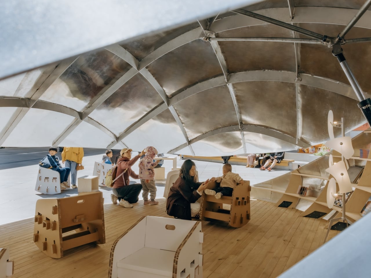
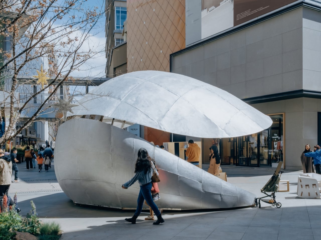
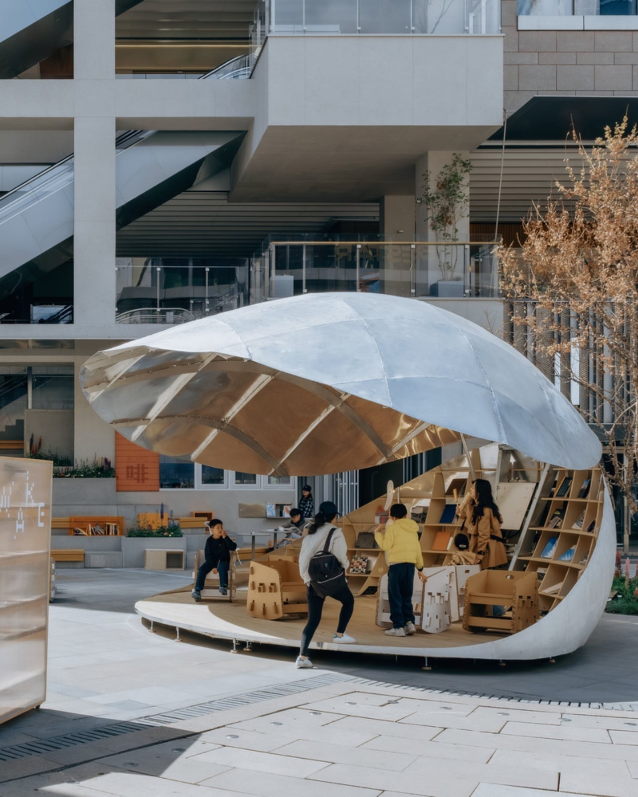
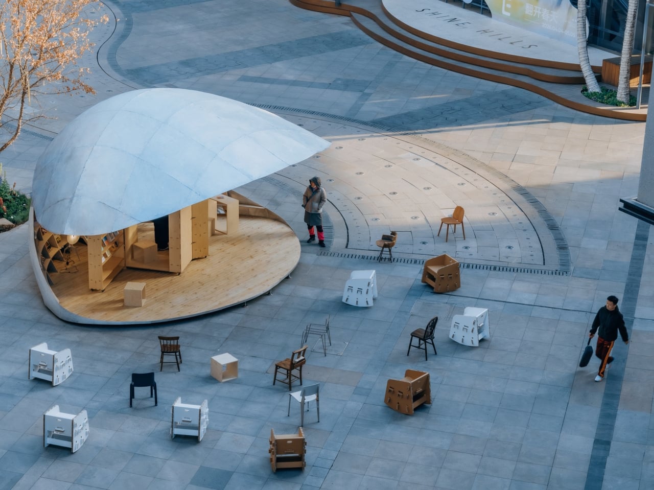
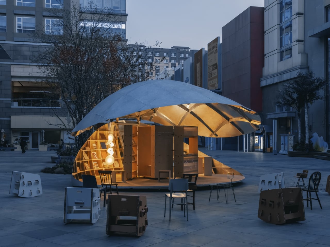
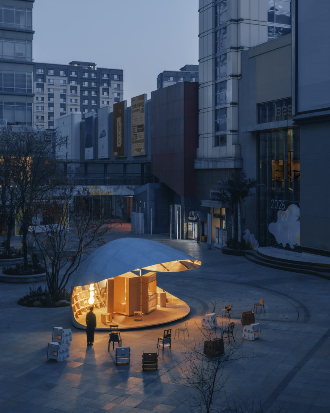
Completed in 2026 and tucked into the plaza of Xiangyun Town, a commercial district in Beijing, the pavilion is exactly as remarkable as it sounds: a 43-square-meter structure shaped like a clamshell that physically opens and closes. Not metaphorically. Not just aesthetically. The shell actually lifts and lowers through a vertical opening system, moving through incremental positions that change the entire character of the space as the day goes on. When it’s raised, it becomes a generous canopy. When it’s lowered, it contracts into something quieter and more intimate. The pavilion isn’t static. It breathes.
Designer: LUO Studio
The idea started from a personal place. The architects at LUO Studio describe prior visits to the same plaza with family, noting how the casual, child-friendly energy of the space already had a natural rhythm to it. The Shell Book Pavilion didn’t try to override that. It responded to it. That kind of grounded thinking tends to produce better architecture than designing purely for an image, and you can feel it here. The pavilion doesn’t demand your attention by being loud. It earns it by being genuinely useful.
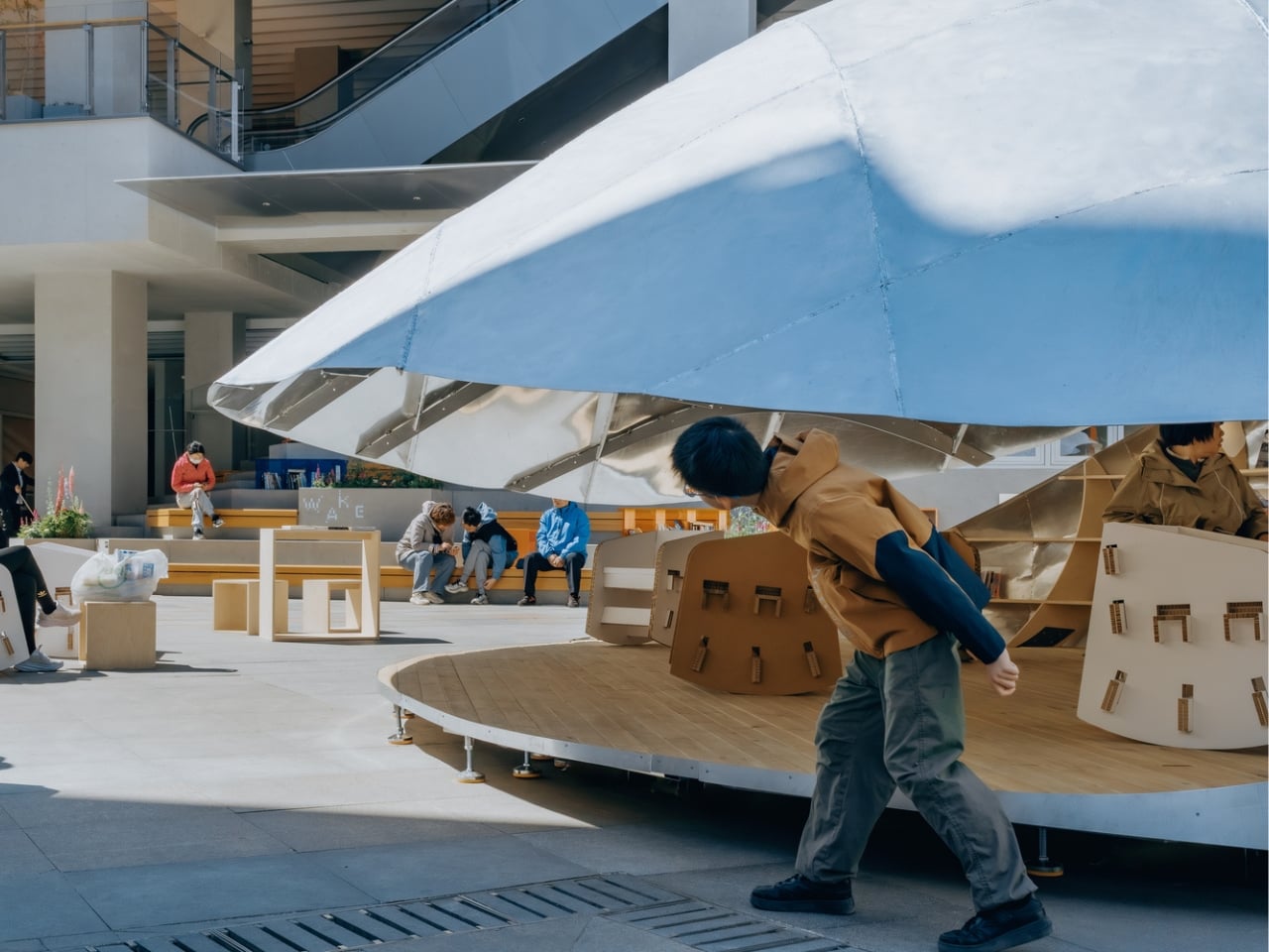
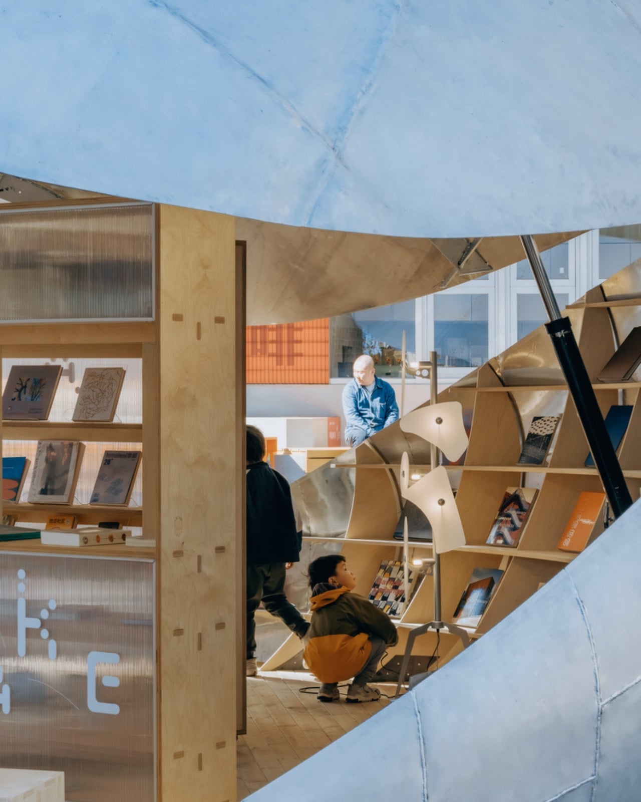
Built with an aluminum shell structure, the design also makes a point of having no fixed front or back. Walk up to it from any direction and it reads clearly. That might sound like a small detail, but it matters enormously in a shared public plaza where people arrive from every angle and at every hour. A space that only works when you’re standing in the right spot isn’t really a public space. It’s a stage set.
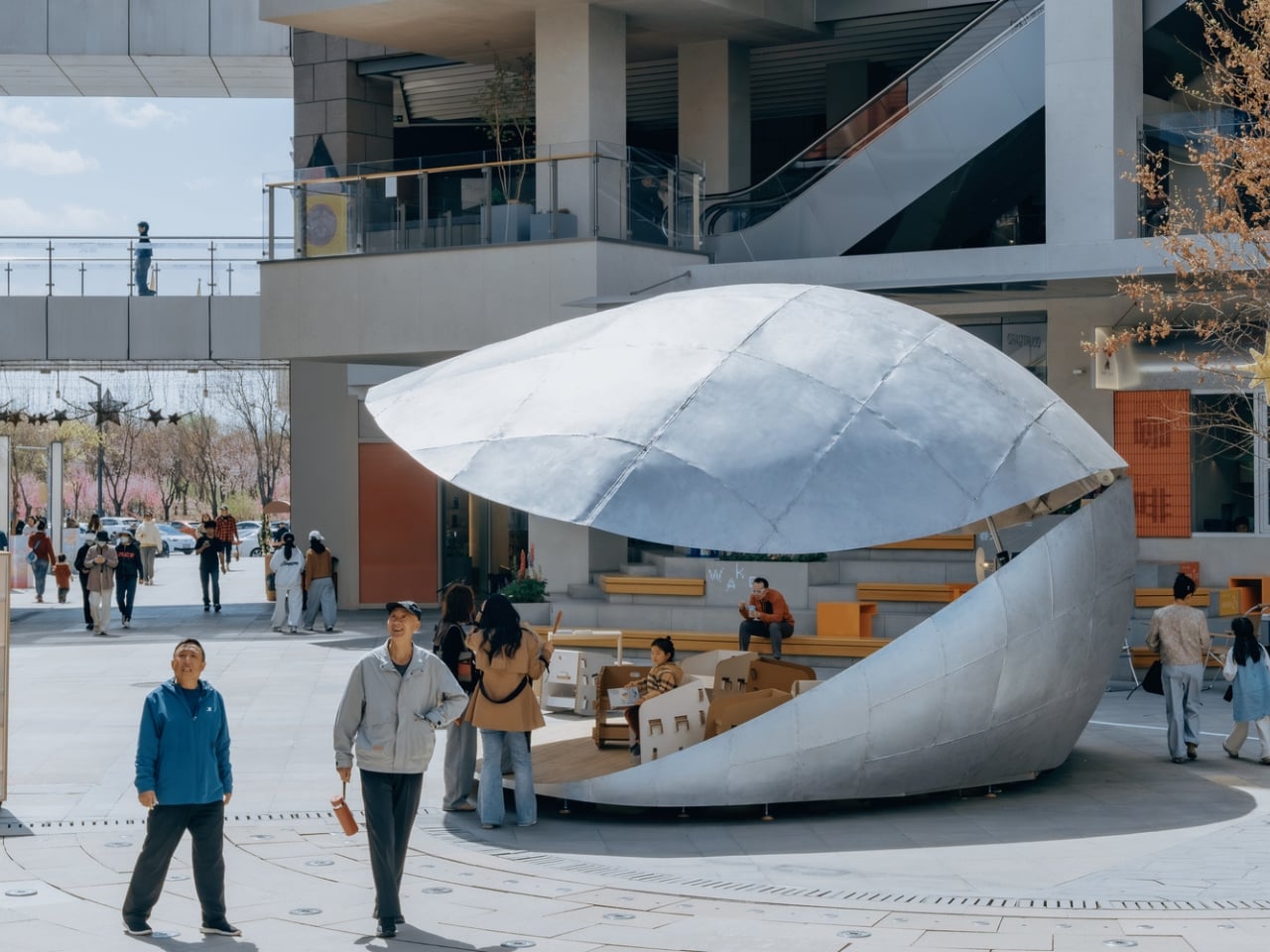
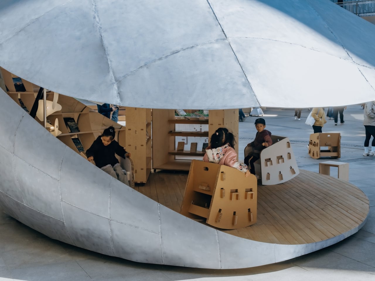
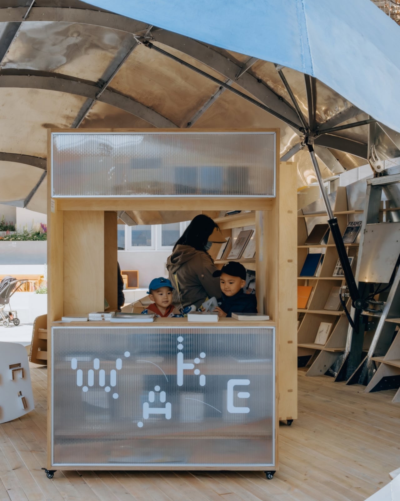
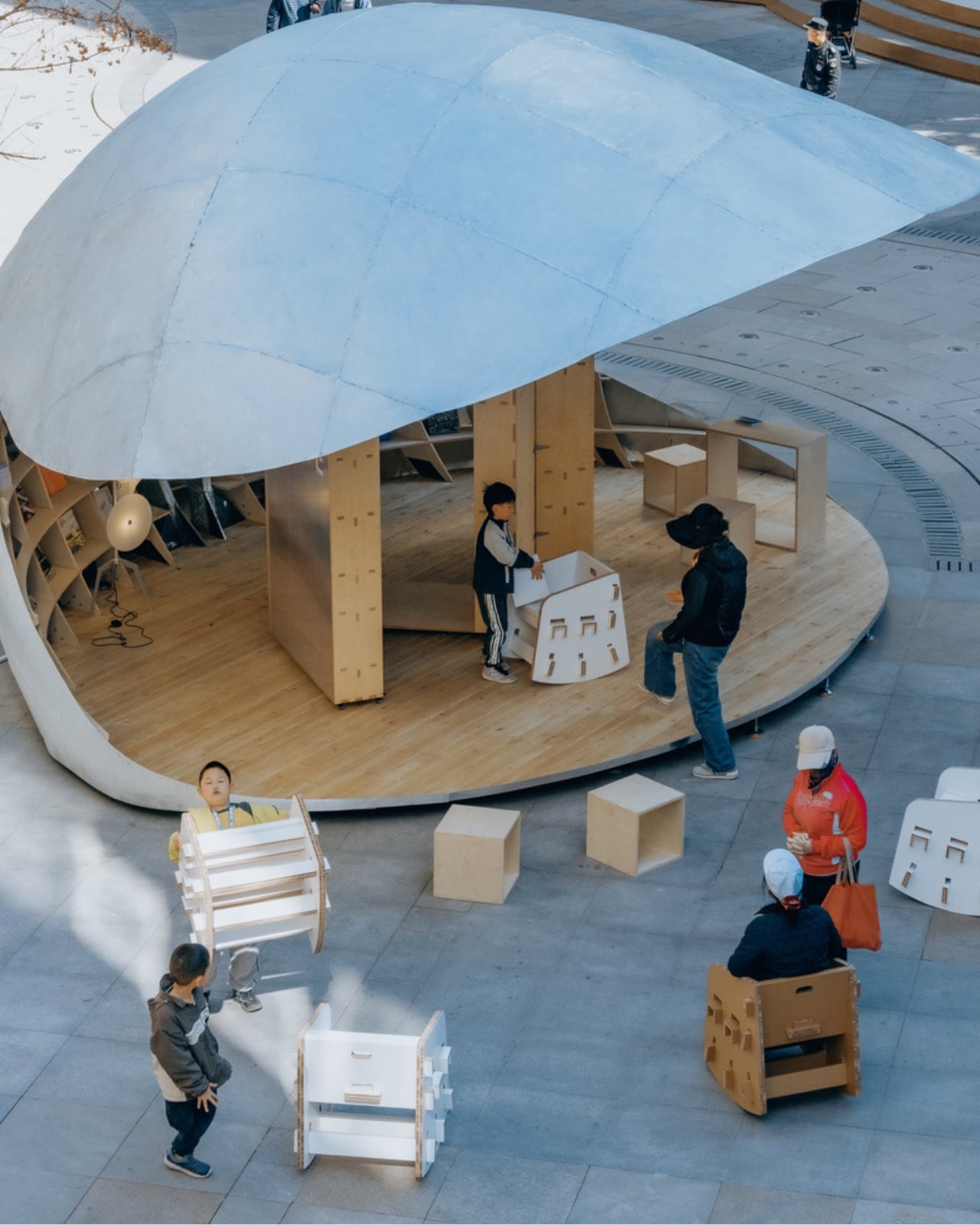
Scattered around the pavilion are movable seating pieces that extend the social footprint beyond the structure’s physical boundary. The pavilion’s influence on the plaza ends up being much larger than its 43 square meters suggest. People don’t just use the space inside the shell. They orbit it. They set up nearby. They stay longer than they planned to. That’s a quiet form of design success that rarely gets enough credit.
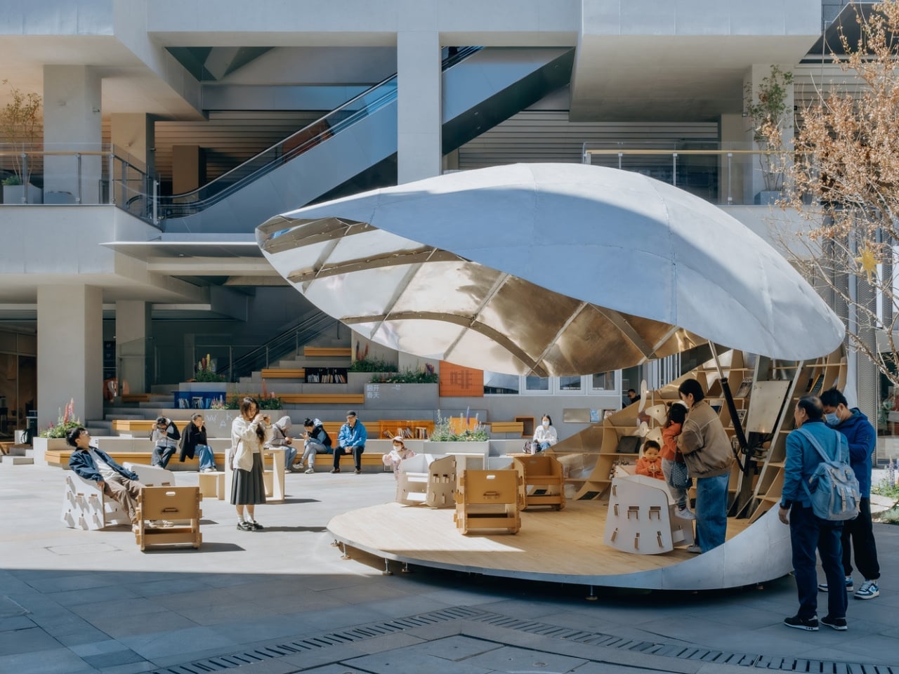
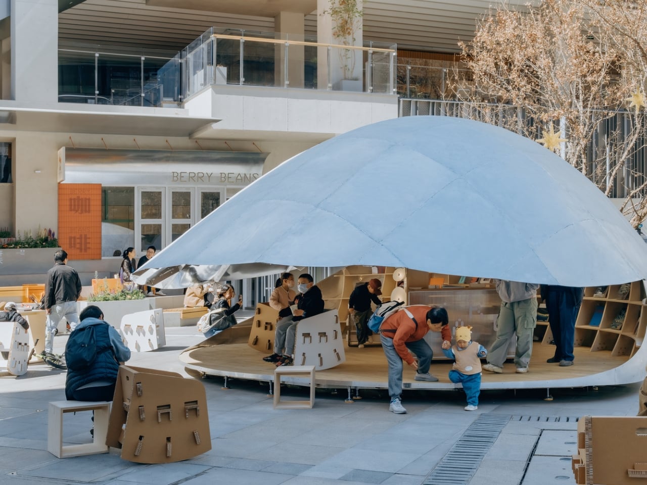
The nature metaphor is doing a lot of heavy lifting here, and it earns every bit of it. A clamshell as a form for a library is the kind of concept that could easily tip into gimmick, but LUO Studio kept the execution clean. The aluminum material choice keeps things from feeling too organic or precious. The structure carries a quiet confidence. The shell looks like it belongs in the future and on that plaza at the same time.
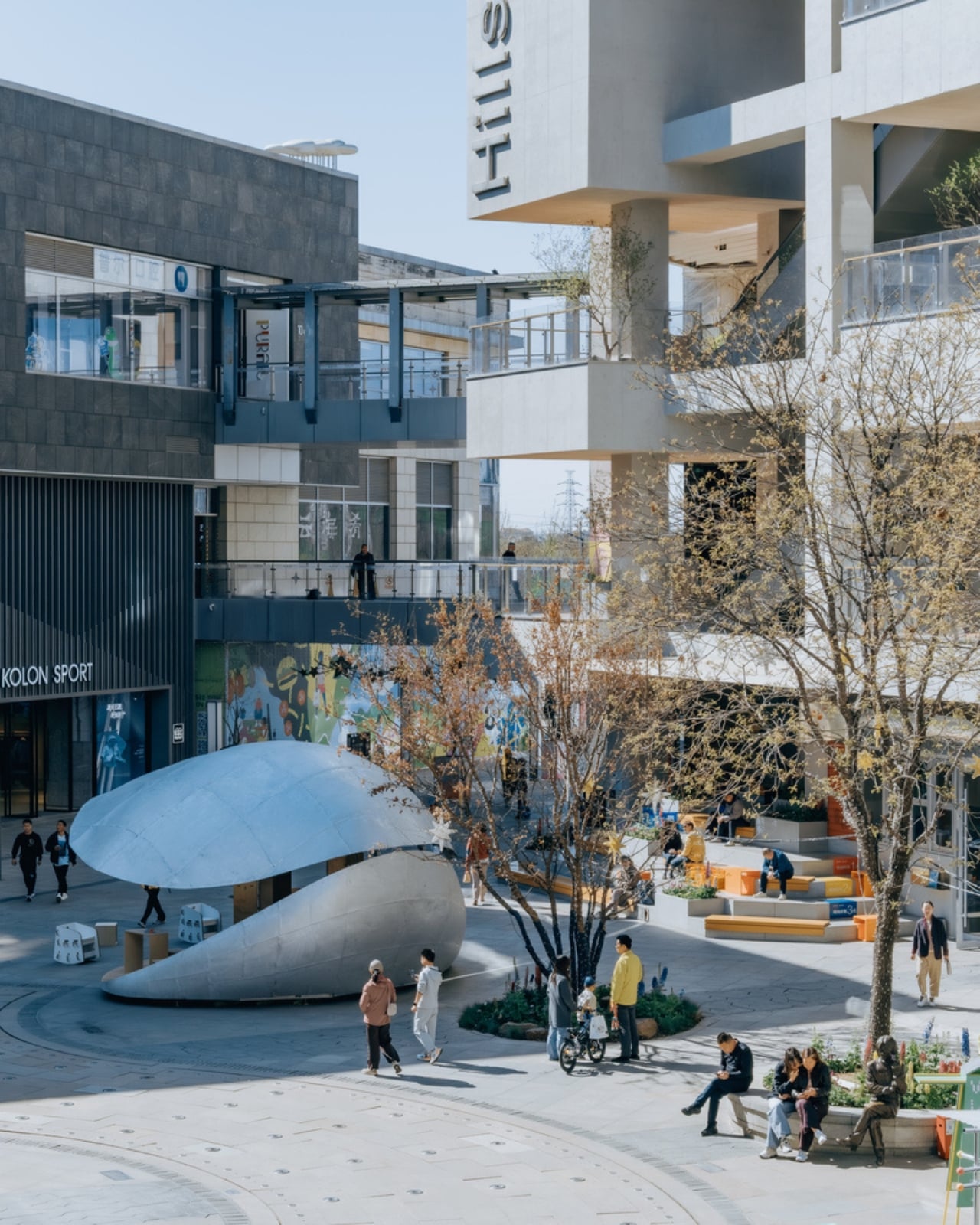
Scale versus ambition is the tension that makes the Shell Book Pavilion interesting beyond its novelty. This is a 43-square-meter structure in a commercial district, not a landmark cultural center with a nine-figure budget. It’s small, and deliberately so. The pavilion argues, simply by existing, that you don’t need a lot of square footage to change how people experience a neighborhood. You need a clear idea, executed honestly.
Public reading spaces have had a complicated decade. Libraries as institutions are being redefined, neighborhood bookshops are staging a comeback, and digital reading has both liberated and fragmented the way we engage with books. The Shell Book Pavilion doesn’t wade into any of that debate. It just makes a place for you to sit with a book, opens itself up when it wants company, and closes a little when the day gets quieter. It meets people exactly where they are.
The photographs by Yumeng Zhu capture the pavilion in soft natural light, and they do the project justice. The structure has a presence that reads beautifully even in two dimensions, which is usually a good sign that something is genuinely working in three. Some designs only photograph well. This one looks like it’s actually worth visiting.
The post Beijing Just Built a Library That Opens and Closes Like a Shell first appeared on Yanko Design.