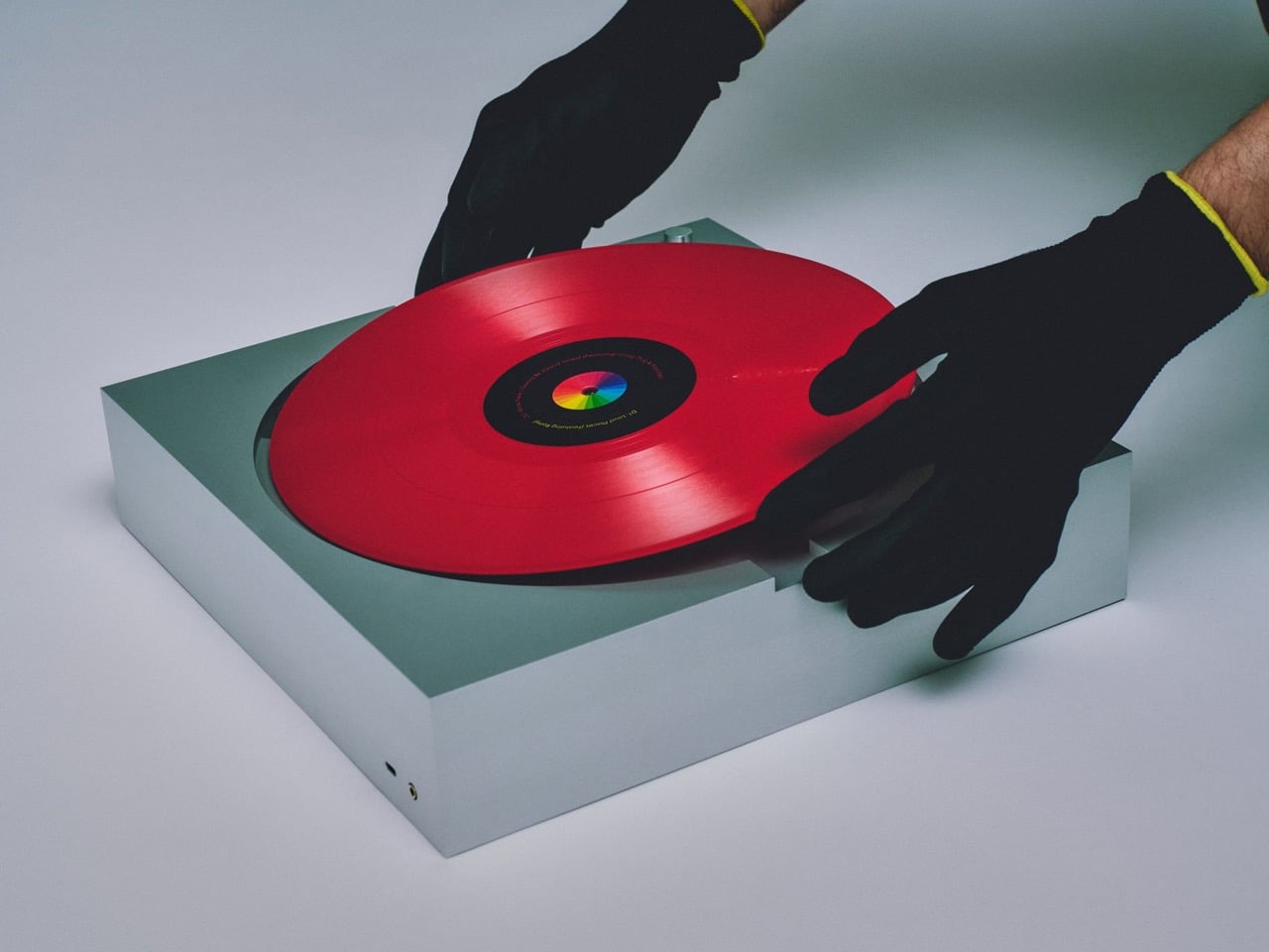
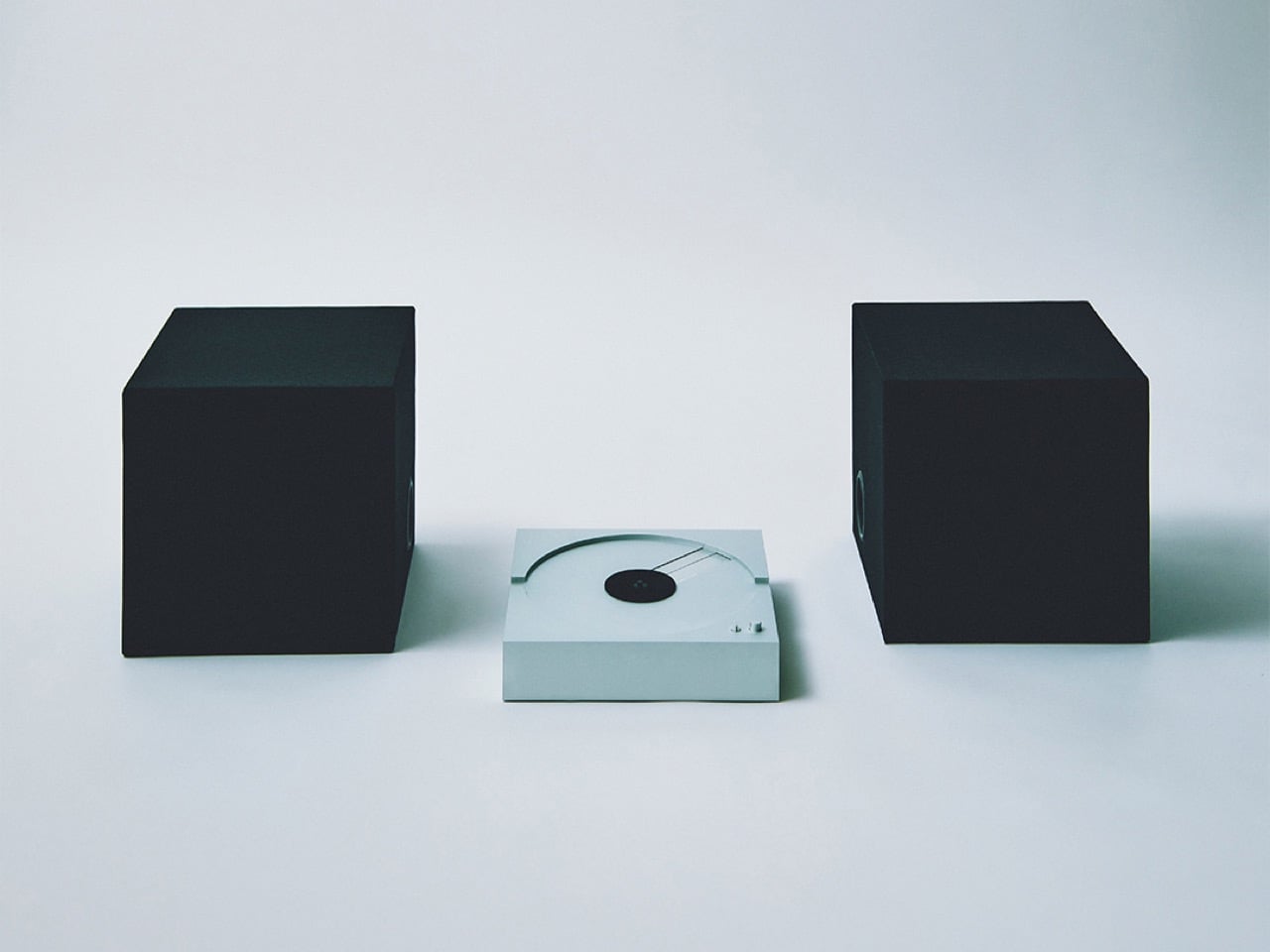
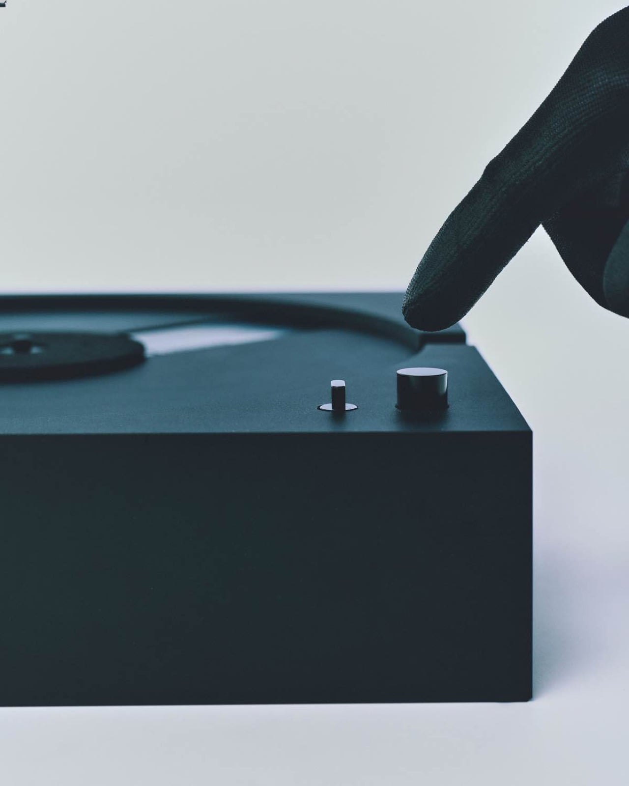
For something built to play vinyl, the PP-1 barely behaves like a turntable at all. There’s no tonearm visually staking its claim across the platter, no exposed hardware reminding you this is an analog ritual machine. Instead, it looks like someone took the clean, self-contained logic of a CD player, scaled it up to 12-inch proportions, and cut a perfect circle into a block of aluminum. The result feels less like retro audio gear and more like a playback object from a timeline where physical media never split into “old” and “new.”
That is what makes the PP-1 so compelling from a design standpoint. Most modern record players still rely on nostalgia, warm wood finishes, visible mechanics, and a kind of ceremonial analog theater. This one strips all of that away and replaces it with something colder, flatter, and far more architectural. The record becomes the only familiar visual cue, while the machine itself recedes into a monolithic slab that feels closer to a giant CD deck than a classic turntable. Instead of celebrating vinyl as a vintage artifact, the PP-1 imagines what the format might have looked like if it had evolved with the same minimalist confidence as the best consumer electronics.
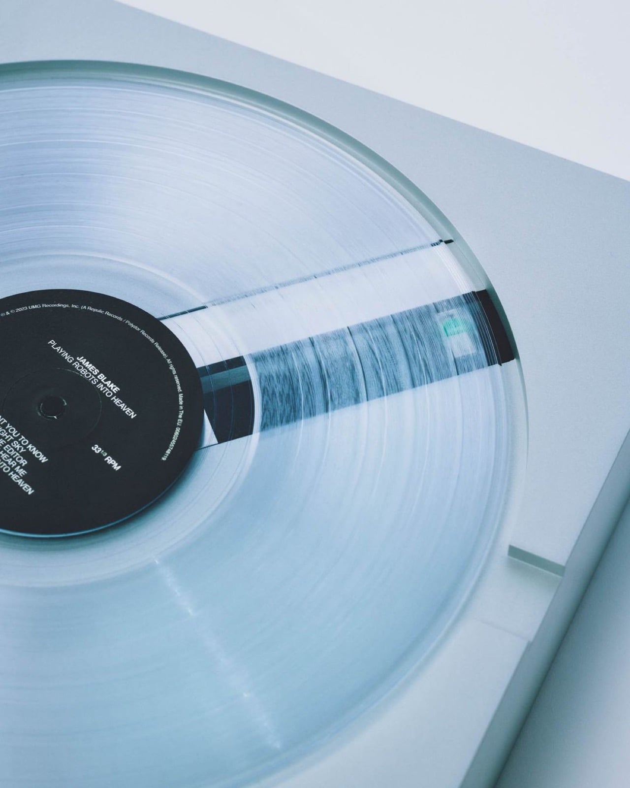
The record goes in upside down, and from there the PP-1 takes over entirely. A reading mechanism built into the platter operates from beneath the vinyl surface rather than above it, which is how the tonearm vanishes without taking the music with it. A built-in sensor automatically detects whether the record spins at 33 or 45 RPM and adjusts accordingly, eliminating the last manual decision from the process. An integrated phono preamp and headphone amplifier live inside the body, so headphone listening requires nothing additional. The interaction reduces to its absolute minimum: place the record, press one of two small buttons on the face, and listen.
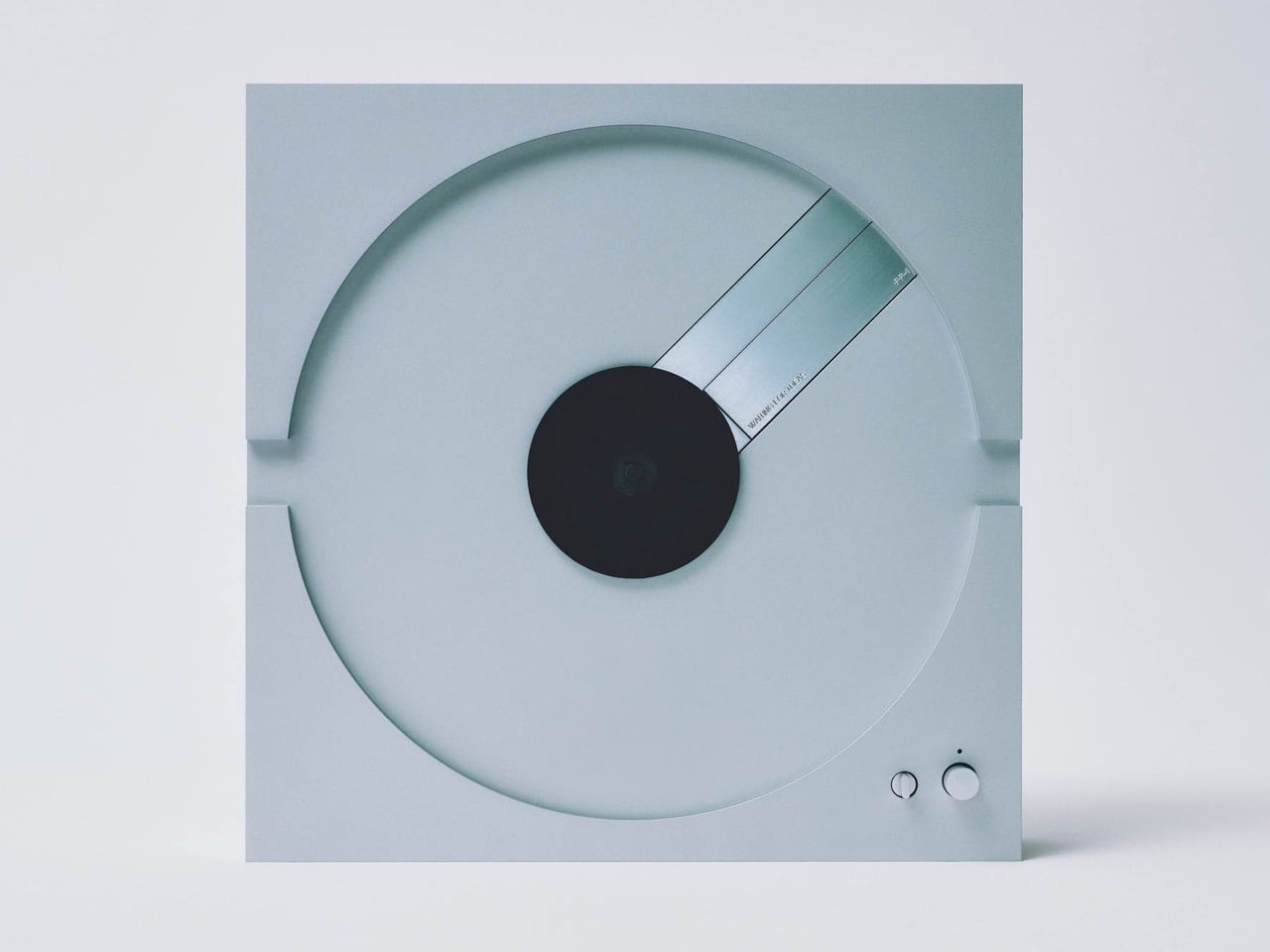
The body itself is milled from a solid block of aluminum, not pressed or assembled from parts, which gives the PP-1 a physical density that conventionally built decks cannot replicate. That mass serves a genuine acoustic purpose, as solid aluminum controls resonance and vibration more effectively than the hollowed wood plinths that most turntables rely on. The PP-1 can also stand and play upright, the record spinning horizontally against a vertical body, and Waiting For Ideas leans into this configuration in their product photography for obvious reasons. In that orientation, the turntable sheds the last visual connection to hi-fi equipment. It looks like a wall piece, a square of brushed metal with a circle cut into it.
Most of the vinyl revival has traded on nostalgia, warm wood finishes, visible cartridges, and retro typography that signals the ritual of analog listening as much as the listening itself. The PP-1 belongs to a different tradition entirely, closer to the restrained, function-forward product language of Dieter Rams at Braun and Bang & Olufsen at its mid-century peak, where the object earns its presence through formal clarity rather than decorative signaling. It launches at €5,800 (roughly $6,050), made to order, placing it in genuine high-end turntable territory alongside decks from Rega, Pro-Ject, and Clearaudio, all of which look considerably more conventional by comparison. Whether audiophiles make peace with the tonearm-free setup is a legitimate debate. The design argument the PP-1 makes is considerably harder to dismiss.
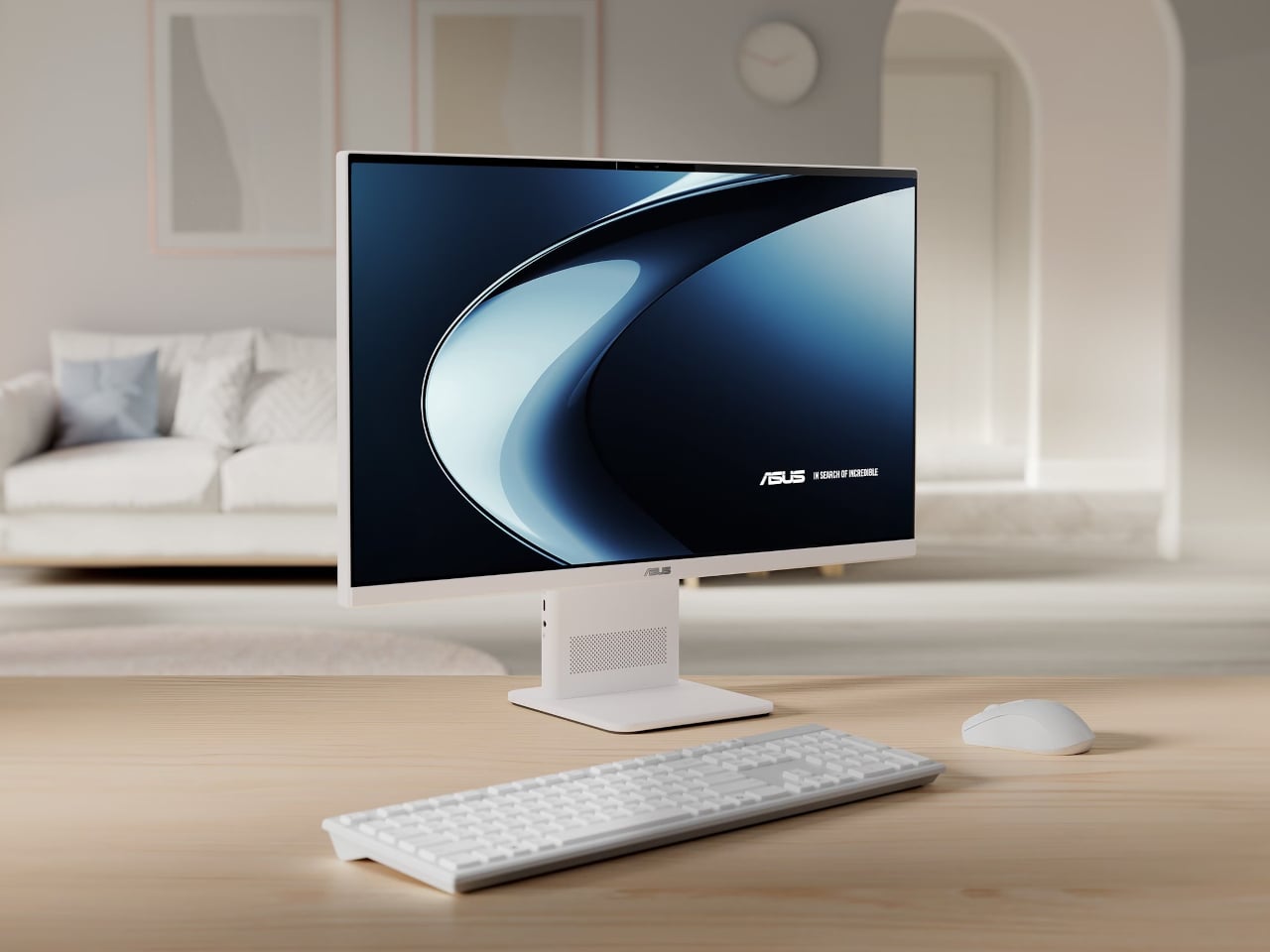
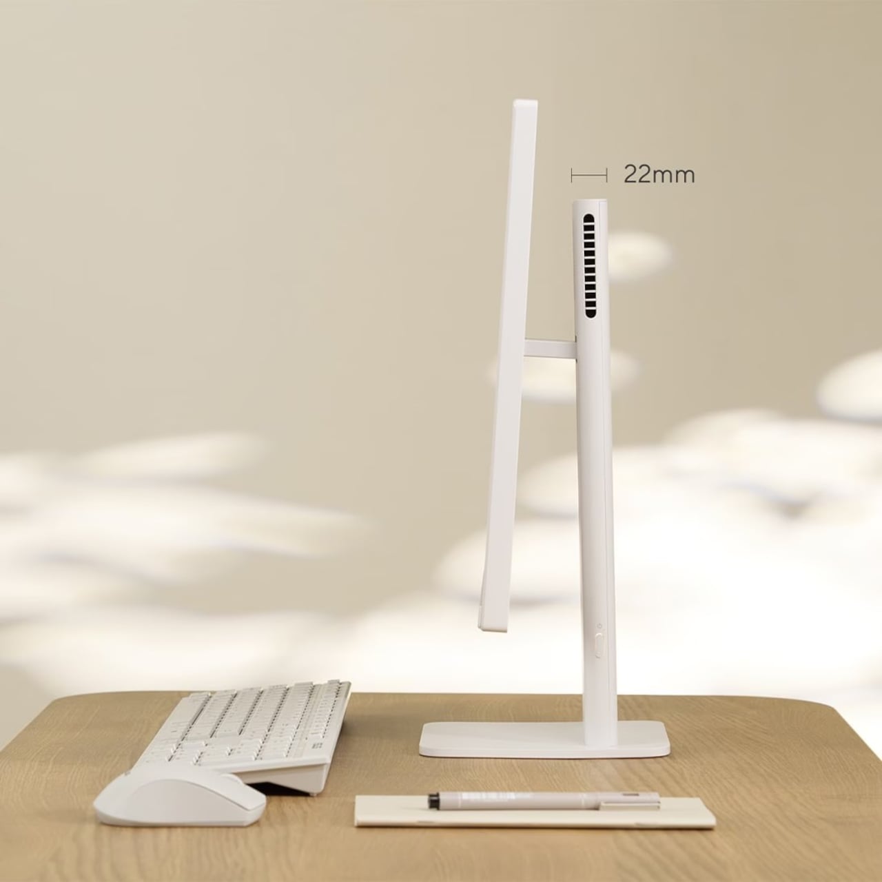
All-in-one computers have always promised clean desks, but they rarely deliver a truly minimal presence. Traditional AiOs hide their processors inside their displays, and those chips generate enough heat to demand substantial cooling, adding bulk to what should be a space-saving device. The result is often a thick, monitor-shaped box that makes you wish the cables were the only problem.
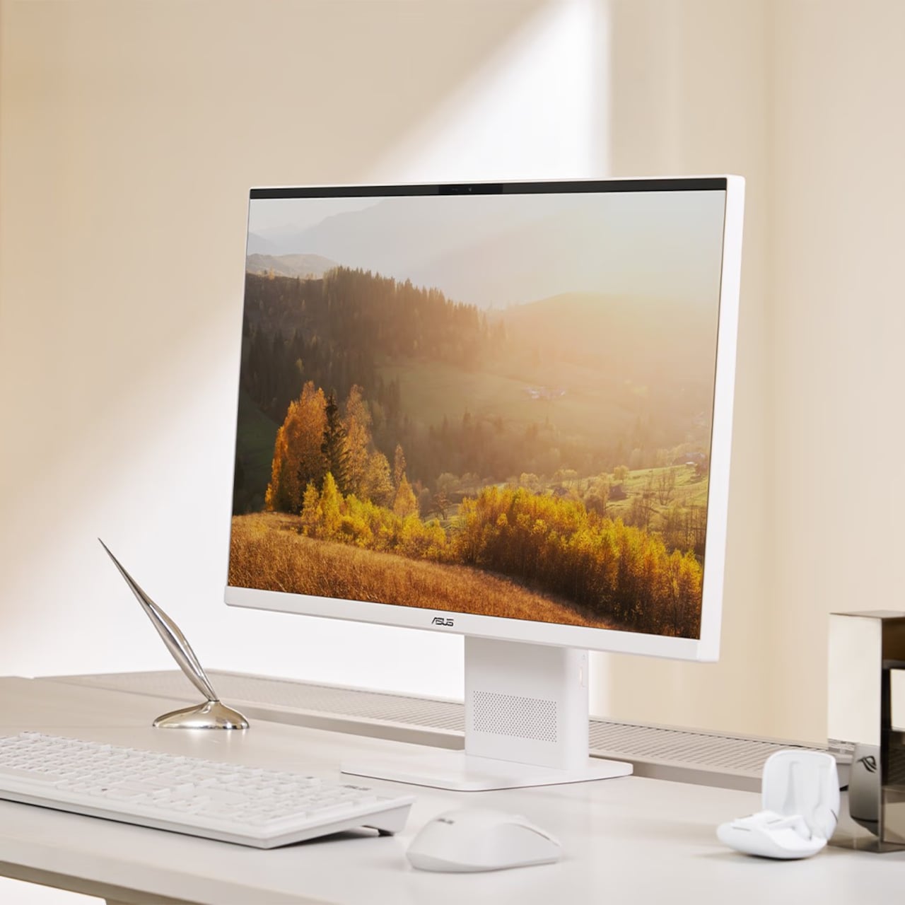
ASUS’s answer to that problem isn’t a slimmer chassis on paper, but a different processor choice entirely. The V400 AiO is the first all-in-one PC built on Qualcomm’s Snapdragon X platform, an ARM-based chip with mobile roots. Because it runs more efficiently than conventional desktop processors, it generates less heat, which means the cooling system can shrink significantly, and so can everything around it.
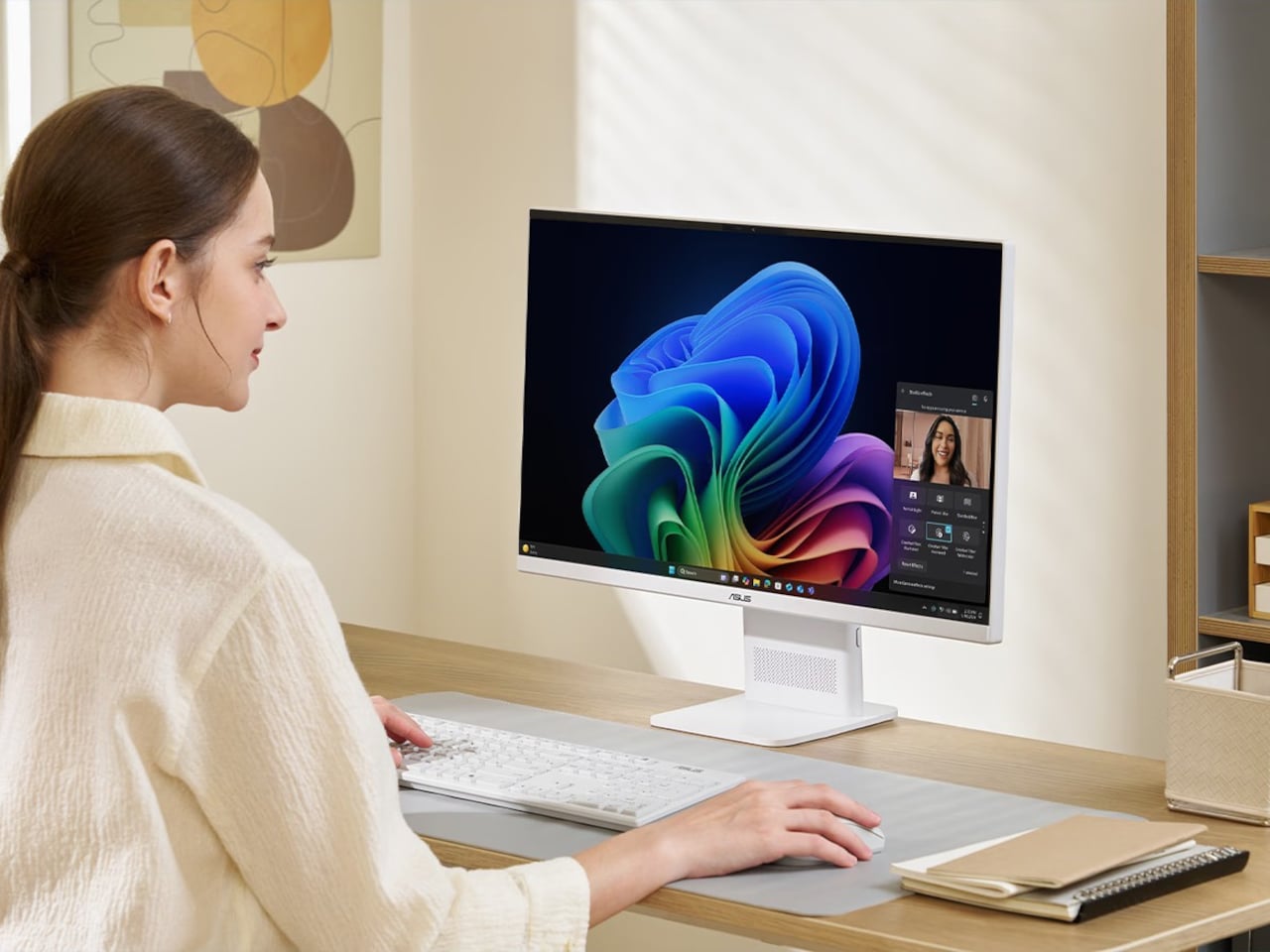
The lean stand and uncluttered rear panel make the V400 AiO look more like a monitor than a desktop. In a living room or study doubling as a homework station, it doesn’t demand attention the way a traditional AiO does. The quieter cooling helps too; no loud fans cycling up during video calls or while someone streams in the next room.
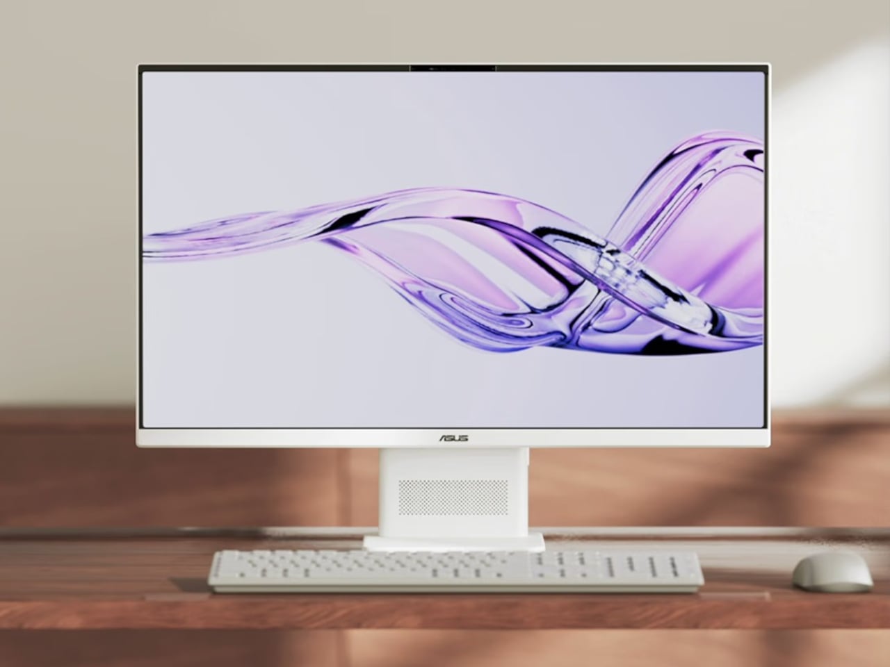
The 23.8-inch Full HD IPS display supports touch input and covers the full sRGB color gamut, making it comfortable for both casual browsing and creative work. With up to 32 GB of LPDDR5X memory and up to 1 TB of PCIe 4.0 SSD storage, it handles simultaneous tasks without hesitation. The 5-megapixel IR camera gives video calls a cleaner look than most built-in webcams manage.
The Snapdragon X’s 45 TOPS NPU qualifies the V400 AiO as a Copilot+ PC, meaning it runs Microsoft’s on-device AI features without routing anything through the cloud. Smart photo management, real-time voice processing, and intelligent assistance all happen locally, keeping personal data off third-party servers. For a machine that’ll likely sit in a shared family space, that kind of privacy has practical appeal.
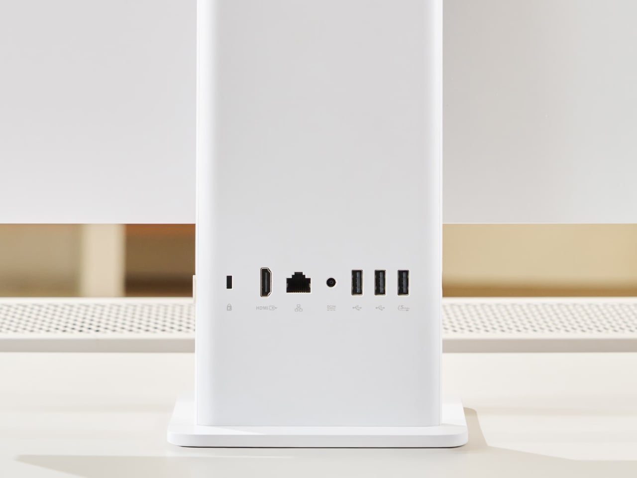
Dolby Atmos handles the audio, which makes a difference when the V400 AiO doubles as an entertainment hub for the family. Connectivity includes HDMI output, USB 3.2 Gen 1 Type-A, and USB-C ports, covering most peripherals without adapters. A wireless keyboard and mouse ship in the box, so the whole setup can be up and running without hunting for extra accessories.
ASUS priced the entry-level V400 AiO at $649.99 in the US, with 16 GB of RAM and a 512 GB SSD. The Indian market gets a 512 GB model at ₹1,01,990 and a 1 TB version at ₹1,11,990. For an all-in-one that doubles credibly as a piece of furniture in a modern room, that starting point asks less than many Intel-powered competitors.
What the V400 AiO makes clear is that the Snapdragon X choice isn’t incidental. The chip’s lower heat output is why the chassis stays slim. Its efficient architecture is why the AI runs locally rather than through a server. Its quiet thermal profile is why it belongs in a living room as much as a home office. The processor determines the design, not the other way around.
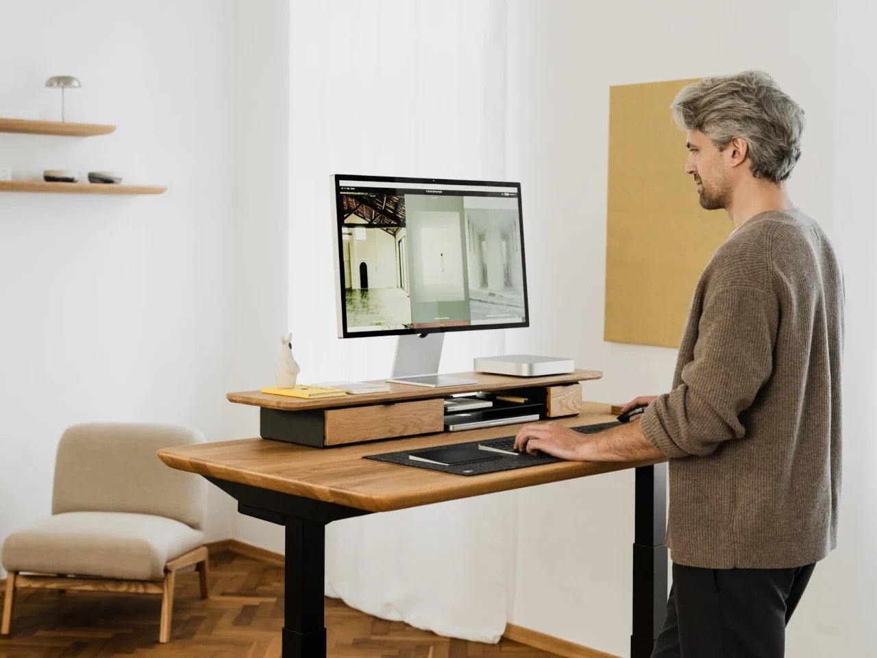
The minimalist desk setup has become one of the most documented trends in home office design, particularly as hybrid work continues pushing people to invest more seriously in the spaces where they spend their days. Most products marketed toward that crowd lean hard on the visual side, neutral finishes, restrained forms, nothing that draws attention to itself. What they’re less reliable at is spatial logic.
The ten accessories on this list were chosen with that in mind. Each one has to pass a practical test, not just look calm on a desk, but actually justify the space it occupies. That means hiding clutter, combining functions, freeing surface area, or removing a small friction before it turns into a habit.
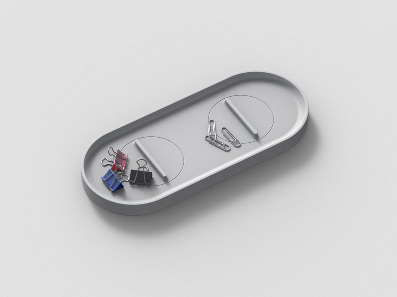
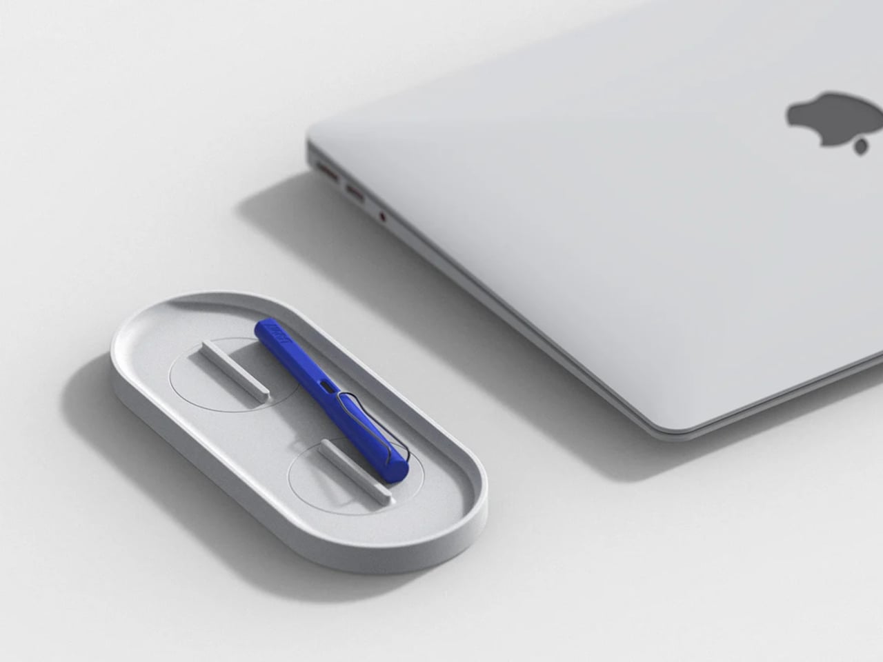
KNOB. Pen Tray
Most pen trays solve a narrow version of the problem. They give you a fixed layout, usually a rectangle divided into two or three compartments, and expect you to work around it forever. That’s fine until your tools change, and they always do. Changho Lee’s KNOB. Pen Tray takes a different approach by making the interior of the tray something you can actually reconfigure.
The dividers are controlled by knobs that take their cues from gas burner controls, a design reference that also gives the tray its name. Turn them and the internal layout shifts, letting you organize pens alongside rulers, adapters, or whatever else needs a place. One tray handles what might otherwise require three, which makes a convincing case for its footprint. The mechanism can feel fiddly if you reorganize often.
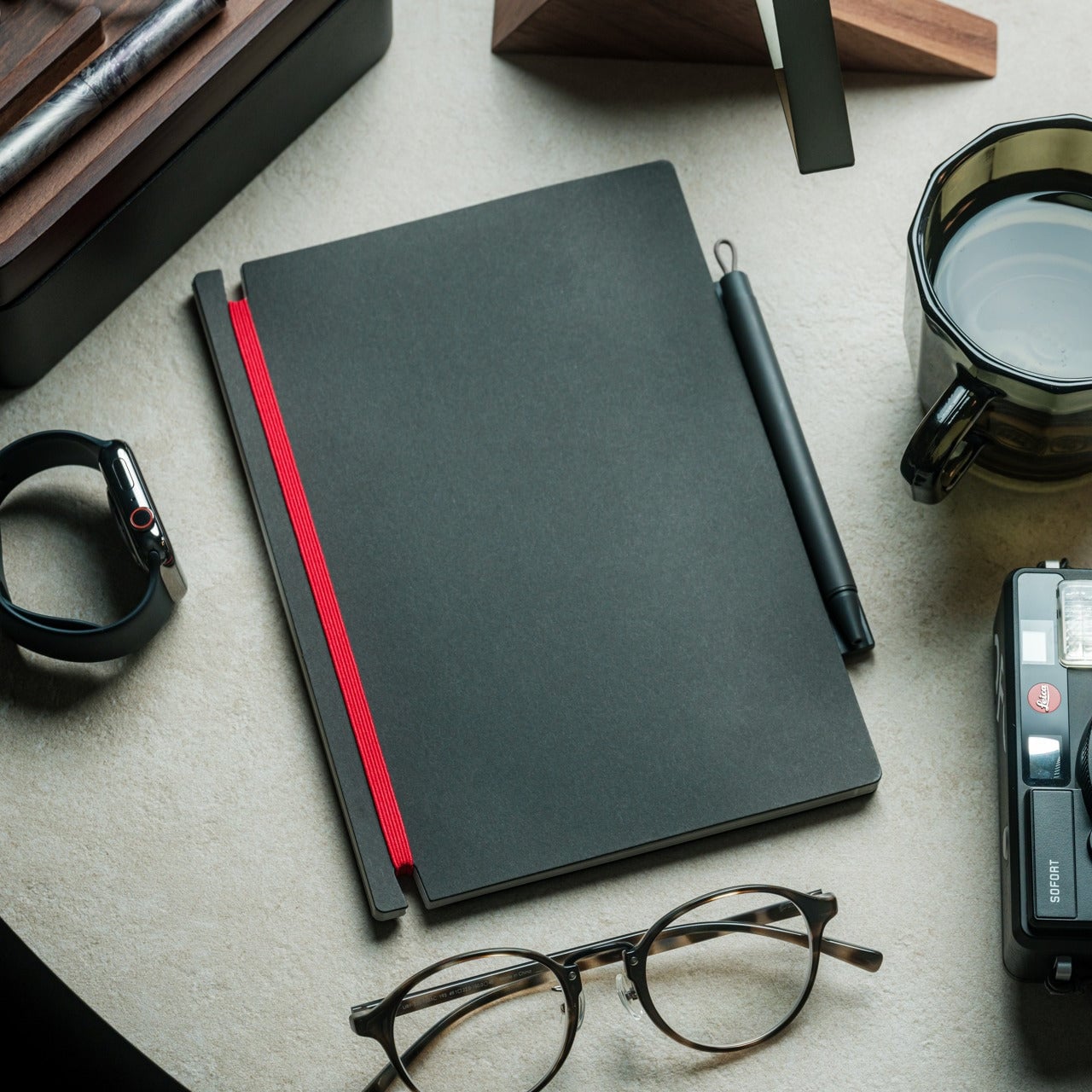
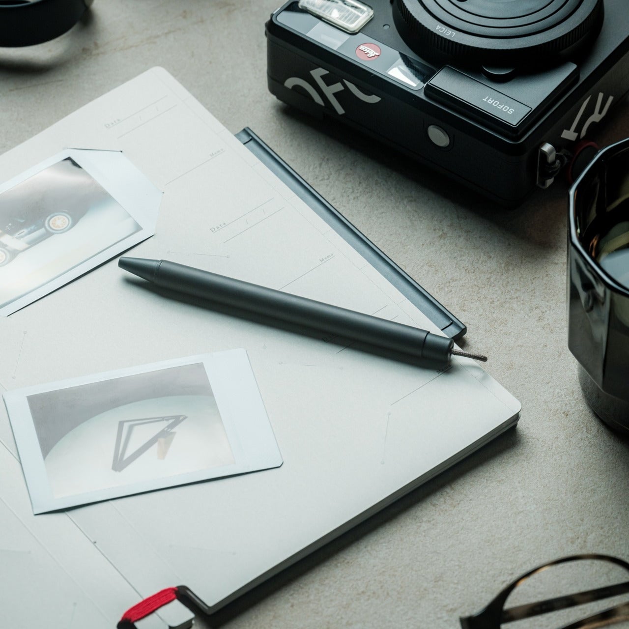
Inseparable Notebook Pen
There’s a particular kind of frustration that comes with reaching for a pen and finding it’s no longer where you left it. It’s small enough to ignore once, but it happens often enough to become a genuine irritant. The Inseparable Notebook Pen doesn’t try to solve desk organization broadly. It solves this one specific problem by keeping the pen attached to the notebook it belongs with.
A magnetic clip secures the pen directly to the notebook cover, so the two travel as a unit and stay that way on the desk. There’s also a built-in silencer that softens the attach-and-release motion, which sounds like a small detail until you use it daily. The pen works best when paired with its intended notebook, so it’s less convincing as a standalone writing instrument.
Orbitkey Desk Mat
Desk mats often get treated as the last layer of a setup, something you add once everything else is in place to make the whole thing look polished. The Orbitkey Desk Mat earns more than that role. It addresses one of the quieter problems on any active desk, the gradual spread of loose papers, sticky notes, and reference sheets that slowly take over the surface.
A document hideaway built beneath the top layer lets you slip papers out of view without throwing anything away. They stay flat and within reach, invisible until you need them. A toolbar along one edge keeps stationery and smaller tools from drifting. Available in Black and Stone across two sizes, the mat works whether you’re running a compact home setup or a larger studio table.
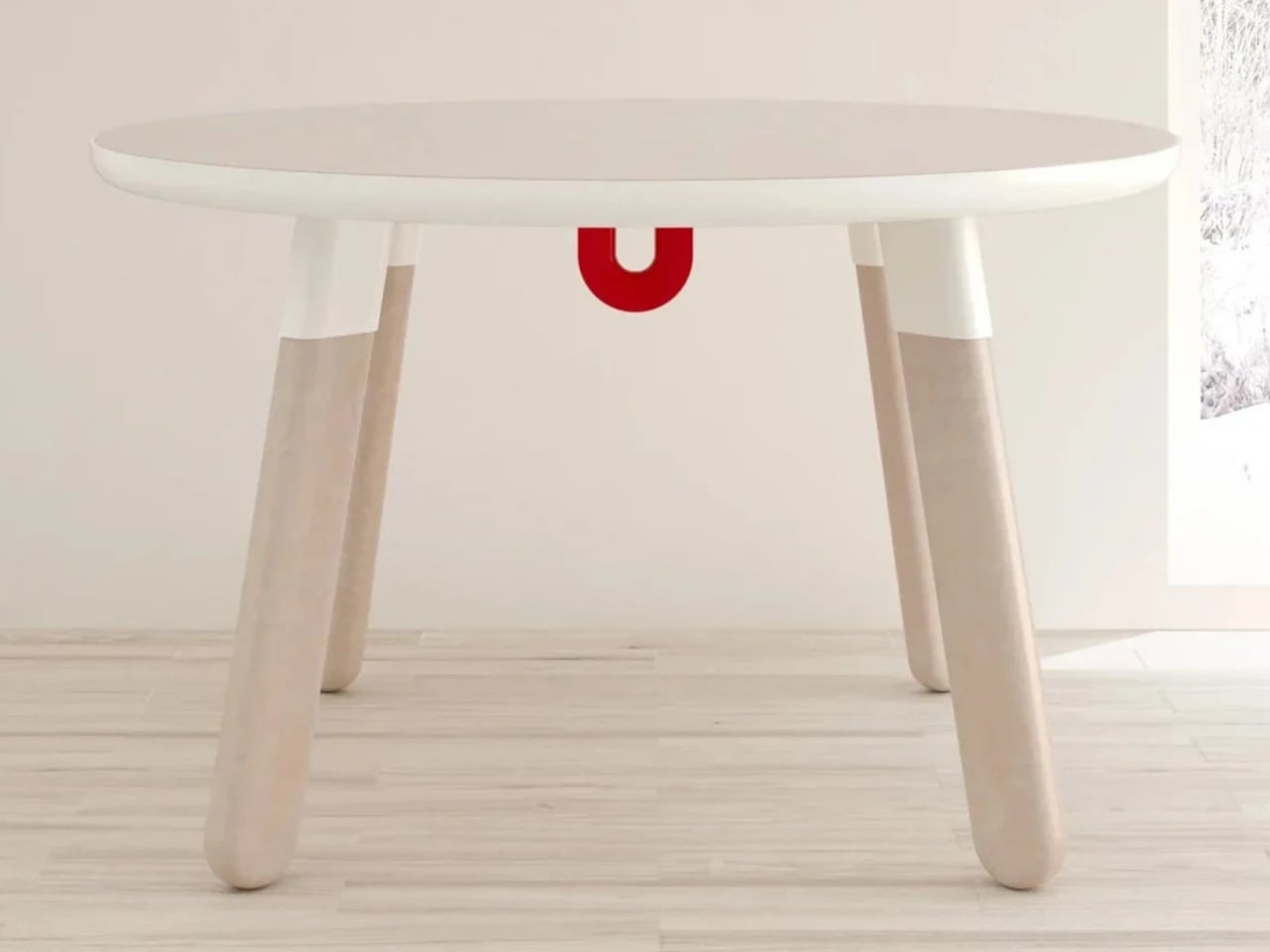
ME-1 U-shaped Power Strip Concept
Cable management is one of those desk problems that most solutions only partially solve. You gather the cords, clip them together, maybe run them through a box, and the result is still visible, still part of the desk’s noise. Michael Kritzer’s ME-1 power strip concept takes a different position, arguing that the power strip itself should hang below the work surface rather than claim space on top of it.
Curved into a U-shape, it can hang under a table or stick to metallic surfaces, while its two legs give you somewhere to wrap cables so they don’t trail freely. There’s also enough spacing between the alternating three-prong sockets and USB ports to fit bulky chargers without blocking each other. It’s still a concept, and questions about how far it protrudes remain, but the logic behind it is sound.
Oakywood Desk Shelf Pro
Monitor risers are supposed to help, and usually they do, but only as far as ergonomics go. The desk surface often ends up just as crowded as before, just with a platform sitting in the middle of it. The Oakywood Desk Shelf Pro approaches the problem differently, treating the riser not as an accessory but as furniture that earns its size by doing more than one job.
The shelf spans desk width, lifting the monitor to eye level while clearing space underneath for a keyboard or laptop, with steel legs at each end creating a floating effect. Built-in drawers tuck away stationery and small tech, and a felt-lined open shelf handles tablets or a closed laptop. It’s built from solid oak or walnut, not MDF with a plastic skin, and can hold up to 100 kg without flexing.
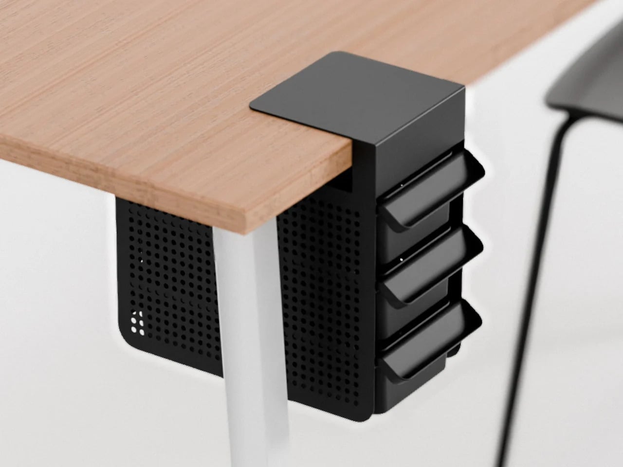
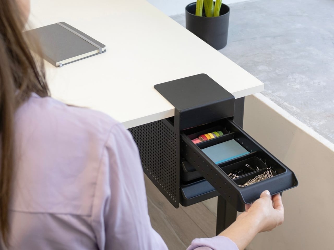
Practiko Otis Hanger 3.0
Minimalist desks look clean partly because many of them don’t come with built-in drawers. That’s a reasonable design choice until the pens, sticky notes, charging cables, and paper clips have nowhere to go and start accumulating on the surface instead. The Practiko Otis Hanger 3.0 adds that missing storage back without a single screw or permanent alteration.
The system clips onto the desk edge and hangs beneath the work surface, giving you three trays and the full top plane back. The 3.0 version features more perforation points for finer divider adjustments, and three nested mini trays handle smaller items like paper clips, thumbtacks, or earbuds. Larger handles on each tray let you pull them out smoothly without looking down, which makes more of a difference in daily use than it sounds.
Nuka Eternal Stationery
There’s a version of minimalism that’s about owning as little as possible. There’s also one that’s about how much the things you do own keep asking of you. Nuka’s Eternal Stationery belongs to the second kind. Built around permanence rather than disposability, it’s a notebook-and-writing-tool system designed to stop demanding replenishment, which is its own quiet argument for staying on a well-edited desk.
The notebook is waterproof and tear-proof, and pairs with a metal alloy tip that writes with the consistency of a traditional pencil but requires no sharpening and never breaks. Pages clear completely with the Nuka Magic Eraser, ready to be written on again. For anyone who writes regularly, the appeal is straightforward, though writers accustomed to ink on paper may need some adjustment time with the metal alloy tip.
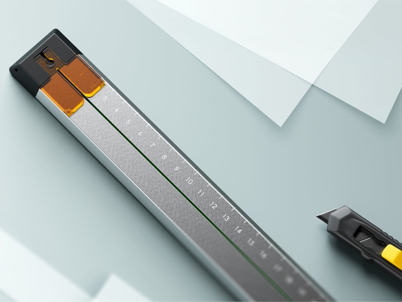
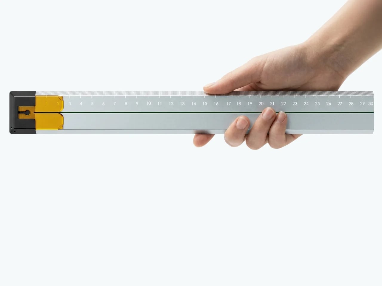
Quiver Ruler
A ruler is one of the few tools that earns a place in a minimalist setup by compressing several small tasks into a single flat form. Tunir Maity’s Quiver does that more thoroughly than most. It’s an anodized aluminum ruler designed primarily for people who actually cut with one, not just measure. It treats shaky hands and imprecise cuts as design problems worth solving, not limitations the user is expected to compensate for.
A clip mechanism holds paper in place, a blade slit guides the cut in a straight line, and the weight distribution favors the cutting end, so you don’t have to press down as hard. It also includes a carabiner attachment for clipping to a bag. Quiver is currently a concept, so availability hasn’t been confirmed, and it’s more specialized than what a casual desk user would reach for day to day.
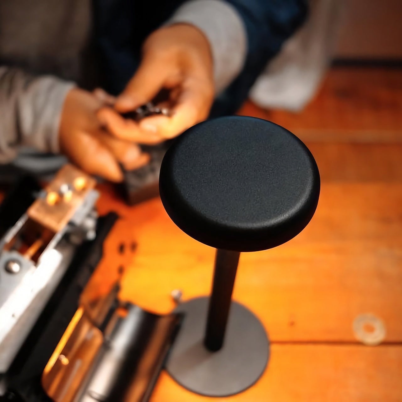
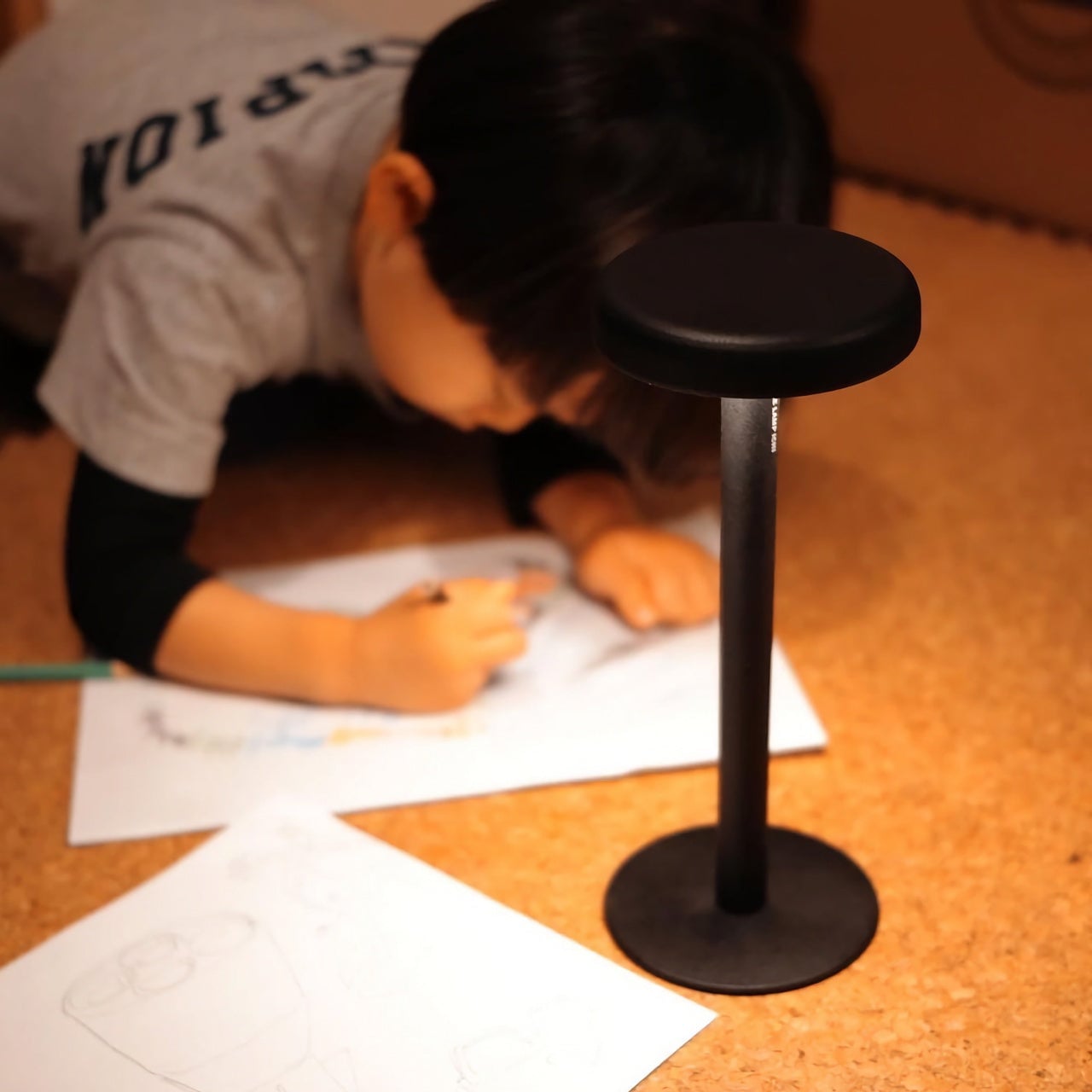
Ichi Portable Lamp
Desk lamps rarely fail in the obvious ways. Most give off enough light and last long enough. What they tend to get wrong is the base, which on wider models claims an entire desk corner, and the cord, which invariably ends up somewhere visible. The Ichi Portable Lamp, born from the collaboration between Fujita Kinzoku and TENT Design, keeps the form slim and goes cordless, addressing both without turning the lamp into a statement piece.
Powered by four standard AA batteries, it runs cordless without the limitations of proprietary chargers. Its warm, high-color-rendering CRI 95 LED creates a soft, radiant glow suitable for task work or winding down. The modular design disassembles into three parts and packs down to a slim 20mm thickness. It’s more portable than a permanent desk fixture, which is worth knowing if you need sustained, high-output lighting for long stretches.
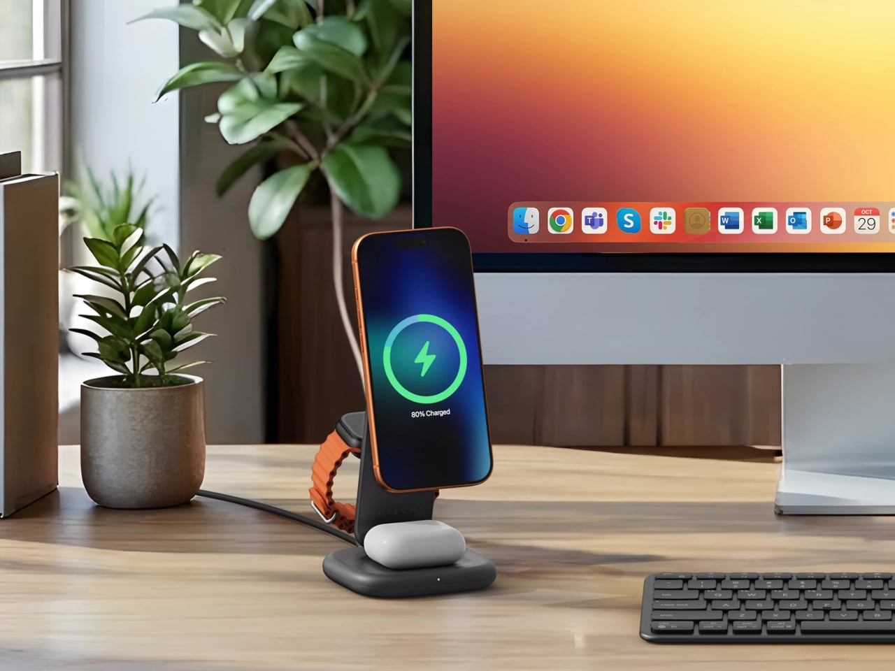
Satechi 3-in-1 Foldable Wireless Charging Stand
Getting a phone stand onto a minimalist desk requires a stronger argument than just holding the phone upright. The Satechi 3-in-1 Foldable Wireless Charging Stand with Qi2 25W makes that argument by doing three jobs at once, replacing the tangle of separate charging pads that Apple users typically accumulate. Wireless charging was supposed to simplify things, but most setups end up with a different kind of mess instead.
Set the iPhone down, and Qi2 snaps it into position, the Apple Watch gets its own fast-charge arm, and the AirPods rest on a pad below, all drawing from a single cable to the wall. The stand folds flat for travel and fits easily in a carry-on. A 45W USB-C adapter with US, EU, and UK plugs ships in the box. It’s most compelling for people already working within the Apple ecosystem.
Building a cleaner desk comes down to the same question applied to every object on it: what is it giving back for the space it takes? Color and material can make things look minimal, but they don’t make them earn their place. That’s a footprint budget, and it’s a much better framework for deciding what stays than any mood board, setup guide, or neutral palette.
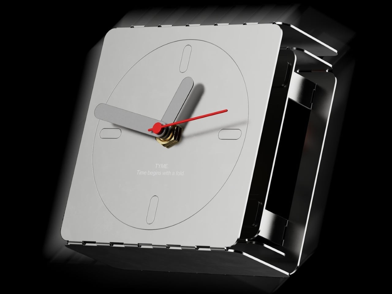
The tabletop clock has been one of the quieter casualties of the smartphone era. Most people stopped owning them the moment a phone took over nightstand duty, and those that survived tend to be either nostalgic holdovers or objects that lean so hard into decoration that the time-telling part becomes secondary. The ones that actually last tend to be the ones that got the balance exactly right from the start.
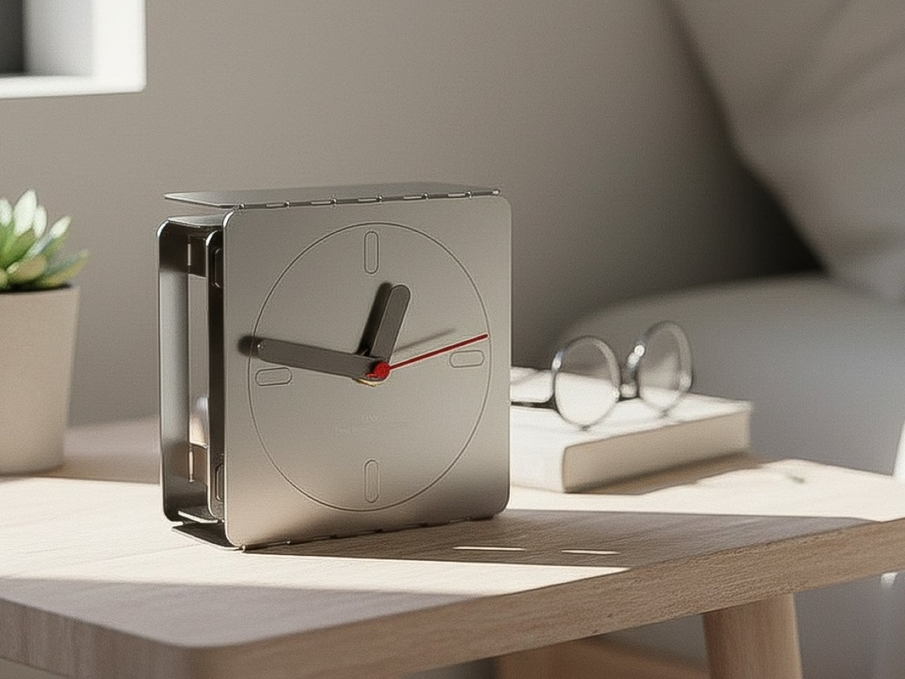
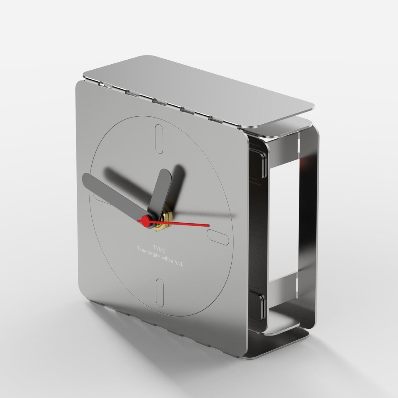
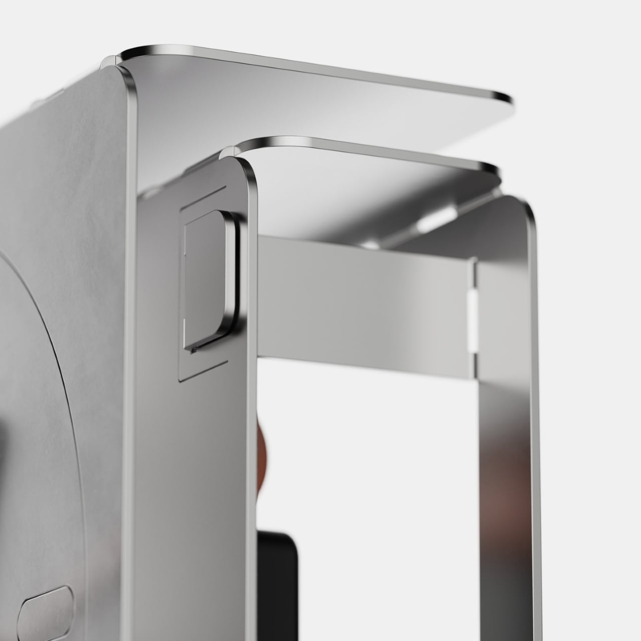
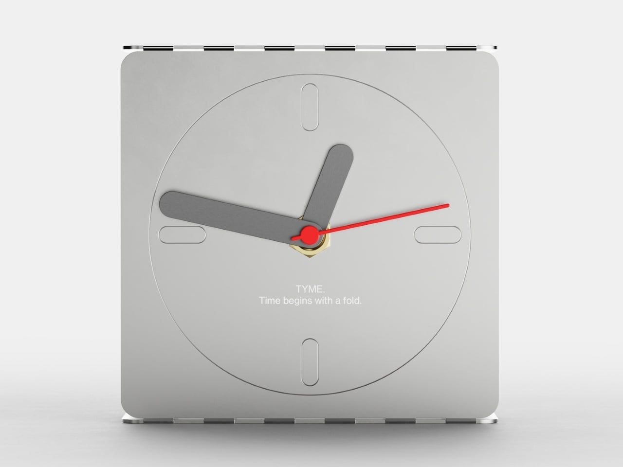
Braun managed that balance better than anyone with the AB 20, a 1975 travel clock by Dieter Rams and Dietrich Lubs that reduced the concept of a clock to almost nothing unnecessary. Argentina-based industrial designer Agustin Papadopulos had that same spirit in mind when he designed TYME, a conceptual table clock that pushes minimalism further by starting from a literal flat sheet of steel.
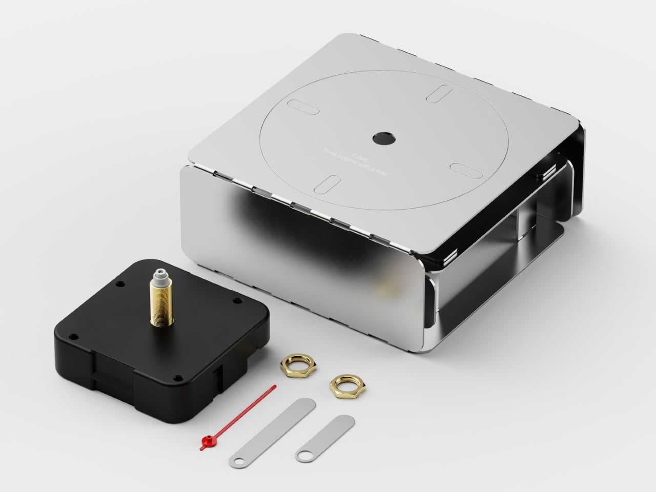
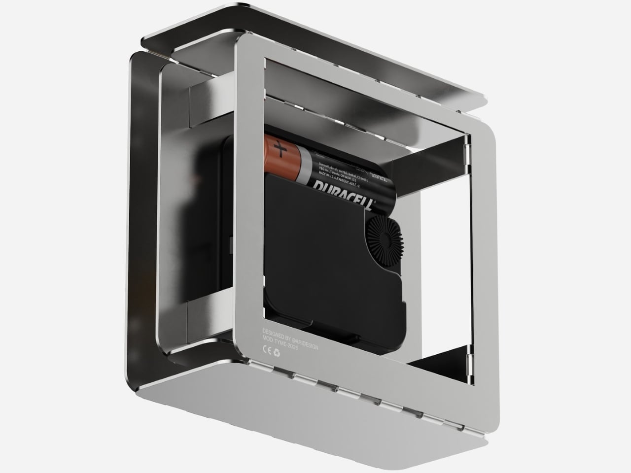
The process starts with a single laser-cut steel sheet, pre-scored along fold lines. Fold the sides inward, interlock the tabs, and a rigid three-dimensional case takes shape without a single screw or adhesive. There are no separate structural components. The entire chassis emerges from one piece of material, with nothing added and nothing wasted, just the geometry of the fold doing all the work.
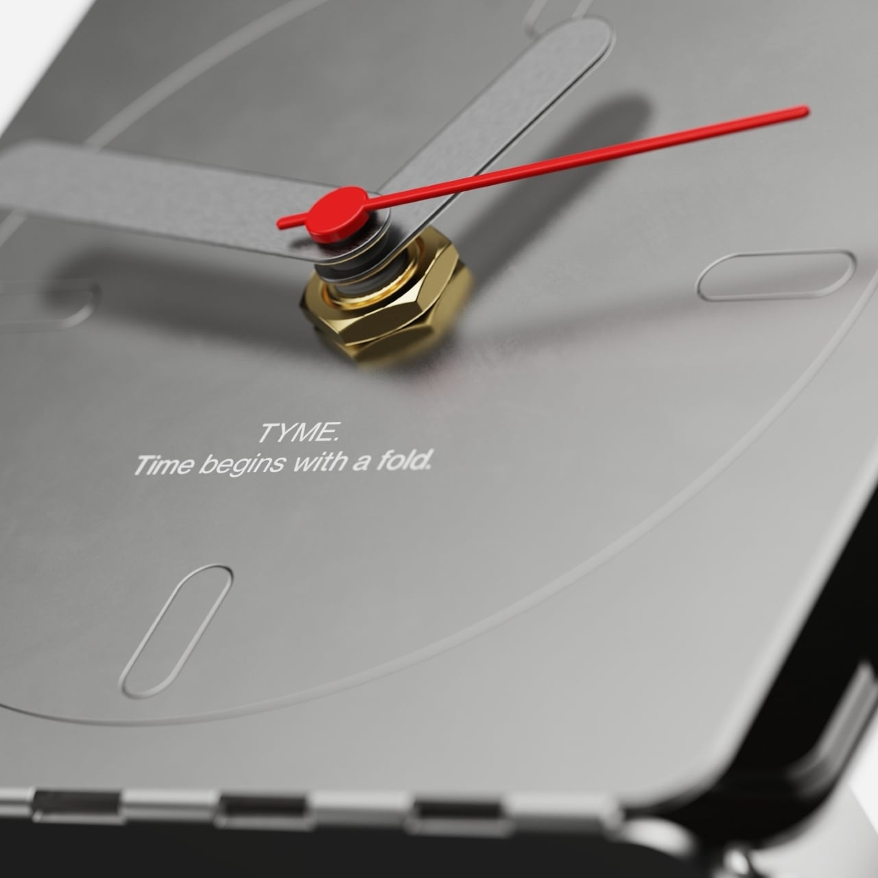
Once the body is formed, the clock mechanism drops in from behind. A standard quartz movement fits inside the folded cavity, with the shaft passing through the circular dial on the face. The hands, two muted gray blades for hours and minutes and a thin red sweep for seconds, slip onto the shaft. A brass hex nut anchors everything with a deliberately exposed, industrial touch.
The face itself is a direct nod to the Braun AB 20’s design language. Four pill-shaped markers at the cardinal positions stand in for numerals, and the circular dial is etched lightly into the face rather than applied as a separate element. It’s been stripped to its most essential logic, which is exactly what Dieter Rams and Dietrich Lubs were doing with the AB 20 back in 1975.
Using a single sheet for both the structure and the visible surfaces makes good sense from a production standpoint. Laser cutting eliminates the need for molds or complex tooling. The fold lines that hold the body together are the same cuts that shape the overall form, so each incision does double duty. Less material, fewer components, and a simpler process all follow from that one decision.
There’s a quieter idea at work in TYME that goes well beyond material efficiency. Papadopulos frames folding not as a simple assembly step, but as the moment you bring the clock into existence. You’re not receiving a finished object. You’re closing the form, installing the hands, dropping in the battery, and starting the mechanism. The first second it ticks is genuinely yours to claim.
Most fitness trackers have followed the same design logic for years: a screen on the wrist that flashes step counts, shows incoming messages, and turns the whole device into a smaller, sweatproof version of your phone. That approach has its fans, but it also has a ceiling. Screens add bulk, drain batteries, and tempt you to keep checking things you probably didn’t need to check while trying to fall asleep.
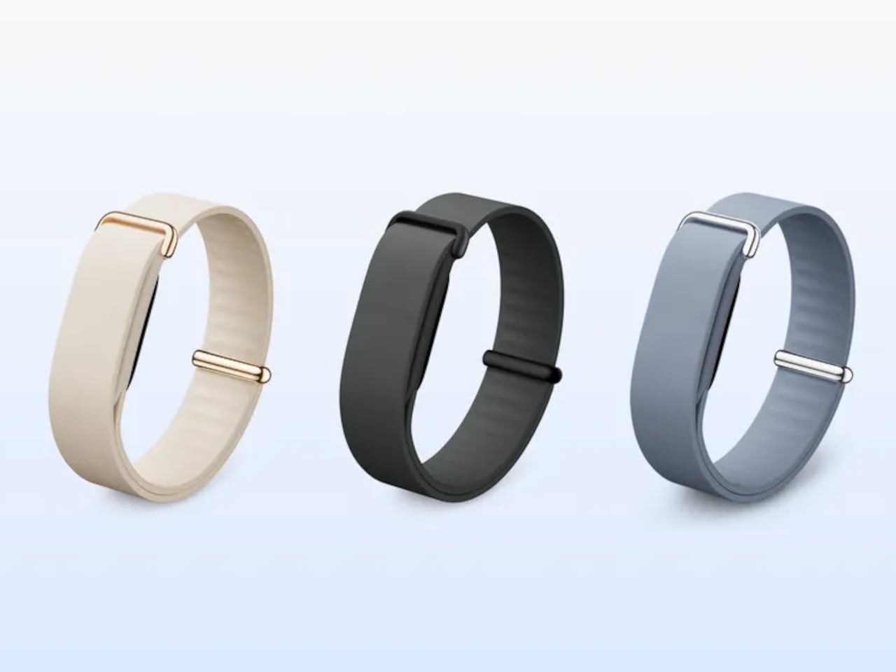
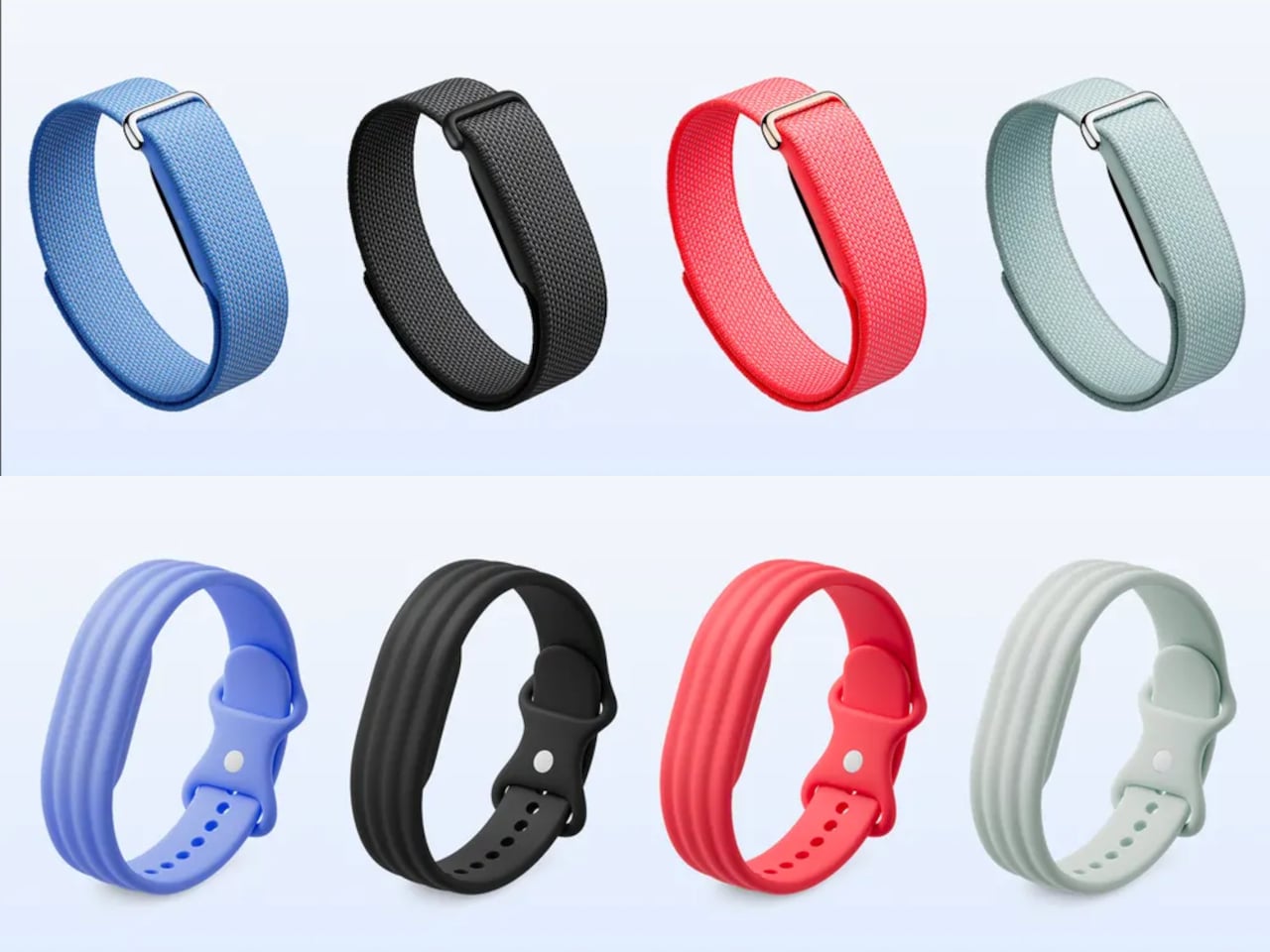
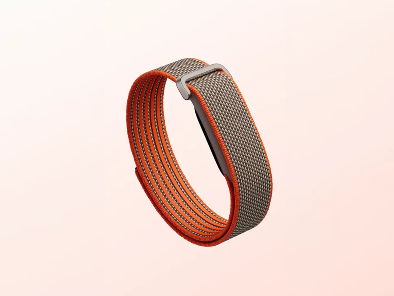
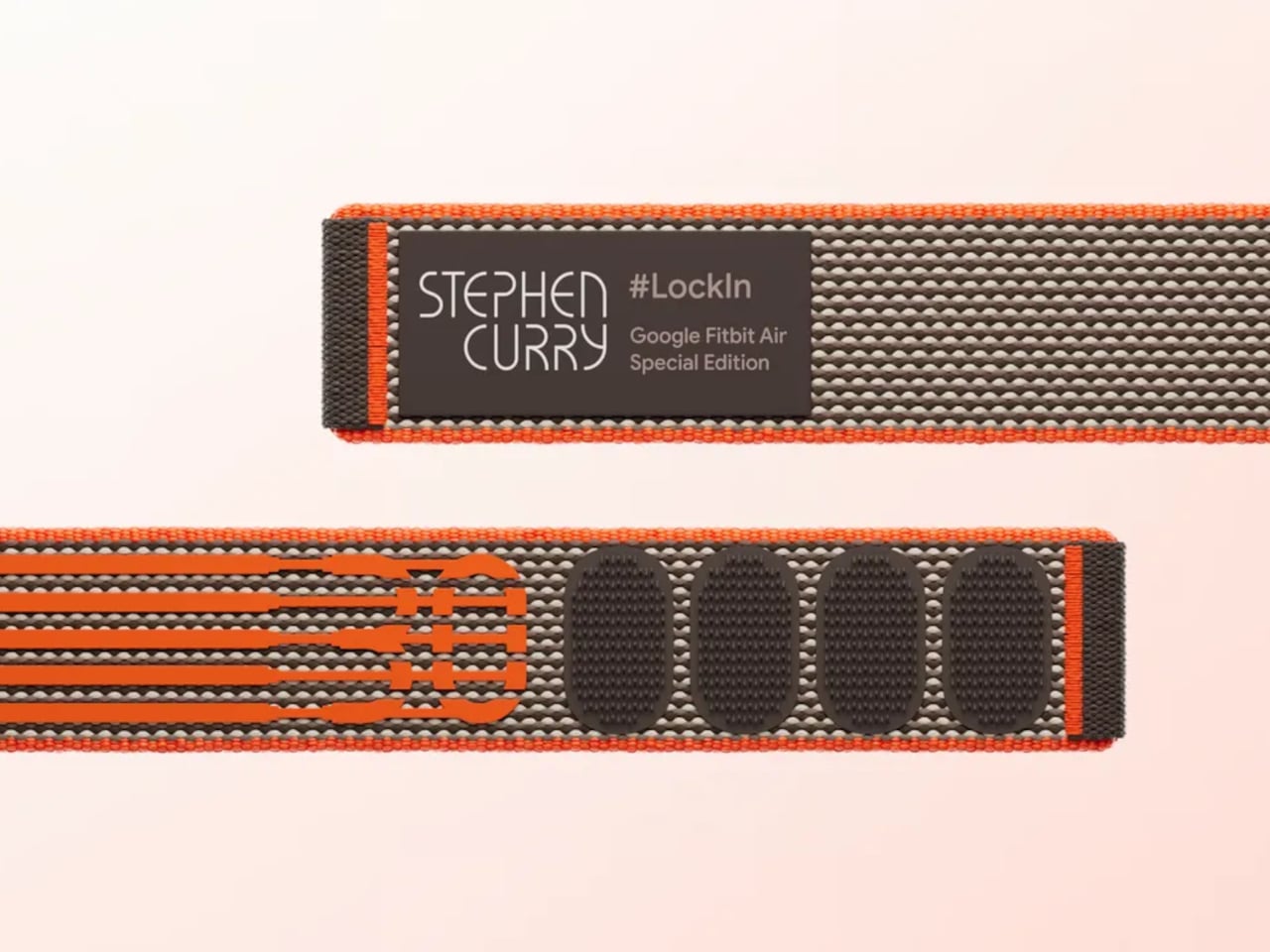
Fitbit Air is Google’s answer to what a fitness tracker looks like when the screen comes off entirely. It’s the smallest Fitbit ever made, weighing roughly five grams on its own and about 12g with a band, and it has nothing on its face except a slim oval housing made from recycled polycarbonate. No display, no haptic button, no notification feed; just sensors doing their job quietly and continuously.
That doesn’t mean there’s less happening inside. The Air carries an optical heart rate monitor, a three-axis accelerometer and gyroscope, red and infrared sensors for blood oxygen monitoring, and a device temperature sensor. Together, these maintain a continuous record of heart rate, heart rate variability, resting heart rate, oxygen saturation, and sleep stages, while also flagging irregular heart rhythms along the way without any input from the wearer.
Wear it to bed, and it tracks sleep stages through the night without lighting up or buzzing. Take it through a workout, and it recognizes the activity automatically. The battery lasts up to seven days under normal use, and a five-minute top-up adds another full day when the charge runs low. Water resistance reaches 50 meters, so showers, swimming, and sweaty training sessions don’t require a second thought.
The data flows into the Google Health app, which is where the Air actually earns its keep. Built on Gemini, Google Health Coach reads everything the tracker has collected and turns it into something genuinely useful: personalized recommendations, recovery guidance, trend analysis, and answers to specific questions about why you might be feeling tired after travel or how to adjust training around an injury, all based on your actual biometrics.
The app works the same way with Pixel Watch, meaning the Air can slot into an existing Google wearables setup or work entirely on its own. Wearing both simultaneously is supported, health data syncs automatically, and the app lets you sort metrics by device. For someone who already carries a Pixel Watch but wants continuous overnight tracking without the bulk of a full smartwatch, the Air fills that gap neatly.
Fitbit Air is available for preorder at $99.99, with first shipments scheduled for May 26. That price includes three months of Google Health Premium, which unlocks full access to Health Coach. After the trial, continuing the service runs $9.99 per month or $99.99 per year. A Stephen Curry Special Edition runs $129.99, and interchangeable accessory bands start at $34.99, compatible with Android and iOS.
Compared to other services that charge nothing upfront but require a subscription from the start, the Air’s $99.99 entry price is a more accessible way in. As a device you’re genuinely not meant to look at, its value lives almost entirely in the software behind it; the band gathers, and Google Health interprets. For a tracker specifically designed to be forgotten on the wrist, that’s a quietly compelling arrangement.
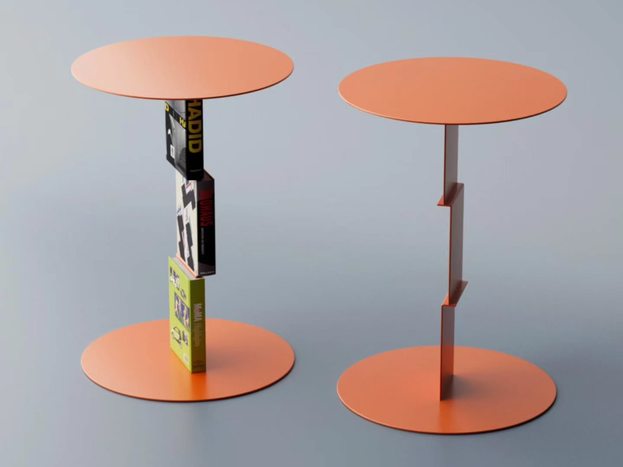
The coffee table is the hardest surface in the living room to get right. Put too much on it, and it looks like a staging mistake. Put too little and the room reads unfinished. The minimalist approach settles this by demanding each object justify its place twice — once as something useful, once as something worth looking at. Every product on this list earns on its own terms.
These five objects were chosen because they share a logic rather than a matching aesthetic. A kinetic toy, a modular ceramic, a structural tray, a floating mobile, a handpoured candle vessel — different categories, different price points, one consistent standard. Each one does more than its category suggests, and none of them requires anything around it to look complete. That is the whole point of a surface that does more by doing less.
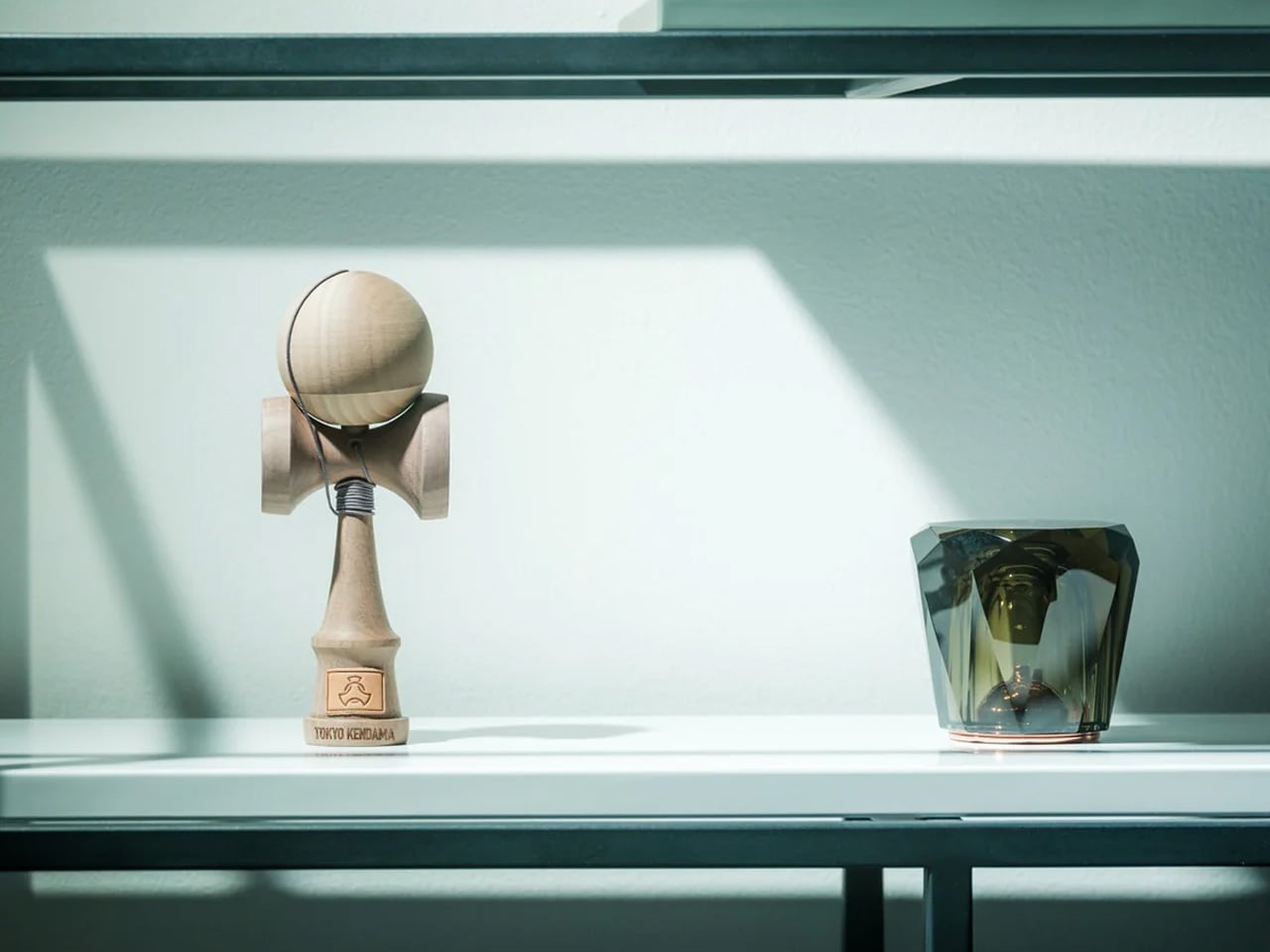
1. ClearMind Kendama
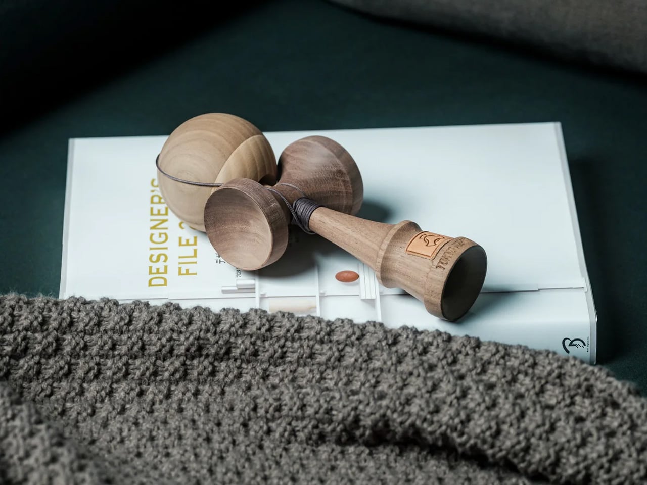
The ClearMind Kendama is the object on this list that will raise the most eyebrows and earn the most genuine conversation. Crafted in Tokyo from solid, unpainted walnut and maple, it’s a Japanese skill toy that sits on a minimalist coffee table the way a chess set sits on a side table — quietly suggesting a way of spending time that isn’t a screen. The two-tone wood grain reads as sculpture when it’s at rest, and the proportions are tight enough that it occupies almost no footprint while contributing significant material presence and warmth to the surrounding surface.
What makes the Kendama work as a coffee table object rather than just a novelty is the quality of its materials and the honesty of its finish. Walnut and maple at this weight don’t look like toys — they look like considered objects, which is exactly what they are. The practice itself is deliberately simple: the ball catches on the cup, the spike, the base plate. Each successful catch requires a small act of focus that pulls you out of passive consumption and toward something genuinely present. On a minimalist table, it functions as an invitation — to pick up, play, put down — and every time it rests, it returns to being a beautiful wooden form that needs no explanation.
The unpainted natural wood reads as a sculpture at rest
The meditative play pattern offers something no other object on this list provides
What we dislike:
The cup-and-ball proportions are an acquired taste for anyone who associates kendamas with children’s toys
The string can feel visually busy if left extended rather than gathered
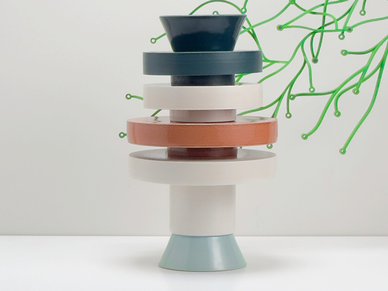
2. Torre Modular Ceramic Vase
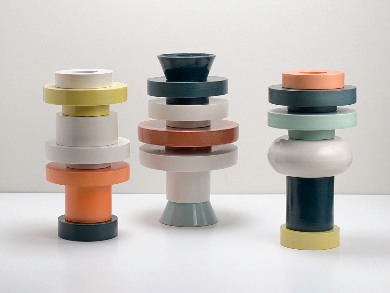
The Torre Modular Ceramic Vase by Scott Newlin for Dudd Haus is the most expensive object on this list by a significant margin, and the one that earns that price most transparently. Each piece is hand-thrown at Powerhouse Arts in Brooklyn and arrives as a set of stackable ceramic modules — two, three, or four components depending on the configuration — that interlock through consistent diameters and lipped rims. The forms are architectural, muted, and deliberately quiet: off-white, sand, stone. On a coffee table, they read as a composed sculpture from any angle, at any height.
What sets the Torre apart from a standard ceramic vase is that it offers a choice every time you approach the table. Stack the modules high for a vertical moment, separate them into a low cluster, or pull one aside entirely and set a dried stem inside the remaining piece. The act of rearranging them is part of the object’s value — it rewards attention in a way that static objects never can. For a minimalist surface, the price demands justification, and it finds it here: the Torre is three objects in one, each configuration as resolved as the last, none of them requiring anything around them to look finished. It is the closest thing on this table to pure design.
What we like:
Each reconfiguration creates a genuinely different visual read
The hand-thrown ceramic carries natural variation that improves with close attention
What we dislike:
At $1,200, it is a significant commitment for a surface object
The off-white and sand palette, while intentional, can disappear on lighter table materials
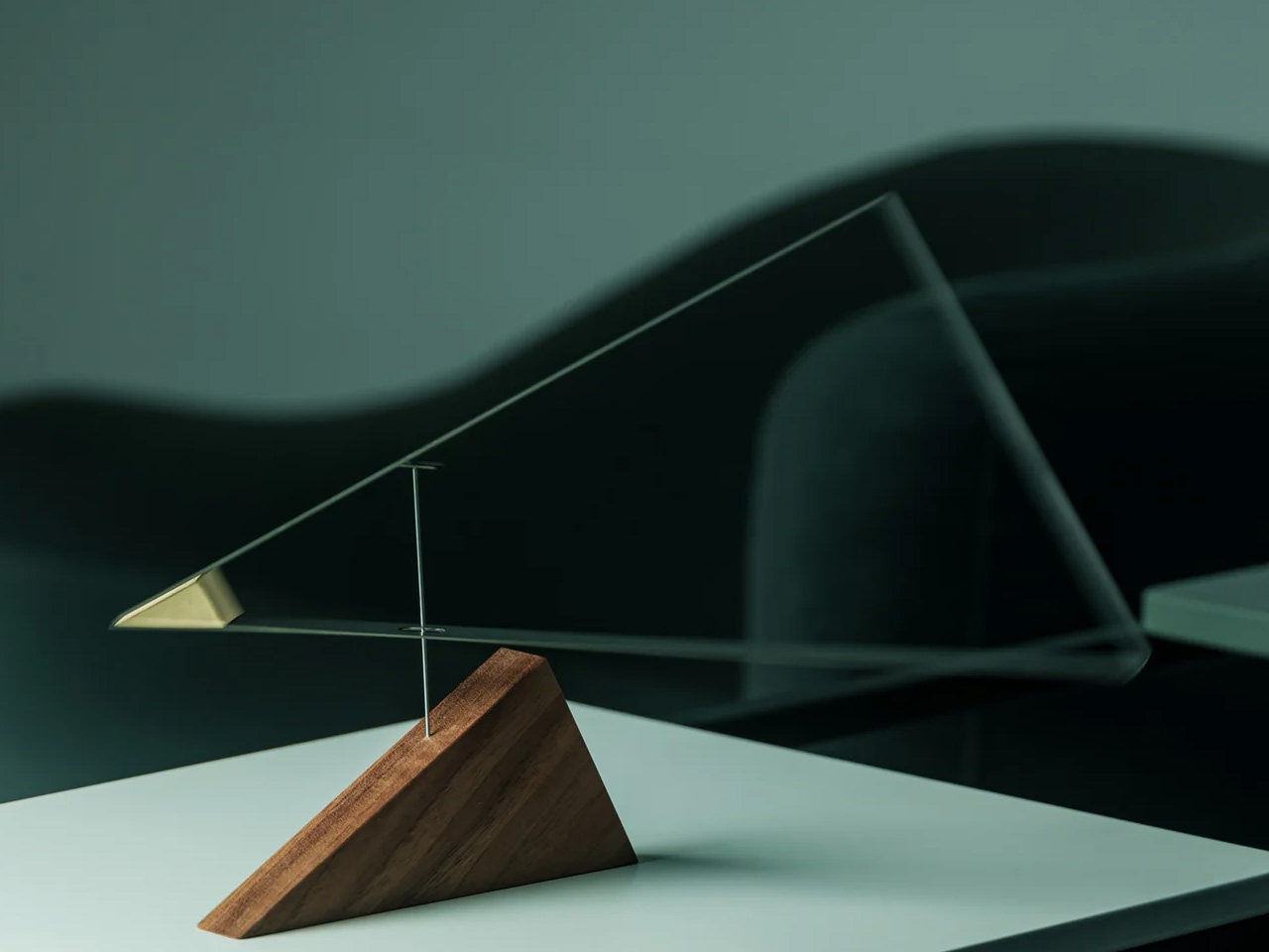
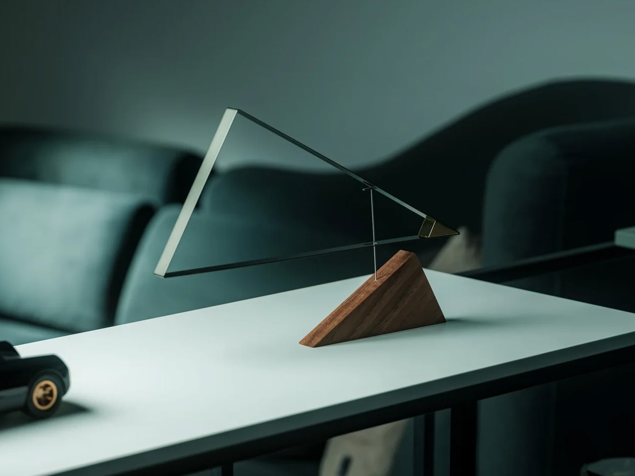
3. Sail Away Tranquility Mobile
The Sail Away Tranquility Mobile is the only object on this list that moves, and movement is precisely why it belongs here. Three balanced triangular forms — drawn from the geometry of sailboats — hang in calibrated tension and respond to the slightest air current in the room. On a coffee table, it introduces a kinetic quality that no static object can replicate: the table becomes the most animated surface in the living room without adding any visual weight. The proportions are compact enough for a tabletop, the construction is clean, and the physics are genuinely surprising the first time you see it shift in still air.
What makes the Sail Away work as a minimalist object is its restraint. The movement is subtle rather than theatrical — a slow drift rather than a spin — and it never demands attention so much as rewards it, which is the correct register for a surface meant to feel considered rather than performed. At $145, it occupies a different design category from every other object on this list: not sculpture exactly, not functional exactly, but somewhere between the two that feels honest rather than decorative. Set at the far edge of the Platform Tray, it creates a vertical moment that anchors the whole composition without competing with anything around it.
The kinetic movement brings a living quality to the table that no static object can match
The geometric forms hold their visual logic from any angle
What we dislike:
The mobile requires a stable surface — consistent vibrations from foot traffic or sound can overanimate it
The string suspension looks considered but feels delicate in a high-use living room
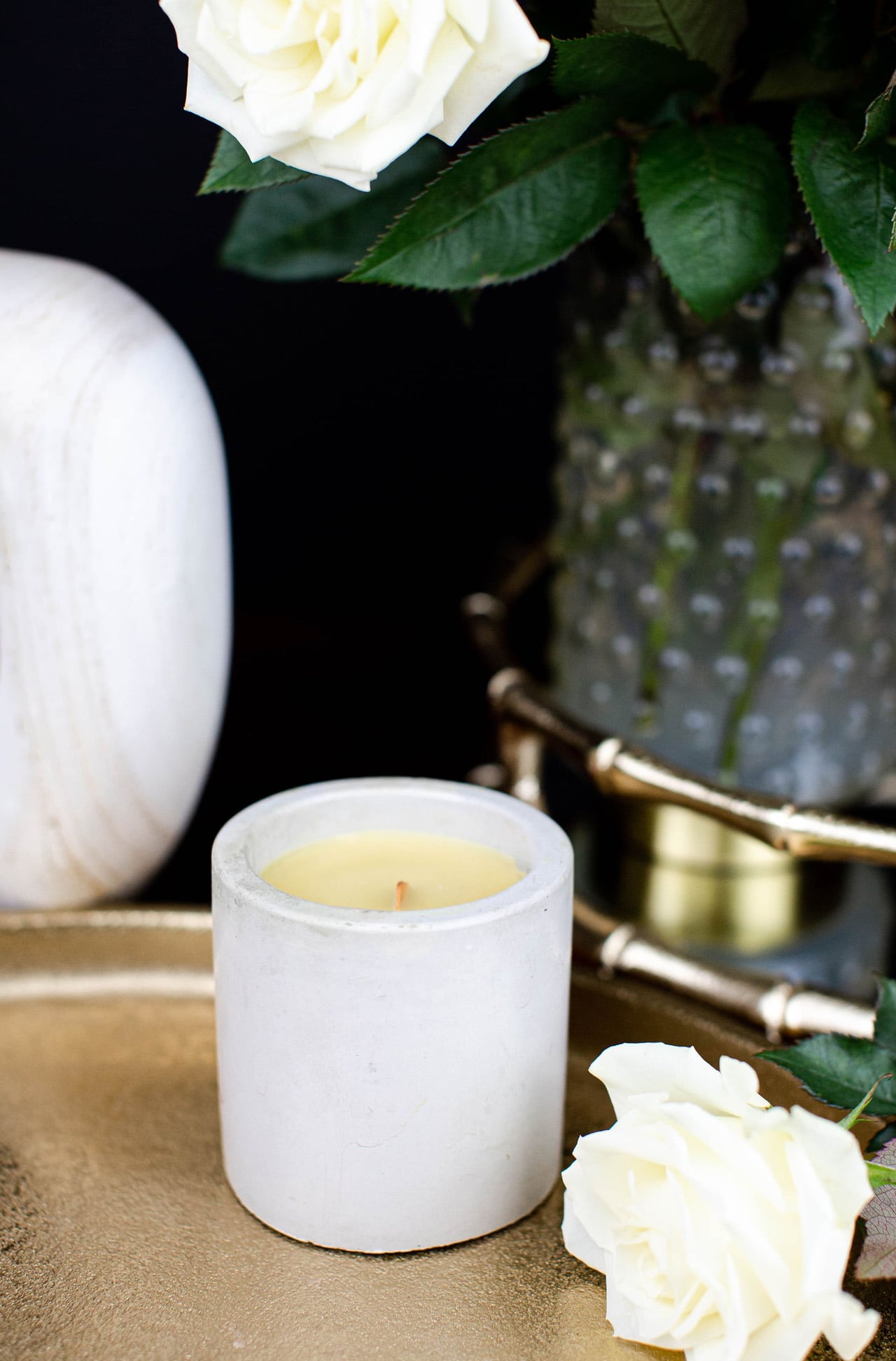
4. Simple Candle Co. Concrete Vessel
The Simple Candle Co. Concrete Vessel is the most affordable object on this list and the one that punches furthest above its price. Each vessel is hand-poured in small batches from a grey concrete body with a short soy wax wick and no label. The scent runs deliberately clean — white linen, cashmere cedar, or unscented — and the vessel itself is the product as much as the candle inside it. At $20, it brings concrete’s material seriousness to the table at a price that makes it easy to keep two: one lit, one resting, both earning their place on the surface.
The concrete body doesn’t get hot to the touch during burning, which is a practical advantage that most candle vessels at three times the price can’t claim. Burn time runs approximately 25 to 30 hours, and when the wax is finished, the bowl stays. Rinse it out, and it becomes a catch-all for a matchbox, a small stone, a ring. That second life is built into the object from the first glance — the vessel was always the point, and the candle is what justifies buying it for $20 rather than considerably more. Alongside the Kendama’s natural wood and the Torre’s matte ceramic, the concrete introduces a third material that completes the tactile range without competing for visual dominance.
What we like:
The vessel earns its place before and after the candle burns
The concrete stays cool during use, which is a genuine functional advantage over glass and ceramic alternatives
What we dislike:
The scent throw is intentionally subtle and reads as ambient rather than strongly aromatic
The hand-pour process means each vessel varies slightly, so a replacement may not match an existing piece exactly
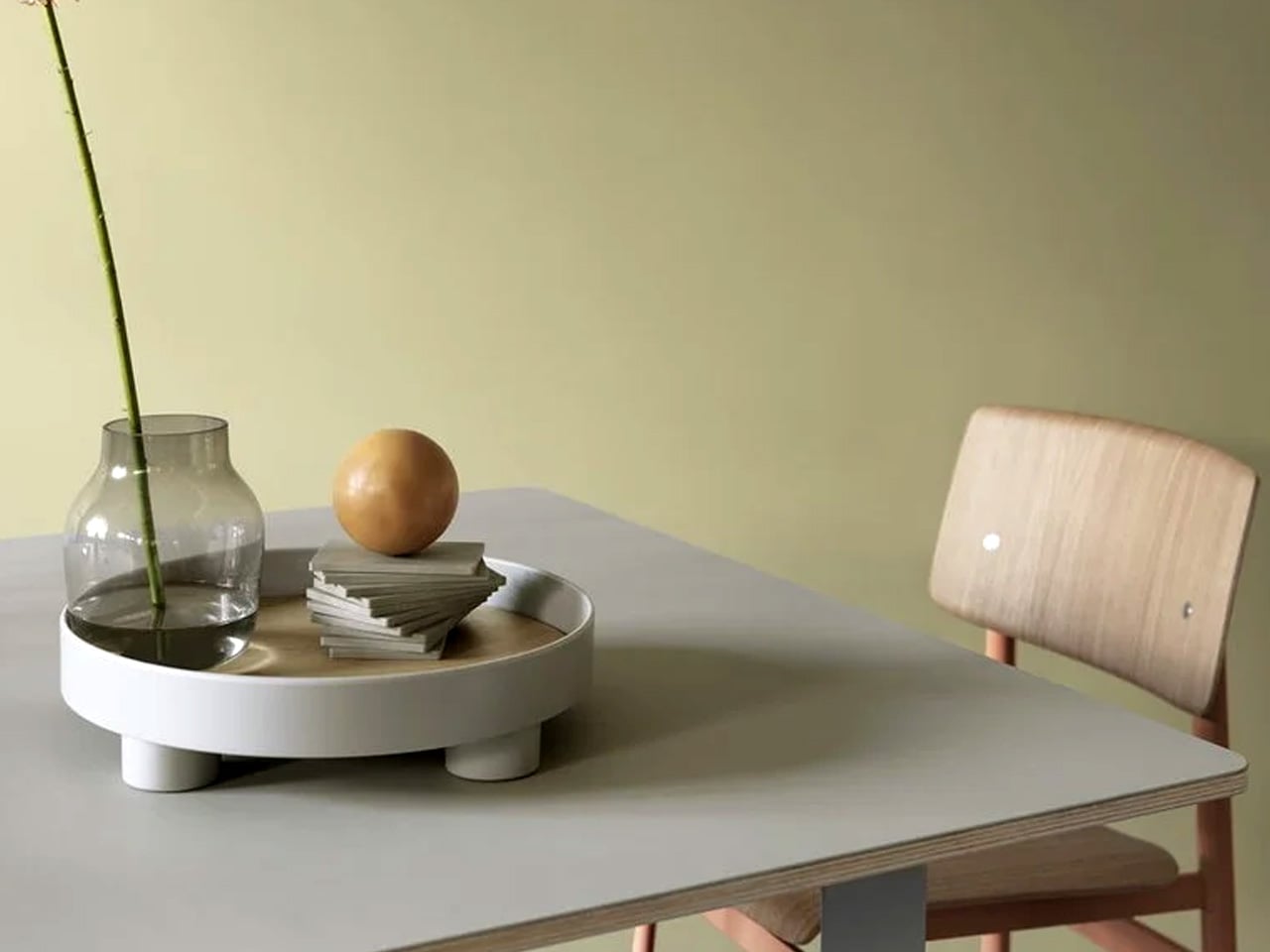
5. Muuto Platform Tray — Grey
The Muuto Platform Tray is the object that makes every other object on this list look better. Available at Finnish Design Shop for $109 in grey, it’s a round tray with an oak veneer surface and small metal legs that lift it just enough off the table to create a clear visual boundary between the objects inside and the surface beneath. That boundary does more compositional work than it should — it turns a group of objects into a considered arrangement rather than a collection of things that happen to be sitting on the same surface. The grey metal and warm oak read well together, and the form is simple enough to disappear.
In practical terms, the Platform Tray is the anchor. The candle vessel sits inside it. The Kendama rests at its edge. The mobile grounds one end. The tray doesn’t organize these objects so much as it frames them, and the difference between a frame and a container is the difference between editorial and domestic. The oak veneer surface develops warmth over time, and the small legs mean it can be lifted off the table intact when the surface needs to be cleared without disturbing the composition it holds. At $109, it is the least visually dramatic piece on this list and almost certainly the most indispensable one.
What we like:
The oak veneer surface brings warmth to a mixed material setup
The raised legs separate the composition from the table surface with minimal visual noise
What we dislike:
The round form can feel restrictive on a narrow or strongly rectangular table
It comes in one size, so there’s no option to scale up for a larger surface
The Only Five Objects Your Coffee Table Needs
Five objects, five categories, one shared logic. The tray frames. The candle grounds. The mobile moves. The Kendama invites you to participate. The Torre rewrites what a vase can be. Together they fill a coffee table without crowding it, and none of them needs the others to look resolved. That is the discipline a minimalist surface asks for, and these five meet it.
The full build comes to $1,444, with the Torre carrying most of that weight. Buy the other four first — at $344 combined, they build one of the strongest minimalist coffee table setups available at that price — and treat the Torre as the object you earn over time. Start with the Platform Tray. Everything else finds its place from there.
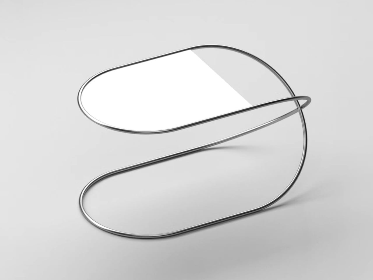
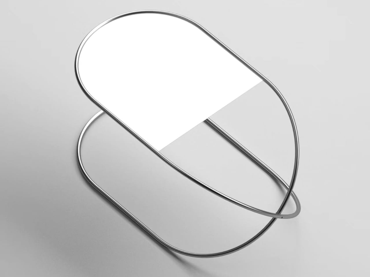
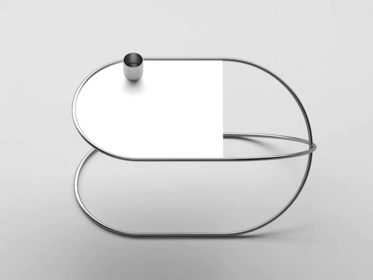
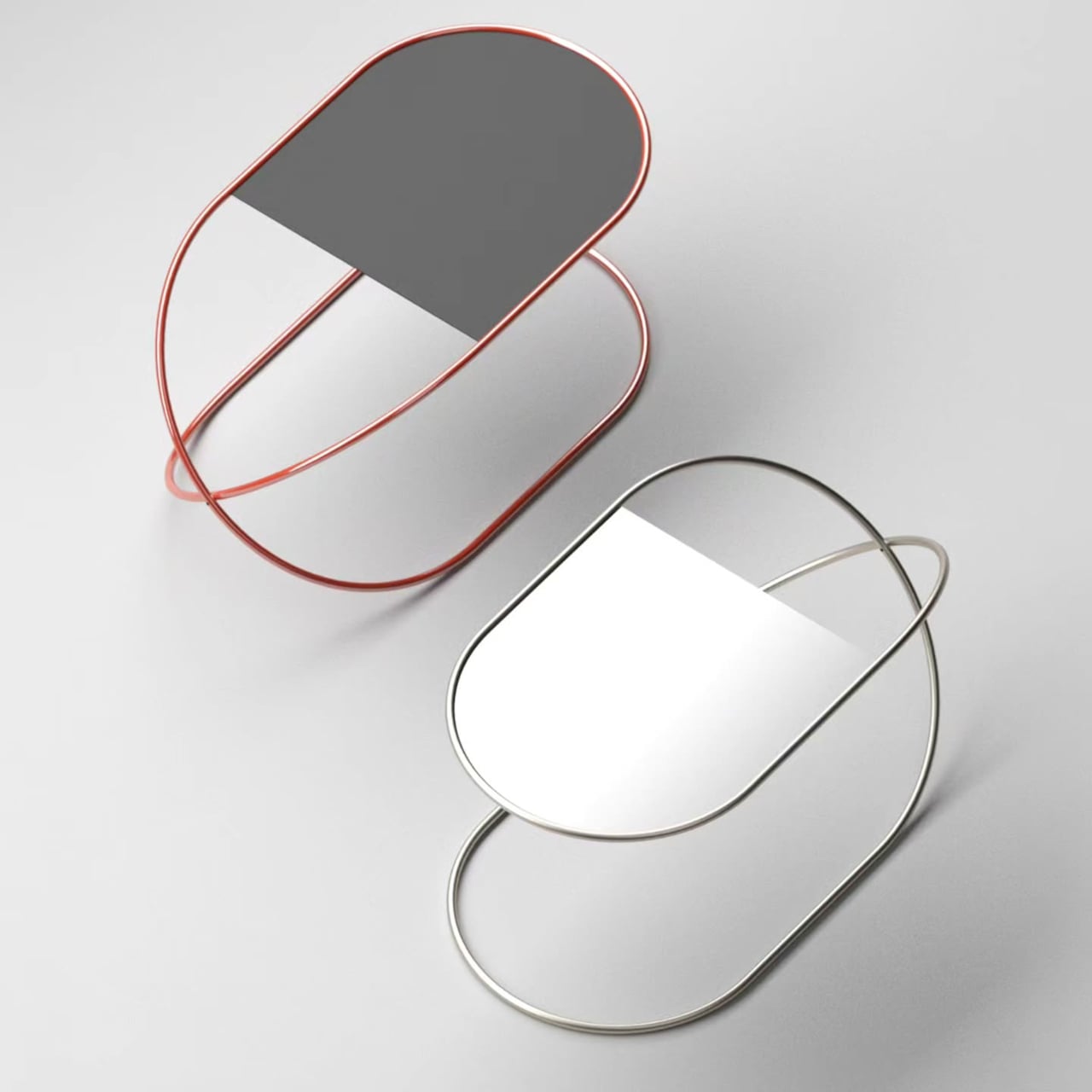
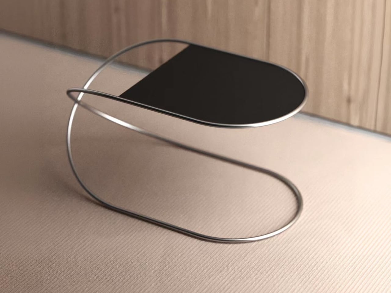
Side tables have a bit of an identity problem in furniture design. Most treat them as purely functional afterthoughts, giving you a flat surface at the right height and not much else. The ones that do try to stand out tend to overcorrect, piling on decorative legs, unusual proportions, or materials that compete with everything else in the room. Very few ask whether the structure itself could be the point.
That’s the question Stuttgart-based designer Deniz Aktay explores with the Whisk table, a side table built around a single continuous tube that does all the heavy lifting. Aktay’s work consistently gravitates toward pure lines and the expressive potential of a single well-chosen material. The Whisk is one of his cleaner expressions of that thinking.
The tube bends into two rounded loops stacked at different heights, forming an S-curve when viewed from the side. One loop reaches the height of a standard side table and cradles the tabletop. The other sweeps back to the floor, forming the base. The whole thing reads as one fluid gesture rather than a frame assembled from parts, which is very much the point.
Where it gets interesting structurally is at the center, where the tube crosses itself. That crossing point isn’t decorative; it’s what keeps the table stable. The two loops work against each other in a way that resists rocking or shifting, so you get a table that looks almost impossibly light while still holding its ground next to a sofa or armchair without wobbling every time you set something down.
The tabletop is designed to stay in the background. It fits within the upper loop and matches its rounded profile, so the two read as a single shape rather than two components joined together. The surface adds just enough contrast to define the functional plane without competing for attention. The tube does the work; the top is simply where you put your coffee, your book, or a small lamp.
As a side table, the Whisk works in less space than you’d expect. Its footprint is compact enough for tight spots beside a lounge chair or at the end of a bed, and the open structure doesn’t crowd the room the way solid-legged tables often do. It comes in a polished silver finish and a warm red option, giving it a bit more personality for spaces that can take it.
The Whisk explores what a single material or fabrication method can do without adding more than it needs to. It’s a single tube, bent twice, crossed once. It’s the kind of idea that sounds almost too simple to work, until you’re actually using it and realize that nothing about it needed to be more complicated.
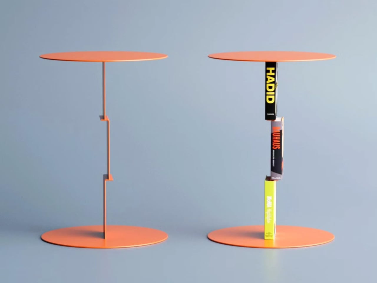
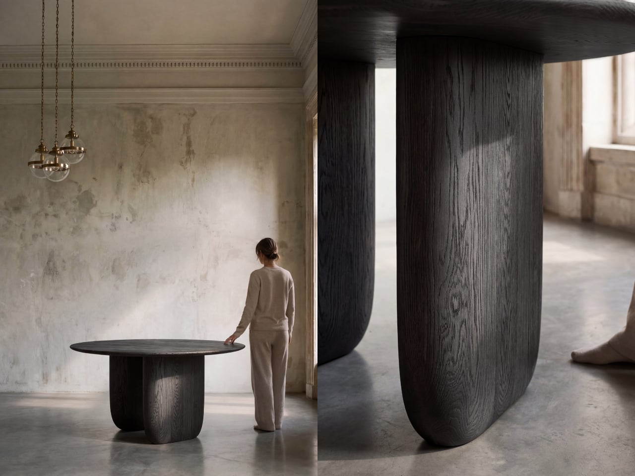
Side tables have always been one of the harder pieces of furniture to make genuinely interesting. They’re functional by nature, meant to hold a drink, a remote, or that ever-growing stack of books. Most designs take the easy route: a flat surface, four legs, and nothing more. A few try to add storage or visual flair, but the table and whatever sits on it rarely share anything deeper than proximity.
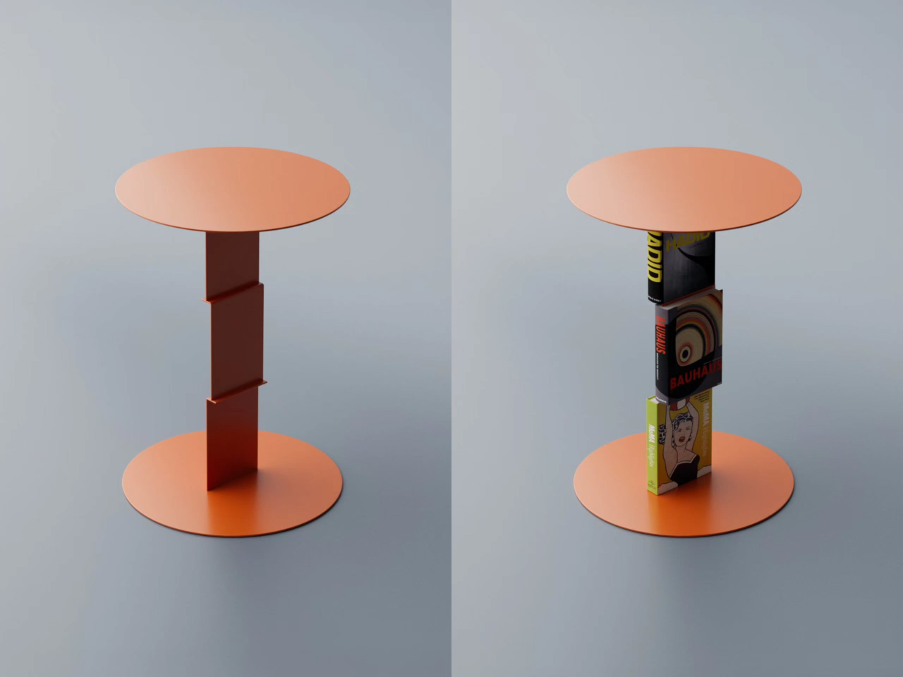
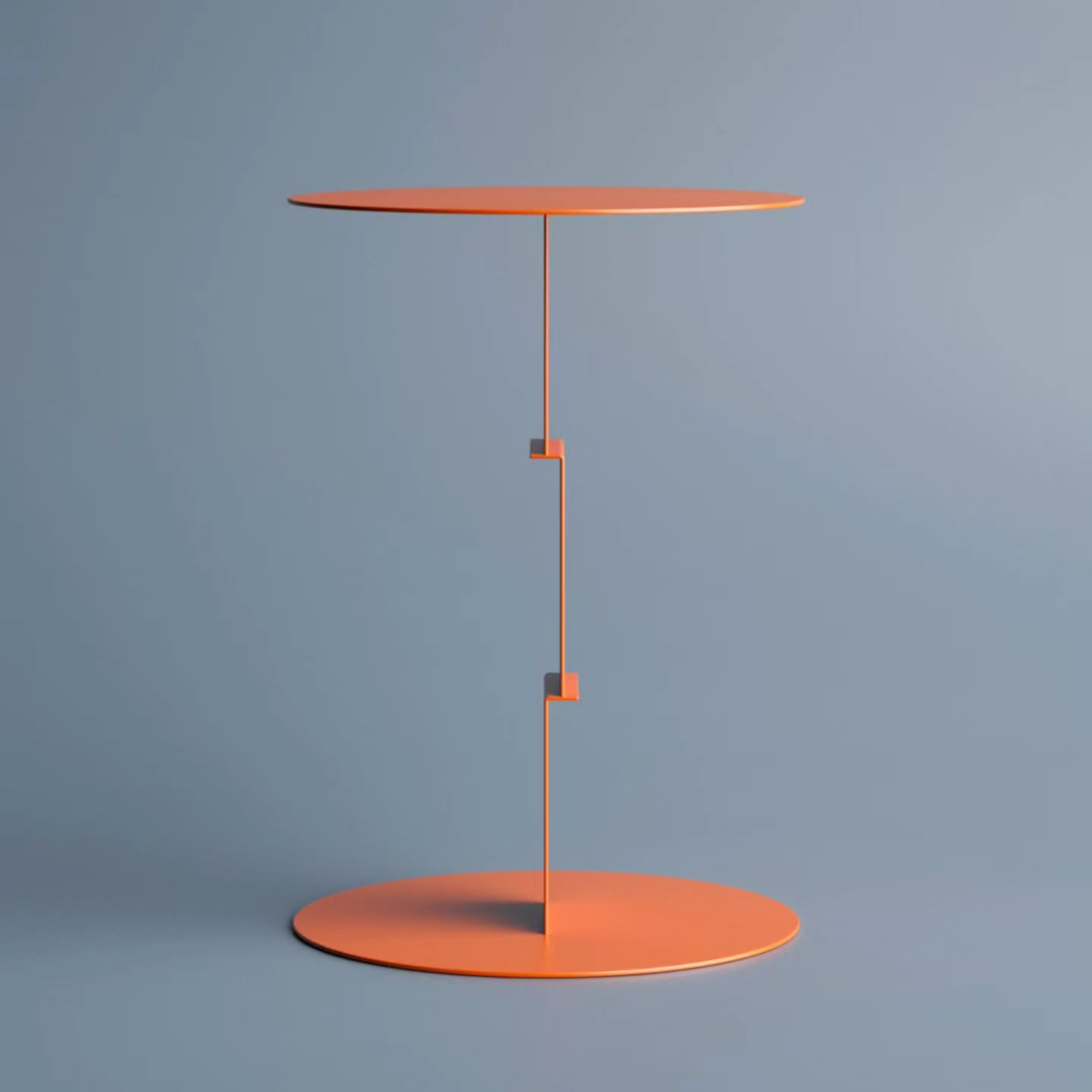
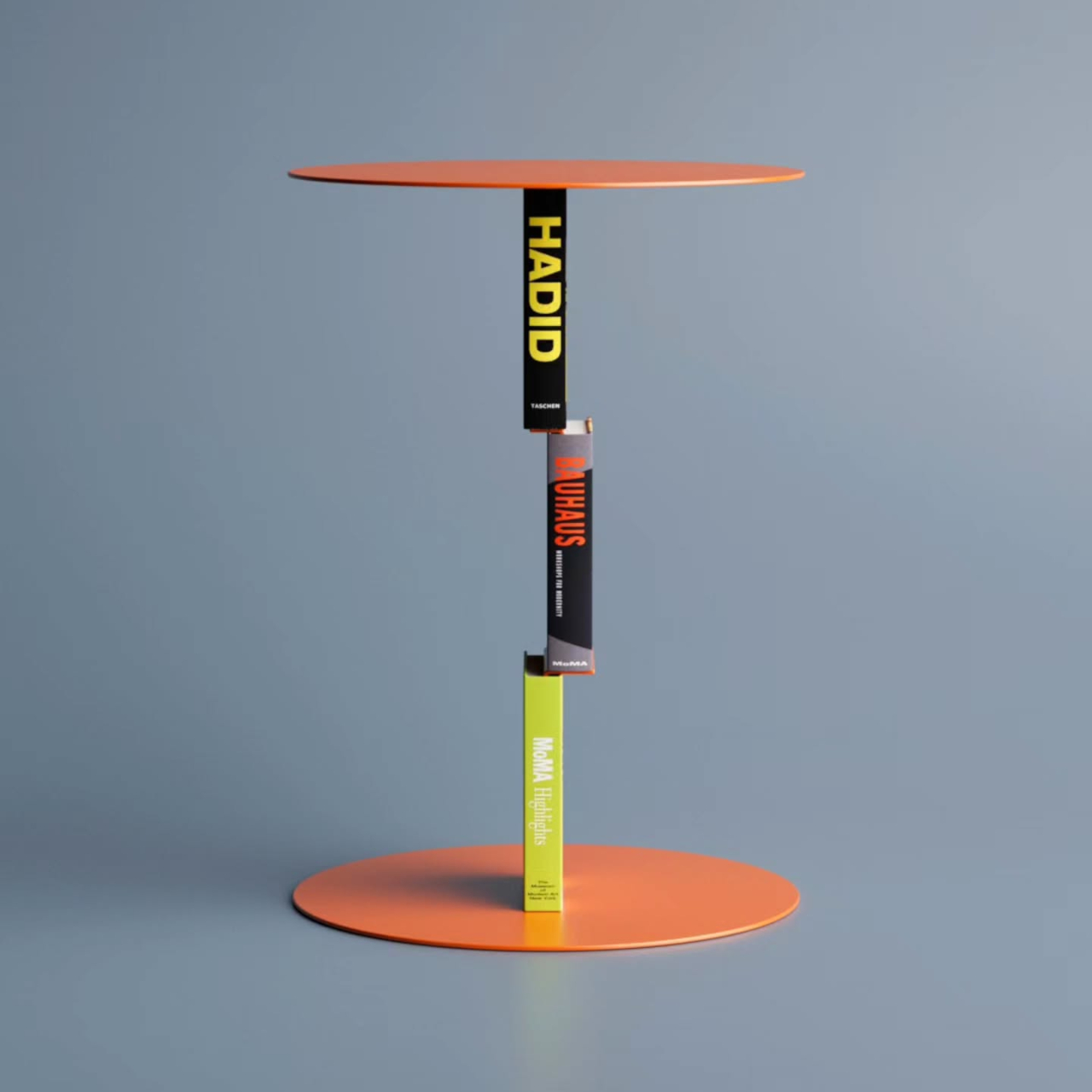
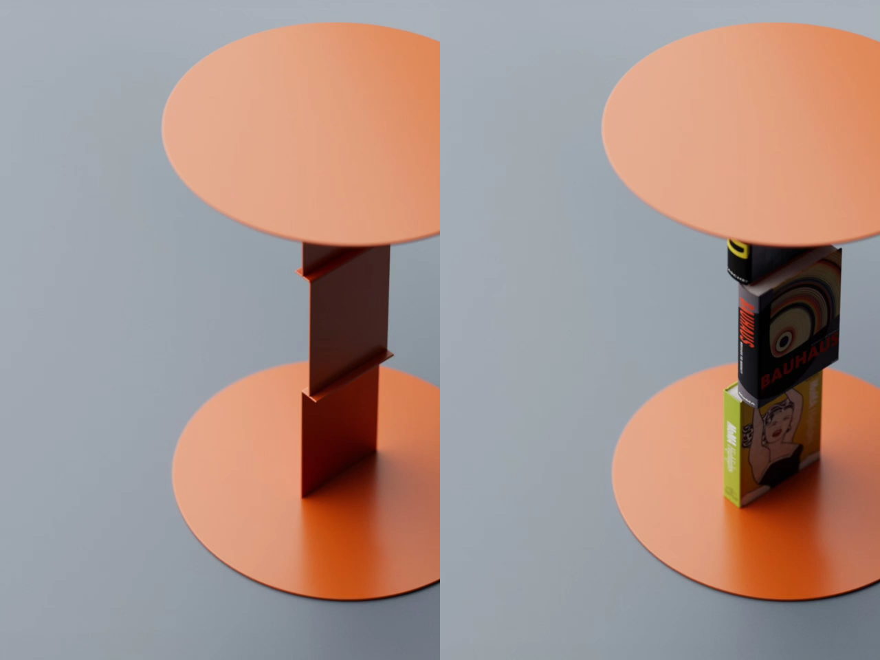
Deniz Aktay’s Delusion Table turns that relationship on its head. The Stuttgart-based designer has crafted a side table concept where books aren’t just accessories resting on the surface; they become part of the table itself, or at least appear to. The idea is simple but arresting: a purpose-built metal framework connects the tabletop to the base, and once books are loaded onto it, the metal structure all but disappears.
The trick borrows from a principle already used in certain bookmarks and floating wall shelves, where a thin metal channel slides between a book’s pages and disappears behind the covers. Aktay applies the same logic vertically: the table’s central stem has integrated clips that hold books upright against the structure. Slot a few thick art or design volumes in, and the metal seems to dissolve quietly into the spines.
What results is a table that looks as if a small stack of books has somehow defied physics to hold an entire surface aloft. It’s a visual gag, but an elegant one. The books aren’t floating or leaning on something concealed behind them. They’re gripping the structure, pages pressed against the clips, covers facing outward, spines reading clearly, creating something that looks accidental but is actually very deliberate.
That deliberateness extends to the books themselves. The volumes you choose to insert don’t just support the illusion; they become part of the design statement. A stack of oversized architecture monographs communicates something entirely different from a row of photography books or a handful of paperbacks. The table changes with whoever assembles it, which is a quiet but genuinely meaningful layer of personalization built right into the concept.
It’s also worth considering where a table like this fits most naturally. A reading nook, a home office corner, or a bedside setup for someone who always has a few books in rotation: in any of these settings, the Delusion Table doesn’t need anything extra to feel complete. The books it needs to function are probably already nearby, waiting to serve a purpose they weren’t originally designed for.
Aktay has made a habit of designing furniture that asks questions as much as it answers them, and the Delusion Table is no exception. It’s a concept that works on two levels: as a functional object that holds books and a tabletop, and as something that quietly unsettles your perception. You look at it, pause a moment, and find yourself genuinely unsure of what’s doing what. That’s exactly the point.
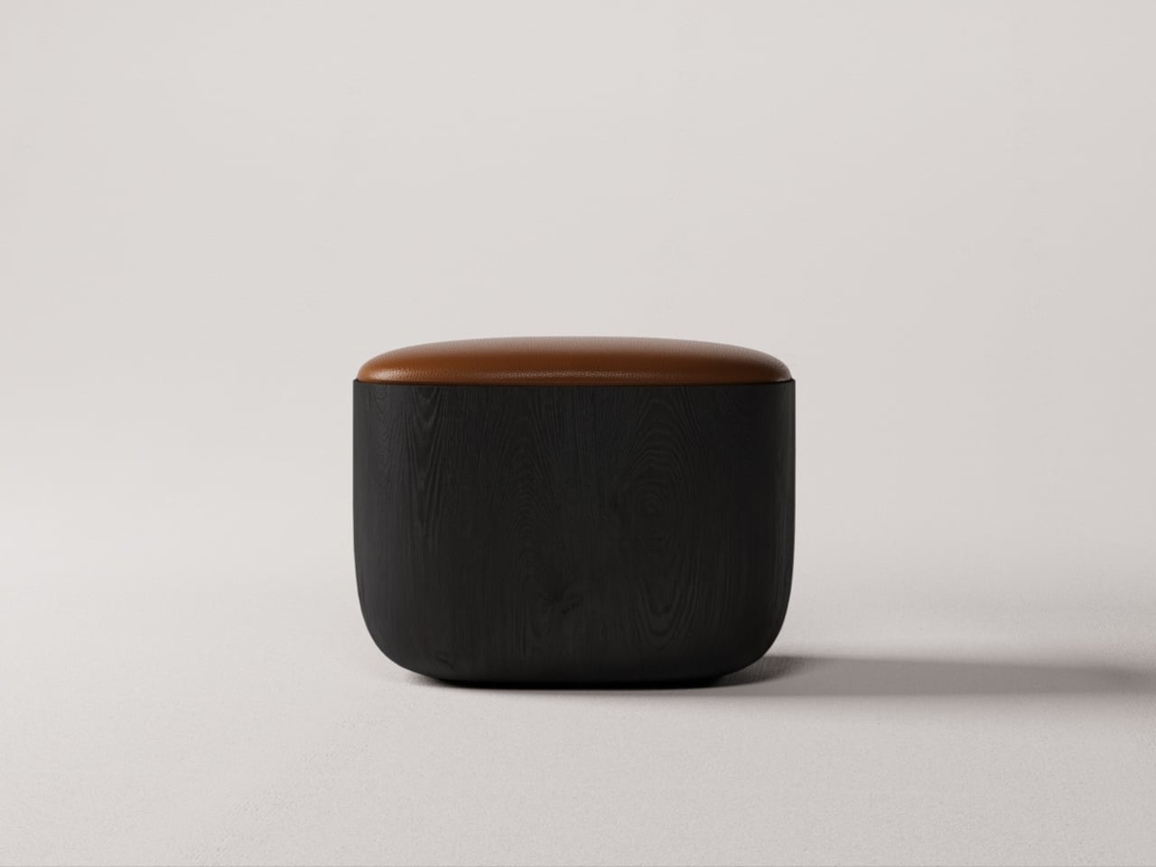
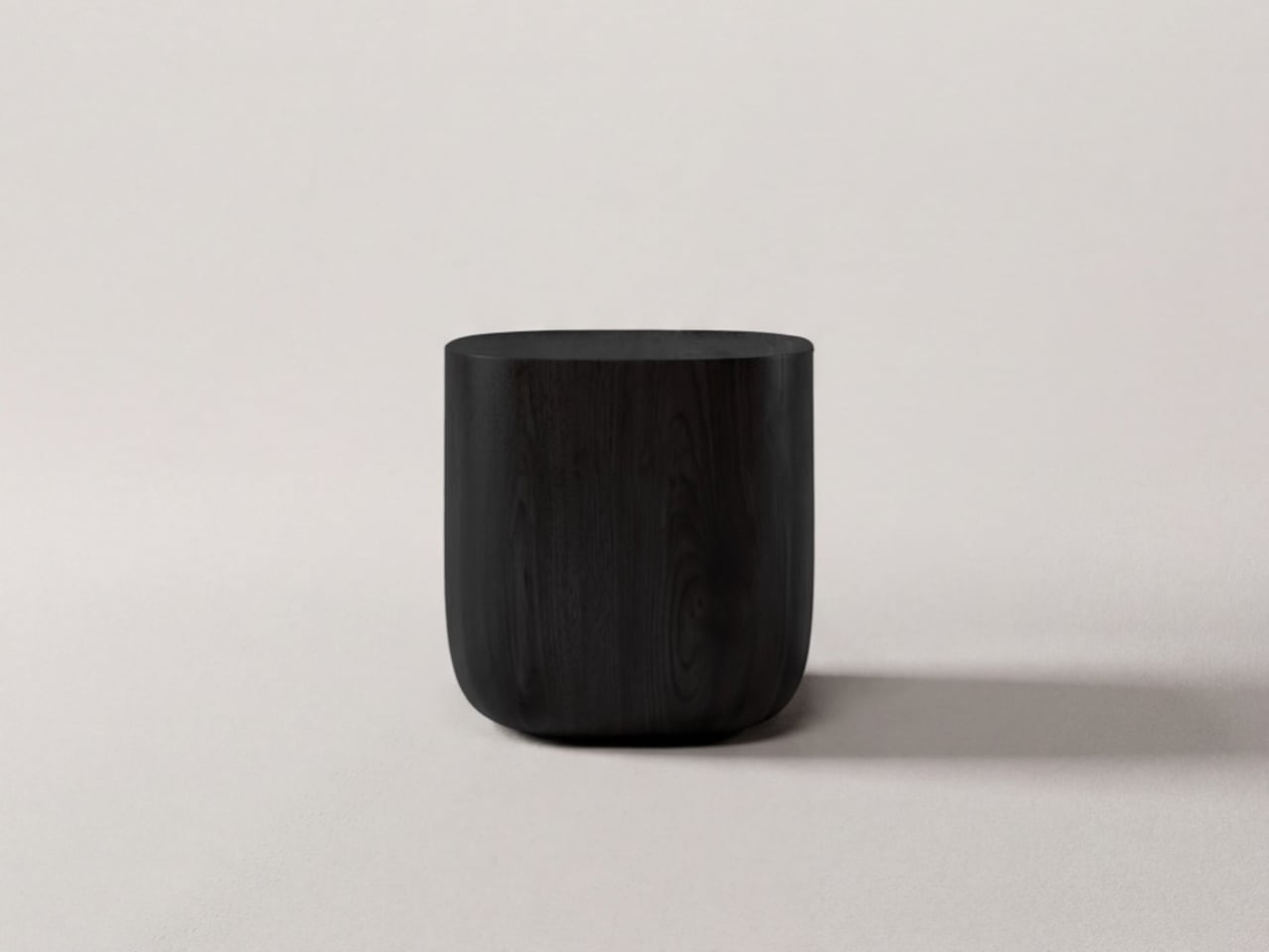
Modern furniture design has been quietly shifting priorities. Smaller homes and more deliberate interiors have created real demand for pieces that do more without taking up more space or sacrificing how they look. Stools and side tables are easy targets for this kind of dual-purpose thinking, but most of them still feel like a workaround, a compromise dressed up as a solution, rather than a genuinely well-considered object.
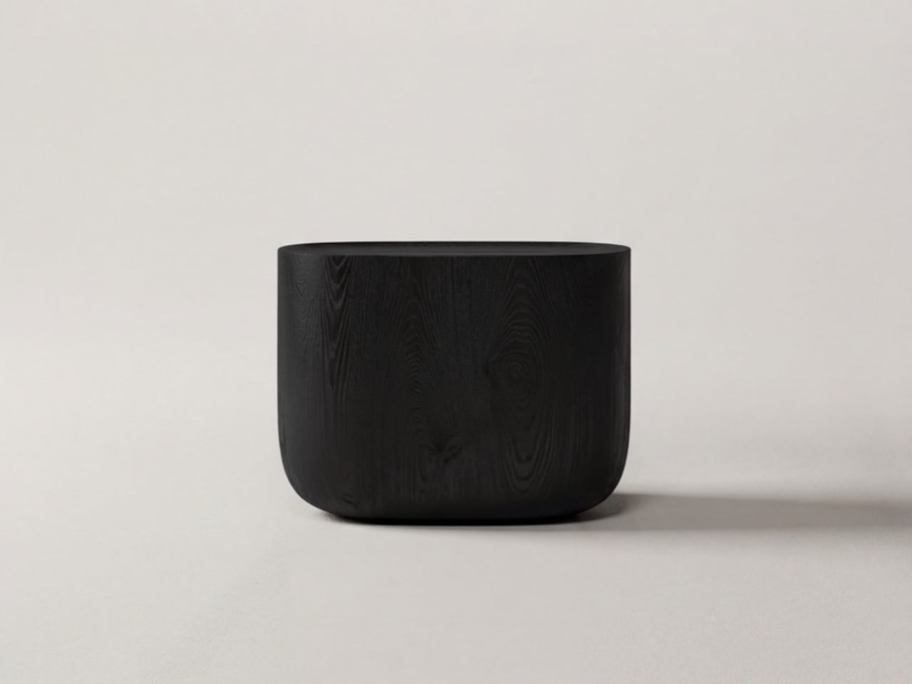
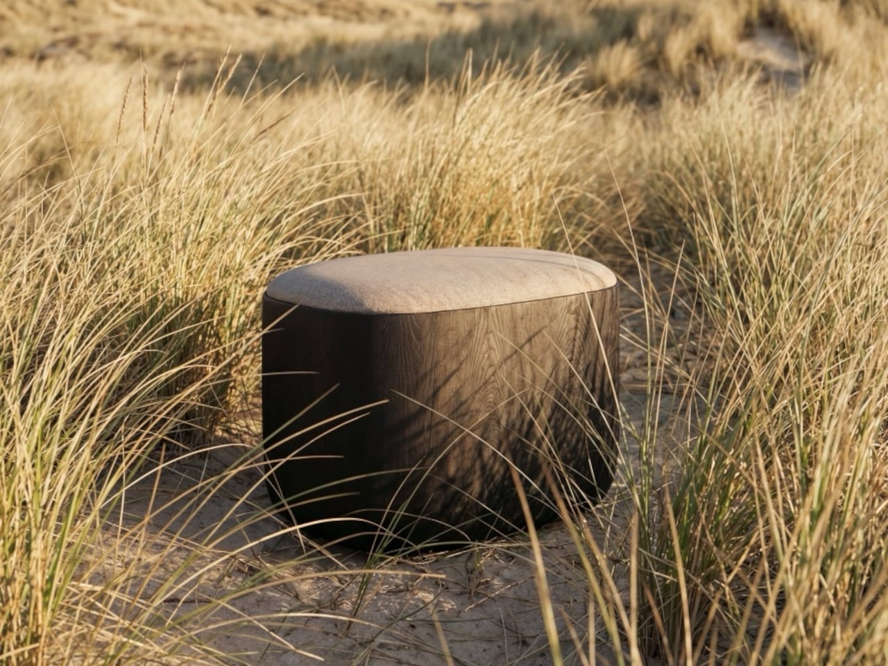
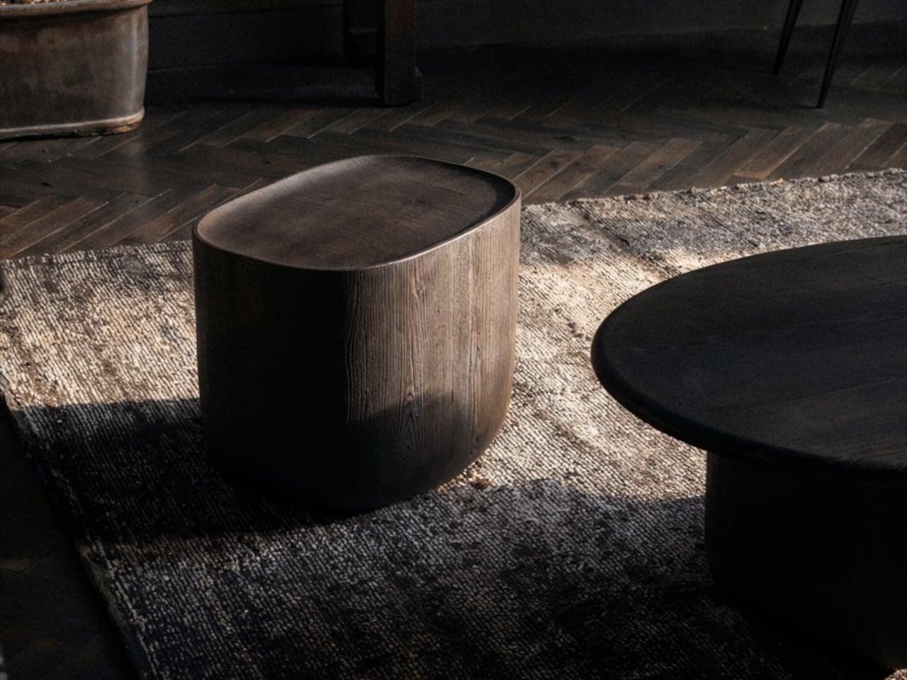
The Ishi stool from Japanese studio Mililab isn’t that kind of compromise. It came out of a separate project entirely, one that had nothing to do with stools, and it ended up as something that’s equal parts furniture object and quiet design statement. That accidental origin is actually central to understanding why it looks the way it does, and why it works as well as it does.
The story starts with the studio’s own Maru dining table. While developing it, founders Livert Lim and Mengfei Wu kept drifting back to the legs, almost despite themselves. Those legs tapered inward along one unbroken curve, giving them a presence that had little to do with the tabletop above. As Mililab described it: “A shape that didn’t need the table above it.” So they separated it and let it stand alone.
Working with collaborator Djordje Cebic, they developed Ishi into a form that’s both monolithic and unexpectedly soft, something like a river-worn pebble given volume. From across the room, it appears impossibly thin; up close and under your hand, it’s substantial. That tension between visual lightness and physical solidity isn’t accidental. It’s the result of curves computed in Tokyo and then realized by hand in the workshop.
The material process behind that solidity gets genuinely obsessive. The stool is made from North American white oak, selected for grain consistency, kiln-dried, hand-shaped, then kiln-dried again, because the glue introduced during assembly brings moisture back into the wood. Most workshops skip that second drying. Mililab doesn’t. It’s sealed immediately after, locking in a 10% moisture content, the exact point at which white oak is most dimensionally stable.
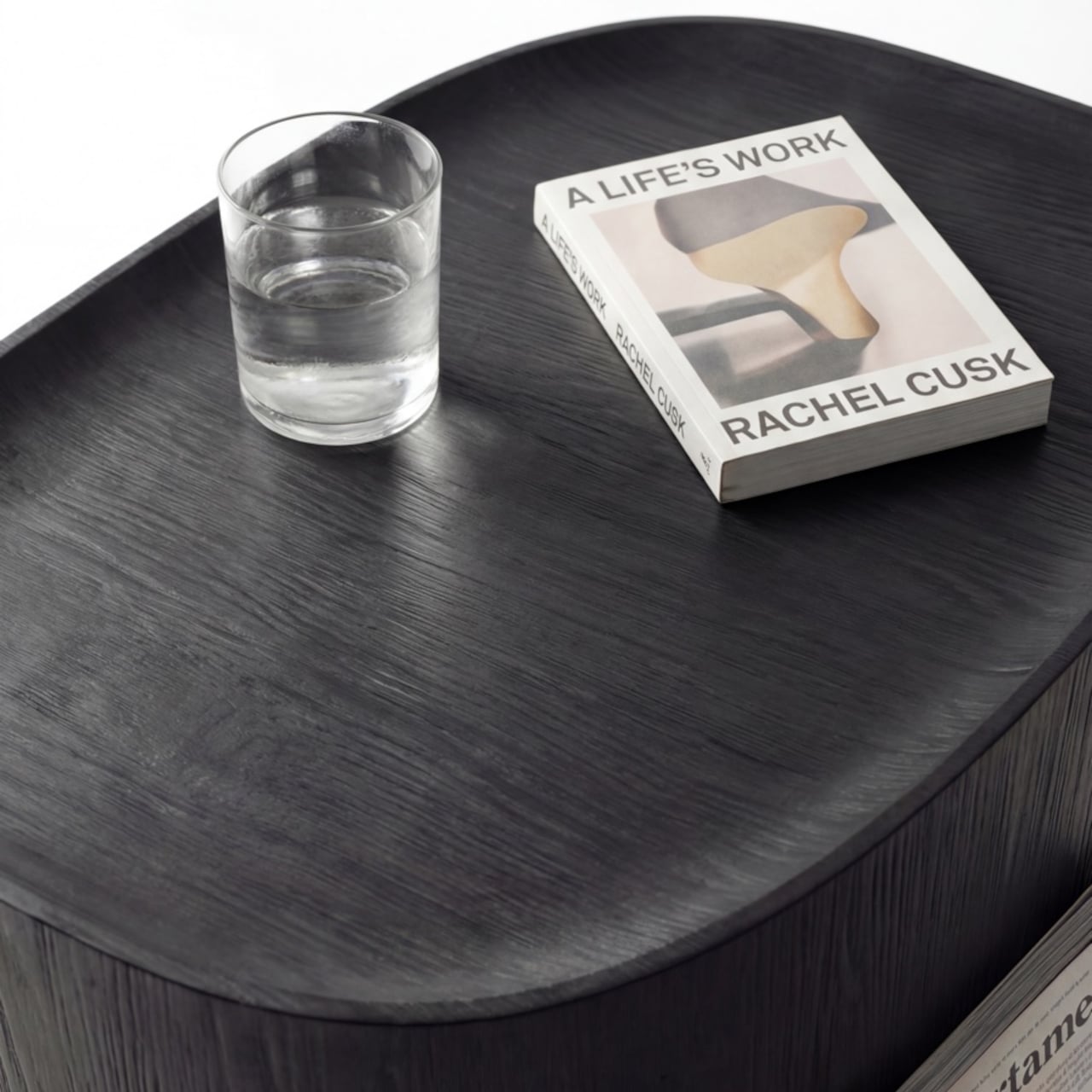
The cushion on top, available in Kvadrat Savanna, Dedar fabric, or Italian leather, looks fully integrated with the oak base. It isn’t, of course, which is the point. Pull it off, flip it over, and the flat underside becomes a surface, turning the stool into a side table. It works just as well beside a sofa at home as it does in a hotel lobby or a studio apartment. At 430mm, the height was chosen deliberately. It’s low enough to pair with a lounge chair, yet also tall enough to sit beside a dining table or vanity desk.
There’s something refreshing about a piece of furniture that arrived this way, not from a brief or a market gap, but from genuine distraction. Lim and Wu were supposed to be designing a dining table and kept staring at the legs instead. It’s not a narrative most furniture studios would lead with, but it does explain why the Ishi stool feels like something they simply couldn’t help making.