
Apple expands parental controls to include automatic image filtering
Apple is beefing up parental controls to address concerns about child protection.


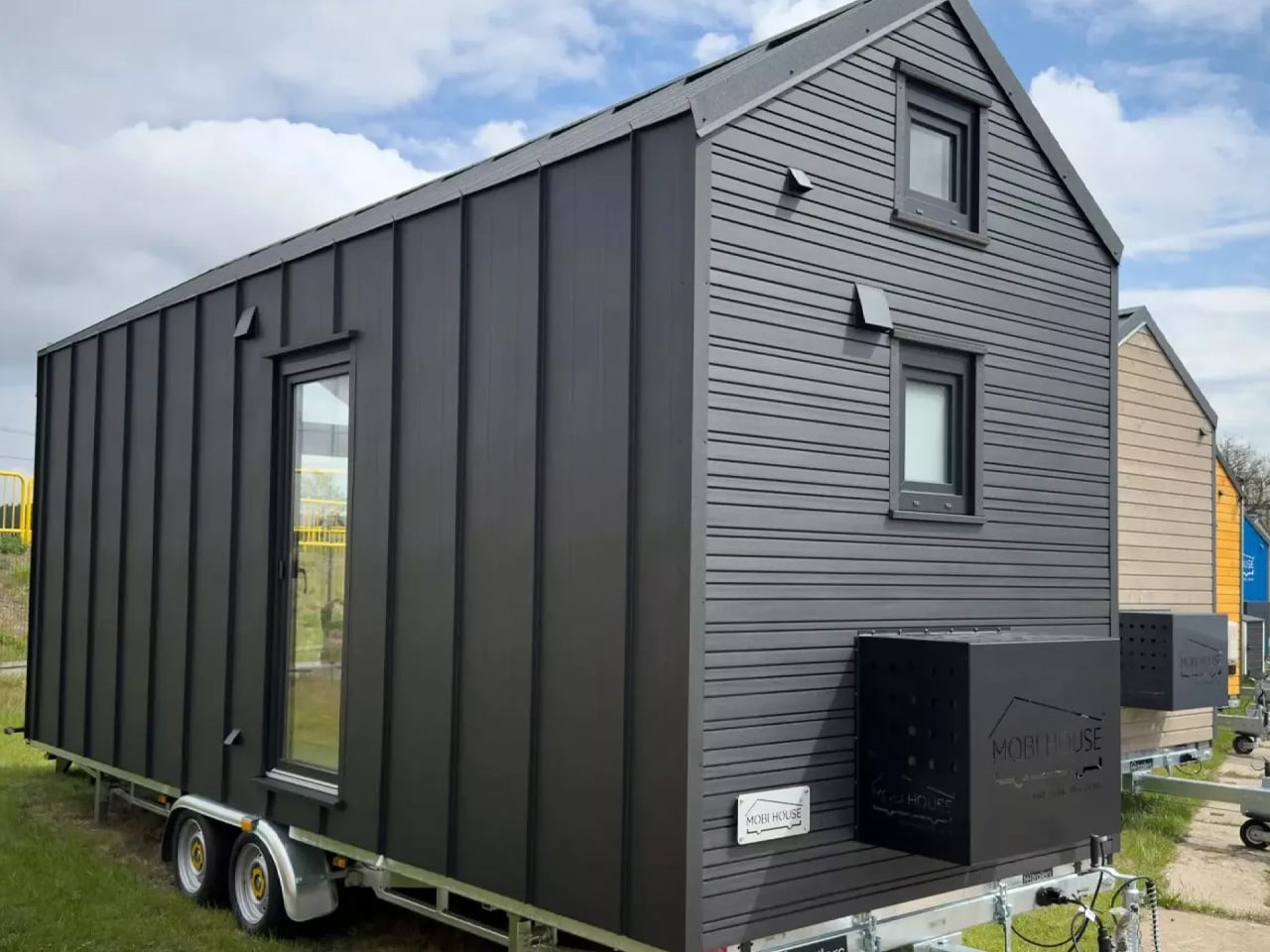
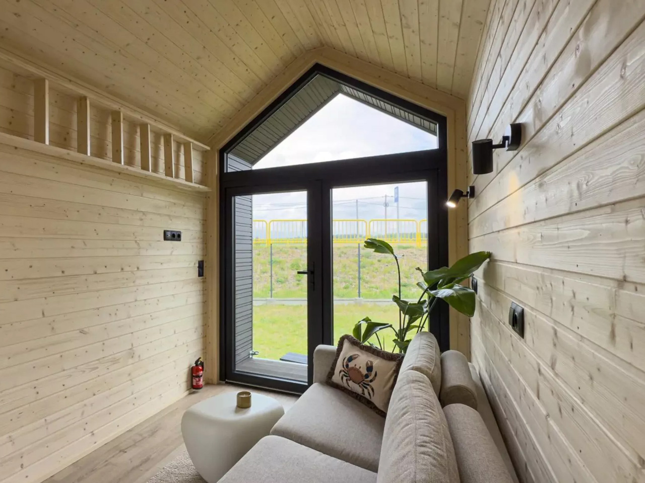
Poland’s Mobi House has always had a thing for understated design, but the Chocolate — a new variation of their Mobi Modul Sunrise series — takes that restraint somewhere altogether richer. It’s a tiny house that looks like it was pulled from a brutalist mood board and softened just enough to feel livable. Dark on the outside, warm on the inside — it plays with contrast in a way that most compact homes don’t bother trying.
At just 6.6 meters long, 2.5 meters wide, and 4 meters tall, the Chocolate sits on a THM 660 Lift&Go trailer, which means it’s mobile without making any visual concession to that fact. The exterior combines metal cladding with wood-texture insertions beneath an A-frame roofline, giving it the clean geometry of a container but with enough material warmth to stop it from reading as industrial. A built-in covered terrace extends from the front, the kind of detail that makes it feel more like a glamping retreat than a house on wheels.
Designer: Mobi House

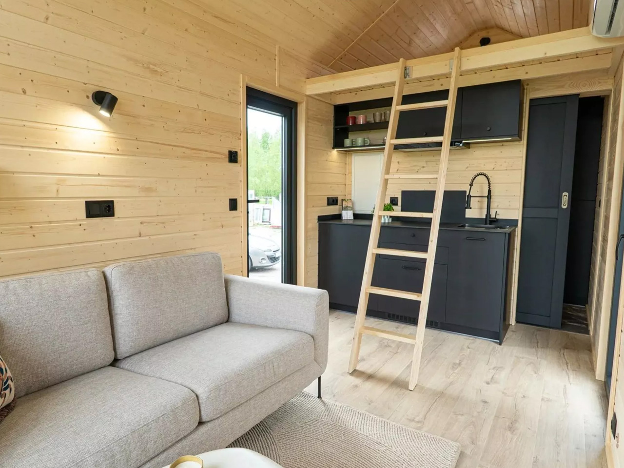
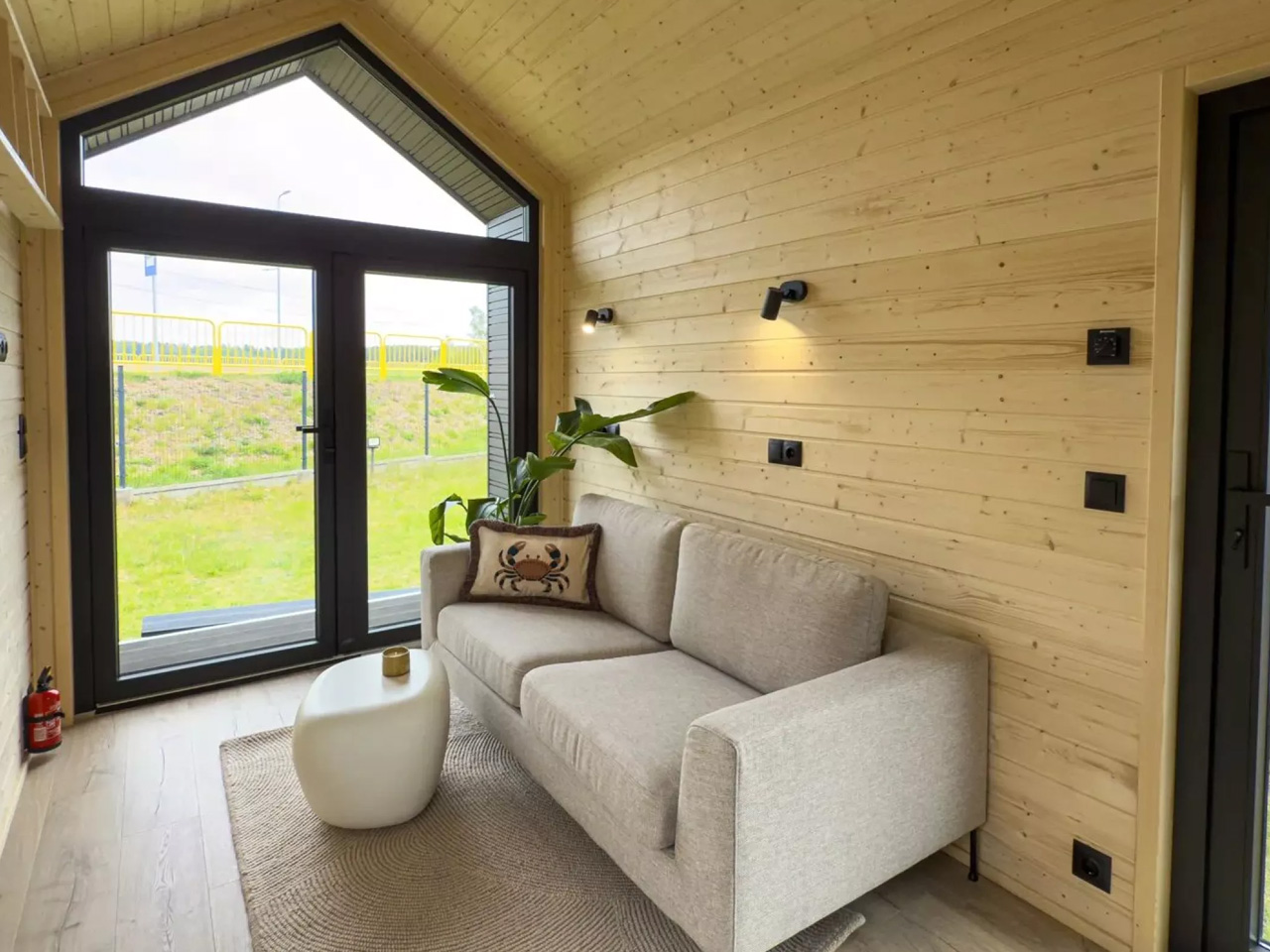
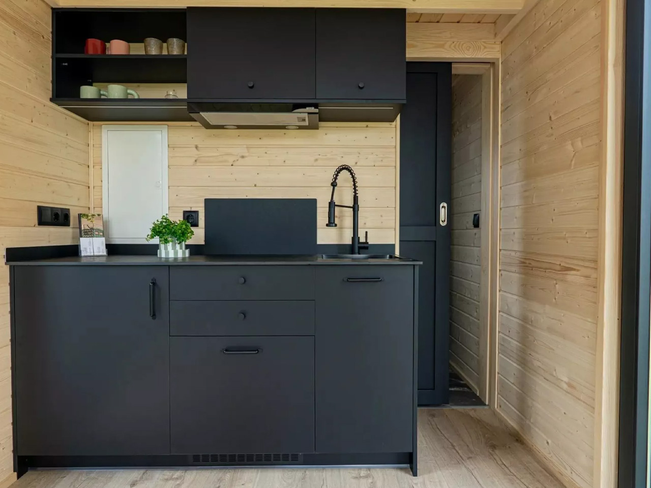
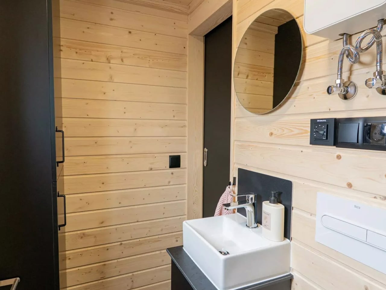
Inside, the 169 square feet of usable floor space is divided into four zones: a flexible lounge area, a kitchenette with black cabinetry, a bathroom, and a sleeping mezzanine for two. The layout is tight but considered — every corner is accounted for without feeling like a puzzle you have to solve each morning. The kitchen keeps things sharp with dark finishes that echo the exterior palette. The bathroom, accessed through a sliding door, leans into the same contrast language with stone-look tile flooring, a walk-in shower, and cabinet storage that keeps the floor clear.
The sleeping loft is compact and honest about it — a small rear window, a movable ladder, and just enough headroom to remind you that you chose this life intentionally. It’s not a weakness so much as a trade-off that comes with the territory of sub-170-square-foot living. What makes the Chocolate more compelling than most is its ability to expand — the structure is designed to connect to a second module if more space eventually becomes a priority.
Mobi House, one of the most reputable tiny home builders in Europe, has been quietly evolving past its Scandinavian origins into something sharper and more versatile. The Chocolate feels like proof of that evolution — a house that’s built for hospitality entrepreneurs and minimalist dwellers alike, without looking like it was designed for either specifically. Pricing is available upon request directly through Mobi House.


The post The Chocolate Tiny House Is Dark on the Outside and Surprisingly Warm Within first appeared on Yanko Design.
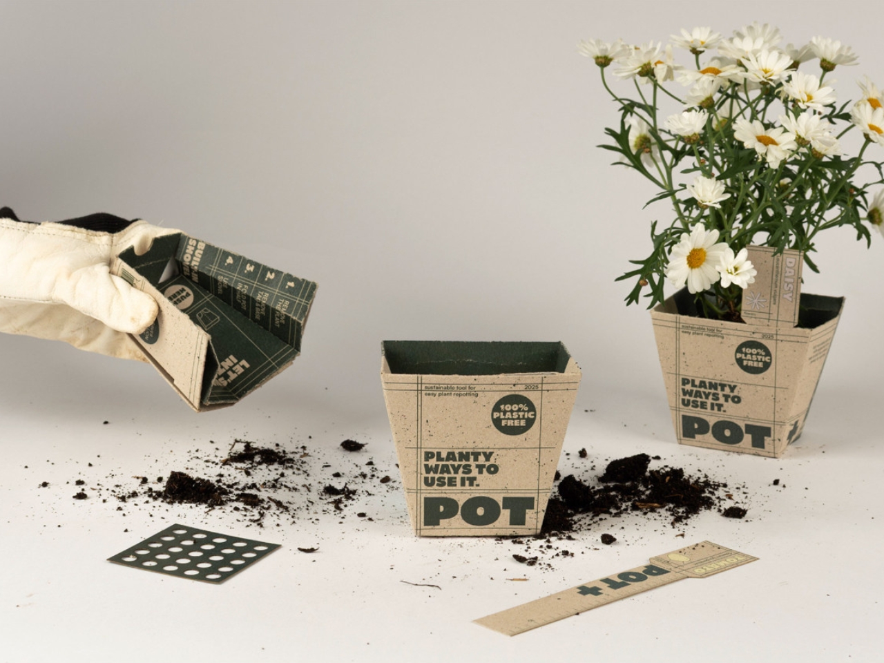
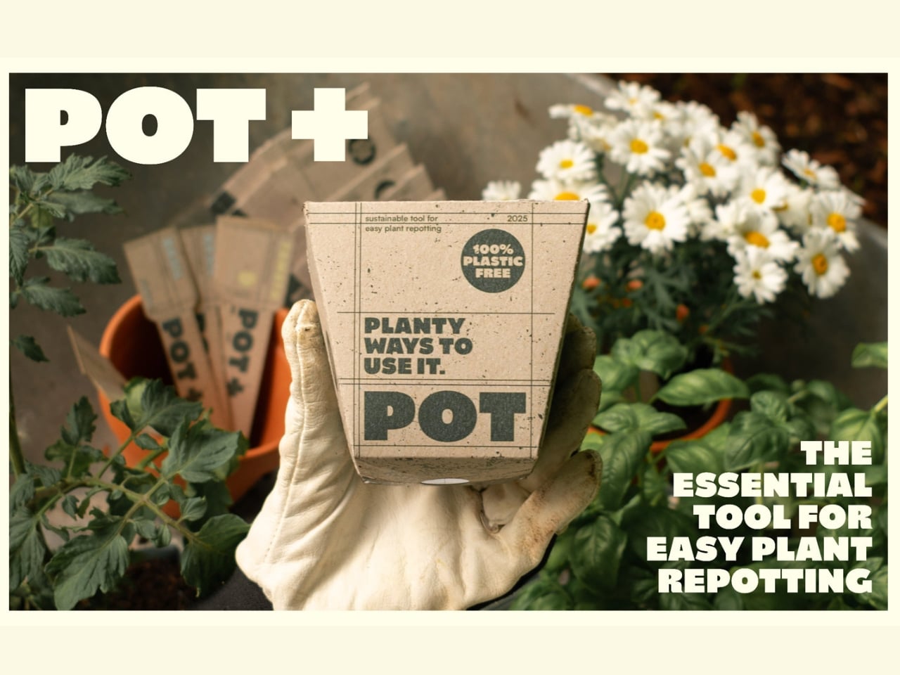
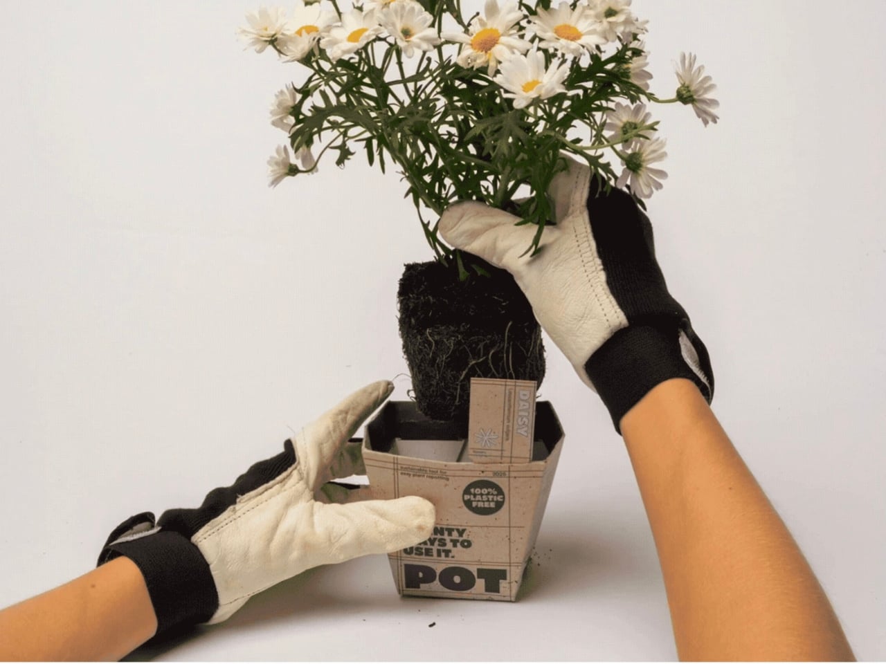
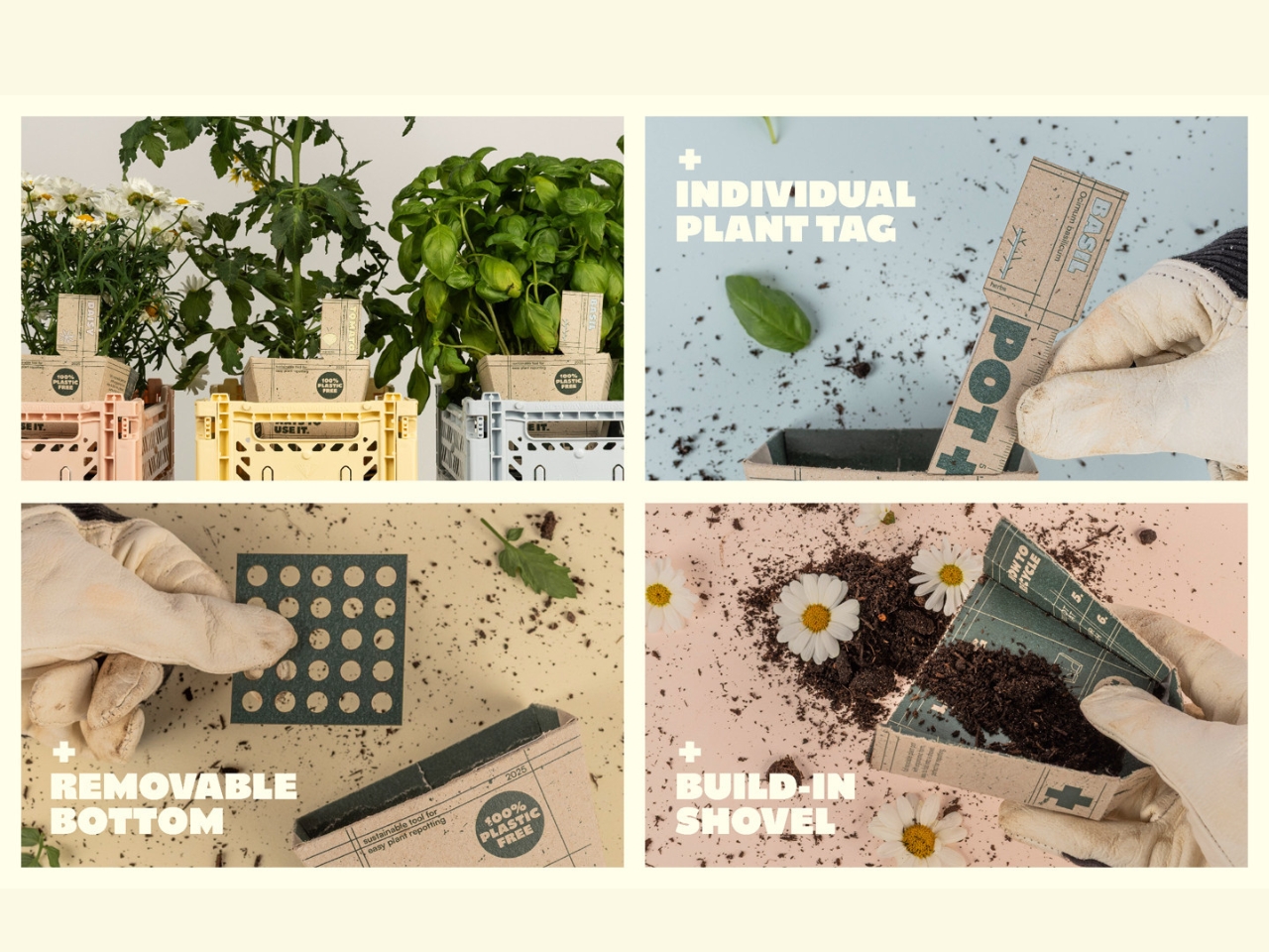
The plant pot is not a product most people think about reinventing. It holds soil, it sits on a shelf, and eventually you wrestle it off the root ball and toss it in a bin. End of story. But three design students from Münster School of Design looked at that ordinary object and saw something worth fixing, and the result is POT+, a 3-in-1 recyclable cardboard plant pot that manages to be both surprisingly clever and genuinely necessary.
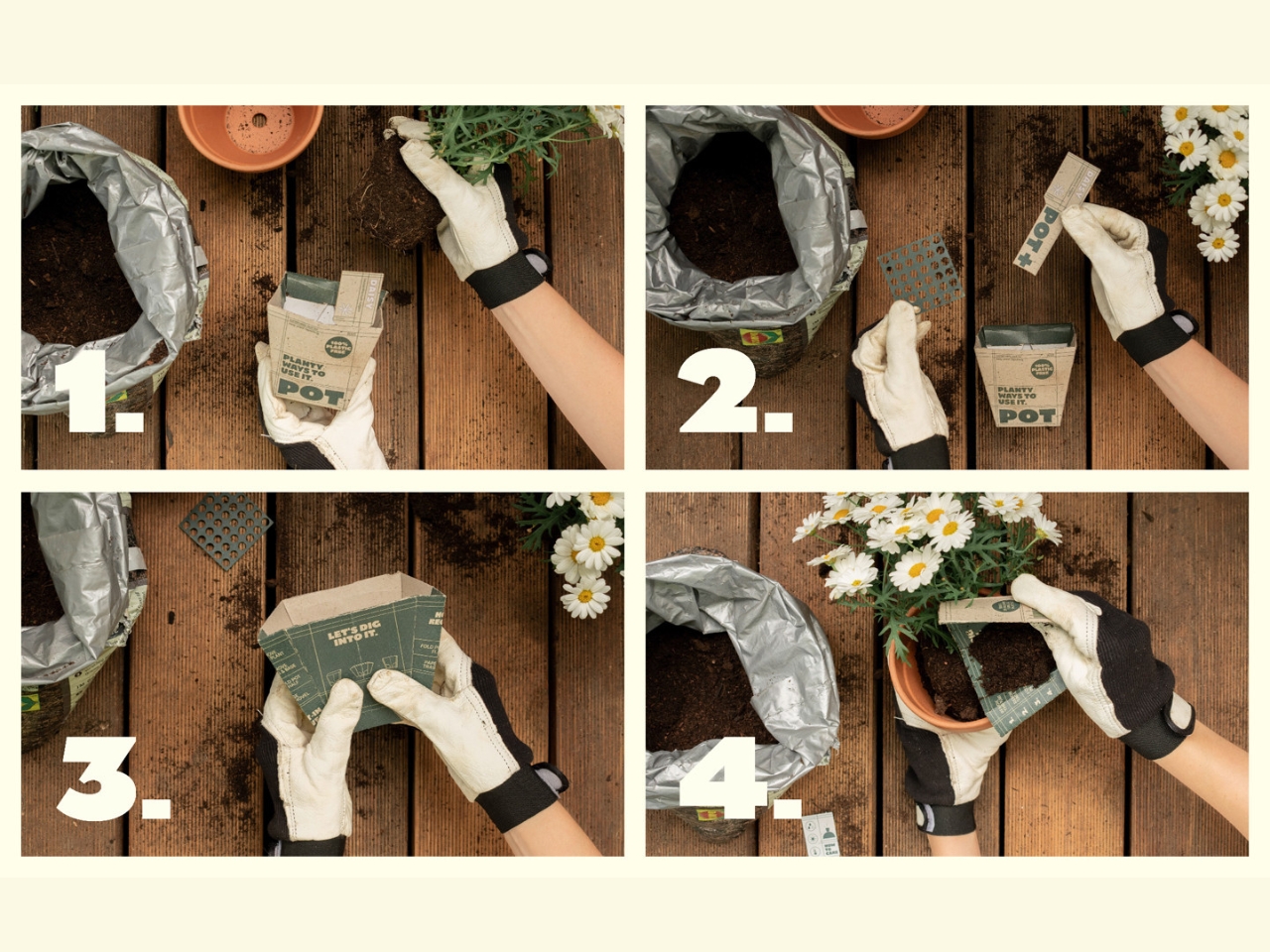
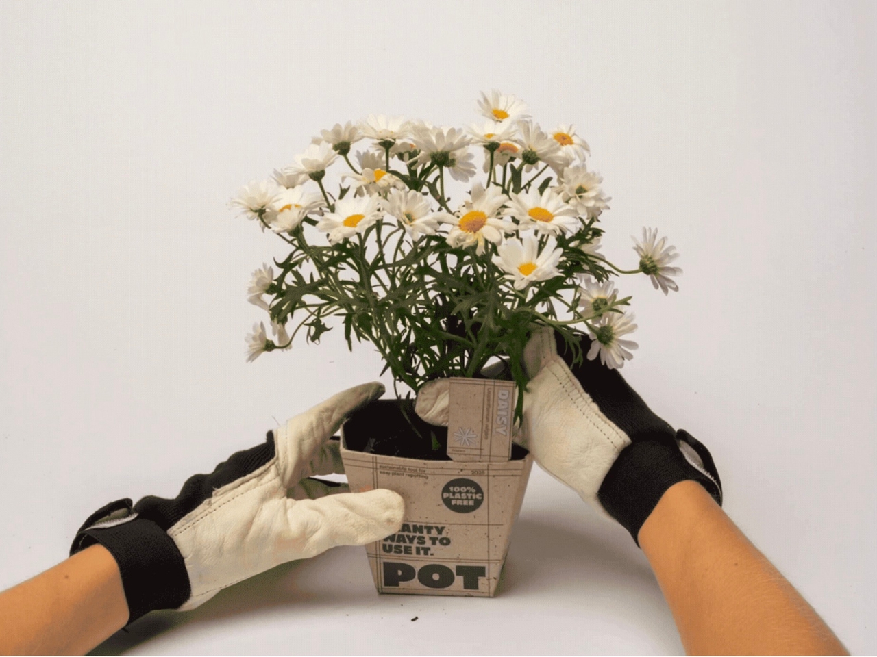
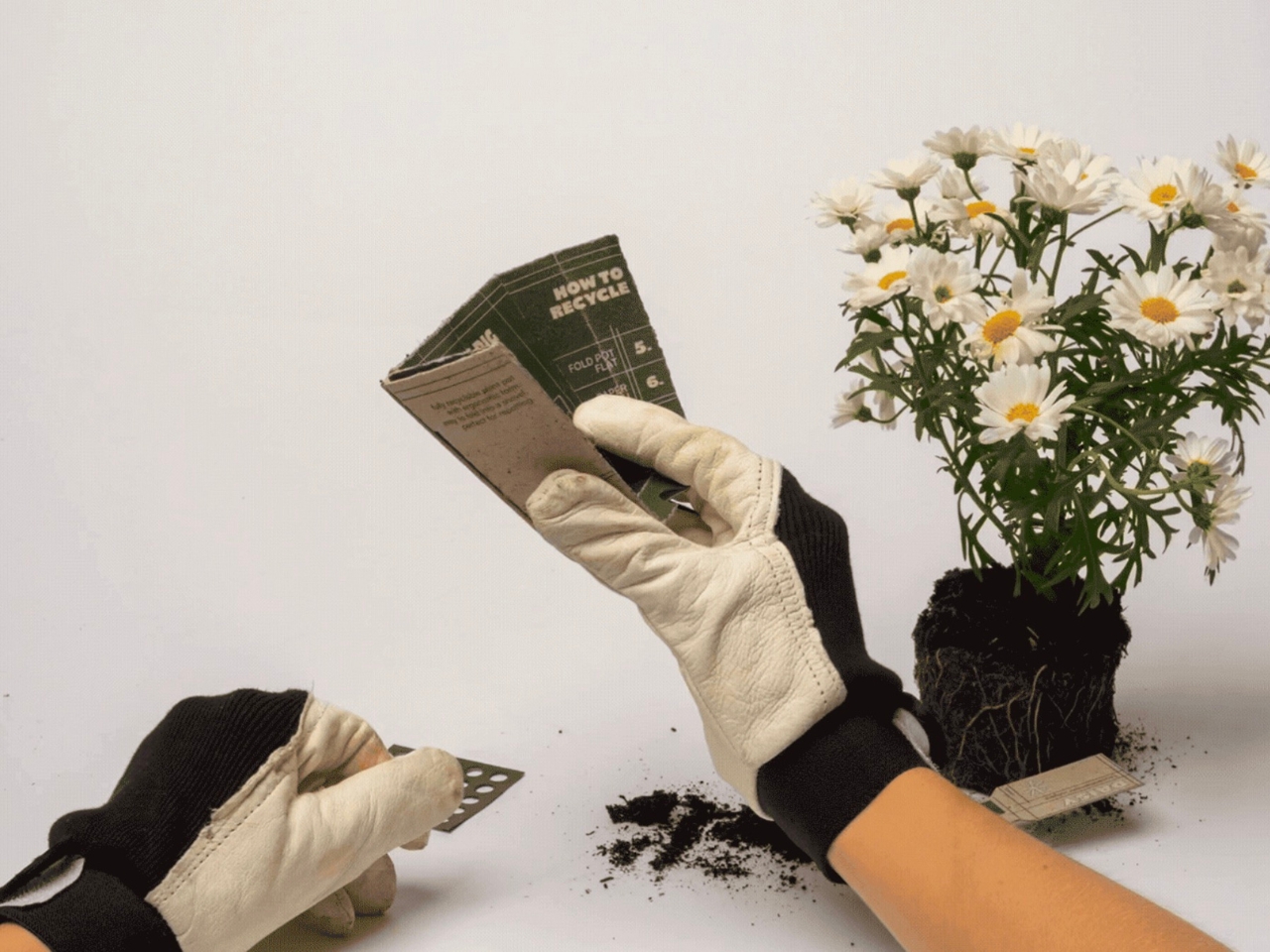
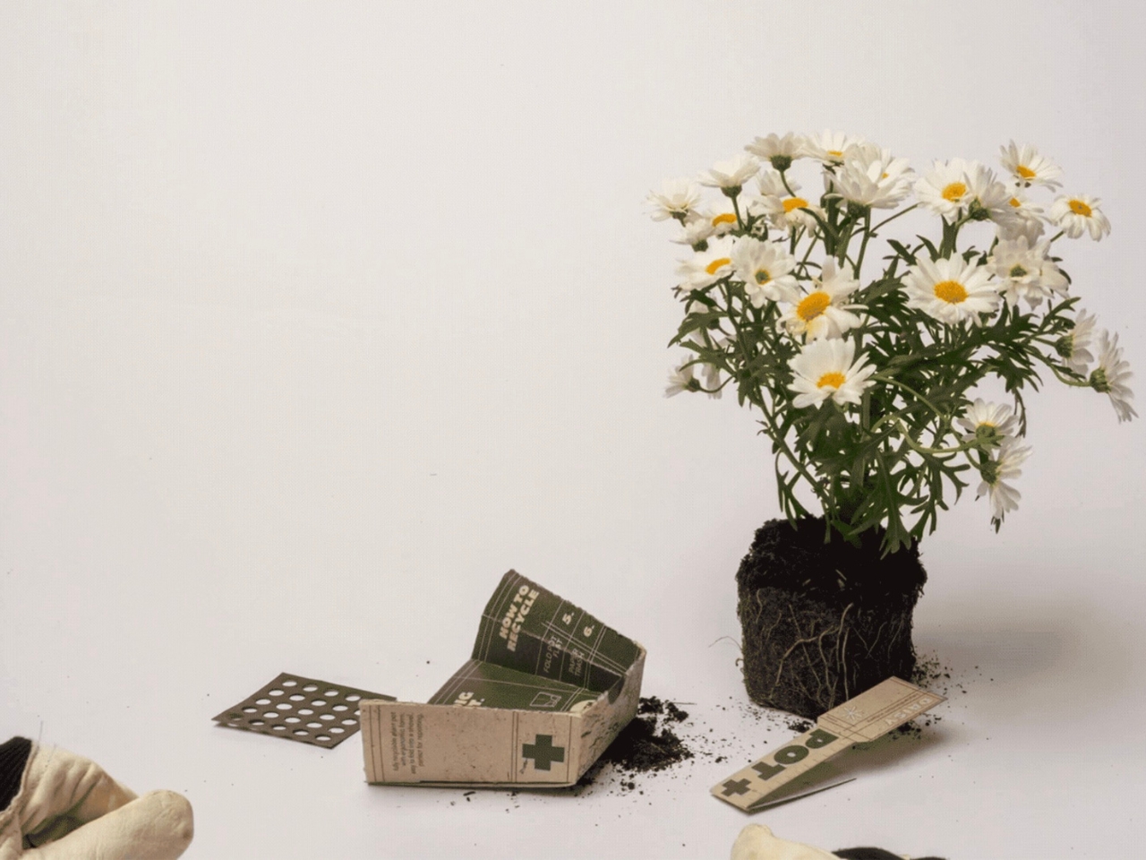
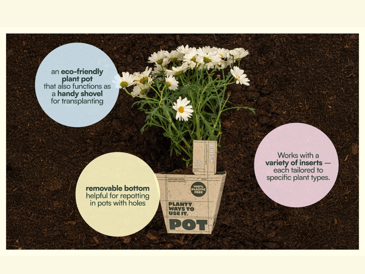
Sophie Greif, Paul Sommerfeld, and Paula Storm developed POT+ over just eight weeks as part of a course on sustainable cardboard packaging. Eight weeks is not a lot of time. It barely covers a single design iteration at most studios, which makes what they produced even more impressive. The concept is straightforward: a biodegradable, glue-free cardboard pot that doubles as a scoop and includes a built-in plant tag. Three tools, one object, zero plastic.
Designers: Sophie Greif, Paul Sommerfeld and Paula Storm
The plastic plant pot problem is bigger than most of us realize. Most of those thin, flimsy pots that come with supermarket herbs or garden centre annuals are not recyclable. They fall into a category of plastics too contaminated with soil and organic material to process properly, so they end up in landfill. Billions of them, every year. Environmental groups have flagged this as one of the garden industry’s most persistent and overlooked waste problems, and yet the plastic pot has remained almost entirely unchanged for decades. We have essentially built a throwaway infrastructure around plants, which is a genuinely bizarre thing to do for products sold in the name of nature.
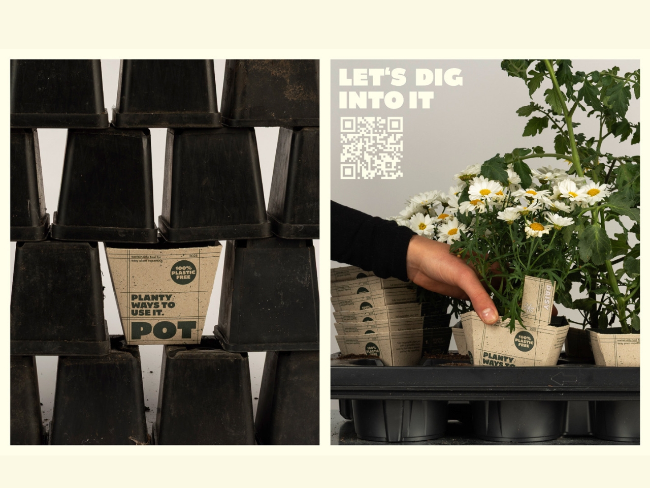
POT+ addresses this directly and without fanfare. Made from 100% recyclable cardboard, it can be tossed straight into the paper recycling bin after use. It is water-resistant and stable for up to two weeks, which covers the window between purchase and repotting for most plants. Beyond that, the ergonomic design and integrated scoop make the actual task of repotting cleaner and easier. And the built-in plant tag is one of those small details that makes you wonder why it was not always part of the package. Anyone who has scratched a plant name on a popsicle stick and promptly lost it will know exactly what I mean.
What strikes me about POT+ is how it reframes the idea of sustainable design. So much green design falls into the trap of asking people to change their behavior significantly in exchange for a smaller environmental footprint. POT+ does not do that. The user experience is genuinely better: fewer tools to fumble with, a biodegradable pot that sidesteps the recycling bin debate, and a plant tag already built in. The sustainability is incidental from the user’s perspective, even though it is clearly the central intention from the designers’.
That alignment between good design and ethical design is harder to achieve than it looks. Students are often praised for one or the other, but rarely both. Sophie, Paul, and Paula merged perspectives from Communication & Product Design and Media & Product Design, which likely accounts for the final product feeling as considered in its branding as it is in its function. POT+ has a clear identity. It looks intentional, not experimental.
The Green Product Award recognized it for good reason. But the more interesting conversation is about what POT+ signals for design education. Eight weeks, three students, three different disciplines, and a finished concept that could genuinely replace a product category. That is not a student project in the diminutive sense of the phrase. It is the kind of outcome that most professional design teams would be proud to put their name on.
The plastic plant pot has been a quiet environmental problem for decades, hiding in plain sight because it is so mundane, so ubiquitous, so easy to overlook. POT+ does not try to be remarkable. It just quietly gets the job done better. And right now, that might be the most useful kind of design there is.
The post 3-in-1 Cardboard Pot Just Made Plastic Pots Obsolete first appeared on Yanko Design.
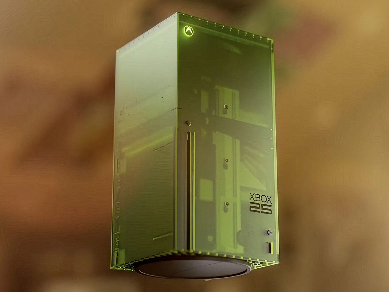
Xbox limited edition makes are nothing uncommon, as Microsoft often delves into collaborations for some really interesting themed consoles and controllers. The gaming brand just turned 25 this year, and Microsoft isn’t going to let go of the opportunity to amaze fans.
This is the limited edition Xbox 25th Anniversary Collection specifically designed to celebrate the quarter-century of Microsoft’s gaming brand. The special themed console and controller remember the platform’s historical development right from the time it came to the shelves, and also pays gratitude to its dedicated community of gamers.
Designer: Microsoft

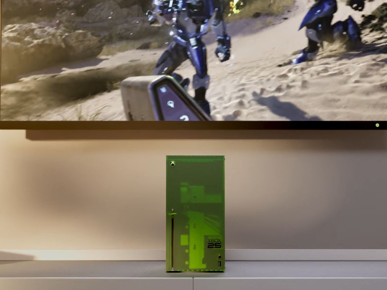
Since we are talking about the highly nostalgic element, the limited-edition creation is draped in the OG Green translucent theme. If you are an avid Xbox fan, that reminds me of the aesthetic worn by the original 2001 Xbox console. The fused hues of the outer shell are absolute dope, both on the console and the controller, while the backplate gets the more traditional black make. Apparently, this is the first time Microsoft has gone for the translucent treatment for the chassis on any current-generation console models. I’m glad they did, because the thing looks so magnetic.

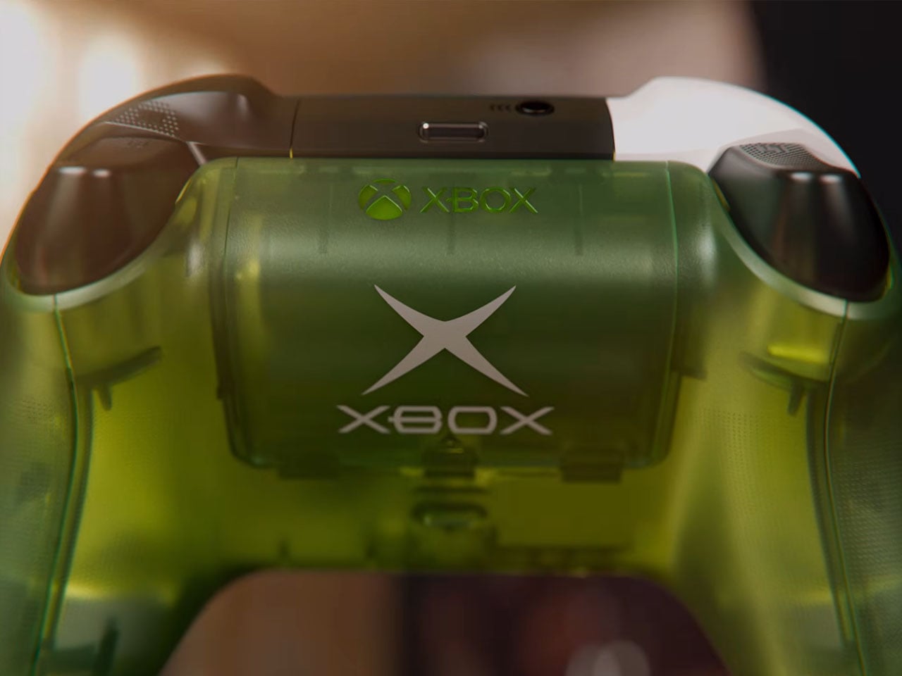
According to Jason Ronald, VP Next Generation, “The XBOX Series X25 Limited Edition respects our history, with the power and performance of the XBOX Series X, including 1TB of storage, and a design that reflects where we’ve been and the community that’s been with us along the way.” Both the console and the controller are etched with the “Xbox 25” anniversary logo on the front. That is complemented by the “X” button that turns green as soon as the console is switched on.


The controller comes with the original ABXY colors for the buttons, and the bumpers on the gamepad are black and white to go with the classic theme of the Duke controller. The translucent goodness flows to the rear, where the back case and the battery panel reveal the Xbox logo. That said, the texture feel and the ergonomic grip are more comparable to the current generation gamepads. Ronald added that there will be some “hidden surprises throughout” to keep things interesting for lucky owners.


Microsoft hasn’t detailed anything about the pricing of the special edition Xbox console, but it’ll be within bounds, I guess. Availability, though, is hinted at for select markets as a special edition collection in November. Those who fail to buy the collection can grab the XBOX Wireless Controller X25 Special Edition standalone as well, but that’s also a limited Edition offering.


The post Xbox Series X25 Limited Edition celebrates brand’s 25 years of nostalgic gaming first appeared on Yanko Design.

Installing iOS 27 Beta 1 on your device without relying on a computer is a straightforward process when approached with proper preparation and attention to detail. This guide provides a comprehensive walkthrough, from making sure your device is ready to troubleshooting potential issues, so you can explore the latest features of iOS 27 with confidence. […]
The post How to Get iOS 27 Beta 1 Right Now (Without a Computer) appeared first on Geeky Gadgets.