Why a $70 Screenless Camera Is the Most Interesting Gadget Right Now

A camera with no screen sounds like a step backward. It is, by design. And that’s exactly the point. We live in an era where every piece of technology is racing to give you more. More features, more connectivity, more reasons to stay glued to a display. And here comes a small, cheerful little camera doing the opposite on purpose. It’s almost rebellious, except it fits in your pocket and comes in Strawberry Splash.

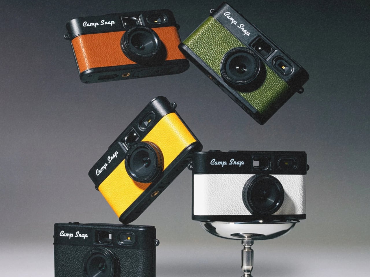
Camp Snap just released its second-generation screenless digital camera, the Camp Snap 2, and it’s already making the rounds on social media with the kind of low-key enthusiasm that feels genuine rather than manufactured. If you missed the original, here’s the short version: it’s a point-and-shoot with no rear LCD, no Wi-Fi, no app ecosystem, and no ability to review your shots before downloading them later. The whole pitch rests on the idea that not knowing what you captured is actually better for you.

Designer: Camp Snap

I’ve thought about this a lot, and I don’t think it’s a gimmick. We’ve spent years optimizing the act of photographing something into oblivion. We shoot, we review, we retake, we add a filter, we post, we check the likes. The photo becomes less about the moment and more about the performance of documenting it. The Camp Snap strips all of that away, and when you hold a camera you literally cannot scroll through, you start paying attention to the moment in a way that feels a little foreign at first, then oddly refreshing.

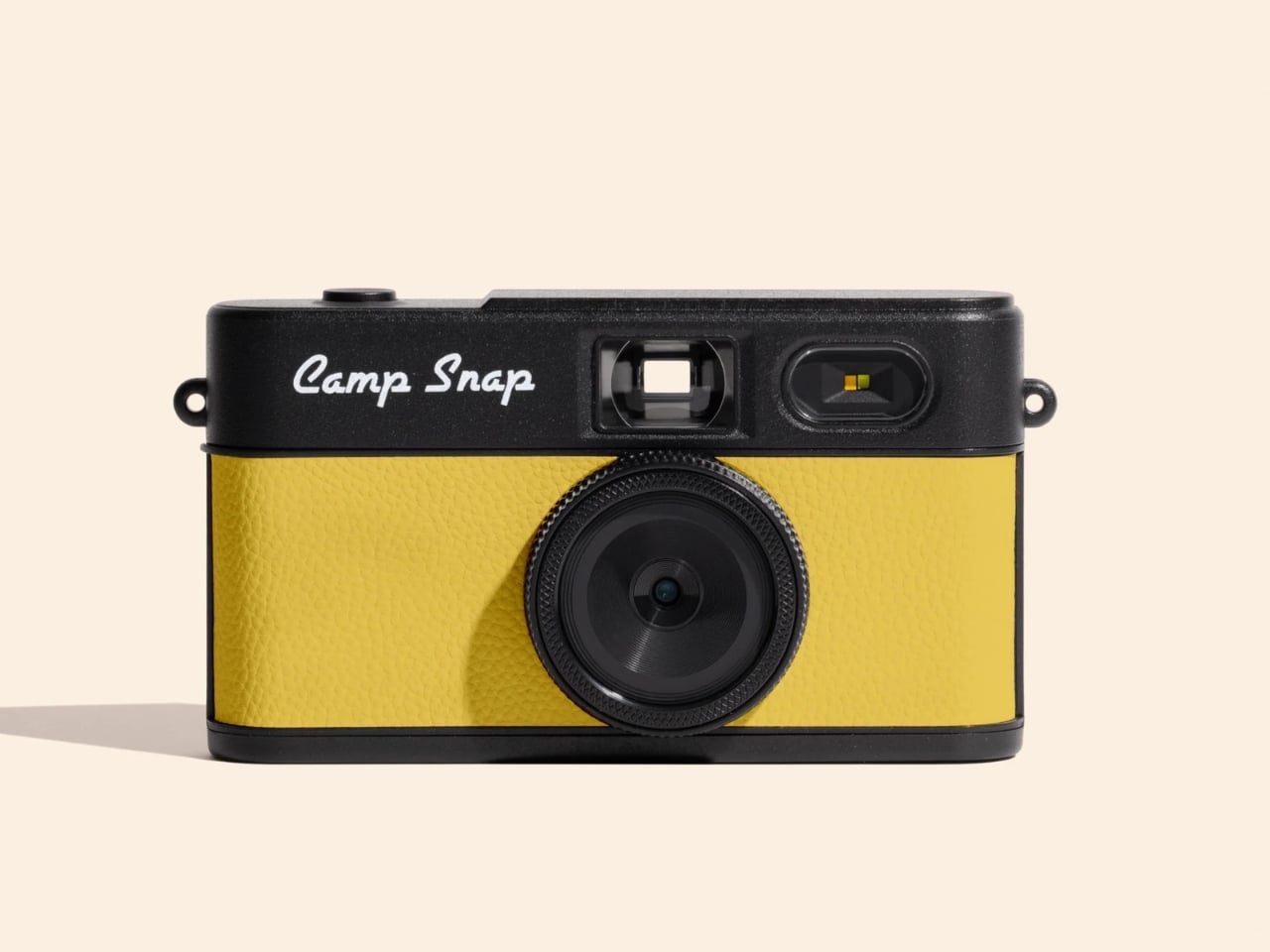
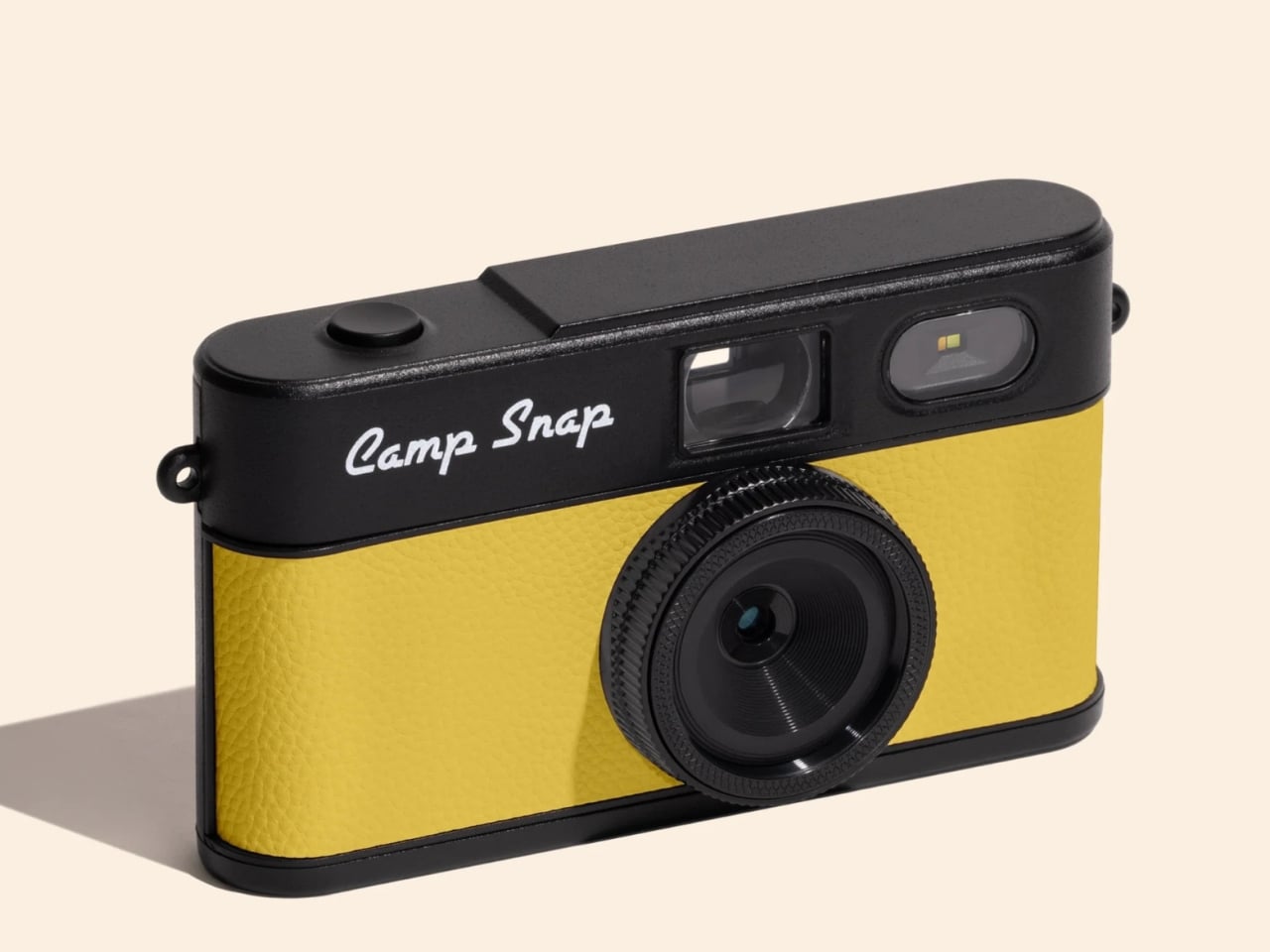
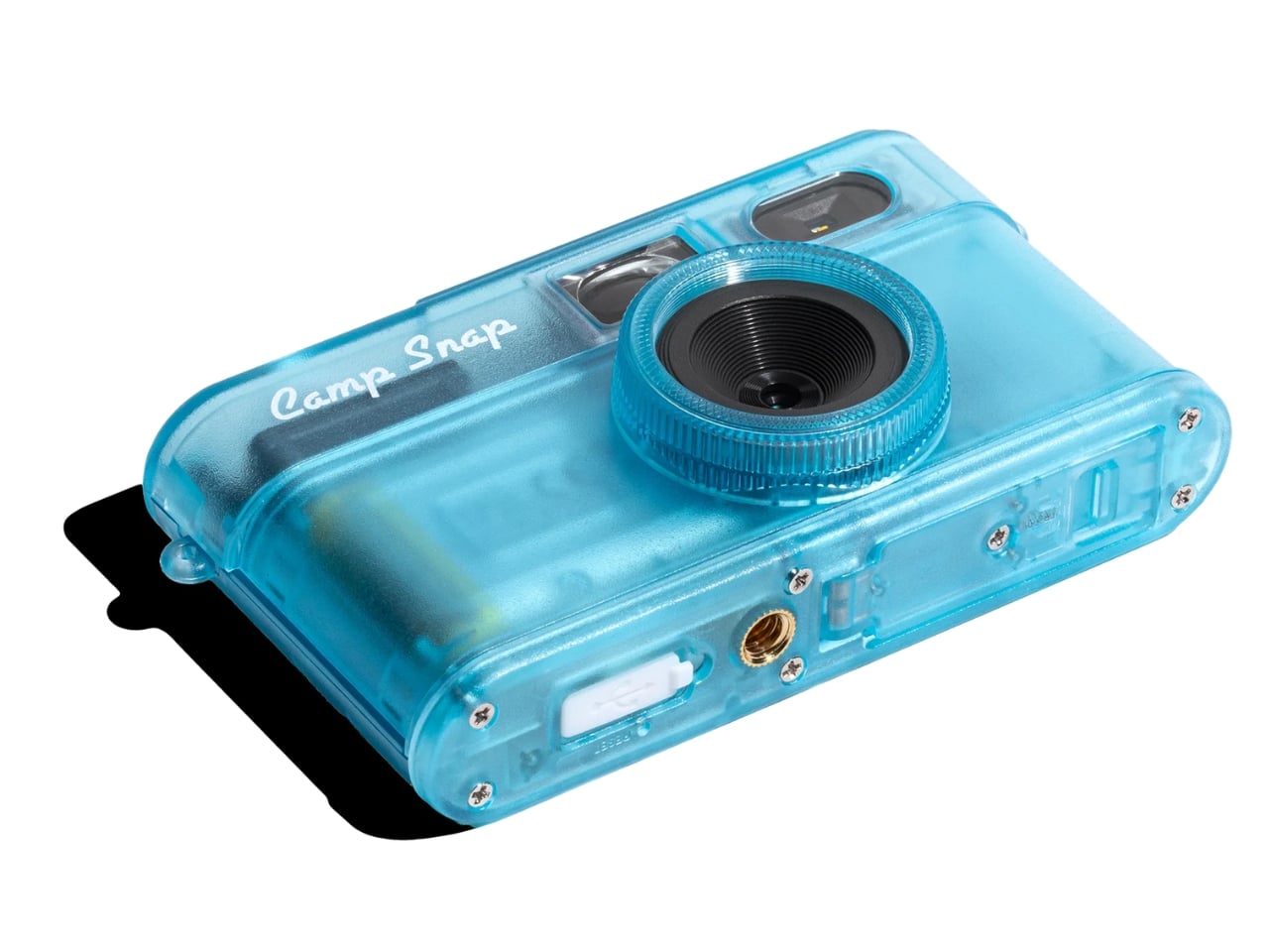
The Camp Snap 2 keeps everything that worked about the original and quietly fixes what didn’t. It’s 15% slimmer than the V1, which sounds minor until you actually slide it into a pocket and forget it’s there. The 8-megapixel sensor is unchanged, which will either bother you or not depending on what you’re looking for. The photos are not going to replace your iPhone shots. They’re warmer, a little imperfect, and have that slightly analog quality that makes you feel like you developed something rather than downloaded it.

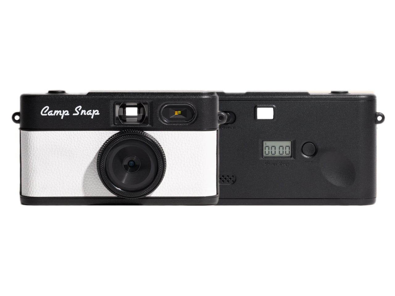
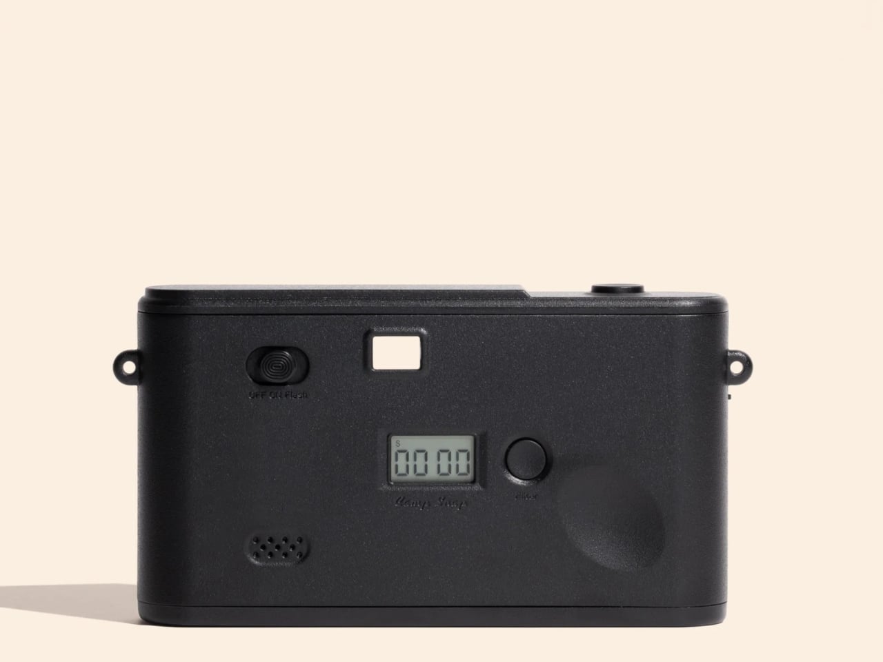
The biggest upgrade is the filter button. On the original Camp Snap, switching filters required plugging the camera into a computer, which was a meaningful enough friction point that most people probably just left it on the default setting and moved on. The Camp Snap 2 now has a dedicated button on the back that cycles through six built-in looks: Standard, Vintage 1, Vintage 2, Vintage 3, Analog, and Black & White. No apps, no computer, just click until you land on the vibe you want. For anyone who bought the first version and felt mildly cheated by the filter situation, this is the update they were owed.

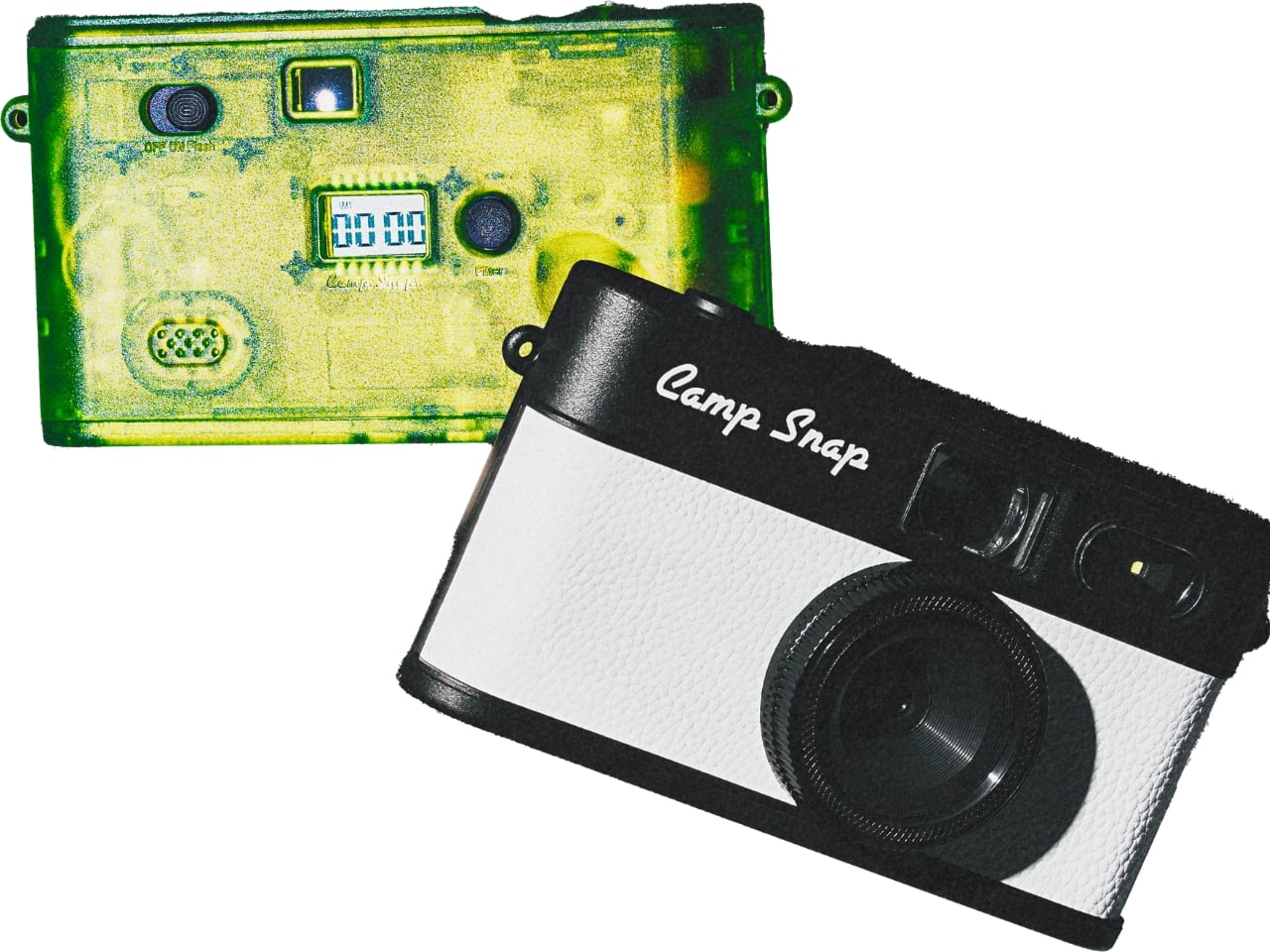
For families, Camp Snap also added a CampLock feature, which disables the filter button so younger users can’t cycle through settings accidentally (or intentionally). You unlock it by holding the button for ten seconds, which is the kind of low-tech solution that’s either charming or mildly annoying depending on the day.

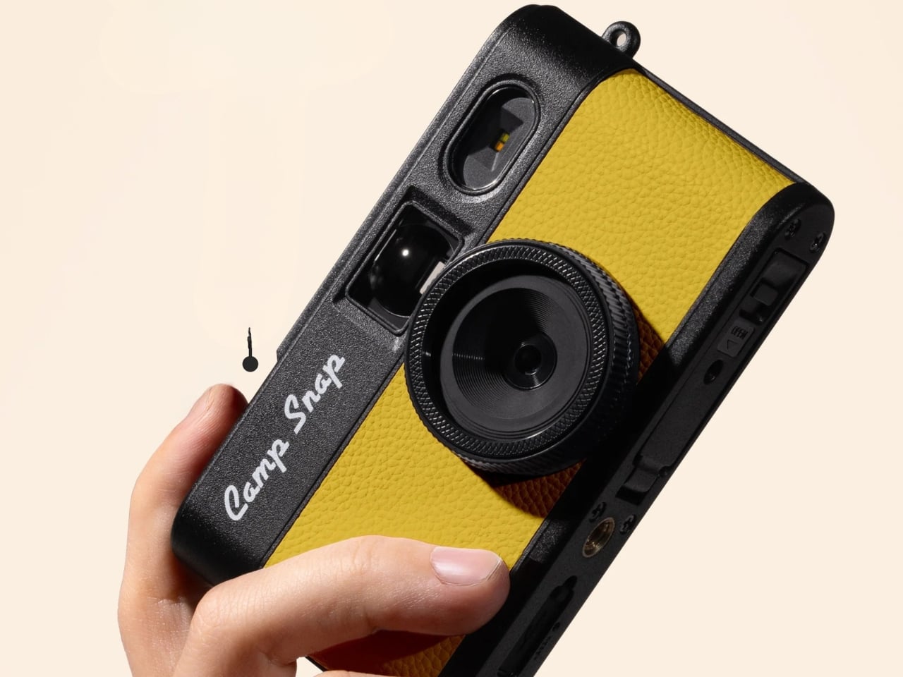
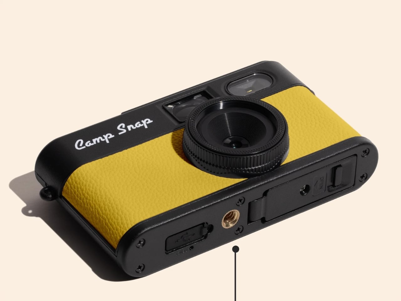
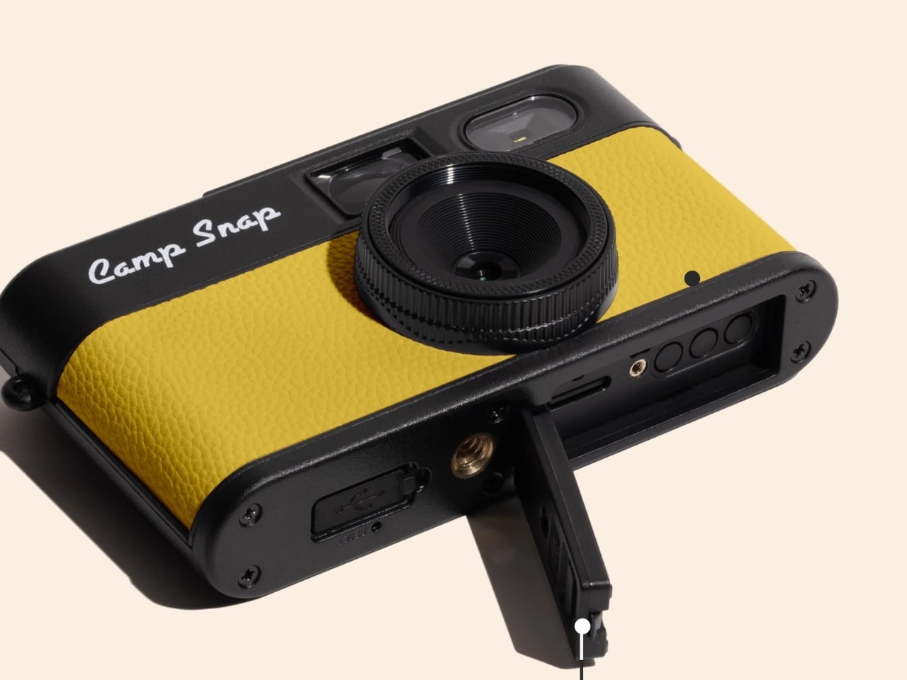
The new model also supports 30.5mm screw-in filters, which opens up creative territory that feels almost comically ambitious for a camera of this nature. Wide-angle adapters, diffusion filters, star effects, macro attachments. It’s a camera designed to make you feel less precious about photography, and now it technically supports a whole accessory ecosystem. The tension between those two ideas is interesting, and I’m curious to see how people actually use it.

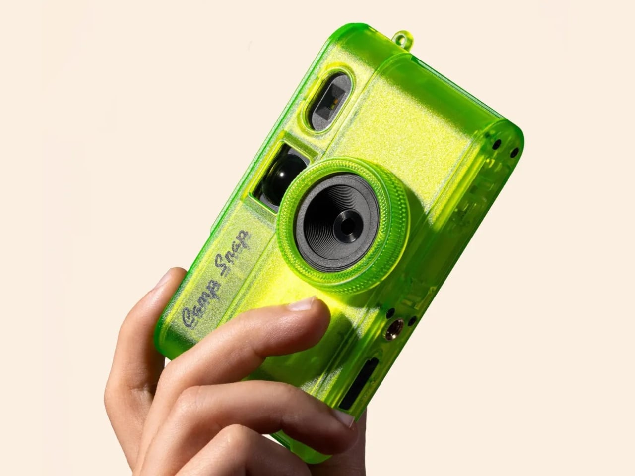
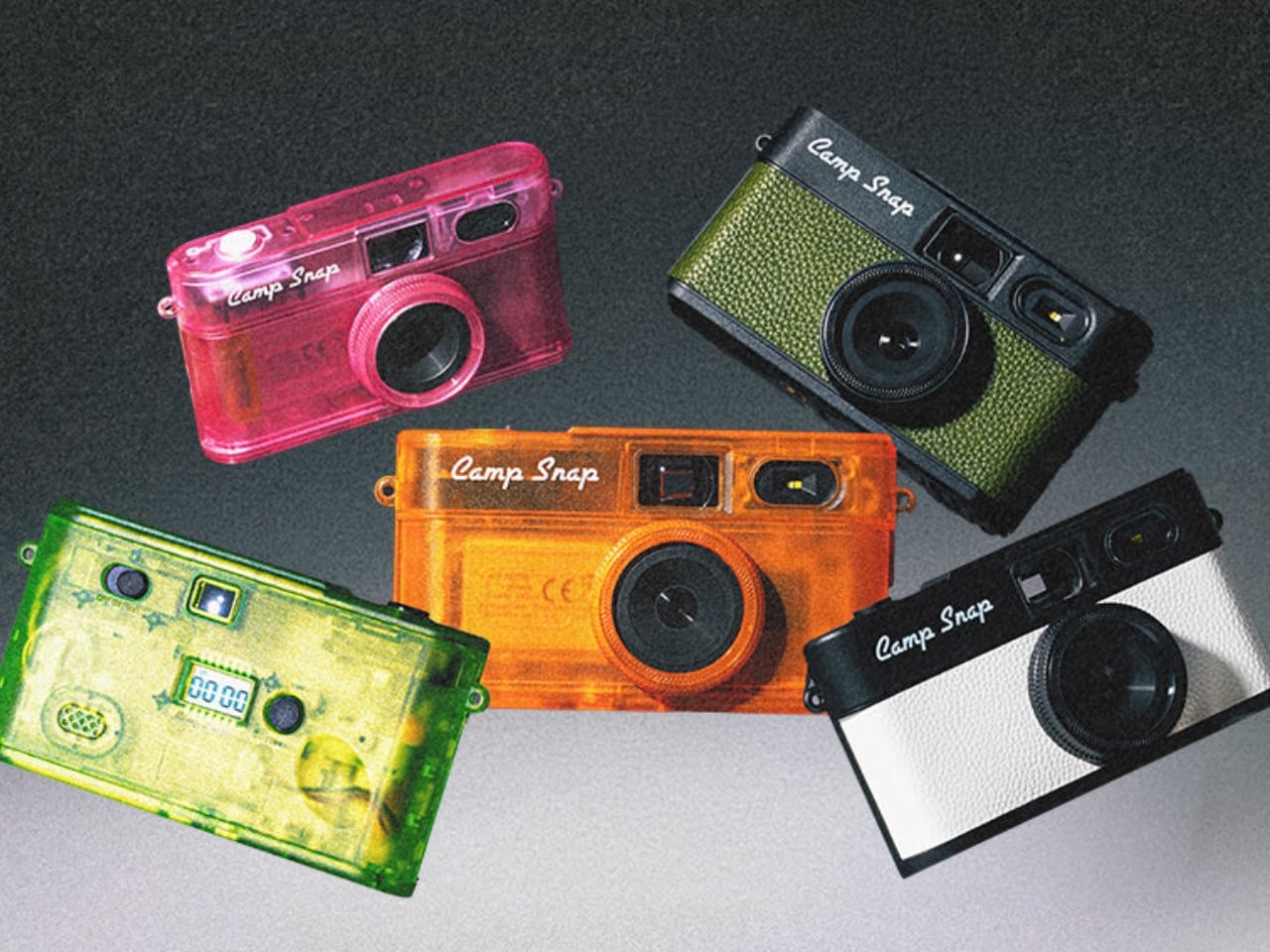
The Camp Snap 2 comes in nine colorways, including some jelly-style translucent options that hit the Y2K nostalgia button hard. Sunbeam Yellow, Tangerine Drift, Twisted Lime, and Strawberry Splash are doing a lot of visual heavy lifting here, and they look exactly like the kind of tech that lived in every locker in 2003. That’s not accidental. Camp Snap knows its audience includes adults who are as nostalgic for simpler devices as they are tired of their smartphones.

At $69.95, the Camp Snap 2 costs about the same as a dinner out, and it will probably be more memorable. It’s not asking you to quit your phone or adopt a new philosophy. It’s just a small, uncomplicated camera that asks you to look up more than you look down. For a lot of people, that might be worth exactly seventy dollars.

The post Why a $70 Screenless Camera Is the Most Interesting Gadget Right Now first appeared on Yanko Design.

A Thunderstorm, Frozen in Marble and Gold Leaf

Most lamps ask very little of you. They sit in corners, cast light, get switched off. Electric Rocks, a new collectible luminaire by British designer Mark Mitchell for Italian marble company Serafini, refuses to be ignored. It is two blocks of marble split open by a bolt of lightning, and the lightning is still there, frozen between them, glowing warm and low like the aftermath of something ancient and violent.

The concept is straightforward in theory and staggering in execution. Mitchell wanted to capture lightning at the exact moment of impact, not as decoration, but as event. “The electric arc appears to hang in the air, frozen at its most powerful point,” he says. “The bolt feels dangerous, but controlled. It is power held in stone.” That line does a lot of work, and it earns it.

Designer: Mark Mitchell for Serafini

What makes this piece land so hard is the contradiction it holds together. Lightning is the definition of fleeting, over in milliseconds, gone before you can fully process it. Marble is the opposite: dense, ancient, built to outlast everything we make. Placing one inside the other shouldn’t work, and yet it does, completely. The tension between those two materials is precisely what gives Electric Rocks its emotional weight. You’re standing in front of something that feels simultaneously permanent and urgent.

The craftsmanship behind it is genuinely serious. The stones are polished Italian marble, coated in gold leaf to intensify the presence of the bolt. The lightning element is entirely handcrafted from 2200K LEDs and stainless steel, engineered to replicate the jagged, irregular quality of a real electric arc. The warm amber glow reads less like interior lighting and more like geological heat, like light escaping from somewhere deep underground. At 96 x 56 x 97 cm, it’s a significant physical presence, not a table lamp you’d tuck beside a sofa but a sculptural object that changes the atmosphere of an entire room.

Mitchell, based in Cheshire, England, has built his practice around exactly this kind of poetic restraint. His work draws consistently on natural phenomena: the way light moves, the way materials age, the space between objects rather than the objects themselves. His design language is minimalist but never cold. Electric Rocks is perhaps his most dramatic statement to date, but it still carries that quality of stillness his work is known for. He describes it as “a space where power and calm coexist,” and that reads less like a press line and more like a genuine philosophy.

The historical dimension of the piece adds another layer worth sitting with. Across cultures and centuries, stones struck by lightning were considered sacred objects, permanently altered by extreme celestial force and sought after for the mythological weight they carried. Electric Rocks draws a quiet line from that ancient reverence to a contemporary luxury object without being heavy-handed about it. The mythology is embedded, not announced, which is how the best design references tend to work.

If I’m being honest about why this piece interests me beyond the aesthetics, it’s because it asks a real question about what luxury objects should do. The best ones don’t just signal taste or cost. They change the energy of a space. They make you feel something you weren’t expecting. Electric Rocks does that. Sitting in a dark room with those two glowing marble slabs and a thin thread of light stretching between them, you’re not thinking about function or finish. You’re thinking about storms, about deep time, about the strange quiet that follows something overwhelming.

For Serafini, commissioning this piece is a smart move creatively. The Italian marble industry has long understood that stone is not just a material but a story, millions of years compressed into surface and weight. Electric Rocks extends that story into something wilder and more elemental. It turns a lamp into a conversation about nature’s force and human craft working in the same breath. It is, without question, one of the most compelling collectible objects to emerge this year. And it casts a very beautiful light.

The post A Thunderstorm, Frozen in Marble and Gold Leaf first appeared on Yanko Design.

Leaked: the Surprising Difference Between Samsung’s Galaxy Z Fold 8 Ultra and Wide

Leaked: the Surprising Difference Between Samsung’s Galaxy Z Fold 8 Ultra and Wide Leaked prototype of the Samsung Galaxy Z Fold 8 Wide showing a passport-style design

Samsung continues to push the boundaries of foldable smartphone technology with the Galaxy Z Fold 8 Ultra and Galaxy Z Fold 8 Wide. These two models represent a strategic evolution in Samsung’s foldable lineup, offering distinct designs tailored to meet diverse user needs. The Fold 8 Ultra retains the classic taller, narrower design that Galaxy […]

The post Leaked: the Surprising Difference Between Samsung’s Galaxy Z Fold 8 Ultra and Wide appeared first on Geeky Gadgets.

Posted in Uncategorized

Steam Deck OLED vs Switch 2: the Ultimate Travel Test

Steam Deck OLED vs Switch 2: the Ultimate Travel Test Person playing Nintendo Switch 2 during a family road trip

Handheld gaming in 2026 offers two standout options: the Steam Deck OLED and the Nintendo Switch 2. In a feature by PlayFever, these devices are compared through the lens of a family road trip across Europe, highlighting their real-world performance. For instance, the Nintendo Switch 2’s low energy consumption makes it a practical choice for […]

The post Steam Deck OLED vs Switch 2: the Ultimate Travel Test appeared first on Geeky Gadgets.

Posted in Uncategorized

FutureWave’s Furny home robot talks to you by moving, not by talking

Most home robots ask a lot from the room they inhabit. They arrive with screens, speakers, wake words, and personalities, all requiring acknowledgment from whoever happens to be nearby. The interaction model is fundamentally borrowed from smartphones: alerts, prompts, and responses delivered through layers of interface. The result is a machine that demands attention in a space that already has more than enough competition for it.

Brussels-based studio Futurewave took a different position with Furny, a domestic robot concept presented at the last Milan Design Week 2026. Rather than building something with a face, a voice, and a screen, the team asked whether a robot in the home could communicate through posture and movement alone, the way furniture communicates presence and purpose without saying anything at all.

Designer: Futurewave

The answer is a furniture-sized object with a movable head that expresses itself entirely through physical behavior. When something happens nearby, the head tilts. When the robot is ready to act, it orients toward the task. When it’s waiting, it recedes into a posture that reads as neutral, almost still. The timing, direction, and intensity of each shift are calibrated to communicate specific states: focus, readiness, attention, and reaction. There are no pixels involved in any of it.

Deliberately avoiding humanoid proportions was a foundational decision. Furny doesn’t mimic the way a person or animal moves. The gestures it uses are abstract enough to feel designed rather than imitated, which makes them easier to read in context without triggering the uncanny valley that tends to follow robots built on biological templates. The visual restraint also helps it belong in a room. It reads as an object with behavior, rather than a character out of place.

The research behind the project draws on work in expressive movement design for non-anthropomorphic robots, a field that looks at how physical states and intentions can be conveyed through spatial behavior without resorting to screens or voice. Furny’s head doesn’t speak for it. The way the body holds itself does. The robot signals what it’s about to do before it does it, which is a meaningful distinction from machines that simply act and leave the explanation for an app notification afterward.

Futurewave also built Furny within a manufacturable framework, which separates it from most conceptual robot work. The project integrates industrial design, embedded electronics, and software-controlled motion systems in a way that points toward practical production rather than exhibition only. That framing is important because the most interesting thing about Furny isn’t the movement vocabulary itself but the argument it makes about what a domestic robot is supposed to be.

The prevailing assumption has been that robots become more useful as they become more capable of mimicking human interaction. Furny pushes back on that. A robot that remains quiet when nothing’s needed, reads the room through its posture, and signals intention before acting doesn’t interrupt the household. It becomes part of it, the way a good piece of furniture does, present and purposeful without drawing attention to itself until the moment calls for it.

The post FutureWave’s Furny home robot talks to you by moving, not by talking first appeared on Yanko Design.