Entering a space and feeling an instant sense of calm and energy shows the effect of biophilic design. In contemporary built environments, the lack of connection to natural elements can reduce comfort, focus, and overall well-being.
Light becomes the critical medium for restoring this connection. Biophilic lighting replicates the spectrum, dynamics, and intensity of daylight by integrating seamlessly into architectural spaces. It transforms sterile interiors into environments that nurture health, enhance productivity, and promote mental balance. More than a visual tool, let’s understand how it serves as a measurable, evidence-based strategy for embedding nature’s restorative qualities into design.
1. Mimics Natural Light
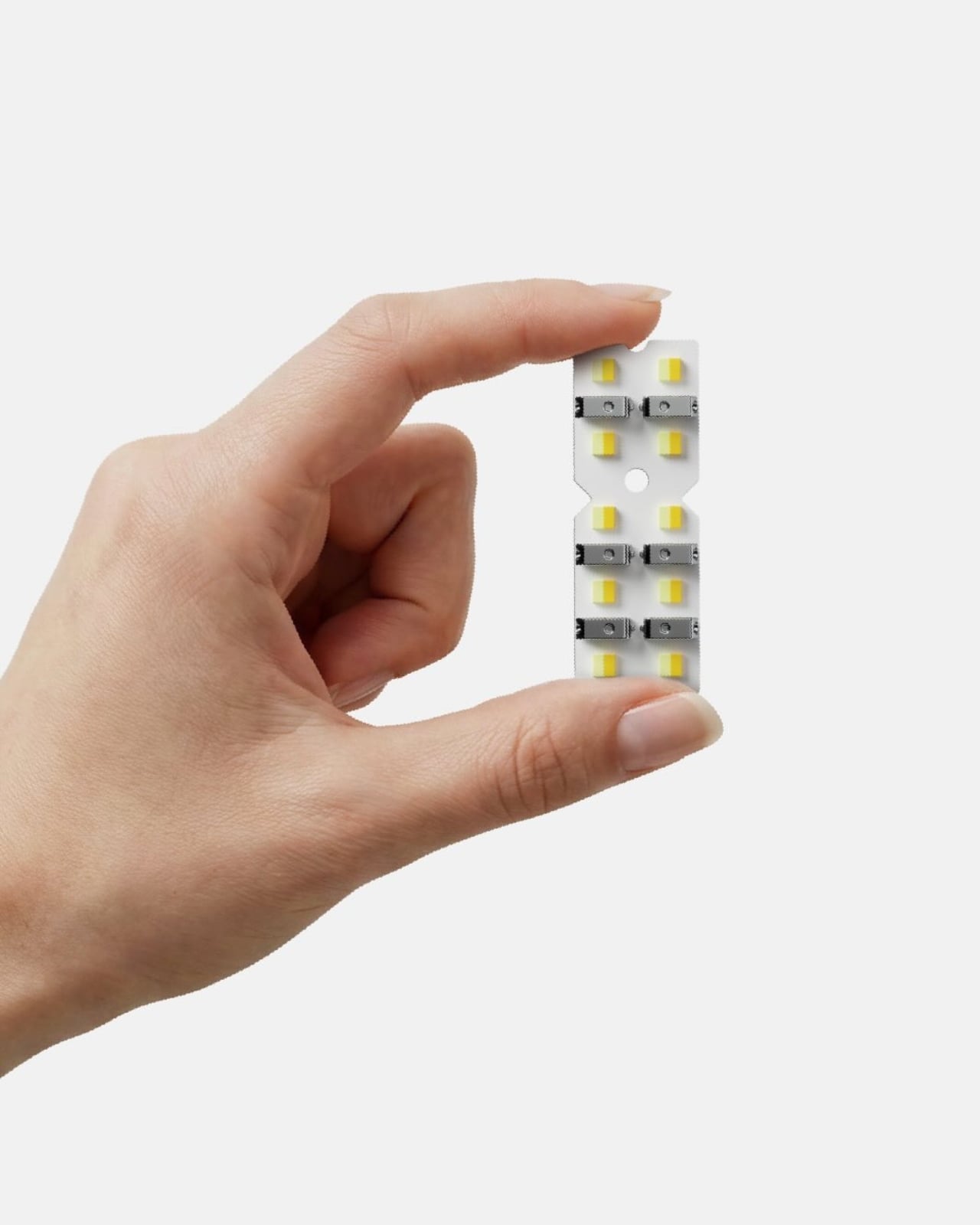
The human body runs on a 24-hour internal clock known as the circadian rhythm, which is shaped by the light entering the eyes. This cycle influences sleep quality, hormone release, and energy levels. Static artificial lighting disrupts the body’s rhythm, often causing poor sleep and daytime fatigue, a common effect of modern indoor living.
Dynamic lighting systems offer a restorative solution. By adjusting color temperature and intensity to reflect the sun’s natural path, they promote balance like bright cool light for morning alertness, gradually shifting to warm dim tones in the evening to prepare for rest.
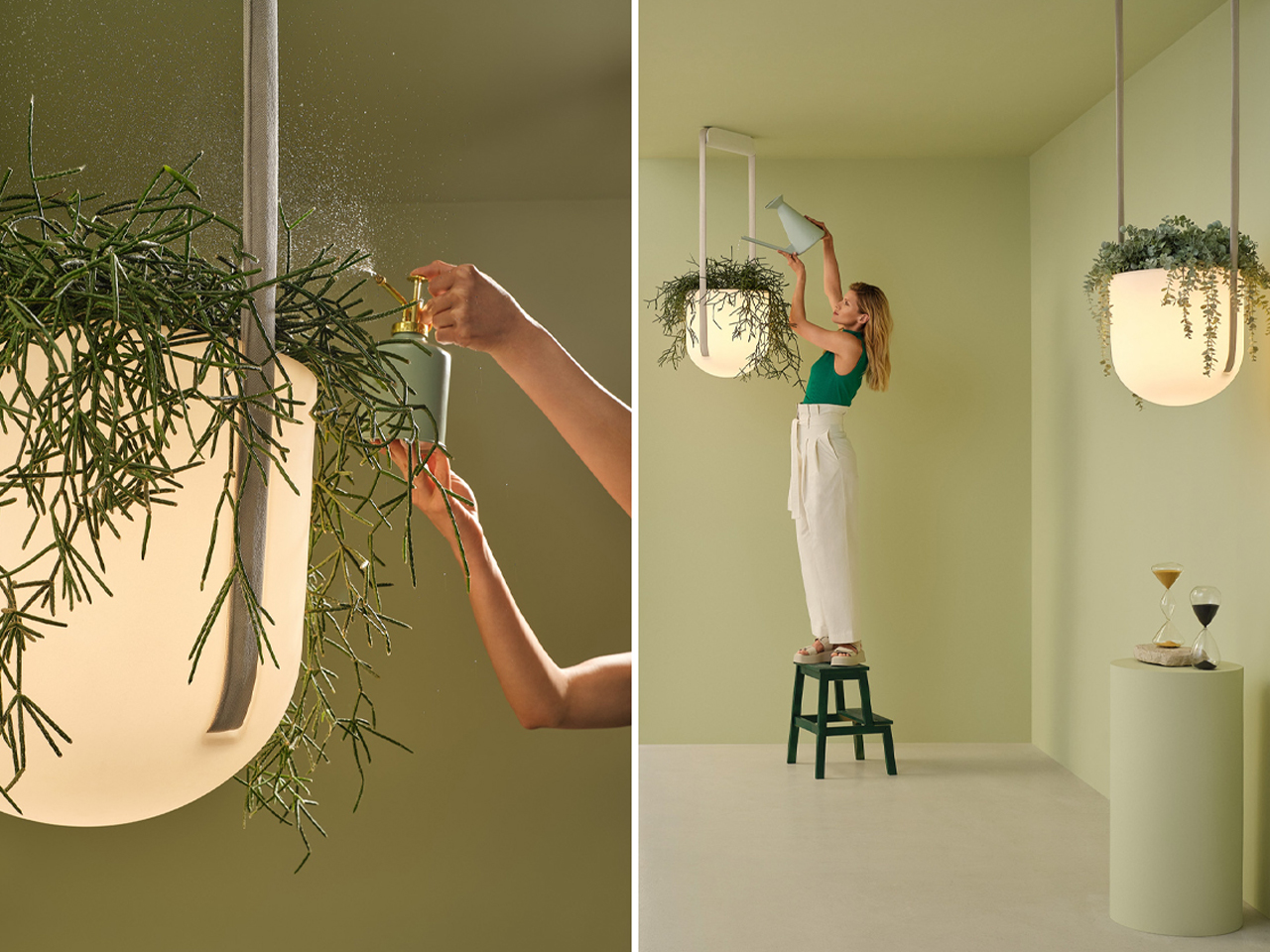
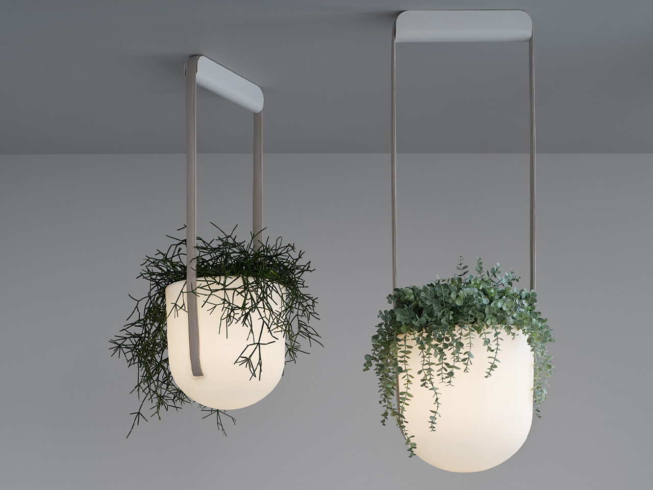
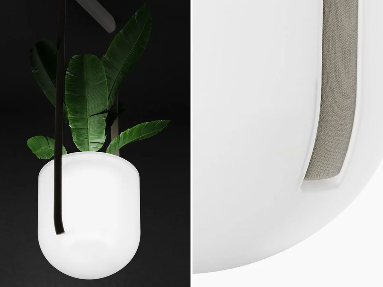
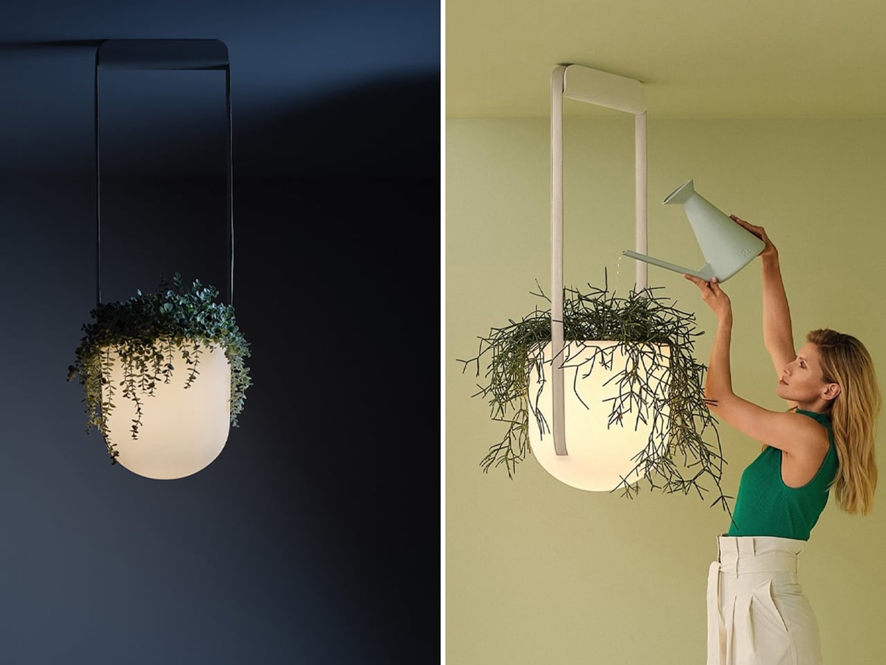
Jungle is a hybrid creation, part planter and part light fixture, suspended from the ceiling by two long fabric straps. Since remote work became widespread, biophilic design has emerged as a way to bring the benefits of nature indoors. Indoor gardens are a common expression of this approach, blending greenery with architectural or interior elements. Jungle interprets this principle beautifully, combining a hanging planter with a semi-flush mount light fixture. Its bulbous, capsule-shaped centerpiece emits a warm, golden glow through an opaque body, softly illuminating the surrounding greenery while enhancing the sense of calm and connection to nature.
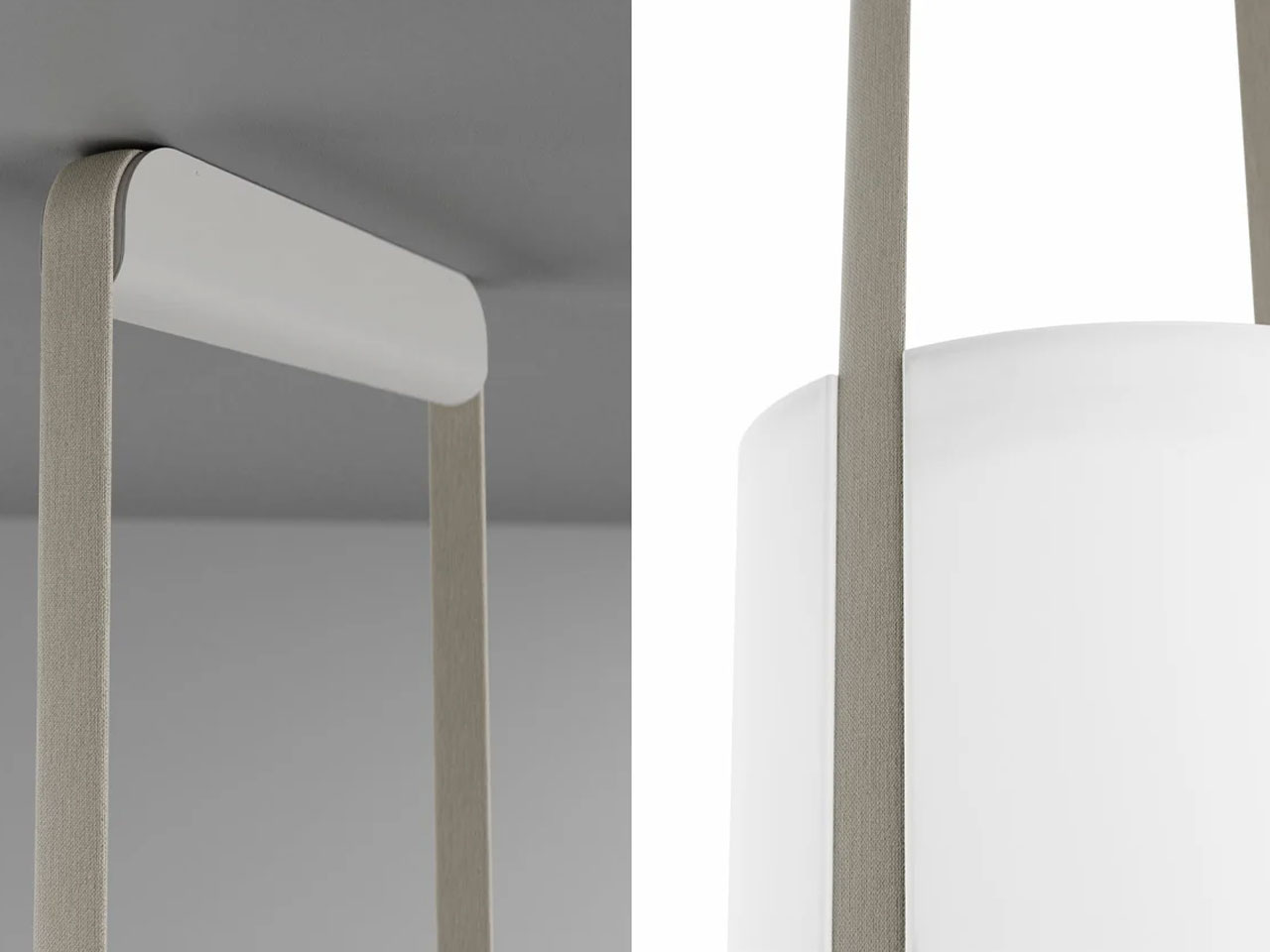
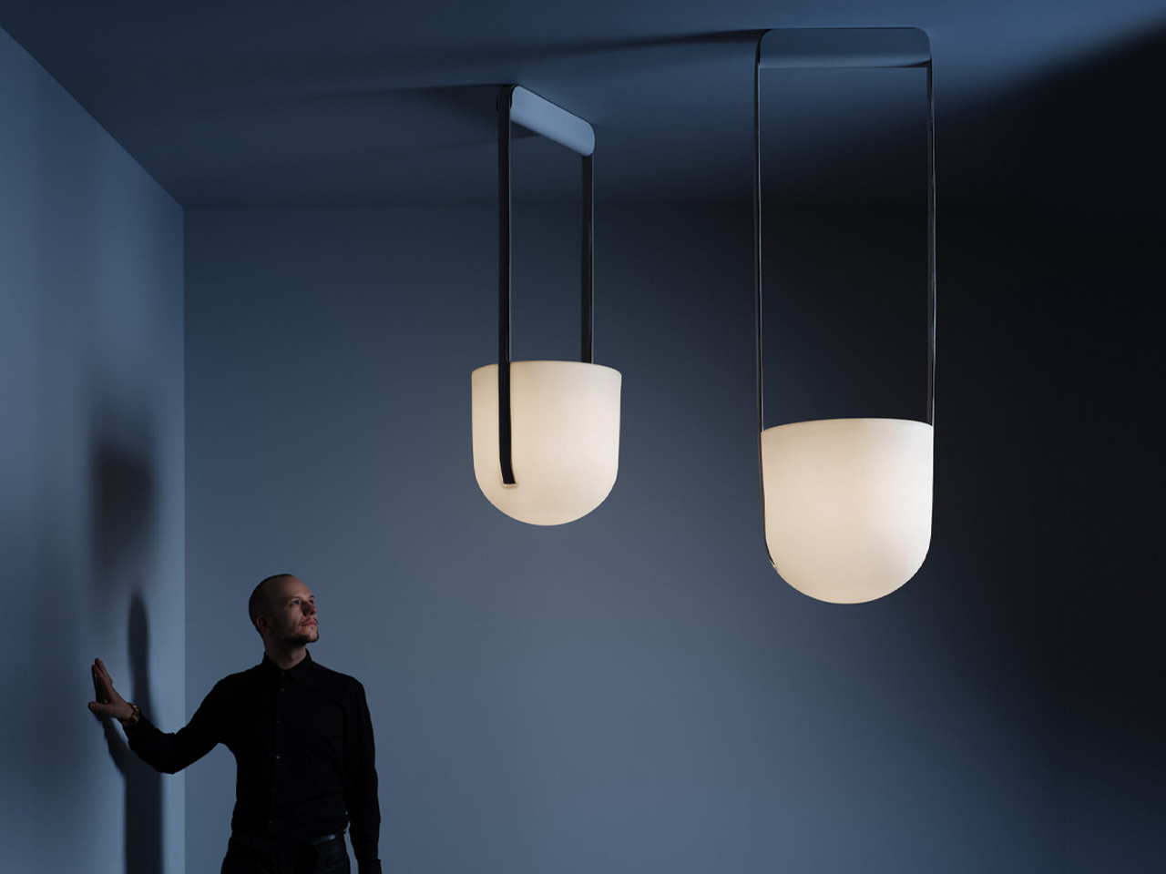
The opaque lampshade diffuses light and provides a subtle backdrop for plants to drape naturally, creating a dynamic interplay of light and life. Watertight and minimal in design, Jungle integrates seamlessly into any living space. Its combination of greenery, soft illumination, and floating suspension exemplifies biophilic lighting, fostering well-being while serving as a striking decorative centerpiece.
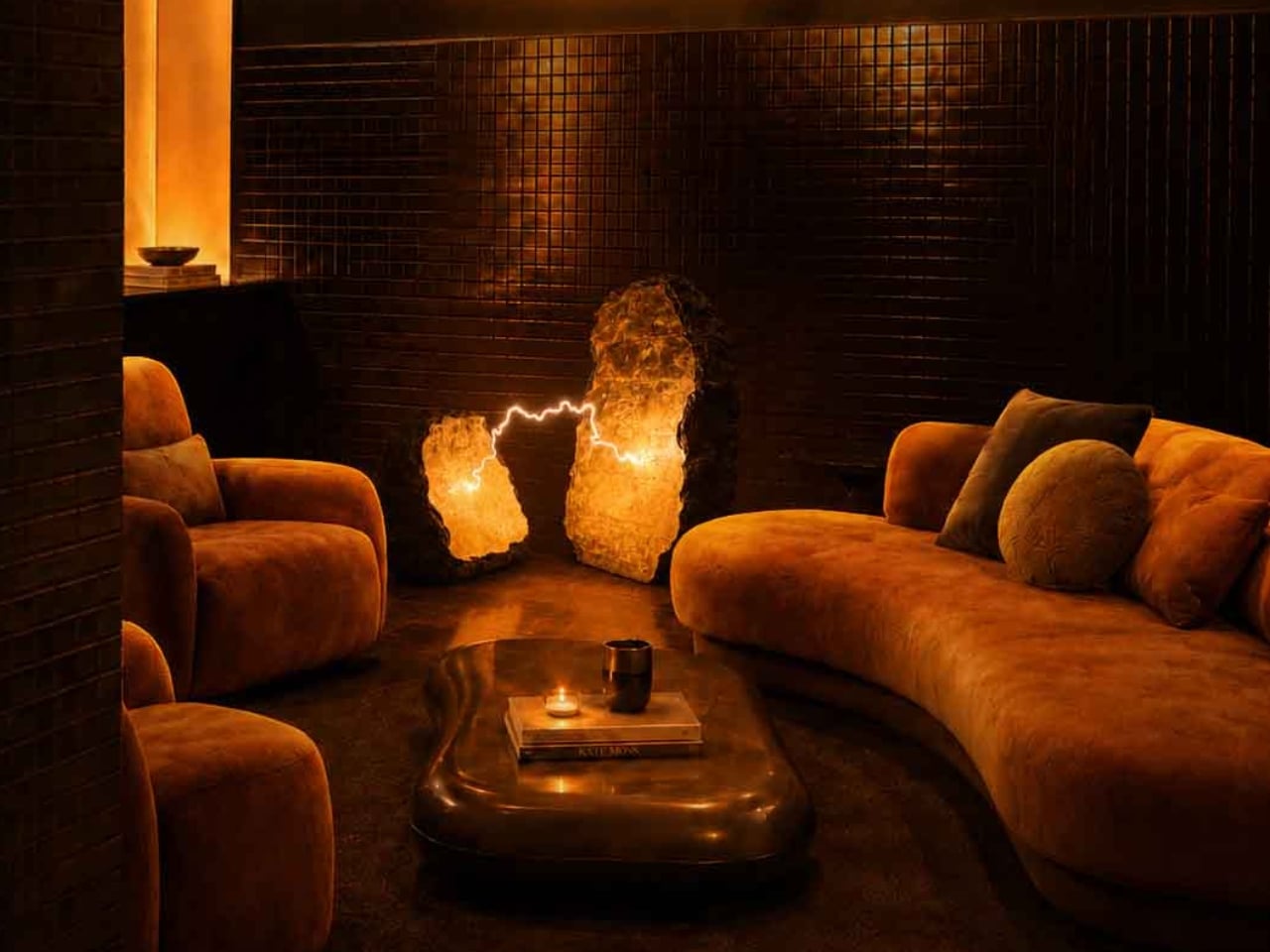
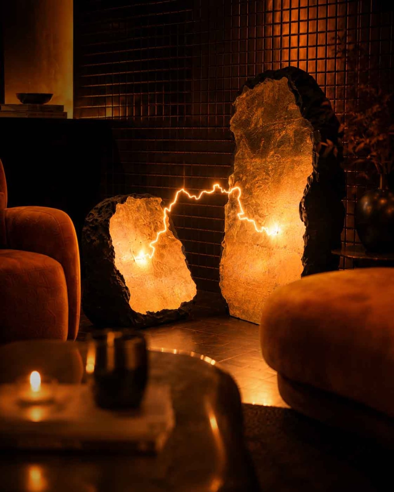
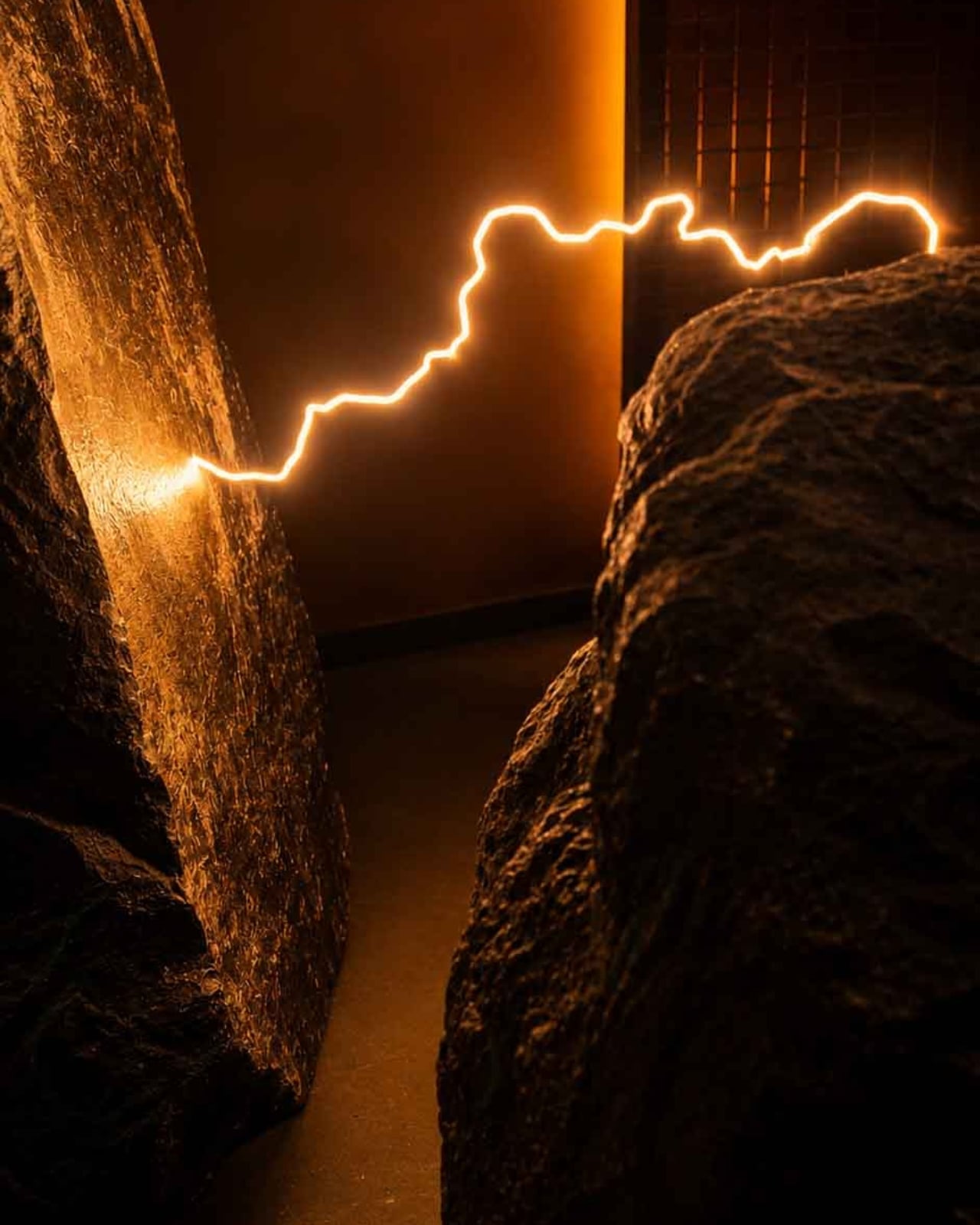
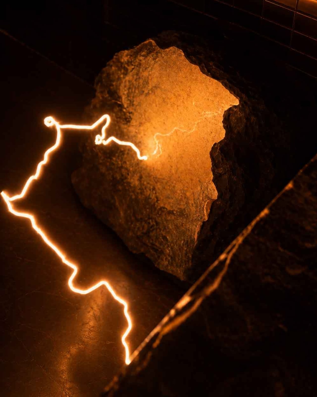
2. Biophilic Light Strategies
Biophilic design focuses not only on the source of light but also on creating strong visual connections to nature. A room may be perfectly illuminated yet still feel incomplete without a view of the outdoors or natural materials. People instinctively feel calmer and more focused when they can rest their eyes on organic elements such as a tree line, greenery, or the texture of wood.
Biophilic lighting enhances these experiences by framing natural features. Subtle uplighting on wooden details or targeted light on plants draws attention to nature. Minimizing glare is equally essential, as harsh reflections undermine comfort and strain the eyes.
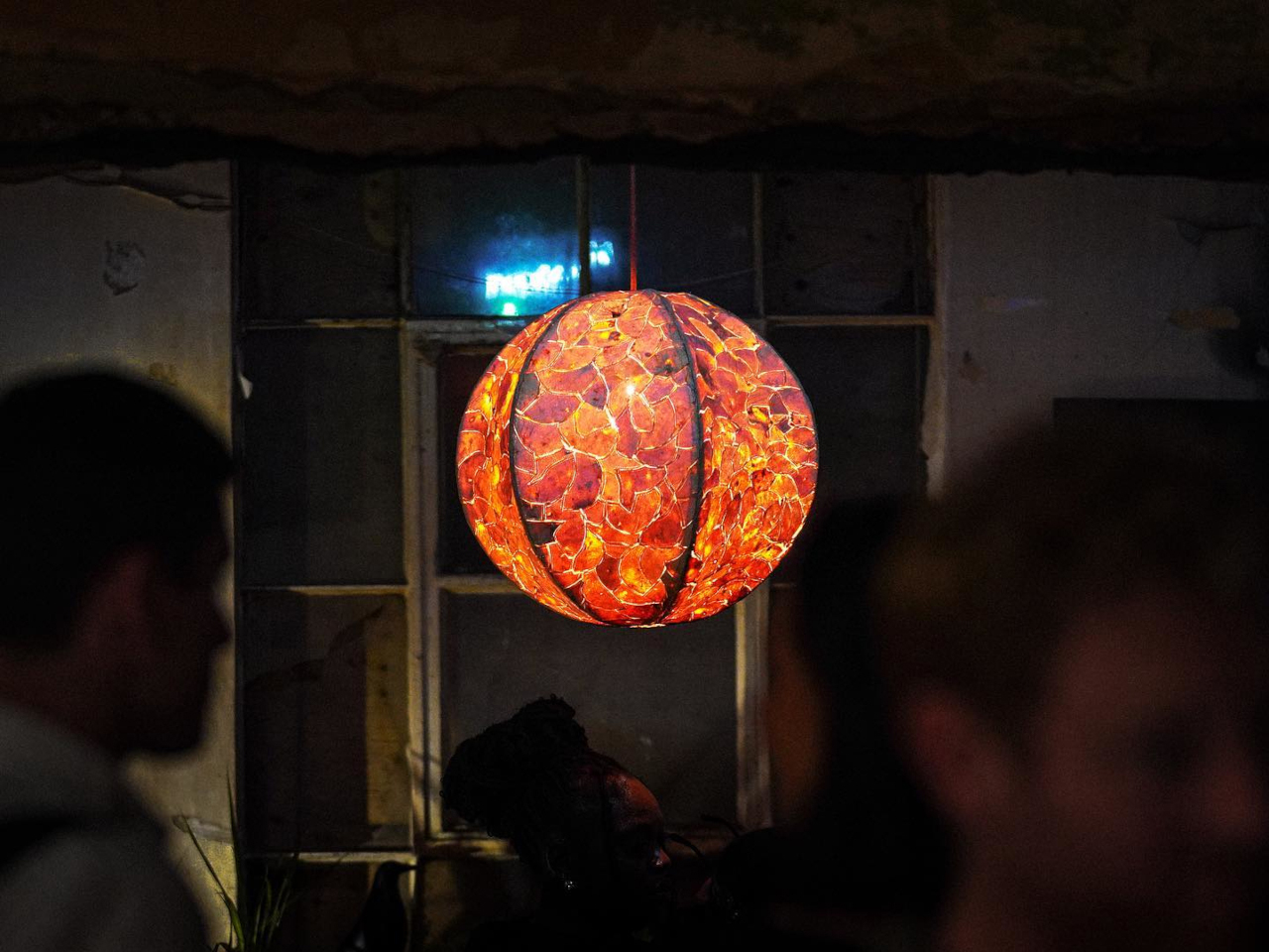
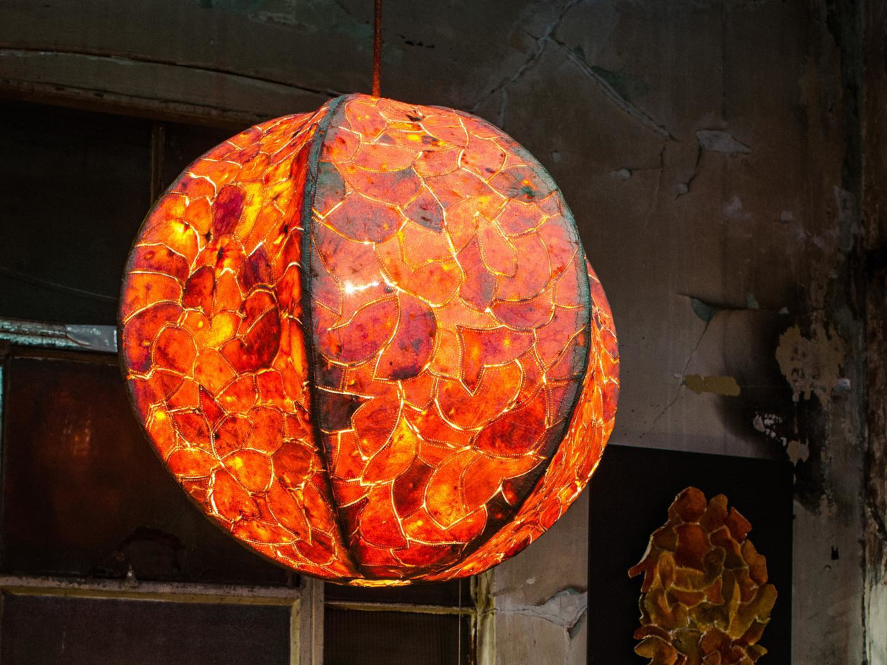
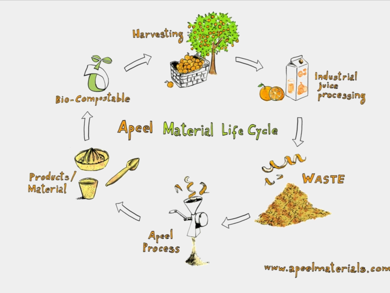
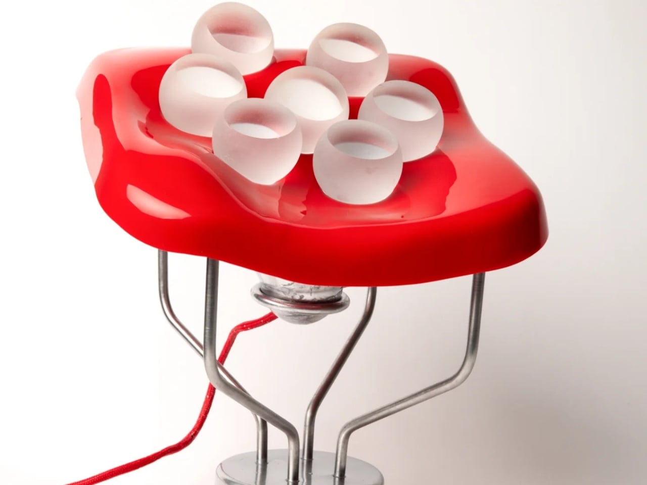
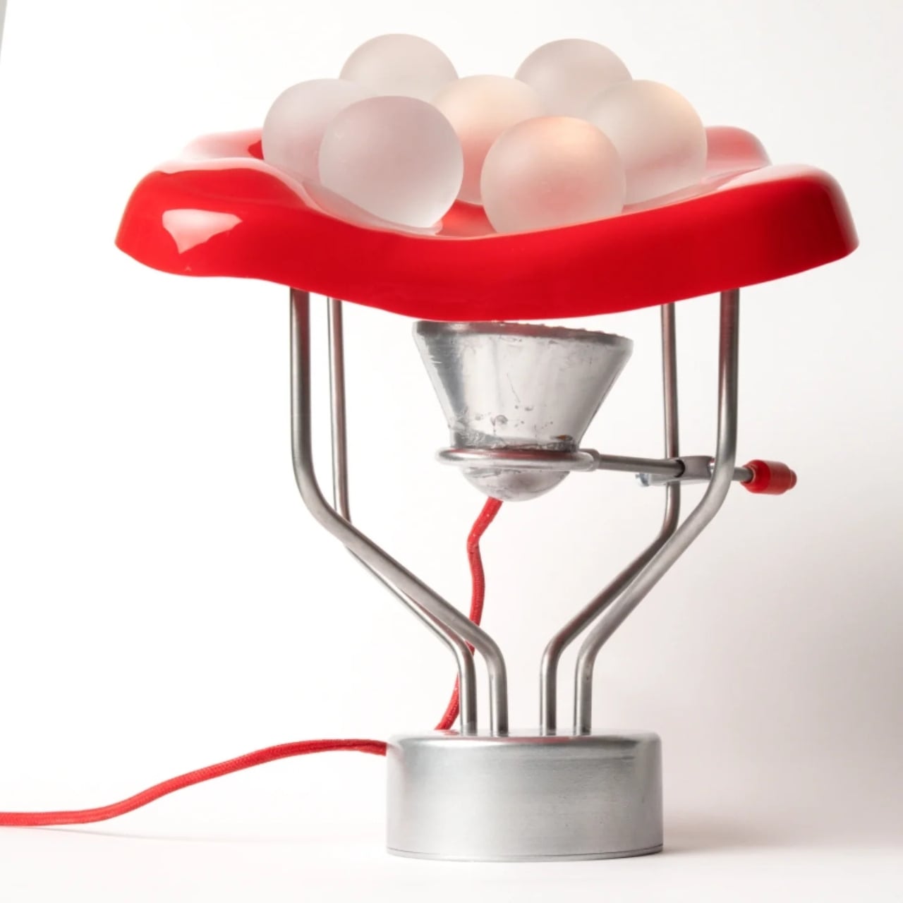
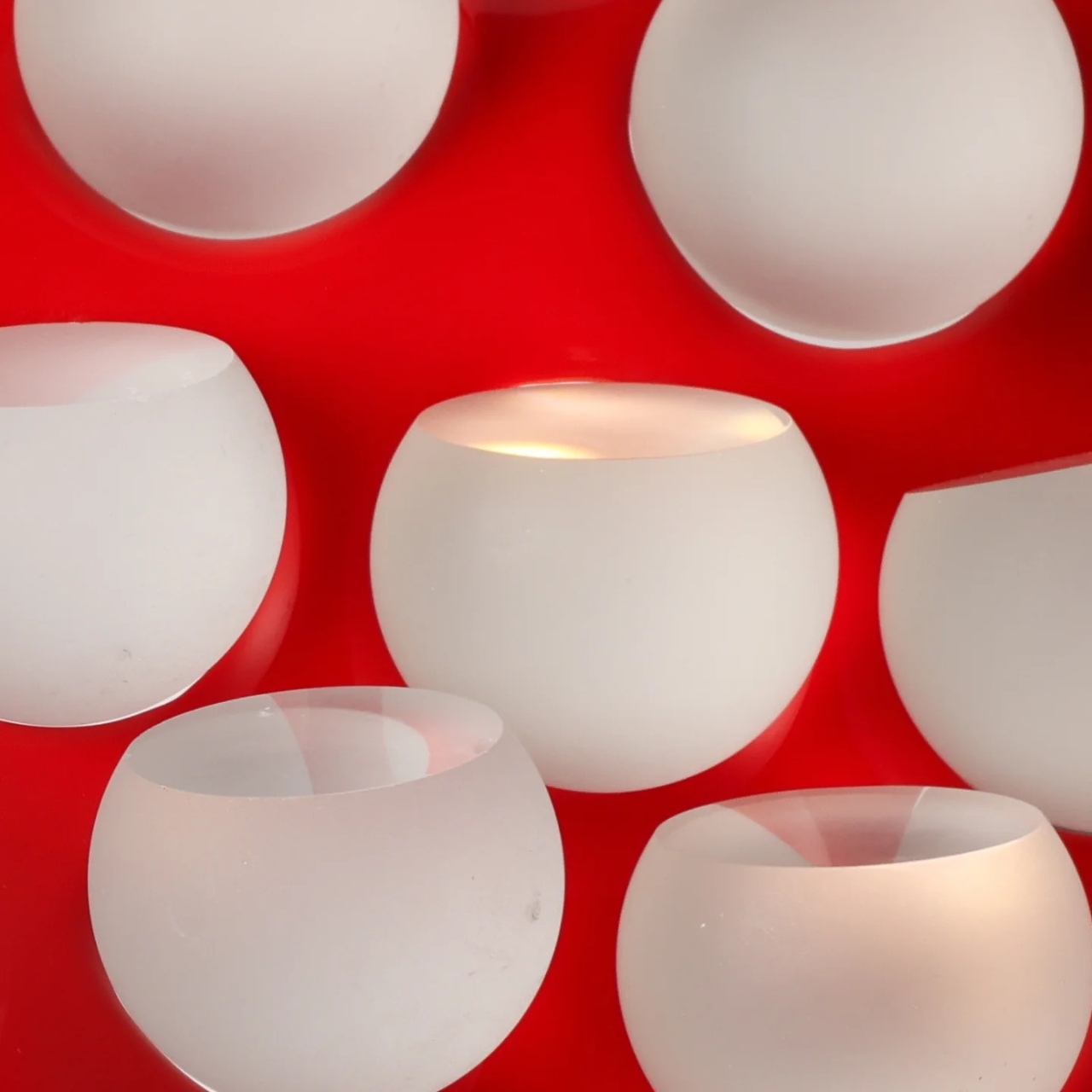
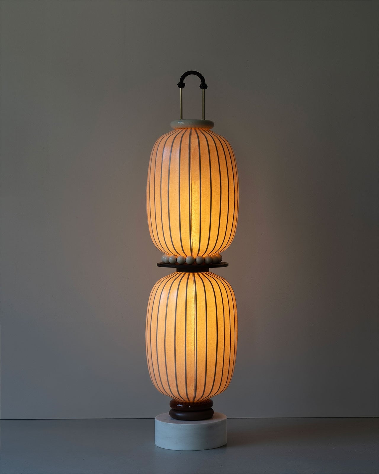
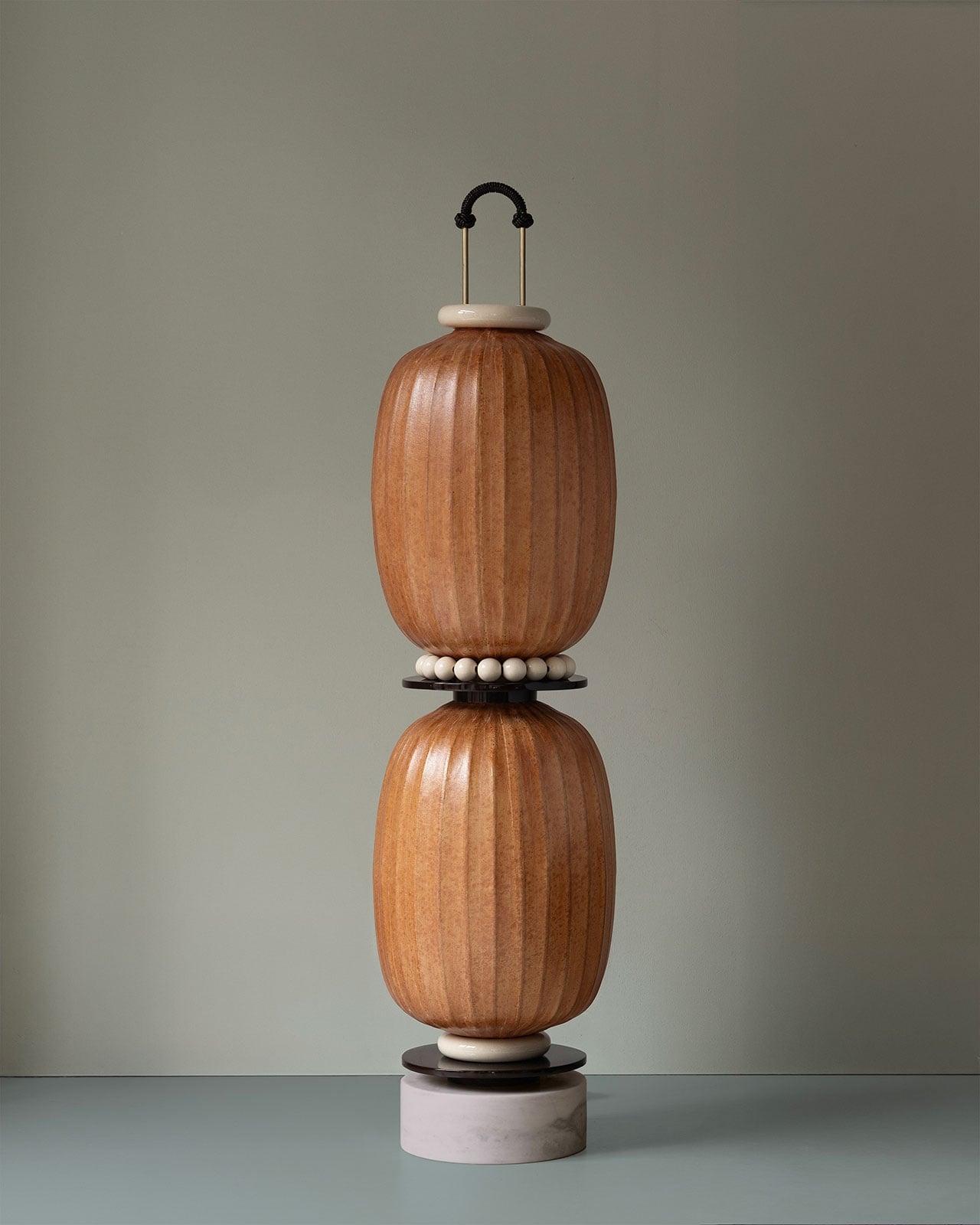
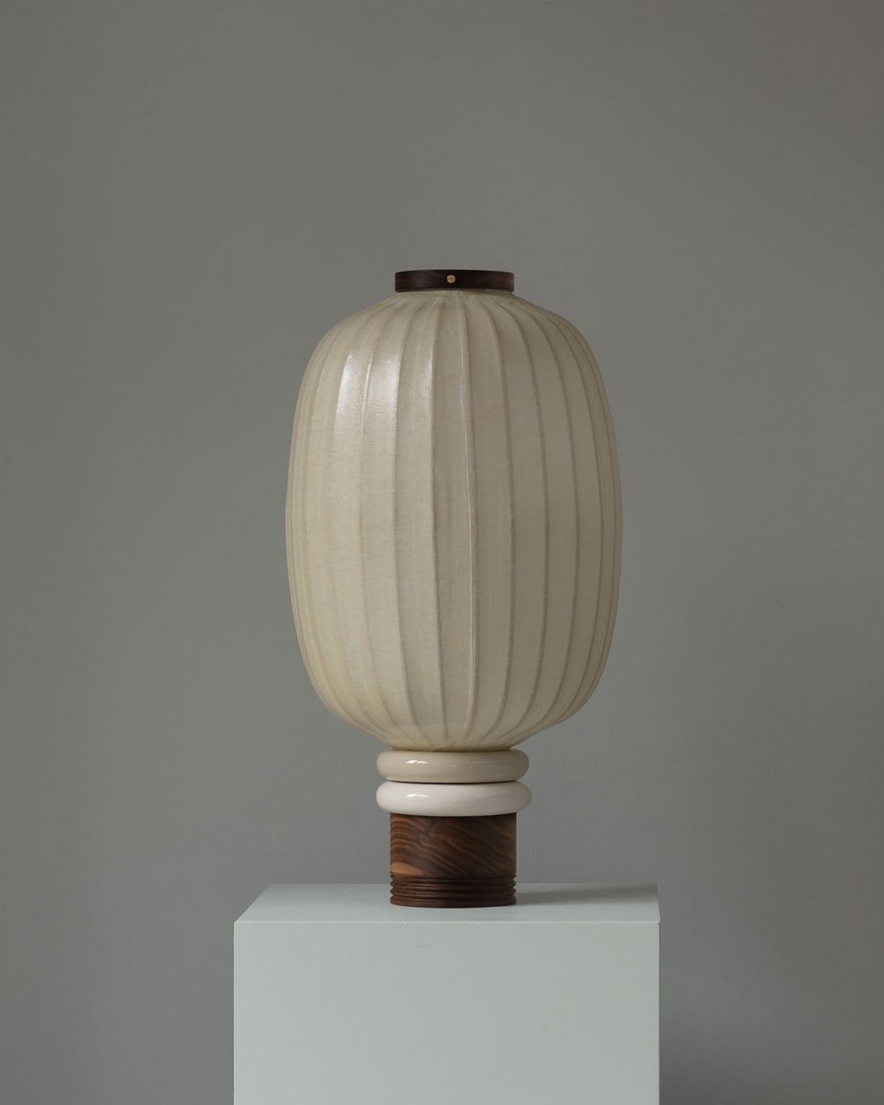
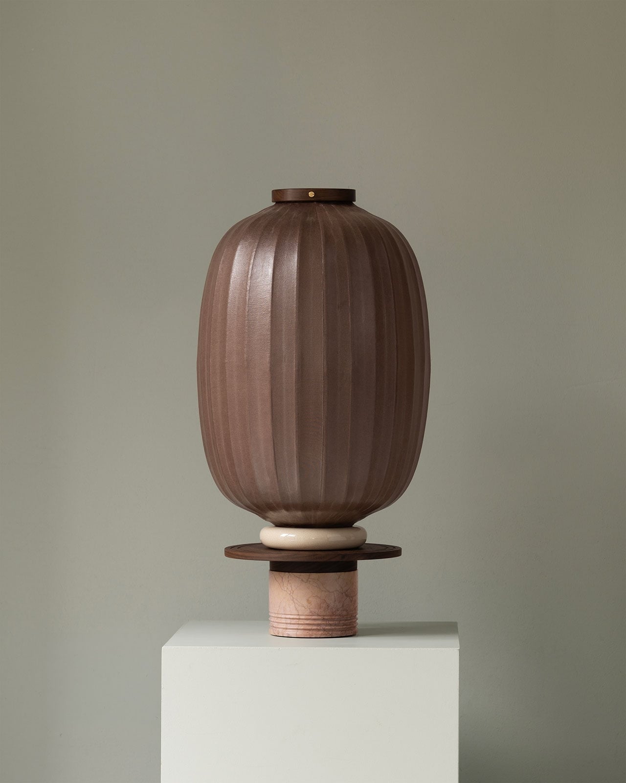
Sustainable design often highlights recycled metals, plastics, wood, or rubber, yet many overlooked materials can also be repurposed, including food waste. While biodegradable, food scraps still contribute to landfill mass and water pollution. Orange peels, typically discarded, can be transformed into a leather-like material. Sewn together, these pieces form a sturdy, fabric-like surface that becomes part of innovative products, such as a spherical pendant lamp resembling a glowing orange. This design merges sustainability with biophilic lighting principles, bringing organic forms and textures into the interior while connecting occupants to nature.
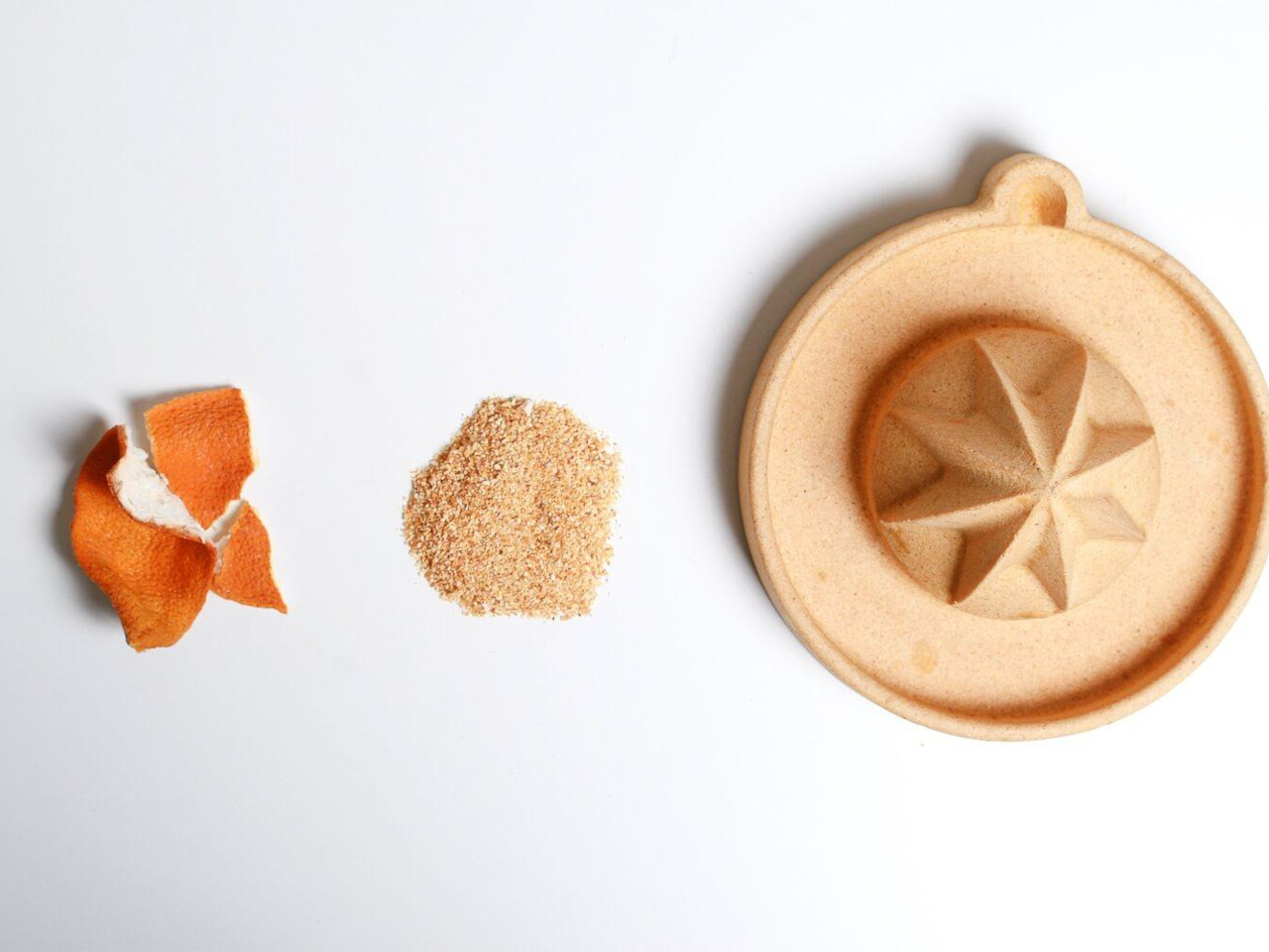
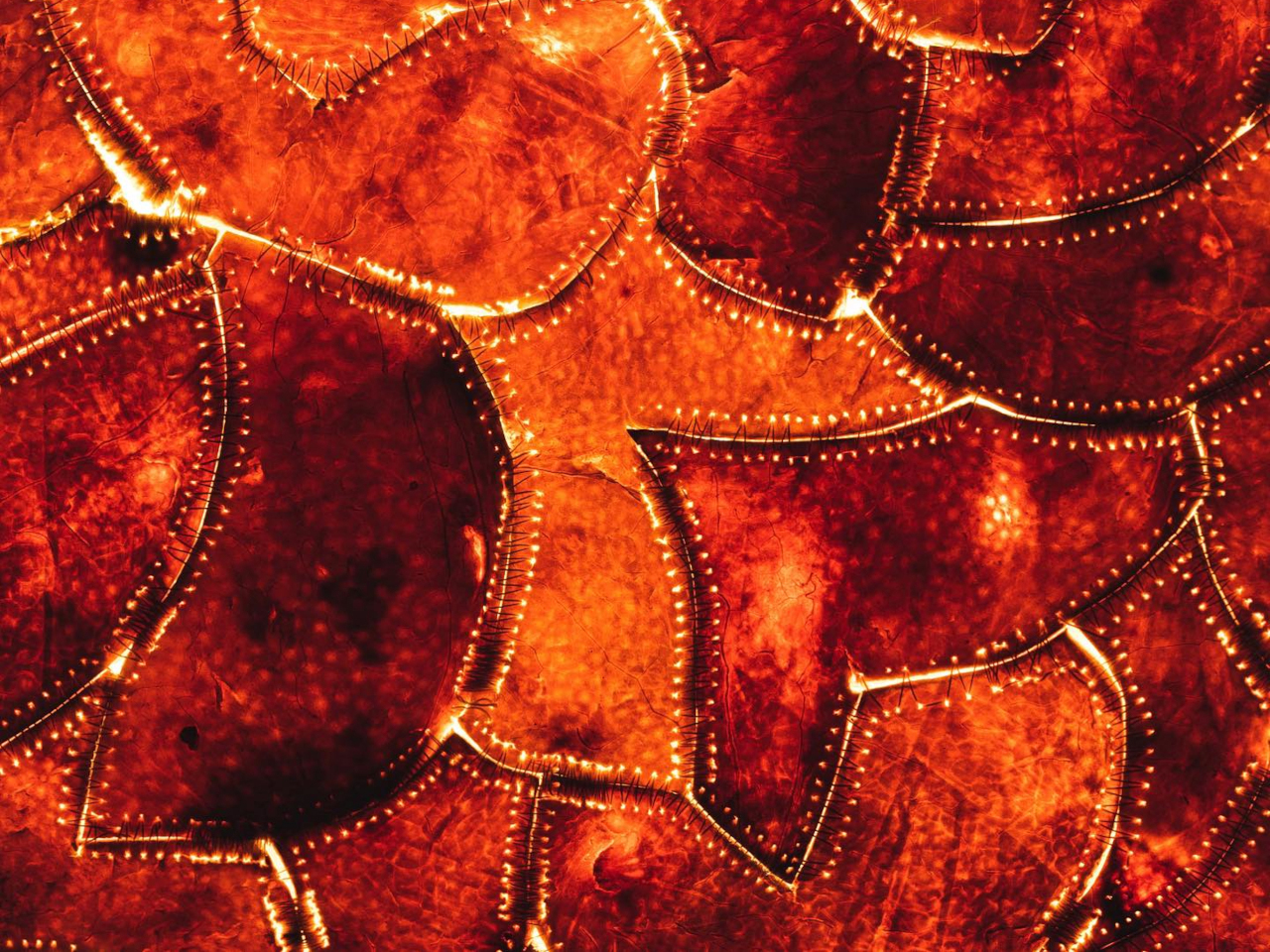
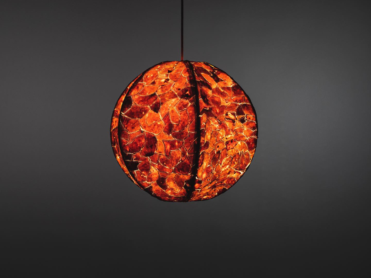
APeel transforms citrus peels into a lamp with unique visual and tactile qualities. Fully biodegradable, it can return to the soil as fertilizer for fruit trees, completing a circular, low-waste system. The warm, natural glow from the lamp enhances a biophilic interior, fostering calm, engagement, and a deeper connection to organic forms.
3. Light Color and Mood
The color temperature of light, measured in Kelvins (K), is a subtle yet powerful way to influence the mood of a space. Warm light under 3000K, much like candlelight or sunset, creates comfort, intimacy, and relaxation, making it perfect for bedrooms and living areas. On the other hand, cool light above 4000K, similar to midday sunlight, encourages focus, energy, and alertness, making it effective for kitchens, home offices, and task-driven spaces.
By selecting the right Kelvin rating for each area, designers can shape how a home feels and functions. Using one uniform light source throughout misses an opportunity. Instead, layering a spectrum of temperatures creates distinct zones that support daily activities and emotional well-being.
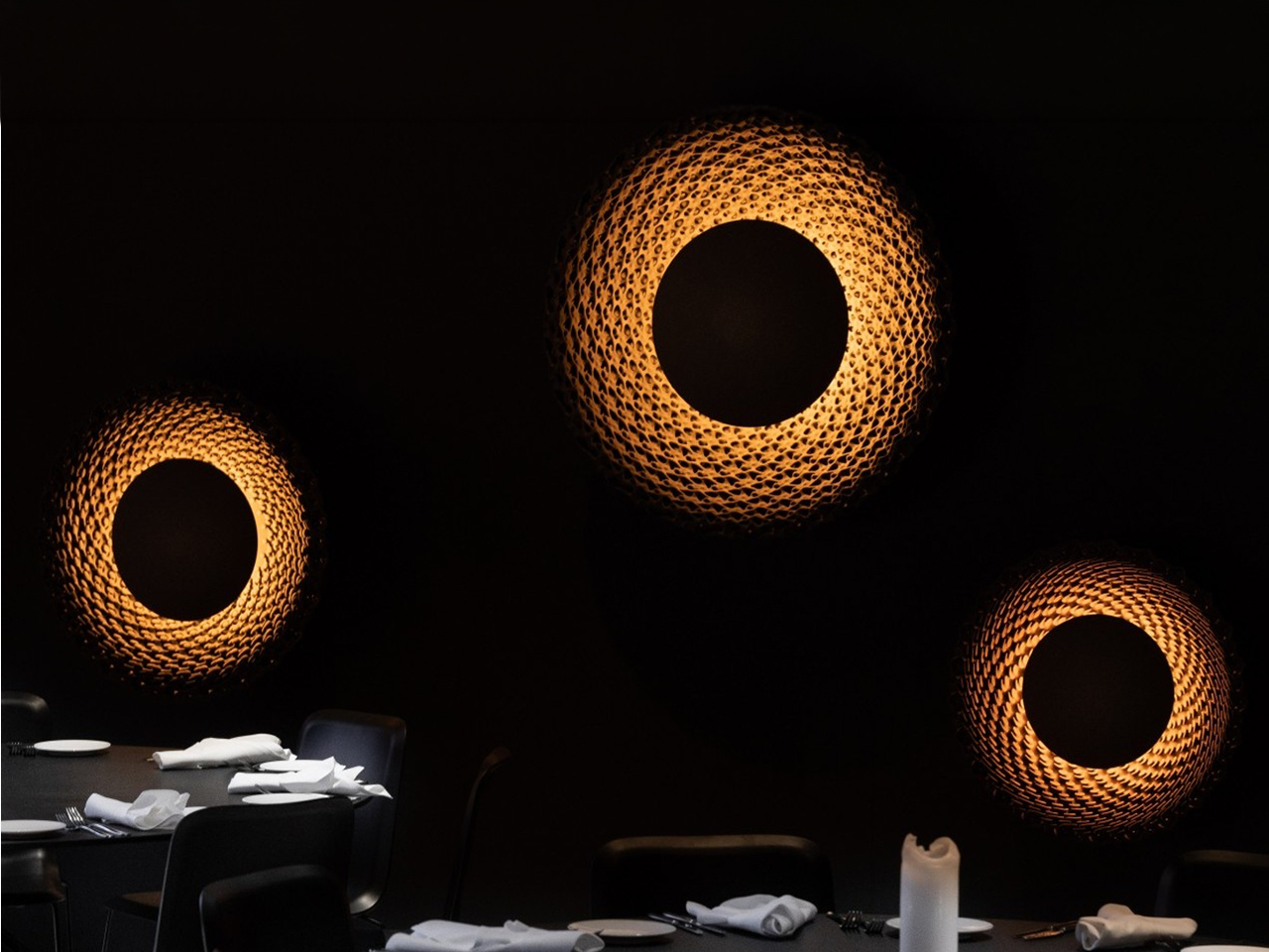
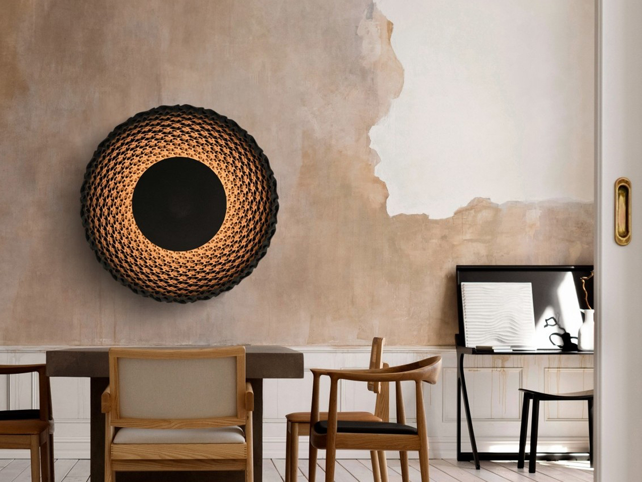
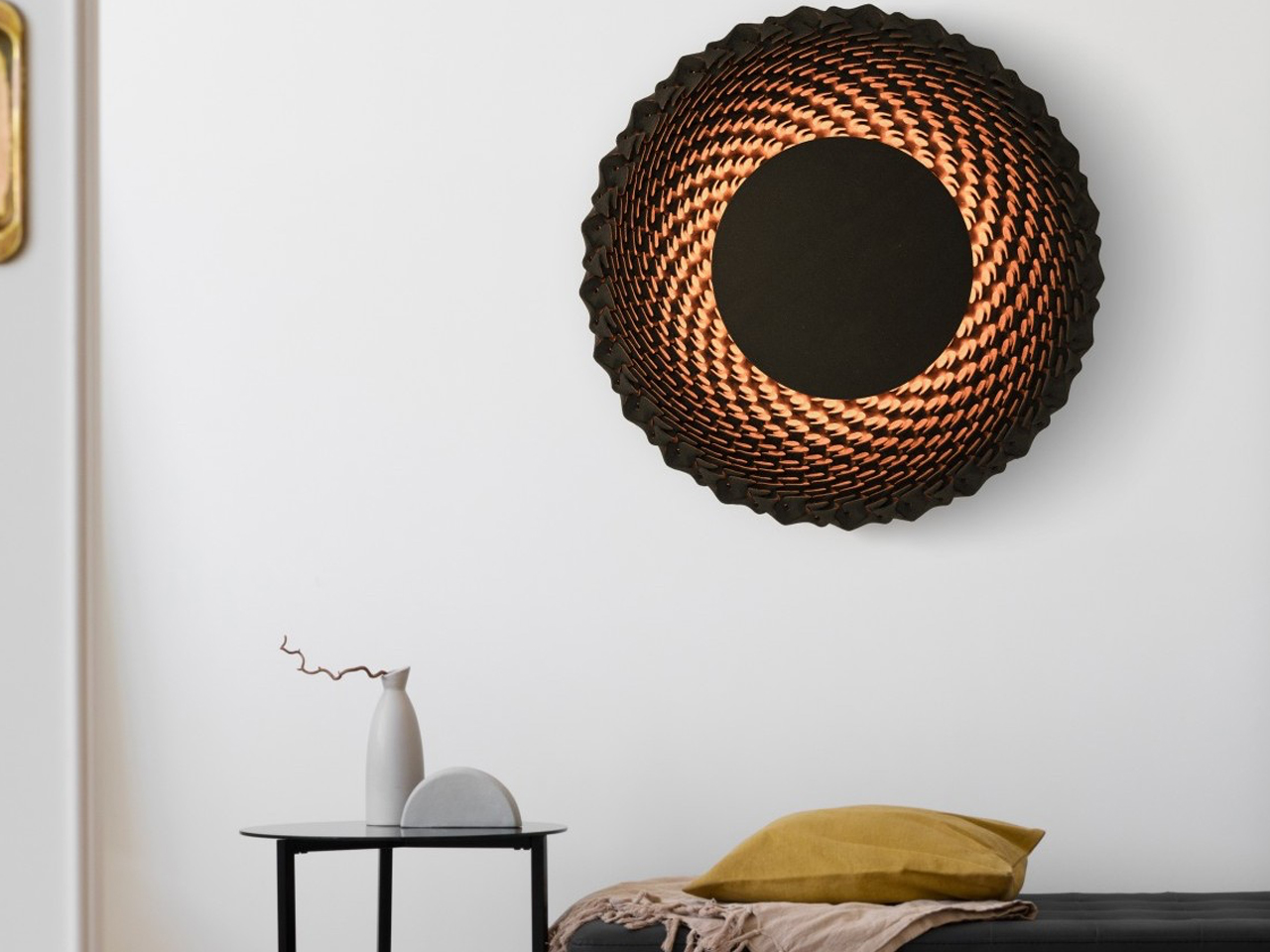
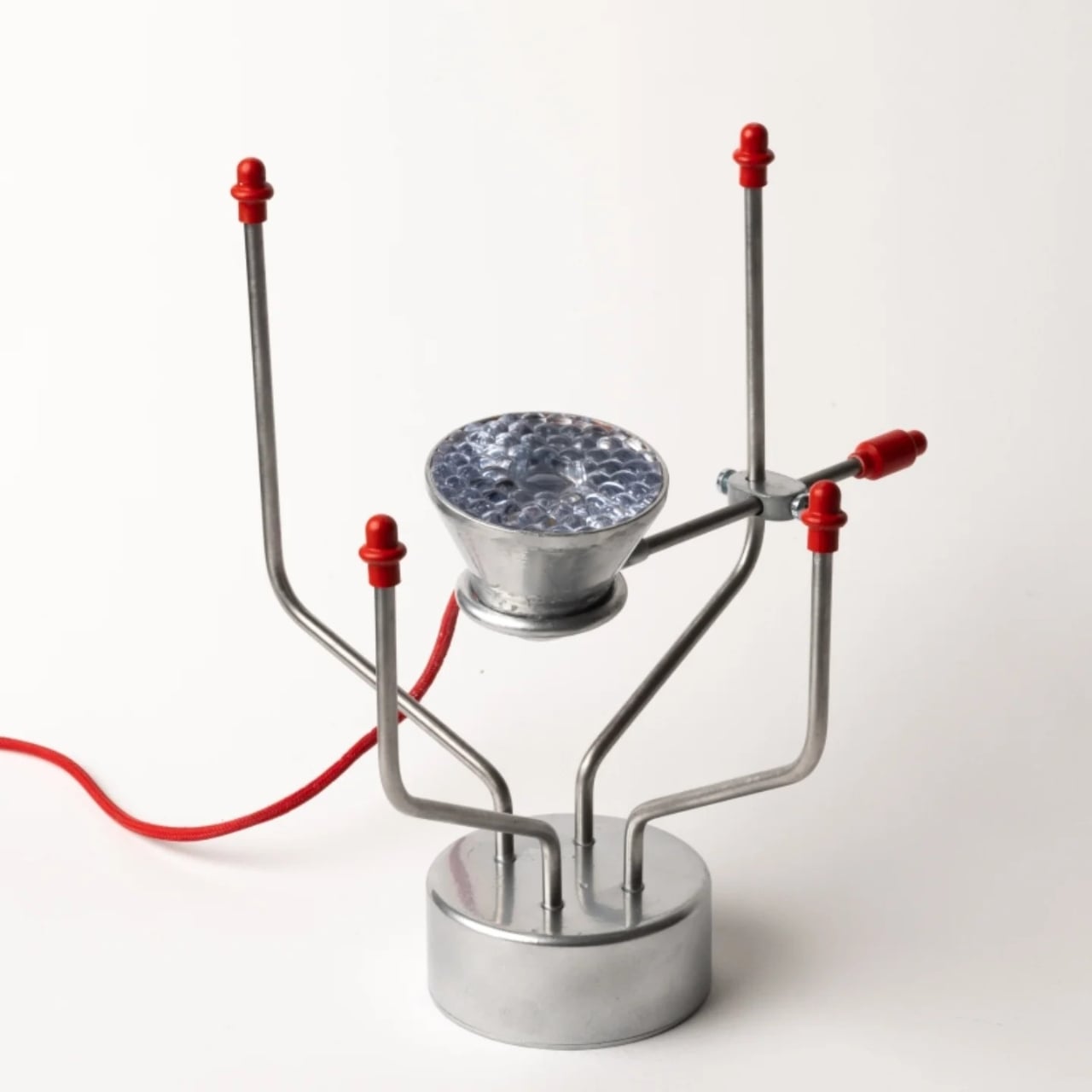
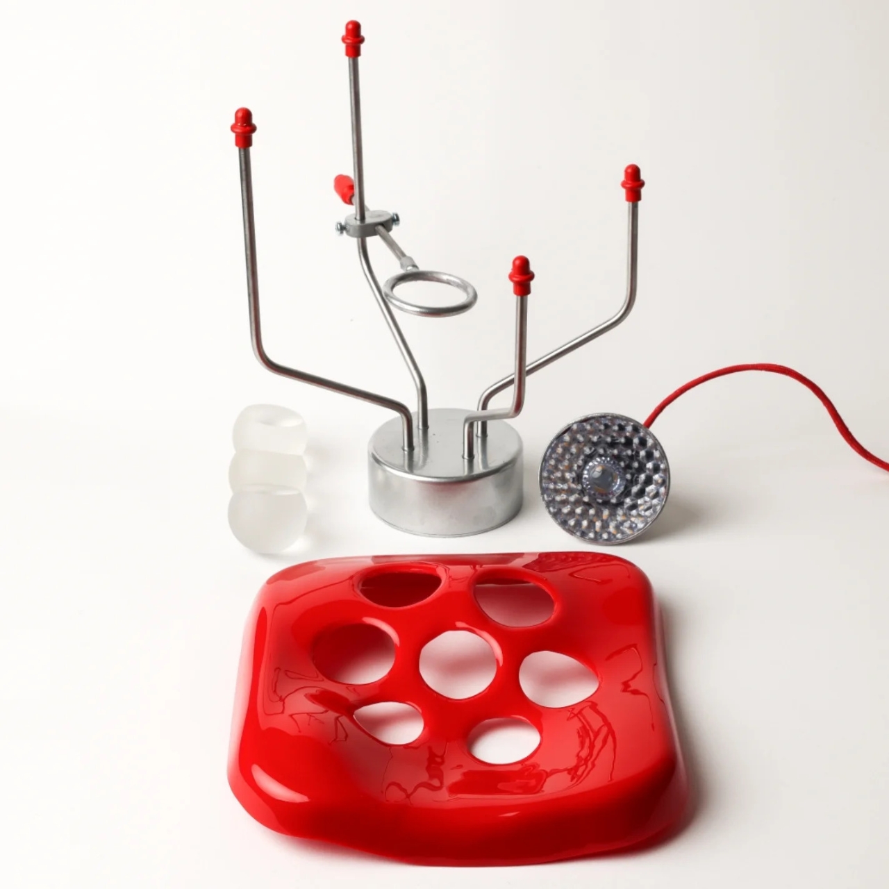
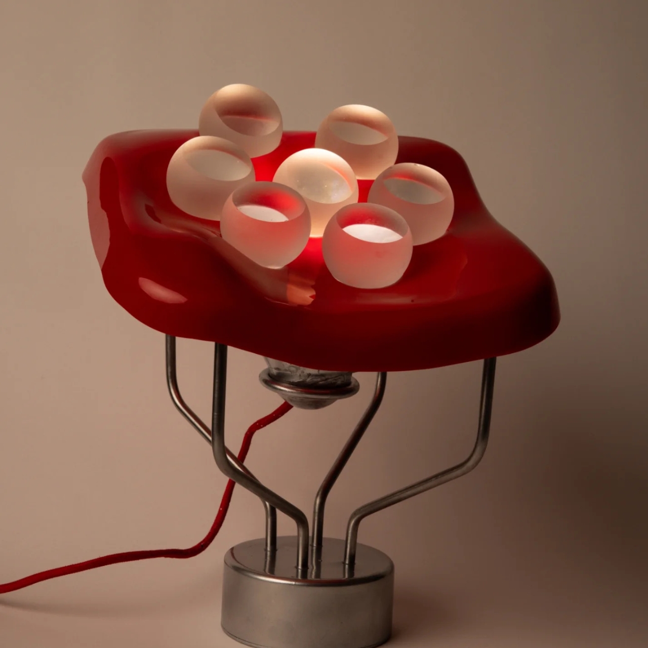
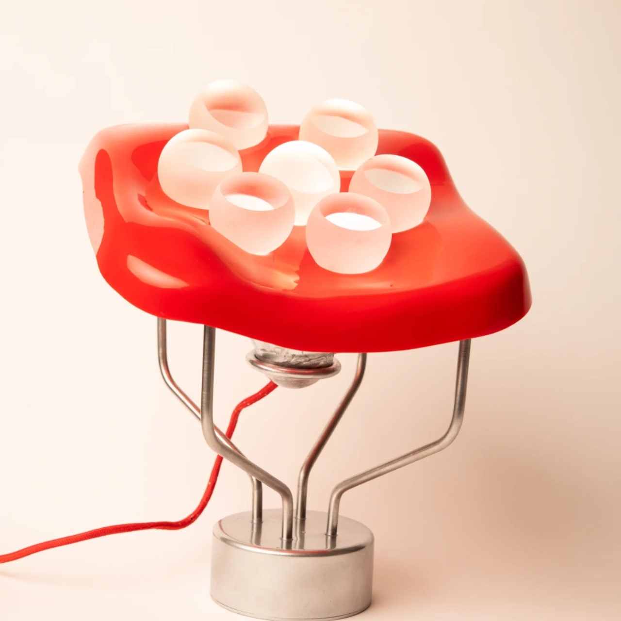
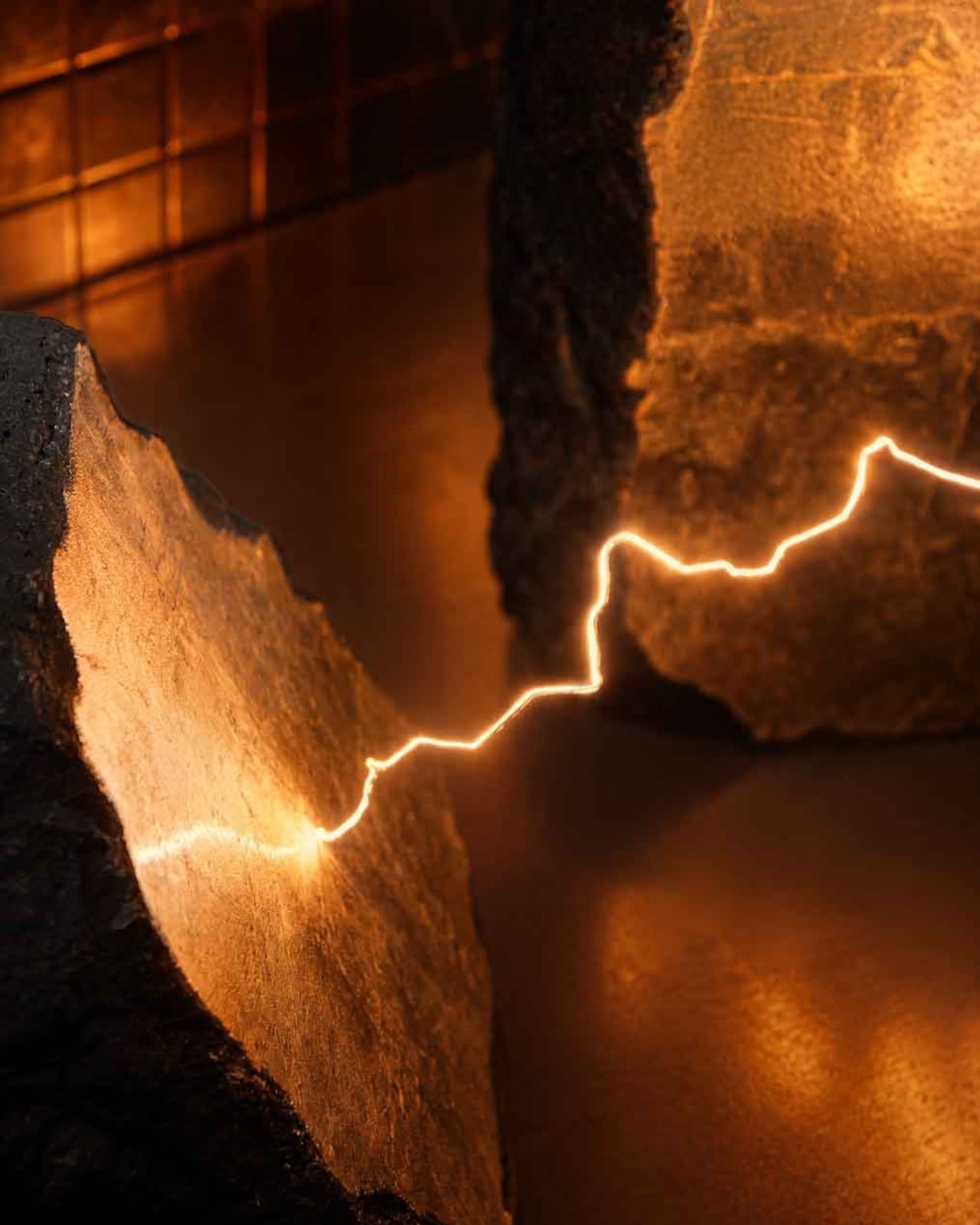
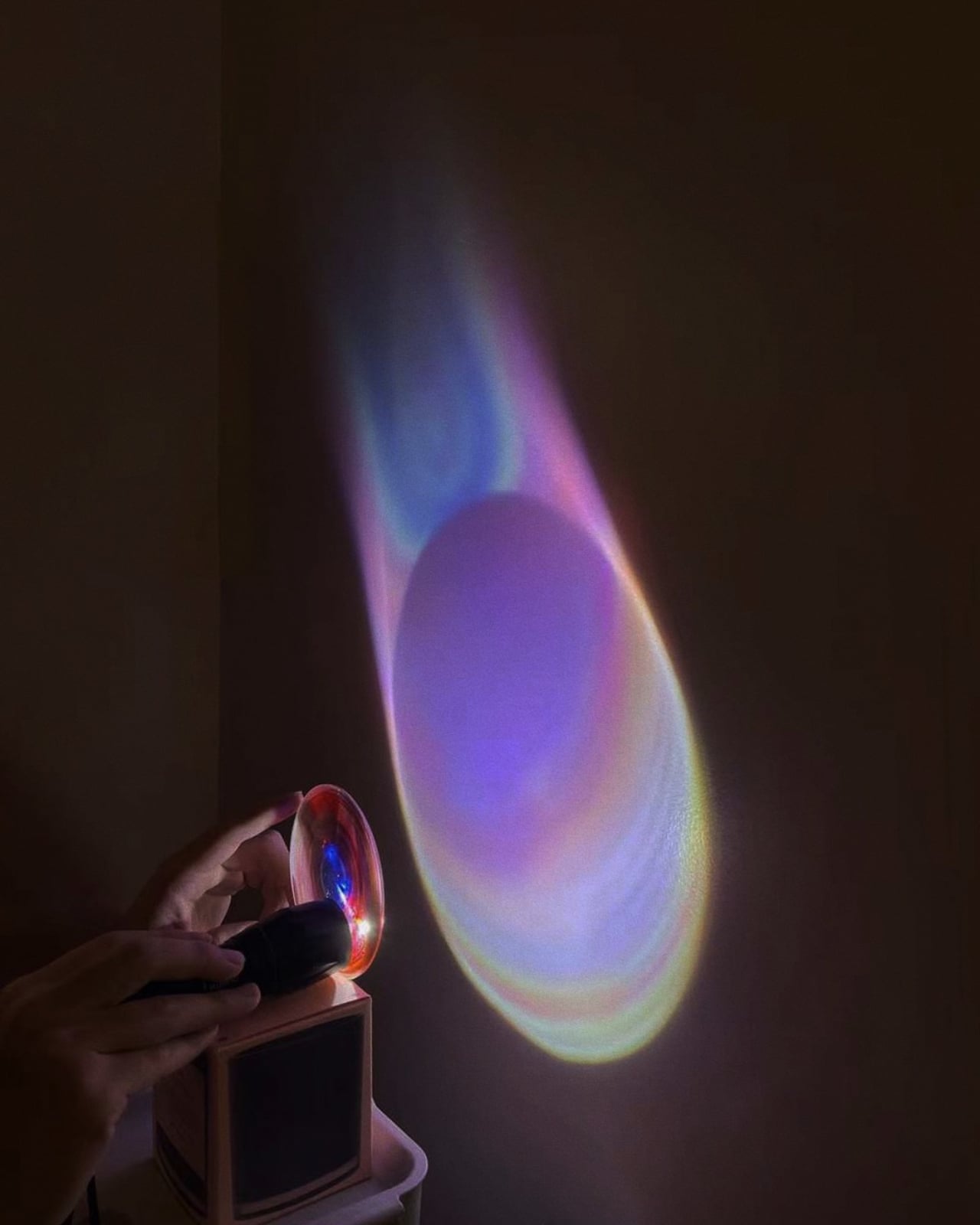
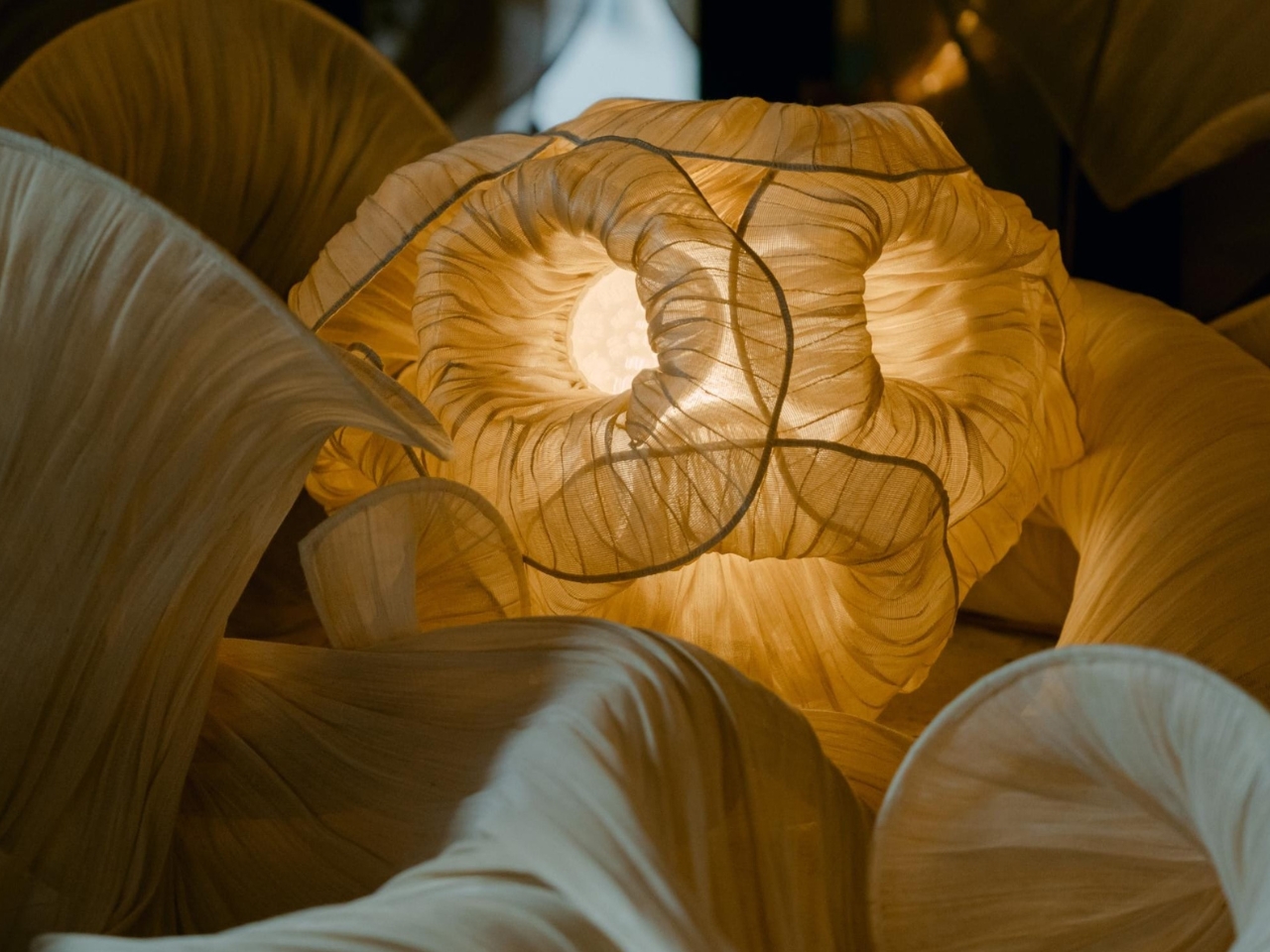
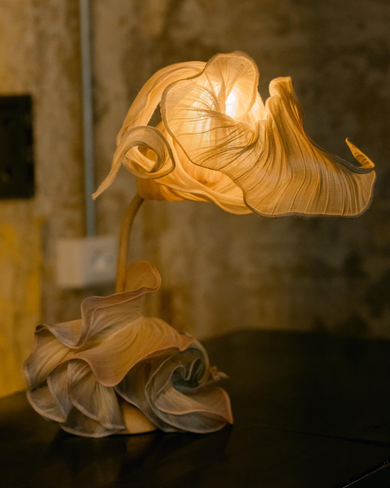
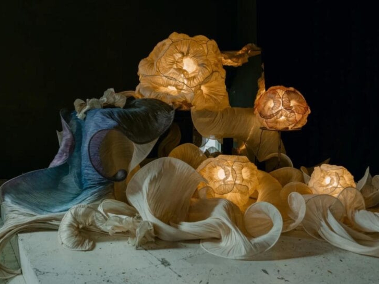
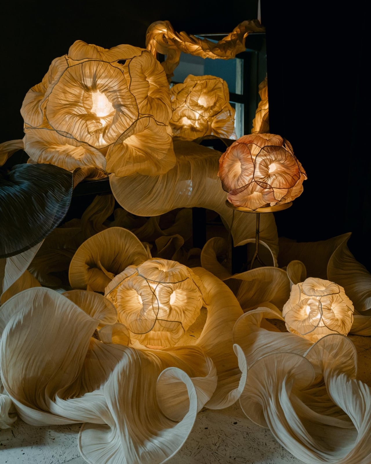
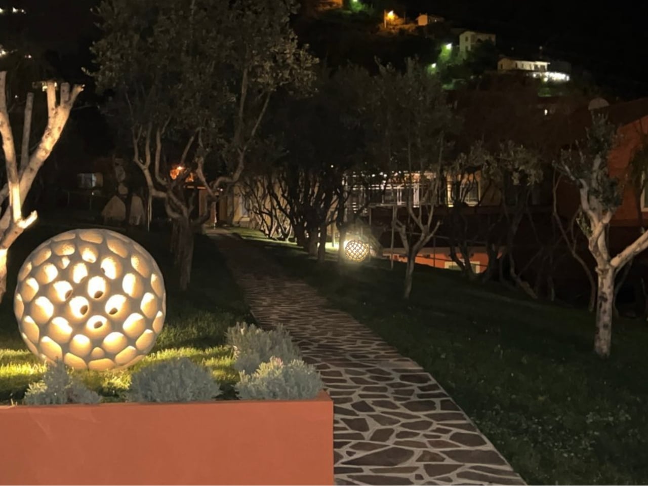
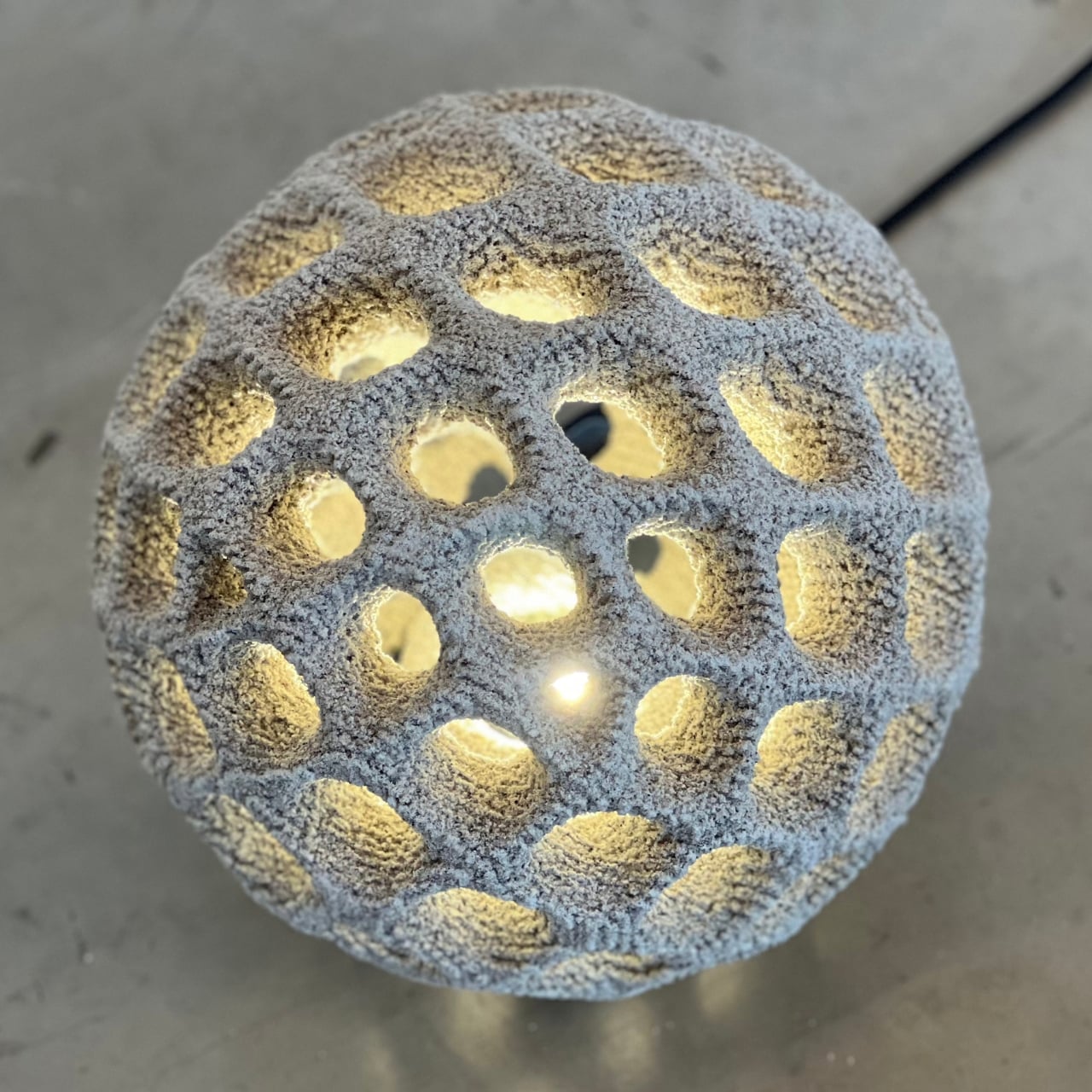
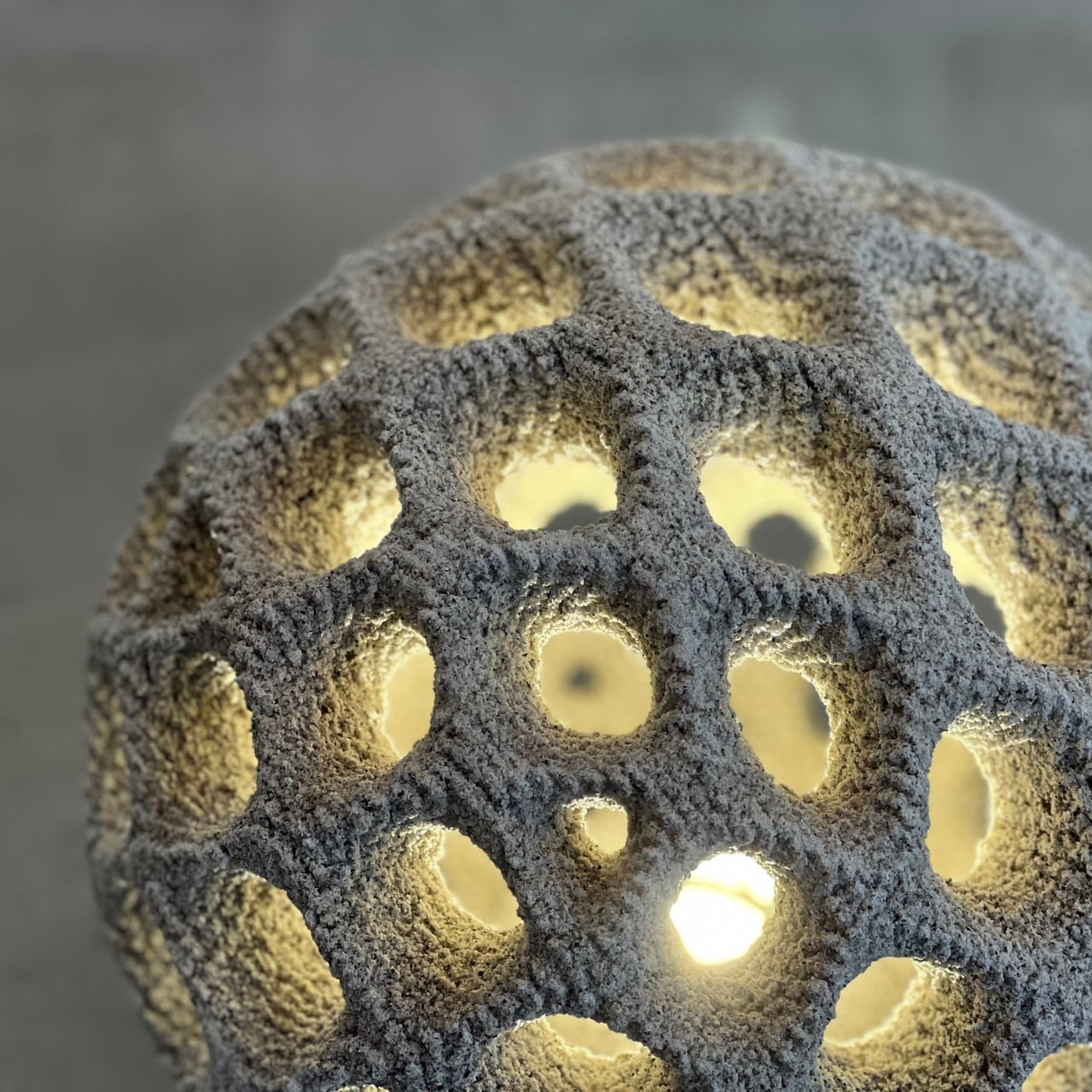
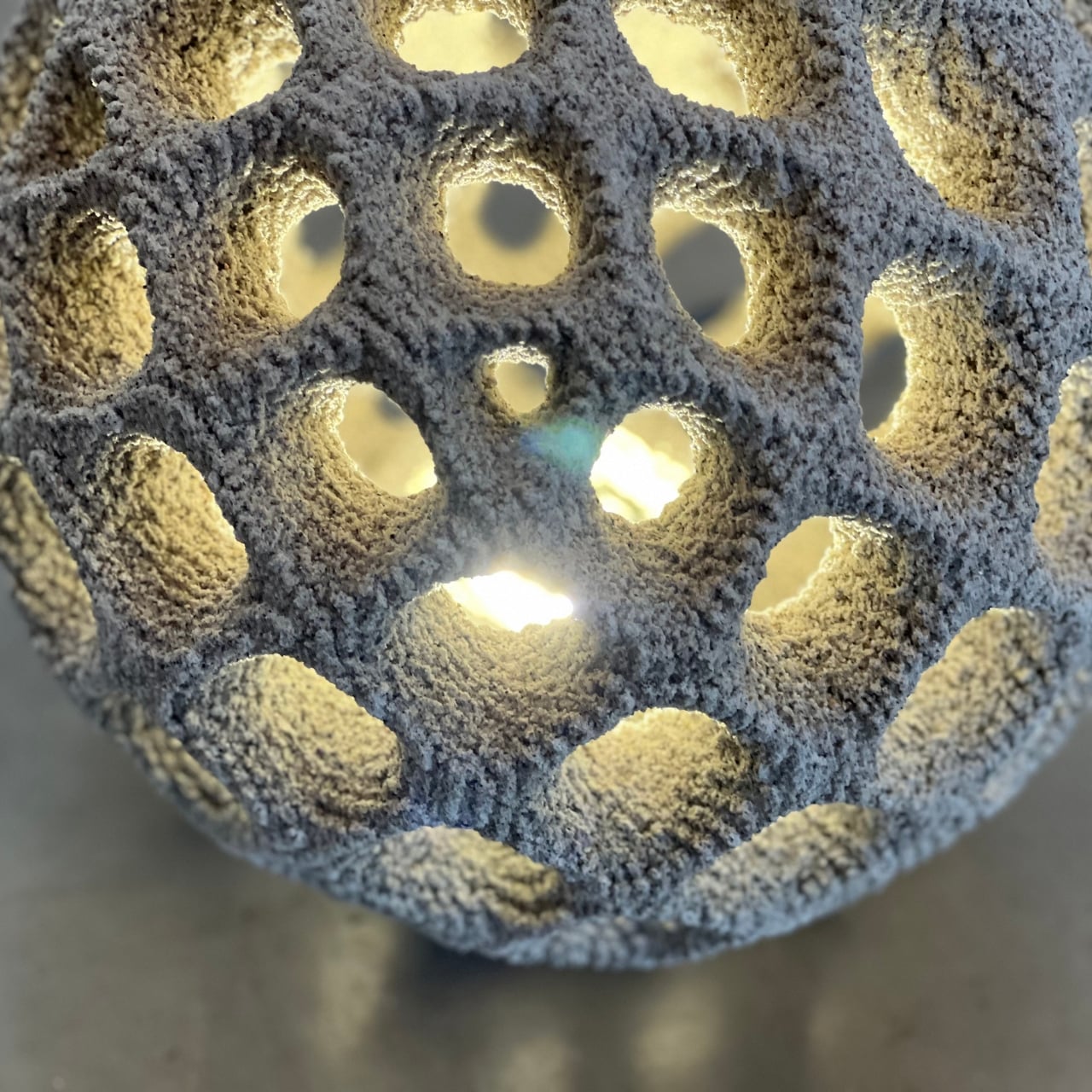
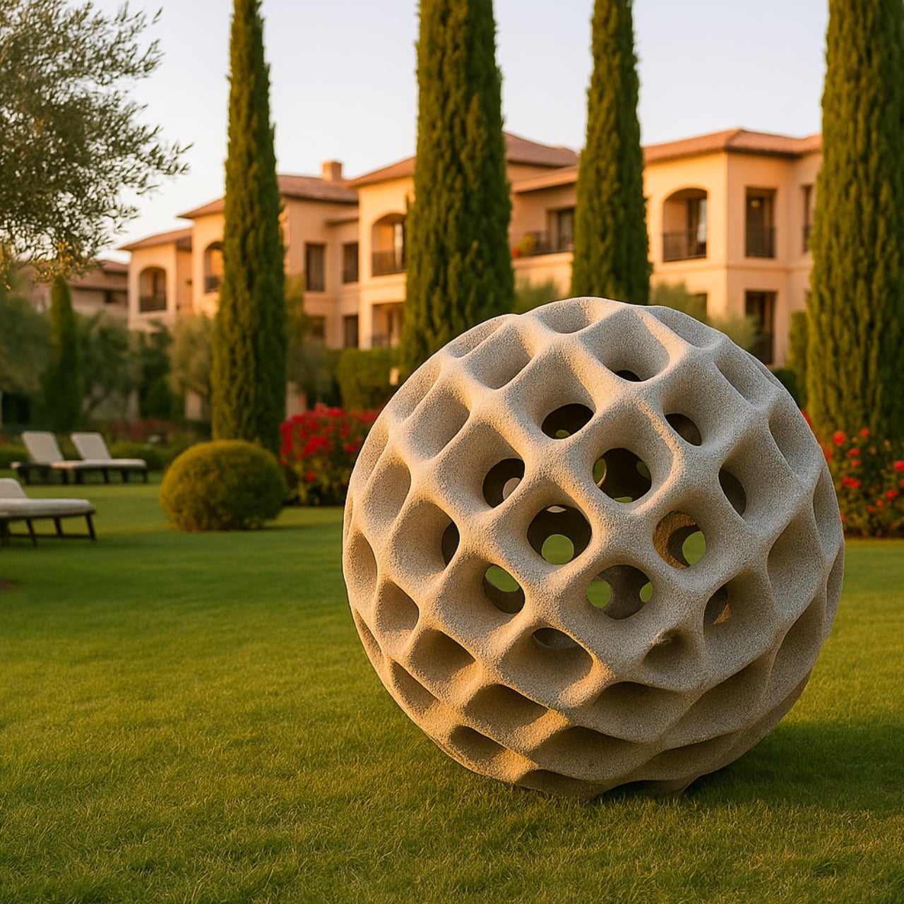
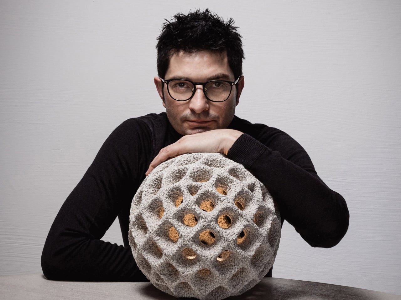
Many contemporary designs draw inspiration from nature, which is the ultimate designer. Some replicate natural forms directly, while others reinterpret them in unexpected ways, creating objects that feel familiar and slightly alien. The Aureole wall lighting takes cues from the tiny disk florets at the center of a sunflower. Its swirling curves and raised structures hint at the flower’s intricate pattern without being literal. Crafted from quartz sand that is normally used for molds, these lamps push the boundaries of both material and 3D printing technology, resulting in a form that is mesmerizing even when unlit.
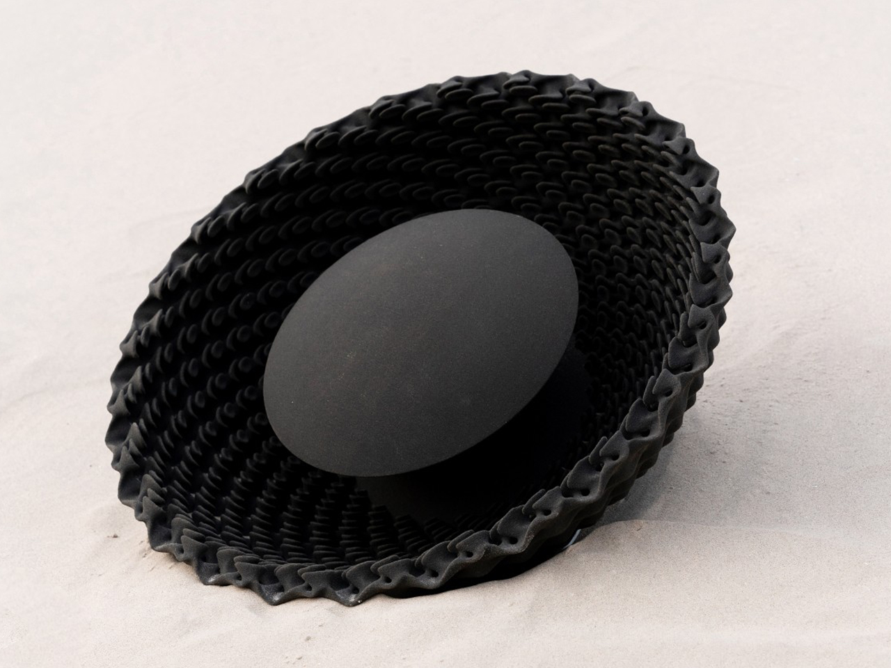
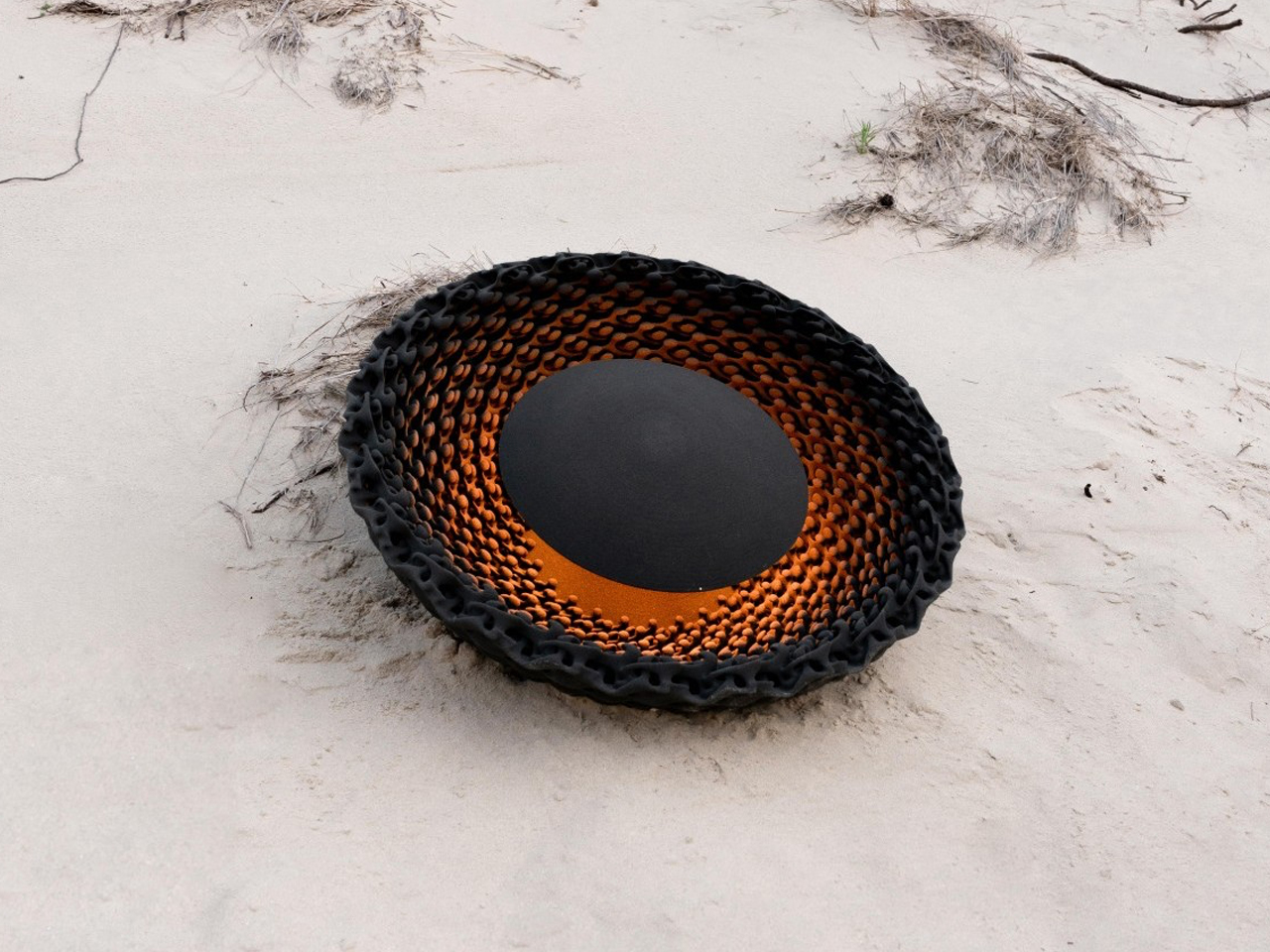
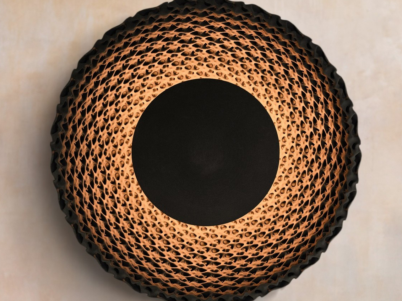
When illuminated from beneath a central opaque disc, Aureole transforms entirely. The light interacts with the complex 3D structure to cast intricate shadows, creating an ethereal, almost hypnotic effect reminiscent of a solar corona. Its combination of organic inspiration, innovative material use, and dynamic light makes it an interesting example of biophilic design.
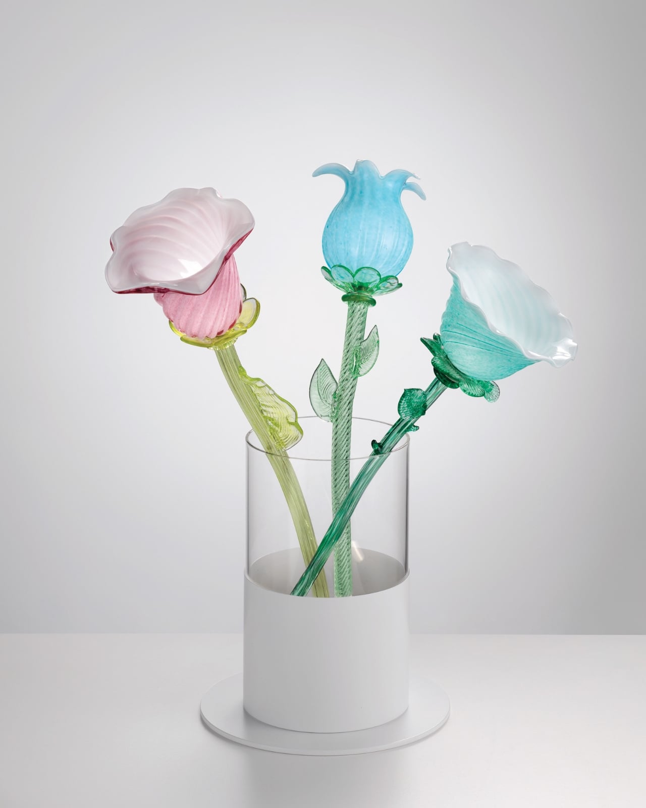
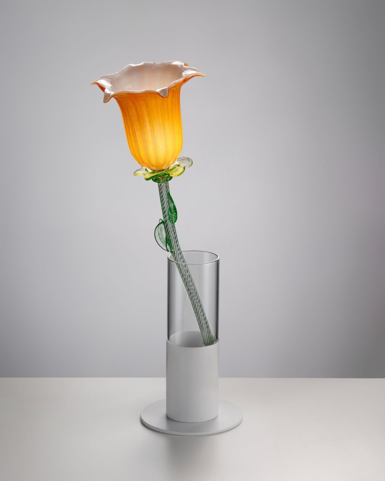
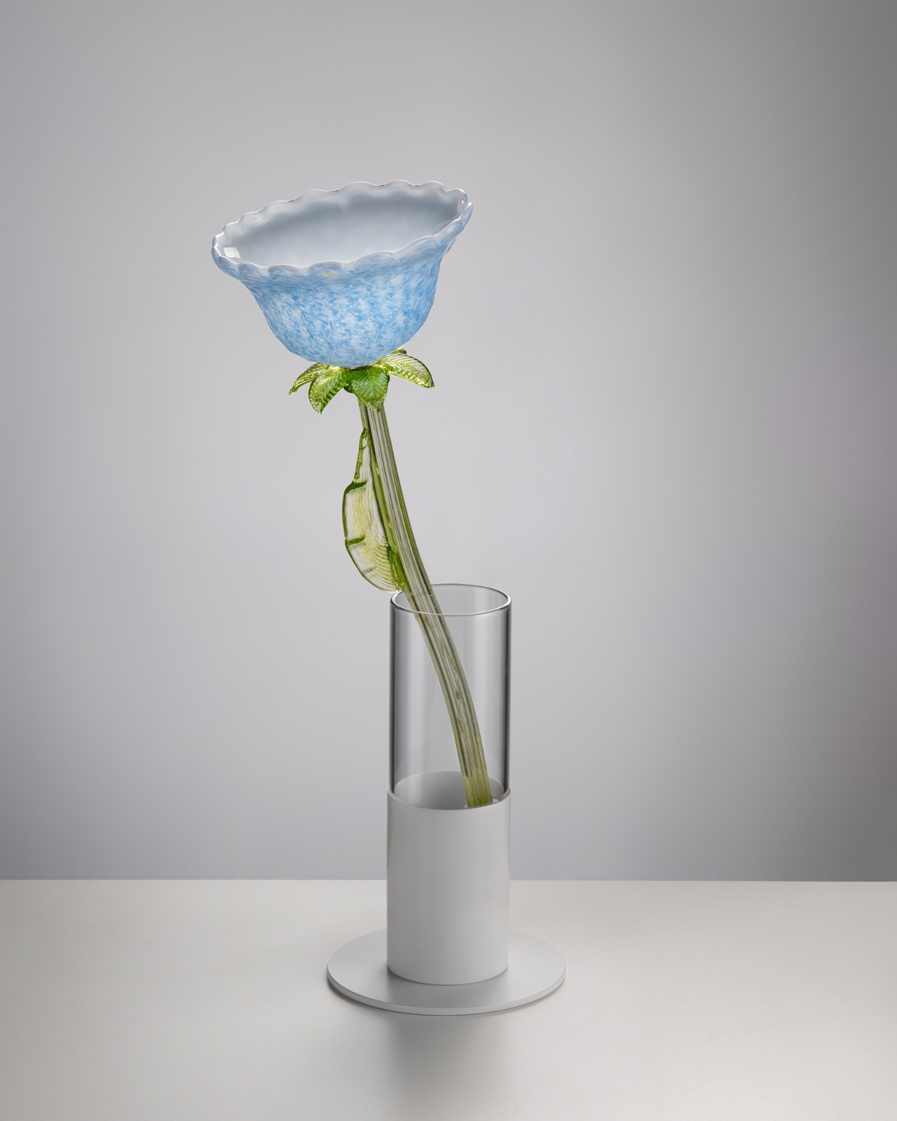
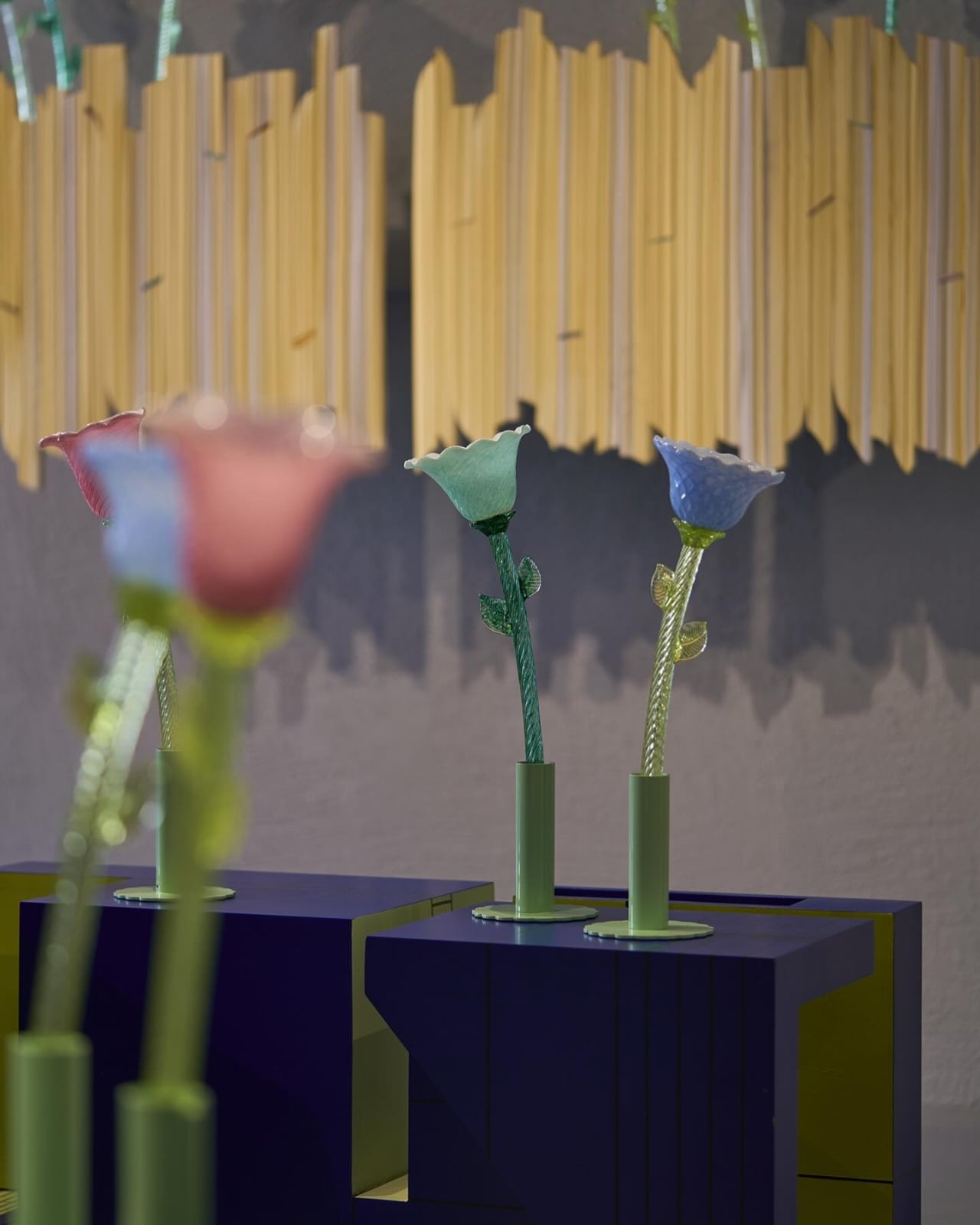
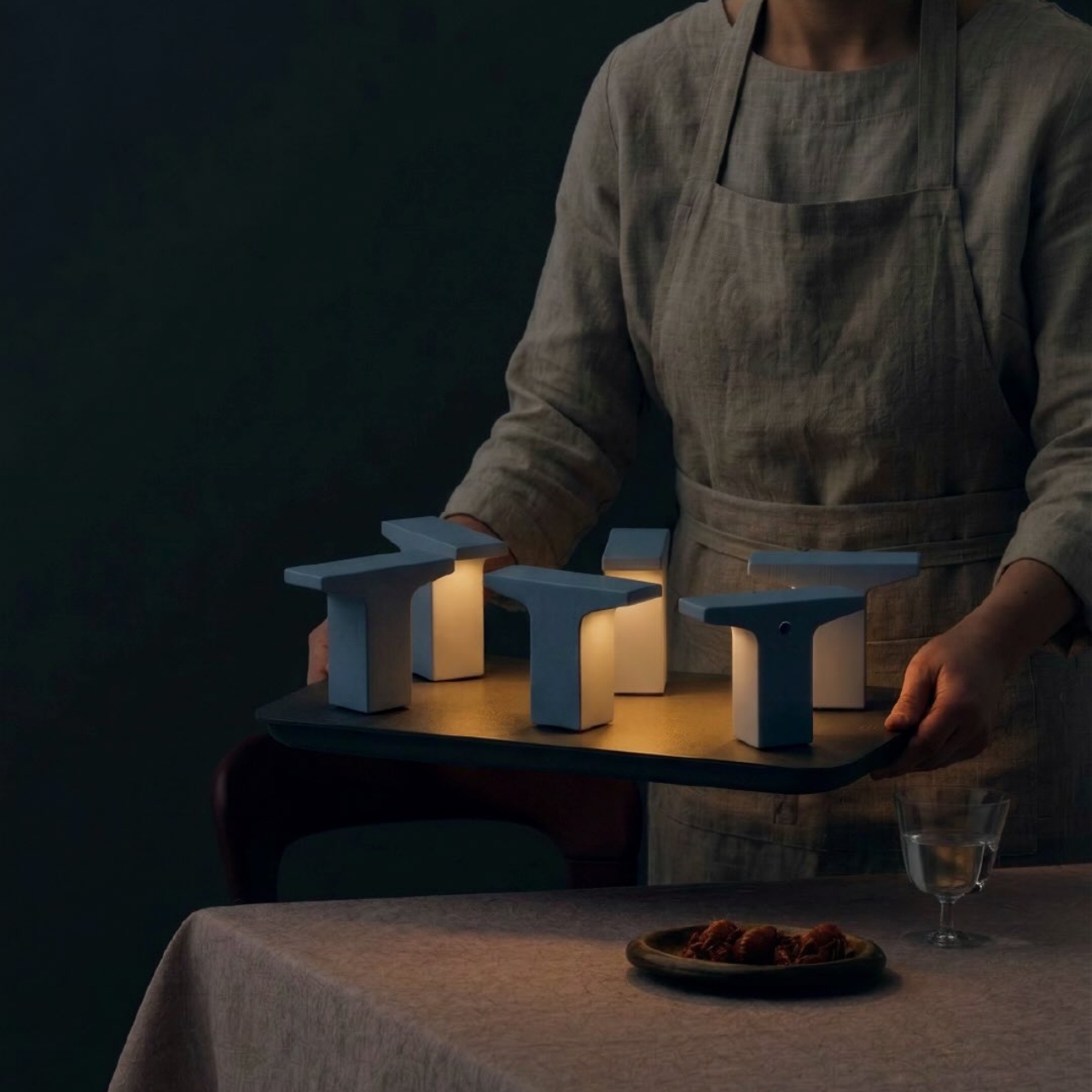
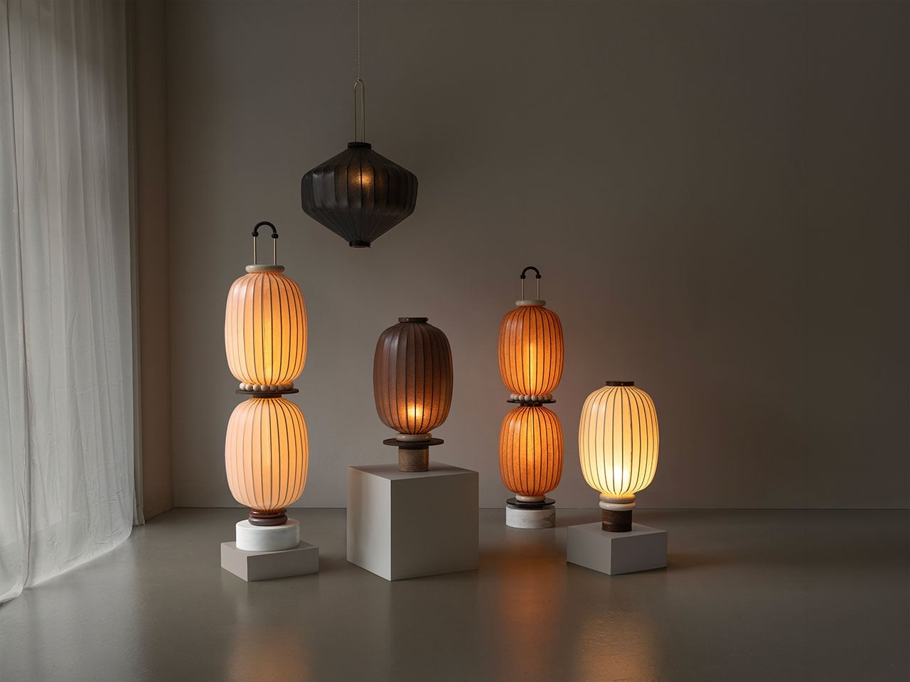
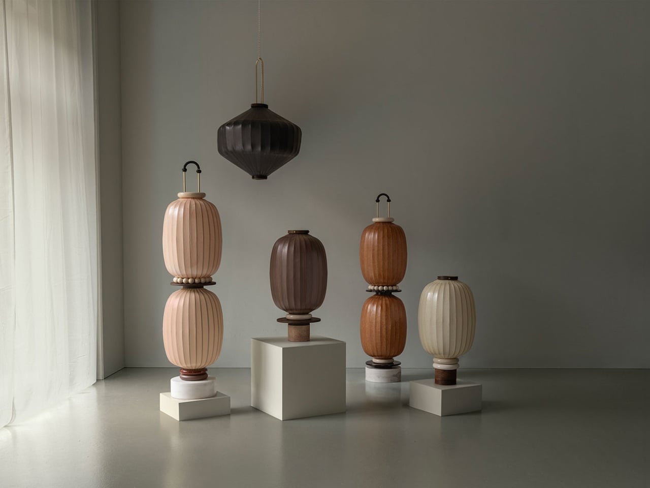
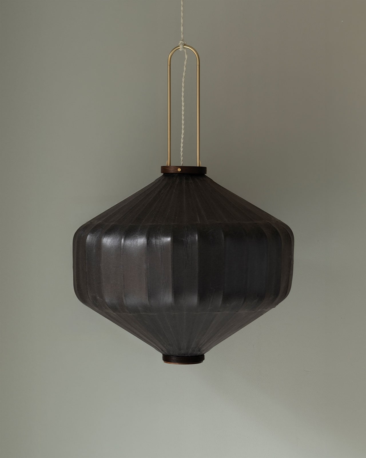
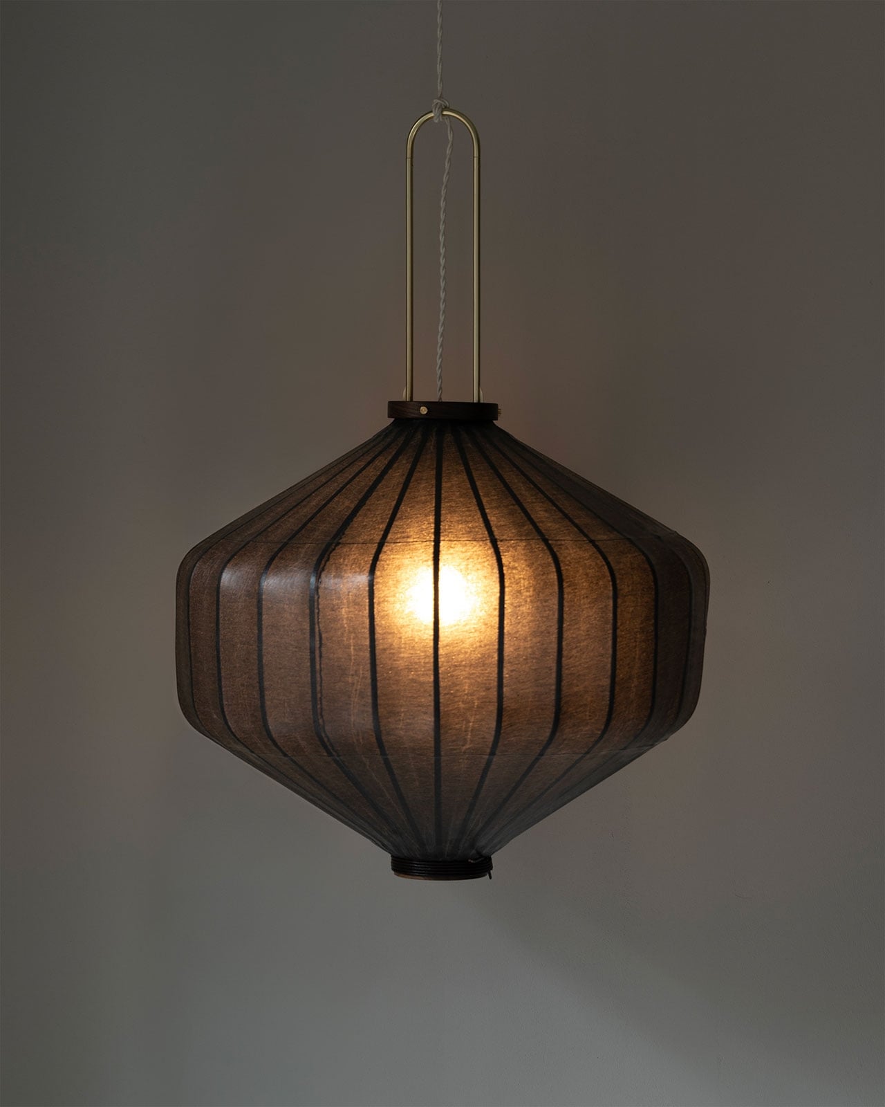
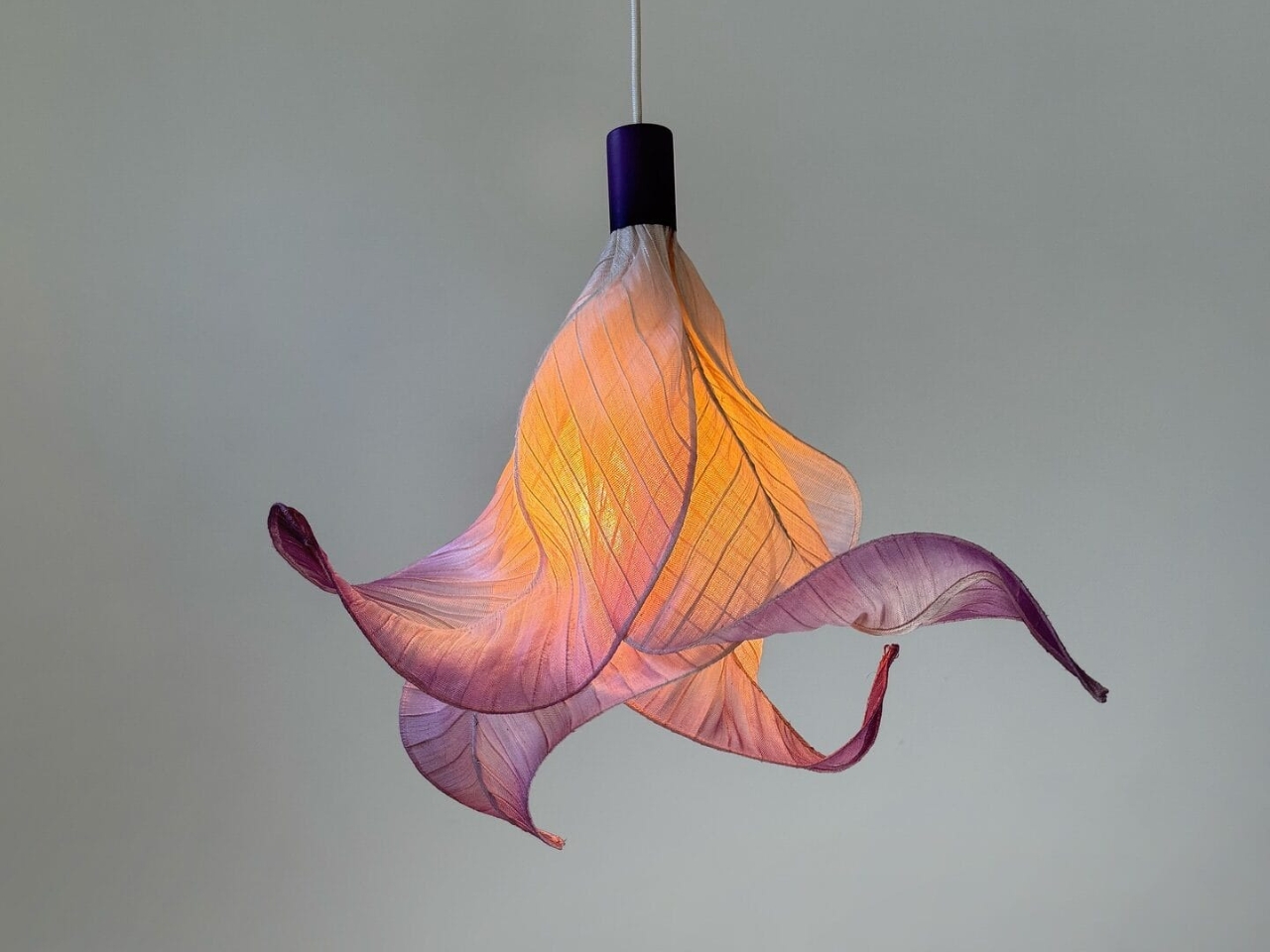
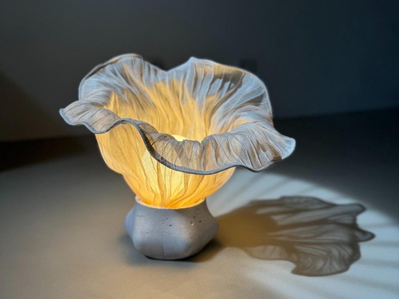
4. Layered Lighting with Natural Forms
Layered lighting, the combination of ambient, task, and accent light, is the foundation of effective design. In a biophilic context, it is elevated by incorporating nature-inspired elements. Instead of standard fixtures, designers can introduce lights that echo organic shapes, textures, or branching patterns found in trees, creating a more harmonious and engaging environment.
Examples include pendant lights that cast a soft, moonlike glow or lamp bases with subtle stone-like textures. Using natural materials such as woven rattan, recycled glass, or unpolished metals adds an extra layer of nature’s beauty, ensuring that the lighting feels integrated, warm, and connected to the natural world.
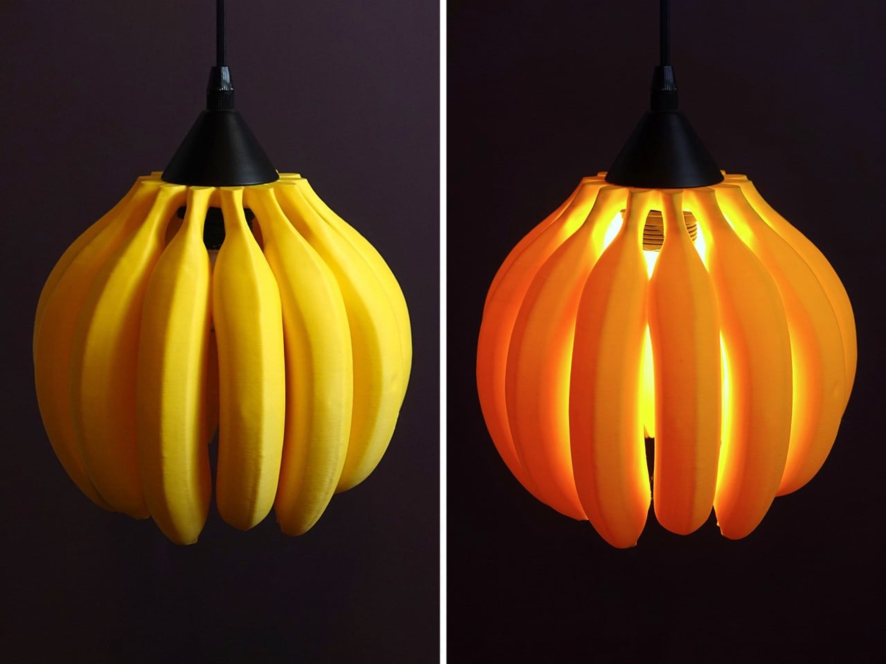
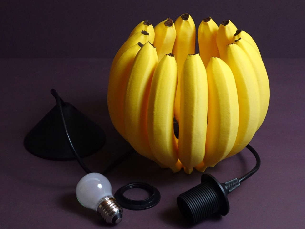
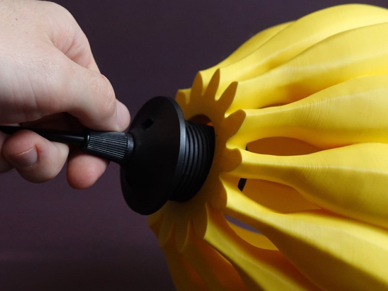
The Banana Lamp by Gazzaladra turns a simple fruit into a playful, nature-inspired piece of functional art, aligning perfectly with biophilic design principles. Crafted using precise 3D scans of real bananas, each lamp captures organic details such as peel ridges and natural curves, bringing the charm of the natural world indoors. Beyond illumination, it sparks conversation, adds visual delight, and connects occupants to a sense of whimsy and creativity found in nature, echoing the restorative qualities that biophilic lighting seeks to provide.

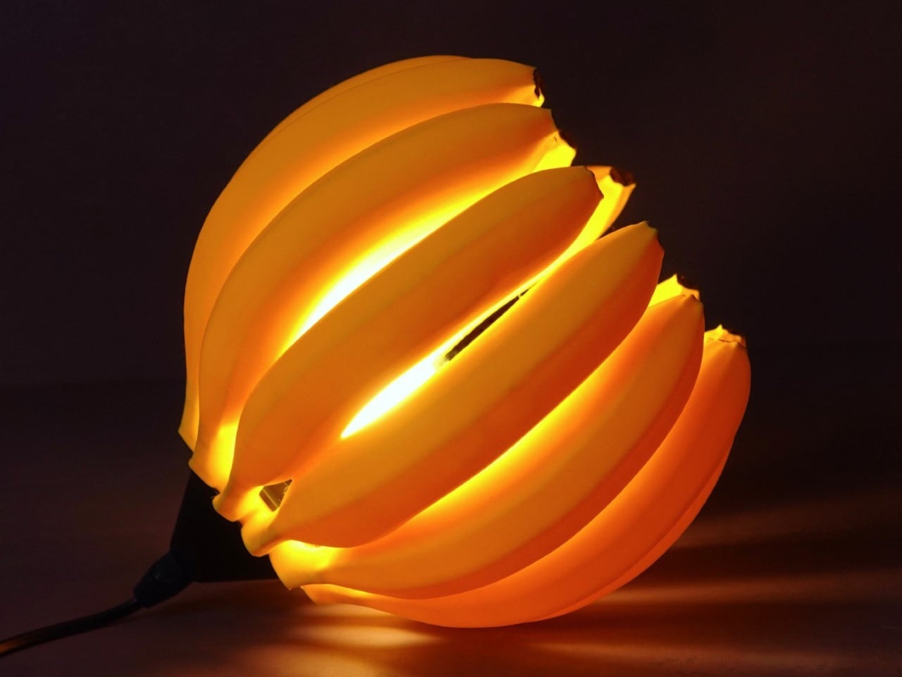
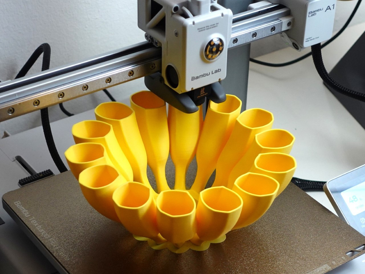
Available as a 3D model on thangs.com, the hollow design works best with LED bulbs and translucent filaments for a soft, glowing effect. Users can experiment with colors, textures, and printing techniques to enhance its natural appeal. With pendant and desk versions compatible with common socket kits, the Banana Lamp transforms everyday spaces into engaging, biophilic environments that fuse humor, aesthetics, and the organic beauty of natural forms.
5. Optimizing Sunlight Indoors
Maximizing daylight, or daylighting, is one of the most effective strategies in biophilic lighting. It uses architectural elements such as windows, skylights, and light shelves to bring natural sunlight deep into interior spaces. It helps in reducing the need for artificial lighting as daylight uniquely uplifts mood, boosts energy, and enhances overall well-being.
Simple design strategies can optimize existing windows, such as using sheer curtains instead of heavy drapes. These techniques extend daylight penetration, reduce harsh contrasts between bright and dark areas, and strengthen the occupant’s connection to the outdoors, creating visually balanced and restorative interiors.
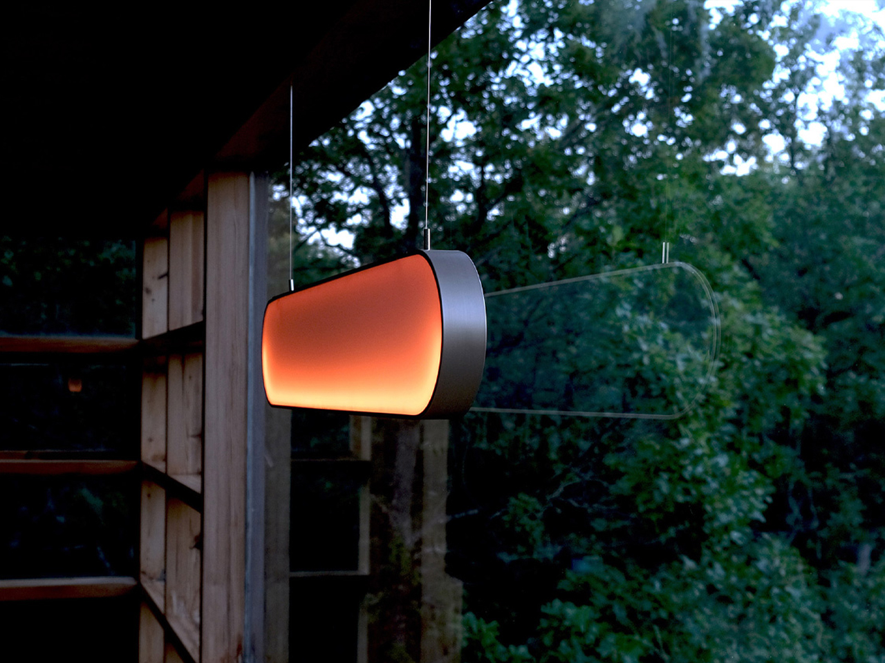

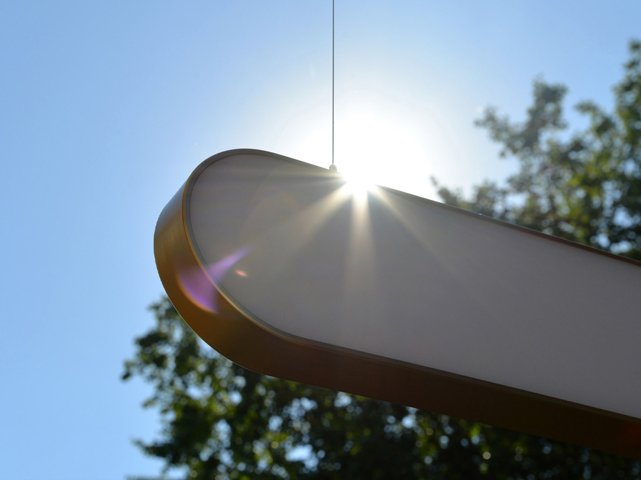
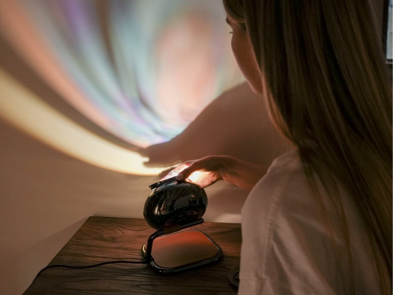
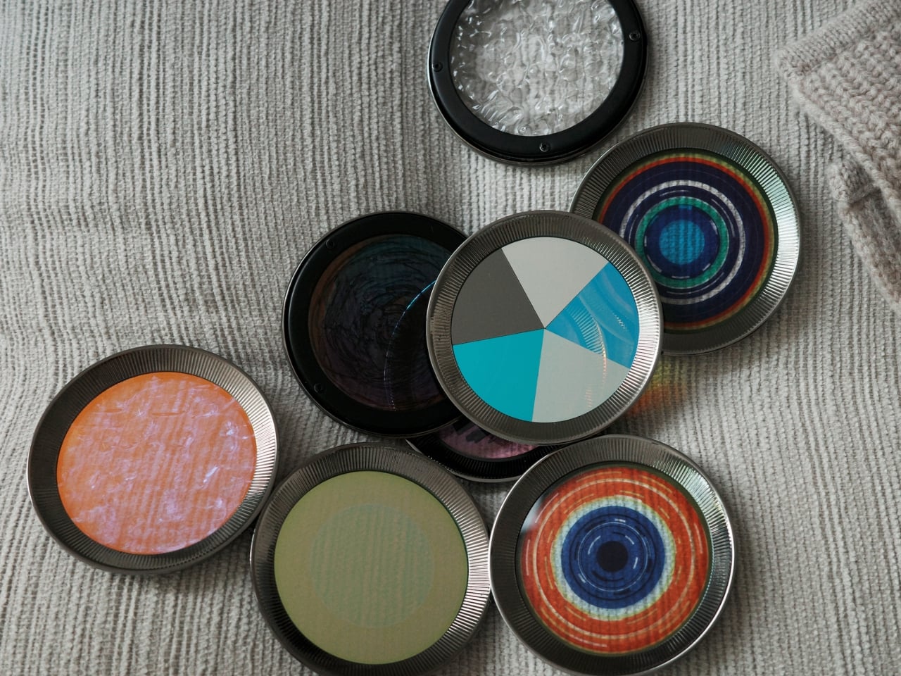
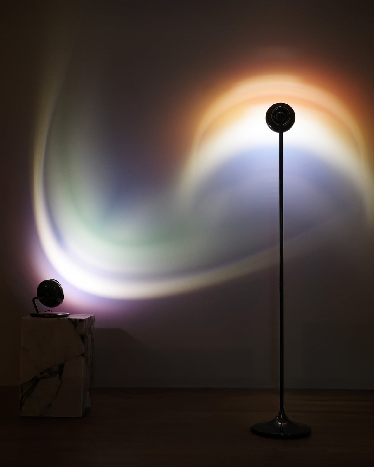
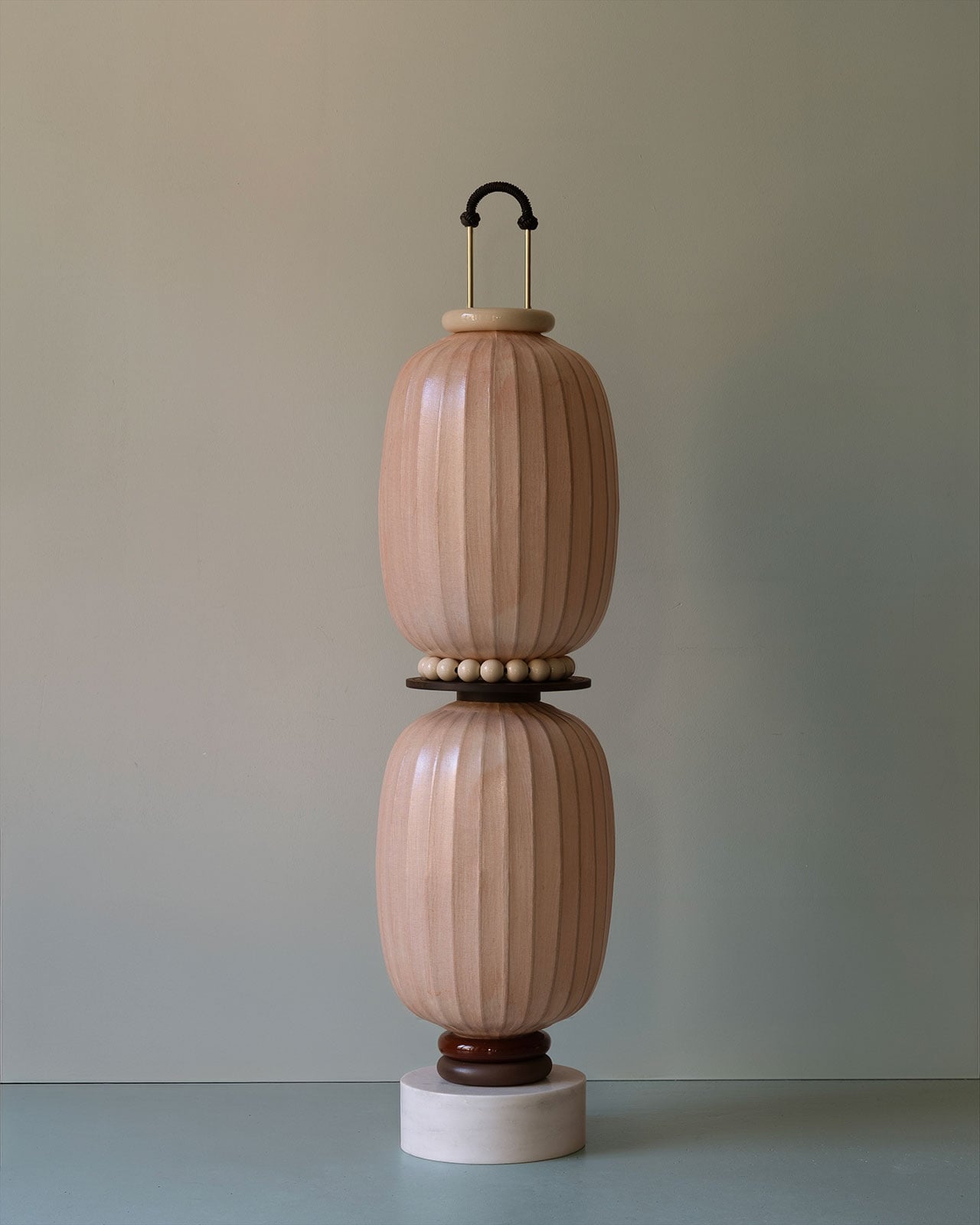
Dutch lighting brand Sunne partnered with designer Marjan van Aubel to create their first product, which is a self-powered solar lamp that harvests energy during the day to illuminate interiors at night. The Sunne Light mimics natural sunlight and is entirely powered by solar energy, bringing the restorative qualities of daylight indoors. By integrating biophilic principles, the lamp fosters a connection to nature, supporting human circadian rhythms and enhancing well-being. Its horizon-inspired design, with an 85-centimeter landscape-oriented panel suspended by two wires, reflects the organic forms and visual serenity found in natural landscapes.
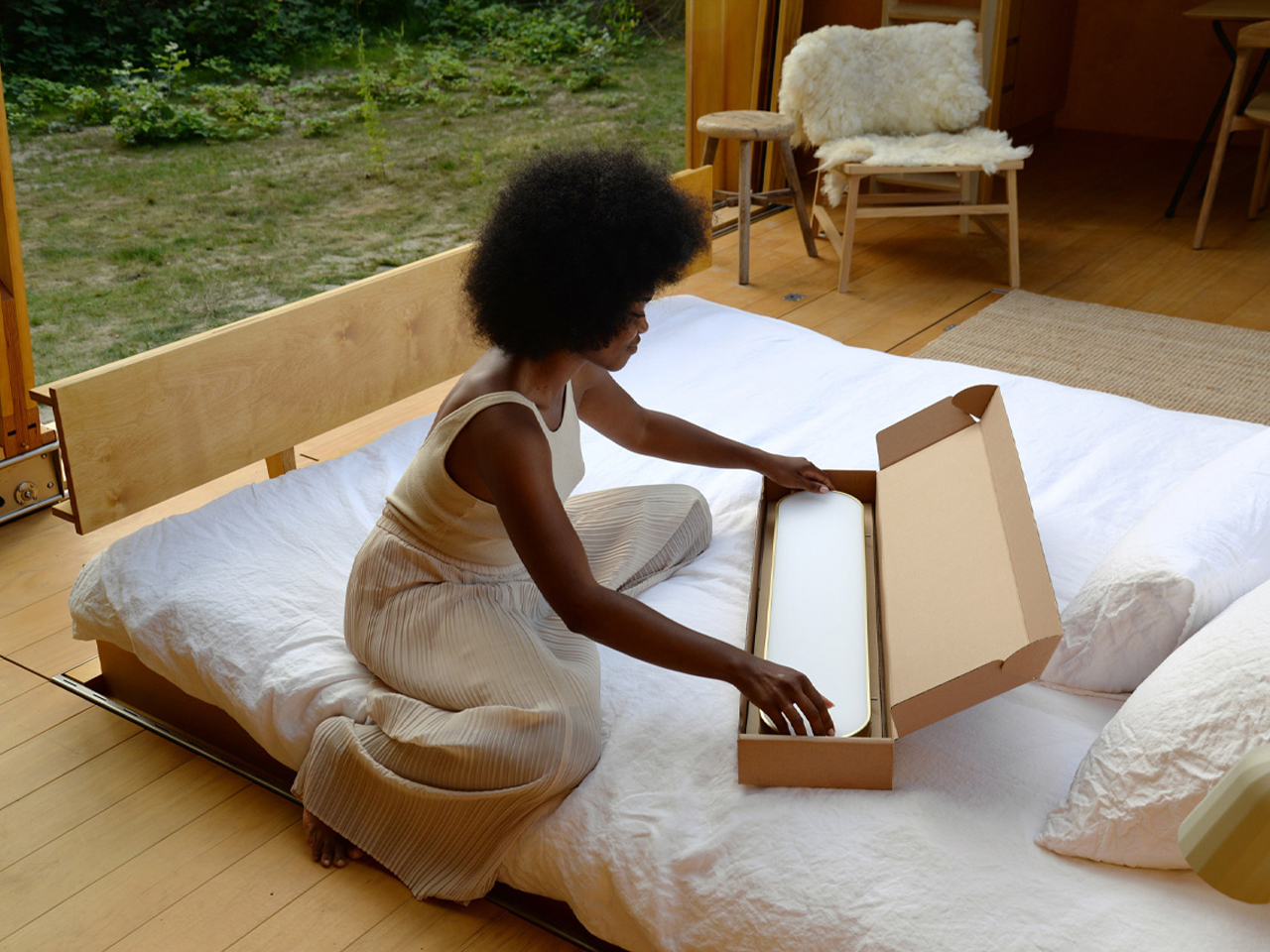
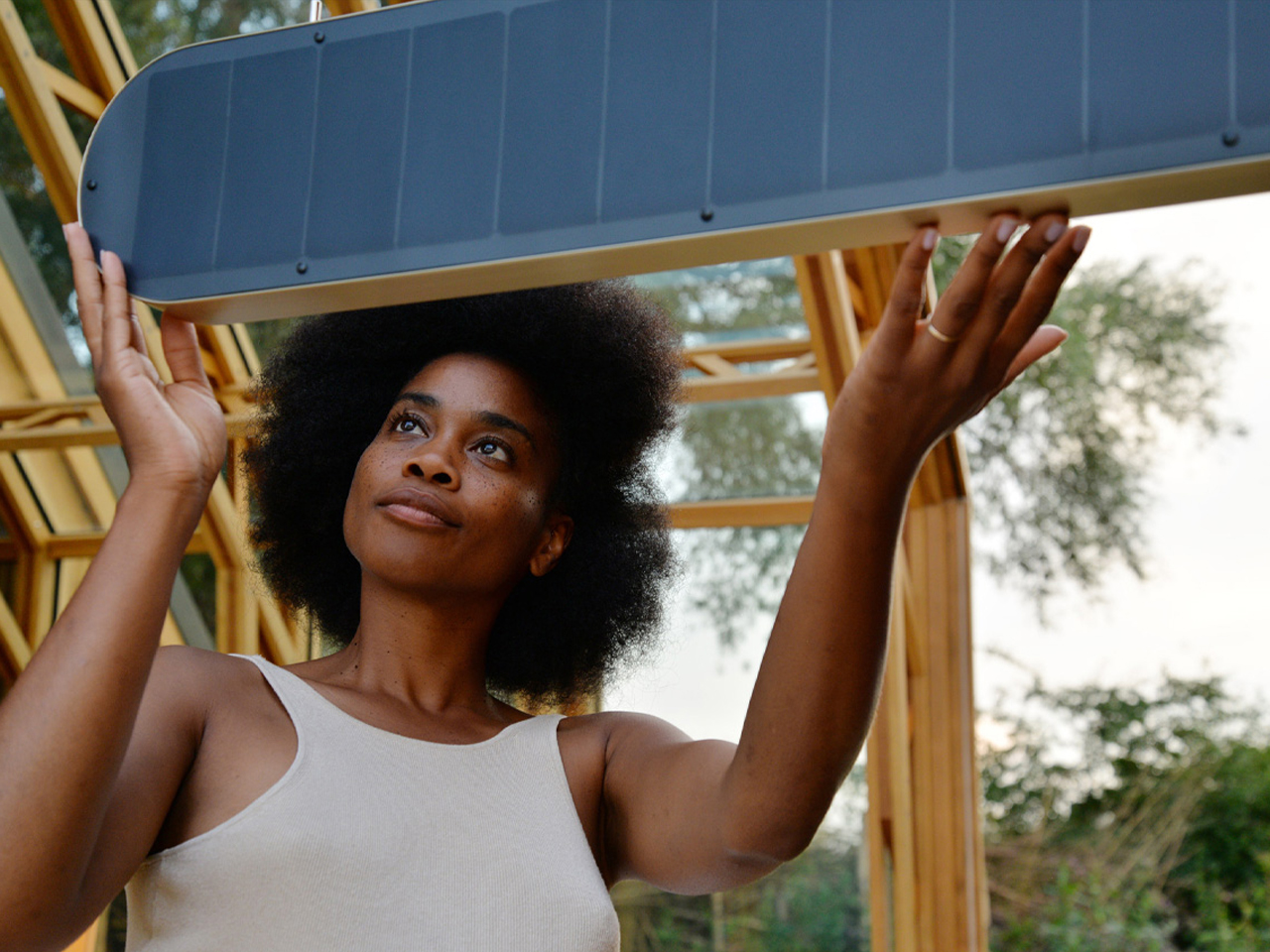
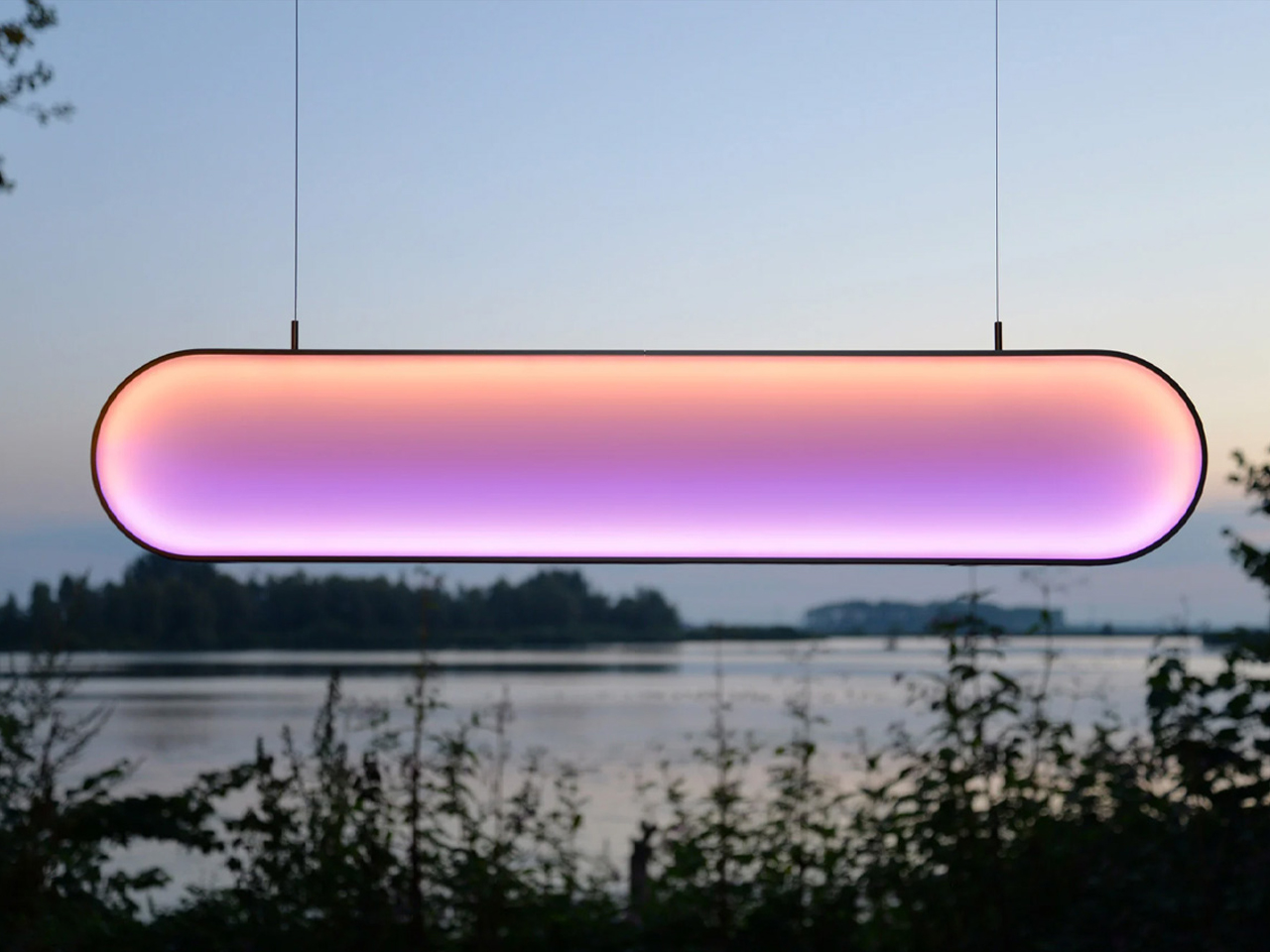
Equipped with photovoltaic cells and an integrated battery, the lamp stores energy collected from sunlight and operates without external power. A companion app offers three modes like Sunne Rise, Sunne Light, and Sunne Set, which replicate morning, midday, and evening light. Made-to-order with sustainable, detachable components, the Sunne Light combines functionality, longevity, and environmental consciousness while creating an innovative biophilic lighting experience.
Biophilic lighting is more than a trend and is essential for healthier homes. By mimicking natural light, enhancing outdoor views, and choosing supportive fixtures, interiors become calming and restorative. Thoughtful lighting helps regulate sleep, boost energy, and improve well-being.
The post 5 Lamps That Adjust Like Sunlight That Fix Your Circadian Rhythm To Keep Your Energy Up first appeared on Yanko Design.