The tiny home is having a genuine design moment. Not the kind driven by social media aesthetics or minimalism as a lifestyle brand, but the kind where builders are solving real problems, and the results are getting sharper each season. What once felt like a compromise category has grown into a serious architectural conversation, one where craft, livability, and genuine spatial intelligence are setting the standard. The homes arriving this April reflect that maturity clearly.
Each home on this list approaches compact living from a distinctly different angle. One eliminates the loft bed that most tiny houses treat as structural law. Another was designed from the ground up around a growing family’s daily rhythms. A third draws from Japanese craft traditions to build something that feels purposeful at every scale. These are not the tiny homes of five years ago. They are fully realized dwellings that simply happen to take up less space, and the best five of April 2026 make a case worth hearing in full.
1. Betty — The Towable That Finally Gets the Bedroom Right
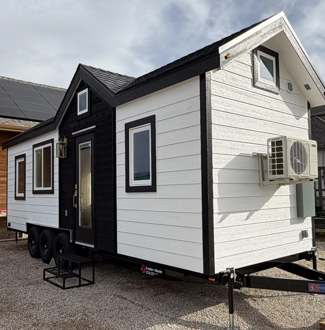
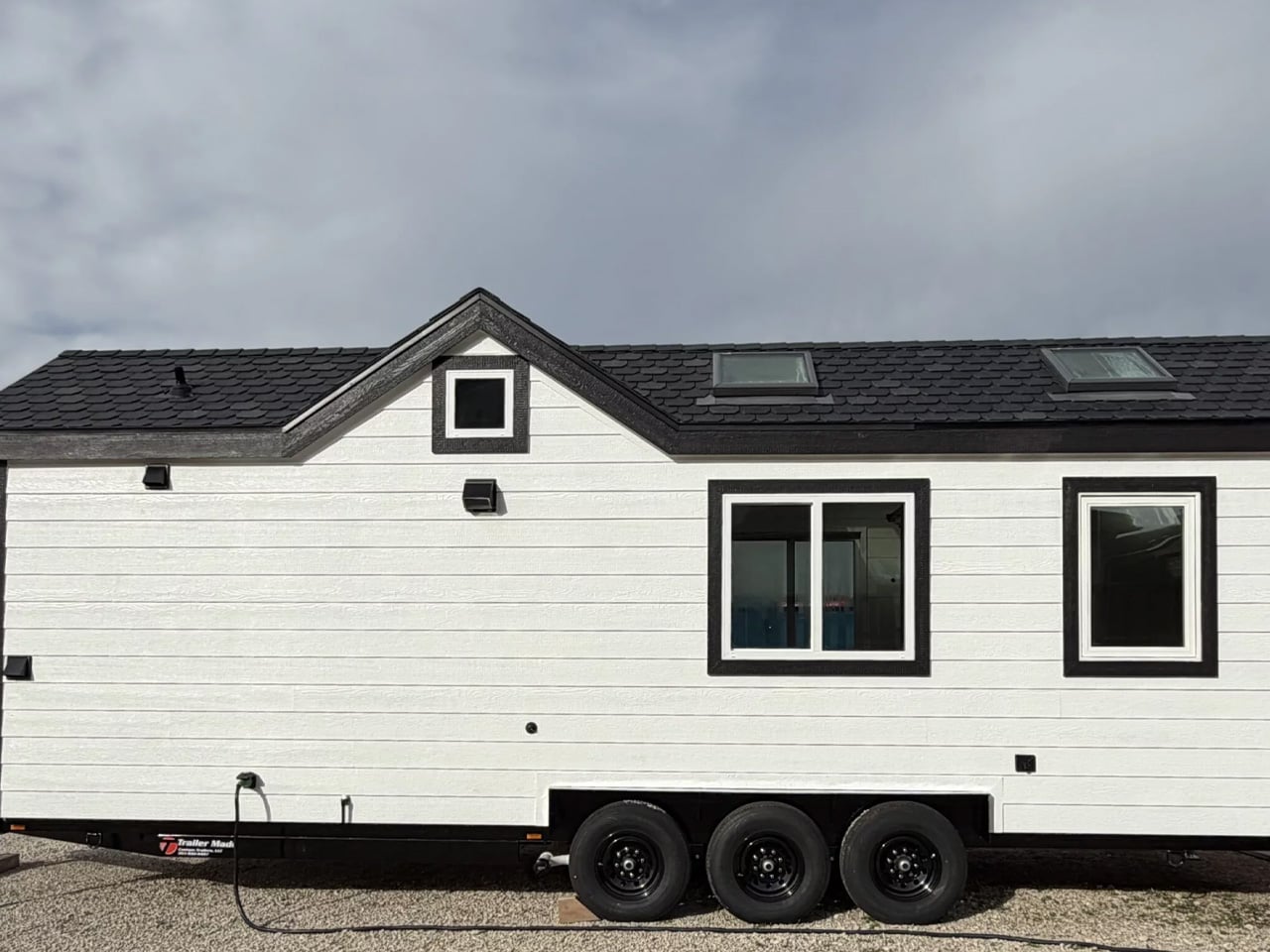
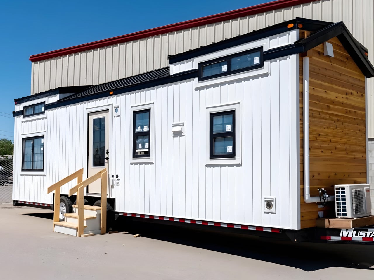
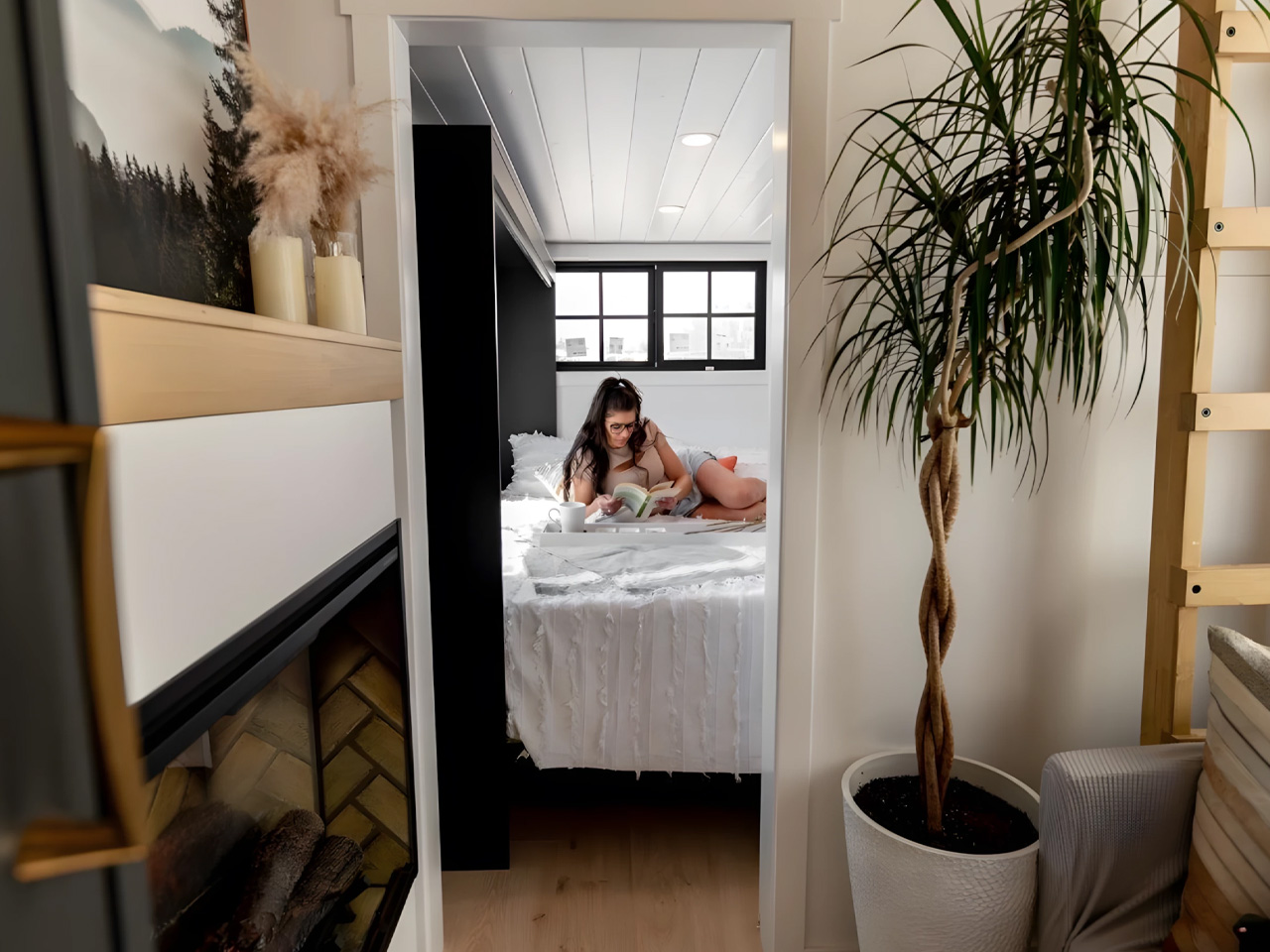
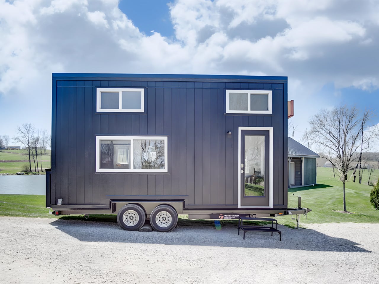
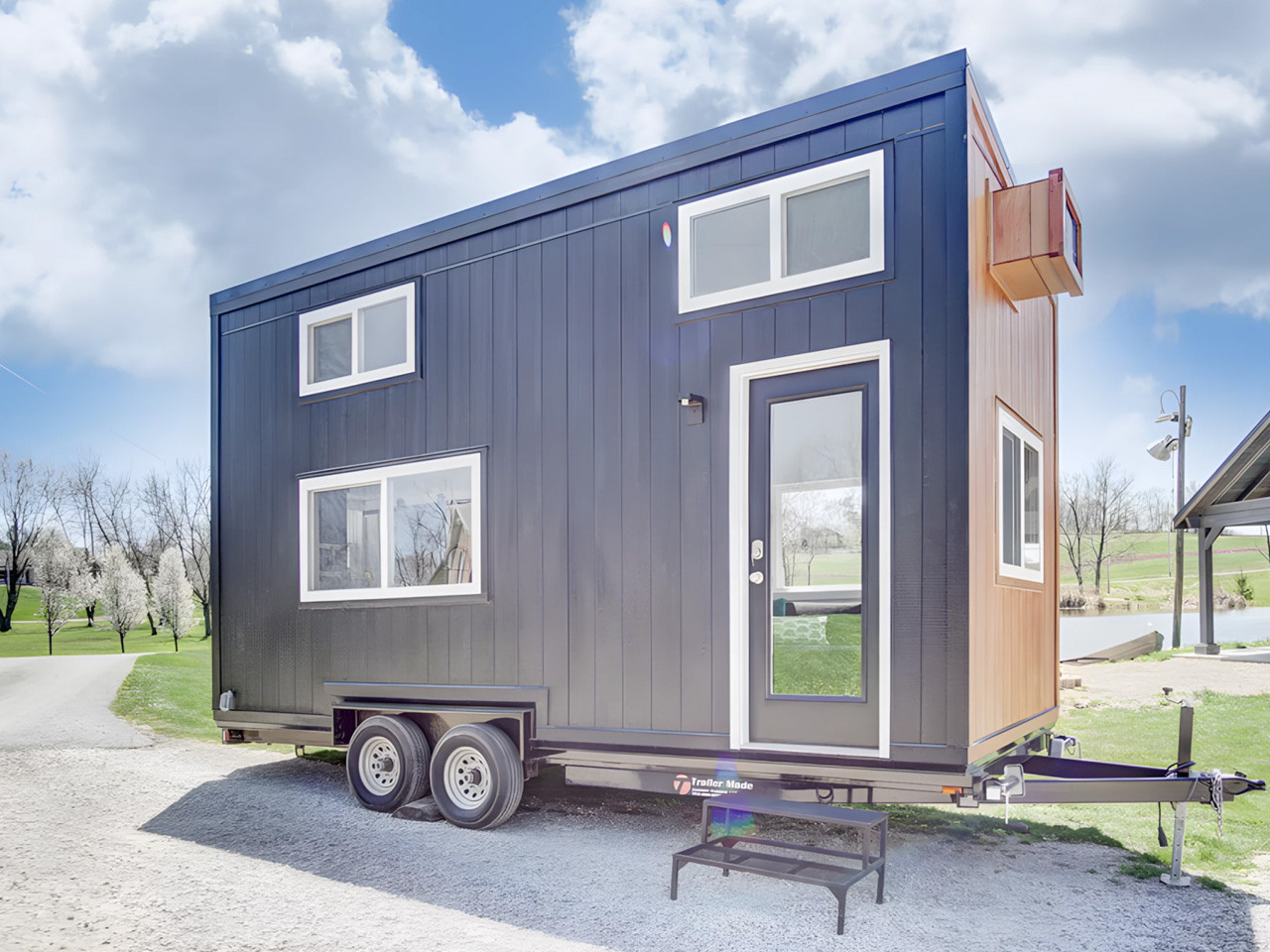
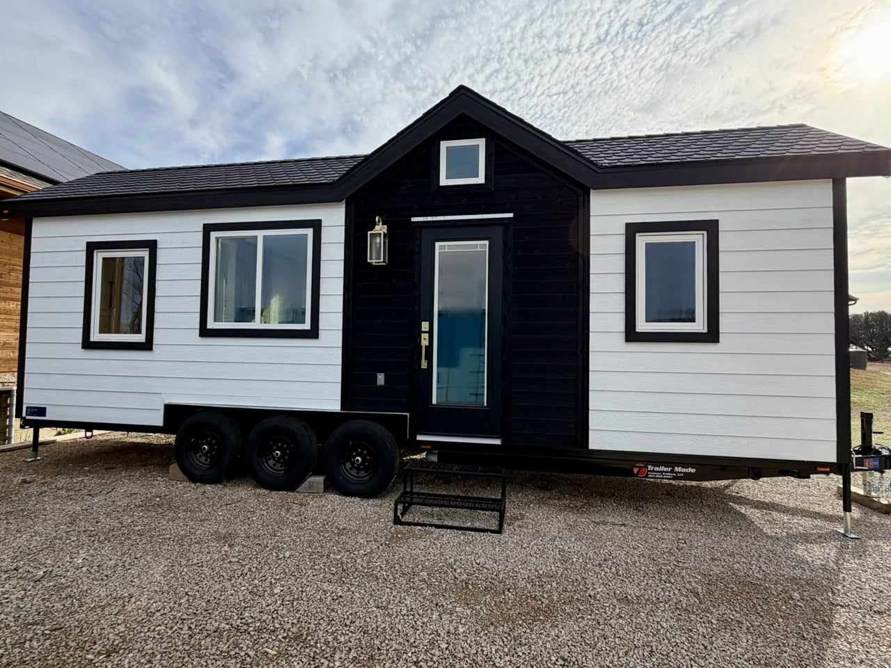
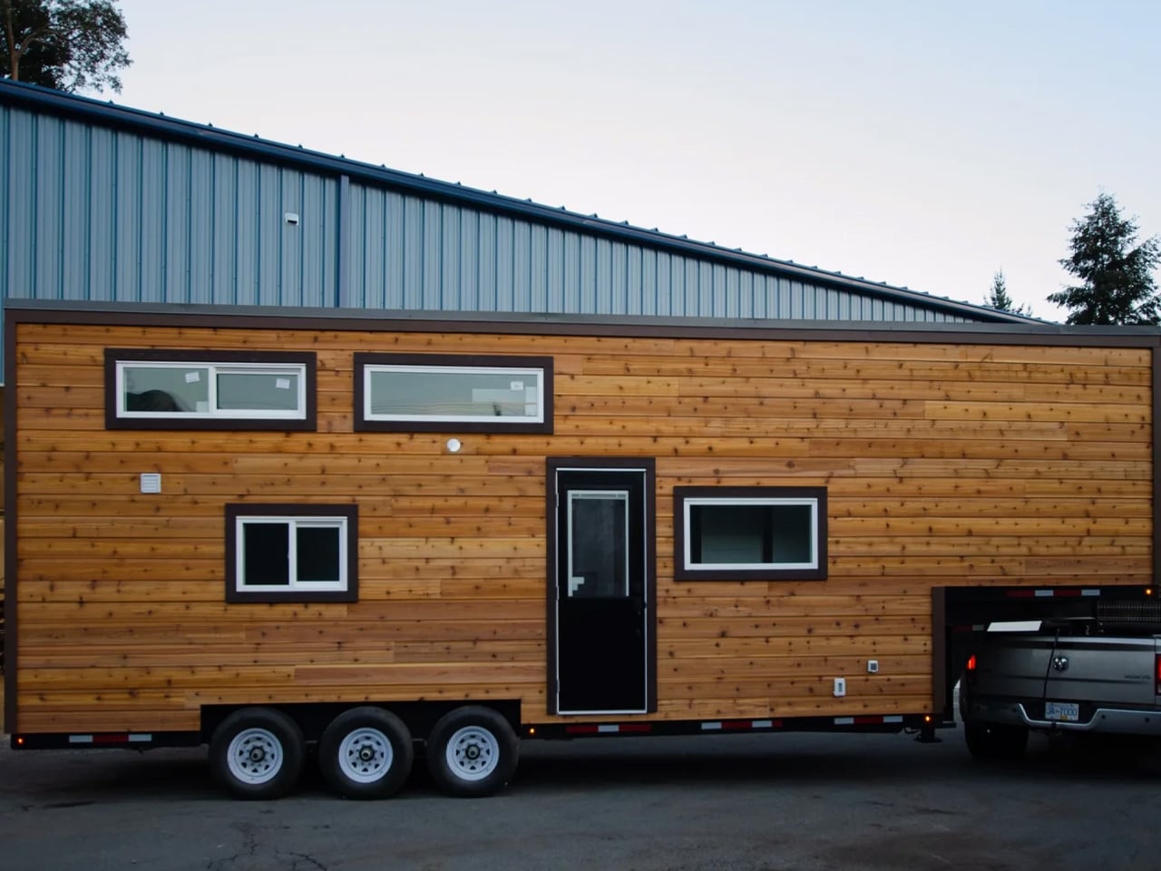
Tiny house living often demands tough trade-offs between mobility and livability, but the Betty by Decathlon Tiny Homes aims to strike a balance that most towable homes fail to find. At 28 feet long on a triple-axle trailer, it sits comfortably in the mid-size category without feeling cramped. The exterior clad in engineered wood with composite roof shingles keeps things durable and low-maintenance, a practical foundation for a home designed to spend much of its life on the road with two occupants.
The ground-floor bedroom is what separates the Betty from most of its competition. Where loft beds dominate tiny home layouts, this room offers full standing headroom, a queen bed platform with two large integrated storage drawers, a built-in wardrobe, and a skylight that floods the space with natural light. A wall-mounted TV, a mini-split AC unit in the living area, and a sliding barn-style door complete a setup that never quite asks you to feel like you are settling for something.
What we like:
- The ground-floor bedroom with full standing headroom is a rare feature in this size category, making the space feel genuinely livable rather than something you climb into at the end of the day.
- Engineered wood cladding and composite roof shingles offer real long-term durability without demanding intensive upkeep, a sensible material choice for a home that moves regularly.
What we dislike:
- The living room footprint is modest enough that two people spending extended stretches at home may find it limiting over longer periods together.
- There is no dedicated workspace mentioned in the layout, which matters increasingly for buyers who plan to work remotely as their primary daily routine.
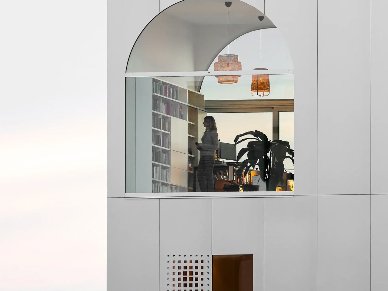
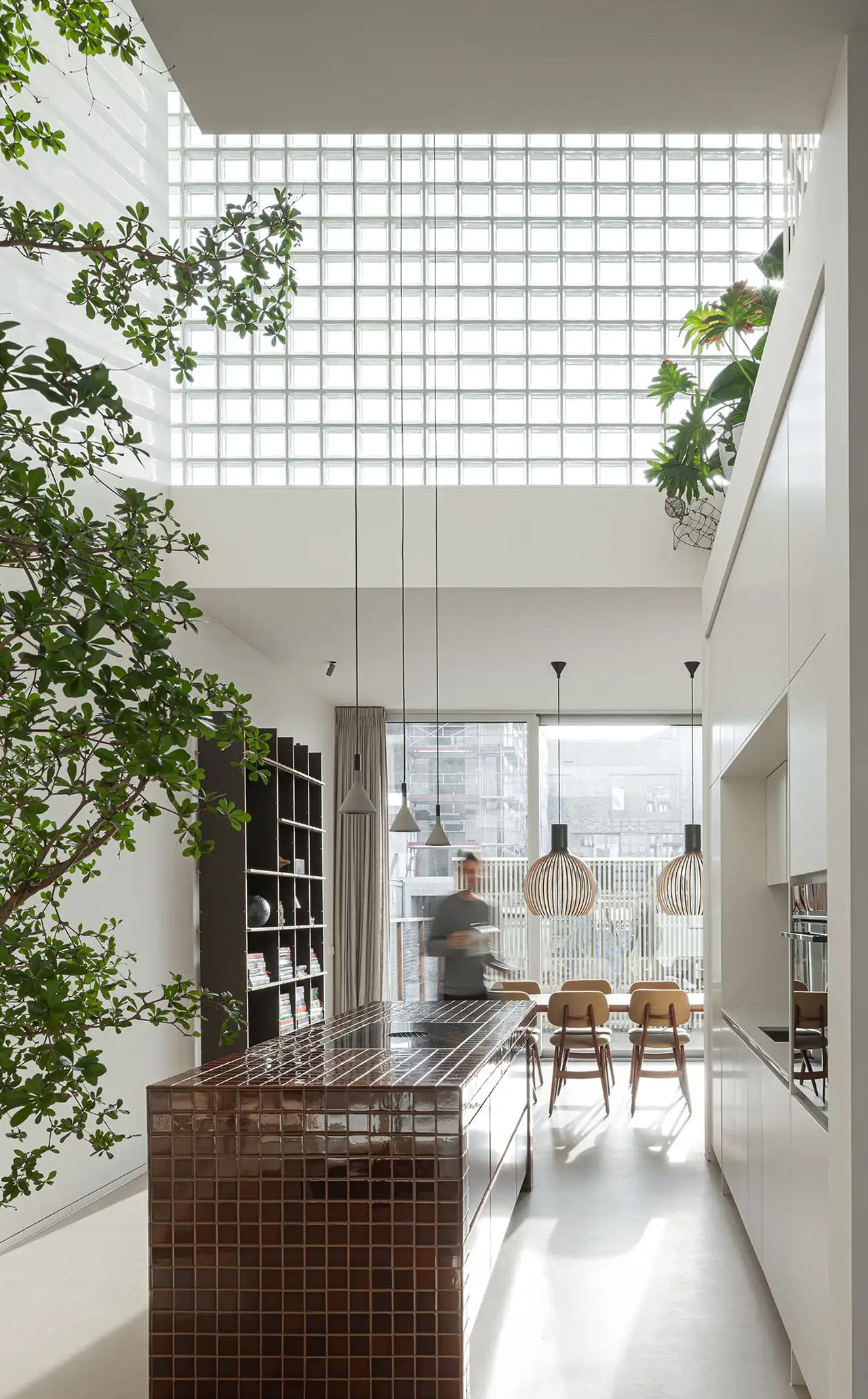
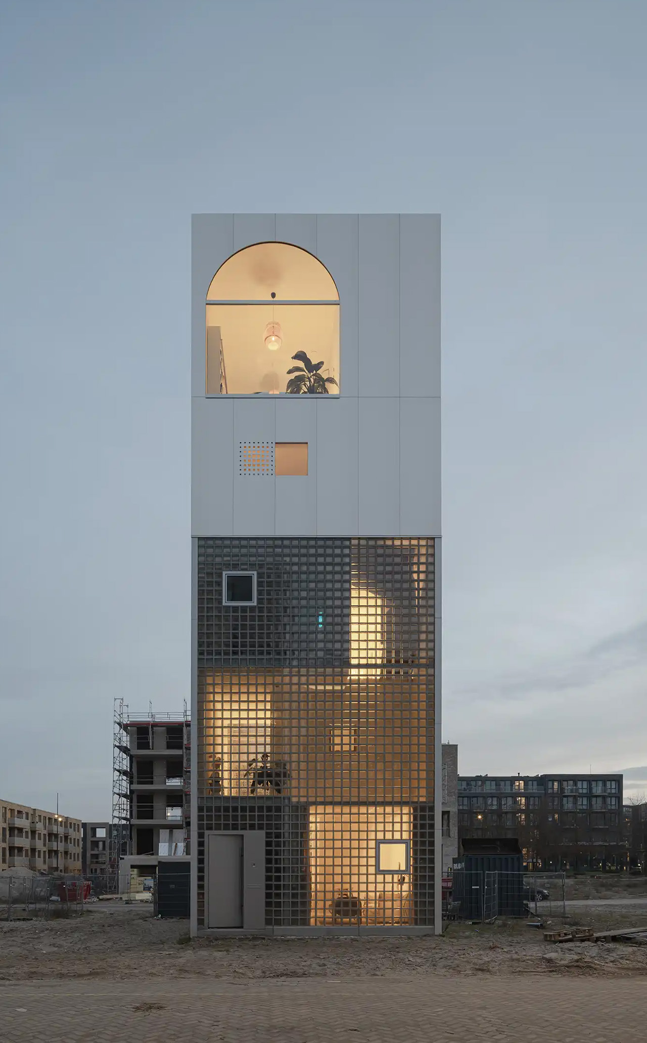
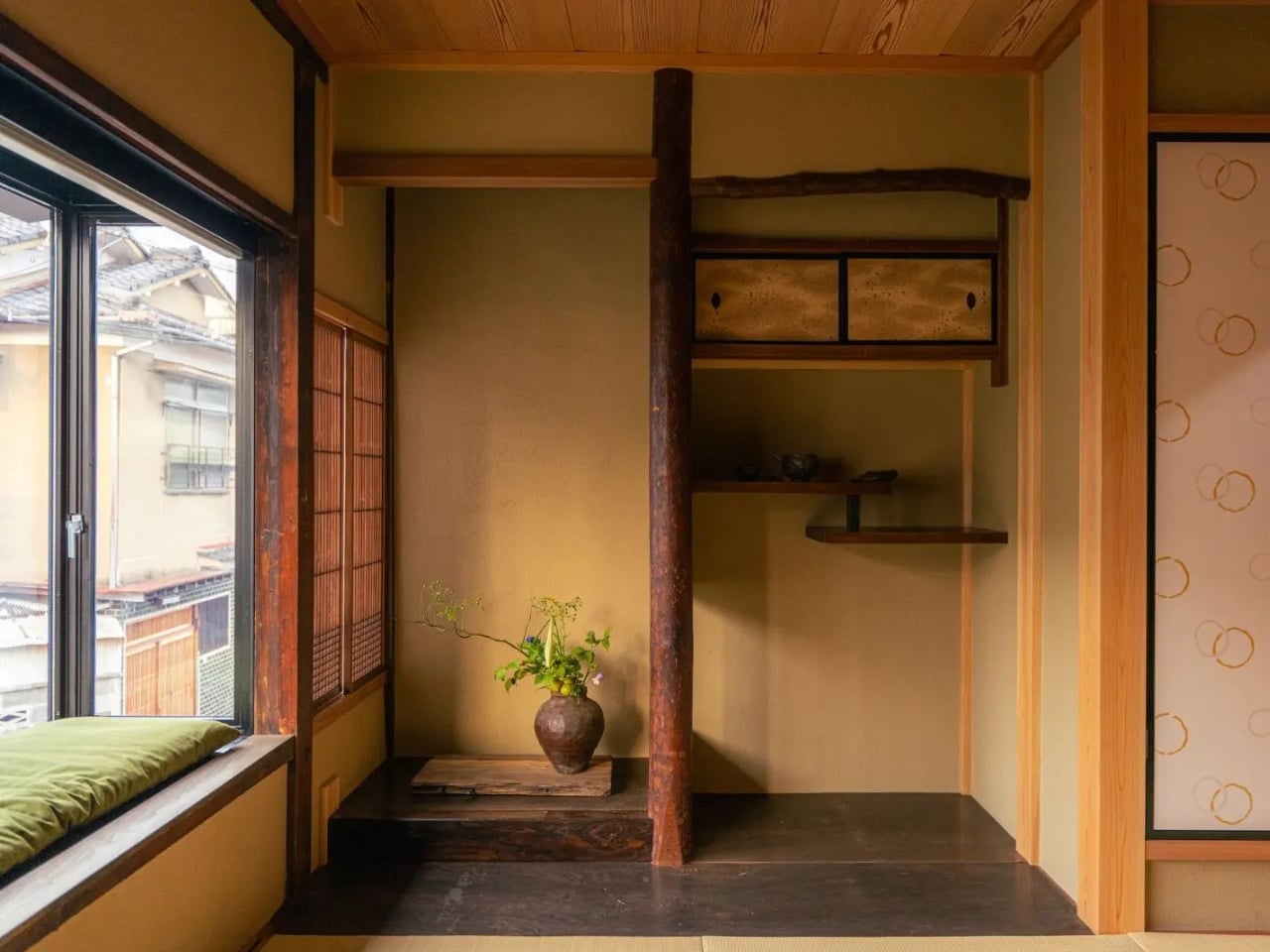
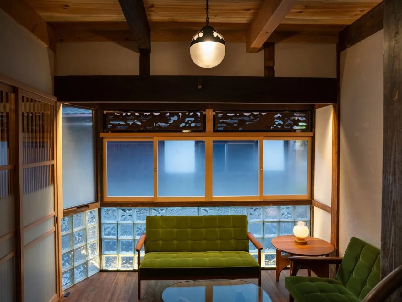
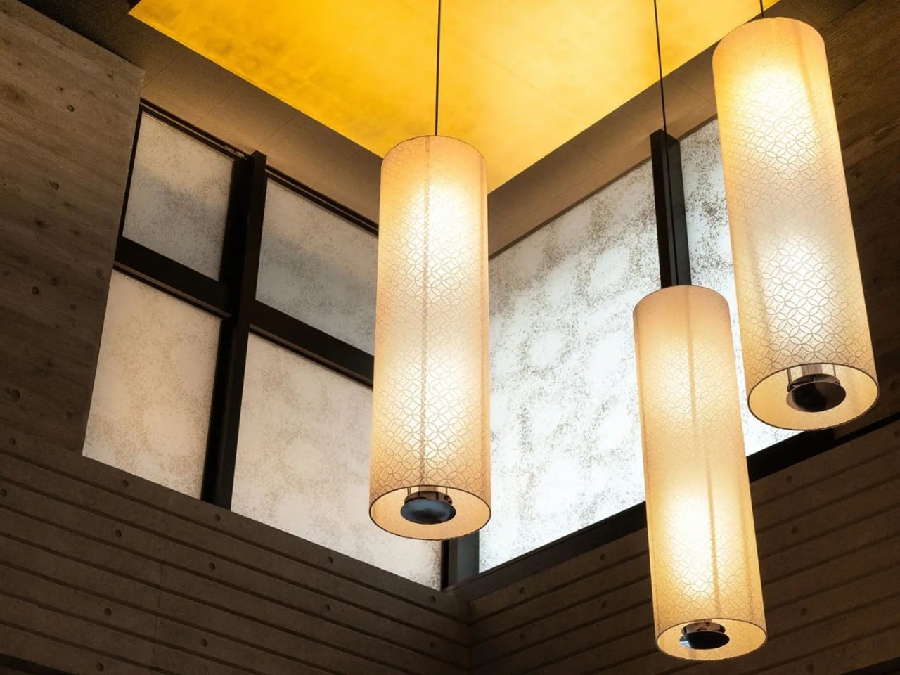
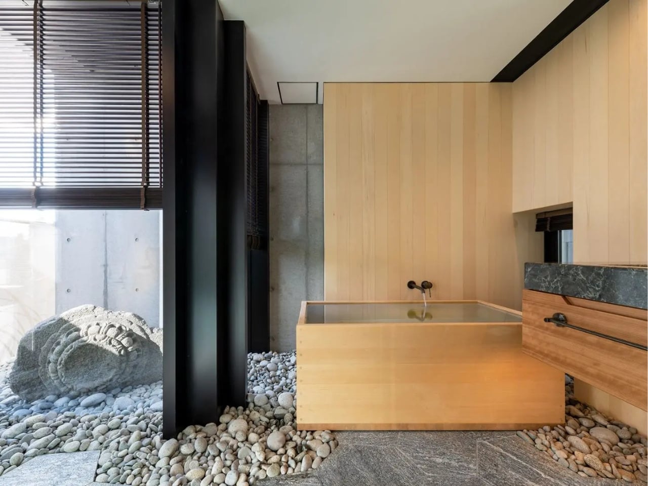
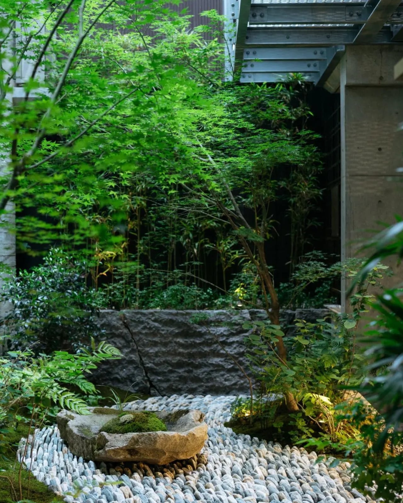
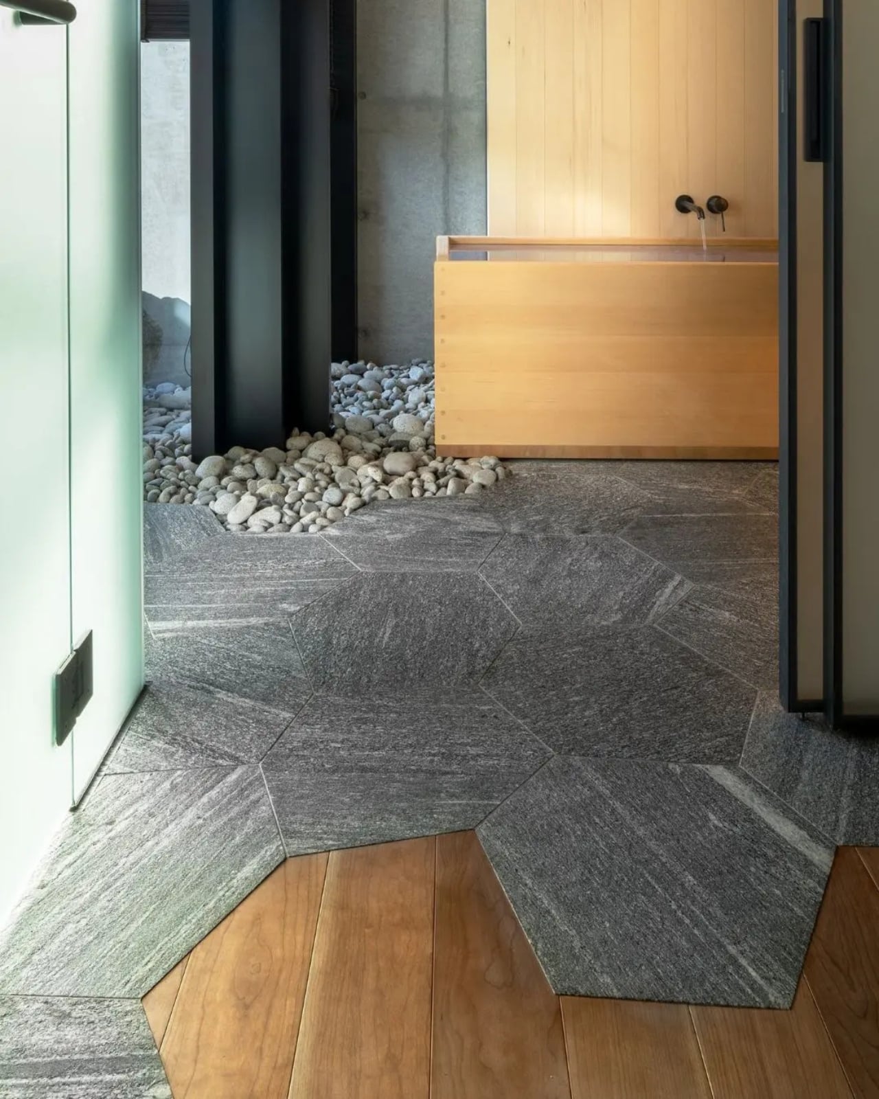
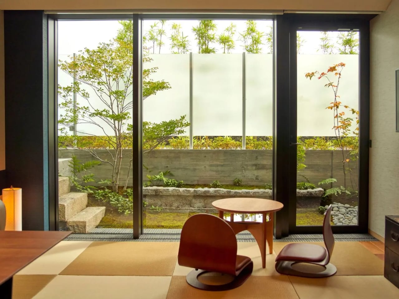
2. Mizuho — Japanese Craft Meets Intentional Living
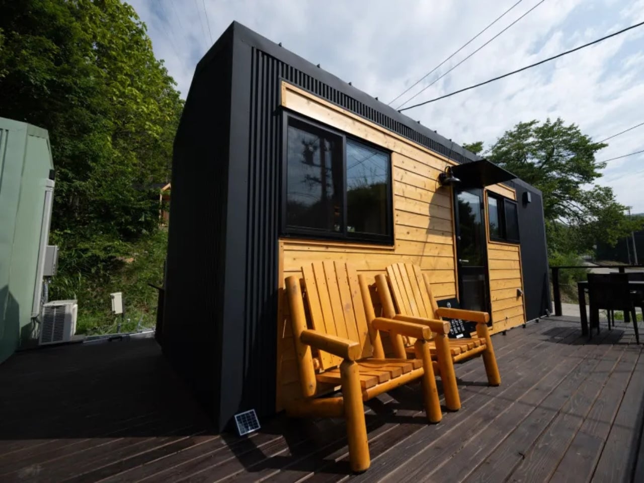
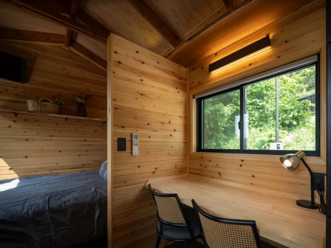
The Mizuho does not try to look like every other tiny home on the market, and that restraint is its first strength. Designed by Ikigai Collective and named after the Japanese philosophy of purposeful living, this home measures 6.6 meters long, 2.4 meters wide, and 3.8 meters tall. It is built for one person or a couple who genuinely want to live with less, combining traditional Japanese aesthetics with modern building technology in a way that feels coherent rather than borrowed.
What makes the Mizuho stand apart is its commitment to authenticity. Ikigai Collective works directly with local partners in Nozawaonsen, Japan, to craft each home to strict quality standards. Every material choice and spatial decision reflects a coherent set of values rooted in simplicity, mindful living, and environmental care. For those drawn to the Ikigai philosophy of finding meaning in everyday life, this home does not reference that tradition from the outside. It builds it into every wall and surface.
What we like:
- Authentic Japanese craftsmanship sourced through local partners in Nozawaonsen gives the Mizuho a material integrity that most tiny homes, regardless of their aesthetic direction, simply cannot replicate.
- The eco-friendly design philosophy extends beyond surface-level choices, reflecting a genuine commitment to sustainable and intentional living that runs through every aspect of the build.
What we dislike:
- At 6.6 meters long and 2.4 meters wide, the dimensions are compact even by tiny home standards, making it a tight fit for couples who value clearly defined personal space.
- The deeply specific aesthetic may feel limiting for buyers who appreciate the minimalist philosophy but prefer more visual flexibility in how their space looks from day to day.
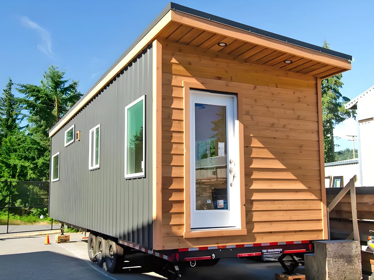
3. Sora 20′ — More Room for the Way People Actually Work Now
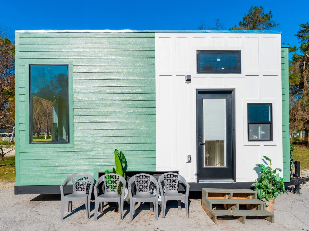
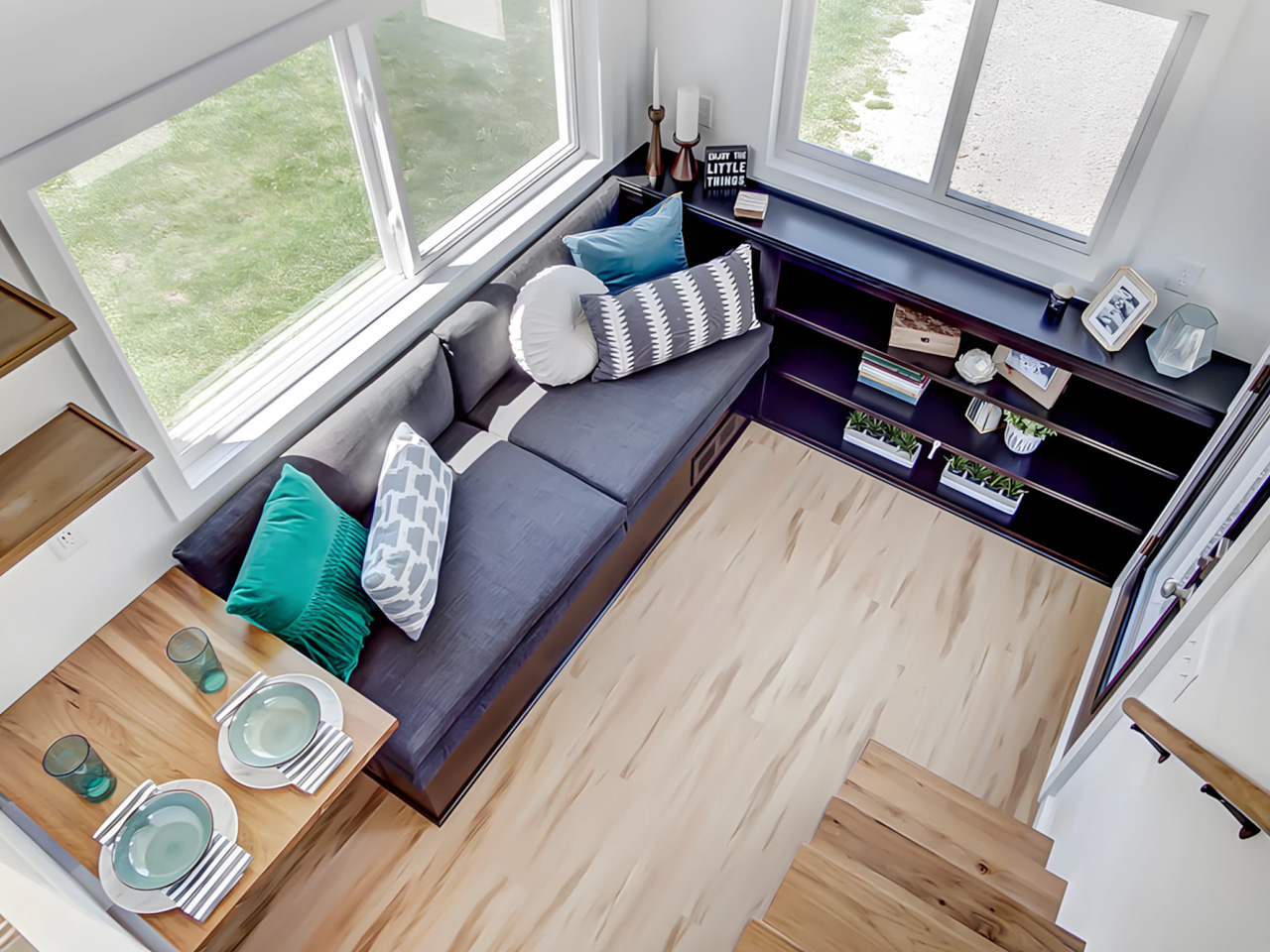
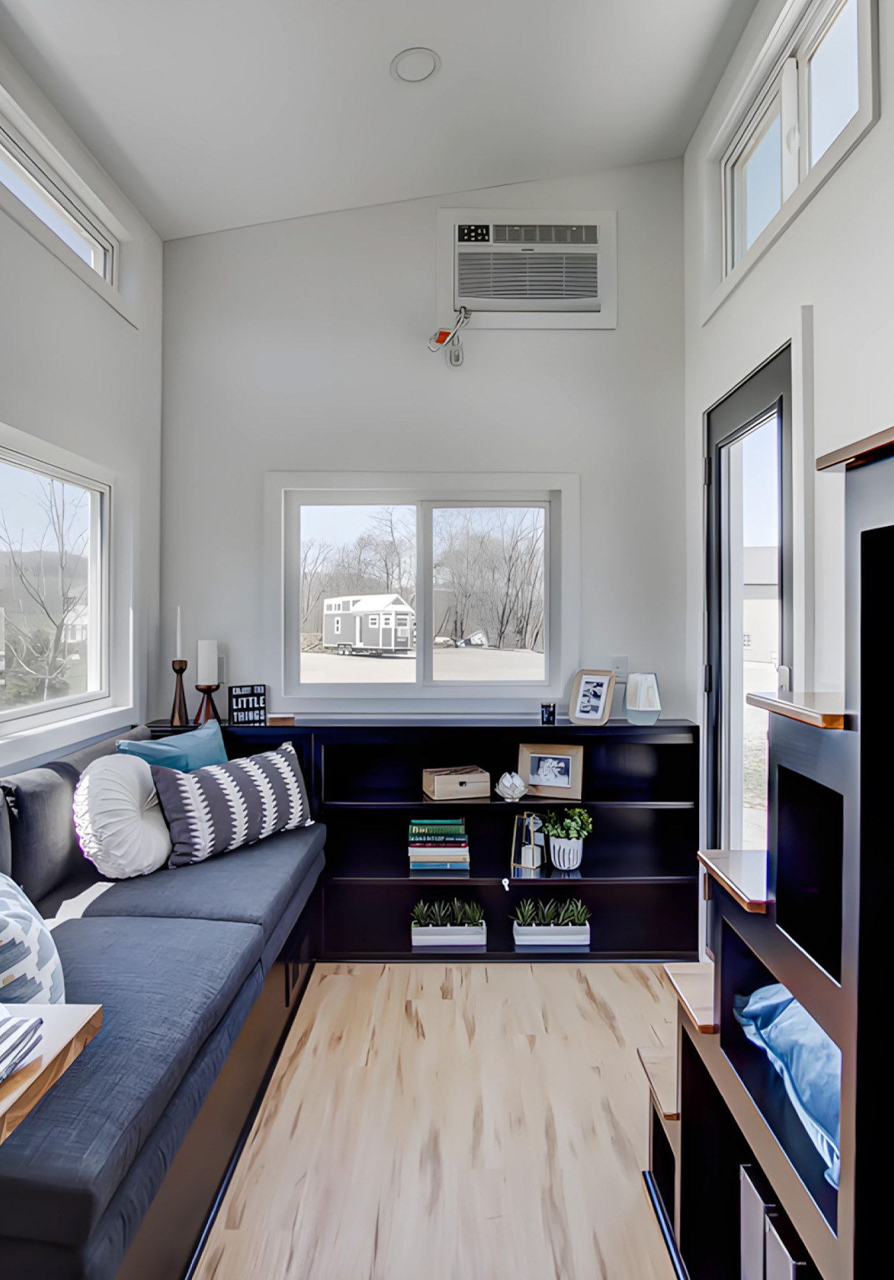
The Sora 20′ arrived as a direct response to what Dragon Tiny Homes customers were asking for: more space, without losing the clarity that made the original Sora worth buying in the first place. Expanded from the popular 16-foot model, this version offers increased square footage while maintaining the bright, practical design philosophy its predecessor established. The layout flows from one area to the next in a way that makes daily routines feel effortless rather than choreographed around a tight and unforgiving floor plan.
At $61,000, the Sora 20′ puts full-time tiny living within reach for a broader range of buyers, particularly remote workers who need a home that functions just as well as a workspace. Large windows keep the interior naturally bright throughout the day, and every element earns its place through purpose rather than habit. Dragon Tiny Homes has built something that does not feel like a clever workaround. It feels like a home that simply chose to be more efficient than the ones built around it.
What we like:
- The $61,000 price point is one of the most accessible in the full-featured tiny home category, making the Sora 20′ a genuinely attainable starting point for first-time buyers entering the market.
- Large windows and a well-considered floor plan create a sense of openness that consistently exceeds what the square footage would suggest when you look at the numbers alone.
What we dislike:
- Expanded from a 16-foot base, the layout density may still feel tight for two full-time residents with distinct work schedules and separate daily routines running simultaneously.
- Published details on built-in storage solutions are limited compared to competing homes in this roundup, which is a meaningful gap for buyers planning a permanent and fully committed move-in.
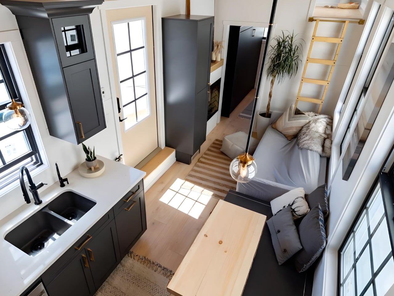
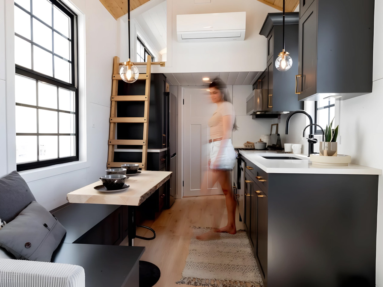
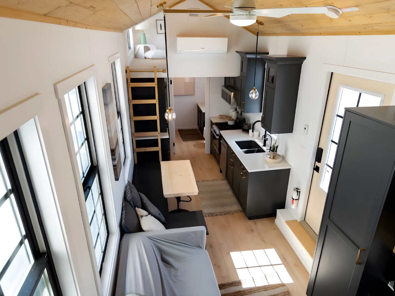
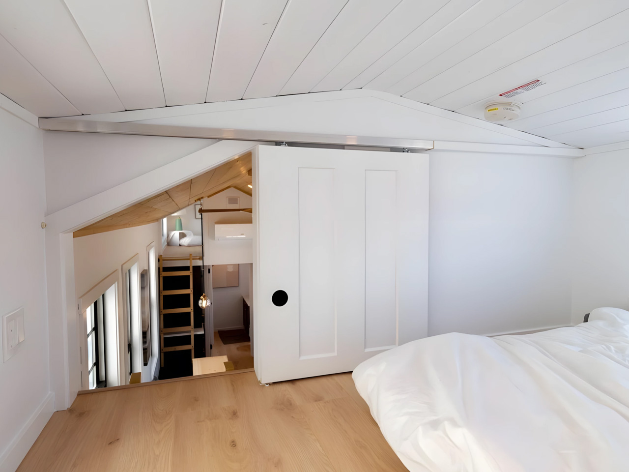
4. Starling — The Family Tiny Home That Doesn’t Ask You to Lower the Bar
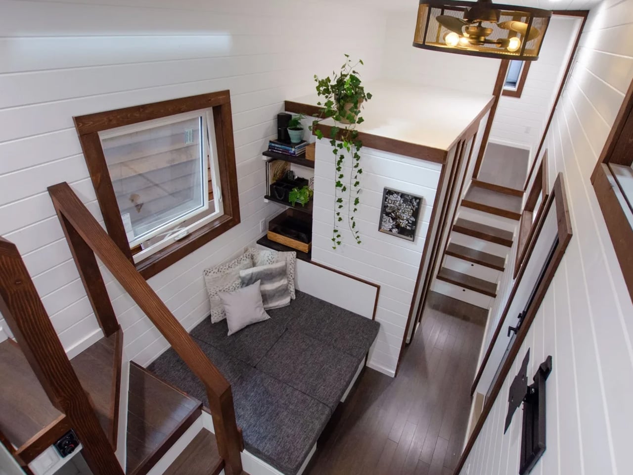
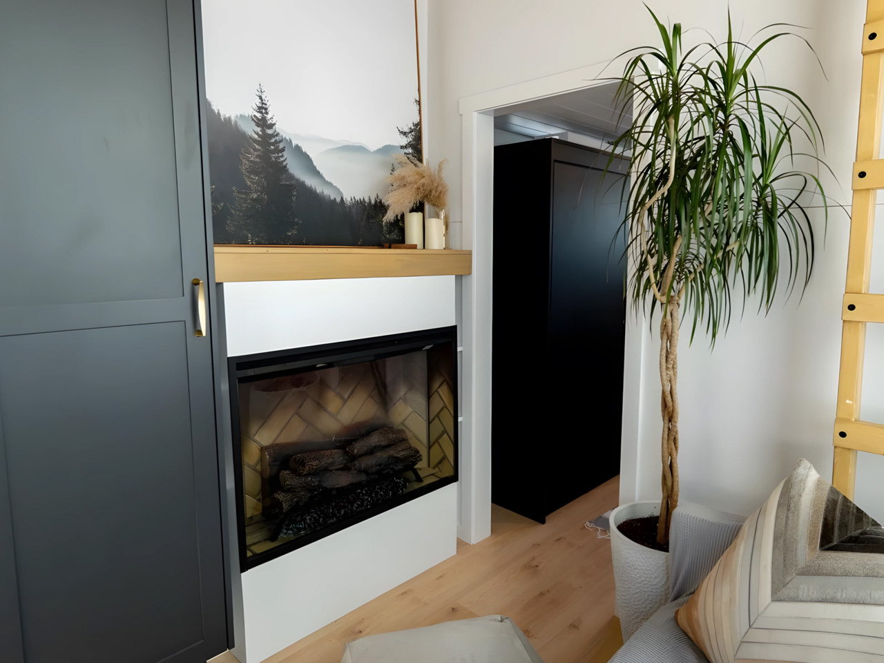
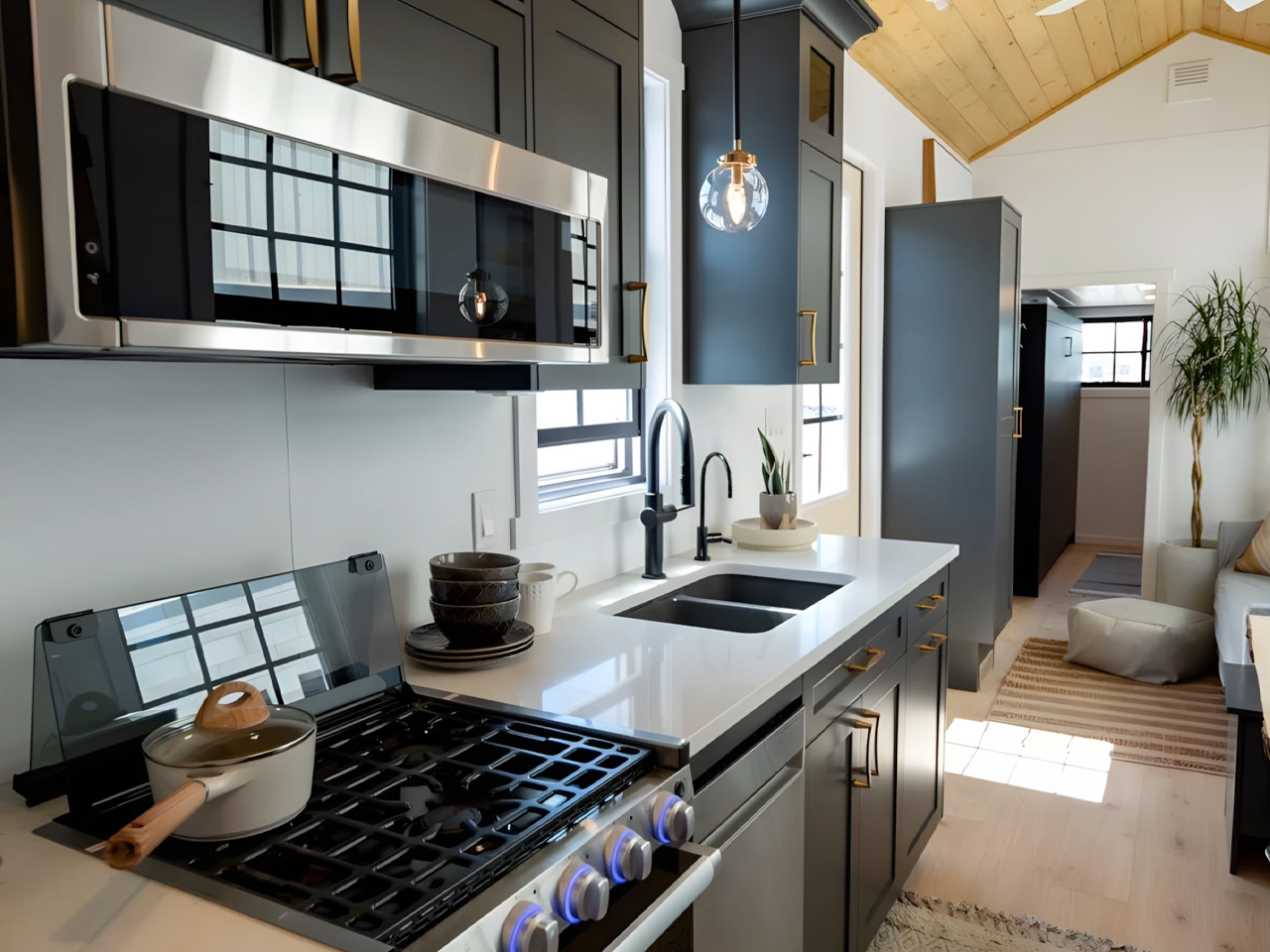
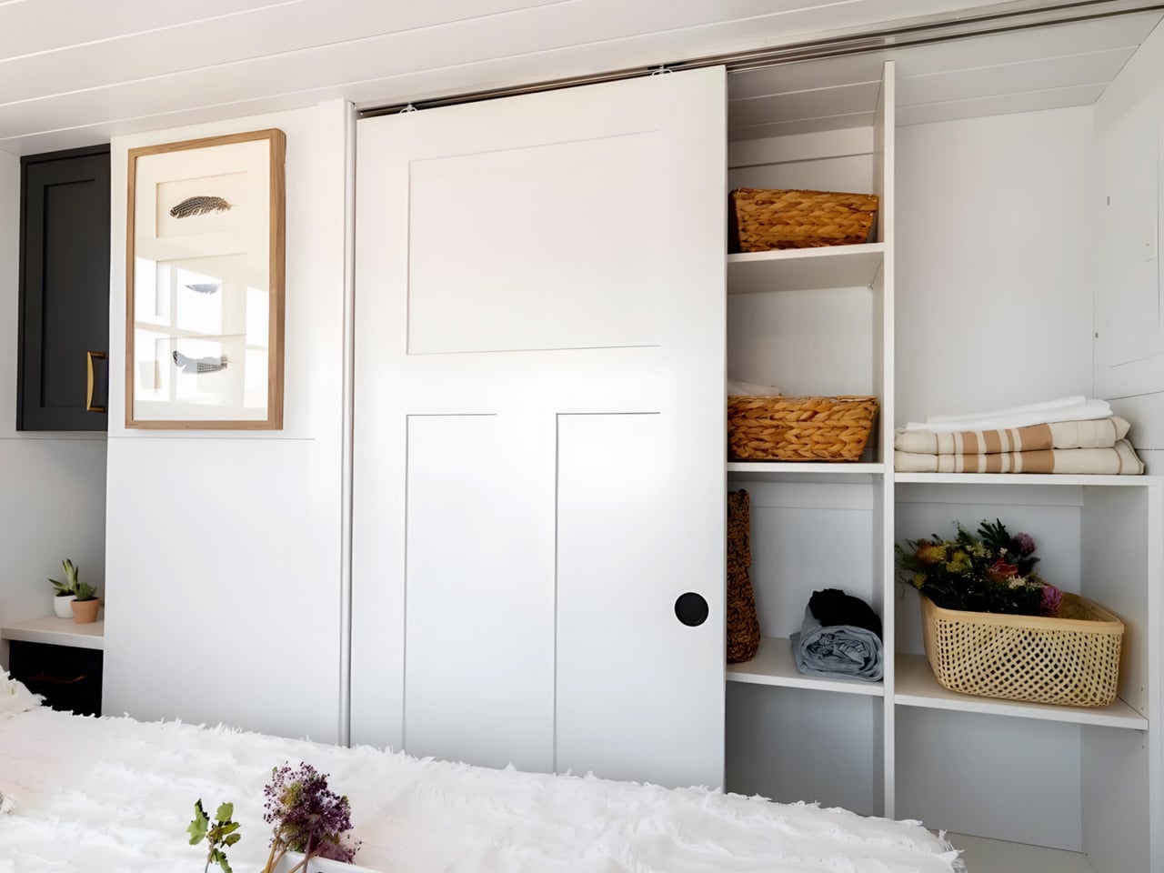
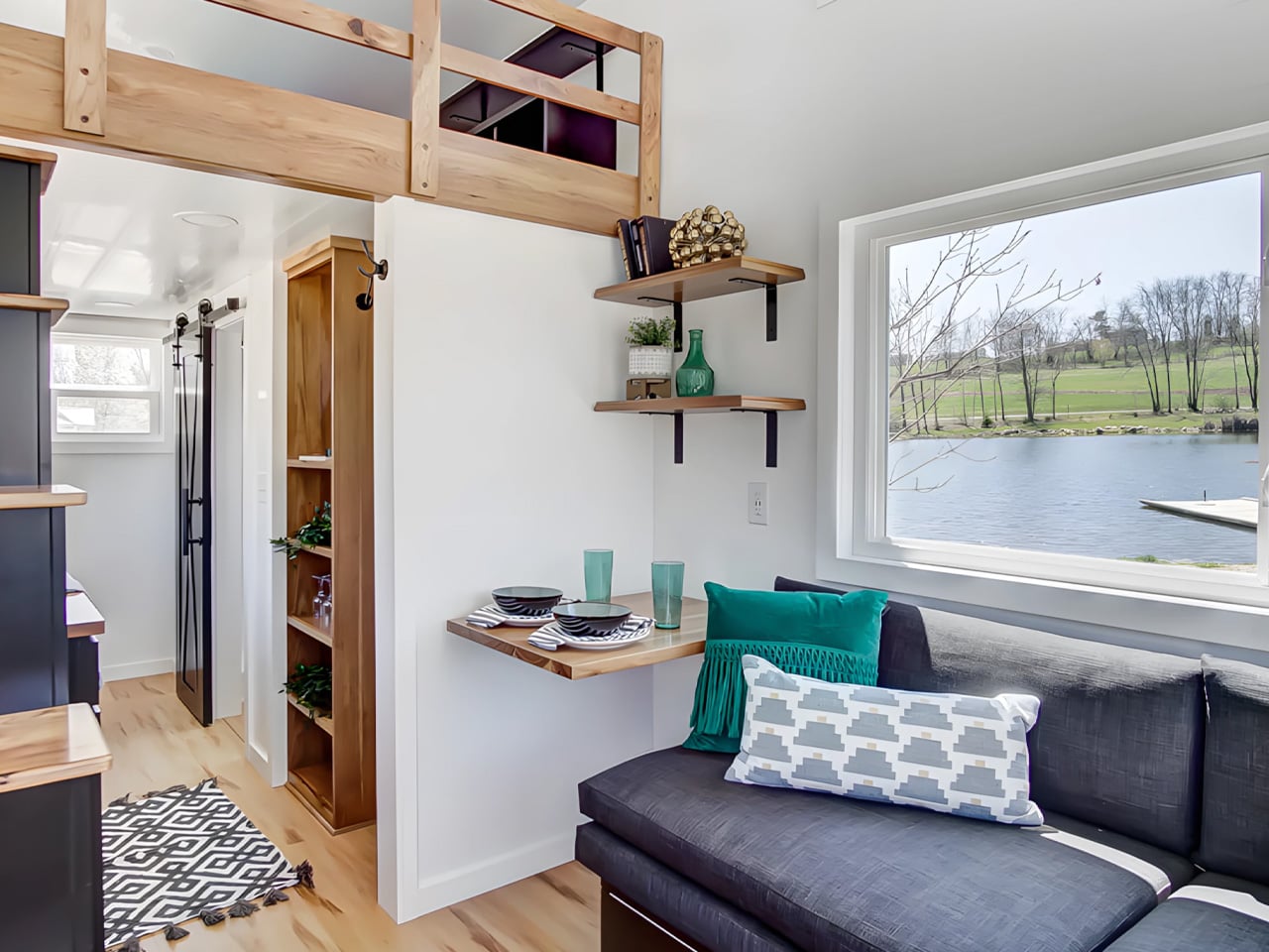
The Starling quietly dismantles the assumption that tiny living means fewer people. Built by Rewild Homes in Nanaimo, British Columbia, this 33-foot gooseneck tiny house was designed with a growing family at the center of every decision. The raised gooseneck section creates genuine spatial separation between living zones, something most tiny homes attempt to achieve with curtains or partitions rather than actual architecture. Natural wood cladding under a metal roof grounds the exterior against the Pacific Northwest landscape it was clearly built for.
Inside, the details compound quickly. A convertible dining banquette folds flat into a third sleeping space, with hidden storage built beneath every seat. The U-shaped kitchen anchors daily life with dark wood countertops, a breakfast bar, a four-burner propane range, a high-efficiency fridge with a bottom freezer, a double sink, and pull-out cabinetry. None of it feels like a workaround. It feels like a kitchen that simply chose to exist somewhere smaller, designed by people who understand that a family’s daily rhythm doesn’t shrink just because the footprint does.
What we like:
- The gooseneck configuration creates real architectural separation between living and sleeping areas, a level of spatial privacy that is genuinely rare in tiny homes at this scale and price range.
- The convertible dining banquette adds a functional third sleeping space with integrated storage beneath, making the Starling meaningfully more capable for families without adding a single foot to the overall length.
What we dislike:
- At 33 feet on a triple-axle gooseneck trailer, the Starling sits at the larger end of the towable category, which may complicate towing logistics and limit suitable placement options for some buyers.
- The family-forward layout and three-sleeping-zone configuration may feel over-engineered for solo occupants or couples without children who won’t make use of the additional sleeping flexibility.
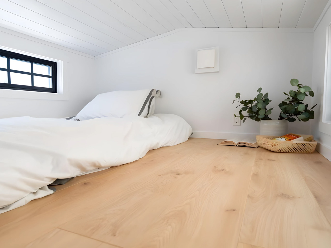
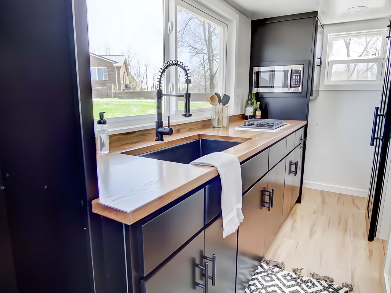
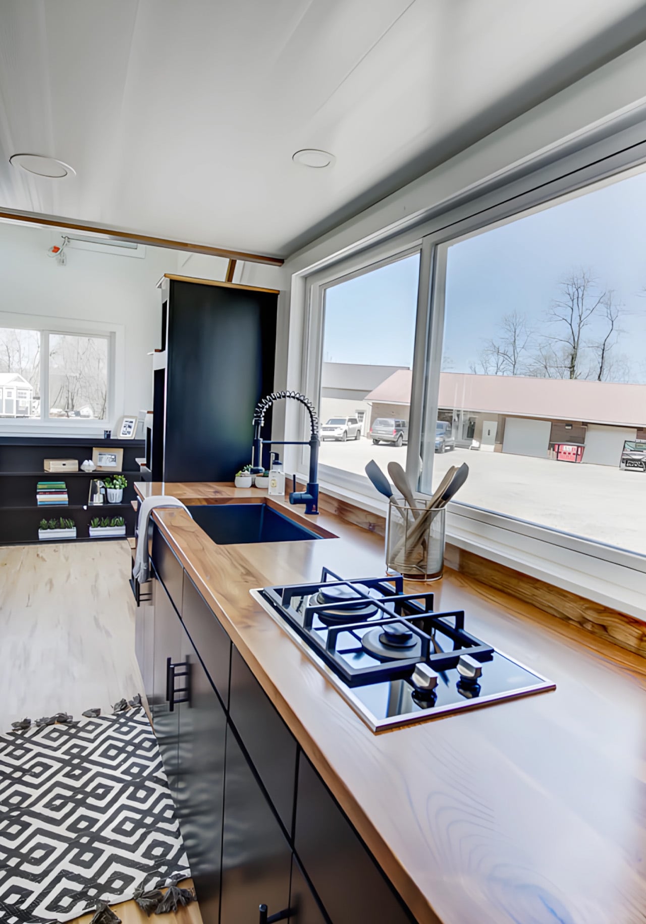
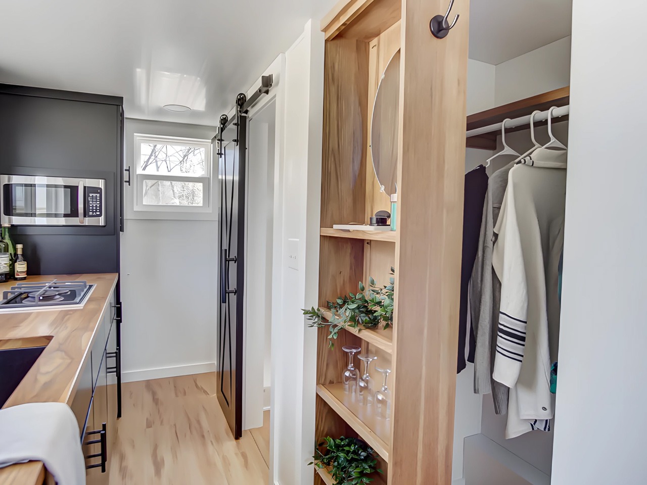
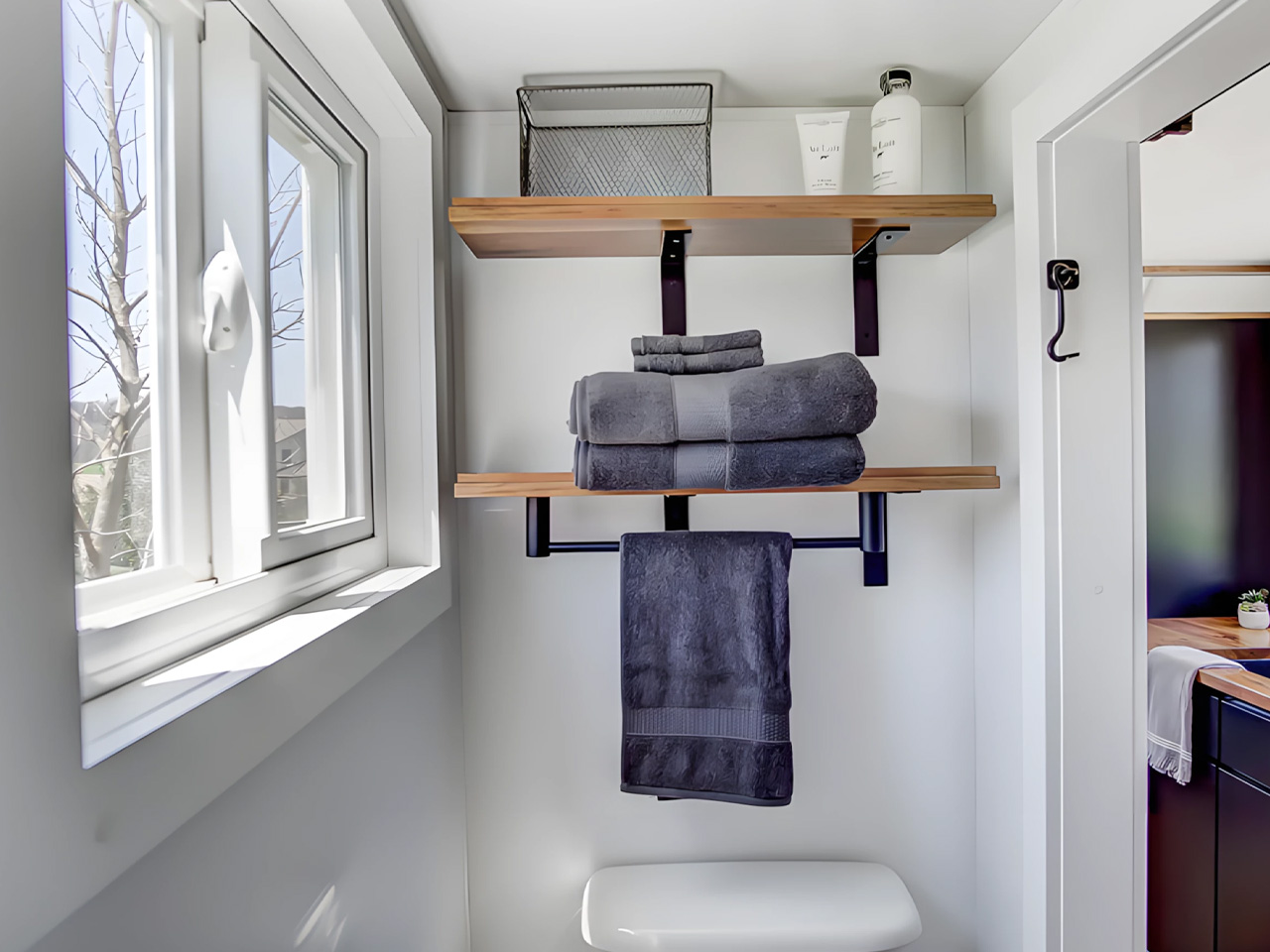
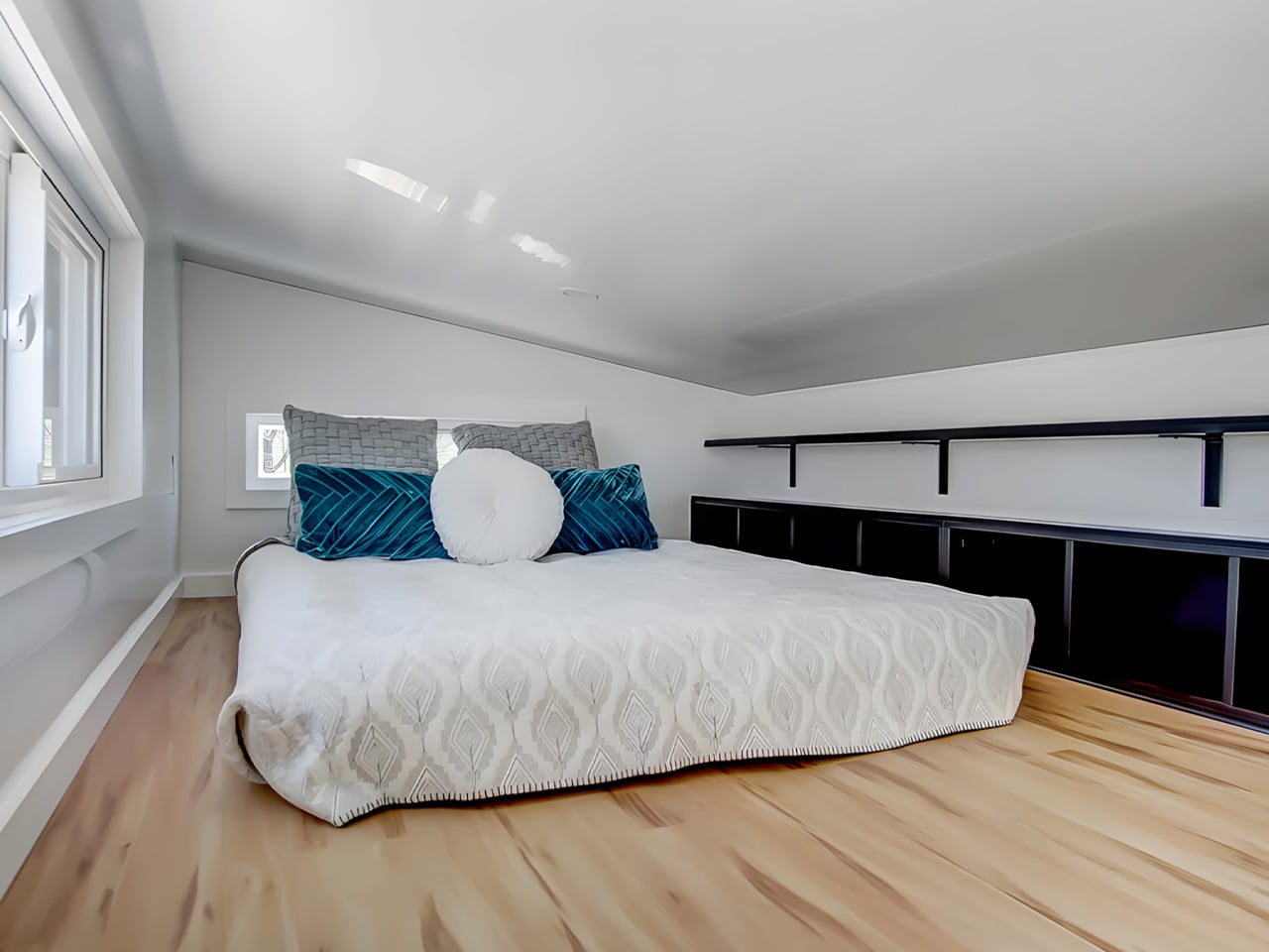
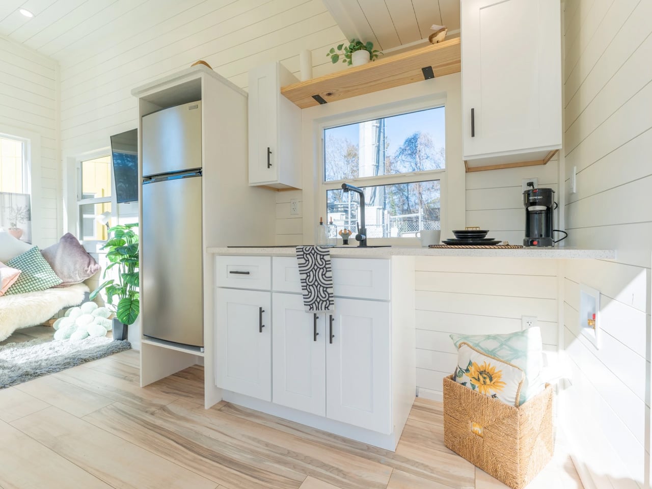
5. Barred Owl — Single-Level Living That Removes the One Thing Nobody Wanted
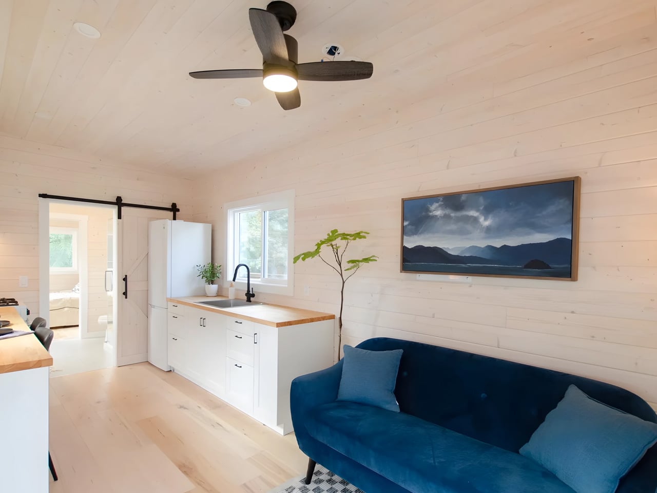
At $119,000, the Barred Owl makes one clear argument: sometimes the most intelligent upgrade in tiny home design is the one that removes something entirely. Rewild Homes built this 34-foot home on a single-level plan, eliminating the loft bed that most tiny houses treat as a structural inevitability. Mounted on a triple-axle trailer and measuring 10 feet wide, 1.5 feet wider than the North American standard, the Barred Owl transforms how the interior functions at every point of the day, from the moment you walk in.
The layout moves in railroad apartment fashion, with rooms connecting directly to one another. Entry opens into a bright living room finished in whitewashed pine tongue-and-groove. The galley kitchen features butcherblock counters wrapping into an eating bar that doubles as a dedicated workspace, alongside a full-size refrigerator, a four-burner propane cooktop, and an oven. A dining area seats two comfortably, and the bedroom sits at the far end, private, accessible, and at floor level. It is a home that takes the inconveniences of tiny living seriously and removes them methodically, one by one.
What we like:
- The single-level layout eliminates the loft bed, delivering a bedroom that functions like an actual room rather than a sleeping platform accessed by a ladder at two in the morning.
- At 10 feet wide, the Barred Owl offers noticeably more floor space than the standard North American tiny home, and that extra room is felt immediately in how naturally the interior breathes.
What we dislike:
- At $119,000, the Barred Owl sits at the premium end of the tiny home market, which narrows its accessibility significantly compared to several other strong options featured in this roundup.
- The railroad-style floor plan, while highly functional, offers limited visual or acoustic separation between the living and dining zones for buyers who prefer more distinctly defined spaces within the home.
The Tiny Home Has Arrived
The five homes on this list represent the clearest thinking in compact residential design right now. They don’t ask you to lower your expectations. They ask you to redirect them toward what actually matters: light, function, thoughtful proportion, and craft that earns its keep over the years rather than simply photographs well on first look. From the Mizuho’s Japanese authenticity to the Barred Owl’s single-level conviction, each one makes a case that is genuinely hard to dismiss.
What is becoming clear is that the tiny home is no longer a reaction to excess. It is a legitimate design category with its own standards, ambitions, and evolving vocabulary. Builders like Rewild Homes, Ikigai Collective, and Dragon Tiny Homes are pushing that vocabulary forward, season by season. If April 2026 is any indication, the most compelling residential design thinking isn’t happening in expansive floor plans. It’s happening in 20 to 34 feet of very carefully considered space.
The post 5 Best Tiny Homes of April 2026 Prove You Don’t Need More Space to Live Better first appeared on Yanko Design.