Color theory guides the use of light and color for interior designers, helping them create attractive and functional homes. Understanding the basics, like the color wheel and combinations, is crucial for enhancing aesthetics and it enables designers to create visually pleasing, cohesive, and harmonious spaces. This theory also aids in developing effective color schemes without overwhelming the space.
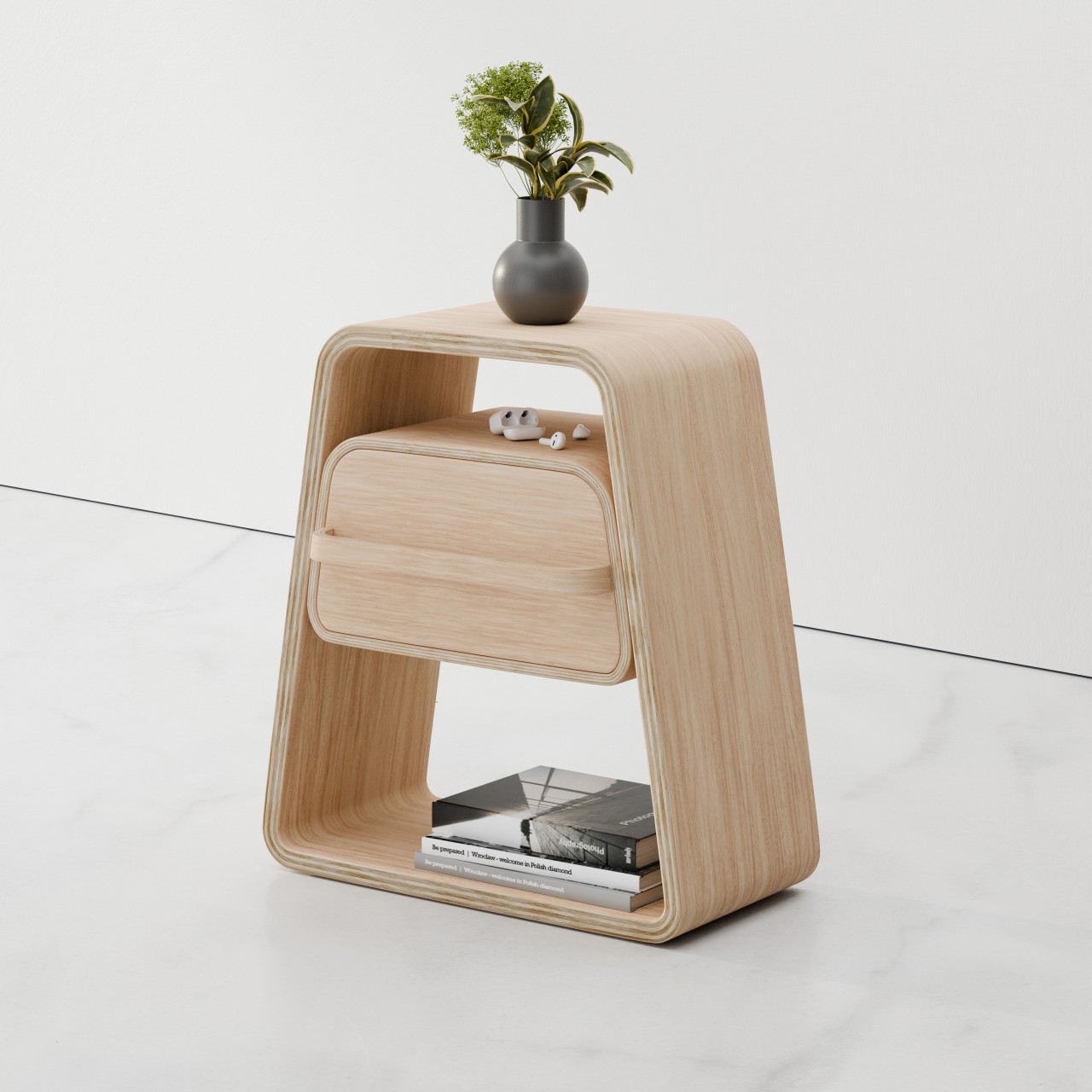
Designer: Snappy Living
What is the importance of Color Theory?
Color theory is an invaluable tool in home design, aiding in the creation of a visually appealing space. Designers use it to select color combinations that bring rooms to life. Additionally, color theory helps balance warm and cool tones, create contrast, and introduce a sense of drama or calmness using different colors. It also guides the choice of lighting for each space, considering how different lighting types affect color perception in specific environments.
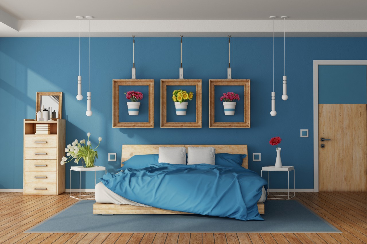
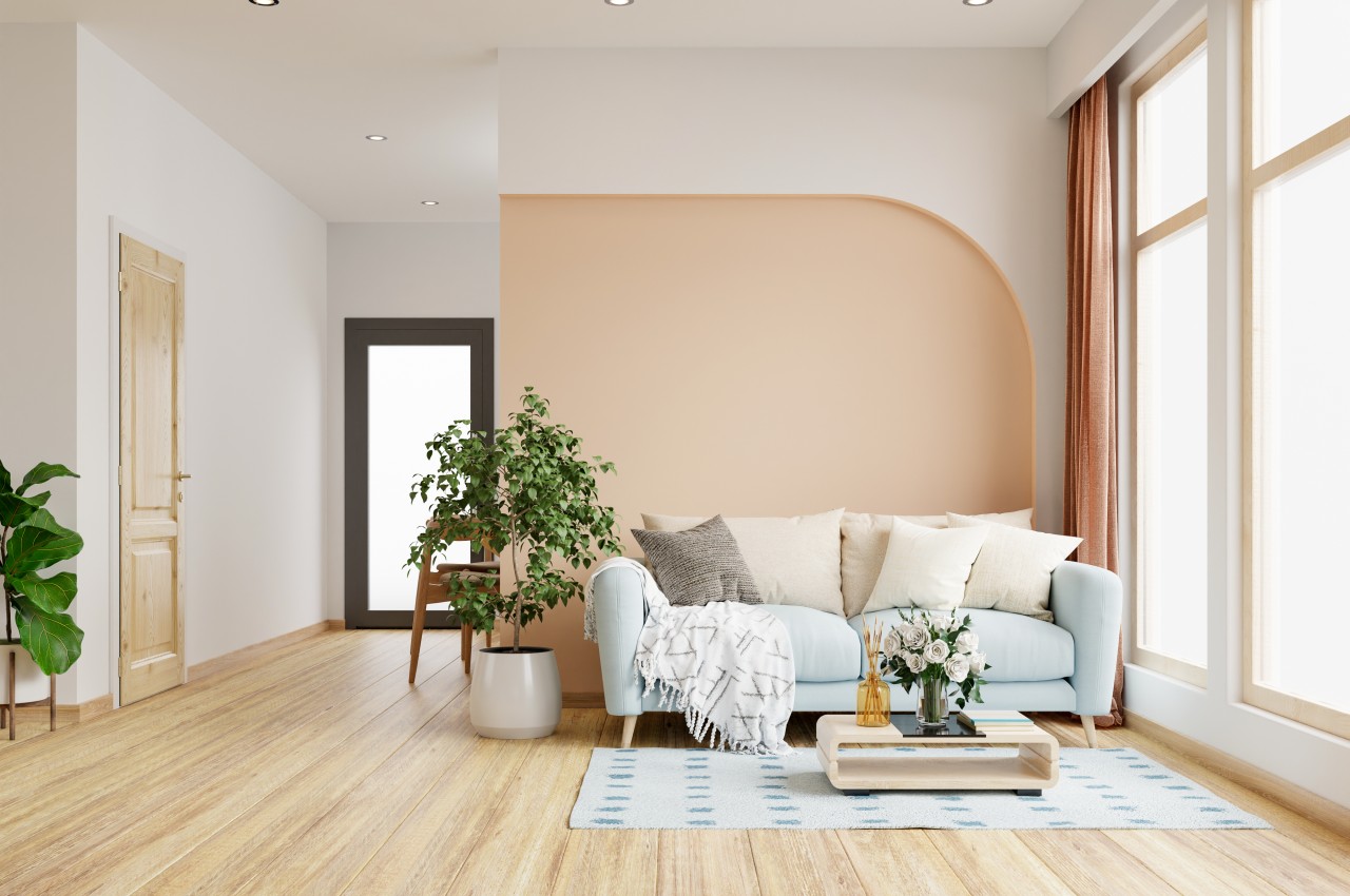
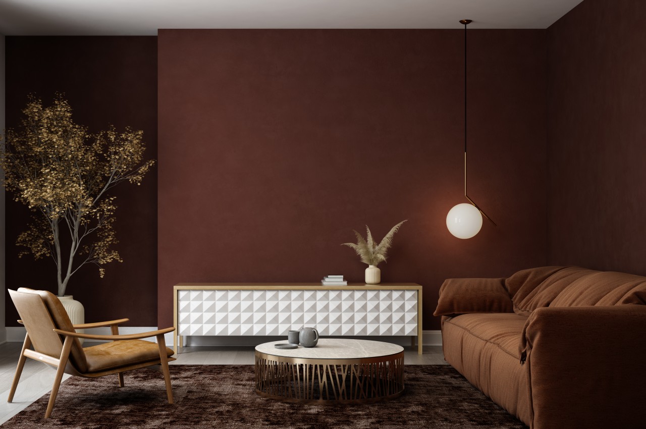
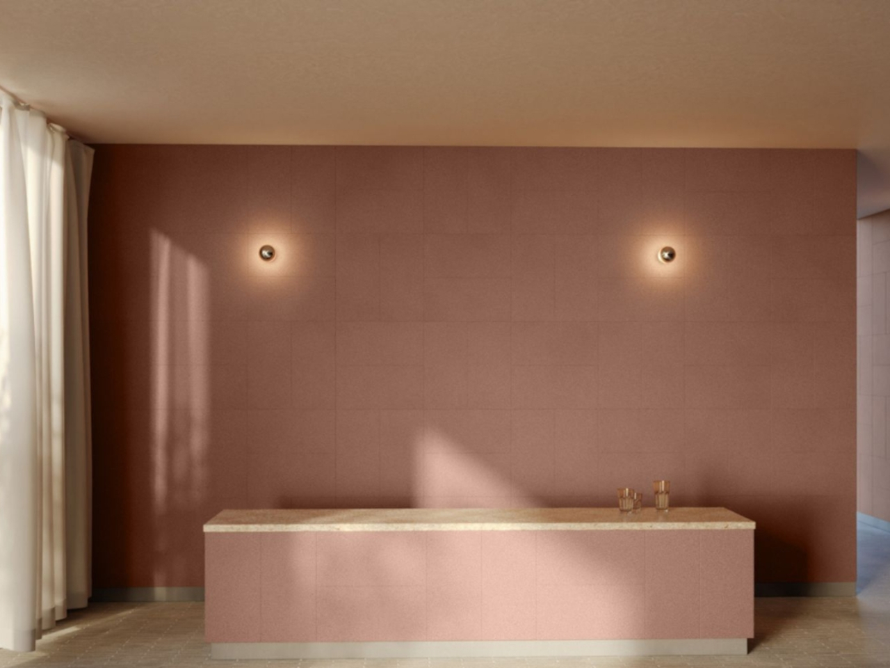
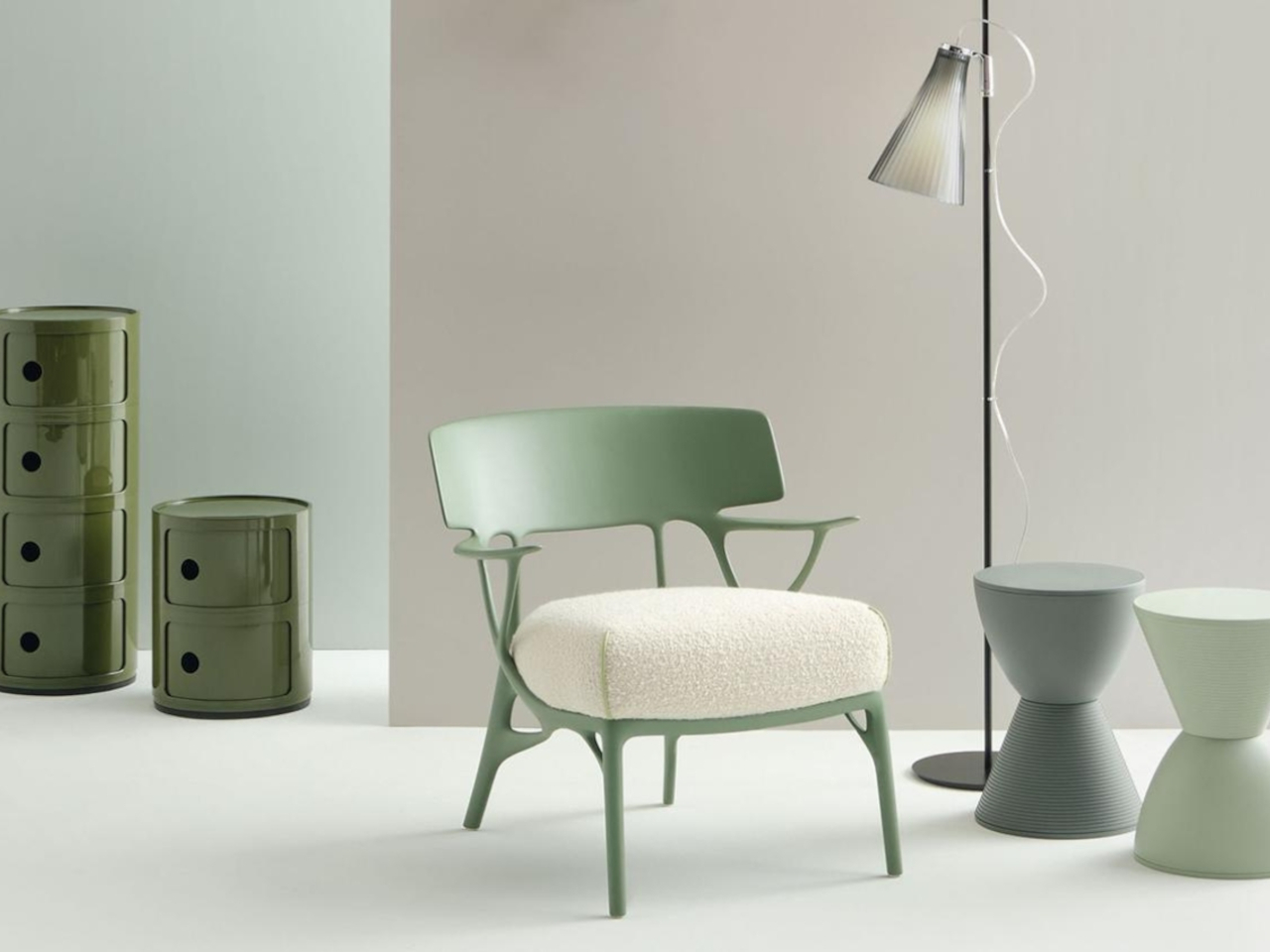
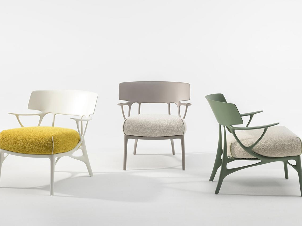
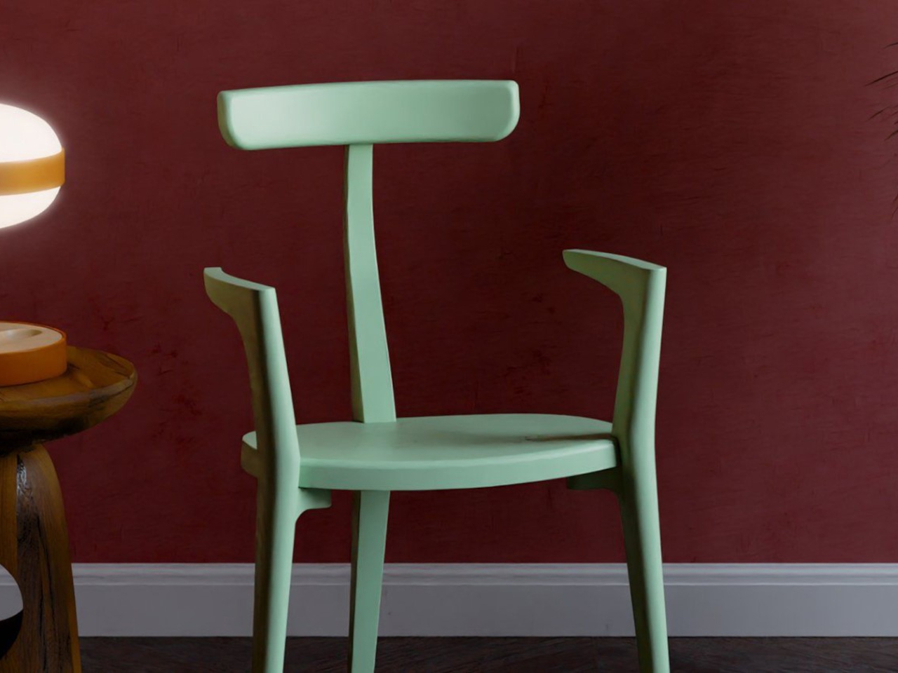
Designer: Philippe Starck
Eight fundamental principles of color theory can be incorporated into interior design.
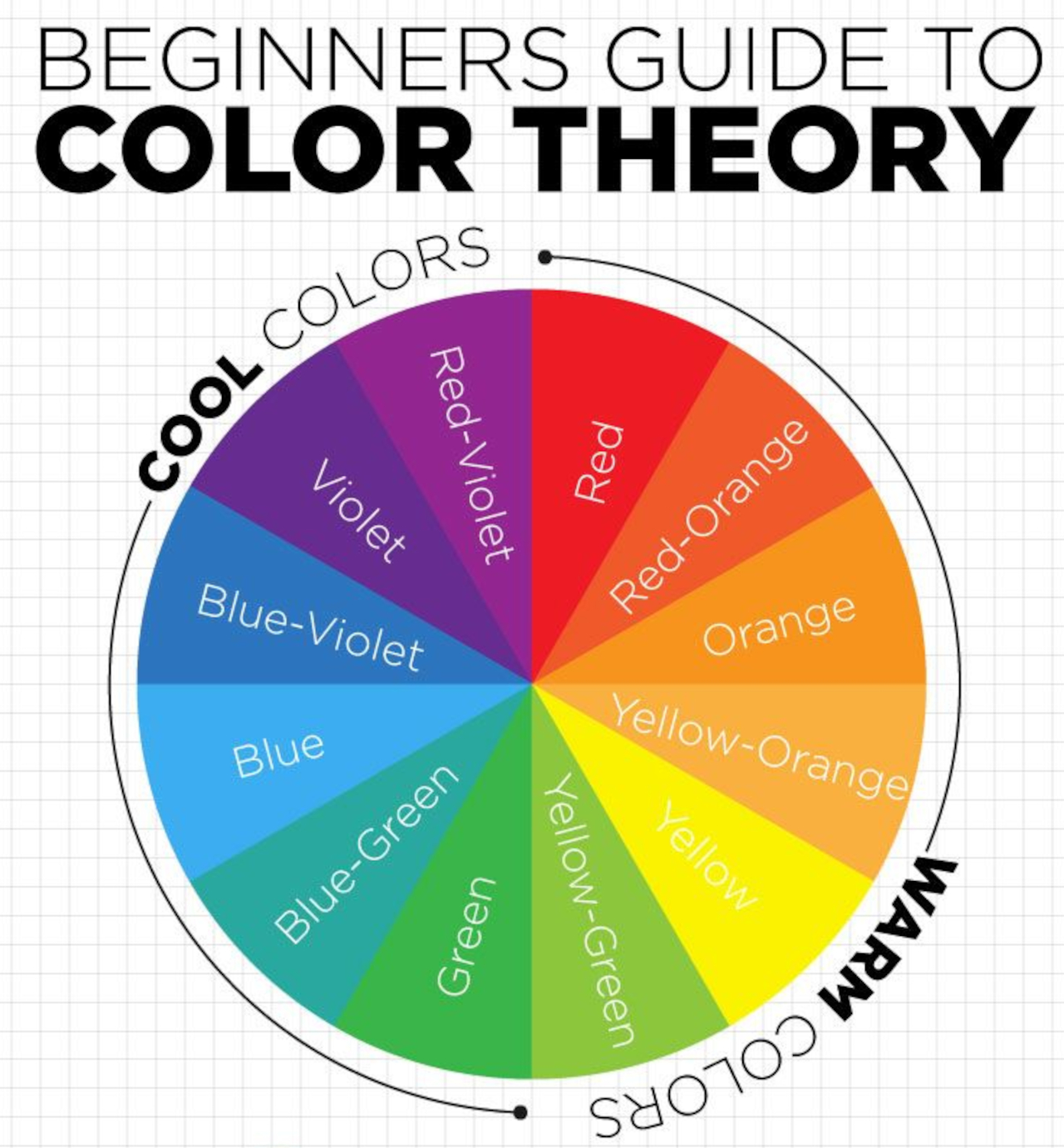
1. Color Wheel
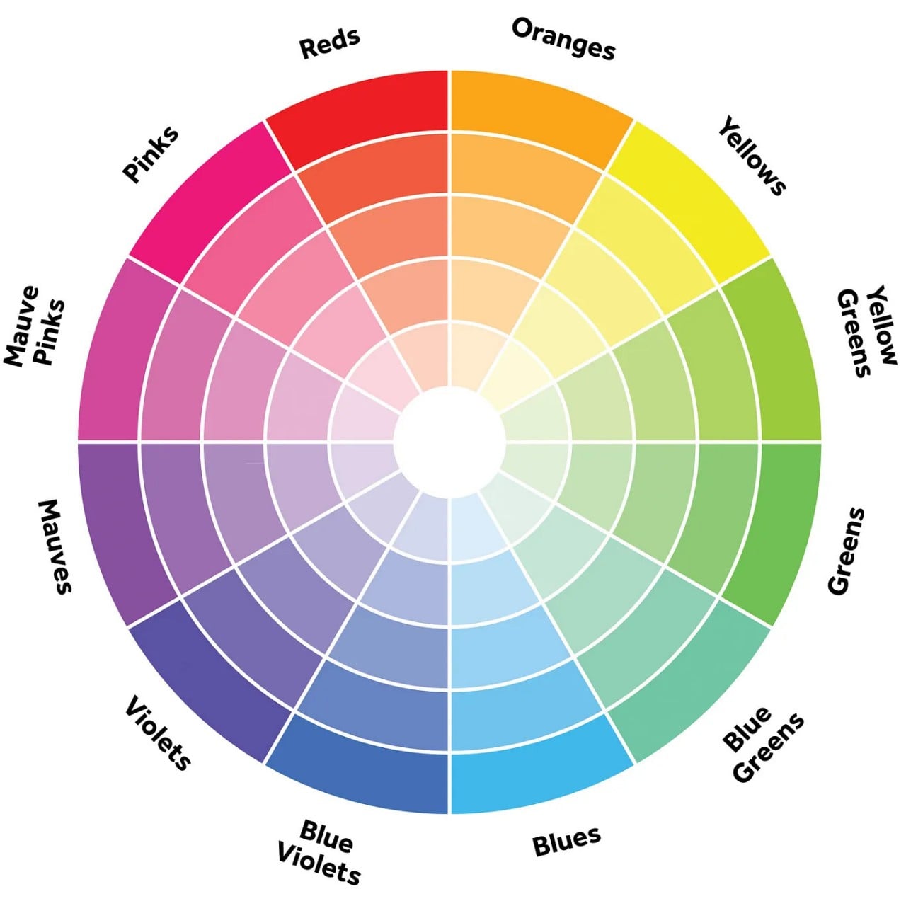
The color wheel serves as a visual depiction of the entire color spectrum, illustrating the interactions between different colors. The conventional color wheel comprises 12 segments, each corresponding to one of the primary hues like red, orange, yellow, green, blue, purple, and their respective shades. Grasping the fundamentals of color theory enables the creation of breathtaking compositions that mirror the beauty and grace found in nature.
The different types of colors include:
Designer: DecoArt
• Primary Colors:
The primary colors are red, yellow, and blue which cannot be produced by blending other colors.
• Secondary Colors:
The Secondary colors include hues of orange, green, and purple which results from the combination of two primary colors.
• Tertiary Colors:
Tertiary colors emerge by blending one primary color with one secondary color.
• Complementary Colors:
These colors are situated opposite each other on the color wheel and yield a striking contrast when used together in design.
• Split Complementary Colors:
Just like complementary colors, split complementary colors include two additional hues from either side of their complement, for instance, hues of orange, yellow, and blue.
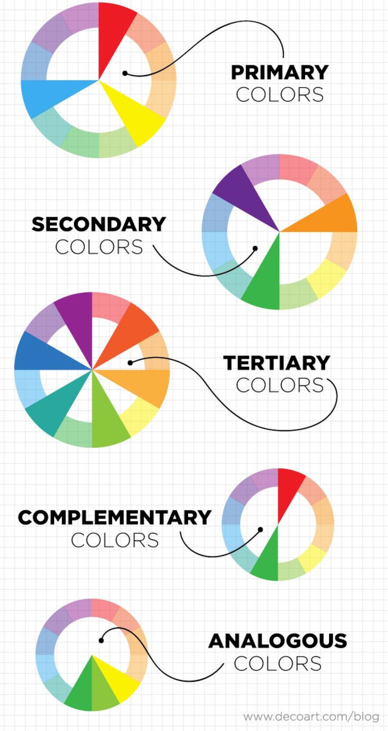
• Analogous Colors:
Harmonious in nature, analogous colors are adjacent to each other on the color wheel, producing a pleasing effect when incorporated into home decorating designs.
• Monochrome Colors:
Monochrome colors employ different tints and tones within a single hue and are primarily used to establish a serene ambiance in various room decor schemes.
• Neutral Colors:
Colors like white, black, grey, beige, and brown serve as neutral elements that can be incorporated throughout an entire room or utilized as accent pieces to infuse a sense of balance into an already vibrant color palette.
2. Dimensions of Color
To precisely describe colors, one must consider these attributes of color.
• Hue
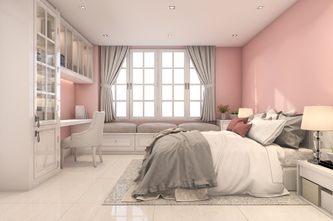
Designer: Maggie Maggio
Hue, the most noticeable characteristic, is determined by the color’s position on the visible spectrum, with an infinite variety represented on the color wheel as pure colors without tint or shade.
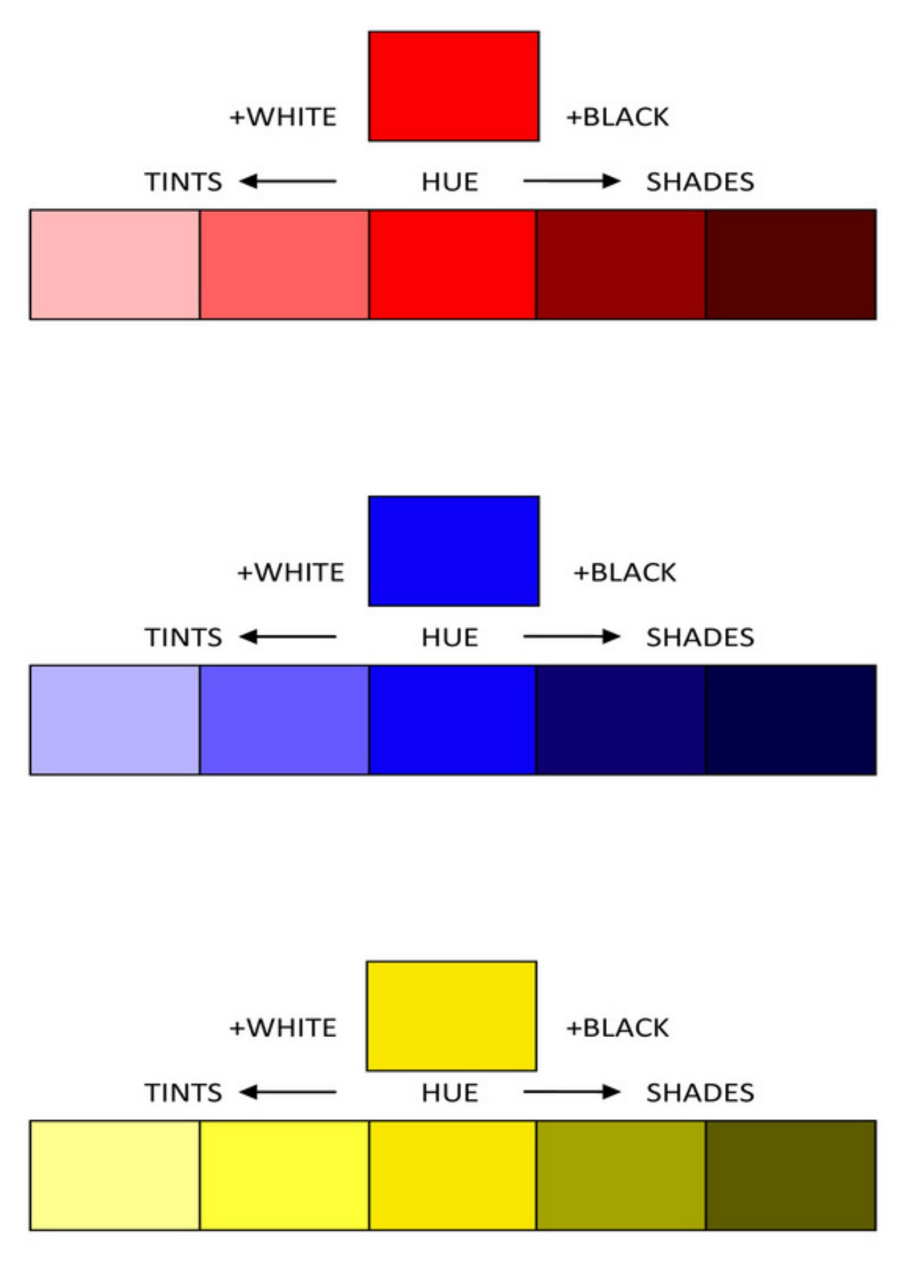
• Value
Value, the lightness or darkness of a color, is determined by adding black or white to the pure hue. Tints (lighter values) and shades (darker values) result from this adjustment. These variations impact the perceived size and character of a space, with bright values creating spaciousness and dark values evoking coziness.
• Tints
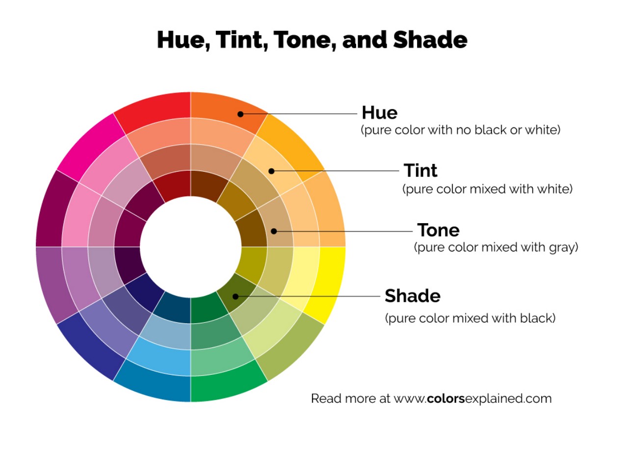
Image courtesy of: Colors Explained
A tint is a color lighter than the normal value of pure hues on the color wheel, created by mixing a pure chromatic color with white or a lighter hue. While the color wheel illustrates hues with 50% white added, a room dominated by light tints may feel cold unless skillfully handled.
• Shades
Shades are darker tones created by mixing pure chromatic colors with black or darker hues. The color wheel illustrates normal value hues with 50% black added to produce shades. However, a room dominated by dark hues might feel gloomy and confined unless handled skillfully. Like tints, incorporating value contrasts and skillful transitions can enhance a dark color scheme.
• Intensity
Intensity, also known as saturation or chroma, indicates the purity of a color. A color with high intensity appears bright, while a low-intensity color is more neutral or muted. Colors are at their purest in their unmixed state, straight out of the tube.
• Tones
Tones, often linked with intensity, refer to a subdued or neutralized version of a hue. Created by combining white and black, tones can be lighter or darker than the original hue, possessing a more nuanced quality than tints and shades. Vibrant colors are called “jewel tones,” while subdued colors are known as “muted tones.”
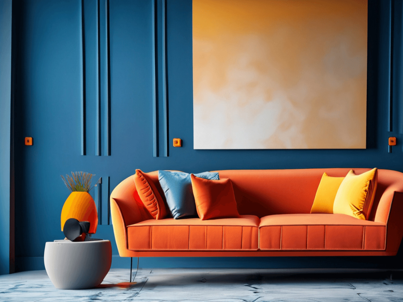
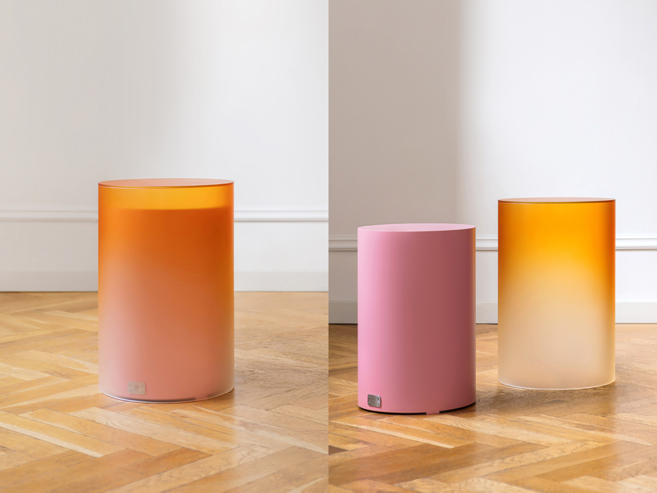
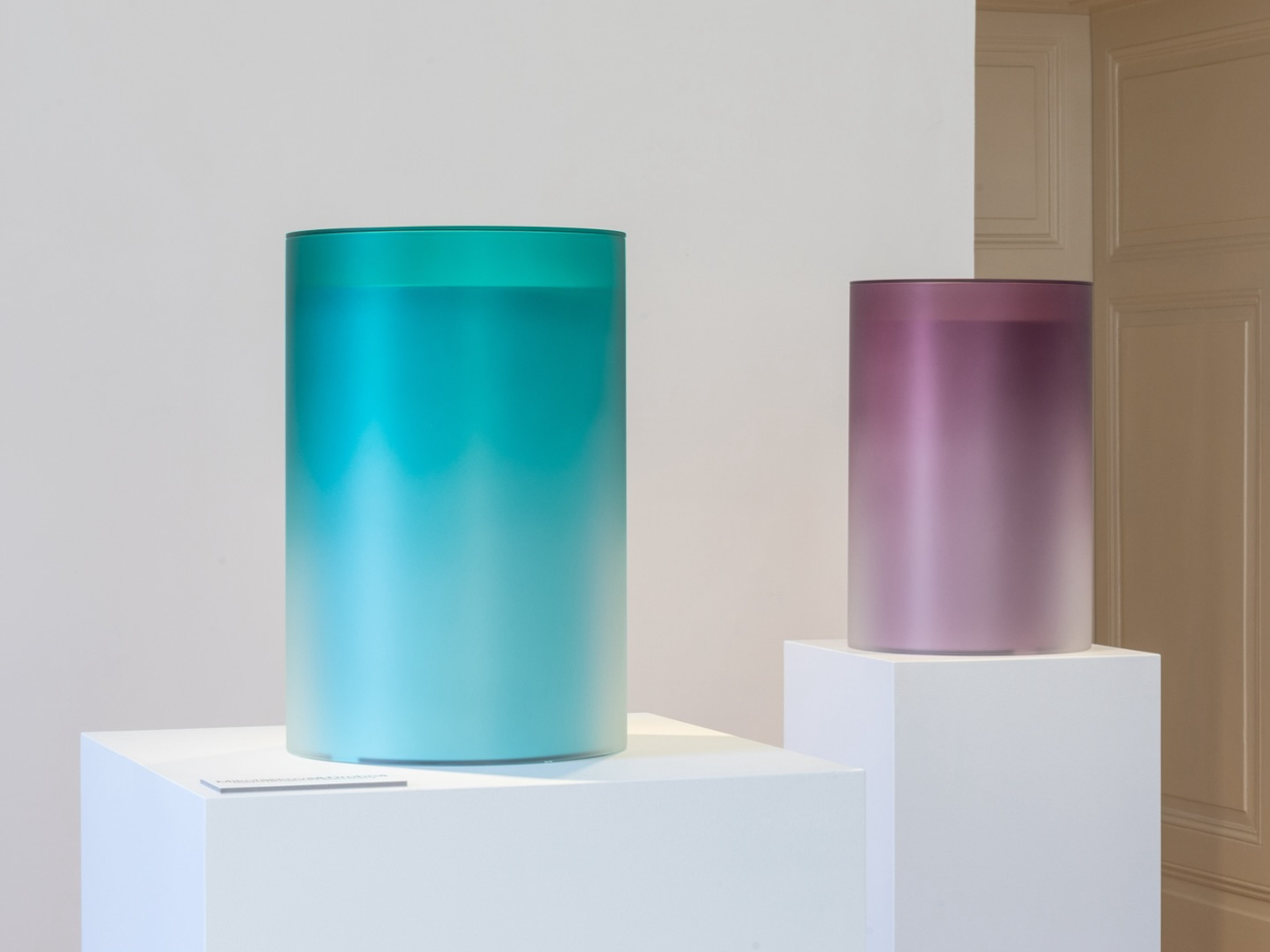
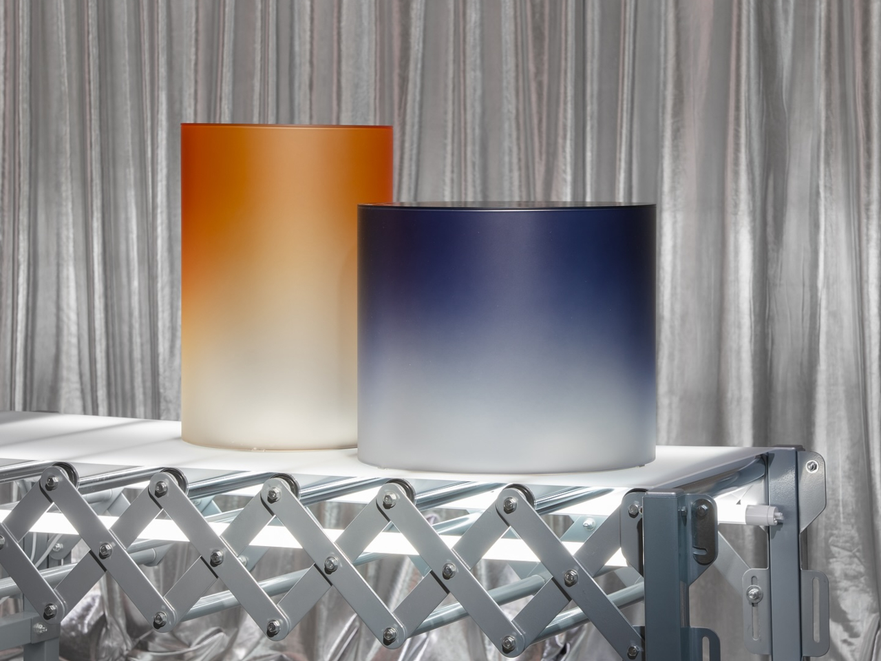
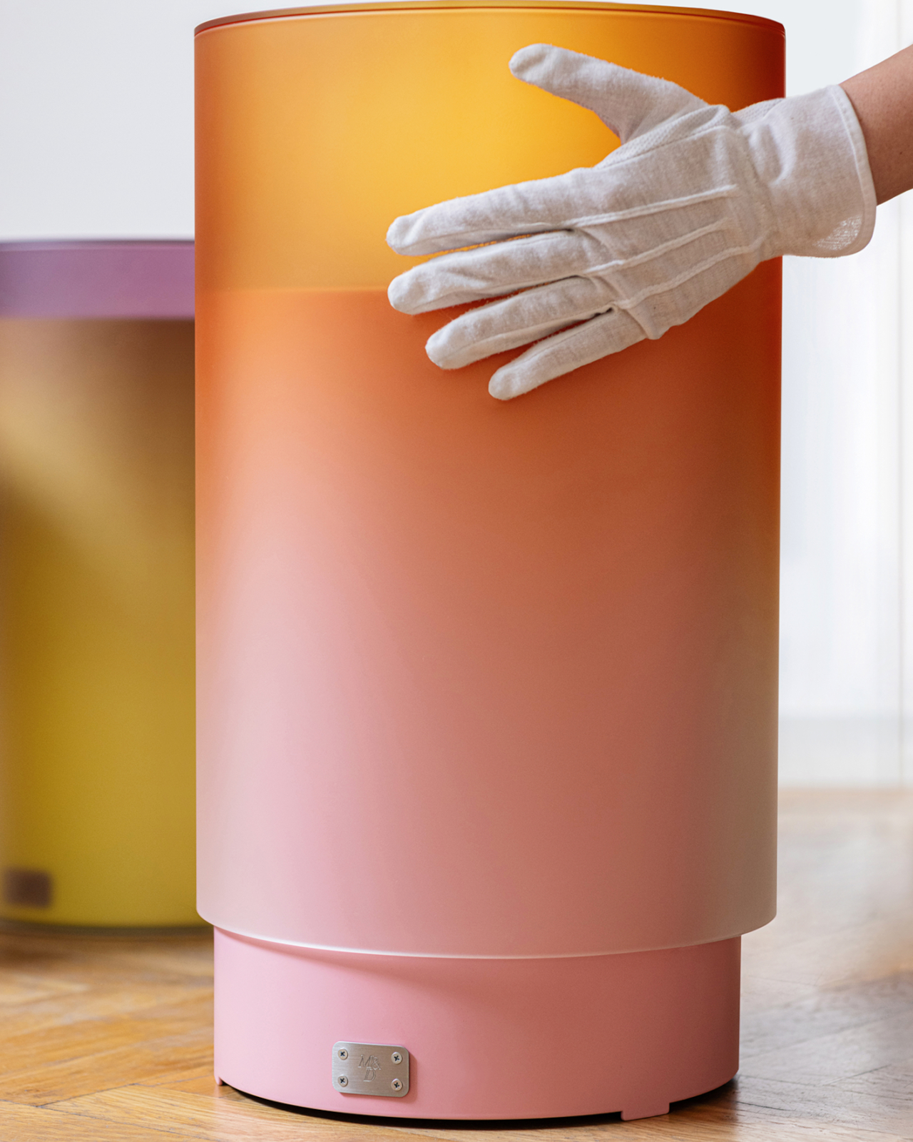
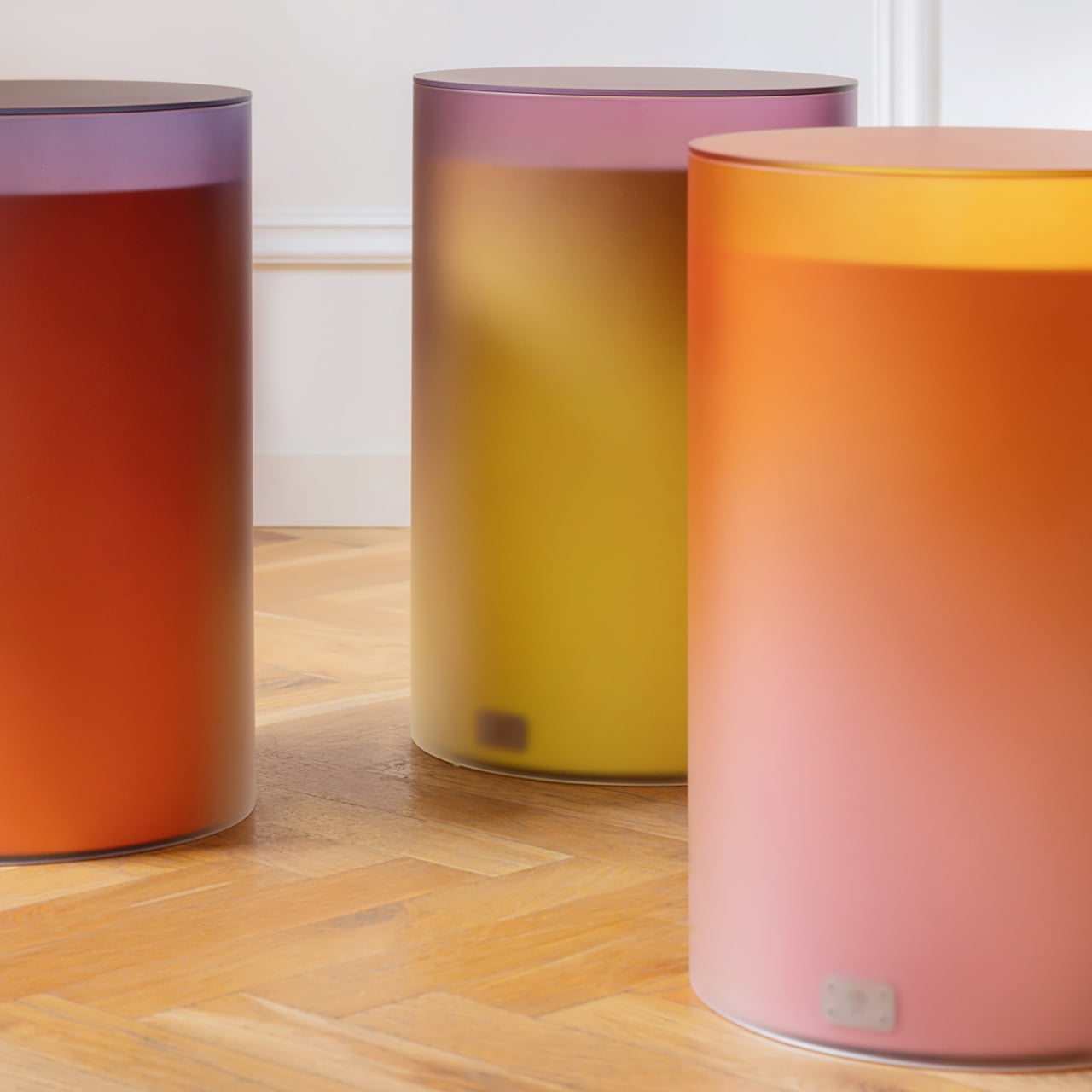
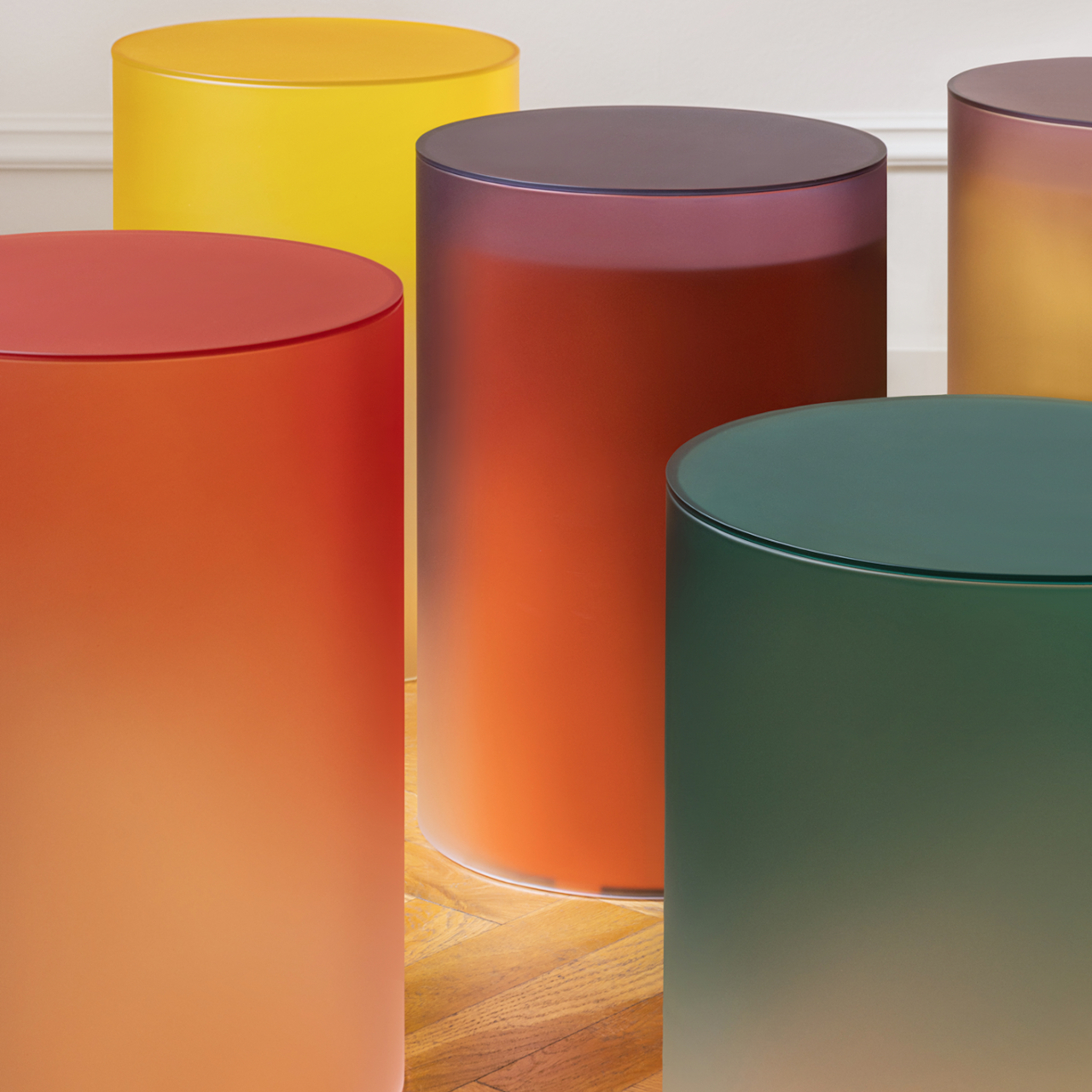
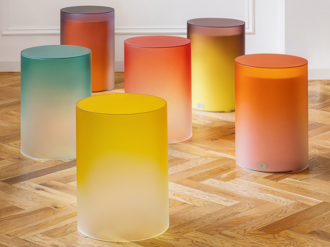
3. Color Temperature
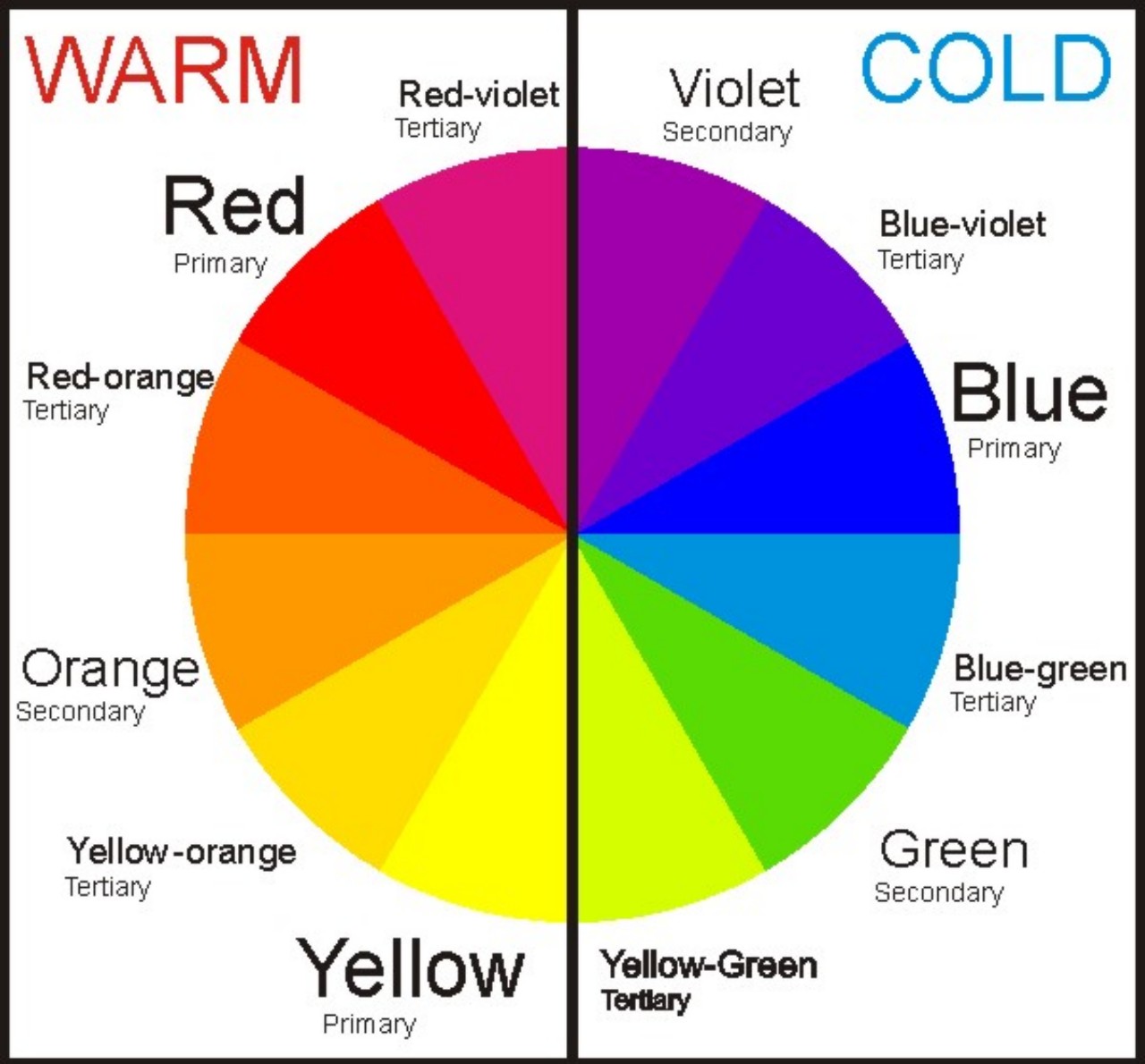
Image courtesy of: beata
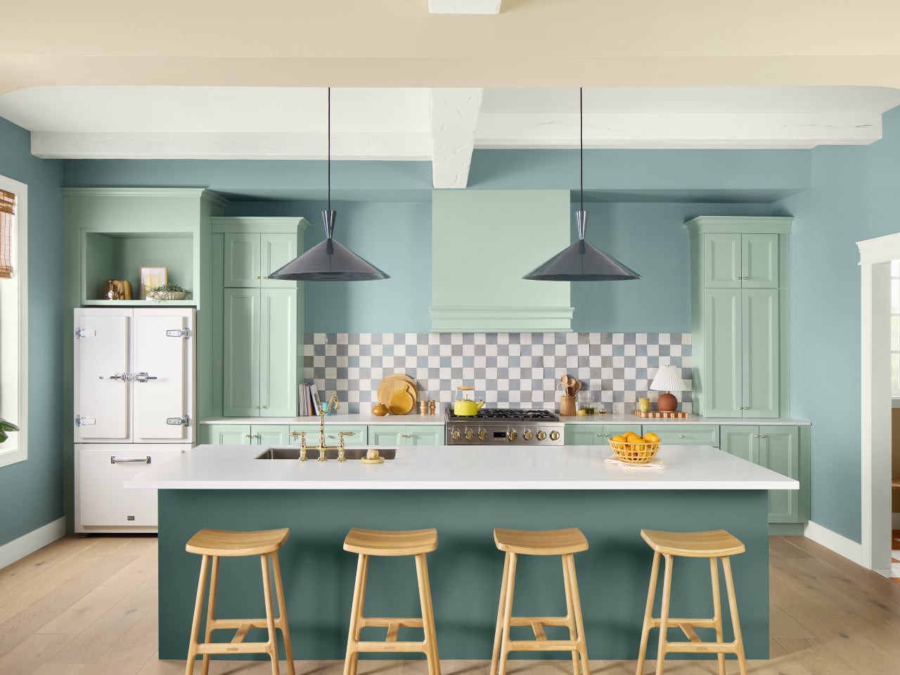
The color temperature plays a crucial role in interior design, influencing the ambiance of a space. Cool tones, such as blues and greens, contribute to a serene atmosphere, whereas warm hues like reds, oranges, and yellows infuse warmth and energy into the interiors. Neutral shades, like beige or gray, serve as a harmonious middle ground between these contrasting extremes. Designers can attain the desired effects in their projects by skillfully blending tints and shades with varying temperatures.
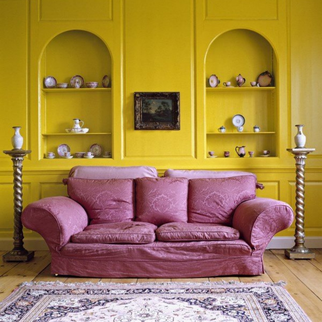
4. Color Combinations
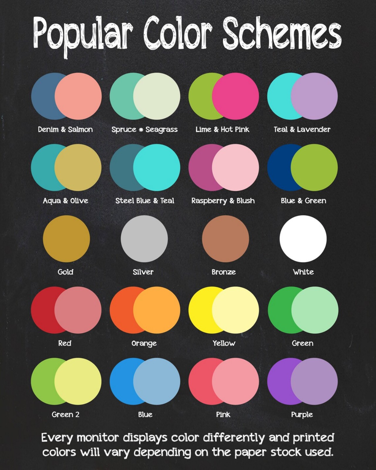
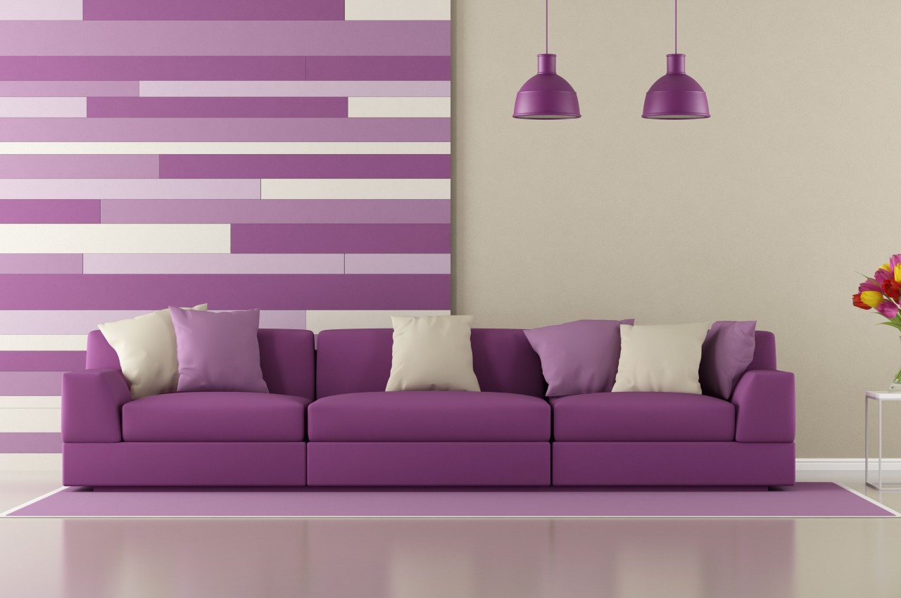
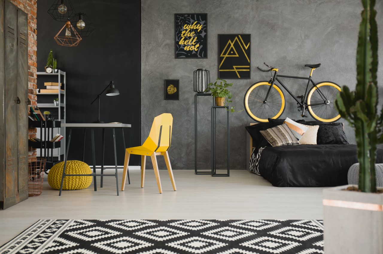
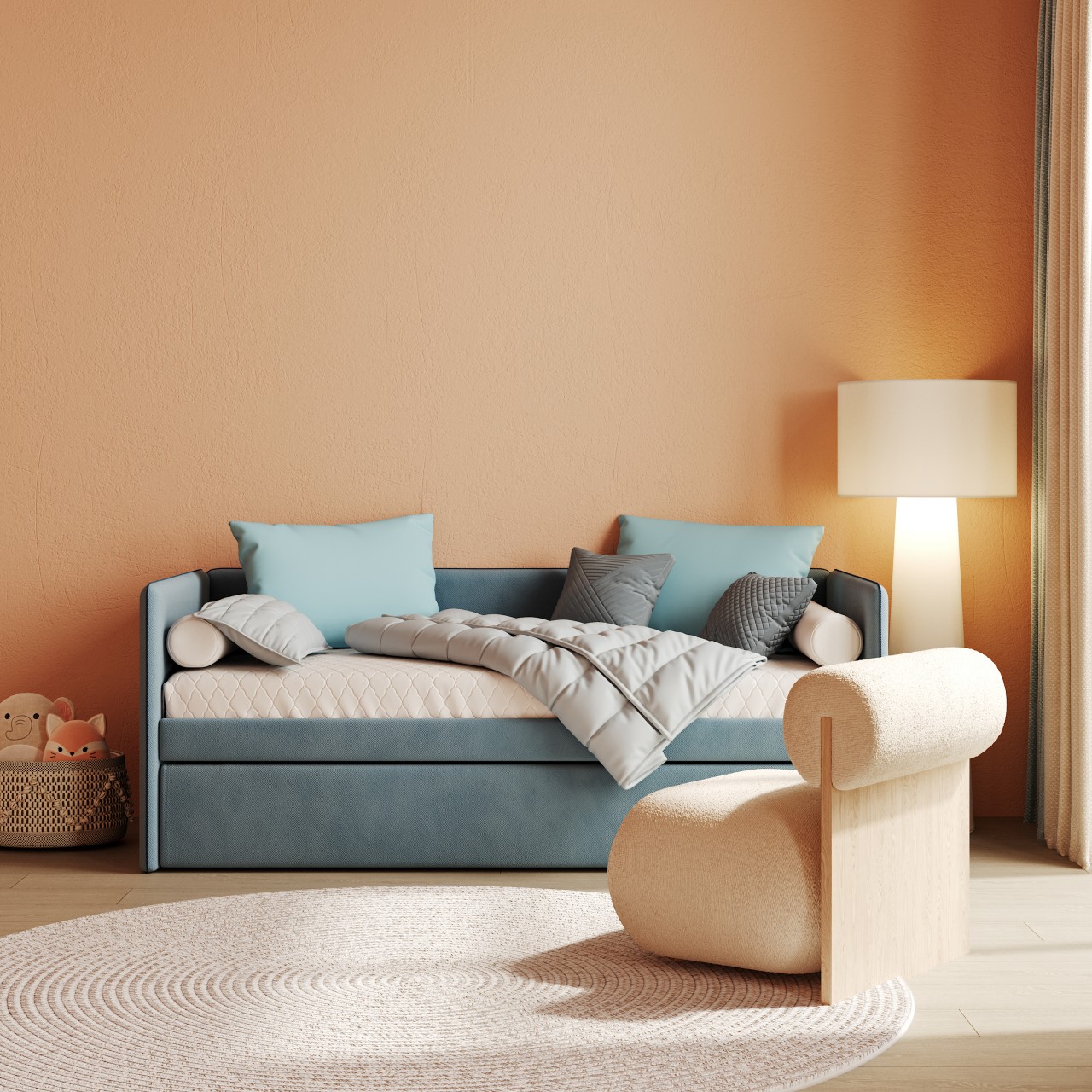
Designer: DearCustomDesigns
By blending colors of varying temperatures, designers can create visual interest and a unique atmosphere in any home project. Cooler and warmer tones can be contrasted, and complementary pairs like pink and green or yellow and purple can add vibrancy. Neutral shades provide a balance between extremes. With careful consideration, designers can use color combinations to achieve their desired atmosphere.
5. Color Mixing
Color mixing is the art of combining primary colors (red, blue, and yellow) to create a range of secondary and tertiary shades. In interior design, color theory is essential for stylishly blending hues and crafting visually appealing compositions. Mastering color mixing allows designers to optimize their palettes, leading to the creation of unique and distinctive color combinations.
6. Color Scheme
Different color schemes evoke various moods, from lively to calming.
• The monochromatic scheme uses tones of a single hue, creating a unified and timeless look.
• The analogous scheme combines three similar hues for balanced contrast.
• The complementary scheme pairs colors opposite on the wheel for high contrast without overwhelming.
• The triadic scheme blends three evenly spaced colors, adding energy without overpowering.
• Tetradic color schemes encompass four distinct hues, forming two pairs of complementary colors equally spaced on the color wheel.
• Square color schemes, on the other hand, consist of four separate hues positioned at 90-degree angles from each other on the wheel.
• Split-complementary combines three hues, consisting of a base hue and two adjacent opposites.
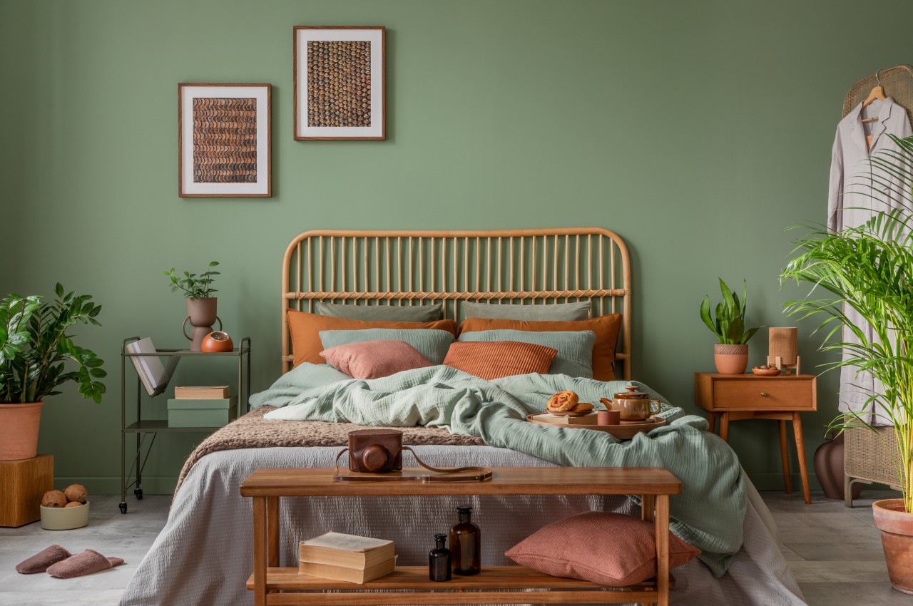
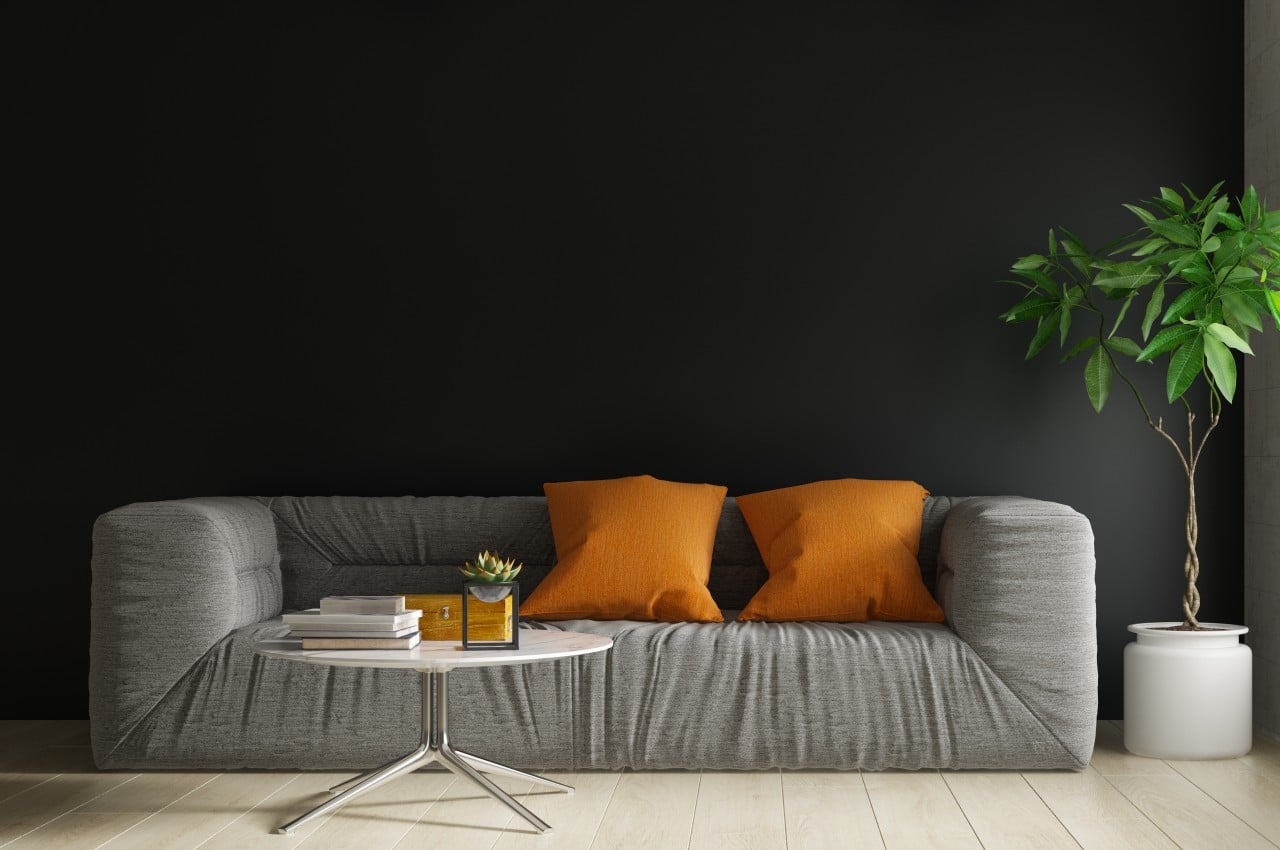
Designer: Inside Decors
7. Contrast Colors
The contrast in design involves opposites, adding visual interest through distinctions in color, values, or intensities. Sharp or vivid contrast signifies large differences, while low contrast indicates small variations. Achieved through complementary colors or value contrast, it emphasizes light and dark without progressing through middle values. This dynamic element contributes balance, relief, and drama to a scheme, best when paired with restraint in color variety.
8. Psychology of Color
Colors profoundly affect our moods and emotions. Cool hues bring relaxation, while warm hues generate energy. Reds signify excitement, blues induce calmness, oranges suggest creativity, and yellows increase optimism. Designers can create tailored atmospheres in home projects by carefully selecting colors to meet clients’ unique needs.
Designer: Deavita
Designers can leverage these color theory principles to create beautiful and functional home designs.
The post Basic Element of Interior Design: Color first appeared on Yanko Design.


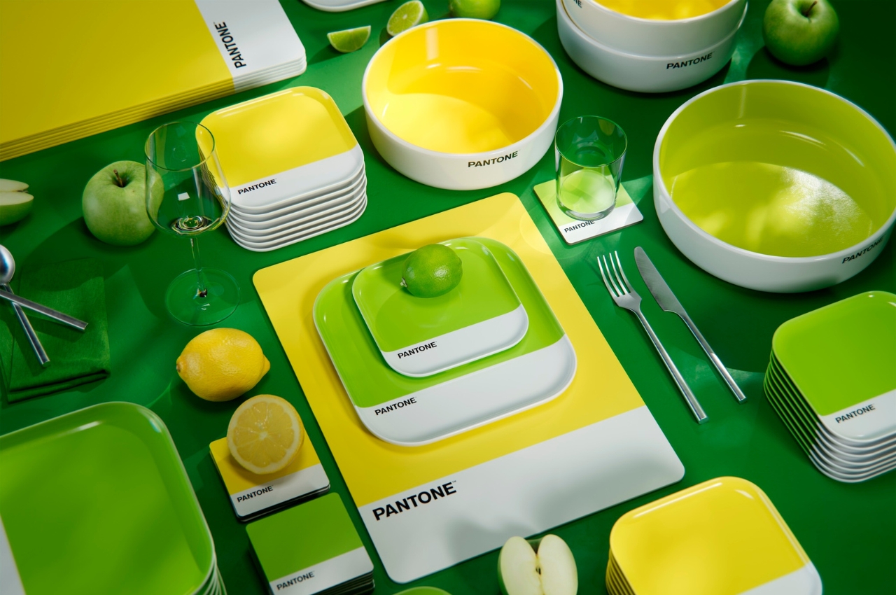

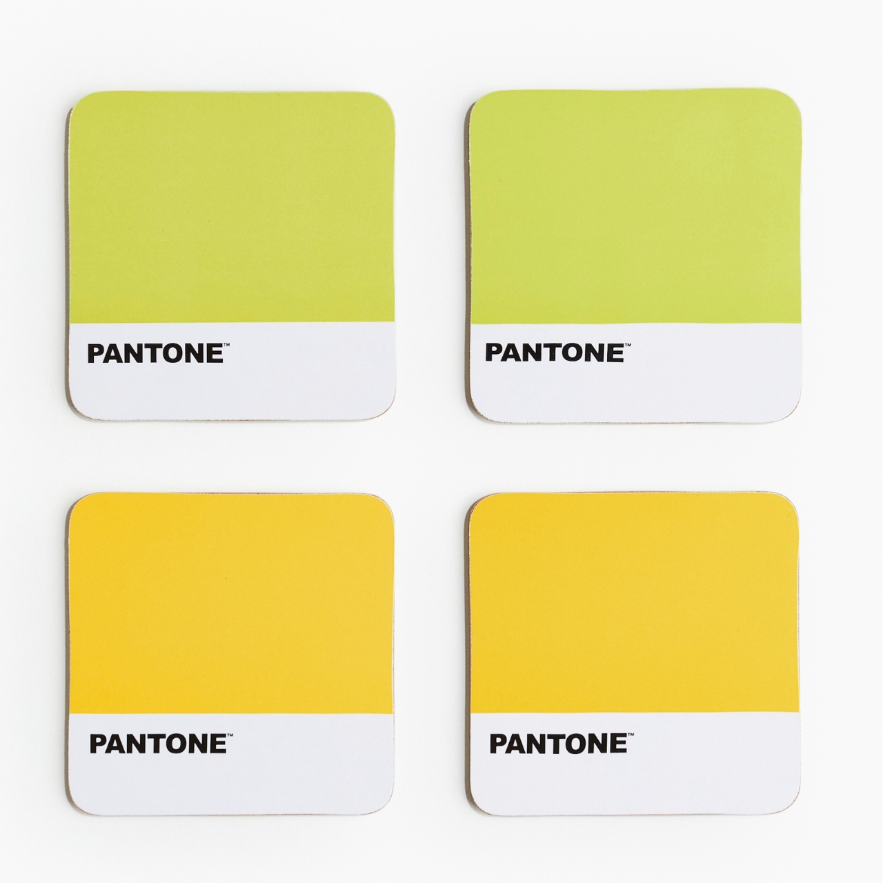
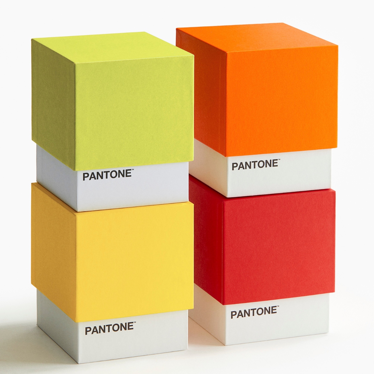
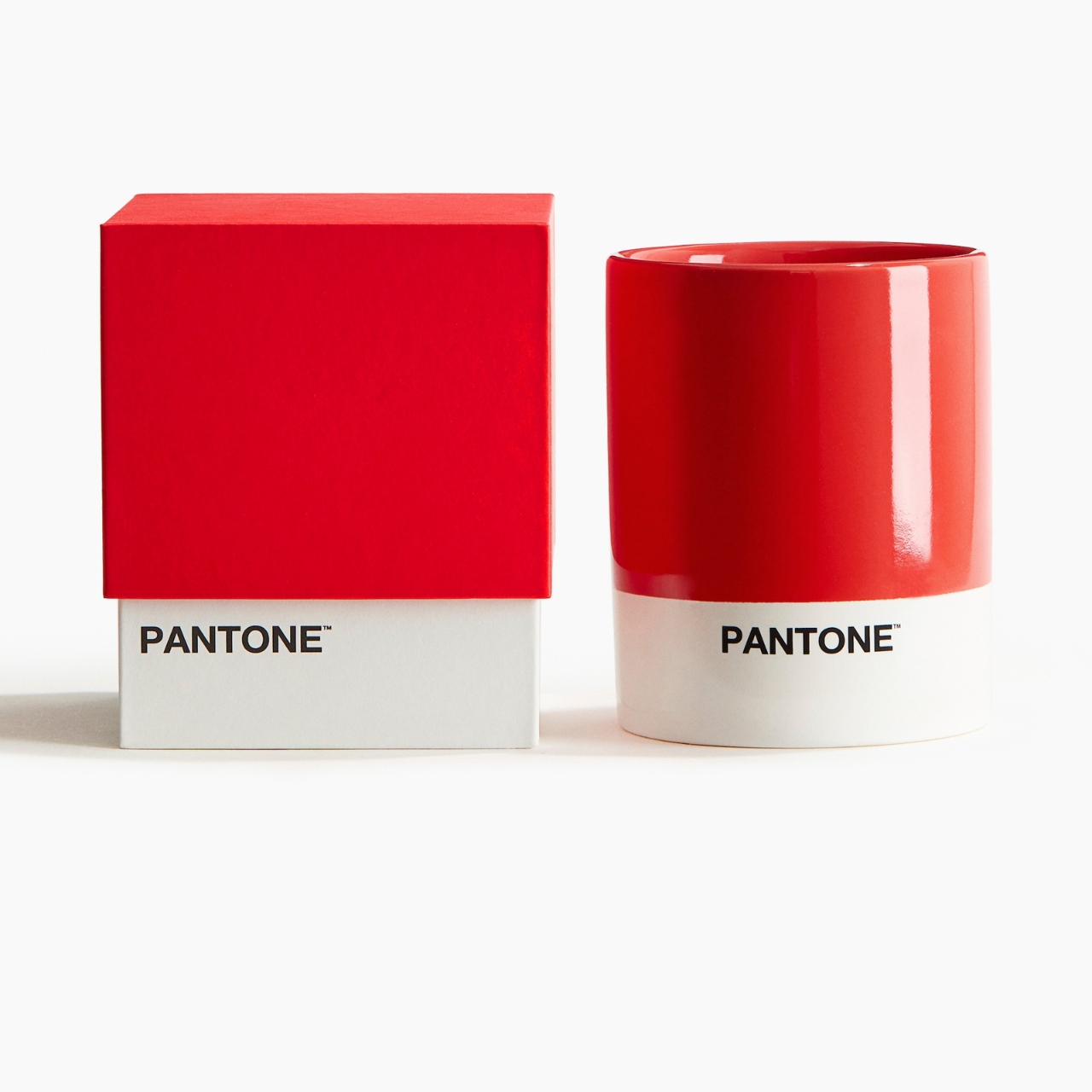
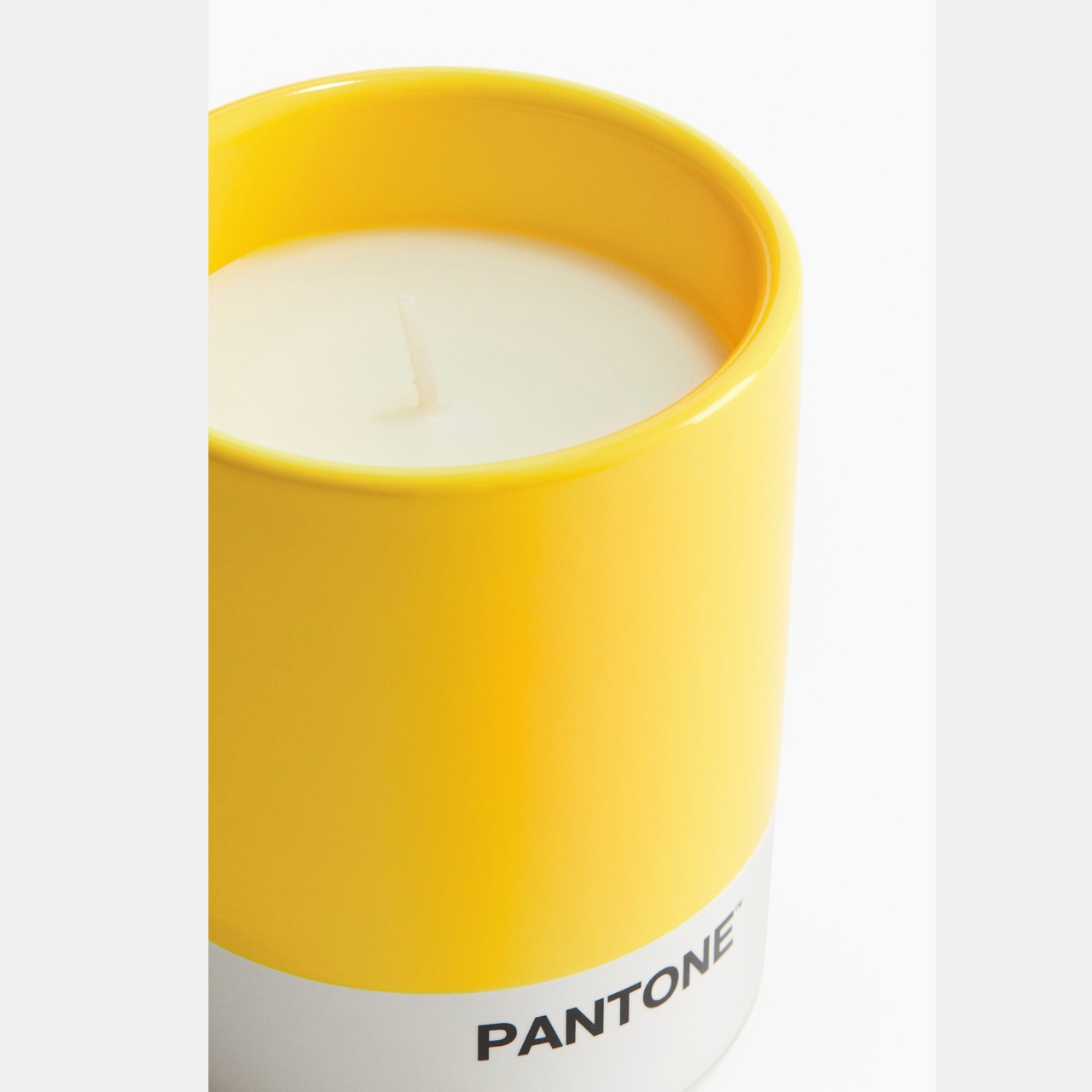
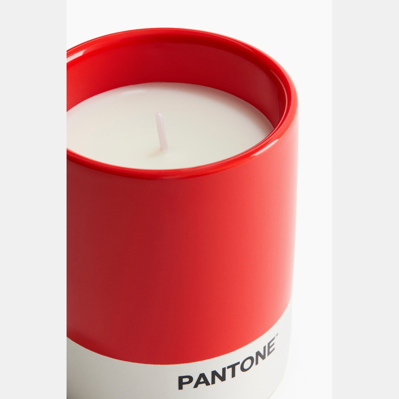
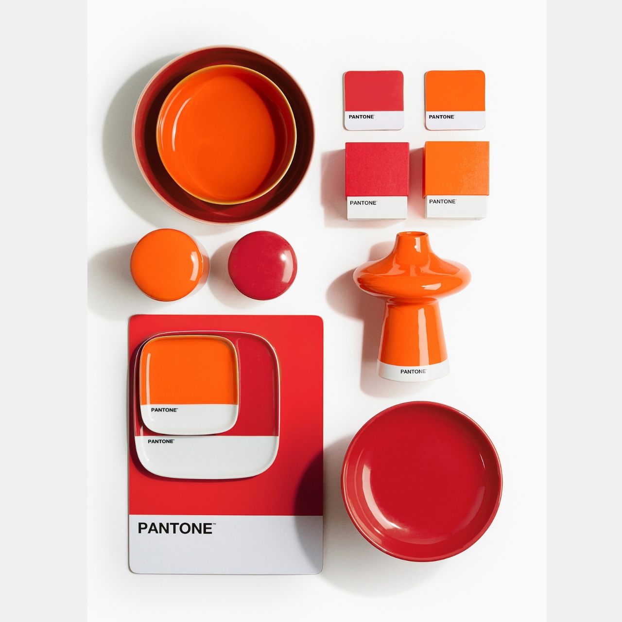
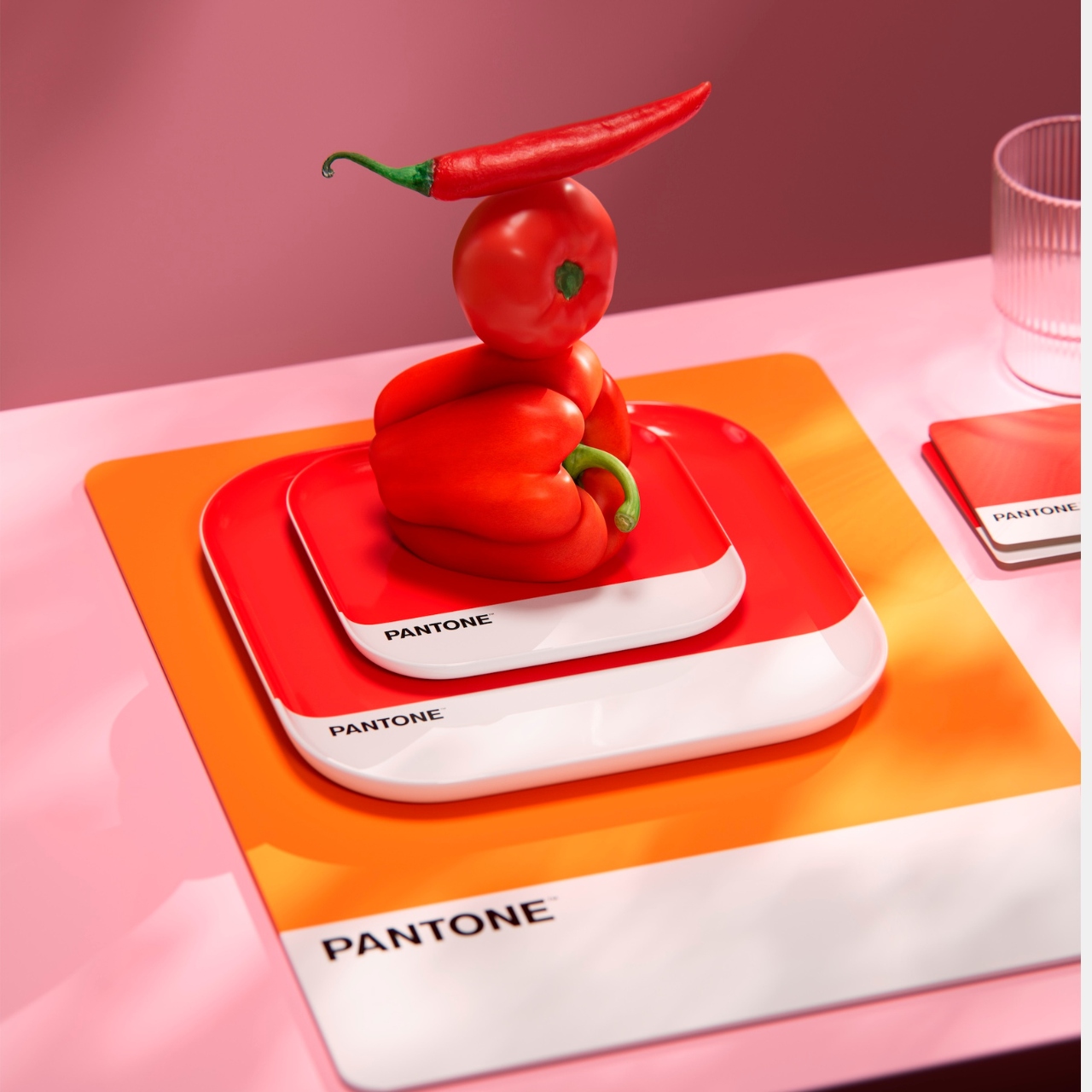
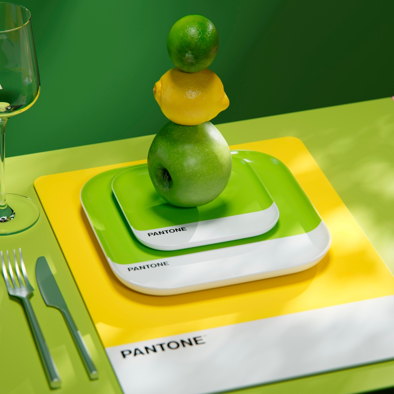
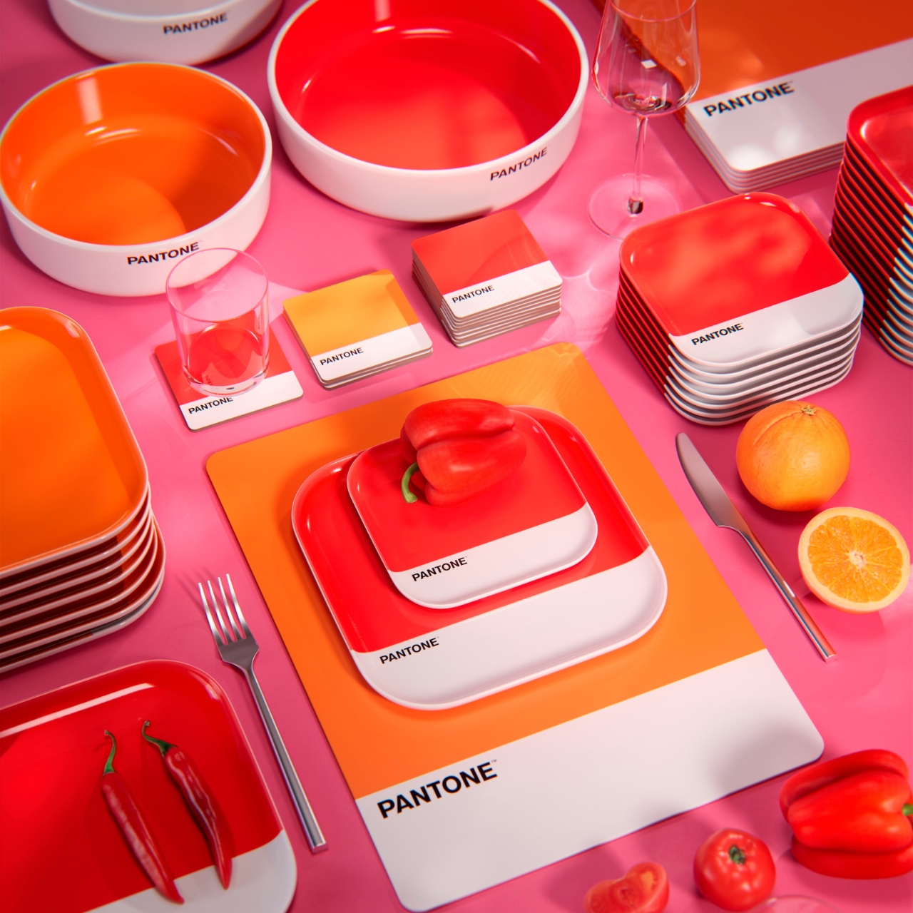
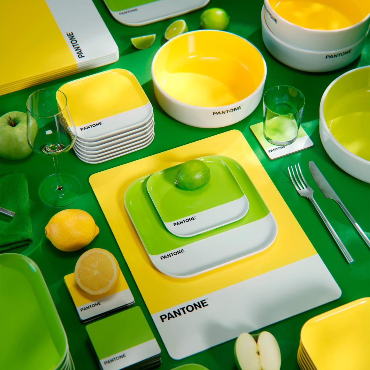
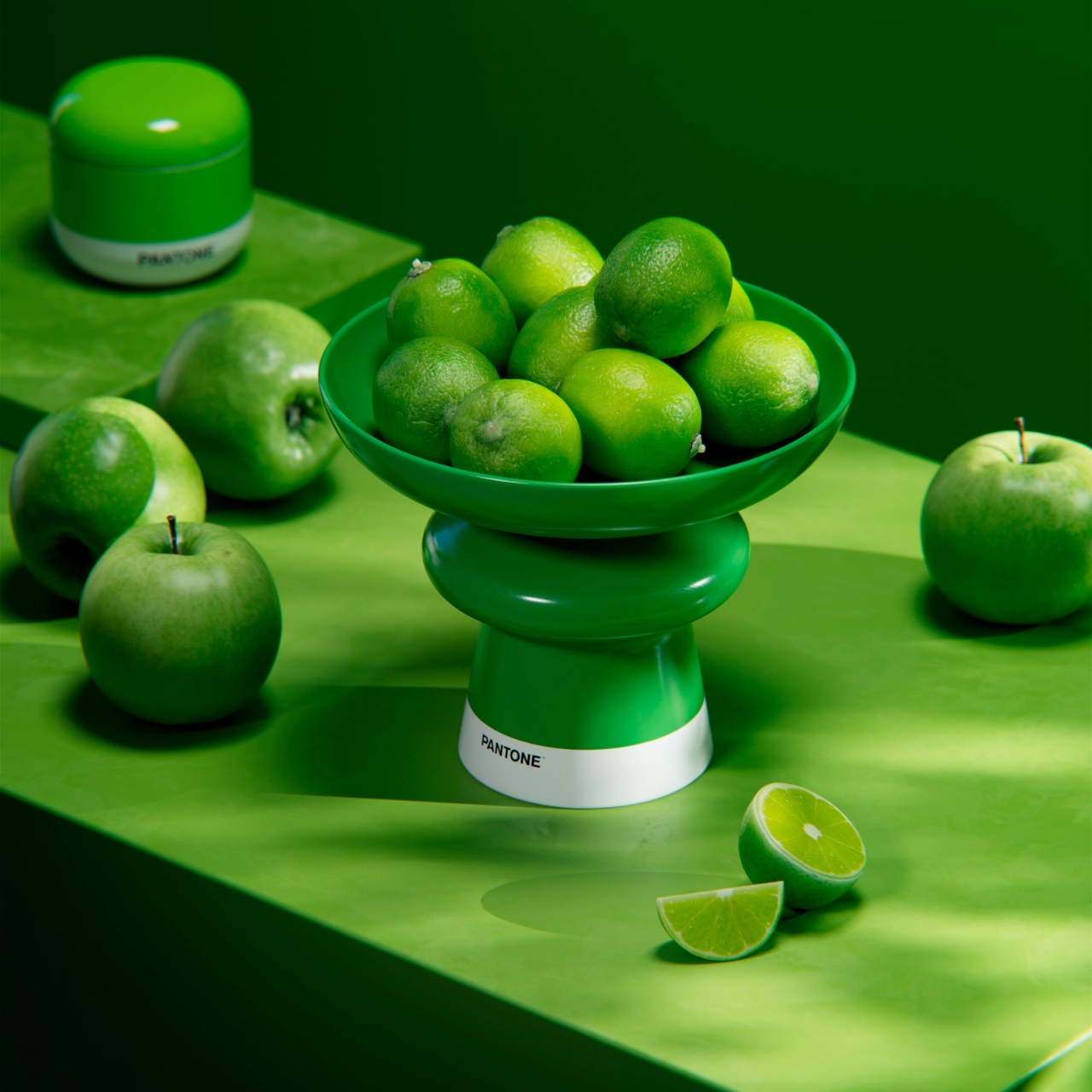
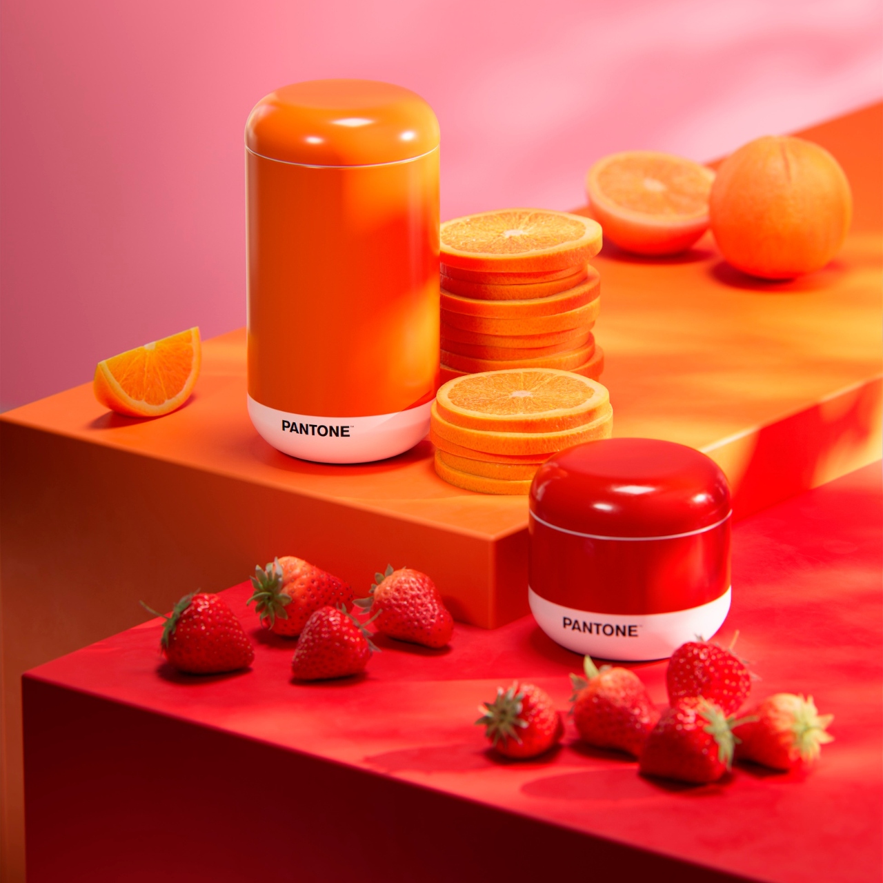
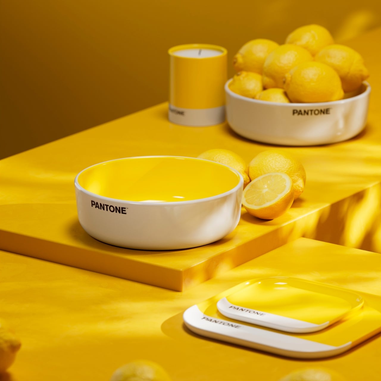
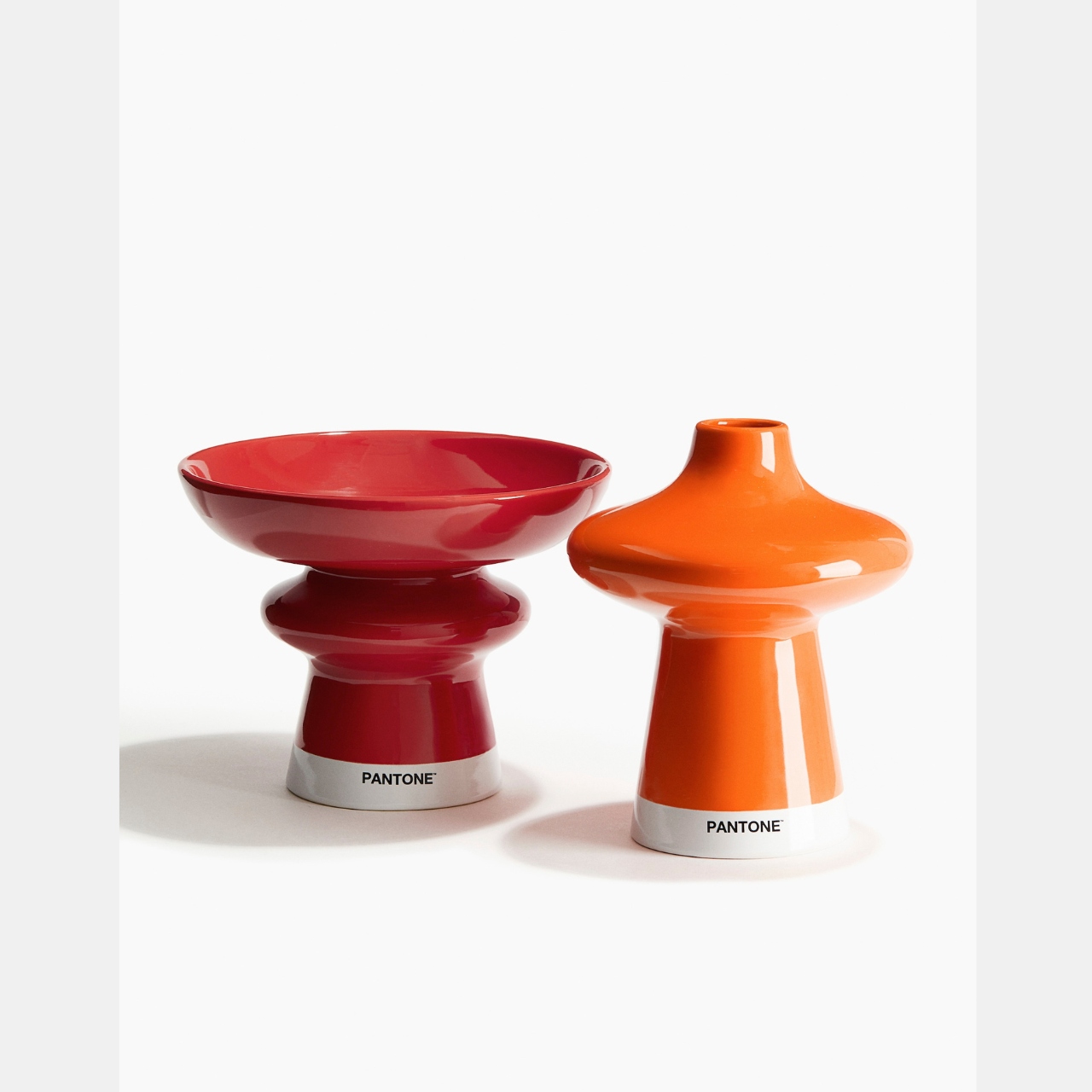
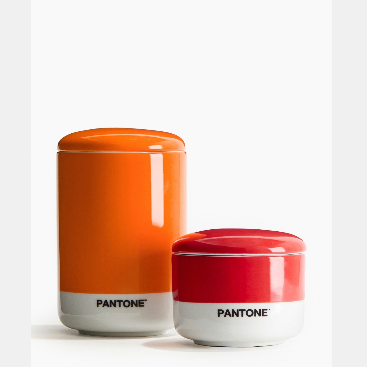
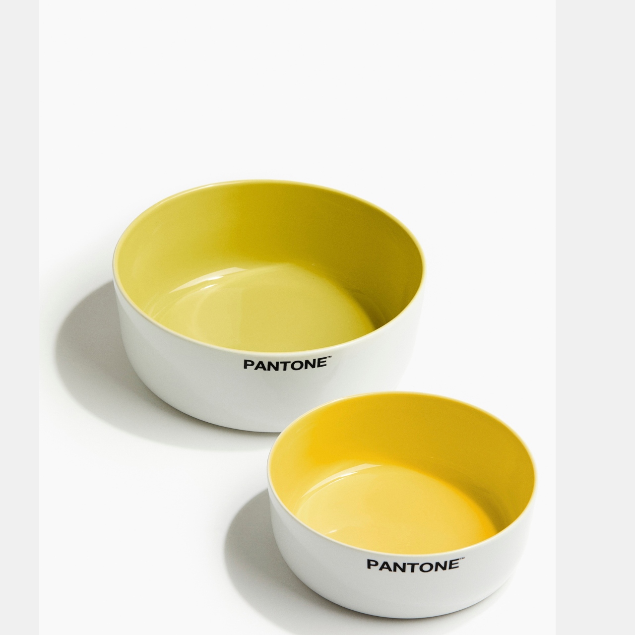
 Pantone Collection comes in two palettes: Zesty & Fresh and Sweet & Juicy. The collection includes different food serving and food storage items like serving bowls, placemats, footed trays, coasters, salt shakers, etc. Just like the previous collection, you also get different colors of scented candles that come in the pantone palette looking box.