This Limited Edition Desk Lamp Has Four Legs and Looks Like It’s Alive

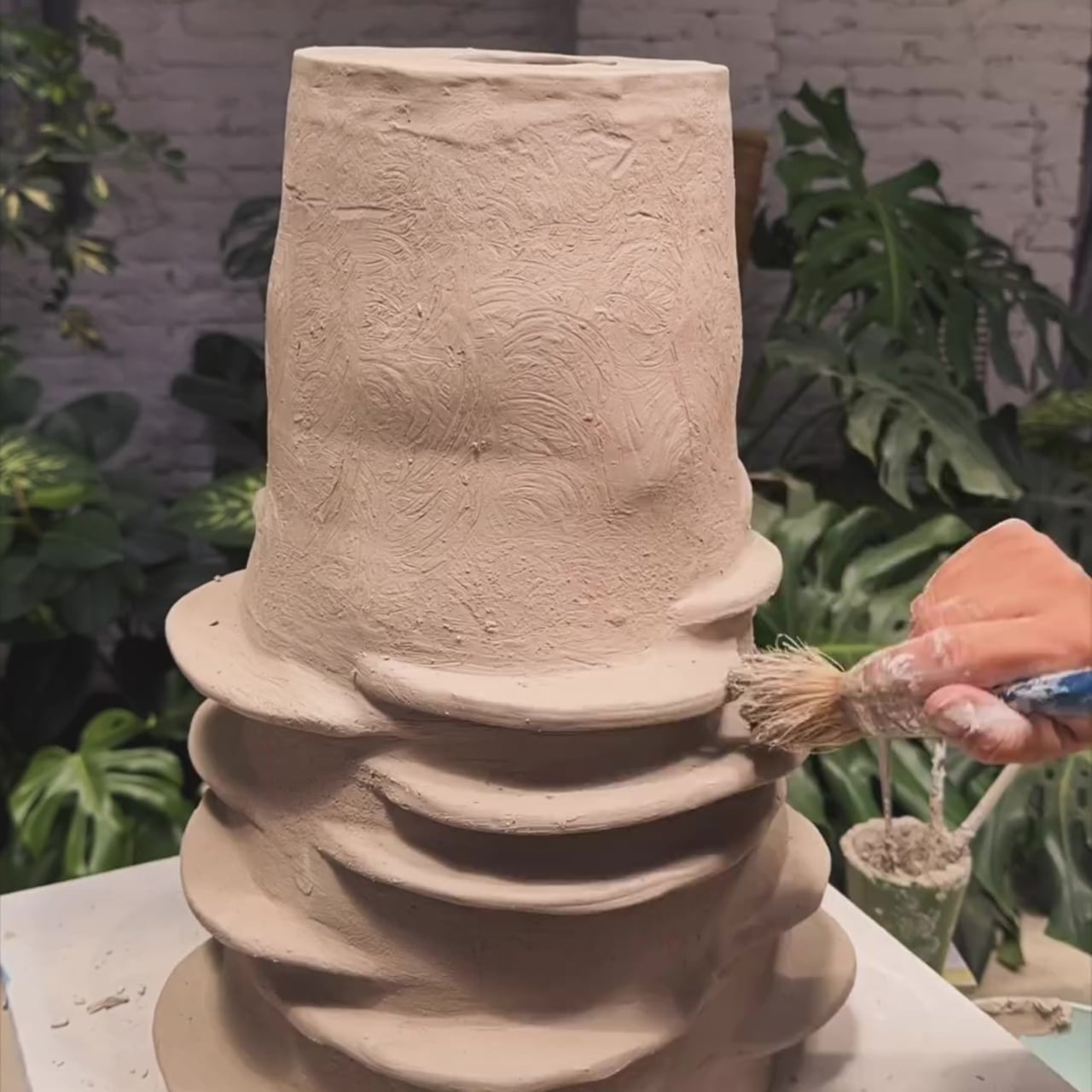
The line between product design and sculpture has been blurring for years, but most objects still declare their purpose plainly. A lamp looks like a lamp. Its form is a familiar enough gesture that it becomes invisible, something you reach for and forget. The more interesting territory is what happens when a designer begins with something alive and works backward into a functional object.

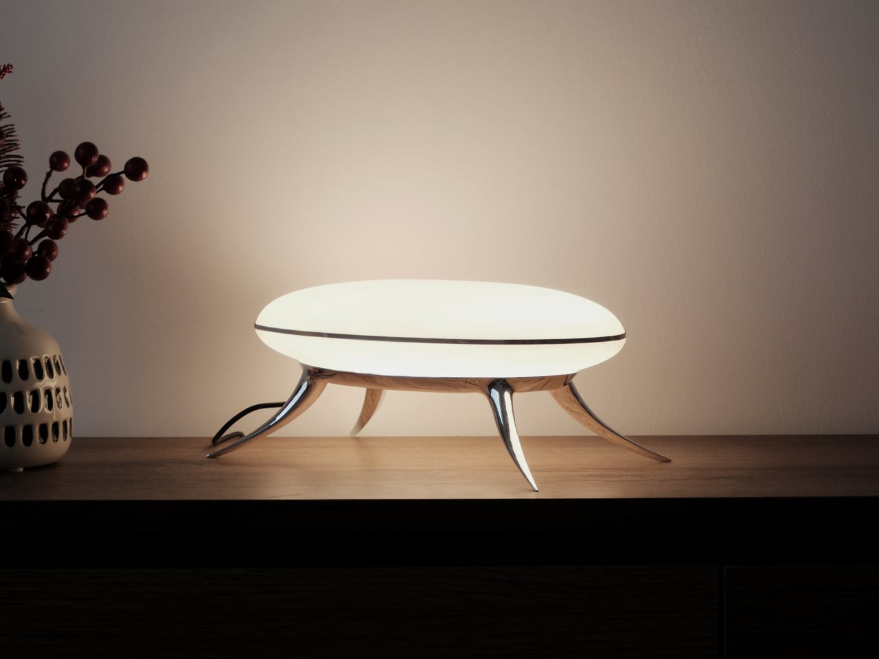
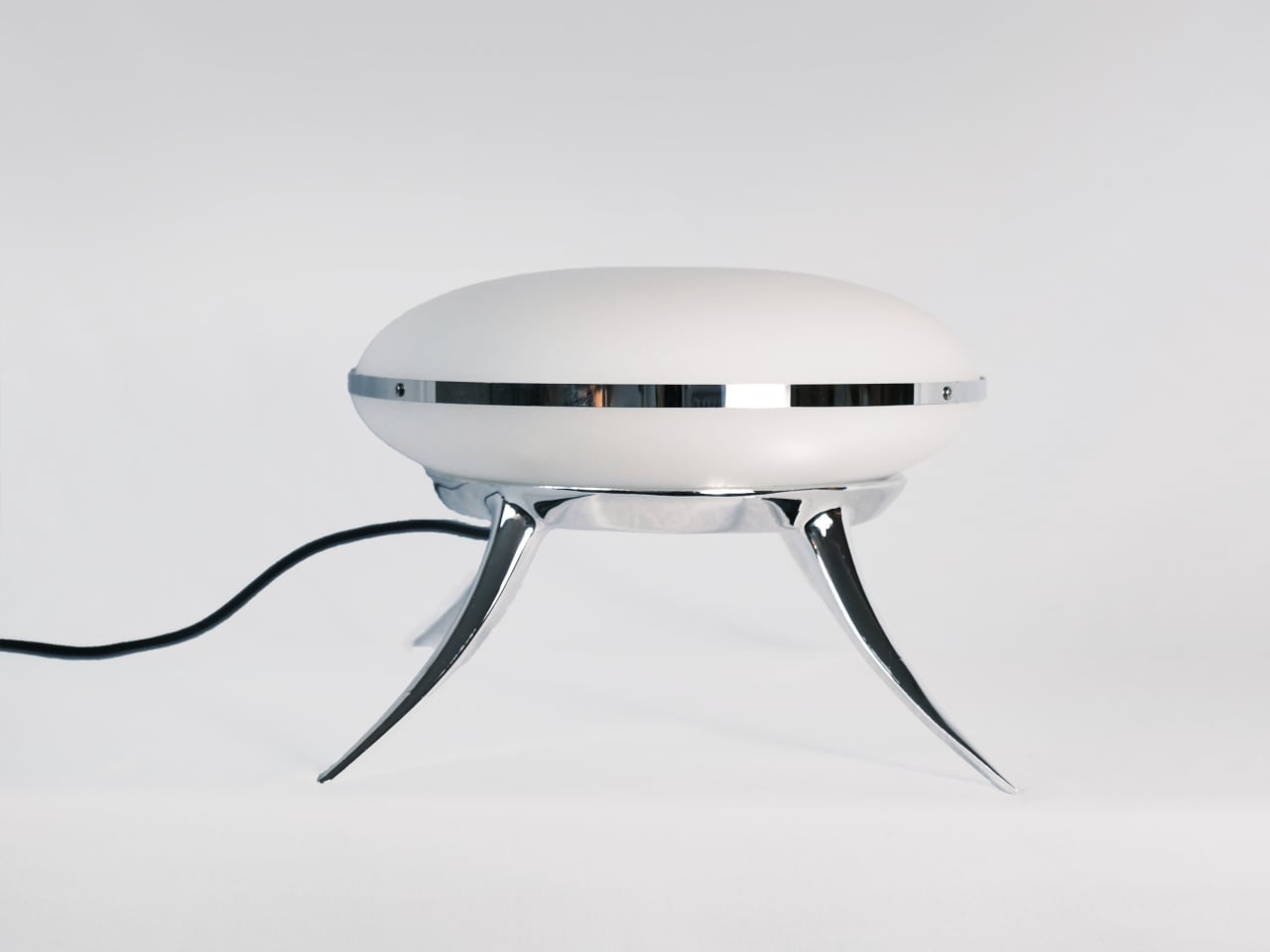
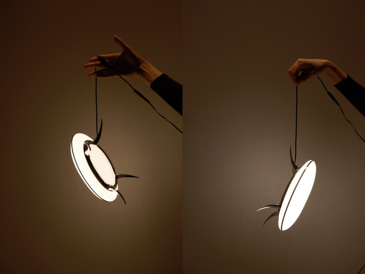
That’s what Hazel Villena did with the Bean Lamp, a limited-edition desk light designed in Brooklyn in 2026 that functions as a light source and a quietly unsettling presence at the same time. Villena started with the creature first and then solved the engineering around it. The legs exist to hold the disc of light. That they read as limbs is entirely deliberate.

Designer: Hazel Villena

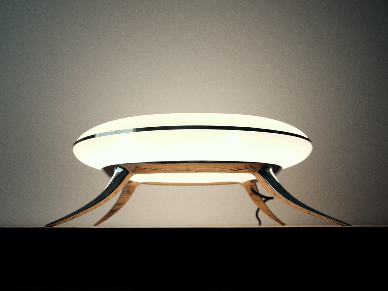
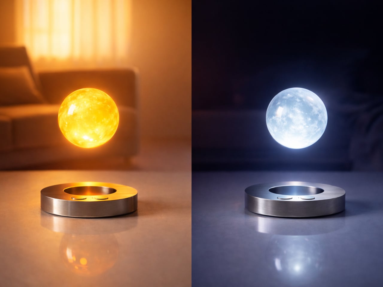
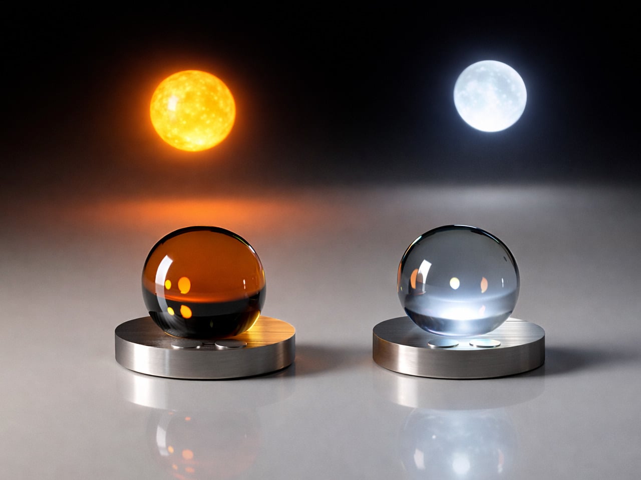
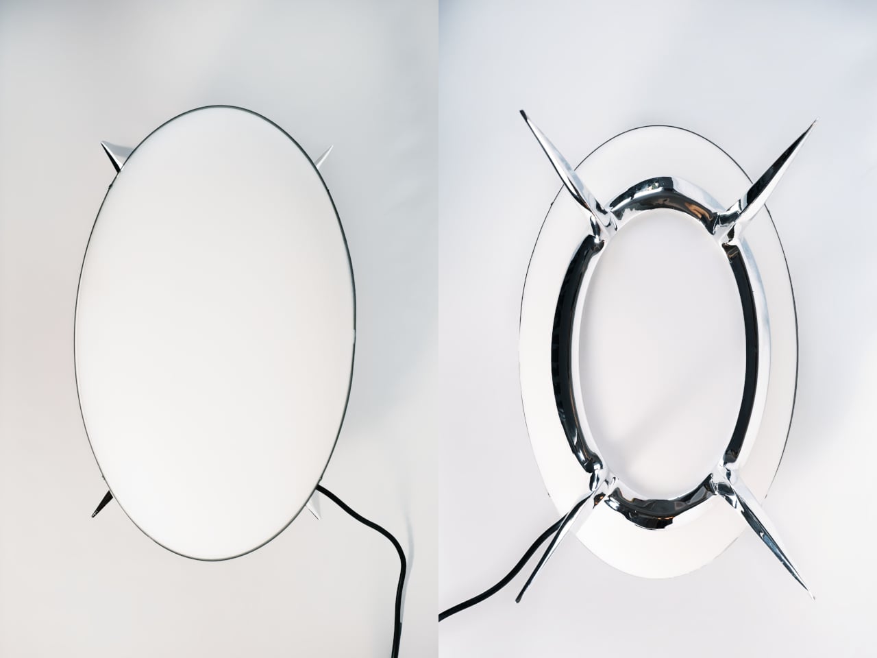
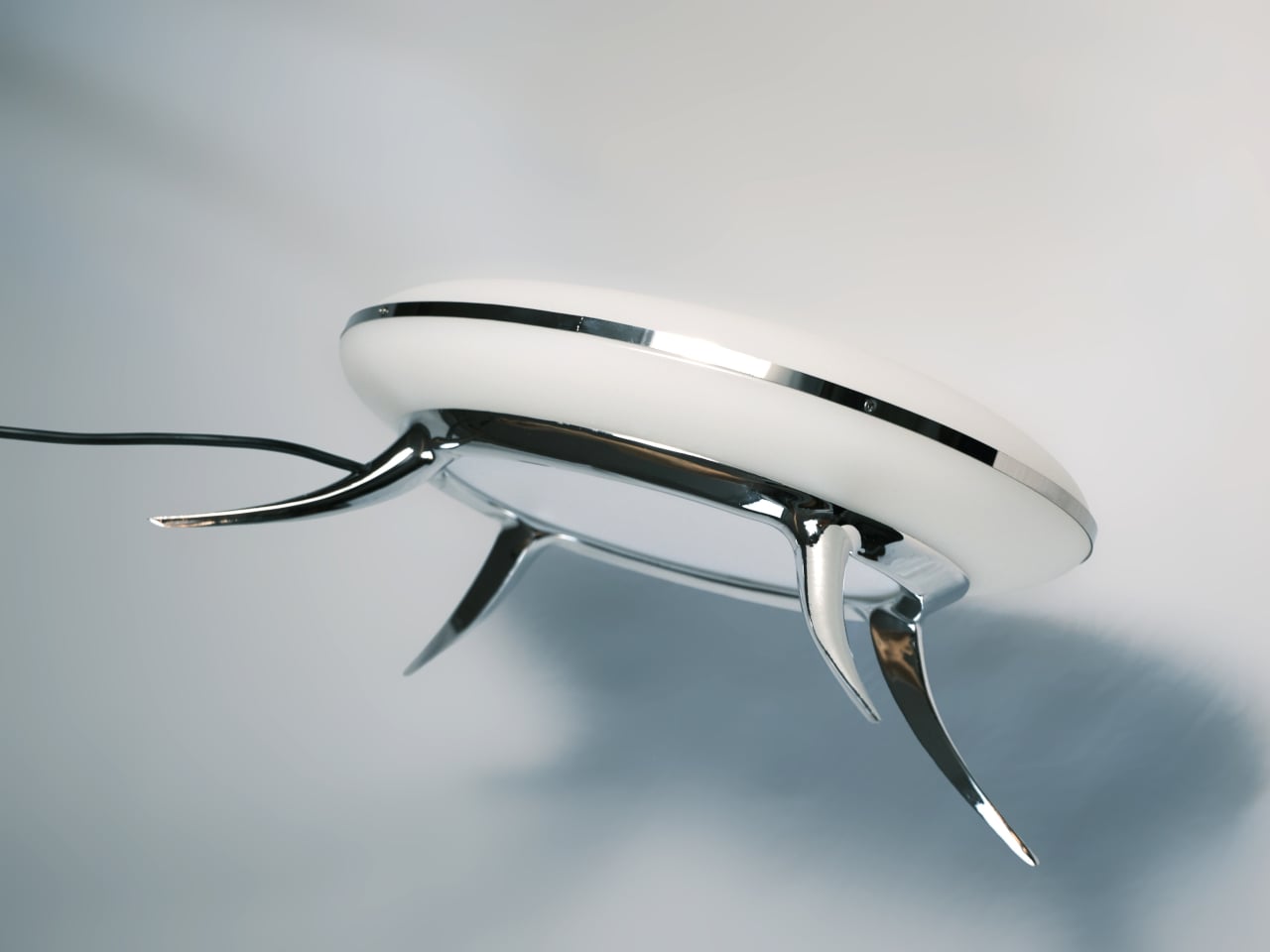
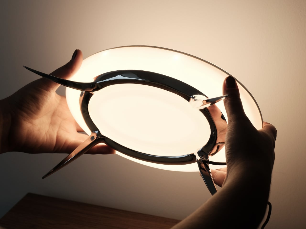
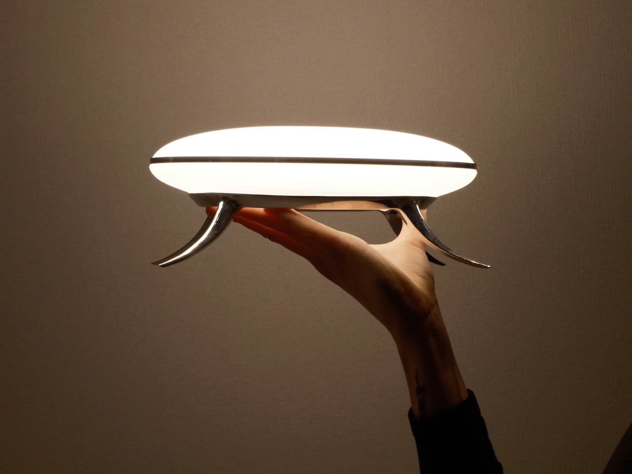
The body is cast copper with a chrome finish, sculpted into a low, wide stance on four tapered legs that curve and splay at angles borrowed more from biology than furniture. A polished aluminum ring joint at the center holds the matte polycarbonate diffuser in place, and the integrated LED disc inside throws a soft, contained pool of warm light across the surface beneath it.

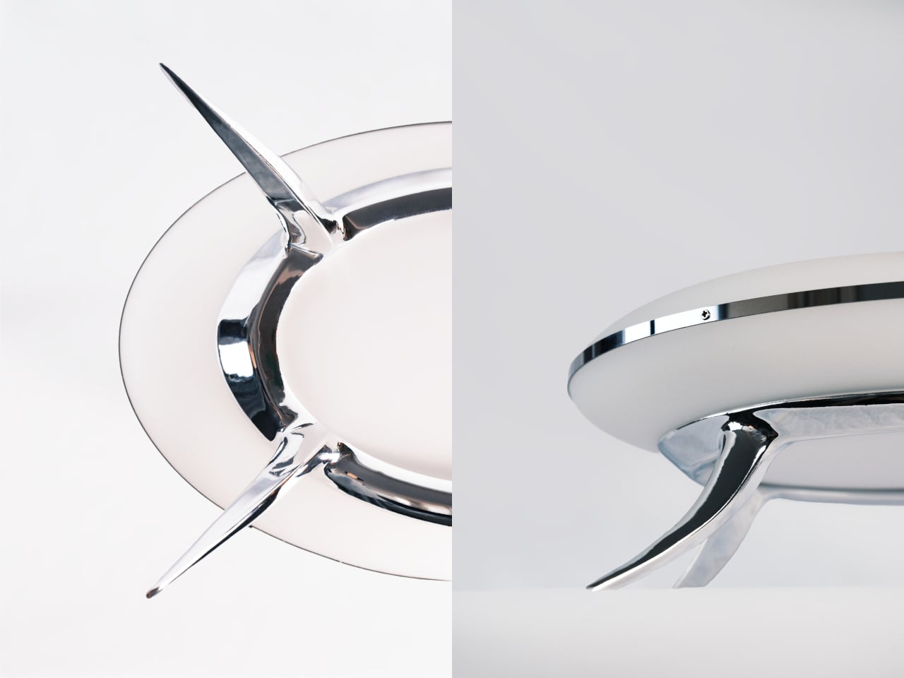
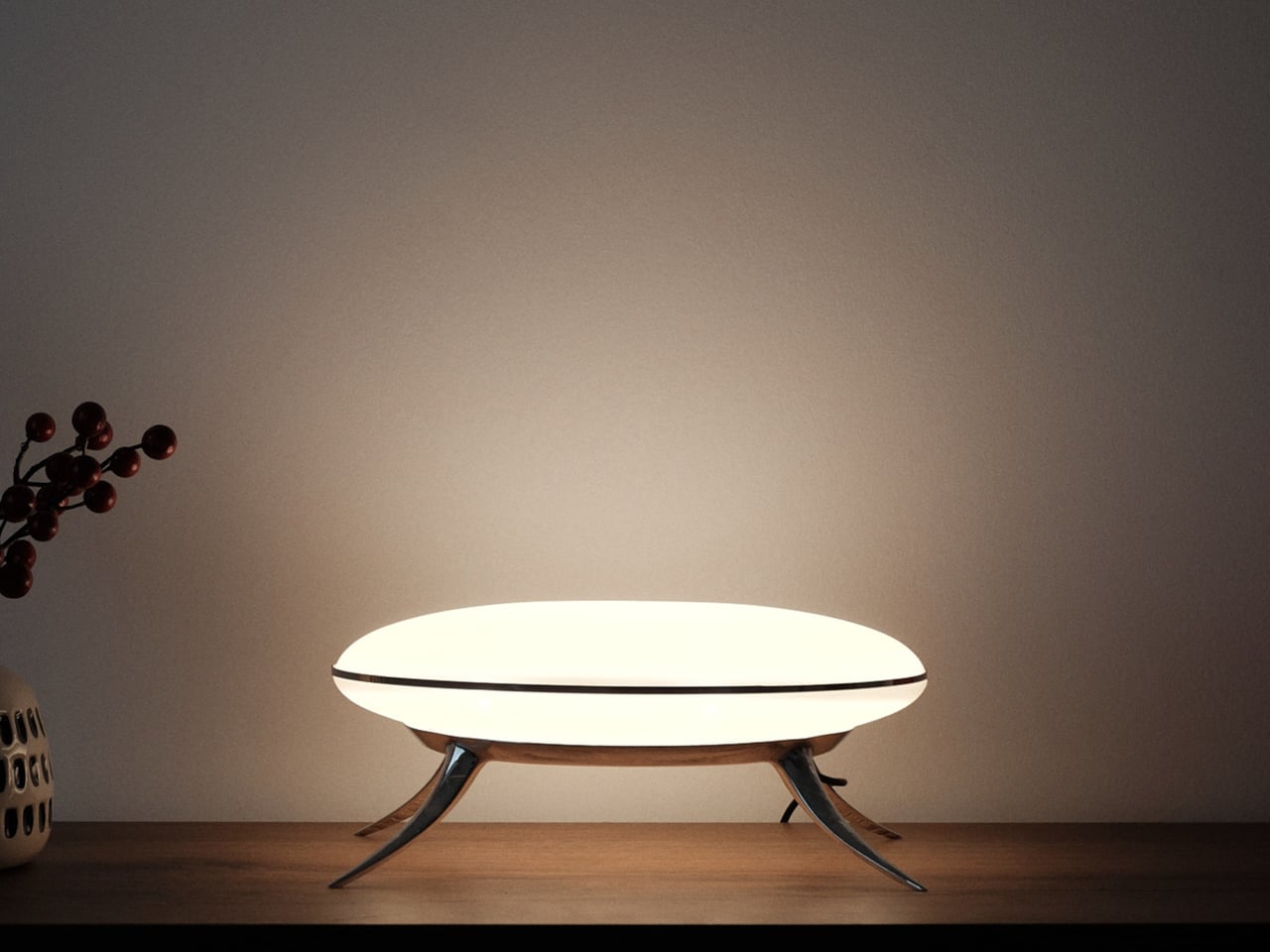
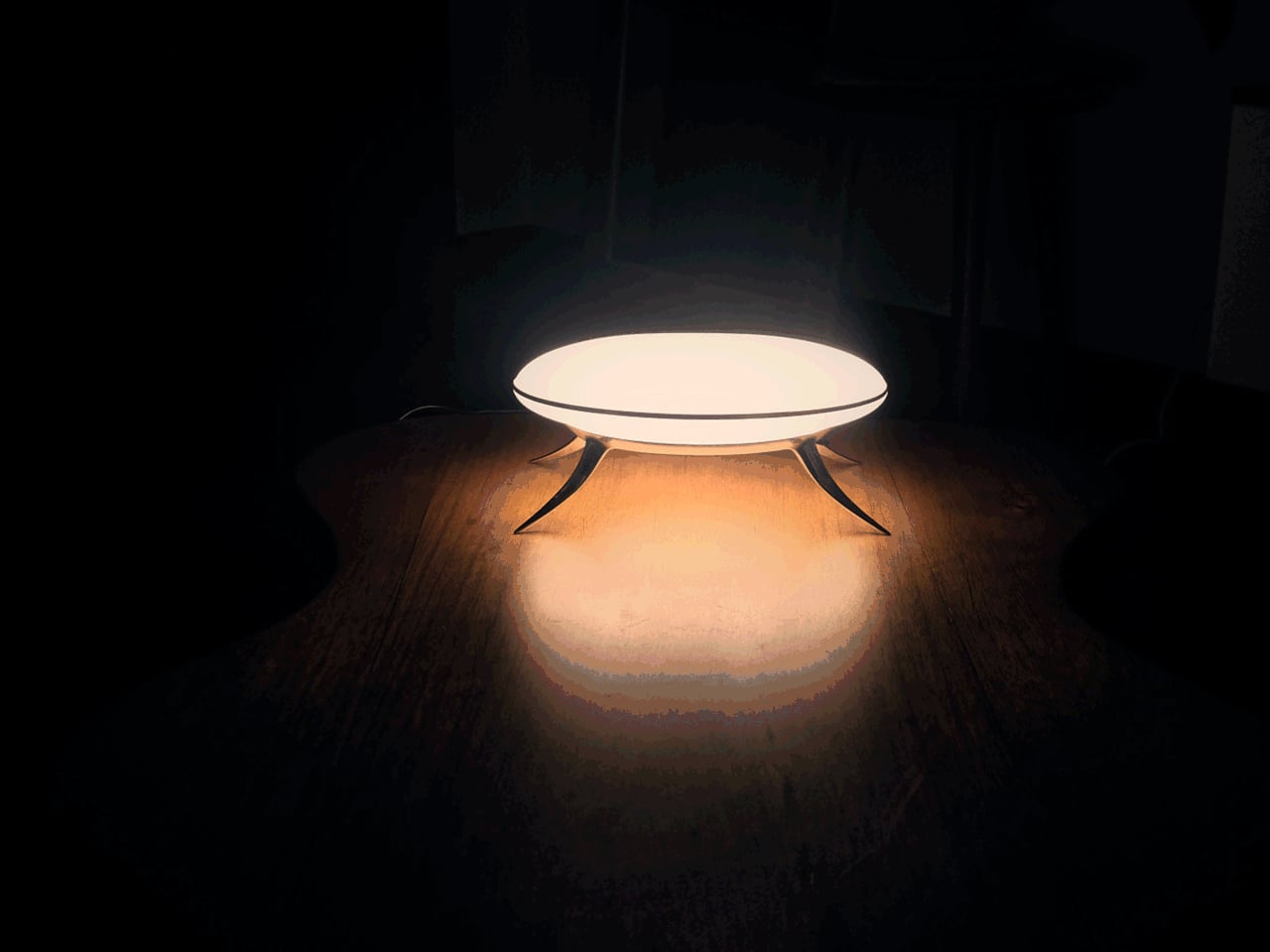
At 10.5 inches long and 4.5 inches tall, the Bean Lamp is compact enough to sit on a desk or shelf without dominating the space, though it tends to hold the eye. Proportion was a significant part of the design process, giving an elementary silhouette more gravity than its simple form suggests. The chrome catches light, the matte disc diffuses it, and the four curved legs suggest something caught mid-pause.

There’s also how it comes apart. The Bean Lamp is mechanically assembled rather than bonded, which means it can be fully disassembled when needed. The shade and LED unit can each be replaced or upgraded independently, extending its life beyond any single component. At the end of its life, the copper body and aluminum ring separate cleanly into existing metal recycling streams, a quiet argument for longevity built directly into the object.

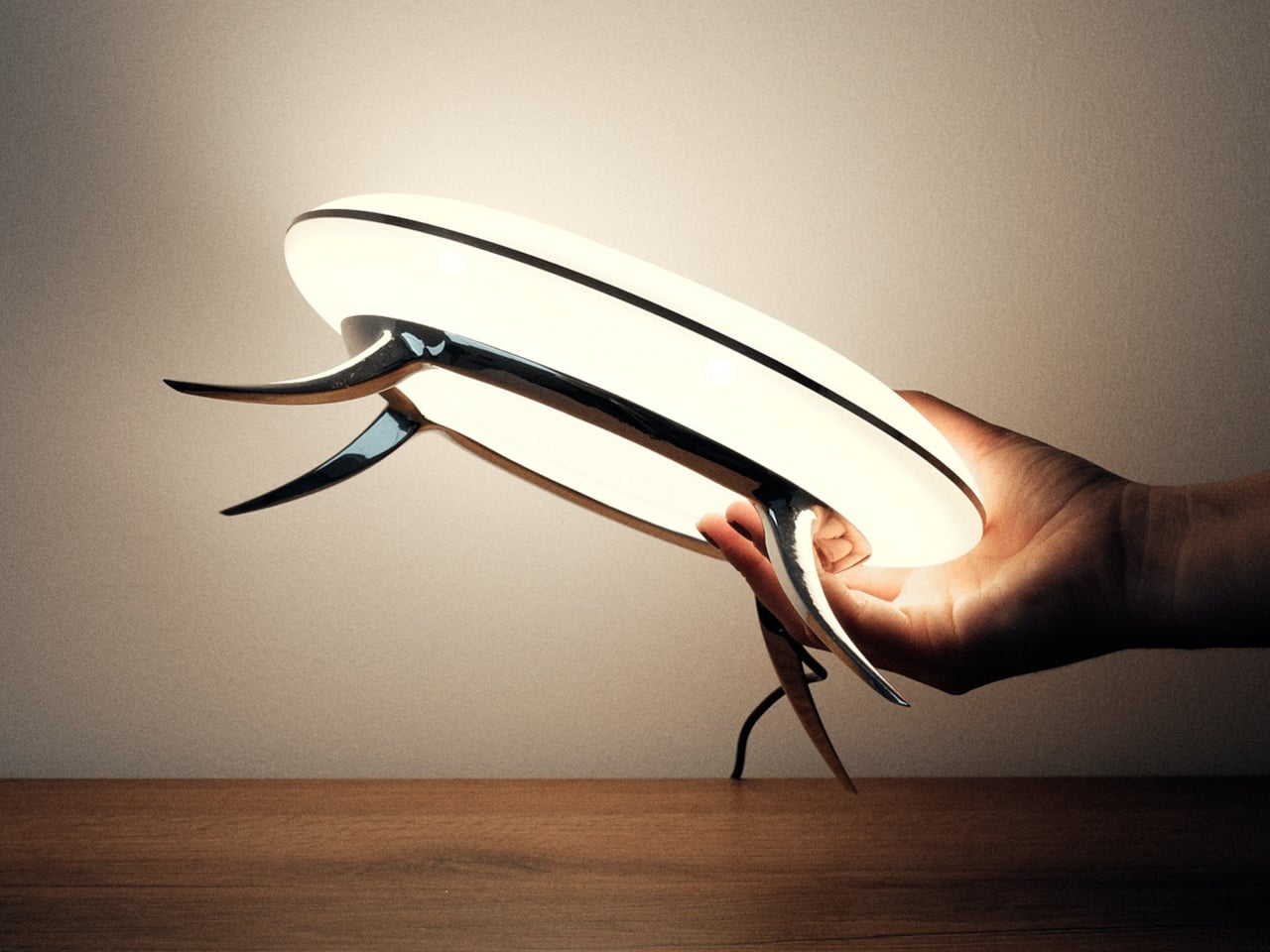
The lamp runs on a 12V cord with an in-line switch, keeping the operation uncomplicated. Plug it in, turn it on, and it does what a lamp is supposed to do: lights a small, deliberate area of wherever you’ve put it. What it also does, and what takes longer to resolve, is sit there looking like it might eventually decide to move on its own when nobody’s watching.

It reads differently across the room than it does up close, and differently still once it’s switched on. Villena’s stated goal was an object that sits in a deliberate blur, familiar enough to understand, strange enough to stop you. The Bean Lamp lands there without apology and seems to have no intention of clarifying itself further.

The post This Limited Edition Desk Lamp Has Four Legs and Looks Like It’s Alive first appeared on Yanko Design.

This Levitating Orb Lamp Drifts Toward You in the Dark Before You Ask

Artificial lighting has come a long way, but most of it still operates on the same basic logic. You plug something in, it stays where you put it, and you arrange your life around it. The growing understanding that light quality directly affects mood, sleep, and well-being has pushed designers to rethink what a lamp should do, but rarely where it should go.

Ivana Nedeljkovska’s Flying Moon & Sun takes a different position on that. Her conceptual design doesn’t ask you to move toward the light; it imagines the light moving toward you. Drawn from the natural rhythms of the sun and moon, it proposes a mobile, levitating lamp that follows you through your home and adapts to whoever it’s meant to illuminate.

Designer: Ivana Nedeljkovska

The concept takes shape as two glass orbs, one in warm amber that channels the sun’s energy, and one in cool frosted blue that mirrors the moon’s quieter character. Each rests on a brushed circular metal base, capable of levitating above it through magnetic force. That floating quality physically expresses the central idea, that this is a light that doesn’t feel tied to any single spot.

The two orbs aren’t just stylistically distinct; each serves a purpose tied to the body’s natural cycles. The warm, sun-toned orb supports alertness and activity, while its cool lunar counterpart eases the body into rest. By mapping its light to the gradual arc from sunrise to sunset, the design draws on circadian science, offering something that most smart bulbs attempt through apps but rarely manage to make feel genuinely natural.

Nedeljkovska was thinking about people who don’t always have the option of adjusting their environment easily. For someone with visual or sensory challenges, a light that moves toward them rather than waiting to be repositioned carries real value. The concept doesn’t frame this as a special accommodation; it simply makes intuitive, responsive behavior the default, which is what good inclusive design tends to do.

That mobility is perhaps the most striking aspect of the idea. Imagine waking at night and finding a glowing orb already near a doorway, having drifted to where you’ll likely need it next. For older users, or anyone navigating in the dark, that kind of preemptive illumination offers a quiet, practical benefit that no ceiling fixture or bedside lamp can really replicate.

The form reinforces the emotional ambition. There are no buttons, no menus, no settings to configure. The smooth glass surfaces and soft inner glow make the orbs feel more like objects found in nature than anything in a typical lighting store. That’s a deliberate choice, one that tries to make a lamp feel comforting rather than functional, which is a harder design problem than it sounds.

Flying Moon & Sun is still a concept, but the questions it raises are genuine. How much of our discomfort with artificial light comes from having to work around it, rather than having it work around us? A lamp that floats, follows, and shifts with the hour is ambitious, but the premise that light should serve the person rather than the room is hard to argue with.

The post This Levitating Orb Lamp Drifts Toward You in the Dark Before You Ask first appeared on Yanko Design.

A Whale Lamp That Transforms Ocean Vastness into a Gentle Bedside Glow

There is something quietly radical about a whale that does not belong to the ocean. Not because it has been displaced, but because it has been reimagined. COSIN DESIGN’s whale lamp is not an imitation of nature. It is a reinterpretation of how we feel about it. We are used to whales as symbols of magnitude. Vast, powerful, unknowable. They belong to depths we cannot reach. Yet here, that same creature is reduced in scale, softened in form, and placed gently on a bedside table. It no longer overwhelms. It comforts, and that shift in perception feels intentional.

The lamp captures a whale mid-leap, its body curved in a suspended gesture that feels both dynamic and still. The lines are fluid and uninterrupted, almost meditative. There are no sharp edges, no visual noise, just a continuous surface that invites the eye to move along with it. It feels like a sculpture before it feels like a product, and that is what gives it presence even when it is not turned on.

Designer: COSIN DESIGN

The real transformation happens with light. It seeps through the semi-transparent abdomen, not as a beam but as a soft diffusion that spreads slowly and evenly. It does not try to dominate the room or claim attention. Instead, it settles into the space, creating a calm and ambient glow. There is something almost alive about it, as if the whale carries light within itself, like a quiet presence from the deep sea. In that moment, the object shifts from something you look at to something you feel, and that emotional transition is where the design becomes meaningful.

For a long time, lamps have been about control. Adjustable brightness, direction, and precision. But there has been a noticeable shift toward lighting that feels more atmospheric and emotionally aware. The whale lamp sits comfortably within this shift. It does not attempt to do everything. It focuses on creating a specific feeling, and it does so with clarity and restraint. The design does not rely on complexity or excess detail. Instead, it leans into softness, both in form and in function.

Nature plays an important role here, but not in a literal sense. The whale is recognizable, yet simplified just enough to feel universal. It is less about replicating an animal and more about capturing a sense of calm, depth, and quiet strength. That balance allows the lamp to exist across different environments without feeling out of place. It feels just as appropriate in a child’s room, where its gentle glow can provide comfort at night, as it does in a more mature, minimal interior where it reads as a sculptural object.

The availability of four color options adds to this flexibility. Each variation subtly changes the mood of the piece, allowing it to align with different interior styles and personal preferences. Whether placed in a playful setting or a more subdued one, the lamp adapts without losing its identity.

What lingers most, however, is the way the design translates something vast into something intimate. A whale, typically associated with scale and distance, becomes a small, glowing presence that quietly occupies a personal space. It turns awe into reassurance and transforms something distant into something familiar. In doing so, it reflects a broader shift in how we approach design today, where emotional resonance matters just as much as function.

Not everything needs to be louder or brighter to be effective. Sometimes, the most powerful design choice is to soften, to create objects that do not demand attention but instead become part of the atmosphere. The whale lamp does exactly that. It does not insist on being noticed, yet over time, it becomes something you grow attached to.

The post A Whale Lamp That Transforms Ocean Vastness into a Gentle Bedside Glow first appeared on Yanko Design.

This Jellyfish-Inspired Lamp Transforms When You Switch It On

Table lamps have a fairly narrow brief: sit on a surface, produce light, and try not to embarrass themselves in the process. Most manage two out of three. The Aurelia table luminaire takes a more considered approach, drawing from the slow, hypnotic movement of jellyfish to build something that works as a light source and as an object worth looking at when it’s switched off.

The reference point is specific, not from a general impression of the ocean, but from the particular way jellyfish tentacles move: slow, layered, and almost meditative in repetition. That quality informs the lamp’s layered construction and the dense organic lattice etched across its translucent shade. The pattern reads quietly in a lit room. Switch the lamp on and the whole surface activates, casting warm amber light through the texture in a way that feels atmospheric rather than task-driven.

Designer: Nizamuddin N.S

That distinction matters for where the lamp is meant to live. Aurelia isn’t designed to light a workspace, and the designer makes no claim that it should. The design targets bedside tables, desk corners, and living spaces where the goal is to soften the mood of a room rather than sharpen its focus. Diffused light changes the quality of a space in ways that sharp overhead sources simply cannot manage, which is the quiet premise the whole lamp is built around.

The physical form carries that logic through. The shade is a tall, slim panel mounted on a dark rectangular base that reads as wood. Unlit, the lamp is restrained and cool, with the etched lattice surface present but not clamoring for attention. Lit, the object shifts register entirely. Warm amber pushes through the pattern, and the base-to-shade contrast, dark below and luminous above, becomes the lamp’s defining visual move.

Beyond the light itself, Aurelia stands as a small sculptural piece meant to give a room some character. That’s a harder claim than it sounds. Most decorative lamps lean entirely on their shades for visual interest and have nothing to offer in the middle of the afternoon. Aurelia’s etched surface is structured enough to hold attention without illumination, which is the minimum requirement for a lamp that wants to be treated as more than a lamp.

There’s also a practical dimension that the jellyfish reference shouldn’t distract from. A lamp that produces soft, diffused warmth rather than direct output is genuinely useful in spaces that already have overhead lighting covered. It fills a secondary role well: the kind of light you turn on at the end of the day, not the kind you read by, and rooms that lack that option tend to feel unfinished in ways that are hard to articulate.

The post This Jellyfish-Inspired Lamp Transforms When You Switch It On first appeared on Yanko Design.

This Bio-mimicking Safari Deck Is Designed to Look Exactly Like a Rhino

Sri Lankan designer Thilina Liyanage has built a recognizable portfolio around one core idea: that architecture in wild spaces should speak the language of those spaces. His previous concepts have drawn from bird forms, insect geometries, and the angular logic of animal skeletons, earning him a following among readers who track biomimetic architecture with the same enthusiasm others reserve for gadgets. His latest, the Rhino Safari Deck, takes that approach to one of its most literal and structurally ambitious expressions yet. Rendered under overcast skies above a scrubby, semi-arid landscape scattered with cacti and boulders, the structure earns its name in full. From a distance, you are looking at a rhino. The silhouette is unmistakable: a squat, armored mass with a pronounced horn erupting from the roofline, flanked by secondary angular spires that read as ears, the whole thing hunched forward on its platform like the animal mid-charge.

Liyanage named the project “Kifaru Point,” using the Swahili word for rhino, which sets the geographic and tonal intention clearly. The structure is conceived as a wildlife observation deck, elevated above the terrain on a concrete plinth with a timber-decked lower platform that wraps around the base. A set of steel-railed stairs leads visitors up from the rocky ground level, and the shaded gathering area beneath the main structure provides a transition space before the ascent continues to the upper observation level. The interior views glimpsed in the renders show open, framed apertures that funnel sightlines out across the flat scrubland below, the kind of panoramic sweep that makes the elevated position feel earned rather than arbitrary. As a piece of safari infrastructure, Kifaru Point is doing something most viewing platforms do not bother attempting: it turns the act of looking at animals into an architectural experience that is itself worth looking at.

Designer: Thilina Liyanage

The entire form is built from triangulated steel frames, with each panel clad in ribbed, corrugated steel slats that create a warm, striated texture across the facets. Spherical steel nodes connect the struts at every junction, giving the whole skeleton a Meccano-meets-brutalism quality that suits the rugged setting perfectly. There is no smooth surface anywhere on this building. Every plane is either angled, folded, or interrupted, and the aggregate effect genuinely reads as armored hide from the outside while remaining open and structurally legible from within. The corrugated steel and timber combination ages well in outdoor conditions, which matters for a structure intended to sit in a landscape indefinitely rather than perform at an exhibition and disappear.

What Liyanage is clearly working through in this series is the question of how a building earns its place in a landscape. The typical eco-lodge answer involves receding into the environment through natural materials and muted palettes, becoming invisible by design. Kifaru Point goes the opposite direction: it announces itself as a landmark, a destination, something you orient toward from across the plain. The rhino reference gives it a totemic presence that goes beyond novelty. Rhinos are ancient, armored, and critically endangered, and a safari deck that reads visually as one of those animals is making an argument about the relationship between the people who come to observe wildlife and the wildlife itself. Biomimetic architecture has a long tradition of borrowing animal logic for structural efficiency, but borrowing it for symbolic weight, for the purpose of rhino conservation awareness built into a building’s silhouette, is a less common move and a more interesting one.

The rendered setting positions Kifaru Point among desert shrubs and saguaro-like cacti, suggesting a location somewhere in southern or eastern Africa, though the landscape has a looseness that keeps the concept legible across multiple possible sites. The palette of weathered steel and warm timber sits comfortably against the muted greens and grays of the terrain, and the overcast sky in most of Thilina Liyanage’s renders gives the structure a moody weight that a blue-sky backdrop would have undercut entirely. He knows how to light his visualizations for atmosphere, and that skill is doing real work here, making a conceptual project feel like a building that already exists and is already waiting for visitors to climb its stairs and look out across the plain at whatever is moving in the distance.

The post This Bio-mimicking Safari Deck Is Designed to Look Exactly Like a Rhino first appeared on Yanko Design.

These Shell-Inspired Lamps Cast Wing-Like Shadows on Your Walls

Most lamps are designed to disappear into a room. The fixture is an afterthought, a delivery mechanism for the bulb, and anything drawing attention to itself risks becoming a problem rather than a solution. Mostafa Arvandbarmchi and Lampart Lighting Solution took the opposite position with the Pelk collection, designing lamps that treat the fixture as the point, with light almost secondary to the form holding it.

The starting reference is the black sea shell, specifically the way its structure balances curvature, layering, and quiet rhythm without any of it feeling constructed. Each Pelk module translates that logic into a pair of curved metal arcs, split open at the front, wrapping a frosted spherical globe without fully enclosing it. The arcs have a brushed, darkened finish and a visible surface texture that reads as geological up close, smooth from a distance, but clearly worked.

Designer: Mostafa Arvandbarmchi

What the shell geometry does for the light is more interesting than what it does for the form. The arcs cup the globe rather than enclose it, so light spills forward and sideways while the back of the shell stays dark. Brass-toned cylindrical connectors catch just enough ambient glow to register as a material contrast. On the wall behind, the arcs throw wide, wing-like shadows that shift with viewing angle, extending the fixture’s presence well beyond its physical footprint.

Pelk comes in two configurations. The floor lamp mounts two modules on a slender black rod above a flat circular base, staggered in height and rotated so the pair reads as a branching structure rather than a stack. The pendant version runs a thin cable from a ceiling mount down to a cylindrical floor counterweight, with four modules spiraling the full length, each rotated slightly from the last for a slow, unwinding rhythm.

That pendant version is the more spatially demanding of the two, occupying a full ceiling-to-floor span and working best against tall, uninterrupted walls where the vertical composition has room to resolve. A low ceiling or a cluttered corner fights it. The floor lamp is more forgiving, but it still performs better with clear wall space behind it, where the shadow work has somewhere to register, and the arcs read as architecture rather than decoration.

Arvandbarmchi frames Pelk as a spatial object that brings rhythm and proportion into a room, not just illumination. That ambition holds up in the pendant version especially, where the spiraling modules do something genuinely unusual with vertical space. That said, the lamp’s strong visual identity could either make it a collaborator in a room’s composition or a fixture that quietly competes with everything around it.

The post These Shell-Inspired Lamps Cast Wing-Like Shadows on Your Walls first appeared on Yanko Design.

Meet the Electronic Dolphin, the Mini Robot That Cleans Oil Spills With Urchin-inspired Filters

A sneaker-sized robot developed at RMIT University in Australia is making a compelling case for rethinking how humanity responds to one of the ocean’s most persistent threats. The “Electronic Dolphin” is a Wi-Fi-controlled minibot built to skim oil slicks from contaminated marine surfaces without deploying any chemical dispersants, and without putting human responders anywhere near the hazard. Detailed in the journal Small, the device is compact, remote-operated, and draws on one of nature’s more underrated structural templates to do its job. It is not the first machine built to address marine oil contamination, but it may be the first to approach the problem with this particular combination of biomimicry, material science, and autonomous ambition.

The secret is in the filter. Rather than relying on PFAS-based absorbents, which are toxic, persistent in the environment, and increasingly regulated worldwide, the RMIT team engineered a composite coating from specialized carbon layers and modified barium carbonate. The resulting material mimics the microscopic spine geometry found on sea urchins, forming tiny protrusions that trap air pockets in a precise architectural arrangement. That structure makes the surface simultaneously superhydrophobic and oleophilic, a combination that causes water to roll straight off while oil latches on and gets drawn in. The chemistry here is elegant in the way good materials science often is: solving a messy physical problem through surface geometry rather than reactive chemistry.

Designers: RMIT University

The filter sits at the robot’s nose, paired with a small onboard pump that actively draws the oil slick inward. In controlled laboratory tests, the prototype processed oil at roughly two milliliters per minute, achieving over 95% purity in the recovered material. The coating also demonstrated strong corrosion resistance when exposed to saltwater, and held up across multiple reuse cycles without meaningful degradation. Those numbers matter because reusability is one of the practical bottlenecks that has historically limited oil spill response hardware. A filter that survives repeated deployment in a corrosive marine environment is a filter worth scaling.

The current battery life runs to about 15 minutes, which is honest enough for a research prototype operating at this scale. The RMIT team is candid about the limitations, and equally clear about the trajectory. Future iterations are envisioned at dolphin scale, fully autonomous, and capable of operating in a continuous loop: skim the surface, return to a base station, drain the collected oil, recharge, and head back out. That remediation model borrows from how robotic vacuum cleaners normalized autonomous domestic cleaning, and it translates surprisingly well to open-water spill response, where the geography is hostile, the timeline is open-ended, and human supervision is expensive.

Marine oil spills remain one of the more intractable environmental disasters, not because the problem is poorly understood but because the cleanup tools available have lagged behind the scale of the damage. Dispersants break oil into smaller particles that sink rather than surface, which looks like cleanup but often relocates the harm. Booms and skimmers are manual, slow, and weather-dependent. The Electronic Dolphin does not solve all of that at once, but it represents a shift in the design logic: autonomous, chemical-free, biomimetically informed, and built from the start with continuous deployment in mind. That is the kind of thinking the problem has always deserved.

The post Meet the Electronic Dolphin, the Mini Robot That Cleans Oil Spills With Urchin-inspired Filters first appeared on Yanko Design.

When Zoo Design Tells the Story of Life Itself

Forget everything you think you know about zoo buildings. Bangkok-based VMA Design Studio just won first prize for a zoological pavilion that reads less like a typical animal enclosure and more like an architectural journey through Earth’s creation story.

The House of Elements, set to become the crown jewel of Orientarium Zoo in Łódź, Poland, takes the classical elements (earth, ice, water, fire, and air) and transforms them into a 6,000-square-meter narrative experience. Rather than designing a building where you walk from exhibit to exhibit, VMA created a continuous downward-then-upward journey that mirrors the evolution of life itself.

Designer: VMA Design Studio for Orientarium Zoo

Picture this: you enter the pavilion and immediately begin descending underground into Earth. From there, the path rises through zones dedicated to Ice, Water and Fire, and finally Air. Each section tells the story of how these elements have shaped life on our planet, with the animals serving as living characters in that epic tale.

What makes this design fascinating is how VMA used a single architectural seed profile that diverges and adapts throughout the building. Think of it like watching one musical theme morph and transform across a symphony. The result? A unified facade that looks like a forest of timber-clad profiles rising like tall planters, each capped with green roofs. This modular approach means the building can respond individually to different needs (enclosure, shading, circulation, landscape integration) while still feeling like one cohesive whole.

The animal habitats themselves are impressively diverse. Giant tortoises live among volcanic terrain with elevated walkways tracing along their space. Capybaras hang out near living moss walls and chrome sculptures. There’s even a sea lion courtyard and a central garden connected by a spiral path. Each zone captures the essence of its element without resorting to theme park theatrics.

VMA didn’t just think about the building in isolation either. The project establishes a new public open space that connects the zoo’s main entrance, the existing Orientarium complex (a Southeast Asian wildlife facility completed in 2022), and this new pavilion. The design includes a series of planted roof decks and ramps serving a cafe and aviary, creating multiple layers of experience both inside and outside the main structure.

There’s something particularly clever about how the building treats humans as the fifth element. Visitors aren’t just passive observers walking through glass corridors. The architecture positions people as part of the evolutionary narrative, making the experience feel less like watching nature behind barriers and more like understanding our place within it.

The competition itself attracted international attention, with architects given until December to submit proposals that included visualizations of the building integrated into the zoo’s landscape plus three floor plans showing different levels. That VMA, a Bangkok-based studio, won a competition in Poland speaks to how universal their design language became. The elements, after all, are the same everywhere.

Looking at the renderings, what strikes you most is the facade. Those timber profiles create rhythm and texture while the green roofs blur the line between building and landscape. It’s biophilic design done right, not as decoration but as fundamental architectural strategy. The structure looks like it grew from the ground rather than being imposed on it.

This project represents a bigger shift in zoo design philosophy. The best contemporary zoos recognize they’re not just about displaying animals but about telling stories of conservation, evolution, and interconnection. Architecture becomes the narrative framework that makes those stories visceral rather than abstract. VMA understood this assignment perfectly.

The House of Elements follows the completion of the Orientarium Southeast Asian wildlife complex and represents the second major development at Łódź Zoo. Together, these projects are transforming what was once a standard municipal zoo into something far more ambitious: a place where architecture, animals, and ideas converge to create experiences that stick with you long after you leave.

When the pavilion eventually opens, visitors will walk through earth and ice and fire and emerge changed, having experienced not just animal habitats but the fundamental forces that make life on this planet possible. That’s the kind of design ambition we need more of.

The post When Zoo Design Tells the Story of Life Itself first appeared on Yanko Design.

LEGO® Botanicals to release four new collections for your inner florist

While it would be nice to always have fresh flowers adorn your homes, there are several reasons why not all of us can have that. It can either be too expensive to constantly have to replace them or if you’re like me, you have a black thumb and they may not last that long. An alternative to this would be to have artificial or plastic ones but wouldn’t it be more fun if you could “build” your own?

Designer: LEGO®

This is what LEGO® has discovered with the success of their hugely popular Botanicals collection. It’s not kids and geeks who have fun with all these builds but even those who believe plants and flowers are relaxing. It’s so popular that it now has its own logo and specific theme. For next year’s collection, they are adding four new sets: the LEGO® Botanicals Pretty Pink Flower Bouquet, the LEGO® Botanicals Mini Orchid, the LEGO® Botanicals Lucky Bamboo and LEGO® Botanicals Flower Arrangement. They will be available for pre-orders at the very start of 2025.

The LEGO® Botanicals Pretty Pink Flower Bouquet includes 15 flower stems and foliage including some of the most popular pink flowers like daisies, roses, cymbidium orchids, waterlily dahlia, etc. The stems are adjustable and this set can be combined with other bouquets. The LEGO® Botanicals Mini Orchid meanwhile features five orchid flowers that are in bloom and some that are still buds. it also has a terracotta flowerpot on a wood-effect plinth so you can display it beautifully.

The LEGO® Botanicals Lucky Bamboo is for those that find it relaxing to have a bamboo plant in the room but can’t keep an actual one. This includes three green bamboo stems, pebbles, a plant pot, and a wood-effect plinth. Lastly, the LEGO® Botanicals Flower Arrangement has several flowers in the set including camellia, peonies, hydrangeas, baby’s breath, ranunculus, bouvardia and lilies. This is the ultimate collection for those who want to explore their inner florist without wasting actual flowers.

The post LEGO® Botanicals to release four new collections for your inner florist first appeared on Yanko Design.

Palm-like floor lamp mix 3D printed and handmade elements in a surreal design

Most floor lamps are designed with modern home interiors in mind, whether they come in minimalist forms or industrial aesthetics. Even those with more organic curves and shapes offset that with metallic materials or finishes that still make them look at home in the majority of modern interior designs available today.

Of course, those aren’t the only options, and this strange-looking floor lamp puts a different spin on nature-inspired design. Made from clay but shaped like tree trunks, these lamps put an almost otherworldly vibe to a space as if you stepped into a parallel world with alien colors and unusual shapes.

Designers: Ana Milena Hernández Palacios, Christophe Penasse (Masquespacio)

Lamps don’t just give light; they can also change the ambiance of a space. With the right design combined with a themed interior, a living room can become a cinema, a spa, or even a jungle. Some have designs intended to fade into the background, while others capture your attention, imagination, and envy. While most lamps are made from a combination of metal, plastic, and sometimes glass, those are definitely not the only options available.

It might be named after a flower, but the Ceramic Blossom floor lamps stand tall like trees. In fact, if you’re familiar with the grooves on the trunk of a palm tree, you might even mistake these lamps for one, except for the fact that they come in colors other than earthy tones, giving them an alien vibe. The lighting part itself is enclosed in a white dome, adding to that otherworldly aura.

The lamp isn’t made from wood either and is constructed using a combination of traditional and modern techniques. The core of the “trunk” is 3D printed from clay, while the petal-like protrusions are carefully made by hand. These are assembled together before they’re fired to give it a glazed finish. The body is made in segments rather than as a whole and then simply stacked together.

The Ceramic Blossom lamp can definitely stand on its own, becoming a point of interest in any room motif. That said, it is perhaps best used in an interior with nature-inspired design and indoor plants, especially large, leafy plants. This gives an image of walking into a fantasy world, capturing your imagination and perhaps even inspiring your mind.

The post Palm-like floor lamp mix 3D printed and handmade elements in a surreal design first appeared on Yanko Design.