The 3D printing community has spent years trying to prove that a printer can produce more than desk trinkets and cable organizers. Lighting has always been the harder sell, where aesthetics and function have to work together in ways that cheap plastic usually undermines. The better designers in that space have been quietly closing that gap, and the results are starting to look like things you’d want to live with.
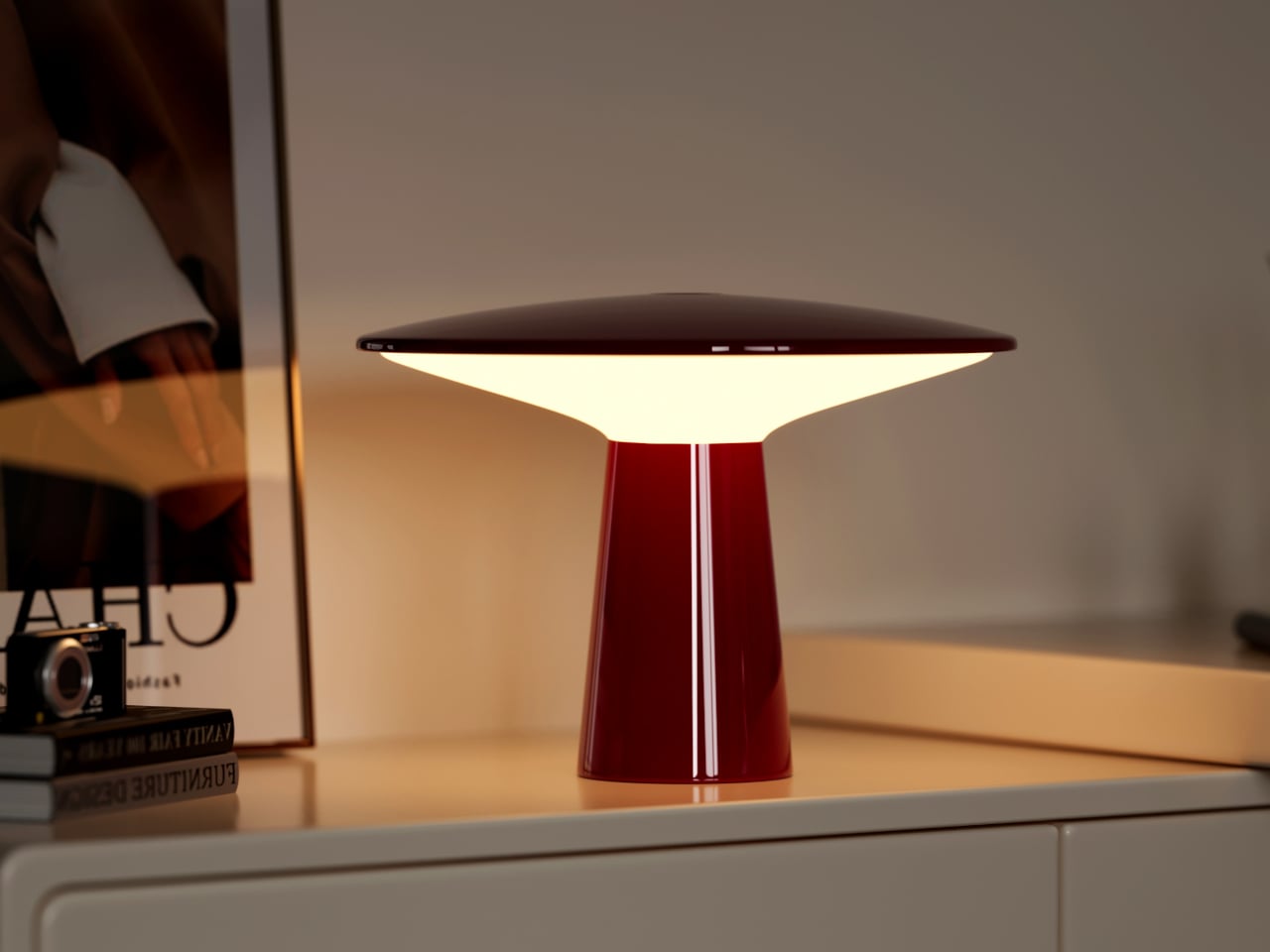
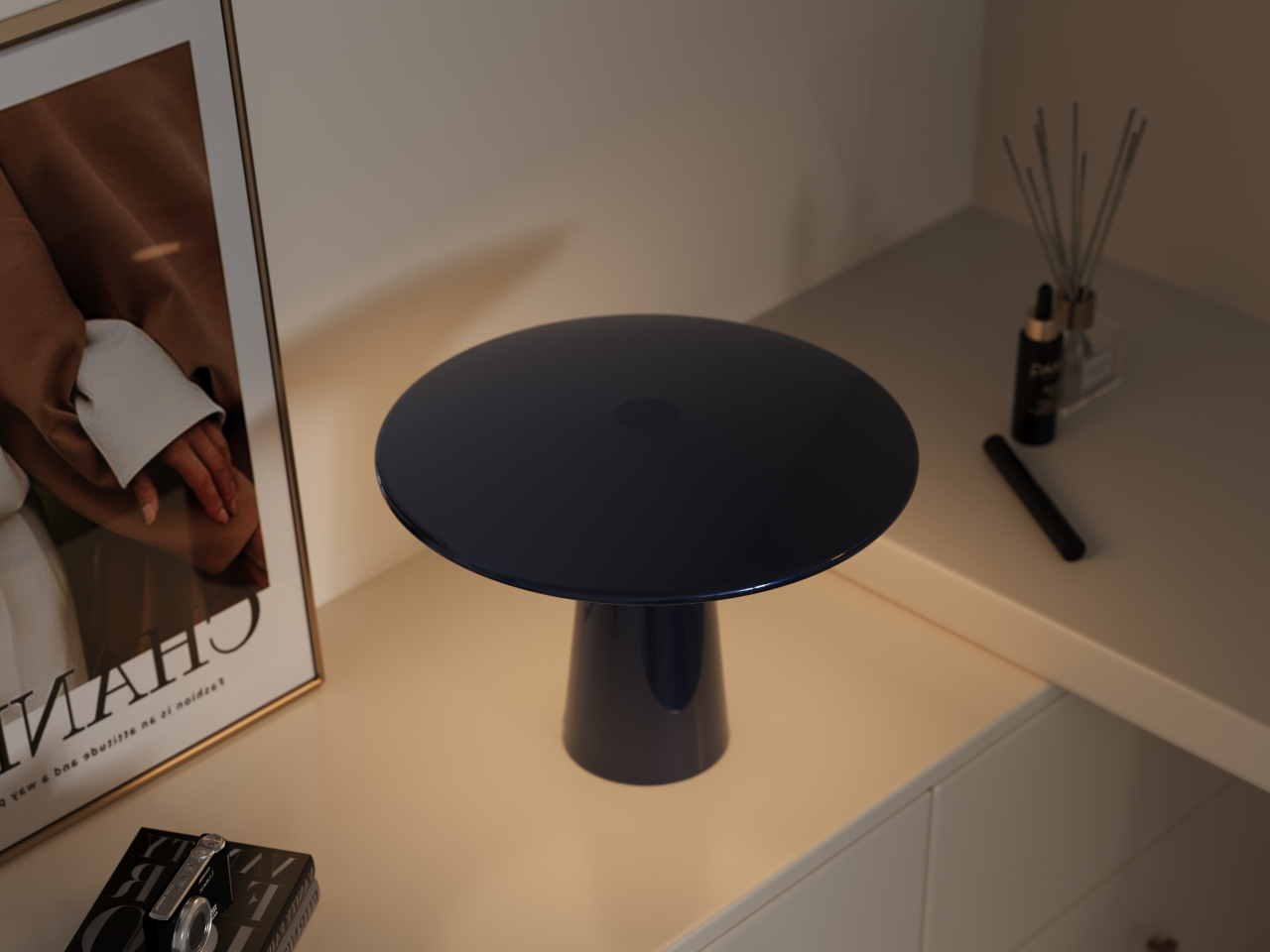
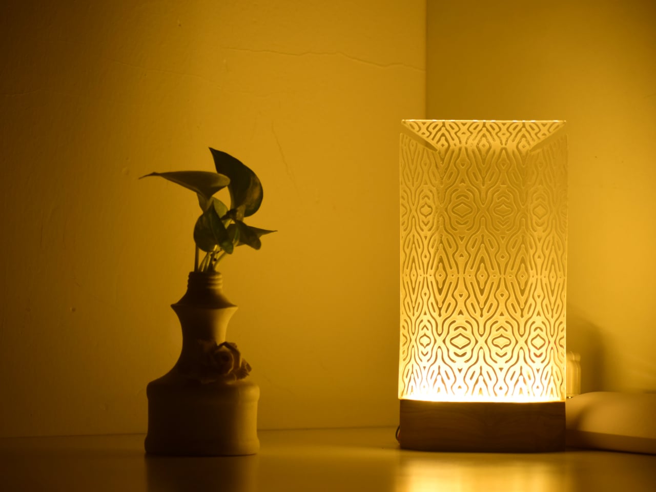
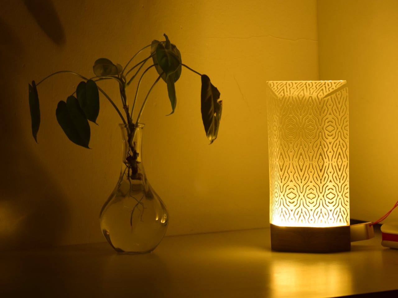
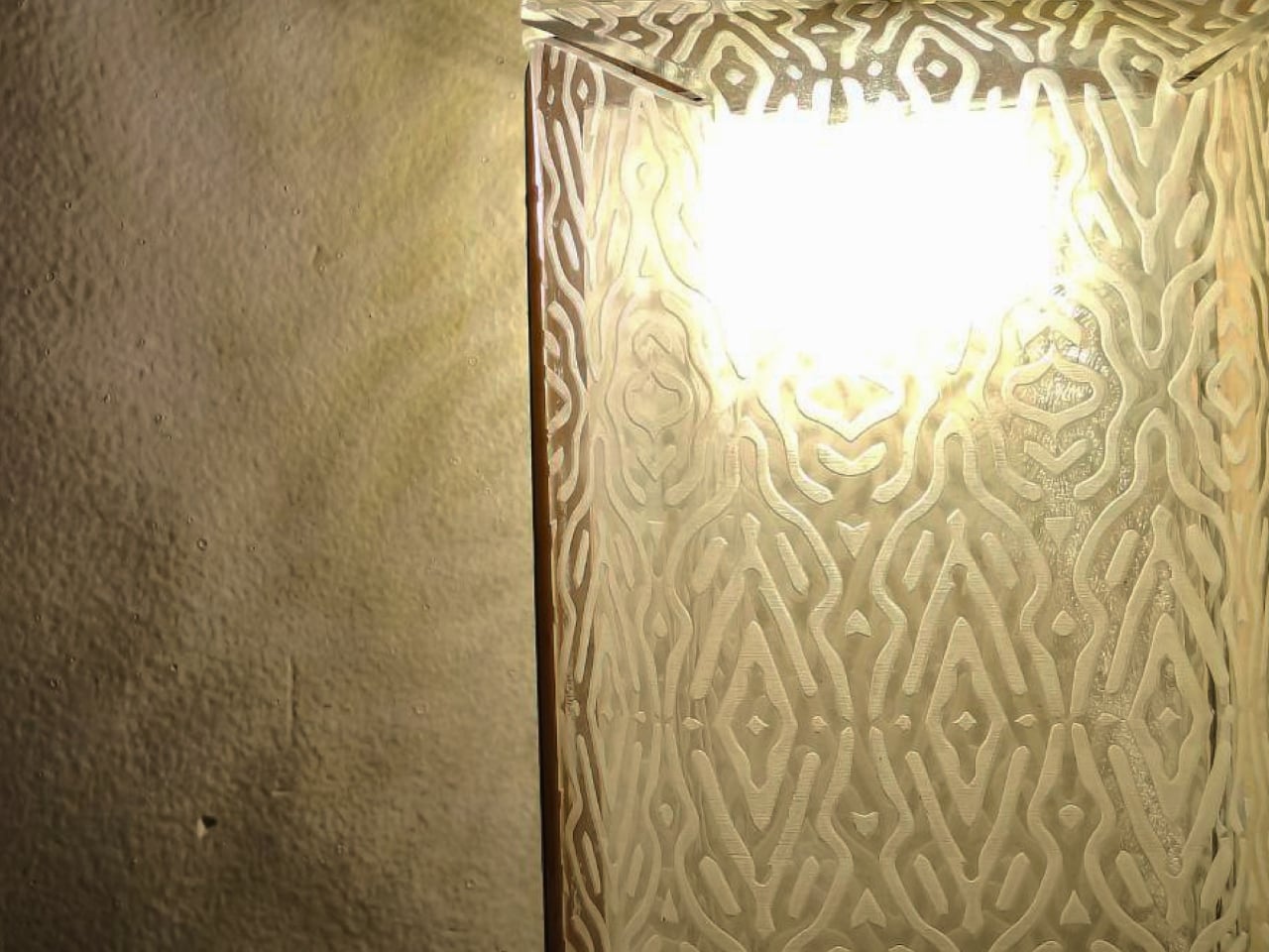
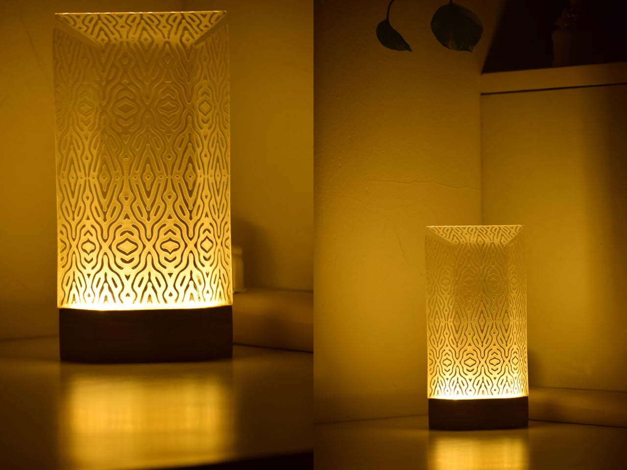
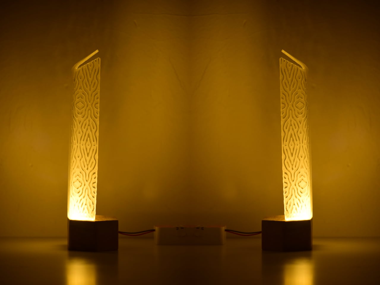
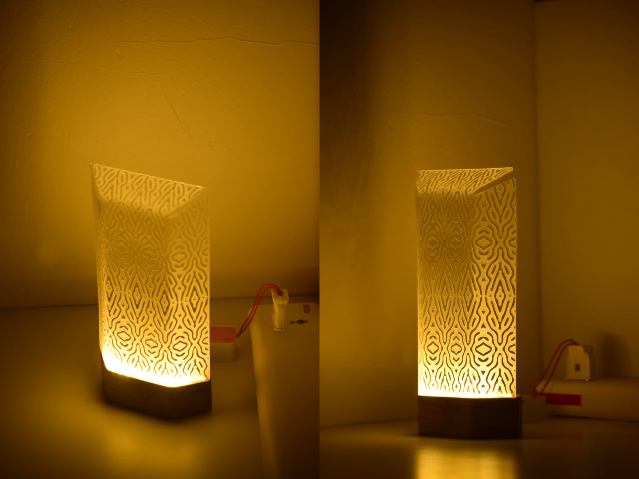
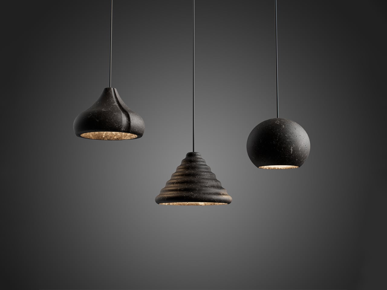
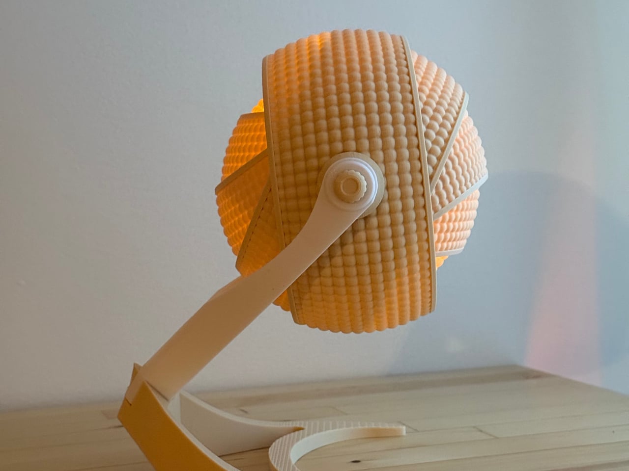
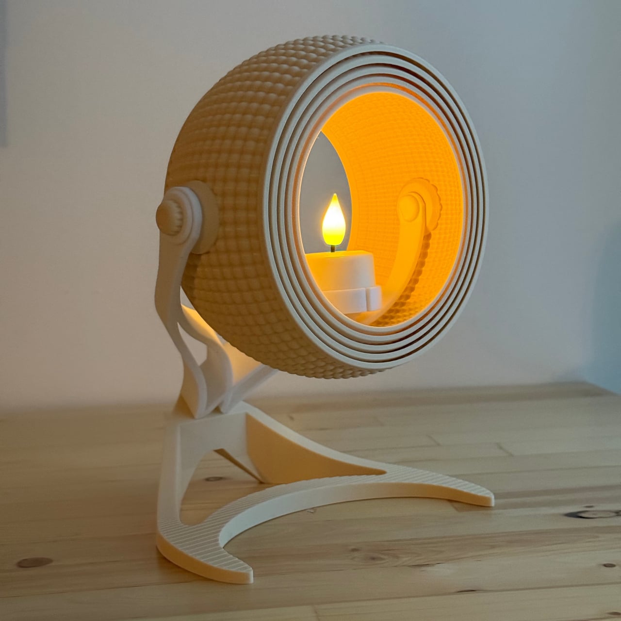
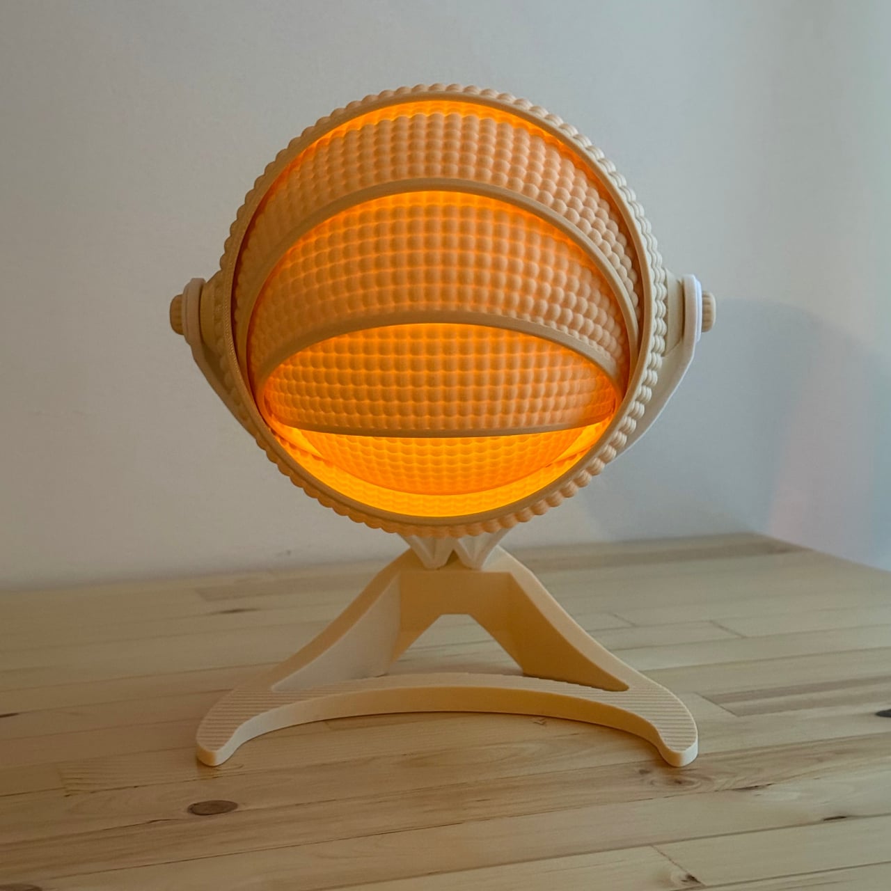
OHR Design, a Canadian 3D printing studio, is a good example of what that progress looks like. Its Armadillo series takes inspiration from one of nature’s most recognizable shapes, the segmented, overlapping bands of the armadillo shell, and turns it into a lamp shade that adjusts depending on how much, or how little, light you want in a room. And it all started from a tea light holder.
Designer: OHR Design
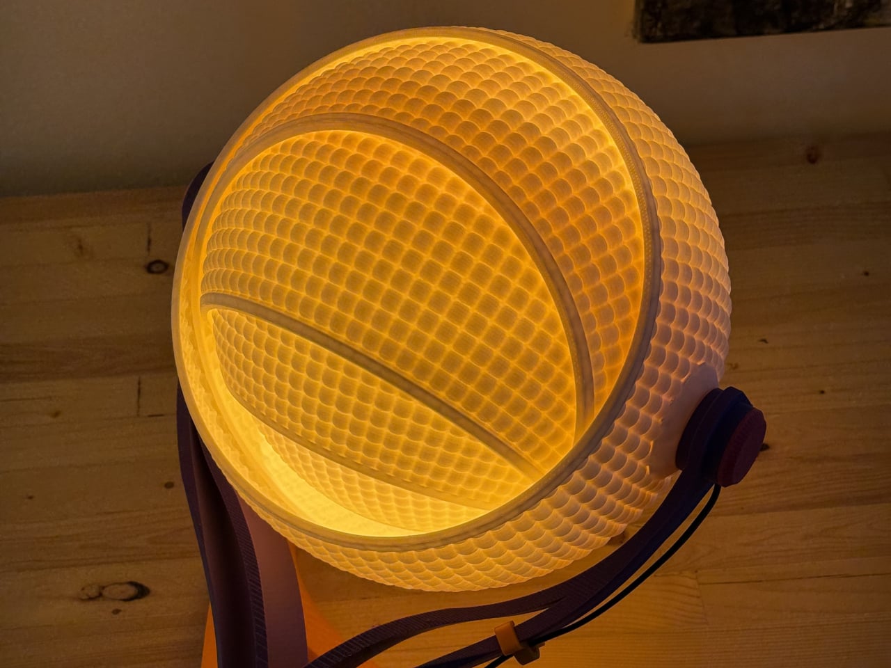
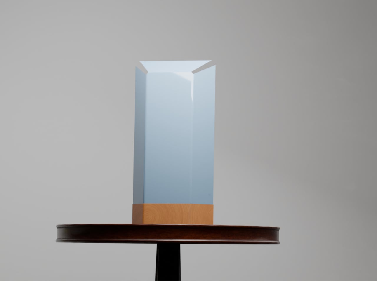
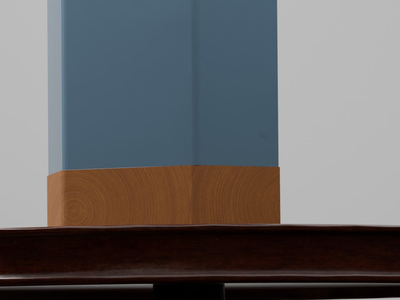
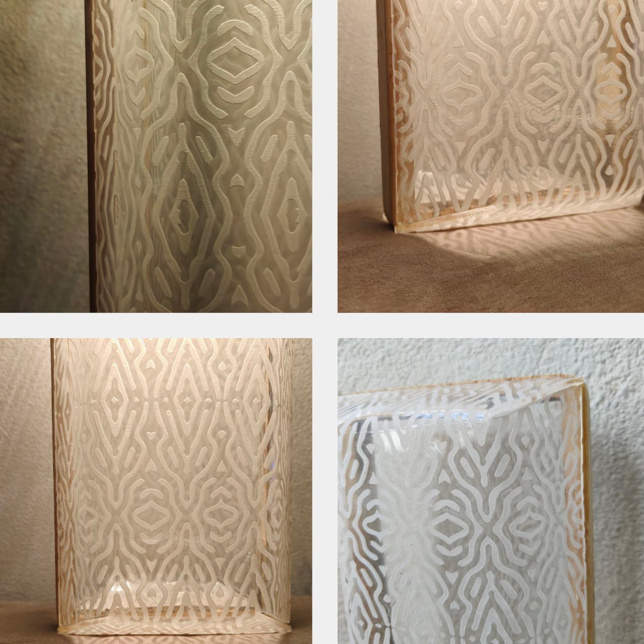
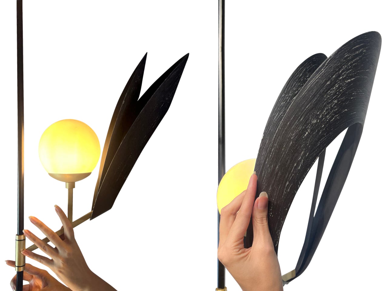
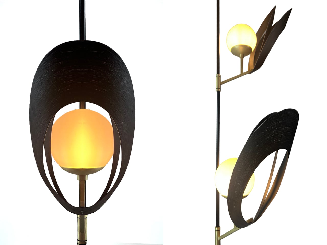
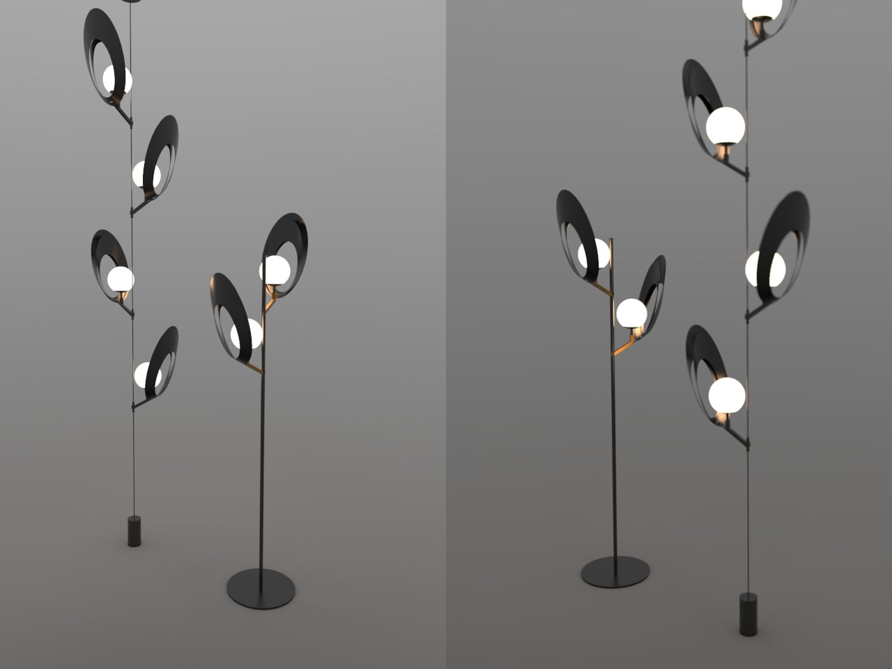
The original Armadillo grew from an earlier OHR Design called the OHRB, and it’s since inspired a whole family of spin-offs. True to its origins, the Armadillo wraps a tea light in a series of concentric rings that tilt forward to close the shade down or pull back to widen it. At 240mm tall, it’s compact enough for a bedside table or a bookshelf without demanding much real estate.
For those who want the same aesthetic energy at a bigger scale, the Armadillo XL scales the concept up into a proper desk lamp. At 373.8mm tall and 283.9mm wide, it makes a statement on a desk without being overwhelming. It accepts a real light bulb rather than a tea light, making it far more practical for anyone who actually needs their lamp to pull its weight.
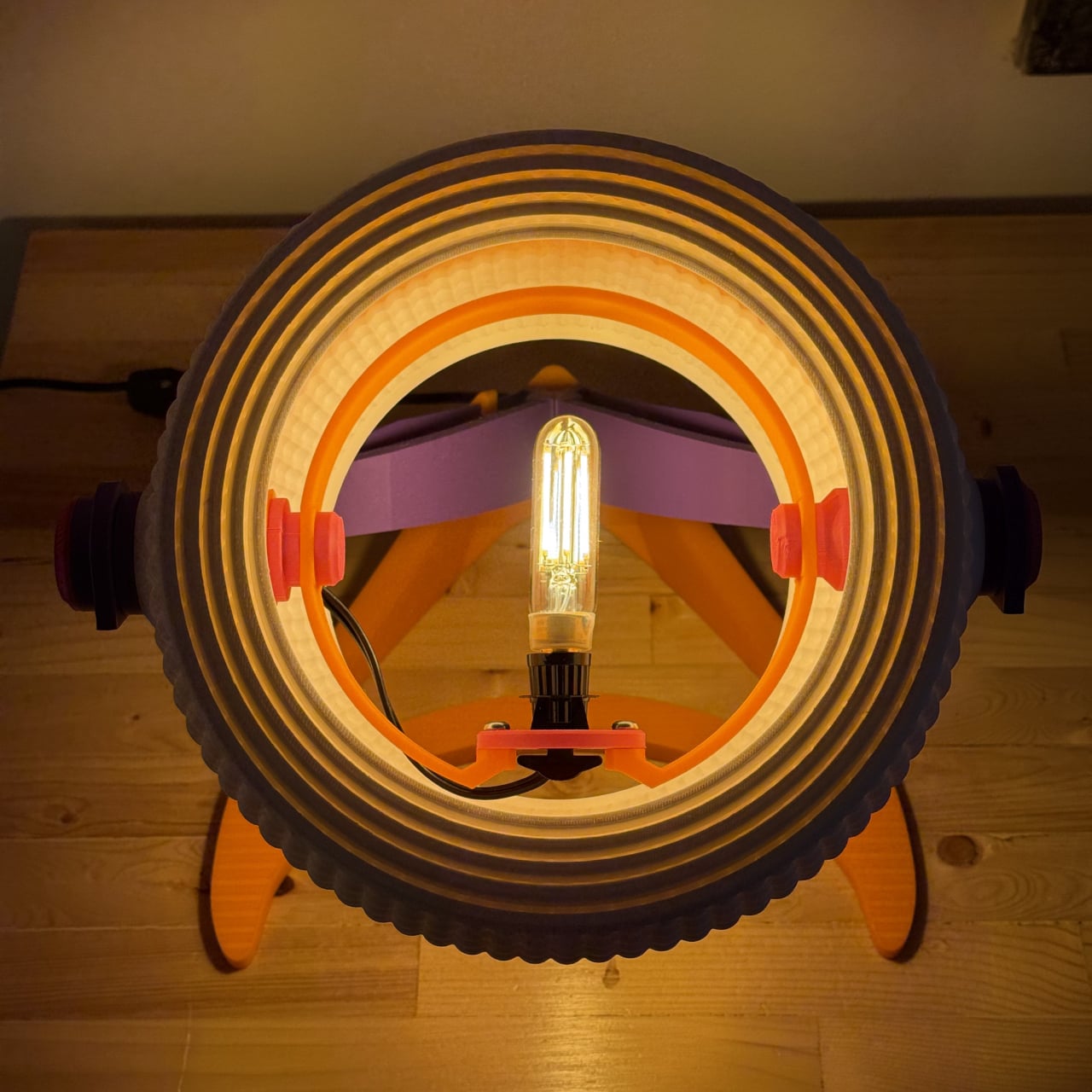
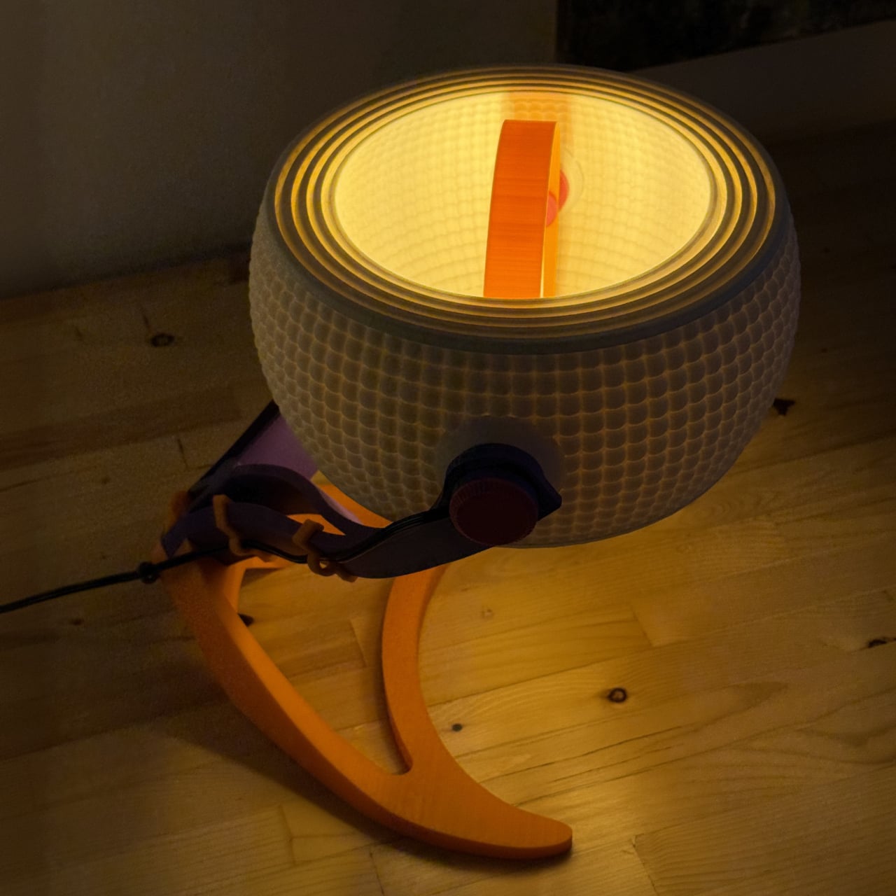
What gives both versions their character is the adjustable ring system. The segmented shade isn’t just decorative; opening and closing the rings changes how the light spreads through the room, softening the glow when the rings are fully open or concentrating it when they’re pulled shut. It’s the kind of thing that turns a simple on/off appliance into something you keep reaching over to tweak.
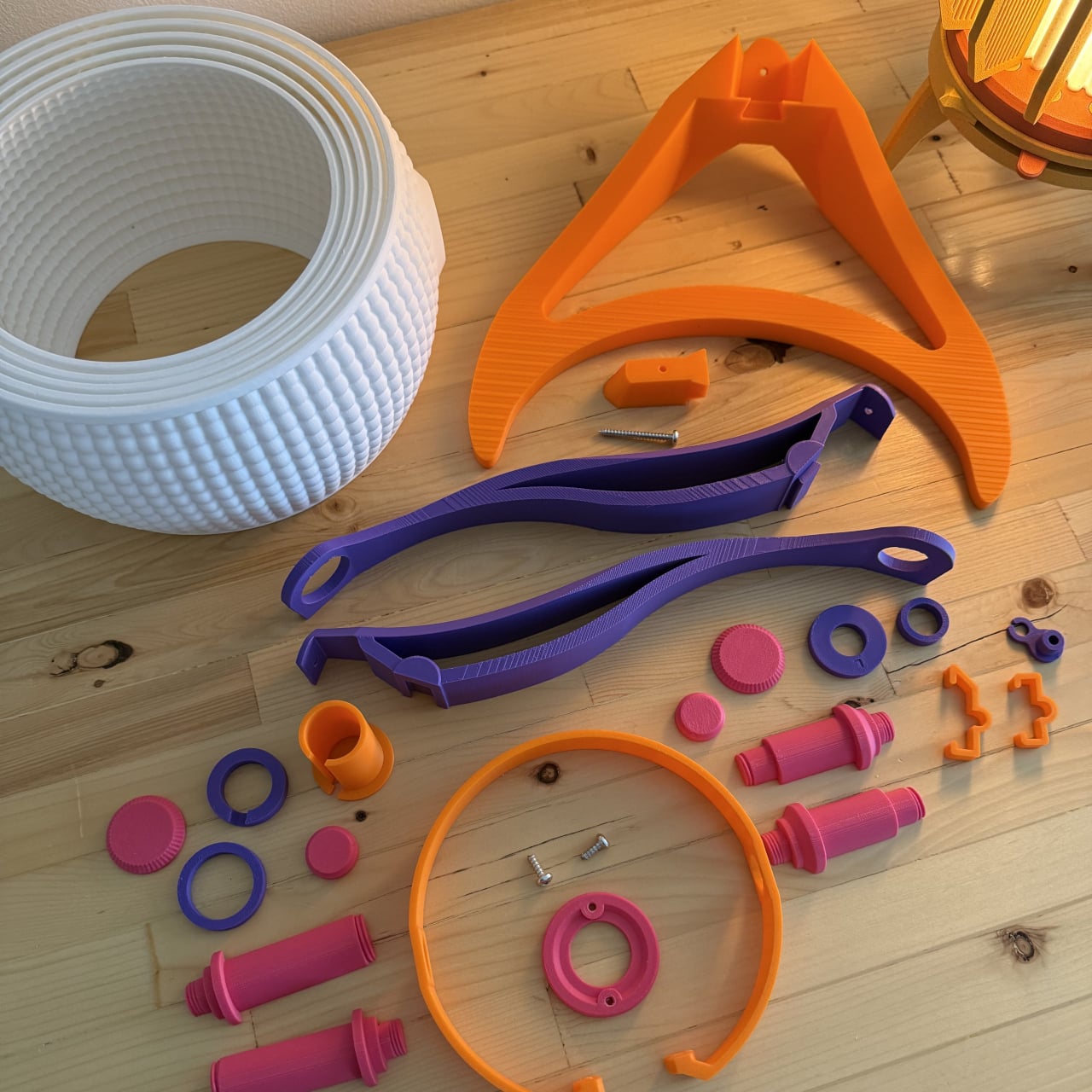
What’s equally interesting is how OHR Design sells these. You aren’t buying a finished lamp; you’re buying the STL files to print one yourself. The original Armadillo fits on a 180mm × 180mm print bed, making it accessible on smaller machines like the Prusa Mini or Bambu Lab A1 Mini. The Armadillo XL, being larger, requires a 256mm × 256mm build volume.
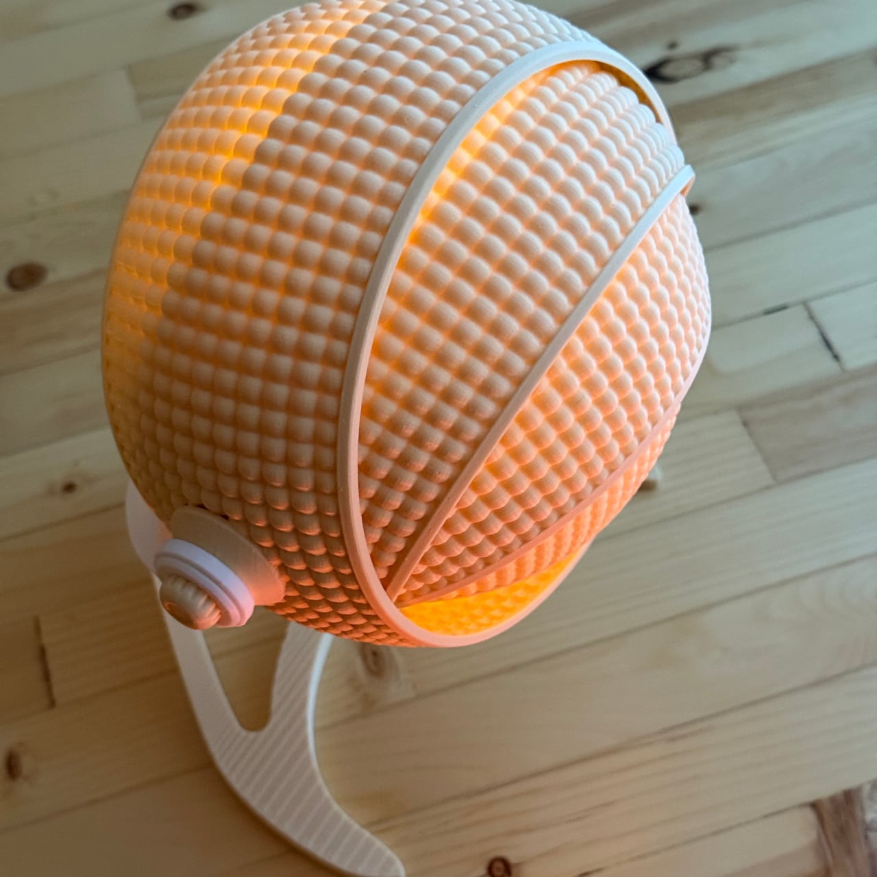
The filament choice is entirely yours, which means the lamp can be as neutral or as bold as you want. OHR Design has been spotted using Overture’s Super PLA+ in various colors, from muted naturals to vivid hues, all of which change how the diffused light reads. Not many lamps invite you to physically shape the light they cast, and fewer still can be reimagined entirely based on the color spool you have on hand. The Armadillo family puts creative control squarely in the hands of whoever prints it, and that’s a genuinely refreshing place to land.
The post This 3D-Printed Lamp Has a Shell That Opens and Closes to Shape Light first appeared on Yanko Design.