The World’s Longest Single-Mast Bridge Has Arrived

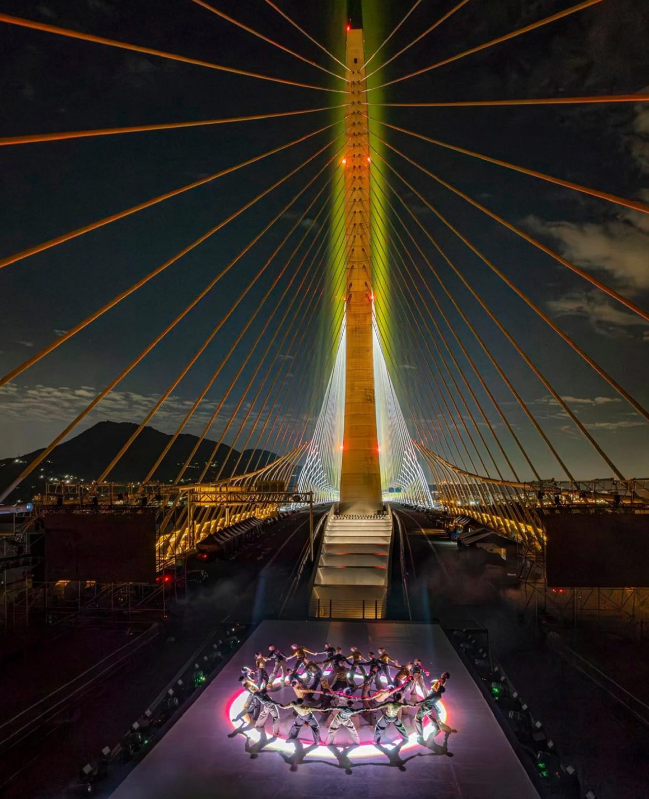
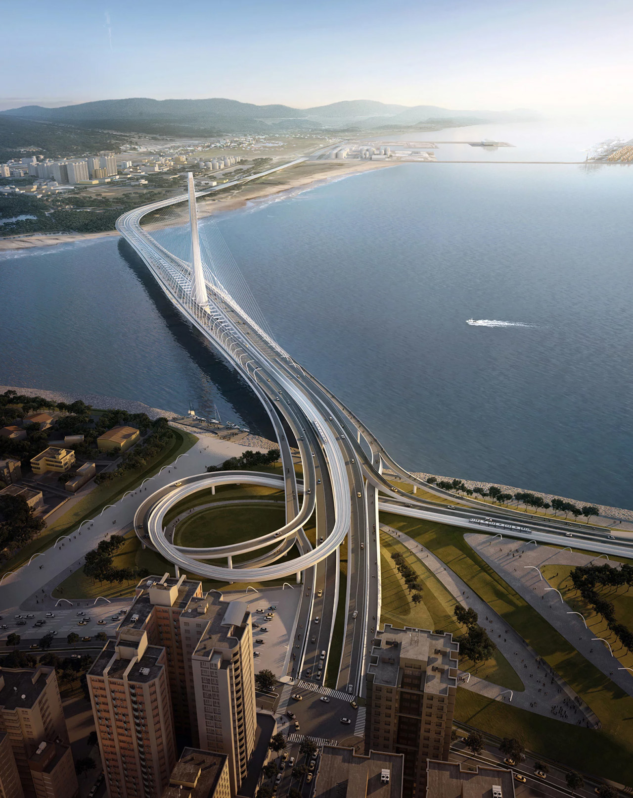
At the mouth of Taiwan’s Tamsui River, a new landmark has quietly redrawn the skyline. The Danjiang Bridge, designed by Zaha Hadid Architects, has opened as the world’s longest single-mast, asymmetric cable-stayed bridge — a record-breaking piece of infrastructure that manages to feel more like a gesture than an imposition on its surroundings.

The project stretches 920 meters between New Taipei City’s districts of Tamsui and Bali, held aloft by a single concrete mast rising 200 meters above the estuary. That restraint is intentional. Where most bridges of this scale rely on a sequence of towers or supports planted through the riverbed, ZHA stripped the structure down to one vertical element — tall and slim enough to leave the horizon largely intact. The main span reaches 450 meters to the west of the mast, with a 175-meter span to the east, and cables fan outward asymmetrically from the tower in a sweeping, almost calligraphic arrangement.

Designer: Zaha Hadid Architects

The 71-meter-wide deck is built for a full range of movement. It carries motor traffic, dedicated pedestrian paths, cycle routes, and has been designed to accommodate a future extension of the Danhai Light Rail network — making it less a single-purpose crossing and more a layered piece of public infrastructure. ZHA director Patrik Schumacher described the design as one that would “make a conspicuous landmark against the backdrop of Tamsui’s famous sunsets,” and the placement of the mast against open water at dusk delivers exactly that.

Getting the form right required careful environmental modeling. The original competition brief placed significant weight on protecting views of the river’s famously photogenic sunsets, and ZHA used detailed mapping to ensure the mast’s silhouette — tall and linear — would read as a marker rather than a barrier in the landscape.

Engineering had to match Taiwan’s seismic reality. The support system is built to withstand earthquakes of magnitude 7 or above, combining pier supports, cable stays, hydraulic dampers, friction pendulum bearings, and synthetic rubber pads that work together to absorb both vertical and horizontal force. The structure is doing considerable technical work beneath its clean exterior.

ZHA won the Danjiang Bridge International Competition in 2015, and construction ran from that year through to 2025. For a firm whose identity is closely tied to cultural buildings and interior spaces, the bridge represents something different — a piece of civic infrastructure where the signature fluid language has been channeled into cable geometry, seismic engineering, and a view that already mattered deeply to the city it now connects.

The post The World’s Longest Single-Mast Bridge Has Arrived first appeared on Yanko Design.

A House In London Where Floors Drop, Walls Vanish, and the Garden Moves In

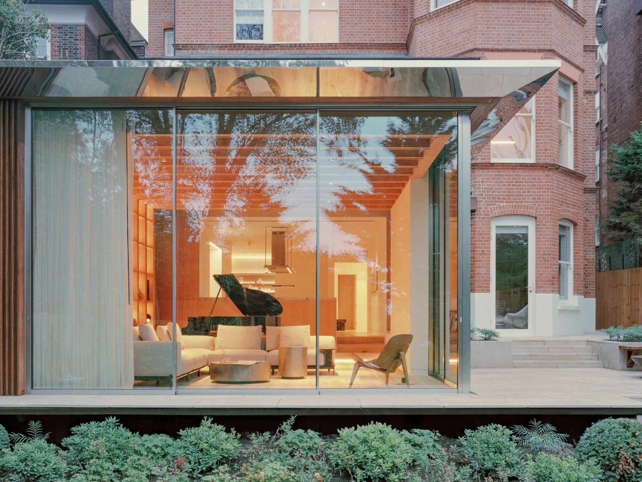
Many homes treat the garden as something separate from daily life, something to look at through a window or visit when the weather is good. This house in Hampstead, redesigned by MATA Architects, takes a far more connected approach. Created for a family with teenage children, the project focuses on transforming the lower ground floor and rethinking how the house relates to its south-facing garden. Rather than adding space for the sake of it, the redesign improves the way the home is lived in and how each room connects to the outdoors.

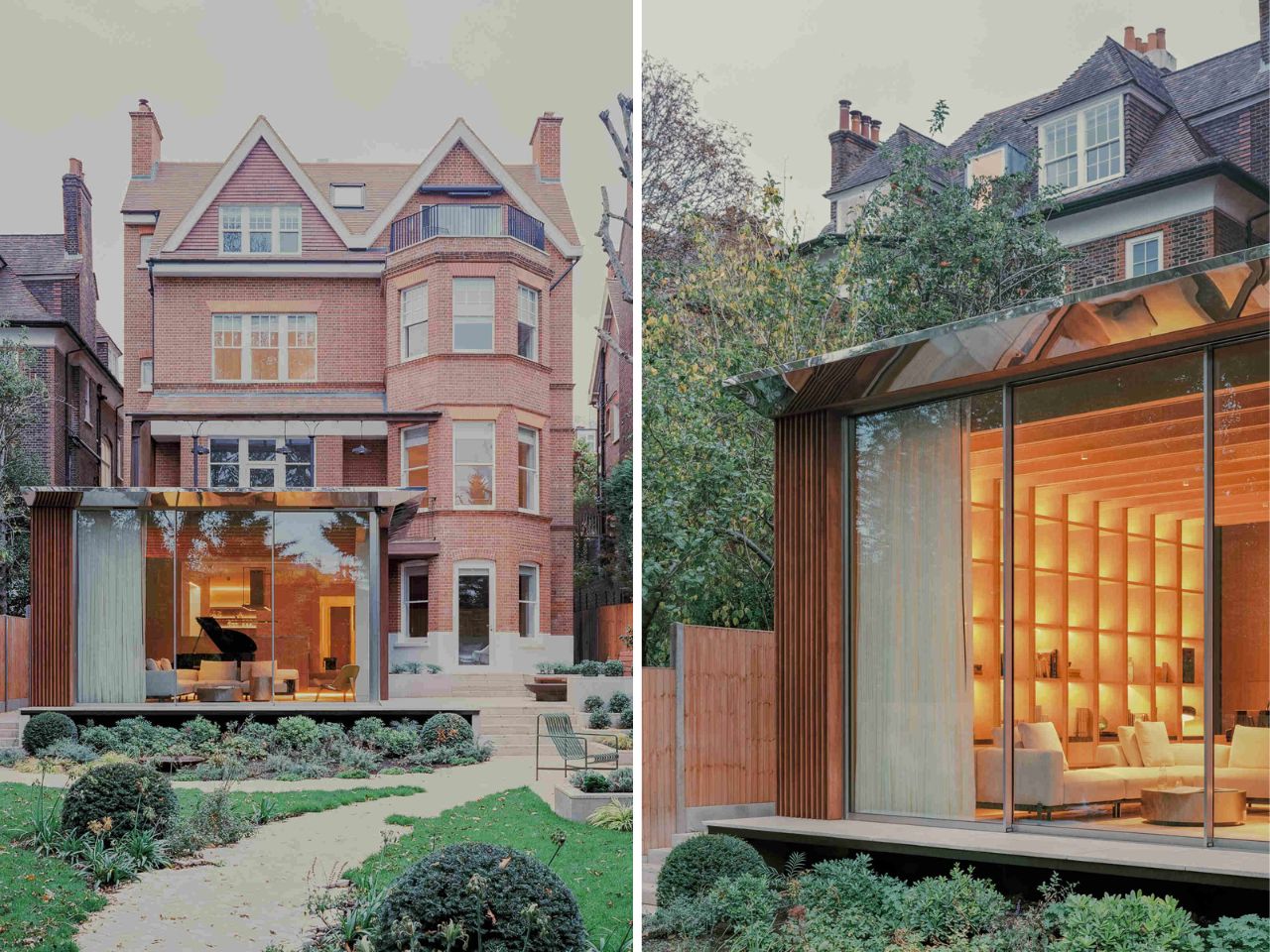
Before the renovation, the house sat well above the garden, with a long staircase creating a clear sense of separation between inside and outside. The architects solved this by bringing the main living spaces closer to the landscape. The new extension steps almost a meter lower than the original level, placing the family rooms directly alongside the garden. This simple shift changes everything. The ceilings feel taller, natural light reaches deeper into the interior, and the garden becomes part of everyday life instead of feeling like a separate area at the bottom of the plot.

Designer: MATA Architects

The surrounding trees played a major role in shaping the design. Because of root protection zones, the footprint of the extension had to be carefully planned. Instead of forcing a standard solution onto the site, the architects allowed these constraints to guide the final form. That careful response gives the project a sense of balance, as though it belongs naturally within its setting.

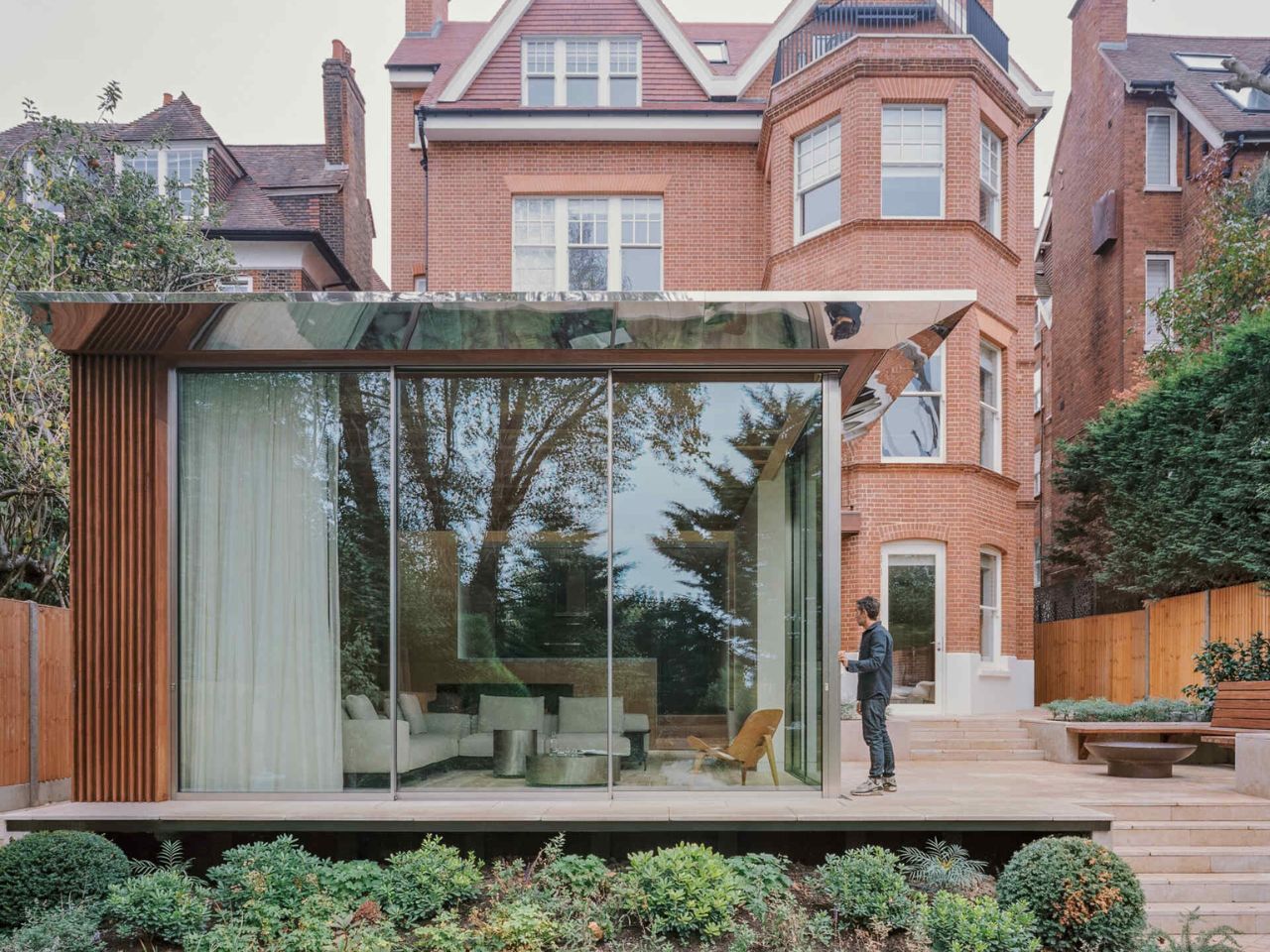
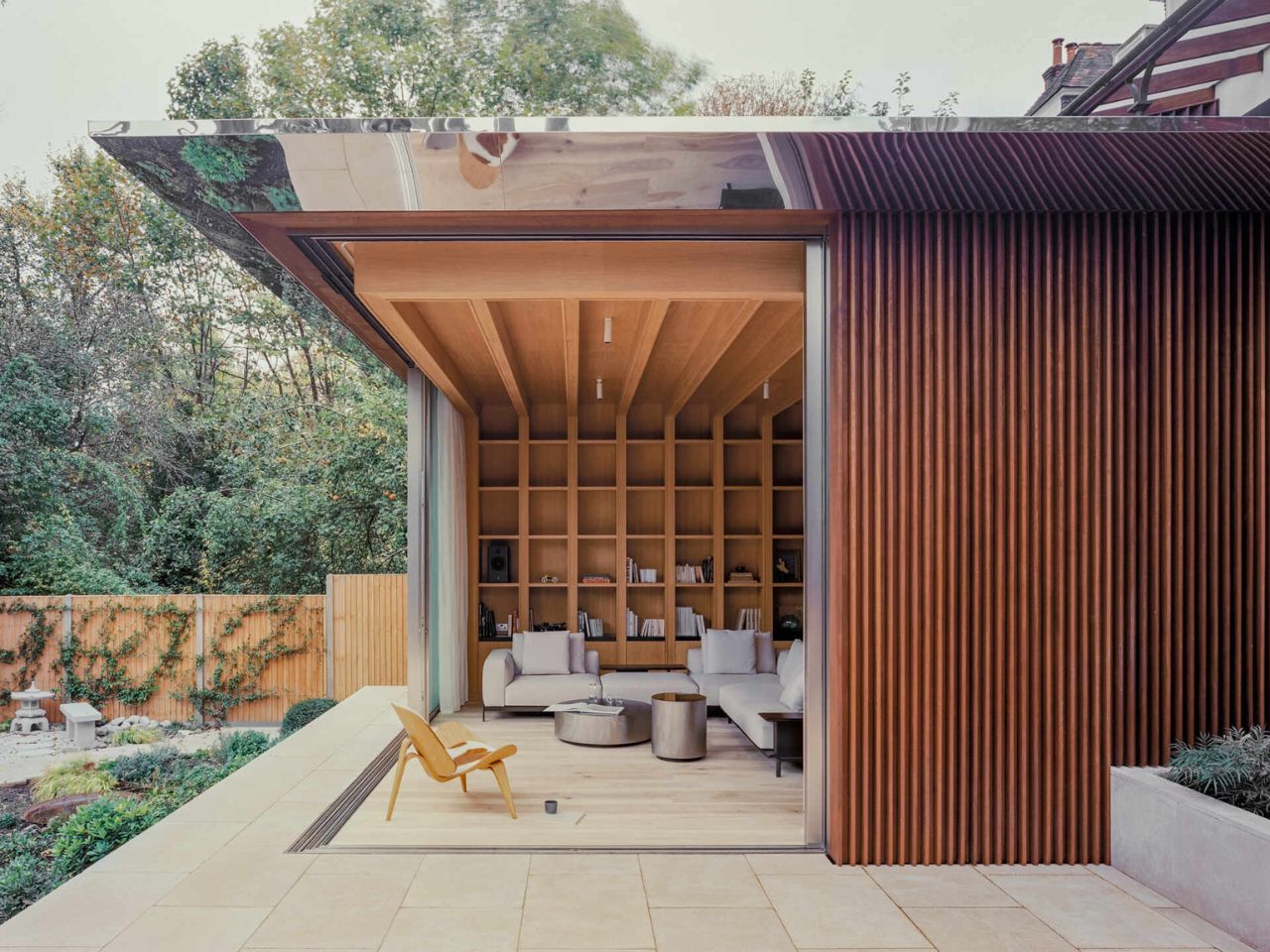
The materials help reinforce that feeling. The exterior is wrapped in hit-and-miss iroko hardwood battens, which add texture and warmth while softening the lines of the new addition. Above, a tapering roof stretches outward to provide shade during warmer months. Its underside is finished in mirror-polished stainless steel, reflecting the trees and sky overhead. It is a subtle detail, but an effective one, helping the roof feel lighter and less dominant in the garden.

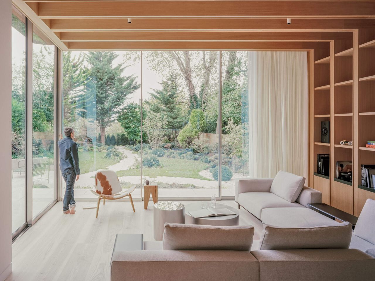
The standout feature is the fully glazed corner facing the terrace. Large sliding glass panels meet without a visible support, allowing the corner to open completely when the doors are pulled back. When open, the living room flows straight onto the terrace and into the garden beyond. When closed, the glazing still maintains clear views and fills the interior with daylight. It is the kind of feature that looks impressive, but it also genuinely improves how the house works.

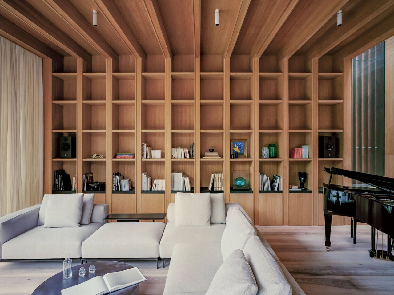
Inside, the lowered living room sits at the heart of the extension. The slight change in floor level helps define the area within the open plan layout without the need for walls. Full-height glazing keeps the space bright throughout the day, while views of greenery are visible from almost every angle. Built-in timber shelving adds warmth and prevents the room from feeling too minimal or exposed. It also provides useful storage and gives the living area a stronger sense of identity.

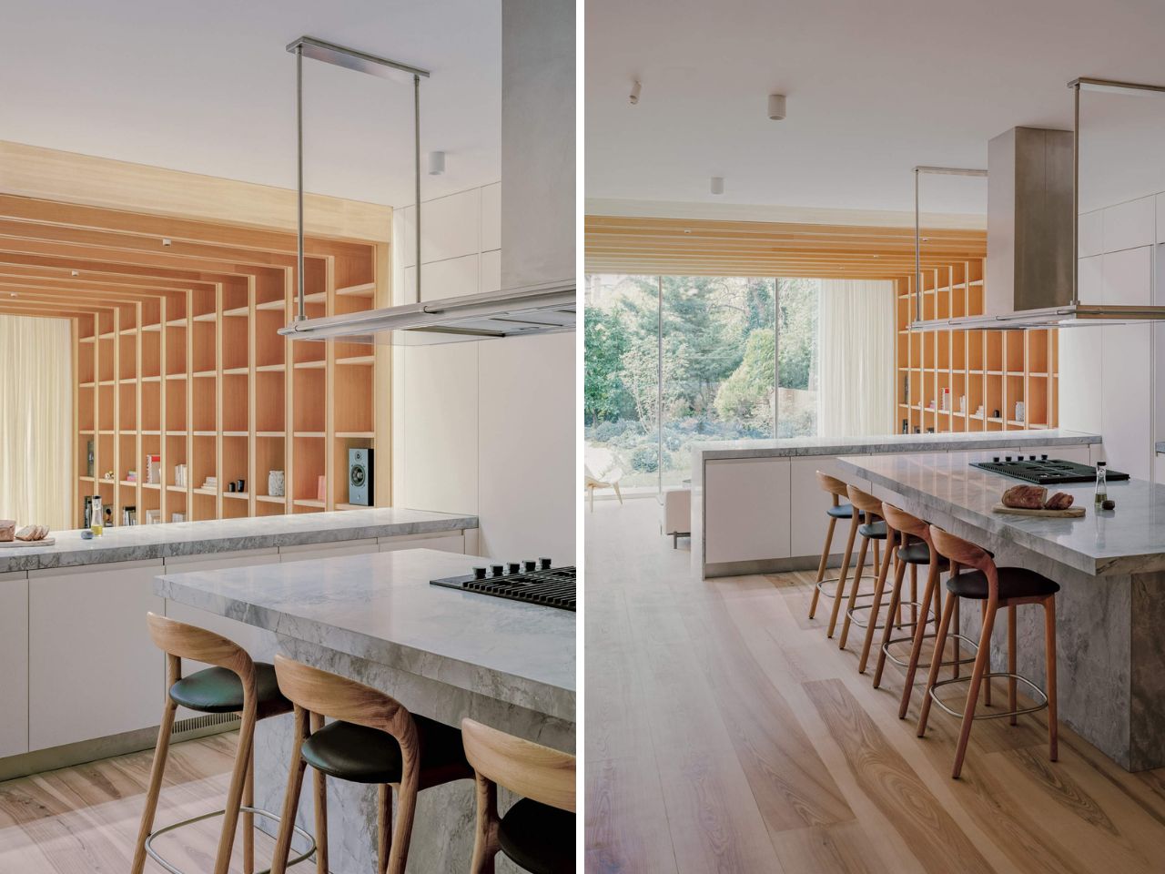
Dinesen ash flooring runs throughout the interior, creating continuity and a calm, natural base for the spaces above it. In the kitchen, a large island in Bianco Eclipse quartzite acts as both a working surface and a gathering point. Positioned centrally, it allows clear views across the living room and out to the garden, helping the kitchen feel connected to the rest of the home.

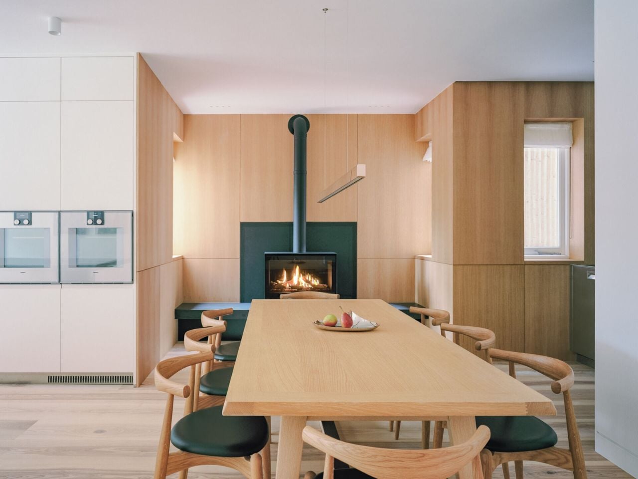
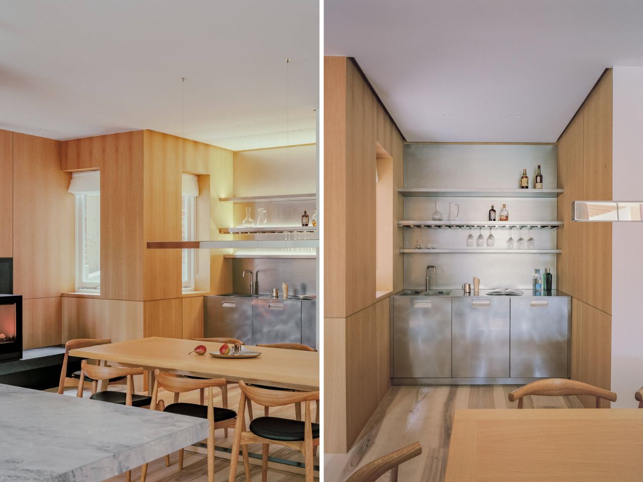
Next to it, the dining area brings a slightly more intimate atmosphere. A wood-lined alcove, fireplace, and built-in bar make it equally suited to family dinners or hosting friends. Smaller spaces have been given the same level of attention. The powder room features a sculptural stone sink, combining rough texture with clean detailing, softened by warm timber and subtle lighting.

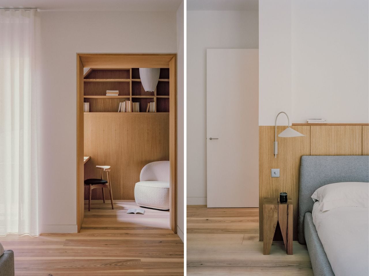
The private rooms continue the same thoughtful approach. The primary suite combines sleeping, working, and bathing in one cohesive space, complete with an integrated study area and an ensuite with a timber soaking tub, concrete sinks, and stainless steel fittings. Another bedroom includes its own fireplace, adding warmth and character.

What makes this home successful is that every design decision feels purposeful. Nothing is there just to impress. By lowering the main rooms and opening them fully to the garden, MATA Architects have turned a once disconnected outdoor space into the natural center of the home.

The post A House In London Where Floors Drop, Walls Vanish, and the Garden Moves In first appeared on Yanko Design.

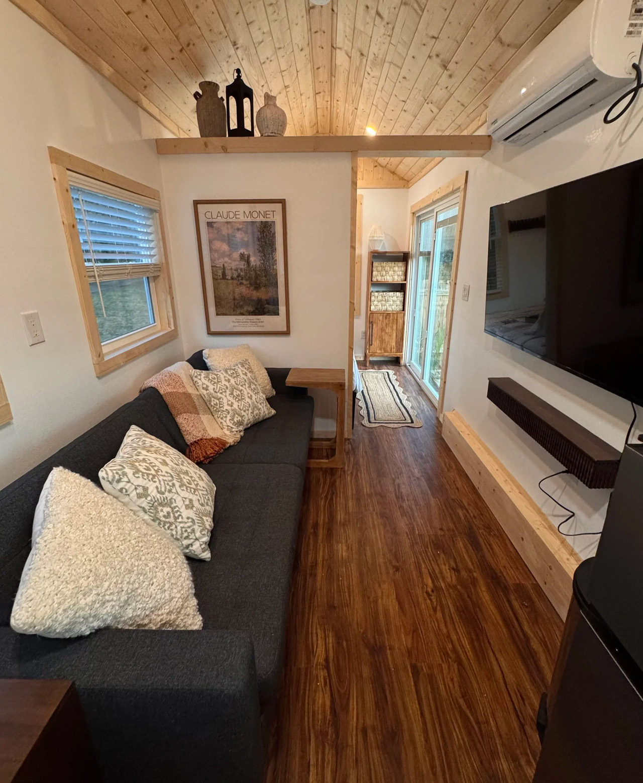
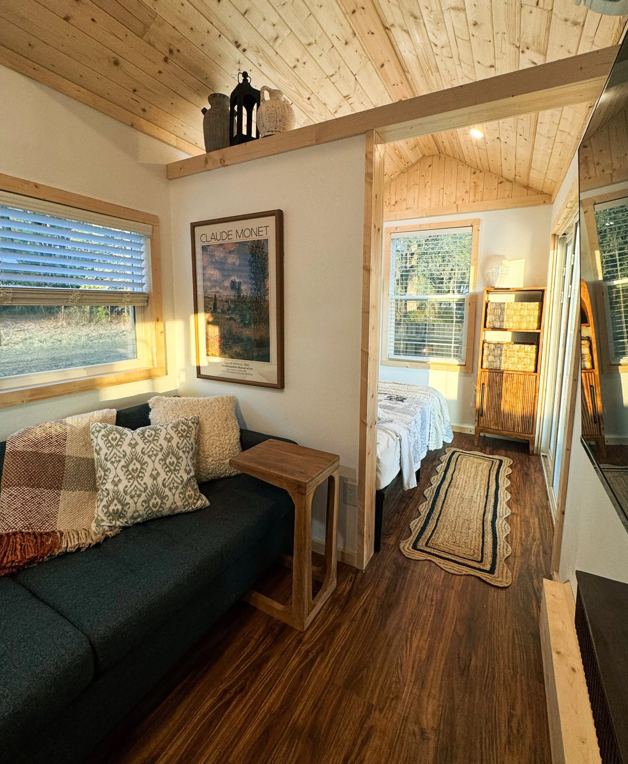
The Surya Is the Tiny House That Finally Makes Single-Level Living Worth It

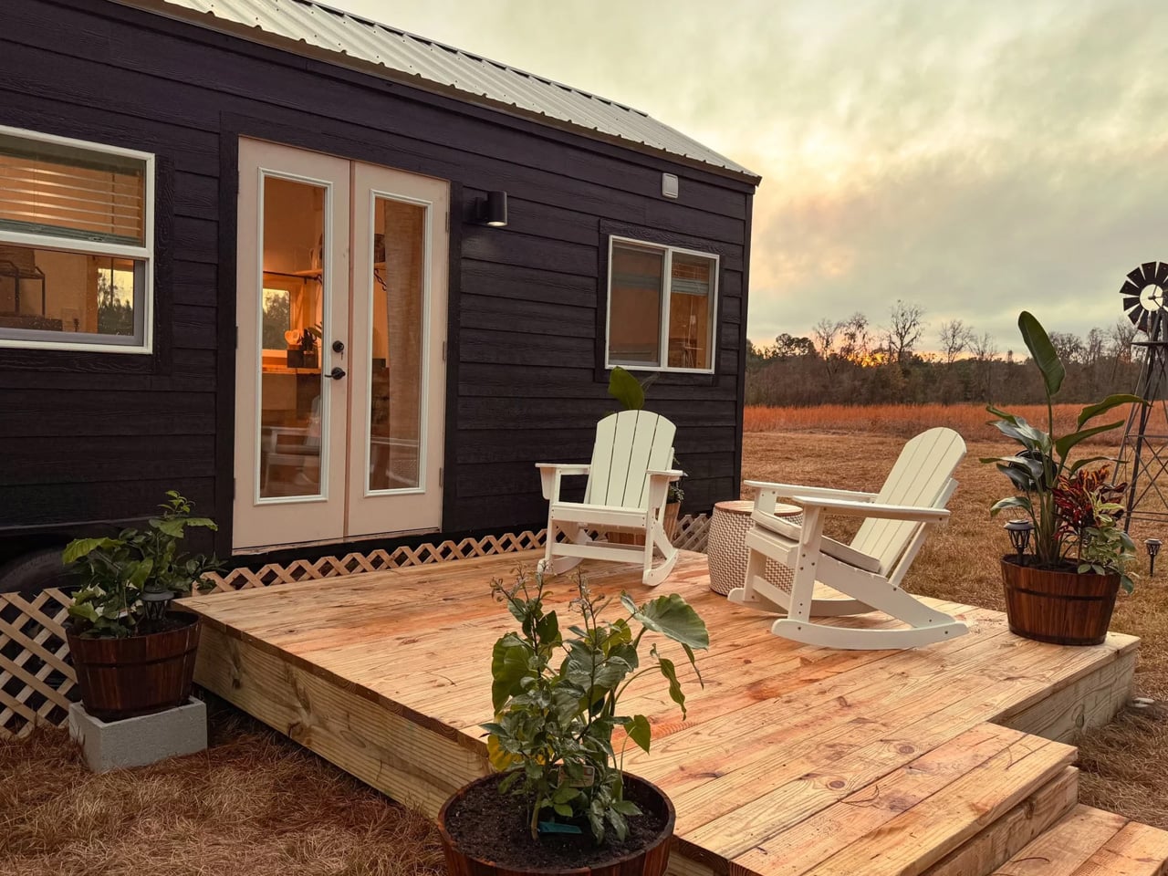
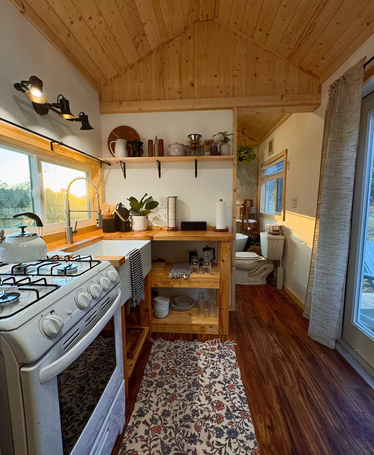
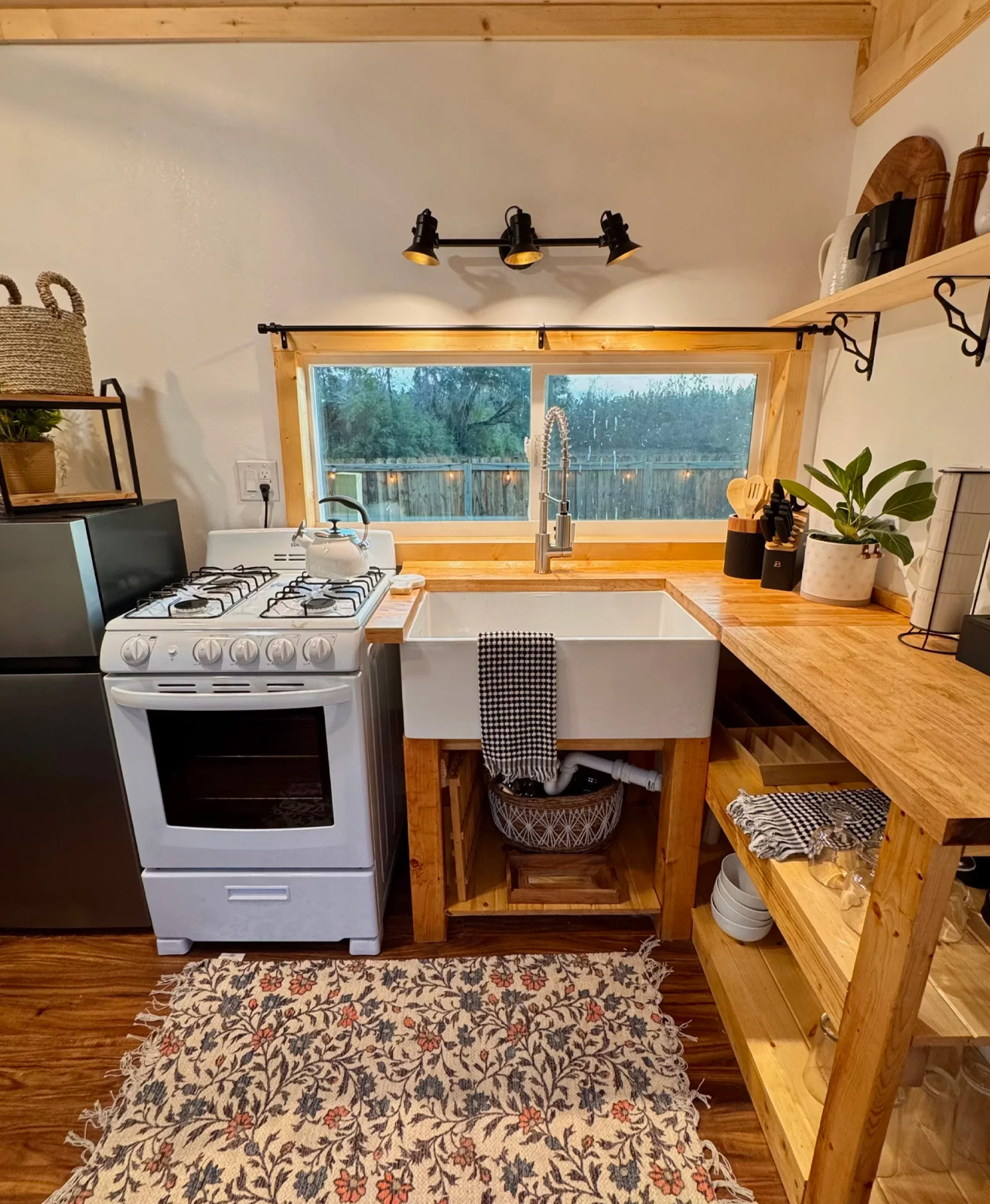
I love a home that fits everything you need into 256 square feet without making you feel like you’re compromising. The Surya tiny house by Florida-based Simplify Further Tiny Homes does exactly that — a single-level, 32-foot build that sits somewhere between a well-considered home and a design statement.

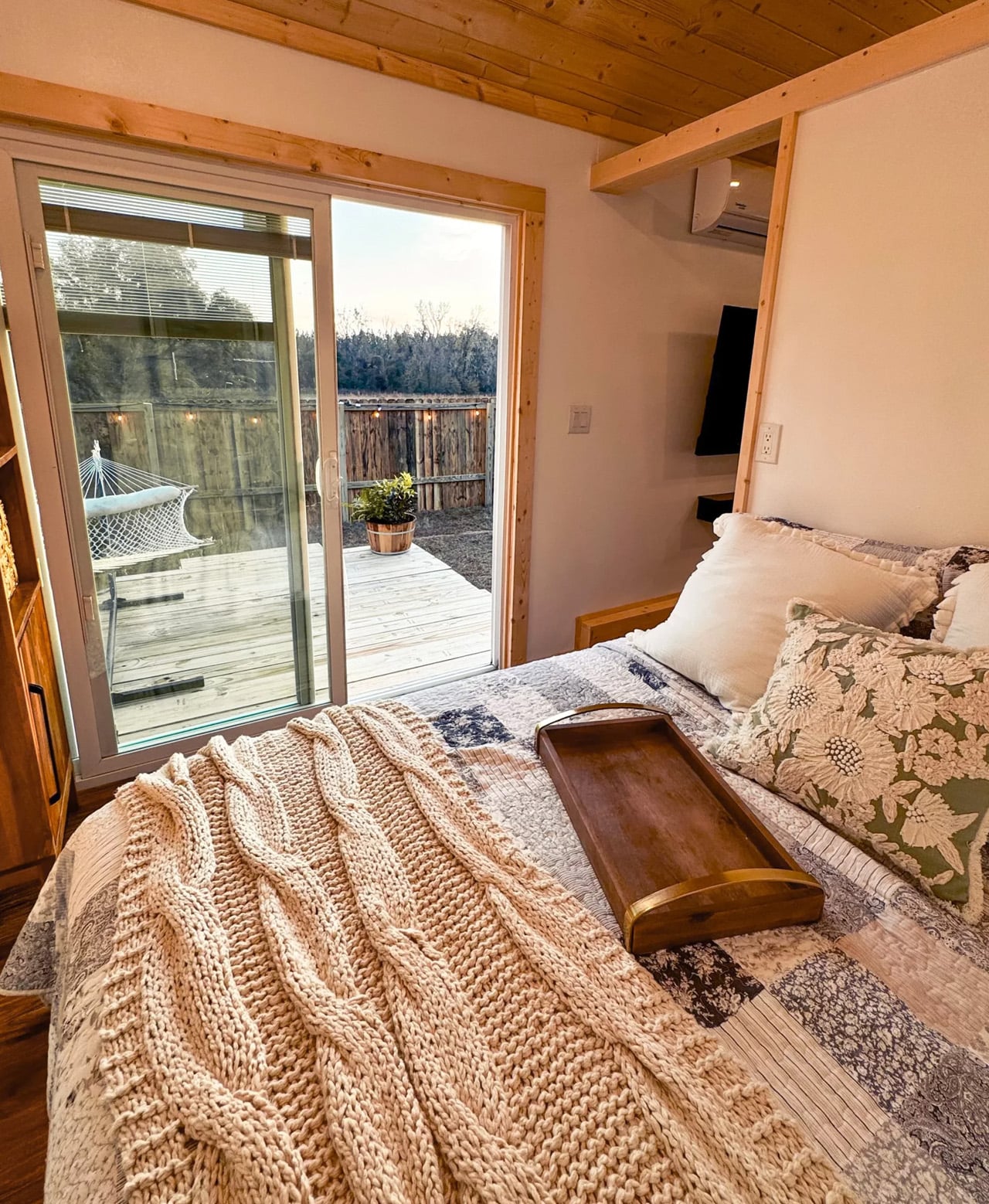
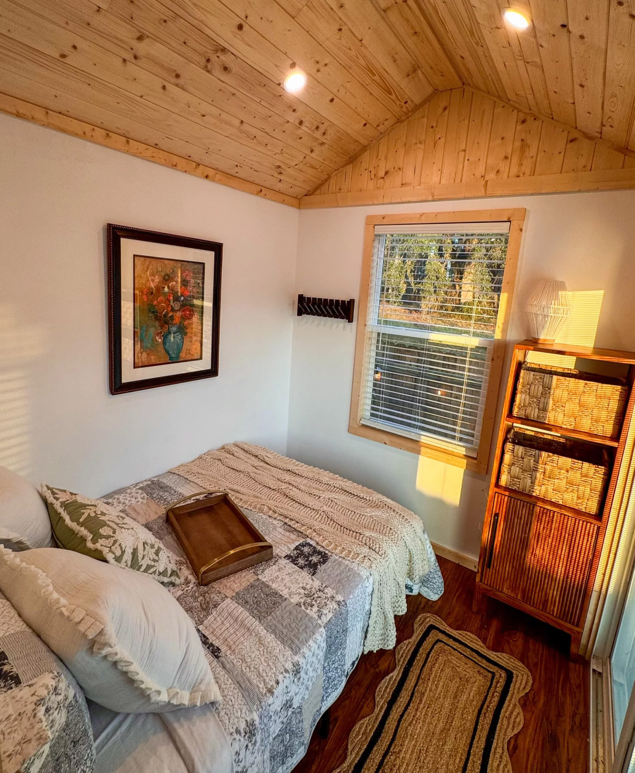
Named after the Sanskrit word for “sun,” the Surya carries that warmth through every inch of its interior. Where most tiny homes lean heavily into the loft layout, the Surya takes a different route — keeping the bedroom on the main level with enough room for a queen-sized bed. It’s a practical choice that makes the space feel less like a cleverly packed suitcase and more like an actual home you’d want to live in full-time.

Designer: Simplify Further Tiny Homes

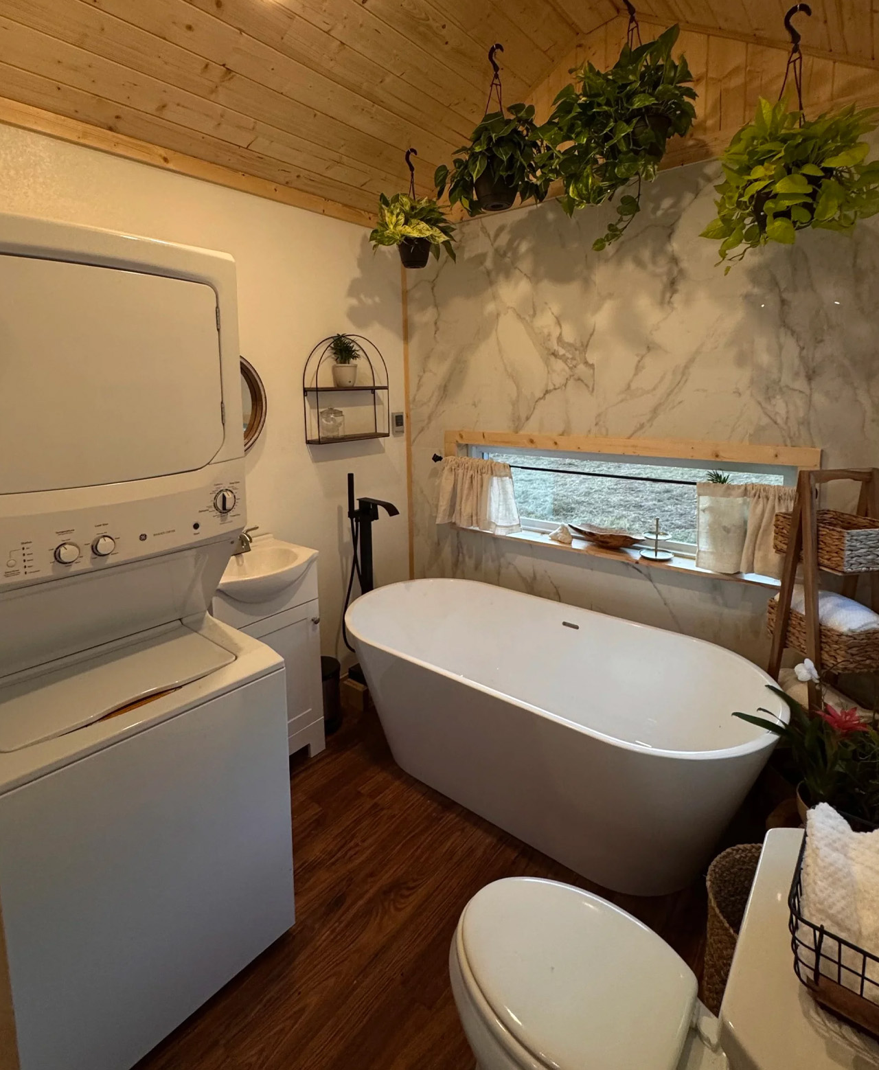
The layout reads cleanly. A well-equipped kitchen anchors one end of the build, a full bathroom sits in the middle, and a spacious living area opens up toward the other end — offering a flexible 5×7-foot floor plan that works as a lounge, a workspace, or an extra sleeping area depending on how you configure it. There’s no loft in the standard model, though Simplify Further offers the option to add one or two for households that need the overhead real estate.

At 8 feet wide and 13.6 feet tall, the Surya is built on a bumper-pull trailer with a hand-built chassis, thick-gauge steel, double axles rated at 7,500 pounds each, trailer brakes, and DOT-approved highway lighting. It ships nationwide and carries NOAH certification as a recreational vehicle — a detail that matters when it comes to parking, financing, and insurance. Starting at $75,000, the price reflects the build quality, with a one-year limited warranty on workmanship included.

Simplify Further isn’t a newcomer to the space. The Lake Butler, Florida-based builder holds a BBB Accredited A+ rating and has taken home the Best Tiny House award at Florida’s Tiny Home Festival — not once, but twice. Their builds have also been featured across media outlets and the broader tiny home community, which speaks to a level of craft that goes beyond the spec sheet.

The Surya isn’t trying to be everything for everyone. It’s designed for couples or small households who want full-time livability, a guest house with real presence, or a short-term rental that actually converts bookings. For those drawn to the single-level lifestyle, it makes a convincing case that a smaller floor plan doesn’t have to mean less life.

The post The Surya Is the Tiny House That Finally Makes Single-Level Living Worth It first appeared on Yanko Design.

This Is What a Theater Looks Like When Architecture Gets Out of the Way

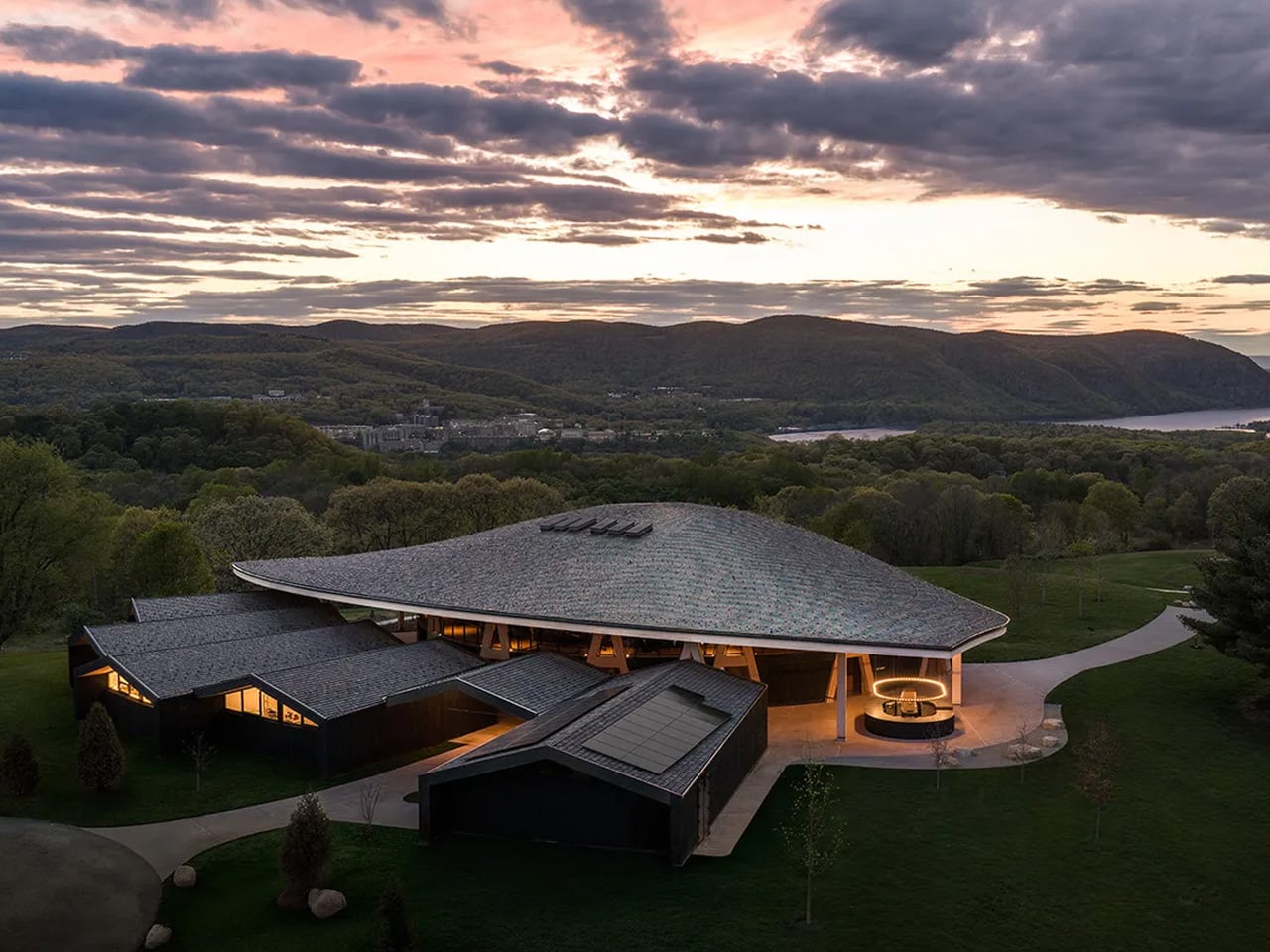
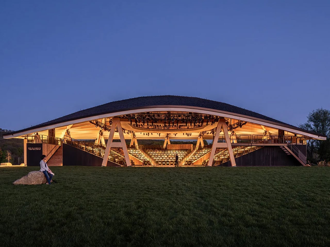
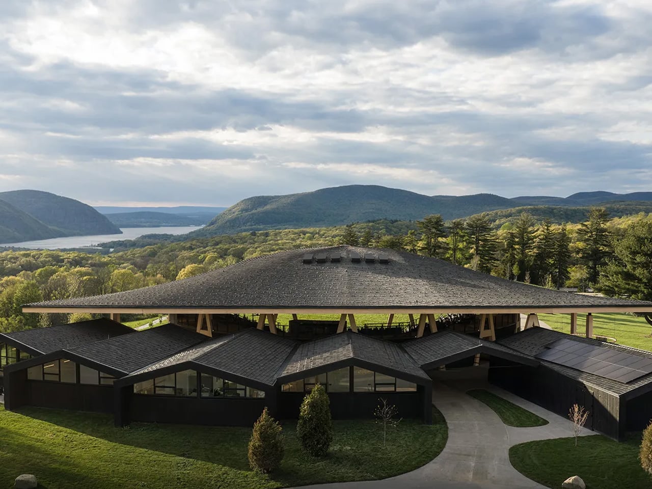
For decades, Hudson Valley Shakespeare performed under a simple tent — seasonal, transient, and entirely at the mercy of the elements. That changed this May with the completion of the Samuel H. Scripps Theater Center in Garrison, New York, designed by Studio Gang. The project marks the first-ever permanent home for Hudson Valley Shakespeare (HVS), and it delivers on every promise the setting demands.

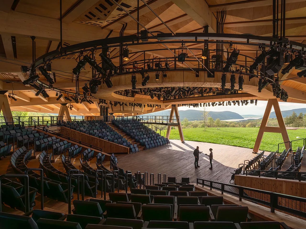
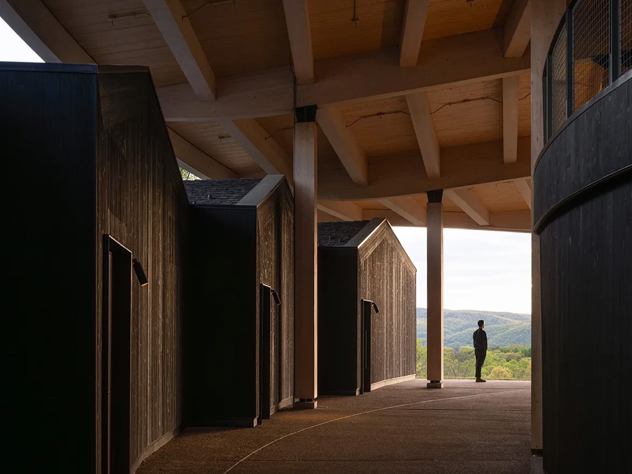
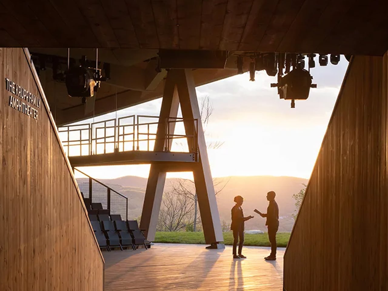
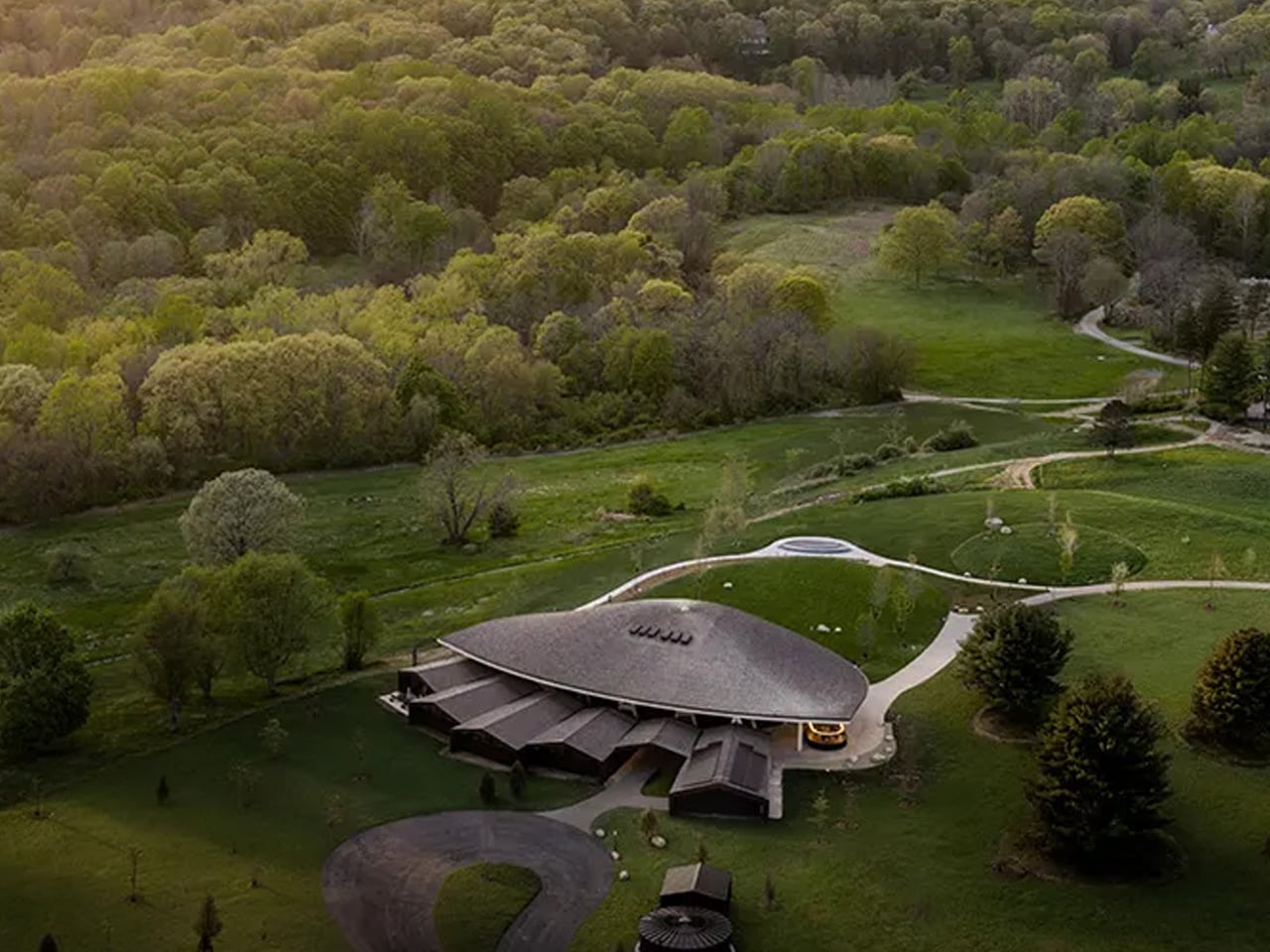
Perched on a 98-acre campus overlooking the Hudson Highlands, the theater is less a building than a landscape intervention. Studio Gang organized the design around a curved, timber-framed grid shell that encloses a 451-seat open-air auditorium. The structure is only partially enclosed, so the rolling hills of the Hudson Valley become a literal backdrop to every performance — a design move that makes the scenery non-negotiable. You don’t look past the landscape here. You look into it.

Designer: Studio Gang

The material choice is where the project becomes truly considered. The domed roof is constructed from mass timber — a prefabricated laminated-timber structure that harmonizes with the site’s natural character while sharply reducing its carbon footprint. Environmental performance was central to the entire design and construction strategy, not an afterthought. The gently curved shell reads differently depending on the hour — warm and structural at midday, almost canopy-like as the light drops. It is the kind of material that gets better with time, not worse.

Founding partner Jeanne Gang put it plainly: “The building’s curved mass timber structure harmonises with the natural beauty of the site while modelling a more sustainable future for cultural and performing arts spaces.” That word — modelling — is doing real work. The Scripps Theater isn’t just a venue upgrade. It’s an argument for what publicly facing cultural architecture can look like when sustainability and site responsiveness aren’t treated as constraints.

Beyond the main auditorium, the 14,850-square-foot venue folds in rehearsal, administrative, education, and public gathering spaces within a landscape-oriented master plan. Accessibility was expanded. The bird-safe design was factored in. Nothing feels incidental. What Studio Gang has built here is rare — a theater where the architecture earns its place in the landscape rather than competing with it. The Hudson Valley finally has a stage worthy of the view.

The post This Is What a Theater Looks Like When Architecture Gets Out of the Way first appeared on Yanko Design.

90,300 Empty Offices Are Becoming Apartments Across the US. “Adaptive Reuse” Just Hit Critical Mass.

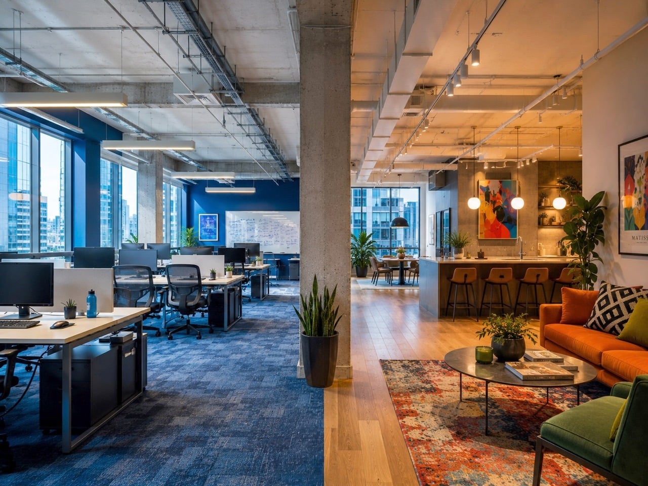
Across America, downtown office towers sit half lit and half leased, their elevators still running, their HVAC systems still humming, their floorplates waiting for people who are never fully coming back. At the same time, rents keep climbing, vacancy stays tight in the places people actually want to live, and homelessness pushes further into public view in city after city. The contradiction is so stark it barely needs interpretation. The office building has too much space and hardly any occupants. Millions of prospective homeowners, however, have no permanent place to call their residence.

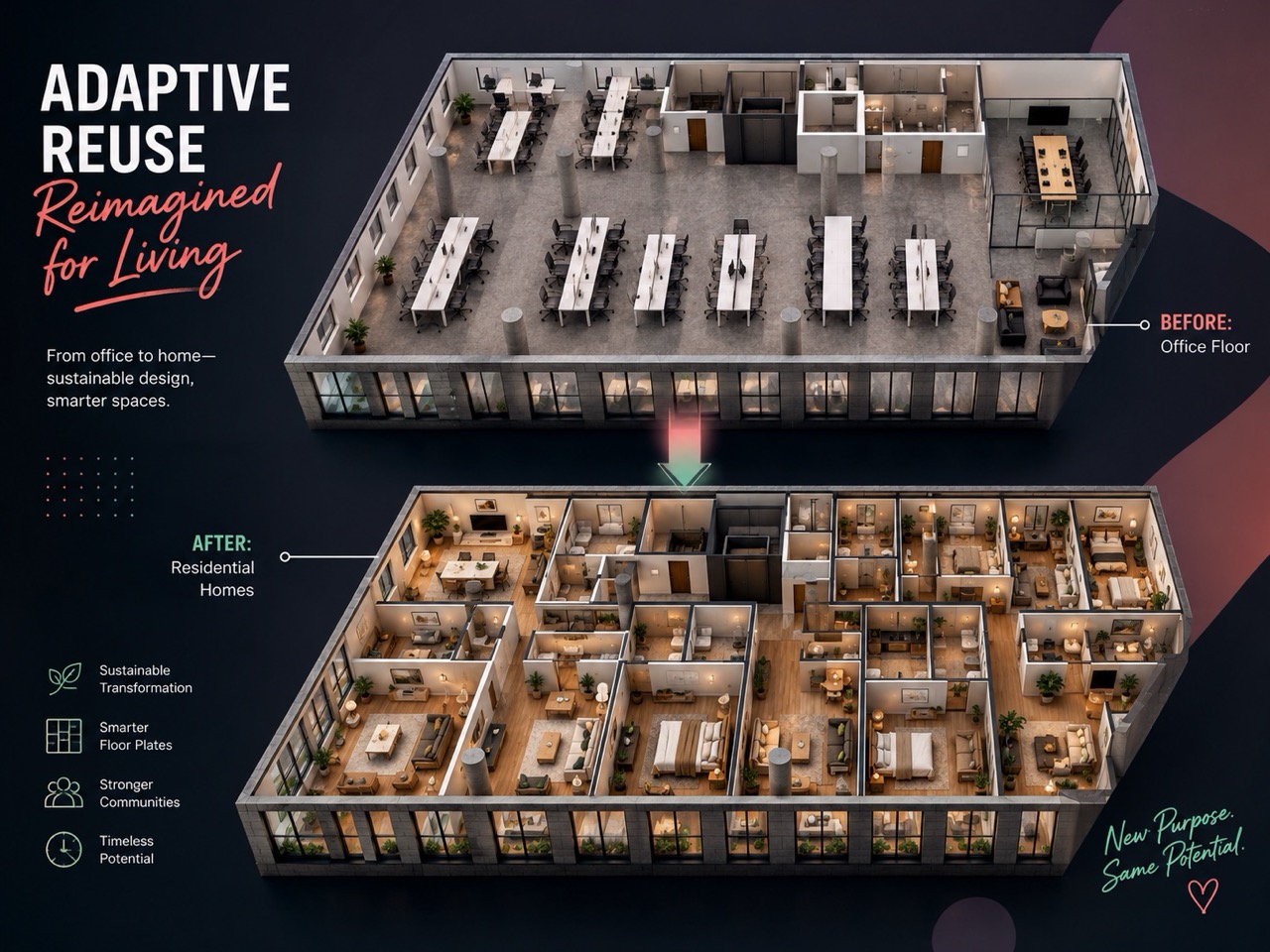
More than 90,300 apartments are now planned through office-to-residential conversions across the U.S., marking a dramatic expansion of adaptive reuse at the exact moment cities need housing most. For years, adaptive reuse lived in architecture circles as a smart, sustainable idea. If you’ve ever seen an old warehouse repurposed into a club, a factory into an office space, or a tiny rural church into a quaint home, that’s adaptive reuse – the ability to take a structure and adapt your needs around it without demolition and rebuilding. Now it is entering the market at national scale, and forcing cities, developers, and designers to answer a blunt question. When housing demand is urgent and office demand has collapsed, how long can empty office buildings maintain the status quo instead of transforming into meaningful housing?

From Virtue to Volume
RentCafe’s March 2026 report confirmed what a lot of people in real estate and architecture had been watching build for years: 90,300 U.S. apartments are currently mid-conversion from former office buildings. That figure is up 28% year over year from 70,600 units in early 2025, and it is nearly four times the total recorded in 2022. New York City alone has 16,358 units in the pipeline. Washington, D.C. follows with 8,479. Chicago has 4,360. Los Angeles, 4,340. Dallas, 3,966. Denver, 2,991. Philadelphia, 2,697. Atlanta, 2,642. Cleveland, 1,771. Cincinnati, 1,770. Three cities, Philadelphia, Denver, and St. Louis, more than doubled their pipelines in a single year, recording year-over-year jumps of 119%, 114%, and 110% respectively. Office conversions now account for 47% of all 193,900 future adaptive reuse projects nationwide, up from 42% the year before. The pipeline is approaching 100,000 units and shows no sign of slowing.

The real-estate press has covered this exhaustively, and fairly, as a finance story. Vacancy rates hovering near 20%, physical occupancy in office buildings sitting around 50-55%, loan maturities forcing owners to act. The incentives are real. New York City offers tax exemptions of up to 90% for converted buildings that designate at least 25% of units as affordable housing. Los Angeles passed its Citywide Adaptive Reuse Ordinance in February 2026, rewriting zoning rules to make the process significantly less painful. The policy environment is, for the first time, actually moving in the same direction as the market.

But here is the thing almost nobody is writing about: this is, at its core, a design problem. A brutal, fascinating, genuinely unsolved design problem. And the 90,300 number only looks tidy from the outside.

The Floorplate Doesn’t Care About Your Floor Plan
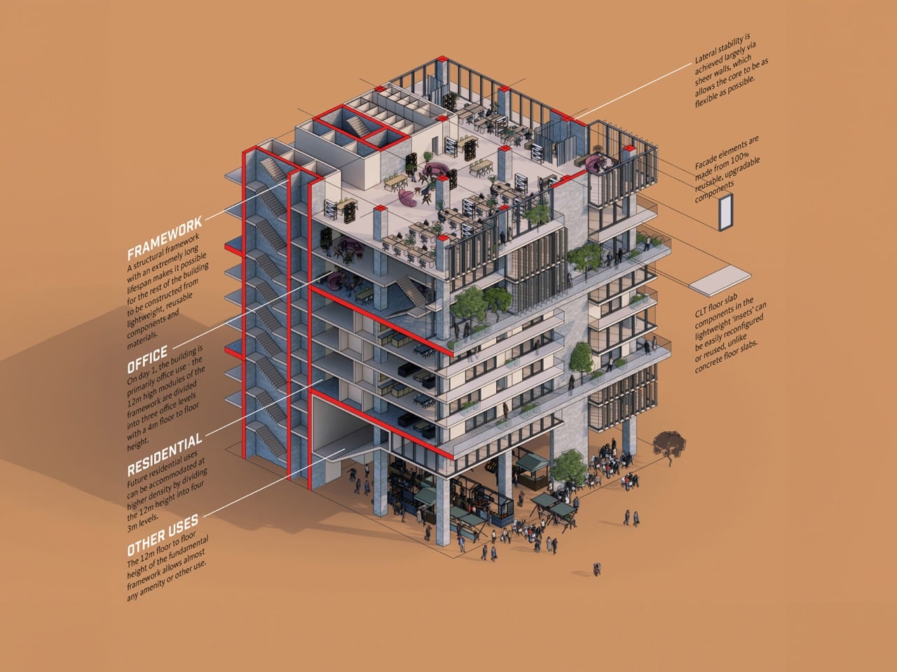
Image Credits: Gensler

Walk into a typical Class B office building from the 1980s or 1990s, and you are standing on a floorplate that might run 25,000 to 40,000 square feet. The structural core, housing elevators, stairwells, and mechanical shafts, sits somewhere in the middle. Windows ring the perimeter. Everything between the core and the glass is open, column-interrupted, and completely indifferent to the concept of a bedroom.

Residential building codes in most U.S. cities require natural light and ventilation in every habitable room. That is a reasonable ask for a building designed around people sleeping in it. It is an architectural puzzle when your building was designed around people sitting at desks under recessed lighting for eight hours and going home.

The further you get from the perimeter windows, the darker and more unusable the space becomes for residential purposes. Architects working on these conversions are solving this in a few different ways. Some carve light wells through the floorplate, essentially punching holes through multiple stories to bring daylight deep into the plan. Others reorganize the unit layout so that bedrooms and living spaces claim the window line, while kitchens, bathrooms, corridors, and storage absorb the windowless interior. Some projects rezone that dead center space entirely, turning it into shared amenity areas, lobbies, or co-working zones that don’t require natural light by code.

None of these solutions are clean. All of them require an architect to fundamentally rethink what a floor plan can be when the building has already decided its own geometry.

Pipes, Cores, and the Part That Really Costs Money
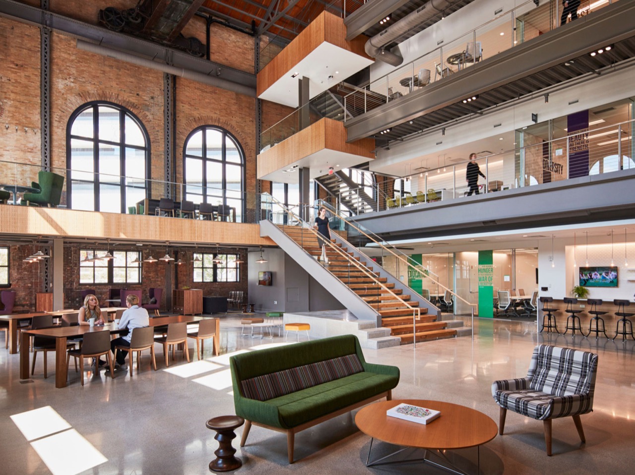
Office buildings run their plumbing infrastructure in centralized wet walls, concentrated near the core, because nobody on a 30,000 square foot trading floor needs a bathroom in the southeast corner. Apartments, by contrast, need kitchens and bathrooms distributed across every unit, which means new drain lines, new vent stacks, and new penetrations through concrete slabs that were poured without any of that in mind. On a large building, this is closer to surgery than renovation. The structure has to accommodate changes its engineers never anticipated, and every floor compounds the cost.

This is partly why the conversion wave took so long to arrive despite the office vacancy crisis being years in the making. The economics only started making sense when office asset values dropped far enough that the acquisition cost left room for the renovation budget a real conversion actually requires.

What Kind of City Does This Build?
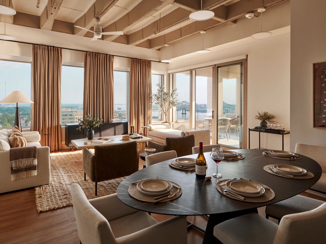
The embodied carbon argument for adaptive reuse is well established at this point. Demolishing a building and rebuilding it releases all the carbon locked into its existing steel, concrete, and glass, materials whose production already happened and cannot be undone. Keeping the structure and changing its use is, from a climate accounting standpoint, one of the most effective things the construction industry can do.

There is a longer-term design question buried inside the 90,300 number, though. Office buildings were placed, massed, and programmed for a specific kind of urban life: daytime population density, ground-floor lobbies designed for badge-tap arrivals, parking structures calibrated for 9-to-5 peaks. Converting them into housing changes the rhythms of the neighborhoods around them. Ground floors that were lobbies become storefronts, or stay lobbies and deaden the street. Parking structures sized for daily commuters become oversized and awkward for residents who do not own cars.
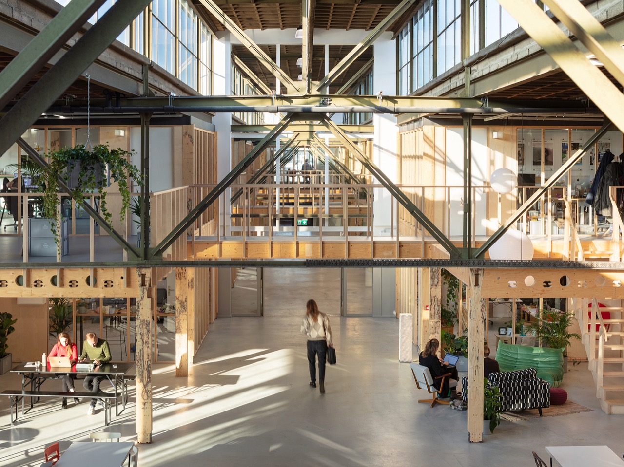
The cities that will get this right are the ones treating conversion as a neighborhood redesign project, not a building-by-building transaction. Los Angeles’s new ordinance is a start. New York’s tax incentives are a start. The design discipline this moment actually demands, though, is urban, not just architectural.

Adaptive reuse at 90,300 units is no longer a niche. It is the dominant form of new housing supply in several major American cities. The question the industry spent two decades asking, whether it works, has been answered. The question now is whether it produces cities that are genuinely good to live in, and that one is still very much open.

Data sourced from RentCafe’s 2026 office-to-apartment conversion report, based on Yardi Matrix data.

The post 90,300 Empty Offices Are Becoming Apartments Across the US. “Adaptive Reuse” Just Hit Critical Mass. first appeared on Yanko Design.

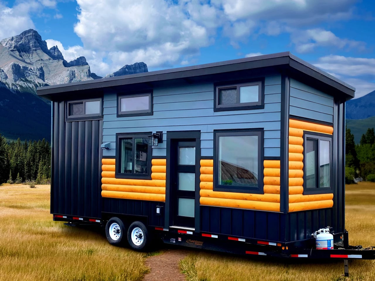
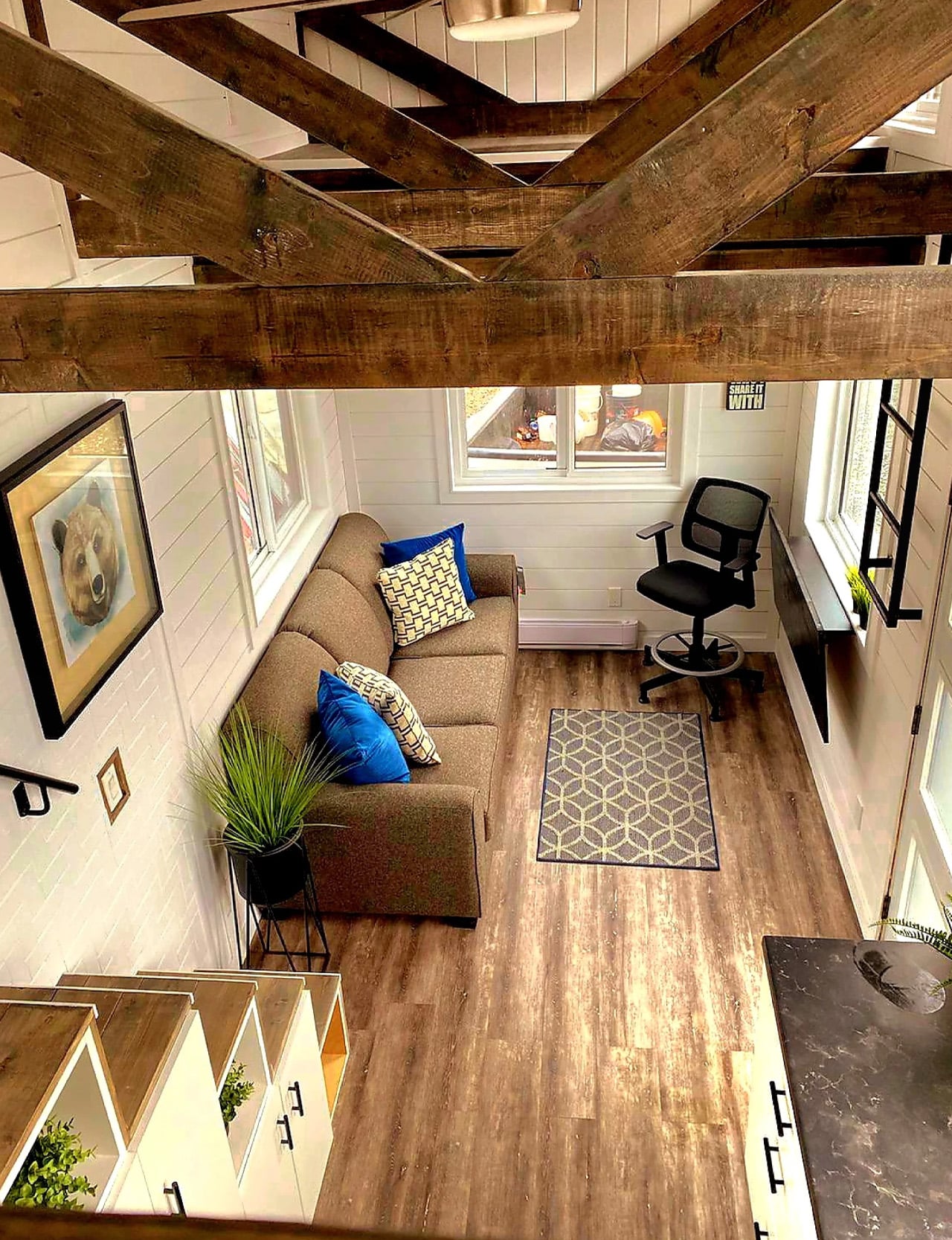
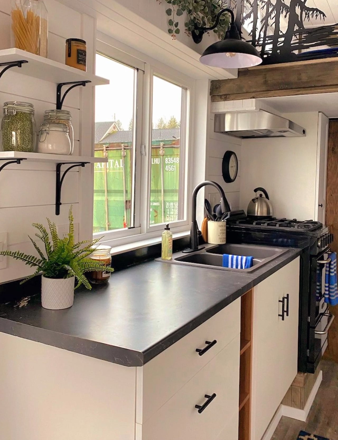
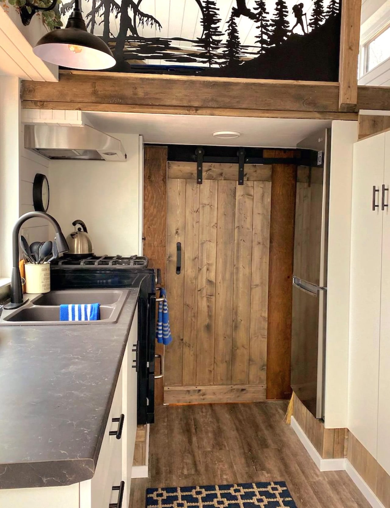
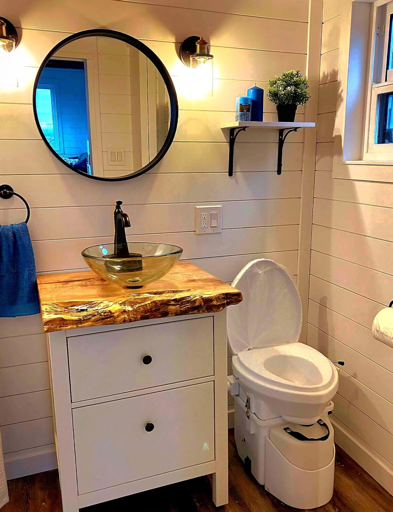
The Koala Bear Is the Tiny Home Built for People Who’d Rather Move Than Settle

There’s a certain kind of freedom that only comes when you stop trying to fit your life into more square footage than you actually need. Rolling Bear Tiny Homes understood that when they built the Koala Bear, a compact, mobile dwelling designed specifically for solo adventurers and couples who’d rather wake up to a new view than a fixed address.

Rolling Bear Tiny Homes is a custom builder based in Richmond, British Columbia, operating under the umbrella of Rolling Bear Construction Inc. The brand has built a reputation across BC for crafting tiny homes that don’t compromise on quality, and the Koala Bear might be the clearest expression of that philosophy yet. At 26 by 8.5 feet, it packs up to 250 square feet of thoughtfully designed living space into a form that’s road-ready and genuinely livable.

Designer: Rolling Bear Tiny Homes

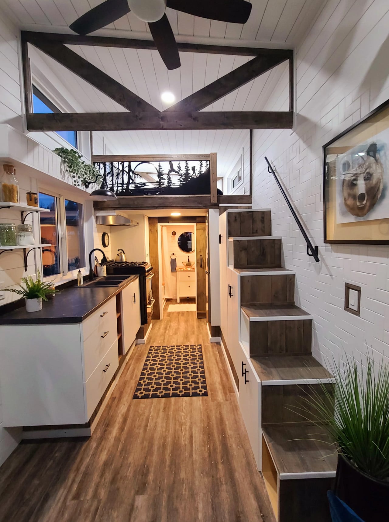
The interior doesn’t feel like a compromise. Custom joinery, premium finishes, and artisanal detailing run throughout, giving the Koala Bear an aesthetic that reads more like a well-edited apartment than a mobile shelter. The layout includes a comfortable bedroom, a fully equipped kitchenette, and a living area designed around how people actually move through a small space, not just how it photographs. Every inch is accounted for without ever feeling claustrophobic.

On the technical side, the Koala Bear is built to exceed both CAD Z240 RV and Canadian Building Code guidelines, and it’s constructed to meet NOAH certification standards. That matters more than most buyers initially realize. It’s the difference between a home that holds up through BC winters and one that doesn’t. A state-of-the-art HVAC system and a sustainable water-heating solution handle year-round climate control, while a full suite of energy-efficient appliances keeps utility costs low.

For solo travelers and couples, the appeal goes beyond the specs. The Koala Bear is built around the idea of flexibility, the ability to be parked along a coastline one season and nestled near a mountain trail the next. Rolling Bear offers delivery and setup services, which removes a significant logistical barrier for first-time tiny home buyers.

Priced at approximately at US$87,000 with financing available, the Koala Bear sits at an accessible entry point for the Rolling Bear lineup. For what it offers, craftsmanship, mobility, and a design sensibility that doesn’t ask you to sacrifice style for size, it makes a compelling case that the best homes aren’t always the biggest ones. Sometimes, they’re exactly the right size.

The post The Koala Bear Is the Tiny Home Built for People Who’d Rather Move Than Settle first appeared on Yanko Design.
The Koala Bear Is the Tiny Home Built for People Who’d Rather Move Than Settle

There’s a certain kind of freedom that only comes when you stop trying to fit your life into more square footage than you actually need. Rolling Bear Tiny Homes understood that when they built the Koala Bear, a compact, mobile dwelling designed specifically for solo adventurers and couples who’d rather wake up to a new view than a fixed address.

Rolling Bear Tiny Homes is a custom builder based in Richmond, British Columbia, operating under the umbrella of Rolling Bear Construction Inc. The brand has built a reputation across BC for crafting tiny homes that don’t compromise on quality, and the Koala Bear might be the clearest expression of that philosophy yet. At 26 by 8.5 feet, it packs up to 250 square feet of thoughtfully designed living space into a form that’s road-ready and genuinely livable.

Designer: Rolling Bear Tiny Homes

The interior doesn’t feel like a compromise. Custom joinery, premium finishes, and artisanal detailing run throughout, giving the Koala Bear an aesthetic that reads more like a well-edited apartment than a mobile shelter. The layout includes a comfortable bedroom, a fully equipped kitchenette, and a living area designed around how people actually move through a small space, not just how it photographs. Every inch is accounted for without ever feeling claustrophobic.

On the technical side, the Koala Bear is built to exceed both CAD Z240 RV and Canadian Building Code guidelines, and it’s constructed to meet NOAH certification standards. That matters more than most buyers initially realize. It’s the difference between a home that holds up through BC winters and one that doesn’t. A state-of-the-art HVAC system and a sustainable water-heating solution handle year-round climate control, while a full suite of energy-efficient appliances keeps utility costs low.

For solo travelers and couples, the appeal goes beyond the specs. The Koala Bear is built around the idea of flexibility, the ability to be parked along a coastline one season and nestled near a mountain trail the next. Rolling Bear offers delivery and setup services, which removes a significant logistical barrier for first-time tiny home buyers.

Priced at approximately at US$87,000 with financing available, the Koala Bear sits at an accessible entry point for the Rolling Bear lineup. For what it offers, craftsmanship, mobility, and a design sensibility that doesn’t ask you to sacrifice style for size, it makes a compelling case that the best homes aren’t always the biggest ones. Sometimes, they’re exactly the right size.

The post The Koala Bear Is the Tiny Home Built for People Who’d Rather Move Than Settle first appeared on Yanko Design.
SoBA Stacks Color-Coded Blocks Into a Castle-Like Kindergarten That Defies Its Urban Surroundings

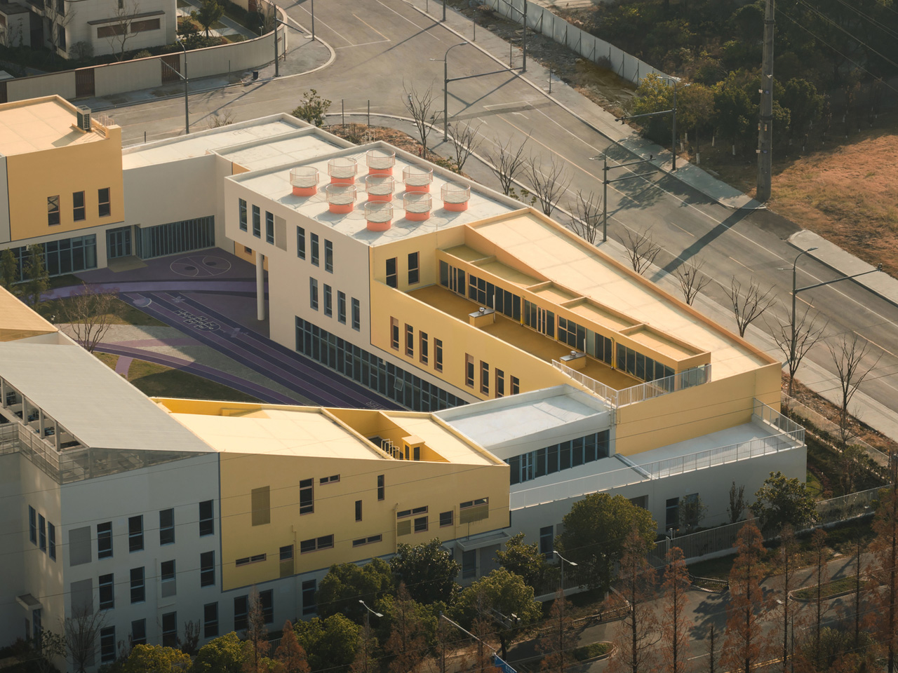
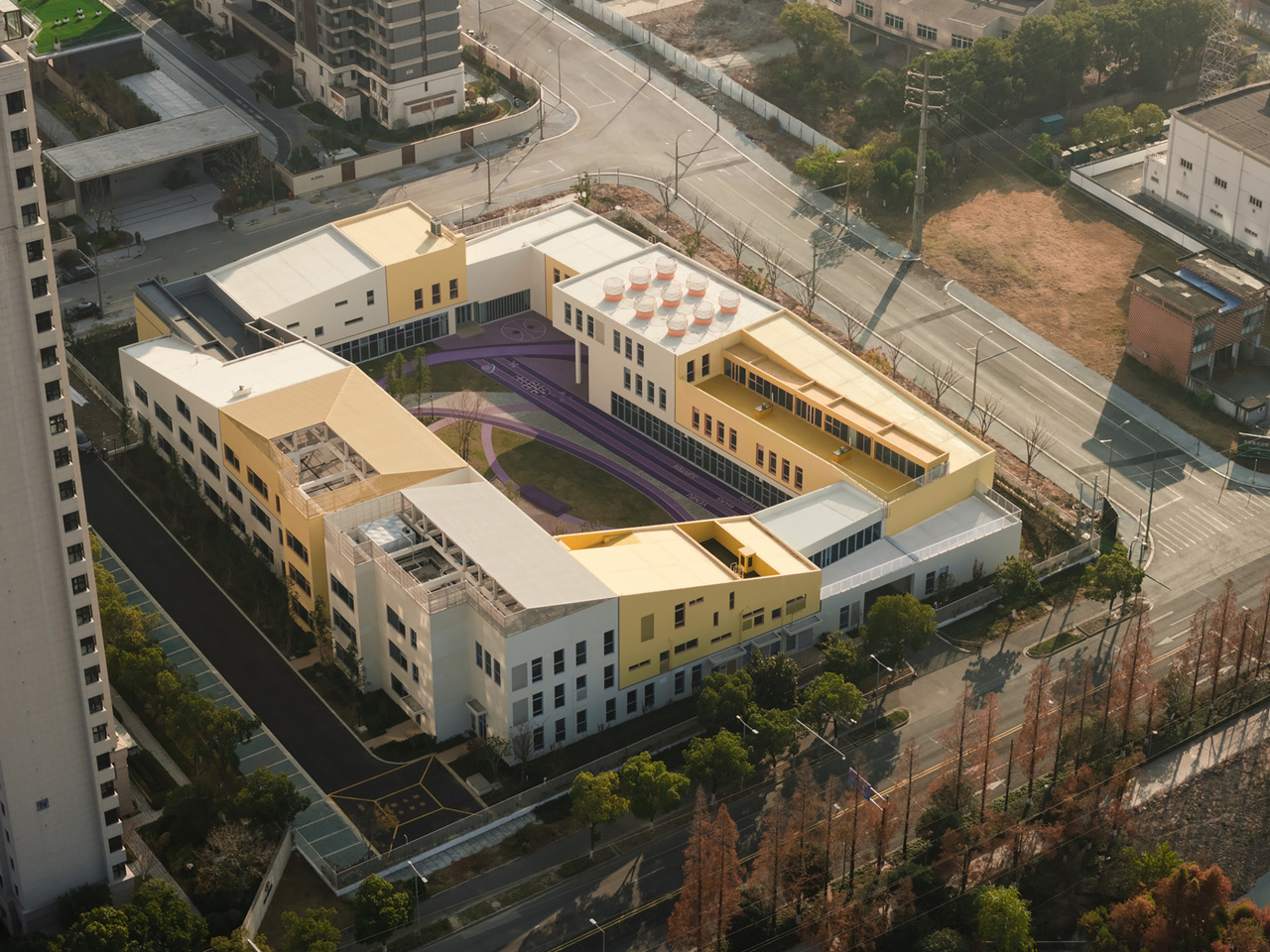
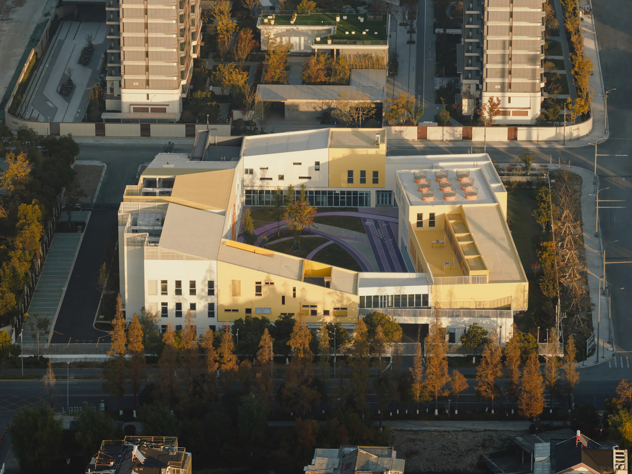
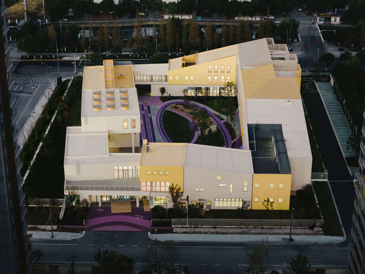
SoBA — the architecture and landscape practice led by Wang Ruo and Tang Haiyin — has completed Block Kindergarten in Kunshan, Jiangsu Province, a 21-class campus that stacks modular, color-coded volumes into something between a fortress and a LEGO set. Sitting east of Hongqi Road and north of Zhenchuan Road, the 9,012-square-meter campus doesn’t try to disappear into its surroundings. It holds its ground — and for good reason.

The site itself presents a genuinely difficult brief. High-rise residential towers crowd the north, more housing is planned to the east, and the south is lined with a 110kV substation, a waste transfer station, and an emergency medical center — the kind of infrastructure that leaves little room for poetry. SoBA’s response was to stop trying to negotiate with the context and instead build against it. The result is an inward-facing campus that prioritizes a protected inner world for children, using layered transitions between architecture and landscape to slowly introduce them to the city beyond.

Designer: SoBA

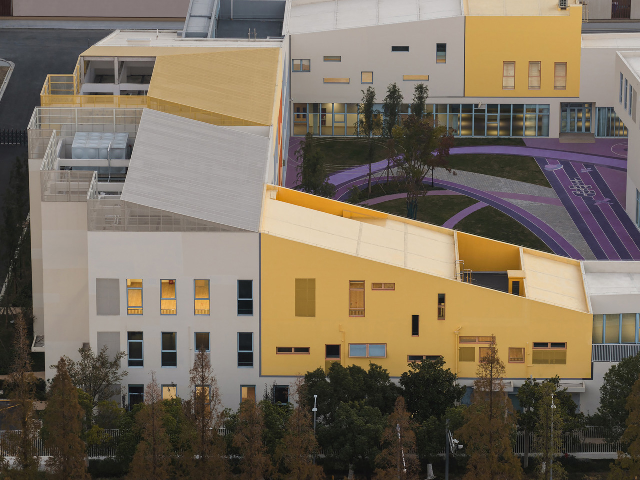
The organizational logic is direct: modular classroom volumes are stacked and arranged around a central courtyard that serves as the campus core. That courtyard integrates play, planting, and gathering in one continuous space — less a leftover void and more the beating heart of the whole scheme. Green landscape buffers line the perimeter, softening the transition from the campus edge to the surrounding infrastructure.

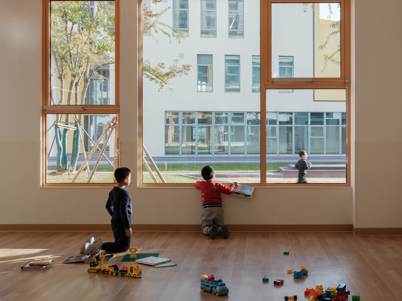
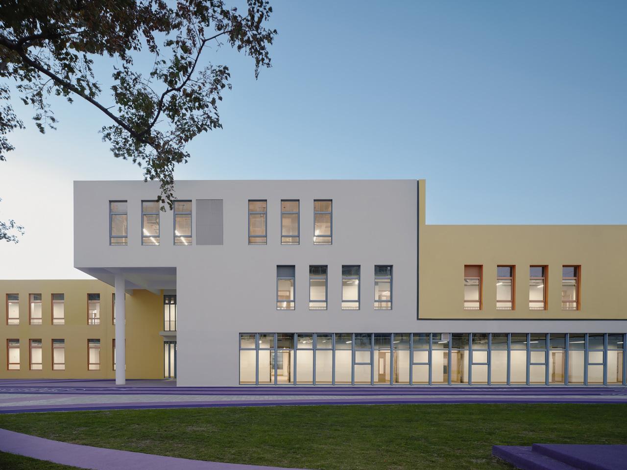
Color isn’t decorative here — it functions as spatial language. Children between three and six years old learn primarily through sensory perception, and SoBA leans into that, using variations in brightness and saturation to create gentle but legible spatial layers throughout. The reference point, according to the architects, is Luis Barragán’s concept of emotional architecture — the idea that a building can orchestrate light, color, and scale to evoke memory and feeling. Applied to a kindergarten, that philosophy translates into spaces that feel warm without being saccharine.

Transparency punctuates the massing at key moments. Glazed volumes interrupt the solid facade, letting children glimpse the sky, trees, and the city through carefully framed openings. Ecological thinking extends to the landscape: a planting garden in the southeast corner tracks seasonal growth cycles, while a rain garden in the northeast turns stormwater collection into a daily lesson. Block Kindergarten is a project that takes children seriously — architecturally, sensory-wise, and spatially — and it shows.

The post SoBA Stacks Color-Coded Blocks Into a Castle-Like Kindergarten That Defies Its Urban Surroundings first appeared on Yanko Design.
Africa’s Tallest Tower Was Worth the 40-Year Wait

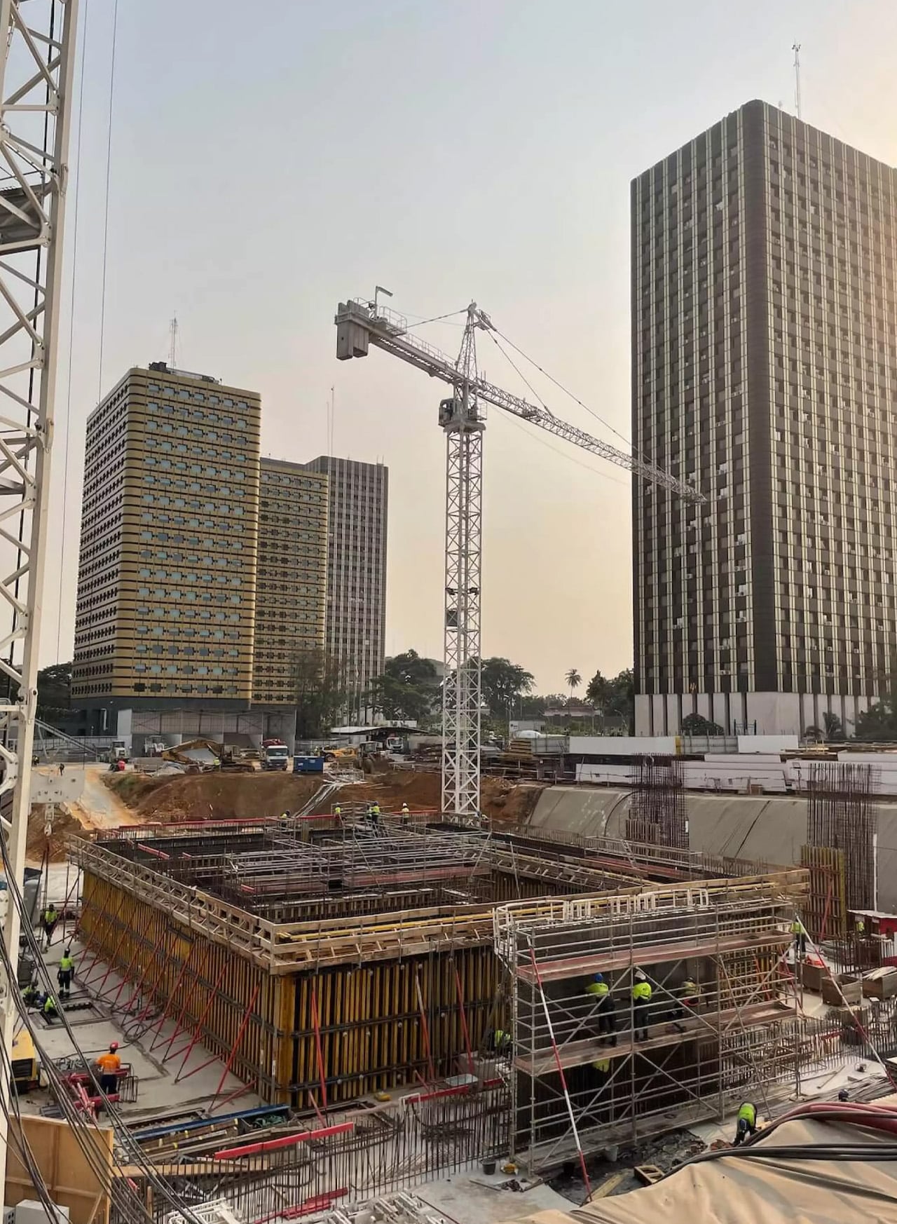
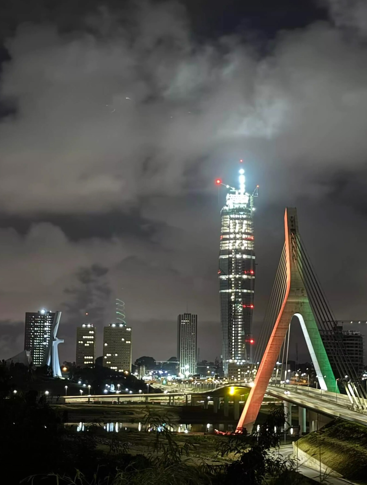
Forty years is a long time to wait for a building. But when you see what’s rising in Abidjan, the delay starts to feel almost intentional — like the city was simply holding its breath for the right moment. Tour F, the supertall skyscraper currently piercing the skyline of Ivory Coast’s economic capital, was first imagined in the 1970s as part of a sweeping urban development plan for Abidjan’s Plateau district. The idea was straightforward: complement the existing administrative towers — A through E — with a sixth.

What wasn’t straightforward was actually building it. The project stalled for decades, a vision suspended in bureaucratic and economic uncertainty. Construction finally broke ground in 2021, with BESIX Group drilling 70 foundation bars and 62-meter-deep diaphragm wall panels to anchor the structure.

Designer: Pierre Fakhoury

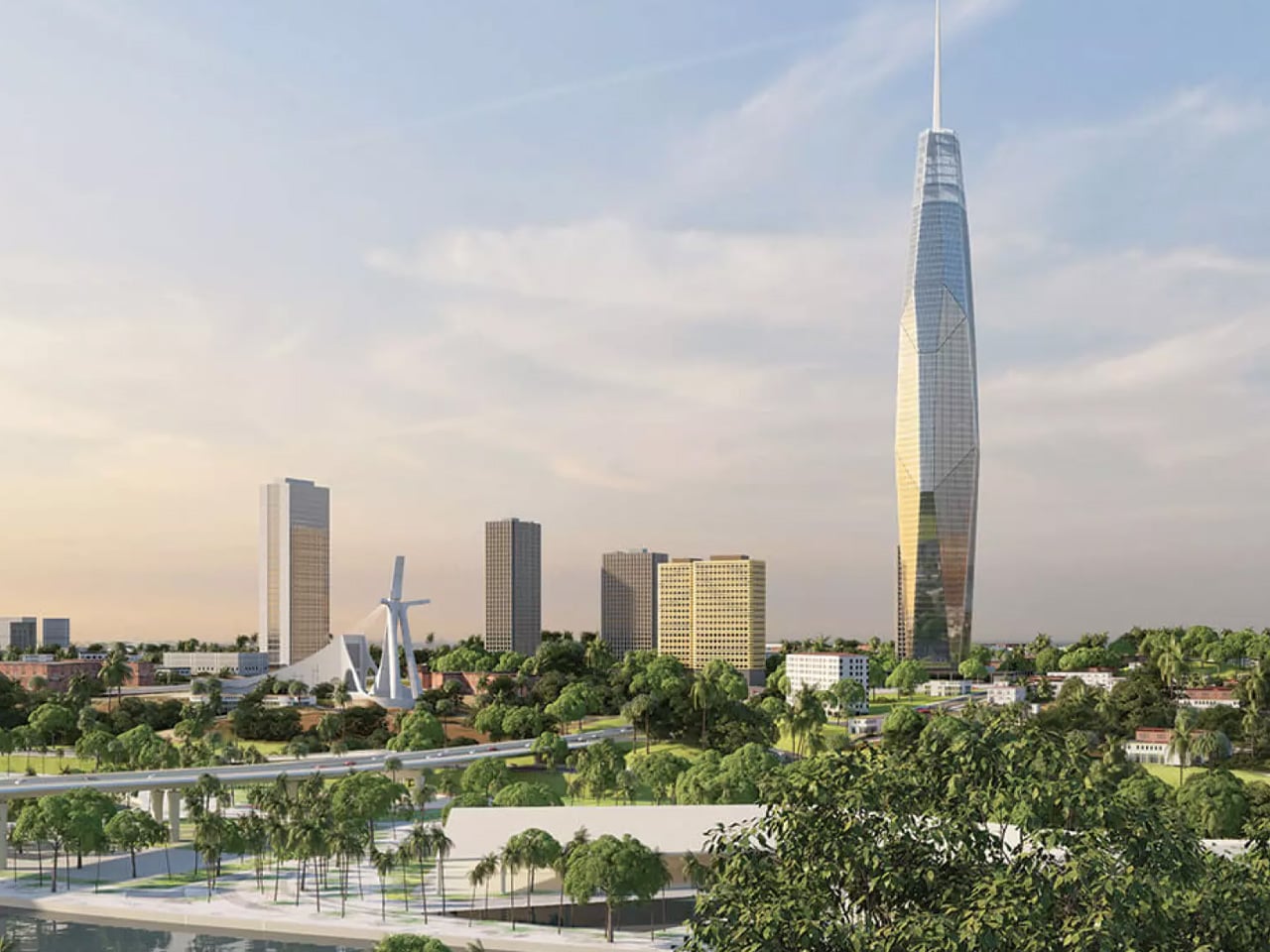
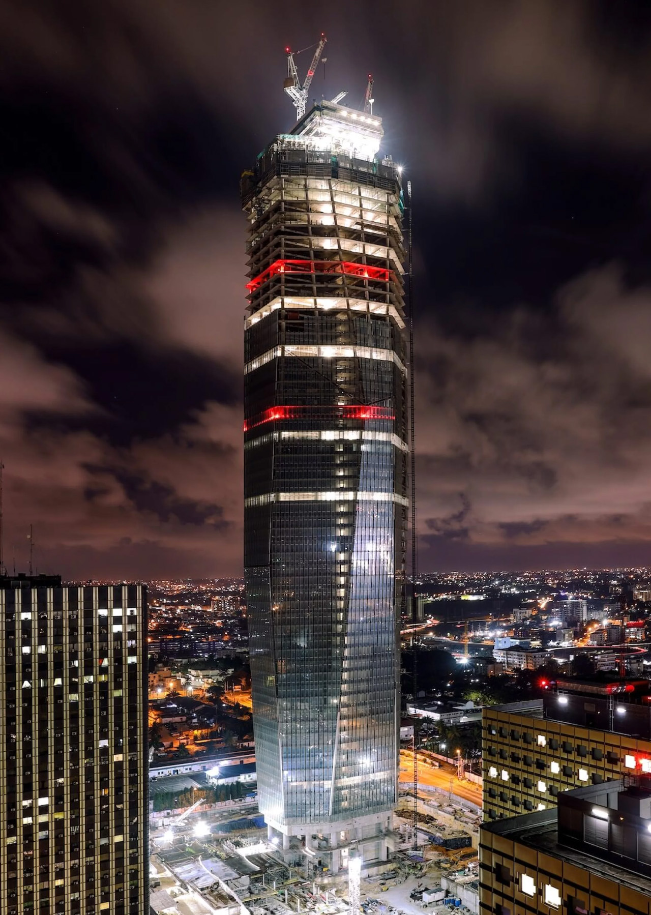
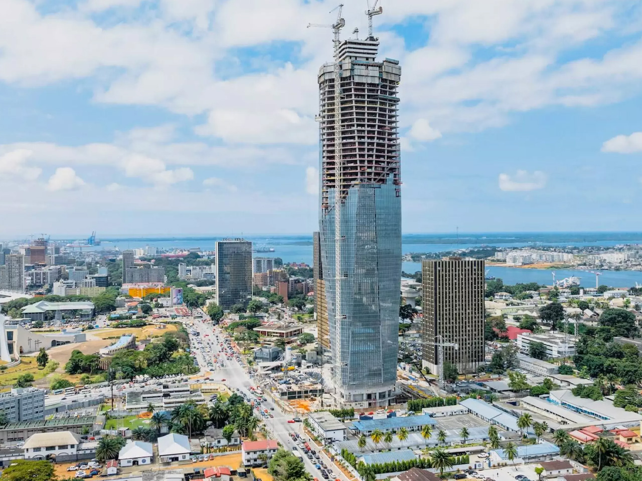
Designed by Lebanese-Ivorian architect Pierre Fakhoury — the same mind behind the breathtaking Notre-Dame de la Paix Basilica in Yamoussoukro — Tower F is not trying to be a generic glass box. It has something to say. The form is sculptural: a slender volume whose facade is carved into trapezoidal inclined glass planes, each facet tilting inward toward the earth or reaching toward the sky. The top is cleanly truncated, then crowned with a dramatic extension of the glass facade that dissolves into open air. It’s restrained and bold at the same time — a difficult balance that Fakhoury pulls off with architectural confidence.

What makes the design genuinely compelling is its embedded cultural logic. When viewed from a certain angle, the play of facets reads as a stylized African mask — a nod to West African artistic tradition embedded quietly into a 21st-century supertall. The building is symmetrical along its east-west axis, grounding the sculptural gesture in structural clarity. At street level, a simple rectangular podium houses the main entrance hall and support services, keeping the base honest and approachable despite the tower’s imposing scale.

At 421 meters, Tower F is set to claim the title of Africa’s tallest building, surpassing The Leonardo in Johannesburg. The gross floor area reaches approximately 140,000 square meters, consolidating government ministries and administrative units currently scattered across the city — a practical ambition wrapped in an extraordinary shell.

Construction costs are estimated at approximately €450 million, developed through a collaboration between the Ivorian Ministry of Construction and local firm PFO Africa. Completion is expected in 2026. For a continent whose architectural ambitions are accelerating fast, Tower F is exactly the kind of project that reframes the conversation — not just about African skylines, but about what it means to design a building that carries cultural memory into the future.

The post Africa’s Tallest Tower Was Worth the 40-Year Wait first appeared on Yanko Design.
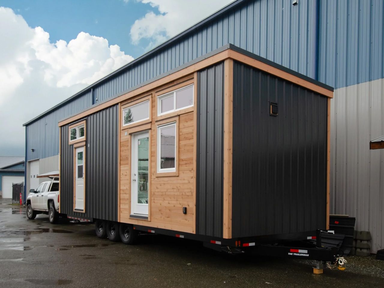
This Extra Wide Tiny Home Ditches the Loft and It’s Better for It

The loft bedroom is tiny home design’s most accepted cliché. Most designs in this space stack a sleeping loft above the living area and call it efficient. The Rose, a custom build by Vancouver Island-based Rewild Homes, takes a different position entirely, one that’s turning heads for all the right reasons.

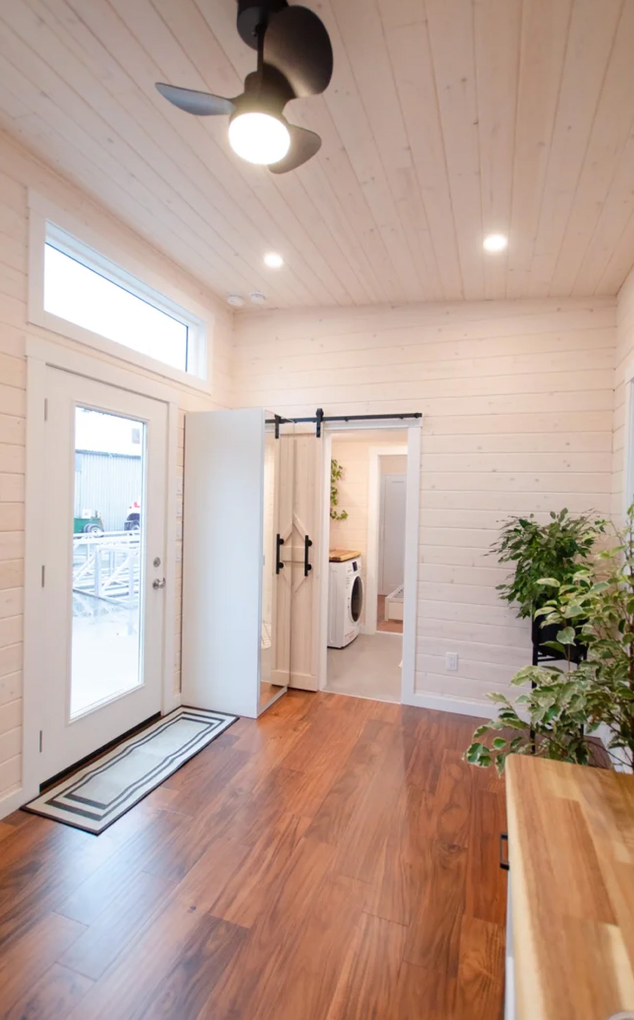
Named after the client’s beloved donkey, the Rose measures 30 feet long by 10’6″ wide, making it extra wide by tiny home standards. That additional footprint isn’t just a spec sheet flex. It’s what makes the entire layout feel less like a compromise and more like a considered place to actually live. The interior opens up in a way that standard narrow builds simply can’t achieve, bright, breathable, and genuinely functional across a single floor.

Designer: Rewild Homes

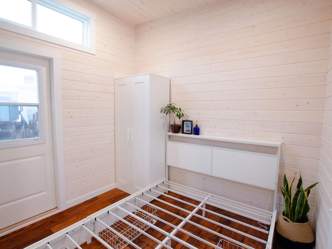
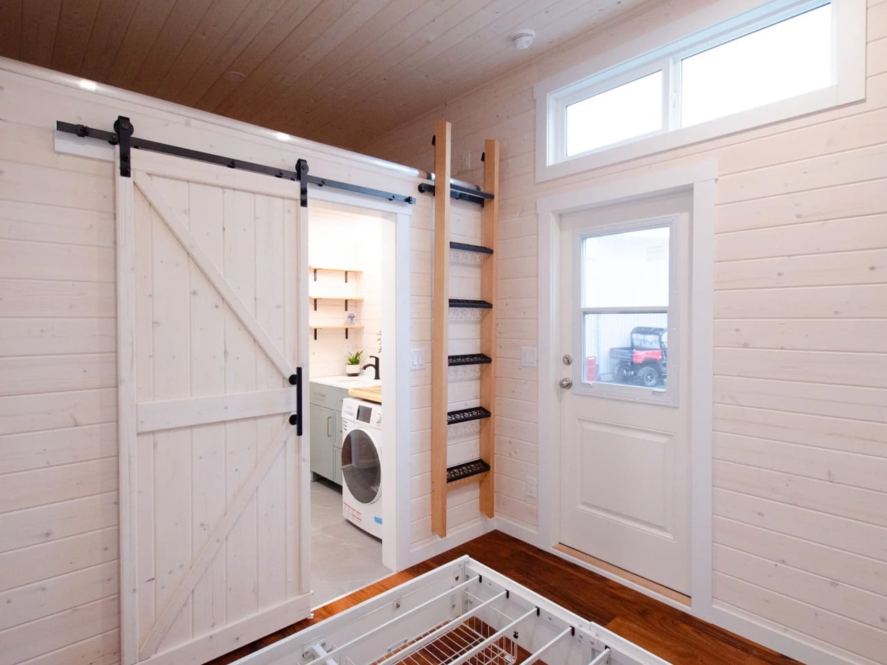
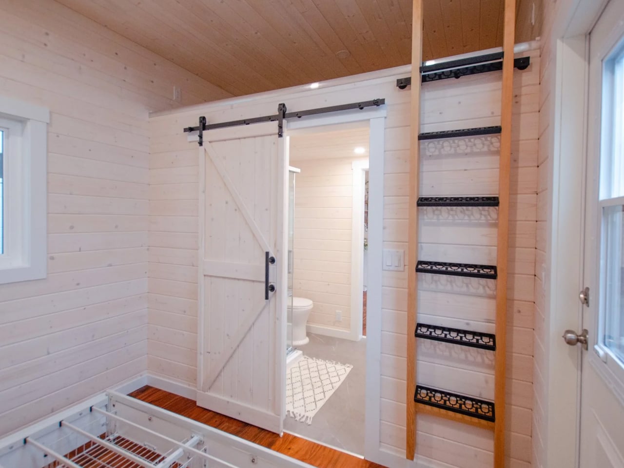
The standout move here is the ground-floor bedroom. Rather than tucking a sleeping area into a loft accessed by ladder, Rewild Homes kept everything at eye level, sliding behind a private door with its own separate exterior entrance. Beneath the bed, storage is built in. Closet space is tucked neatly alongside. It’s the kind of thinking that makes a small home feel resolved rather than resigned. The small loft above the bathroom, meanwhile, has been repurposed entirely as a storage zone, a practical pivot that frees the rest of the home from clutter. High ceilings throughout give taller inhabitants room to breathe, a detail that rarely gets enough credit in this category.
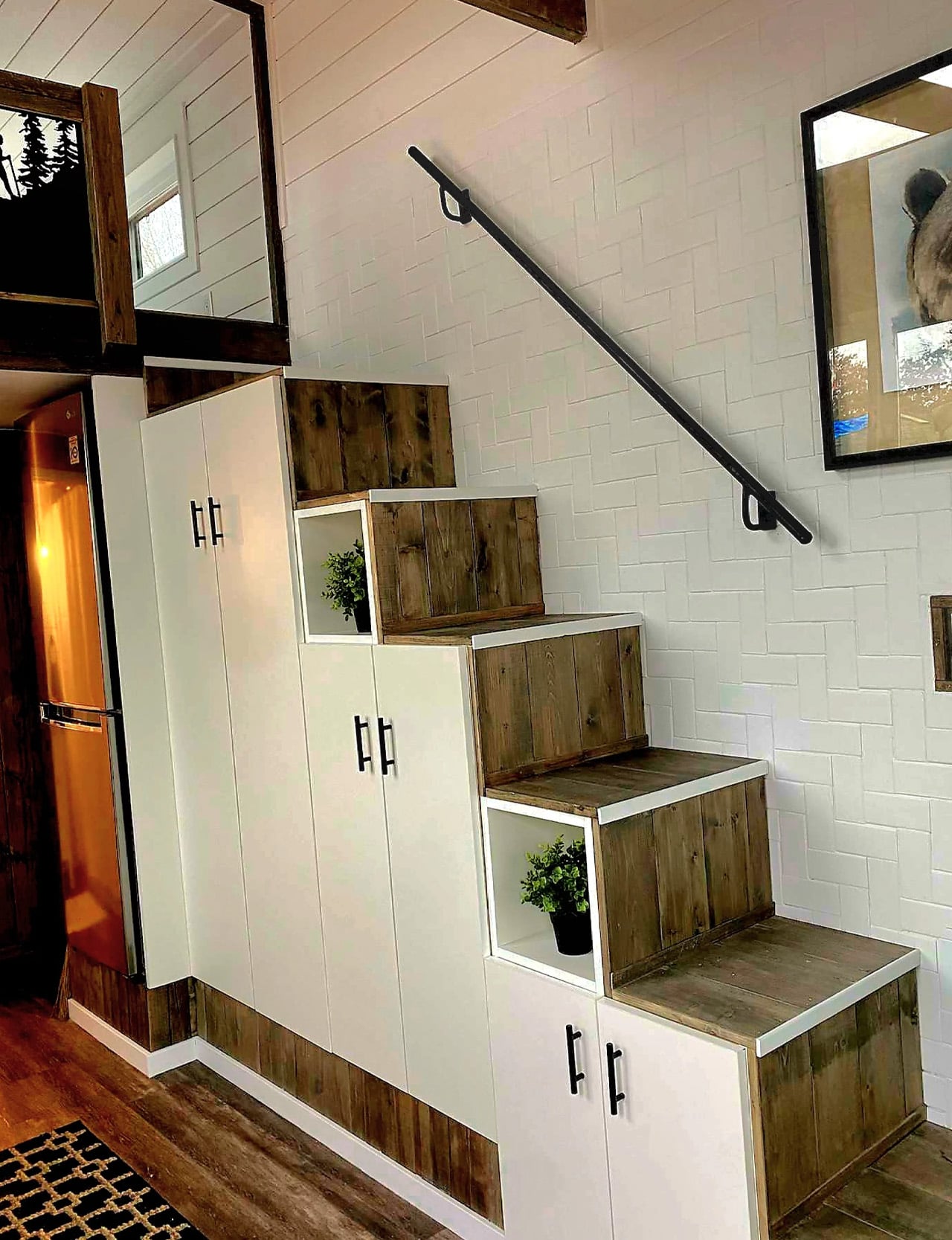
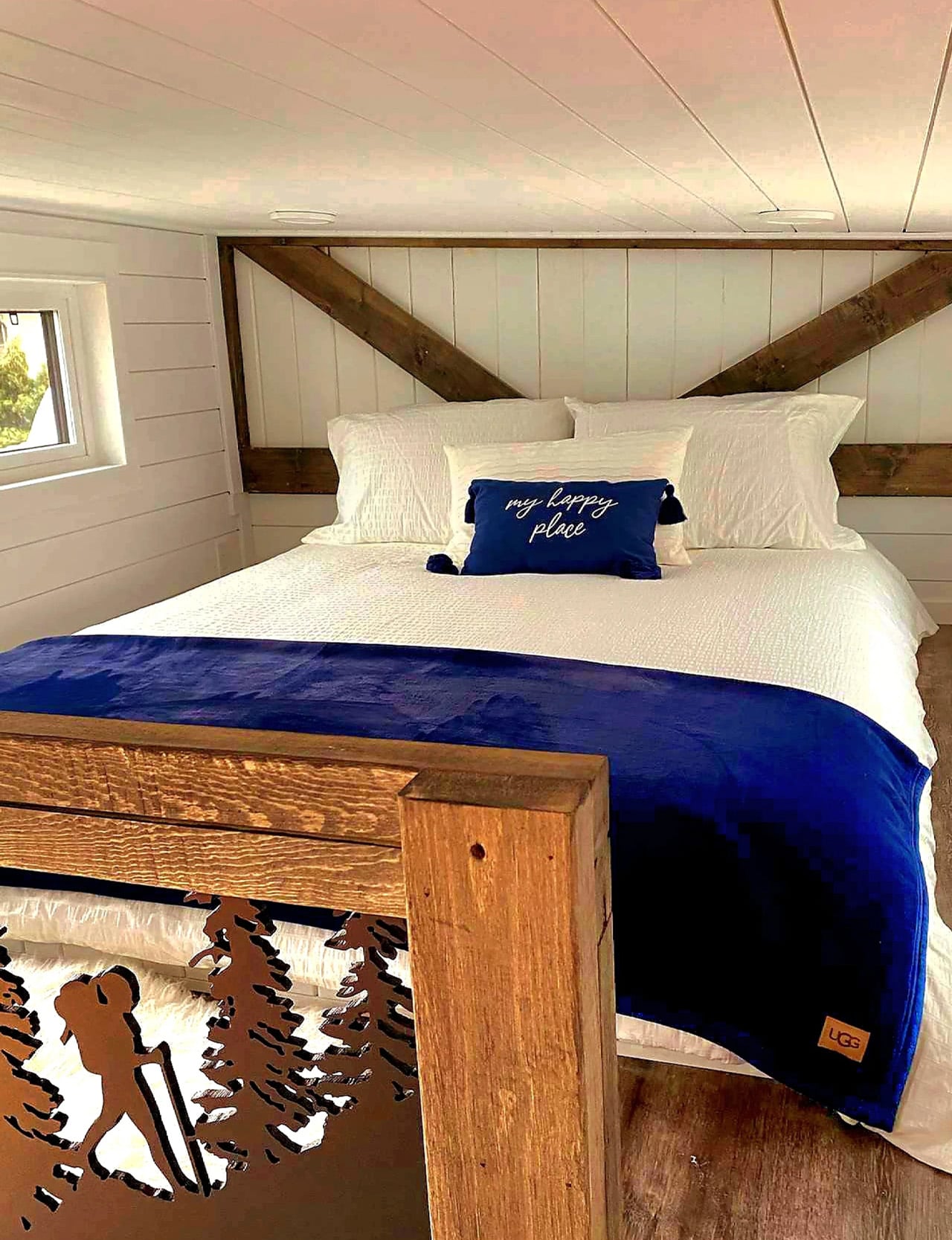
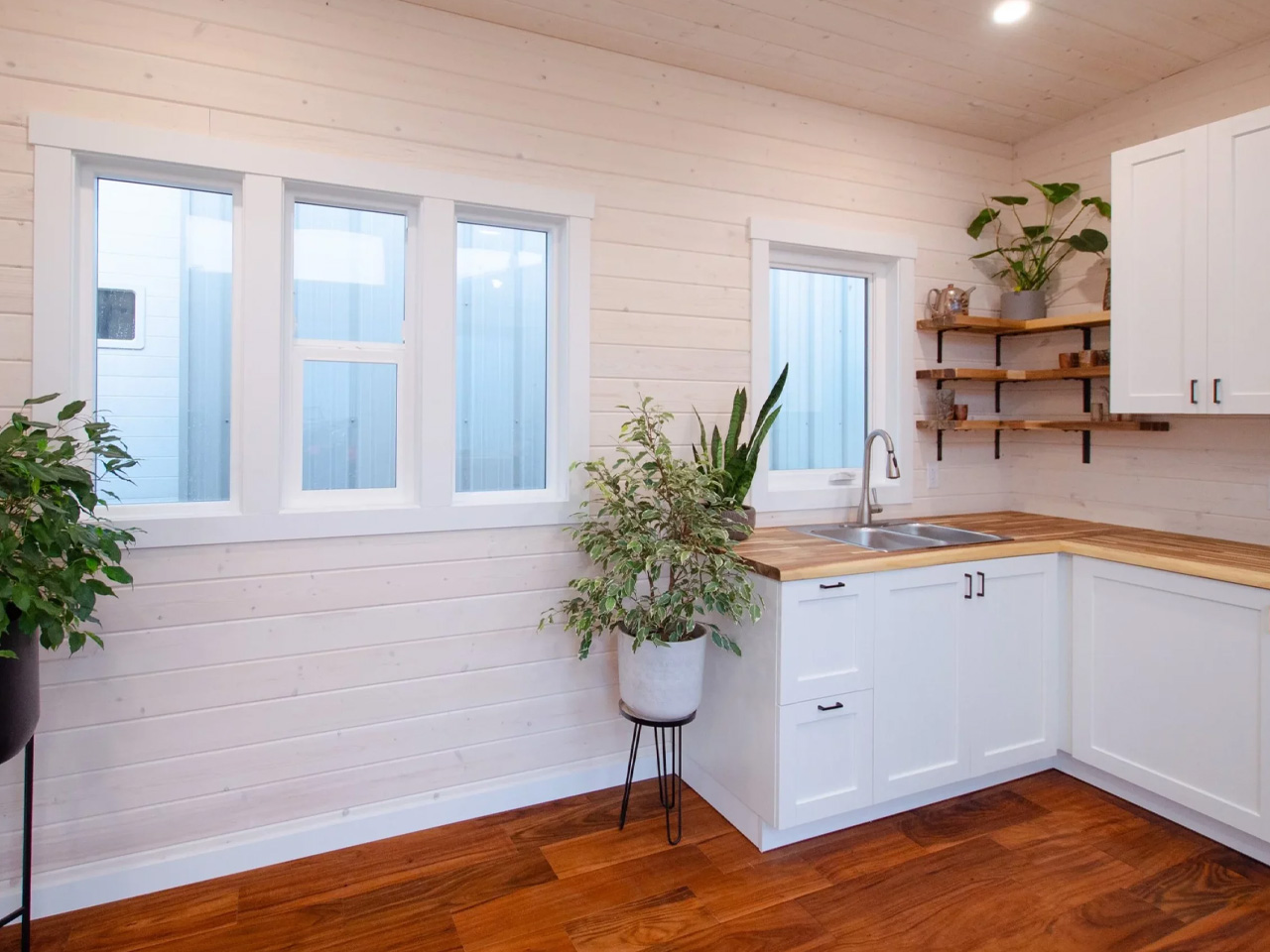
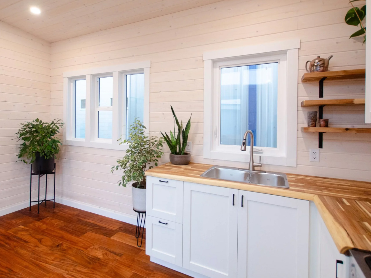
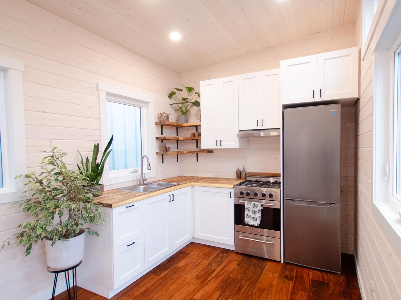
The kitchen and open living room flow naturally into each other, with the bathroom and bedroom each accessed via sliding doors that keep traffic patterns clean without sacrificing privacy. Utility requirements are simplified through propane-powered water heating and cooking, allowing the home to run on a 50-amp electrical connection, lean by design, not by accident.

Outside, the Rose wears its West Coast origins confidently. A combination of metal and cedar siding gives the exterior a durable, low-maintenance finish that still has warmth and character. A metal roof rounds out the build, built to handle whatever the Pacific climate throws at it.

Rewild Homes operates out of Cobble Hill, British Columbia, building fully custom tiny homes with a focus on high-quality local materials. The Rose is a strong example of what that philosophy looks like in practice, a home that doesn’t ask you to sacrifice comfort for square footage, but rather rethinks what square footage can do.

The post This Extra Wide Tiny Home Ditches the Loft and It’s Better for It first appeared on Yanko Design.