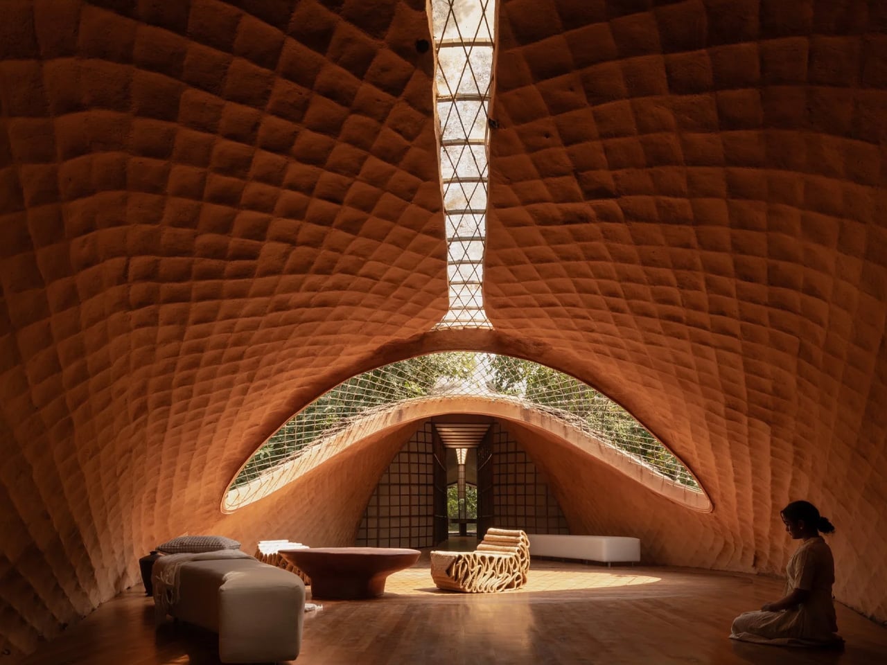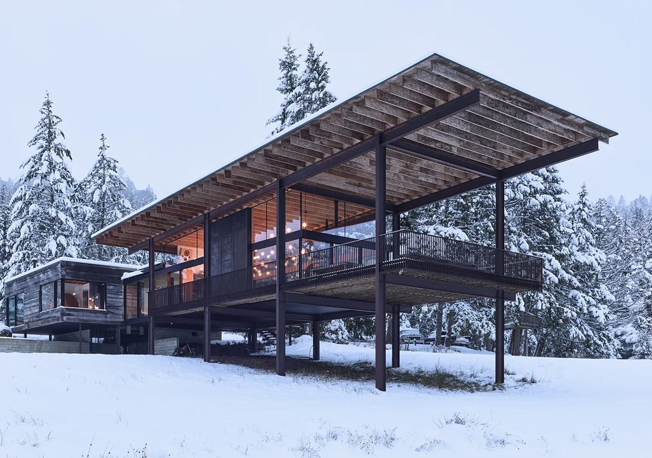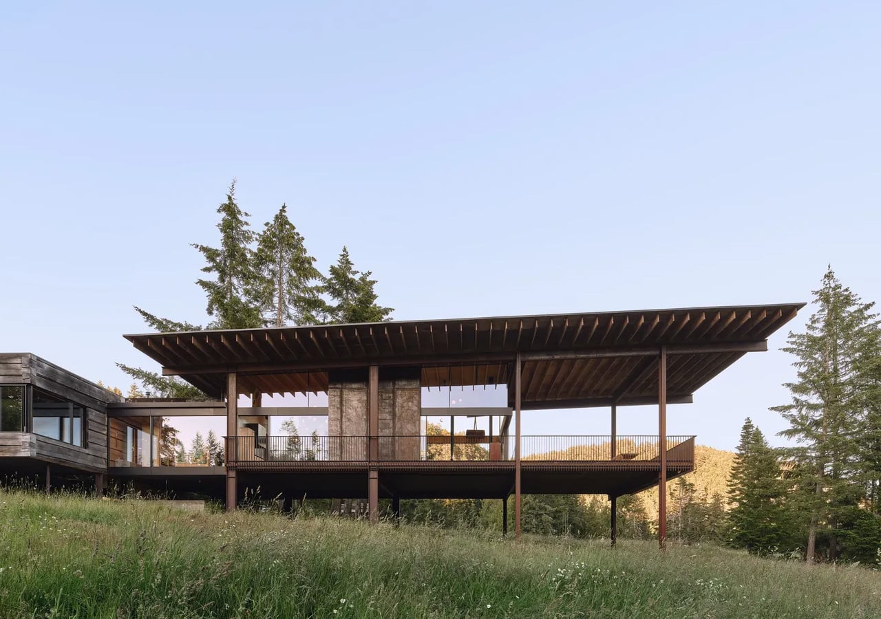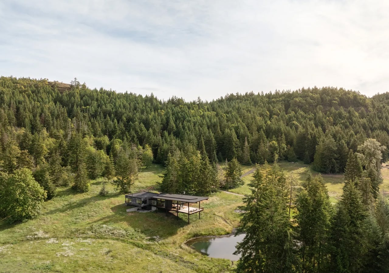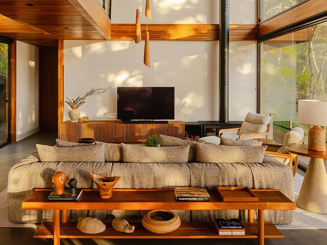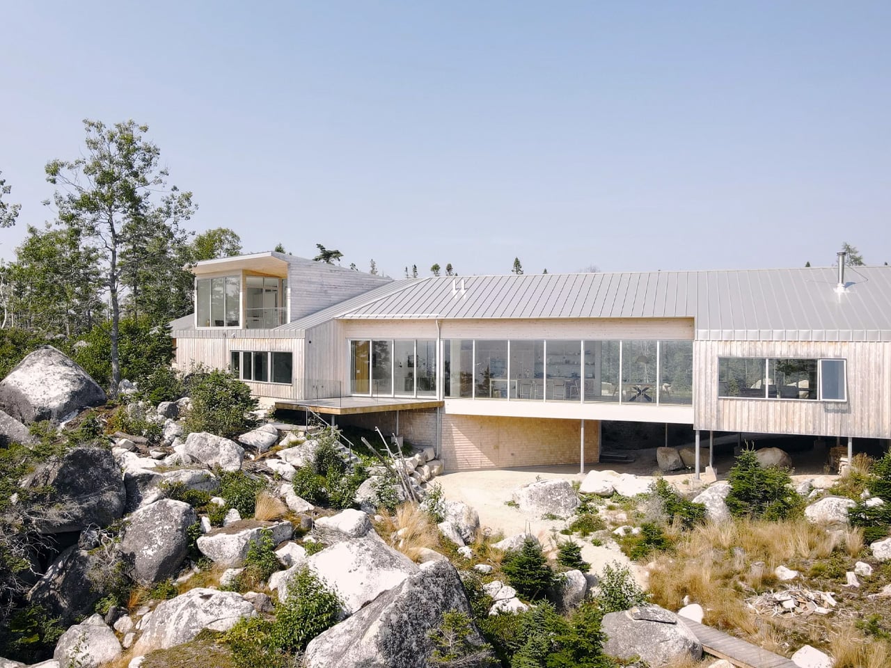
Most mountain houses try too hard. Cut Out House, designed by New York-based studio Young Projects, does the opposite — it sits in the foothills of the Canadian Rocky Mountains, tucked into a low-density development where the land does most of the talking.
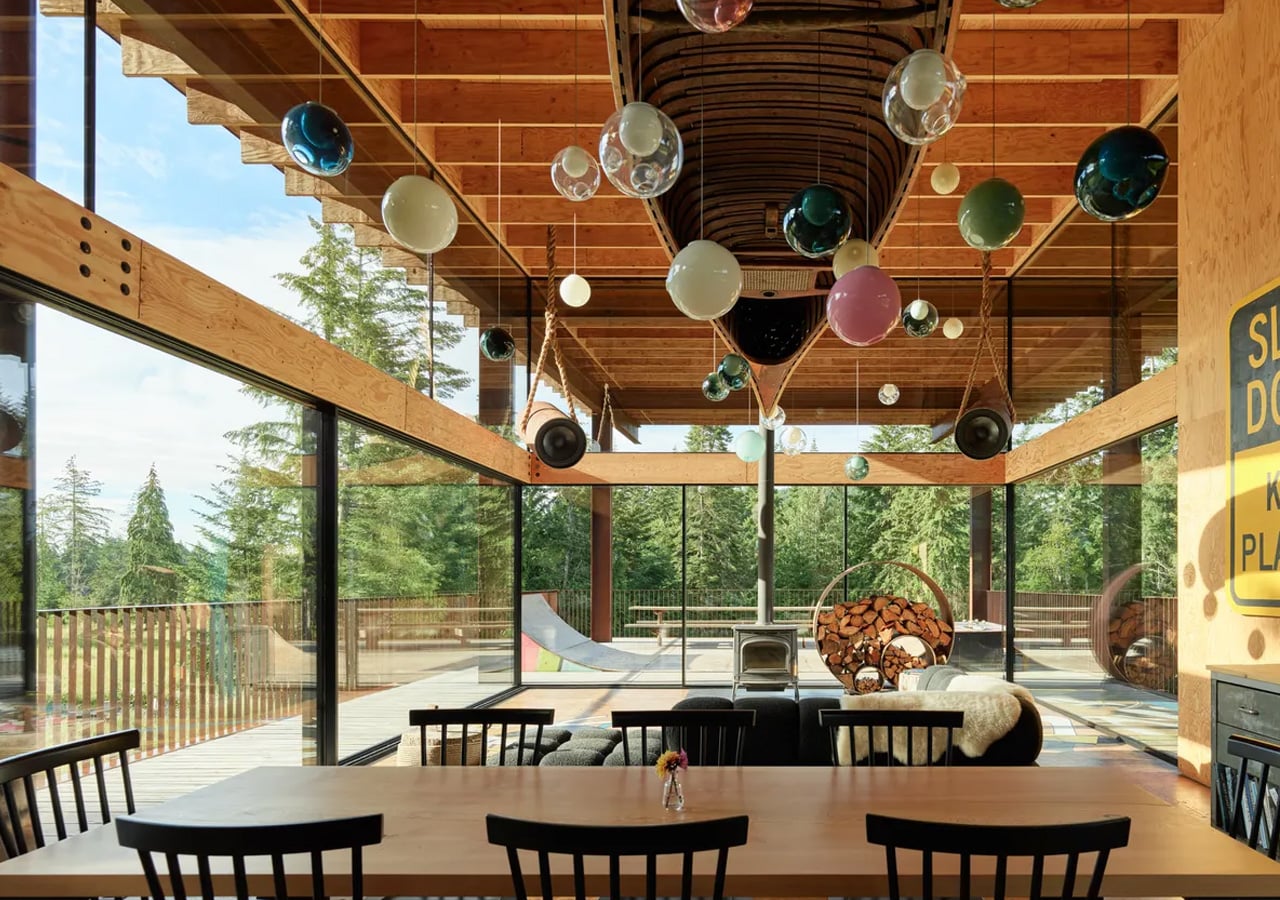
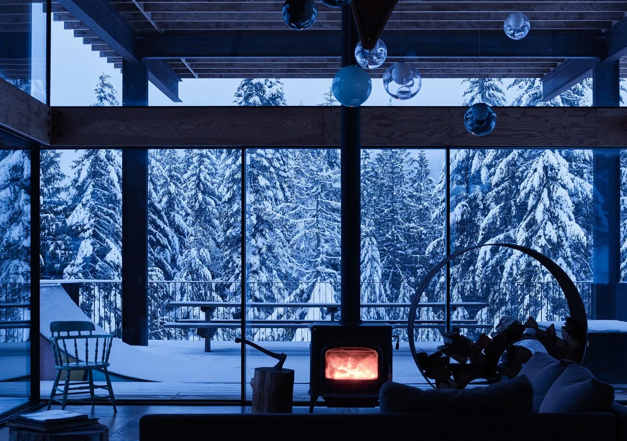
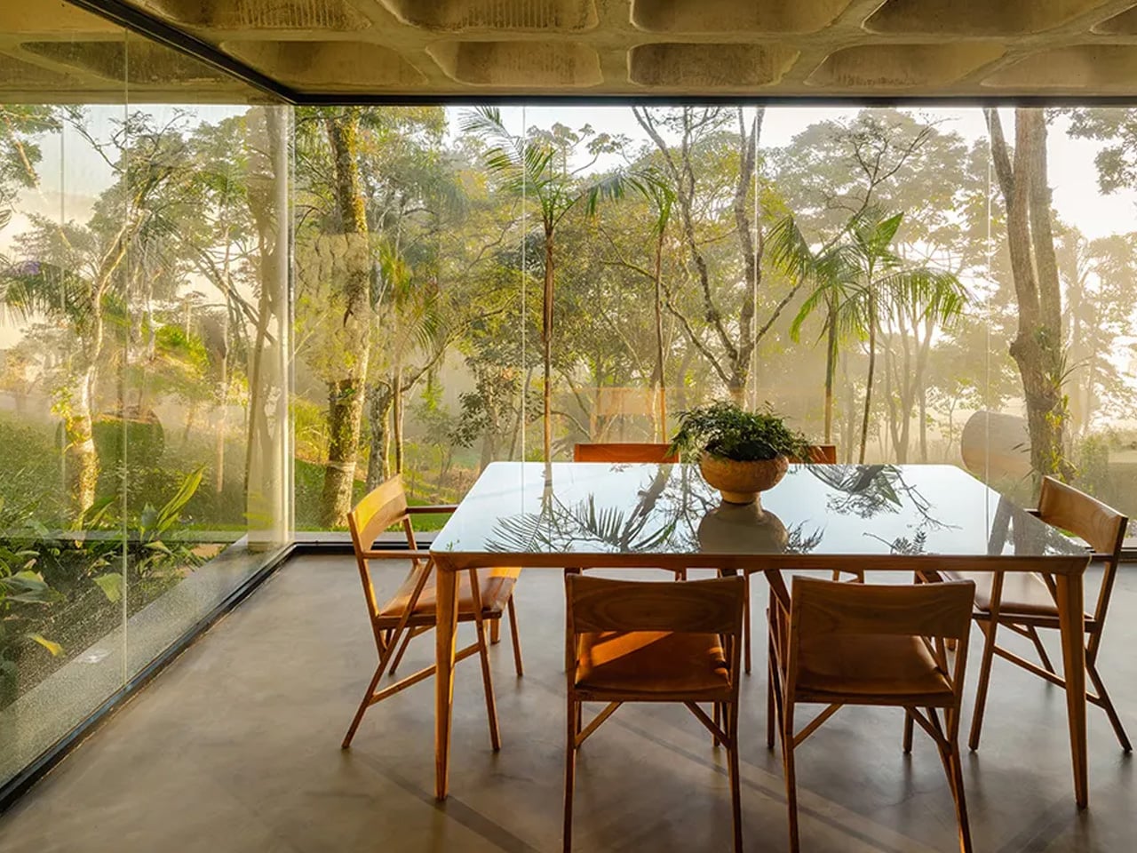
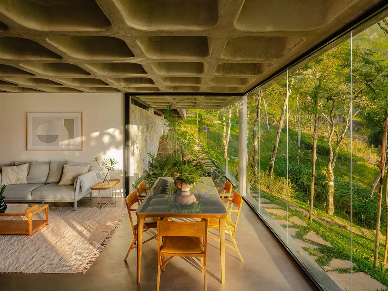
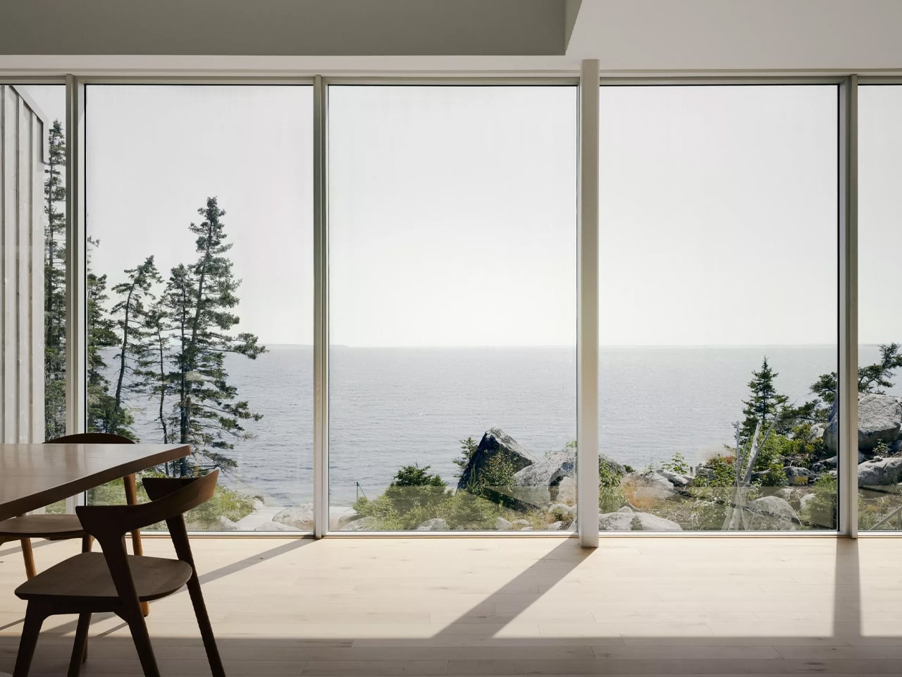
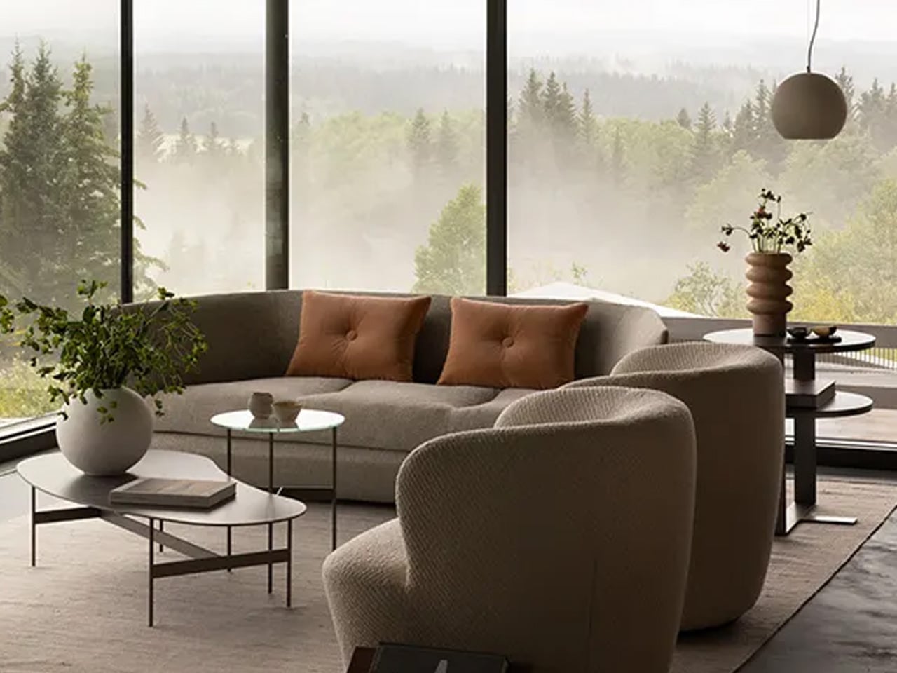
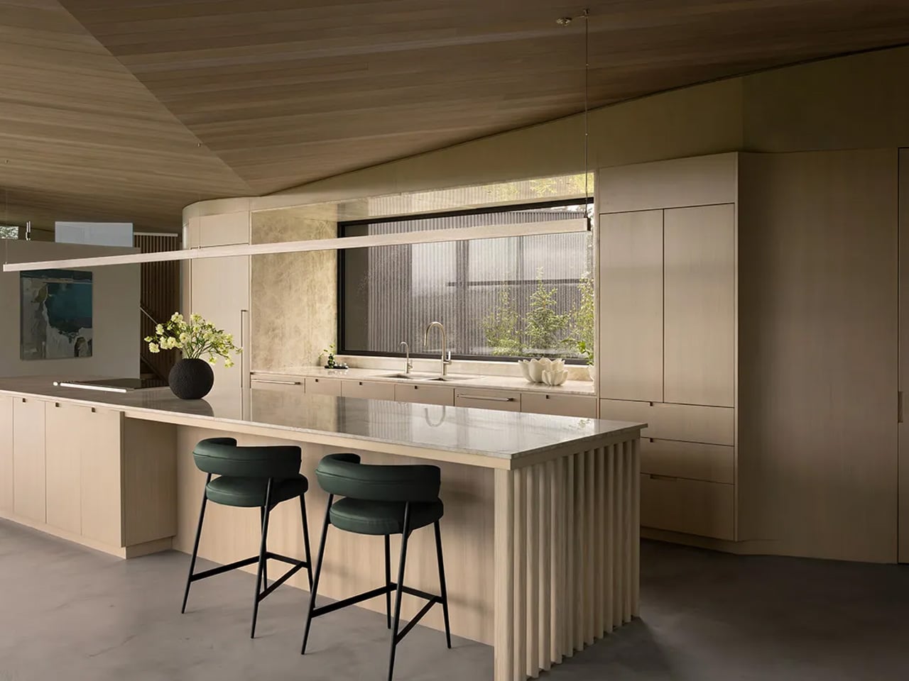
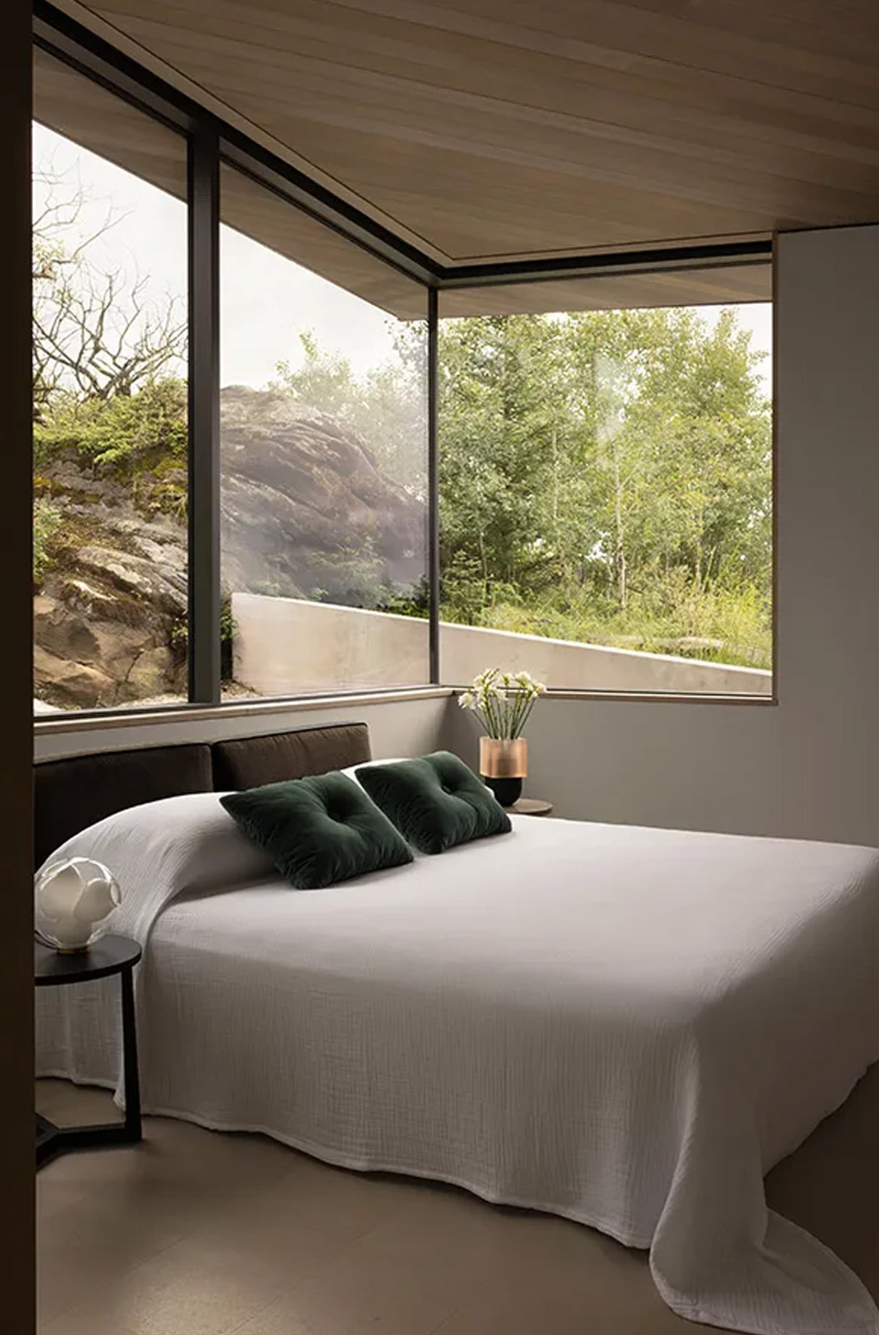
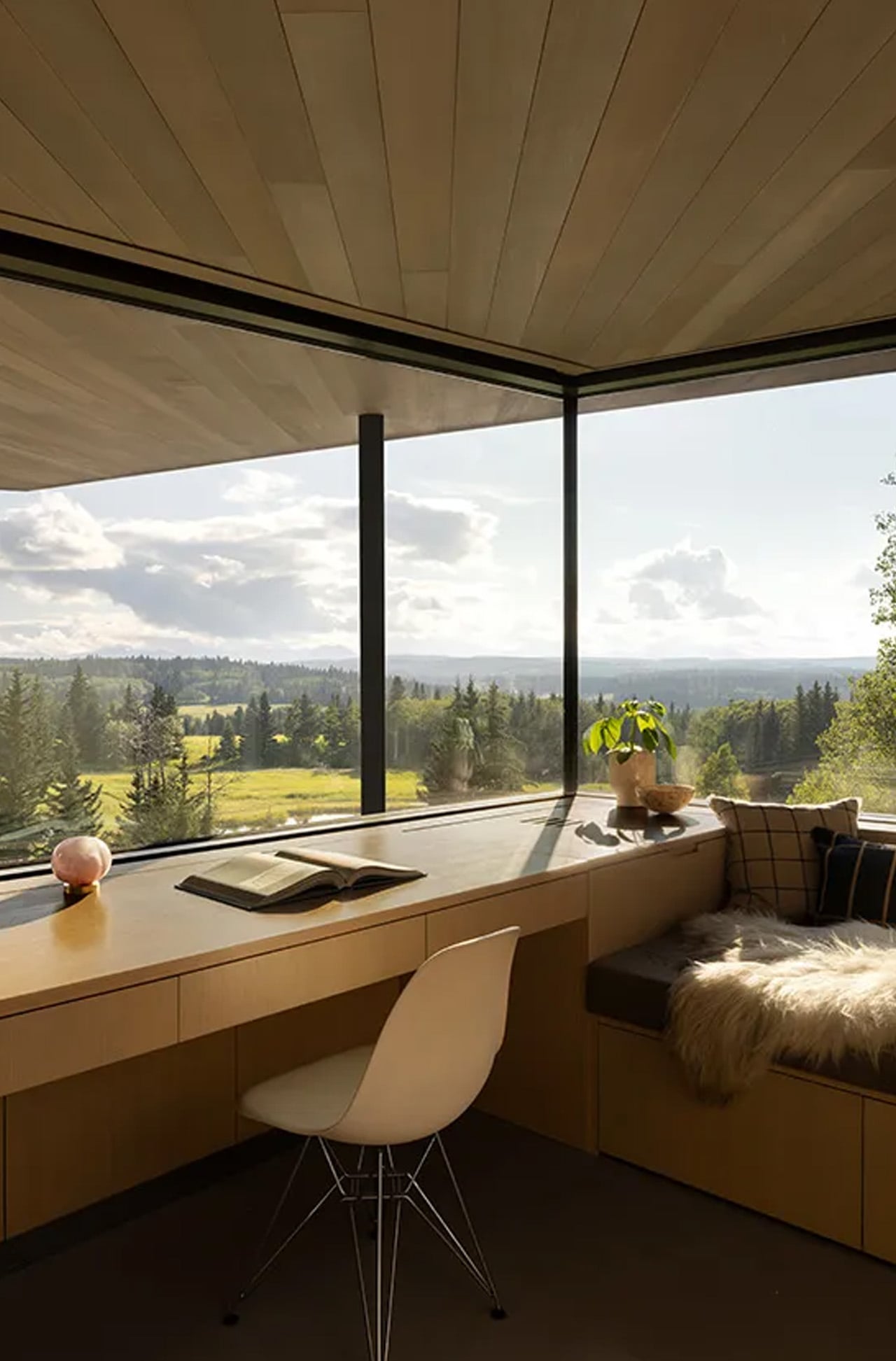
The project was conceived as a family vacation home, and it wears that intention openly. Rather than asserting itself against the landscape, the house responds to it — balancing intimate spaces oriented toward the dense surrounding woodland with communal areas that open dramatically toward the mountains. That duality is the architecture. Everything else follows from it.
Designer: Young Projects
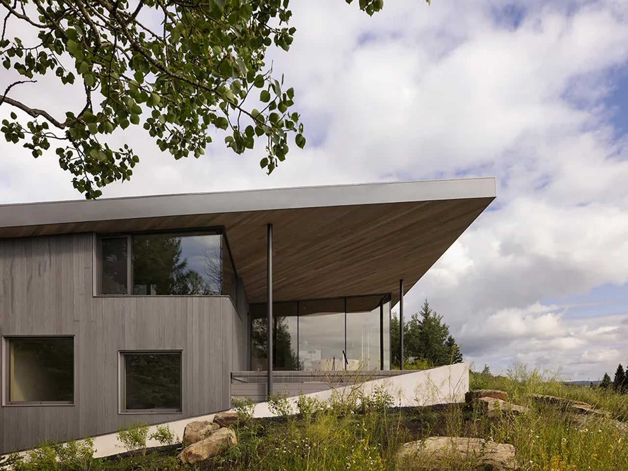
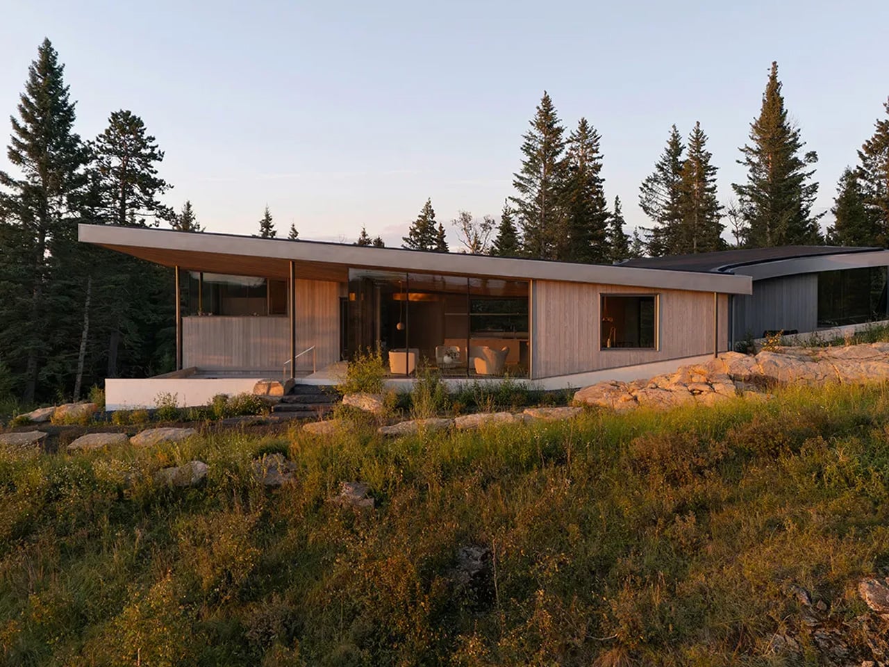
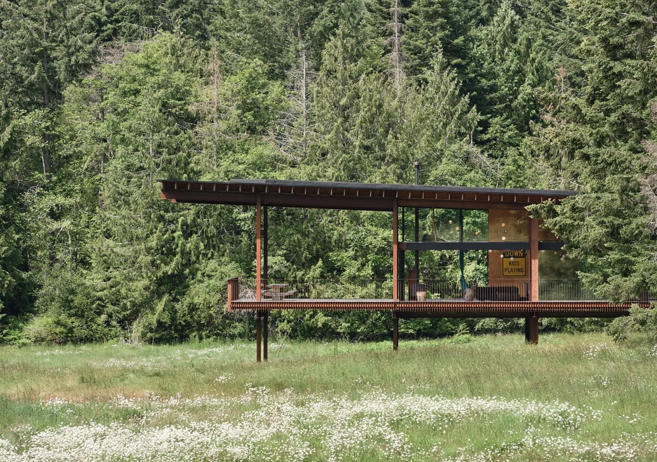
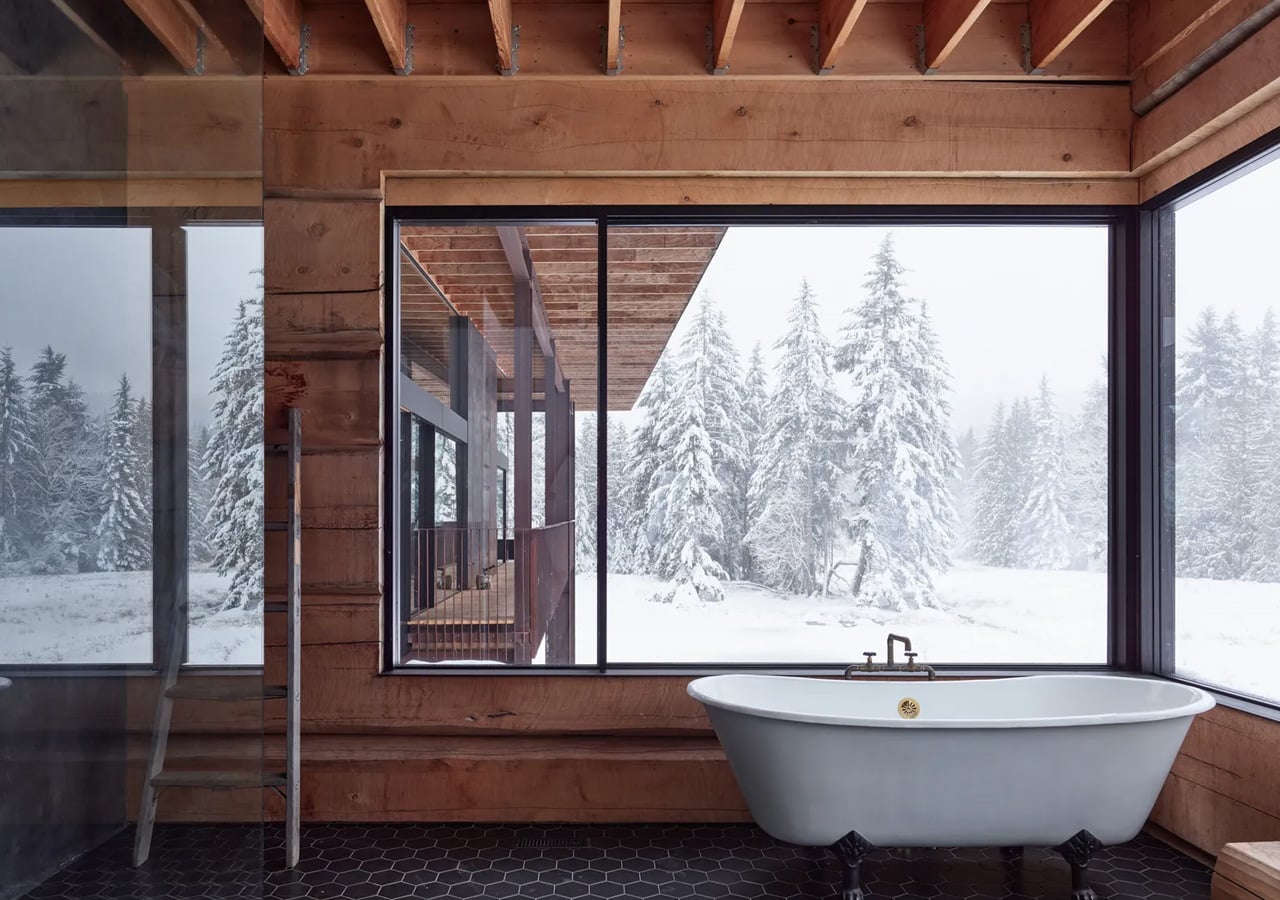
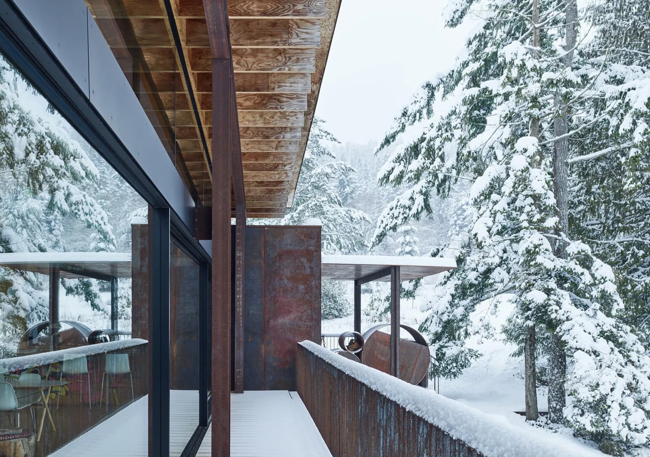
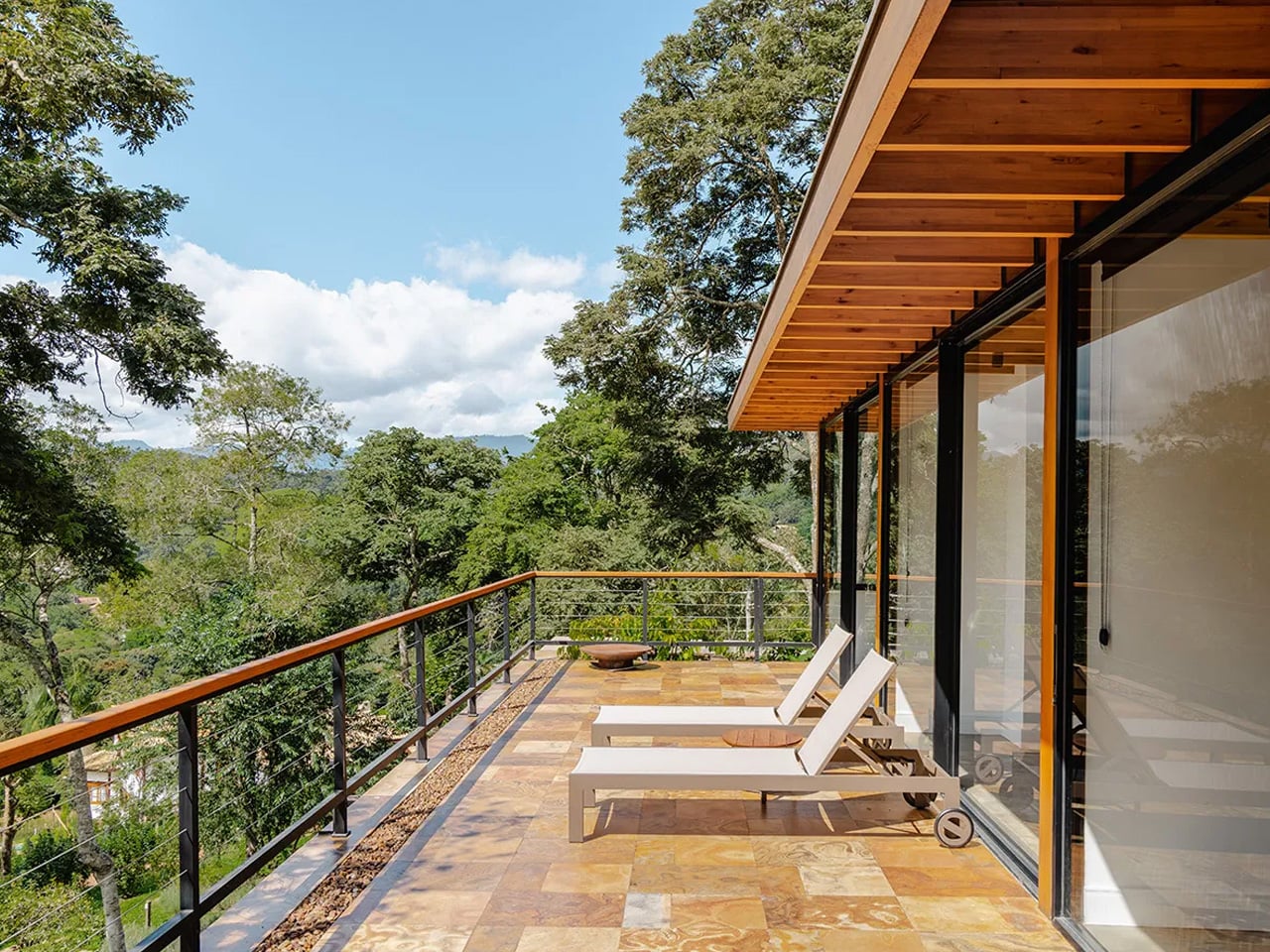
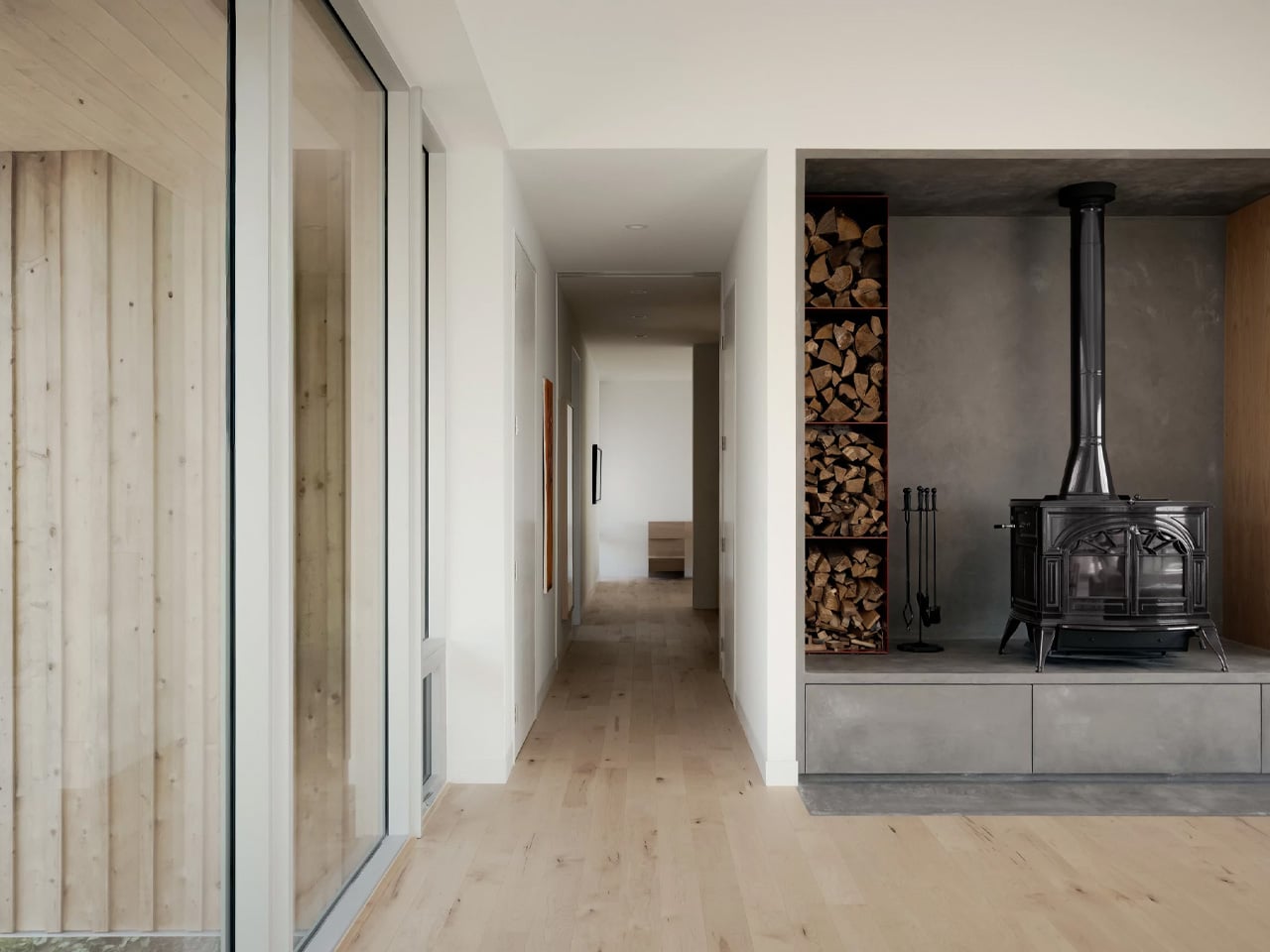
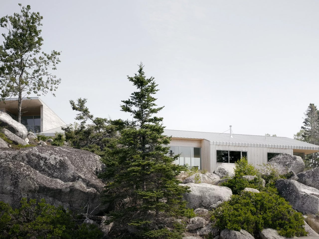
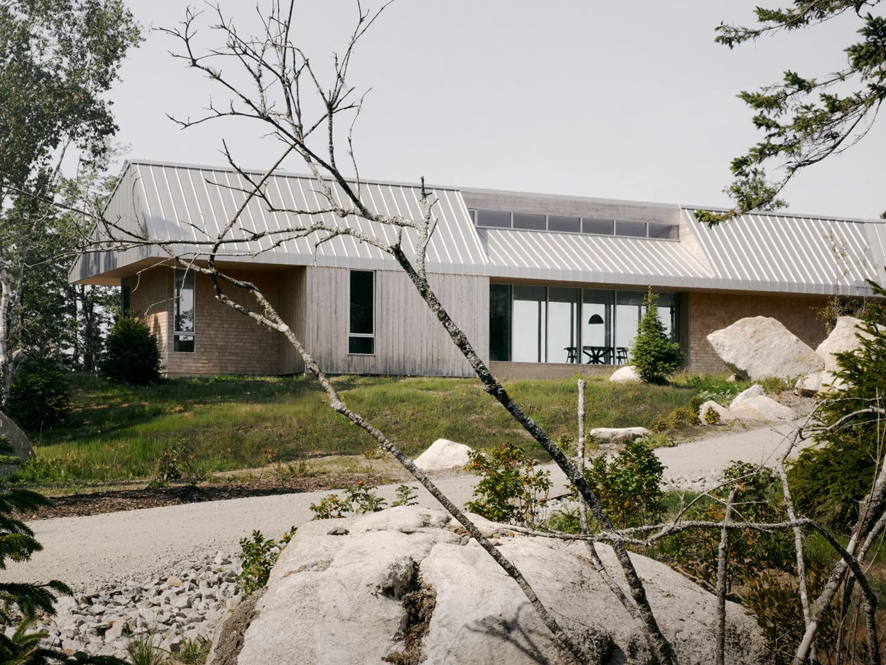
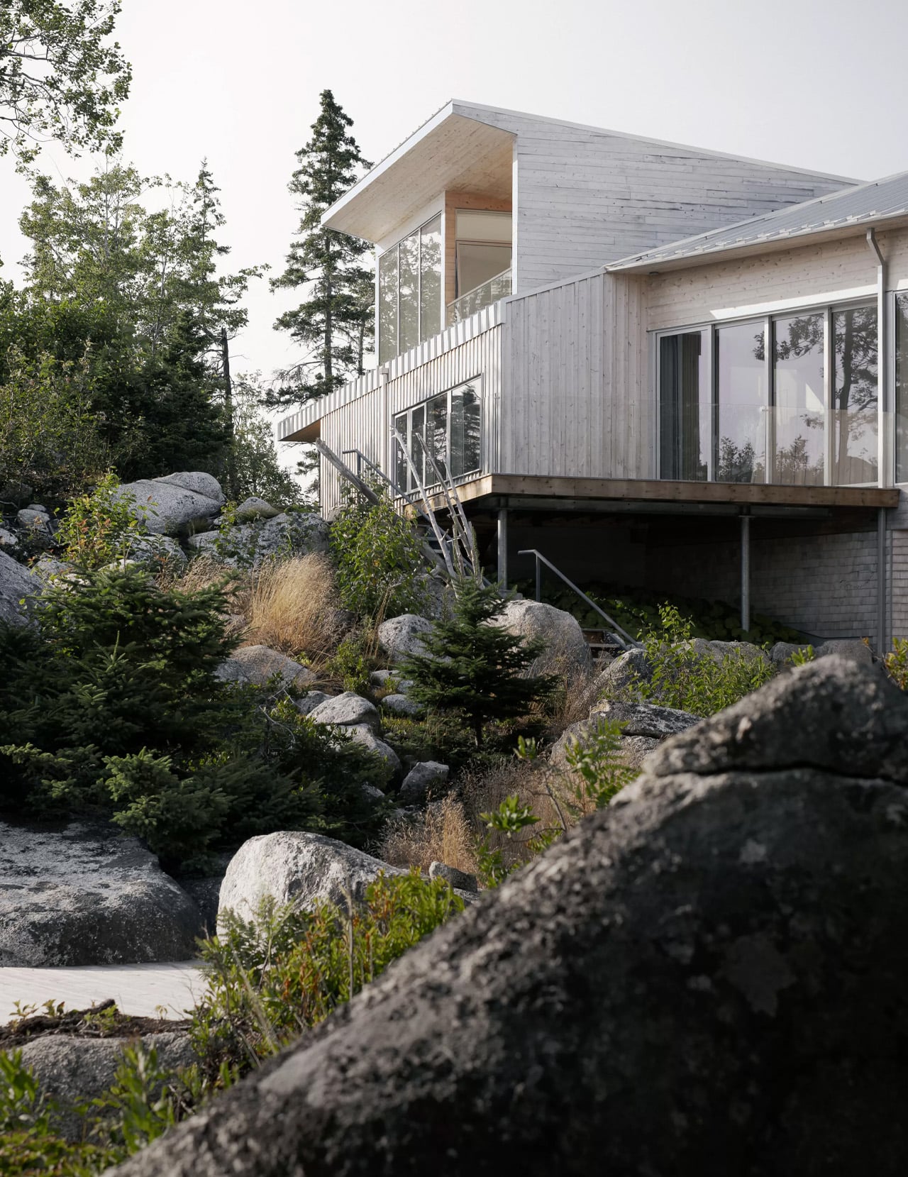
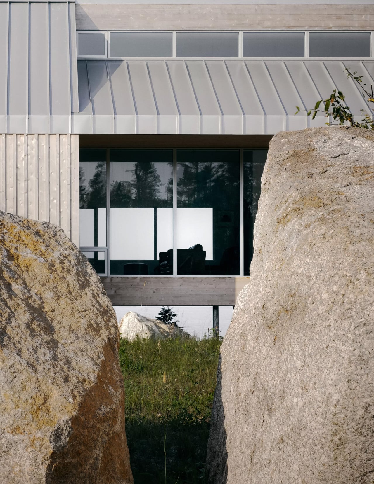
The defining move is the butterfly roof, which Young Projects uses not just as a formal gesture but as a tool for orchestrating experience. The angled planes slope in opposite directions, directing views outward from within while reflecting the terrain’s gradient from outside. Where the roofline climbs, communal living spaces claim the panoramic views. Where tree density compresses the sightlines, private bedrooms pull back into quieter, more sheltered corners of the plan. The roof, in a sense, is the planner.
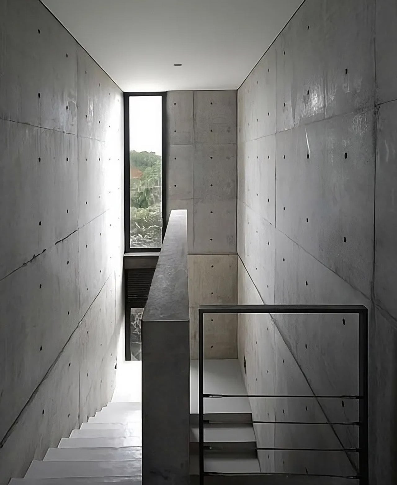
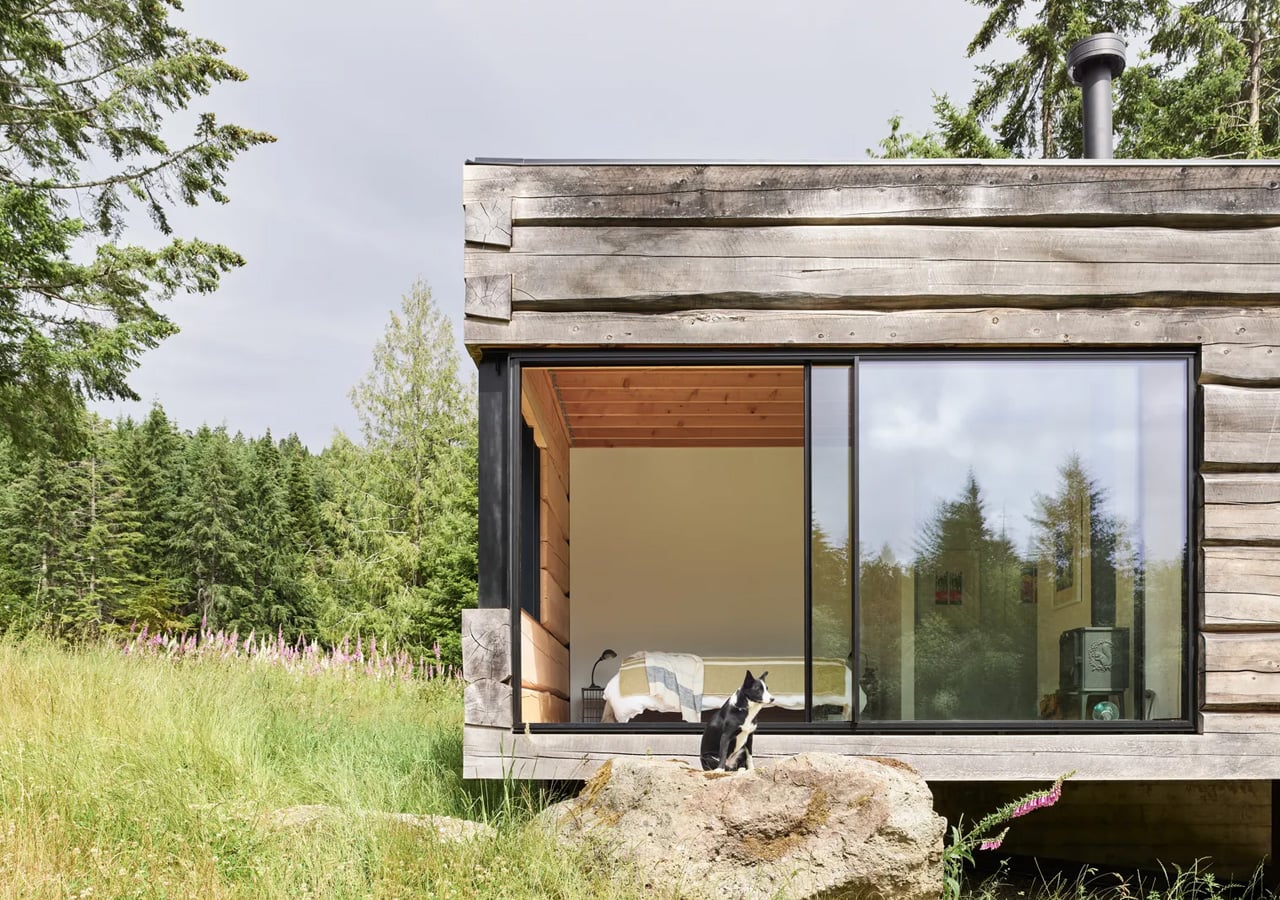
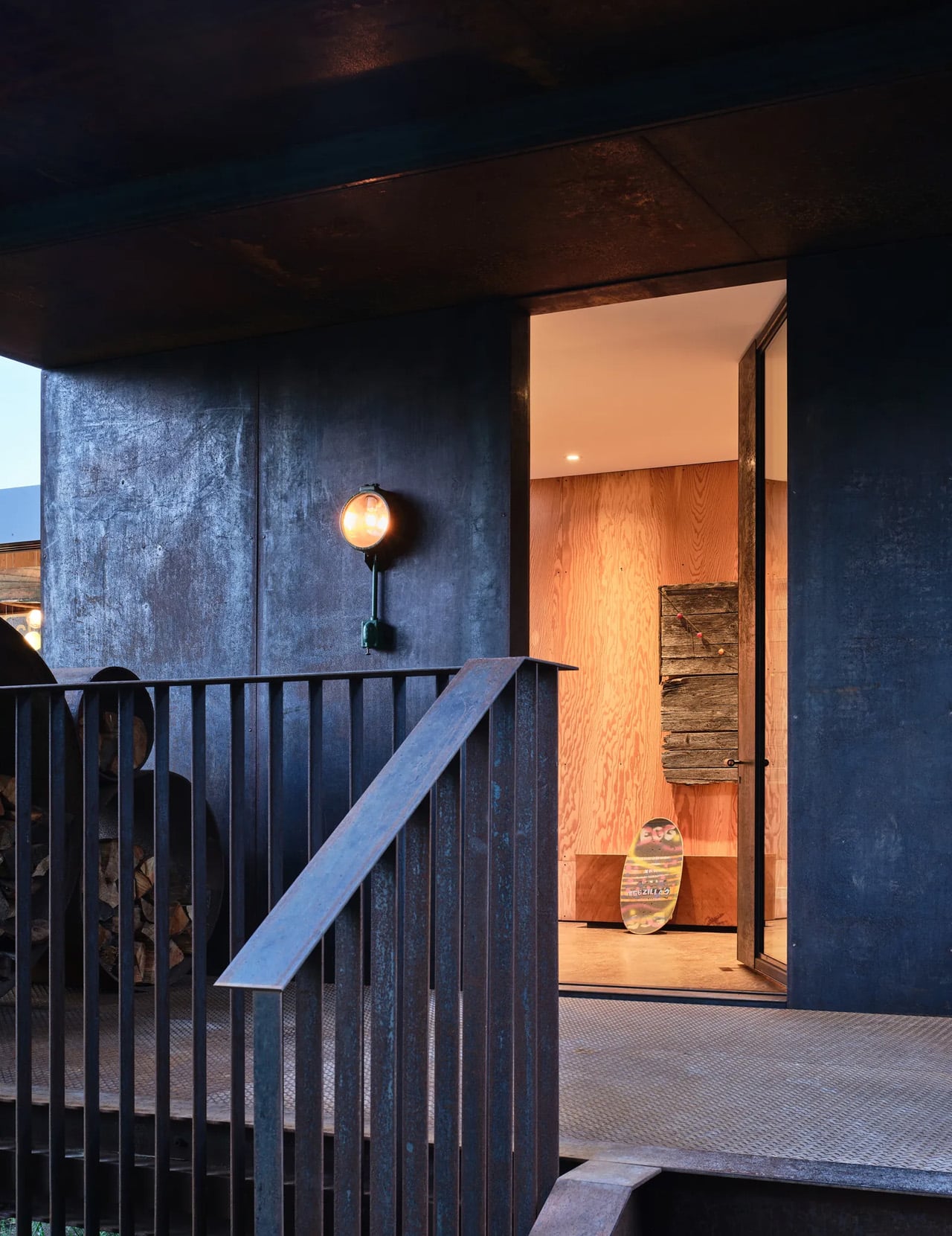
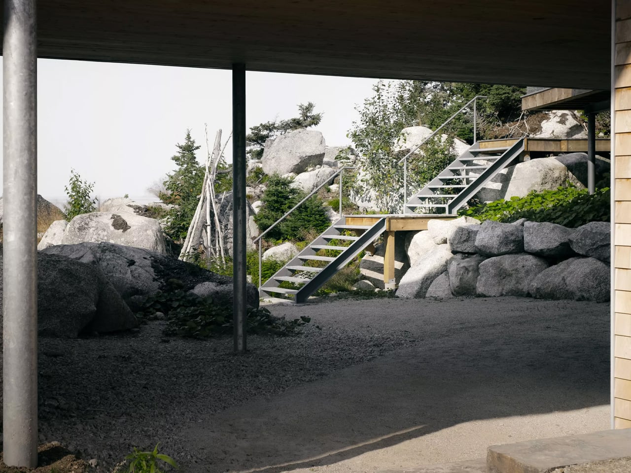
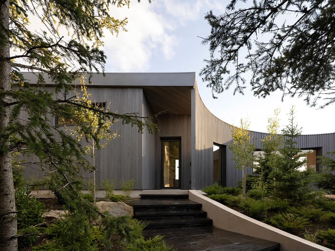
The “cut out” in the name refers to a series of subtractions carved from the building’s overall volume — openings and recesses that give the house its sculptural character without overworking it. This is a form shaped as much by removal as by addition. The result reads as something confidently simple, which is the harder thing to achieve. Most houses at altitude either defer too much to the landscape or compete with it. Cut Out House does neither.
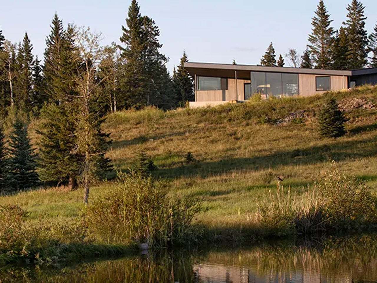
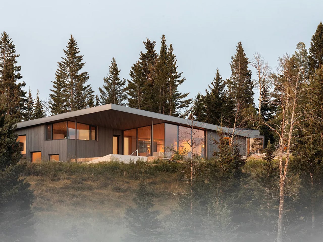
Gray Accoya wood clads the exterior, a material choice that ages gracefully and lends the structure a tonal continuity with the rock and timber of the surrounding terrain. It doesn’t announce itself. From across a nearby body of water, the butterfly roofline is the first thing you read — a dynamic silhouette that shifts with the light and suggests movement even when the house is still.
Bryan Young founded Young Projects in New York in 2010, and the studio has built a reputation for work that thinks carefully about the relationship between built form and context. Cut Out House extends that sensibility into alpine territory, where the stakes of getting that relationship wrong are immediately visible in every window. The house doesn’t compete with the Rockies. It leans into them, shapes itself around them, and in doing so becomes something more interesting than a retreat — it becomes a calibrated act of looking.
The post Young Projects’ Cut Out House Proves Subtraction Is the Most Powerful Tool in Architecture first appeared on Yanko Design.