UNStudio’s Wasl Tower Is Dubai’s Most Sculptural Skyscraper Yet

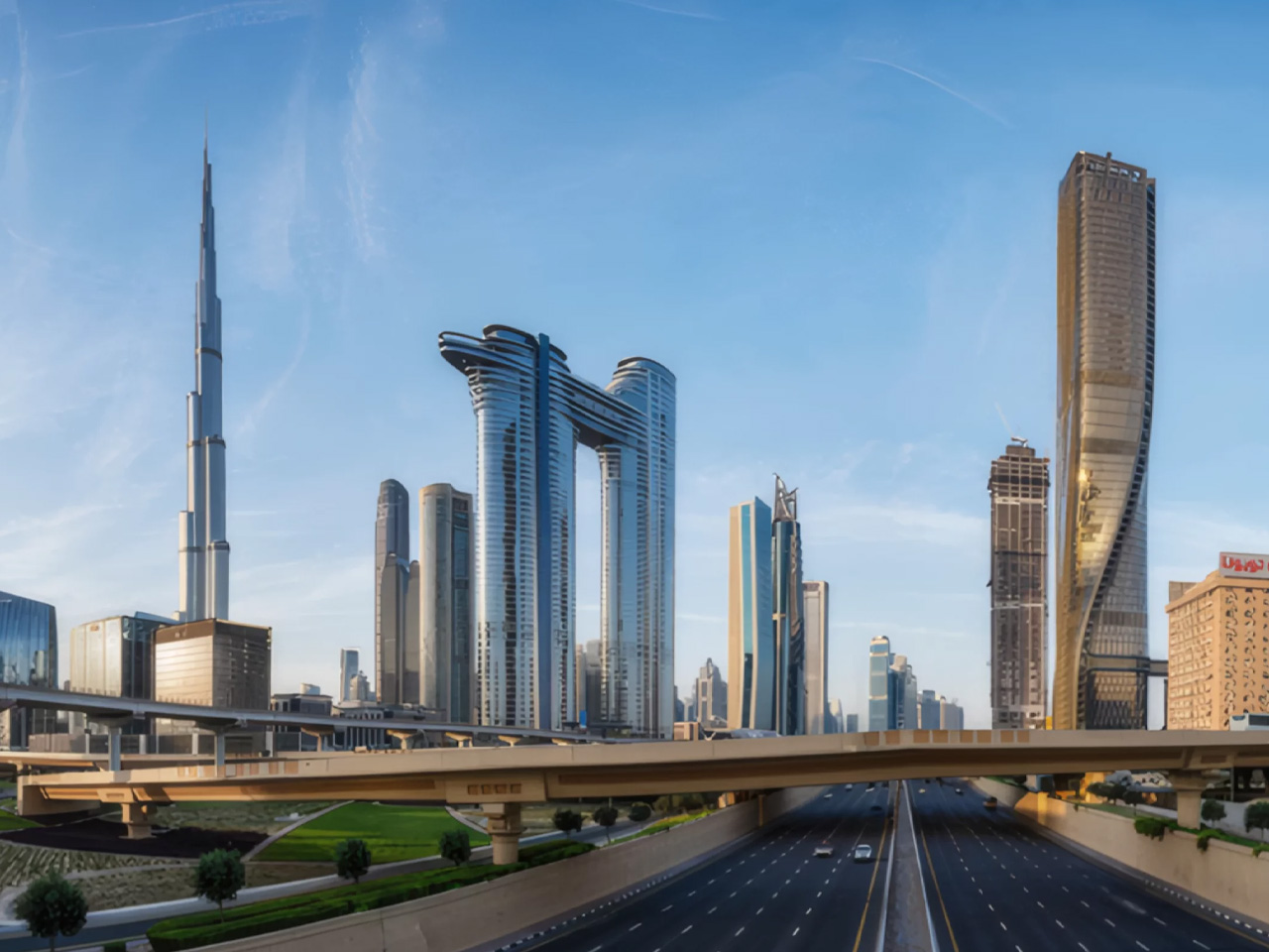
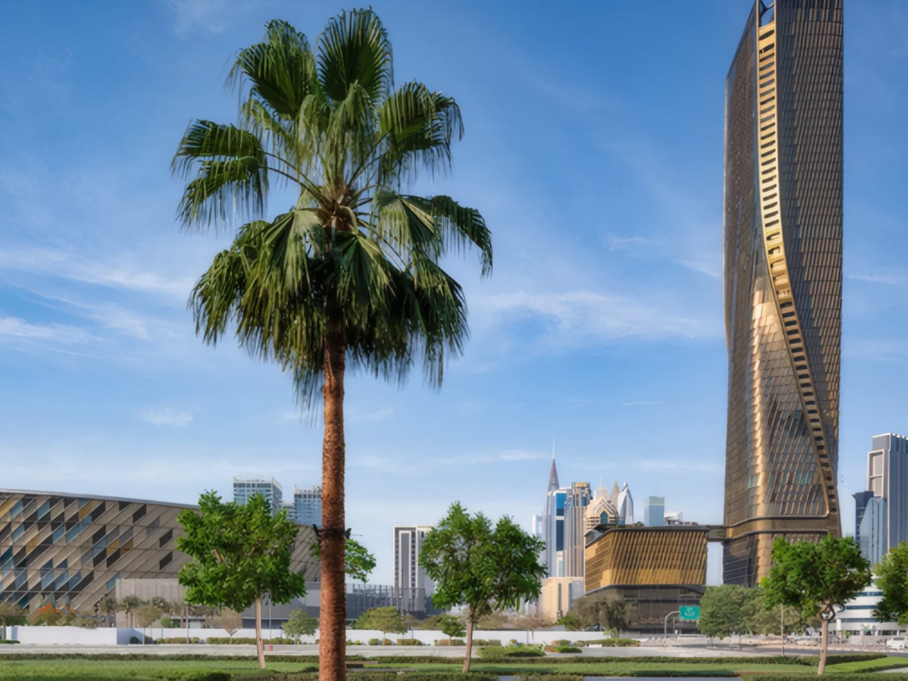
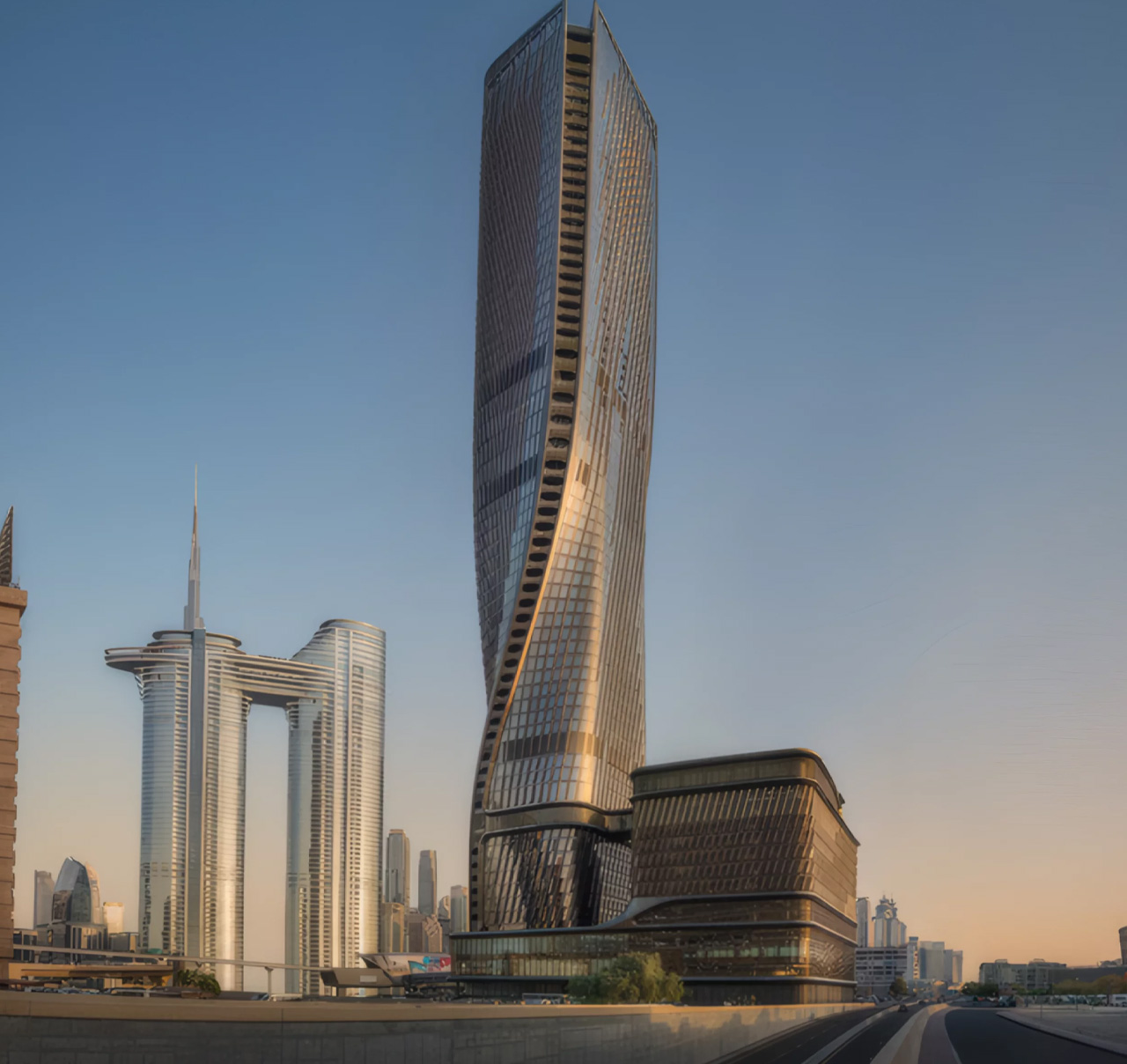
There’s a building rising on Sheikh Zayed Road that isn’t trying to be the tallest thing in the room — it’s trying to be the most alive. The Wasl Tower, designed by UNStudio in collaboration with structural engineers Werner Sobek, stands 302 metres above Dubai and carries with it one of the most thoughtful design narratives in the city’s recent skyline story. Conceived as early as 2014 and nearing completion, the 64-storey supertall is a landmark in the truest sense, not just because of its height, but because of what it means to stand there.

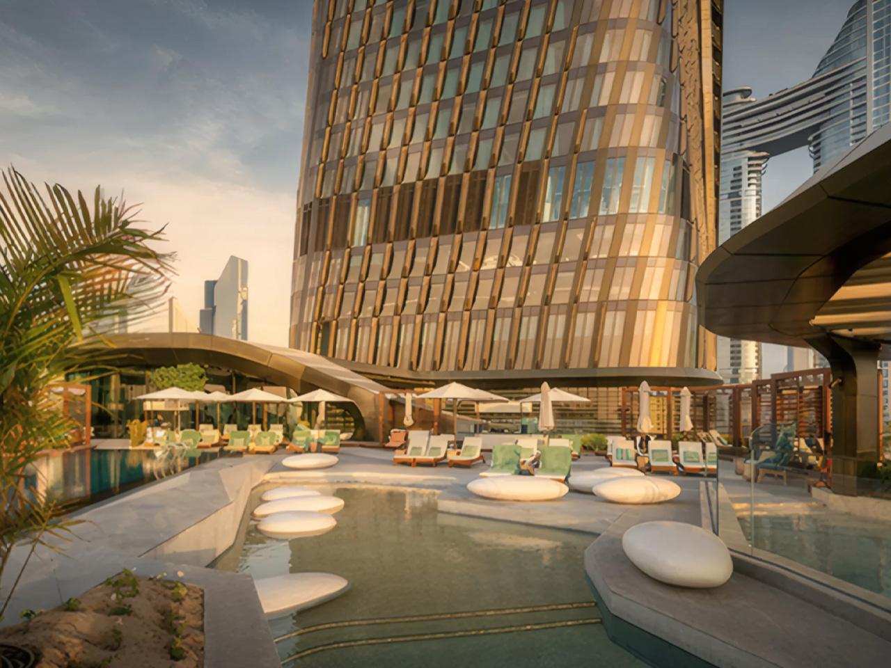
The tower draws its form from classical sculpture. UNStudio looked to the ‘contrapposto’, a Renaissance-era pose in which a figure shifts weight and twists slightly at the torso, suggesting movement mid-stride, and scaled it to 302 metres. The result is a building that appears to rotate as you move around it, its geometry shifting with every vantage point. Structurally, this feat is achieved through three massive 300-metre shear walls linked by four strategic outriggers, a system that allows the building to twist gracefully while still supporting a fully flexible, mixed-use floorplate.

Designer: UN Studio

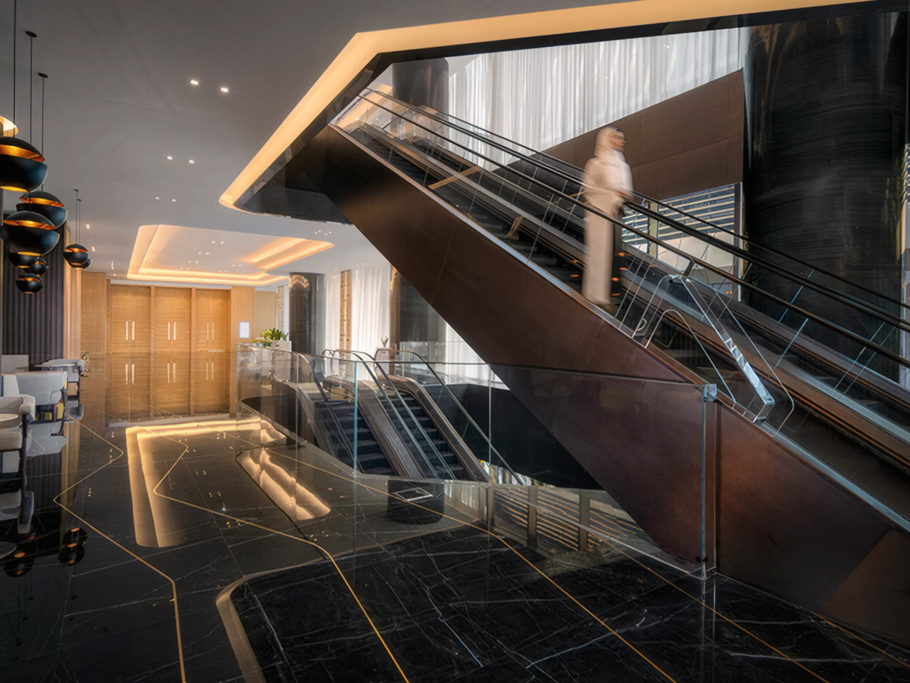
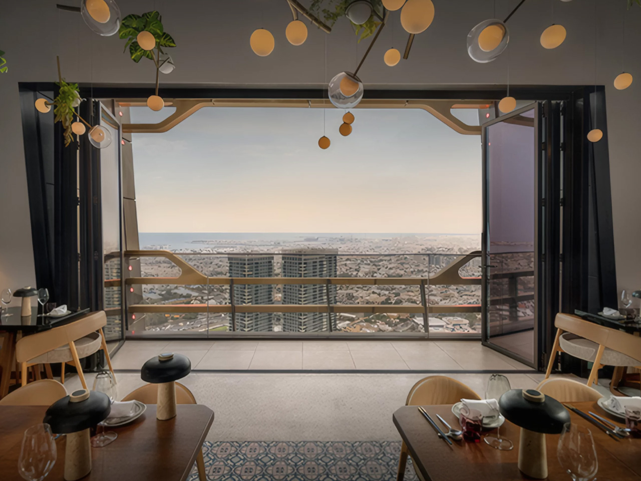
Positioned directly opposite the Burj Khalifa along Dubai’s main north-south artery, the Wasl Tower occupies a site that was previously untouched by high-rise development. A new pedestrian bridge now connects it to the Burj Khalifa metro station, threading the tower into the city’s movement infrastructure and making it a genuine civic node rather than an isolated object. Its programming reflects that ambition — the building houses residential apartments, offices, a hotel, restaurants, and entertainment spaces, with public programming deliberately elevated high above street level.

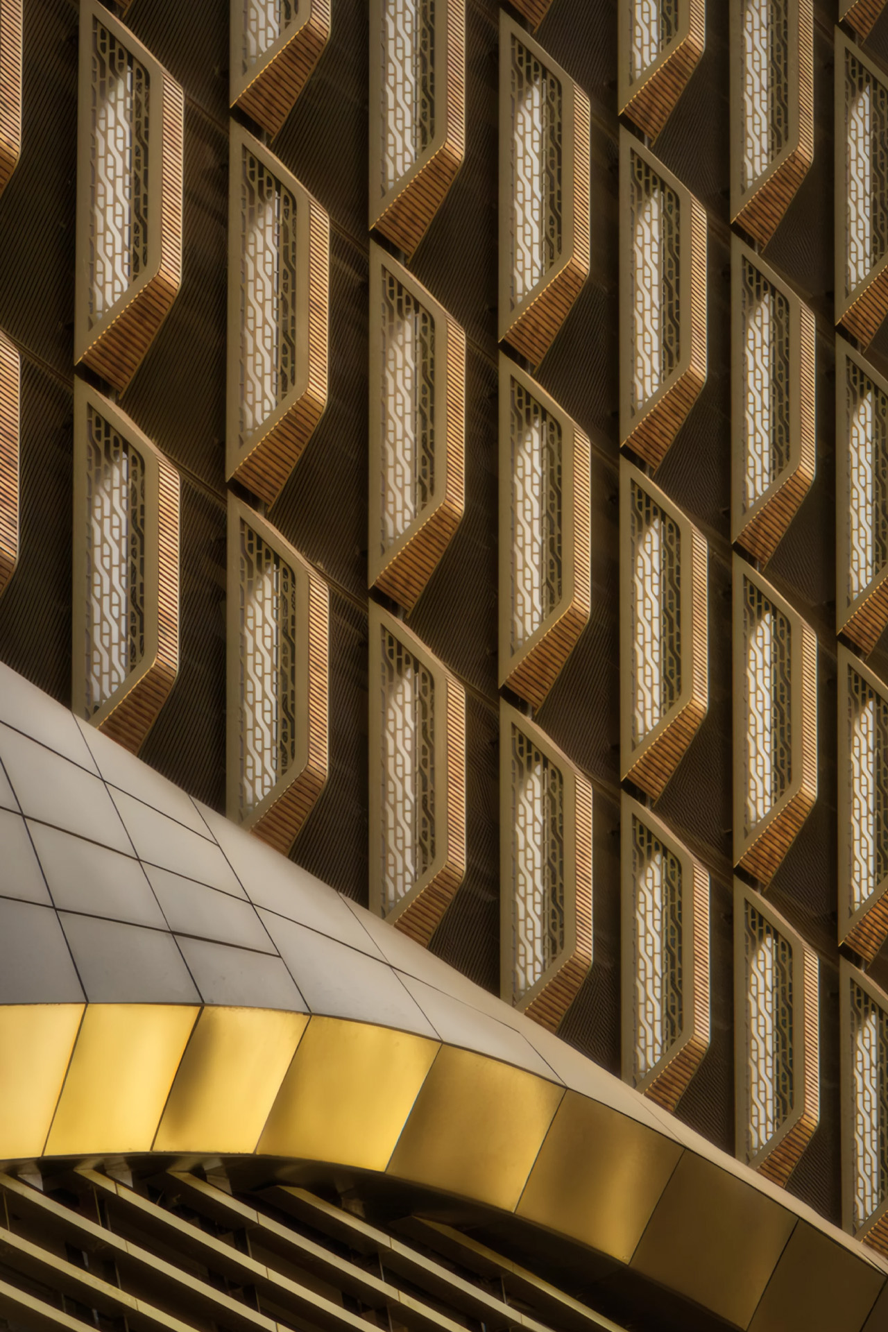
What gives the tower its visual texture is its facade, one of the tallest ceramic facades in the world. UNStudio and Werner Sobek clad the building in a lace-like grid of glazed clay fins, a material choice that is as low-tech as it is clever. The ceramic tiles diffuse and reflect the desert sun, reducing heat gain and eliminating the need for more energy-intensive shading systems. At night, the facade takes on an entirely different quality, illuminated in a way that makes the building appear to breathe.

For a city that has never been shy about spectacle, the Wasl Tower earns its place on the skyline by being something rarer: a building with a rigorous idea behind it. It references art history, responds to climate, and reshapes a stretch of one of the world’s most iconic roads, all at once.

The post UNStudio’s Wasl Tower Is Dubai’s Most Sculptural Skyscraper Yet first appeared on Yanko Design.

MAD Just Opened a 46,000 sqm Silver Cloud Museum in China

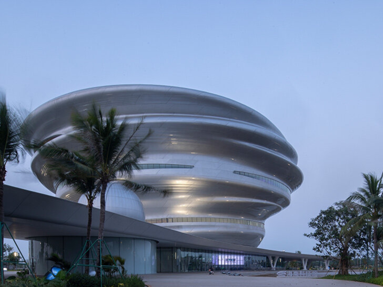
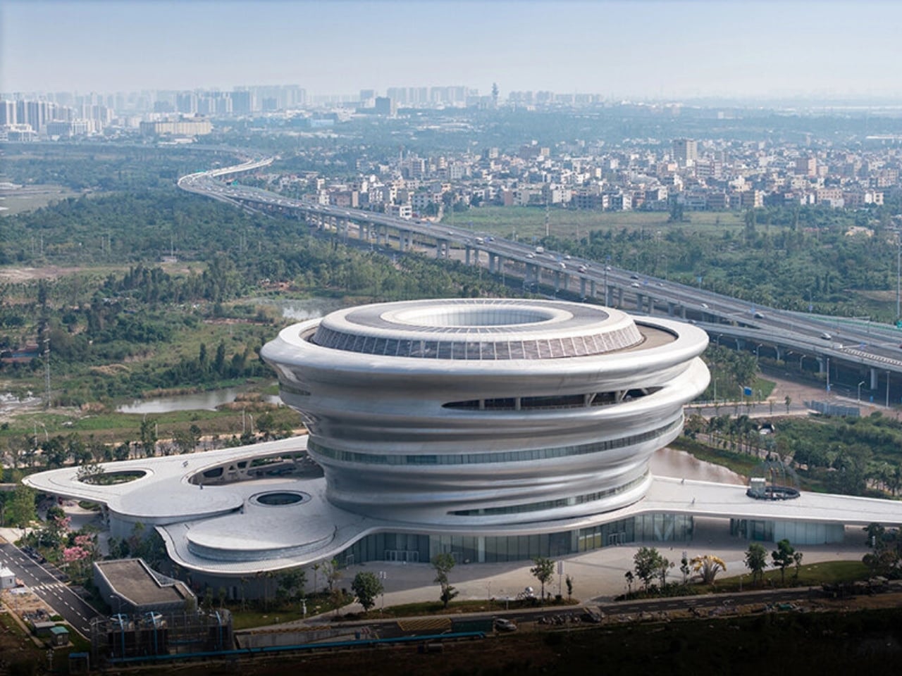
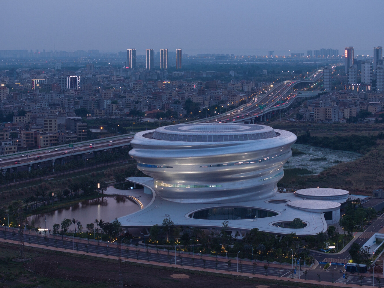
When we covered the Hainan Science Museum back in 2024, it was still a promise on renderings. The images showed a billowing silver form rising above a tropical wetland, and the honest reaction was: is this actually going to get built? It looked too cinematic, too untethered from the logic of real construction. It’s open now. And it looks almost exactly like the renders promised.

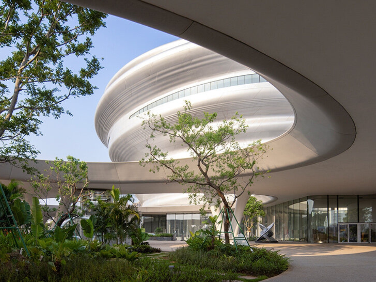
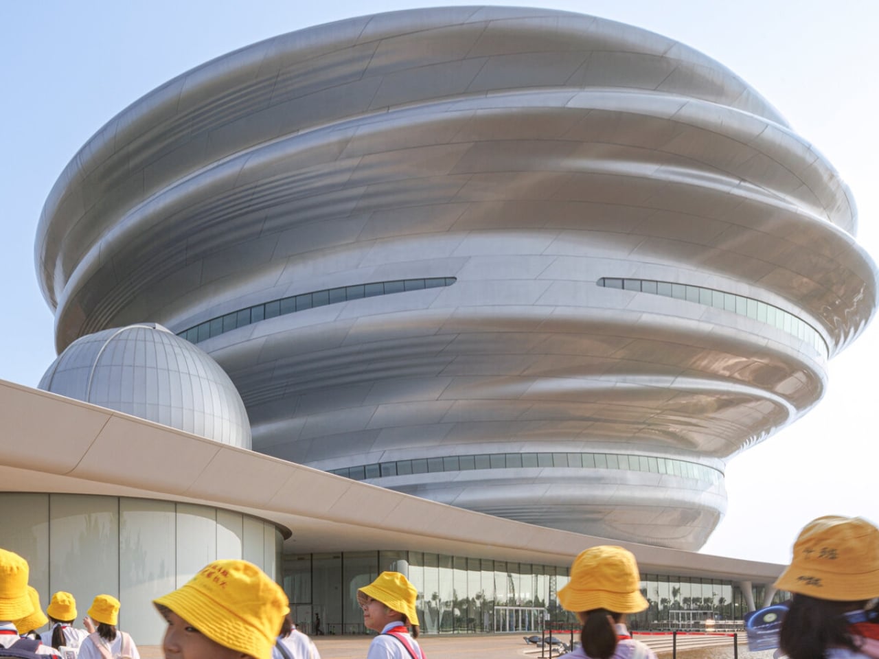
The museum sits on the edge of Wuyuan River National Wetland Park on the west coast of Haikou, in China’s Hainan Province, designed by Ma Yansong and MAD Architects. The shimmering silver exterior is made up of 843 individual pieces of fiberglass-reinforced plastic, fitted together to create a form that ripples and spirals upward like a thermal updraft. That is quite literally the design reference: the movement of warm air rising from the earth’s surface. From a distance, the structure reads as a cloud that materialized above the jungle. Up close, the seams and surface geometry become visible, but it doesn’t break the spell. It deepens it. The material choice matters too. The reflective quality of the panels shifts depending on light and weather, which means the building never quite looks the same twice.

Designer: MAD Architects

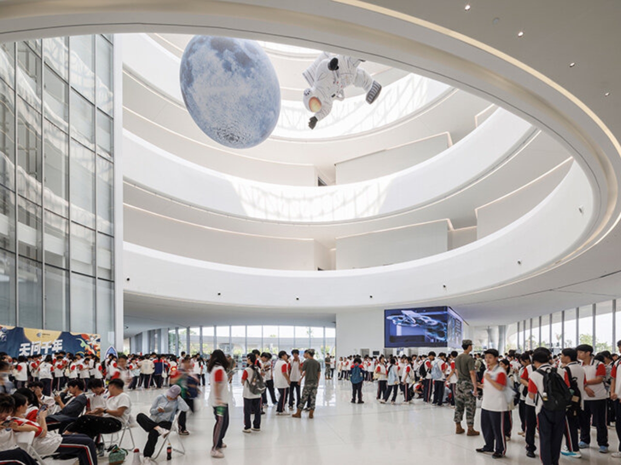
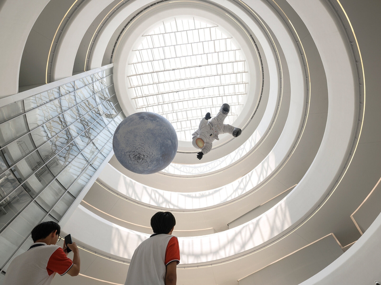
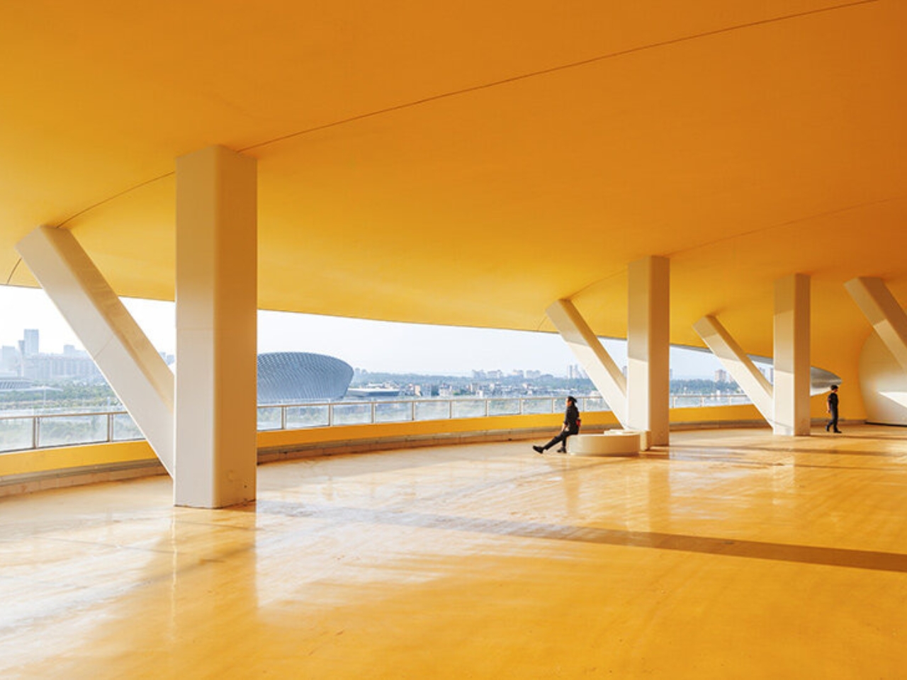
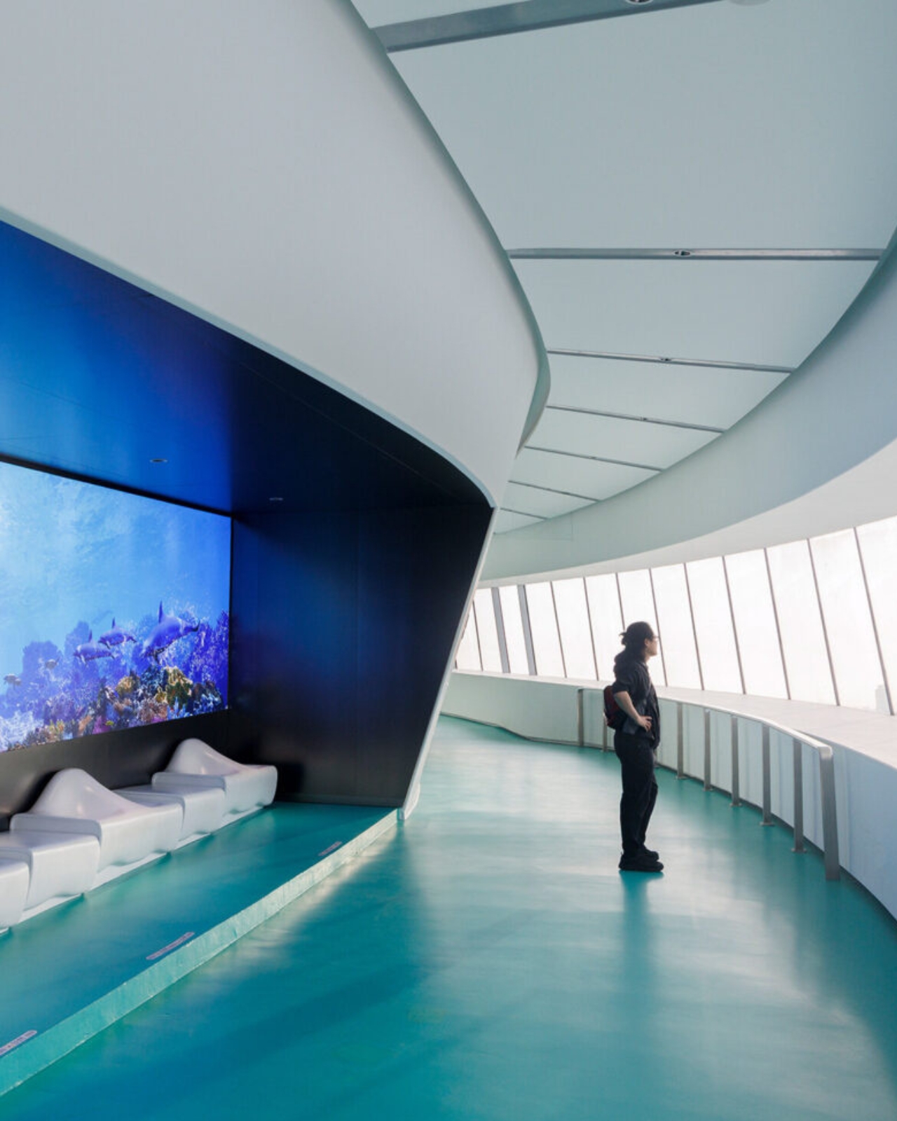
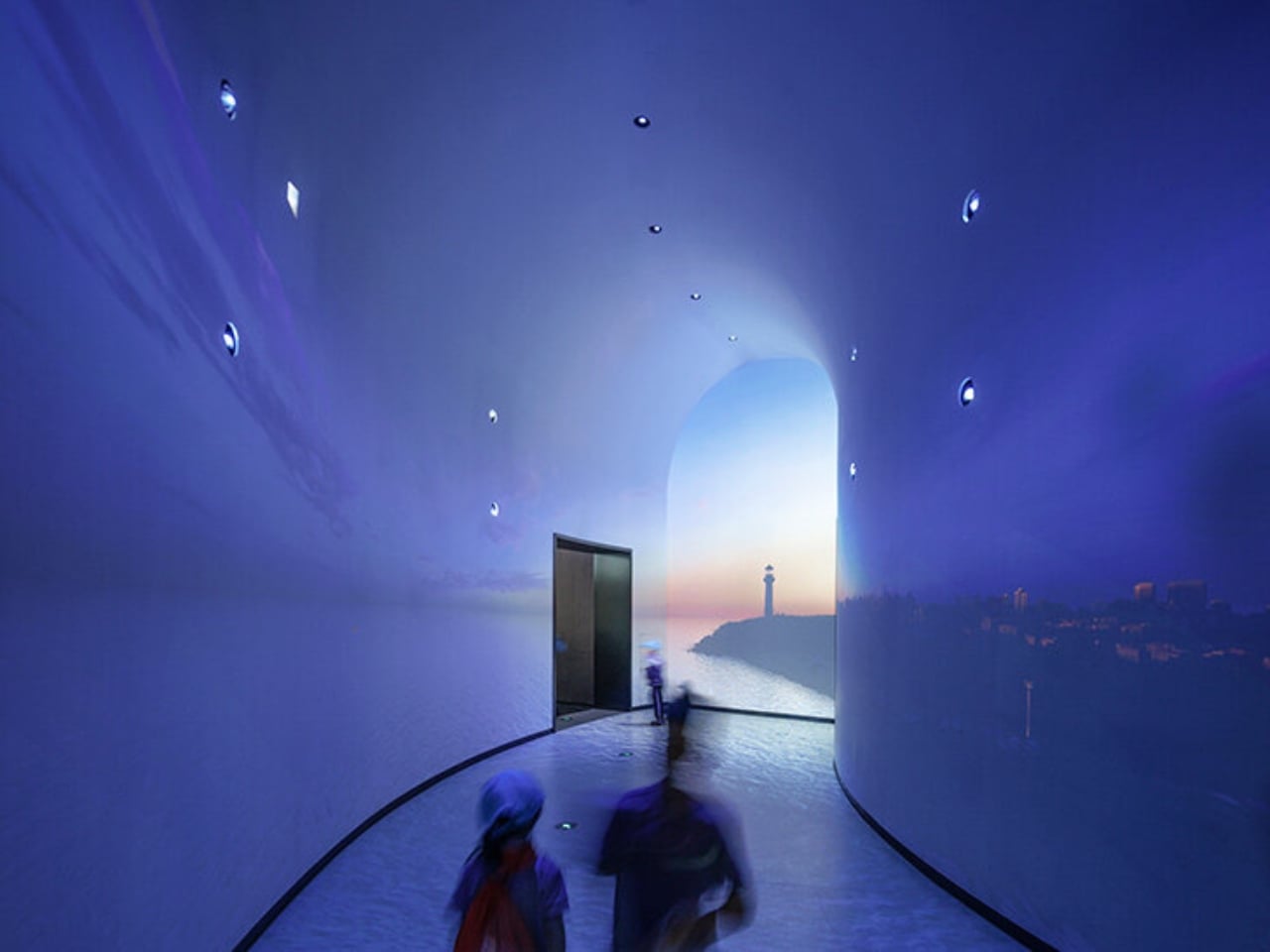
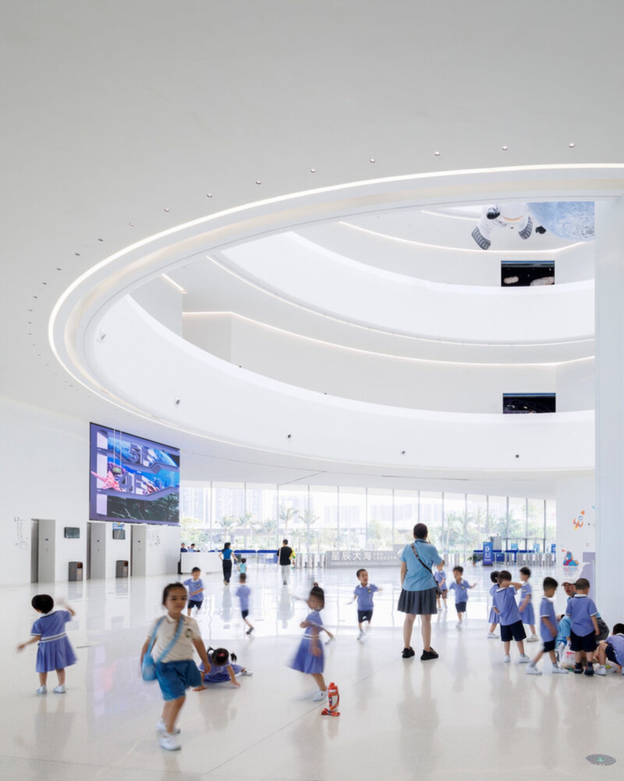
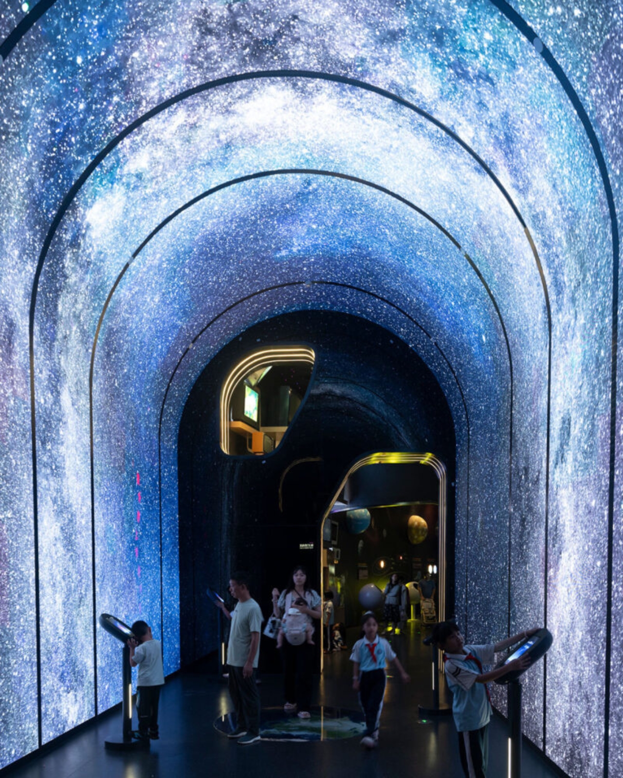
The interior is where things get genuinely impressive. The main structure is column-free, which is a structural achievement worth acknowledging on its own. The total building area is approximately 46,528 square meters. Visitors move through the museum via a spiraling ramp that ascends from the central hall across five floors, with the exhibition experience beginning at the top level on a 360-degree viewing platform with open views of both the sea and the city below. A skylight dome floods the central atrium with natural light, and the whole space feels deliberately open and unhurried. That matches MAD’s stated philosophy around what a science museum should actually feel like. As Ma Yansong put it: “A science museum is about education and imagining the future; we want nature to be part of that vision as well.”

That quote is worth sitting with. Science institutions have historically been designed to feel authoritative. Imposing facades, grand columns, marble lobbies. The architecture announces itself as serious and expects visitors to match. MAD is proposing something different: that curiosity and wonder are better triggered by a space that already inspires both. The science content doesn’t need to be communicated through the building itself; the building just needs to make you feel open to receiving it. Whether you fully buy into that idea philosophically, you can’t argue that the Hainan Science Museum fails to create a mood before you’ve even stepped inside.

The building is also elevated off the ground, which allows the wetland landscape to continue flowing underneath it. That relationship between the structure and the site feels considered rather than incidental. It prevents the building from swallowing its environment whole, which matters here given that the natural setting is precisely what the whole project is in conversation with. Standing underneath it, the ground remains soft, green, and alive. For a structure this visually assertive, it sits lightly in a way that isn’t easy to pull off.

This is MAD’s second major public project in Hainan, following the Cloudscape of Haikou, which opened back in 2021. Together, they’re beginning to form a kind of visual language along the Haikou coastline, a series of dreamlike structures that feel more like environmental installations than civic buildings. For a city actively building its identity within China’s free-trade port framework, having work like this on the waterfront is a deliberate cultural statement about where Haikou wants to stand on the global stage.

Design began in 2020. Groundbreaking was in 2021. The main structure wrapped in 2023. Five years from concept to opening doors is a reasonable arc for a project of this ambition and scale. Seeing it finally receive visitors closes a loop that many who followed its construction had been waiting for. Sometimes the renders really do deliver. This is one of those times.

The post MAD Just Opened a 46,000 sqm Silver Cloud Museum in China first appeared on Yanko Design.

Sydney Just Opened a 42-Metre Steel Lookout Over a Former Quarry

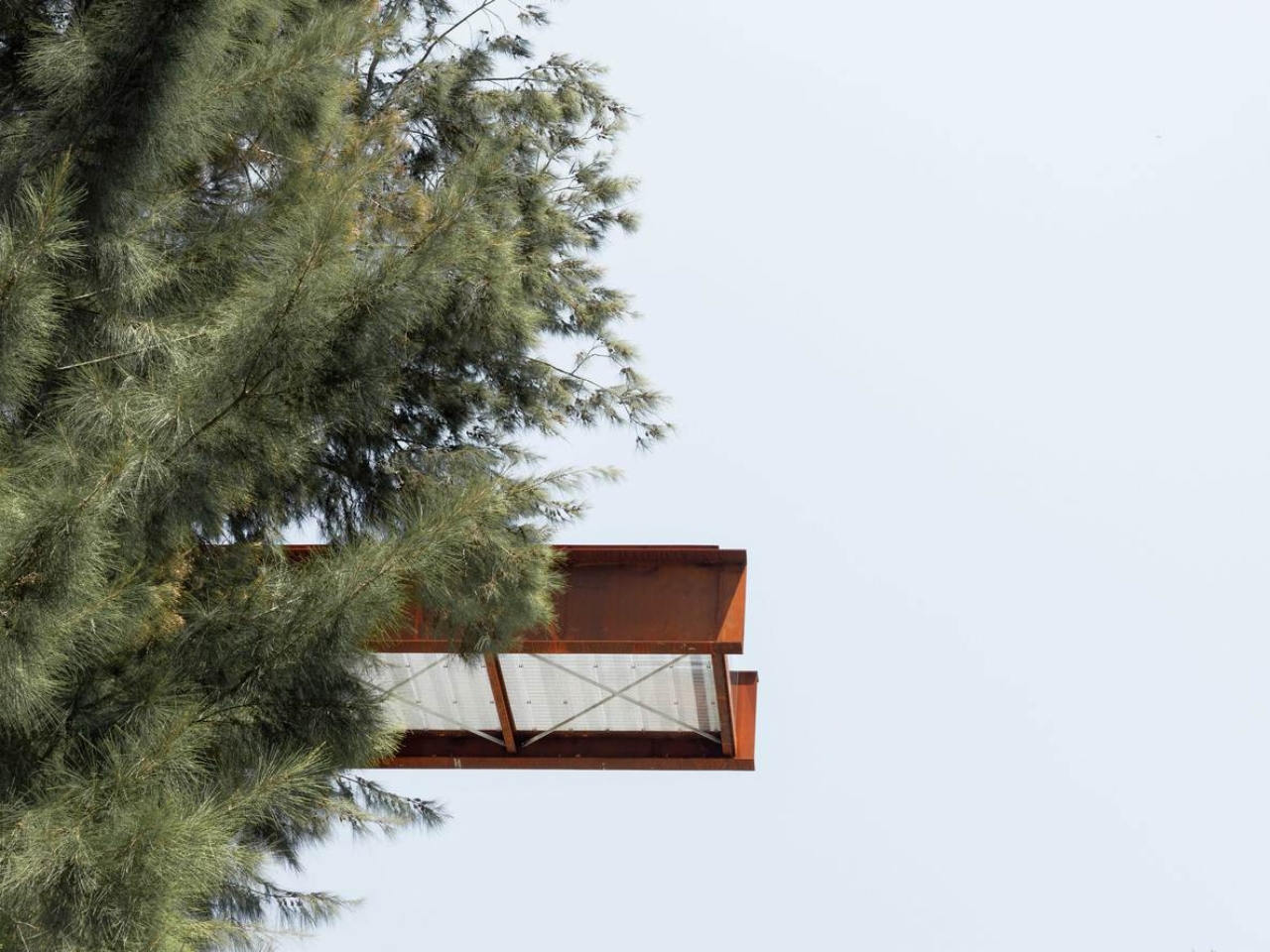
If you told me a 42-metre platform made of weathering steel, suspended over a former rock quarry, would be one of the most compelling pieces of public architecture right now, I’d say I believe you completely. The Southern Lookout at Hornsby Park in Sydney is exactly that. And it is worth every bit of attention it’s getting.

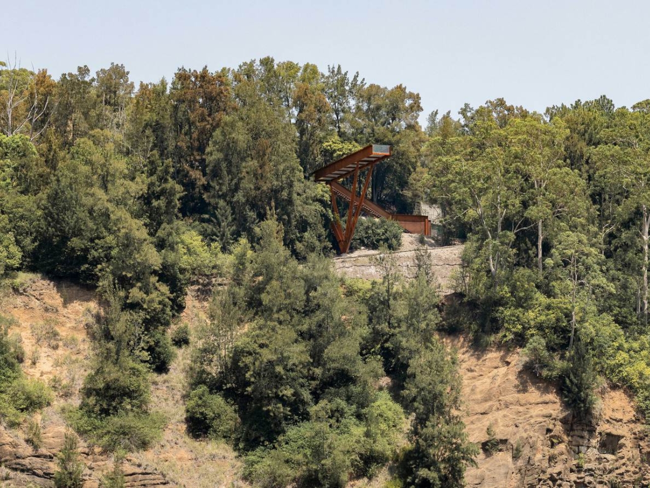
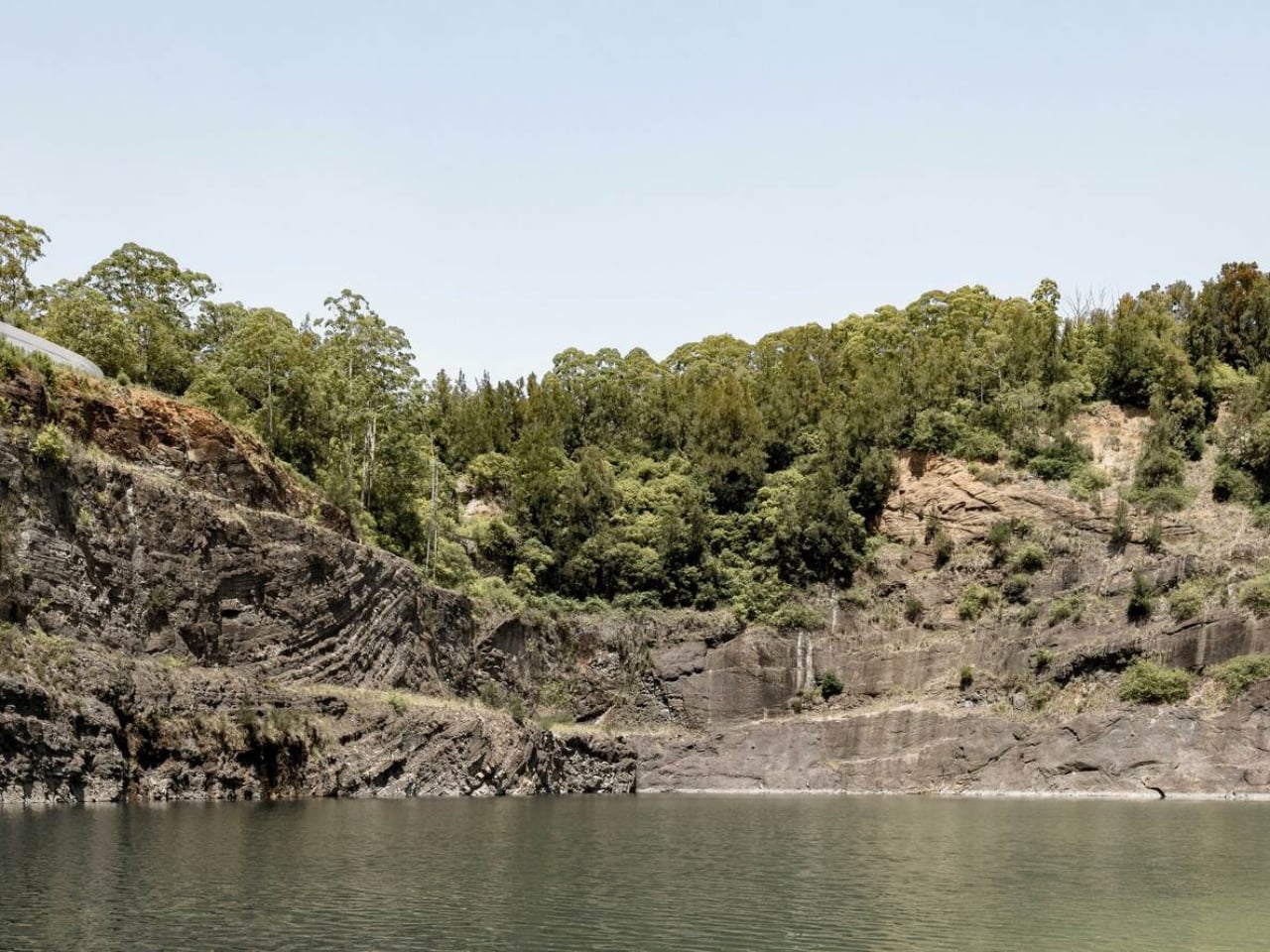
Designed by AJC Architects in collaboration with Clouston Associates, the structure sits on the northern edge of Sydney, overlooking the dramatic topography of Hornsby Quarry. The site itself has a remarkable backstory. For over a century, the quarry was completely inaccessible to the public. A place that had been carved out and worked, left to become something between ruin and wilderness, invisible to the city that had grown up around it. The Southern Lookout is the first completed architectural piece of a much larger 60-hectare landscape masterplan. It is, in the most literal sense, an opening.

Designer: AJC Architects

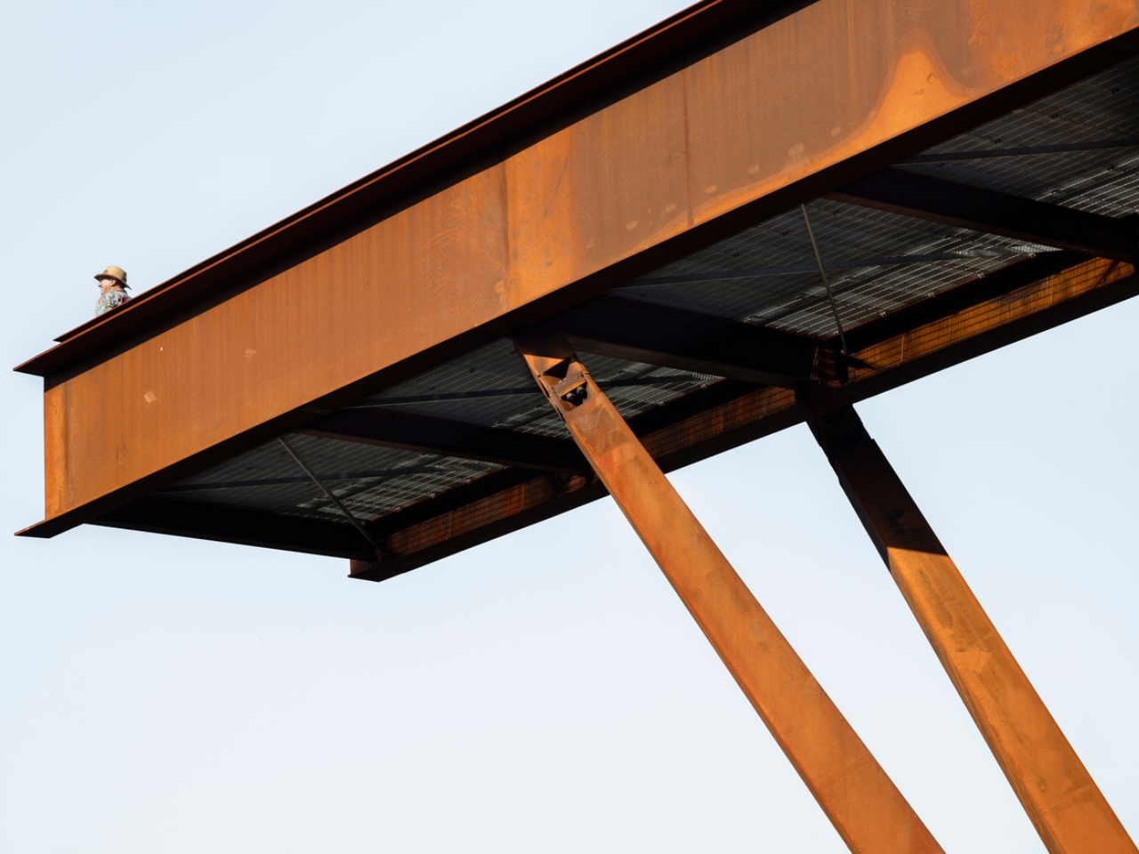
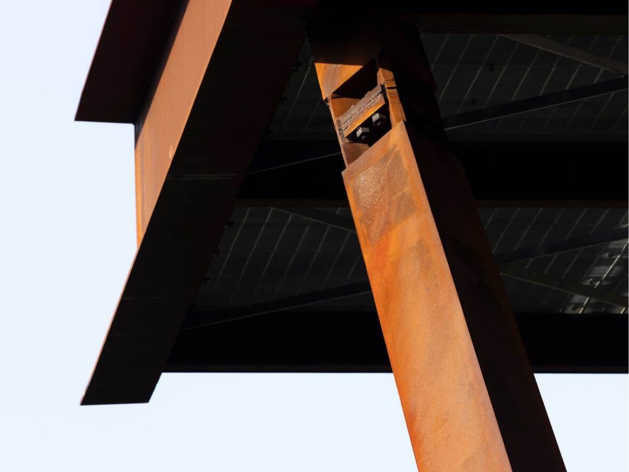
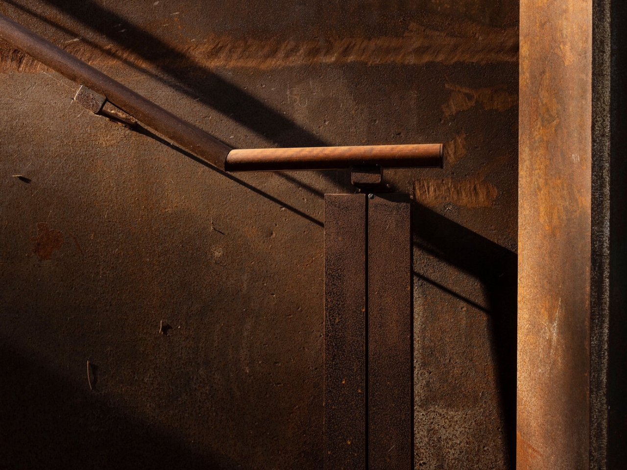
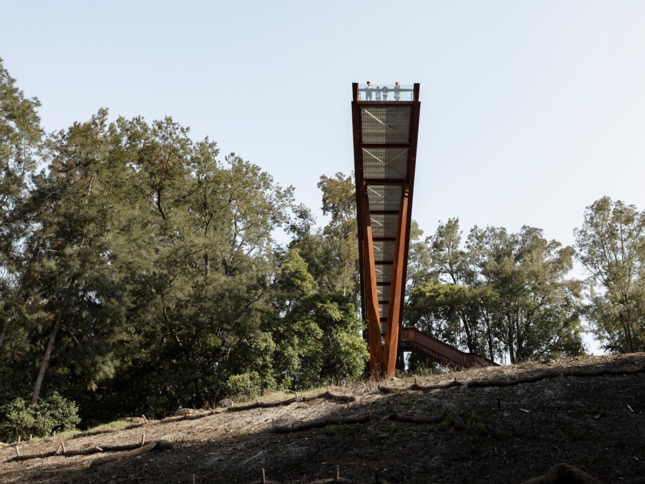
The choice of weathering steel is the first thing that makes you stop and think. Cor-Ten, as it’s commonly known, is a material that rusts deliberately. It forms a stable oxidized layer on its surface that protects the steel beneath while giving it that signature warm, amber-brown tone. It is a material that ages visibly and honestly, and for a project like this one, placed on the edge of a quarry whose story is entirely about time and transformation, it feels less like a design decision and more like a point of view.

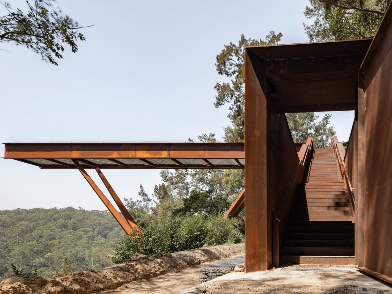
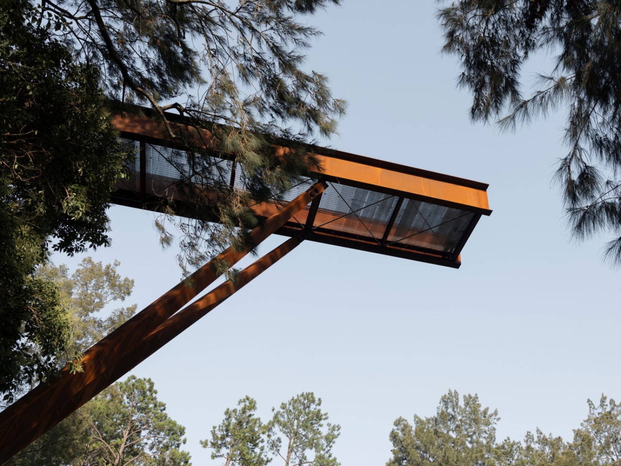
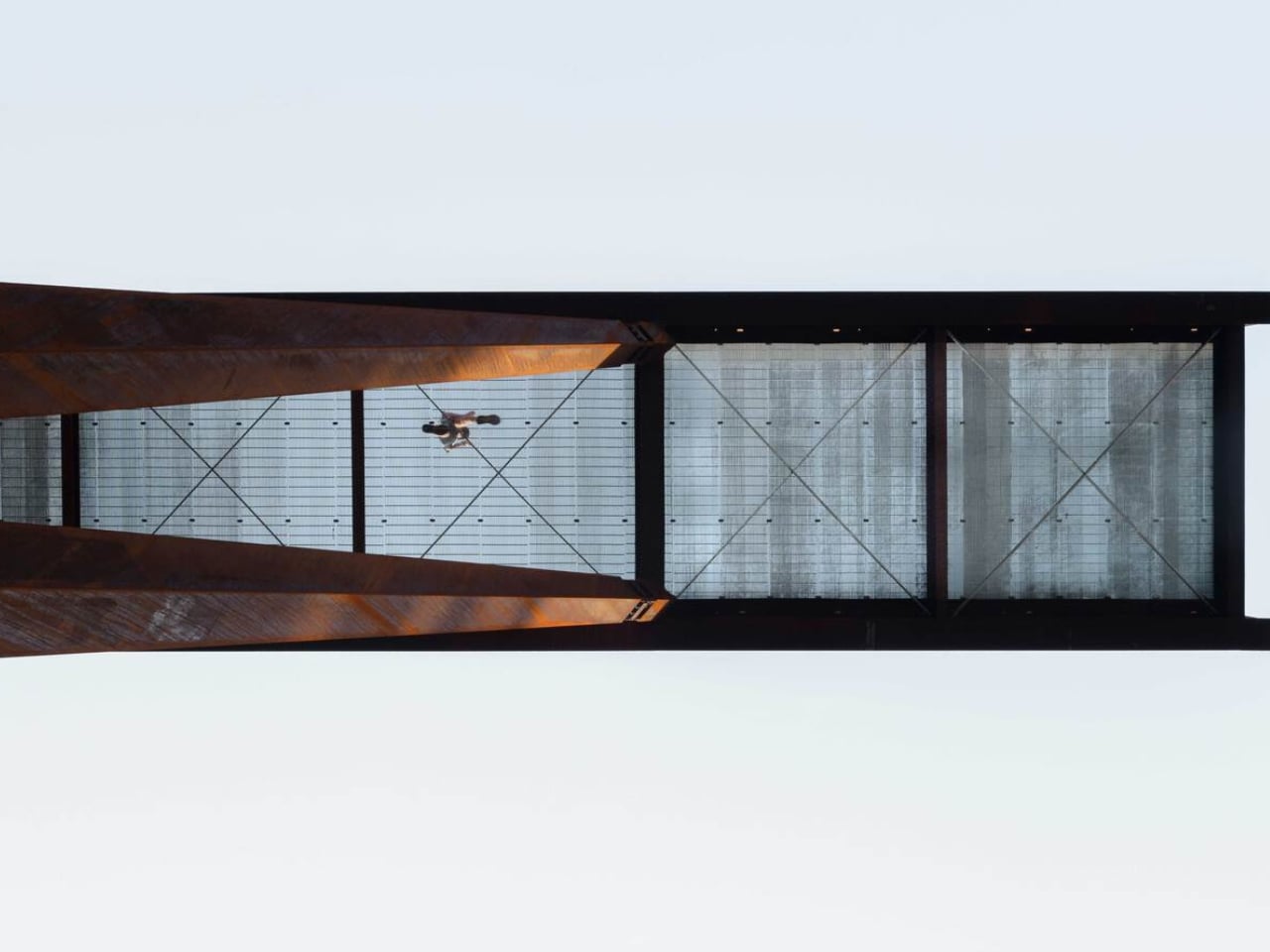
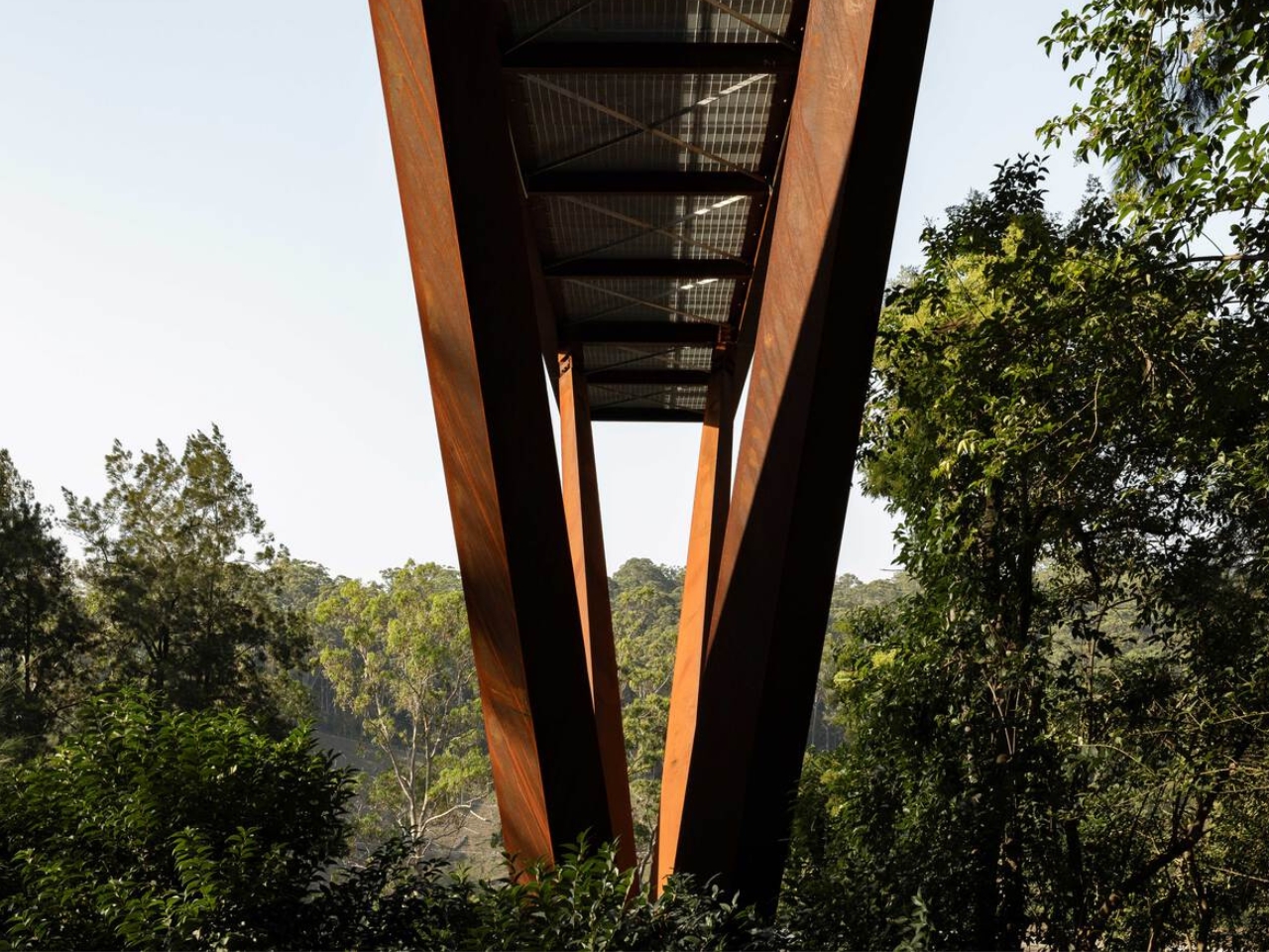
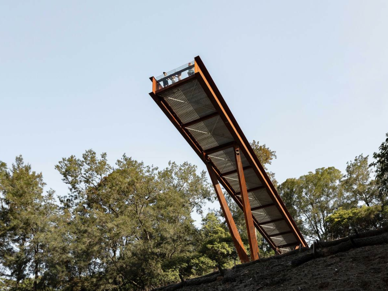
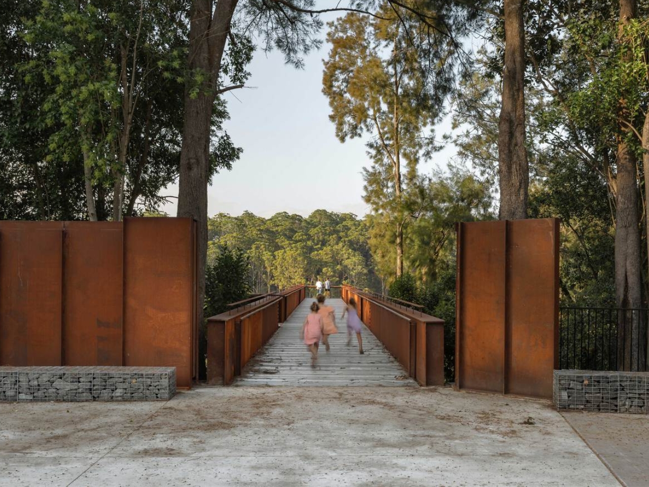
The platform runs 42 metres through the forest canopy, anchored into the embankment and balanced on four angled columns that converge on a single central footing below. That minimalism is intentional. The architects worked specifically to keep ground disturbance on the sensitive slope to a minimum. The result is a structure that feels both bold and careful, which is a hard balance to get right, and one AJC Architects manages convincingly.

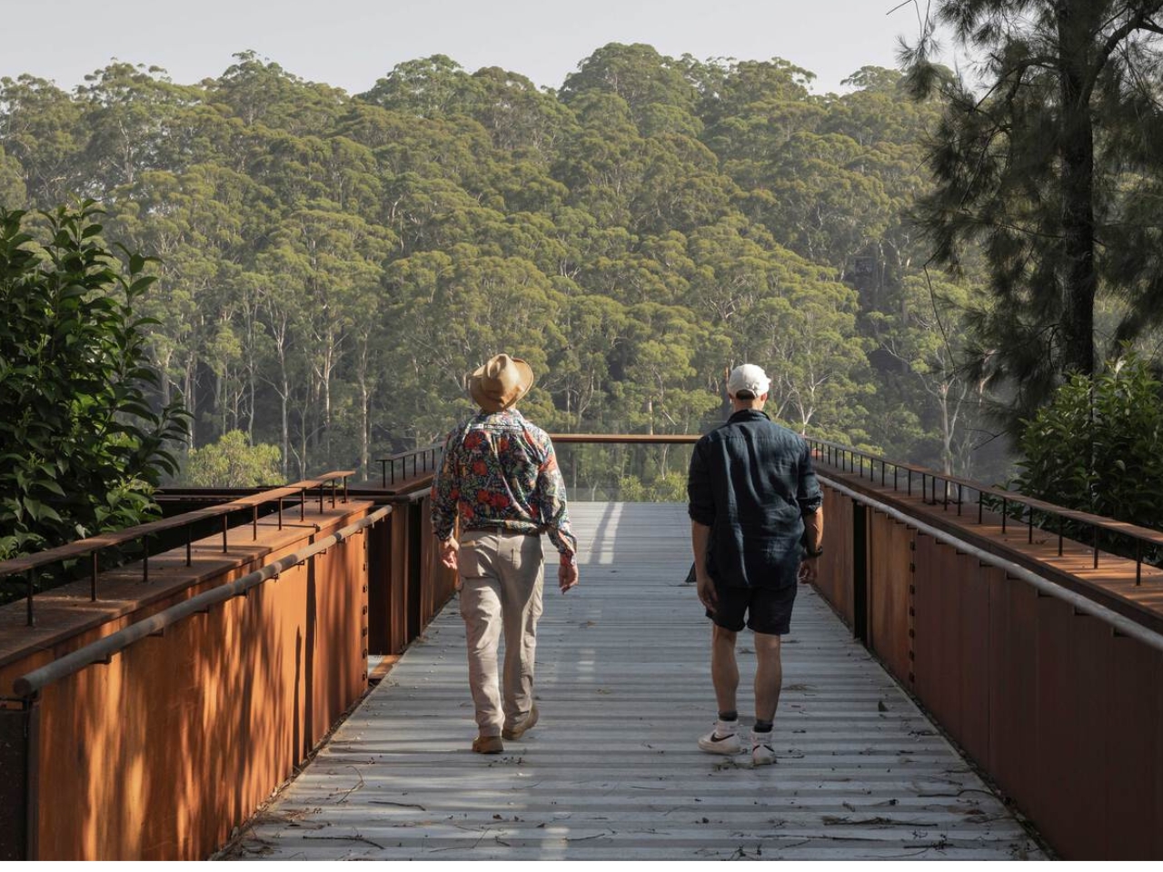
Walking it is designed to be as much of an experience as looking at it. The rhythmic sound of footsteps on the metal, the glimpses of the falling topography beneath one’s feet, the steady build of height as you move further along the platform create a physical connection to the sheer scale of the man-made canyon. Every design choice is oriented toward making you feel exactly where you are. That kind of sensory engagement is something the best public infrastructure delivers and so rarely does. Most walkways just take you somewhere. This one makes you reckon with the place itself.

The entrance is framed by steel portals and gabion stone walls, the kind of raw structural language that references the quarry’s industrial character without cosplaying it. It doesn’t try to look cute or approachable. It looks like something that belongs to the site. That restraint is refreshing at a time when so many public design projects err on the side of spectacle for its own sake.

The broader context matters here too. The Southern Lookout is the inaugural phase of an ambitious plan to open Hornsby Quarry up as a 60-hectare public park. That kind of urban regeneration project usually moves at a pace that frustrates everyone involved, so the fact that this lookout is already open, already drawing visitors, already giving people a reason to show up, feels like a meaningful start rather than a placeholder.

AJC Architects, working in collaboration with Hornsby Shire Council, has delivered something that respects the complexity of the site without over-explaining it. The architecture doesn’t lecture you about the quarry’s history. It simply places you inside it. It gives you the height, the steel, the sound, the view, and leaves you to do the thinking.

Public architecture at its best creates a relationship between a person and a place they might not have noticed otherwise. The Southern Lookout does exactly that. Sydney has always had dramatic natural geography. Now, at the edge of a former quarry, it has something that finally lets you see it.

The post Sydney Just Opened a 42-Metre Steel Lookout Over a Former Quarry first appeared on Yanko Design.

Japan Just Built a Pokémon Footbath and It’s Genuinely Moving

When you hear “Pokémon footbath,” your brain probably goes one of two places: either immediate delight or mild confusion. Both reactions are fair. But when you actually see what just opened in the small coastal town of Wakura Onsen in Nanao City, Japan, the response tends to land somewhere more unexpected than either. It lands in quiet, genuine warmth.

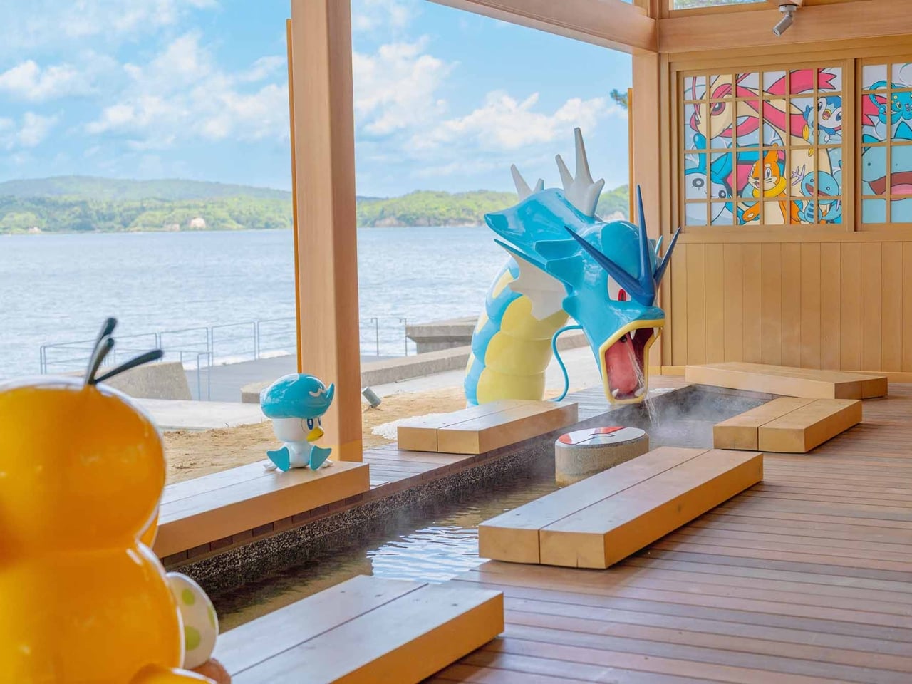
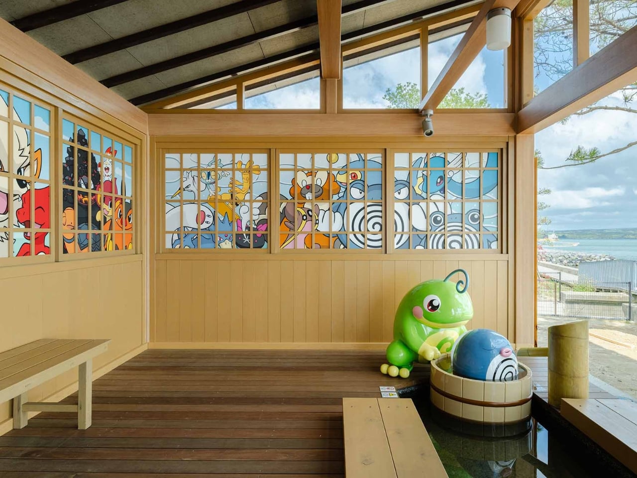
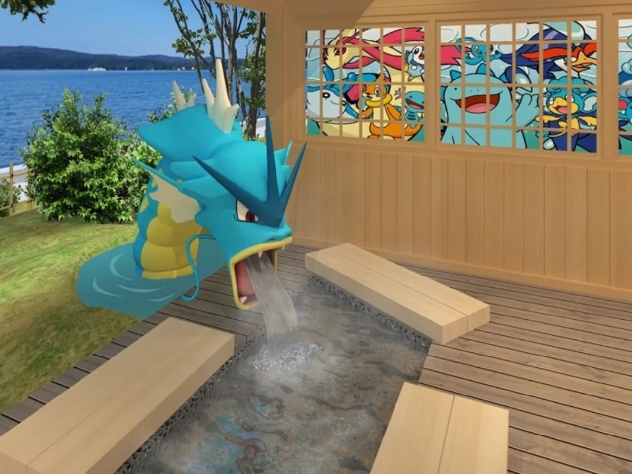
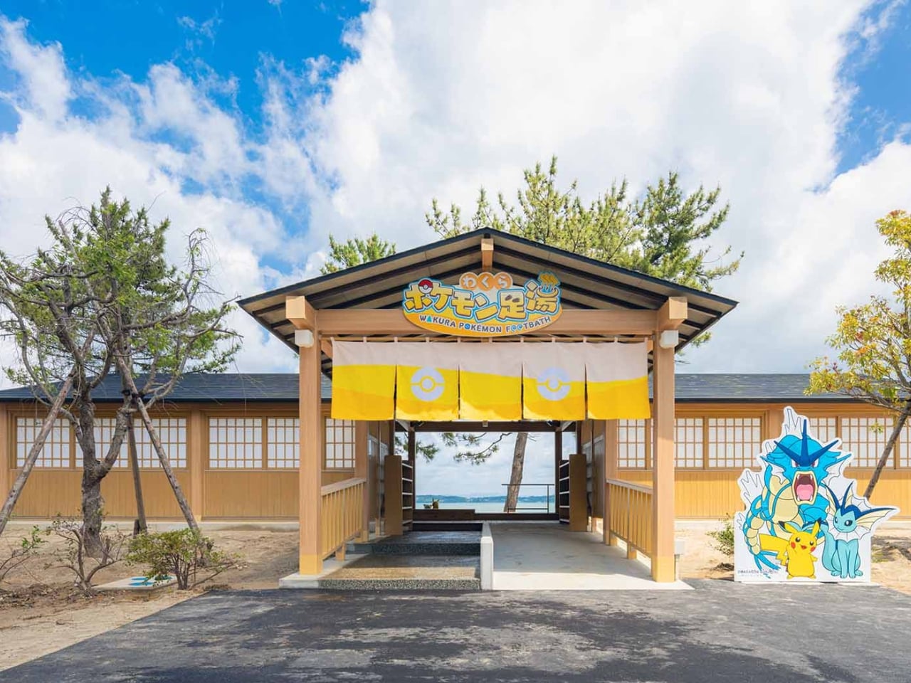
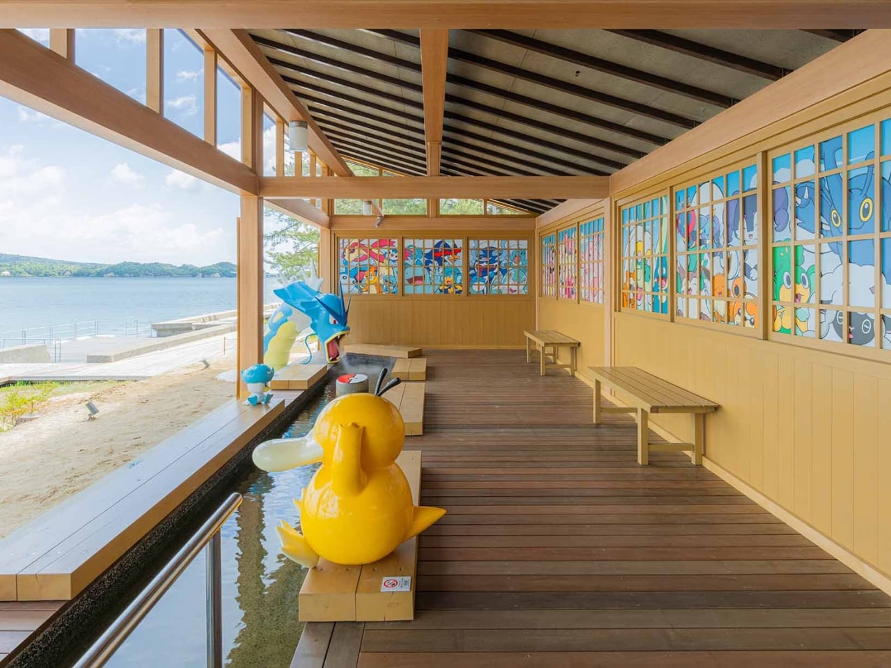
The Wakura Pokémon Footbath officially opened on May 12 inside Yuttari Park in Ishikawa Prefecture, and it is exactly what it sounds like: a public footbath surrounded by beloved Water-type Pokémon. Gyarados towers over the soaking pool, appearing to blast water in with its Hydro Pump. Psyduck perches nearby, looking stressed as always. Vaporeon, Pikachu, Poliwag, Poliwhirl, and Quaxly are scattered throughout the wooden structure, each one in character, each one impossibly charming. The facility is free to use and open daily from 7 AM to 7 PM, though it may close depending on weather conditions.

Designer: Wakura Onsen

From a pure design standpoint, it works. The Pokémon figures feel integrated into the space rather than slapped onto it as an afterthought. The Gyarados placement especially is clever: positioning a creature historically associated with destruction as the one filling a community wellness space with warm water is a quietly subversive design choice. It takes a familiar icon and gives it a new job, and the whole thing is better for it. Good character-led design usually does this. It finds the emotional logic of the IP and builds something genuinely functional around it, instead of just stamping a logo on a wall and calling it a day. The wooden structure keeping everything together also helps ground the Pokémon elements in something tactile and traditionally Japanese, which keeps it from reading as pure merchandise and more as a genuine place to be.

But the design story here is only part of the picture. What elevates the Wakura Pokémon Footbath beyond a cute novelty is the context surrounding it. Wakura Onsen is still recovering from the 2024 Noto Peninsula earthquake, which caused major damage to local tourism infrastructure. The footbath was renovated and developed through a collaboration between Nanao City and the Pokémon With You Foundation, an organization that has long used Pokémon’s reach to support communities facing hardship. Local officials are hoping the new attraction will draw visitors back to a region that urgently needs them. On opening day, a dedication ceremony was held, and children from a local nursery school were among the first to try it out.

That detail matters. It reframes the entire project. A giant Gyarados shooting water into a hot spring pool is fun in isolation. A giant Gyarados shooting water into a hot spring pool in a community rebuilding after a disaster, inaugurated by children experiencing something joyful, is a different kind of story. It is design as care. It is pop culture as infrastructure.

I think we underestimate how much deliberate playfulness can do for a place in recovery. A footbath is not a hospital. It is not a new road or a rebuilt building. But public spaces designed to give people a reason to show up, to sit down, to stay a while, do real work. They signal that a place is worth visiting again. That it has something to offer. That life, in some form, is continuing. And sometimes the difference between a place that comes back and one that does not comes down to whether people believe it is worth returning to.

The footbath also ties into the newly installed Pokémon manhole covers placed around Nanao City, part of Japan’s Pokéfuta initiative, which uses collectible Pokémon-themed covers to encourage visitors to explore lesser-known regions. It is a broader ecosystem of soft infrastructure pointing in the same direction: come here, look around, stay awhile.

Wakura Onsen may not be the first destination that comes to mind for a travel itinerary. But a free footbath where a reformed Gyarados keeps your feet warm while Psyduck quietly spirals next to you? That is a genuinely compelling reason to make the trip. And right now, Nanao City could use a few more of those.

The post Japan Just Built a Pokémon Footbath and It’s Genuinely Moving first appeared on Yanko Design.

Mass Timber, Passive House, & a Curving Roof: This Canadian Community Centre Is the Civic Building Other Cities Should Be Copying

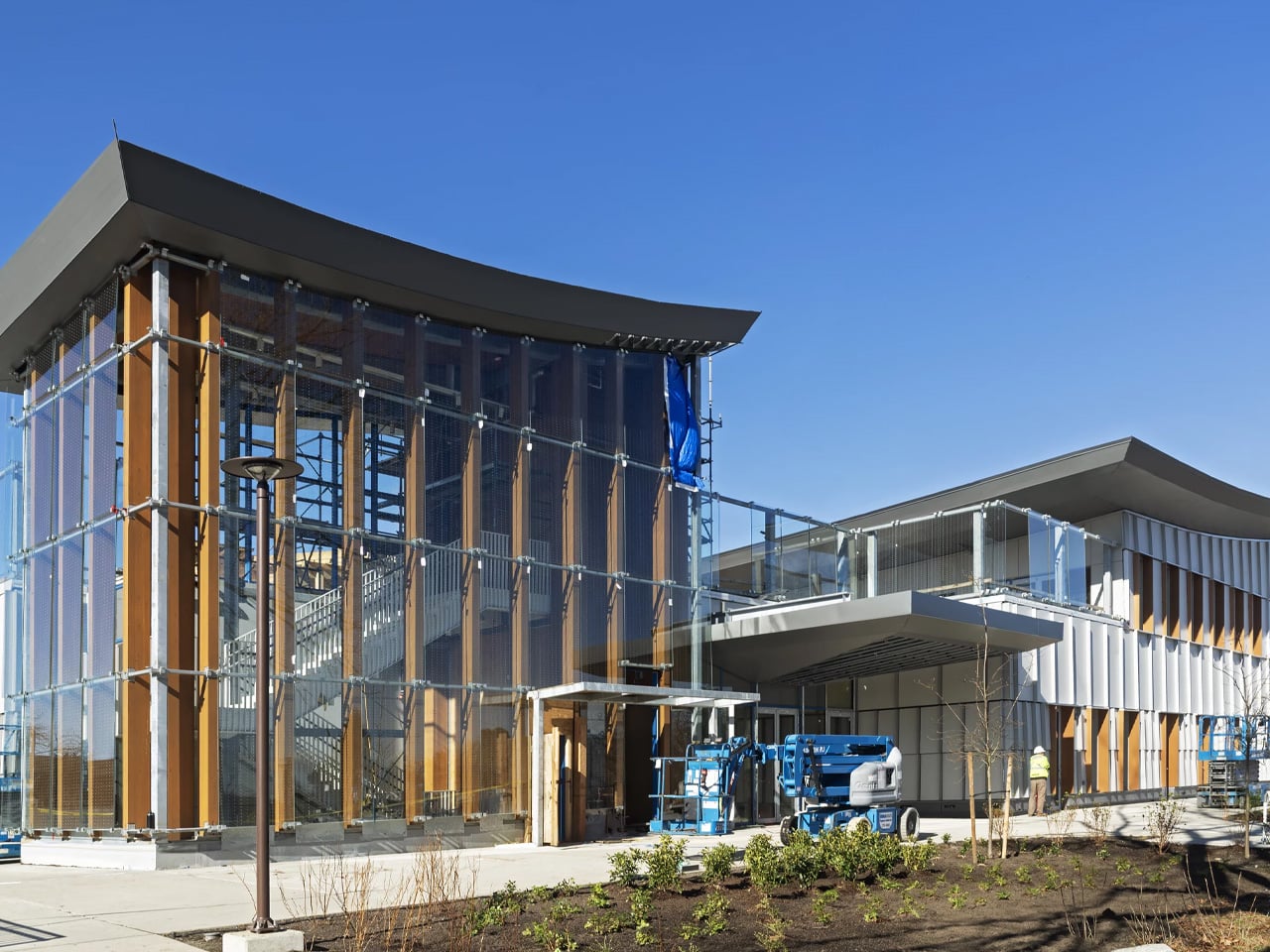
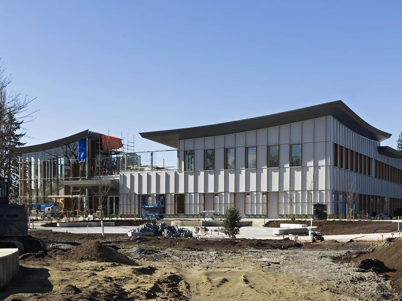
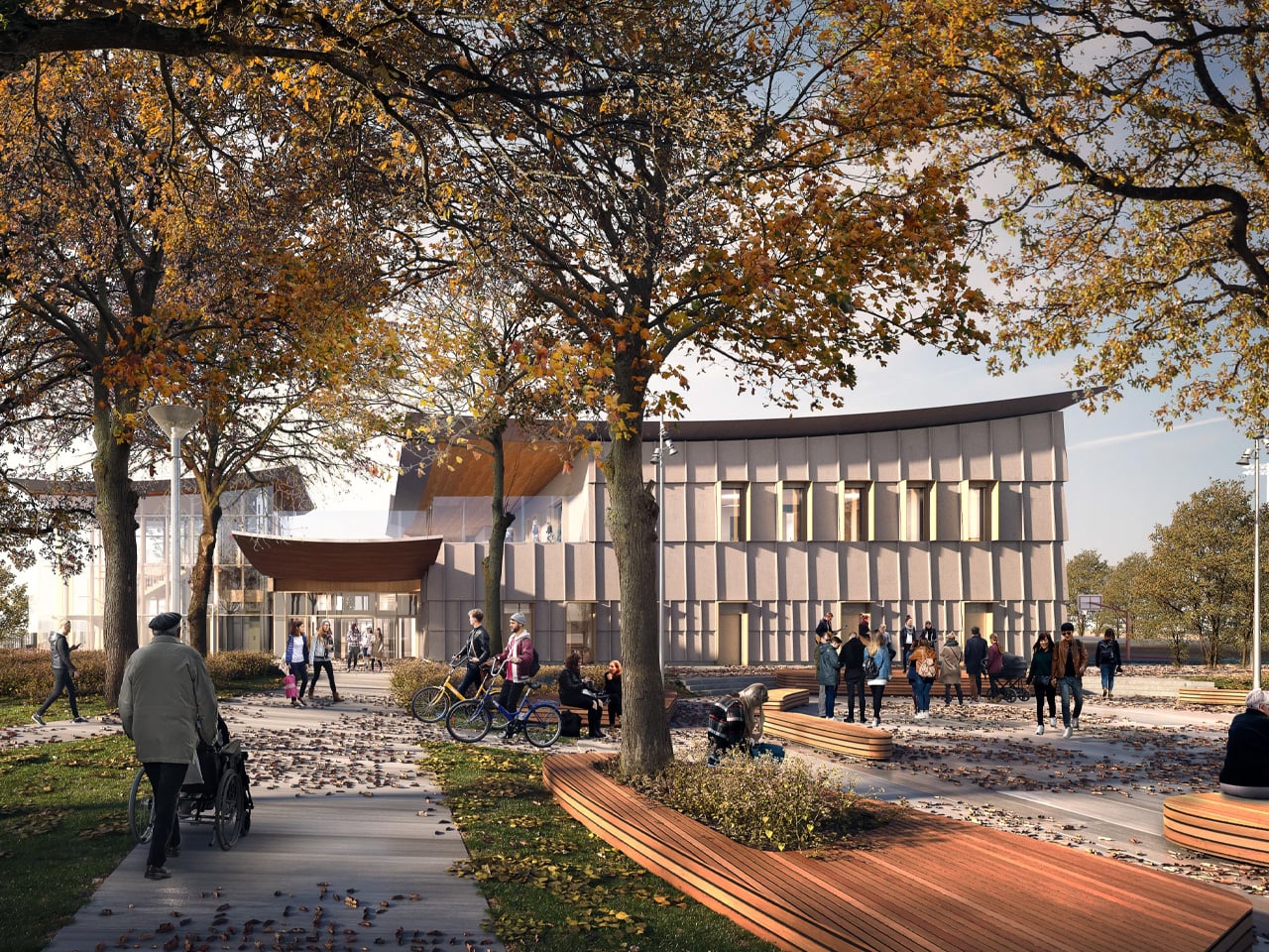
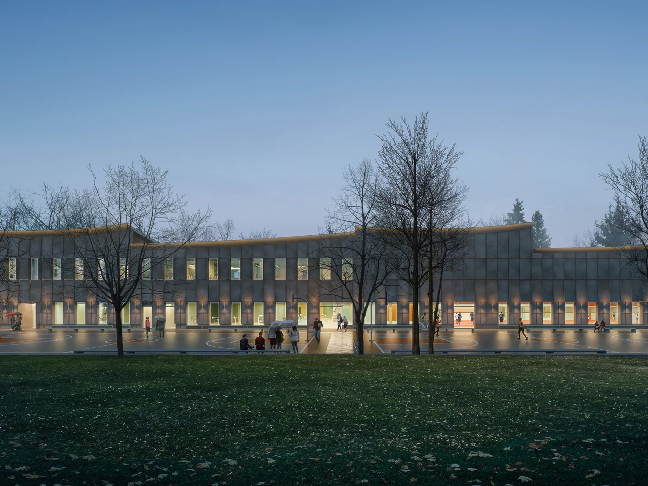
There’s a version of a public building that checks all the sustainability boxes and still feels cold, institutional, and somehow indifferent to the people it’s meant to serve. The new Marpole Community Centre is not that building. Designed by Diamond Schmitt for the City of Vancouver and the Vancouver Board of Parks and Recreation, it’s nearing completion in Oak Park. It quietly resets expectations for what a civic facility can be.

The project replaces a well-loved but outgrown facility with a two-storey structure nearly double its size, measuring 5,000 square metres. The program is generous: a gymnasium, fitness centre, field house, multi-purpose rooms for seniors and youth, and a 74-space childcare facility. Underground parking is tucked beneath the building to protect the surrounding natural vegetation, letting Oak Park remain exactly that — a park.

Design: Diamond Schmitt

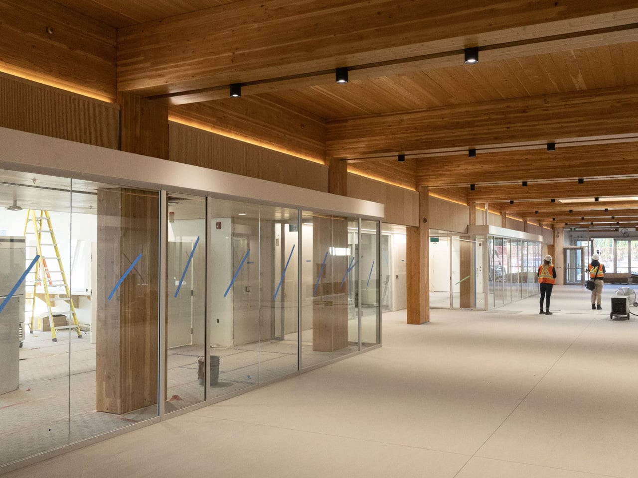
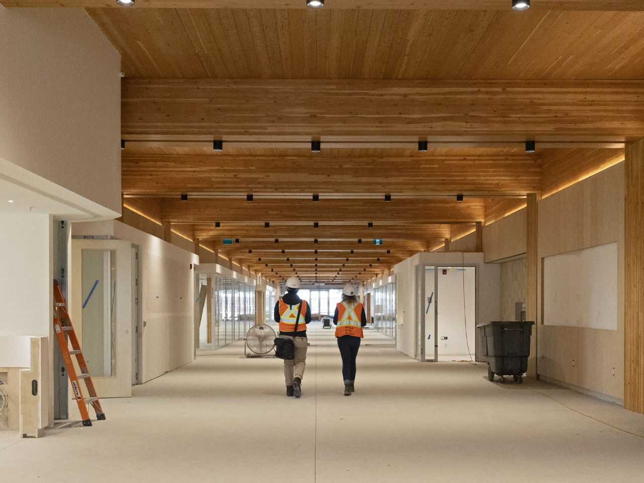
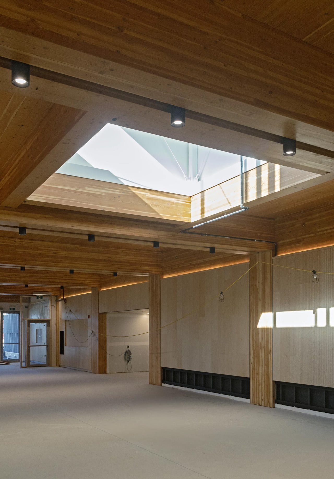
What makes the architecture worth paying attention to is the mass timber. Rather than limiting wood to the roof structure, as institutional buildings often do, the Marpole Community Centre uses a comprehensive mass timber frame — glulam columns and beams, a CLT floor system, and a long-span upper roof built from steel wide flange beams and a CLT deck. The result is a structure that reads as warm and considered, not engineered into submission. Exposed throughout the interior, the timber gives the building a human scale that concrete rarely allows.

The signature move is the gently curving roof. The doubly curved cantilever form, supported by long-span steel beams, required close coordination between the design team and contractors — but the payoff is an exterior that feels unified without being monotonous, and an interior where the ceiling becomes the experience. Strategic glazing pulls the landscape in, connecting occupants to Oak Park’s natural setting without sacrificing energy performance.

On the sustainability front, the numbers are serious. The building targets Passive House and LEED Gold certifications and has achieved a 41% reduction in embodied carbon. It’s also a pilot project for the City of Vancouver’s Embodied Carbon Guidelines, meaning lessons learned here will directly shape future civic buildings across the city. The project is also pursuing the CAGBC’s Zero Carbon Building Design Standard.

Beyond the technical performance, the centre was designed with inclusion, equity, and Indigenous cultural representation as core principles — not afterthoughts bolted on at the end. For a neighbourhood as diverse as Marpole, that intentionality matters. A community centre tends to be the most democratic building a city can build. This one makes a strong case that it can also be among its most thoughtful.

The post Mass Timber, Passive House, & a Curving Roof: This Canadian Community Centre Is the Civic Building Other Cities Should Be Copying first appeared on Yanko Design.

10 Modular Sofas That Rearrange Like Furniture-Grade Lego

The sofa has always been the most consequential decision in a living room. It’s the largest piece, the one that dictates traffic flow, color direction, and whether guests feel welcome or squeezed. For a long time, it also came with a kind of finality: once it was in the room, that was that. One shape, one configuration, and very little room for second thoughts.

That’s changed considerably. The best modular sofas today don’t ask you to commit to a single layout. They expand, split apart, hide extra surfaces, wrap around awkward corners, or grow alongside a family over the years. Curved modular sectionals are tracking as one of the clearest furniture directions of 2026, and this list pulls together ten designs that show just how far the category has come.

Aura Sofa
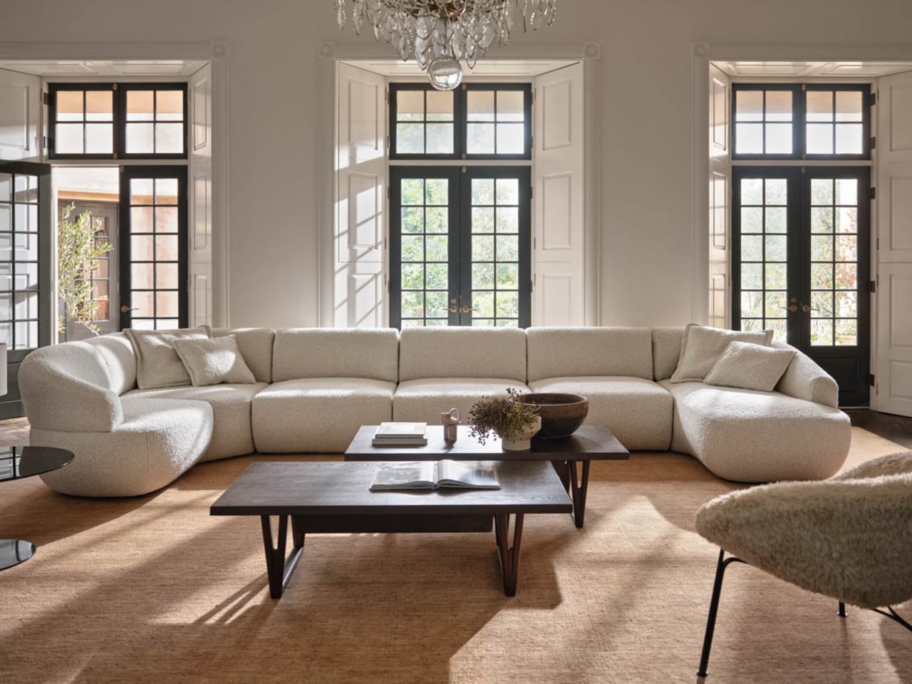
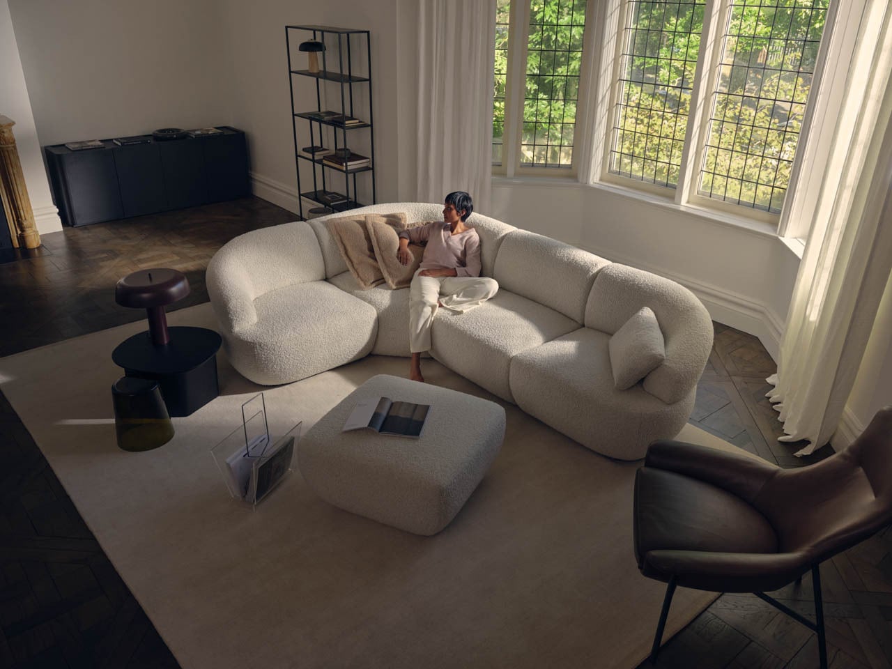
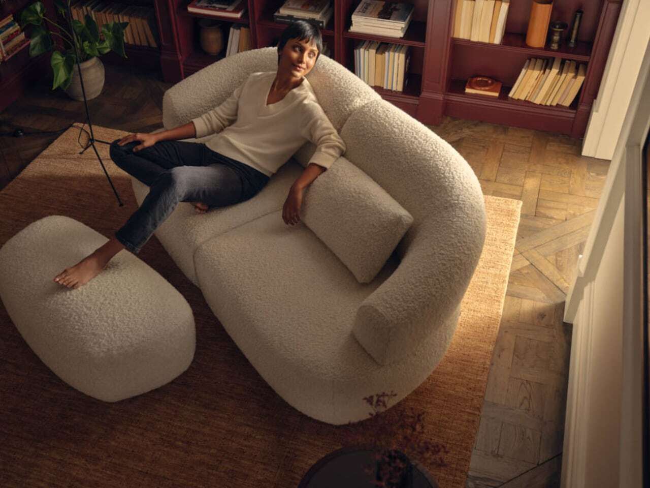
Most modular sofas make their flexibility obvious, which isn’t always a compliment. The Aura Matrix Sofa by King Living is the exception, a curved modular sectional that looks less like a configurable system and more like a single, sculpted object. The pieces flow into each other so naturally that the seating arrangement feels designed rather than assembled, which is a harder thing to pull off than it sounds.
Designer: King Living

What makes it genuinely useful is that the same fluidity works in your favor when the room changes. The modules can follow a bay window, open up for a larger gathering, or pull inward for something more intimate, without ever looking like you just rearranged the furniture. For a room where aesthetics and flexibility both matter, this is the kind of modular sofa that doesn’t force a compromise.

Modular Sofa for Small Spaces, and Small Pets
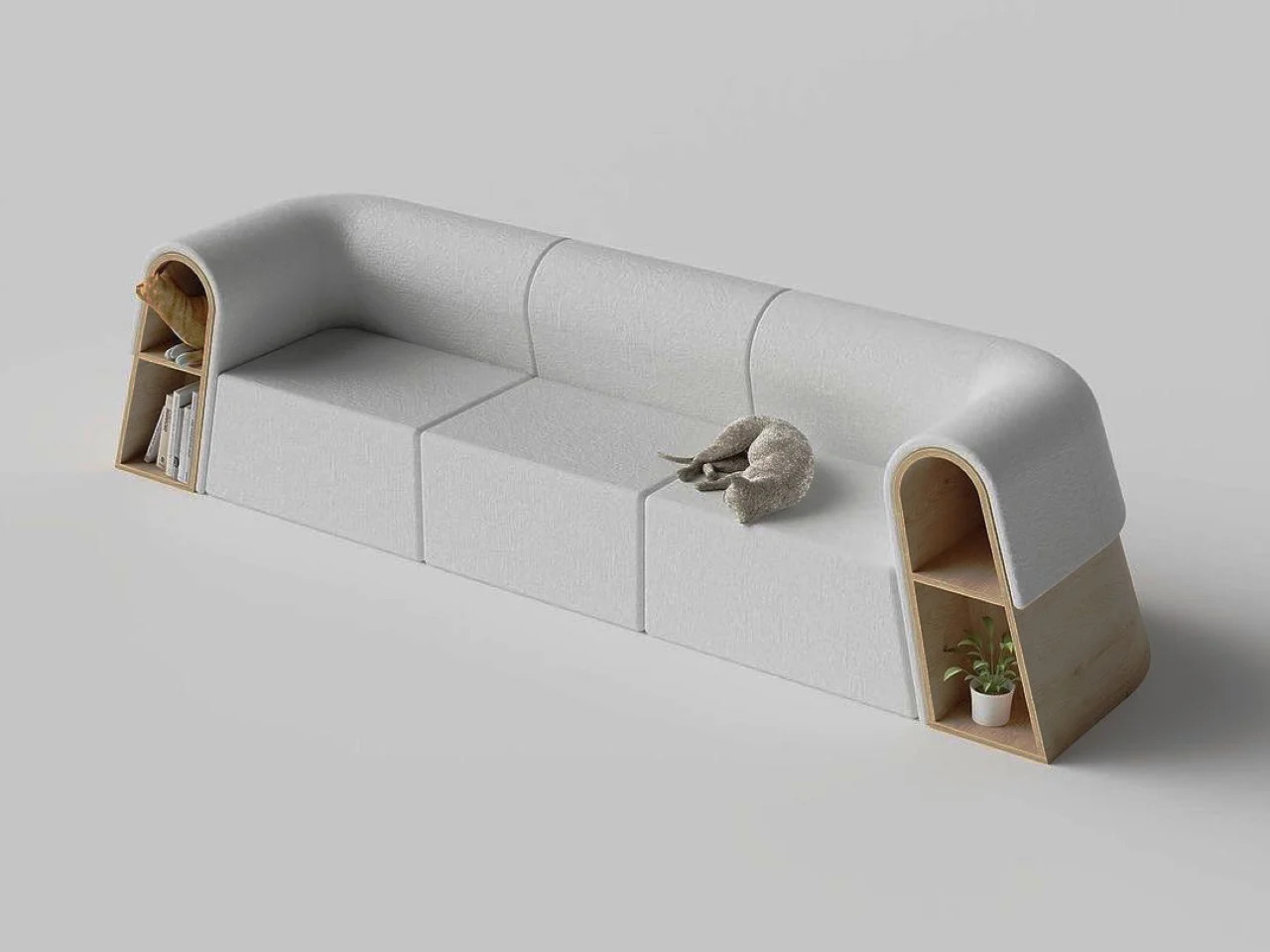
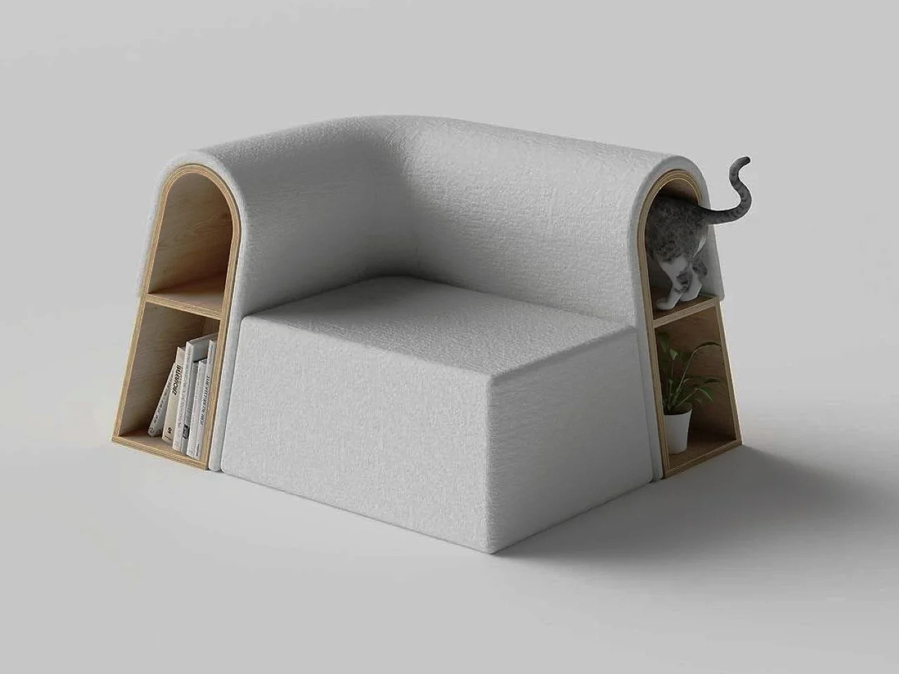
Apartment living comes with constraints that most furniture brands still treat as the buyer’s problem. This modular sofa takes the opposite approach, designed specifically with compact floor plans and the reality of pet ownership in mind. The sections are scaled to fit tighter rooms without making the space feel overrun, and the layout includes thoughtful allowances for small animals that usually end up on the furniture anyway.
Designer: Sunriu

In a small apartment, furniture that serves more than one purpose without looking like it’s trying too hard earns its keep quickly. This modular sectional sofa manages that by being genuinely comfortable for people while still carving out a spot that a small dog or cat can claim. It’s a small distinction, but one that changes the dynamic of sharing a compact space with a pet considerably.

Silky
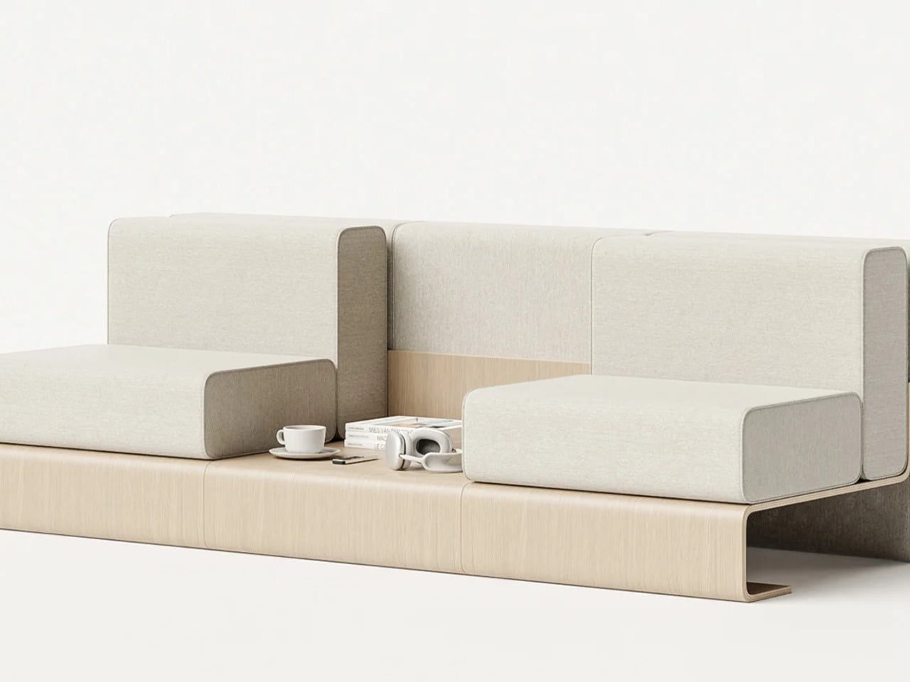
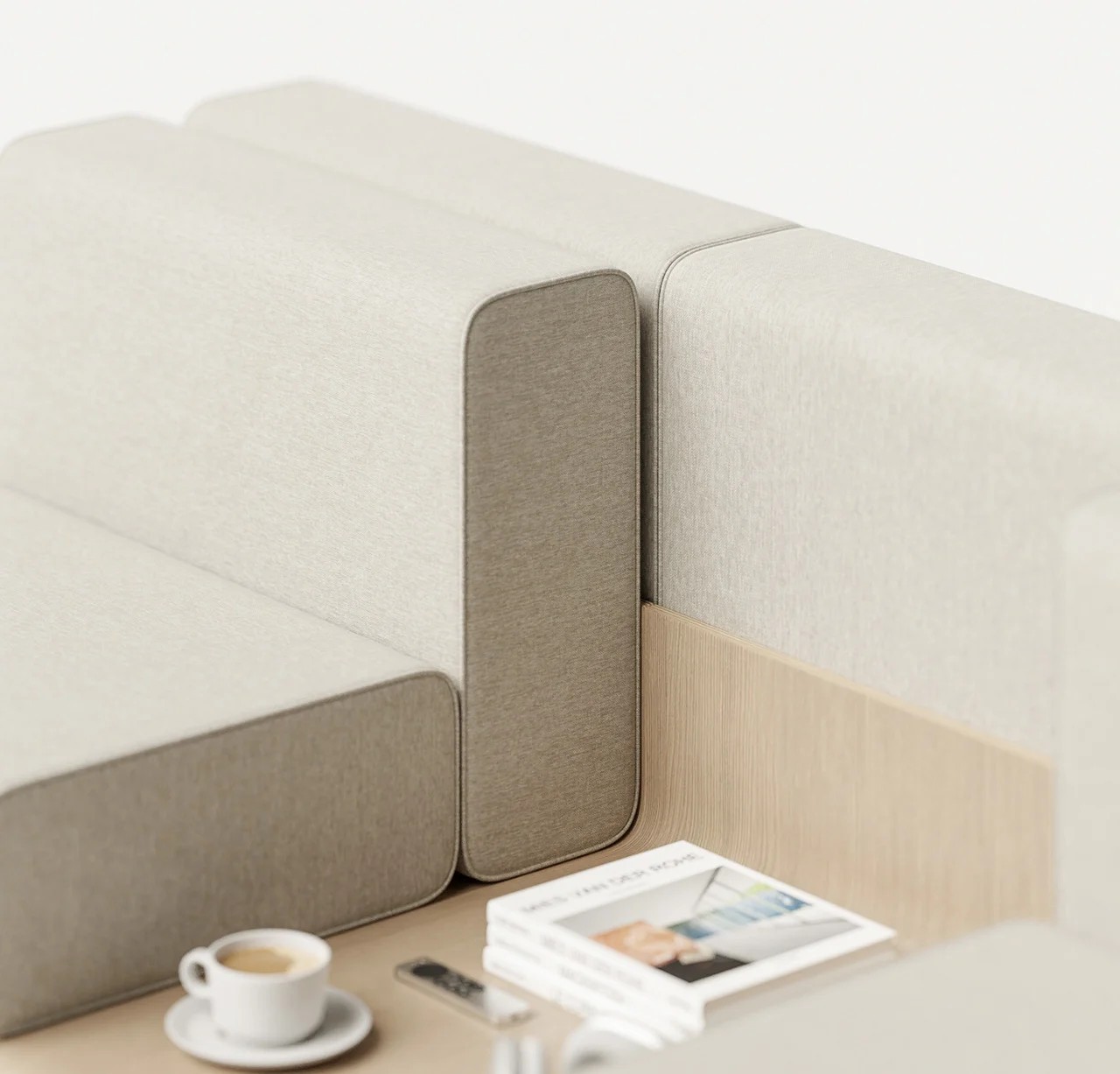
A modular sofa that brings its own coffee table along sounds like the kind of feature that gets mentioned once and forgotten in production. The Silky sofa takes it seriously, integrating the table directly into the sectional layout so it becomes part of the arrangement rather than an afterthought. The result is a modular sectional that does the work of two pieces without doubling the footprint.
Designer: Teixeira Design Studio

What that means in practice is a room that feels more composed and less cluttered with competing furniture. Drinks, books, remotes, and phones have somewhere to go without requiring a separate surface to be dragged over and moved again. For smaller living rooms, especially, reducing the number of objects you need to manage without sacrificing comfort is a quietly valuable thing.

Twiny
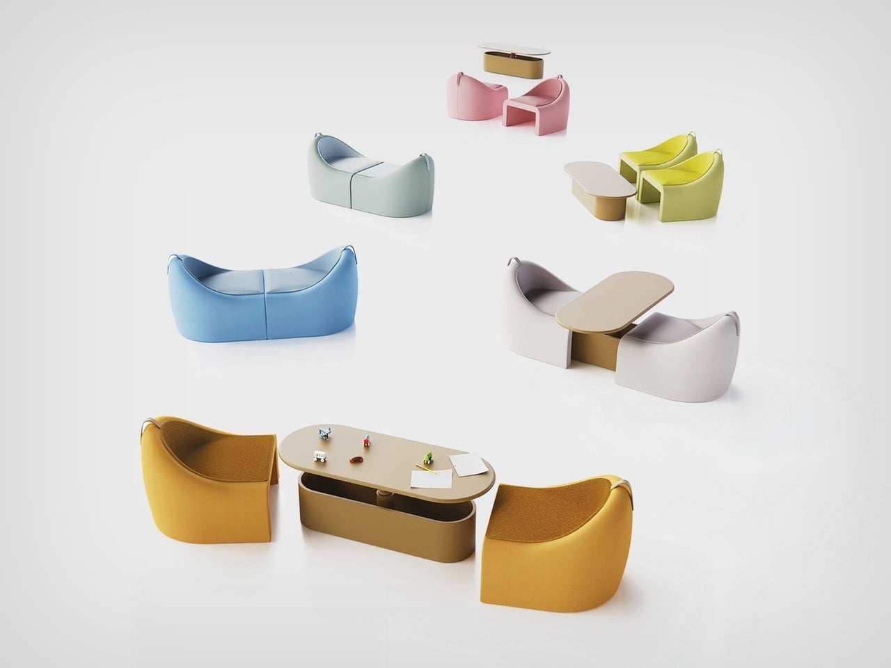
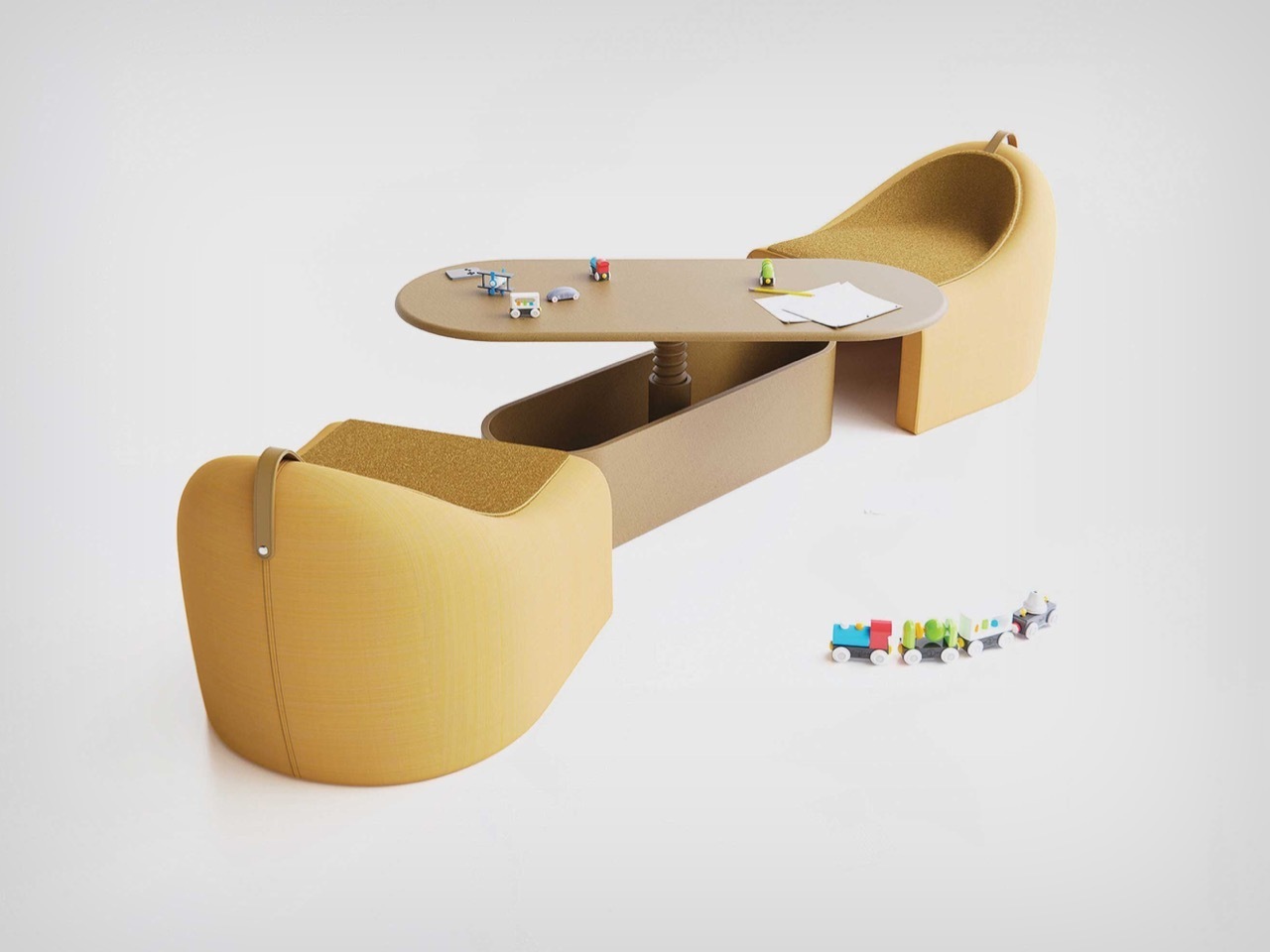
The Twiny sofa carries a similar idea but takes a more playful approach to hidden utility. Instead of making the table a visible part of the sectional layout, it tucks a surface away inside the sofa that can be pulled out when needed, including by kids who tend to find that kind of reveal irresistible. It’s furniture that has a little surprise built into it.
Designer: Nurettin Badur for Ziel Home Furnishing Technology Co., Ltd.

It matters more than it might seem in homes where the living room doubles as a play space, snack zone, and homework corner within the same afternoon. A modular couch that can quietly produce an extra surface without requiring anyone to drag something over from another room changes the flow of those moments in a small but meaningful way. The hidden table isn’t a novelty; it genuinely earns its place.

The Lounge Chair That Becomes a Sofa When Paired
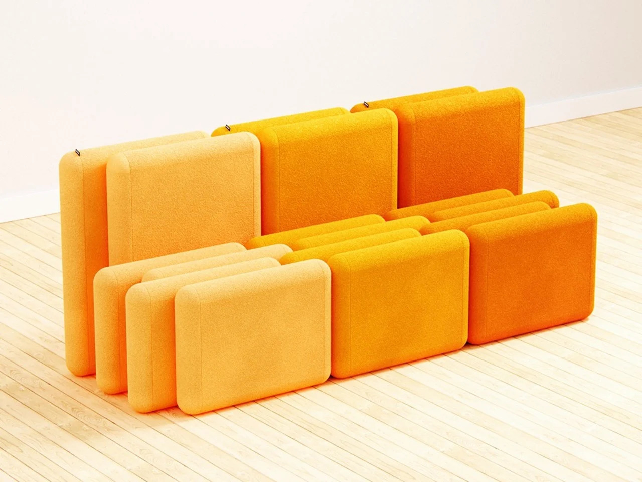
Not everything on this list started out as a modular sofa. This particular design begins as a lounge chair, and it’s only when you put two of them together that they form a convincing two-seater. The premise is clever, not because it’s a novel trick but because it reframes modularity as a compositional question, asking what furniture should look like when you’re not ready to commit to a full sectional.
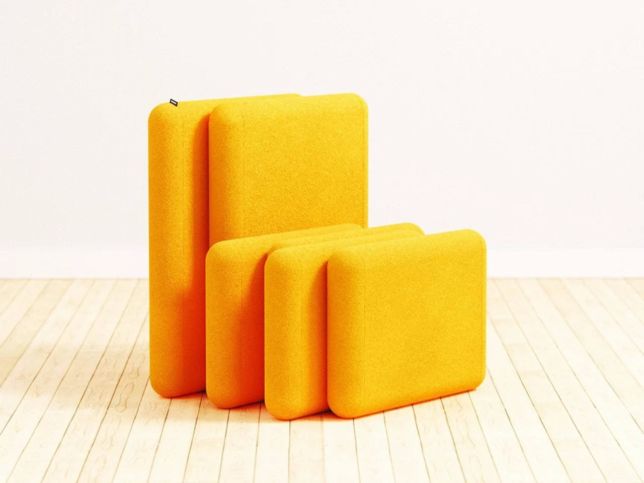
Designer: Liam de la Bedoyere

The option to split the seating into two independent chairs when you need floor space is genuinely useful in a studio or single-bedroom apartment. You can open the room for a workout, a gathering, or a change of scenery, then push them back together when you want more casual seating. It’s a flexible arrangement that doesn’t even look like a modular system.

The Crocs-Meets-Lego Modular Seating System
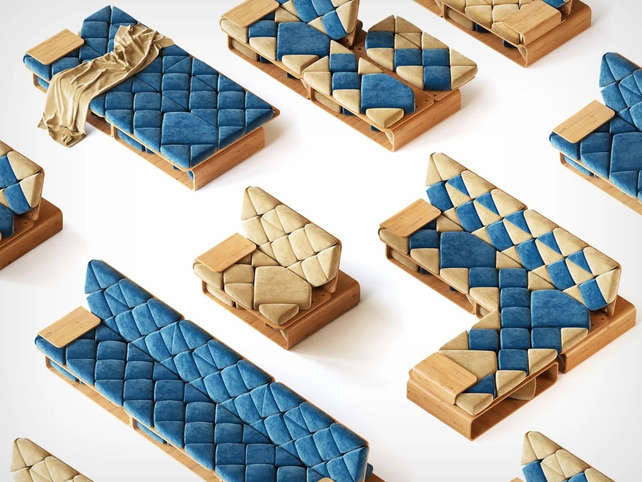
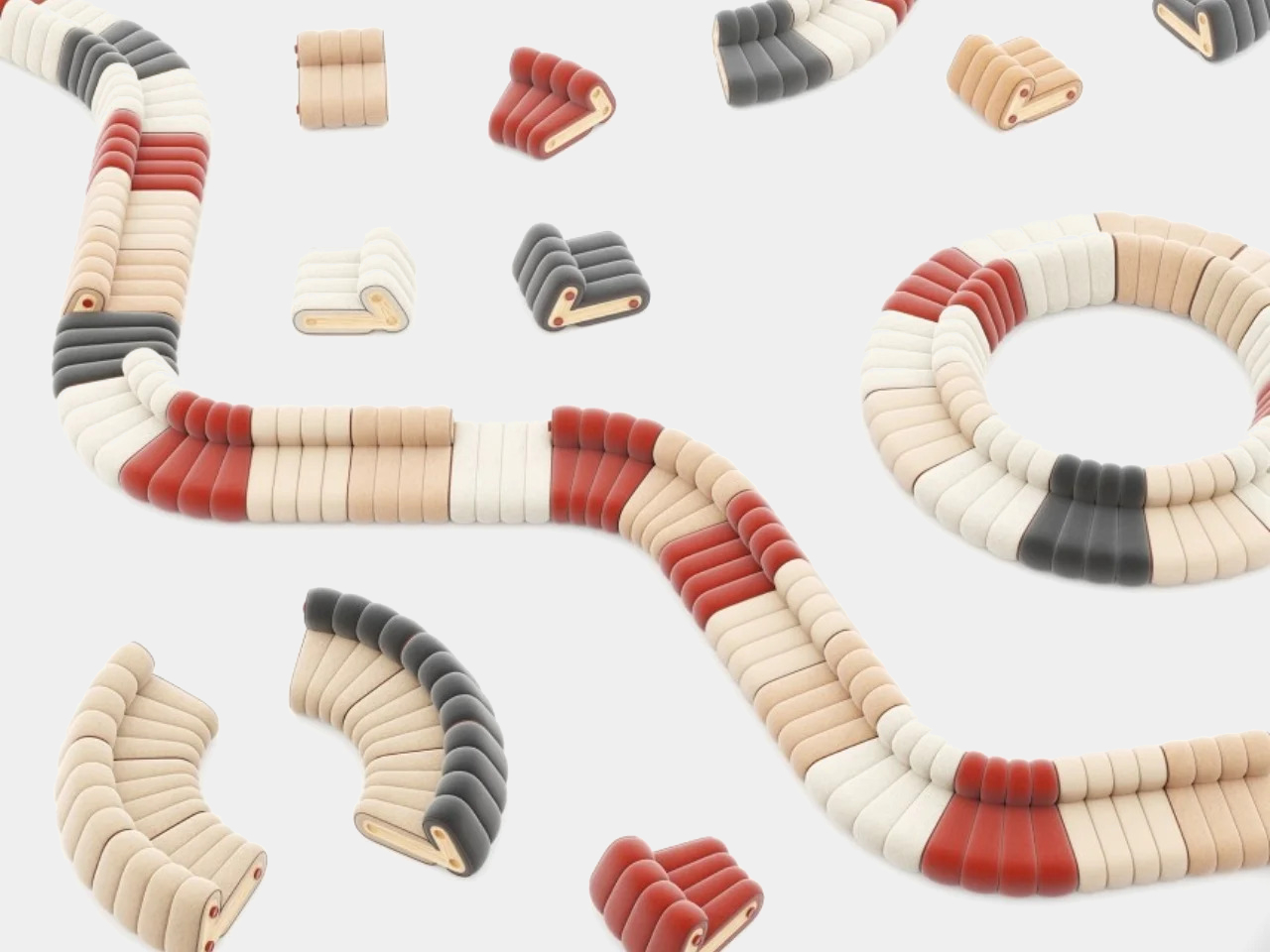
If Lego and Crocs had a furniture design meeting and somehow settled on Japanese minimalism as the shared aesthetic, the result might look something like this modular seating concept. The system is built around interlocking units that snap together in a way that makes rearranging the layout feel low-effort, treating configuration as part of the experience rather than a one-time decision you eventually regret.
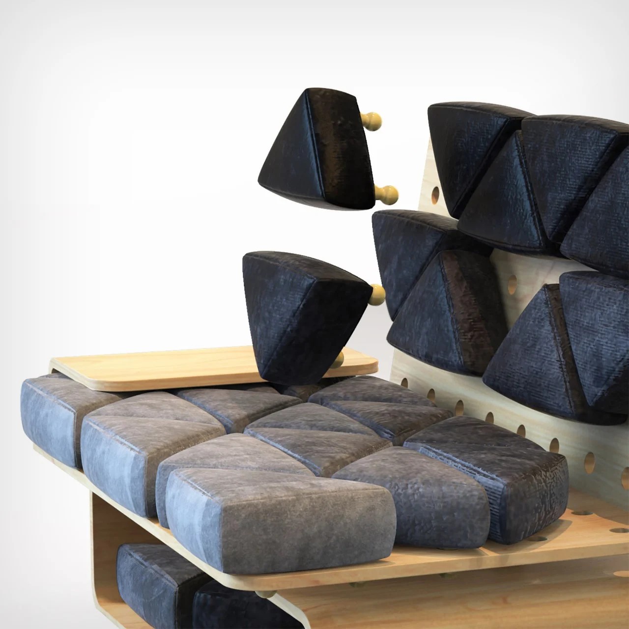
Designer: Arman Farahmand

Furniture that invites rearrangement has a way of making a space feel more alive, especially for renters still figuring out how they want a room to work. The clean lines keep the system from looking like a children’s toy, but the assembly logic is approachable enough that adjusting the layout on a weekend doesn’t feel like a major undertaking. It changes with your mood.

The Accordion Sofa
Modularity usually describes what a sofa can do once it’s in the room. This design moves the conversation earlier, to the part that most furniture brands still treat as the buyer’s problem: getting it through the door. The accordion-compression mechanism lets the sofa collapse into a much smaller form for delivery, which sounds like a technical footnote until you’ve tried maneuvering a full sectional through a narrow hallway.
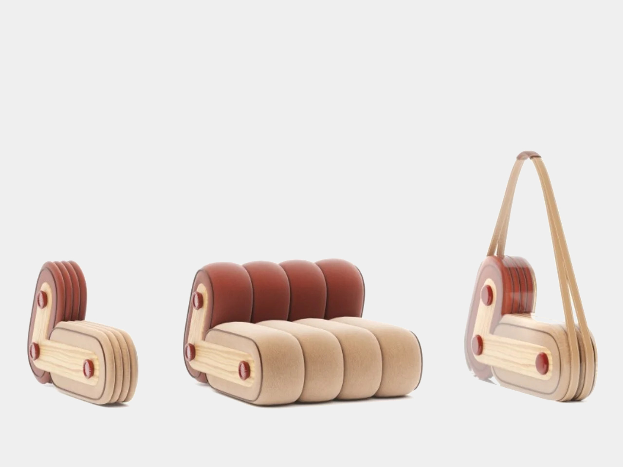
Designer: Yuqi Wang

For renters and frequent movers, a large sofa that can compress for transport removes one of the most consistent headaches that comes with furnished apartment living. There’s no need to wait for a professional delivery team or spend an afternoon dismantling something that wasn’t designed to be taken apart. Once it’s in the room, it opens back up and behaves like a normal sofa, which is the whole point.

Modular Couch for Waiting Spaces
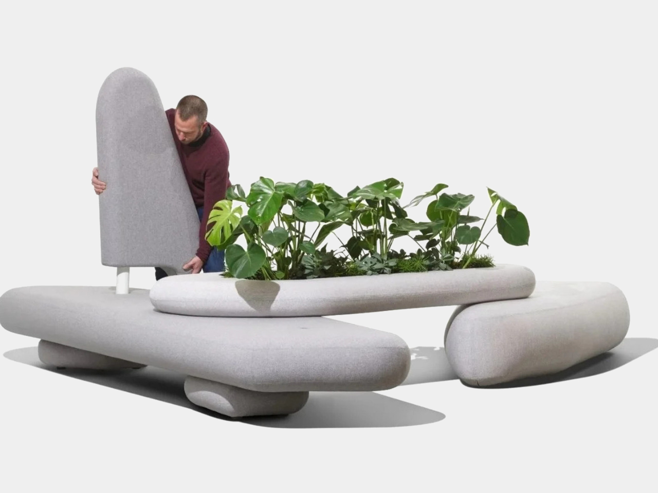
Not every modular sofa belongs in a living room. This design was built for waiting areas, the kind of shared spaces that usually default to rigid rows of institutional seating and very little else. The modular system makes it possible to arrange the furniture into natural clusters, creating smaller pockets of space that feel more considered than the typical lineup of chairs bolted to a wall.

Designer: Sander Mulder

The emotional dimension matters as much as the spatial one here. Waiting rooms are rarely designed with comfort in mind, and the furniture usually makes that obvious. A modular seating system that allows for softer arrangements, varied orientations, and a more human scale changes the experience without requiring a full overhaul. It’s a quiet reminder that shared spaces don’t have to feel punishing to be in.

The Work-from-Home Modular Lounge System
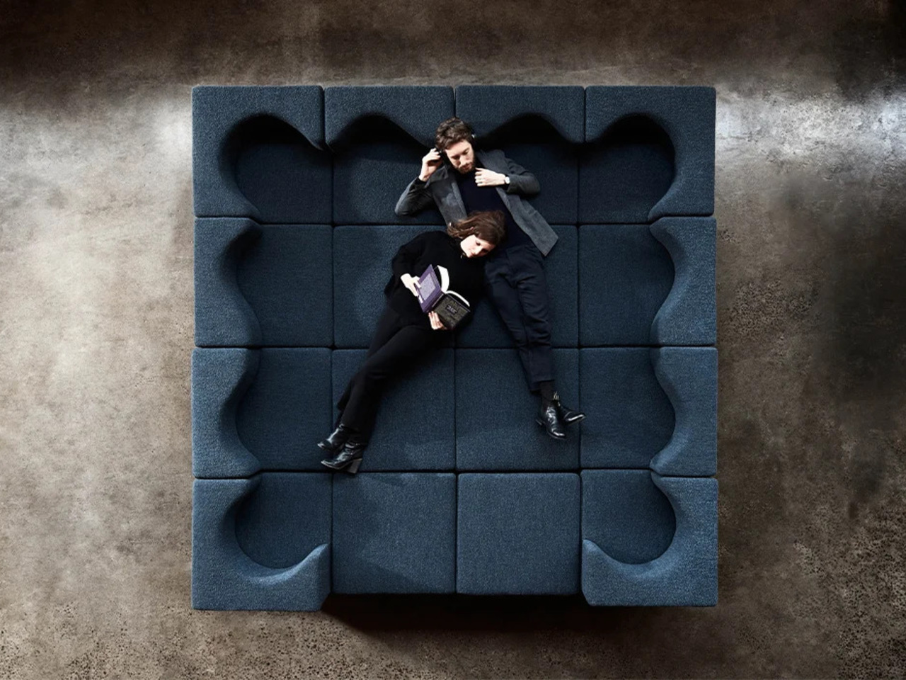
Working from home still means managing the fact that the sofa tends to be many things in the same room: a desk-adjacent perch in the morning, a lunch spot at noon, and a proper lounge space by evening. This modular lounge system was designed around that reality, with sections that support upright sitting for work-mode postures and reconfigure into something more relaxed when the day winds down.
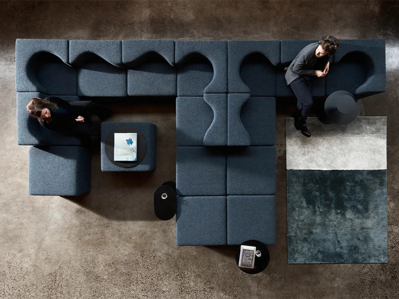
Designer: Foolscap Studio

The flexibility here doesn’t require the room to look like an office. The modular sections shift without dismantling anything, so moving between a work posture and a full lounge is quick enough to actually happen. For anyone whose living room has to serve double duty on a daily basis, that kind of seating system starts to feel less like an option and more like a given.

The Crib That Eventually Becomes a Couch
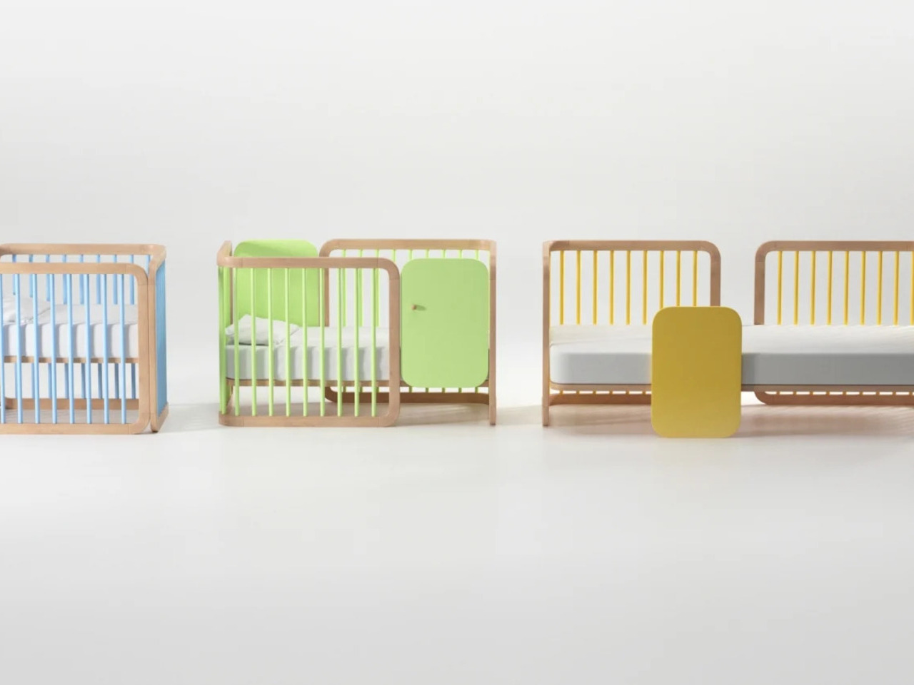
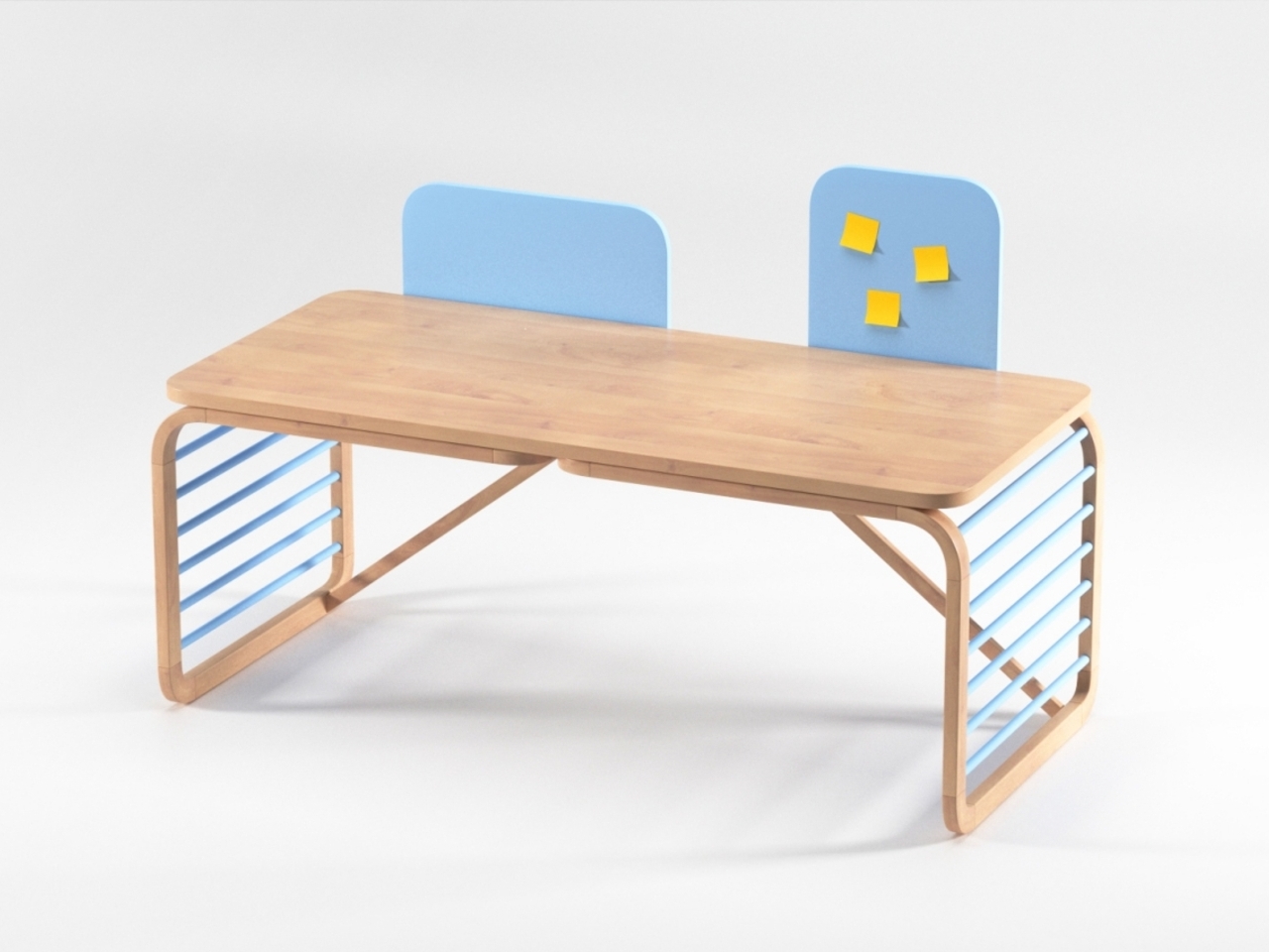
The most dramatic transformation on this list doesn’t involve flipping a sectional into a new shape or pulling a hidden surface out of a compartment. This design changes category entirely, starting as a crib and converting into a couch as the child grows out of it. It’s a long-game approach to furniture that most brands aren’t interested in, largely because selling two separate pieces is the easier model.
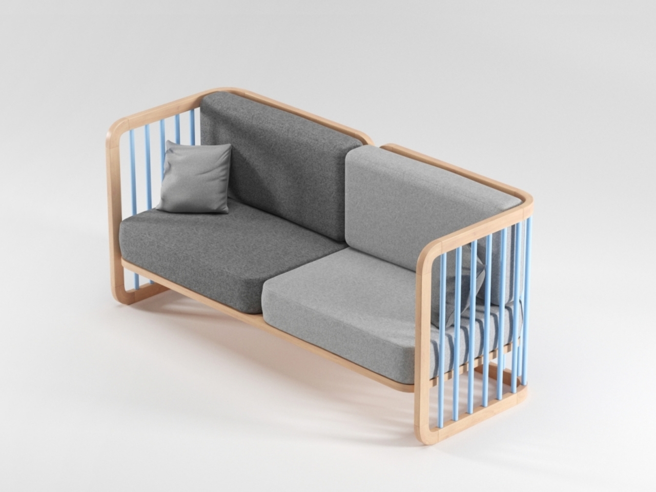
Designer: Vedran Erceg

Children outgrow nursery furniture fast, and most of it ends up in storage or a garage sale before it’s had much chance to earn its keep. A piece that moves from one stage of family life to another sidesteps that cycle almost entirely, which makes it more sustainable, more economical, and a smarter way to think about what furniture should actually do over the long run.
The post 10 Modular Sofas That Rearrange Like Furniture-Grade Lego first appeared on Yanko Design.
This Stationary Tiny Home Has More Room Than Most City Apartments

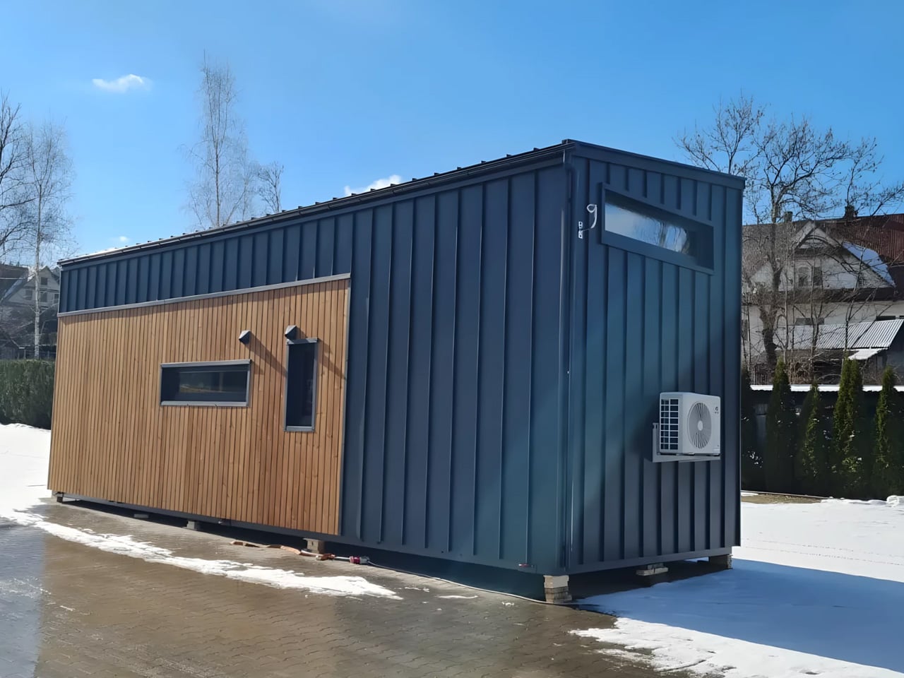
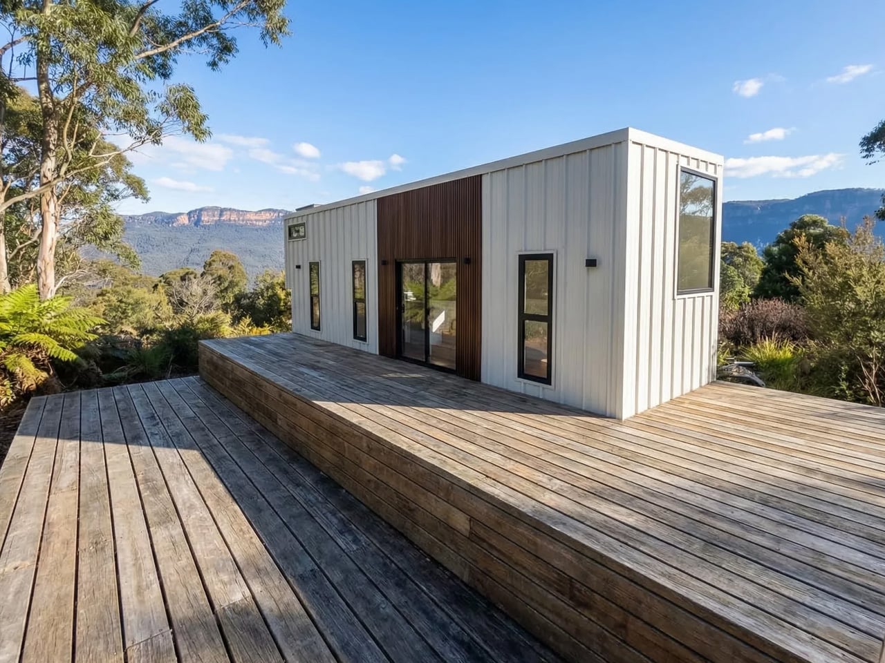
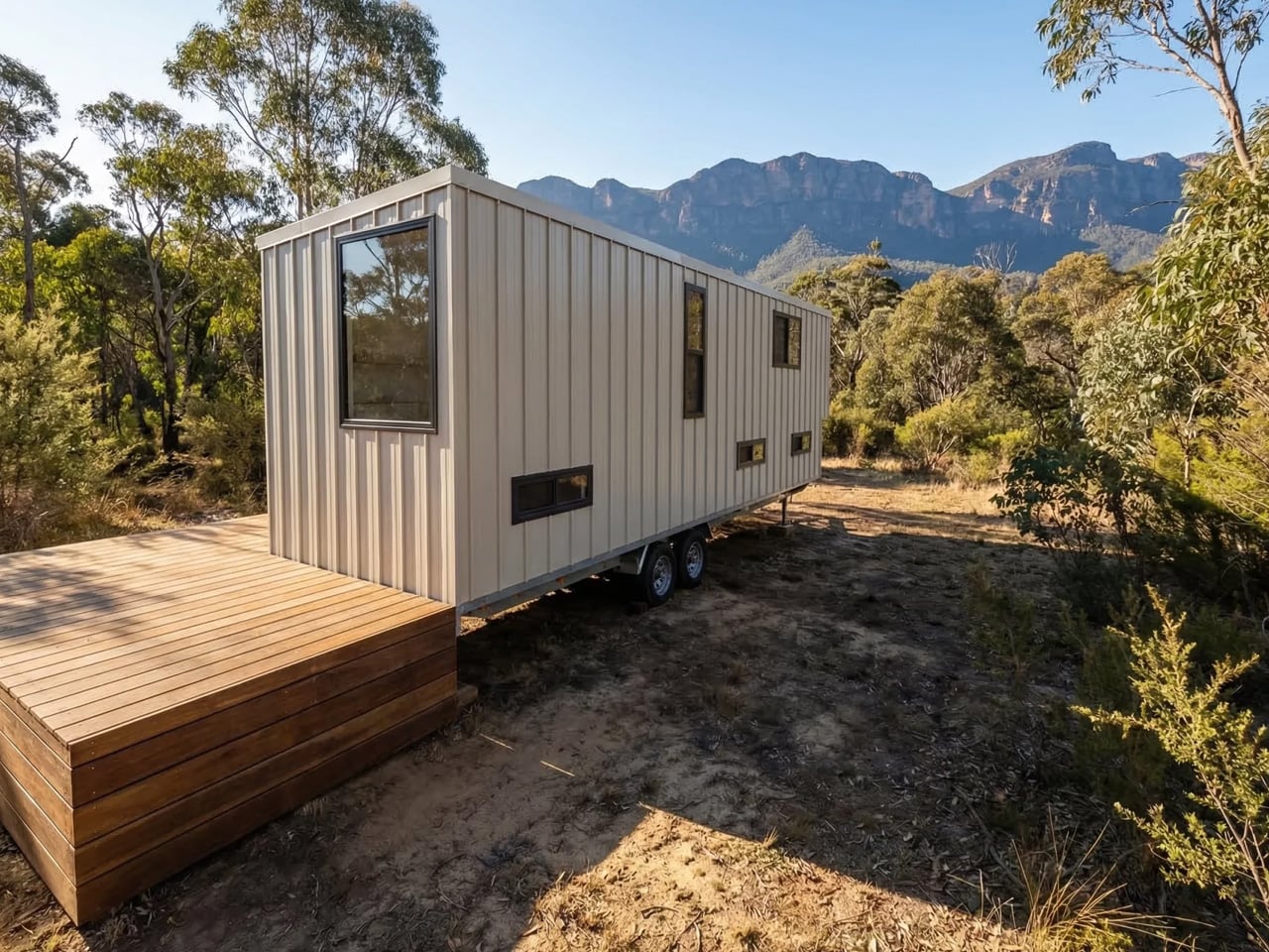
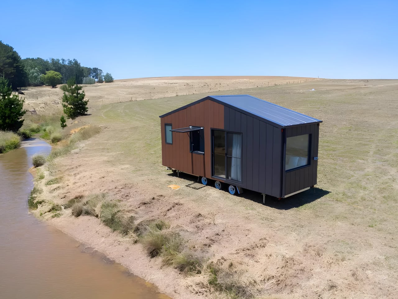
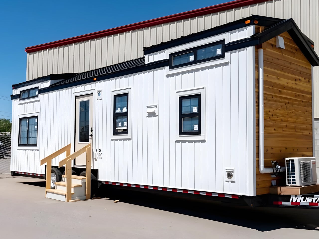
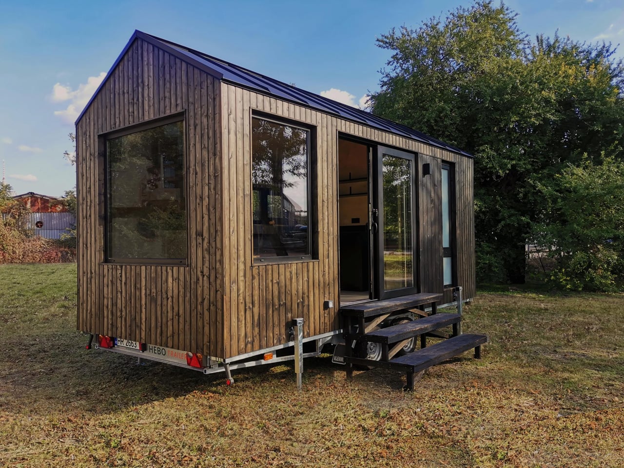
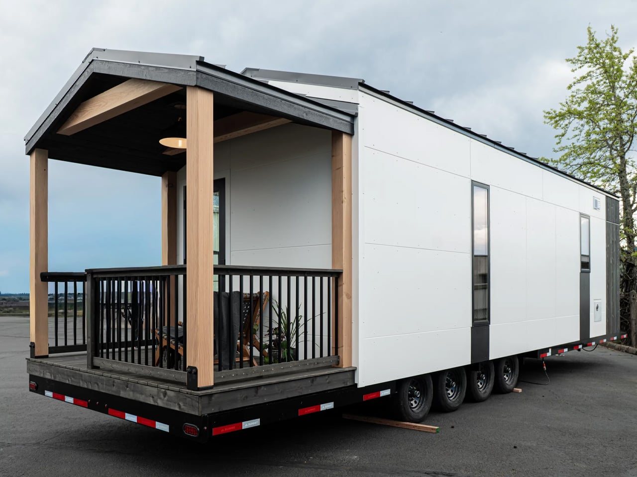
Most tiny houses ask you to make a trade-off. You get the romance of compact living, but sacrifice the one thing that makes a home feel like a home — space. Craft House, a modular builder operating across Poland, Austria, and Ireland, decided to flip that script entirely with the Samuel, a non-towable module house that prioritizes spacious full-time living over the freedom to hitch and go.

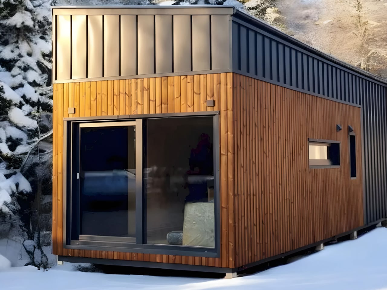
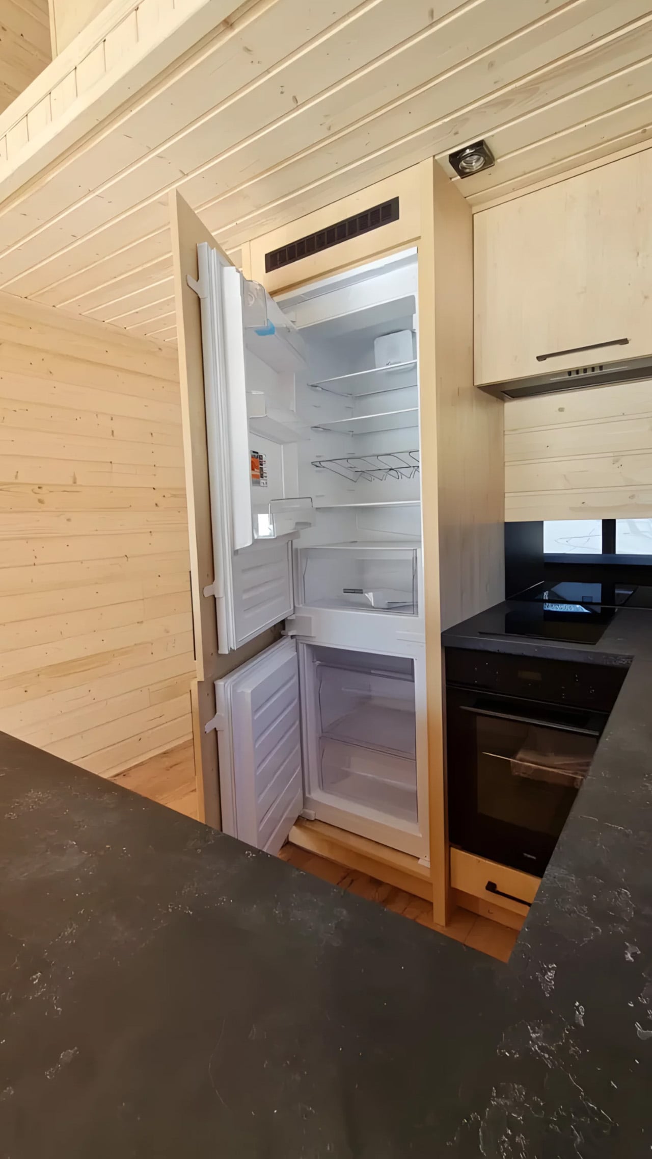
The Samuel sits at 10 meters (32 ft) long and an unusually generous 3.2 meters (10.6 ft) wide, measurements that push well beyond the European tiny home average. That extra width is deliberate. It’s what allows the interior to breathe in a way that most towable models simply can’t, opening up a layout that reads less like a cleverly compressed box and more like a well-considered apartment. The structure wears a single-pitched roof, topping out at 4.1 meters at the ridge, and is finished in engineered wood and metal, a clean pairing that reads industrial without feeling cold.

Designer: Craft House

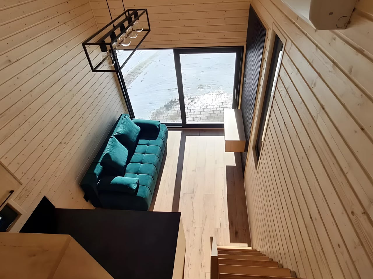
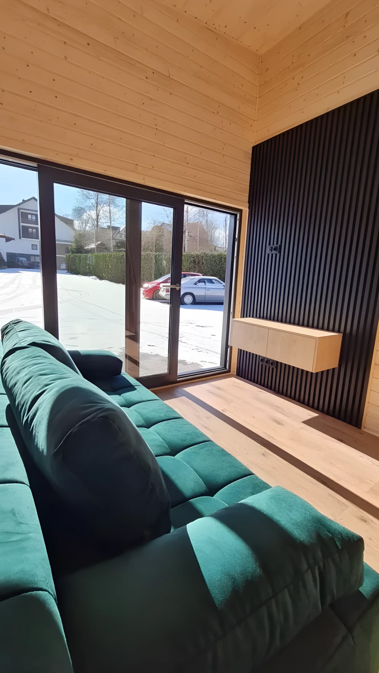
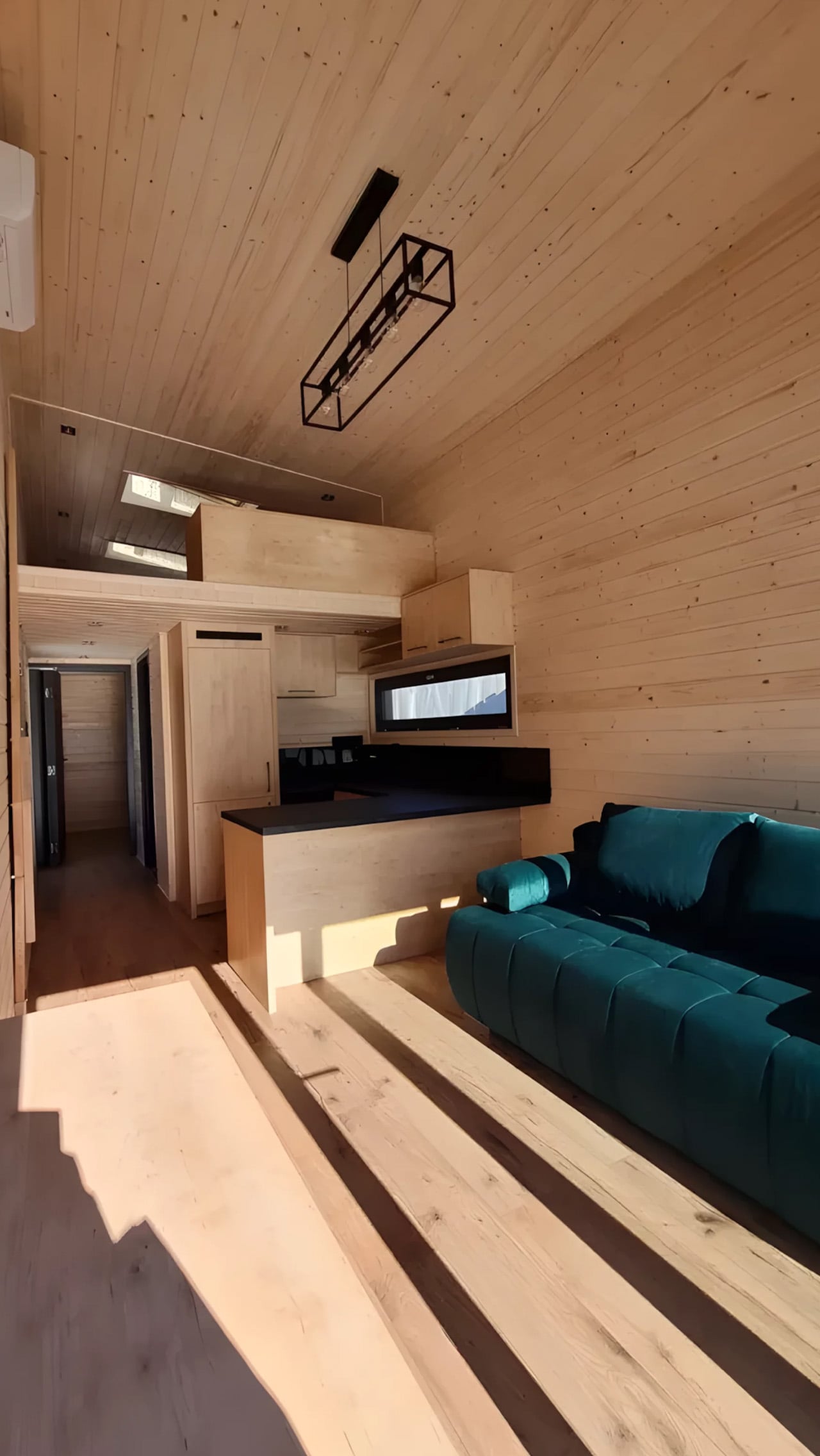
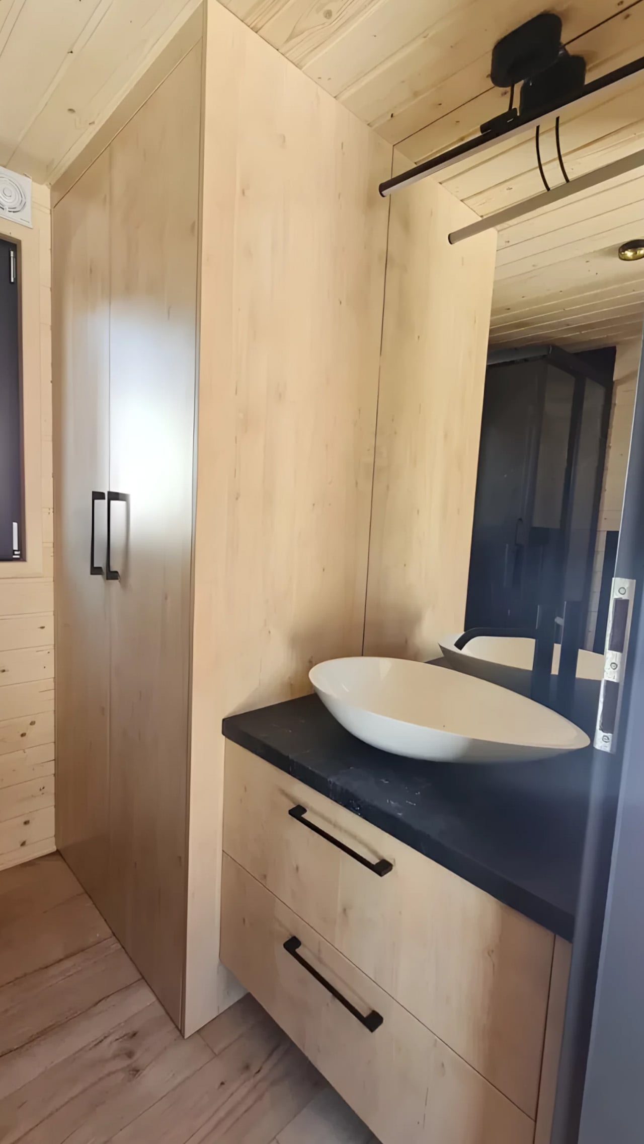
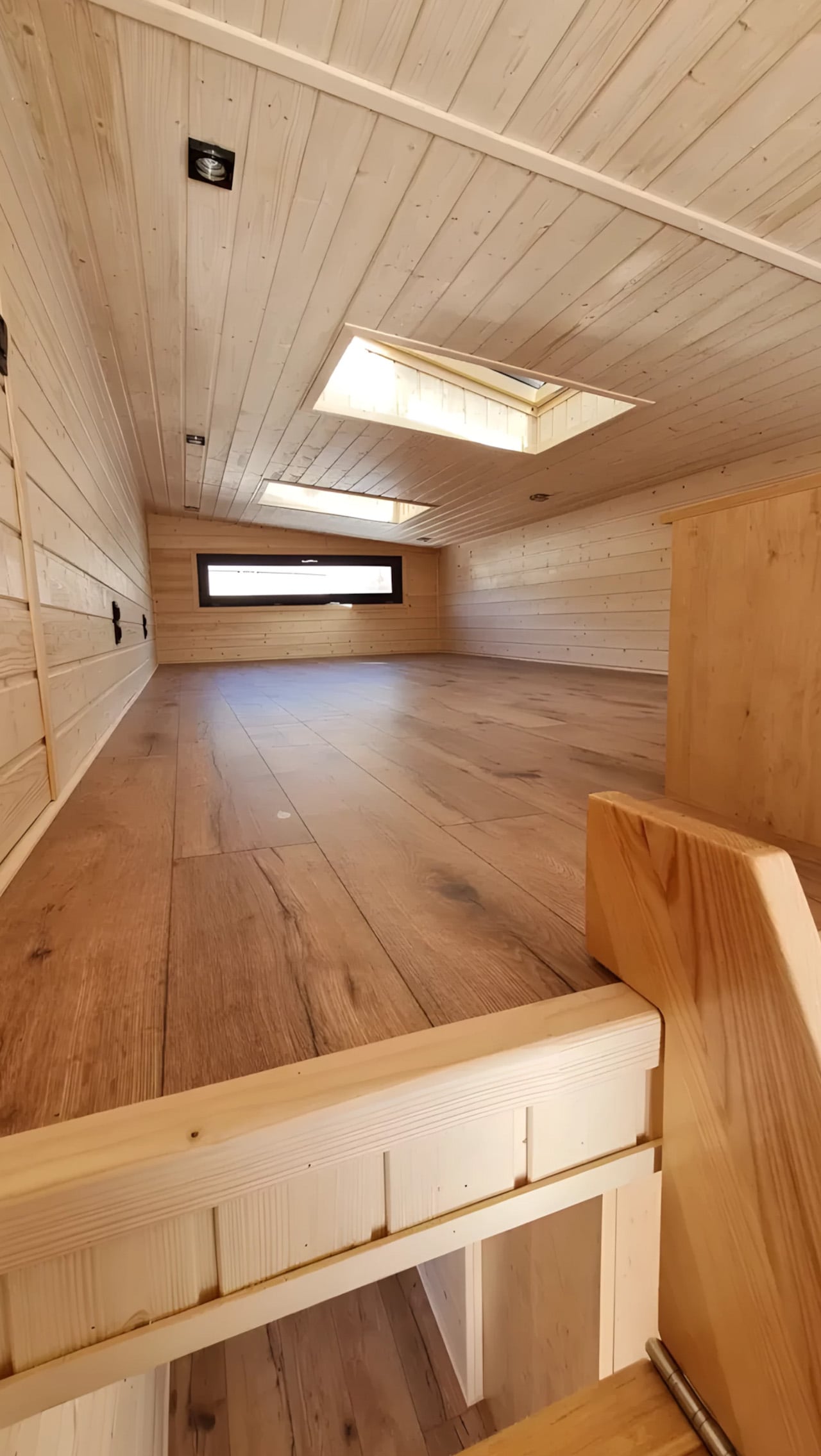
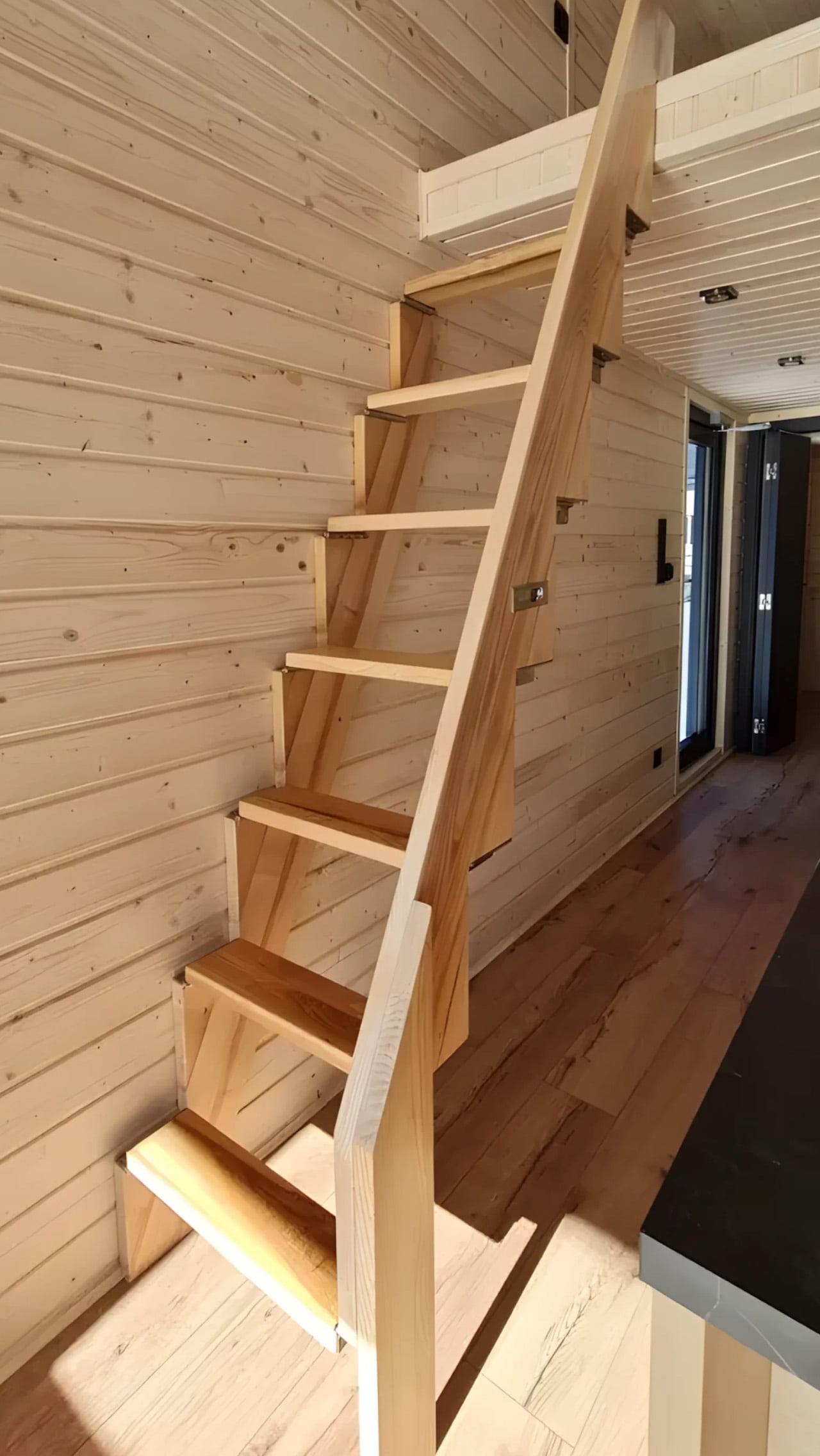
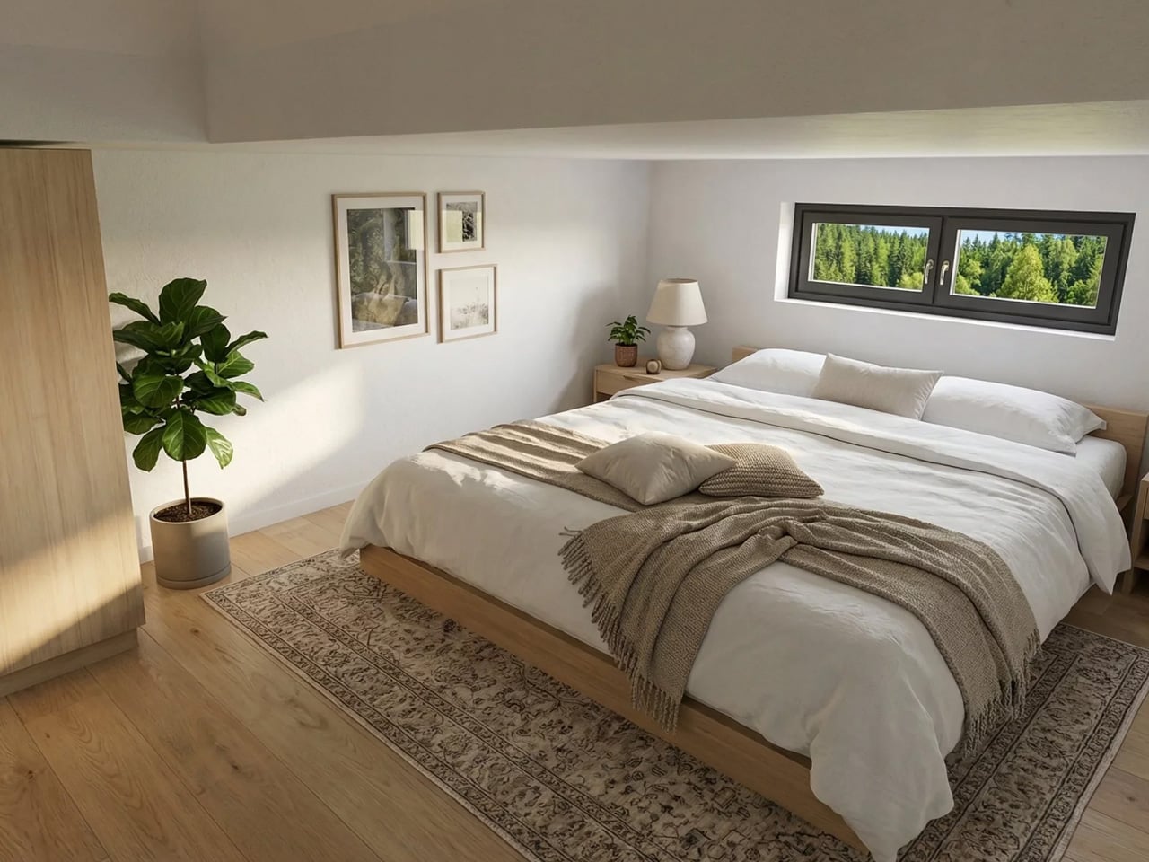
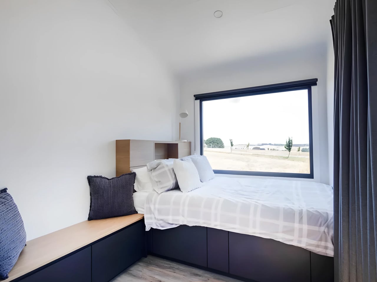
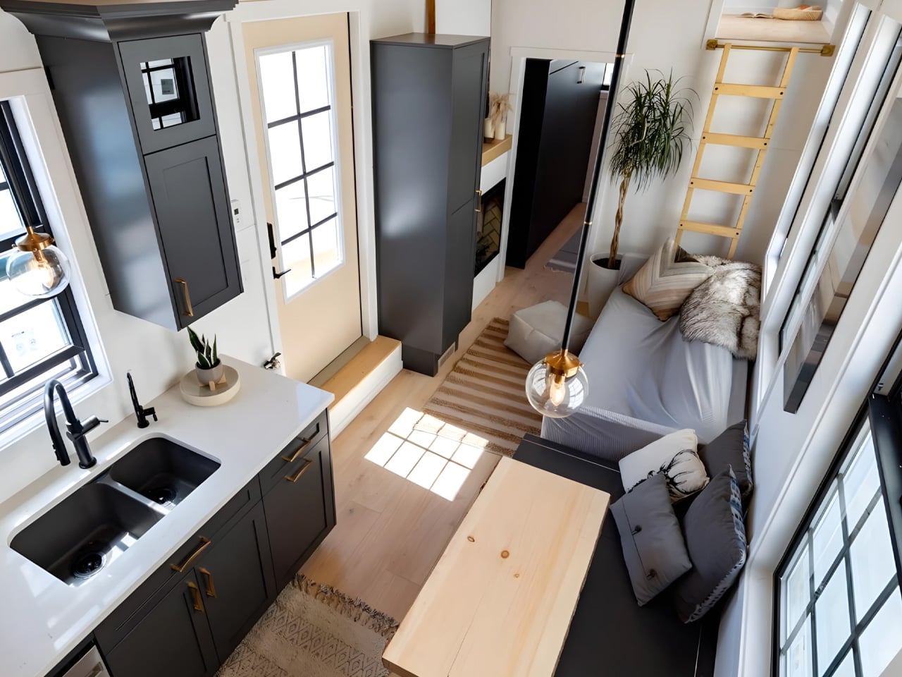
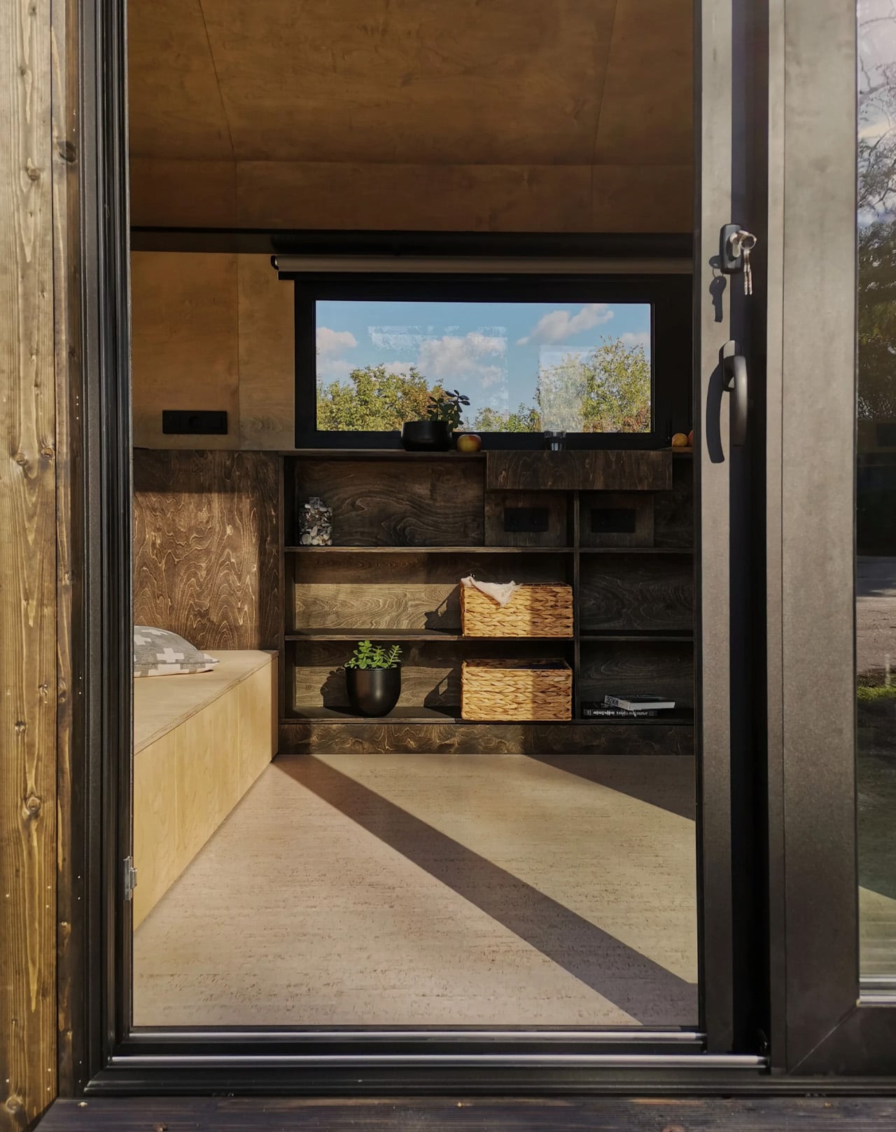
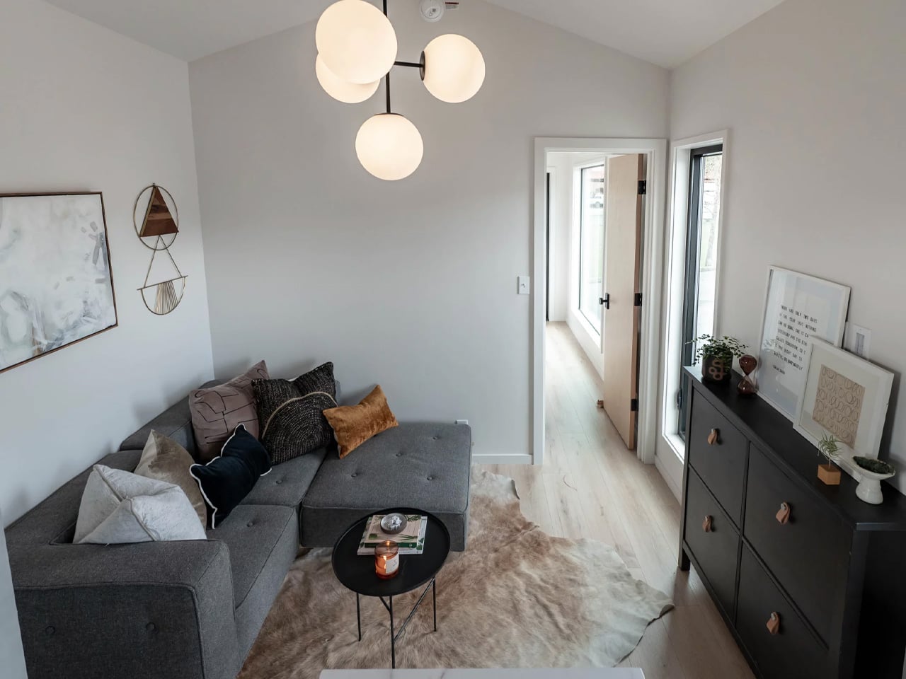
Inside, the ground floor spans 26 square meters, with a 13-square-meter mezzanine sitting above and a 4.3-square-meter bathroom rounding out the floor plan. The layout makes room for two distinct sleeping areas, and the volume created by the sloped ceiling gives the mezzanine level a loft-like quality that larger homes often fail to capture. Optional off-grid upgrades are also on the table, making the Samuel a realistic candidate for plots far beyond urban infrastructure.

What Craft House understood when designing the Samuel is that the tiny home market has two very different buyers. There’s the nomad, always ready to hitch the trailer and head somewhere new. Then there’s the person who simply wants a well-designed, right-sized home that doesn’t carry the financial weight of a conventional build. Samuel is clearly built for the latter. By dropping the wheels and leaning into a fixed footprint, Craft House was able to allocate width and volume in ways that towable structures prohibit by law and logistics.

Priced at around US$72,000, the Samuel lands in a range that makes it a genuinely viable alternative to traditional housing in several European markets. It isn’t trying to be everything. You won’t be parking it in a new location every season. What it offers instead is something arguably more valuable: a permanent, considered space that proves small doesn’t have to mean cramped, and that the best tiny homes aren’t always the ones with the biggest adventures, but the ones that make staying put feel worth it.

The post This Stationary Tiny Home Has More Room Than Most City Apartments first appeared on Yanko Design.
This NYC Restaurant Was Built From Materials Other Designers Threw Away – And It Looks Stunning

Interior design has a quiet problem that rarely makes it into glossy magazine spreads. Behind the polished renders and immaculate finishes lies an uncomfortable truth. Enormous amounts of material are discarded in the pursuit of perfection. Samples are ordered and then rejected. Finishes are replaced for being slightly off. Entire surfaces are redone for the sake of visual consistency. Waste is not a byproduct. It is often built into the process.

Gourmega in Manhattan offers a different way of thinking.  The restaurant does not attempt to hide imperfections. It leans into it. It reframes it. And in doing so, it turns restraint into a form of luxury.

Designer: Mariam Issoufou Architects

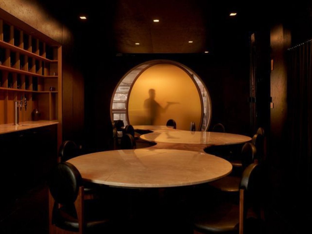
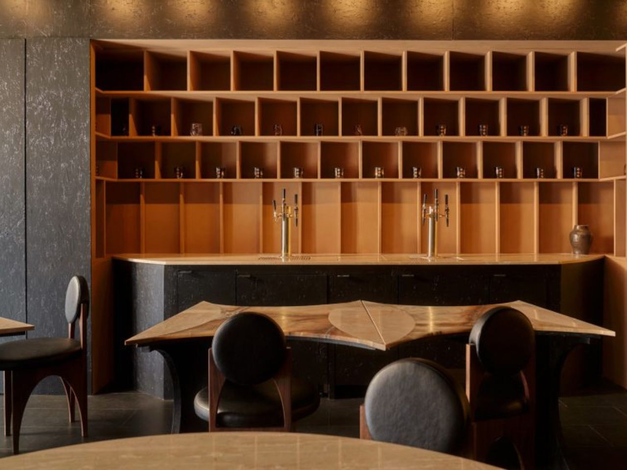
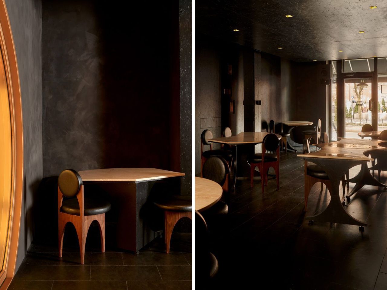
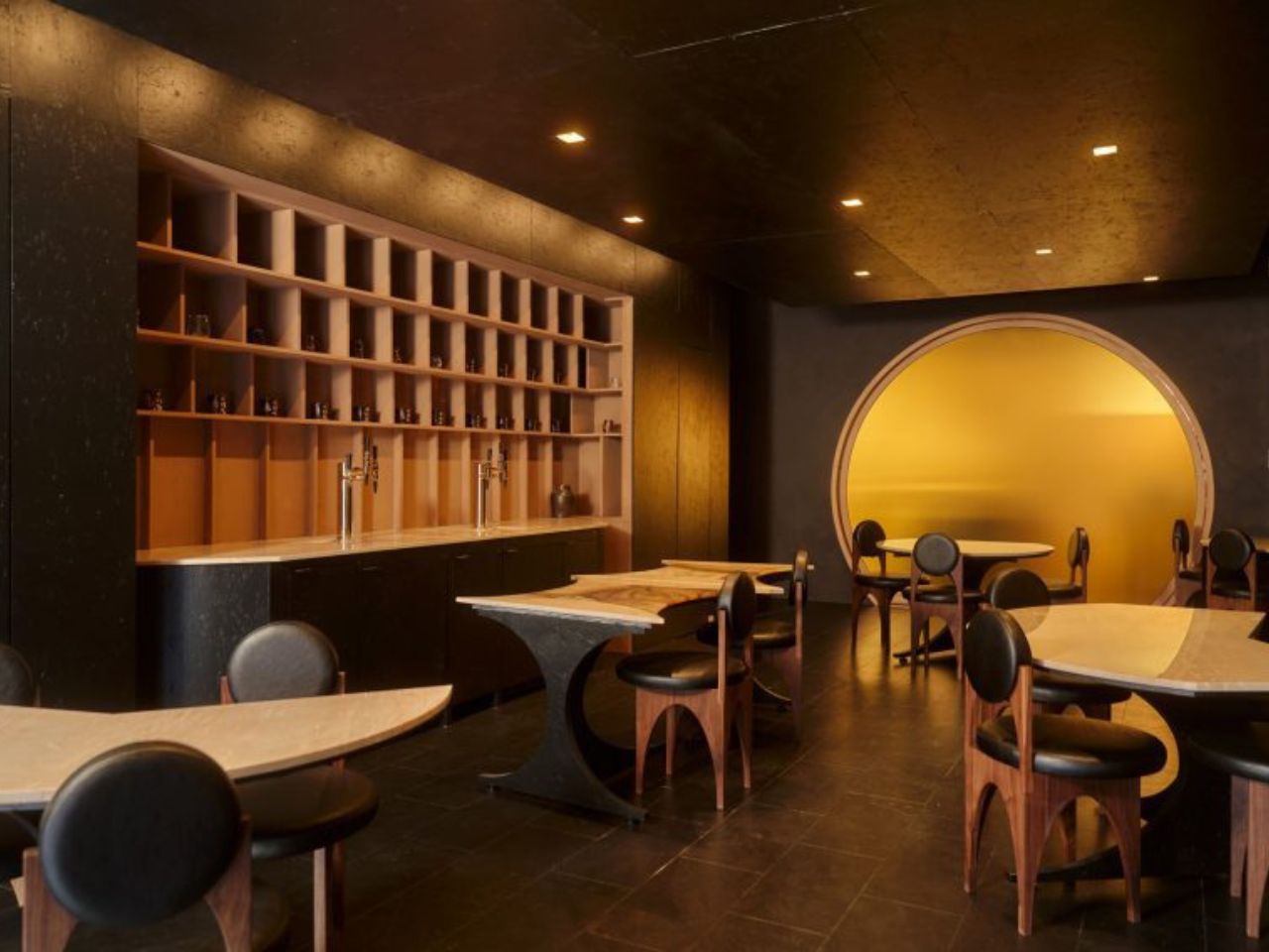
The space is described as a zero-waste restaurant, but that label only scratches the surface. The design is not just about reducing waste. It is about redefining what is considered valuable in the first place. The black lime-washed walls hold uneven textures that catch light differently across the room. The black-stained cork floor carries a softness and irregularity that feels lived in rather than manufactured. Walnut chairs with black vegan leather sit quietly within this palette, never demanding attention but always belonging.

Founder Mariam Issoufou grounds this material honesty in history. The site was once known as the Land of the Blacks, a place where African-owned farms and early Black social spaces existed in New York. Rather than translating this into literal symbols, the design holds it in the atmosphere. The darkness is not emptiness. It is density. It is memory. It is a way of anchoring the present within a layered past.

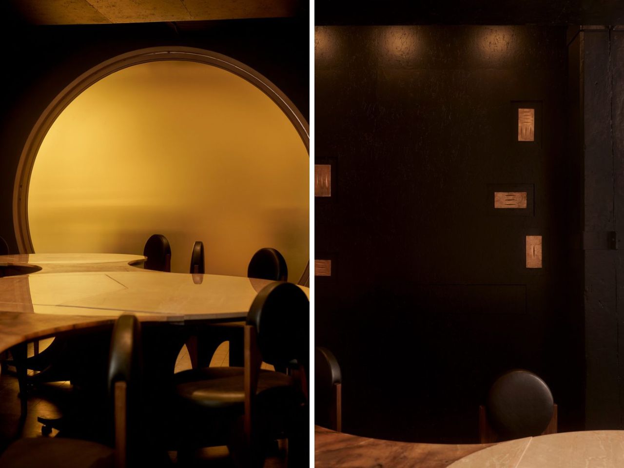
Then, just when the room settles into its depth, a moment of contrast appears. A translucent yellow circular pivot door marks the transition to the kitchen. It glows. It moves. It reveals silhouettes of chefs at work. What could have been a simple divider becomes a performance. The act of cooking is no longer hidden. It becomes part of the dining experience, flickering in and out of view like a living backdrop.

At the center of the space sits the most radical decision. A circular communal table made of alabaster and travertine. It can be split into seven smaller tables, allowing the restaurant to shift from a daytime cafe to a nighttime supper club. But its real impact is social. Circular seating removes hierarchy. There is no head of the table. No privileged position. Every diner shares the same spatial status. In a city defined by speed and stratification, this simple gesture feels quietly revolutionary.

The project extends beyond its walls through its collaboration with Rethink Food. Gourmega contributes to a system that provides free meals across New York, linking fine dining to food access in a way that feels integrated rather than performative. Sustainability here is not just about materials. It is about relationships and responsibility.

Even the walls resist finality. They are treated as exhibition surfaces for local African American artists, including bronze panels by Nifemi Marcus-Bello. The space is designed to change, to hold new stories over time, rather than remain frozen as a finished object.

Gourmega does something that many interiors avoid. It accepts that making something meaningful does not require making it perfect. It suggests that beauty can come from constraint, that history can be carried through material choices, and that design can hold both dignity and imperfection at once. In a discipline obsessed with control, this restaurant offers something far more compelling. It lets go.

The post This NYC Restaurant Was Built From Materials Other Designers Threw Away – And It Looks Stunning first appeared on Yanko Design.
5 Best Tiny Homes of May 2026 Prove Tiny House Design Stopped Being Cute — It Became a Category

Tiny homes had a moment. Then they had another. Then, somewhere between the Instagram hashtags and the weekend specials, they quietly became something more serious. The designs releasing in 2026 aren’t pitching a lifestyle fantasy — they’re solving real problems: family space, year-round comfort, material quality, and genuine mobility. The builders showing up this year aren’t compensating for square footage. They’re rethinking what square footage is even supposed to accomplish.

What’s changed is the thinking behind the build. Reverse floor plans. Apartment-scale dimensions on trailer frames. Japanese material sensibility packed into a 130-square-foot shell. Choices that match what you’d find in a well-funded apartment remodel, not a budget cabin kit. These five tiny homes, all surfacing this spring, represent what the category looks like when builders stop apologizing for the format and start designing with full conviction.

1. Onda

The Tiny Home That Put Bedrooms on the Bottom and Changed the Entire Conversation

The Onda doesn’t tweak the tiny home formula — it inverts it entirely. Australian builder Removed Tiny Homes placed all three bedrooms on the ground floor and pushed the kitchen, living room, and bathroom to the elevated upper level, a reverse loft plan that nobody had executed quite like this before. Built on a double-axle trailer and finished in steel with warm wooden accents, it measures 10 meters long, 3.4 meters wide, and 4.5 meters tall, pushing it firmly into apartment territory.

What the upside-down layout gives you is privacy on your own terms. Bedrooms stay quiet, dark, and grounded — actual breathing room away from the communal noise above. A full-height hallway with 200cm of standing clearance connects each room below, so moving through the home never feels cramped. An optional deck spills the upper-level living space into the open air. For a family that wants to downsize without shrinking their sense of home, this is the most coherent answer currently on the market.

What We Like

  • The reverse loft layout is genuinely original — private spaces below, communal life above — and the spatial logic holds up completely once you see it in practice
  • At 70 square meters across a double-axle trailer, the scale rivals a proper apartment without surrendering mobility or road-legal status

What We Dislike

  • The 4.5-meter height may face clearance restrictions in some regions, limiting where the Onda can realistically be parked or towed permanently

2. Audrey

The Single-Level Build That Makes Efficient Living Look Effortless

There’s a certain confidence in keeping things flat. CozyCo’s Audrey is a single-level build, 7.2 meters long and mounted on a triple-axle trailer, and its restraint is exactly what makes it work. The exterior pairs corrugated aluminium with timber-look panels — a combination that slots into a bush property, a coastal block, or a suburban backyard without missing a beat — while a neatly tucked propane storage box keeps the silhouette clean. It looks like a home that knows precisely what it wants to be.

Inside, the open studio layout does what smart single-level design does best: it makes the space feel larger by refusing to fight itself. Sliding glass doors bring in light and dissolve the boundary between inside and out. R2.5 insulation, double-glazed windows, gas, hot water, and air conditioning mean you can live in the Audrey year-round without a second thought. A storage bed removes the need for bulky furniture. Whether you’re running it as a guest suite, a short-stay rental, or a granny flat, it earns its position effortlessly.

What We Like

  • The combined thermal package — R2.5 insulation, double-glazed windows, and full air conditioning — makes it genuinely livable across every season without requiring expensive upgrades after purchase
  • Single-level circulation eliminates the ladder-and-loft compromise that makes most tiny homes feel like clever camping rather than actual living

What We Dislike

  • Sleeping comfortably up to two people limits the Audrey’s appeal — it isn’t a family home and doesn’t pretend to be, but that’s a real ceiling on its long-term versatility
  • At 7.2 meters, the footprint sits on the smaller end, even for a tiny house, meaning storage and layout flexibility have a defined and non-negotiable limit

3. Harmony

The Family Tiny Home That Proves Four People Don’t Need Four Thousand Square Feet

The Harmony was originally commissioned by a family of four in Southern Alberta who were done with the time and financial weight of conventional living. What emerged from that brief is one of the most thoughtfully designed family tiny homes on the market right now. Built by Alberta-based Teacup Tiny Homes on a triple-axle trailer and clad in metal and wood, it measures 34 feet long and 8.5 feet wide — road-legal across North America, towable without a special permit — with 423 square feet of considered interior space.

That floor plan matters because it holds the things families actually use. A sofa, a fireplace, and a dedicated TV wall mean family evenings don’t have to be compressed into a bench seat. What the Harmony gives you specifically is the freedom to move — across provinces, across states — without putting your life into storage. Mobility and stability, sharing the same triple-axle frame. For a family that wants flexibility without surrendering the feeling of a real home, this is one of the most convincing arguments the tiny home world has produced.

What We Like

  • Standard 8.5-foot road-legal width means the Harmony can be towed anywhere across North America without a special permit — genuine mobility, not just the promise of it
  • 423 square feet with a sofa, fireplace, and dedicated TV wall means family life doesn’t get flattened into efficiency mode the moment you walk through the front door

What We Dislike

  • The metal-and-wood cladding combination, while durable and practical, is familiar territory — the Harmony doesn’t push any aesthetic boundaries and looks exactly like you’d expect it to
  • At 34 feet long, site placement requires real planning, and not every property has the physical footprint to accommodate it without trade-offs

4. Shoji

The 130-Square-Foot Home That Makes the Case for Japanese Minimalism on Wheels

At 130 square feet and just 5.5 meters long, the Shoji is a study in not flinching. Completed in November 2022 and sited in Brittany, France, it was designed by Koleliba alongside architect Hristina Hristova as the brand’s S Tiny model. The name points directly to its influence: clean lines, natural materials, and a deep respect for negative space. Vertical timber siding, a metal roof, and expansive sliding glass doors give it an exterior that reads equally well in a forest clearing or an open countryside field.

Inside, the birch plywood interior does what Koleliba does best — furniture becomes a seamless continuation of the architecture. A U-shaped couch converts into a queen-size bed. There’s a dedicated home office desk, essential kitchen appliances, a washing machine, and a roomy shower, all packed into a footprint that defies logic. Electric floor heating and solid winter insulation make it genuinely year-round livable. What the Shoji gives you is proof that living with intention — rather than abundance — isn’t a lesser version of home. It’s a stronger argument for what home can be.

What We Like

  • The furniture-as-architecture approach means nothing feels crammed in or improvised — every element is a deliberate continuation of the interior, not an afterthought placed inside it
  • Electric floor heating and serious winter insulation make this a genuine four-season home, not a warm-weather retreat built for photography

What We Dislike

  • 130 square feet is a real constraint — there’s no graceful way to accommodate guests, and solitude becomes a structural feature of the design, whether you planned for it or not
  • As a completed, commissioned project, the Shoji isn’t a ready-to-buy model — interested buyers would need to engage Koleliba directly, with no standard production line to order from

5. Urban Gable Park

The Park Model That Stopped Making Compromises and Started Making a Statement

The Urban Gable Park is what happens when a builder decides to stop apologizing for comfort. At 30 feet long and 11 feet wide — significantly beyond the standard 8.5-foot width that most trailer-based homes are constrained to — it’s a single-level park model that gives rooms actual space to breathe. The bedroom has real headroom. The living area fits a proper sofa. That extra width isn’t just a number on a spec sheet; it fundamentally restructures how the interior feels and how you move through it on an ordinary Tuesday.

The material choices confirm the intent. The kitchen comes fitted with maple slab cabinets, an induction cooktop, a full-size fridge, and a dishwasher, all set within a striking limewash alcove. In the bathroom: a concrete vessel sink, terrazzo tile floors, matte black fixtures, a walk-in shower, and a stacked washer/dryer. These aren’t budget finishes dressed up to photograph well — they’re material decisions made by people who know exactly what they’re doing. The Urban Gable Park gives you apartment-grade quality in a format that doesn’t ask you to keep justifying the choice to everyone you meet.

What We Like

  • The 11-foot width fundamentally changes how the interior reads — rooms have breathing room, and daily living stops being an exercise in constant spatial problem-solving
  • Kitchen and bathroom material quality — limewash alcoves, terrazzo tile, maple slab cabinets — matches what you’d find in a thoughtful urban apartment remodel, not a prefab compromise

What We Dislike

  • The 11-foot width requires a road permit for towing on public roads, which meaningfully limits relocation flexibility compared to any standard road-legal tiny home
  • Built as a park model designed to stay in place, the Urban Gable Park won’t suit buyers expecting the full mobility and spontaneity of a traditional tiny home on wheels

The Cute Phase Is Over — What Replaced It Is Far Harder to Dismiss

What these five homes share isn’t a size or a price point — it’s a standard. None of them asks you to romanticize the limitations of small living. They ask whether those limitations are even real. The Onda inverts the entire floor plan. The Shoji strips everything down to what actually matters. The Urban Gable Park adds width and lets the rooms speak for themselves. Each one represents a distinct position on the same argument: that less space is not, by definition, a lesser life.

The category has grown up. The builders who matter right now aren’t chasing aesthetics for a mood board feature — they’re engineering real precision into formats that serve families, couples, remote workers, and anyone tired of paying for rooms they never enter. If May 2026 is a signal of where tiny home design is heading, the message reads clearly: the cute phase is over. What’s replaced it is something far more interesting, and far harder to dismiss.

The post 5 Best Tiny Homes of May 2026 Prove Tiny House Design Stopped Being Cute — It Became a Category first appeared on Yanko Design.
This Quebec Home Doesn’t Fight the Forest – It Disappears Into It

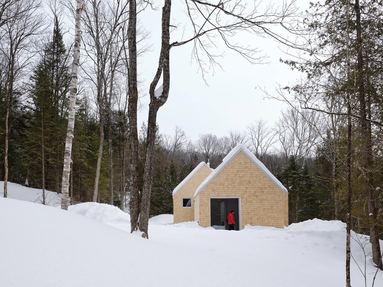
Certain kinds of architecture don’t announce themselves. La Maraude, the latest project by Nathalie Thibodeau Architecte, is exactly that — a compact residential dwelling tucked into the dense woodlands of Boileau, in Quebec’s Outaouais region, that earns its presence through restraint rather than spectacle. Completed in 2024, it’s one of the more quietly compelling houses to come out of Canada in recent memory.

The name itself carries meaning. ‘Maraude’ — to roam, to forage — hints at the relationship the house cultivates with its surroundings. Rather than claiming a dominant position along the river’s edge, the architects deliberately set the home deeper within the treeline, orienting the house’s interior life entirely toward the forest. It’s a gesture that shapes everything else about the project.

Designer: Nathalie Thibodeau Architects

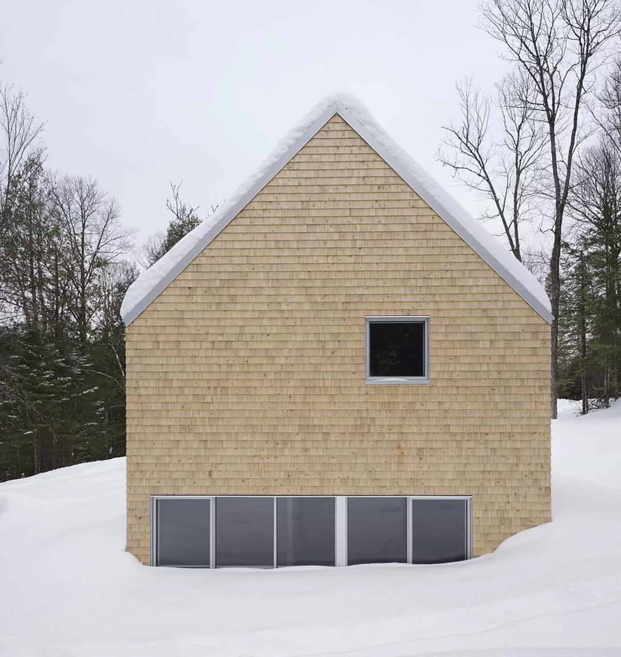
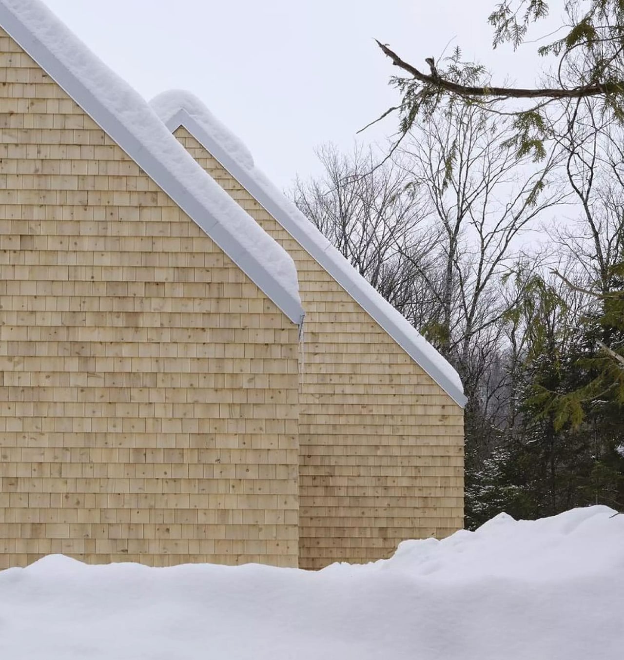
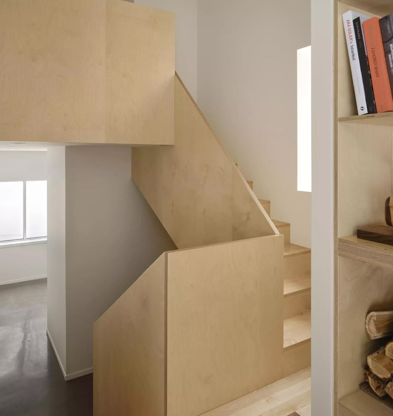
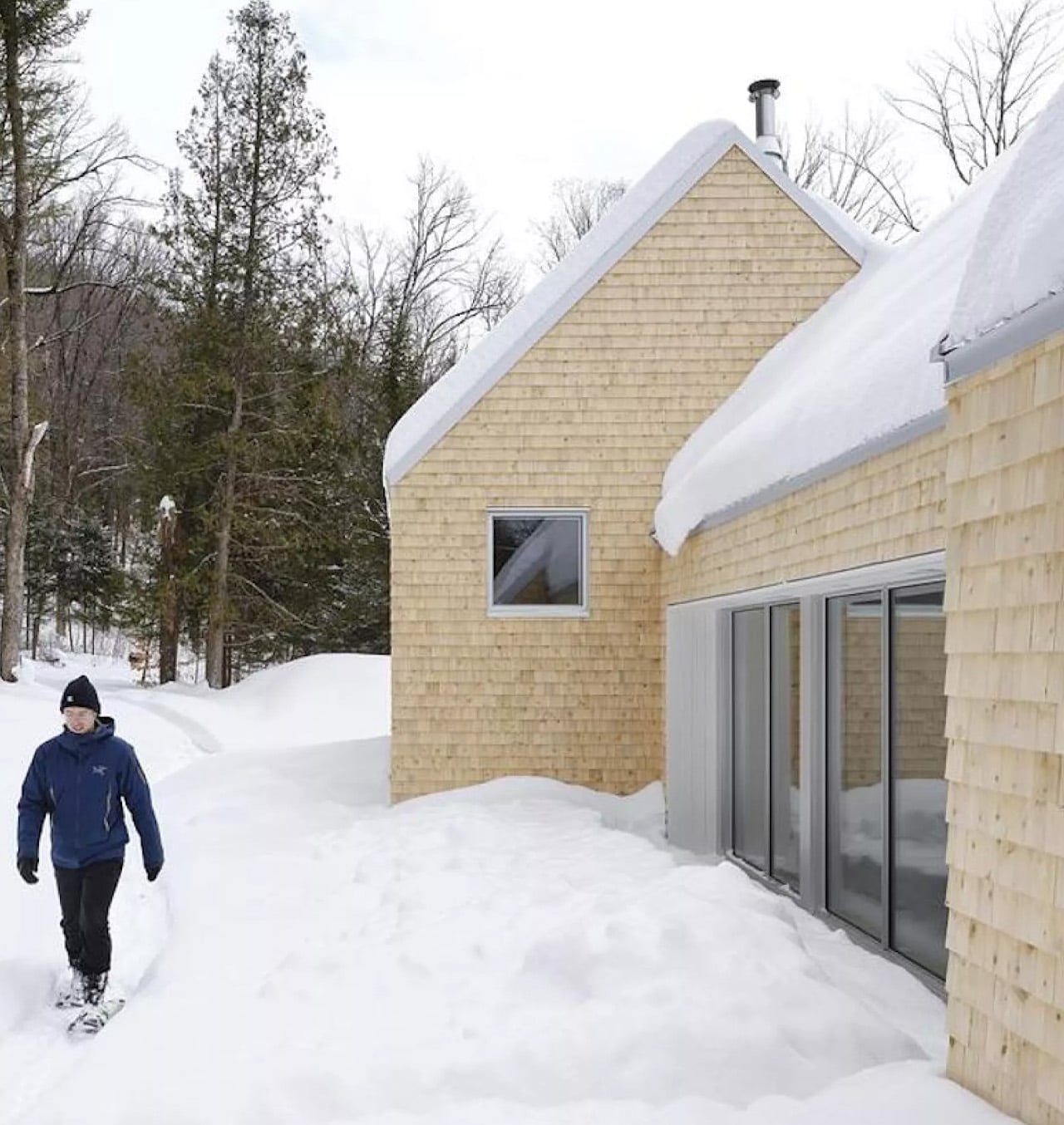
The design draws directly from Quebec’s vernacular architectural tradition — steeply pitched rooflines, grounded proportions, and a material palette that feels native to the region. The exterior is clad in natural cedar shingles and topped with a metal roof, two materials with deep roots in the local building culture. These aren’t nostalgic choices. They’re translated through a contemporary lens, stripped of ornament, reduced to their essential geometry. “Designed with particular attention to simplicity, functionality, and respect for traditional codes, La Maraude embodies a successful dialogue between contemporary architecture and local traditions,” says Nathalie Thibodeau Architecte.

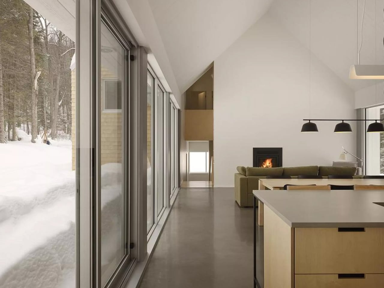
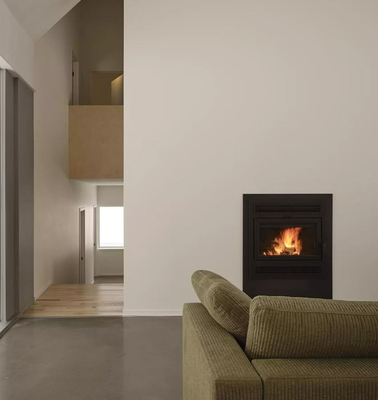
What makes the spatial sequence genuinely interesting is the use of two courtyards as organizing devices. The plan doesn’t simply open to the outdoors — it pulls the forest in, fragmenting the landscape into a series of framed views that shift with the seasons. One courtyard faces north, more sheltered and partly enclosed by the building itself, oriented toward higher ground. The other faces south, brighter and more expansive, drawing the eye down toward the lower terrain. The result is a house that reads differently in every light condition, every month of the year.

The second volume, arranged over two levels in response to the site’s slope, plays a more introverted role. Openings here are smaller and precisely placed to frame specific moments within the tree canopy — quiet apertures rather than panoramic statements.

Photographed by Maxime Brouillet, La Maraude has the look of a project that will age well, both materially and culturally. It’s already being discussed as a potential anchor for a broader ensemble of small retreats on the site — a first building in what could become a considered, evolving conversation between architecture and landscape.

The post This Quebec Home Doesn’t Fight the Forest – It Disappears Into It first appeared on Yanko Design.