This $152 Laptop Backpack Has 7 Features Most Business Bags Skip

The office is no longer a place. For a growing number of professionals, work happens across a rotating cast of locations, on trains, in hotel lobbies, at standing desks in co-working spaces, at airport gates between meetings. What gets carried through all of that has quietly become one of the more personal decisions in a working day. The bag has to hold a laptop, a water bottle, travel documents, chargers, and sometimes a change of clothes, while still looking appropriate in every environment it passes through. Most bags manage the functional half of that requirement passably well; the visual half tends to be where the compromises show.

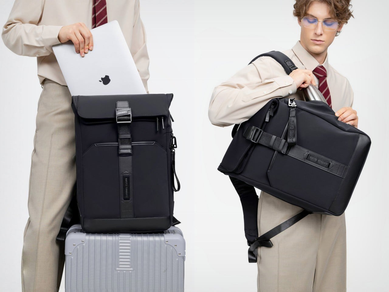
Nayo Smart designed the Herman Pro around exactly this reality. The half-roll-top silhouette keeps things looking composed from the outside, while the internal architecture handles an impressive amount of organized complexity. A dedicated laptop compartment sits separately from the main storage zone, accessible directly from the back panel for quick retrieval at security. The L-shaped main opening lays nearly flat for visibility and easy packing. A FIDLOCK magnetic buckle secures the flap in one motion, and hidden pockets, a side waterproof sleeve, and a luggage strap round out a carry system built around real transit habits rather than feature checklists.

Designer: Nayo Smart

Click Here to Buy Now: $152.10 $169 (10% off) Free Waterproof Packing Cube included with your Herman Pro
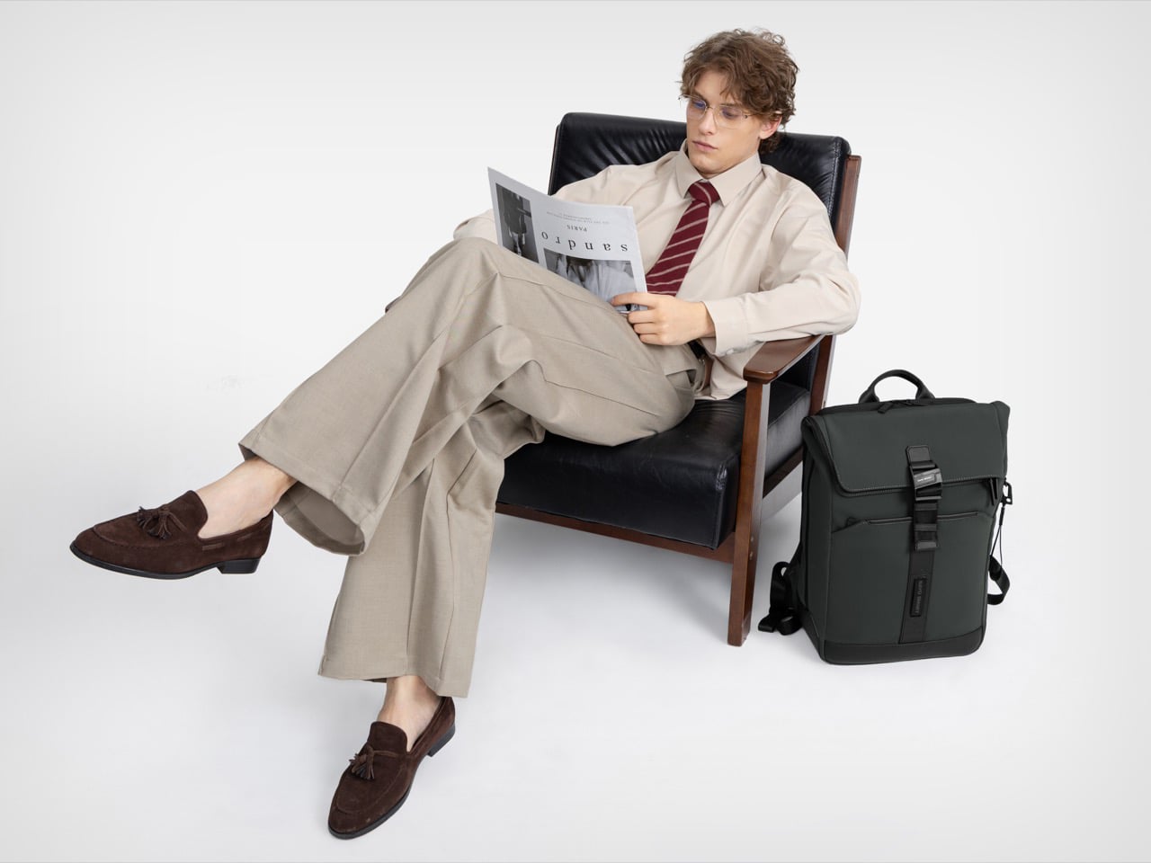
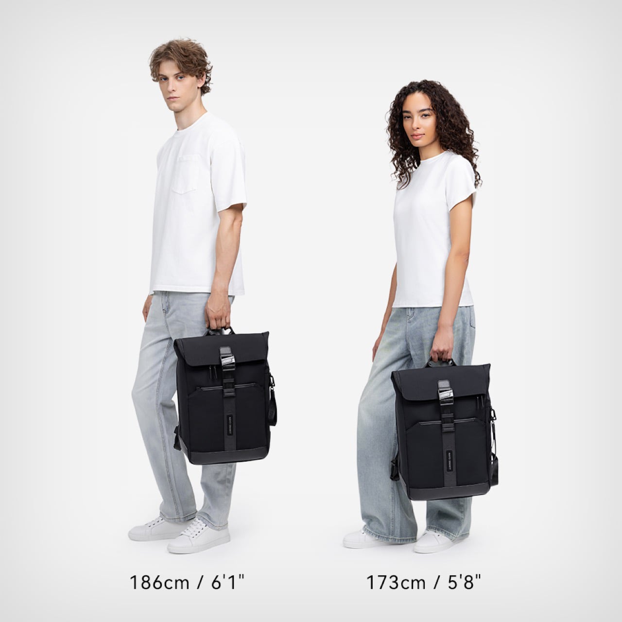
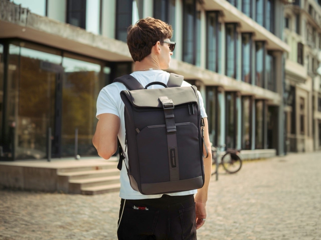
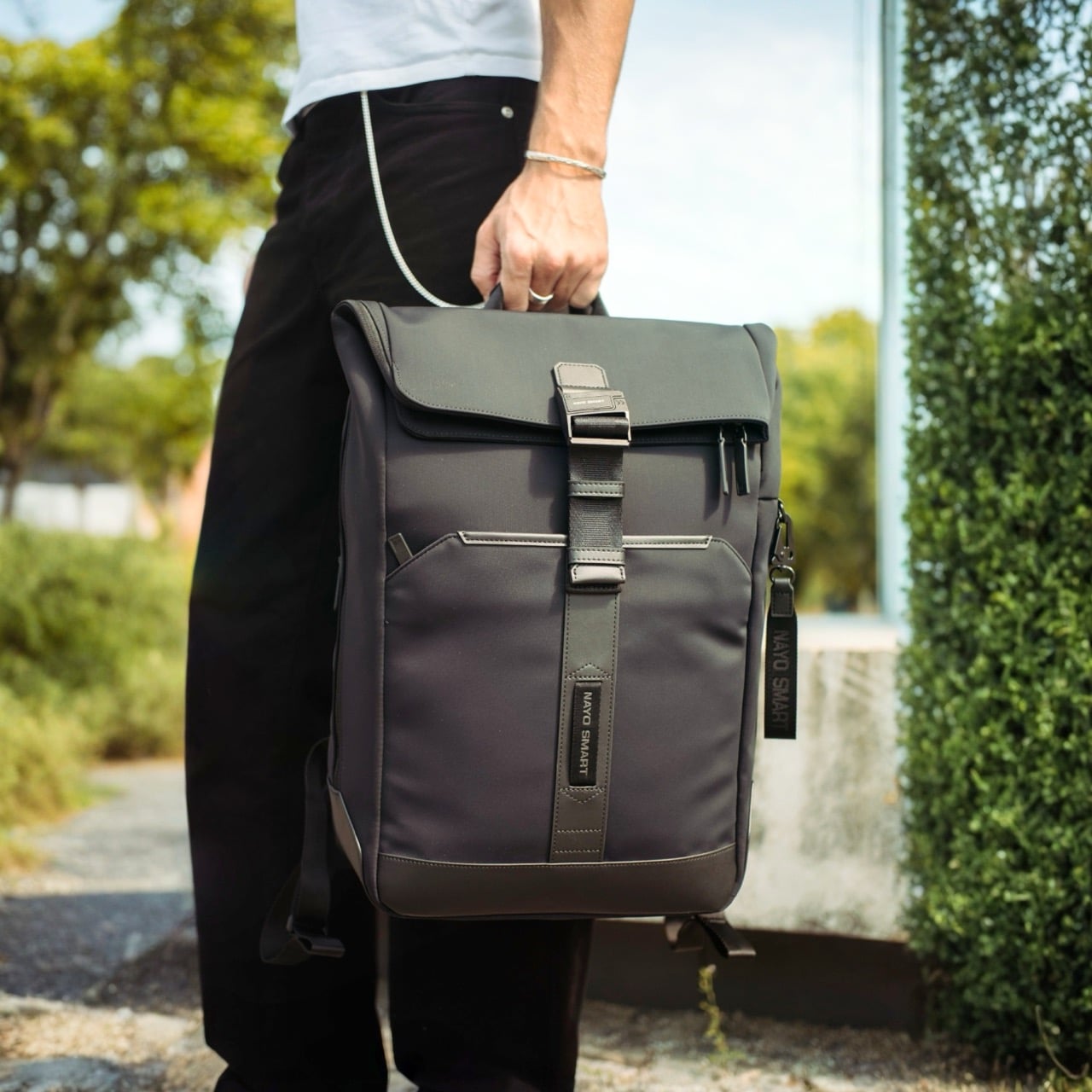
The most immediate visual quality of the Herman Pro, looking at it against the body, is how settled the silhouette stays. Many contemporary backpacks have evolved into highly technical, feature-heavy products that prioritize utility, and the result is often a bag that reads more like field gear than office carry. The Herman Pro’s exterior has been edited rather than accumulated. A clean rectangular body in dark nylon, a structured top flap held down by the FIDLOCK buckle, and a vertical webbing strap running the full length of the front panel make up the entirety of what faces the world. Both colorways, the deep black and the muted forest green, land firmly on the right side of understated, and the structured base gives the bag a stable, planted quality that prevents the slouching common in softer nylon designs.
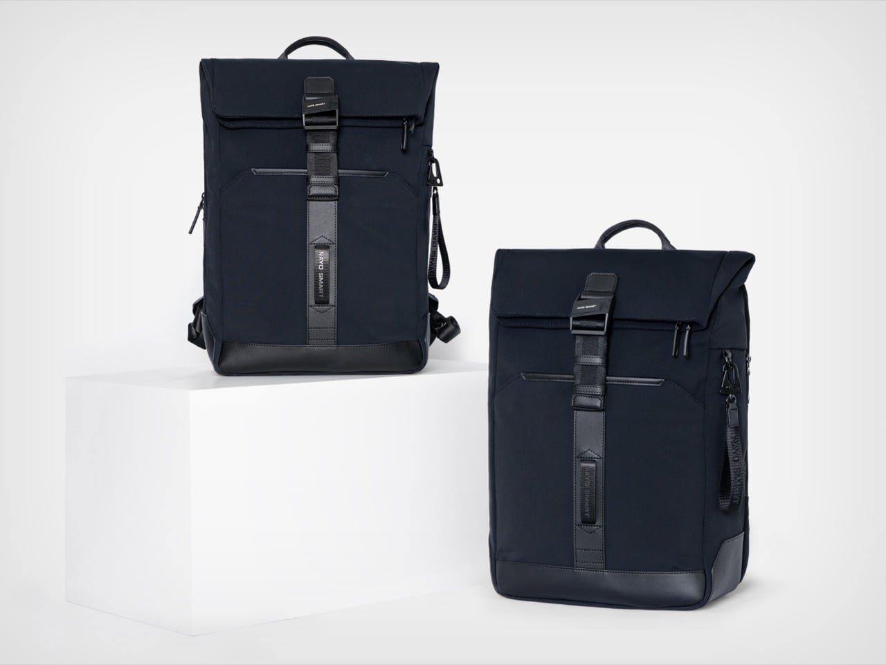
Beyond durability and weather resistance, equal importance was placed on tactile quality, structure retention, visual texture, and long-term everyday usability, and the parachute-inspired water-repellent NA-TEX fabric was ultimately selected because it balances performance with a more refined and premium visual character. The surface has a matte density to it that holds its character under different lighting conditions, which matters for a bag that moves between a boardroom and a café in the same afternoon. Water beads off without leaving marks or altering the fabric’s structure, the kind of weather performance that earns trust over months of daily use rather than in a single dramatic rain test. A slightly firmer, smoother material at the base grounds the bag both structurally and visually, adding subtle zoning to the exterior without making a statement of it. Tactile quality was clearly weighed alongside durability here, and the difference from a generic nylon backpack is noticeable at first contact.
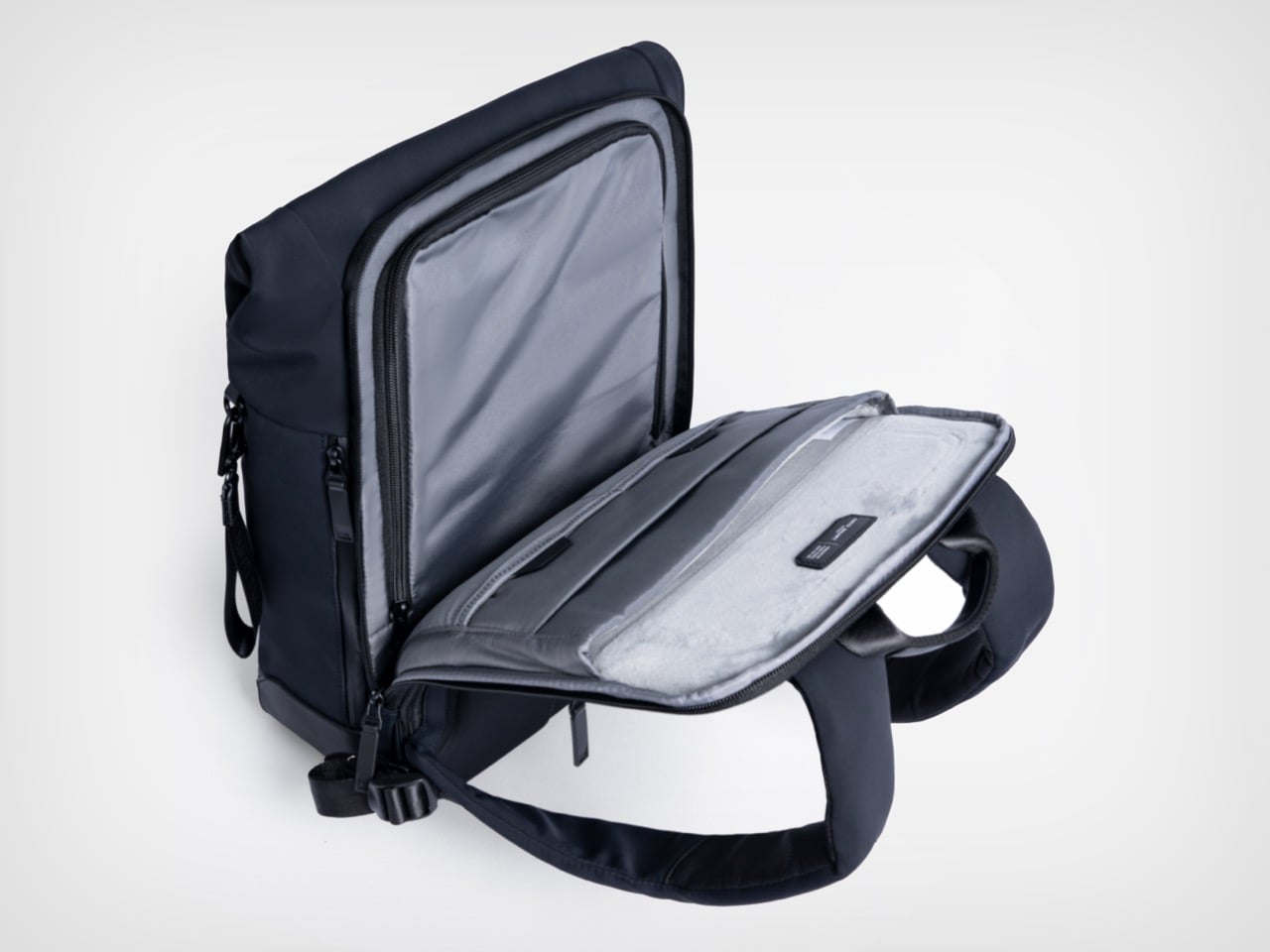
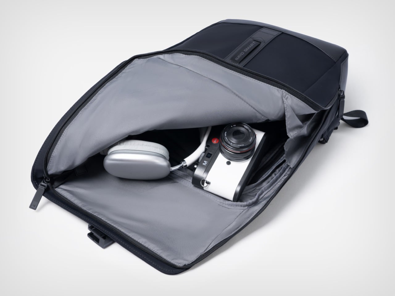
The L-shaped opening improves packing visibility and access in a way that is genuinely hard to go back from once you’ve experienced it. A conventional top-loader reveals its contents in layers, demanding that you excavate through whatever went in last to find what you need now. The L-shaped zipper runs across the top and down one full side, so the flap swings away and the entire main compartment opens in a single motion, nearly flat. The light gray interior lining amplifies this, creating strong contrast against dark items so headphones, cables, and loose accessories are immediately locatable rather than lost at the bottom. Cameras, over-ear headphones, and a tablet all fit comfortably in the main zone without competing for space with the laptop, which lives in an entirely separate section of the bag.
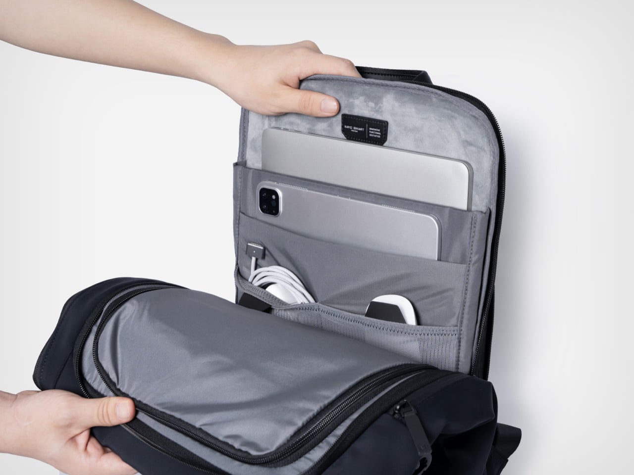
The independent laptop compartment, accessed directly from the rear panel, is one of the more practically useful organizational decisions in the Herman Pro’s design. Airport security typically means pulling the laptop out in a motion that requires setting the whole bag down, opening the main compartment, and digging through accumulated carry chaos. The back-access panel changes that entirely, allowing the laptop to slide out cleanly without touching the main storage zone. The dedicated laptop and digital device organization helps separate work essentials from personal items, and the compartment fits modern 15-inch laptops without forcing anything, with a padded tablet slot sitting alongside it. What looks like a relatively minor structural decision on paper becomes one of those carry conveniences that is hard to give up.
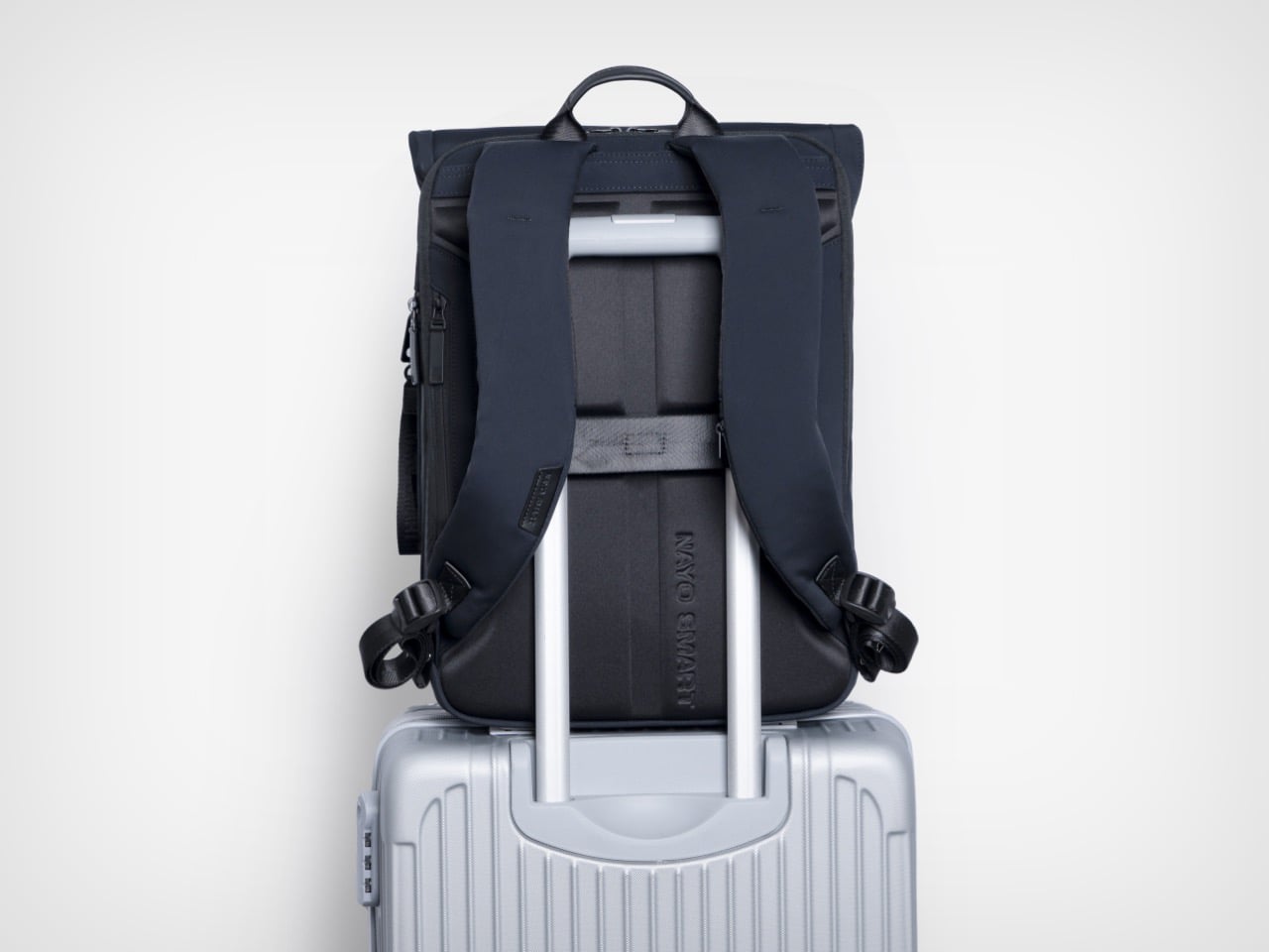
FIDLOCK’s magnetic buckle system has been appearing across premium outdoor and travel gear for several years now, and its inclusion here reads as a purposeful hardware specification rather than a borrowed credential. The mechanism snaps shut with one hand in a single motion and releases just as cleanly, removing the small but cumulative friction of a conventional buckle from what might amount to dozens of open-and-close cycles across a travel week. Hidden anti-theft pockets add a layer of security for passports and cards, while a hidden front zipper pocket handles flat documents or a transit card in a separate zone entirely. The side waterproof pocket accommodates a water bottle or umbrella without disrupting the bag’s profile from the front. A nylon luggage strap on the rear panel completes the transit toolkit, locking the Herman Pro cleanly onto a roller case handle when the load demands it.
Nayo Smart is a Singapore-based brand operating in a market that has gotten genuinely competitive at this price tier. The Herman Pro starts at $169 for the black colorway, placing it in direct conversation with well-regarded carry brands like Aer, Boundary Supply, and Tropicfeel, all of which have raised baseline expectations around what a commuter or travel backpack should deliver. Reviewers have already been reaching for the “affordable Tumi alternative” framing, which is a pointed comparison given how aggressively Tumi’s pricing has drifted upward over the past decade. The more interesting discussion may not simply be how functional a backpack can become, but how modern business backpacks are evolving alongside changes in work culture, mobility, and contemporary everyday lifestyles, and the Herman Pro fits into that conversation as a considered example of how a business travel backpack can become more organized, more comfortable, and more visually restrained without losing the practical performance that modern professionals expect. Both colorways are available directly through nayosmart.com, in standard 20L and large 25-30L sizing.

Click Here to Buy Now: $152.10 $169 (10% off) Free Waterproof Packing Cube included with your Herman Pro

The post This $152 Laptop Backpack Has 7 Features Most Business Bags Skip first appeared on Yanko Design.
This $152 Laptop Backpack Has 7 Features Most Business Bags Skip

The office is no longer a place. For a growing number of professionals, work happens across a rotating cast of locations, on trains, in hotel lobbies, at standing desks in co-working spaces, at airport gates between meetings. What gets carried through all of that has quietly become one of the more personal decisions in a working day. The bag has to hold a laptop, a water bottle, travel documents, chargers, and sometimes a change of clothes, while still looking appropriate in every environment it passes through. Most bags manage the functional half of that requirement passably well; the visual half tends to be where the compromises show.

Nayo Smart designed the Herman Pro around exactly this reality. The half-roll-top silhouette keeps things looking composed from the outside, while the internal architecture handles an impressive amount of organized complexity. A dedicated laptop compartment sits separately from the main storage zone, accessible directly from the back panel for quick retrieval at security. The L-shaped main opening lays nearly flat for visibility and easy packing. A FIDLOCK magnetic buckle secures the flap in one motion, and hidden pockets, a side waterproof sleeve, and a luggage strap round out a carry system built around real transit habits rather than feature checklists.

Designer: Nayo Smart

Click Here to Buy Now: $152.10 $169 (10% off) Free Waterproof Packing Cube included with your Herman Pro

The most immediate visual quality of the Herman Pro, looking at it against the body, is how settled the silhouette stays. Many contemporary backpacks have evolved into highly technical, feature-heavy products that prioritize utility, and the result is often a bag that reads more like field gear than office carry. The Herman Pro’s exterior has been edited rather than accumulated. A clean rectangular body in dark nylon, a structured top flap held down by the FIDLOCK buckle, and a vertical webbing strap running the full length of the front panel make up the entirety of what faces the world. Both colorways, the deep black and the muted forest green, land firmly on the right side of understated, and the structured base gives the bag a stable, planted quality that prevents the slouching common in softer nylon designs.

Beyond durability and weather resistance, equal importance was placed on tactile quality, structure retention, visual texture, and long-term everyday usability, and the parachute-inspired water-repellent NA-TEX fabric was ultimately selected because it balances performance with a more refined and premium visual character. The surface has a matte density to it that holds its character under different lighting conditions, which matters for a bag that moves between a boardroom and a café in the same afternoon. Water beads off without leaving marks or altering the fabric’s structure, the kind of weather performance that earns trust over months of daily use rather than in a single dramatic rain test. A slightly firmer, smoother material at the base grounds the bag both structurally and visually, adding subtle zoning to the exterior without making a statement of it. Tactile quality was clearly weighed alongside durability here, and the difference from a generic nylon backpack is noticeable at first contact.

The L-shaped opening improves packing visibility and access in a way that is genuinely hard to go back from once you’ve experienced it. A conventional top-loader reveals its contents in layers, demanding that you excavate through whatever went in last to find what you need now. The L-shaped zipper runs across the top and down one full side, so the flap swings away and the entire main compartment opens in a single motion, nearly flat. The light gray interior lining amplifies this, creating strong contrast against dark items so headphones, cables, and loose accessories are immediately locatable rather than lost at the bottom. Cameras, over-ear headphones, and a tablet all fit comfortably in the main zone without competing for space with the laptop, which lives in an entirely separate section of the bag.

The independent laptop compartment, accessed directly from the rear panel, is one of the more practically useful organizational decisions in the Herman Pro’s design. Airport security typically means pulling the laptop out in a motion that requires setting the whole bag down, opening the main compartment, and digging through accumulated carry chaos. The back-access panel changes that entirely, allowing the laptop to slide out cleanly without touching the main storage zone. The dedicated laptop and digital device organization helps separate work essentials from personal items, and the compartment fits modern 15-inch laptops without forcing anything, with a padded tablet slot sitting alongside it. What looks like a relatively minor structural decision on paper becomes one of those carry conveniences that is hard to give up.

FIDLOCK’s magnetic buckle system has been appearing across premium outdoor and travel gear for several years now, and its inclusion here reads as a purposeful hardware specification rather than a borrowed credential. The mechanism snaps shut with one hand in a single motion and releases just as cleanly, removing the small but cumulative friction of a conventional buckle from what might amount to dozens of open-and-close cycles across a travel week. Hidden anti-theft pockets add a layer of security for passports and cards, while a hidden front zipper pocket handles flat documents or a transit card in a separate zone entirely. The side waterproof pocket accommodates a water bottle or umbrella without disrupting the bag’s profile from the front. A nylon luggage strap on the rear panel completes the transit toolkit, locking the Herman Pro cleanly onto a roller case handle when the load demands it.

Nayo Smart is a Singapore-based brand operating in a market that has gotten genuinely competitive at this price tier. The Herman Pro starts at $169 for the black colorway, placing it in direct conversation with well-regarded carry brands like Aer, Boundary Supply, and Tropicfeel, all of which have raised baseline expectations around what a commuter or travel backpack should deliver. Reviewers have already been reaching for the “affordable Tumi alternative” framing, which is a pointed comparison given how aggressively Tumi’s pricing has drifted upward over the past decade. The more interesting discussion may not simply be how functional a backpack can become, but how modern business backpacks are evolving alongside changes in work culture, mobility, and contemporary everyday lifestyles, and the Herman Pro fits into that conversation as a considered example of how a business travel backpack can become more organized, more comfortable, and more visually restrained without losing the practical performance that modern professionals expect. Both colorways are available directly through nayosmart.com, in standard 20L and large 25-30L sizing.

Click Here to Buy Now: $152.10 $169 (10% off) Free Waterproof Packing Cube included with your Herman Pro

The post This $152 Laptop Backpack Has 7 Features Most Business Bags Skip first appeared on Yanko Design.
This $152 Laptop Backpack Has 7 Features Most Business Bags Skip

The office is no longer a place. For a growing number of professionals, work happens across a rotating cast of locations, on trains, in hotel lobbies, at standing desks in co-working spaces, at airport gates between meetings. What gets carried through all of that has quietly become one of the more personal decisions in a working day. The bag has to hold a laptop, a water bottle, travel documents, chargers, and sometimes a change of clothes, while still looking appropriate in every environment it passes through. Most bags manage the functional half of that requirement passably well; the visual half tends to be where the compromises show.

Nayo Smart designed the Herman Pro around exactly this reality. The half-roll-top silhouette keeps things looking composed from the outside, while the internal architecture handles an impressive amount of organized complexity. A dedicated laptop compartment sits separately from the main storage zone, accessible directly from the back panel for quick retrieval at security. The L-shaped main opening lays nearly flat for visibility and easy packing. A FIDLOCK magnetic buckle secures the flap in one motion, and hidden pockets, a side waterproof sleeve, and a luggage strap round out a carry system built around real transit habits rather than feature checklists.

Designer: Nayo Smart

Click Here to Buy Now: $152.10 $169 (10% off) Free Waterproof Packing Cube included with your Herman Pro

The most immediate visual quality of the Herman Pro, looking at it against the body, is how settled the silhouette stays. Many contemporary backpacks have evolved into highly technical, feature-heavy products that prioritize utility, and the result is often a bag that reads more like field gear than office carry. The Herman Pro’s exterior has been edited rather than accumulated. A clean rectangular body in dark nylon, a structured top flap held down by the FIDLOCK buckle, and a vertical webbing strap running the full length of the front panel make up the entirety of what faces the world. Both colorways, the deep black and the muted forest green, land firmly on the right side of understated, and the structured base gives the bag a stable, planted quality that prevents the slouching common in softer nylon designs.

Beyond durability and weather resistance, equal importance was placed on tactile quality, structure retention, visual texture, and long-term everyday usability, and the parachute-inspired water-repellent NA-TEX fabric was ultimately selected because it balances performance with a more refined and premium visual character. The surface has a matte density to it that holds its character under different lighting conditions, which matters for a bag that moves between a boardroom and a café in the same afternoon. Water beads off without leaving marks or altering the fabric’s structure, the kind of weather performance that earns trust over months of daily use rather than in a single dramatic rain test. A slightly firmer, smoother material at the base grounds the bag both structurally and visually, adding subtle zoning to the exterior without making a statement of it. Tactile quality was clearly weighed alongside durability here, and the difference from a generic nylon backpack is noticeable at first contact.

The L-shaped opening improves packing visibility and access in a way that is genuinely hard to go back from once you’ve experienced it. A conventional top-loader reveals its contents in layers, demanding that you excavate through whatever went in last to find what you need now. The L-shaped zipper runs across the top and down one full side, so the flap swings away and the entire main compartment opens in a single motion, nearly flat. The light gray interior lining amplifies this, creating strong contrast against dark items so headphones, cables, and loose accessories are immediately locatable rather than lost at the bottom. Cameras, over-ear headphones, and a tablet all fit comfortably in the main zone without competing for space with the laptop, which lives in an entirely separate section of the bag.

The independent laptop compartment, accessed directly from the rear panel, is one of the more practically useful organizational decisions in the Herman Pro’s design. Airport security typically means pulling the laptop out in a motion that requires setting the whole bag down, opening the main compartment, and digging through accumulated carry chaos. The back-access panel changes that entirely, allowing the laptop to slide out cleanly without touching the main storage zone. The dedicated laptop and digital device organization helps separate work essentials from personal items, and the compartment fits modern 15-inch laptops without forcing anything, with a padded tablet slot sitting alongside it. What looks like a relatively minor structural decision on paper becomes one of those carry conveniences that is hard to give up.

FIDLOCK’s magnetic buckle system has been appearing across premium outdoor and travel gear for several years now, and its inclusion here reads as a purposeful hardware specification rather than a borrowed credential. The mechanism snaps shut with one hand in a single motion and releases just as cleanly, removing the small but cumulative friction of a conventional buckle from what might amount to dozens of open-and-close cycles across a travel week. Hidden anti-theft pockets add a layer of security for passports and cards, while a hidden front zipper pocket handles flat documents or a transit card in a separate zone entirely. The side waterproof pocket accommodates a water bottle or umbrella without disrupting the bag’s profile from the front. A nylon luggage strap on the rear panel completes the transit toolkit, locking the Herman Pro cleanly onto a roller case handle when the load demands it.

Nayo Smart is a Singapore-based brand operating in a market that has gotten genuinely competitive at this price tier. The Herman Pro starts at $169 for the black colorway, placing it in direct conversation with well-regarded carry brands like Aer, Boundary Supply, and Tropicfeel, all of which have raised baseline expectations around what a commuter or travel backpack should deliver. Reviewers have already been reaching for the “affordable Tumi alternative” framing, which is a pointed comparison given how aggressively Tumi’s pricing has drifted upward over the past decade. The more interesting discussion may not simply be how functional a backpack can become, but how modern business backpacks are evolving alongside changes in work culture, mobility, and contemporary everyday lifestyles, and the Herman Pro fits into that conversation as a considered example of how a business travel backpack can become more organized, more comfortable, and more visually restrained without losing the practical performance that modern professionals expect. Both colorways are available directly through nayosmart.com, in standard 20L and large 25-30L sizing.

Click Here to Buy Now: $152.10 $169 (10% off) Free Waterproof Packing Cube included with your Herman Pro

The post This $152 Laptop Backpack Has 7 Features Most Business Bags Skip first appeared on Yanko Design.
5 Brilliantly Weird 3D Printed Designs That Show Exactly Where Industrial Design Is Headed

3D printing is redefining the language of future technology and design. Tech peripherals are evolving from standardized, mass-market products into sculpted forms. This transformation signals a tectonic shift – where precision fabrication meets individuality, and performance aligns seamlessly with form.

For designers and conscious consumers alike, 3D printing enables precise ergonomics, material efficiency, and expressive geometry to coexist seamlessly. The result goes beyond customization, fostering a new ecosystem of tools that respect sensory feedback and minimize waste. It transforms everyday technology into a refined, human-centered design experience across industries ranging from consumer electronics and gaming to wearable tech and medical innovation.

1. Computer Peripheral Tectonics

The workstation now operates as a micro-architectural environment where precision, materiality, and human anatomy converge. Through 3D printing, the computer peripheral is redefined from a standardized accessory into a deliberately engineered component. Mice, keyboards, and input tools become tectonic objects that are formed with structural clarity and material authenticity, responding directly to natural hand geometry and movement patterns rather than generic manufacturing molds.

This transformation delivers tangible ergonomic advantages by minimizing repetitive strain through proportionate scaling and calibrated spatial alignment. As design thinking evolves, customized printed interfaces are recognized for enhancing workflow efficiency and sensory engagement. Tactile feedback becomes integrated into the rhythm of work, elevating everyday digital interaction into a more intuitive, refined, and human-centered experience.

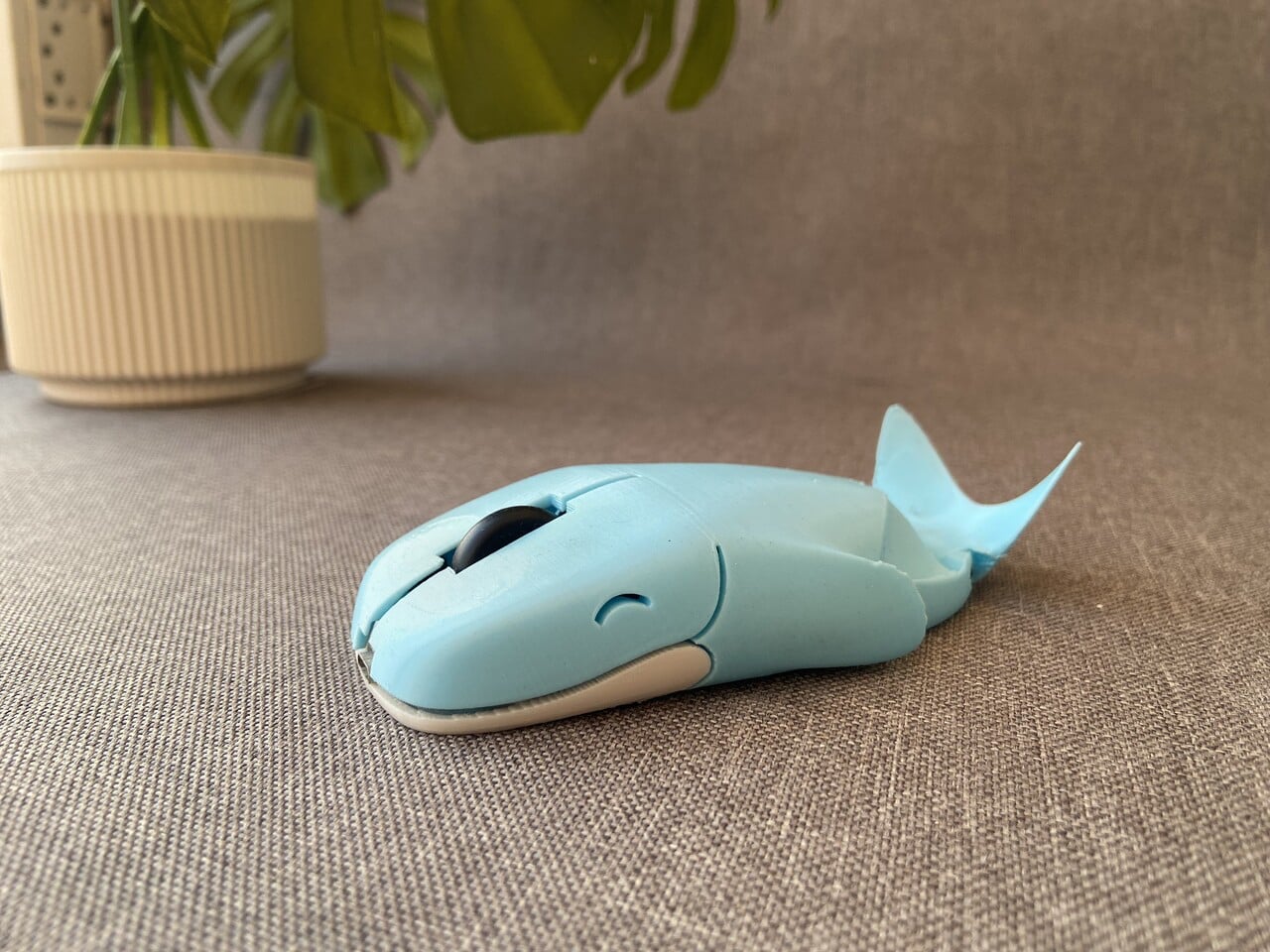
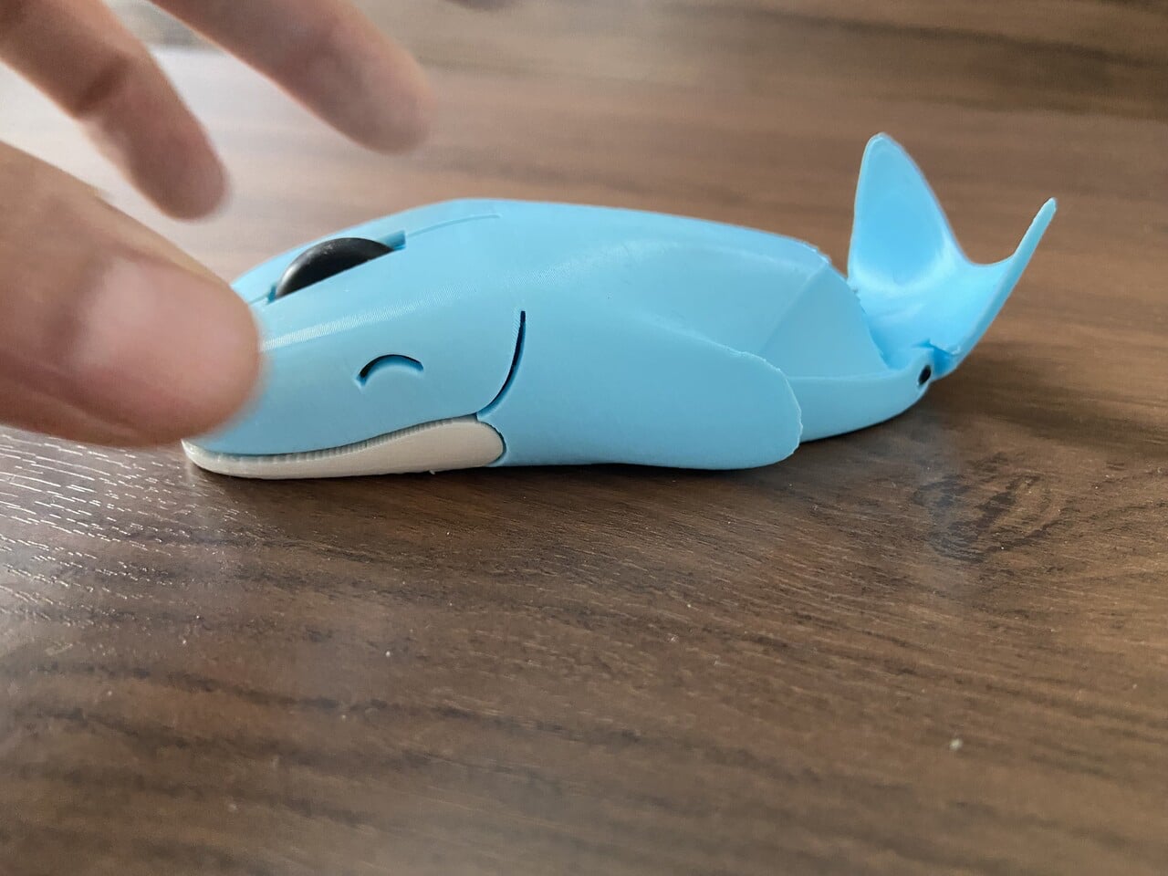
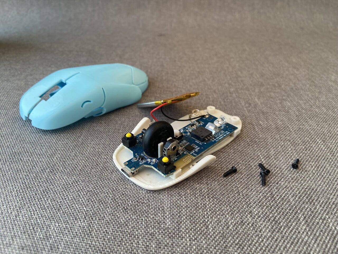
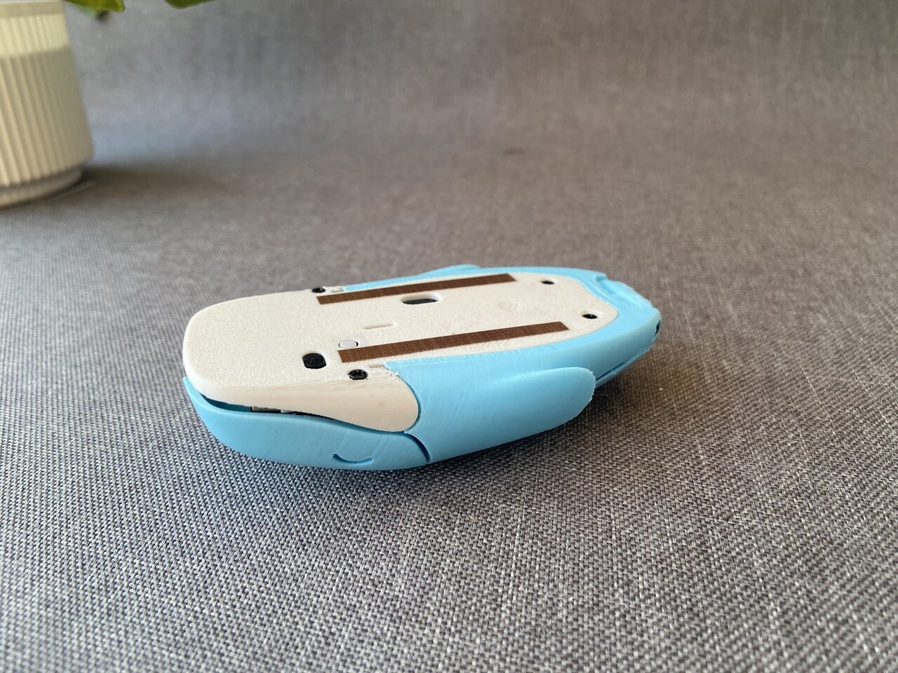
This mouse – Whaley is not just a character but a fully realized product shaped through iteration and hands-on experimentation. What began as a simple whale sketch evolved into a compact wireless mouse designed to balance personality with practicality. The form is sculpted to sit naturally under your palm, with the whale’s rounded back supporting the hand instead of mimicking a generic plastic shell. Its head integrates the left and right click buttons, while the scroll wheel is positioned like a subtle blowhole, blending function seamlessly into form.

The body went through multiple 3D-printed prototypes, refining the curve of the spine, the flexibility of the click panels, and the fit around the internal components. Electronics from a standard wireless mouse were carefully transplanted into a custom shell, ensuring reliable tracking and smooth scrolling.

2. Sculpted Gaming Interfaces

In the gaming sphere, 3D printing unlocks sculptural freedom that reshapes standard controllers into precision-engineered ergonomic forms. Instead of uniform plastic casings, high-performance shells are built with intricate lattice geometries that reduce weight while maintaining structural rigidity. This layered construction improves airflow, supports thermal regulation during extended sessions, and enhances overall durability.

Beyond function, the aesthetic impact is equally transformative. Integrated LEDs diffused through translucent printed lattices create atmospheric depth and spatial glow. The controller becomes immersive architecture in hand and less of a mechanical device and more a responsive extension of the player’s digital identity, blending sensory engagement with advanced fabrication technology.

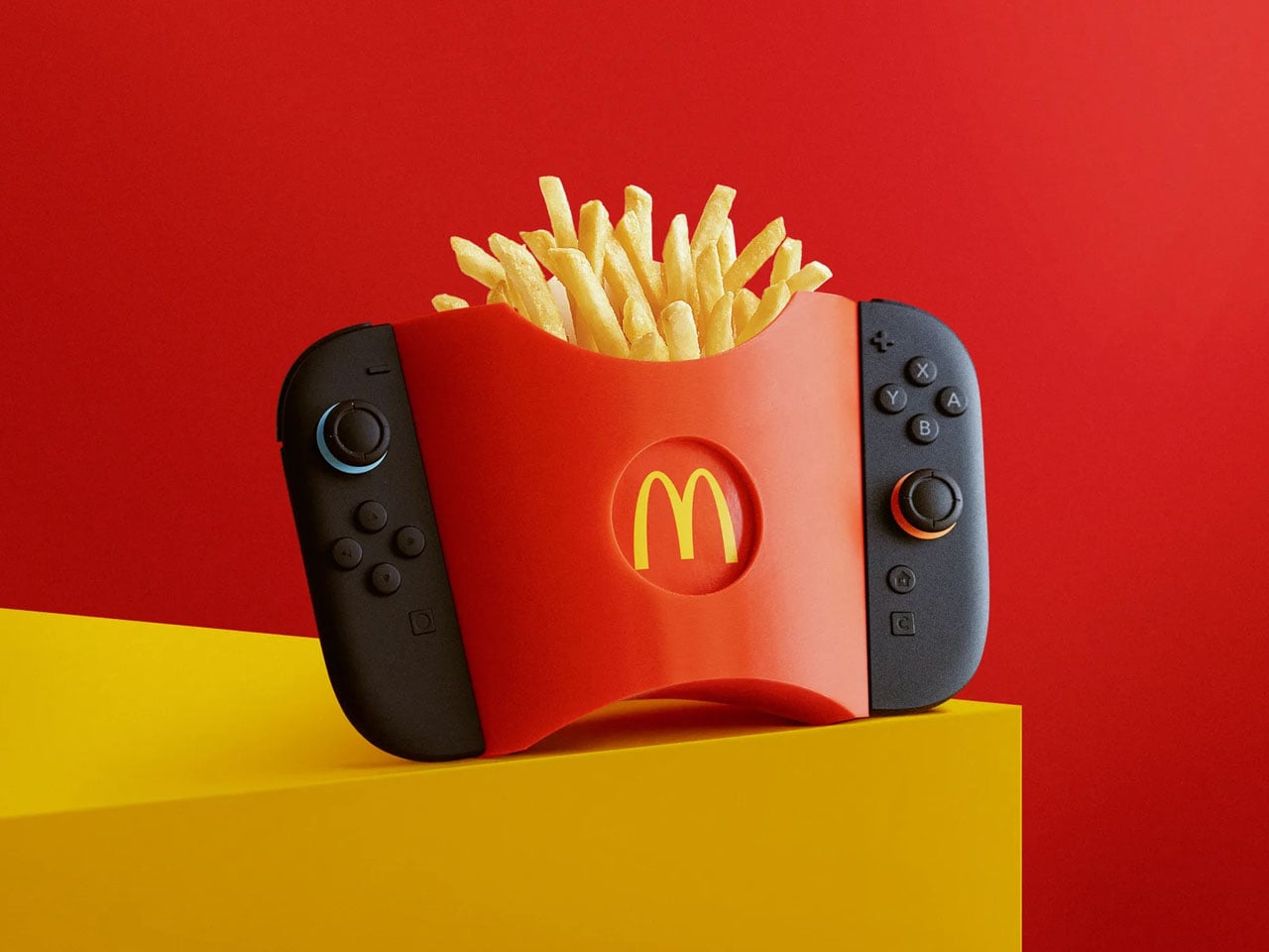
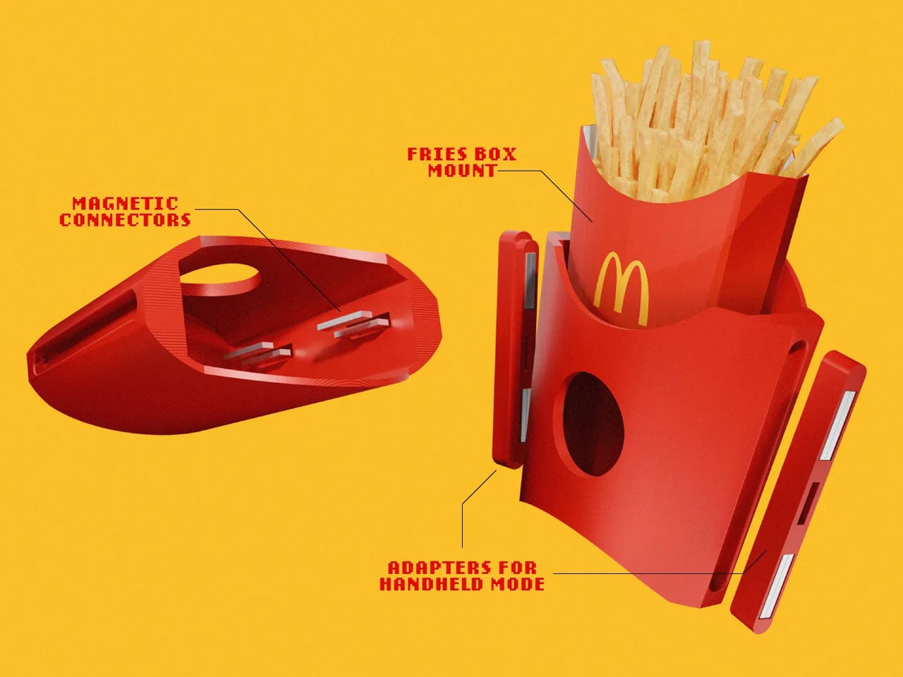
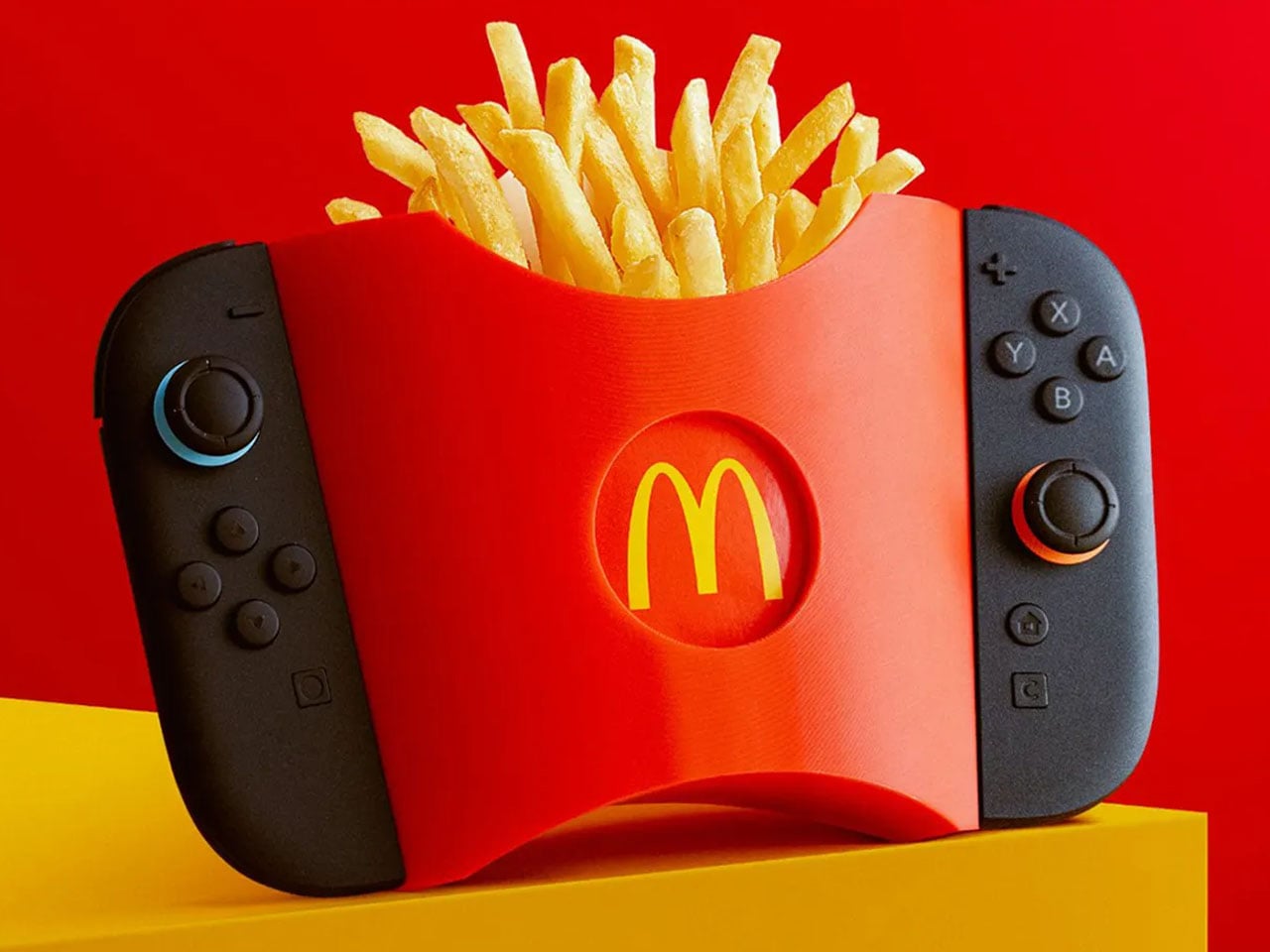
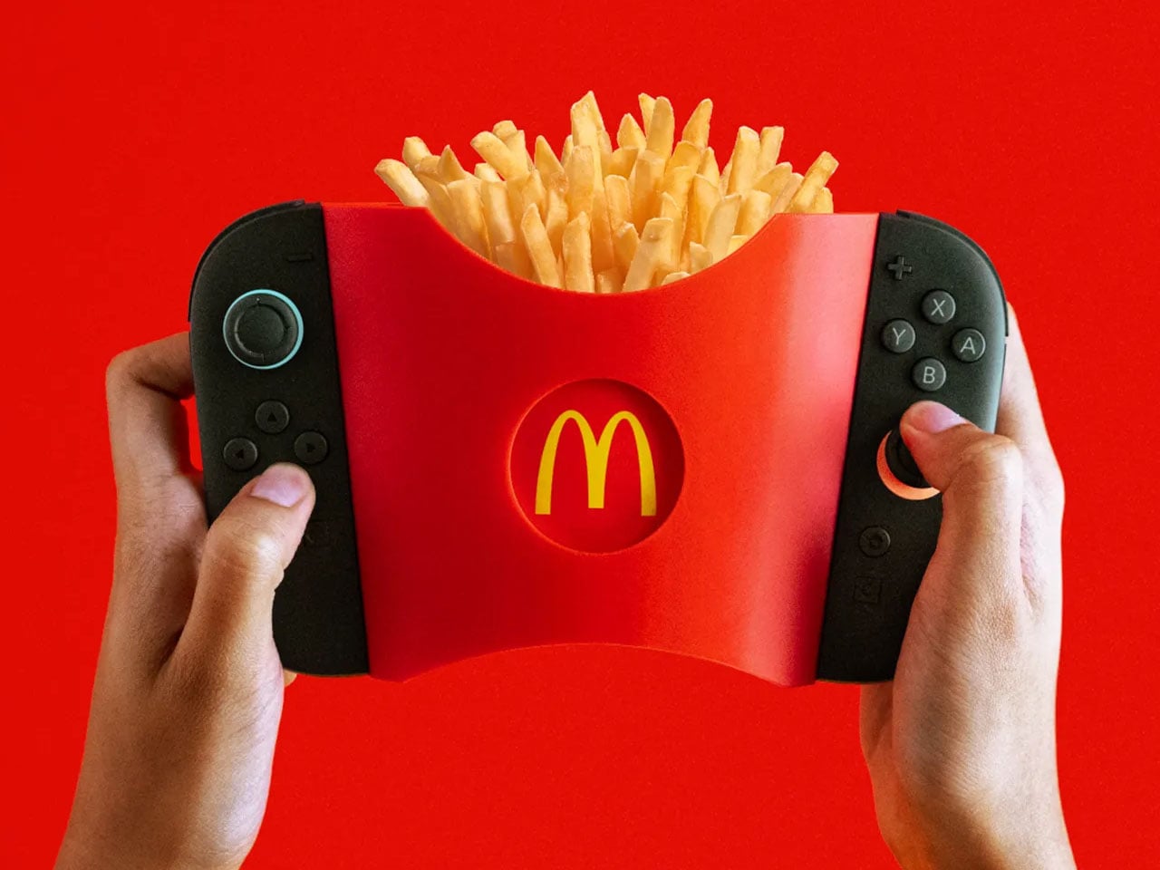
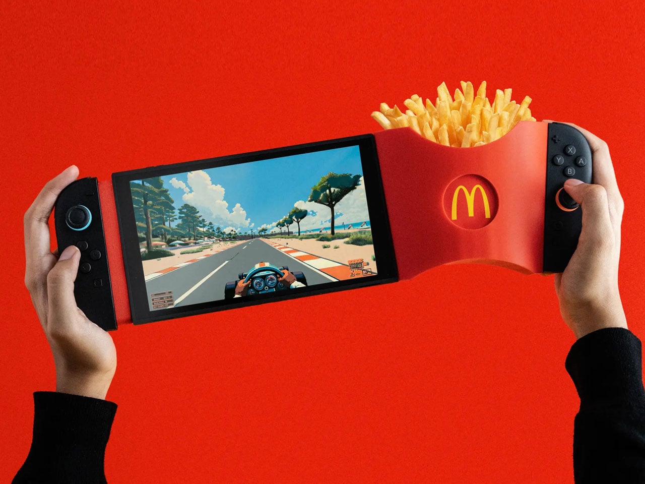
GamiFries is a purpose-built 3D-printed accessory designed exclusively for the Nintendo Switch 2. It functions as a clip-on fries holder that attaches directly to the console using its built-in magnetic system, locking into place with a clean, secure snap. The structure is engineered to remain stable in both handheld and docked modes, ensuring it does not interfere with gameplay, button access, or screen visibility. Its lightweight printed body keeps the added load manageable while maintaining balance during extended play sessions.

The container replicates the familiar silhouette and ridged texture of a classic McDonald’s fries pack, but its proportions are optimized to sit flush against the console. Fasteners and adapters are integrated into the design for a firm hold, and minor magnetic polarity issues can be corrected through simple recalibration.

3. High Performance Audio Form

3D printing has transformed high-fidelity audio by enabling complex internal geometries that traditional milling or casting cannot achieve. Speakers can now be fabricated with non-parallel internal walls and intricate chamber structures that reduce standing waves and distortion. This precision engineering refines acoustic clarity, allowing subtle tonal details and dynamic range to emerge with greater authenticity. The enclosure becomes a structurally intentional form where material integrity and acoustic science operate in alignment.

Beyond performance, these printed speakers contribute to a curated sensory environment. Their sculptural exteriors reflect the logic of their internal acoustic architecture, creating harmony between sound, space, and visual form—an immersive experience where engineering meets poetic design.

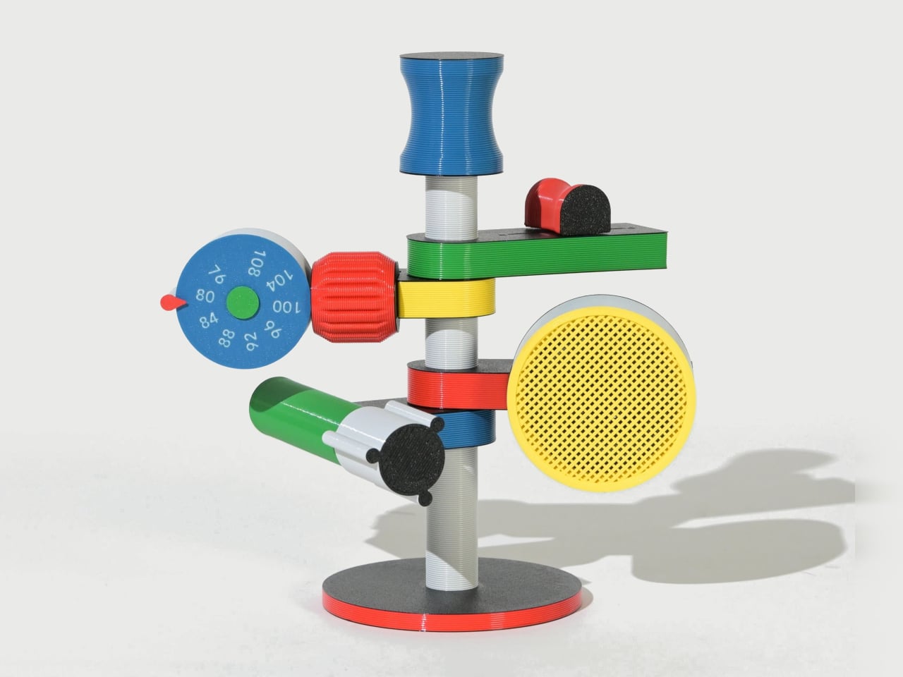
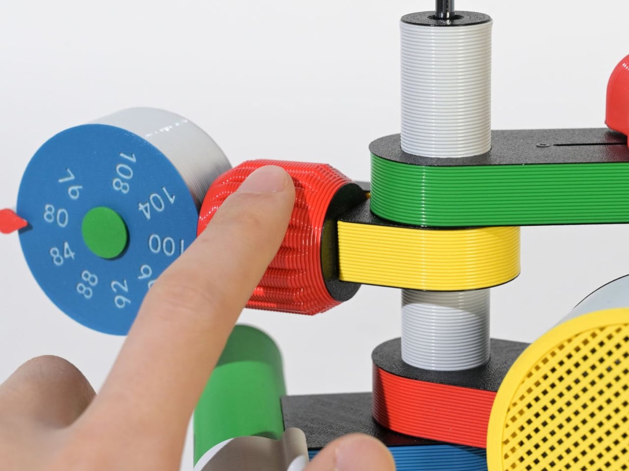
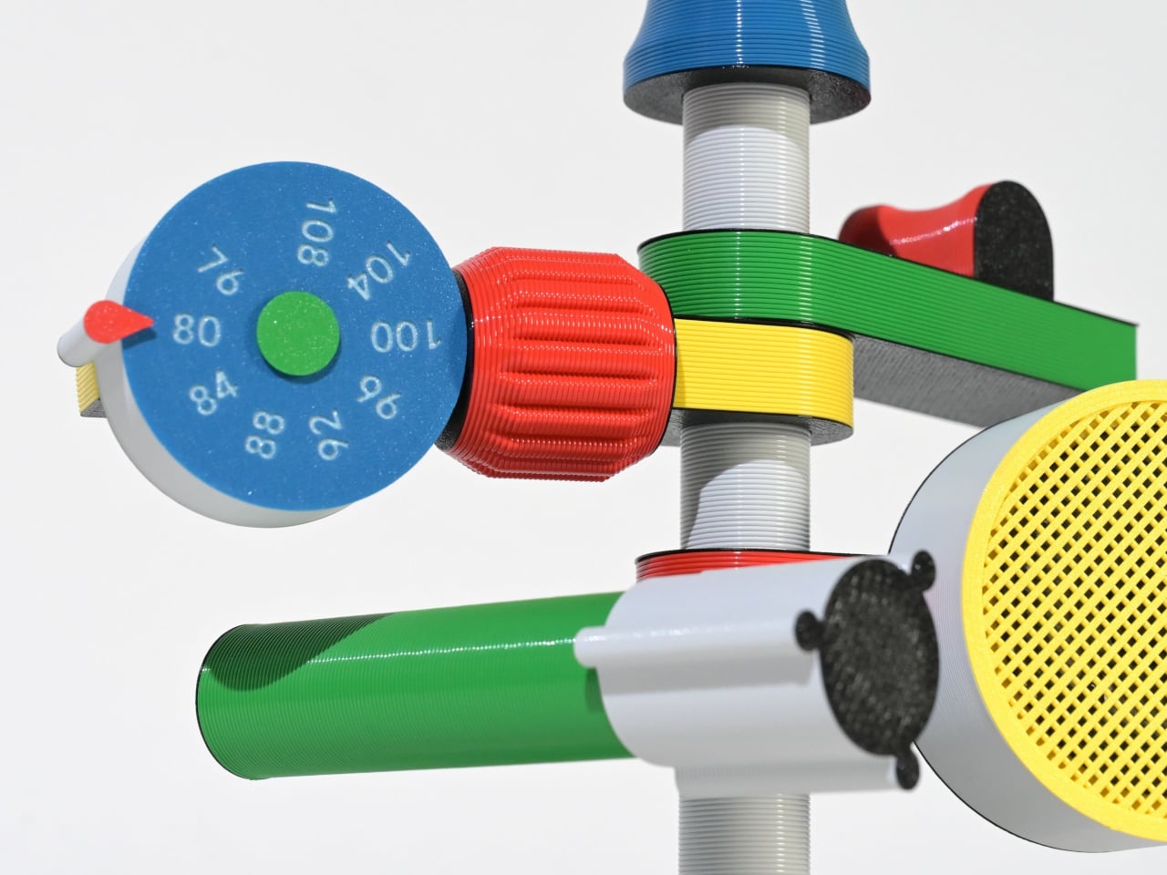
The Anomalo FM Radio by SHINKOGEISHA is designed as a functional object that challenges conventional radio aesthetics. Instead of a compact rectangular body, it features a vertical antenna that acts as the structural spine. From this central axis, multiple colorful limbs extend outward, each assigned a specific function. The form is intentionally exposed, turning mechanical and electronic components into visible design elements rather than concealing them within a casing.

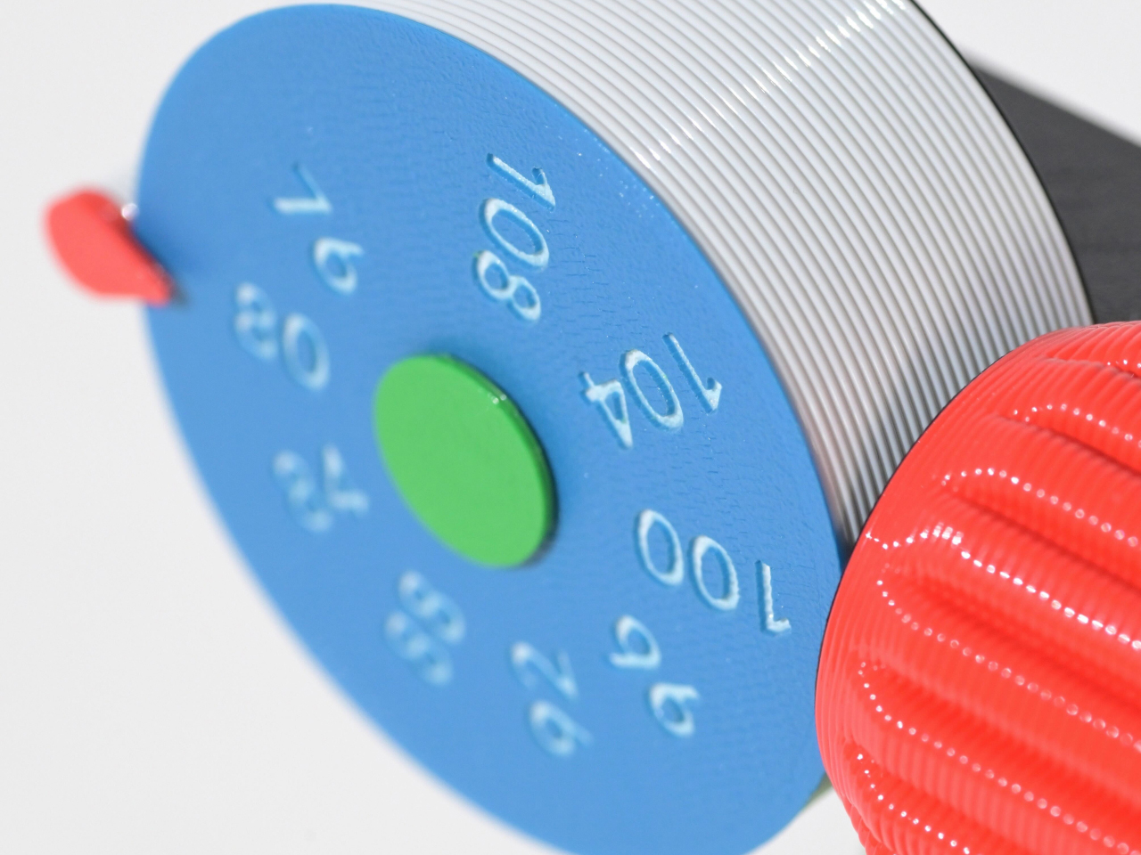
Each protruding branch operates as part of a three-dimensional control system. A roulette-style dial enables station tuning, a cylindrical red knob adjusts volume, and a bold yellow speaker projects sound. Another module houses the batteries, while visible wiring connects the components, reinforcing the radio’s engineered transparency. Manufactured using digital fabrication techniques and PLA material, the device prioritizes structural experimentation and modular assembly.

4. Wearable Organic Interface

Wearable technology represents the most intimate intersection between body and device, and 3D printing refines that relationship with anatomical precision. Through detailed body scanning, smart glasses, health monitors, and adaptive bands are fabricated to align perfectly with individual contours. This tailored construction enhances long-term comfort, reduces material waste, and streamlines production. Instead of standardized sizing, the device responds directly to human geometry, delivering structural clarity and material efficiency in equal measure.

Experientially, these wearables are designed to feel almost imperceptible. Their lightweight calibration and ergonomic balance allow them to integrate naturally into daily movement. Personalization also improves sensor stability and data accuracy, elevating performance outcomes. The result is technology that moves beyond utility, becoming a refined extension of the body rather than an external attachment.

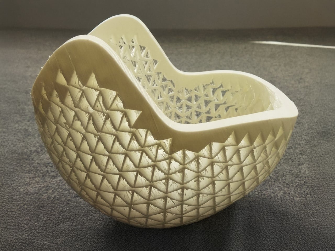
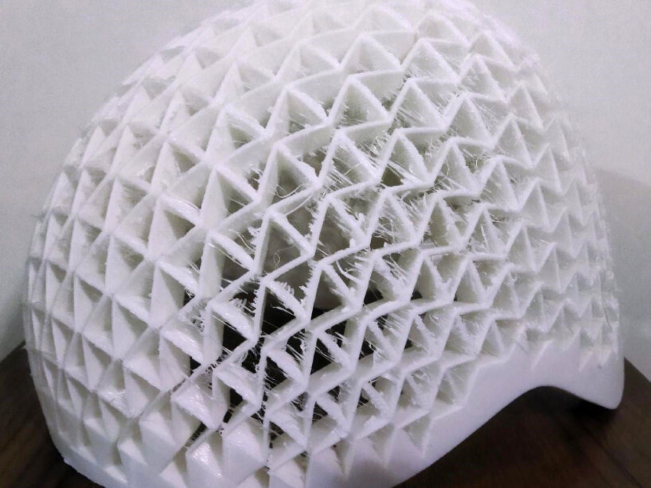
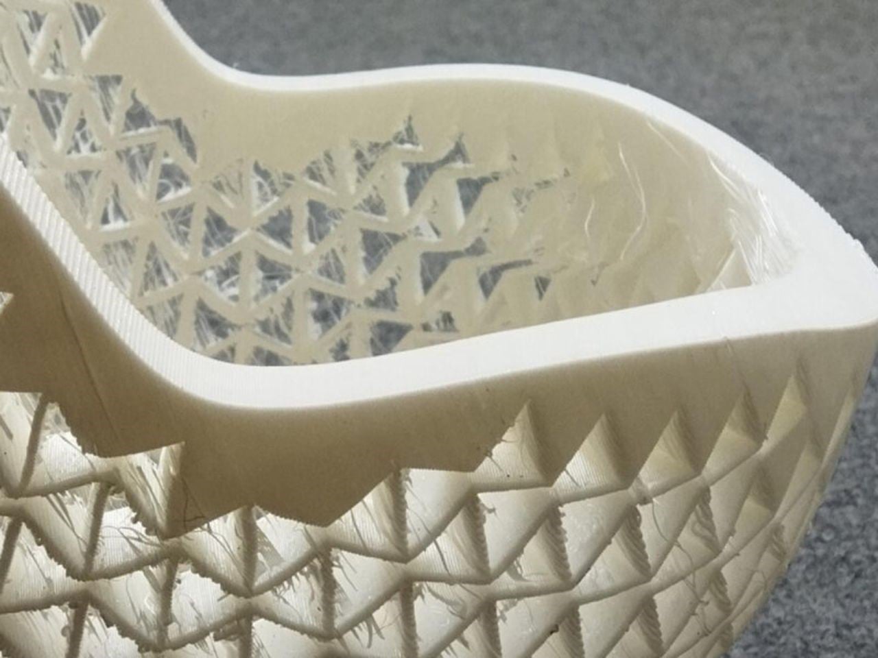
Researchers at the Universities of Gothenburg and Isfahan have developed a revolutionary 3D-printed helmet built with auxetic metastructures that react dynamically to collisions. Unlike traditional foam liners that simply compress, these geometric patterns pull inward on impact, dispersing energy more efficiently. The protective layer is made from a hyperelastic polymer that stretches and returns to its original form, allowing the helmet to maintain performance even after repeated impacts. Standardized crash tests showed significantly improved protection compared to conventional foam designs.

Beyond performance, customization sets this innovation apart. Traditional helmets come in fixed sizes and often fail to match individual head shapes perfectly, reducing both comfort and safety. With 3D printing, the auxetic liner can be tailored precisely to the rider, creating a snug, gap-free fit. Although currently more expensive, advancing technology is expected to lower production costs. This breakthrough could soon redefine not only cycling helmets but protective gear across multiple industries.

5. Personalized Medical Engineering

In the medical field, 3D printing enables the creation of patient-specific devices that traditional manufacturing cannot achieve. Custom orthotics, prosthetic limbs, and surgical guides are fabricated based on detailed anatomical scans, ensuring exact alignment with the patient’s body. This precision reduces discomfort, improves functionality, and accelerates recovery. Instead of standardized solutions, each piece is engineered as a structurally intentional form that responds directly to individual physiology.

Beyond fit, the technology enhances clinical performance. Lightweight lattice structures improve breathability and reduce material use, while rapid prototyping shortens production timelines. The outcome is a highly responsive healthcare ecosystem where design intelligence, structural clarity, and human well-being converge in measurable and transformative ways.

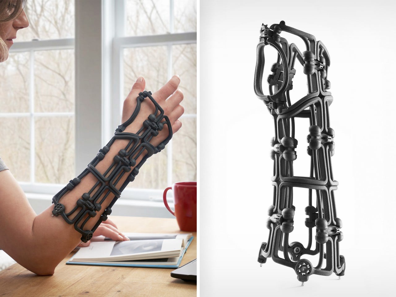
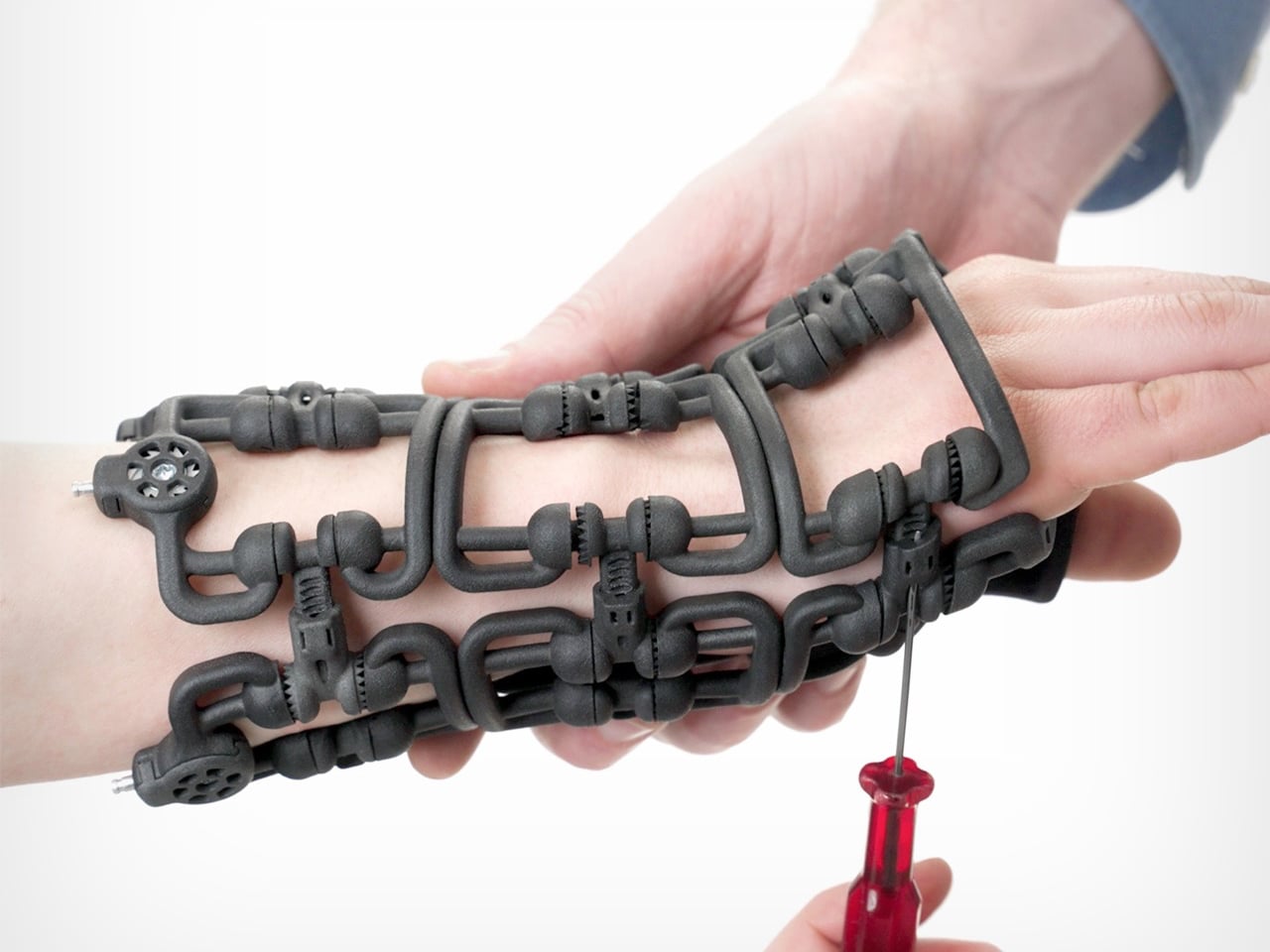
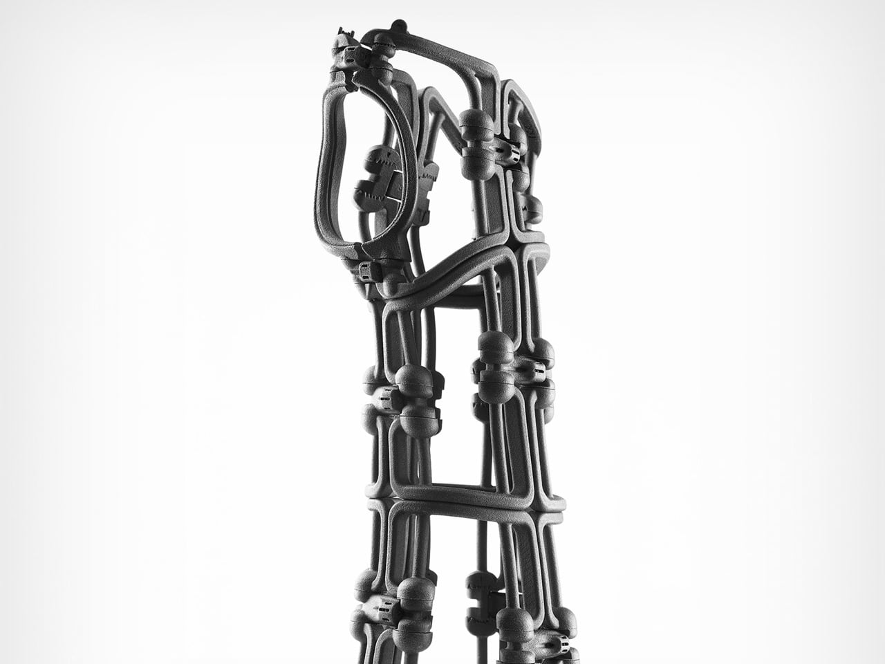
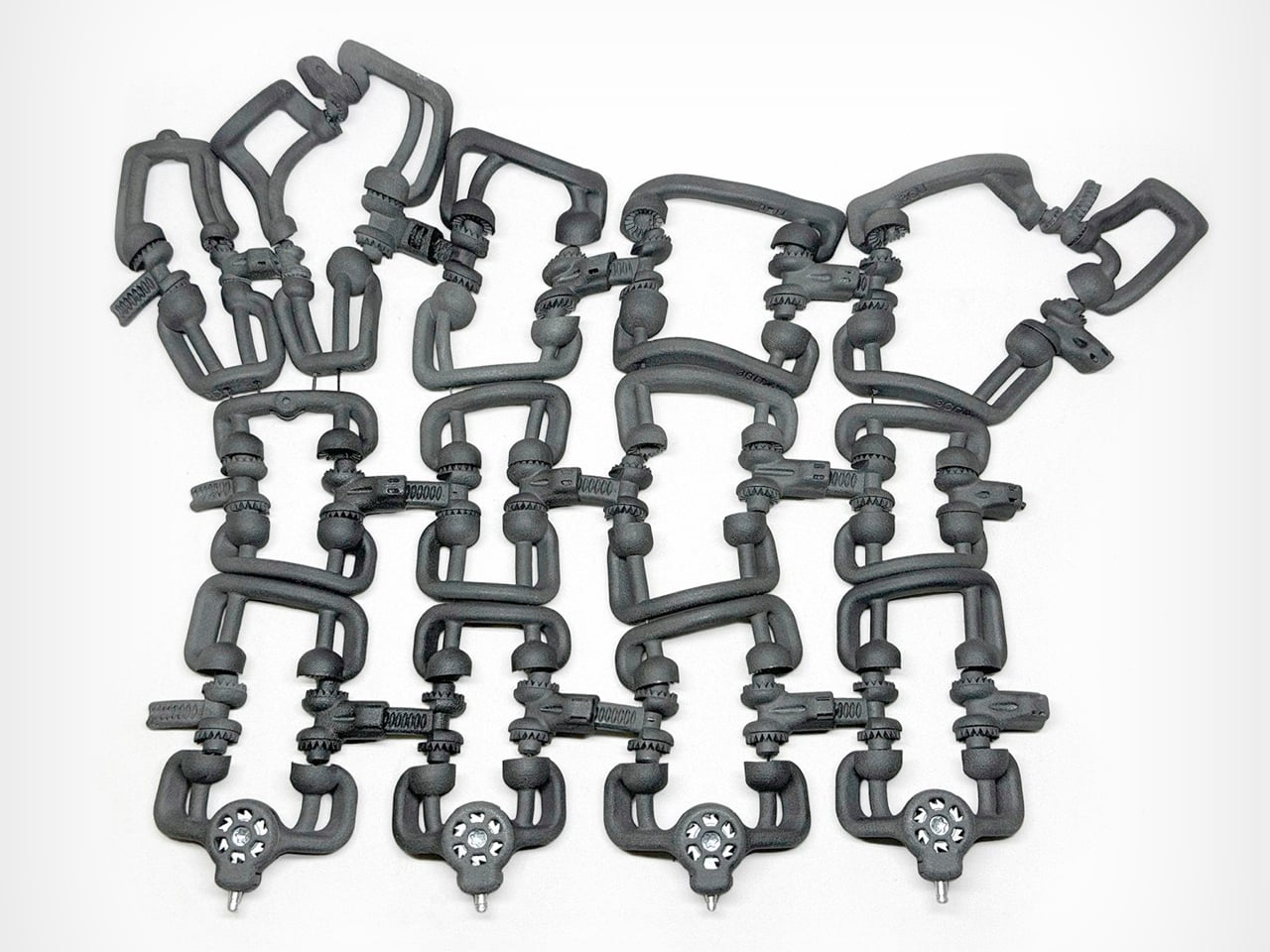
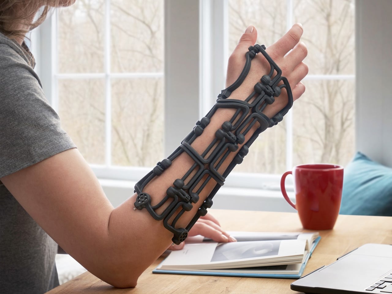
Bracesys by the Osteoid Design Team rethinks fracture immobilization as a precision-engineered, adjustable system rather than a static cast. Instead of plaster or rigid prefab braces, it uses a lightweight segmented framework weighing just 150 grams. The structure folds flat into an envelope for storage, then expands into a rigid wrist support comparable to traditional casting. Articulating connectors and calibrated tension dials allow clinicians to shape the brace directly on the patient’s limb, adjusting fit instantly and refining compression as swelling reduces during recovery.

Kevlar cables run through the frame and tighten through integrated dials, distributing force evenly across the structure for controlled stabilization. The body is produced using SLS and MJF 3D printing in medical-grade Nylon 12, reinforced with CNC-machined aluminum and stainless steel at high-stress points. Data from over 600 CT scans informed four optimized sizes that cover most wrist anatomies while maintaining semi-custom adaptability. Spring-loaded quick-release pins simplify adjustments, and individual components can be replaced when needed. Reusable, recyclable, and mechanically precise, Bracesys shifts immobilization from fixed fabrication to real-time clinical customization.

3D printing is steadily transforming the way products are imagined and made. Across industries, it enables smarter structures, efficient material use, and greater design freedom. By allowing form and function to evolve together, this technology supports more adaptable, thoughtful solutions. The future of design is becoming more responsive, refined, and human-centered through additive manufacturing.

The post 5 Brilliantly Weird 3D Printed Designs That Show Exactly Where Industrial Design Is Headed first appeared on Yanko Design.

The Grocery Container That Finally Makes Reuse Actually Work

Walk into any supermarket and you’ll notice that the food gets a lot of attention, but the packaging it comes in? Almost none. We’ve become so accustomed to grabbing a plastic-wrapped chicken breast or a shrink-sealed block of cheese and tossing the container without a second thought that it has essentially become invisible. Which is exactly why Lars Biedermann’s ReLoopBox caught my attention the moment I came across it.

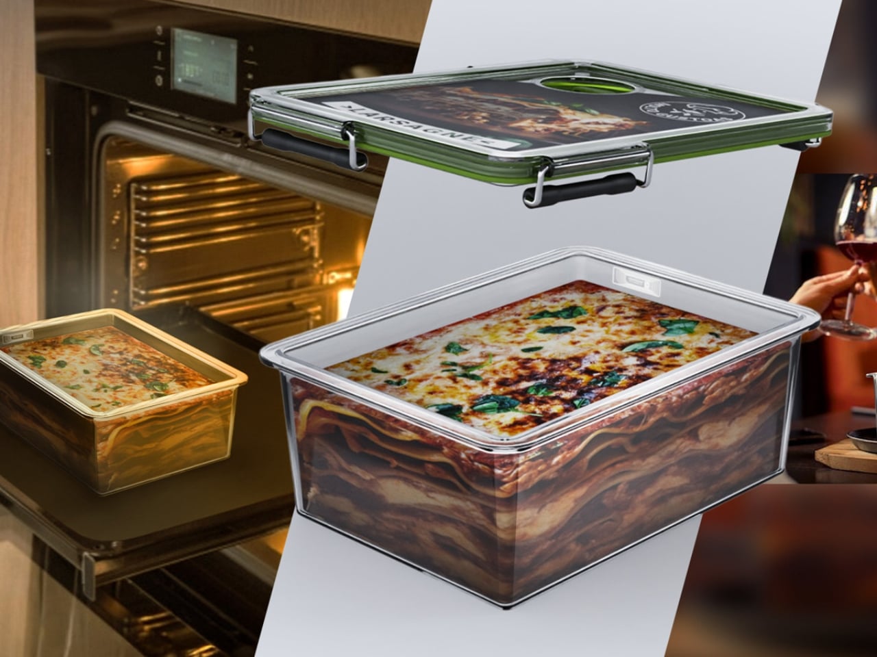
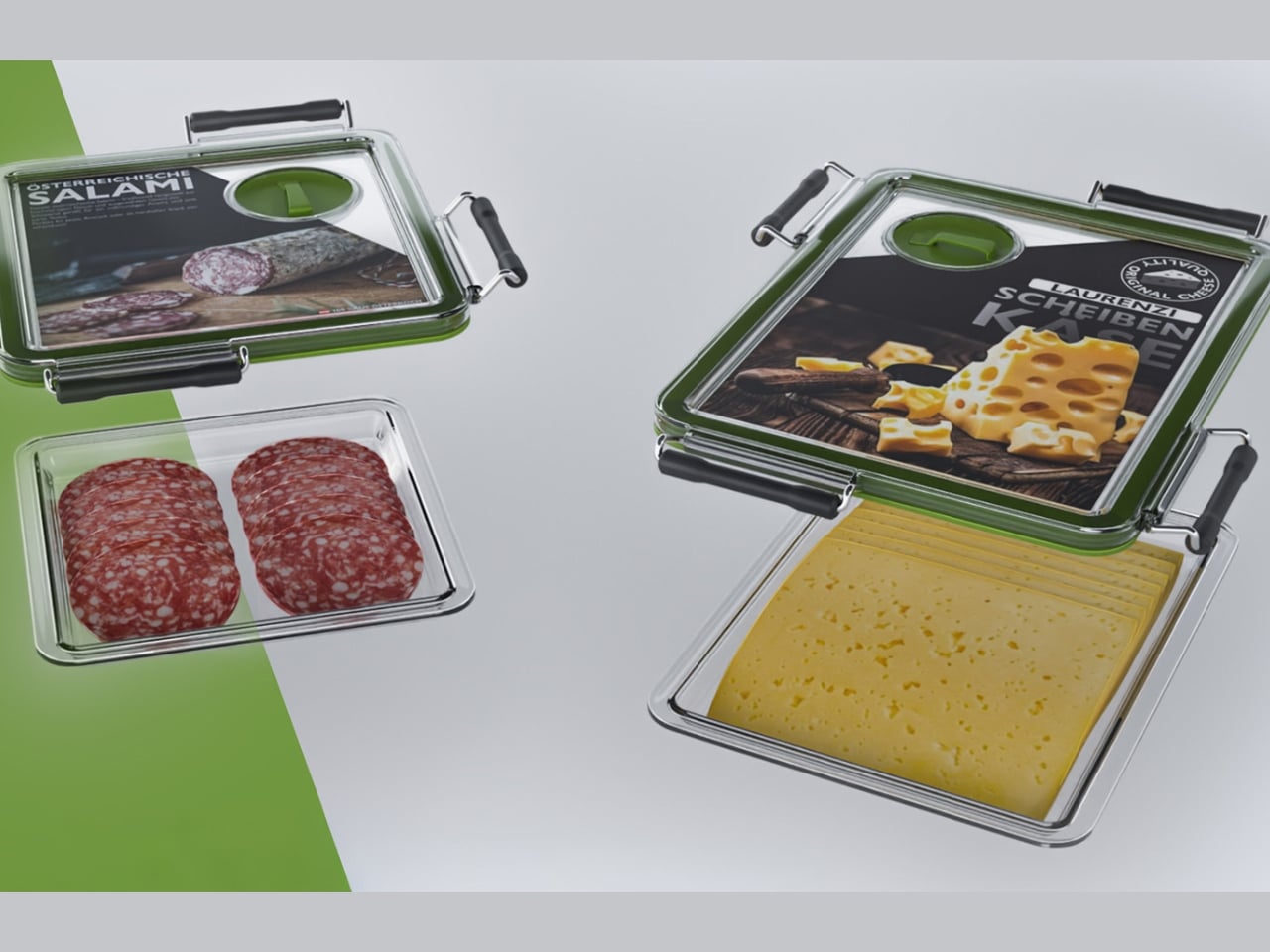
ReLoopBox is a circular, reusable container system designed to replace the disposable plastic packaging that floods our grocery stores, refrigerators, and eventually, our landfills. On the surface, it sounds like a straightforward sustainability pitch. But the more you look at it, the more you realize that Biedermann, an industrial design graduate from FH Joanneum in Austria, wasn’t just designing a container. He was designing a completely different logic for how food packaging should work.

Designer: Lars Biedermann

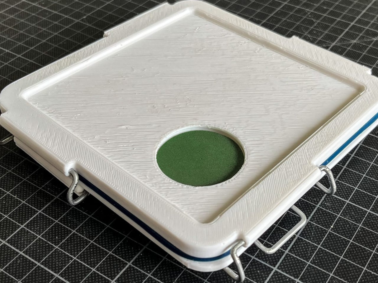
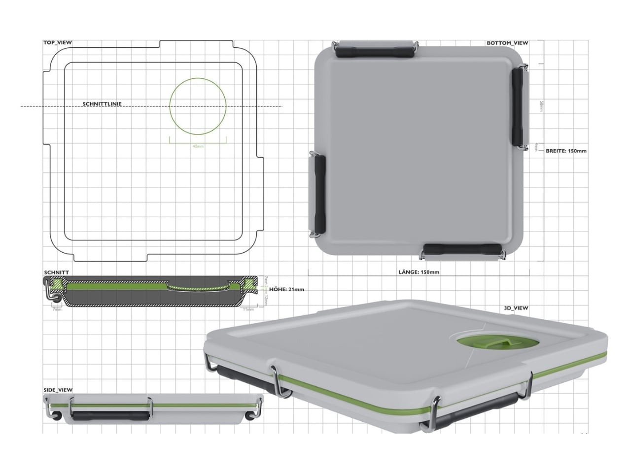
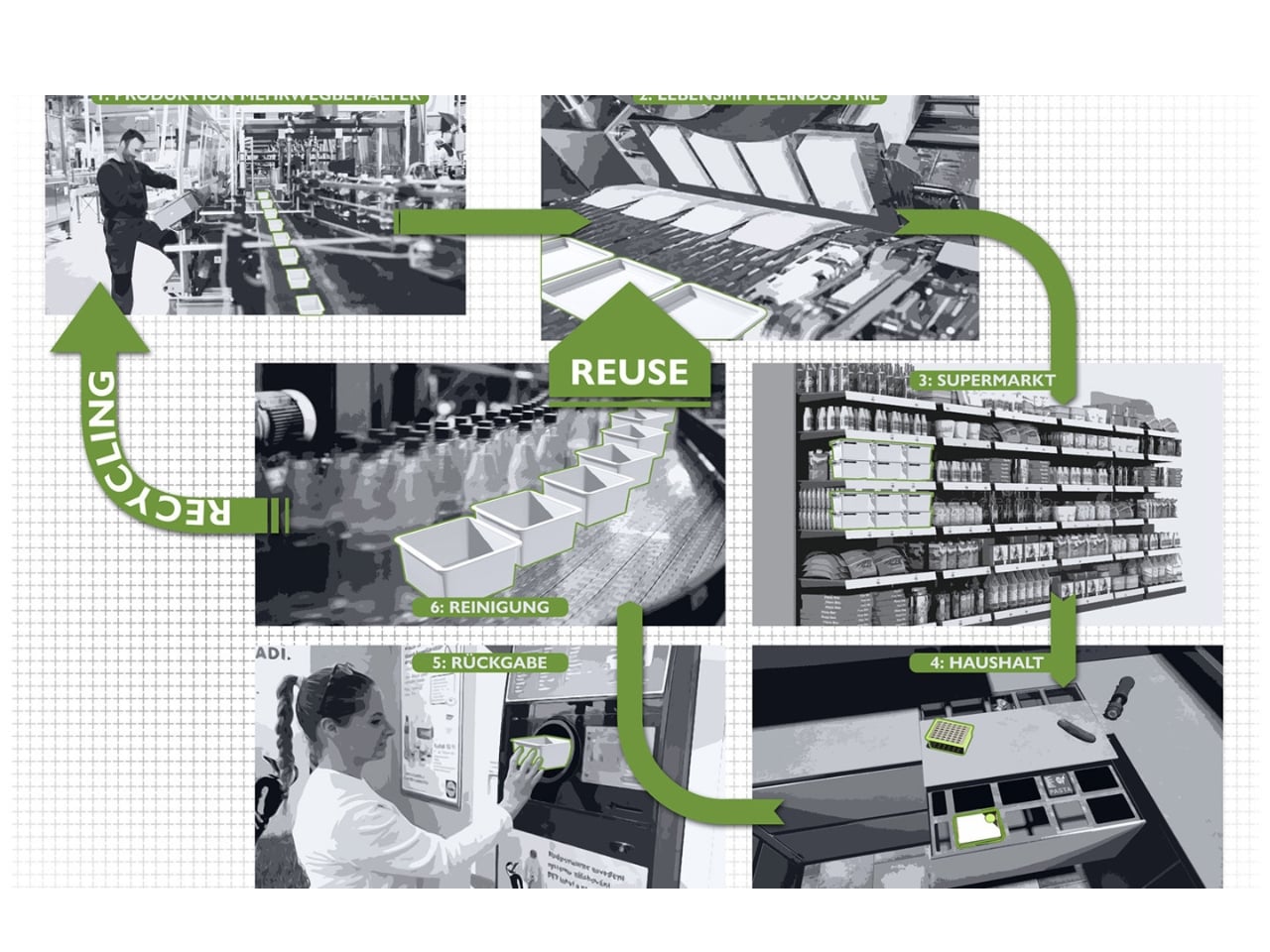
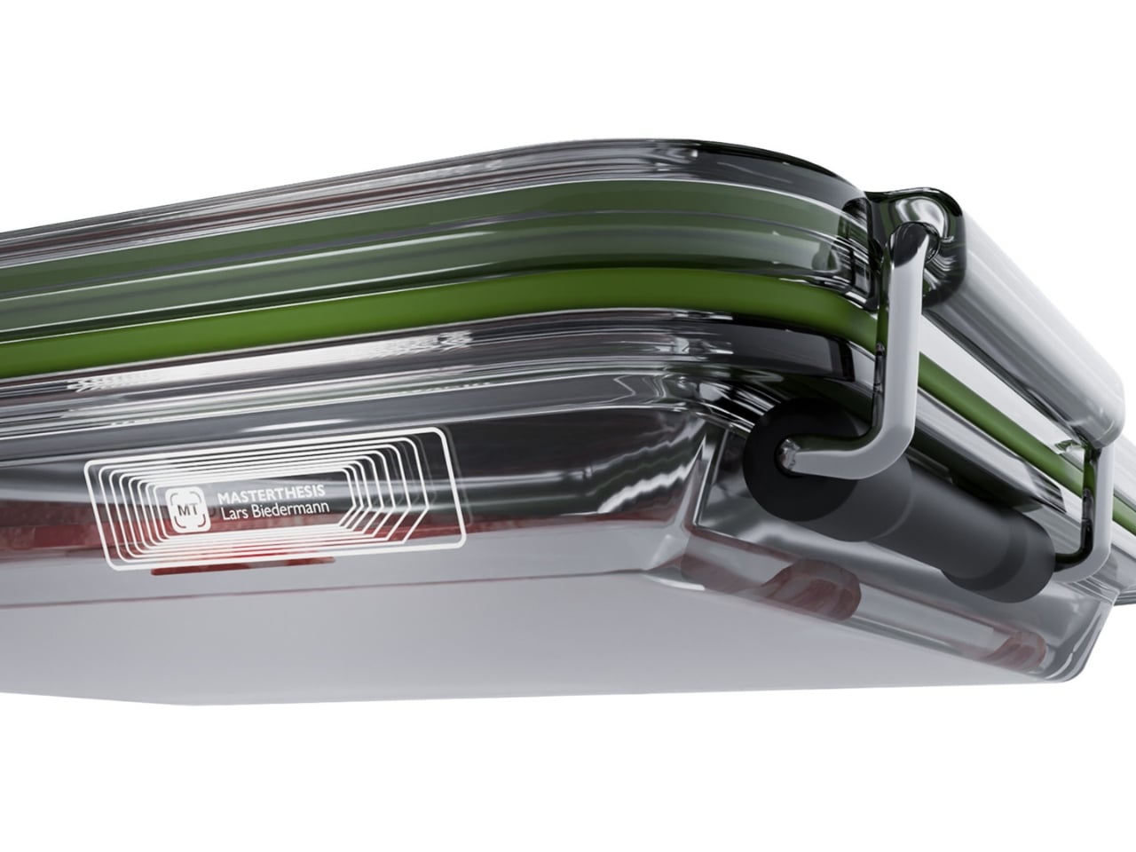
The system uses standardized, vacuum-sealed containers made from copolyester, silicone, and stainless steel. These aren’t flimsy alternatives to plastic wrap. They’re built to be durable, reusable, and returnable, meant to circulate between consumers, manufacturers, and retailers rather than taking a one-way trip to the bin. Each container is embedded with a digital chip that tracks it through the supply chain, handling inventory and logistics with minimal friction. It’s the kind of detail that quietly separates a thoughtful design from a well-intentioned one.

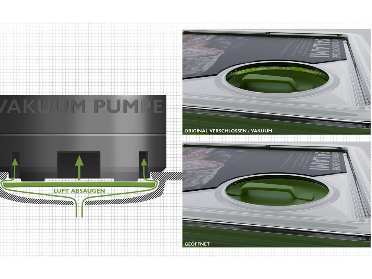
The vacuum seal is also doing real work here, and it’s worth noting. One of the grimmer realities in food sustainability is that a significant portion of what we buy never actually gets eaten. Food goes bad too quickly, and a lot of that comes down to packaging that doesn’t do much beyond keeping things contained for the journey home. A vacuum environment slows spoilage significantly, which means ReLoopBox isn’t just arguing against plastic waste. It’s also quietly taking aim at food waste. That’s two problems addressed through one design decision, and I appreciate when a solution earns its own complexity.

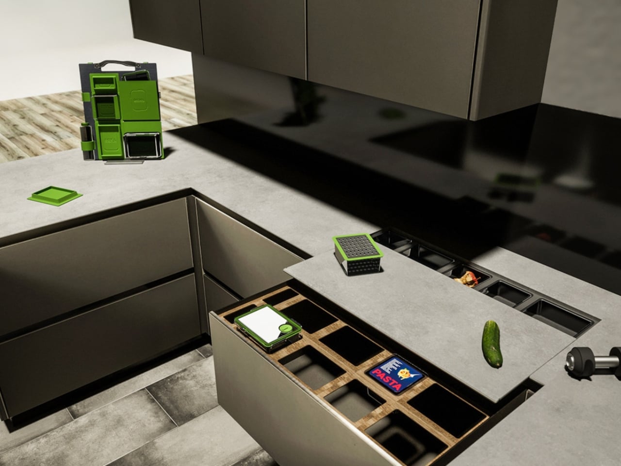
Aesthetically, the design is clean and considered, which matters more than people give it credit for. Sustainable products have historically struggled with an image problem. They tend to look corrective rather than desirable, like they’re asking you to make a sacrifice. ReLoopBox doesn’t carry that energy. It looks like something that belongs in a well-designed kitchen, which is probably the smartest thing Biedermann could have done. If a product doesn’t look good, it doesn’t get adopted, and if it doesn’t get adopted, the environmental argument is moot.

My honest take is that the real challenge for a system like this isn’t the design itself, which is genuinely impressive. It’s behavioral. Getting consumers to return containers, getting retailers to build the infrastructure to accept them, getting manufacturers to commit to a circular model instead of a linear one, that’s a much bigger lift than any design brief can anticipate. We’ve seen well-designed reuse programs come and go because the return loop is where things tend to fall apart. Biedermann seems to understand this, which is why the digital chip integration is such a critical piece of the system. It removes guesswork from the tracking process and makes the logistics side of the loop far more manageable.

What makes ReLoopBox feel genuinely fresh isn’t that it proposes reuse. We’ve had reusable containers for decades. It’s that it proposes a reuse system, one that thinks about the full journey of a container rather than just the moment it sits on a shelf. Biedermann has described his practice as holistic design with a goal of contributing something positive to the world, and that philosophy is visible in every layer of this project.

Whether ReLoopBox eventually scales into something we see in mainstream retail remains an open question. But as a piece of design thinking, it’s the kind of proposal that makes you look at the grocery aisle a little differently, and realize that even the most mundane objects are still waiting to be redesigned.

The post The Grocery Container That Finally Makes Reuse Actually Work first appeared on Yanko Design.

The Coffee Sleeve Reinvented From the Grounds Up

Every morning, millions of people grab a coffee to go and toss the paper sleeve into the trash without a second thought. It is a tiny object, easy to overlook. But that tiny object is part of a system that produces an estimated 16 billion disposable cups every year, sleeves included, and nearly none of it gets recycled. In the UK alone, cup sleeve recycling sits at roughly 2.8%, which is a polite way of saying almost everything ends up in a landfill.

That number has been sitting in the back of my mind ever since I came across GoBean, a design concept by Aranza V. Sanchez and Song Yeon Lee, two design students from Hochschule für Gestaltung Offenbach in Germany. The project recently earned a nomination for the Green Product Award, and when you look at what they have actually built, you understand why.

Designers: Aranza V. Sanchez & Song Yeon Lee

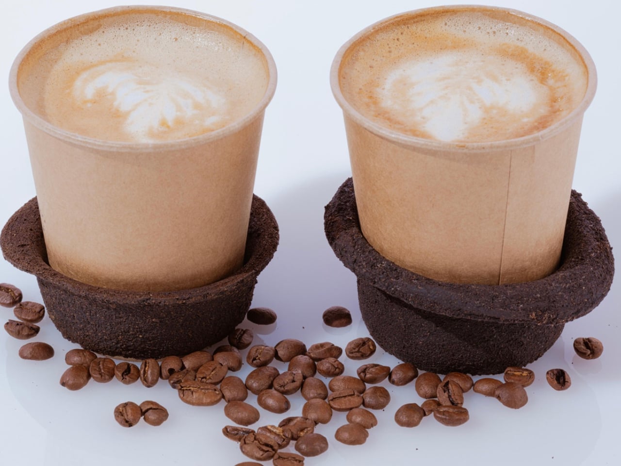
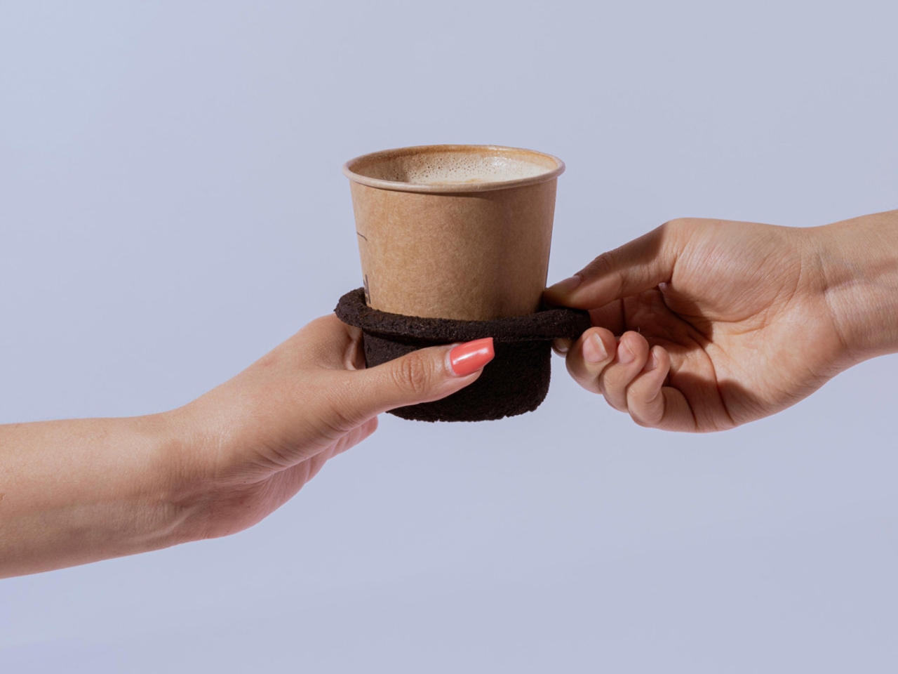
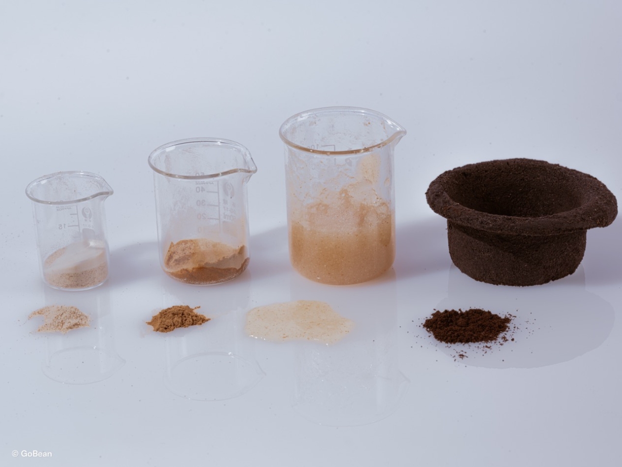
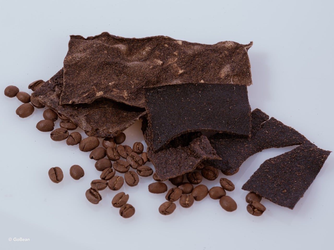
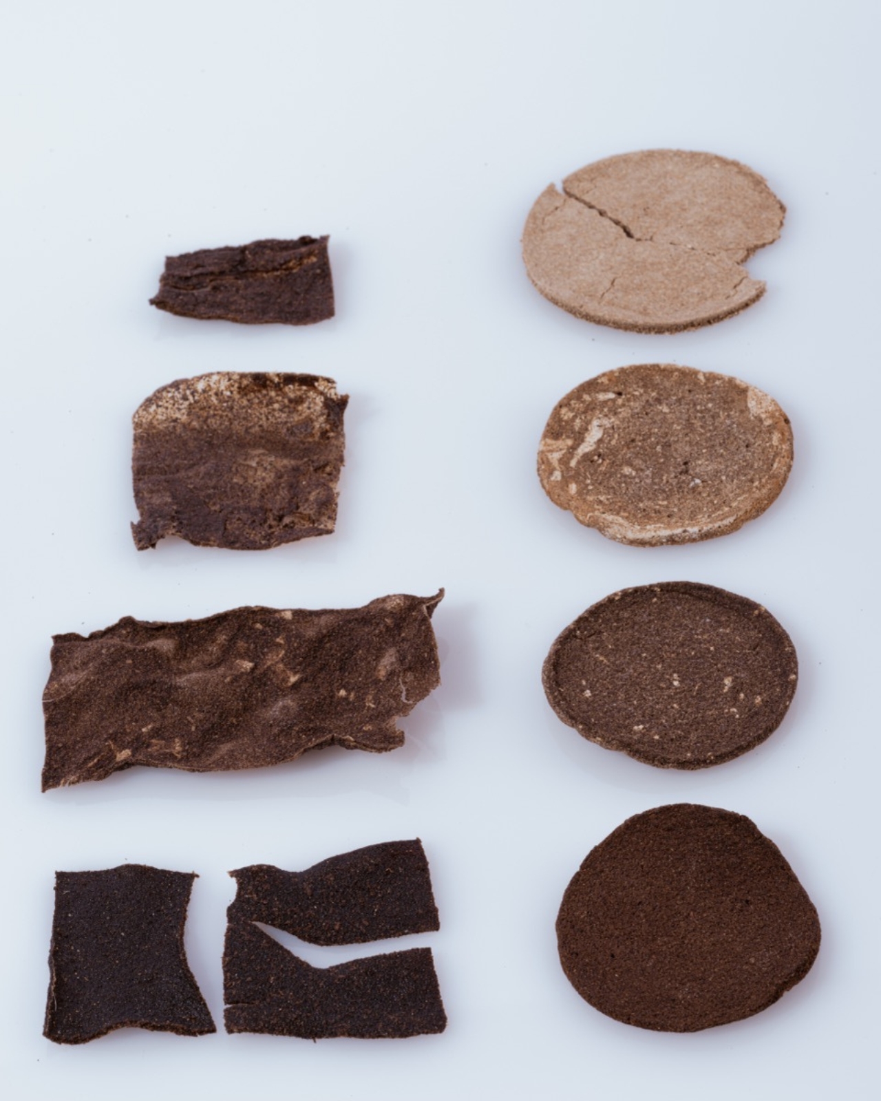
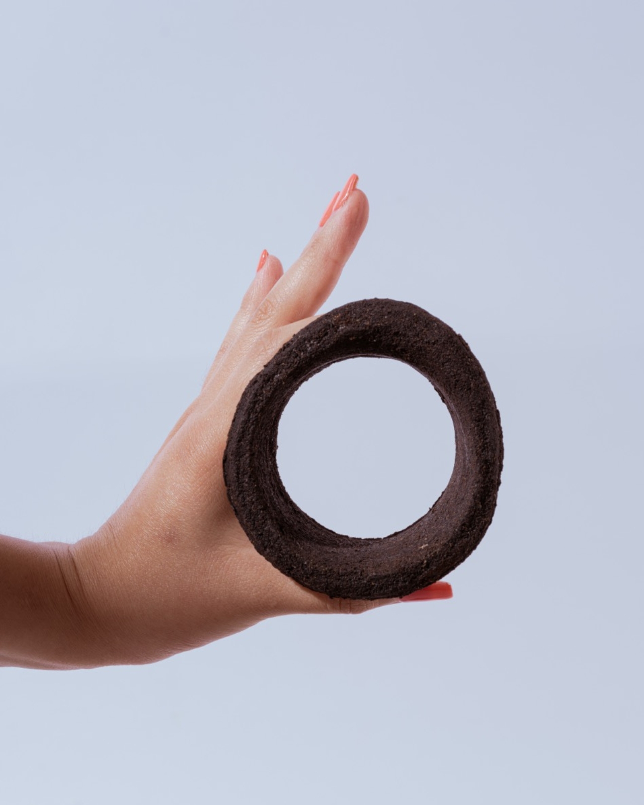
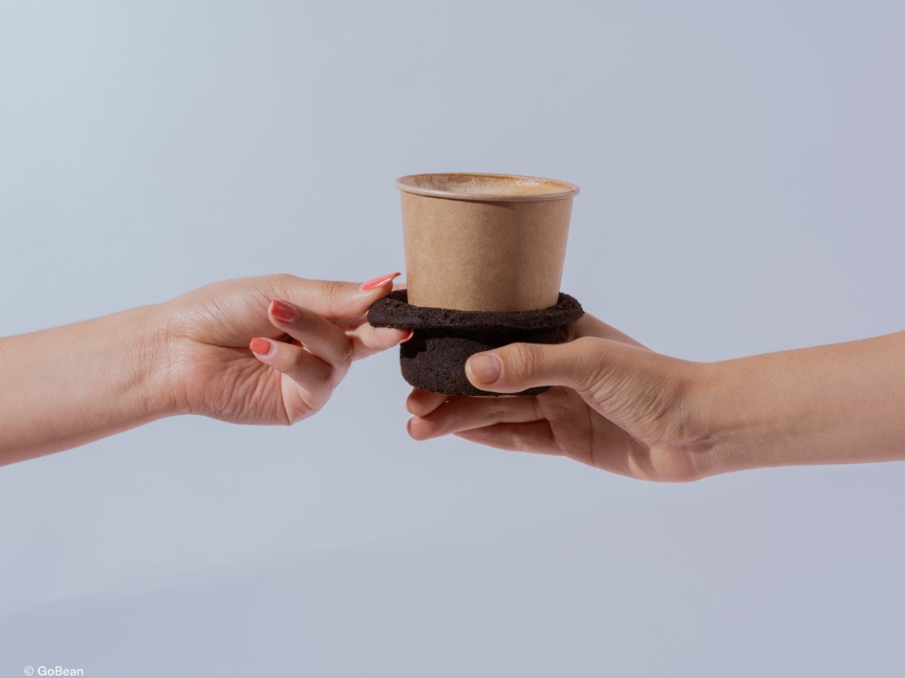
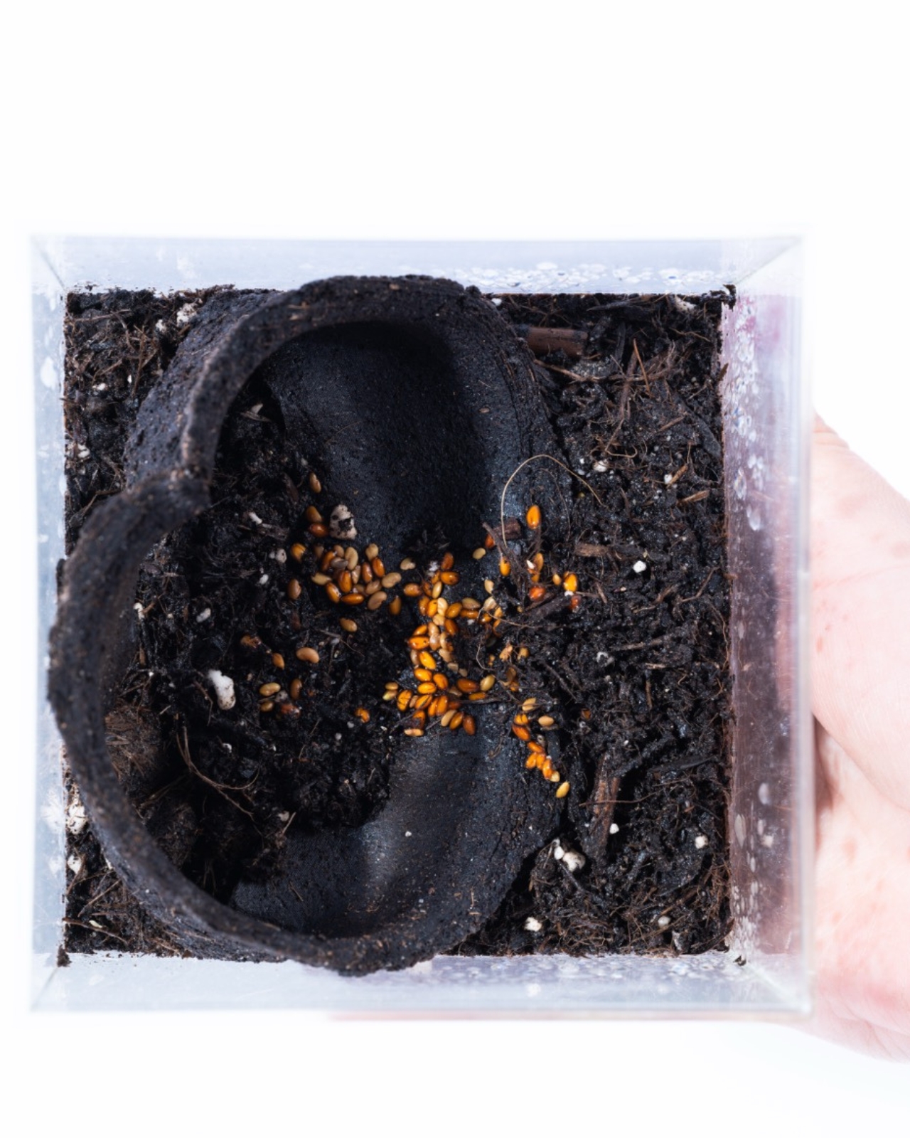
GoBean is a coffee cup sleeve made from coffee grounds. Not coffee-inspired, not coffee-colored. Actually made from the used, spent, leftover grounds that cafés collect and typically throw away. Combined with natural binders, the material becomes water and heat resistant, which matters quite a bit when your job is to wrap around a hot cup. It feels like a design idea so obvious that you wonder why it took this long to exist.

The material is 100% compostable and breaks down completely in about three weeks. If you would rather not compost it, you can plant it directly into soil. The sleeve, the thing that kept your fingers from burning on a Tuesday morning, becomes part of your herb garden by Friday. That circularity is not just a marketing point. It is genuinely elegant design logic.

What makes GoBean feel more serious than a typical student concept is the business model built around it. The idea is that cafés supply their own spent coffee grounds as the raw material for production. This turns waste into a resource, gives cafés a reason to participate, and keeps the material loop local. Designers often get credited for solving the object, but solving the system is harder, and Sanchez and Lee are clearly thinking about both.

I will admit, I have a complicated relationship with sustainable packaging projects. A lot of them promise a lot and deliver something that either does not perform as well, costs too much, or requires consumer behavior change that just is not going to happen at scale. GoBean avoids most of those traps by meeting the product exactly where it already exists. The sleeve still looks like a sleeve, fits like a sleeve, works like a sleeve. The only difference is where it comes from and where it goes afterward.

The Green Product Award tends to surface work that is genuinely trying to move the needle on material innovation rather than just putting a green label on something old. A nomination here carries a bit of weight, and GoBean fits the ethos of that kind of recognition.

It is also worth noting that this is a concept still in development, not something you can order from a café supplier today. That distinction matters. Student projects are exactly where this kind of thinking should live, unencumbered by the commercial pressures that usually flatten ideas before they can fully form. Whether GoBean eventually makes it to mass production will depend on all the less exciting stuff: manufacturing cost, supply chain logistics, regulatory approvals. None of which are guaranteed.

But as a vision of what disposable packaging could be, it is hard to argue with. The sleeve you use for ten minutes does not need to exist for a hundred years. That mismatch has always been the problem, and GoBean is one of the more elegant answers I have seen to it. Design does not always save the world, but sometimes it asks the right question. In this case, the question is simple: if your coffee sleeve is made from coffee grounds, has it ever really left the café?

The post The Coffee Sleeve Reinvented From the Grounds Up first appeared on Yanko Design.
Your Charger Is On Display for 23 Hours a Day, ORNA Designed for That

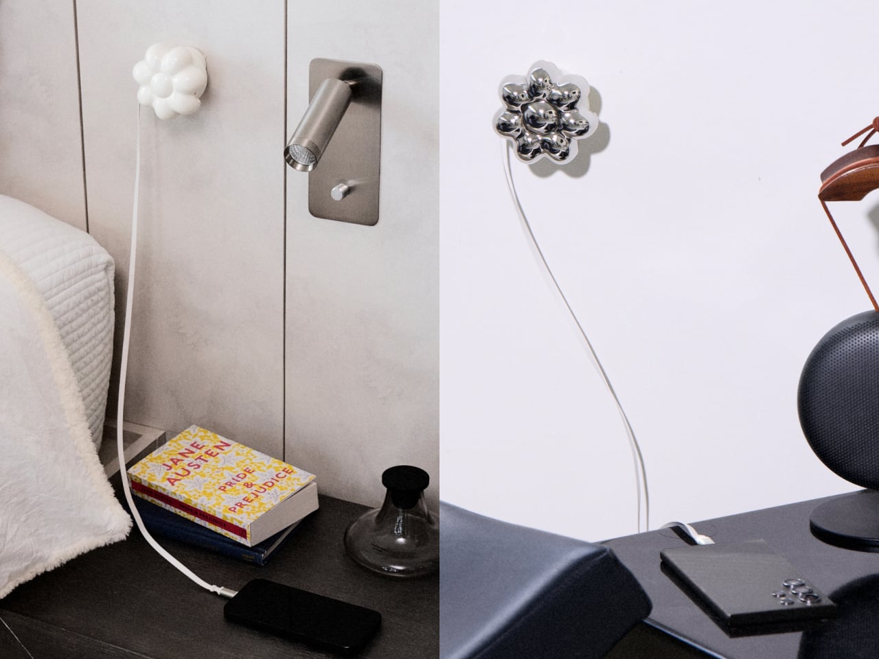
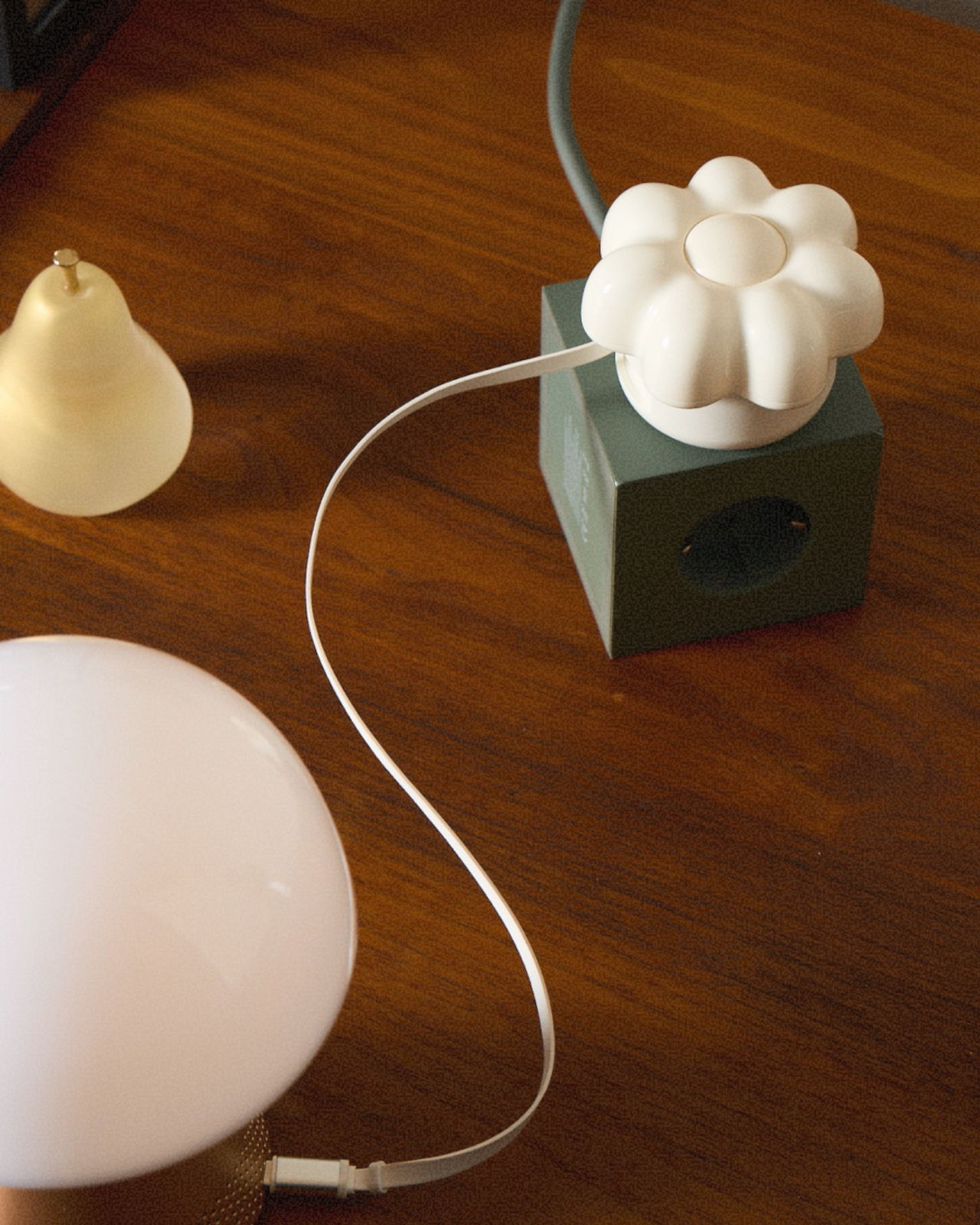
The wall charger is one of the most present objects in any home and one of the least considered. It sits on bedside tables, desk corners, and coffee tables for most of the day, then gets used for a few minutes and goes right back to being an uninvited presence. Nobody picks a charger because it belongs in their space. They pick it because it was cheap, available, and functional.
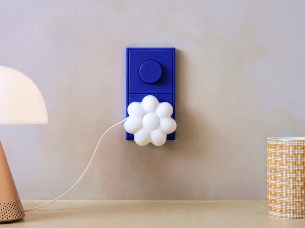
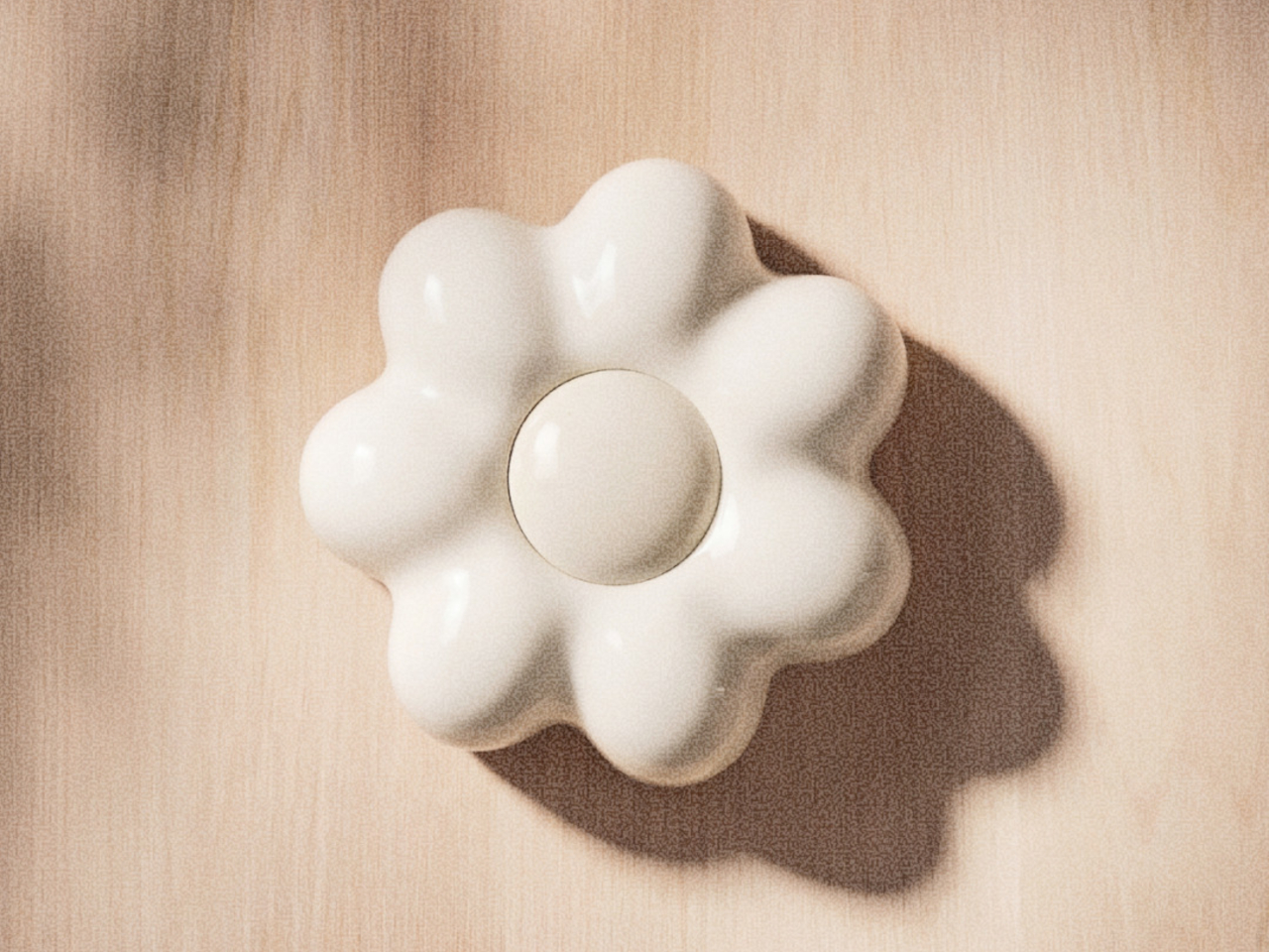
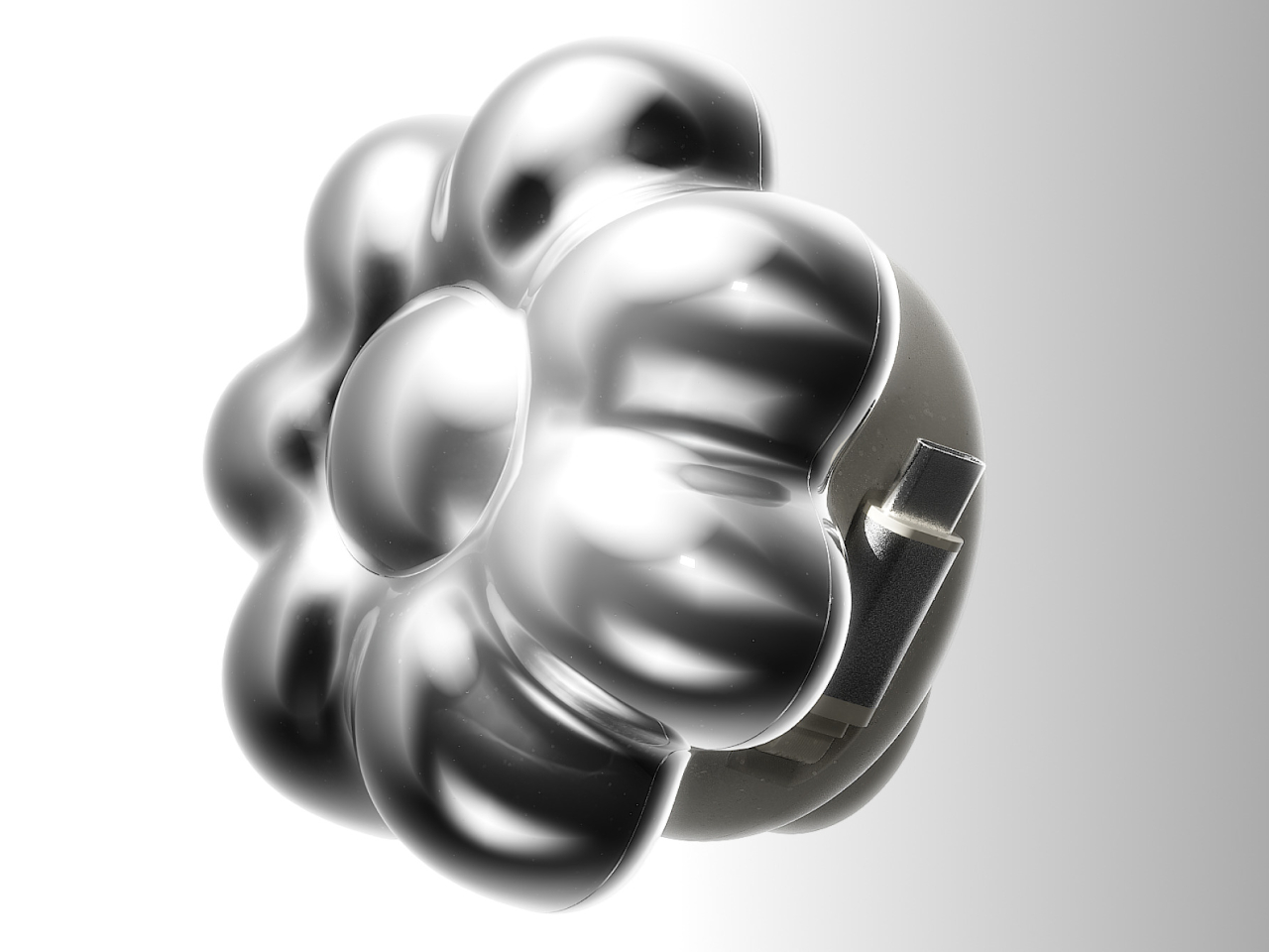
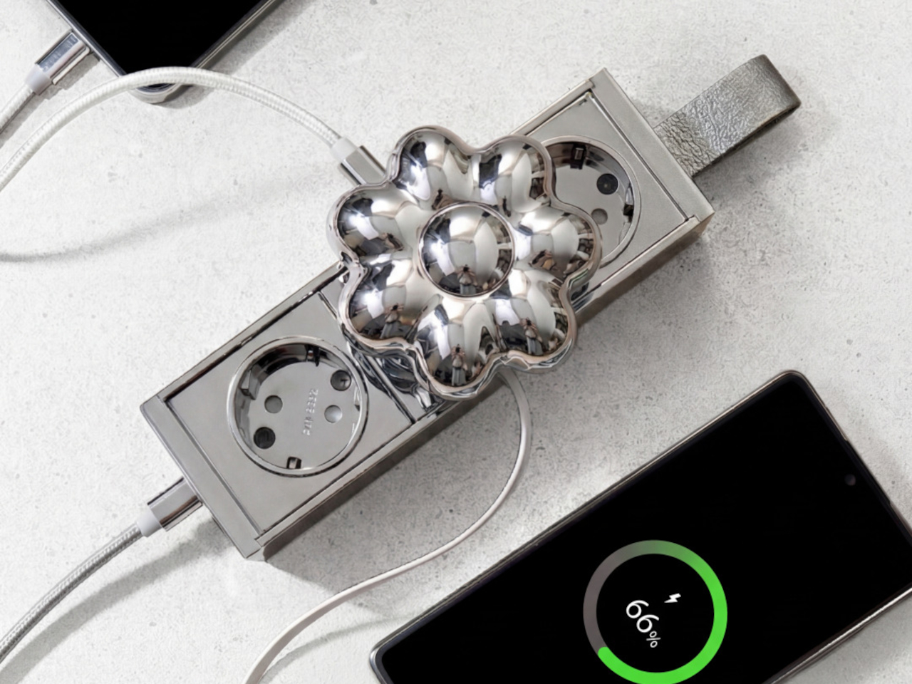
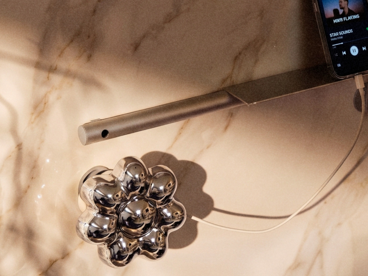
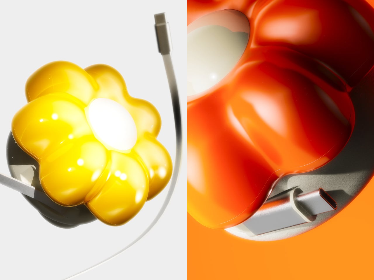
ORNA’s Objet Charger proposes a different starting point. It’s a 35W USB-C wall charger that treats the design of the object as seriously as the technology inside it. The key is a modular floral cover with a high-gloss, pop-art silhouette that attaches magnetically to the charger body and turns an overlooked utility item into a sculptural presence on any wall.

Designers: Kangnim Park, Jaehwa Lee, Jinsu & Jiwoong Studio for ORNA

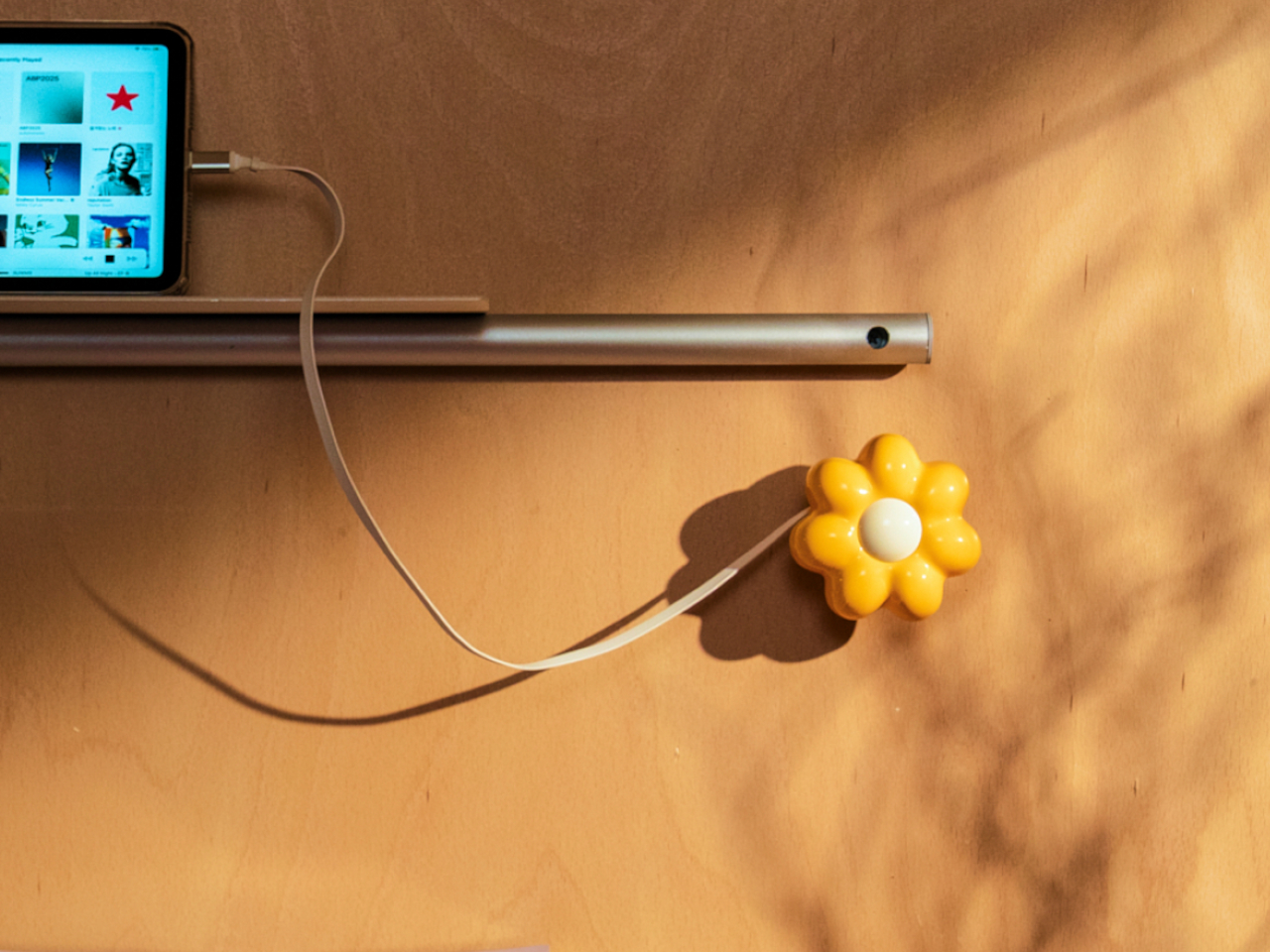
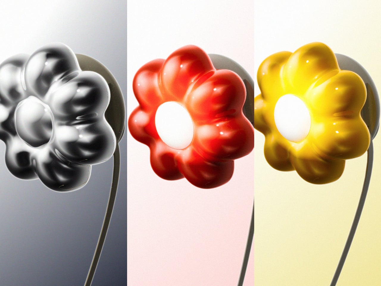
The cover is the part that gets swapped out to suit personal taste. Four versions are available: Daisy White, Sunflower Yellow, Marigold Orange, and Chrome Silver, each finished in a high-gloss surface that reads differently by room. The magnetic connection makes switching instant, which is part of what makes the concept work. Changing the personality of the object doesn’t require a new charger, just a different flower.

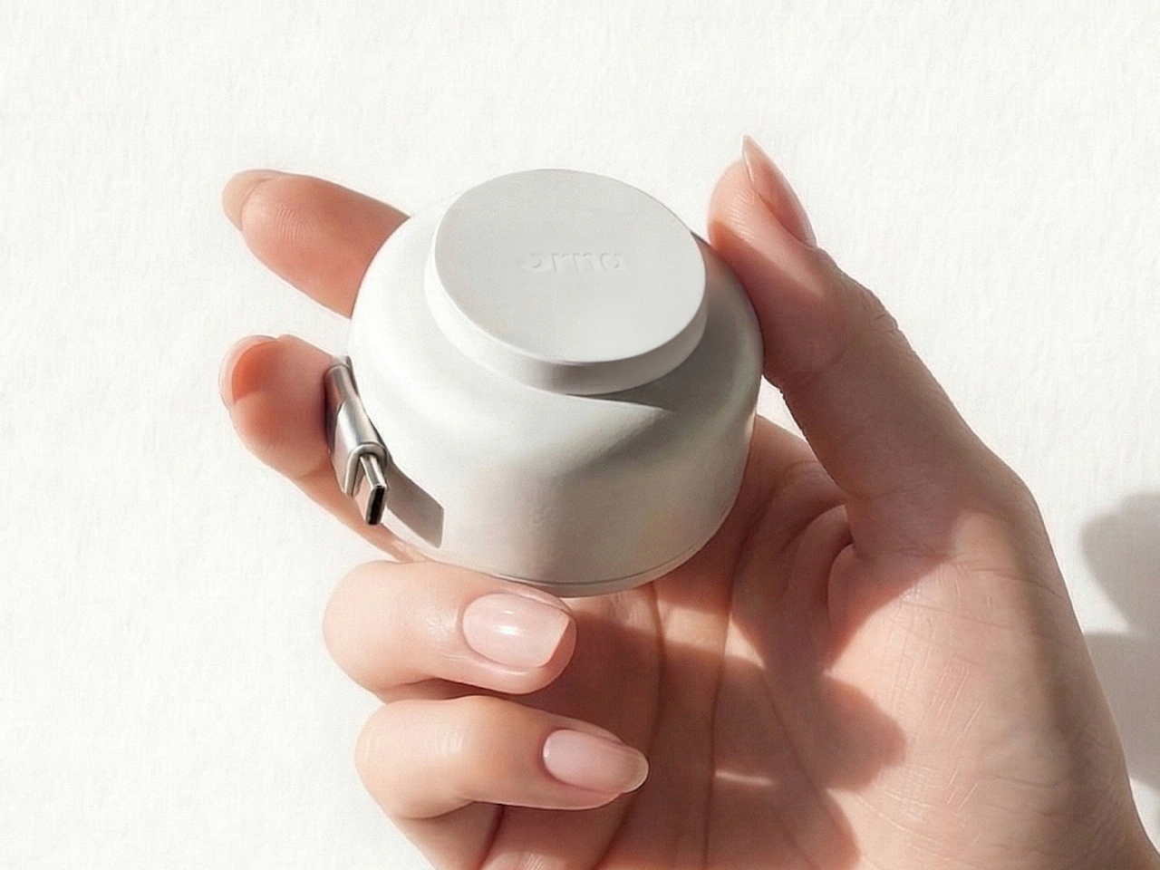
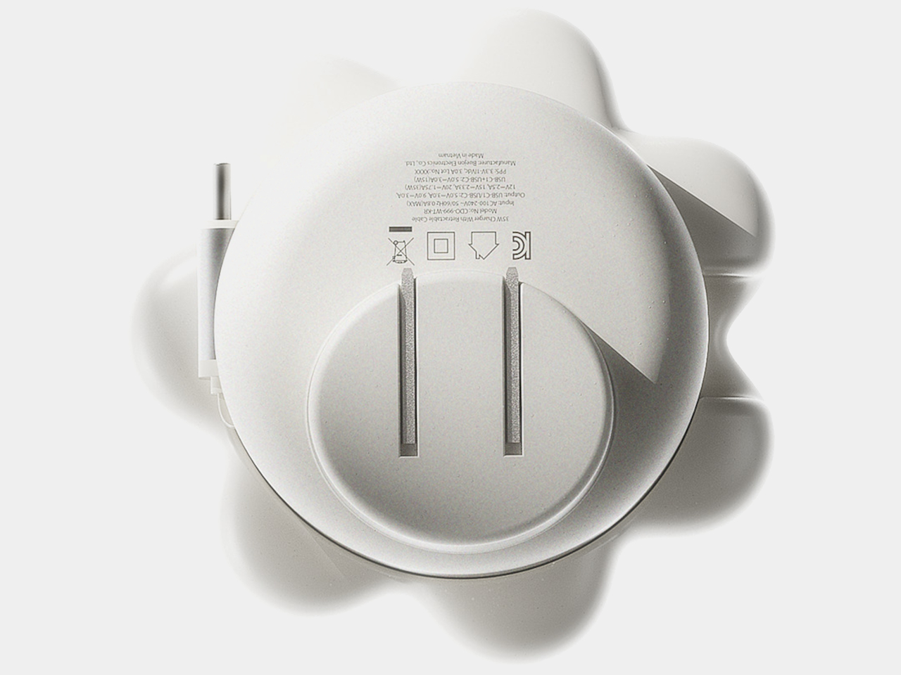
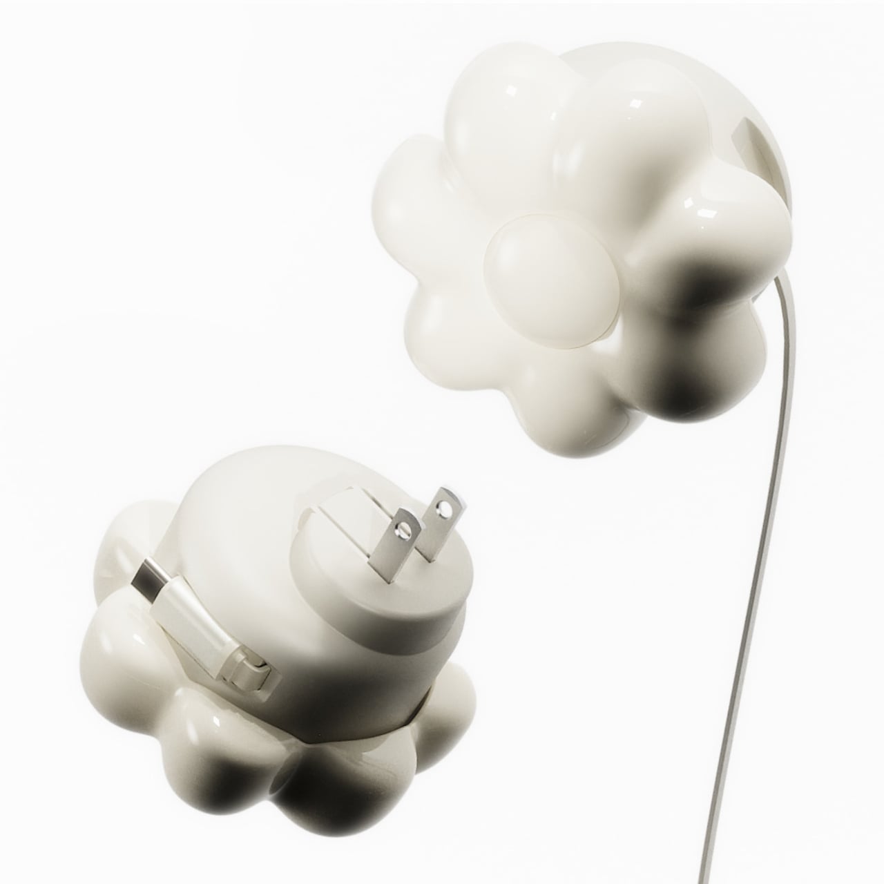
Underneath the sculptural exterior is a charger built for serious daily use. A one-meter USB-C cable is integrated into the body and retracts cleanly, so there’s no loose cord when the charger isn’t in use. A secondary USB-C port on the base handles a second device simultaneously, with the total output shared at 15W when both are active. Single-device charging peaks at 35W with full fast-charge protocol support.

The base of the charger was designed with the proportions of a traditional Korean Moon Jar in mind, a ceramic form known for the quiet completeness of its rounded body and the restraint of its surface. That design context matters more than it might sound. The charger is meant to occupy the wall the same way a carefully selected object occupies a shelf, present, purposeful, and unhurried.

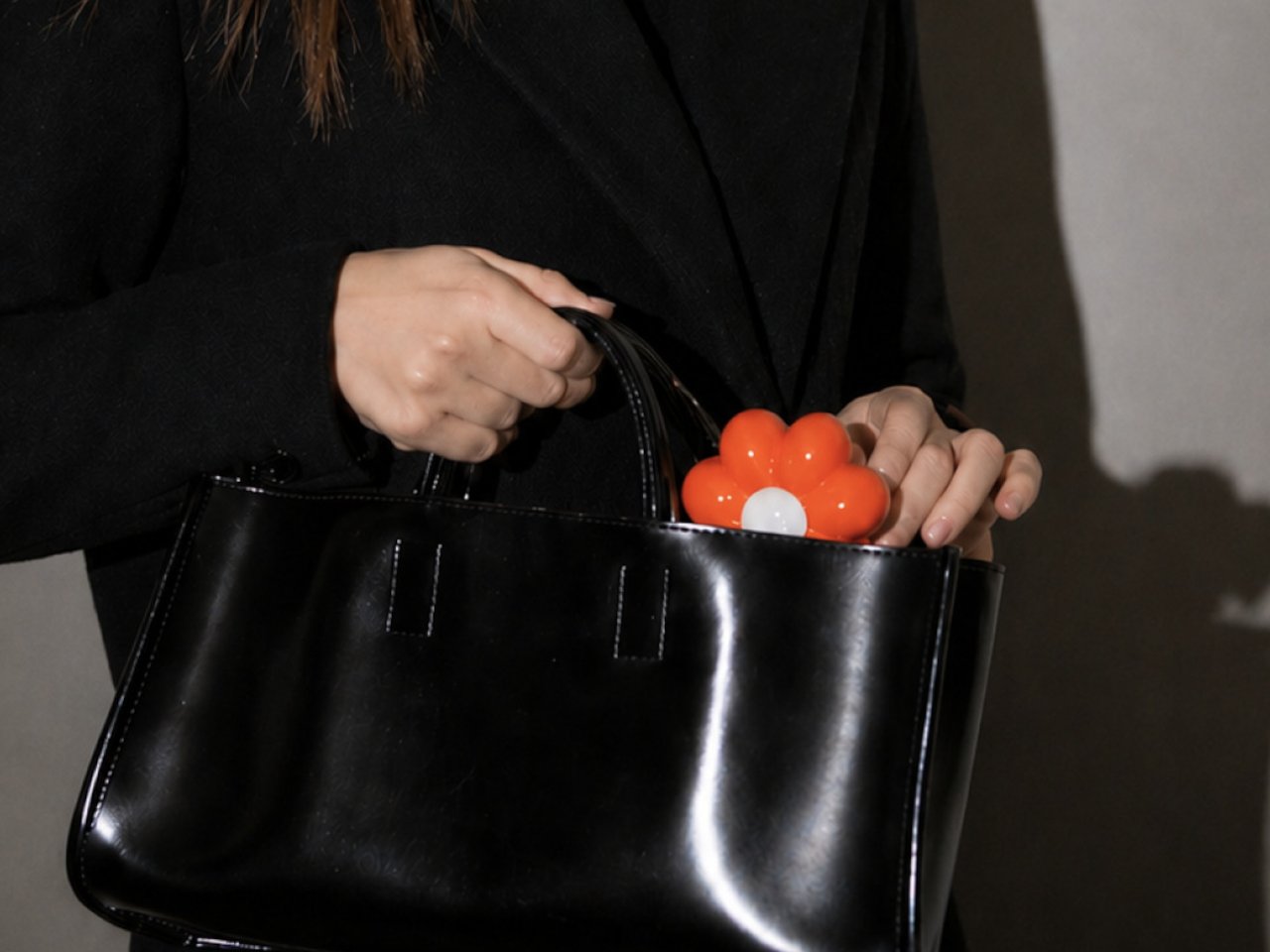
Flower Objet covers are sold separately from the charger base, starting at $49 for the Daisy White and Sunflower Yellow finishes and $99 for the Chrome Silver variant. The modular logic means the same base stays in place for years while the floral cover changes with the seasons, the room, or simply a shift in taste. The foldable plug keeps the package compact enough to carry between rooms or pack into a bag without a trailing cable. It’s a long-term object, not a disposable tool.

ORNA frames the proportion of the charger’s daily existence as roughly 23 hours of visual presence for every one hour of active use. That framing captures why most chargers feel like failures: they’re designed entirely for the one hour and ignored for the 23. The Objet Charger is built for both, which is the kind of quiet attention most objects in our homes never receive.

The post Your Charger Is On Display for 23 Hours a Day, ORNA Designed for That first appeared on Yanko Design.