Stoa Turns Chess Into Quiet Architecture for the Modern Home

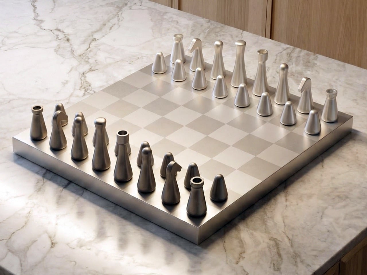
Chess has always been a game of structure, strategy, and symbolism. The pieces carry centuries of visual language: the authority of the King, the movement of the Knight, the strength of the Rook, the quiet repetition of the Pawns. Many chess sets lean into that history through ornament, carving, and decorative detail. Stoa takes a different path. It looks at the same familiar game and asks what can be simplified without losing meaning.

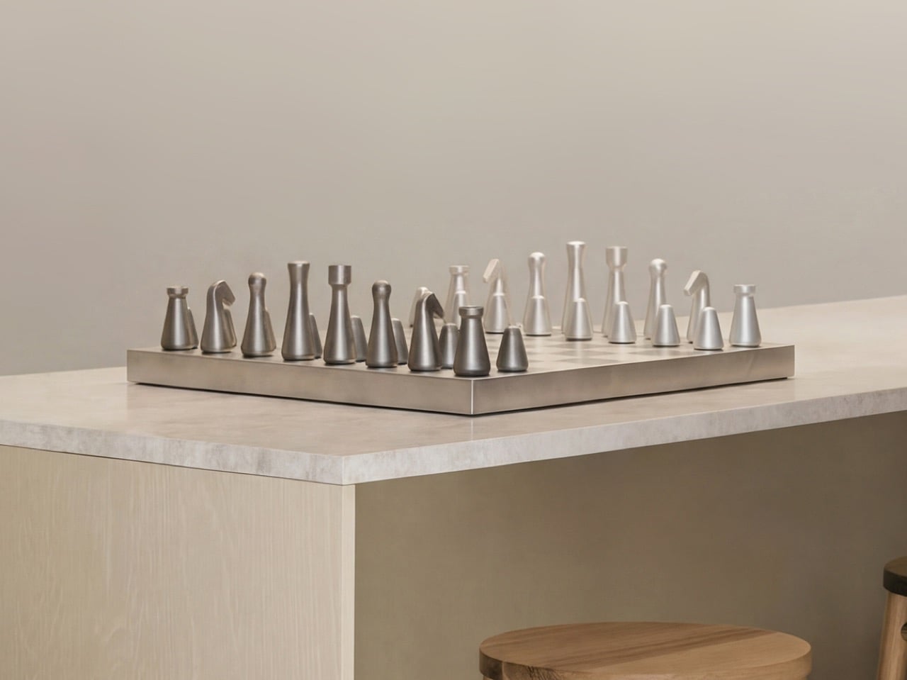
Inspired by Scandinavian design principles, Stoa is shaped by clarity, balance, and calm visual expression. Its forms are clean, architectural, and restrained, giving the set a quiet presence that feels natural in modern interiors. The pieces do not feel overly decorative or nostalgic. They feel composed, almost like small spatial objects arranged across a board. This gives Stoa a visual language that is contemporary, but still deeply connected to the traditions of chess.

Designer: Fabian Haydt

The strength of the design lies in its balance between reduction and recognition. Each piece is simplified to its essential geometry, yet remains easy to identify during play. This is an important distinction. Minimal chess sets can sometimes become so abstract that they ask too much from the player. Stoa avoids that by treating simplicity as a careful design decision rather than a visual shortcut. The King, Queen, Bishop, Knight, Rook, and Pawn each have their own identity, but none of them rely on unnecessary detail to communicate their role.

That clarity matters because chess is a game of focus. A player should be able to read the board quickly, understand the position of each piece, and make decisions without visual distraction. Stoa supports that experience through uncluttered forms and restrained proportions. The pieces are easy to recognize, comfortable to hold, and stable on the board. Their visual calmness allows attention to stay on the game itself.

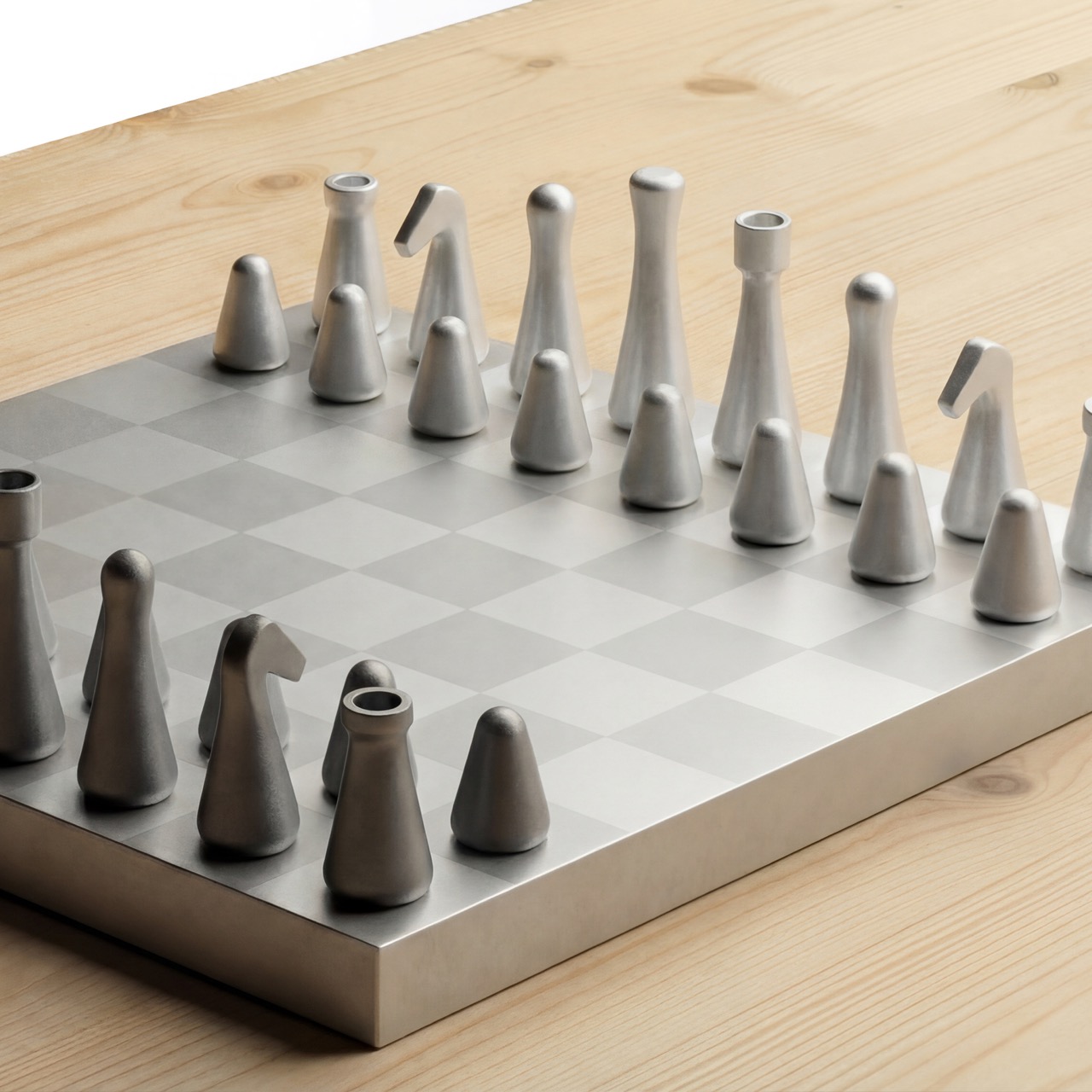
The Knight becomes one of the most interesting moments in the set. In traditional chess design, the Knight is often the most expressive piece, usually represented by a horse’s head. Reducing that form into a minimal object while keeping its character intact is a difficult challenge. Stoa handles it through proportion, silhouette, and a subtle sense of personality. It does not imitate the traditional Knight literally, but it preserves enough of its identity to make the piece immediately understandable.

Materiality adds another layer of refinement. Each piece is CNC-machined from solid recycled aluminum, giving the set a precise and durable foundation. After machining, the surfaces are polished and treated with fine glass bead-blasting to achieve a uniform matte texture. The pieces are then anodized for durability. This process gives Stoa a soft, premium finish that feels controlled rather than flashy.

The tactile experience is equally considered. Internal brass weights give the pieces a grounded feel, while leather pads on the bases provide stability and protect the board surface. These details make each move feel deliberate and satisfying. The weight, touch, and surface finish all contribute to a more immersive playing experience. Nothing feels accidental. Every material choice supports both function and atmosphere.

The proportions are compact and precise. The King stands at 68 mm, followed by the Queen at 62 mm, Bishop at 58 mm, Knight at 52 mm, Rook at 47 mm, and Pawn at 32 mm. The board measures 280 mm by 280 mm. This scale gives the set a refined presence without overwhelming the space around it. It can sit comfortably in a living room, study, or studio, carrying the elegance of a design object while remaining fully playable.

The development process focused on refining visual clarity, balance, and ergonomics. Multiple prototype stages helped test how the pieces felt in the hand and how quickly players could recognize them during faster gameplay. The challenge was not simply to make chess look minimal. It was to preserve the logic of the game while reducing each piece to a cleaner, more contemporary form. That required careful iteration, especially in maintaining distinction between pieces with similar proportions.

What remains is a chess set that feels calm, tactile, and quietly luxurious. Stoa brings a centuries-old game into a modern design language without disconnecting it from its roots. It respects tradition by understanding it, then translates that tradition through geometry, material precision, and visual discipline. The result is a set that feels made for contemporary life: thoughtful enough to admire, clear enough to play, and restrained enough to last.

The post Stoa Turns Chess Into Quiet Architecture for the Modern Home first appeared on Yanko Design.

The Tong Side Table Turns Geometry Into Good Company


There’s something refreshing about furniture that doesn’t take itself too seriously while still being completely serious about design. The new Tong side table from designer Zelimhan Hamitsaev walks that line beautifully, bringing a playful sculptural presence to a piece that’s fundamentally about function.

At first glance, the Tong looks like it might topple over. That angled wooden wedge connecting the circular base to the kidney bean-shaped top seems to defy logic, like it’s mid-lean in some elegant furniture ballet. But that’s exactly what makes it so visually compelling. The geometry creates this sense of movement and lightness, even though the piece is crafted from solid wood and stands a confident 700 mm tall (that’s about 27.5 inches for those of us still mentally translating).

Designer: Zelimhan Hamitsaev

The tabletop itself deserves attention. It’s not quite oval, not quite rectangular. Instead, it has this organic, almost pebble-like shape with softly rounded edges that feel like they’ve been worn smooth by water over time. There’s something inherently friendly about curves like these. They invite you to set down your coffee cup, your phone, that book you’ve been meaning to finish. The surface area is just right for those essentials that need a home within arm’s reach of your favorite reading chair or sofa.

What really sets the Tong apart is its commitment to solid wood construction. In an era when so much furniture relies on veneers, particle board, and shortcuts, there’s something grounding about a piece that embraces natural material through and through. You can see it in the natural wood version, where the grain patterns tell their own story across the surface. But the collection also offers painted finishes in a palette that feels both contemporary and timeless: dusty blue, forest green, terracotta orange, and soft grey. These aren’t the shouty colors of trend-chasing design. They’re the kind of hues that feel right now but won’t feel dated in five years.

The Tong side table joins a family that’s been steadily growing. The collection already includes an armchair, three coffee tables, a dining chair, and three dining tables. What’s clever about the range is how each piece maintains the same design DNA, that distinctive angled support element and organic shapes, without being matchy-matchy. You could absolutely style multiple Tong pieces together for a cohesive look, or let a single side table be your conversation starter in an eclectic space.

That sculptural quality makes the Tong more than just functional furniture. It’s the kind of piece that changes how a room feels. Place it next to a mid-century armchair, and it adds contemporary edge. Put it beside a minimalist sofa, and it introduces warmth and personality. The design is confident enough to hold its own but humble enough to play well with others.

There’s also something to be said for furniture that looks like it has a point of view. The Tong doesn’t try to disappear into the background or apologize for taking up space. That dramatic support angle makes a statement, but it’s a statement about thoughtful engineering and creative problem-solving rather than empty theatrics. It’s the difference between design that screams for attention and design that earns it.

For anyone navigating the overwhelming world of furniture shopping, pieces like the Tong offer a middle path between disposable fast furniture and investment heirlooms that require a second mortgage. It’s thoughtfully made, visually interesting, and genuinely useful. The kind of side table that makes you happy every time you reach for your morning coffee or set down your evening glass of wine.

In smaller living spaces where every piece needs to pull its weight aesthetically and functionally, the Tong’s compact footprint and vertical emphasis make it particularly smart. It provides surface area without eating up valuable floor space, and that eye-catching silhouette gives you decorative impact without requiring additional styling. The Tong side table proves that everyday objects can have personality without sacrificing practicality. It’s furniture that works hard and looks good doing it, which is really all we can ask from the pieces we live with every day.

The post The Tong Side Table Turns Geometry Into Good Company first appeared on Yanko Design.

Johan Link’s LinkOne Watch Masterfully Fuses Icelandic Nature with Scandinavian Minimal Design

Imagine the rugged, untamed landscapes of Iceland, where raw geometric forms meet delicate natural beauty. Inspired by this breathtaking scenery, Johan Link, a Swiss architecture student with an unyielding passion for design, set out on a remarkable journey. His goal was to create a timepiece that captured the essence of nature’s raw elegance and timeless charm. The culmination of his vision and meticulous craftsmanship is the LinkOne, a watch that effortlessly blends the rugged and the refined.

Designer: Johan Link

Johan Link’s journey to create the LinkOne was an intricate dance of creativity and precision. Months were spent sketching, iterating, 3D printing, and prototyping, all to achieve the perfect balance between form and function. The result is a distinctive watch that embodies the simplicity and elegance of nature while showcasing the innovative spirit of its creator.

At first glance, the LinkOne captivates with its black anodized aluminum case, a testament to both strength and style. Crafted from CNC-milled 6061-T6 aluminum, the case is not only durable but also boasts a bead-blasted and anodized finish, giving it a sleek, refined appearance. This robust exterior protects the intricate mechanics within, ensuring the watch’s reliability and longevity.

However, the true allure of LinkOne lies in its unique combination of materials. The watch features 3D-printed Thermoplastic Elastomer (TPE) straps, which provide a velvet-like texture for unparalleled comfort. These straps are more than just functional; they are a tactile delight, inviting the wearer to experience a new level of comfort and style.


The post Johan Link’s LinkOne Watch Masterfully Fuses Icelandic Nature with Scandinavian Minimal Design first appeared on Yanko Design.

World’s First E-Ink Smartphone with a QWERTY Keyboard will get your eyes and hands to fall in love

It’s like if the smartphone, Kindle, and Blackberry had a baby… and frankly, it’s gorgeous.

The Minimalist Phone stands at a rather unique junction of two trajectories – one, with smartphones getting more and more advanced, and being able to do much more than they previously did, and another, with phones that are designed to be ‘dumb-phones’ that just handle the basics, and don’t have you becoming a screen addict. Strangely enough, even though the two of them should really never have an intersection point, it seems like the Minimalist Phone IS that intersection point. It’s a unique combination of traditional smartphone features, coupled with a no-nonsense design that cuts all the clutter, but reintroduces the QWERTY keyboard, bringing a world of user-focused functionality back. And just if you’re wondering, yes, the Minimal Phone works exactly like any other smartphone – it runs Android 13, supports all your favorite apps, has a fingerprint reader, 4G LTE, and surprisingly enough, both rear and front-facing cameras so you can click color photos just like you would on a regular phone. (You’ll still need to view them in color on a regular screen though)

Oh, and it also has a 3.5mm jack.

Designers: Andre Youkhna and Armen Youssefian

Click Here to Buy Now: $325 $450 ($125 off, exclusive perk for YD Readers only). Hurry, only a few left!

“Live more. Scroll less,” say Andre Youkhna and Armen Youssefian, the folks who designed the Minimal Phone, a smartphone designed to switch the existing relationship where we’re slaves to our technological devices. Here, the smartphone empowers you, giving you the features of a phone without the layer of addictive interfaces and notifications. In essence, the Minimal Phone behaves just like your existing smartphone but has a different approach to interface, features, hardware, etc.

The e-ink display of the Minimal phone offers users a comfortable, glare-free reading experience, significantly reducing eye strain even during prolonged use.

Just like the Fairphone focuses on supply-chain transparency, the Minimal Phone focuses on a user-centric design. The device boasts a 3.5-inch-wide e-ink touchscreen that runs all your apps, lets you send/receive messages, watch videos, and even browse the internet. It has a 300PPI resolution and a 90Hz refresh rate, which even by regular OLED screen standards, is pretty impressive. However, the e-ink screen notably, trades color for high-contrast, daytime visibility, and a much longer battery life. The lack of color isn’t really a bug, but rather a feature that helps deliver information without any distractions, ensuring you use your phone for exactly what you need and don’t spend more time on it than necessary.

Under the screen lies a 43-key QWERTY keyboard that brings back the glory days of being able to type out messages without accidental presses and those godawful typos that are still a problem with touchscreen keyboards. The Minimal Phone’s QWERTY keyboard is 70mm wide, and each key has a respectable travel of 0.15mm, giving you a confident and reliable typing experience.

When you’re not typing out messages and emails (or sh*tposting on X), the phone’s touch-sensitive screen lets you easily browse the internet, use apps, and perform regular smartphone-related functions. Building on the ongoing trend of the minimal OS courtesy brands like Nothing, the one on the Minimal Phone is fairly utilitarian too, with clear text, easy-to-navigate menus, and even widgets. The only difference, however, is the landscape nature of the display, which means apps look/feel different on the Minimal Phone. Nevertheless, you can still use all your favorite Android apps like Uber, Spotify, Instagram, WhatsApp, even Maps.

Its software capabilities aside, the Minimal Phone has some impressive hardware too. Under its hood you’ve got a MediaTek 6769 processor with 6GB of RAM, 128GB of storage, and a 4000mAh battery that should last up to a week on a full charge. The Minimal Phone has Bluetooth 5.0, dual-band WiFi, NFC, and 4G LTE. The phone stands at 4.7 inches tall, 2.8 inches wide, 0.39 inches (or 10mm) thick. It’s got a fingerprint reader built into the power button, a USB-C port, a single SIM tray, a 12MP main camera and an 8MP front-facing selfie-cam, and most impressively, still retains a 3.5mm aux input, quite literally giving you the best of all worlds! The Minimal Phone starts at a discounted price of $325, and is designed to be completely repairable, complying with the latest EU regulations.

Click Here to Buy Now: $325 $450 ($125 off, exclusive perk for YD Readers only). Hurry, only a few left!

The post World’s First E-Ink Smartphone with a QWERTY Keyboard will get your eyes and hands to fall in love first appeared on Yanko Design.