Furniture, as a category, is not usually meant to make you smile. It holds things, supports things, stores things. Function dictates form, and form gets built around the assumption that your chair or side table should have as little personality as possible. That is the design orthodoxy, at least. The longstanding idea that objects in service of a purpose should quietly disappear into the background, noticed only when they are missing. Liam de la Bedoyere disagrees. And Mini Monsieur is his very persuasive argument.
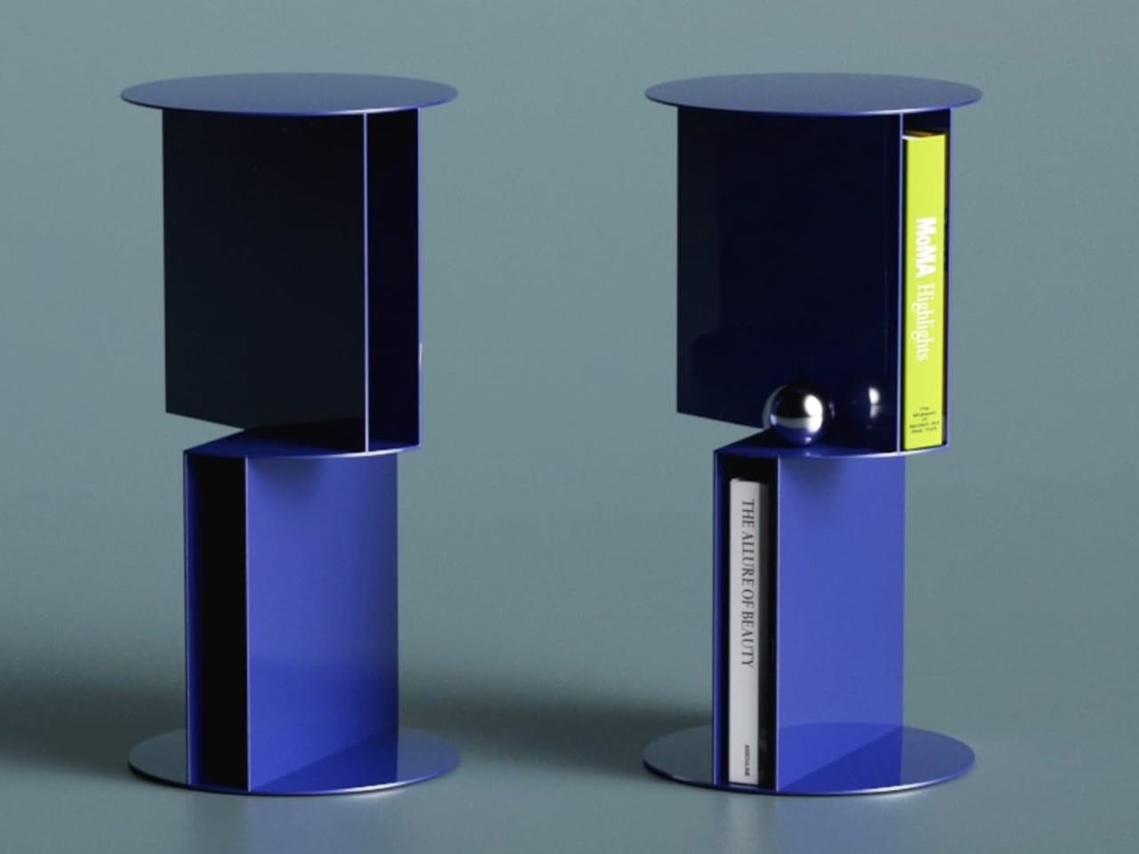
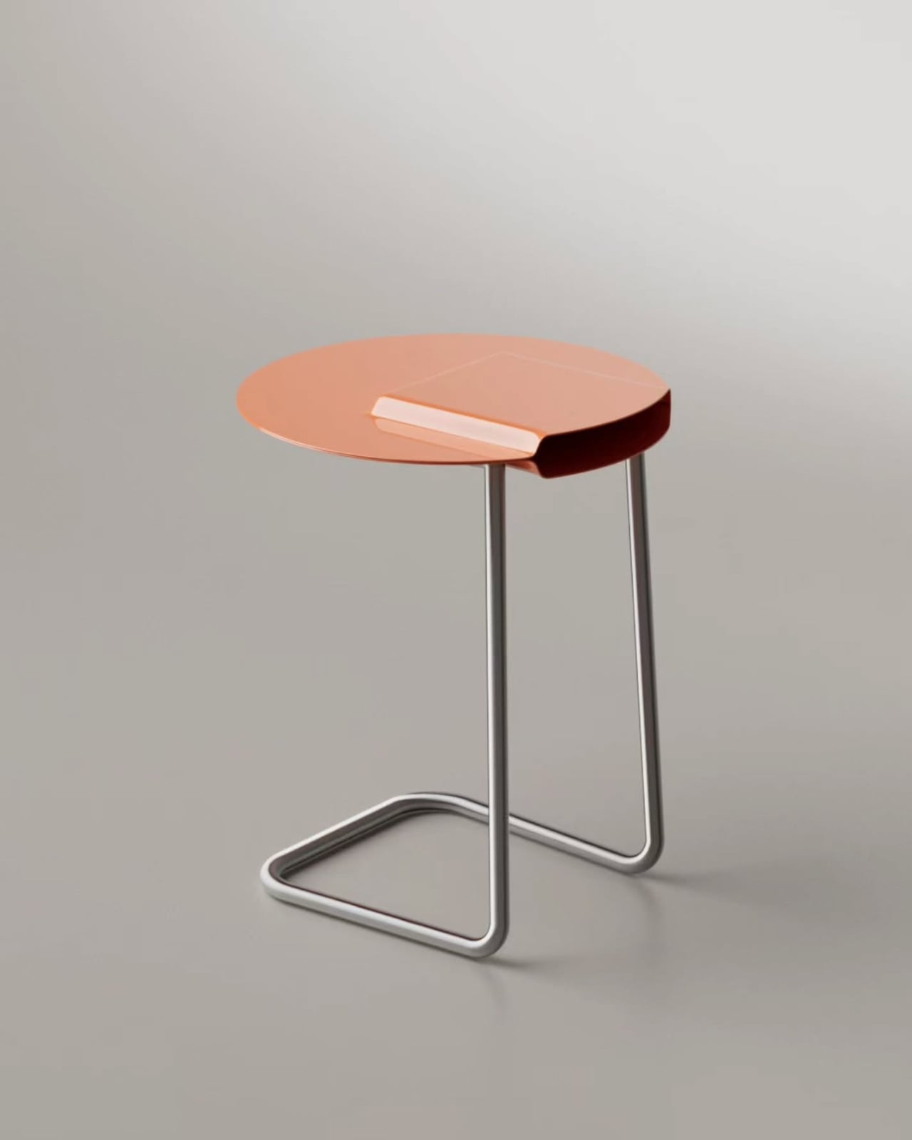
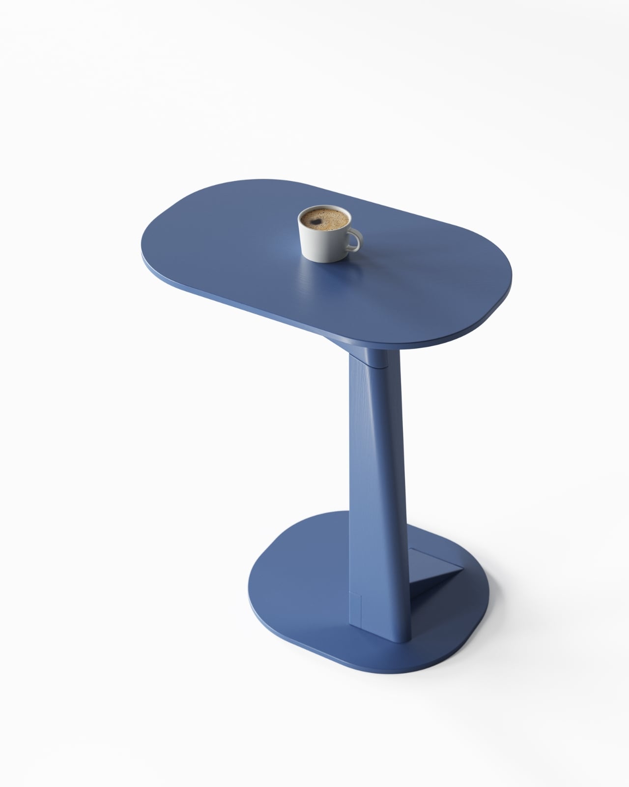
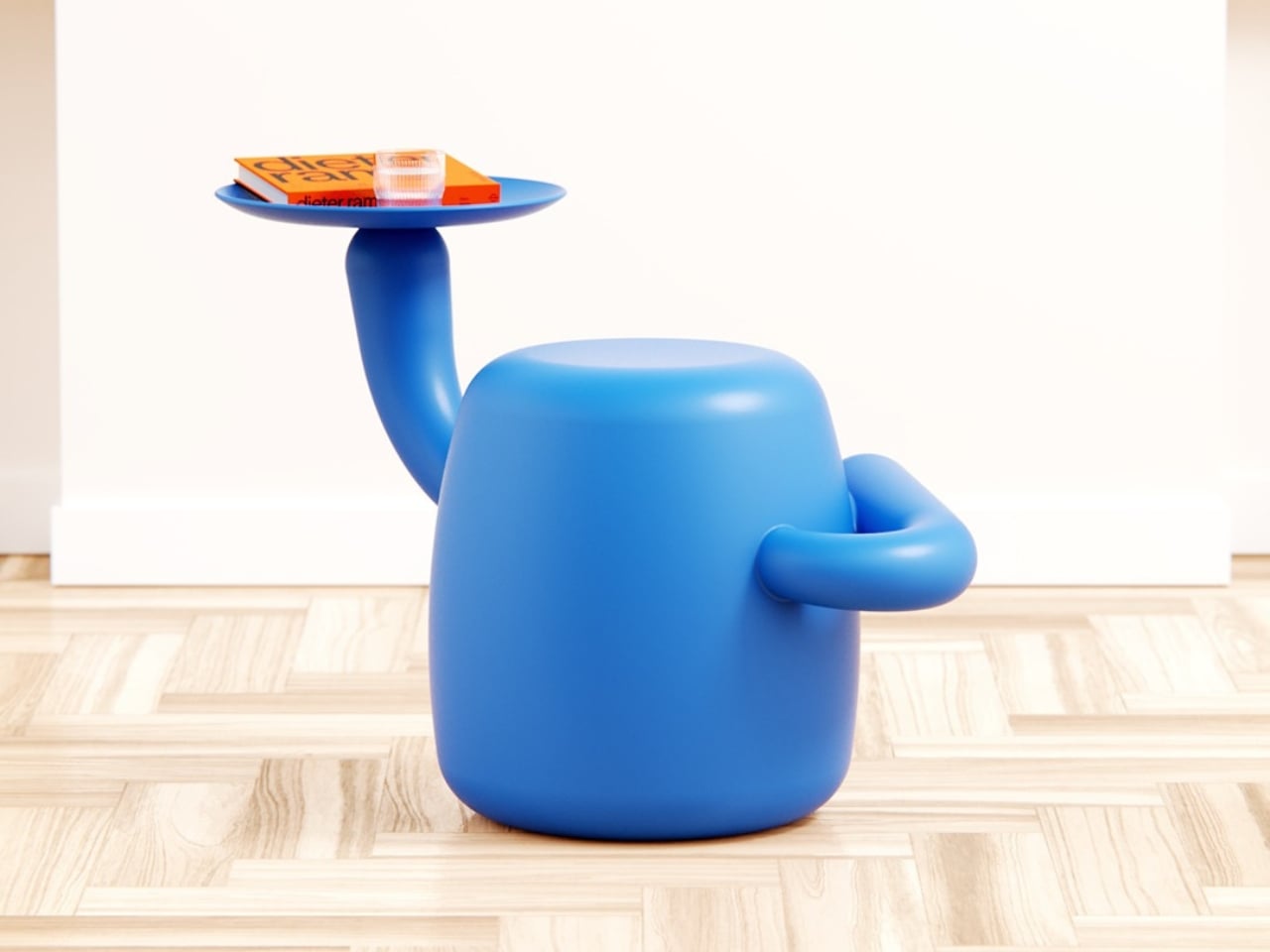
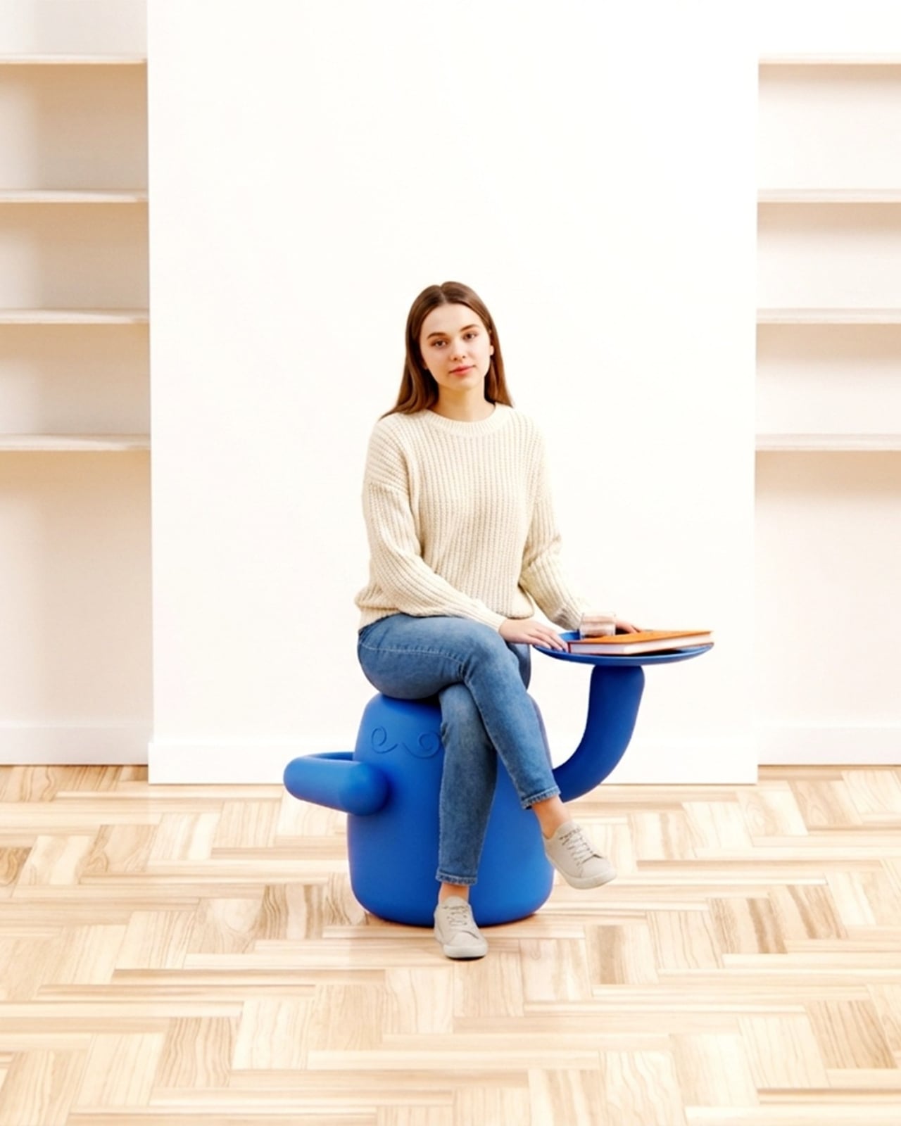
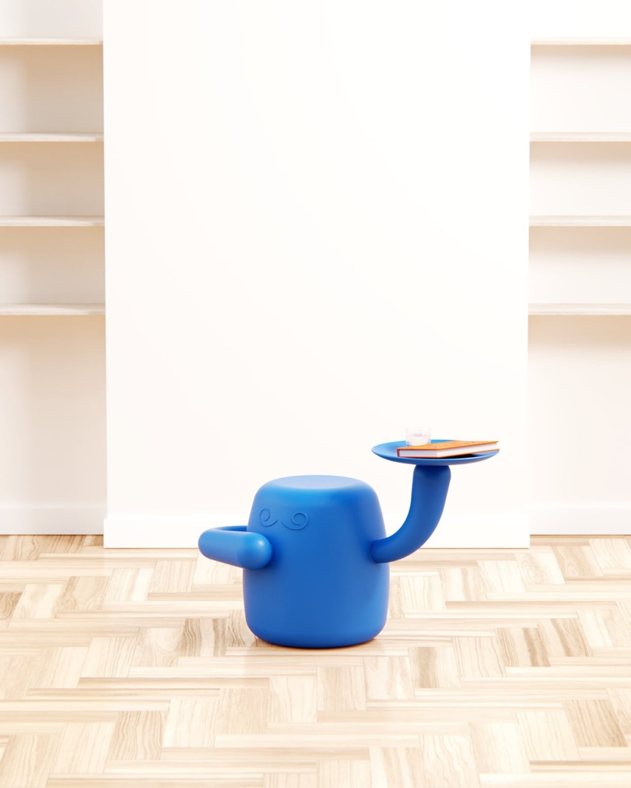
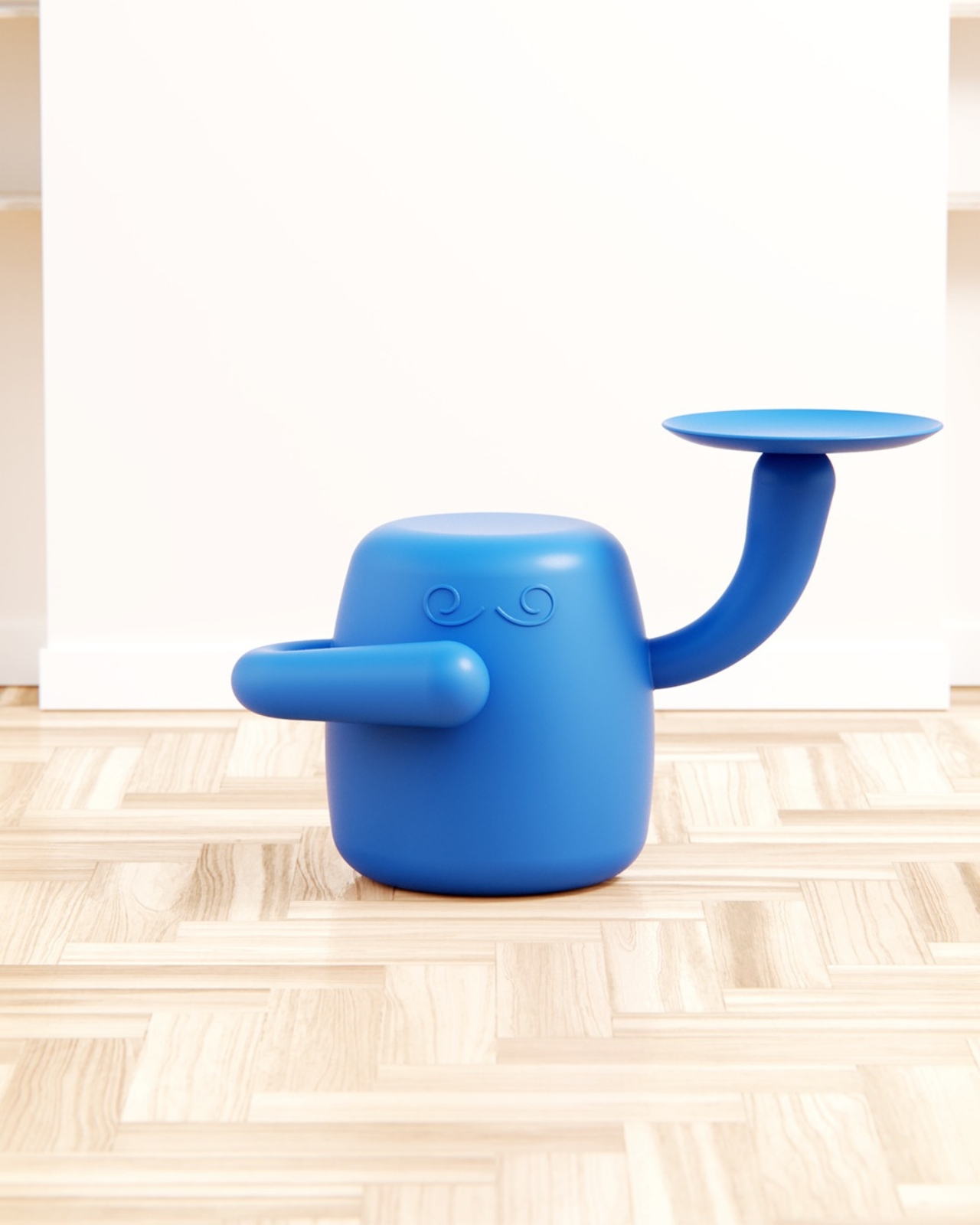
This concept piece, developed as a personal project at boredeye.design, rethinks the stool and side table as something altogether more alive. Mini Monsieur is a squat, rounded body rendered in an irresistible cobalt blue, with two arms posed differently: one curled against its torso, the other raised high and balancing a flat circular tray. Two swirling embossed brows sit just below the flat crown of its head, giving it the air of a patient, quietly distinguished little servant. If you have ever thought your furniture should have more opinions, this piece has exactly enough.
Designer: Liam de la Bedoyere (boredeye.design)
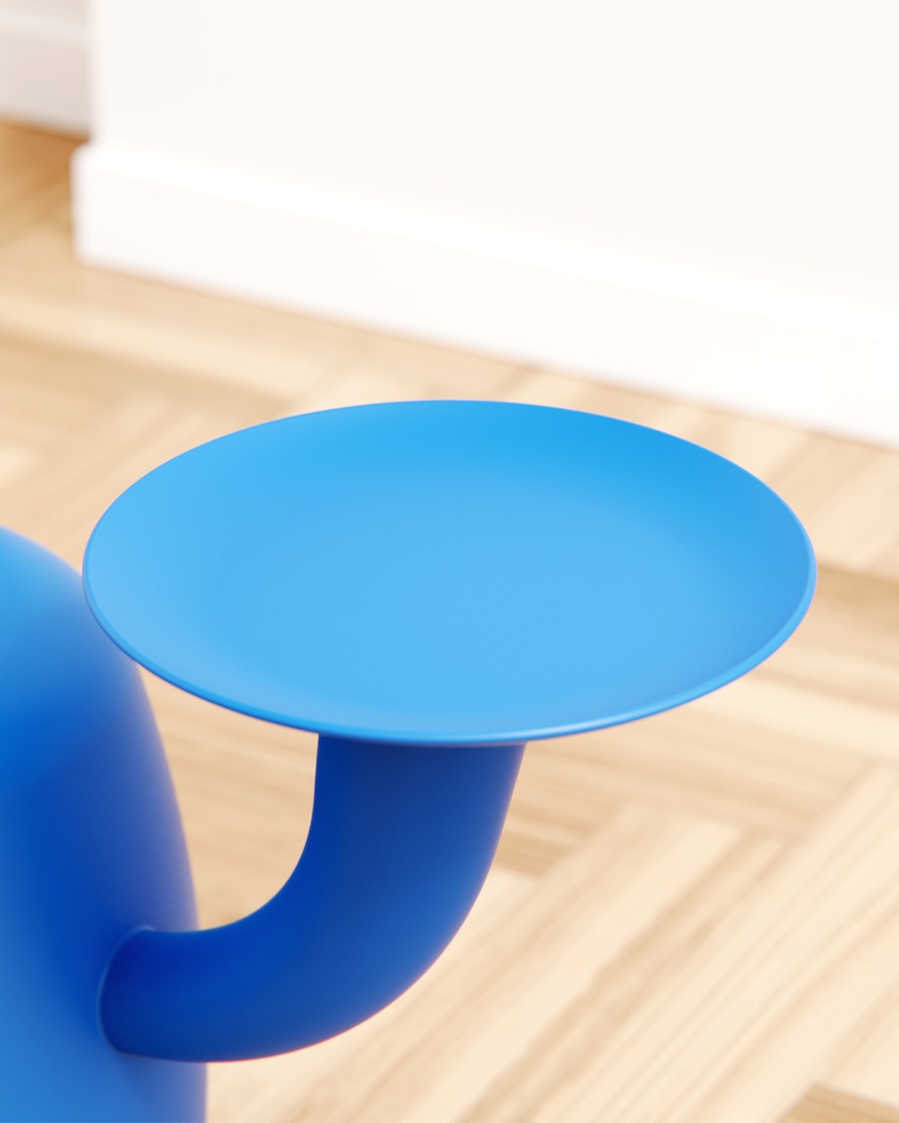
The butler concept is where the design gets genuinely clever. De la Bedoyere is not just making something cute, though it absolutely is that. The character premise actually explains the function. A butler exists to be present without being intrusive. It waits. It holds things for you. It serves without asking why. Translating that relationship into furniture means the form earns its personality rather than wearing it purely as decoration. The raised tray arm is not a quirky detail; it is a job description made physical.

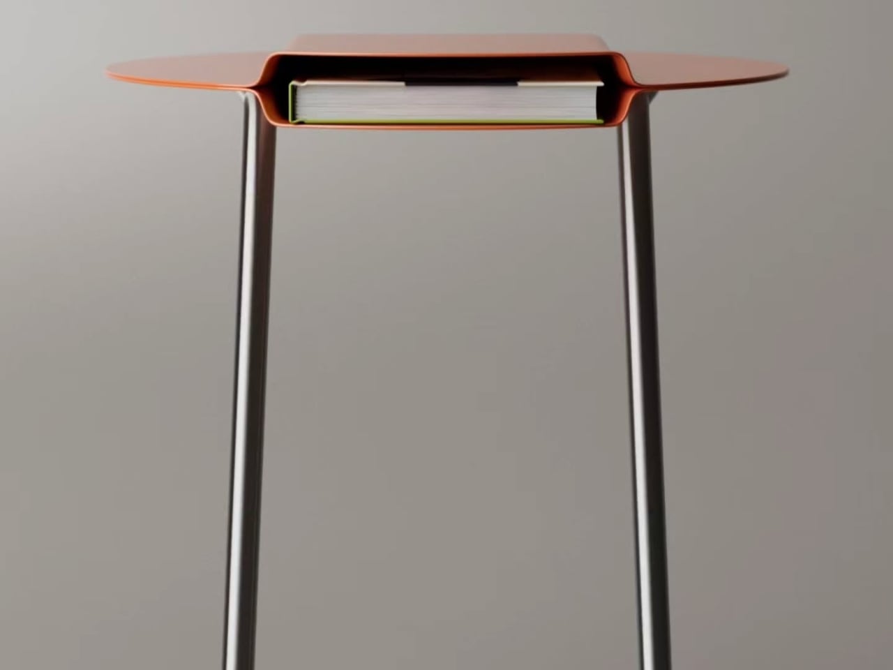
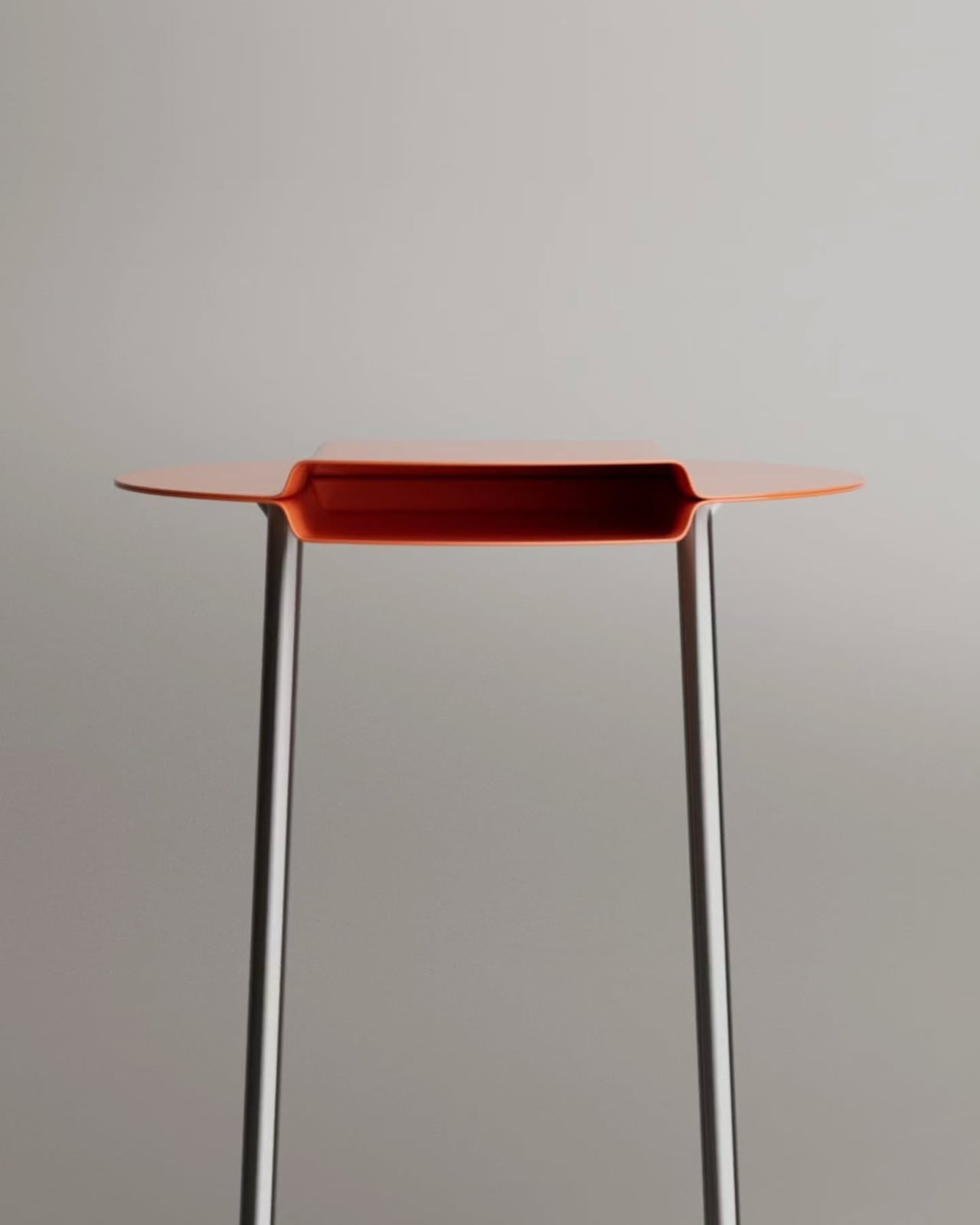
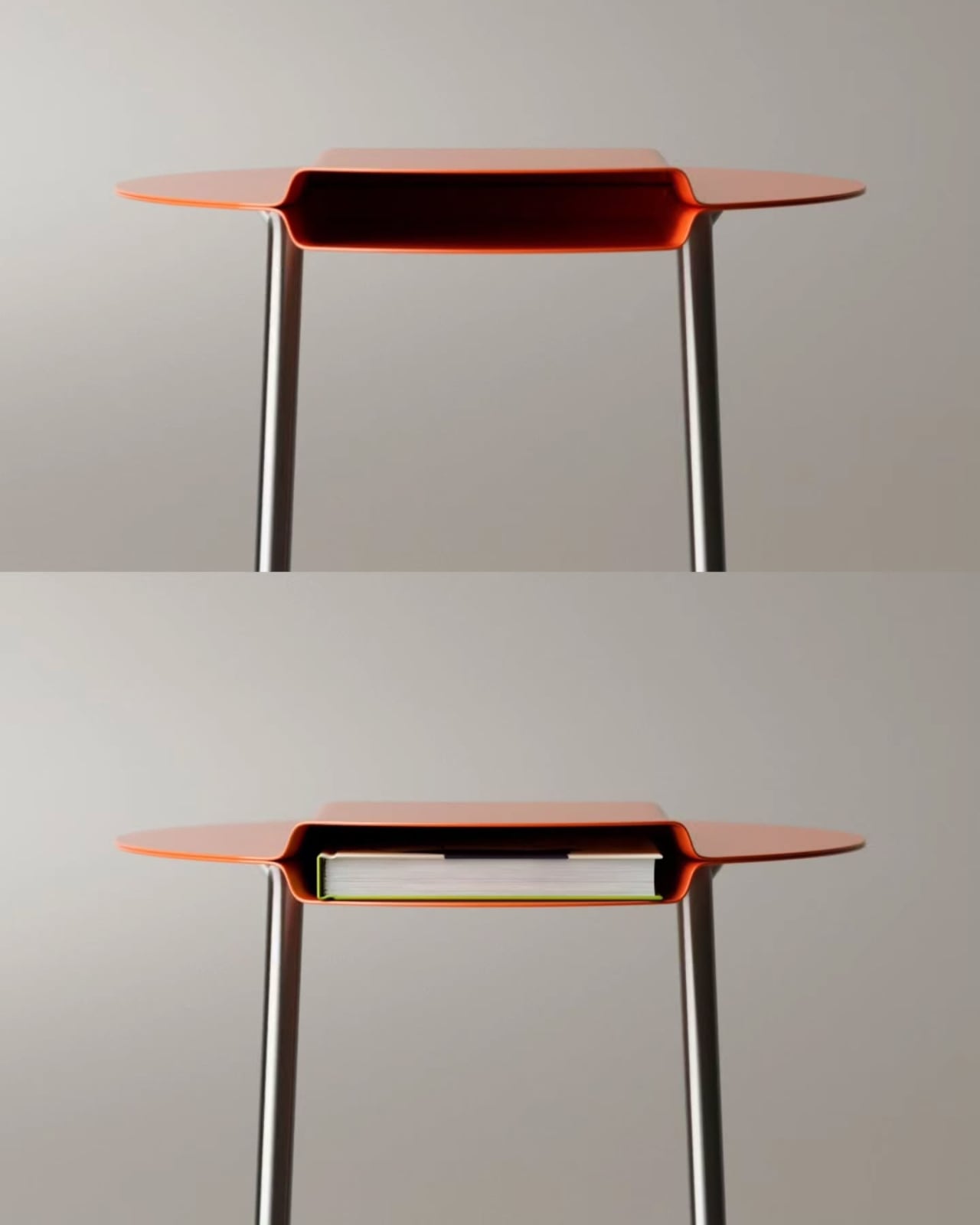
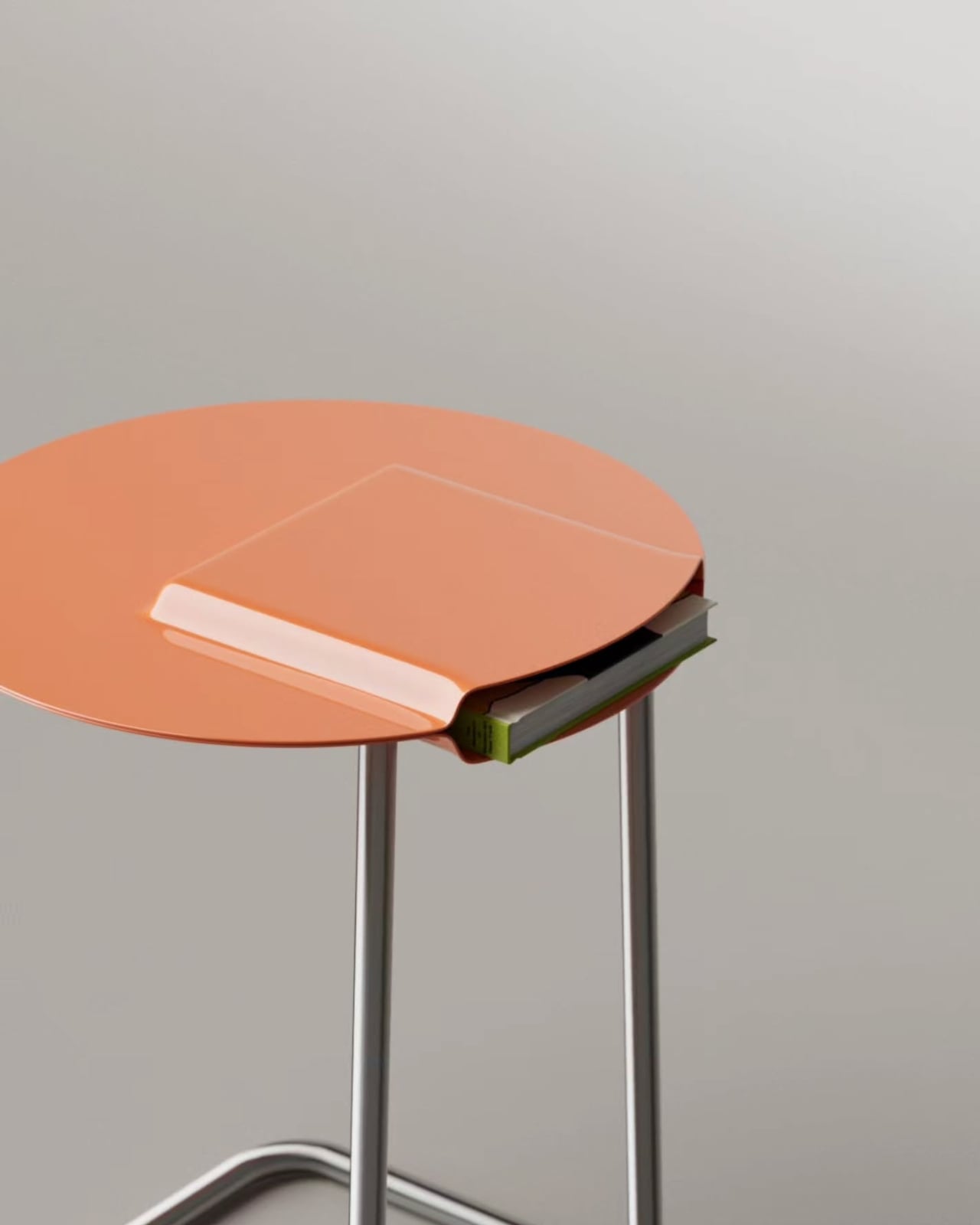
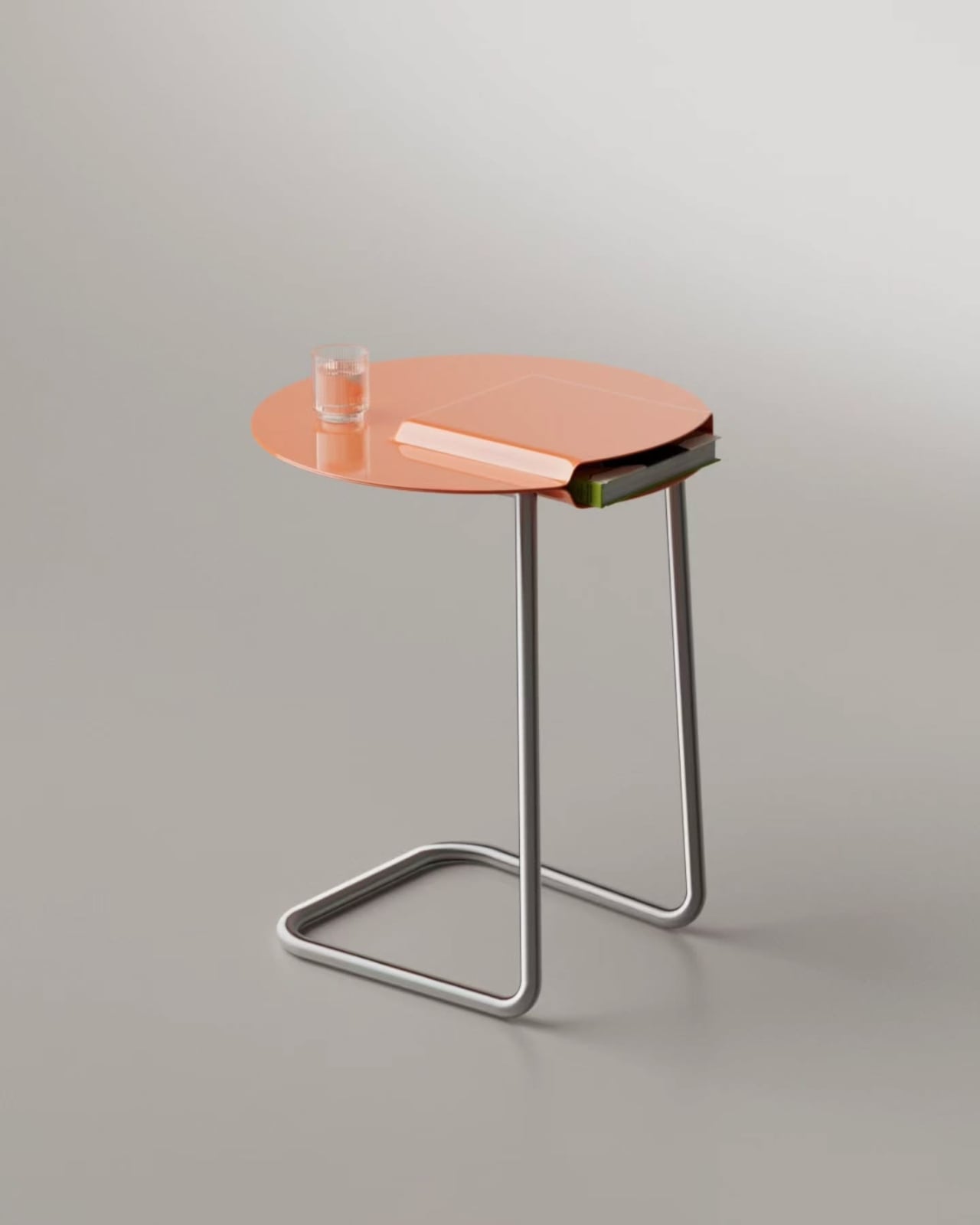
Functionally, Mini Monsieur works as both a stool and a side table, which makes it surprisingly practical for something that looks like it wandered off a Pixar set. The tray holds a glass, a phone, a book, whatever needs to be within arm’s reach without claiming additional floor space. A scaled render with a seated figure confirms it holds its own proportionally, compact without being precious, sized to actual human use rather than just optimized to photograph beautifully. You could genuinely use this every day.
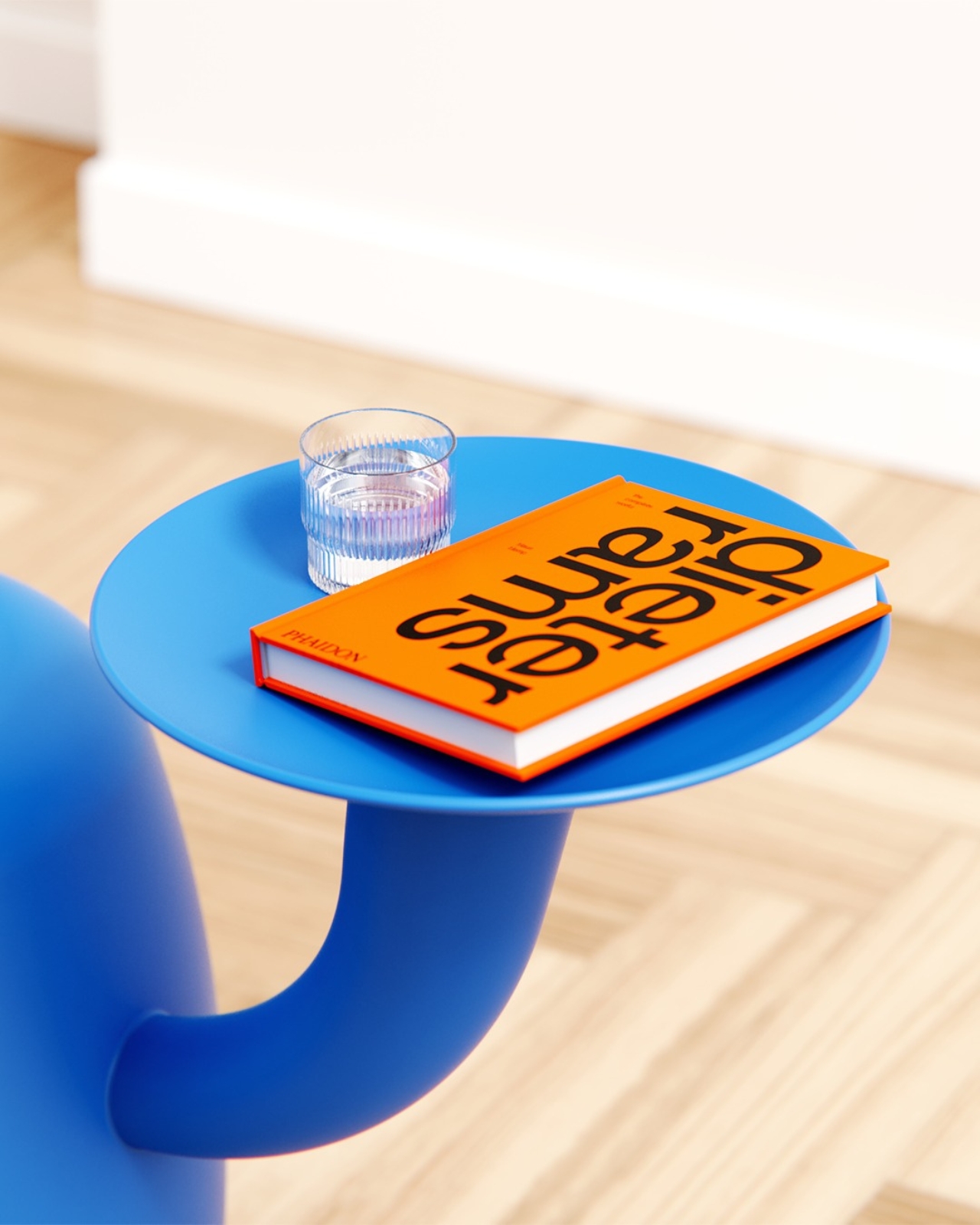
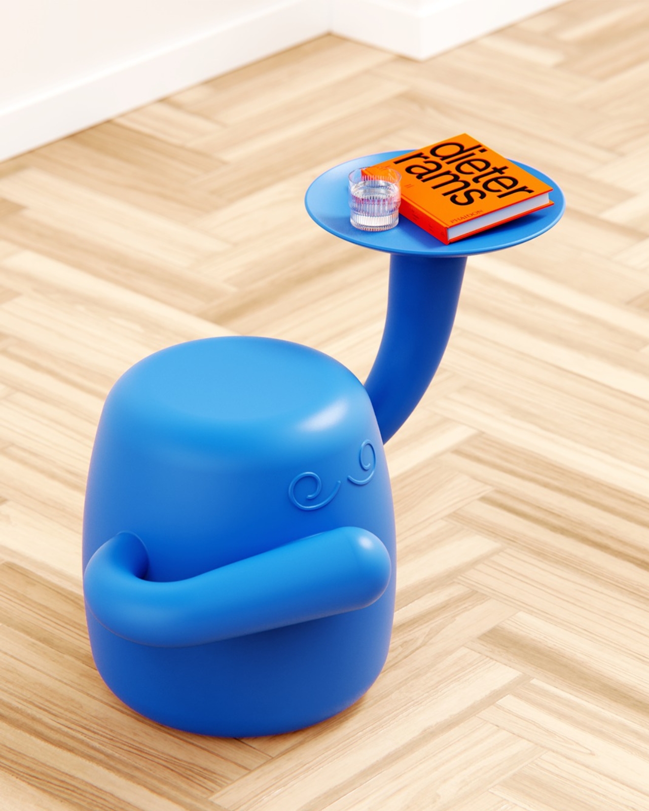
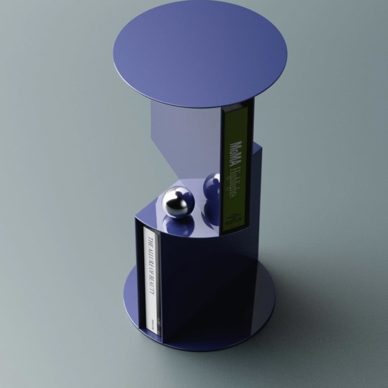
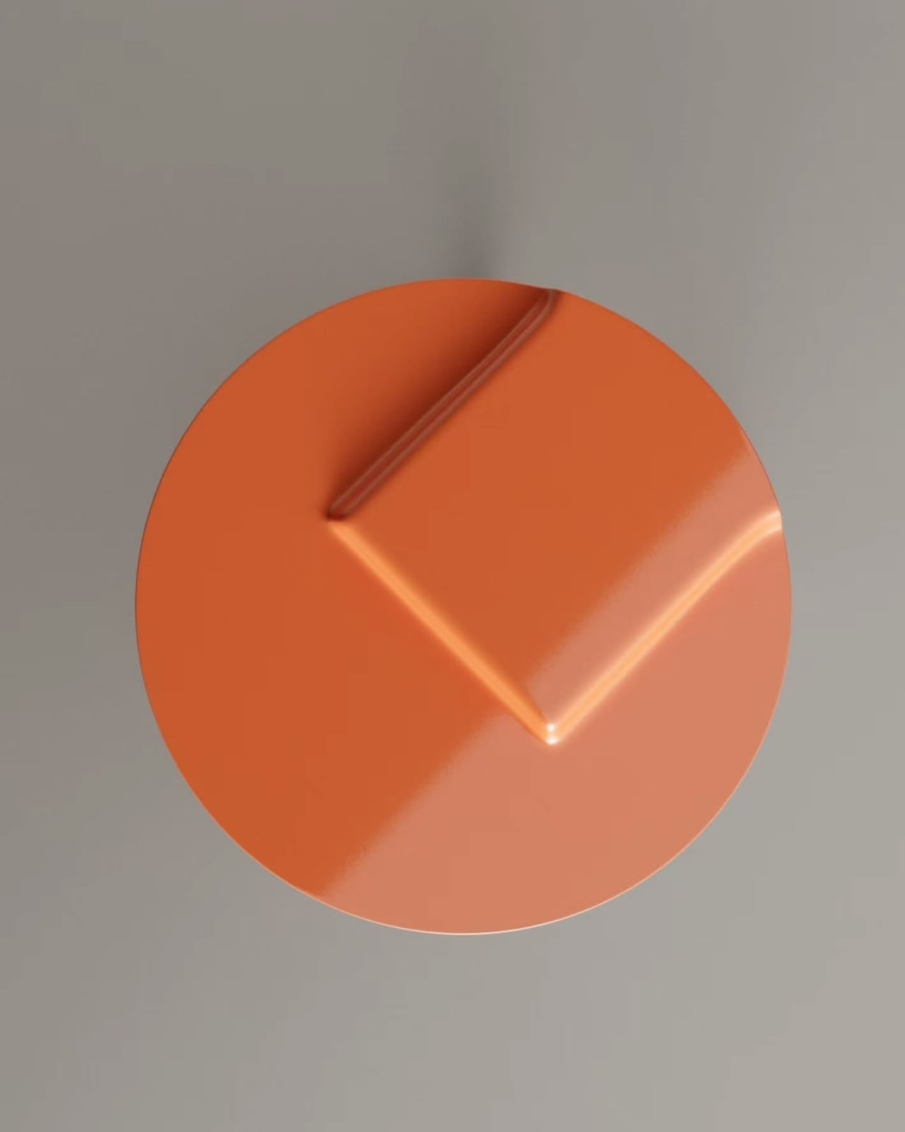
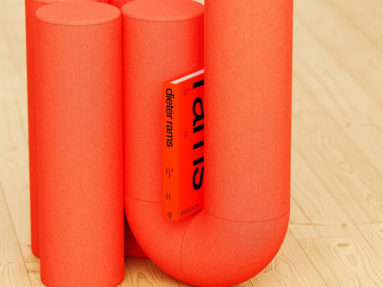
Where the design earns its real credibility is in the restraint around how far the character goes. No mouth. No eyes. Just those two curled brows and the asymmetrical arms. De la Bedoyere stops exactly where he should, giving Mini Monsieur enough personality to register as a character without crossing into novelty-item territory. That balance is harder to strike than it looks, and it is the reason this concept holds its own in conversation with serious design references. The Dieter Rams book staged on the tray in the renders is not accidental. It is a knowing nod to the idea that rigorous design intent and genuine warmth do not have to occupy separate spaces.
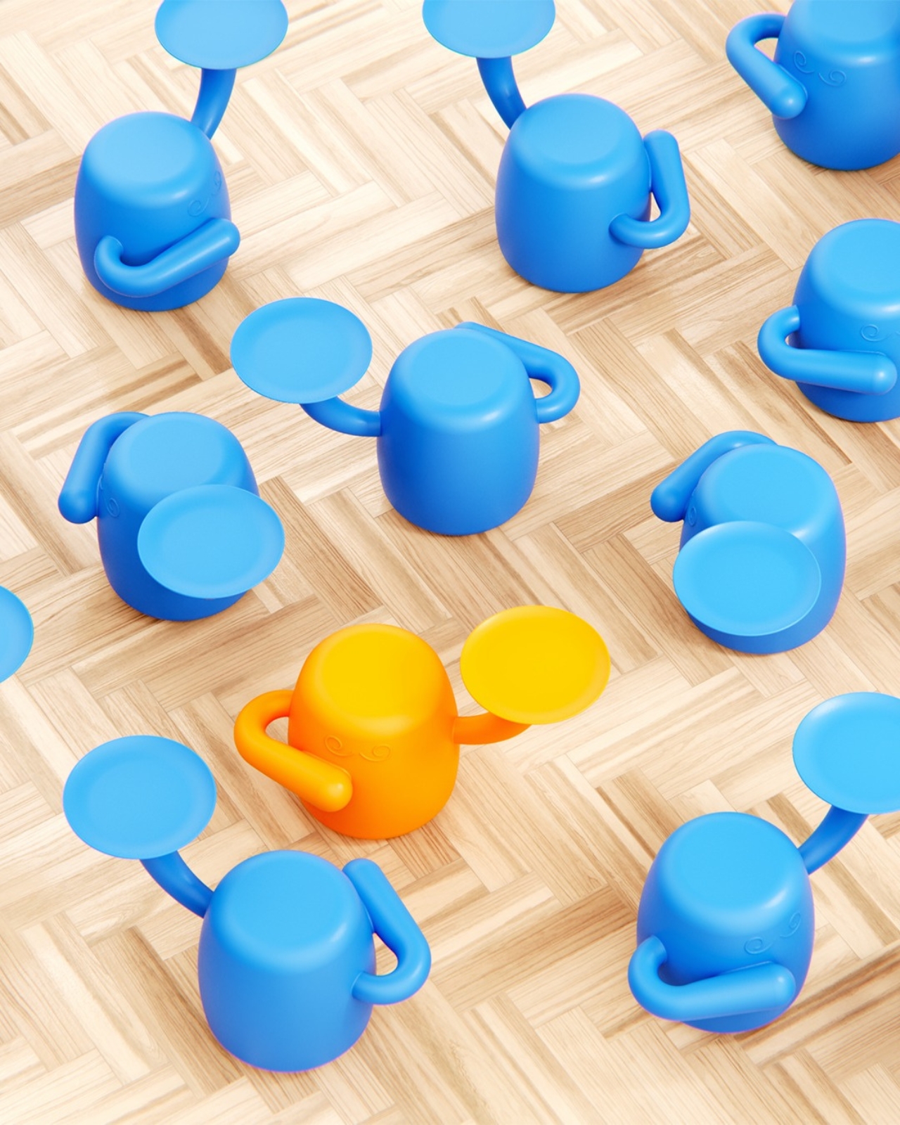
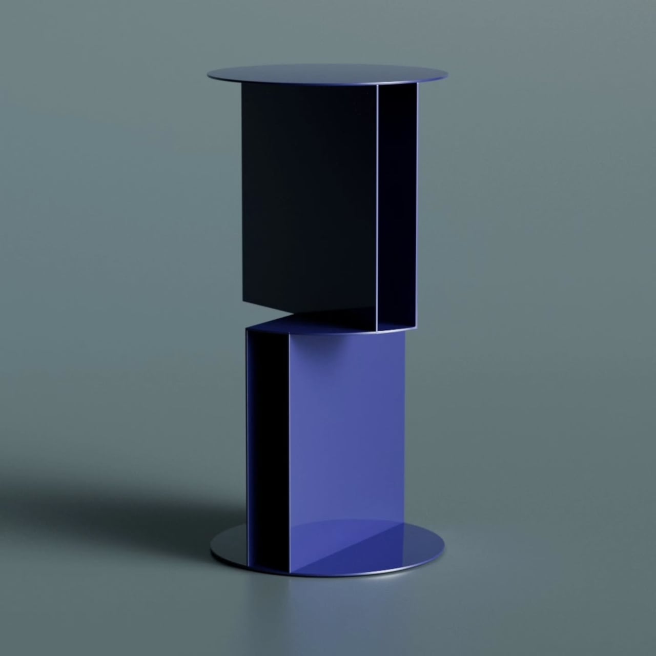
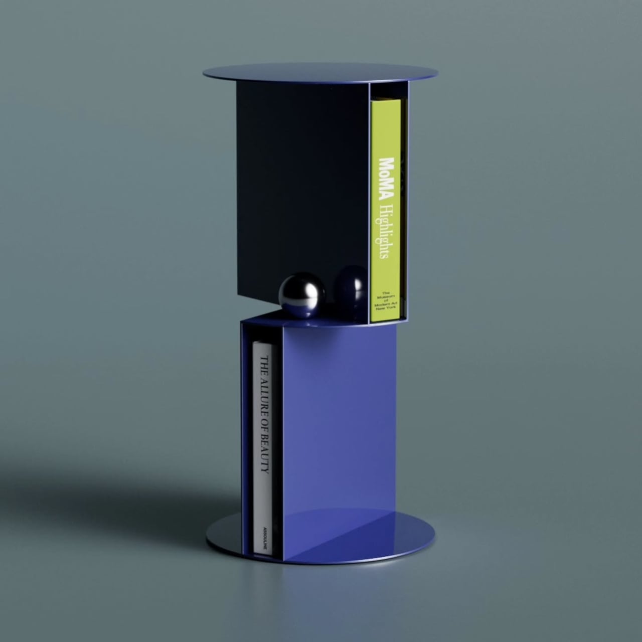
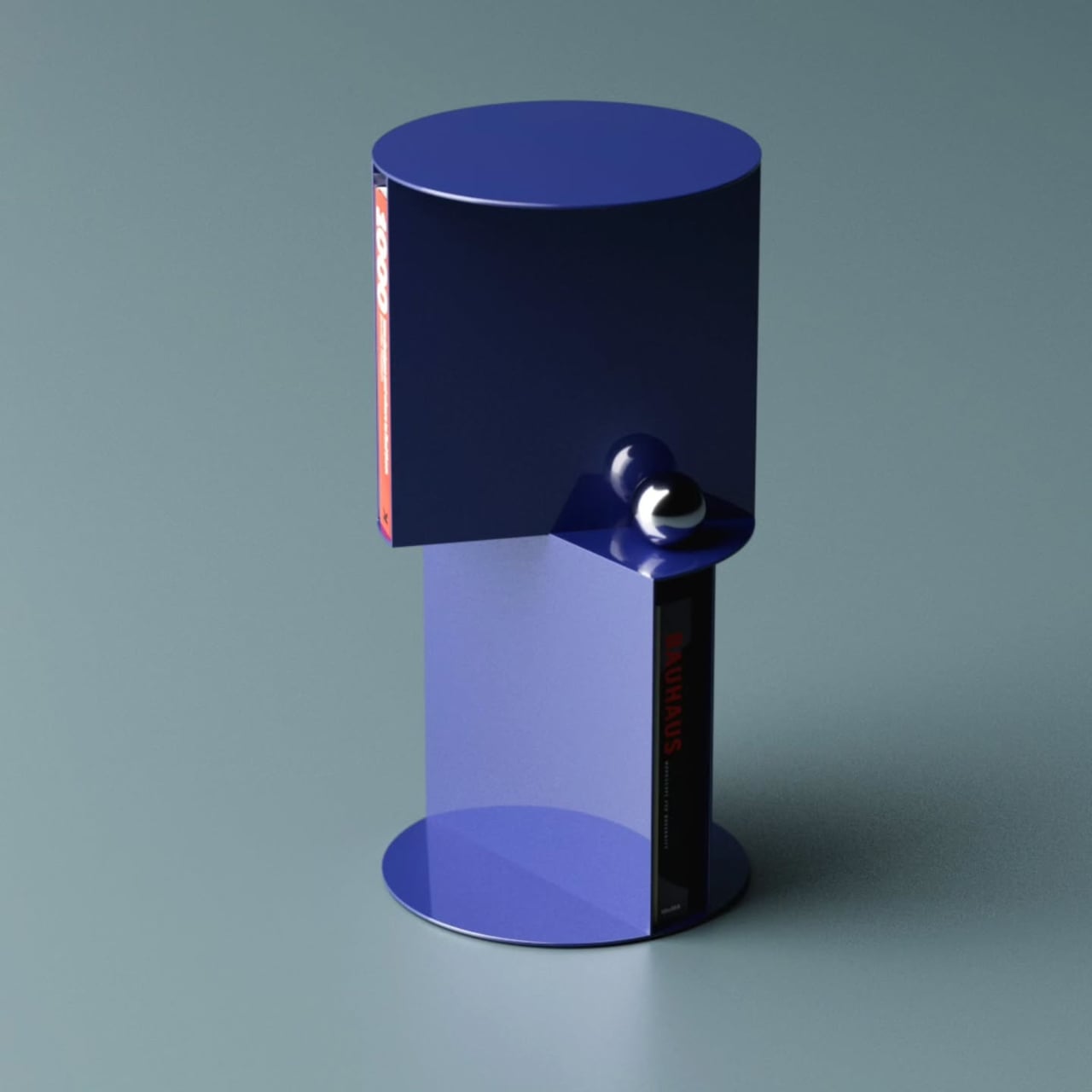
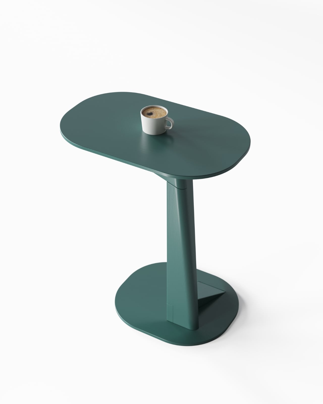
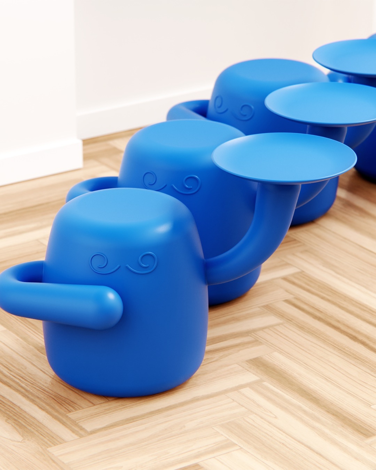
The all-over cobalt blue is also worth pausing on. Monochromatic execution is one of those choices that either elevates a form completely or exposes every weakness in it. Here, it does the former. The single-color treatment lets the silhouette read with full clarity, makes the curves feel more deliberate, and keeps the tray-as-arm reading as part of one cohesive body rather than a tacked-on accessory. One render includes a lone orange version surrounded by a field of blue, the kind of detail that signals a designer already thinking in colorways, editions, and how pieces behave as a family. That level of forward thinking is encouraging.
Whether Mini Monsieur moves from concept to production remains the open question, and frankly it is the only thing standing between this design and a very good home. My genuine hope is that it does, because the market for furniture that takes itself seriously while still being joyful is more underserved than we tend to acknowledge. Not everything needs to be a neutral linen cube or a Scandinavian plank. Sometimes a room benefits from something with a recognizable presence, a little dignity, and one arm already raised to take your drink. Mini Monsieur is already at its post, ready and waiting.
The post Your Home’s Newest Resident Is a Tiny Blue Butler first appeared on Yanko Design.