3 Brothers Finally Solved the LEGO Mess for £1,850

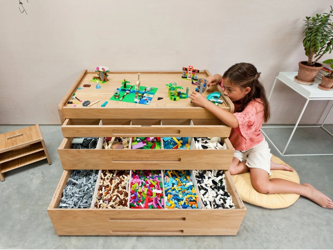
If you’ve ever stepped barefoot onto a LEGO brick at 2 a.m., you already understand the problem the Brickle was made to solve. But the solution the Newland brothers arrived at goes far beyond a plastic bin with compartments. It’s a piece of furniture. Real furniture. The kind that earns a permanent spot in your home and actually makes the room look better for being there.~

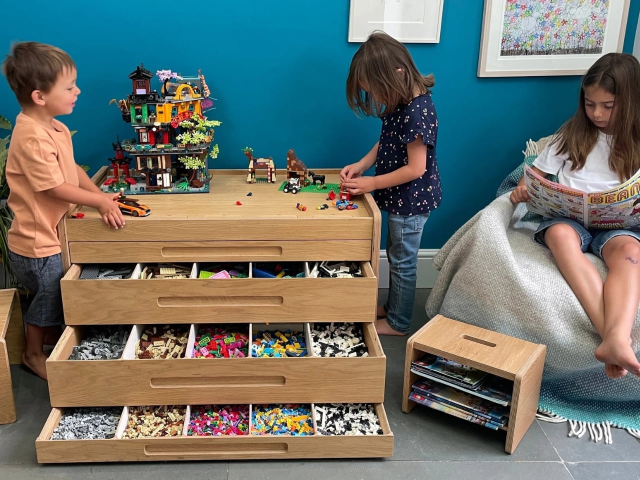
The Brickle is a LEGO storage and sorting table, handcrafted in Wales by three brothers: Ben, a nano-scientist; Matt, an engineer; and Geoffrey, an LSE graduate. The product came out of a very ordinary parental frustration. Ben noticed his kids had stopped building their own things. They were only following kit instructions, because digging through a jumbled pile of bricks to find the one piece you need takes too long and kills the creative momentum entirely. His first attempt at a solution started with rough MDF and a lot of trial and error. Fourteen prototypes later, the Brickle was born.

Designers: Matt, Ben, and Geoffrey Newland
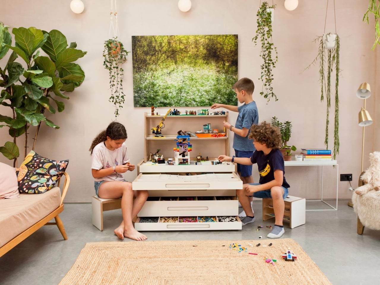
That origin story matters because it’s what separates this product from every other overpriced gadget that promises to fix something you’ve been managing just fine without. The Brickle wasn’t designed in a boardroom. It came from a dad who wanted his kids to build more freely, and then happened to have two brothers with the right skill sets to help him do it properly.
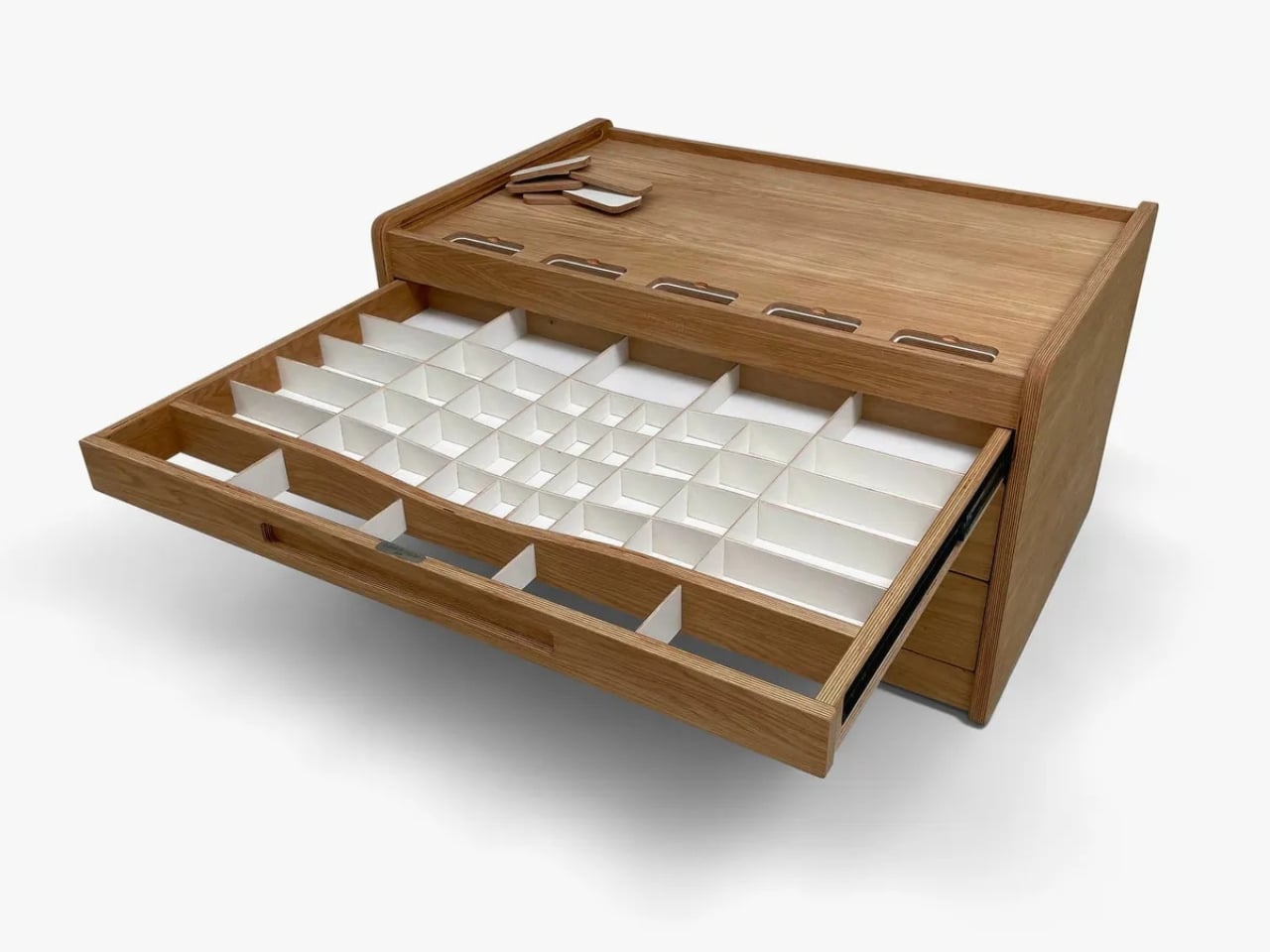
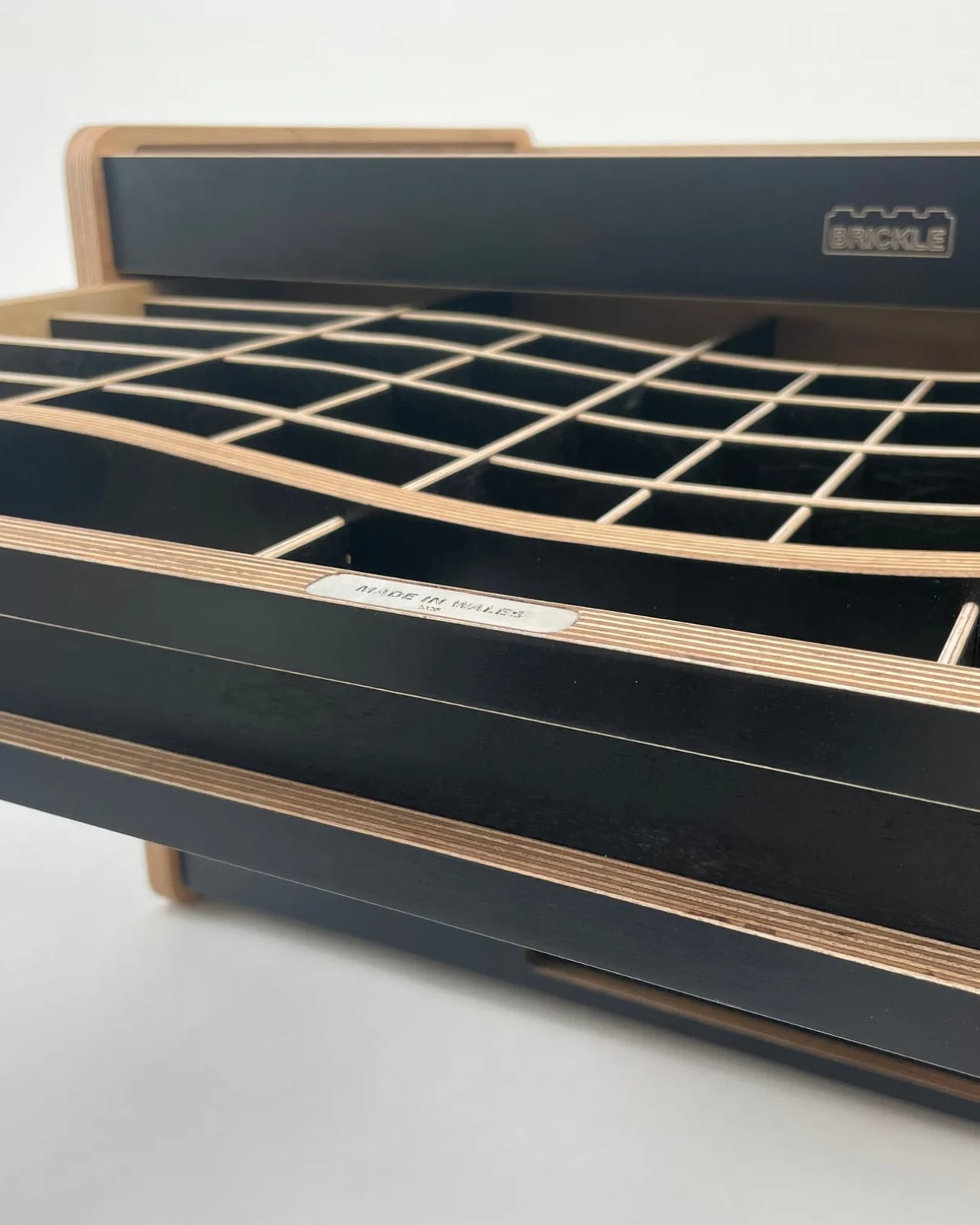
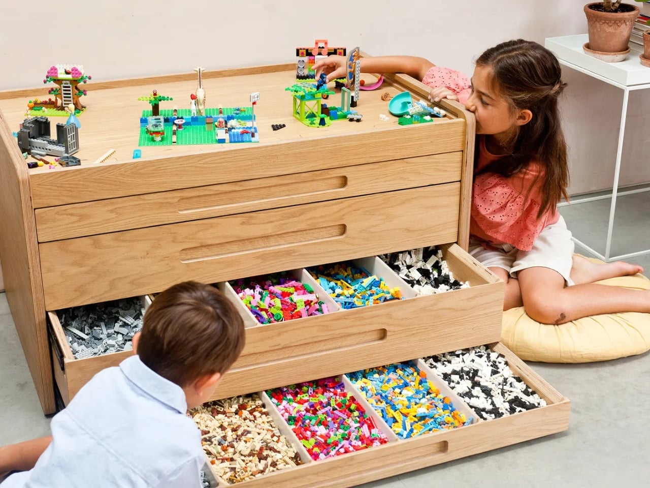
The design itself is genuinely considered. The filtration system sorts bricks by size as they’re dropped in, which means the sorting happens as part of play rather than as a separate chore nobody wants to do. The drawers are accessible, the surface doubles as a proper play table, and the whole unit is built to last long enough to hand down. Wallpaper* Magazine described it as “the most elegant LEGO storage system ever made,” and it’s difficult to argue with that. It looks like something from a high-end children’s furniture brand, not a toy storage category.
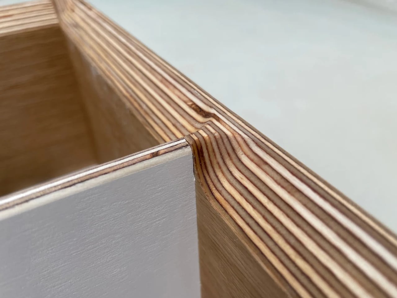
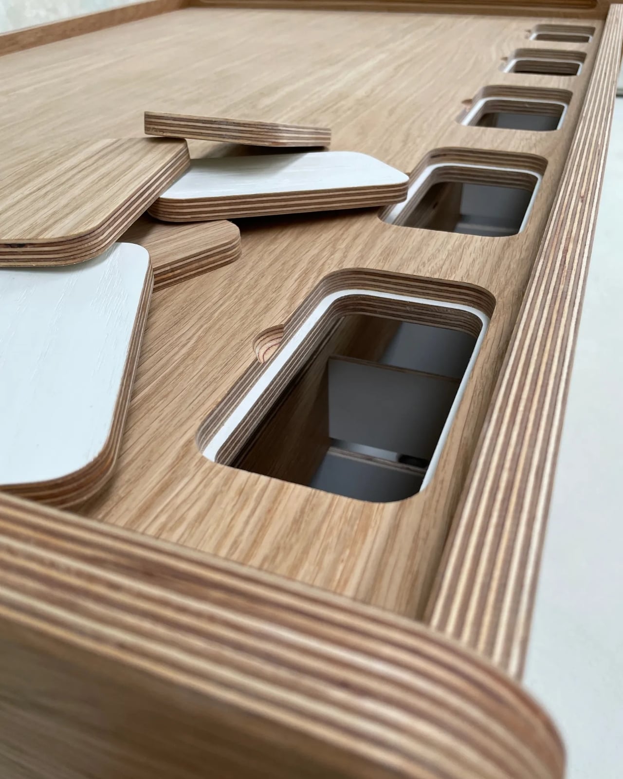
The price reflects that. The cream version starts at £1,850, with an oak version at £3,650. That’s a significant amount of money, and I don’t think it’s useful to pretend otherwise. But the conversation around the Brickle isn’t really about whether it’s affordable. It’s about what it represents: the idea that objects designed for children don’t have to be ugly, that good design and practicality aren’t mutually exclusive, and that some things are worth making extremely well even if fewer people can buy them. The Brickle sits comfortably alongside other premium design pieces that parents justify not as toys but as furniture investments. Which is exactly what it is.
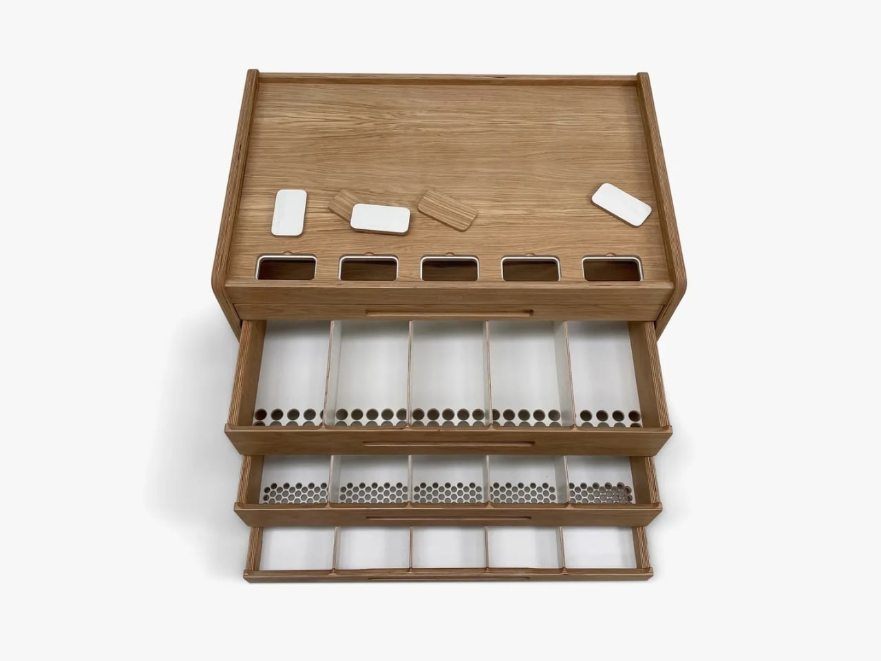
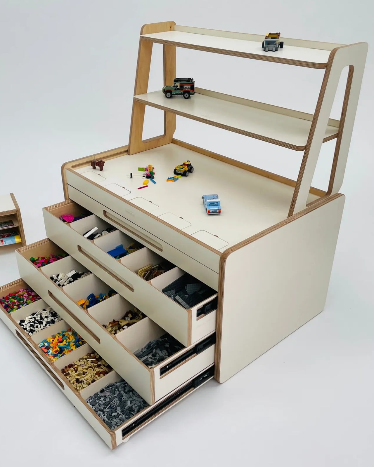
The creativity angle is arguably its most compelling argument. Parents who own a Brickle consistently report that their kids started building original things instead of just following kit instructions. One parent noted that her daughters were finding it easier to create their own sets and games. Another mentioned that the sorted, accessible layout helped his son with ADHD stay focused long enough to actually finish builds. These aren’t polished marketing claims. They’re the kind of specific, unscripted feedback that usually only shows up when a product genuinely changes how someone uses a space.
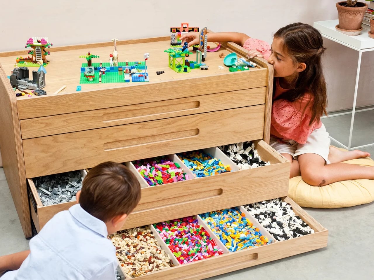
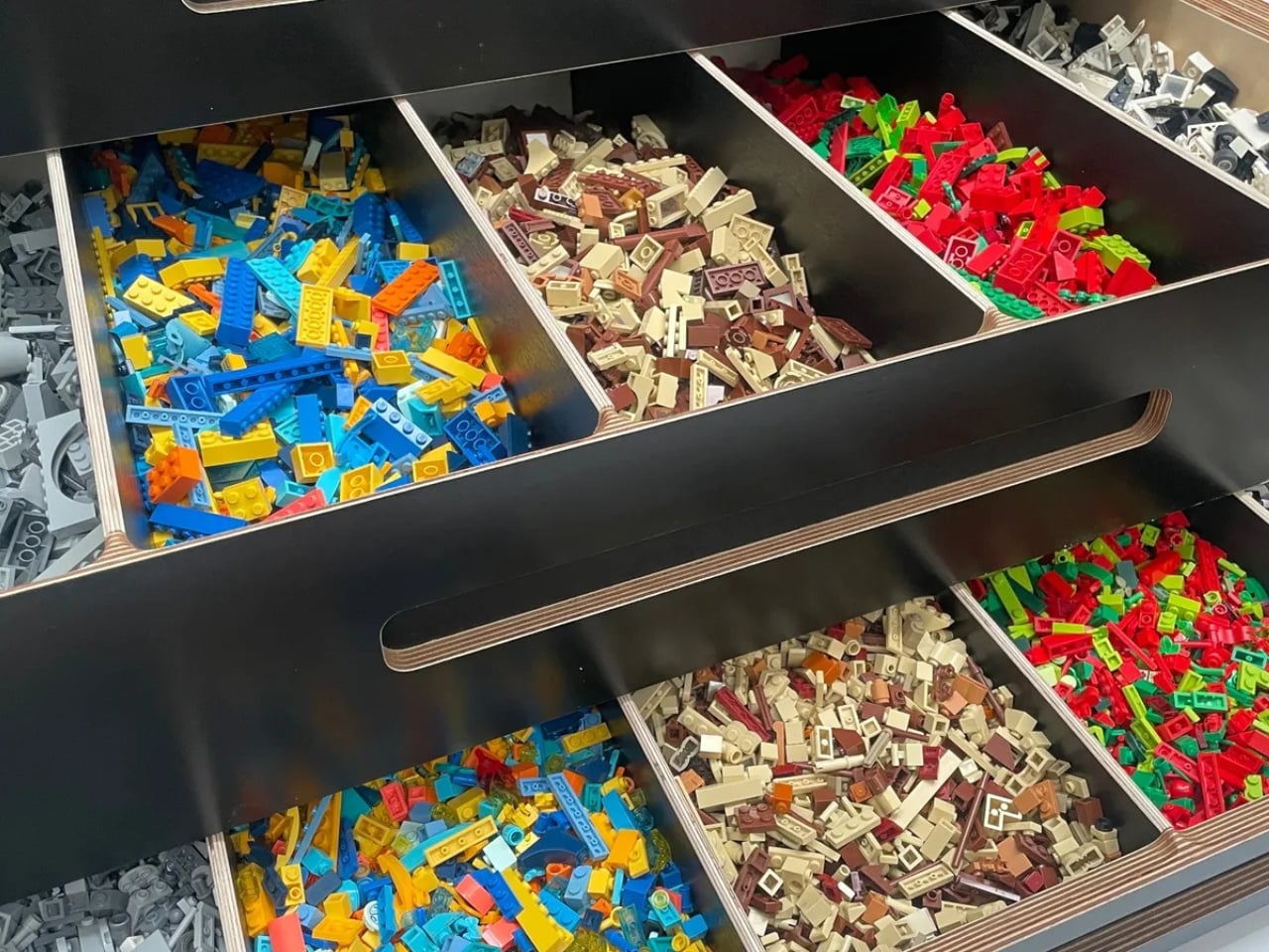
The Brickle also comes in a smaller version called the Brickle Bach (Bach is Welsh for small), which handles up to 9 kilograms of bricks. Matching stools and shelves round out the range, meaning you can pull together an entire LEGO corner that looks like it was designed on purpose.
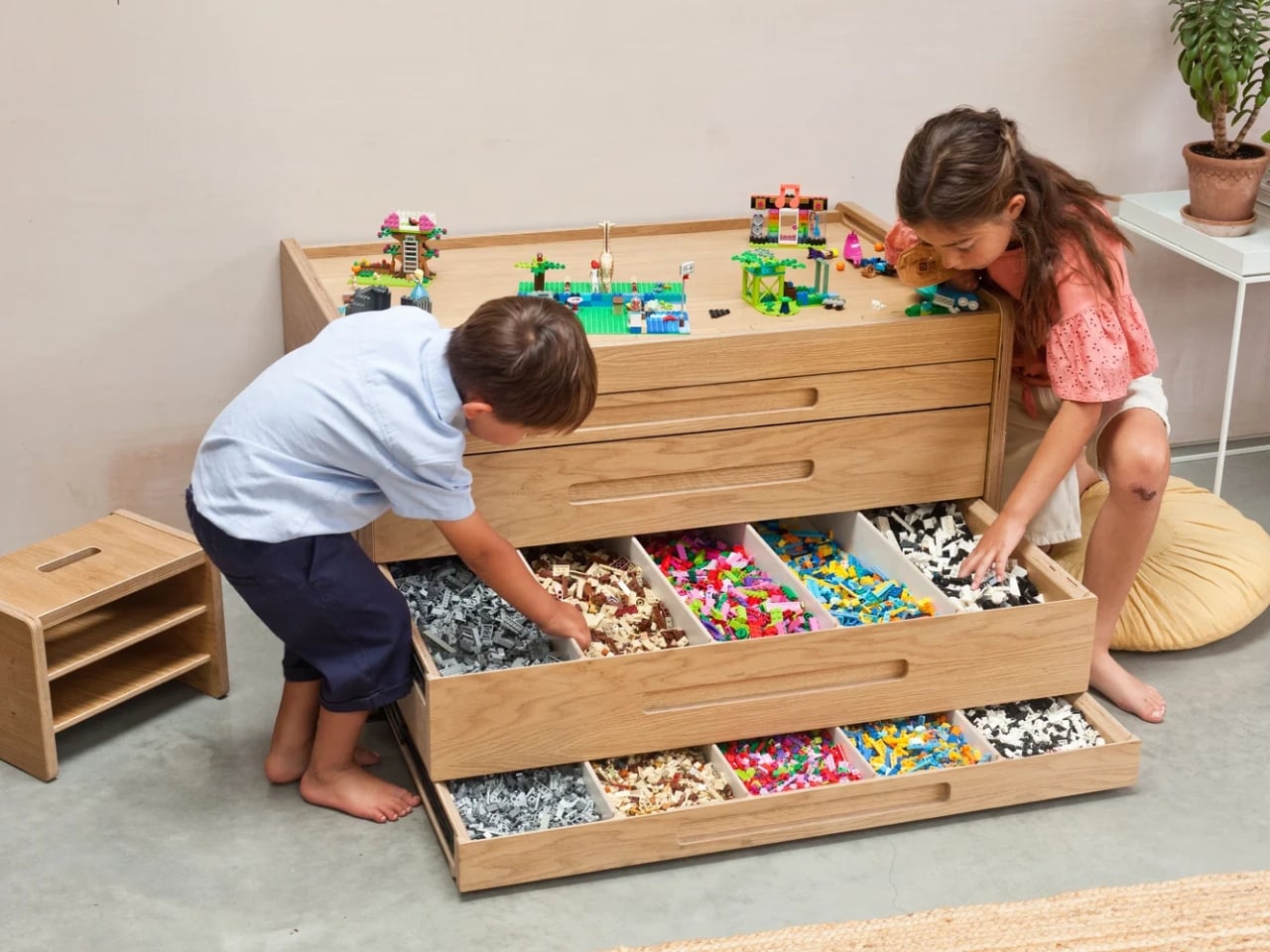
The Newland brothers still operate out of a workshop on the West coast of Wales, which adds a quiet layer of meaning to the whole thing. This isn’t a startup that found a manufacturer and slapped a logo on it. It’s a family making something they believe in, in a place that means something to them. The LEGO chaos in your home isn’t going anywhere. But with the Brickle, it might finally have a place that suits it.
The post 3 Brothers Finally Solved the LEGO Mess for £1,850 first appeared on Yanko Design.
Furniture Made From Wood Scraps You’d Actually Pay For

Every furniture workshop generates a particular kind of guilt. There are the offcuts, the trimmings, the odd-shaped remainders of boards that got cut to size and are now too small for anything useful, or so we assume. Most of them end up as kindling, compost, or landfill. We’ve accepted that as the cost of making things, a small fine paid for the privilege of precision. Studio Booboon is not interested in paying that fine.

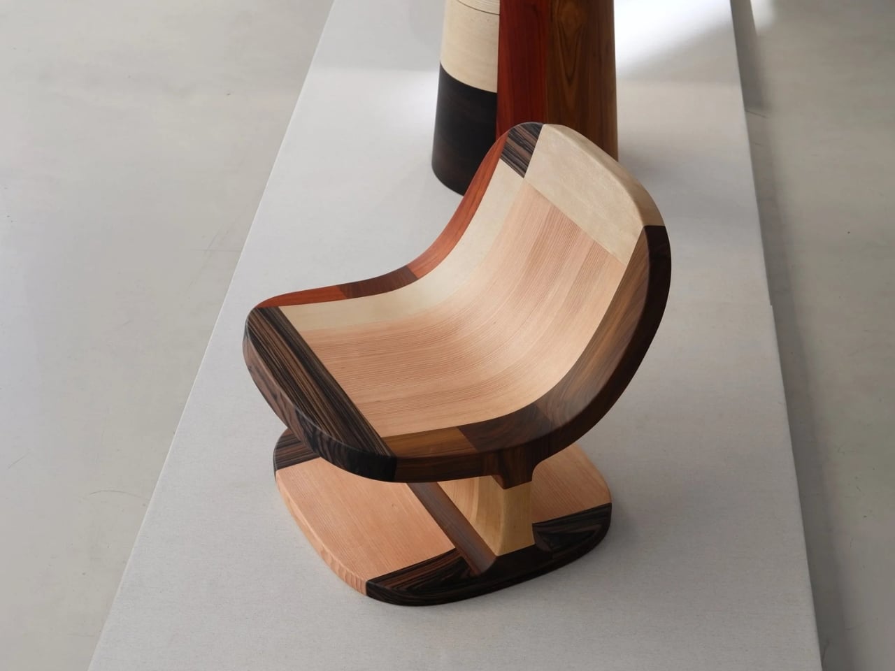
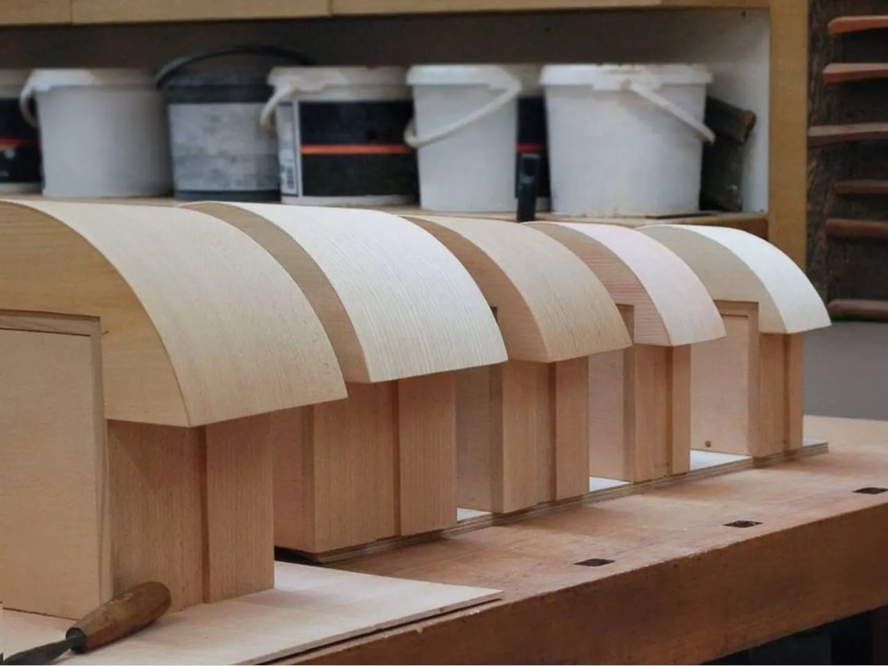
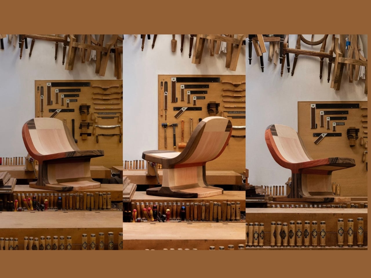
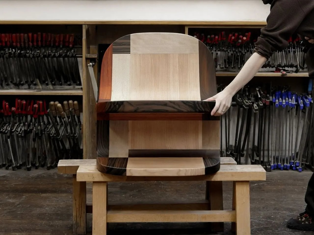
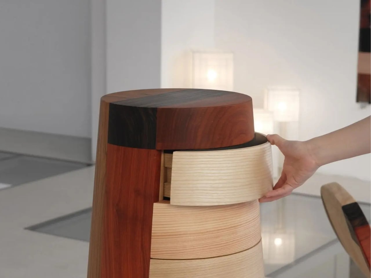
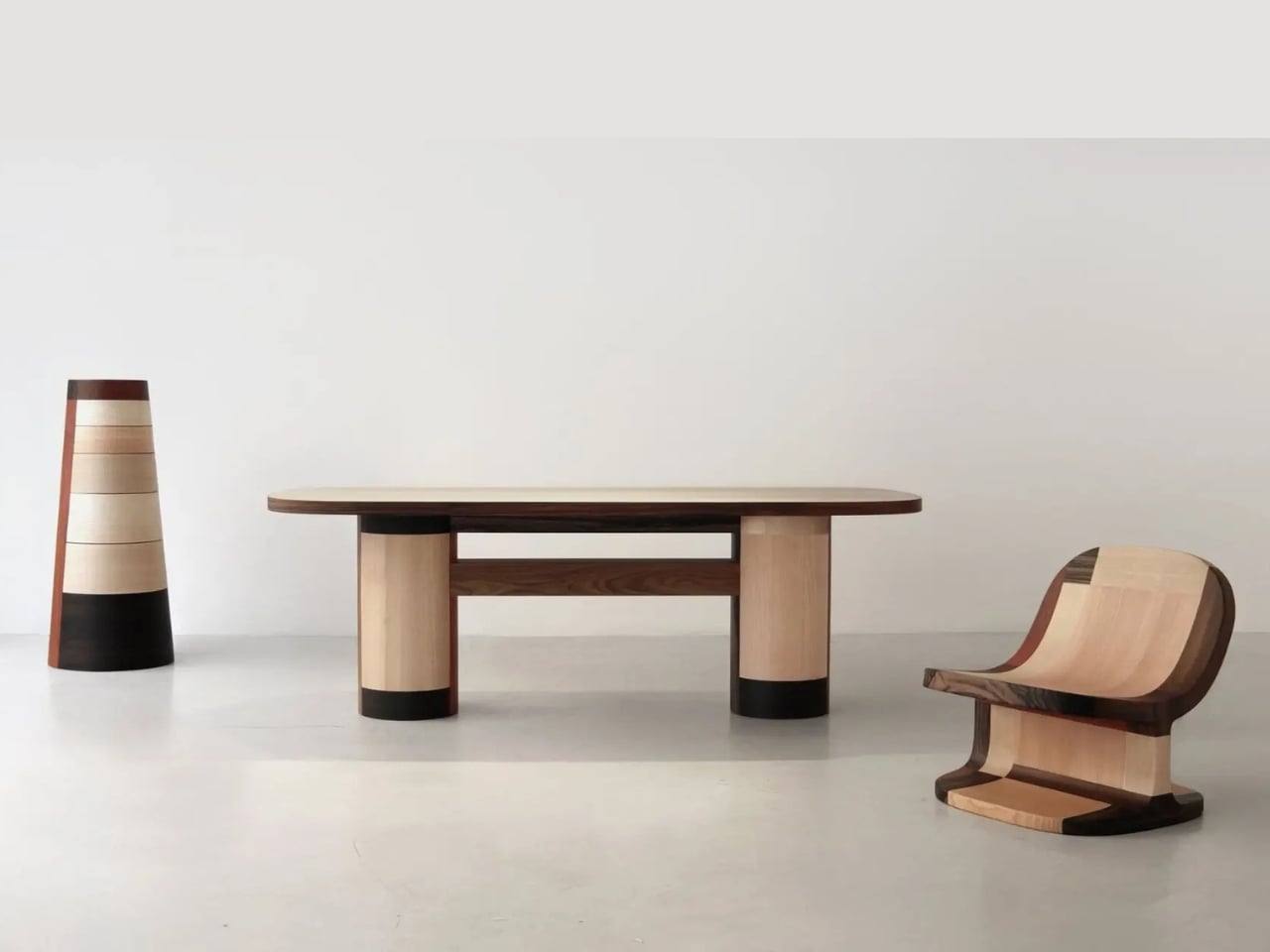
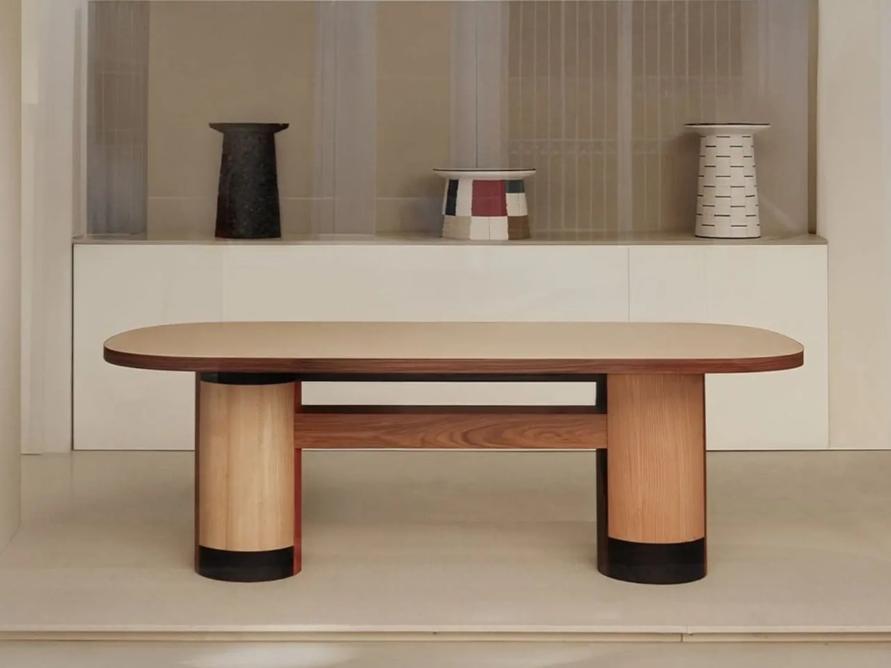
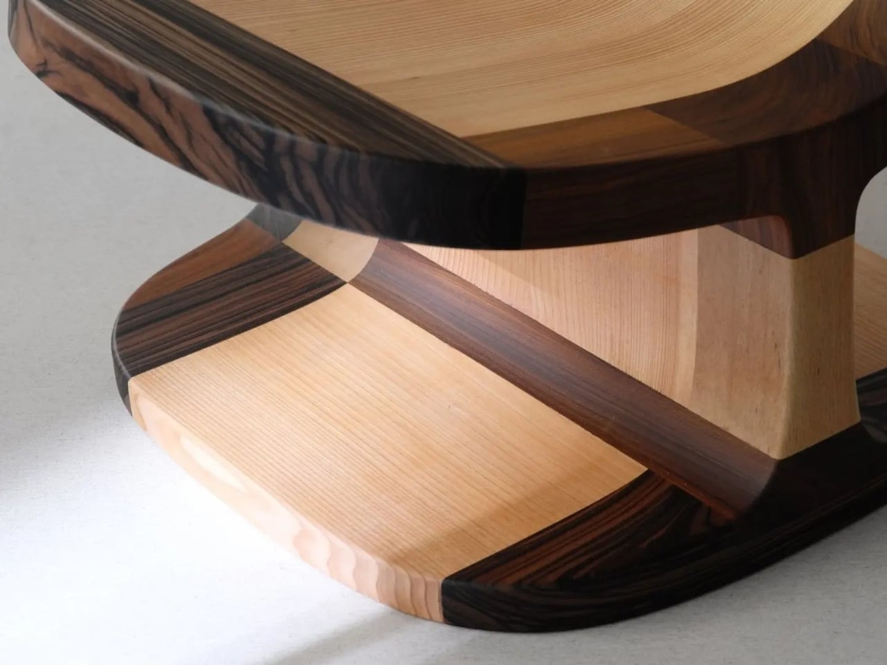
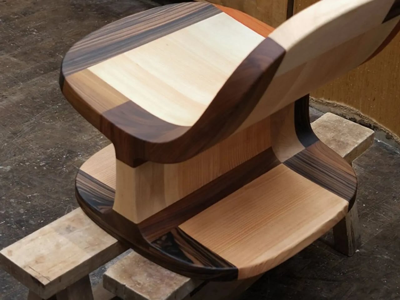
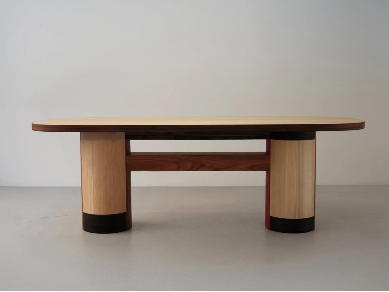
The Copenhagen-based studio, founded by Richard Bone and Jisu Yun, two designers who both trained under Japanese studio Nendo, released their latest collection, Fragments Becoming, and it’s exactly the kind of work that makes you wonder why no one thought to do it this way sooner. The collection is built entirely from timber offcuts, and before you picture something rustic or deliberately imperfect, let me be clear: these pieces are stunning. A cabinet, a dining table, and a lounge chair, each constructed from assembled fragments of discarded wood arranged with such precision and intention that the effect is closer to fine art than furniture-as-apology for sustainability.

Designer: Studio Booboon

The concept the studio uses is something they call “3D marquetry,” which sounds technical but is actually a fairly elegant idea once you sit with it. Traditional marquetry, the kind you’d see on antique furniture or decorative boxes, applies a pattern to a surface. It’s essentially decoration laid on top of structure. What Studio Booboon does instead is treat each fragment of wood as the structure itself. The pattern isn’t on the cabinet door; the door is the pattern. It runs through the object’s entire volume, which means the visual logic and the physical construction are the same thing. That’s not a subtle distinction. That’s a fundamentally different philosophy.

What I appreciate about this approach is that it removes the option to hide mistakes. The studio works with unstained wood, which means every fragment has to earn its place on its own terms, no pigment masking a poor match, no stain blurring the edges. Each piece has to work compositionally before it works functionally. That kind of constraint tends to produce either chaos or brilliance, and in this case, it’s clearly the latter.

Bone and Yun bring a cross-cultural sensibility to the work that shows up in the details. Their debut collection, Playful Reappropriation, released at Milan Design Week 2024, pulled from Korean craft traditions, and Fragments Becoming continues that thread. The materials include hanji (traditional Korean paper), canvas, silk, and Ottchil, a Korean lacquer technique that adds depth without dominating the natural tones of the wood. The combination of a British RCA education, Korean craft heritage, and a shared apprenticeship at Nendo, one of the most conceptually rigorous studios in contemporary design, explains a lot about why this work feels so considered without ever feeling cold.

The collection premiered at Milan Design Week 2026 and later showed at Other Circle 2026 during 3daysofdesign in Copenhagen. That double-billing matters. Milan tends to reward spectacle, while the Copenhagen circuit rewards ideas. The fact that Fragments Becoming landed well in both contexts suggests it’s doing something more than just looking good in photographs, which, for the record, it absolutely does.

Sustainability in design has become such an overused talking point that the word barely registers anymore. Every brand gestures toward it. But there’s a difference between sustainability as a value and sustainability as a method, and Studio Booboon’s work lives in the second category. They’re not telling you the collection is responsible and letting the aesthetics carry a different message. The responsible practice is the aesthetic. The offcut isn’t hidden. It’s the whole point.

That feels rare enough to be worth paying attention to. Design tends to celebrate the new, the seamless, the perfect. Fragments Becoming makes a quiet argument that the incomplete, the leftover, and the discarded might be where the most interesting work is still waiting to happen.

The post Furniture Made From Wood Scraps You’d Actually Pay For first appeared on Yanko Design.
A Chair With a Drawer, a Calendar, and a Point of View

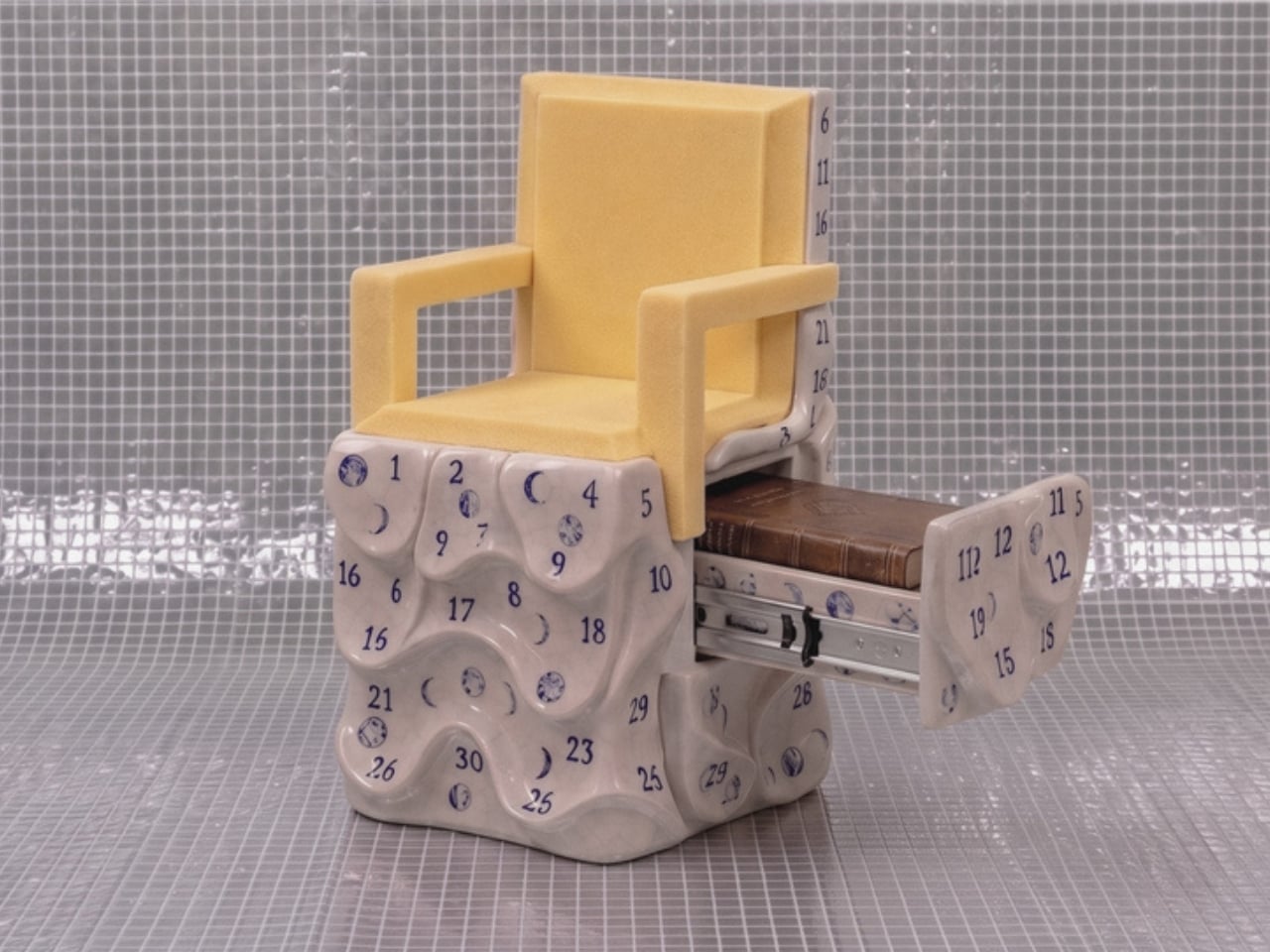
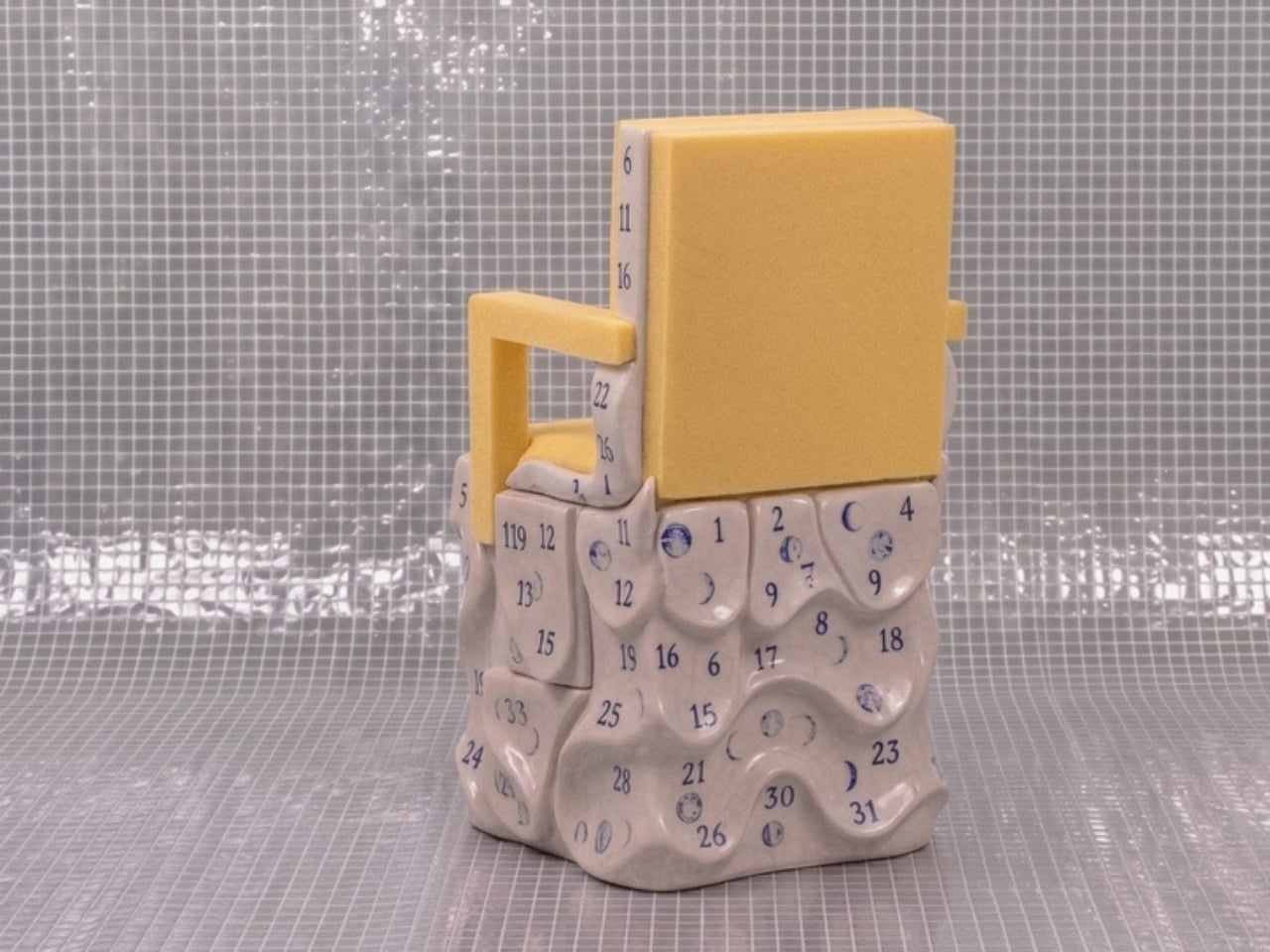
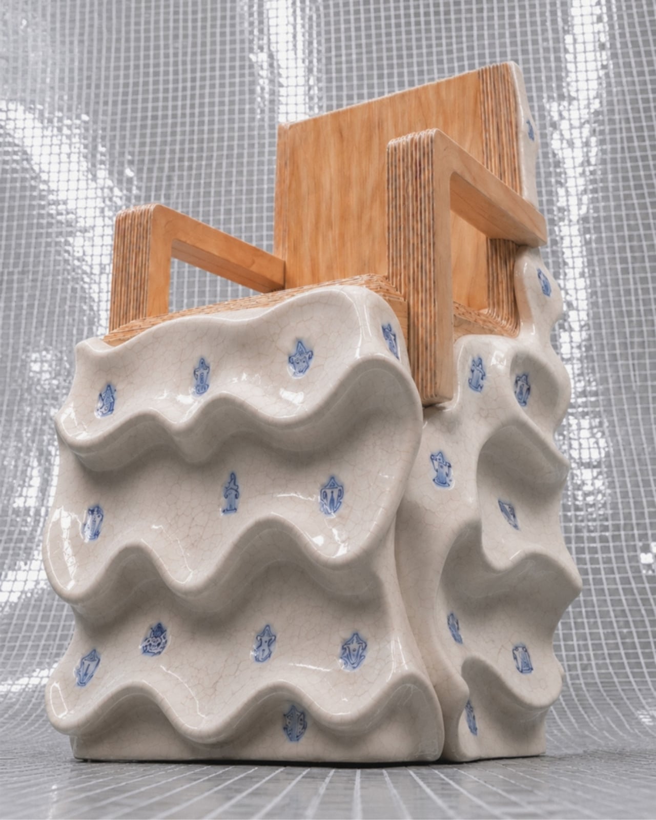
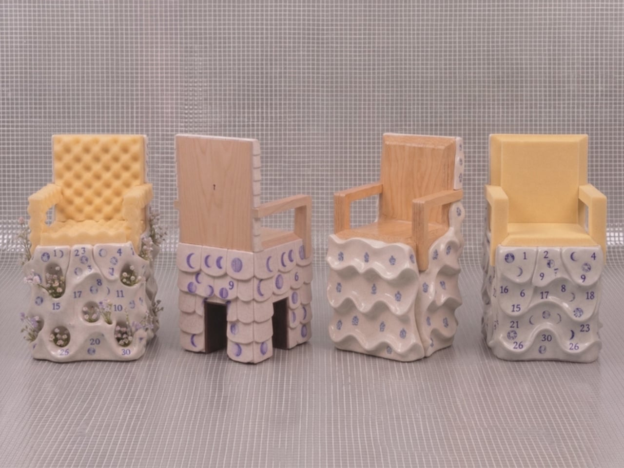
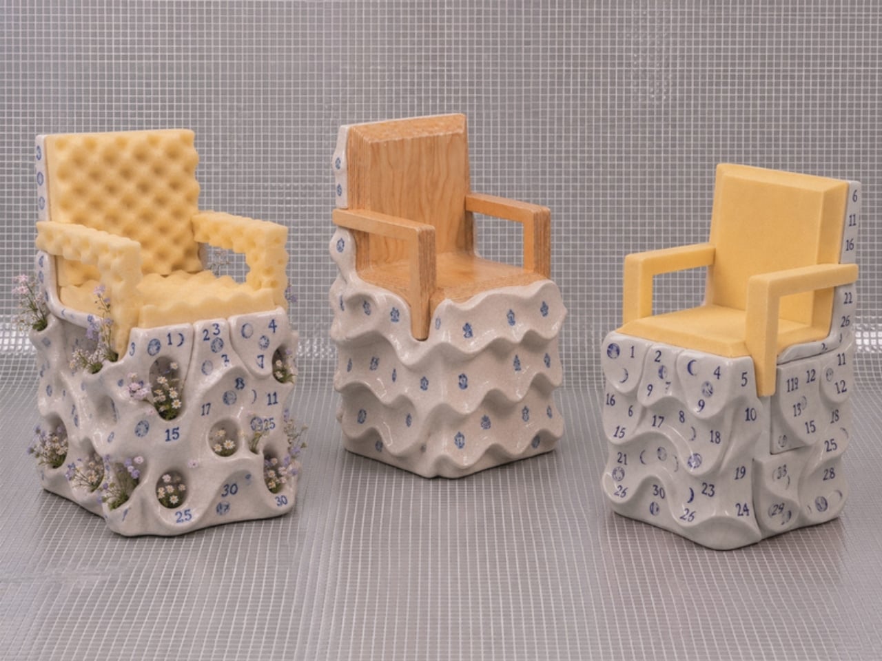
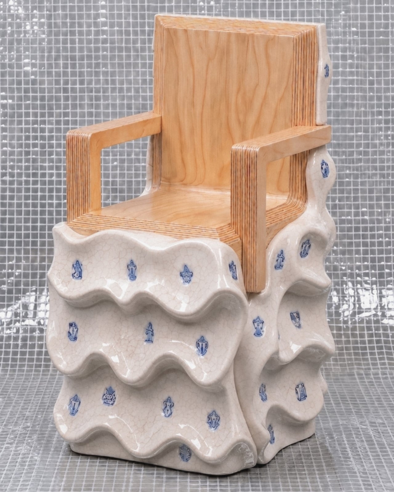
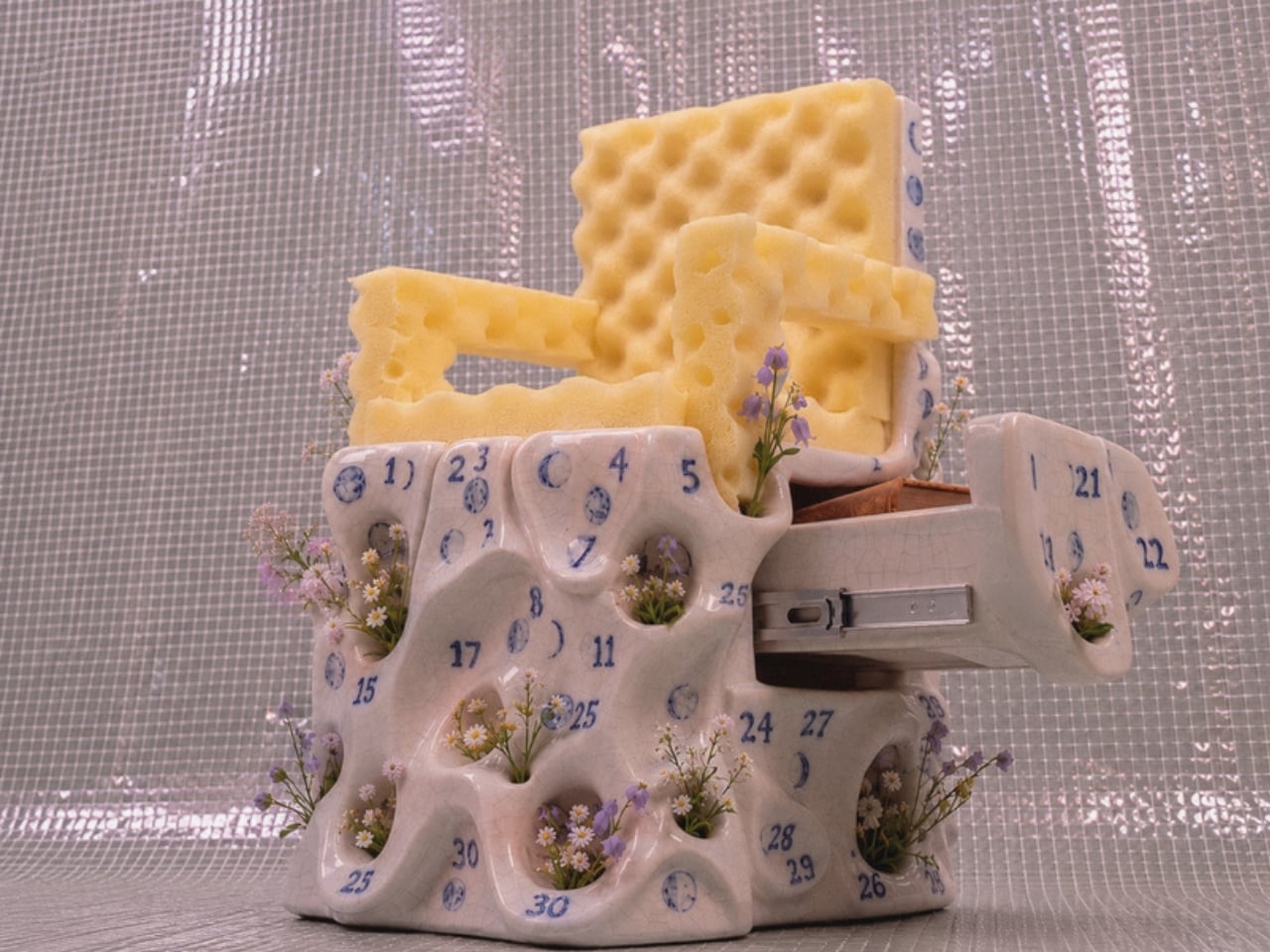
The first thing you notice about Massimiliano Malagò’s chairs is that the bottom half looks like it’s giving up. The ceramic bases appear to be softening, pooling, their surfaces undulating in slow waves as if the weight of everything sitting on top has finally gotten to them. The upper halves, either blond plywood cut with clean geometric precision or yellow foam dense as old mattress padding, hold their shape with complete indifference. The contrast is the whole conversation.

Malagò is an Italian architect based in New York who teaches at Columbia University’s Graduate School of Architecture and runs the practice HHMM with set designer Helene Helleu. His body of work has a recurring habit of using furniture as intellectual argument, treating each piece as a spatial essay. These chairs, created as part of On the Calculation of Volume for a Greenpoint apartment renovation he developed alongside client Kathleen Pongrace, are his most layered statement yet. Literally and figuratively.

Designer: Massimiliano Malagò

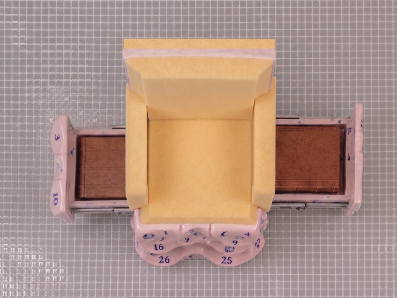
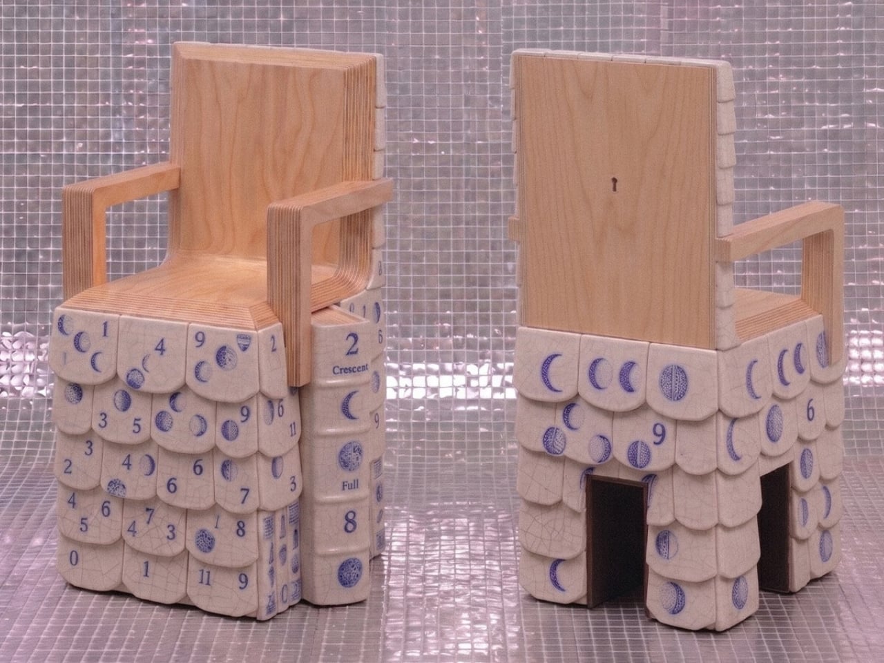
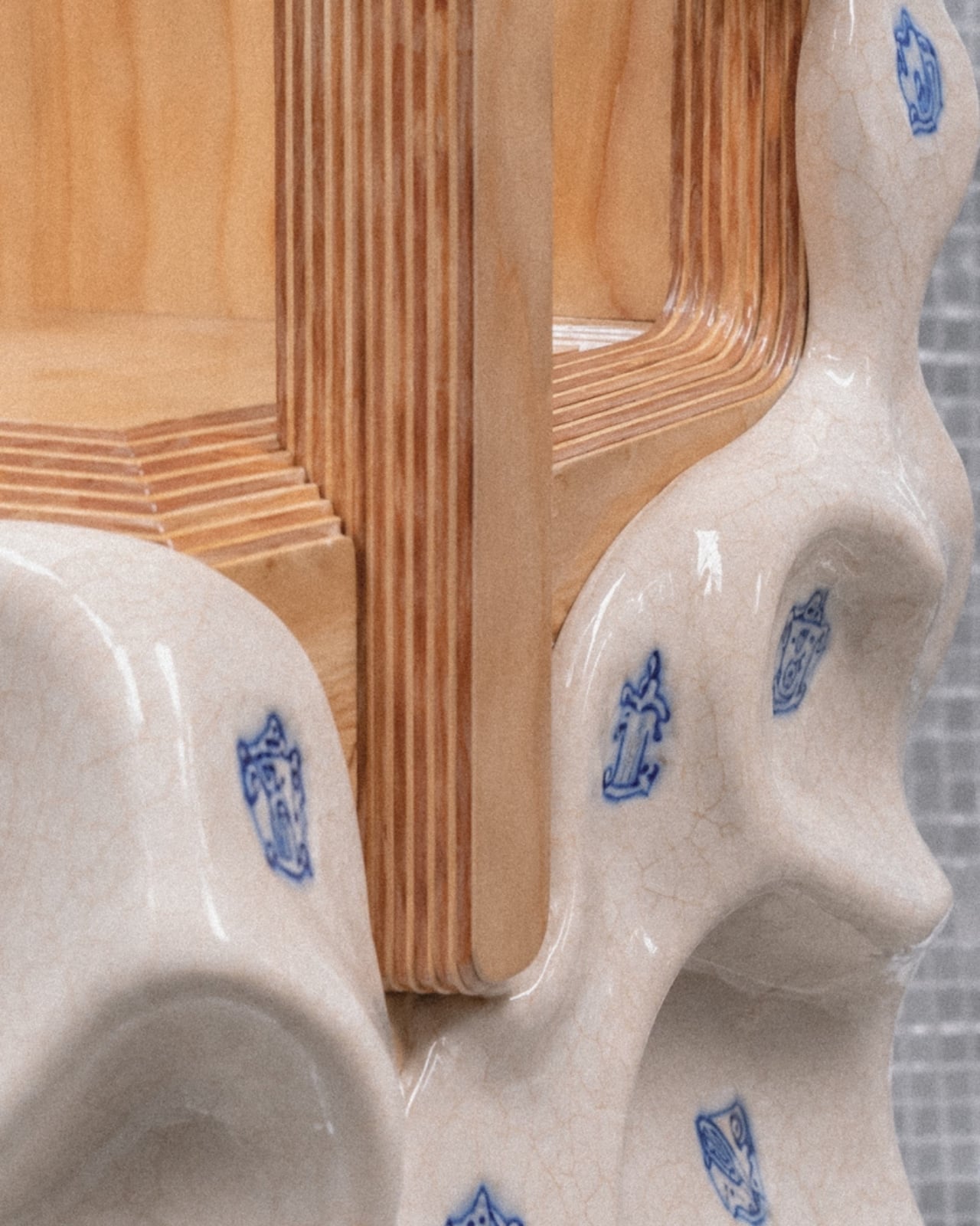
Each chair is essentially two objects in a standoff. The bases are hand-sculpted ceramic glazed in a crackled off-white, decorated with small blue motifs that range from heraldic figures and crests to lunar phase calendars marked with numbers from one to thirty. Depending on which chair you’re looking at, the surface texture shifts too. Some bases have a wavy, rippled undulation. Others are pocked with circular voids, perforations from which actual small flowers grow, as if nature has decided to quietly move in through whatever gaps the city left open.

The upper chair structures sit on top of these organic, softened bases like they arrived from a different address entirely. The plywood versions are laminated and layered, their cut edges revealing the strata of material inside like a cross-section of something ancient, while the foam versions have a raw, utilitarian quality that reads somewhere between construction material and domestic comfort. Both feel deliberately unfinished in a way that is not careless but considered. Malagò is clearly not interested in making the perfect chair. He is interested in making a chair that has something to say about what living in New York actually costs you, in time, in money, and in compromises.

The storage element is where it gets genuinely clever. Pull open a drawer concealed within the ceramic base and you find a sliding metal mechanism holding books. The idea that a chair can house your library inside its own body, that seating and storage are so compressed in a small New York apartment that they must physically merge, is either a practical solution or a quiet diagnosis of how little room the city actually allows. I’d argue it’s both.

The lunar calendars printed across the ceramic surfaces in blue add another layer. Numbers arranged around moon phases suggest cycles, passing time, the rhythm of days that accumulate in a place where rent comes due whether you’re thriving or barely holding on. These aren’t decorative flourishes. They’re documentation. Malagò treats the surfaces of these chairs the way someone might treat the margins of a notebook, filling them with information that only makes full sense once you step back and read the whole thing together.

The material pairings are where the real honesty lives. Ceramic is permanent, archival, the kind of material you associate with objects meant to outlast the people who made them. Foam and plywood are impermanent, budget-conscious, the materials of first apartments and temporary solutions. Putting them together isn’t a design provocation for its own sake. It’s a portrait of how most people actually live, reaching for something lasting while working with whatever is available. The chair holds that tension without resolving it, which feels exactly right.

Design that tries to tell you something about city life usually does so at a comfortable, critical distance. These chairs plant themselves in the middle of it. They sit in a real apartment, used by a real person, and they carry the full weight of that reality in every surface.

The post A Chair With a Drawer, a Calendar, and a Point of View first appeared on Yanko Design.
This Modular Teak and Aluminum Box Has a Lid That Folds Into a Table

The line between outdoor gear and everyday carry has never been blurrier. More people are treating their camping setups with the same discernment they’d bring to a wardrobe or a home office, hunting for things that work hard but also look intentional. The market has responded, and the range of portable gear sitting somewhere between rugged utility and refined object design has never been broader.

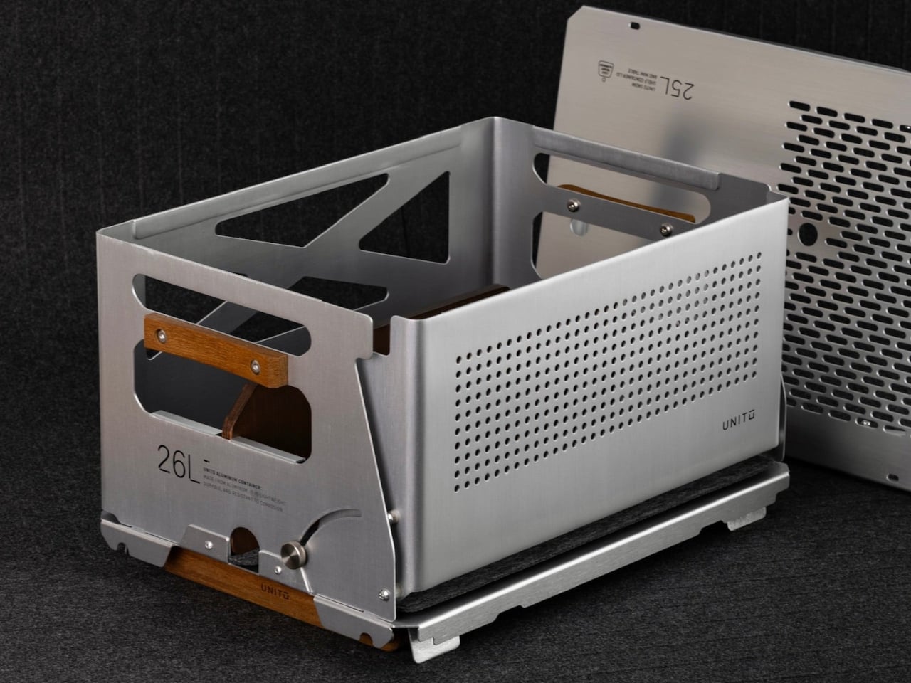
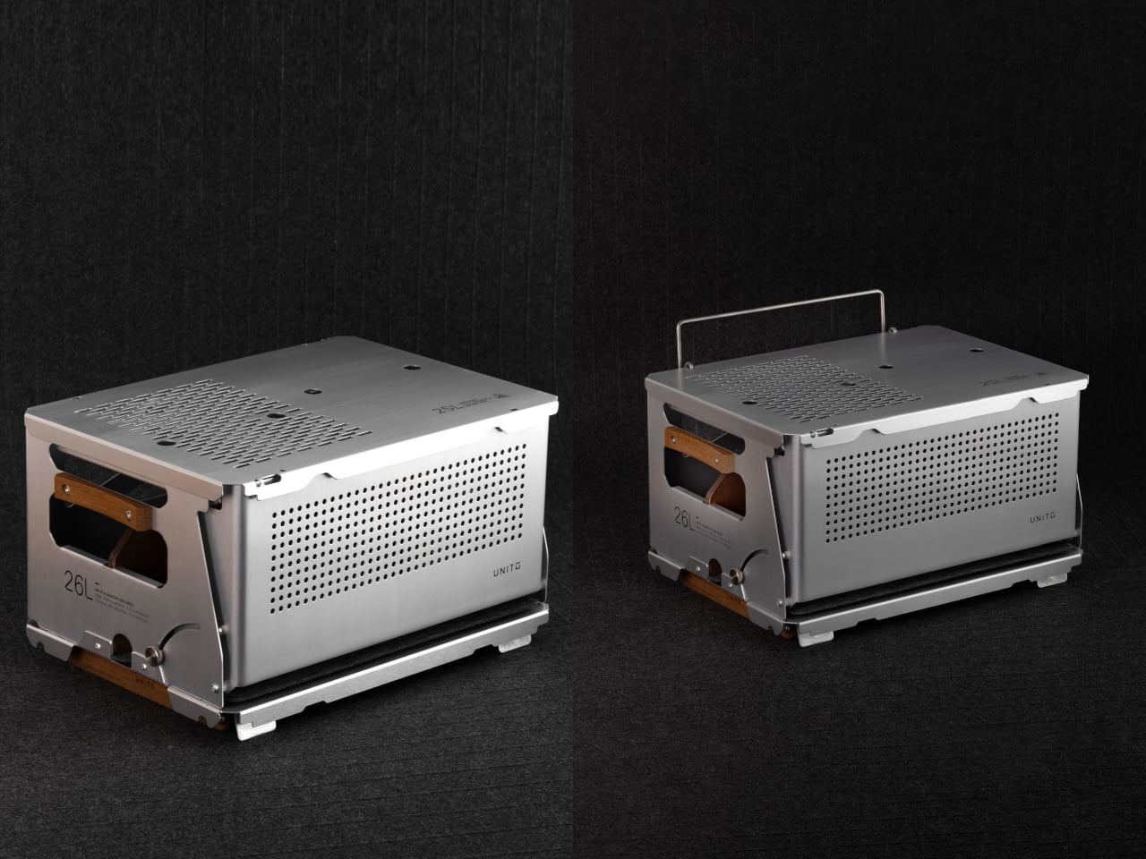
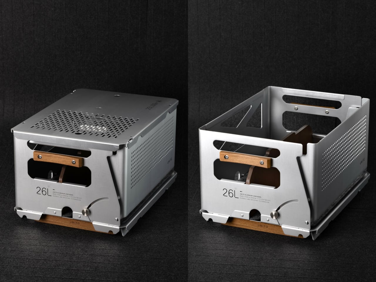
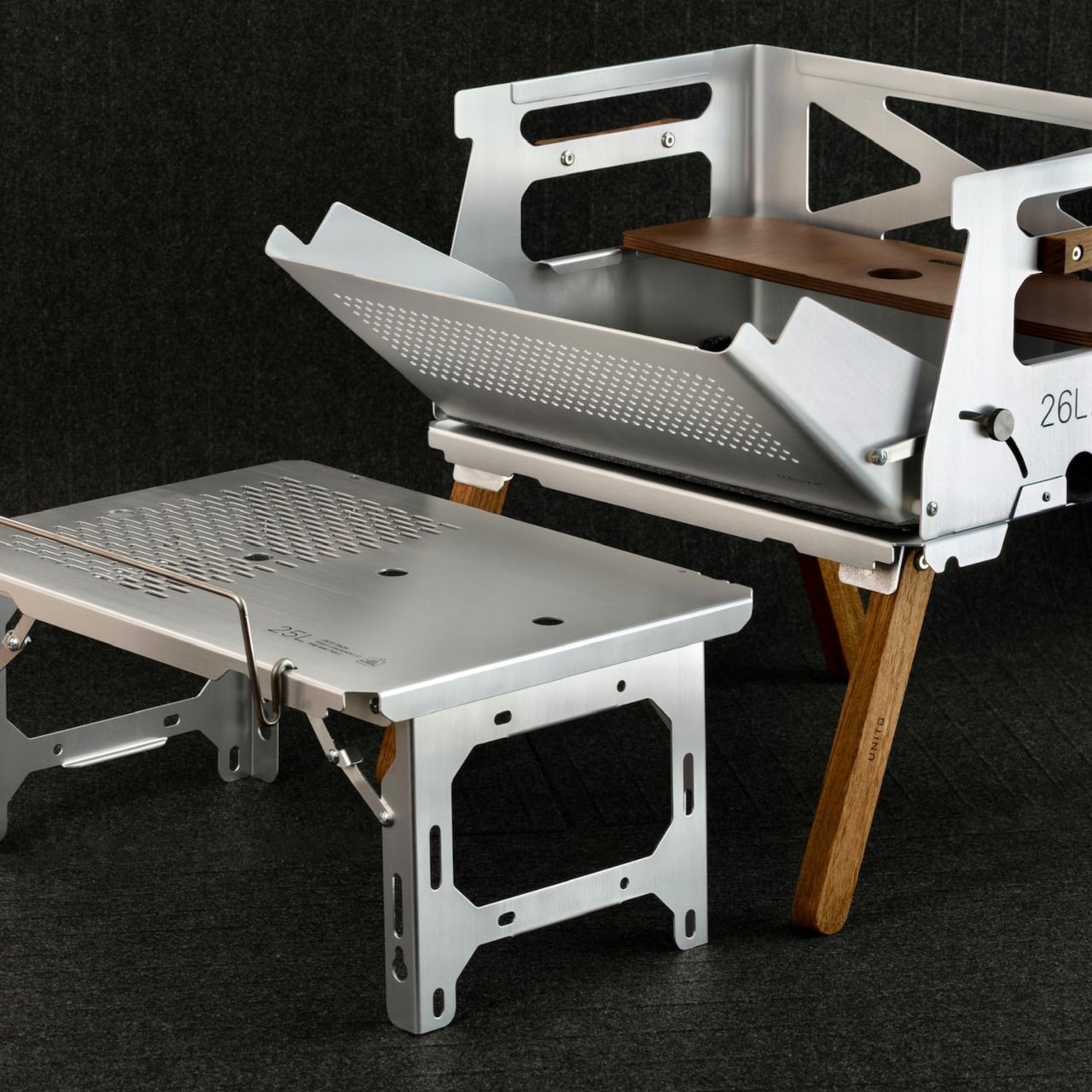
Unito, a Thailand-based brand, has positioned its Container 26L squarely in that territory. The box holds 26 liters of storage and comes loaded with teak wood accents, a foldable table lid, flip-out extension legs, a divider, and a soft pad, all in a full set that retails for $290. It’s built to adapt across environments rather than anchor itself to just one.

Designer: Unito

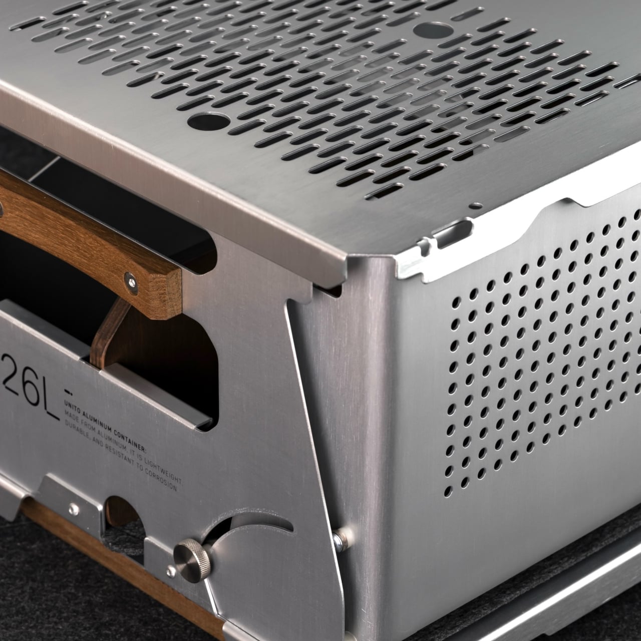
The choice of anodized aluminum for the body does a lot of the heavy lifting. The finish is more corrosion-resistant than bare metal and tougher than paint, which makes it well-suited for the kind of regular outdoor exposure that would start to wear down lesser materials. The silver anodized variant, in particular, has a clean industrial look that doesn’t try too hard and ages without embarrassing itself.

Teak handles sit on either side of the box, giving you a comfortable grip that reads differently against the metallic finish. The flip-out teak extension legs raise the container off the ground into a standing station. Unito supposedly sources the wood from managed plantation forests in Thailand, where the brand is made, addressing concerns about the choice of material.

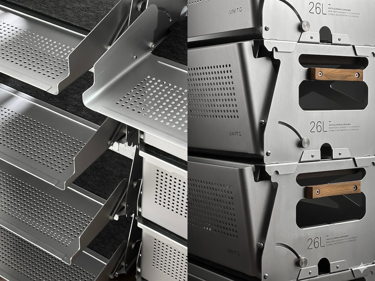
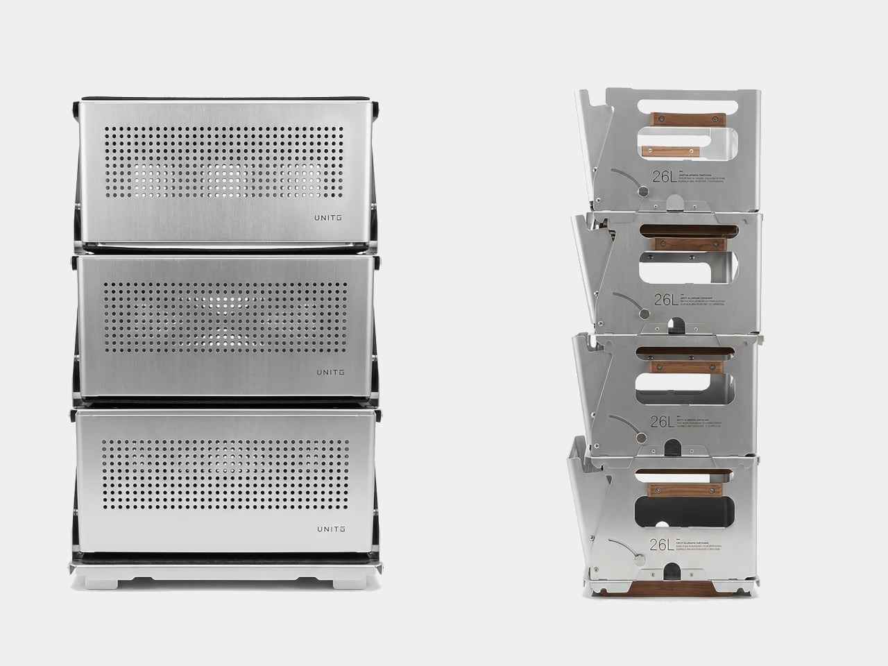
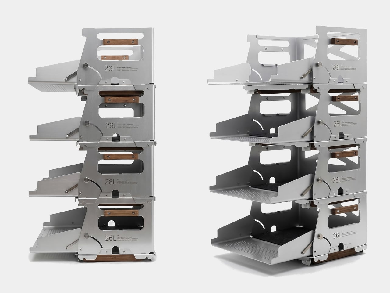
The Snow 25L is the lid that ships with the box, but calling it just a lid undersells what it does. It’s a foldable aluminum table weighing 950 grams, and it’s also compatible with Snow Peak’s 25L crate, which broadens the system’s appeal considerably. Stack two containers, and each lid still opens independently, so access isn’t sacrificed in the name of keeping the stack looking neat.

On a campsite, the legs deploy, and the box becomes a prep station for gear, food, or brew equipment. The perforated aluminum body lets air circulate, which matters when you’re storing anything prone to trapping heat or moisture. The included divider helps section off the interior, and a built-in carry handle means you’re not scrambling for a grip when it’s time to pack up.

Back in the studio or at home, the same container holds art supplies, camera gear, or electronics with enough structure to keep things sorted rather than thrown together. The modular system lets you pair containers, add accessories, or use just the box and lid without the legs. It’s the kind of setup that rewards people who’ve thought carefully about their gear.

The post This Modular Teak and Aluminum Box Has a Lid That Folds Into a Table first appeared on Yanko Design.
This Modular Teak and Aluminum Box Has a Lid That Folds Into a Table

The line between outdoor gear and everyday carry has never been blurrier. More people are treating their camping setups with the same discernment they’d bring to a wardrobe or a home office, hunting for things that work hard but also look intentional. The market has responded, and the range of portable gear sitting somewhere between rugged utility and refined object design has never been broader.

Unito, a Thailand-based brand, has positioned its Container 26L squarely in that territory. The box holds 26 liters of storage and comes loaded with teak wood accents, a foldable table lid, flip-out extension legs, a divider, and a soft pad, all in a full set that retails for $290. It’s built to adapt across environments rather than anchor itself to just one.

Designer: Unito

The choice of anodized aluminum for the body does a lot of the heavy lifting. The finish is more corrosion-resistant than bare metal and tougher than paint, which makes it well-suited for the kind of regular outdoor exposure that would start to wear down lesser materials. The silver anodized variant, in particular, has a clean industrial look that doesn’t try too hard and ages without embarrassing itself.

Teak handles sit on either side of the box, giving you a comfortable grip that reads differently against the metallic finish. The flip-out teak extension legs raise the container off the ground into a standing station. Unito supposedly sources the wood from managed plantation forests in Thailand, where the brand is made, addressing concerns about the choice of material.

The Snow 25L is the lid that ships with the box, but calling it just a lid undersells what it does. It’s a foldable aluminum table weighing 950 grams, and it’s also compatible with Snow Peak’s 25L crate, which broadens the system’s appeal considerably. Stack two containers, and each lid still opens independently, so access isn’t sacrificed in the name of keeping the stack looking neat.

On a campsite, the legs deploy, and the box becomes a prep station for gear, food, or brew equipment. The perforated aluminum body lets air circulate, which matters when you’re storing anything prone to trapping heat or moisture. The included divider helps section off the interior, and a built-in carry handle means you’re not scrambling for a grip when it’s time to pack up.

Back in the studio or at home, the same container holds art supplies, camera gear, or electronics with enough structure to keep things sorted rather than thrown together. The modular system lets you pair containers, add accessories, or use just the box and lid without the legs. It’s the kind of setup that rewards people who’ve thought carefully about their gear.

The post This Modular Teak and Aluminum Box Has a Lid That Folds Into a Table first appeared on Yanko Design.
Carrying a USB-C Hub and SSD? ADAM elements Hub S Does Both

Modern laptops aren’t short on power, but they’re increasingly short on ports. One USB-C port ends up doing everything: charging, video out, storage, and peripherals, while a small pile of adapters accumulates next to the keyboard. The setup works, but it doesn’t look like the clean, minimal desk you were going for, and it means carrying more pieces than you’d like when you’re working somewhere that isn’t home.

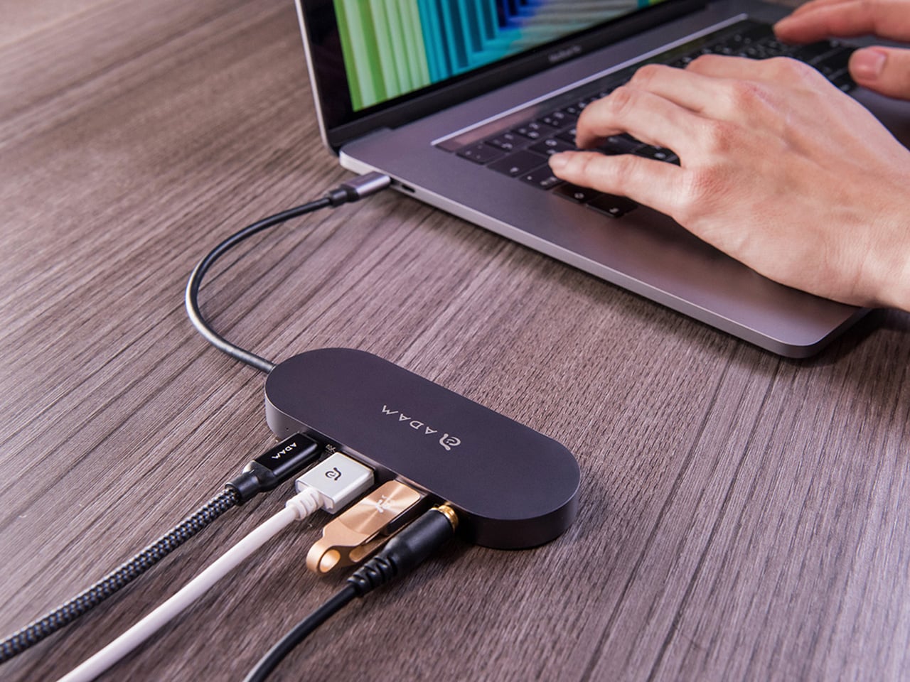
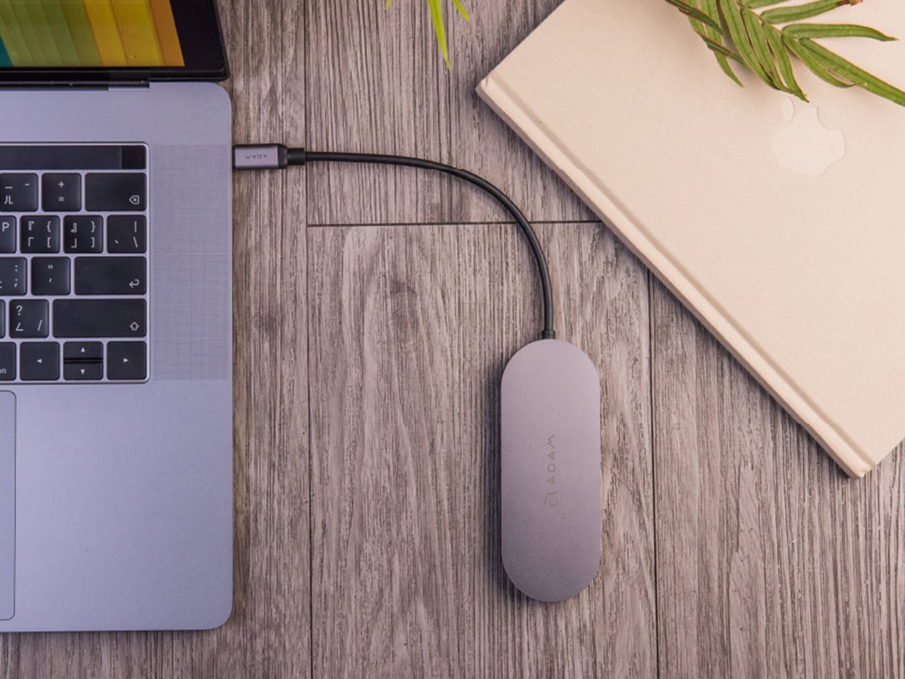
ADAM elements’ Hub S is a USB-C hub with built-in SSD storage, designed around the idea that a hub and an external drive don’t need to be two separate objects. Instead of plugging in one thing for ports and another for files, you plug in one slim aluminum accessory that handles both. It isn’t trying to replace a full docking station, but it’s the right-sized tool for someone who needs the essentials covered without the clutter.

Designer: ADAM elements

Click Here to Buy Now: $69.30 $99 (30% off, use coupon code “30YANKOHBSN”). Hurry, deal ends in 48-hours!

The built-in SSD is available in 240 GB, 480 GB, and 960 GB capacities, so there’s a size for whether you’re keeping a working project library or just enough space for recent shoots and backups. Having storage physically attached to your hub means it’s always there when you need to dump footage, move large project files, or keep a client’s assets close during a session, without remembering to pack a separate drive.

Transfer speeds are rated at up to 520 MB/s read and 456 MB/s write, which makes moving large files feel routine rather than something you schedule around. That kind of speed isn’t just a spec, though. It’s the difference between waiting through a transfer and forgetting it’s happening. For photographers and video editors working on the road, that matters more than it sounds on a product page.

For Mac users, the ADAM elements Hub S is also Apple Time Machine compatible. That means it can act as a rolling backup target every time you plug in, turning a habit that’s easy to forget into something that happens automatically. Backup isn’t exciting, but having it built into the same accessory you’re already using for everything else makes it feel less like a separate job.

The USB-C port on the hub supports PD 3.0 pass-through charging up to 60W, so your laptop doesn’t lose its charge while the hub is handling storage, display, and peripherals. That’s a meaningful consideration when you’re transferring large files and streaming to an external display at the same time, both of which can pull enough power to make a laptop feel like it’s running a sprint.

The HDMI port outputs up to 4K at 30Hz and supports HDCP 2.2, which is the protocol required for streaming 4K HDR content from services like Netflix. A lot of hubs advertise “4K output” but fail on DRM handshakes, so the HDCP 2.2 compliance isn’t a minor footnote. Whether you’re mirroring for a presentation or extending to a monitor for a proper editing session, the connection holds up where it matters.

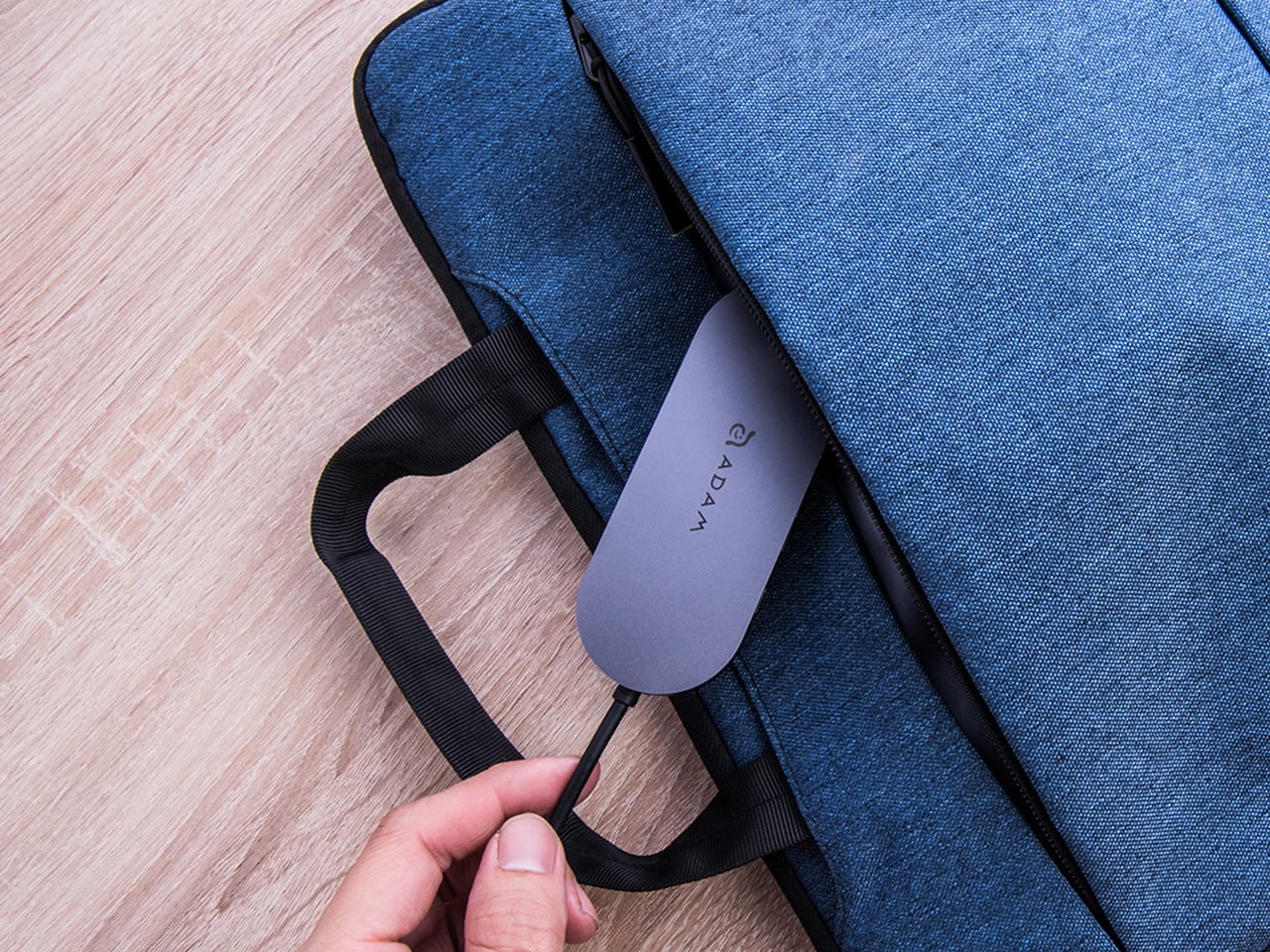
Rounding out the port selection is a USB-A 3.1 port rated at up to 5 Gbps for peripherals or flash drives, and a 3.5mm headphone jack that supports 48kHz/16-bit audio. Neither is glamorous, but together they cover the inputs that would otherwise require yet another adapter. The aluminum alloy body is designed to sit flush on a desk surface, and the whole thing weighs about 2.5oz, roughly the weight of a single C battery.

The ADAM elements Hub S works best as the kind of accessory you stop thinking about. You plug it in, your files are there, your display is connected, your laptop is charging, and your headphones are plugged in. That’s it. For people who’d rather carry one considered piece of hardware than a small collection of adapters and drives, consolidating all of that into a single slim object that fits in a jacket pocket feels like the more sensible way to work.

Click Here to Buy Now: $69.30 $99 (30% off, use coupon code “30YANKOHBSN”). Hurry, deal ends in 48-hours!

The post Carrying a USB-C Hub and SSD? ADAM elements Hub S Does Both first appeared on Yanko Design.
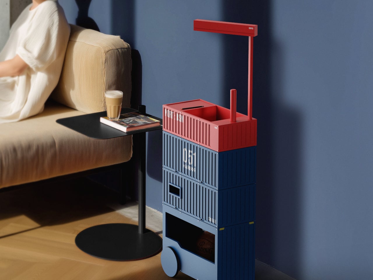
This Trolley Stacks and Rotates Like Shipping Containers at a Port

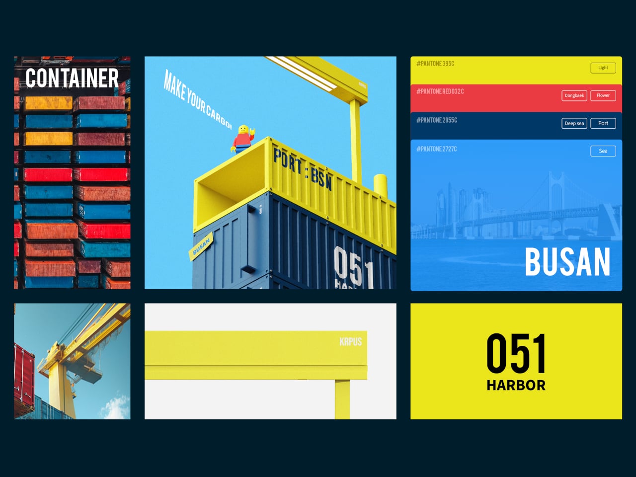
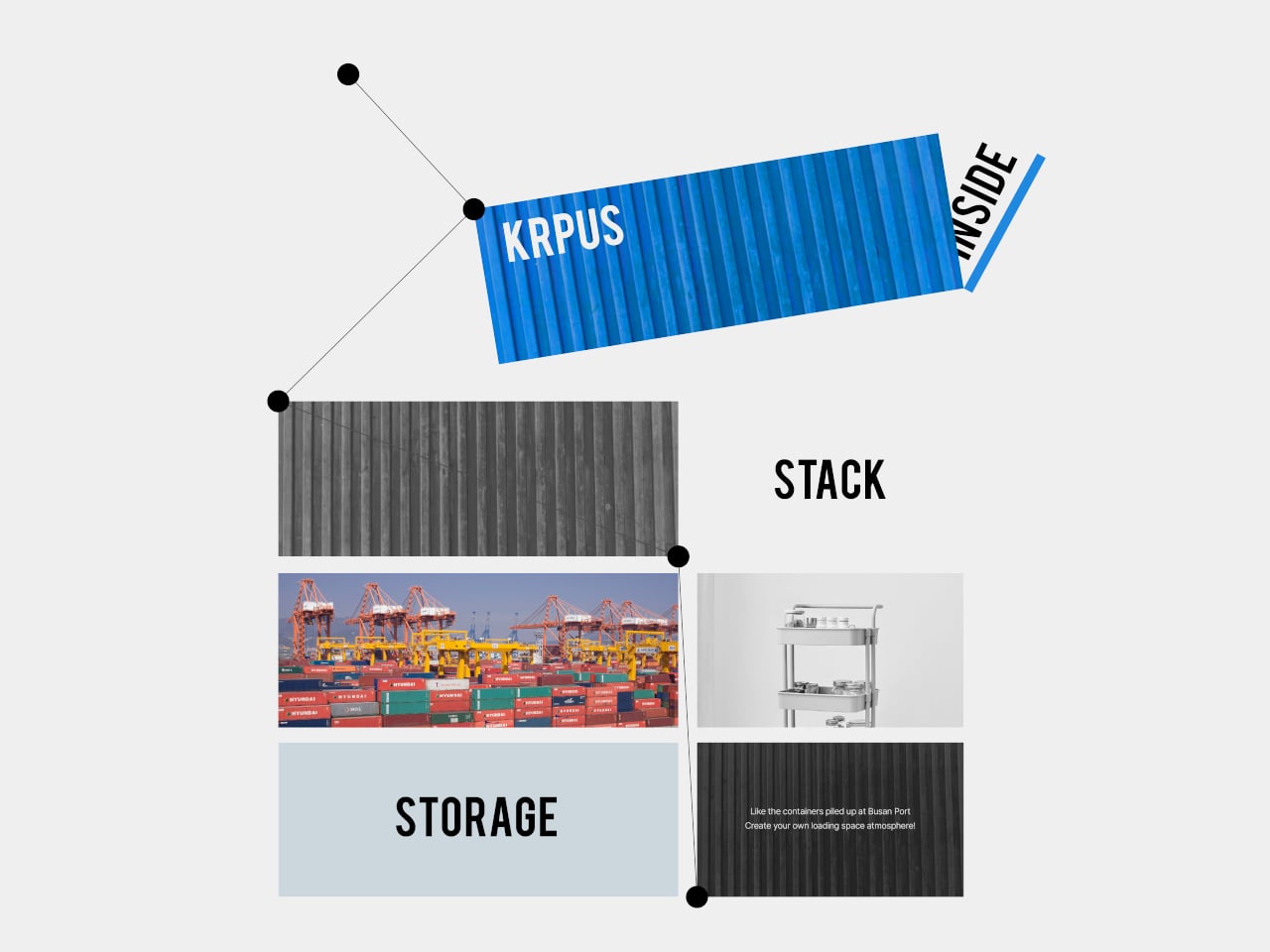
Most storage furniture sits where you put it, fixed shelves and cabinets that do their job but rarely respond to how space changes during a day. Trolleys help with mobility, but they often feel generic, more utility than character. Harbor 051 is a storage trolley that borrows its logic from a place built entirely around movement and stacking, Busan Port, where containers shift and cranes swing in a constant choreography.

Busan’s harbor is where standardized containers are stacked and moved in regular patterns, and where cranes handle goods with a rhythm that becomes its own visual language. Harbor 051 takes that logistical landscape and reinterprets its structure and rhythm into storage furniture, applying the repetition and organized arrangement of containers to the way the trolley is built and used at home, echoing the port’s distinctive sense of flow.

Designers: Ho joong Lee, Ho taek Lee

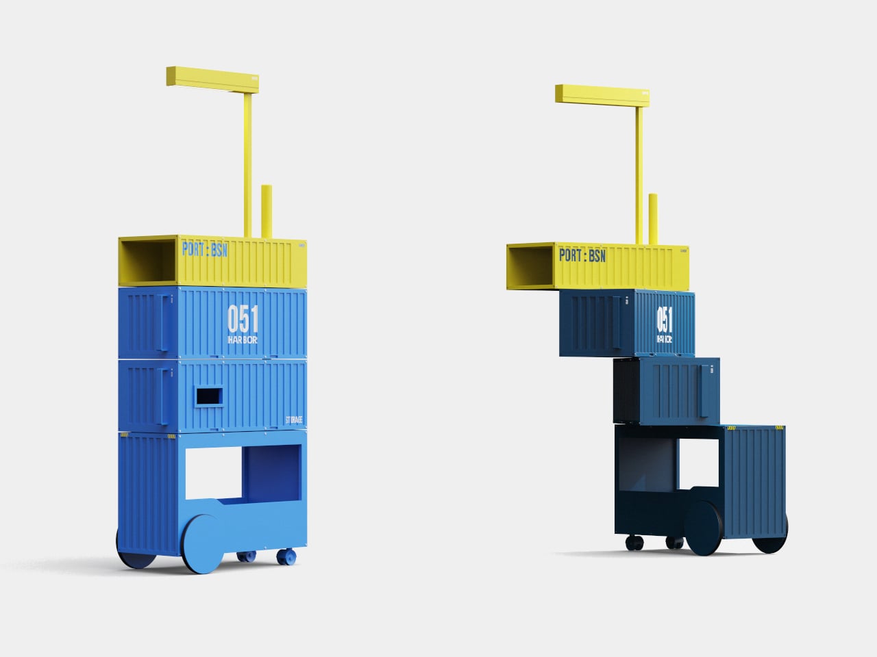
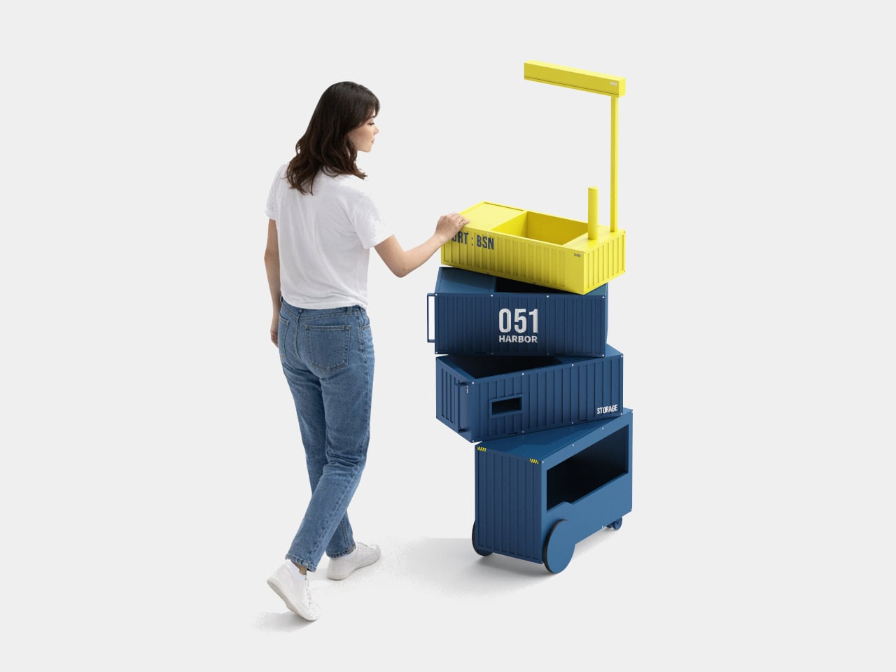
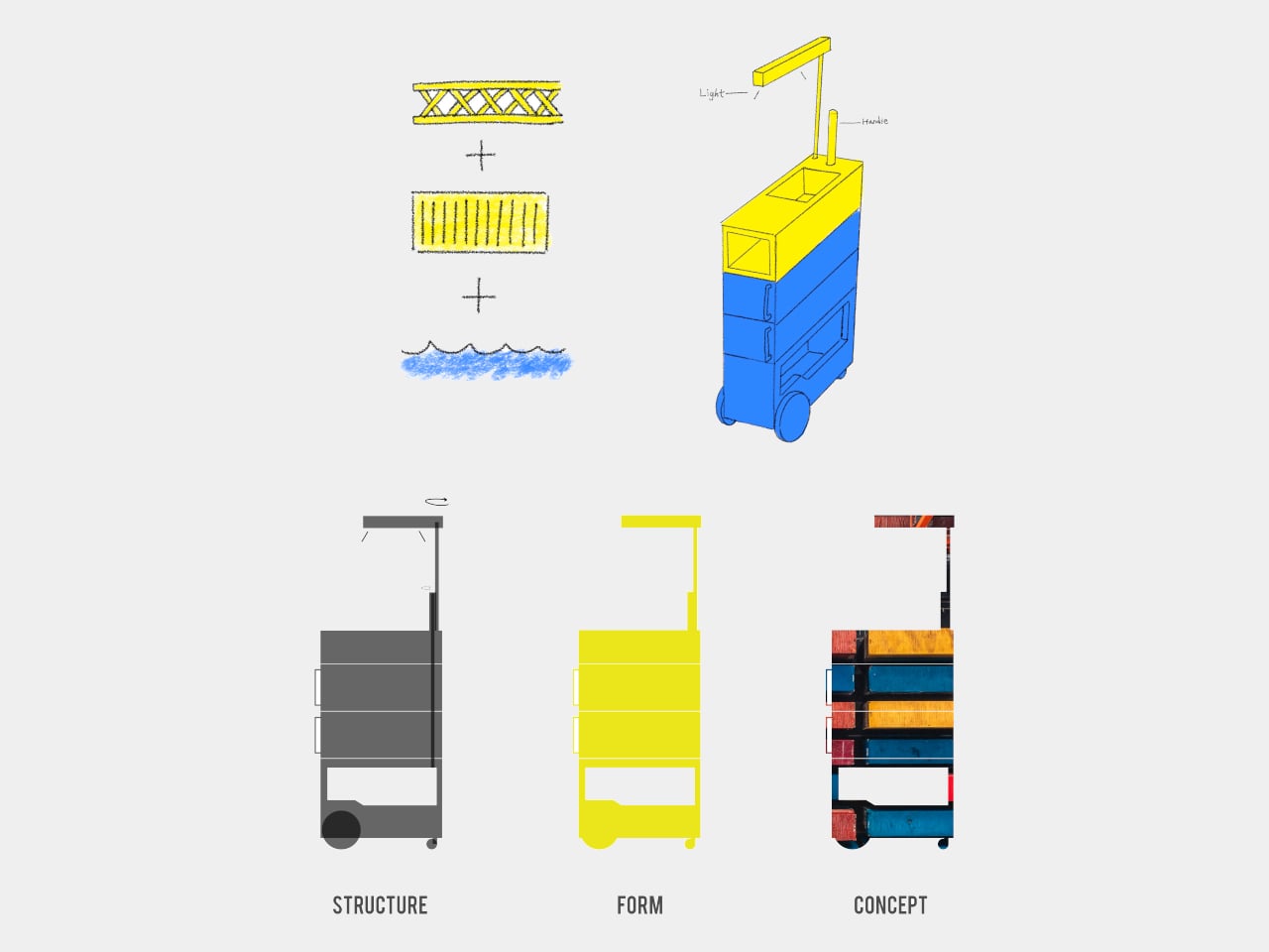
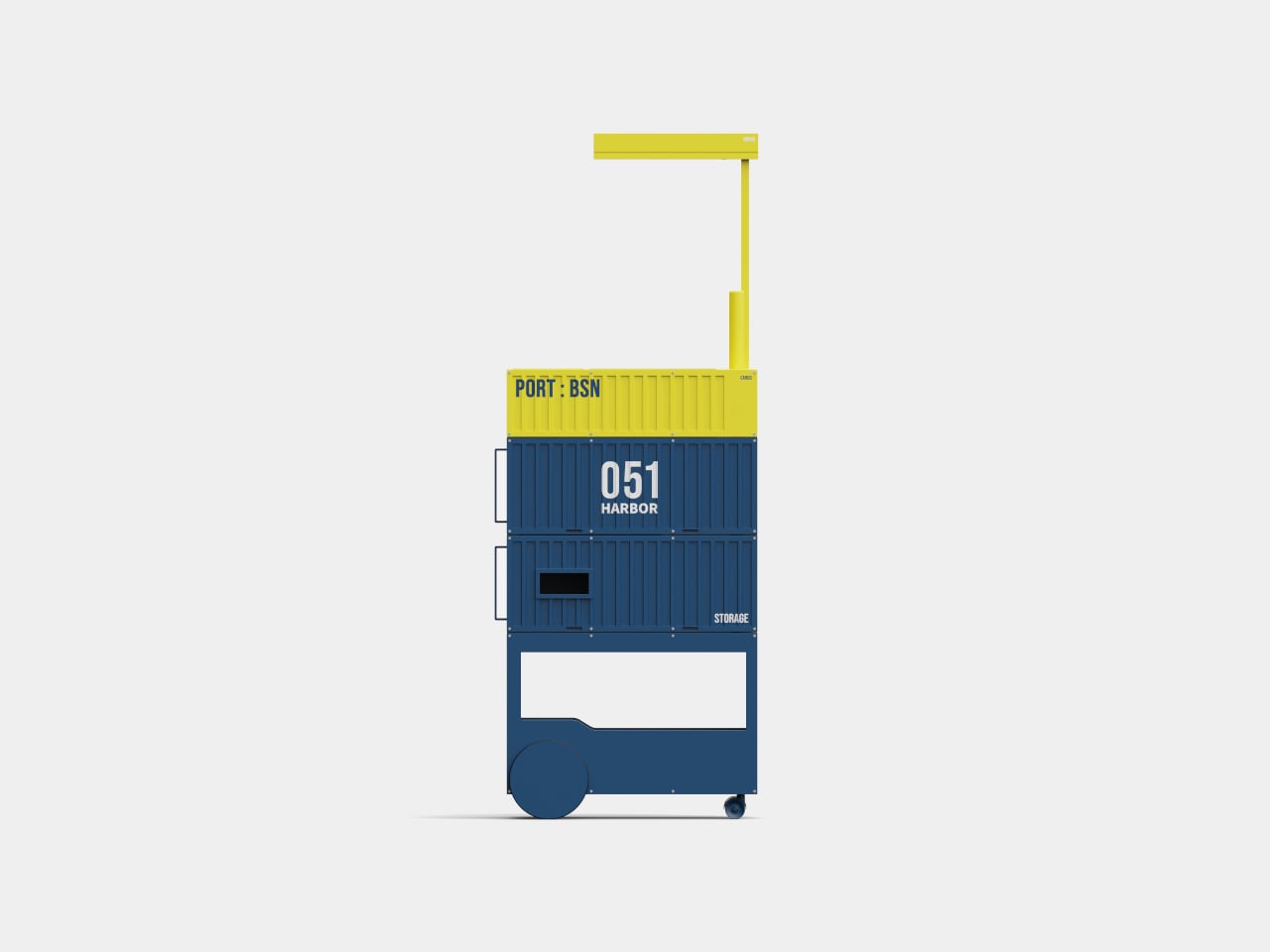
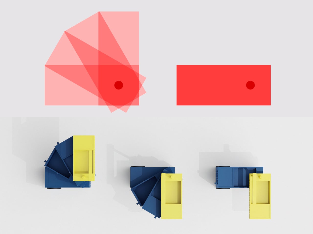
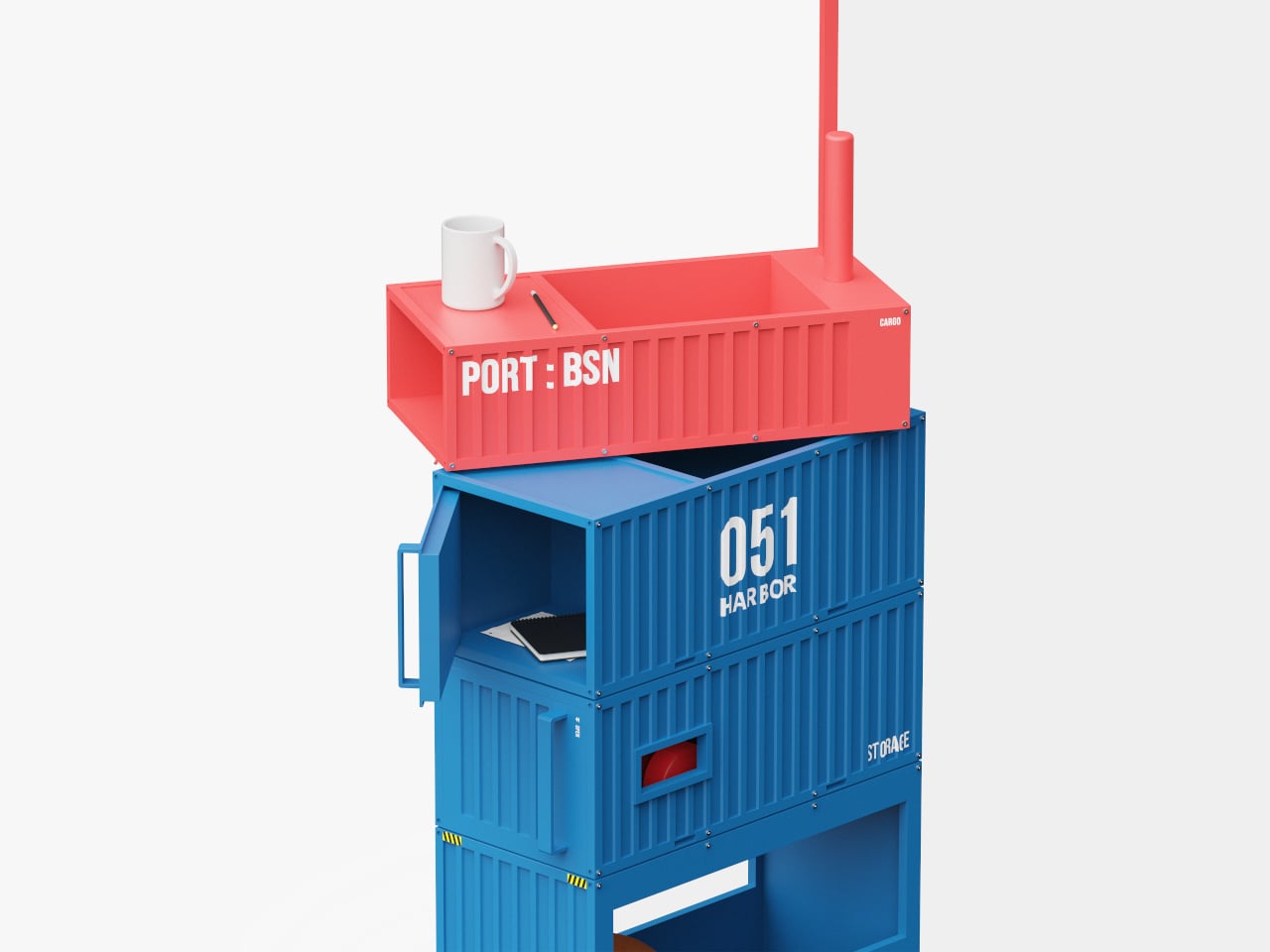
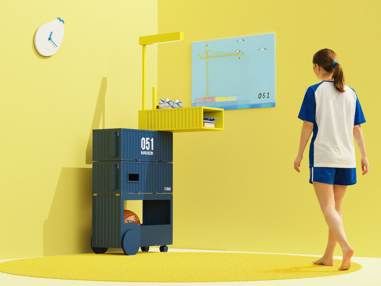
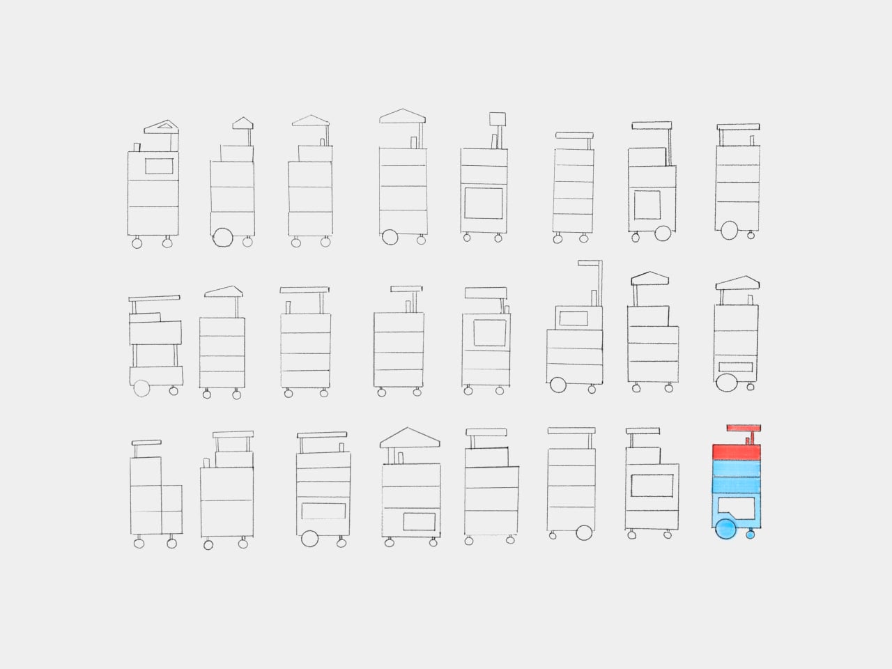
The trolley consists of four container-like boxes stacked on a wheeled base, each able to pivot around a central axis. In a narrow hallway or next to a desk, you keep them aligned as a compact tower. When you settle on the sofa or work at a table, you swing modules out to the side, opening up access to books or supplies without taking over the floor.

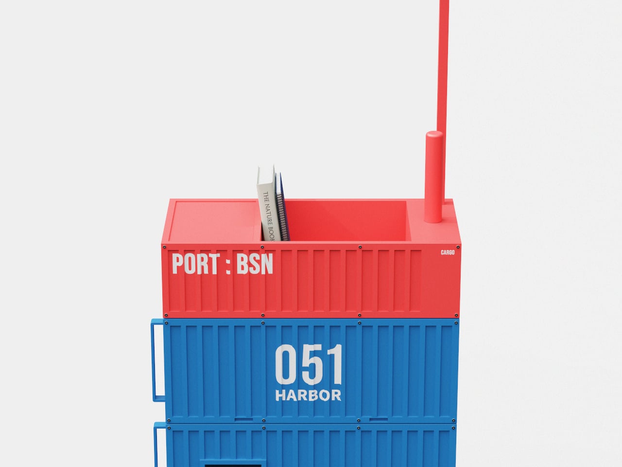
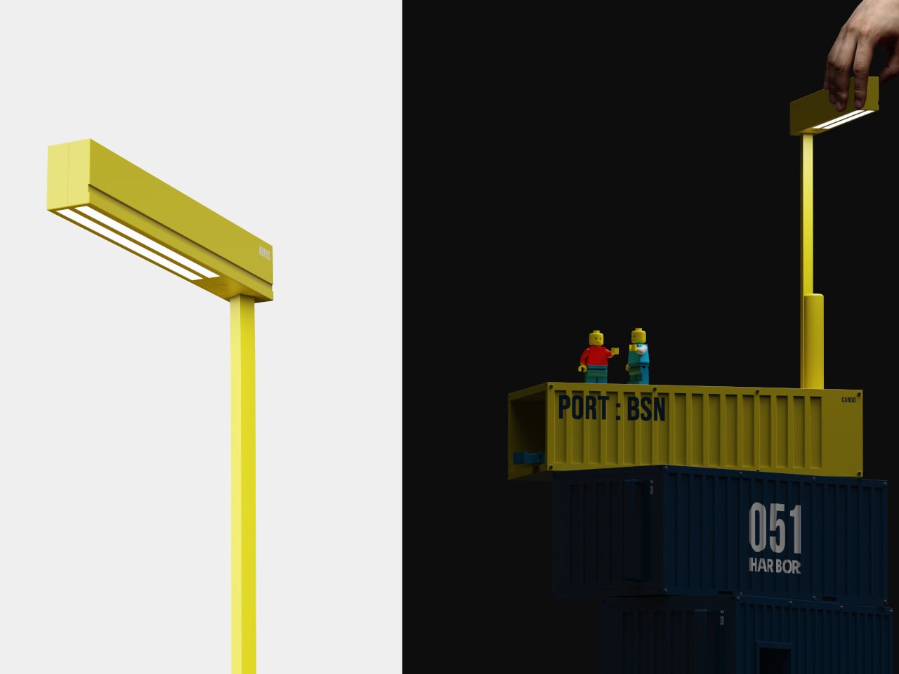
A vertical mast rises from the top, capped with a horizontal beam that doubles as a light. It reads like a tiny crane or gantry, giving the trolley a clear front and sense of direction. In a living room, that light becomes a reading lamp or soft ambient glow, while the mast acts as a subtle signpost, a little landmark instead of anonymous storage hiding in a corner.

The colors are pulled directly from Busan and its port. Yellow comes from cranes and working equipment, navy and blue from the sea in front of and beyond the harbor, and red from the camellia flower that represents the city. In practice, that means a base of deep blue containers, a bright yellow mast, or a red top module bringing energy into an otherwise neutral space.

Harbor 051 is more than a playful reference. The rotating structure makes storage and placement genuinely flexible, the wheels let it move between rooms, and the integrated light adds another layer of function. It is a small example of how a logistics system’s order and rhythm can become a domestic tool instead of staying at the edge of the city.

Harbor 051 brings a city’s backbone into something you can live with every day. Instead of a generic cart, you get a trolley that feels like a stack of containers paused mid-movement, ready to pivot as your day shifts. Storage does not have to be invisible to be useful; sometimes the most satisfying pieces are the ones that quietly carry a story from outside your window into the room where you spend time.

The post This Trolley Stacks and Rotates Like Shipping Containers at a Port first appeared on Yanko Design.
This Elegant High-Top Table Hides Wine Bottles In Its Placemats

You know that moment when you’re setting up for a dinner party and realize you have nowhere to put the wine bottle except awkwardly on the table or tucked under a chair? Miray Özlem Er just solved that problem in the most unexpectedly elegant way possible.

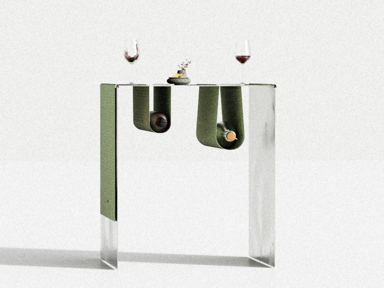
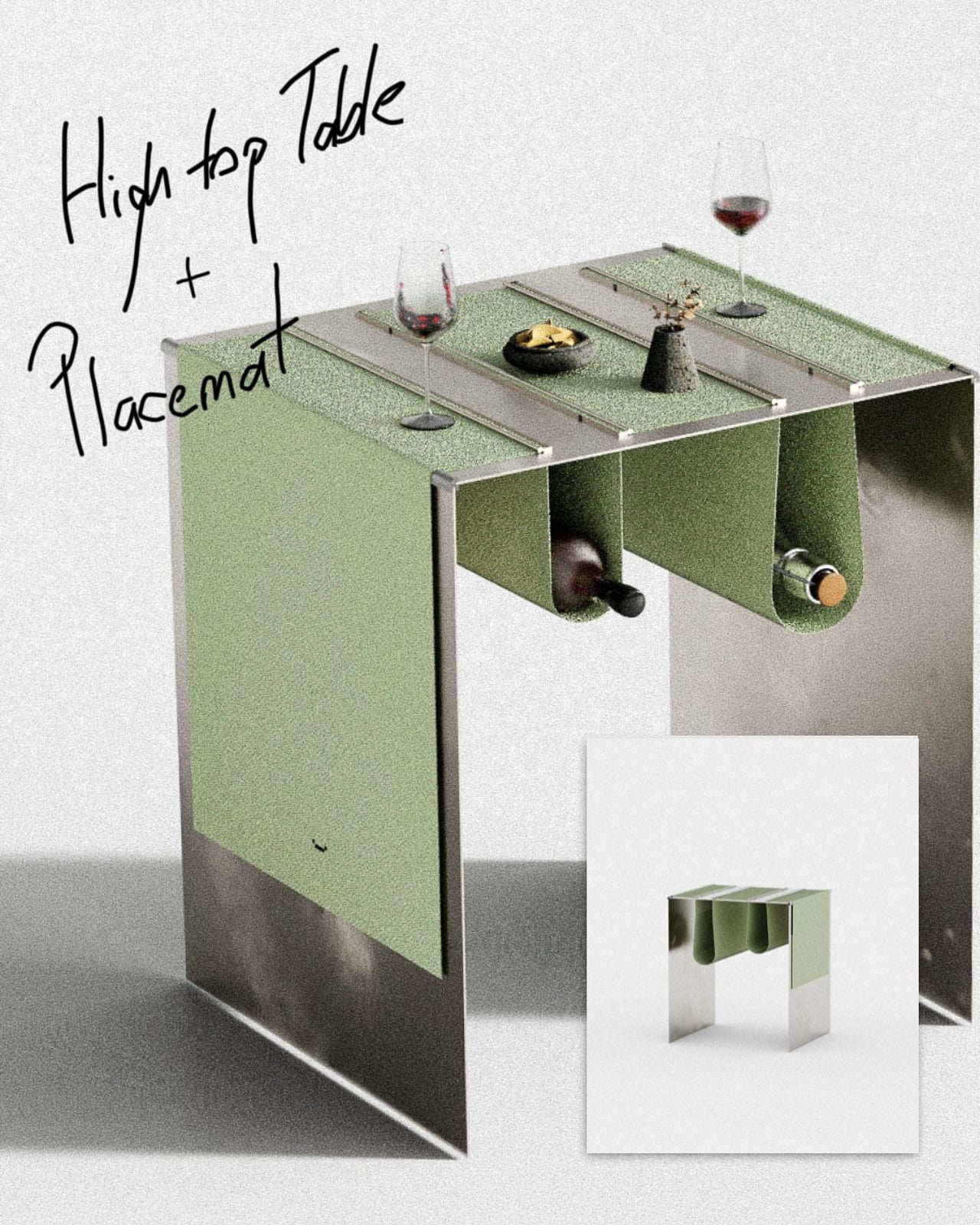
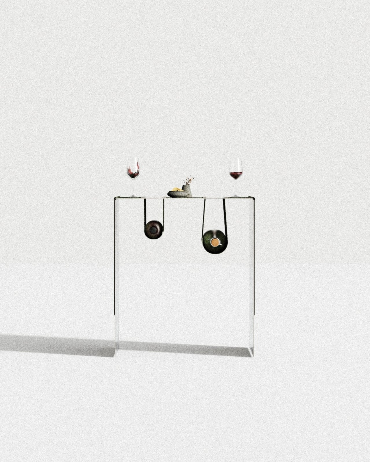
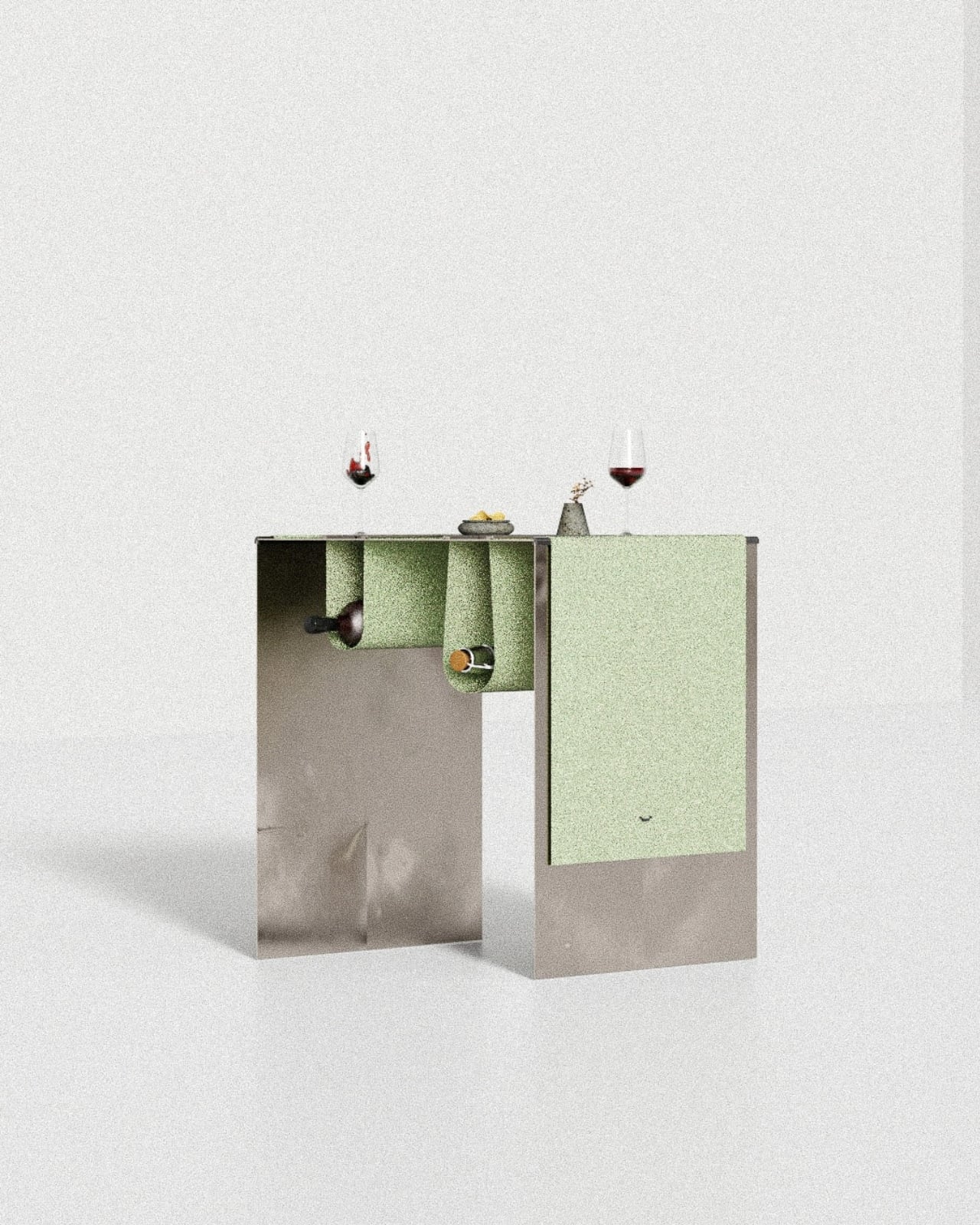
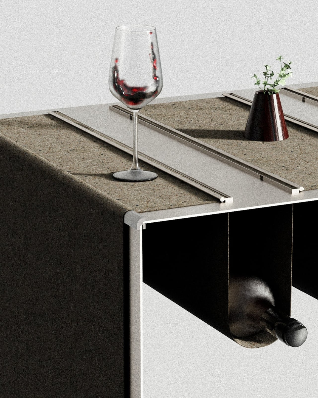
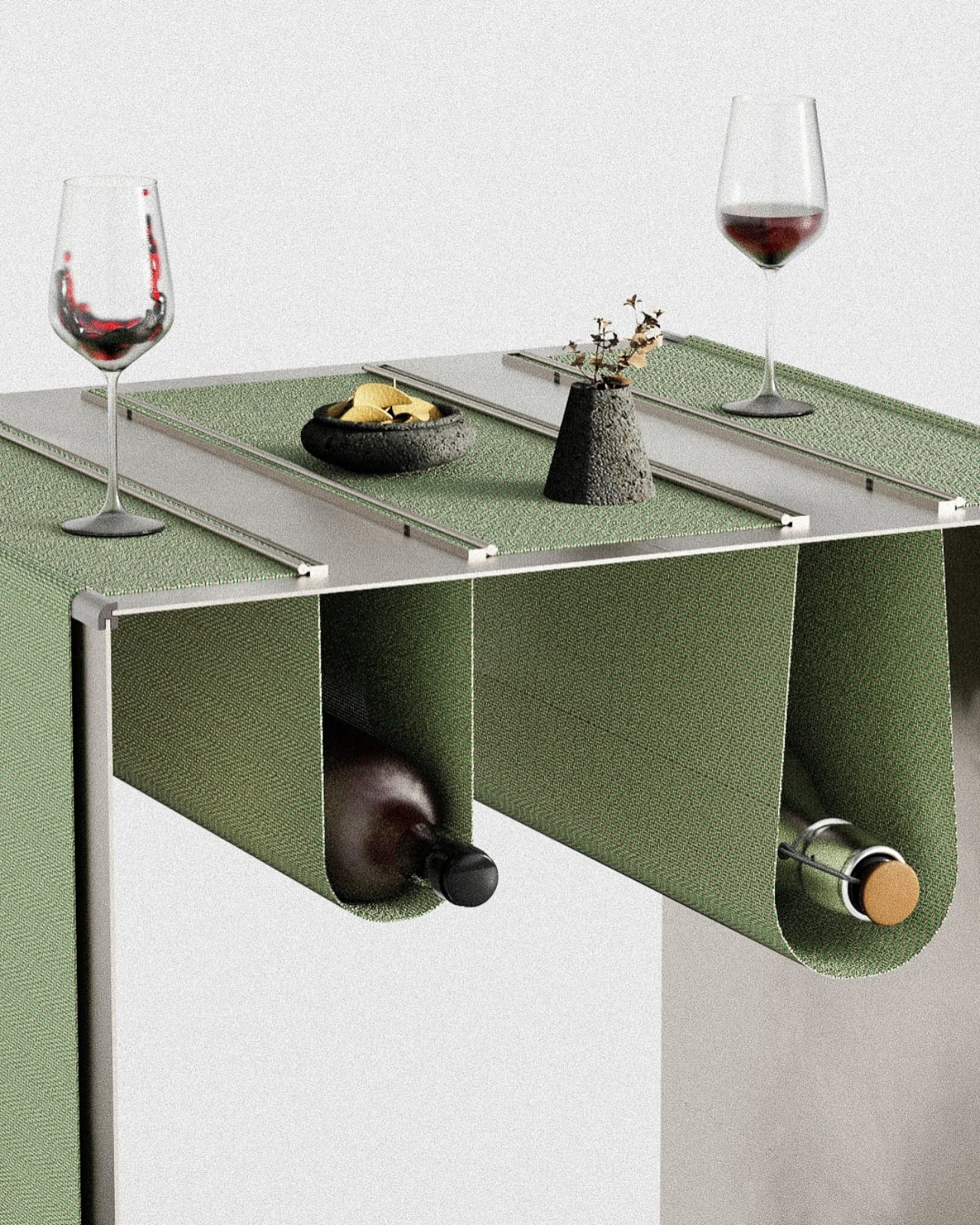
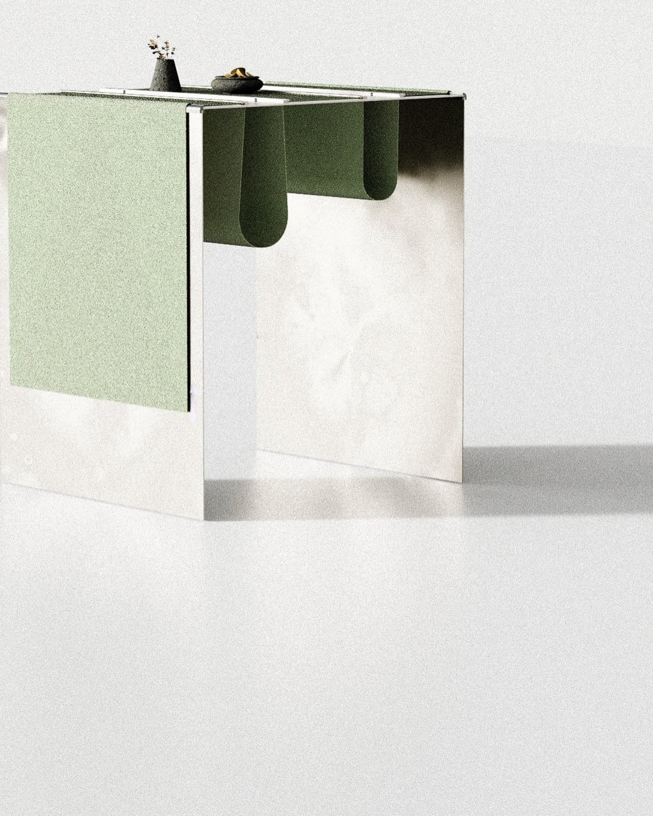
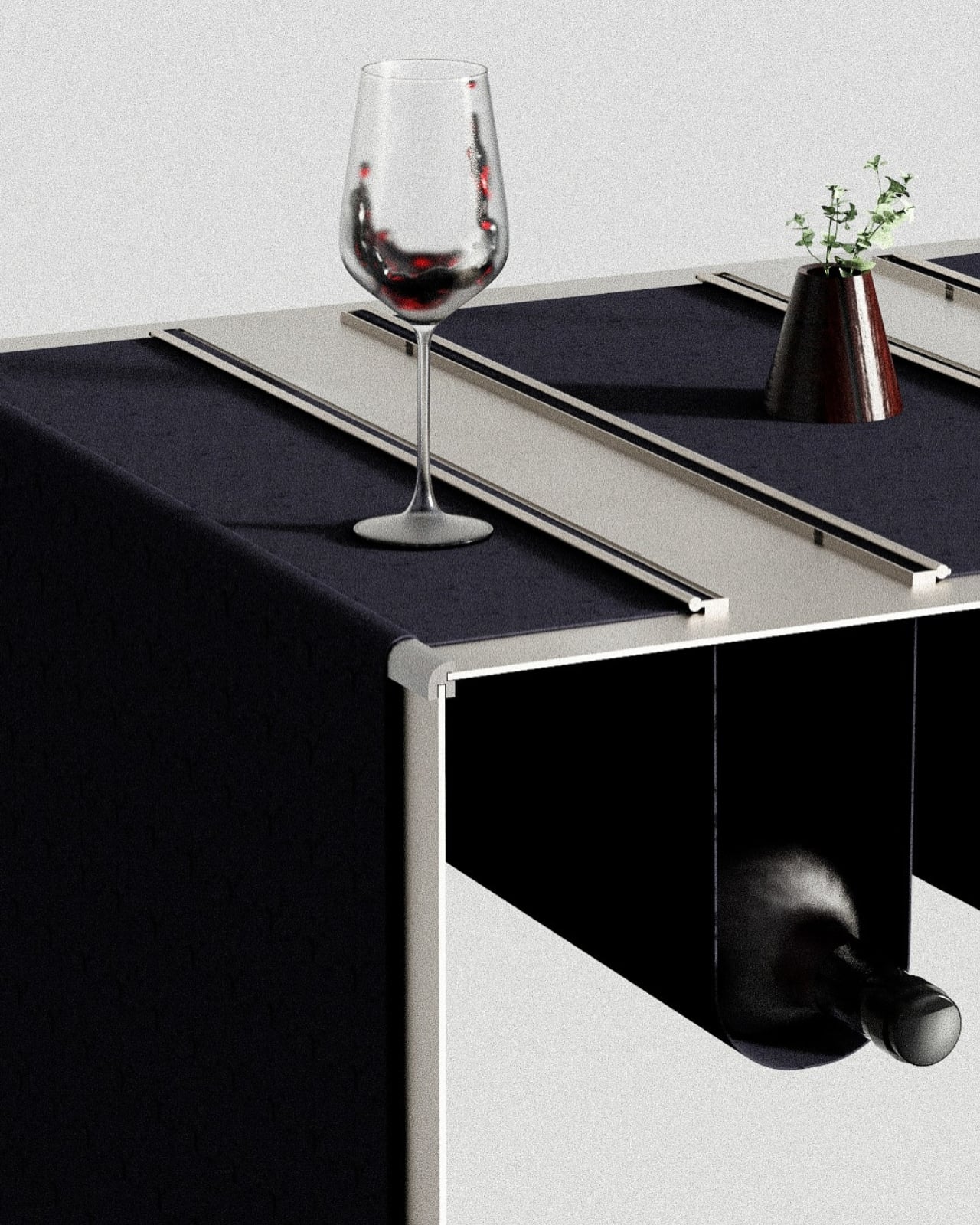
Meet the Placemat hightop table, a piece of furniture that makes you wonder why nobody thought of this sooner. At first glance, it looks like a sleek, minimalist high-top table with felt placemats secured by thin metal rails. Clean lines, transparent acrylic legs, simple construction. Pretty standard stuff for contemporary furniture design. But then you notice something curious hanging beneath the table surface. Those placemats? They keep going, draping down to create fabric pockets that perfectly cradle wine bottles.

Designer: Miray Özlem Er

It’s one of those designs that makes you pause and smile because it’s so ridiculously practical yet completely unexpected. The placemats serve double duty, marking your dining space while simultaneously creating storage that’s right there when you need it. No more getting up to grab the bottle from across the room. No more wine rings on your beautiful table surface. Just reach down, grab what you need, and keep the conversation flowing.

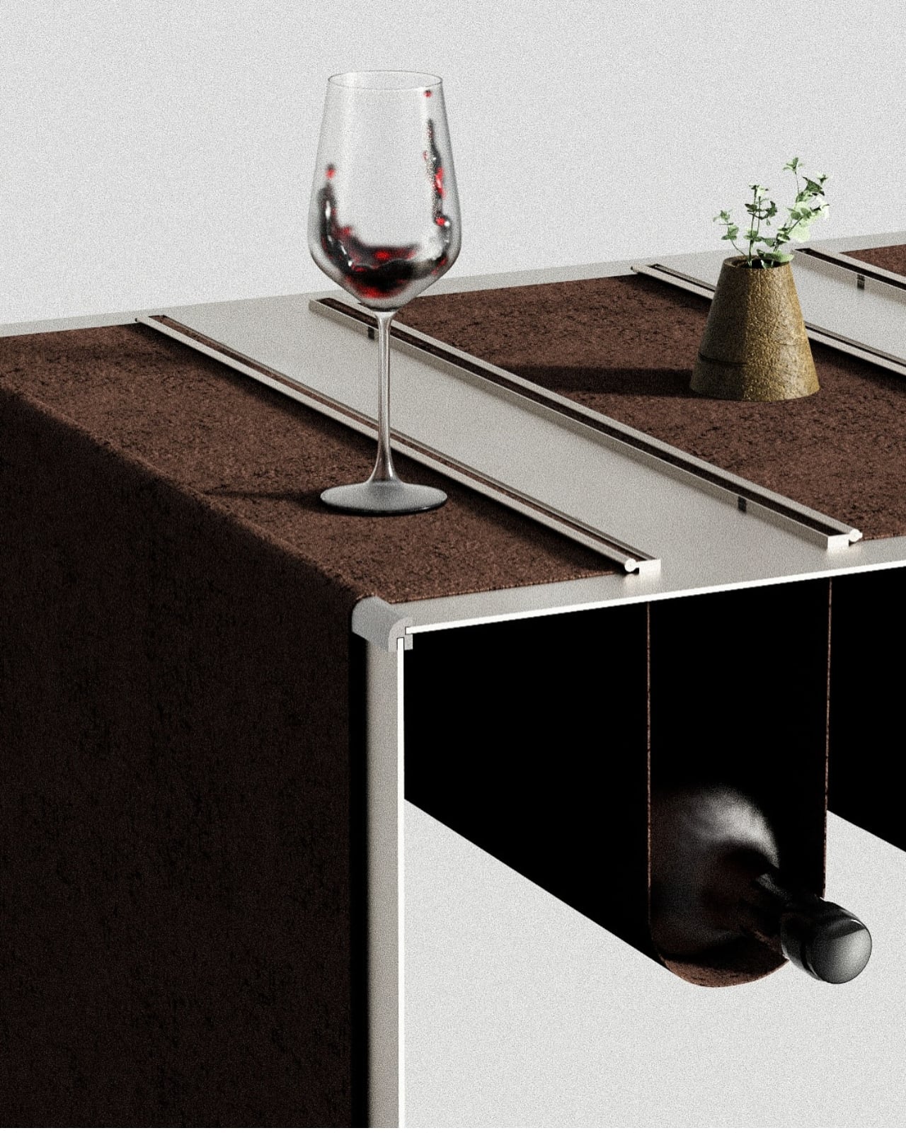
The engineering here is surprisingly sophisticated for something that looks so simple. The placemats are made from thick felt material that provides just enough structure to hold a bottle securely while maintaining that soft, draped aesthetic. Metal rails run along the table’s edge, keeping everything aligned and preventing the fabric from shifting during use. The transparent legs give the whole thing a floating quality, making what could have been a bulky piece feel light and airy.

What really gets me about this design is how it challenges our expectations about what furniture can do. We’re so used to tables being flat surfaces with maybe a shelf underneath if we’re lucky. But Miray looked at the entire vertical space and asked, “What if we used all of it?” The result is furniture that works harder without looking like it’s trying too hard.

The color options show real thoughtfulness too. The classic black version has that sophisticated, gallery-ready vibe. The sage green feels fresh and contemporary, perfect for spaces that embrace color without shouting about it. And the warm brown brings an organic, grounded feeling that would work beautifully in all kinds of interiors. Each colorway completely changes the personality of the piece, which means it can adapt to different aesthetic preferences while maintaining its core functionality.

There’s also something quietly luxurious about the whole concept. Think about high-end restaurant design or boutique hotel details where every element serves multiple purposes without announcing itself. This table has that same energy. It’s the kind of piece that sparks conversation not because it’s loud or flashy, but because it’s genuinely clever.

For small space dwellers, this design is particularly genius. Studio apartments and compact dining areas often require furniture that multitasks, but most storage solutions are pretty obvious about what they’re doing. This table stores things while looking like a sculptural object. The bottles become part of the design rather than clutter you’re trying to hide. The social aspect shouldn’t be overlooked either. When you’re hosting, having the wine right there creates a more relaxed, communal atmosphere. Guests can help themselves without navigating your kitchen or interrupting the flow of dinner. It’s the furniture equivalent of being a thoughtful host who anticipates needs before anyone has to ask.

Miray has created something that sits comfortably at the intersection of art, furniture, and problem-solving. It’s not trying to reinvent the table entirely, just reimagining what a table could be if we paid attention to the negative space around it. In a world of increasingly complex design solutions, there’s something refreshing about an idea this straightforward executed this well. Sometimes the best innovations aren’t about adding more features or technology. They’re about looking at everyday objects with fresh eyes and asking better questions. The Placemat hightop table does exactly that, turning a simple dining essential into an elegant storage solution that makes your space more functional and more beautiful at the same time.

The post This Elegant High-Top Table Hides Wine Bottles In Its Placemats first appeared on Yanko Design.
This 2025 Award-Winner Solved the One Thing Thermal Pots Get Wrong

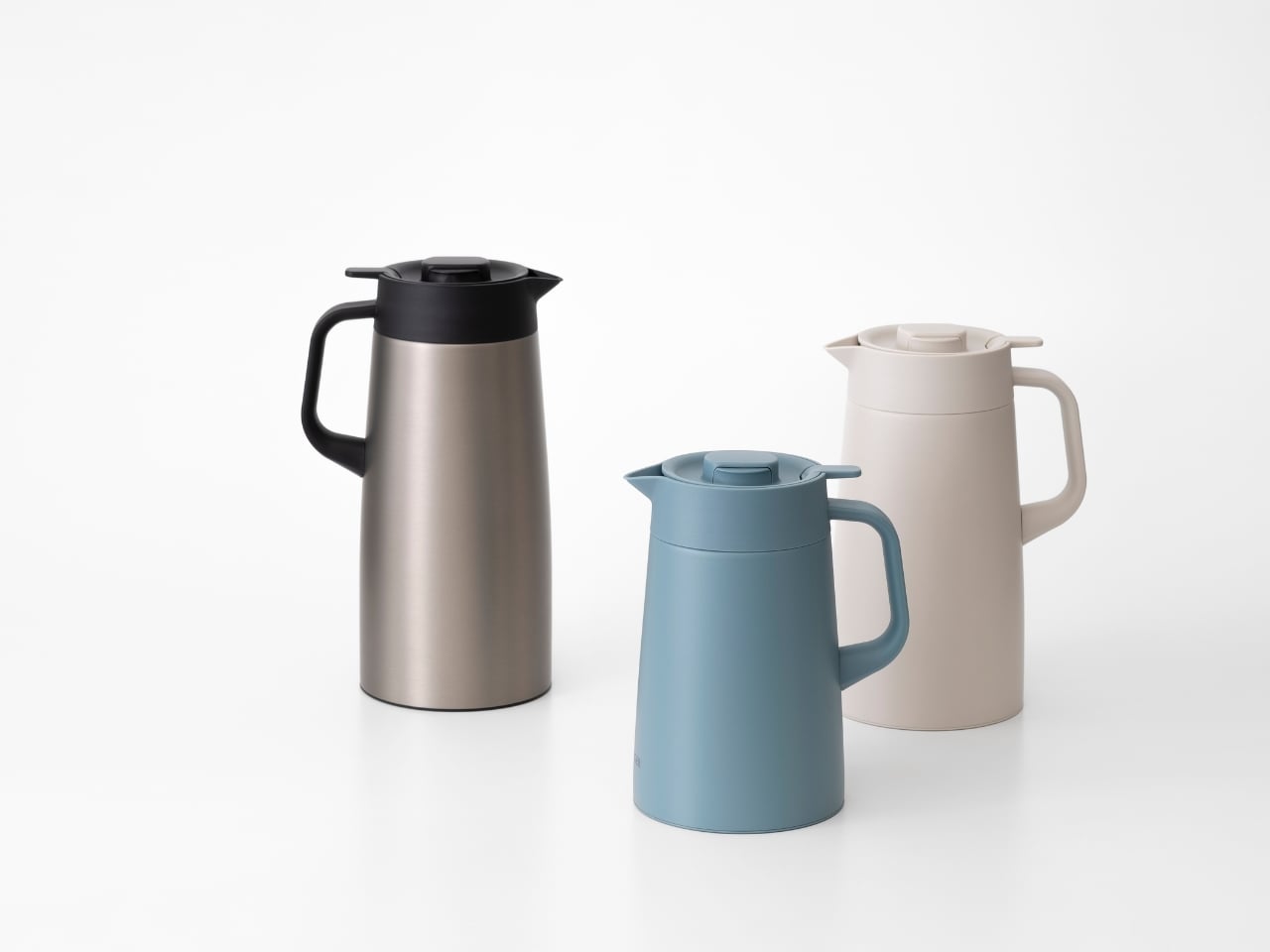
There’s something deeply satisfying about a product that just works. Not in a flashy, look-at-me kind of way, but in that quiet, thoughtful manner where every detail clicks into place. That’s exactly what Doogdesign Inc. has achieved with their Vacuum Insulated Pot PWR, a redesign for Tiger Corporation that recently earned a 2025 Good Design Award.

At first glance, it might seem like just another thermal pot. But here’s where things get interesting. This isn’t a fresh concept pulled from thin air but rather a thoughtful evolution of Tiger’s previous PWO model. The designers at Doogdesign, an Osaka-based studio founded by Kazuya Koike, took on the challenge of addressing real-world frustrations that users had been living with for years.

Designer: Doogdesign Inc

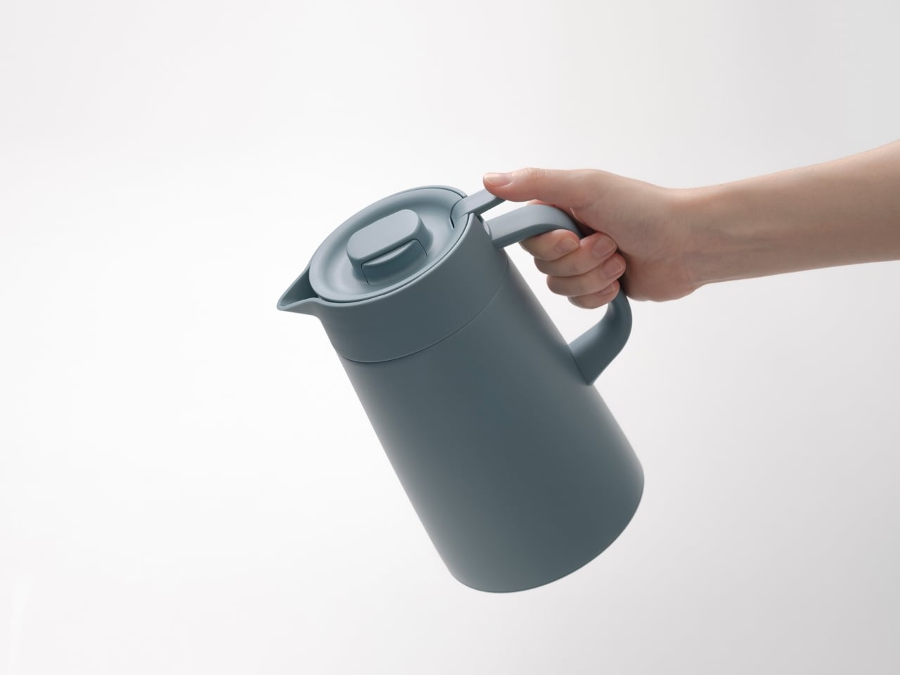
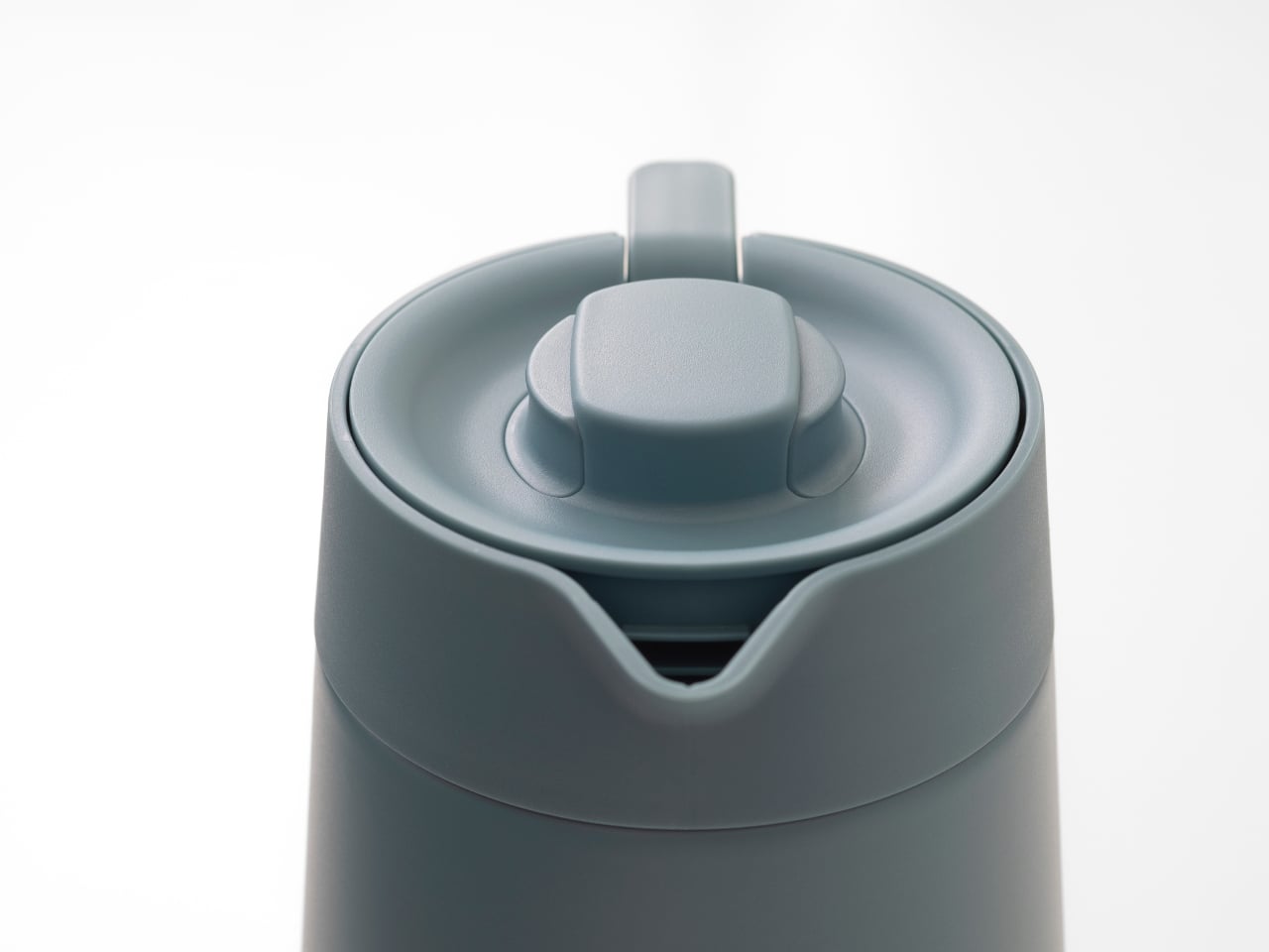
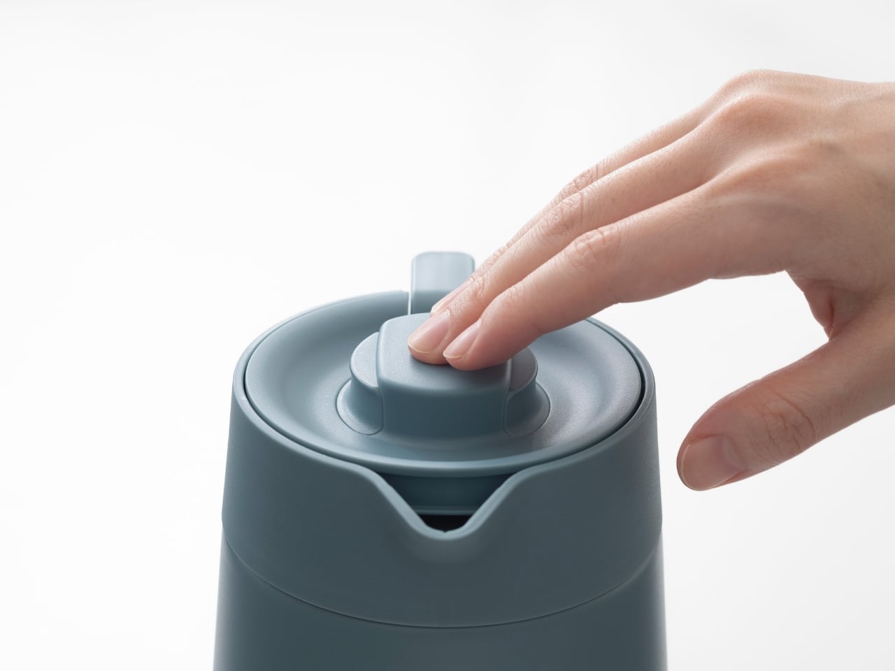
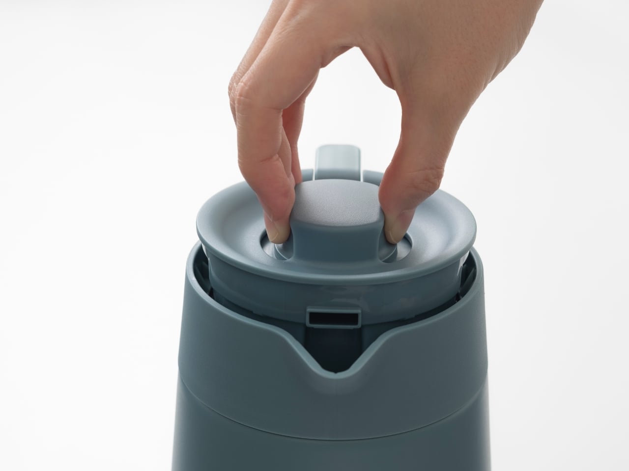
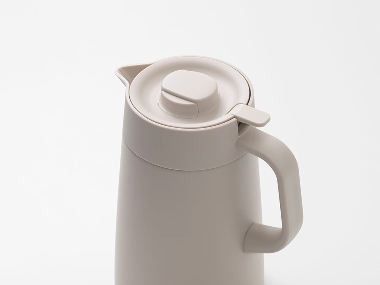
Think about the last time you struggled with a stubborn lid or fumbled with an awkward lever while trying to pour your second cup of tea. Those little moments of friction add up. The PWR tackles exactly these pain points, transforming daily annoyances into seamless interactions. Through extensive prototyping and adjustments, the team refined the lever and lid mechanism until attachment and detachment could happen with just a light touch. It’s the kind of improvement that sounds simple until you realize how much testing and iteration goes into making something feel effortless.

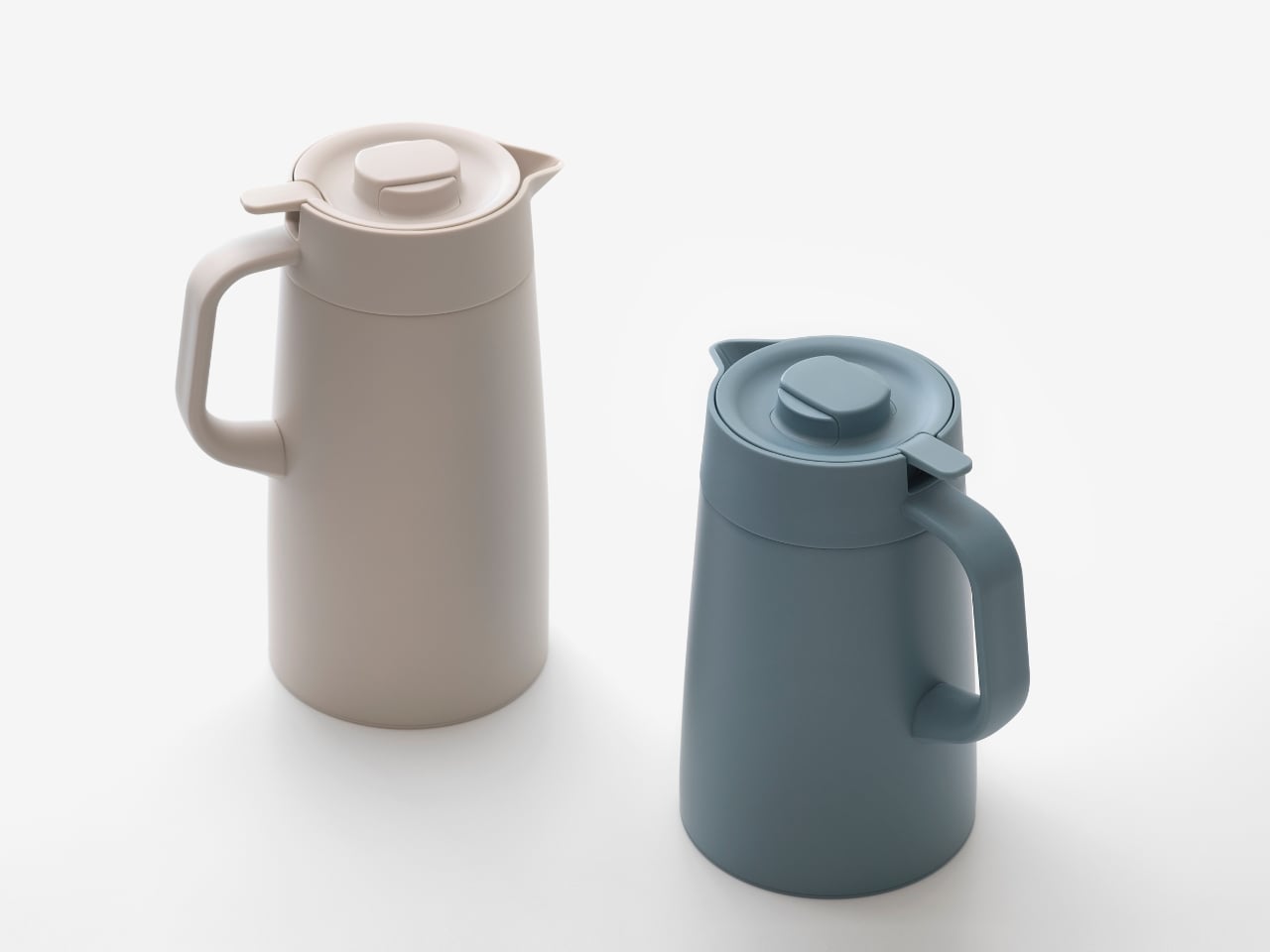
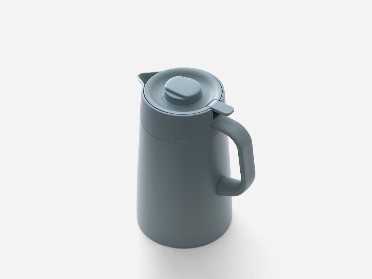
But functionality alone doesn’t make great design. What sets this pot apart is how it balances practical usability with visual grace. The lid features a smooth, curved form that plays beautifully with light and shadow, evoking the quiet presence of fine tableware. There’s an understated elegance here that doesn’t scream for attention but somehow makes your kitchen counter look a little more put-together.

The design philosophy becomes clear when you examine the details. This is about more than just keeping beverages hot (though the vacuum insulation handles that job brilliantly). It’s about creating an object that belongs on your everyday table, something you’re happy to see sitting out rather than hiding away in a cupboard. The stainless steel construction speaks to durability and longevity, while the refined aesthetic ensures it won’t clash with your interior choices, whether you lean minimalist or eclectic.

One of the smartest moves? Offering three size options at 1.2L, 1.6L, and 2.0L. This versatility means whether you’re brewing tea for yourself on a quiet afternoon or hosting a small gathering, there’s a PWR that fits your needs without forcing you to compromise. It’s the kind of practical thinking that shows the designers actually considered how people live, not just how products photograph.

The recognition from the Good Design Award 2025 isn’t just industry back-patting. These accolades matter because they signal that experts in the field recognize when someone has genuinely moved the needle on product design. In a market flooded with thermal containers that prioritize either pure function or pure aesthetics, finding one that nails both deserves acknowledgment.

What makes this project particularly fascinating from a design perspective is how it demonstrates the value of iteration. Redesigning an existing product requires a different kind of creativity than starting from scratch. You’re working within established constraints, user expectations, and manufacturing realities. Yet Doogdesign managed to identify the friction points and address them without losing what made the original concept valuable in the first place.

If you’re someone who appreciates when form follows function without sacrificing beauty, or if you’ve ever caught yourself thinking “there has to be a better way to do this” while using everyday objects, the Vacuum Insulated Pot PWR is a perfect example of what happens when designers listen. It’s not trying to reinvent hot beverage storage. It’s just making it notably, measurably better, which might be the most refreshing approach of all.

The post This 2025 Award-Winner Solved the One Thing Thermal Pots Get Wrong first appeared on Yanko Design.
Stowaway Lap Desk Hides Your Laptop Inside When You’re Done Working

A lot of work now happens on beds, sofas, and in hotel rooms, with laptops balanced on knees and chargers snaking across blankets. Most lap desks are flimsy plastic trays that solve heat and stability but do nothing for clutter, leaving pens, earbuds, and phones scattered around you. The Arlo Skye Stowaway Lap Desk is a piece of travel-inspired furniture that tries to make mobile work feel less improvised and more intentional.

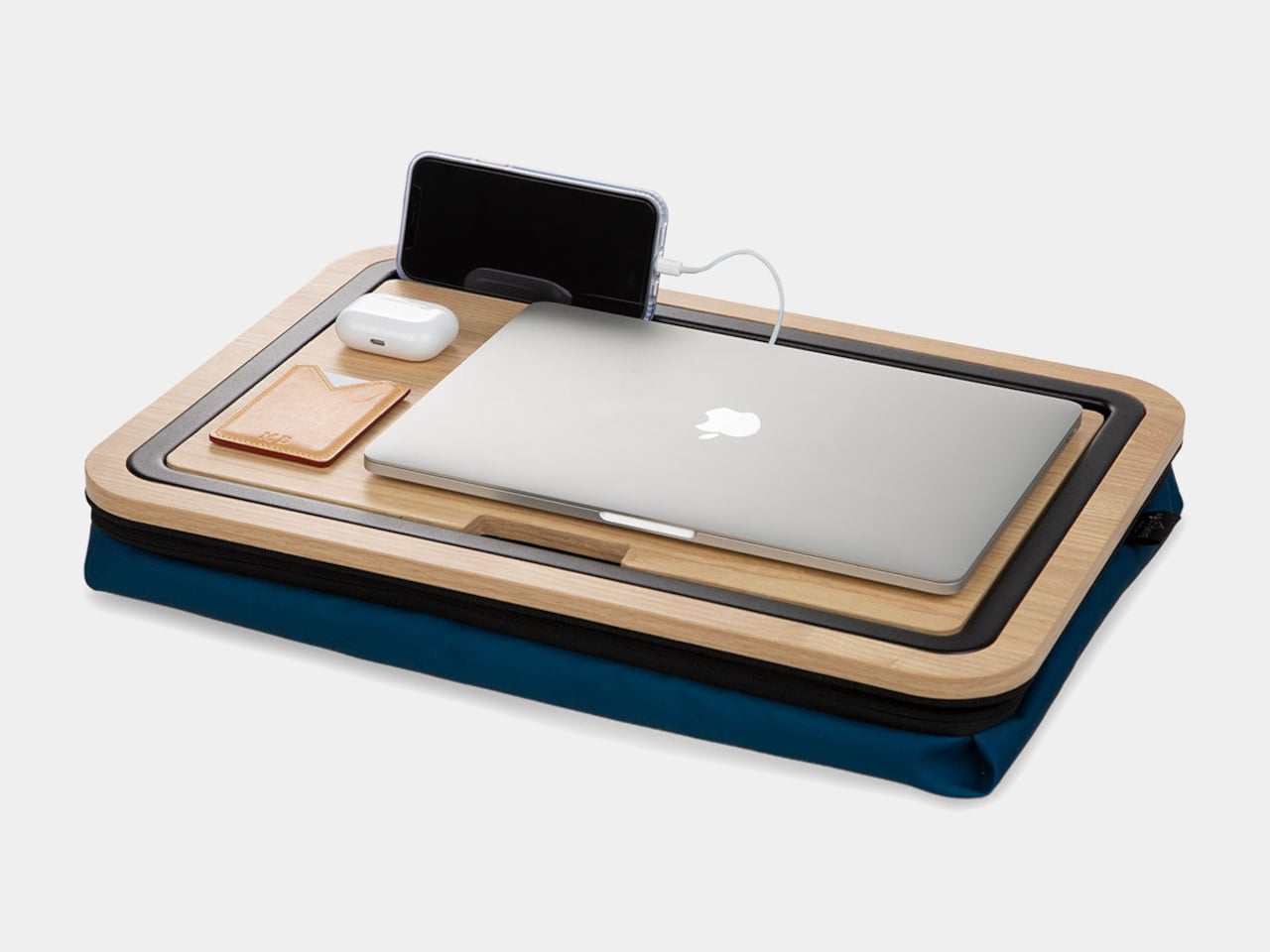
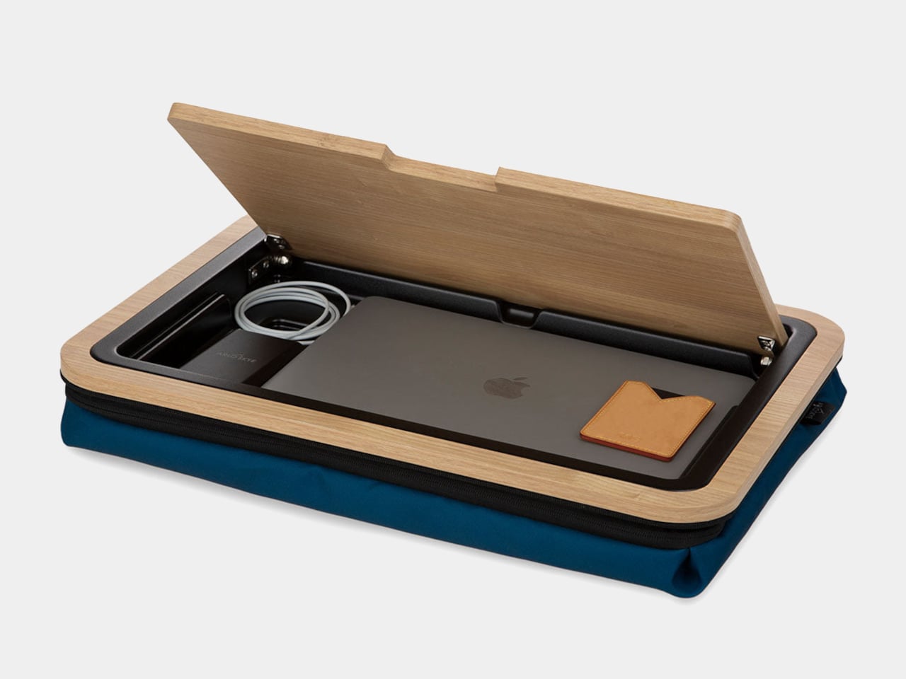
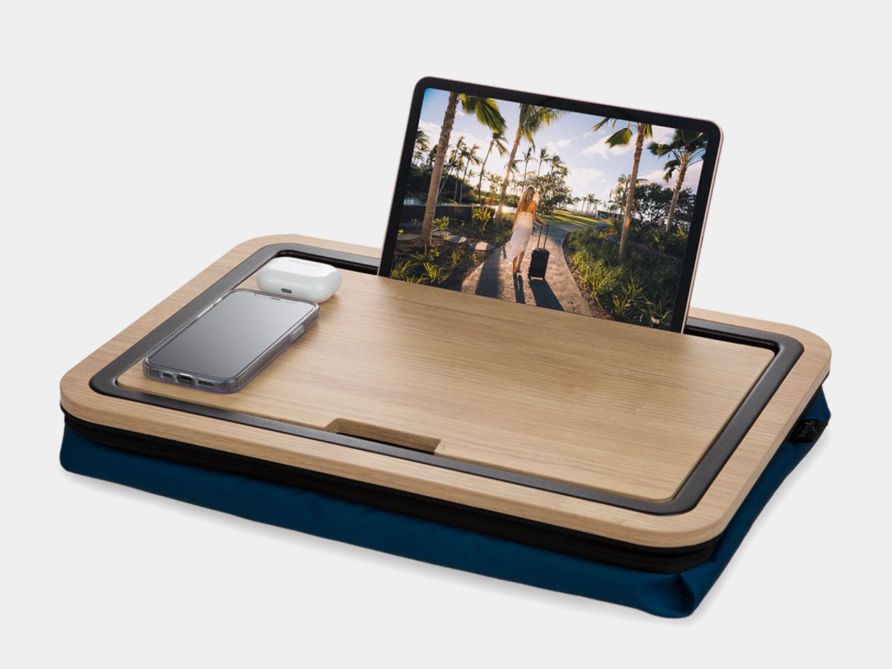
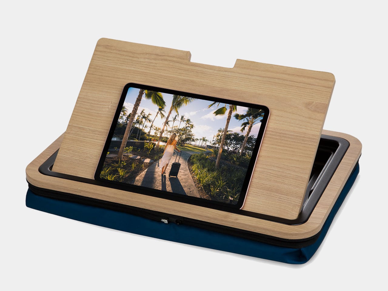
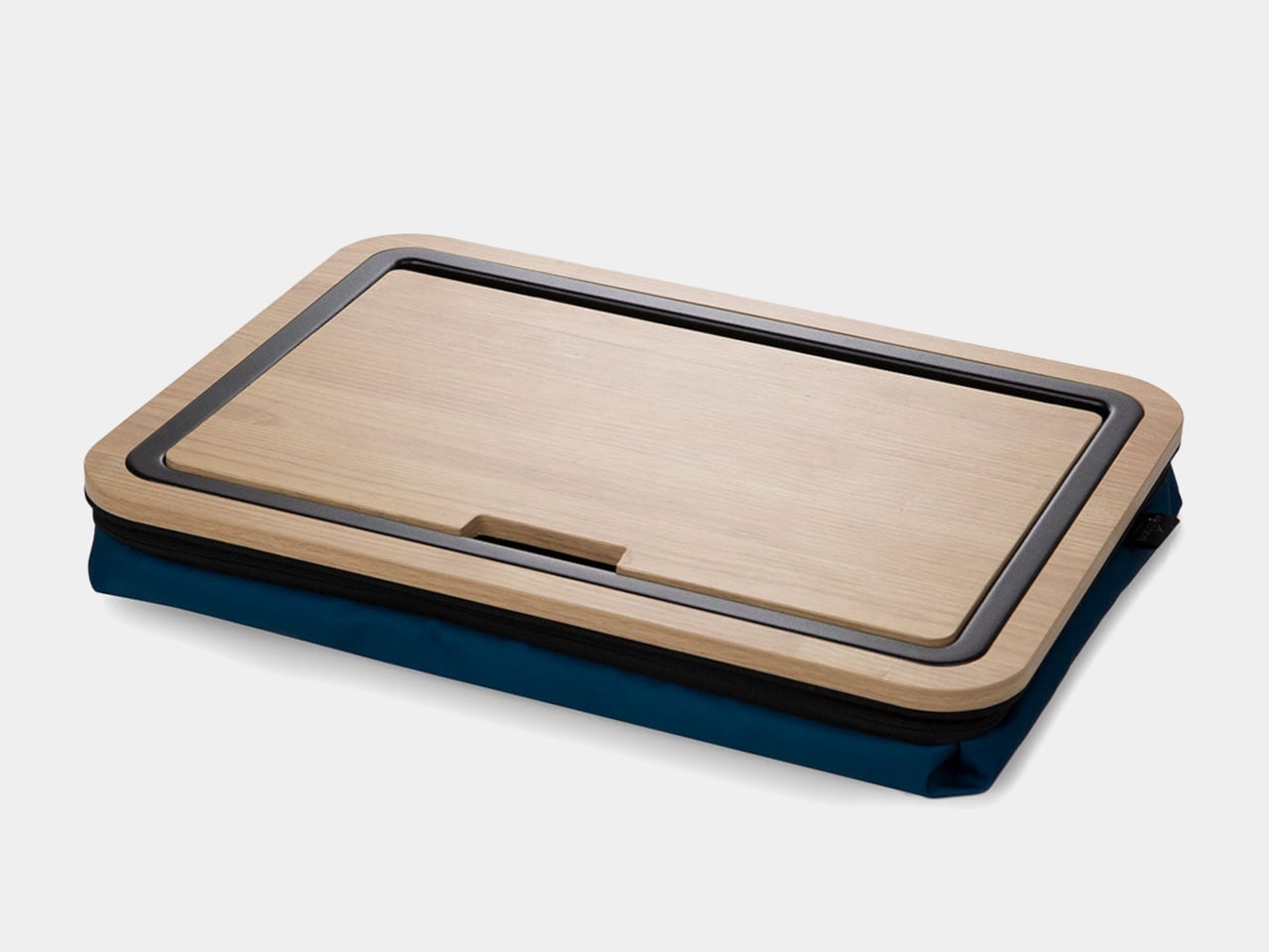
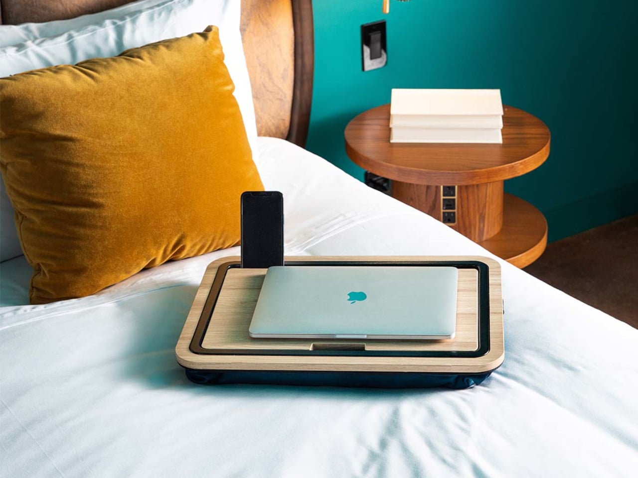
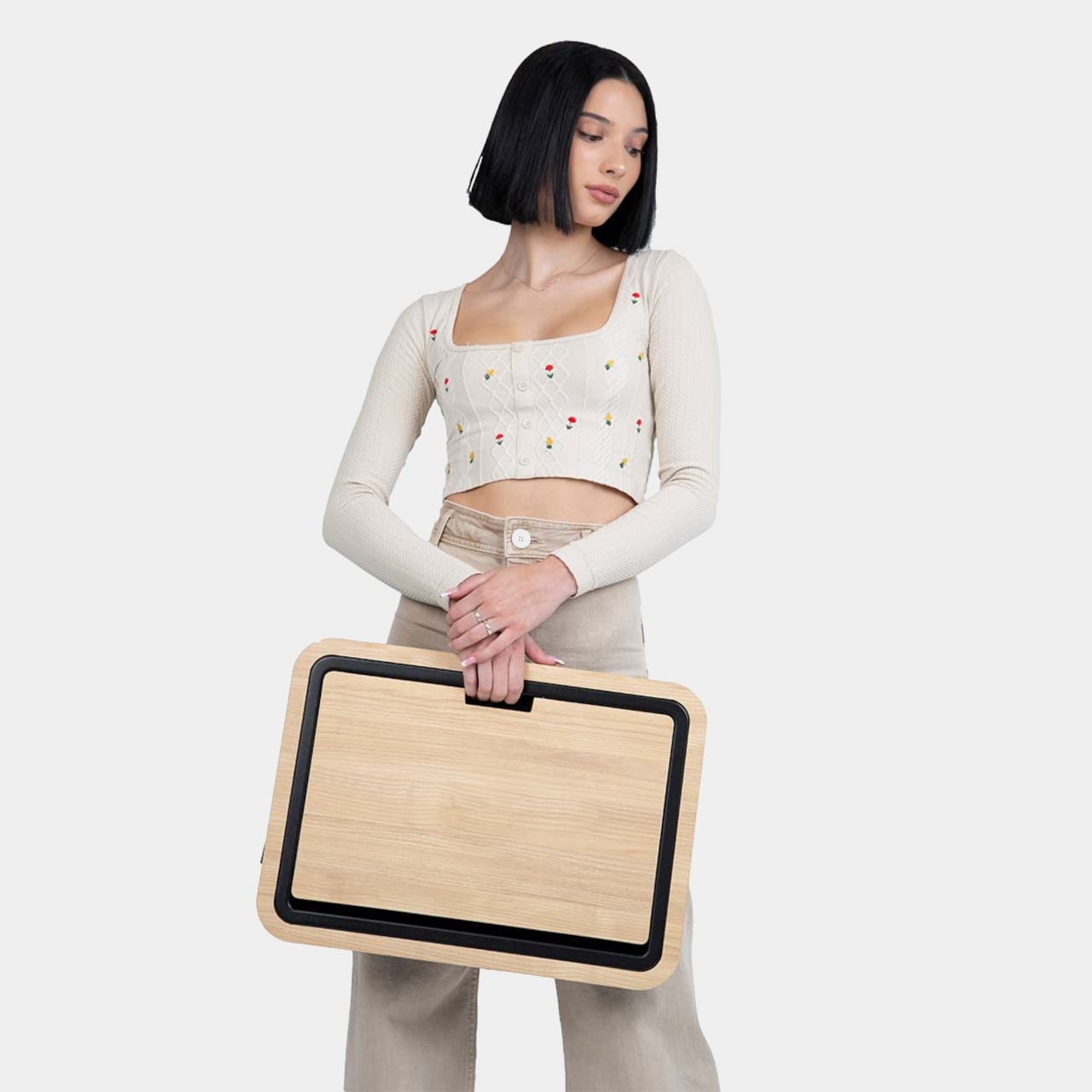
The Stowaway Lap Desk 19 is a compact mobile workstation built around a white-oak work surface and a cushioned base. It is sized for a 16-inch laptop, with room for a mouse or notebook, and designed to move between bed, sofa, and carry-on without looking like office gear. The defining move is the hidden storage built into the desk itself, turning it into a portable drawer for your laptop and everyday tools.

Designer: Arlo Skye

A slot along the back edge holds a tablet or phone upright, turning the lap desk into a small command center with multiple screens. The oak surface is framed by a low lip on three sides, which keeps devices and pens from sliding off when you shift position. The result is a stable, furniture-like platform that feels more like a small table than a tray, with enough space to spread out without everything falling into the blankets.
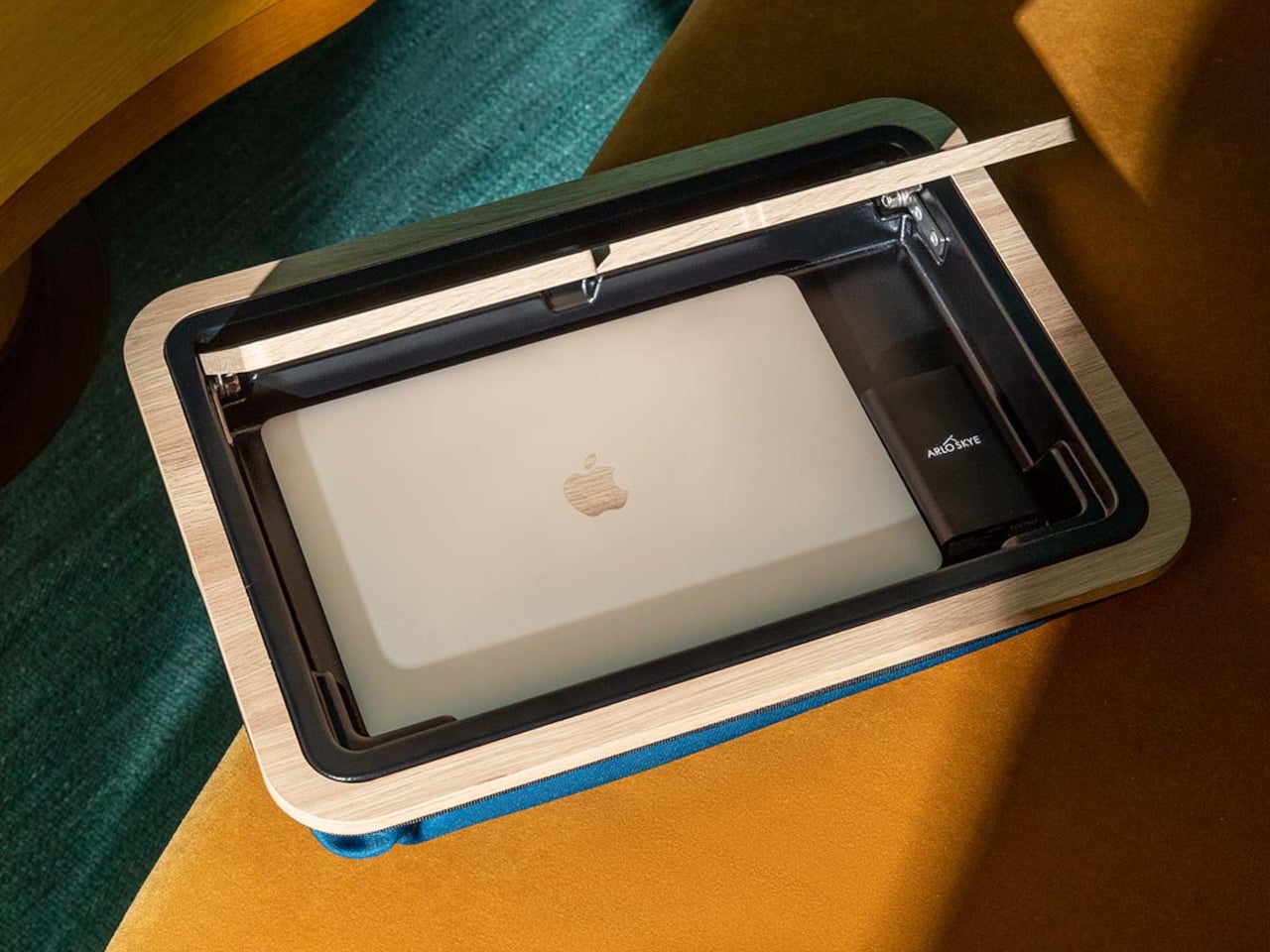
The top opens to reveal a compartment large enough for a laptop, tablet, and flat accessories. That means when you are done working, everything can live inside the desk instead of being scattered across the bed or sofa. A cut-out doubles as a cable pass-through, so you can charge devices while they are tucked away, keeping cords from tangling around your legs or snagging on bedding when you move.

The microbead cushion attached to the underside conforms to your lap and lifts the wooden surface off your legs. It helps with ventilation and spreads weight more evenly than a hard board. Some reviewers find microbeads firmer than expected, but the combination of cushion and wood still feels more considered than a bare tray or a laptop directly on your knees, especially during longer work sessions that stretch past an hour.

The lap desk doubles as a side table or serving tray when you are not working, holding breakfast, snacks, or a book without needing a separate piece of furniture. The oak top and dark cushion let it blend into a bedroom or living room without screaming office, so it can live out in the open instead of being hidden in a closet between uses, ready to grab whenever you need it.

The Stowaway Lap Desk changes the experience of working away from a desk. It corrals your tools, gives them a defined home, and makes it easier to pack up in one motion when you are done. The idea of a lap desk that behaves like a small, self-contained workstation feels like a welcome upgrade over the usual plastic slab, especially when your office is often a bed, sofa, or hotel room and you need every piece of gear to earn its footprint.

The post Stowaway Lap Desk Hides Your Laptop Inside When You’re Done Working first appeared on Yanko Design.