Every so often, a piece of furniture stops you the way a good sentence does. You read it once, then go back and read it again just to understand how it works. The Sori Chair by Portugal’s Teixeira Design Studio is exactly that kind of piece. It started, as the best ideas often do, from a daily ritual of sketching. Not a brief, not a client request, just the quiet, intuitive kind of drawing you do before the day gets loud. And somewhere in that process, a loop took shape that became something worth talking about.
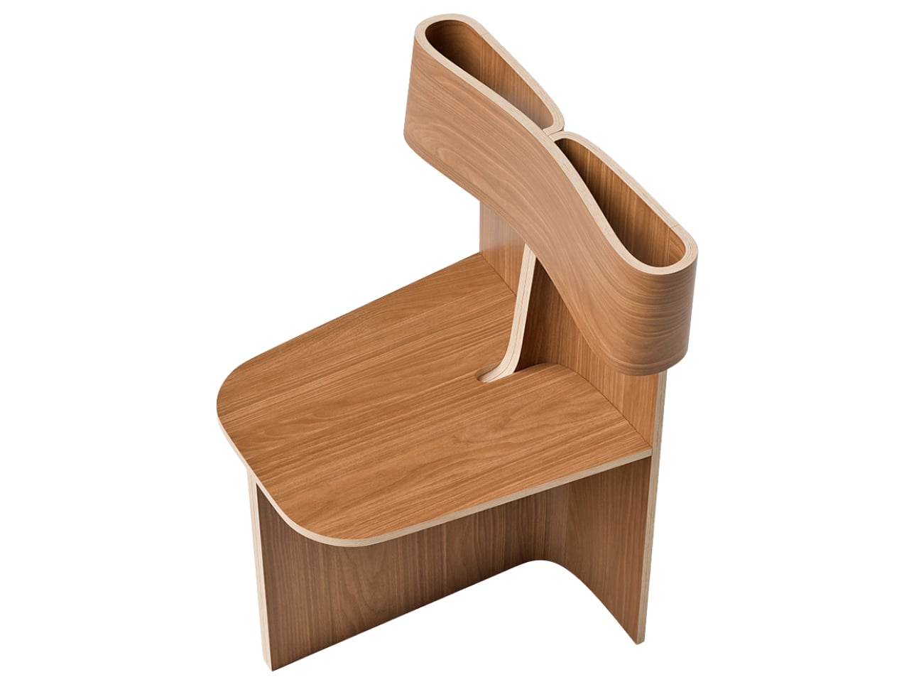
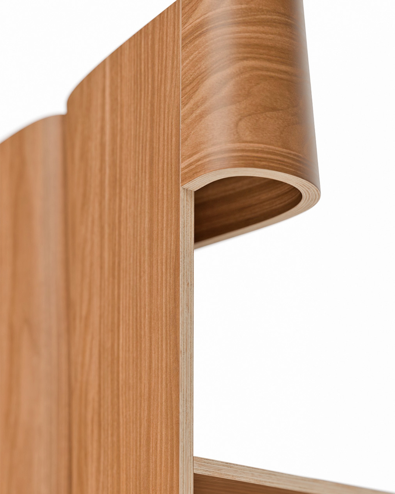
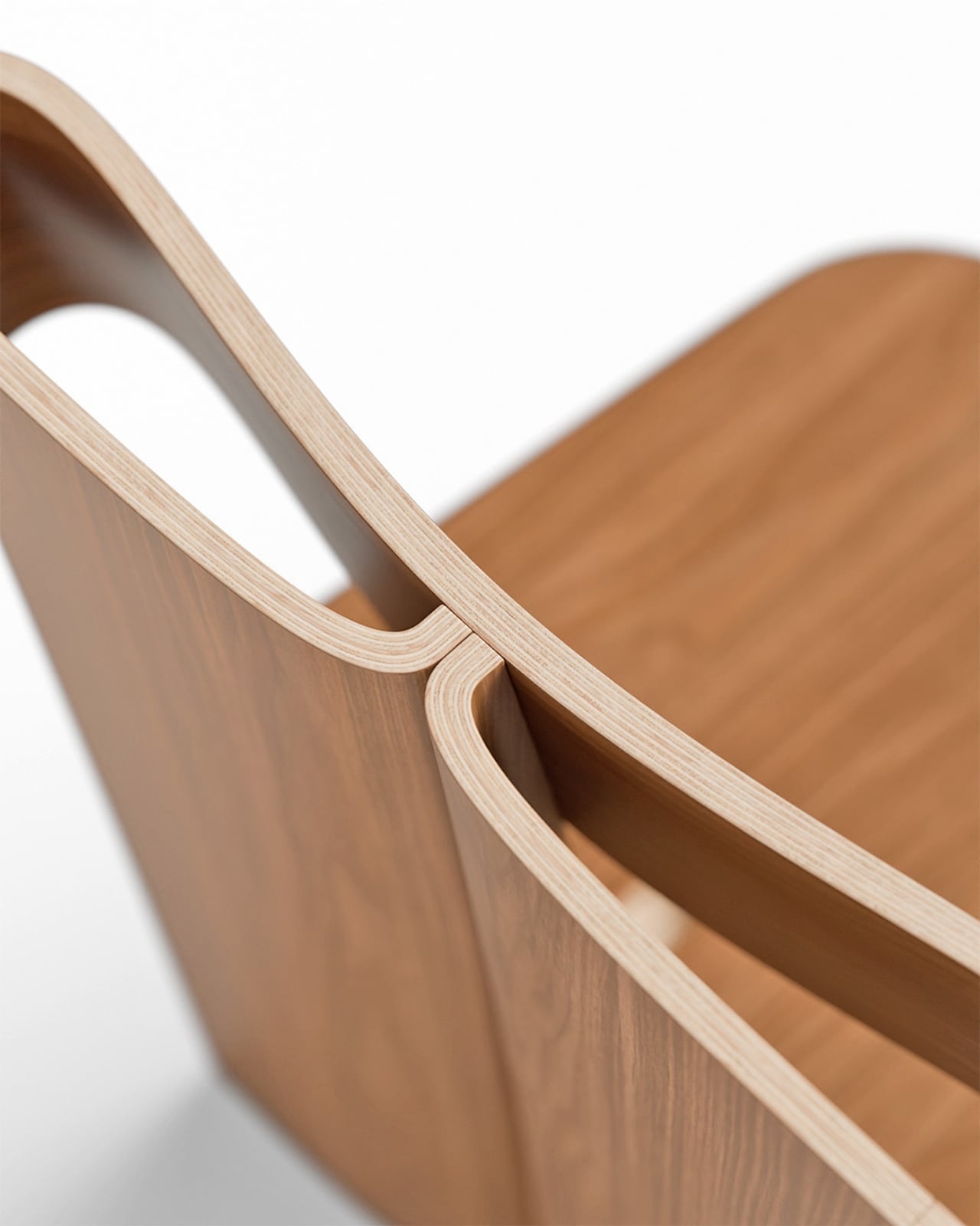
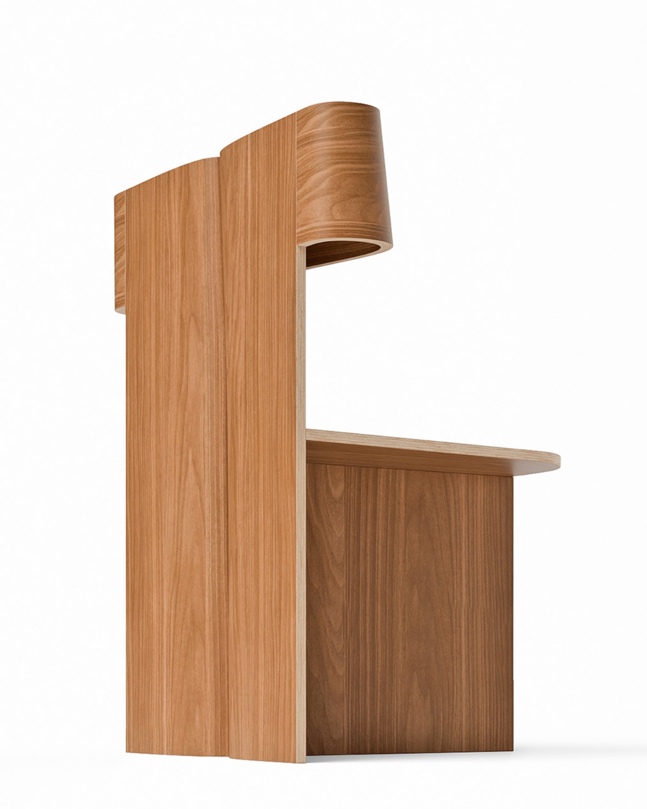
What came out of that ritual is a chair that feels completely resolved. A single, continuous ribbon of bent wood loops upward from the seat to form the double-ply backrest, open at the center like a hollow frame, and the contrast it creates against the chair’s firmly geometric base is fully intentional. Below that fluid loop, the structure is all right angles and clean planes, held together by a cross-shaped base that looks as if it was drawn with a ruler and a very steady hand. That tension between the organic and the architectural is where the Sori Chair lives, and it’s a genuinely compelling place to be.
Designer: Teixeira Design Studio
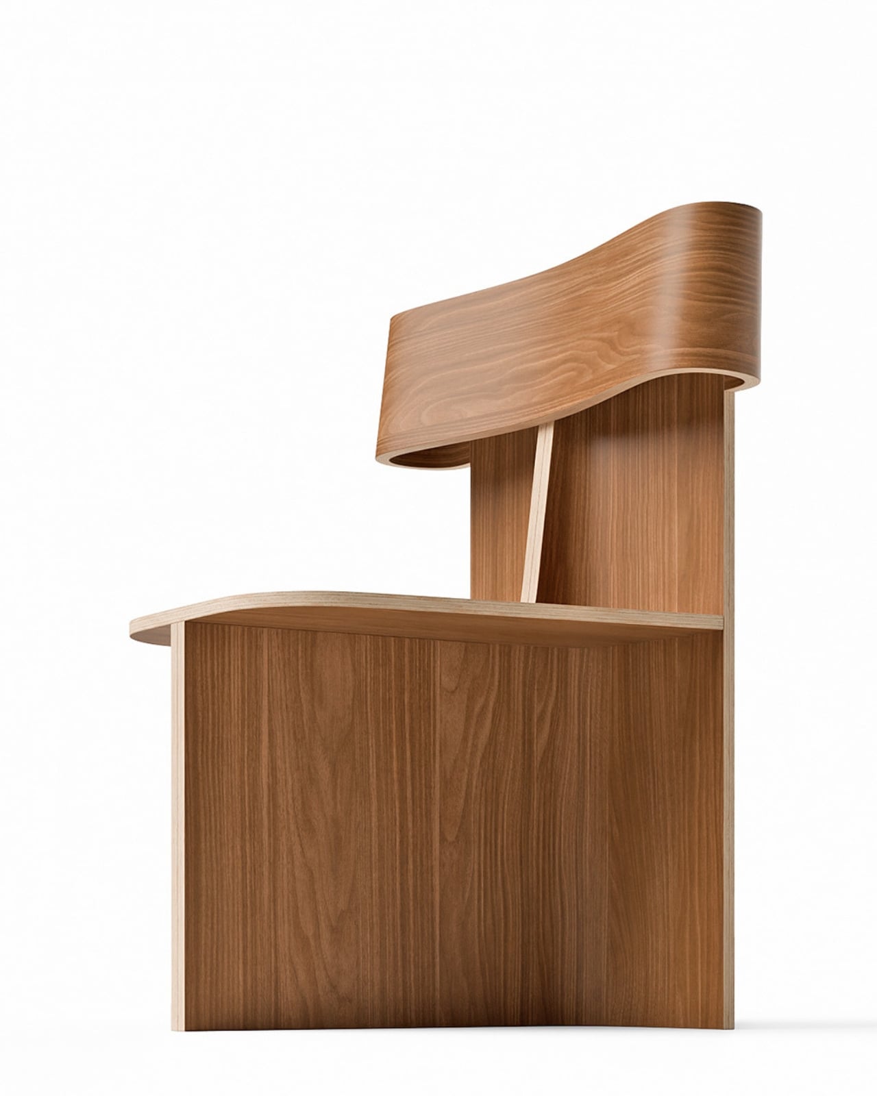
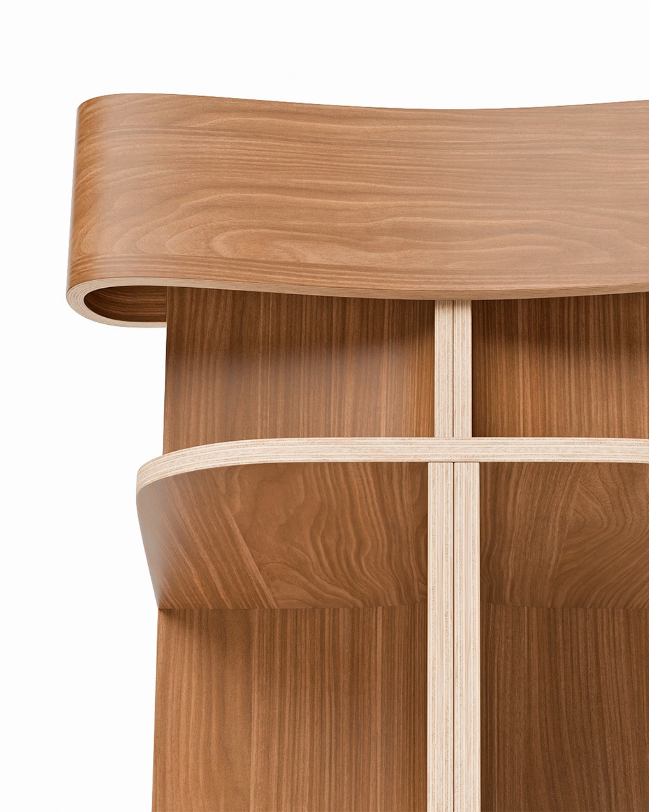
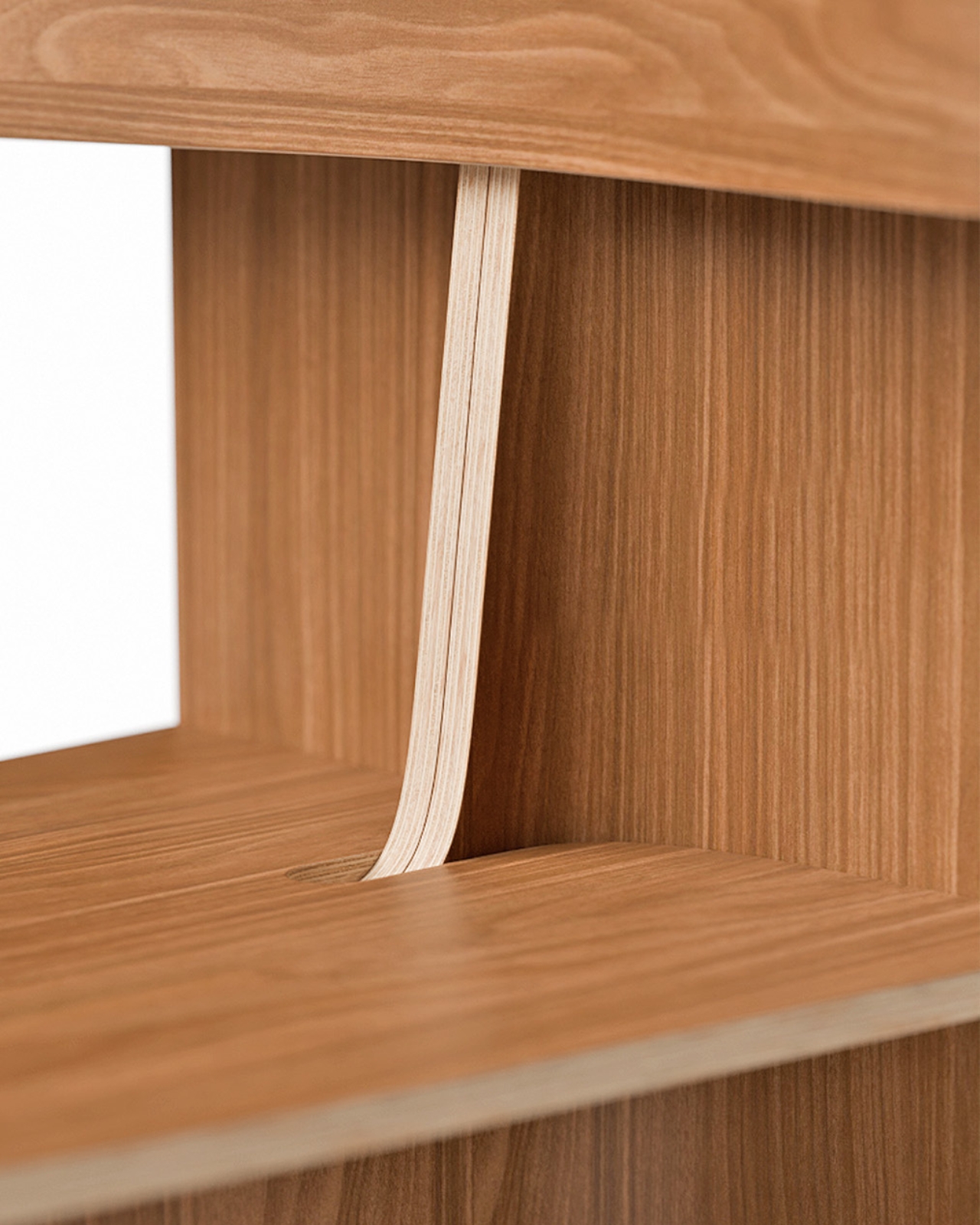
The technical side of this piece deserves more attention than it usually gets in design coverage. That backrest loop doesn’t just sit on top of the seat. It rises through it, emerging from a precise cutout with the kind of considered joinery that takes real craft to execute. The layered plywood edges are fully exposed throughout, and rather than hiding them, the design leans into them. You can see the pale strata of wood at every bend, every curve, every corner. It reads as an honest material and an honest process, and that matters more now than it perhaps ever has. In an era where furniture is increasingly flat-packed and finish-wrapped, a chair that shows you exactly how it was made feels almost countercultural.
The name is worth pausing on. Sori is a Japanese word for the natural curvature or warp of wood, the subtle bow that timber develops over time or when shaped under heat and pressure. Whether the studio intended that specific reference or landed on it instinctively, naming the chair after that particular quality of the material says something about how this work is approached: not as a battle against the material’s limits, but as a genuine conversation with them.
Teixeira Design Studio, based in Viana do Castelo in northern Portugal, has built a portfolio that consistently returns to this idea of using plywood and bent wood to find new formal possibilities. Earlier pieces like the Void Chair explored how a single sheet of plywood could fold into a form that contained seating and hidden storage simultaneously. With Sori, the focus narrows considerably. No secondary function, no added utility. Just the pursuit of one fluid, structural gesture, executed as cleanly as it possibly can be.
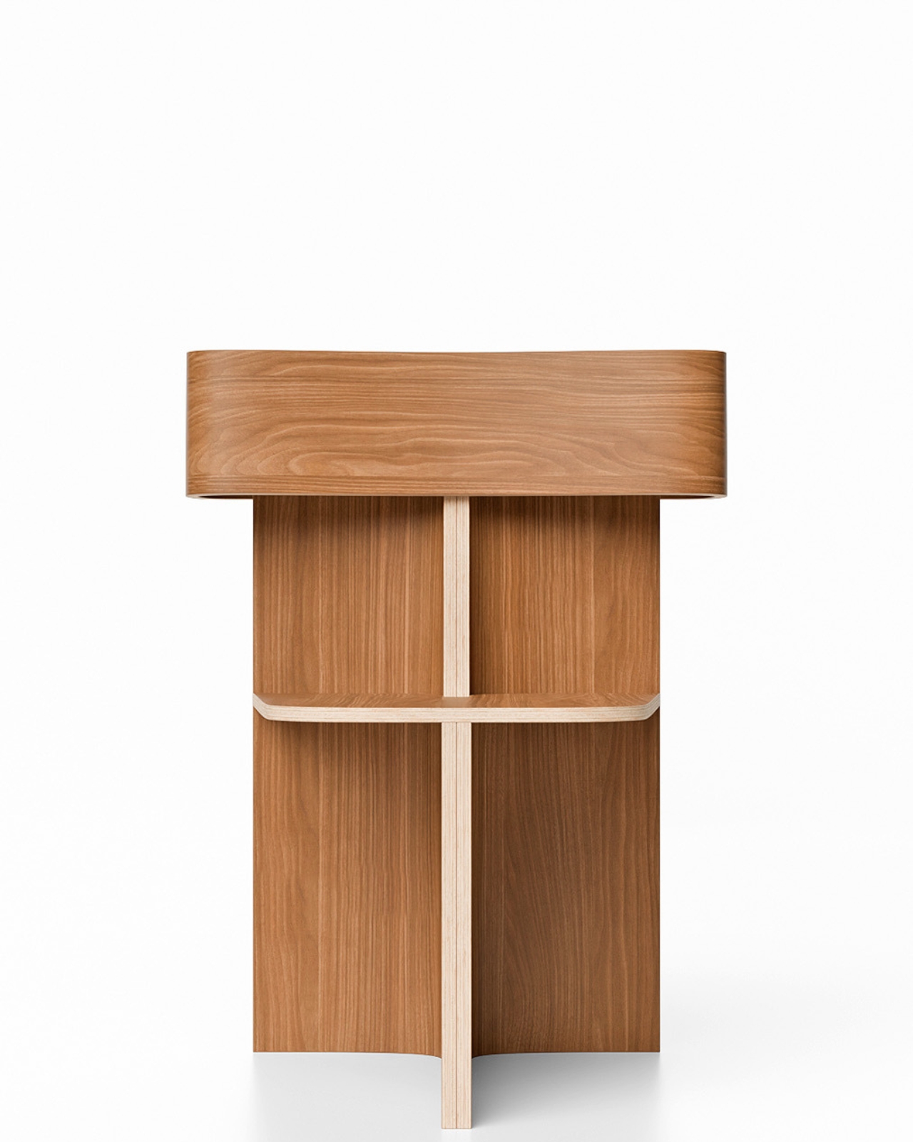
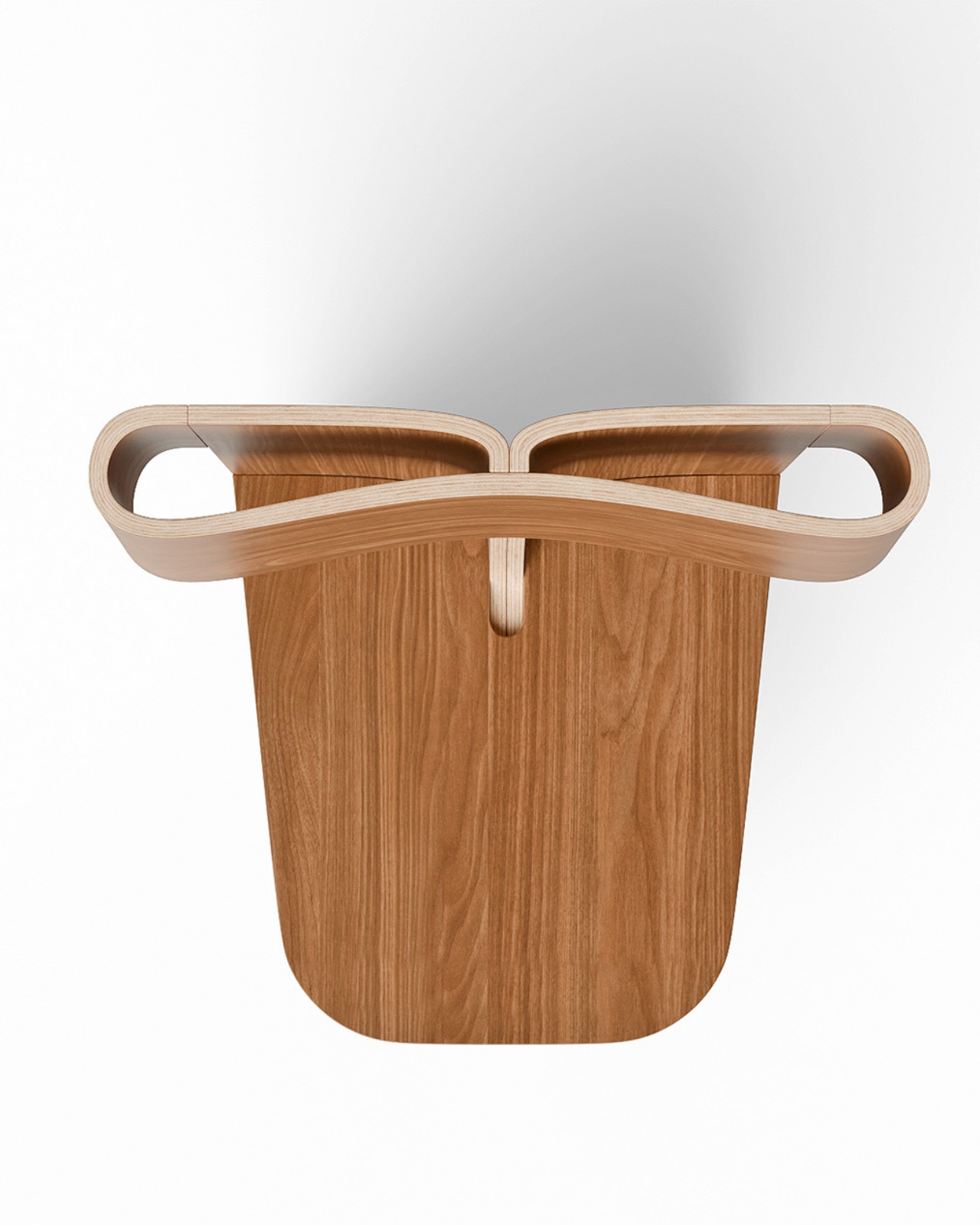
That restraint is what gives the chair its real weight. Designers who know how to do more but choose to do less are often the most interesting ones to follow, and Sori feels like a quiet, confident declaration of that philosophy. Every angle you approach it from reveals something new. From the front, it reads almost architectural, like a small building with an open courtyard. From the side, the loop of the backrest curls inward like a wave at the moment before it breaks. From above, the cutout in the seat and the twin arcs of the backrest create a composition that could hold its own as a flat drawing.
Good design holds up under scrutiny. It doesn’t just photograph well and vanish once you look too closely. The Sori Chair gets richer the longer you sit with it, and that, more than anything else, is the standard worth measuring any piece of furniture against.
The post How One Loop of Bent Wood Became a Complete Chair first appeared on Yanko Design.