Most flashlights spend more time in a drawer than in a pocket. The ones people actually carry tend to earn that habit by being genuinely useful across more than one situation, not just reliable when the power goes out. That gap between gear carried out of habit and gear someone actually reaches for is where most EDC tools either prove themselves or collect dust.
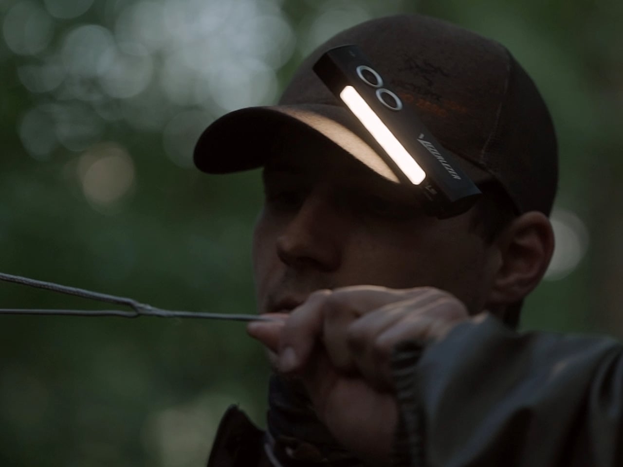
The VEZERLEZER WK2 takes that problem head-on. Rather than being one bright option you might need someday, it covers the full range of lighting situations a person encounters in an average week, from navigating dark outdoor spaces to close work with your hands to pointing something out across a room. The goal is to be a light you actually use every day, not just carry.
Designer: VEZERLEZER
Click Here to Buy Now: $21 $39.99 (48% off).
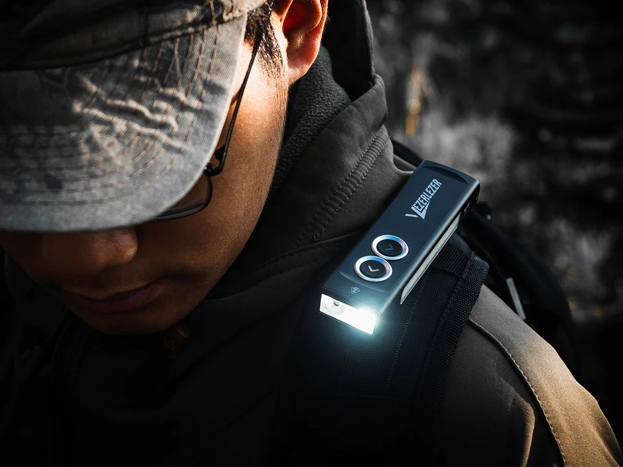
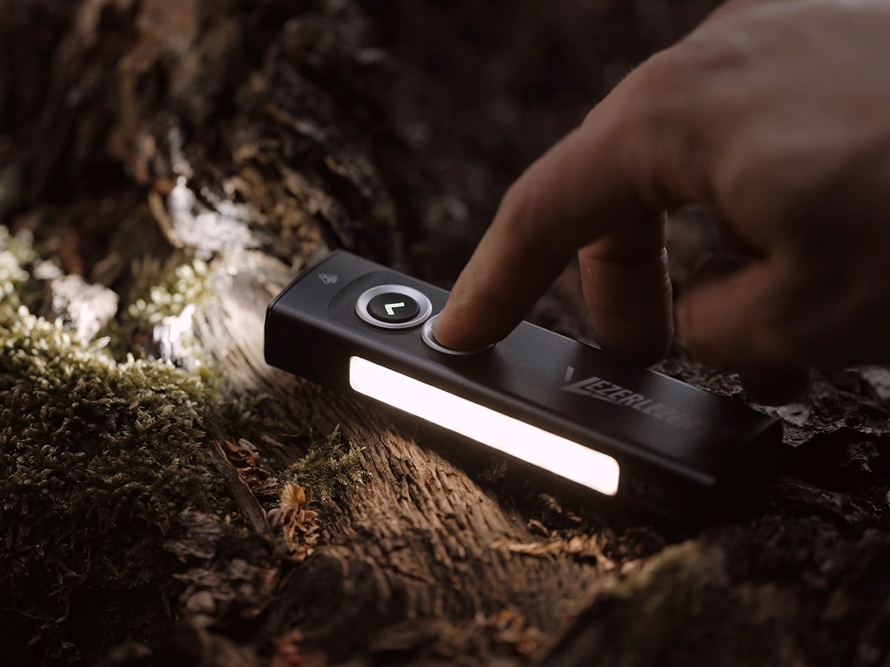
Its front-facing white spotlight handles the primary illumination work, reaching up to 1,300 lumens with a beam that covers serious distance. It isn’t a fixed brightness setting, though. From moonlight mode through low, medium, and high, the output ramps in either direction on command, so it’s easy to dial in exactly the right amount of light rather than landing on whatever happens to come next.
The side light offers an entirely different kind of output. Built around a 4,500K warm-tint LED with a color rendering index of Ra 90, it reveals true colors rather than washing them out, making it useful for close-up tasks where accuracy matters. It’s rampable from as low as one lumen up to 200, covering everything from quiet bedside reading to a broader wash of task lighting.
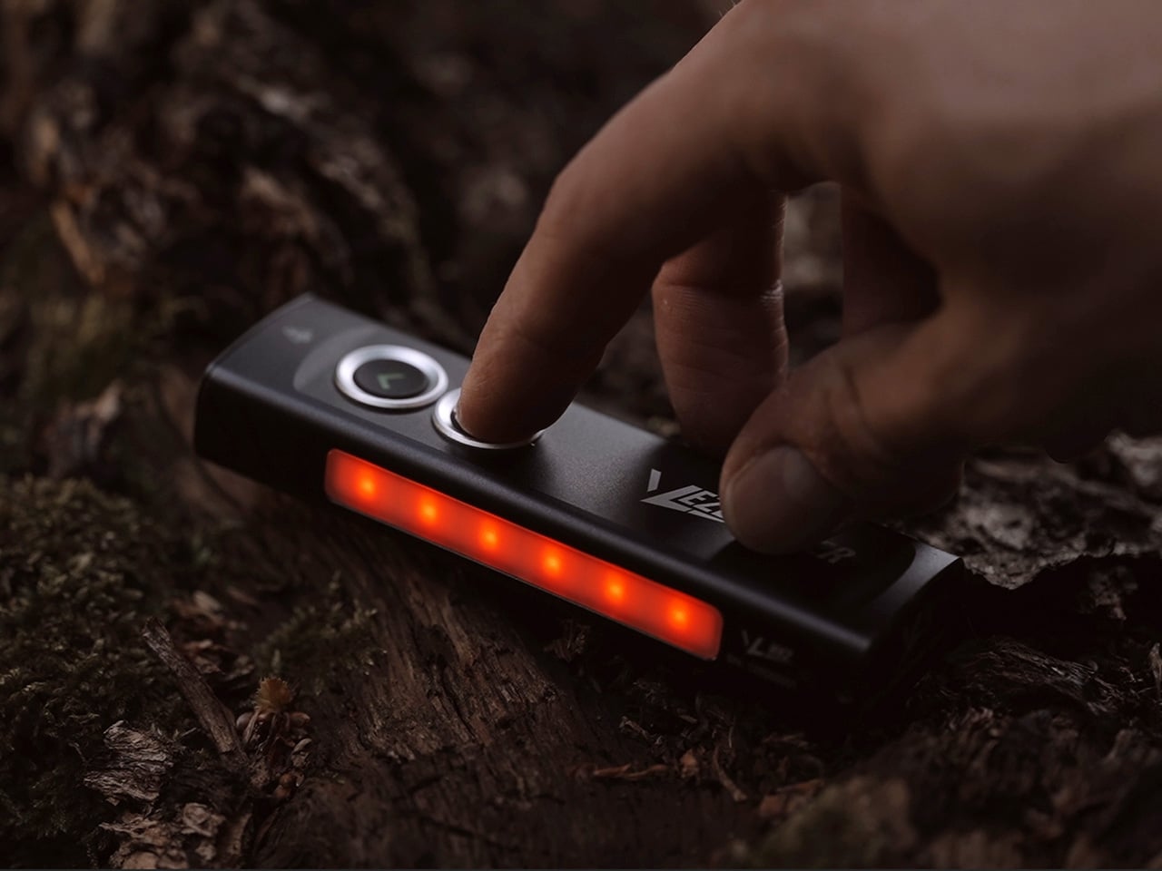
The same side strip also has a red light mode, and it’s more practical than it might initially seem. Red light doesn’t wreck your night vision the way white does, making it a much gentler option for moving around after dark without startling yourself or anyone nearby. A double click takes you straight there without cycling through anything else, which is a small but well-considered touch.
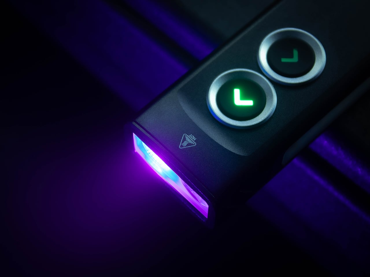
Where the WK2 steps beyond conventional flashlight territory is in its two remaining front outputs. A 365 nm UV light handles surface checks and the kind of inspection tasks a standard beam simply can’t manage, while a 520 nm green laser adds directional precision for pointing out specific details from a distance. Both are accessible independently, without cycling through any other modes first.
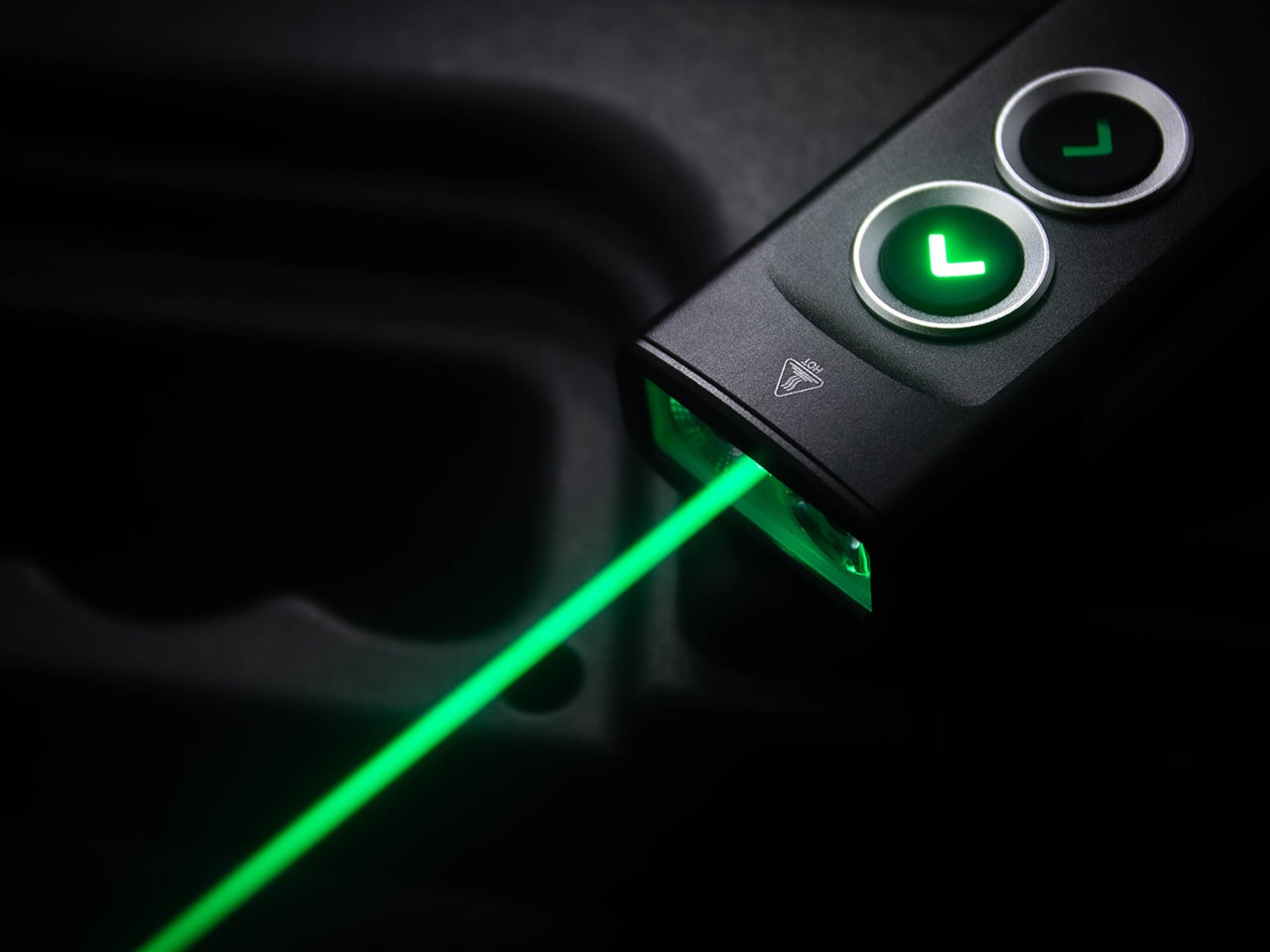
Managing all of that through a single button would be a mess, but the WK2’s dual-switch layout handles things sensibly. The upper switch controls the front outputs; the lower covers the side. Each uses distinct click patterns to jump directly to a specific mode without accidentally landing on the wrong one first. It’s a clean approach to organizing multiple functions without burying them in complicated sequences.
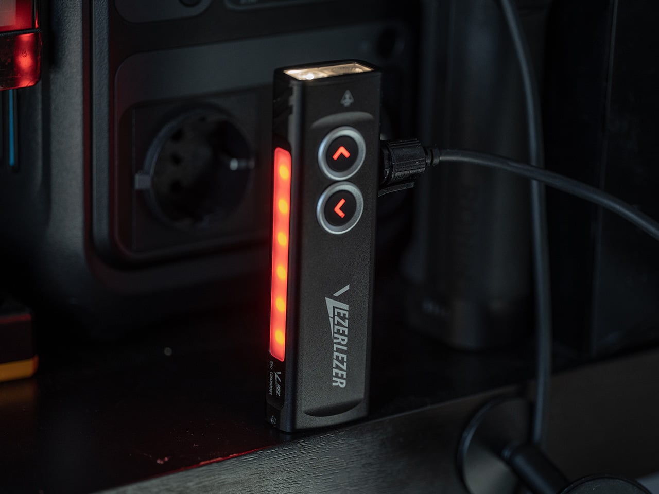
A 2,000 mAh built-in battery handles regular daily use, and USB-C charging makes it easy to keep topped up. What’s more notable is that it also accepts power from an external source while running, meaning a connected power bank can potentially extend the runtime indefinitely. That’s more dependable for longer work sessions, camping, or power outages than relying on a sealed battery alone.
The physical design reinforces the daily carry intent. The WK2’s flat rectangular body fits in a pocket far more naturally than a cylindrical torch, and the wide stainless steel deep-carry clip holds it firmly in place without shifting. It’s low-profile enough to stay discreet, too. A strong tail magnet rounds it out with a hands-free mounting option for any nearby metal surface.
The WK2 makes a case for being the one light that handles a surprisingly broad mix of everyday needs across a typical week. Five distinct outputs, a direct-access layout, and a carry design built around regular use all point to a flashlight that was put together by people who think about their gear as something to be used, not just stowed.
Click Here to Buy Now: $21 $39.99 (48% off).
The post Your EDC Flashlight Is Missing 4 Modes: VEZERLEZER Has All 5 first appeared on Yanko Design.