Quiet on the Street, Joyful at Heart! An Adelaide Cottage That Reveals Its Playful Soul

From the street, this Adelaide cottage keeps its composure. It presents itself as calm, familiar, and almost reserved, another quiet presence in a suburban streetscape. But crossing the threshold reveals an entirely different energy. Designed by Sans-Arc Studio, this art deco-inspired addition transforms the home into a space that is playful, expressive, and deliberately designed around how its young owners like to live and entertain.

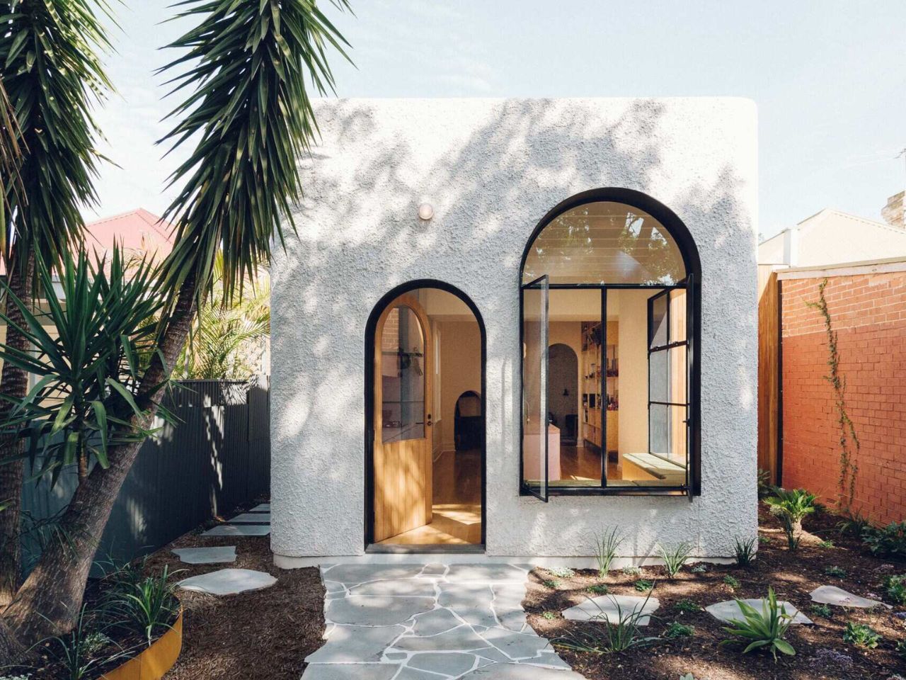
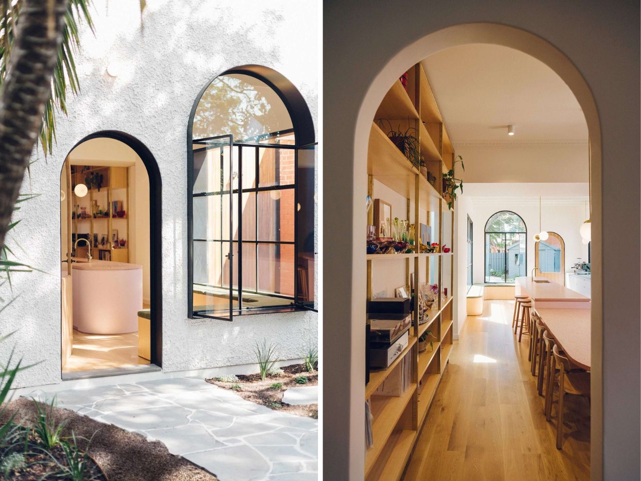
The extension announces itself subtly from the outside. Wrapped in a clean white facade, it avoids loud gestures while still feeling intentional. Deep window reveals lined in black introduce contrast and rhythm, adding a graphic sharpness to the exterior. These recesses are not merely aesthetic; they also shade the interior, reducing glare while allowing light to filter in thoughtfully. The result is an exterior that feels both refined and quietly dramatic, simple in form, but rich in detail.

Designer: Sans-Arc Studio
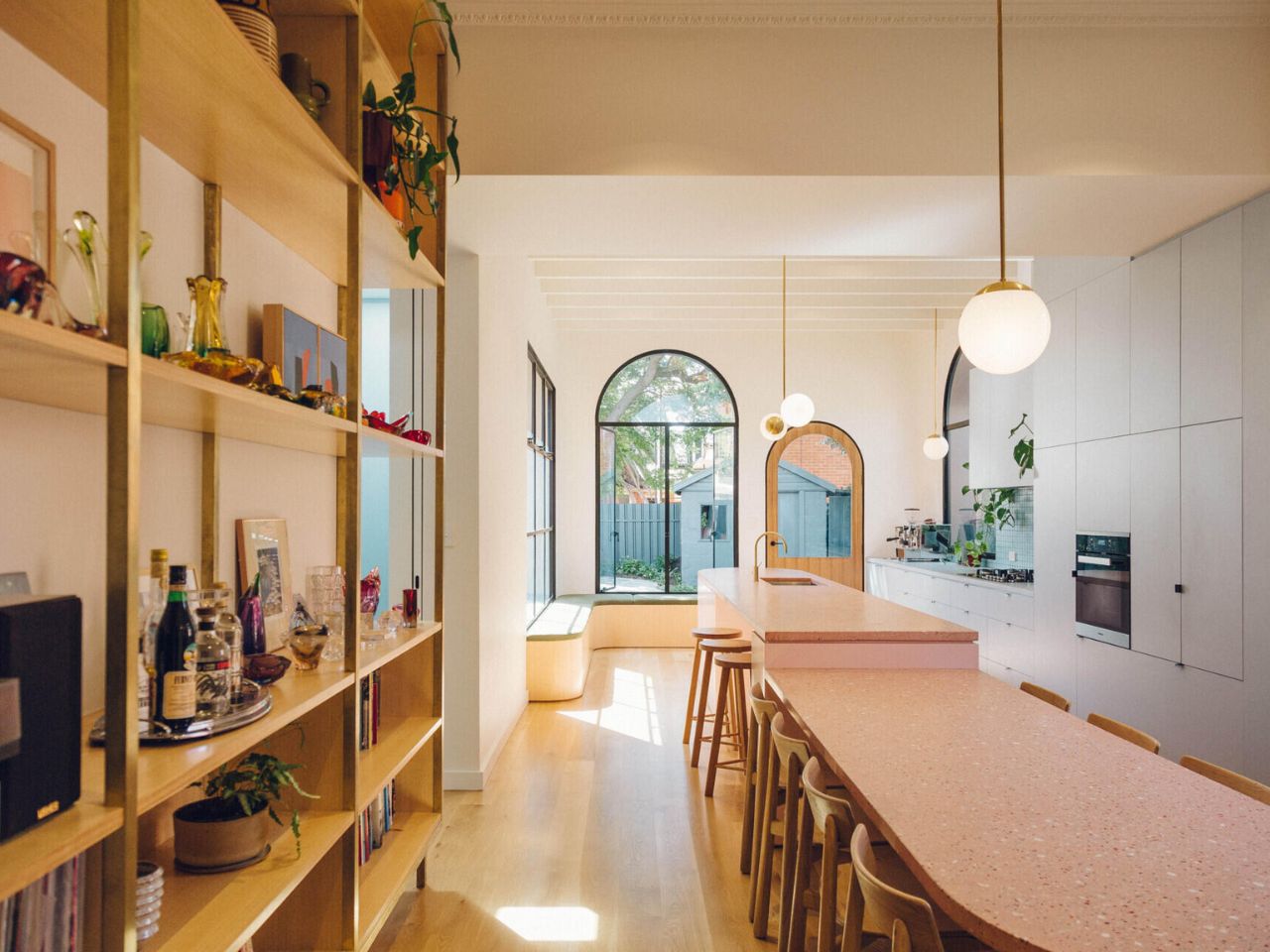
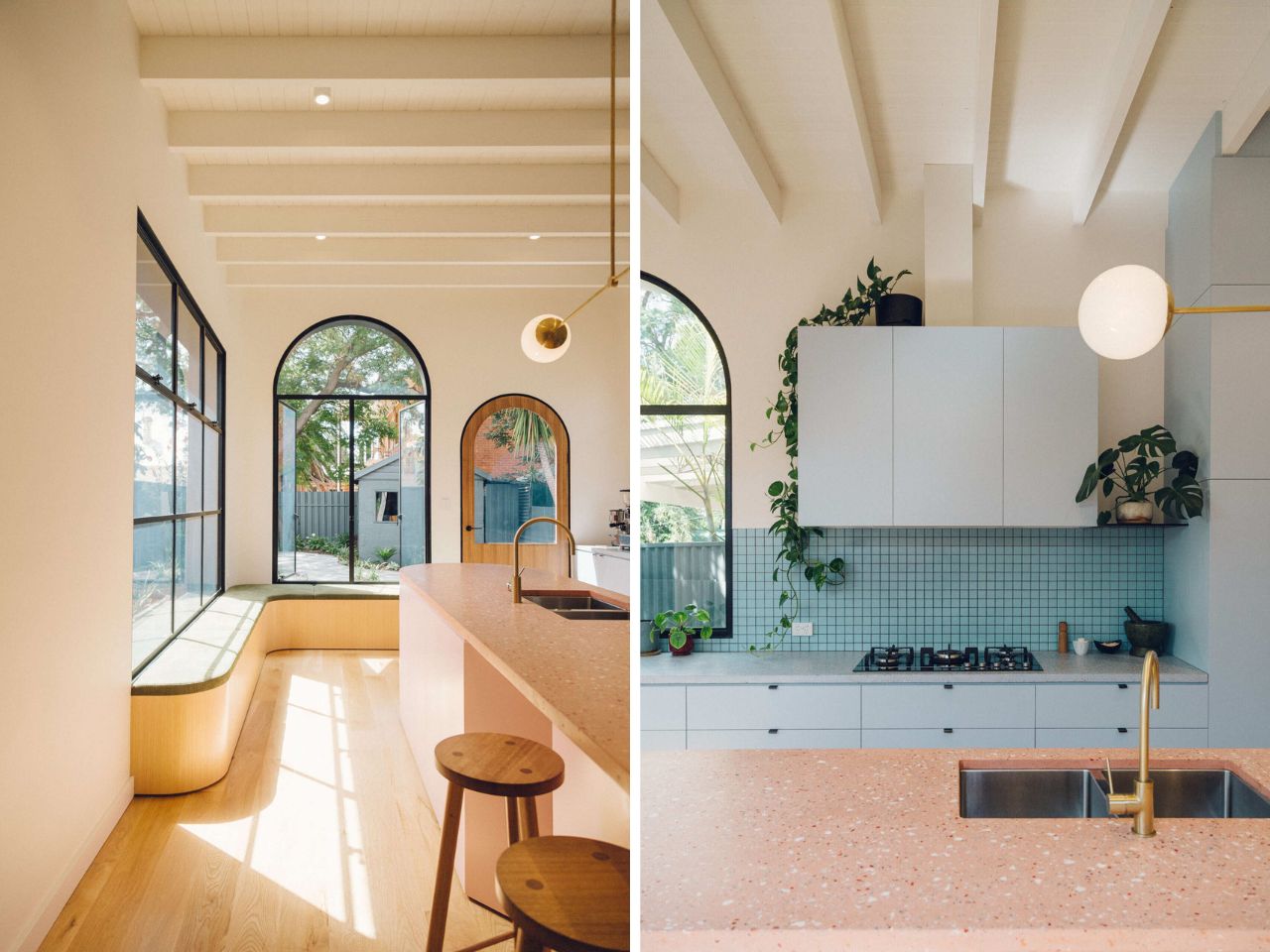
Inside, curves take over. One of the more understated yet memorable moments is a custom corner bench tucked beside a window. Its curved timber base and slim upholstered cushion are a gentle nod to art deco design language, where form and elegance coexist. More than a stylistic flourish, the bench offers a comfortable place to sit, pause, and look out toward the backyard, an everyday moment elevated through thoughtful design.

At the heart of the addition is the kitchen, conceived not as a secluded workspace but as a social anchor. Hosting is clearly central to how this home functions. The kitchen opens itself to conversation, movement, and connection, allowing the homeowners to cook without stepping away from their guests. A tiled accent wall brings light and texture into the space, catching reflections throughout the day and reinforcing the sense of warmth and character.
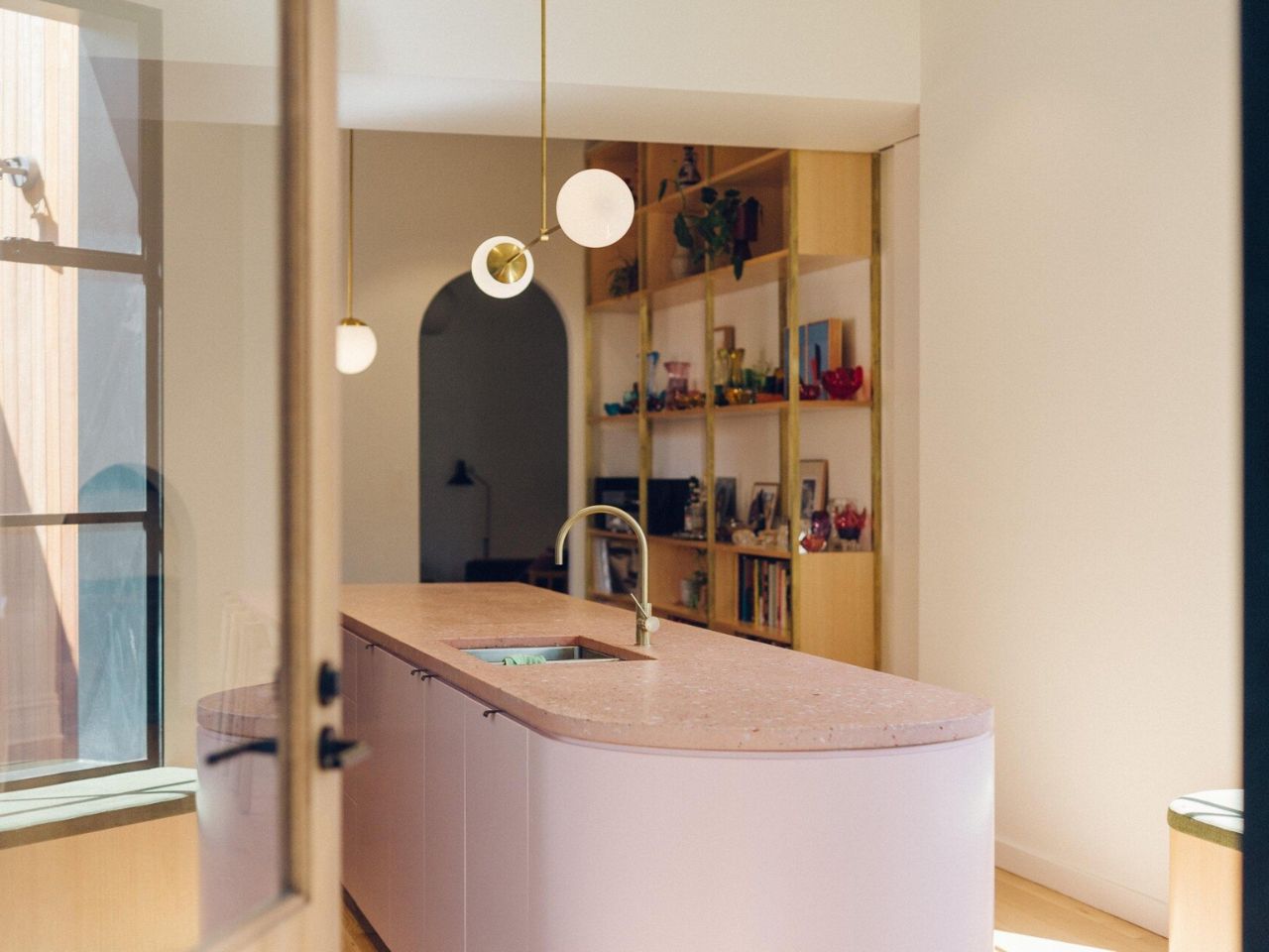
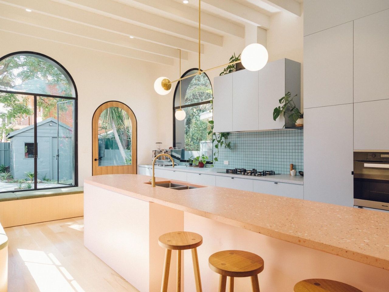
Rather than erasing the past, the project carefully weaves old and new together. A long kitchen island extends through the original cottage and into the new addition, doubling as a dining table. This linear element physically and visually stitches the home together. In the extension, the dining area drops slightly below the island, a subtle level change that defines zones without interrupting flow. It is a quiet architectural move that makes the space feel dynamic while remaining cohesive.

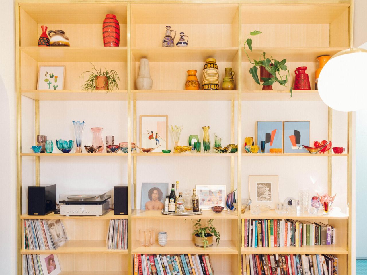
Running alongside the dining area is a timber shelving unit designed as both storage and display. Here, the homeowners’ collection of Italian and Czech glassware, books, and German pottery becomes part of the architecture itself. Bright yet restrained colors and sculptural forms animate the space, turning everyday objects into storytelling elements that reinforce the home’s playful aesthetic.
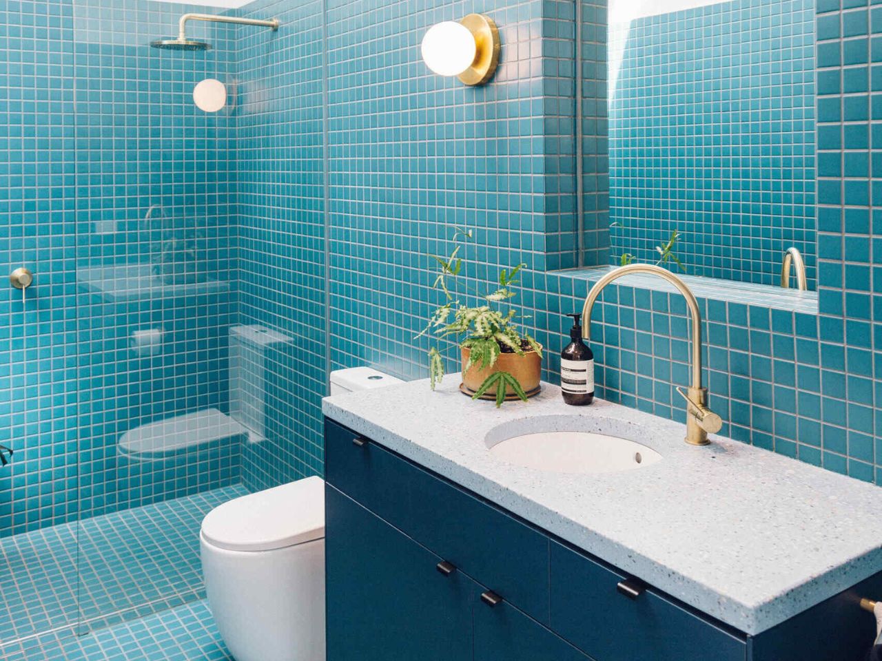
That sense of joy continues into the bathroom. Expanded from its original footprint, the space is wrapped in small square tiles in a vivid blue, instantly energizing the room. A skylight pours natural light from above, while a curved mirror softens the geometry, echoing the rounded forms found throughout the house. The bathroom feels lively, expressive, and deeply personal, a direct reflection of the homeowners’ desire for spaces filled with personality.

An arched doorway off the dining area gently reconnects the new addition to the original cottage. Acting as both a physical passage and a visual cue, it bridges eras while reinforcing the curvy, art deco-inspired language that defines the project. By embracing color, curvature, and the realities of entertaining, Sans-Arc Studio has created a home that feels generous, joyful, and unapologetically fun, proof that quiet exteriors can still hold bold, expressive lives within.
The post Quiet on the Street, Joyful at Heart! An Adelaide Cottage That Reveals Its Playful Soul first appeared on Yanko Design.

HEINZ Put Ketchup on Tap, and Game Day Will Never Be the Same

Abundance defines the modern football watch party. Chips come in oversized bowls, wings arrive by the tray, and drinks are rarely poured one glass at a time. Yet one essential element of the game day ecosystem has remained painfully under-engineered. The ketchup bottle, small, squeezable, and deceptively fragile, has long been the weakest link in an otherwise well-orchestrated snack spread. And during football’s biggest game of the year, that failure is almost inevitable.

This season, HEINZ decided to redesign the ritual!

Designer: HEINZ

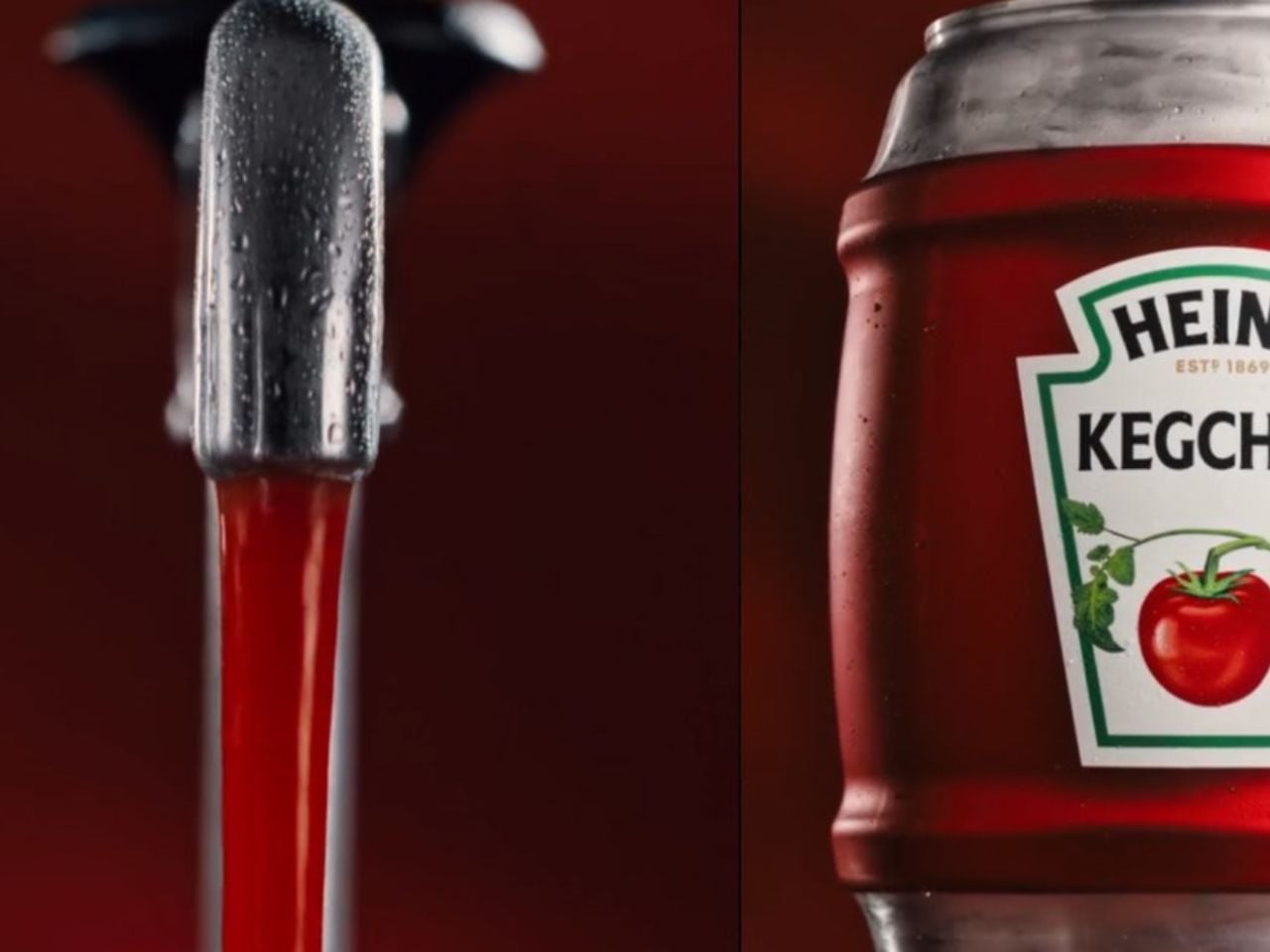
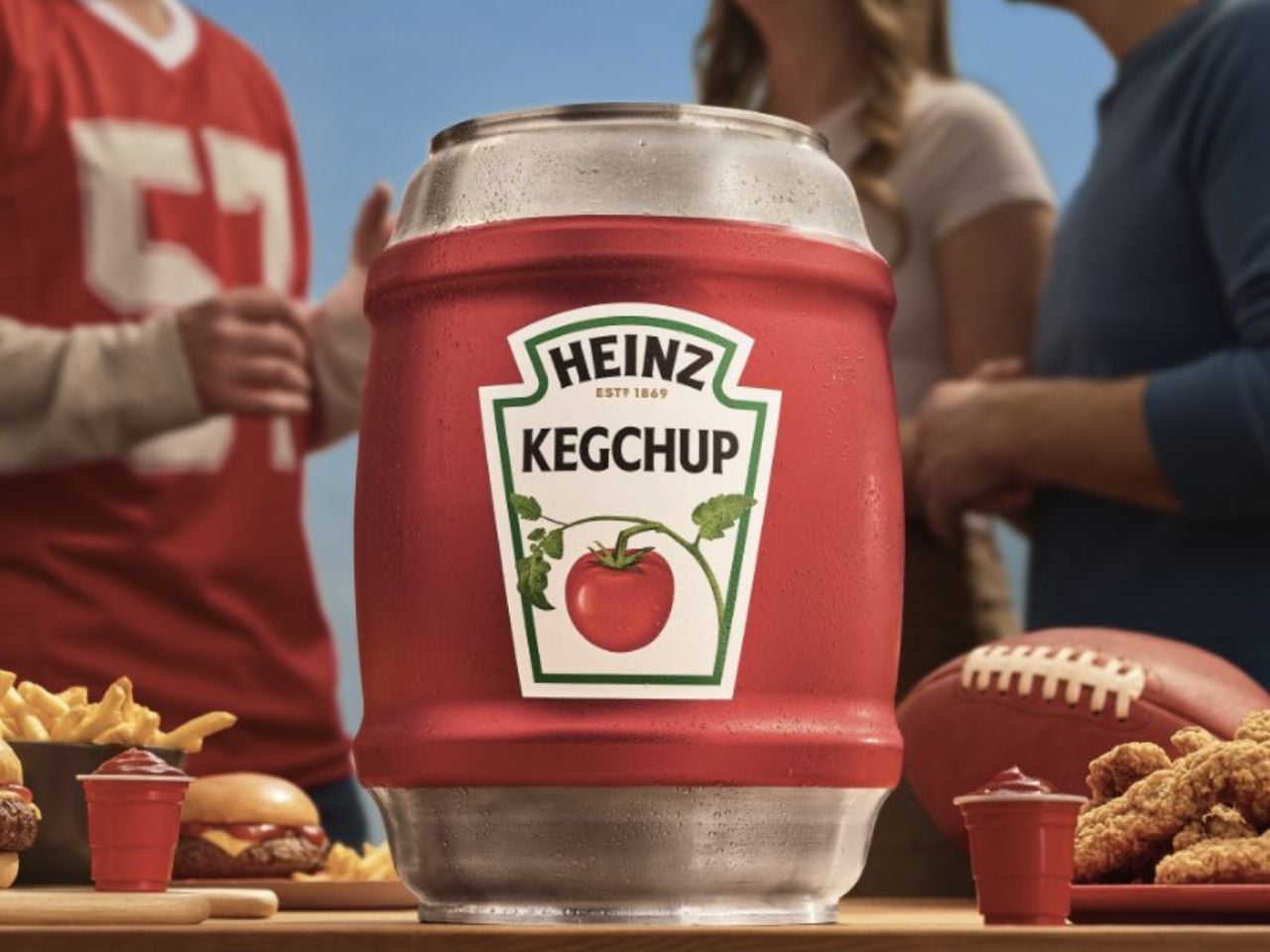
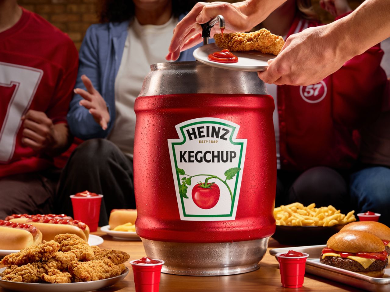
Ahead of the Big Game, the brand has introduced the HEINZ KegChup, a stainless steel, 114-ounce keg filled entirely with its unmistakably rich ketchup. The idea borrows directly from beer culture, a space that solved the problem of running out long ago. Football fans understand this instinctively. When something matters to the experience, it is engineered for scale. It is put on tap!

For decades, beer has been treated as the centerpiece of watch parties, designed for endurance across four quarters. Food, however, has quietly taken on an equally important role. The Big Game is now the second-largest food holiday in the US, with the majority of fans watching from home and preparing their own snacks. Fries, sliders, nuggets, and hot dogs are not just menu items. They are structurally dependent on ketchup. Yet the condiment itself has remained confined to packaging designed for moderation rather than momentum.

The HEINZ KegChup flips that logic entirely. Standing 19.5 inches tall and fitted with a tap-style spigot, the keg is unapologetically excessive. It removes the need to squeeze carefully, ration servings, or keep a backup bottle hidden in the fridge. Instead, it allows ketchup to flow freely throughout the game. Pour, dip, repeat. No interruptions. No halftime shortages.

From a design perspective, the KegChup does more than scale volume. It reframes ketchup as infrastructure. The spigot becomes a visual and functional anchor on the snack table, much like a beer tap at a tailgate. The stainless steel body signals durability and seriousness, while the familiar HEINZ branding ensures the object reads as trustworthy rather than novelty. The result is playful, but grounded in real use behavior.

The product also reflects a feedback-driven design approach. After teasing the concept on Instagram last fall, HEINZ saw nearly 1 million views and thousands of fan interactions, effectively validating the idea before it became physical. That momentum has now translated into a limited rollout, with fans able to enter a social giveaway and sign up for exclusive access ahead of a broader limited edition release planned for the start of the 2026 football season.

In a category often focused on new flavors or packaging tweaks, the HEINZ KegChup stands out by redesigning the ritual itself. It acknowledges a simple truth of football culture. Running out of ketchup can feel like a bigger party foul than a dry keg. By putting its most iconic product on tap, HEINZ is not just solving a supply problem. It is designed for the emotional rhythm of game day, from kickoff to the final whistle.

When the clock is ticking, the crowd is hungry, and the stakes are high, the last thing anyone should be worrying about is whether there is enough ketchup left.

The post HEINZ Put Ketchup on Tap, and Game Day Will Never Be the Same first appeared on Yanko Design.
This Fold-Out Office Desk Acknowledges the Furry Friend Under Your Feet

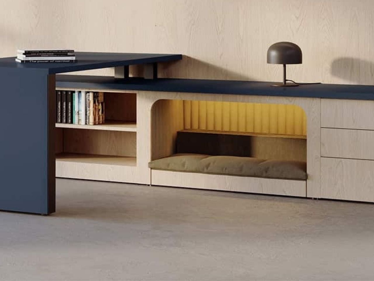
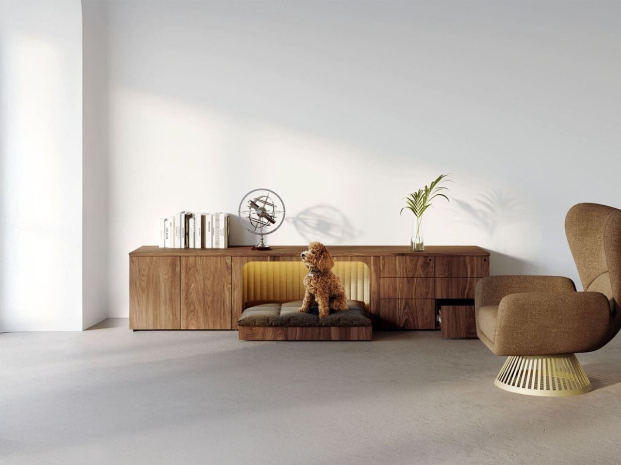
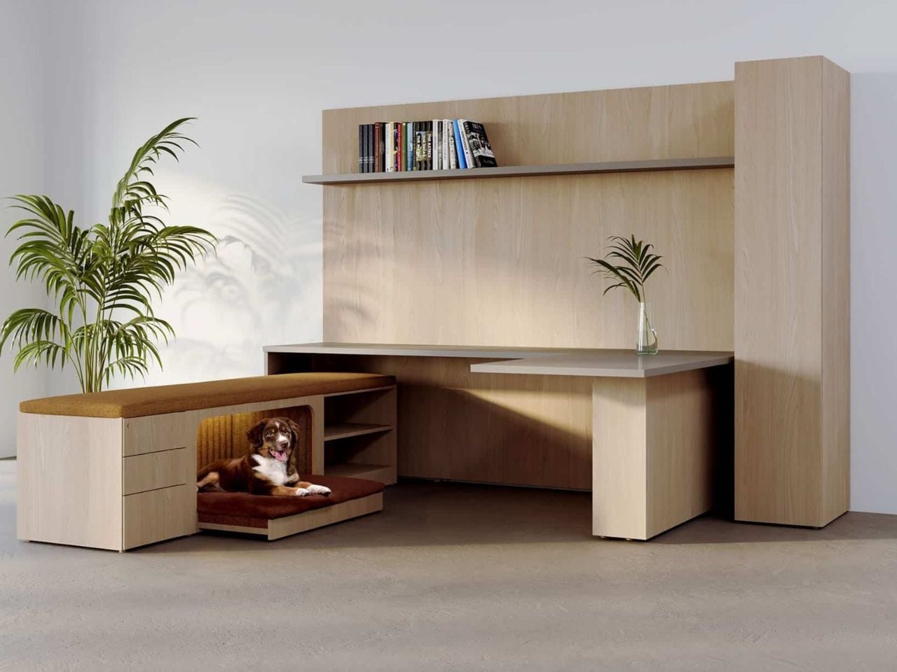
Office design has long focused on the visible: posture, productivity, aesthetics, and efficiency at eye level. But Central Bark, a desk designed by Chrissy Fehan for DARRAN, asks a quieter and more unusual question: what happens in the space beneath the desk?

At its surface, Central Bark looks exactly like what you would expect from a contemporary workplace system. The lines are clean, the proportions restrained, the materials warm yet professional. It belongs comfortably in a modern office without trying to announce itself. And that is precisely the point. The design does not rely on spectacle. Its intelligence lives in the details.

Designer: Chrissy Fehan

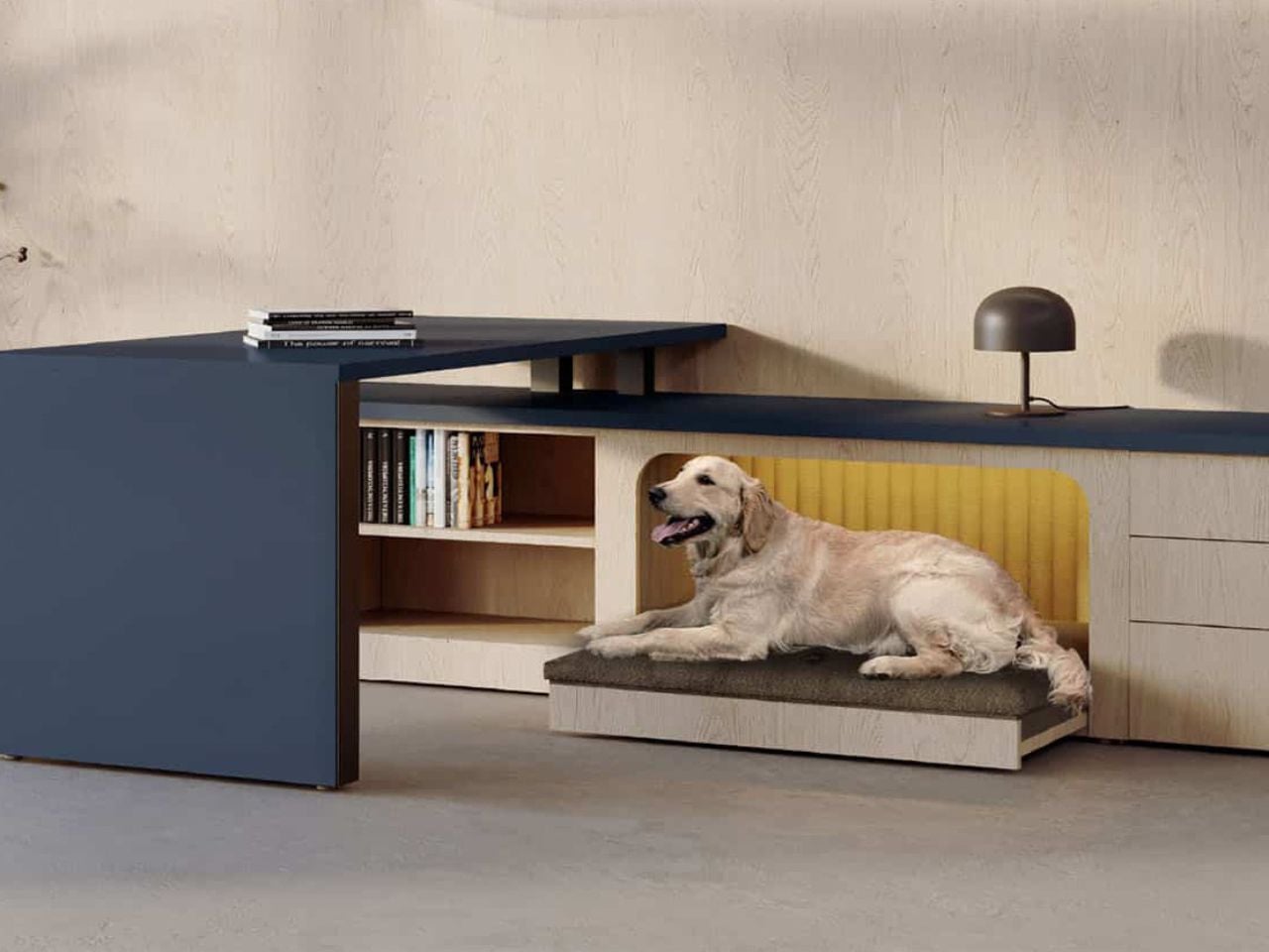
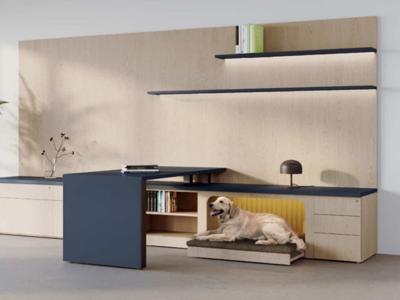
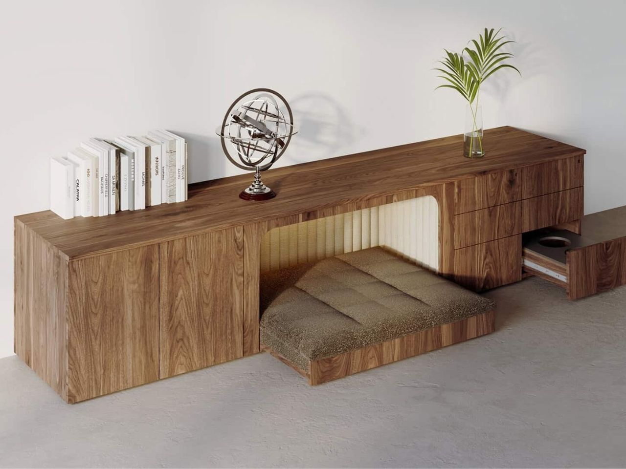
Integrated seamlessly into the desk is a built-in pet nook, a sheltered and intentional space designed for a dog to rest while their human works. Importantly, this is not an accessory or a playful add-on. There is no novelty bed clipped on at the last moment, no awkward cushion pushed beneath a workstation. The pet space is conceived as part of the desk from the very beginning and treated with the same seriousness as legroom, surface depth, or cable management.

The thinking behind Central Bark reflects a broader shift in how we understand work environments today. As offices become more flexible and as the line between home and workplace continues to blur, dogs are increasingly present. In creative studios, startups, and hybrid offices, they are already there, curled up under desks, navigating chair legs, occupying borrowed corners. Central Bark does not invent this reality. It is simply designed for it.

What makes the solution compelling is its restraint. There is no attempt to over-engineer the experience or turn pet-friendly design into a visual statement. Instead, the desk quietly absorbs this need into its form, maintaining a professional aesthetic while acknowledging that workspaces are lived-in and shared environments.

There is also a deeper layer of inclusivity embedded in the design. By accommodating dogs in a natural and integrated way, Central Bark supports people who rely on service animals, offering a workspace that adapts without drawing attention. It removes the need for special adjustments or explanations, allowing both human and canine to coexist comfortably within the same footprint.

One of the most thoughtful aspects of the design is the flexibility of the pet nook itself. The bed is not fixed in place. It can slide forward to give a dog more room to stretch or shift during the day, then tuck neatly back into alignment with the desk edge when not needed. This small gesture keeps the workspace visually tidy and spatially efficient, preserving the desk’s clean silhouette while offering adaptability where it matters.

Rather than proposing a radical reimagining of office furniture, Central Bark offers something subtler and arguably more impactful. It reframes good design as responsive design, attentive to how people actually live, work, and bring their whole lives into shared spaces. It is a reminder that inclusivity does not always require bold statements or complex systems. Sometimes, it is as simple as designing for the quiet presence under the desk, the one that is already there, waiting to be acknowledged.

In that sense, Central Bark is not just a desk for people with dogs. It is a case study in empathetic design, showing how small and thoughtful decisions can make workplaces feel more humane, grounded, and real.

The post This Fold-Out Office Desk Acknowledges the Furry Friend Under Your Feet first appeared on Yanko Design.
This MIT Prototype Translates Images Into Fragrances That Your Mind Remembers Better

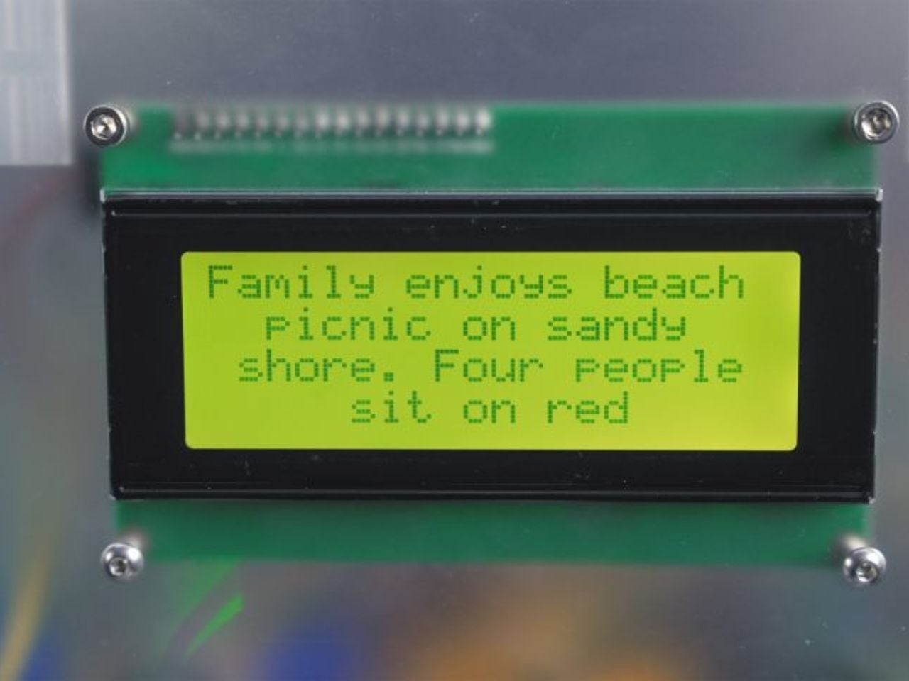
At a time when memories are increasingly flattened into folders, feeds, and cloud backups, a new experimental device from MIT Media Lab proposes a far more intimate archive: scent. Developed by Cyrus Clarke, the Anemoia Device is a speculative yet functional prototype that translates photographs into bespoke fragrances using generative AI, inviting users not to view memories, but to inhabit them through the body.

The choice of scent as a medium is deliberate. Among the human senses, smell is widely understood to be the most directly linked to memory and emotion, bypassing rational processing and triggering vivid recall almost instantaneously. Unlike images or text, scent has the ability to summon atmosphere, mood, and feeling without explanation, making it a particularly powerful carrier for both personal and imagined memories. The Anemoia Device is built around this sensory potency.

Designer: MIT Media Lab

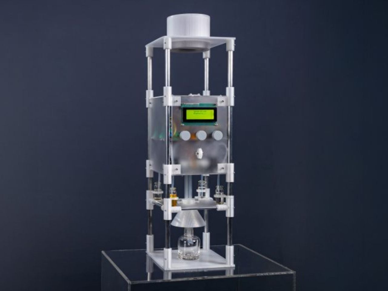
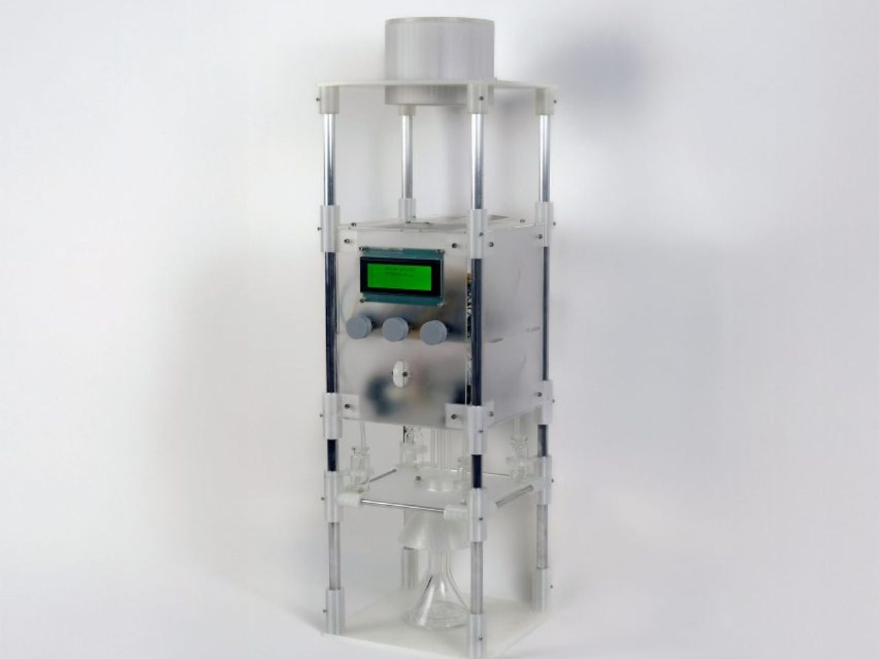
Referred to as a scent memory machine, the device operates on the metaphor of distillation. Memory is treated as something dense and layered that can be compressed into an essence. Physically, the prototype is organised as a vertical apparatus with three distinct sections. At the top, users insert an analogue photograph, a deliberate design decision that slows interaction and foregrounds tactility in contrast to screen-based memory consumption. The middle section houses an AI-powered computer that analyses the image using a vision language model. At the bottom, a series of pumps connected to fragrance reservoirs mix and release a custom scent.

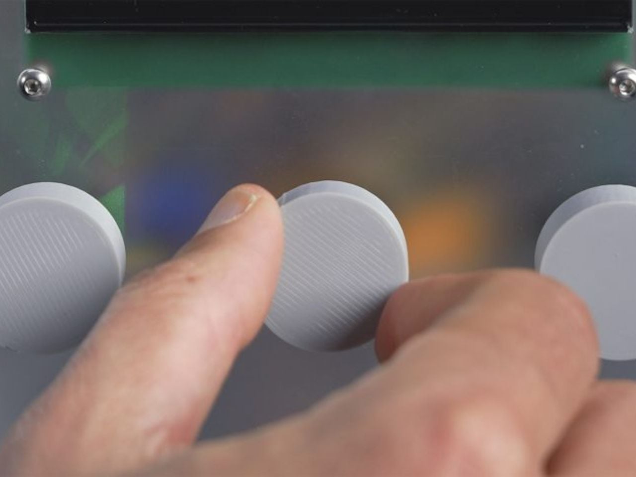
Importantly, the Anemoia Device is not designed as a fully automated image-to-scent translator. Instead, it positions the user as an active participant in shaping the final outcome. After the photograph is interpreted, users interact with three tactile dials that guide the AI’s understanding. The first establishes a point of view within the photograph, which could be a person or a non-living element such as a tree, bicycle, or piece of fruit. The second situates that subject within a lifecycle. For people, this may mean childhood or old age. For objects, the range moves from raw to in use to decay. The third dial assigns emotional tone, shaping the fragrance through mood rather than literal accuracy.

Conceptually, the project draws on anemoia, a form of nostalgia for a time one has never personally experienced. While the device can theoretically transform any photographic memory into scent, its design places particular emphasis on unlived or inherited memories. Archival photographs, family collections, and fragments of collective history become interpretive starting points rather than records to be faithfully reproduced. This framing allows the system to move fluidly between the universal and the deeply personal.

Early trial sessions illustrate how this interpretive flexibility plays out. In one example, a participant uploaded an archival photograph depicting a couple eating fruit in a garden. By selecting the fruit as the subject, defining its state as in use, and choosing a calm emotional tone, the system generated a scent combining spiced apple, pear, and earthy musk. The participant associated the fragrance with autumn, demonstrating how scent can evoke emotional landscapes rather than literal scenes.

This range is enabled by a scent library of 50 base fragrances, spanning notes such as sandalwood, pine forest, leather, old books, and sand. Each fragrance is dispensed in one-second increments, allowing for countless nuanced combinations. While the system begins with shared cultural associations, user narrative and emotional framing often push the output beyond predictable or clichéd interpretations.

The Anemoia Device builds on Clarke’s longer-standing interest in making memory tangible. Before joining MIT, he founded Grow Your Own Cloud, which explored storing digital data within the DNA of plants. Across this body of work runs a consistent critique of contemporary memory practices, which externalise experience into digital infrastructure that is accessible but largely disembodied.

Looking ahead, the project suggests multiple future directions. The prototype could evolve into a desktop-sized device for personal use, allowing people to print memories at home, or into a remote service that translates mailed or uploaded photographs into scents. While it relies on advanced technology, its ambition is notably restrained. Rather than competing for attention, the Anemoia Device gestures toward a form of computing that encourages slowness, reflection, and sensory presence.

The post This MIT Prototype Translates Images Into Fragrances That Your Mind Remembers Better first appeared on Yanko Design.
This Steppe Visitor Center Treats a Volcano as Landscape, Not Landmark

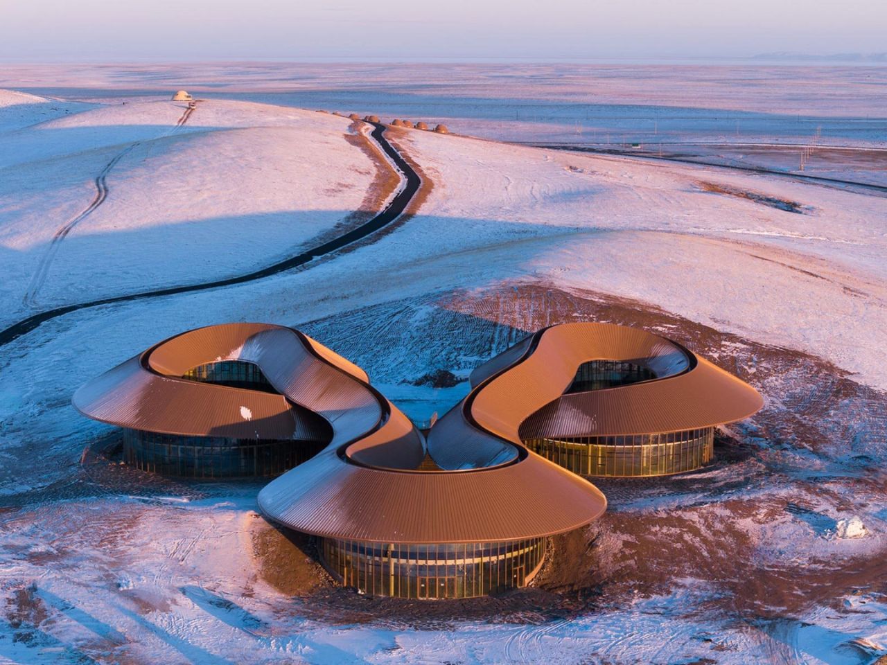
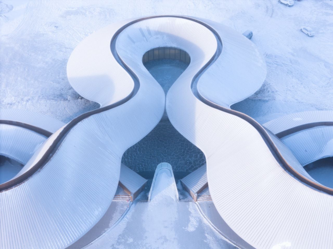
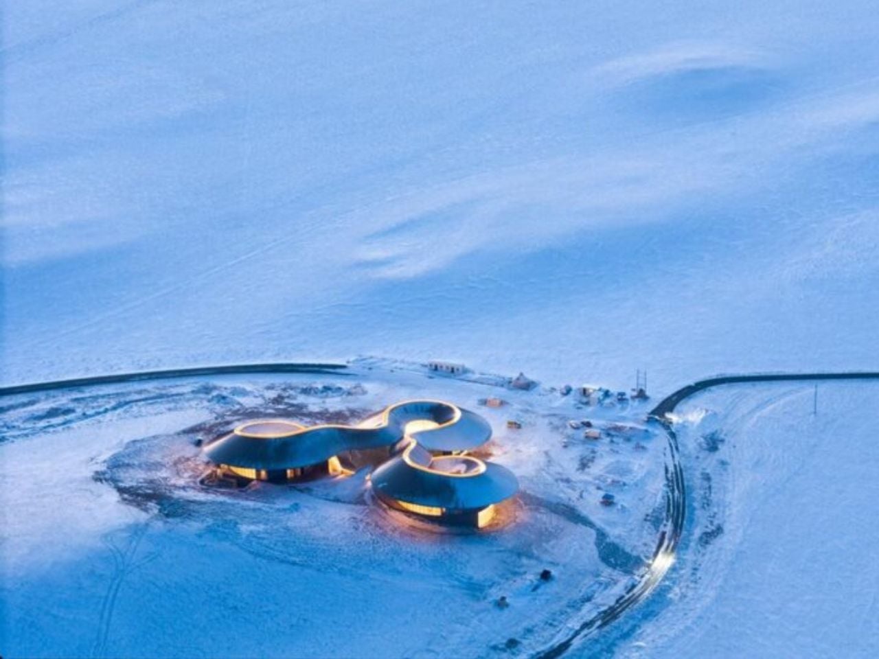
On the southern edge of the Xilingol Steppe in northern China, architecture does not arrive as an interruption. It emerges as a continuation of the land itself. The Volcano In Visitor Center by PLAT ASIA is embedded within the geological structure of a C-shaped extinct volcano formed nearly 150,000 years ago during the Pleistocene Epoch. Here, design is guided not by monumentality, but by a careful negotiation with time, terrain, and climate, framing architecture as co-growth rather than construction.

Completed in December 2025 as part of the first phase of the Baiyinkulun Steppe and Volcano Tourism Resort, the project occupies a rare and expansive geological context. The Baiyinkulun Steppe and Volcano Area is home to 108 volcanoes and lies approximately 380 kilometers north of Tiananmen Square. The surrounding landscape is a mosaic of ecosystems, including wetlands, forests, lakes, open steppe, sandy land, and seasonal snowfields, where environmental fragility and vast scale exist side by side.

Designer: PLAT ASIA

PLAT ASIA began working in the region in 2021, when early site surveys revealed a large excavated area to the west of the volcanic cone. Exposed for nearly a decade, this disturbed ground had become vulnerable to erosion. Rather than expanding into untouched terrain, the architects deliberately chose to build on this damaged site, using architecture as a stabilizing presence. The visitor center thus becomes part of a broader ecological strategy, limiting further impact while supporting long-term landscape recovery.

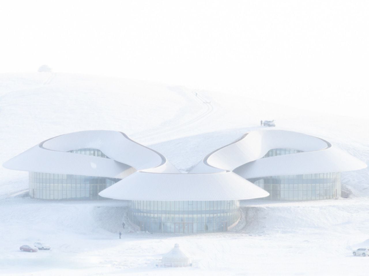
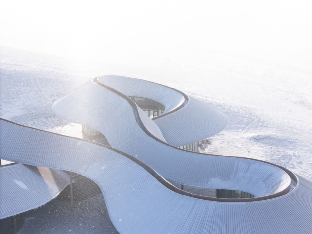
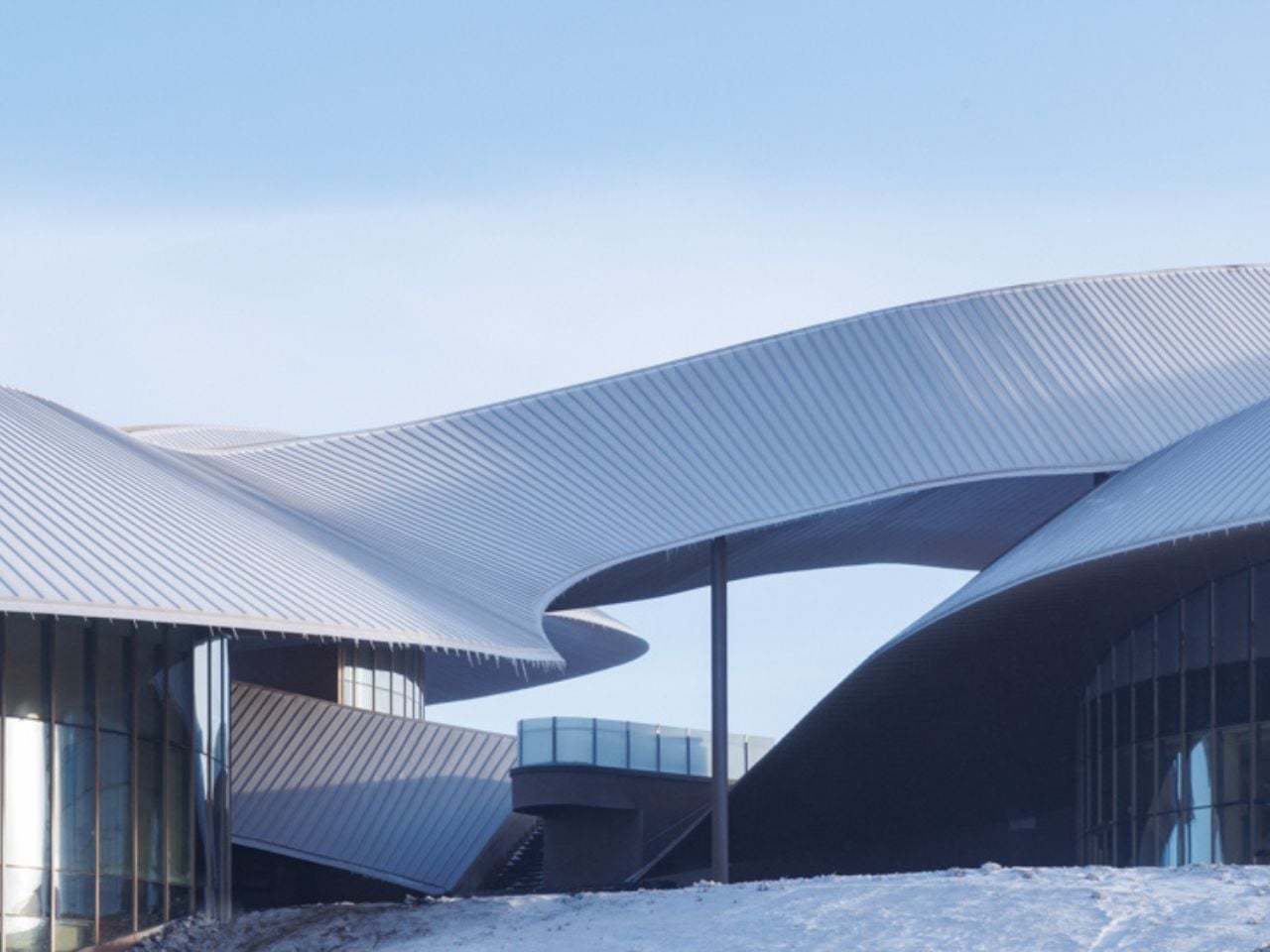
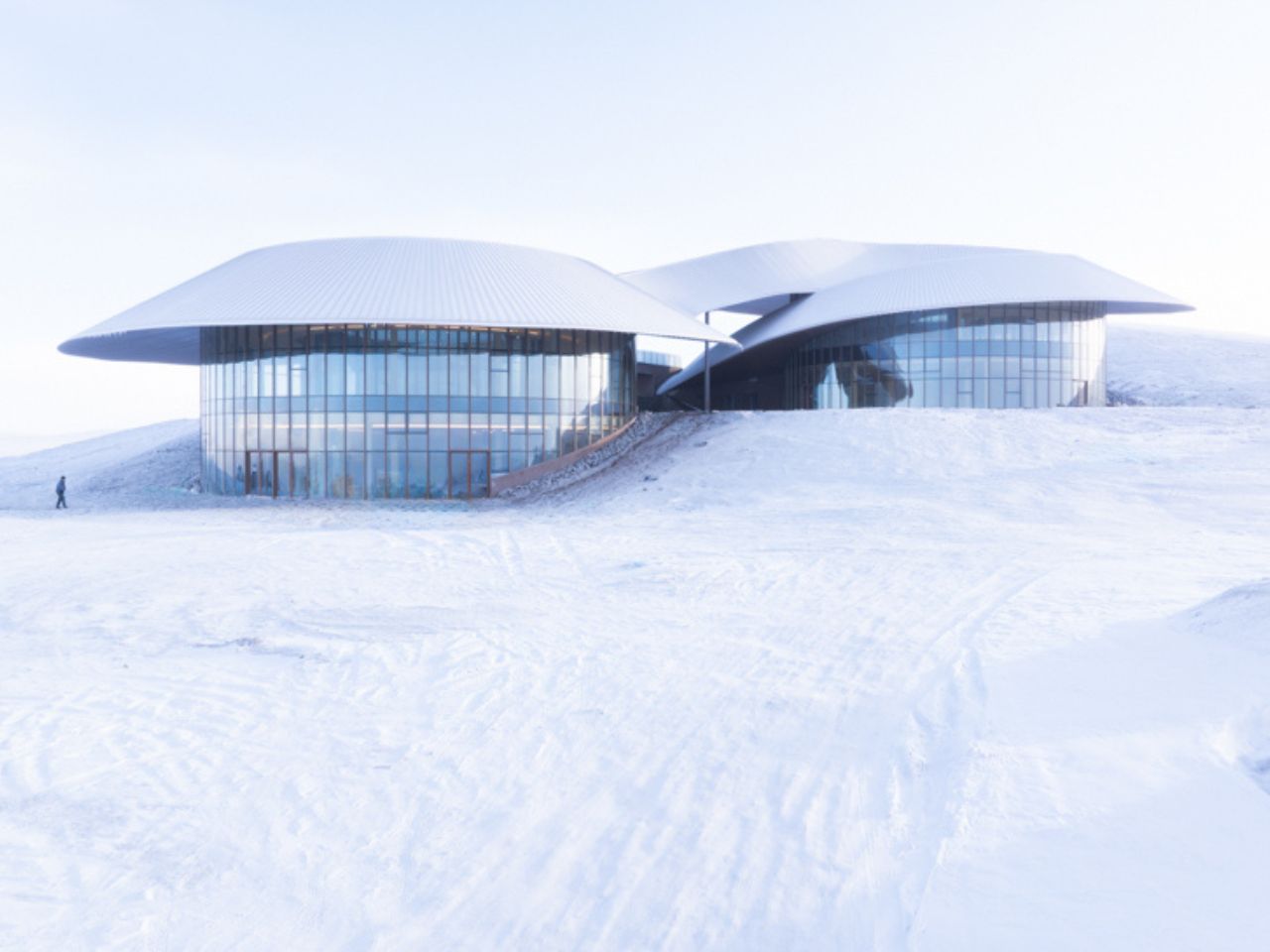
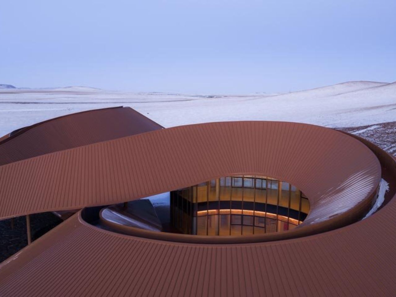
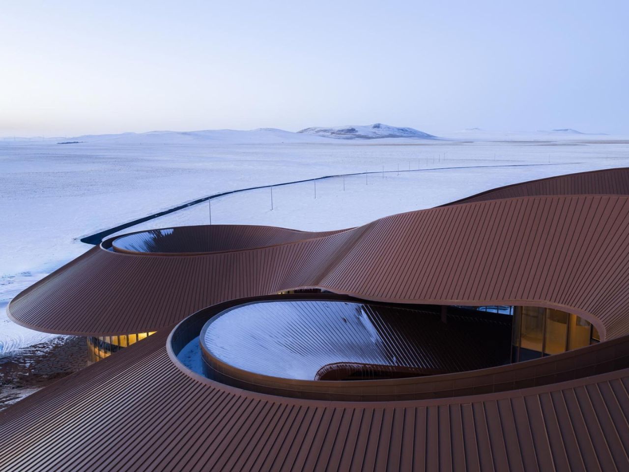
Formally, the volcano itself becomes the primary design reference. The architecture follows the existing topography through a continuous curved roof and three circular volumes positioned at different elevations. Together, these elements trace a conical silhouette that echoes the geometry of the volcanic landform. A winding corridor measuring 274 meters connects the volumes into a continuous loop, guiding visitors around the volcanic ash ring. Movement is central to the experience. The project is designed to be walked, circled, and gradually revealed.

As visitors move along the roof corridor, expansive views unfold toward the surrounding steppe, sandy land, lakes, and neighboring volcanoes. In contrast, inward-facing spaces form a crater-like enclosure that houses the program, including visitor services, a cafe, a bookstore, exhibition spaces, administrative offices, and a restaurant. This spatial rhythm shifts between openness and enclosure, mirroring the volcanic landscape itself.

Outdoor spaces are seamlessly integrated into the architectural layout. A visitor service courtyard accommodates temporary events such as art fairs, while an open square between the exhibition and restaurant volumes functions as an outdoor theater. Eco bleachers embedded into the eastern slope provide seating oriented toward both the roof structure and the wider landscape, reinforcing architecture as a viewing framework rather than an isolated object.

Climate plays a defining role in shaping the project. The region experiences a temperate continental climate with strong winds and heavy snowdrifts in winter and spring. Temperatures can drop as low as- 43 degrees Celsius. The building’s curved profile reduces wind pressure and shear forces, while extended roof eaves protect outdoor spaces from snow accumulation and frame expansive views of the steppe. Weather-resistant metal panel cladding improves thermal performance, while glass curtain walls reflect the volcanic terrain and maintain visual continuity between interior and exterior spaces.

Material choices further ground the project in its context. Locally sourced volcanic stone is used across the site to define pathways and public squares through thin stone slabs laid close to the ground. Weathering steel platforms are embedded directly into the terrain, allowing the architecture to age alongside the landscape over time.

Rather than asserting itself as a singular landmark, the Volcano In Visitor Center establishes a spatial framework that responds to geology, climate, and movement. It positions architecture as a restrained extension of the volcanic environment, inviting exploration while preserving a deep and lasting connection between people and the ancient ground beneath their feet.

The post This Steppe Visitor Center Treats a Volcano as Landscape, Not Landmark first appeared on Yanko Design.
Mummy-inspired Paper Towel Holder looks like a Scooby Doo villain brought to your kitchen

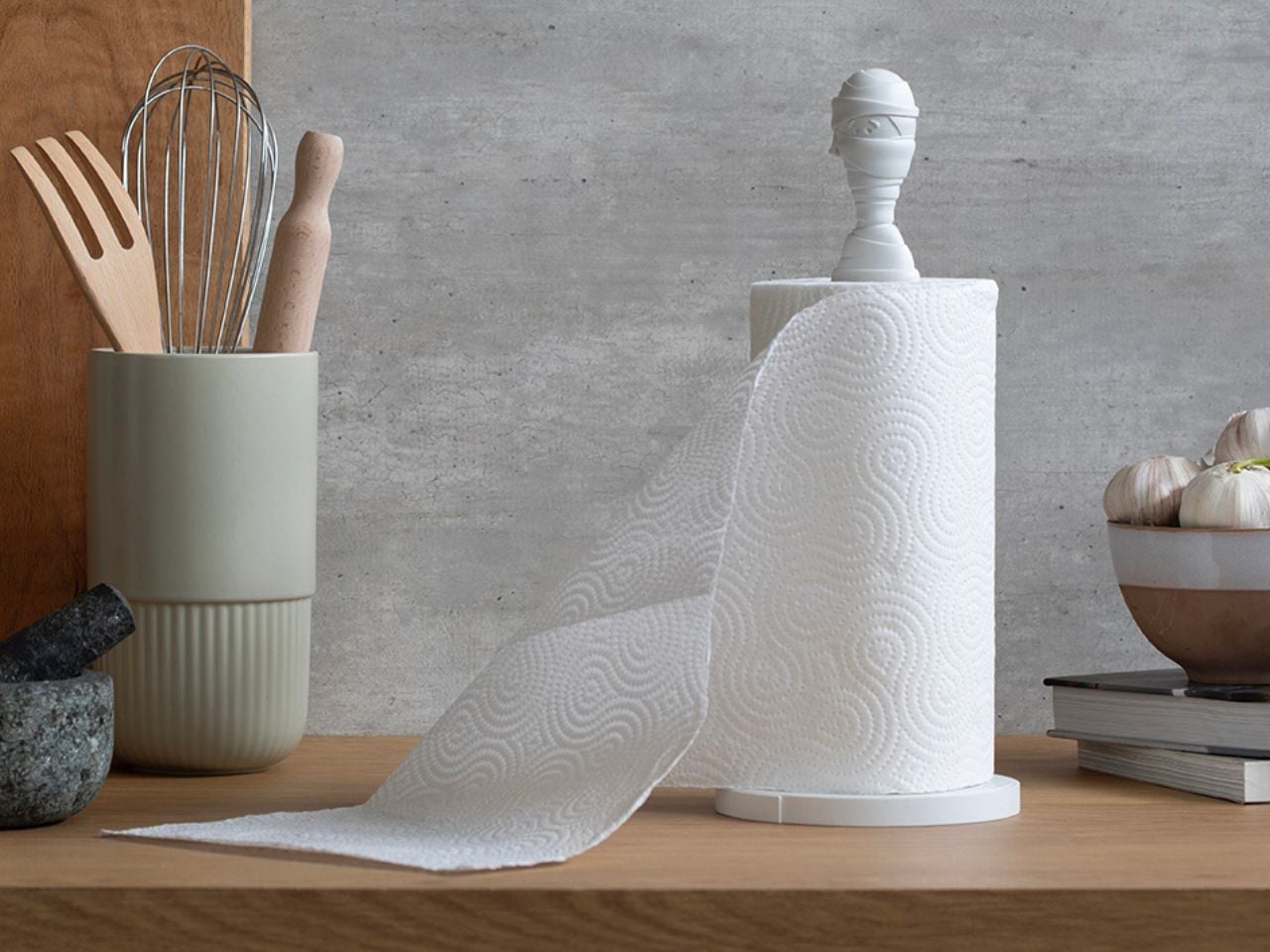
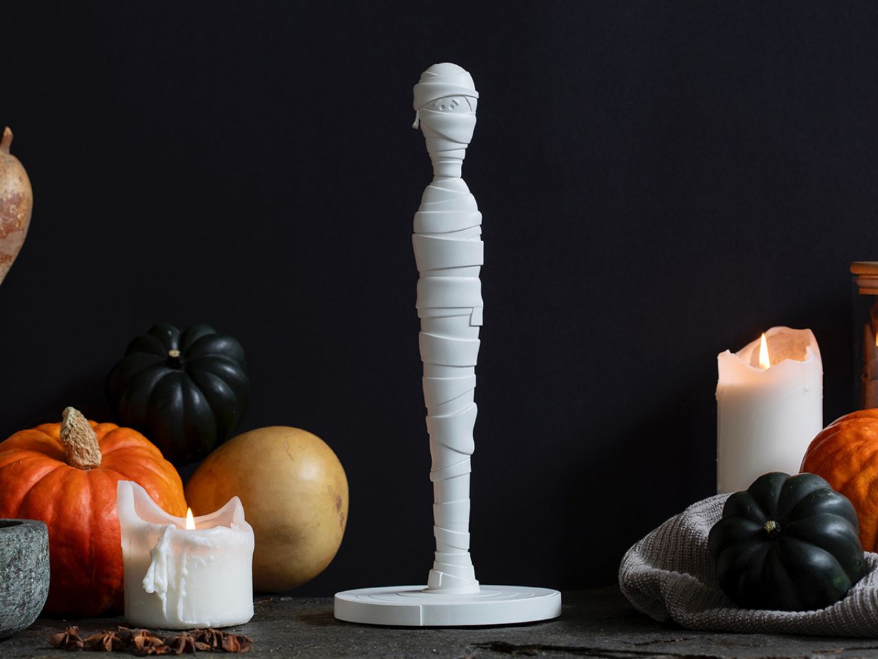
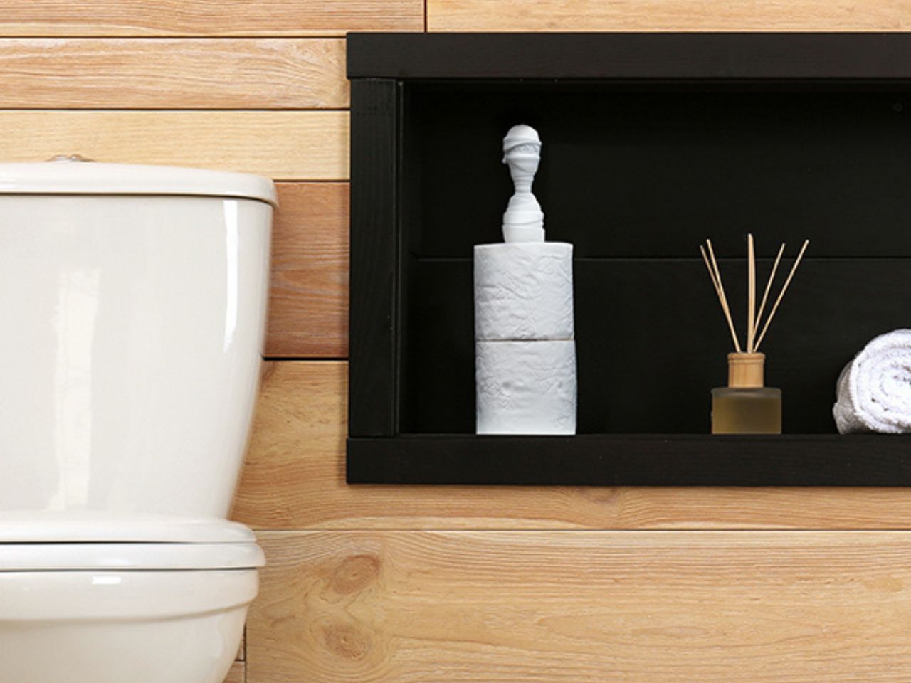
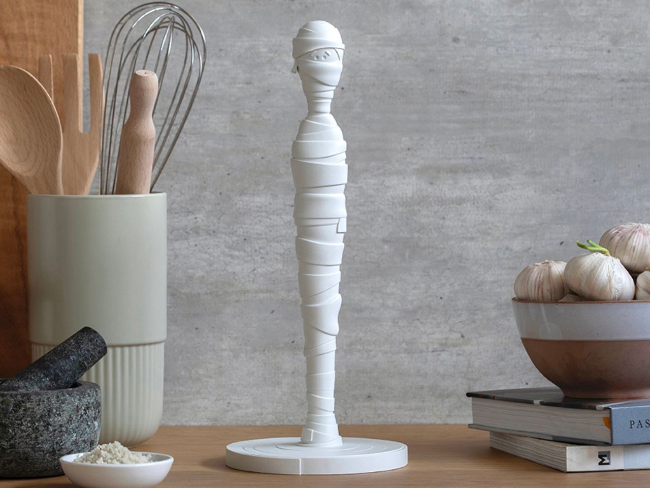
Tangled Joe is a paper towel holder that refuses to be just another kitchen accessory. Designed like a charmingly tangled mummy, it brings a strong sense of personality, humor, and visual delight into everyday spaces while still delivering excellent functionality. What could have been a purely utilitarian object instead becomes a character-driven design piece that instantly adds life to a countertop, shelf, or dining area.

The form of Tangled Joe is where the design truly shines. The mummy’s wrapped body flows naturally in circular layers, echoing the way paper towels themselves are rolled around the stand. This thoughtful alignment between form and function makes the design feel cohesive and intentional. Rather than simply holding a roll in place, the mummy appears to actively engage with it, as if it is part of the object’s story. The result is playful, clever, and visually satisfying from every angle.

Designer: PELEG DESIGN

Click Here to Buy Now

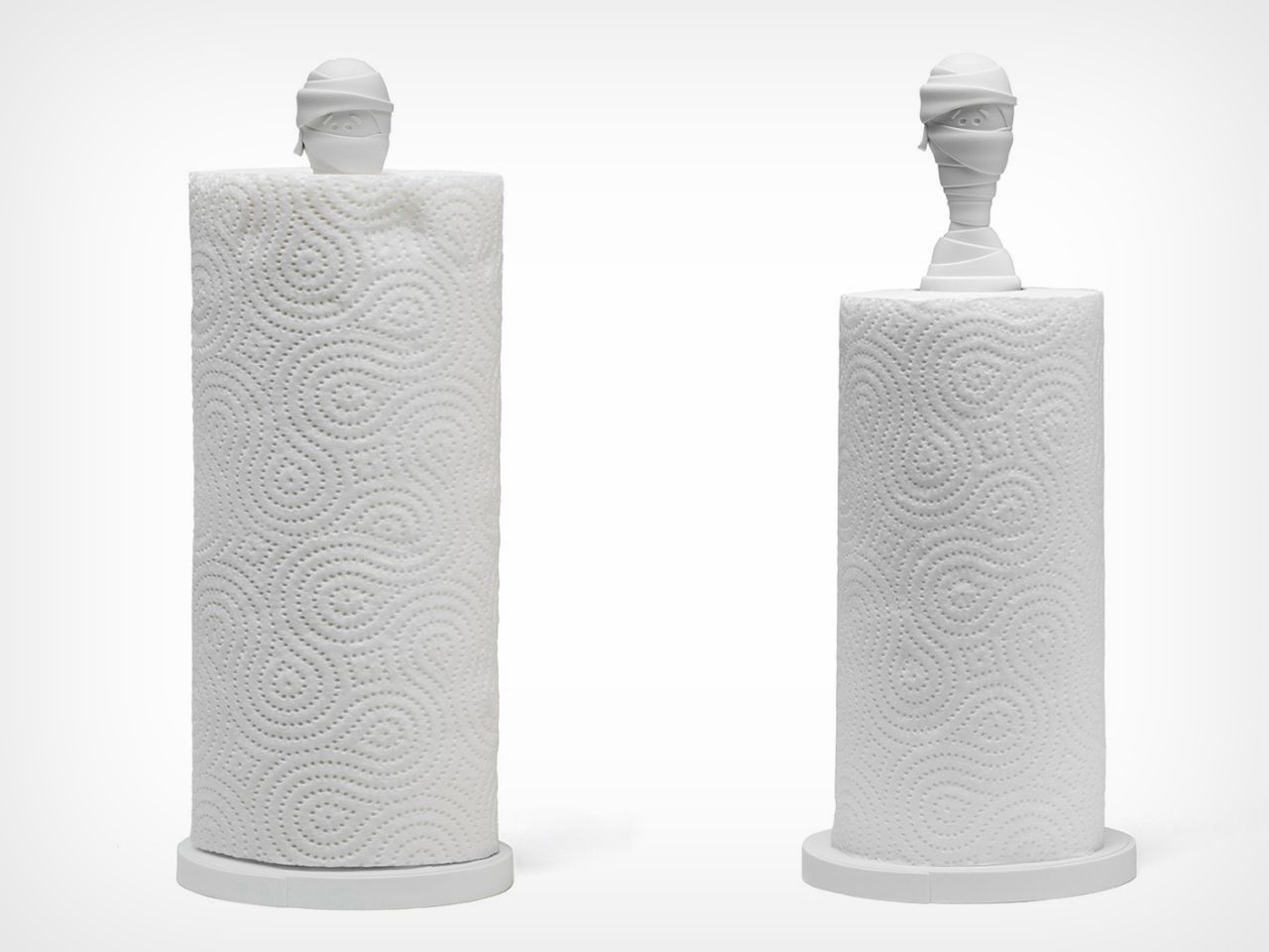
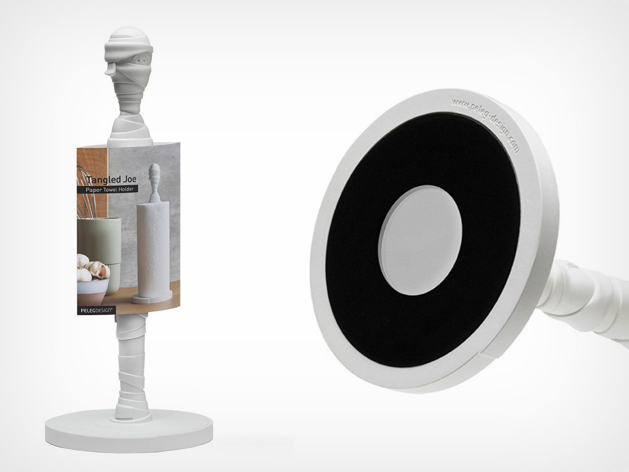
Made of durable plastic, Tangled Joe is both sturdy and lightweight, striking a balance that makes it practical for everyday use. One of its most intuitive features is the mummy’s head that extends above the paper towel roll. This detail is not only expressive and fun, but also highly ergonomic. It creates a natural grip point, allowing the stand to be lifted and moved easily with one hand, especially useful during busy moments in the kitchen.

Beyond usability, Tangled Joe adds undeniable character to a space. It fits beautifully into interiors that embrace dark, spooky, or quirky aesthetics, yet it never feels over the top. Instead, it feels playful and confident, making it a great conversation starter. It transforms the act of cleaning up into something a little more enjoyable, reminding users that good design can bring joy into even the smallest routines.

A standout aspect of Tangled Joe is how complete it feels, even without a paper towel roll. When empty, it does not look unfinished or purely functional. Instead, it reads as a sculptural object, almost like a small figurine or design showpiece. This makes it ideal for design-conscious homes where every object is expected to contribute visually, not just practically.

The clean white color further enhances its versatility. While the mummy form introduces a spooky twist, the neutral tone allows Tangled Joe to blend effortlessly into a wide range of interior styles. It works just as well in minimal and modern kitchens as it does in playful, eclectic, or themed spaces, making it easy to style without overpowering its surroundings.

Functionally, Tangled Joe is designed with flexibility in mind. It can accommodate two different sizes of kitchen paper towels instead of being restricted to a single fixed size. It can also hold two toilet rolls at once, expanding its usefulness beyond the kitchen and into bathrooms or studio spaces.

Overall, Tangled Joe is a thoughtful blend of function, humor, and design. It proves that everyday objects do not have to fade into the background. By adding character, adaptability, and ergonomic intelligence, this mummy-inspired paper towel holder turns routine cleanup into a small but delightful design experience.

Click Here to Buy Now

The post Mummy-inspired Paper Towel Holder looks like a Scooby Doo villain brought to your kitchen first appeared on Yanko Design.

This Mindful Seating Platform Turns Sitting Into a Ritual of Stillness and Connection

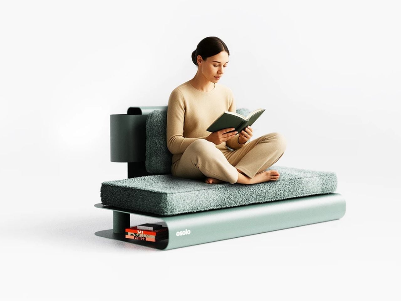
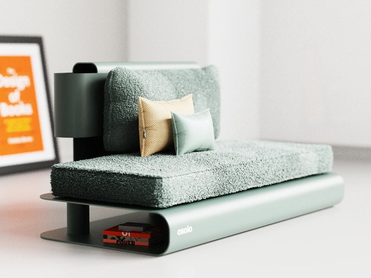
In contemporary interiors shaped by speed, productivity, and constant stimulation, seating has largely become passive. It is designed to hold the body while the mind drifts elsewhere. OSOLO challenges this condition. It is not a chair in the conventional sense, but a mindful seating platform, a ritual object that reconsiders how we sit, gather, and occupy space.

OSOLO emerges at the meeting point of two ancient cultures: Japanese stillness and Turkish hospitality. Though geographically distant, these traditions share a deep respect for simplicity, spatial awareness, and human connection. OSOLO translates these values into a contemporary design language, offering an alternative to chair-based living rooted in awareness rather than acceleration.

Designer: Gökçe Nafak

At the heart of OSOLO is the Japanese understanding of space. In Japanese spatial philosophy, emptiness is not absence. It is present. It allows rooms to breathe, objects to soften, and the mind to quiet. OSOLO reflects this belief through its low-profile form and restrained geometry. It does not dominate the room or impose visual hierarchy. Instead, it steps back, allowing architecture, light, and human presence to come forward.

This deliberate restraint transforms OSOLO into an object that reveals space rather than fills it. Its presence heightens spatial awareness, encouraging users to slow down and engage more consciously with their environment.

Inspired by the Turkish sedir tradition, OSOLO is inherently communal. Unlike single occupancy seating, it invites people to sit side by side, fostering shared presence rather than isolated comfort. In Turkish culture, seating is a social ritual. Stories are exchanged, time is stretched, and hospitality unfolds without urgency. OSOLO carries this spirit forward, existing not as an isolated object but as a platform for connection.

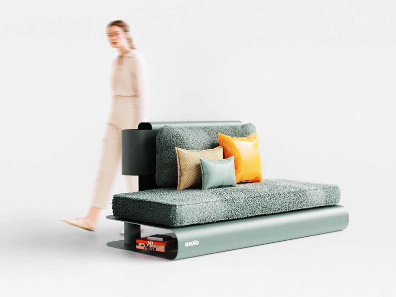
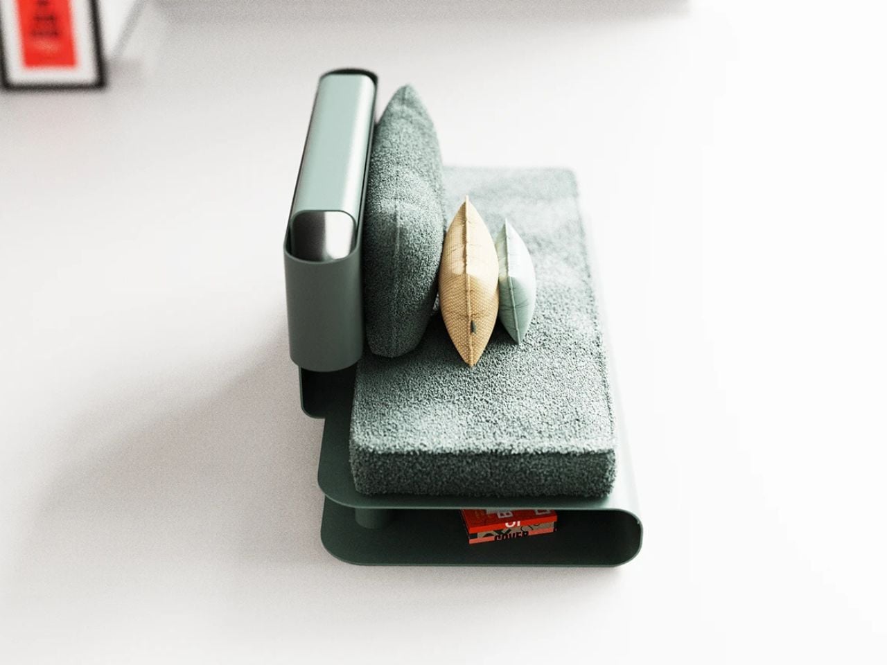
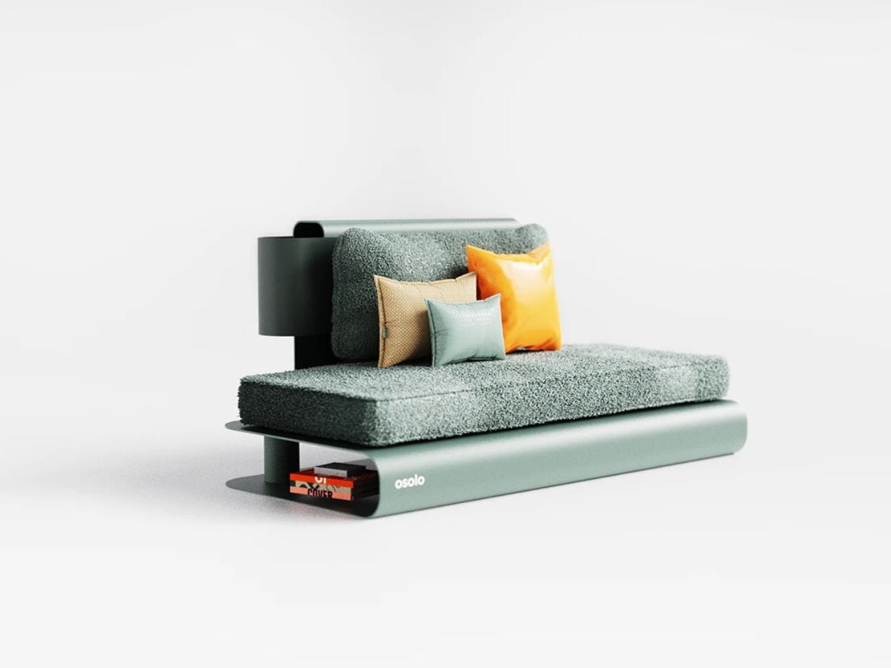
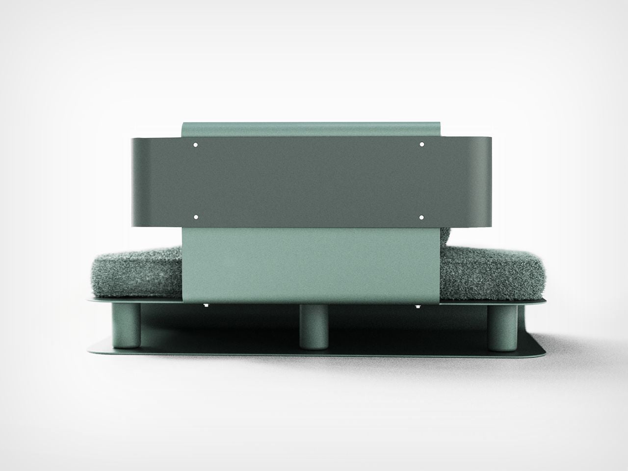
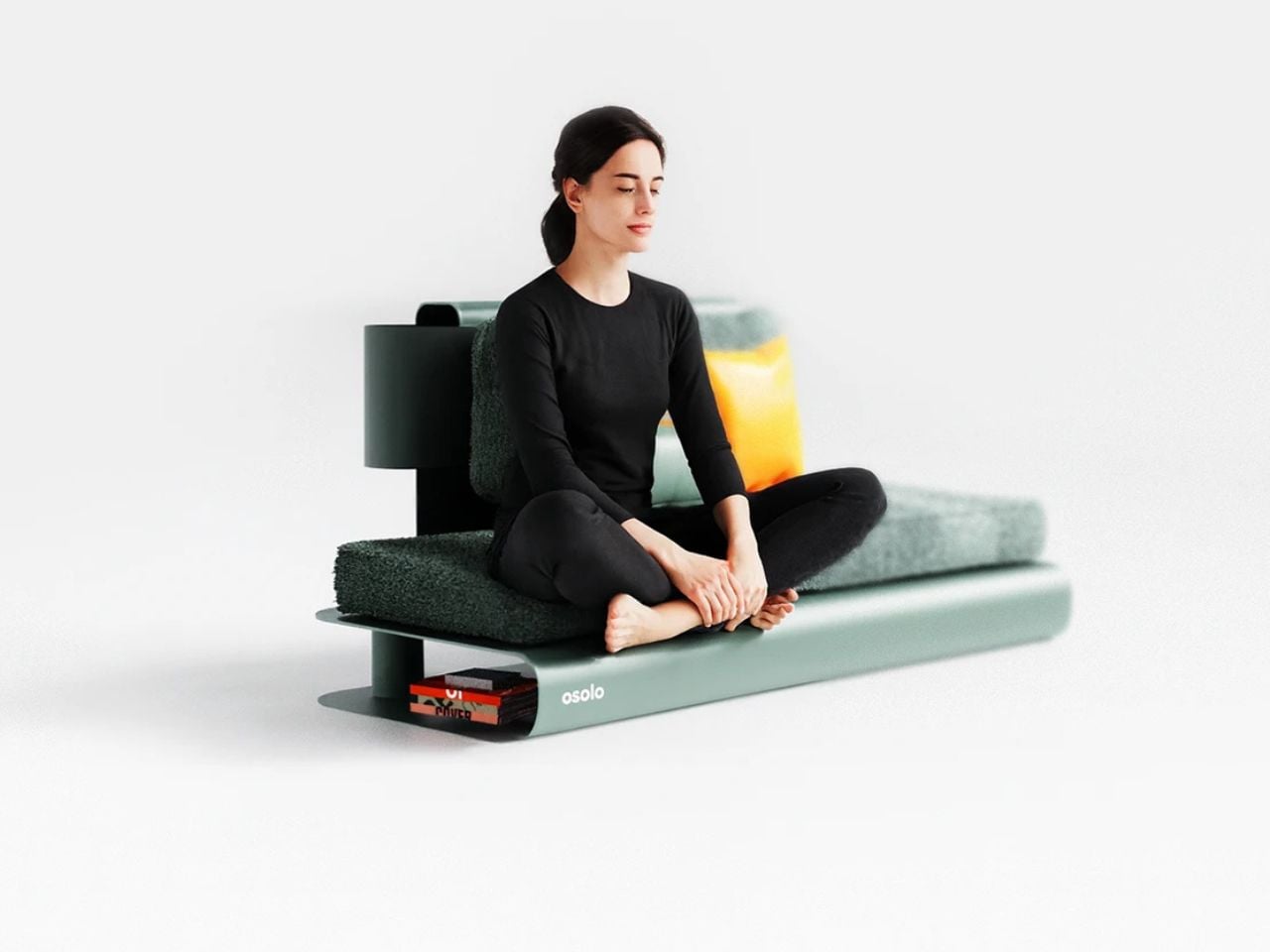
Hidden storage beneath the seating surface reinterprets the traditional cultural chest, integrating functionality without visual disruption. This discreet feature preserves the purity of the form while acknowledging everyday needs, allowing utility to exist quietly within stillness.

OSOLO is designed specifically for cross-legged, floor-adjoining sitting, offering an alternative to chair postures that often promote spinal compression and passive leaning. The platform supports the body’s natural intelligence by encouraging an aligned spine, open hips, and active posture.

By enabling balanced pelvic alignment, OSOLO reduces lumbar collapse and allows the torso to carry its own weight. The opening of the hip joints enhances mobility and helps release tension in the lower back, benefits often lost in conventional seating.

The platform’s elevation of approximately 20 to 25 centimeters from the floor is carefully calibrated to minimize pressure on the knee joints while maintaining the circulatory advantages associated with floor-level sitting. This height also isolates the body from direct contact with hard flooring, striking a balance between grounding and comfort.

Comfort is achieved through a dual-density foam system engineered for short to mid-duration activities such as meditation, reading, or creative practice. A high-density base layer ensures structural stability and pelvic support, while a softer upper layer distributes weight evenly to reduce localized pressure points. The result is a surface that remains supportive without collapsing, encouraging posture awareness rather than passive relaxation.

Upholstery surfaces are finished in breathable, high-friction textiles that prevent slippage during dynamic sitting positions. Removable covers allow for easy maintenance and long-term use, with materials selected to meet contract-grade durability standards suitable for both residential and semi-public environments.

The optional back support follows a soft contact principle. Rather than functioning as a rigid backrest, it provides gentle lumbar feedback during reading or meditation, supporting posture without encouraging full recline or slouching.

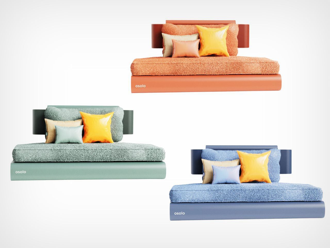
Available in four carefully curated colorways, OSOLO integrates seamlessly into a range of interior contexts while maintaining its minimalist identity. It is not designed to command attention, but to hold space. OSOLO invites a different relationship with furniture, one rooted in presence rather than performance.


The post This Mindful Seating Platform Turns Sitting Into a Ritual of Stillness and Connection first appeared on Yanko Design.
Aghsan Reimagines the Umbrella Stand as a Quiet Ritual After Rain

There is something quietly poetic about the moment you return indoors after the rain. Shoes pause at the threshold, umbrellas drip in silence, and the air briefly carries that unmistakable scent of wet earth. Yet in most homes and public spaces, this moment is interrupted by clutter. Umbrellas are stacked awkwardly in corners, water pools on the floor, and metal stands tip or rust over time. Aghsan enters this overlooked scene not simply as a solution but as a reimagining of the experience itself.

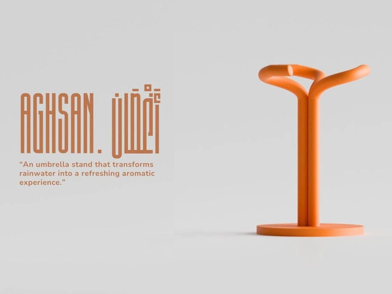
At its core, Aghsan is an umbrella stand. In spirit, it is an experience that transforms rainwater into something sensory, calm, and intentional. The name Aghsan, meaning branches, refers to the limbs of a tree reaching between earth and sky, a symbol tied to life, growth, and connection. This metaphor forms the foundation of the design, guiding both its form and its function.

Designer: Samir Hossam

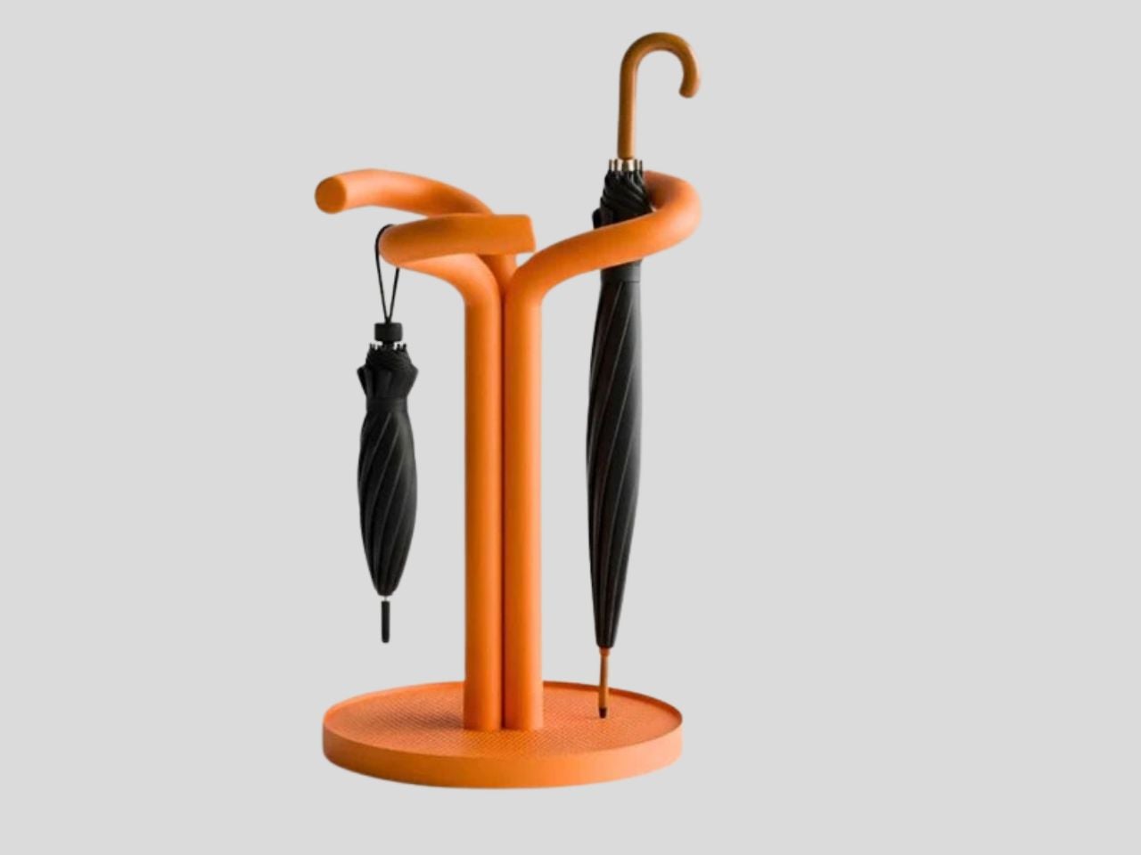
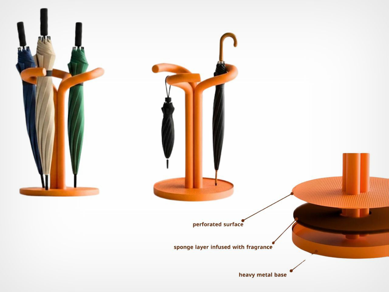
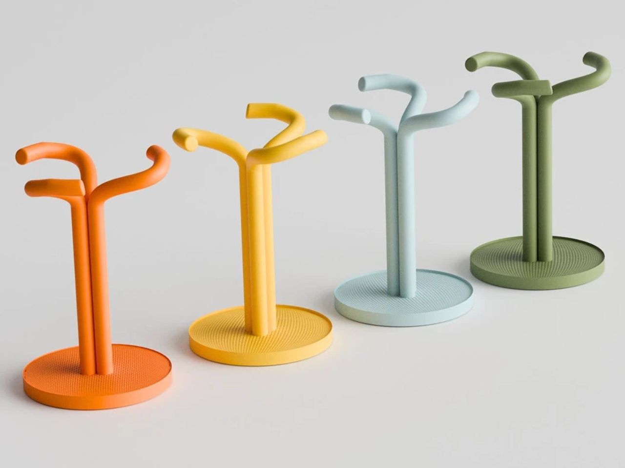
Visually, Aghsan resembles an abstract cluster of intertwining branches rising upward with lightness and balance. Each element feels deliberate, avoiding visual chaos while still expressing movement and vitality. Umbrellas are held individually rather than compressed into a single container, allowing them to dry naturally and remain visually organized. The design recognizes that disorder often comes not from excess but from poor structure, and here that structure is inspired directly by nature.

What truly sets Aghsan apart is how it engages the senses. At the base of the stand lies a water-sensitive aromatic sponge. As rainwater drips from umbrellas, it is absorbed into this layer, triggering the release of a subtle, refreshing fragrance inspired by rainfall. The result is a soft, calming scent that fills the entryway, echoing the feeling of stepping outside just after a storm. Rain is no longer treated as an inconvenience but as part of the atmosphere of the space.

This sensory layer also plays a quiet functional role. Over time, the association between the scent and the presence of an umbrella becomes ingrained. The fragrance serves as a gentle reminder to take the umbrella when leaving, relying on memory rather than instruction. It is designed to work at a subconscious level, supporting everyday behavior without demanding attention.

Functionally,y Aghsan resolves many frustrations associated with traditional umbrella stands. A heavy metal base anchors the design, ensuring stability and preventing tipping, a common issue with lightweight stands. The open perforated structure encourages airflow, while the raised edge of the base keeps umbrellas securely in place even when the stand is partially full or slightly moved. Long umbrellas can be leaned comfortably while smaller ones find their place within the branching openings above, creating intuitive organization without visual clutter.

Material choices further support durability and ease of maintenance. Unlike many metal stands that rust or lose their finish over time, Aghsan is designed to age gracefully. The sponge layer is replaceable, allowing users to refresh the fragrance or change it entirely, adding a personal and almost ritual quality to the object.

By blending organic inspiration with simple technology, Aghsan challenges expectations of everyday household products. It suggests that even the most practical objects can carry emotional value. By turning rainwater into scent clutter into order and routine into experience, Aghsan elevates the umbrella stand from a background object to a thoughtful design presence that brings calm to the threshold of daily life.

The post Aghsan Reimagines the Umbrella Stand as a Quiet Ritual After Rain first appeared on Yanko Design.
This Smart Charging Adapter Finally Flexes So Your Cables Don’t Have To

Charging phones and portable devices has become one of the most routine actions of modern life. From the moment we wake up to the time we go to sleep, our devices depend on reliable power. We charge at home, in offices, cafés, airports, hotels, libraries, and public transportation spaces. Despite how frequently charging occurs, the physical environments designed to support it often feel like an afterthought. Wall sockets are commonly placed low to the ground, behind furniture, under desks, or in narrow corners that were never designed with daily device use in mind.

As a result, charging cables are routinely forced into uncomfortable positions. They are bent sharply against walls, twisted sideways, or compressed between furniture and outlets. Over time, this repeated stress causes visible wear. The outer insulation begins to tear, internal wiring weakens, and charging reliability declines. Many users replace cables not because they stop working suddenly, but because gradual damage makes them unsafe or frustrating to use. This cycle creates unnecessary waste, financial cost, and ongoing inconvenience.

Designer: Berkan Sunayol

Beyond annoyance, damaged charging accessories raise genuine safety concerns. Continuous pressure on the adapter and cable can degrade electrical contact points, increasing the risk of overheating, inconsistent power delivery, or short circuits. In public and shared environments, where users may not notice early signs of damage, this becomes an overlooked safety issue.

Charging cables are intentionally designed to be flexible. They allow users to route them around objects, across surfaces, and through tight gaps. Charging adapters, however, remain rigid and stiff. This mismatch creates a critical point of failure. When a rigid adapter is plugged into an awkwardly placed socket, it locks the cable into a fixed angle. The cable is forced to bend sharply at the connector, which is often the weakest part of the entire system.

Over time, this rigidity undermines the durability of both the cable and the adapter. Despite widespread awareness of cable damage, most existing solutions focus on reinforcing the cable itself rather than addressing the adapter that causes the stress.

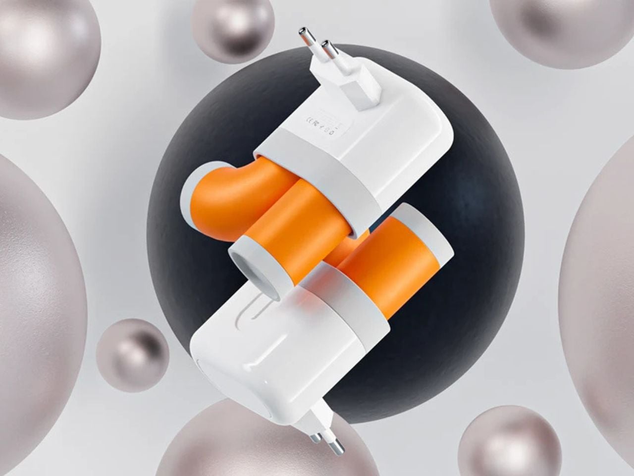
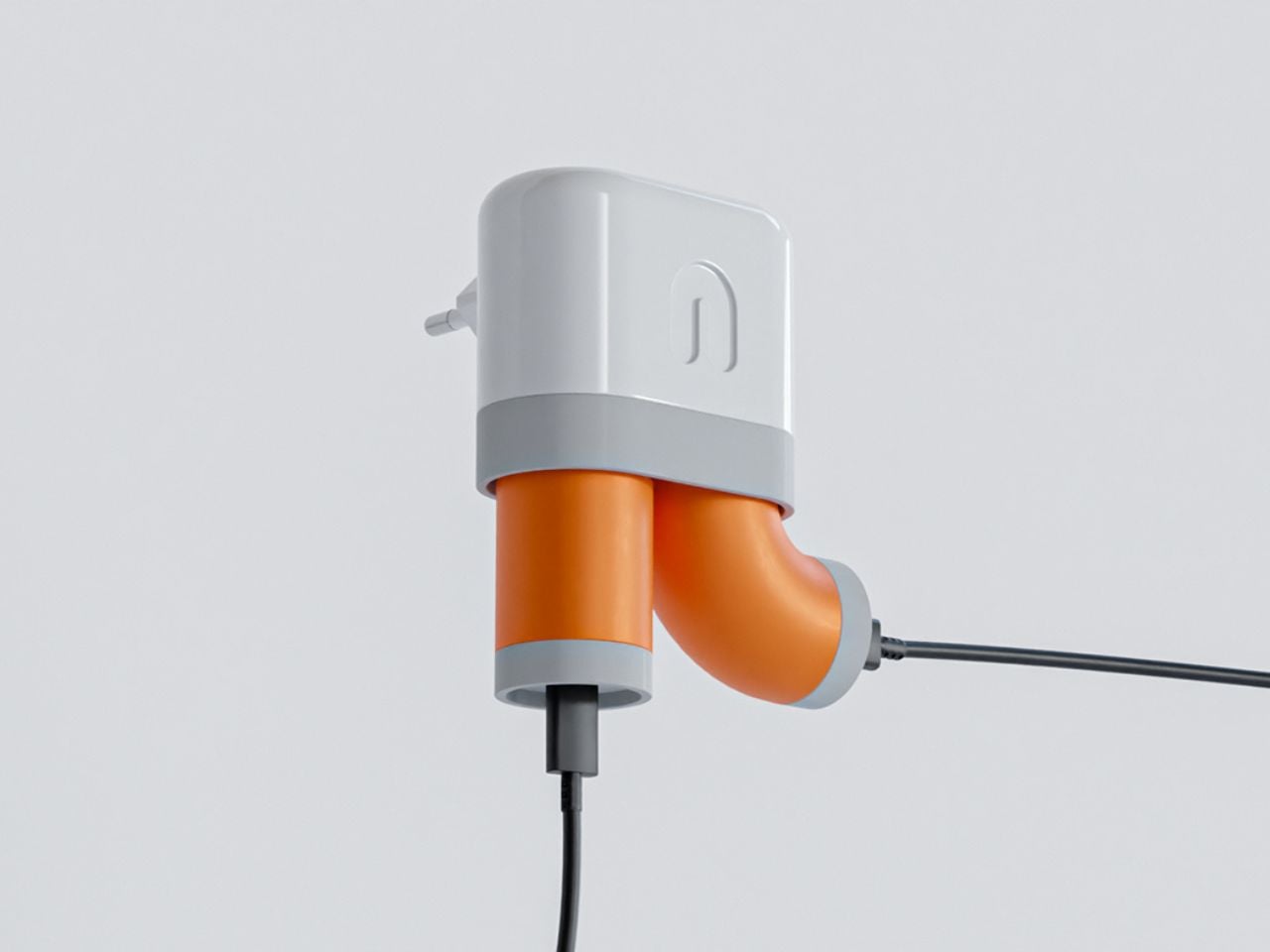
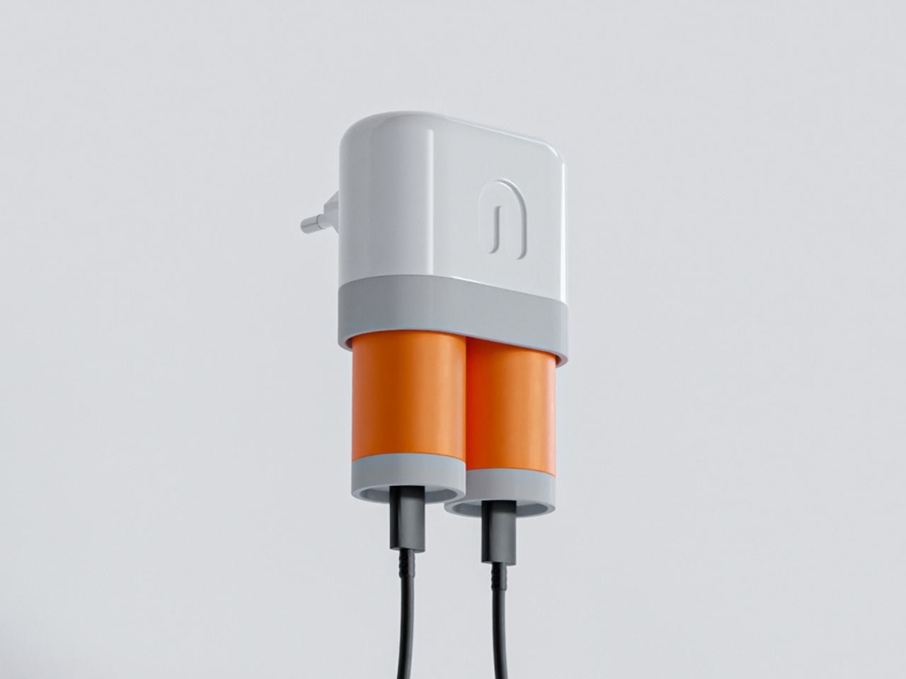
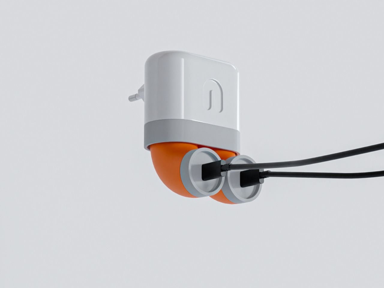
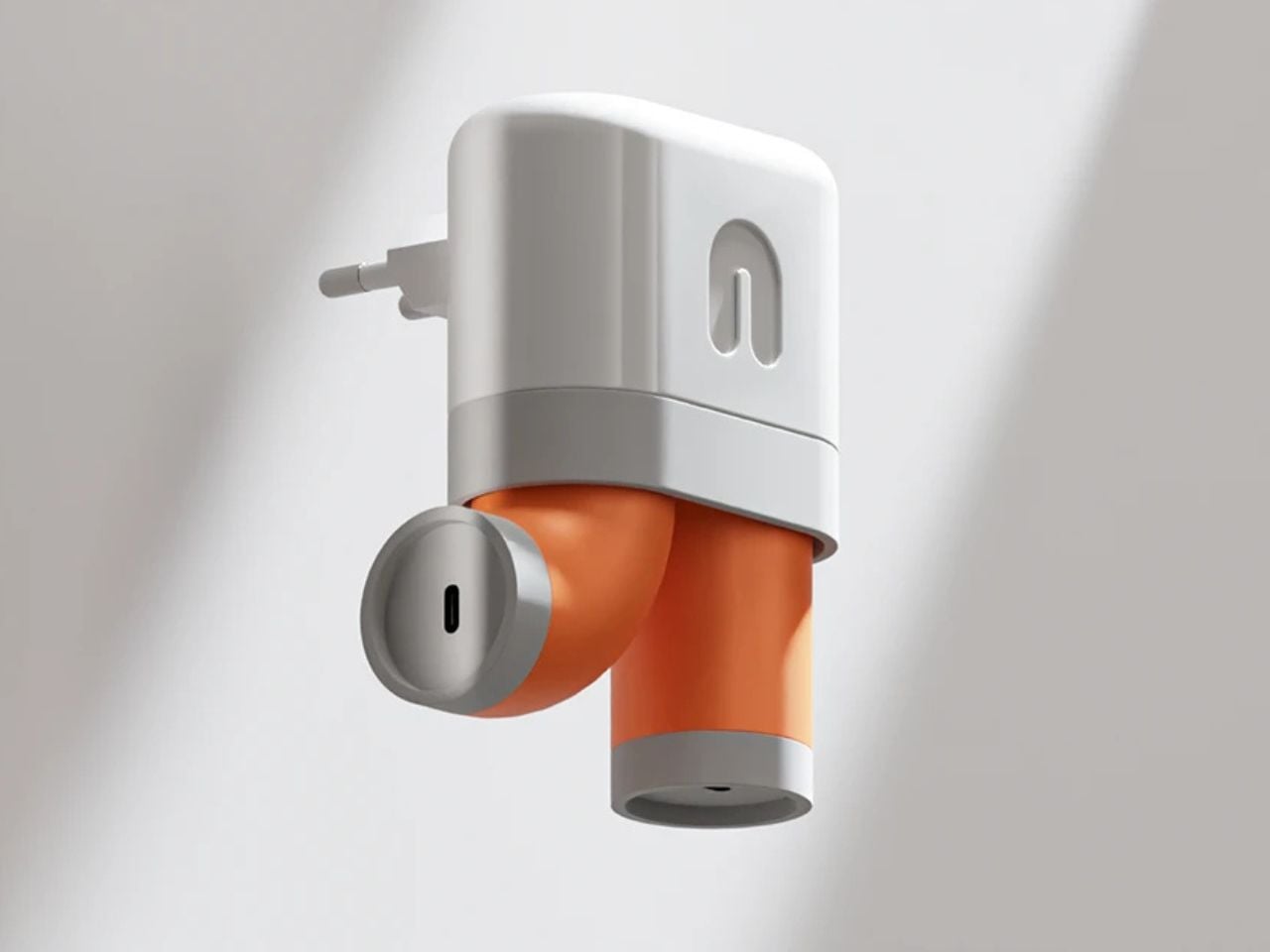
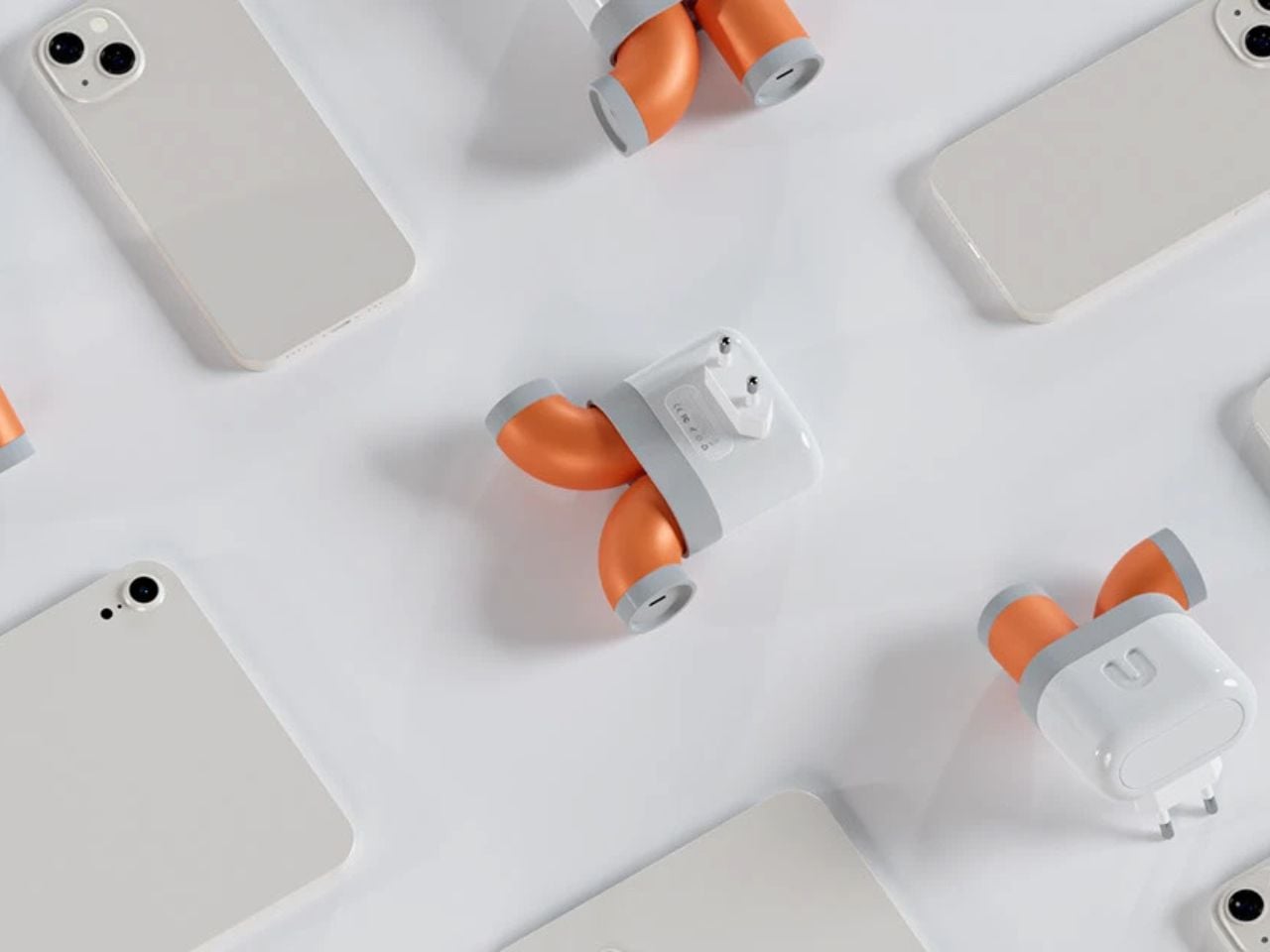
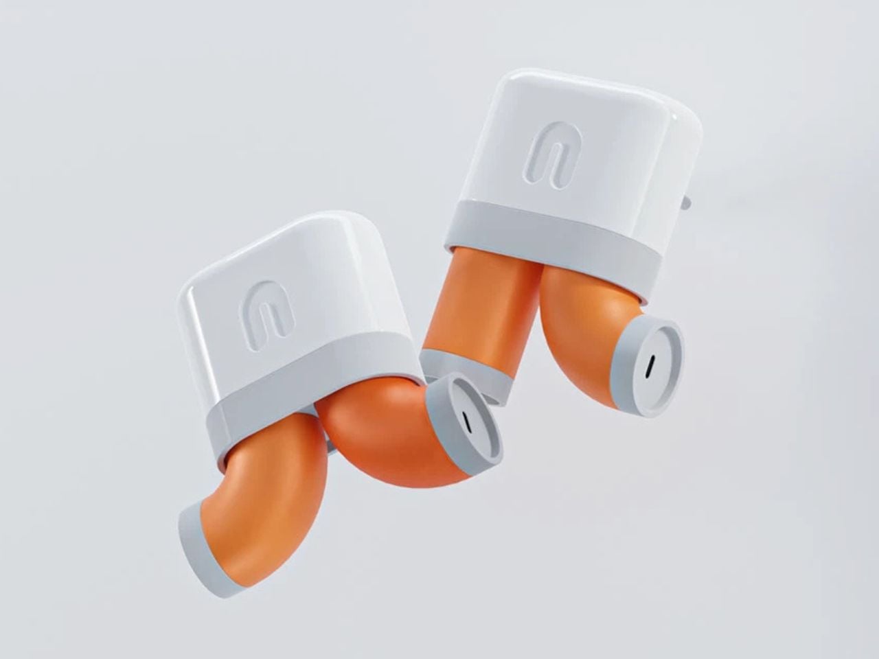
The Flexible Charge Adapter addresses this issue by rethinking the adapter as an adaptive component rather than a static block. A stretchable silicone structure is integrated into a specific section of the adapter, allowing controlled flexibility where it matters most. This design introduces a small but meaningful bend that aligns naturally with the direction of the cable.

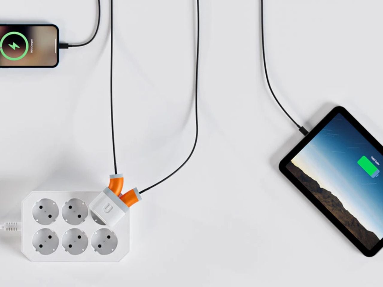
In tight or awkward spaces, this flexibility reduces sharp angles, minimizes pressure at the connection point, and allows the cable to rest in a safer, more natural position. The adapter responds to real-world conditions instead of resisting them, helping preserve the integrity of the cable and the safety of the charging process.

In addition to improving durability and safety, the adapter also supports modern usage patterns. With two charging ports, users can charge multiple devices at the same time, even in confined environments. Phones, earbuds, power banks, and other accessories can be powered simultaneously without crowding the socket or straining cables.

The Flexible Charge Adapter demonstrates how thoughtful design can address everyday frustrations that are often overlooked. By introducing flexibility into a traditionally rigid object, it extends the life of charging accessories, reduces safety risks, and improves the overall charging experience. In a world where charging is constant and unavoidable, this design makes a simple act safer, smarter, and more sustainable.

The post This Smart Charging Adapter Finally Flexes So Your Cables Don’t Have To first appeared on Yanko Design.
This Smart Charging Adapter Finally Flexes So Your Cables Don’t Have To

Charging phones and portable devices has become one of the most routine actions of modern life. From the moment we wake up to the time we go to sleep, our devices depend on reliable power. We charge at home, in offices, cafés, airports, hotels, libraries, and public transportation spaces. Despite how frequently charging occurs, the physical environments designed to support it often feel like an afterthought. Wall sockets are commonly placed low to the ground, behind furniture, under desks, or in narrow corners that were never designed with daily device use in mind.

As a result, charging cables are routinely forced into uncomfortable positions. They are bent sharply against walls, twisted sideways, or compressed between furniture and outlets. Over time, this repeated stress causes visible wear. The outer insulation begins to tear, internal wiring weakens, and charging reliability declines. Many users replace cables not because they stop working suddenly, but because gradual damage makes them unsafe or frustrating to use. This cycle creates unnecessary waste, financial cost, and ongoing inconvenience.

Designer: Berkan Sunayol

Beyond annoyance, damaged charging accessories raise genuine safety concerns. Continuous pressure on the adapter and cable can degrade electrical contact points, increasing the risk of overheating, inconsistent power delivery, or short circuits. In public and shared environments, where users may not notice early signs of damage, this becomes an overlooked safety issue.

Charging cables are intentionally designed to be flexible. They allow users to route them around objects, across surfaces, and through tight gaps. Charging adapters, however, remain rigid and stiff. This mismatch creates a critical point of failure. When a rigid adapter is plugged into an awkwardly placed socket, it locks the cable into a fixed angle. The cable is forced to bend sharply at the connector, which is often the weakest part of the entire system.

Over time, this rigidity undermines the durability of both the cable and the adapter. Despite widespread awareness of cable damage, most existing solutions focus on reinforcing the cable itself rather than addressing the adapter that causes the stress.

The Flexible Charge Adapter addresses this issue by rethinking the adapter as an adaptive component rather than a static block. A stretchable silicone structure is integrated into a specific section of the adapter, allowing controlled flexibility where it matters most. This design introduces a small but meaningful bend that aligns naturally with the direction of the cable.

In tight or awkward spaces, this flexibility reduces sharp angles, minimizes pressure at the connection point, and allows the cable to rest in a safer, more natural position. The adapter responds to real-world conditions instead of resisting them, helping preserve the integrity of the cable and the safety of the charging process.
In addition to improving durability and safety, the adapter also supports modern usage patterns. With two charging ports, users can charge multiple devices at the same time, even in confined environments. Phones, earbuds, power banks, and other accessories can be powered simultaneously without crowding the socket or straining cables.

The Flexible Charge Adapter demonstrates how thoughtful design can address everyday frustrations that are often overlooked. By introducing flexibility into a traditionally rigid object, it extends the life of charging accessories, reduces safety risks, and improves the overall charging experience. In a world where charging is constant and unavoidable, this design makes a simple act safer, smarter, and more sustainable.

The post This Smart Charging Adapter Finally Flexes So Your Cables Don’t Have To first appeared on Yanko Design.