For decades, furniture design has followed an unspoken rule. Comfort equals more. More foam, more padding, more layers, more material. The Knit One Chair by Isomi, designed by Paul Crofts, quietly dismantles that assumption. It proposes something radical for contemporary seating: what if comfort is not about adding, but about removing?
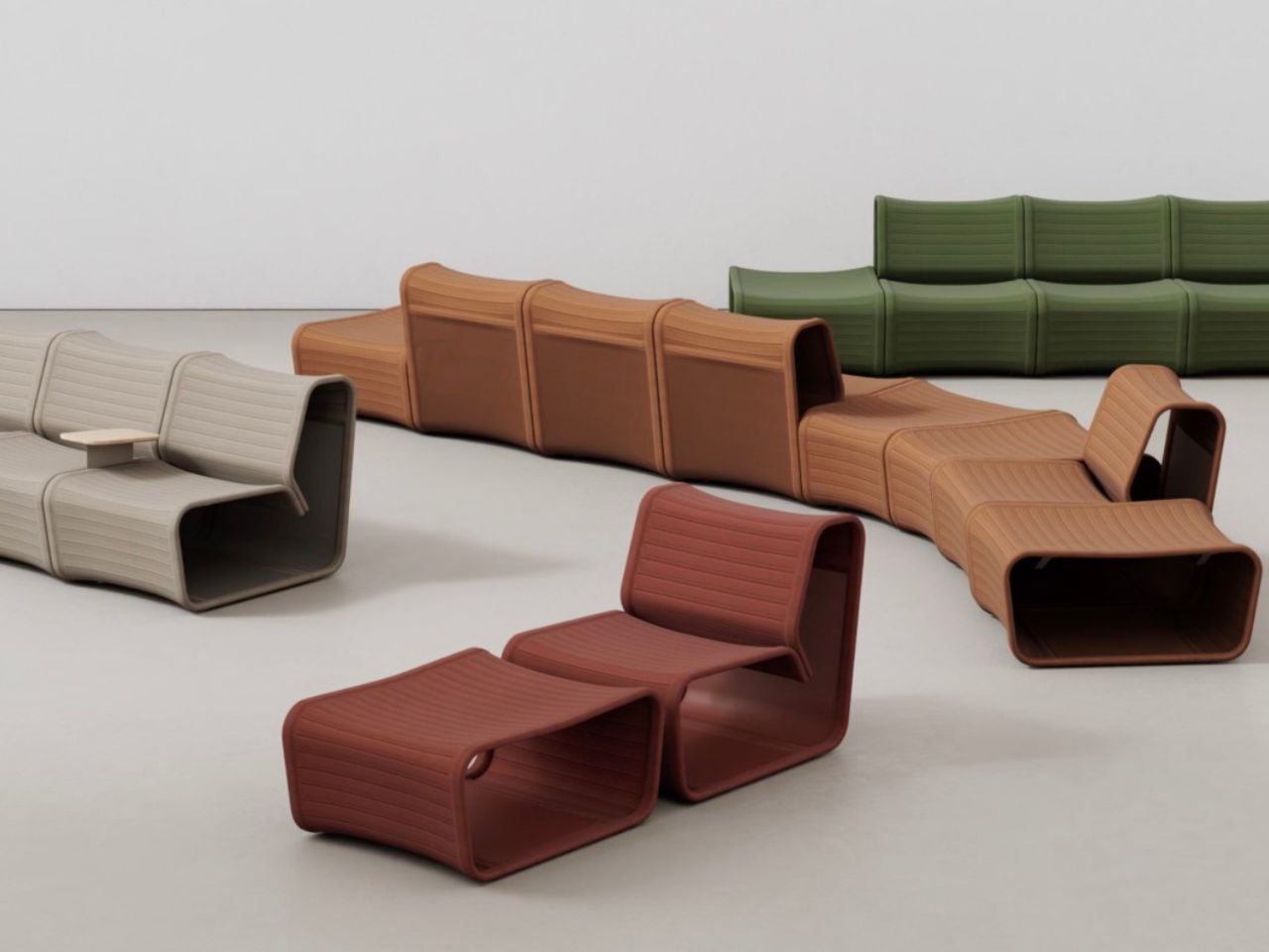
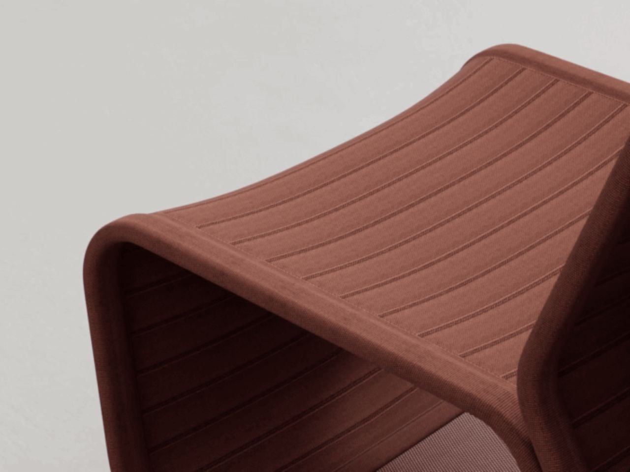
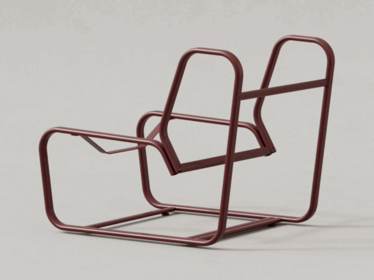
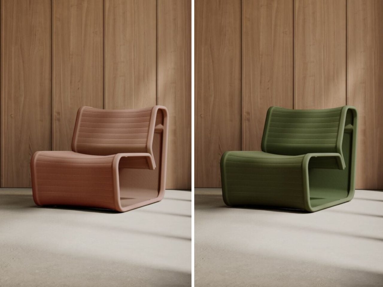
The chair does not shout innovation through spectacle. Instead, it whispers it through restraint. Gone are the dense layers of upholstery that traditionally define lounge seating. In their place sits a single engineered knitted skin stretched across a lightweight metal frame. What appears visually minimal is in fact materially sophisticated. The knit surface is not decorative upholstery but the structural and ergonomic system itself. It supports, flexes, and adapts to the body without relying on bulk.
Designer: Paul Crofts
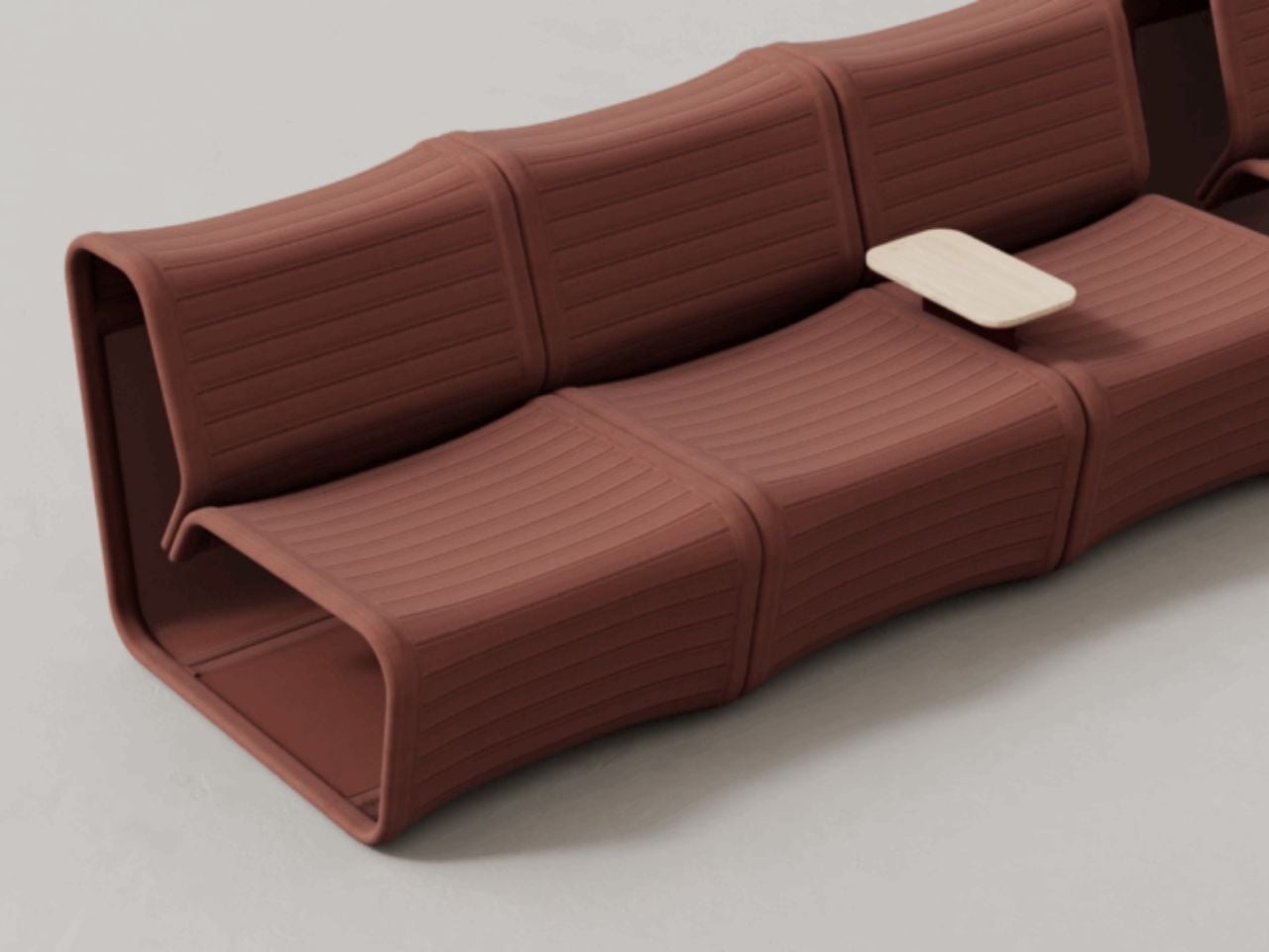
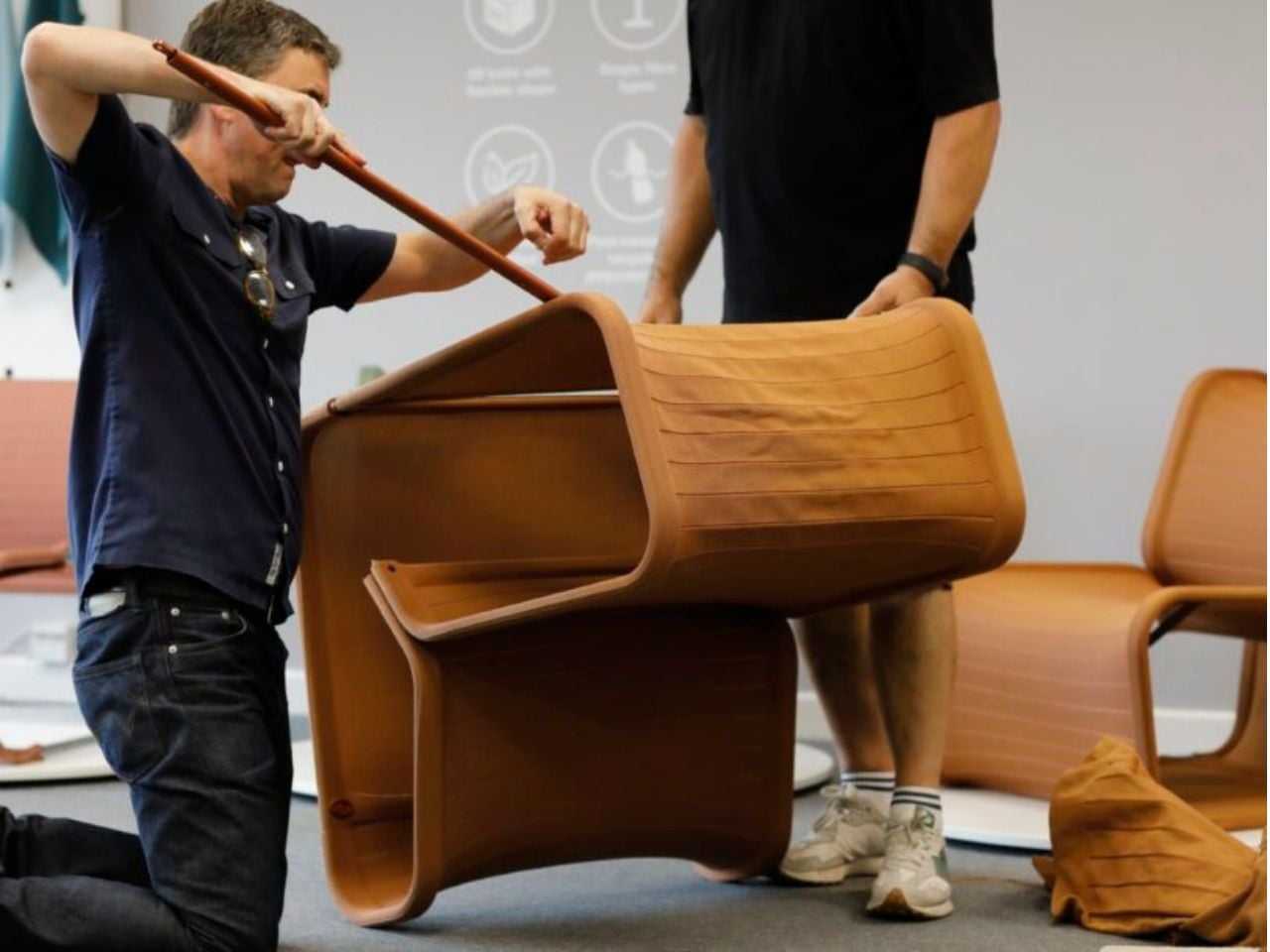
This shift reframes how we understand softness. Rather than cushioning the body with excess, the chair supports it through tension and precision. Paul Crofts describes the intention as a move away from resource-heavy upholstery toward something smarter and more responsible. The frame bolts together on site, while the knitted sleeve simply drops into position. The logic is elegant. Fewer components, less waste, and a construction process that feels closer to assembling a garment than building furniture.
The textile itself carries its own story of transformation. The sleeve is made from Camira’s SEAQUAL collection, a fabric created using post-consumer marine plastic waste. Each meter repurposes up to thirty-five recycled bottles recovered from oceans. Instead of treating sustainability as a surface-level gesture, the material integrates environmental responsibility directly into the structure of the chair. Advanced three-dimensional knitting technology shapes the textile precisely, eliminating offcuts and ensuring that only the exact amount of material required is produced. No surplus. No unnecessary trimming. No hidden waste.
The absence of adhesives or foam layers also means the knit can be replaced or recycled independently of the frame, extending the product’s lifespan. In an industry where furniture is often discarded when upholstery wears out, this detail feels quietly revolutionary. Longevity is designed into the system rather than promised as an afterthought.
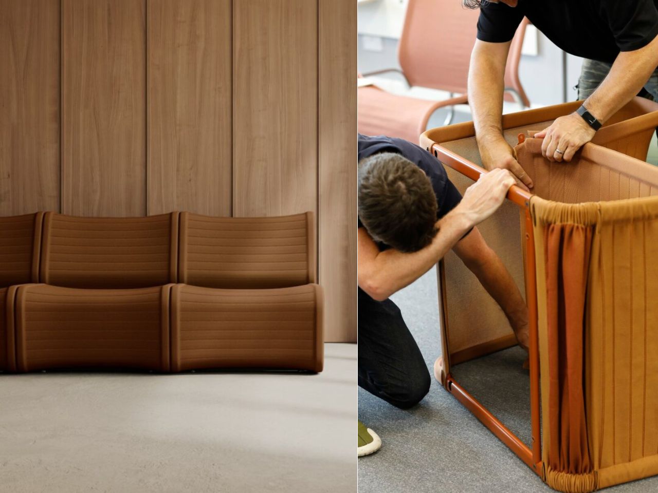
Logistics also becomes part of the design intelligence. The lightweight frame and knit components ship flat-packed, reducing transport volume and emissions. Assembly is intentionally simple, allowing the chair to be constructed locally with minimal effort. For large-scale furniture, which often involves complex delivery and installation processes, this level of efficiency is rare and refreshingly pragmatic.
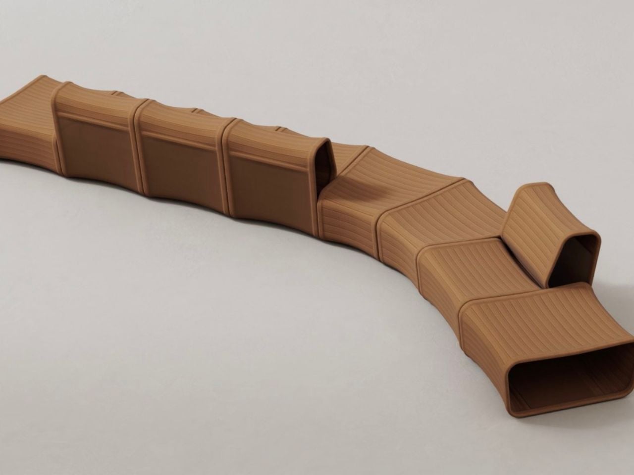
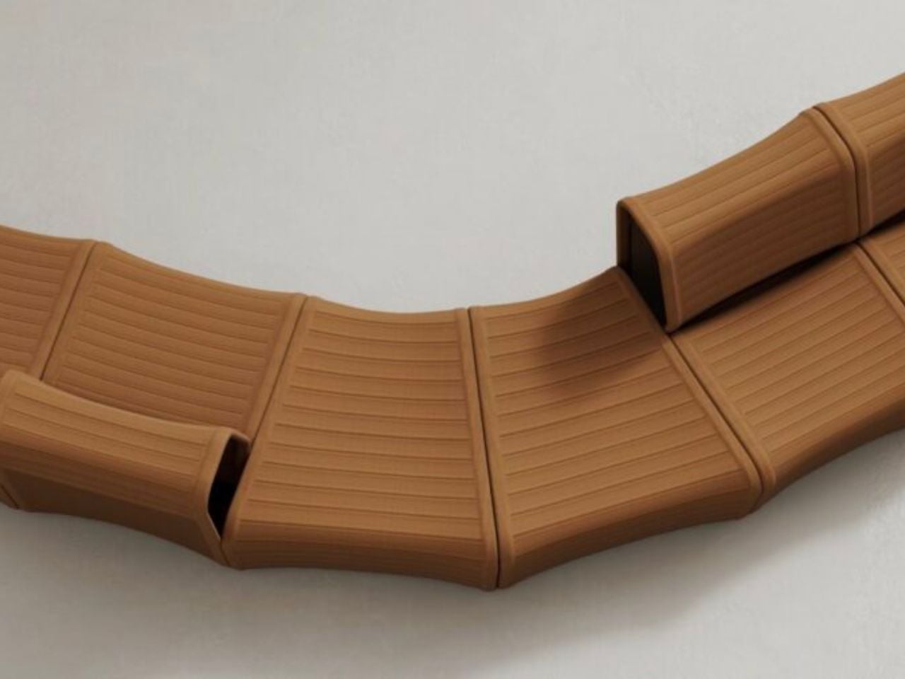
The Knit One Chair is not a standalone object but part of a modular seating family that includes a lounge chair, straight module, angled module, and a solid wood side table. Each piece is reversible, allowing configurations to shift depending on spatial needs. A single system can move from individual seating to collaborative arrangements without adding new elements. Flexibility here is not a feature but a philosophy.
What makes the design compelling is not just its sustainability credentials or modular versatility. It is the conceptual challenge it poses to the industry. The chair asks designers and users alike to reconsider a deeply embedded belief that comfort must be padded, layered, and concealed. Instead, it demonstrates that comfort can emerge from clarity of structure, intelligence of material, and precision of form.
In a time when sustainable design is often framed as sacrifice, the Knit One Chair suggests another narrative. Reduction does not mean deprivation. It can mean refinement. By removing excess, the design creates space for innovation, longevity, and environmental responsibility to coexist. It is not simply a chair. It is a quiet argument for a future where furniture is lighter, not just in weight, but in impact.
The post The Knit Chair That Rewrites Comfort by Subtracting Instead of Adding first appeared on Yanko Design.