Replace 100 Tutorial Videos With This One Smart Keyboard

If you’ve ever tried to learn Photoshop, Illustrator, or pretty much any serious creative software on your own, you know the ritual. Open the app, watch a tutorial, pause the tutorial, switch back to the app, forget what you just watched, rewind, watch it again, lose your place in the project, repeat. It is a loop that is less about learning and more about surviving, and it is the reason so many people quietly give up on tools they actually want to use.

Designer Ming Sheng Shih clearly knows this frustration, because KeyFlowAI is built around that exact problem. The constant back-and-forth between tutorial and practice does not just slow you down; it breaks the thread of whatever you were trying to create. And once that thread snaps, getting back into it takes more energy than most beginners have left after the third rewind.

Designer: Ming Sheng Shih
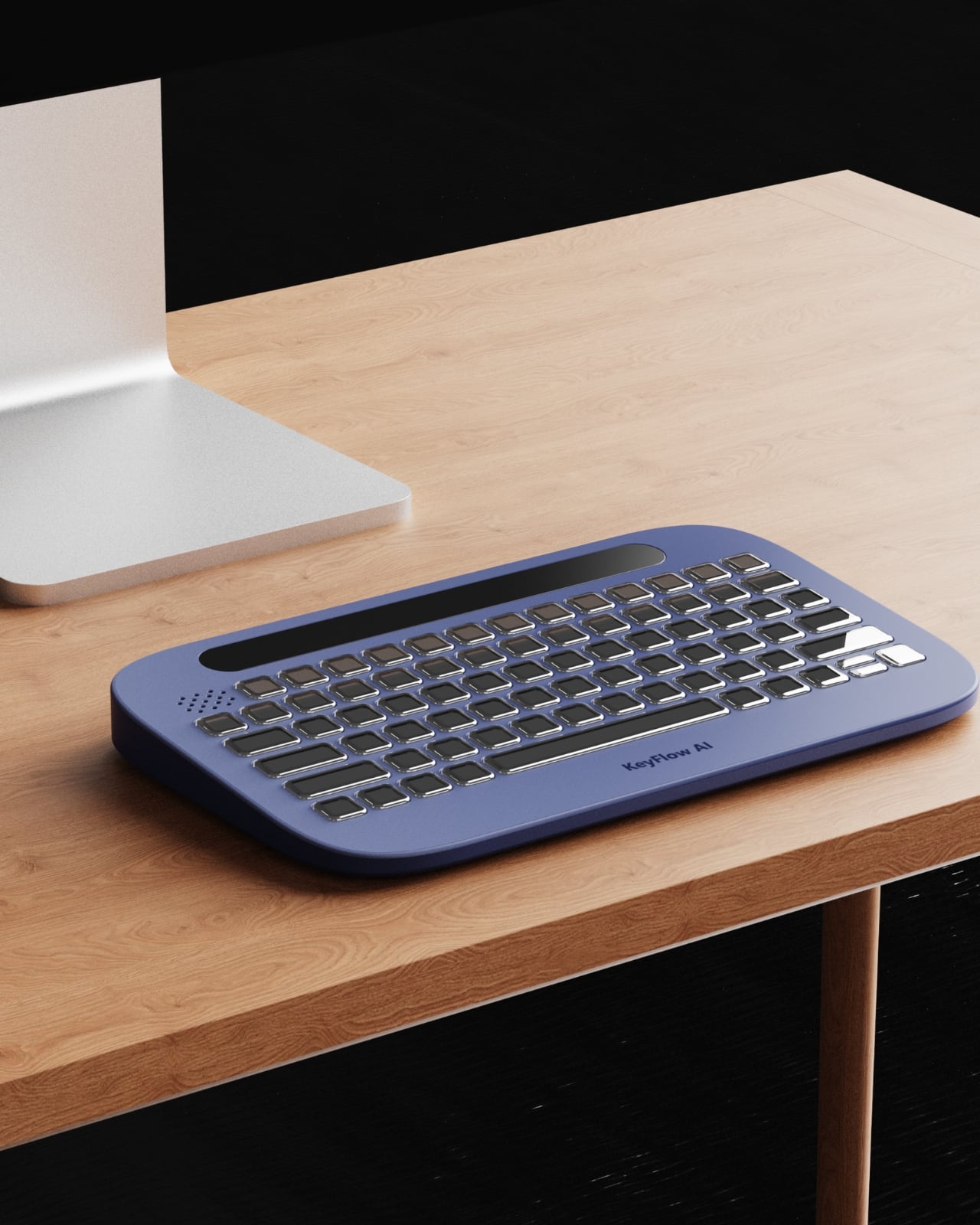
The concept is straightforward but genuinely clever. KeyFlowAI combines an AI-powered guidance system with an adaptive keyboard to bring step-by-step assistance directly into your workflow. Instead of alt-tabbing your way through browser tabs or scrubbing back through YouTube, the keyboard itself becomes the guide. The keys adapt contextually, surfacing relevant shortcuts and workflow cues for whatever task you are working on, right where your hands already are. It is a fundamentally different approach to the onboarding problem that creative software has had for decades.
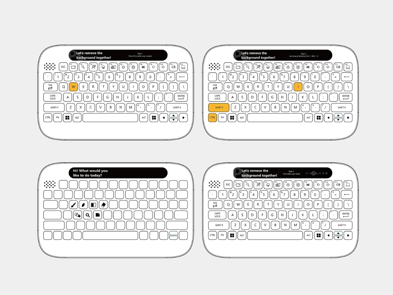
What strikes me about this design is how it reframes the learning challenge at the hardware level rather than the software level. Most ed-tech solutions pile another app on top of the chaos, another overlay, another subscription layer you have to manage alongside the thing you are actually trying to learn. KeyFlowAI goes the other direction. It meets you at the physical interface, which is where attention already lives during any hands-on creative session. The keyboard stops being just an input device and starts acting as a co-pilot.

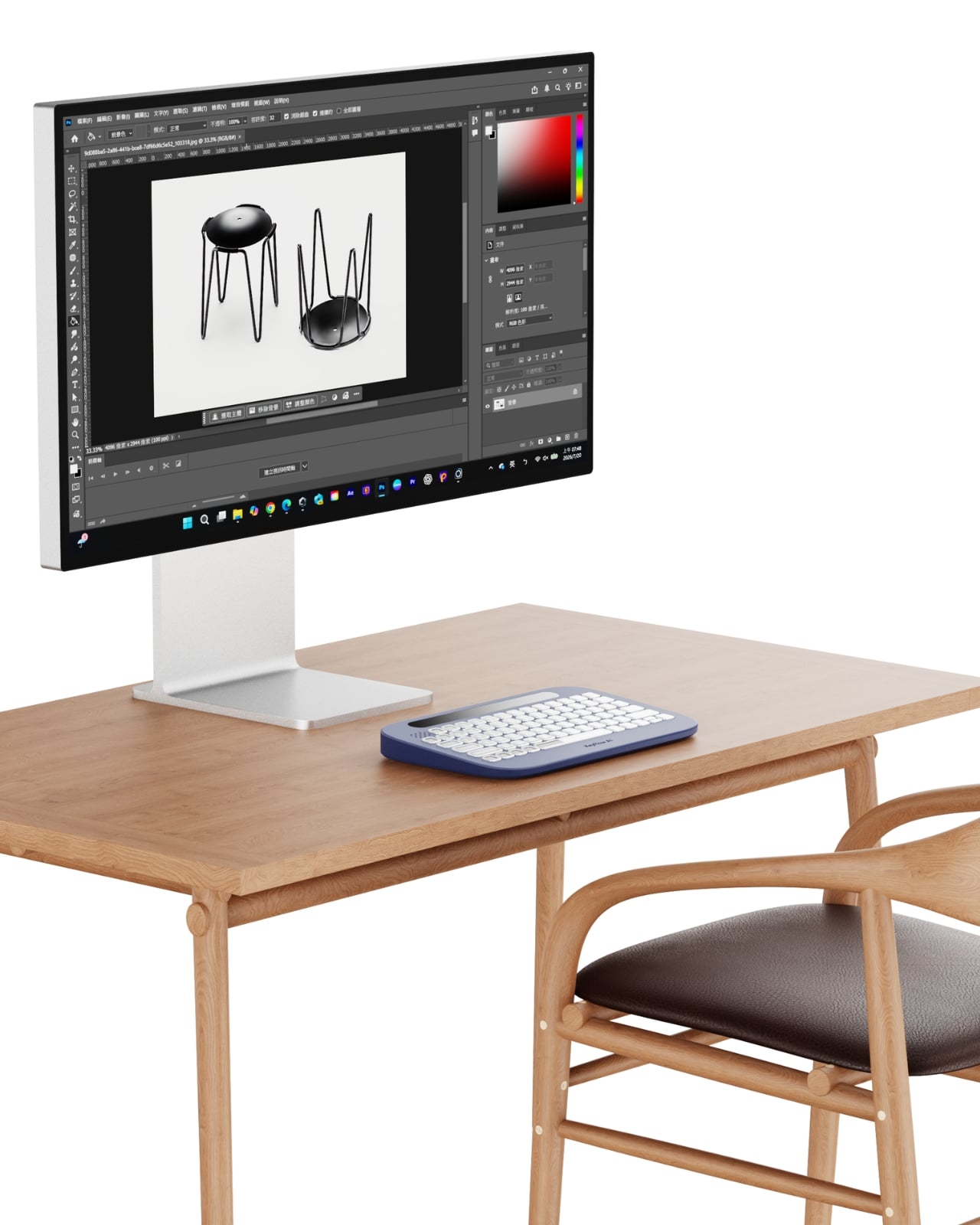
Visually, the design is clean and restrained in the best way. The rounded, slightly pill-shaped body comes in navy blue, light gray, and a soft sage green. None of the colors are aggressive or trendy in an obvious way. The keys have that satisfying, slightly domed profile that looks genuinely tactile even in product renders. Running along the top edge is a narrow display strip that presumably serves as the main guidance interface, showing instructions or prompts without pulling your eyes fully away from the screen. It is a small detail that shows real consideration for how people actually look at their desks when they are working.


The back of the device features two raised rails that function as a stand, letting you tilt the keyboard to a more comfortable working angle. A coiled cable option is also part of the design language, and while coiled cables are very much having a moment in the mechanical keyboard world right now, it does not feel forced here. It fits the overall aesthetic without trying too hard.
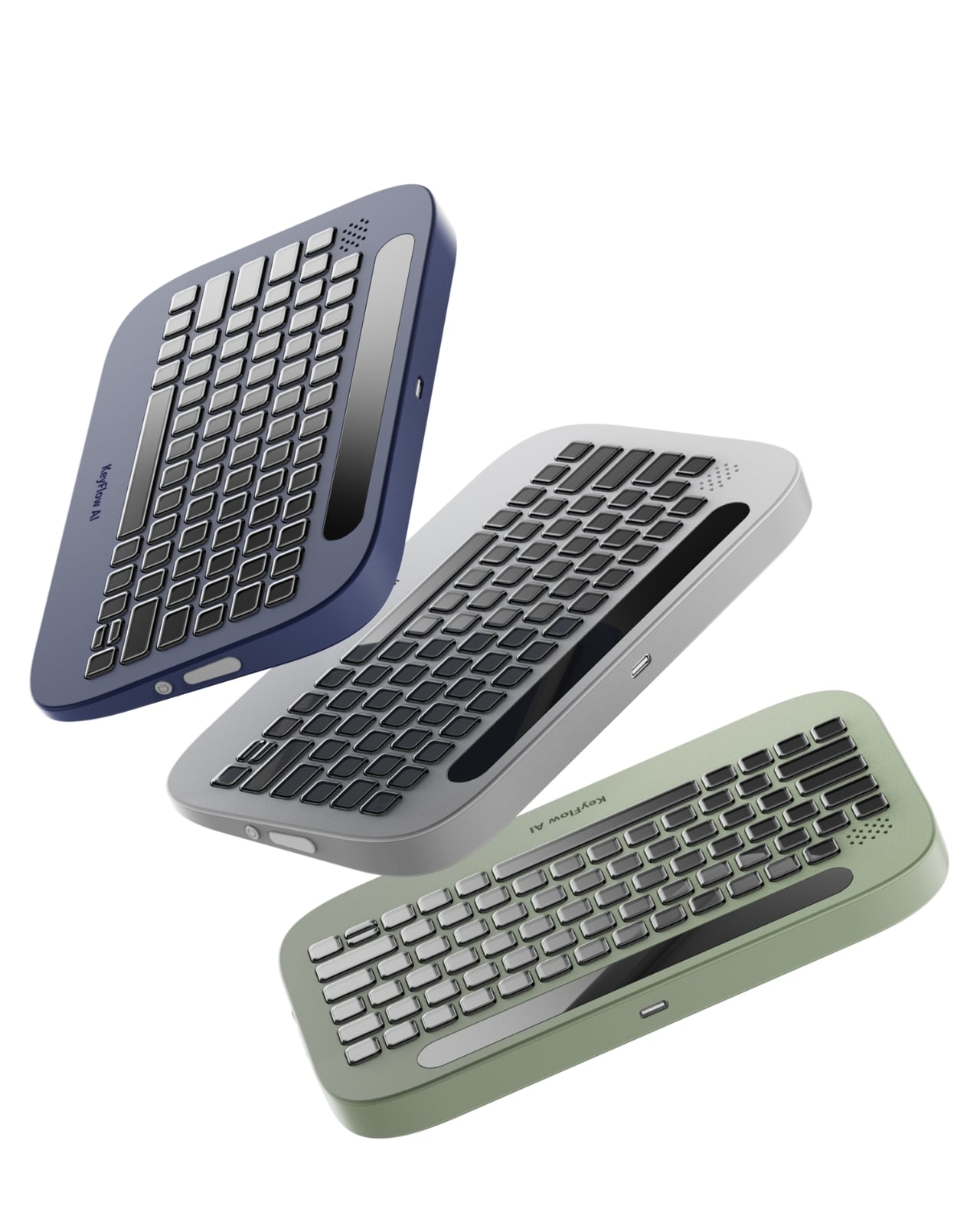
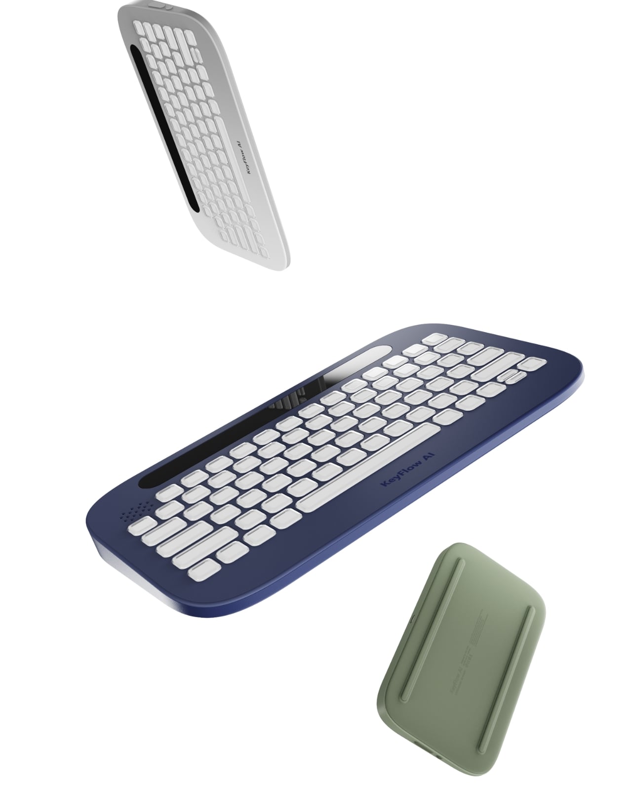
To be fair, KeyFlowAI is still a concept from Shih, which means there are open questions that a working prototype would need to answer. How accurately does the AI read your current task within the software? How quickly do the adaptive key labels update? Does the system scale to more advanced workflows, or is its sweet spot firmly in the beginner range? These are the kinds of details that make or break a tool like this, and they cannot be answered on paper.
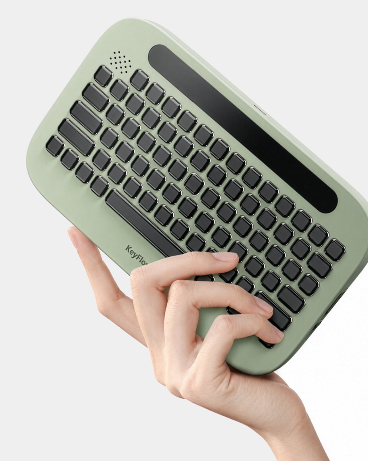
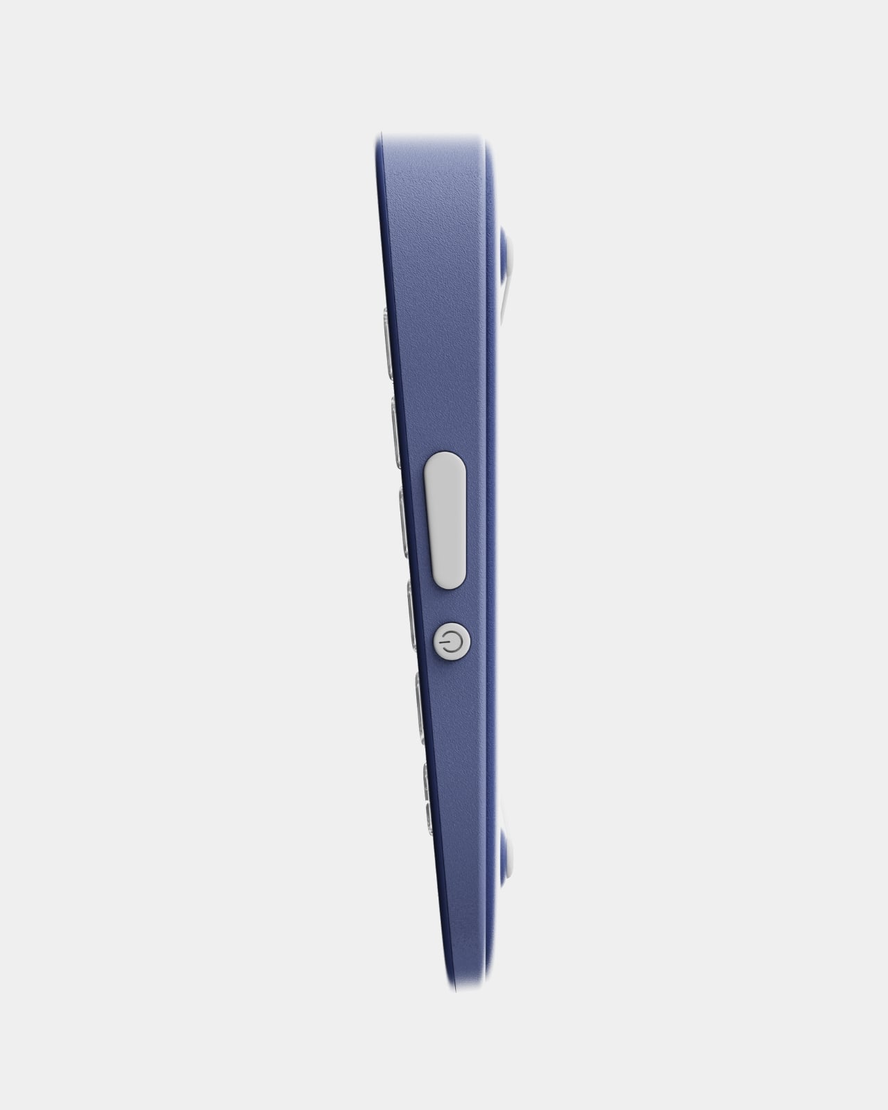
But the underlying premise is sound, and more than that, it is overdue. The gap between watching a tutorial and actually building something has always been wider than the creative software industry acknowledges. Beginners do not need more content; they need less friction in the moment of doing. KeyFlowAI is betting that the solution lives right there on the desk, sitting under your hands. Whether or not it makes it to production, it is making the right argument.
The post Replace 100 Tutorial Videos With This One Smart Keyboard first appeared on Yanko Design.

A Chess Set So Well-Designed It Doubles as Desk Art

Chess has had its design moments before. The Bauhaus crowd took a swing at it in the 1920s. The Staunton standard has been the global norm since the 1800s, and somehow nobody’s fully managed to unseat it. Every generation eventually looks at the board and decides the pieces deserve a second opinion. Right now, that reinterpretation is coming from a 23-year-old UK-based 3D artist named Jess Wiseman, operating under the handle @chesslwiseman, and his set is called CHEKT.

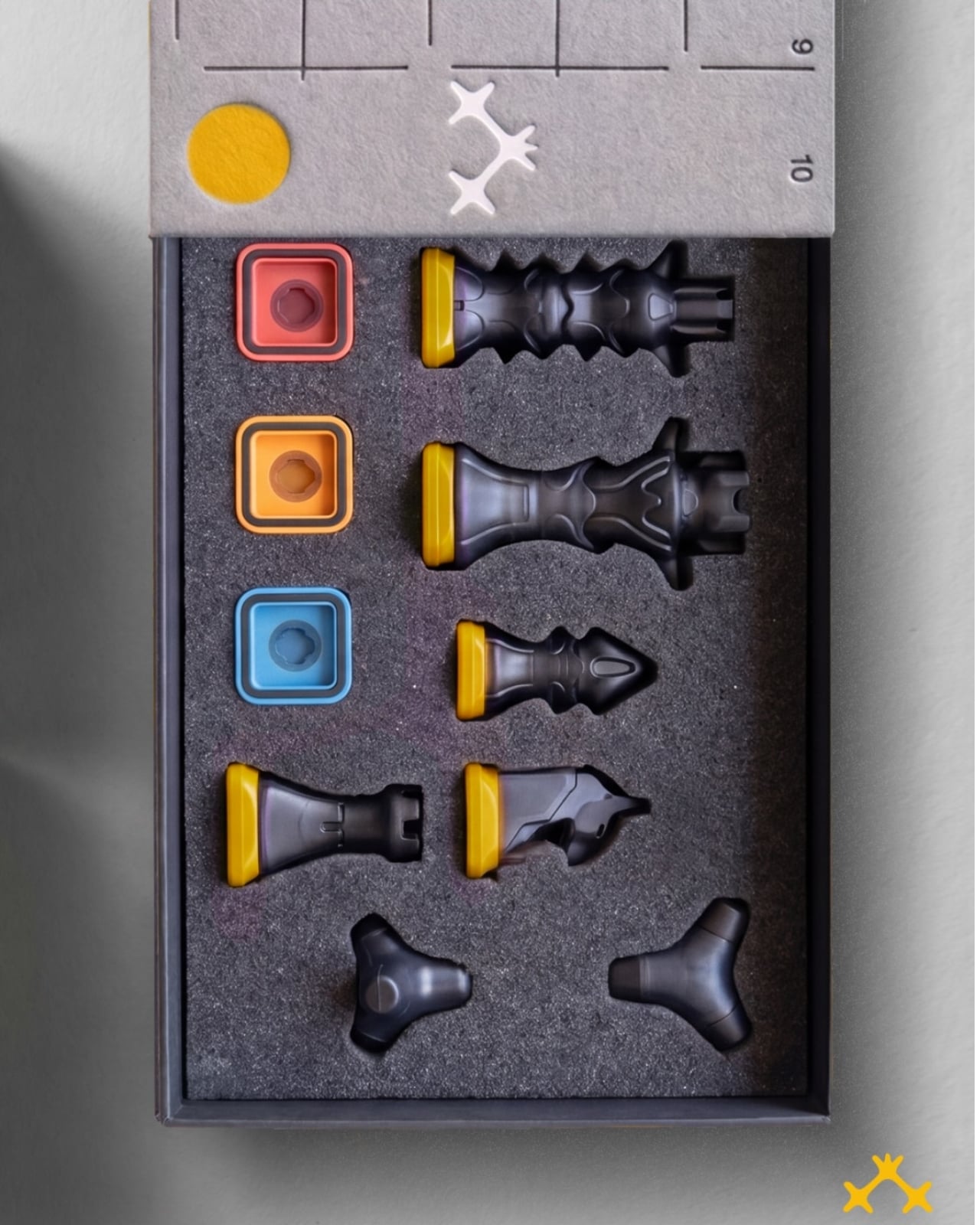
The photographs alone are enough to stop you mid-scroll. Six pieces nestled into tight foam cutouts, each one precision-milled in matte obsidian with a warm cream undertone that catches light differently depending on the angle. Wiseman designed them entirely from scratch, replacing the traditional Staunton silhouettes with sculptural, geometric forms that still read unmistakably as their archetypes. The queen is still regal. The knight still suggests a horse. But the language they’re speaking is architectural rather than decorative, all sharp edges, weighted bases, and deliberate negative space that makes each piece feel like a standalone object worth studying on its own terms.

Designer: Jess Wiseman

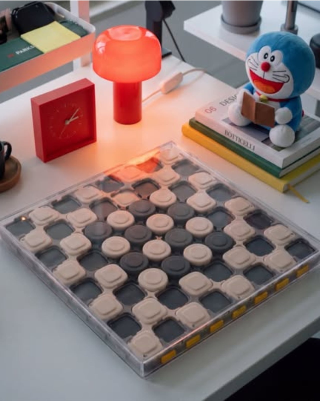
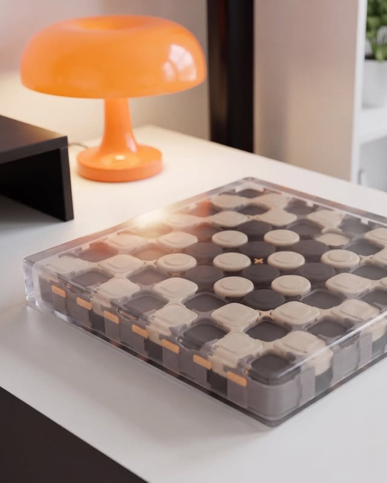
That commitment to negative space runs through the entire set. The pieces are designed with rhythmic repetition across the grid in mind, so when they’re arranged on the board, the composition has a visual logic that goes beyond the game. It doesn’t just look like a chess set mid-play. It looks like an installation. That’s a hard balance to strike without the pieces feeling cold or inaccessible, and Wiseman manages it without sacrificing the tactile quality that makes a chess set satisfying to actually handle.

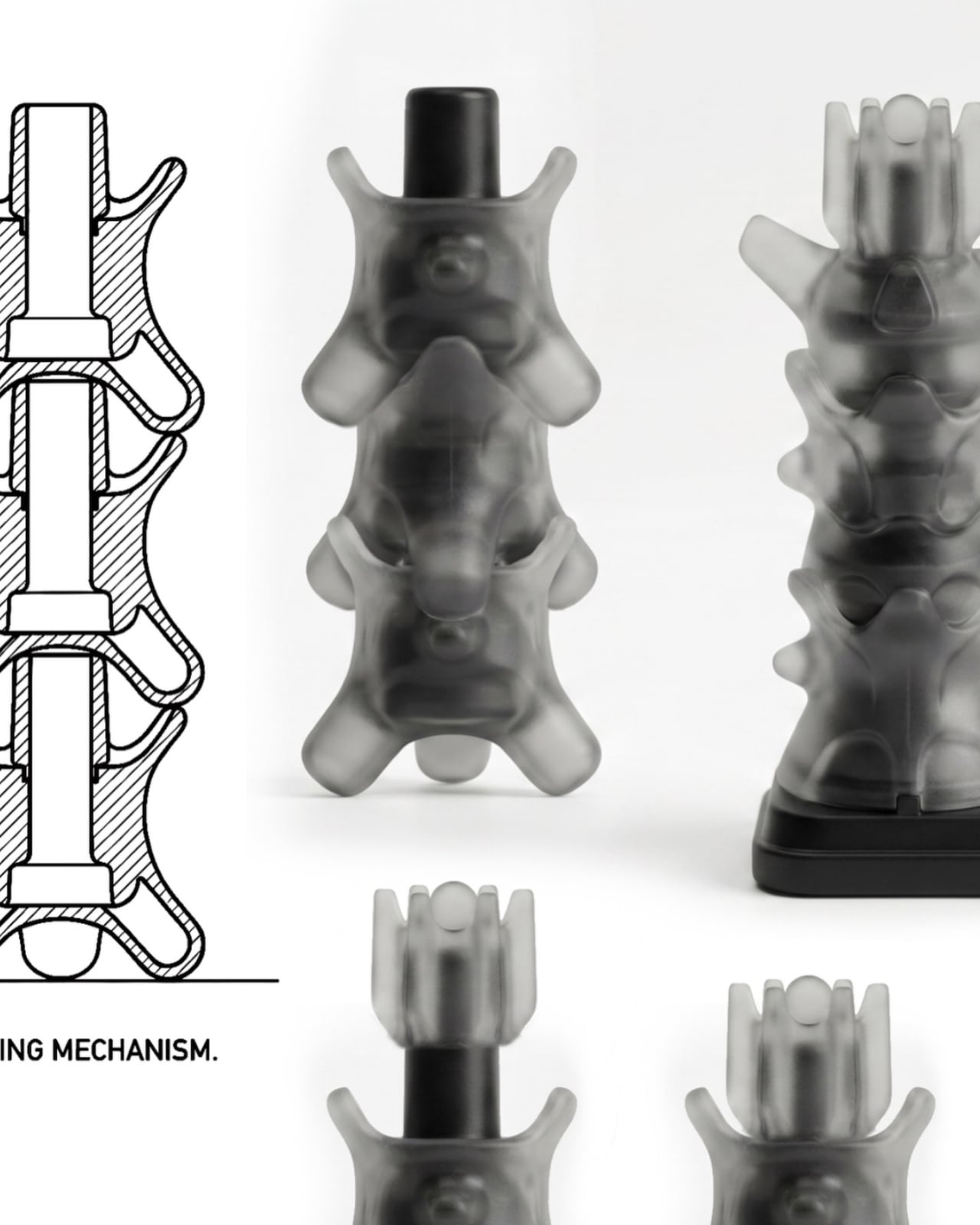
The stacking mechanism is where the engineering becomes genuinely difficult to look away from. Cross-section diagrams reveal an internal locking system built directly into each piece, allowing them to stack and store compactly without compromising their form. The pieces are also magnetic, keeping them grounded during play. It solves the oldest tension in chess set design: something this considered should also be able to travel. CHEKT. was built to do both, and the construction makes that clear without needing to announce it.

The packaging is what really gets me, though. Packaging is almost always the afterthought, the thing that ends up in recycling within ten minutes of a product arriving. Here it functions as a co-equal part of the design language. The main box is a muted gray with an illustrated coordinate grid and gold line drawings of the pieces printed on the lid. Below that, a dark foam tray holds each piece in a custom-cut pocket alongside three colored marker squares in red, orange, and blue. Then there’s the separate mustard yellow storage box, embossed with CHEKT. lettering and graphic iconography in a way that reads like a limited-run streetwear release. Stack the whole thing on a desk and it doesn’t look like something waiting to be put away. It looks like it’s already home.

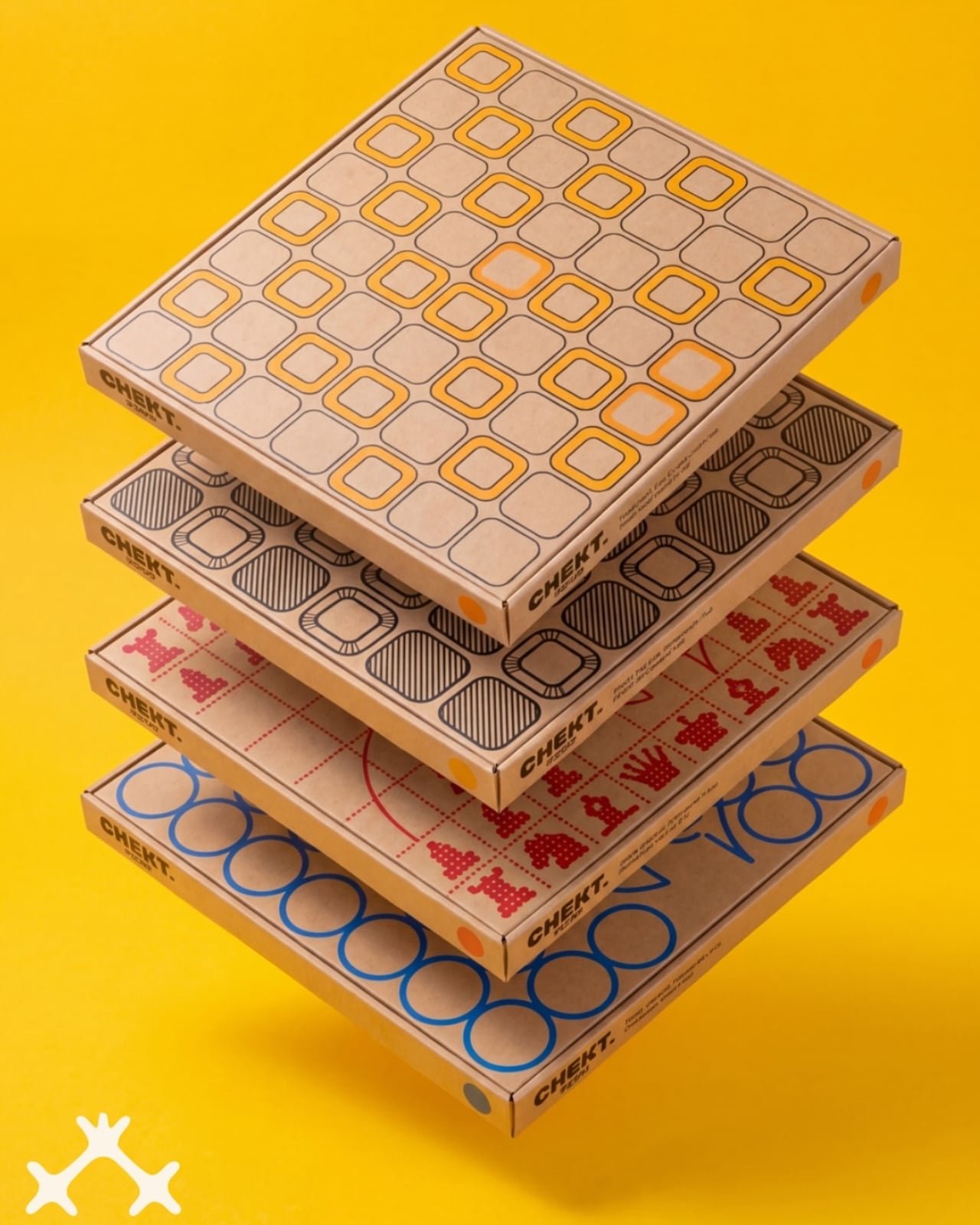
CHEKT. also comes in multiple board packaging editions, each one with a different graphic treatment on its kraft paper exterior. One uses full geometric abstraction, another halftone circles, a third illustrated chess piece silhouettes in pop-art red. They look nothing alike and yet they feel entirely consistent. That kind of visual coherence across variations is harder to achieve than it seems, and Wiseman pulls it off without apparent strain.

That small detail of the colored marker squares says a lot, actually. Their presence shifts the whole personality of the set. It signals that CHEKT. was designed for actual play, for real people sitting across from each other, not just for a shelf or a coffee table book. That feels like a deliberate philosophical choice, and it’s one worth noting.

Wiseman’s background covers 3D animation, visual effects for artists like Doja Cat and Lil Nas X, and lifestyle branding through his label Figuregot. All of that cross-disciplinary range shows up in how this project holds together. It doesn’t look like a chess set designed by someone who only knows chess. It looks like a chess set designed by someone who understands what objects are truly capable of, and decided to prove it.

The post A Chess Set So Well-Designed It Doubles as Desk Art first appeared on Yanko Design.

Smart Glasses Run Hot. A 1mm Fan Might Finally Fix That.

Smart glasses have a problem they don’t talk about enough, and it has nothing to do with design or battery life or social awkwardness. It’s heat. Plain, boring, uncomfortable heat. When you pack AI processing, computer vision, translation capabilities, and high-resolution displays into a frame that sits directly on your face, things get warm fast. Not warm in a “this laptop is on my lap” kind of way, but warm in a “I need to take these off because my temple is burning” kind of way. It’s a limitation that has quietly held the entire category back, and it’s one of the reasons smart glasses have struggled to make good on years of very loud promises.

xMEMS Labs is trying to fix that with the XMC-1200, and the approach is genuinely clever. The XMC-1200 is a solid-state micro fan, billed as the world’s smallest active micro fan purpose-built for AR, XR, and AI-powered smart glasses. It measures just 46mm², it’s 1mm thin, and it draws only 70mW of power. For context, that is less energy than most Bluetooth earbuds consume. Yet it still manages to deliver up to a 10°C temperature reduction at a 1W thermal load, which is not a small number when you’re dealing with wearable tech that people expect to use comfortably for hours at a time.

Designer: xMEMS

What makes the XMC-1200 different from conventional cooling solutions is that it’s built for the exact spaces those solutions can’t reach. Traditional fans simply don’t fit inside a glasses temple arm. The XMC-1200 does. Paired with xMEMS’ Astra2 drive ASIC, the chip targets heat directly at the source rather than trying to dissipate it passively. It also carries an IP68 rating, meaning it holds up against water and dust, which matters a great deal for something you’re wearing on a humid afternoon or during a light rain.

The timing here is significant. We’re at a point where the smart glasses category is starting to feel real in a way it hasn’t before. Meta’s Ray-Ban smart glasses have sold surprisingly well. Apple continues iterating on Vision Pro. Startups and established brands alike are betting big on the idea that the next dominant computing interface lives on your face. But all of that progress runs into the same wall: you can miniaturize a processor, you can shrink a display, but you can’t compress the laws of thermodynamics. Heat is still heat.

That’s what makes xMEMS’ announcement feel more foundational than it might appear at first glance. This isn’t a headline feature. Nobody is going to choose smart glasses because of the cooling chip inside them. But they will absolutely notice when their glasses throttle performance after 20 minutes of use, or when the frame gets too hot to wear during a long session, or when the display dims because the hardware is desperately trying to regulate its own temperature. These are the friction points that kill user adoption quietly, before anyone stops to ask why.

The XMC-1200 won’t be the last word in wearable thermal management, but it represents a genuinely meaningful step toward smart glasses that actually behave like the always-on, AI-powered tools they’re marketed as. Engineers working on next-generation devices now have an option that doesn’t force them to choose between ambitious performance and a form factor people will actually want to wear.

Engineering samples are currently available under NDA for qualified OEMs and technology partners, which means this is still early. Consumers won’t be picking XMC-1200-equipped glasses off a shelf anytime soon. But the fact that a purpose-built cooling solution at this scale exists at all is a signal that the industry is finally treating thermal management as a design priority, not just a footnote in a spec sheet. Good design has always been about solving the problems nobody sees. The XMC-1200 is exactly that. Invisible, necessary, and quietly important to everything the smart glasses category is trying to become.

The post Smart Glasses Run Hot. A 1mm Fan Might Finally Fix That. first appeared on Yanko Design.

Artefilo Makes Home Objects From Elephant Grass and Hospital Cabinets

The sustainable home goods market has a specific credibility problem. Products marketed as eco-conscious often get there through incremental adjustments, reducing a percentage of virgin plastic, switching to a recyclable box, or sourcing from a slightly shorter supply chain. The result is a kind of sustainability theater that satisfies certification requirements without fundamentally changing either what objects are made from or how they find their way into a home.

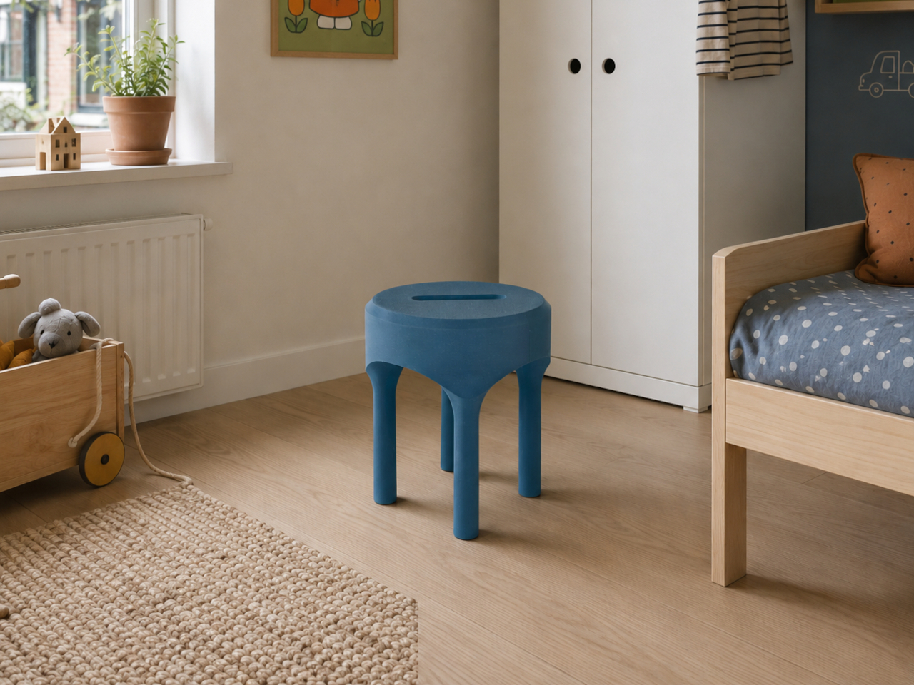
Artefilo approaches that question differently. Based in Edam in the Netherlands, the independent design atelier makes contemporary home objects from materials most manufacturers wouldn’t consider: elephant grass combined with recycled plastic, reclaimed wood fibres, brick dust, and salvaged hospital cabinetry. Each piece is made locally in small batches, and the materials are chosen with the specific intention of giving discarded resources a renewed place in a living space.

Designer: Guido Baratta

The choice of Edam isn’t incidental. The city has a long tradition of ceramics craftsmanship, and Artefilo draws on that heritage without replicating it, taking the spirit of making by hand and applying it to a different material palette. Elephant grass combined with recycled plastic, for example, produces a surface that reads as handmade pottery without the environmental cost of extracting virgin clay or new plastic.

The rest of the material list is equally unexpected. Reclaimed wood fibres and brick dust bring texture and warmth to objects that might otherwise feel too composed, while recycled hospital cabinets contribute rigidity and durability that wouldn’t be obvious from the source. Finding these materials requires locating waste streams that industry hasn’t already claimed, then working out what form they can credibly take in a domestic setting.

Making in small batches has real consequences for what the objects can be. It means pieces that are genuinely one-of-a-kind, because material conditions are never exactly repeatable from one batch to the next. Brick dust carries different tones from different sources; reclaimed wood fibres vary in density and grain. That variability isn’t a flaw in the production model; it’s built into it deliberately.

The underlying premise is that objects shape the atmosphere of a space, not dramatically, but persistently. Something placed on a windowsill or bookshelf gets seen many times a day, and that repetition adds up. Artefilo’s design philosophy treats each piece as something that participates in the daily texture of a home rather than simply occupying it. The materials reinforce that, each carrying a visible trace of its previous life.

The atelier distributes through its own online store and through a local stockist in Edam. The collection is small, deliberately so, and the material sourcing means it isn’t trying to scale into something it isn’t. For a design category that often talks about slowing down without quite managing it, Artefilo appears to have structured itself around that idea from the ground up.

The post Artefilo Makes Home Objects From Elephant Grass and Hospital Cabinets first appeared on Yanko Design.