This Hydrogen Motorcycle Concept Revives a 90-Year-Old BMW Idea That Never Reached Production

In 1934, a BMW designer named Alfred Böning built a motorcycle so far ahead of its time that BMW itself did not know what to do with it. The R7 wrapped its entire mechanical guts in smooth, pressed steel bodywork shaped by Art Deco geometry, and it was so expensive and so strange next to the “bicycle with a motor” norms of the era that BMW shelved the one and only unit, crated it up, and basically forgot it existed. It sat lost in a warehouse until someone rediscovered it in 2005. It took until 2012, and a full restoration by Hans Keckeisen, for the world to actually see what Böning had been sitting on for seven decades, and it walked away with best in class at Pebble Beach the moment it did.

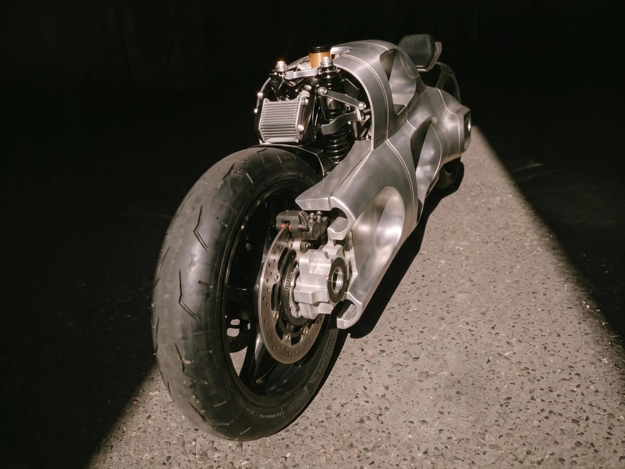
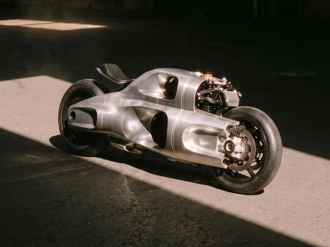
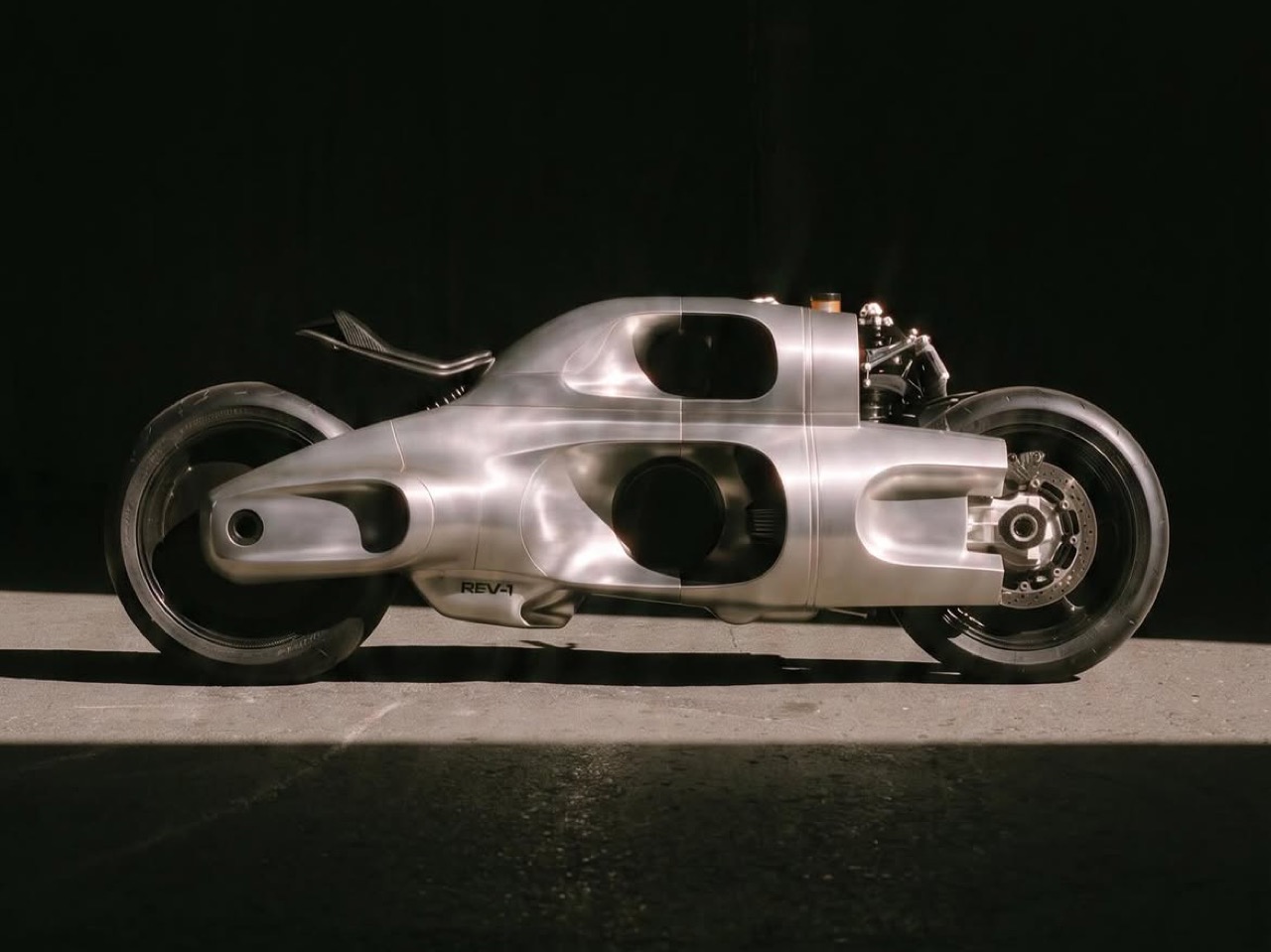
I bring this up because REV-1 feels like the same idea getting a second shot, minus the eight decades of waiting around in a crate. Designer Lennart Baramsky has wrapped a hydrogen powertrain in one continuous, hand-formed aluminum shell with barely a shut line in sight, badged simply REV-1 on the flank. There is no traditional fork, no fairing bolted over a chassis, just one sculpted metal body with cutouts carved through it like a machine that grew its own windows. Böning would probably recognize the impulse immediately, even if the engineering underneath has changed a lot in ninety years.

Designer: Lennart Baramsky
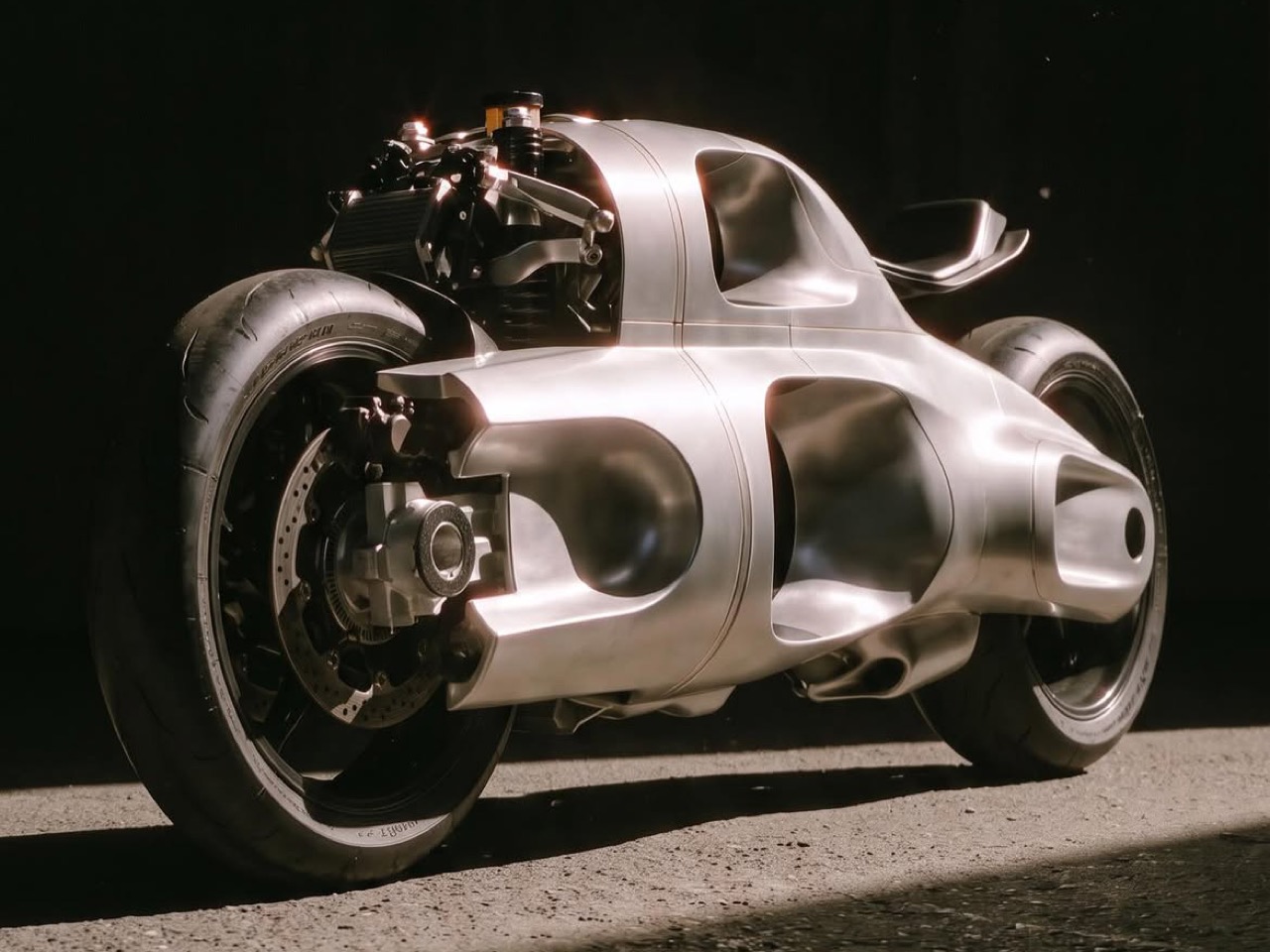
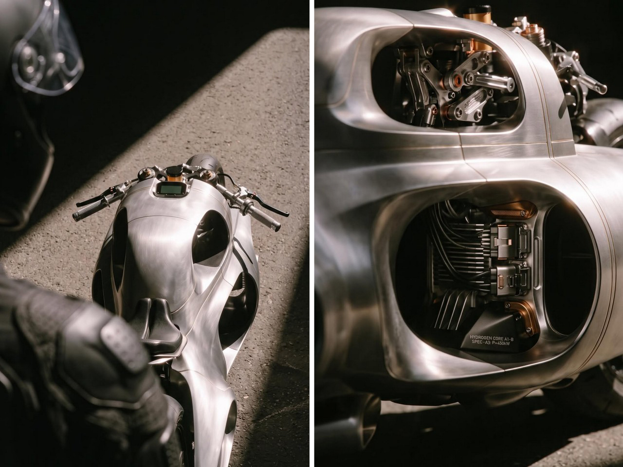
The front end is the part that stops you. Instead of a telescopic fork, there is a linkage setup, rod ends, a rocker arm, and a coilover mounted almost flat against the body, the same basic family of idea behind hub-center designs like the Bimota Tesi or the BMW Duolever we have covered on this site before, except here it disappears into the bodywork so completely you have to squint to find where the suspension actually lives. That single design decision does more to sell the “grown, not built” read of this bike than anything else on it.
The badge on the tank claims a 450kW hydrogen core, and I want to be honest about what that number means in context. The most advanced real hydrogen motorcycle running today, Kawasaki’s Ninja H2 HySE, went public at Suzuka in 2024 making nowhere near that figure, and hydrogen fuel cell scooters like Suzuki’s Burgman have spent over a decade proving out the tech at a fraction of REV-1’s claimed output. That is not a knock on the design. It is a reminder that this is a concept badge doing concept badge things, the same way we flagged when covering Bandit9’s aluminum and carbon fiber Ducati builds that a beautiful shell does not always mean a buildable one.
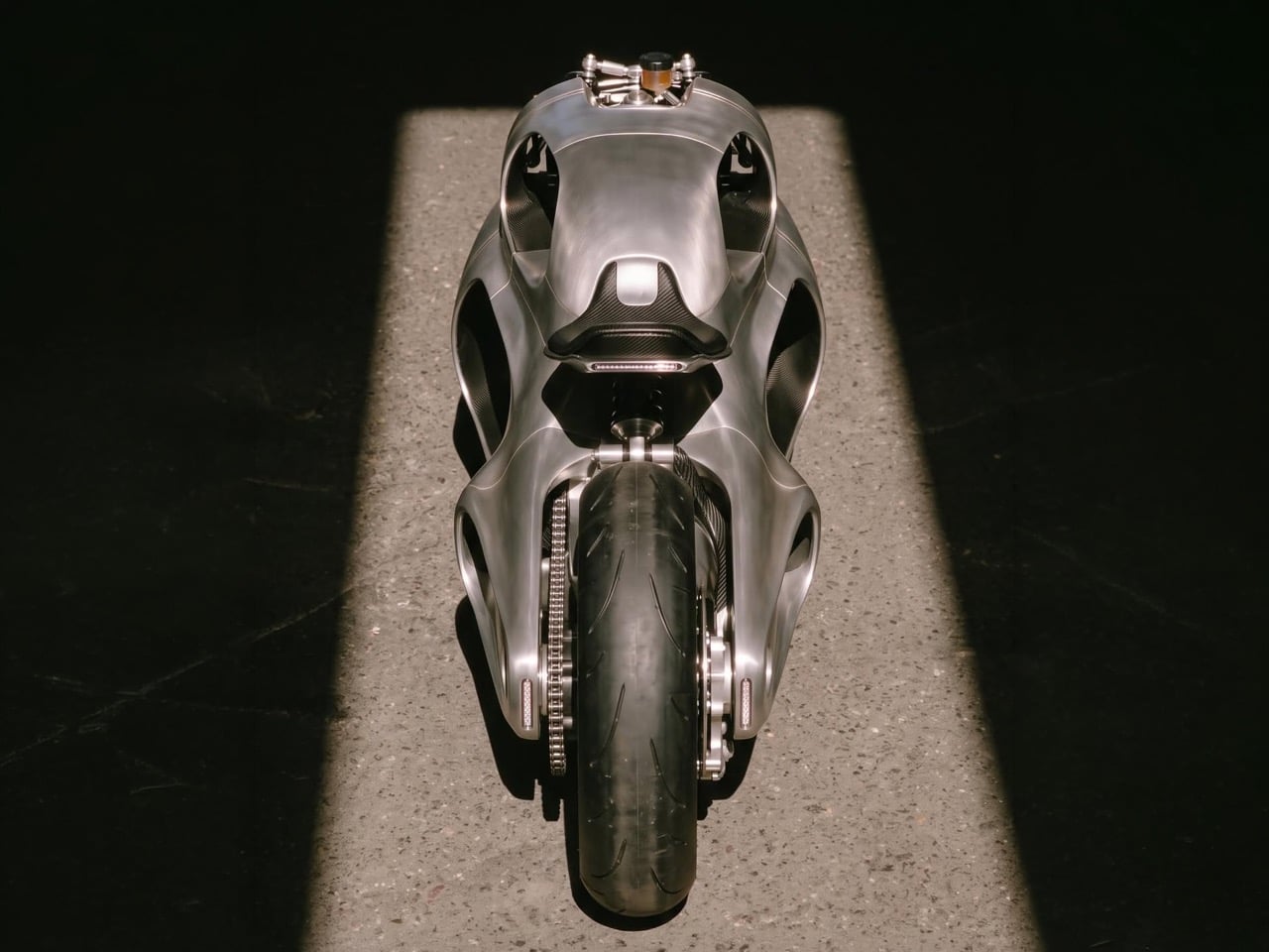

What REV-1 actually nails is the argument that a motorcycle can be one object instead of a pile of bolted-together ones. Böning tried to make that case in 1934 and got a crate for his trouble. Baramsky is making it again in an era with hydrogen fuel cells and render engines good enough to sell the illusion completely, and whether or not this thing ever turns a wheel in real life, the shape has already done its job.
The post This Hydrogen Motorcycle Concept Revives a 90-Year-Old BMW Idea That Never Reached Production first appeared on Yanko Design.
The Diffuser That Refuses to Plug In, Beep, or Buzz

Most home fragrance today falls into one of two camps. There’s the ultrasonic diffuser blinking a soft blue LED on your nightstand, gurgling every few minutes like a tiny humidifier with opinions. Or there’s the reed diffuser, quietly leaking oil onto whatever surface it sits on, looking exactly like the reed diffuser your aunt has had since 2011. Neither one actually solves what people want, which is a room that smells intentional without turning fragrance into one more gadget you have to charge, clean, or explain to guests.

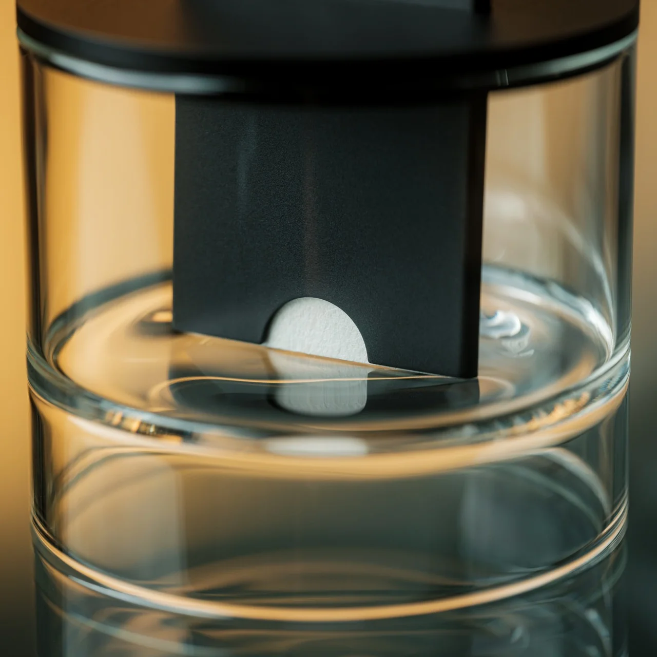
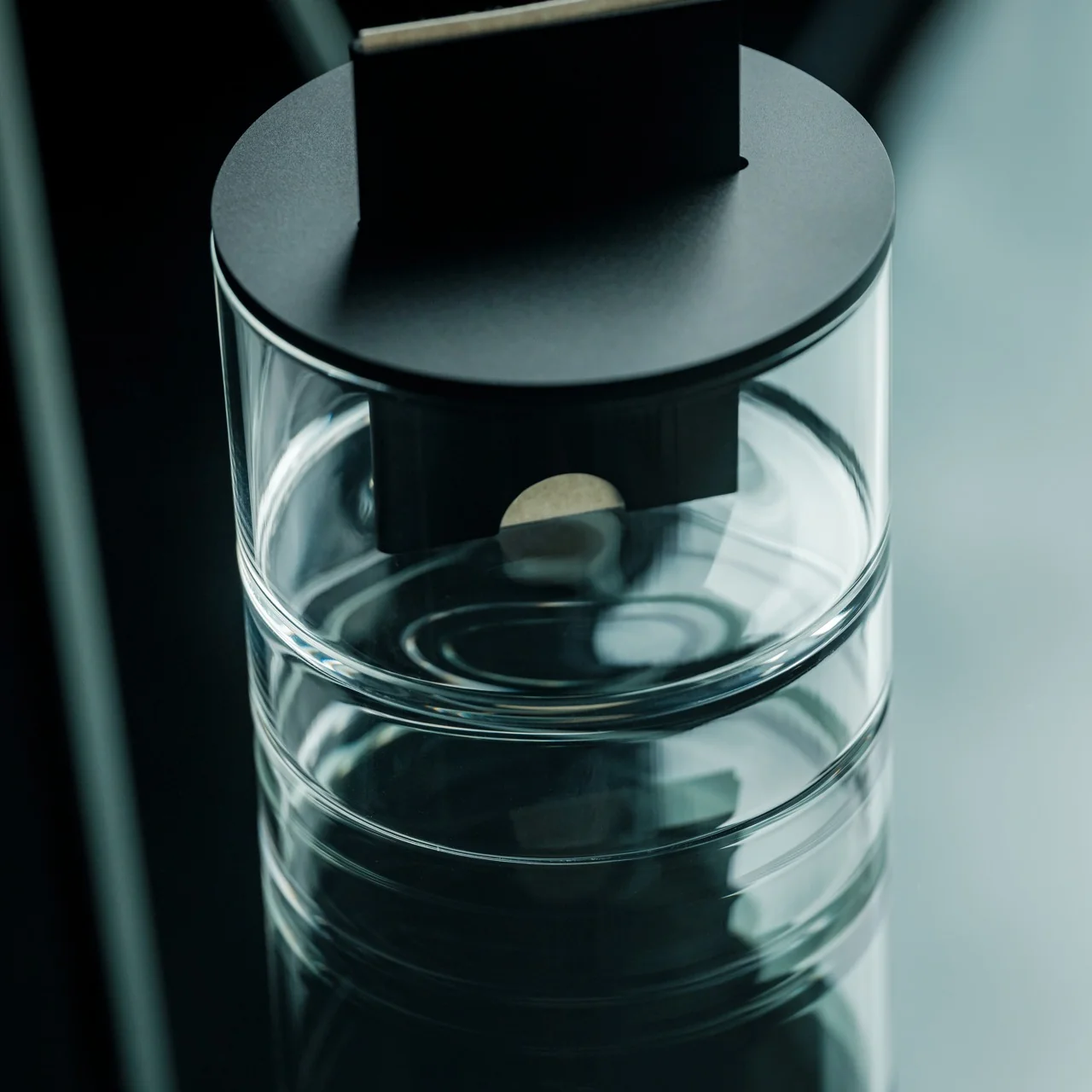
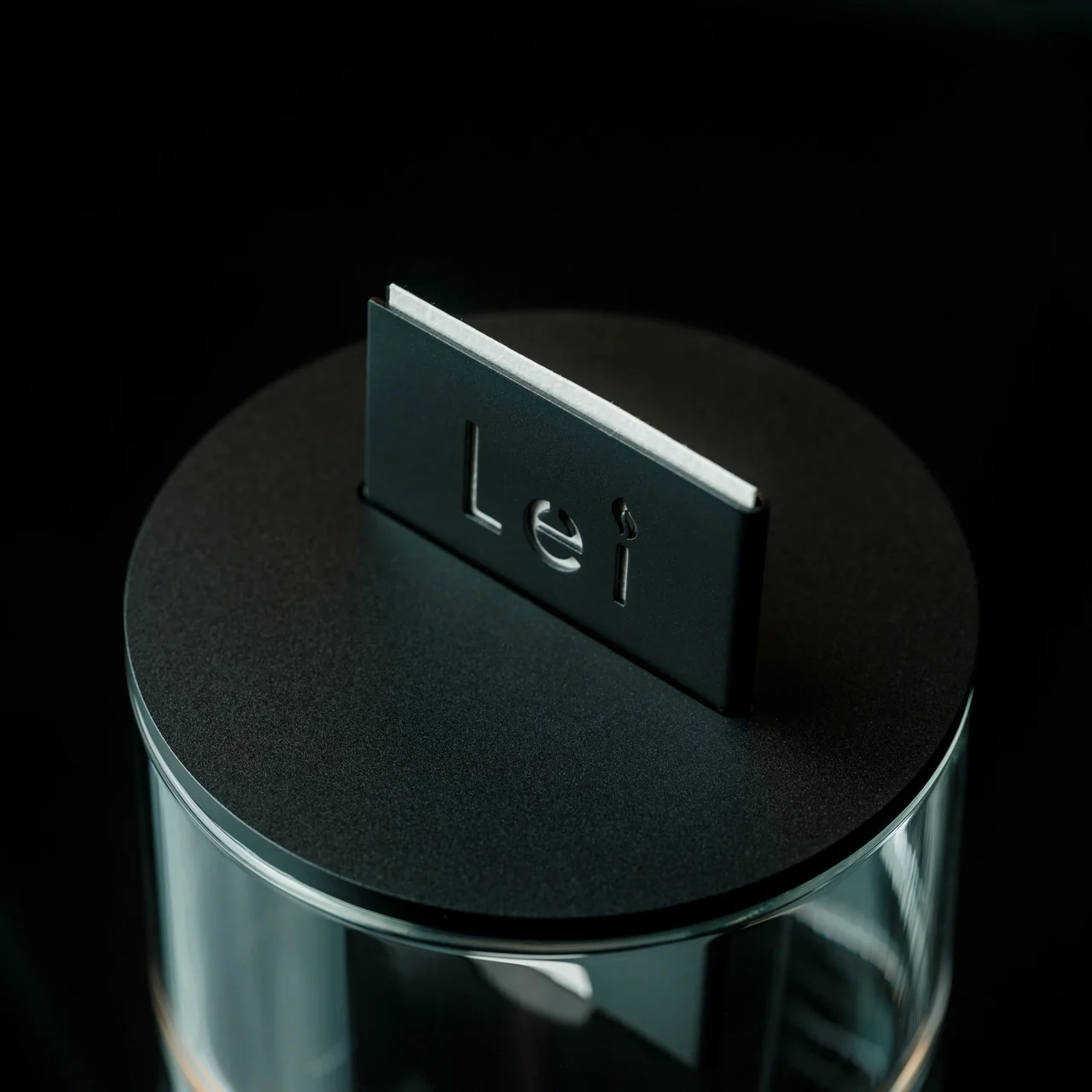
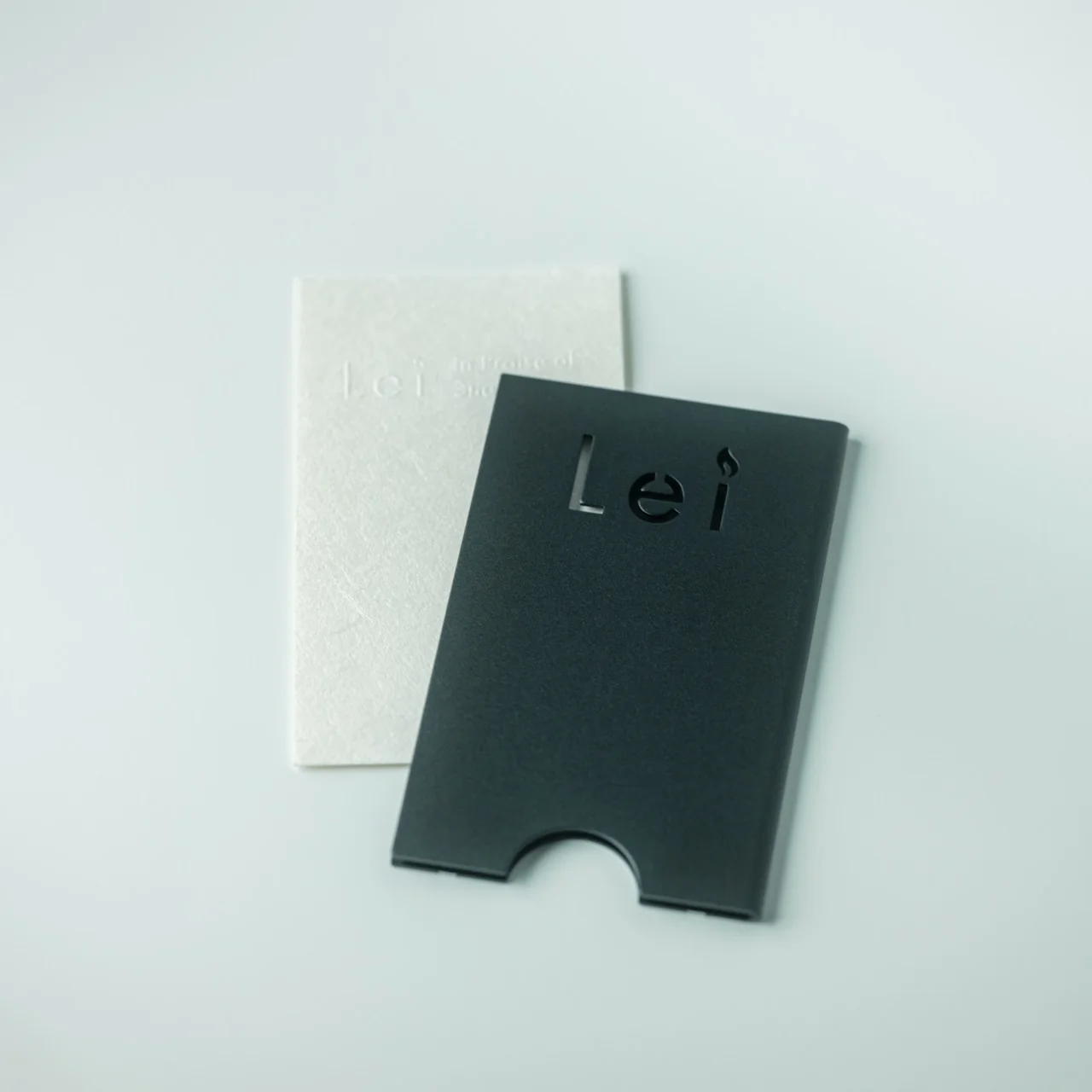
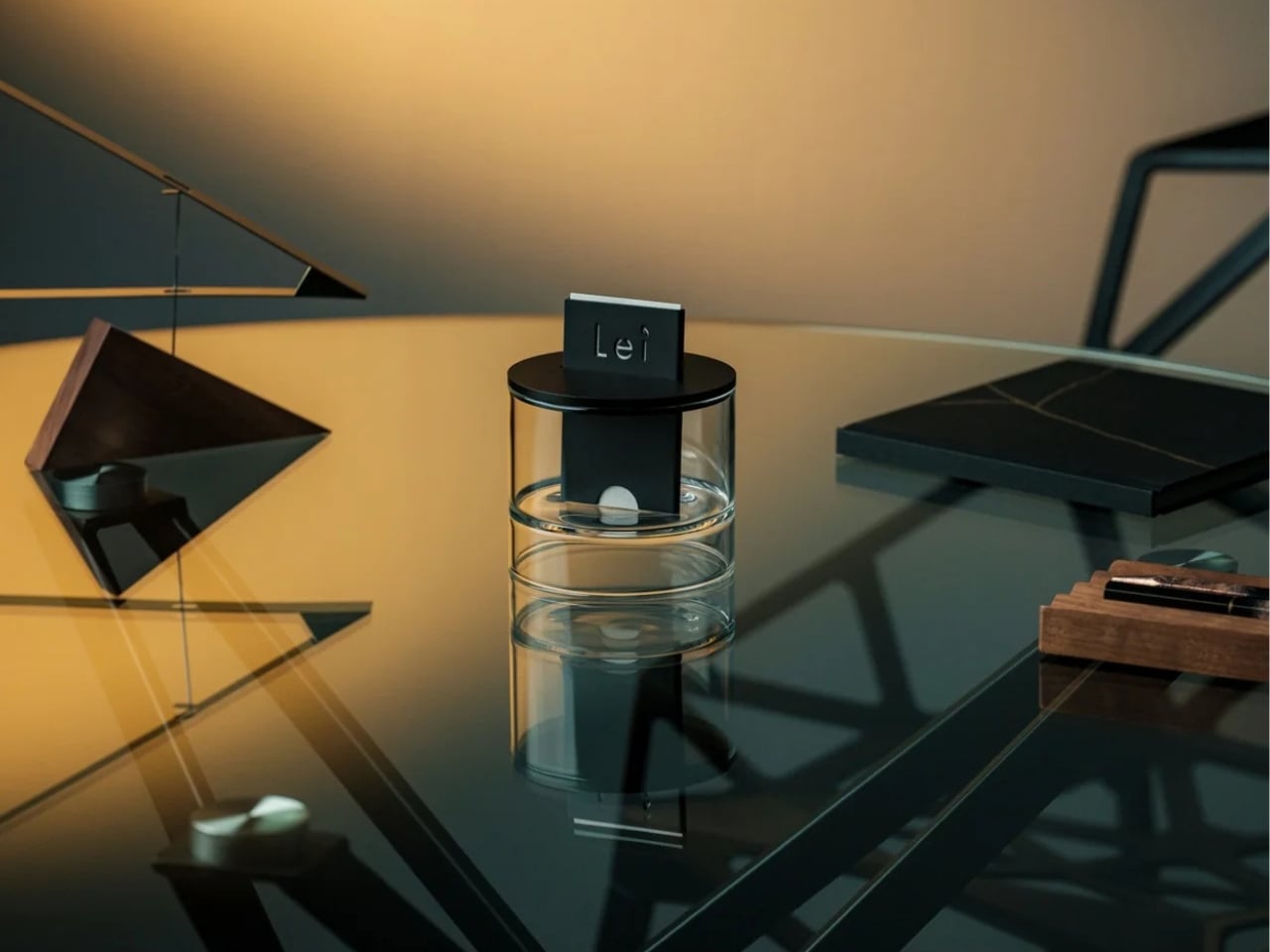
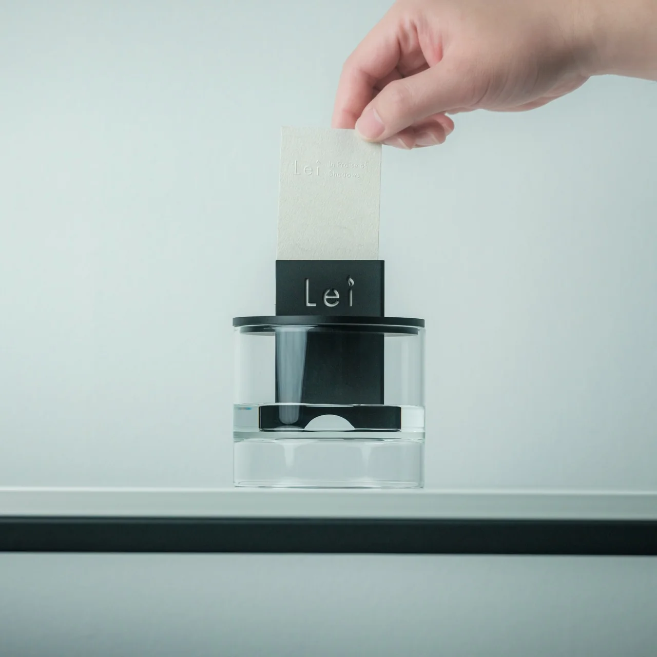
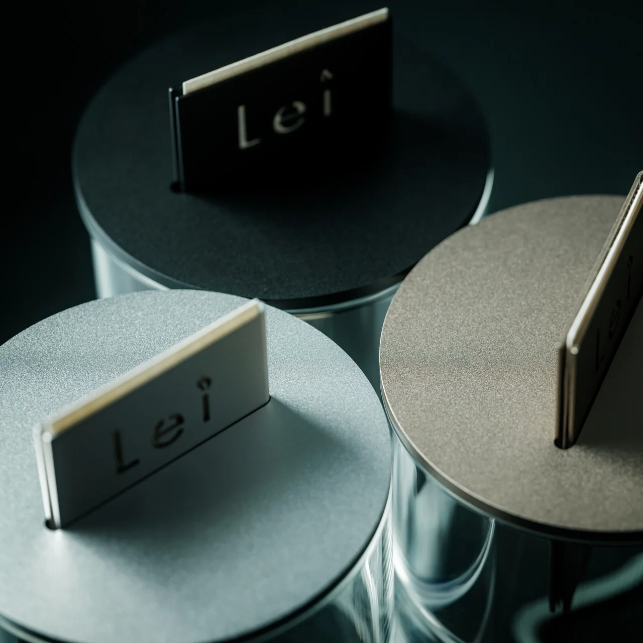
The Ritual Card Diffuser, designed by Yasuyuki Nagato and the studio SOL style, skips both problems by refusing the premise entirely. There’s no battery, no cord, no flame, no mist. You slide a handmade washi paper card into an anodized aluminum body, the same motion as tapping a train ticket or slipping a bookmark into a novel, and that gesture alone starts the diffusion. A patented mechanism pulls alcohol-based fragrance oil upward through the card using nothing but capillary action. No moving parts, no sound, no plug. It just works, quietly, in the background of your day.

Click Here to Buy Now: $125.00

I like objects that make you do something with your hands before they reward you, and this one leans into that fully. The card-sliding motion isn’t decoration bolted onto a function, it’s the function. Most diffusers want to disappear into the wall outlet and be forgotten. This one wants five seconds of your attention, and honestly that’s a better trade than it sounds like on paper.

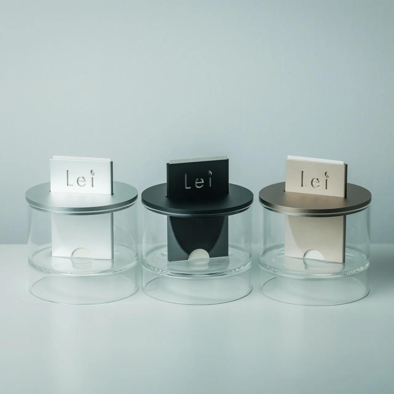
The materials back up the concept instead of just dressing it up. The body is cut aluminum with an anodized finish, which holds up to daily handling without looking scuffed after a month. Underneath sits a dual-layered glass base that makes the whole thing look like it’s floating slightly above the table, which is a nice trick for something that’s actually quite solid and grounded. The washi paper cards are handmade using traditional Japanese methods, and they diffuse scent at a slower, more natural pace than a synthetic wick would. Three cards come with the diffuser, and once one dries out, it’s not exactly trash. You can tuck it into a drawer or a bag and it still carries a faint trace of scent, which is a small detail that made me like this thing more than I expected to.

It’s worth putting this next to something like Pura, the smart plug-in diffuser that’s become a fixture in a lot of American homes over the past few years. Pura is genuinely useful. It’s app-controlled, it schedules scents, it syncs with your routine. But it also asks you to hand fragrance over to your phone, which is one more thing living on your screen and one more subscription-adjacent habit. The Ritual Card Diffuser goes the opposite direction on purpose. There’s no app, no notification, no need to open anything except a fragrance bottle. It’s not trying to be smarter than you. It’s trying to ask less of you, which for some people is the more valuable feature.

At $125, it’s not an impulse buy, and I won’t pretend the price doesn’t put it in a different category than a candle from the drugstore. But you’re paying for a mechanism that’s patented, materials that are meant to last years instead of a single season, and a design object that looks intentional sitting on a shelf, not something you’d hide in a drawer between uses.

None of this means every diffuser needs to work this way, or that convenience tech is somehow the enemy. But there’s a real appetite right now for objects that don’t ask you to download anything to use them, and this Ritual Card Diffuser is a clean example of what that looks like when it’s done with actual craft behind it. It doesn’t try to impress you with what it can do. It just does the one thing it’s built for, slowly, and lets that be enough.

The post The Diffuser That Refuses to Plug In, Beep, or Buzz first appeared on Yanko Design.
Hublot Turned Jeff Koons’ $58 Million Balloon Dog Sculpture Into a 42mm Watch

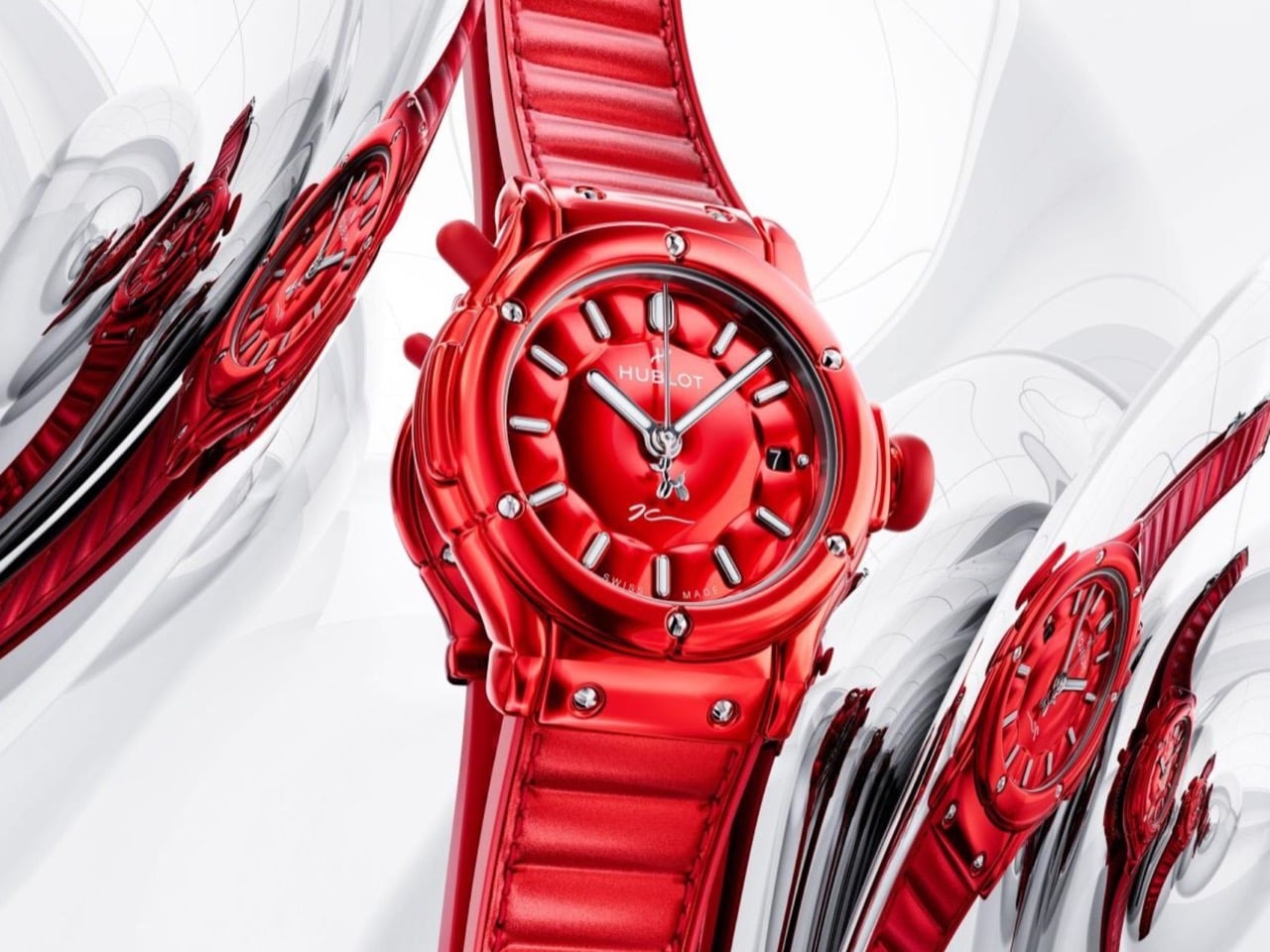
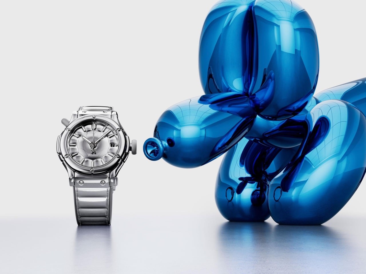
Hublot x Jeff Koons Classic Fusion Balloon Dog Watch in the red colorway

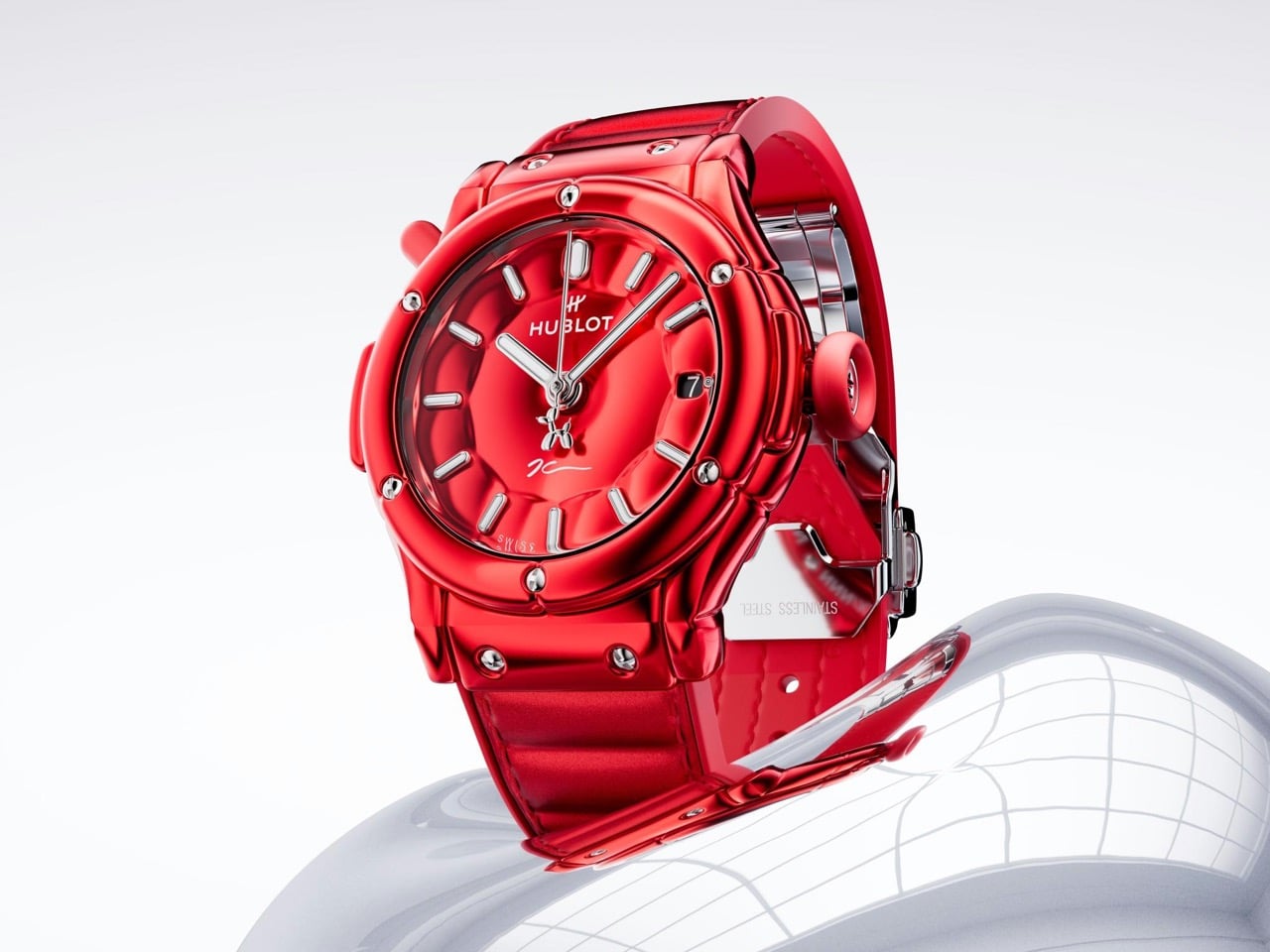
Koons has spent three decades turning party balloons into stainless steel, freezing something floppy and disposable into ten feet of mirror-polished permanence. Hublot has now run that trick backwards. The new Classic Fusion Balloon Dog takes a rigid lump of machined metal and bullies it into looking like it is full of air. Every surface bulges outward. The crystal domes up, the dial swells, and even the titanium screw heads look like somebody left them parked next to a helium tank. I have seen plenty of watches wear art on the dial like a bumper sticker, and this one goes out of its way to avoid that.

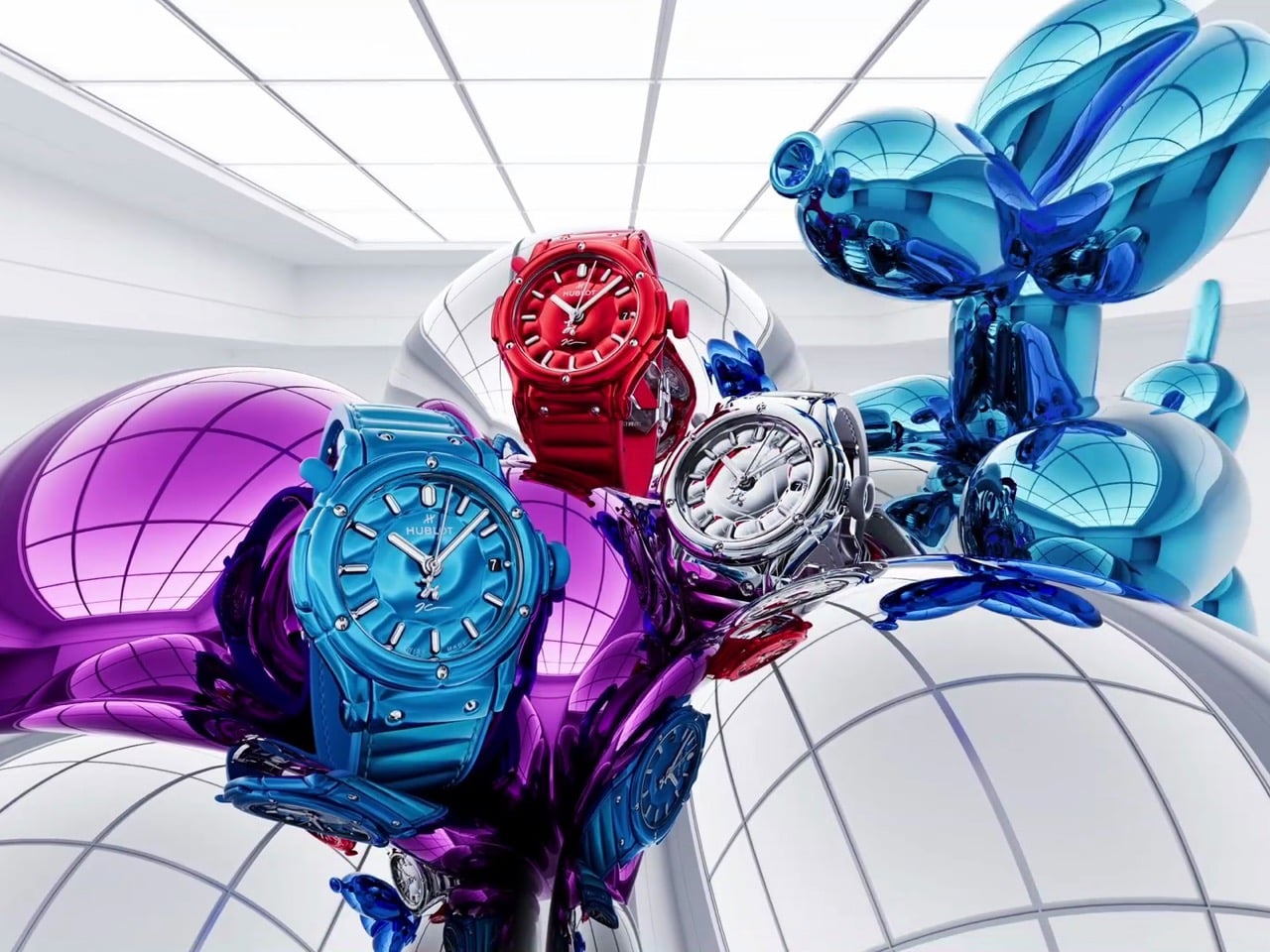
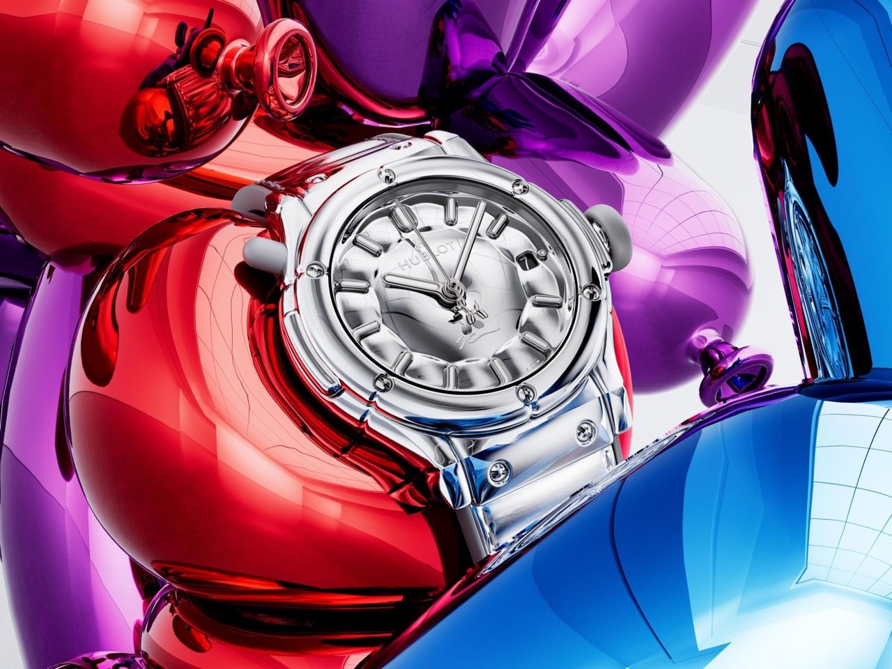
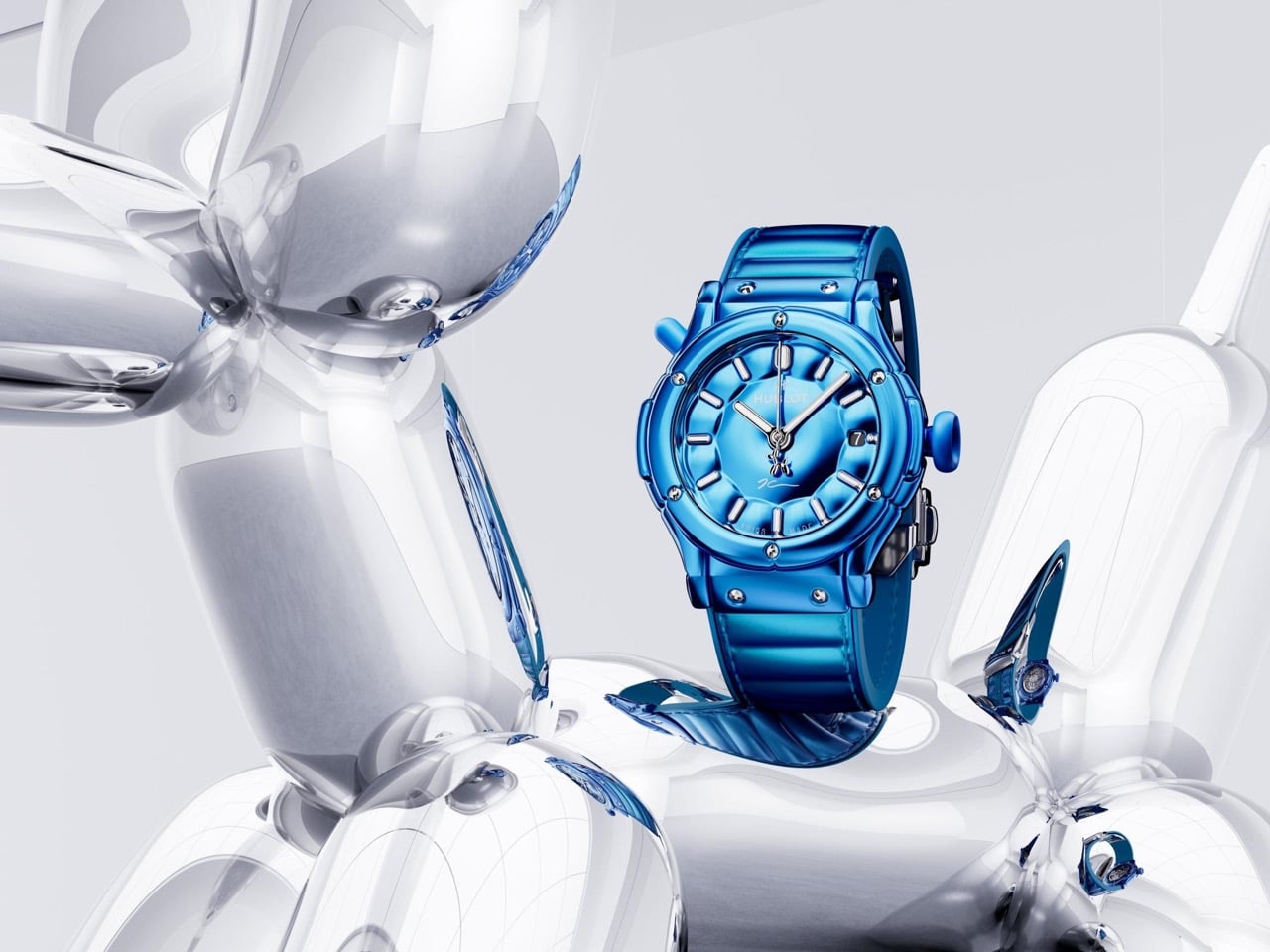
Hublot dropped it on September 16 in New York, alongside a $488,000 sapphire tourbillon called the MP-14 Origin. The Balloon Dog comes in three flavors. Silver is mirror-polished stainless steel, while red and blue use polished anodized aluminum, chosen because anodizing builds saturated color into the metal instead of sitting on top of it like paint. The case runs 42mm wide and 11mm thick, with the HUB1710 automatic inside and roughly 50 hours of power reserve. The crown is shaped like a balloon’s inflation valve, and a floppy rubber dog tail sticks out at 10:30. Each color is capped at 200 pieces and costs $25,100.

Designer: Jeff Koons, in collaboration with Hublot

Rather than printing an image of the sculpture onto a dial and calling it a day, Hublot rebuilt the Classic Fusion’s entire architecture around the idea of internal pressure. The normally flat, angular case profile has been reshaped into convex lines and soft domed surfaces throughout. The sapphire crystal sits raised and rounded. The bezel puffs outward. Even the H-shaped screws that anchor the case get inflated, domed heads, which is a ridiculous amount of engineering effort for a component nobody examines closely. It is the same instinct we saw when a design team built an entire chair around Koons’ inflated visual language, chasing the illusion of softness in a material that has no business looking soft at all.

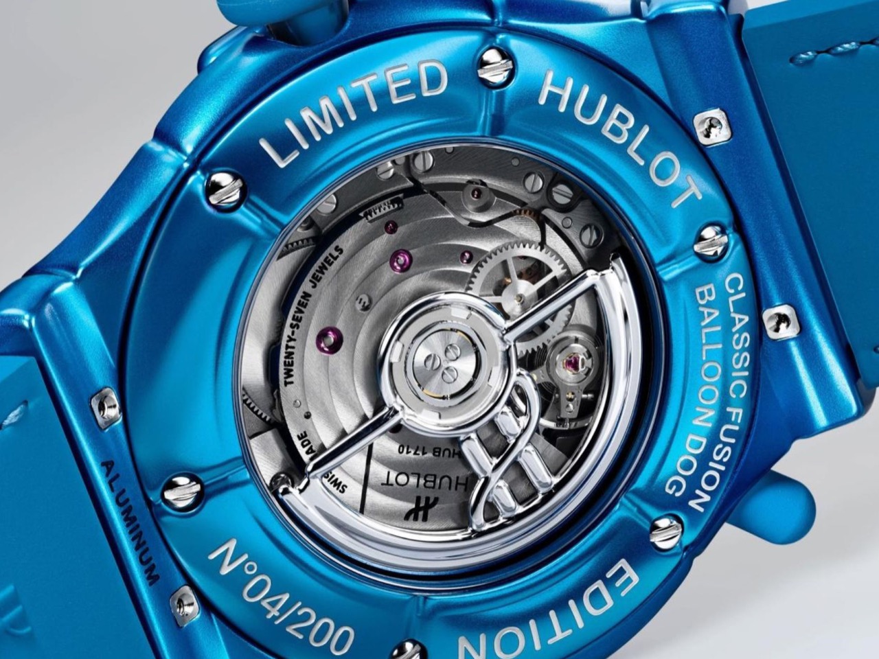
Koons’ actual sculptures get their color from transparent coatings baked onto mirror-polished stainless steel, and Hublot chased that same saturation by anodizing the red and blue cases instead of painting them. Anodizing builds color into the metal’s oxide layer rather than resting on top of it, which is why these two colorways read closer to candy than lacquer. Silver skips the tint and goes straight for mirror polish, putting it in the most literal conversation with the source sculpture. Even the tungsten rotor swinging behind the caseback picks up the same rounded, voluminous shape as the rest of the watch, a detail almost nobody will ever see in person. It is the kind of commitment Hublot has shown before, whether that meant wrapping Daniel Arsham’s MP-17 in fluid, water-formed titanium or handing Samuel Ross a canvas of micro-blasted titanium for the Big Bang Tourbillon SR_A.

Hublot x Jeff Koons Classic Fusion Balloon Dog Watch in the silver colorway

Hublot x Jeff Koons Classic Fusion Balloon Dog Watch in the blue colorway

The dog riding the seconds hand does not actually move, a detail Hublot’s own product page has to clarify because the launch film animates it, so temper your expectations of kinetic sculpture on your wrist. Koons has licensed this exact balloon vocabulary everywhere from a BMW 8 Series hood to a pair of Lexon lamps and speakers built with The Broad museum, and a wristwatch is arguably the hardest surface in that lineup to pull off, since the whole point of a watch is daily contact rather than gallery distance. Hublot cleared that bar by treating this as an engineering brief instead of a printing job.

Hublot x Jeff Koons Classic Fusion Balloon Dog Watch in the red colorway

At $25,100 for 200 pieces per colorway, you are paying gallery-adjacent money for a watch running an entry-tier automatic movement, and that math will sit fine with some collectors and badly with others. What nobody can argue is that Hublot made the sculpture’s whole DNA visible in every component instead of stopping at the dial.

Rear View of the Hublot x Jeff Koons Classic Fusion Balloon Dog Watch’s Exhibition Window

The post Hublot Turned Jeff Koons’ $58 Million Balloon Dog Sculpture Into a 42mm Watch first appeared on Yanko Design.
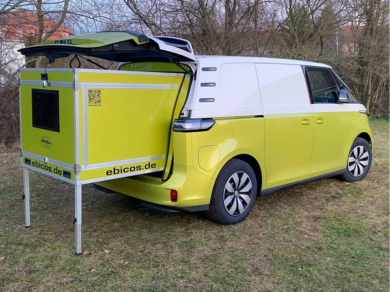
Ebicos Happy Dreamer collapsible pod turns your van into a camper without modifications

It’s not necessary to go about converting the entire innards of a van to achieve camping convenience. You can just clean out the cabin to make space for an electric camper pod, and it will do the rest. Instantly transforming your ride into a fully-fledged camping rig, you can pull out from the back at a campsite and live freely.

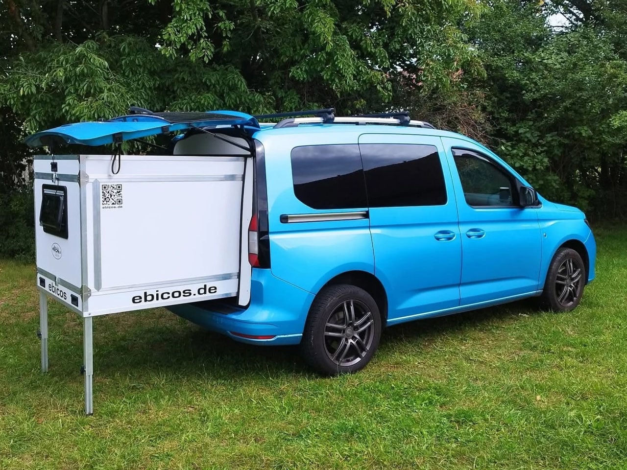
The concept of camper pods got a new dimension and meaning at the recently concluded Düsseldorf Caravan Salon. First, we were floored by the versatility and convenience of the Cubivan Camping System, and now our minds are blown away by the simplicity and portable design of the new Ebicos Happy Dreamer. The latter is not as elaborate (with a pop-up roof et al) like the Cubivan’s system, yet is a small and useful addition to tailgate camping in a van.

Designer: Ebicos

As its marketing jingle on the website reads, the Happy Deamer is a tiny, collapsible camper pod that “transforms your everyday vehicle into an adventure vehicle in minutes. No tools required. No modifications needed,” the company notes. Each of these modules, which deploys and retracts with a single push of a button, is manufactured in the company’s workshop in Saxony, Germany, and comes with the features of a full conversion, “but without the full conversion.”

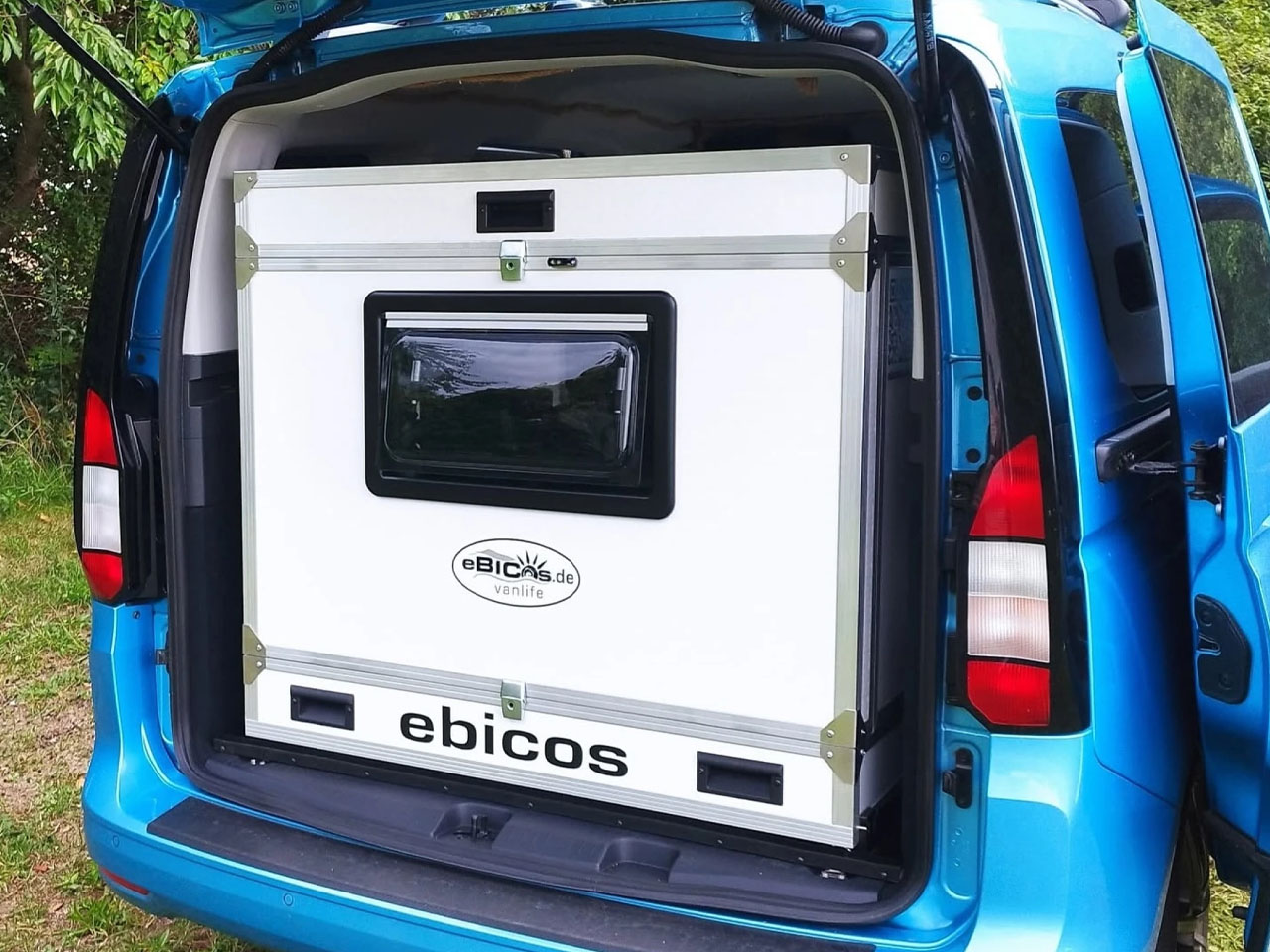
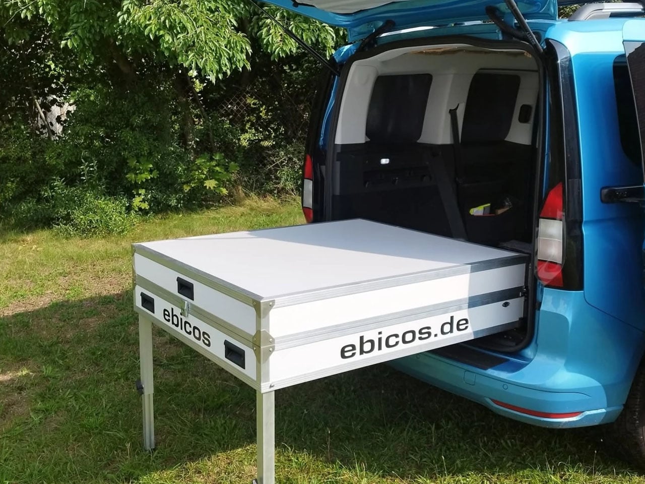
When not onboard your van, the Happy Dreamer – made using polypropylene honeycomb panels and aluminum honeycomb flooring – can collapse down to measure 47- x 51- x 11 inches, so a couple of people can easily carry it off (for storage) and onto the van back for camping. It weighs almost 60 kg and could be purchased with a wheeled trolley, making it just ideal for a solo van camper.

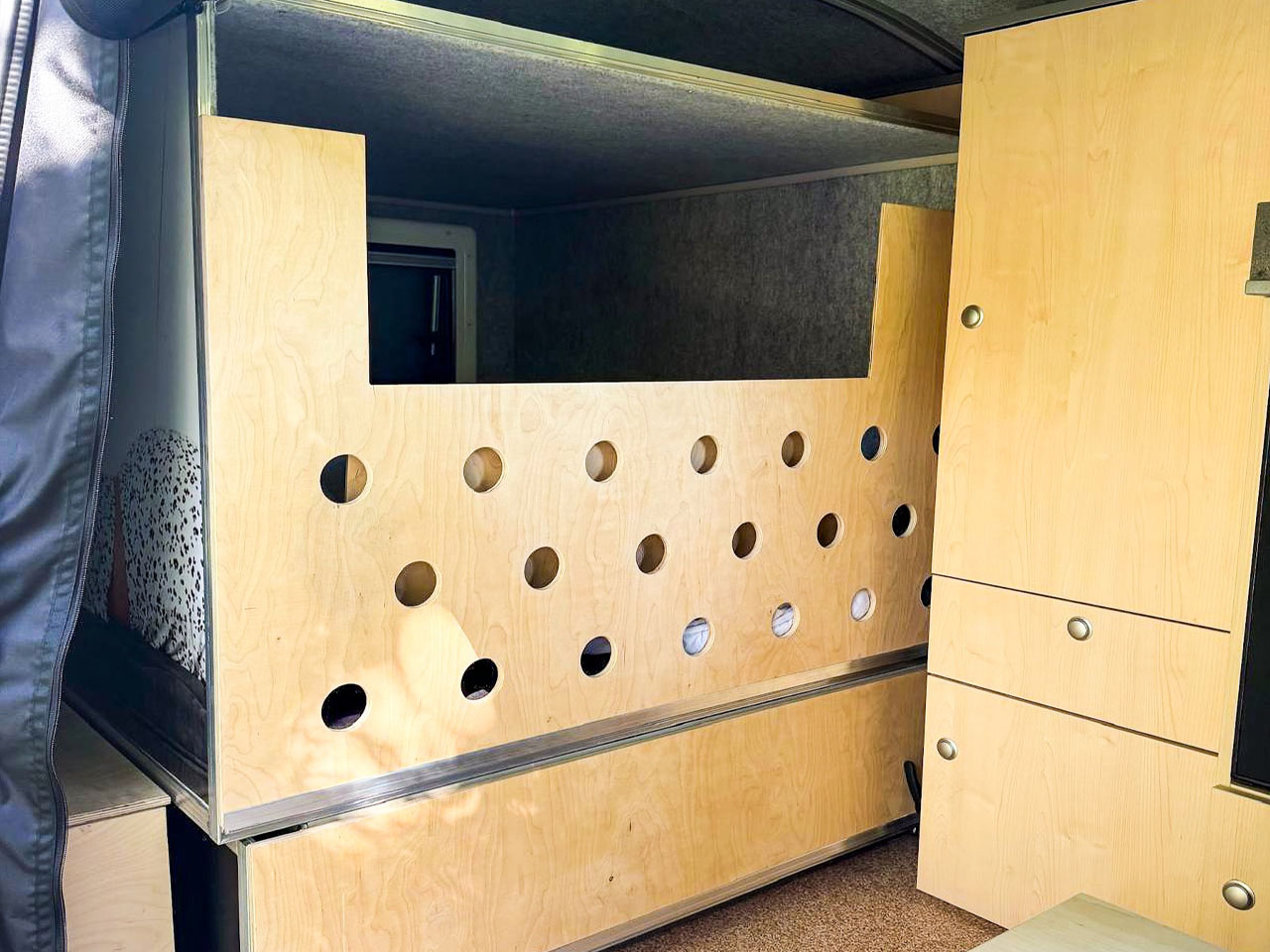
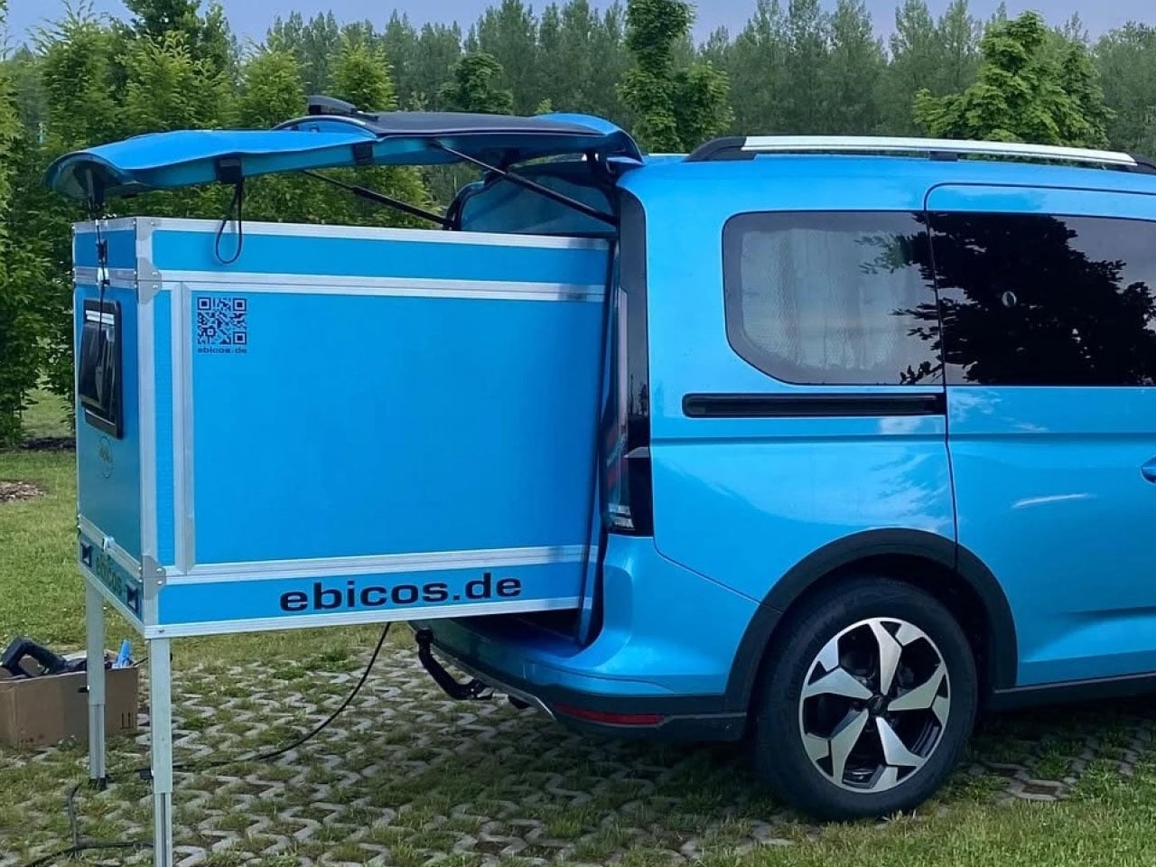
When you want to install the camper pod, you can install it using the three walls and roof secured through rails and latches. The cube shaped pod, then can slide on the rails in and out of the van tailgate. When pulled out at camp, the pod rests stably on its drop-down legs (hitting the ground) and provides campers with king-size bed space to sleep from inside the van out to the pod. For further security and living convenience, the tailgate can be secured to the Happy Dreamer’s roof by a cord, while the space between the pod and the van interior is filled with fabric insulation to seal out weather and insects.

The Happy Dreamer is designed to be a versatile pod, ensuring compatibility with a range of midsize and small cargo and passenger vans. Even though the pod itself comes raw and only provides a place to sleep. The company says it will offer add-ons for a functional slide-out kitchen. The pod will start at €6,250 (approximately $8,500).

The post Ebicos Happy Dreamer collapsible pod turns your van into a camper without modifications first appeared on Yanko Design.
UGREEN’s iPhone 18 Pro Case Packs An Extra Screen For That ‘iPhone Duo Effect’

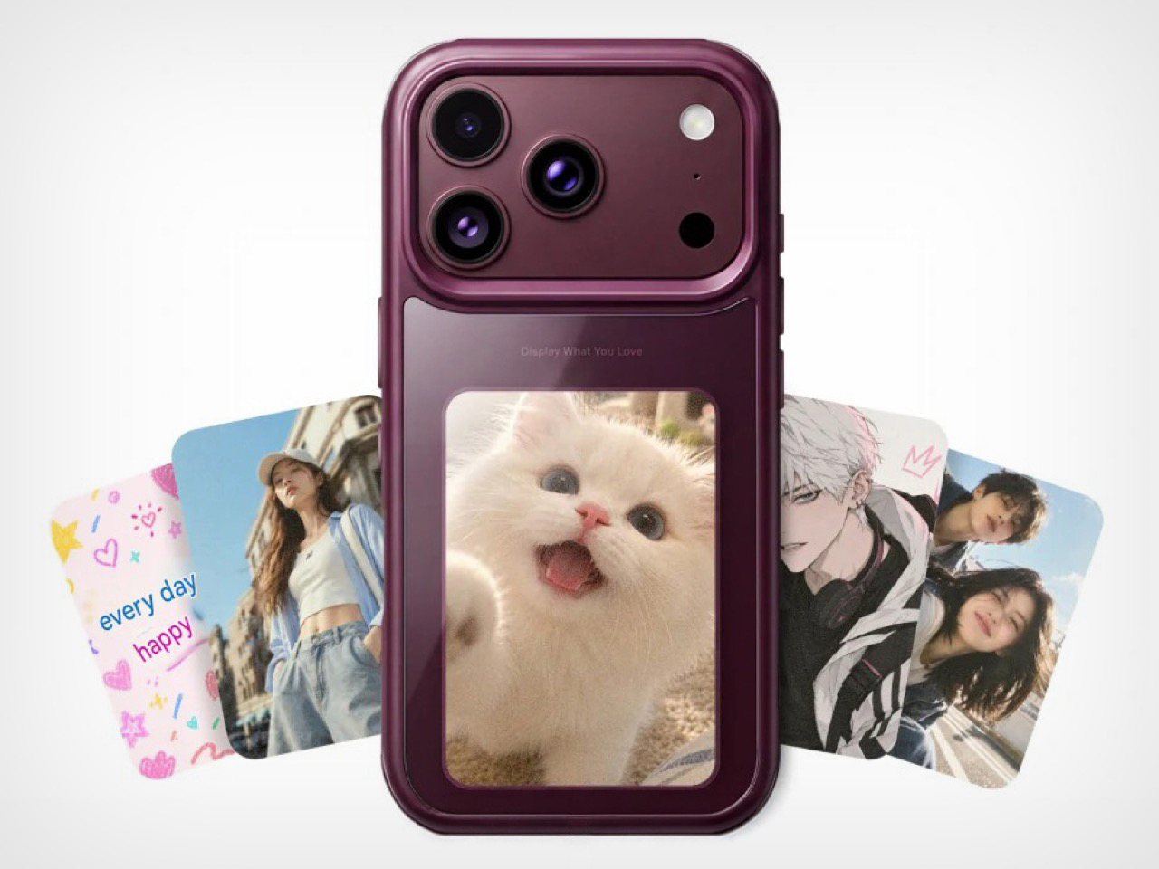
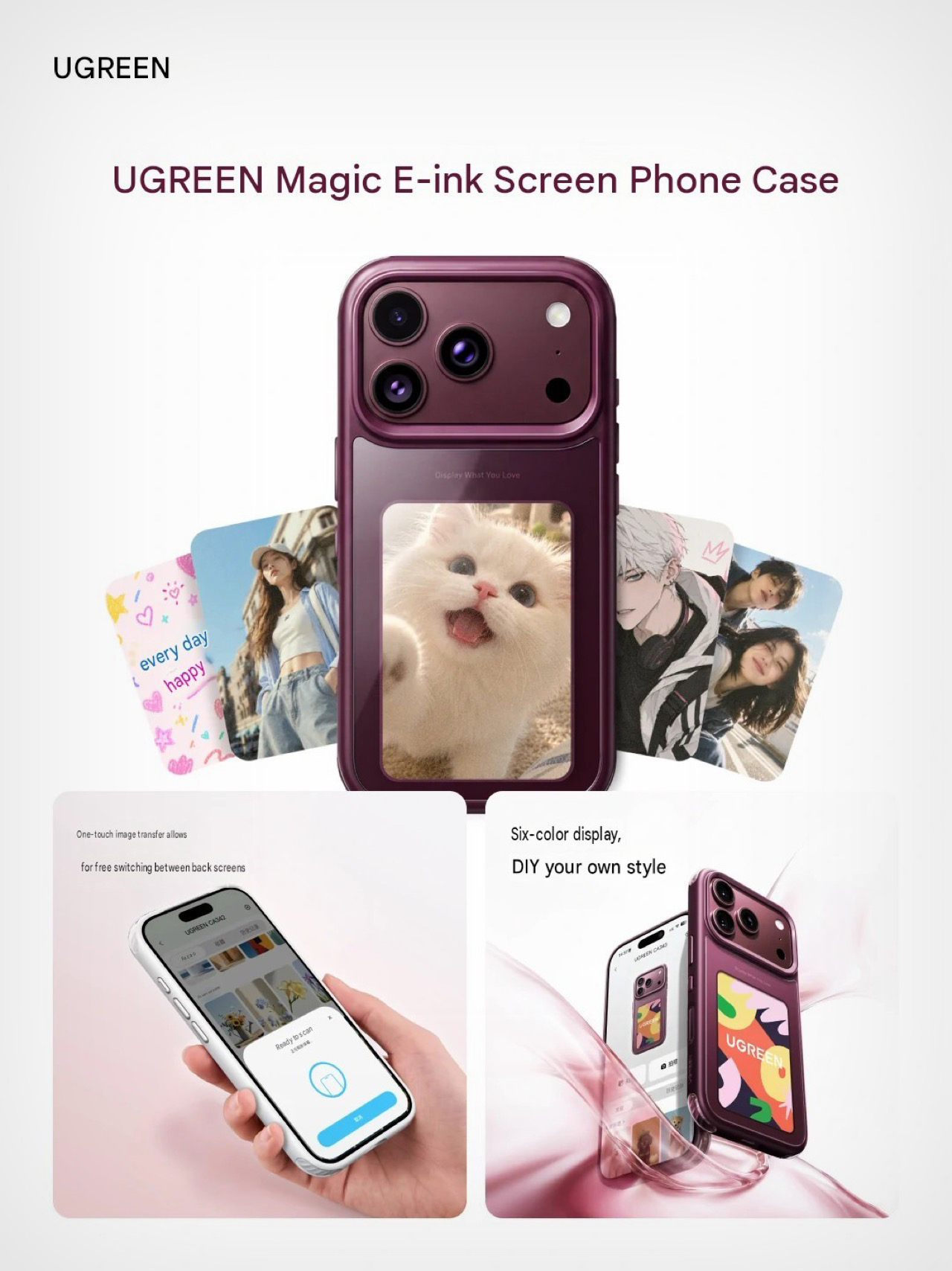
Don’t worry, you don’t need to spend $1999 to gift yourself an iPhone with an extra screen. UGREEN debuted what they call the “Magic E-ink Screen Case” for the iPhone 18 Pro series – a protective case that gives your 18 Pro an extra display… kind of like the Duo, but without the bleeding price tag. The case, shown in a complementary burgundy colorway, packs a 6-color E-ink display on the back, making it perfect for photos, wallpapers, notes, QR codes, or any sort of personalization you’d want. No, sadly it won’t pull off that cool frosted glass animation that made the Duo so drool-worthy!

Fresh off a successful run at IFA (with the company debuting their world’s first liquid-cooled MagSafe power bank), UGREEN decided resting was for the week. Just days after Apple’s iPhone announcement, the company took to Weibo, sharing a look at three products to complement Apple’s latest Pro-series device. The first, a 45W charging brick, second, a screen protector, and thirdly, a protective case that makes the back of your phone about as interesting as the front.

Designer: UGREEN

The case’s primary role is to serve as protection for your $1199 phone. It covers the sides with a thick bumper, packed with air-cushion corners for extra drop protection. The camera plateau gets a raised lip to shield your lenses (especially that variable aperture shooter), but the screen on the back steals the cake. UGREEN hasn’t specified its dimensions, but we do know that it’s a 6-color E-ink display that can be controlled via an app on the phone, letting you send images, wallpapers, and notes to the display with a simple button push. Once there, the e-ink screen renders the image out, keeping it there forever without any power consumption.

We don’t know whether this still lets you use wireless charging on your iPhone, my guess is that you’ll have to make that compromise, along with never being able to ever put any MagSafe accessory on the back. The benefit, however, is having a hyper-personalized smartphone case so you don’t ever confuse your device with someone else’s ever again. For the right audience, that’s a very doable trade-off.

While details remain scarce, there are two worth noting. Notebookcheck mentions that the e-ink screen won’t function as a viewfinder for the rear camera – a feature that would almost instantly turn this case into a very acceptable iPhone Duo replacement for a large group of people. It’s just photos for now, which makes sense because adding extra features would mean adding a bigger battery and more powerful processor. At that rate you might as well just pack an OLED in there along with a thick battery panel.

The second caveat is that UGREEN’s marketing the Magic E-ink Screen Case exclusively in China, with no word on a global launch. That’s probably why we didn’t see this at IFA 2026 either. I’m sure it would’ve been all the rage on the show floor!

The post UGREEN’s iPhone 18 Pro Case Packs An Extra Screen For That ‘iPhone Duo Effect’ first appeared on Yanko Design.

Pikachu Just Got Hidden Inside Your Coffee Mug, and Pokémon Fans Are Going to Lose It

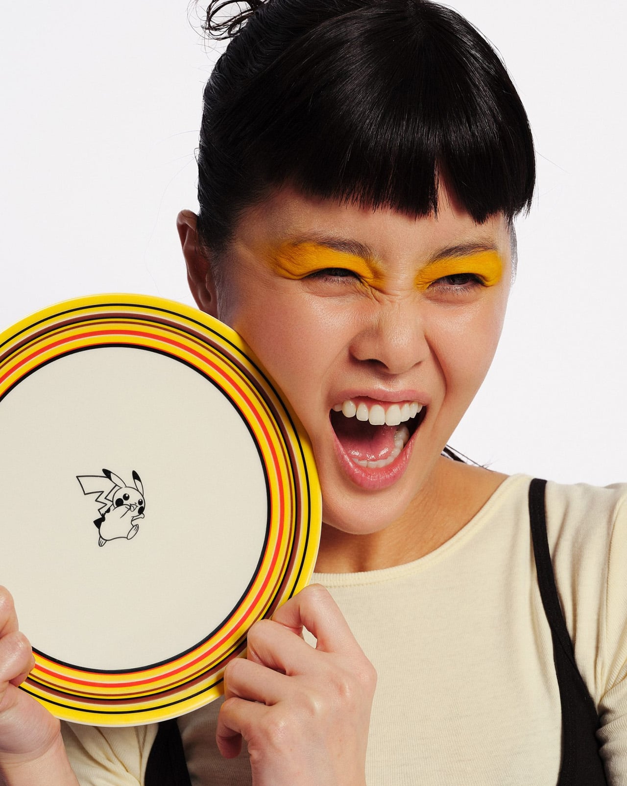
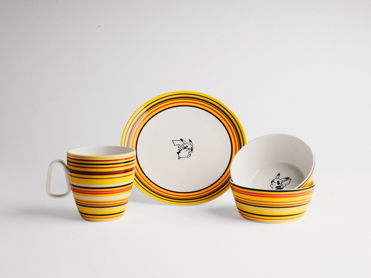
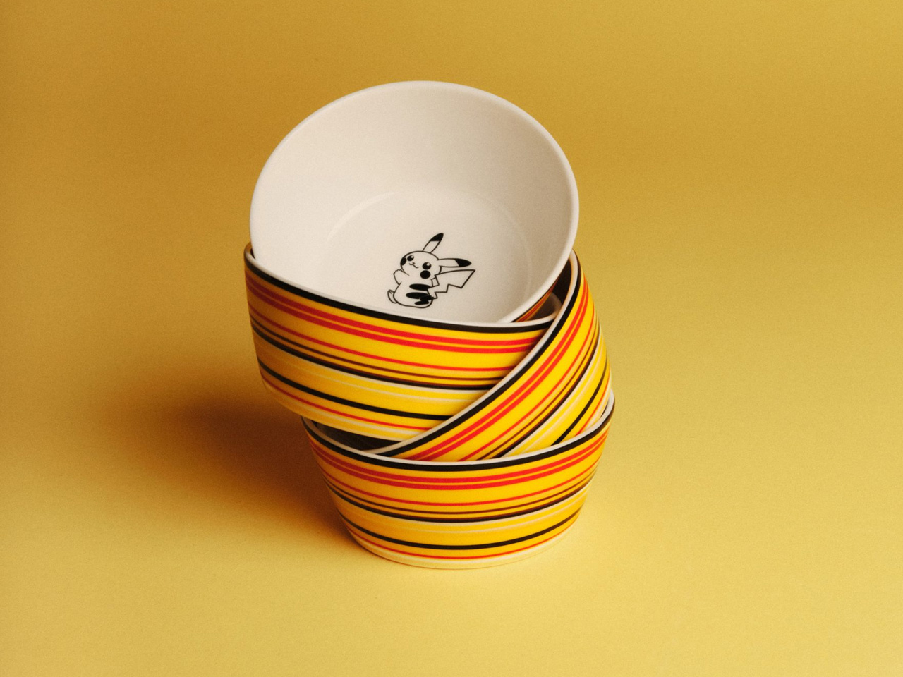
Pikachu has appeared on a lot of things over the past 30 years — Alfredo Häberli’s Origo tableware wasn’t exactly the obvious next stop. Finnish design brand Iittala has reimagined its beloved Origo tableware collection in collaboration with Pokémon, marking 30 years of the Japanese media giant with a trio of pieces that feel both nostalgic and entirely fresh. A mug, a plate, and a bowl — each one a small study in restraint meeting playfulness.

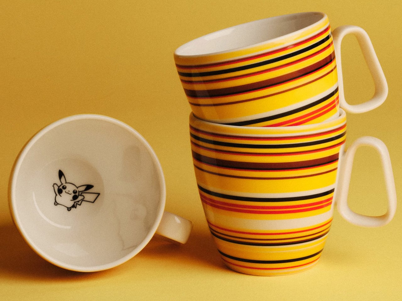
Origo is no stranger to cult status. Originally designed by Alfredo Häberli in 1999, the striped tableware has long been a fixture in Finnish homes, celebrated for its simple geometry and quiet charm. For this collaboration, Häberli returned to his own work, subtly shifting the collection’s signature stripes into a warm palette of yellow, red, and brown — tones drawn directly from Pikachu, Pokémon’s most recognisable character. The result doesn’t shout. It earns its second glance.

Designer: Iittala & Pokémon

That restraint extends to how Pikachu appears across the pieces. Black and white illustrations are tucked onto the insides of the mug, plate, and bowl, as well as their bases — small discoveries rather than declarations. “Pikachu is almost ‘adventuring’ across the collection, adding a layer of surprise and charm,” said Janni Vepsäläinen, Iittala’s creative director, who joined the brand in 2023 after a tenure at JW Anderson.
Vepsäläinen was candid about the unexpected nature of the pairing. “At first glance, Iittala and Pokémon might seem like an unlikely match, two worlds that don’t obviously touch,” she said. “But that quiet friction is exactly what drew us in.” It’s the kind of creative logic that tends to produce the most interesting work — not two brands that naturally overlap, but two identities whose contrast makes the collaboration worth paying attention to.
The emotional hook is the 1990s. Both Origo and Pokémon were born in that decade, and the collaboration leans into that shared origin with intention. “Design culture from that era continues to feel relevant today — timeless products that still spark joy,” Vepsäläinen noted. It’s a sentiment that holds. There’s a reason Origo never left Finnish kitchen tables, and a reason Pikachu never needed a rebrand.

What Iittala has done here is resist the temptation to over-design the moment. The Pikachu Origo collection doesn’t try to be a statement. It simply invites a little joy into the everyday — a flash of yellow on the breakfast table, a small illustration at the bottom of your coffee cup. As Vepsäläinen put it, “Pikachu brings happiness across generations.” On the evidence of these pieces, it’s hard to argue otherwise.

The post Pikachu Just Got Hidden Inside Your Coffee Mug, and Pokémon Fans Are Going to Lose It first appeared on Yanko Design.