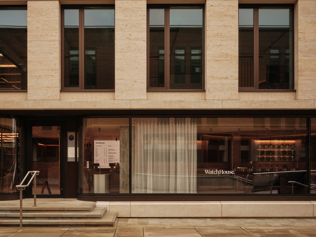
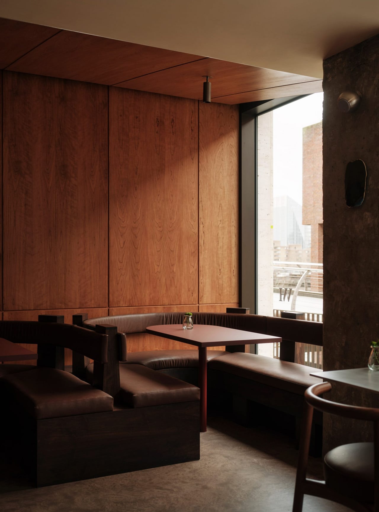
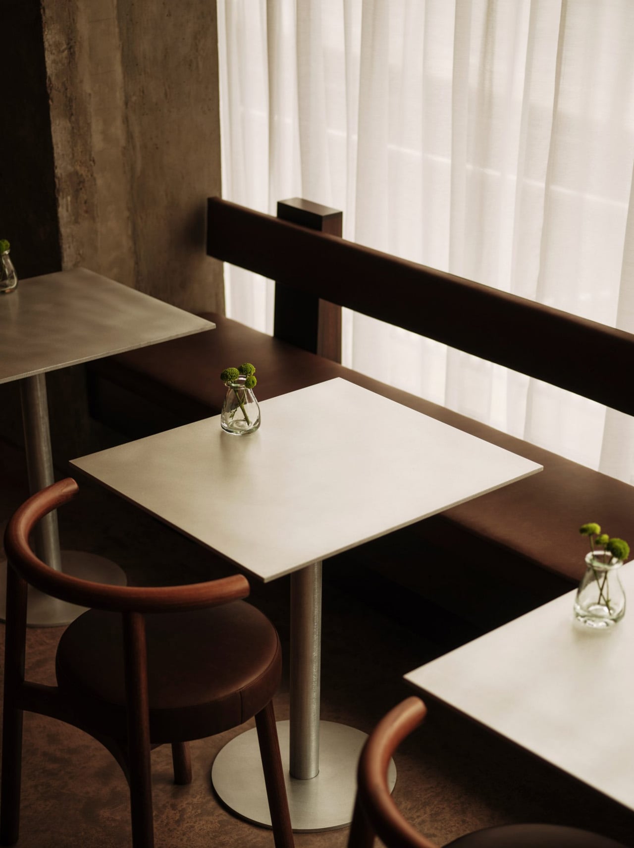
The stretch of the Thames running between Tate Modern and St Paul’s is one of those London views that never quite loses its effect — and London studio Cake Architecture made that exact backdrop the entire design brief for WatchHouse’s newest café, a 60-seat riverside space that absorbs some of the city’s most iconic architecture and folds it into something intimate and grounded.
The project sits directly beside the Thames, though it never leans on the view as a crutch. The design operates at a more atmospheric level, rooted in the tension between the monumental permanence of London’s skyline and the restless, shifting energy of the river running past it. It’s a conceptual starting point that could easily stay theoretical. Here, it doesn’t.
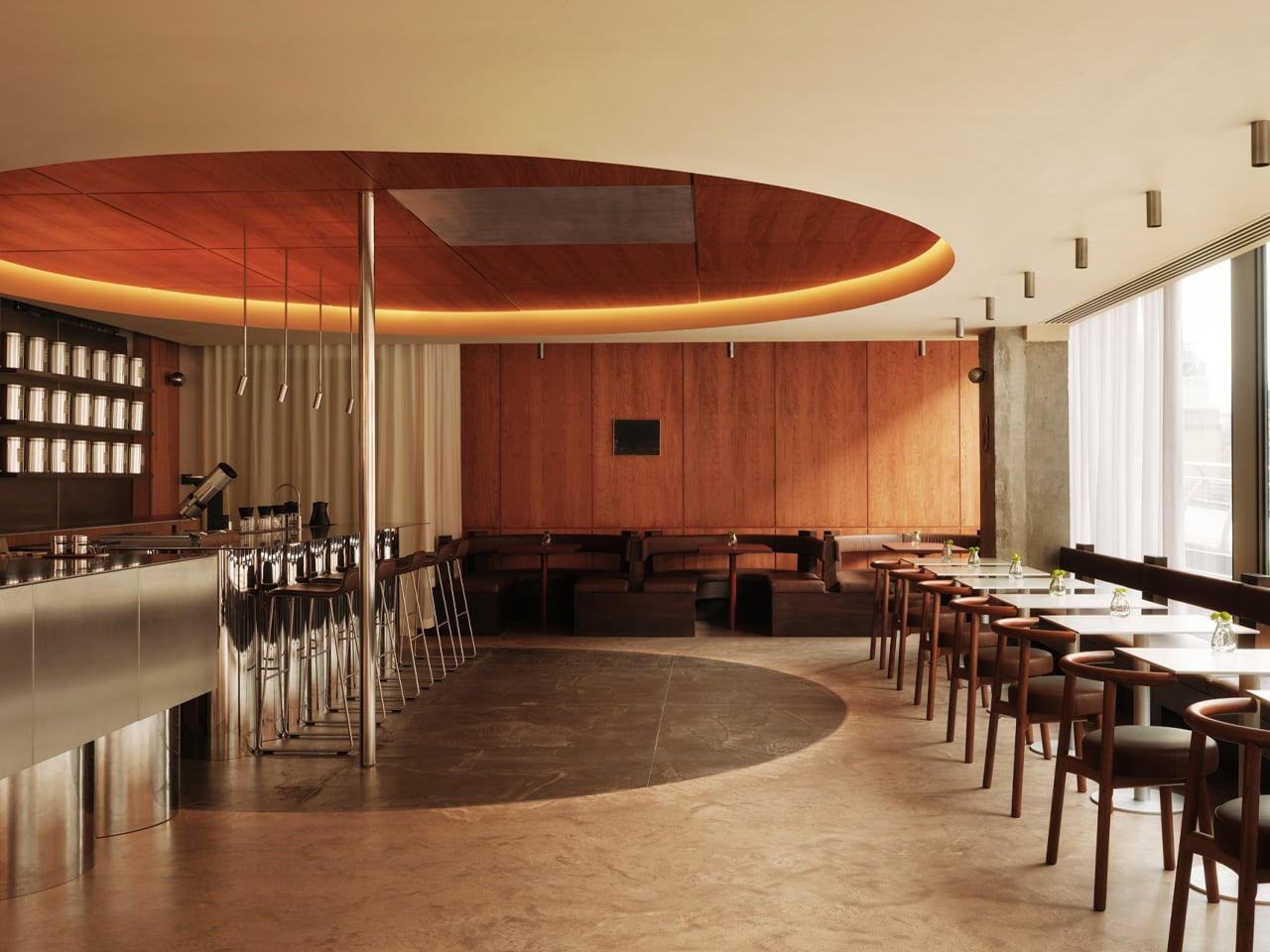
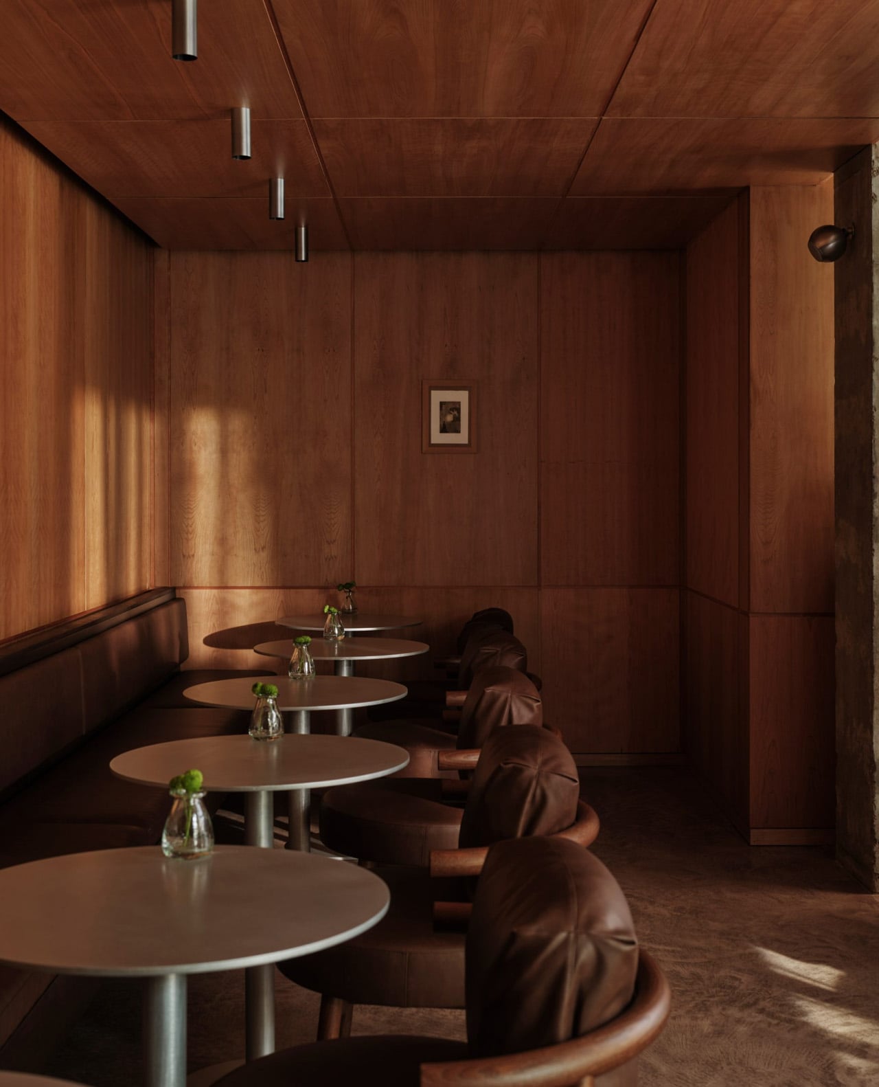
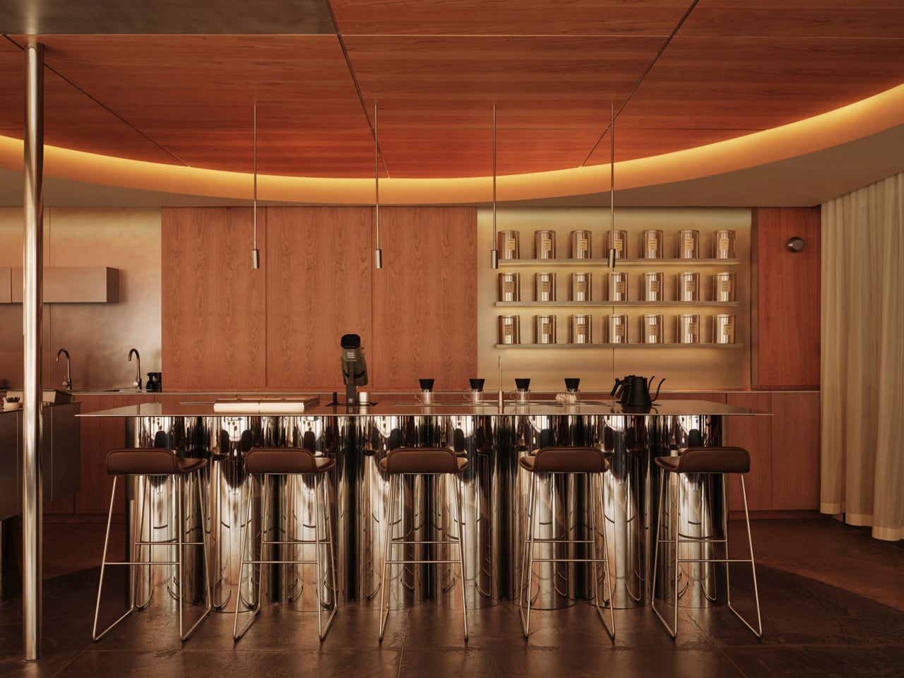
That thinking earns its keep through specific, well-resolved gestures. The most arresting is a dramatic circular void carved into the ceiling, a spatial echo of St Paul’s dome, translated from the sacred to the everyday. Below it, a monolithic espresso counter holds the room together, its weight and material language borrowed from Tate Modern’s industrial character and the infrastructural logic of the riverbanks themselves. Neither move is decorative. Both shift the room into territory that most café designs never reach.
The palette is handled with the same restraint. Colour is drawn from the immediate surroundings: the tonal range of the river at different hours, the bleached stone of the embankment walls, the open and often overcast London sky. Back-painted finishes introduce a soft iridescence to the surfaces, so the room doesn’t read as a fixed thing. It responds to the time of day, softening in morning light and warming as the afternoon settles in.
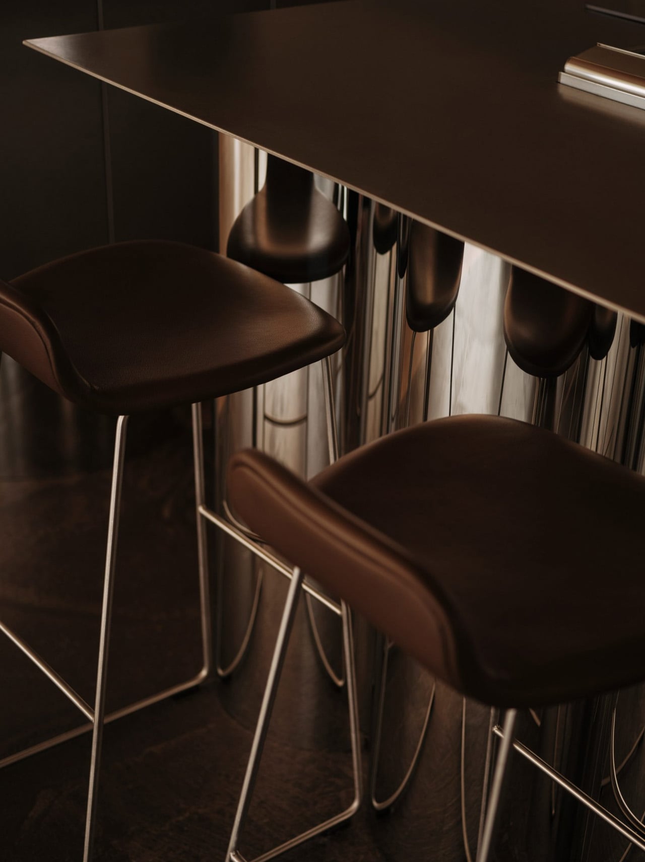
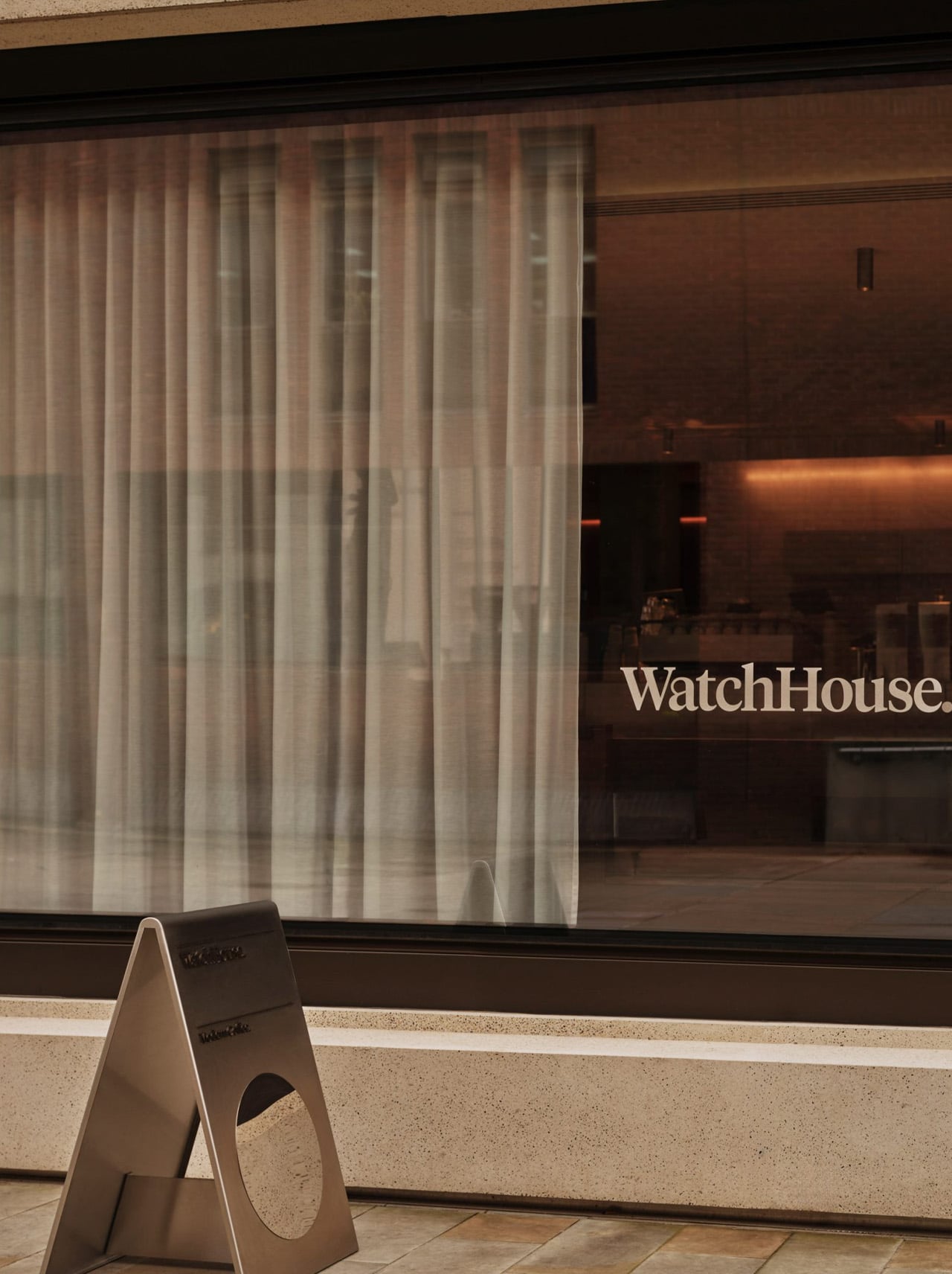
WatchHouse has always been deliberate about place; each of its London locations takes its visual cues from the neighbourhood it occupies, but this Thames-side outpost feels like one of the most fully resolved in the portfolio. The 60-seat space will serve rare and special coffees alongside breakfast, viennoiserie, and bakery options, giving the room both the footfall and the menu to justify the ambition behind its design. For Cake Architecture, it’s another assured project from a studio building a reputation for spaces that think carefully about where they are. Here, the scale is modest, and the mood is quiet, and it’s all the stronger for it.
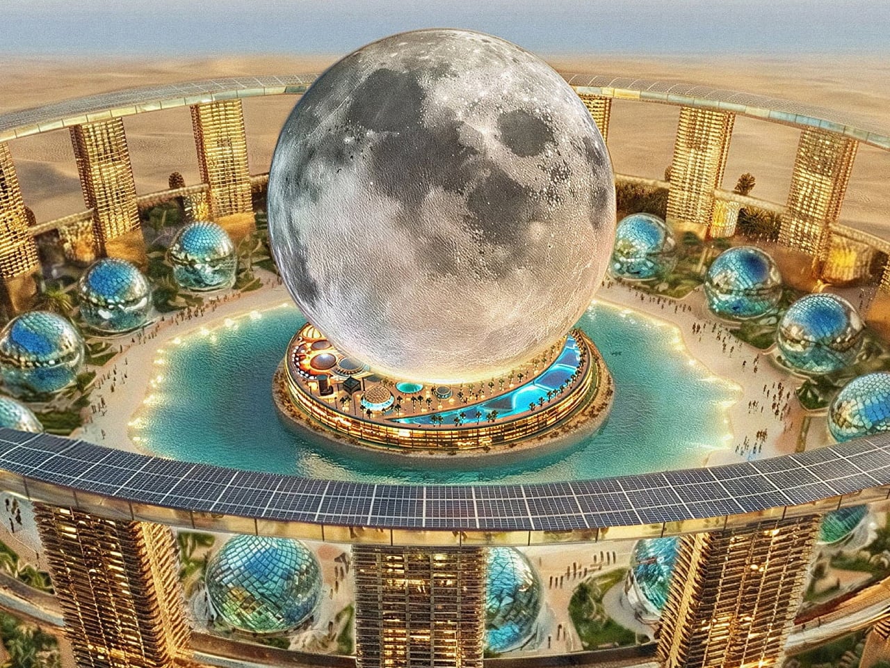
A proposal to simulate the experience of standing on the Moon inside a giant spherical structure once captured imaginations before quietly disappearing. That concept never got off the ground, but four years on, the team behind it has returned with something far bigger — a full Smart City Masterplan and a vision that makes the original look modest by comparison.
Toronto-based Moon World Resorts Inc. went public with the new concept in February 2026, calling it simply Moon. Each development carries an estimated price tag of $5 billion, and while no site has been locked in yet, the company has named ten countries as candidates for regional licensees: Australia, Brazil, China, Egypt, India, Poland, Spain, Thailand, the United Arab Emirates, and the United States. Saudi Arabia, notably absent from the list, still feels like an obvious fit for something this audacious.
The structural ambition alone is staggering. The central building would be a true sphere — 271 meters wide and 312 meters tall — making it the largest and tallest of its kind anywhere in the world. For context, Las Vegas’ Sphere, itself a marvel of engineering, measures 157 meters across and rises just 112 meters. Moon isn’t playing in the same league; it’s playing a different sport entirely.
Inside, the resort would be anchored by a 4,000-room all-suite five-star hotel, with a convention center, restaurants, wellness facilities, an e-sports hub, and a boutique hotel all occupying the ground level. The crowning feature, though, would be a simulated lunar surface and base positioned above it all — an “authentic” recreation of what walking on the Moon might feel like, reportedly capable of hosting up to two million visitors a year. The method for achieving that effect remains, for now, a mystery.
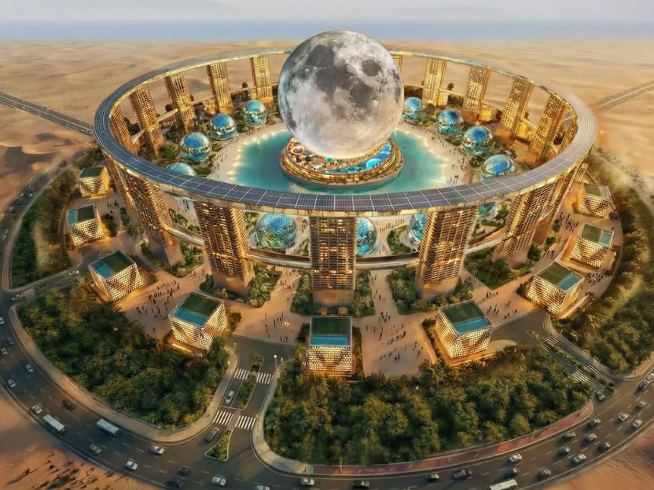
On the outside, 20 towers would ring the sphere, connected by a panoramic elevated walkway that renders suggest will be lined with solar panels along the top. Sixteen smaller spherical structures are also planned nearby, creating a campus-like complex that would reshape the skyline of whichever city claims it.
The broader development extends well beyond the sphere itself, incorporating a transit hub, heliport, vertiport, parking infrastructure, and 10,000 luxury branded residences set among generous green space. Moon World Resorts estimates construction would take around 60 months, pointing to a potential opening as early as 2032 — assuming everything moves quickly on a project that, at this stage, remains largely conceptual. Ambition is clearly not in short supply here, but the leap from striking renders to a working lunar resort is a long one.
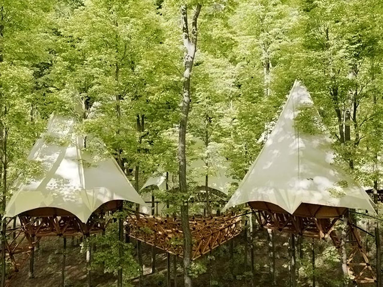
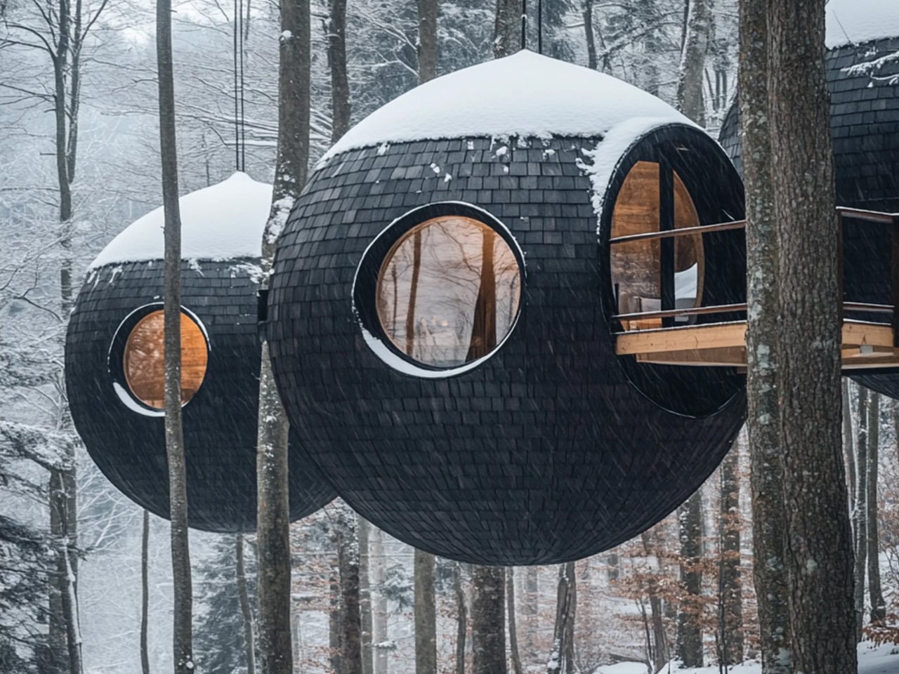
Treehouses have re-emerged not as nostalgic artifacts, but as serious architectural propositions. Within contemporary practice, they are understood as a distilled form of biophilic thinking – where structure, ecology, and human occupation are inseparable. Rather than imposing form on landscape, treetop architecture allows the built environment to coexist, adapt, and respond to living systems.
Occupying a treehouse establishes a rare spatial contract with nature. The tree is not a backdrop but a collaborator, shaping load, movement, and experience. This vertical inhabitation reframes ideas of shelter and elevation, offering a quiet yet powerful redefinition of how architecture can belong within the canopy.
1. Safe and Elevated Spaces
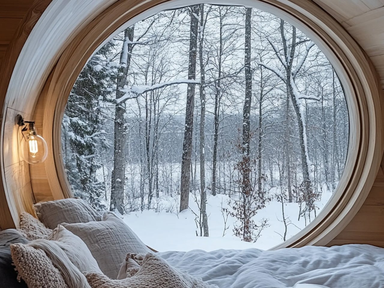
The charm of a treehouse comes from the idea of prospect and refuge – our natural need to see without being seen. Being up high gives a clear view of the surroundings, while the leaves and branches around provide shelter and privacy. This combination makes us feel safe and calm instinctively.
Raising the floor above the ground keeps us away from noise and distractions below. The treehouse becomes a peaceful, natural cocoon. Height isn’t just about the view as it gives a sense of security and comfort, letting us enjoy both openness and protection in one space.
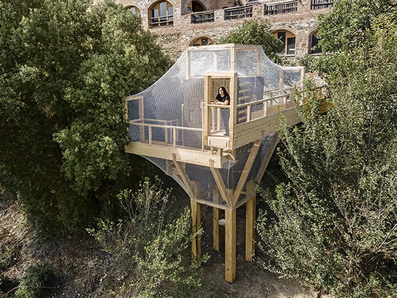
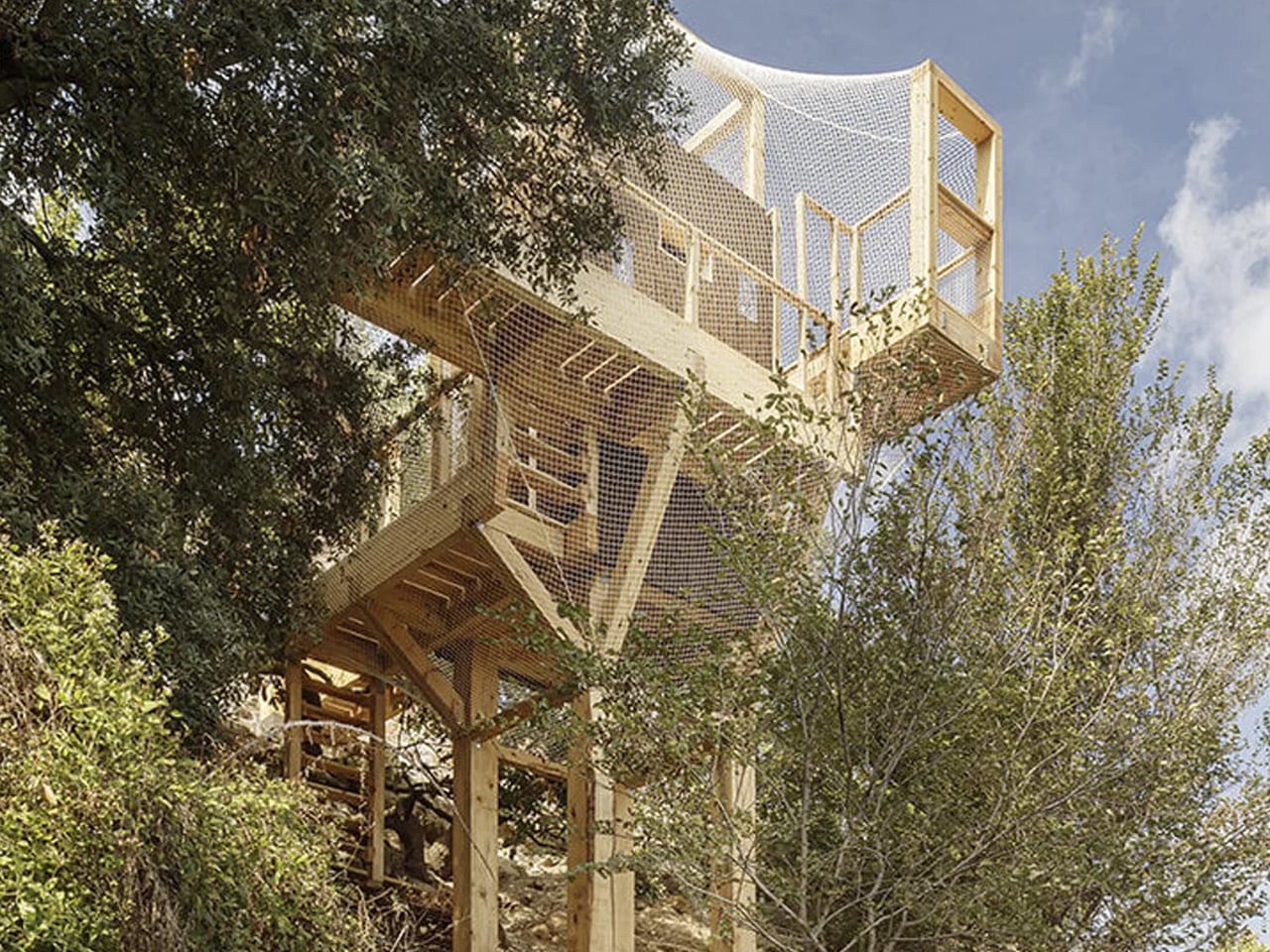
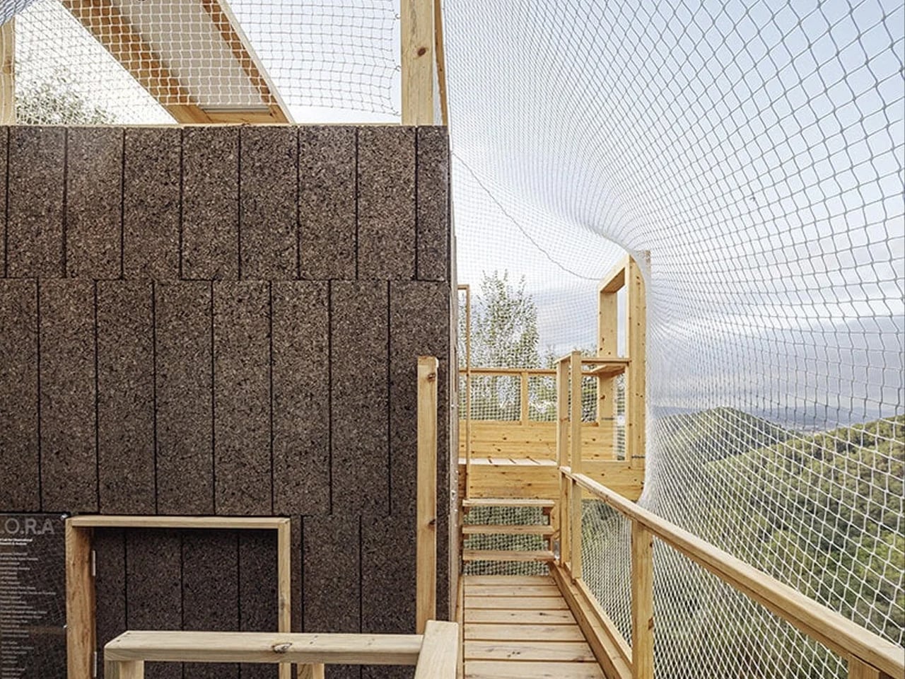
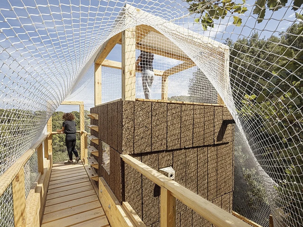
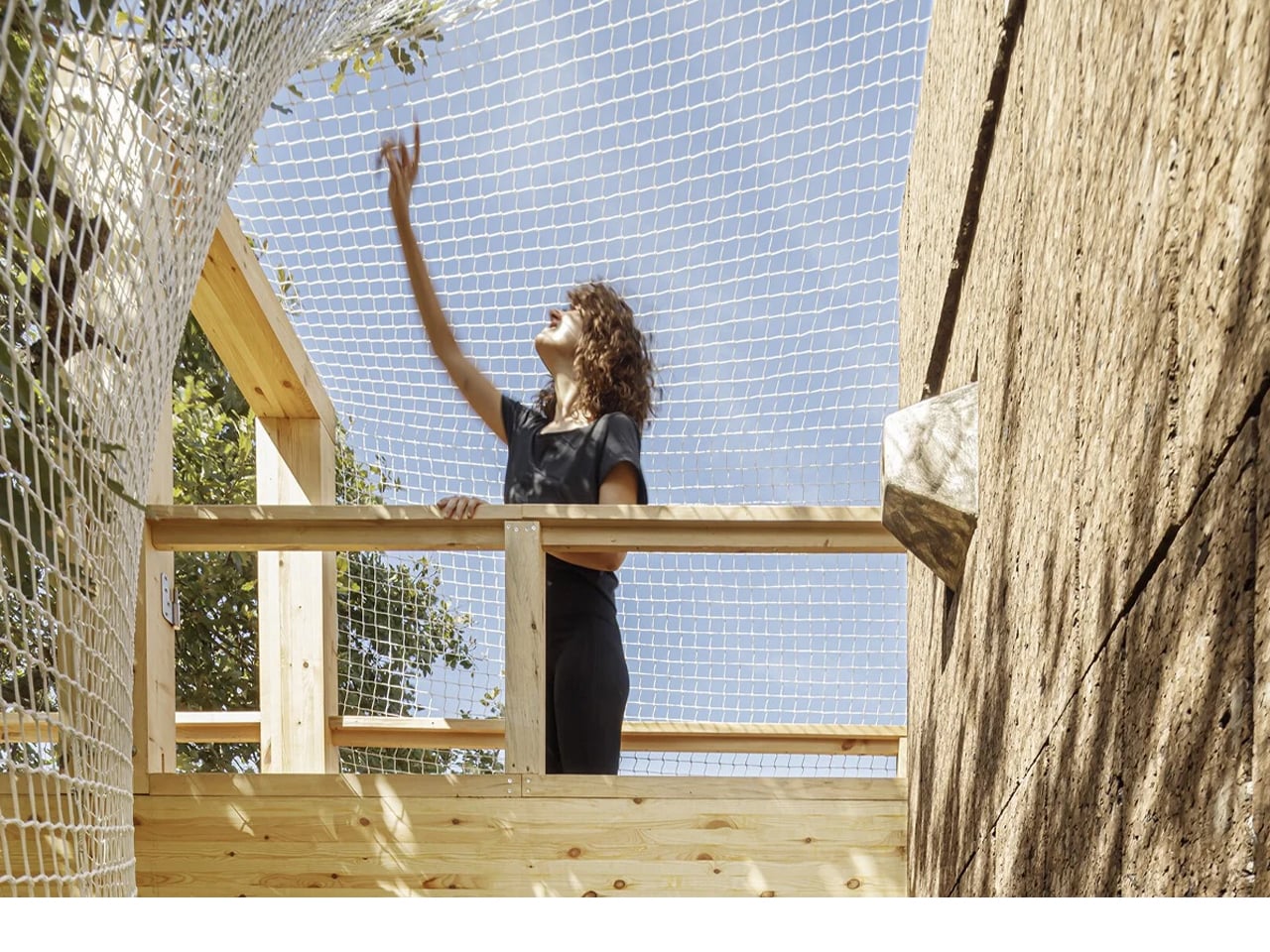
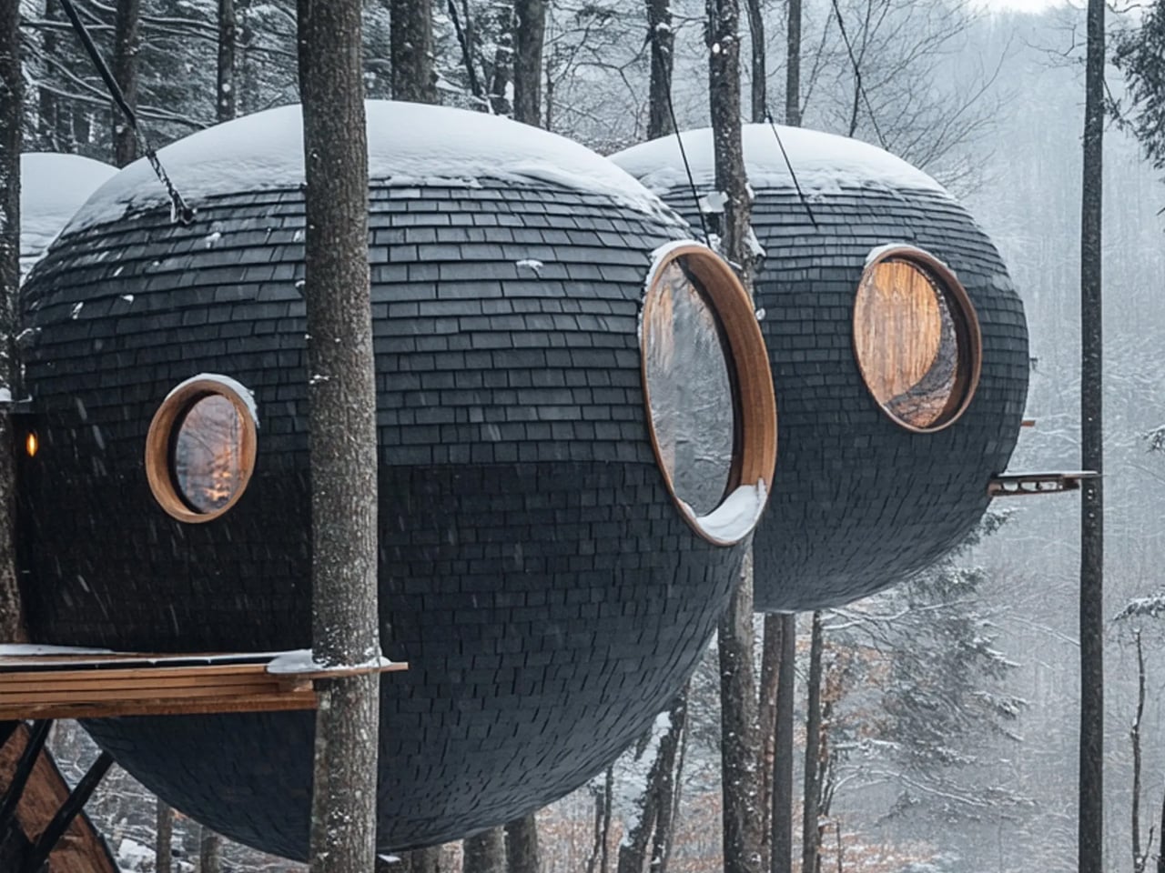
Called the Forest Lab for Observational Research and Analysis (FLORA), this treetop observatory sits within Barcelona’s Collserola Natural Park at the Institute for Advanced Architecture of Catalonia (IAAC). Suspended within the forest canopy, the compact structure serves as a living and working space for researchers studying local biodiversity. Rising about 28 feet high, FLORA is designed as an immersive platform that allows direct access to the upper layers of the forest, making scientific observation possible without disturbing the ground below.
What makes FLORA especially notable is its material strategy. The entire mass-timber structure was built using invasive pine trees sourced from within the park through carefully managed forestry practices. These trees were processed into cross-laminated timber panels, laminated beams, and solid wood components, following a zero-kilometer approach to construction. Inside, the observatory includes work areas, projection space, and bird-monitoring features, turning the building into a functional research prototype that demonstrates how sustainable materials and sensitive design can support long-term ecological study.
2. Use of Honest Natural Materials
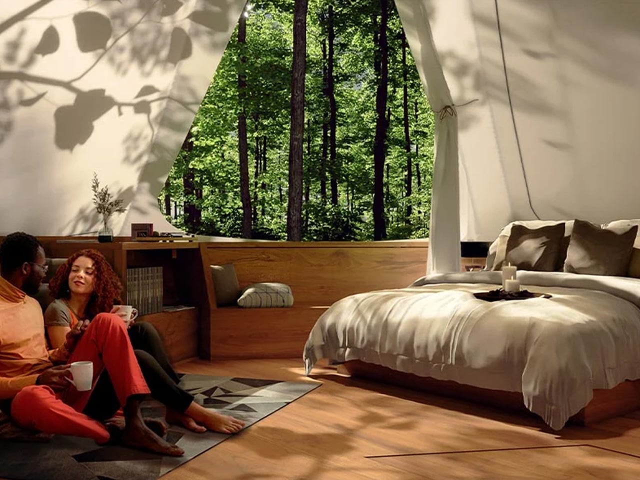
A treehouse’s beauty comes from using materials that feel natural and honest. High-quality timber, like cedar or reclaimed teak, allows the house to grow and age alongside the tree. This isn’t just for looks, as it supports the strength and health of both the tree and the structure.
Special hardware, such as Treehouse Attachment Bolts (TABs), lets the tree move and grow naturally without damage. By avoiding heavy concrete foundations, this method protects the tree and reduces environmental impact. The result is a sustainable, long-lasting design where architecture and nature coexist in balance.
Set within the wooded hills of Dunabogdány, Hungary, Console House by Hello Wood is a quiet retreat overlooking the Danube Bend. Designed to sit lightly within the landscape, the minimalist home follows a calm, nature-first approach, allowing the forest to remain the main visual focus. Raised on slender stilts, the structure appears to float above the ground, preserving natural water flow and wildlife movement beneath. Large glass openings frame peaceful valley views while filling the interiors with soft daylight.
A defining feature of the home is its long cantilevered roof, which creates a generous terrace that extends the living space outdoors. Built using cross-laminated timber and laminated beams, the structure balances strength with environmental sensitivity, while screw pile foundations minimize site disruption. The exterior is finished in charred wood using the shou sugi ban technique, giving the house a dark, textured surface that blends into the trees. Together, these choices create a refined, modern hideaway rooted in its surroundings.
3. The Climbing Experience
The magic of a treehouse starts long before you step inside, as it begins with the climb. Whether it’s a spiral staircase or a suspension bridge, moving upward slowly lifts you away from the ground. This gradual ascent helps the mind shift into a calm, reflective state.
Rising from solid earth into the airy canopy feels like a sensory reset. In many cultures, this vertical journey reflects a spiritual path, taking you from the everyday world below to the quiet, elevated sanctuary among the branches. The climb itself becomes an essential part of the treehouse experience.
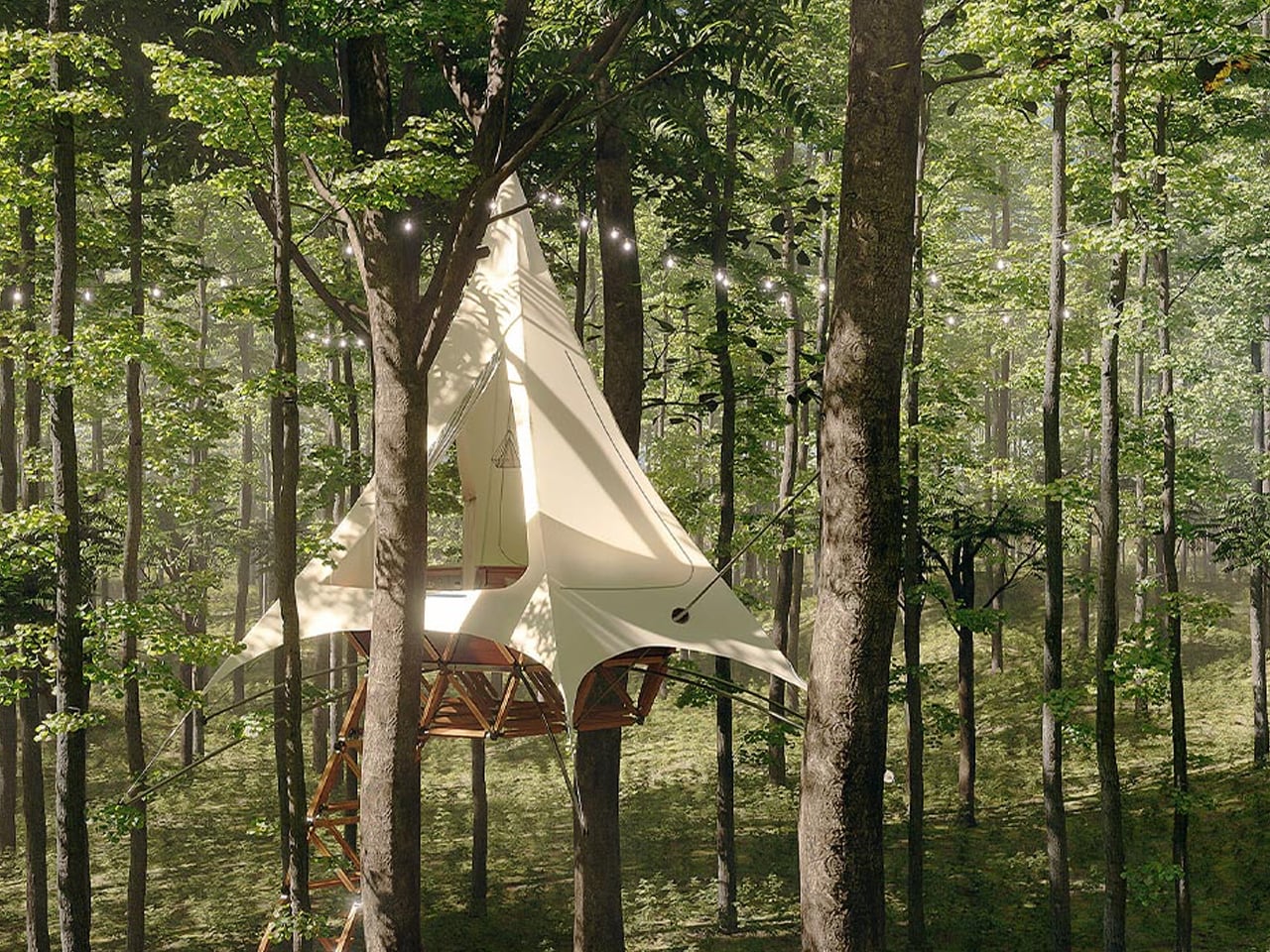
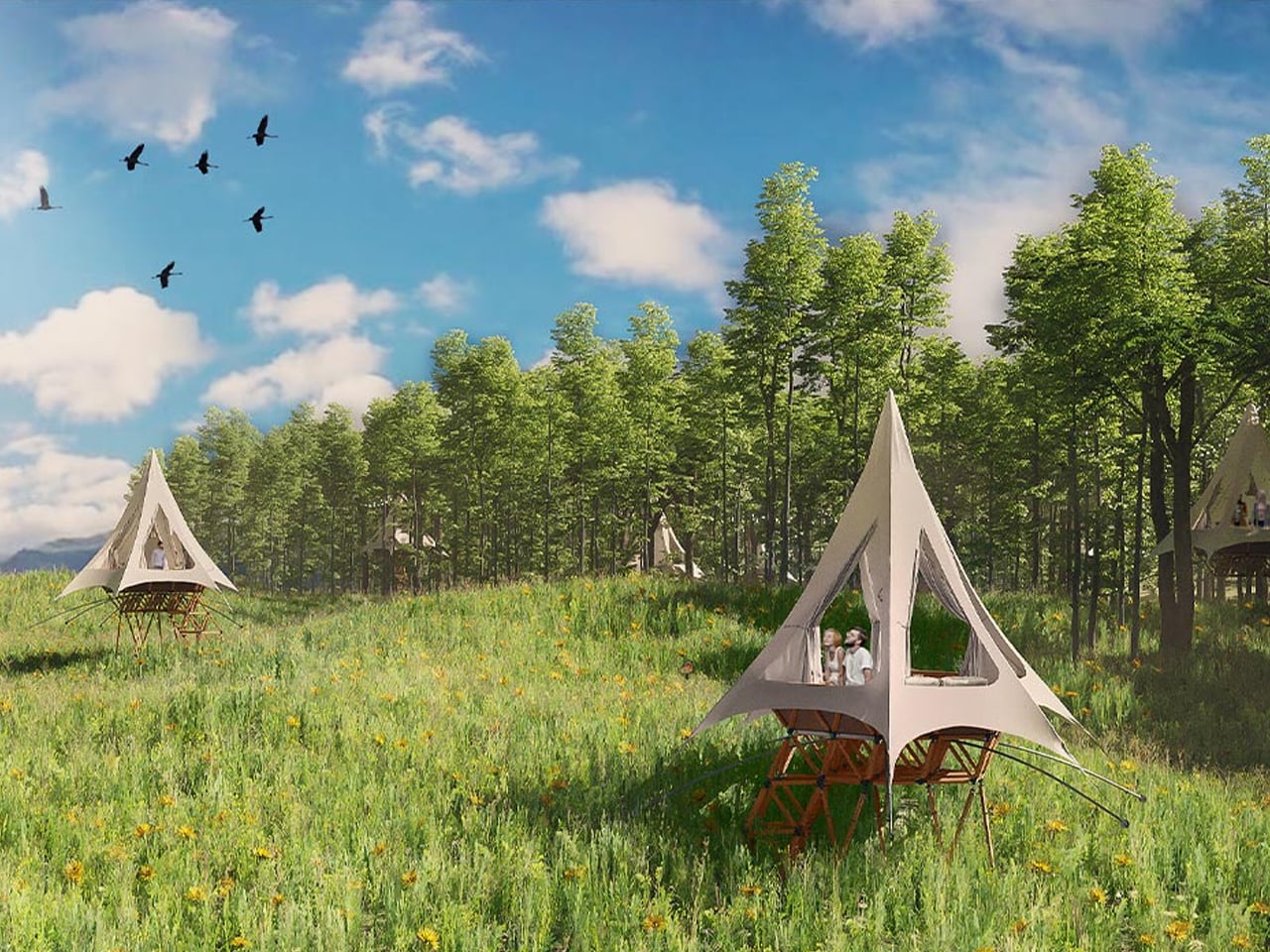
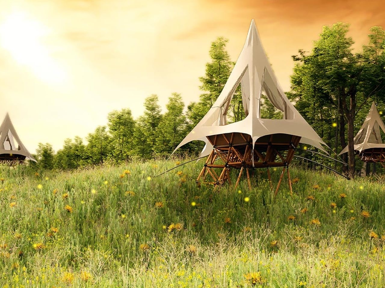
Treehouses may feel like childhood nostalgia, but the O2 Treehouse by Treewalkers brings that sense of wonder firmly into adult living. You step into a lightweight, elevated home that blends playful design with thoughtful sustainability, creating a retreat that feels both imaginative and grounded in nature. Inspired by geodesic structures and forest ecosystems, these tree-supported homes appear to float among the canopy, offering a quiet escape that reconnects you with your surroundings while keeping the natural landscape largely undisturbed.
What makes these homes especially compelling is their modular, lattice-based construction, which allows multiple units to connect and evolve into small, customisable clusters. You can adapt layouts, shapes, and interior details to suit how you live, work, or unwind, while enjoying warm, wood-toned interiors, generous natural light, and breathable canvas roofing. From iconic A-frame forms to dome-like shelters, each structure balances architectural innovation with the simple comfort of being tucked into the trees.
4. Natural Climate Control
A treehouse isn’t just beautiful, but it naturally stays comfortable throughout the seasons. Leaves provide shade and cooling in summer, while letting sunlight through in winter. This passive system keeps the space pleasant without relying on air conditioning.
The tree itself helps regulate the microclimate through its natural transpiration. Thoughtful placement of windows and openings captures changing light and shadow, softening the interior and creating a calm, diffused atmosphere. By working with the tree and its environment, the treehouse achieves energy efficiency and comfort, showing how design can harmonize with nature rather than fight it.
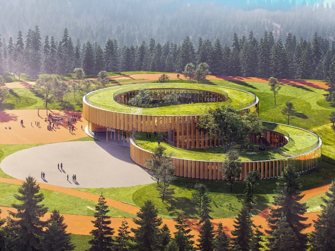
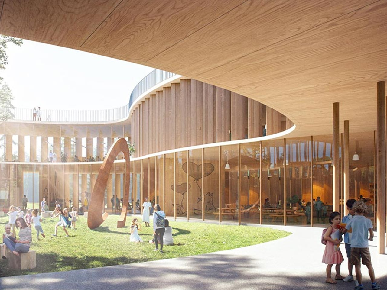
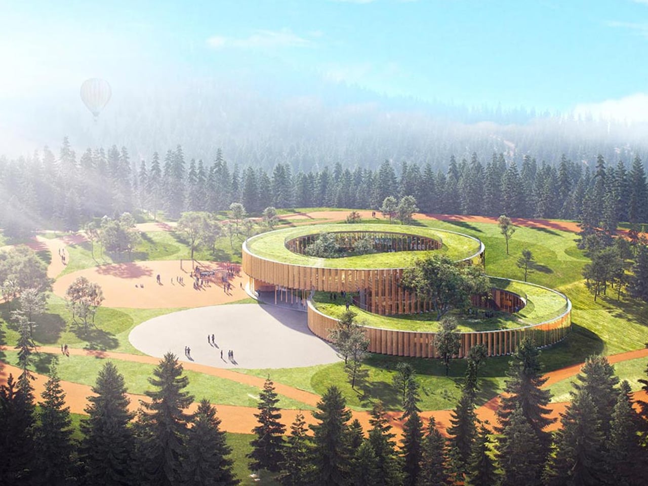
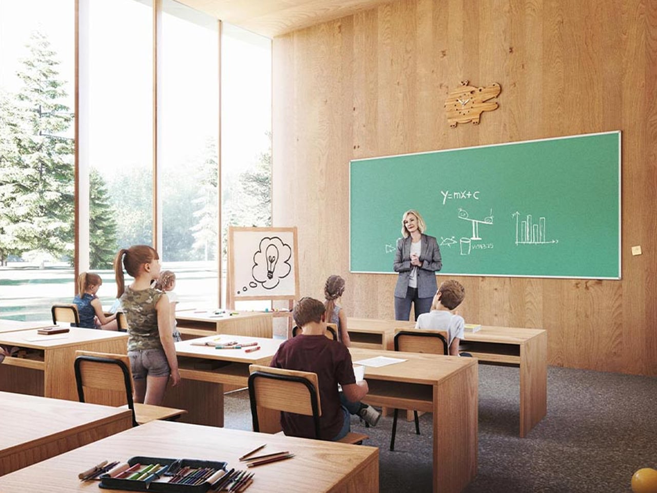
You might remember turning a treehouse into a make-believe classroom, complete with a tiny chalkboard and a big imagination. Designer Valentino Gareri brings that playful idea into real-world architecture with the Tree-House School, a modular learning building set directly within nature. Raised among the trees, the structure eases pressure on dense cities while creating outdoor-focused spaces where education blends with exploration. It becomes a shared hub that reconnects learning with landscape, movement, and everyday discovery, all while using design strategies that support comfortable indoor conditions.
At the core of the design are two large, interconnected rings that organize classrooms from kindergarten through secondary levels, each accommodating up to 25 students and opening toward the surrounding greenery. The circular layout forms sheltered courtyards and a usable rooftop for group activities, while faceted façades alternate timber panels and glass to manage sun exposure, encourage cross-ventilation, and maintain stable interior temperatures. These passive climate-control features reduce reliance on mechanical systems, keeping classrooms bright, airy, and naturally regulated throughout the day.
5. Suspended Sanctuary
Luxury today is found in the ability to disconnect, and a treehouse offers just that. As a “hovering hearth,” it lifts you above the noise and weight of daily life. Being suspended creates a quiet, focused space where creativity, reflection, and rest come naturally.
For those who appreciate design, the treehouse is more than shelter—it’s a statement. It balances perfectly with the forces of nature, respecting both gravity and the life of the tree. This equilibrium transforms the simple act of being into a luxurious experience of calm, presence, and connection with the natural world.
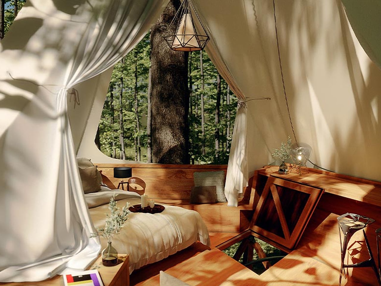
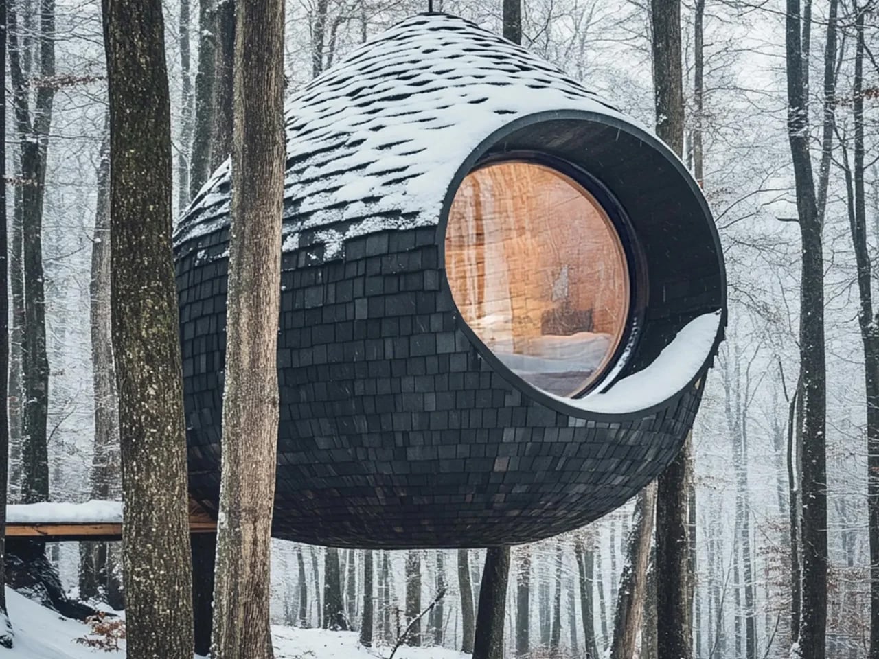
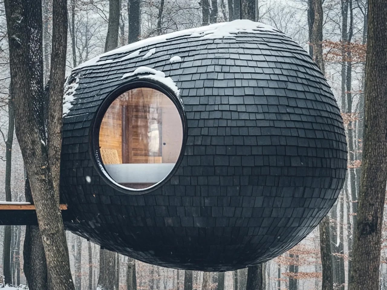
Designed by architectural designer Antony Gibbon, the Burl Treehouse is a concept series of rounded pods that reinterpret forest living through a sculptural, nature-inspired lens. Shaped after tree burls—the textured growths found on trunks, the pods blend organic form with a restrained, minimalist aesthetic. Suspended above the forest floor, each structure appears to float among the trees, creating an immersive experience that feels both futuristic and deeply connected to its surroundings.
The pods are supported by slim vertical struts and suspension cables anchored directly to the trees, minimizing ground disturbance and preserving the forest below. Accessed by timber suspension bridges, the interiors are lined with light-toned cedar and ash, creating a warm, cocoon-like atmosphere. Each unit includes a bedroom with built-in storage, a compact bathroom, and custom furnishings that maximize space. A central circular window brings in natural light and frames wide forest views, while charred wood shingles on the exterior add texture and durability through traditional shou sugi ban treatment.
Treehouses captivate because they embody our longing to connect with nature. Merging honest materials, smart engineering, and poetic spatial design, they offer more than a room—they create an experience. Building among the trees honors humanity’s timeless bond with the forest, uplifting both spirit and structure in perfect harmony.
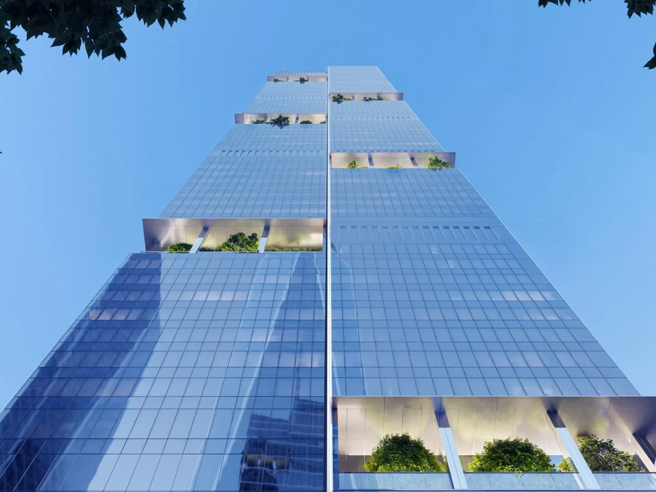
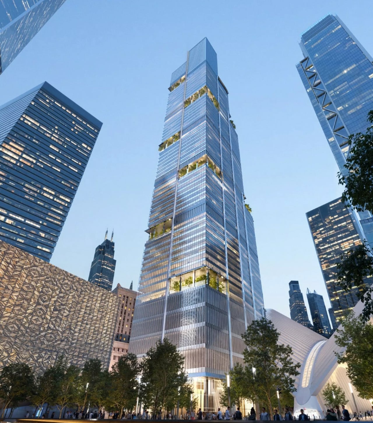
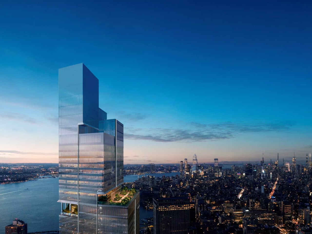
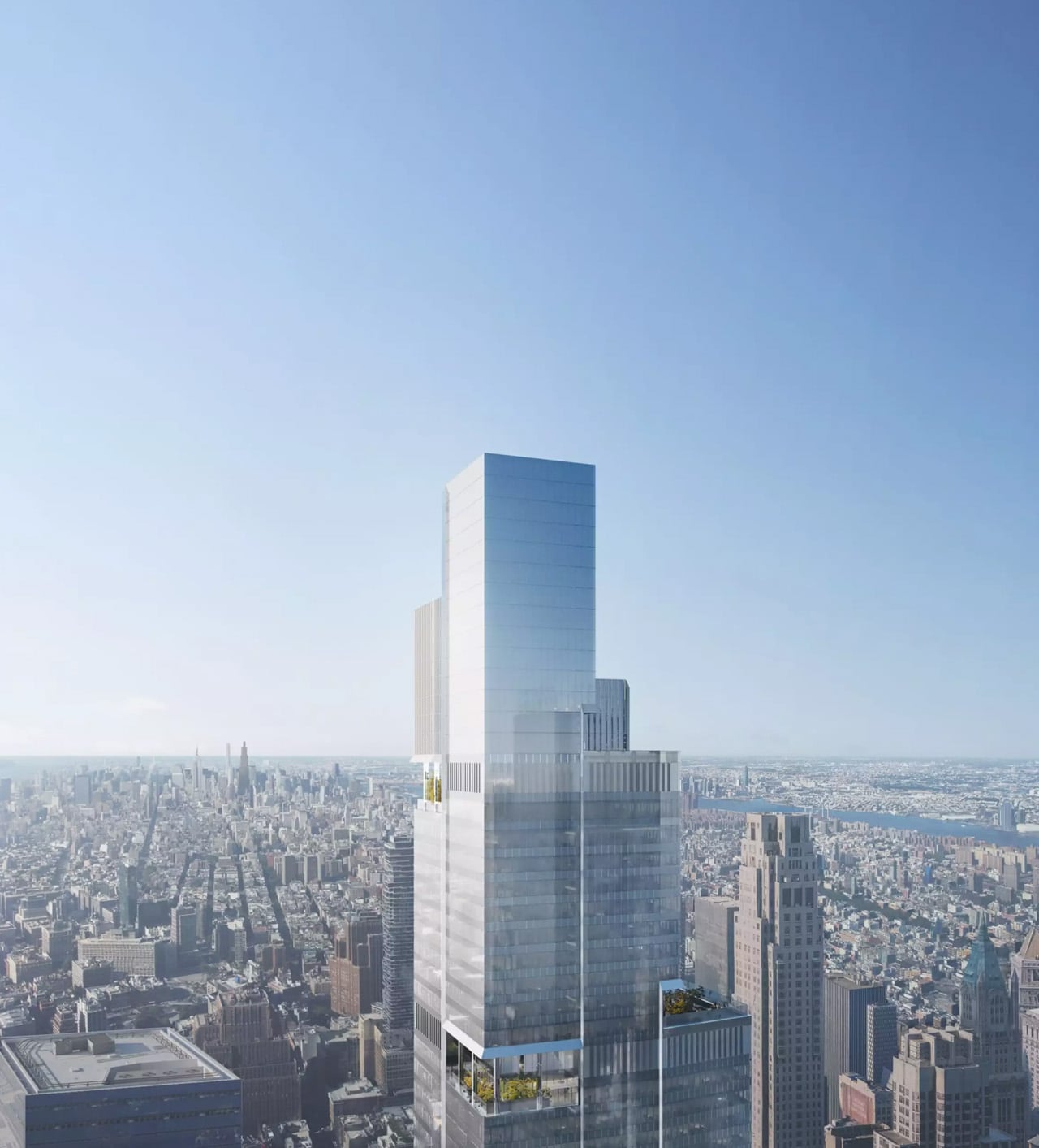
It has been almost 25 years since the September 11 attacks forever changed the skyline of Lower Manhattan, and now the rebuilding of the World Trade Center campus is entering its final stretch. The last major commercial tower on the site, 2 World Trade Center, is expected to break ground in spring 2026 and wrap up construction by 2031. American Express has committed to making the building its new corporate headquarters.
Getting to this point hasn’t been simple. British firm Foster + Partners was originally hired to design the tower, only to be replaced by Bjarke Ingels Group, which put forward a striking terraced concept. That plan was eventually scrapped, and Foster + Partners was brought back to start fresh. The result, based on recently released renderings, is a broad rectangular tower sheathed in glass, with three open-air terraces and six landscaped corner gardens woven into the facade to bring some greenery to an otherwise sleek profile.
The tower will rise to 1,226 feet, comfortably placing it in the supertall category and making it roughly the 11th-tallest building in the United States. It won’t overtake its famous neighbor, though. One World Trade Center still holds the title of the country’s tallest at a symbolically chosen 1,776 feet. Inside, the building will offer close to two million square feet of usable space across 55 stories, with the bulk of that dedicated to offices. When fully occupied, it could house around 10,000 workers.
Specifics are still thin at this early stage, but American Express has said the tower will incorporate smart building technology and energy-efficient systems. The project is also targeting LEED certification, which has become something of a baseline expectation for major commercial developments in recent years.
Kevin O’Toole, Chairman of the Port Authority of New York and New Jersey, called the project a meaningful milestone, both for the campus and for the surrounding region. He pointed to the tower’s role in reinforcing the World Trade Center as one of the country’s most important centers of commerce and transportation, and acknowledged just how much sustained effort it takes to deliver projects on this scale.
Silverstein Properties, the development firm that has overseen much of the site’s post 9/11 transformation, is once again at the helm. When the building finally opens its doors in 2031, it will effectively close the book on one of the most ambitious and emotionally significant urban rebuilding efforts in modern history. More than anything, it will stand as a reminder of what New York City is capable of when it commits to moving forward.
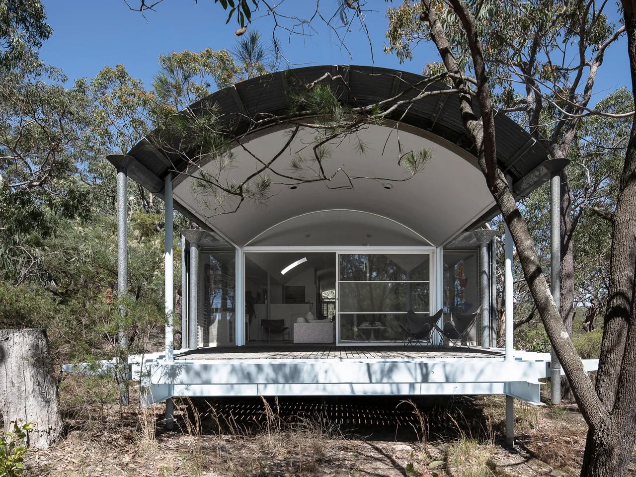
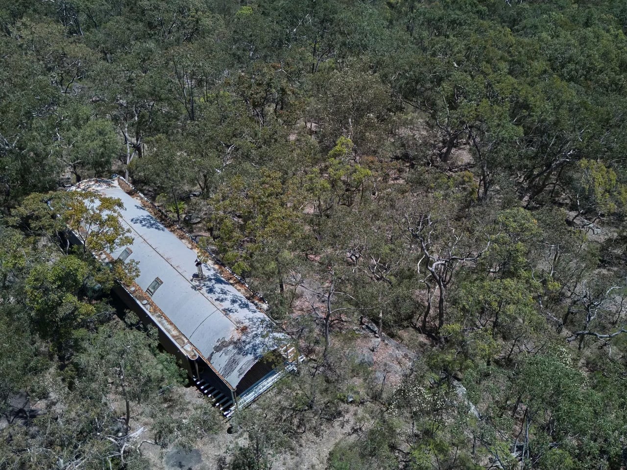
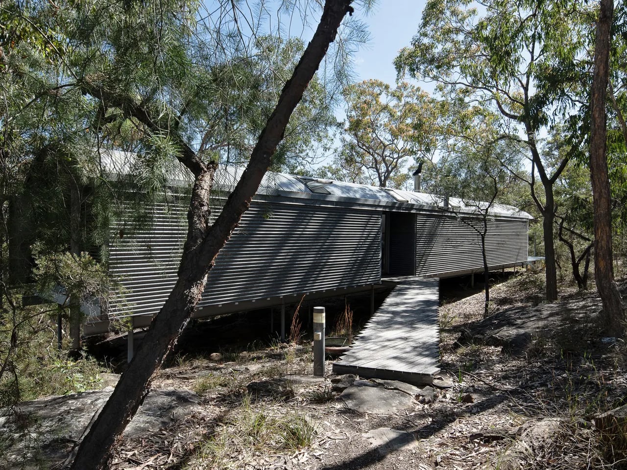
For the first time since its completion in 1983, one of Australia’s most architecturally significant homes is available to buy. The Ball-Eastaway House, designed by Pritzker Prize-winning architect Glenn Murcutt, has been listed with Modern House at a guide price of AUD 2.4 to 2.6 million, an extraordinary opportunity to own a piece of living architectural history.
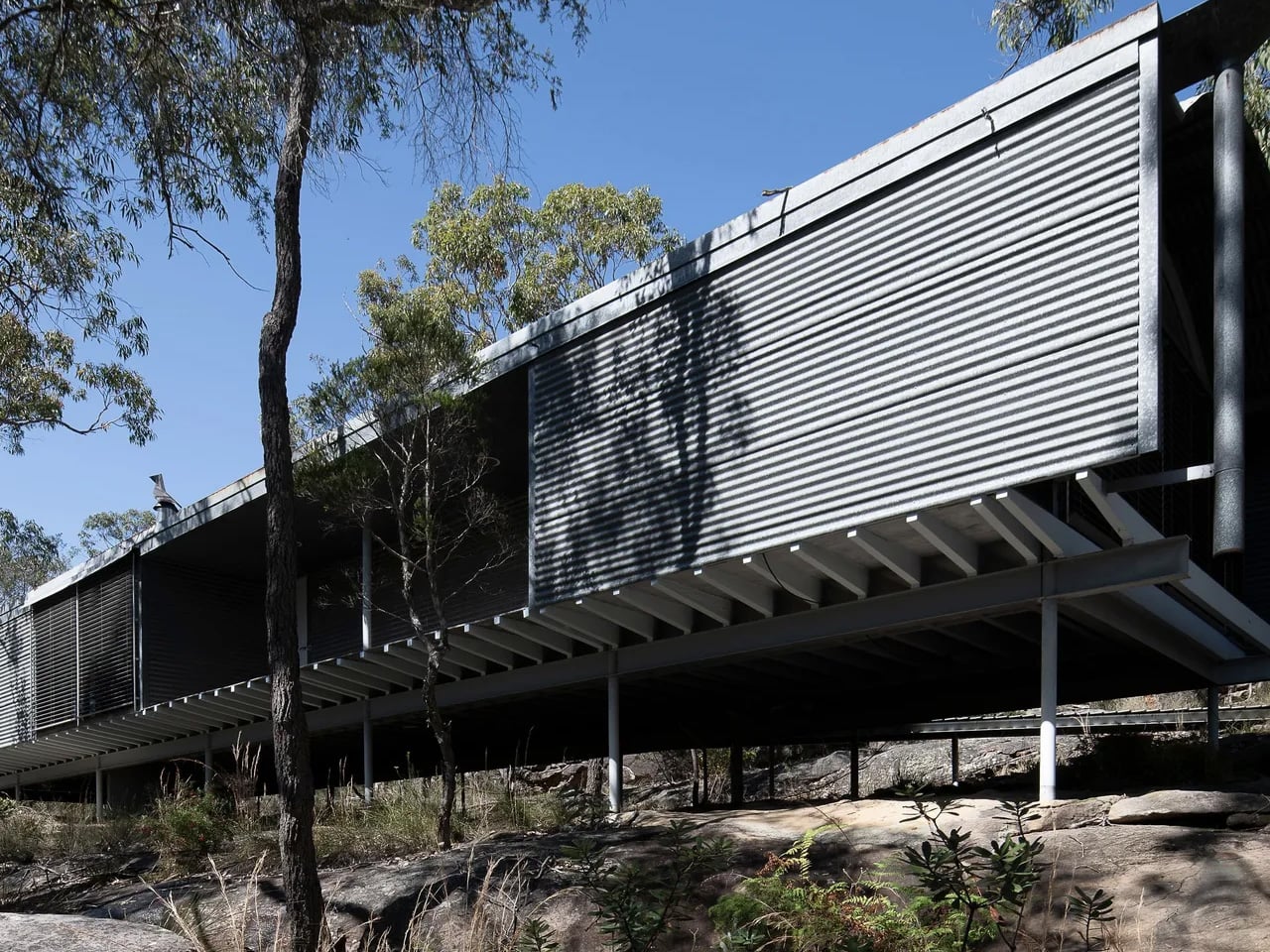
Set on 25 acres of dry sclerophyll forest in Glenorie, roughly an hour northwest of Sydney, the property feels worlds apart from the city it neighbours. The rugged site presented Murcutt with a natural rock ledge that became the building’s platform, and rather than taming the land, the architect worked with it. Not a single tree was removed during construction, a commitment that shaped every decision made from the ground up.
The house sits elevated on slender steel pipe columns, its long, low form skimming the earth without disturbing it. Murcutt has long described this approach as “touching the earth lightly,” placing humanity within nature rather than above it. The exterior is clad in corrugated iron, marking the first time Murcutt used the material on a residential project, and its gently curved roofline reads almost like a topographical feature rather than a built structure.
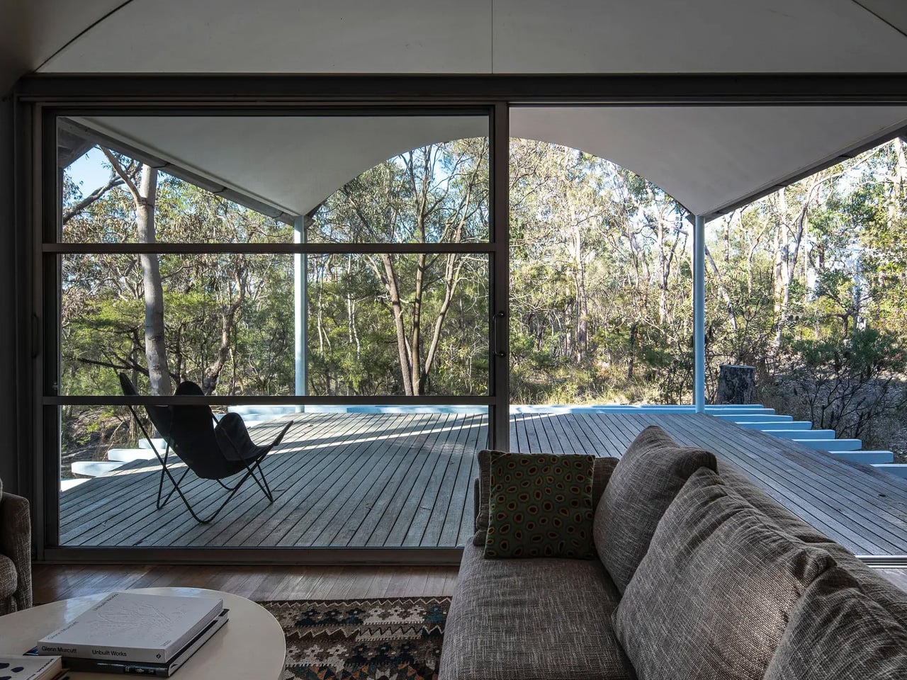
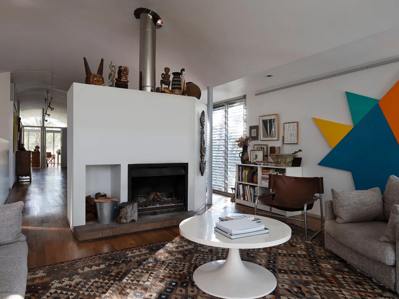
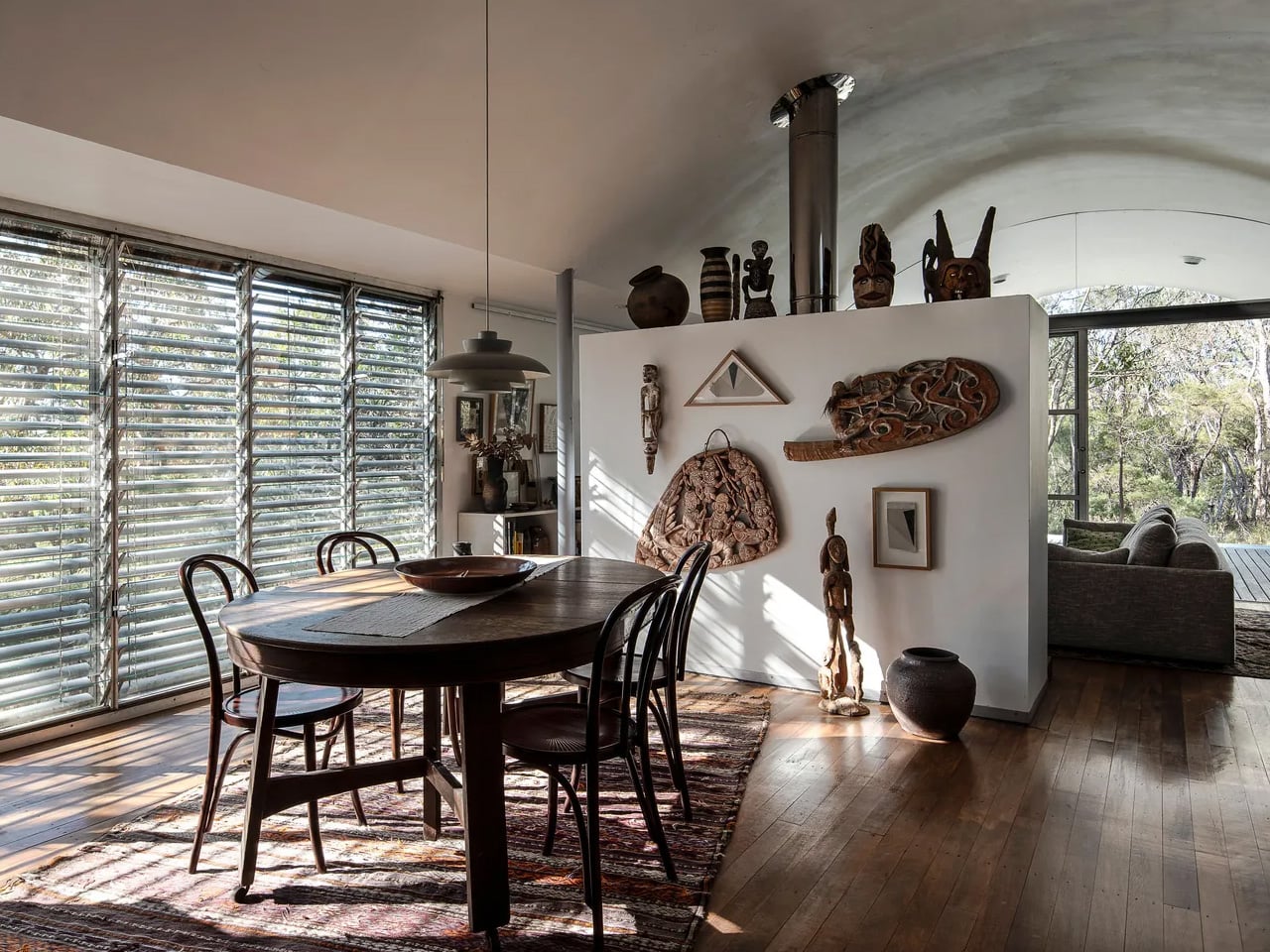
Inside, the design is as considered as the form suggests. Aluminium shading devices and timber-lined interiors regulate heat and light throughout the seasons, while expansive north-facing glazed walls and skylights draw in the kind of soft, sustained light that painters depend on. The home was built specifically for abstract artists Sydney Ball and Lynne Eastaway, and their creative lives are woven into the architecture itself. Ball’s large-scale paintings run the length of an internal wall that forms the spine of the entire plan.
Behind that wall lies a concealed northwest verandah, originally conceived as a meditation space, and two generous studios where many of both artists’ most significant works were made. During a jury visit for the 1984 Wilkinson Award, which the house went on to win, the jury chair called it the most serene space he had ever encountered.
That quality of stillness hasn’t faded. The environmental intelligence built into the structure, passive ventilation, solar orientation, and minimal site intervention, was pioneering in the early 1980s and reads today as a quiet blueprint for how buildings should relate to the landscapes they occupy. The entire ten-hectare site has since been heritage listed, ensuring whatever comes next for the Ball-Eastaway House, its integrity remains protected.
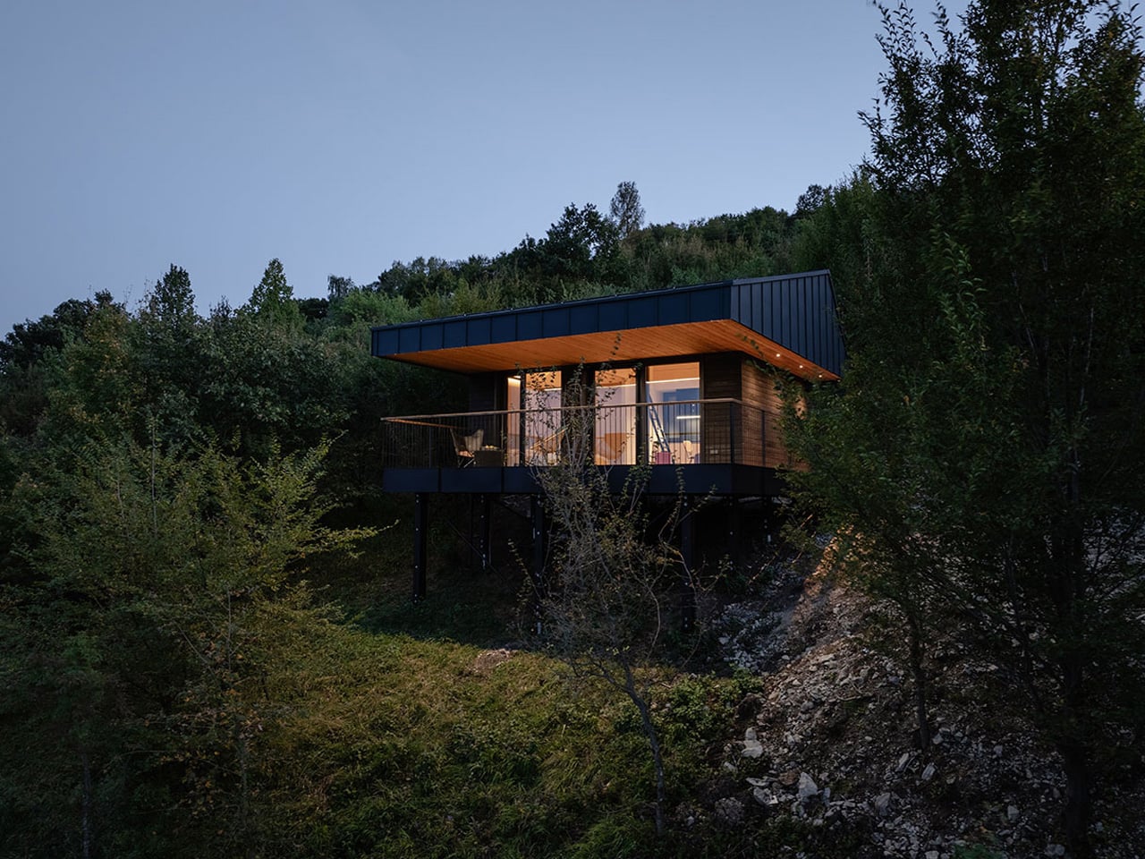
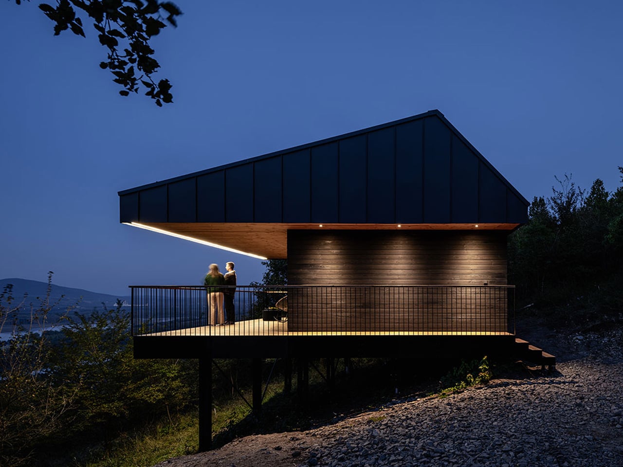
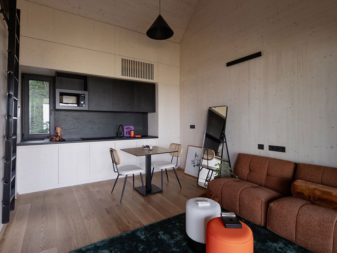
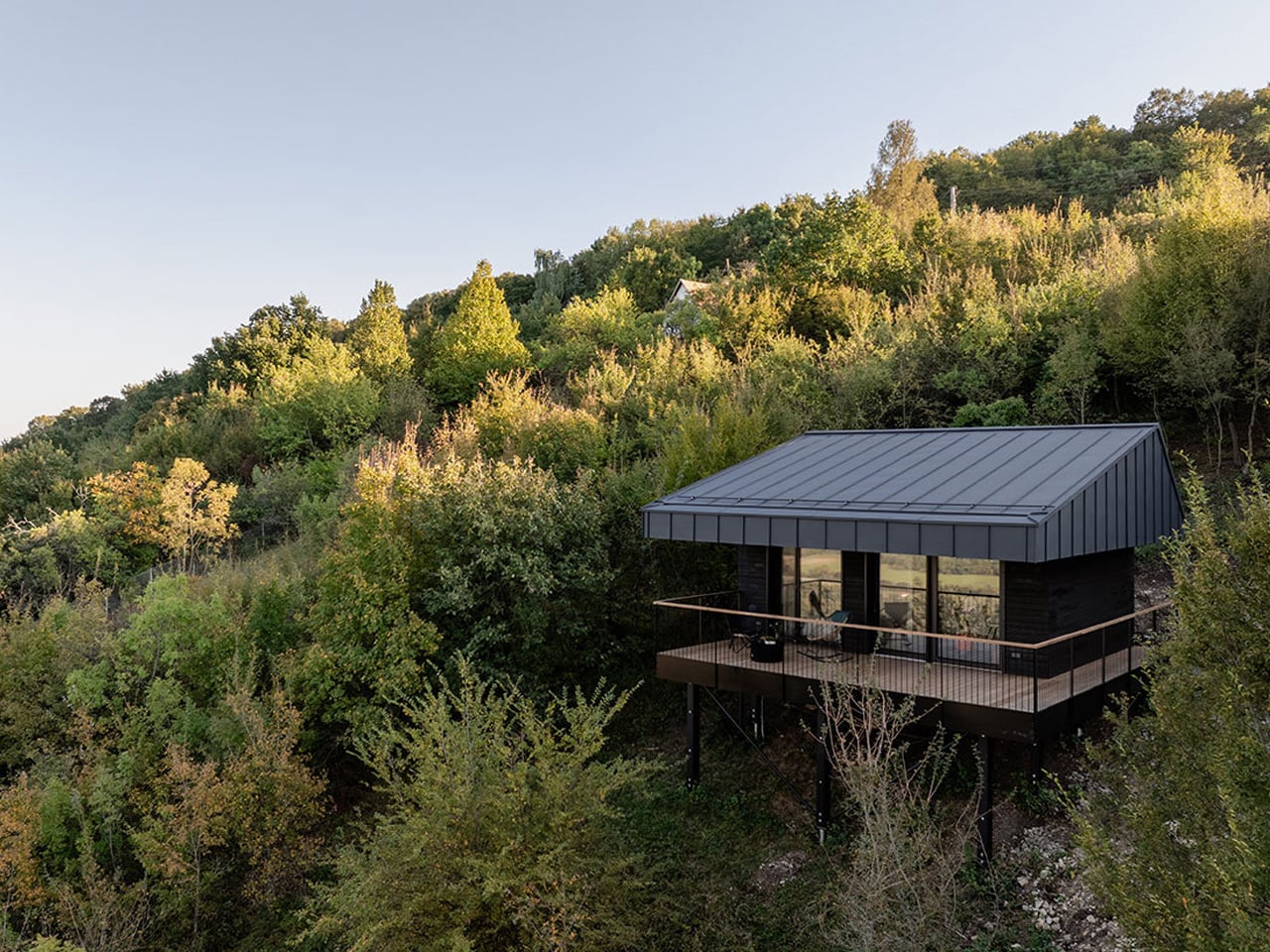
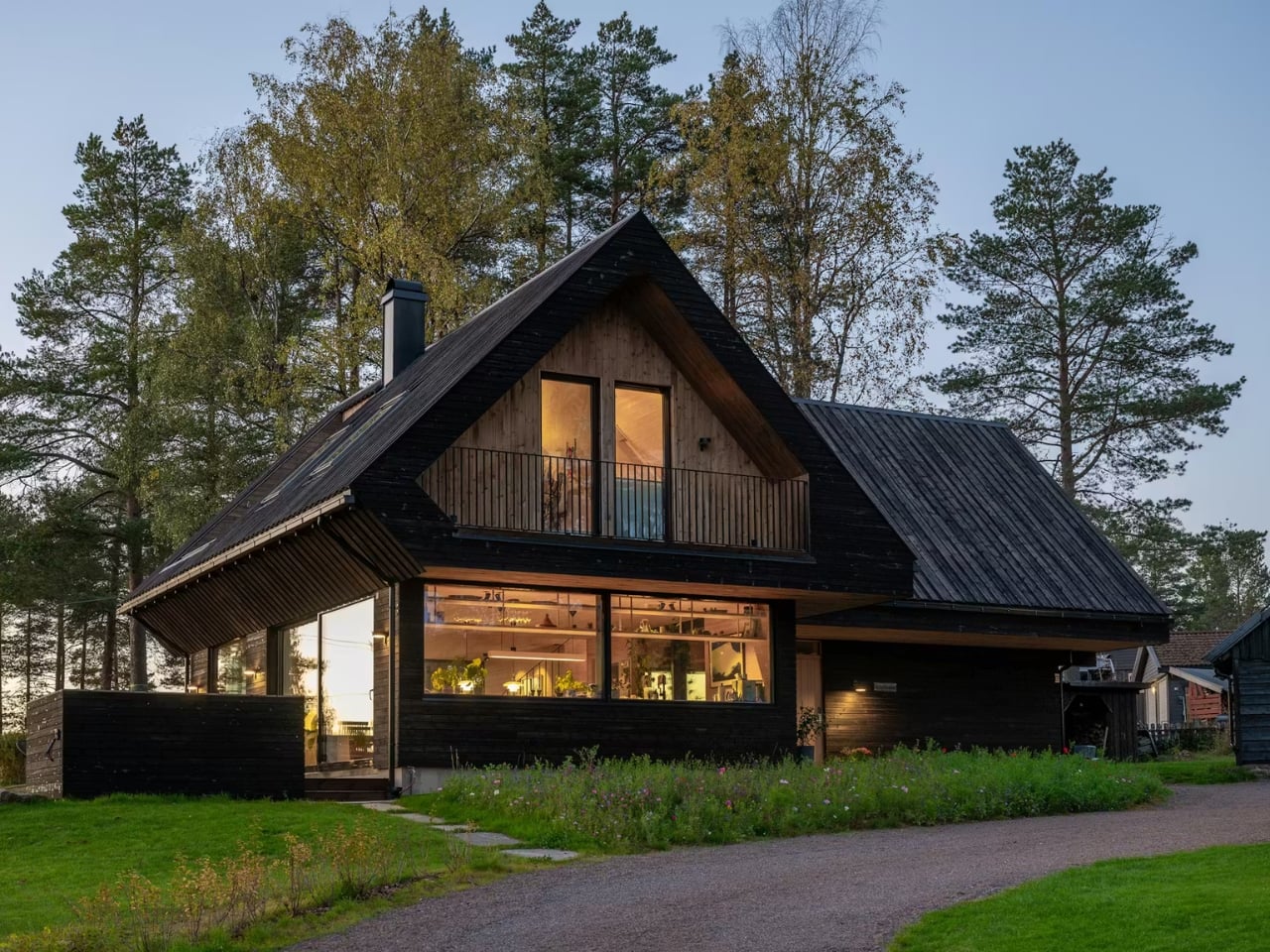
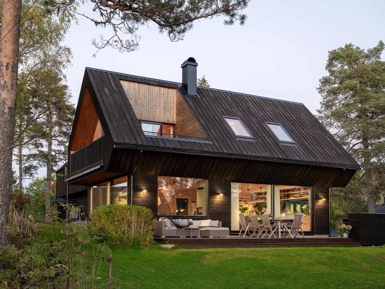
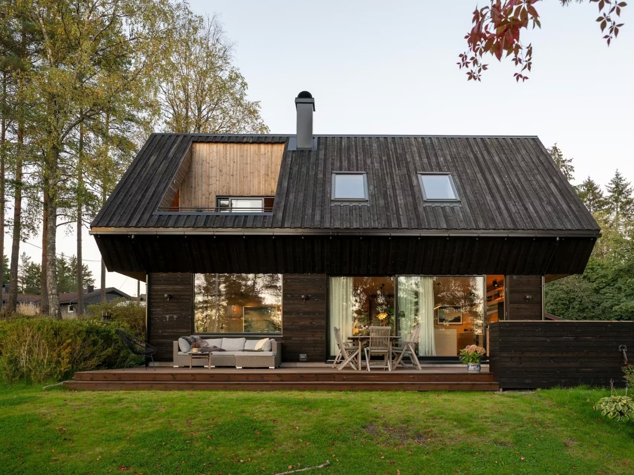
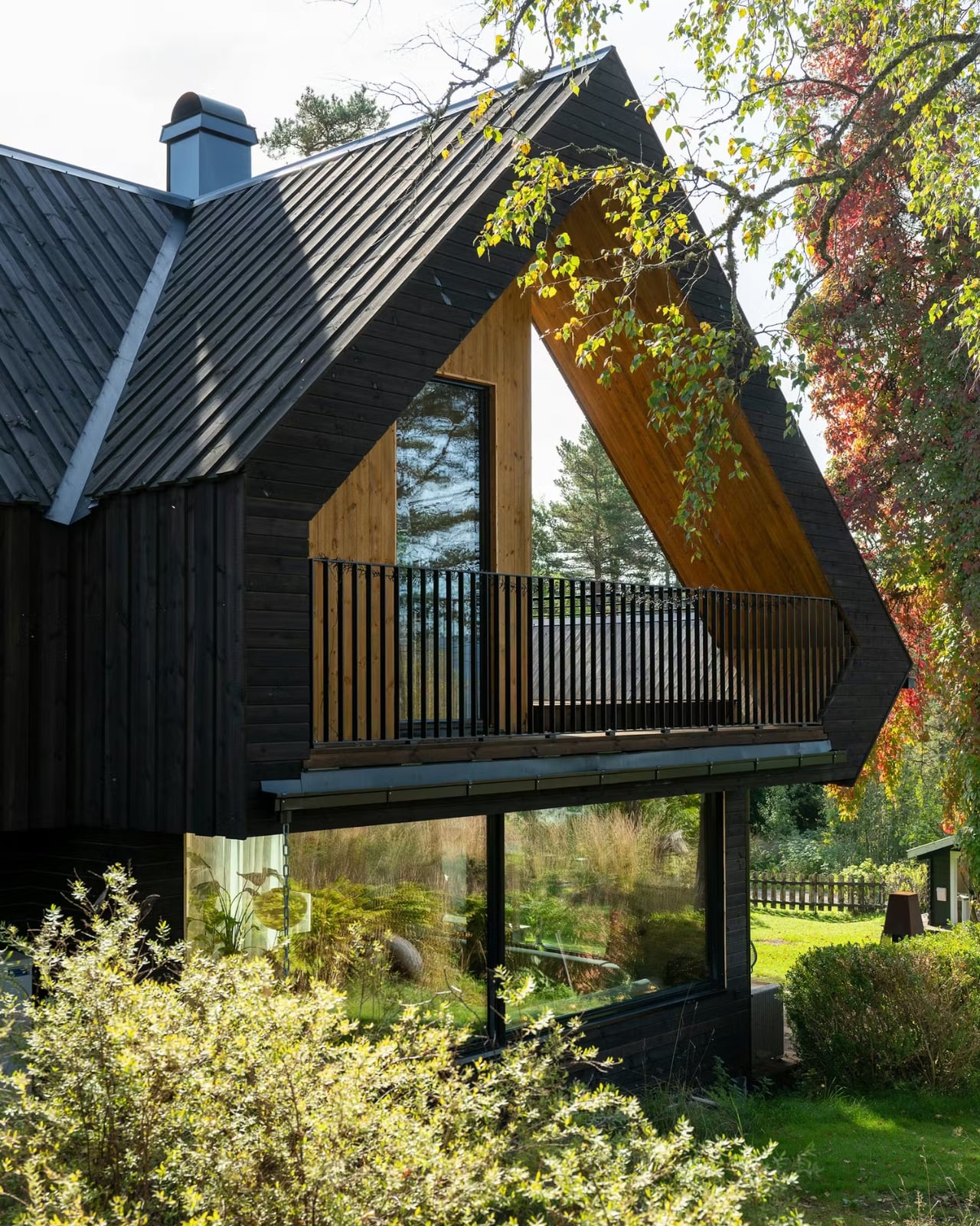
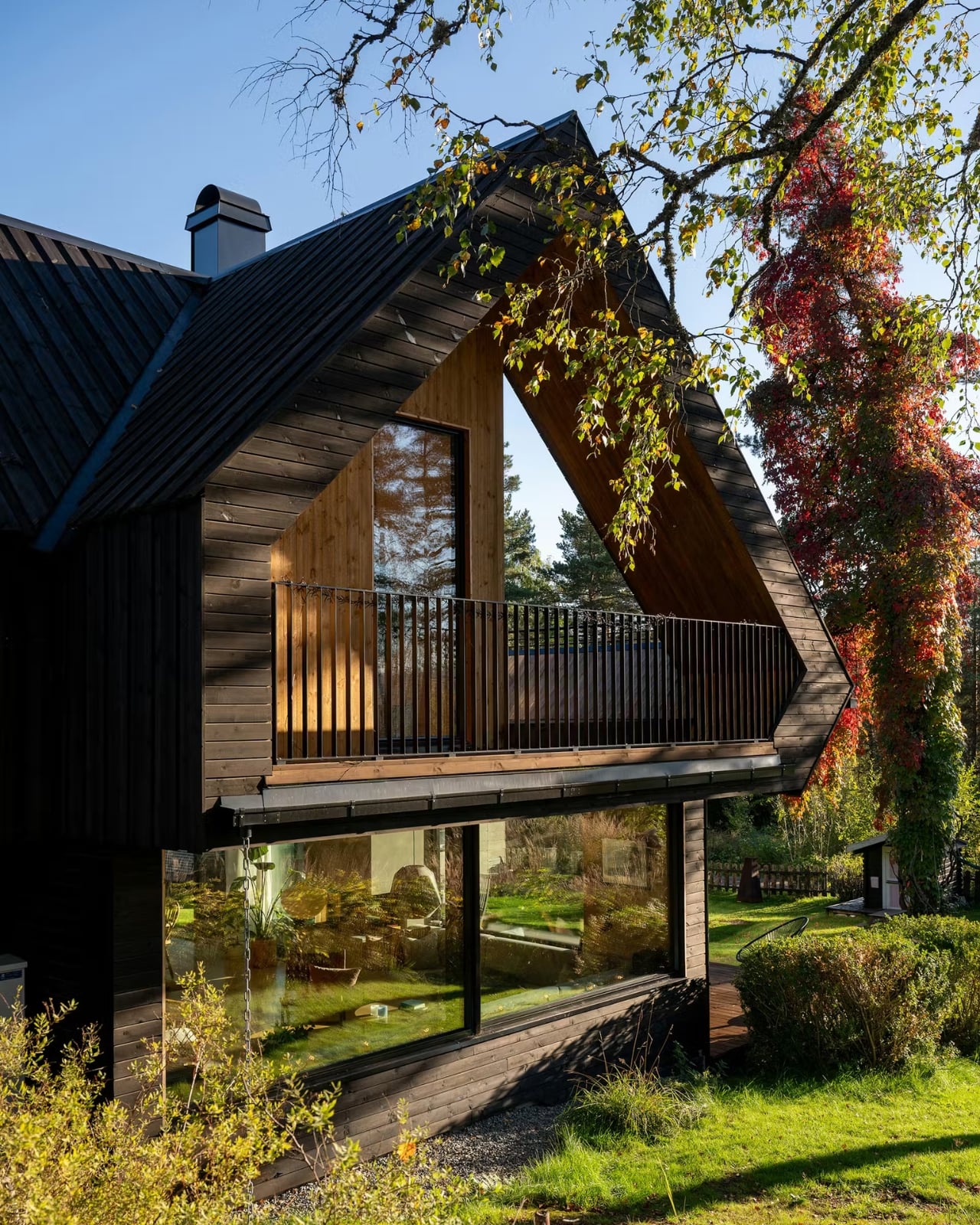
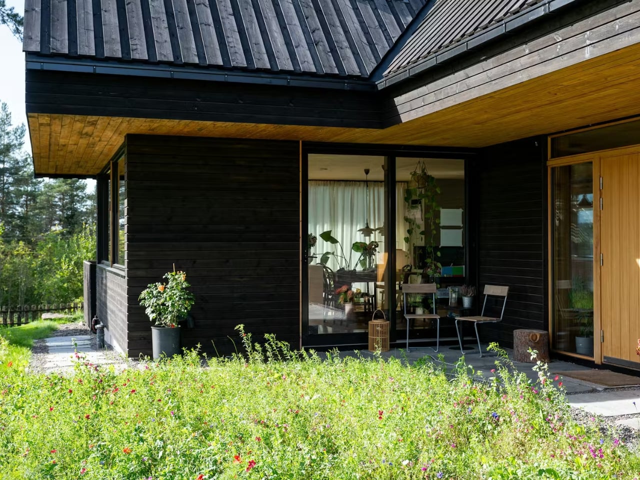
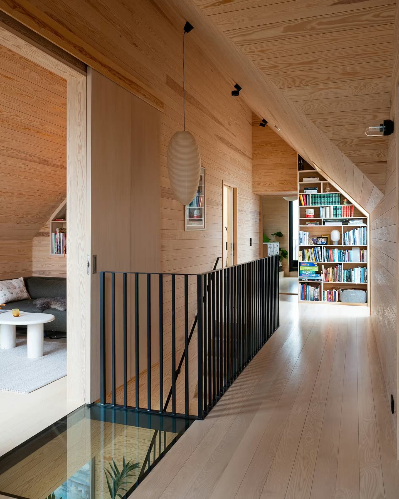
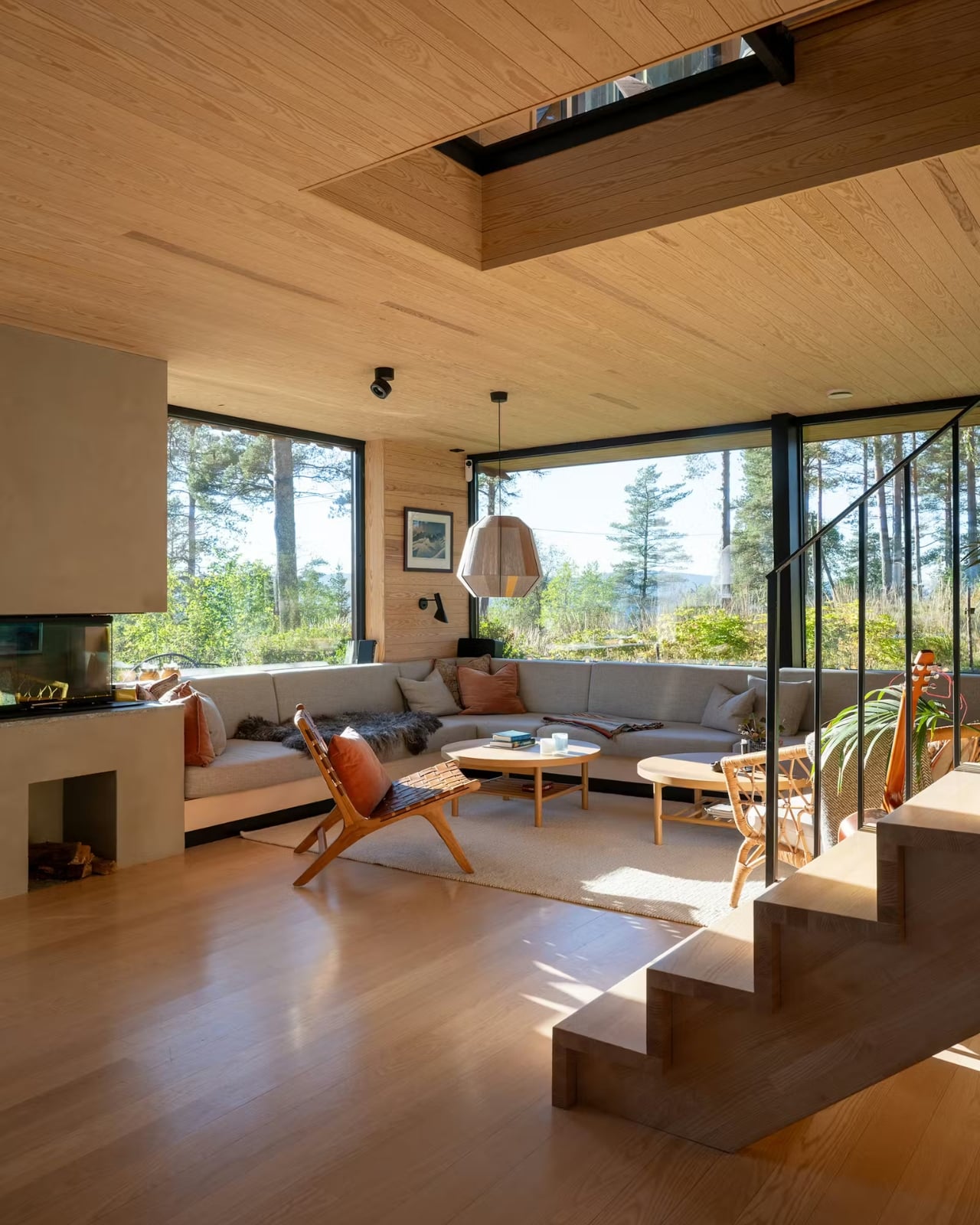
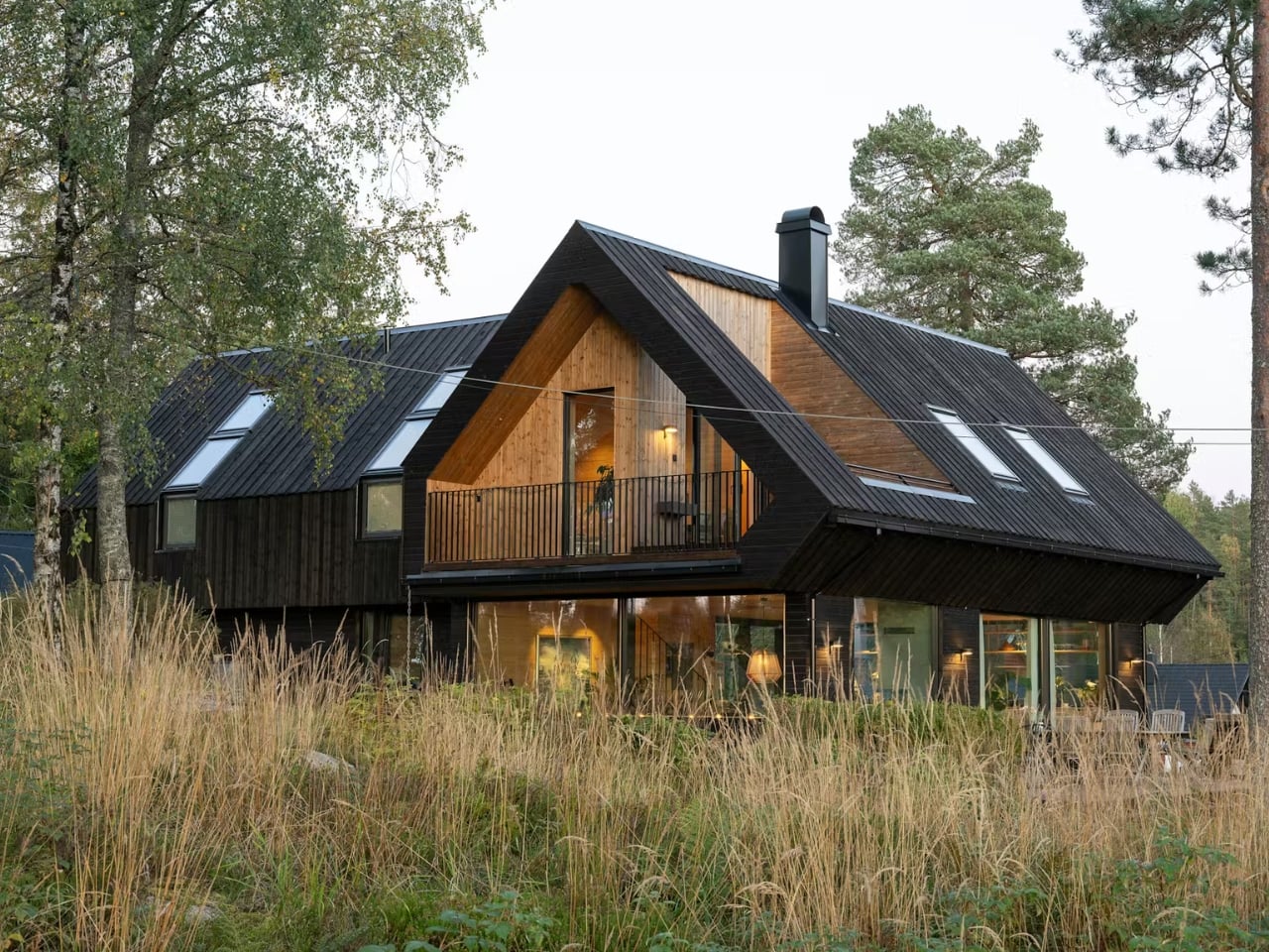
There’s a particular kind of restraint that’s genuinely hard to pull off in architecture. Anyone can build something that commands attention. Far fewer can build something that quietly earns it. The Solem Forest House in Oslo, Norway, designed by MORFEUS arkitekter, belongs firmly in the second category, and it’s the kind of project that stops you mid-scroll and makes you think about what good design actually is.
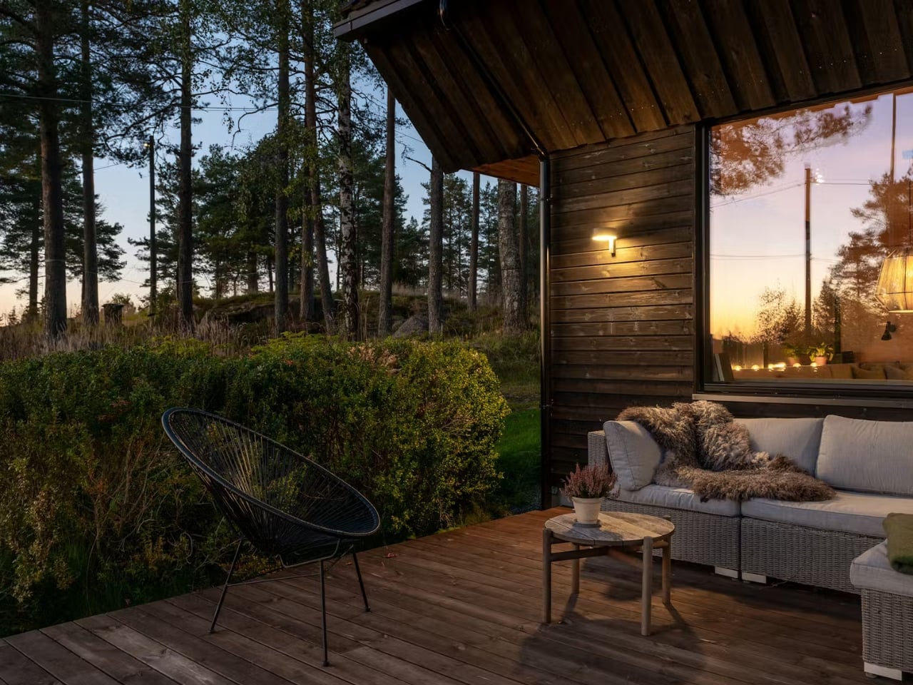
The house sits on a gently sloping ridge just east of Maridalsvannet, Oslo’s main water supply, in a small residential area surrounded by tall pine trees and deep forest. It’s not a massive project. At 170 square meters, it’s modest by most standards. But what MORFEUS arkitekter did with that footprint, and more importantly, what they chose not to do, is what makes it worth talking about.
The most striking feature from the outside is the dark vertical timber cladding. It’s the kind of exterior that reads as almost austere in photographs until you place it in context. Against the trunks of surrounding pine trees, it doesn’t contrast. It converses. The dark tones echo the bark, the vertical lines mirror the trees, and the result is a home that feels like it grew out of the ridge rather than landed on it. Dwell described it as “a continuation of the forest rather than an imposition on it,” which isn’t just poetic writing. It’s an accurate description of the design intent made physical.
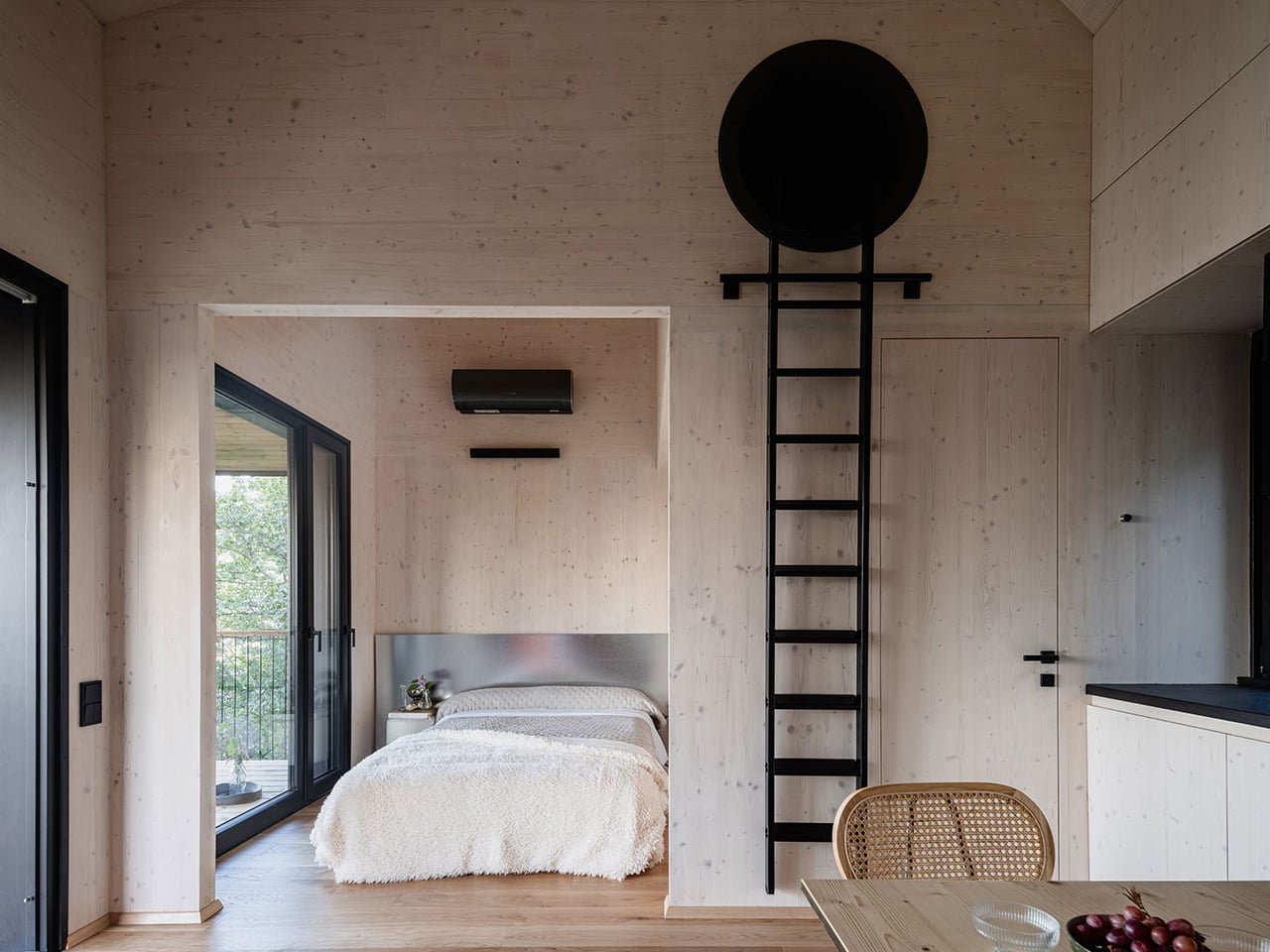
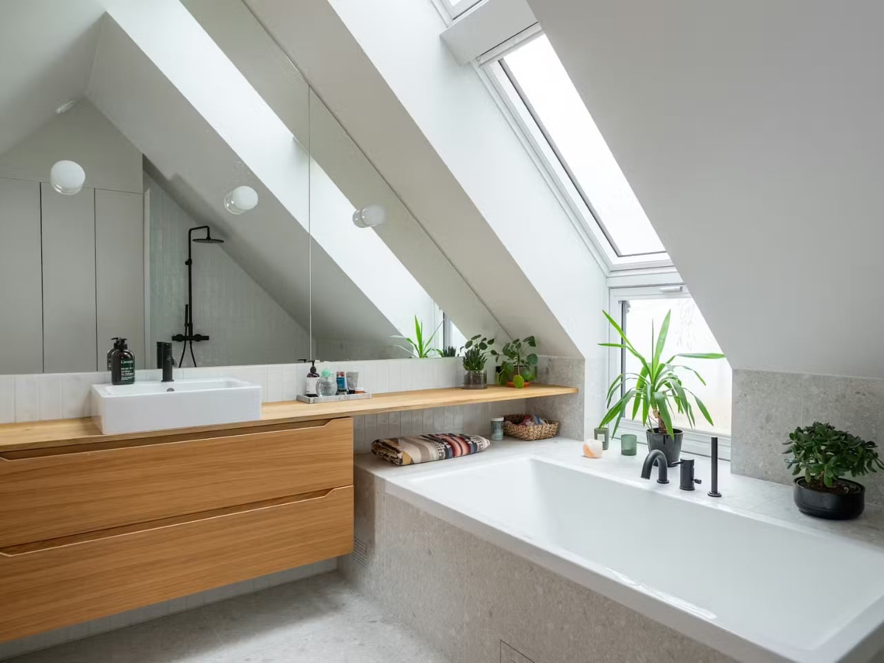
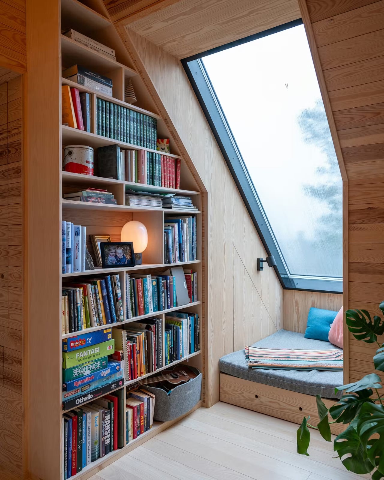
The roof is another story entirely. A large cross-gabled form defines the home’s architectural identity, and it does something genuinely clever: the second floor is partially embedded within the roof volume. What that means in practice is that you get rooms with character, with angles and nooks and a sense of shelter that flat-ceilinged spaces simply can’t replicate. The title of the Dwell feature on the project is “The Roof at This Norwegian Retreat Holds a Surprisingly Roomy Second Level,” and that element of surprise is very much the point. From the outside, the home reads compact and contained. Inside, the geometry works entirely in your favor.
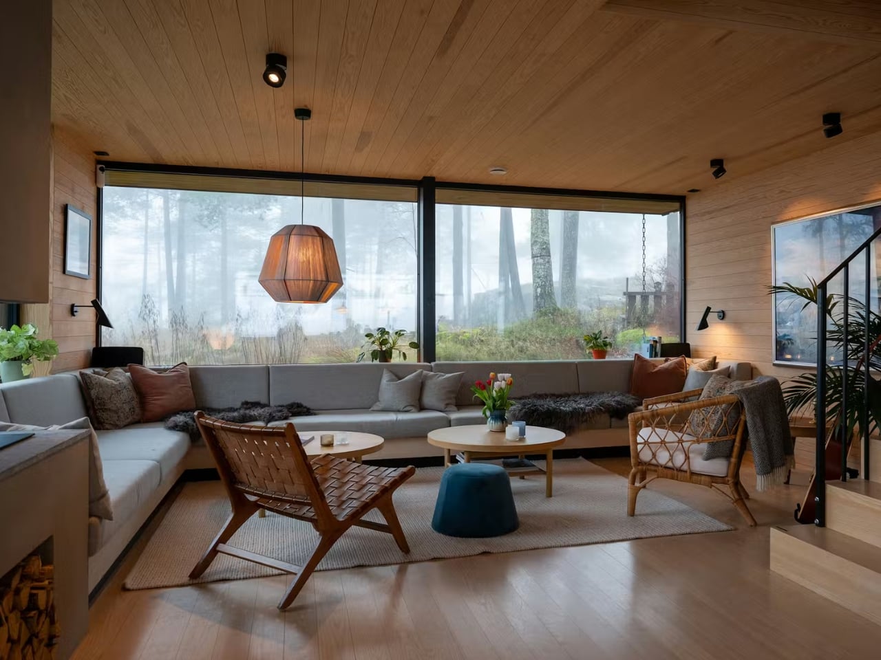
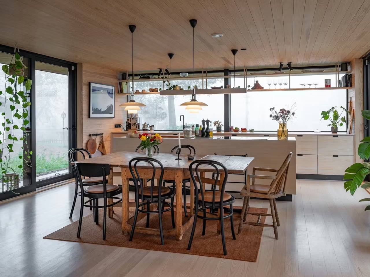
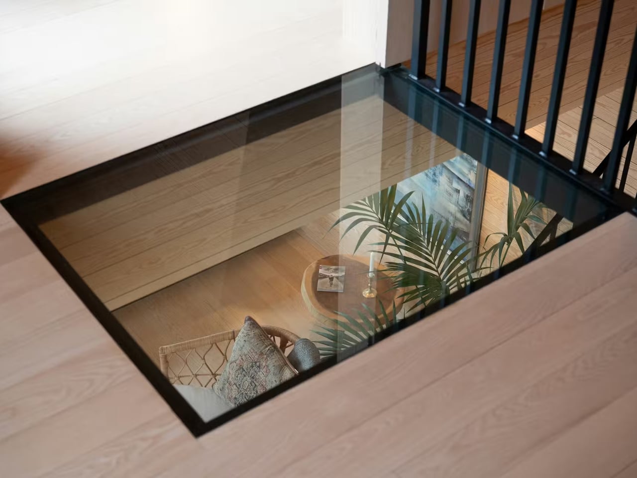
That interior warmth carries through in the materials. Solid wood finishes, a fireplace anchoring the living room, large picture windows framing forest views, custom bookshelves tucked along the upper hallway. There’s even a glass floor detail that lets light and sightlines move through the structure in ways that feel both unexpected and completely natural at once. These are the kinds of details that age beautifully and that no amount of trend-chasing can replicate.
What I find most compelling about the project, though, is what happened before a single new board was nailed. The original structure on the site dated back to 1946, and rather than tear everything out, MORFEUS arkitekter worked with the existing foundation walls. The site’s natural profile, the topsoil, the exposed rock, and the existing trees and undergrowth were all largely preserved. Every external surface is permeable, and rainwater infiltrates locally, keeping the water cycle intact in an area that sits within Oslo’s strictly regulated water supply catchment zone.
That level of site sensitivity isn’t just admirable from an environmental standpoint. It changes how the architecture feels. A home that respects what was already there carries a different kind of weight than one that simply imposes its will on a plot of land. There’s humility in it, and that humility reads through the final result.
MORFEUS arkitekter, founded in Oslo by architects Caroline Støvring and Cecilie Wille, has built a reputation on exactly this kind of approach: intuition balanced with rationality, traditional Scandinavian craft paired with contemporary methods, and a consistent commitment to letting the site lead. Their work has earned multiple architecture prizes over two decades, including the Nordnorsk Architecture Prize and an Oslo City Architecture Prize nomination. But what stays with you after looking through the Solem Forest House isn’t the awards. It’s the feeling that the building belongs exactly where it is, and that someone spent a long time making sure it did.
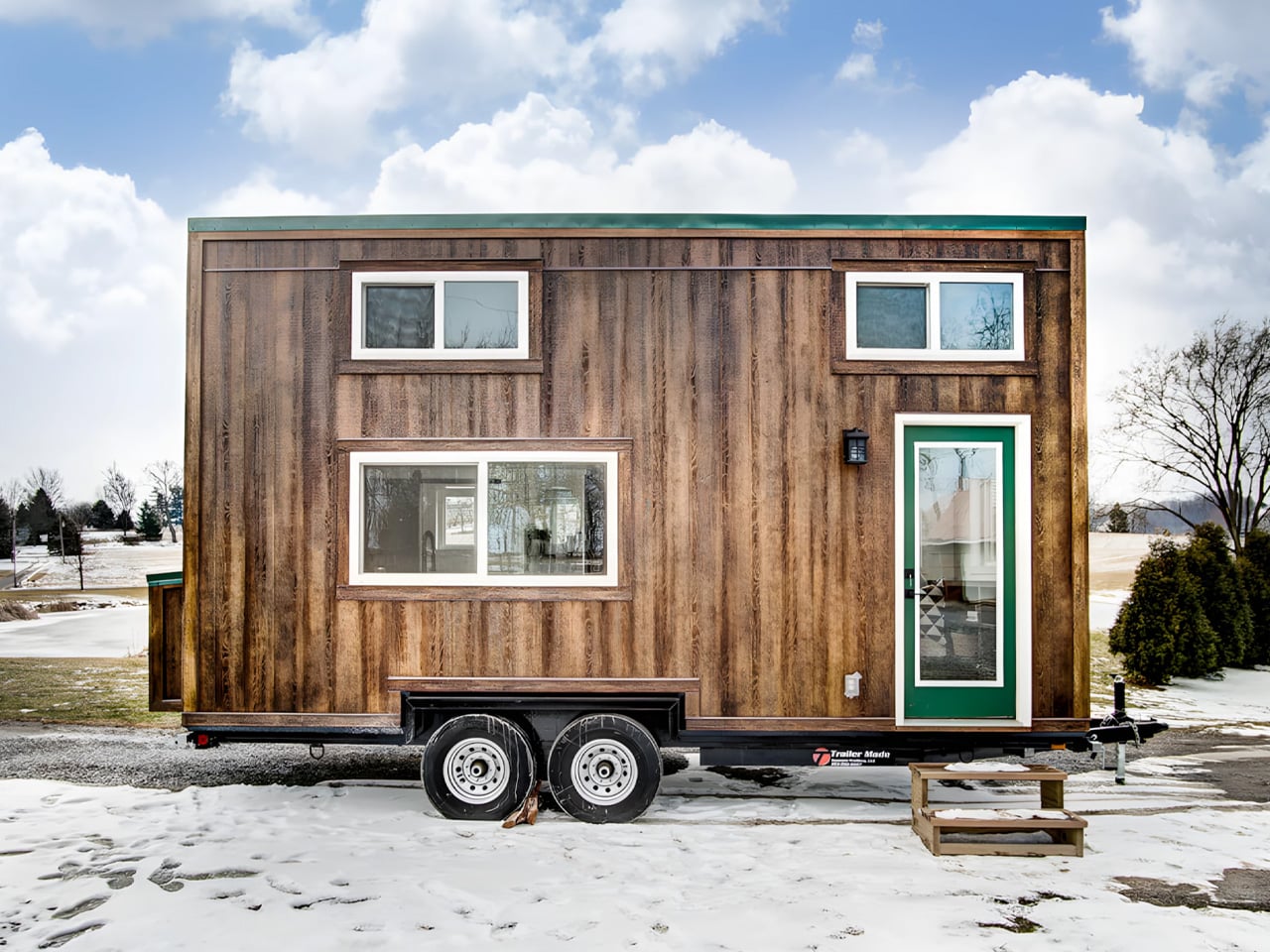
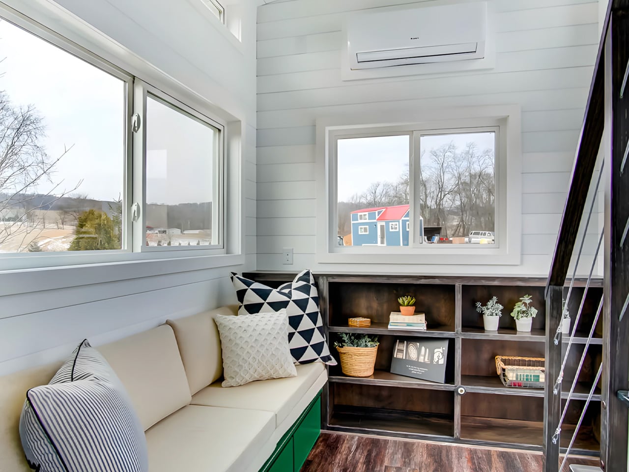
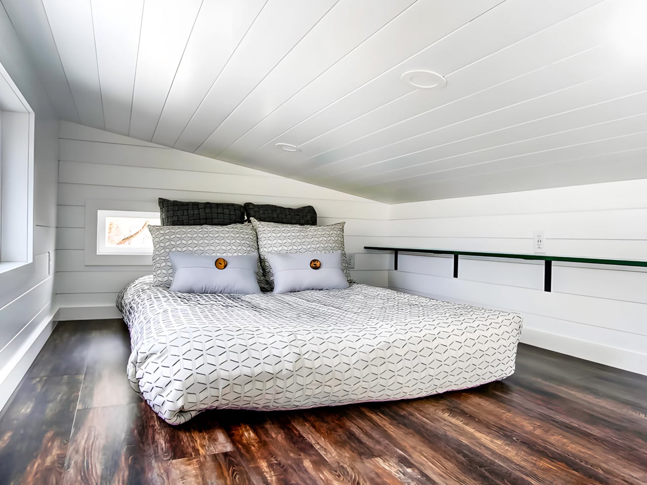
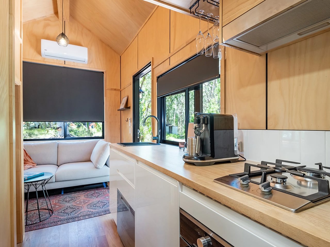
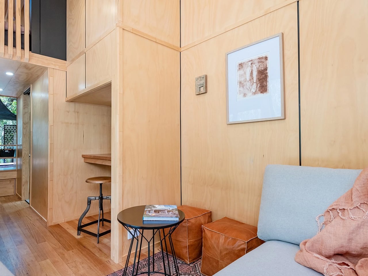
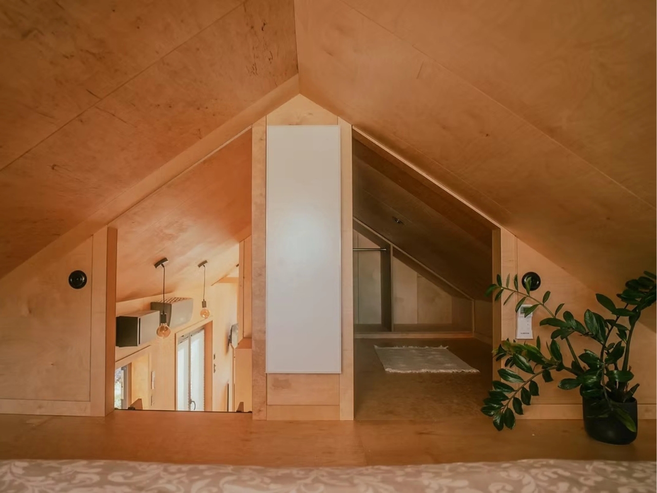
Twenty feet doesn’t sound like much until you step inside the Kinnakeet. Built by Ohio-based custom tiny home builder Modern Tiny Living, this road-ready dwelling packs a surprising amount of life into a footprint most people would walk past without a second thought.
The Kinnakeet is rooted in one of Modern Tiny Living’s most celebrated designs: the Mohican model, which earned a spot on HGTV’s Journey to the Tiny House Jamboree. While it inherits the Mohican’s clever bones, the Kinnakeet carves out its own identity with a crisp white interior, broad green accents, and dark floors that ground the whole aesthetic. The exterior is wrapped in engineered wood and capped with a metal roof, making it understated, durable, and sharp.
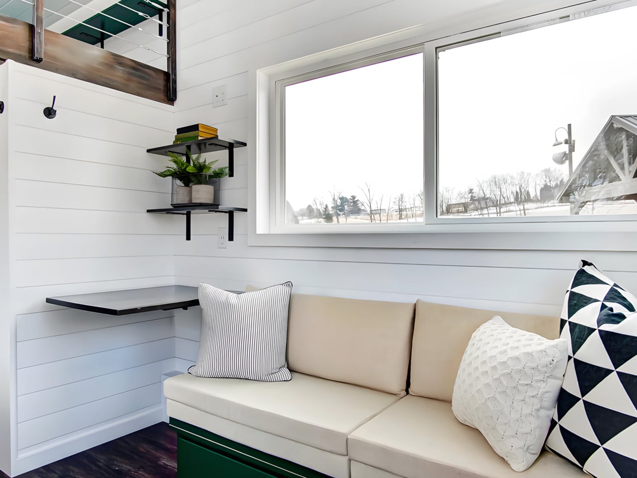
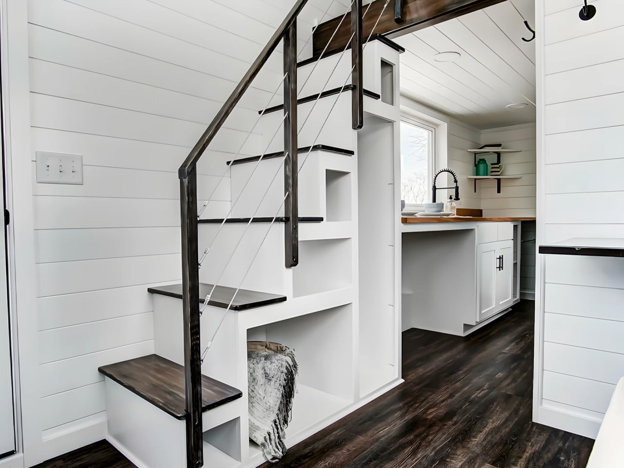
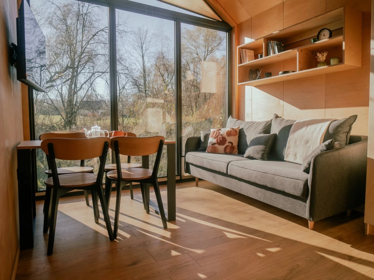
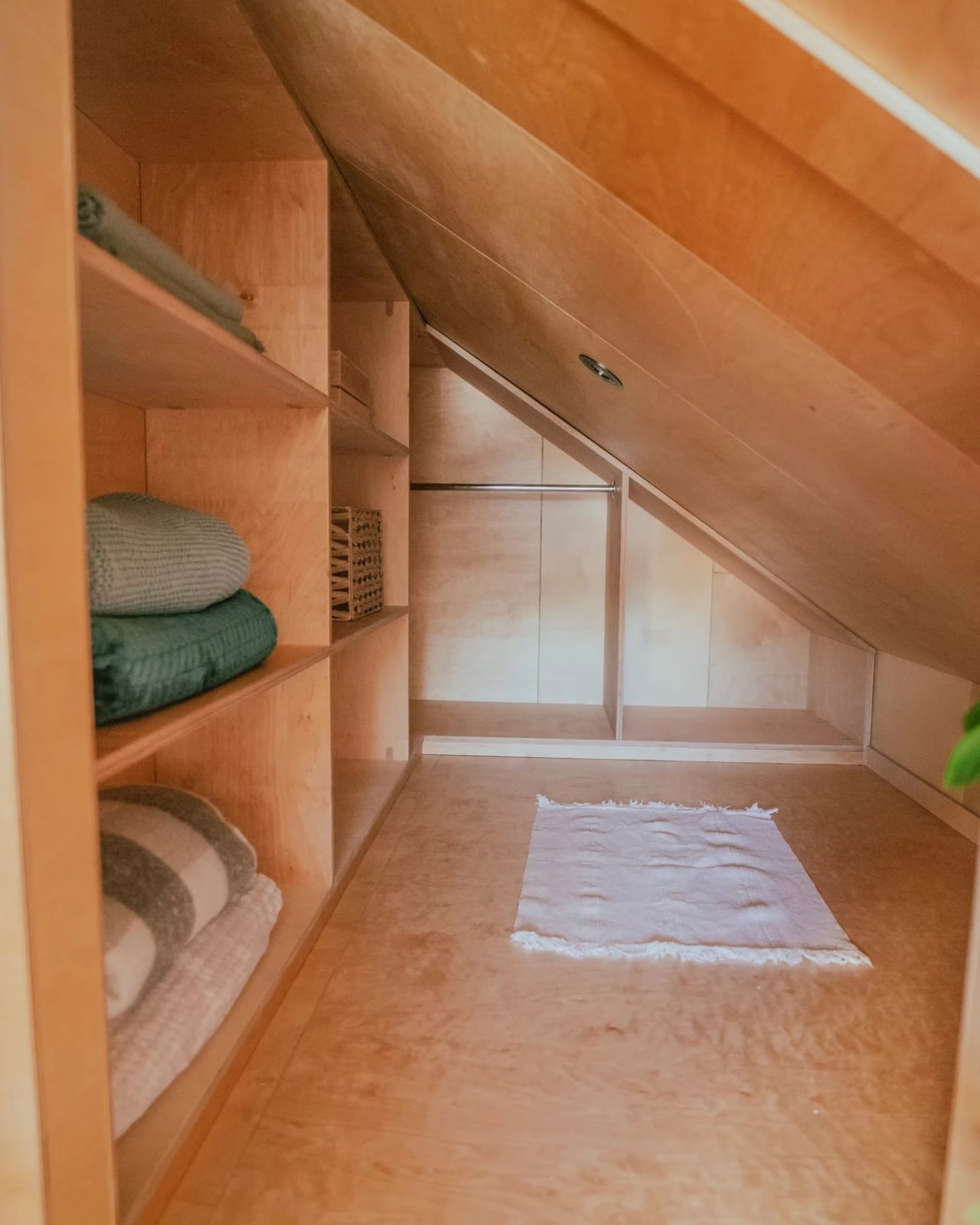
Step inside, and the first thing you notice is the light. The living area is anchored by two large windows that flood the space, paired with a sofa that doubles as a bed for two, with three storage drawers tucked underneath. A folding table doubles as a workspace or dining surface, and a large custom bookcase makes the room feel intentional rather than improvised. The staircase leading up to the loft doesn’t waste a single riser — each step hides a cubbyhole of varying sizes for shoes, books, or whatever you need within reach.
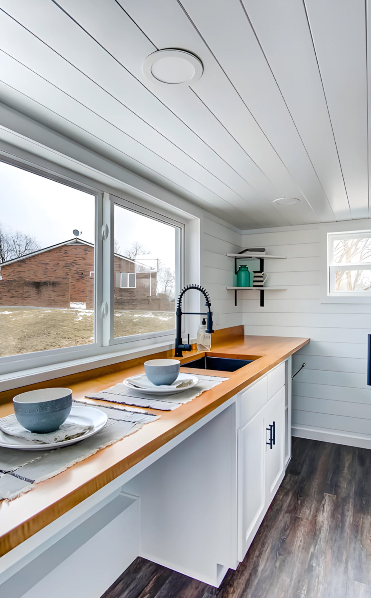
The kitchen is compact but thoughtful, featuring a sink, custom cabinetry, and open space that accommodates additional appliances depending on the owner’s needs. Since the Kinnakeet was originally designed for use as a vacation rental on Airbnb, it skips the full-size appliances found in Modern Tiny Living’s permanent residences — a deliberate choice that keeps the build flexible and the cost accessible.
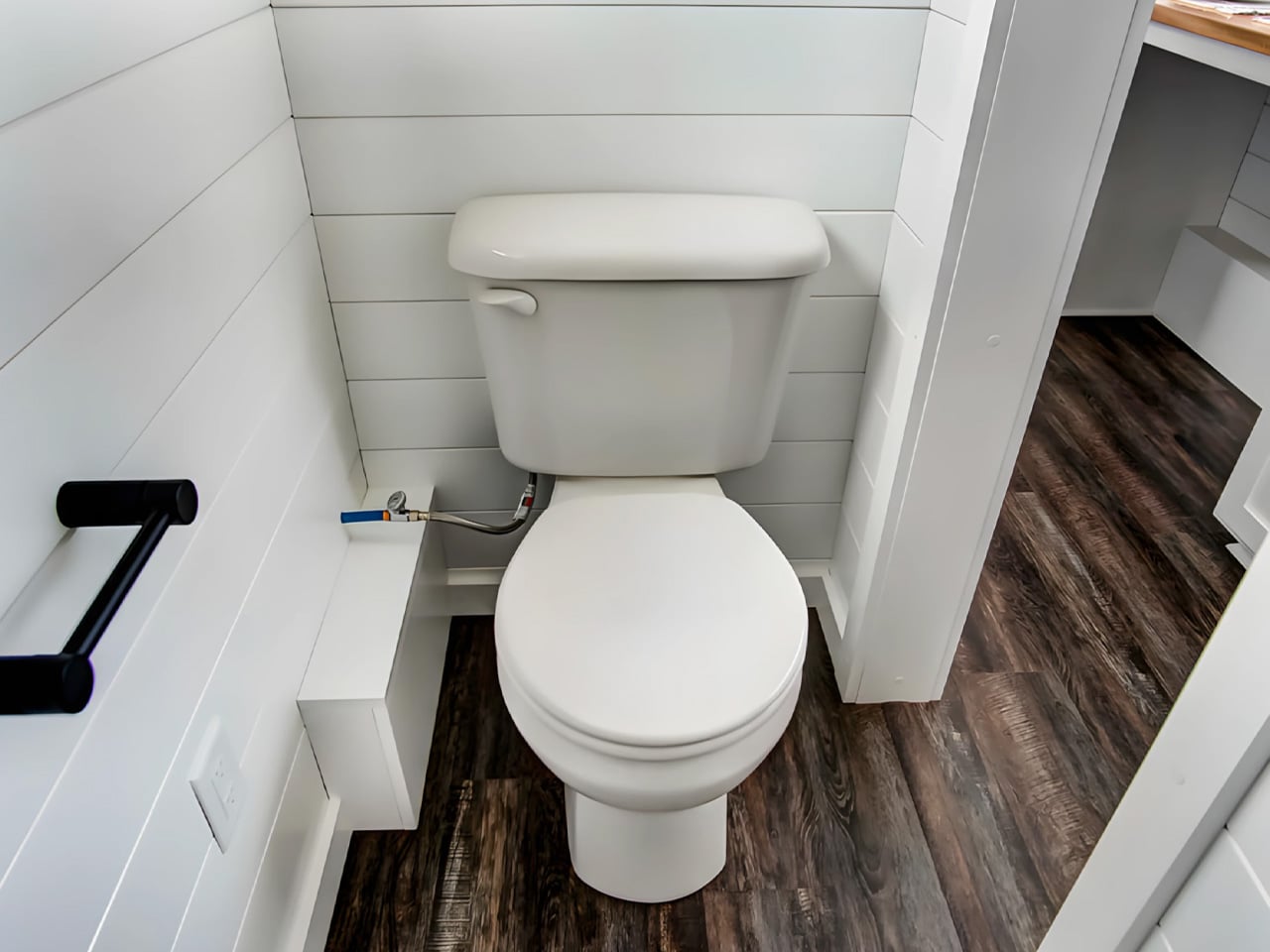
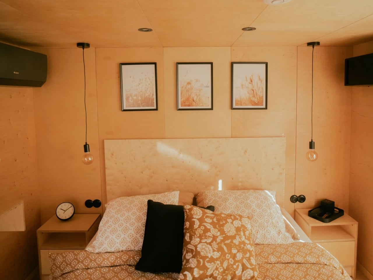
The bathroom is accessed through a sliding barn-style door off the kitchen and manages to fit in a walk-in shower and a flushing toilet without feeling squeezed. Up the storage staircase, the lofted bedroom fits a double bed with enough room to feel like a proper retreat, even if the ceiling keeps things cozy.
Priced at $79,000 as a starting point, the Kinnakeet is customizable, more or less depending on finishes, appliances, and personal priorities. Whether you’re looking for a full-time downsized lifestyle or a smart vacation rental investment, the Kinnakeet makes a compelling case that 20 feet is more than enough.
The housing crisis is not a headline anymore; it is a lived reality. Soaring property prices, relentless rent increases, and the quiet exhaustion of never quite owning anything have pushed a whole generation to question what a home genuinely needs to be. The answer, for many, is less. Less debt, less space, less compromise on quality of life. The Artista by Australian tiny house builder Tiny Tect is exactly that kind of answer — compact in footprint, but completely uncompromising in how it lives.
Sitting at 7 metres long, 2.4 metres wide, and 4.25 metres tall, the Artista is built on a certified triple-axle trailer with a 4.5-tonne weight capacity and full road registration capability. On paper, those numbers sound modest. In person, the experience is entirely different. The layout is deliberate from the moment you walk in; a storage-integrated staircase sits at the entrance, turning what is usually dead space into something useful before you have even settled in.
The loft bedroom is where the Artista earns its name. Positioned centrally rather than pushed to one end, it opens up views from both sides of the home — a move that feels more architectural than practical, and intentionally so. The space fits a double bed and a walk-in wardrobe, and for those who need the ground floor to work harder, a flexible lower-level room can serve as a second sleeping area, a home office, or a guest space. For a home this size, sleeping up to four adults is not a workaround…it is part of the plan.
The kitchen does not shrink away from the challenge either. A four-burner cooktop, full oven, sink, and fridge-freezer sit together in a layout that functions like a proper kitchen should. Besides it, the living area holds a sofa and a compact work desk — a quiet acknowledgment that home now means office too, for a lot of people. The ensuite bathroom and a built-in planter box round out the interior with the kind of details that make a small space feel considered rather than crammed.
What the Artista ultimately solves is bigger than square footage. It hands people back financial breathing room. Starting from $98,900 and available from roughly $243 per week in repayments, it sits well below the cost of traditional homeownership in most Australian cities. Optional solar panels, battery storage, and water tanks take it further toward genuine off-grid independence — lowering ongoing costs and loosening the ties to utility bills and landlords alike. The Artista is not a consolation prize for people who cannot afford a real home. It is a deliberate choice for people who have decided that freedom, quality, and intention matter more than floor area. Small in size, yes, but not in any way that actually counts.
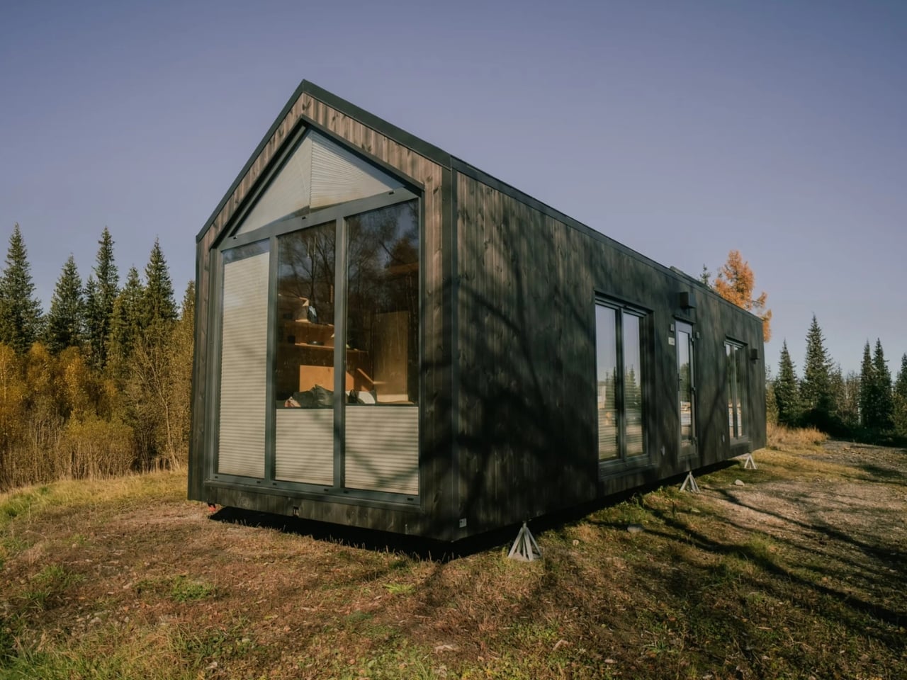
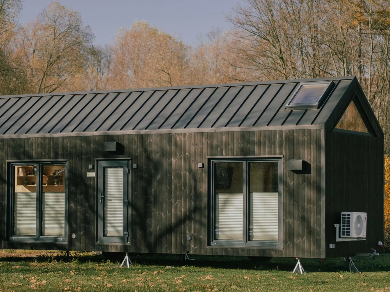
Most people picture a tiny house as a romantic retreat for one or two people with very few belongings and an even smaller grocery budget. The Zenith by Vagabond Haven is here to argue otherwise. Built by the Sweden-based design studio behind some of the most thoughtfully crafted small homes in Europe, the Zenith is a non-towable tiny house that takes aim at a demographic the tiny house movement has largely ignored: families. Not just couples, not just digital nomads, but actual families with kids, toys, and the basic human need for a door that closes.
At 11 meters long and 3.45 meters wide (about 36 by 11 feet), the Zenith stretches the definition of “tiny” just far enough to make it livable for more than one person. The total living area clocks in at 44 square meters, or roughly 473 square feet. That’s generous for a tiny house, and the layout makes every inch count.
The Zenith is an evolution of Vagabond Haven’s earlier Sky model. Where the Sky kept things minimal, the Zenith brings in a second sleeping space in the form of an overhead loft, a dedicated flex room that can serve as a walk-in closet or a child’s bedroom, and a larger kitchen designed for actual cooking rather than survivalist meal prep. These aren’t small upgrades. They’re the kind of design decisions that signal a shift in who the tiny house market is really meant to serve.
The exterior is finished in engineered wood with an aluminum roof, which gives it a clean, modern aesthetic without the sterile coldness of a shipping container conversion. Big windows and skylights run throughout the interior, keeping the space feeling open even when square footage isn’t exactly on your side. Natural light is doing a lot of heavy lifting here, and it shows.
Inside, the main bedroom sits on the ground floor, which is a meaningful detail for anyone who’s ever tried to navigate a steep loft ladder at 2 a.m. The bathroom doesn’t cut corners either. It features wet room-approved walls from Fibo panels, a glass shower cabin, a generous countertop, and space under the vanity for a washing machine. Vagabond Haven also gives buyers a choice between flush, composting, Separett, or incinerating toilets, which speaks to the range of customers they’re designing for, from sustainability-minded homeowners to those building on remote land without conventional hookups.
Storage is woven into the design at every turn rather than treated as an afterthought. The floor plan has a logical flow to it, the kind that only comes from spending real time thinking about how people actually move through a home. The flex room in particular is one of the smarter elements, giving the layout breathing room for families at different stages of life.
On the utilities side, the Zenith can be configured with a solar system, a rainwater harvesting setup, a heat recovery ventilator, and electric or gas hot water heating. It’s a house that can run largely off the grid if that’s what you’re after, or connect to standard services if you’d rather keep things conventional. Vagabond Haven offers eurowide delivery, which means this isn’t just a Scandinavian fantasy but a genuinely accessible option for buyers across the continent.
Pricing starts at around €53,380 before VAT, which puts it well below the cost of a traditional home in most European cities and in the same ballpark as a high-end campervan, except with considerably more dignity and a door that locks from the inside.
The tiny house movement has spent years proving that you can live with less. The Zenith makes a slightly different case: that you can live with less space without actually giving up the things that make a house feel like a home. For families who’ve been watching the tiny house trend from the sidelines and wondering if there’s something in it for them too, the Zenith might finally be the answer they’ve been waiting for.
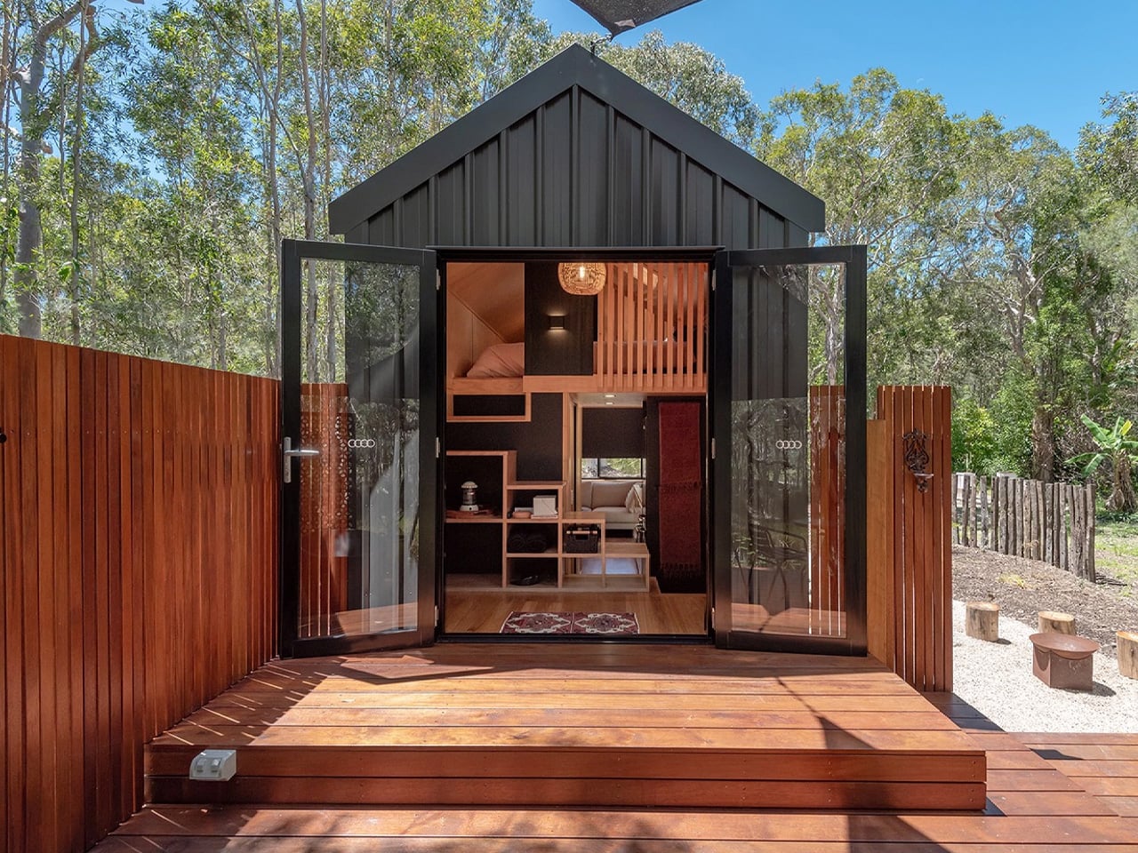
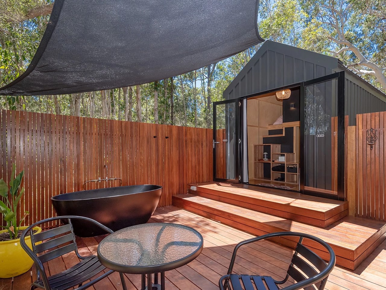
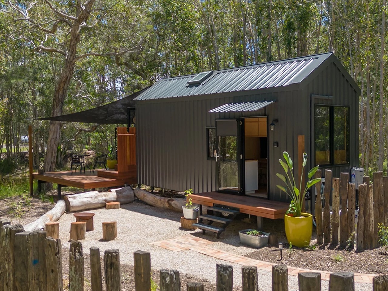
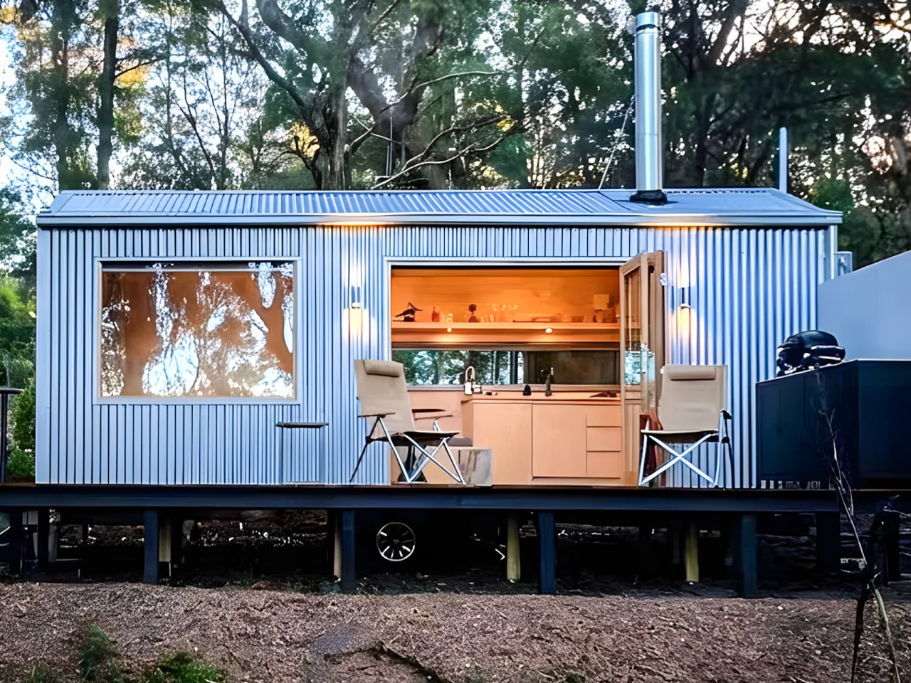
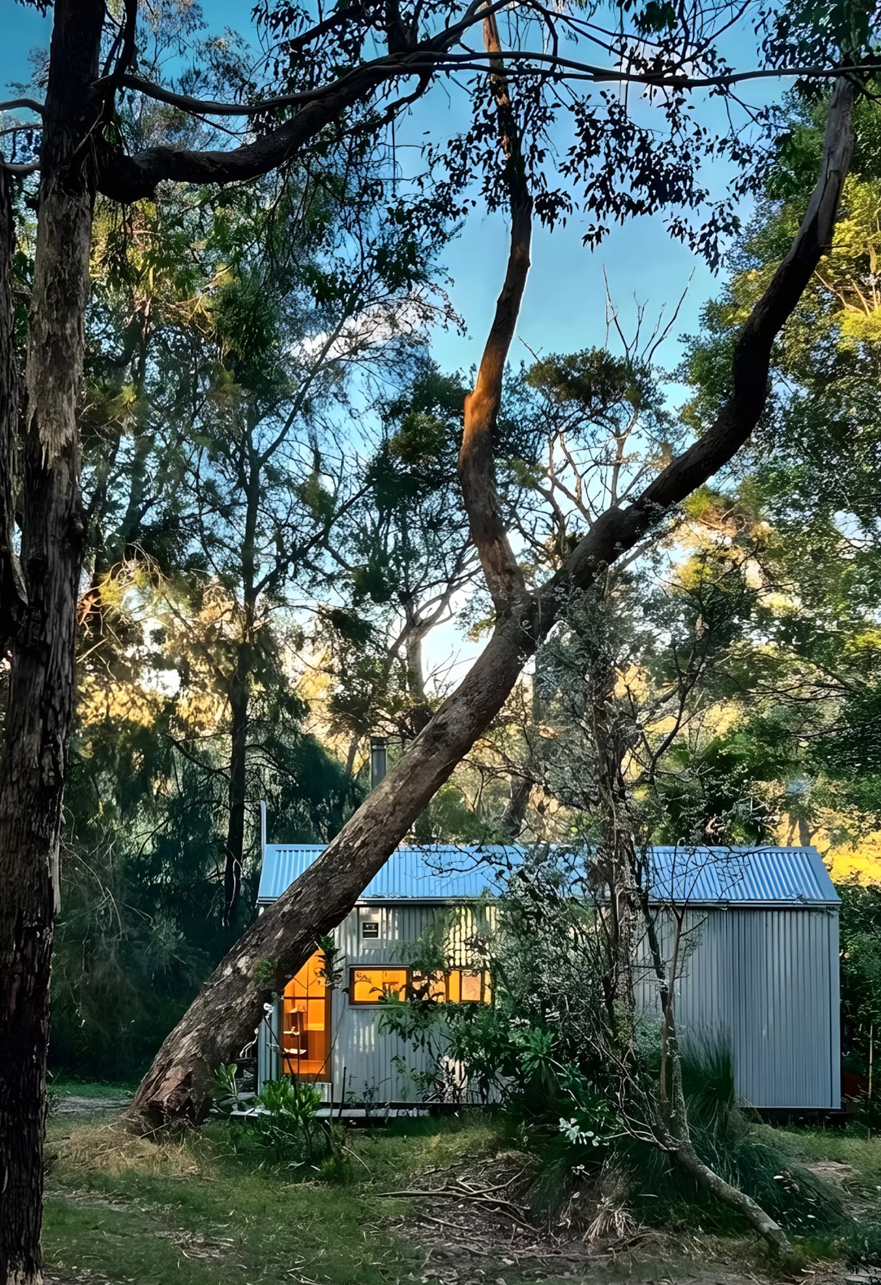
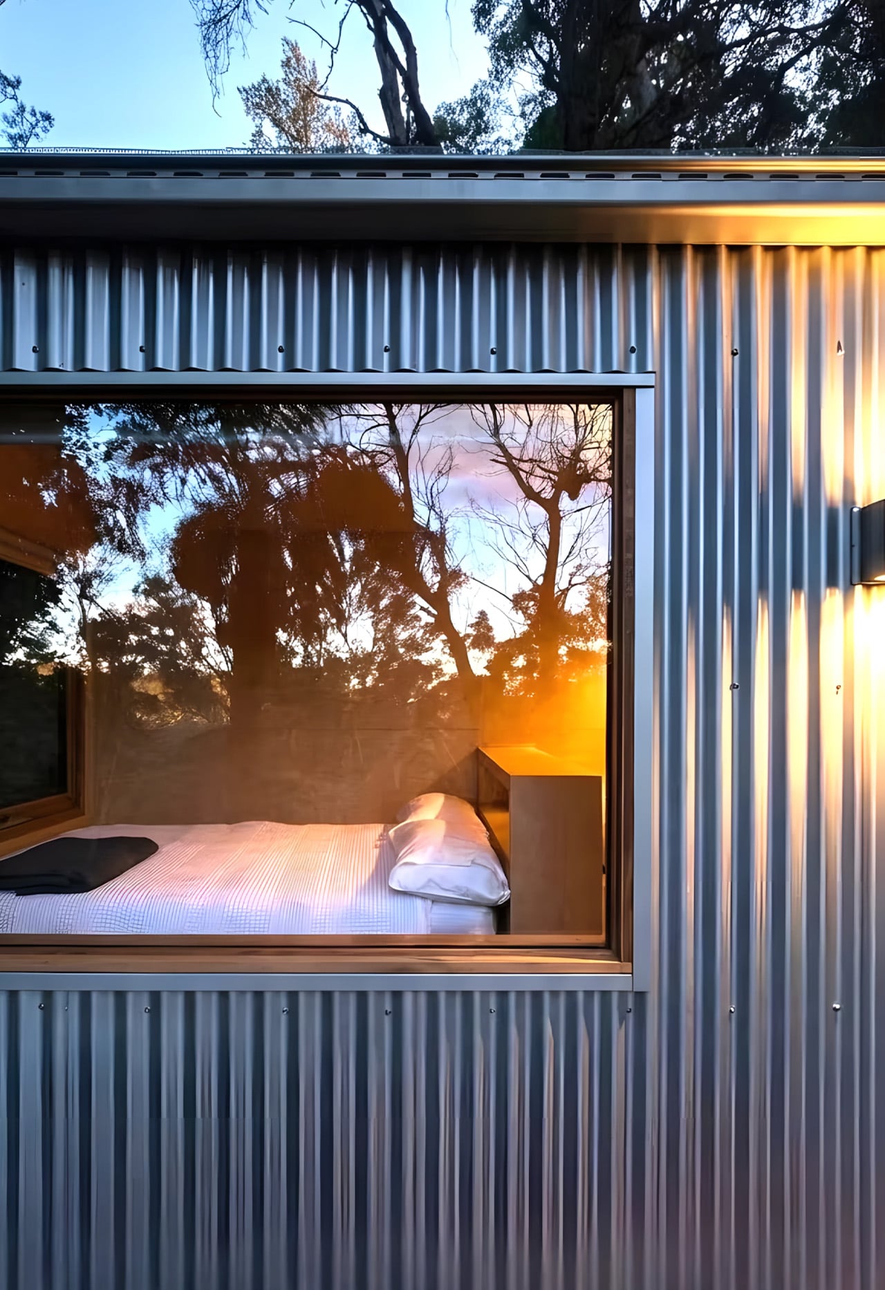
The Zinc Studio Cabin looks like a shed. That’s entirely the point. It pulls from the corrugated iron sheds and shearers’ quarters of rural Australia — those weathered, no-fuss outbuildings that have quietly shaped the country’s built landscape — and re-engineers that heritage into something genuinely architectural. It doesn’t try to be a house pretending to be modern. It’s a prefab that knows exactly what it is, and that confidence shows in every detail.
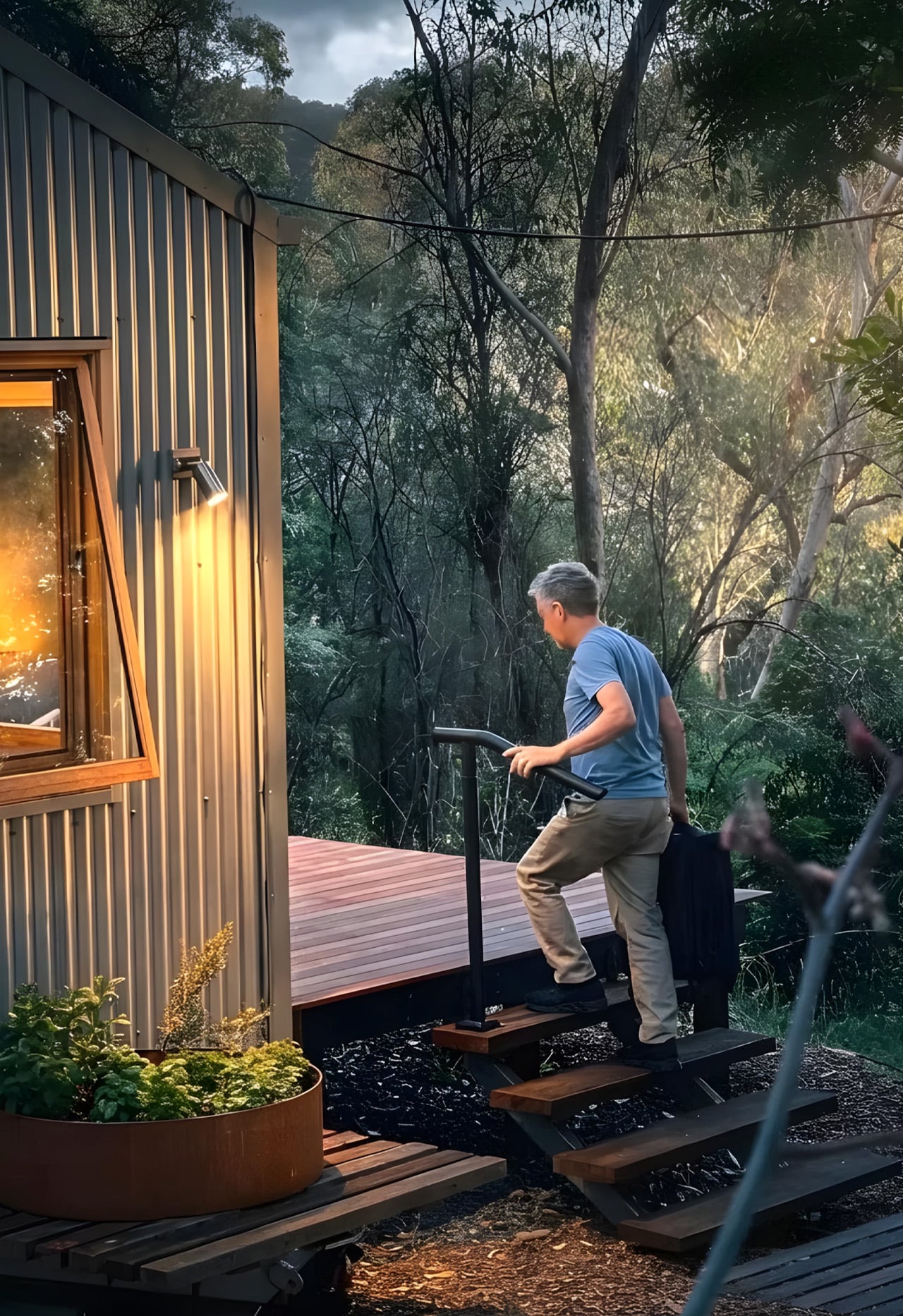
Built on a steel skid foundation and delivered by truck, the cabin arrives turn-key in as little as eight weeks. The standard model runs seven meters in length, though bespoke configurations stretch to twelve, making it adaptable across residential plots, farm stays, and short-term accommodation sites. The process feels less like commissioning a build and more like receiving a very well-resolved object — one that can be live-in ready the same day it lands on site.
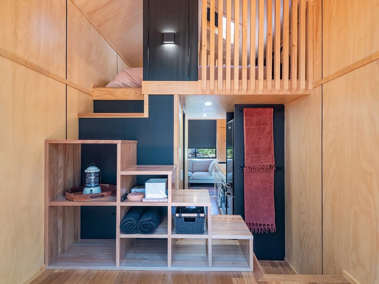
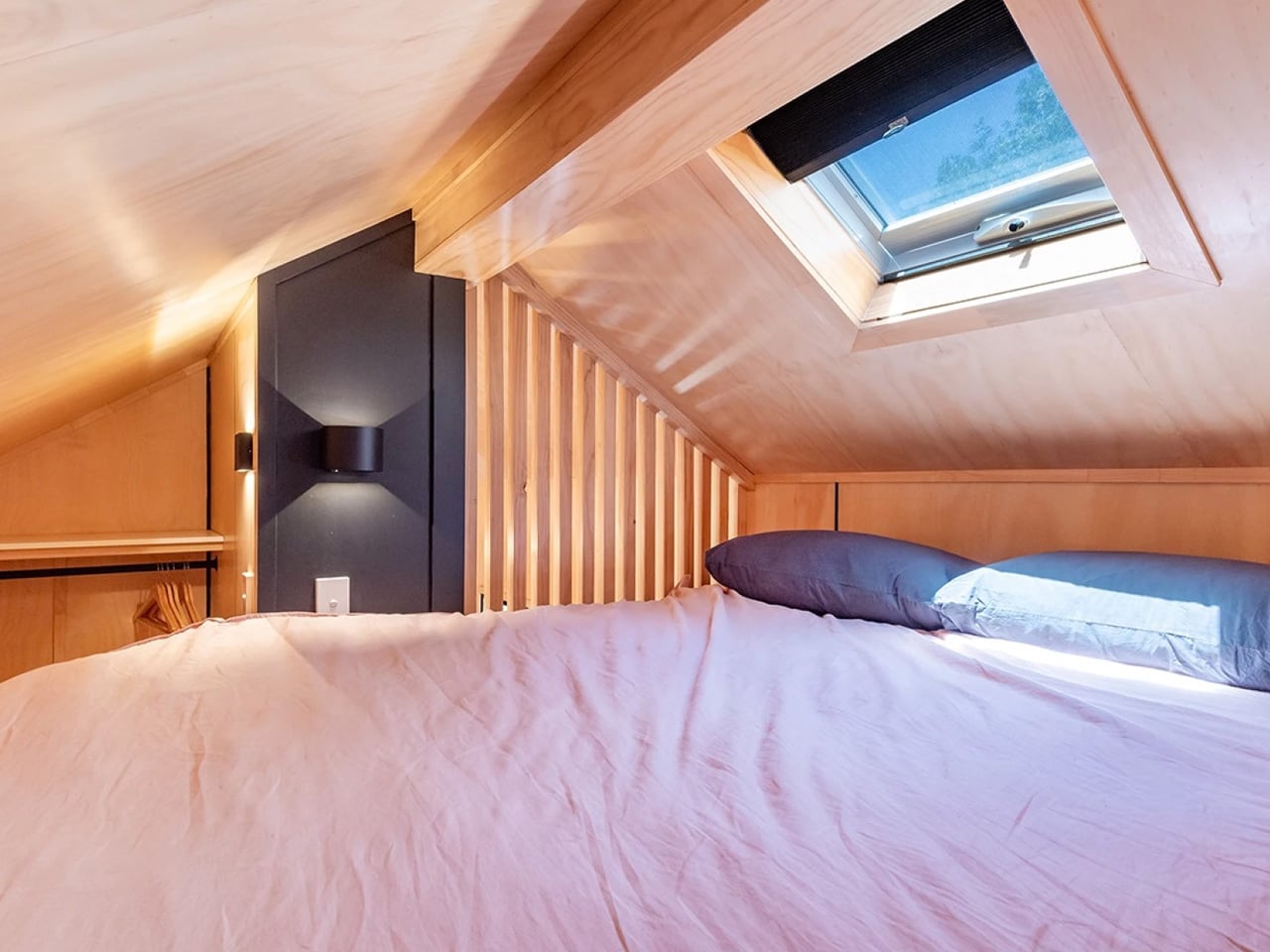
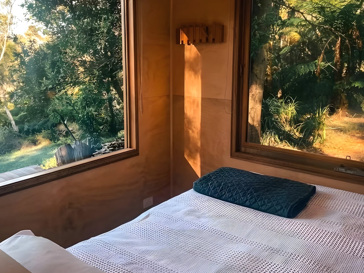
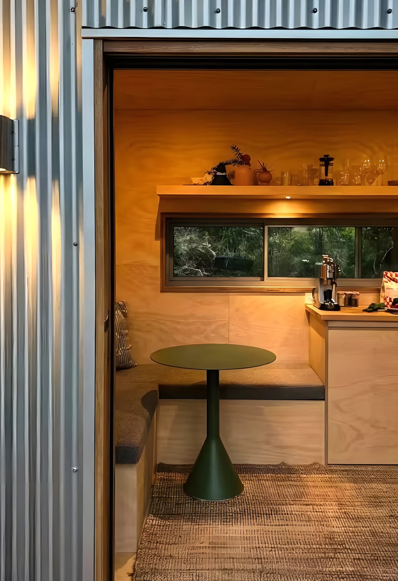
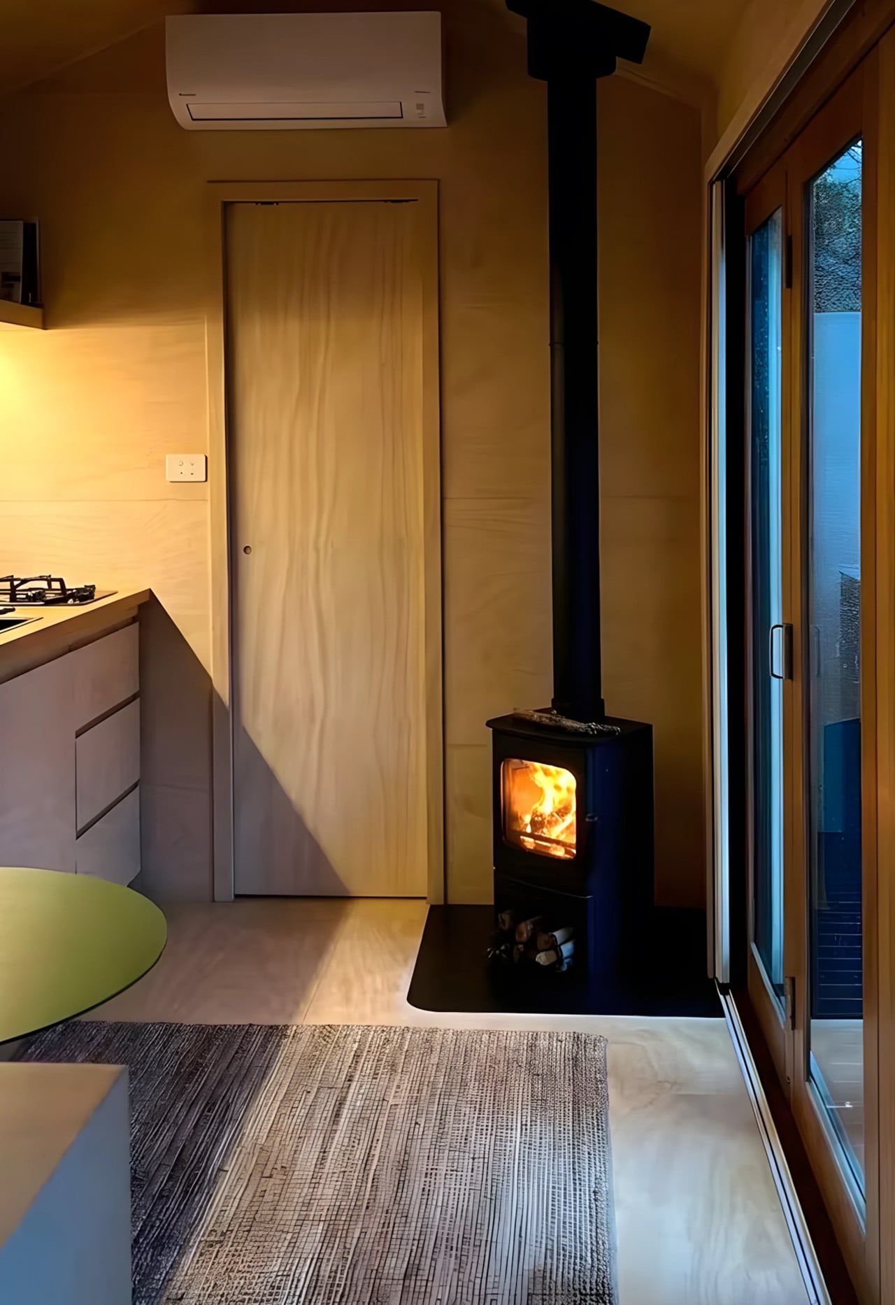
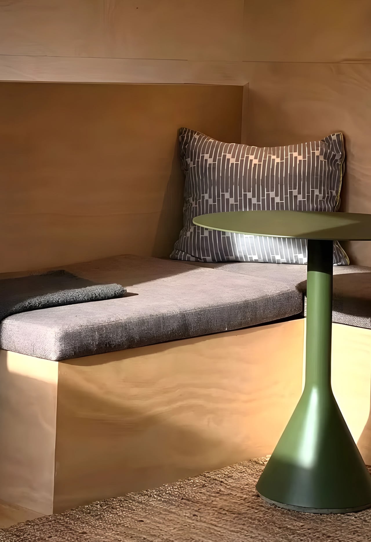
Inside, the single-level layout is open without feeling bare. Architectural-grade plywood lines the walls, hardwood trim works through the details quietly, and a run of generous glazing keeps the cabin in conversation with whatever landscape surrounds it. The tri-fold glass doors are where the design earns its keep — folding back entirely to collapse the boundary between interior and deck, shifting the whole space into something closer to a pavilion. Natural light moves through the cabin freely, making the footprint feel more expansive than its dimensions suggest.
The bathroom is considered complete, with a glass-enclosed shower, vanity, and toilet that sit neatly within the overall material language. A log-burning stove near the entry brings warmth that the plywood and hardwood already hint at. The zincalume exterior handles the elements with minimal upkeep, and Colorbond colour options let the finish be dialled to suit the site. Full off-grid capability rounds out a specification list that holds up whether the cabin is sitting on a remote rural block or a working vineyard.
Zinc Studio has also positioned the cabin as a genuine short-stay income vehicle, and their own hosted properties back that up in practice. What makes the cabin worth paying attention to isn’t any single feature — it’s the consistency. For a structure that arrives fully resolved on the back of a truck, the level of design rigour on display is something the broader prefab market is still working to catch up with. Australia has been building corrugated iron structures for over a century. Zinc Studio is simply doing it better than most.