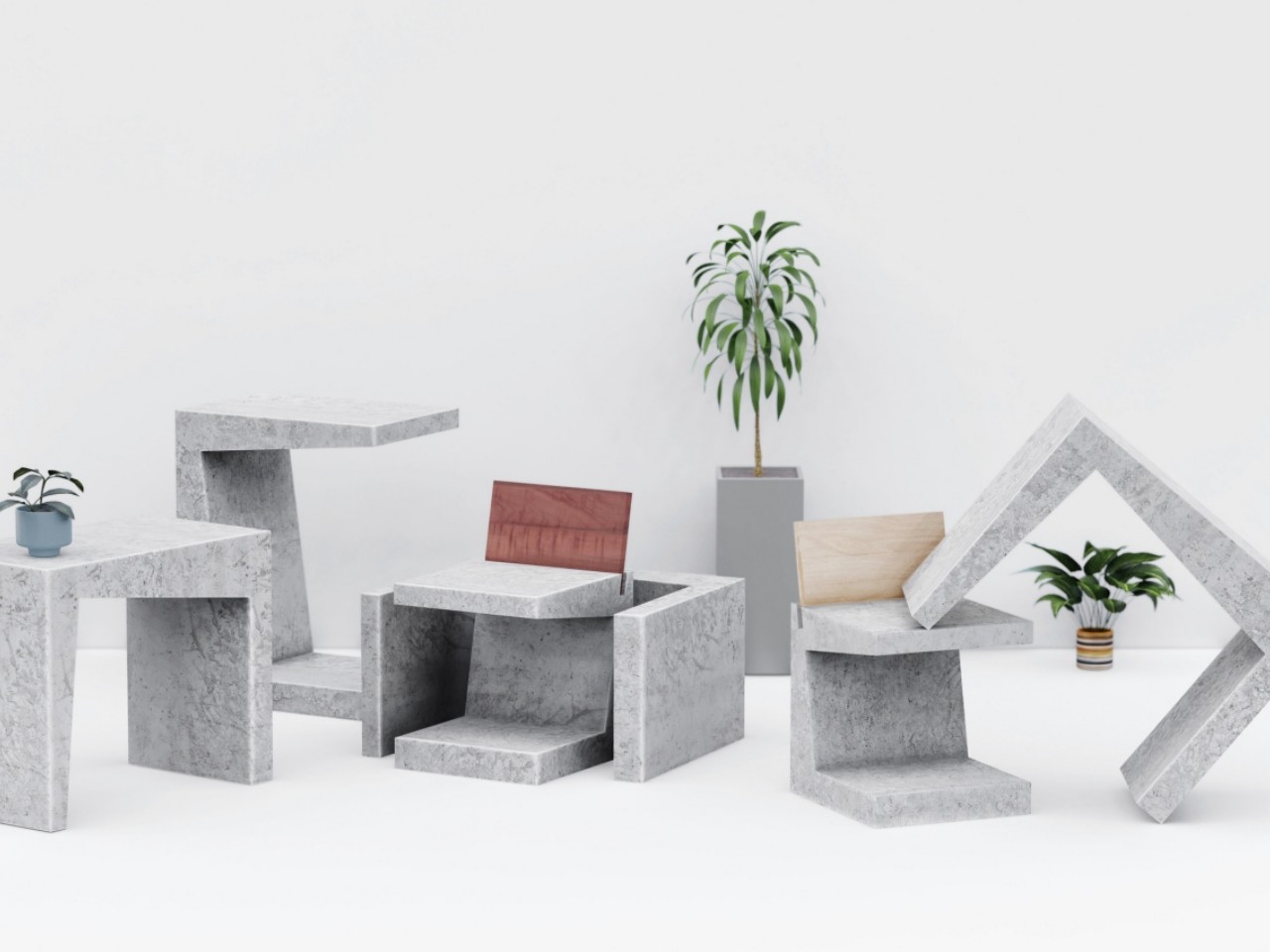
A messy desk is one of those problems that feels minor right up until it isn’t. You reach for a pen, knock over a cup, lose a paperclip into some void between your keyboard and monitor, and suddenly, five minutes are gone. Most organizers solve this with dividers and compartments, which is fine, but they tend to sit on your desk like afterthoughts, plastic trays that slide around and rarely match anything else in the room.
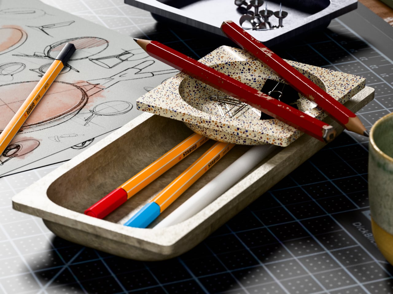
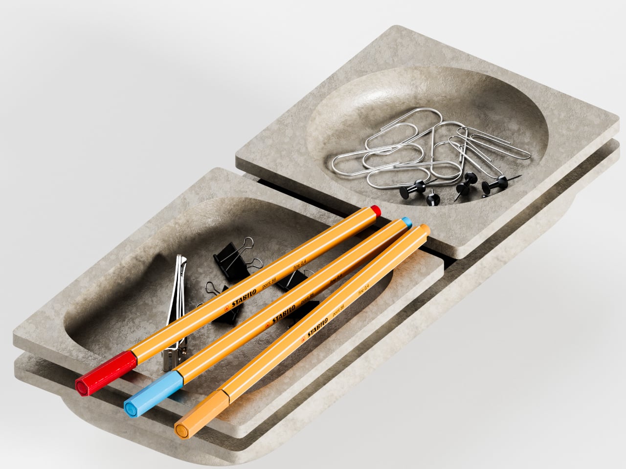
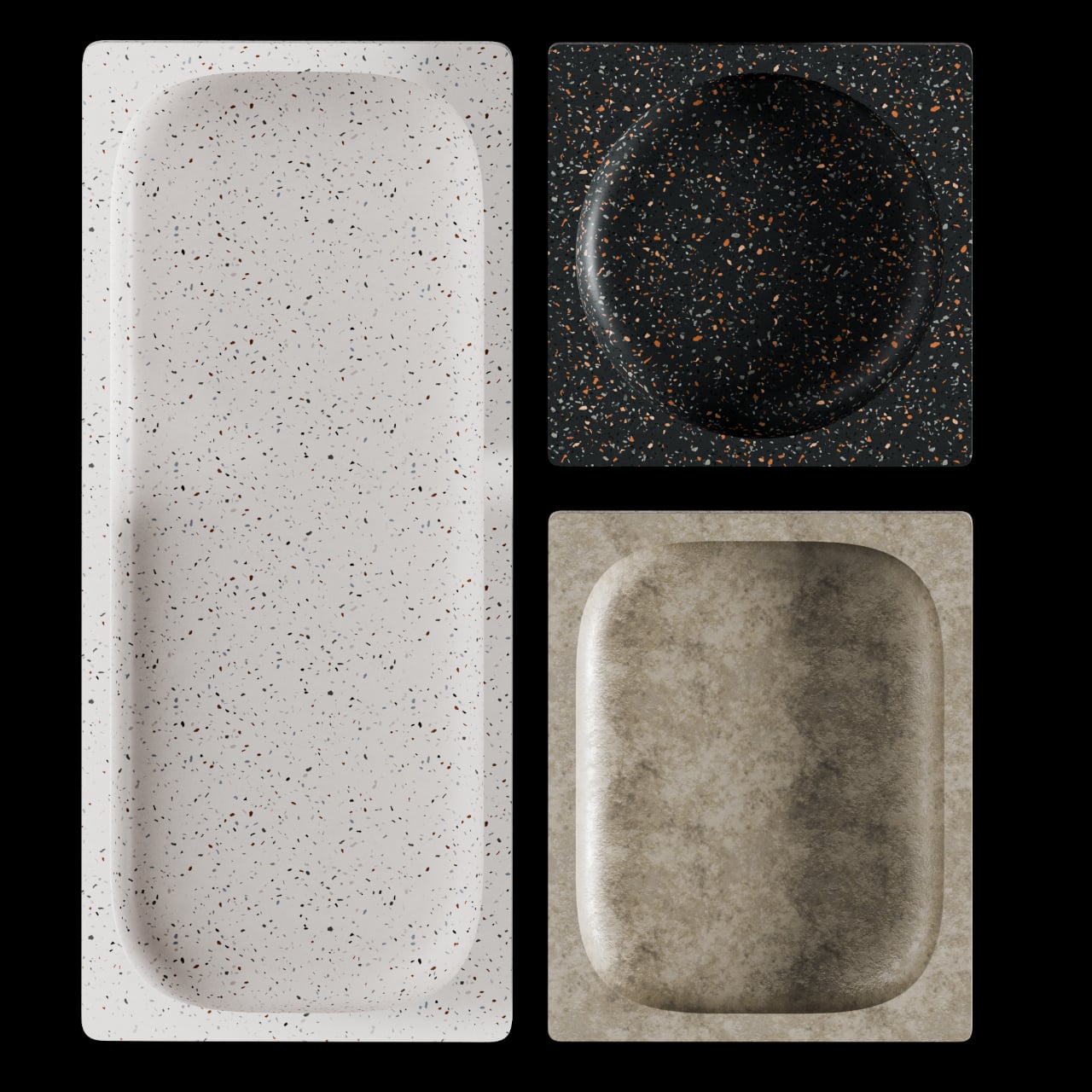
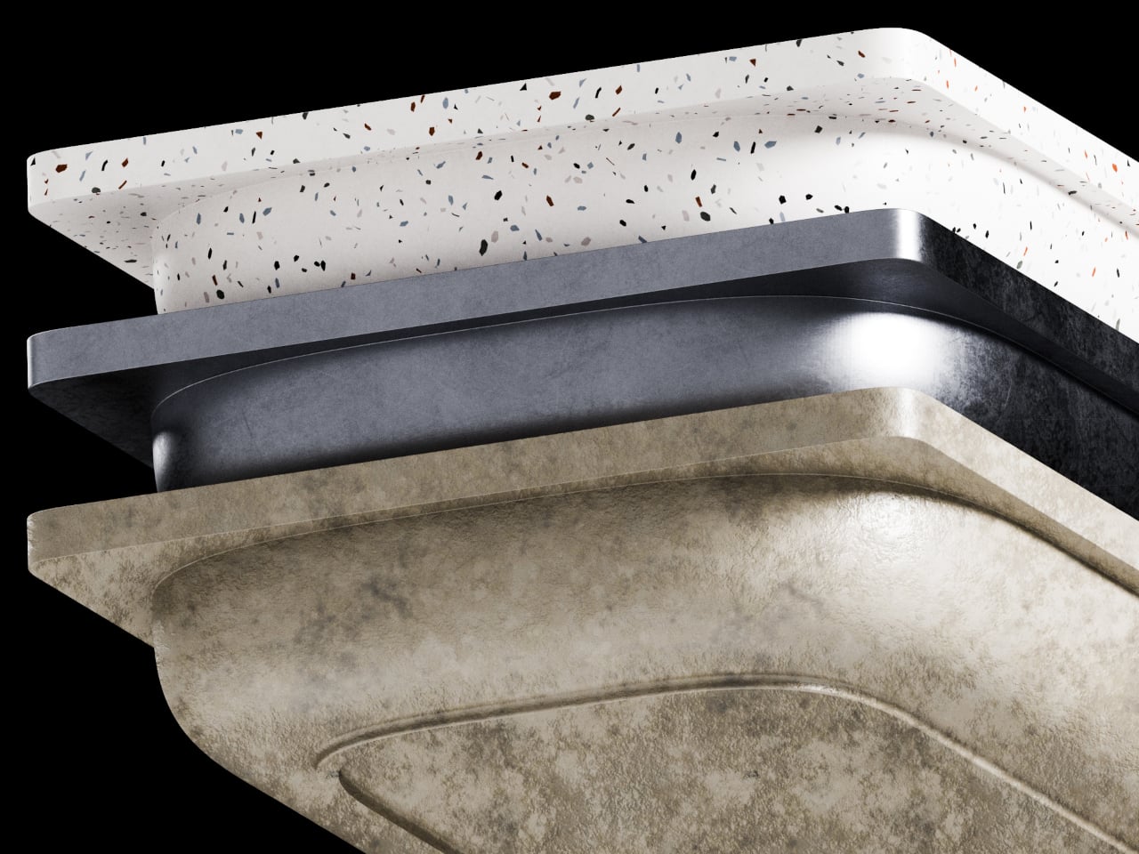
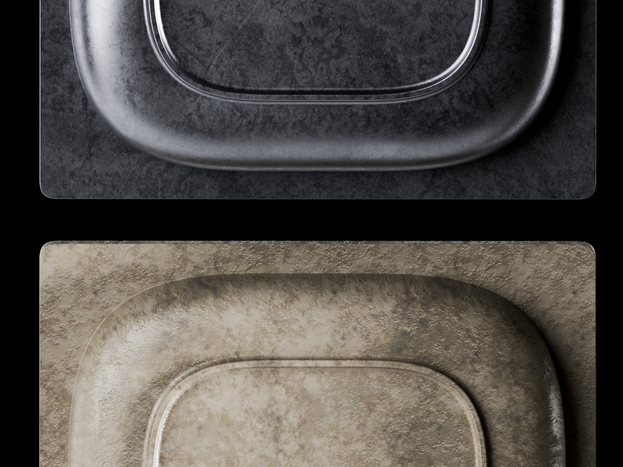
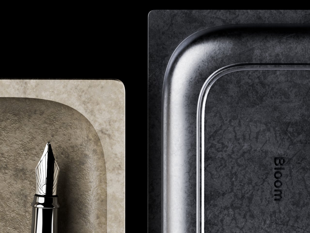
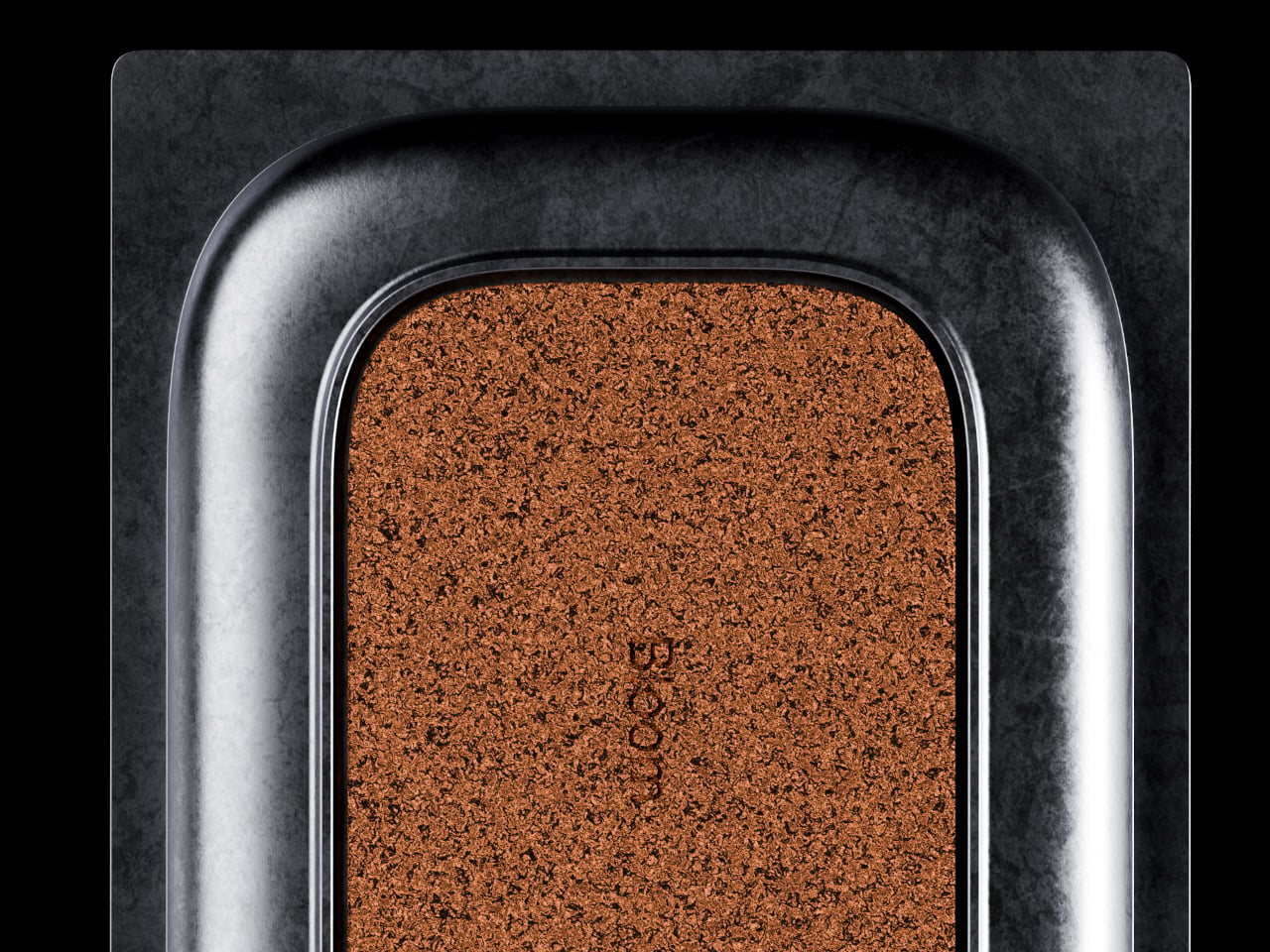
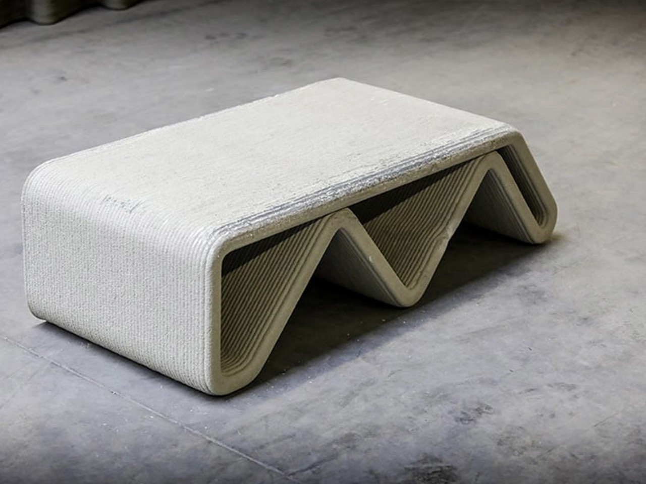
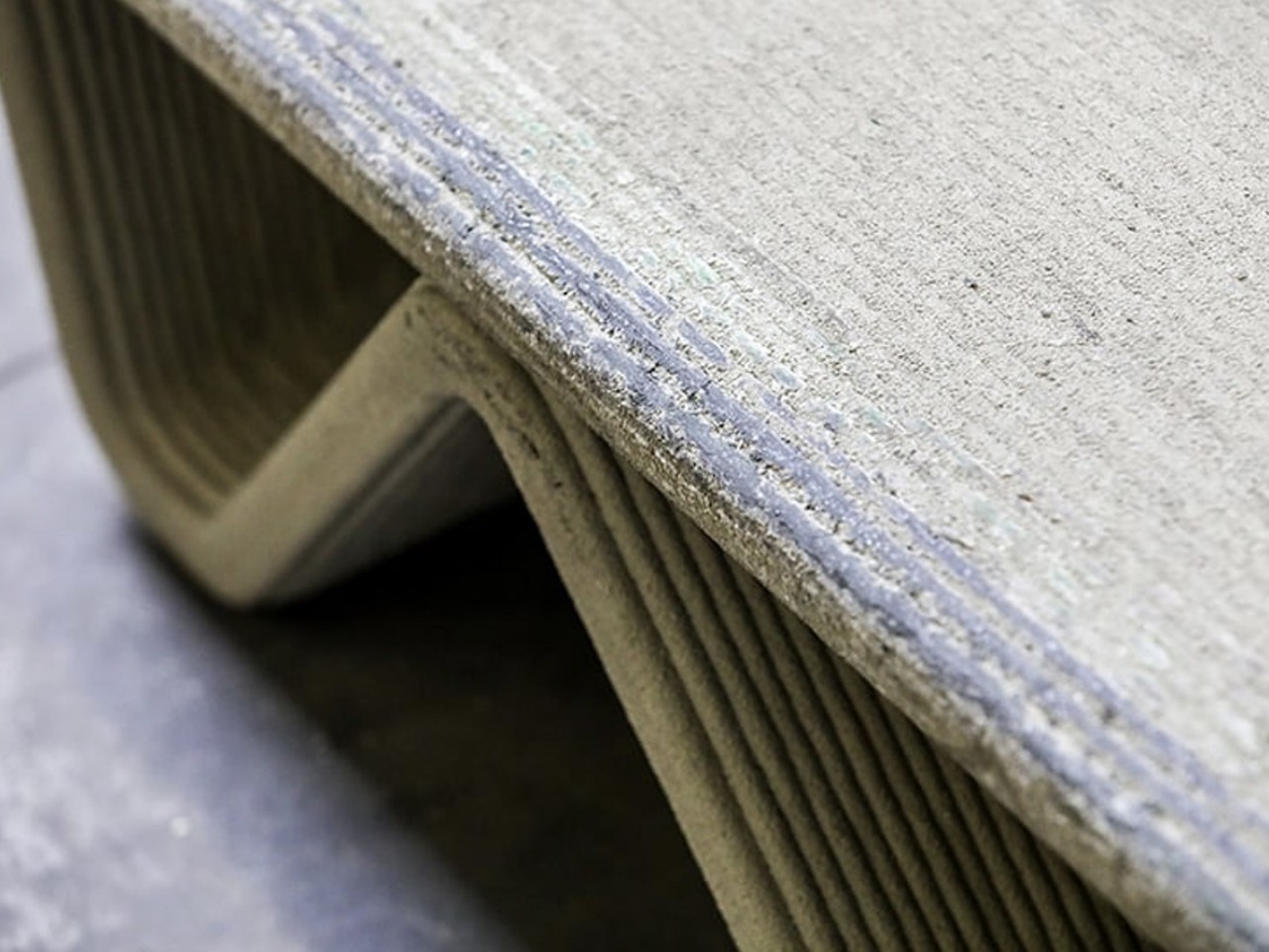
BloomCase approaches the problem from a different angle. Made from concrete, metal, and stone, it is heavy enough to stay put without any grip pads or rubber feet, and that weight is load-bearing in a more literal sense, too. The concrete body gives it a raw, architectural presence that feels deliberate rather than decorative, the kind of object that reads as intentional rather than incidental on a desk that already has some thought behind it.
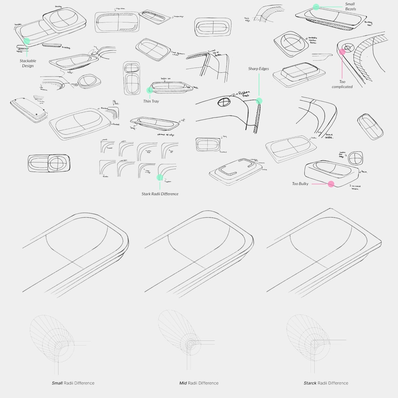
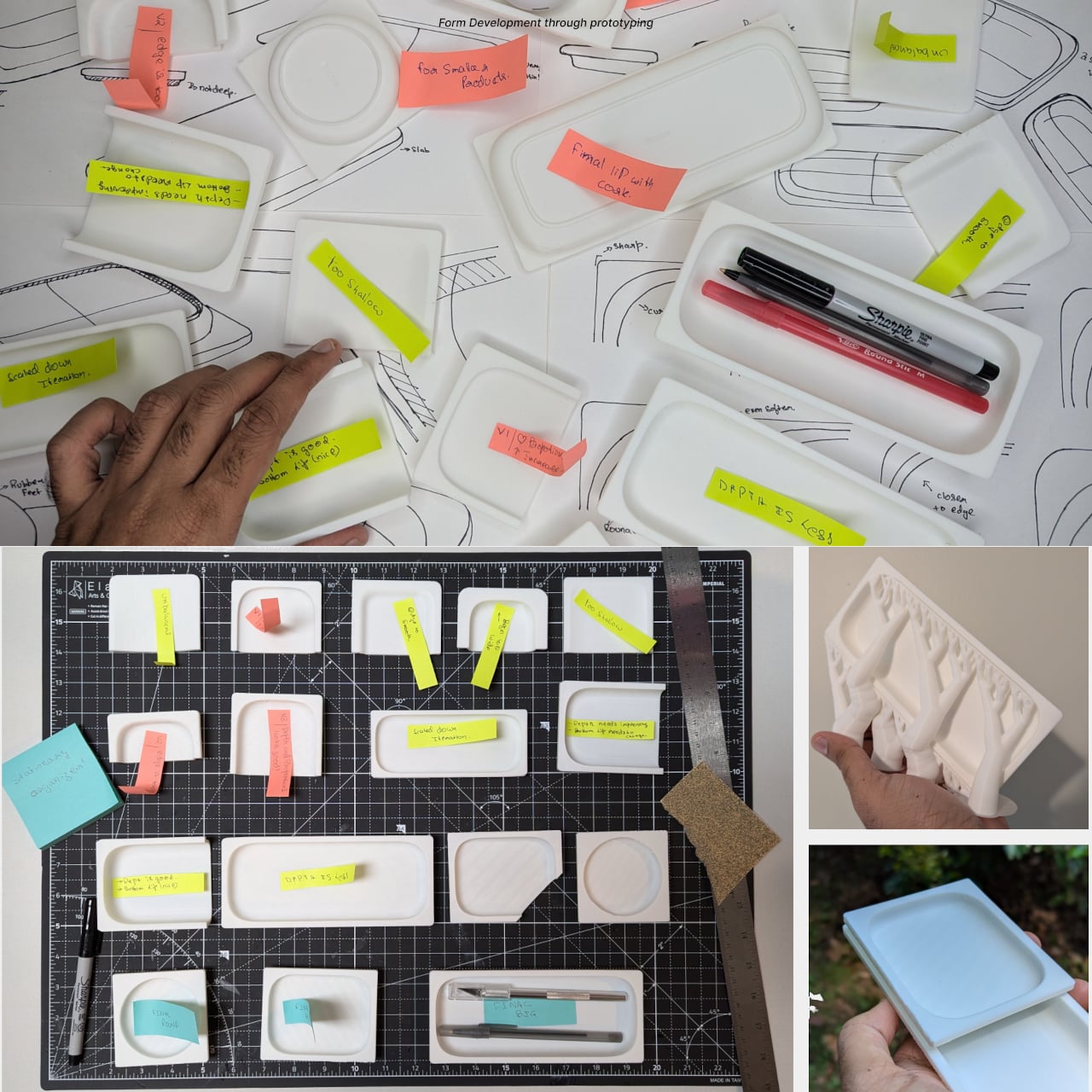
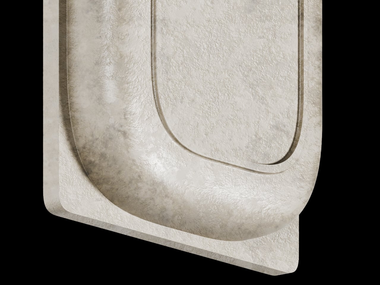
The form itself is where things get interesting. Circular basins sit alongside parallel rectangular bays, each with a specific job. The basins are contoured to cradle small loose items, thumbtacks, paperclips, and the miscellaneous hardware that scatters across every flat surface it touches. The bays run parallel and are angled to hold pens and pencils upright and accessible, so what you reach for most is what you find fastest. There is a satisfying logic to that division, one that needs no instructions to grasp.
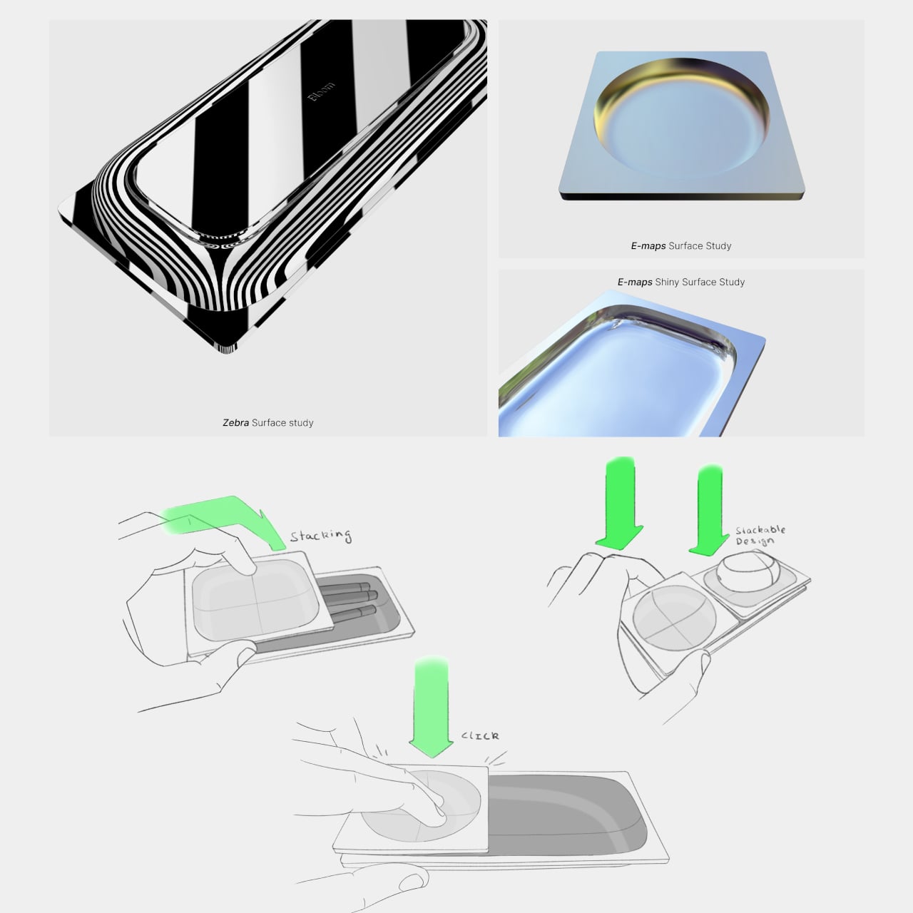
What separates BloomCase from a standard tray is the interlocking system. Two or more units snap together so that separate pieces merge into a single continuous footprint. The connection is designed to feel secure and repositionable, which matters when your desk layout shifts with a project, or when you realize three months in that you needed more pen space all along. The name comes from this behavior, units blooming outward across the workspace as organizational needs grow.
The aesthetic sits at an interesting intersection. Concrete and geometric curves do not usually share a design brief, but the combination here avoids the coldness that brutalist objects can carry in domestic or office settings. The raw material quality of the concrete against the softer basin profiles creates enough contrast to hold visual interest without tipping into decorative territory. It looks like a tool that was designed carefully, which is a harder thing to pull off than it sounds.
The modular logic is a genuinely smart idea, but it only makes practical sense if you actually need more than one unit. A desk covered in connected concrete trays starts to raise honest questions about how much surface you are willing to trade for organization. There is also the matter of audience: heavy raw materials appeal most to designers and architects who already have a taste for that kind of object on their desks, which is a narrower group than the broader market for desk tidiness.
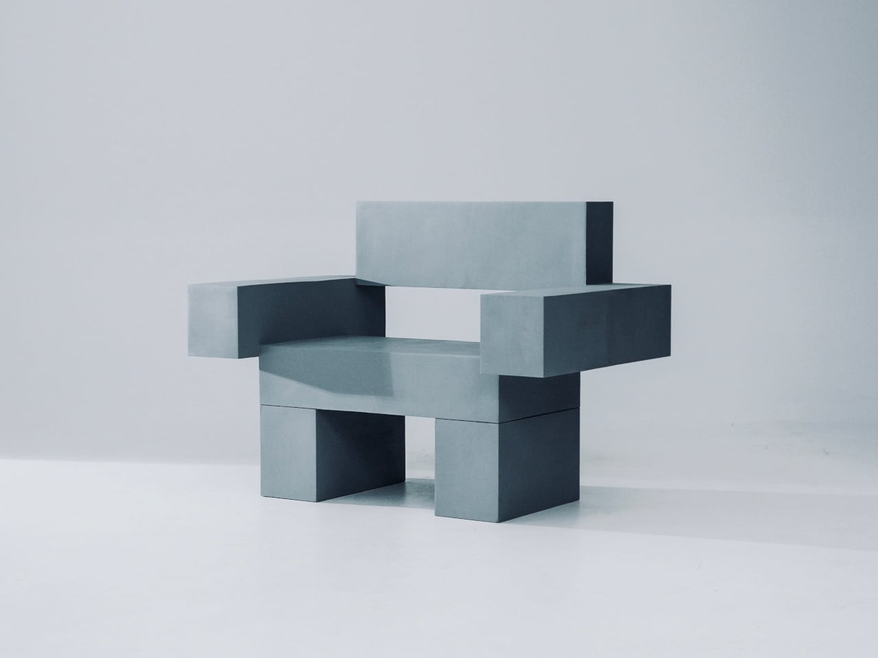
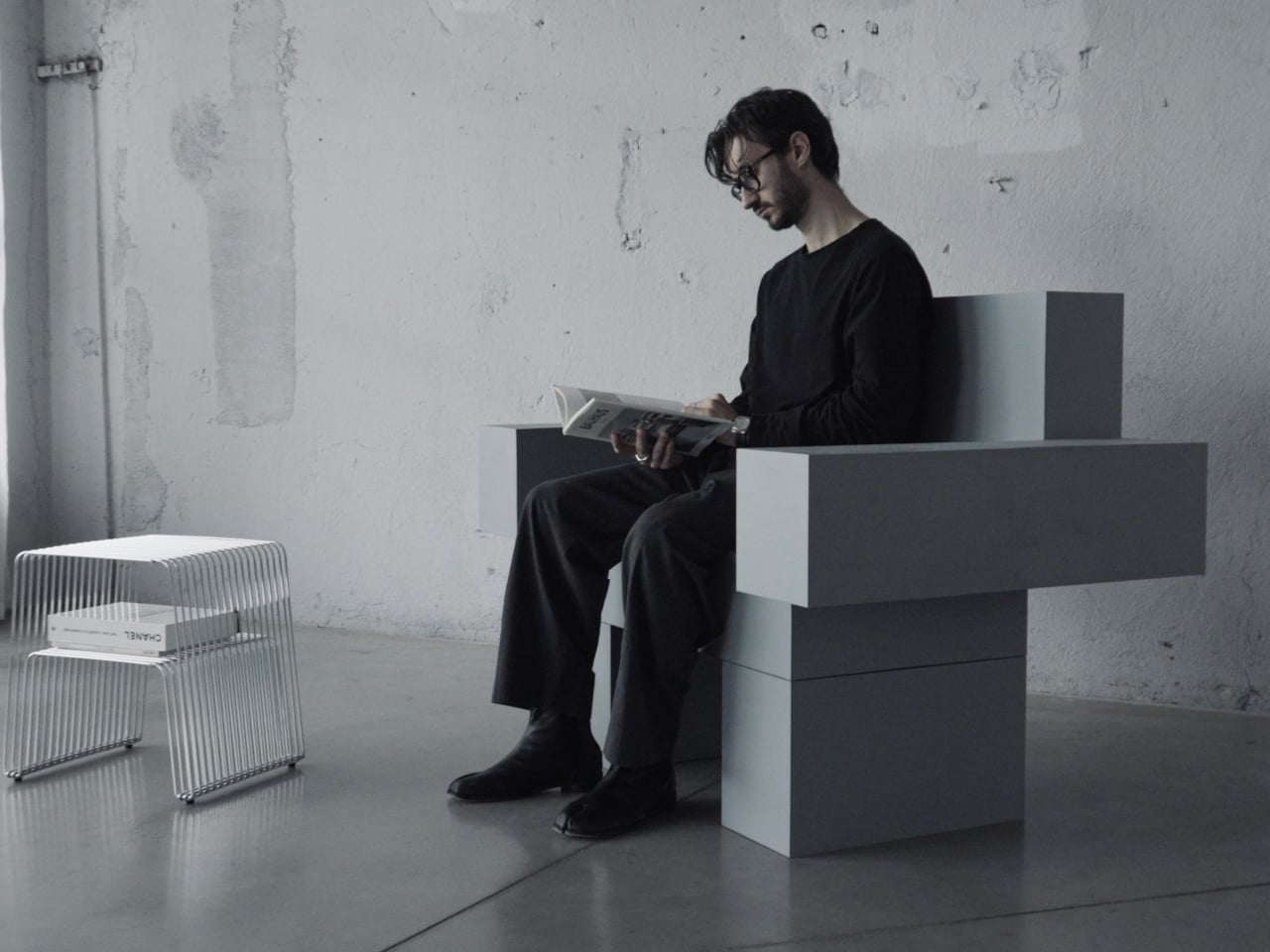
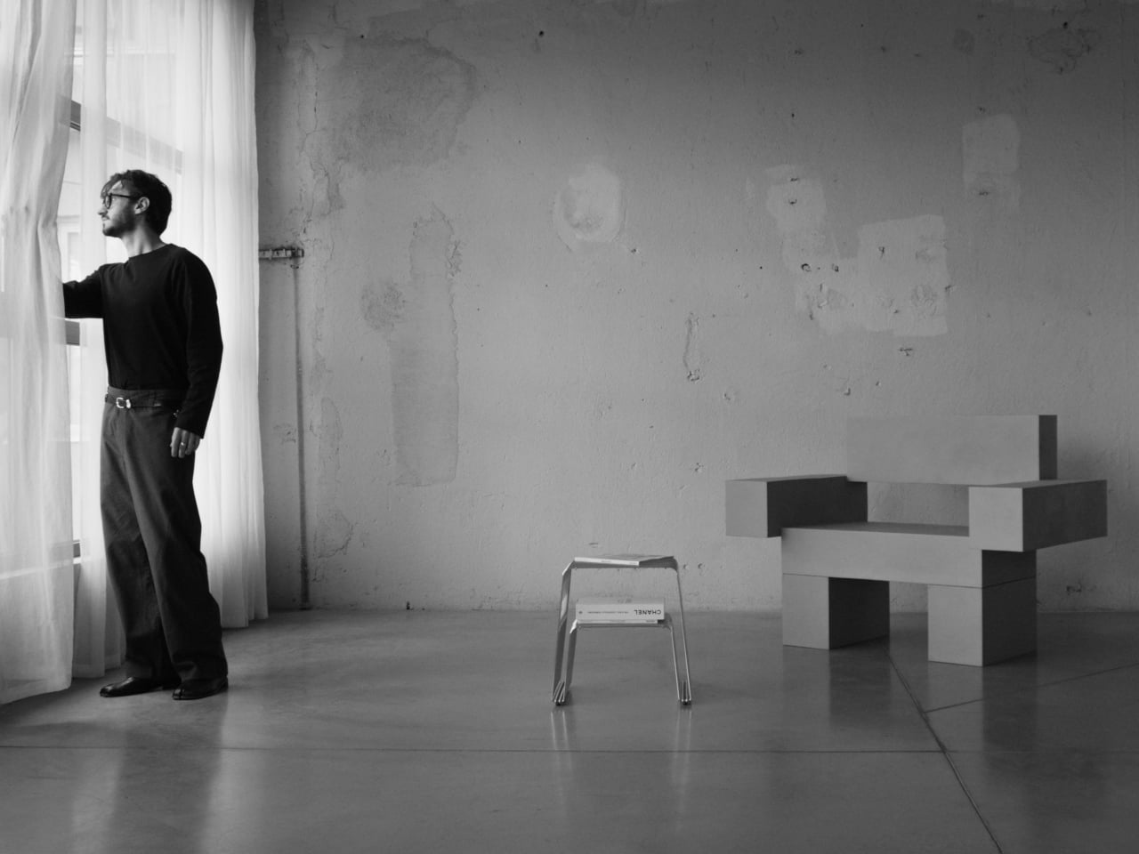
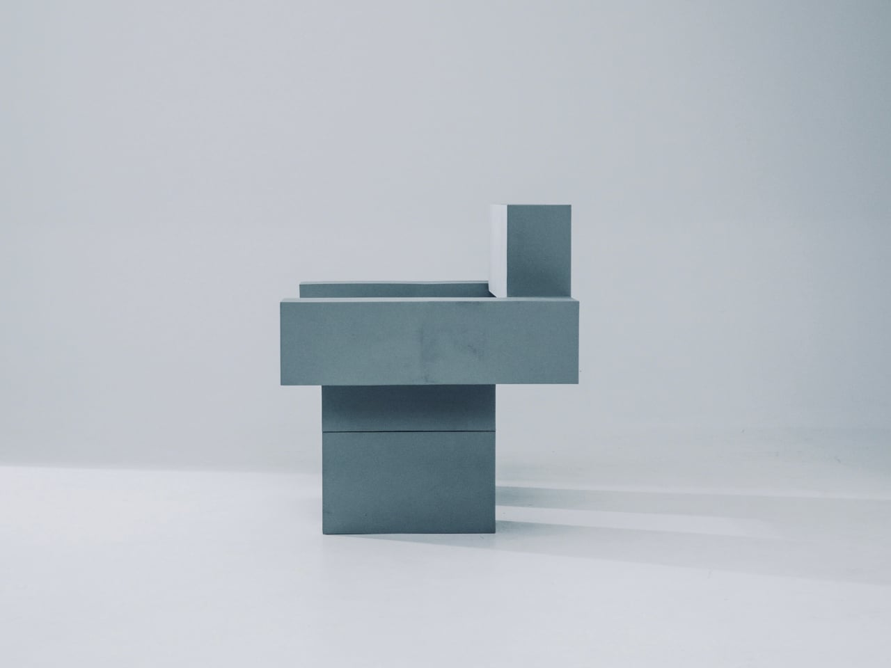
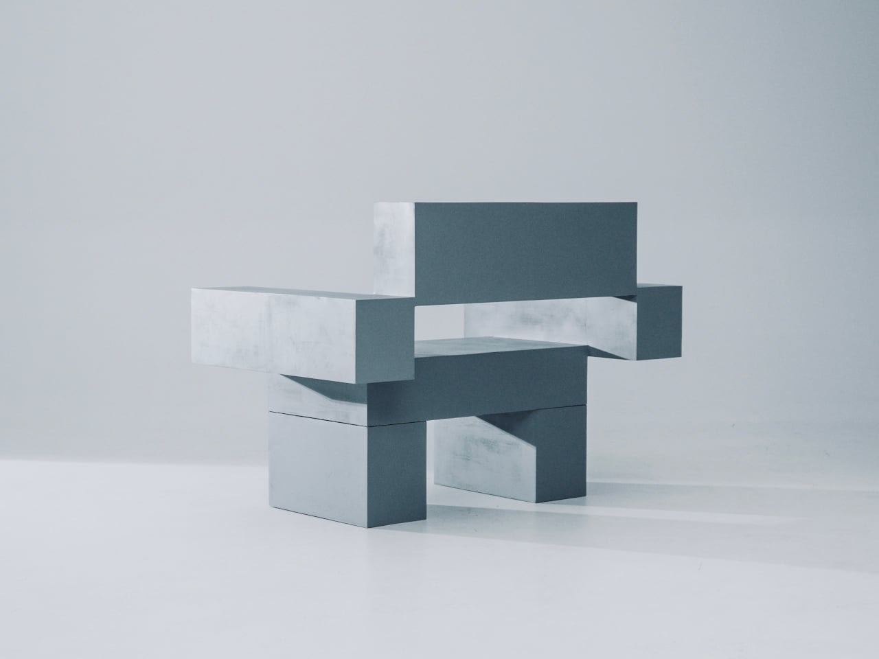
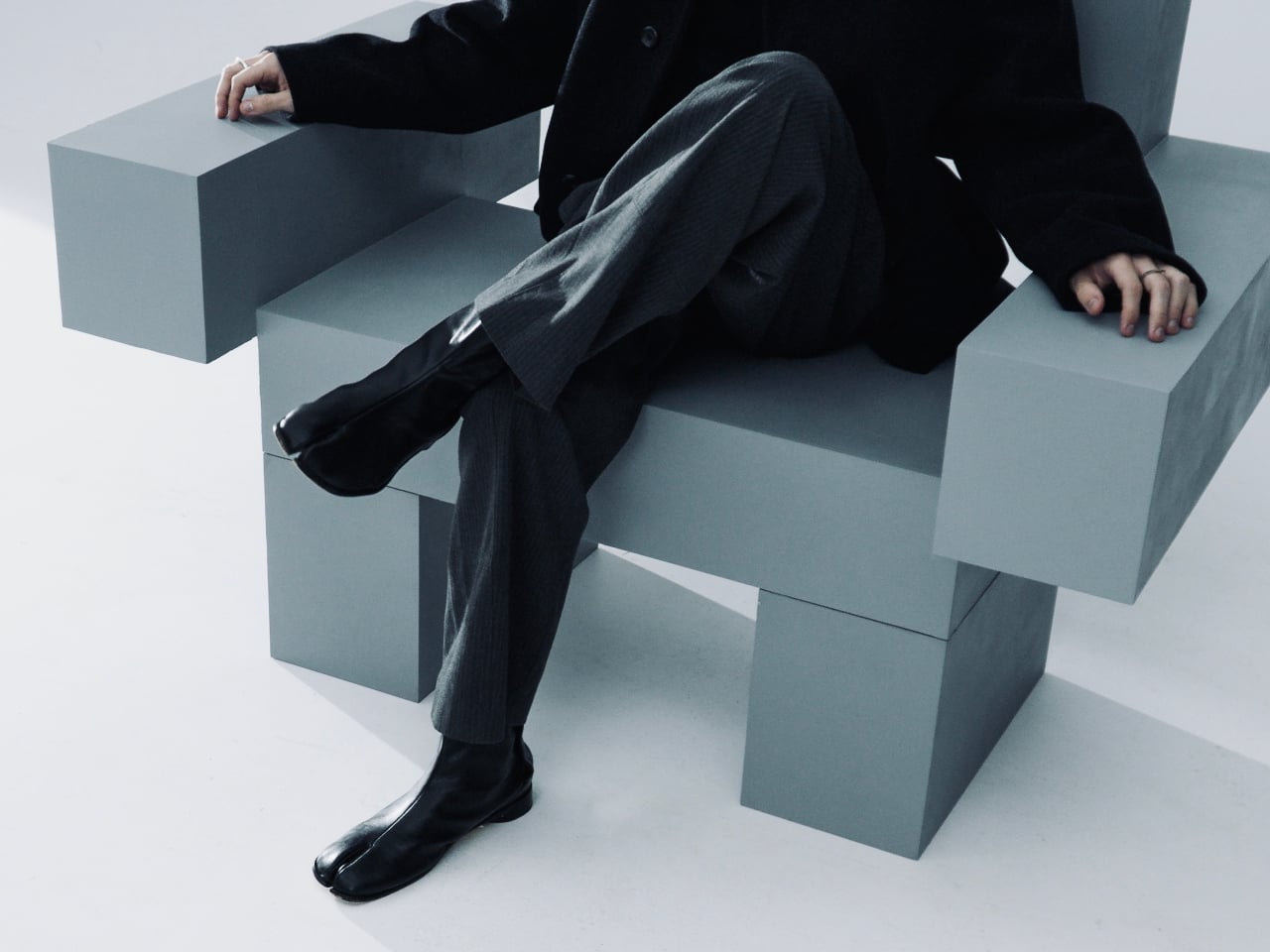
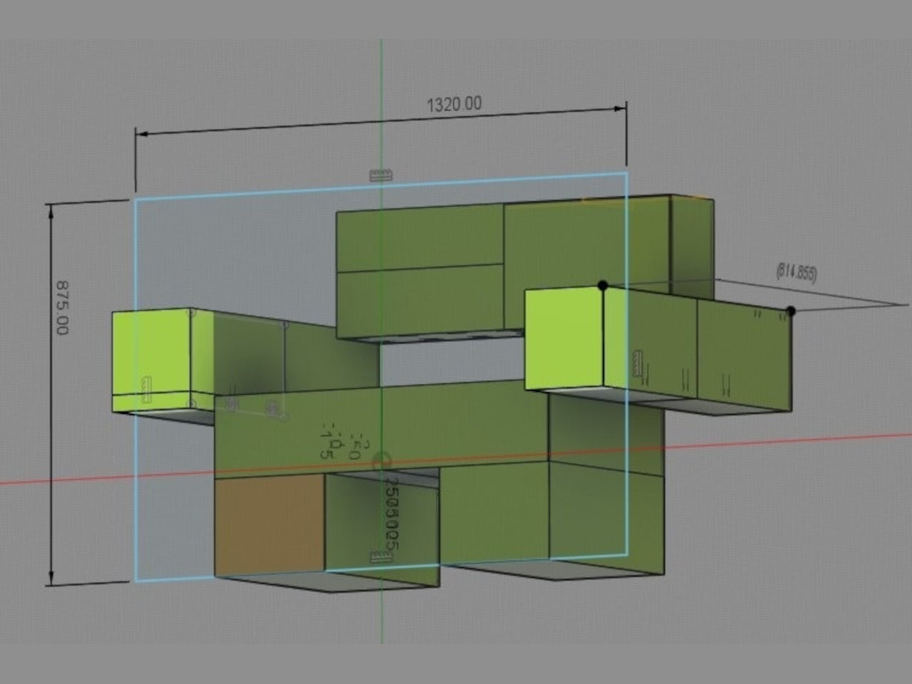
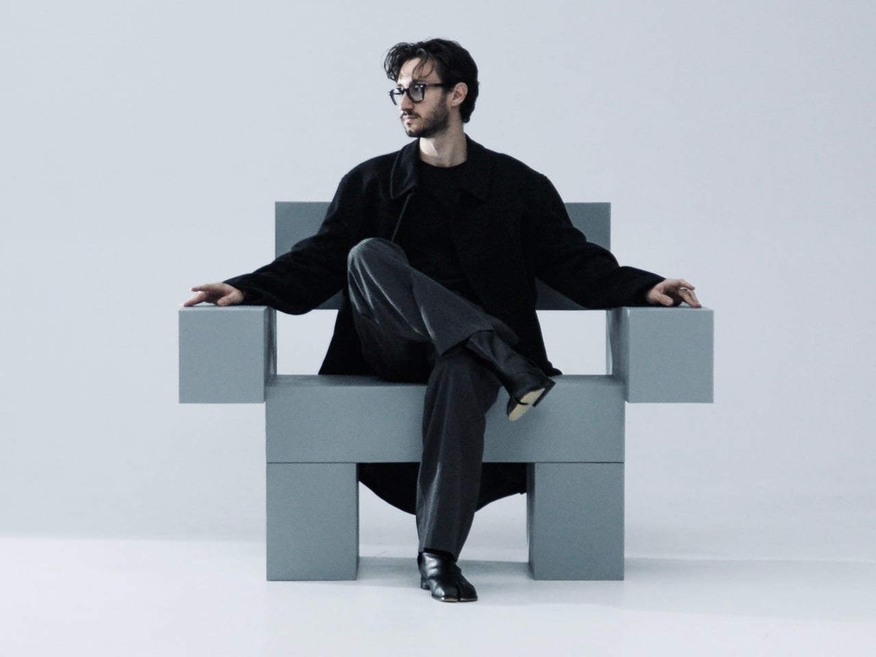
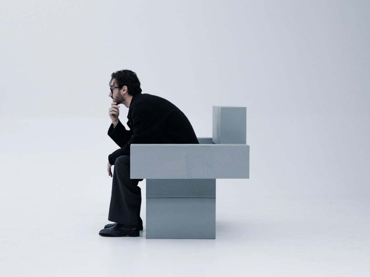
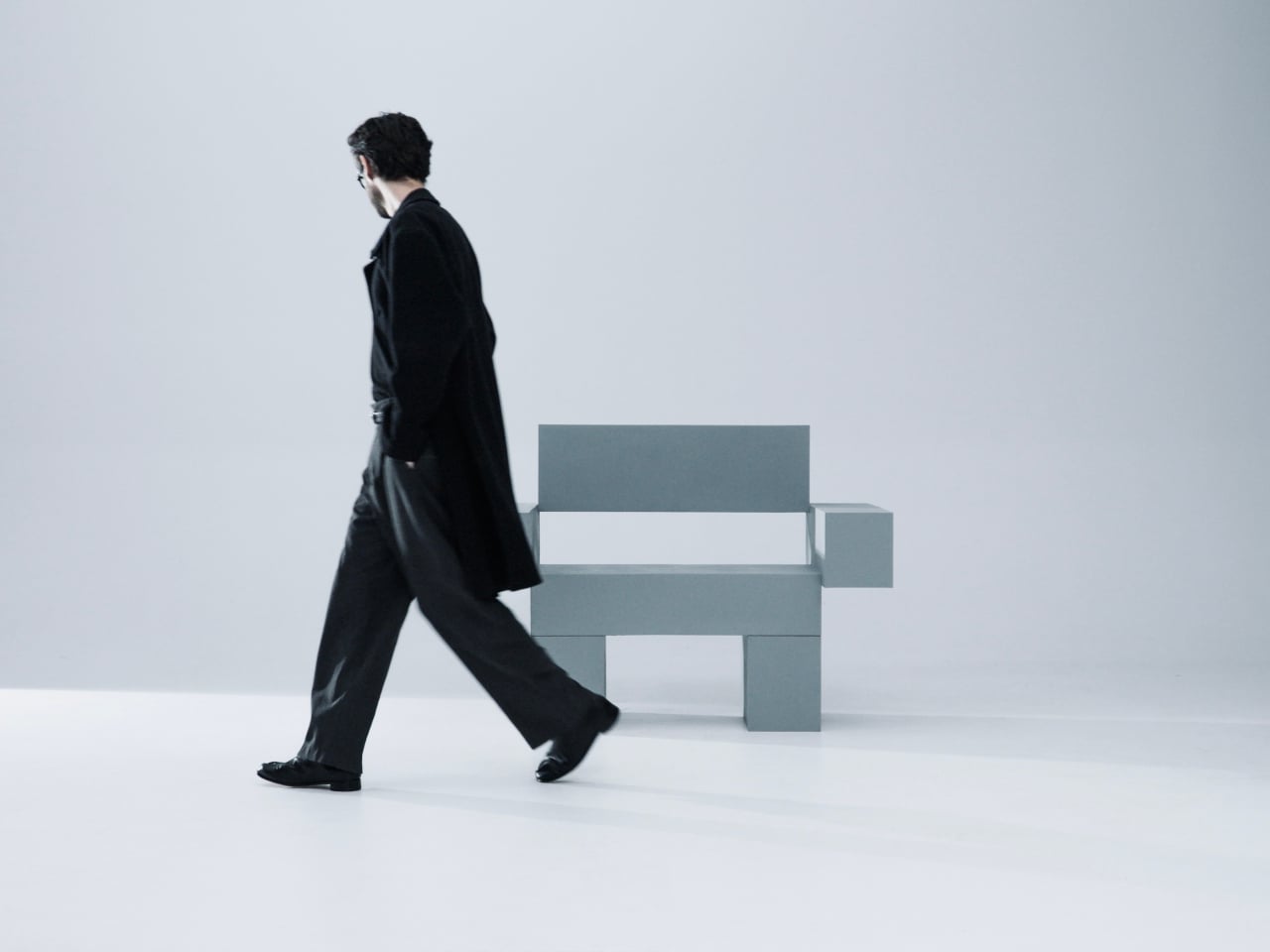
Most furniture sits in a room without saying much. It fills a corner, does its job, and disappears into the background. Nako Baev’s THE OBJECT 01 is not that kind of furniture. The Amsterdam-based designer set out to build a chair that carries the weight of a spatial statement, something that holds its ground without decoration or apology, and in that specific ambition, the object largely delivers.
THE OBJECT 01 is a 3D-printed lounge chair built from recycled PETG, a plastic more commonly found in water bottles than in furniture workshops. At 20kg, it is lighter than its blocky, slab-heavy proportions suggest, though not exactly something you would reposition on a whim. Its dimensions push it closer in scale to a small architectural fragment than to a typical chair, which is likely the whole point.
The construction follows a modular panel system, where each 3D-printed block fits into a sequence designed to cut material waste and keep the overall mass structurally lean. Finished in a cold grey Baev calls “Kyoto Fog,” the chair reads somewhere between concrete and matte stone. In a sparse studio or raw loft, it anchors the space with quiet authority. In a more conventional living room, it would likely dominate in ways not every household would welcome.
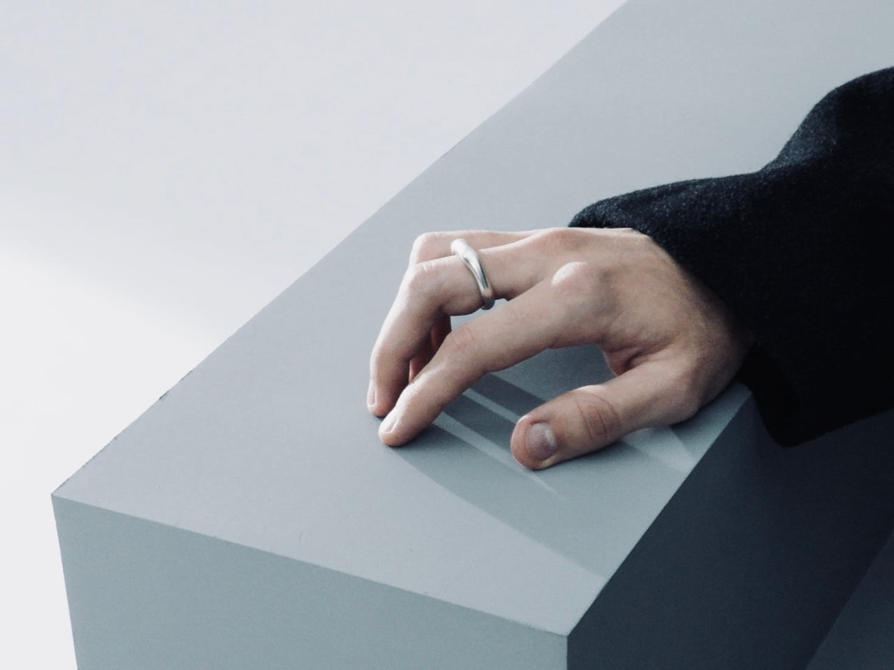
What makes THE OBJECT 01 genuinely worth attention is how honestly it exposes its own making. The layer-by-layer texture from the printing process is not hidden or smoothed away; it stays visible across the surface, turning the manufacturing method into part of the visual language. That kind of material honesty is far more common in ceramics or cast concrete than in plastic furniture, and it gives the piece a tactile quality that polished renders simply do not convey.
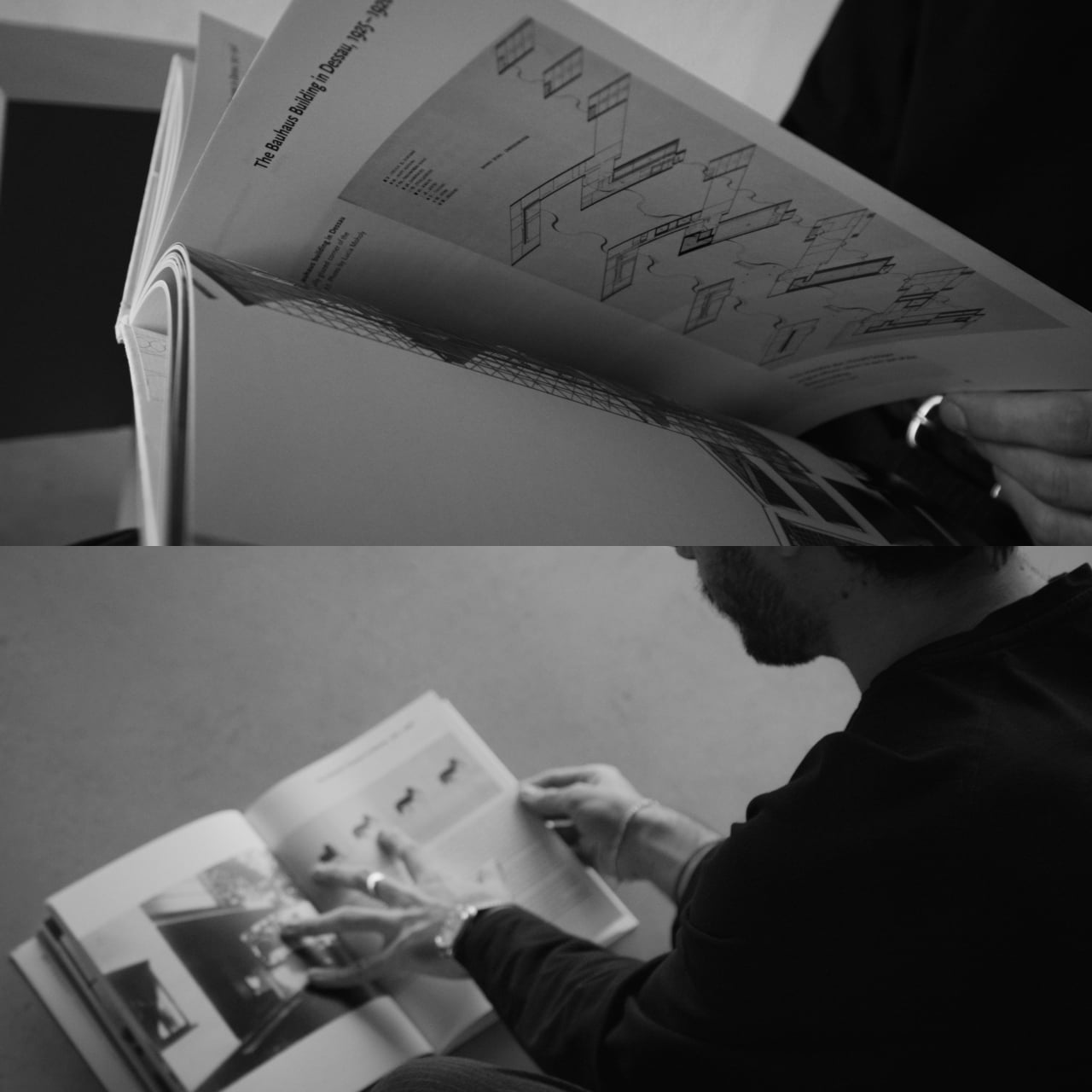
Baev describes the design as sitting between furniture and sculpture, drawing on minimalist brutalism and a quieter Japanese restraint in equal measure. The emotional reference points are more unusual: the designer cites the atmosphere of Silent Hill and Half-Life, those game environments built from silence and abandoned space, as part of what shaped the object’s mood.
The workflow involved AI assistance across early form studies, structural testing, and design refinement, reducing development time considerably. That footnote is becoming standard across the industry, and it doesn’t add or subtract much here. This process might even become the key to sustainable furniture design, as it can help optimize 3D printing, increase efficiency, and reduce waste in the long run.
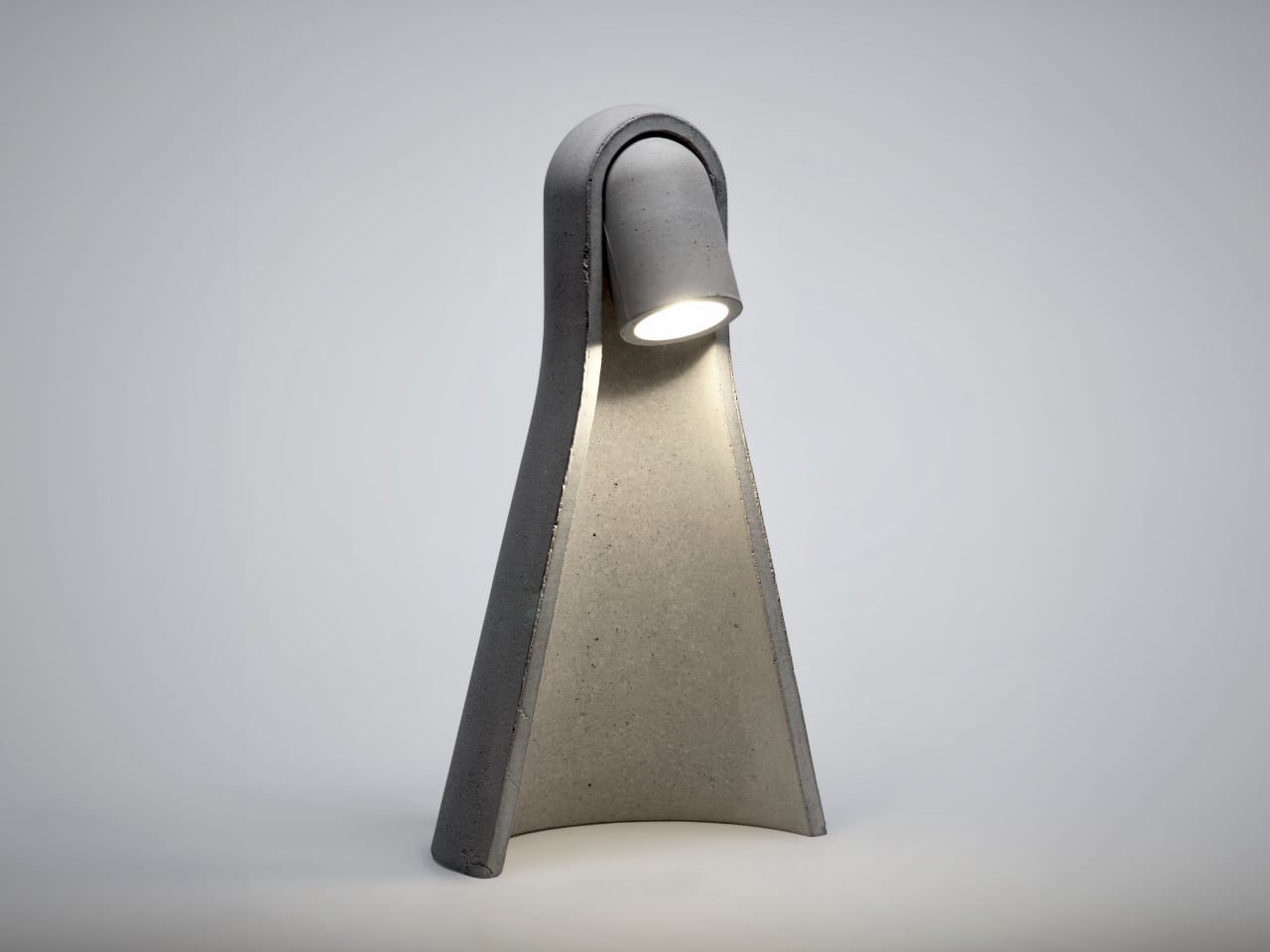
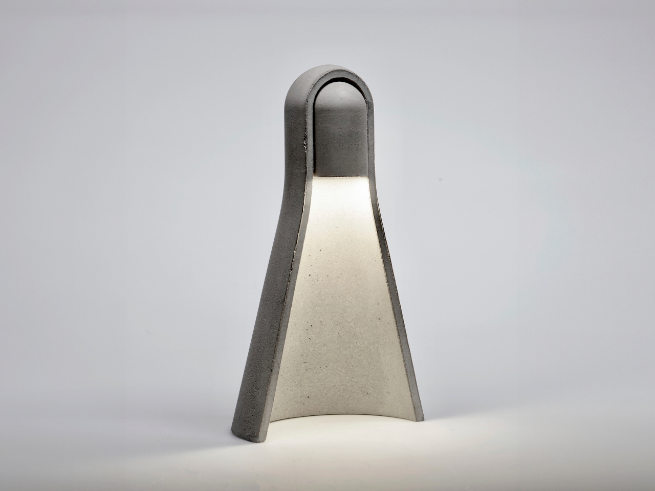
Concrete’s default mode in product design is heavy, rectilinear, and a little confrontational. It shows up in candles, bookends, and lamp bases that lean into the brutalist reference, as if rawness is the whole point. That aesthetic works in the right context, but it rarely feels calm or considered at desk scale, where the goal is usually a surface that helps you focus rather than one that announces itself at every angle.
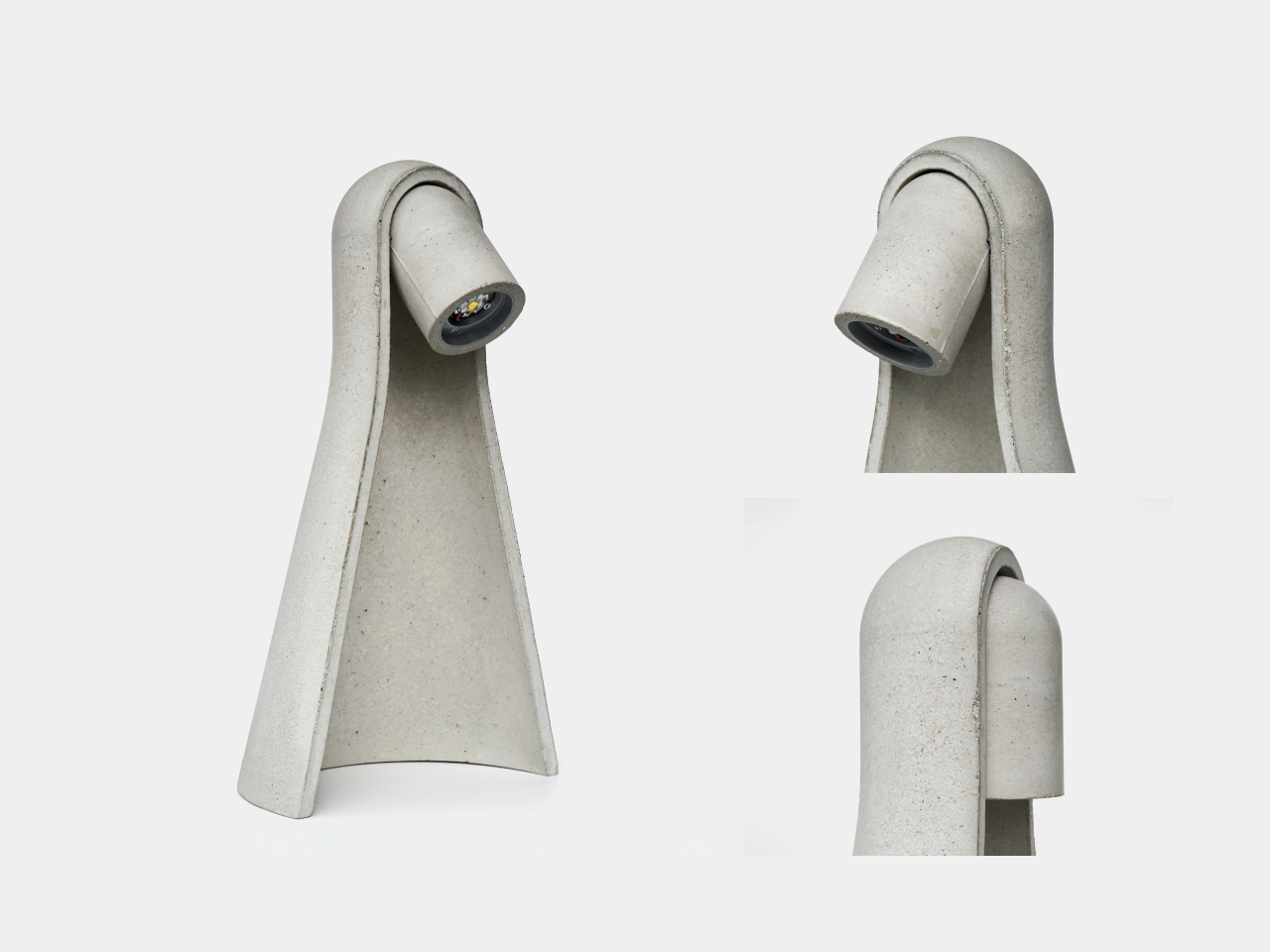
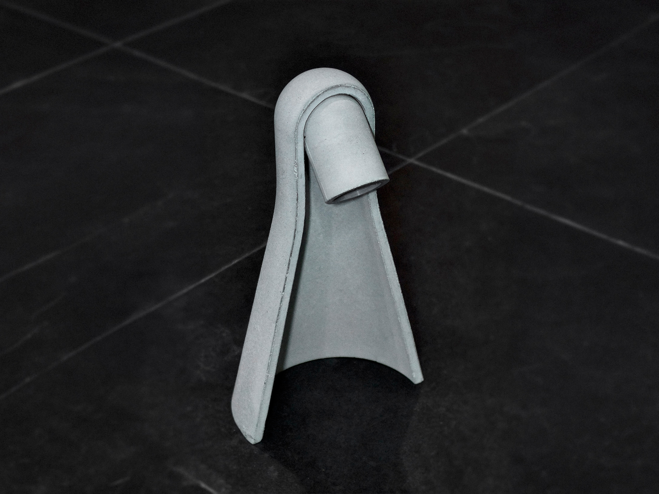
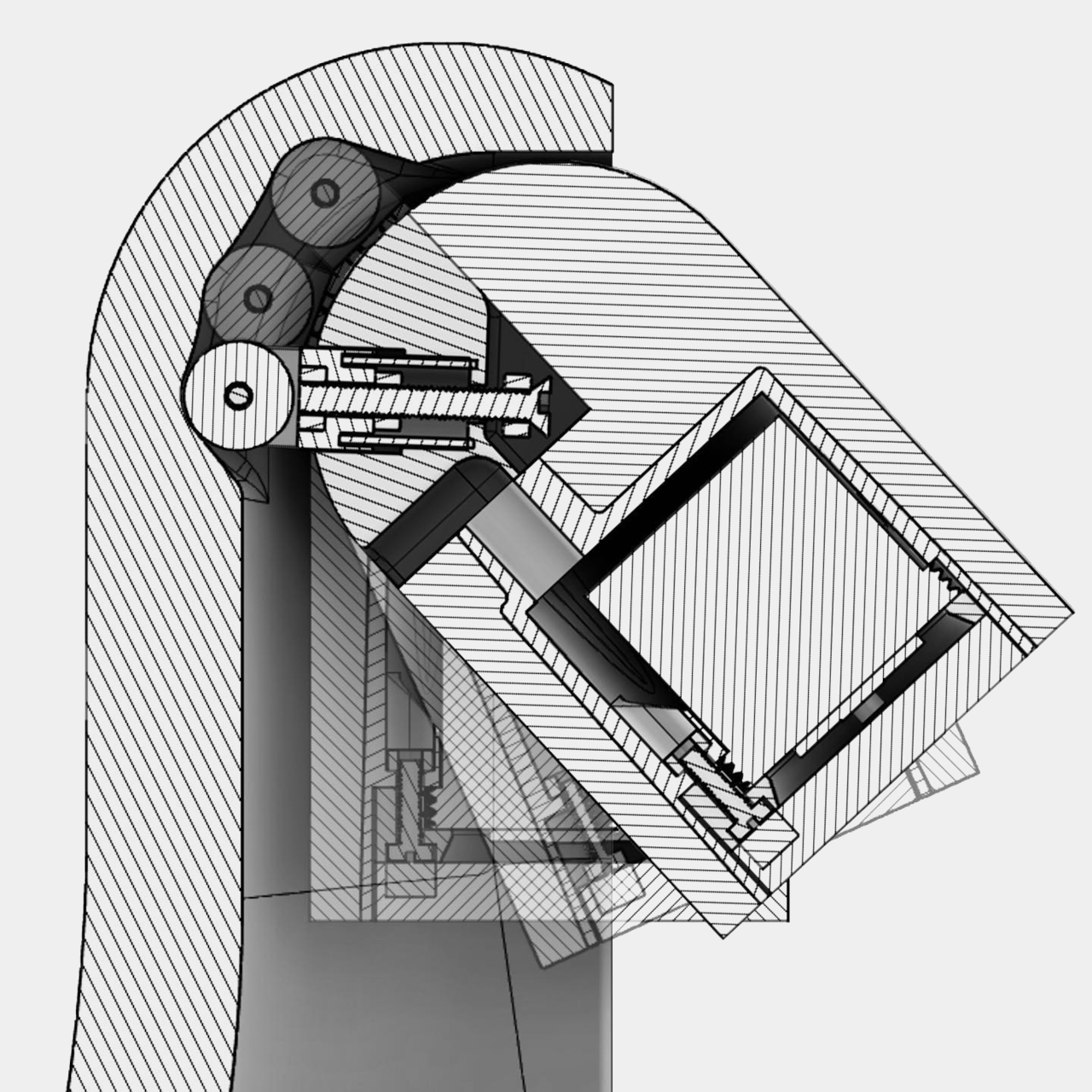
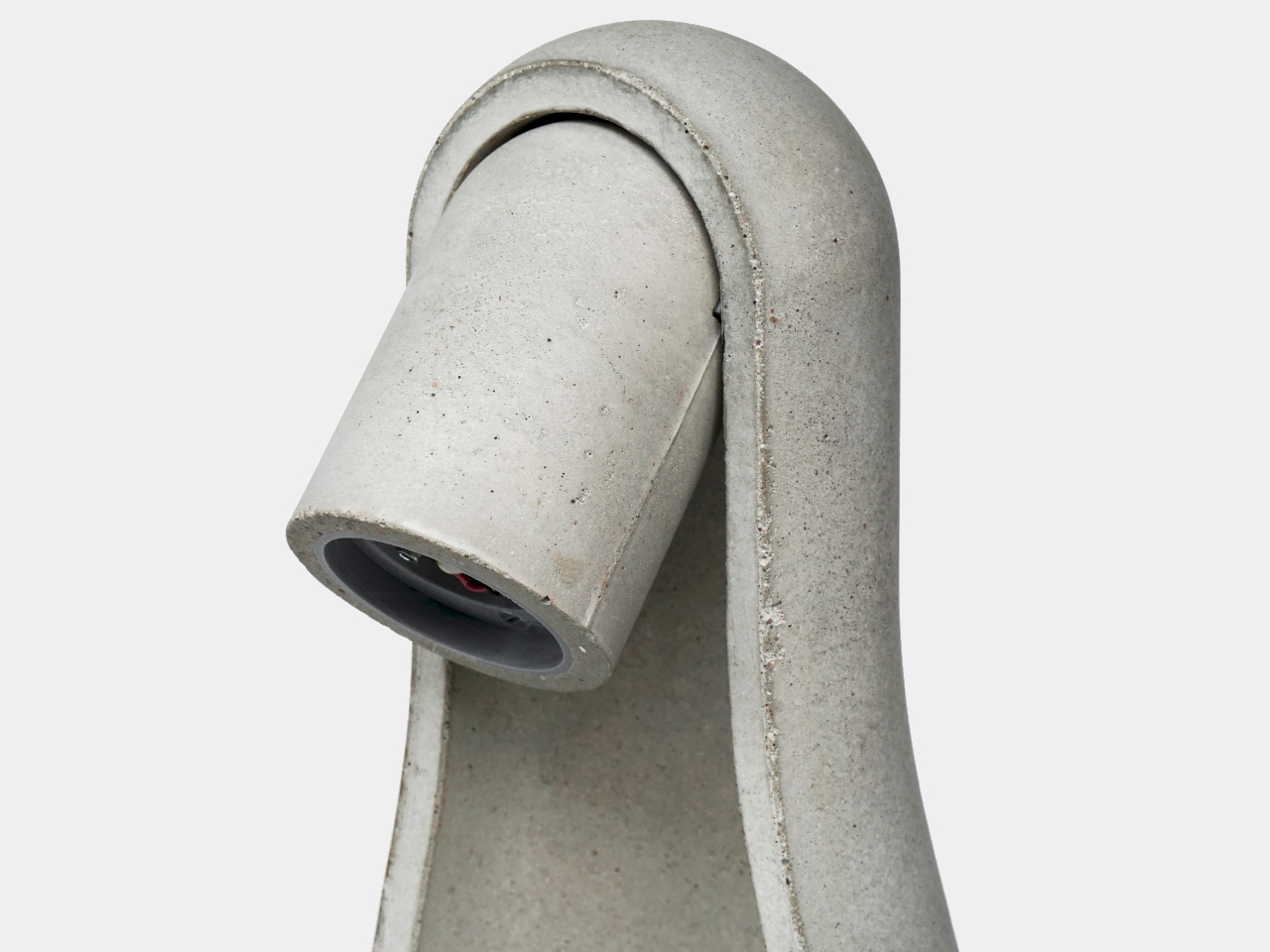
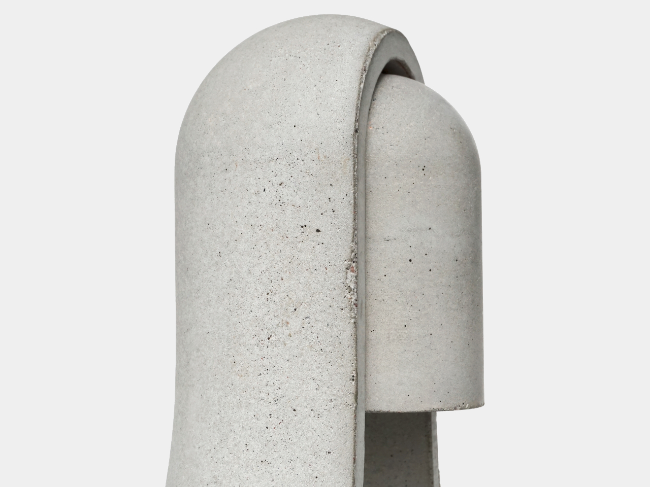
Mikka started as a question: what if cast concrete could feel light? The answer was a desk lamp with softened edges, carefully balanced volumes, and a silhouette that reads as calm rather than rigid. The intent wasn’t to disguise the material or pretend it’s something else, but to present concrete in a way that feels contemporary and approachable without stripping away what makes it honest.
The form does most of the work. Surface transitions are controlled and gradual, edges are rounded rather than chamfered, and the overall proportions avoid the solid block feel that makes most concrete objects look like they belong on a construction site. The negative space inside the body carves away visual mass, helping the lamp feel lighter than any concrete object has a right to feel when you know how dense the material actually is.
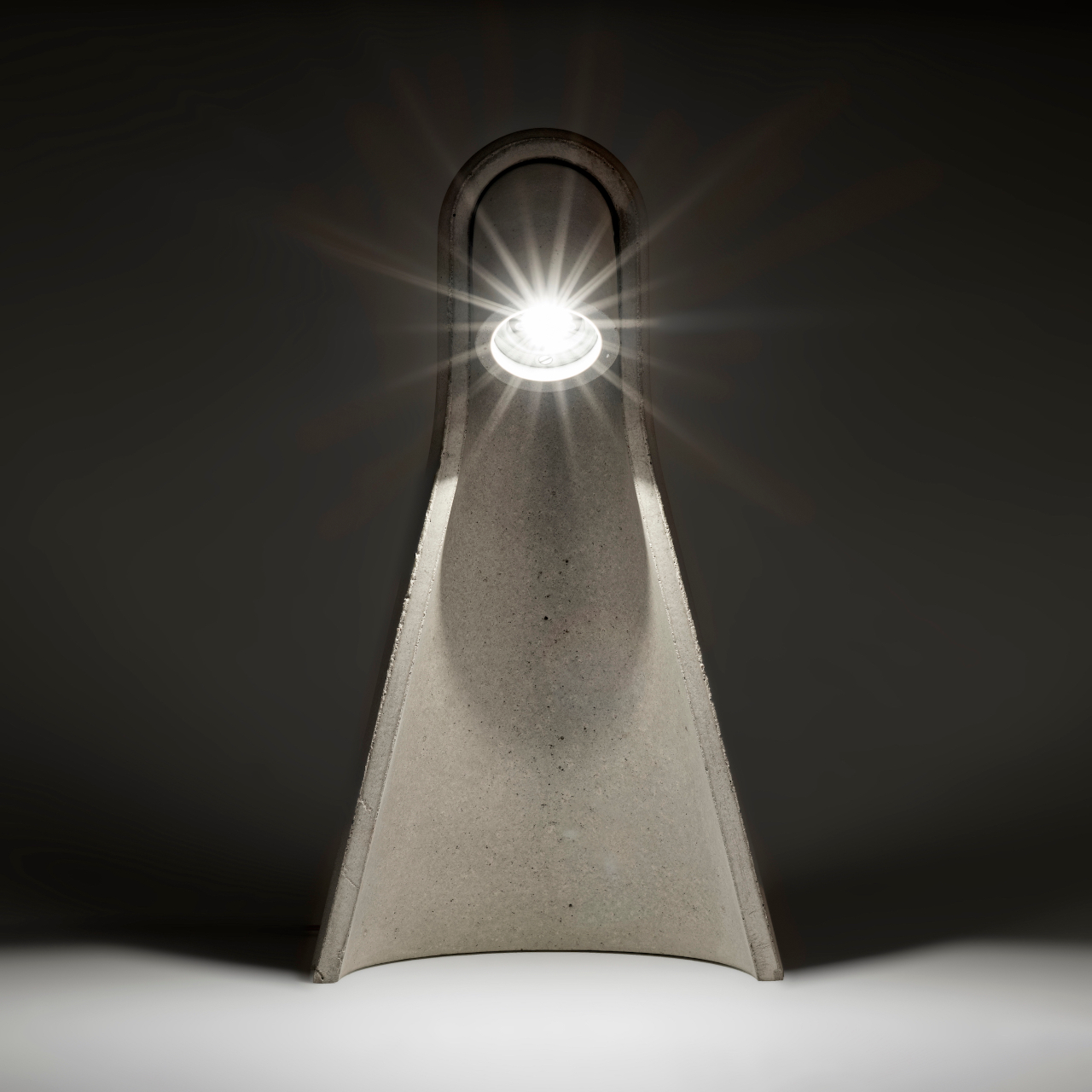
Manufacturing played a central role in making that geometry possible. The housing was cast using a precisely engineered 3D-printed mold, which enabled tight radii, consistent wall conditions, and a refined surface finish that would be difficult to achieve with conventional mold making. This is a hybrid workflow, additive manufacturing used as tooling for traditional casting, and it’s what allows the lamp to have the controlled, nuanced form language it’s going for rather than the rougher profile that hand-built molds often produce.
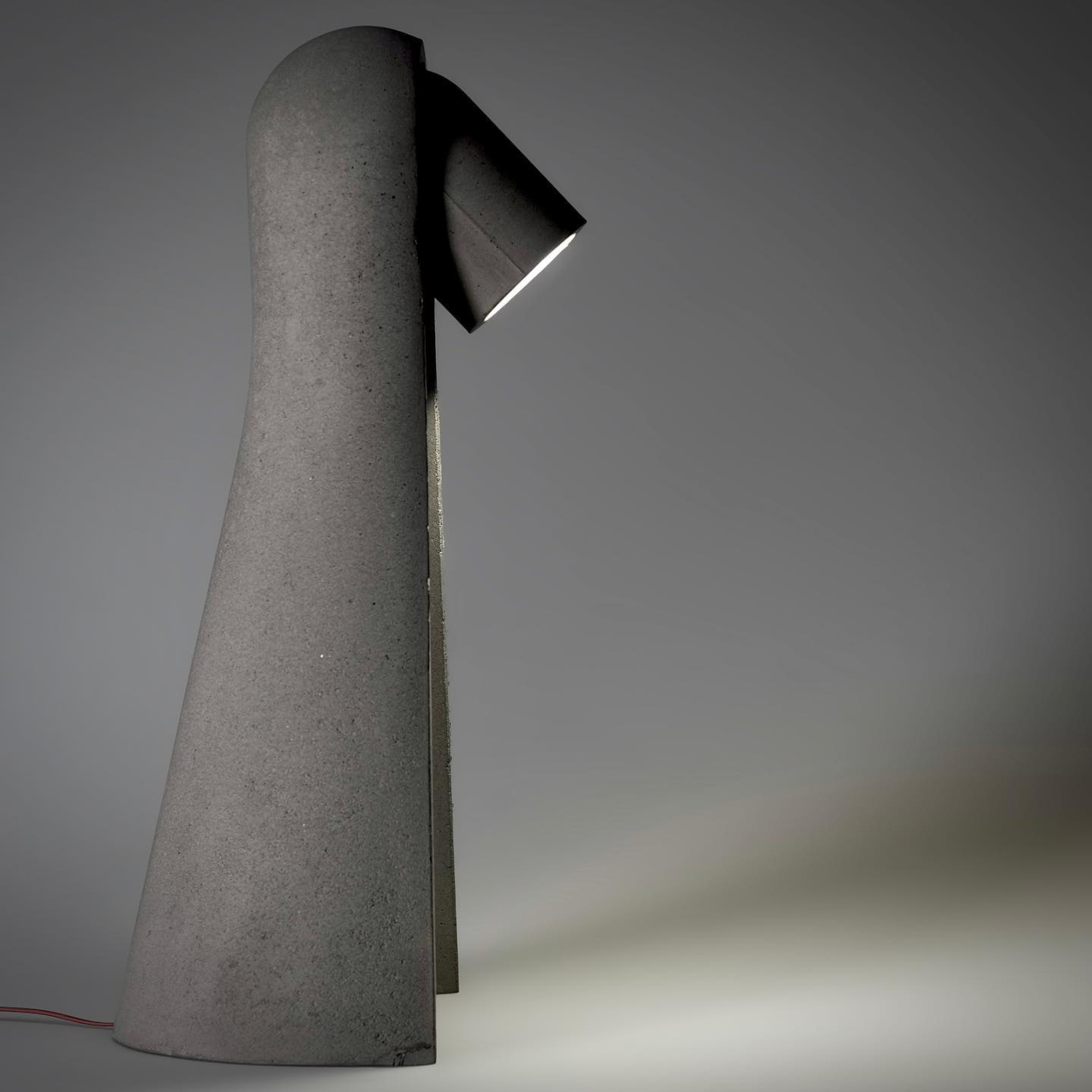
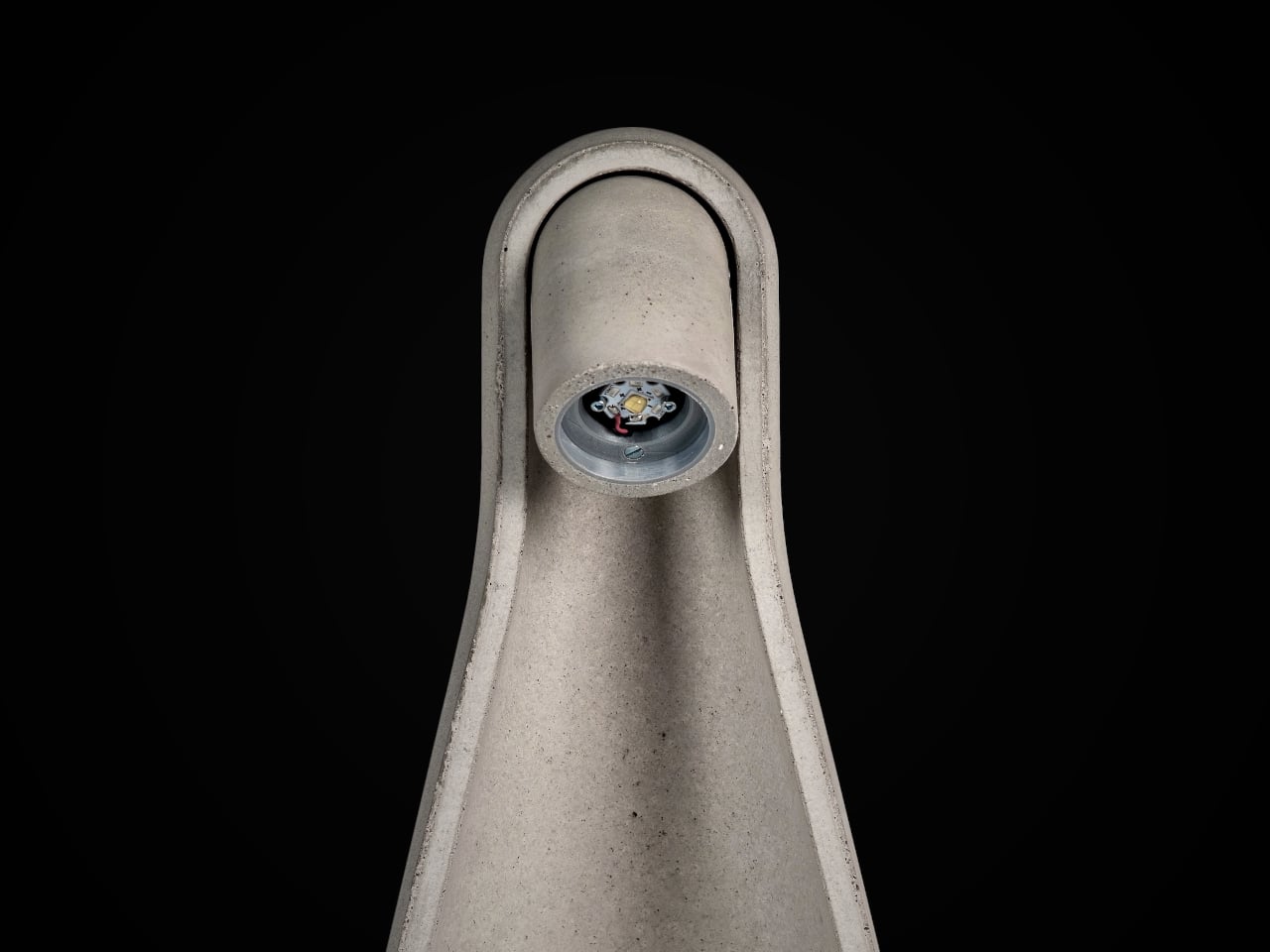
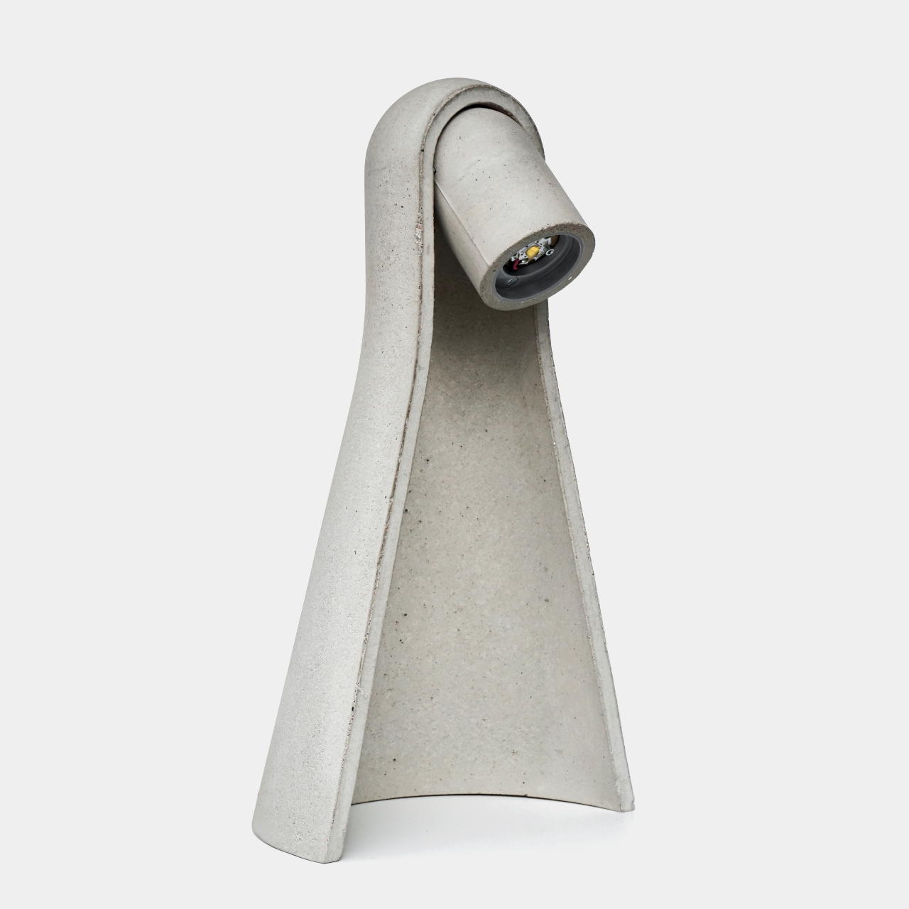
The pivot mechanism is where Mikka asks for interaction. Angle the head downward, and the beam grazes across the concrete surface, revealing subtle texture variations and the natural imperfections from the casting process. The lamp becomes almost self-referential in that mode, drawing attention to the material qualities that define it. Angle it outward, and it becomes a practical reading or work light, focused and direct. One gesture shifts the whole character of the object.
That duality is what keeps it interesting on a desk rather than just on a shelf. Late at night, angled inward, it’s a quiet ambient presence. During the day, aimed at a book or screen, it’s functional and unfussy. It doesn’t ask you to commit to one mode, which is a useful quality in a lamp that has to share space with other objects.
Mikka suggests that concrete at product scale doesn’t have to default to weight and aggression. When the form is thoughtful, and the mold is controlled, the material can carry a different kind of presence, one that fits on a desk at home without demanding to be the only thing you notice in the room.
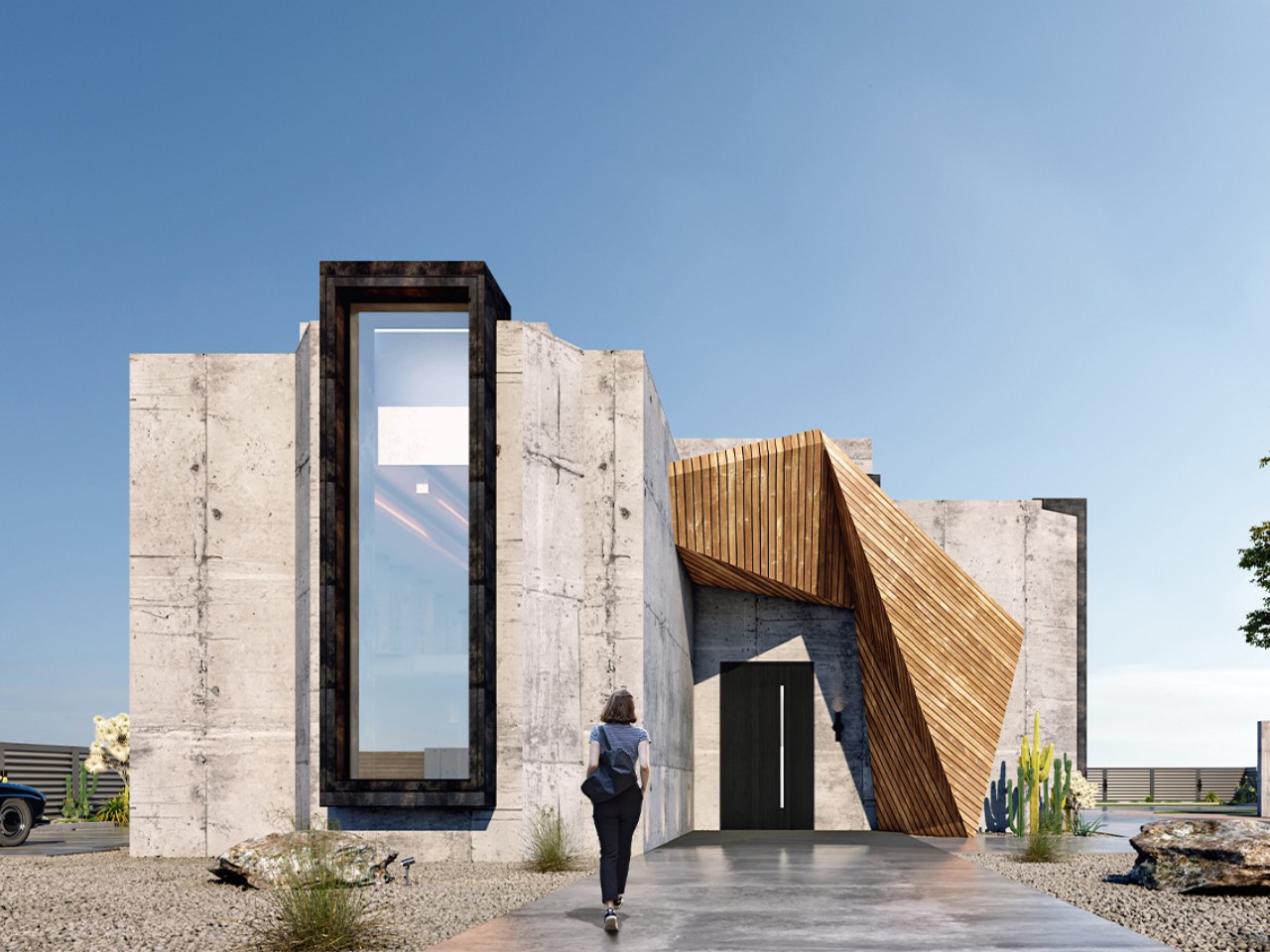
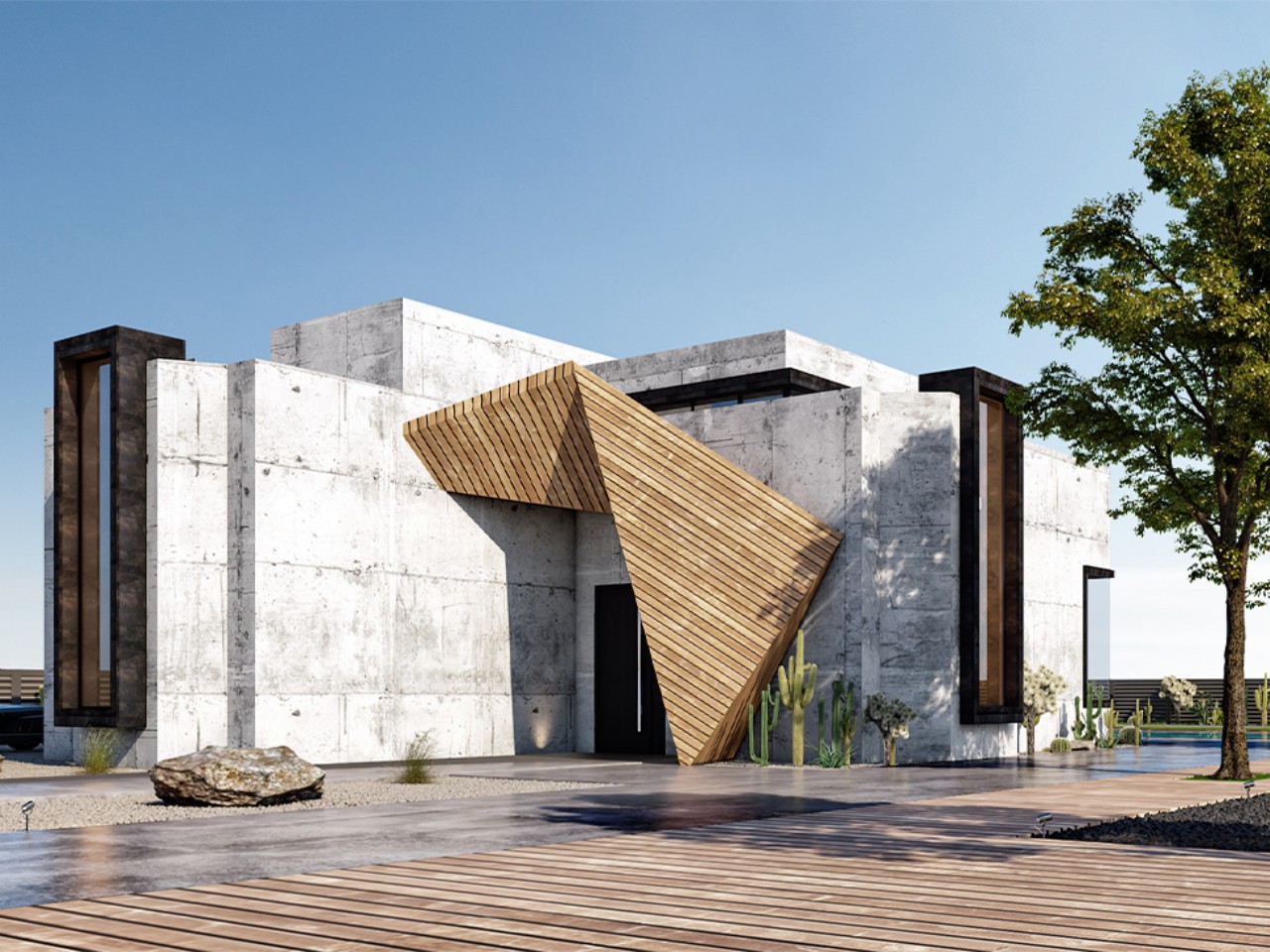
Brutalist architecture and interior design, popular from the 1950s to the mid-1970s, prioritize function over decoration, showcasing the raw beauty of materials like concrete. The term “Brutalism” comes from “béton brut,” French for “raw concrete,” emphasizing its minimalist approach. Bold elements, exposed materials, and functionality define this style, which emerged as a reaction to sleek mid-century designs. Architects and designers reveal the innate beauty of materials such as concrete and steel by exposing structural elements. Recently Brutalism is not only a part of architecture but also product design.
Brutalist architecture has an industrial aesthetic and became famous not just for how it looked or what it meant culturally, but also because it was used in rebuilding projects after a big war and when the economy was unstable. Additionally, it is based on the idea of designing buildings that prioritize functionality, honesty in materials and social structure, and the avoidance of unnecessary decoration. Some of the most well-known brutalist architects include Le Corbusier from Switzerland and France, Paul Rudolph from Kentucky, and Kenzo Tange from Japan, among others.
What are the characteristics of Brutalist design?
1. Use of Exposed Concrete
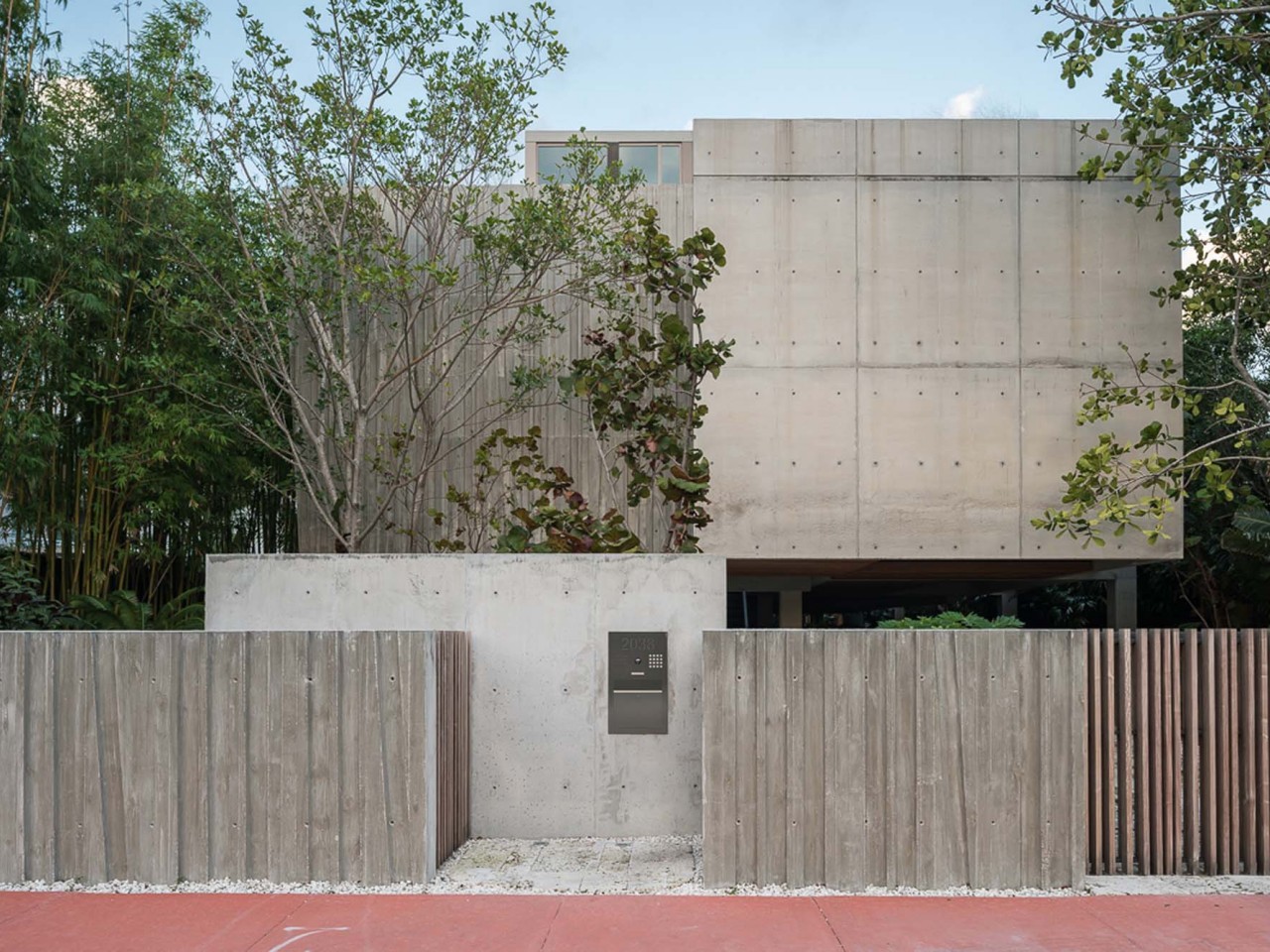
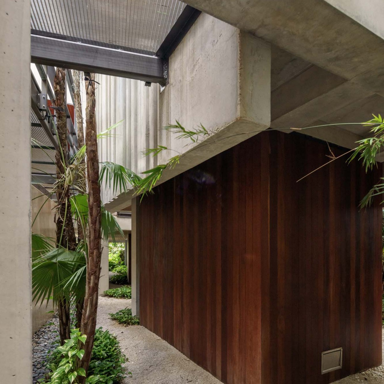
Brutalist buildings feature exposed concrete on walls, floors, and ceilings, creating a raw ambiance and monochromatic palette with its rough texture and grey hues. Concrete’s affordability, versatility, and durability make it a staple in Brutalist architecture, often complemented by untreated steel, wood, and glass.
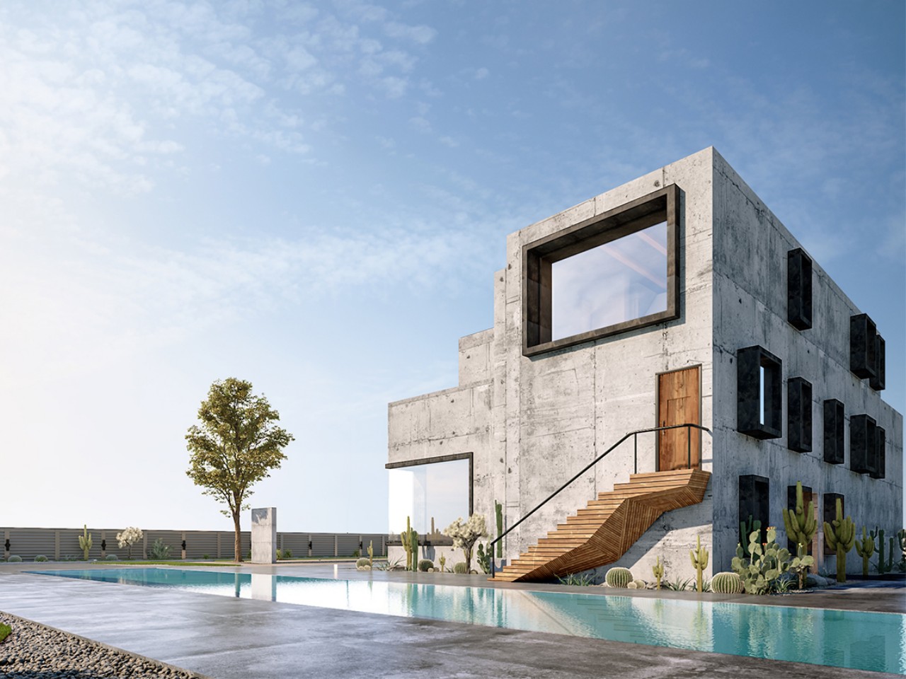
The Maadi Villa by Badie Architects is a striking fusion of brutalist architecture and contemporary warmth. Nestled in a tranquil oasis away from the Egyptian bustle, this urban gem redefines residential living. Featuring sleek concrete, steel, and wood accents, it harmonizes cool minimalism with inviting comfort. Expansive windows frame breathtaking views while a luxurious pool beckons relaxation. Step inside to find modern elegance accentuated by a captivating spiral staircase and abundant natural light. With Mohamed Badie’s visionary touch, Maadi Villa transcends convention to embody timeless sophistication.
2. Geometrical Shapes
Brutalist design frequently integrates bold geometric shapes, including angular forms and sharp edges, to establish a cohesive and organized atmosphere, enhancing the structured essence of the space.
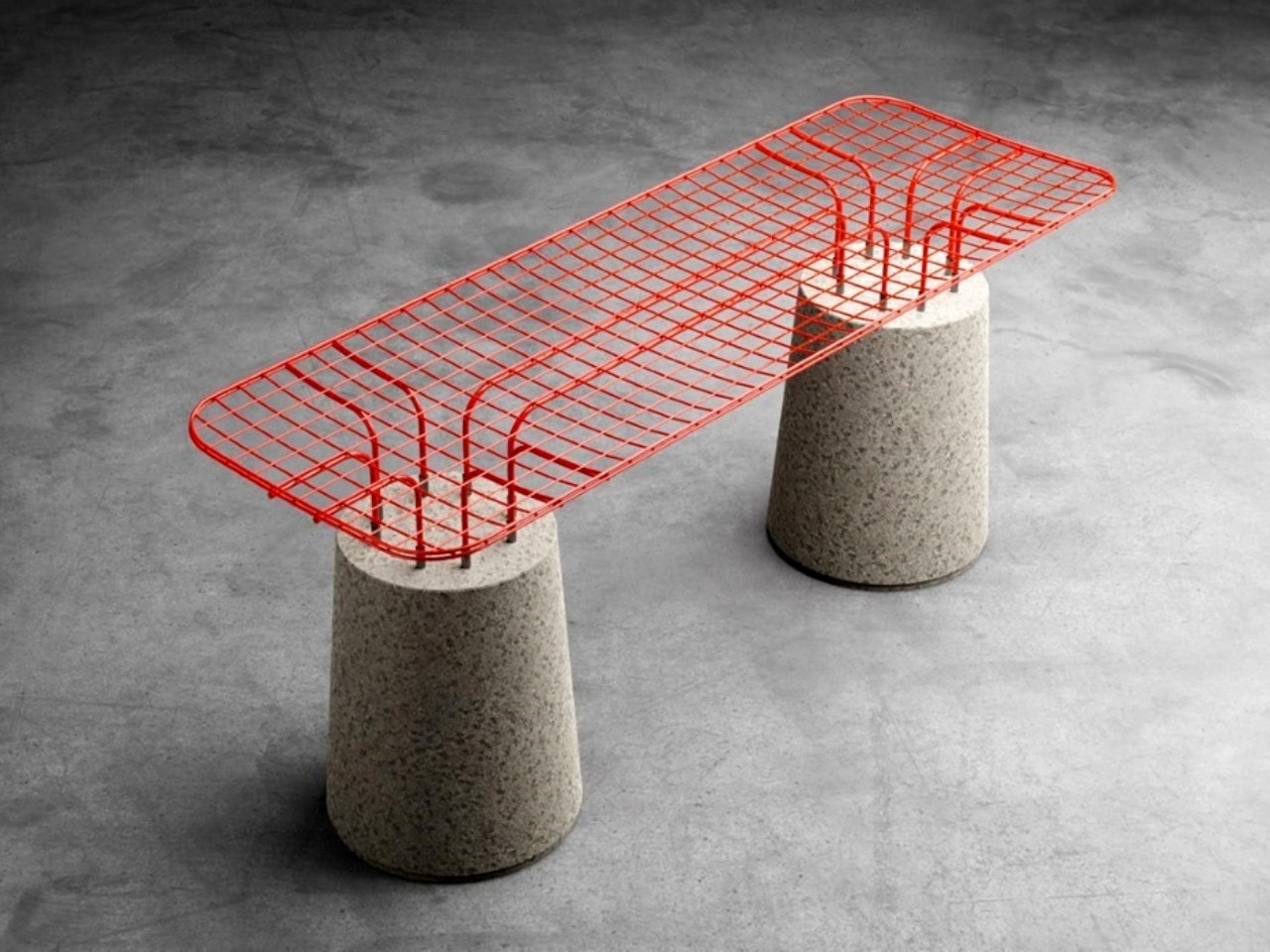
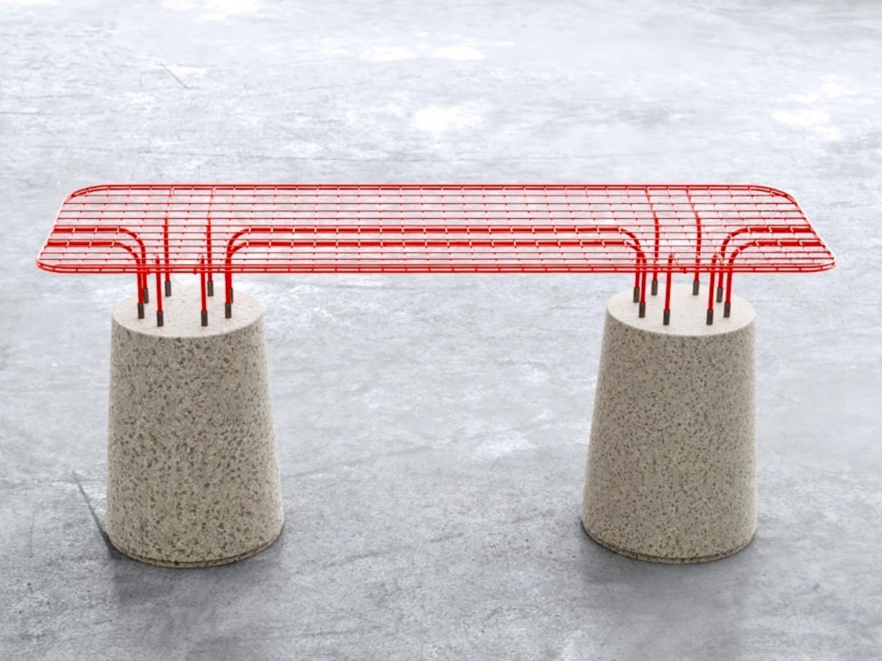
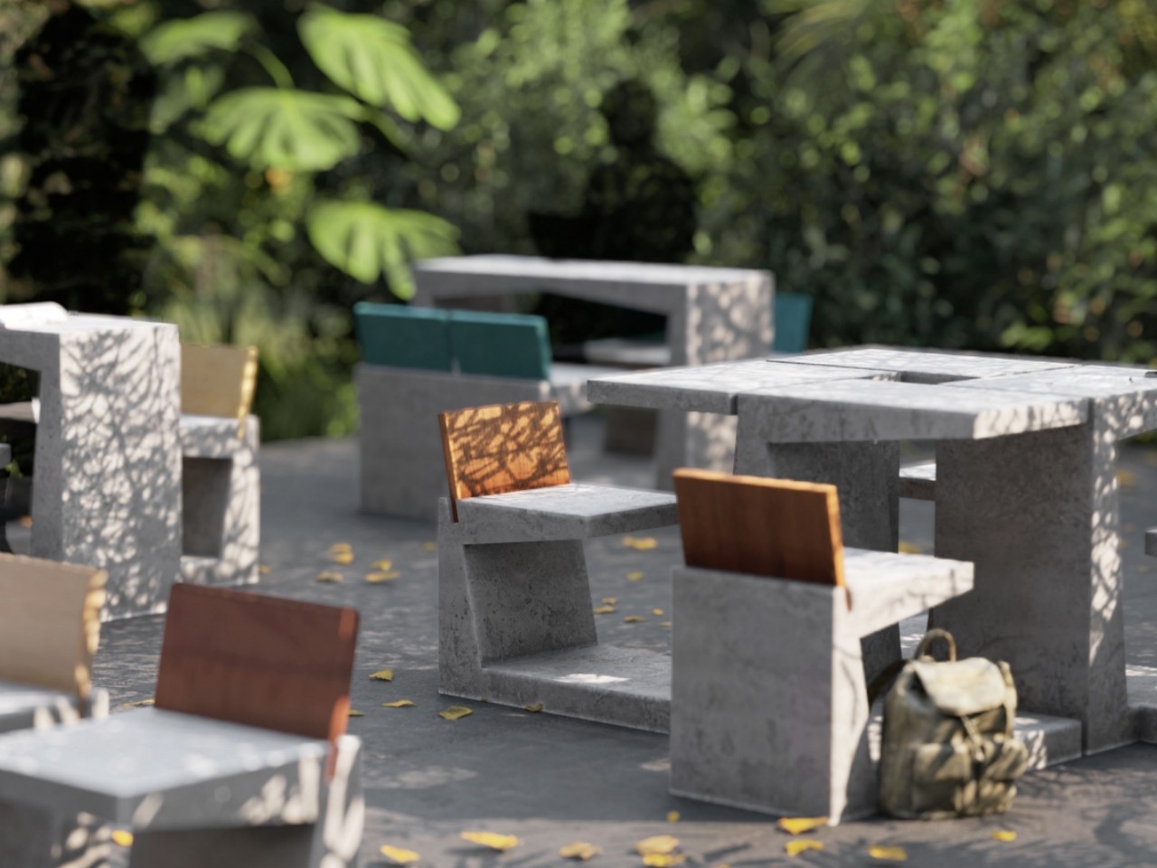
In MeshH, it’s the vibrant colors meet brutalist design. This unique seating solution features a light wireframe seat atop a sturdy concrete base, creating a striking contrast of aesthetics and materials. Designed for outdoor use, MESH combines toughness with inviting comfort, making it perfect for any space. With its minimalist construction and eye-catching colors, MESH adds a touch of playful sophistication to any environment.
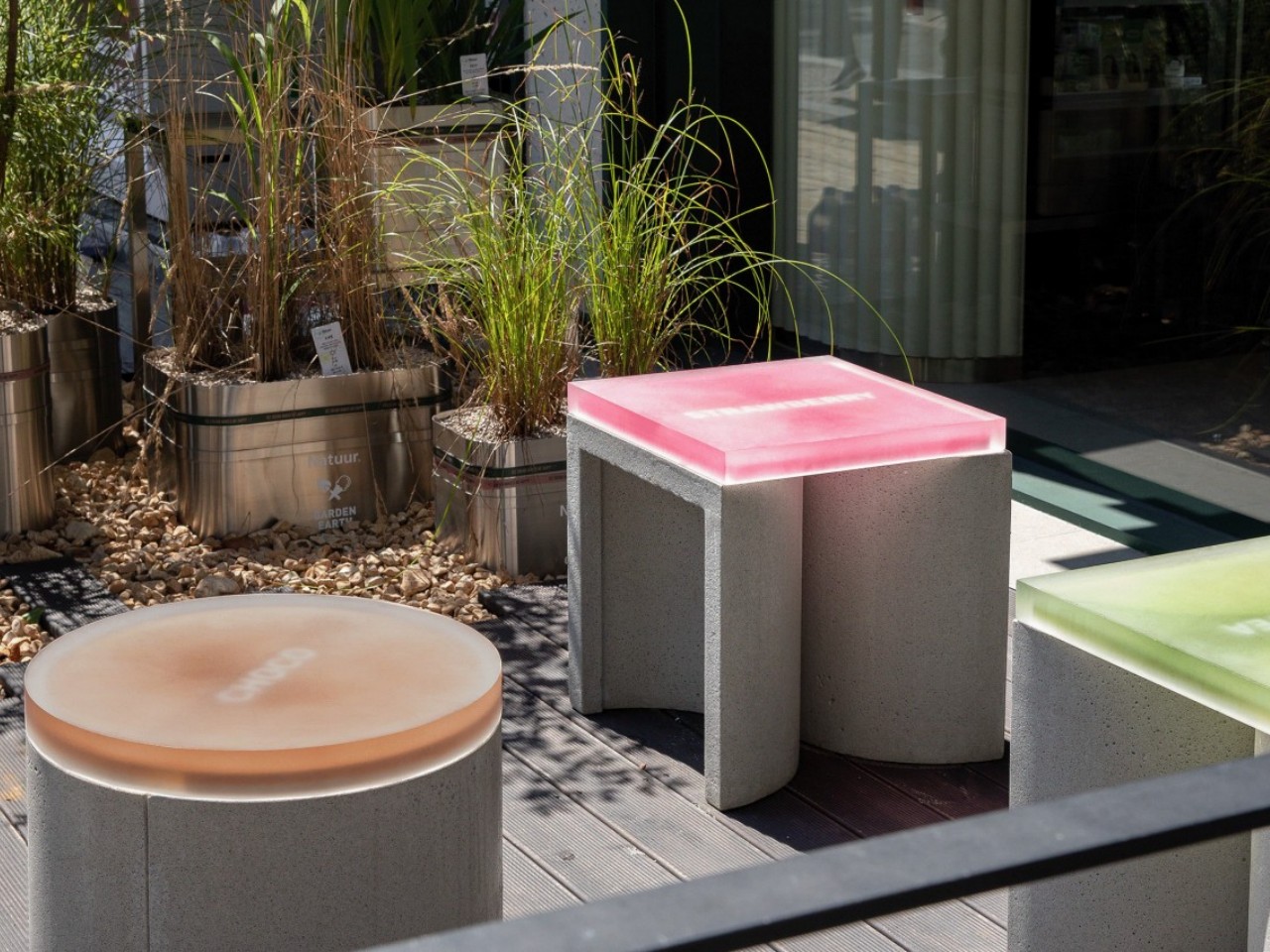
CONECTO is a modular concrete stool which is a bold fusion of brutalist design and innovative functionality. Despite concrete’s typical rigidity, this stool redefines expectations with its customizable shapes and vibrant acrylic tops. Whether as a solitary piece or configured into benches, CONECTO offers versatility without compromising on style. Designed with sustainability in mind, it utilizes high-strength UHPC concrete and plans for future eco-friendly materials. These stools are the perfect balance of form, function, and environmental consciousness.
3. Minimalism
Brutalist interiors keep it simple, focusing on what’s essential and avoiding extra decorations. Furniture with clean lines adds to the practical design, keeping things straightforward and purposeful.
Brutalist design embraces imperfections, finding charm in raw and unfinished surfaces. This approach infuses character and authenticity into the space.
The Brute Chair and Table is a bold reinterpretation of outdoor furniture with a raw, brutalist aesthetic. Crafted from sturdy concrete, these modular pieces combine form and function in a strikingly minimalist design. The chair features a unique plywood backrest for added comfort and warmth, while the table’s versatile configuration options allow for flexible seating arrangements. With holes for connecting rods, the Brute collection offers endless possibilities for outdoor gatherings.
Brutalist interiors frequently showcase substantial, imposing forms that command attention within the space. These monolithic structures lack ornamentation and convey a feeling of mass, and strength, and create a heavy presence.
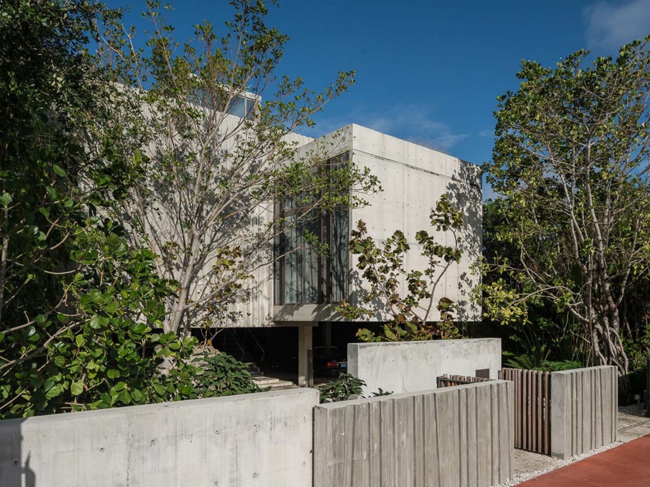
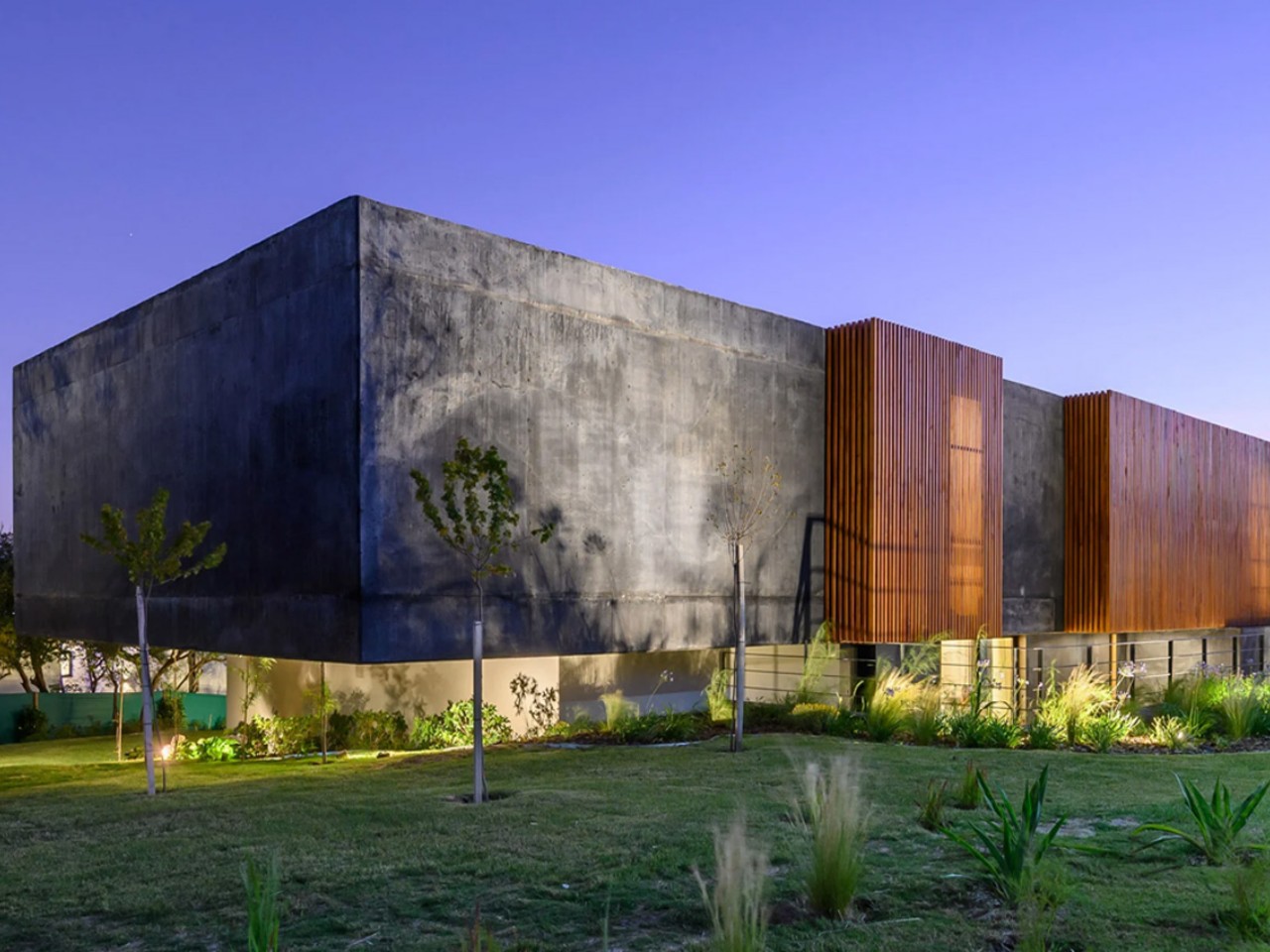
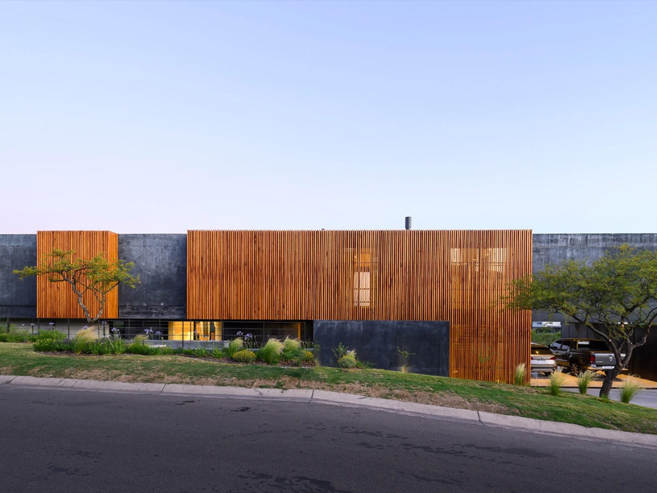
The Black House by AR Arquitectos is a stunning testament to modern brutalist design nestled in the mountains of Córdoba. This residence, crafted from black-stained concrete, redefines traditional architecture with its bold aesthetic and innovative use of materials. Featuring an open-concept layout, panoramic views of the surrounding mountains, and seamless integration with the outdoors, The Black House offers a unique living experience. With its sleek design and attention to detail, this home exemplifies contemporary elegance while providing a serene retreat from city life.
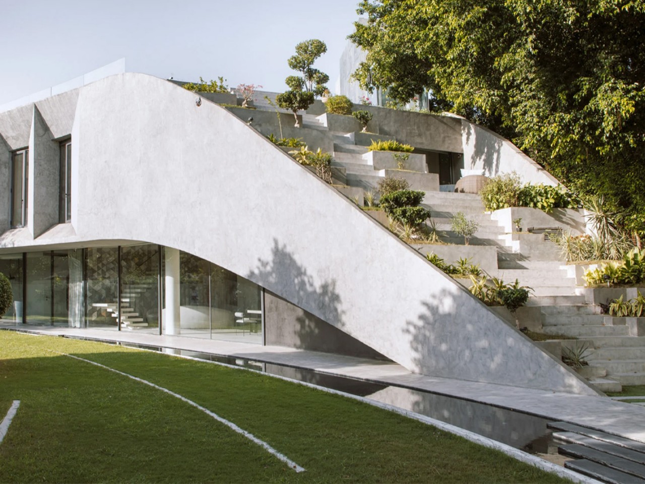
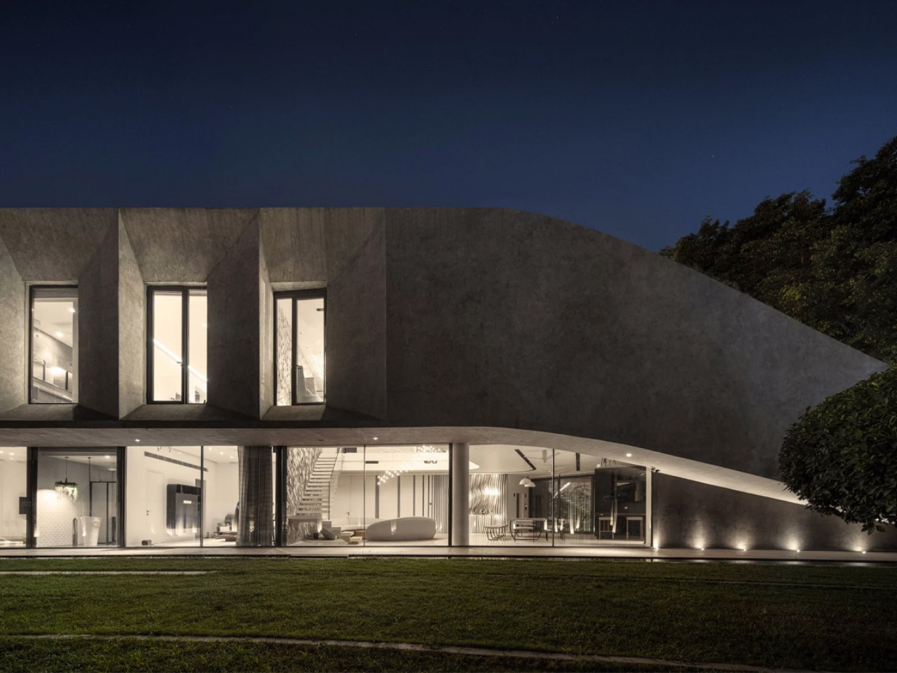
Villa KD45 by Studio Symbiosis is a striking concrete residence nestled in the vibrant city of New Delhi, India. This imposing villa stands out with its majestic terraced roof and distinctive brutalist-inspired aesthetic. Surrounded by landscaped grounds and lush greenery, Villa KD45 offers a tranquil urban oasis amidst the hustle and bustle of the city. With thoughtful design elements like lowered ground floors, cantilevered upper levels, and angular windows to combat the city’s heat, this home seamlessly blends comfort with sustainability. Brutalist structures often aim to blend in with their environment, whether it’s an urban setting or a natural landscape.
6. Functional Furniture
In Brutalist interiors, furniture tends to be straightforward and practical, featuring clean lines and minimal adornments. Make sure to choose functional pieces of furniture equipped with built-in storage solutions for different areas of the home.
7. Industrial Aesthetics
Choose fixtures that blend seamlessly with the industrial and utilitarian atmosphere found in Brutalist interiors, like lighting installations that highlight exposed bulbs or metal pendants.
8. Use of Bold Colors
Although Brutalist design typically favors neutral hues, bursts of vibrant, contrasting colors are frequently employed to introduce visual intrigue and focal points amidst the subdued palette.
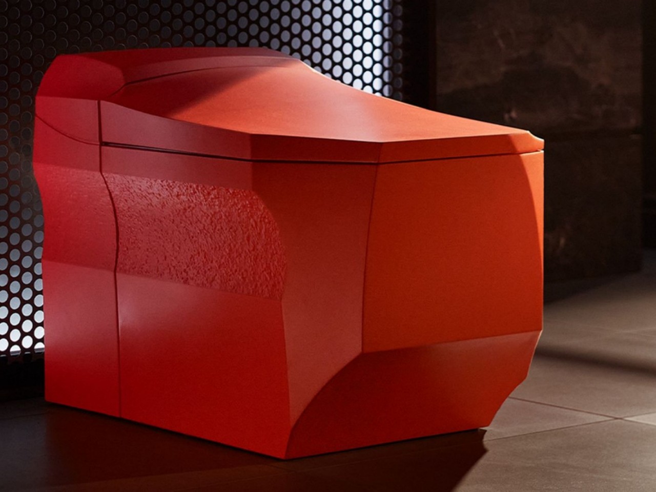
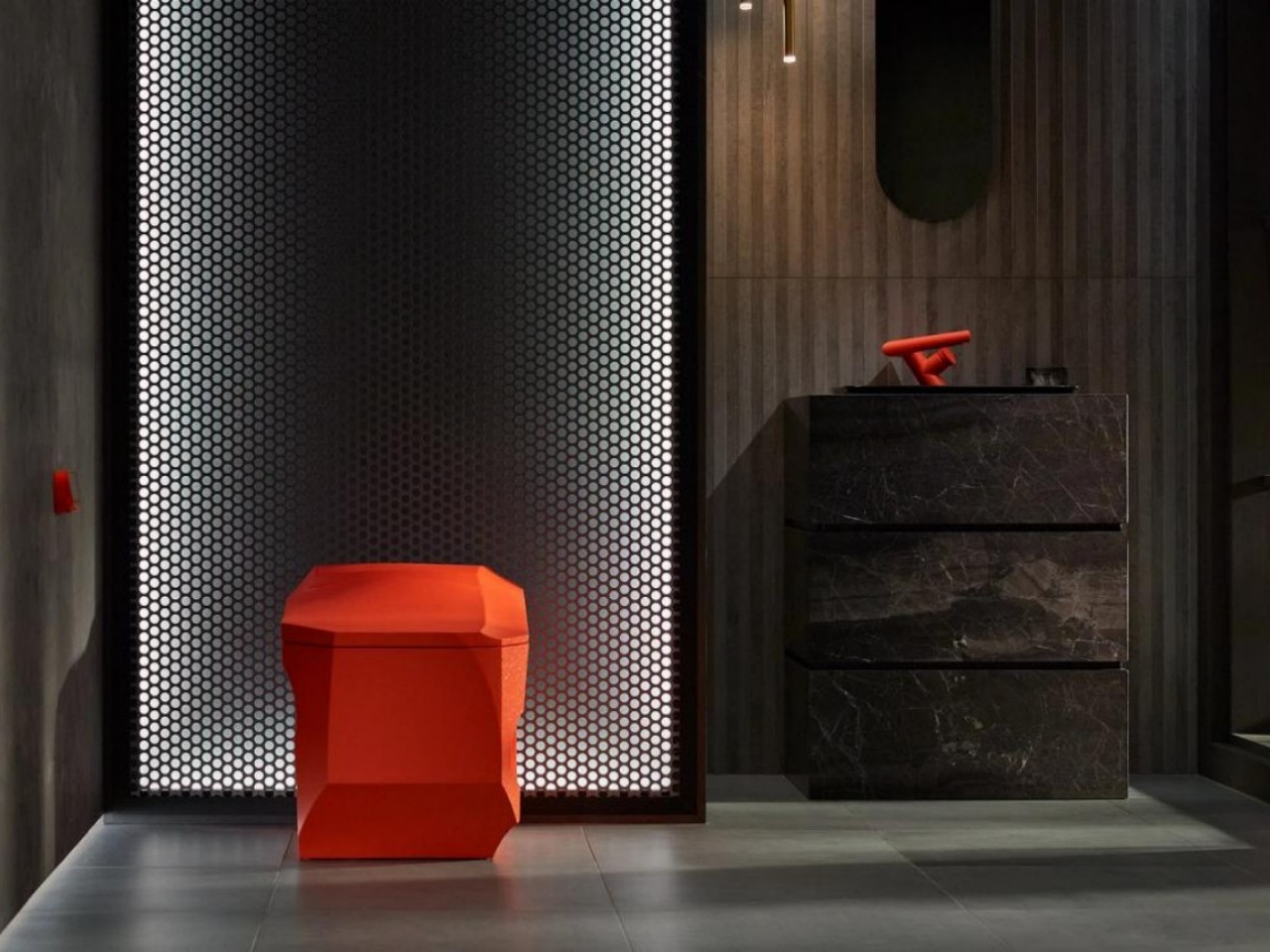
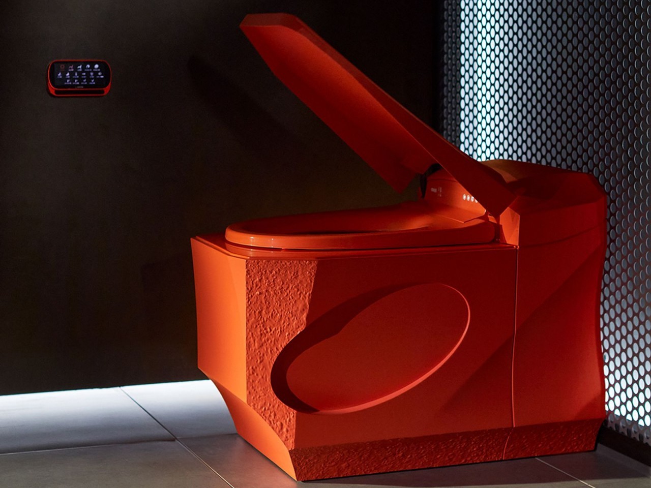
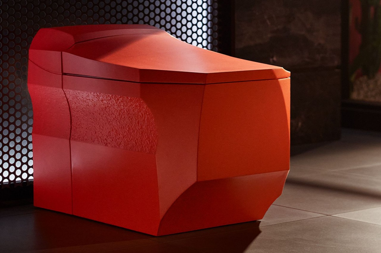
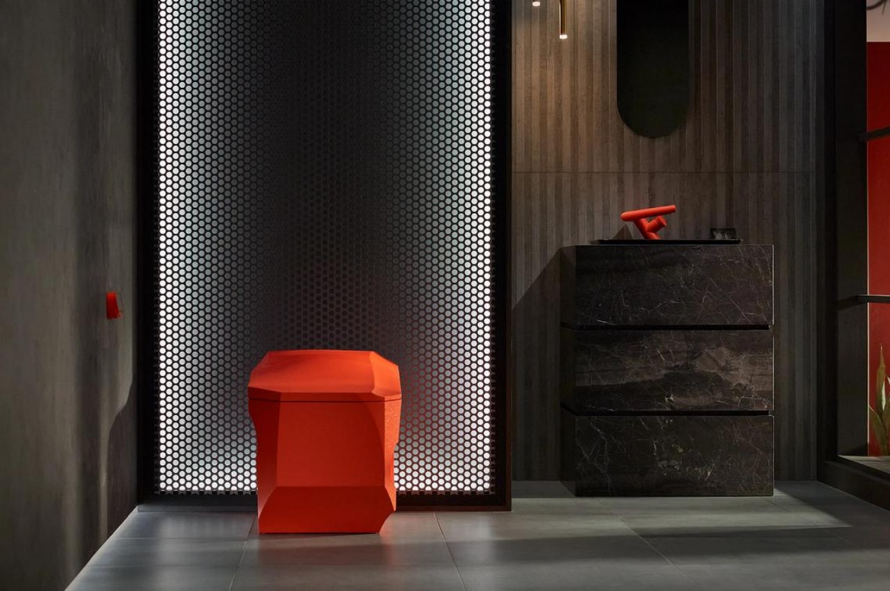
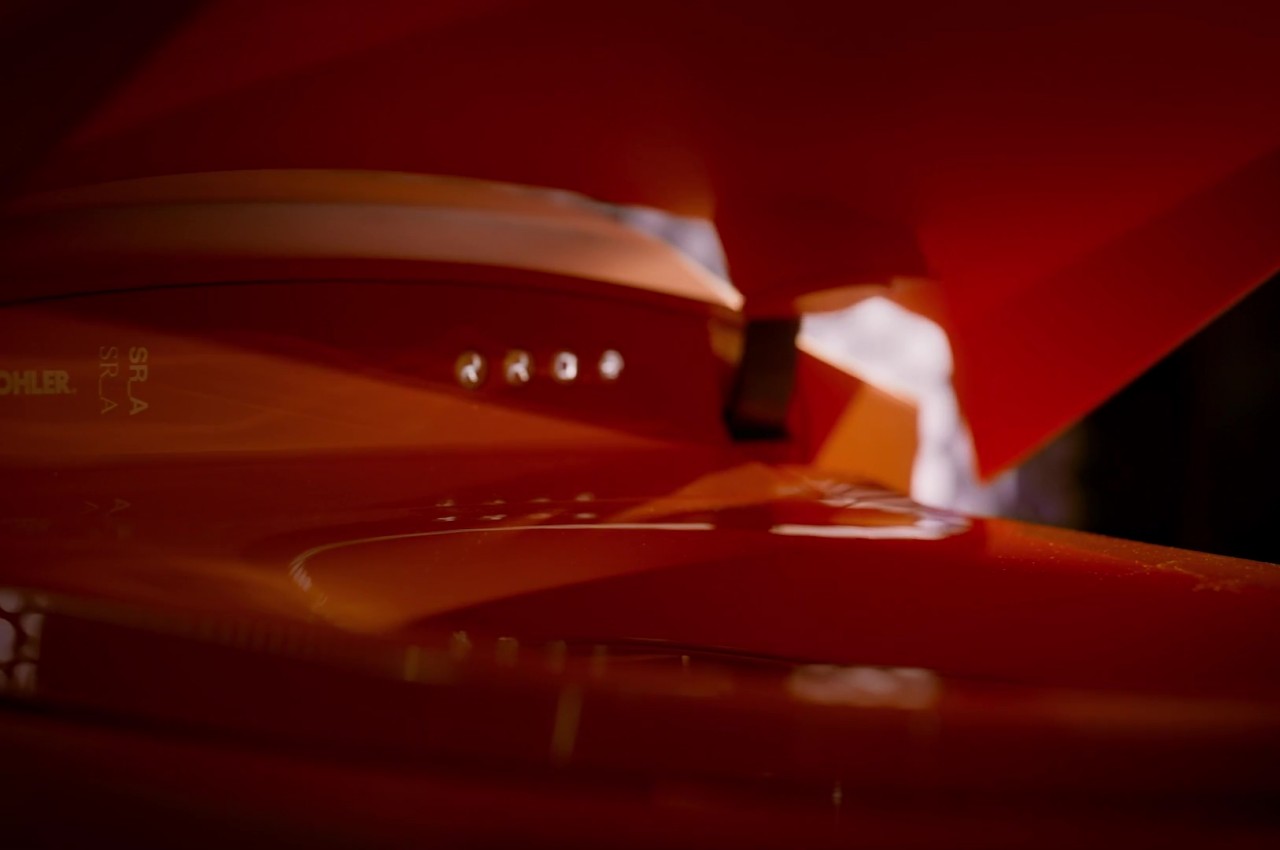
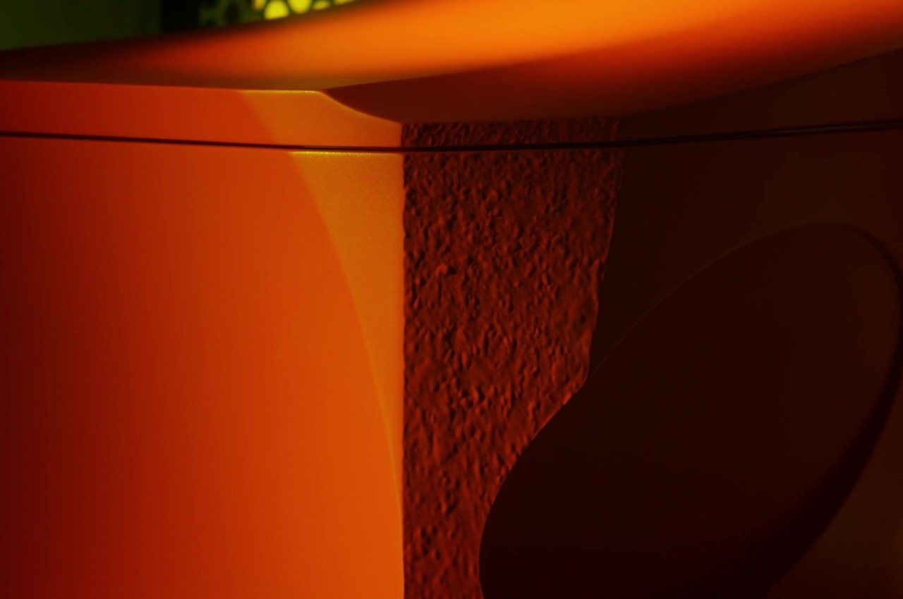
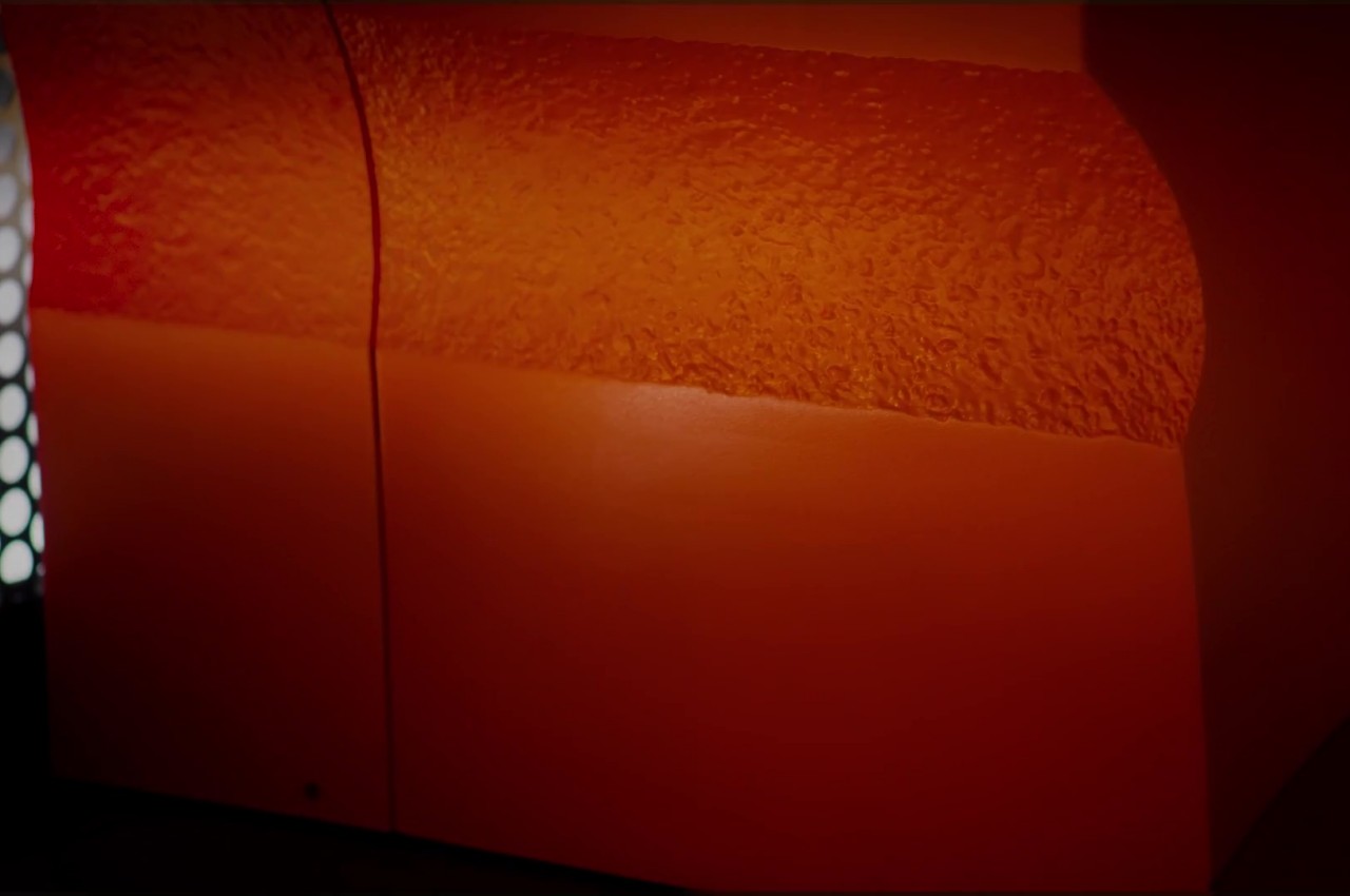
The Kohler Brutalist Smart Toilet reimagines conventional bathroom design with its bold aesthetic and innovative features. Inspired by the transformative power of water, this unique toilet combines a blocky, faceted form with a rugged texture, reminiscent of brutalist architecture. Despite its unconventional appearance, the Formation 02 remains a fully functional and comfortable toilet, equipped with smart features such as a heated seat and customizable bidet cleansing. With its distinctive design and advanced technology, the Kohler Brutalist Smart Toilet offers a one-of-a-kind bathroom experience that seamlessly blends style and functionality.
9. Play of Textures
Brutalist design embraces texture play, blending rough and smooth surfaces to evoke a tactile experience. This can be achieved by introducing materials like leather, metal, and textured fabrics.
Designer: Rich Holland
Rich Holland’s revolutionary skatepark endeavor in Southampton introduces groundbreaking 3D-printed concrete furniture to Guildhall Square. The PSFF Bench, a remarkable prototype, seamlessly combines sculptural grace with sports-centric utility. Prioritizing minimalism and longevity, these distinctive pieces redefine skate furniture on a global scale. Immerse yourself in the intersection of avant-garde design and skate culture through Holland’s iconic innovations.
10. Celebrates Imperfections
The Brutalist design aesthetic embraces imperfections and the natural aging of materials, enhancing the space’s character and authenticity by allowing materials to evolve and reveal their wear and patina over time.
Brutalist architecture declined in the 1980s due to shifting perceptions and concrete deterioration, but it is now making a comeback, influencing contemporary products and residential interiors, and being recognized for its unique contribution to architectural heritage. However, Brutalist design continues to find its place in graphic design, web design, and product design.
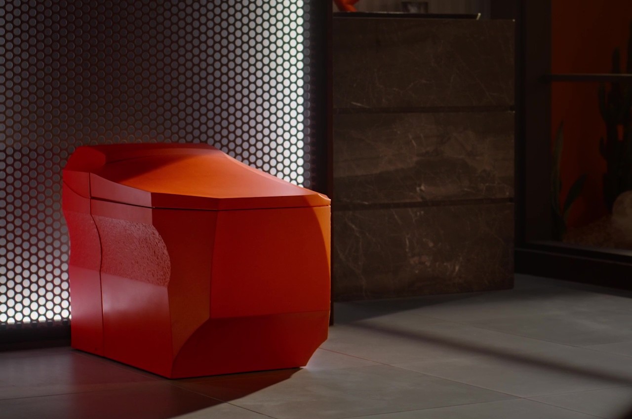
It’s almost too easy to take for granted what a toilet looks like, especially considering what we use it for. At the same time, that’s the very reason why these fixtures need to not only be well-designed but also aesthetic, providing a sense of comfort and maybe even delight despite and in spite of the context. That is why the majority of toilets are designed with shiny white surfaces and smooth curves in an attempt to provide a visual and tactile contrast to their purpose. That said, that is hardly the only way to design a striking product, and this rather unique toilet design concept uses a different strategy that still manages to capture the eyes and the mind with its brutalist form inspired by the powerful waters that course through it.
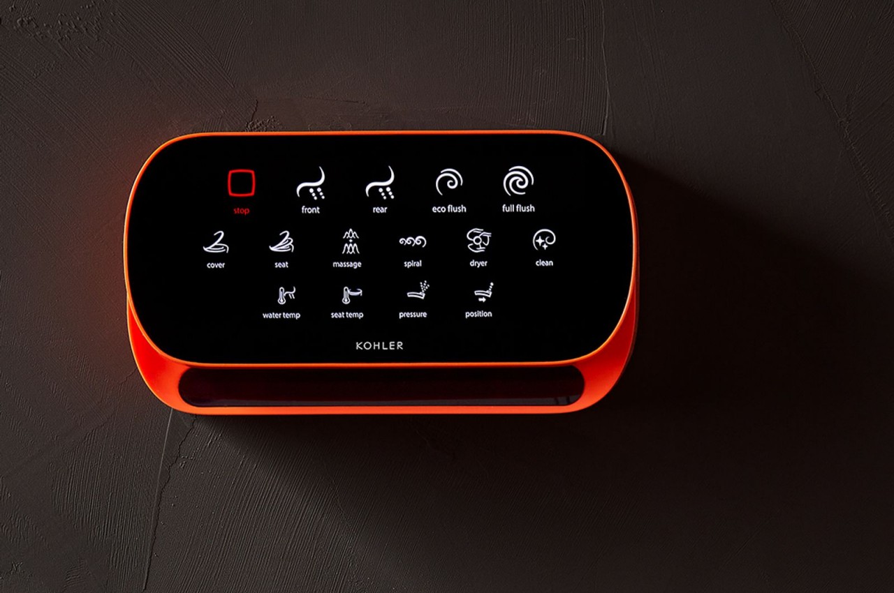
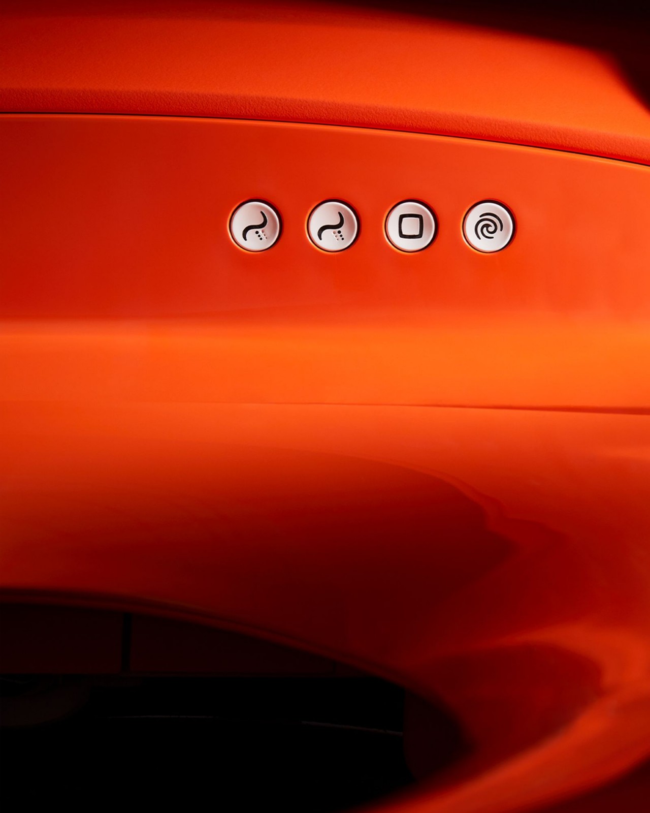
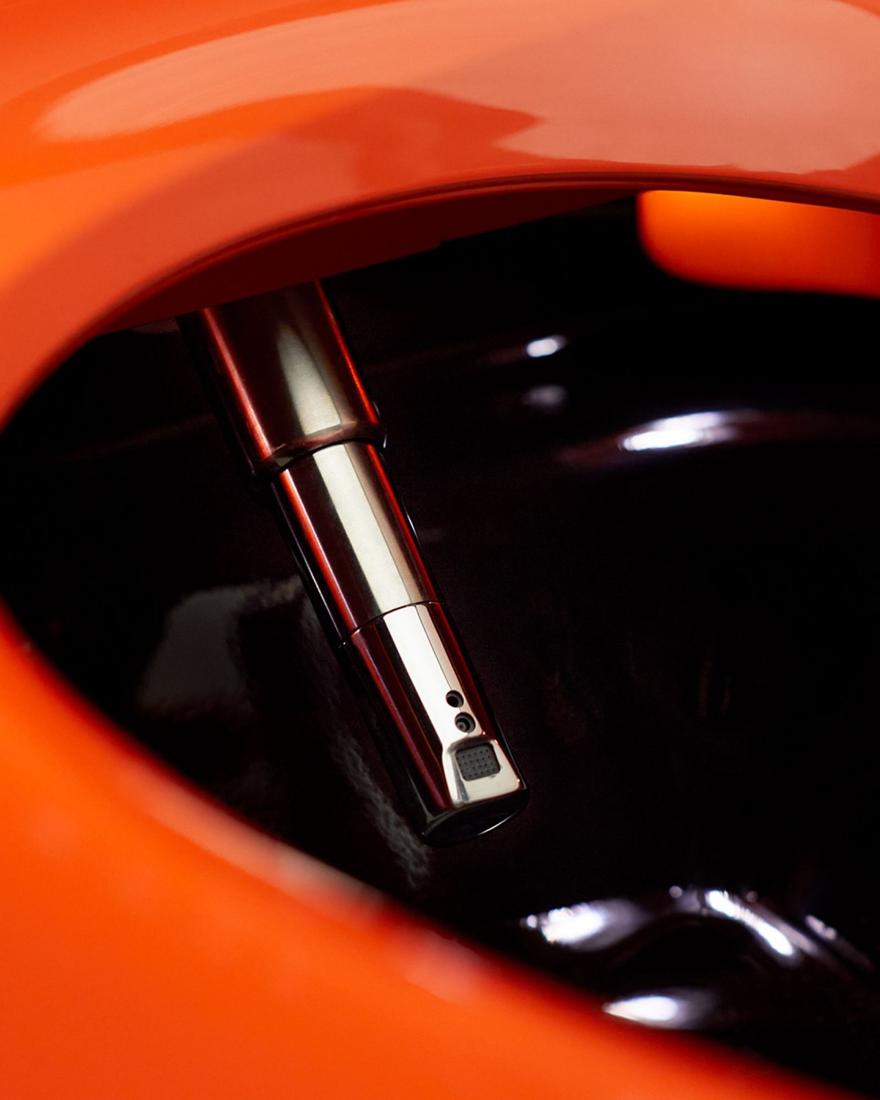
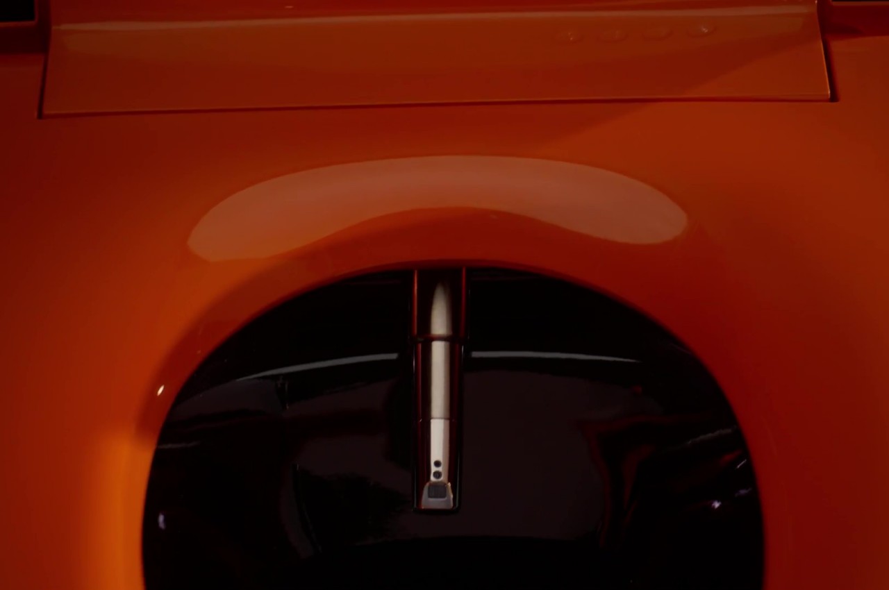
There’s really no hard rule on what a toilet should look like as long as it functions as intended and is more or less comfortable to use. That toilets are often white, smooth, and curvy is simply a matter of convention and convenience. There are, of course, exceptions to these that add a bit of flair to the bathroom, and the Formation 02 is one design that immediately stands out from the crowd both in its shape and its unconventional color.
As if its orange paint weren’t enough to get it noticed, the Formation 02’s blocky and faceted form evokes a different imagery from typical toilets. It has a rough sort of character as if the whole body was hewn from stone, giving it a brutalist aesthetic you won’t find in any toilet. It’s a design chosen not merely for the sake of being different but for the message it tries to convey.
In particular, it tries to demonstrate the effects of moving water on its environment, shaping and changing the way things look. Sometimes it can smooth out rocks into pebbles, but sometimes it can also wear them down to rough surfaces. The Formation 02 represents both possibilities, with some sides smooth while others left rough and raw.
While it might indeed look rough on the outside, the Formation 02 is still a functional toilet that brings comfort and convenience once the lid is lifted, which can be done without even touching it. It’s a smart toilet, after all, and it offers a heated seat, customizable bidet cleansing, and more, allowing you to do your thing neatly and cleanly while appreciating the distinctive design of this one-of-a-kind toilet concept.
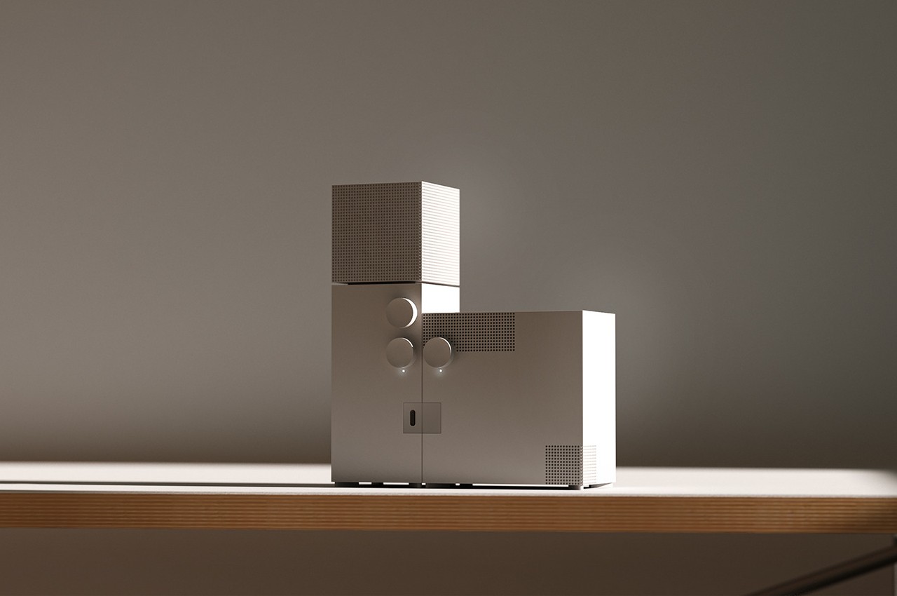
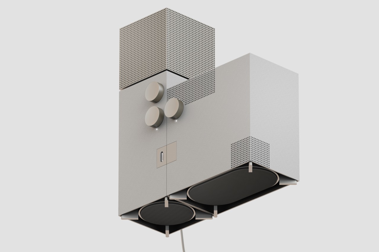
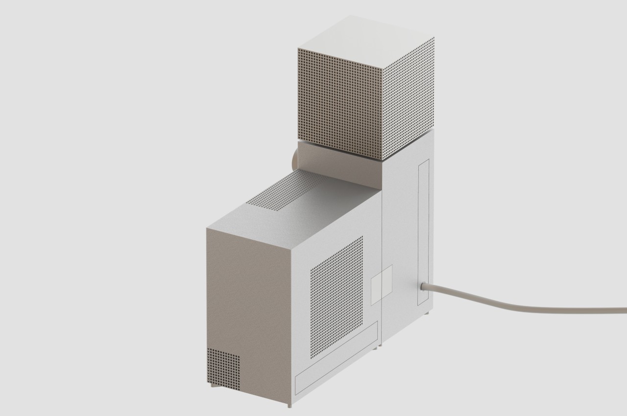
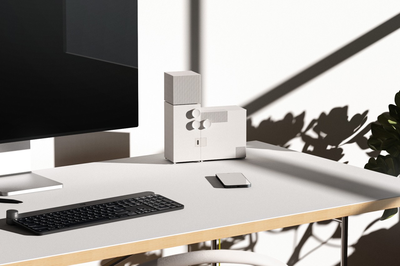
Regardless of religious inclination or lack thereof, the word “church” would often conjure up images of lofty buildings designed to inspire awe or command respect. Of course, church architecture often reflects the trends and styles of their times, and there are indeed churches today that wouldn’t look out of place beside commercial buildings and structures. Of these, the former Church of Saint Agnes in Berlin, now home to the Konig gallery, is perhaps one of the most striking examples of the modern brutalist movement applied to such a structure, and its imposing character happens to be the almost literal inspiration for a desk speaker concept that similarly embraces that spirit of extreme austerity in a beautiful and memorable way.
Designed by architect Werner Duttmann and finished in 1967, the former Church of St. Agnes, now the Gallery of Konig, stands almost in opposition to common church architectures of that period and the ages before it. Its unadorned, boxy shapes don’t stand out among the rows of concrete buildings that line up most cities, making it feel like just another part of the community. At the same time, however, its austere appearance still cuts an imposing figure that gives the impression of something that is meant to exist on a completely different and higher level.
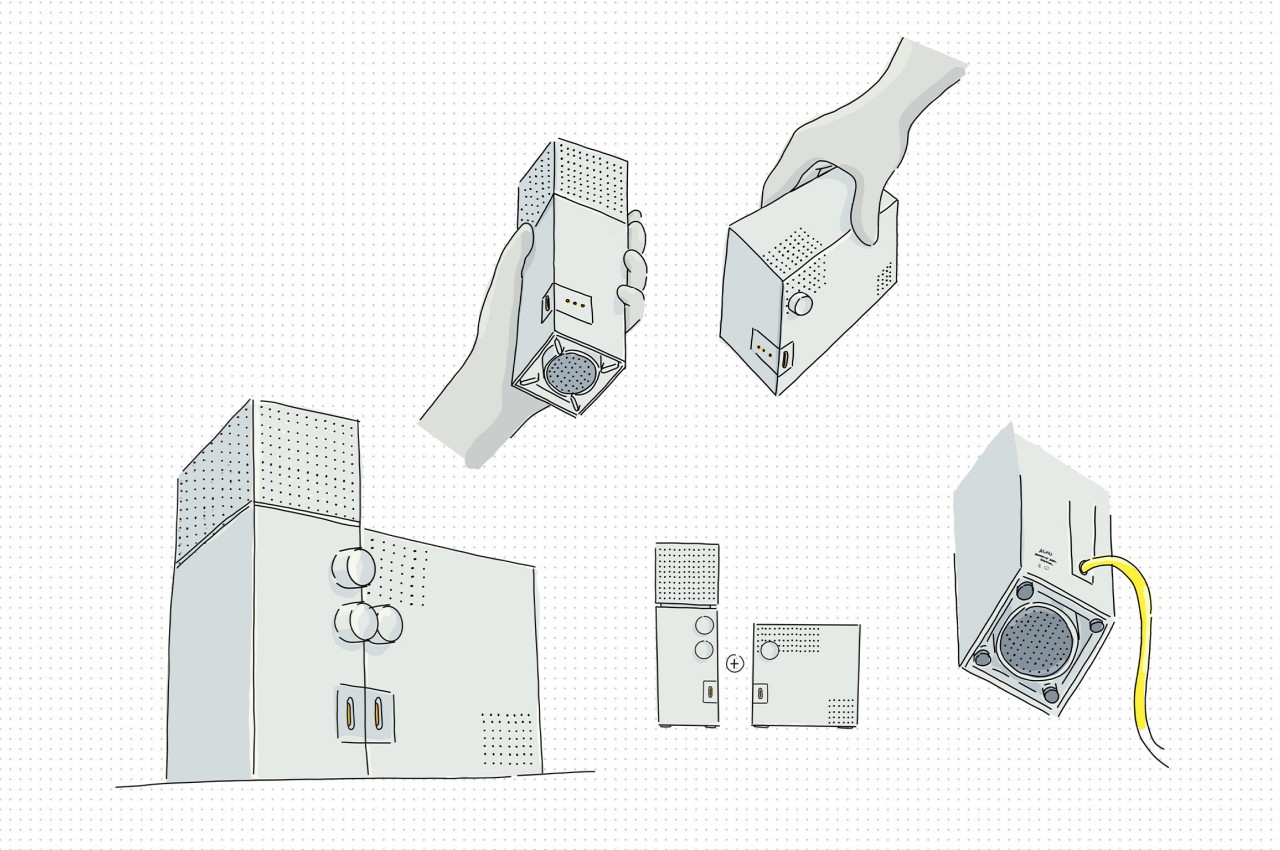
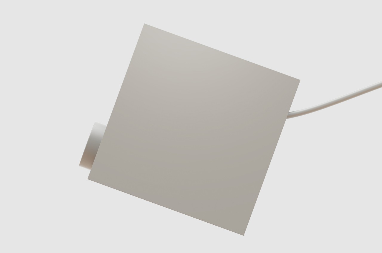
It’s that same stunning characteristic that the Agnes desk speaker concept tries to convey on a smaller scale. Like the church it takes both its shape and name from, the design is made from two plain rectangular pieces, though the roles are switched. The vertical “bell tower” is actually the main speaker, with the top box providing 360-degree output, while the larger detachable box provides bass on demand.
Like any brutalist design, the speakers express rawness, expressed through metal instead of concrete and accentuated by the use of the simplest geometrical shape and sharp edges. In terms of functionality, however, there is nothing unrefined about the Agnes speaker concept, and it even imagines a feature not found in any 360-degree speaker today. While the lower knob controls the speaker volume, the one above it determines where sound is directed, whether it’s only from the front, from the front and the sides, or from all four sides.
Smart speakers today are trying their best to blend into their surroundings, namely your interior decor, and just like its inspiration, the Agnes desk speaker concept presents a duality in that regard. It definitely mixes well with minimalist designs, but its raw appearance and imposing stature also make it stand out easily, turning what would normally be just a functional appliance into a unique work of art that looks almost out of place and out of time.
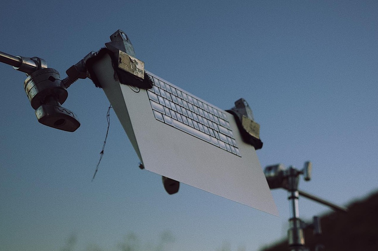
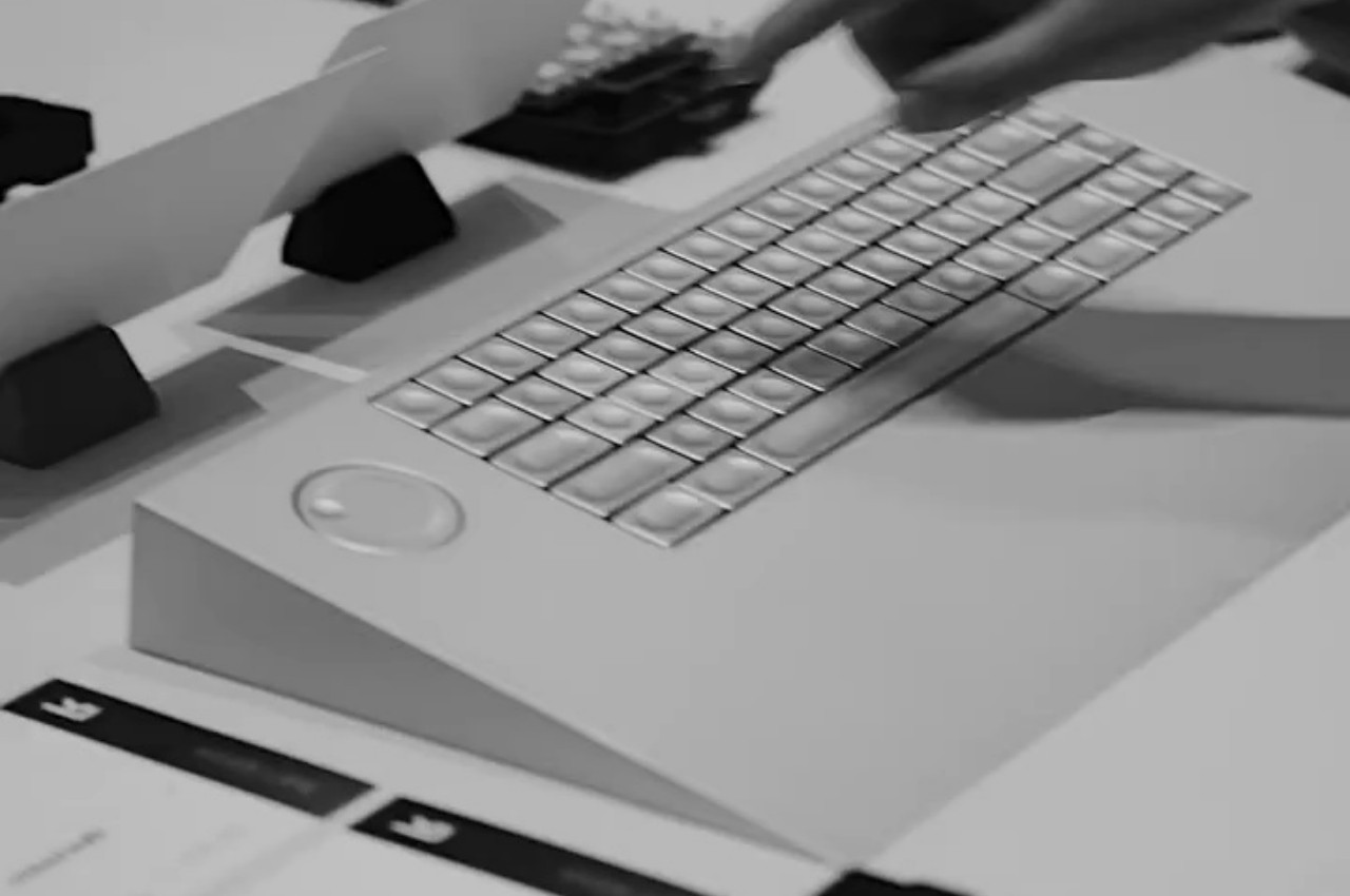
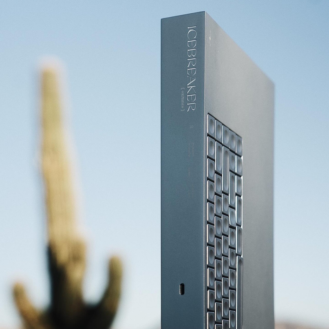
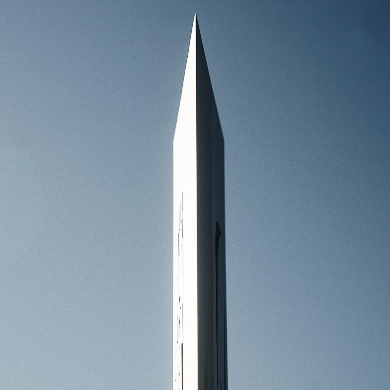
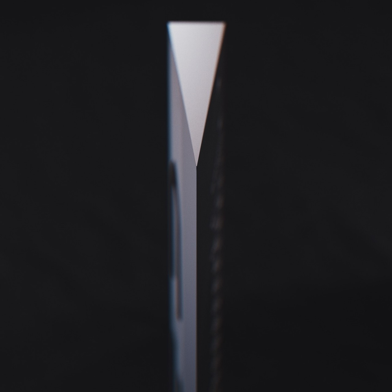
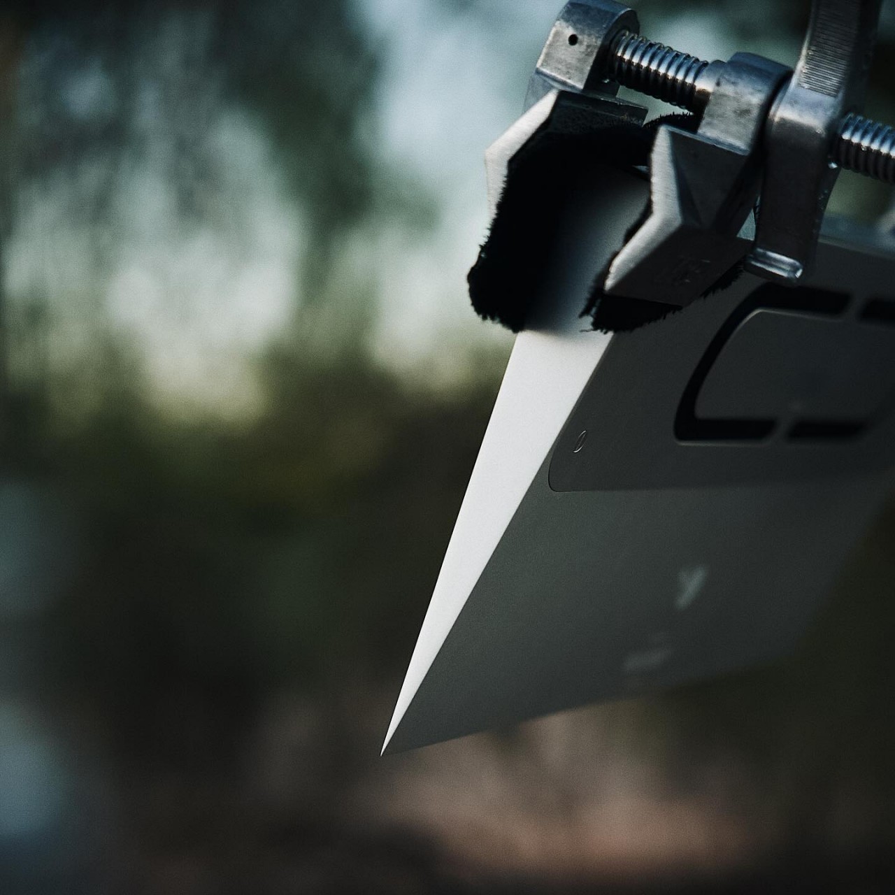
Computer keyboards are designed for utility primarily, with aesthetics often coming in second place if at all. Considering its purpose, that’s not exactly puzzling, but there are thankfully fresh new designs that are giving keyboards more refreshing visuals without changing the standard formula in any way. There are, however, also bolder attempts at carving a completely different character for the humble keyboard, without losing any of its functionality, of course, creating a product that is as much a work of art as it is a piece of engineering. One such piece is this all-metal “Icebreaker” keyboard, presenting a rather radical approach that aims for maximum impact by distilling the design down to its bare essentials, resulting in an almost brutalist form that takes its cues from that iconic steel-framed building in New York City.
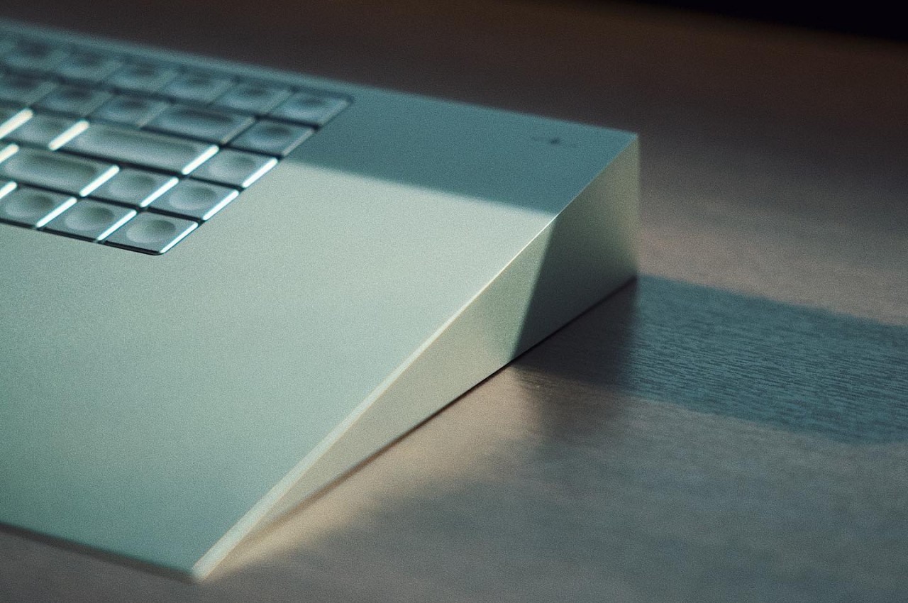
The earliest computer keyboards came with a chunky wedge shape, not for the sake of appearances but almost out of necessity. It offered a naturally inclined plane that was more ergonomic than typing on a flat surface, although the designers of that period may have not been completely cognizant of that. It’s a design convention that today’s keyboards implement using foldable stands in order to accommodate varying user preferences as well as sleeker styles and thinner profiles.
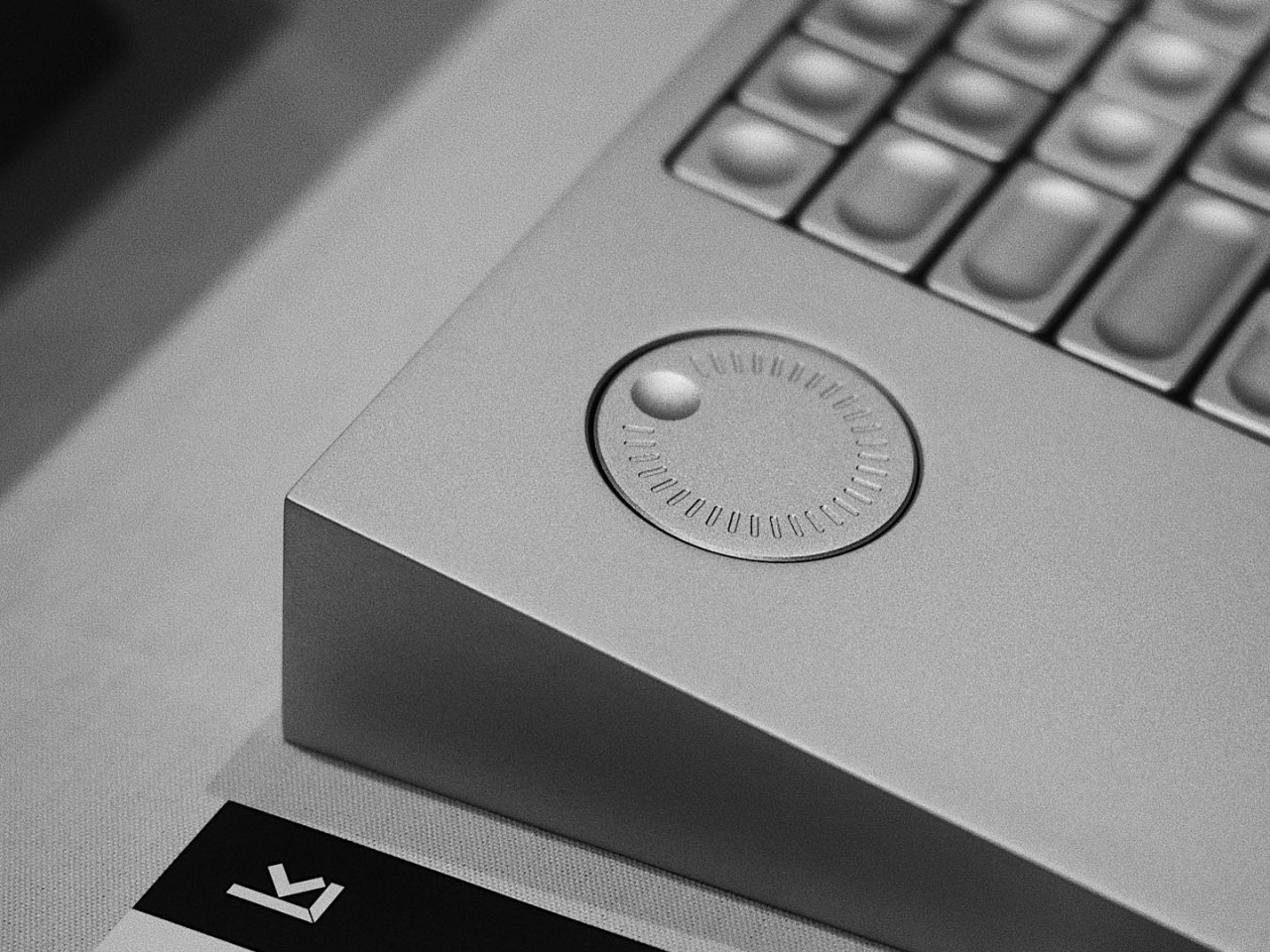
The Icebreaker, in contrast, is unapologetic in embracing that wedge shape and does so in an almost extreme way. It’s actually more of a triangle than a wedge, with the angle facing the user presenting an edge that looks sharp enough to chop wood or even break ice, hence the name. The inclined plane naturally forces your hands to type at a fixed angle, but unlike the first keyboards of old, the design comes with built-in wrist support. When viewed from certain angles, like when the keyboard stands upright on one of its sides, it resembles the Fuller “Flatiron” Building in New York, a piece of architecture that is famed for its unusual shape that represents a cast-iron clothes iron.
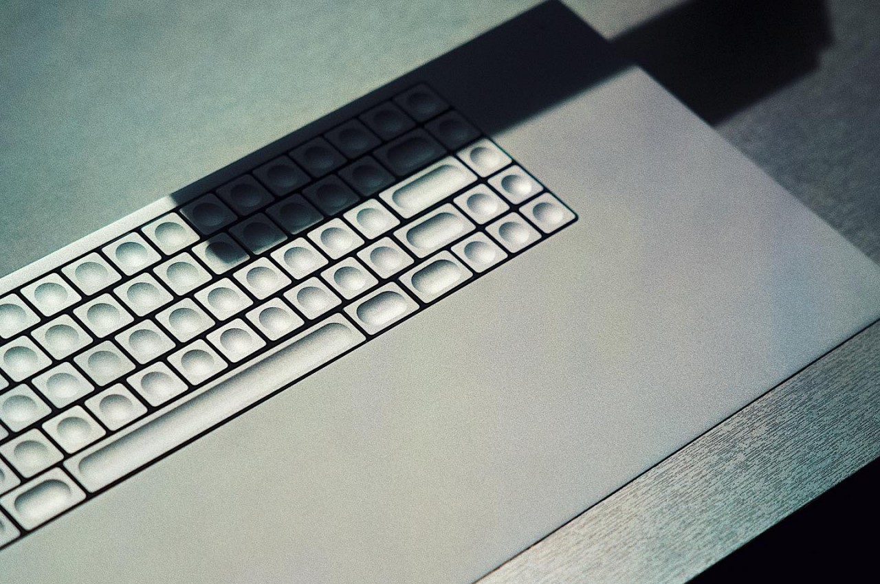
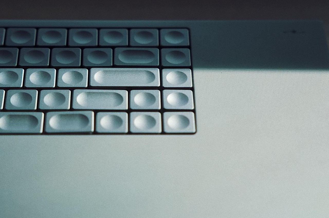
Just like that building, or perhaps even more so, the entire keyboard is machined from aluminum, including the keycaps. Unlike your typical keycaps, these are completely concave circles. Even more interesting, the marks on the keys aren’t in the middle but are off to the corners, created using 300-micron micro-perforations. There are no other markings on the keyboard, no color or even backlighting, giving it an industrial aesthetic that borders on brutalism because of its raw, full metal appearance.
Of course, The Icebreaker isn’t just for show and it actually has one feature not found on most keyboards. There’s a programmable dial off the left of the keyboard, a useful tool for creators who constantly scroll through menus and options. It’s definitely an interesting piece of computer equipment, at least visually. Its actual usability and ergonomics, however, are still to be judged when the product actually becomes available for purchase.