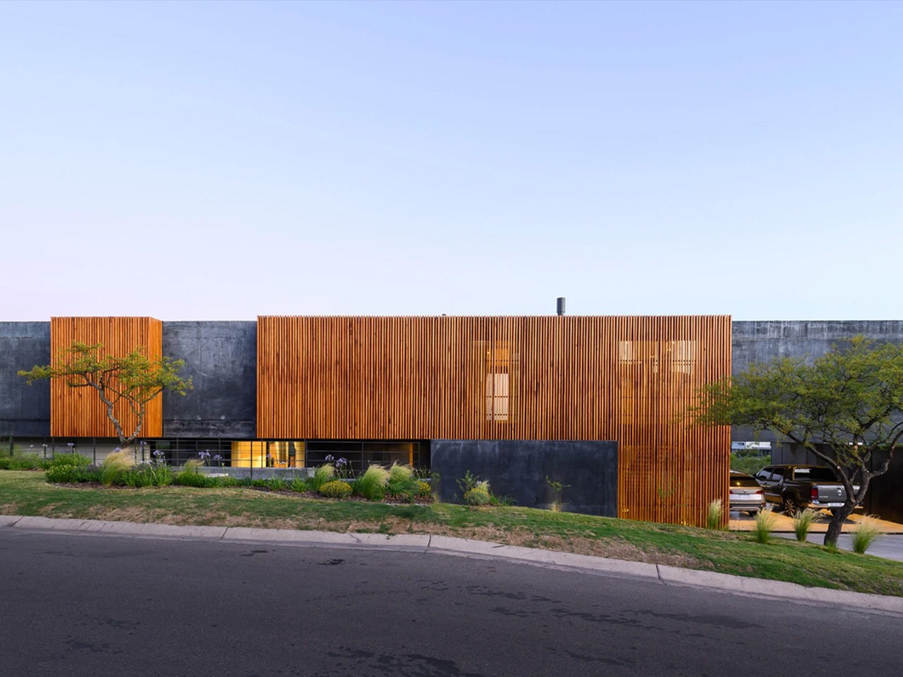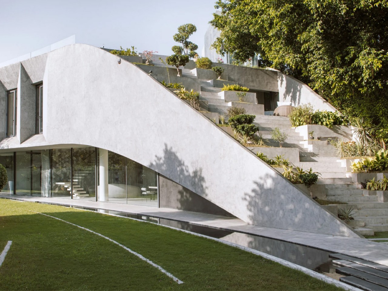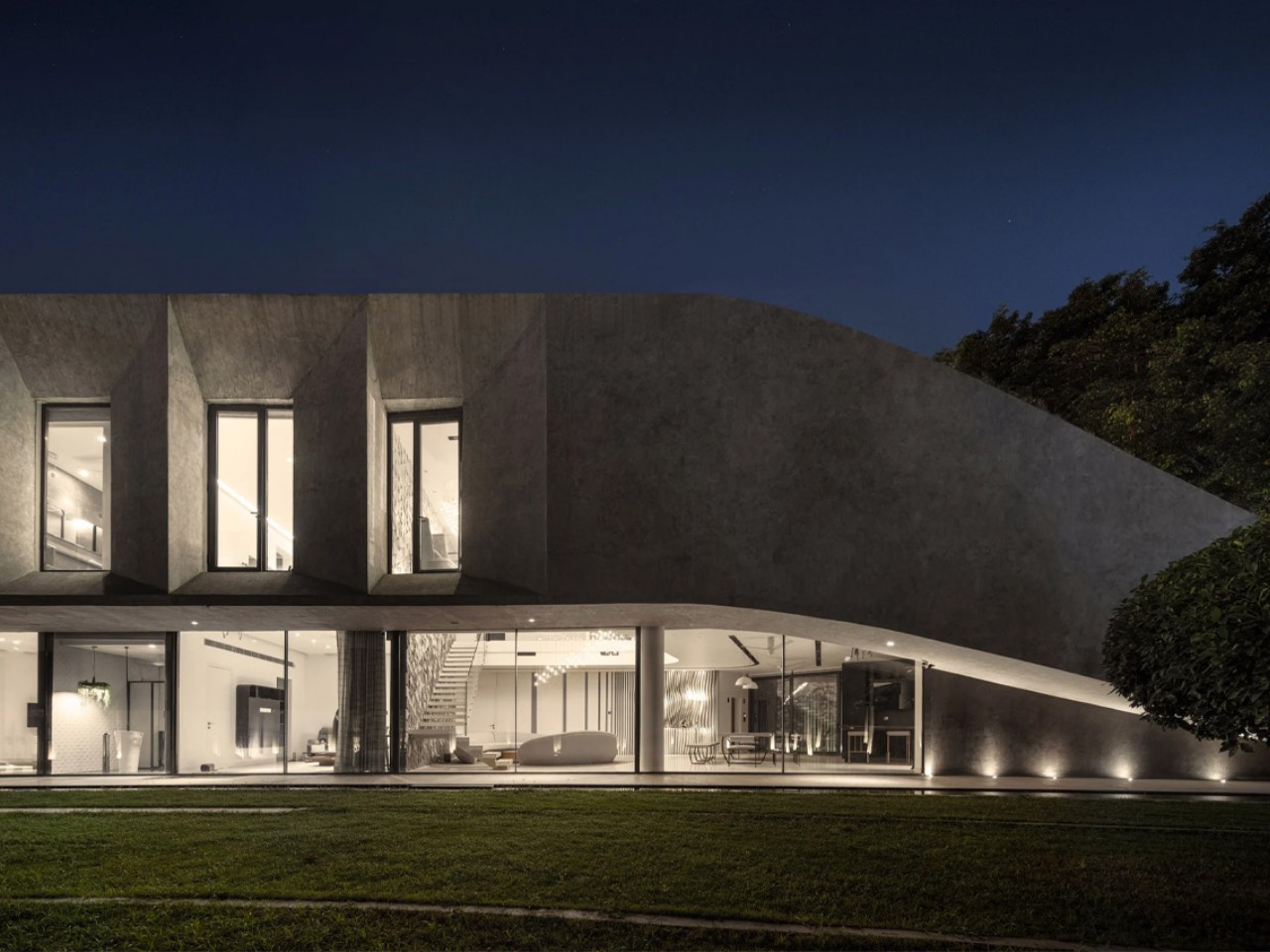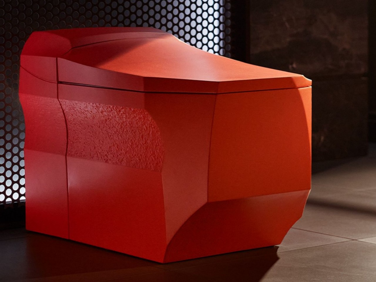
Brutalism once suggested stark, monumental forms, with raw concrete presented in uncompromising honesty. Today, that legacy is evolving into a softer interior design language: Soft Brutalism. Rather than a contradiction, it becomes a thoughtful fusion where concrete is shaped into gentler, more human-centered forms. This shift responds to a culture saturated with disposable design and offers a return to authenticity, weight, and permanence.
Design studios increasingly agree that real luxury now lies in longevity and the tactile bond between people and material. Soft Brutalism embraces concrete’s structural clarity while softening its presence through refined casting, subtle tones, and smooth contours, transforming a once cold material into a warm, grounding element in contemporary spaces.
1. Texture As Poetic Expression
Soft Brutalism reimagines the concrete surface as a sensory landscape. Instead of the coarse, exposed finishes of classic Brutalism, this approach introduces a gentler, more tactile vocabulary. Ultra-high-performance concrete and advanced admixtures allow surfaces to feel like polished stone or soft, leathered marble, shifting concrete from industrial to intimate.
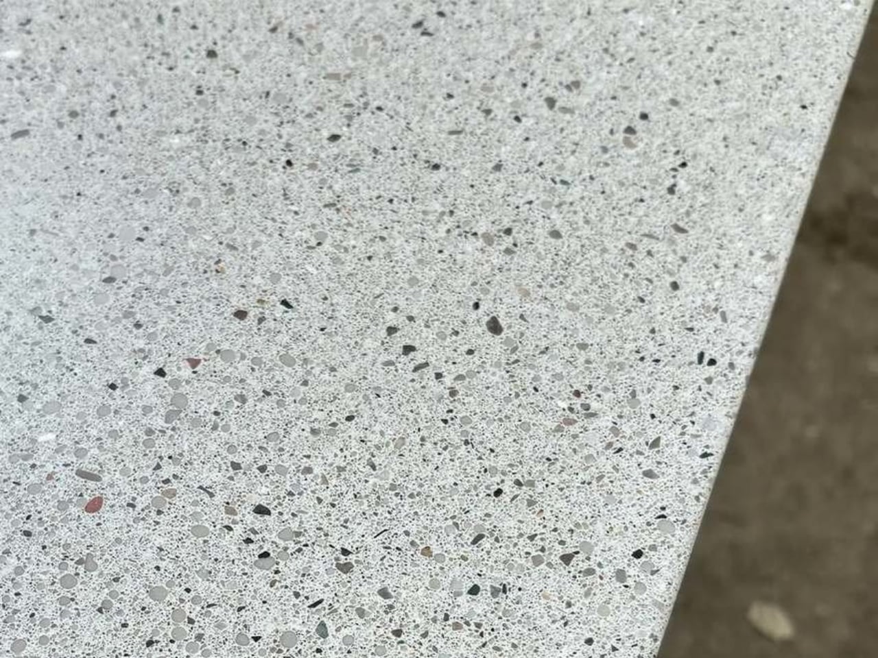
Subtle natural pigments bring earthy tones that warm the material visually, while delicate pores and faint aggregate patterns preserve its authenticity. This balance of refinement and imperfection creates a presence that feels grounded, crafted, and emotionally resonant – inviting touch and elevating concrete into a poetic element of contemporary design.


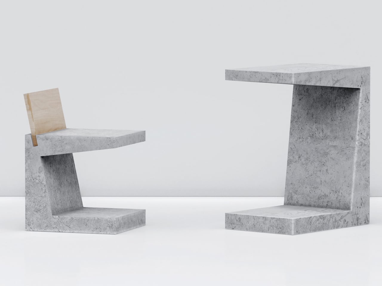
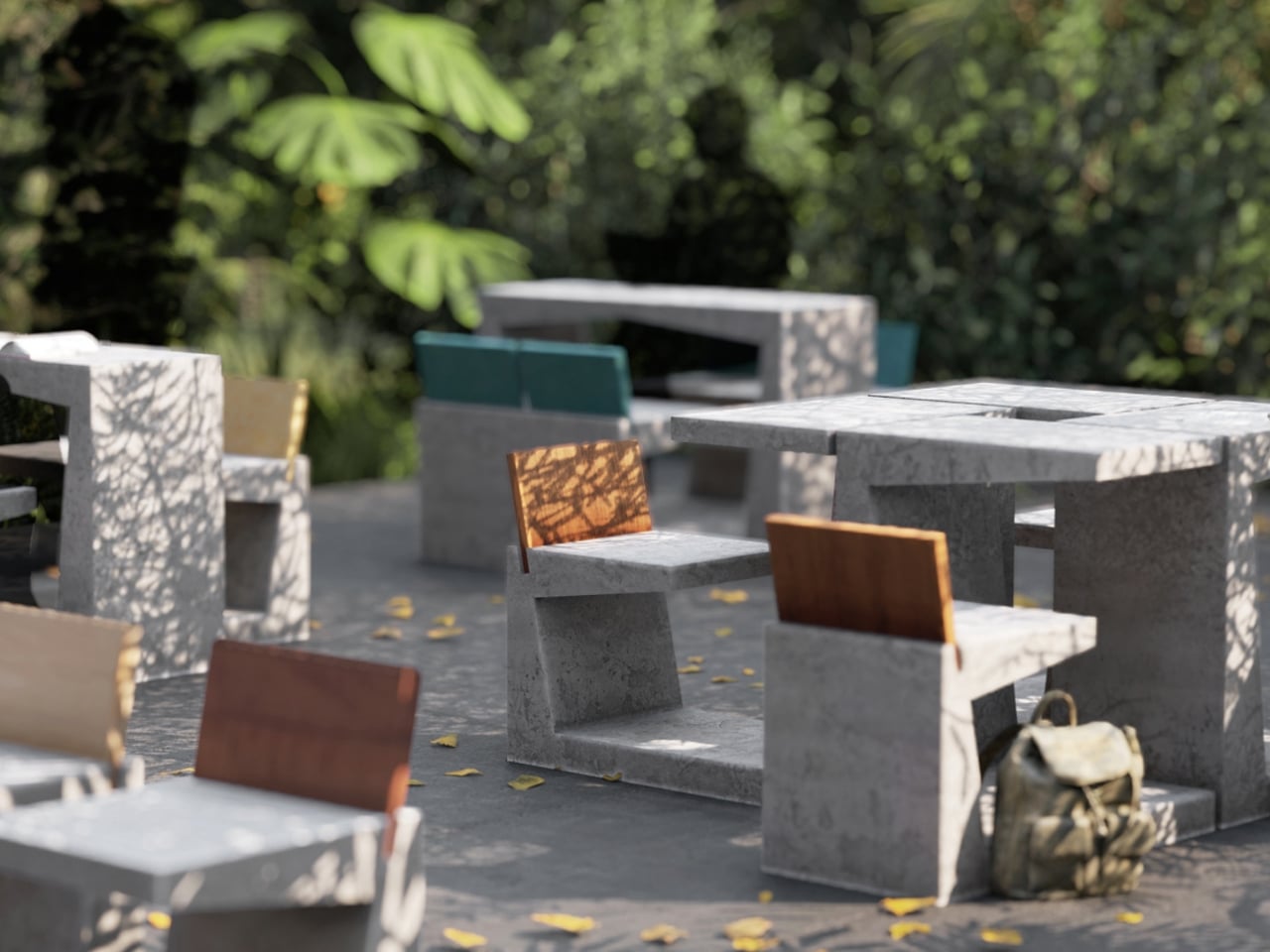
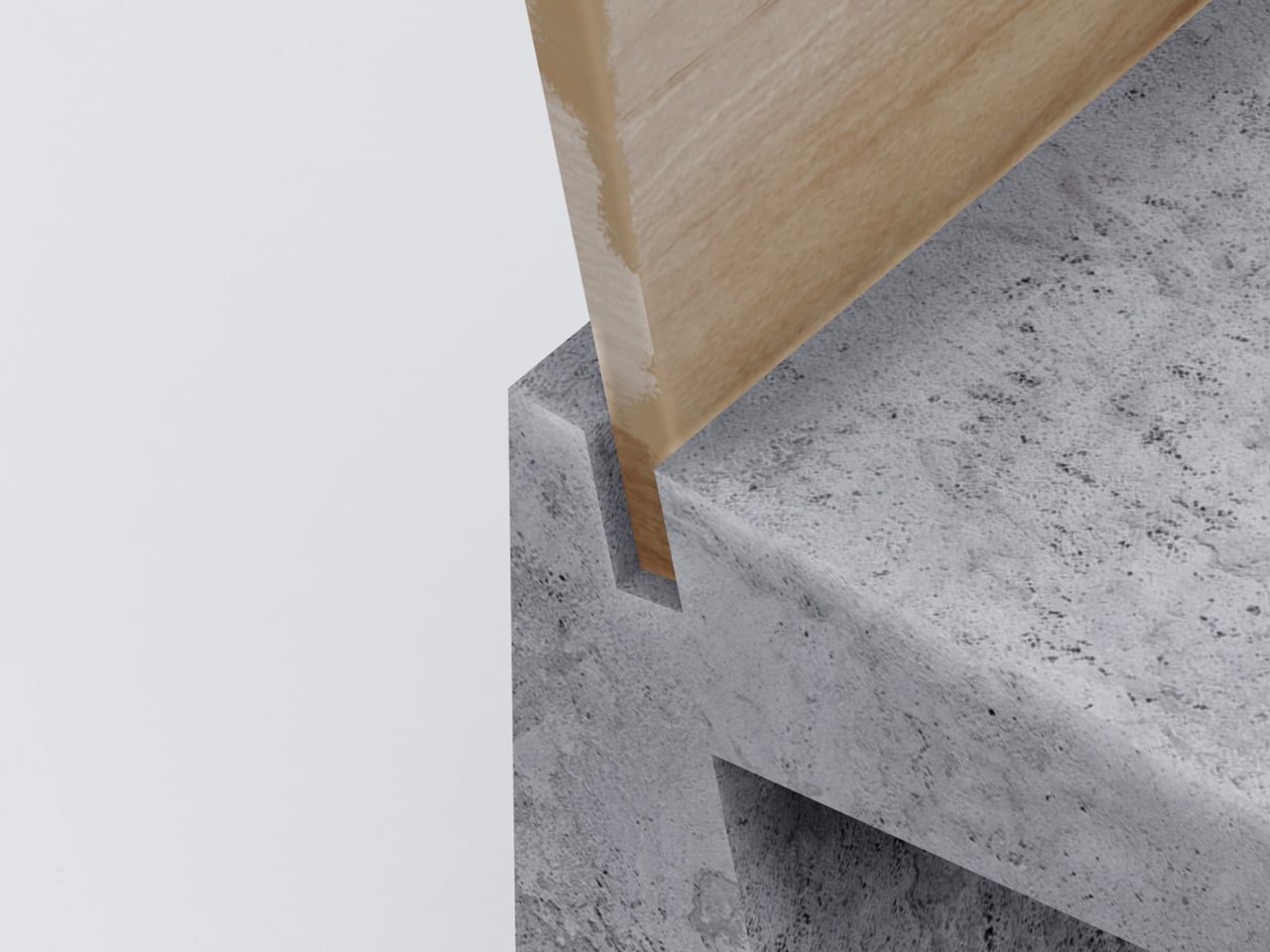
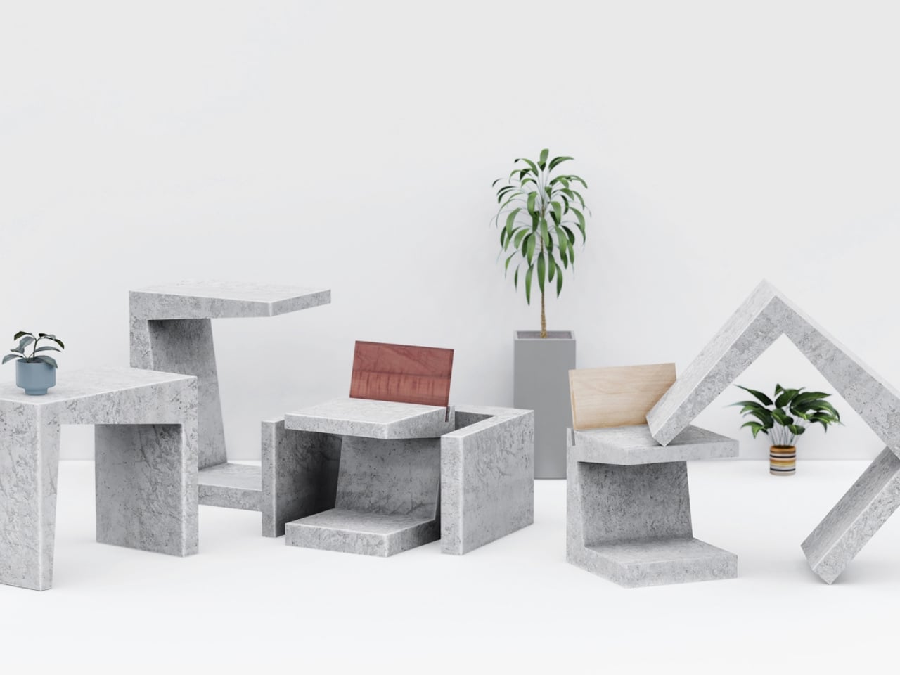
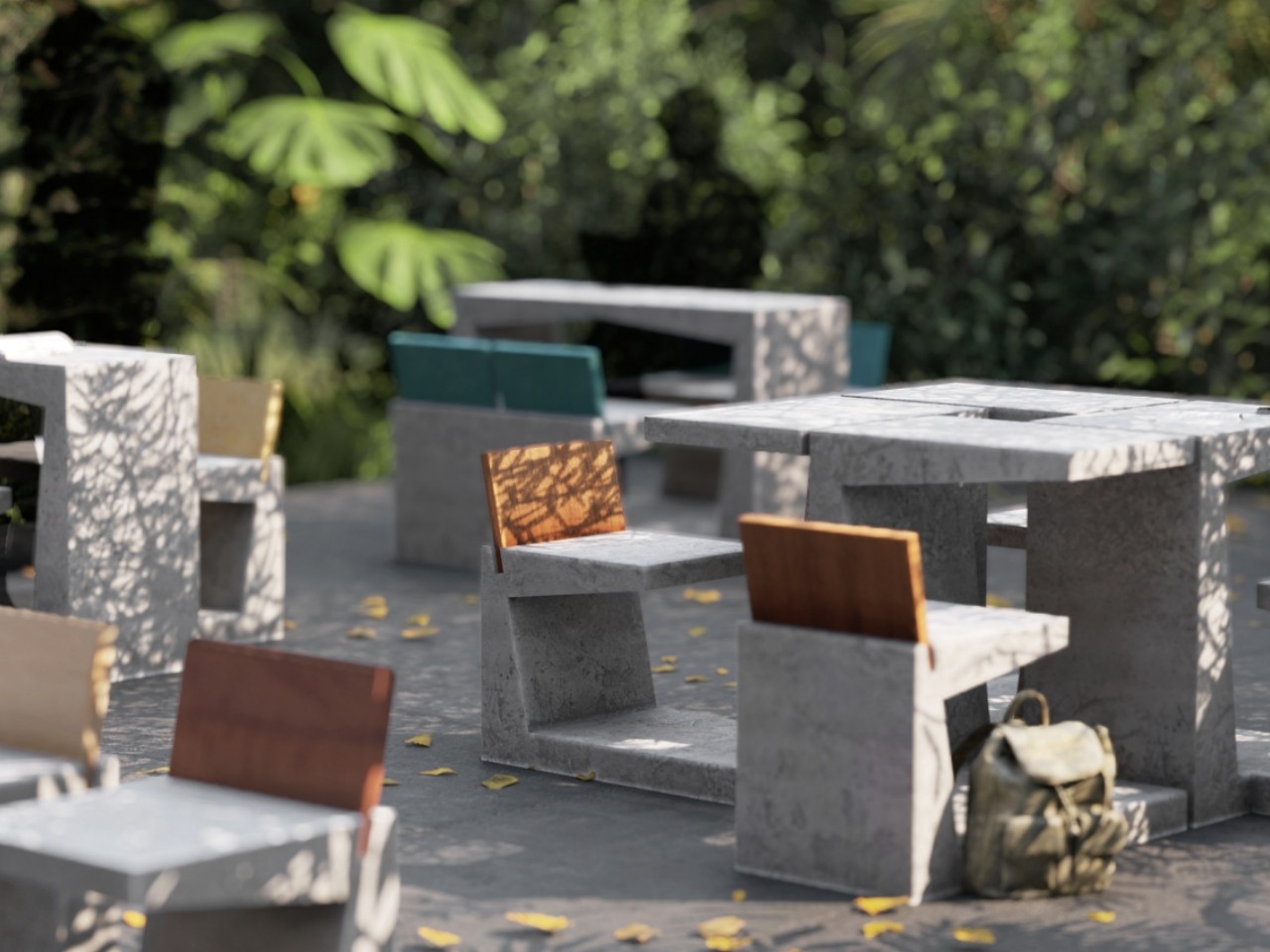
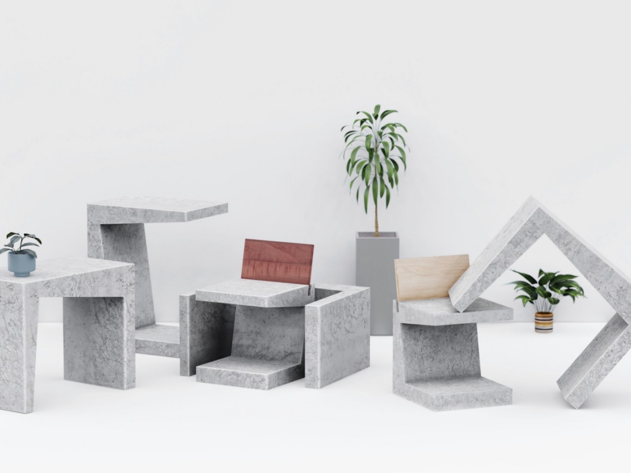
The Brute concept reinterprets outdoor furniture through a raw concrete expression of minimalism. Instead of the polished wooden surfaces often associated with minimalist design, these pieces embrace the unrefined character of concrete, inspired by brutalist architecture. The collection includes a chair and a table, each shaped like an enlarged square bracket. The chair features a recessed groove that holds a thick plywood backrest, creating a warm, natural contrast against the cool exposed concrete. Its form remains intentionally austere while highlighting the structural honesty of the material.


The table echoes the chair’s geometry but can be positioned in two orientations. It may be placed horizontally for a sculptural presence or stood upright for a more familiar table profile. Both pieces incorporate openings at their base that allow them to be linked using milled steel rods, creating multiple configurations. This modular system enables varied seating arrangements, giving the Brute furniture set practicality and visual impact within outdoor environments.
2. Sculpted Concrete Forms
Soft Brutalism preserves the inherent weight of concrete while reshaping it into forms that feel gentle and approachable. Instead of sharp right angles, the furniture relies on organic curves and softened edges that create calm, sculptural silhouettes. These substantial pieces ground a space, offering quiet stability while inviting touch and reducing visual intensity.
Drawing inspiration from nature, many forms echo river stones or stacked cairns, strengthening a biophilic connection within interiors. Their smooth, continuous surfaces interact beautifully with light, diffusing shadows and highlights so the material feels alive. This interplay transforms concrete into a warm, human-centred design language.


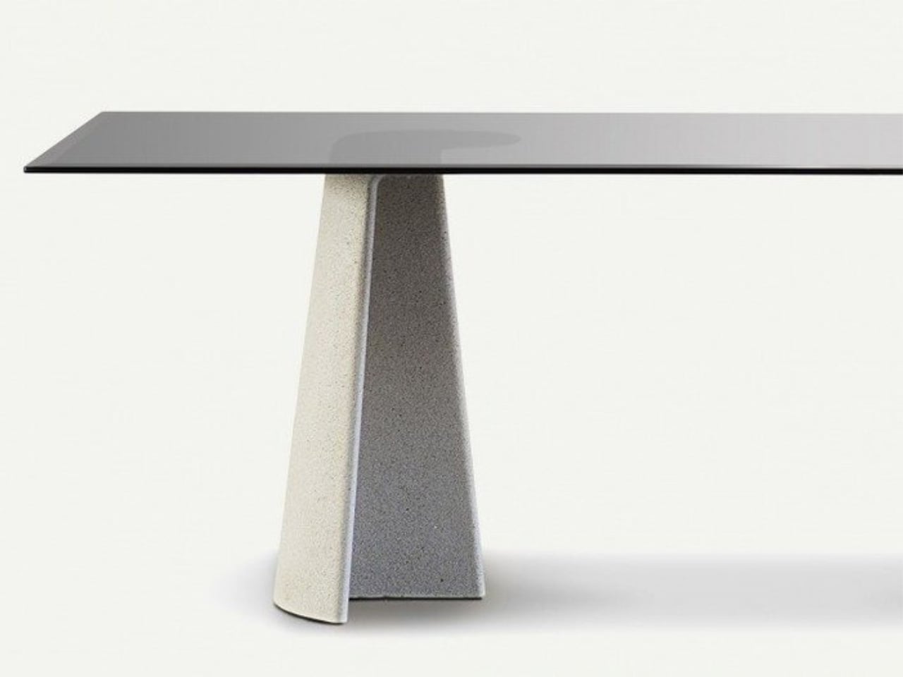
Ronan Bouroullec’s Ancora tables for Magis reframe concrete with an unexpected sense of refinement. Each piece is defined by a sculptural anchor-shaped base where a curved edge meets a central rib, giving the form both stability and visual lightness. The collection includes rectangular and round dining tables, as well as low and side tables, designed for indoor and outdoor settings. The rectangular model measures 220 × 90 cm, while the round version is 130 cm in diameter, offering two distinct spatial expressions.


Materiality sits at the core of Ancora. The concrete base establishes a quiet architectural presence, while the tabletop options, like tempered glass in clear or smoked finishes, or oak-veneered MDF, allow for different aesthetic directions. With its clean geometry and absence of decorative flourishes, the design relies on proportion, curvature, and structure to express character. Ancora demonstrates how concrete can shift from industrial to poetic when shaped with precision and restraint.
3. Warm Material Contrast
Soft Brutalism balances concrete’s cool, dense character with warm, organic materials, creating both visual and sensory harmony. Instead of relying solely on mass, this approach pairs concrete with richly grained woods, supple leathers, and hand-woven textiles, bringing an inviting counterpoint to the material’s inherent solidity.
Thoughtful placement of wood, cushions, and softer textures ensures that human touchpoints feel warm, ergonomic, and comfortable. This pairing transforms each piece from a purely industrial object into a crafted work of art, highlighting the precision of concrete casting alongside the refined joinery and material richness that elevate its presence in contemporary interiors.


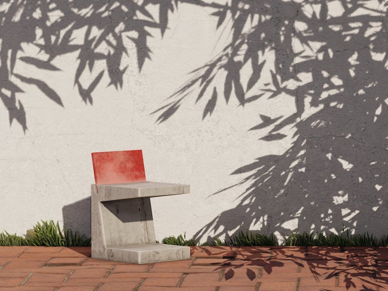
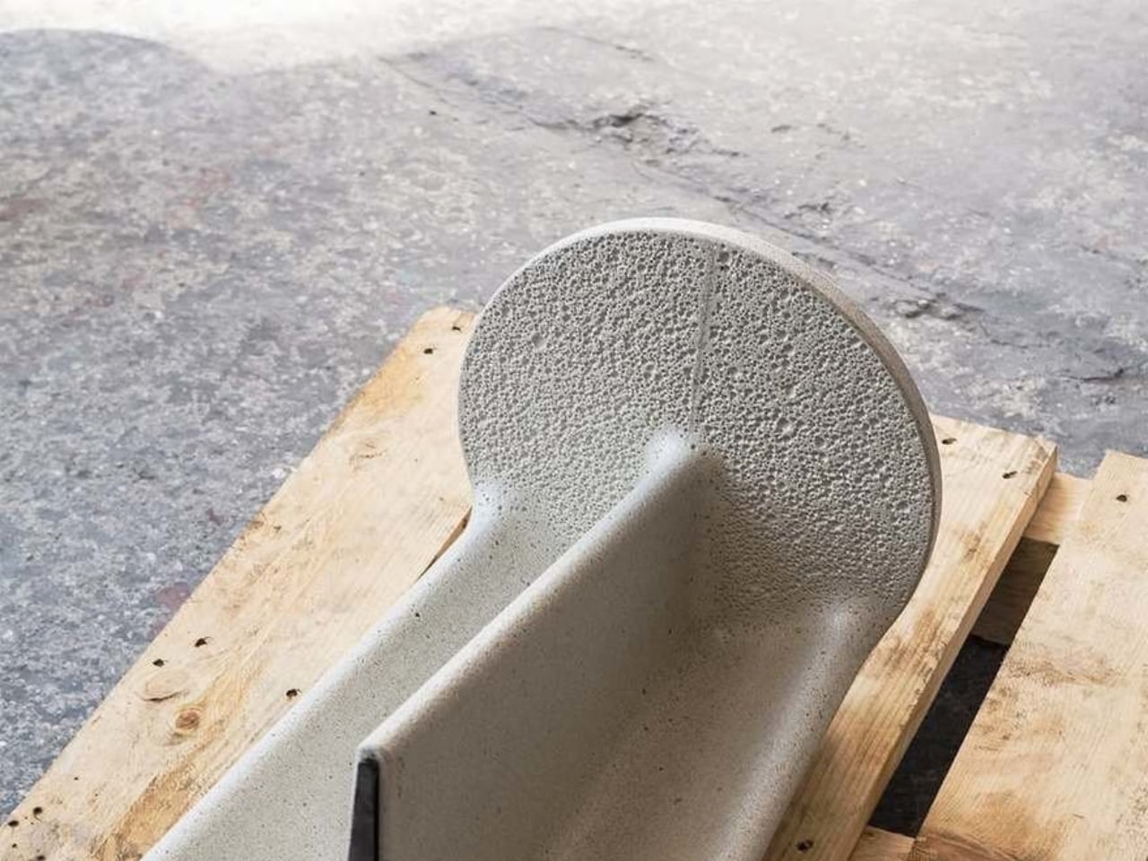
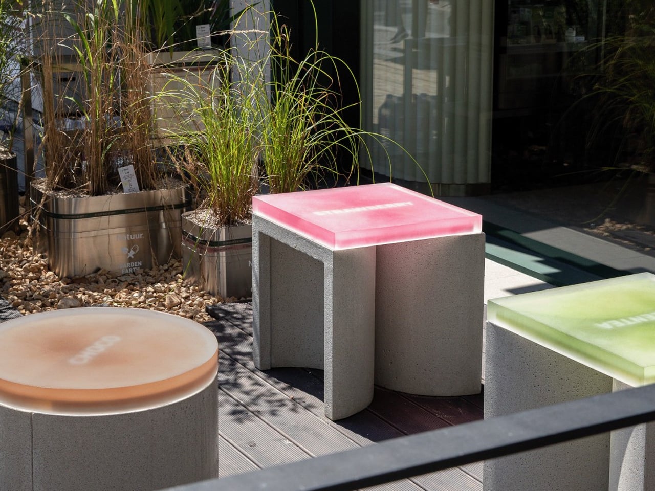
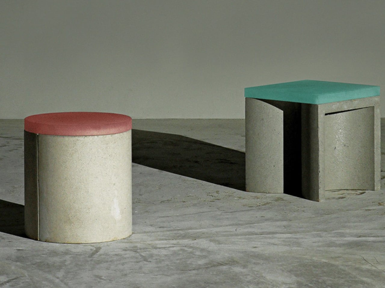
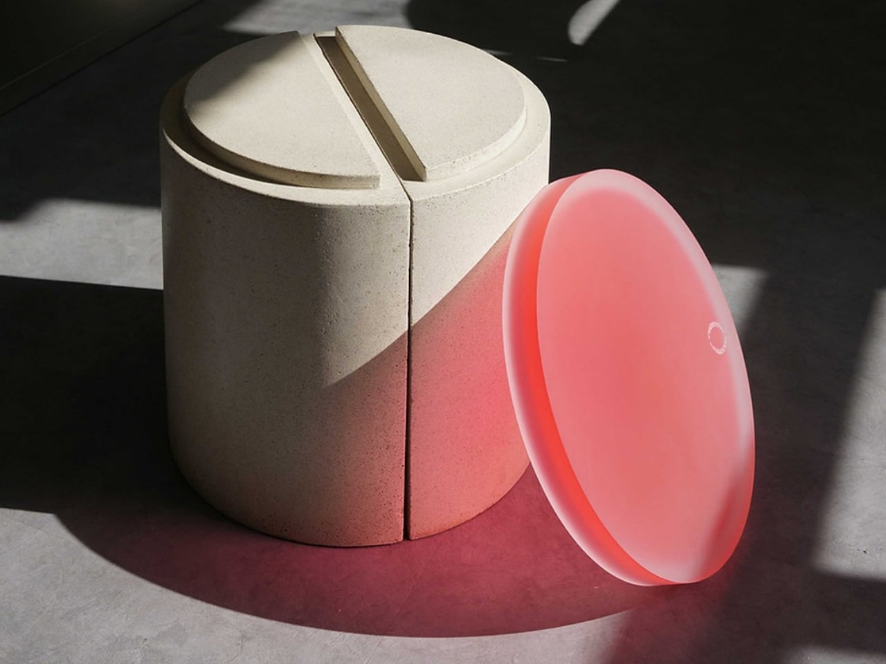
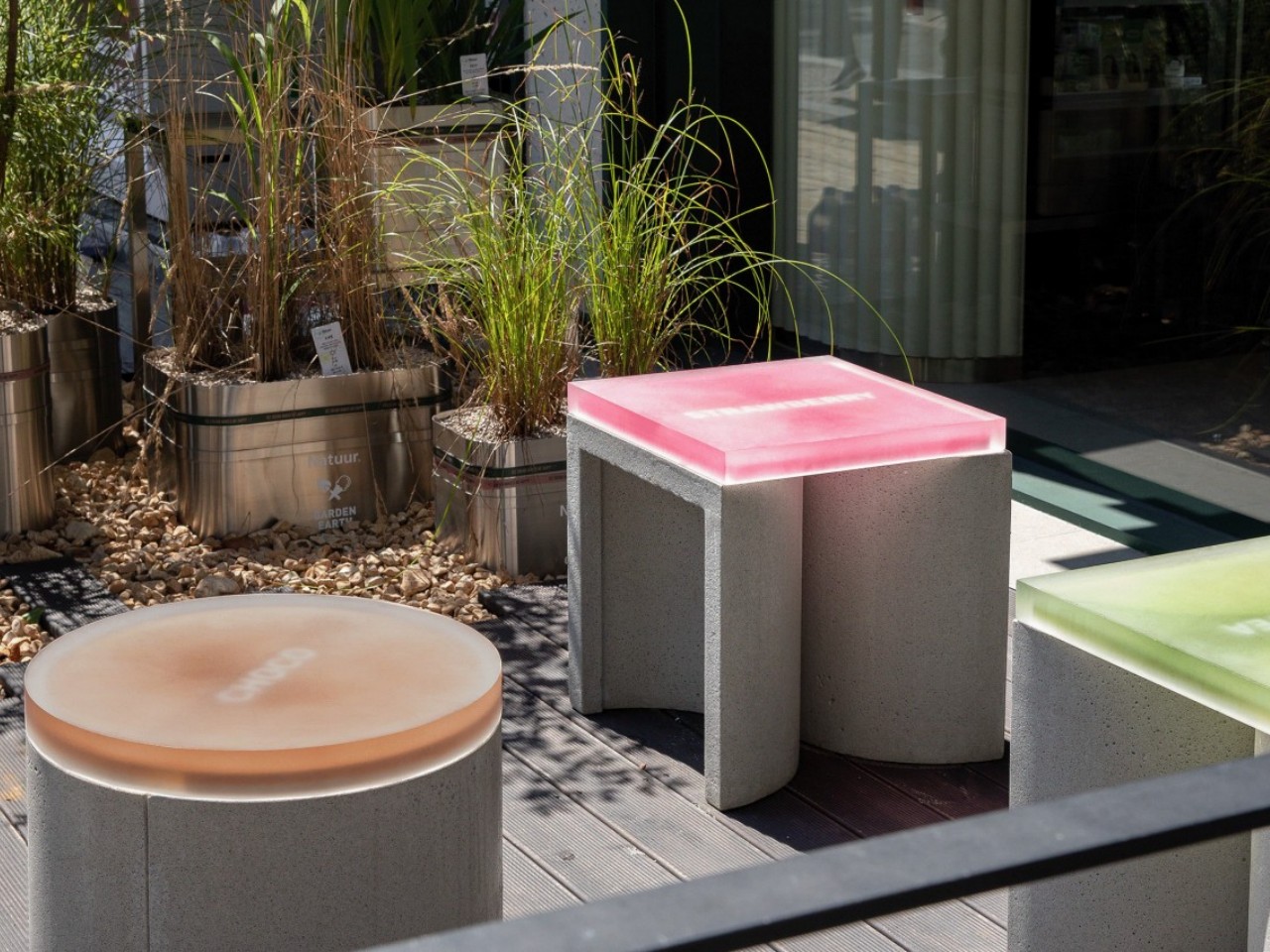
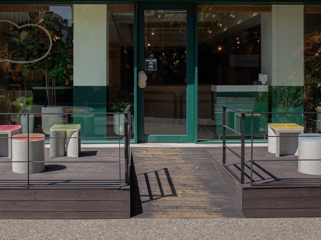
The CONECTO system reconsiders how concrete can function within outdoor furniture by using the material in a modular rather than static way. At first glance, the stool appears as a simple cylindrical form topped with a coloured acrylic surface. In reality, the base consists of two half-cylinders joined along their flat sides, allowing each segment to be repositioned and combined with others. This modular approach enables multiple configurations: a single unit as a compact stool, two halves arranged to support a square top, or extended arrangements that create elongated seating. When three full cylinders are grouped, the system forms a triangular bench suitable for multiple users.


Acrylic plays a functional and visual role, acting as the connector between concrete elements while adding colour and translucency that contrast with the raw, tactile base. The design’s aesthetic merges minimalism with a subtle brutalist influence, resulting in a visually engaging outdoor piece. Developed in high-strength UHPC concrete, the system also incorporates sustainable intent, with future versions planned to integrate recycled materials for enhanced environmental performance.
4. Timeless Design Value
Soft Brutalism positions concrete furniture as a long-term investment rather than a trend-driven purchase. For high-net-worth homeowners, its appeal lies in permanence: pieces built to endure physically and aesthetically. When treated and sealed correctly, concrete becomes exceptionally durable, resisting wear and retaining its visual integrity for decades, making longevity itself a form of luxury.
Choosing locally cast, high-quality concrete also reduces carbon footprint and supports regional craftsmanship. These pieces are conceived as future heirlooms that are robust, architectural, and timeless enough to remain relevant across shifting styles. Their lasting presence offers both emotional and material return on investment.


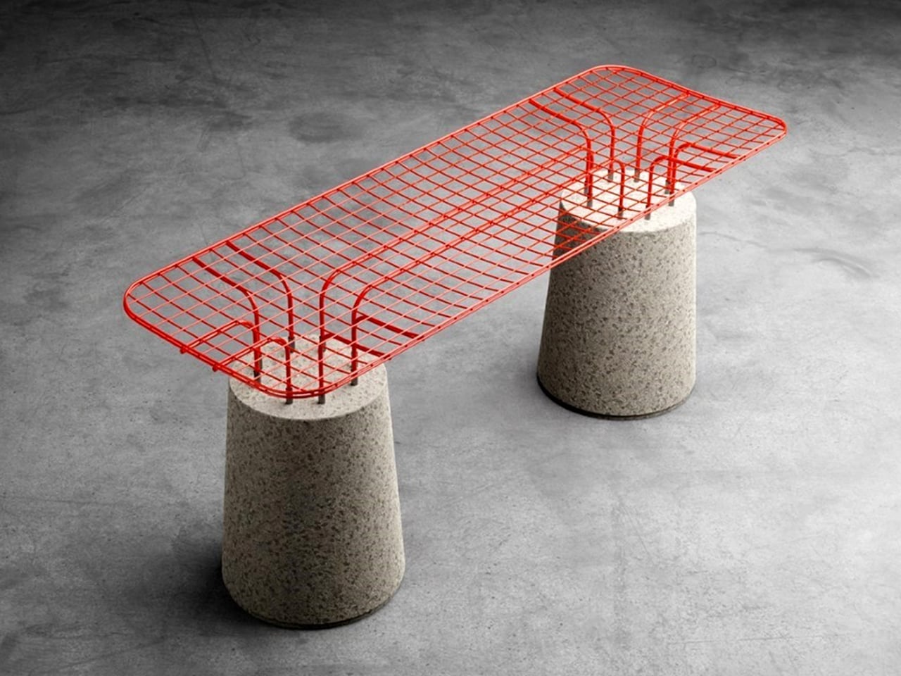
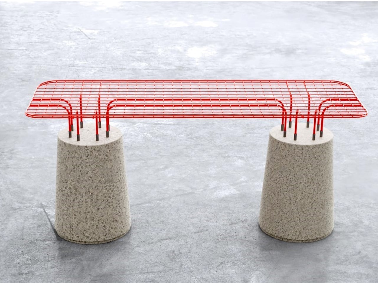
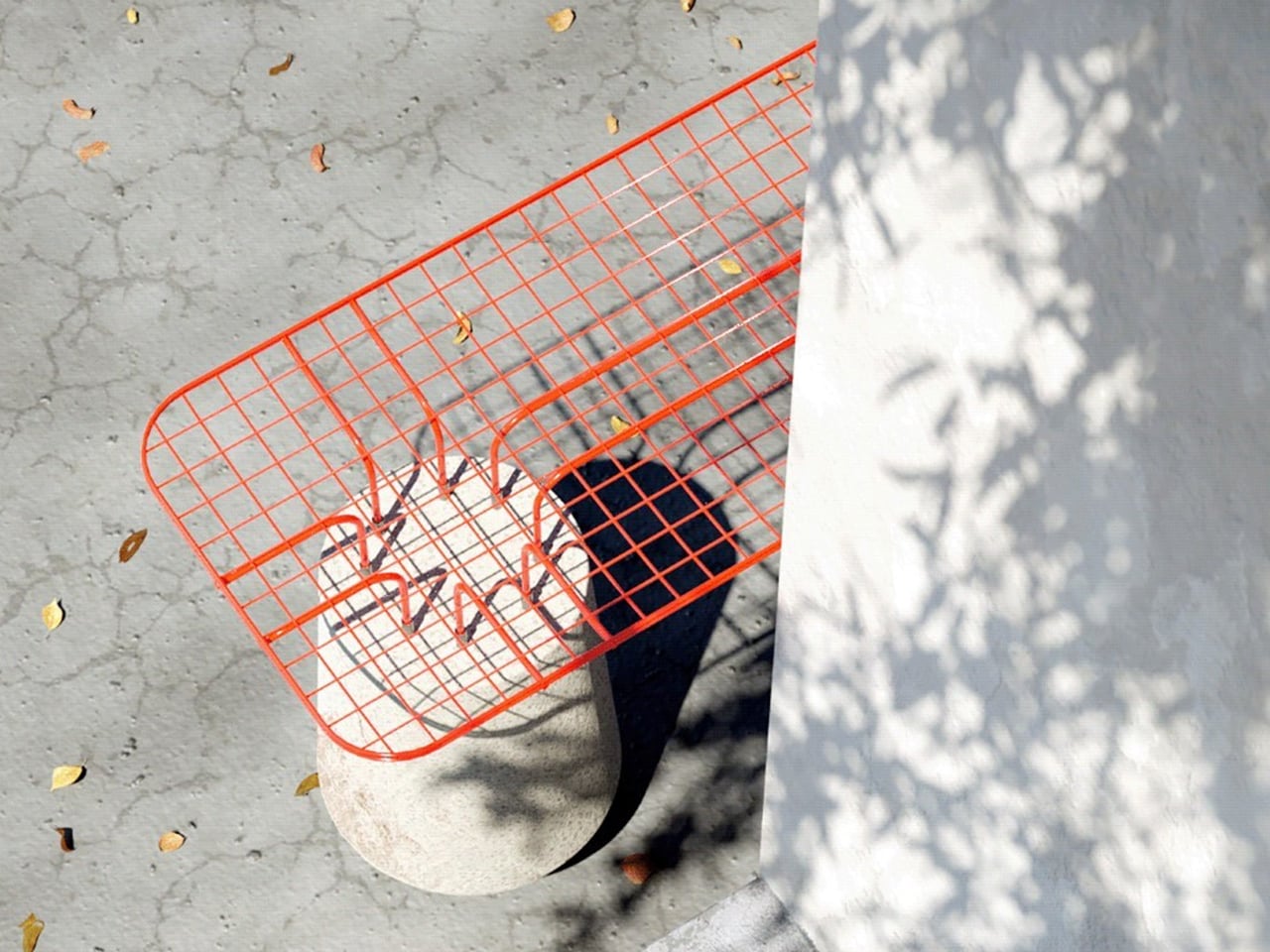
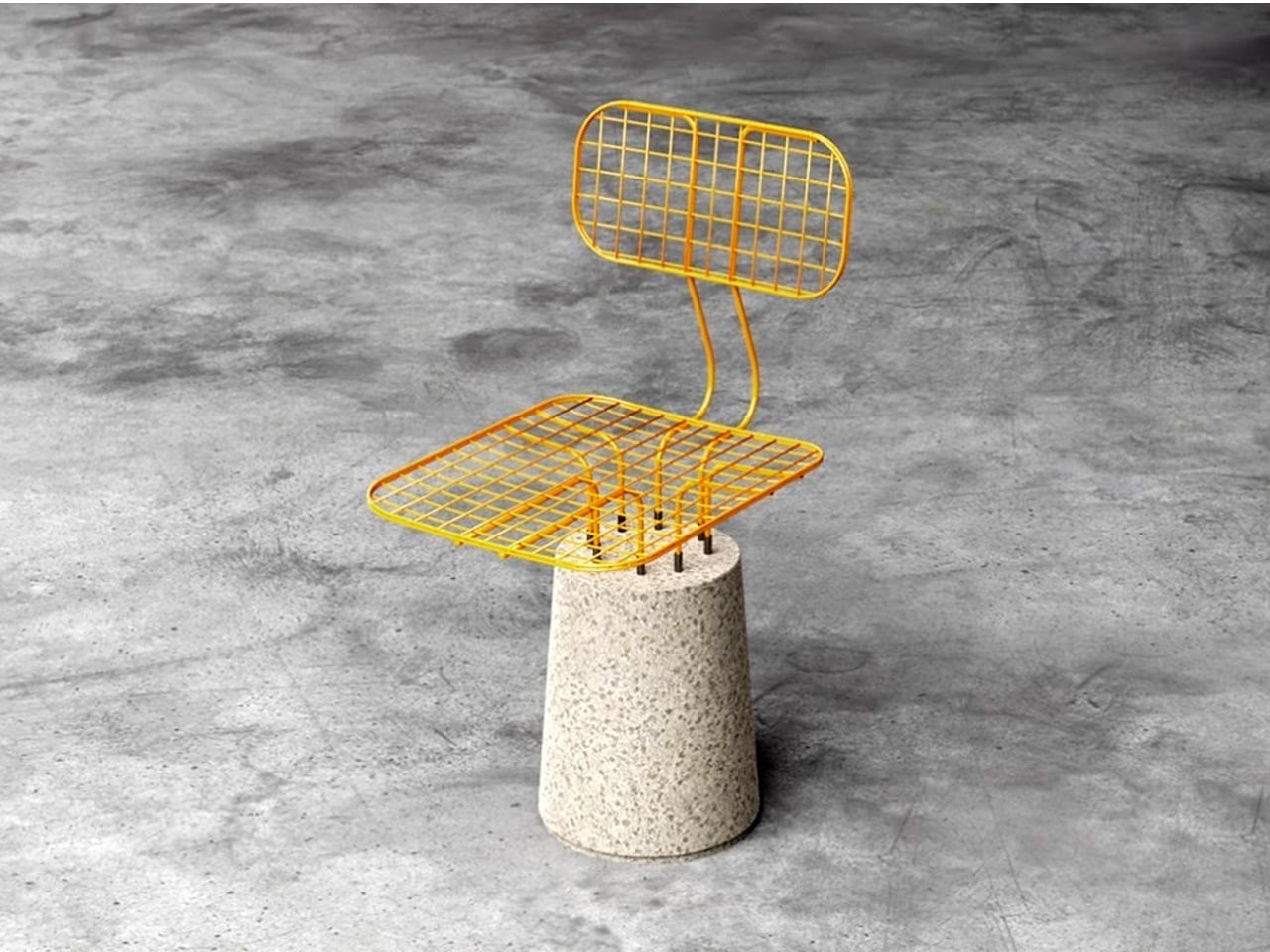
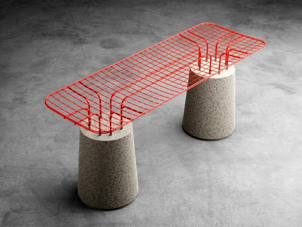
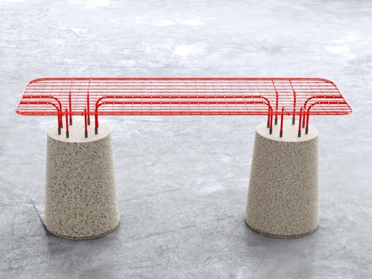
The MESH seating series explores contrast through form, material, and colour. Each piece pairs a solid tapered concrete base with a lightweight powder-coated metal wireframe, creating a striking balance between heaviness and visual transparency. The concrete element grounds the design with a muted grey tone, while the vivid wireframe seat introduces colour and energy. This interplay gives the seating a sculptural presence suited to outdoor environments, where durability and weather resistance are essential. The combination of industrial materials also lends the pieces a distinctive character that merges playful expression with a subtle nod to brutalist design.


Construction remains deliberately simple. The wireframe upper plugs directly into the concrete base, producing a secure structure that is both functional and visually refined. The open metal pattern casts dynamic shadows that enhance the aesthetic appeal, while the ergonomically shaped seat offers unexpected comfort despite its materials. With its bold silhouette and vibrant finishes, the MESH series stands out as a practical yet artistic outdoor seating solution.
5. Concrete as Spatial Architecture
In Soft Brutalism, furniture functions as micro-architecture, shaping the home’s spatial rhythm rather than merely occupying it. Monolithic pieces like concrete dining tables or consoles become purposeful anchor points, establishing stability and directing how movement and energy flow through the room. Their presence offers both visual weight and emotional grounding.
These elements also echo the architectural philosophy of the space, emphasizing honesty, material integrity, and substance over ornamentation. For those mindful of Vastu principles, the natural weight and earth-derived composition of concrete enhance grounding and positive spatial energy, reinforcing harmony and stability within the home’s overall design.


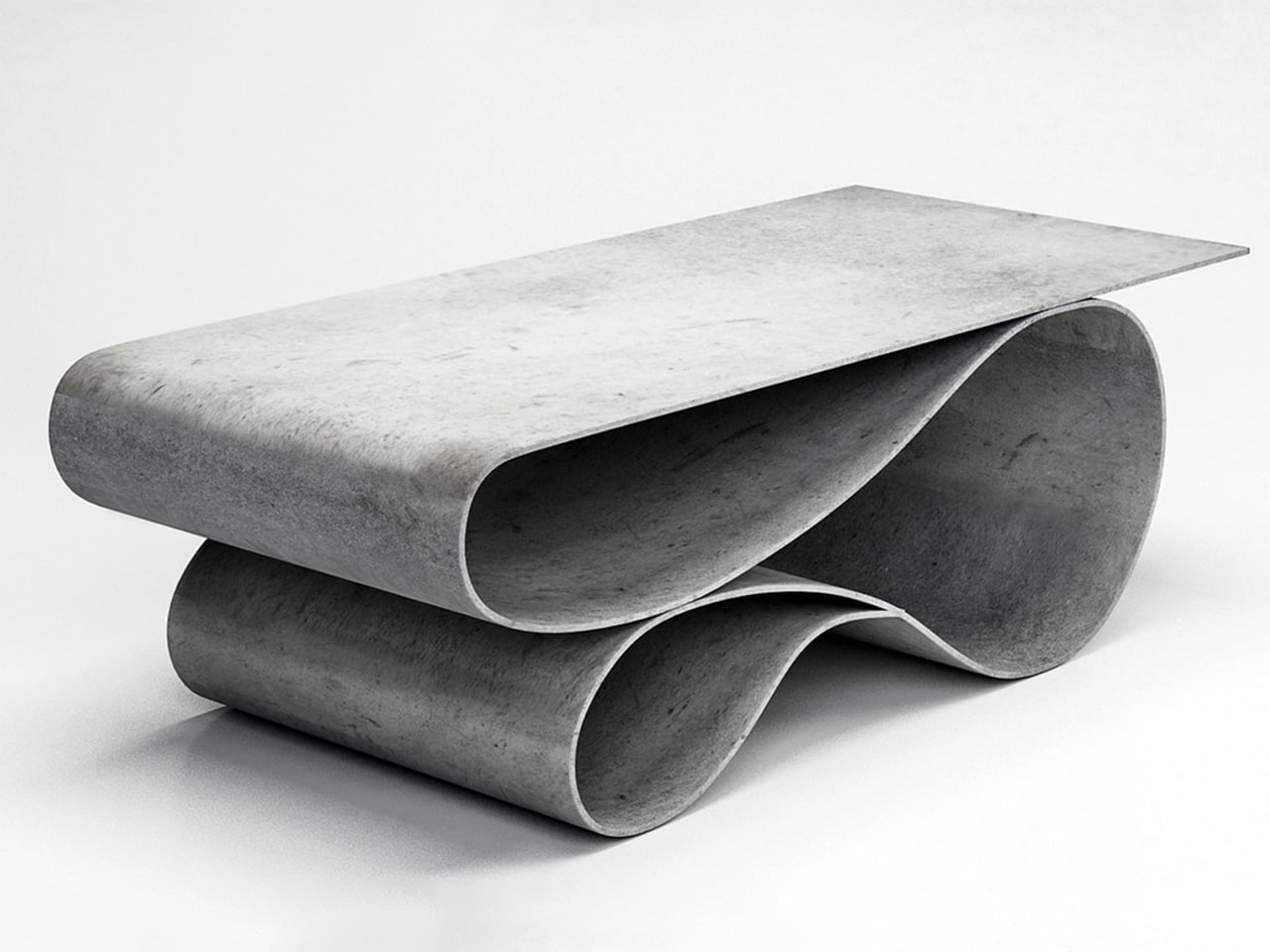
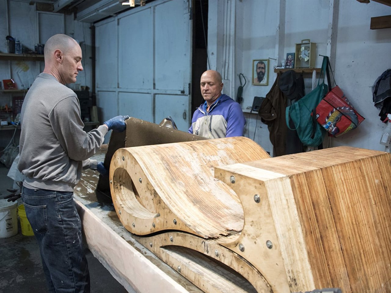
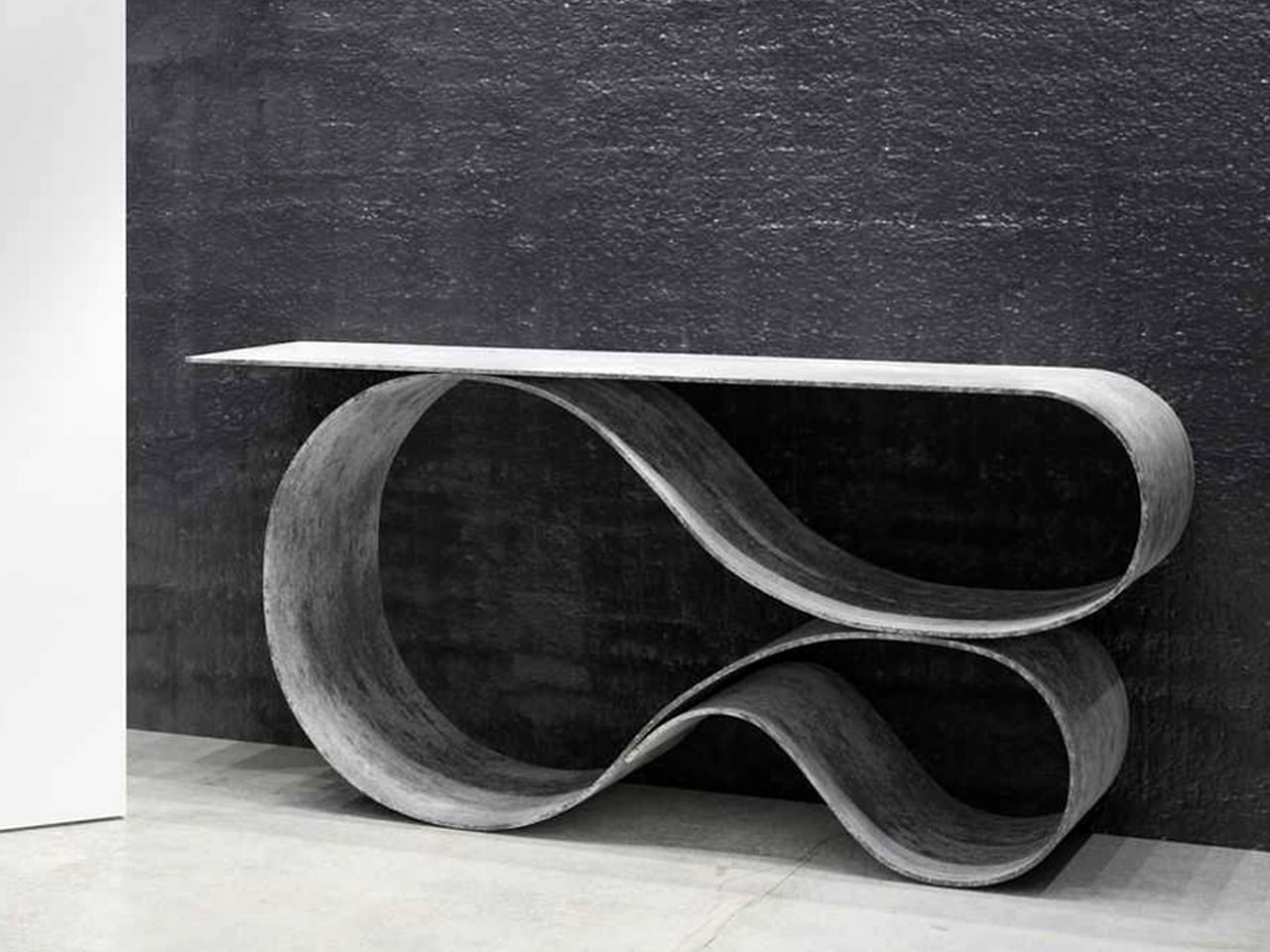
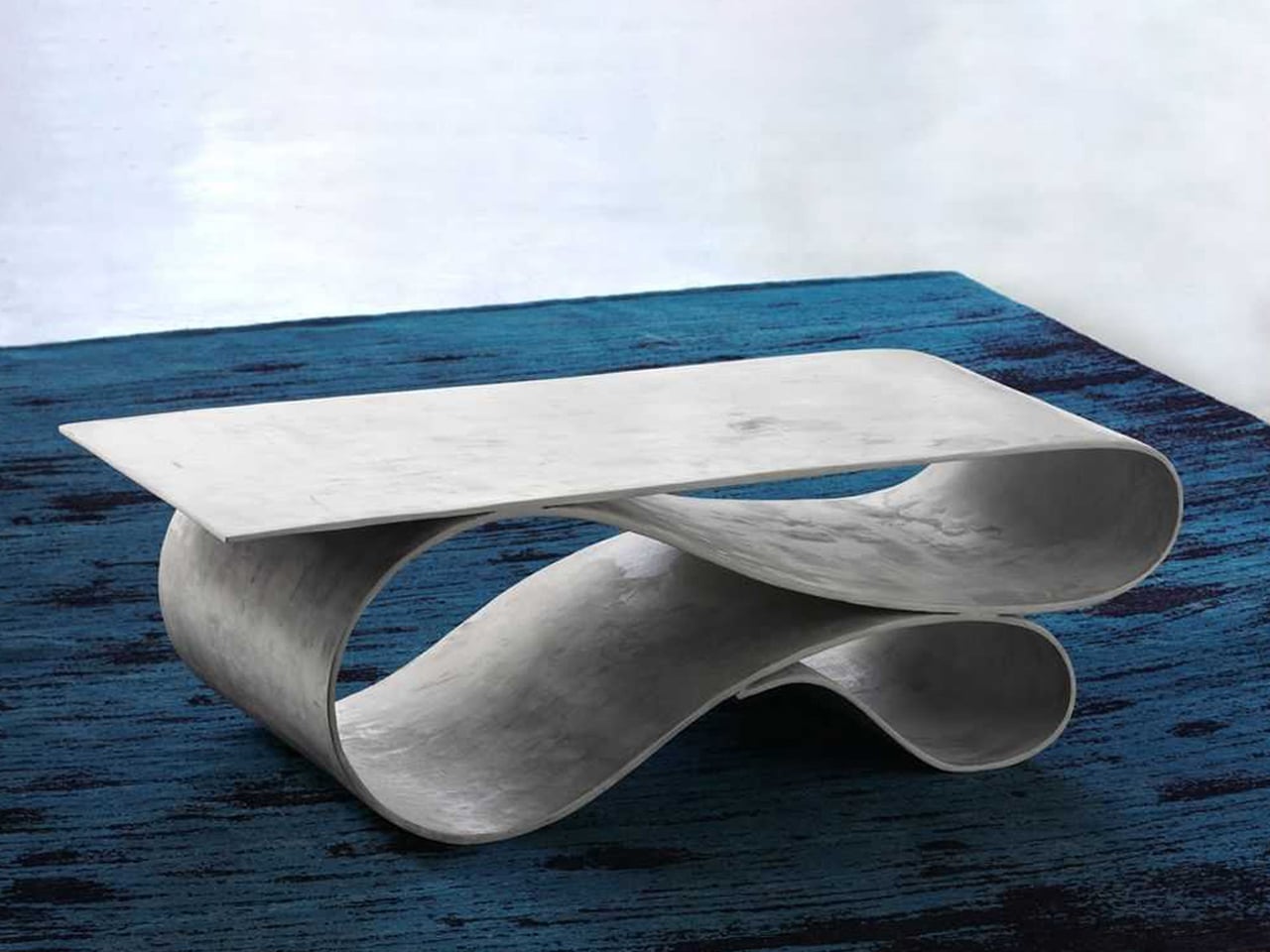
Designer Neil Aronowitz reimagines concrete through an innovative material called Concrete Canvas – a flexible, waterproof, fabric-and-cement composite developed by the UK company Concrete Canvas. By manipulating this thin, durable “concrete cloth,” he created a furniture series that highlights concrete’s unexpected fluidity. The collection includes the Whorl Console, Whorl Table, and Enso Table, each formed by stretching the concrete cloth over sculptural molds before it cures into a rigid, lightweight shell. Aronowitz developed custom casting and shaping techniques to achieve these complex geometries, using the material’s structural properties to shift concrete from a dense, static medium to one that appears almost weightless.


The Whorl pieces, with their ribbon-like curves, balance function with sculptural presence and feature smooth, pigmented cement surfaces that echo Japanese minimalism. The Enso Table continues this language with a form inspired by the single brushstroke of traditional ink paintings. Wall-mounted and restrained in expression, it complements the collection’s emphasis on fluid lines and quiet, crafted elegance.
Soft Brutalism in concrete furniture represents more than an aesthetic, as it expresses a modern interior philosophy rooted in authenticity and permanence. By softening form and elevating texture, it transforms a primal material into one of warmth, light, and calm. Here, true luxury emerges from integrity and the quiet harmony between nature’s rawness and human craftsmanship.
The post Concrete Furniture Just Got Soft: 5 Designs That Feel Like Art first appeared on Yanko Design.
