Two Concrete Walls and No Electricity Make This Tiny Chapel Unforgettable

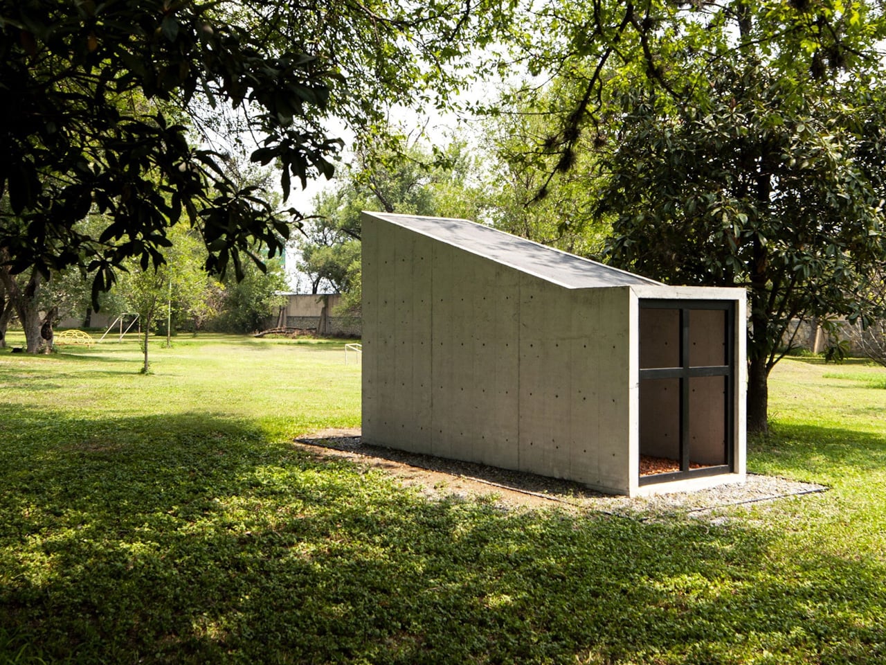
Most buildings erase what came before them. This one didn’t. That’s exactly what Mexican studio S-AR has achieved with its Oratory Chapel in Santiago, Nuevo León, a compact sacred space set within a sprawling garden that breathes new life into a demolished predecessor.

The project began with an act of demolition. A preexisting chapel on the same site was taken down, but rather than discarding its materials, S-AR retained them and worked them back into the new construction. The result is a structure that operates as a continuation rather than a replacement — the old chapel doesn’t disappear; it reassembles itself into something fresh, its fragments carrying forward a spatial and material dialogue between past and present.

Designer: S-AR
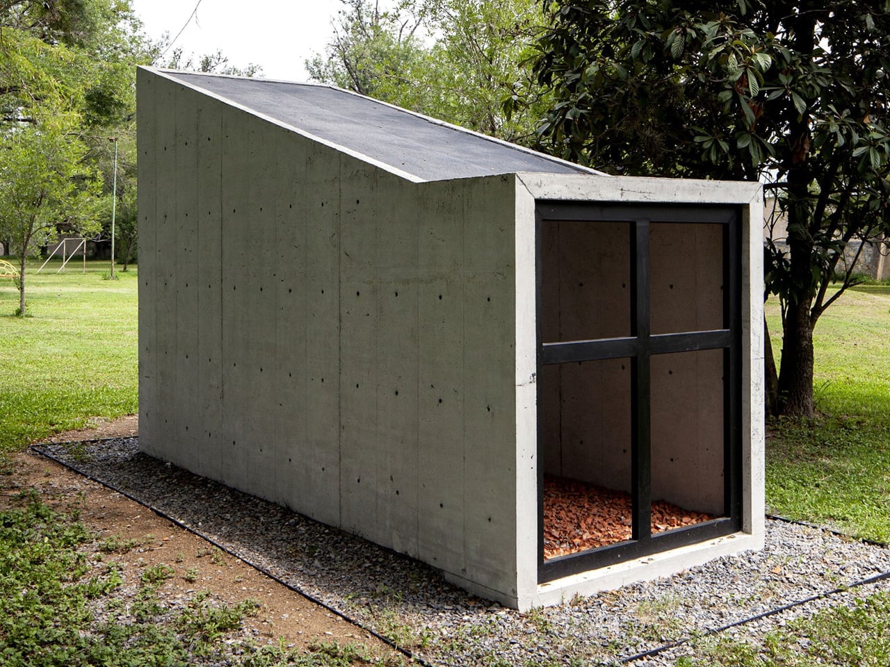
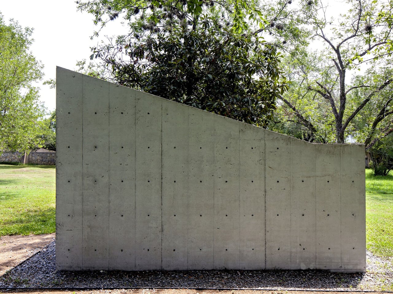
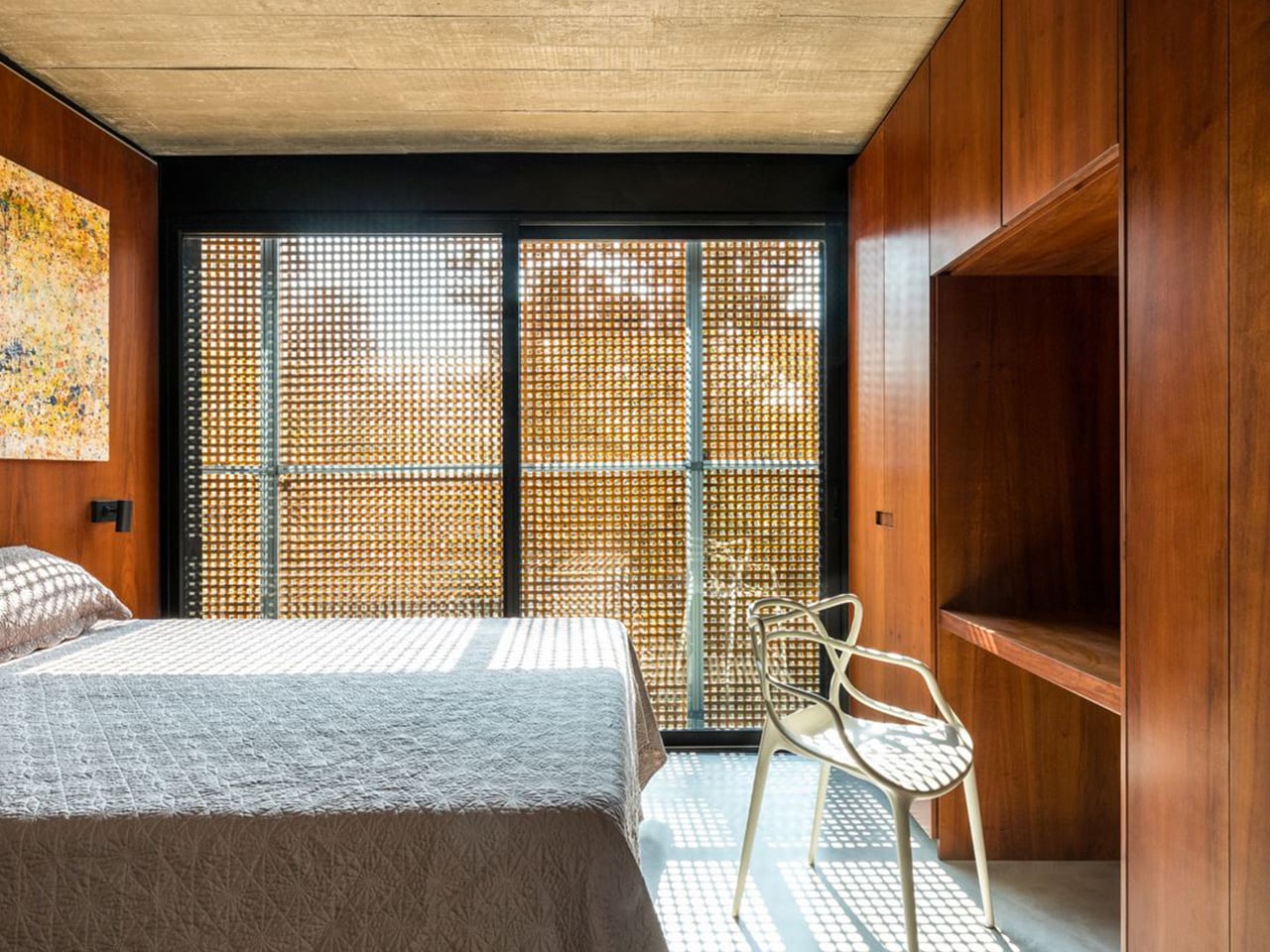
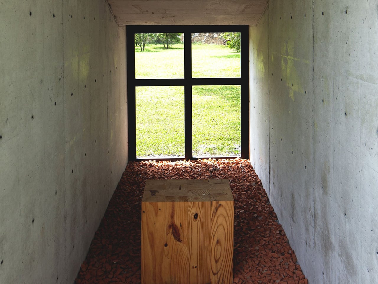
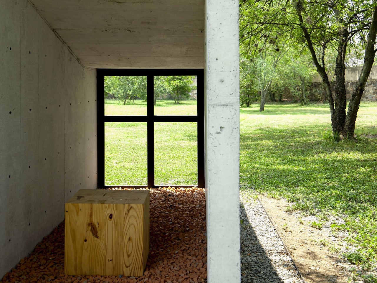
Architecturally, the chapel is a study in precision and restraint. Two reinforced concrete walls, each just 8 cm thick, rise at variable heights along a diagonal axis and support a slab only 6.5 cm deep, forming what reads almost like a tunnel — a narrow, directional passage that channels both movement and contemplation. The formwork follows a 30.5 cm modulation, and the holes left by the wall’s constructive system are deliberately left unfilled, allowing light and air to filter through the structure like something between architecture and screen.

This handling of light is where the chapel finds its spiritual character. Without electricity or artificial utilities, the building relies entirely on natural illumination. Light enters through the voids in the concrete, drifting across surfaces in patterns that shift with the hour and season. It turns the act of sitting inside the chapel into something inherently tied to time — not just sacred time, but the slow, physical time of the garden and the sky surrounding it.
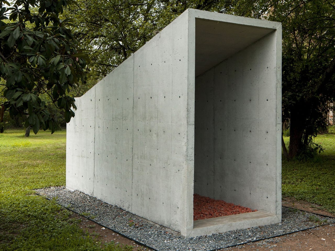
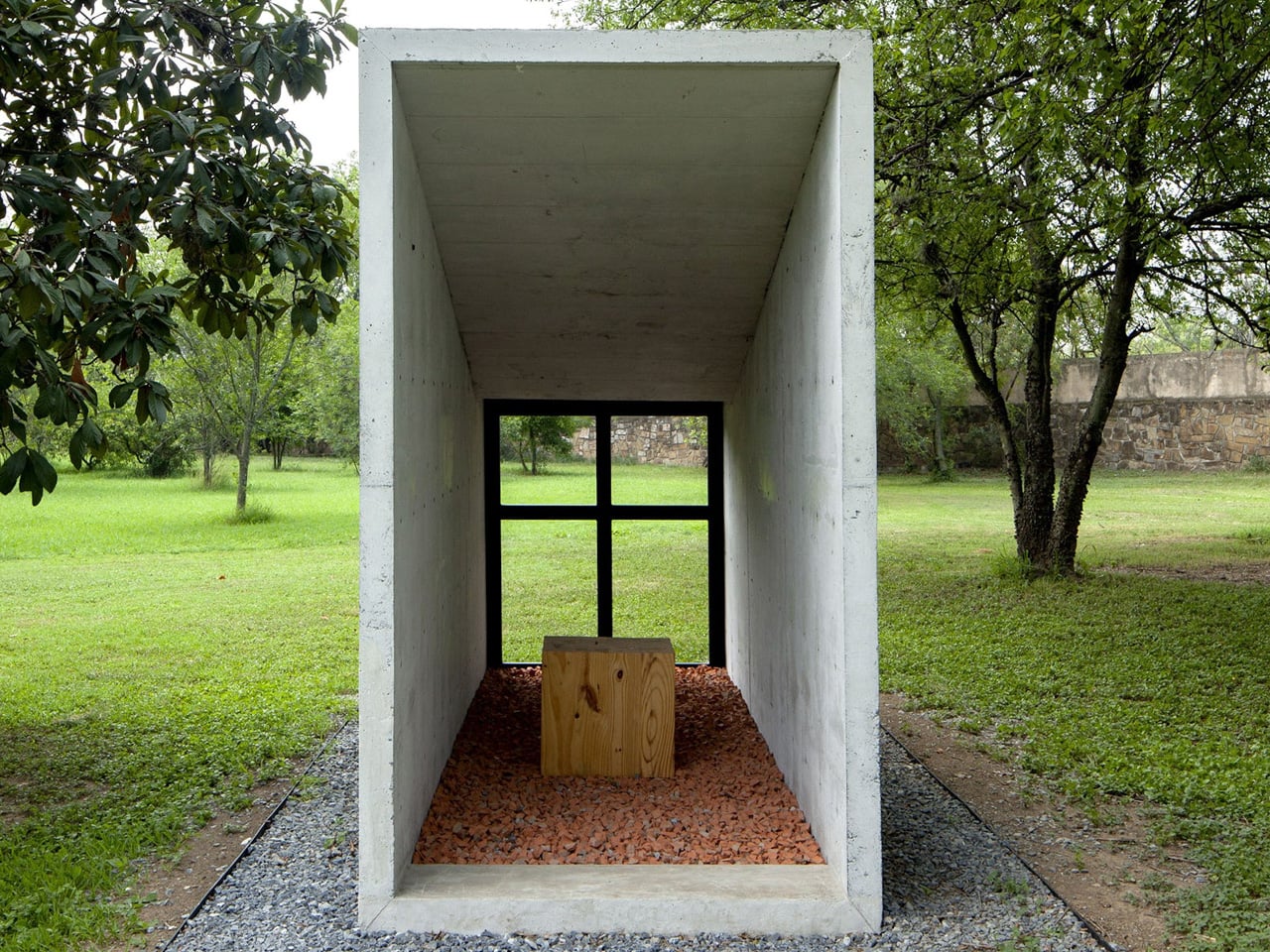
S-AR, the Monterrey-based studio known for its material rigor and contextual sensitivity, has built a reputation for working with concrete in ways that feel more geological than constructed. The Oratory Chapel continues that lineage. Its walls don’t feel poured so much as grown from the site. At just a few square meters, it’s one of the smallest things the studio has made — and possibly one of the most considered.

In an era where sacred architecture often reaches for scale and spectacle, this small chapel in a big garden does the opposite. It compresses everything down to two thin walls, a sliver of a roof, and the light that passes between them. That, it turns out, is enough.
The post Two Concrete Walls and No Electricity Make This Tiny Chapel Unforgettable first appeared on Yanko Design.
This $156K Tiny Home Is Essentially a Tiny Mansion With a Party on Its Roof

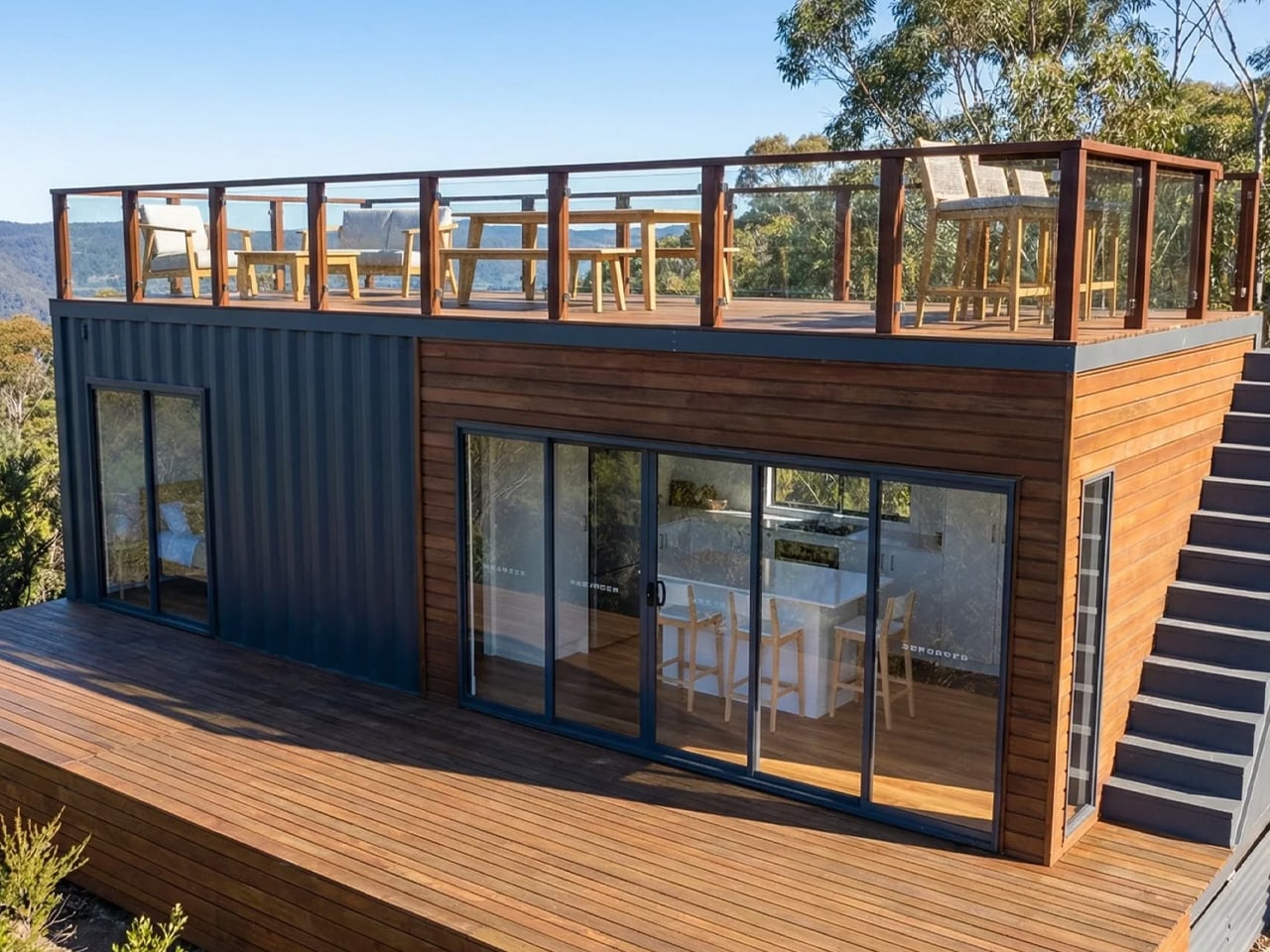
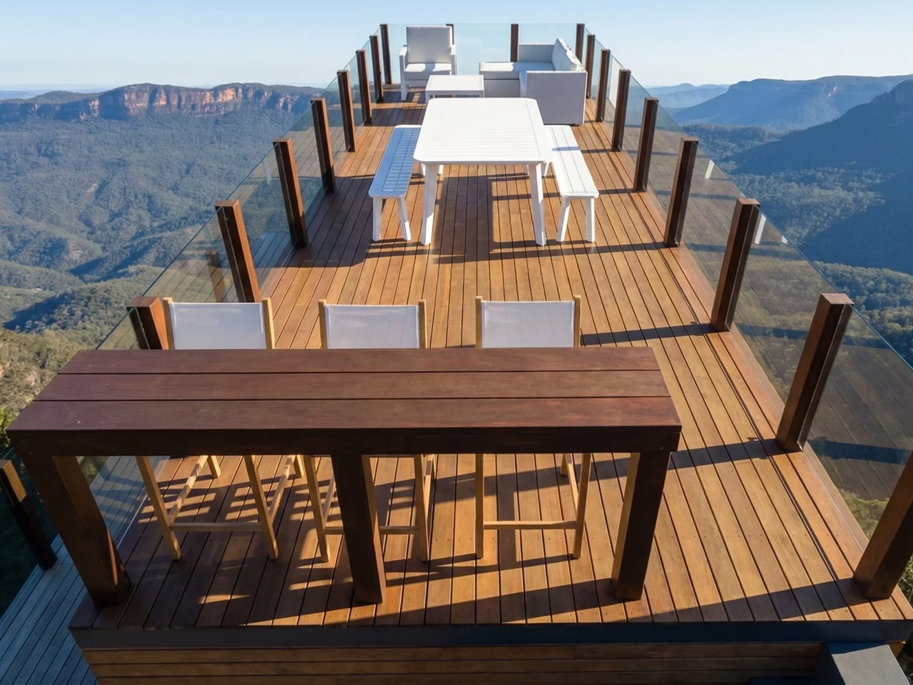
The tiny home movement has long wrestled with one stubborn contradiction: how do you downsize without actually feeling like you’ve given something up? Brisbane-based builder Removed Tiny Homes has a compelling answer with the Solace — a wide-body, rooftop-equipped micro-dwelling that reframes what small living can look and feel like.

The Solace sits within Removed Tiny Homes’ newly launched Tiny Mansion collection, a premium lineup designed for people who are genuinely drawn to intentional living but aren’t willing to sacrifice comfort, space, or a little luxury to get there. It’s a category of architecture that’s quietly shifting the tone of the entire tiny home conversation — less rustic escape, more elevated lifestyle choice.

Designer: Removed Tiny Homes

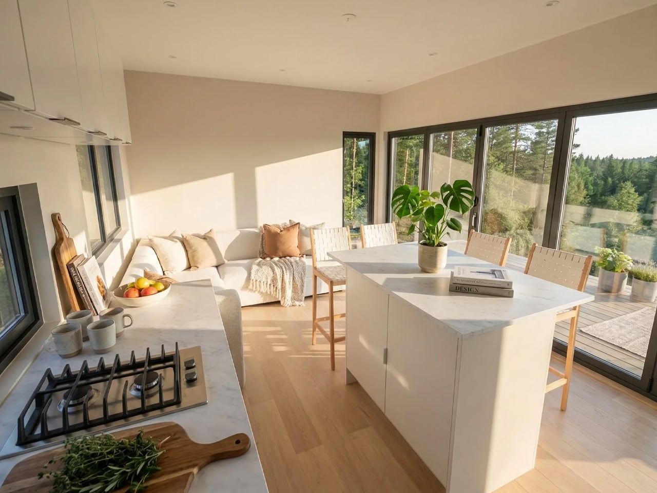
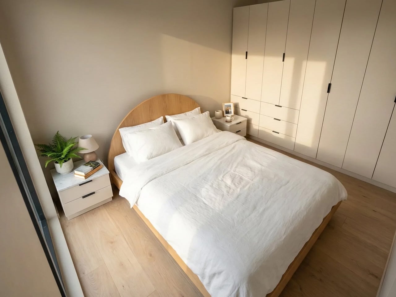
At its core, the Solace is built on a triple-axle trailer and measures 10 meters (32.8 ft) long and 3.4 meters (11.1 ft) wide, making it notably broader than most tiny homes on the market. That extra width is immediately felt inside — the layout is open, breathable, and free of the cramped compromises that often define the category. There are no loft sleeping arrangements here. Instead, the single bedroom is a proper retreat, fitted with a king-size bed and a floor-to-ceiling wardrobe that spans the entire right wall. A private glass entrance door connects the bedroom directly to the outdoors, adding a hotel-suite quality that feels anything but modest.

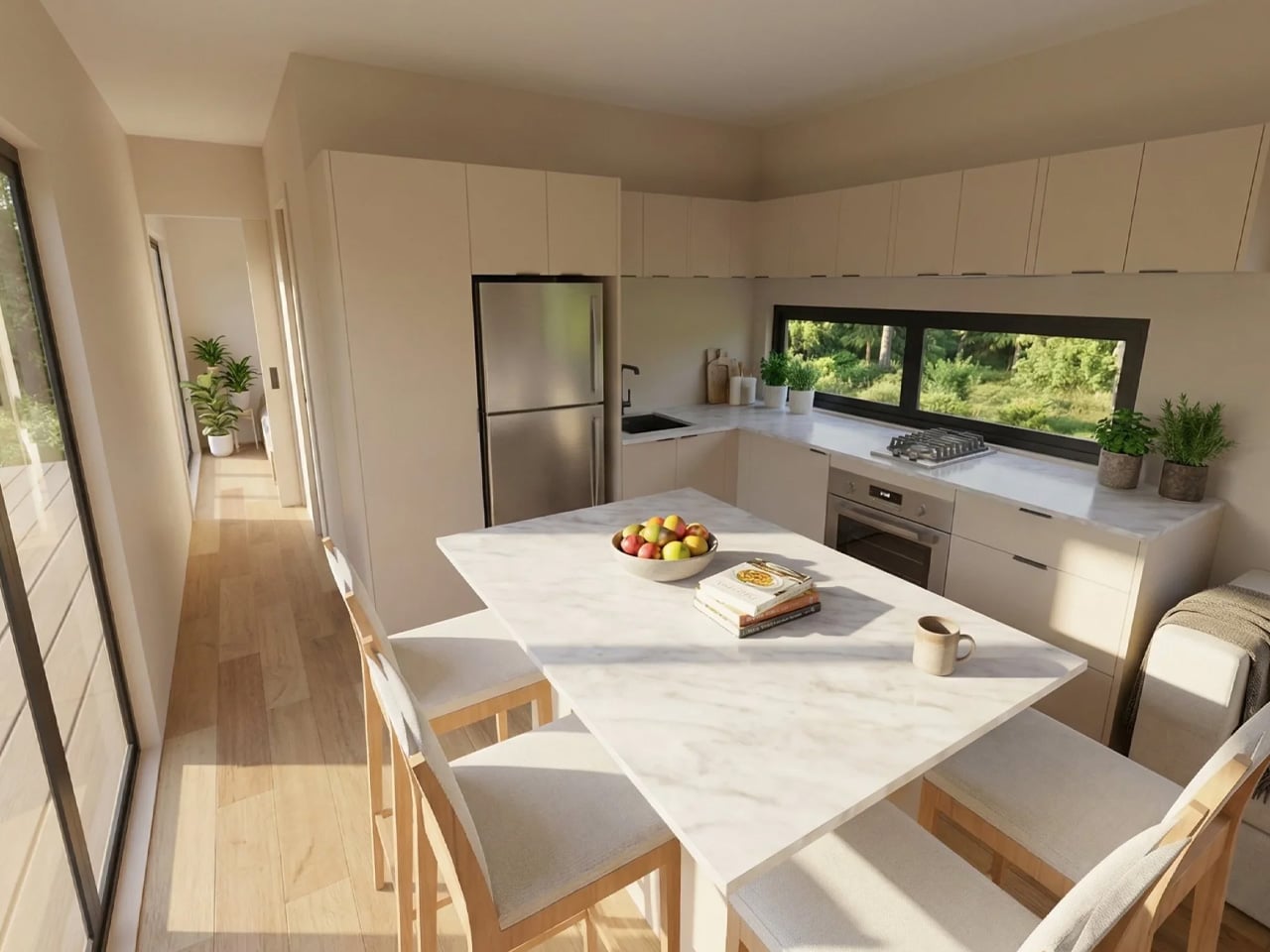
The kitchen and living spaces carry the same thoughtful confidence. Clean lines, full-scale proportions, and modern finishes give the interior a sense of permanence rather than temporariness. The exterior wraps in a combination of corrugated metal and timber, a pairing that reads as both industrial-modern and grounded in natural warmth.

What truly sets the Solace apart is what sits above and below. A large ground-floor deck wraps the front of the home, while an expansive rooftop terrace crowns the structure, generous enough for outdoor dining, lounging, and genuinely hosting guests. It’s a design move that effectively doubles the usable living space without adding a single square foot to the floorplan. That’s smart architecture.

Pricing starts at approximately USD $155,800, with customization options available for those who want to personalize the build. Early buyers can also access a Luxury Living Upgrade Pack, valued at over AUD $30,000, which adds a fully tiled bathroom, optional skylights, and stone kitchen worktops. The Solace doesn’t ask you to romanticize sacrifice. It asks something far more interesting: what if living smaller actually meant living better?

The post This $156K Tiny Home Is Essentially a Tiny Mansion With a Party on Its Roof first appeared on Yanko Design.

The $17,000 Micro Cabin That Makes Every Other Tiny Home Look Overpriced

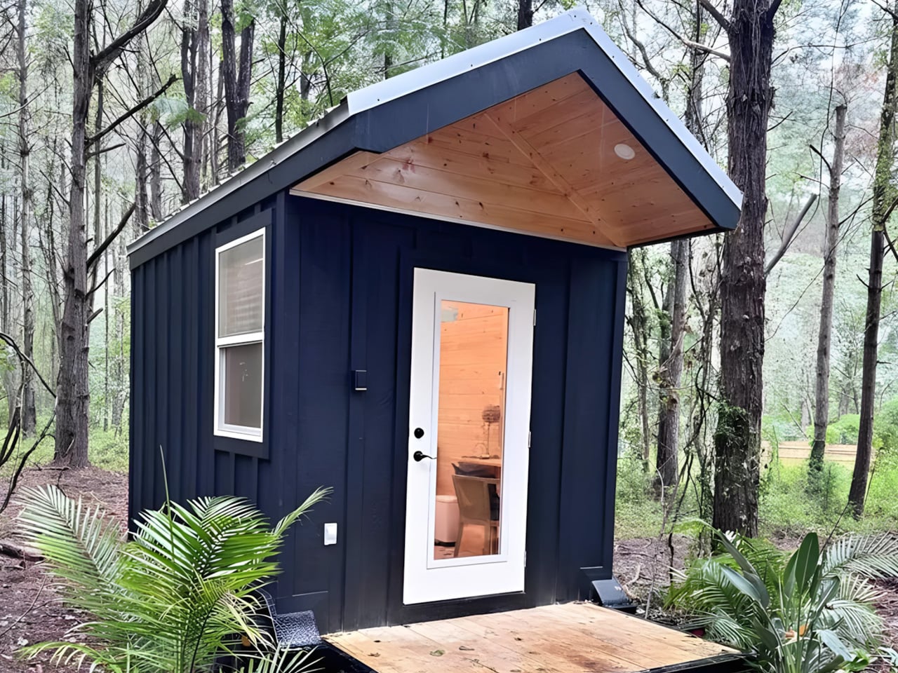
I must admit there is a certain freedom in stripping things back to exactly what you need and nothing more. That’s the quiet confidence behind the Mantra, the newest micro cabin from Florida-based Simplify Further Tiny Homes — and at $17,000, it might just be the most straightforward shelter concept to come along in years.

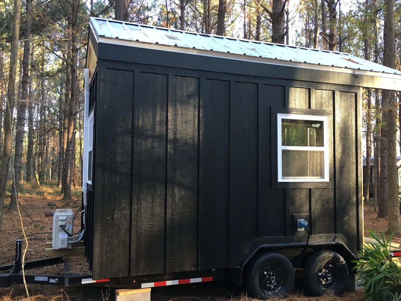
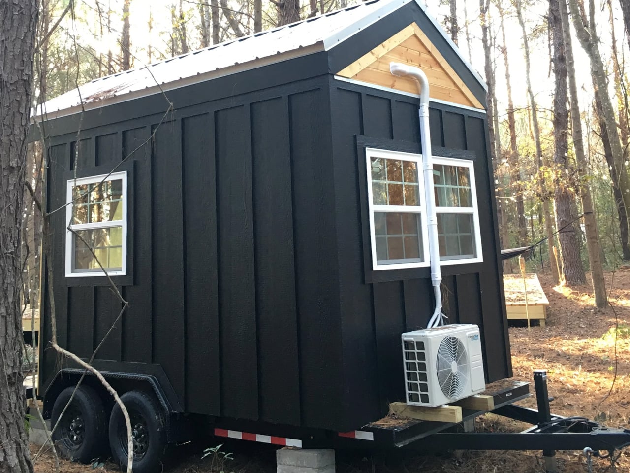
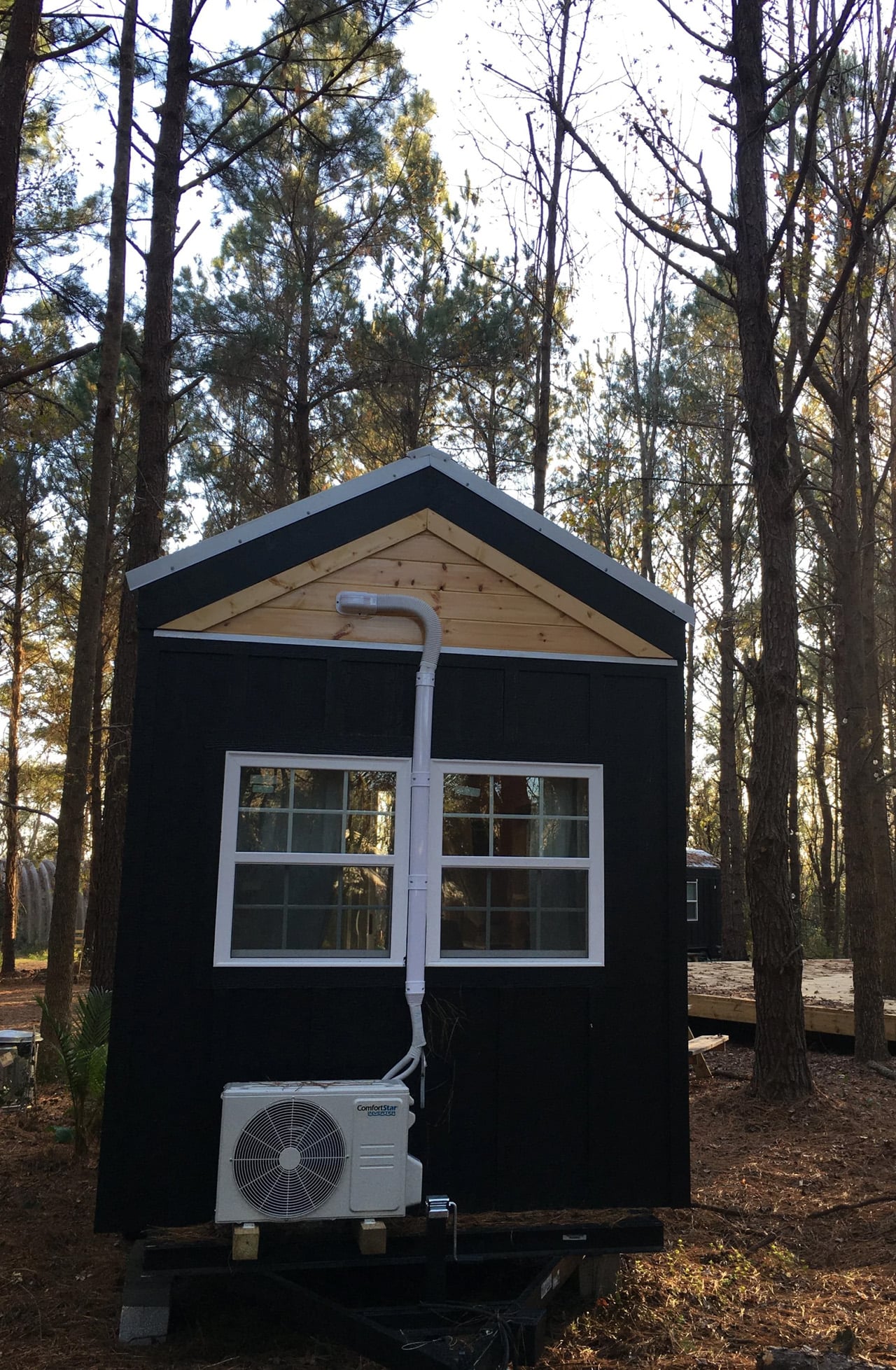
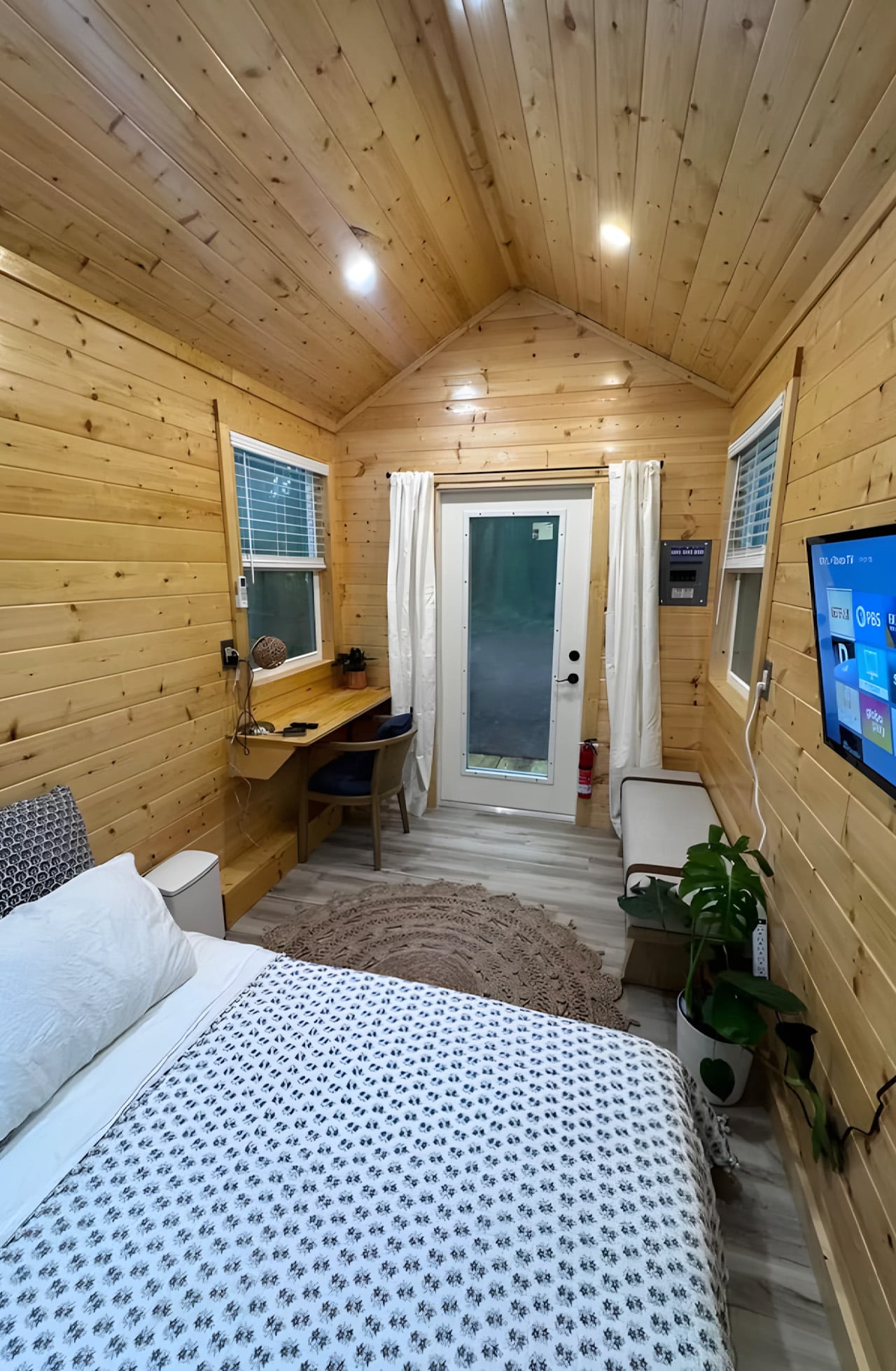
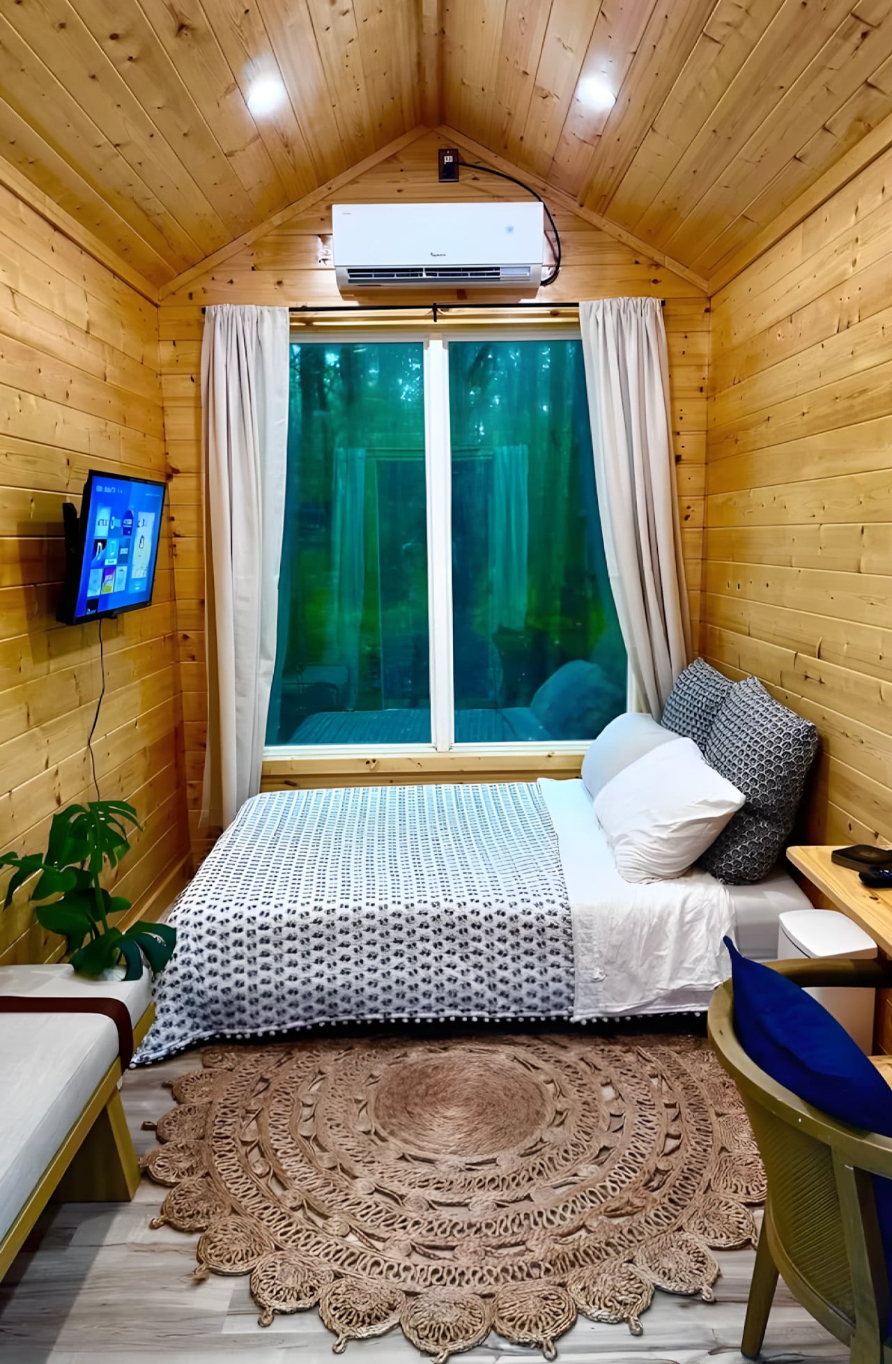
The Mantra measures 12 x 8 feet as a living unit, sitting on a double-axle trailer that brings its full length, porch included, to 16 feet (4.8 meters). The usable interior clocks in at just 98 square feet (9.1 sq m), which sounds tight until you see how it’s been organized. Everything lives in a single open room: a bed that doubles as a daybed, a desk and dining table, seating, a wall-mounted TV, and a mini-split air-conditioning unit. The whole thing sleeps up to two people.

Designer: Simplify Further Tiny Homes

What Simplify Further didn’t include is just as deliberate as what they did. There’s no indoor kitchen, no bathroom — a choice that keeps the footprint honest and the price point realistic. The Mantra was designed for people who want a serious shelter without the serious overhead: a glamping cabin, a backyard guest suite, an accessory dwelling unit, a dedicated work-from-anywhere office. It earns its role by not pretending to be something it isn’t.

On the outside, the cabin wears engineered wood cladding with pine tongue and groove accenting and a metal roof, materials picked for durability and a cabin aesthetic that doesn’t look out of place whether it’s parked in the woods or in a suburban backyard. The double-axle trailer base means it can be moved between sites without a production, which opens up use cases most permanent structures simply can’t compete with.

The $17,000 starting price is the number that tends to stop people mid-scroll, and for good reason. Most tiny houses, marketed as simple and affordable alternatives, have quietly crept into the $80,000 to $150,000 range. The Mantra pushes back on that without sacrificing the things that actually matter: climate control, a comfortable sleeping setup, and a design sensibility that doesn’t feel like an afterthought.

Simplify Further built their name on the idea that design and craftsmanship don’t require excess. The Mantra is that philosophy distilled. It’s not trying to replicate a house in miniature; it’s building something that knows exactly what it is. And in a market cluttered with overbuilt, overpriced micro dwellings, that clarity is worth more than the square footage.

The post The $17,000 Micro Cabin That Makes Every Other Tiny Home Look Overpriced first appeared on Yanko Design.

Morocco’s Mohammed VI Tower: The Rocket That Rewrote Africa’s Skyline

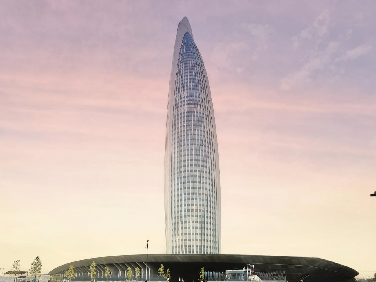
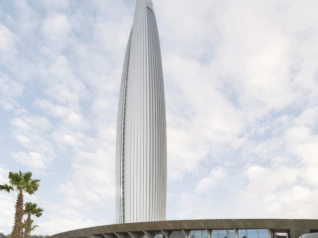
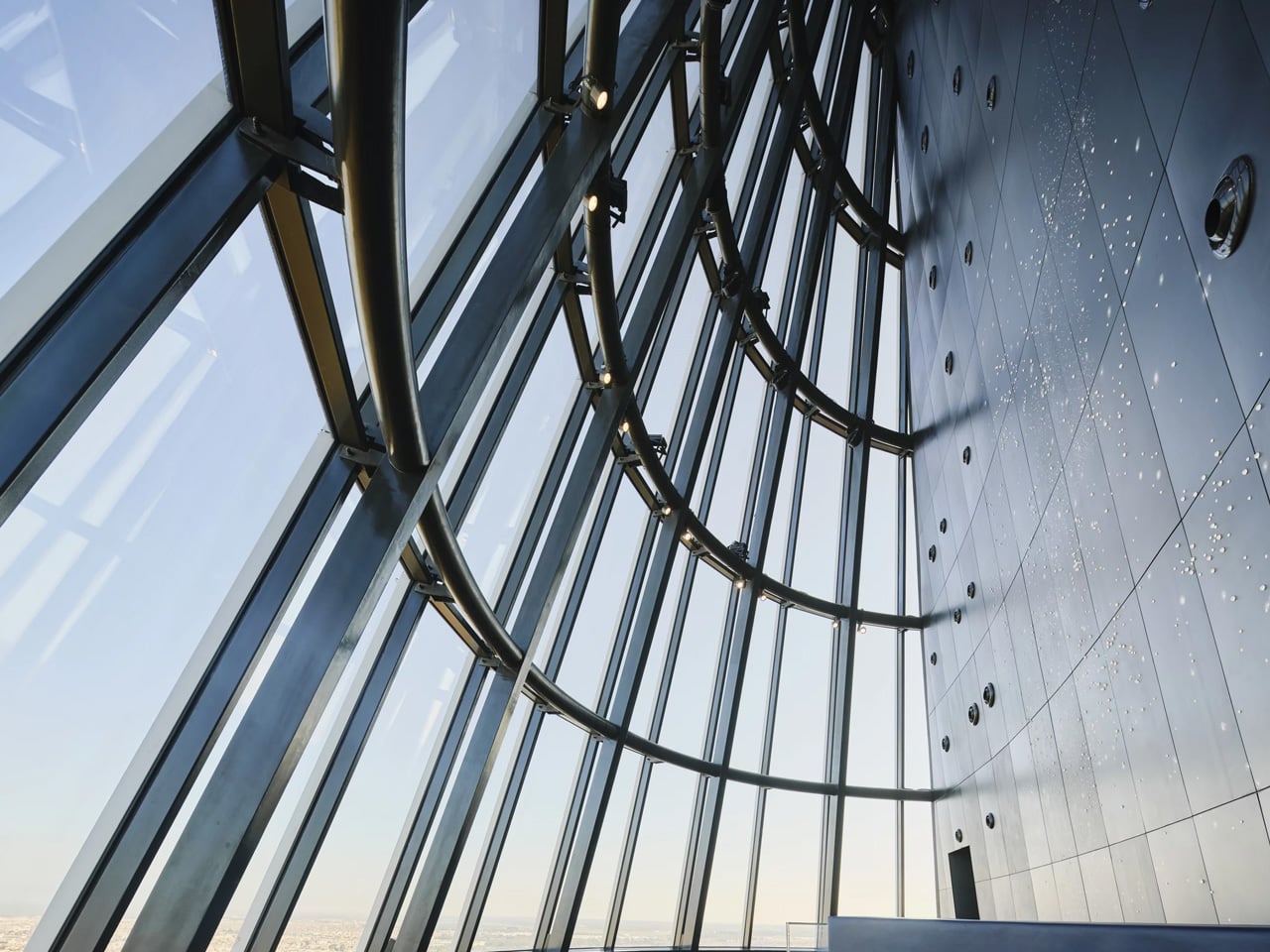
There are buildings, and then there are statements. The Mohammed VI Tower, inaugurated on April 23, 2026, in Salé, Morocco, belongs firmly in the second category. Rising 250 metres across 55 floors on the east bank of the Bouregreg River, it is now the tallest building in Morocco and the third tallest on the African continent. It did not arrive quietly. Visible from 50 kilometres in every direction, the tower has already redrawn the skyline that was once defined by centuries-old minarets.

The story behind it is as cinematic as the structure itself. Othman Benjelloun, the 93-year-old billionaire and chief executive of the Bank of Africa, conceived the idea decades ago after visiting a NASA facility ahead of the Apollo 12 mission. Standing before the Saturn V rocket, he saw not just a machine but a metaphor. That image, a rocket braced on its launchpad and ready to ascend, became the architectural soul of the tower. Spanish architect Rafael de la Hoz and Moroccan architect Hakim Benjelloun translated that vision into steel, glass, and concrete, producing a silhouette that reads like liftoff frozen in time.

Designer: Rafael de la Hoz and Hakim Benjelloun

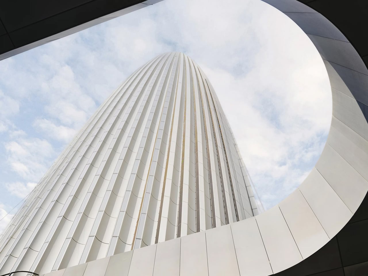
The tower is far more than its form. Across its 102,800 square metres of floor area, it houses a Waldorf Astoria hotel, premium offices, high-end residential apartments, retail spaces, and a panoramic observation deck at its crown. Interior design was handled by Pierre Yves Rochon, with furniture and fittings curated by FLAMANT. The facade spans 70,000 square metres and integrates solar panels, while a tuned mass damper ensures stability at height. The building holds both LEED Gold and HQE sustainability certifications, setting a benchmark for green construction across the continent.

Construction began in July 2017 and was delivered by BESIX in a joint venture with TGCC, Six Construct, and the China Railway Construction Corporation, with a total cost of 3.5 billion Moroccan dirhams, roughly $700 million. The project forms the centrepiece of the Bouregreg Valley Development, a broader effort to transform Rabat into a city of international standing ahead of the 2030 FIFA World Cup, which Morocco will co-host.

Not everyone is celebrating at the same altitude. Critics point out that major investment continues to concentrate along Morocco’s Atlantic corridor, while inland regions contend with high unemployment and uneven public services. The tower, they argue, is a monument to ambition that has yet to translate into equity.

Still, as an act of architecture, the Mohammed VI Tower is difficult to argue with. Rafael de la Hoz and Hakim Benjelloun have given Morocco something rare: a building with a founding myth, a bold form, and the scale to match both.

The post Morocco’s Mohammed VI Tower: The Rocket That Rewrote Africa’s Skyline first appeared on Yanko Design.
The Forest Came First. The House Came Second. That Was Always the Plan.

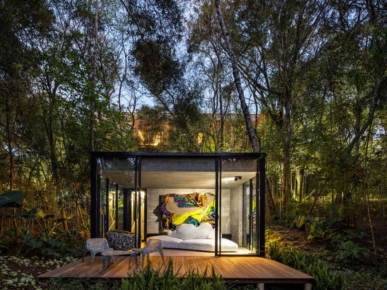
Most architects are handed a site and told to make something of it. Luiz Volpato was handed a forest and told not to ruin it. House 17-JB, completed in 2022 within the Jardins do Batel condominium in Curitiba, southern Brazil, grew out of a deeply personal brief: a client of Italian descent, a self-professed architecture enthusiast, wanted to find not just land, but the ‘right’ land.

Together with the office, they eventually settled on a plot defined by two non-negotiable conditions — a protected native forest and a dramatically steep topography. Those constraints didn’t limit the project. They became it.

Designer: Luiz Volpato Architects

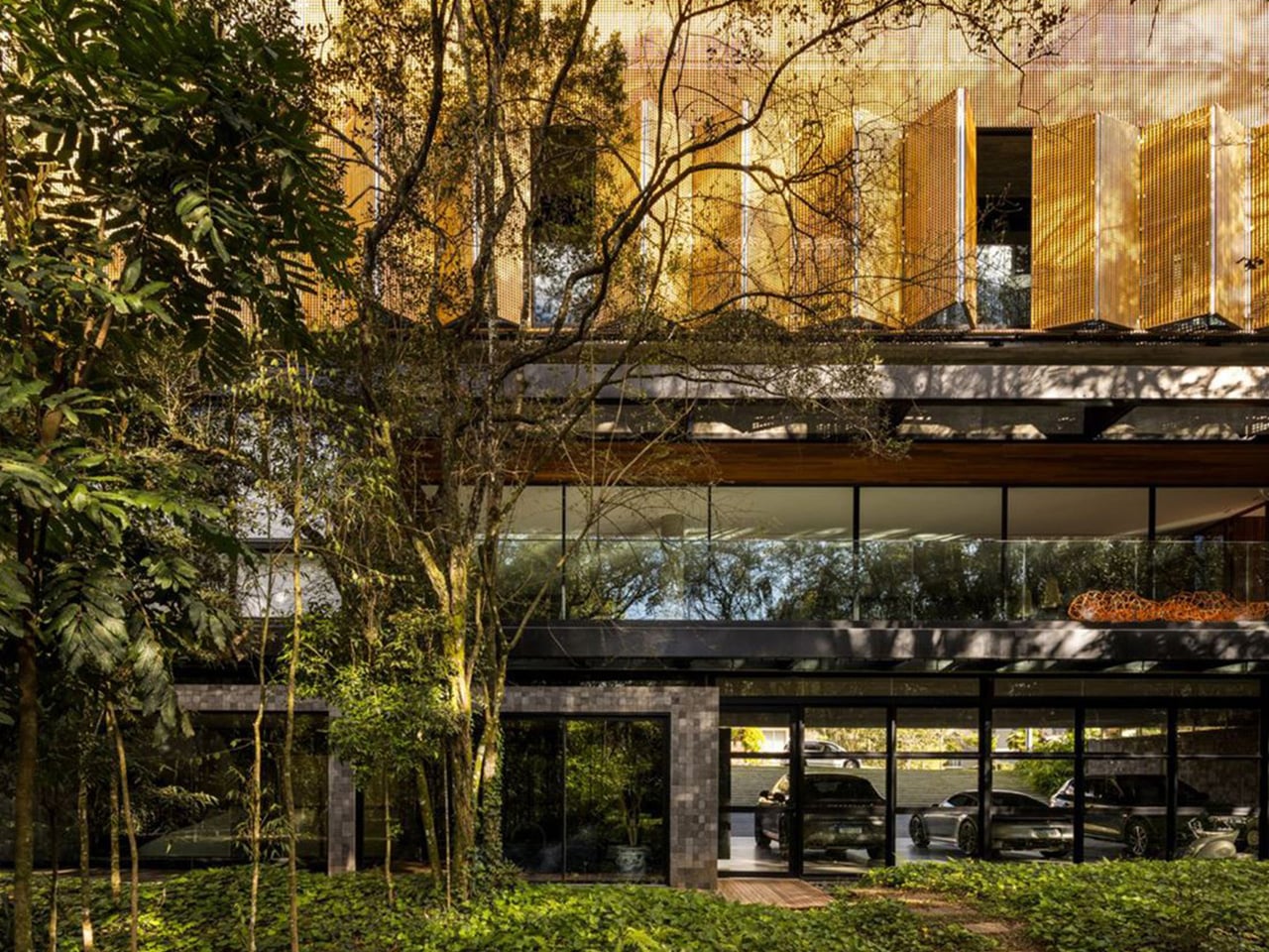
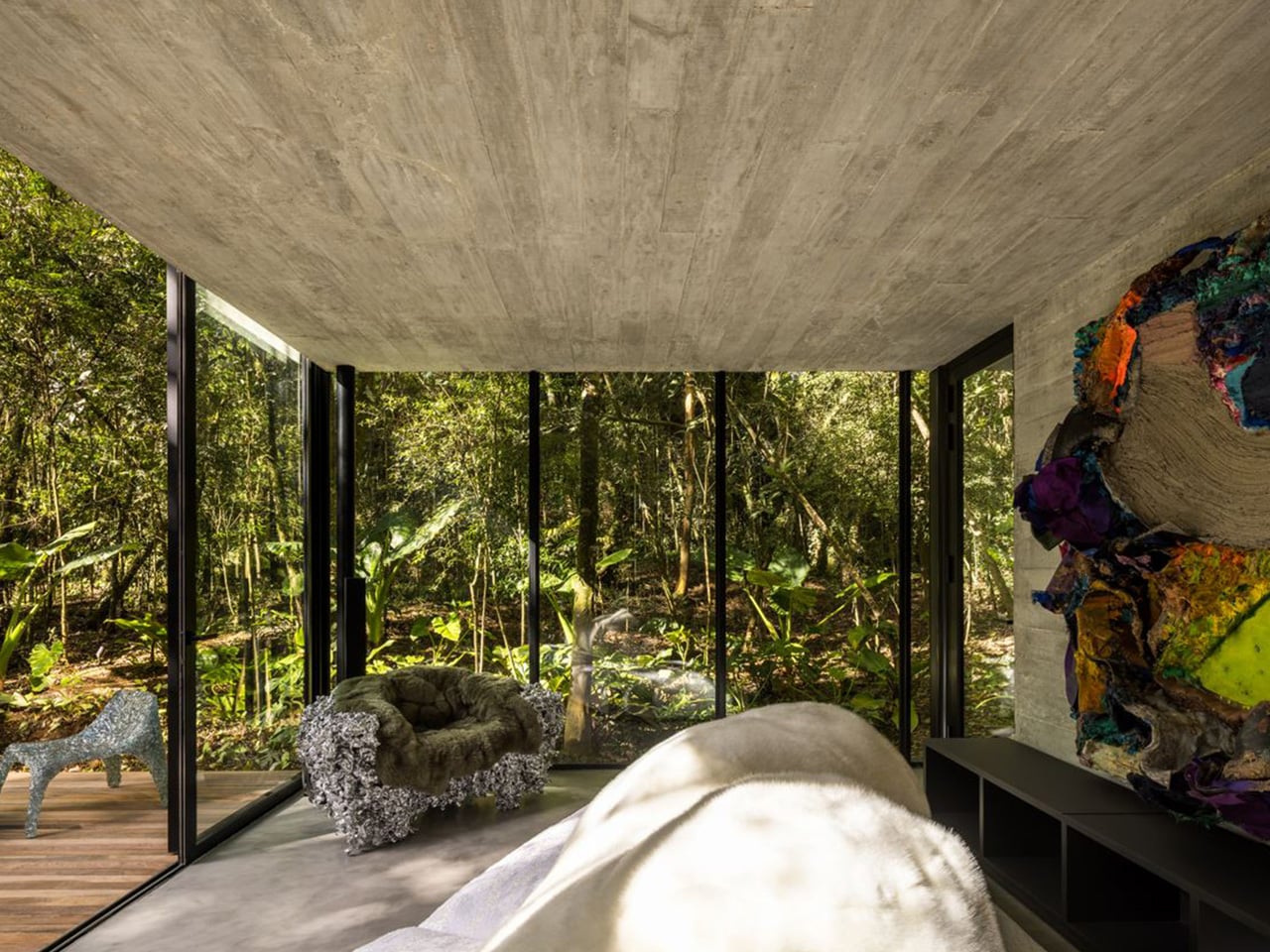
With occupation restricted to just 30% of the 2,300 square metre plot, and that footprint concentrated along the front portion of the land, the design team was forced to think vertically. The solution was elegant: four overlapping volumes, two elevated and two semi-underground, stacked in direct response to the terrain’s fall and the density of vegetation surrounding the site. The result is a 1,113 square metre home that feels both monumental and discreet, as if the building grew from the hillside rather than being placed on top of it.

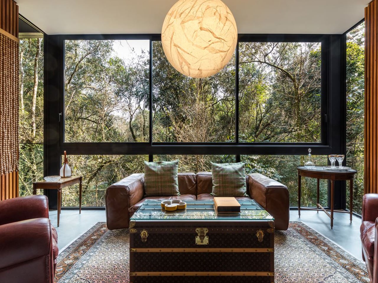
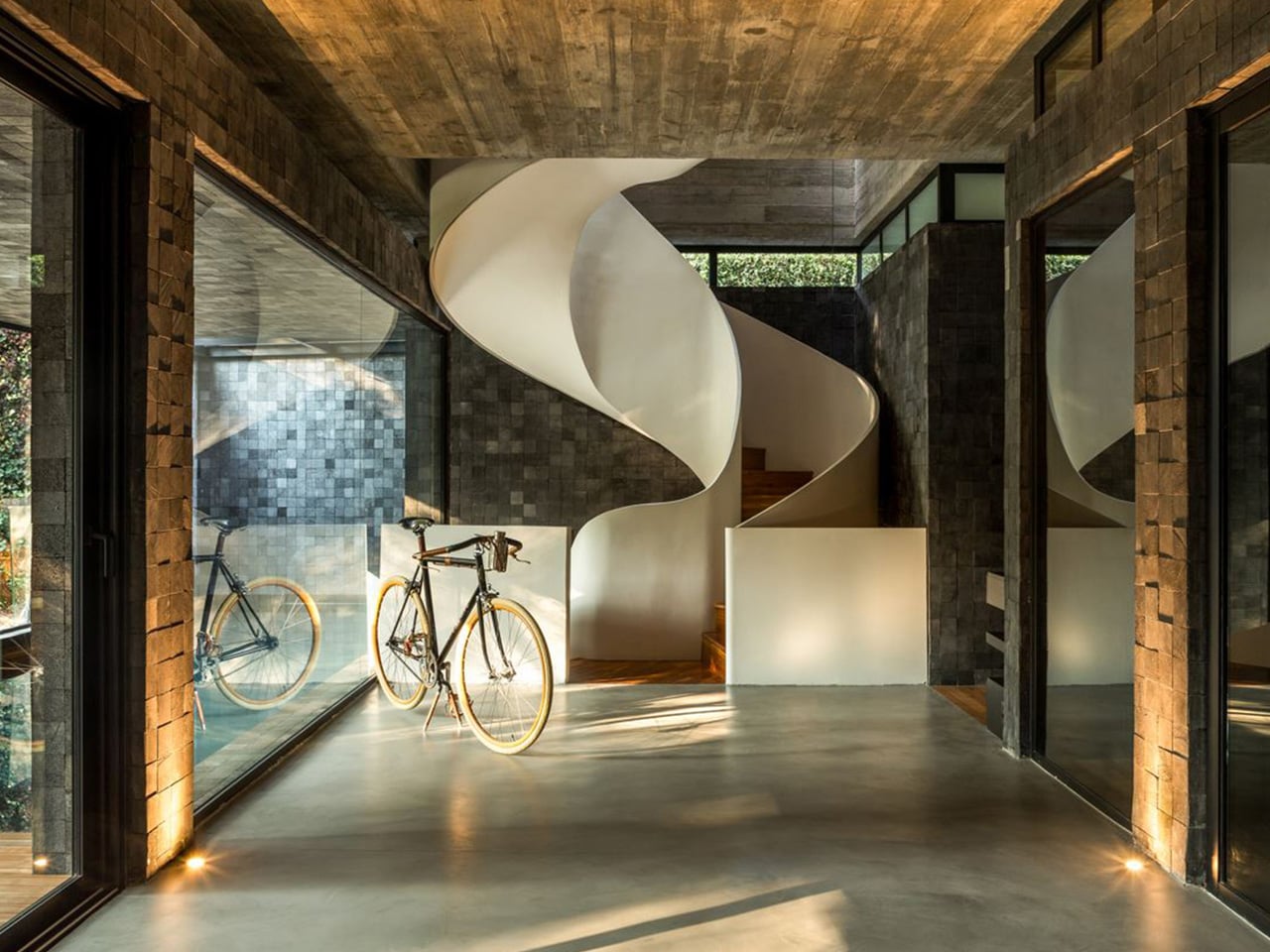
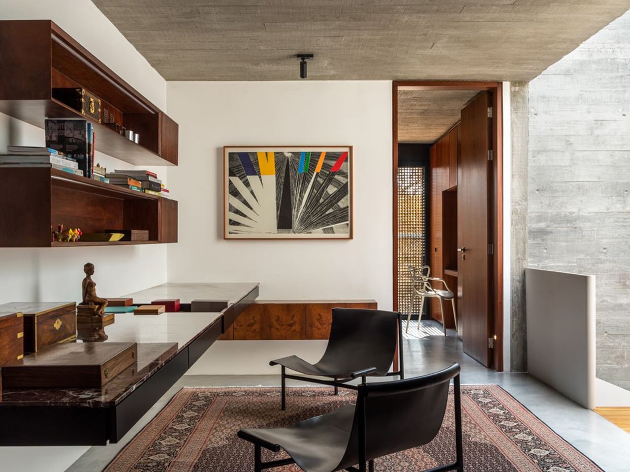
Architecturally, the project sits at the intersection of modernism and brutalism, drawing on structural clarity, constructive rationality, and an honest approach to material selection. The material palette tells its own story: moss green upholstery, warm timber millwork, and stone surfaces work together to blur the boundary between inside and out. Natural textures sit alongside smooth finishes, creating an interior that reads as fluid and quiet rather than loud or performative.

On the upper floors, the intimate volume houses the suites and a family living area, with balconies positioned precisely at the height of the tree canopy. Living among the treetops rather than looking up at them is a subtle but powerful distinction, one that shapes the daily experience of the house in ways that no floor plan can fully capture.

The project has since gained international recognition, featured in Edra Magazine No. 5, launched in Milan. It is a fitting acknowledgment for what is, at its core, a study in restraint. Luiz Volpato and his team, alongside project coordinator Pablo Quintela, never tried to compete with the forest. They listened to it instead. House 17-JB is a reminder that the best architecture doesn’t impose a vision on a site. It finds the vision that was already there, waiting to be built.

The post The Forest Came First. The House Came Second. That Was Always the Plan. first appeared on Yanko Design.
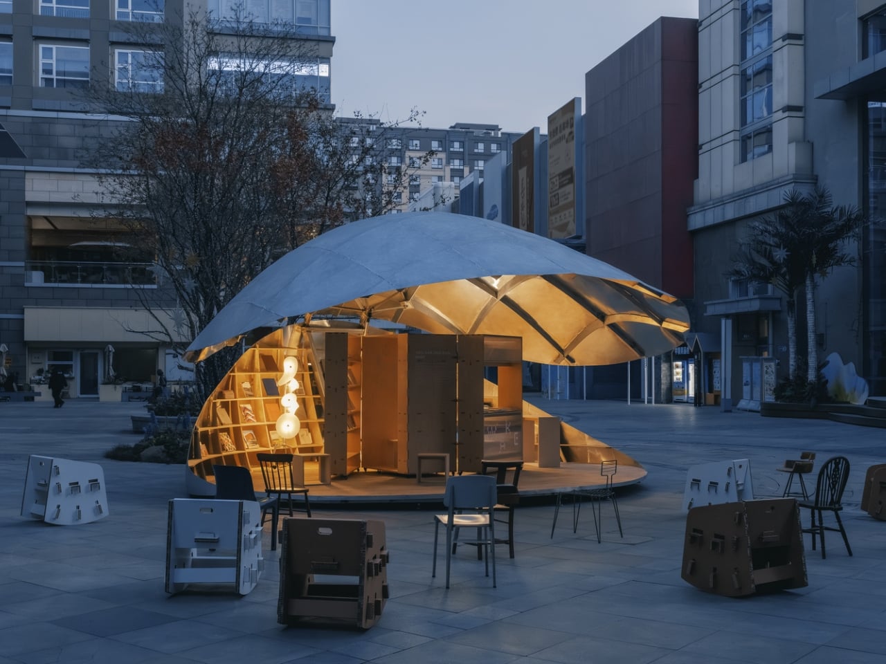
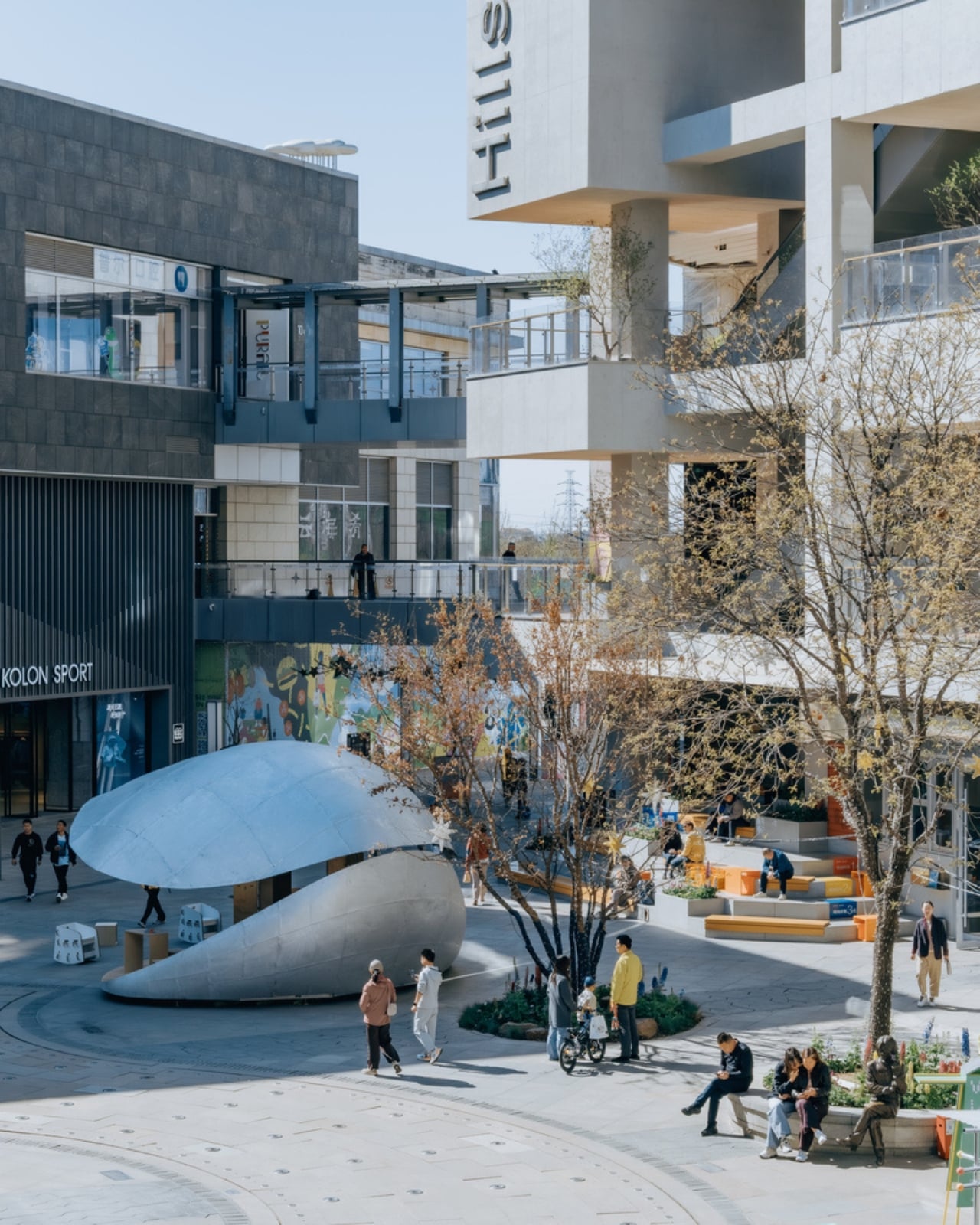
Beijing Just Built a Library That Opens and Closes Like a Shell

Most public spaces do one thing: they sit there. They look the same in the morning as they do at noon, and they expect you to adapt to them. That’s just how it’s always been. LUO Studio’s Shell Book Pavilion in Beijing decided to skip that whole arrangement entirely.

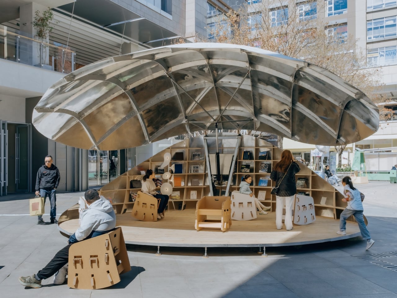
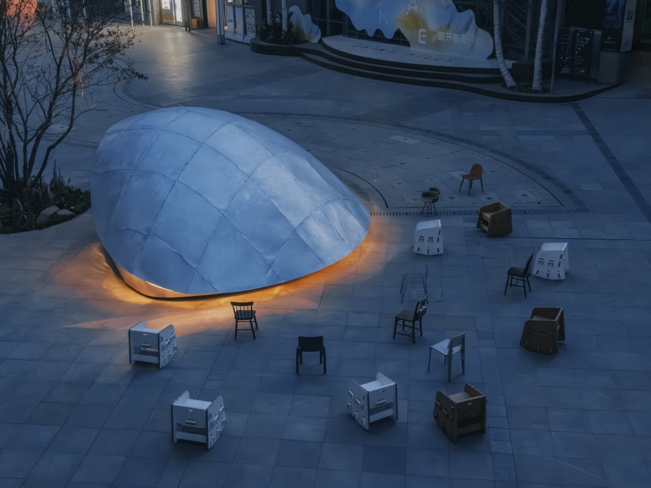
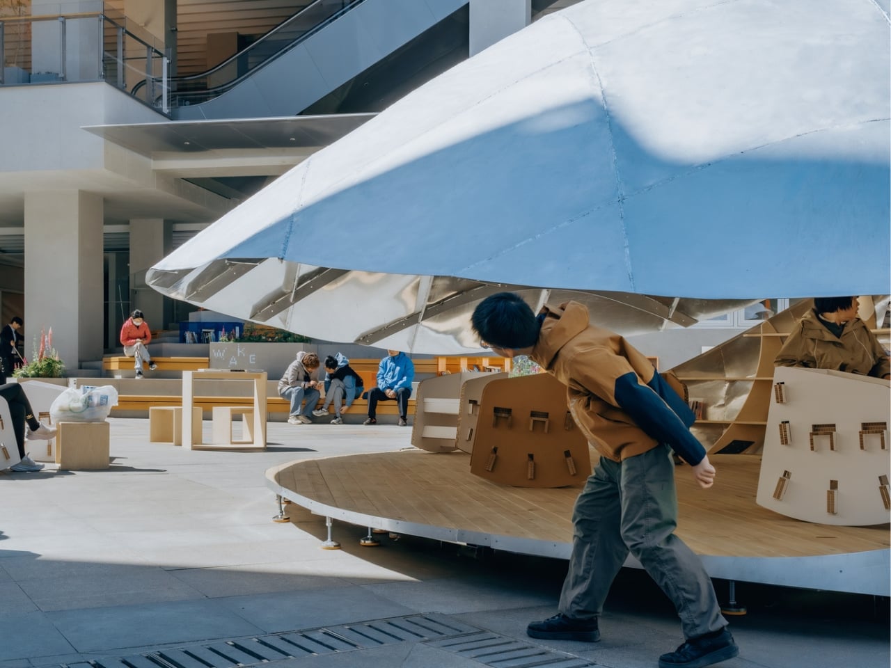
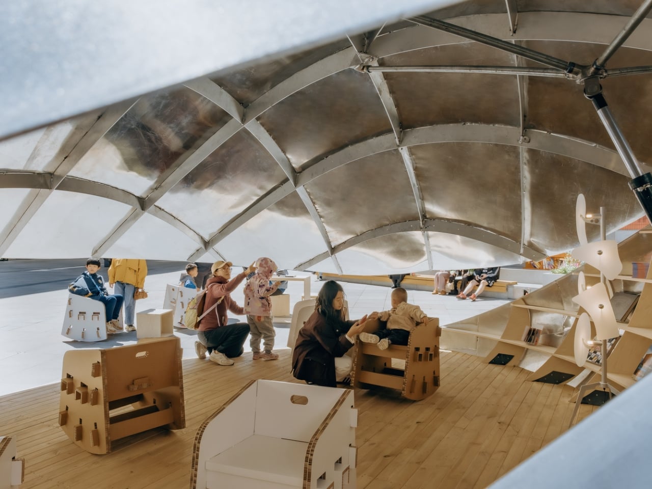
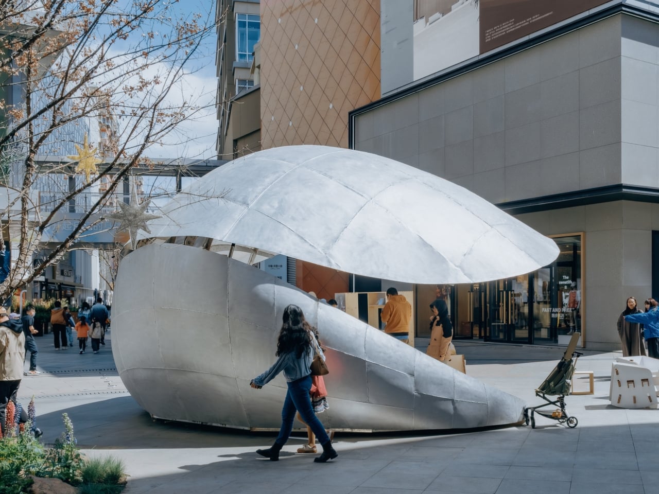
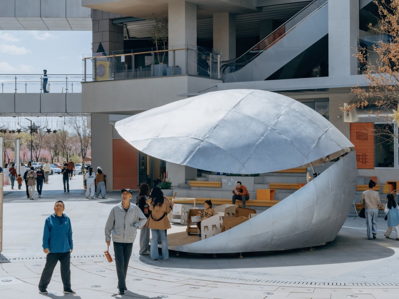
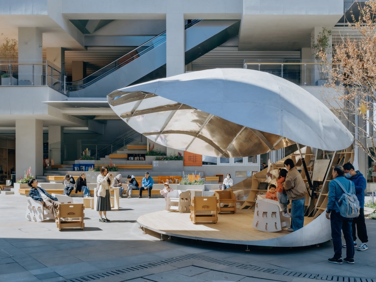
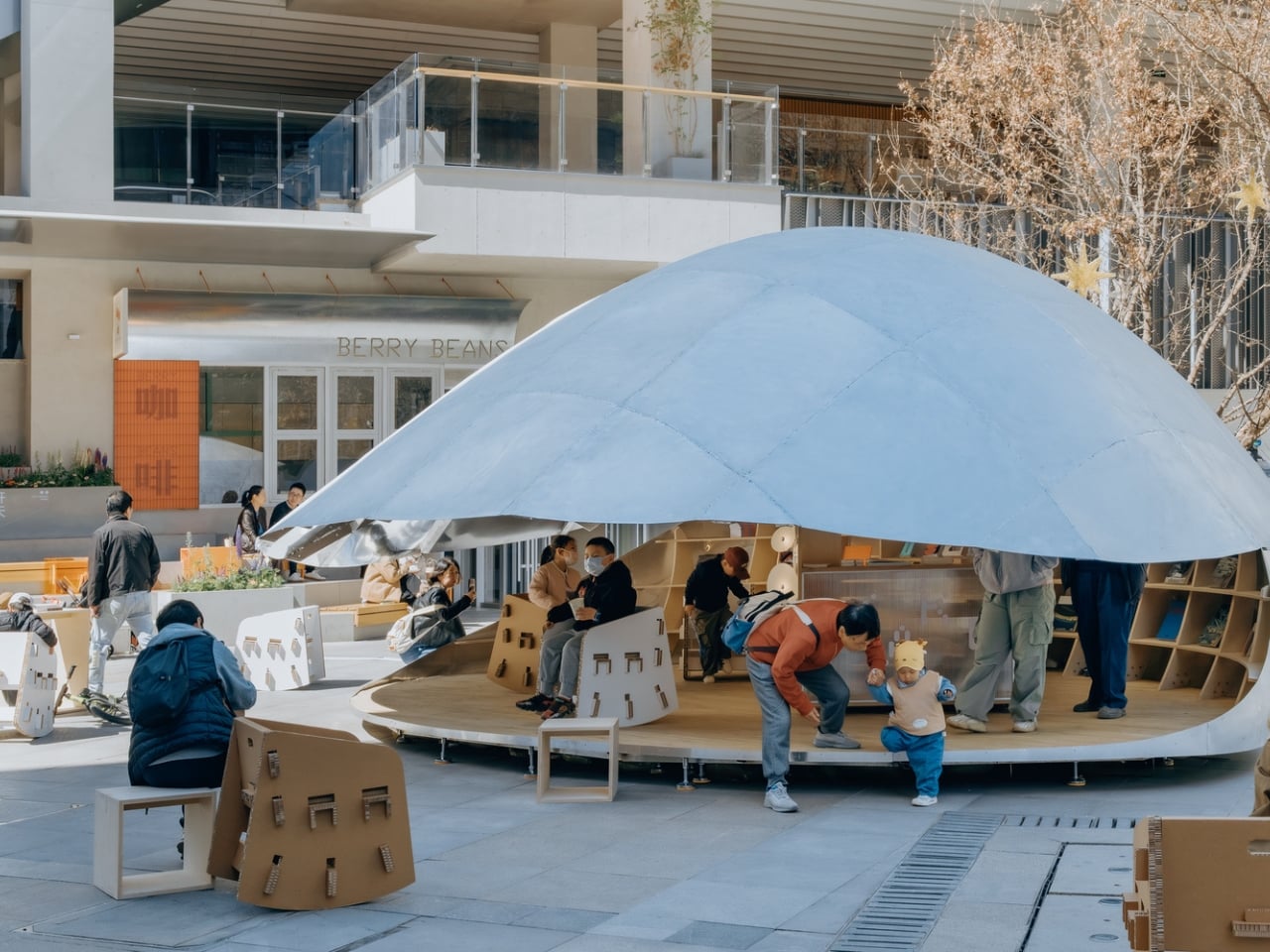
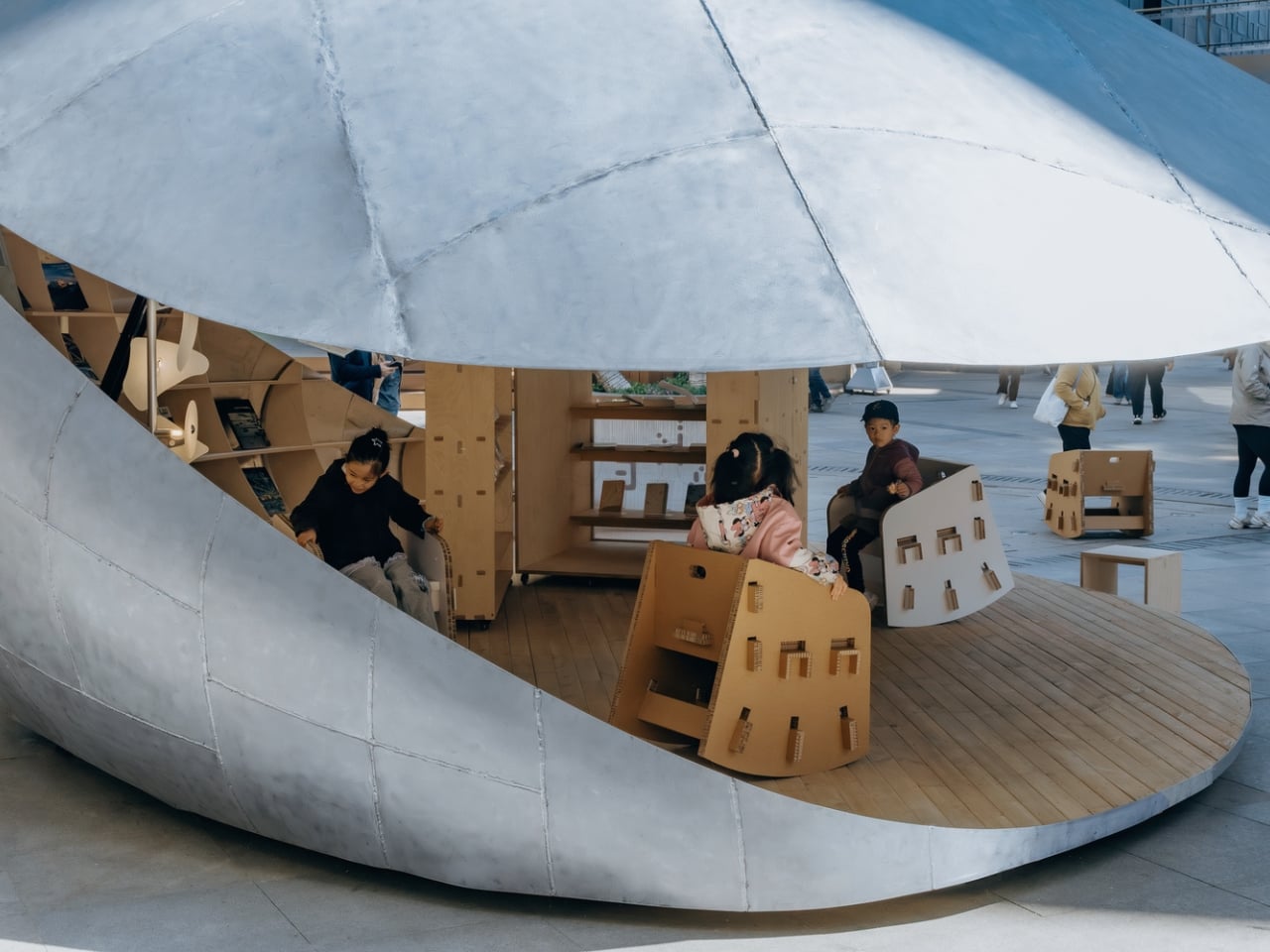
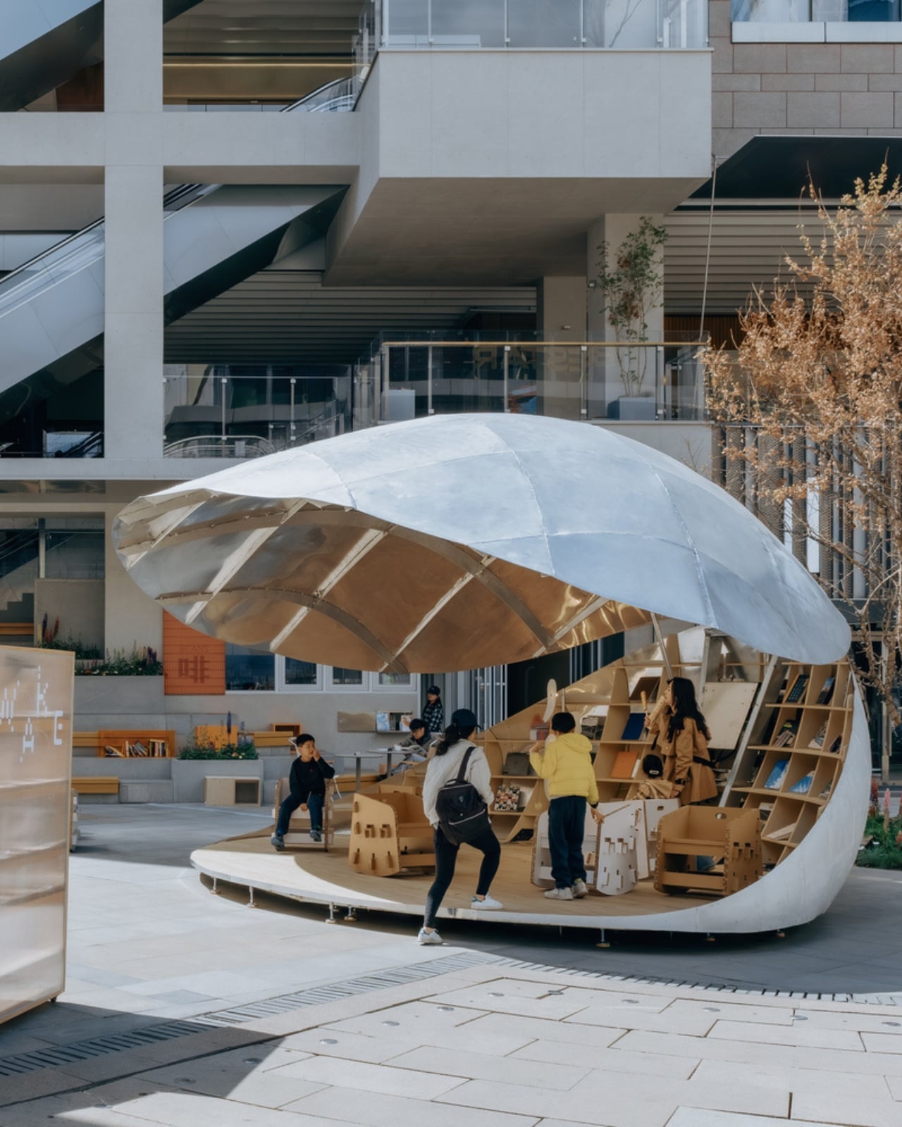
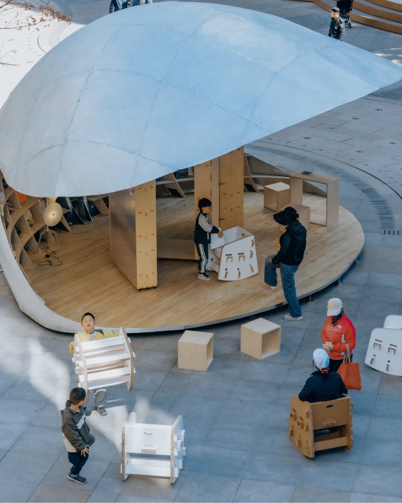
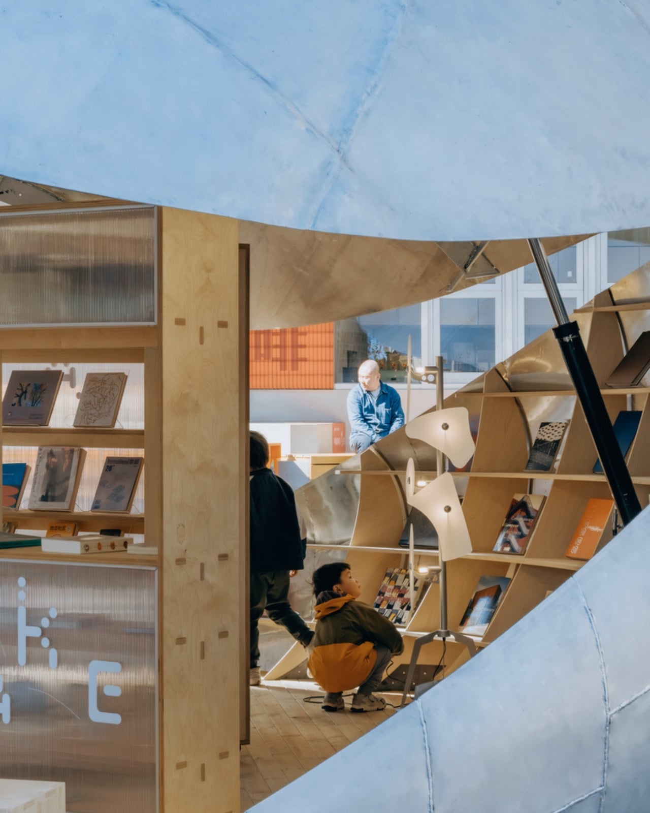
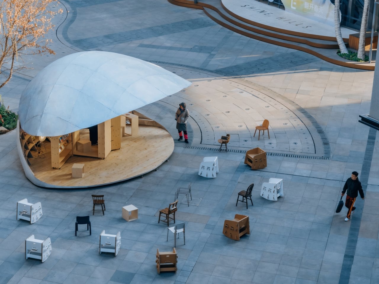
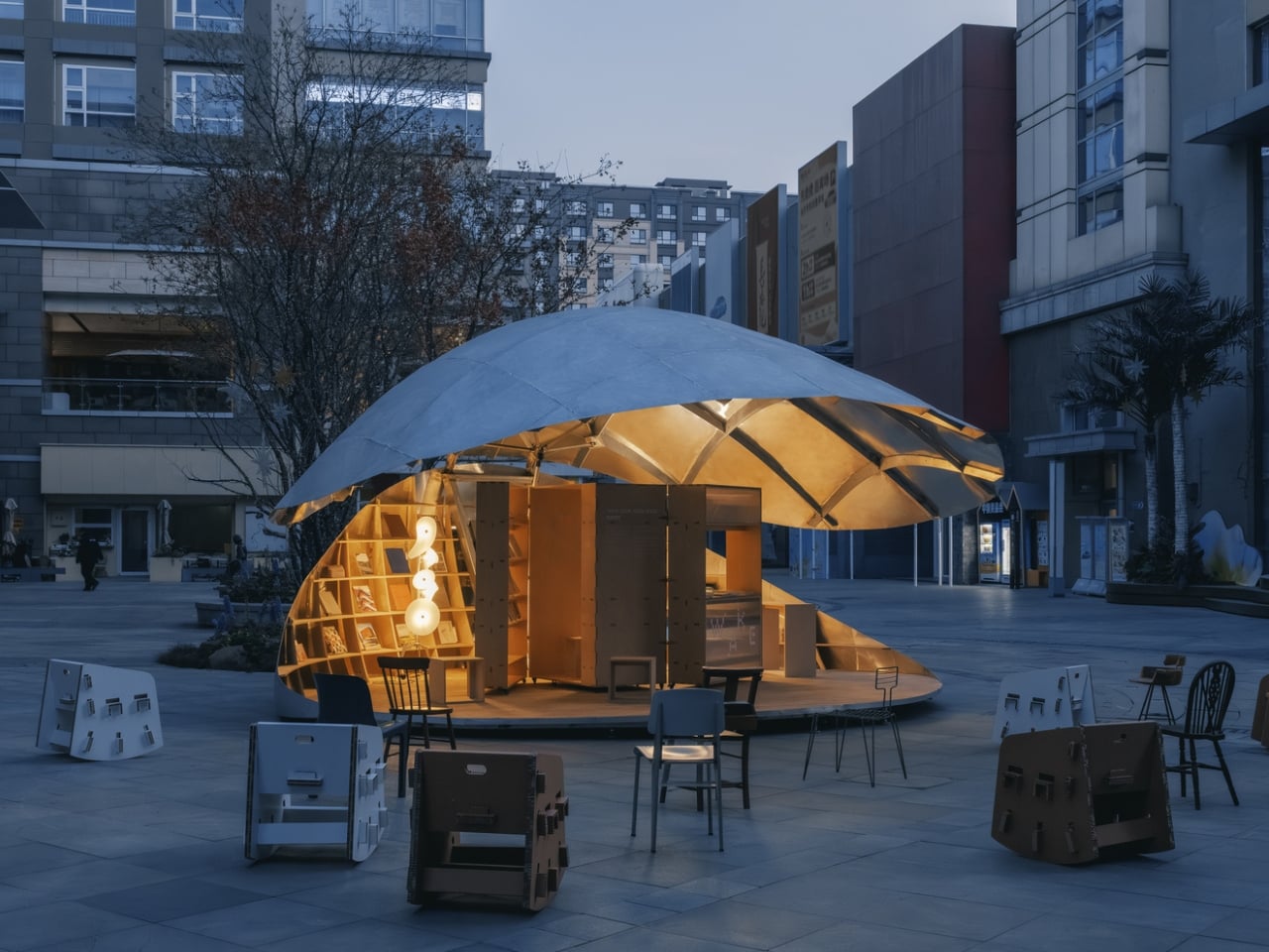
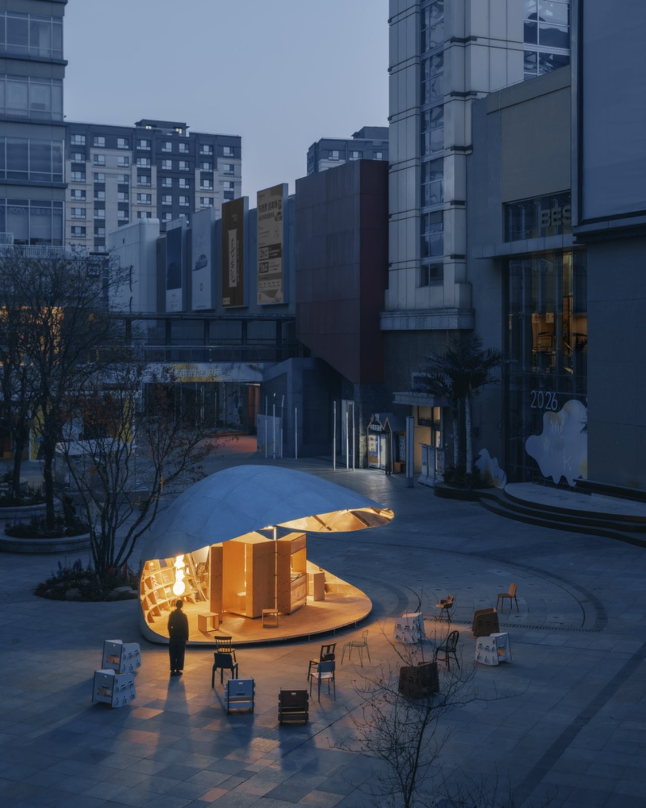
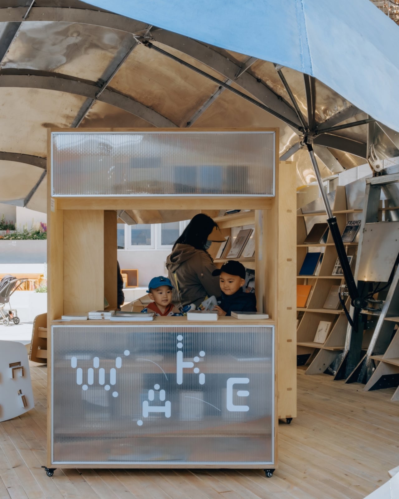
Completed in 2026 and tucked into the plaza of Xiangyun Town, a commercial district in Beijing, the pavilion is exactly as remarkable as it sounds: a 43-square-meter structure shaped like a clamshell that physically opens and closes. Not metaphorically. Not just aesthetically. The shell actually lifts and lowers through a vertical opening system, moving through incremental positions that change the entire character of the space as the day goes on. When it’s raised, it becomes a generous canopy. When it’s lowered, it contracts into something quieter and more intimate. The pavilion isn’t static. It breathes.

Designer: LUO Studio

The idea started from a personal place. The architects at LUO Studio describe prior visits to the same plaza with family, noting how the casual, child-friendly energy of the space already had a natural rhythm to it. The Shell Book Pavilion didn’t try to override that. It responded to it. That kind of grounded thinking tends to produce better architecture than designing purely for an image, and you can feel it here. The pavilion doesn’t demand your attention by being loud. It earns it by being genuinely useful.

Built with an aluminum shell structure, the design also makes a point of having no fixed front or back. Walk up to it from any direction and it reads clearly. That might sound like a small detail, but it matters enormously in a shared public plaza where people arrive from every angle and at every hour. A space that only works when you’re standing in the right spot isn’t really a public space. It’s a stage set.

Scattered around the pavilion are movable seating pieces that extend the social footprint beyond the structure’s physical boundary. The pavilion’s influence on the plaza ends up being much larger than its 43 square meters suggest. People don’t just use the space inside the shell. They orbit it. They set up nearby. They stay longer than they planned to. That’s a quiet form of design success that rarely gets enough credit.

The nature metaphor is doing a lot of heavy lifting here, and it earns every bit of it. A clamshell as a form for a library is the kind of concept that could easily tip into gimmick, but LUO Studio kept the execution clean. The aluminum material choice keeps things from feeling too organic or precious. The structure carries a quiet confidence. The shell looks like it belongs in the future and on that plaza at the same time.

Scale versus ambition is the tension that makes the Shell Book Pavilion interesting beyond its novelty. This is a 43-square-meter structure in a commercial district, not a landmark cultural center with a nine-figure budget. It’s small, and deliberately so. The pavilion argues, simply by existing, that you don’t need a lot of square footage to change how people experience a neighborhood. You need a clear idea, executed honestly.

Public reading spaces have had a complicated decade. Libraries as institutions are being redefined, neighborhood bookshops are staging a comeback, and digital reading has both liberated and fragmented the way we engage with books. The Shell Book Pavilion doesn’t wade into any of that debate. It just makes a place for you to sit with a book, opens itself up when it wants company, and closes a little when the day gets quieter. It meets people exactly where they are.

The photographs by Yumeng Zhu capture the pavilion in soft natural light, and they do the project justice. The structure has a presence that reads beautifully even in two dimensions, which is usually a good sign that something is genuinely working in three. Some designs only photograph well. This one looks like it’s actually worth visiting.

The post Beijing Just Built a Library That Opens and Closes Like a Shell first appeared on Yanko Design.
Helsinki’s Kruunuvuori Bridge Is One of the World’s Longest Car-Free Crossings

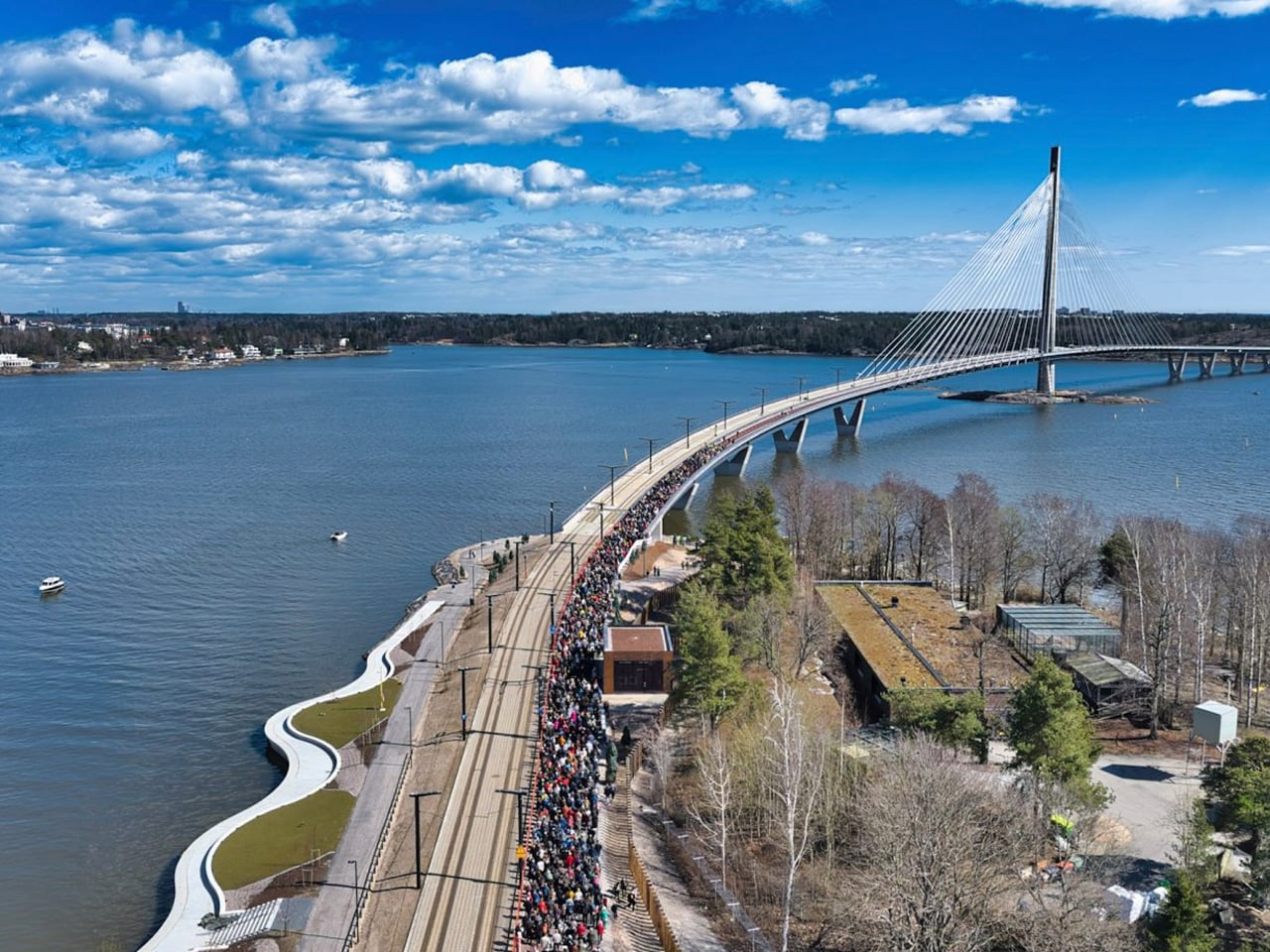
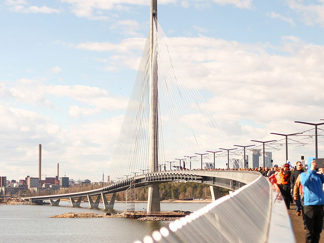
Crowd of people walking along a curved waterfront bridge over a wide river, with a cable-stayed bridge in the background under a blue sky.

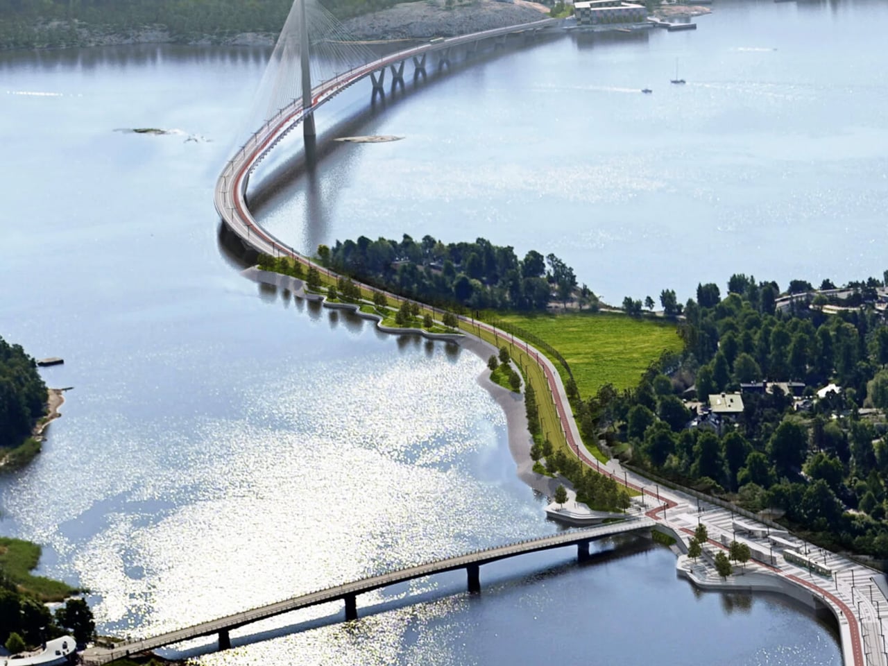
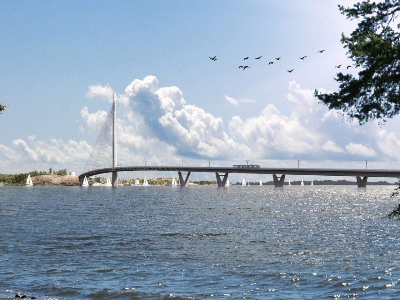
After more than a decade in the making, Helsinki’s Kruunuvuori Bridge has officially opened, and it’s unlike almost anything else built at this scale. Designed by engineering firm WSP Finland and London-based Knight Architects, the 1,191-metre crossing is now Finland’s longest and tallest bridge, and one of the longest in the world, built exclusively for pedestrians, cyclists, and public transport. There’s not a car lane in sight.

The story begins in 2012, when the City of Helsinki launched an international design competition titled “Kruunusillat” or “Crown Bridges.” Out of 52 entries, the WSP and Knight Architects collaboration, under the project name Gemma Regalis, emerged as the winner in 2013. Thirteen years later, that vision is now a physical reality, reshaping the way Helsinki’s inner city is experienced.

Designer: WSP & Knight Architects

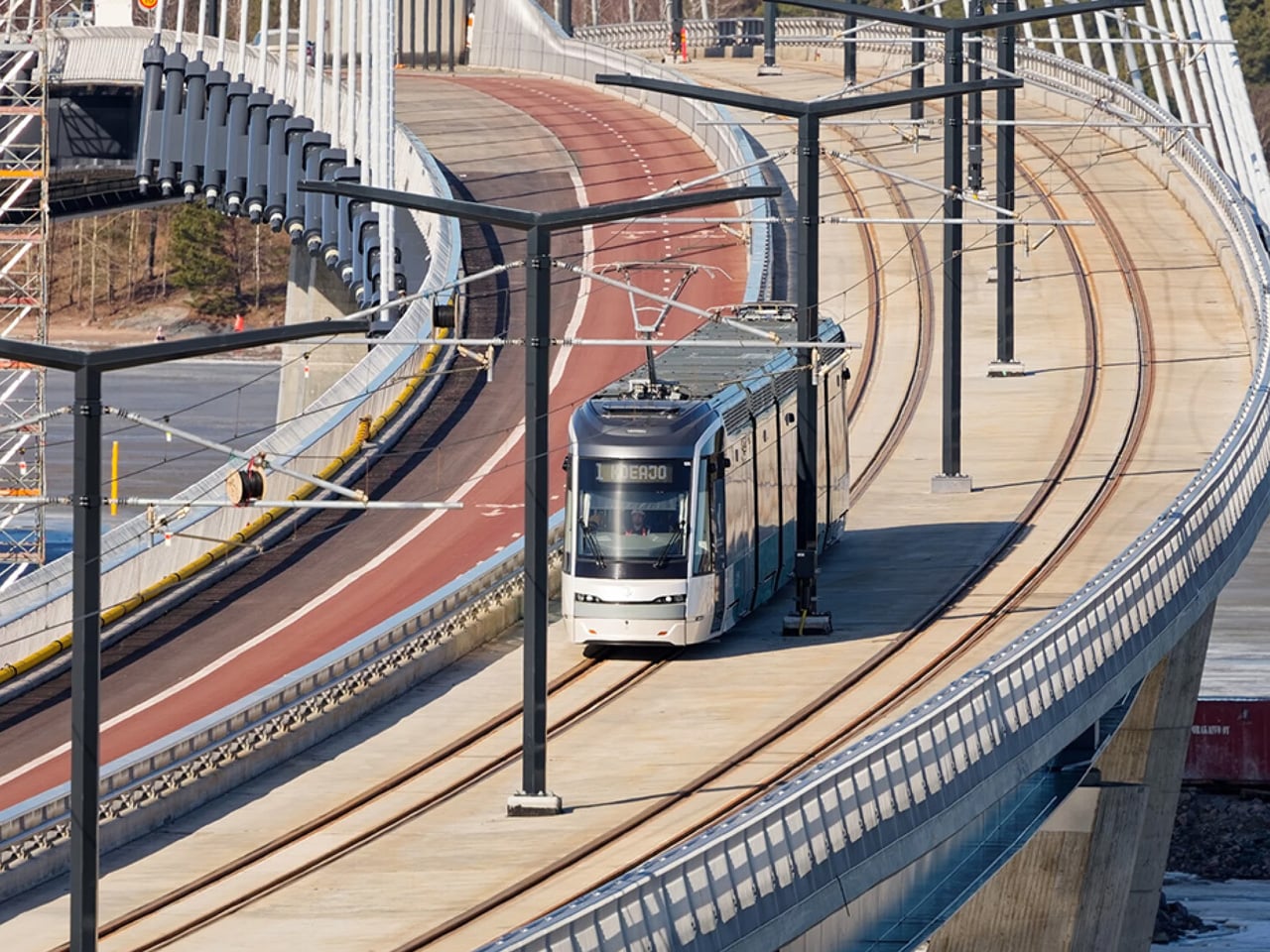
Aerial view of a winding riverside bike path and road with trees, crossing a curved bridge over calm water.

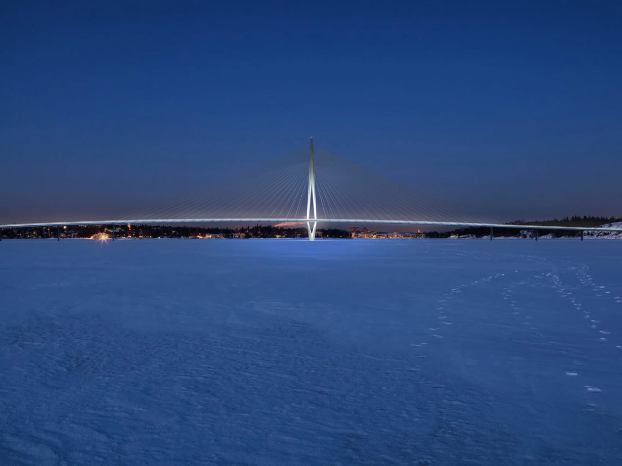
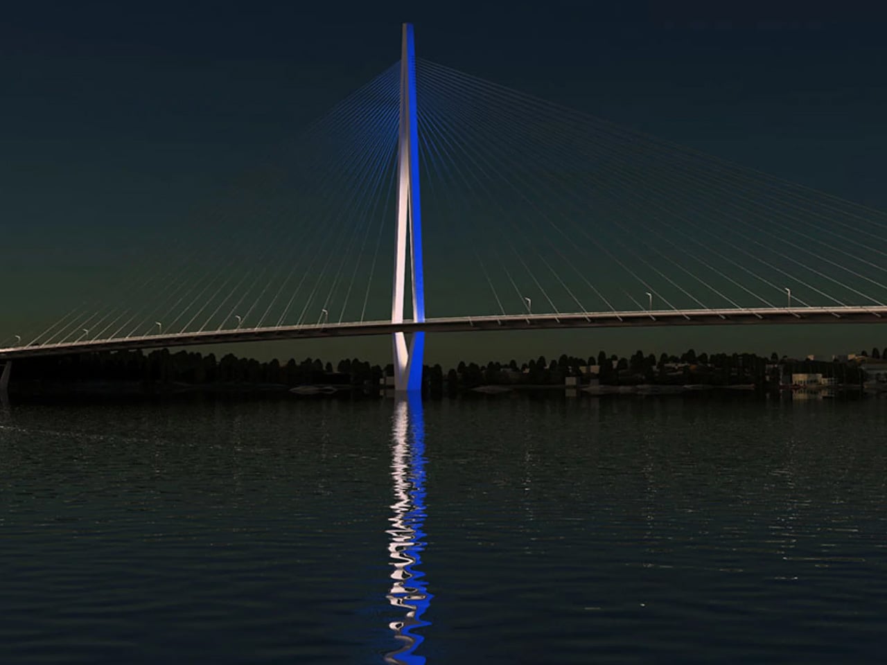
The bridge links the waterside residential area of Kruunuvuorenranta to the Nihti district via Korkeasaari island, pulling thousands of residents meaningfully closer to the city centre. Its defining feature is a slender, 135-metre-tall concrete diamond pylon at its centre, flanked by two 260-metre cable-stayed spans. When illuminated, the pylon is visible from across the city, its facade lighting shifting with the time of day and the season, a deliberate addition to Helsinki’s skyline.

The design team’s priorities went well beyond engineering. WSP lead designer Sami Niemelä noted that the team considered “pedestrian and cyclist safety, a comfortable travel experience, and barrier-free accessibility” from the outset. The bridge’s gentle curve was an intentional choice — a winding path lets users visually track where they’re headed, making the crossing feel more intuitive. Lighting was carefully calibrated to minimise light pollution while still ensuring safety after dark, directing light precisely onto walking and cycling surfaces without excessive glare.

Finnish winters were also factored into the structure. The steel cables were engineered with solutions to prevent snow and ice accumulation, a non-negotiable in this climate. With a design life of 200 years, this is a bridge built to outlast generations. The bridge opened to pedestrians and cyclists on April 18, 2026, with more than 50,000 visitors crossing it during the opening weekend alone.

Construction was carried out by YIT and Kreate under the TYL Kruunusillat consortium, with Knight Architects involved from the earliest concept sketches all the way through to completion. The next chapter begins in early 2027, when tram services are scheduled to activate across the bridge, the final piece in making this crossing a fully operational transit corridor for Helsinki.

The post Helsinki’s Kruunuvuori Bridge Is One of the World’s Longest Car-Free Crossings first appeared on Yanko Design.
Iran’s Mirror Pavilion Turns a 400-Year-Old Craft Into the Future

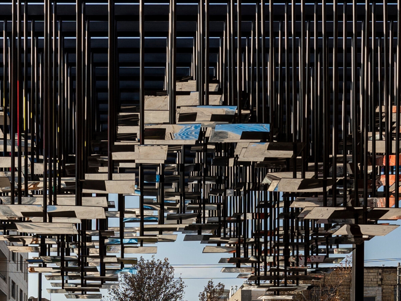
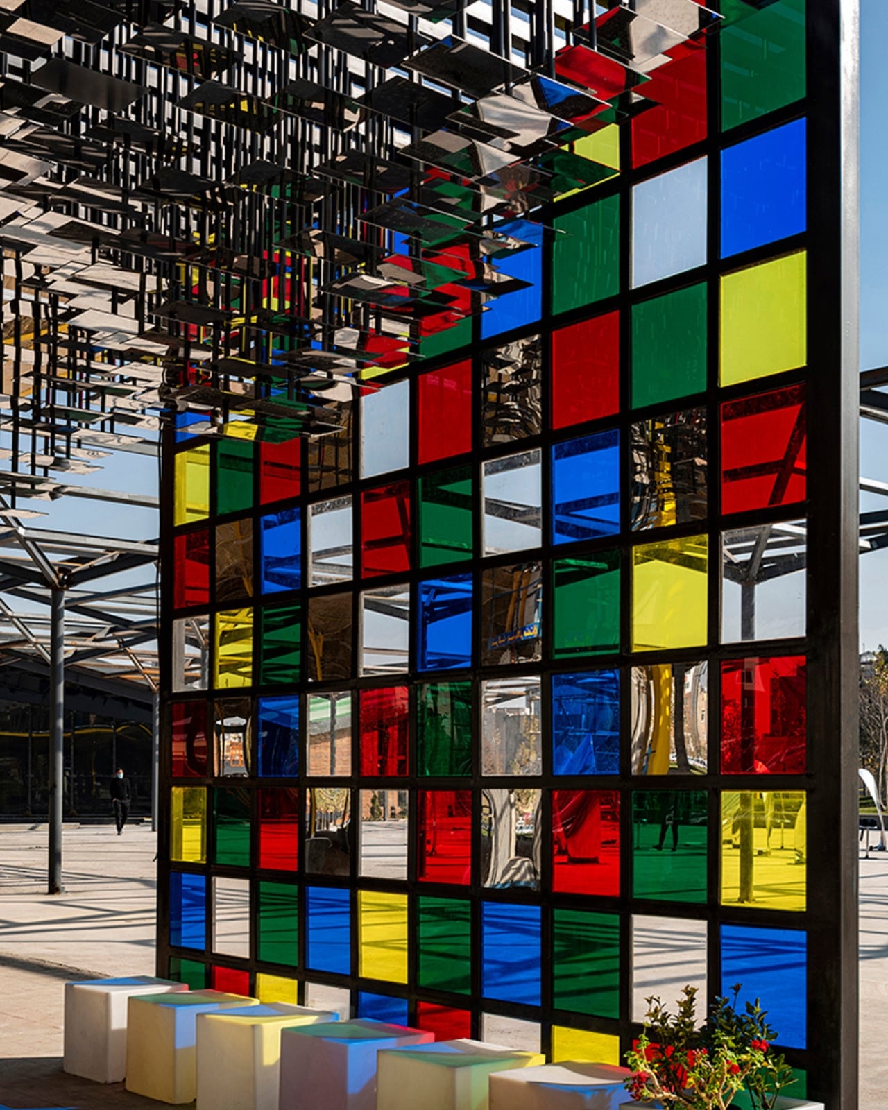
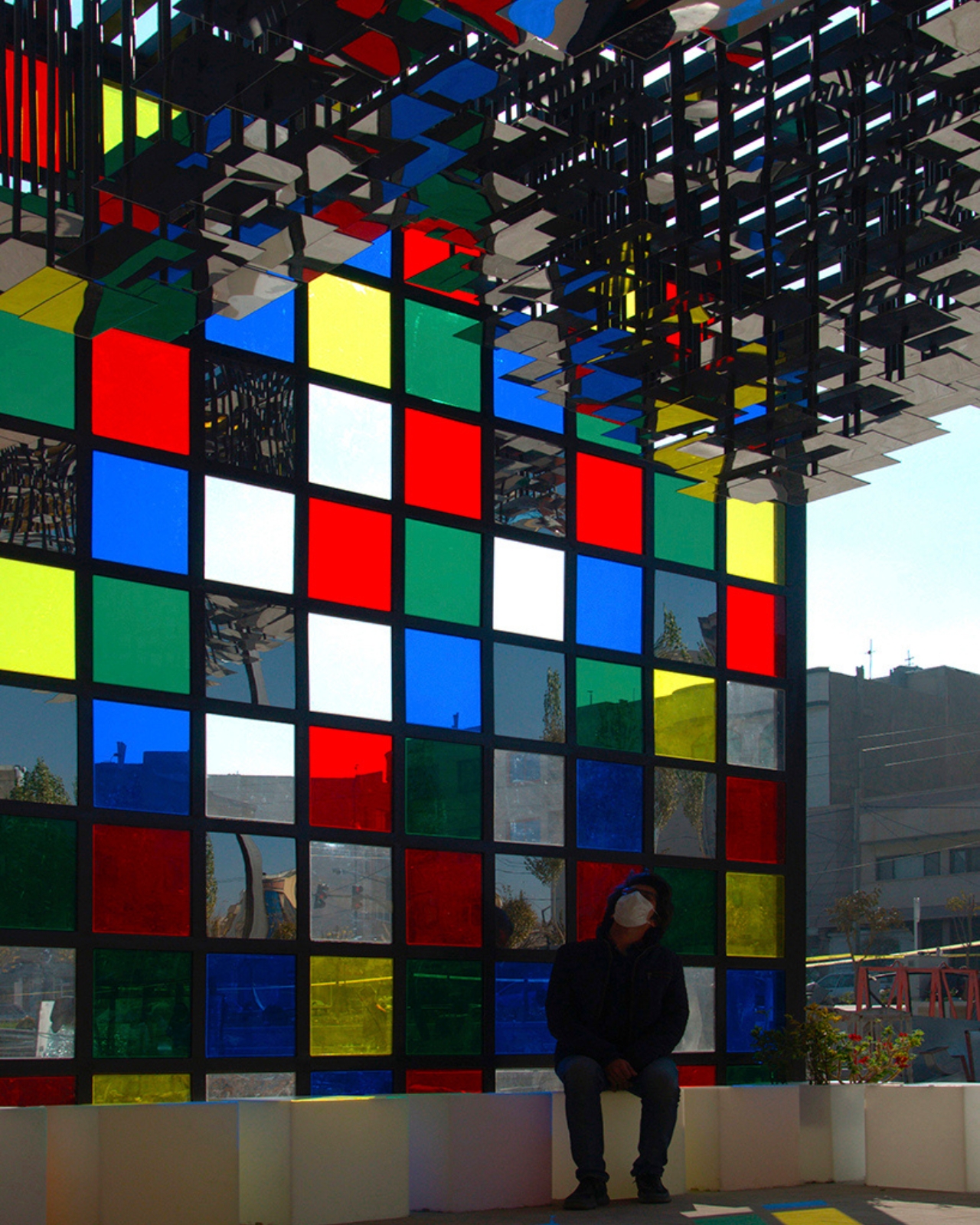
If you’ve ever been inside an Iranian shrine or palace, you already know the feeling. The moment you step into a space lined with mirror mosaic, you lose your sense of where the ceiling ends and the air begins. Fragments of light scatter in every direction, bouncing off thousands of hand-cut pieces of glass in a way that feels more like stepping into a living kaleidoscope than standing inside a building. That experience, rooted in a craft called Ayeneh-Kari, has shaped Persian architecture for centuries. Now, a studio called Ehsani Sharafeh Associates is doing something genuinely exciting: they’re rebuilding that feeling from scratch, using algorithms.

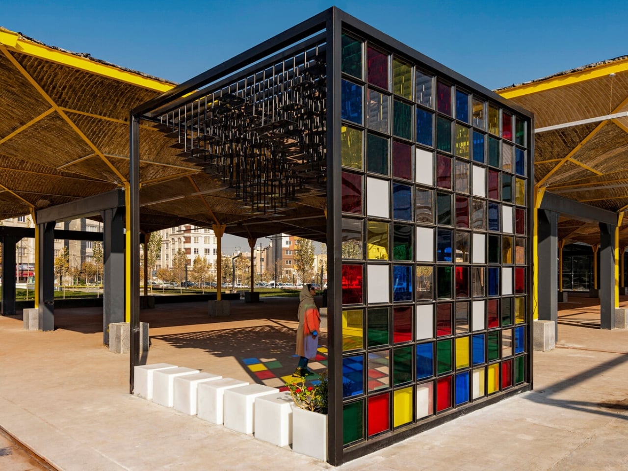
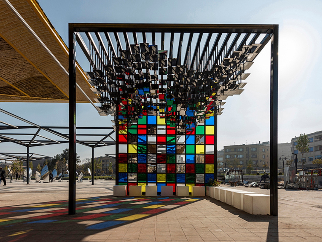
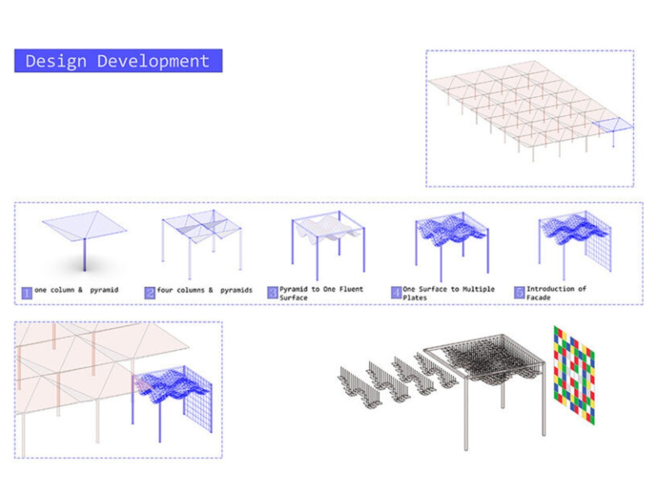
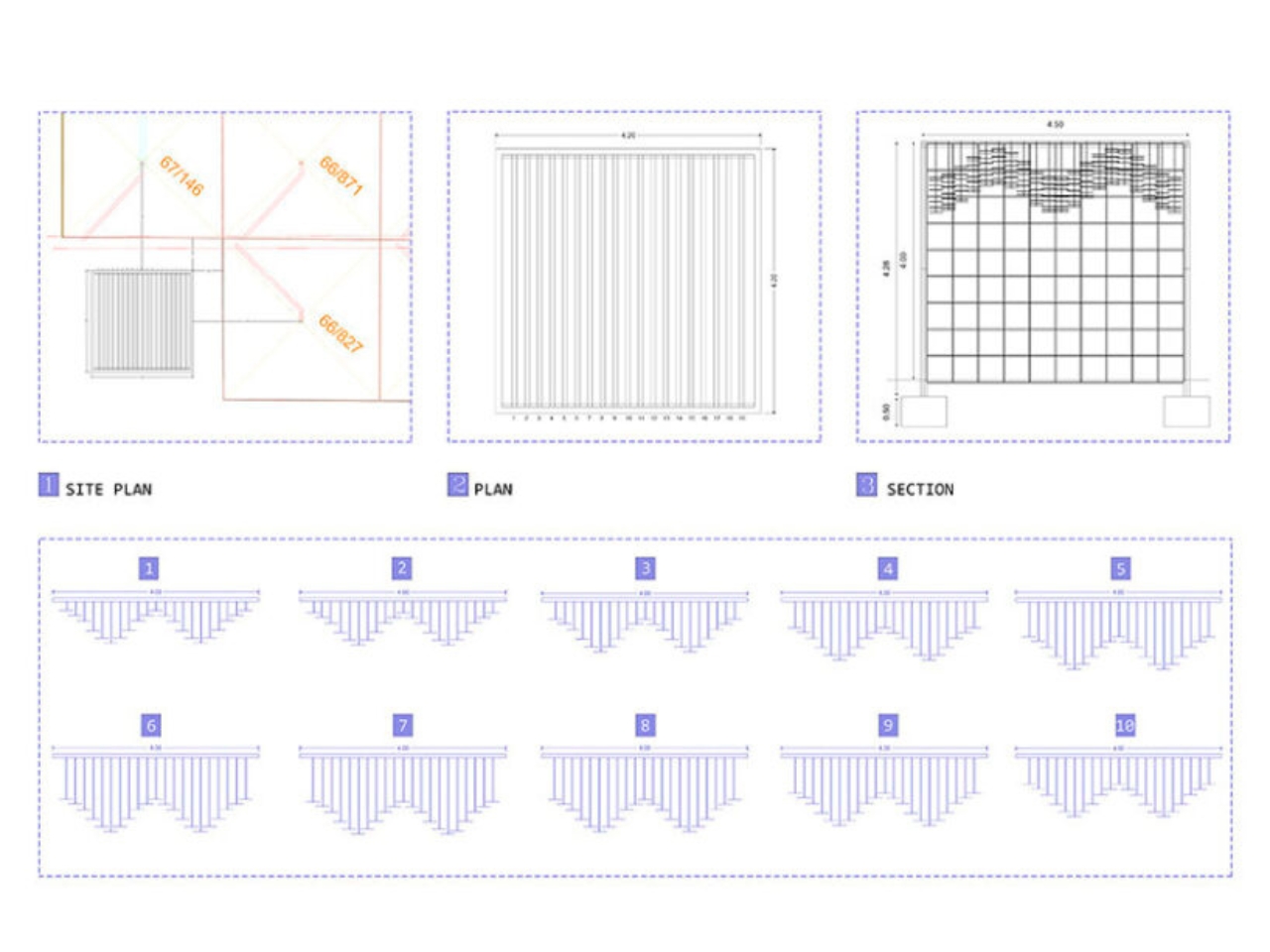
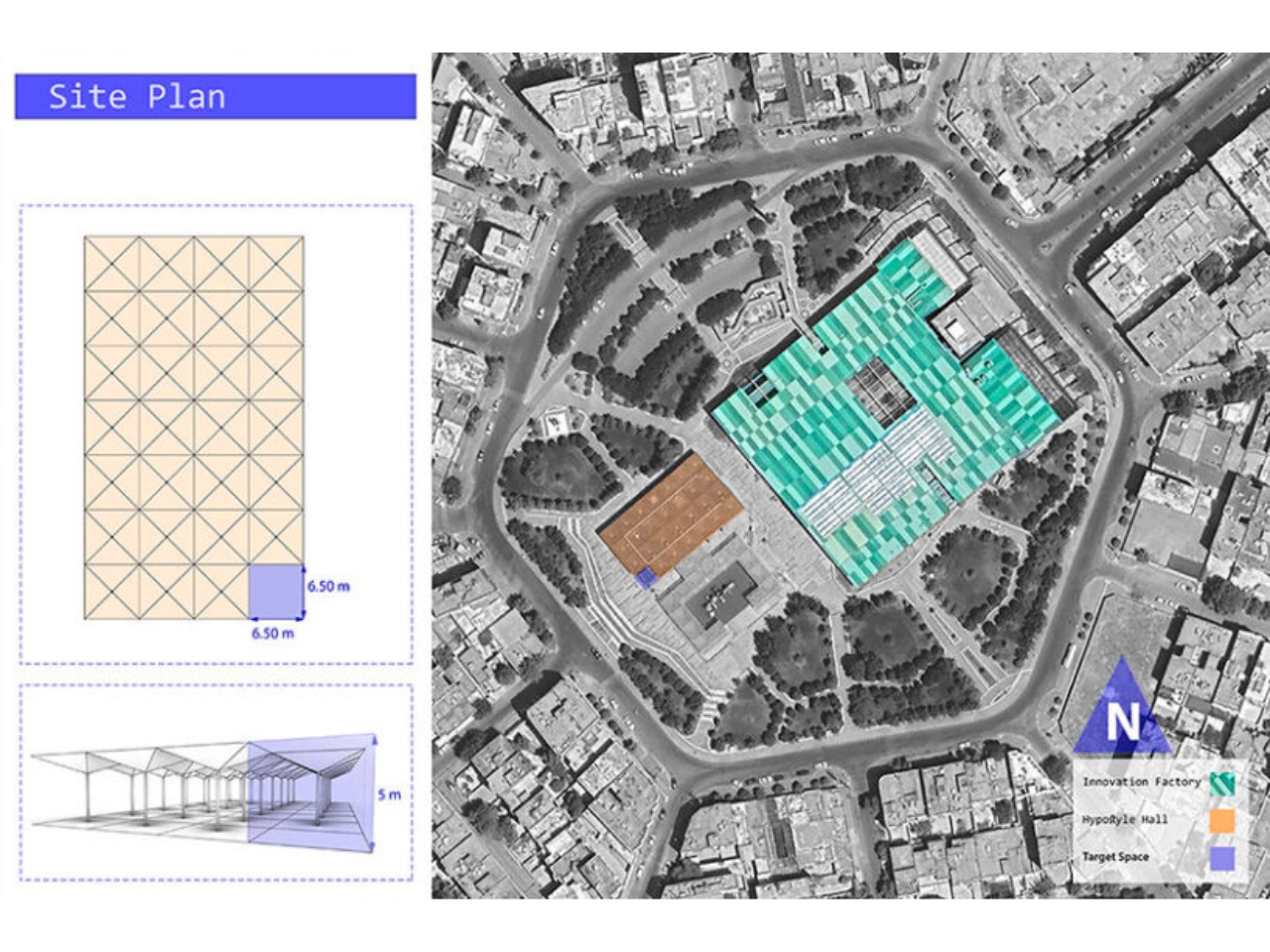
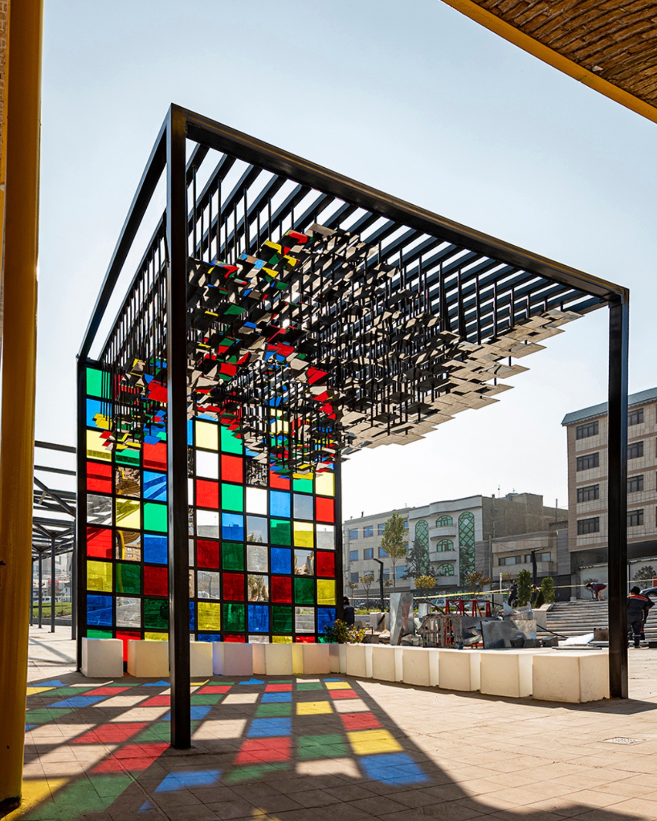
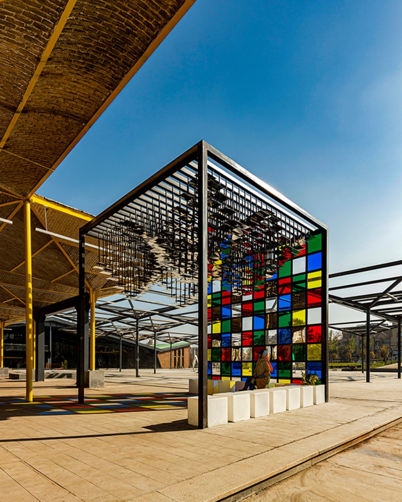
The Mirror Pavilion, located in Mashhad, Iran, sits inside a former industrial hall. That setup alone creates a tension worth paying attention to. The pavilion is a cubic structure inserted within the existing hypostyle framework, self-supporting and deliberately contrasting with its surroundings. From the base, the space feels restrained. But look up, and the whole thing shifts.

Designer: Ehsani Sharafeh Associates

The ceiling is where the real conversation happens. Rather than replicating a traditional vault, the team designed a three-dimensional sinusoidal surface formed by merging four pyramidal geometries. It’s a mouthful to describe, but the visual effect is anything but clinical. Hundreds of fragmented mirrors are arranged across this undulating surface through computational processes, catching light and redistributing it in ways that feel almost alive. Add stained glass into the mix, and the space starts producing color shifts that no static installation ever could.

Ayeneh-Kari became prominent during the Safavid period in the 16th and 17th centuries, when trade routes brought large Venetian mirrors to the Persian court. Many of them arrived cracked or broken from the long journey. Rather than discarding the damaged pieces, Iranian craftsmen cut them into smaller fragments and reassembled them into intricate decorative mosaics. Out of something broken came something extraordinary, and that origin story feels deeply embedded in what mirrors have meant to Persian design ever since. The craft was inscribed on UNESCO’s Representative List of the Intangible Cultural Heritage of Humanity in December 2025, a recognition that feels both overdue and timely given projects like this one.

Ehsani Sharafeh Associates isn’t just borrowing the aesthetic of Ayeneh-Kari and wrapping it around a contemporary shell. The team, made up of Nasrin Sharafeh, Ali Ehsani, and Milad GholamiFard, is using computational design methods to genuinely reconsider how traditional Iranian spatial principles behave in a new context. The algorithmic approach isn’t a shortcut. It’s what allows the complex geometry and patterned arrangements of the ceiling to exist at the scale and precision they do, while still feeling like a faithful extension of a much older sensibility.

That balance is harder to pull off than it looks. A lot of design that claims to honor tradition ends up either being too faithful and feeling like a replica, or too abstract and losing the thread entirely. The Mirror Pavilion manages to land somewhere in the middle, where the history is legible but the result is clearly contemporary. You can feel the ancestry of the space without it ever feeling like a museum piece.

What also stands out is the decision to place this inside an industrial hall. The contrast between the raw, utilitarian structure of the existing space and the luminous, almost otherworldly quality of the pavilion isn’t accidental. It makes both things more interesting. The industrial hall gives the mirrors context. The mirrors give the hall something to reach for.

In Persian culture, mirrors and water have long represented purity, clarity, and illumination. Reflective interiors amplified natural light and reinforced ideas about enlightenment and divine presence, which is why mirror work appears so frequently in shrines and sacred spaces. The Mirror Pavilion carries that weight without announcing it, which might be the most impressive thing about it. Some buildings describe an idea. This one embodies it.

The post Iran’s Mirror Pavilion Turns a 400-Year-Old Craft Into the Future first appeared on Yanko Design.
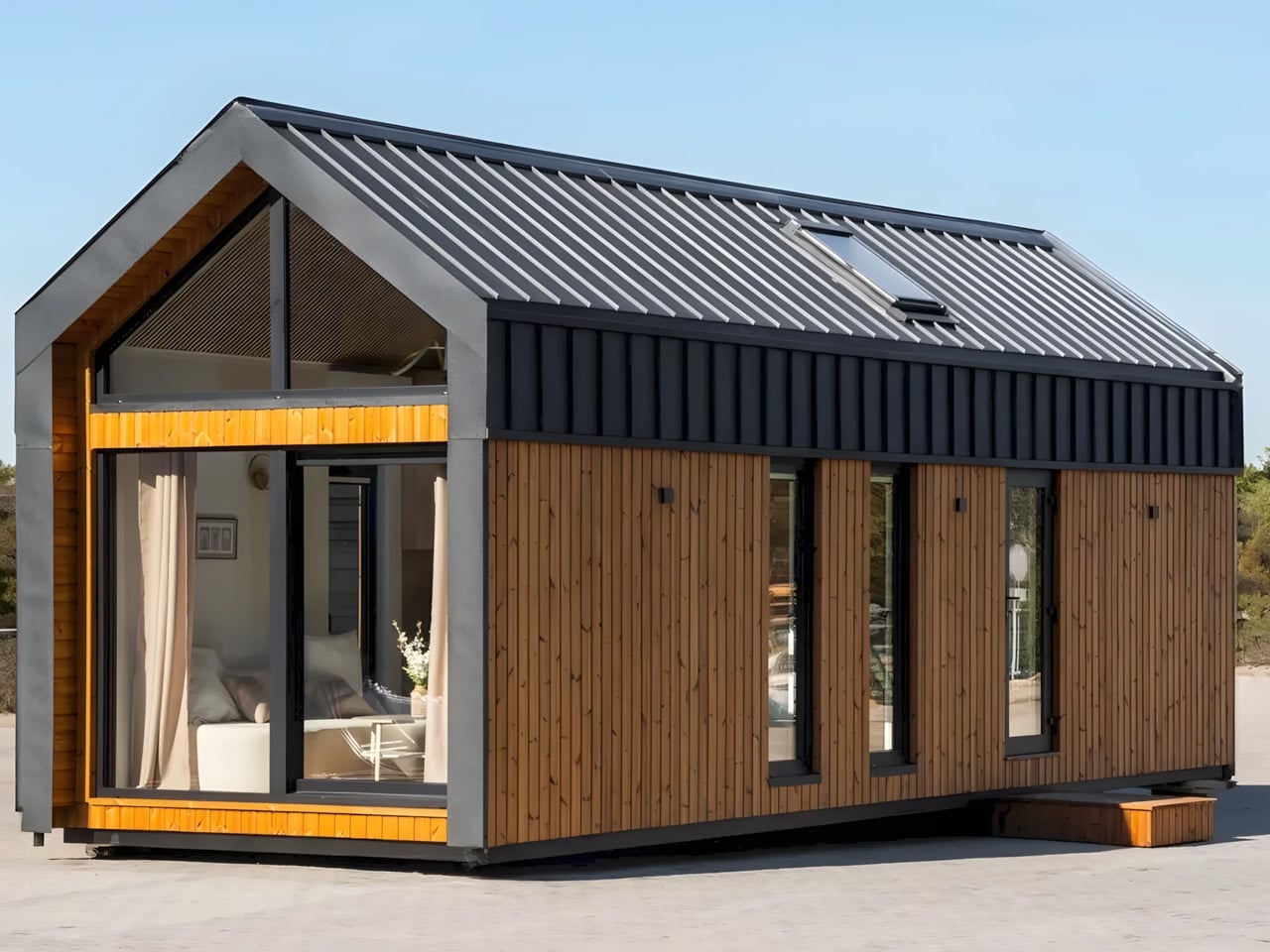
This Tiny Home Has No Wheels and That’s Exactly the Point

Craft House’s latest model arrives without wheels and makes no apology for it. The obsession with portability is slowly giving way to something more intentional, and the Lukas makes a strong case for planting roots.

The Lukas is not towable. It has no wheels, and it arrives at its destination by truck. For anyone dreaming of nomadic living, that might sound like a dealbreaker. But step inside, and the trade becomes immediately clear. What Lukas gives up in mobility, it returns in space, comfort, and a roomy interior that genuinely feels like a proper apartment.

Designer: Craft House

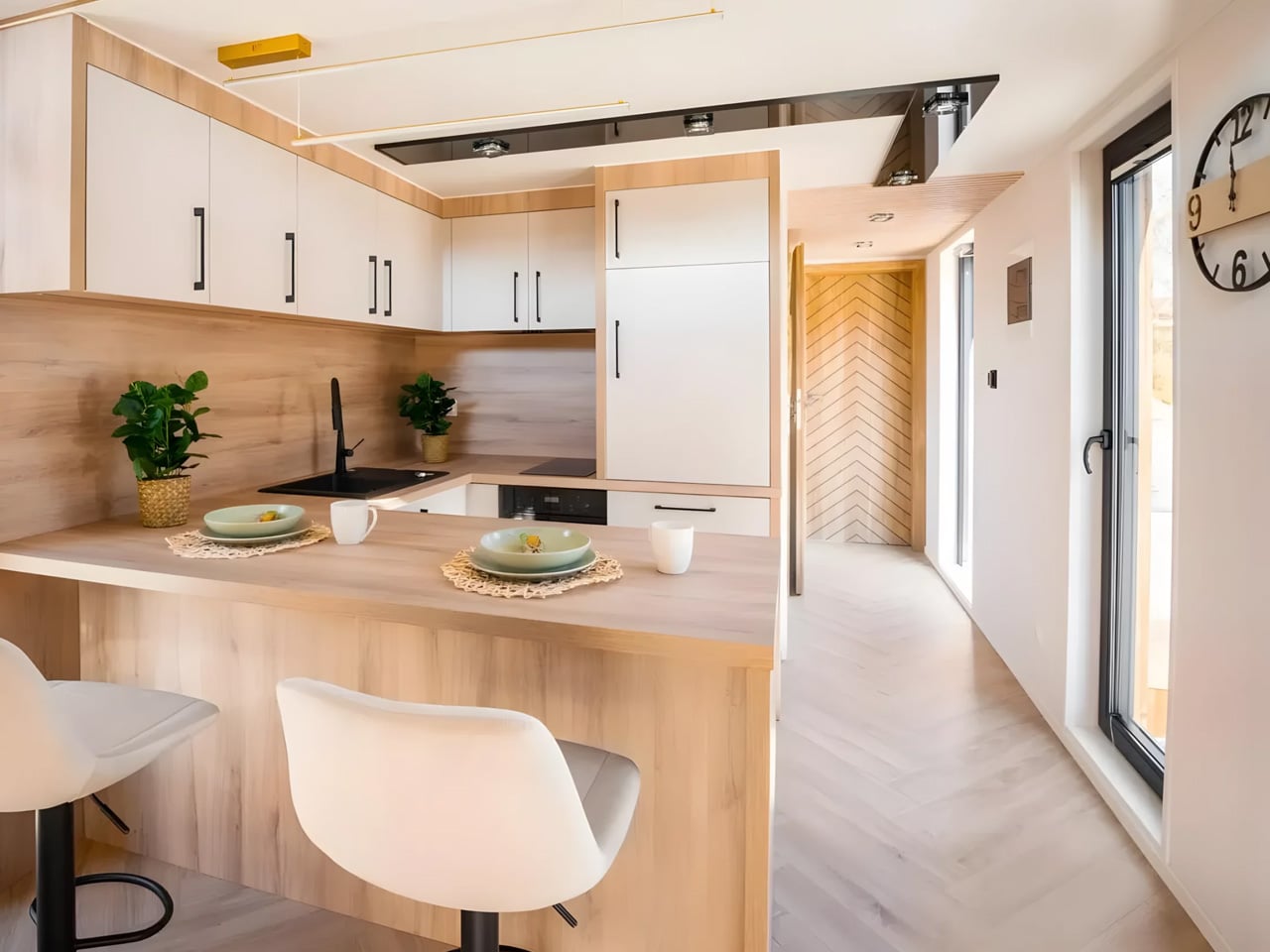
At 10 meters long and 3.5 meters wide, the Lukas sits in an interesting middle ground. It is compact enough to earn the tiny home label with a straight face, yet generous enough to sleep four people comfortably. That is no small feat for a structure of this scale, and Craft House pulls it off without compromising the refined design language that has come to define the brand across its previous models.

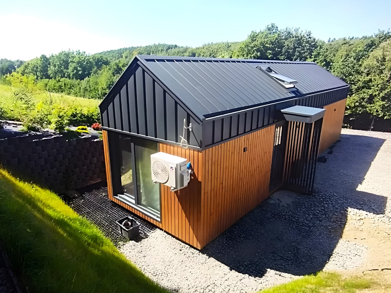
The exterior reads clean and considered. Engineered wood and standing seam aluminum make up the cladding, a material pairing that signals permanence without heaviness. It shares visual DNA with earlier Craft House models like the Katrin, though the Lukas carries a quieter confidence that comes from not needing to justify its footprint.

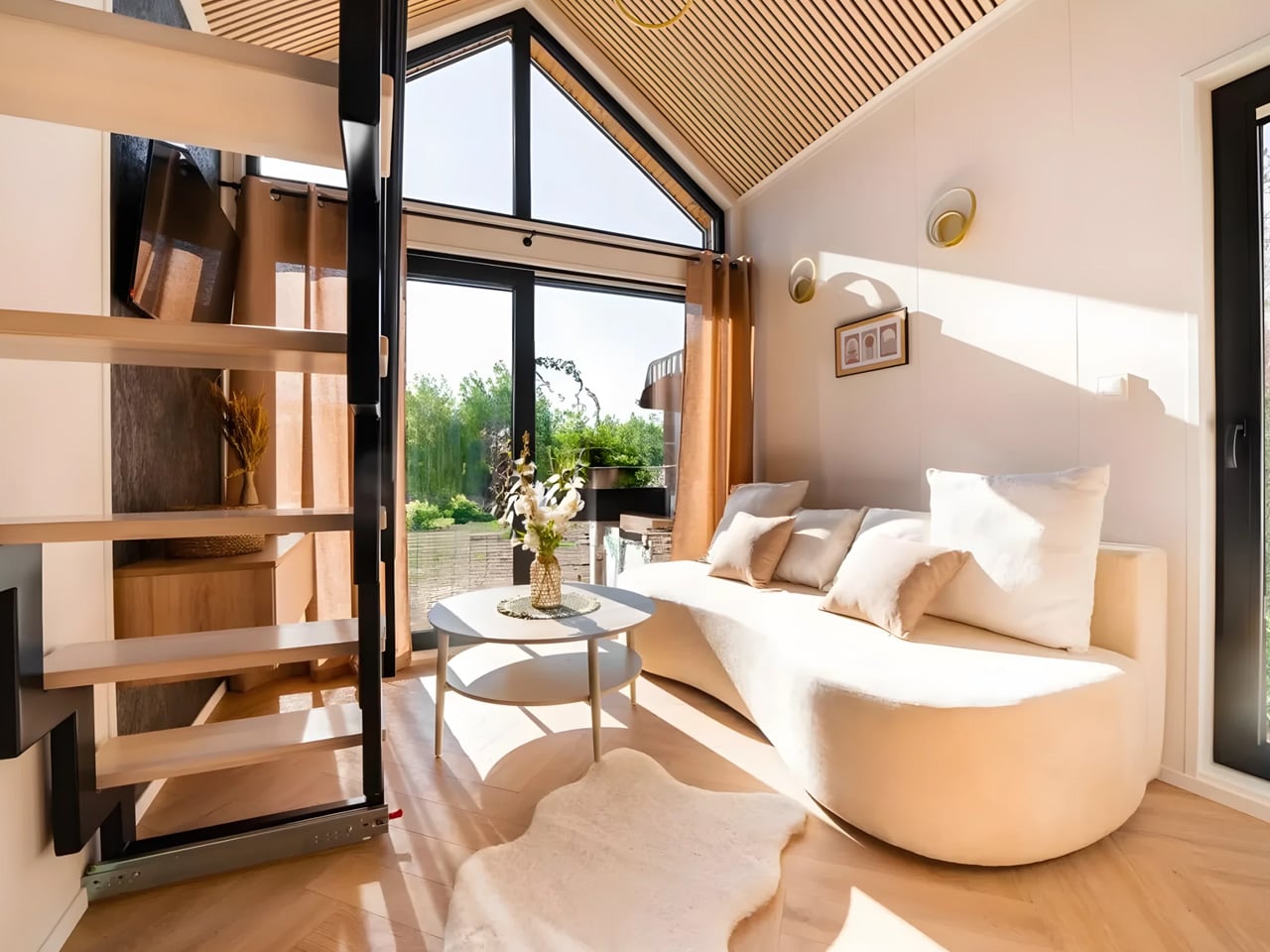
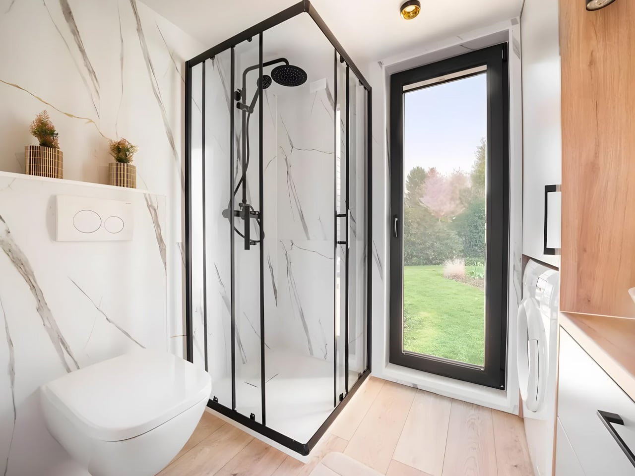
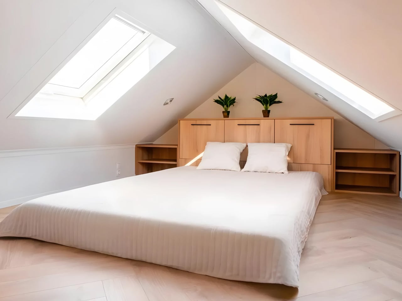
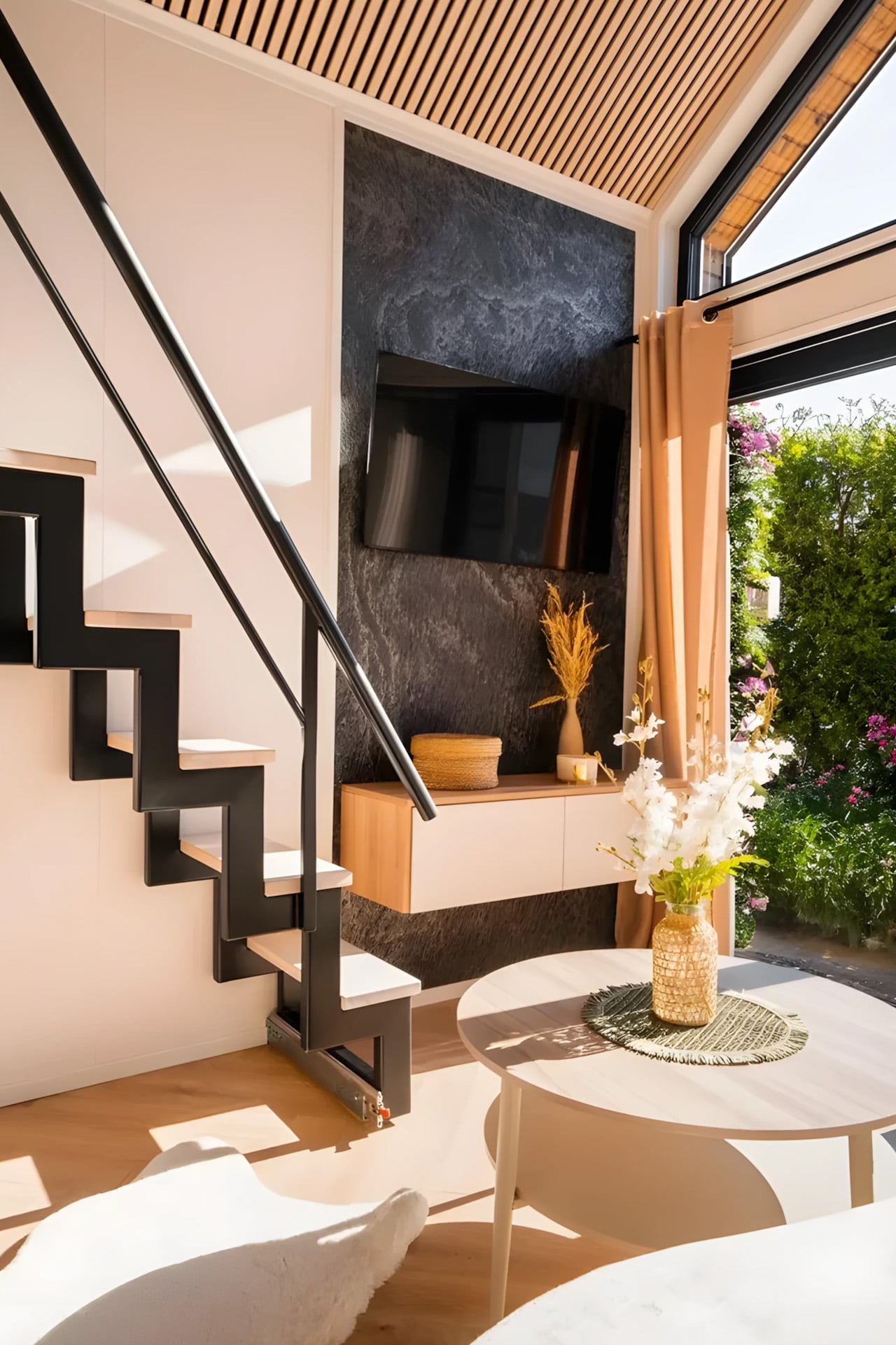
Inside, light does a lot of the work. Generous glazing runs throughout, and multiple skylights flood the space with natural brightness that makes the interior feel larger than its dimensions suggest. The kitchen is a genuine highlight, offering real cabinetry and a breakfast bar for two. This is not a kitchenette tucked into a corner. It is a proper cooking space built for everyday use, and it shows that Craft House understands what people actually need when they downsize.

Like other models in the Craft House lineup, the Lukas is built to order, which means buyers can shape it to their needs. An outdoor terrace is available as an optional extra, and those wanting full independence from the grid can opt for a complete off-grid package, making it viable as a permanent, fully independent residence in almost any location.

Pricing starts at roughly $88,000 USD. For a structure of this quality, finish, and livability, that number is competitive. Delivery timelines are not publicly listed at this time, so those seriously interested are encouraged to reach out to Craft House directly to discuss lead times and configuration options. The Lukas will not suit everyone. But for those willing to let go of the fantasy of endless movement, it offers something arguably more valuable: a small home that actually feels like one.

The post This Tiny Home Has No Wheels and That’s Exactly the Point first appeared on Yanko Design.
The Urban Gable Park Is What Happens When a Tiny Home Builder Stops Making Compromises

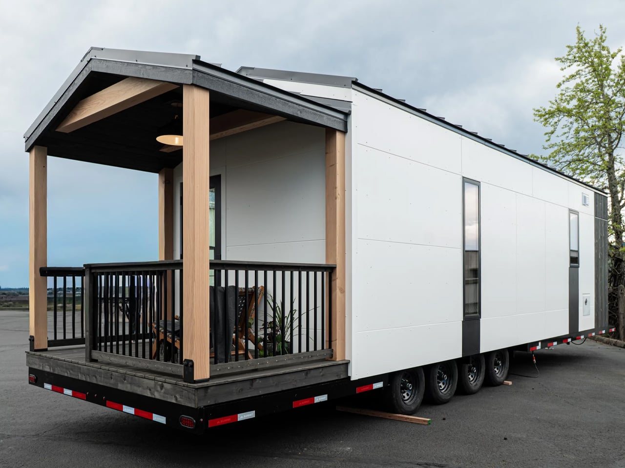
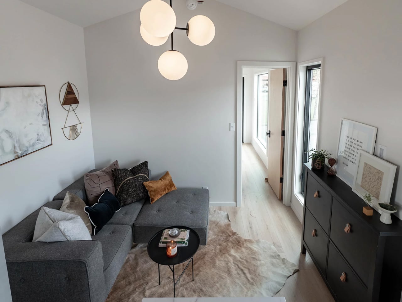
There’s a version of tiny home living that asks you to give things up…headroom, counter space, the dignity of a real kitchen. The Urban Gable Park by Tru Form Tiny isn’t that version. This is a single-level park model that leans fully into comfort, using its generous footprint to deliver something closer to a well-designed apartment than a life lived sideways.
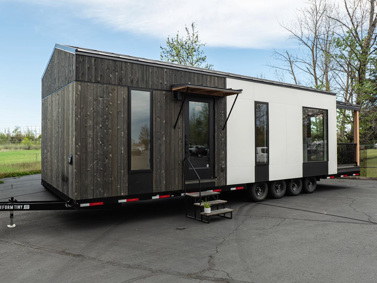
The numbers tell part of the story. At 30 ft long and 11 ft wide, the Urban Gable Park goes significantly beyond the standard 8.5 ft width found in most tiny homes on wheels. That extra width isn’t just a spec, it changes how the interior feels. Rooms breathe. The bedroom has real headroom. The living area fits an actual sofa without everything feeling like a puzzle. The trade-off is a permit requirement for towing on public roads, but given that this is a park model built to stay put, that’s rarely a concern.

Designer: Tru Form Tiny

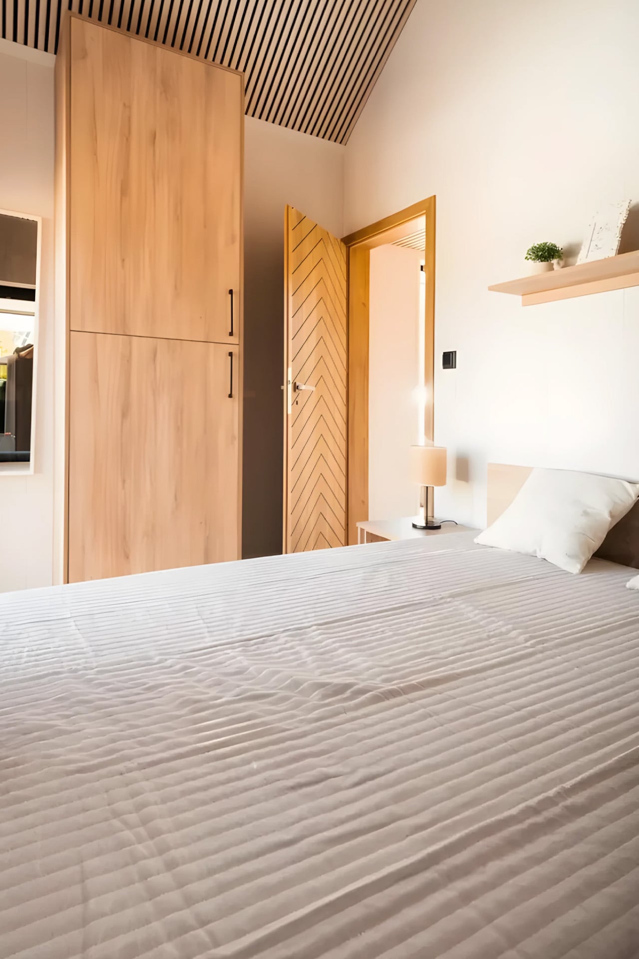
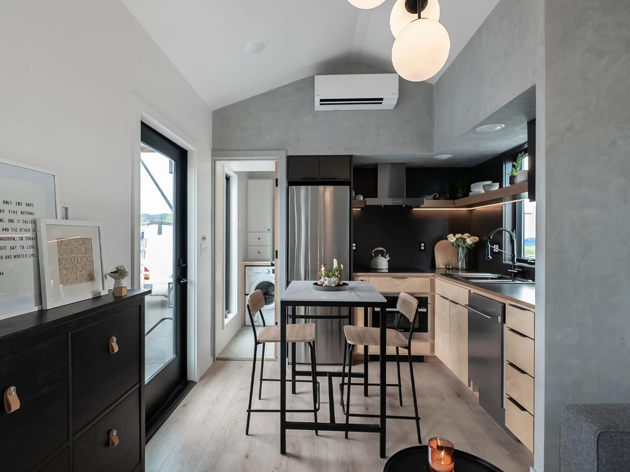
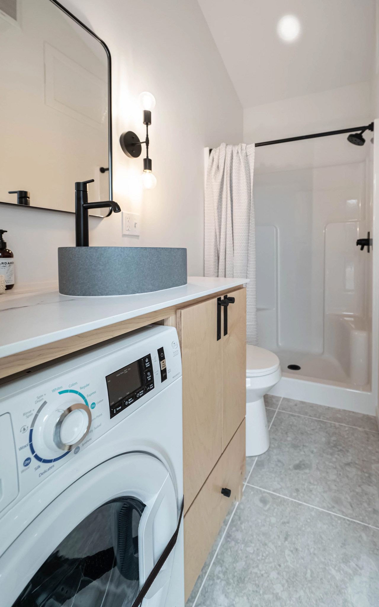
The design language throughout is clean and considered. The kitchen is fully equipped with maple slab cabinets, an induction cooktop, a full-size fridge, and a dishwasher, all tucked into a striking limewash alcove. It’s the kind of kitchen that makes cooking feel intentional rather than improvised. The bathroom holds its own too. A concrete vessel sink, terrazzo tile floors, and matte black fixtures run throughout, alongside a walk-in shower and a stacked washer/dryer. These aren’t budget compromises dressed up to look good. They’re material choices made by people who know what they’re doing.

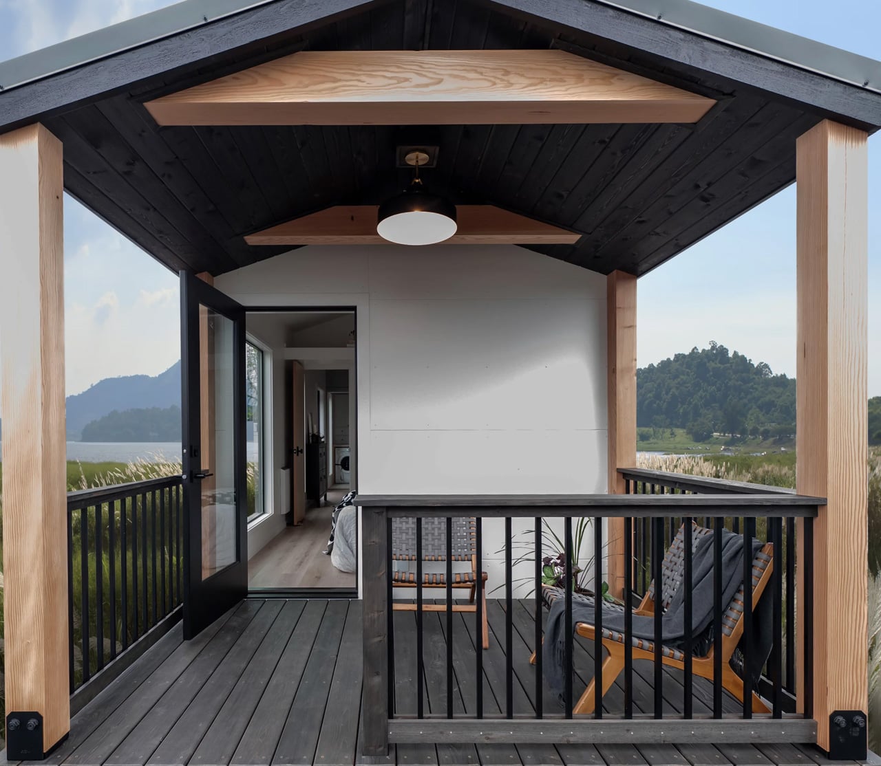
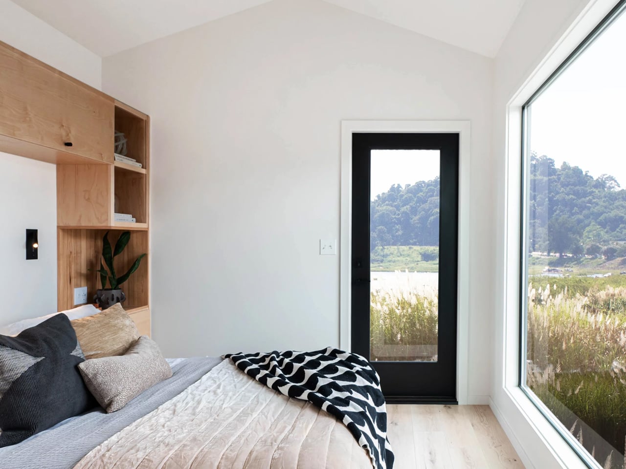
The layout is built for two. The bedroom features deck access, offering a private outdoor connection that’s rare at this scale. A full-light black fiberglass entry door anchors the exterior alongside the home’s gable roofline; simple, architectural, and confident. A covered porch rounds out the outdoor living space, giving the Urban Gable Park a residential quality that most park models simply don’t reach.

Built on a quad-axle trailer, the Urban Gable Park is currently available starting at $174,000. For a home this refined and this livable, that figure starts to make a certain kind of sense. Tru Form Tiny, now celebrating its 10th year as a builder, has always understood that downsizing shouldn’t mean downgrading. The Urban Gable Park is the clearest proof of that philosophy yet.

The post The Urban Gable Park Is What Happens When a Tiny Home Builder Stops Making Compromises first appeared on Yanko Design.