The Knoll Is a Tiny House That Finally Refuses to Think Small

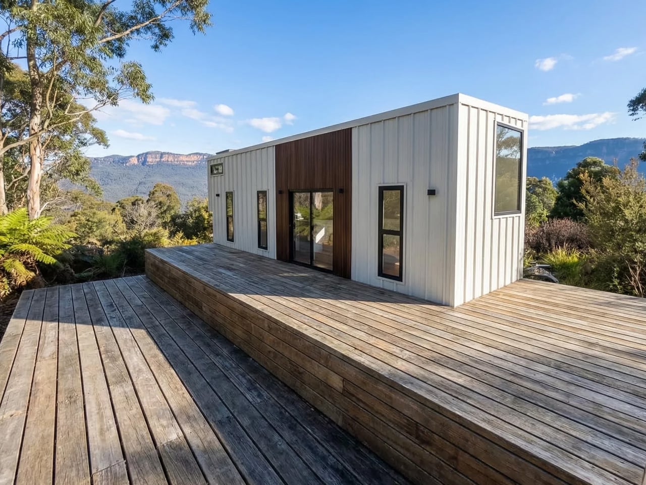
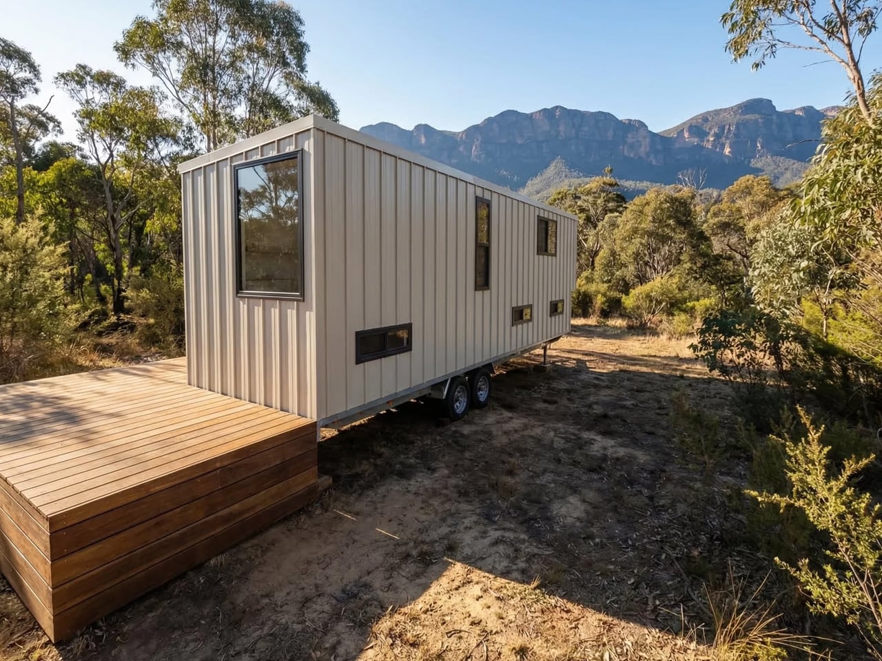
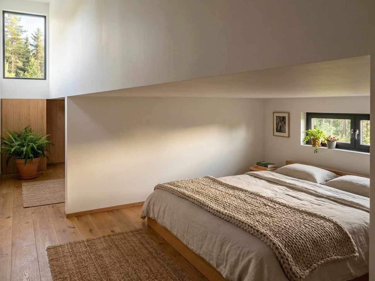
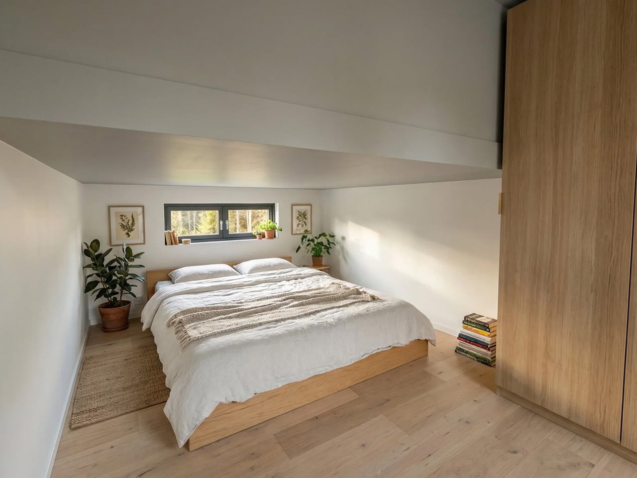
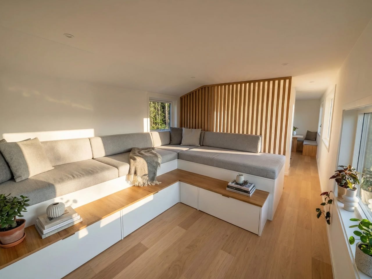
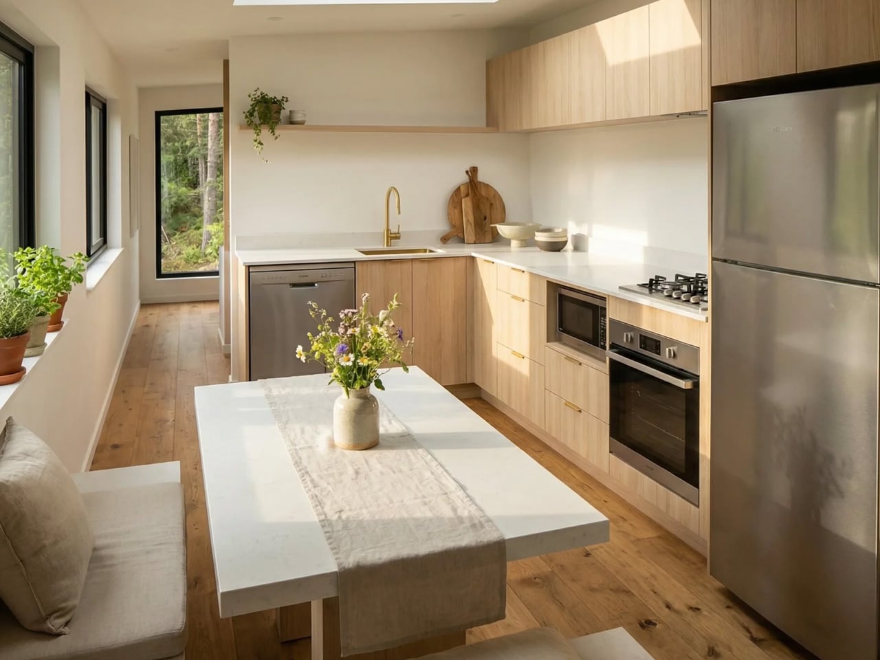
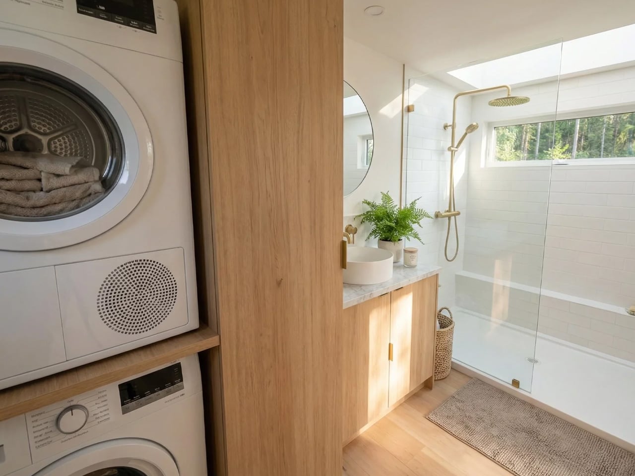
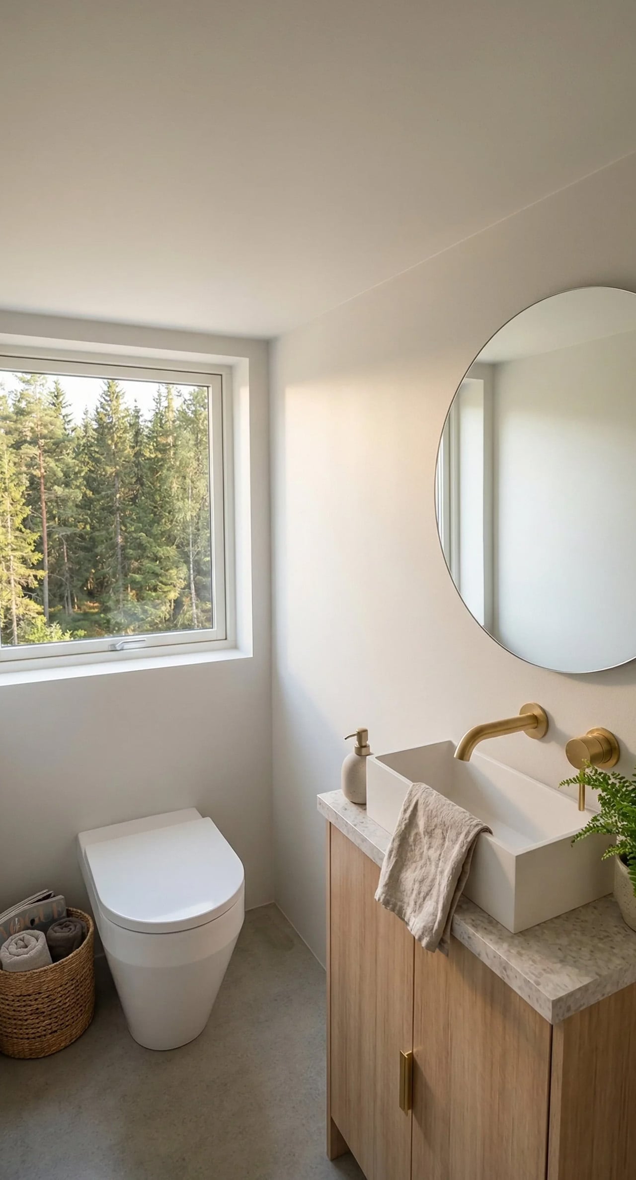
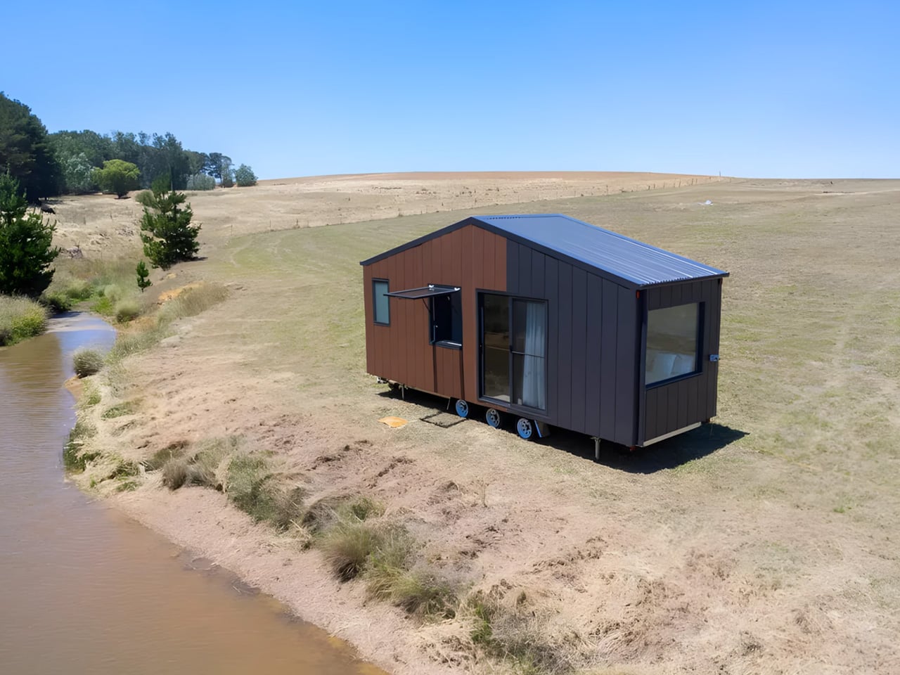
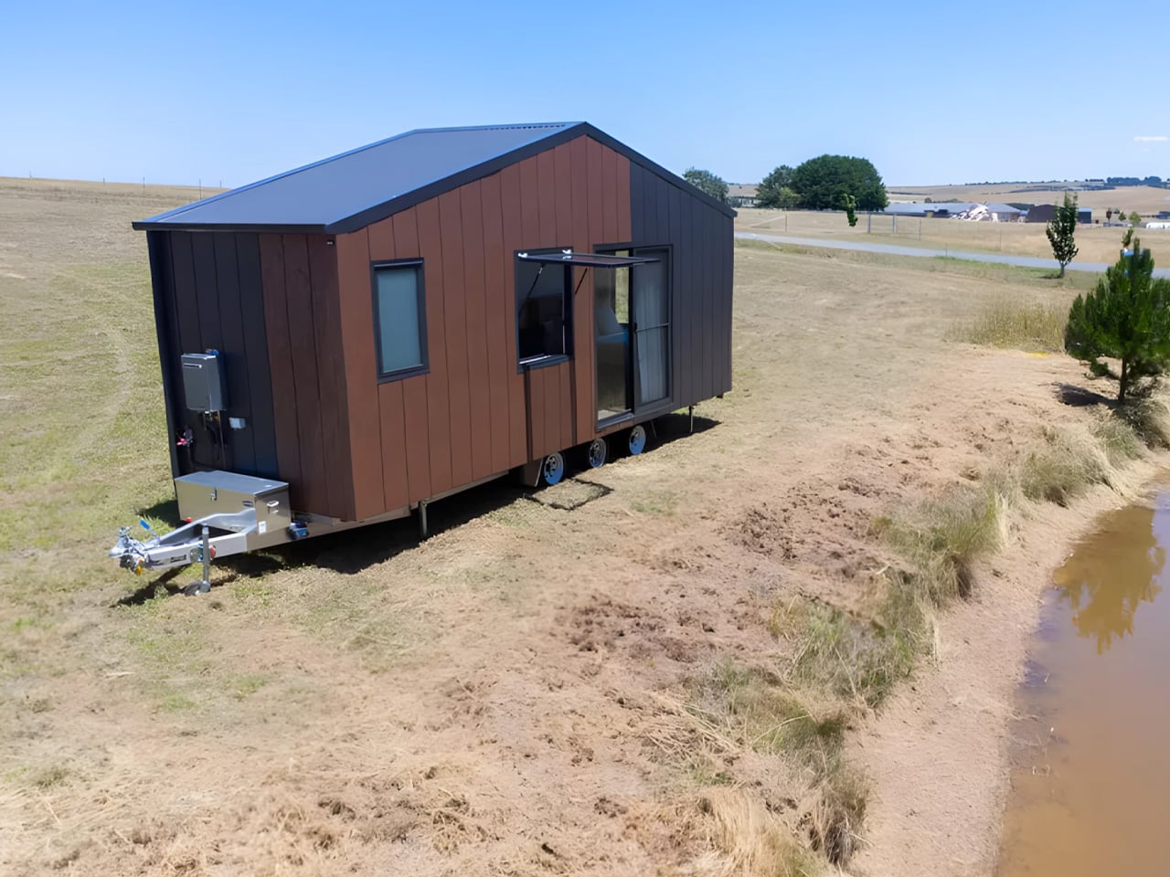
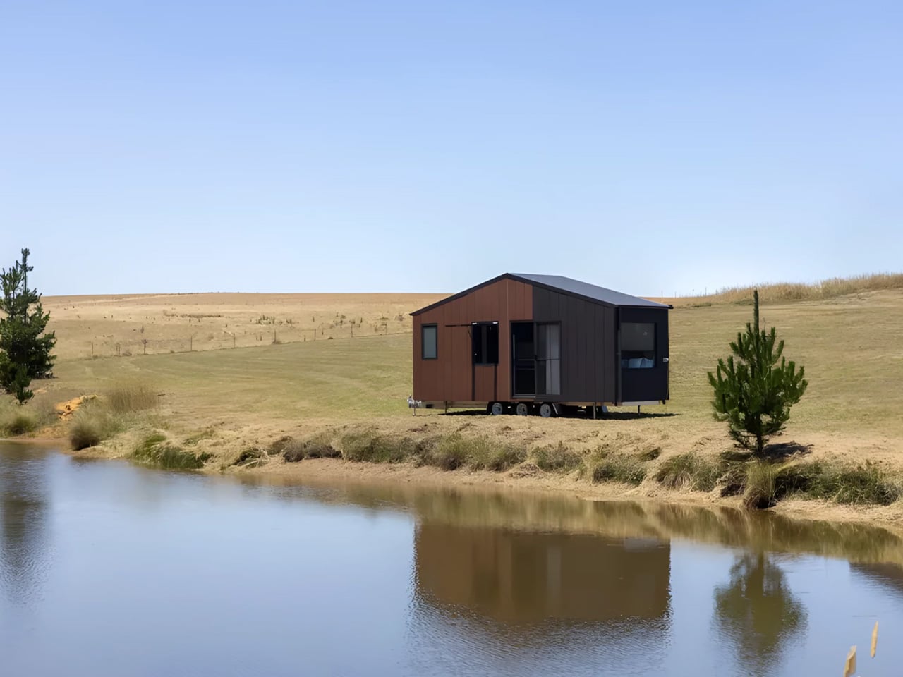
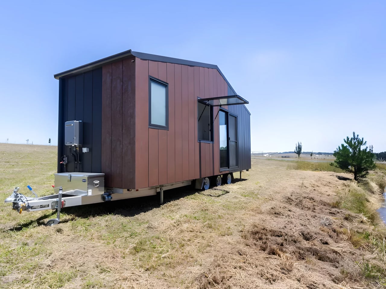
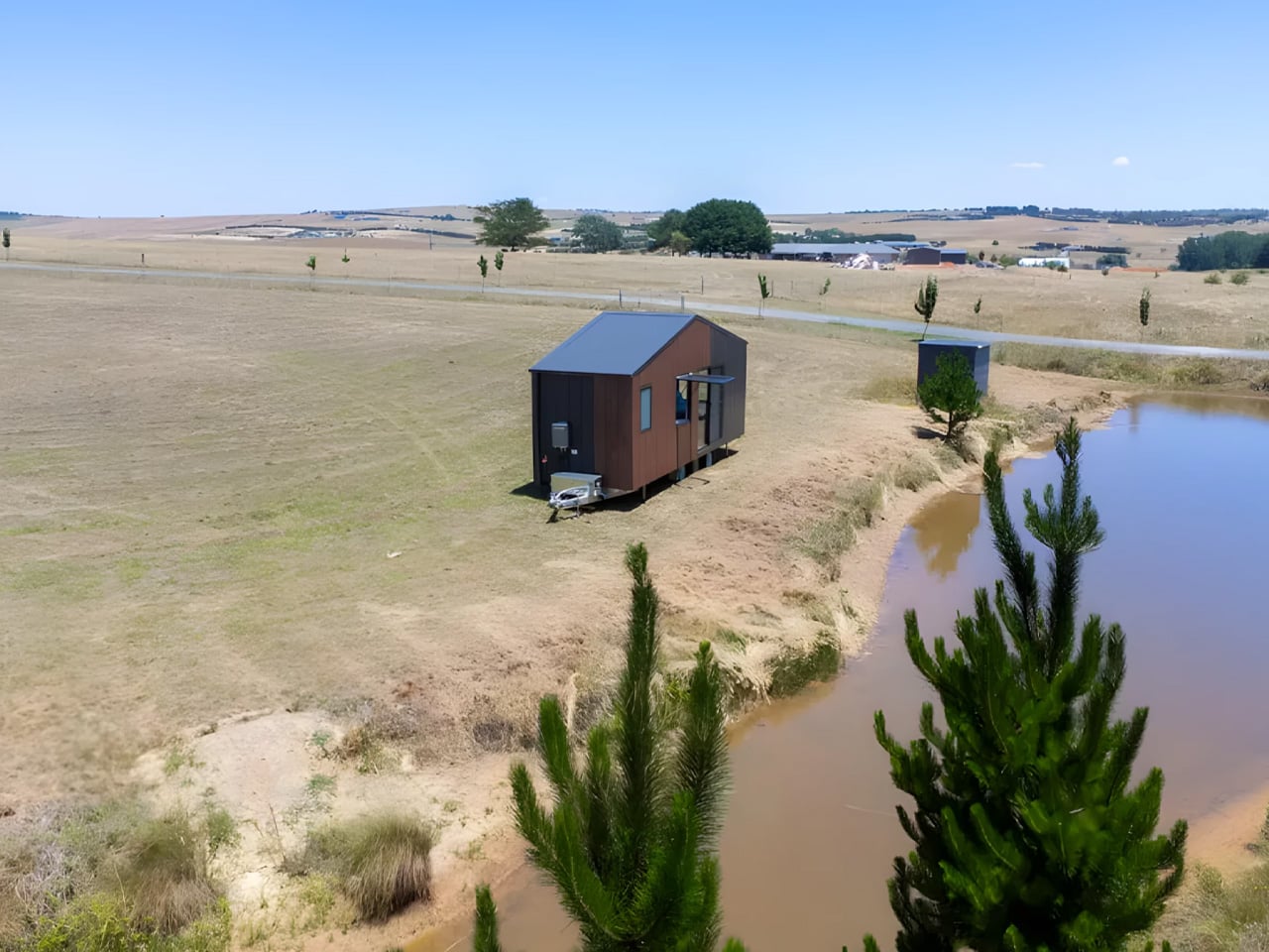
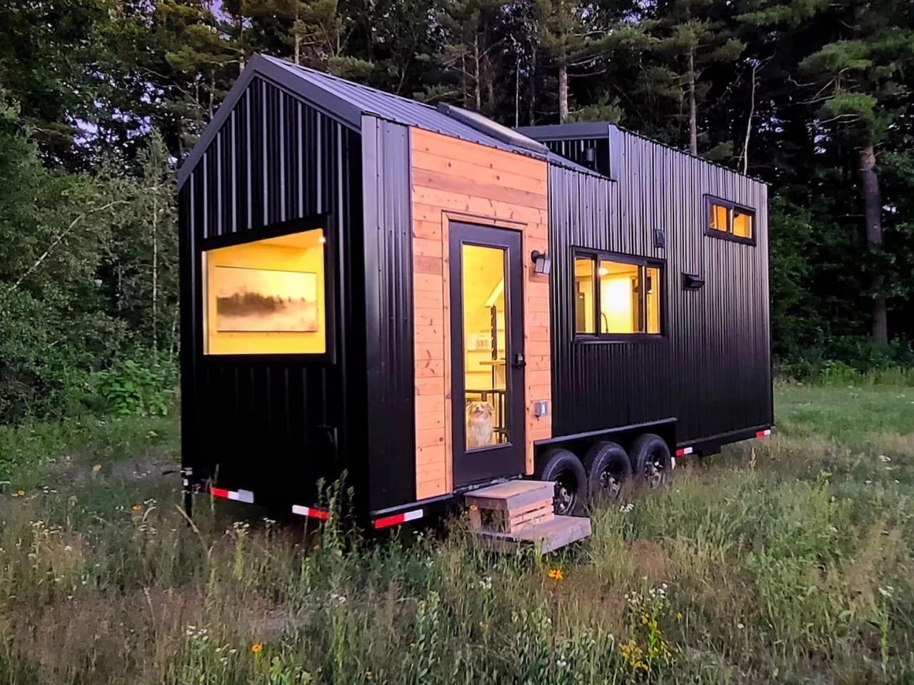
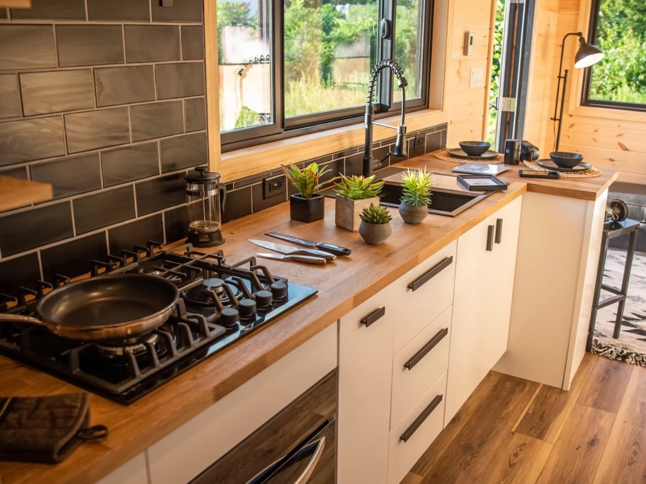
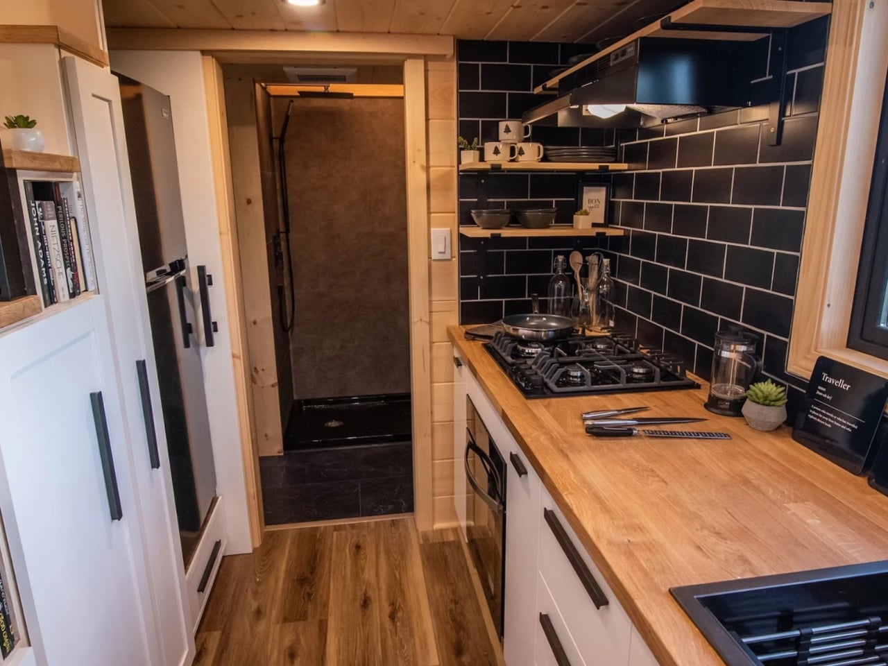
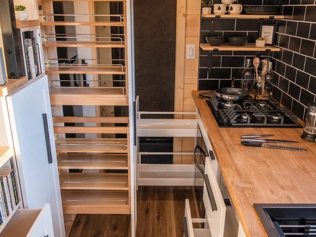
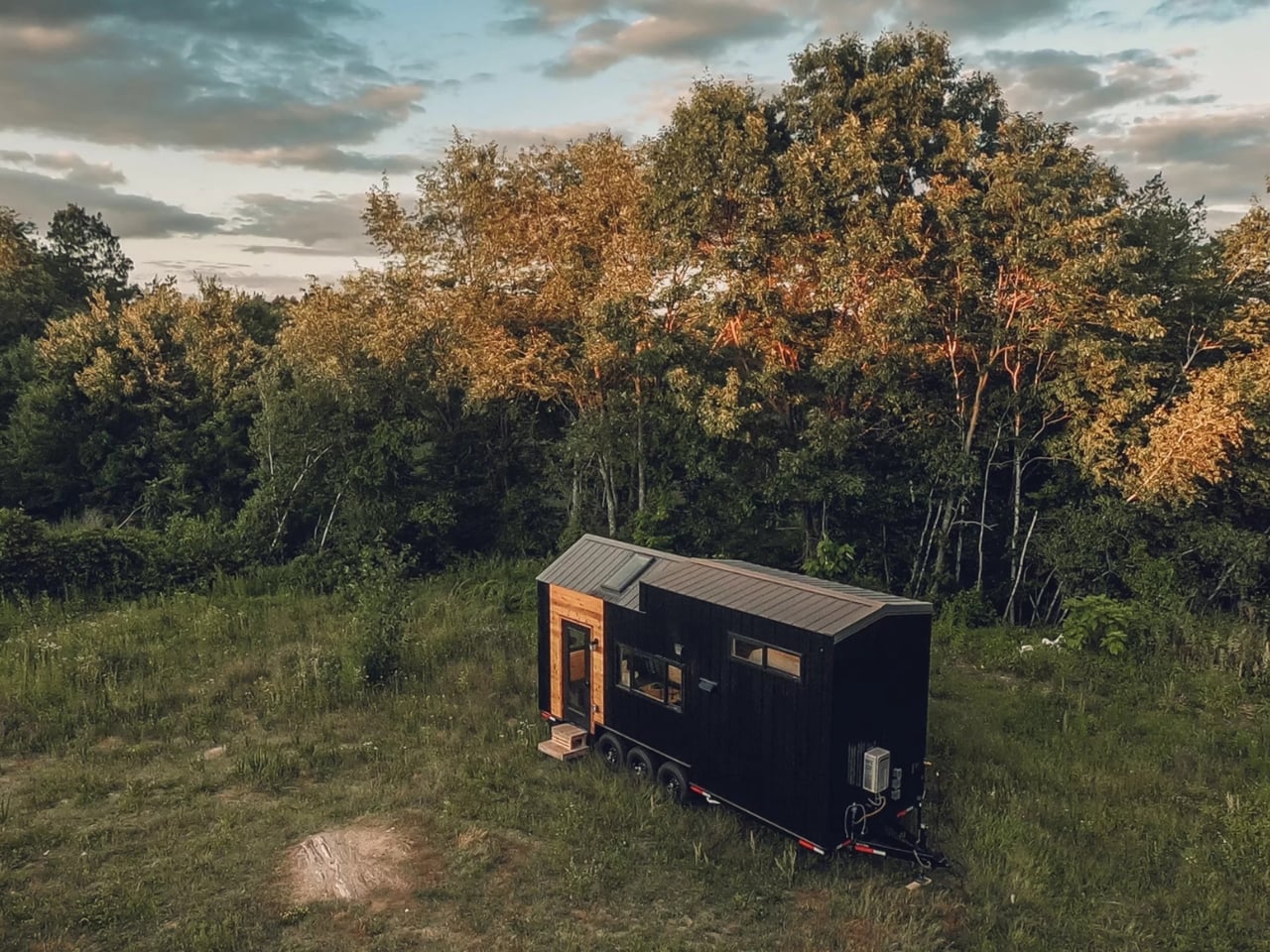
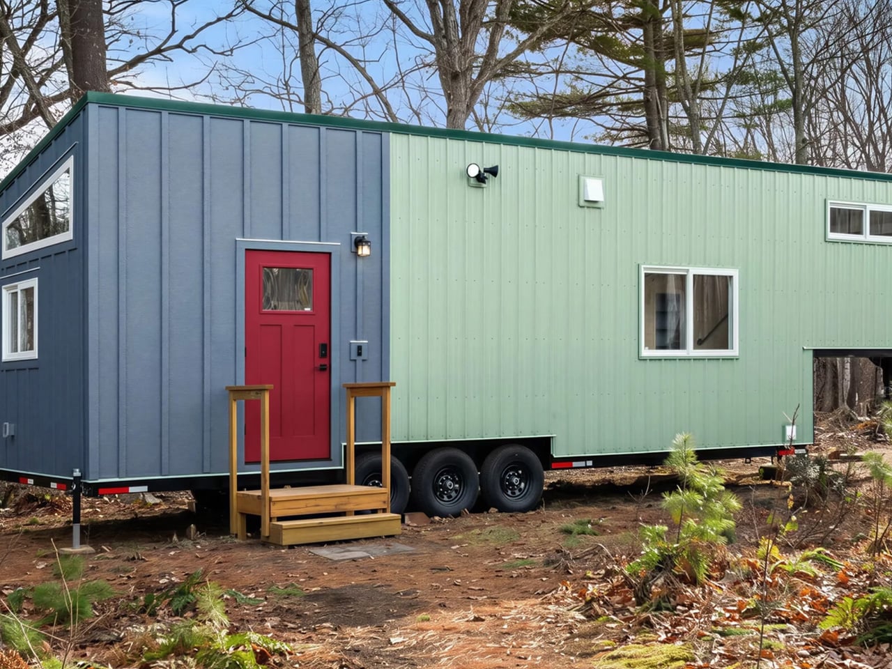
Tiny house living has always asked one thing of its converts: sacrifice. Less square footage, less storage, less room to breathe. The Knoll, the latest model from Backcountry Tiny Homes, pushes back on that idea — and does so with a lot of personality. Built on a triple-axle gooseneck (raised) trailer, the Knoll stretches 38 feet long and 10 feet wide, giving it 390 square feet of total living space.

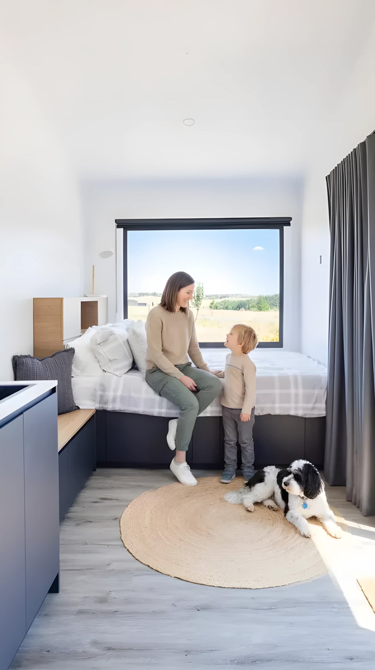
That extra foot and a half of width over standard tiny homes makes a real difference inside — the layout feels less like a camper van and more like a proper apartment. It’s wide enough to sleep between one and five people, which makes it a genuine option for couples or small families who want to downsize without completely giving up comfort. The trade-off is that its width requires a permit to tow on public roads — a logistical consideration, but one most buyers seem willing to accept.

Designer: Backcountry Tiny Homes

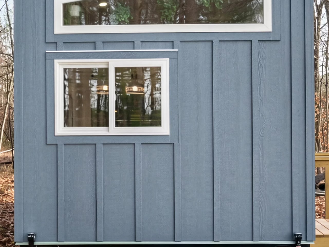
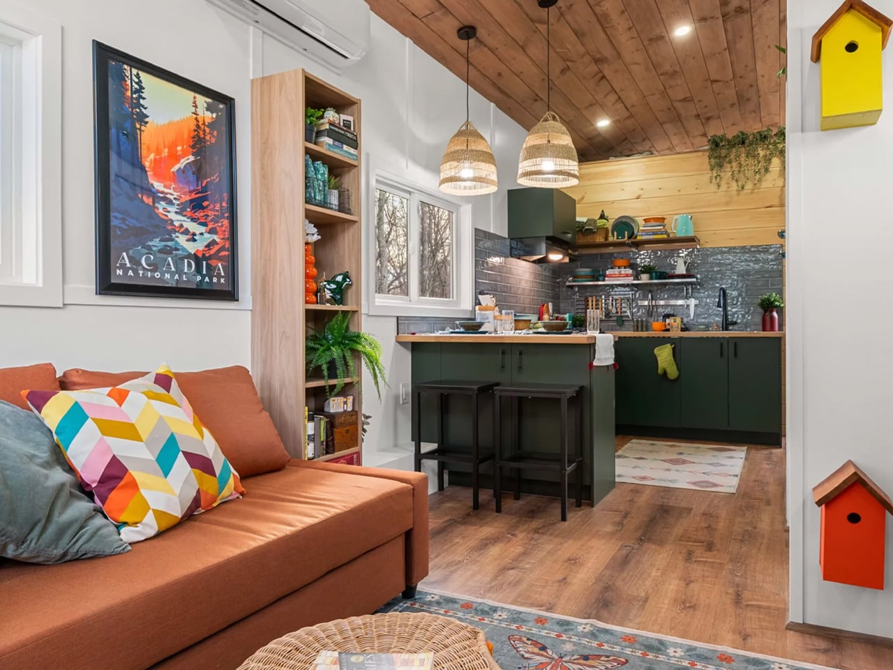
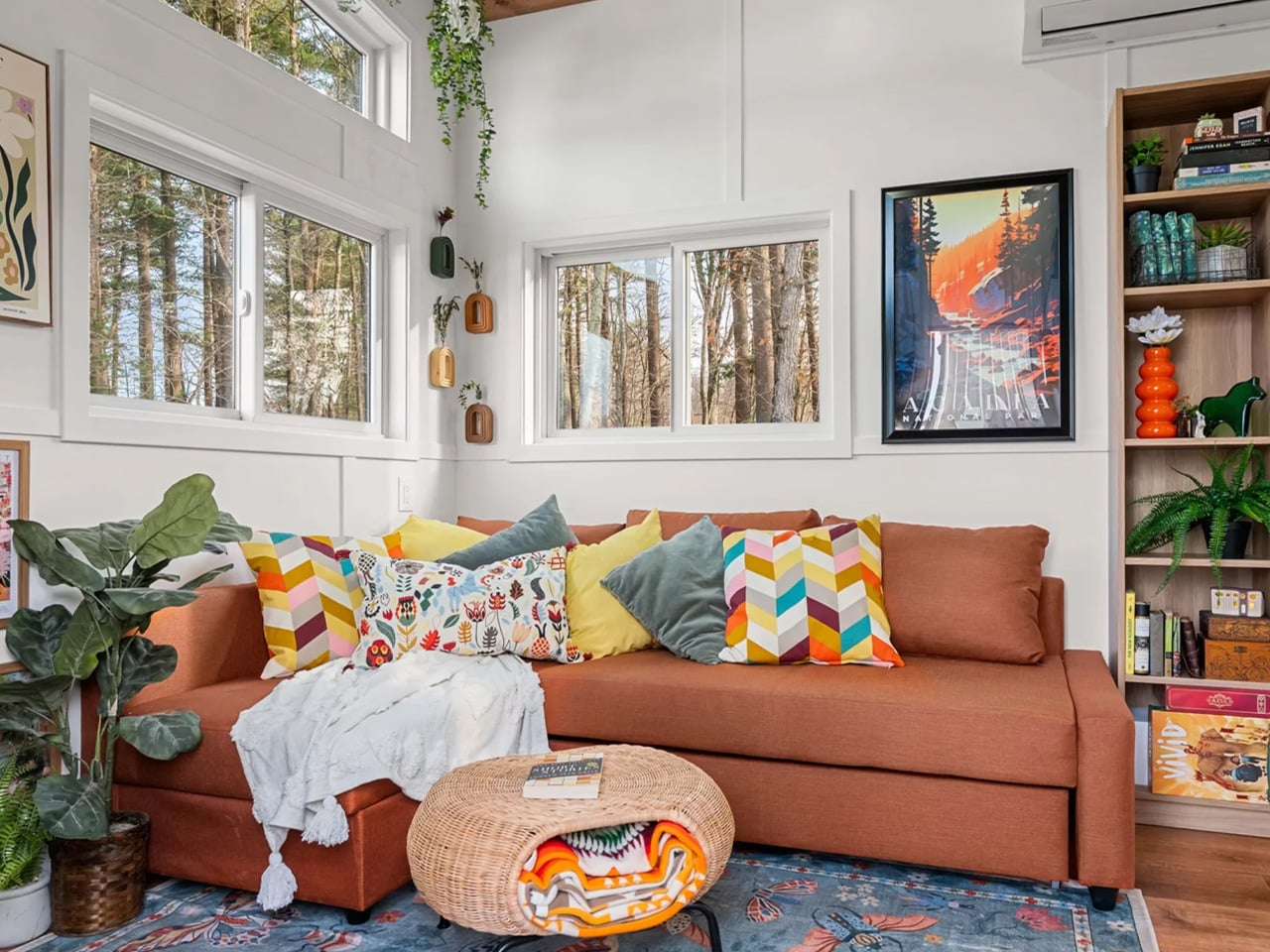
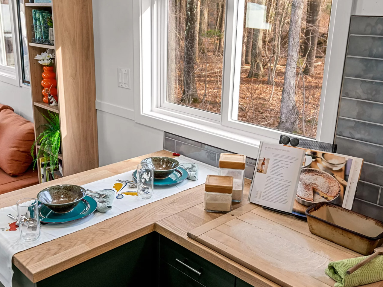
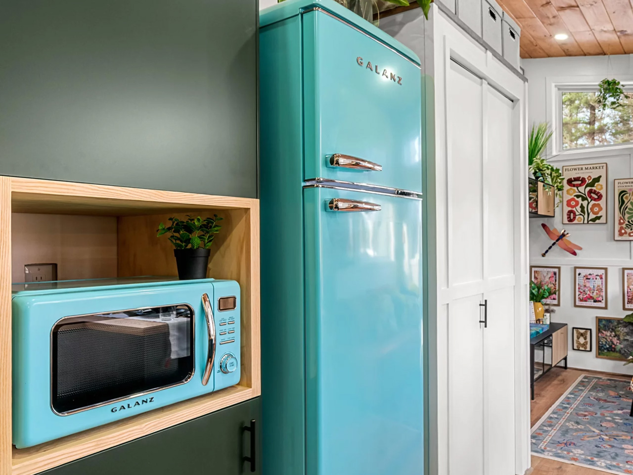
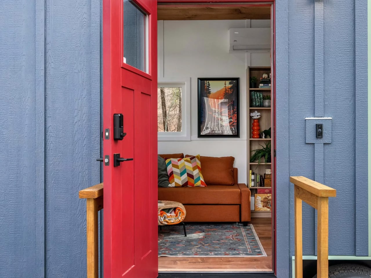
The exterior sets the tone early. A two-tone mix of metal and board and batten siding sits beneath a metal roof, giving the Knoll a sharp, modern look that reads more mountain cabin than mobile home. Inside, the design team leaned into color — boldly. The home’s interior philosophy is captured in a quote right on the Backcountry website: *”Color does not add a pleasant quality to design — it reinforces it.”* That commitment shows in every room, with rich, layered tones that make the space feel intentional rather than improvised.

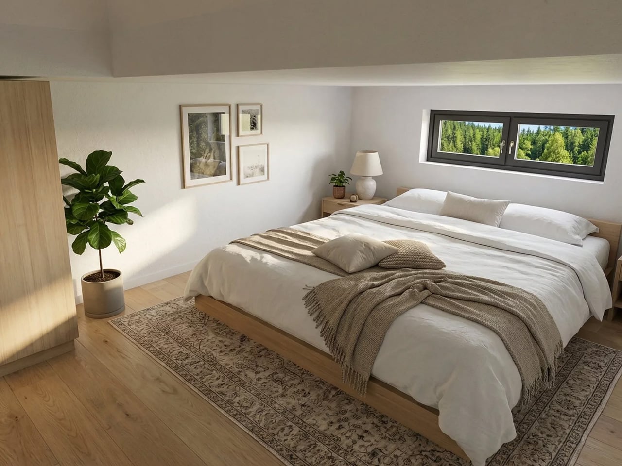
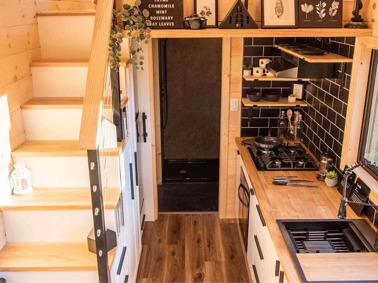
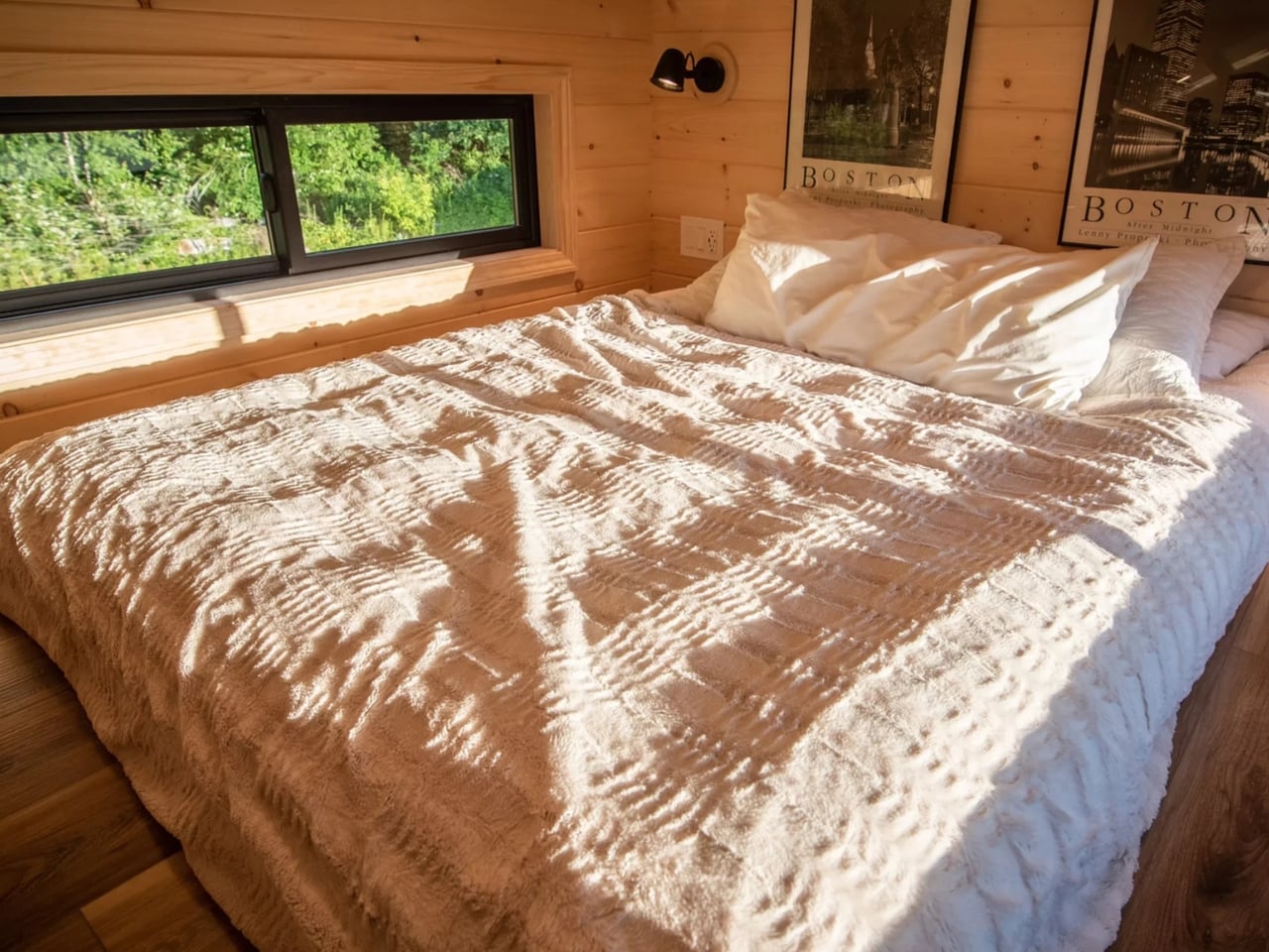
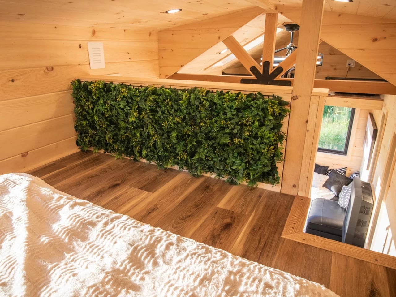
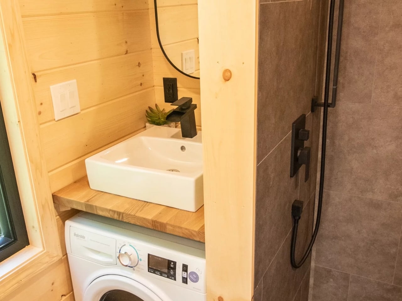
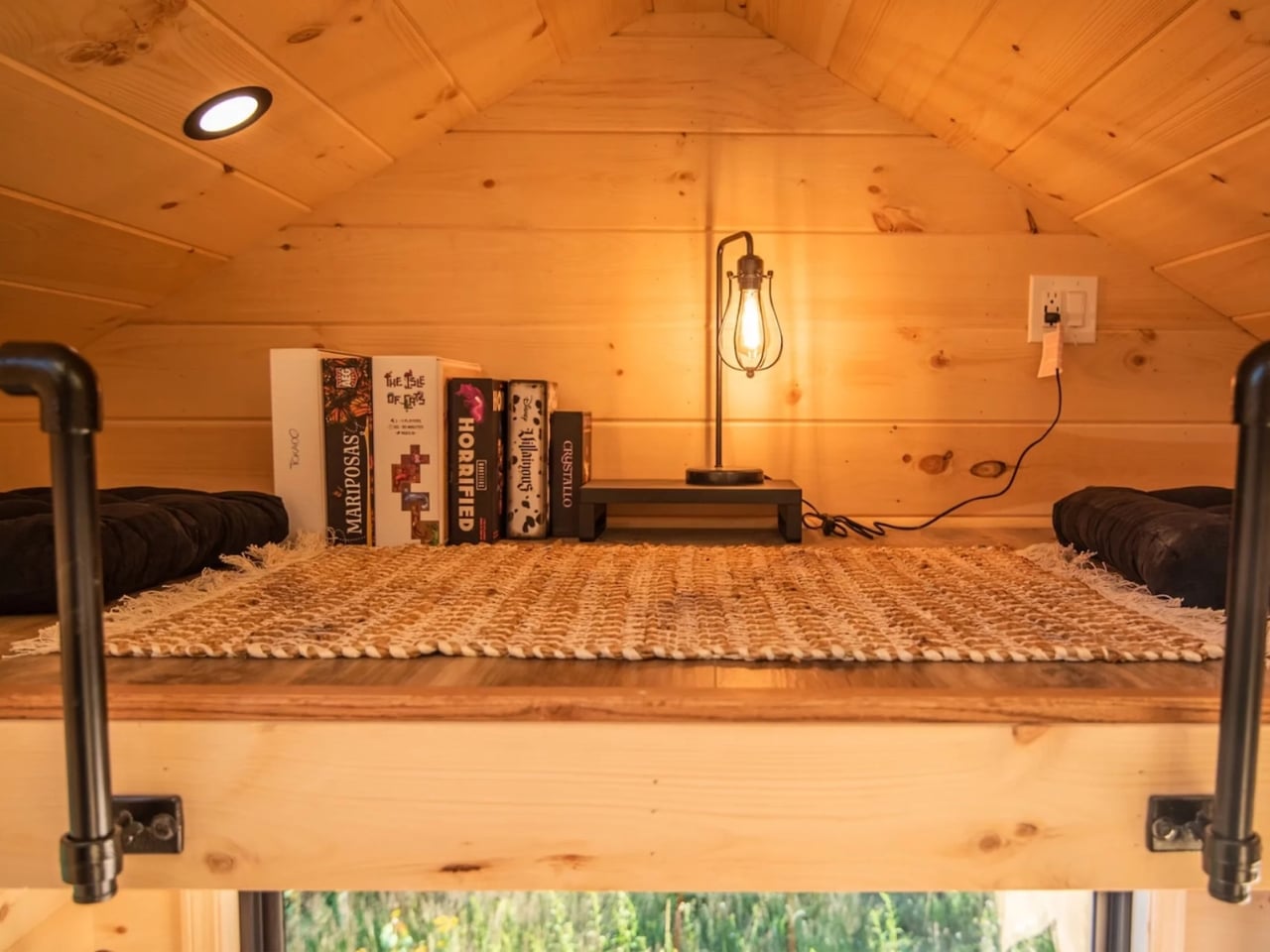
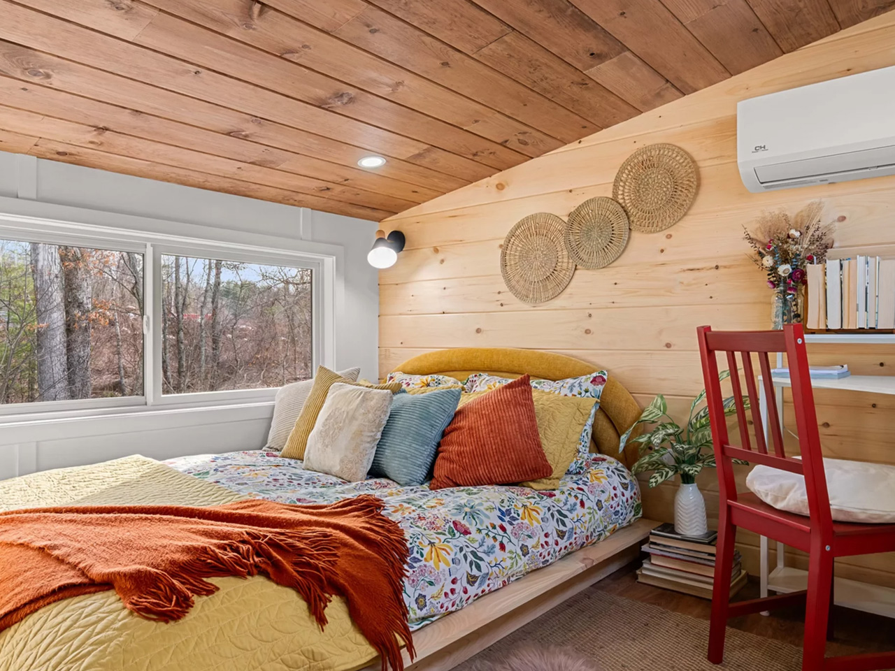
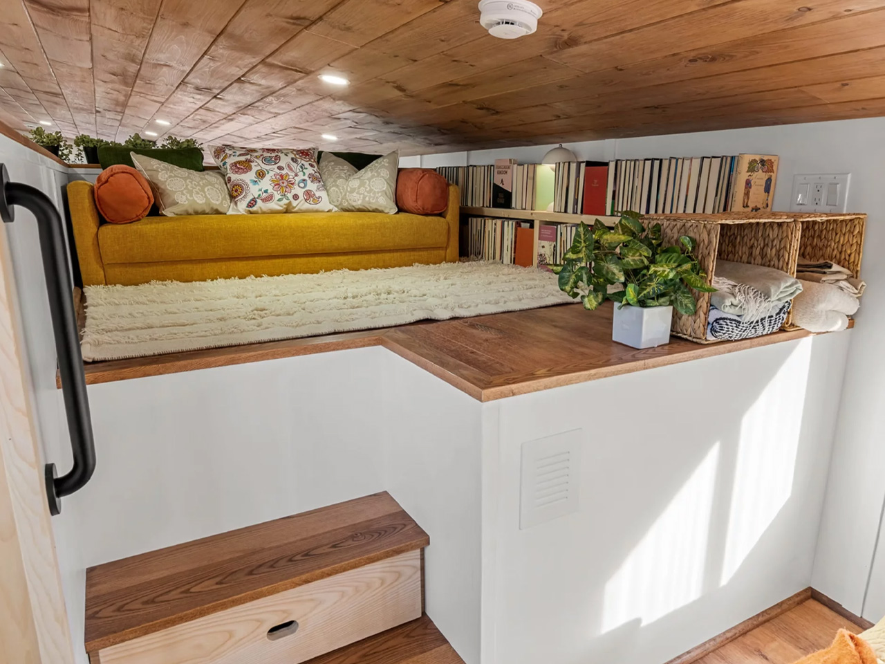
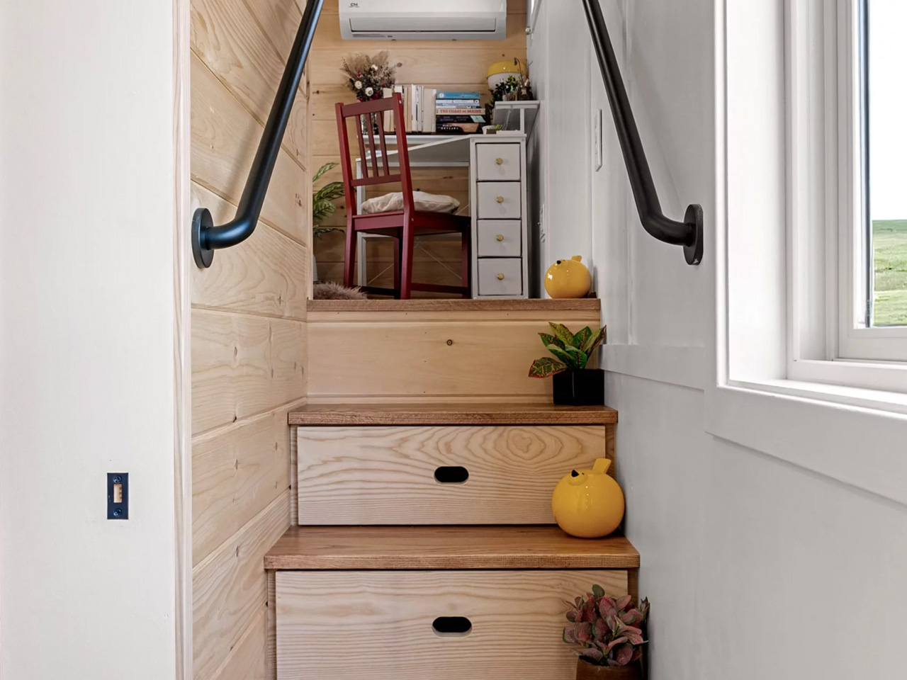
The floor plan is where things get genuinely clever. The main level handles the kitchen and living area, while the full-height gooseneck loft above serves as the primary bedroom — a queen-size bed, a desk, and a chair for working from home. From there, storage-integrated steps lead to a second, lower-ceilinged library loft, fitted with a long bookcase and a single sleeper sofa. It’s a rare thing in tiny living — a dedicated reading nook. The home also includes washer and dryer hookups, making it a fully functional permanent residence rather than a glorified weekend retreat.

All configurations come NOAH certified. Pricing runs $162,950 for the fully furnished turnkey version, $155,250 for the unfurnished option (which still includes the kitchen and bathroom), and $81,475 for the shell build for those who want to finish the interior themselves. The Knoll doesn’t try to hide what it is. It’s a small home — but it’s a real one, built for people who want to live smaller without feeling like they settled.

The post The Knoll Is a Tiny House That Finally Refuses to Think Small first appeared on Yanko Design.

The Restaurant Made of Mud and Marine Waste Is Drop-Dead Gorgeous

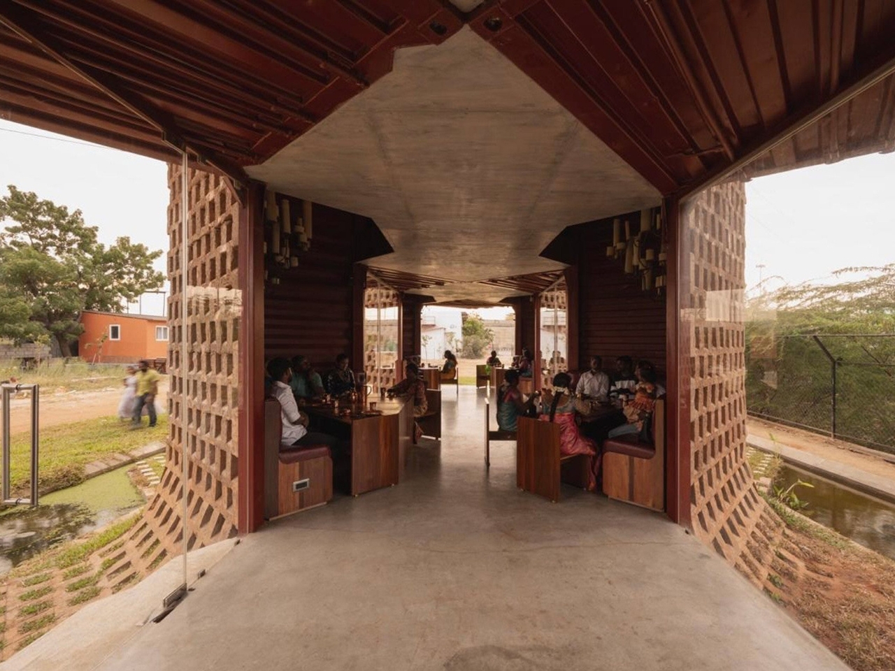
When you hear “shipping container restaurant,” you probably picture a food truck-adjacent setup with exposed steel walls and Edison bulb string lights. Petti, a restaurant in Tuticorin, Tamil Nadu, is nothing like that. Designed by Indian studio Wallmakers, it is one of those rare projects that makes you stop and ask why we haven’t been doing this all along.

Tuticorin is a port city, and like most port cities, it has a very specific kind of visual language. Industrial, gritty, layered with the residue of trade. Discarded shipping containers are a common sight there, stacked along waterfronts and left to rust once their working lives are over. For most people, they’re background noise. For Wallmakers’ founder Vinu Daniel and his co-architect Oshin Mariam Varughese, they were a starting point.

Designer: Wallmakers

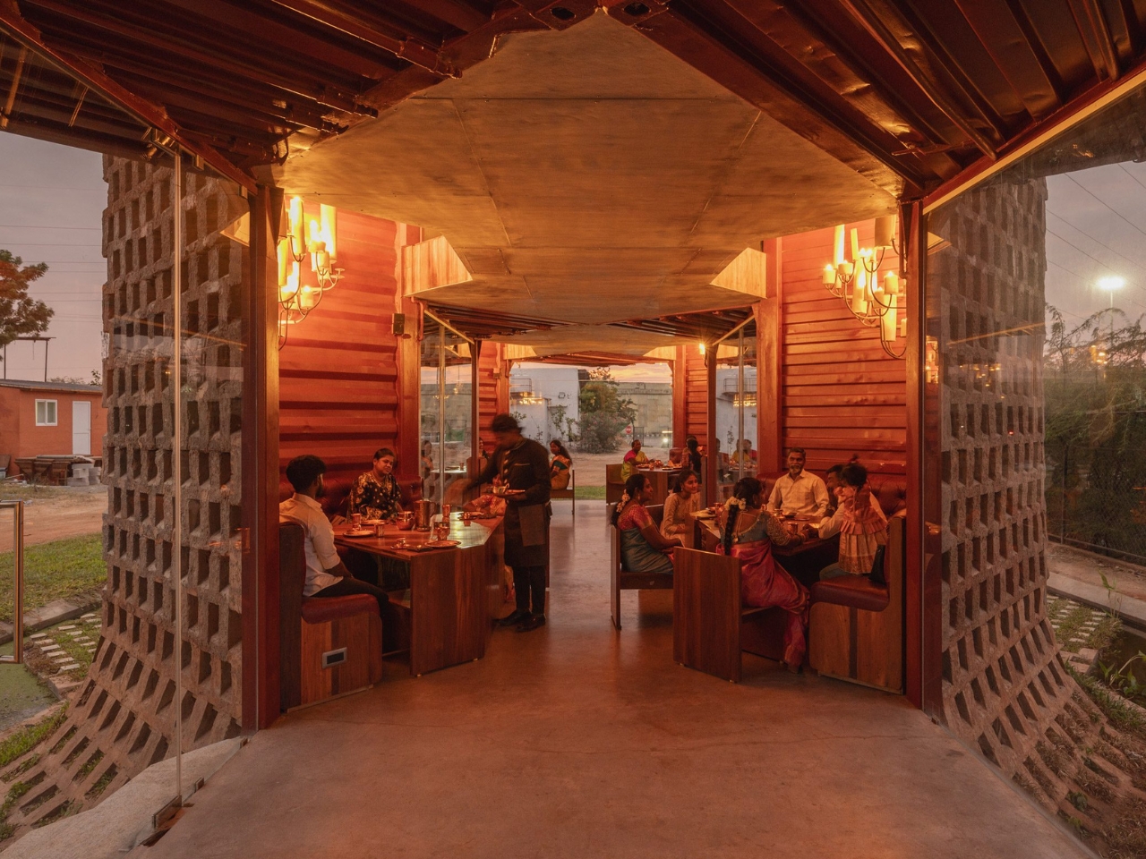
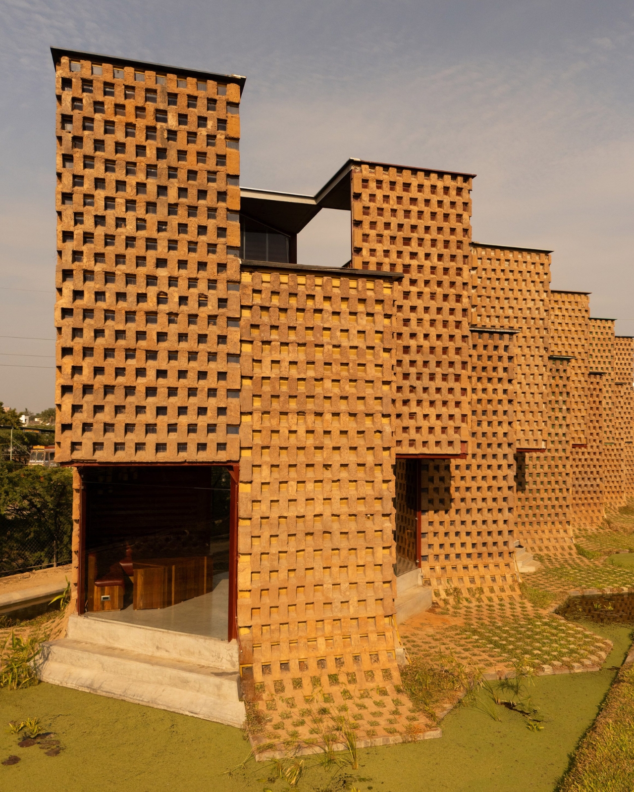
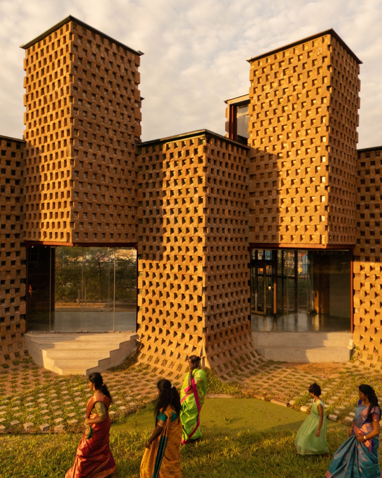
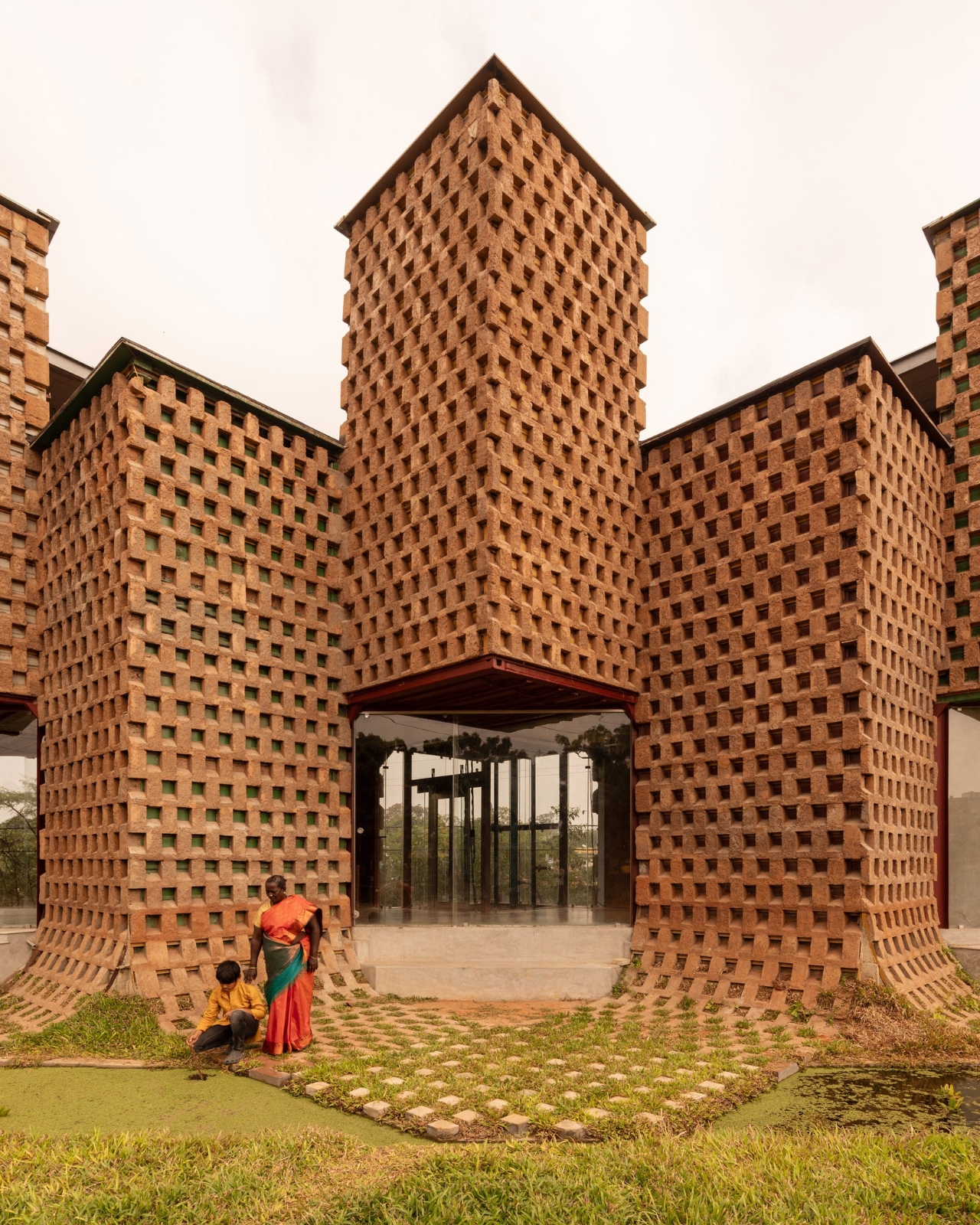
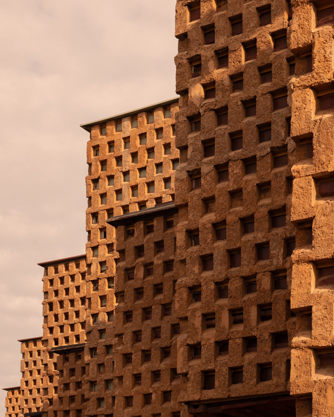
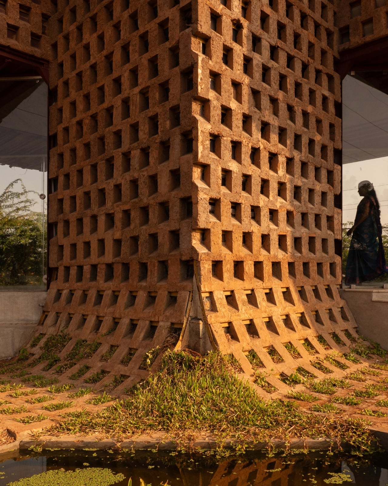
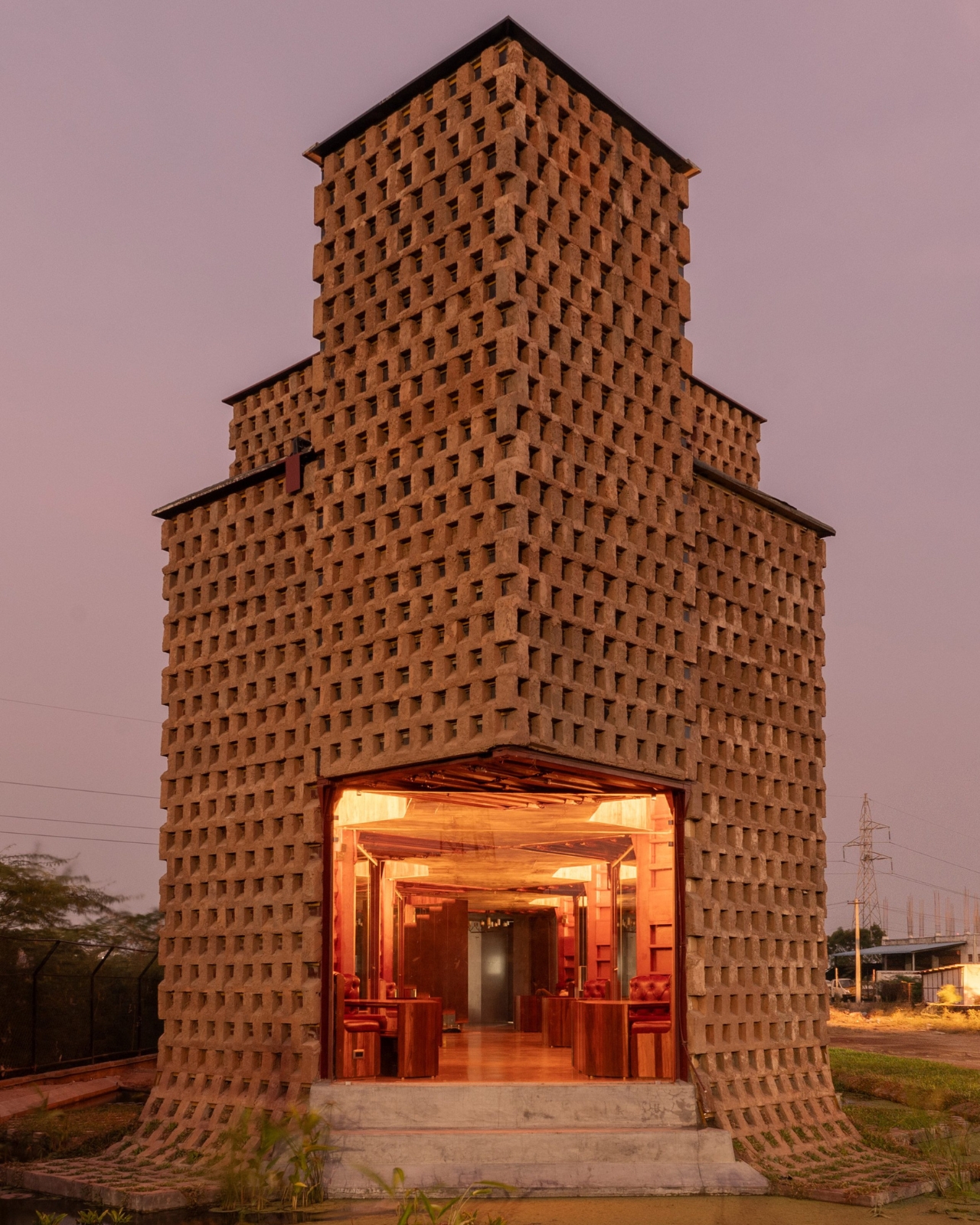
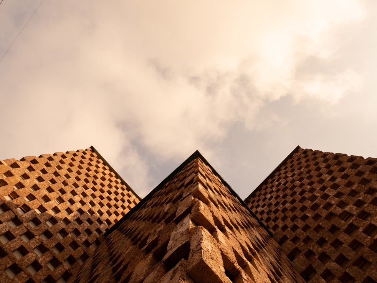
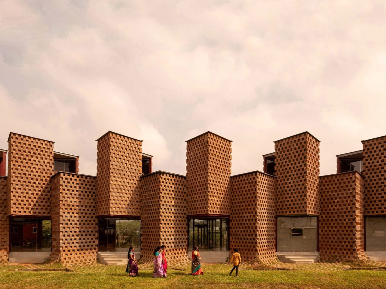
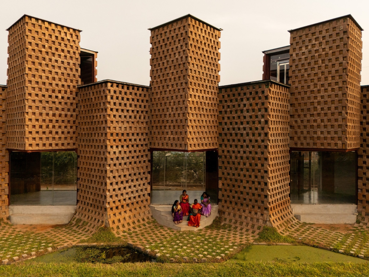
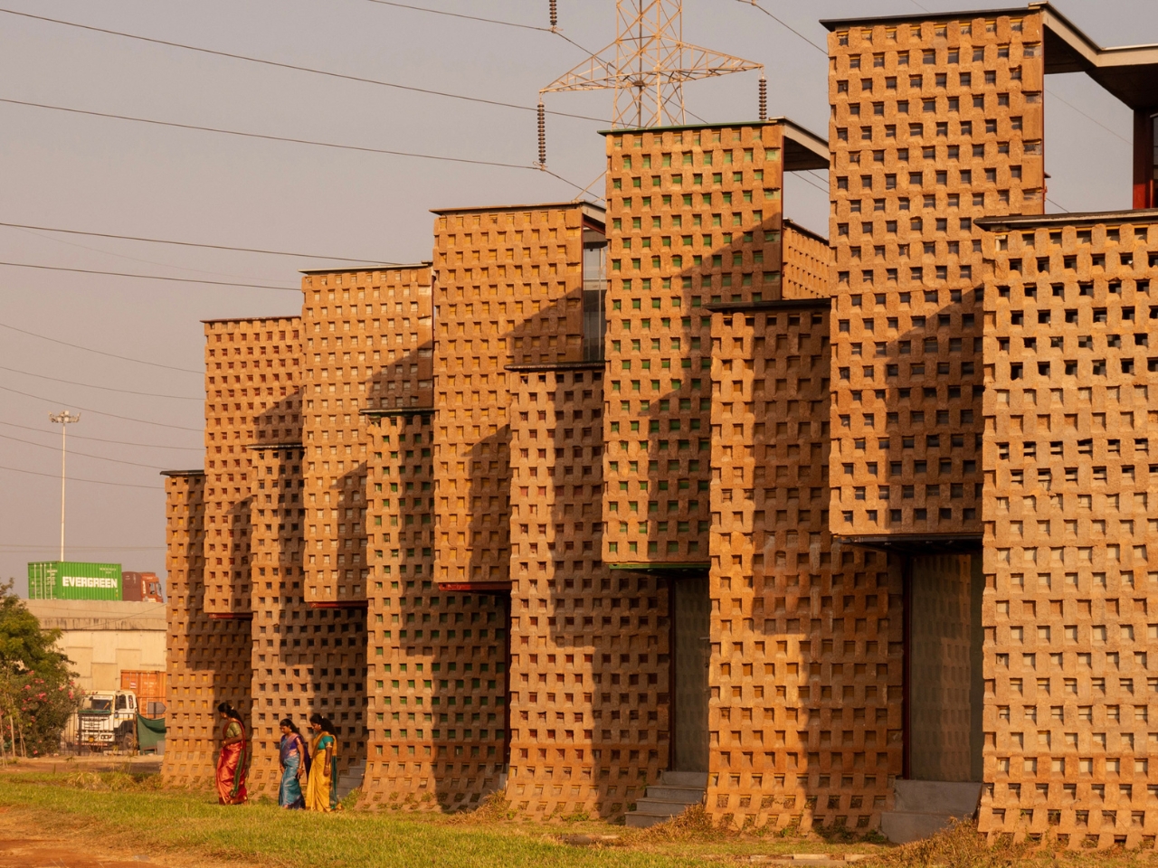
The team took twelve of those containers, cut them in half lengthways, and welded them onto a steel frame. That alone sounds like a fairly standard repurposing story. But here’s where it gets genuinely interesting. Instead of leaving the steel exposed or cladding it in something conventional, they coated the entire exterior in poured earth. Not just a surface treatment for looks, either. The earth layer was designed in an alternating recessed pattern specifically to reduce heat gain and cut the building’s reliance on air conditioning by 38 percent. In tropical Tamil Nadu, where heat is a year-round reality rather than a seasonal inconvenience, that’s a serious design decision with real consequences.

The result is a building that looks like it grew out of the ground. From the outside, Petti reads as a textured, warm-toned structure with a zigzagging profile, the kind of silhouette that makes you stop and puzzle over whether it’s old or new, industrial or handcrafted. The answer is that it’s both, and that tension is exactly the point.

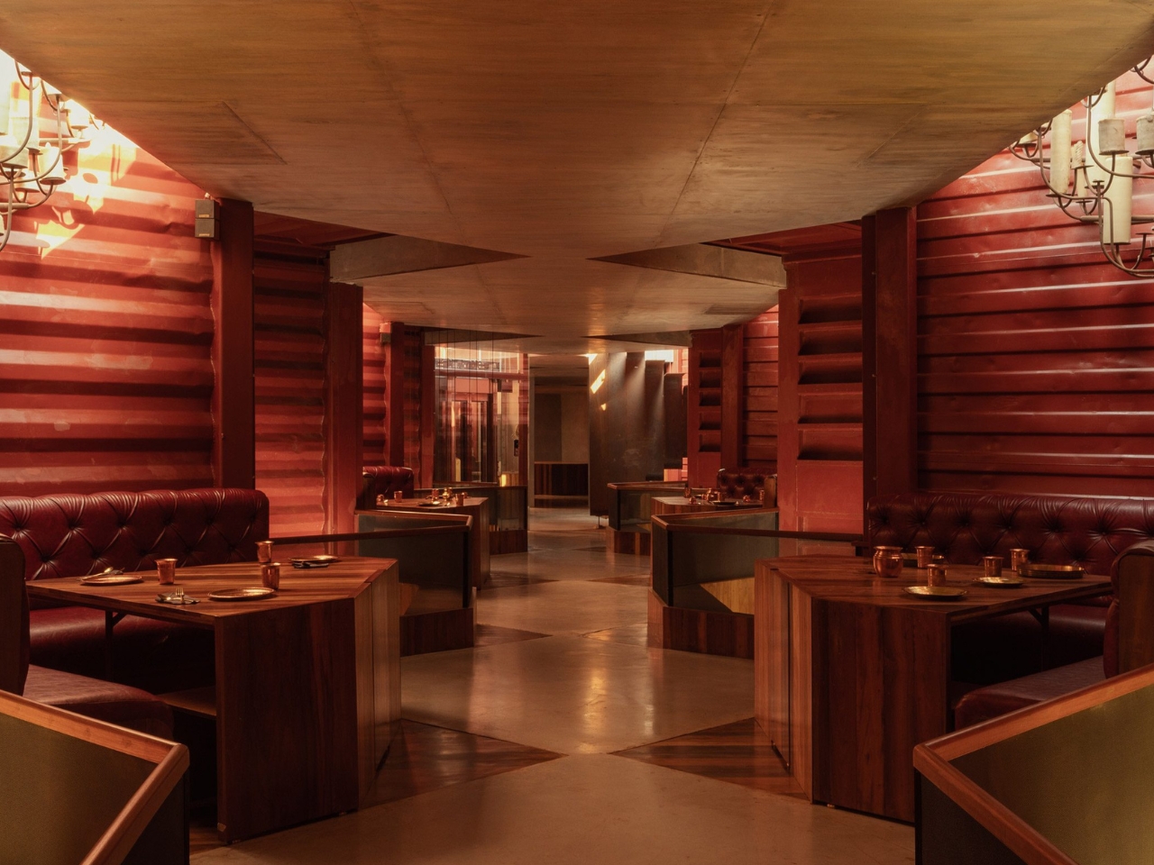
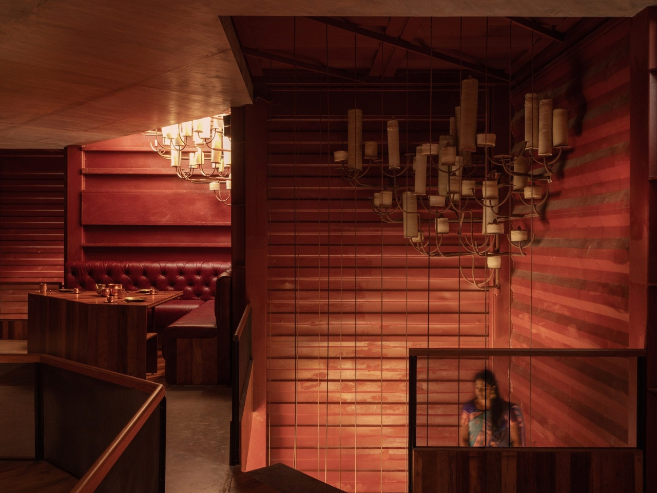
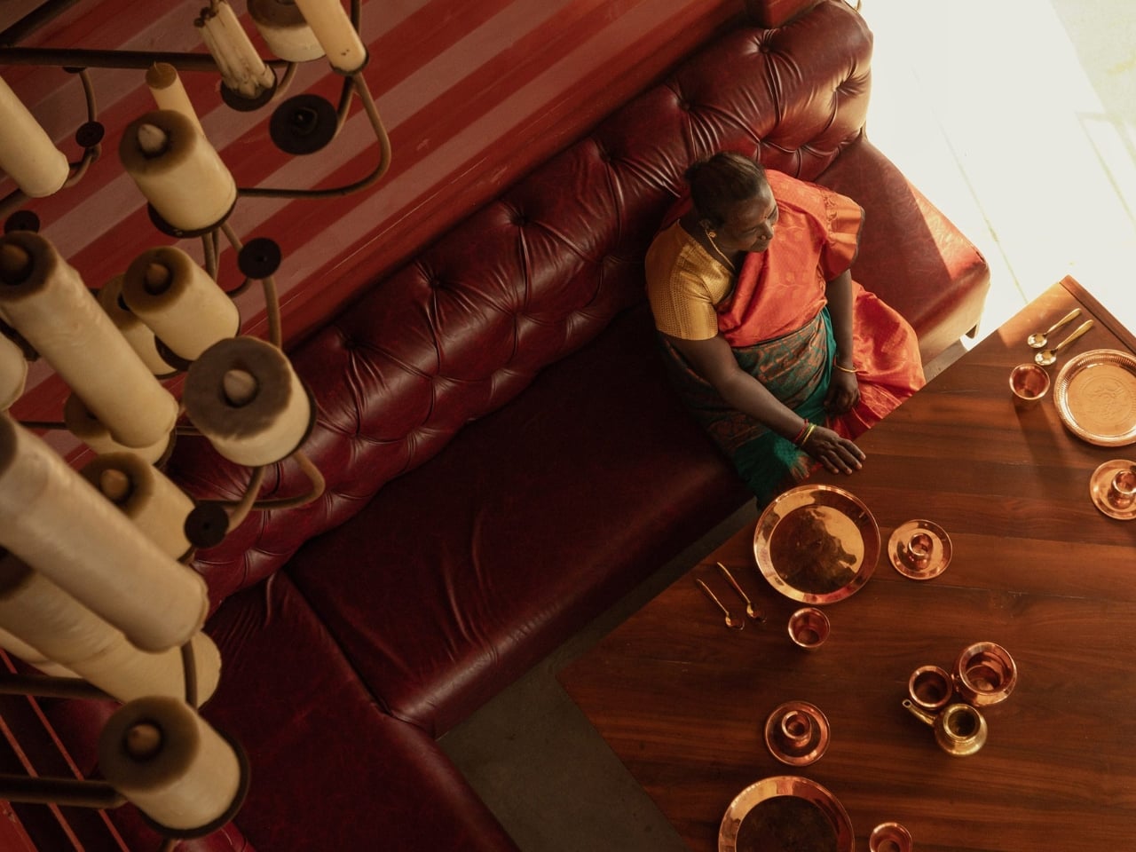
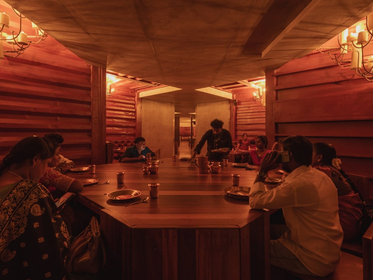
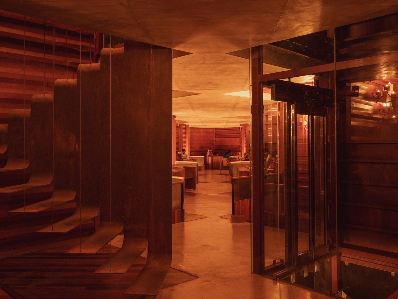
Inside, the layout follows the logic of the containers themselves. Each container half creates a defined niche, so the dining experience becomes surprisingly intimate for a space that seats 200 people. You’re tucked in, not floating in a vast open plan. During the day, natural light filters in through skylights above each seating area. At night, chandeliers made from old wax and pipes take over, filling the space with a glow that’s warm without being precious. The floors are laid with discarded deck wood and oxide. It’s a level of material consistency that tells you the team thought carefully about every surface, not just the ones visible from the street.

Petti doesn’t perform sustainability, and that’s a distinction worth making. A lot of design projects with eco credentials feel like they need you to notice the eco credentials first and the design second. Petti reverses that. The photograph you’re drawn to first is a beautiful one: warm light, earthy texture, layered geometry. The backstory, the fact that you’re looking at marine waste and mud, makes it more compelling, not less beautiful.

There’s a real argument here about how we build in tropical climates. Shipping containers are notoriously poor insulators on their own, which is why so many container architecture projects end up being thermally uncomfortable. Wallmakers addresses this head-on with the poured earth facade, and the 38 percent reduction in cooling load isn’t a marketing figure pulled from thin air. It reflects the kind of climate-specific thinking that a lot of globally distributed architectural trends skip entirely because they were never designed with heat in mind.

Petti also pushes back on a certain aesthetic snobbery in sustainable design, the assumption that salvaged materials and low-carbon building methods produce something that looks compromised or impermanent. This restaurant looks better than most places that cost considerably more to build, and it leaves a much lighter footprint while doing it.

The name itself is worth sitting with. Petti means “box” in Tamil, and the simplicity of that is quietly perfect. A box, rethought, coated in earth, stacked into something you’d travel to see. That’s not a small thing.

The post The Restaurant Made of Mud and Marine Waste Is Drop-Dead Gorgeous first appeared on Yanko Design.

5 Libraries That Look Nothing Like Libraries (And Are Better For It)

In a world shaped by AI, constant notifications, and shrinking attention spans, focused reading has become harder to protect. Distractions are no longer just external; they are embedded in the very tools you use every day. Against this backdrop, libraries are no longer quiet backdrops to digital life, but intentional spaces designed to help you slow down, disconnect, and return to deeper forms of attention.

The library has evolved far beyond its conventional identity as a storage space for books. You now experience it as an active social and intellectual landscape, one where spatial rhythm, light, and material honesty shape moments of focus and exchange. Contemporary design responds to how you move, pause, and engage, creating environments that support deep concentration and collective learning in an age of constant interruption.

By shifting away from static shelving systems toward spaces that encourage interaction and introspection, here is how architecture establishes a deeper dialogue between built form and human presence.

1. Libraries in Motion

The portable library signals a new approach to how knowledge inhabits the home. Rather than remaining fixed, it moves with you and is integrated into daily life through carefully designed, lightweight structures. These mobile elements allow reading, reflection, and display to shift naturally across spaces, responding to changing moods and routines.

From a design and value standpoint, portability introduces long-term flexibility. Spaces can be reconfigured without loss of visual coherence or function. These modular forms act as movable architectural markers, maintaining relevance as lifestyles evolve while transforming reading into a deliberate, spatial experience woven through the home.
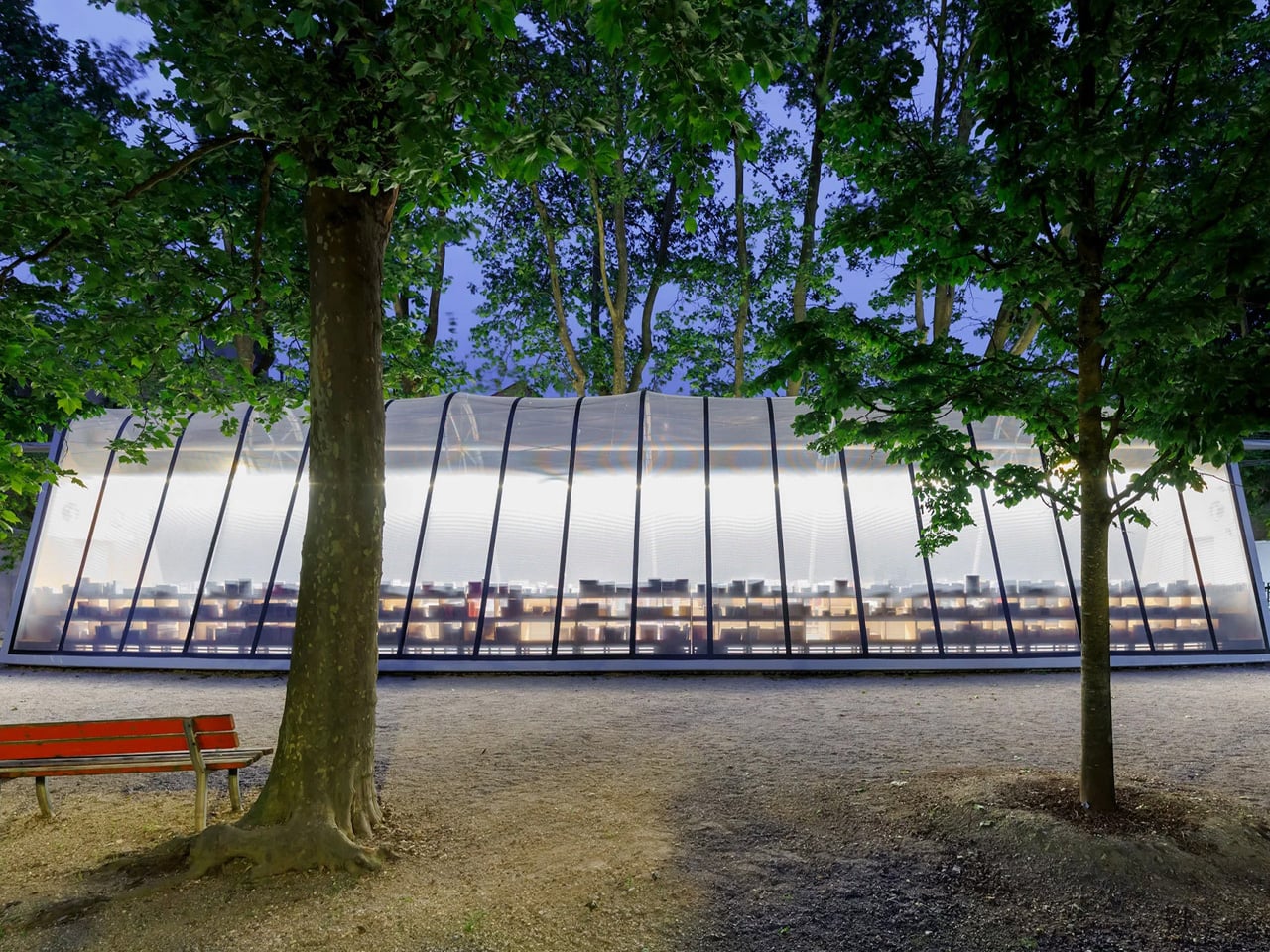
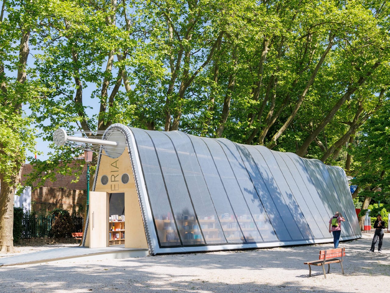
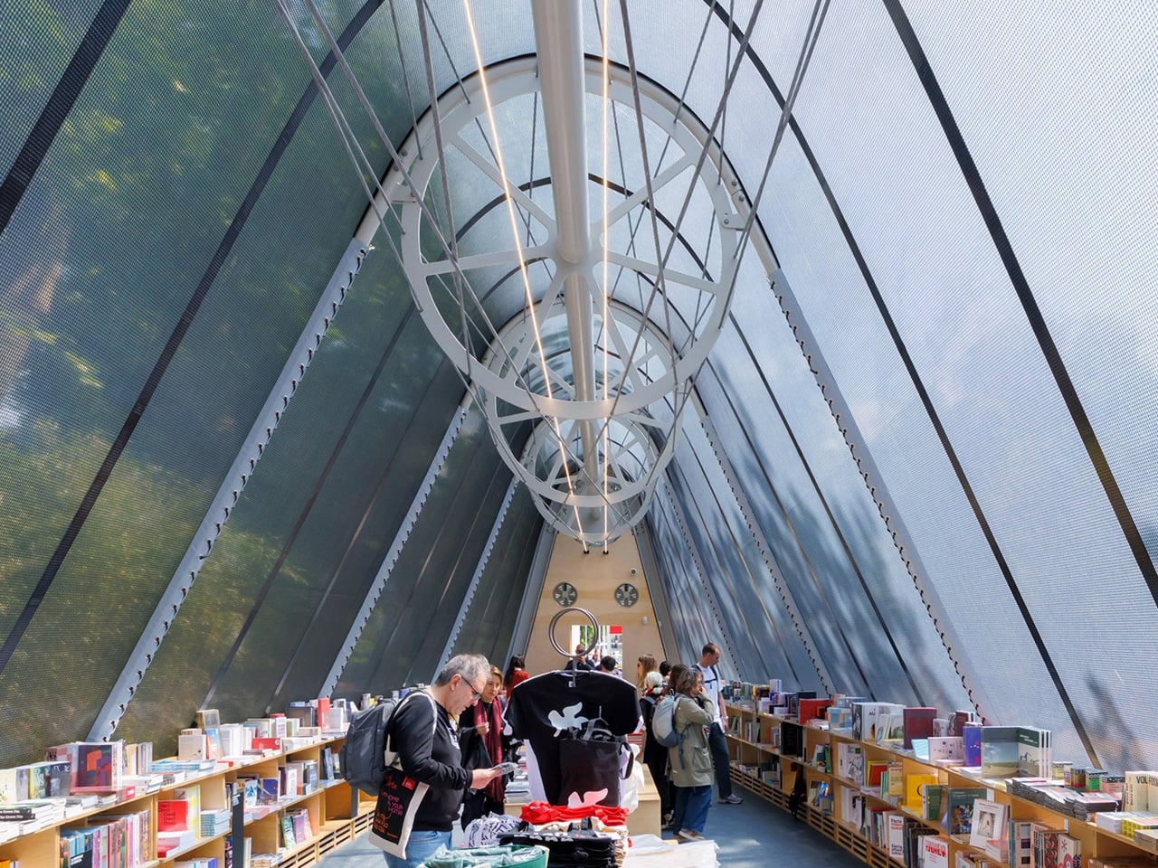
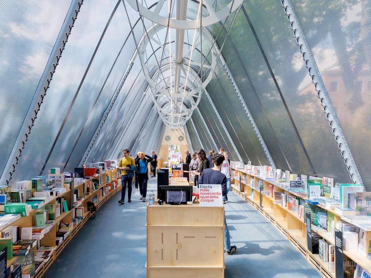
La Libreria is a lightweight, demountable library designed by Diller Scofidio + Renfro for the Venice Architecture Biennale, created to travel and encourage reading wherever it is installed. Spanning 24 metres, the pavilion draws on principles of tensile architecture influenced by the research of French engineer Robert Le Ricolais. Rather than being fixed to the ground, the structure gains stability from ballasts and the weight of the books themselves, which are displayed on timber shelves running along its length. This clever integration of structure and storage keeps the library open, flexible, and easy to reassemble in new settings.
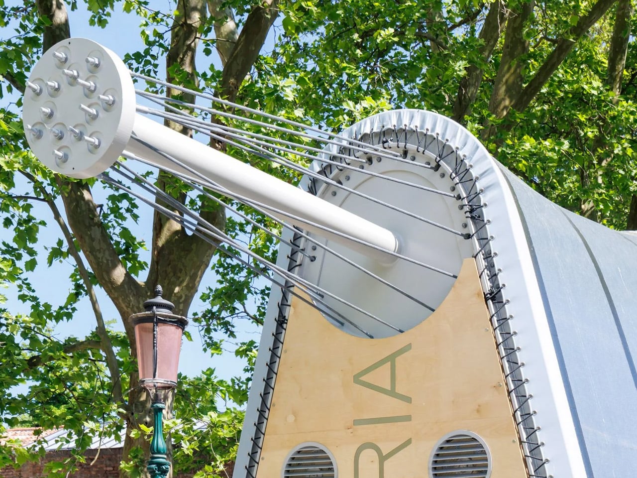
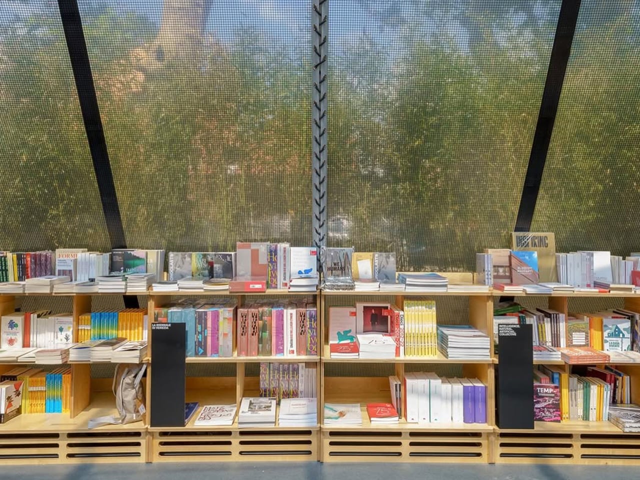
Wrapped in a transparent STFE architectural textile, the pavilion remains visually light while being durable and portable, allowing it to be packed into a container and relocated with ease. Currently situated in the Giardini della Biennale, it stands among experimental national pavilions, reinforcing the event’s spirit of innovation.

2. Biophilic Reading Sanctuary

Integrating biophilic design transforms the library into a calm, light-filled refuge. You experience softened architectural edges through diffused daylight, interior planting, and tactile natural materials. This deliberate balance between structure and nature supports mental clarity, creating a focused reading environment that restores attention and strengthens your sensory connection to space.

Beyond visual comfort, biophilic strategies deliver measurable performance value. You benefit from improved air quality, passive cooling, and reduced energy demand through living walls and natural ventilation. These systems create a stable microclimate while grounding the design in regional traditions, ensuring the library feels timeless, responsible, and deeply human.
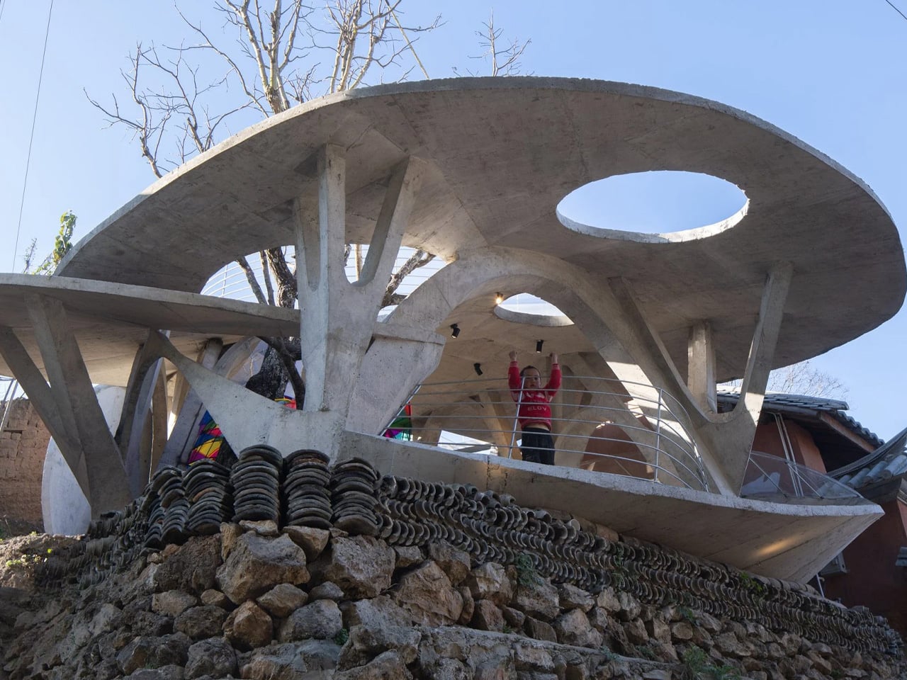
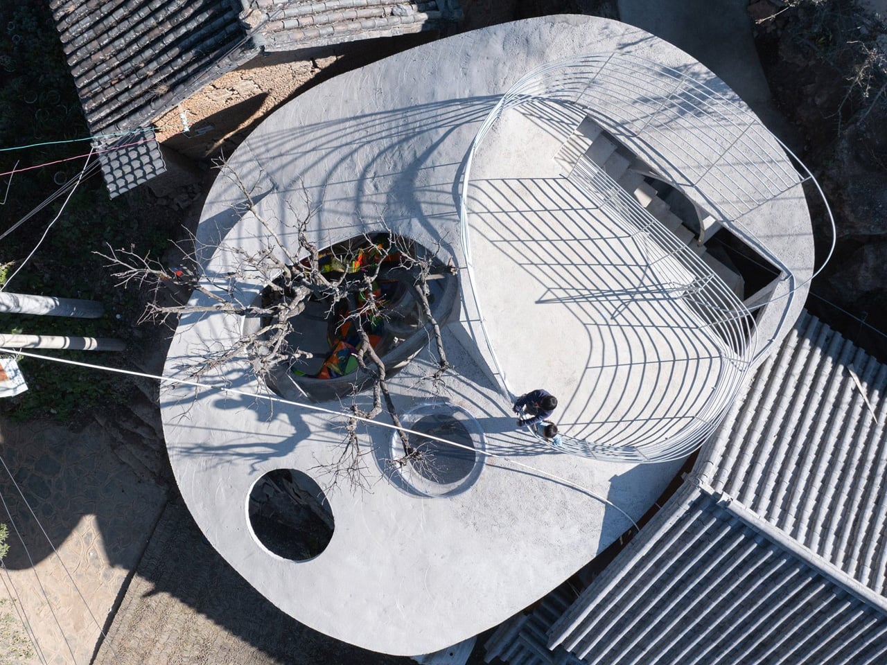
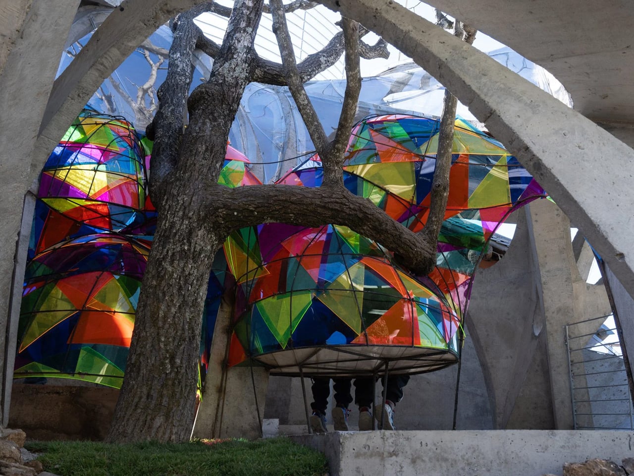
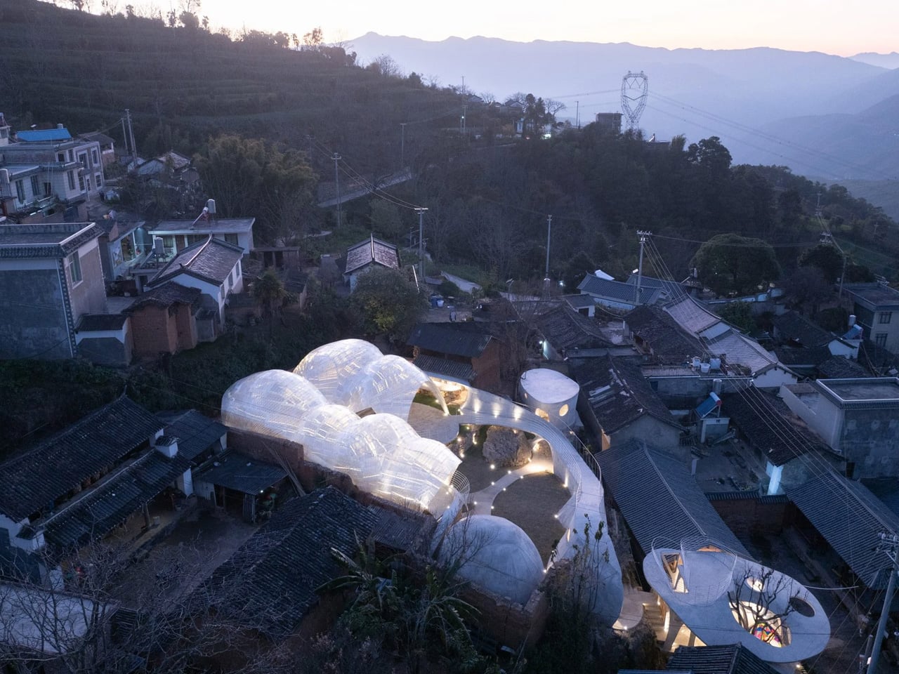
Stalk-like arches and mushroom-inspired canopies form a playful shelter for the Mushroom Library, a children’s reading space in Yanzitou Village, rural China. Envisioned as a “fantastical village landmark,” the library acts as a welcoming gateway to a future community centre and a lively gathering point. Inspired by the fungi found in nearby forests, the structure blends gently into its landscape while standing out as a symbol of cultural continuity. In a village facing depopulation, the library becomes a place where returning children and residents reconnect, turning weekends into moments of shared learning and intergenerational exchange.
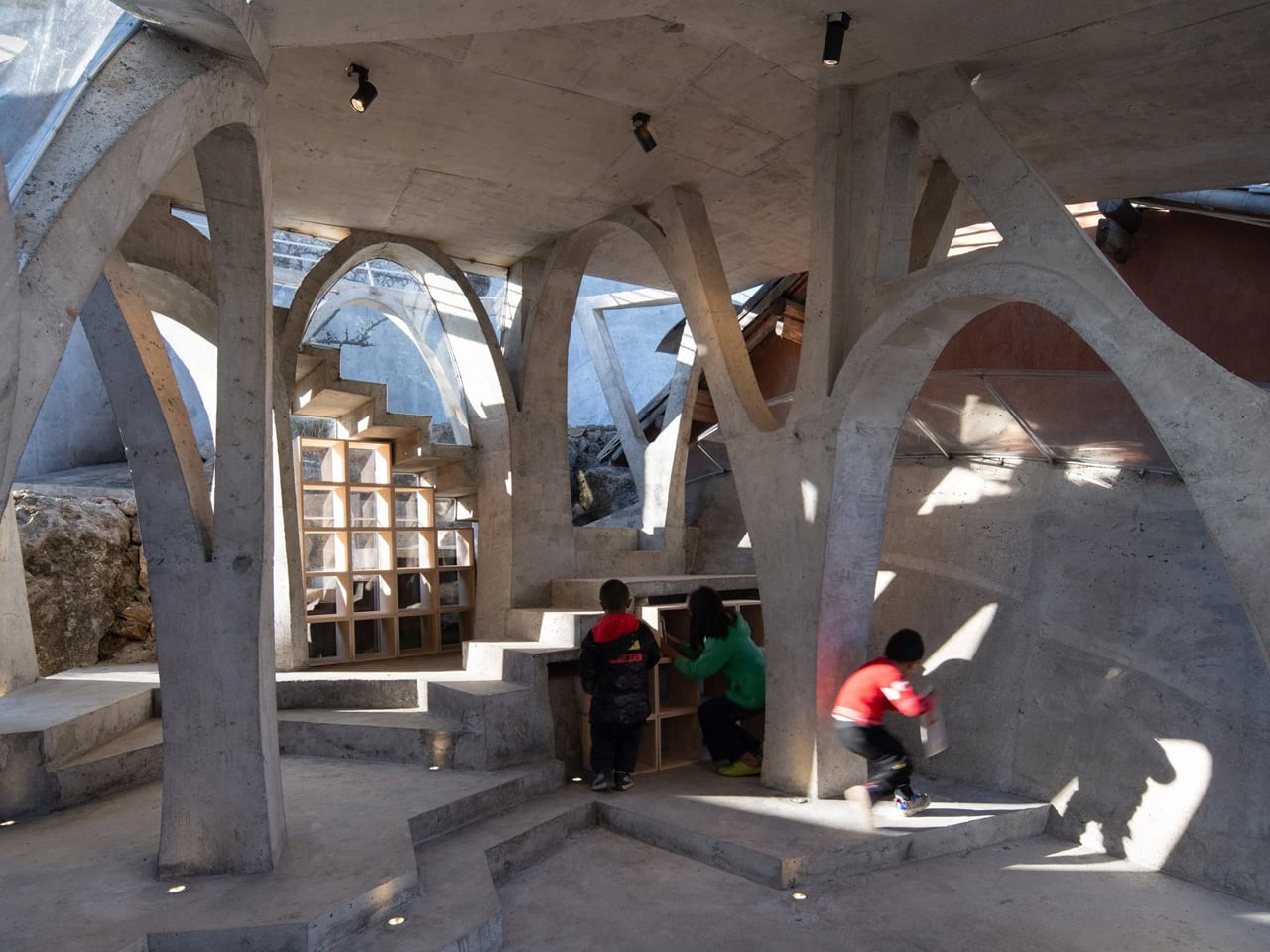
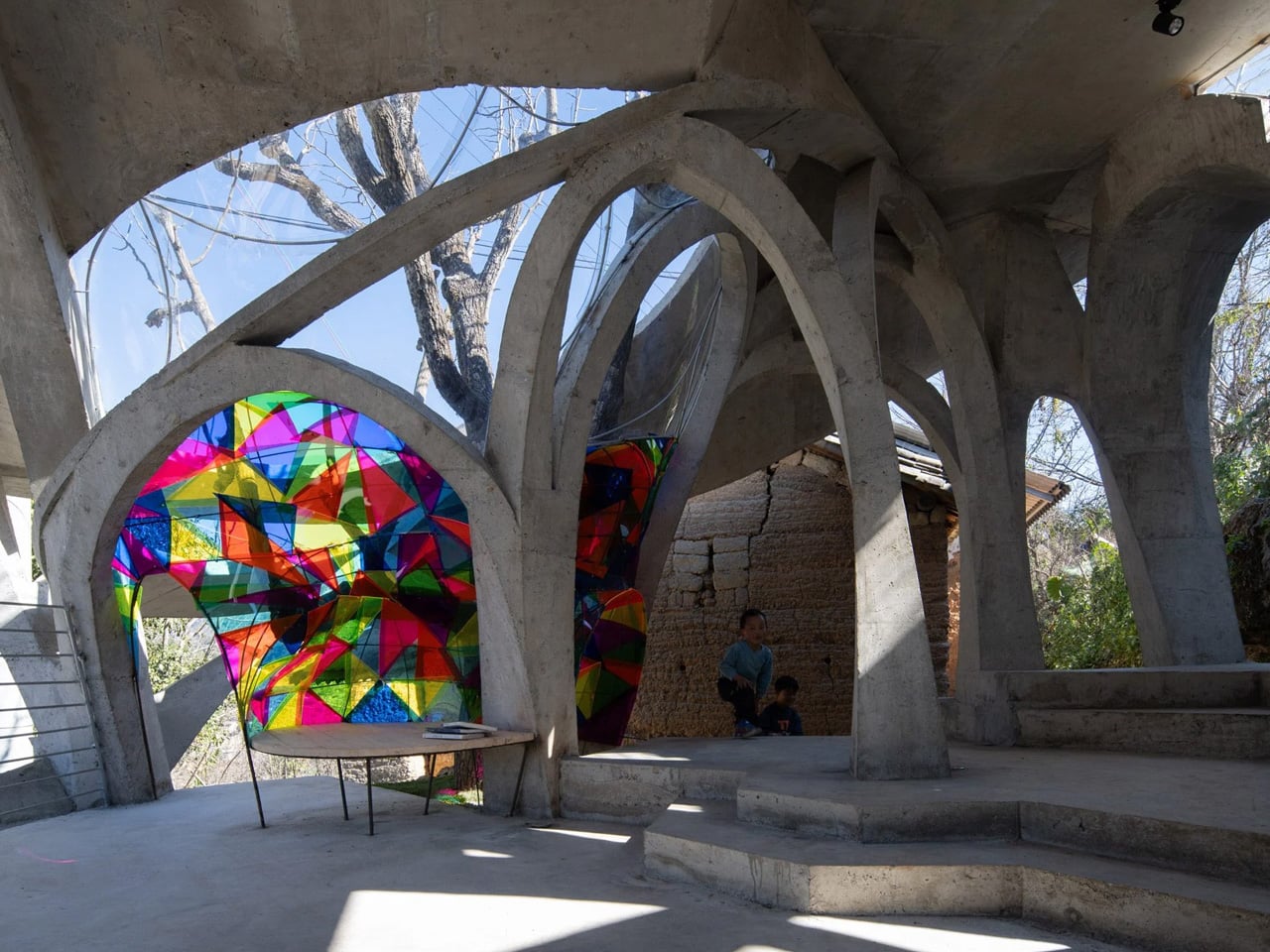
Built around an existing raisin tree, the library reflects close collaboration with local craftspeople. Ribbed steel bars are woven into tall arches, later encased in concrete to create an organic yet durable form. An irregular canopy, punctured with circular openings, filters daylight into the reading room, while one opening allows the tree to grow through the roof. Inside, curved concrete walls and timber shelves create cosy reading corners, as shifting light patterns animate the space and spark imagination.

3. Multifunctional Library

The multifunctional library functions as a central knowledge hub where work, study, and social exchange coexist. You experience a carefully layered spatial sequence that supports silence, collaboration, and digital engagement within a single setting. Integrated joinery discreetly houses technology, allowing the space to shift seamlessly with your daily intellectual needs.

From a value perspective, this typology maximizes spatial efficiency by intensifying the use of every square foot. These libraries remain active throughout the day, contributing measurable performance to the home. Through refined materials and bespoke detailing, functionality is elevated into a lasting architectural statement.
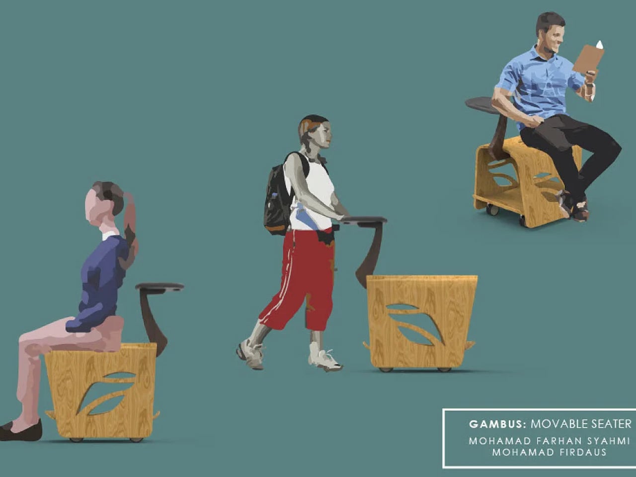

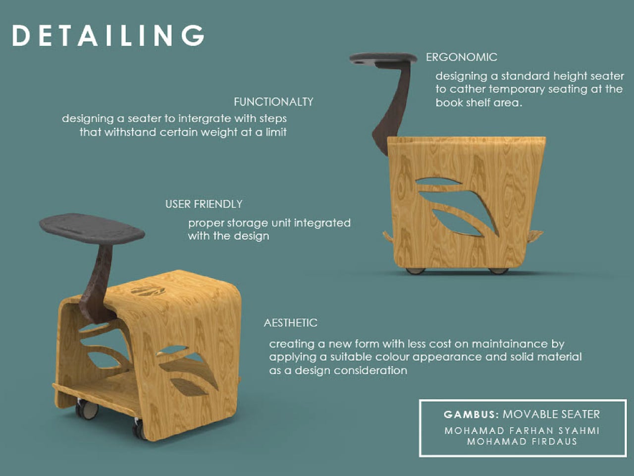
You may not wheel this compact book cart outdoors, but it lets you carry your favourite reads to any quiet corner indoors. Most people have a preferred spot for unwinding with a book, whether it’s a sofa, a bed, or a tucked-away chair that offers a sense of privacy. Public spaces like libraries rarely provide that comfort, often relying on long shared tables and stiff seating that make reading feel more like work than pleasure. This mobile bookshelf rethinks that experience, allowing you to choose your own corner and settle in with both your books and a place to sit.
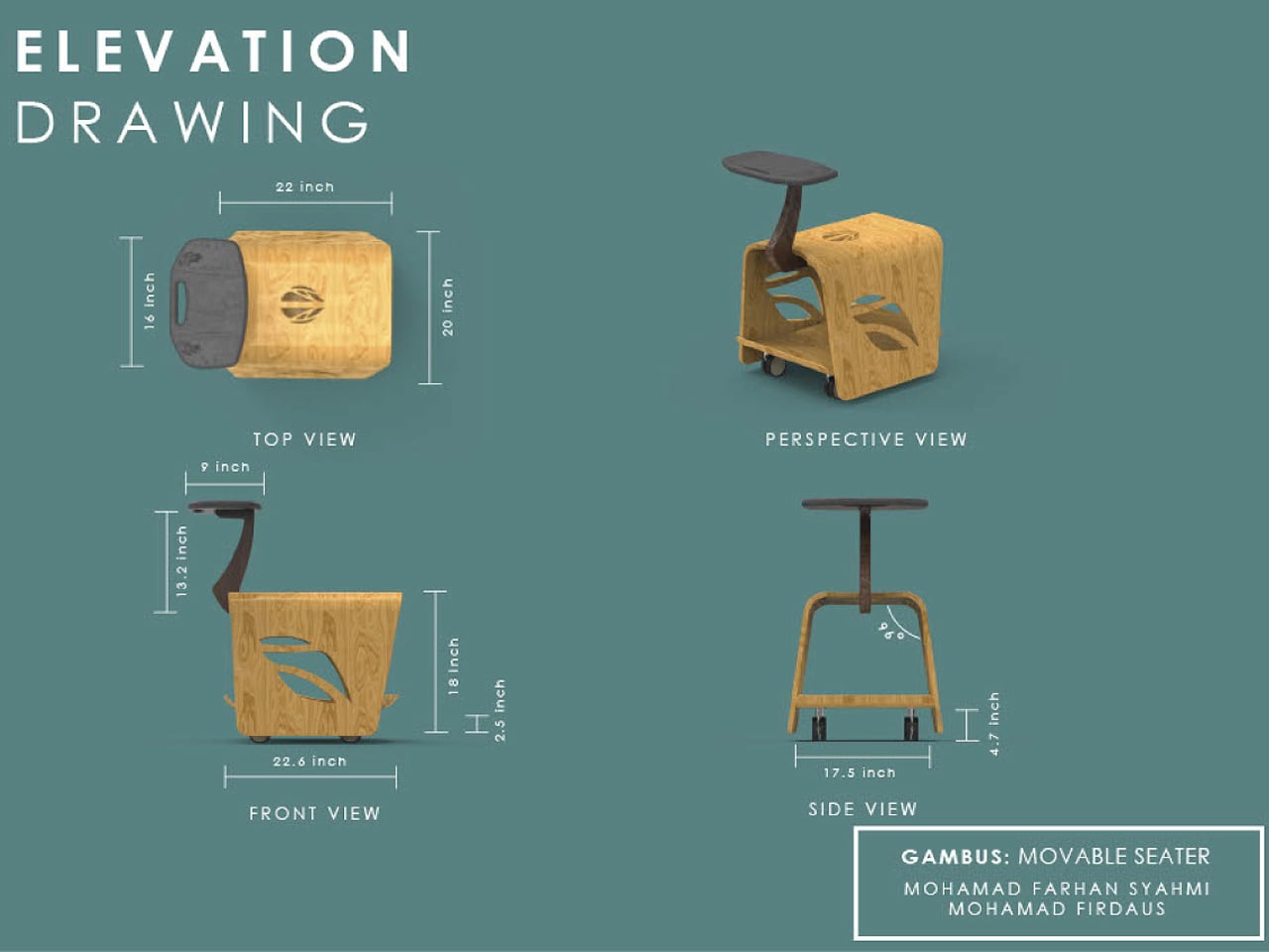
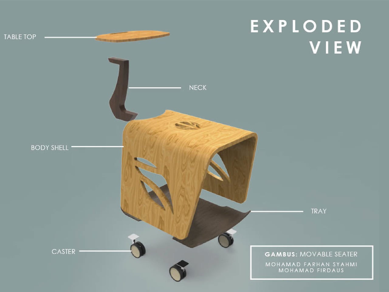
Inspired by the pear-shaped gambus instrument, the wooden body holds several books while doubling as a seat. A curved stem rises to form a small tabletop for resting your current read and helps guide the cart across the floor. Designed as a personal, movable reading nook, it encourages quieter, more intimate moments with books, even in busy shared spaces.

4. Exploring Sculptural Forms

Futuristic library design reimagines the archive as a sculptural experience rather than a static container. You move through fluid, parametric forms shaped by curves, height, and light. These spaces dissolve rigid shelving, allowing architecture to express the boundless nature of knowledge through movement, transparency, and spatial drama.

Behind the expressive geometry lies technical rigor. Advanced composites and high-performance materials ensure strength, thermal control, and longevity. You gain durability and distinction, as these libraries balance innovation with precision. Visionary form becomes a long-term asset, connecting intellectual heritage with the evolving digital landscape.
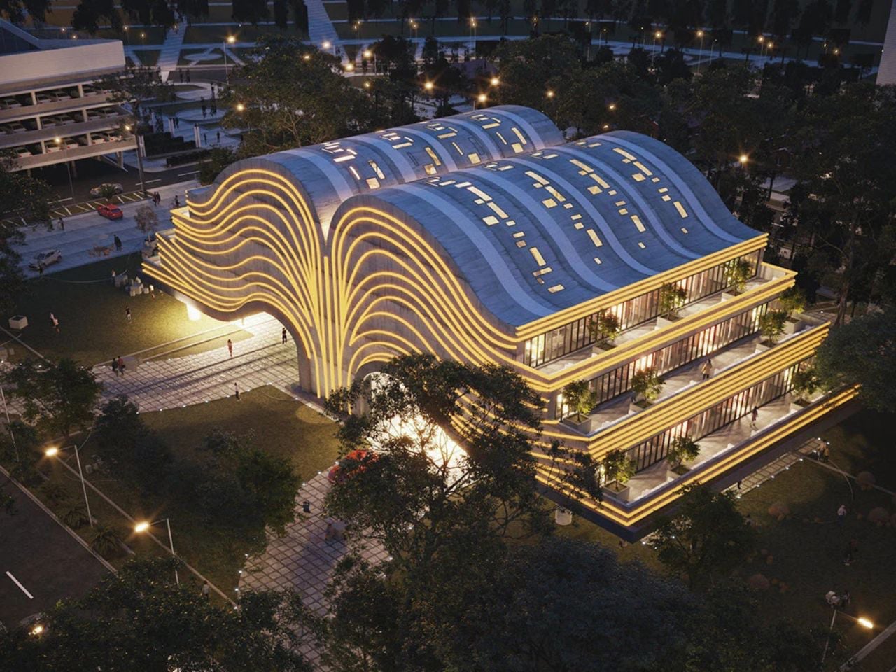
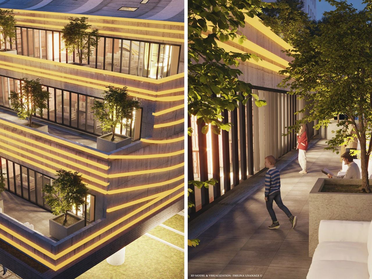
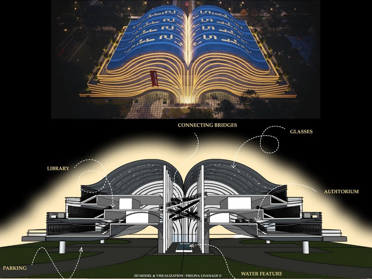
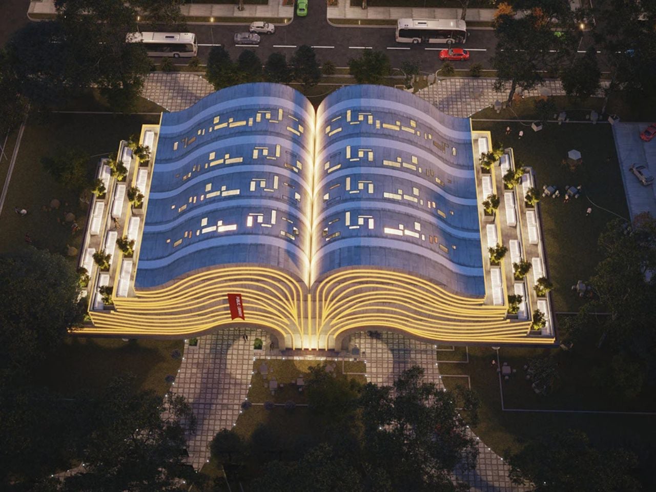
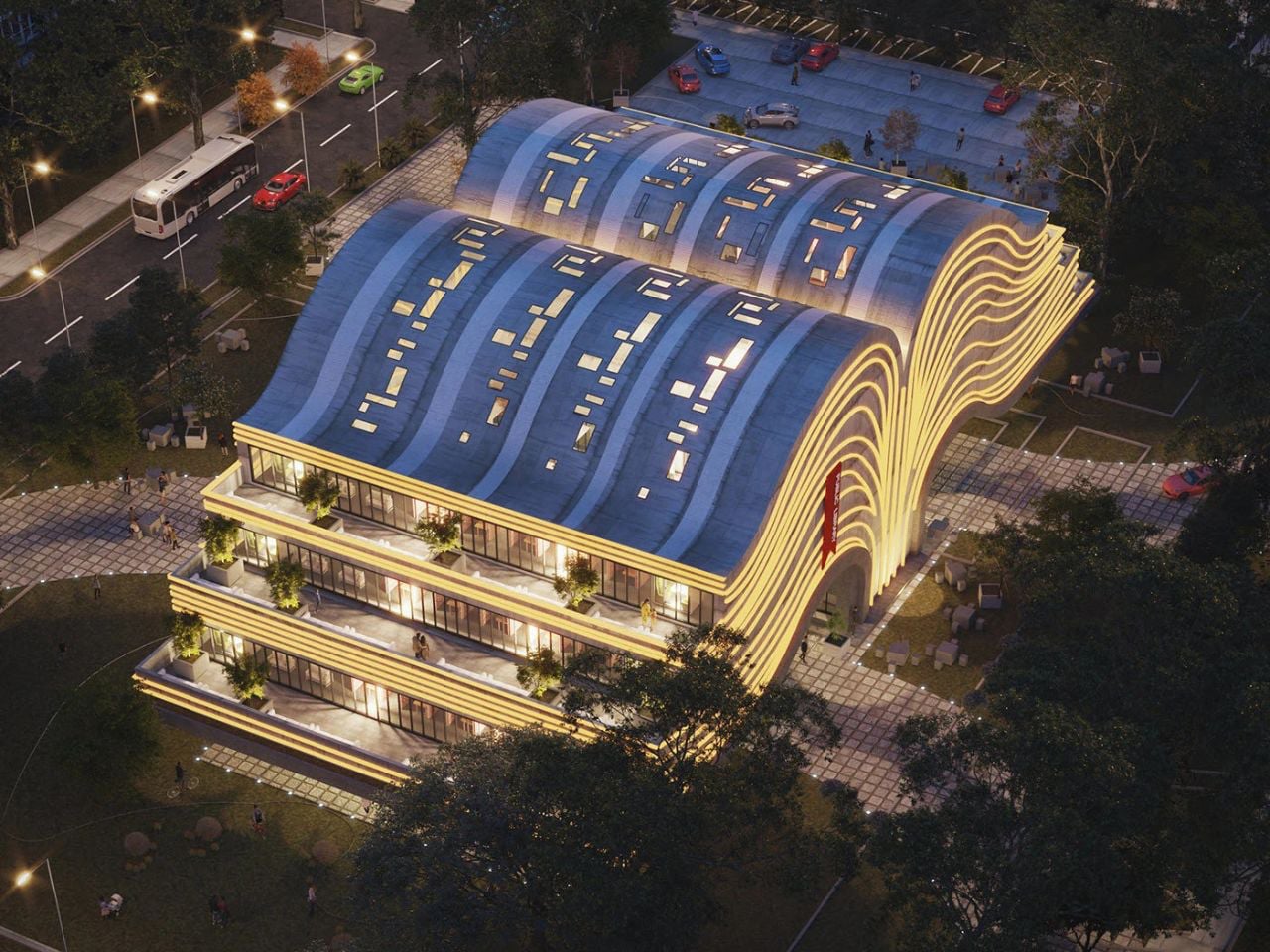
Envisioned as more than a functional building, this futuristic public library was designed as a living tribute to books and the act of reading. The architect imagined a space that evokes wonder, sparks curiosity, and offers calm – an intellectual refuge rather than a mere storage for knowledge. Shaped like an open book, the form symbolises openness, shared ideas, and limitless learning. Sweeping curves echo turning pages, while illuminated roof lines resemble flowing text, making the structure appear animated even from afar. A bold cantilevered concrete base lends the building a sense of lightness, opening generous interiors filled with natural light and quiet comfort.
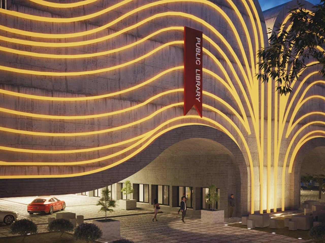
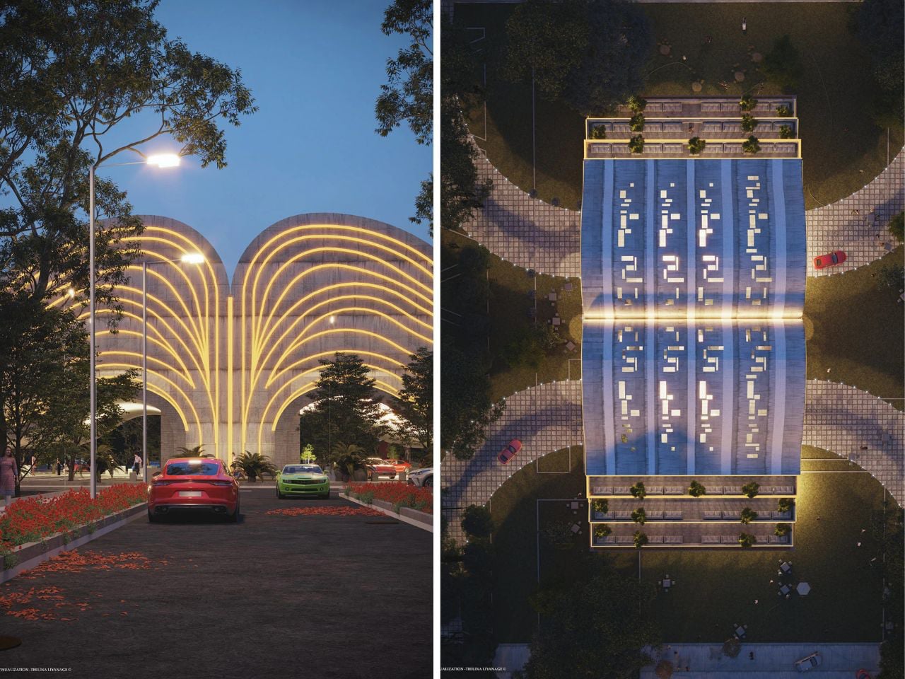
The “pages” of the book become layered floors with balconies that extend reading into the open air, while shaded spaces below host gatherings and mark the entrance with a calming water feature. From the front, the silhouette subtly recalls a tree, linking learning to growth and renewal. A central “spine” connects reading halls and auditoriums through elevated bridges, reinforcing the metaphor while guiding movement. Every detail balances symbolism with contemporary elegance, creating a space that honours tradition while embracing modern expression.

5. Transparent Reading Lounge

The community reading lounge restores the library’s role as a shared cultural space. You experience it as a modern gathering ground where quiet reflection and conversation coexist. Thoughtful layouts and contextual references help the space feel rooted, familiar, and socially inclusive.

Its success lies in sensory balance, like soft acoustics, gentle light, and spatial warmth. Value is measured through social engagement and long-term relevance rather than metrics alone. With local materials and passive strategies, the lounge becomes a low-impact, resilient environment that nurtures collective intellectual life.
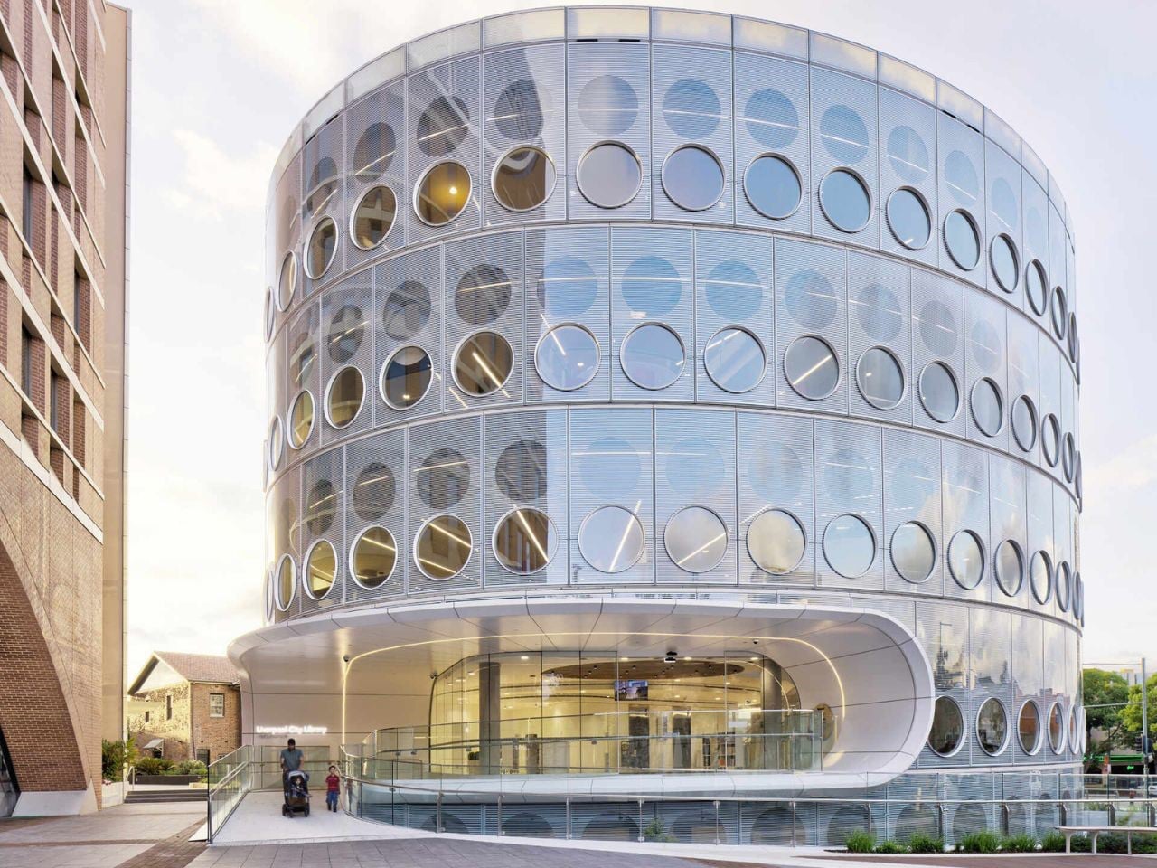
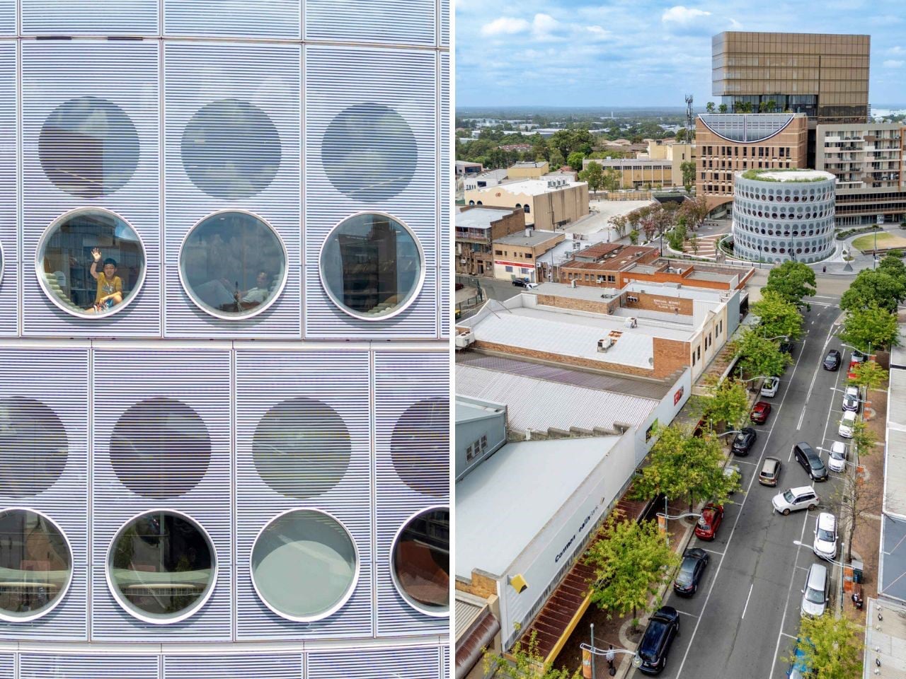
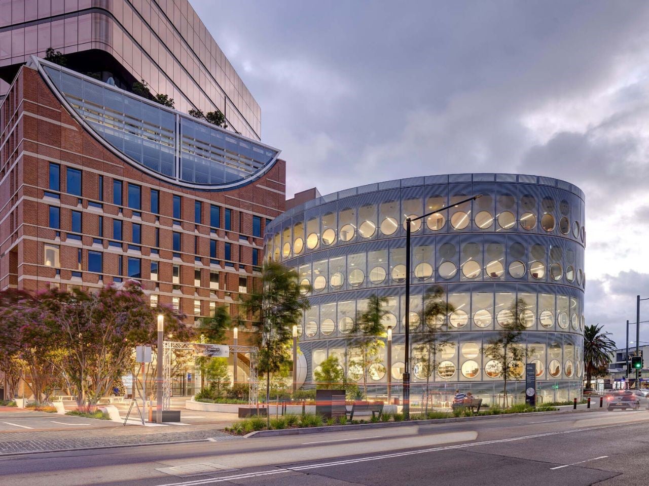
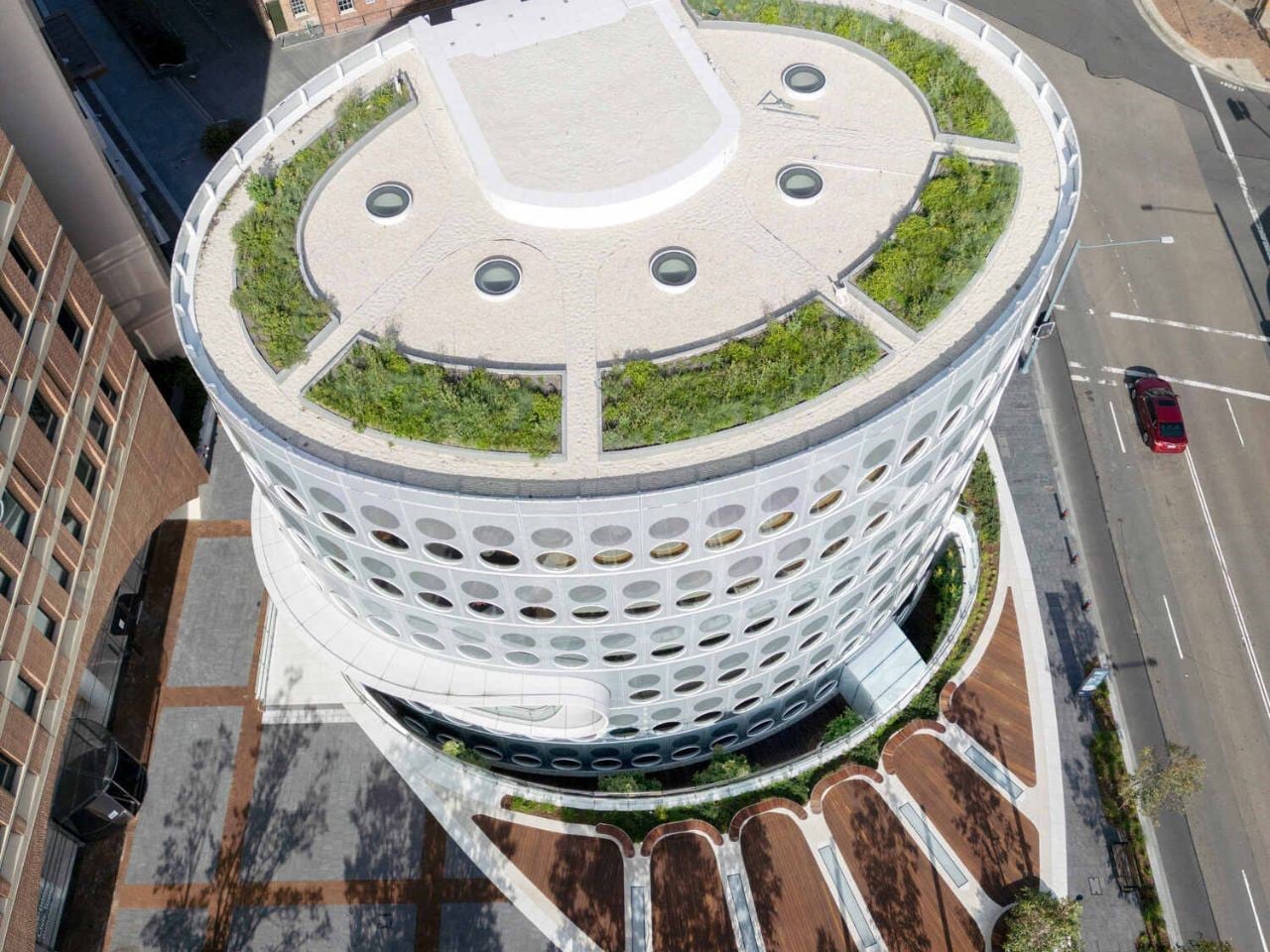
In an age dominated by digital ease, Yellamundie Library in Western Sydney shows how physical libraries are evolving rather than disappearing. Designed by fjcstudio as part of the Liverpool Civic Place precinct, the building is conceived as a social and cultural anchor for one of Australia’s fastest-growing and most diverse communities. Its oval form and round windows soften the surrounding urban grid, drawing inspiration from the nearby Georges River. With transparent façades on all sides, the library puts community life on display, and by night it glows like a lantern, signalling openness and welcome.
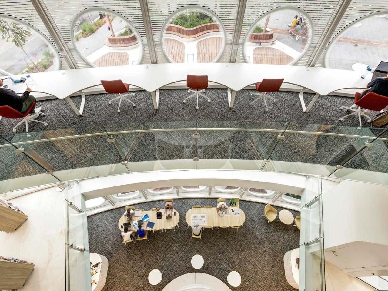
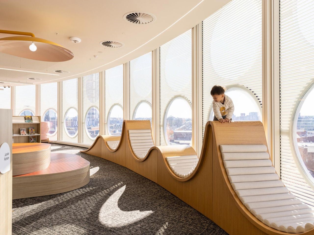
Inside, the 5,000-square-metre space is layered and adaptable, with part of the library set below the public plaza and lit by skylights and a planted courtyard. Upper levels house study areas, maker spaces, digital labs, and flexible event zones, all supported by mobile shelving. Multilingual collections, youth-focused floors, and creative programmes ensure the library serves every generation, making it a place for learning, making, and belonging.

The evolution of the library reflects a decisive move away from static storage toward a dynamic architectural experience. By integrating portability, biophilic principles, and forward-looking forms, you shape spaces that function as living systems of knowledge. These libraries transcend utility, becoming active environments that support resilience, creativity, and intellectual growth through a continuous dialogue between human experience and built form.

The post 5 Libraries That Look Nothing Like Libraries (And Are Better For It) first appeared on Yanko Design.
This Nova Scotia Home Floats Above the Land on Steel Legs and Changes Nothing Beneath It

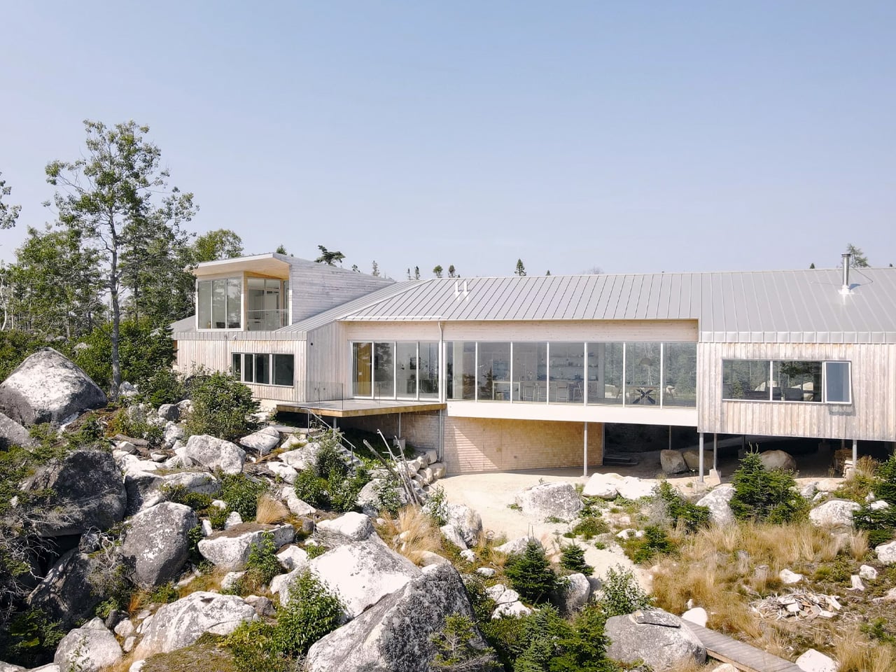
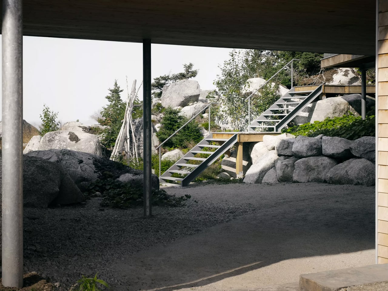
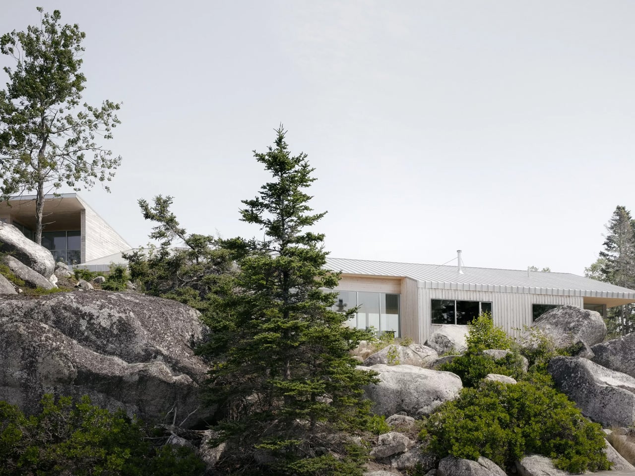
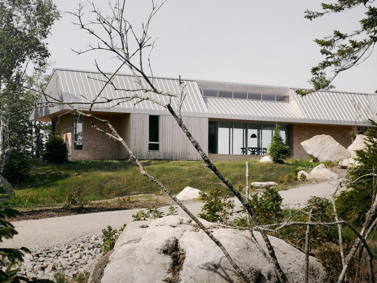
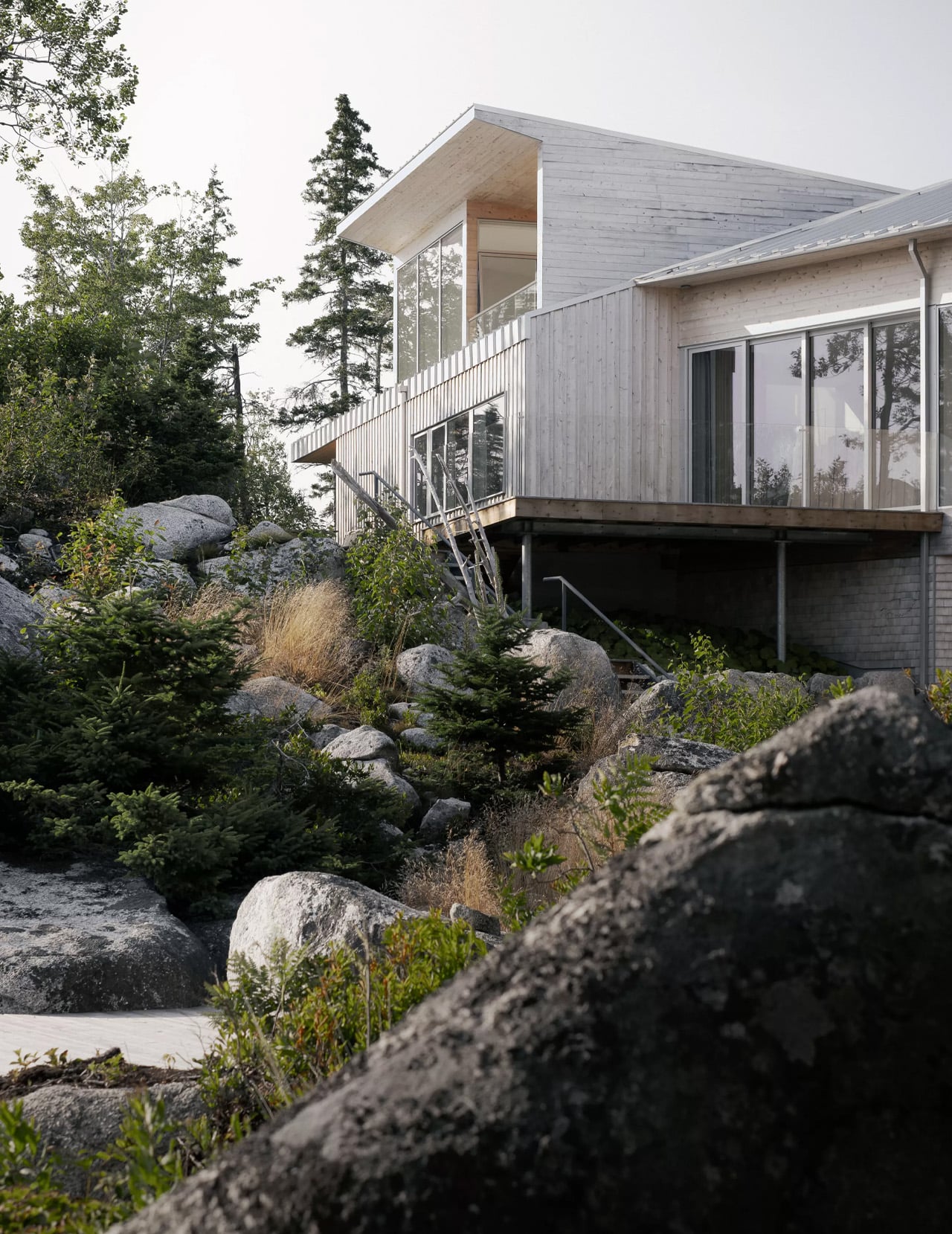
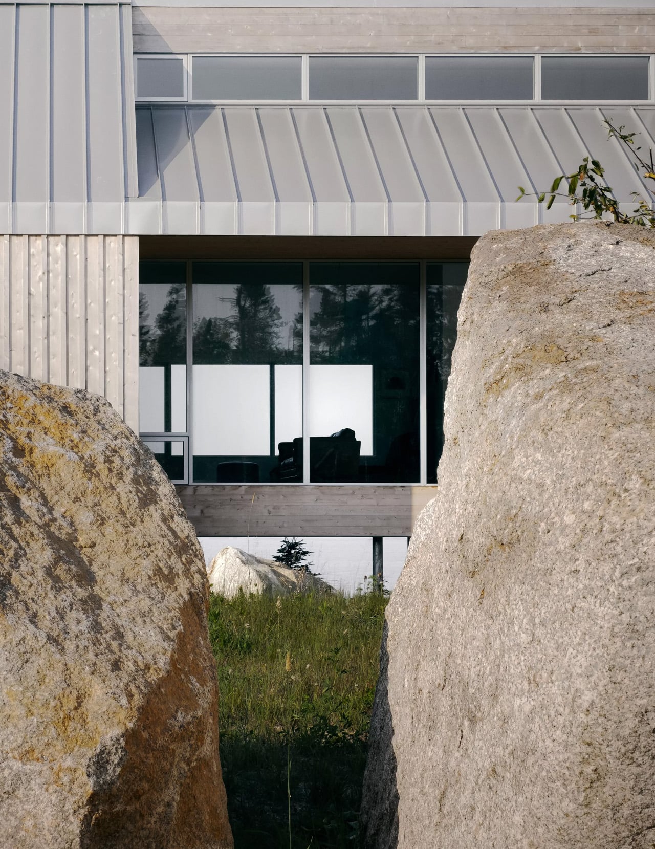
There’s a certain restraint in the decision to let a building hover. Not every architect earns that move. Along the rugged Atlantic coastline of Nova Scotia, Canadian studio Omar Gandhi Architects has completed the East River Residence — a home that doesn’t so much sit on the landscape as suspend itself above it, perched on slender steel columns that let the rocky terrain breathe freely underneath.

The project was conceived for a couple relocating from Montreal, trading city life for something quieter, more grounded, more defined by the presence of the Atlantic. On the first visit to the site, the architects followed the coastline inward through a dense stand of forest, arriving at a soft valley held between two steep, rocky inclines. That natural bowl — rather than being fought or filled — became the entire logic of the building.

Designer: Omar Gandhi Architects

The result is a home that reads like a bridge. It spans the depression between two embankments, and the terrain flows underneath it the way water would. Hidden from the shore by thick forest, the only way to encounter it is to go inland, walk along the coast, and let it reveal itself gradually — which feels entirely intentional. This isn’t a house that announces itself. It listens.

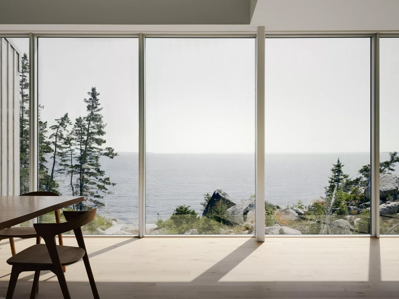
The roofline is where the architecture gets genuinely expressive. The gable follows the rhythm of the land below it — rising over the rocky outcrops, dipping low at the main living space to pull in southern light and create a sense of interior intimacy, then lifting again at the yoga studio to expand the room toward the sky. Each shift in section corresponds to a shift in how the space feels, and how the view outside changes with it.

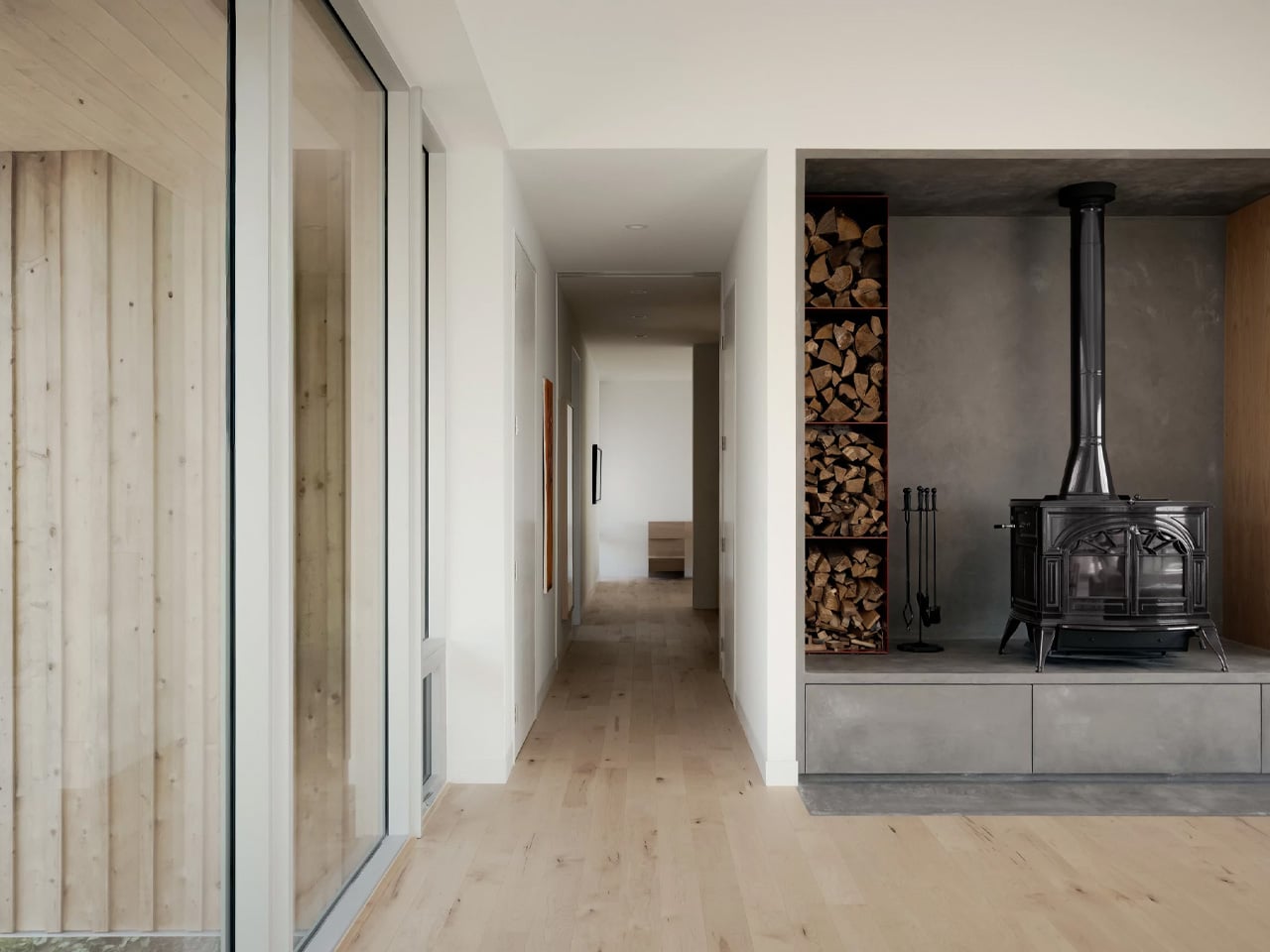
Materially, the home stays close to its coastal context. The palette is dark and restrained — chosen to disappear into the treeline rather than compete with it. Steel, wood, and shadow do most of the talking. The structure was built by Blueprint Construction with structural engineering by Design Point, and the technical execution of suspending a full residence above challenging terrain is considered as the architecture itself.

Photographed by Felix Michaud, the images capture something that most architecture photography misses: the feeling of a building that genuinely belongs where it is. The East River Residence isn’t trying to conquer its site. It’s floating above it, quietly, letting the land remain exactly what it was — which, as architectural philosophies go, is a rare and admirable one.

The post This Nova Scotia Home Floats Above the Land on Steel Legs and Changes Nothing Beneath It first appeared on Yanko Design.
This Nova Scotia Home Floats Above the Land on Steel Legs and Changes Nothing Beneath It

There’s a certain restraint in the decision to let a building hover. Not every architect earns that move. Along the rugged Atlantic coastline of Nova Scotia, Canadian studio Omar Gandhi Architects has completed the East River Residence — a home that doesn’t so much sit on the landscape as suspend itself above it, perched on slender steel columns that let the rocky terrain breathe freely underneath.

The project was conceived for a couple relocating from Montreal, trading city life for something quieter, more grounded, more defined by the presence of the Atlantic. On the first visit to the site, the architects followed the coastline inward through a dense stand of forest, arriving at a soft valley held between two steep, rocky inclines. That natural bowl — rather than being fought or filled — became the entire logic of the building.

Designer: Omar Gandhi Architects

The result is a home that reads like a bridge. It spans the depression between two embankments, and the terrain flows underneath it the way water would. Hidden from the shore by thick forest, the only way to encounter it is to go inland, walk along the coast, and let it reveal itself gradually — which feels entirely intentional. This isn’t a house that announces itself. It listens.

The roofline is where the architecture gets genuinely expressive. The gable follows the rhythm of the land below it — rising over the rocky outcrops, dipping low at the main living space to pull in southern light and create a sense of interior intimacy, then lifting again at the yoga studio to expand the room toward the sky. Each shift in section corresponds to a shift in how the space feels, and how the view outside changes with it.

Materially, the home stays close to its coastal context. The palette is dark and restrained — chosen to disappear into the treeline rather than compete with it. Steel, wood, and shadow do most of the talking. The structure was built by Blueprint Construction with structural engineering by Design Point, and the technical execution of suspending a full residence above challenging terrain is considered as the architecture itself.

Photographed by Felix Michaud, the images capture something that most architecture photography misses: the feeling of a building that genuinely belongs where it is. The East River Residence isn’t trying to conquer its site. It’s floating above it, quietly, letting the land remain exactly what it was — which, as architectural philosophies go, is a rare and admirable one.

The post This Nova Scotia Home Floats Above the Land on Steel Legs and Changes Nothing Beneath It first appeared on Yanko Design.
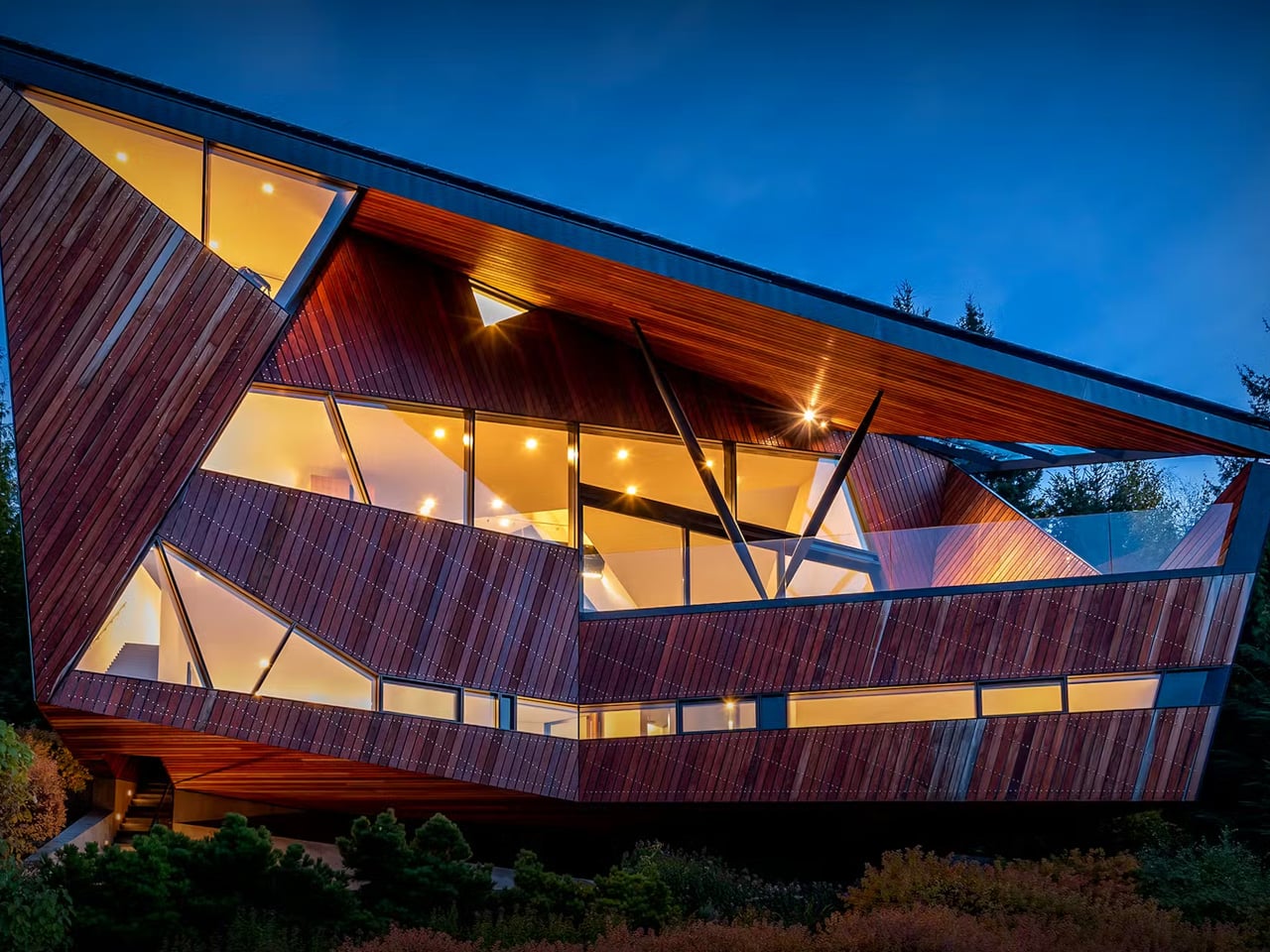
The Whistler Home That Looks Like It Fell From the Mountain

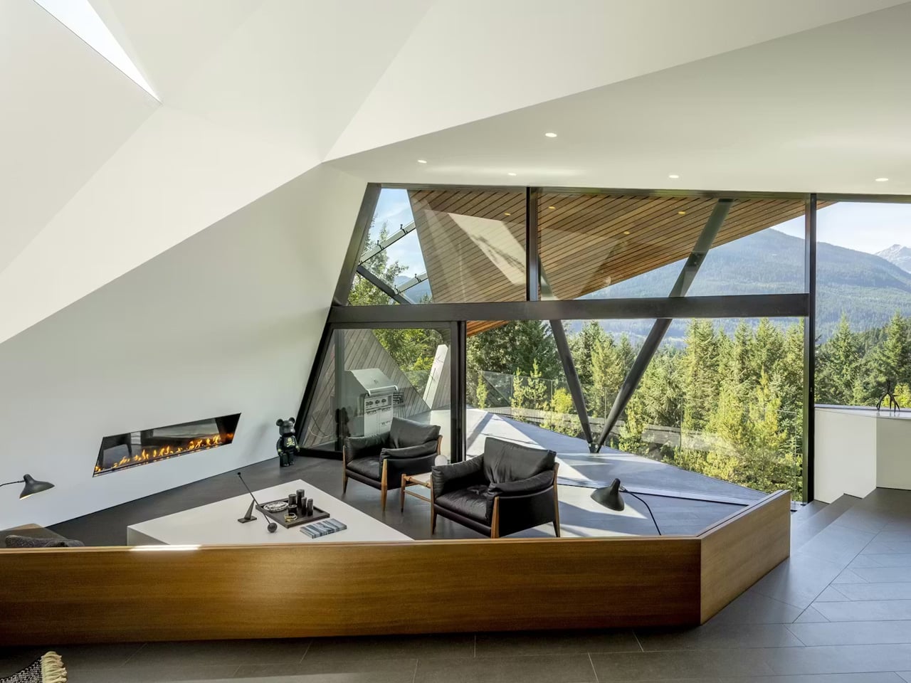
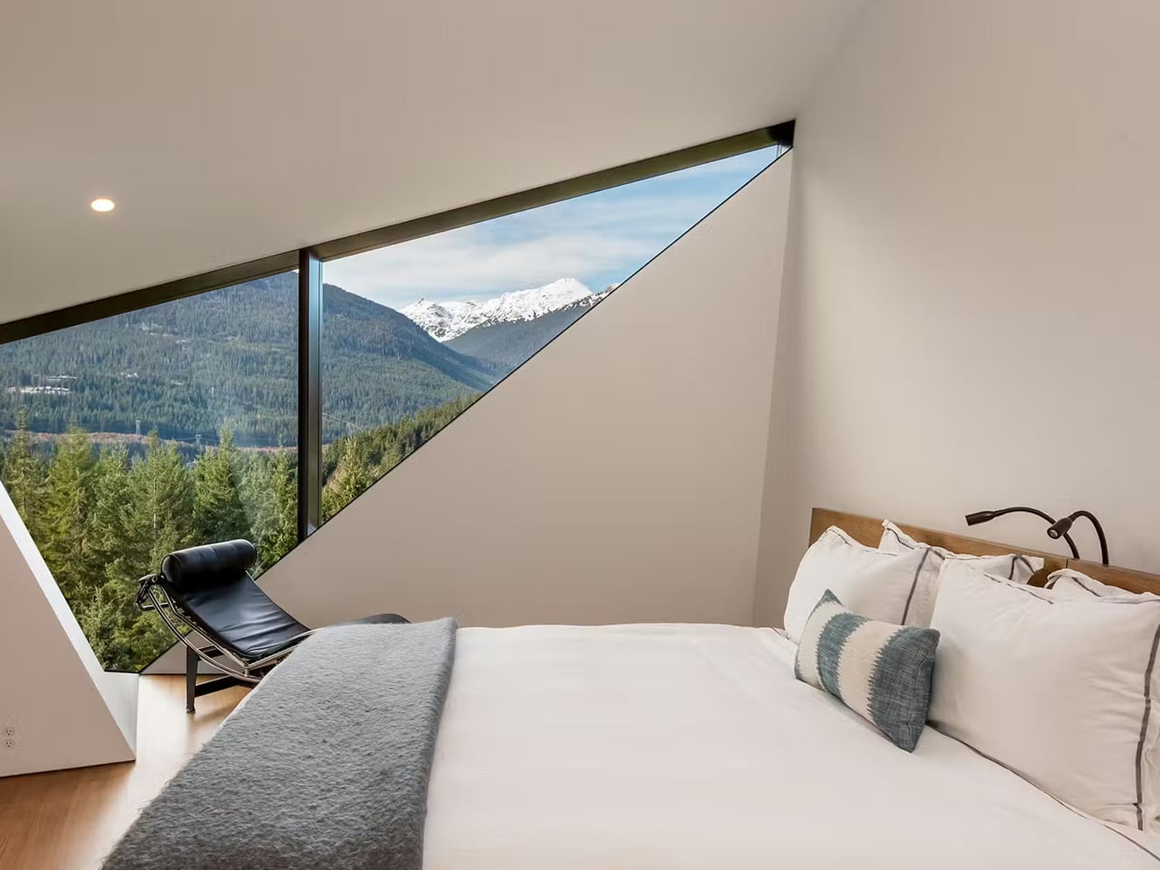
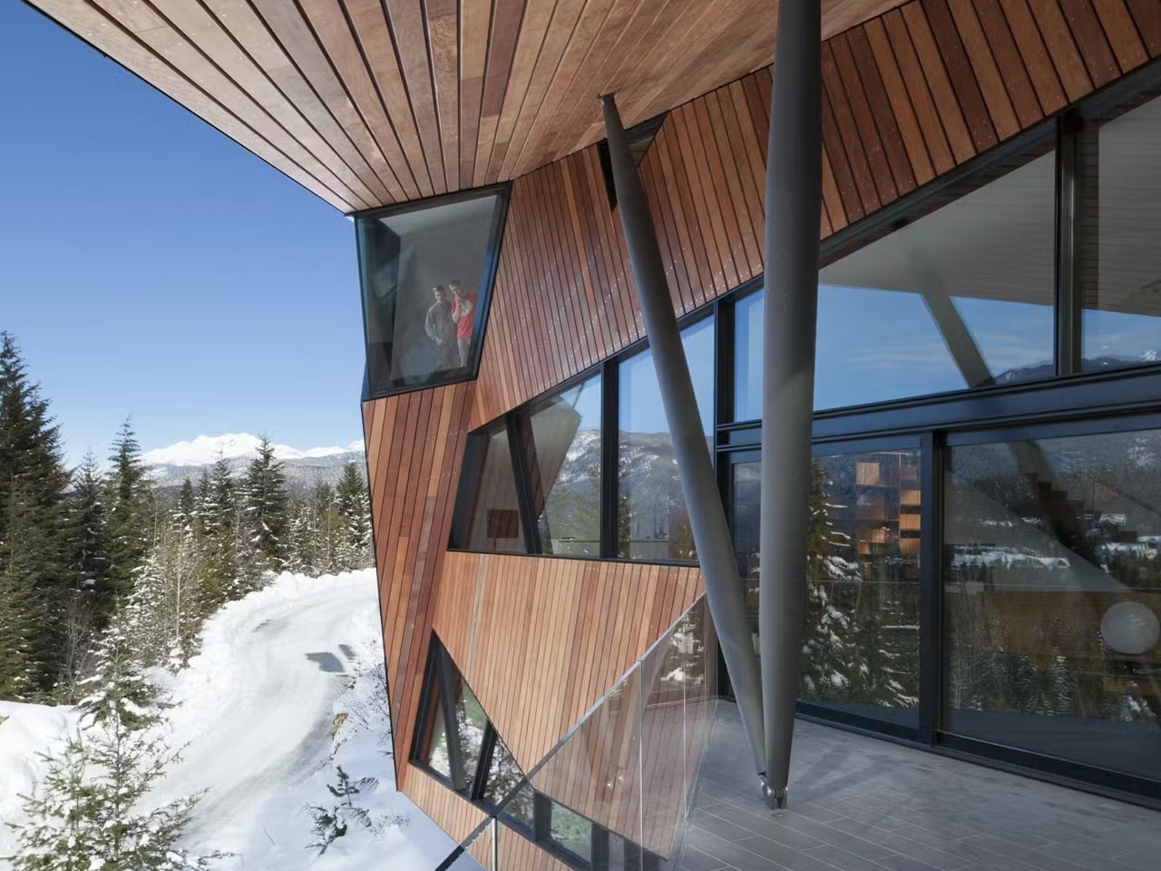
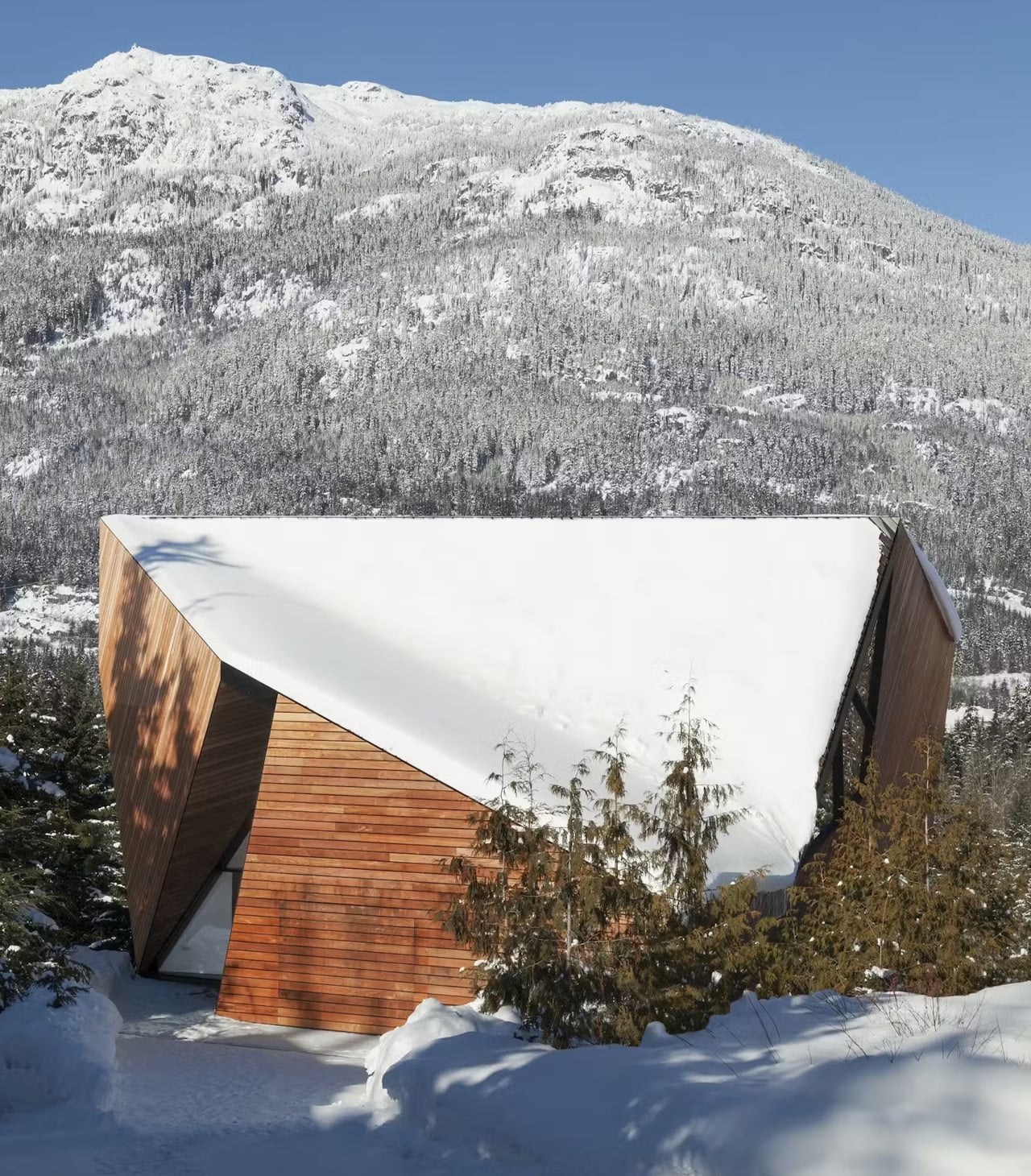
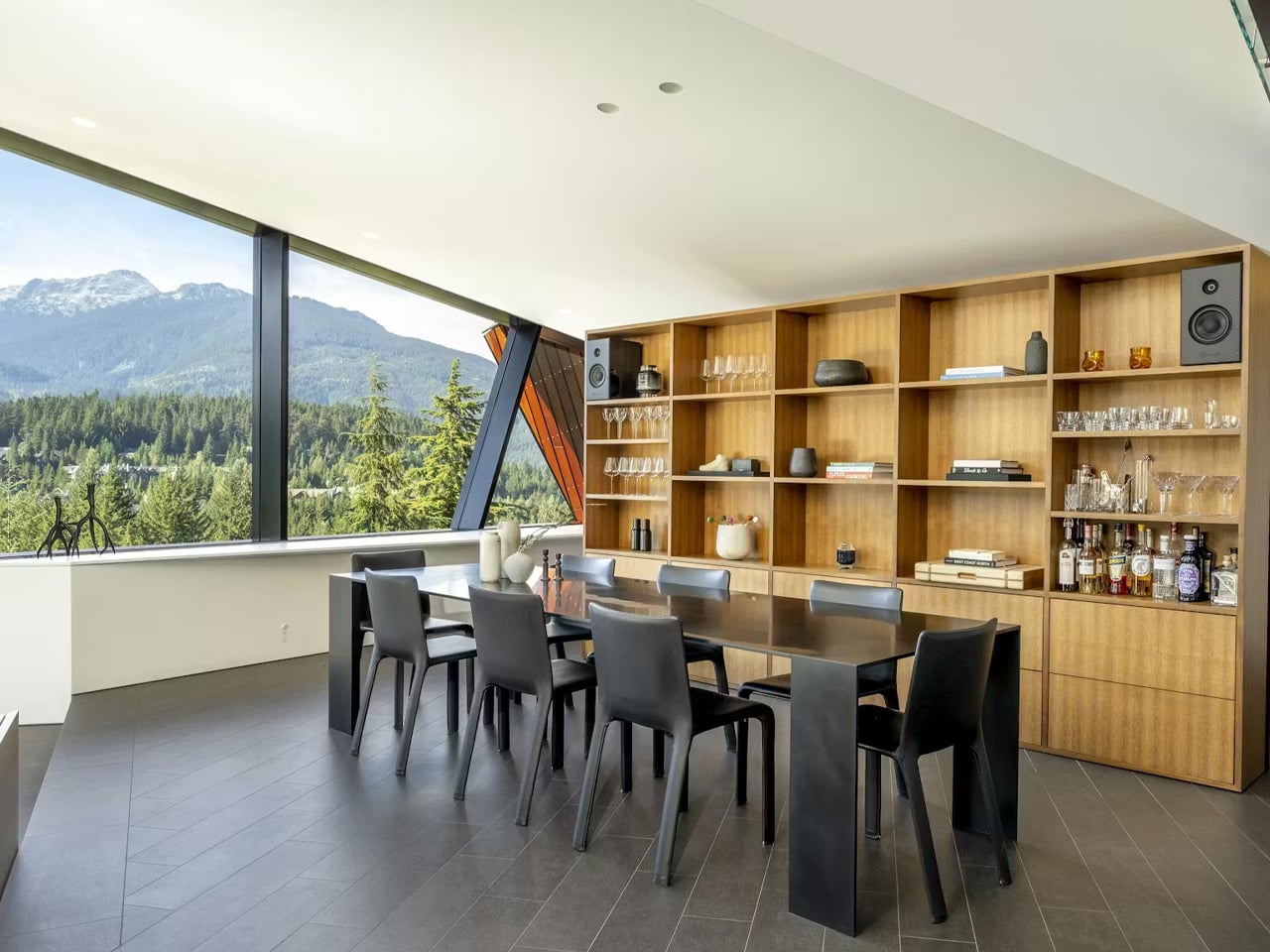
There are mountain homes, and then there is the Hadaway House. Perched on a northwest-facing slope in Whistler’s exclusive Sunridge neighbourhood, this 4,497-square-foot residence by Patkau Architects reads less like a chalet and more like a crystalline object that fell from the mountain itself — all sharp planes, acute angles, and glass that pulls the valley in from every direction.

The firm, best known locally for the nearby Audain Art Museum, pushed its own limits here. Principal John Patkau put it plainly: “We’ve done lots of geometrically complex projects, but this is the most three-dimensional that we have ever done.” It shows. The timber-clad exterior juts dramatically from the hillside, its steeply angled roof engineered not just for visual impact but for a very practical alpine reason — to shed snow. Form and function collapse into one another so completely that it’s hard to tell where the architecture ends and the landscape begins.

Designer: Patkau Architects

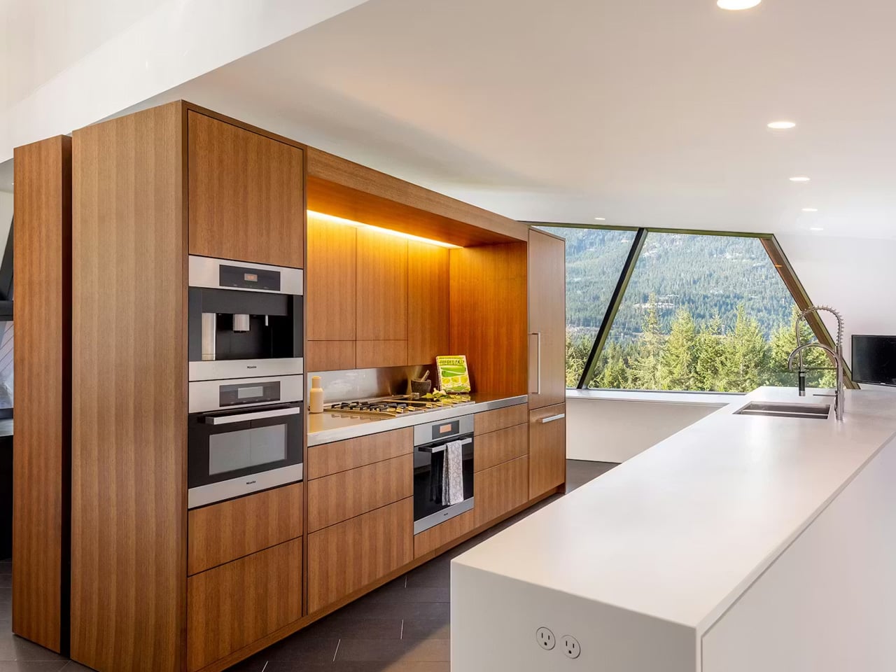
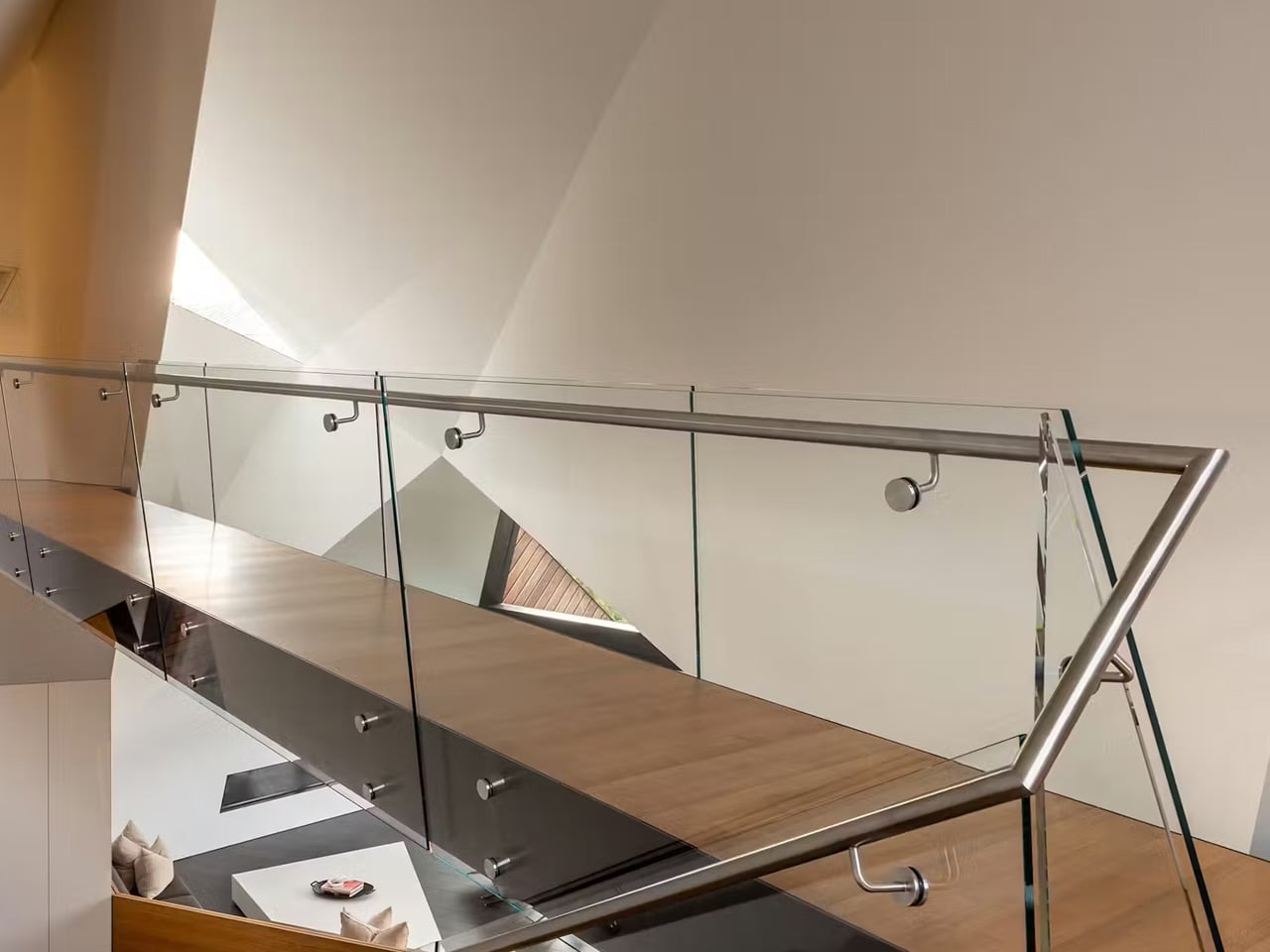
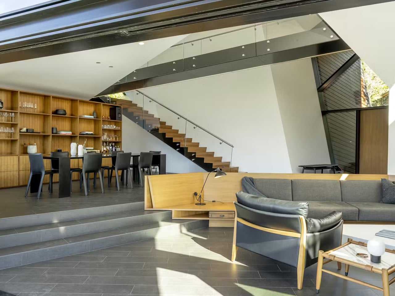
Inside, the home opens up in ways the exterior doesn’t telegraph. Soaring ceilings give the living spaces an almost civic scale, while expansive walls of glass frame panoramic views across Whistler Valley that shift with the light throughout the day. A glassy staircase rises to a catwalk above the main living area, adding a vertical drama that keeps the interior feeling animated. Glass sliders connect the living room to a large covered deck, making the boundary between inside and outside feel like a suggestion rather than a rule.

The three-bedroom, 4.5-bath layout sits on a 0.26-acre lot that sits moments from the mountain and minutes from Whistler Village — close enough to be convenient, private enough to feel removed from all of it. The Sunridge neighbourhood earns its reputation for discretion, and the house takes full advantage of that positioning. Thoughtfully designed indoor and outdoor spaces handle both intimate evenings and larger entertaining with equal ease; the refined finishes never compete with the architecture’s bolder gestures.

Completed in 2013, the house earned a Canadian Architect Award of Excellence, a recognition that has aged well. What was striking a decade ago feels, if anything, more relevant now — a period when alpine architecture is being rethought from the ground up, moving away from the rustic pastiche that dominated mountain design for so long.

The Hadaway House is currently listed at roughly $7.3 million USD by John Ryan Team at UNISON Real Estate Brokerages and Luxury Portfolio International. For a home of this architectural pedigree, in one of Canada’s most coveted mountain destinations, that number tells its own story.

The post The Whistler Home That Looks Like It Fell From the Mountain first appeared on Yanko Design.
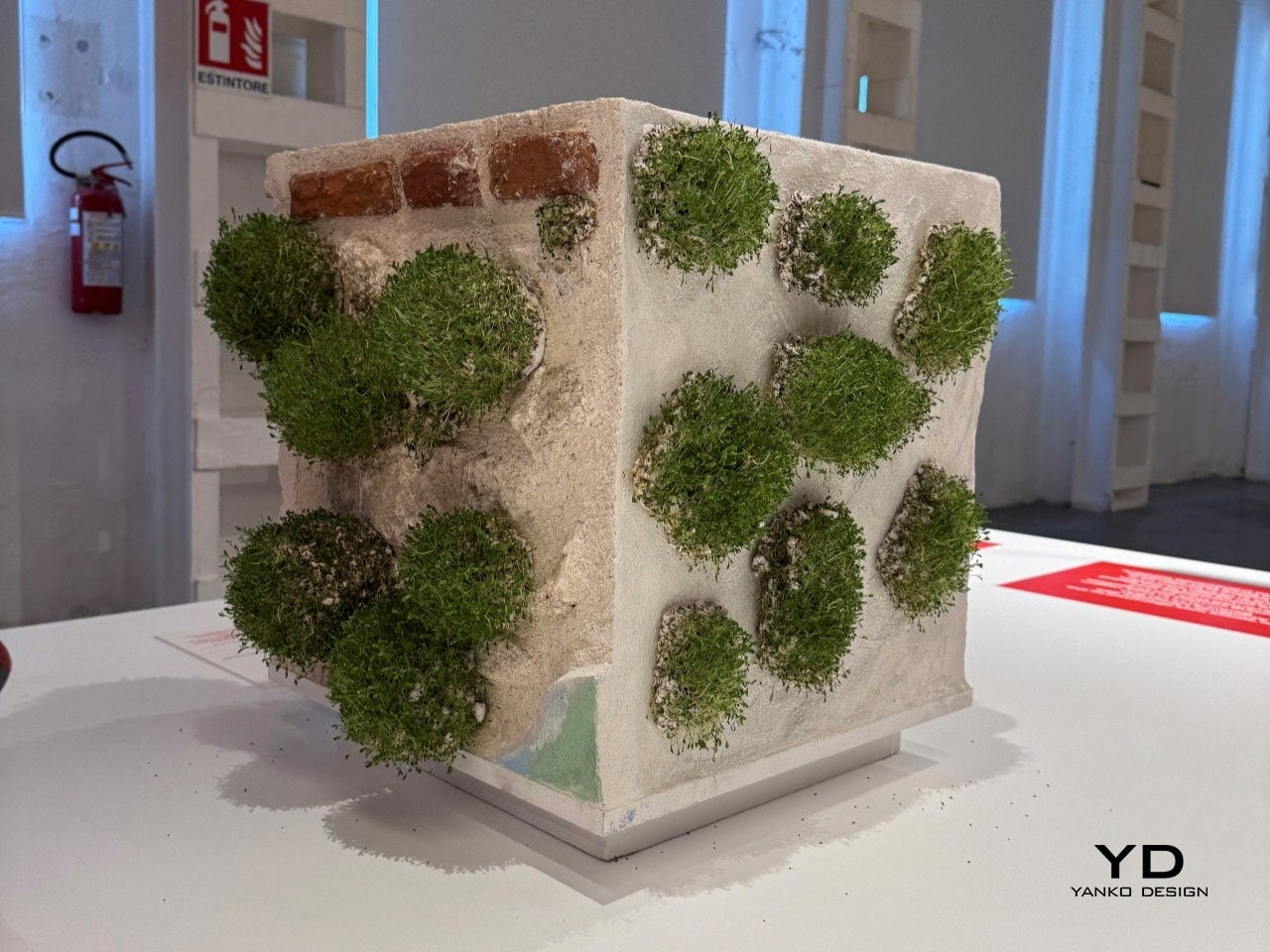
These Stickers Turn Crumbling City Walls Into Tiny Living Ecosystems

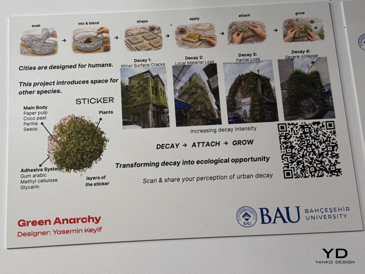
Cities are built almost exclusively for people. Every surface, every wall, every façade is designed, maintained, and repaired with human use in mind. But cities aren’t just inhabited by humans, and the idea that urban decay, those crumbling plaster patches and cracked brick faces, is purely a problem to be fixed ignores the potential it quietly holds for other species.

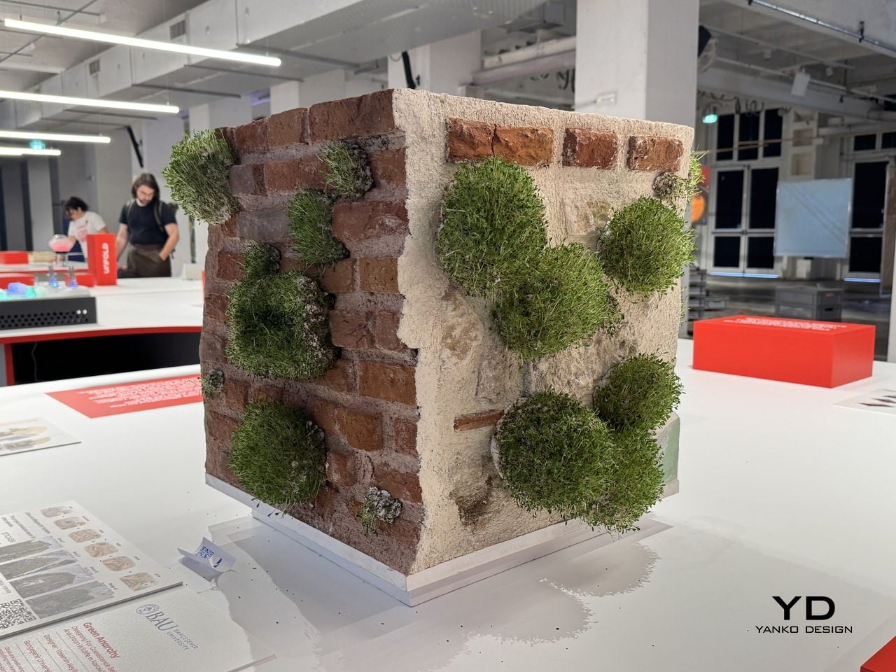
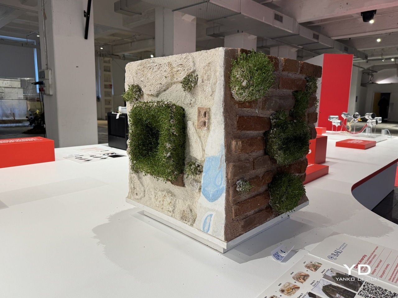
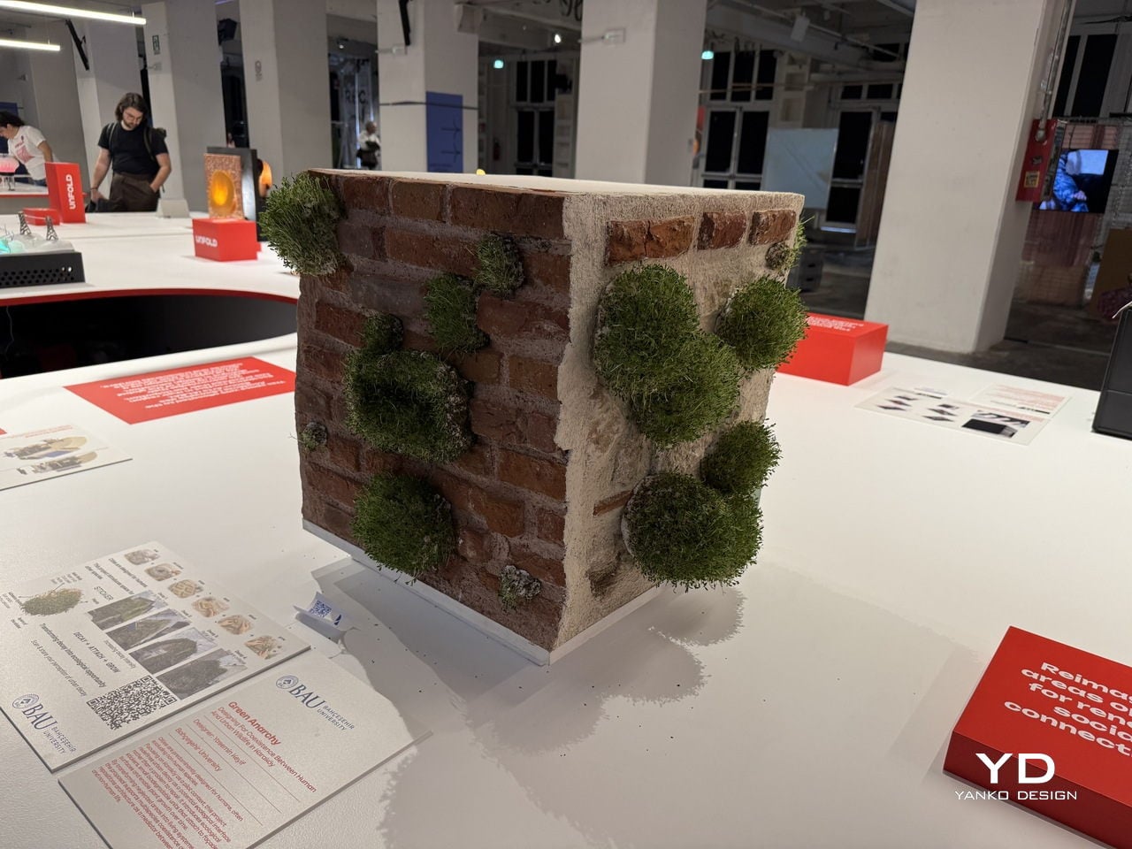
That’s the provocation at the heart of Green Anarchy, a project by Yasemin Keyif of Bahçeşehir University in Istanbul, presented as part of the UNFOLD 2026 exhibition at BASE Milano during Milan Design Week. Rather than treating a cracked or crumbling façade as something to be patched over, Keyif asks what happens when designers choose to work with decay instead of against it.

Designer: Yasemin Keyif (Bahçeşehir University)

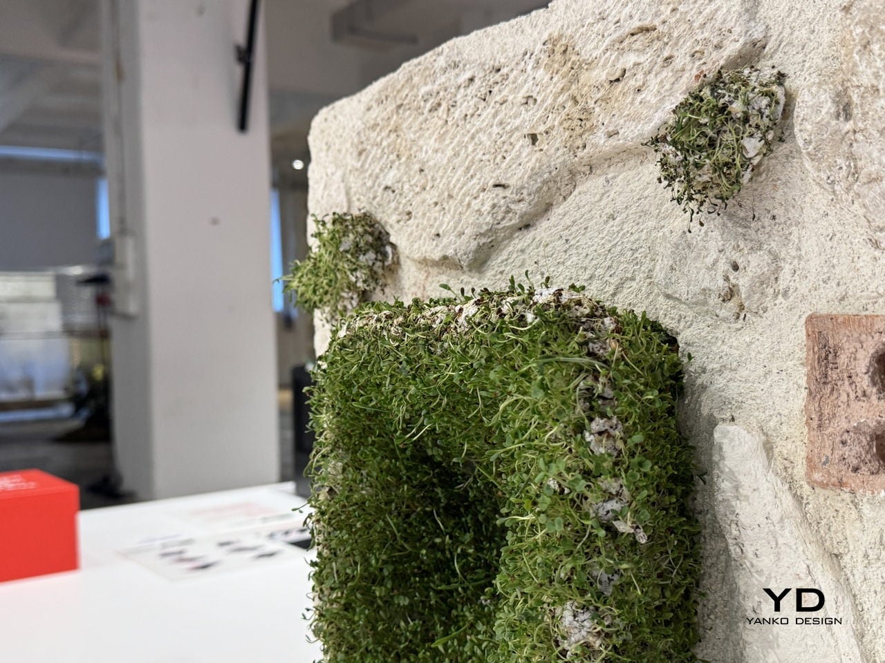
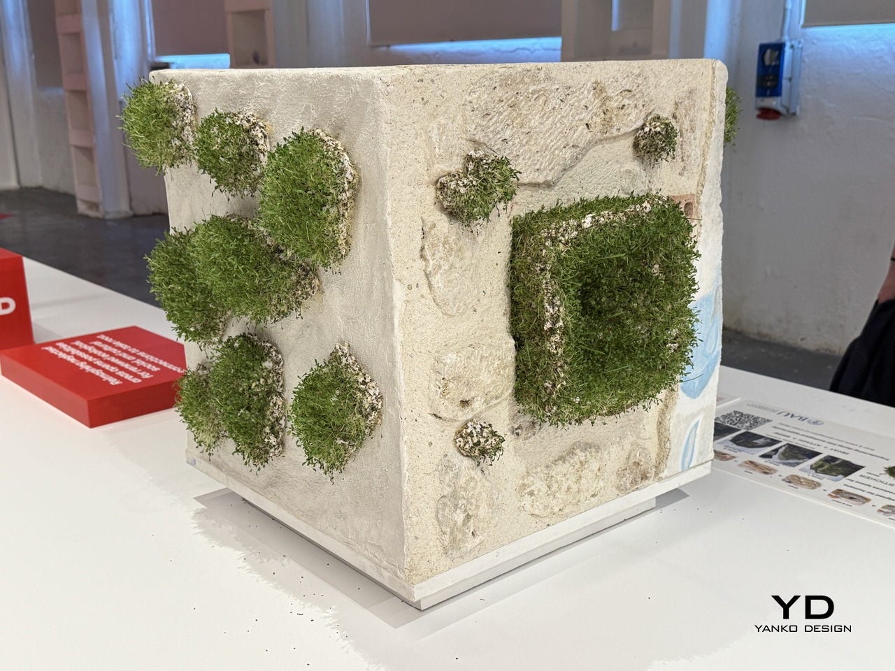
The answer takes the form of a small, biodegradable sticker pressed directly onto damaged building surfaces. Each unit is made from a blend of paper pulp, coco peat, perlite, and seeds in its main body, with an adhesive system of gum arabic, methyl cellulose, and glycerin that lets it bond to roughened or degraded masonry without any synthetic materials.

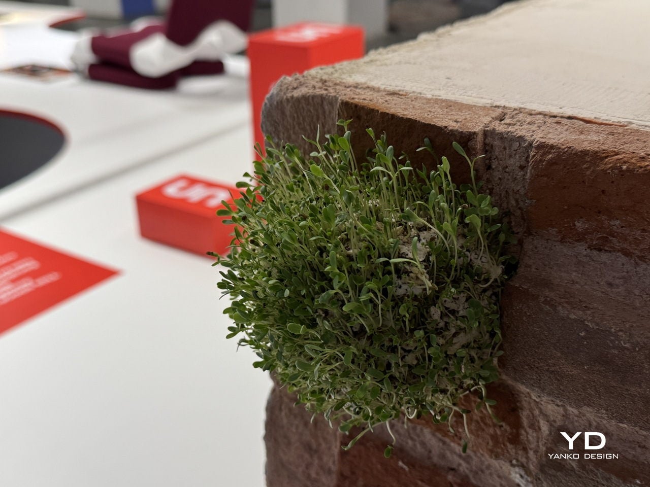
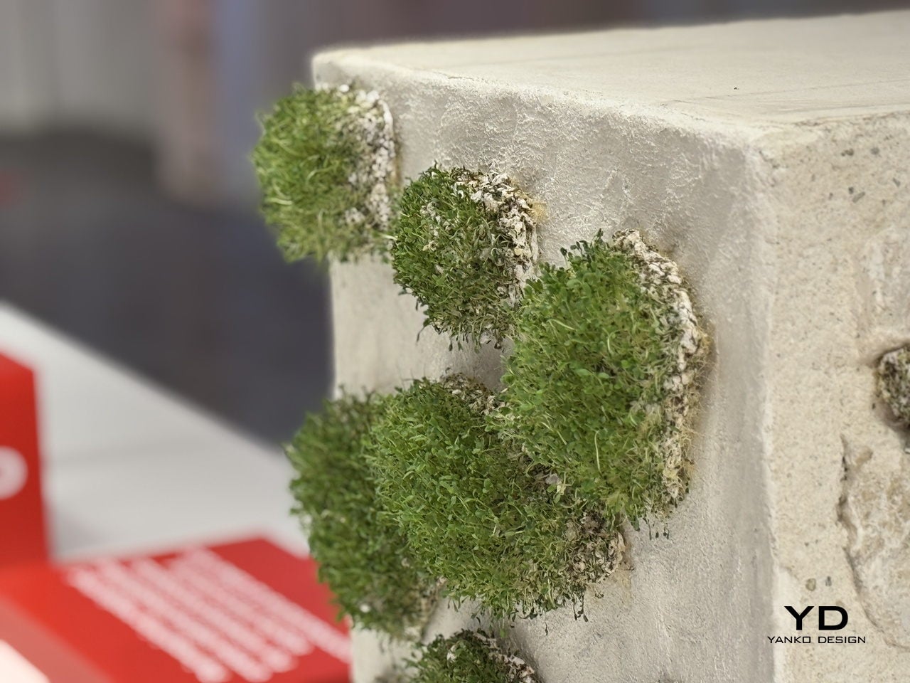
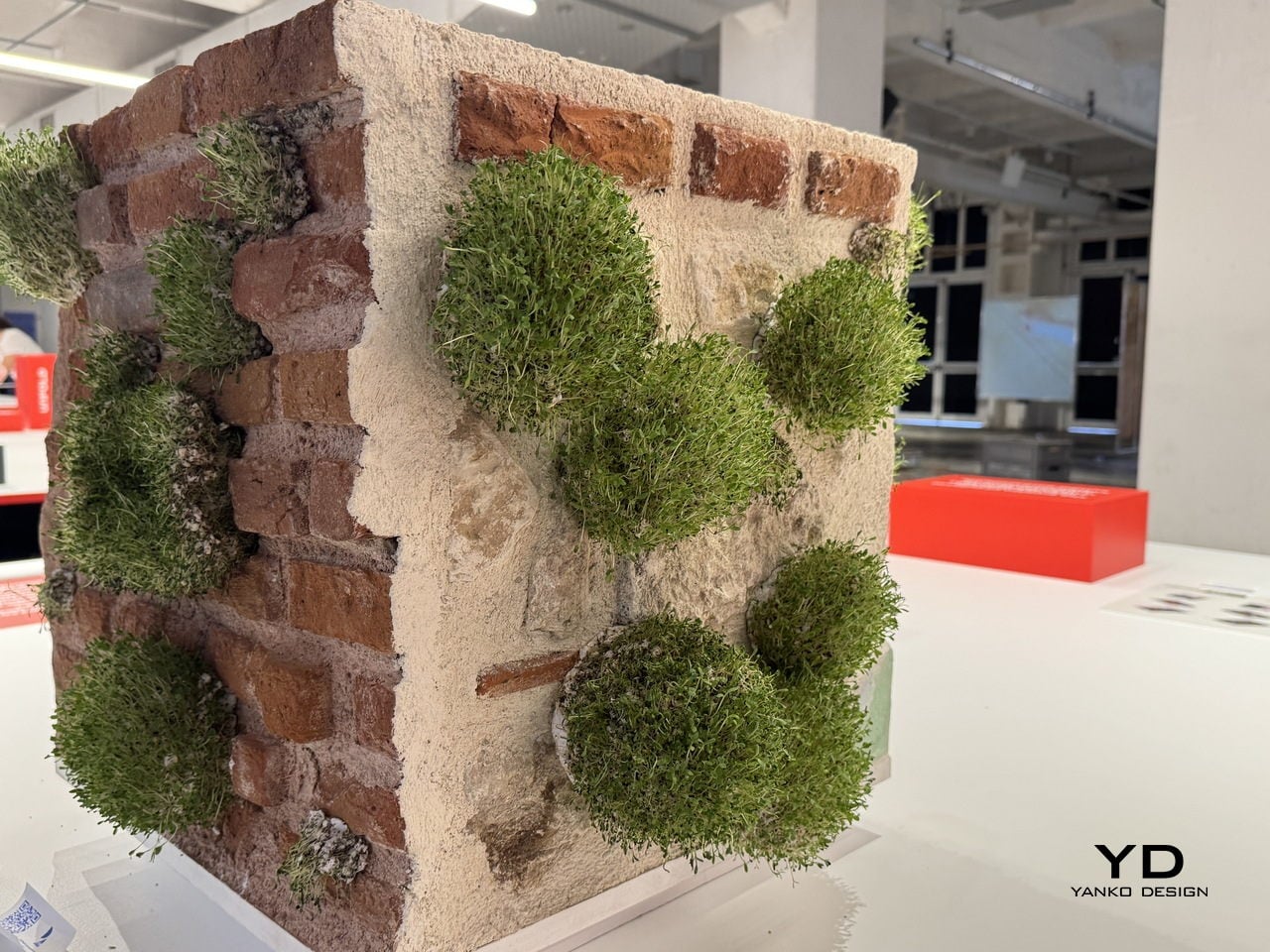
The process is surprisingly simple: the stickers are soaked, mixed, shaped, and applied by hand directly onto the wall. Over time, the seeds embedded in the substrate germinate and take root in the existing cracks and recesses, gradually turning neglected building surfaces into small, self-sustaining ecosystems. The name for this sequence, decay, attach, grow, also doubles as the project’s driving logic.

Keyif developed the concept with Karaköy, a dense historic neighborhood in Istanbul, as the pilot context. The project maps four escalating stages of urban decay, from minor surface cracks to severe structural collapse, and identifies each stage as a viable entry point for the stickers. The greater the damage, the more surface area becomes available for attachment and growth, turning the most deteriorated walls into the most fertile ground.

The deeper idea is a repositioning of architecture itself. Buildings, in this framework, aren’t just infrastructure for human activity but potential interfaces between human and non-human life. Cities already host birds, insects, mosses, and small animals that quietly inhabit the spaces we overlook, and Green Anarchy asks whether design can actively make room for that, rather than continually squeezing it out.

Presented as part of UNFOLD 2026, Domus Academy’s annual international design showcase held under the theme “Engage Friction: Designing Through Conflict,” Green Anarchy fits the brief almost too well. It doesn’t try to resolve the tension between the built city and the natural world so much as give them a way to grow into each other, slowly, without asking anyone’s permission.

The post These Stickers Turn Crumbling City Walls Into Tiny Living Ecosystems first appeared on Yanko Design.
Three Bedrooms, Two Bathrooms, and a Tiny Home Layout Nobody Thought to Try Until Now

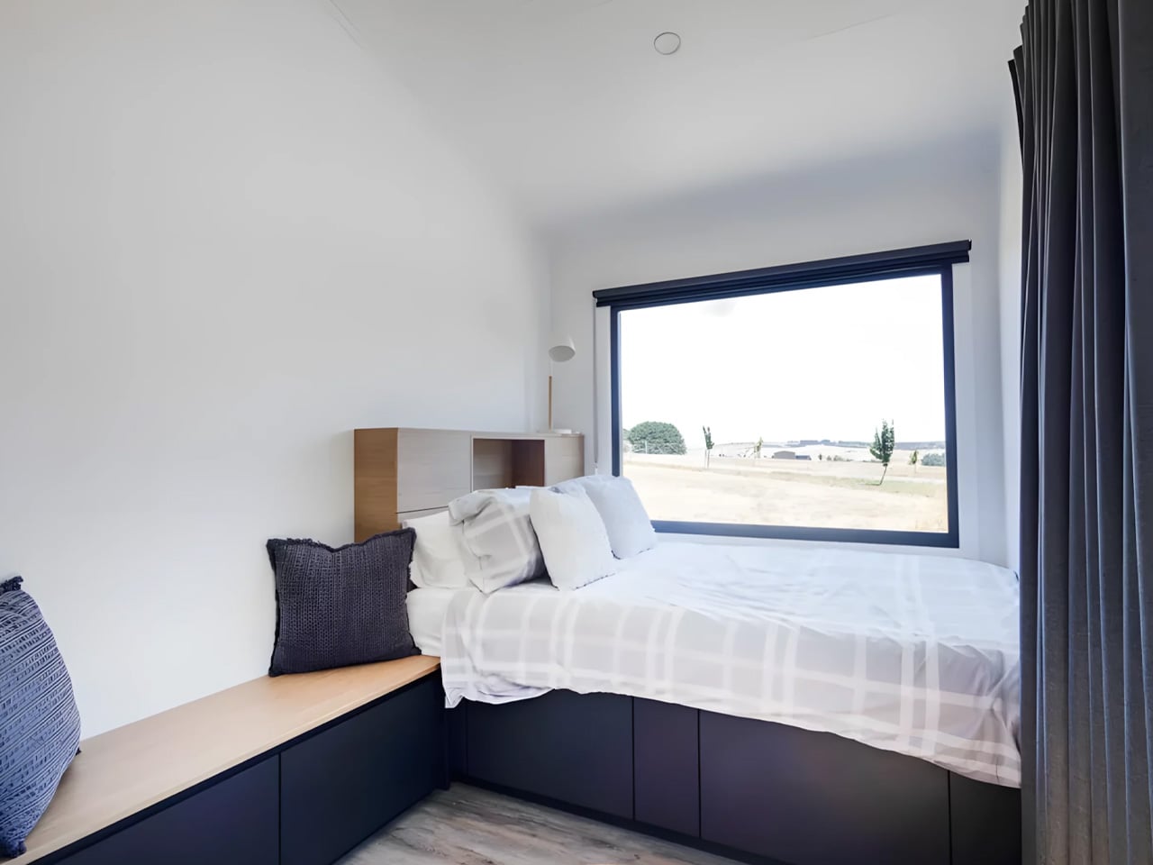
Most tiny homes follow the same predictable playbook: squeeze a loft bed above, cram the kitchen below, repeat. The Onda by Australian builder Removed Tiny Homes throws that rulebook out entirely. Part of the brand’s new Tiny Mansions lineup — a series of oversized, premium tiny homes built for people who love the concept of small-scale living but refuse to sacrifice comfort — the Onda is the first of its kind to introduce a true upside-down layout.

The concept is disarmingly simple, yet nobody has really done it before. All three bedrooms sit on the ground floor, while the kitchen, living room, and bathroom occupy the elevated upper level. It’s a reverse loft plan, and once you see it, the logic is undeniable. Private spaces below, communal life above, all wrapped in a design that moves with natural fluency between the two.

Designer: Removed Tiny Homes

Built on a double-axle trailer, the Onda is finished in steel with warm wooden accents that keep it from reading too industrial. It measures 10 meters long, 3.4 meters wide, and 4.5 meters tall, dimensions that push it squarely into apartment territory rather than anything you’d call a cabin. An optional deck extends the footprint further, spilling the living area outdoors when the weather calls for it.

Upstairs is where the design really earns its Tiny Mansion billing. The kitchen is a proper one with stone benchtops, full cabinetry, and no compromises. The living room opens beside it, lit by a trio of skylights that flood the space with natural light. The bathroom is equally considered: a central vanity, a glass-enclosed shower positioned directly beneath a skylight, a toilet, a closet, and a stacked laundry setup all within a space that somehow feels spa-like.

The three downstairs bedrooms give a growing family actual breathing room, not a ladder-accessed loft shared with luggage, but real rooms with doors. That shift alone repositions the Onda from novelty to a genuine alternative for families navigating an increasingly impossible housing market.

Early buyers are rewarded with a Luxury Living Upgrade Pack that includes the fully tiled bathroom, the skylight trio, and the stone benchtops at no extra cost. Customization options ranging from strategic window placement to full off-grid capability mean the Onda can be tailored to wherever life needs to land next. Pricing starts at around USD $161,700, with delivery available across Australia. For a home that carries three bedrooms, two bathrooms, and an entirely new way of thinking about space, that number is harder to argue with than it looks.

The post Three Bedrooms, Two Bathrooms, and a Tiny Home Layout Nobody Thought to Try Until Now first appeared on Yanko Design.
Why the Audrey by CozyCo Might Be the Most Practical Tiny Home on the Market

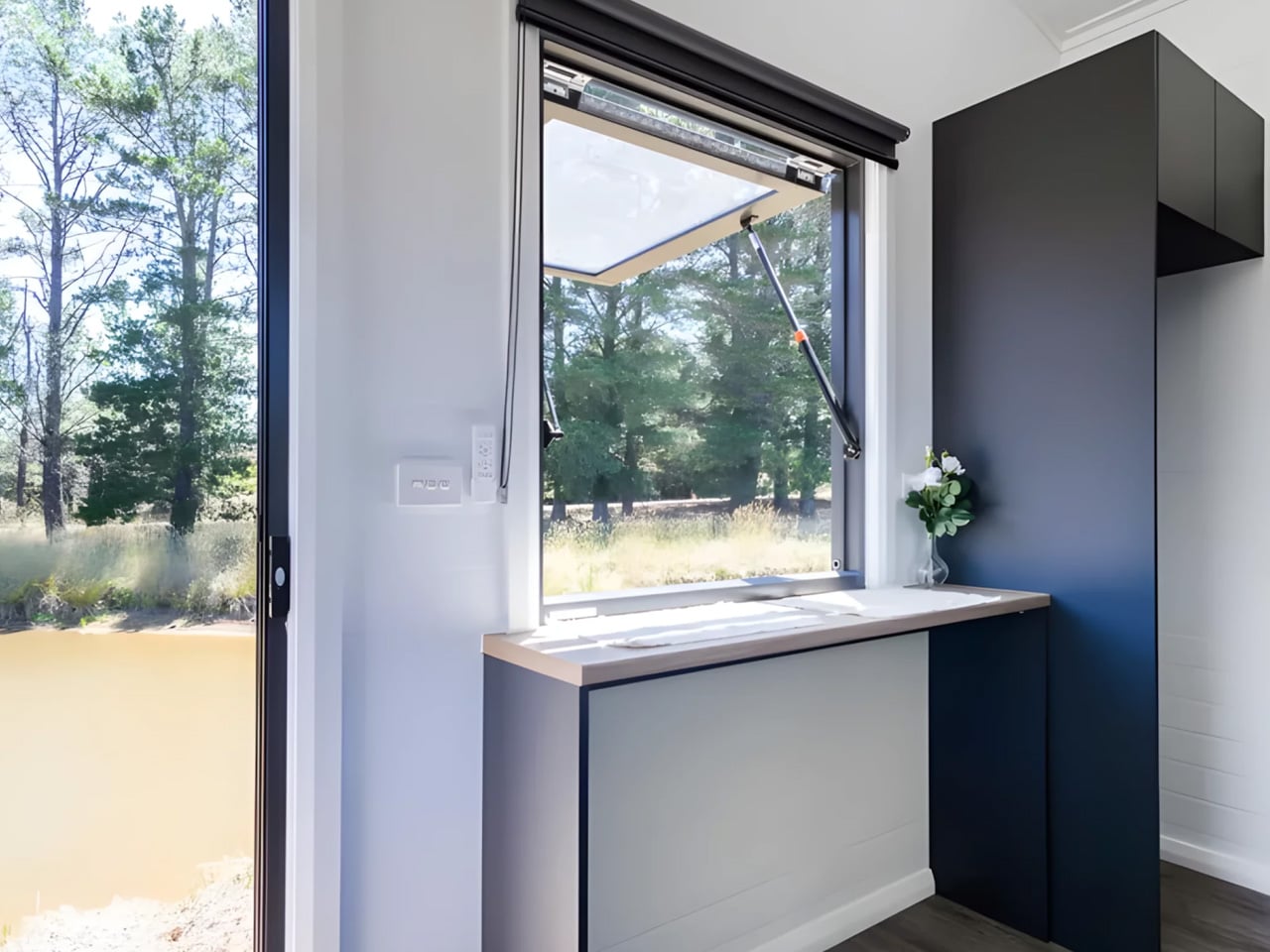
Most tiny homes ask you to compromise. The Audrey by Australia’s CozyCo Tiny Homes is built around the idea that you shouldn’t have to, delivering a compact, single-level build that makes efficient living look effortless. At just 7.2 metres (23.7 ft) long and mounted on a triple-axle trailer, the Audrey punches well above its footprint.

Its exterior is a clean mix of corrugated aluminium and timber-look panels, a combination that gives the home a timeless aesthetic that could slot into a bush property, a coastal block, or a suburban backyard without missing a beat. A small external box handles propane storage, keeping things tidy on the outside.

Designer: CozyCo Tiny Homes

Step inside, and the single-level layout immediately makes sense. Designed to sleep up to two people comfortably, the Audrey works equally well as a short-stay rental, a guest suite, a granny flat, or a semi-permanent retreat. The open studio configuration keeps circulation easy, while sliding glass doors flood the interior with light and make the space feel far larger than its dimensions suggest.

The build quality is where CozyCo makes its case. R2.5 insulation, VJ paneling, and double-glazed windows work together to keep thermal comfort dialed in across seasons. Gas, hot water, and air conditioning mean the Audrey handles year-round living without compromise. A storage bed rounds out the interior, removing the need for bulky furniture and keeping the floor plan clean.

For those who want to go further off-grid, CozyCo offers optional packages that include solar power systems, eco-friendly toilets, and water storage. The brand sources materials locally and builds each home to residential standards, backing every Audrey with a seven-year structural warranty and a lifetime warranty on the trailer. That’s a level of confidence that’s rare in the tiny home space.

CozyCo is an Australian outfit that brings real construction industry experience to the table, with a clear focus on builds that minimise environmental impact and maximise longevity. The Audrey is architecturally designed and finished to a premium standard, not a flat-pack workaround, but a proper home that happens to be mobile.

Whether the goal is Airbnb income, a low-maintenance guest house, or a quieter way of living, the Audrey makes a compelling argument. It’s proof that you don’t need more square footage. You need better decisions about the space you already have.

The post Why the Audrey by CozyCo Might Be the Most Practical Tiny Home on the Market first appeared on Yanko Design.
Backcountry’s Scandi Inn Makes 270 Sq Ft Feel Generous

The tiny house movement has had its share of aesthetic whiplash over the years. One week it’s shiplap and barn doors, the next it’s industrial pipe fixtures and Edison bulbs. So when something comes along that actually commits to a visual language and carries it through consistently, it’s worth paying attention. The Scandi Inn by Backcountry Tiny Homes is one of those rare builds that knows exactly what it is.
At 270 square feet and 24 feet long, the Scandi Inn sits on a triple-axle trailer and borrows its design sensibility from Scandinavian interiors. Cedar tongue-and-groove siding on the exterior, paired with metal cladding, gives it that understated cabin quality that reads more European alpine than American backwoods. It doesn’t shout for attention, which is a deliberate choice, and the right one.

Designer: Backcountry Tiny Homes

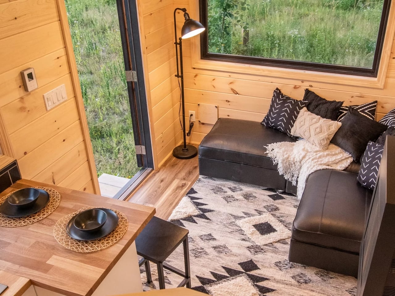
Step inside, and the interior is finished entirely in tongue-and-groove pine. The effect is warm without being heavy, which is genuinely hard to pull off in a small space. Nordic design has always understood the relationship between wood and light, using natural materials to compensate for limited square footage and often-limited daylight. In the Scandi Inn, that same logic applies, and it translates surprisingly well to a 270-square-foot box on wheels. The overall atmosphere lands somewhere between a mountain cabin and a well-curated hotel room, which is a balance most interior designers wouldn’t attempt at full scale, let alone this one.

The layout makes serious use of every inch. The kitchen includes a breakfast bar that seats two, alongside a dining area, a living room, and a tiled shower bathroom. A loft bedroom sits above the main floor, and a reading nook tucks into the plan somewhere in between, which is the kind of detail that separates a thoughtful design from a merely functional one. A reading nook isn’t about space efficiency. It’s about acknowledging that people need places to exist quietly, even in small homes. Especially in small homes.

The Scandi Inn sleeps up to three people, which is ambitious for 270 square feet but not unrealistic. The loft configuration handles sleeping without eating into the main living space, a solution that tiny house designers have relied on for years. What makes it work here is that the loft doesn’t feel like an afterthought squeezed in at the last minute. It feels planned, proportional, and consistent with the rest of the interior.

Backcountry Tiny Homes has built a reputation for custom builds that take their design cues seriously, and the Scandi Inn reflects a clear maturity in that thinking. Earlier tiny house builds, from this maker and others, often suffered from the same problem: too many styles competing for attention in a space that couldn’t support the noise. The Scandi Inn has none of that. The palette is restrained, the material choices are cohesive, and the proportions feel considered rather than accidental.

The turnkey price lands at $77,800, which in the current housing market feels almost quaint. That’s not a dismissal of the cost. It’s a significant sum. But context matters. The average home price in the US continues to climb past the reach of a growing number of people, and builds like the Scandi Inn represent a legitimate alternative for those rethinking what homeownership can look like. It’s not a compromise so much as a reorientation of priorities.

The tiny house conversation used to center on sacrifice, on what you give up, what you do without, how you make peace with less. The Scandi Inn frames it differently. The quality of the materials, the cohesion of the design, and the genuine livability of the layout suggest that the goal was never to shrink a house. It was to build something intentional from the start. That distinction matters more than it might seem. Most spaces, regardless of size, feel the way they do because of decisions made about materials, light, layout, and proportion. The Scandi Inn makes good decisions throughout. At 270 square feet, that’s all it needs to do.

The post Backcountry’s Scandi Inn Makes 270 Sq Ft Feel Generous first appeared on Yanko Design.