Sorry, Slackbot. Claude is taking your job
Anthropic has introduced @Claude for Slack.
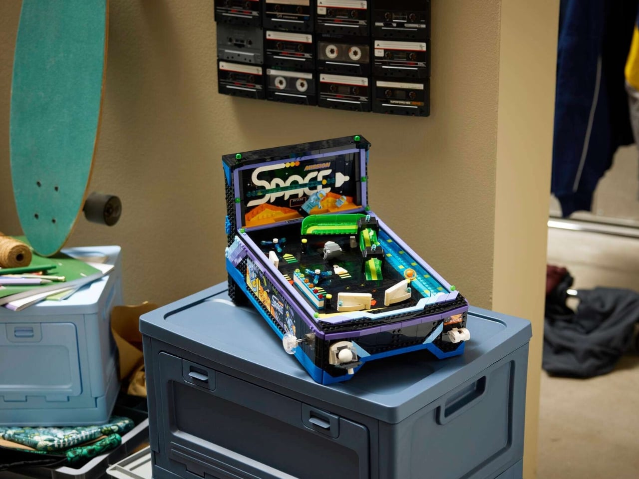
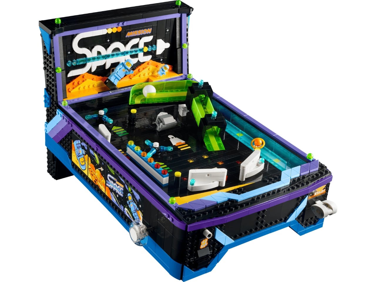
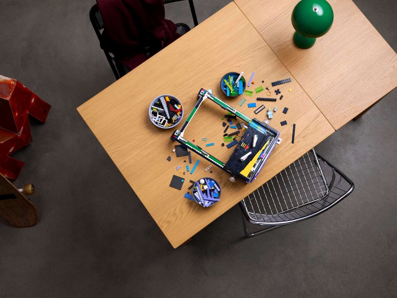
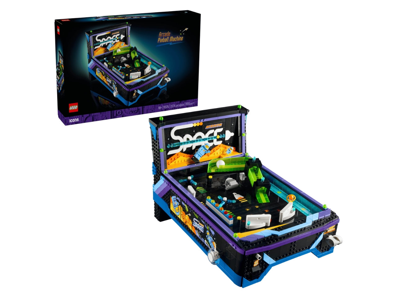
LEGO has been on quite a streak lately with its adult-targeted Icons sets, and the latest one might just be its most interesting flex yet: a fully playable, tabletop-sized arcade pinball machine built entirely from 2,274 bricks.
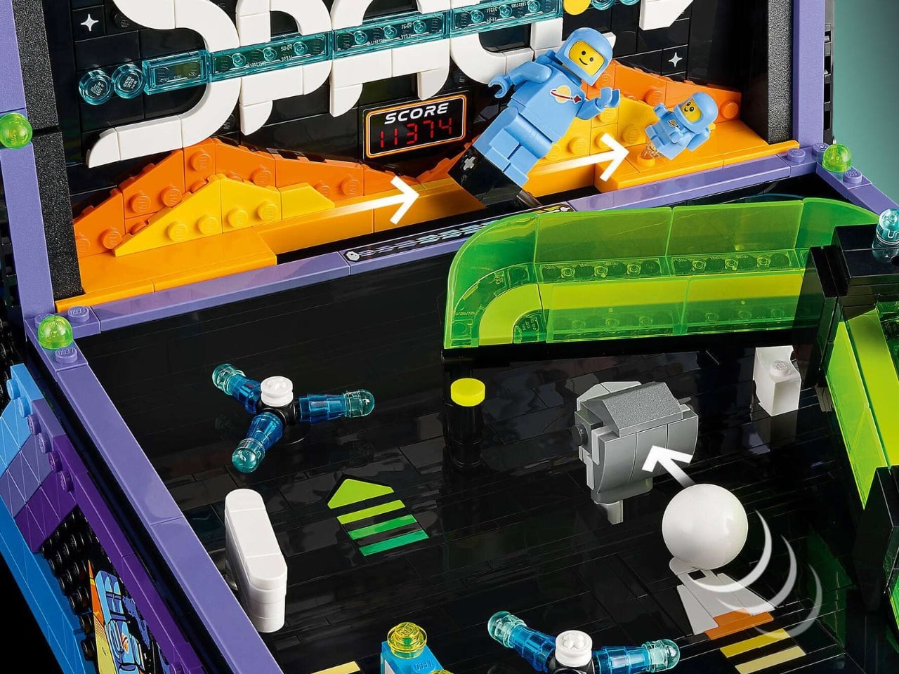
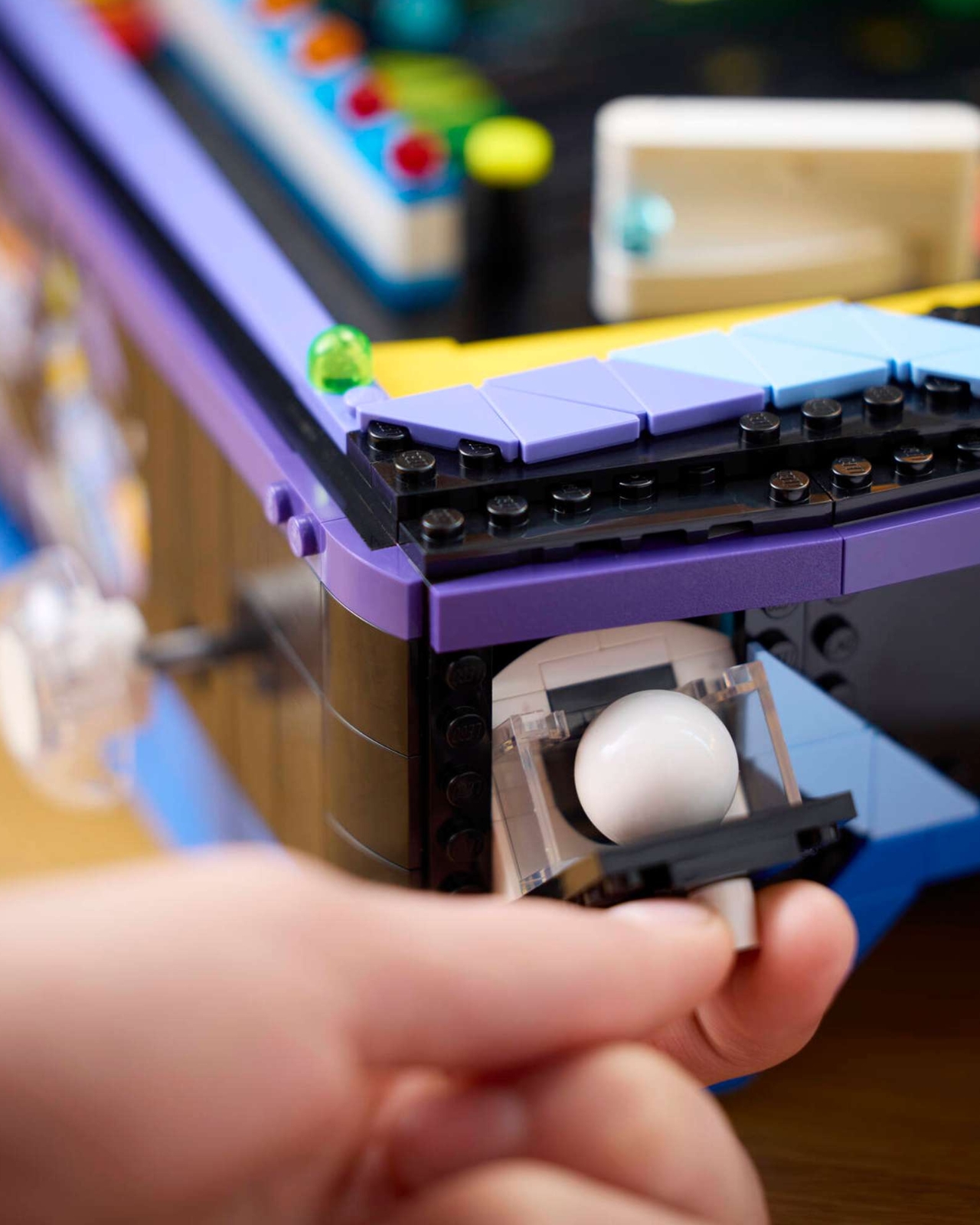
Set number 11374, simply called the Arcade Pinball Machine, does exactly what you hope it does. It plays. Featuring a spring-powered launcher, dual flippers, and spinning bumpers, this is not a decorative replica meant to sit quietly on a shelf while you admire it from a distance. LEGO clearly wanted you to actually use it, and that ambition alone is worth paying attention to.
Designer: LEGO
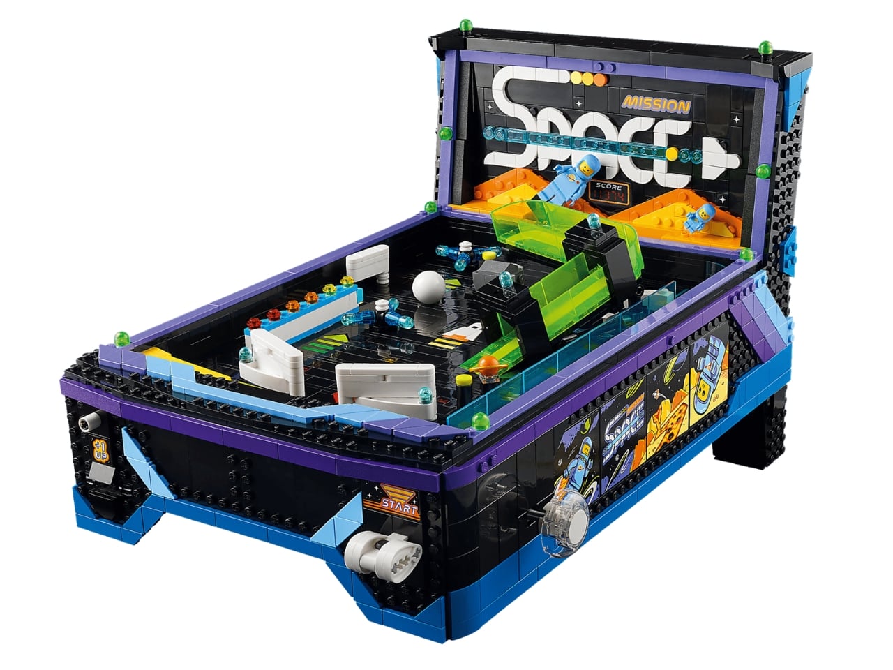
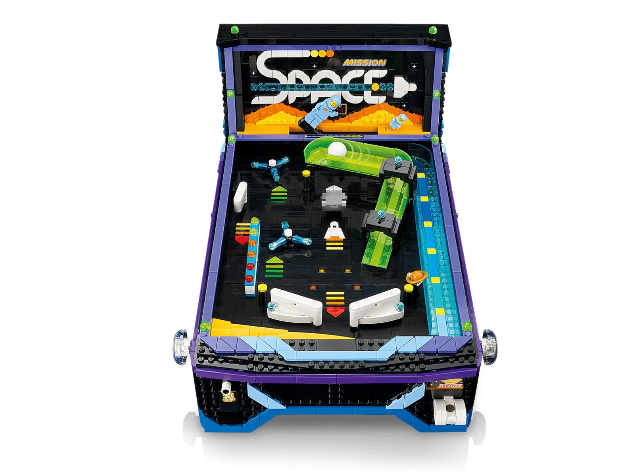
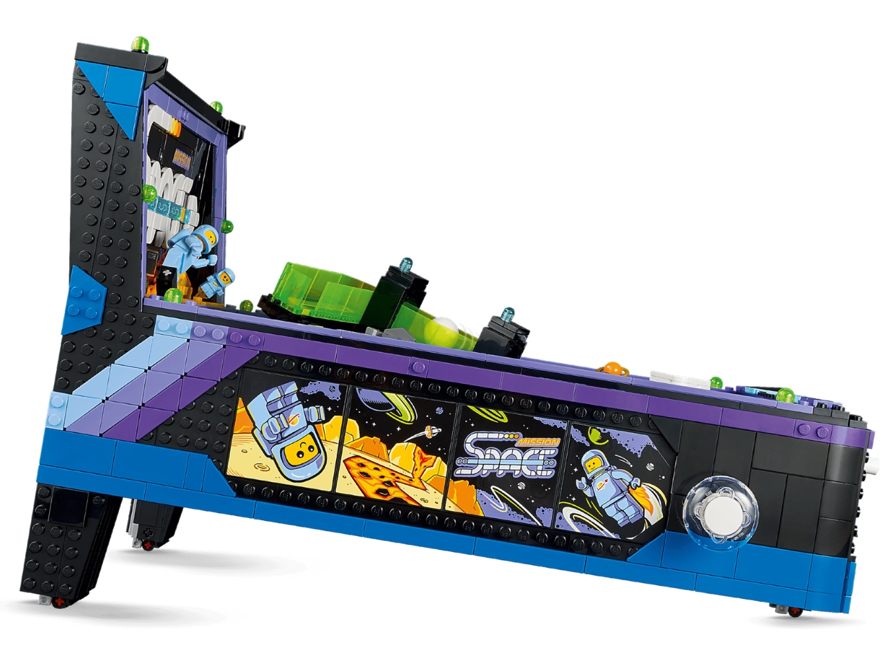
The machine is space-themed, pulling from LEGO’s beloved Classic Space universe. The scoreboard reads “MISSION SPACE” with a bold nod to the set number itself, and two minifigures are included: a classic pale blue astronaut and the now-iconic baby astronaut, affectionately known among fans as the “space baby.” The classic spaceman minifigure also doubles as the score counter, physically moving in increments as the ball hits its targets. It’s a clever, tactile detail that completely elevates the overall playability and gives the set a mechanical personality you don’t expect.
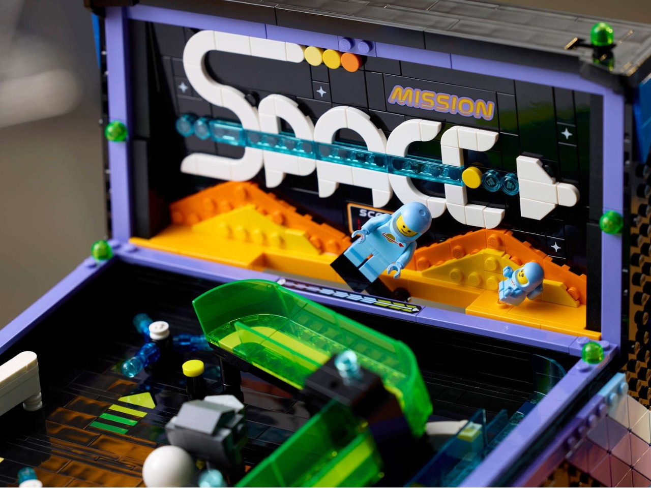
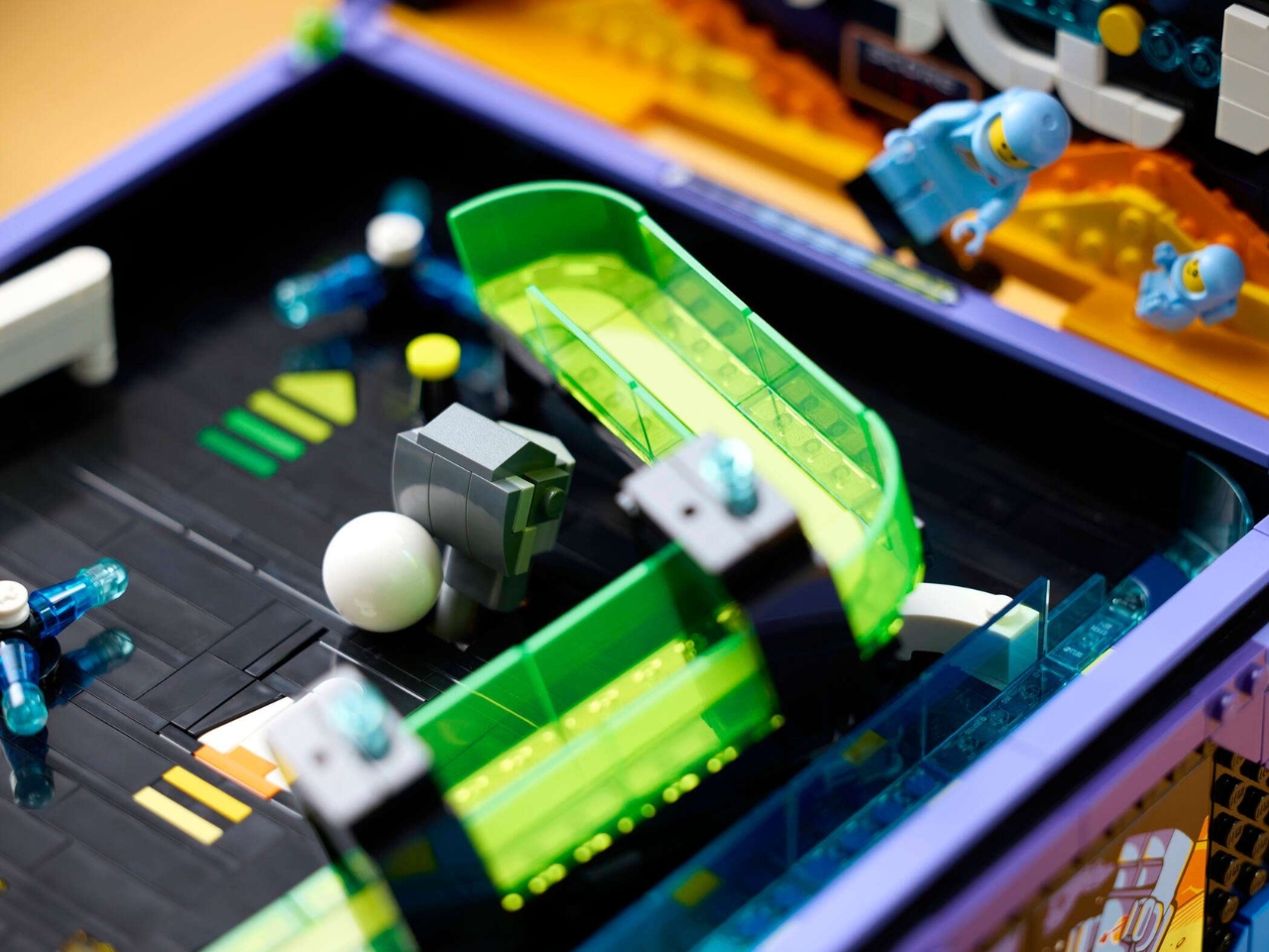
Visually, it leans into the aesthetic of vintage tabletop pinball toys from the 70s through the 90s, those smaller home versions that captured the spirit of full arcade cabinets without the industrial footprint. The color palette is vibrant, the proportions feel deliberate, and the whole thing comes across as a genuinely considered design object rather than a novelty. The space theme gives it a clear visual identity rather than leaning on generic retro graphics, which is a choice that pays off. LEGO has been getting better at threading that needle between toy and collectible, and this set lives comfortably in that space.
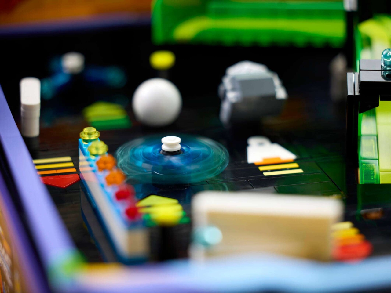
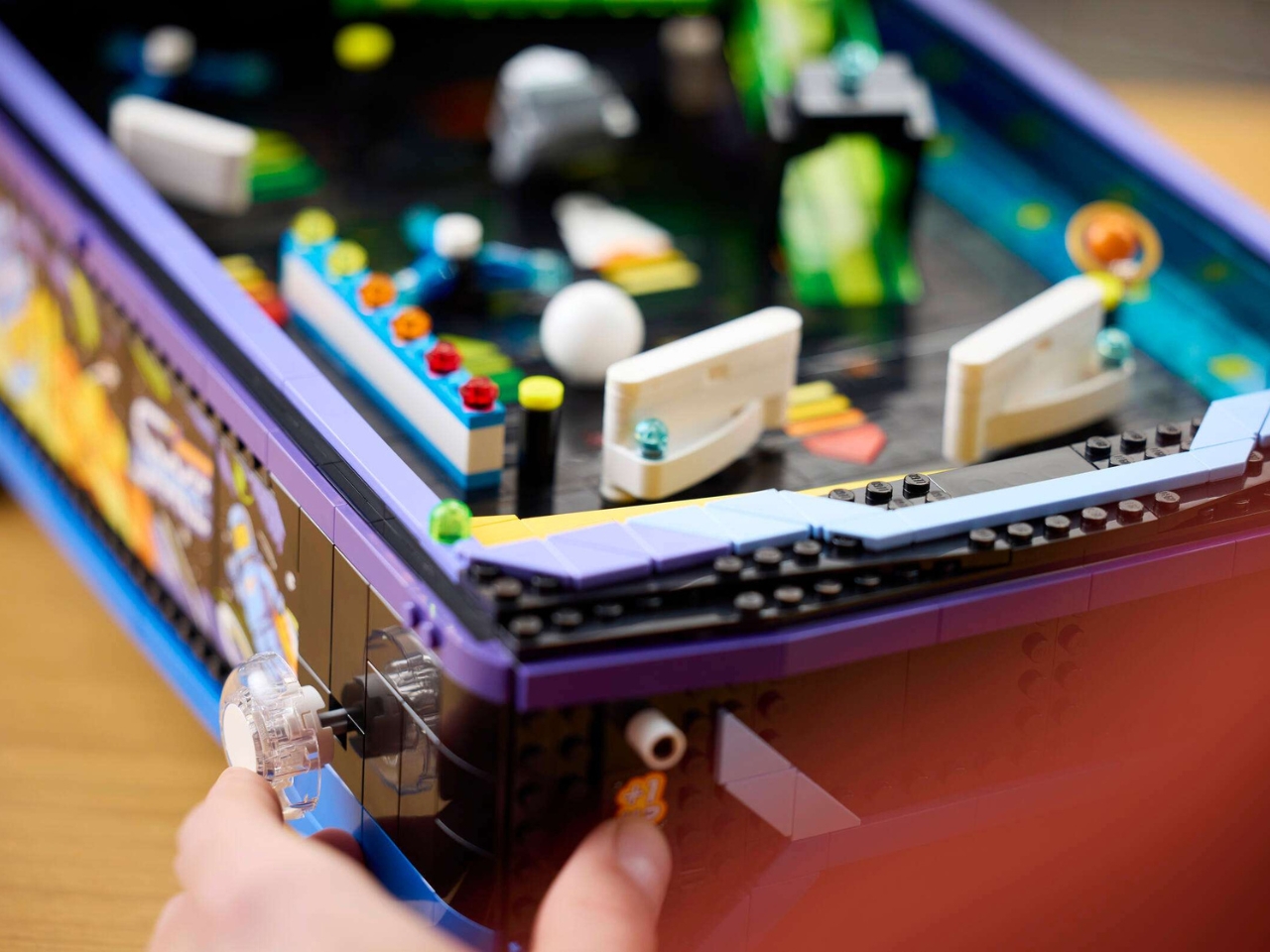
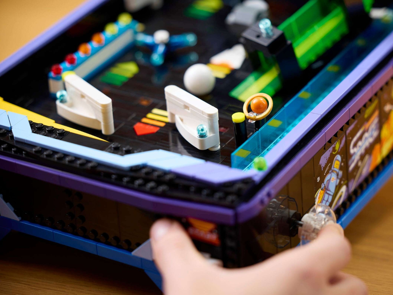
Whether it fully sticks the landing is another question entirely. Some early reviewers have noted that the experience, while mechanically impressive, feels a little thin over time. The playfield doesn’t have the layered complexity of a real pinball machine, which is understandable given the constraints of building with interlocking bricks, but it does raise the question of whether the set is more satisfying to build than it is to play. Personally, I think that’s fine. Most of us buying something like this are not expecting to replace a real pinball machine. We’re buying the idea of one, the memory of one, the quiet joy of having something tactile and slightly ridiculous sitting on a desk.
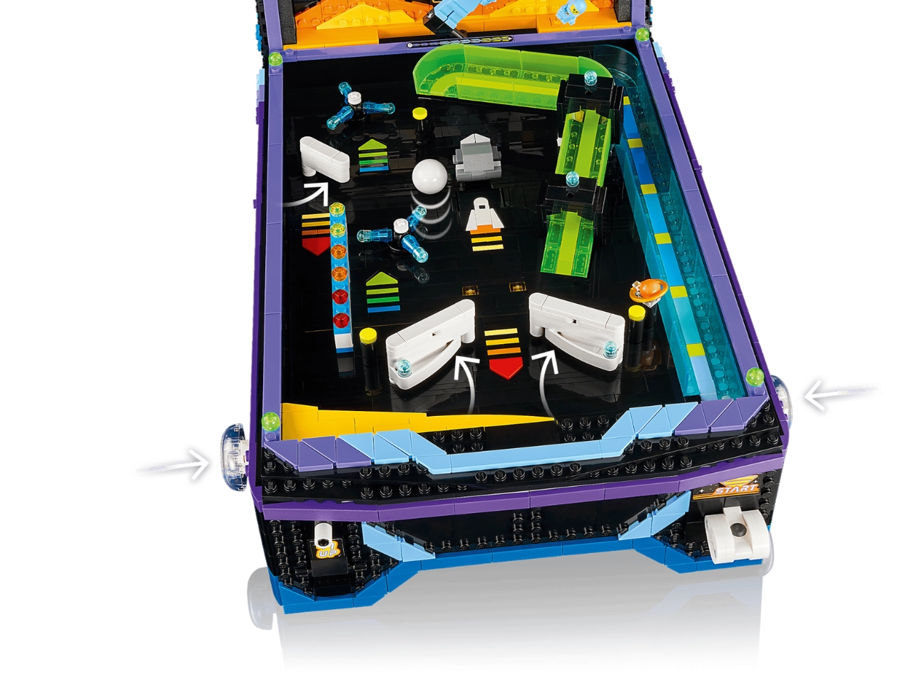
And at that, this set delivers. The engineering required to make a functional pinball machine out of LEGO bricks is genuinely impressive. Getting the ball physics right, the flipper tension, the bumper response, all within the rigidity of interlocking plastic pieces, is not a trivial design problem. The team clearly cared about getting the mechanics to work, not just to look the part, and that commitment shows in the final product.
Priced at $229.99 USD, with a July 4, 2026 release date and early access for LEGO Insiders starting July 1, it sits comfortably in the range that LEGO has been targeting for its collector-grade sets. Whether that price feels justified will depend entirely on what you value. If you’re a Classic Space fan, the minifigures alone might tip the scales. If you’re a design nerd, the engineering story makes it worth considering. And if you’re somewhere in between, well, a playable LEGO pinball machine on your desk is a pretty specific kind of conversation starter that most people don’t see coming.
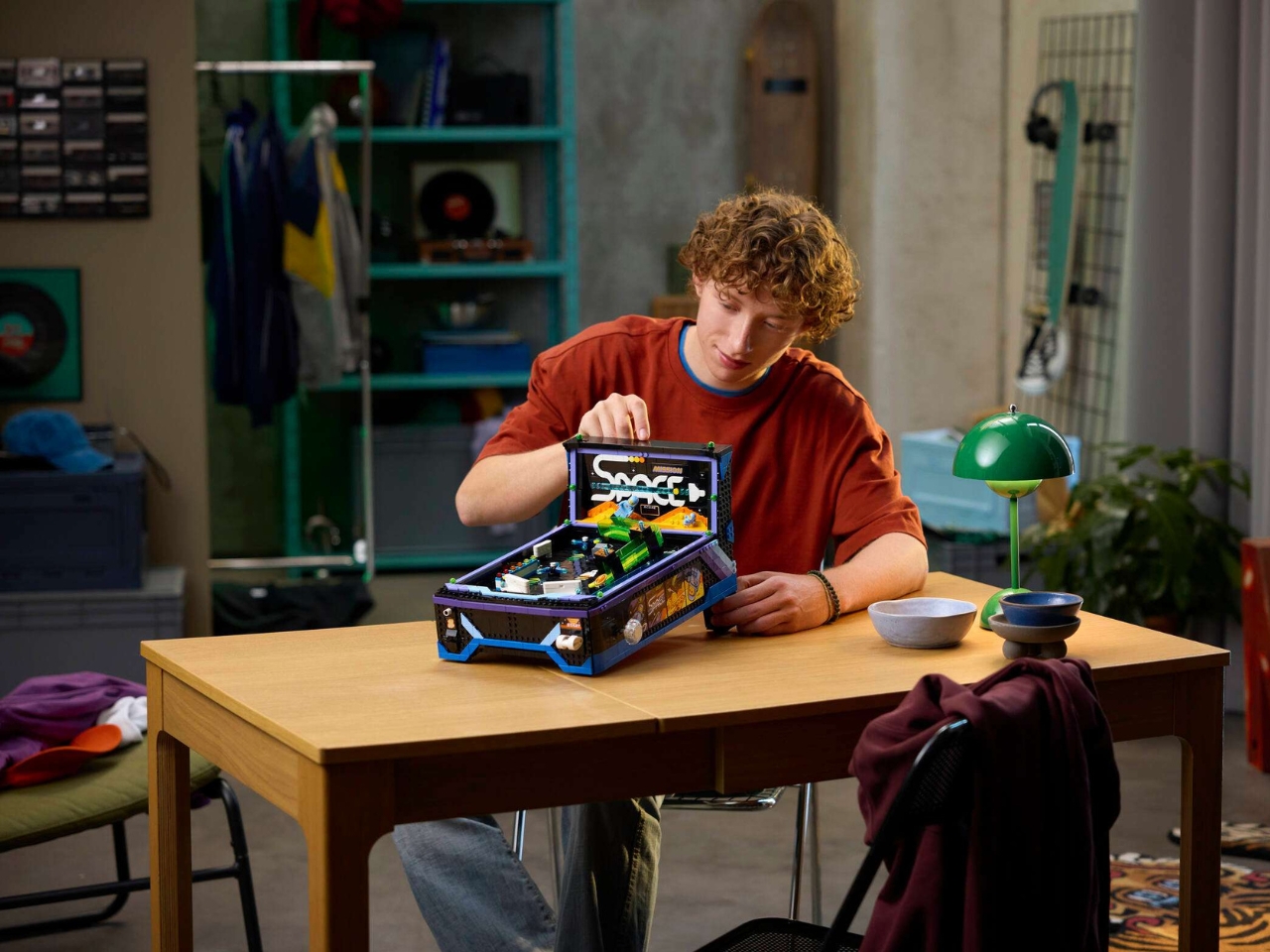
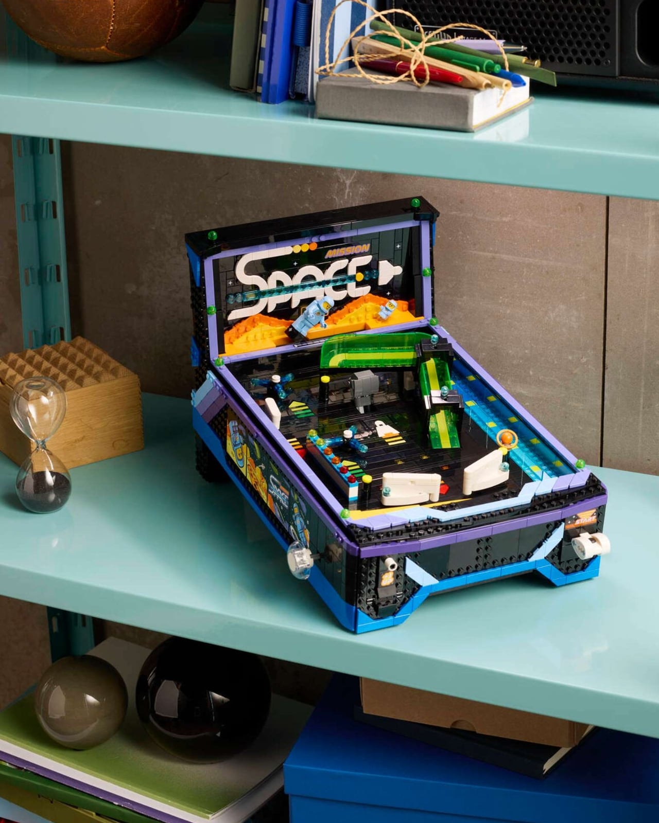
The LEGO Icons line has always understood that nostalgia is a serious market. People want objects that connect them to something, that make a room feel like it belongs to someone with a point of view. A space-themed pinball machine built entirely from bricks hits that note cleanly. It’s retro without being lazy about it. It’s playful without being juvenile. It is, in the best possible way, deeply unnecessary, and that’s exactly what makes it worth wanting.
The post LEGO’s $229 Pinball Machine Is Part Toy, Part Time Machine first appeared on Yanko Design.

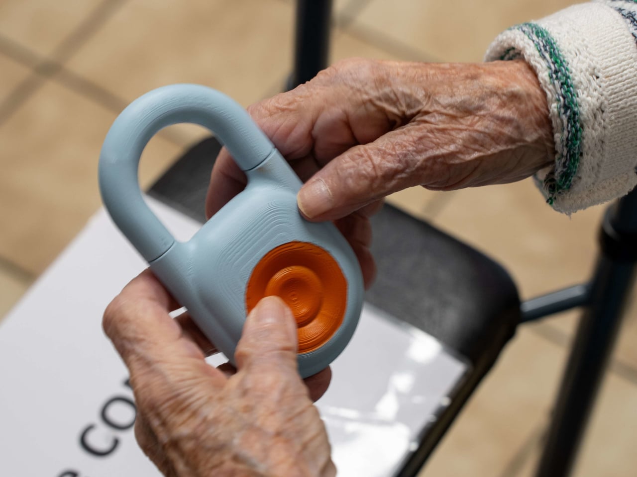
Caring for elderly residents in a facility setting is one of the most demanding jobs in healthcare. Staff are stretched thin, emergencies don’t follow schedules, and the systems many facilities still rely on, from paper logs to fragmented call tools, create gaps that can have serious consequences. As populations age faster than care infrastructure can keep up, the pressure on care workers and the systems they depend on keeps mounting.
That’s the challenge Kando was designed around. Rather than layering another standalone app or device onto an already crowded workflow, it takes the form of three integrated hardware components that work together as a single connected care system. The pieces include a wearable button for residents, a wall-mounted box for the room, and central communication hubs that link the entire facility.
Designer: Futurewave
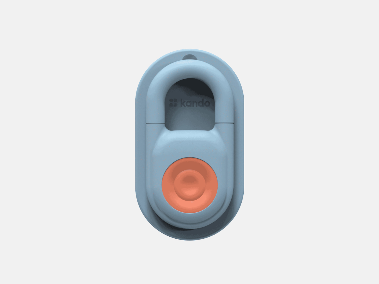
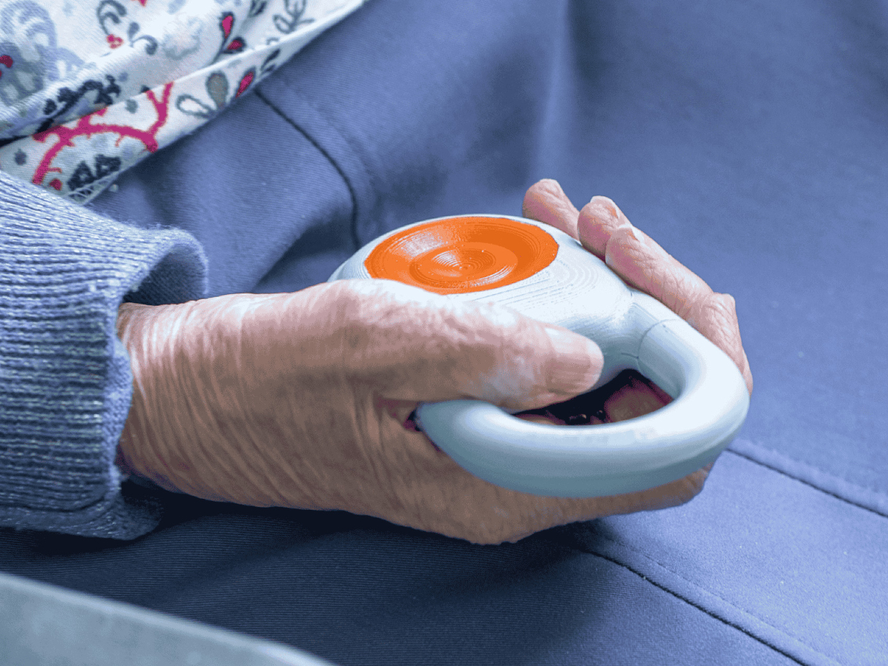
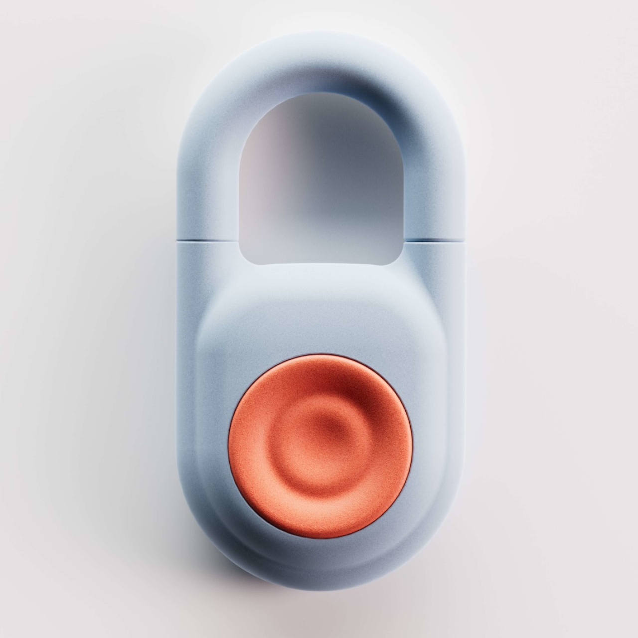
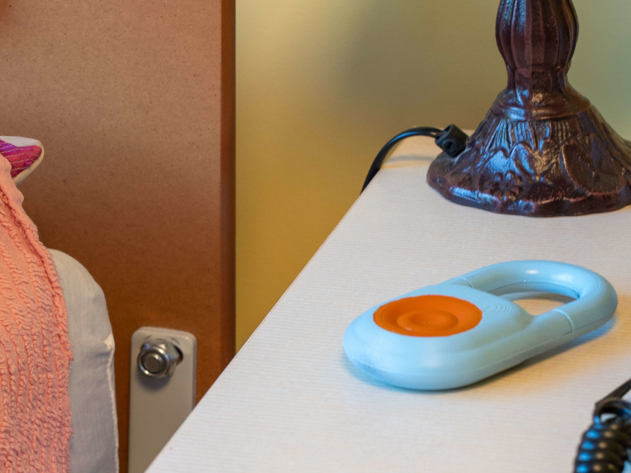
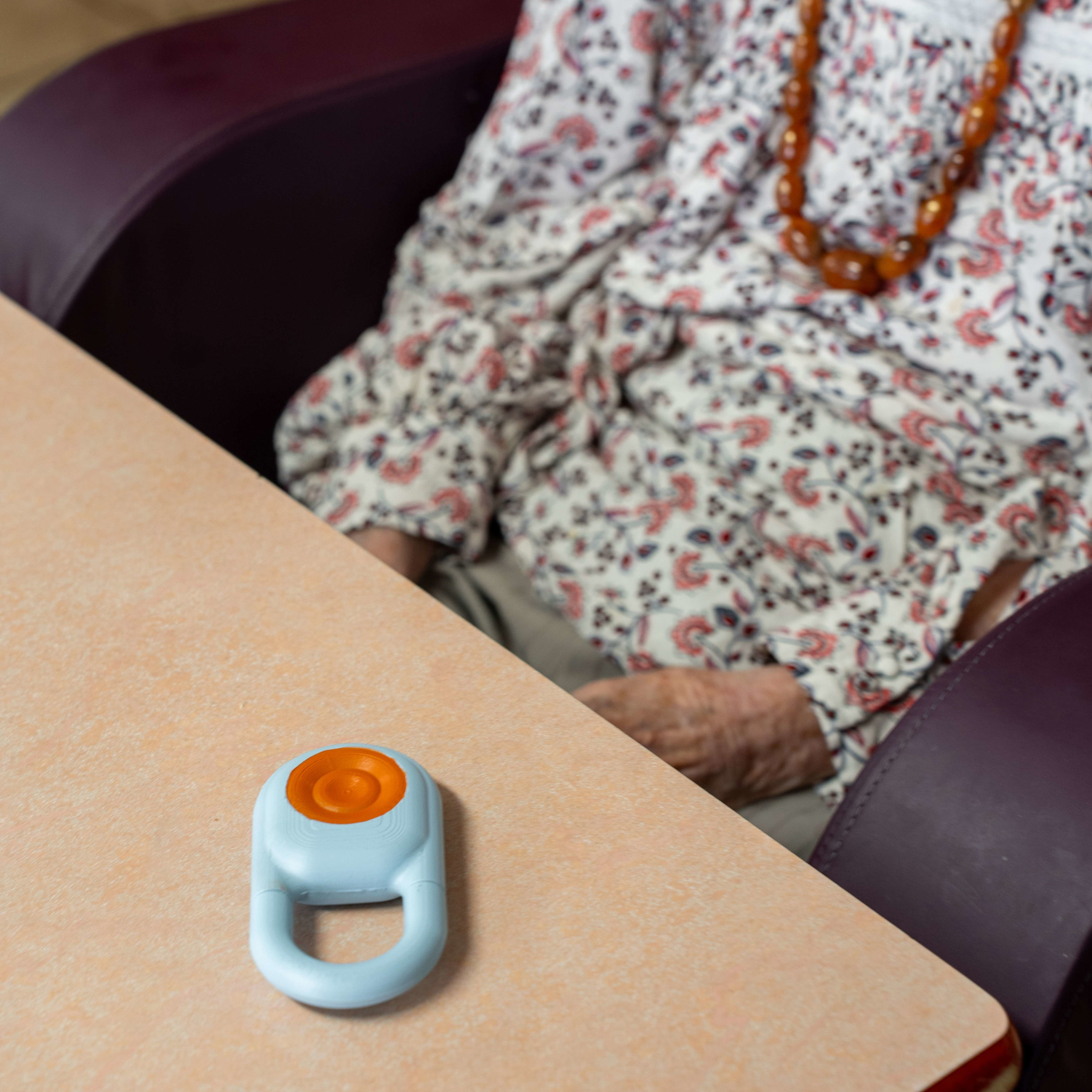
At the heart of the system is the Kando Button, a small wearable device that a resident clips onto their clothing or bed. It’s designed for simplicity: one touch triggers a request for help, confirmed immediately through both LED feedback and vibration, so the resident knows the signal went through. For someone who’s suddenly unwell or in distress, that instant confirmation matters.
Complementing the Button is the Kando Box, a wall-mounted unit that connects to the television already present in the resident’s room. Rather than adding a separate screen or terminal, it turns the TV into a visual communication interface between the resident and the care team. It’s a practical choice that keeps the environment familiar and avoids adding yet another unfamiliar device to the room.
Central hubs tie everything together, coordinating communication across the entire facility so that alerts don’t get lost between shifts. When a resident presses the Button, the information travels through a connected network rather than relying on a single staff member to notice and relay it. This end-to-end connection is what makes Kando a system rather than a collection of separate devices.
The practical outcomes add up for a facility dealing with dozens of residents and a care team that can’t be everywhere at once. Response times shorten. Paper-based documentation gives way to digital records, and over time, the operational costs tied to manual processes start to fall. For administrators, that combination of speed, accuracy, and efficiency is a genuinely compelling case.

What’s also worth noting is that Kando wasn’t designed with clinical functionality alone in mind. Every hardware decision carried a human weight too: it had to feel familiar and manageable in the hands of an elderly resident, not intimidating or cold. Medical technology often prioritizes technical function over the experience of the person it’s meant to serve, and this system tries to close that gap. The result is a system that clearly took the realities of a care environment seriously, not just from a technical standpoint but from a genuinely human one.
The post The Care Wearable That Confirms Your Alert With a Vibration, Not Silence first appeared on Yanko Design.
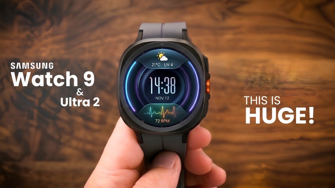
Samsung is poised to redefine the smartwatch landscape with the anticipated launch of the Galaxy Watch 9 and Galaxy Watch Ultra 2 in July 2026. Leaks and rumors have already hinted at substantial upgrades in design, hardware, and software, sparking widespread interest among tech enthusiasts. However, the potential discontinuation of the classic model with its […]
The post Samsung Galaxy Watch Ultra 2 & Watch 9 Leak with the Upgrades We’ve Been Waiting For appeared first on Geeky Gadgets.
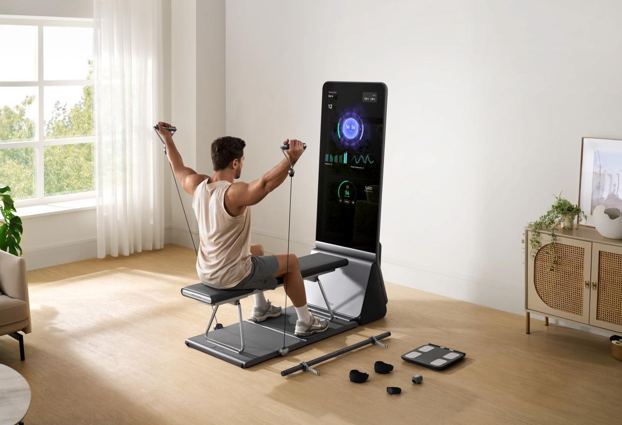
Fitness technology produces plenty of data. The more useful question is what happens next. The AEKE K1 Smart Home Gym is built to take information about the user, translate it into a training plan, and provide feedback while the work is happening. Its hardware brings together a 43-inch 4K mirror touchscreen, AI motion analysis, a […]
The post AEKE K1 Prime Day Deal Cuts $1,300 From a 220-Pound AI Home Gym appeared first on Geeky Gadgets.

Modern life has made genuine rest surprisingly hard to come by. Homes are saturated with obligations, travel gets consumed by itineraries, and the spaces that are supposed to support recovery often fall short. Young people in particular are navigating a kind of exhaustion that doesn’t come from a lack of free time, but from a lack of environments that actually know how to be still.
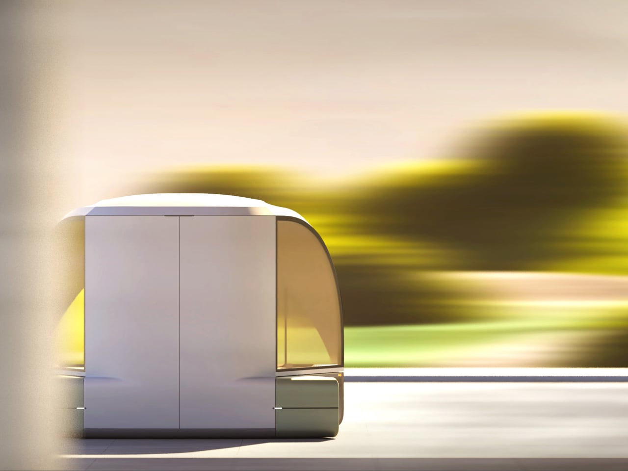
Epik is a mobility concept that addresses this at its root. Rather than packing more comfort into transit or filling trips with more activities, it takes a different route entirely: nature and light, the things that already surround you but go unnoticed, become the primary tools for rest. The vehicle reimagines the journey as a second home that moves with you and adapts entirely to your intentions.
Deisgners: Ellie Ahn, Shirley Cheon, Changdong Min, Geonhoo Son

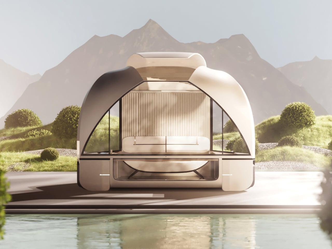
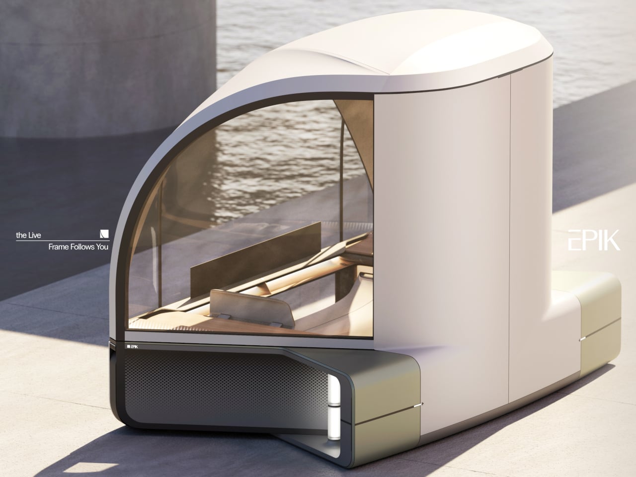
The exterior form draws from the architecture of an auditorium, with a broad, arched glass canopy that gives the interior an immersive, wide-angle view of whatever lies outside. This isn’t incidental; it’s the entire premise. Epik calls this the “Live Frame,” treating the vehicle less like a transport pod and more like a moving window that actively captures and amplifies the surrounding scenery.
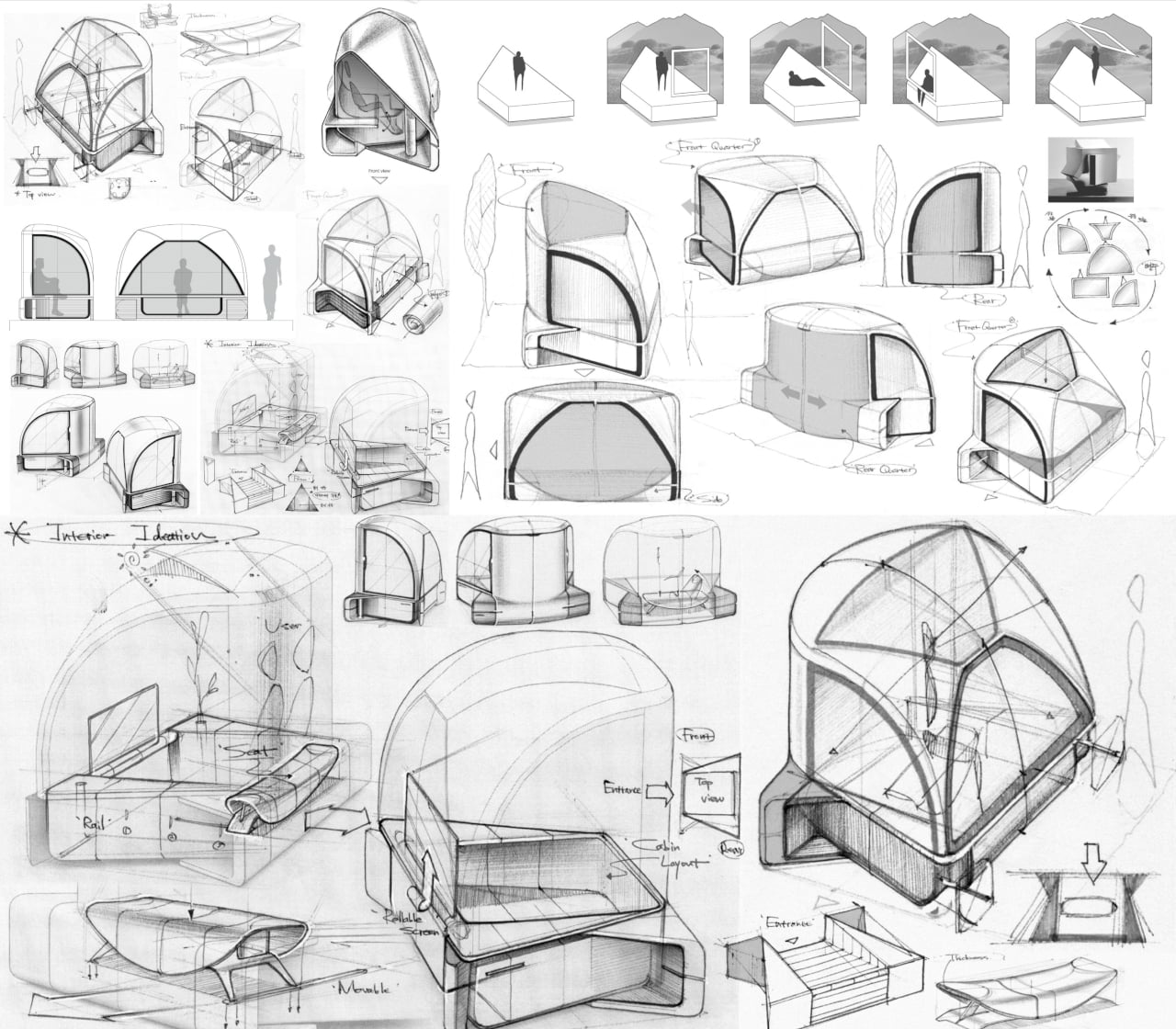
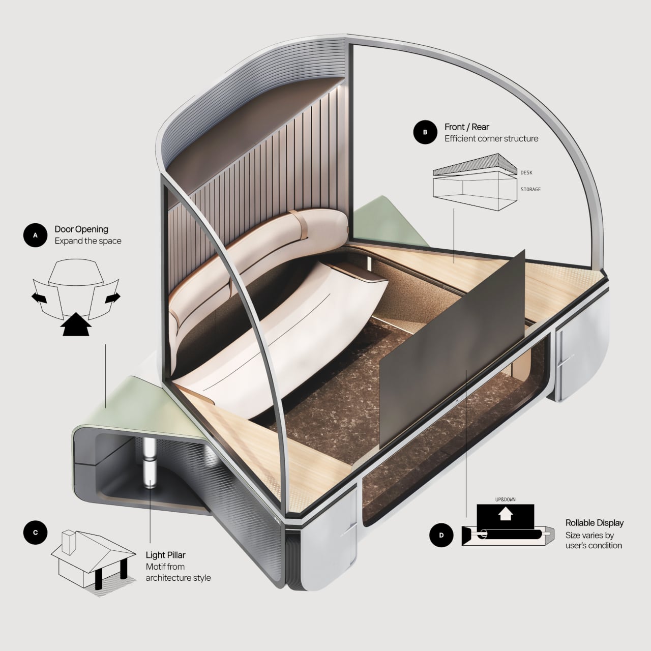
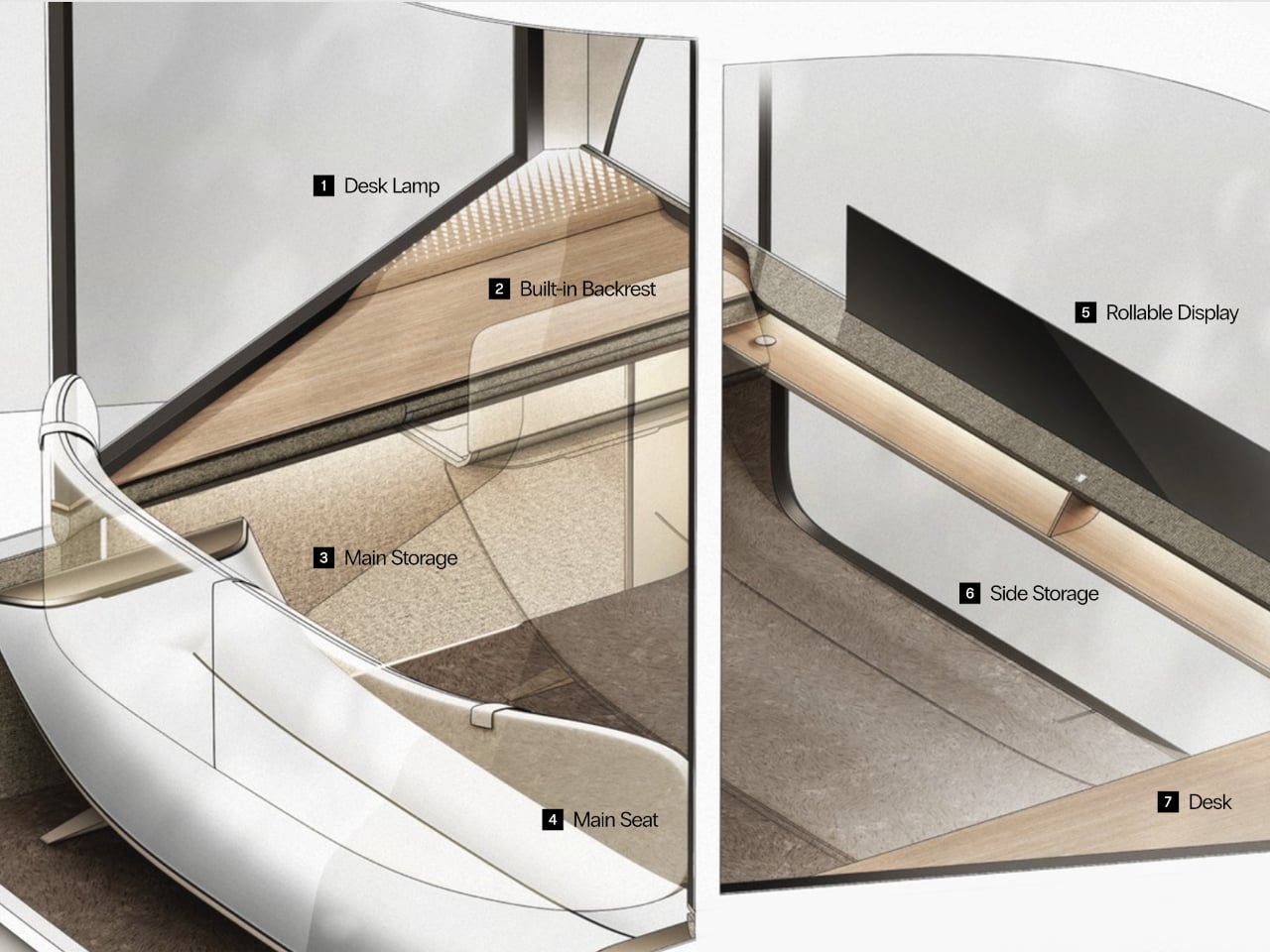
Inside, the compact cabin is built around flexibility rather than fixed arrangements. Doors and windows can open to varying degrees, inviting nature in or closing it out. A rollable display changes size depending on what the occupant wants to do, while corners that would otherwise go to waste are repurposed as storage and a small work surface. The same space can hold one person alone or two people together.
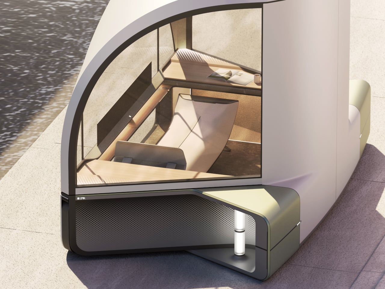
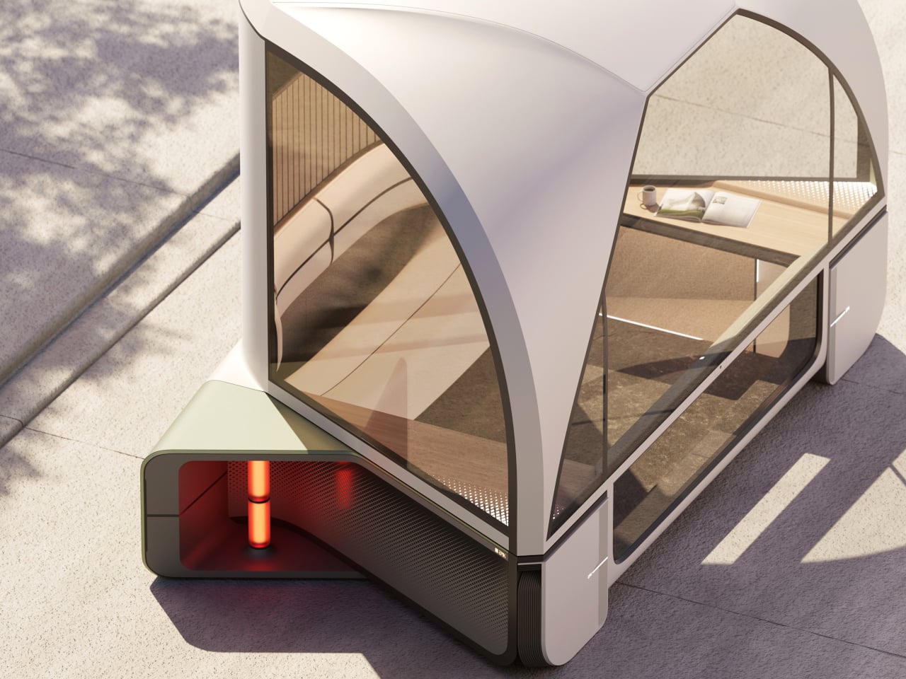
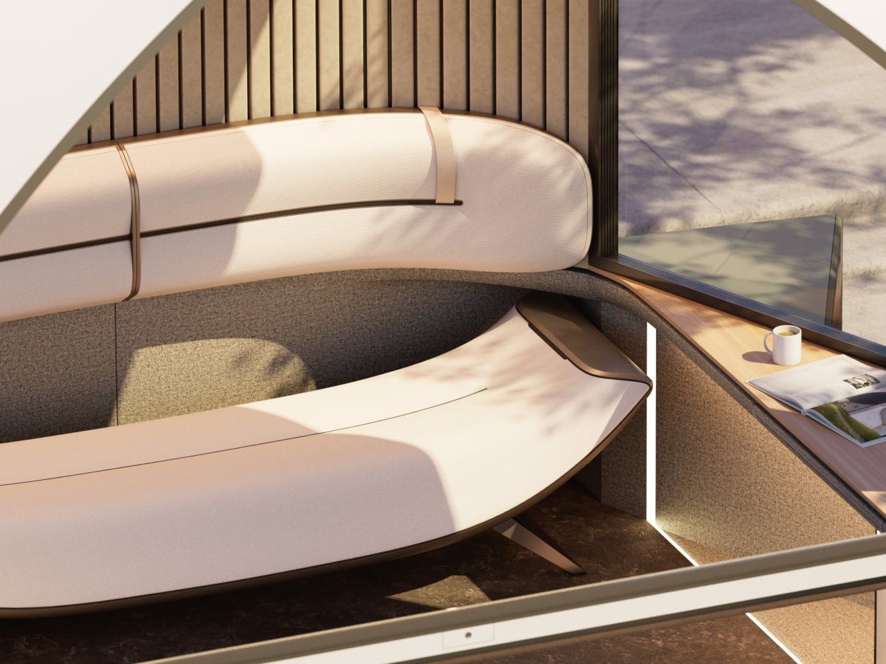
On a trip through mountain country, Epik’s Scenic Mode detects beautiful stretches of road and quietly slows the vehicle, adjusting window angles to frame the best view, almost as if the pod itself is composing a photograph. The detours it suggests aren’t inconveniences; they’re the whole point. Every landscape encountered gets logged in the “Rest Timeline,” a running record of every journey worth remembering.
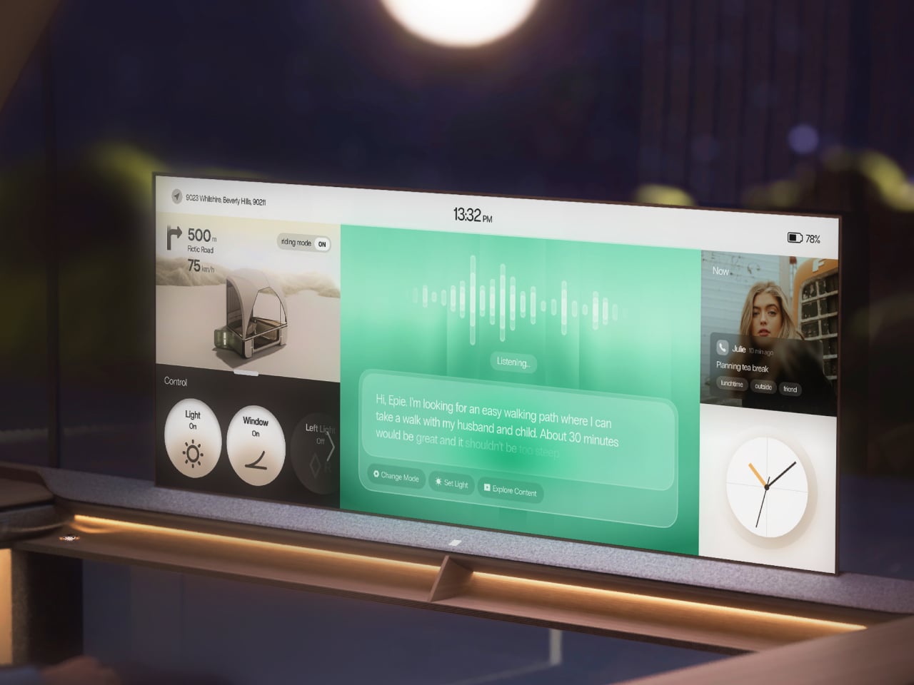
The onboard AI, called EPIE, learns the occupant’s routines, preferences, and how they typically spend time with the people around them. It reads mood signals through music and content choices, then gently nudges toward what comes next, whether that’s a nearby walking path, a quiet stop, or simply reconfiguring the cabin layout. For couples, it can even split the space into two personalized zones when schedules diverge.
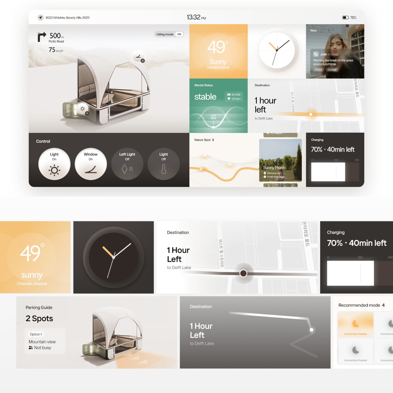
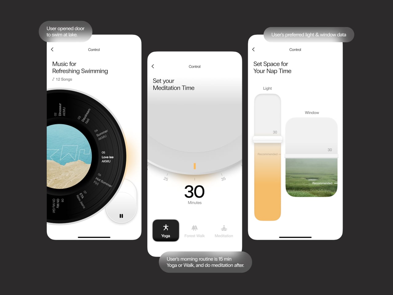
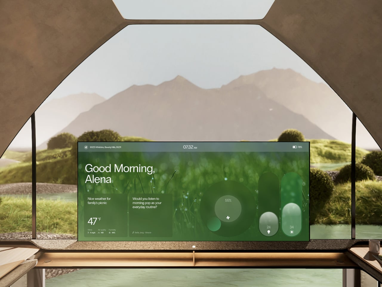
When there’s nothing more to do than absorb the moment, the interface knows to retreat. The screen takes on a skin drawn from the surrounding landscape, blending into the view, and only the most essential details, like weather and music, stay visible. Controls are modeled after analog buttons, using transparent textures so the display feels less like a gadget and more like a natural extension of the cabin walls.
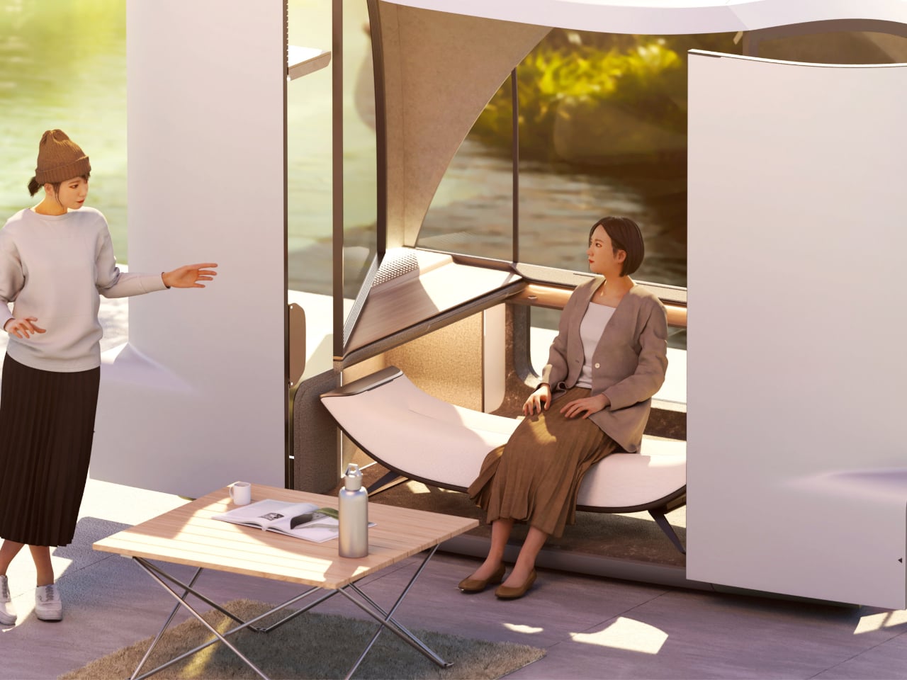

The idea that a vehicle could be primarily about rest rather than destination is still a rare one. Epik doesn’t claim you can find peace anywhere with the right pod, but it argues that the ingredients, specifically light, nature, and a space that listens, are far closer than most people realize. Getting somewhere just becomes the occasion for that rest, rather than the thing standing in its way.
The post This Concept Car’s AI Slows Down When It Finds a Scenic Road first appeared on Yanko Design.

Hermes Agent is an autonomous AI designed to manage workflows and automate tasks with minimal supervision. It includes features such as memory for storing user-specific data, reusable skills for task execution and cron jobs for scheduling actions. According to AI Foundations, one key capability is its ability to adapt to user preferences over time, allowing […]
The post Master Hermes Agent: Easily Automate Recurring Tasks with Skills appeared first on Geeky Gadgets.
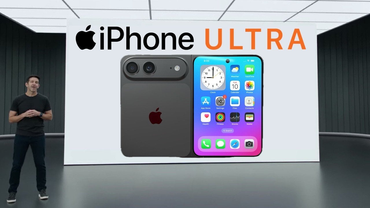
Apple’s rumored foldable device, the iPhone Ultra, is generating significant buzz as it promises to reshape the foldable smartphone landscape. Recent leaks, including detailed dummy units, provide insights into Apple’s innovative approach to this emerging category. Unlike many competitors aiming for widespread adoption, the iPhone Ultra appears to be a premium statement product, designed to […]
The post Why Apple’s iPhone Ultra Fold Ditches a Key Features appeared first on Geeky Gadgets.