About ten years ago, designer Adam C Miller made a pillbox for a close friend living with an invisible illness. The standard option available to her was the familiar hard plastic pharmacy organizer, practical enough, but hardly something anyone would want to carry proudly or leave out in the open. Miller decided she deserved better. Starting with a block of maple, paper templates, a few screws, and a lot of sandpaper, he built a pillbox she would actually want to keep nearby. That first handmade object became the beginning of Helia.
The project stayed with him for years. Miller kept refining the idea, and when he began taking a daily regimen himself, the design took on even more personal weight. About a year ago, he revisited the category and found plenty of pill cases that handled the basics, but very few that felt genuinely beautiful, portable, and display-worthy at the same time. Helia became the answer to that gap, shaped by a decade of iteration and by the simple belief that an object tied to daily care can carry warmth, beauty, and intention.
Designer: Adam C Miller (IDMill)
Click Here to Buy Now: $40 $60 (33% off) Hurry! Only 14 of 100 left.
That mindset allowed Miller to look at Helia and pillboxes very differently. We already reserve beautiful containers for the things we value most. Watches arrive in fitted cases, jewelry rests in lined boxes, and keepsakes are stored in objects designed to honor their presence. Helia brings that same level of consideration to a weekly pill organizer. It treats a daily medical routine as something worth leaving out where you can see it –
personal and dignified instead of something to hide in a drawer.

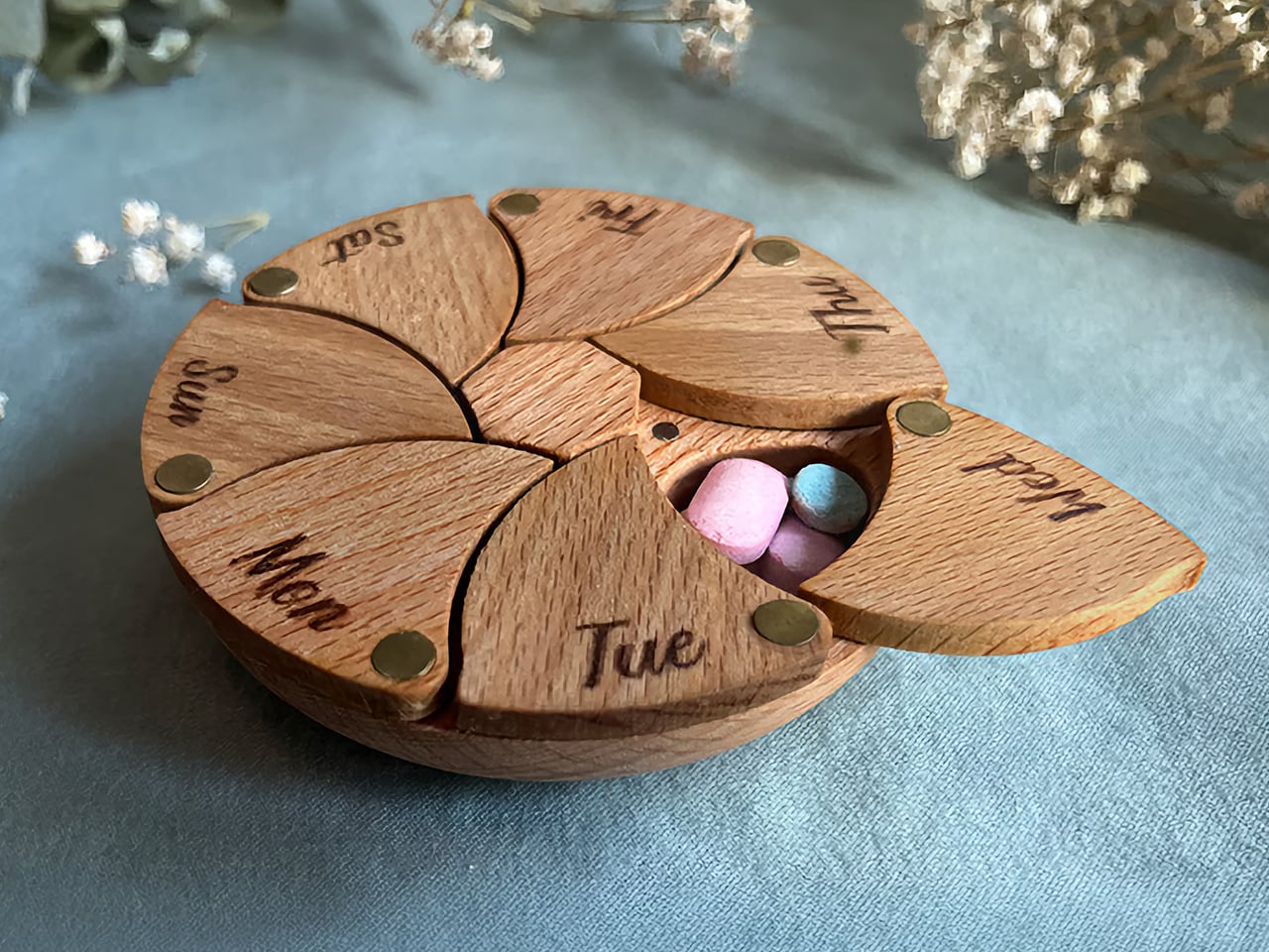
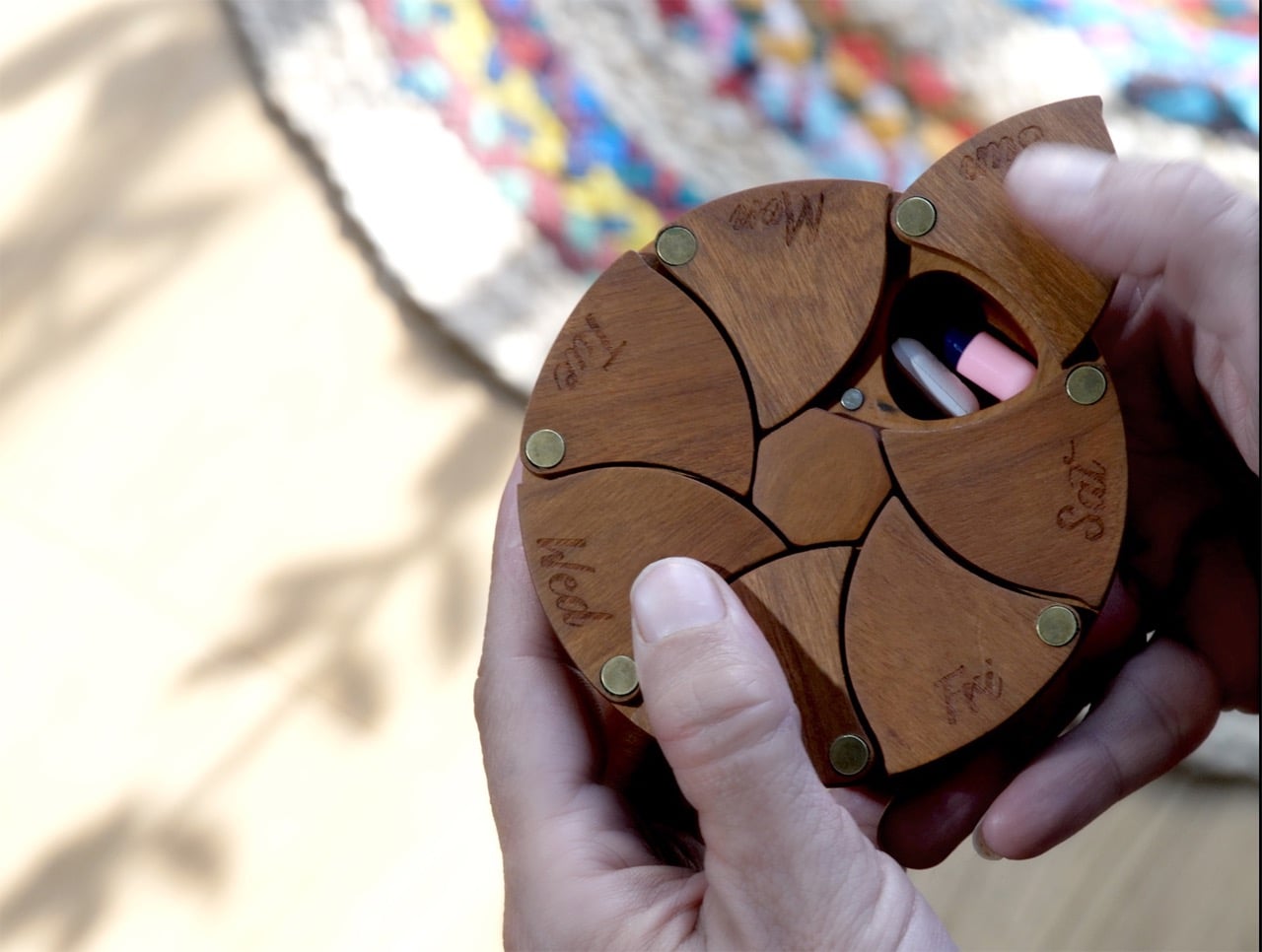
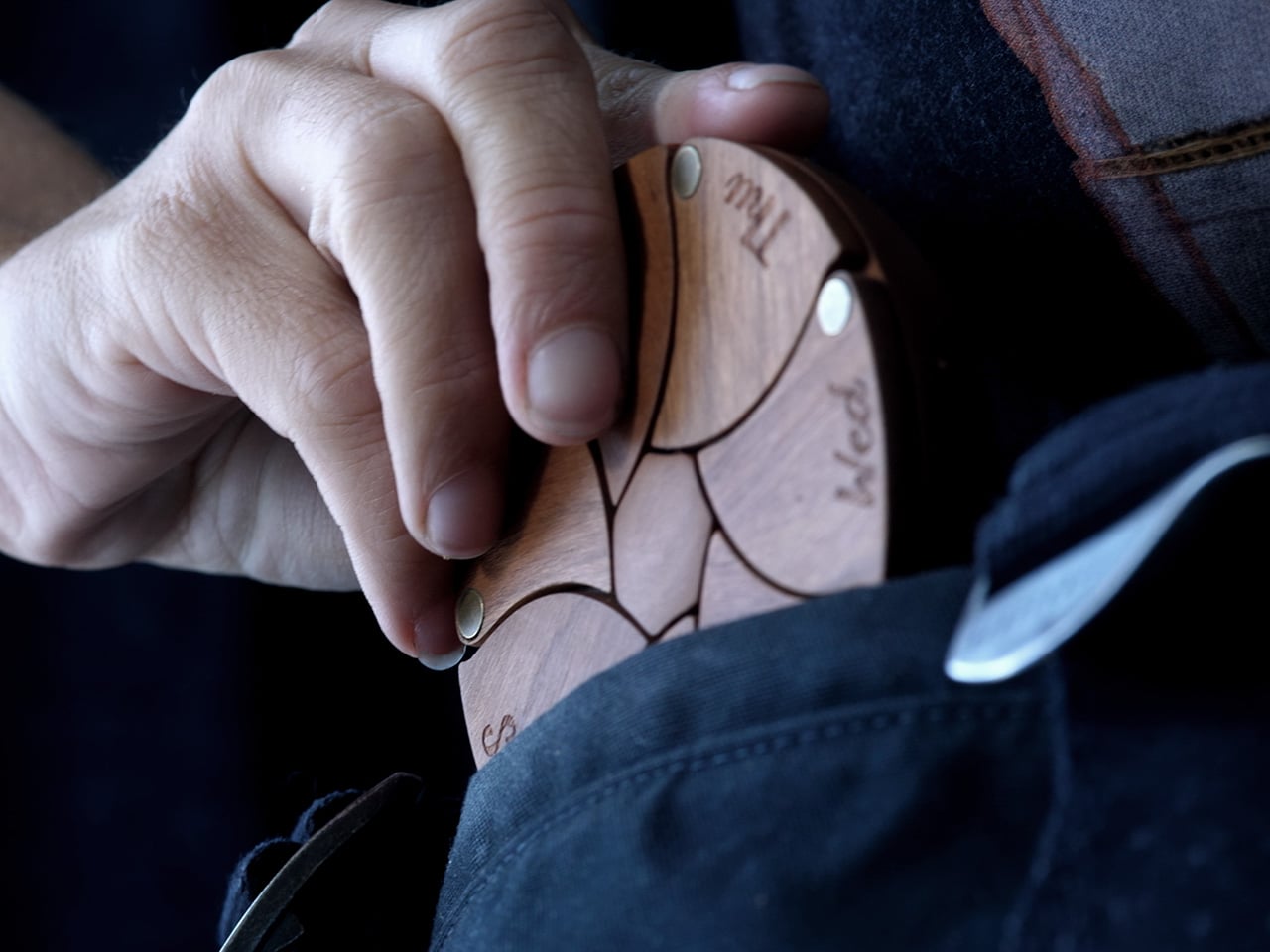
Seven petal-like compartments radiate from a central axis, forming a circular disc that reads closer to a crafted artifact than a storage device. With beautiful hardwood construction and seven magnetic doors, it is confidence-inspiring and satisfying to use. The primary material is FSC-certified cherry wood, finished with a food-safe, water-resistant mineral oil that brings out the warm reddish tones the species is known for. The wood species were tested one by one until cherry emerged as the clear choice after the finish was applied. Each compartment door turns on solid brass rivets and closes with strong neodymium magnets, adding a material contrast that lifts the object’s visual weight considerably, and the combination of wood, brass, and organic petal geometry gives Helia a design language the category has simply never used.
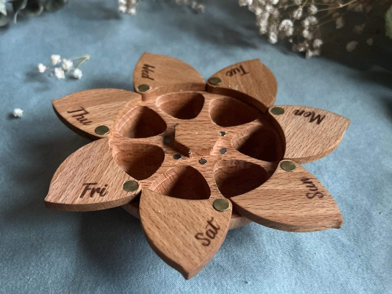
Each of the seven doors snaps open and closed with a satisfying click, held in place by four magnets each. They hold open while you load your medicine for the week, and when they snap closed, they hold your medication safe and secure. The door mechanism alone went through half a dozen iterations before it felt exactly right. Each daily pocket is about 0.9 inches across and roughly 0.5 inches deep, with room for a realistic daily mix, such as one large pill, three medium ones, and four small ones in a single compartment. It holds a week’s worth of medicine, while being compact enough to slip into a bag, and beautiful enough to leave on your counter.
Through his consulting firm IDMill, Miller has developed products spanning consumer electronics, furniture, RC vehicles, home goods, and tattoo machines, from initial sketch to production, for organizations ranging from thirty to thirty thousand employees. Within that range, his design work received a 2025 Silver A’Design Award for accessible design. He is also not new to Kickstarter, having co-founded the successfully funded ChargeCard and Snactiv campaigns before arriving at Helia.
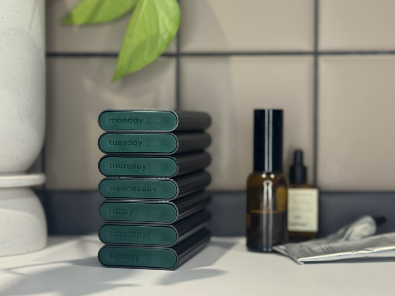
The pharmacy pillbox has remained essentially unchanged for decades, and we are all familiar with the utilitarian rectangular plastic pill cases. These medicine organizers are designed to be used, then forgotten, out of sight in a drawer or buried in a bag. Everything about them reads clinical. Helia borrows from the same design playbook that transformed reading glasses into eyewear, orthopedic footwear into lifestyle sneakers, and fitness trackers into jewelry-grade wearables. In each of those cases, the category shifted when designers gave as much thought to the person using the object as to the function it performed. Helia frames itself as the shift from “clinical medicating” to “a daily ritual of taking care of you,” drawing on how spectacles evolved into eyewear and elevating the feeling of self-care through an object with genuine warmth, presence, and polish.
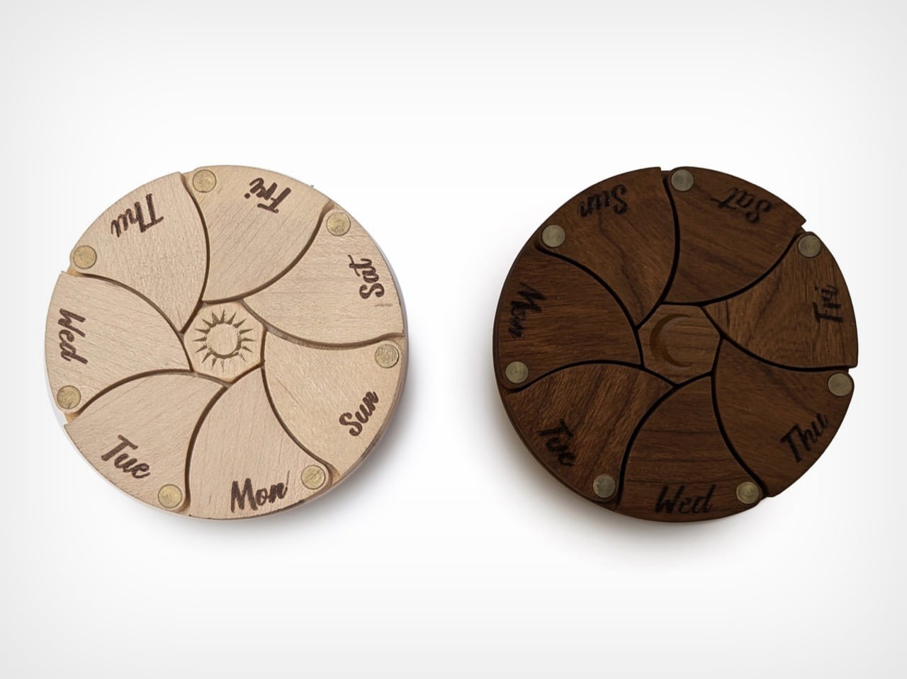
Helia is live on Kickstarter, where the standard cherry wood version starts at $40 for the early bird tier, limited to 100 pieces, before moving to a $45 campaign price, with retail planned at $60. The campaign also includes a Day and Night set that pairs a light maple Helia with a dark walnut one, engraved with a sun and moon respectively, along with personalized options, downloadable DIY files, and other extras worth exploring on the project page linked below. Shipping is expected in late 2026.
Click Here to Buy Now: $40 $60 (33% off) Hurry! Only 14 of 100 left.
The post A Designer Spent Ten Years Perfecting the Most Beautiful Pill Organizer You’ll Ever See first appeared on Yanko Design.