Foam Earplugs Haven’t Changed Since the 1970s — This Spiral Design Just Made Them Obsolete

The humble foam earplug has been functionally unchanged since the 1970s: roll it down, jam it in, hope it expands to a seal, and find it somewhere in the sheets by 2 AM. It’s one of the few everyday objects that design culture has genuinely never come for, maybe because the attenuation numbers technically work, or maybe because nobody with enough resources was annoyed enough to fix it. The Ears 360 Silence, a CE-certified soft silicone earplug from Paris, is a structural redesign of that whole idea. Its retractable spiral wraps into the outer ear’s helix rather than anchoring in the canal, locking the plug flat and flush against the head with 24 dB SNR measured to EN 352-2:2020 and a peak of 29.9 dB at the frequency range where snoring and human voices live. The foam never had a chance.

Youcef Abdaoui runs a studio near Paris and started prototyping the Silence in 2024 with a bent wire and a bit of putty, just to test whether a helix-anchoring spiral could hold in an ear. It did, and the dozens of iterations that followed produced a product France voted Product of the Year 2026, consumer-elected rather than jury-awarded, which tells you something about how it performs in actual ears. Ears 360 has since shipped to more than 120,000 customers through their store, 500+ pharmacies, and B2B partners before going international. The Silence is not a prototype. It is certified to EN 352-2:2020, mass-produced, and more than 14,000 units are already in stock. I got to see a pair in person, and the silicone finish reads as serious product, not a health-aisle impulse buy.

Designer: Youcef Abdaoui

Click Here to Buy Now: $21 $35 (40% off). Hurry, only 57/300 left!

The ear is already a spiral. The outer rim of the pinna is anatomically called the helix, a curved ridge that traces a partial revolution around the auricle, and deeper inside, the cochlea completes that geometry: a full spiral chamber, coiled like a snail shell, that converts sound pressure into neural signal. Nature returns to the spiral repeatedly because it distributes force without concentration points, the same structural logic behind a nautilus shell or the tight coil of a fern fiddlehead before it unfurls. The Ears 360 Silence works with that architecture: the spiral holds, not the tip. Instead of pressing into the canal and trusting friction, the retractable spiral wraps laterally into the helix and locks there through geometry, bearing almost no canal pressure, which is the whole reason the plug sits flush rather than protrude. If you know how spiral springs work, think of the way the spiral on the earplug expands to fill your ear canal. Along with friction, this physical detail helps the Silence adapt to pretty much any ear shape or size.
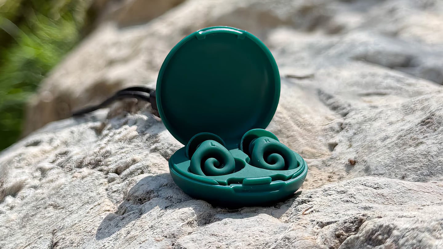
The flatness is perhaps the most impressive detail, setting it apart from every earplug you’ve seen in the past. The loop-style reusable earplugs that have become popular over the past few years make a design virtue of their visibility, with a circular protrusion sitting outside the ear canal as a deliberate aesthetic statement. That works at a concert, but it becomes a pressure point the moment you roll onto your side in bed, which is the situation most people are buying earplugs for in the first place. The Silence’s spiral body measures 18.44 mm by 15.49 mm, slim enough that there’s nothing significant pressing against a pillow. The profile looks almost deceitfully small for what it’s actually doing… and yes, Youcef did mention that the earplugs work perfectly well in concerts too.

One spiral body, two protection levels, switchable in seconds from 24 dB to 29 dB. The standard silicone tips, available in three sizes (9.9 mm, 11.9 mm, and 12.9 mm diameter), deliver 24 dB SNR, enough to take a busy street down to library territory without muffling conversation entirely. The Swim & Work Kit clips on triple-flange tips that push attenuation up to 29 dB, entering genuine worksite and industrial territory. User satisfaction data from Ears 360 puts concert approval at 91% and commute approval at 97%, and an IPX7 waterproof rating keeps the spiral itself pool-ready alongside the kit’s triple-flange seal.

One Silence replaces hundreds of disposable foam earplugs. The earplug’s body is made to last for years, the silicone tips are replaceable instead of throwing the product away, and the packaging is compact by design so every shipment travels as a slim letter, not a parcel. No separate carbon offset claim required. Pricing starts at €24 (roughly $28) for a single unit with carry case and all three tip sizes, with the Silence and Swim & Work Kit bundle at €27, and a Duo Pack at €39 for two. Current colorways are Black and Pink, with Green planned as a future addition. Delivery is November 2026, and no specific warranty period is stated on the product page, though the replaceable-tip architecture makes longevity something you can actually act on rather than just take someone’s word for.

Click Here to Buy Now: $21 $35 (40% off). Hurry, only 57/300 left!

The post Foam Earplugs Haven’t Changed Since the 1970s — This Spiral Design Just Made Them Obsolete first appeared on Yanko Design.


No Switches Needed. Just Press, Pull, or Bop These Silicone Lamps: Behind The Design with YD

Here is a fun little contradiction to chew on before we get into the actual lamps. The whole point of Call It a Day, Tongqi Design’s new lighting collection, is that you barely have to try. You bop it, you tug it, you flop your hand near it, and it turns on. Zero precision required, zero thinking involved, which is exactly the pitch when you have just walked through the door after a day that emptied you out. But get this. The less effort the lamp asks of you, the more effort someone else clearly put into making that possible. That is the trade we are here to unpack.

Shanghai-based designer Tongqi Lu built the collection, a table lamp, floor lamp, and pendant, around soft silicone shades with zero switches anywhere on them. Every gesture works because the material itself is doing the sensing, not a button hunting for your finger. It sounds simple sitting in your living room. It is not simple to make, and that gap between the two is basically our whole story today.

Designer: Tongqi Lu

Click Here to Know More

The Design

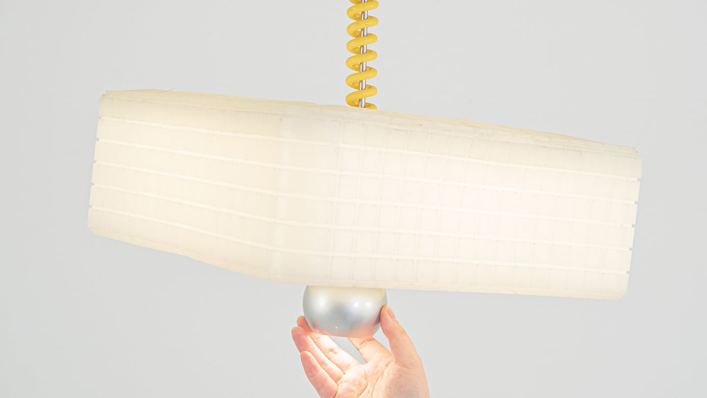
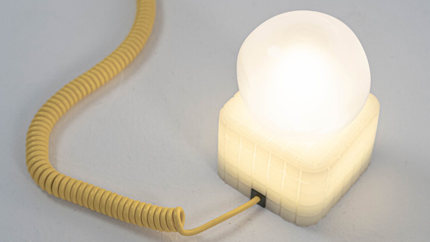
Call It a Day is a three piece lighting collection, a table lamp, a floor lamp, and a pendant, and every one of them is dressed in soft, translucent silicone instead of glass or fabric. That alone is a break from convention, since silicone shades are usually reserved for LED strip diffusers rather than the whole visible body of a lamp. But the real departure is that none of these lamps have a switch. You bop the table lamp, you tug the pendant by its cord, you press the floor lamp wherever feels natural, and the light responds. There is no correct spot to find in the dark. The entire shade is the input, which sounds like a small shift until you realize how much of lamp design has always been built around finding one tiny precise point.

Lu frames the whole thing around the moment you get home and your body checks out before your brain does. She has talked about dropping onto the sofa and reaching out to press, pull, or tap without really thinking about it, and the light turning on not because she followed a rule but because she did not. That is a genuinely sharp way to think about interaction design. Most lighting asks you to be at your most coordinated right when you are at your least. Call It a Day flips that expectation, and the coiled yellow cable running through the collection is a nice touch too, borrowing the old pull chain gesture without being precious about it.

The Process

Here is where things get interesting, because the studio itself is not some slick production facility. It is an office in Shanghai with a plastic sheeted folding table, jerrycans of liquid silicone lined up against the wall, and a window looking out over the skyline. Before any of it was cast, the whole collection existed as full scale cardboard mockups, a pendant hung from a coiled cord and a table lamp balanced on a paper cone, sitting in the corner of the room like a rough draft nobody threw away. That is a genuinely useful thing to see, because it shows the gesture and the proportions were locked in long before the material was.

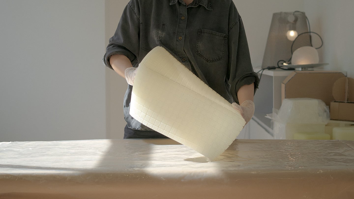
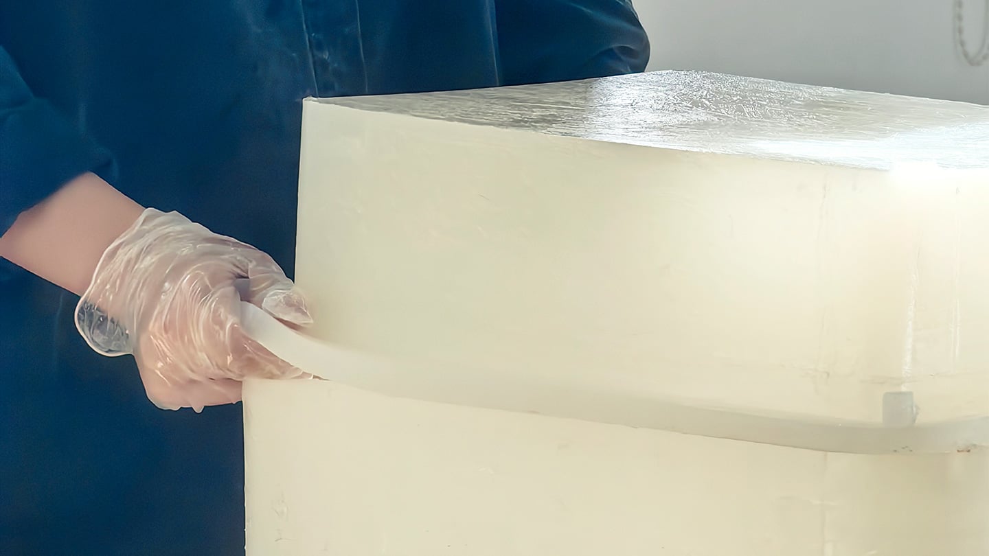
The shades themselves come out of large block molds with a fine grid texture cut into the cavity, which shows up on the finished silicone as a soft woven pattern once the lamp is lit. Getting silicone out of a mold cleanly is trickier than it sounds, since silicone tends to bond to itself, so getting a cast shade out of a cast mold without either tearing or fusing takes real care with release agents and material choice. Pouring it clean adds another layer of difficulty, since bubbles trapped in a translucent material show up as visible flaws once the light hits them. In the photos, you can see two people pouring together, one holding the bucket steady, the other running a palette knife across the lip so the silicone comes down in a thin ribbon instead of glugging out in one shot, which is a simple trick for keeping air out of the pour. It is not a factory process. It is a hand process, done carefully, on a folding table, gallon by gallon.

The Perspective

What I like most about Call It a Day is that the ease on the user’s end is clearly paid for somewhere upstream, and that upstream cost is visible if you know where to look. A switchless lamp sounds like a simple idea until you have to actually engineer a material that can be grabbed, twisted, and mistreated without breaking or losing its shape, and then cast that material cleanly at scale in a small studio. That gap between the lived experience and the labor behind it is exactly what a lot of good product design tries to hide, and here it is sitting right out in the open in the process photos.

It also helps that the whole thing traces back to something real. Lu’s early work, the lemon shaped Citron lamp, her furniture line built around trees and water lilies, all of it circles the same idea of pulling people back into their bodies after a long day in a city that does not really let them slow down. Call It a Day feels like the most literal version of that idea yet, a lamp built entirely around the ninety seconds when you have officially given up on being careful. Whether or not the gesture control holds up over years of actual use is a question only time and daily wear will answer, but as a piece of intent, this one lands.

Click Here to Know More

The post No Switches Needed. Just Press, Pull, or Bop These Silicone Lamps: Behind The Design with YD first appeared on Yanko Design.
5 Best Homes That Disappear Into the Landscape in 2026

Modern architecture is increasingly moving beyond simply occupying a site to becoming part of it. Instead of dominating the landscape, many contemporary homes integrate the contours, colors, and materials of their surroundings, creating a visual harmony that minimizes environmental impact. Through thoughtful siting, natural materials, and restrained forms, these residences blur the boundary between the built and natural worlds.

Whether nestled into rugged mountains, hidden among dense forests, or perched along windswept coastlines, these homes show how architecture can celebrate instead of competing with nature. By responding to local climate, terrain, and ecosystems, they create immersive living experiences while leaving a lighter footprint on the landscape.

1. Mountain Homes That Become Part of the Terrain

Mountain homes often embrace steep slopes, rocky outcrops, and dramatic elevations instead of reshaping them. Architects use locally sourced stone, weathered timber, exposed concrete, and green roofs to visually anchor buildings within the landscape. Many designs are partially embedded into hillsides, allowing the surrounding topography to become an integral part of the architecture.

Large panoramic windows frame distant peaks while low-profile forms reduce visual impact. These homes appear sculpted from mountains, offering protection from harsh climates while creating a seamless relationship between architecture and the natural terrain.

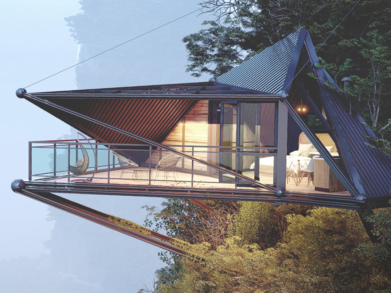
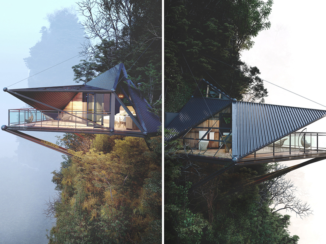
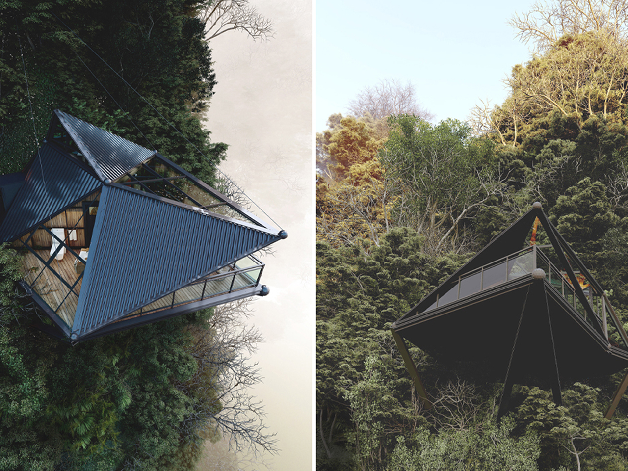
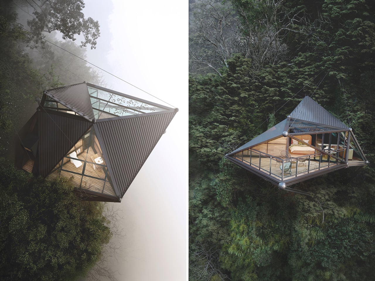
3D visualizer and architectural designer Thilina Liyanage conceptualizes mountain living through a contemporary cabin concept that engages directly with extreme terrain. Set high above a rugged slope, the design appears to float against the mountainside, framed by expansive glass façades and sleek metal cladding. Its sharp triangular form enhances the sense of lightness, while the fully glazed surfaces open uninterrupted views of the surrounding peaks, turning the landscape into a continuous visual experience from inside the home.

Structurally, the cabin is anchored into the rock using steel beams and tension cables, making the engineering part of the architecture itself. This allows the home to project outward dramatically, hovering above the cliff edge. Inside, warm timber finishes balance the exterior’s industrial expression, creating a softer, livable atmosphere. A cantilevered deck extends the space further into the void, combining wooden flooring with a protective canopy.

2. Beach Homes That Blend with Coastal Landscapes

Coastal homes are designed to respond to shifting dunes, ocean breezes, and expansive horizons. Elevated structures, light-colored materials, timber cladding, and generous glazing help buildings harmonize with sandy beaches while improving resilience against coastal conditions. Their open layouts maximize natural ventilation and uninterrupted views.

Instead of becoming dominant landmarks, these homes maintain a quiet presence within the shoreline. Reflective glass, soft material palettes, and carefully integrated landscaping allow them to merge with the surrounding environment while preserving the character and beauty of the coast.

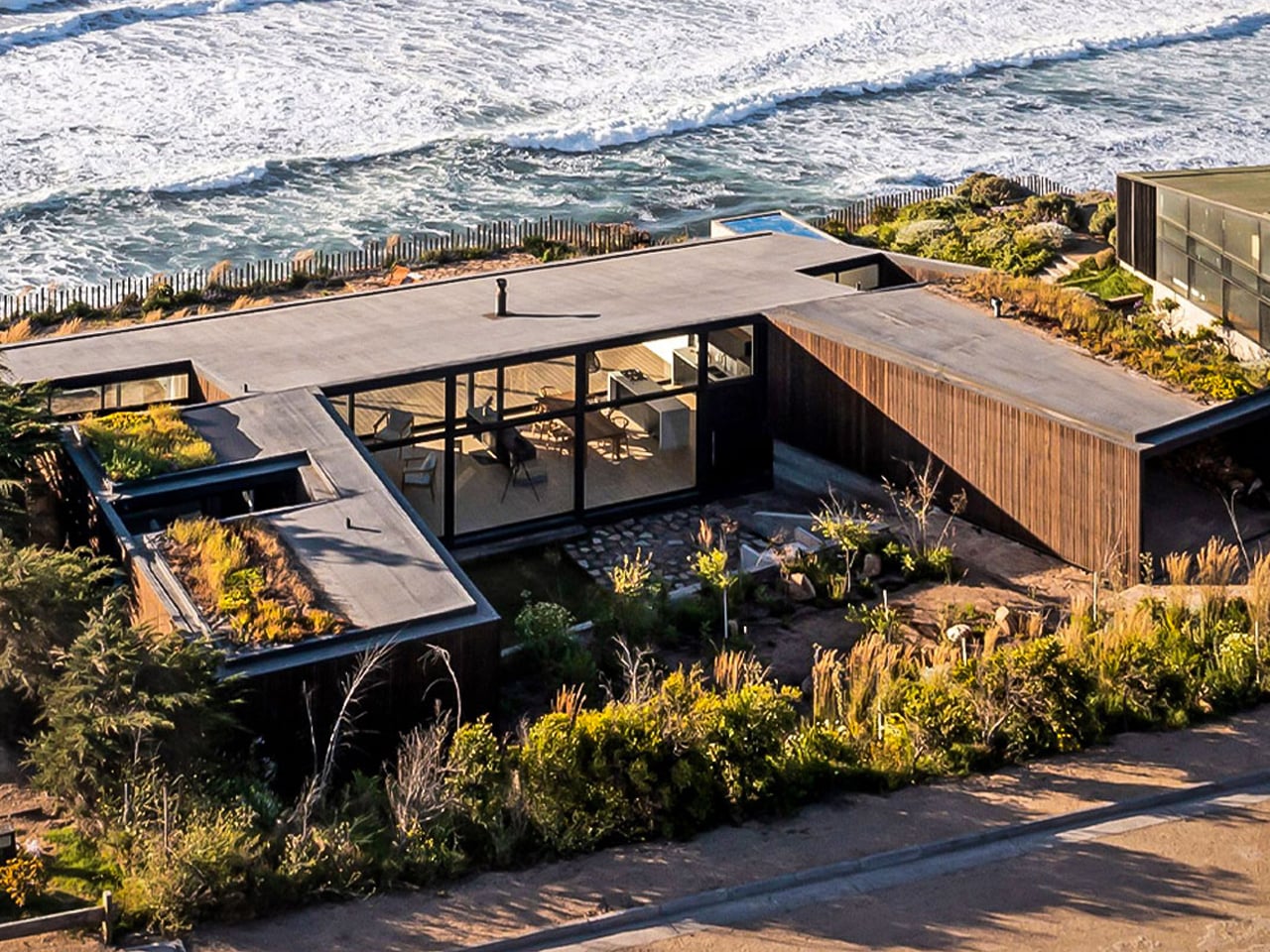
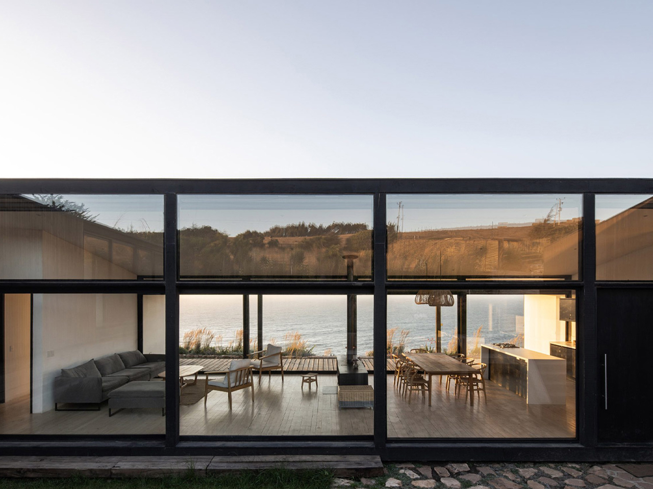
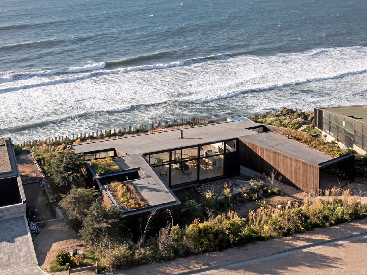
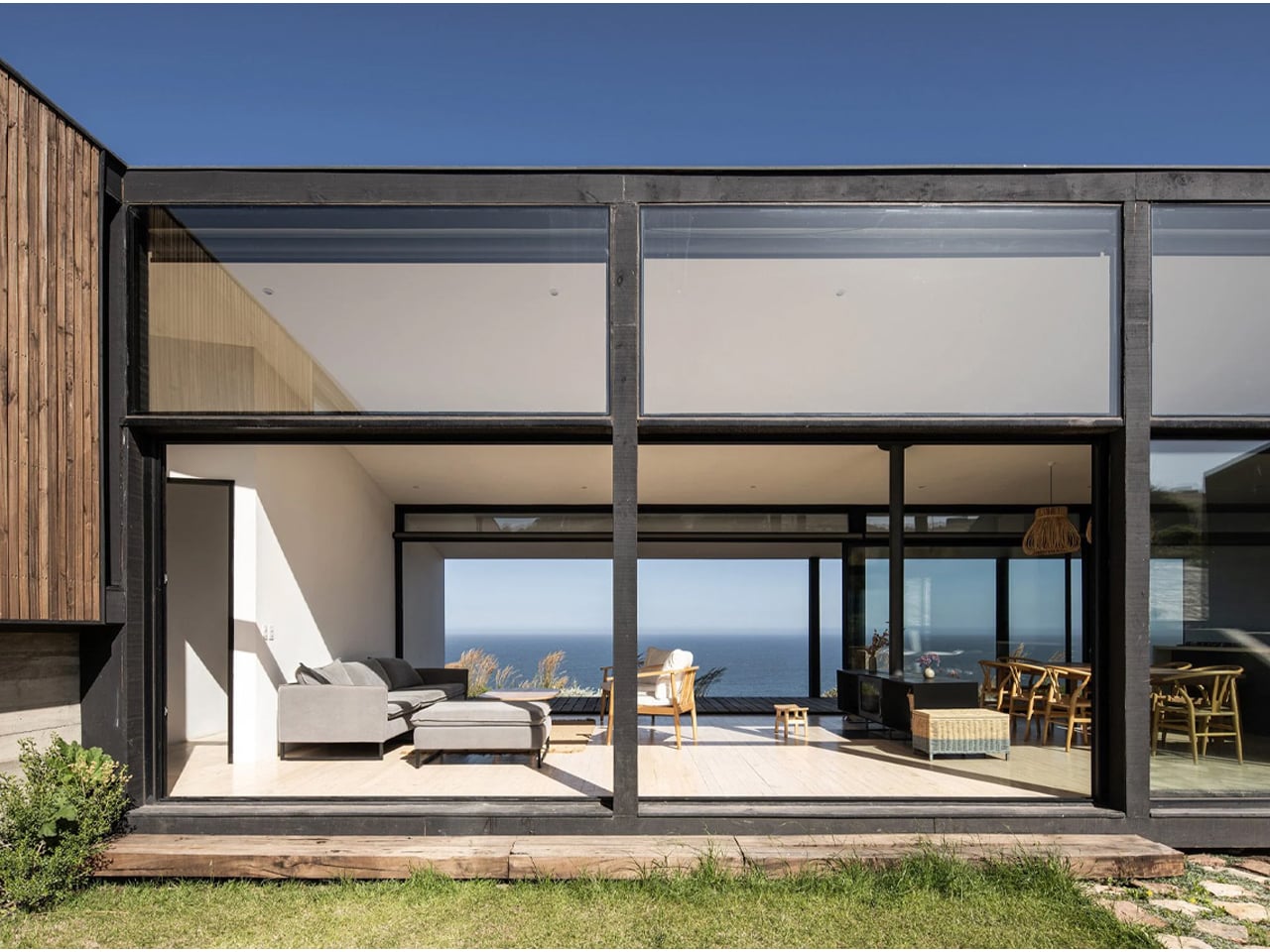
Based in Chile, ERRE Arquitectos designed Casa Ferran, a low-profile beach house in Matanzas. Set on a 240-square-meter site along the Pacific coast, the home follows a U-shaped plan that gently wraps the cliff edge, responding directly to the dramatic drop toward the ocean. The composition is carefully oriented to balance exposure and shelter, using its geometry to soften the impact of strong southwestern winds while preserving privacy along the side edges.

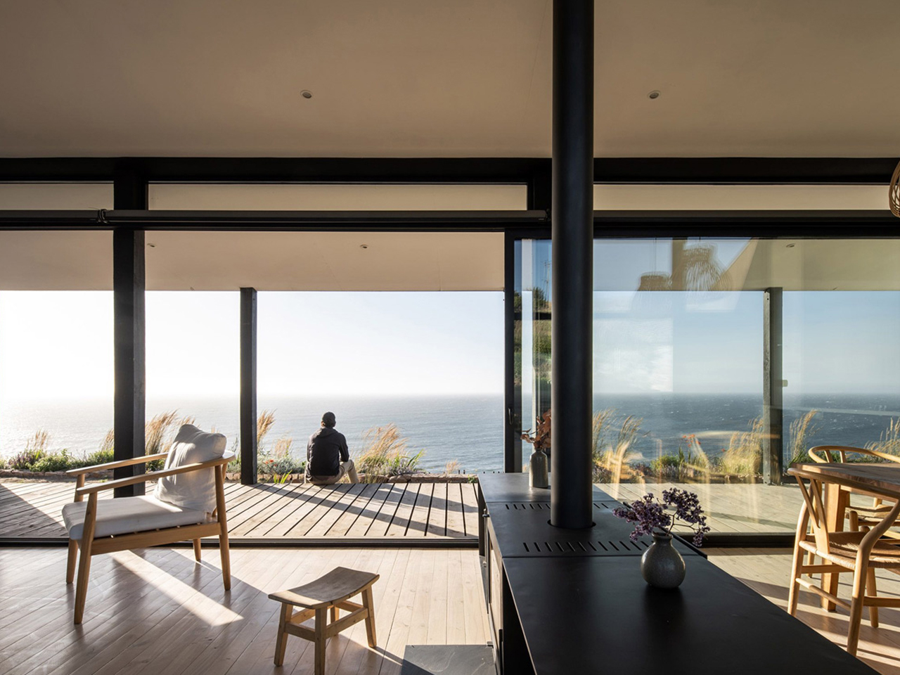
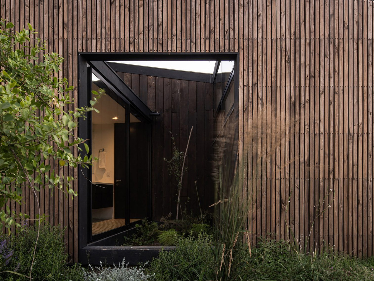
The central design strategy creates a protected courtyard that connects visually to the sea through a glazed common volume. This core space holds the kitchen, living, and dining areas, defined by full-height glass that draws in light and frames uninterrupted coastal views. Two wings extend outward: one containing bedrooms with planted atriums, and the other accommodating parking, guest rooms, and service zones. Built in black steel with pine cladding, and softened by white interiors and warm wood finishes, the home blends structure, landscape, and coastal living into one cohesive architectural gesture.

3. Forest Homes Hidden Among the Trees

Forest homes prioritize preservation by weaving architecture between existing trees rather than clearing the landscape. Dark timber, charred wood, Corten steel, and natural stone allow buildings to recede into woodland settings while respecting the surrounding ecosystem. Elevated walkways and compact footprints minimize disturbance to the forest floor.

Large windows invite natural light through the canopy, creating interiors that remain closely connected to seasonal changes. These homes dissolve into their wooded surroundings, allowing residents to experience nature without disrupting the delicate balance of the forest environment.

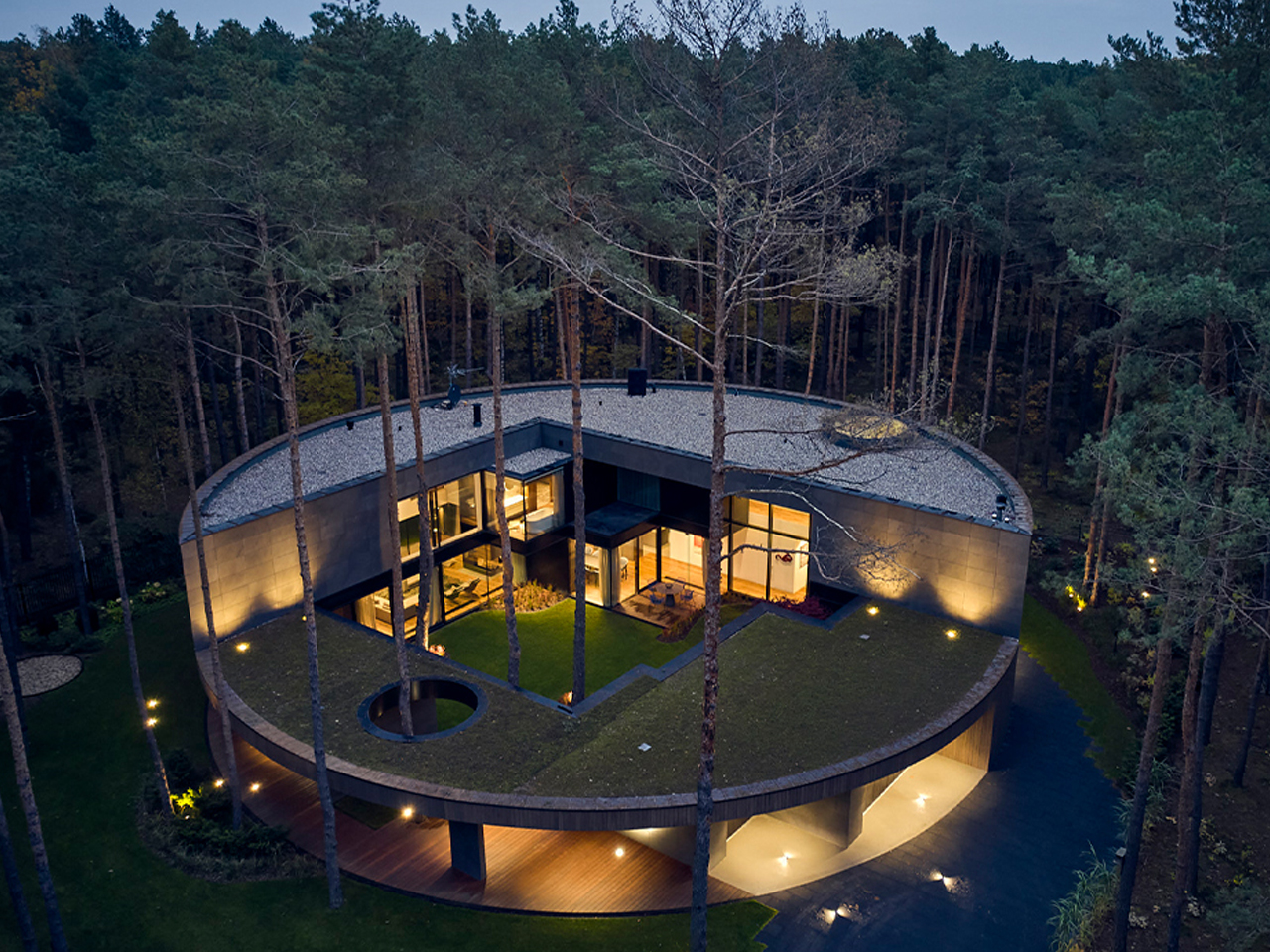
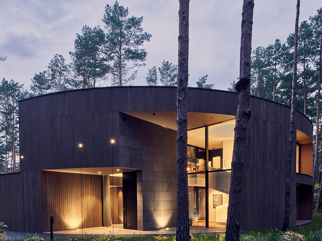
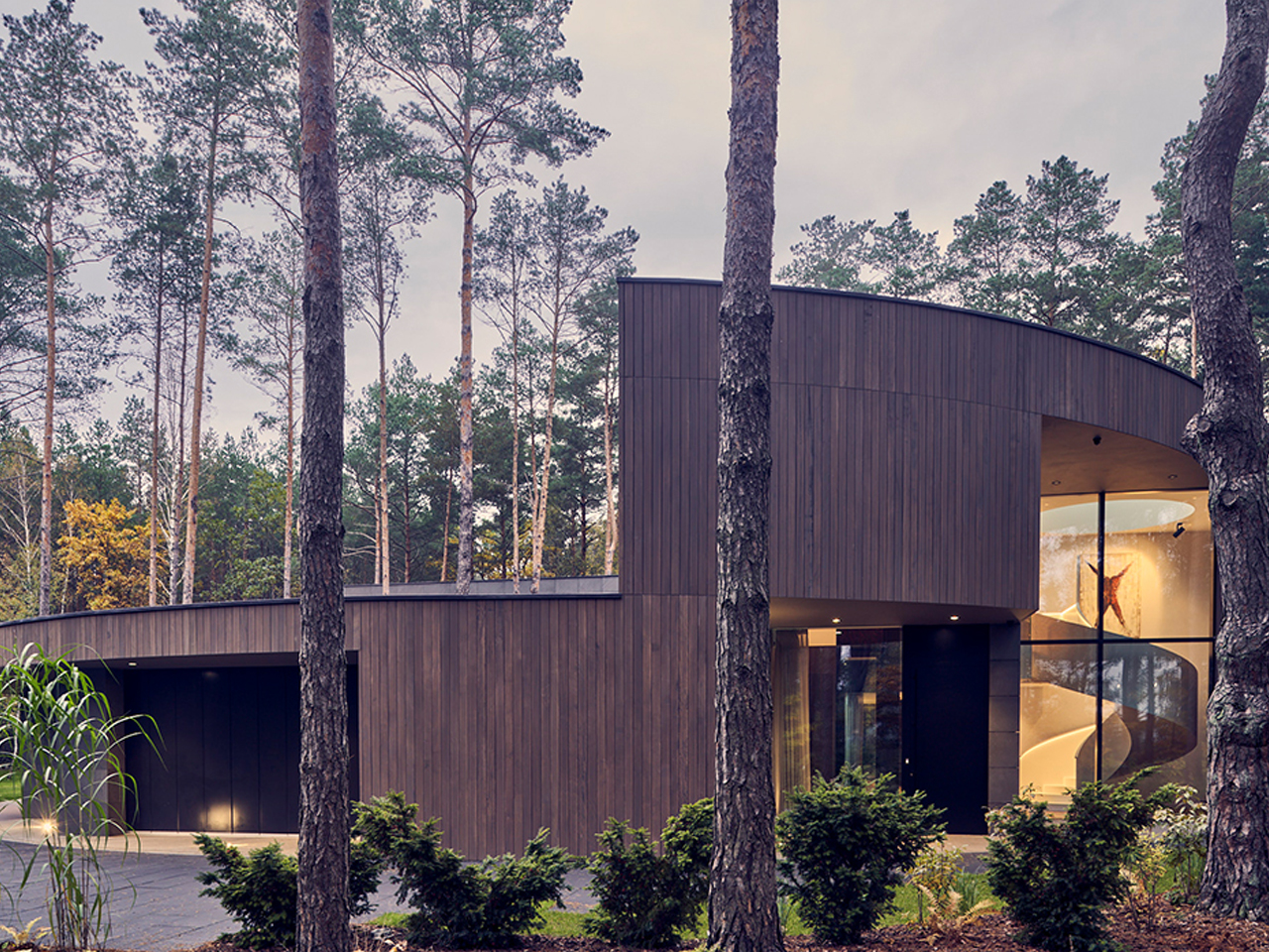
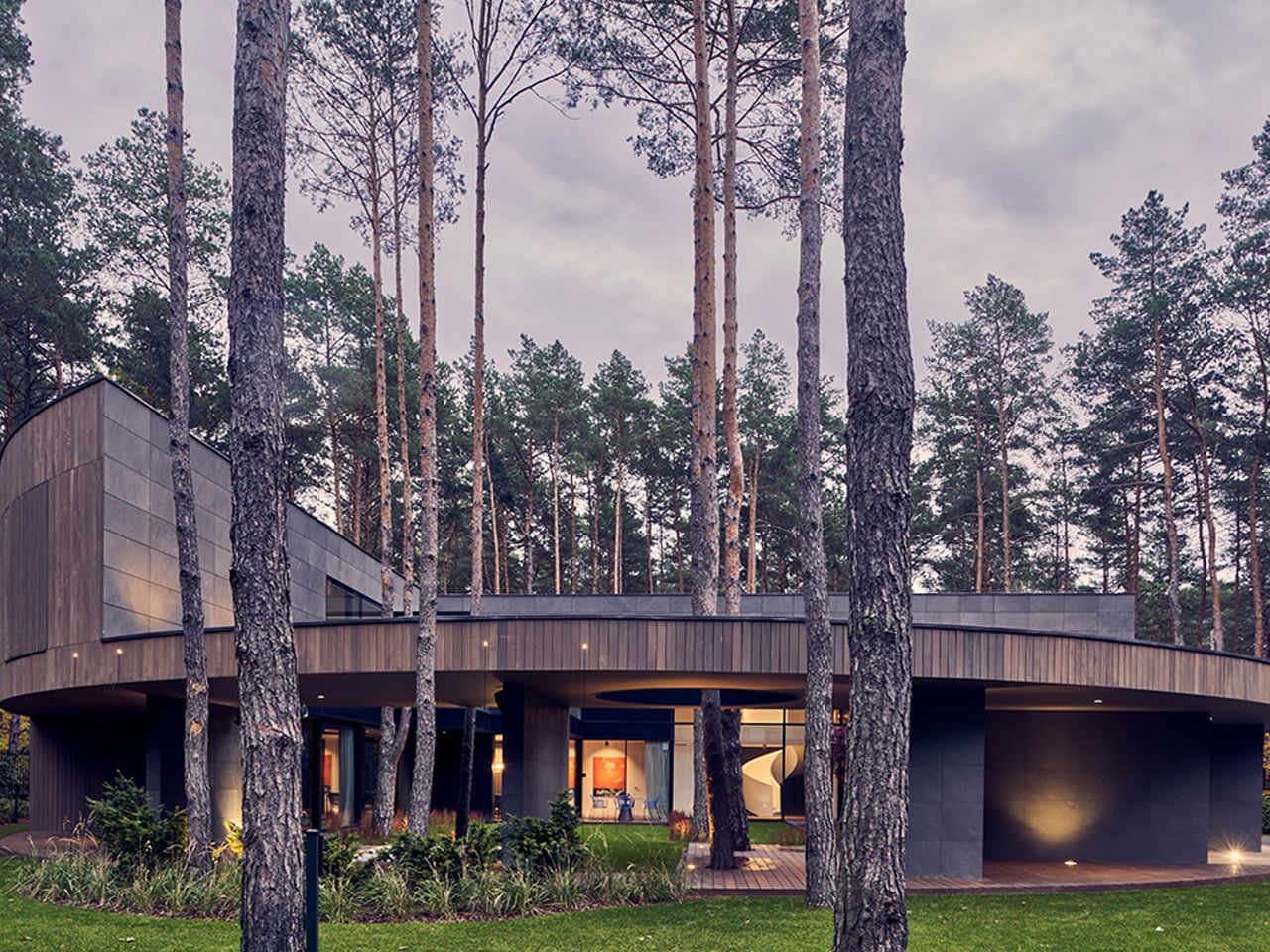
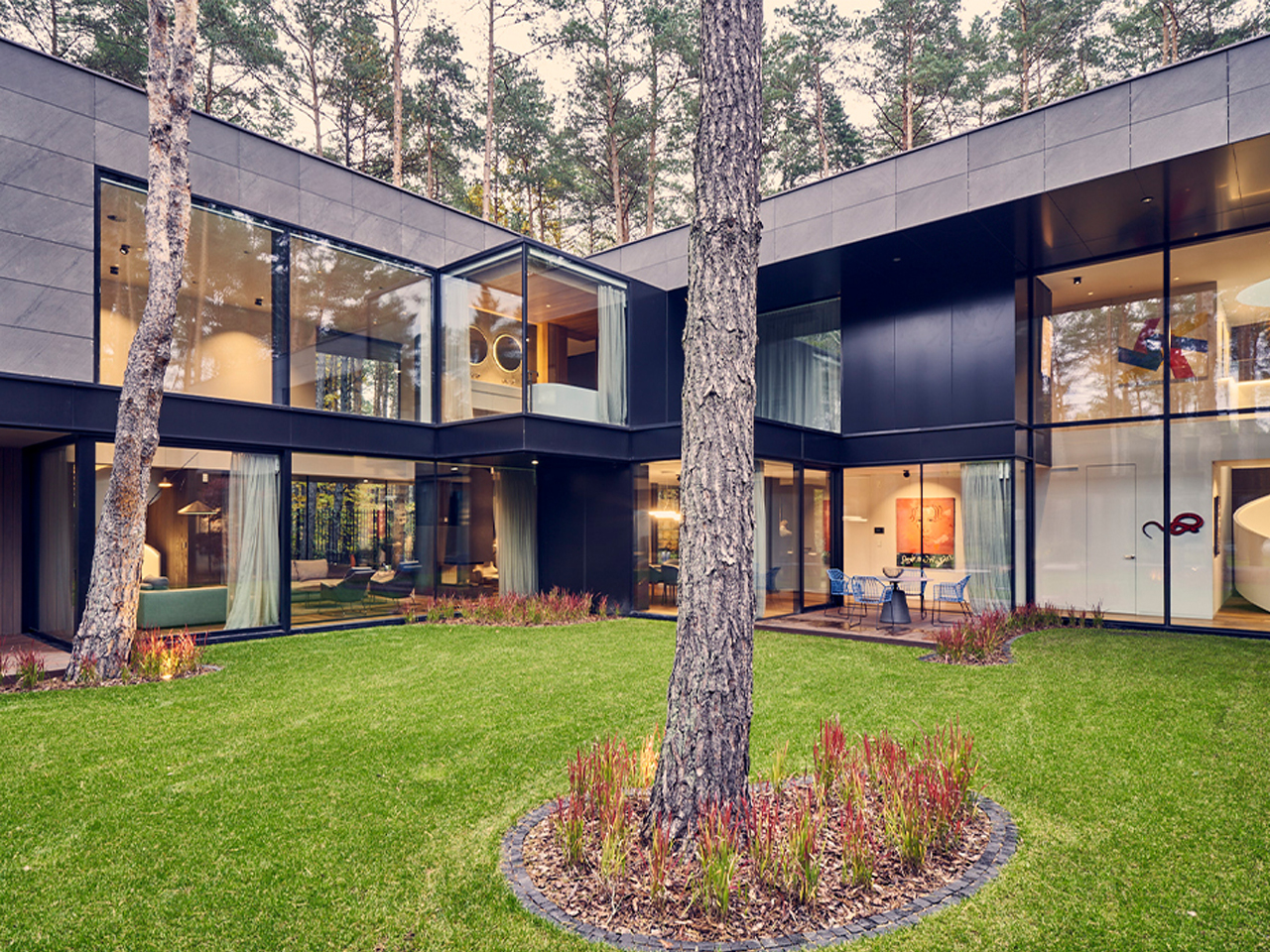
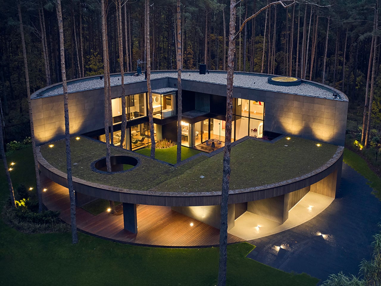
Circle Wood by Mobius Architekci redefines circular home design at a larger residential scale, set within a dense pine forest. Inspired by the form of a sliced tree trunk, the 400-square-meter house adopts a continuous circular geometry clad in okoume wood, carefully selected to help the structure merge with its natural surroundings. The smooth, knotless wooden exterior reinforces the idea of a seamless object embedded in the landscape rather than placed upon it.

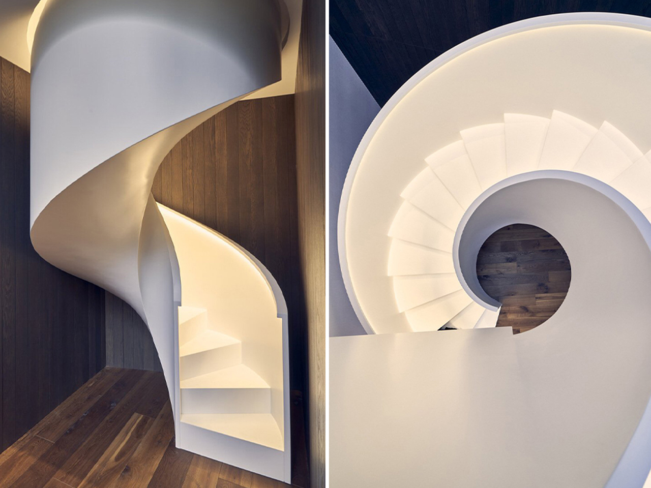
The design organizes living spaces through a fluid, looping layout where rooms feel carved into the volume like pockets within timber. An overhanging oval frame extends the architecture to include a garage and open spa, strengthening the sense of continuity between functions. Generous glazing dissolves boundaries between inside and forest, while a central atrium draws daylight deep into the home. Inside, gallery-like interiors and sculptural elements, including a sweeping white staircase, enhance the experience of movement, making the house feel like a continuous walk through nature and space.

4. Desert Homes Inspired by the Landscape

Desert architecture embraces simplicity, using forms and materials that echo the surrounding terrain. Rammed earth, textured concrete, adobe, and locally sourced stone create earthy palettes that blend naturally with sand dunes, rocky formations, and arid landscapes. Courtyards and shaded outdoor spaces further respond to the harsh climate.

Low horizontal profiles reduce visual prominence while passive cooling strategies improve comfort with minimal energy use. These homes demonstrate how architecture can adapt to extreme environments by working alongside nature instead of resisting it.

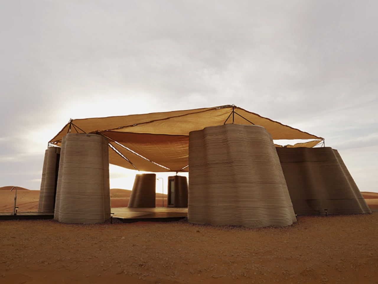
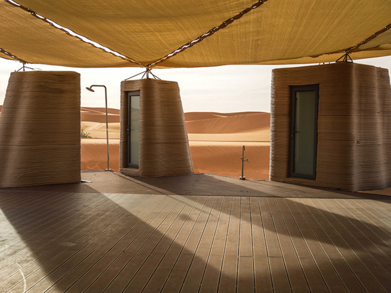
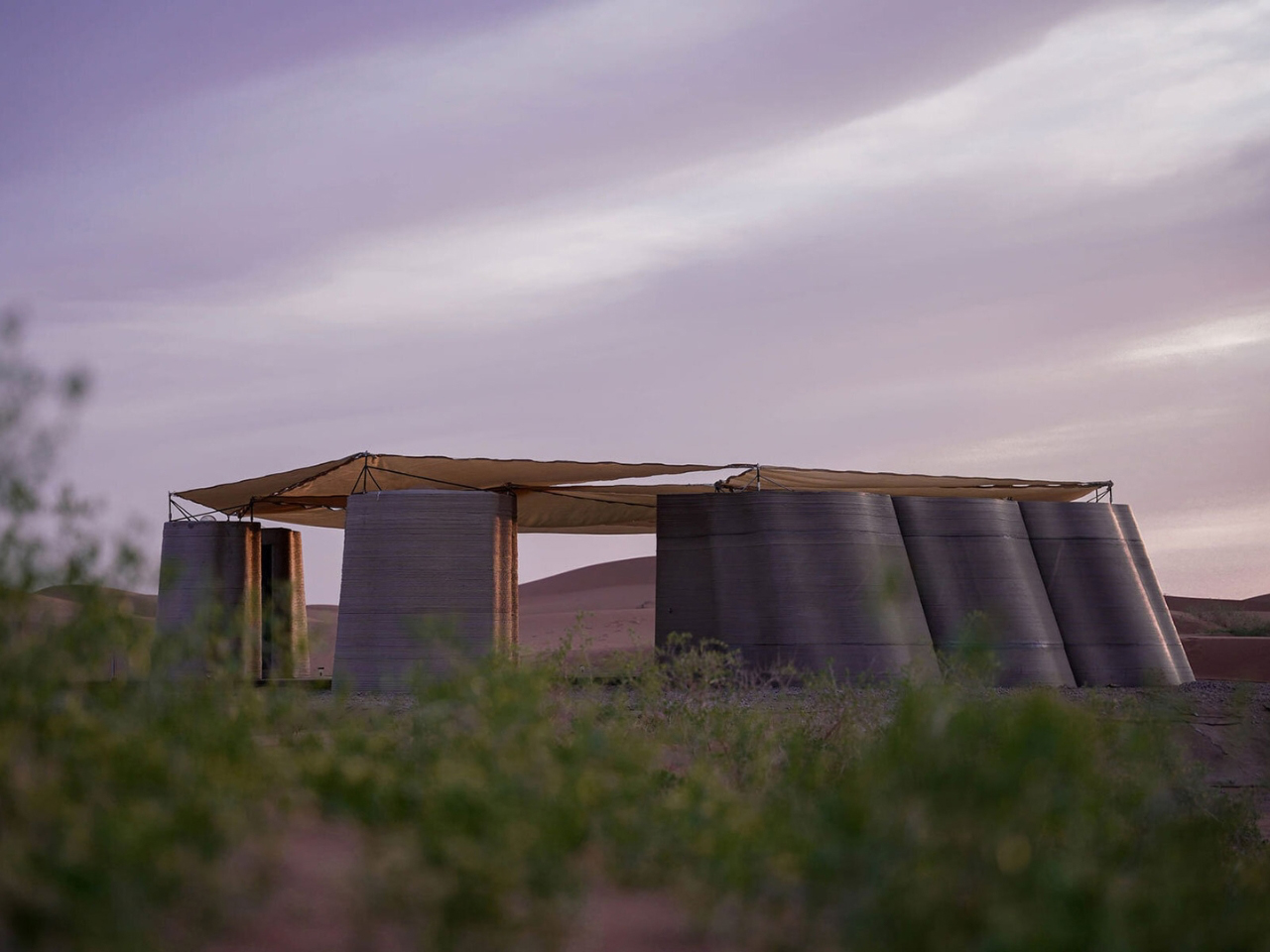
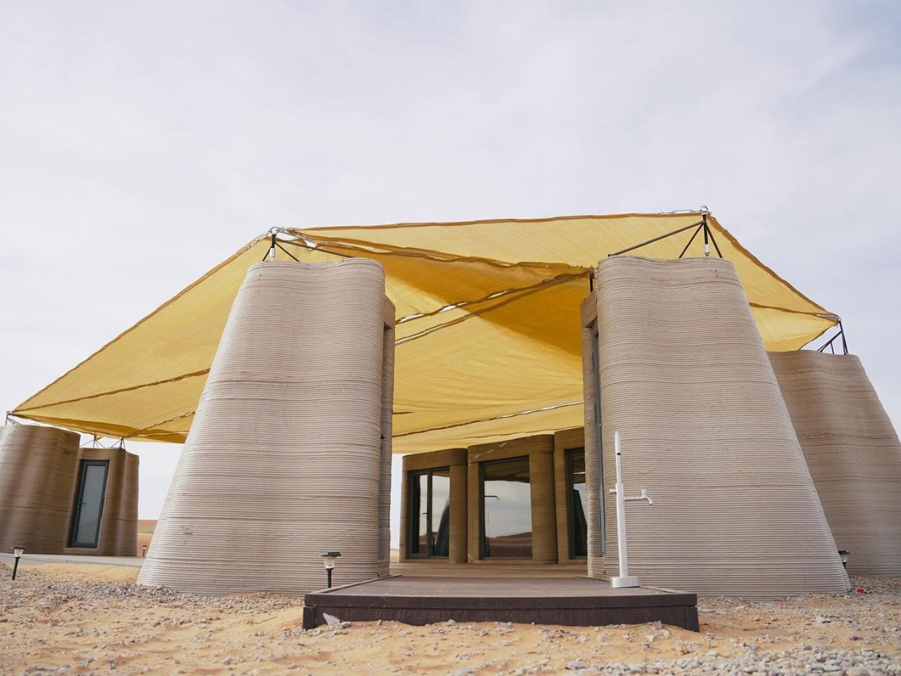
In the heart of Inner Mongolia’s Tengger Desert, designRESERVE introduces Desert Ark, a 3D-printed concrete shelter system that redefines how architecture merges with extreme desert landscapes. Designed for volunteers working on large-scale reforestation efforts, the 150-square-meter base camp responds directly to harsh conditions where temperatures swing from extreme heat to cold. Instead of resisting the desert, the architecture is shaped to coexist with it, forming a compact settlement that feels naturally embedded in the sandscape.

The modular design consists of nine units arranged in a circular layout around a shared communal core, balancing privacy with collective living. Built using robotic 3D-printing and sand-based concrete, the structures feature layered, wavy surfaces that echo wind-shaped dunes, allowing them to visually dissolve into the environment. Integrated insulation cavities regulate temperature, making the interiors more habitable in extremes. Beyond function, Desert Ark becomes part of the desert itself as an adaptive, low-impact form that blends shelter, landscape, and technology into a unified architectural response.

5. Lakeside Homes That Reflect Their Surroundings

Homes along lakes and rivers often use transparency and subtle material choices to reduce their visual presence. Glass façades reflect changing skies and water, while timber, stone, and planted roofs soften the transition between architecture and the surrounding landscape. Many designs gently follow the shoreline instead of altering it.

By emphasizing reflection, openness, and carefully framed views, these homes create a continuous dialogue between indoor and outdoor spaces. The result is architecture that appears to dissolve into the water’s edge while providing peaceful living environments immersed in nature.

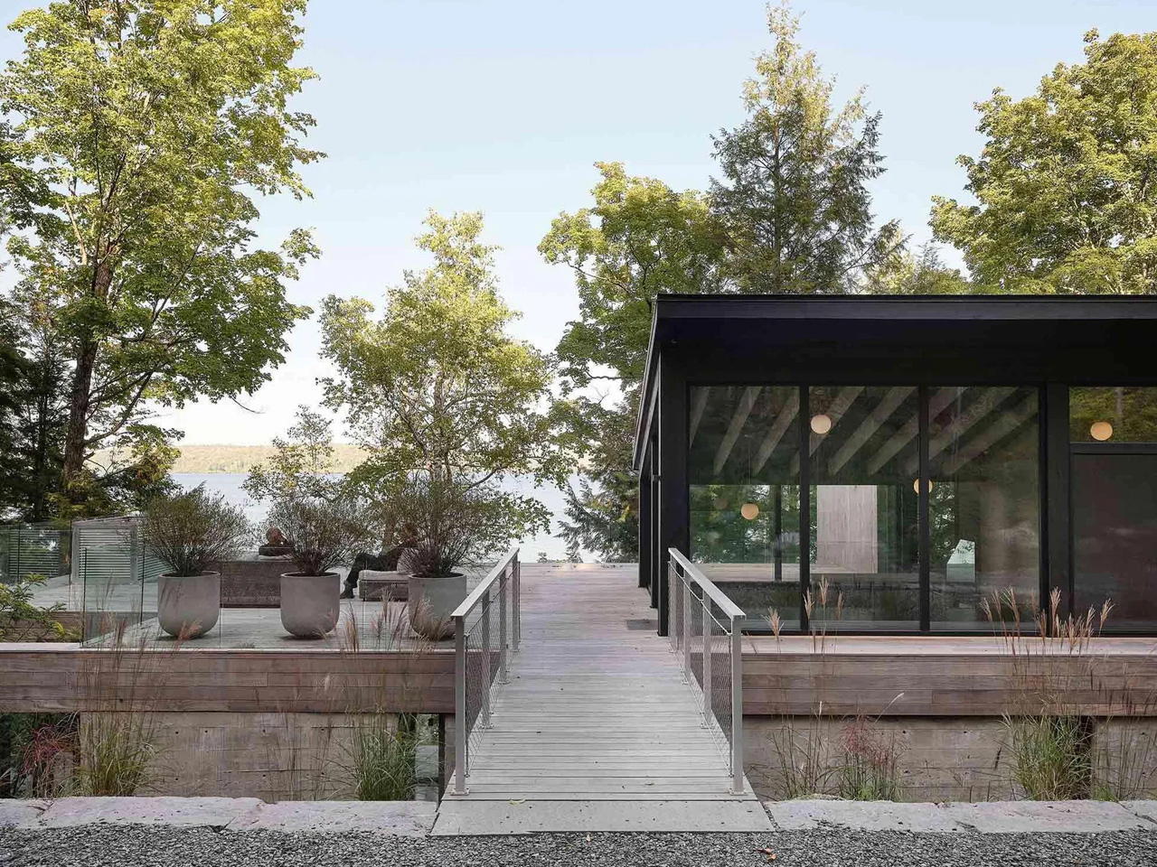
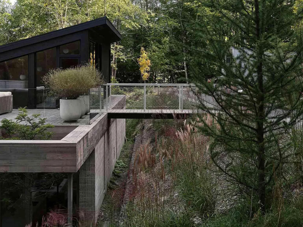
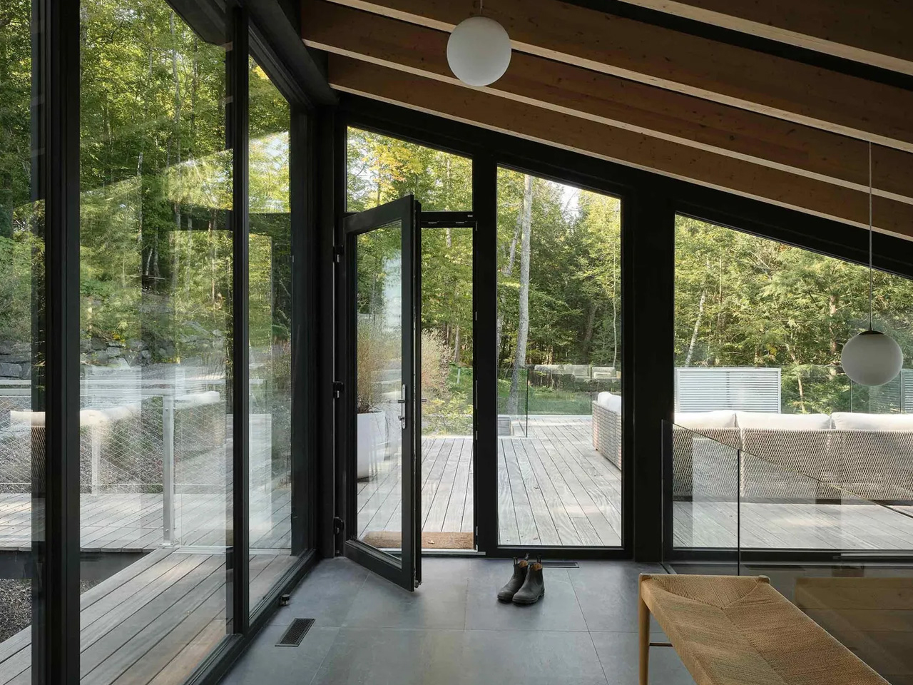
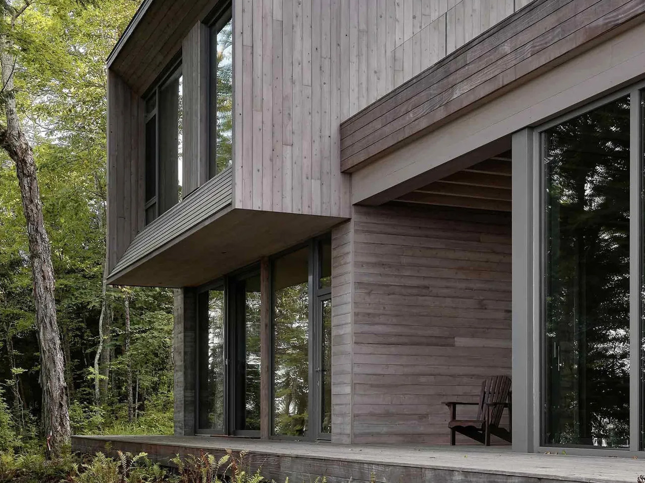
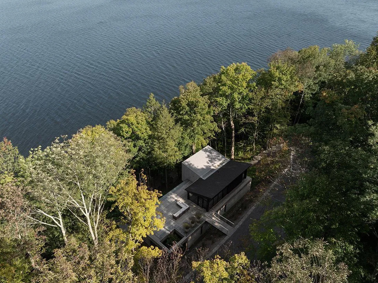
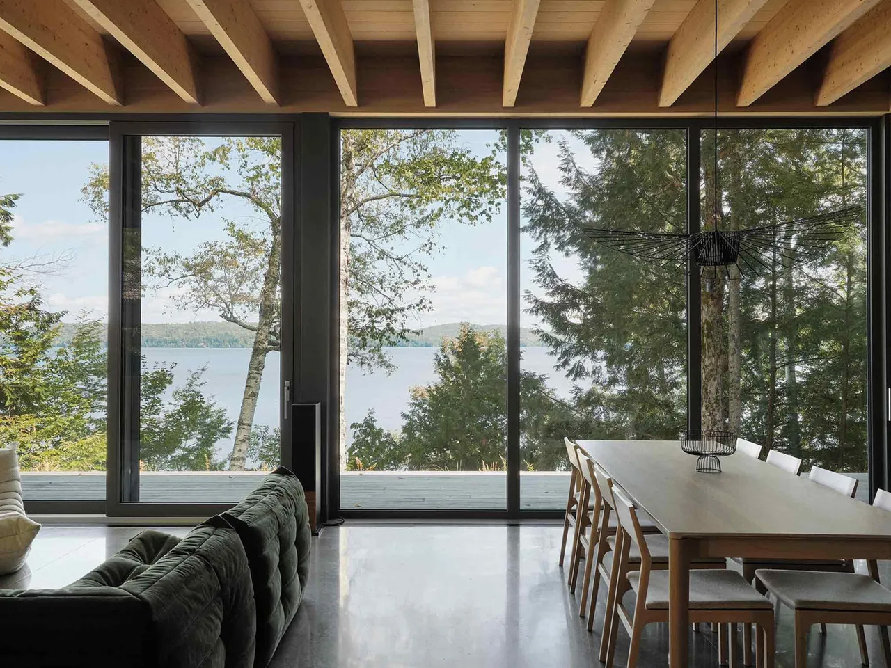
yh2 Architecture designs the Counter-Slope House as a quiet intervention within the steep terrain of Lake Memphremagog in Potton, Quebec. The 4,530-square-foot residence is embedded in a sharply sloping woodland site, where dense trees and shifting gradients shape every architectural decision. Instead of asserting presence toward the lake, the house withdraws into the land, reading more like a calibrated extension of the hillside.

The building is composed of two interlocking volumes that step gently with the slope, each capped by a subtly shifting dual-pitched roof that reduces visual mass and echoes the surrounding topography. Weathered cedar cladding allows the exterior to dissolve into the forest, while interiors in white oak introduce warmth and structure. Openings are carefully placed to capture fragmented lake views through trees rather than direct exposure, making light, movement, and seasonality central to the lived experience.

Ultimately, homes that disappear into their natural surroundings reflect a thoughtful approach to design, where architecture complements rather than competes with the landscape. By respecting local environments and embracing contextual materials, these residences create timeless spaces that foster a deeper connection between people and nature.

The post 5 Best Homes That Disappear Into the Landscape in 2026 first appeared on Yanko Design.
Finally, a Bench Design That Never Wastes a Seat

Anyone who has ever sprinted through a train station with a rolling suitcase in one hand and a coffee sloppily balanced in the other knows the particular despair of scanning a row of seats and finding every single one occupied by someone’s backpack. Not a person. A bag. Sitting there like it paid for the ticket too.


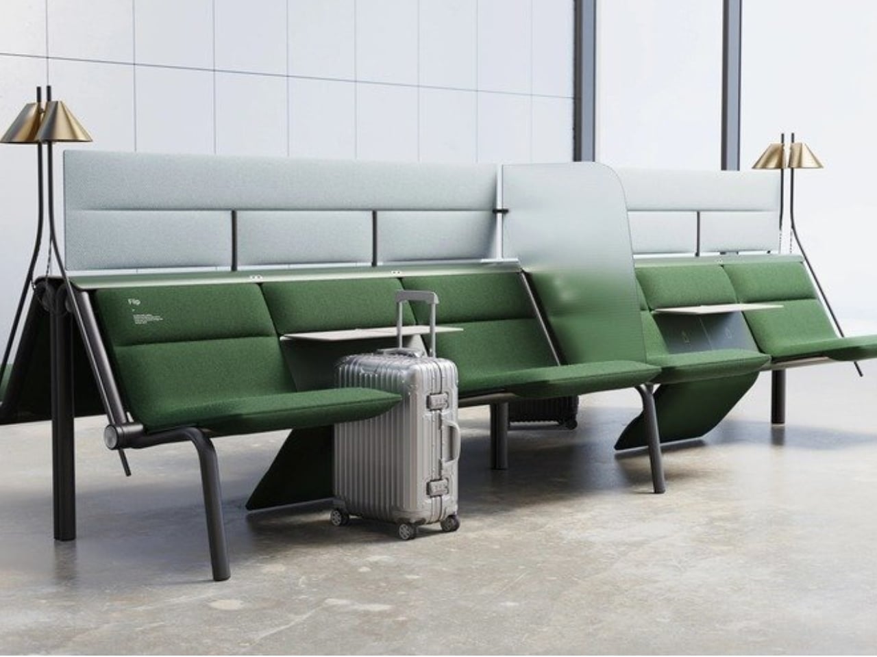
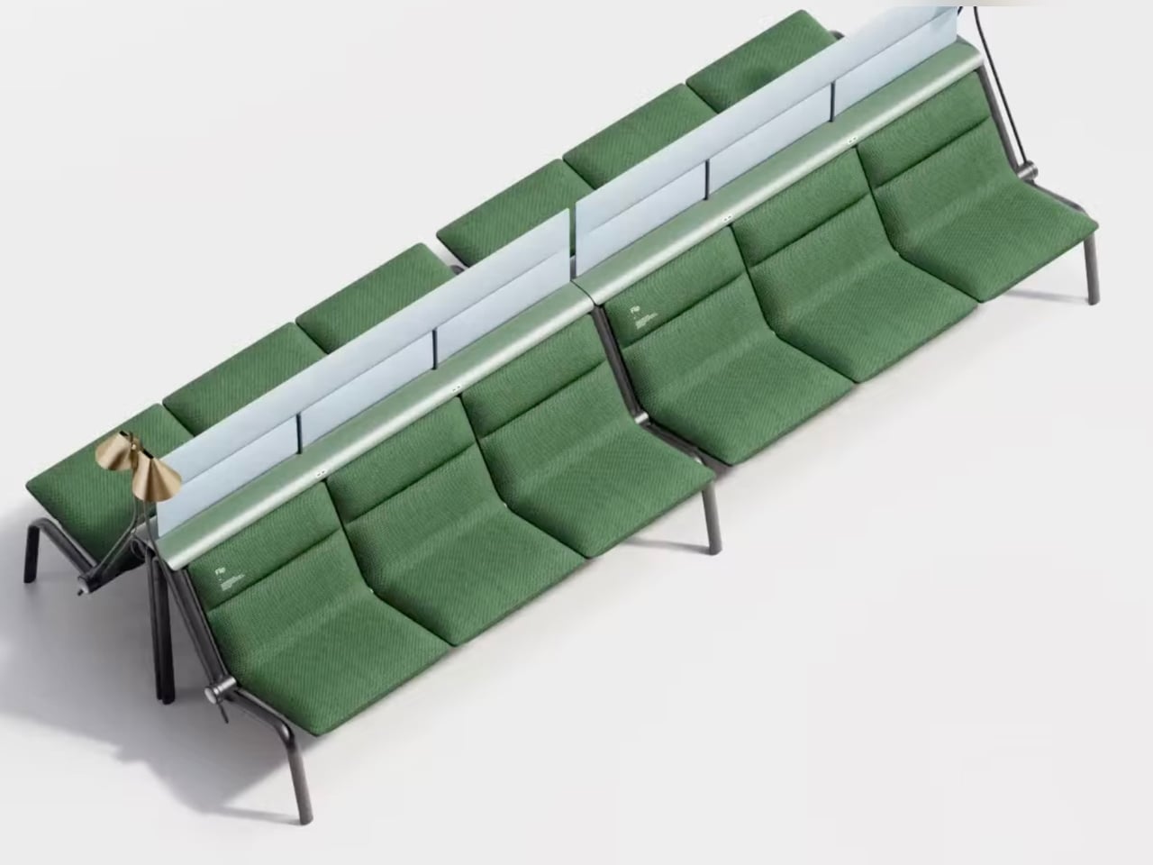
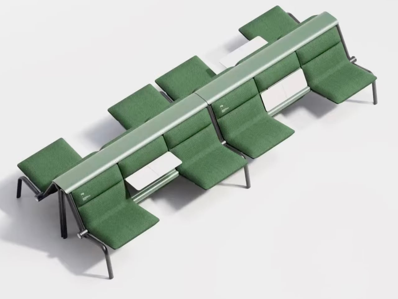
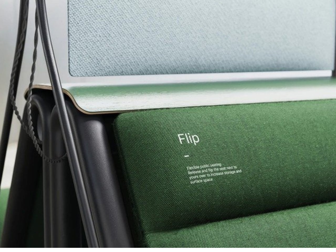
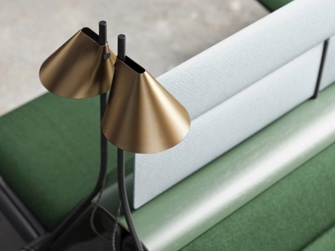
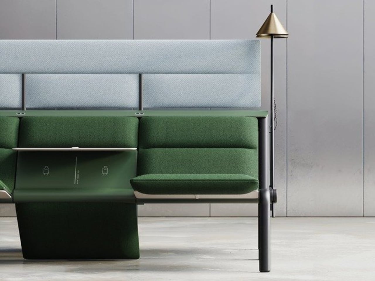
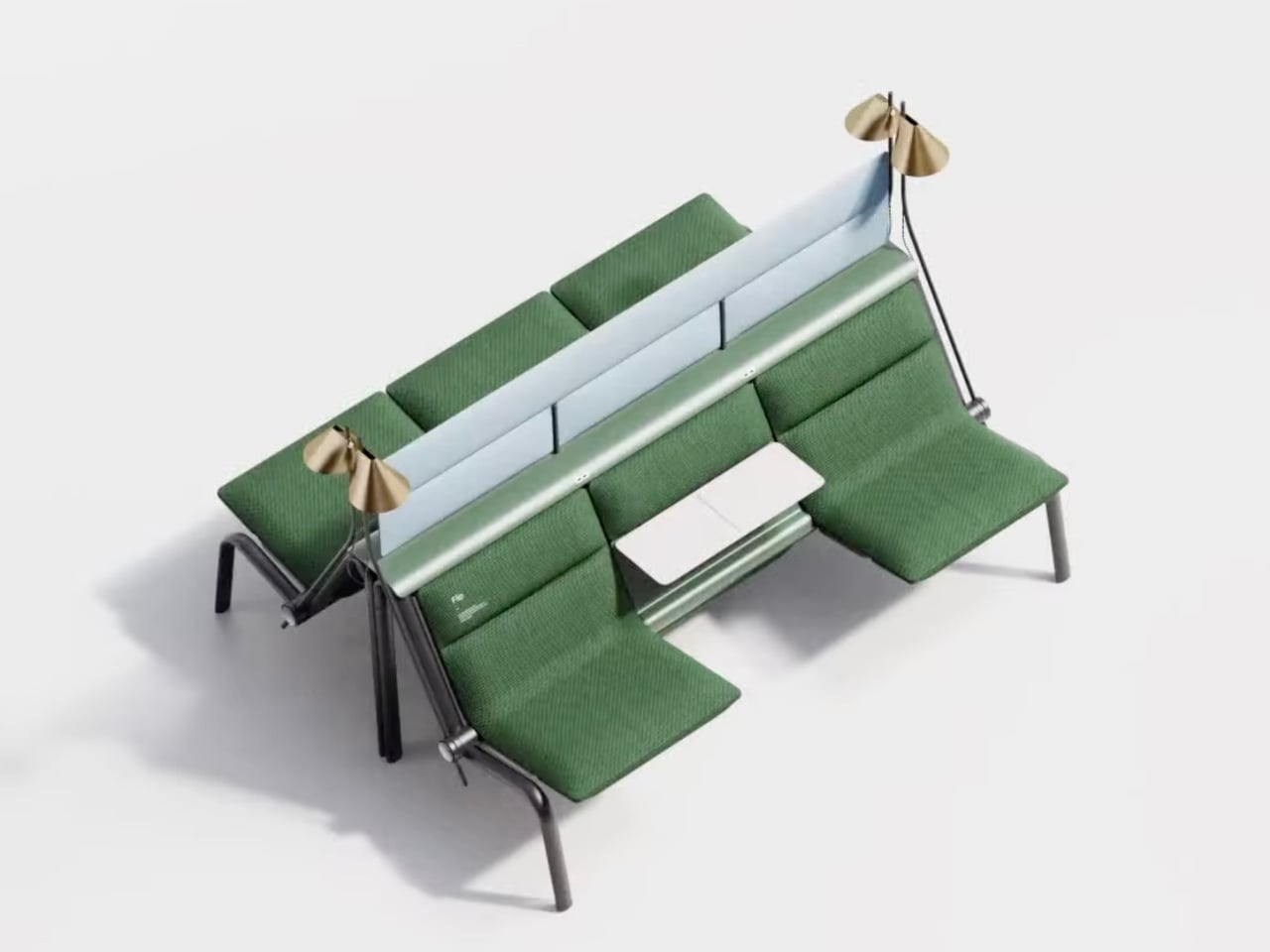
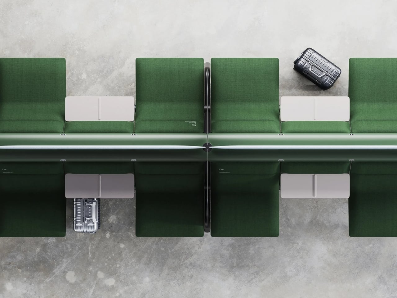
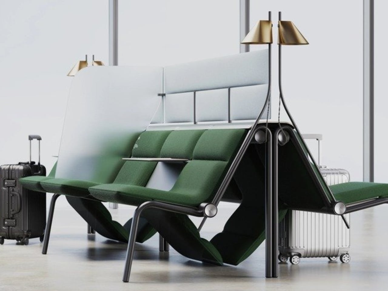
That small, maddening moment is basically the whole reason a London studio called Of My Imagination designed something called Flip, a modular public seating system where each individual seat can rotate out of the way on command. Instead of a bench being a fixed slab of “sit here or don’t,” Flip treats every seat as its own hinge point. Flip it down, it’s a chair. Flip it up and out, it becomes open space for luggage, a stroller, or just more room to breathe when a platform gets crowded. It sounds almost too simple to be clever, which is usually the sign of a genuinely good idea.

Designer: Of My Imagination

I’ve been thinking about public seating a lot lately, mostly because so much of it seems designed for an idealized version of how people move through the world rather than the messy, unpredictable reality of it. Airports, bus terminals, hospital waiting rooms. These spaces swing between dead quiet and total chaos within the same hour, and yet the furniture almost never adjusts with them. A bench built for a slow Tuesday afternoon becomes a liability during a holiday rush, when every inch of floor space suddenly matters and immovable seating just gets in the way.

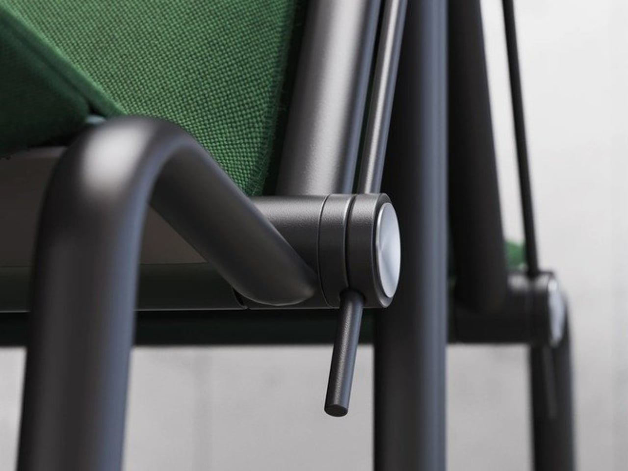
Flip’s answer isn’t flashy. There’s no app, no motor, no sensor deciding when a seat should move. It’s a mechanical latch and a rotating joint, the kind of low-tech solution that feels almost old-fashioned in a moment when everything gets pitched as “smart.” I actually like that restraint. Public infrastructure breaks down constantly not because the technology is too simple, but because it’s too complicated, too fragile, too dependent on software updates and maintenance contracts nobody budgeted for. A seat that flips because a person physically flips it is a seat that still works during a power outage, a system failure, or just a Tuesday when the maintenance crew is short-staffed.

The pandemic-era spacing rules get a mention in OMI’s own description of the project, and it’s worth sitting with that for a second. Remember all those benches wrapped in caution tape or marked with awkward stickers telling you where not to sit? Most of that signage disappeared once the emergency did, but the underlying problem never really left. Public seating still needs to flex between “pack people in tightly” and “spread them out,” whether that’s for health reasons, accessibility needs, or just the reality of rush hour versus a quiet Sunday morning.

What strikes me most is how much this design respects the intelligence of the people using it. Flip doesn’t try to predict what a traveler needs. It just gives them the option and gets out of the way. That’s a surprisingly rare quality in public design, where the instinct is often to over-engineer a solution that anticipates every scenario instead of trusting a commuter to make a simple physical adjustment themselves.

Is it going to replace every bench in every transit hub across the country? Probably not right away, and cost, durability testing, and vandalism resistance are the unglamorous hurdles any concept like this has to clear before it shows up somewhere you’d actually sit down. But as a proof of concept, it’s a refreshing reminder that flexibility doesn’t require a screen or a subscription. Sometimes it just requires a hinge and a little humility about how unpredictable public spaces actually are.

The next time I’m standing in a crowded terminal, silently negotiating personal space with a stranger’s overstuffed duffel bag, I’ll probably think about Flip. Not because it solves everything, but because it solves the one thing that’s been sitting there, unaddressed, for as long as public benches have existed.

The post Finally, a Bench Design That Never Wastes a Seat first appeared on Yanko Design.