Most dinnerware is designed to disappear. Plates, bowls, chopsticks — they accumulate in cabinets and get used without being noticed, which is fine until you eat a meal set on something that was actually made with care. Then the gap becomes impossible to close. Japan produces more objects in that second category than anywhere else on earth, not because of tradition for its own sake, but because the Japanese design standard demands that everyday tools perform well and look considered doing it.
These seven pieces represent that standard in different forms — a lacquered cedar bowl from Hida Takayama, a folding knife that rests on the rim of a plate, a porcelain cup that invites you to finish designing it yourself. None of them is a status object or a conversation piece. They are tools for eating, built by people who decided that the distance between acceptable and excellent was worth the extra work.
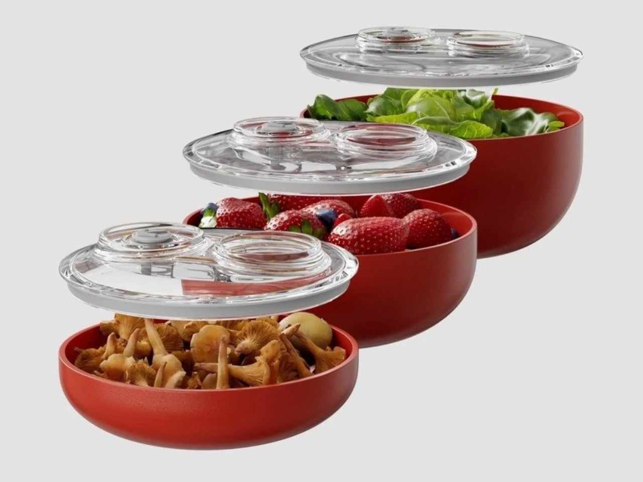
1. Higashi Shunkei Hida-Cedar Lacquer Bowl
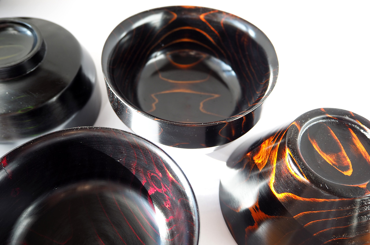
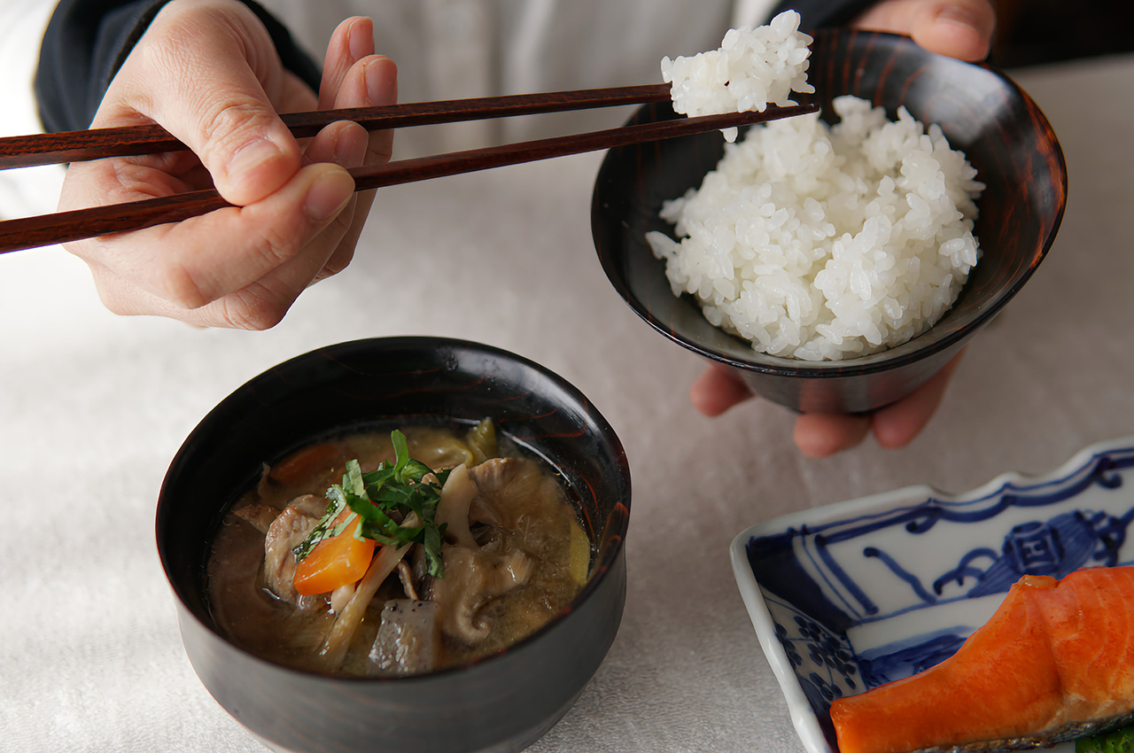
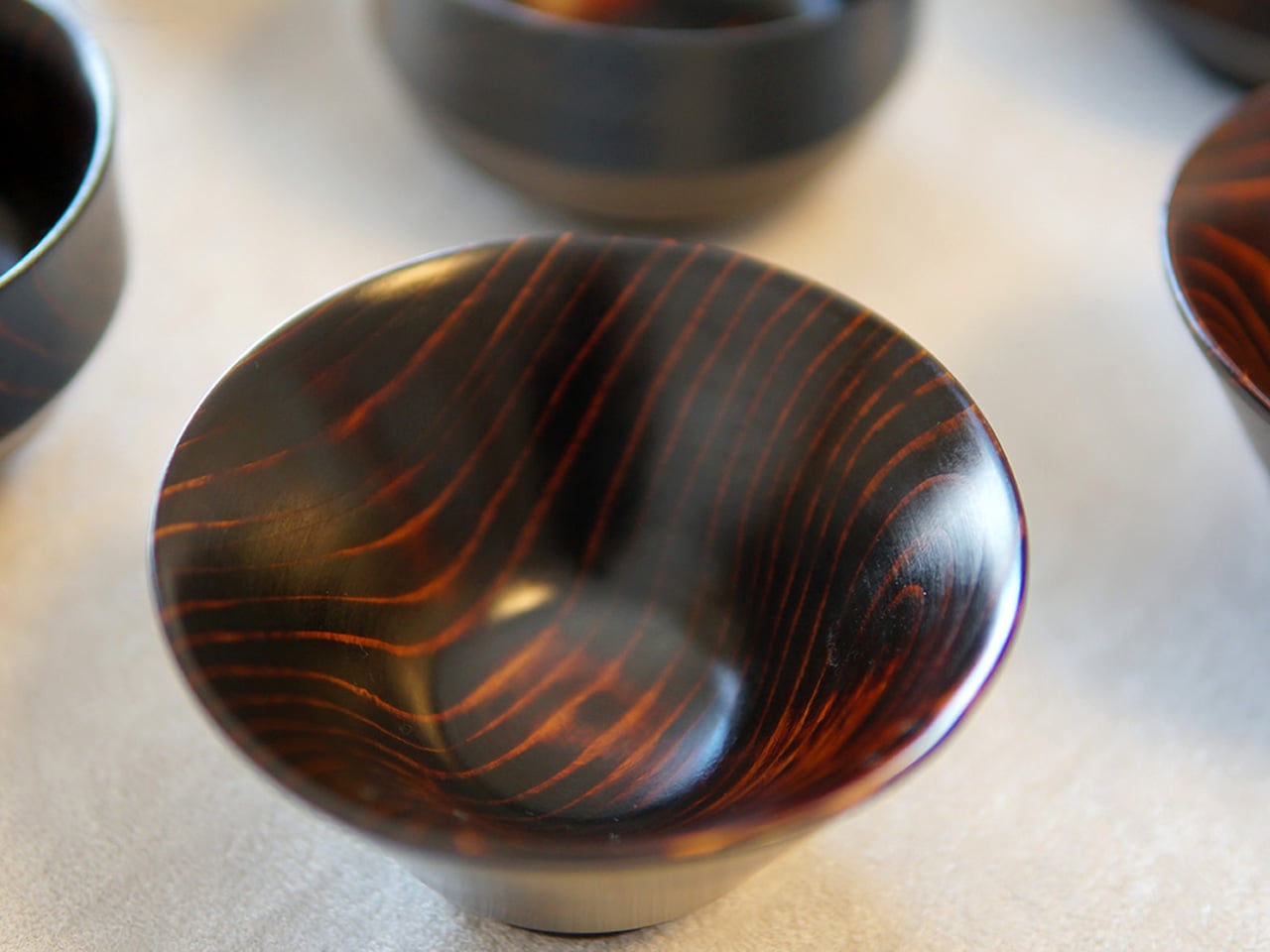
The forests around Hida Takayama cover ninety-two percent of the city’s land, and Higashi Shunkei has been sourcing cedarwood from them for sixty-eight years. The bowls they make are not the obvious Japanese craft choice — that would be ceramic — but cedar carries properties that ceramic cannot replicate. The wood grain in Hida cedar is unusually hard, with softer spaces between grains, making it difficult to process and rare even within Japan. Each bowl is spun on a lathe and finished by hand before a single coat of lacquer is applied.
The lacquer goes on in layers through a process called Suri Urushi, each coat saturating the wood’s pores rather than sitting on top of them. The result feels dense, like ceramic, but insulates like wood, so hot soup stays warm while the bowl remains comfortable to hold. The color deepens with every year of use, meaning a bowl used daily for a decade looks more alive than the one you first bought. They come in rice and soup configurations, in red, black, or blue lacquer, and are dishwasher safe, which, for traditionally lacquered woodwork, is genuinely unusual.
What we like
- Suri Urushi lacquering fuses into the wood rather than coating it, creating a surface that strengthens and deepens over time rather than peeling or chipping
- Each bowl’s cedar grain pattern is unrepeatable, making every piece distinct without any designer having to engineer that distinction
What we dislike
- Hida cedar’s rarity makes these bowls difficult to source outside Japan, and the original crowdfunding campaign that brought them to international attention has since closed
- The color range of red, black, and blue is considered, but limited for those wanting a neutral or natural wood tone at the table
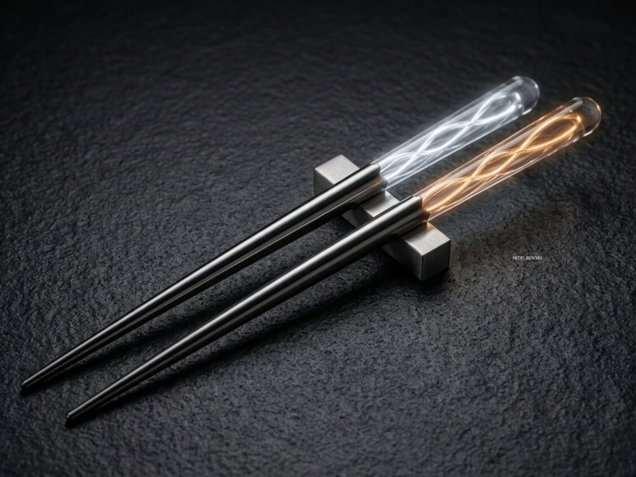
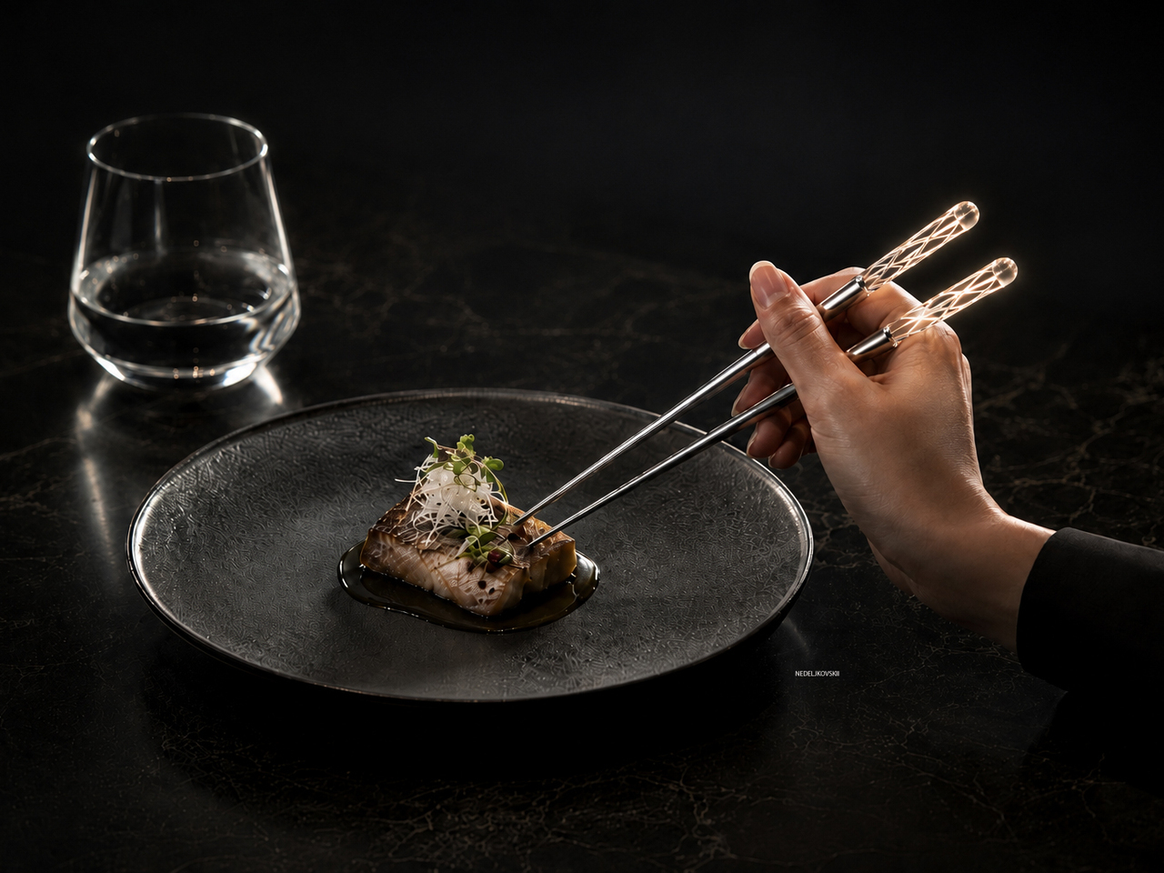
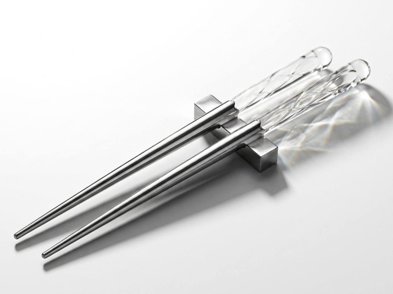
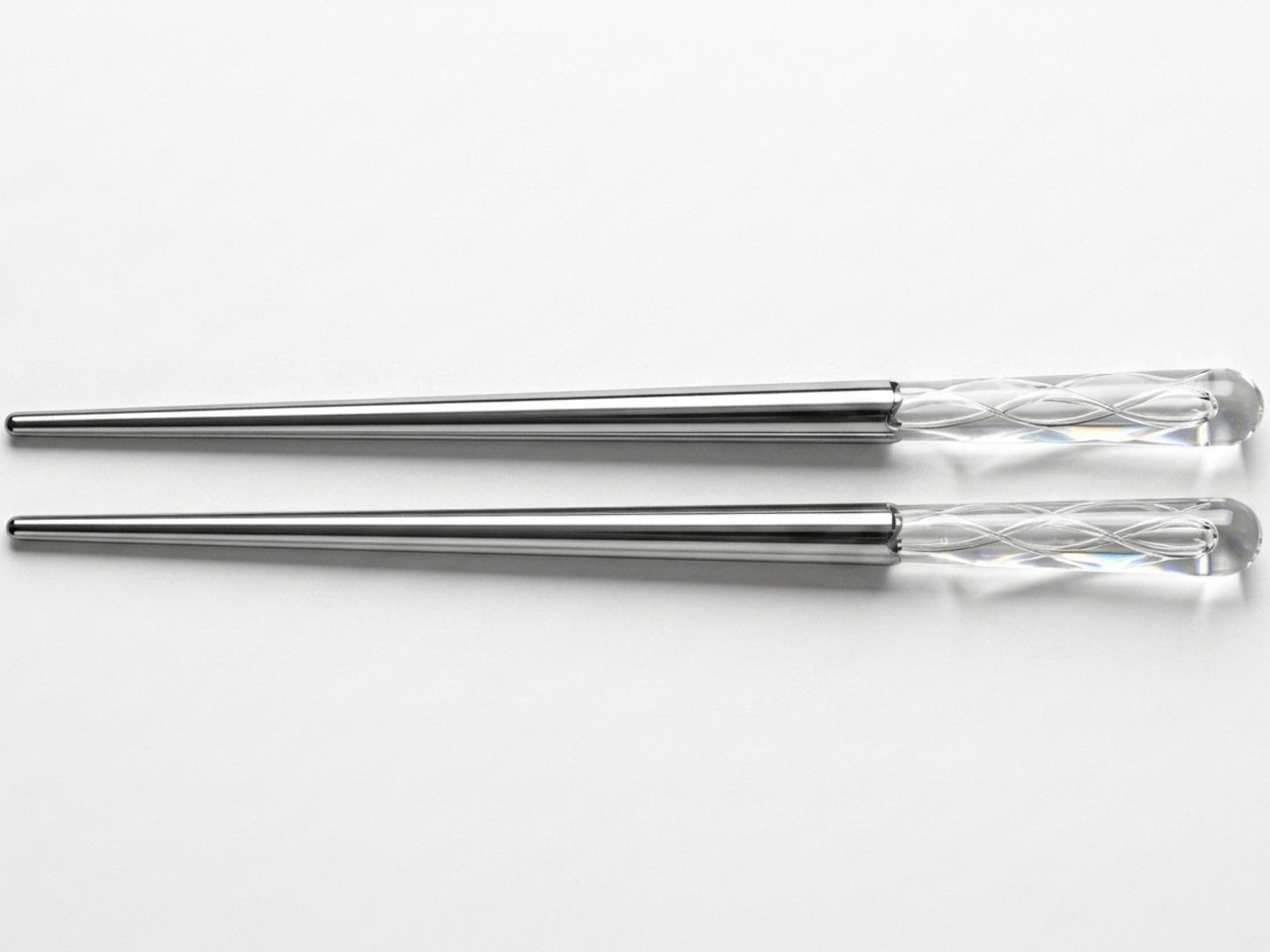
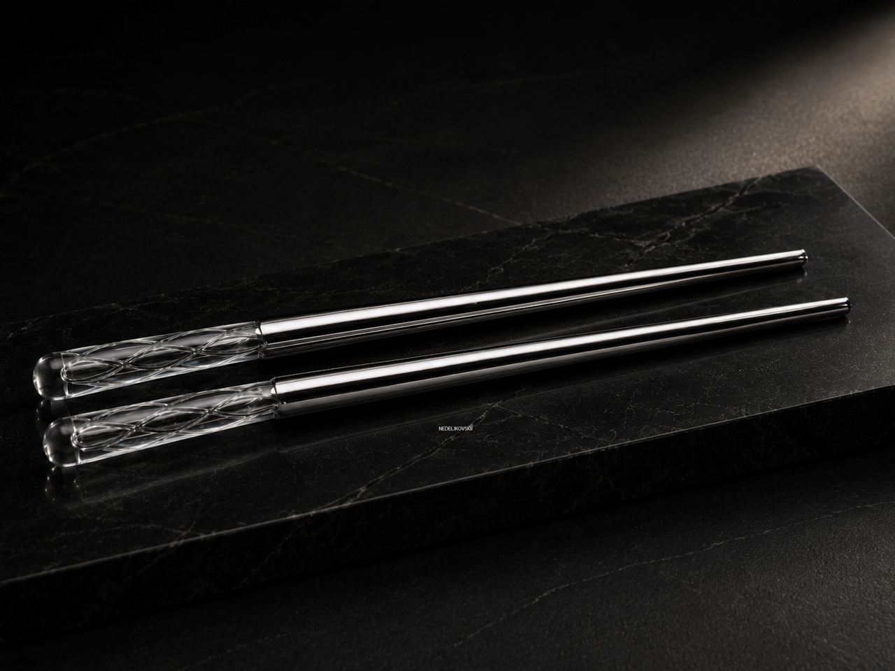
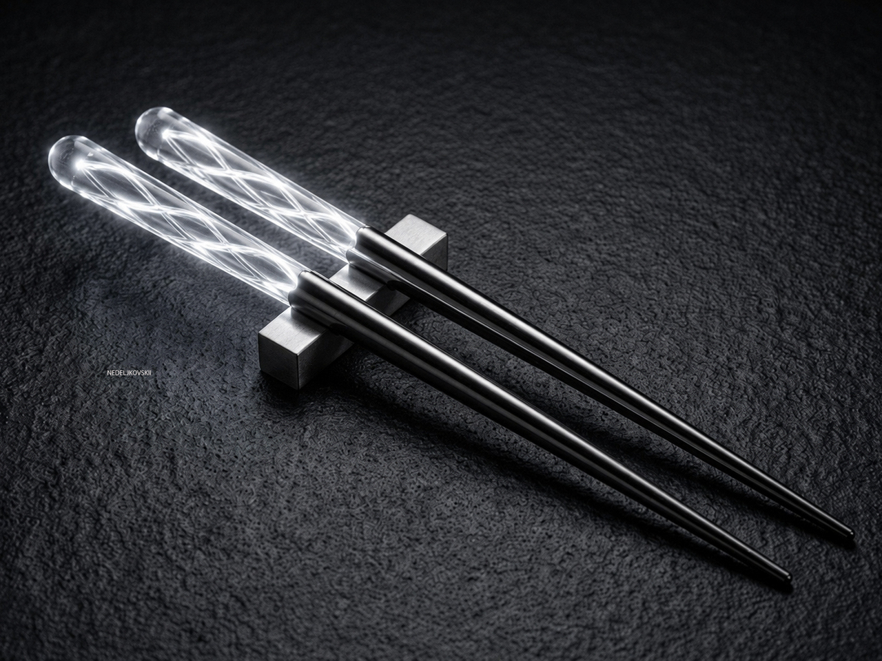
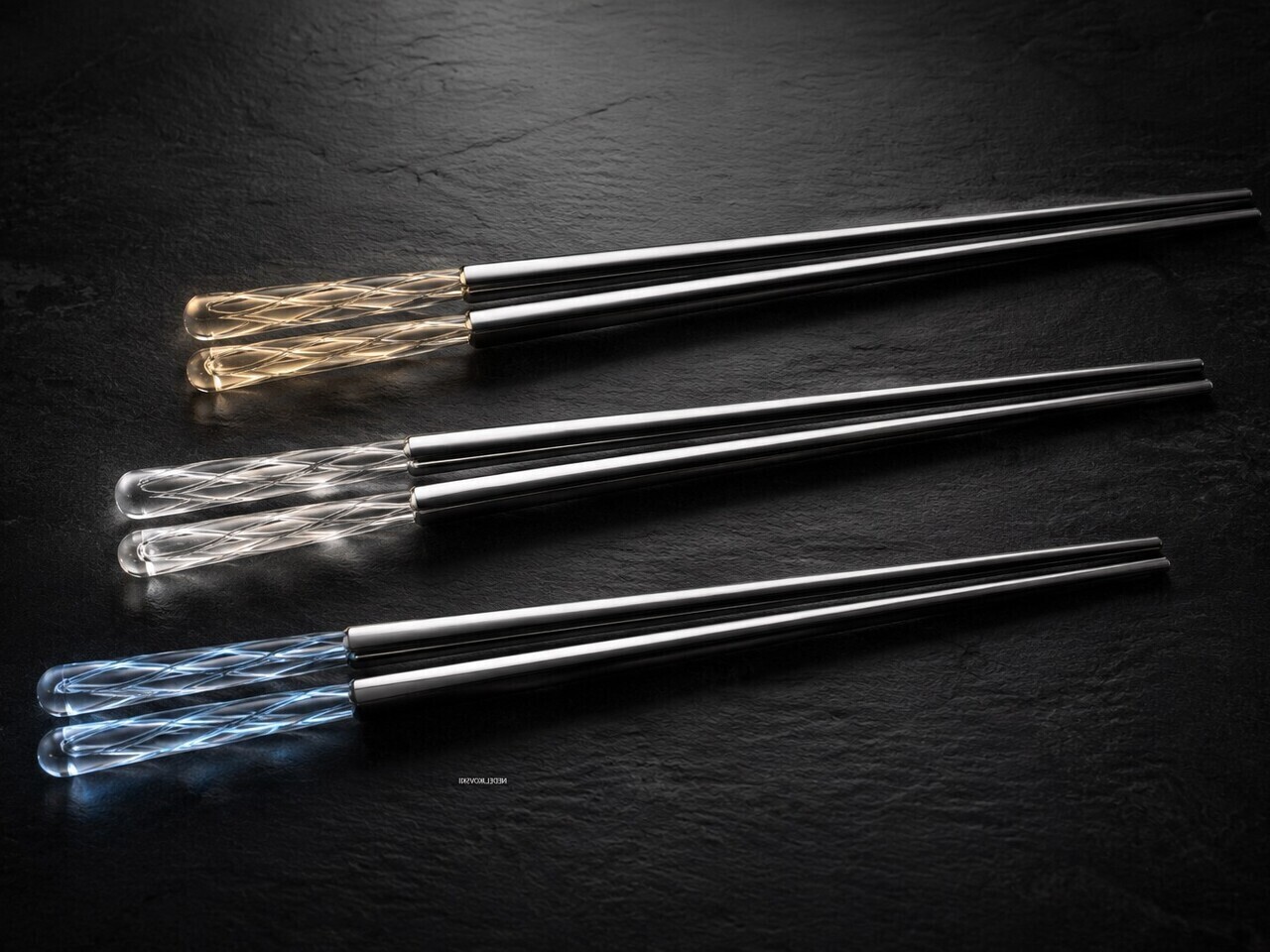
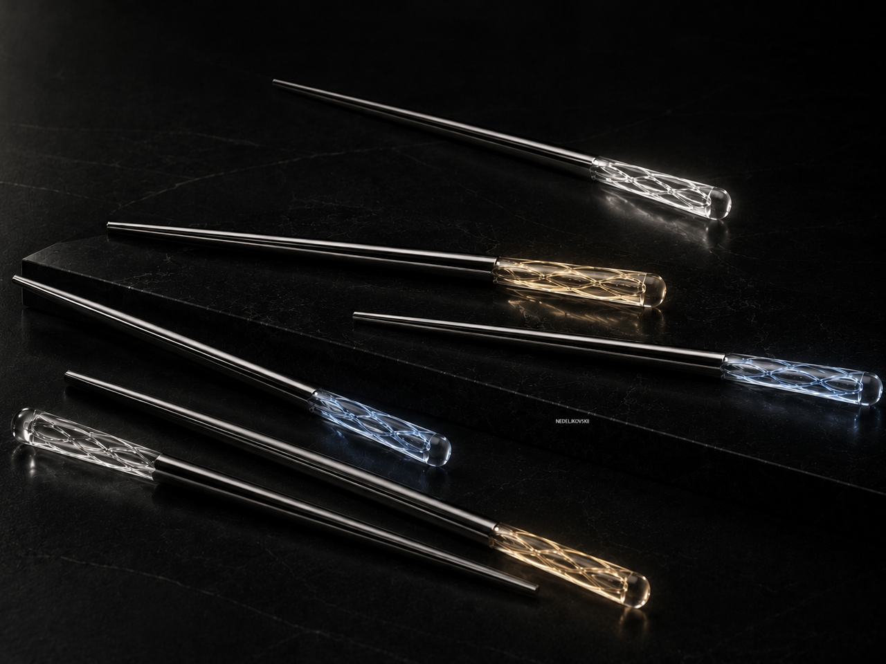
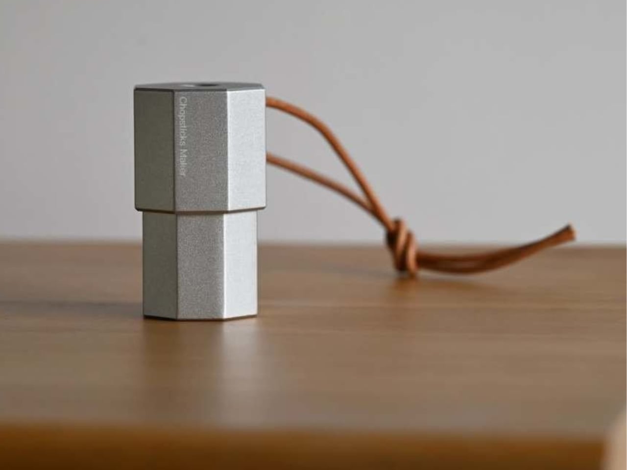
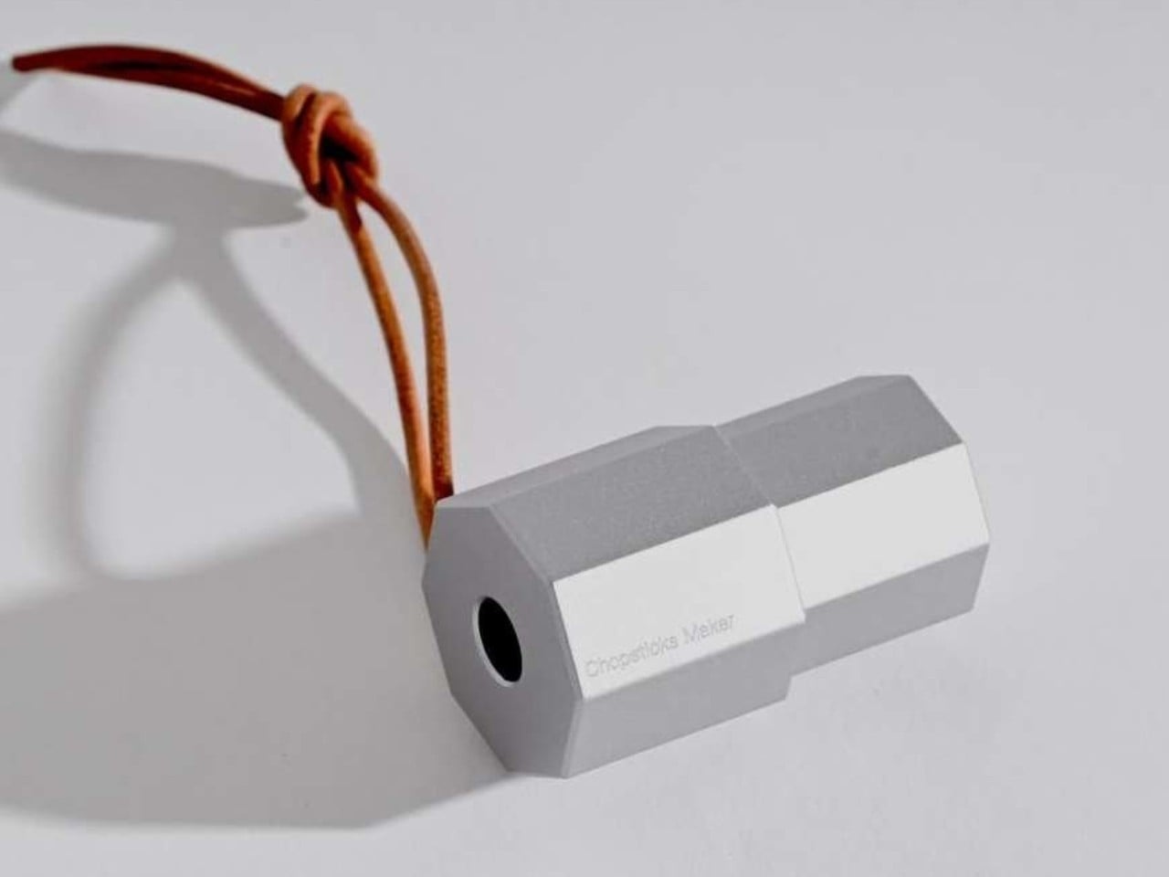
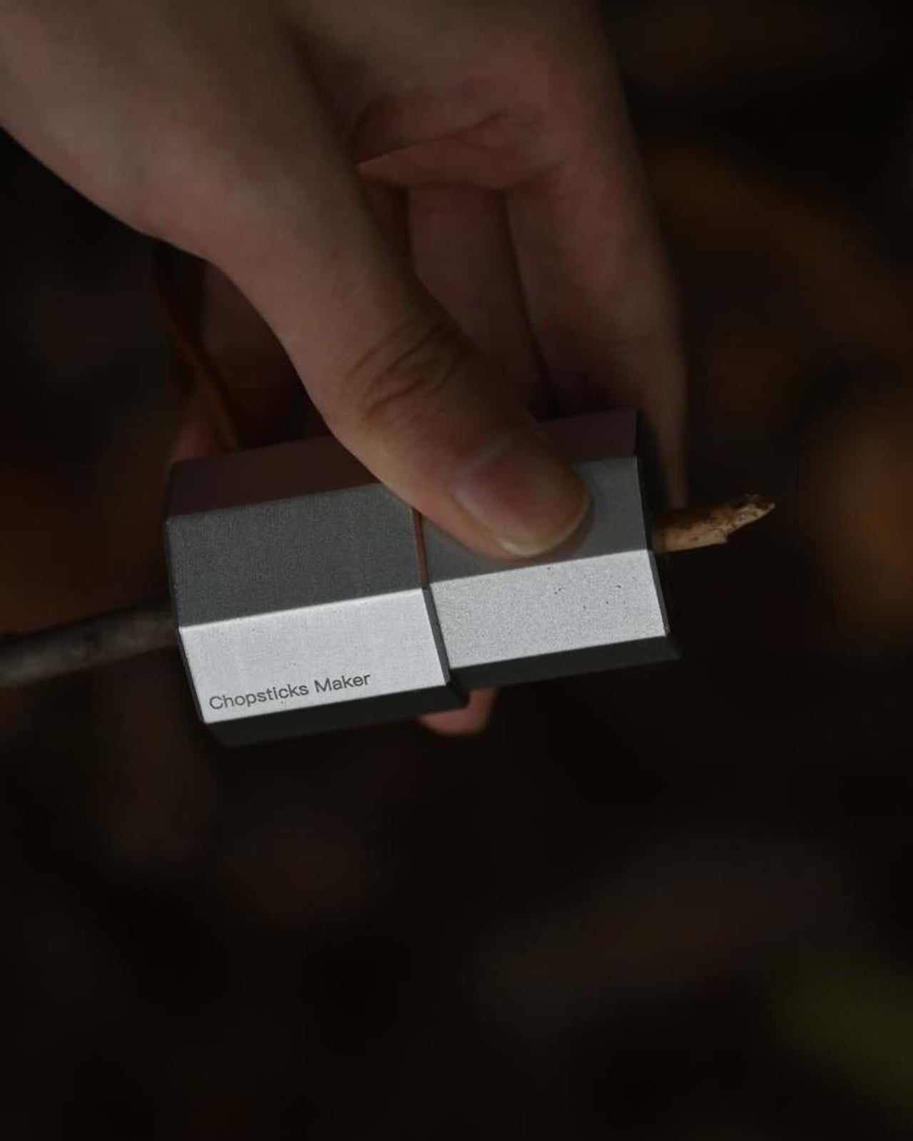
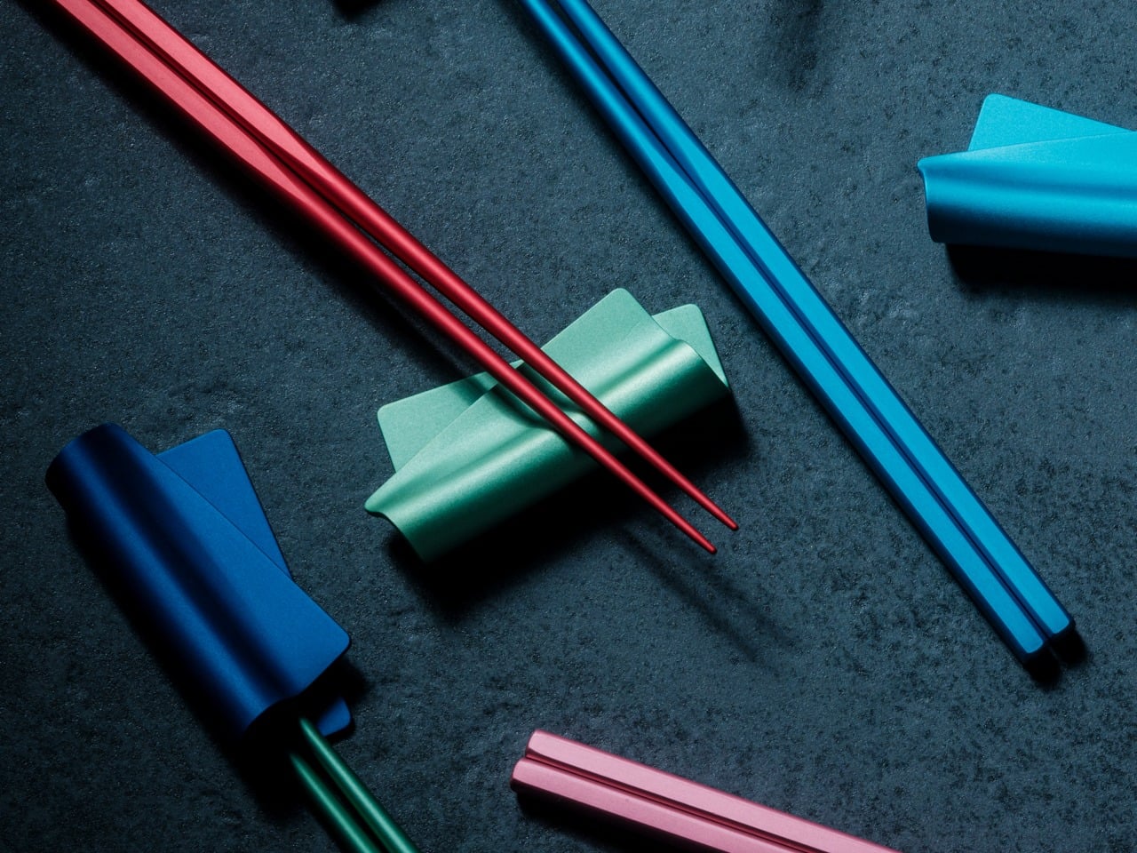
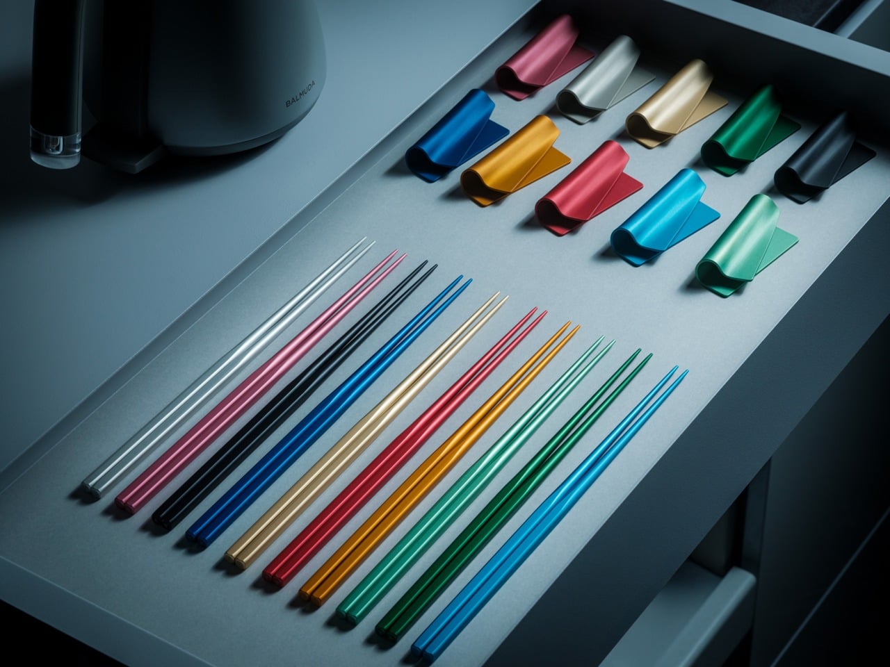
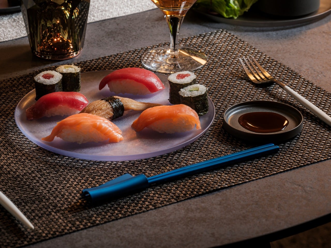
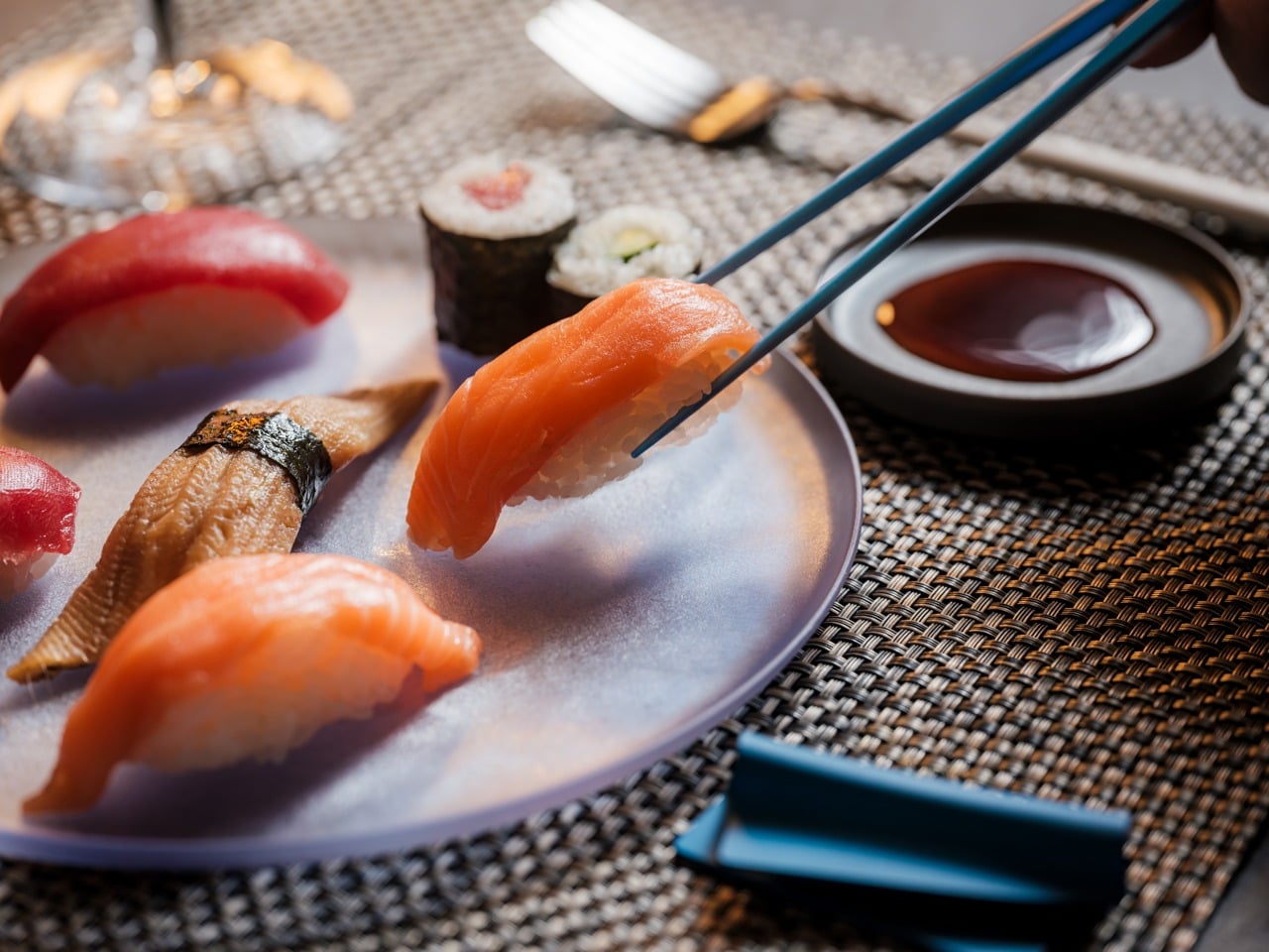
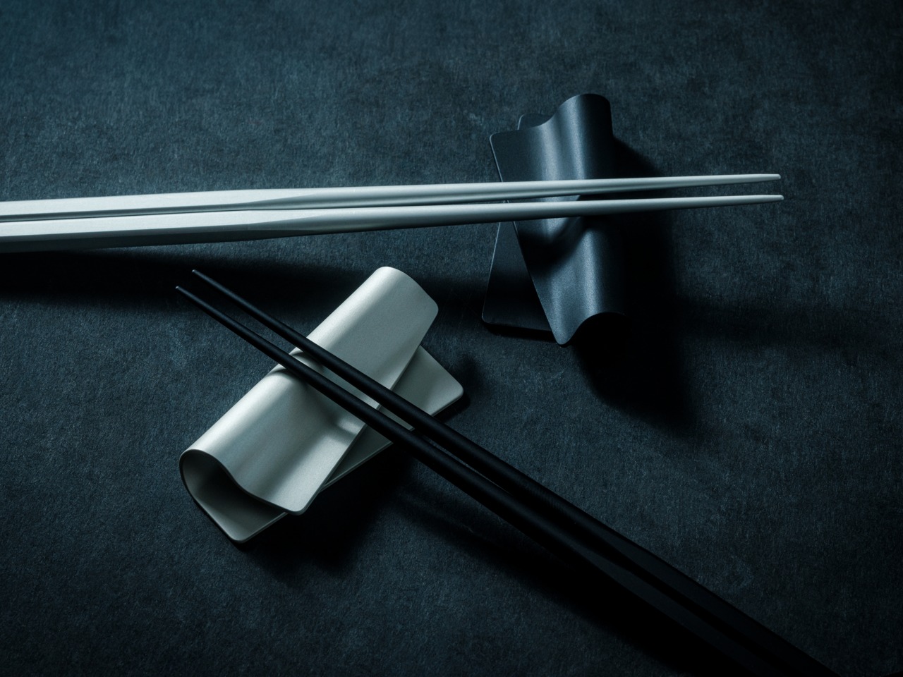
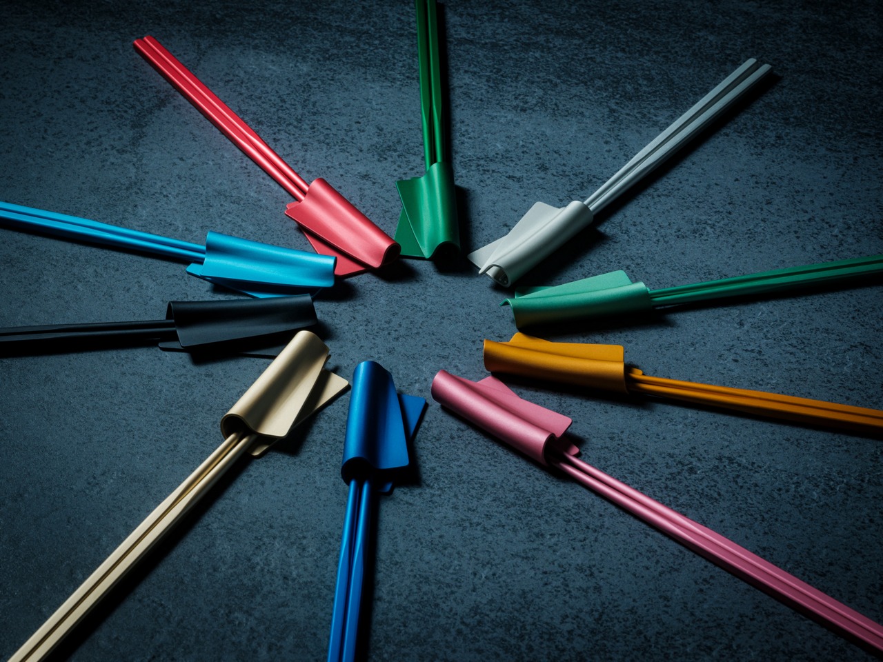
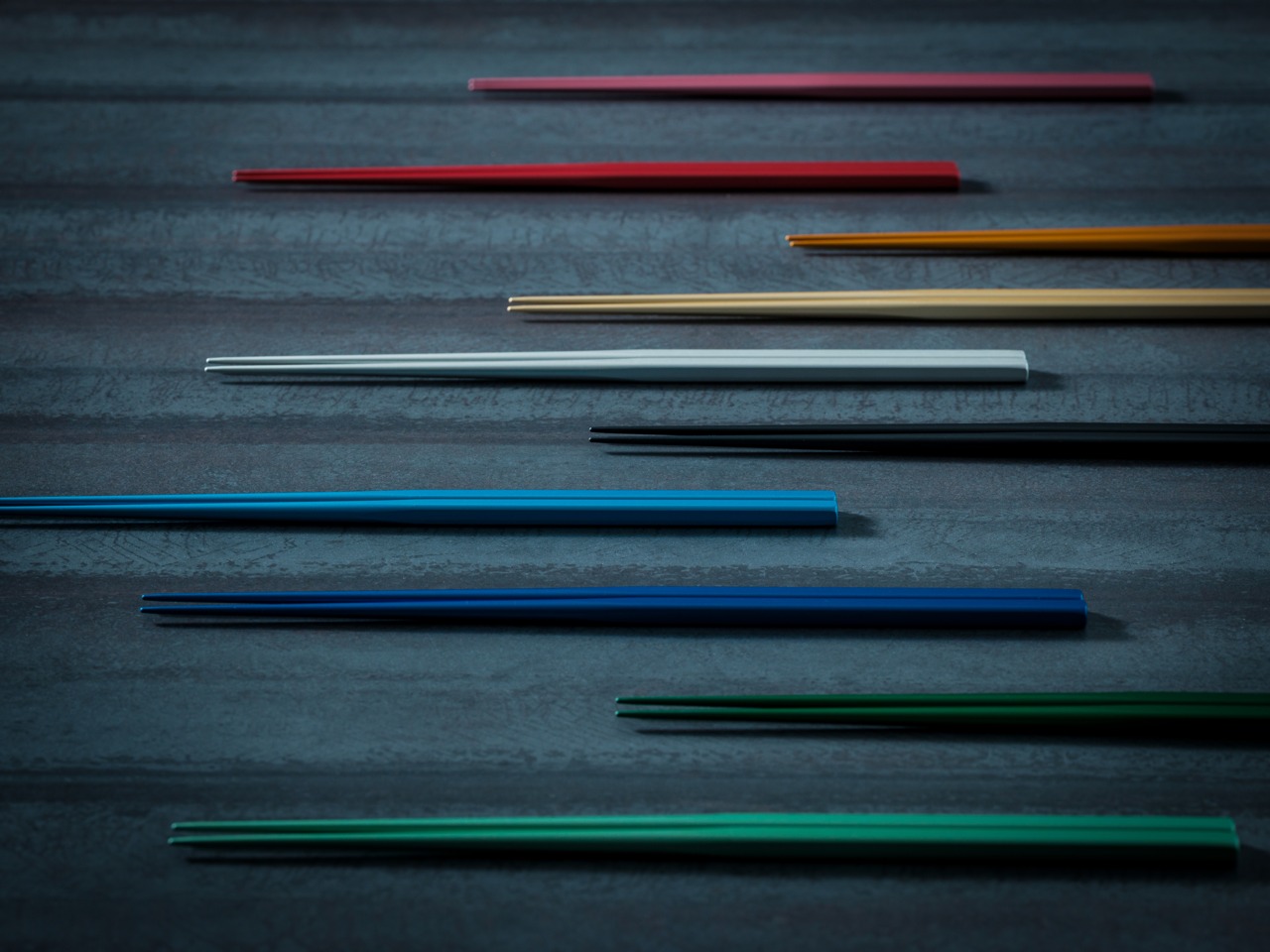
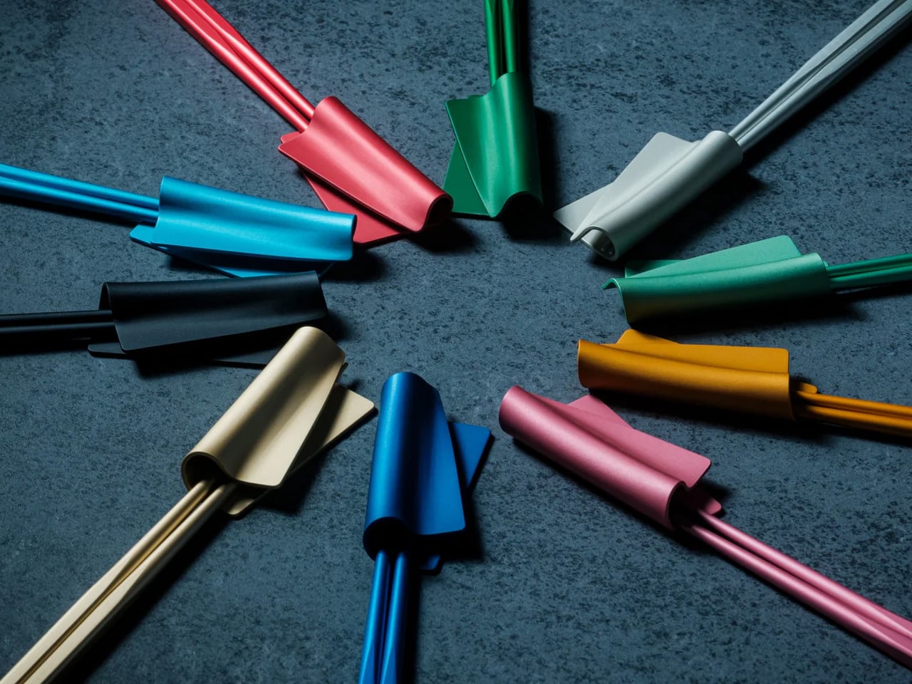
2. FineLine Aluminum Chopsticks
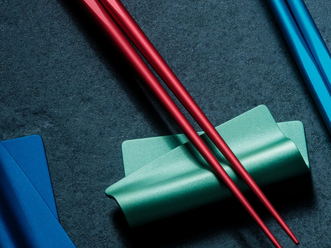
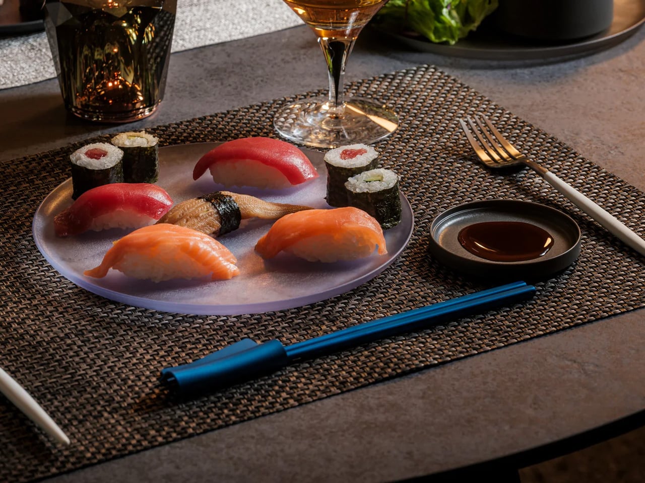
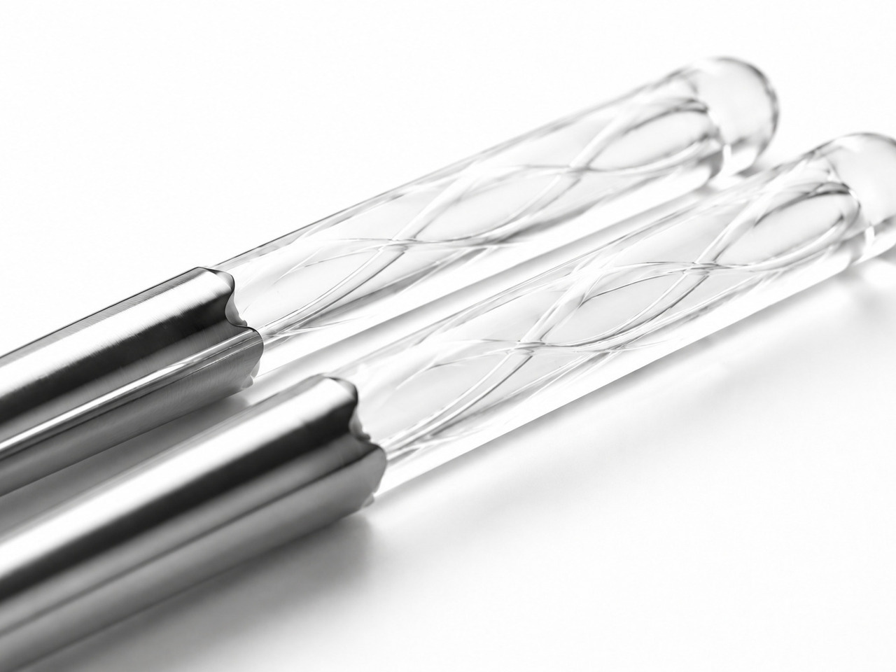
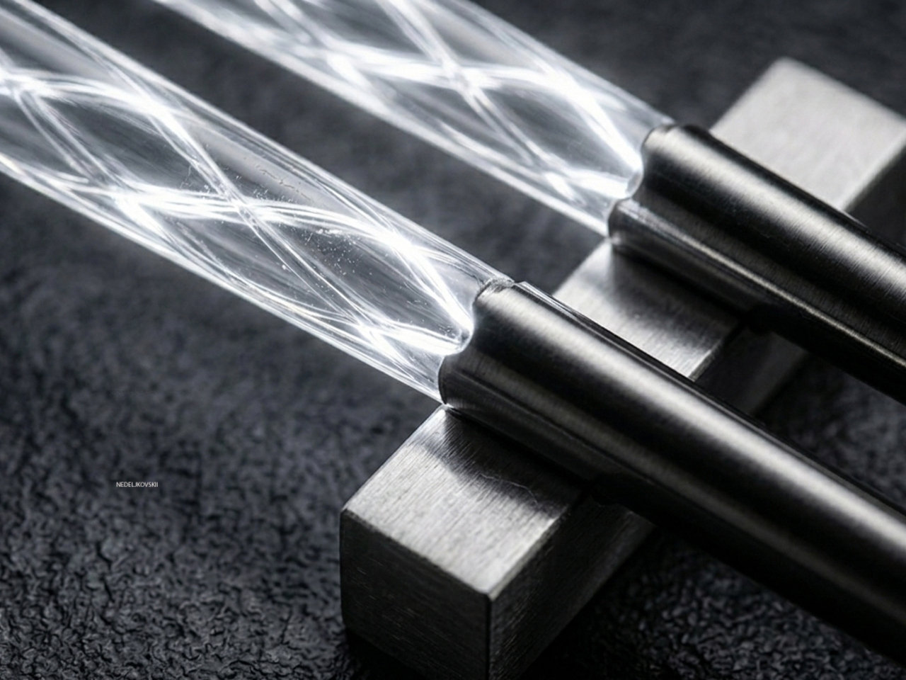
Forty rounds of refinement in Tsubame-Sanjo, Japan — adjustments to tip diameter, taper angle, grip texture, and balance in increments as small as 0.1mm. The Tsubame-Sanjo region produces surgical instruments and precision cutting tools, and that context matters here because the FineLine’s most important specification — a 1.5mm tip, roughly half the diameter of a standard pair — hides nothing. Metal chopsticks done poorly feel clinical and slippery. At this tolerance, applied through a century of metalworking discipline, they feel like the tool was always supposed to be this way.
The faceted body prevents rotation, which is the quiet frustration that round chopsticks impose across every meal. Standard chopsticks ask the hand to constantly realign the tips without the user ever quite noticing it. The FineLine removes that entirely. Anodized aluminum construction resists moisture, staining, and dimensional drift indefinitely, and the finish maintains the same grip feel years after first use as it did on day one. Available in ten satin anodized tones, the range is broad enough to suit any table setting built with intention.
Click Here to Buy Now: $30.00
What we like
- The 1.5mm precision tip creates cleaner contact and greater control than any standard chopstick, turning precision eating into something that requires less effort, not more
- The faceted anti-rotation body eliminates the constant silent grip corrections that round chopsticks demand, making long meals noticeably calmer
What we dislike
- Metal chopsticks require a brief adjustment period for users conditioned to the natural flex and warmth of wood or bamboo pairs
- A single colorway per pair means building a matched set across multiple tones requires purchasing separately
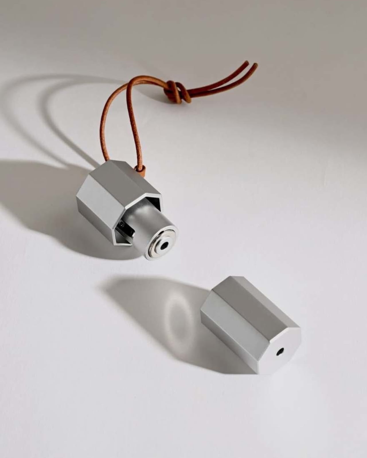
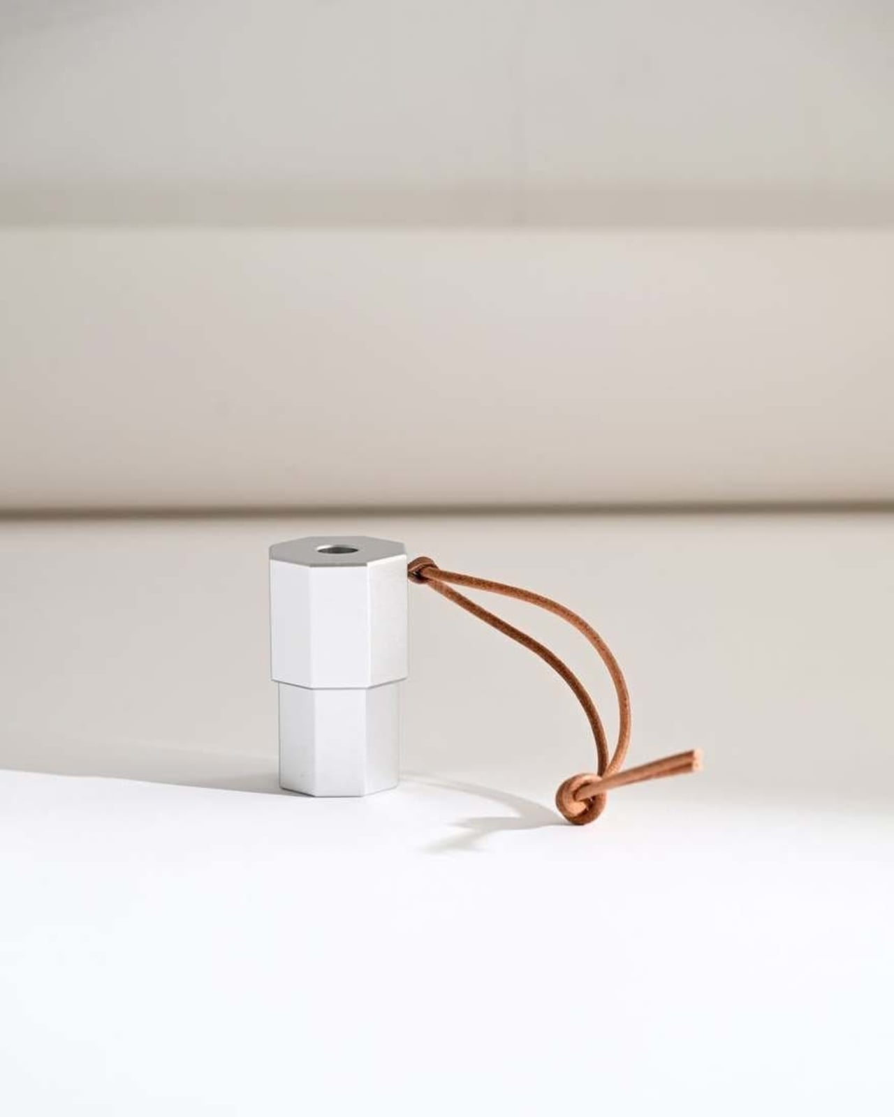
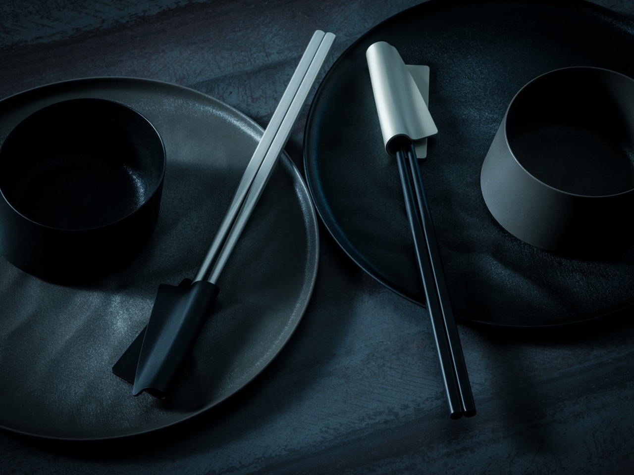
3. FineLine Chopstick Rest
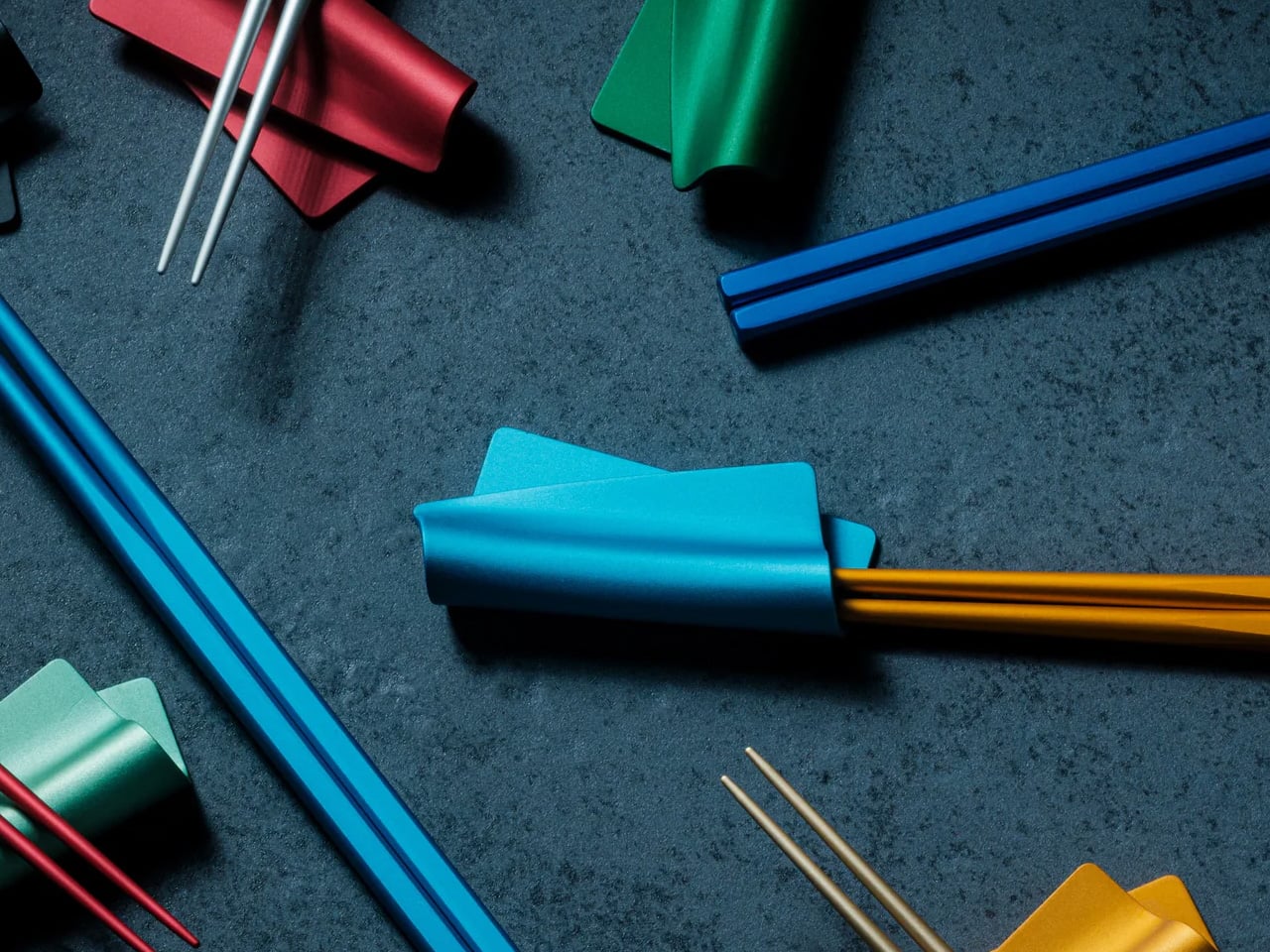
The FineLine Chopstick Rest carries the same design logic as the chopsticks themselves: anodized aluminum, matching satin finish, the same restraint applied to a form most table settings never think about. Set the chopsticks down between courses, and the rest hold them at a clean angle above the cloth, keeping the tips off the surface without drawing any attention to themselves. This is the table setting equivalent of good posture — it contributes to the overall impression without announcing that it’s working at all.
On a table assembled with care, the rest completes the system. The FineLine chopsticks and their rest read as a single considered object rather than two separate purchases, which is not something many tableware accessories manage. The matching color options mean every tonal decision across the pair, and the rest can be made deliberately, whether the goal is a perfectly uniform setting or a considered contrast that only becomes legible when the whole table comes together.
Click Here to Buy Now: $20.00
What we like
- Shares the exact anodized finish and color range as the chopsticks, reading as a unified system rather than a matching accessory treated as an afterthought
- Holds chopstick tips cleanly above the table between courses without any visual interruption to the setting around it
What we dislike
- Designed around the FineLine form factor, making it a less natural pairing with wider traditional wooden or bamboo chopstick styles
- Holds chopsticks only — no accommodation for spoons or additional cutlery alongside a mixed table setting
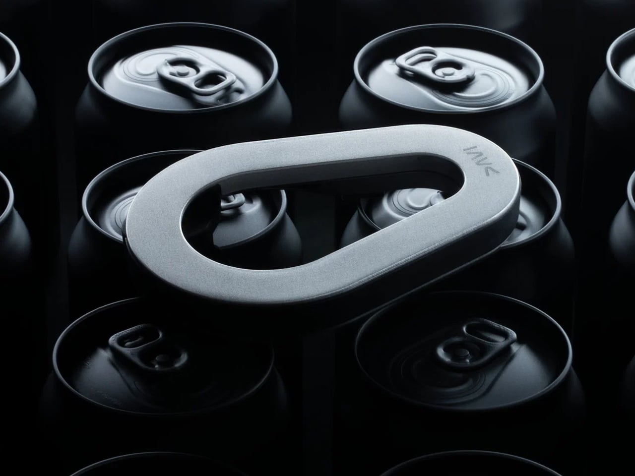
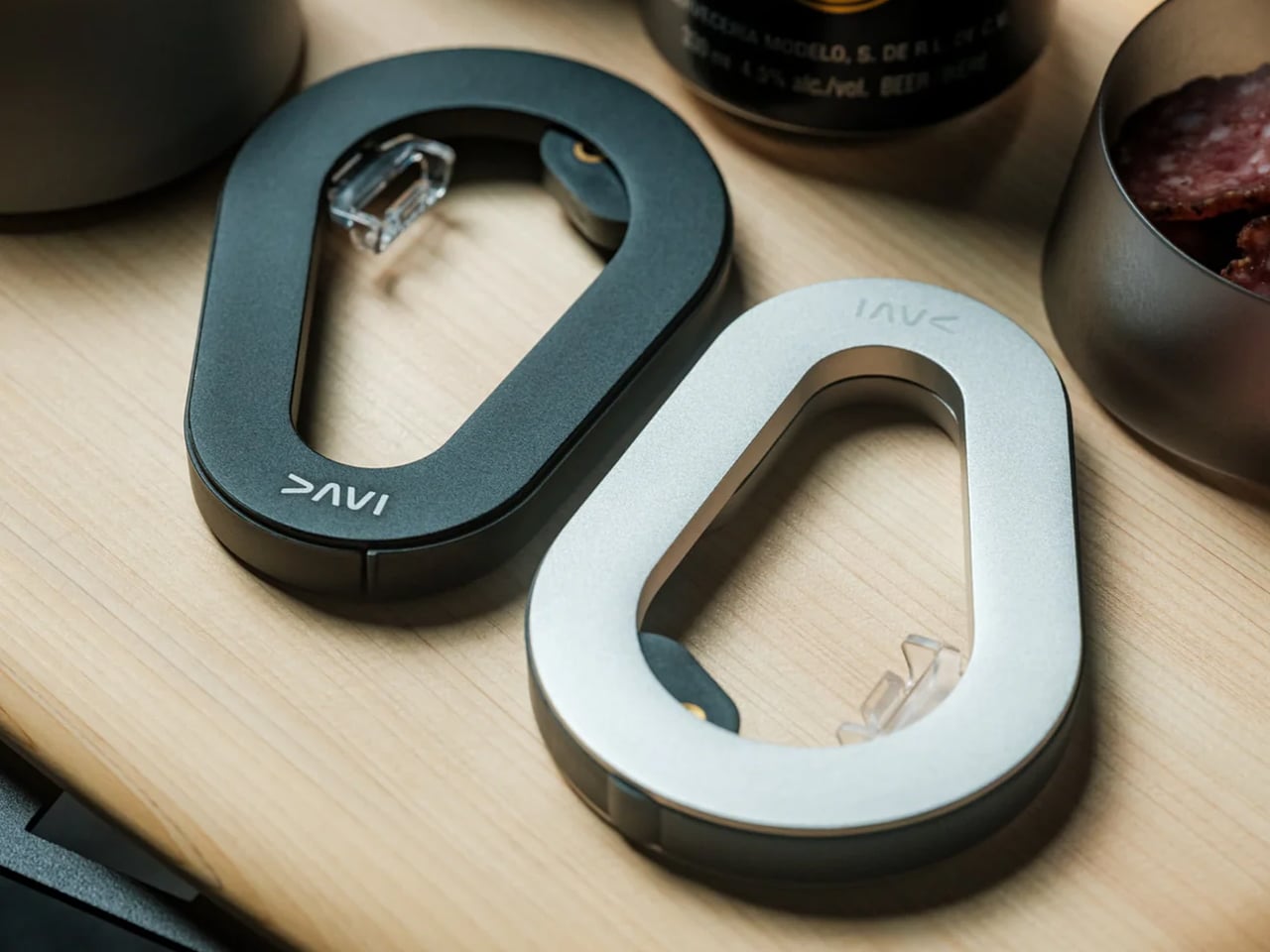
4. Oku Folding Knife
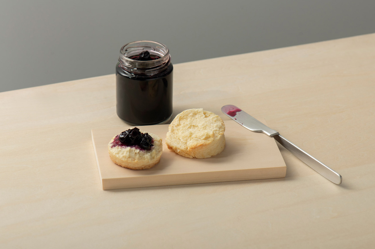
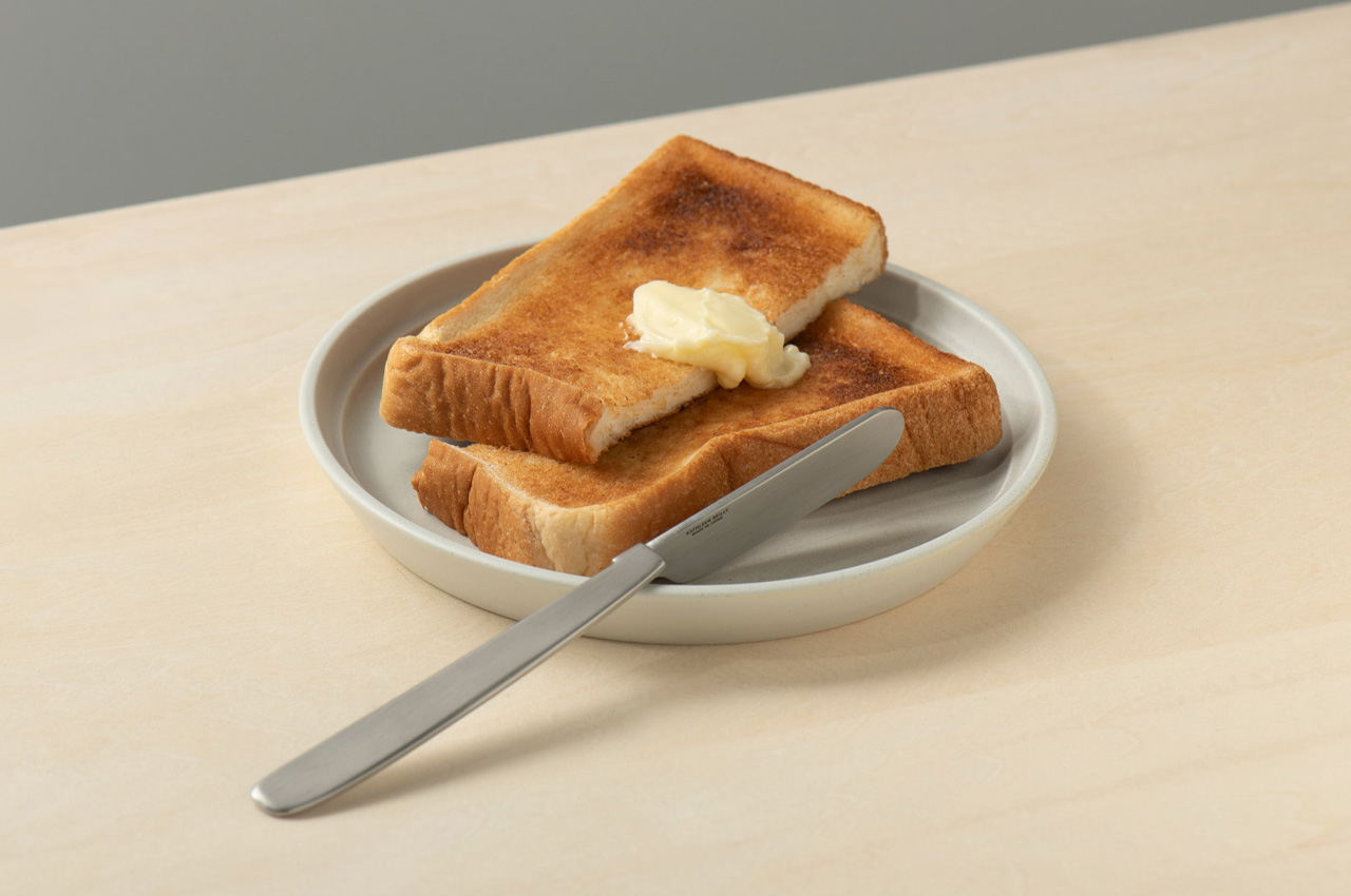
Scottish artist and metalworker Kathleen Reilly spent time living in Japan before designing the Oku Knife, and that experience shows in the problem she chose to address. In Japanese table settings, chopstick rests elevate the tips off the surface between bites, keeping them clean and the cloth unstained. Reilly asked whether a Western table knife could carry that same principle. The result is a handle folded ninety degrees from the blade, letting the handle rest flat on any surface while the blade sits perpendicular to it, never touching the table.
The blade can also hook onto the rim of a plate, held cleanly in position between uses. Reilly worked with craftsmen in Tsubame — the same metalworking city behind the FineLine chopsticks — using generations-old handcrafting techniques in stainless steel. The inner curve of the handle makes it comfortable to hold despite the unconventional angle. The name Oku comes from the Japanese word for “to place,” and the entire object functions as a design argument: that where a tool rests between uses is part of how it should be designed, not an afterthought left to the user to solve.
What we like
- The handle’s ninety-degree fold solves a genuine table hygiene problem with a form that addresses it structurally rather than requiring a separate accessory
- Handcrafted in Tsubame using traditional metalworking techniques, carrying genuine craft lineage from one of Japan’s most respected precision metalworking cities
What we dislike
- The unconventional form reads as puzzling until its purpose is understood — guests unfamiliar with the concept tend to reach for it with visible hesitation
- No direct retail pricing or purchase link was included alongside the original design feature, making sourcing require independent research
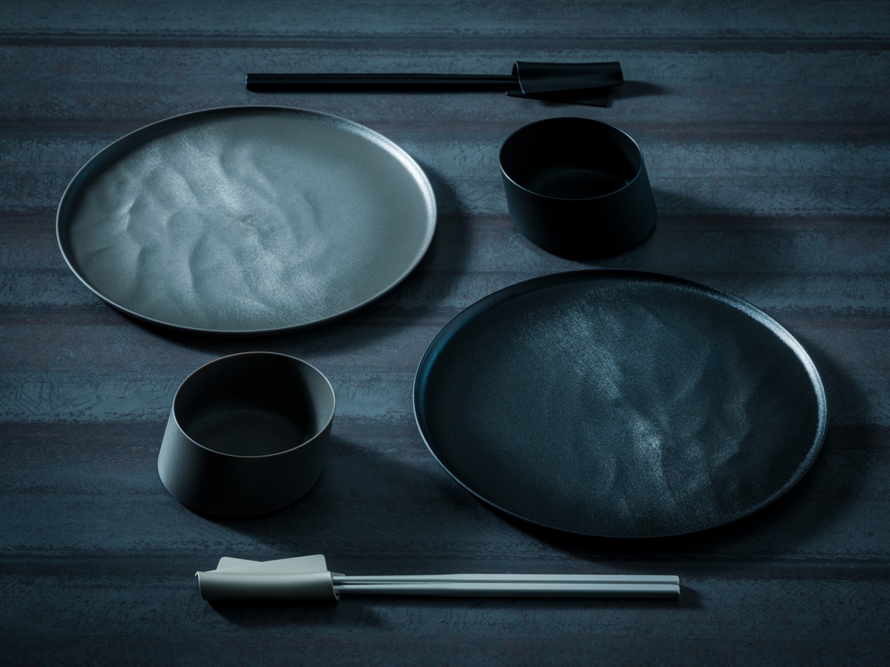
5. USUKIYAKI KIKKA Chrysanthemum Side Plate
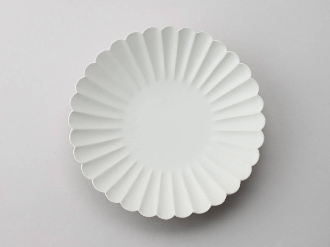
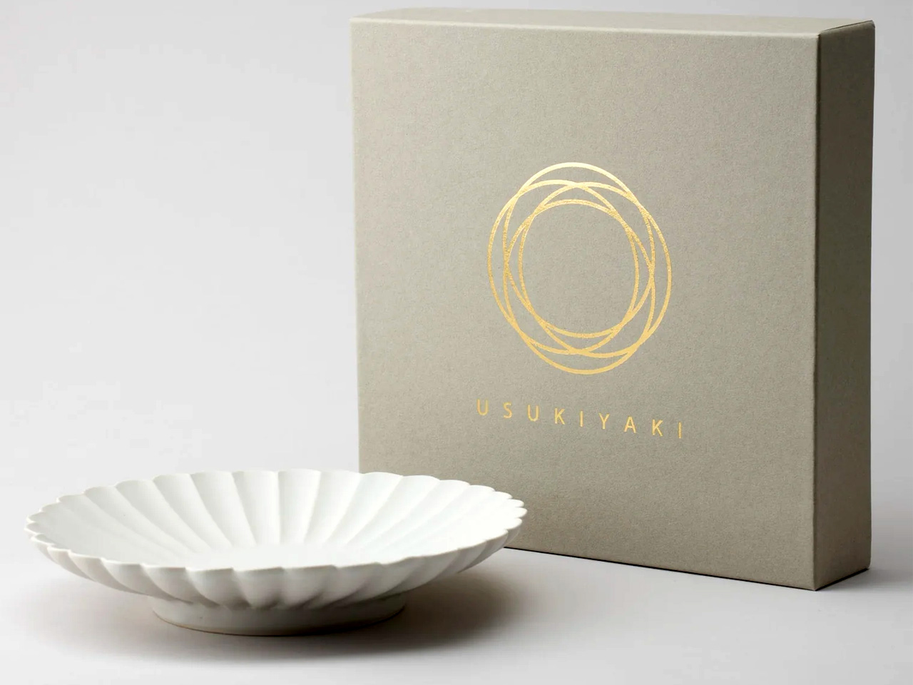
Usuki ware disappeared for two hundred years. The kiln tradition of Usuki City, in Oita Prefecture, went dormant until ceramicist Usami Hiroyuki spent years reconstructing the technique from historical fragments and reviving it as a living practice. The KIKKA series is the clearest expression of what came back. Each plate is shaped using the Katauchi molding technique, producing soft petal-curved forms along the rim that suggest the chrysanthemum, the series is named after. The matte white finish sits in the register between porcelain refinement and handmade warmth, where the best Japanese ceramics have always lived.
At 9.5 centimeters across, the plate is scaled for the foods that benefit from their own surface: tsukemono, a few slices of sashimi, a piece of fruit, and a small side of tofu. The wavy petal rim casts small shadows across the table as the light shifts, so the space around the food changes throughout a meal without the food itself changing at all. Microwave and dishwasher safe, the KIKKA is not a display object saved for guests. It is a daily plate built from a tradition that came within a generation of being lost permanently.
What we like
- The Katauchi petal rim casts a genuine shadow across the table surface, creating a dynamic visual quality that flat-rimmed plates cannot produce, regardless of glaze or material quality
- Made by USUKIYAKI artisans reviving a tradition dormant for two centuries, giving each piece craft lineage that mass production cannot manufacture or approximate
What we dislike
- Hand production means slight variation in petal form and glaze between individual pieces, which requires accepting rather than expecting uniformity across a matched set
- At 3.7 inches in diameter, the scale suits side dishes only — it is not a main plate and should not be asked to function as one
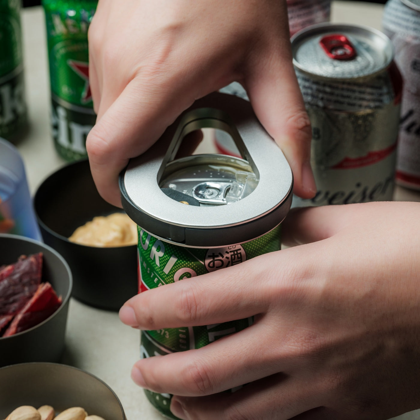
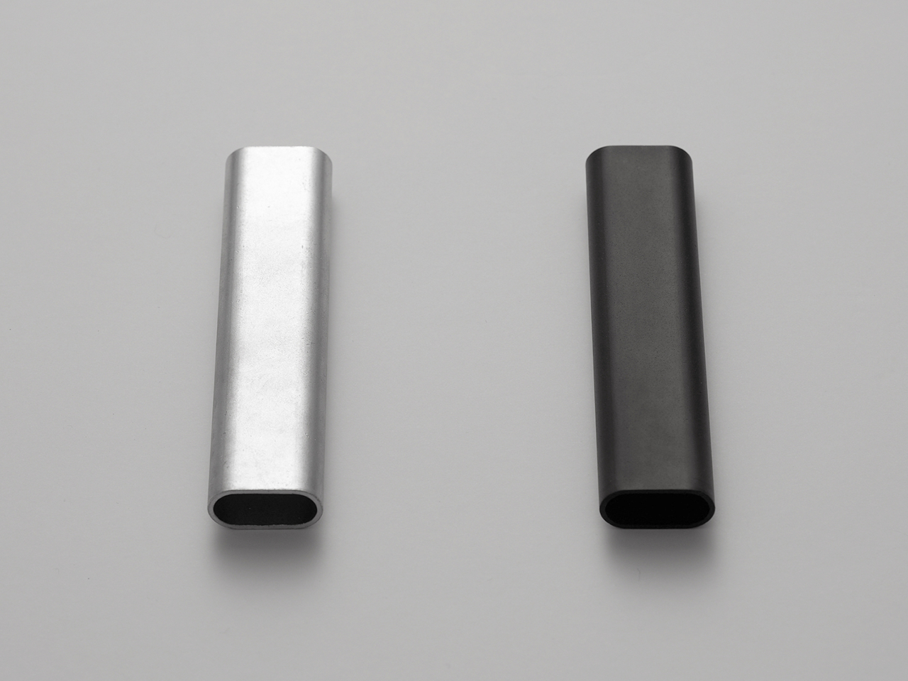
6. Rodent Bottle Opener
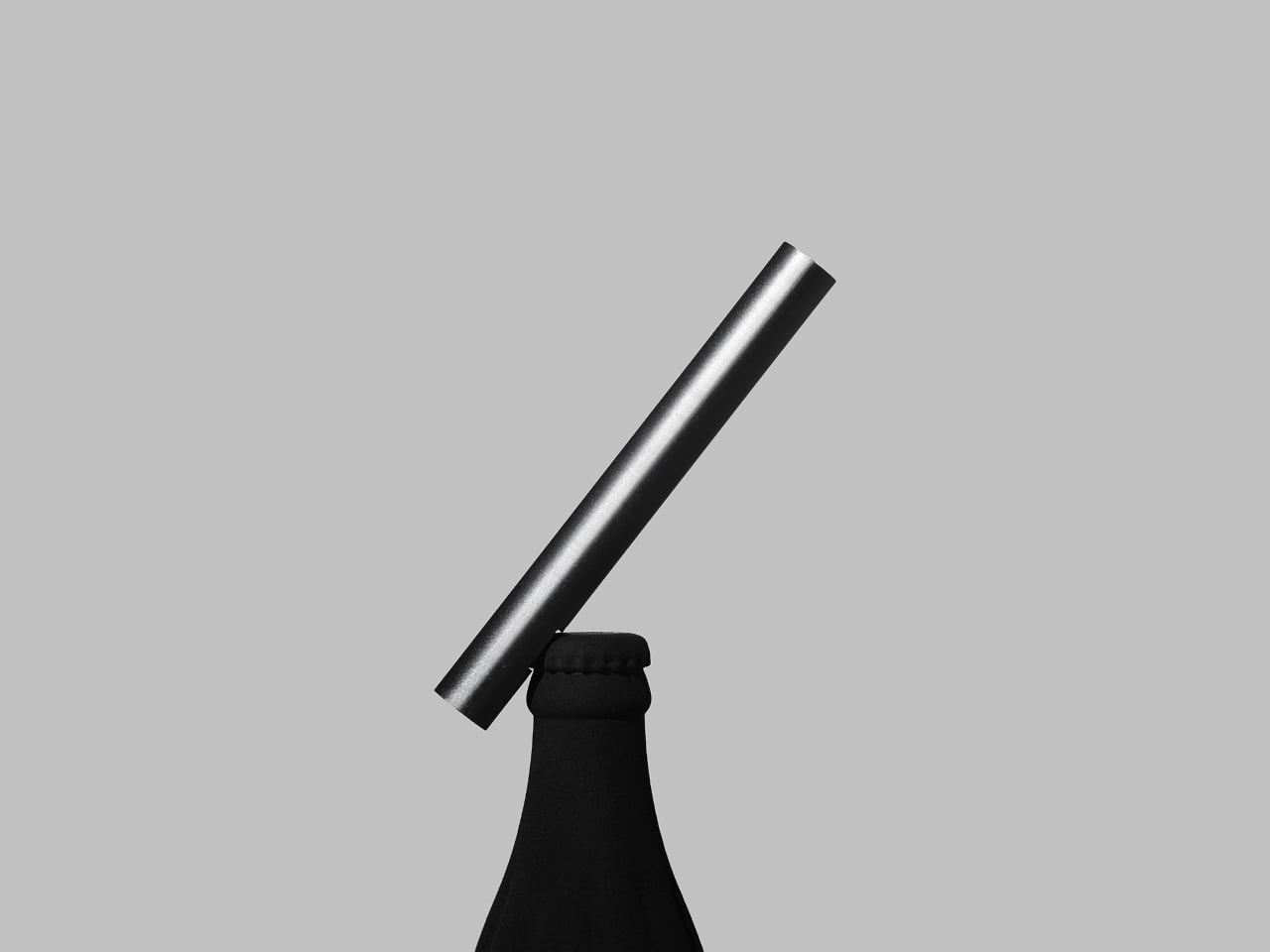
Most bottle openers live in drawers and stay there until they’re needed. Kairi Eguchi’s Rodent opener for WELD DESIGN STORE takes the opposite position. It starts as an oval steel pipe, and only the section required to remove a bottle cap receives any intervention. The rest of the pipe is left as it came, preserving what the designer calls the raw, honest character of freshly cut metal. Advanced 3D pipe laser processing makes that minimal intervention possible with the precision the form requires.
The oval profile fits naturally in the hand and carries a weight that makes the act of opening a bottle feel deliberate rather than reflexive. The cutout is shaped after a rodent’s tooth structure — which gives the product its name — and works whether the user pulls down or up, adapting to hand position without adjustment. Available in silver or black, both finished with RoHS-compliant plating that meets environmental manufacturing standards. Slip it into a drawer, rest it on a bar cart, hang it from a cord. A form this reduced works in any context because it isn’t asking the space to accommodate it.
What we like
- Minimal processing preserves the raw character of the steel, making material honesty the entire design statement rather than a supporting claim
- The universal up-or-down opening mechanism adapts to different hand positions and bottle angles without any deliberate adjustment required
What we dislike
- The pipe form is so reduced that it offers no immediate visual indication of function to someone encountering it for the first time
- A single-function object at a premium price point requires genuine appreciation of design reduction to justify over a utilitarian alternative that does the same job for a fraction of the cost
7. Corcelain Modular Porcelain Cups


Designer Kosuke Takahashi collaborated with 224 Porcelain — founded in 2012 in Ureshino City, Saga Prefecture, drawing from the Hizen-Yoshidayaki ceramic tradition — to produce the Corcelain collection. Each cup arrives from the kiln as a finished, functional vessel. It is also a starting point. Precision-engineered mounting points built into the porcelain accept 3D-printed attachments: feet, handles, lids, decorative elements, configurations that shift the same cup from a morning tea vessel to an evening sake cup without replacing the ceramic itself. The object you buy is the beginning of the design, not the end.
Takahashi’s work centers on systems rather than individual objects, and the Corcelain reflects that orientation. The 3D-printed components are engineered to match the quality and finish standard of the ceramic base, and downloadable models on MakerWorld allow users to create their own attachments — a community of makers extending a traditional craft studio’s output through digital fabrication. The collection makes an argument ceramics rarely voice aloud: that a vessel does not need to be fixed to be complete, and that the user’s participation in determining its final form is a legitimate part of what it means to be designed.
What we like
- The modular system lets users configure handles, feet, and lids to preference, turning a traditional ceramic vessel into something co-designed rather than simply purchased and placed
- Downloadable 3D models on MakerWorld mean the attachment ecosystem is open rather than proprietary, extending the object’s possibilities beyond what either collaborator initially designed
What we dislike
- The modular concept requires access to a 3D printer to unlock the system’s full range, adding a technical barrier for users without that setup at home
- 3D-printed components alongside hand-thrown porcelain require some design literacy to read as intentional rather than mismatched across the same object
The Table You Set Says Something — Make Sure It’s Worth Hearing
The thread connecting these seven objects is not minimalism as decoration. It is rigor — the decision to apply serious thought to a bowl, a knife, a rest for chopsticks, a cup that accepts attachments — and the willingness to spend more time on the object than the market strictly requires. Each piece here exists because someone refused to stop at good enough. That refusal is exactly the quality that makes a table worth sitting down to in the first place.
None of these objects will make food taste better in any measurable sense. What they change is harder to name: the quality of attention a meal receives. A cedar bowl that improves with age, a chopstick rest that holds its position without interrupting anything around it, a side plate whose petal shadow shifts through dinner — these are quiet contributions. Together, they built a table that makes eating feel like it was worth setting up with care.
The post 7 Best Japanese Tableware Finds That Will Make You Throw Out Every Generic Plate You Own first appeared on Yanko Design.