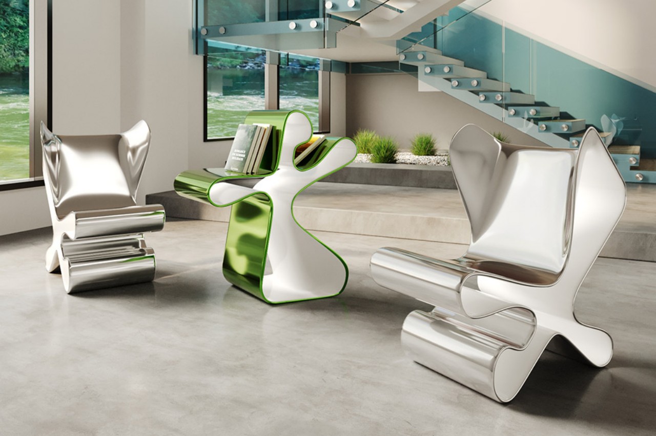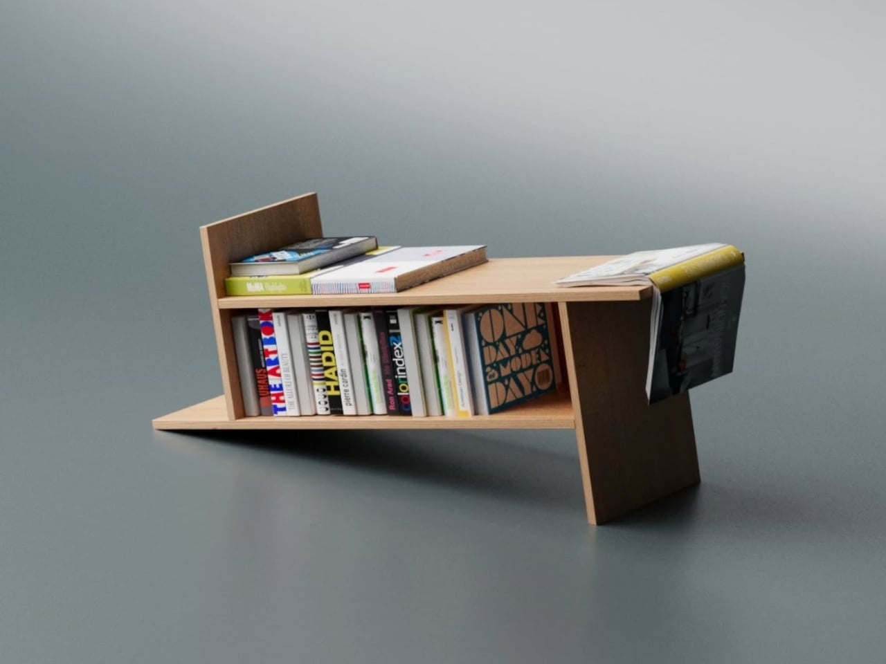
Most furniture design starts with a question about function and ends there. Deniz Aktay, the designer behind the studio @dezinobjects, apparently decided to start with geometry instead, and the result is one of the most quietly clever storage pieces I’ve come across in a while: the Barrow Bookrack.
The concept is almost laughably simple to explain, which is exactly why it works. Take a rectangle. Extend each of its lines on one side only. That’s it. That’s the whole idea. And yet, what comes out the other end of that single decision is a bookrack that feels caught mid-motion, leaning into itself, its proportions oddly satisfying in a way that’s difficult to immediately place. On paper, it barely sounds like a design at all. In person, it’s all you notice.
Designer: Deniz Aktay
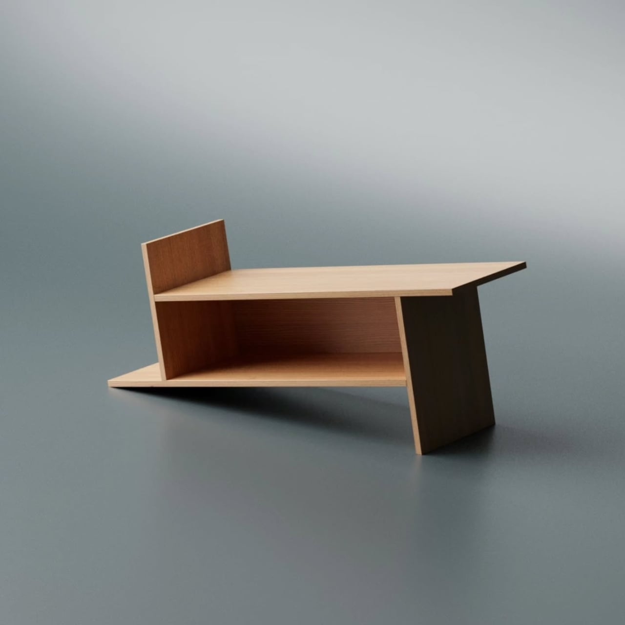
Looking at it from a distance, the Barrow tilts at an angle that initially reads as precarious. It looks like it could tip at any moment, like a shelf that forgot to stand up straight. But it doesn’t. The asymmetry is intentional and controlled, and that’s exactly the kind of design choice that separates a well-considered piece from something that only looks interesting in renders. The structure holds, both physically and visually. The angular feet, the jutting top ledge, the open body sitting between them: everything is doing something.
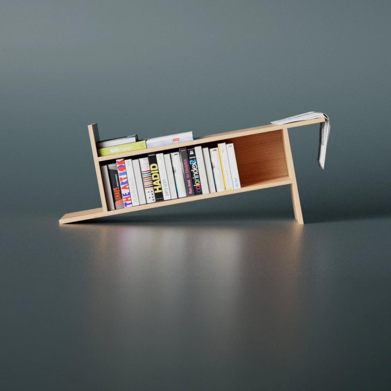
The name is worth pausing on. A barrow, the traditional kind, is a simple carrying frame stripped back to its essential parts. Nothing extra, nothing decorative, just the minimum structure required to move something from one place to another. Aktay’s Barrow carries that same philosophy. Every extended edge and protruding surface earns its place. The result is a range of storage spots, each with its own character. Books stand upright in the central cavity. Larger volumes or stacked titles settle onto the flat extended surfaces. A magazine slipped sideways into one of the outer ledges feels like it was always meant to sit there.
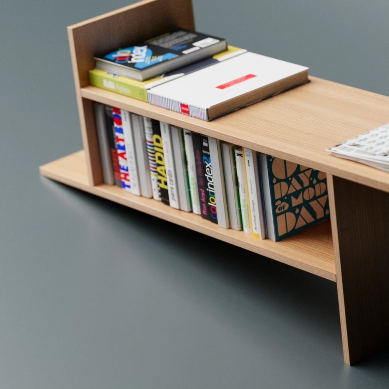
This is the kind of piece that rewards being actually used. A lot of beautiful storage objects suffer from what I’d call the trophy problem: they look better empty than full. Barrow is the opposite. Load it with design books, art monographs, a worn paperback or two, and it genuinely improves. The varying heights, the mix of orientations, the textures of spines pressed against pale wood, it all adds up into something that feels lived in rather than staged. The structure becomes a frame for your reading life rather than something competing with it.
Aktay has explored this kind of thinking before. His earlier Bookgroove piece was a sculptural bookrack-table hybrid that played with the idea of furniture as form. Barrow feels like a sharper, more edited version of that same instinct: fewer moves, more precision. There’s less drama in the silhouette, but the restraint makes it more liveable. A piece like this can sit in a living room, a studio, or a bedroom and feel contextually right without demanding too much visual real estate from the room around it. It has presence without insistence, which is a harder balance to strike than it sounds.
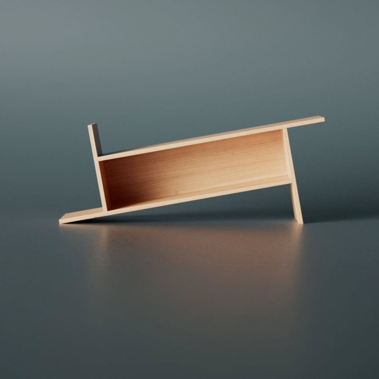
The part that keeps pulling me back to this design is how naturally it moves from a flat idea to a physical one. The Barrow is essentially a graphic concept made tangible, a line drawing that decided to become furniture. The form evolved directly from extending lines on a flat surface before anything was actually built, and seeing that logic translated so cleanly into wood makes the whole thing click. The render and the physical piece are telling the same story, which is rarer in furniture design than it ought to be.
Furniture, at its best, makes you reconsider something you assumed was already settled. You’ve seen hundreds of bookshelves. You’ve probably owned a few. The Barrow doesn’t try to be revolutionary. It just extends a line a little further than expected, and somehow that’s enough to change the whole conversation.
The post A Bookrack That Started as a Rectangle and Refused to Stay One first appeared on Yanko Design.