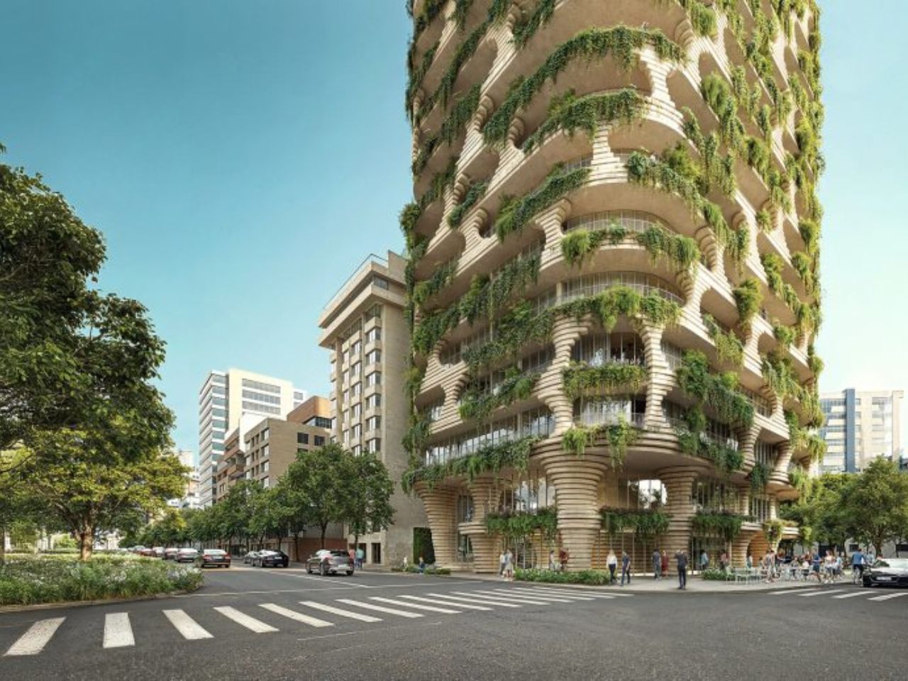
Can’t help but notice something quietly interesting about Qapital, the new residential skyscraper designed by Kengo Kuma and Associates for Quito, Ecuador. At first glance, it has all the ingredients of a contemporary urban tower: compact apartments, shared amenities, a dramatic facade, a strong location, and an international architecture name attached to it. But the more interesting story is not that Quito is getting another high-profile tower. It is that Qapital seems to be asking whether micro-living can feel less like shrinking your life and more like living inside a larger, shared landscape.
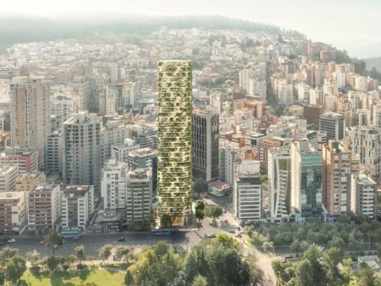
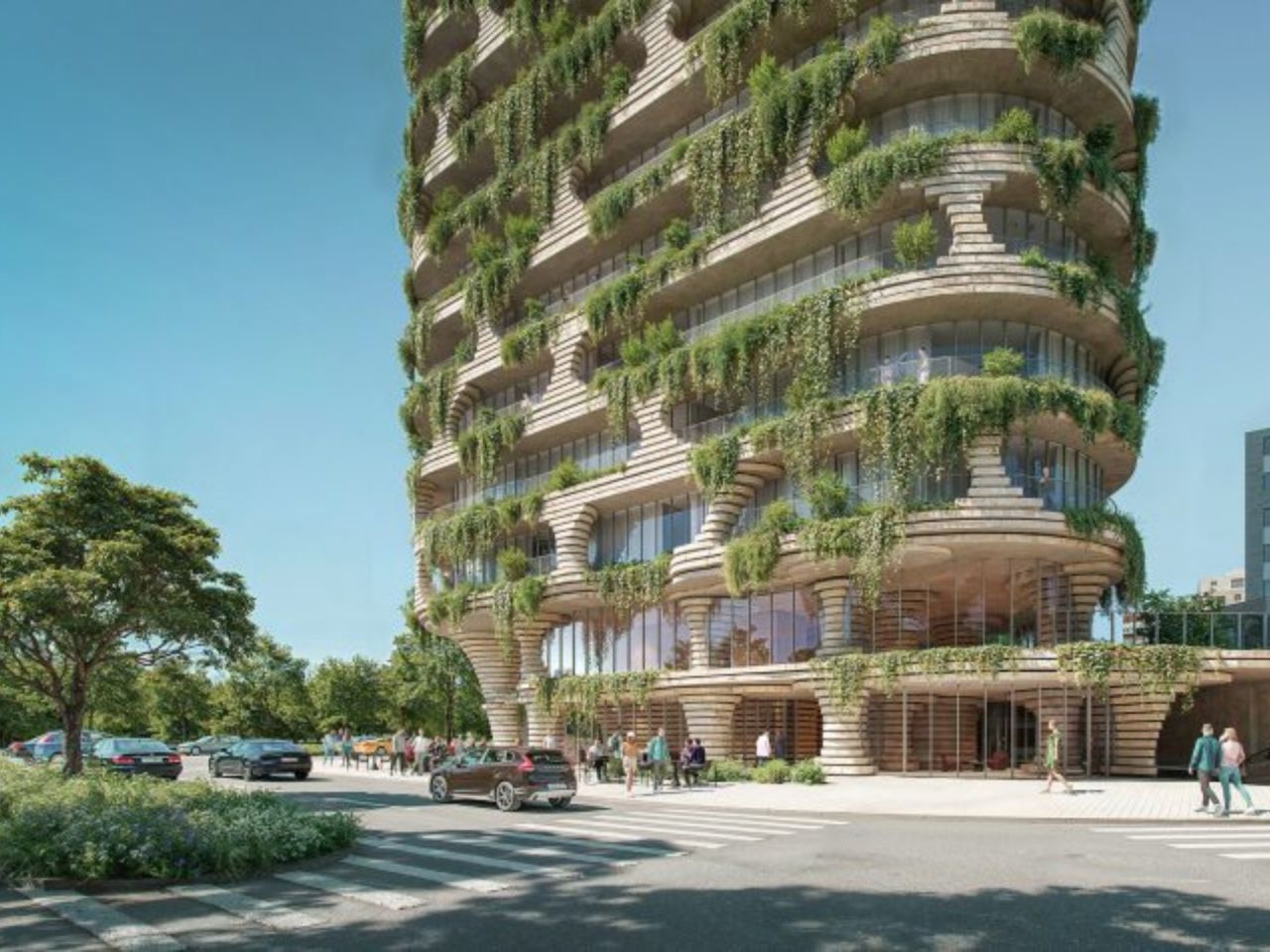
The tower will be Kengo Kuma and Associates’ first project in Quito. Planned at 32 storeys and 420 feet tall, it will sit beside La Carolina Park in the city’s central business district. That placement is important because the building is not being dropped into a neutral skyline. It will stand along one of Quito’s major green edges, joining other internationally designed residential projects by studios such as BIG and Safdie Architects, also developed by Uribe Schwarzkopf. In that context, Qapital becomes part of a bigger architectural shift happening in the city: Quito is increasingly using housing towers not only to add density, but to shape a new image of urban life.
Designer: Kengo Kuma and Associates
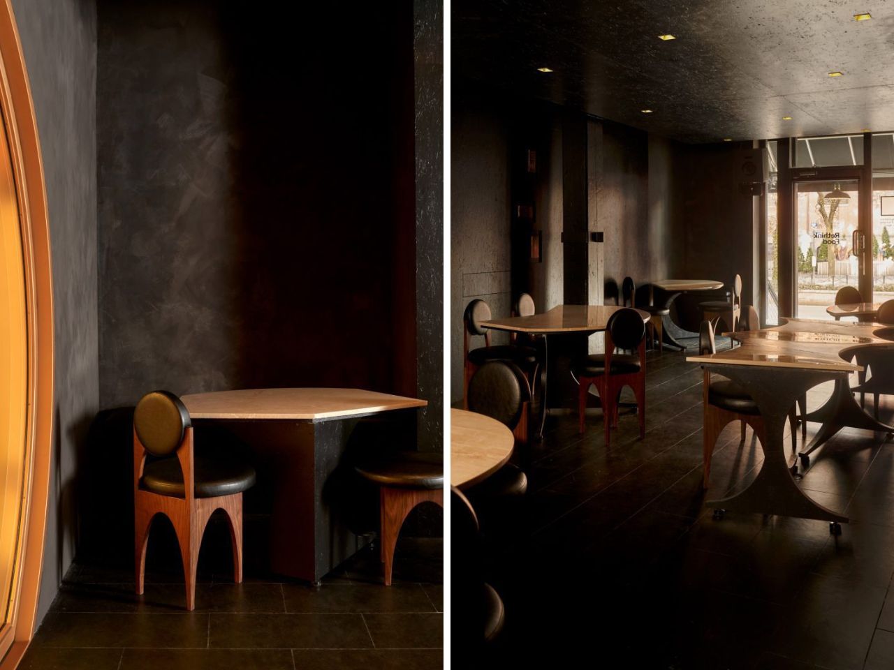
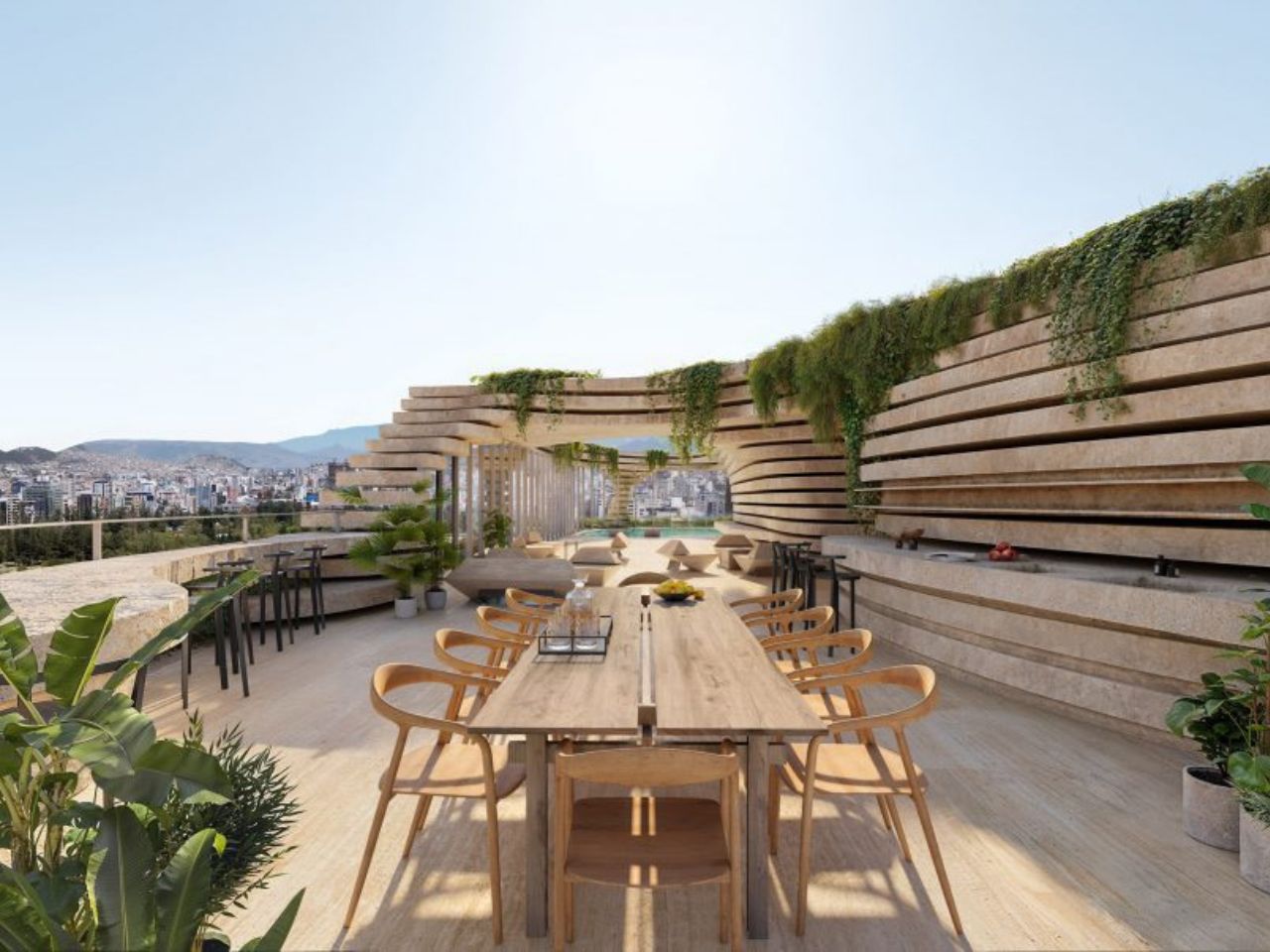
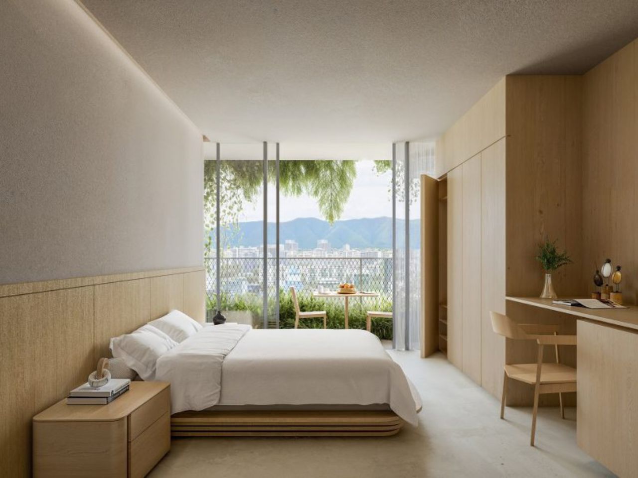
The building will contain 509 micro studio apartments, ranging from 226 to 389 square feet. Those numbers are small, and there is no real way around that. A studio of that size demands discipline from its occupants. Every object has to earn its place. Every surface has to work harder. But the project seems to understand that, which is why the private apartments are only one part of the story. Qapital also includes three commercial floors, a rooftop pool, spa, pet spa, and shared amenity spaces. The pitch is not simply “live in a small apartment.” It is closer to: live compactly, but let the building give you back some of the space your unit cannot hold.
That is where the architecture becomes more compelling. Instead of presenting itself as a sleek glass object, Qapital appears textured, carved, and almost geological. The renders show large openings cut into the facade, with balconies tucked into the building like pockets in a rock face. The exterior is made up of striated stacks of stone, giving it a layered quality that feels much warmer than the usual polished high-rise language. Plants spill out from the balconies, softening the mass of the tower and making it feel less sealed off from the city around it.
The design draws from the landscape of the Andes, which cradles Quito and gives the city such a specific sense of place. But the reference does not feel overly literal. The tower is not shaped like a mountain in the obvious sense. Instead, it borrows from the way rock holds texture, shadow, cracks, and growth. The balconies feel like crevices where plants might naturally take root. That small shift matters. Greenery on buildings can often feel like decoration, something added to make a render look more alive. Here, the plants feel more integrated into the structure, as though the building has been designed to make room for them from the beginning.
There is also a ceramic quality to the project that feels very much in line with Kuma’s broader sensitivity to material. The facade has the feeling of something pressed, layered, and worked by hand, even though it is operating at the scale of a skyscraper. That contrast is one of the tower’s strongest qualities. It takes a typology that is usually associated with repetition and efficiency, then gives it a tactile, almost earthy presence. It is still a tall residential tower, but it does not seem interested in looking weightless or futuristic. It wants to feel grounded.
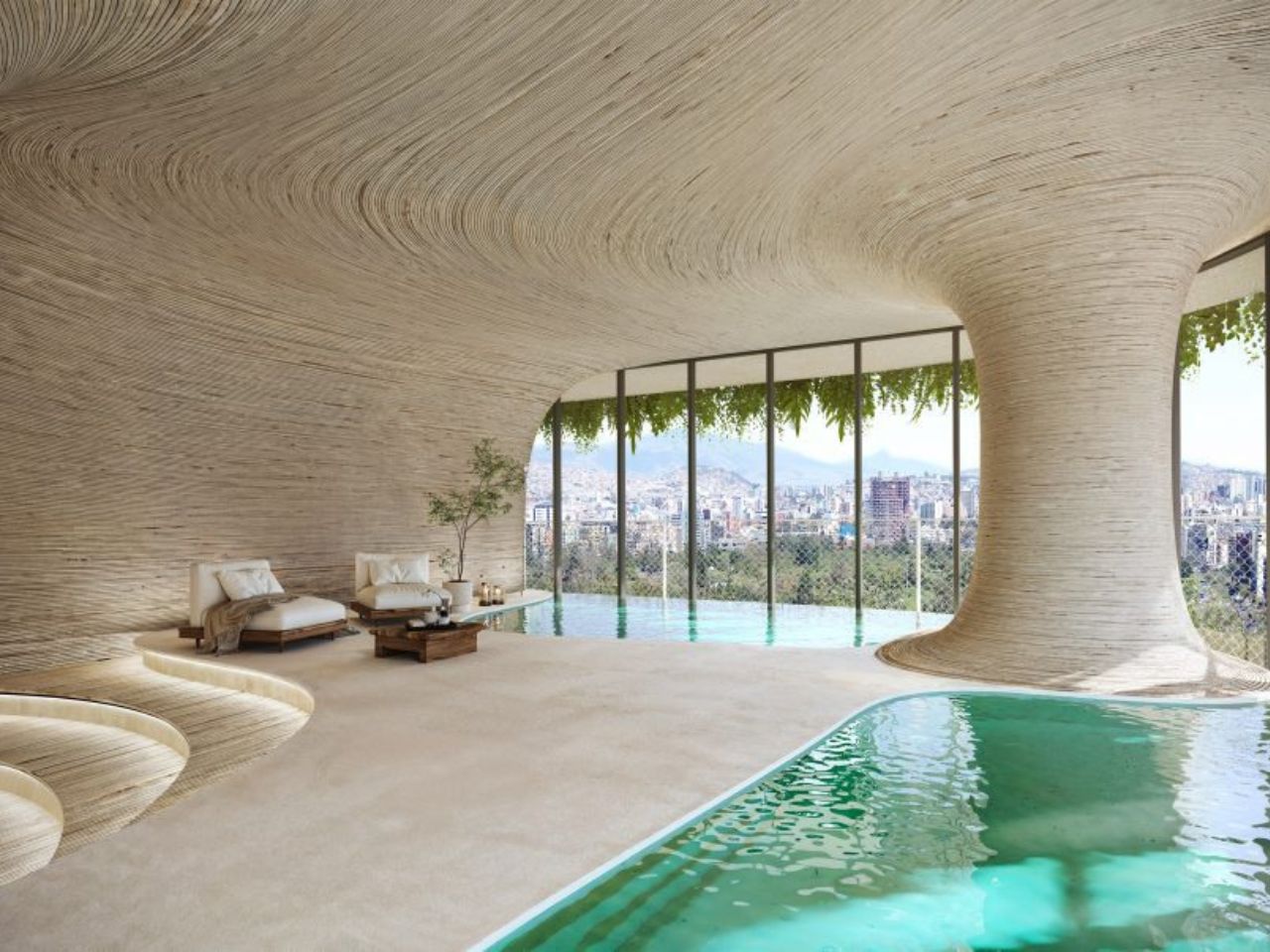
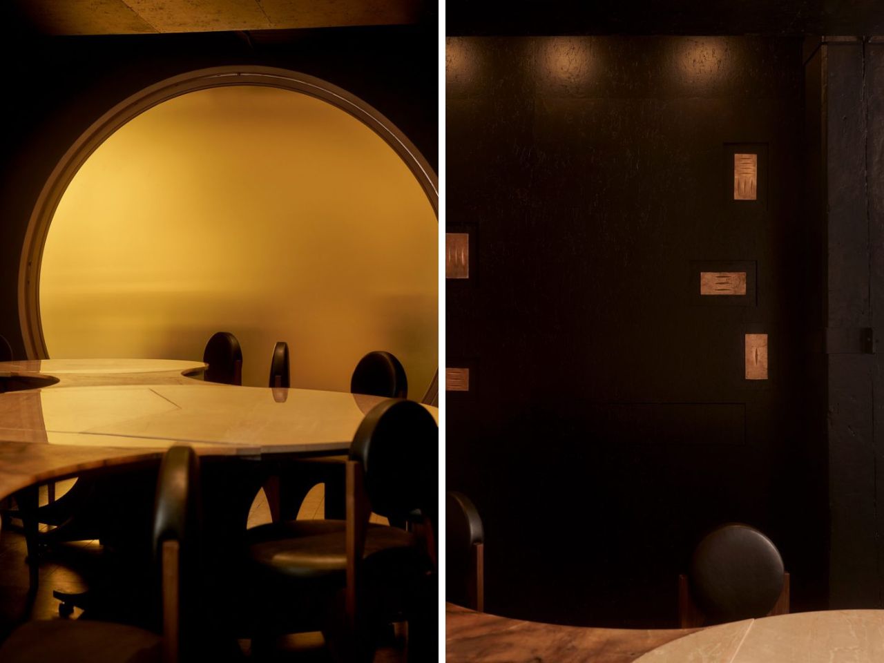
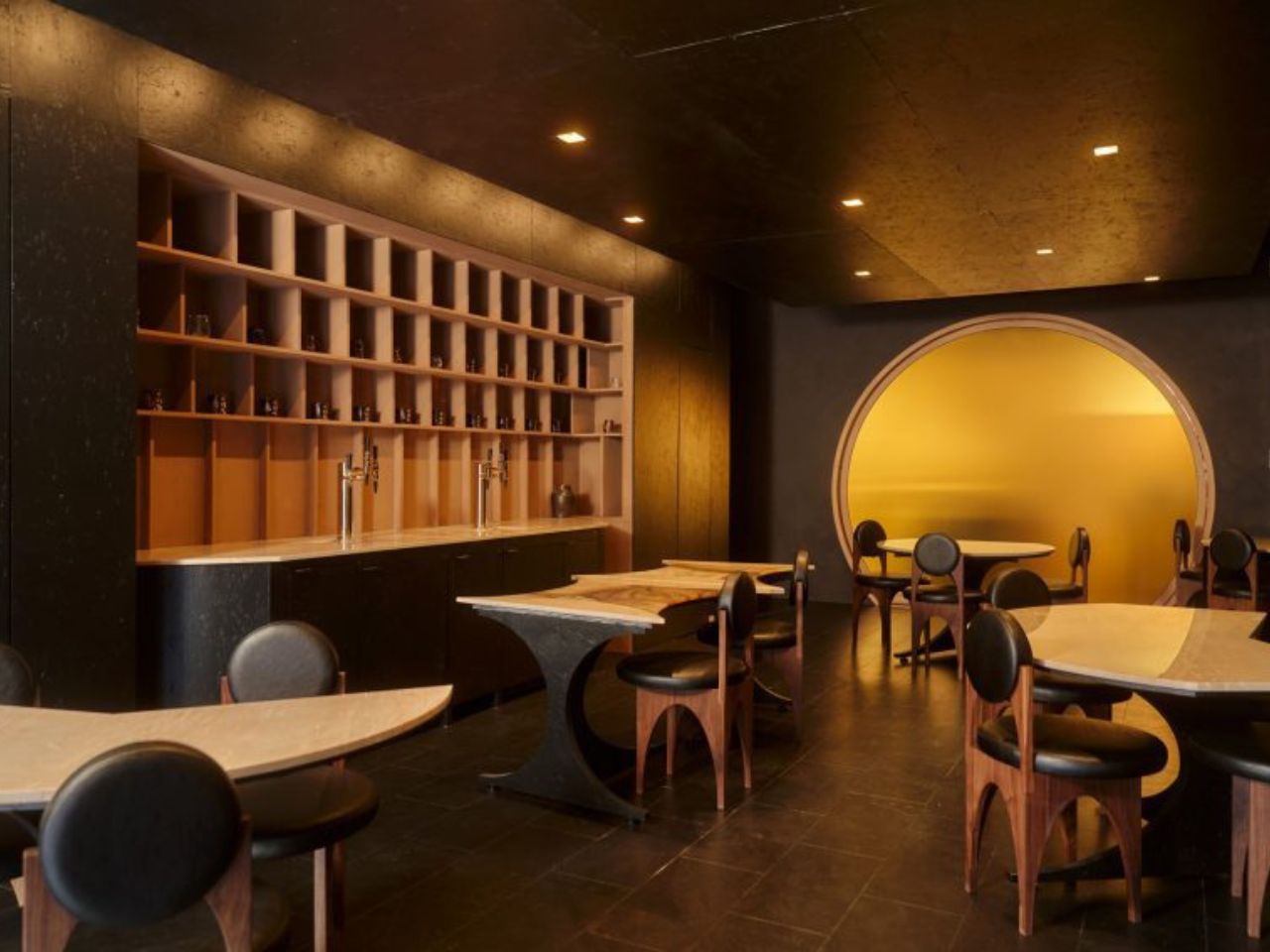
The interiors continue that balance between compactness and atmosphere. The bedroom renderings show small, light wood-lined spaces that feel calm and efficient. The amenity areas, by contrast, are more expansive and organic, with cavernous forms that seem designed to make residents feel like they are stepping out of the compression of the apartment and into something more generous. That contrast could either be the project’s greatest strength or its biggest question mark. If the shared spaces are genuinely useful and accessible, they could make the micro-units feel much more livable. If they become more like visual selling points, the tension between small private space and luxurious shared space will be harder to ignore.
Qapital is also set to include a mosaic by Italian homeware brand Fornasetti, marking the brand’s first work in South America. It adds another layer to the project’s interest in surface, craft, and ornament, all things that feel increasingly refreshing in a world of flat, anonymous towers.
Expected to be completed in 2029, Qapital feels worth watching because it is not just another statement skyscraper. It sits inside a very real urban question: as apartments get smaller and cities grow denser, what can architecture do to make daily life feel richer rather than reduced? The answer here seems to be texture, greenery, shared space, and a stronger relationship to place.
Whether Qapital will fully deliver on that promise will only be clear once it is built and lived in. But as a design idea, it has a strong point of view. It treats the skyscraper less like a machine for stacking apartments and more like a vertical piece of terrain: carved, planted, inhabited, and slowly folded into the city.
The post Quito’s New Skyscraper Feels Carved, Planted, and Lived In first appeared on Yanko Design.