This €265 Aluminum Table Was Designed Backward to Waste Just 4%

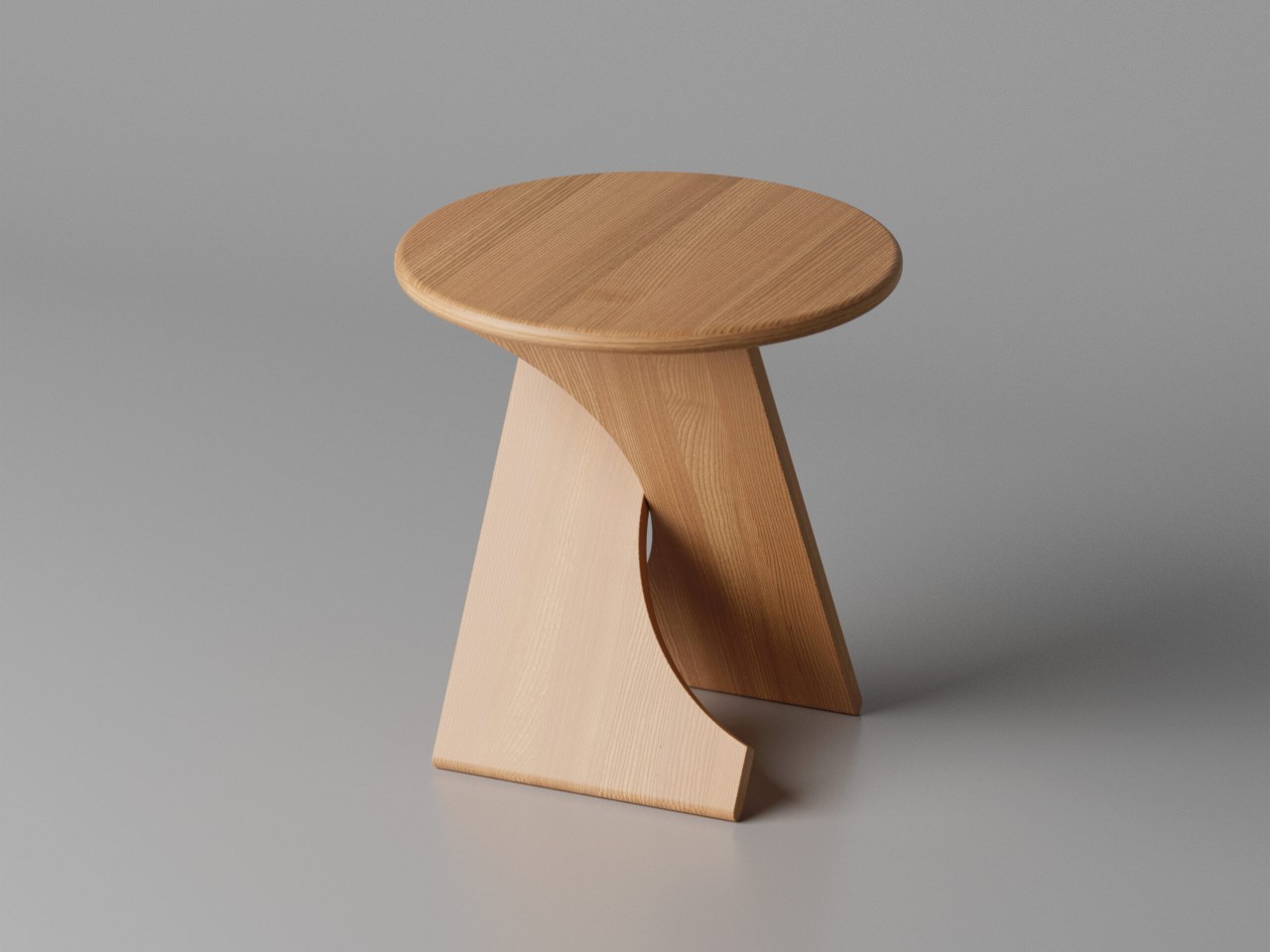
Furniture manufacturing has a quiet waste problem that rarely makes it into the marketing copy. Most pieces require significantly more raw material than what ends up in the finished product, with offcuts, excess, and scraps treated as an acceptable cost of doing business. Some studios have started designing around this inefficiency, treating material constraints not as a limitation but as a creative starting point.

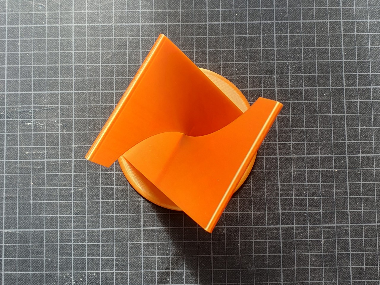
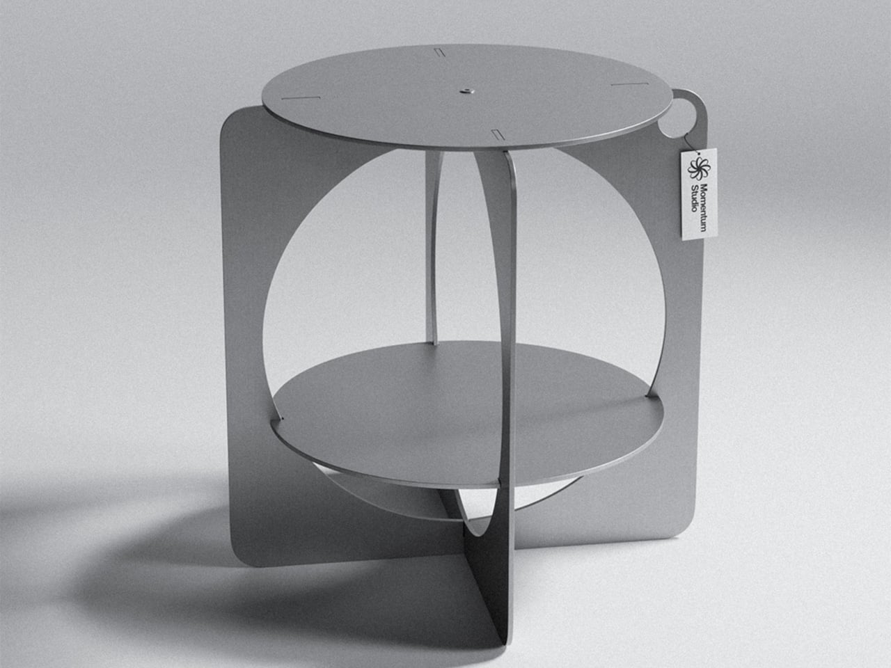
Germany-based Momentum Studio took exactly that approach with its 06 Side Table. Rather than designing a form and then figuring out how to cut it from aluminum, the studio worked the problem in reverse, focusing on how to extract a meaningful shape from a flat sheet with as little waste as possible. The result is a table that looks like it came from a sketch, not a spreadsheet.

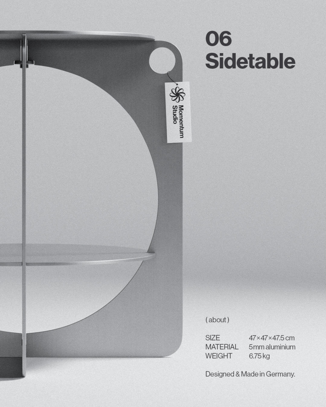
Designer: Momentum Studio

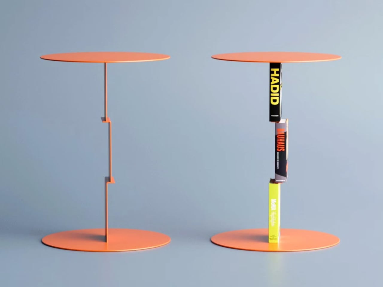
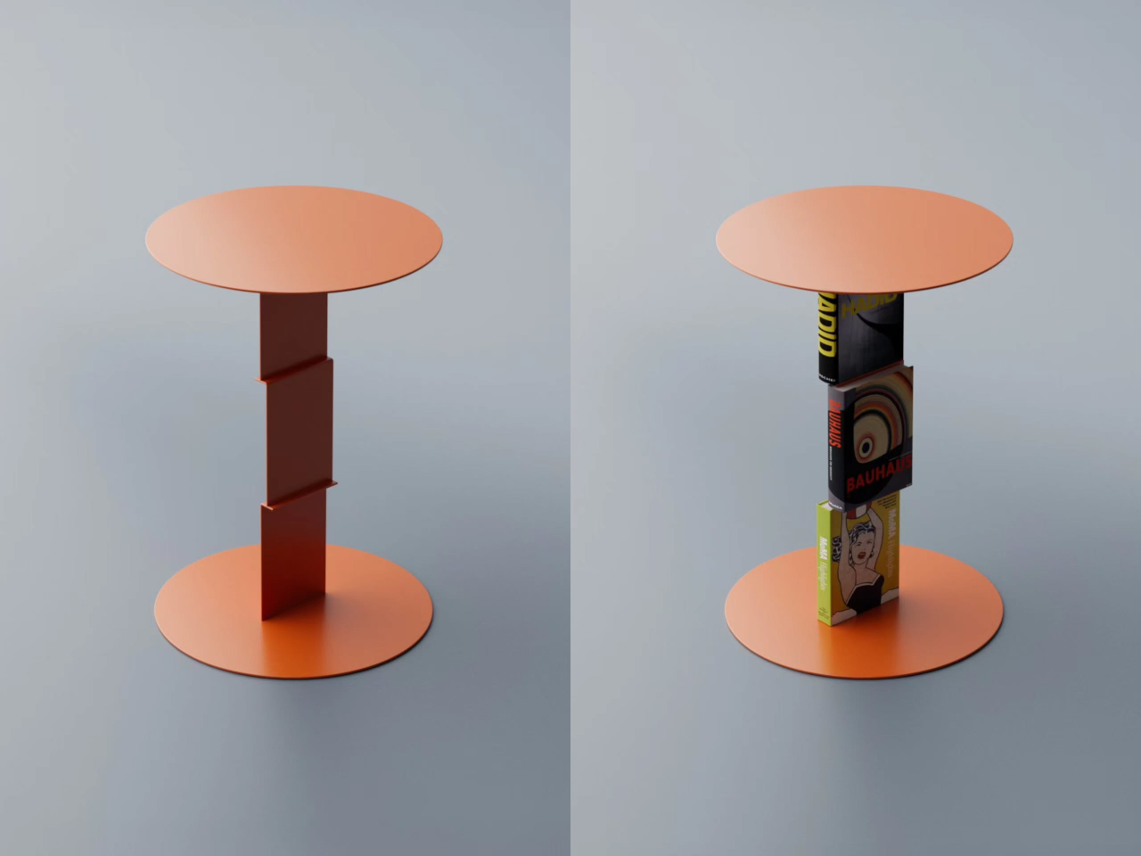
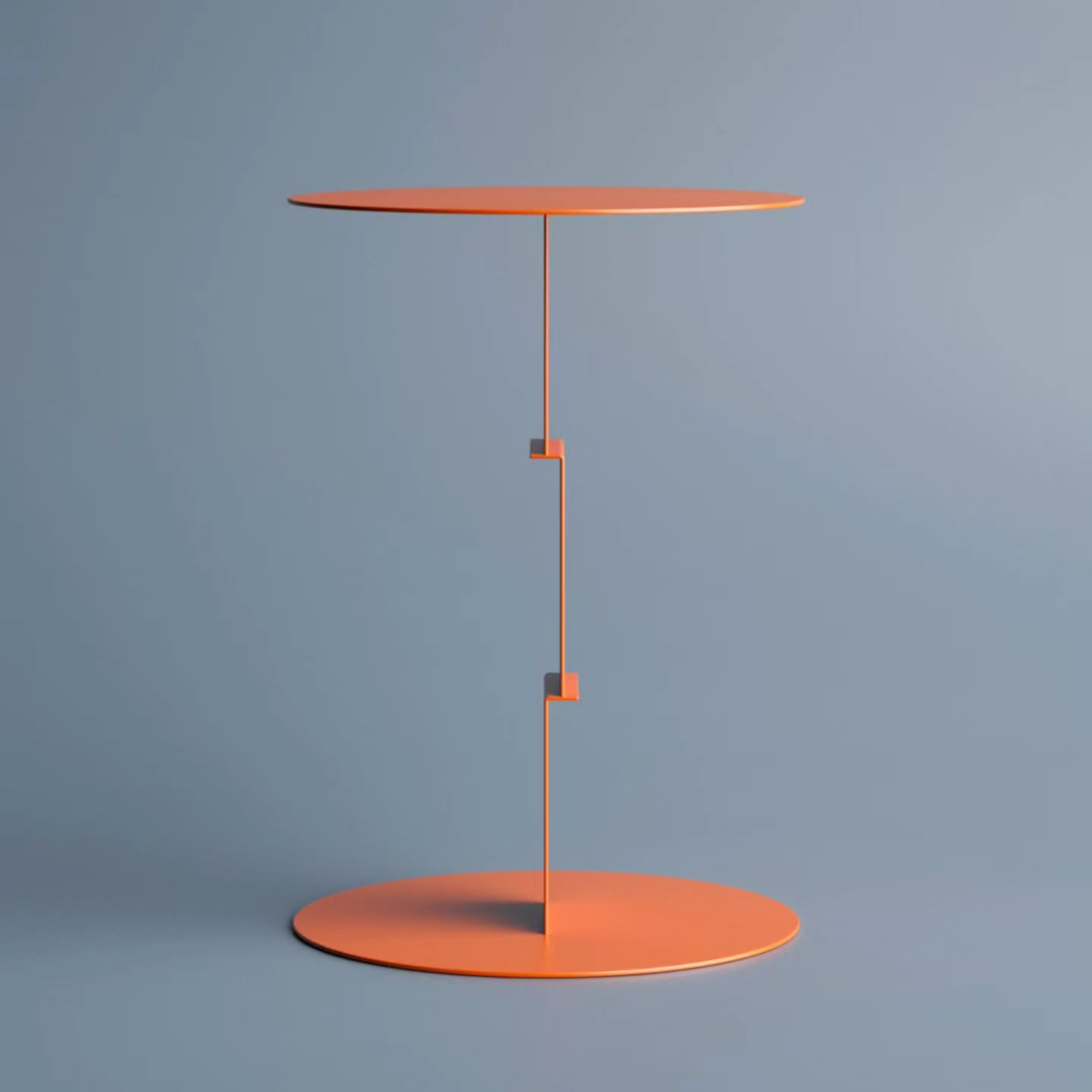
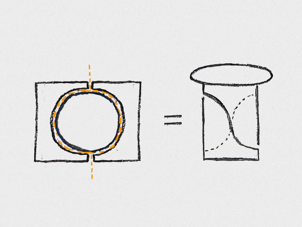
The laser-cut parts were nested with enough precision to use 96% of the raw aluminum area, leaving just 4% as offcuts. That figure wasn’t incidental; it was a major focus during development. By designing the two flat panels to fit together as efficiently as possible, the studio kept material costs low enough to offer the piece at €265 while keeping the entire production strictly made in Germany.

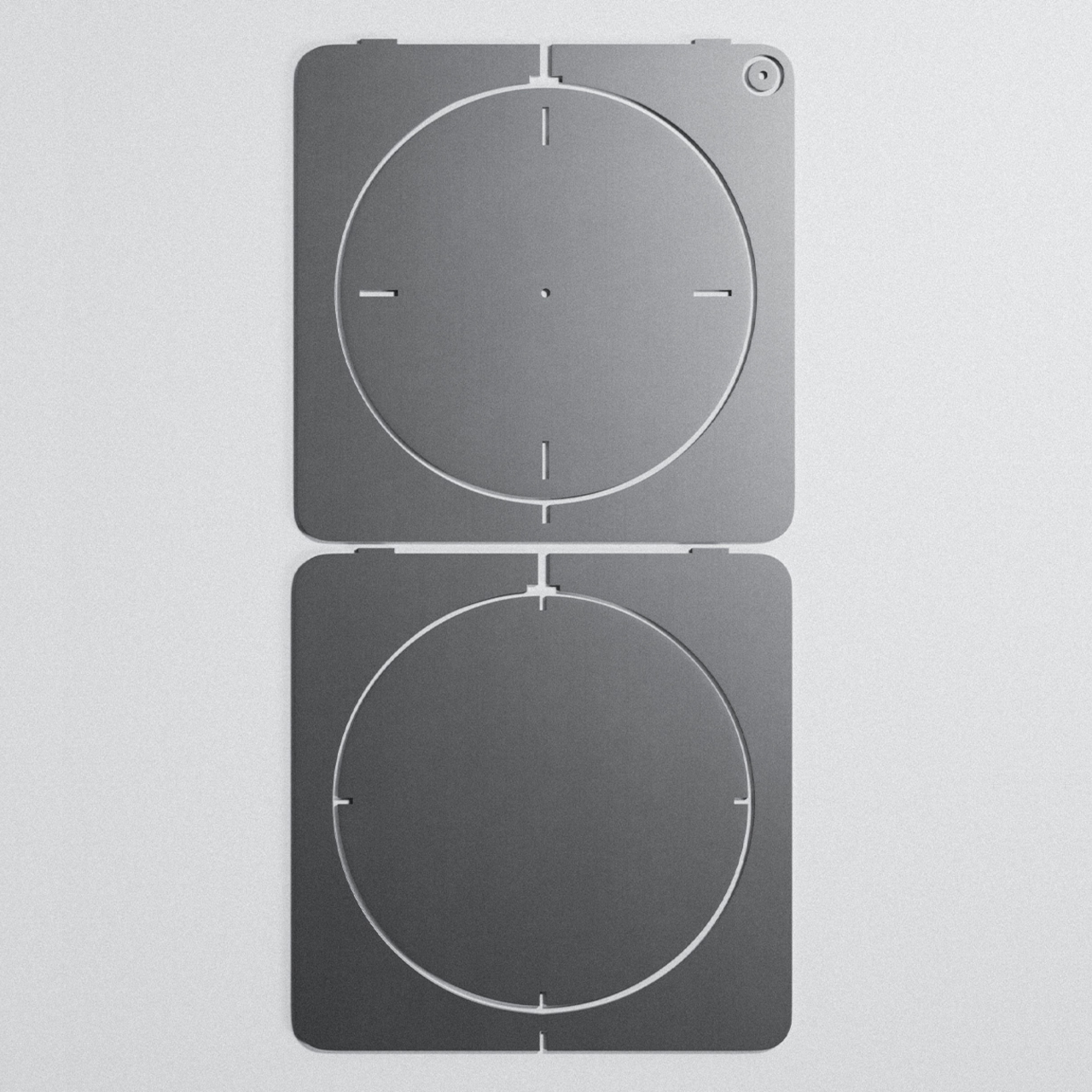
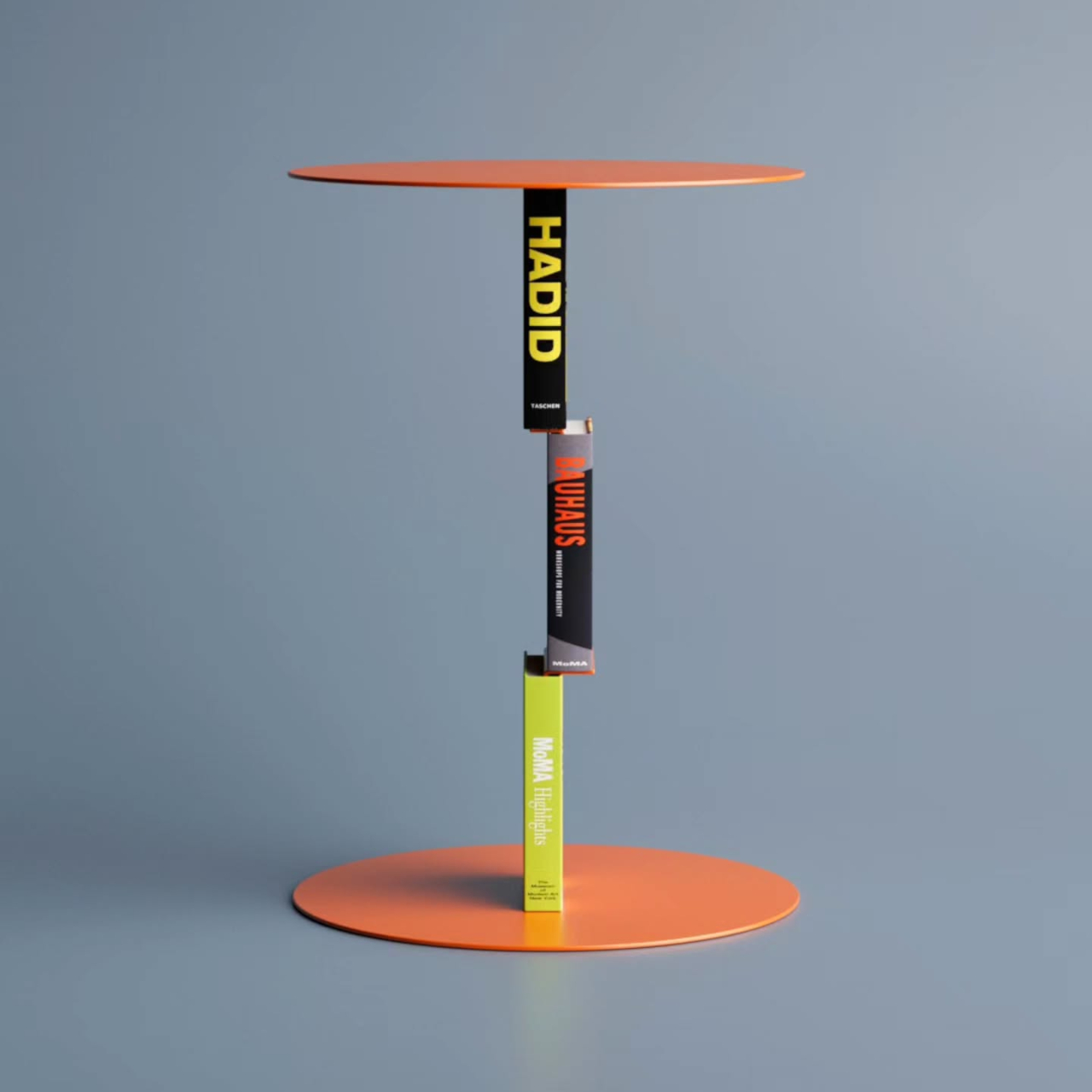
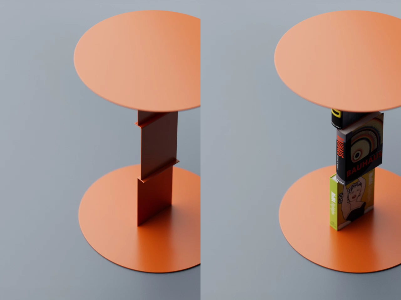
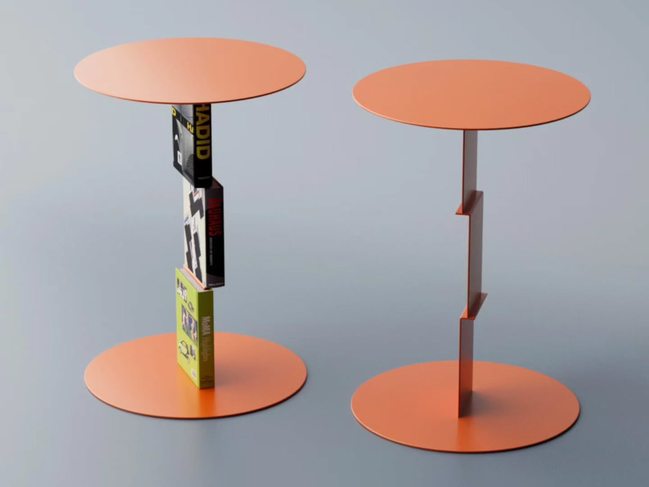
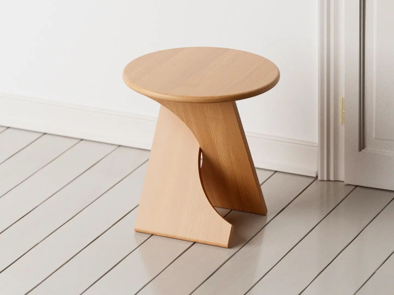
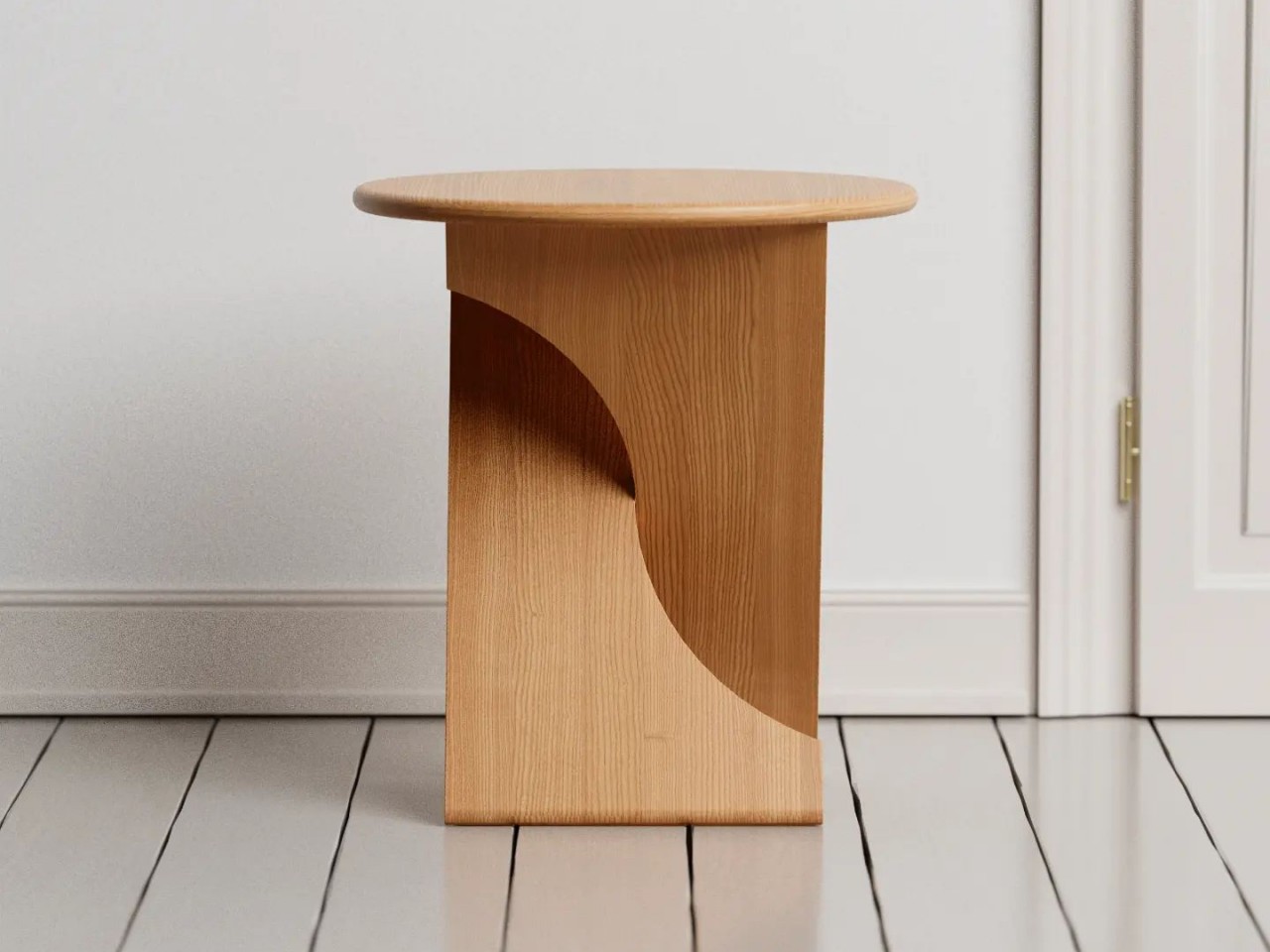
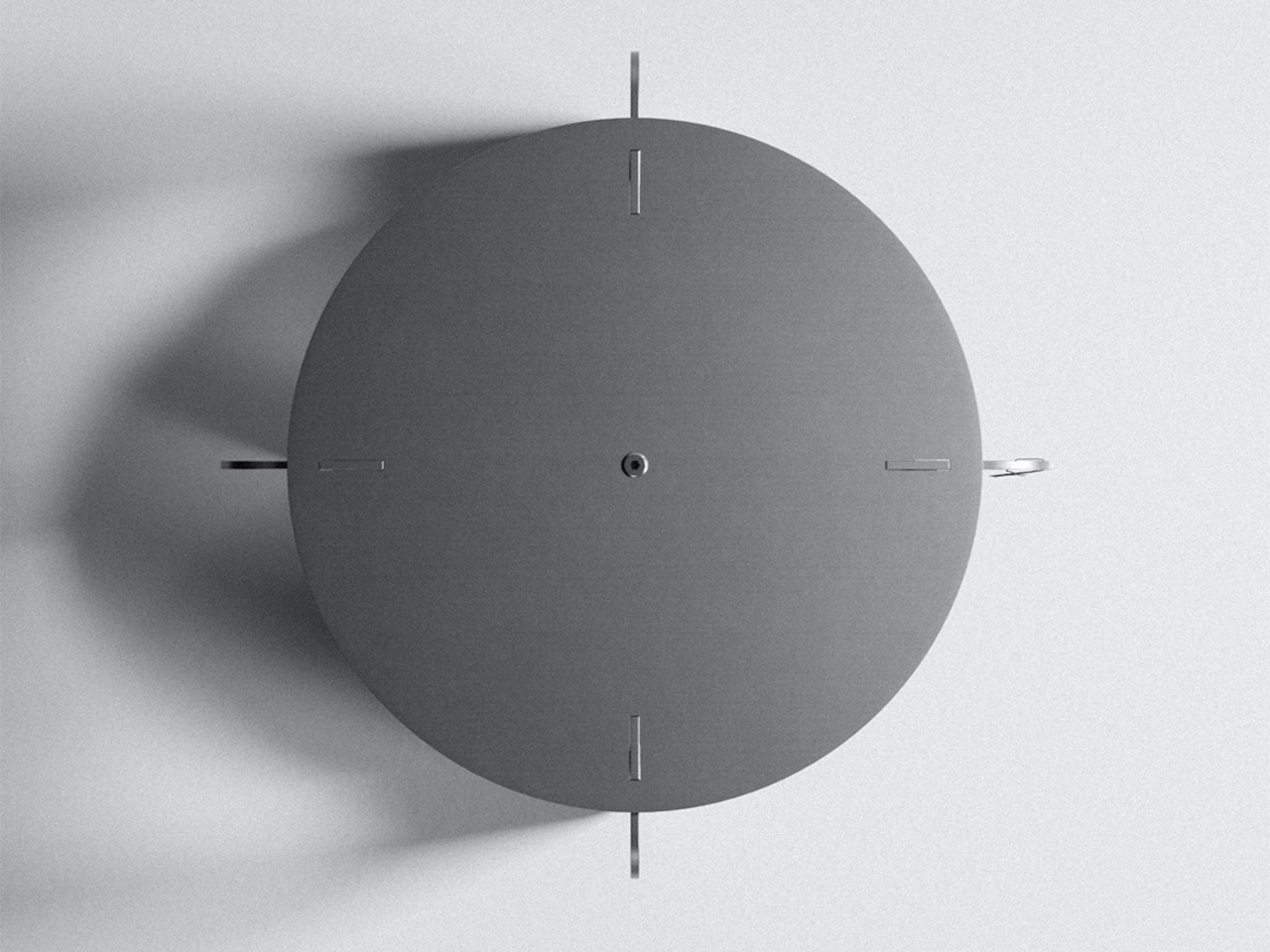
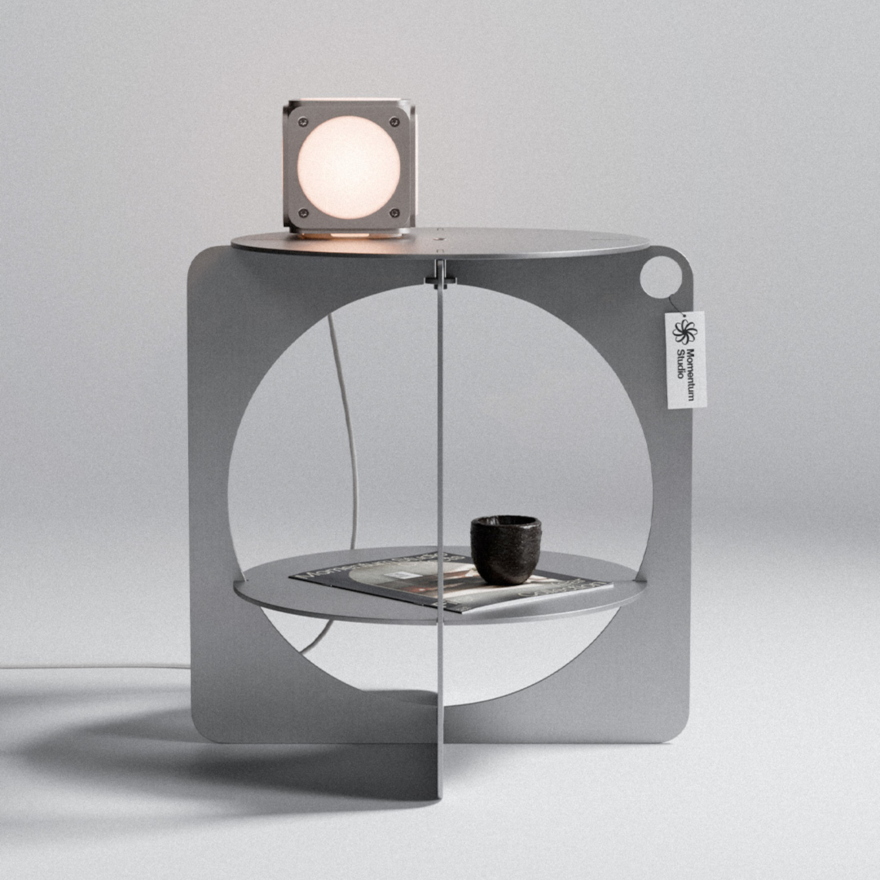
What emerged from that constraint is a silhouette that could easily pass for something from the Bauhaus era. The outer body is formed from two rectangular panels with softly rounded corners, each carrying a large circular cutout that creates an opening through the structure. A circular shelf sits midway inside, and a round tabletop closes the form at the top. The geometry is simple but hard to reduce further.

The material is Aluminium AlMg3, hand-brushed and waxed for what Momentum Studio calls a raw finish. That deliberate restraint means the aluminum will develop a natural patina over time, something the studio frames not as a defect but as part of the piece’s evolving character. The screws are stainless steel, and the assembled table weighs 6.75kg at 47cm x 47cm x 47.5cm.

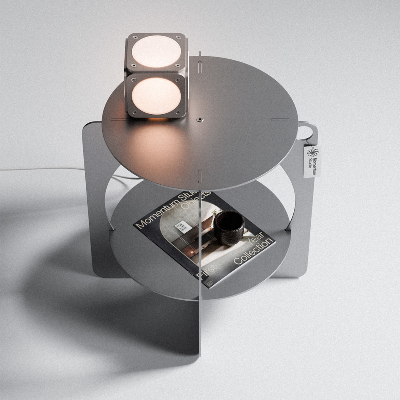
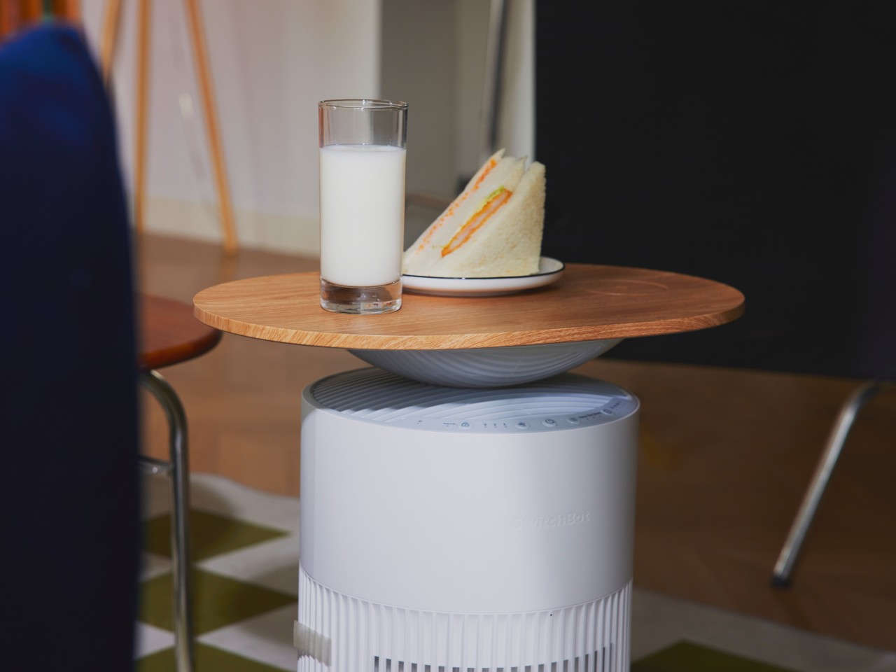
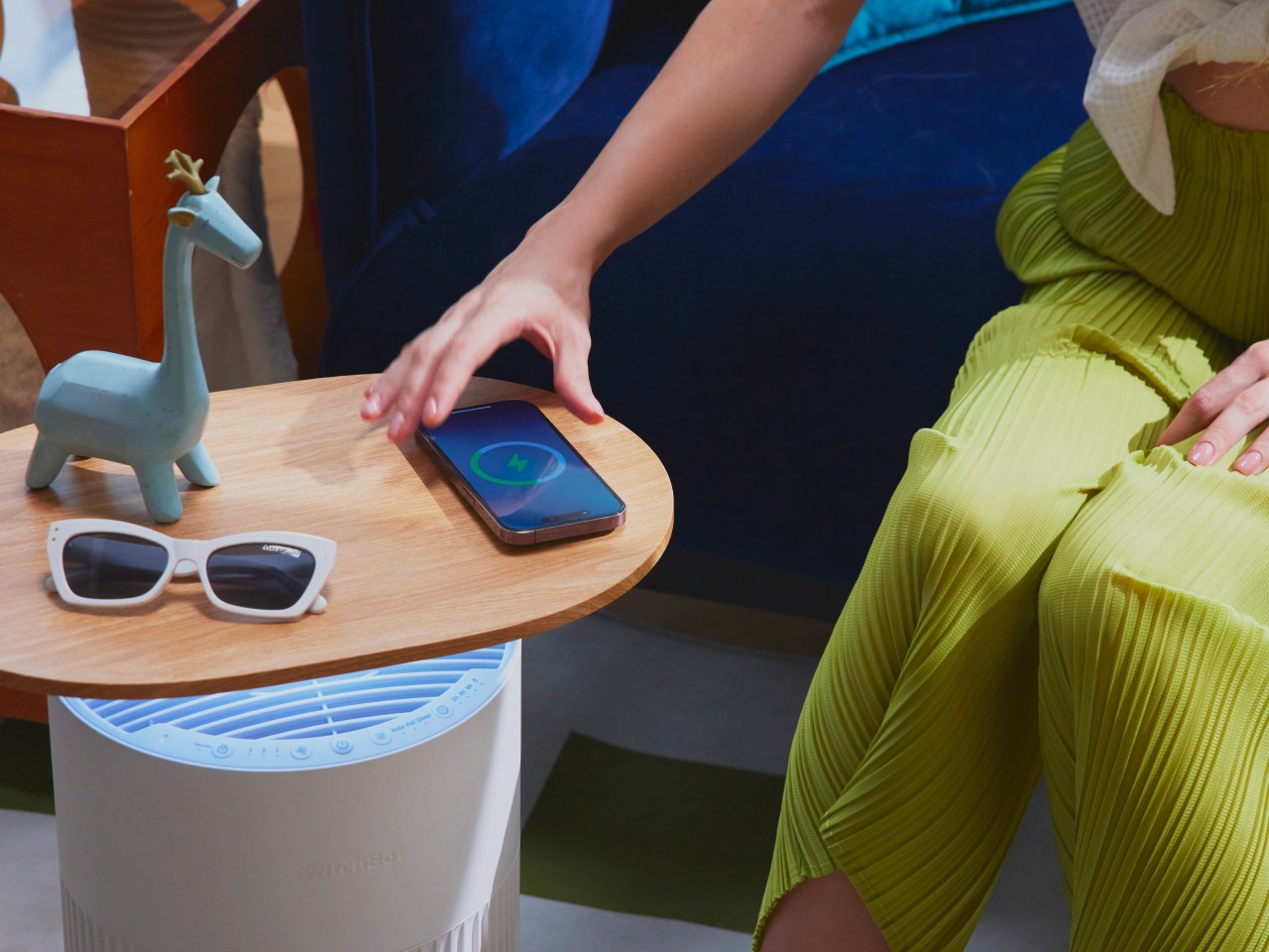
The table ships flat-packed and goes together without any tools in about five minutes. That’s a practical bonus for a piece that doesn’t look like it should be easy to put together. The lower circular shelf is sized well enough for a book, a small object, or whatever habitually ends up beside a reading chair or bed. The tabletop above handles whatever you’d normally want within arm’s reach.

The design commitment extends to its broader material philosophy, which the studio describes as selecting materials for their permanence rather than their convenience, aiming to create objects designed to age with dignity and outlast generations. It’s the kind of table that stays in a room for a long time, which seems to be exactly the point. For a piece built from raw, waxed aluminum, that ambition doesn’t seem far-fetched.

The post This €265 Aluminum Table Was Designed Backward to Waste Just 4% first appeared on Yanko Design.

This Table Lets Four Woods Melt Into One Beautiful Gradient

The Color Gradient Table is a piece that understands something very simple, but often overlooked: wood already has color. It does not need to be overly treated, disguised, or forced into becoming something else. Instead, this design begins by paying attention to the natural tones already present in different wood species, arranging them into a subtle but intentional color scale. The result is a table that feels both designed and discovered, as if the material itself guided the form.

The idea is built around a gradual transition of woods, moving from beech to chestnut, European oak, and finally black-stained chestnut. The shift is quiet, but it gives the piece a strong visual rhythm. It moves from pale warmth to deeper, richer tones without feeling decorative or forced. The color is coming from the wood itself, which makes the gradient feel honest and grounded.

Designer: Luis Gimeno

There is something incredibly satisfying about the way the different sections sit together. Each part has its own character, yet the full piece feels completely resolved. The joins and transitions create a sense of order that feels calm, precise, and almost meditative. It has that rare quality where the more you look, the more you notice: the change in tone, the grain, the weight of the form, the way one wood leads into the next.

Because of its size and weight, this is not a table meant to be moved around casually. It is designed to occupy a special place in the house. Once placed, it becomes part of the room’s identity. It feels grounded, almost architectural, like an object that was meant to live in one exact spot and quietly hold the space around it.

The soft edges make a big difference. They prevent the table from feeling too heavy or severe, even though it clearly has mass. That rounded form gives it the feeling of a modern, polished trunk in the room. It still carries a memory of the tree, but in a refined and contemporary way. It feels natural without leaning rustic, sculptural, without feeling dramatic.

What makes the Color Gradient Table so compelling is its restraint. It does not rely on ornament or visual noise. Its strength comes from material, proportion, and the careful relationship between each wooden element. It adds to a subtle natural aesthetic in a way that feels warm, permanent, and deeply considered. It is the kind of piece that does not need to announce itself loudly; it simply belongs.

The post This Table Lets Four Woods Melt Into One Beautiful Gradient first appeared on Yanko Design.

Deniz Aktay Just Built a Side Table from a Single Tube Bent Twice

Side tables have a bit of an identity problem in furniture design. Most treat them as purely functional afterthoughts, giving you a flat surface at the right height and not much else. The ones that do try to stand out tend to overcorrect, piling on decorative legs, unusual proportions, or materials that compete with everything else in the room. Very few ask whether the structure itself could be the point.

That’s the question Stuttgart-based designer Deniz Aktay explores with the Whisk table, a side table built around a single continuous tube that does all the heavy lifting. Aktay’s work consistently gravitates toward pure lines and the expressive potential of a single well-chosen material. The Whisk is one of his cleaner expressions of that thinking.

Designer: Deniz Aktay

The tube bends into two rounded loops stacked at different heights, forming an S-curve when viewed from the side. One loop reaches the height of a standard side table and cradles the tabletop. The other sweeps back to the floor, forming the base. The whole thing reads as one fluid gesture rather than a frame assembled from parts, which is very much the point.

Where it gets interesting structurally is at the center, where the tube crosses itself. That crossing point isn’t decorative; it’s what keeps the table stable. The two loops work against each other in a way that resists rocking or shifting, so you get a table that looks almost impossibly light while still holding its ground next to a sofa or armchair without wobbling every time you set something down.

The tabletop is designed to stay in the background. It fits within the upper loop and matches its rounded profile, so the two read as a single shape rather than two components joined together. The surface adds just enough contrast to define the functional plane without competing for attention. The tube does the work; the top is simply where you put your coffee, your book, or a small lamp.

As a side table, the Whisk works in less space than you’d expect. Its footprint is compact enough for tight spots beside a lounge chair or at the end of a bed, and the open structure doesn’t crowd the room the way solid-legged tables often do. It comes in a polished silver finish and a warm red option, giving it a bit more personality for spaces that can take it.

The Whisk explores what a single material or fabrication method can do without adding more than it needs to. It’s a single tube, bent twice, crossed once. It’s the kind of idea that sounds almost too simple to work, until you’re actually using it and realize that nothing about it needed to be more complicated.

The post Deniz Aktay Just Built a Side Table from a Single Tube Bent Twice first appeared on Yanko Design.

This Side Table Tricks You Into Thinking Books Are Holding It Up

Side tables have always been one of the harder pieces of furniture to make genuinely interesting. They’re functional by nature, meant to hold a drink, a remote, or that ever-growing stack of books. Most designs take the easy route: a flat surface, four legs, and nothing more. A few try to add storage or visual flair, but the table and whatever sits on it rarely share anything deeper than proximity.

Deniz Aktay’s Delusion Table turns that relationship on its head. The Stuttgart-based designer has crafted a side table concept where books aren’t just accessories resting on the surface; they become part of the table itself, or at least appear to. The idea is simple but arresting: a purpose-built metal framework connects the tabletop to the base, and once books are loaded onto it, the metal structure all but disappears.

Designer: Deniz Aktay (dezinobjects)

The trick borrows from a principle already used in certain bookmarks and floating wall shelves, where a thin metal channel slides between a book’s pages and disappears behind the covers. Aktay applies the same logic vertically: the table’s central stem has integrated clips that hold books upright against the structure. Slot a few thick art or design volumes in, and the metal seems to dissolve quietly into the spines.

What results is a table that looks as if a small stack of books has somehow defied physics to hold an entire surface aloft. It’s a visual gag, but an elegant one. The books aren’t floating or leaning on something concealed behind them. They’re gripping the structure, pages pressed against the clips, covers facing outward, spines reading clearly, creating something that looks accidental but is actually very deliberate.

That deliberateness extends to the books themselves. The volumes you choose to insert don’t just support the illusion; they become part of the design statement. A stack of oversized architecture monographs communicates something entirely different from a row of photography books or a handful of paperbacks. The table changes with whoever assembles it, which is a quiet but genuinely meaningful layer of personalization built right into the concept.

It’s also worth considering where a table like this fits most naturally. A reading nook, a home office corner, or a bedside setup for someone who always has a few books in rotation: in any of these settings, the Delusion Table doesn’t need anything extra to feel complete. The books it needs to function are probably already nearby, waiting to serve a purpose they weren’t originally designed for.

Aktay has made a habit of designing furniture that asks questions as much as it answers them, and the Delusion Table is no exception. It’s a concept that works on two levels: as a functional object that holds books and a tabletop, and as something that quietly unsettles your perception. You look at it, pause a moment, and find yourself genuinely unsure of what’s doing what. That’s exactly the point.

The post This Side Table Tricks You Into Thinking Books Are Holding It Up first appeared on Yanko Design.

The Side Table That Holds One Book Right in Its Legs

Most furniture design is an exercise in addition. More drawers. More shelves. More compartments to fill with things we forget we own. It is refreshing, then, to come across a piece that does the exact opposite and still lands somewhere quietly brilliant.

Meet the Notch Side Table, designed by Liam de la Bedoyere of Bored Eye Design. It is a flat-pack side table made of wood, clean-lined and minimal in the way that good, thoughtful furniture tends to be. From certain angles, it looks almost unremarkable. Two sets of paired legs, a flat top, honest grain. Then you look between the legs and notice the cutout, a precisely carved notch sized to hold a single book suspended between the panels, spine facing out, held steady by the tension of the slot. That is it. That is the entire idea. And somehow, it is one of the more satisfying design moves I have seen in a while.

Designer Name: Liam de la Bedoyere (Bored Eye Design)

The designer’s own framing says it best: material is removed to add use. Rather than building up, de la Bedoyere carved away. By taking wood out, he created a dedicated slot that functions as a book holder without adding any extra hardware, brackets, or fussy mechanisms. The notch is load-bearing in the most elegant sense of the word. It is structural and functional all at once, and it costs the table almost nothing to include. That kind of efficiency is harder to achieve than it looks.

Bored Eye Design is a one-person independent studio, and the Notch feels like the kind of piece that could only come from someone working without a committee. There is a specificity to it, an opinion embedded in the design, that bigger furniture brands tend to sand down in favour of mass appeal. De la Bedoyere has been quietly putting out thoughtful concepts through his Instagram, and the Notch is the one that feels most resolved. It has a clear point of view.

That point of view, as far as I can read it, is about intentionality. The notch holds exactly one book. Not a stack, not an assortment of odds and ends, just one. That constraint is a feature, not a limitation. It asks you to choose. It reminds you, every time you walk past it, that you had a book you were reading, that you actually meant to pick it back up. The book is not tucked away out of sight. It is displayed between the legs of the table like a small personal exhibit.

That is a subtle but genuinely interesting cultural statement about how we relate to the things we claim to care about. Books are increasingly used as decor, stacked artfully on coffee tables in colours that match throw pillows. The Notch does not stack them. It slots one in at midpoint, visible and accessible, in a way that feels more honest than a colour-coordinated pile ever could.

Practically speaking, the flat-pack construction means the table ships flat and assembles without tools that would make your Sunday miserable. The joinery is clean, and the interlocking parts are visible in the design in a way that feels deliberate rather than accidentally exposed. Looking at the disassembled photos, there is a puzzle-like quality to the whole thing that makes it more interesting, not less.

The material is ash wood with a warm, pale grain, and the photos styled with what appears to be a Dieter Rams monograph slotted in the notch feel entirely on brand. That orange spine against the pale timber is doing real editorial work, and it is hard not to appreciate the faintly meta quality of a design book being cradled by a well-designed table.

Whether the Notch moves into full production beyond its current personal project status, I genuinely hope it does. Furniture that nudges you toward more thoughtful habits without being preachy about it is rare. The Notch does not lecture you about slowing down. It just makes it a little easier to do exactly that, by doing less with considerably more conviction.

The post The Side Table That Holds One Book Right in Its Legs first appeared on Yanko Design.

Mililab Made a Dining Table, Got Distracted, and Made a Better Stool

Modern furniture design has been quietly shifting priorities. Smaller homes and more deliberate interiors have created real demand for pieces that do more without taking up more space or sacrificing how they look. Stools and side tables are easy targets for this kind of dual-purpose thinking, but most of them still feel like a workaround, a compromise dressed up as a solution, rather than a genuinely well-considered object.

The Ishi stool from Japanese studio Mililab isn’t that kind of compromise. It came out of a separate project entirely, one that had nothing to do with stools, and it ended up as something that’s equal parts furniture object and quiet design statement. That accidental origin is actually central to understanding why it looks the way it does, and why it works as well as it does.

Designer: Mililab

The story starts with the studio’s own Maru dining table. While developing it, founders Livert Lim and Mengfei Wu kept drifting back to the legs, almost despite themselves. Those legs tapered inward along one unbroken curve, giving them a presence that had little to do with the tabletop above. As Mililab described it: “A shape that didn’t need the table above it.” So they separated it and let it stand alone.

Working with collaborator Djordje Cebic, they developed Ishi into a form that’s both monolithic and unexpectedly soft, something like a river-worn pebble given volume. From across the room, it appears impossibly thin; up close and under your hand, it’s substantial. That tension between visual lightness and physical solidity isn’t accidental. It’s the result of curves computed in Tokyo and then realized by hand in the workshop.

The material process behind that solidity gets genuinely obsessive. The stool is made from North American white oak, selected for grain consistency, kiln-dried, hand-shaped, then kiln-dried again, because the glue introduced during assembly brings moisture back into the wood. Most workshops skip that second drying. Mililab doesn’t. It’s sealed immediately after, locking in a 10% moisture content, the exact point at which white oak is most dimensionally stable.

The cushion on top, available in Kvadrat Savanna, Dedar fabric, or Italian leather, looks fully integrated with the oak base. It isn’t, of course, which is the point. Pull it off, flip it over, and the flat underside becomes a surface, turning the stool into a side table. It works just as well beside a sofa at home as it does in a hotel lobby or a studio apartment. At 430mm, the height was chosen deliberately. It’s low enough to pair with a lounge chair, yet also tall enough to sit beside a dining table or vanity desk.

There’s something refreshing about a piece of furniture that arrived this way, not from a brief or a market gap, but from genuine distraction. Lim and Wu were supposed to be designing a dining table and kept staring at the legs instead. It’s not a narrative most furniture studios would lead with, but it does explain why the Ishi stool feels like something they simply couldn’t help making.

The post Mililab Made a Dining Table, Got Distracted, and Made a Better Stool first appeared on Yanko Design.

These Ceramic Lamps Look Like 90s Caramel Candy and Stack Any Way

The interiors most people aspire to these days tend to share a common trait: they’re clean, restrained, and almost aggressively neutral. Scandinavian minimalism, Japandi aesthetics, and muted palettes have dominated home design for years, and while there’s nothing wrong with a well-curated beige room, a lot of modern spaces have started to feel emotionally flat, like showrooms rather than places where people actually live.

That’s where the Caramel collection comes in. Designed by Moscow-based product designer Maxim Tatarintsev in collaboration with Russian brand Svoy Design, this new series of ceramic lighting and furniture takes a very different approach to interior objects. Rather than adding another understated piece to a polished shelf, it reaches back to a simpler, sweeter time, asking whether a lamp or a side table can carry something as intangible as joy.

Designer: Maxim Tatarintsev

Tatarintsev’s inspiration came from a period of deep personal reflection. Amid what he describes as the noise of contemporary life, he looked inward and found his answer in childhood, specifically in the candy that practically every kid growing up in the 90s and early 2000s would recognize. That small, glossy, jewel-toned caramel sweet became both his muse and his design vocabulary, shaping everything from the forms to the color palette.

The collection spans pendant lights, ceiling fixtures, and wall-mounted lamps, all crafted from semi-porcelain, as well as a low-profile side table made from a proprietary composite material. What stands out is the modular approach: each ceramic unit can be combined and reconfigured, letting you stack or cluster them into different lighting arrangements depending on the mood or corner of the room you’re working with.

Think of it like assembling your own arrangement from a jar of sweets. One configuration might call for a single pendant above a kitchen island; another might cluster a few units along the ceiling of a reading nook. The point isn’t to follow a prescribed layout but to put that creative decision in the hands of the person actually living in the space, not just the designer who furnished it.

The craftsmanship behind the lighting is traditional and deliberate. Each piece starts as a slip-cast semi-porcelain form, drying for several days before being fired at 1,100°C inside a muffle furnace. A coat of glaze and paint follows, giving the finished modules their signature smooth, candy-like sheen. It’s a fairly labor-intensive process for what might look like a simple geometric shape, but that’s precisely what gives each piece its quiet depth.

The side table takes a different manufacturing route altogether. Made from a proprietary composite rather than ceramic, it’s significantly more durable and comes in two versions, one for indoor use and one for covered outdoor settings. At first glance, it reads as a low, rounded ottoman, and people will probably be unable to resist using it as a delicious seat instead.

None of that is accidental. Tatarintsev’s stated goal wasn’t to produce pretty objects but to create what he calls “emotional anchors,” pieces capable of sparking a genuine reaction in whoever encounters them. A set of lamps you can rearrange on a whim, a table that moonlights as a seat, and a color palette borrowed from childhood treats make for a collection that gives any room a personality it actually earned.

The post These Ceramic Lamps Look Like 90s Caramel Candy and Stack Any Way first appeared on Yanko Design.

SwitchBot Air Purifier Table includes a wireless charger for health and convenience

Air quality at home has become a key concern among homeowners in the past few years, finally raising awareness that the air we breathe indoors might be just as bad as the pollution-filed air outdoors. Pet owners have it especially bad, with fur and pet hair adding to their list of worries. While air purifiers are becoming more popular because of that situation, very few of them can be considered to have the same aesthetic maturity as more common appliances that have been around for decades. Many are not only uninspiring but also take up space that could have been otherwise given to more functional and appealing furniture. Venturing into the home appliances market, SwitchBot is launching an air purifier that looks a tad more interesting and definitely more useful thanks to its multi-functional design, doubling as a table you can also use as a phone charger.

Designer: SwitchBot

Many air purifier take on a cylindrical shape that maximizes air intake and output, but that means putting their less than attractive bodies in the middle of spaces where they stick out like a sore thumb. The new SwitchBot Air Purifier Table admittedly does have that cannister design, but it takes steps to set itself apart from the crowd and elevate your living space as well.

In addition to its minimalist style, this air purifier puts a flat oval on top that can be used as a table to hold your things while you sit back and relax for a bit. The wood-like finish gives it a bit of visual flair and helps make it match the other furniture in your living area or bedroom. It also encourages you to put the air purifier in places that get a lot of human presence, usually beside couches or beds or maybe even in the middle of the room, allowing it to have a better impact on the quality of the air people breathe.

Its “extra” functionality doesn’t stop there, however. That tabletop is also a wireless charger, supporting 15W charging for Android devices and 7.5W for iPhones. Simply place your phone there and let it charge while you read, watch, or just chill with friends. The Air Purifier Table has configurable lighting between the air purifier itself and the tabletop, allowing you to set the mood you want or be informed when the air quality in its immediate vicinity worsens.

Of course, the SwitchBot Air Purifier Table is an air purifier, first and foremost, and it boasts plenty of street cred for that. It’s also pretty proud of its ability to remove pet hair and prevent it from contaminating the air that humans breathe, all without stressing out the pet in the process. The SwitchBot Air Purifier Table, available now for pre-order, will set you back $269.99, but there’s also a simpler $219.99 version that trades the wireless charging table top for a smaller bowl-like structure that cats might love to sit on.

The post SwitchBot Air Purifier Table includes a wireless charger for health and convenience first appeared on Yanko Design.

Minimalist side table concept uses a single wood sheet with almost no offcuts

Wood is a favorite among designers, especially furniture designers, because of its innate beauty, unique grains, and sustainability. But although the material is indeed biodegradable and recyclable, most furniture designs still result in a lot of waste. There can be many uses for wood chips, sawdust, and unused wood pieces, but an even better solution would be to reduce the wasted material in the first place. That means making every square inch of a sheet of wood count, leaving very little behind once the piece of furniture has been put together. That’s the idea behind this beautiful minimalist side table, where designing for efficiency has also led to a very interesting organic shape in the process.

Designer: Deniz Aktay

Flat-packed furniture has become trendy, especially with the minimalist designs propagated by the likes of IKEA. But while these designs are indeed space-efficient and economical, most of the time they’re mass-produced in a manner that produces plenty of offcuts and waste by-products. After all, it is also more efficient to cut all the legs of tables from the same batch of wood and all the tabletops from another, even if their shapes mean there will be plenty of scraps literally left on the cutting room floor.

Slide Table is a design concept for a side table that advocates efficiency both in packaging as well as in manufacturing. Every part of the table is actually cut from a single sheet of wood, so even mass-produced versions would have the same qualities. Yes, there will still be some unused parts that are cut off to produce the gaps between parts, but the goal is to minimize this waste as much as possible rather than eliminate them completely.

What makes this efficient use of the material is the rather unique design of the table itself. The tabletop is a disc carved from the middle of a rectangular plank of wood, and the remaining section is split in half to form the legs. The legs themselves “slide” into each other, connecting in the middle and forming a cross shape on which the circular top rests. It’s a simple yet intriguing shape that creates something like an optical illusion when viewed from the side.

While Slide Table does offer a beautiful and more sustainable design, it leaves some concerns about the stability of the furniture itself. There is no clear indication of how the legs stick together, or how the tabletop stays stable. It’s certainly possible that other smaller parts of the wooden sheet can be used as dowel rods to connect the pieces, which would further reduce the amount of wasted materials. This design, however, also has its limits in how big the table can be, as the tabletop will always be proportional to the rest of the sheet that would become its legs.

The post Minimalist side table concept uses a single wood sheet with almost no offcuts first appeared on Yanko Design.