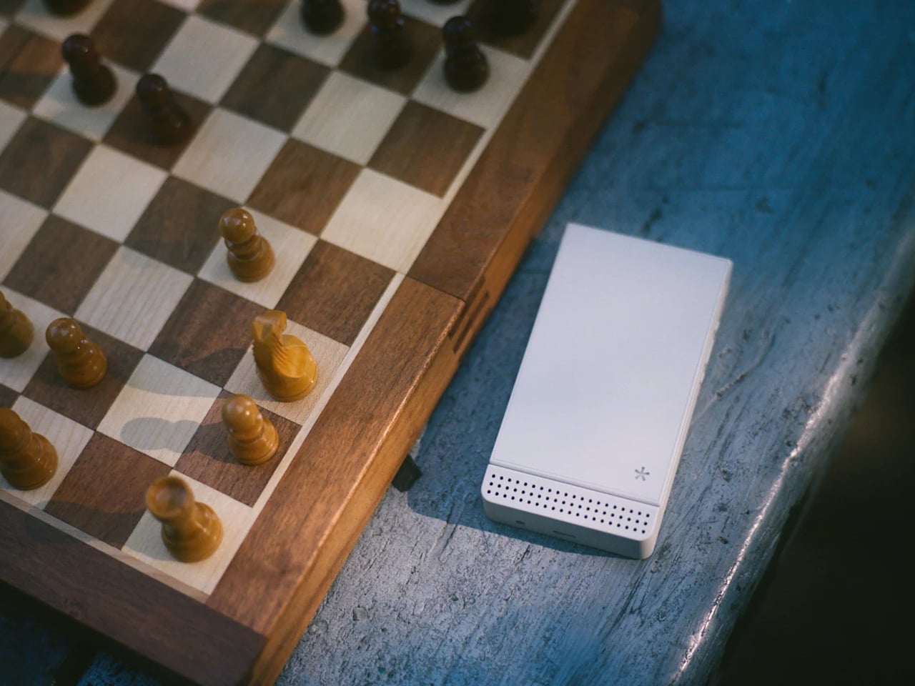
Flip phones never really disappeared. They just got sidelined once smartphones made everything available in a single touchscreen slab. Now they’re back in two very different forms: the foldable flagship, where a large touchscreen folds in half and costs over a thousand dollars, and a growing category of deliberately simpler devices that use the clamshell form to keep things from spiraling into the same habits smartphones enabled.
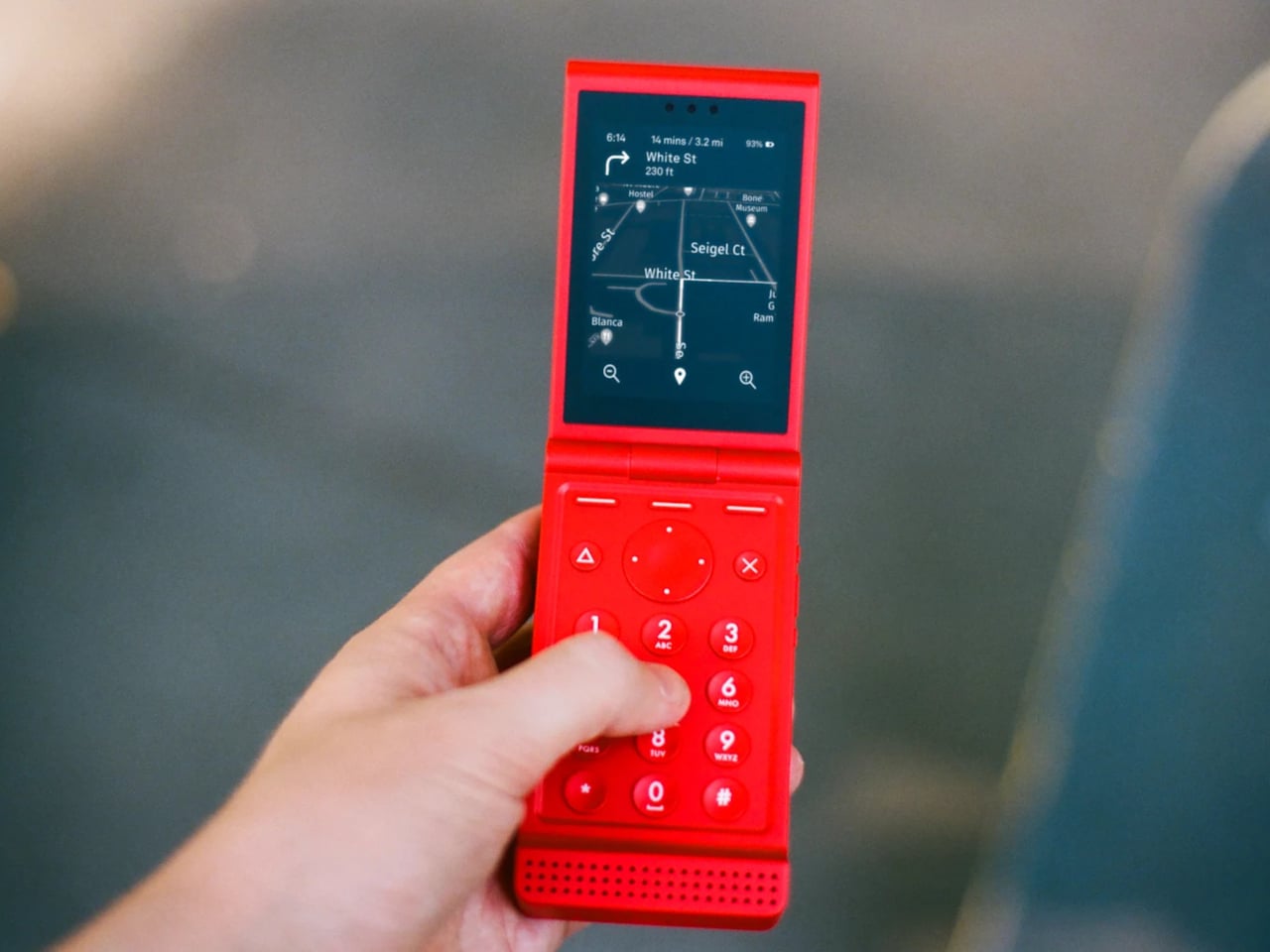
The Light Flip lands firmly in that second camp. It’s a 5G clamshell built around the same philosophy that has driven Light’s earlier devices, giving people the connectivity they need without the features that compete for attention. Fold it open, and you get a 2.8-inch matte OLED display and a physical keypad. Close it, and there’s no outer screen to glance at, no notification count, nothing pulling you back.
Designer: Light Phone
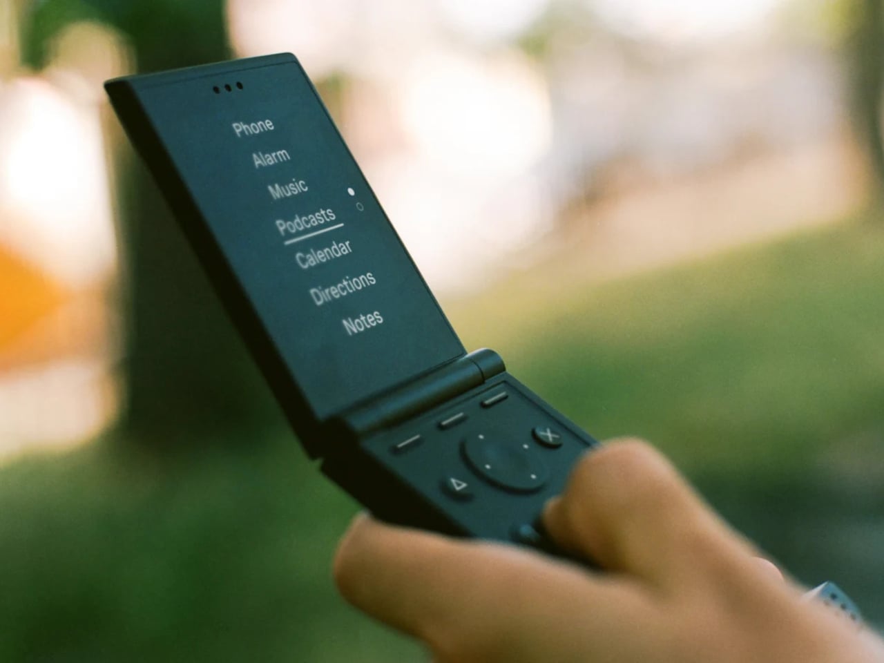
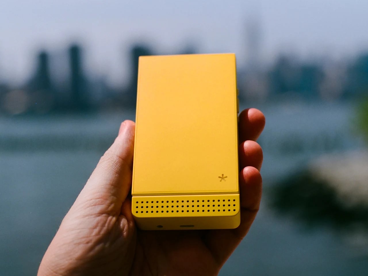
That absence of an outer display is a deliberate one. Most modern flip phones make the external screen a selling point, showing you messages and notifications without opening the phone. The Light Flip skips that entirely, which means the act of opening it is the only way in. It’s a small friction that turns out to make a meaningful difference in how often you reach for the phone by instinct rather than by intention.
Calls, texts, T9 predictive input, voice-to-text, and audio messaging cover the communication basics. Beyond that, LightOS includes a focused set of tools: directions, a music and podcast player, hotspot, calendar, weather, notes, a timer, and an authenticator for two-factor logins. The tools are genuinely useful and show up only when you need them. There’s no app store, no browser, and no social feeds anywhere in the operating system.
The hardware is honest about where the money went. The body is plastic, 160g, and uses a MediaTek MT8873 processor with 128 GB of storage and a 1,800 mAh battery that lands around 1.5 days. The camera uses a 50-megapixel rear sensor to produce 12-megapixel images. There’s no selfie camera, no NFC reader, and no touchscreen, which is how Light kept the price to $299. A 3.5mm headphone jack and a swappable battery are both present, which makes the trade-off feel more deliberate than arbitrary.

Connectivity covers Wi-Fi, Bluetooth 5.0, GPS, and 5G across a wide band range. The phone ships with a nano SIM slot and an eSIM option, and Light offers its own service plan at $39 a month for unlimited calls and texts with 1 GB of data, available in the US on a two-year contract. The unlocked version works on compatible carriers worldwide.
There’s a growing audience for devices that sit somewhere between a dumbphone and a smartphone. The Light Flip fills a specific niche with modern hardware and a considered software layer that adds without overwhelming. For anyone who’s tried screen time apps and focus modes on a smartphone and found them too easy to undo, a phone that simply doesn’t have those functions built in offers a different kind of answer to the same problem.

The post A $299 Flip Phone That Does What Screen Time Apps Never Actually Did first appeared on Yanko Design.