Casa Pinhal Proves the Best Brazilian Architecture Barely Touches the Ground

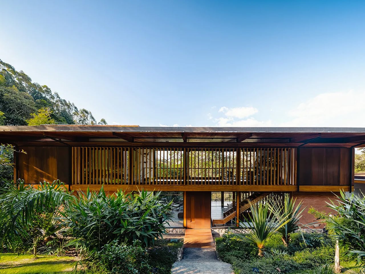
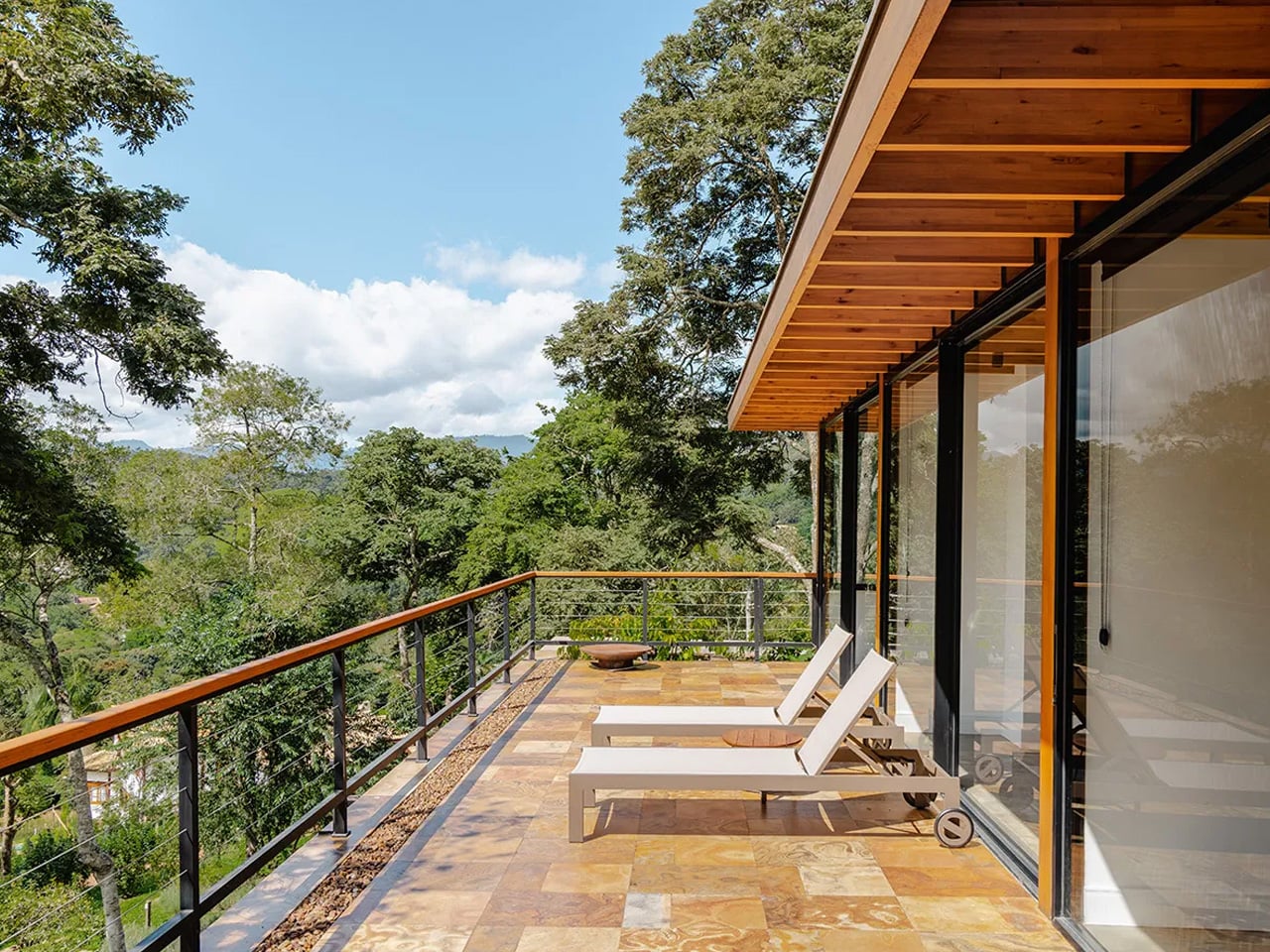
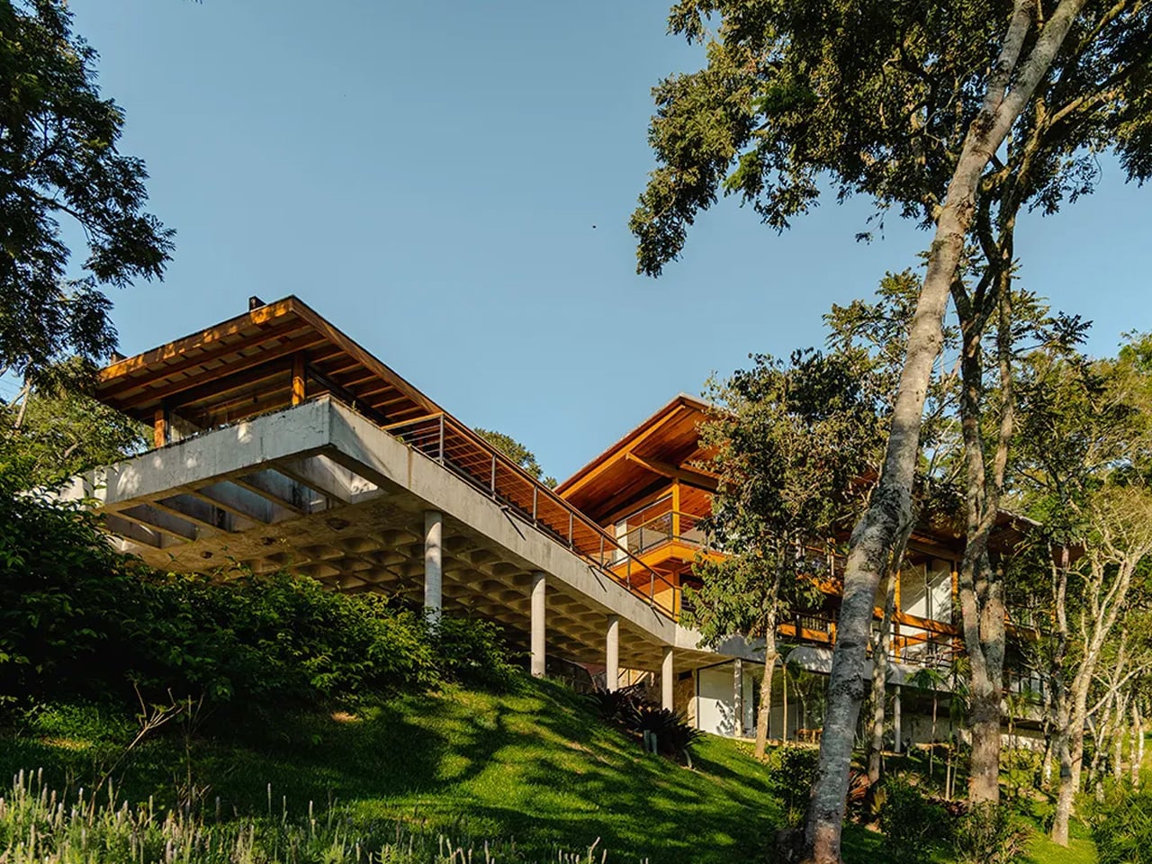
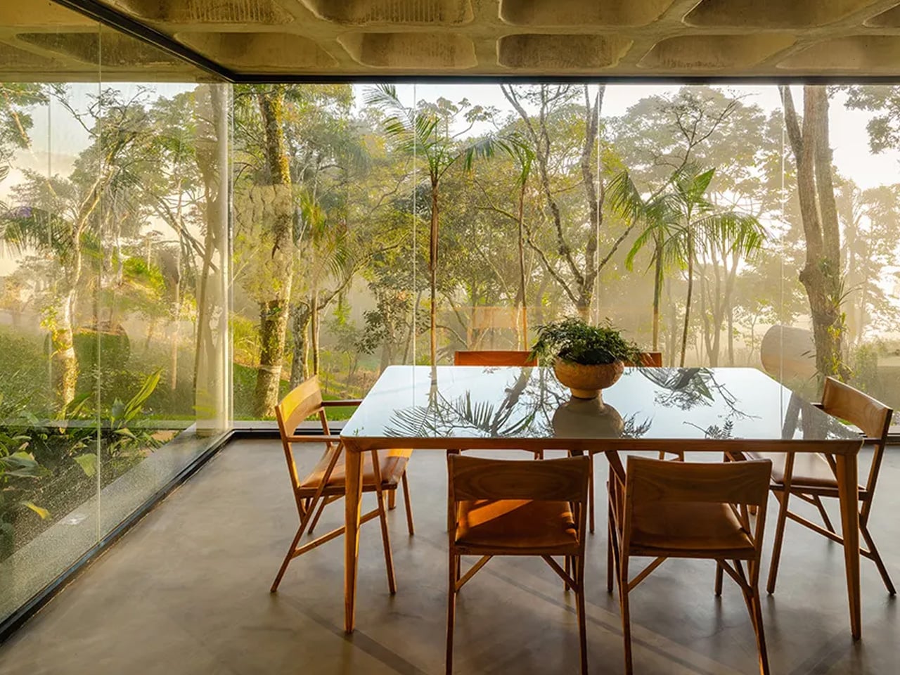
Deep in the Serra da Mantiqueira, where the air is thin and the forest floor barely registers sunlight, Cornetta Arquitetura has completed Casa Pinhal — a 690-square-metre residence in Santo Antônio do Pinhal, São Paulo, that reads less like a building dropped into nature and more like one that grew out of it.

The site is demanding by any measure: a 4,900-square-metre plot with a steep incline and dense native vegetation already well established across it. Rather than fight the terrain, lead architect Pedro Cornetta made the land itself the primary design brief. The project was guided by one clear principle — touch the ground as little as possible. The result is a holiday house that gives its guests the impression of walking among trees rather than beside them.

Designer: Cornetta Arquitectura
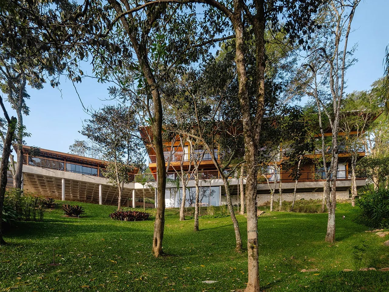
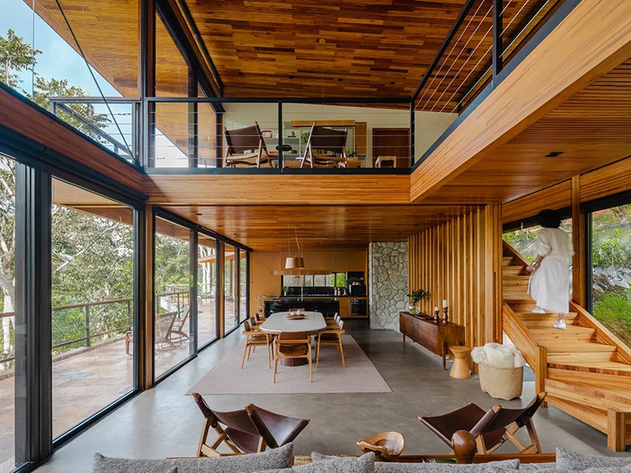
The structural language is built around glued laminated timber (MLC — Madeira Laminada Colada) and wood frame construction, executed in collaboration with Rewood using eucalyptus sourced for the project. Rewood completed the entire timber structure in just 30 days — 40 cubic metres of glulam going up with a pace that conventional concrete construction rarely allows. The system combines a column beam frame, a trapezoidal sandwich roof, dry panel floor slabs, and wood frame walls, all working together as a prefabricated assembly that keeps the site footprint minimal and the build time compressed.

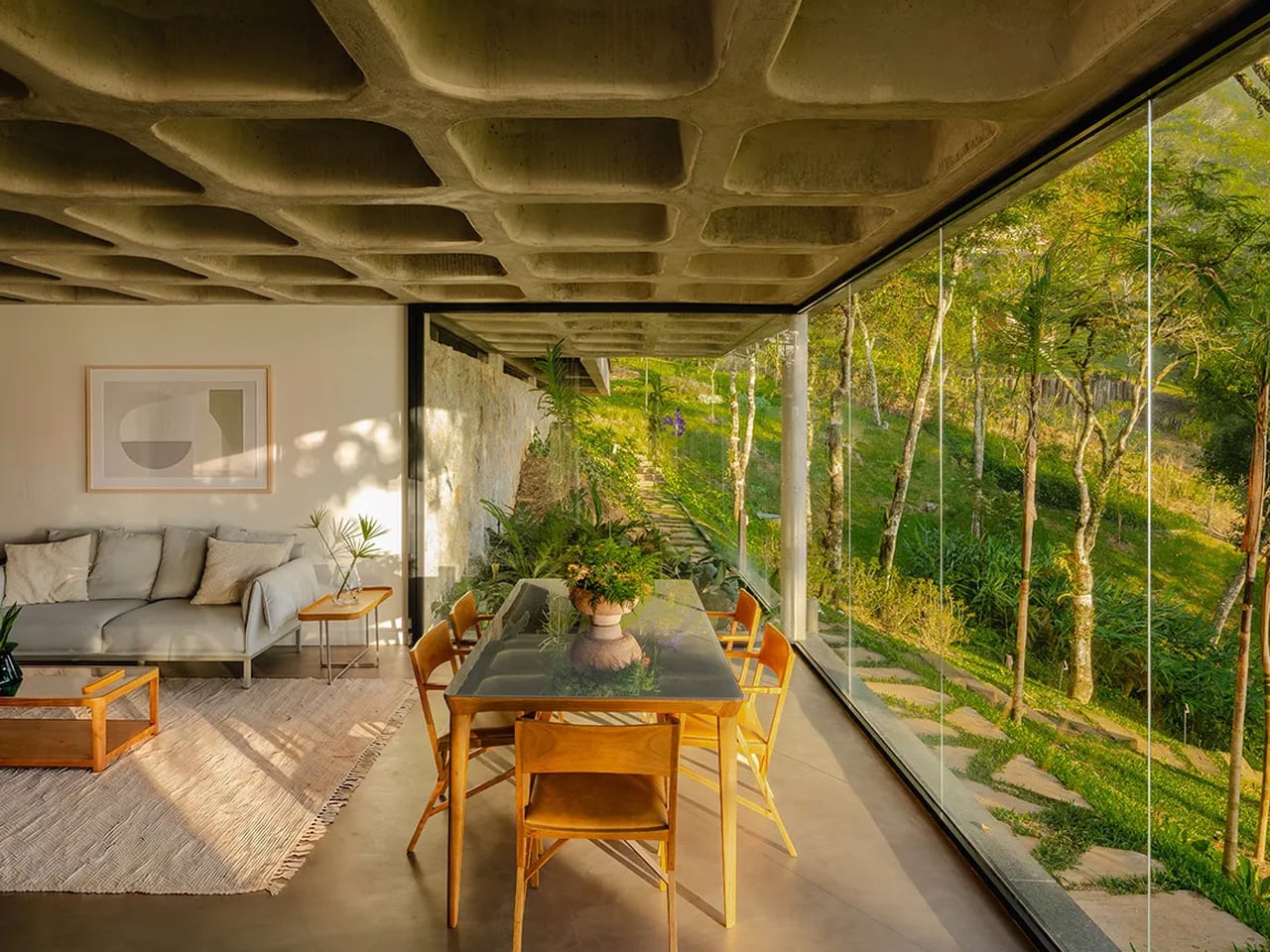
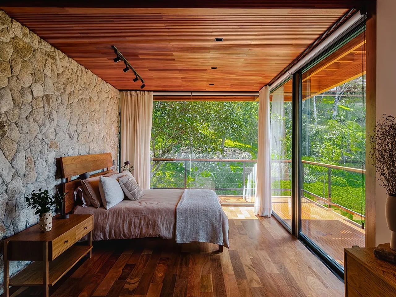
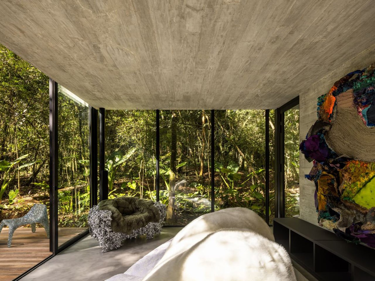
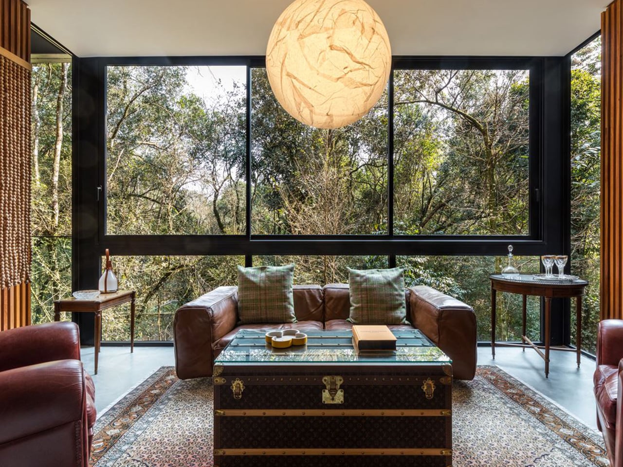
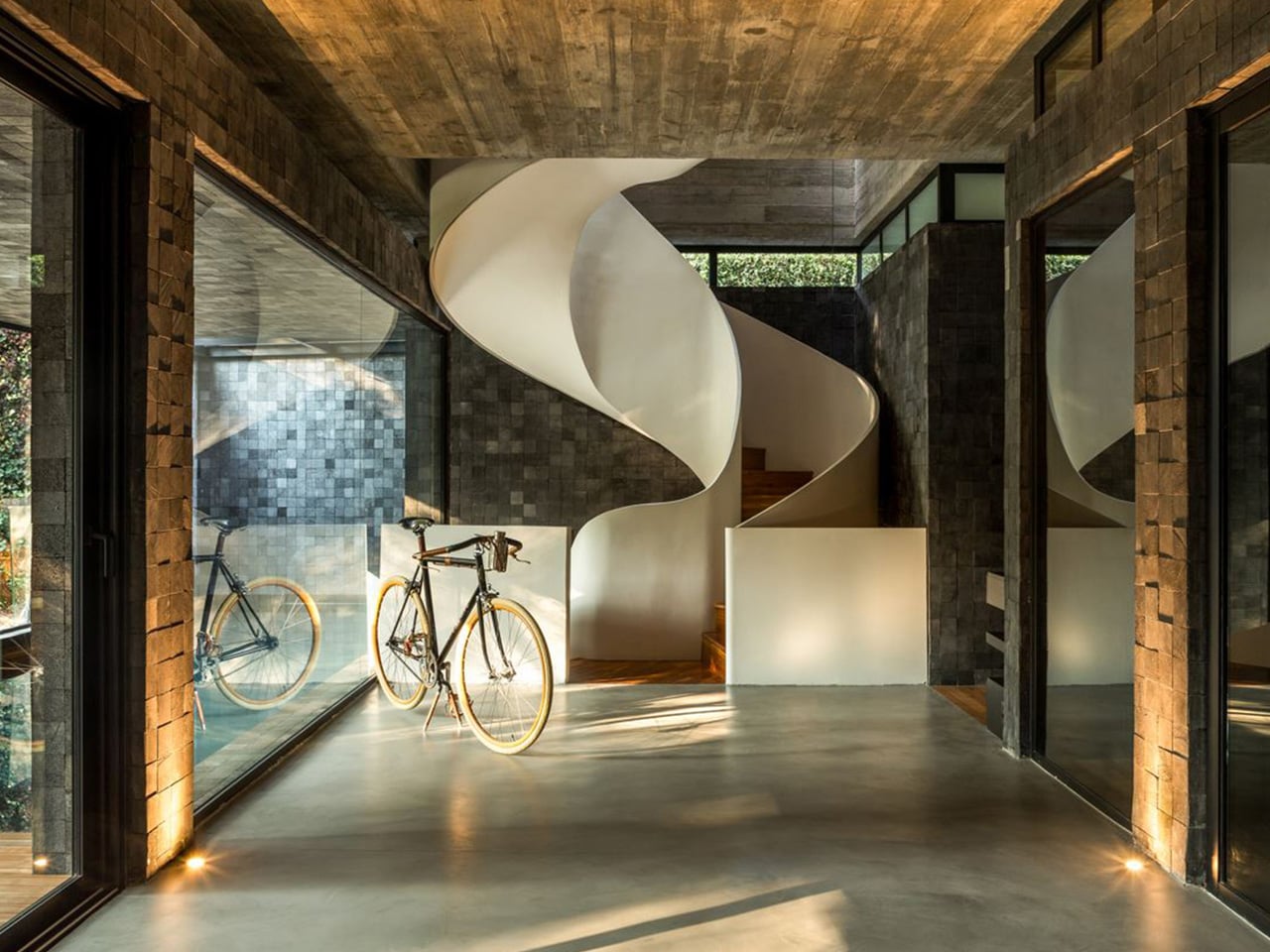
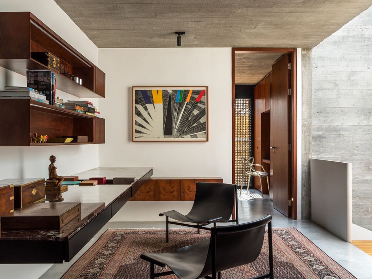
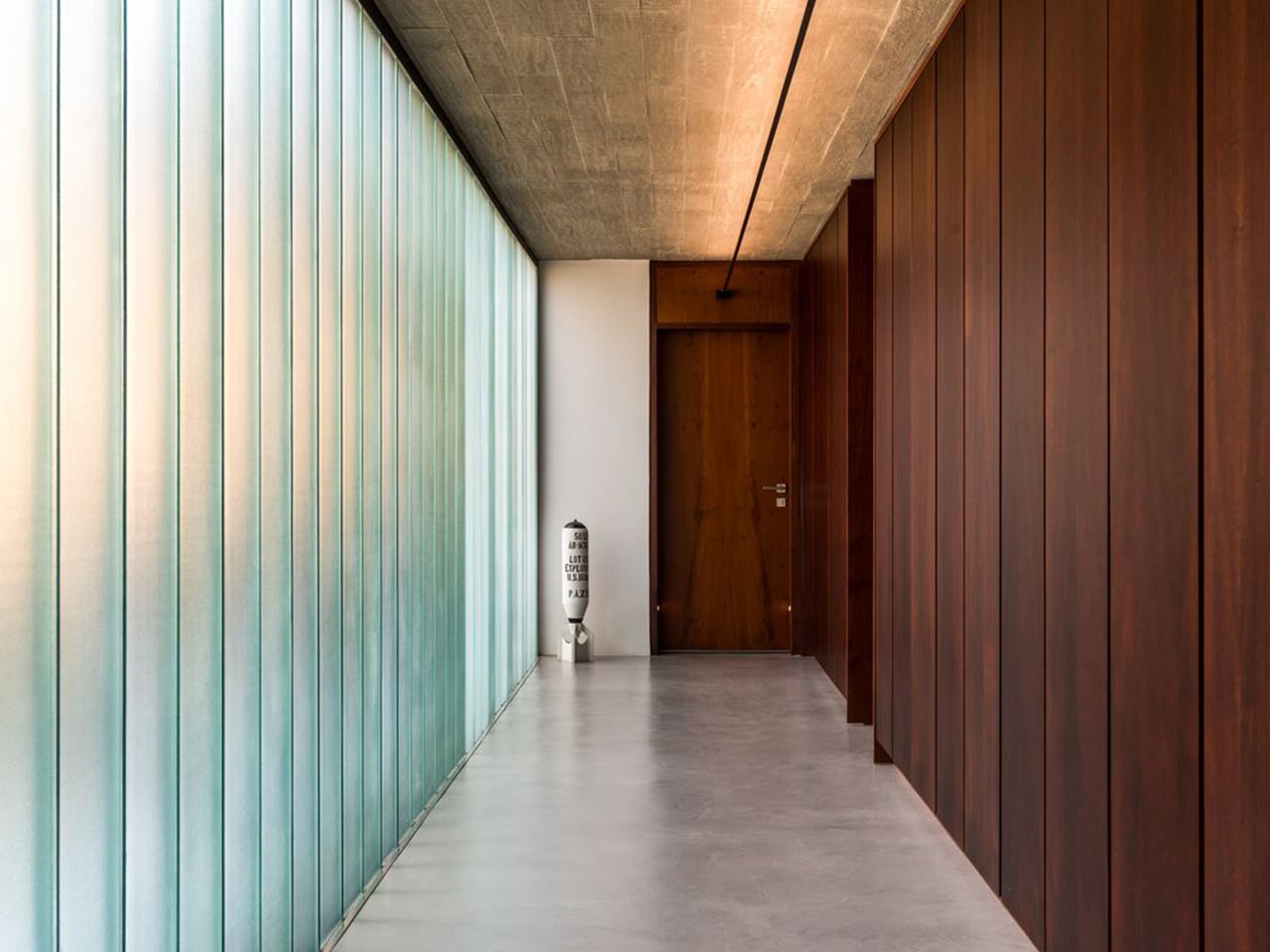
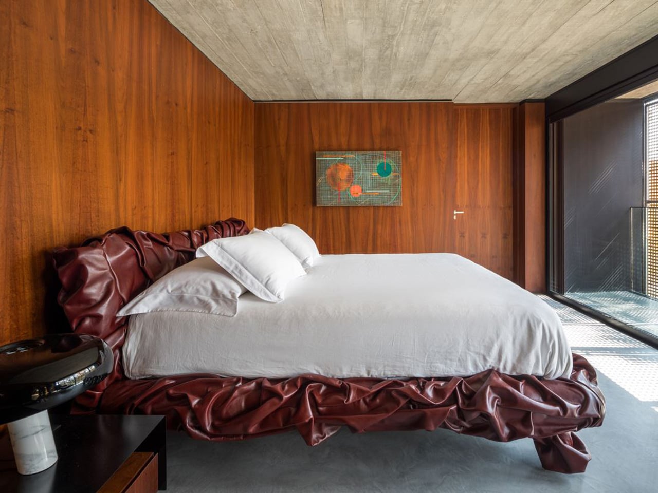
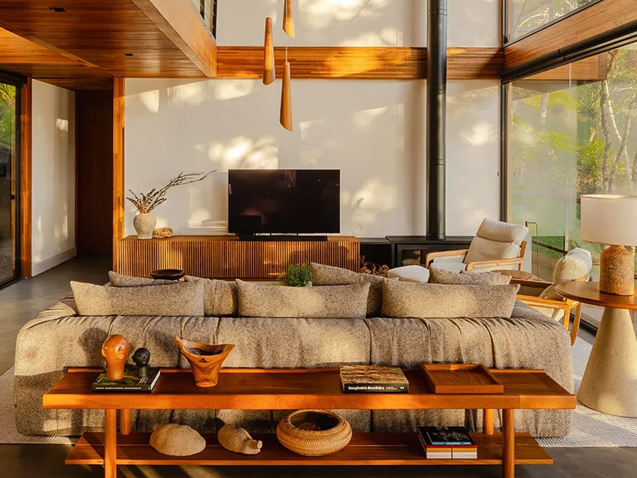
Inside, the material palette is quieter than the engineering behind it. Wood, concrete, and expansive glass panels define the interior volumes — a combination that Cornetta has refined across several projects, but here feels especially deliberate given the forest density outside. At night, the house undergoes a shift: internal lighting catches the grain of the timber, bounces off the concrete, and filters through the glass, turning what is a disciplined structure by day into something closer to a lantern. It’s the kind of detail that separates a house that photographs well from one that actually earns its place on a hillside.
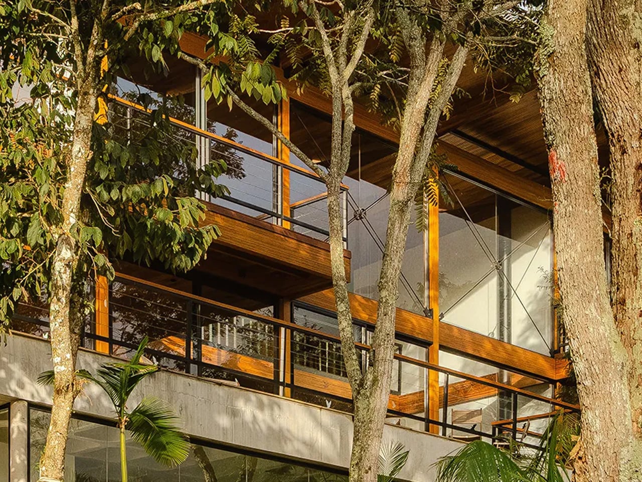
Casa Pinhal sits in a lineage of work from Cornetta Arquitetura that treats sustainability not as an add-on feature but as a structural argument. Like Casa Guapuruvus before it — positioned to avoid disturbing existing flora and elevated off the ground to protect wildlife — Casa Pinhal was placed where native vegetation was already under stress, turning conservation into a site strategy rather than a branding point.

It’s a house built with the kind of restraint that takes real confidence. And in the Mantiqueira mountains, restraint might be the loudest architectural statement you can make.
The post Casa Pinhal Proves the Best Brazilian Architecture Barely Touches the Ground first appeared on Yanko Design.
The Forest Came First. The House Came Second. That Was Always the Plan.

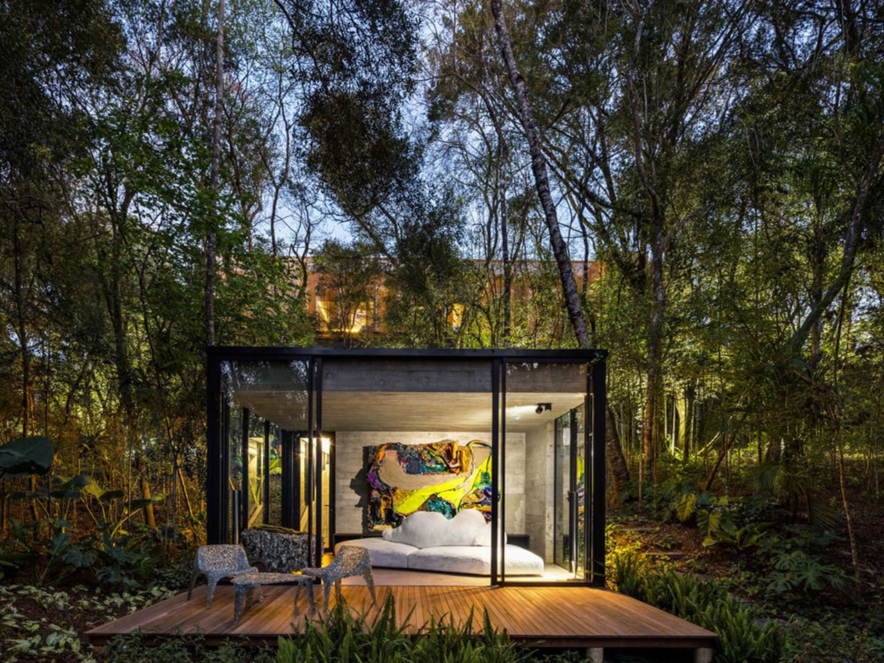
Most architects are handed a site and told to make something of it. Luiz Volpato was handed a forest and told not to ruin it. House 17-JB, completed in 2022 within the Jardins do Batel condominium in Curitiba, southern Brazil, grew out of a deeply personal brief: a client of Italian descent, a self-professed architecture enthusiast, wanted to find not just land, but the ‘right’ land.

Together with the office, they eventually settled on a plot defined by two non-negotiable conditions — a protected native forest and a dramatically steep topography. Those constraints didn’t limit the project. They became it.

Designer: Luiz Volpato Architects

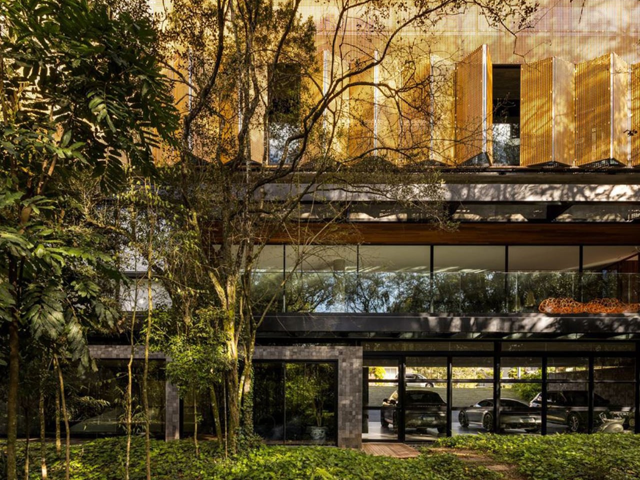
With occupation restricted to just 30% of the 2,300 square metre plot, and that footprint concentrated along the front portion of the land, the design team was forced to think vertically. The solution was elegant: four overlapping volumes, two elevated and two semi-underground, stacked in direct response to the terrain’s fall and the density of vegetation surrounding the site. The result is a 1,113 square metre home that feels both monumental and discreet, as if the building grew from the hillside rather than being placed on top of it.

Architecturally, the project sits at the intersection of modernism and brutalism, drawing on structural clarity, constructive rationality, and an honest approach to material selection. The material palette tells its own story: moss green upholstery, warm timber millwork, and stone surfaces work together to blur the boundary between inside and out. Natural textures sit alongside smooth finishes, creating an interior that reads as fluid and quiet rather than loud or performative.

On the upper floors, the intimate volume houses the suites and a family living area, with balconies positioned precisely at the height of the tree canopy. Living among the treetops rather than looking up at them is a subtle but powerful distinction, one that shapes the daily experience of the house in ways that no floor plan can fully capture.

The project has since gained international recognition, featured in Edra Magazine No. 5, launched in Milan. It is a fitting acknowledgment for what is, at its core, a study in restraint. Luiz Volpato and his team, alongside project coordinator Pablo Quintela, never tried to compete with the forest. They listened to it instead. House 17-JB is a reminder that the best architecture doesn’t impose a vision on a site. It finds the vision that was already there, waiting to be built.

The post The Forest Came First. The House Came Second. That Was Always the Plan. first appeared on Yanko Design.

This Nova Scotia Home Floats Above the Land on Steel Legs and Changes Nothing Beneath It

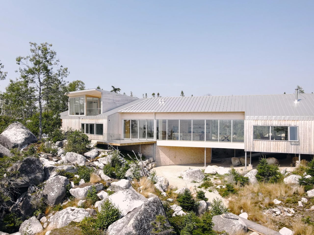
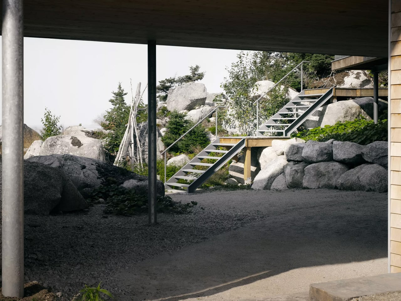
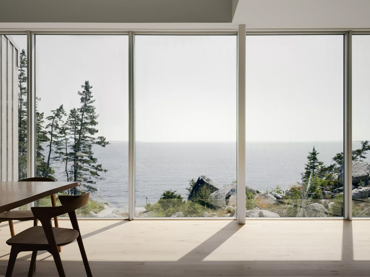
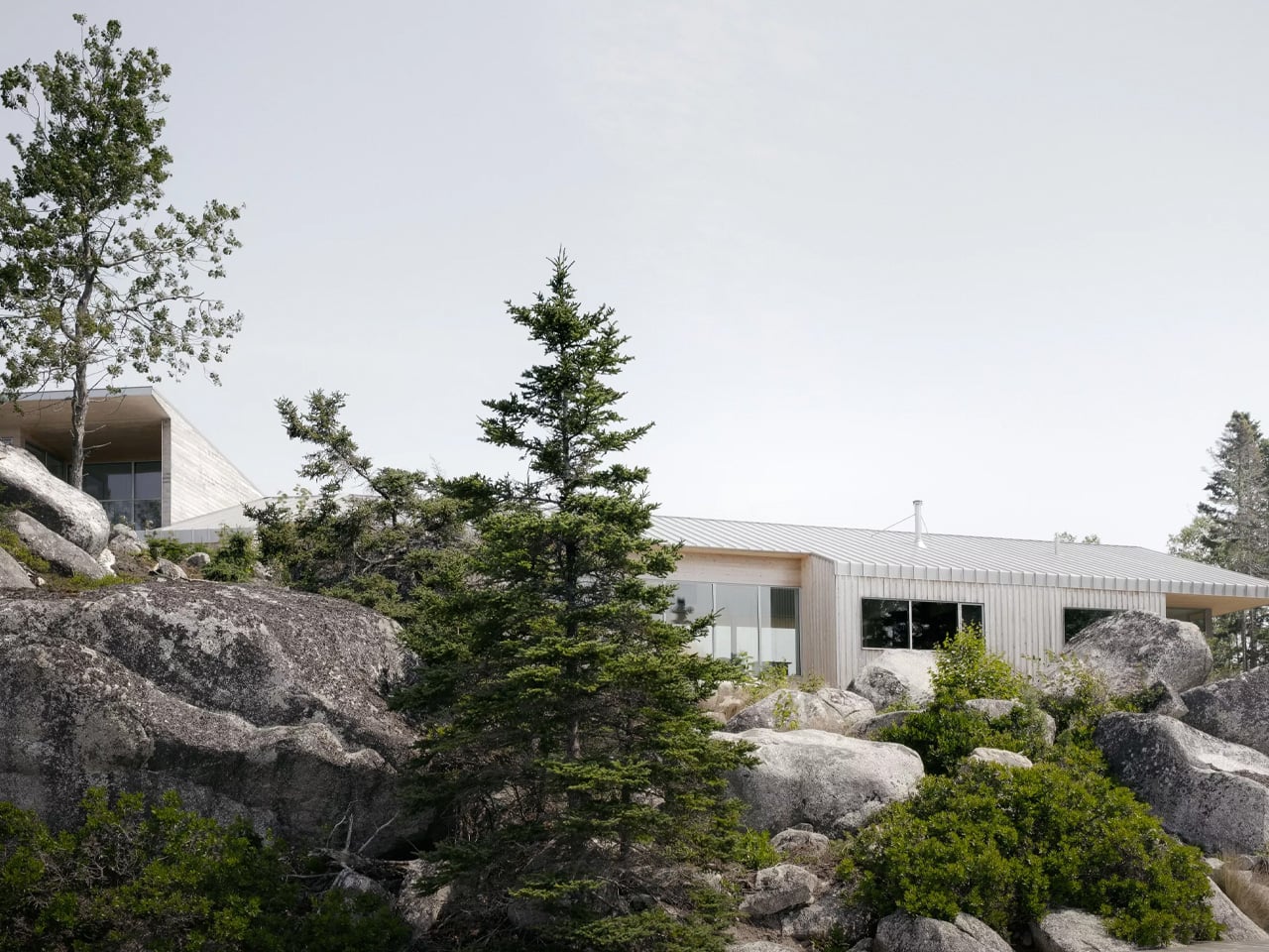
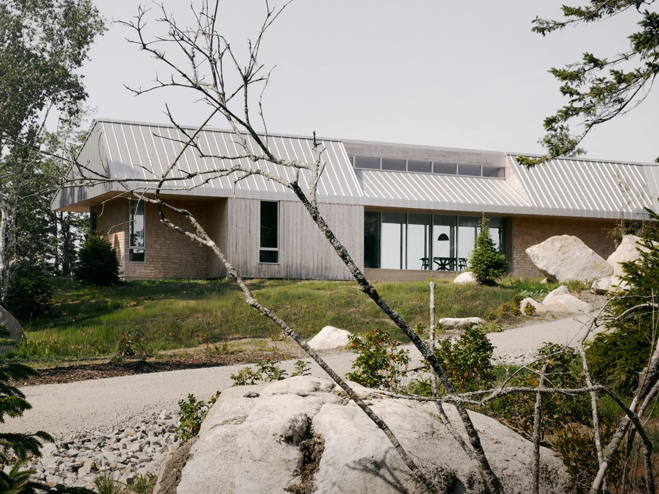
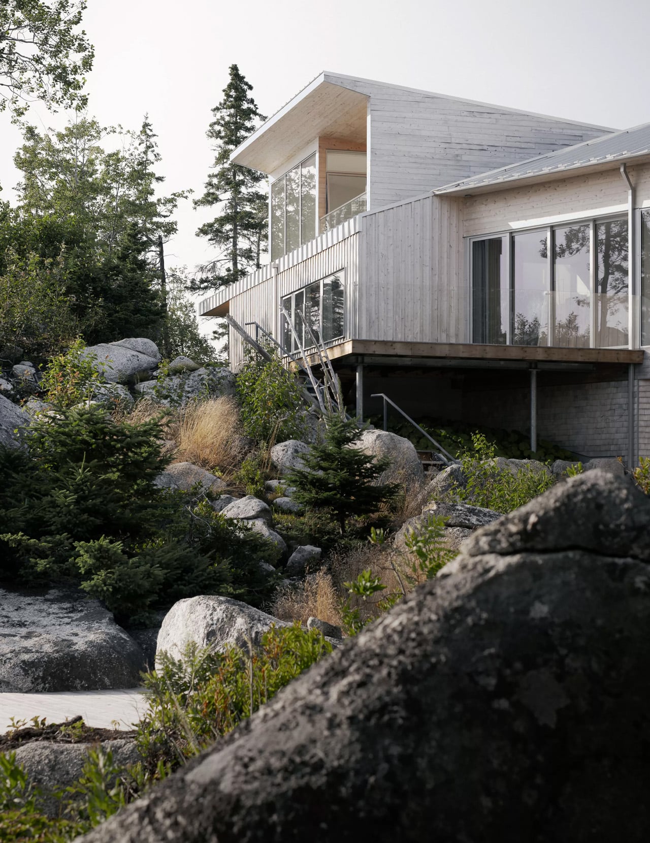
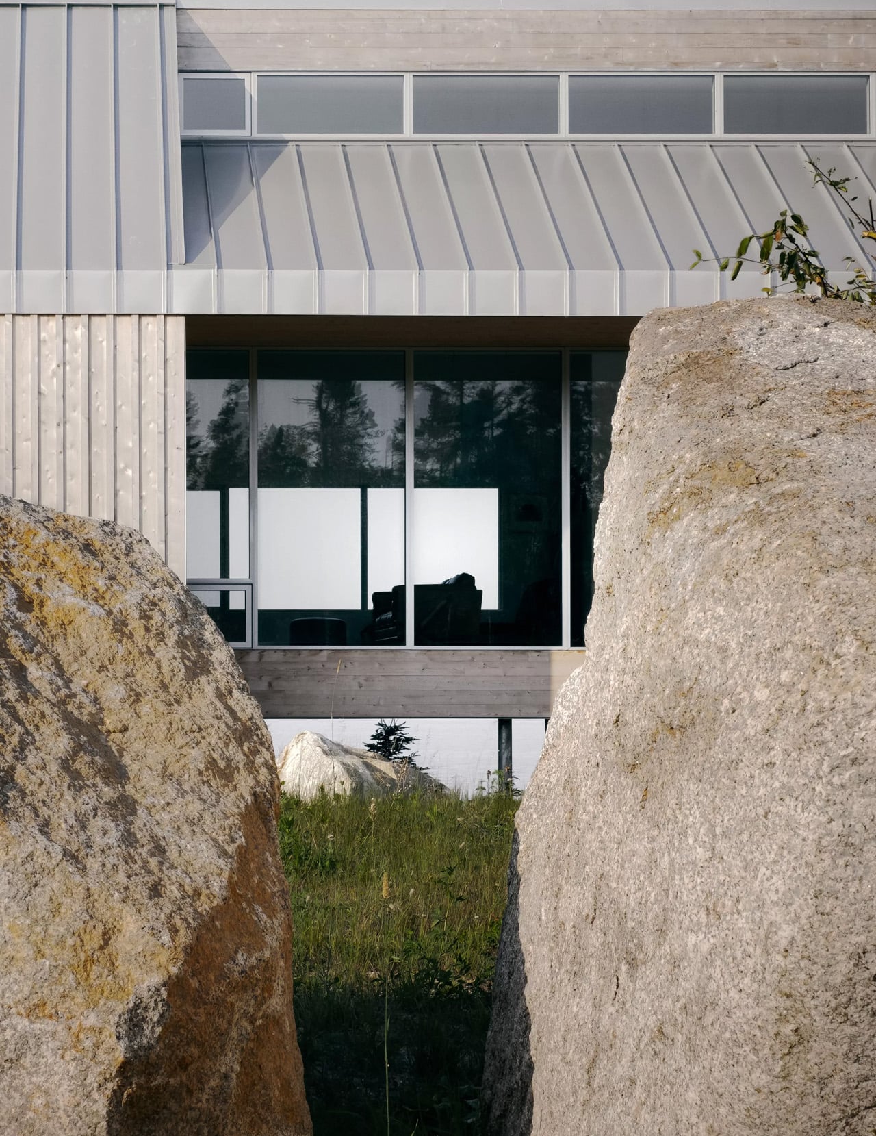
There’s a certain restraint in the decision to let a building hover. Not every architect earns that move. Along the rugged Atlantic coastline of Nova Scotia, Canadian studio Omar Gandhi Architects has completed the East River Residence — a home that doesn’t so much sit on the landscape as suspend itself above it, perched on slender steel columns that let the rocky terrain breathe freely underneath.

The project was conceived for a couple relocating from Montreal, trading city life for something quieter, more grounded, more defined by the presence of the Atlantic. On the first visit to the site, the architects followed the coastline inward through a dense stand of forest, arriving at a soft valley held between two steep, rocky inclines. That natural bowl — rather than being fought or filled — became the entire logic of the building.

Designer: Omar Gandhi Architects

The result is a home that reads like a bridge. It spans the depression between two embankments, and the terrain flows underneath it the way water would. Hidden from the shore by thick forest, the only way to encounter it is to go inland, walk along the coast, and let it reveal itself gradually — which feels entirely intentional. This isn’t a house that announces itself. It listens.

The roofline is where the architecture gets genuinely expressive. The gable follows the rhythm of the land below it — rising over the rocky outcrops, dipping low at the main living space to pull in southern light and create a sense of interior intimacy, then lifting again at the yoga studio to expand the room toward the sky. Each shift in section corresponds to a shift in how the space feels, and how the view outside changes with it.

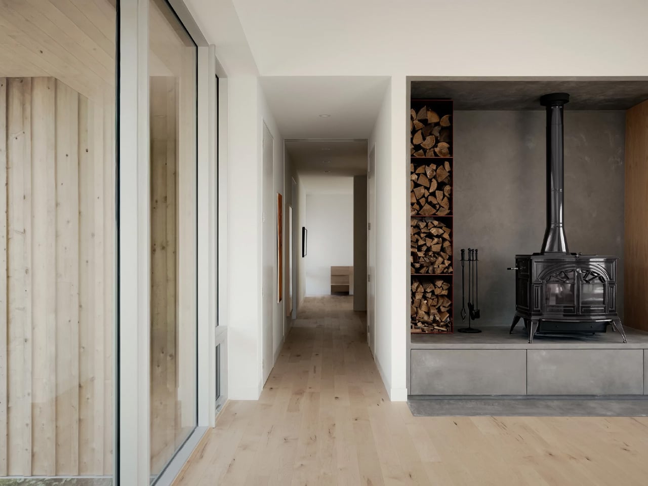
Materially, the home stays close to its coastal context. The palette is dark and restrained — chosen to disappear into the treeline rather than compete with it. Steel, wood, and shadow do most of the talking. The structure was built by Blueprint Construction with structural engineering by Design Point, and the technical execution of suspending a full residence above challenging terrain is considered as the architecture itself.

Photographed by Felix Michaud, the images capture something that most architecture photography misses: the feeling of a building that genuinely belongs where it is. The East River Residence isn’t trying to conquer its site. It’s floating above it, quietly, letting the land remain exactly what it was — which, as architectural philosophies go, is a rare and admirable one.

The post This Nova Scotia Home Floats Above the Land on Steel Legs and Changes Nothing Beneath It first appeared on Yanko Design.

This Nova Scotia Home Floats Above the Land on Steel Legs and Changes Nothing Beneath It

There’s a certain restraint in the decision to let a building hover. Not every architect earns that move. Along the rugged Atlantic coastline of Nova Scotia, Canadian studio Omar Gandhi Architects has completed the East River Residence — a home that doesn’t so much sit on the landscape as suspend itself above it, perched on slender steel columns that let the rocky terrain breathe freely underneath.

The project was conceived for a couple relocating from Montreal, trading city life for something quieter, more grounded, more defined by the presence of the Atlantic. On the first visit to the site, the architects followed the coastline inward through a dense stand of forest, arriving at a soft valley held between two steep, rocky inclines. That natural bowl — rather than being fought or filled — became the entire logic of the building.

Designer: Omar Gandhi Architects

The result is a home that reads like a bridge. It spans the depression between two embankments, and the terrain flows underneath it the way water would. Hidden from the shore by thick forest, the only way to encounter it is to go inland, walk along the coast, and let it reveal itself gradually — which feels entirely intentional. This isn’t a house that announces itself. It listens.

The roofline is where the architecture gets genuinely expressive. The gable follows the rhythm of the land below it — rising over the rocky outcrops, dipping low at the main living space to pull in southern light and create a sense of interior intimacy, then lifting again at the yoga studio to expand the room toward the sky. Each shift in section corresponds to a shift in how the space feels, and how the view outside changes with it.

Materially, the home stays close to its coastal context. The palette is dark and restrained — chosen to disappear into the treeline rather than compete with it. Steel, wood, and shadow do most of the talking. The structure was built by Blueprint Construction with structural engineering by Design Point, and the technical execution of suspending a full residence above challenging terrain is considered as the architecture itself.

Photographed by Felix Michaud, the images capture something that most architecture photography misses: the feeling of a building that genuinely belongs where it is. The East River Residence isn’t trying to conquer its site. It’s floating above it, quietly, letting the land remain exactly what it was — which, as architectural philosophies go, is a rare and admirable one.

The post This Nova Scotia Home Floats Above the Land on Steel Legs and Changes Nothing Beneath It first appeared on Yanko Design.

This Sharp-Cornered Lithuanian Home Only Exists Because Planning Rules Wrecked the Original Design

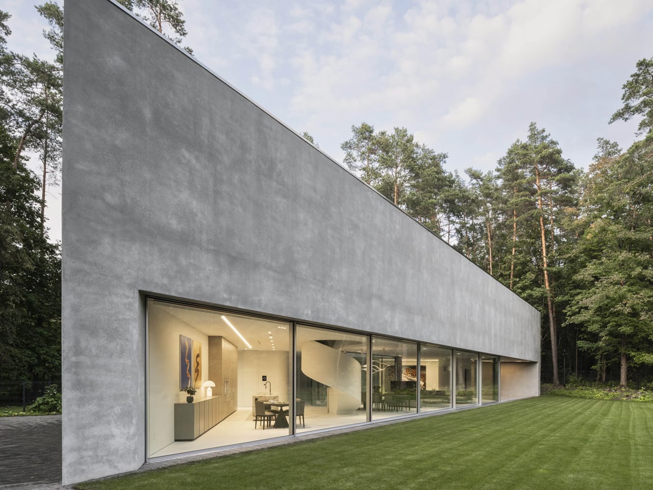
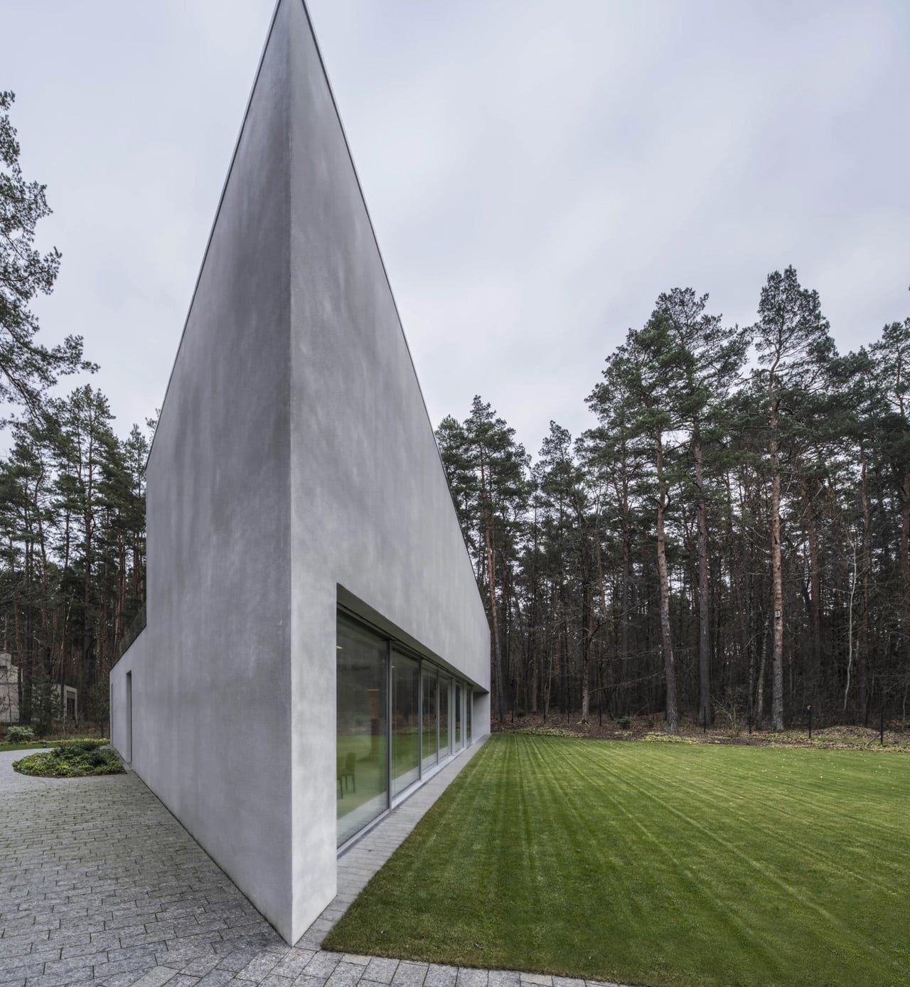
Most architects fold when the rules change. The Trim House by Polish firm KWK Promes, completed in 2025 in a forested suburb of Vilnius, Lithuania, is exactly that kind of project. It began in 2016, when KWK Promes, led by Robert Konieczny, won a closed competition to design a luxury single-family home on a wooded plot in suburban Vilnius. The site carried its own quiet history, once dotted with interwar wooden cottages that had long since disappeared, leaving behind open ground and a loose scatter of trees. What followed was a straightforward brief and an optimistic timeline. Then, mid-design, local planning regulations changed everything.

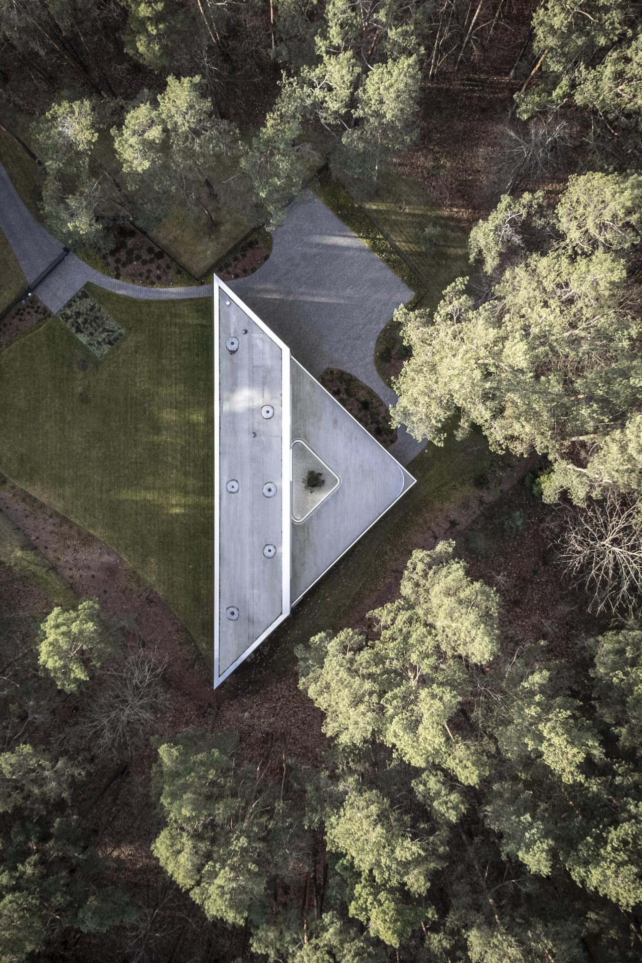
The allowable building footprint was slashed in half. The driveway was also repositioned, now cutting directly through the garden. The client’s instinct was to abandon the site altogether. KWK Promes had a different idea. Rather than retreat, the firm persuaded the client to stay, reduce the total area by 40%, and let the new constraints rewrite the geometry entirely. The result was a triangular floor plan, precise, deliberate, and oddly inevitable once you see it.

Designer: KWK Promes

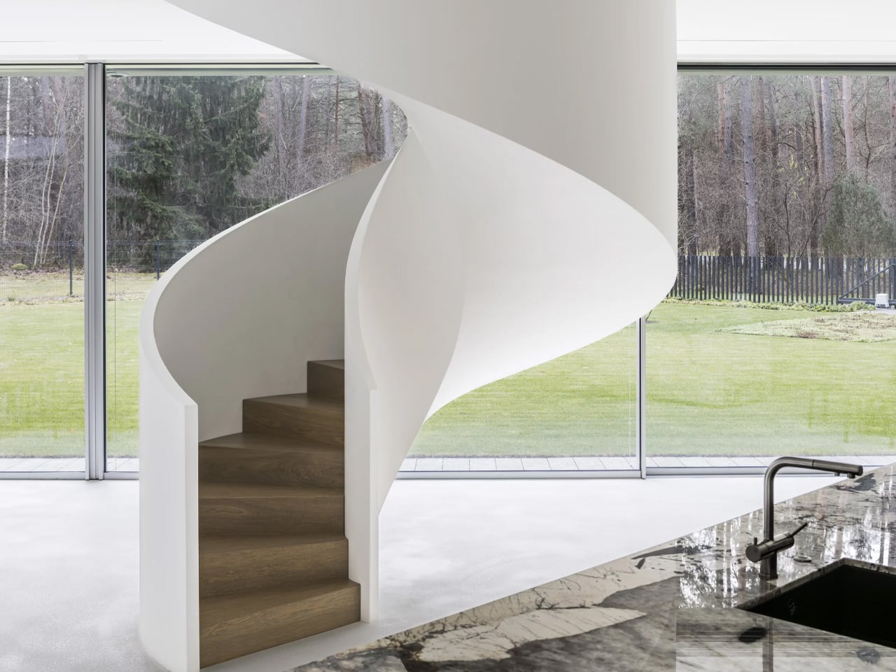
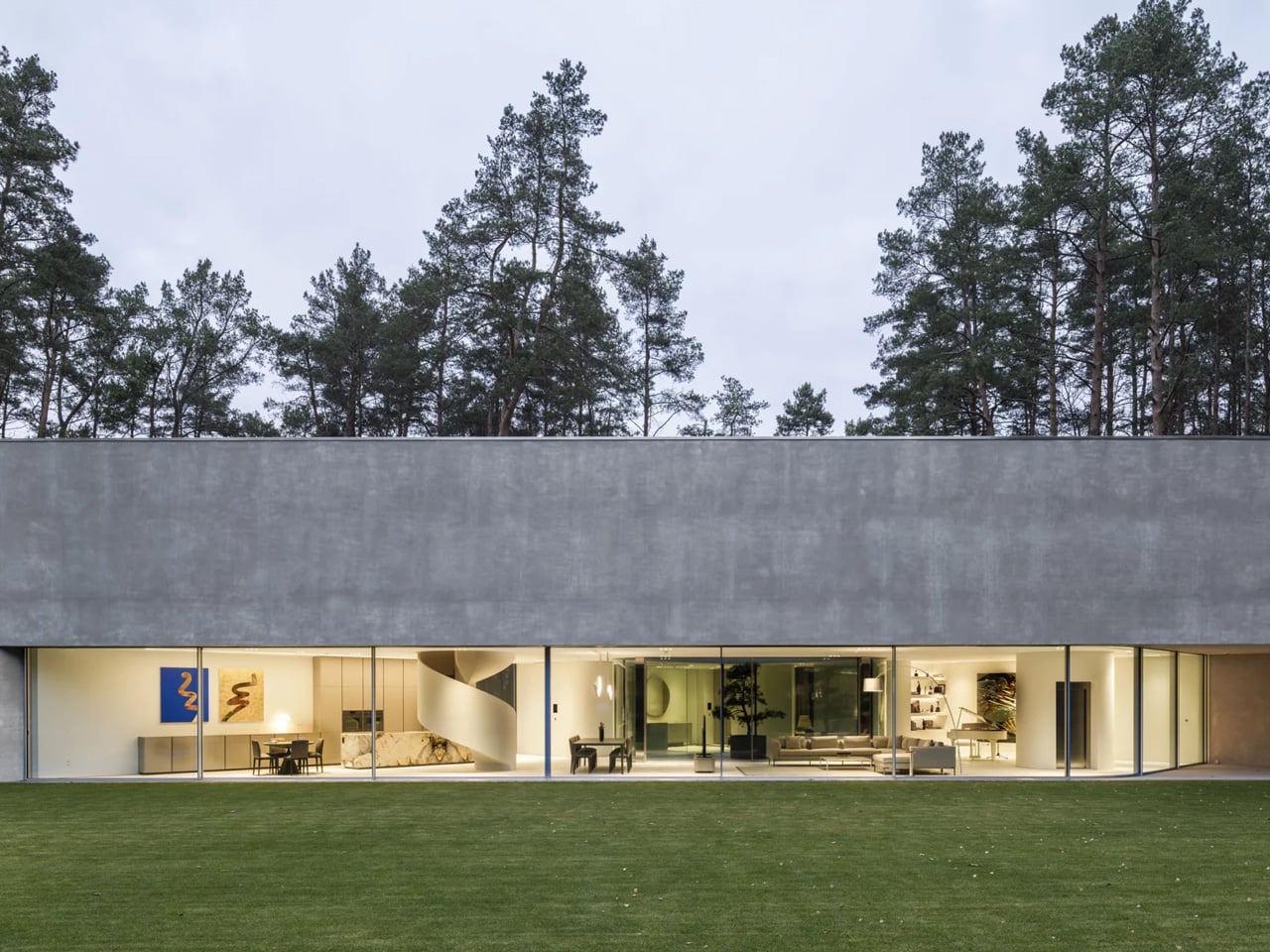
The name does exactly what it says. The house was trimmed. And in being trimmed, it became something far more interesting than the original design might have been. Spanning 299 square meters, the Trim House is a composition of concrete and glass, its sharpest corner cutting through the landscape like an ocean liner carving through ice. The most dramatic elevation reads almost like a flatiron building scaled down to domestic life, angular, taut, and satisfying in a way that’s hard to place. The surrounding pine trees press close, softening what could have felt severe.

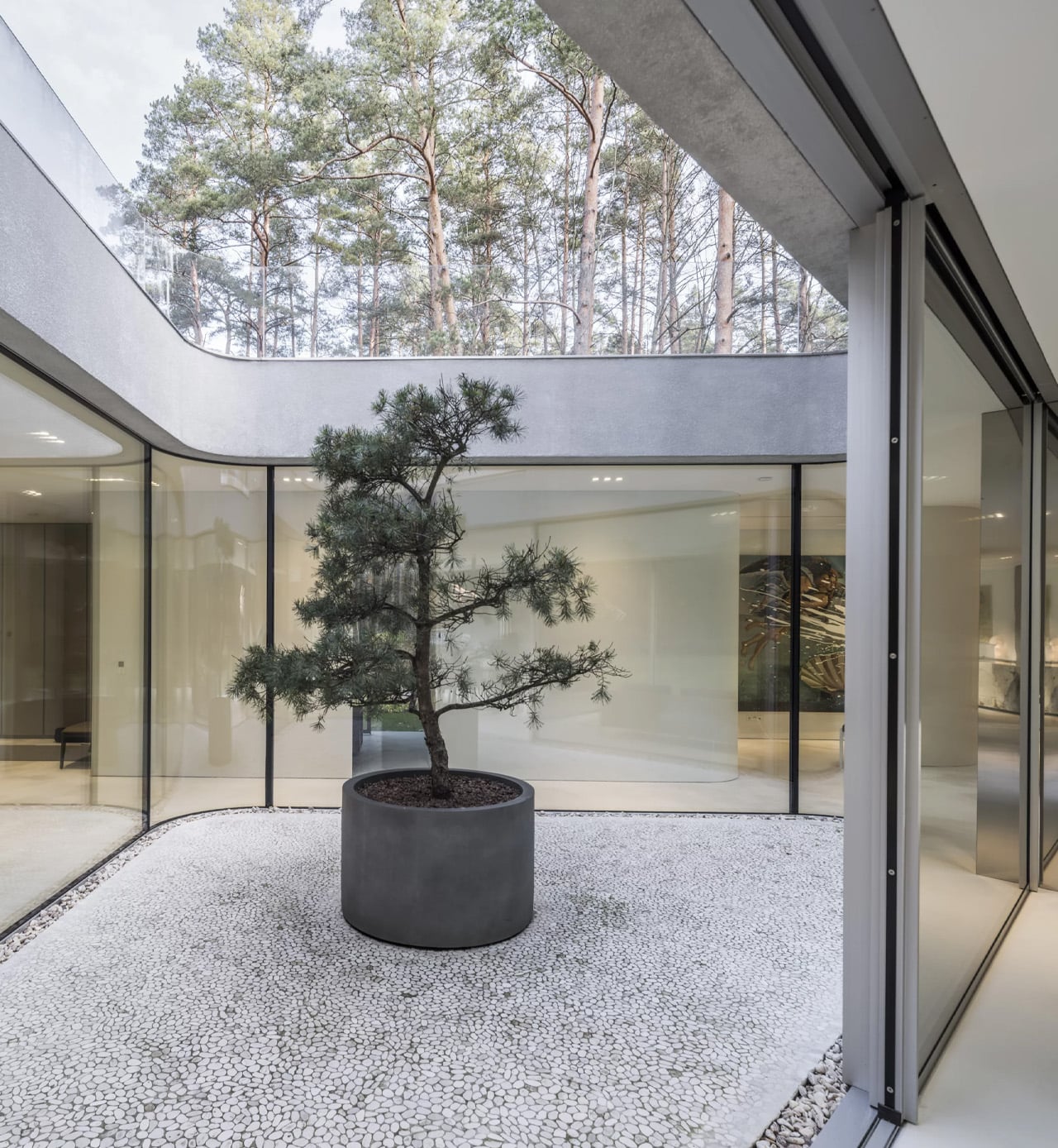
Inside, the two-level plan is organized around a central patio that pulls daylight deep into the heart of the structure. The ground floor holds the living spaces and opens seamlessly into the garden, while the raised first floor contains the private bedrooms, each with access to a terrace that sits above the ground-floor volume. The section plays the two zones off each other, the social, grounded, garden-facing level below, and the quieter, more elevated, view-oriented rooms above. Privacy and nature, held in careful balance.

What makes the Trim House worth paying attention to isn’t just its sculptural confidence. It’s the story behind the form. Constraints aren’t obstacles but essential drivers of innovation, as KWK Promes put it. The Trim House makes that argument with concrete and glass, and it’s hard to argue back.

The post This Sharp-Cornered Lithuanian Home Only Exists Because Planning Rules Wrecked the Original Design first appeared on Yanko Design.

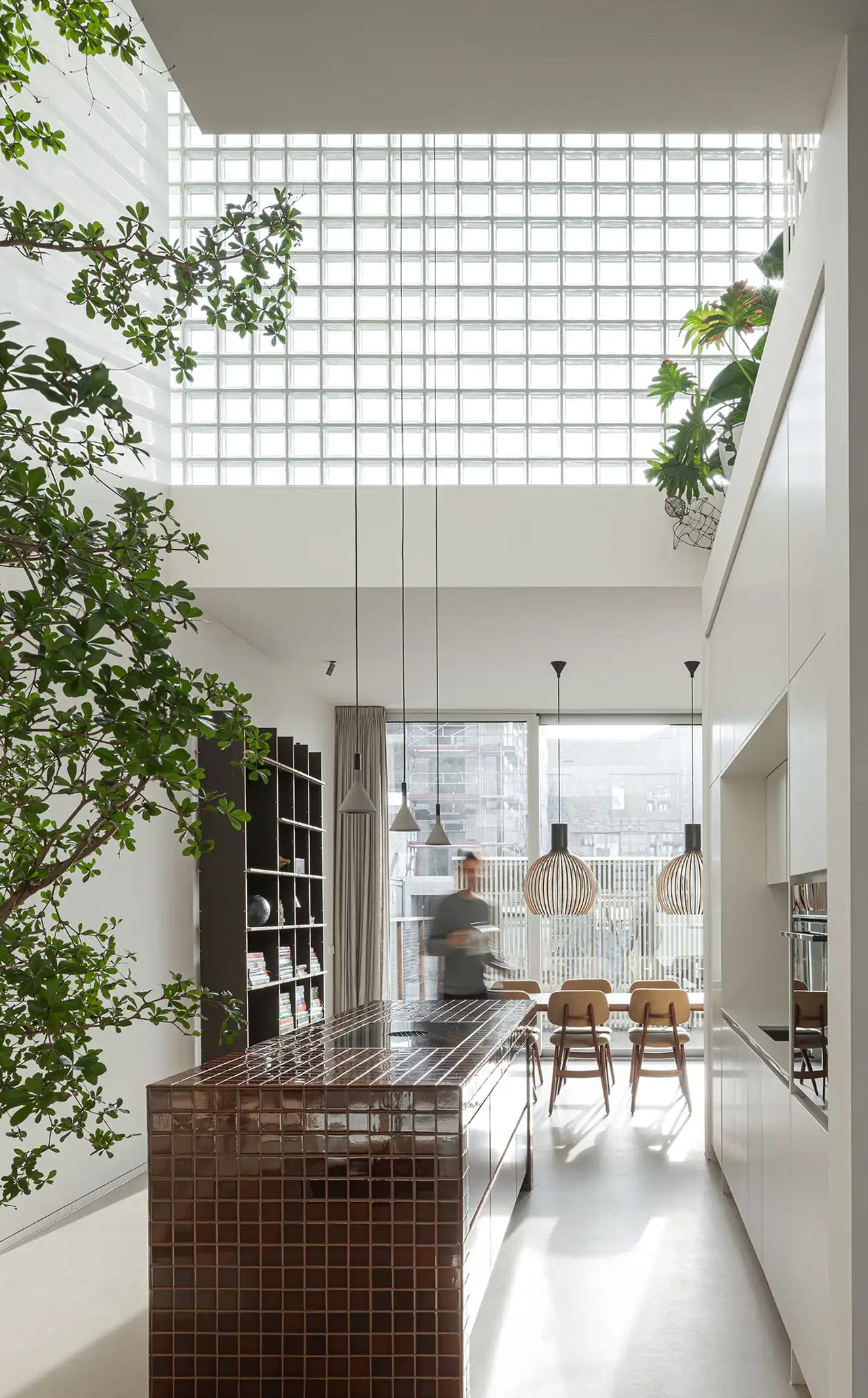
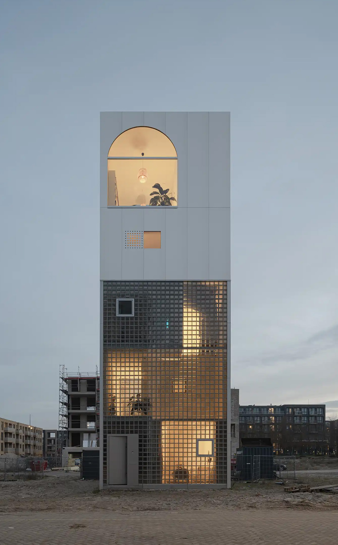
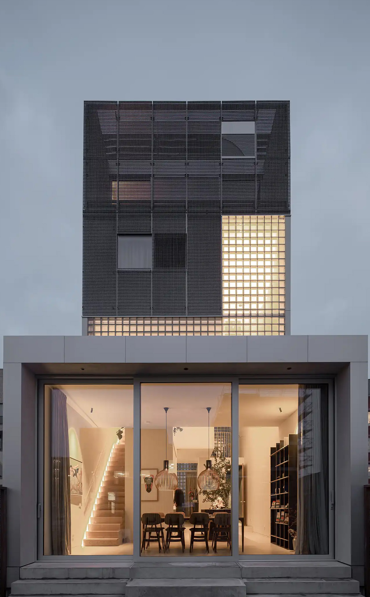
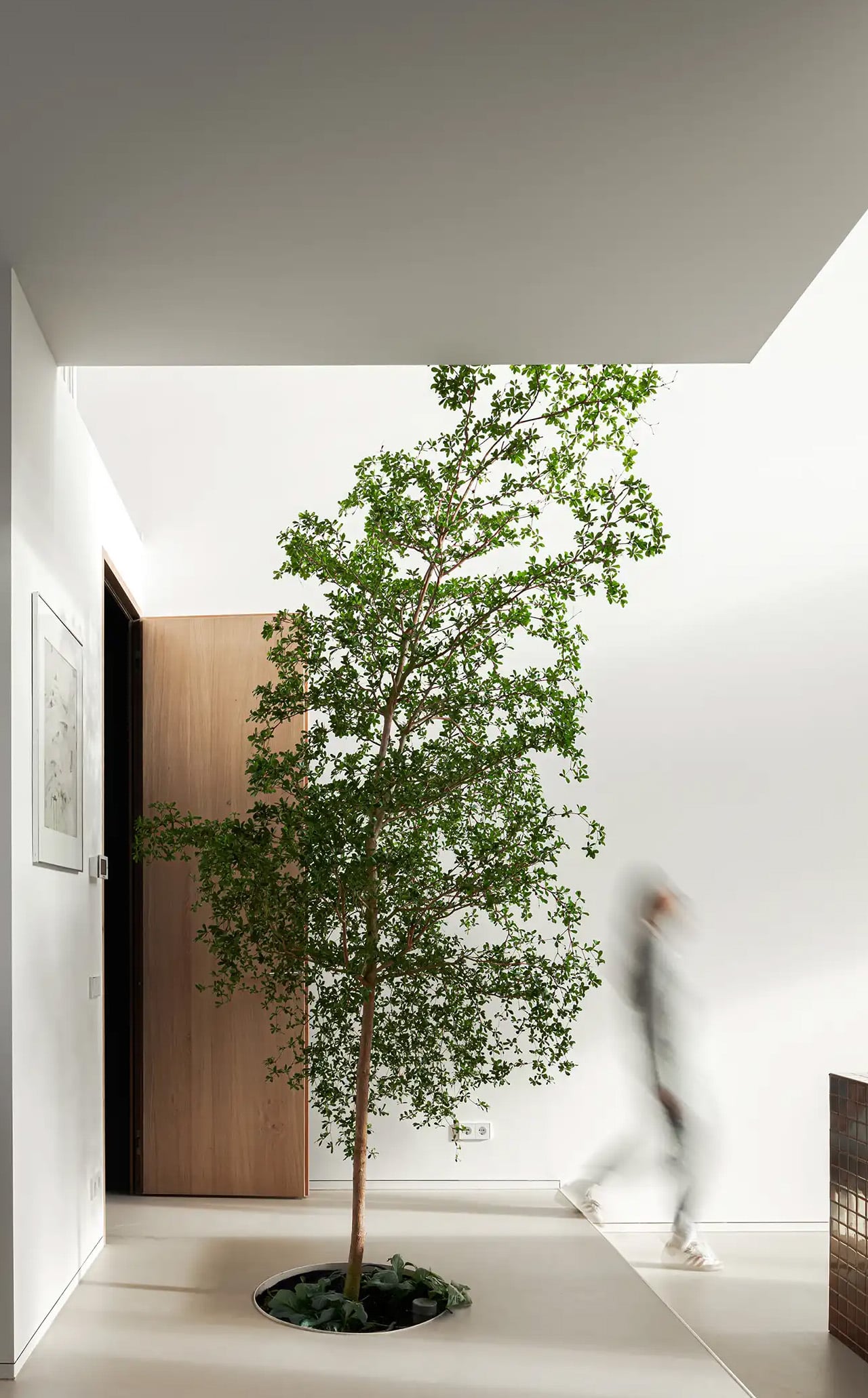
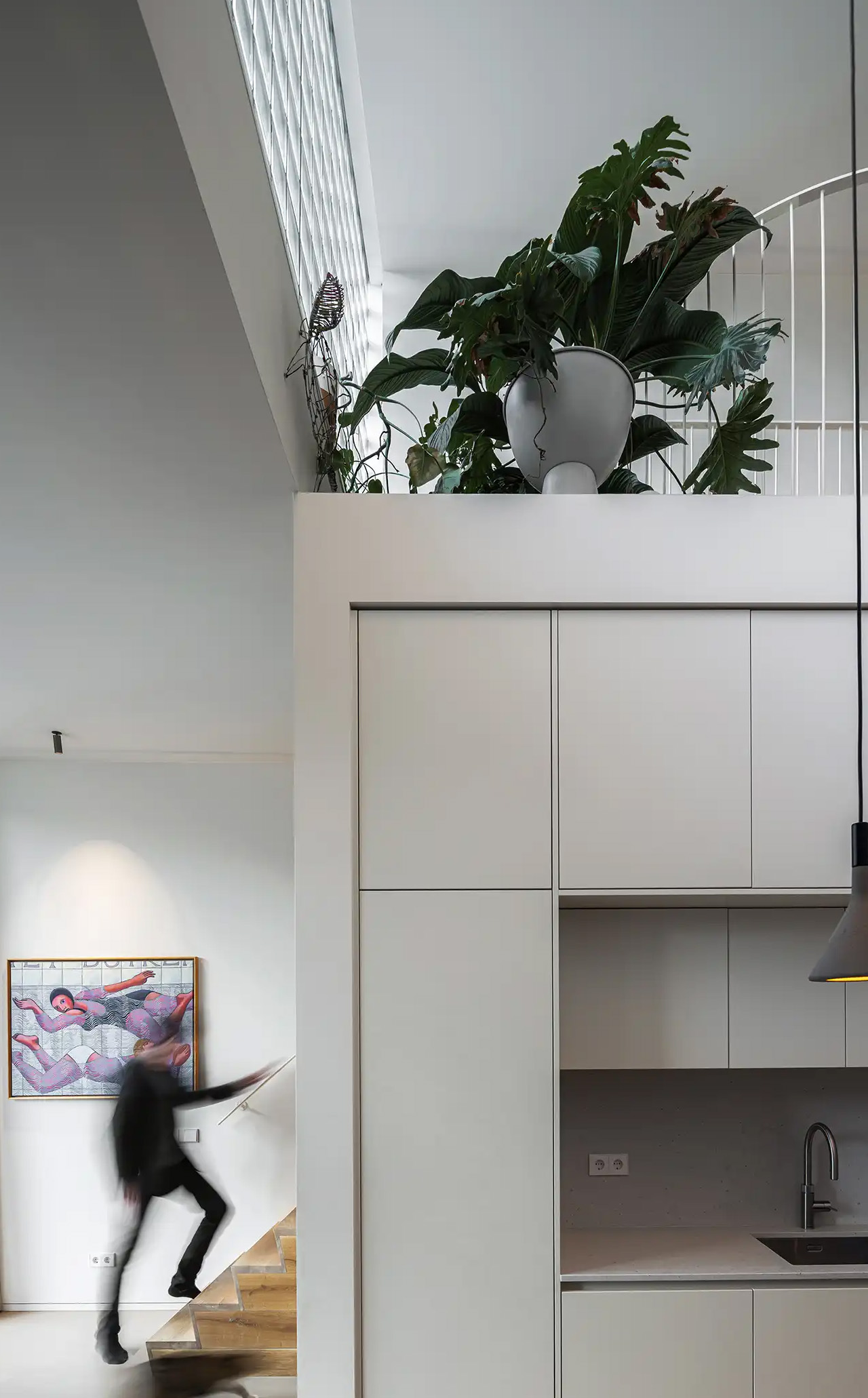
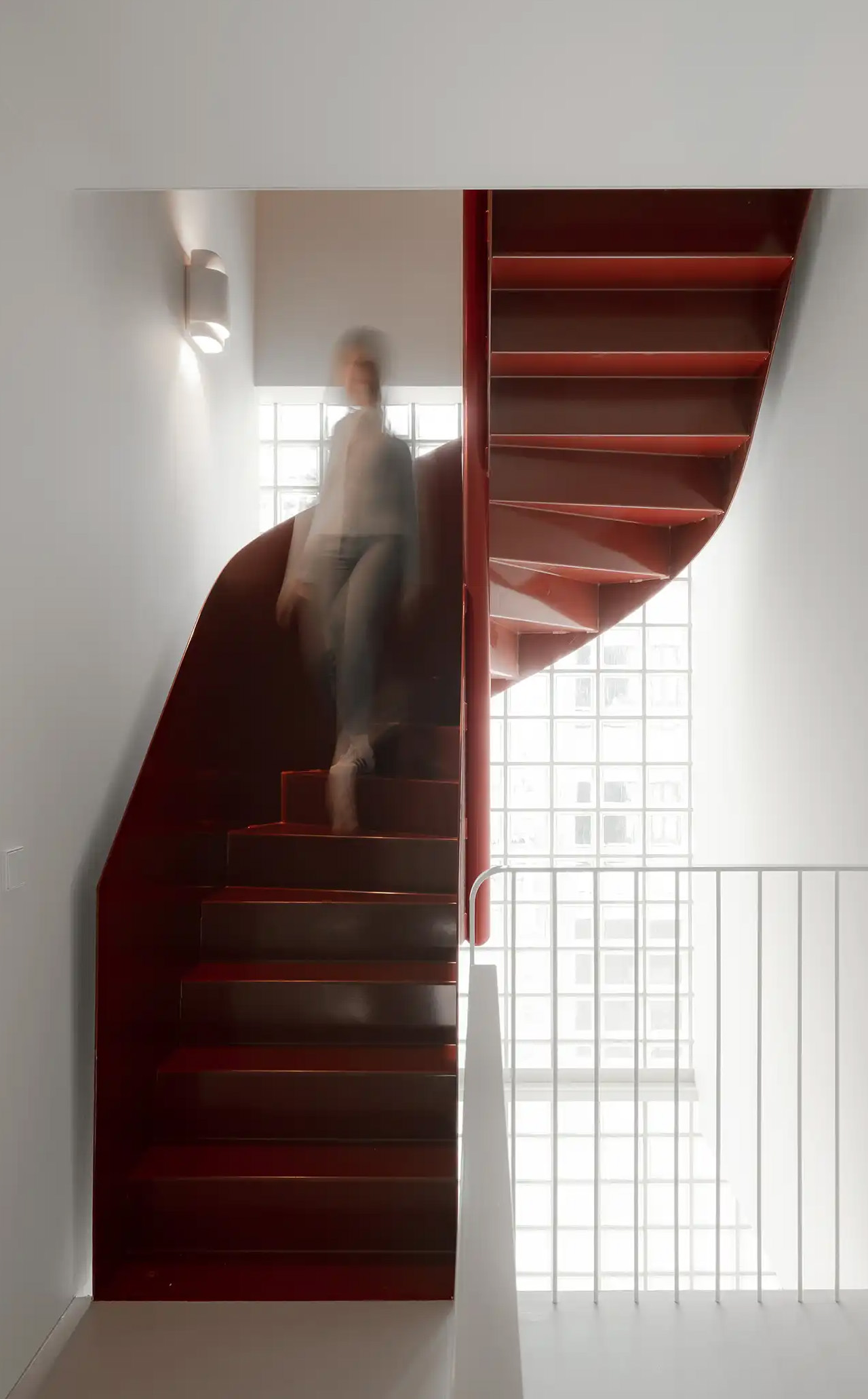
Studioninedots’ Light House Is a Vertical Amsterdam Home Built From Playfully Stacked Boxes

What does a home look like when you throw out the floor plan entirely? For Amsterdam-based firm Studioninedots, the answer is a tower of playfully stacked boxes, each one dedicated to a single moment in life, that rises above one of the Dutch capital’s newest neighborhoods. Completed in 2025, Light House sits on Centrumeiland, a newly developed artificial island district defined by its self-build culture and strong sustainability ambitions.

The project began with a simple brief from a couple with two children who wanted a home that would genuinely bring them together. Rather than anchoring daily life to the ground floor the way most houses do, Studioninedots dedicated each of the family’s key activities — eating, gathering, cooking, relaxing — to its own distinct volume, then arranged those volumes vertically into a single, tightly considered composition. The result is a 257-square-meter residence that feels less like a stacked building and more like a small vertical neighborhood.

Designer: Studioninedots

Movement through the home unfolds through a sequence of open passages and compressed zones, where shifts in scale produce entirely different spatial moods. Smaller, enclosed areas carve out space for focused, quieter activities, while larger voids open up visual connections across levels, dissolving any conventional sense of what is above and what is below. Hovering above the kitchen is a sheltered, secluded volume ideal for yoga or film watching, while the journey through the house culminates at the top in what the architects describe as a “holiday home” within the city. Flanked by arched ceiling-height glass openings, this 14-metre-high gathering room commands panoramic views across the IJmeer lake.

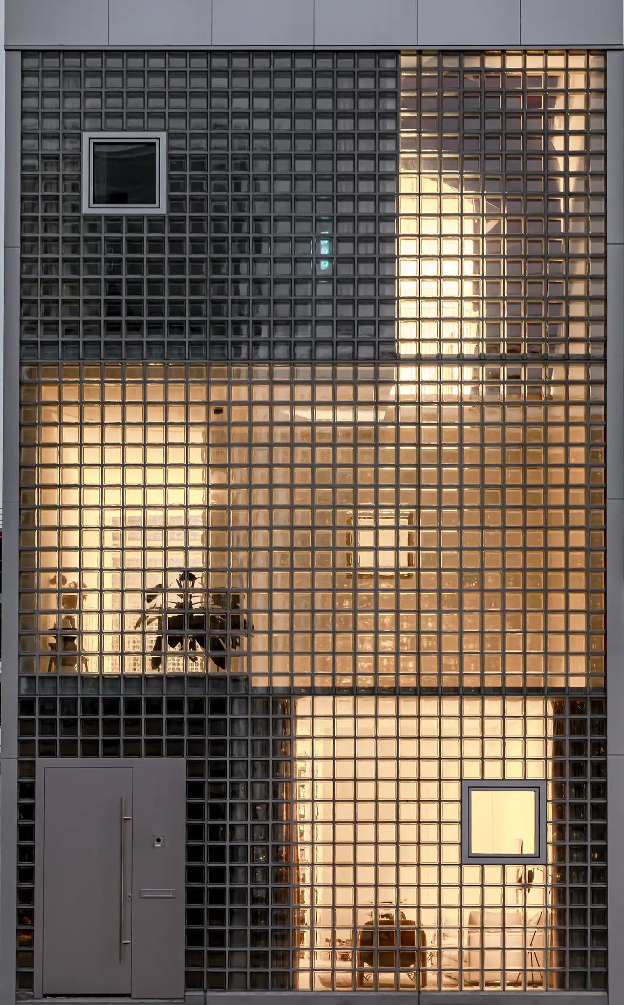
The facade does a lot of the design’s heavy lifting. A wall of square glass blocks wraps the front of the building, filtering natural light into the interior while abstracting the life inside, offering privacy without sacrificing the warmth of daylight. At night, the facade glows from within, giving the house an almost lantern-like presence on the street.

Sustainability is baked into the structure itself. Light House is built as a lightweight system using prefabricated timber components inside a steel frame, a circular and modular method that allows for flexibility, long-term adaptability, and ease of disassembly. The layout is not fixed either, as children grow and priorities shift, the home can be reconfigured to meet whatever the family needs next. Light House is a rare thing: a home that feels entirely personal yet completely considered, one where architecture quietly gets out of the way and lets life fill the space.

The post Studioninedots’ Light House Is a Vertical Amsterdam Home Built From Playfully Stacked Boxes first appeared on Yanko Design.

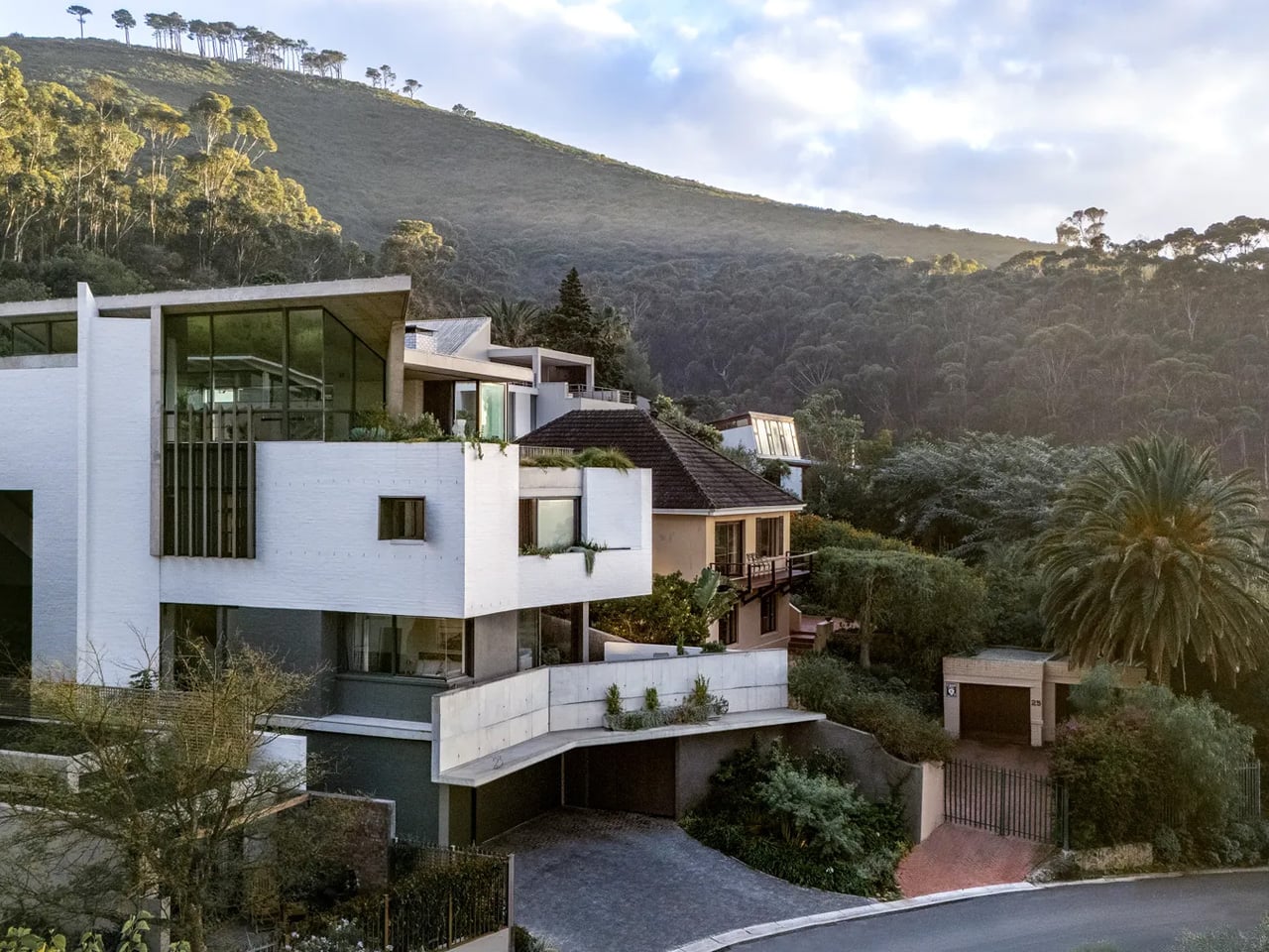
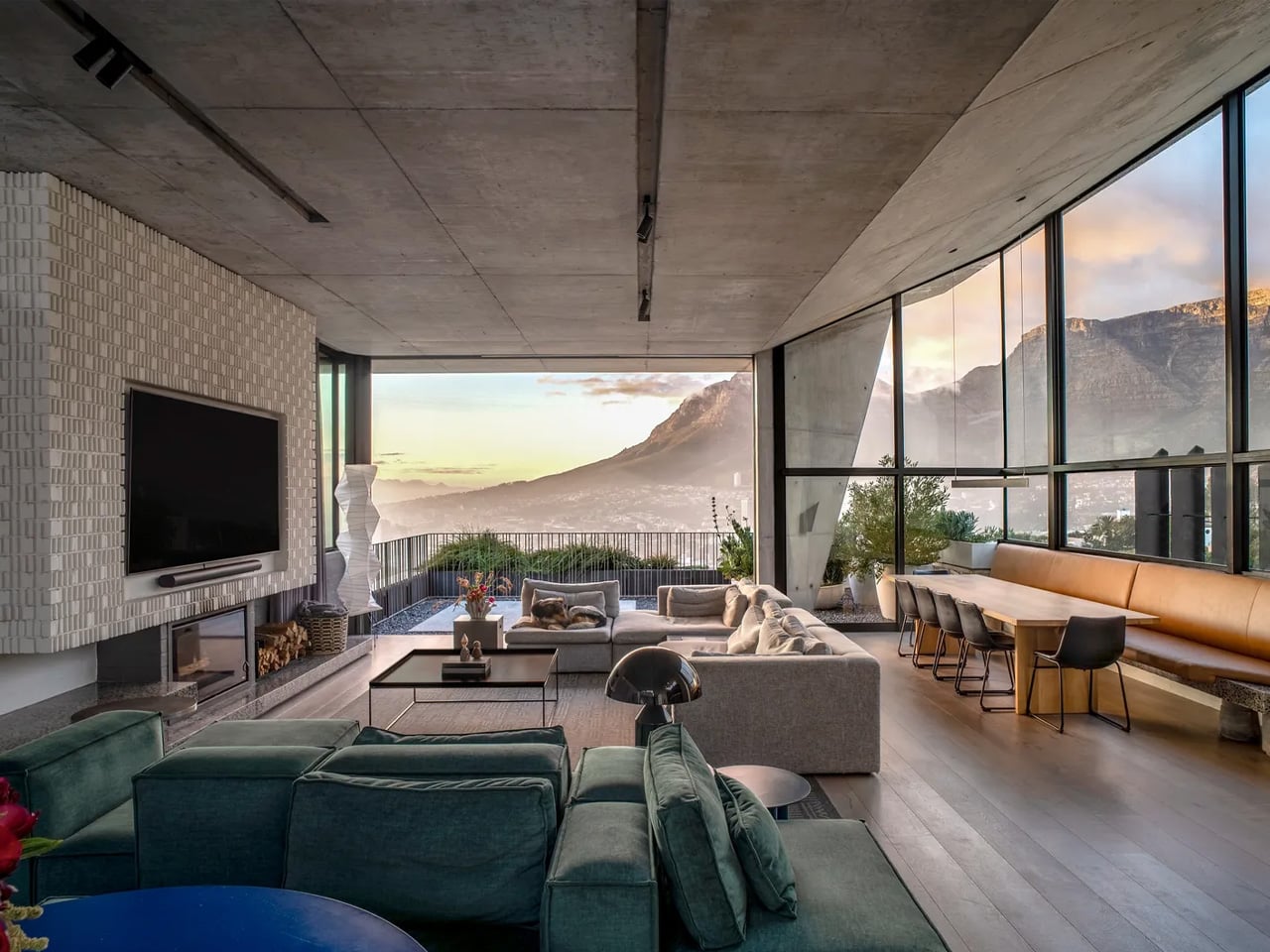
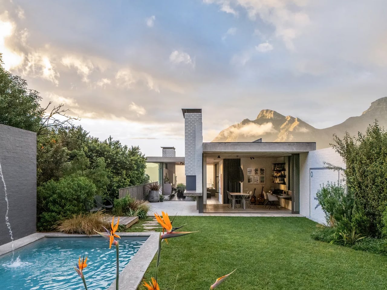
SAOTA’s Kenmore Proves You Don’t Have to Sacrifice Space for an Impossibly Narrow Cape Town Hillside

When Mark Bullivant, principal at South African architecture studio SAOTA, came across a steep, impossibly narrow plot in Cape Town’s Tamboerskloof neighborhood, most architects would have walked away. He bought it. The result is Kenmore — a personal home that quietly dismantles every assumption about what a tight site can hold.

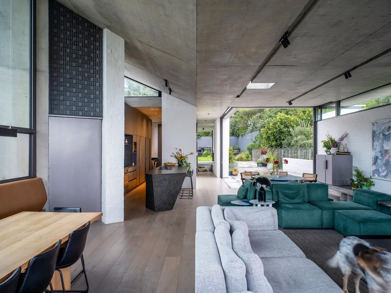
The numbers tell their own story. The plot stretches 58 meters long but only 14 meters wide, with the interior reaching a maximum width of just 7.44 meters. An existing structure occupied the land when Bullivant acquired it, but it was dark, fragmented, and unwieldy — torn down to make room for something entirely more considered. What replaced it sits on the hillside like a long, quiet exhale: terraces extending outward, oversized windows framing the landscape, a home that reads less like a building and more like a vantage point.

Designer: SAOTA Architecture Studio

That framing was intentional. The most compelling views fall on the short sides of the property — east toward Table Mountain and west toward Signal Hill and the national park behind it. The architecture is organized entirely around those two axes, turning the site’s constraints into its greatest asset. Rather than fighting the narrow footprint, the design leans into it — producing a continuous, open living space that flows visually from front to back, resisting the fragmentation that plagued the original structure.

The decision to elevate the primary living level to the top of the house was driven by more than views. Placing it there allowed the home to connect directly to the landscape of Signal Hill and maximize sunlight — a critical move given the site’s limited northern exposure. It also made room for a meaningful garden, something Bullivant had set as a core ambition from the very beginning. What could have been a rooftop afterthought becomes, instead, a living threshold between architecture and the mountain that cradles it.

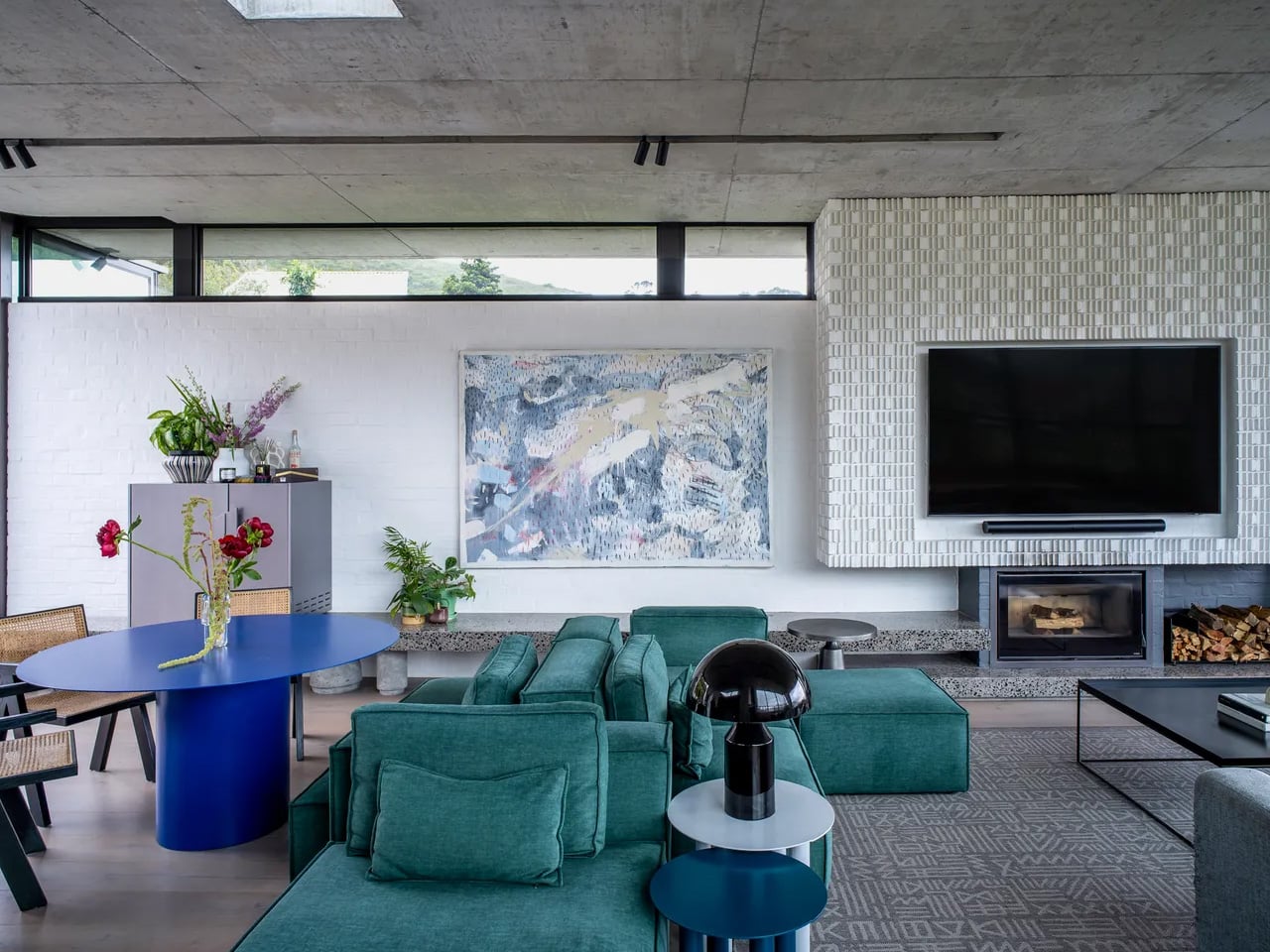
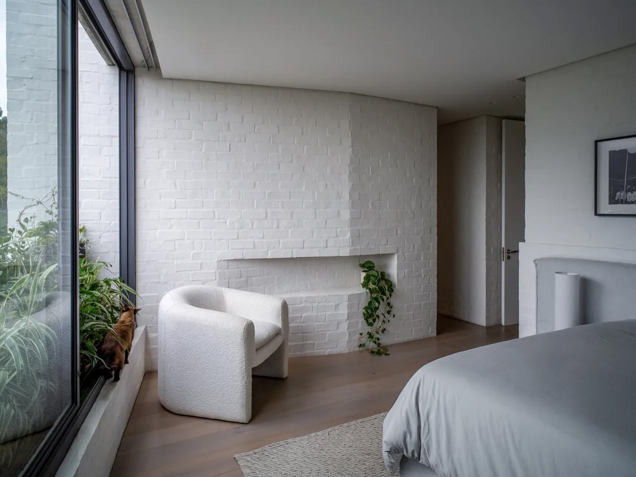
Spanning three levels with five bedrooms, the home never feels like a corridor with rooms attached. Bullivant was deliberate about that. He has never been drawn to living environments defined by a sequence of small, closed-off rooms — and the constraints of the site only pushed that instinct further. The communal spaces are fluid and generous, a pointed rebuttal to the idea that a narrow house must feel narrow.

Kenmore is, in many ways, SAOTA’s philosophy made domestic. The firm has built its reputation on reading a site’s limitations as a design mandate rather than a compromise. Bullivant just happened to live that philosophy out this time — quite literally. The house doesn’t just sit within its difficult terrain. It belongs to it.

The post SAOTA’s Kenmore Proves You Don’t Have to Sacrifice Space for an Impossibly Narrow Cape Town Hillside first appeared on Yanko Design.

SAOTA’s Kenmore Proves You Don’t Have to Sacrifice Space for an Impossibly Narrow Cape Town Hillside

When Mark Bullivant, principal at South African architecture studio SAOTA, came across a steep, impossibly narrow plot in Cape Town’s Tamboerskloof neighborhood, most architects would have walked away. He bought it. The result is Kenmore — a personal home that quietly dismantles every assumption about what a tight site can hold.

The numbers tell their own story. The plot stretches 58 meters long but only 14 meters wide, with the interior reaching a maximum width of just 7.44 meters. An existing structure occupied the land when Bullivant acquired it, but it was dark, fragmented, and unwieldy — torn down to make room for something entirely more considered. What replaced it sits on the hillside like a long, quiet exhale: terraces extending outward, oversized windows framing the landscape, a home that reads less like a building and more like a vantage point.

Designer: SAOTA Architecture Studio

That framing was intentional. The most compelling views fall on the short sides of the property — east toward Table Mountain and west toward Signal Hill and the national park behind it. The architecture is organized entirely around those two axes, turning the site’s constraints into its greatest asset. Rather than fighting the narrow footprint, the design leans into it — producing a continuous, open living space that flows visually from front to back, resisting the fragmentation that plagued the original structure.

The decision to elevate the primary living level to the top of the house was driven by more than views. Placing it there allowed the home to connect directly to the landscape of Signal Hill and maximize sunlight — a critical move given the site’s limited northern exposure. It also made room for a meaningful garden, something Bullivant had set as a core ambition from the very beginning. What could have been a rooftop afterthought becomes, instead, a living threshold between architecture and the mountain that cradles it.

Spanning three levels with five bedrooms, the home never feels like a corridor with rooms attached. Bullivant was deliberate about that. He has never been drawn to living environments defined by a sequence of small, closed-off rooms — and the constraints of the site only pushed that instinct further. The communal spaces are fluid and generous, a pointed rebuttal to the idea that a narrow house must feel narrow.

Kenmore is, in many ways, SAOTA’s philosophy made domestic. The firm has built its reputation on reading a site’s limitations as a design mandate rather than a compromise. Bullivant just happened to live that philosophy out this time — quite literally. The house doesn’t just sit within its difficult terrain. It belongs to it.

The post SAOTA’s Kenmore Proves You Don’t Have to Sacrifice Space for an Impossibly Narrow Cape Town Hillside first appeared on Yanko Design.

A Forgotten Modernist’s Sonoma Masterpiece Finally Gets the Restoration It Deserved

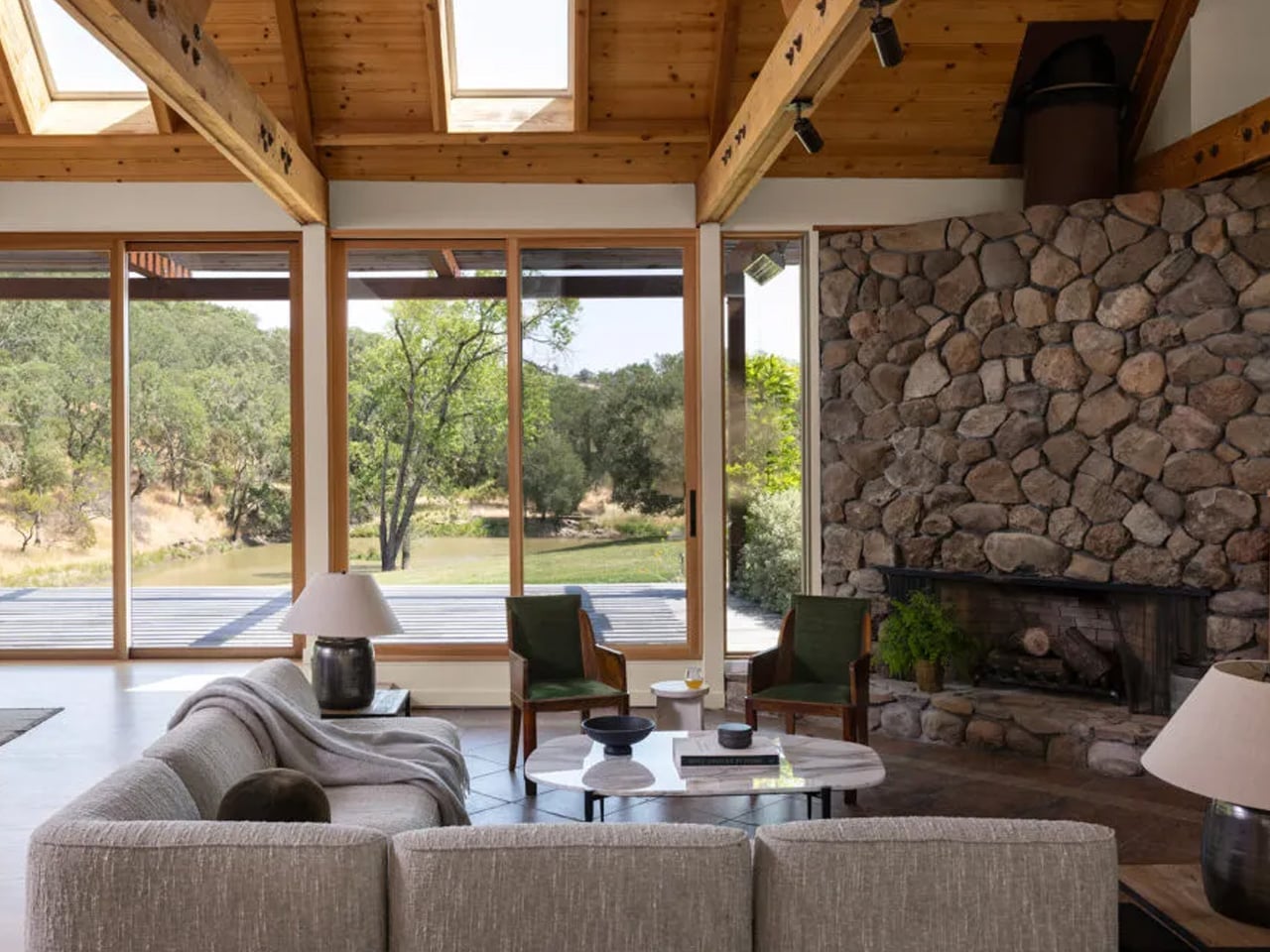
Tucked into the rolling hills of Glen Ellen in Sonoma County, a 14-acre estate carries the kind of stillness that most people spend a lifetime chasing. The land has its own private lake, wildlife moving freely at every hour, and a canopy of Northern California nature that presses in from every direction. At its center sits a house — modest in its ambitions but precise in its relationship to the ground beneath it.

That precision traces back to its original designer, J. Lamont Langworthy, an architect whose name sits just outside the mainstream conversation about California Modernism despite a body of work that more than earns a place in it. Langworthy spent a decade designing hillside homes in Laguna Beach, developing a philosophy rooted in site sensitivity and structural clarity. Architecture critic Alan Hess described his work as carrying a disciplined spatial intelligence — houses that didn’t impose themselves on their environments but instead grew out of them organically.

Designer: J.Lamont Langworthy

Langworthy himself is as layered as his architecture. A home winemaker, sculptor, painter, and self-published author, he eventually settled in Sonoma County, where he spent years managing a century-old building he had personally renovated. The Glen Ellen house represents an earlier chapter of his career — one that, by the time the current owners purchased the property in 2014, had quietly come to an end. The architecture still held its shape, but years of neglect had taken a toll on everything surrounding it.

The renovation was handed to Westward Atelier, whose approach mirrored the same instinct Langworthy brought to the original design — let the land lead. Principal Nikki spoke about the project with the reverence the setting demands, describing the property as something her clients recognized immediately as rare. The brief wasn’t to modernize or reimagine from scratch. It was to restore confidence to a house that had lost it, while preserving the spatial logic that made it worth saving in the first place.

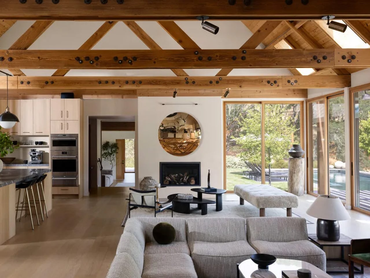
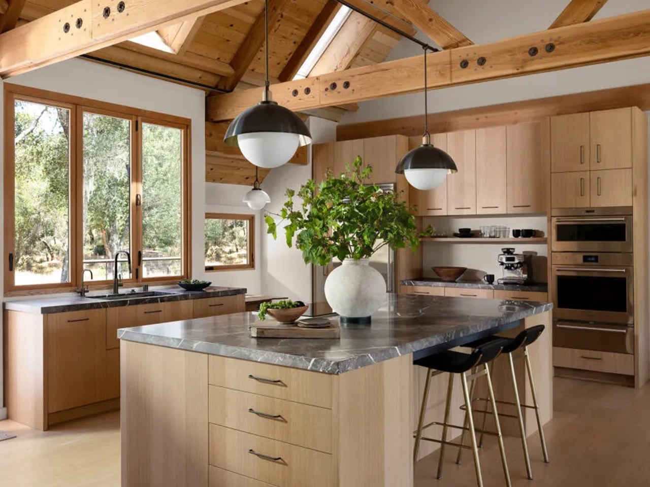
Inside, the most significant transformation occurred in the kitchen. What had been a closed, compartmentalized room was opened to the main living area, with a natural stone island becoming the new visual and social anchor of the space. Concrete countertops and timber cabinetry were paired with bronze hardware and brass fixtures, pulling warmth into what could have easily read as cold. A collection of Southwestern pottery arranged on open shelving added personality without noise, while white oak floors carried the palette quietly through the rest of the home.

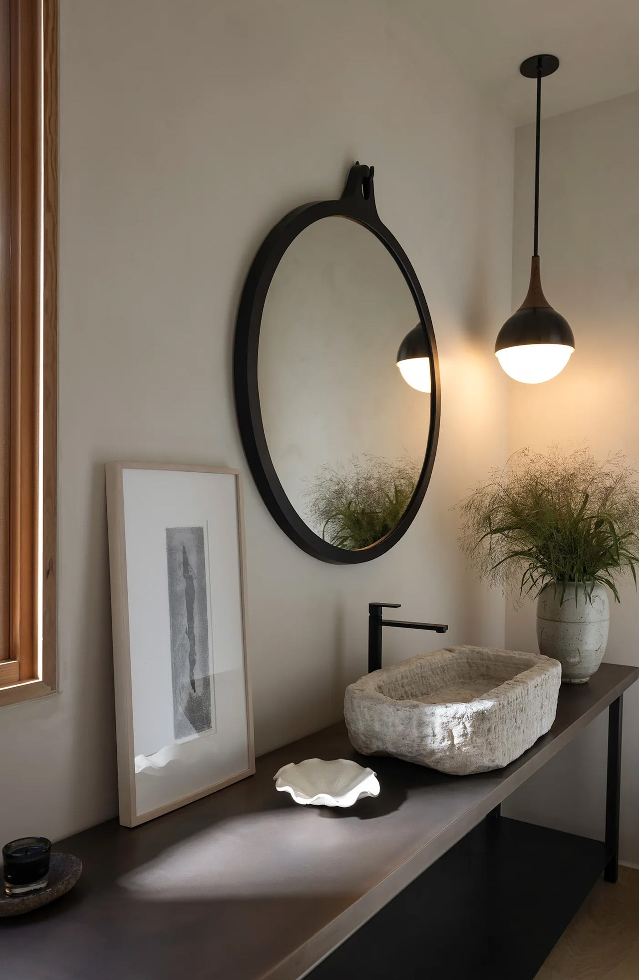
The primary suite presented its own challenge. Rather than reconfigure the existing bedroom, the team added a new north-facing suite designed entirely around calm and privacy. The original master was then converted into a communal gathering space oriented toward the sweeping outdoor views — a decision that rebalanced the whole home around generosity rather than hierarchy. Creamy white walls, marble surfaces, and expansive glass throughout keep the interior quiet enough that the lake, the trees, and the wildlife beyond the windows remain, always, the main event.

The post A Forgotten Modernist’s Sonoma Masterpiece Finally Gets the Restoration It Deserved first appeared on Yanko Design.
This Iconic Australian Bush House Just Hit the Market for the First Time in Over 40 Years

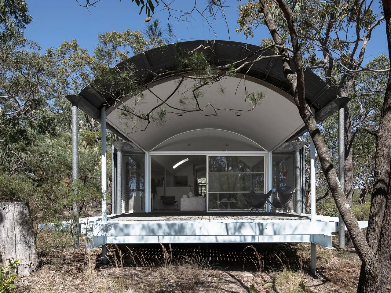
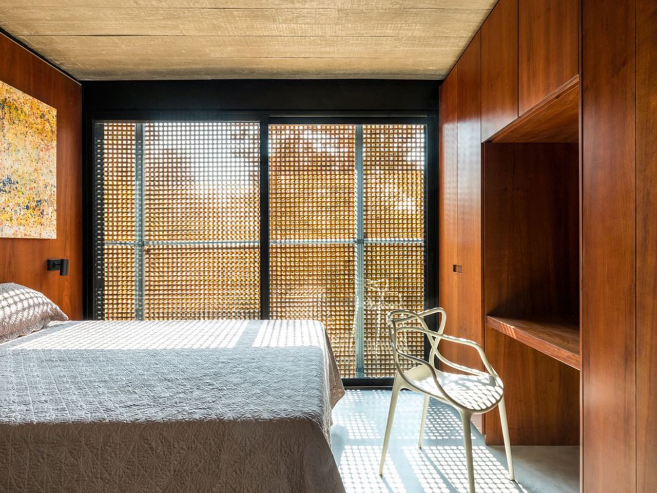
For the first time since its completion in 1983, one of Australia’s most architecturally significant homes is available to buy. The Ball-Eastaway House, designed by Pritzker Prize-winning architect Glenn Murcutt, has been listed with Modern House at a guide price of AUD 2.4 to 2.6 million, an extraordinary opportunity to own a piece of living architectural history.

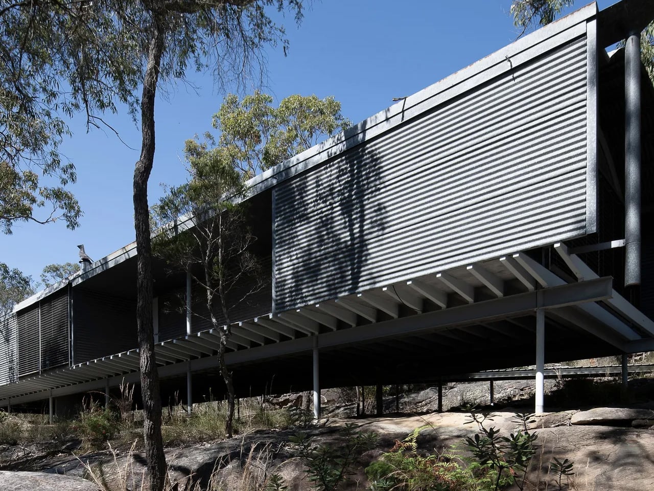
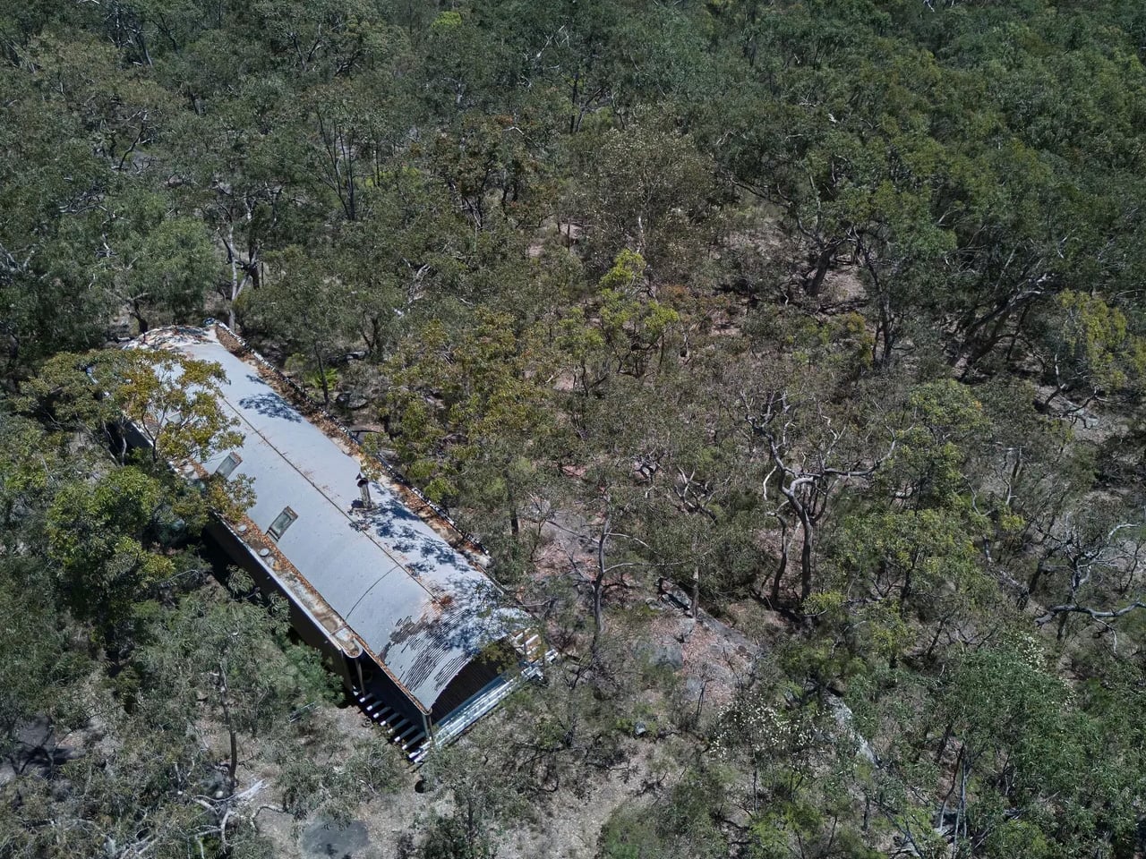
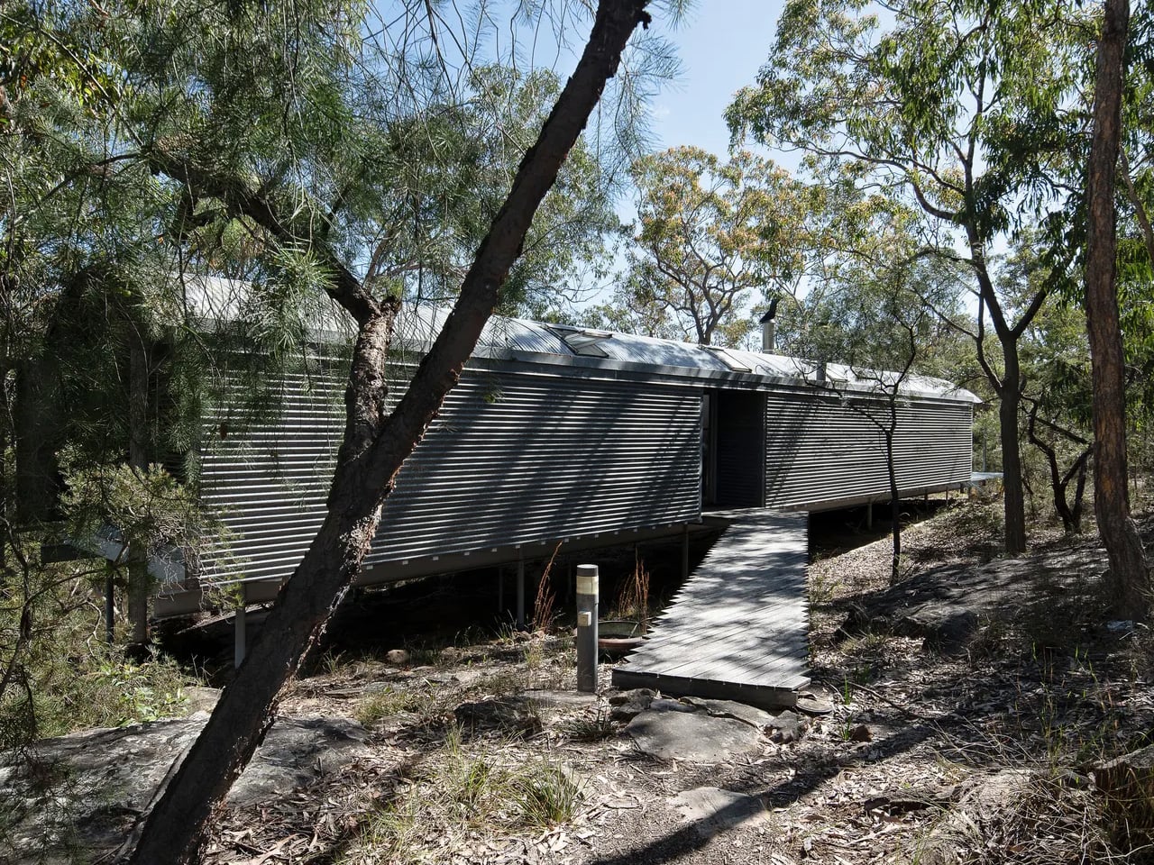
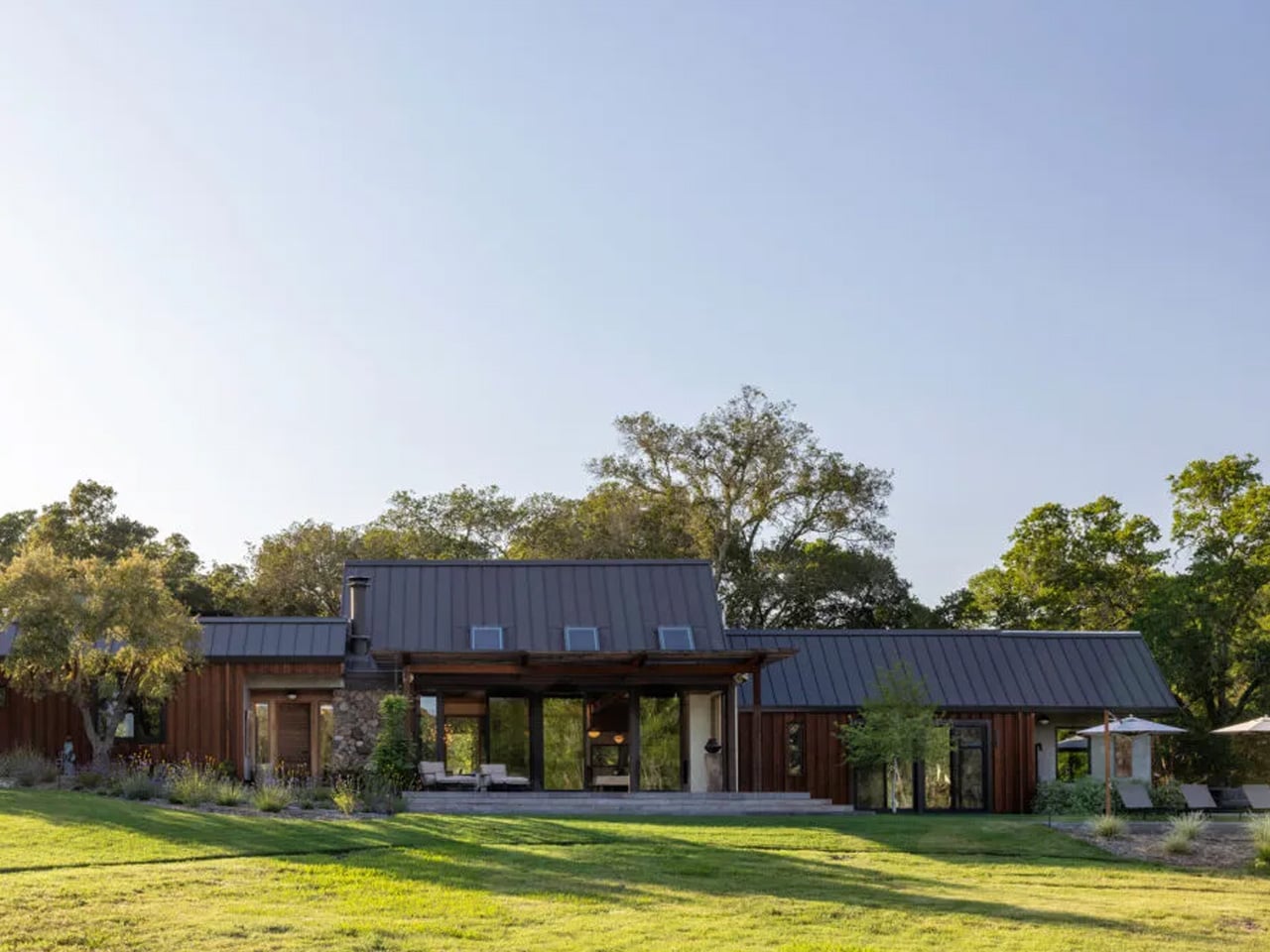
Set on 25 acres of dry sclerophyll forest in Glenorie, roughly an hour northwest of Sydney, the property feels worlds apart from the city it neighbours. The rugged site presented Murcutt with a natural rock ledge that became the building’s platform, and rather than taming the land, the architect worked with it. Not a single tree was removed during construction, a commitment that shaped every decision made from the ground up.

Designer: Glen Murcutt

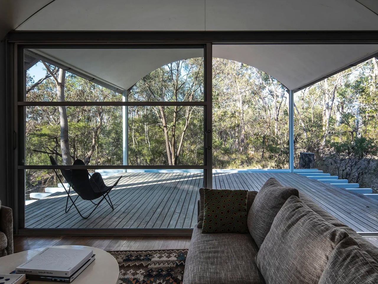
The house sits elevated on slender steel pipe columns, its long, low form skimming the earth without disturbing it. Murcutt has long described this approach as “touching the earth lightly,” placing humanity within nature rather than above it. The exterior is clad in corrugated iron, marking the first time Murcutt used the material on a residential project, and its gently curved roofline reads almost like a topographical feature rather than a built structure.

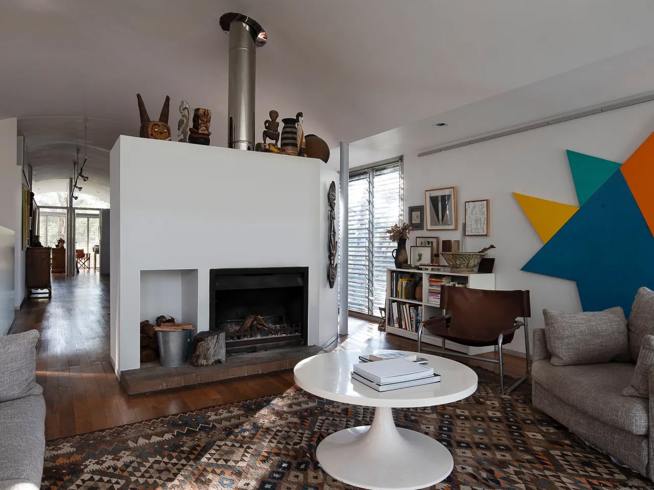
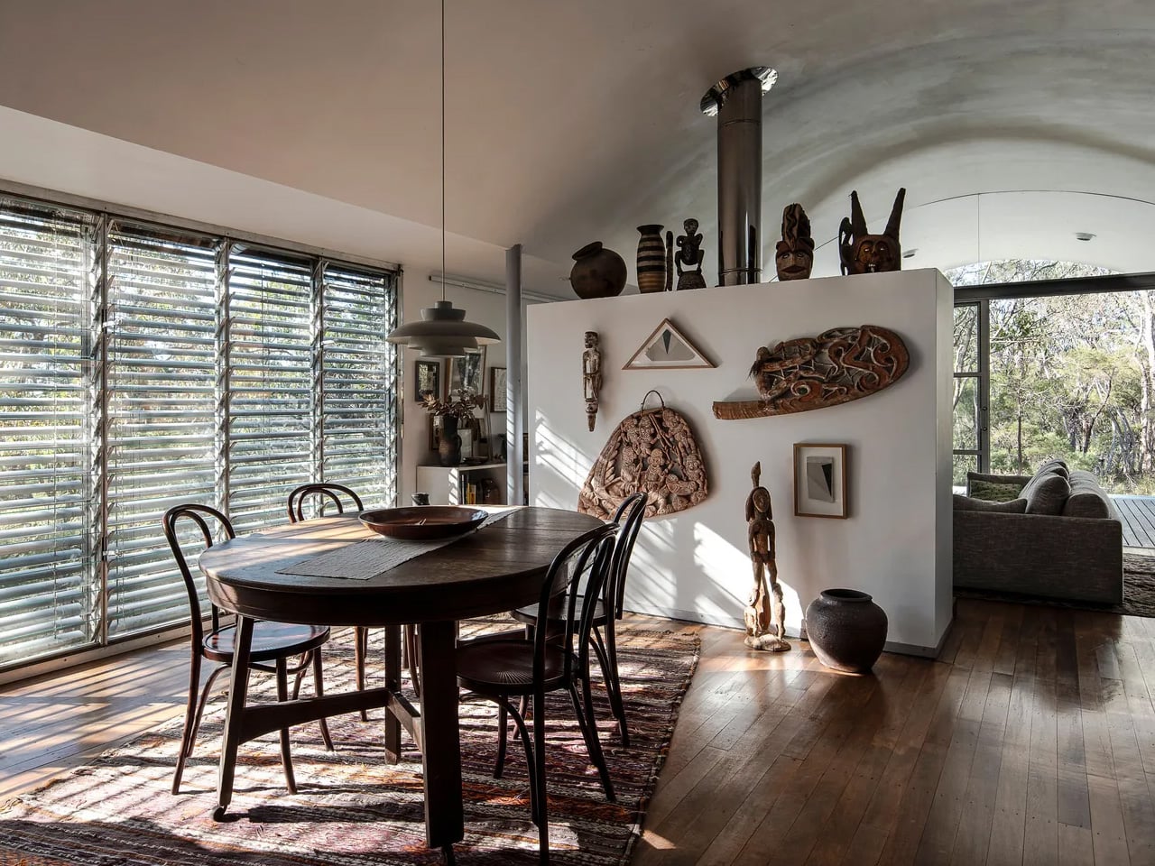
Inside, the design is as considered as the form suggests. Aluminium shading devices and timber-lined interiors regulate heat and light throughout the seasons, while expansive north-facing glazed walls and skylights draw in the kind of soft, sustained light that painters depend on. The home was built specifically for abstract artists Sydney Ball and Lynne Eastaway, and their creative lives are woven into the architecture itself. Ball’s large-scale paintings run the length of an internal wall that forms the spine of the entire plan.
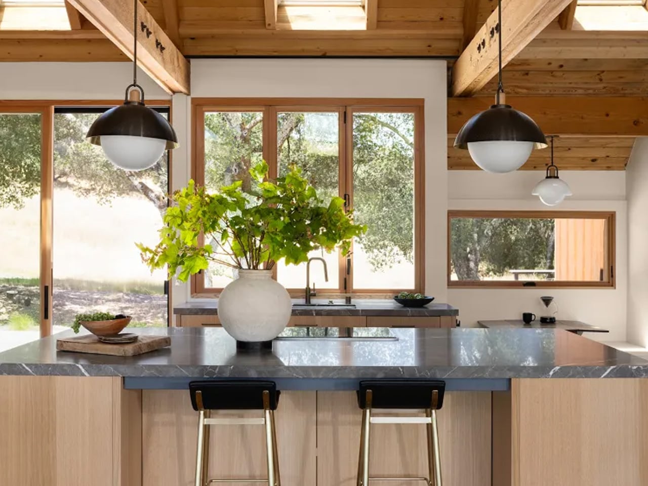
 

Behind that wall lies a concealed northwest verandah, originally conceived as a meditation space, and two generous studios where many of both artists’ most significant works were made. During a jury visit for the 1984 Wilkinson Award, which the house went on to win, the jury chair called it the most serene space he had ever encountered.

That quality of stillness hasn’t faded. The environmental intelligence built into the structure, passive ventilation, solar orientation, and minimal site intervention, was pioneering in the early 1980s and reads today as a quiet blueprint for how buildings should relate to the landscapes they occupy. The entire ten-hectare site has since been heritage listed, ensuring whatever comes next for the Ball-Eastaway House, its integrity remains protected.

The post This Iconic Australian Bush House Just Hit the Market for the First Time in Over 40 Years first appeared on Yanko Design.