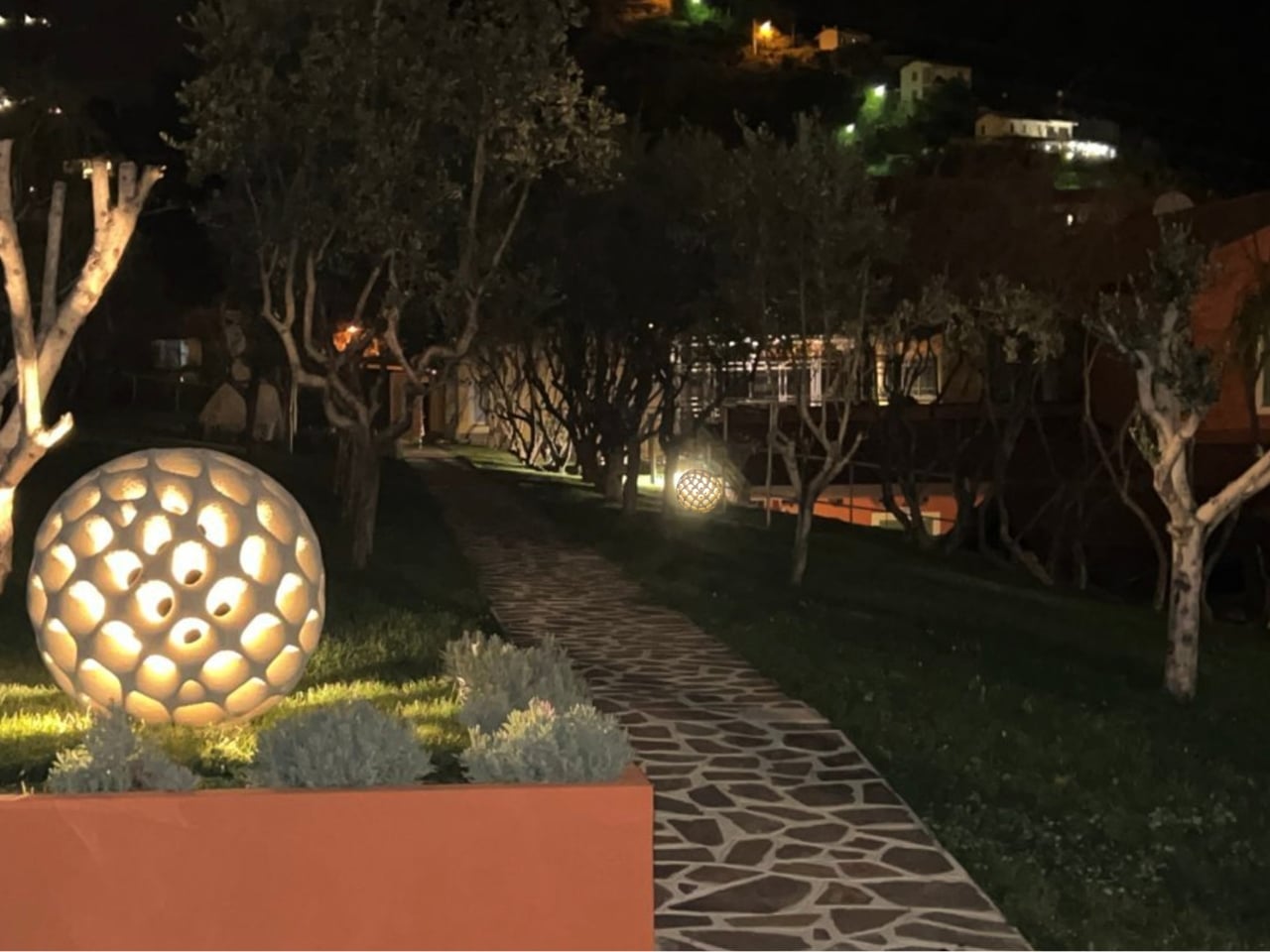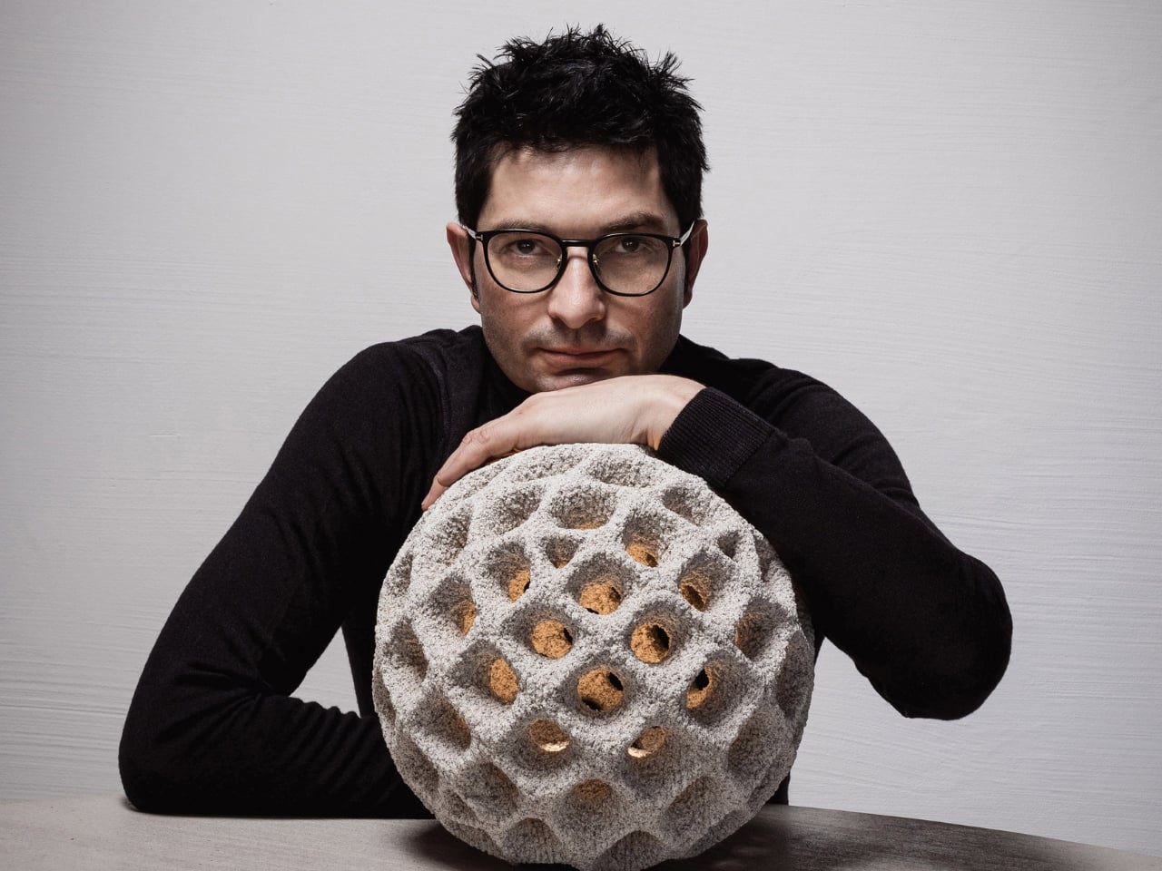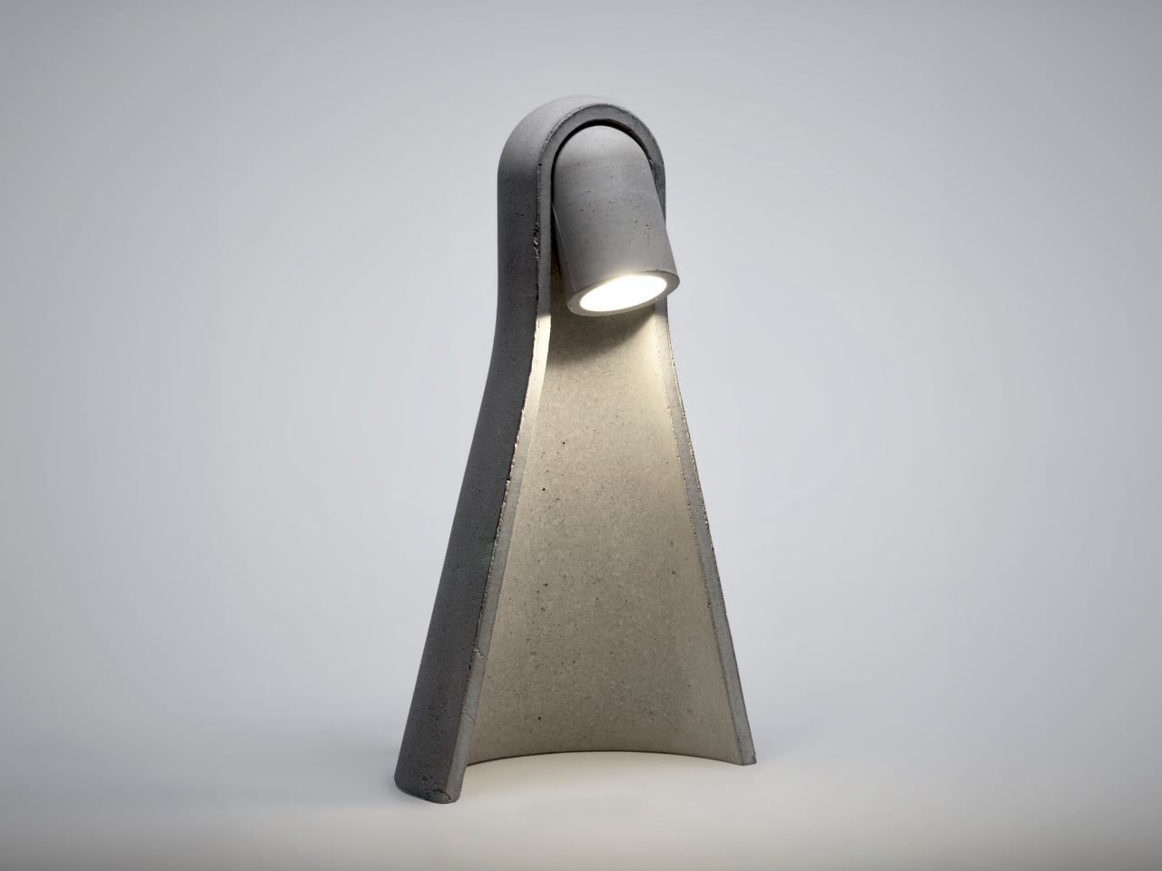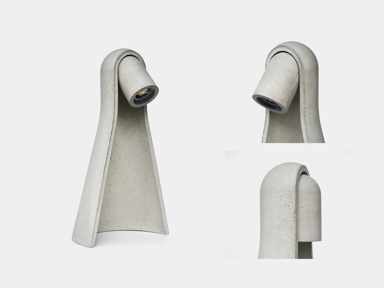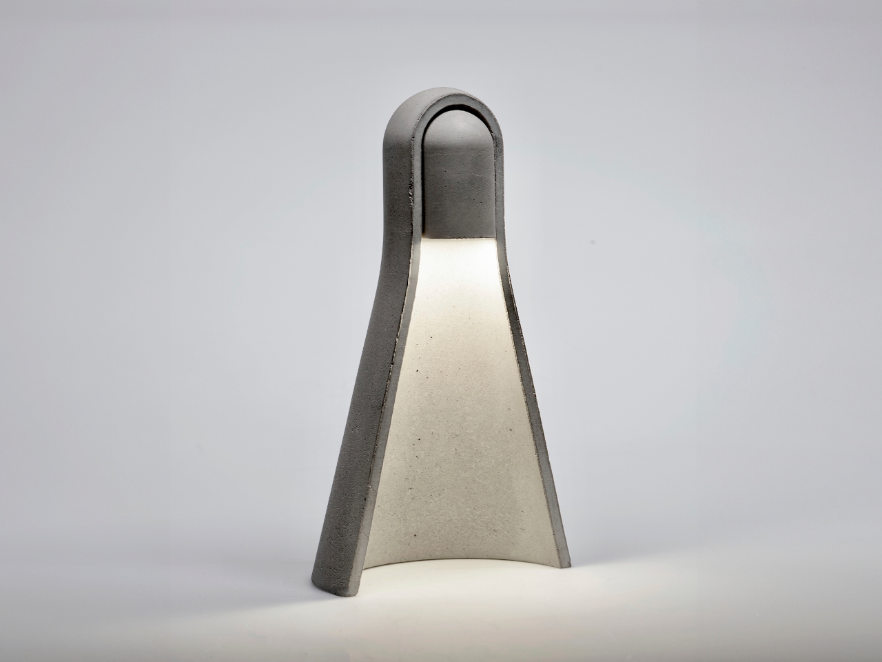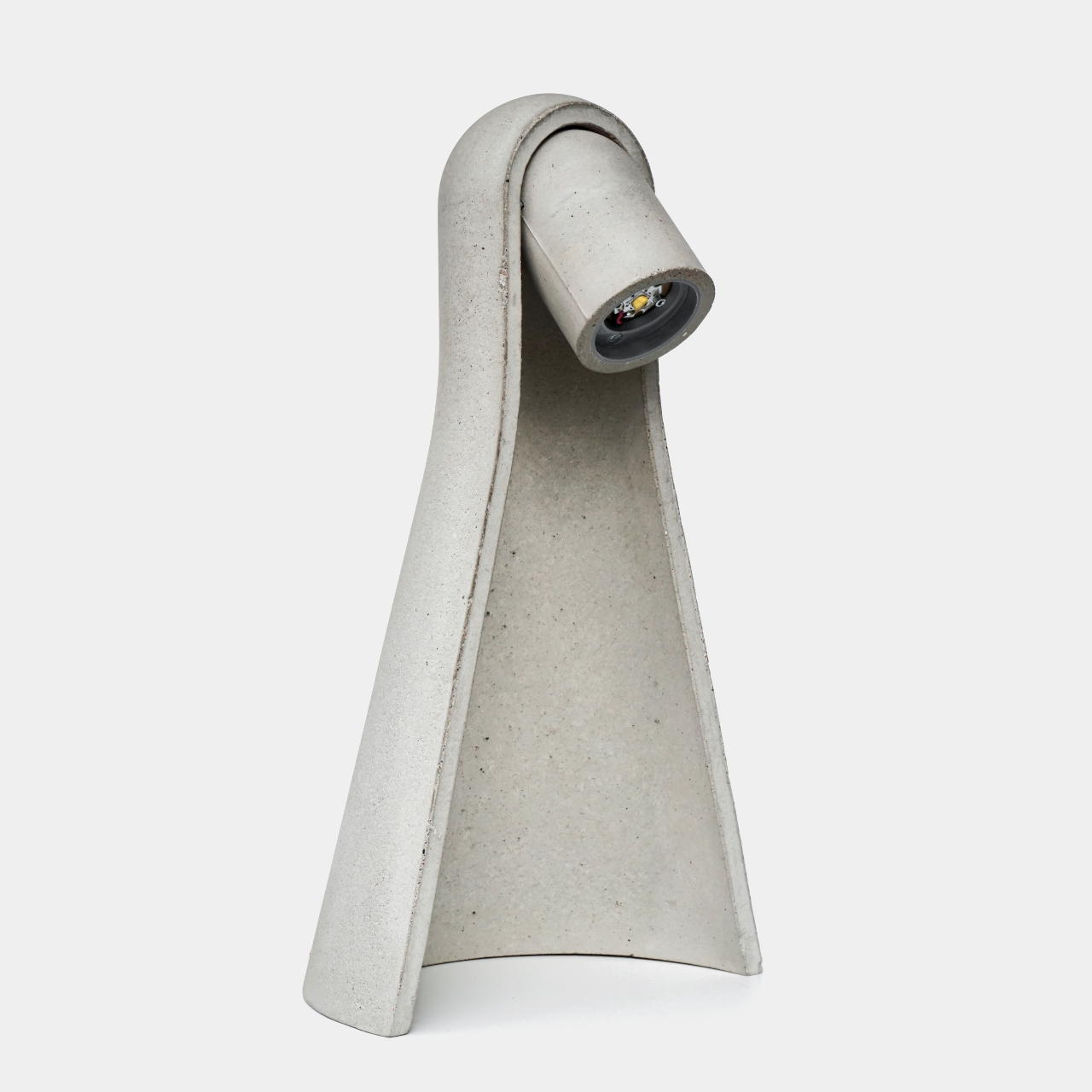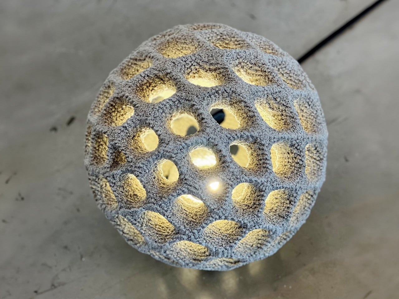
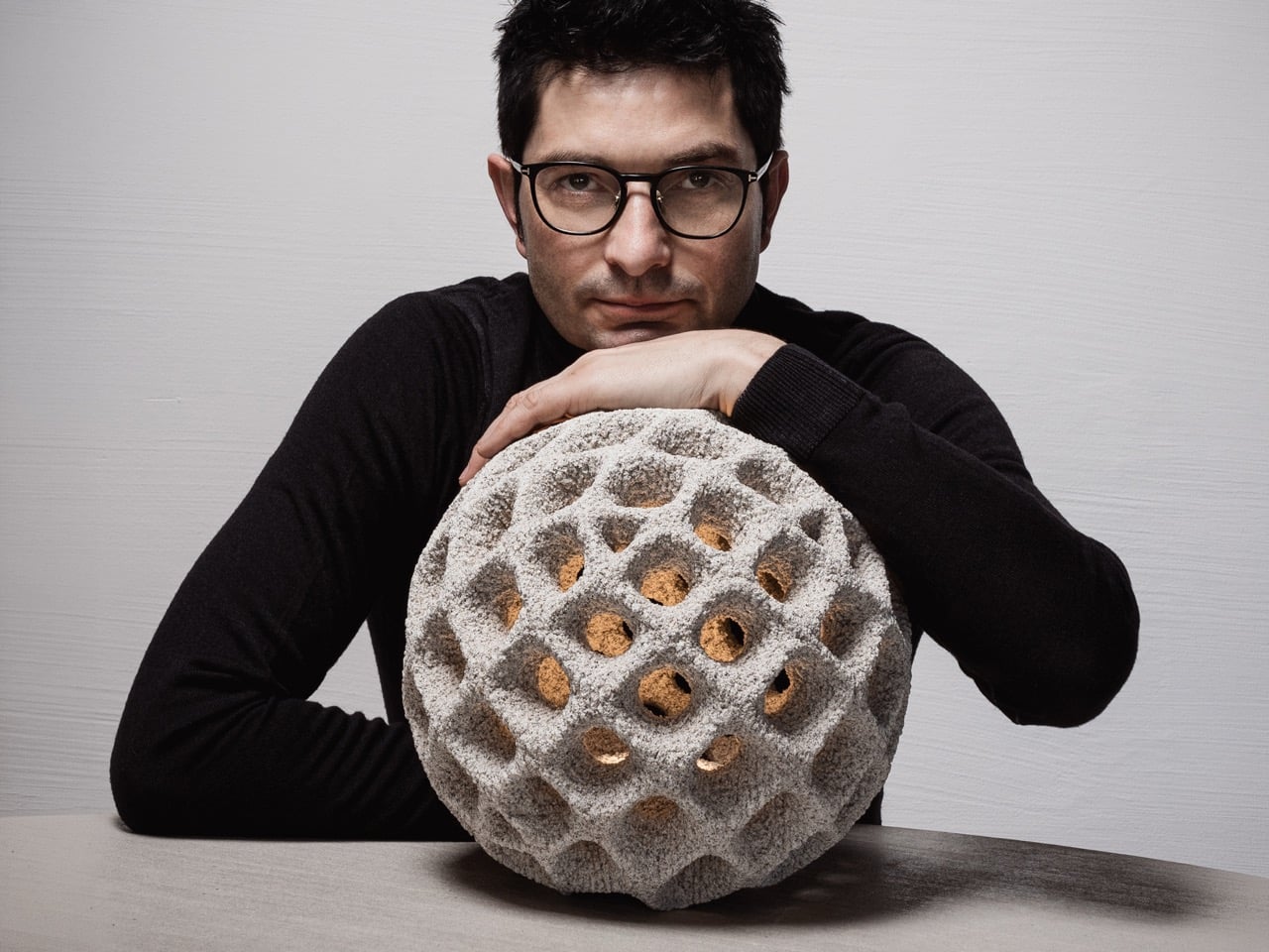
Outdoor lighting is usually seen as something practical. It lights up a pathway, softens a garden, marks an entrance, or creates a mood after dark. Oberhauserer’s Balloon takes that familiar idea and pushes it into a more experimental space. Designed by Martin Oberhauser, the lamp brings together concrete, light, and digital manufacturing in a way that feels surprisingly poetic. It has the presence of a sculptural object, but it still belongs naturally in outdoor spaces.
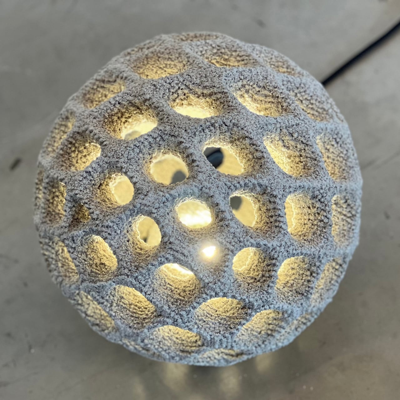
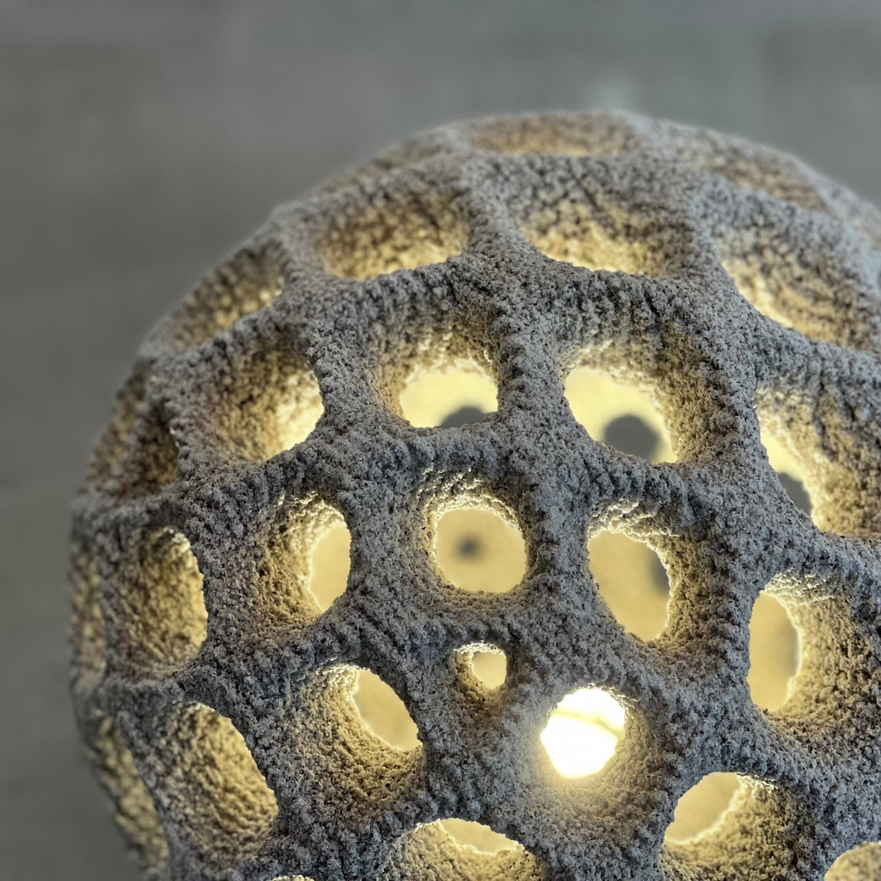
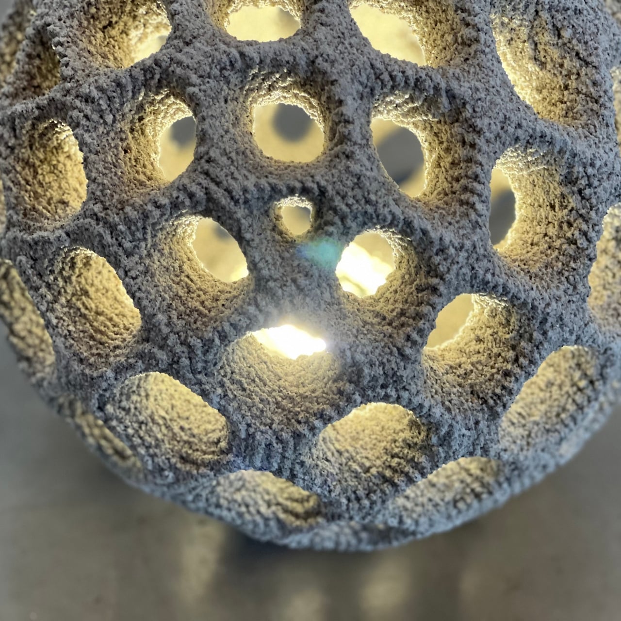
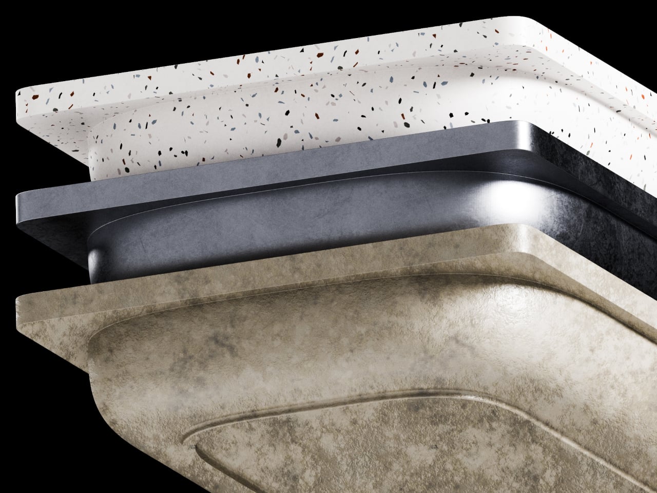
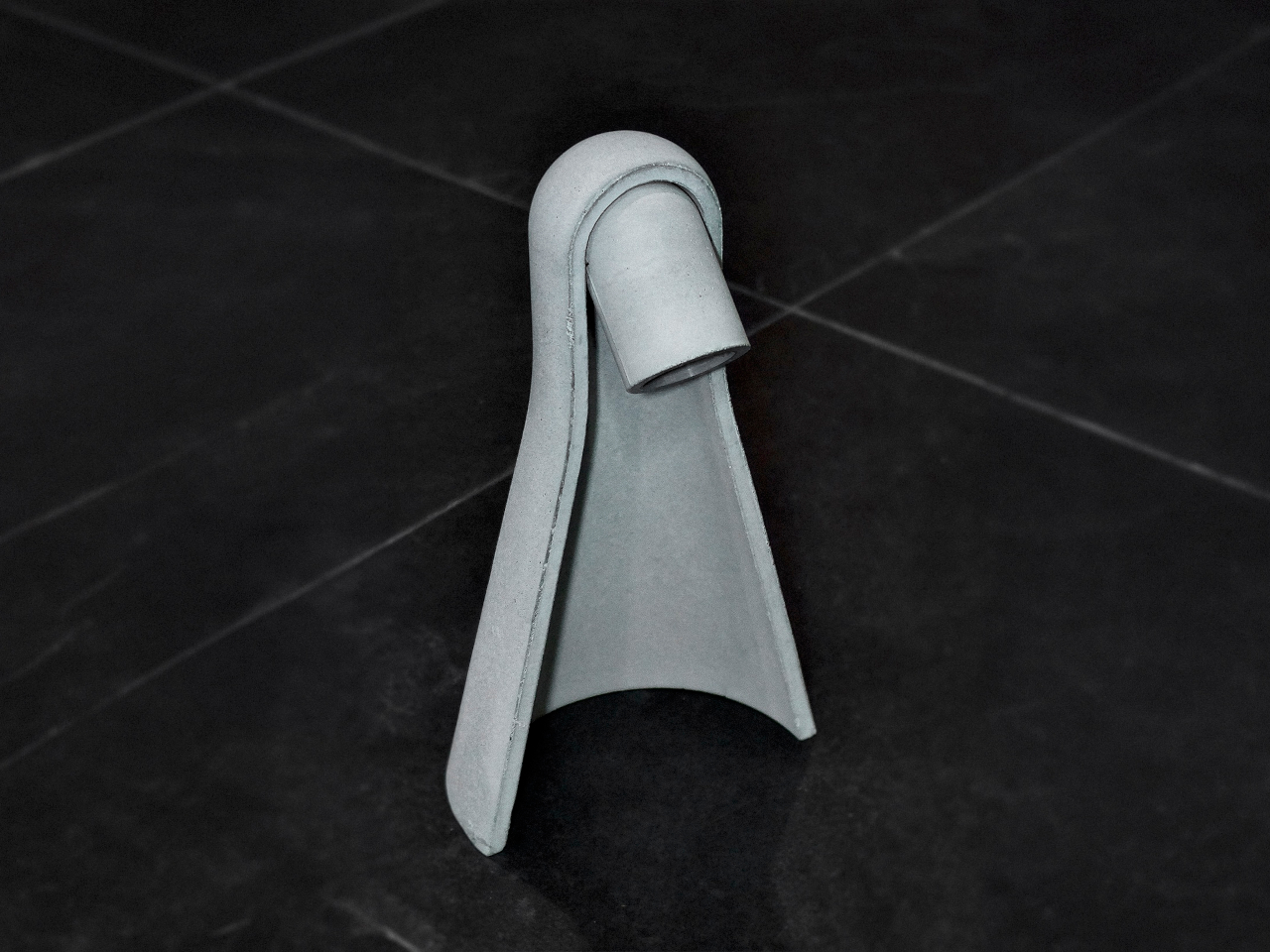
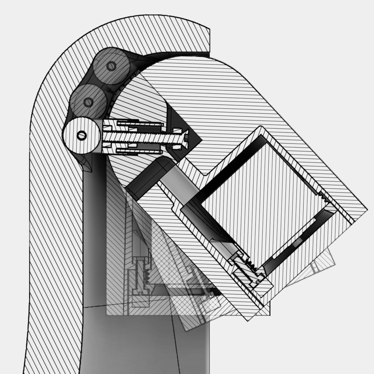
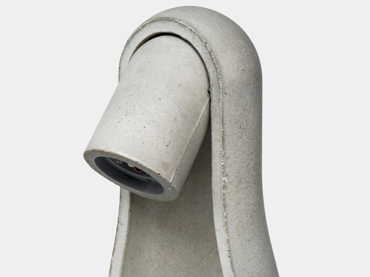
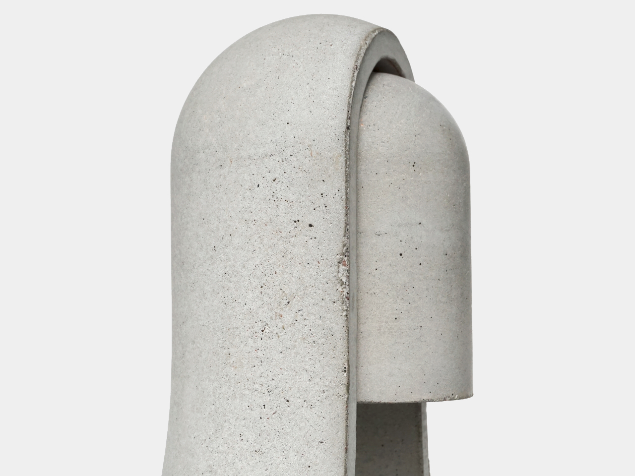
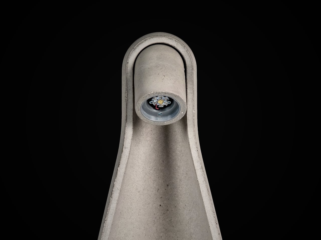
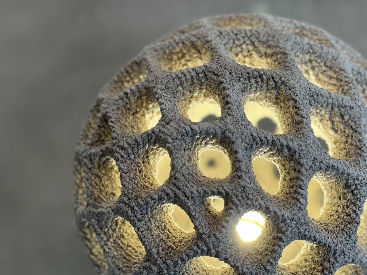
The most interesting part of the lamp begins with its production method. Oberhauserer’s Balloon is made using powder bed concrete 3D printing, also known as Selective Paste Intrusion, or SPI. In this process, cement paste is injected into a powder bed only where the structure needs to form. The lamp is built gradually, layer by layer, allowing the final shape to emerge with a level of detail and complexity that would be difficult to achieve through traditional concrete casting.
Designer: Oberhauser’s Ballon
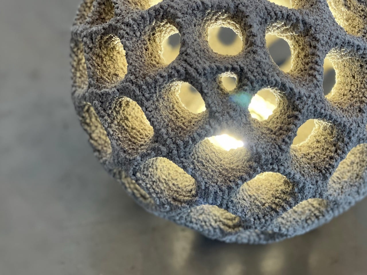
This process removes the need for conventional formwork, which is one of the biggest limitations in concrete design. Traditional molds can restrict the shape of an object, especially when the geometry becomes more detailed or organic. SPI gives the designer more freedom to explore curved forms, softer surfaces, and intricate details without being limited by the mold-making process. This freedom is what gives Oberhauserer’s Balloon its distinctive character.
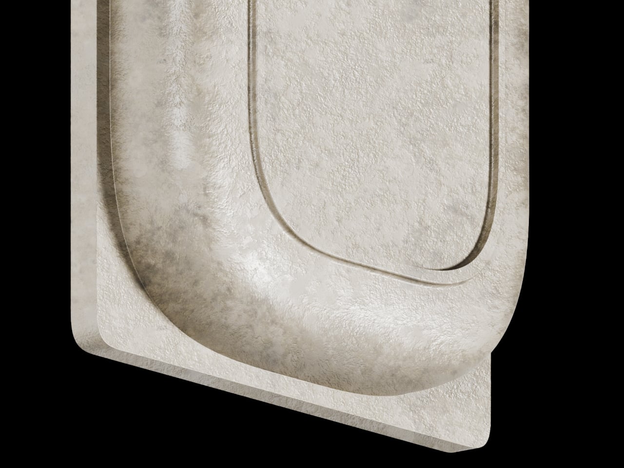
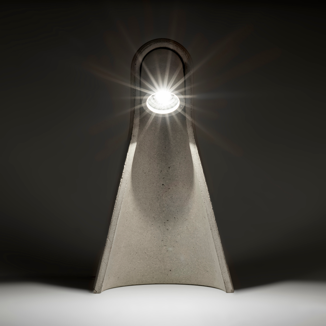
The lamp plays with a beautiful contradiction. Concrete is usually associated with heaviness, buildings, and permanence. A balloon suggests lightness, air, and softness. Bringing those two ideas together makes the object feel unexpected. The form looks rounded and almost inflated, even though it is made from cement. That contrast gives the lamp a quiet charm. It does not try to disguise the material. Instead, it shows how concrete can feel softer, more atmospheric, and more expressive than we usually expect.
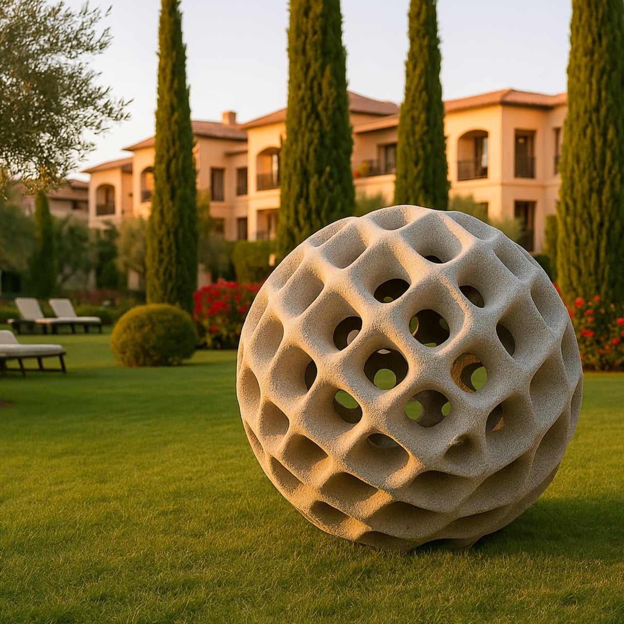
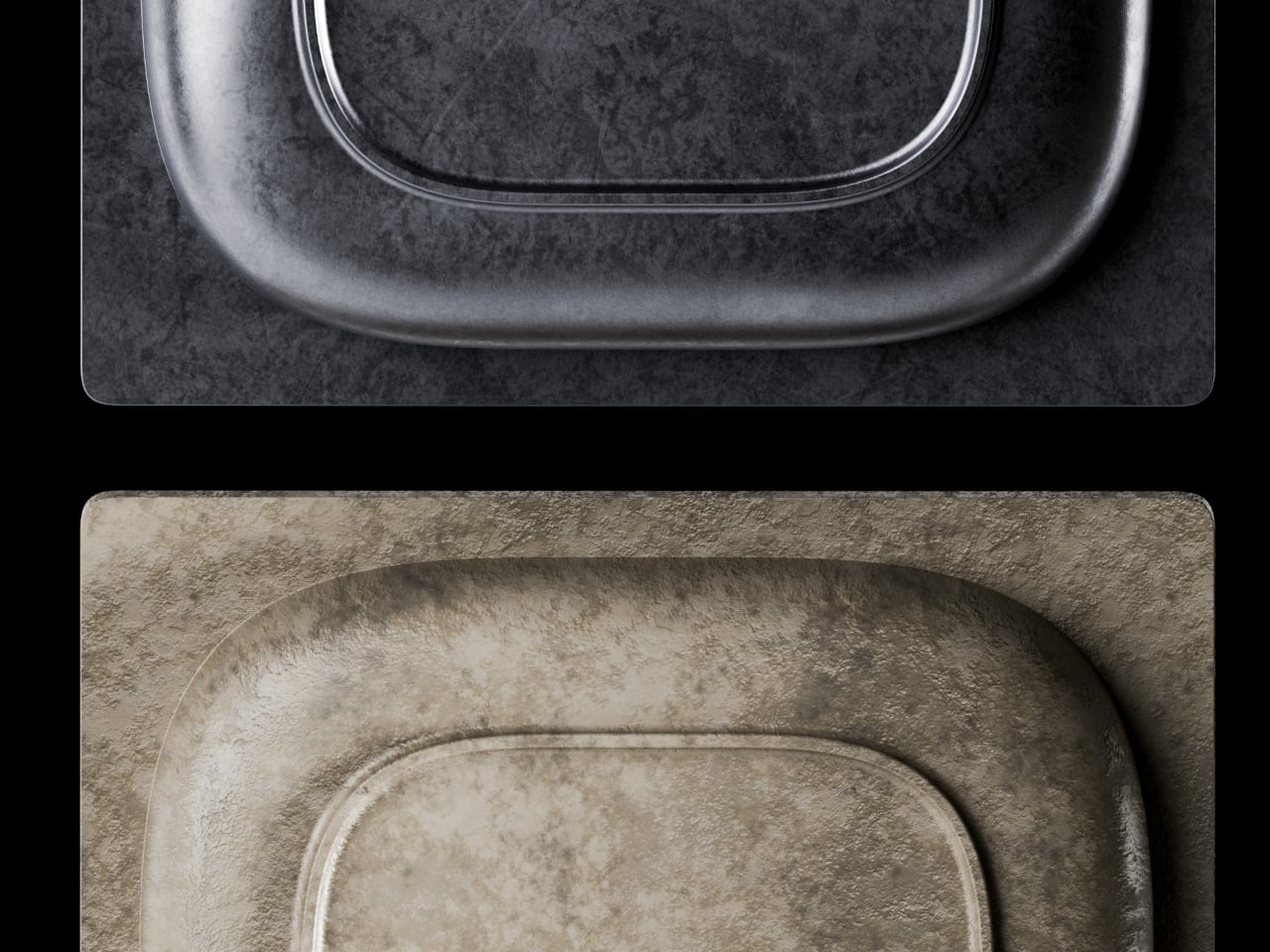
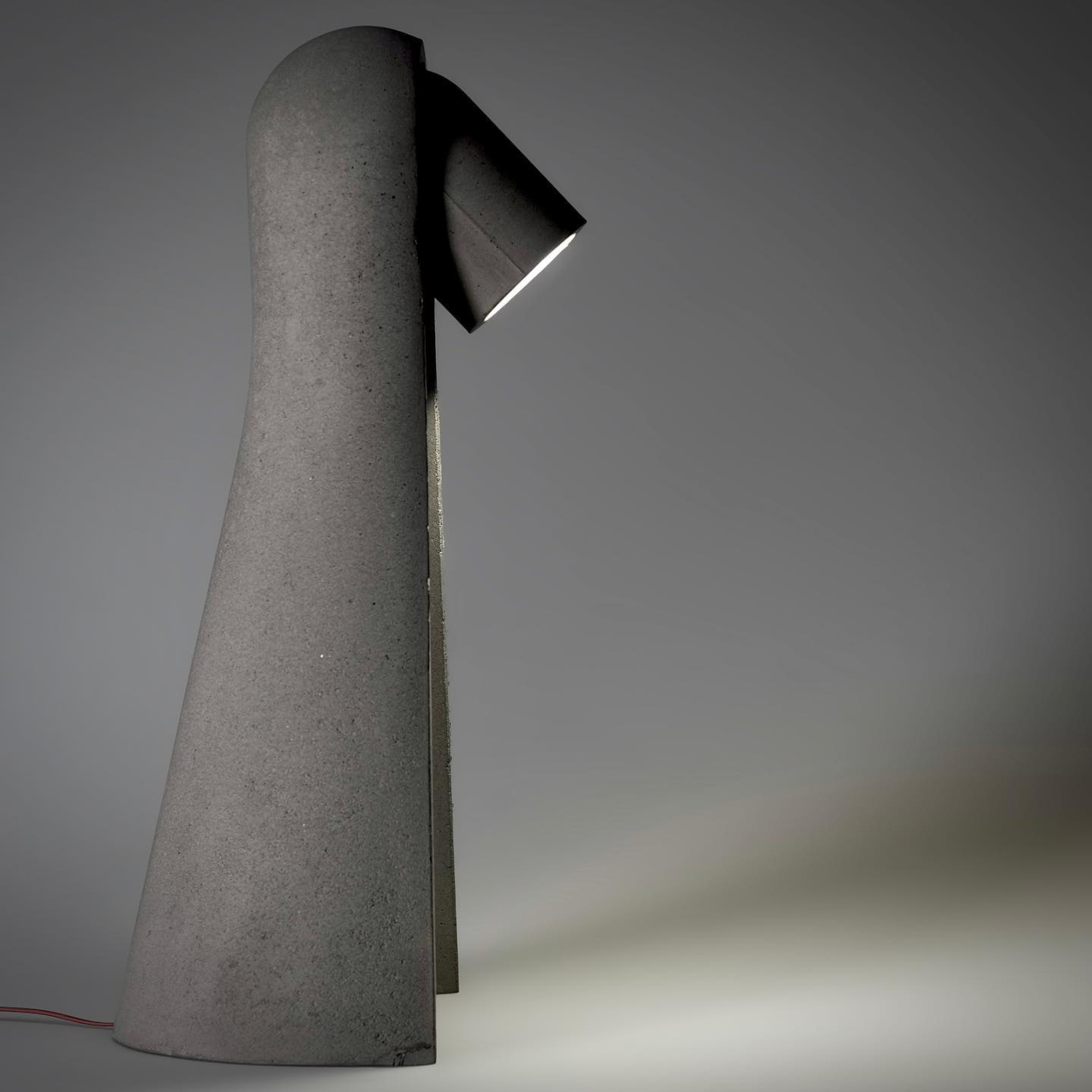
Oberhauserer’s Balloon is available in three sizes: 30 cm, 70 cm, and 100 cm in diameter. Each size changes how the lamp interacts with a space. The 30 cm version can work as a small accent in a garden, terrace, or along a walkway. The 70 cm version has a stronger visual presence and can suit courtyards, hospitality spaces, and residential landscapes. The 100 cm version becomes a bold installation piece, shaping the atmosphere around it while still functioning as a source of light.
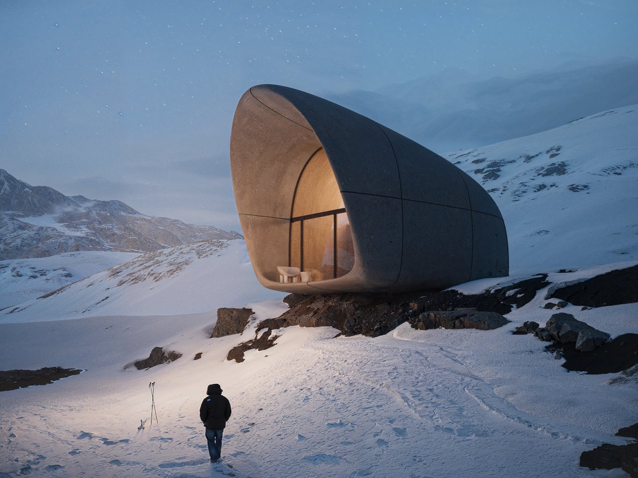
The largest version is especially impressive. With a diameter of 100 cm, it is described as the largest known 3D-printed lamp made from cement. This makes the project more than a beautiful outdoor luminaire. It becomes an example of how far 3D concrete printing can be pushed. What could have remained a small material experiment has been developed into a durable, full-scale lighting product.
The material itself is designed for outdoor use, with high weather resistance that allows the lamp to withstand changing environmental conditions. This durability makes Oberhauserer’s Balloon suitable for gardens, terraces, public landscapes, and architectural outdoor settings. Its strength does not take away from its visual softness. Instead, the lamp balances permanence with atmosphere, making it feel grounded during the day and quietly luminous at night.
The production method also supports a more sustainable approach to manufacturing. Since 3D concrete printing places material only where it is needed, it helps reduce waste and makes material use more efficient. The absence of traditional formwork also cuts down on excess production materials. This gives the lamp a smaller ecological footprint while still allowing for a high level of design detail.
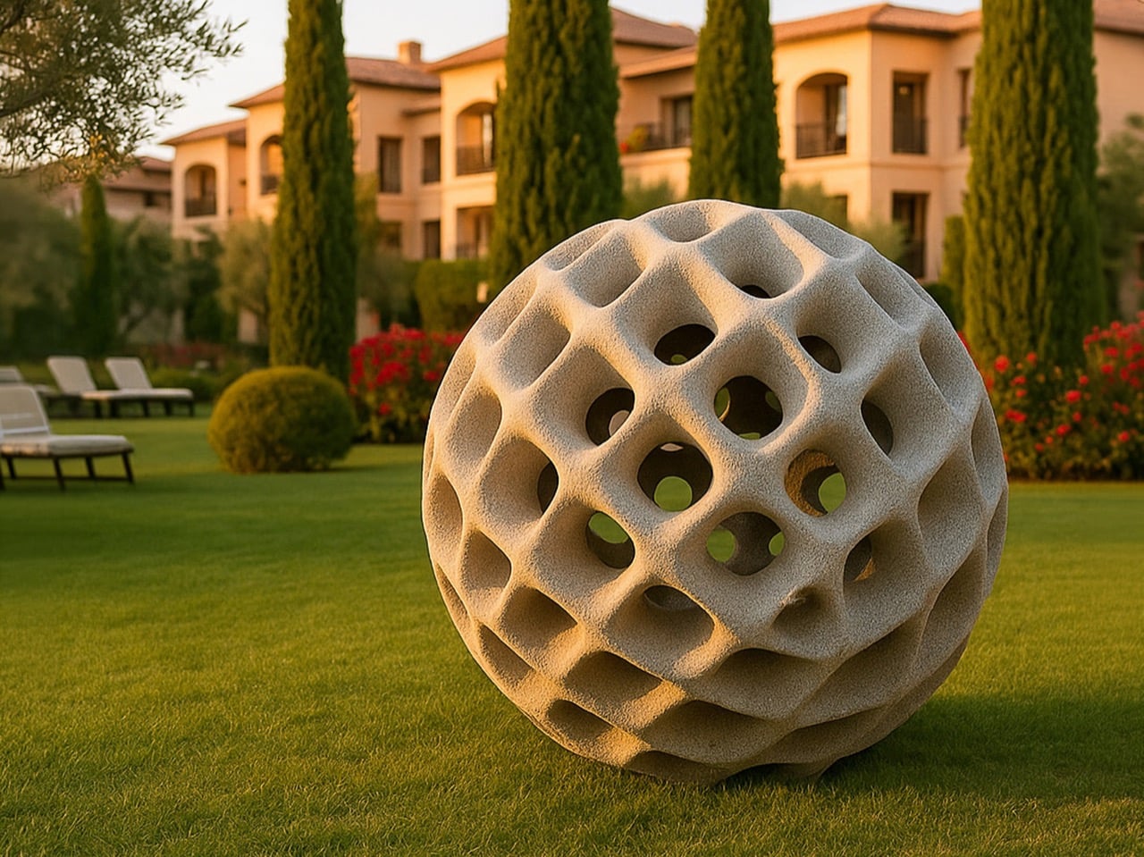
Oberhauserer’s Balloon feels like a glimpse into where lighting design is heading. It shows how technology can create forms that feel warmer, more expressive, and more human when handled with sensitivity. The lamp carries the strength of concrete, the precision of digital fabrication, and the softness of glowing light. In outdoor spaces, it becomes less like an object placed in the landscape and more like a calm presence within it.
The post Oberhauserer’s Balloon Lamp Makes Concrete Feel Surprisingly Weightless first appeared on Yanko Design.