Summer cooking sits at a particular crossroads. The produce is at its best without much intervention, the kitchen gets warm, and the gap between wanting a good meal and actually making one widens every afternoon. Japanese kitchen design has always understood how to close that gap — not by making cooking faster or simpler in a gimmicky sense, but by making the process feel like something worth choosing. These seven tools operate on that principle.
Each one was selected because it shifts how cooking feels, not just what it produces. Some anchor a weekday morning and make the first meal of the day worth setting time aside for. Others make a Saturday evening in the kitchen feel like the destination rather than a precondition. All of them bring a quality of craft to the work that most kitchen drawers simply cannot match, and that quality is exactly what summer cooking needs most.
1. Iron Frying Plate
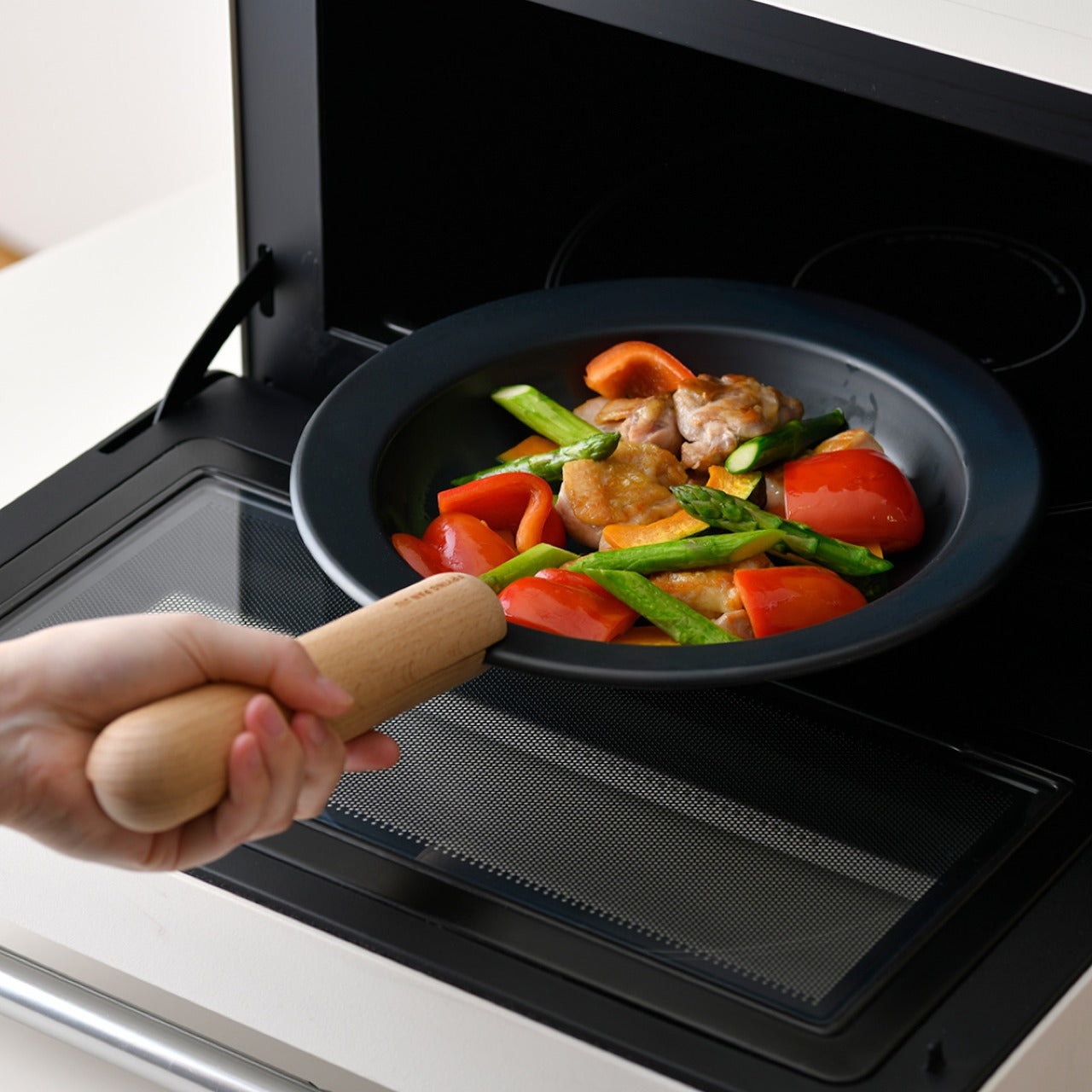
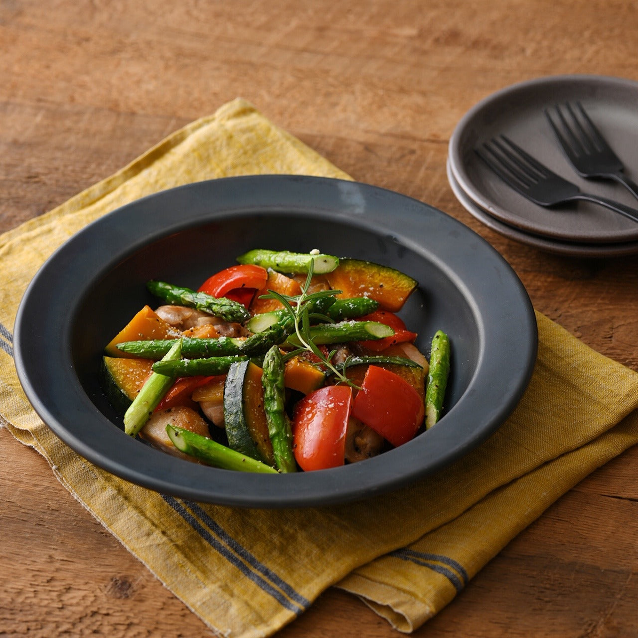
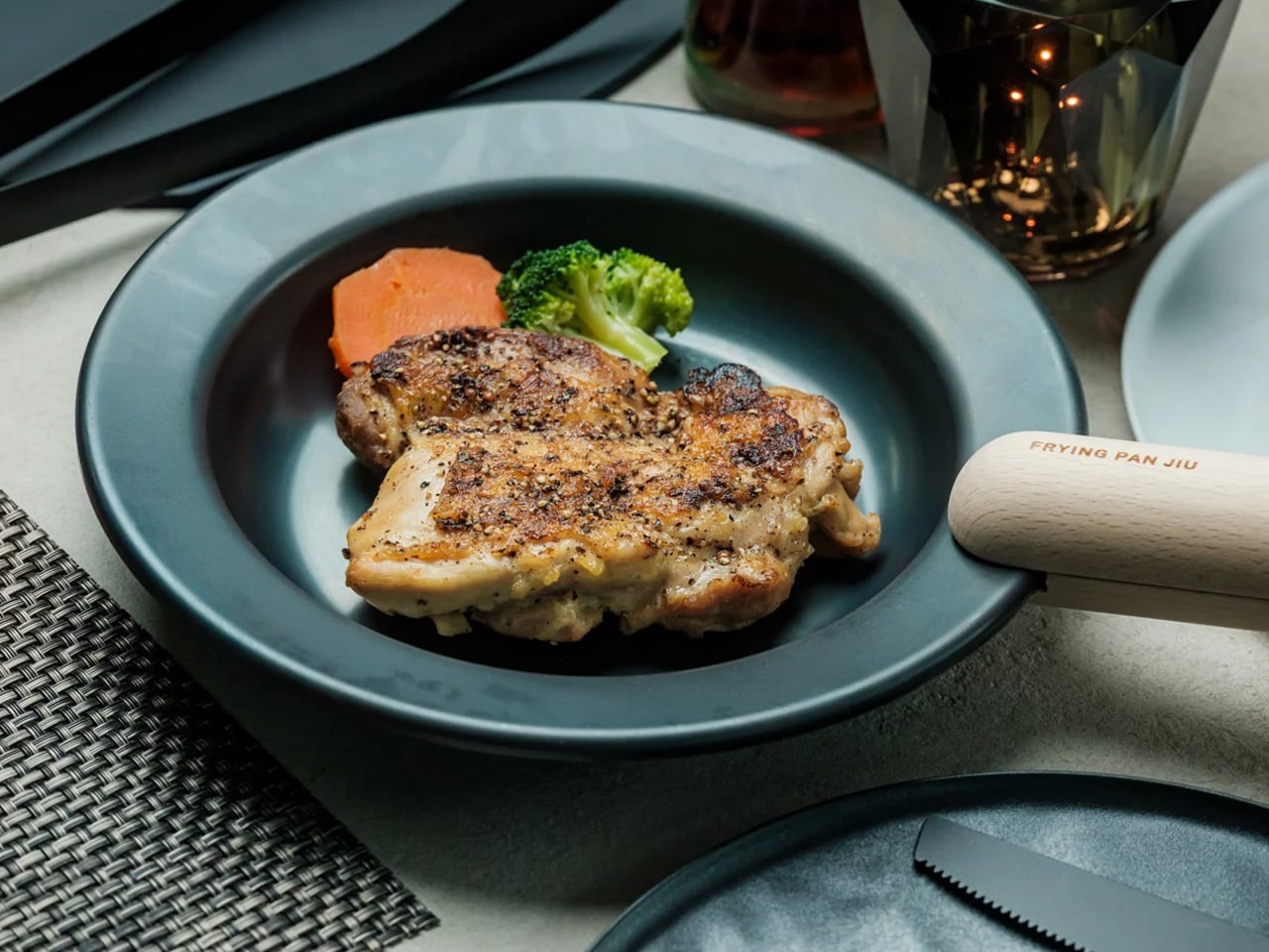
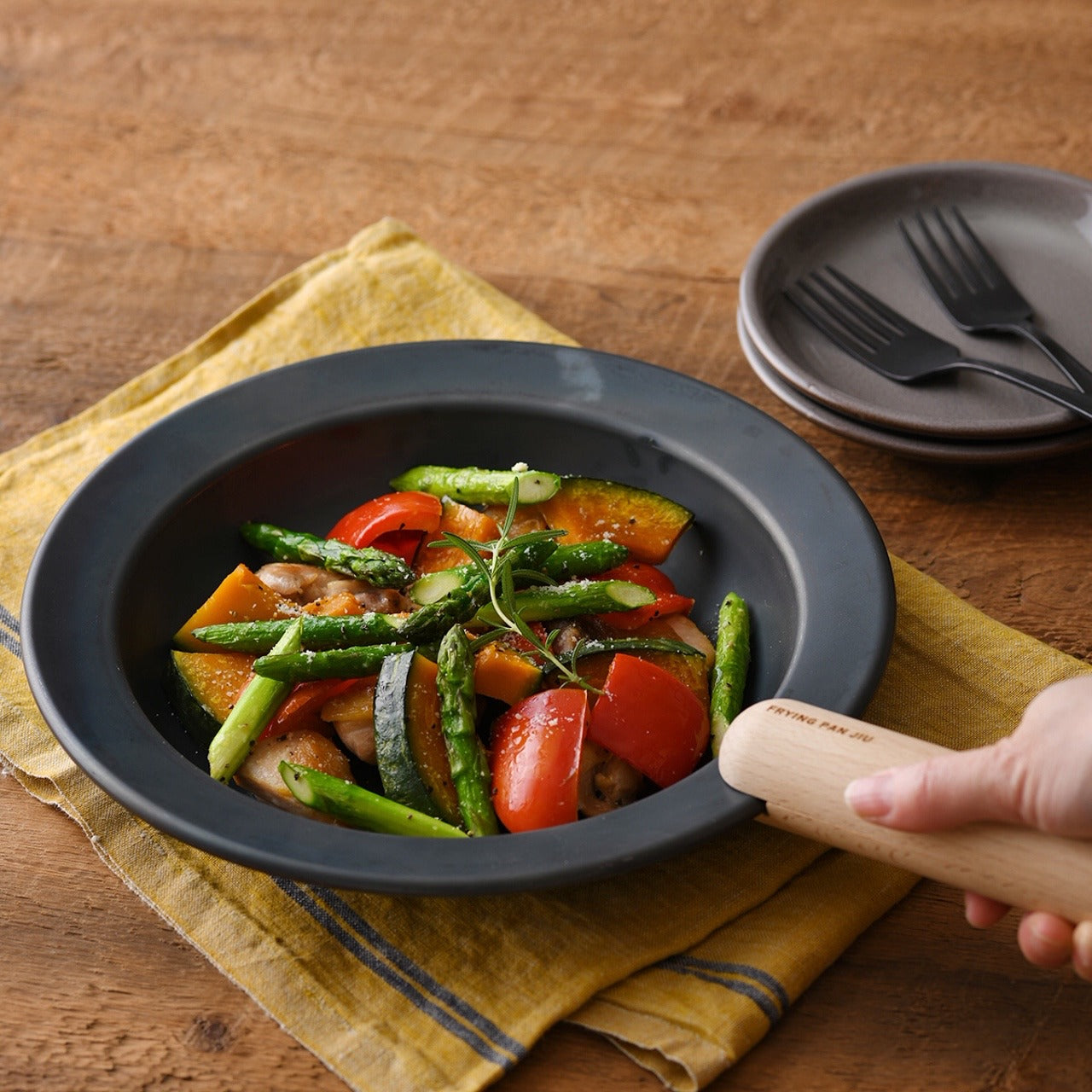
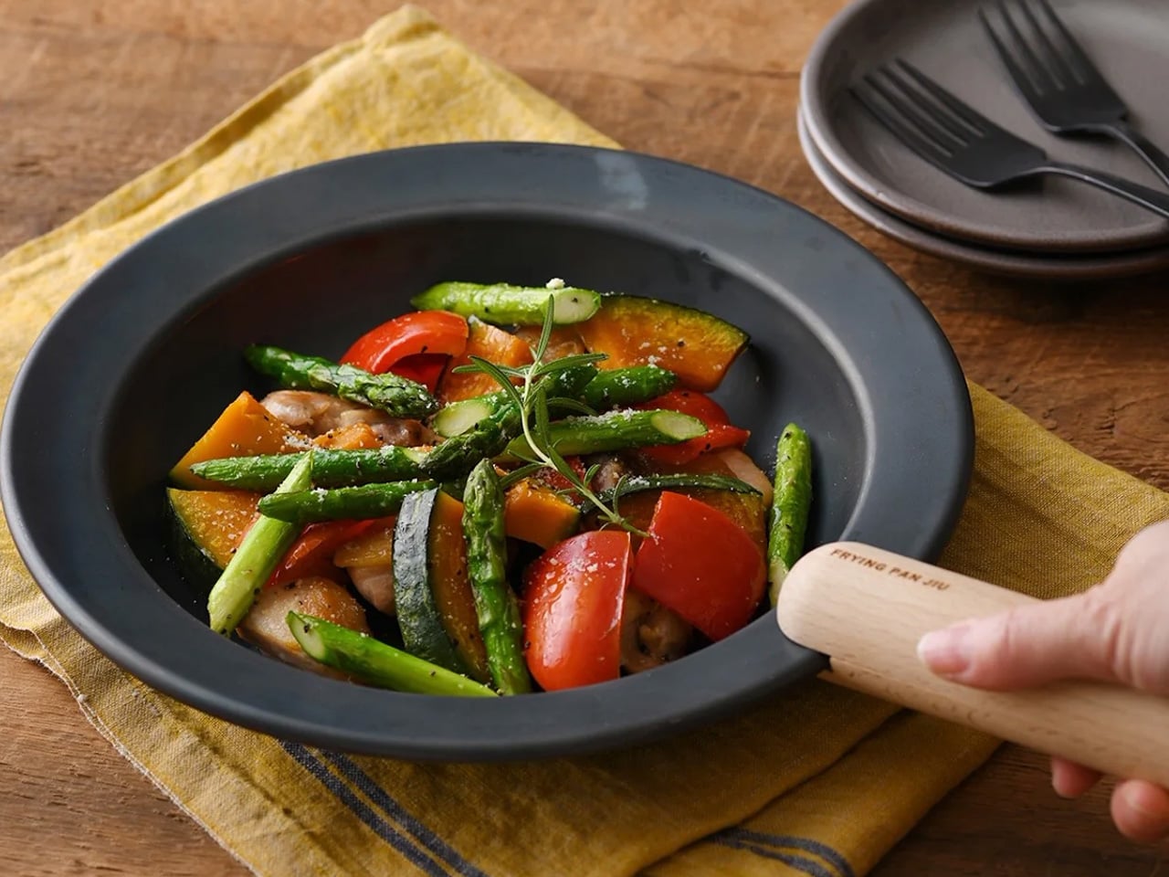
The Iron Frying Plate removes the step between cooking and serving. Crafted from 1.6mm thick mill scale steel with a detachable wooden handle, it moves from stove to table without a transfer in between. Eggs arrive still sizzling. Fish comes off the heat in the same vessel you cooked it in, retaining the temperature and texture that plating onto a cold ceramic plate quietly destroys. The cook-and-serve design changes how a meal begins and ends, and the pace of eating reflects that shift immediately.
The uncoated surface requires no seasoning before first use and develops natural non-stick properties through regular cooking. The detachable wooden handle attaches and releases with one hand, making the move from burner to table completely fluid. You stop rushing through dinner because the plate is still doing its job while you are still deciding what to eat first. Retained heat changes the pace of a meal in ways that are difficult to explain until you’ve eaten a few of them this way.
What we like
- The cook-and-serve design preserves the temperature and texture that get lost in any transfer to a separate plate
- The uncoated mill-scale steel develops natural non-stick properties through use, requiring no seasoning and no chemical coatings
What we dislike
- The iron surface stays hot long after cooking ends, requiring careful handling and surface awareness at the table
- One plate handles one serving at a time, so a group meal requires multiple units to work at scale
2. Yoshihiro VG-10 16-Layer Hammered Damascus Nakiri
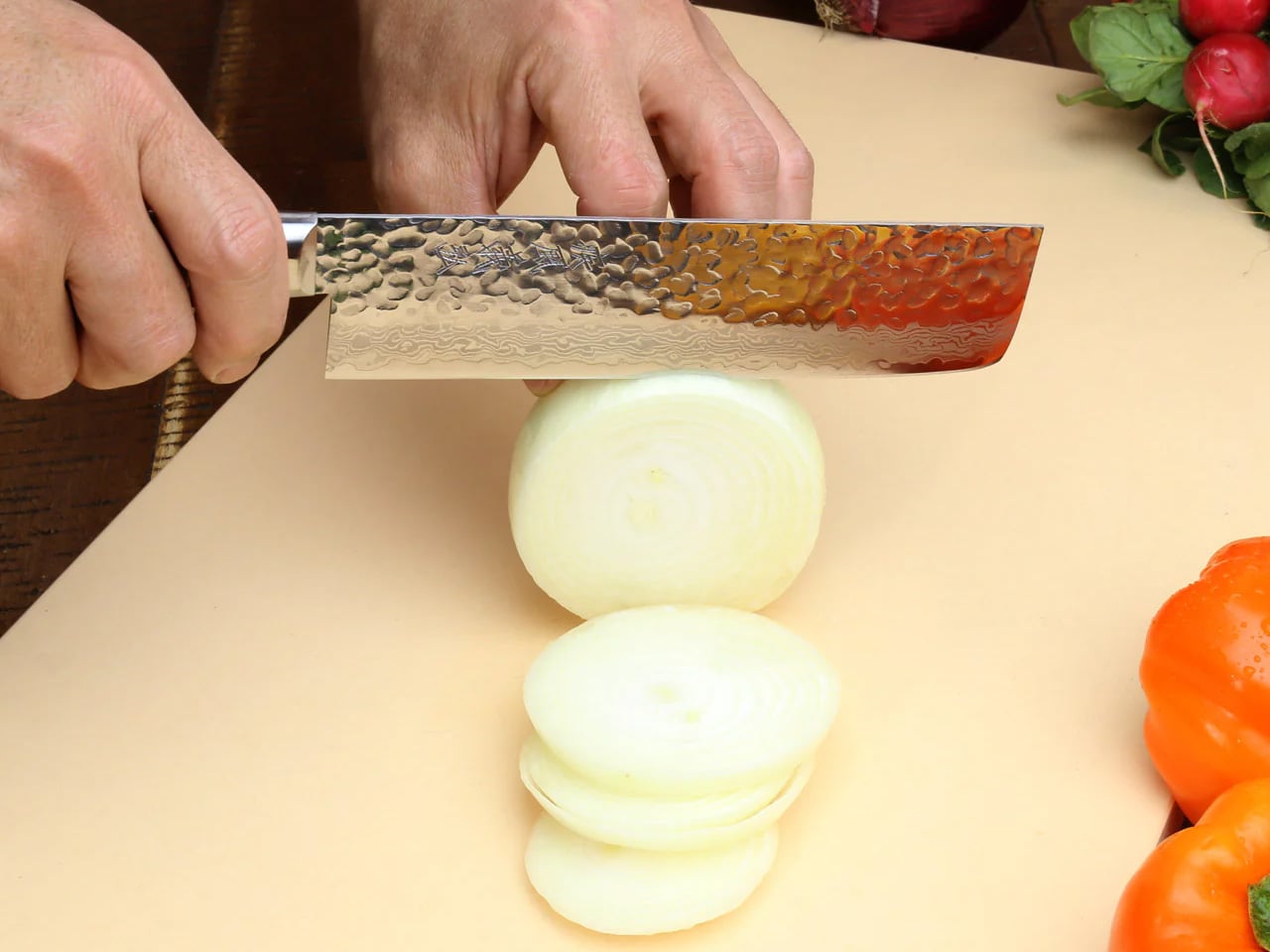
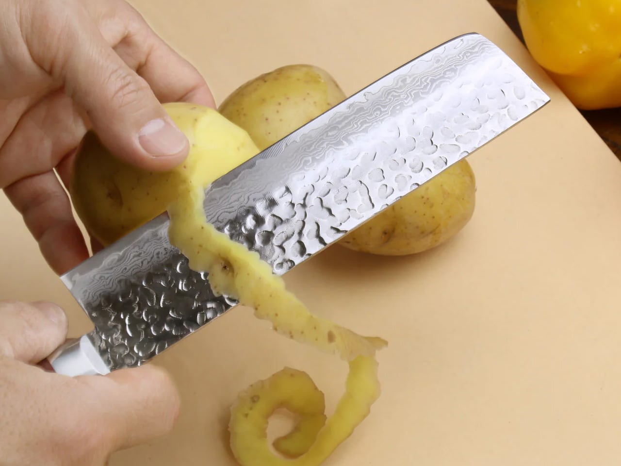
The nakiri is designed exclusively for vegetables, and that singular focus is what makes it work for summer cooking in a way a standard chef’s knife doesn’t. The flat edge makes full contact with the cutting board on every stroke without the tip-lift of a curved blade, producing a clean, complete cut through cucumber, eggplant, and ripe tomato without the drag most home cooks have accepted as normal. The VG-10 core wrapped in sixteen layers of hammered Damascus steel reduces friction through each cut, so nothing sticks or skids.
The full-tang mahogany handle distributes weight evenly from tip to heel, and after fifteen minutes of prep, you feel that balance in a way that poorly weighted knives never let you forget themselves. Summer produce means a lot of repetitive slicing through high-moisture vegetables, and this knife is built for exactly that kind of sustained work. The hammered Damascus pattern is unique to your specific blade, handcrafted by master artisans and certified for commercial kitchen use. The edge holds far longer than most knives in this category.
What we like
- The flat edge makes full contact with the board on every stroke, producing complete cuts that a curved blade with tip-lift cannot replicate with the same consistency
- The hammered Damascus surface reduces drag through each cut and produces a pattern that is unique to every individual blade
What we dislike
- The nakiri is a specialist vegetable knife and is not designed for meat, fish, or anything with bones
- The Damascus finish requires careful dry storage and periodic maintenance to preserve the layered surface over time
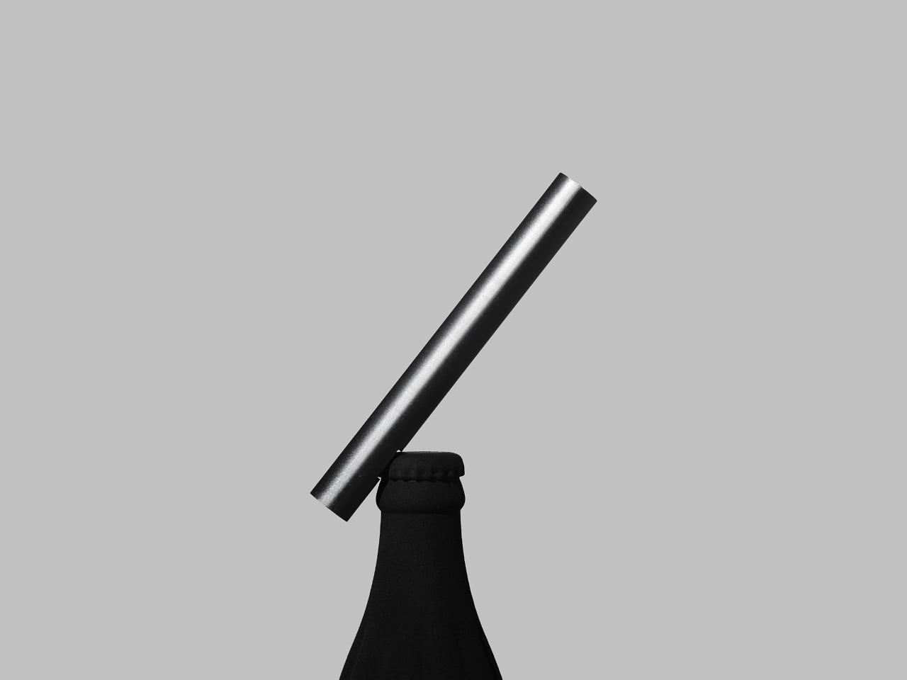
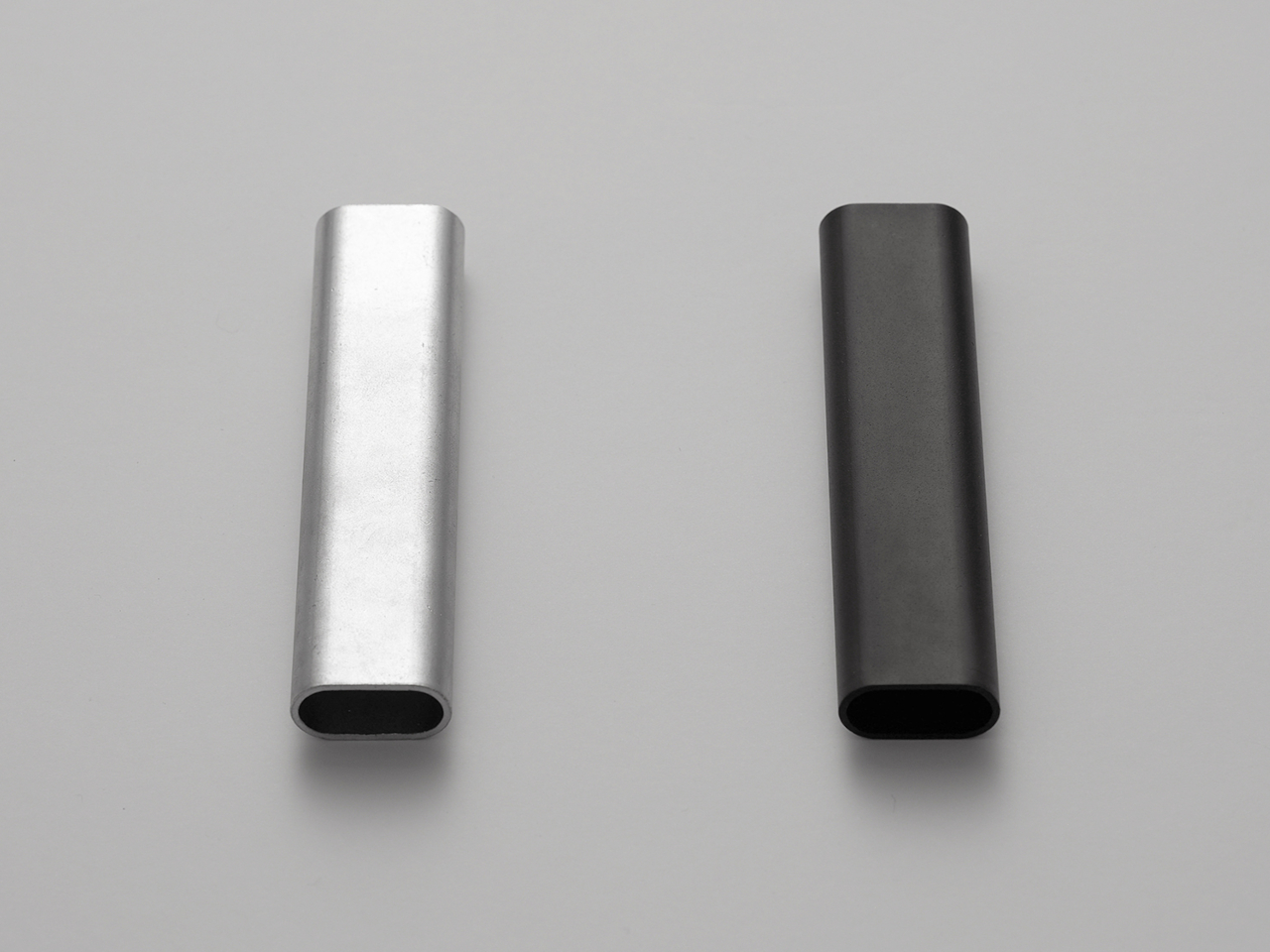
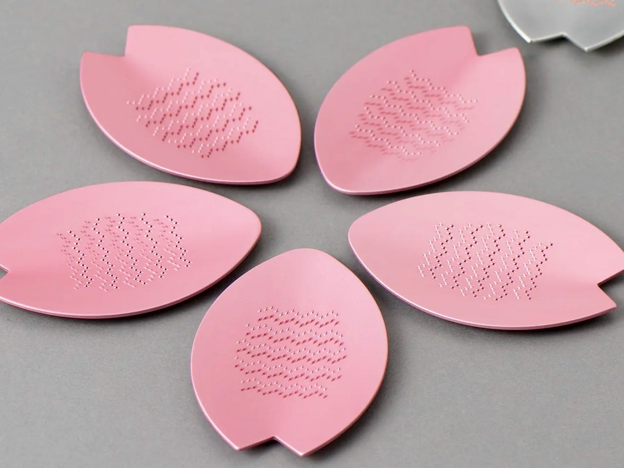
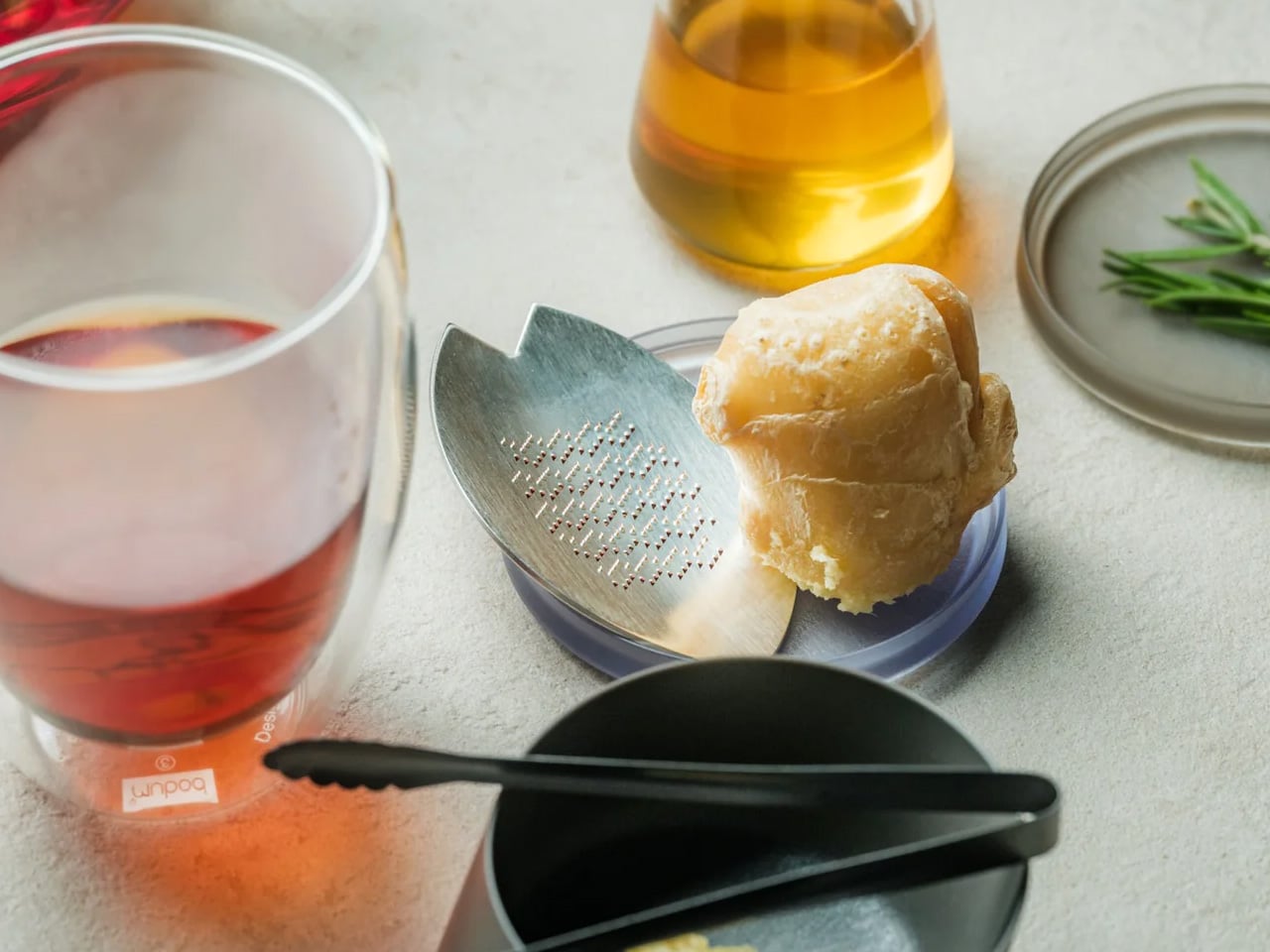
3. Playful Palm Grater
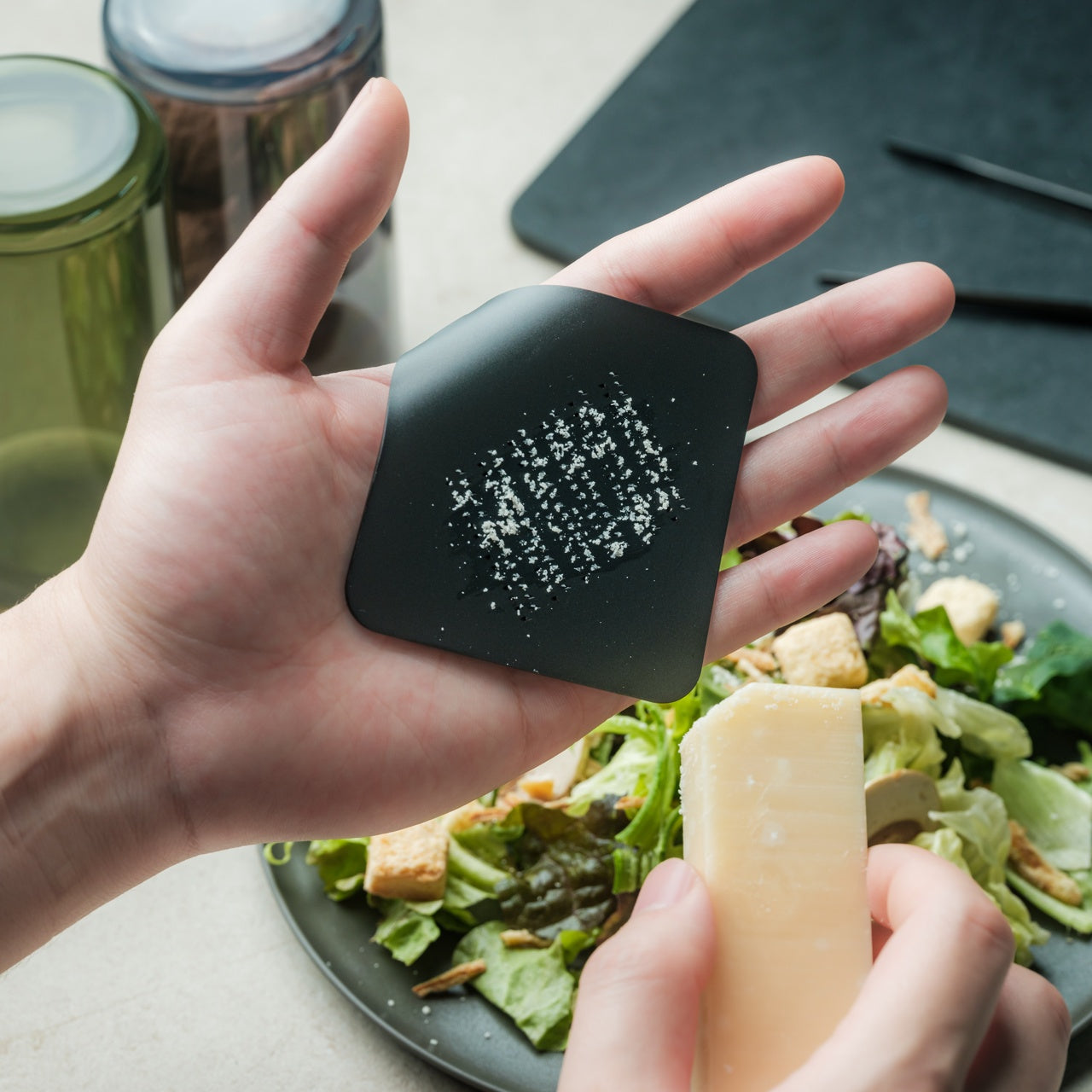
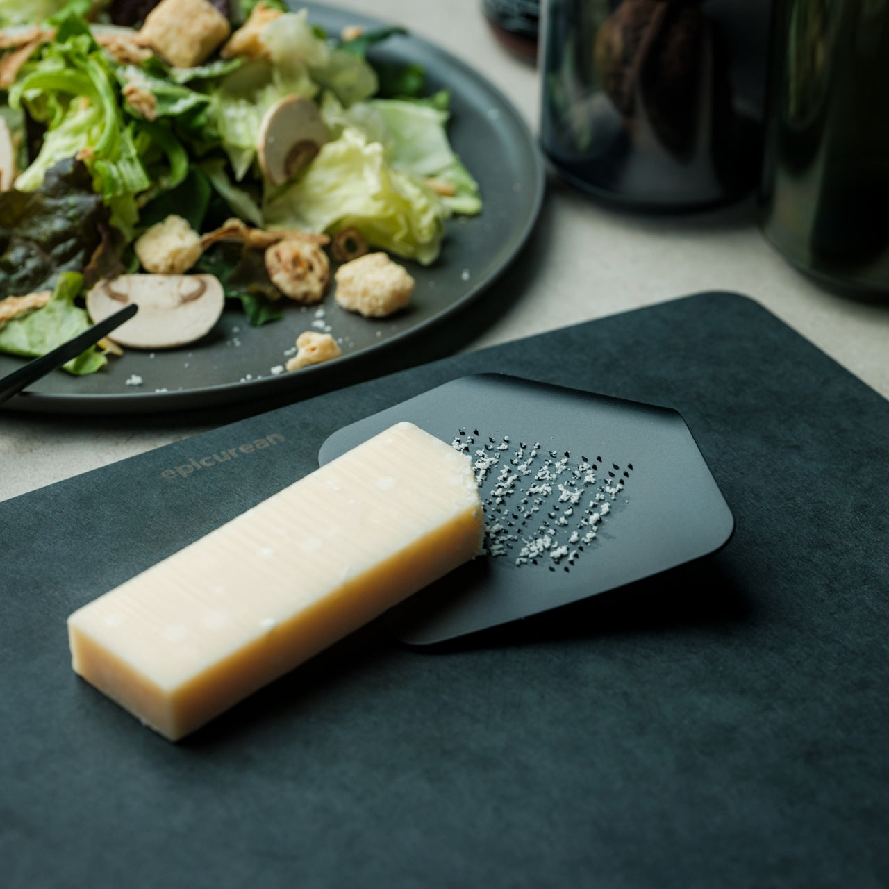
The Playful Palm Grater is shaped like a curled piece of paper and crafted from a single plate of aluminum alloy. It fits in your palm the way you’d hold a stone, close and naturally, rather than the way you hold a box grater, which always feels slightly too large for what it’s doing. That physical closeness changes where your attention goes. You focus on the ingredient and the motion rather than managing an implement that creates more distance from the task than the task actually needs.
For summer cooking, tableside grating transforms garnish preparation from something done in advance and forgotten into something that happens at the table as part of the meal itself. Fresh ginger over cold soba, a small amount of something sharp to cut through a rich sauce, daikon alongside grilled fish. The ergonomic design keeps hands clean and safe from the grater’s surface during use. Compact enough to disappear into any drawer, it adds almost nothing to the counter and changes the experience of finishing a dish.
What we like
- The palm-sized form changes how grating feels physically, making tableside preparation natural rather than effortful or awkward
- Crafted from a single plate of aluminum alloy, the lightweight construction adds virtually no weight or bulk to your kitchen setup
What we dislike
- The compact size means slower processing for any quantity beyond a tableside garnish amount
- Not suited for large-volume grating or ingredients that require significant pressure to break down
4. Vermicular Musui-Kamado Rice Cooker
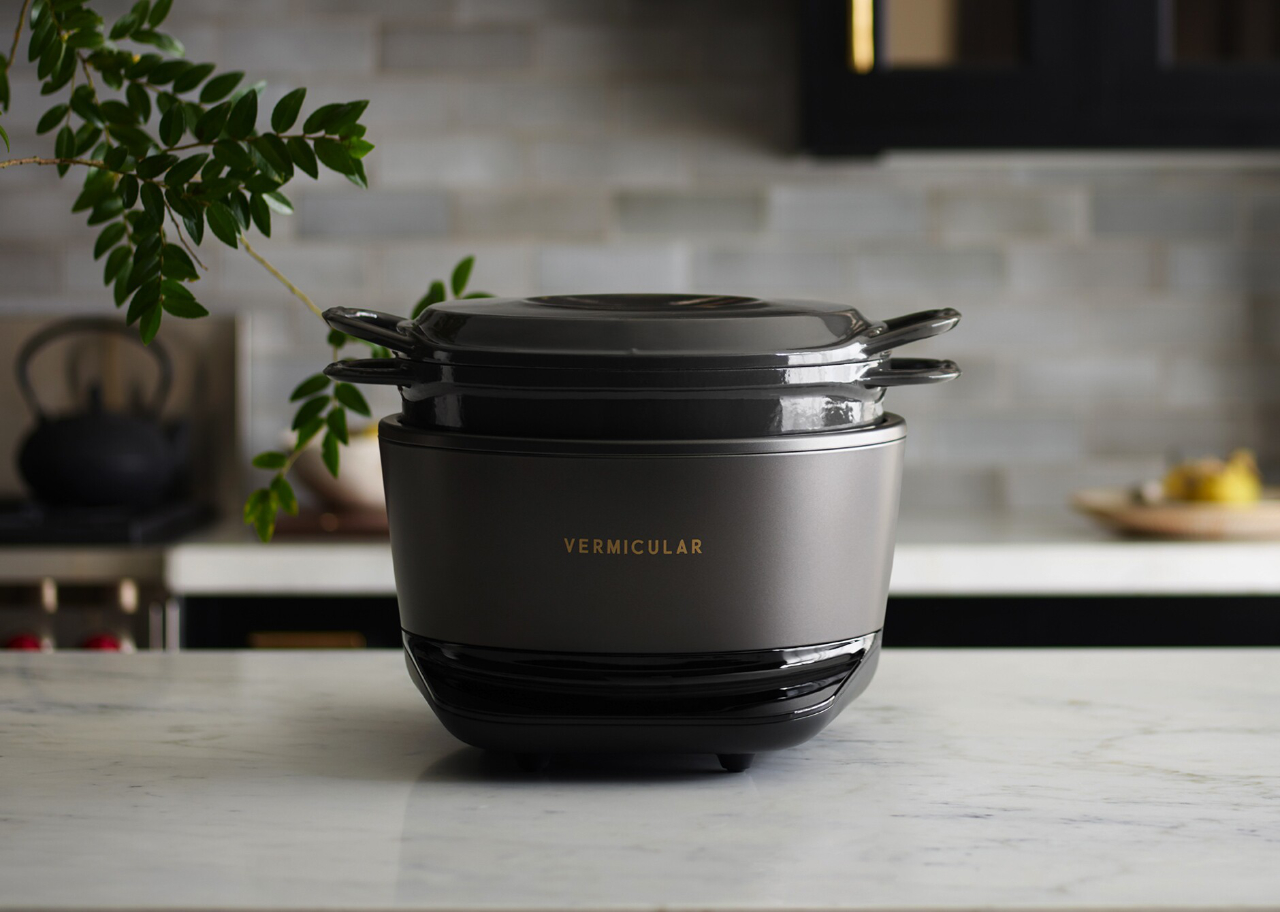
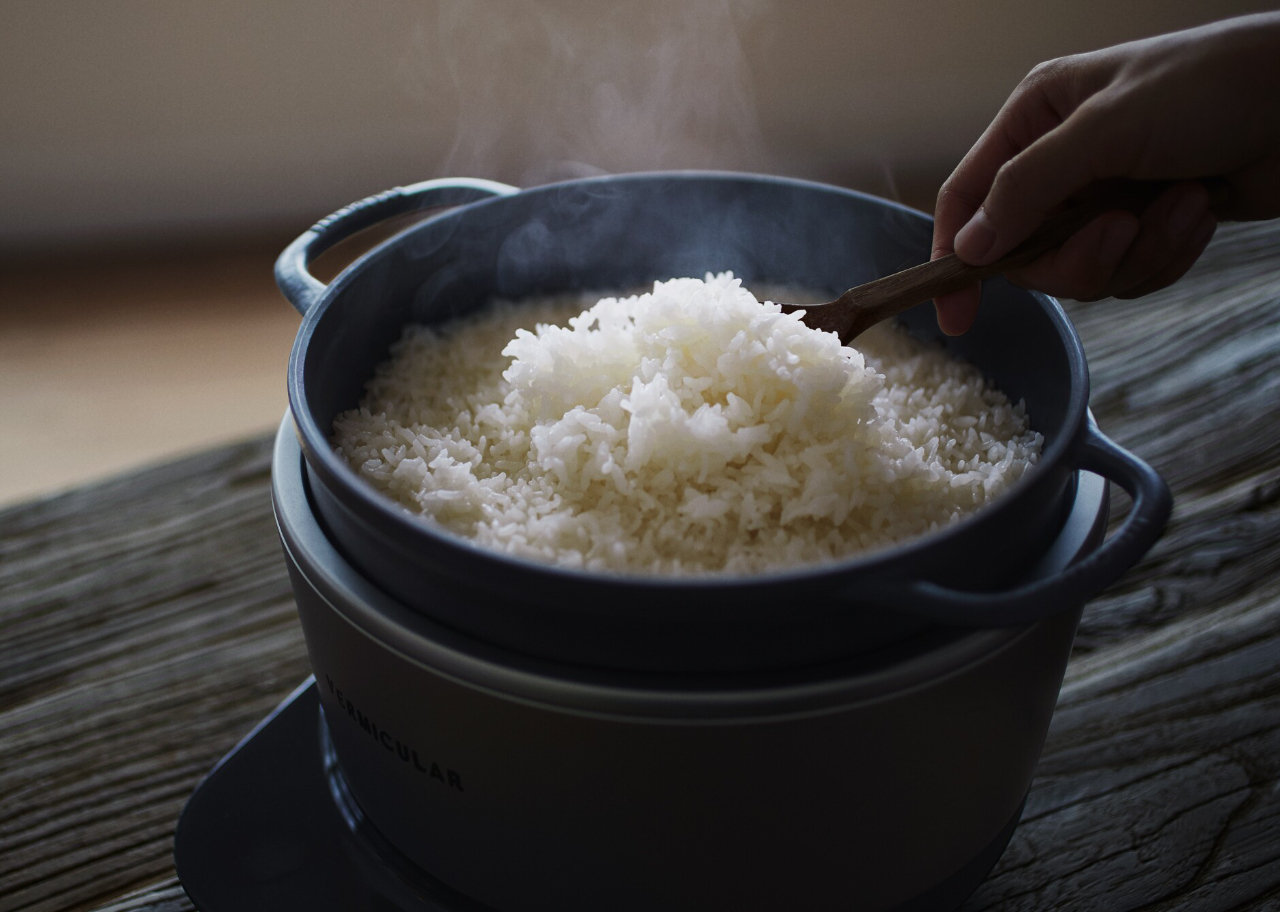
The Vermicular Musui-Kamado pairs precise induction heating with a cast iron pot, and the result is rice with a texture and aroma that standard electric cookers consistently fail to produce. The glossy, aromatic quality is something you notice immediately, something guests will notice before you explain it, and something you stop being able to accept mediocre versions of once you’ve eaten it regularly. For summer cooking, this matters across the full range of meals built around a bowl of rice done properly.
The cold rice bowl, the foundation of a casual sushi spread, the side dish anchoring grilled fish: the rice at the center of those meals either earns everything else on the plate or quietly lets it down. The minimalist design and intuitive controls mean the cooker handles the process in the background without demanding your attention or dominating the counter. This is a daily-use investment that improves a broader range of meals than almost any other single kitchen tool.
What we like
- Precise induction heating combined with a cast iron pot produces rice with a consistency and quality that standard electric cookers cannot replicate
- The minimalist design integrates into any kitchen counter without demanding visual attention or commanding the whole surface
What we dislike
- The cast iron pot is heavier than standard cooker inserts and requires careful hand washing and thorough drying after each use
- The premium construction comes at a premium price, making this a considered investment rather than an impulse buy
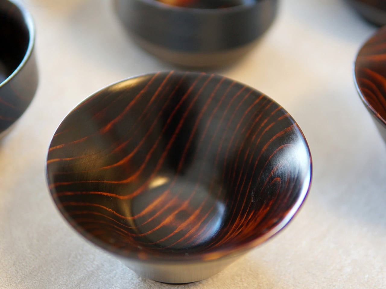
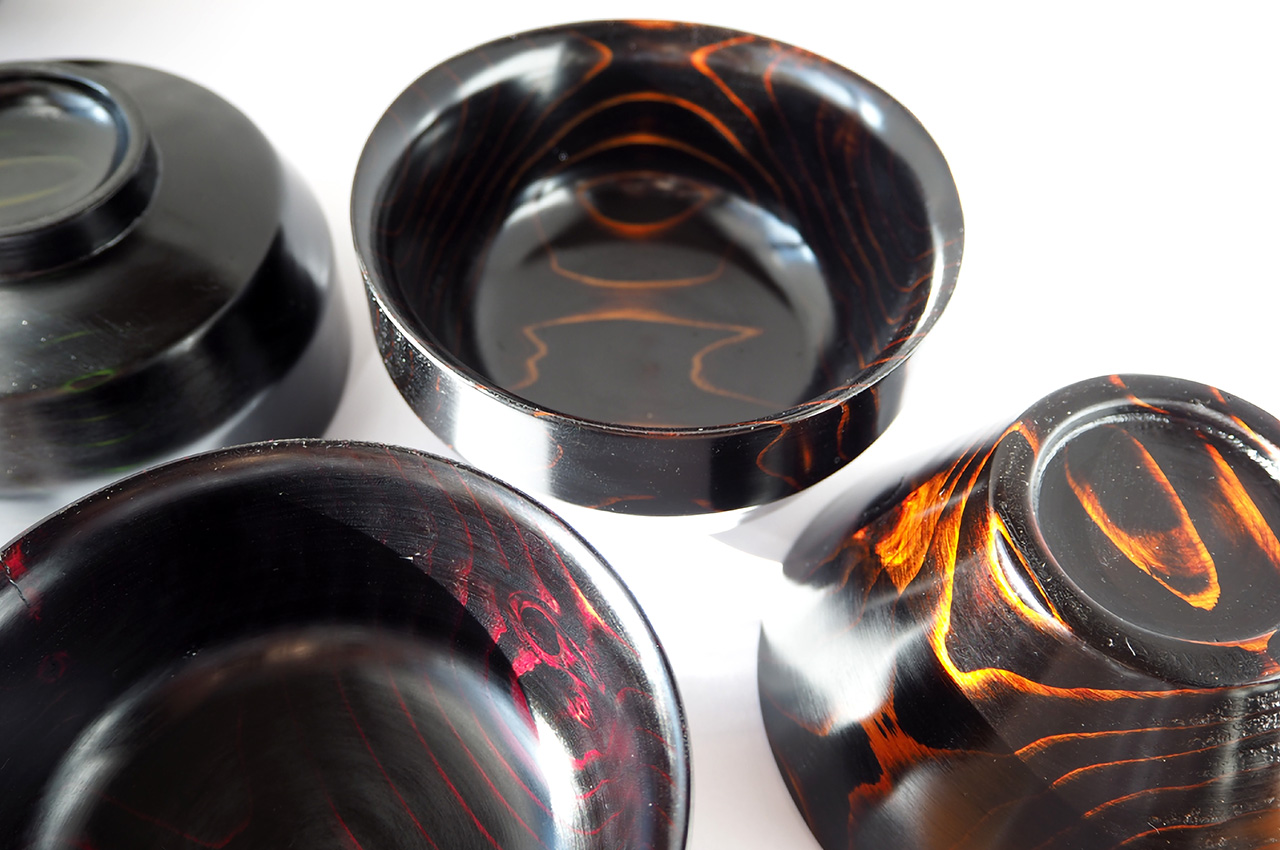
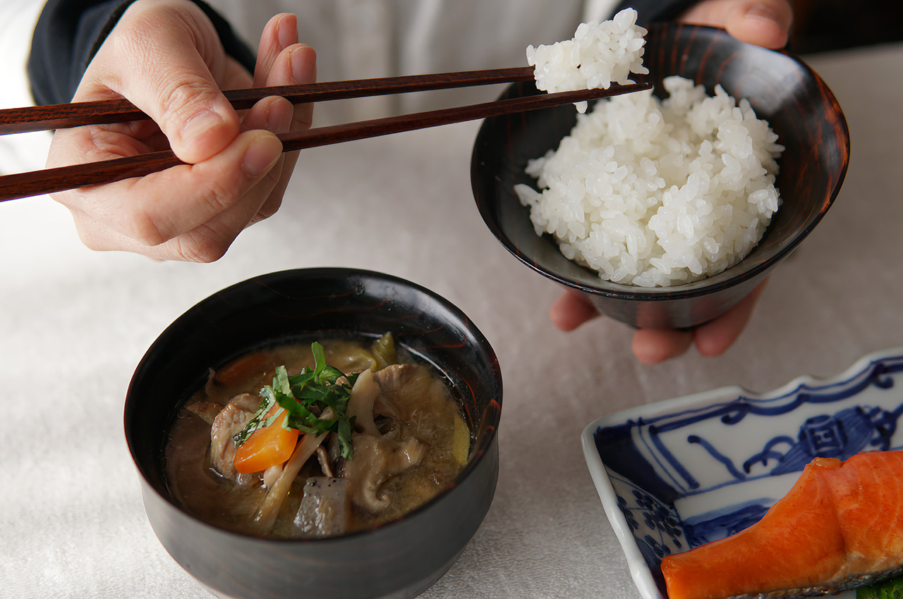
5. Iga-yaki Donabe Clay Pot
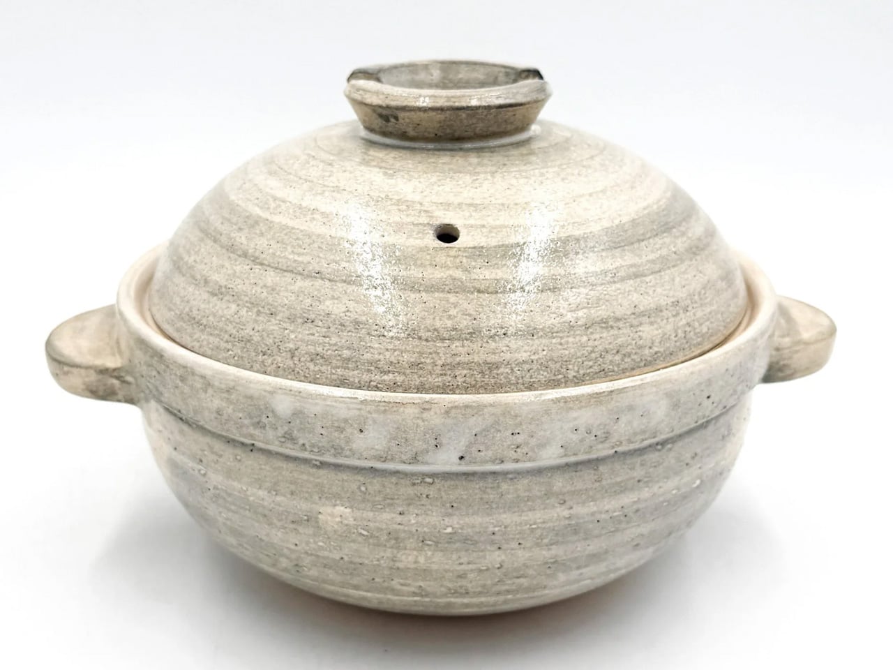
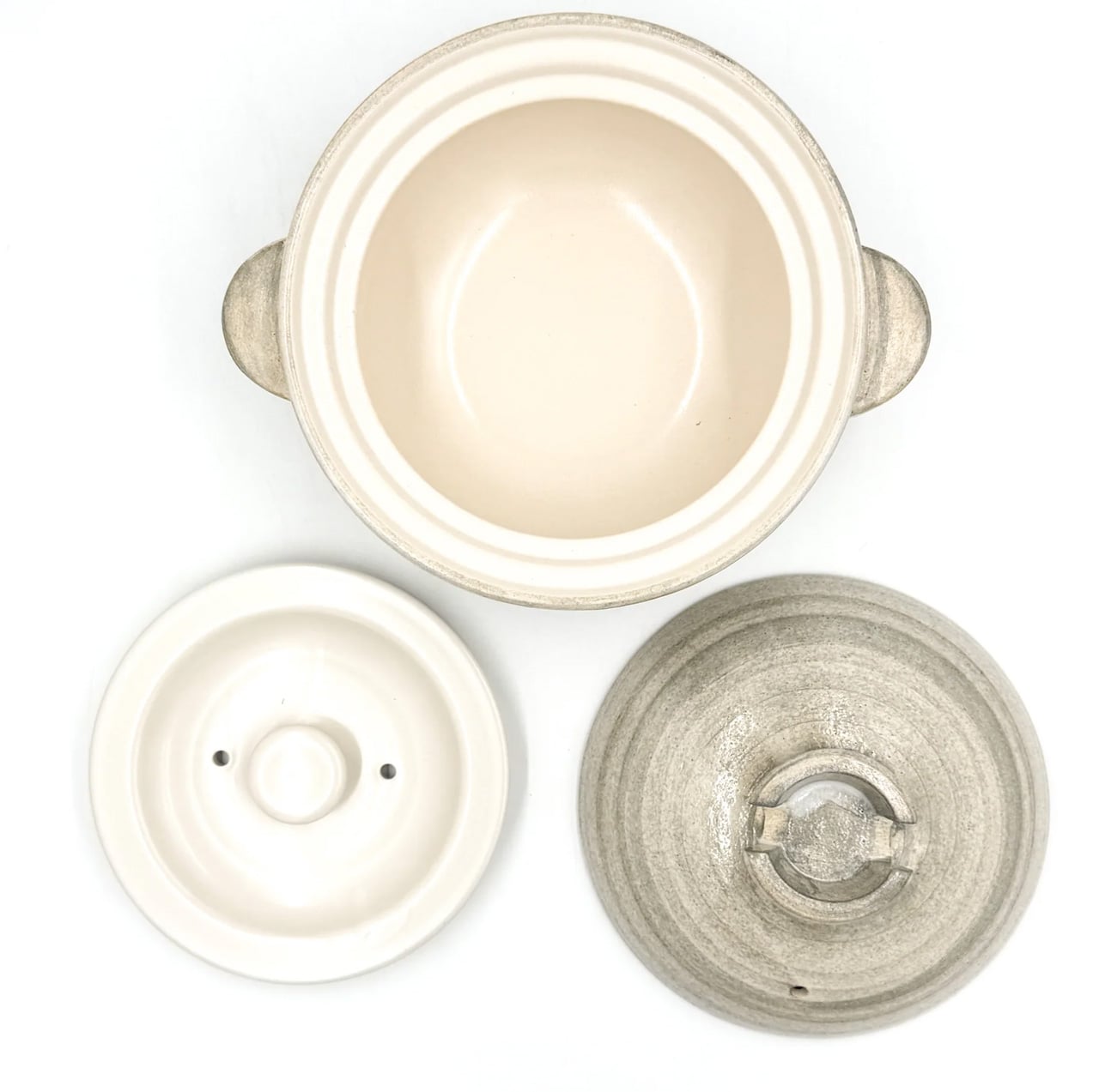
Iga-yaki clay comes from Mie Prefecture in Japan, where local earth has been worked into ceramics for centuries. The porous structure absorbs heat slowly and releases it evenly, which creates a cooking environment that metal pots simply cannot replicate. Rice cooked in a donabe tastes different: sweeter, more aromatic, each grain fully cooked and intact. Broth deepens over a lower flame. The exterior stays rough and textured while the interior is glazed smooth, each surface doing exactly what it needs to and nothing more.
For summer cooking, the donabe covers more ground than most tools twice its size. It steams fish with the lid on, makes hot pot for a warm evening on the patio, braises chicken in dashi while you handle everything else, and holds rice at temperature through a long, unhurried meal. The Kamado-san Simply Donabe edition from TOIRO Kitchen is available in several sizes, all made in Japan from Iga clay. This is the vessel most likely to become the one you reach for first, regardless of what you’re making.
What we like
- Iga-yaki clay retains heat well past the point of turning off the flame, keeping food at temperature through an unhurried meal at the table
- Versatile across rice, hot pot, steaming, and slow braise — one vessel that covers the full range without compromise
What we dislike
- Clay donabe requires seasoning before first use by simmering rice water inside, a step that isn’t always clear from the packaging
- The porous body can absorb strong cooking odors over time and needs to be stored with the lid off after washing to stay fresh
6. All-in-One Grill
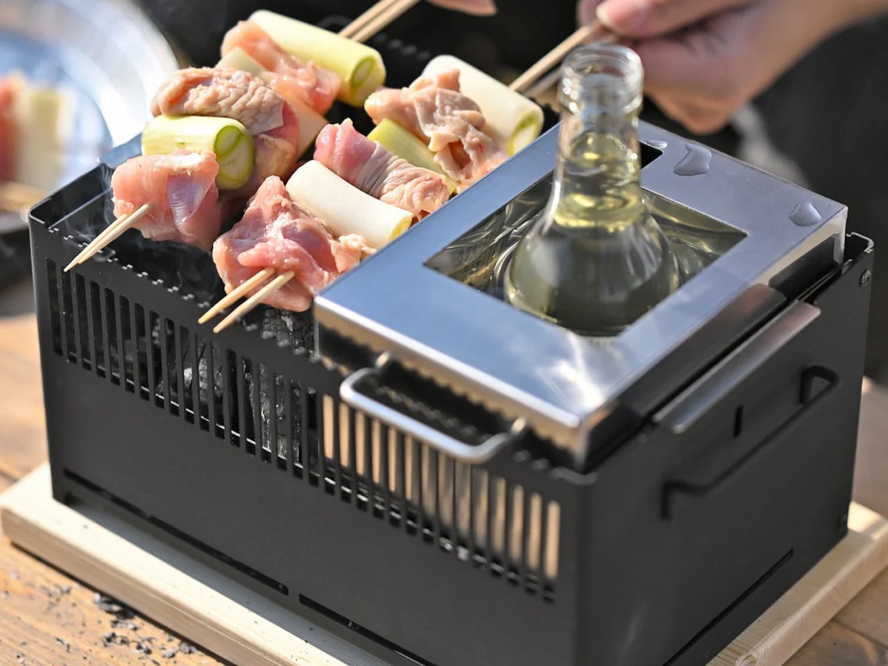
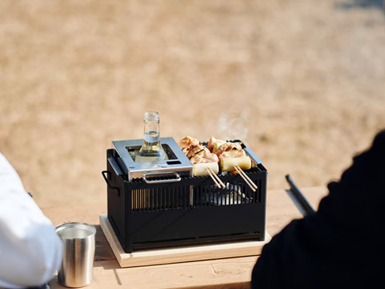
The All-in-One Modular Grill handles barbecuing, frying, grilling, steaming, smoking, and bottle warming through a system of modules that snap in and out without tools or complicated reassembly between uses. You can move from grilling skewers to steaming dumplings without changing stations or rethinking the setup mid-meal. That flexibility changes how you approach outdoor cooking entirely. You stop planning around the limitations of a single-purpose grill and start cooking whatever you actually want to make, which is how outdoor cooking should feel in the first place.
The portability is real and not aspirational. Every module is engineered to fit together compactly, making it practical to carry to a rooftop, campsite, or garden without second-guessing the decision to bring it along. Each part disassembles quickly for washing when the evening is over, which matters more than it sounds after a long outdoor meal without a kitchen nearby. Available from the YD shop at $449, this is the anchor of a summer cooking setup worth taking seriously. The other tools on this list inform the meal. This is where it actually happens.
What we like
- Multiple interchangeable modules let you move through entirely different cooking methods without leaving the station or swapping out equipment mid-cook
- The system disassembles quickly after use, making cleanup manageable even in outdoor settings far from a kitchen
What we dislike
- The full grill with all modules is heavier than single-purpose outdoor cookware, which matters if you’re carrying it any real distance on foot
- The modular system takes some initial orientation for anyone accustomed to simpler, single-function grills
7. Yoshikawa Polished Bamboo Makisu
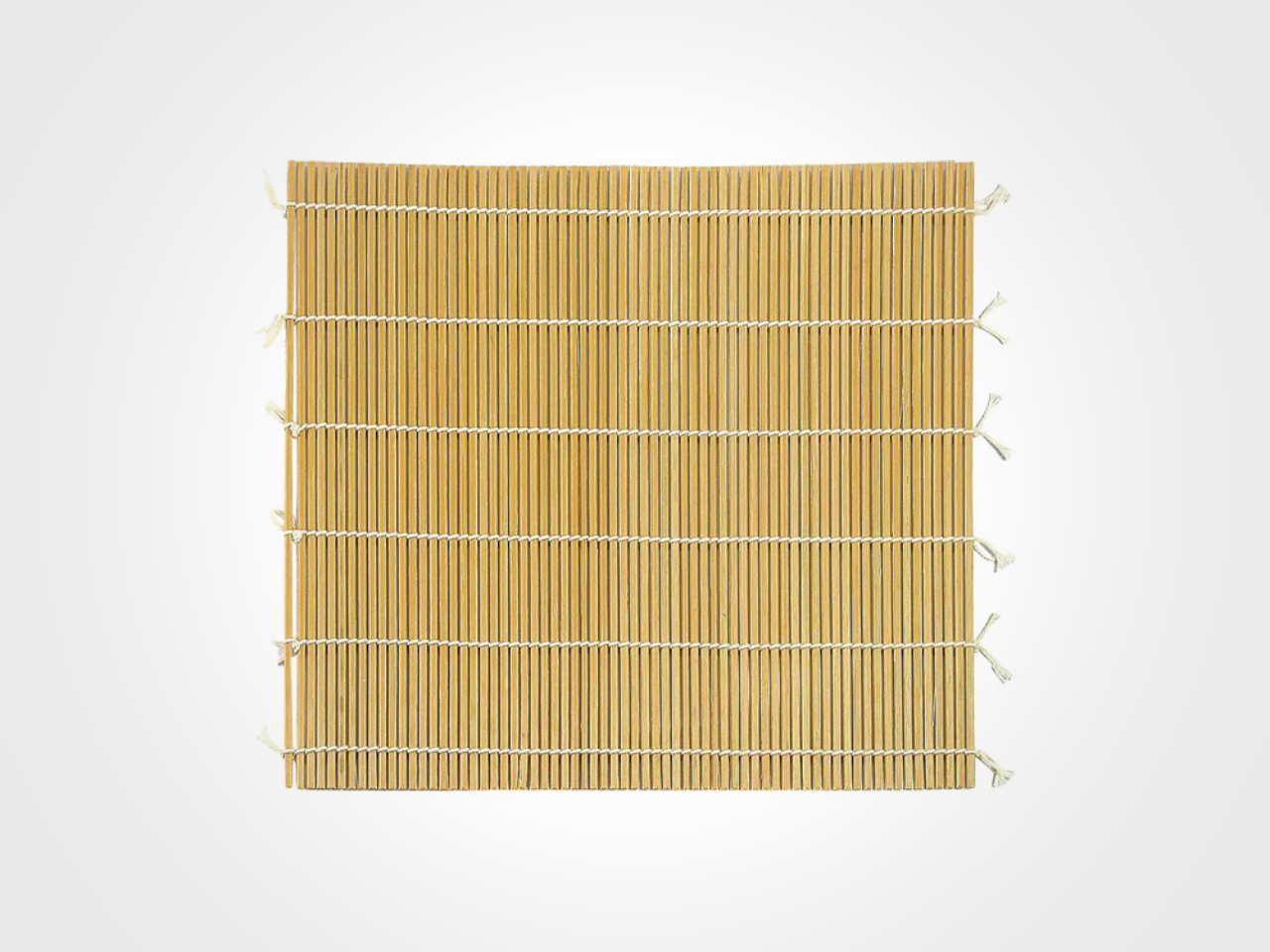
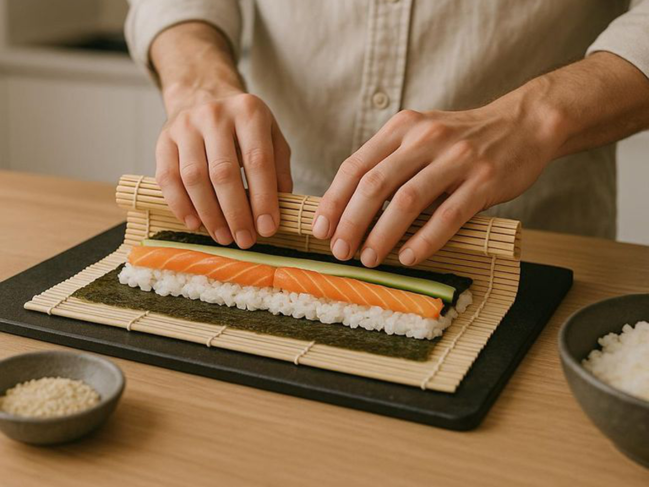
Most bamboo sushi mats are made from standard green bamboo and fade as they age, gradually becoming something you stop noticing rather than something you reach for with intention. The Yoshikawa Polished Bamboo Makisu works differently. Made from bamboo that has had its outer skin removed and its surface hand-finished, it starts with a warmth and smoothness that typical mats don’t carry and develops a rich amber tone with every use. It becomes more itself the more you cook with it, which is a quality worth paying attention to.
The smooth surface feels different in your hands during the rolling process, and that tactile quality is not incidental. When the tool itself feels considered, the task feels considered too, and the sushi you make reflects that shift in attention. Summer sushi nights stop feeling like a project and start feeling like a practice worth returning to. Available through Yoshikawa’s Japanese store, this is a small investment in a kind of cooking that becomes more enjoyable every time you do it, which is the best argument any kitchen tool can make for itself.
What we like
- The polished bamboo surface develops a beautiful amber tone and individual character that deepens with every use, unlike standard mats that only fade over time
- The hand-finished surface creates a tactile quality during rolling that changes the attention you bring to the task
What we dislike
- Not dishwasher safe and requires more attentive drying and storage than synthetic mat alternatives to stay in good condition
- More delicate than standard green bamboo mats if handled carelessly during washing or storage
The Best Kitchen Tools Don’t Make Cooking Easier — They Make It Worth Doing
The best argument for any of these tools is the same: they make summer cooking feel like a choice rather than a negotiation. The nakiri makes you want to stay at the cutting board. The donabe makes you want to wait for the steam. The grill makes you want to be outside with something good happening on the surface in front of you. These seven tools don’t just produce better food. They produce the desire to cook at all, which is the harder thing to manufacture.
Japanese kitchen design built its reputation on exactly this idea — that the right object doesn’t just solve a problem but changes your relationship to the task it belongs to. None of these tools will feel like a novelty in six months. They will feel like the obvious choice, the one you reach for first, the one you genuinely miss when you cook somewhere that doesn’t have it. Summer is the right time to find out which one that is for you.
The post 7 Best Japanese Kitchen Gadgets That Make Summer Cooking Actually Worth Getting Off the Couch first appeared on Yanko Design.